20 Bathroom Paint Colors Interior Designers Always Reach For
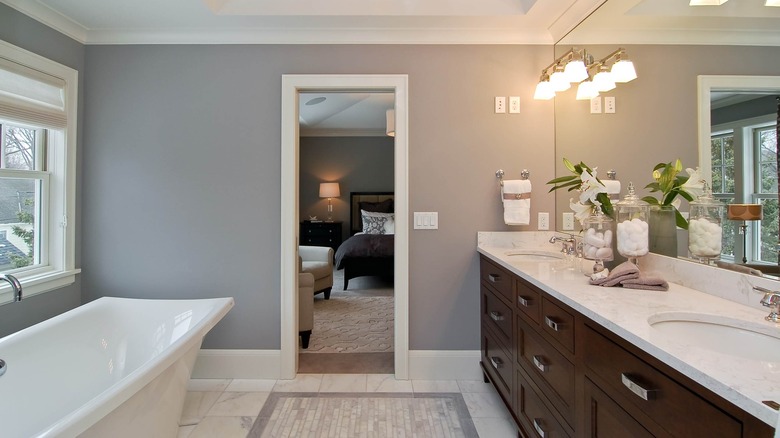
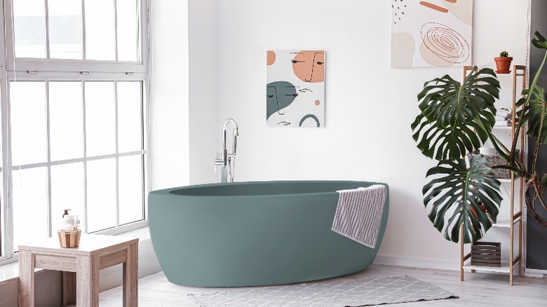
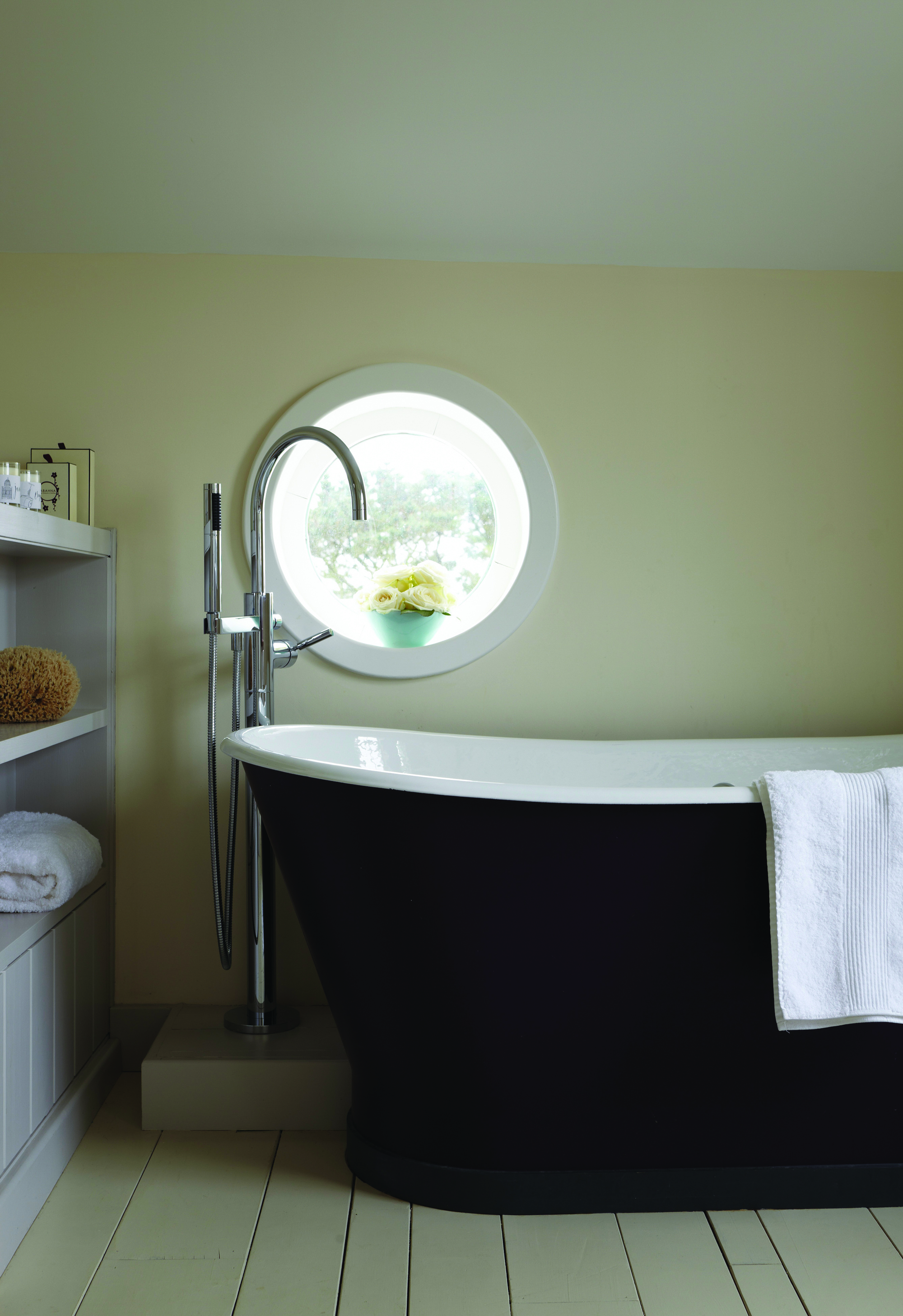
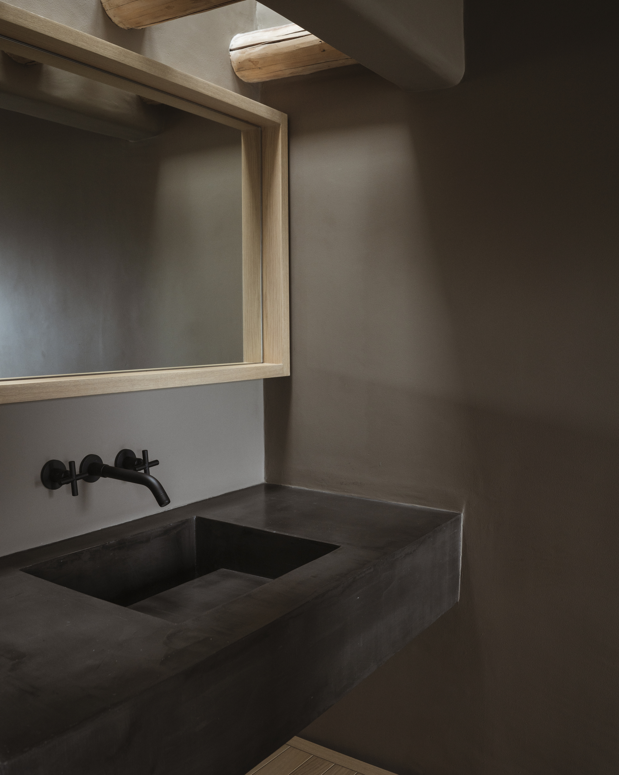
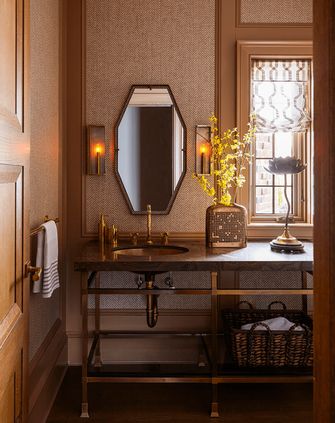
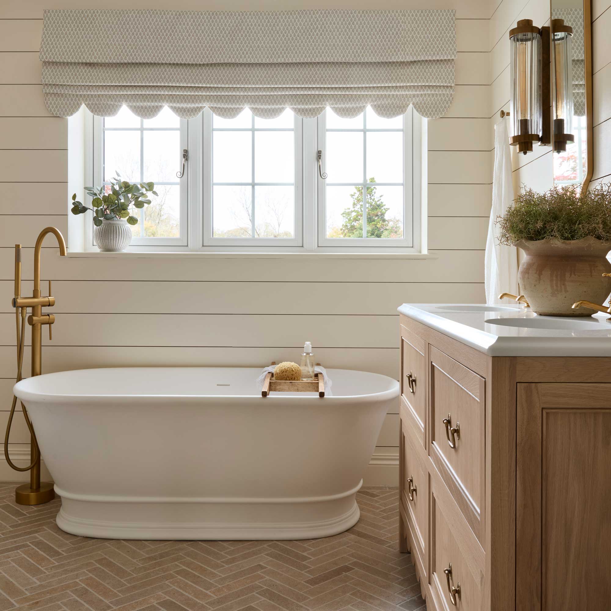
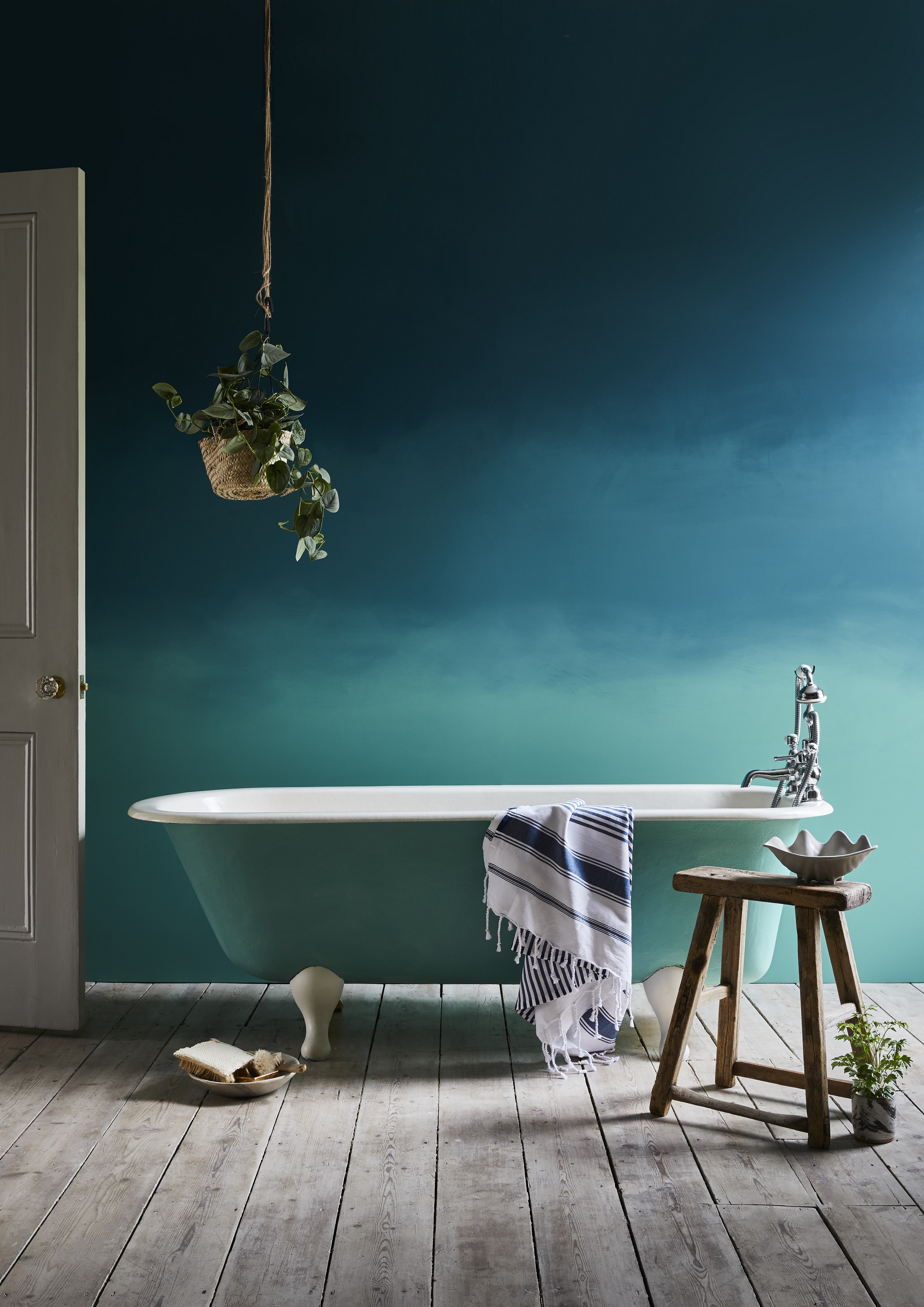
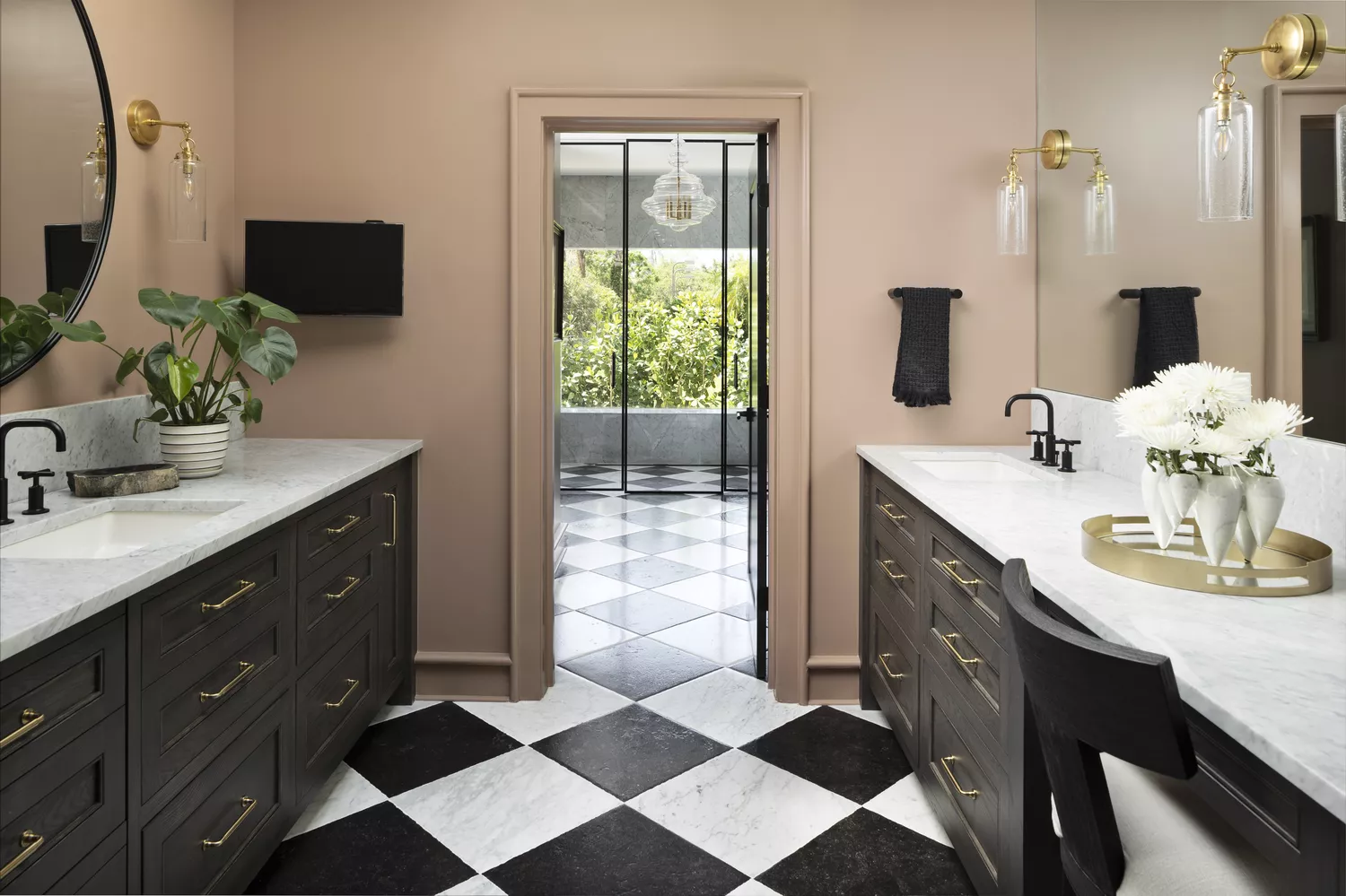
Choosing the right paint color can dramatically transform a bathroom's ambiance without the expense of a full renovation. Interior designers prioritize two key factors when selecting bathroom paint: how the color complements skin tone, particularly for spaces where individuals prepare for the day, and how well it harmonizes with existing elements like countertops, tiles, and accessories. A paint color should integrate seamlessly with the bathroom's overall design, whether aiming for a bold statement or a subtle backdrop.
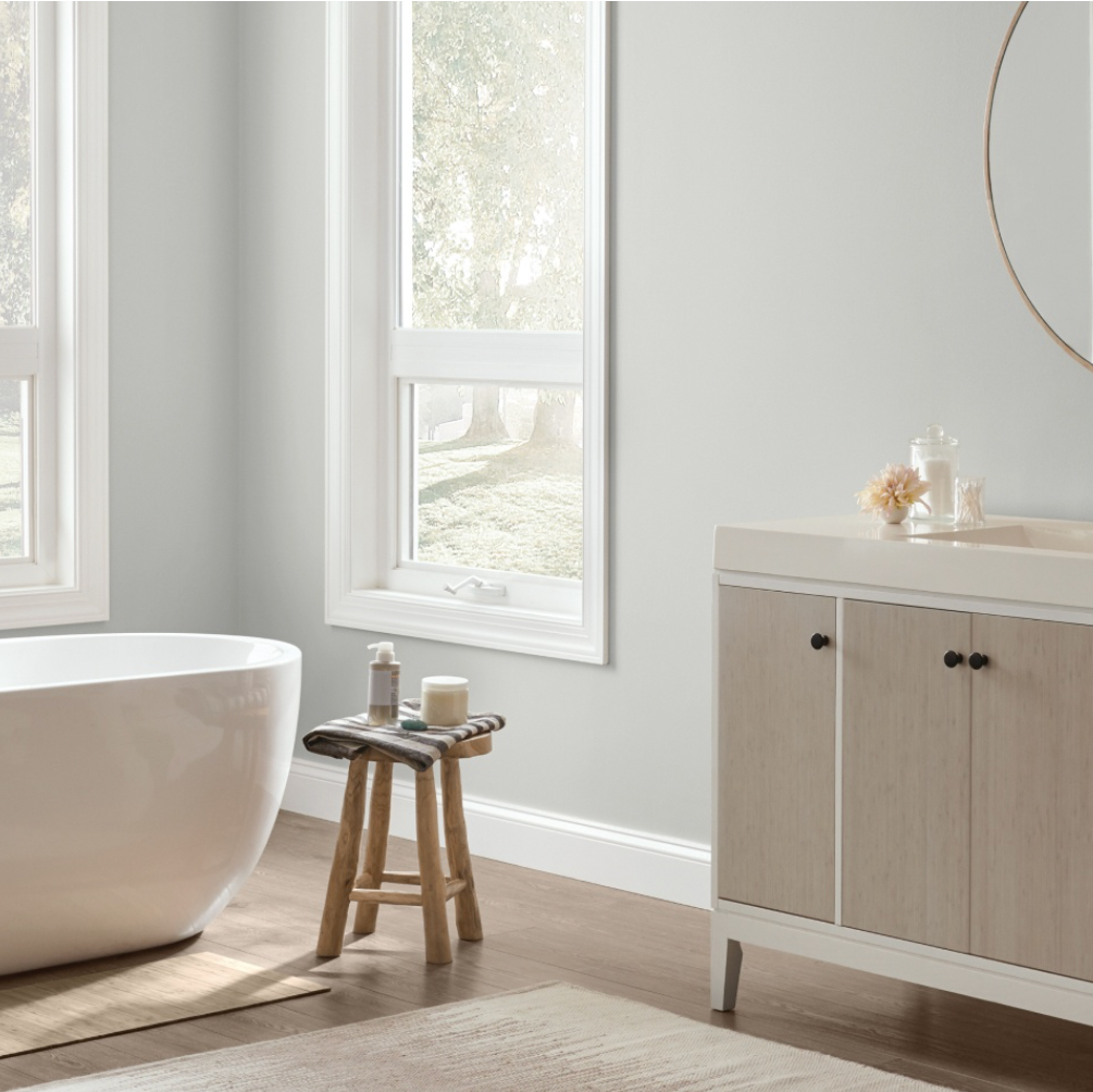
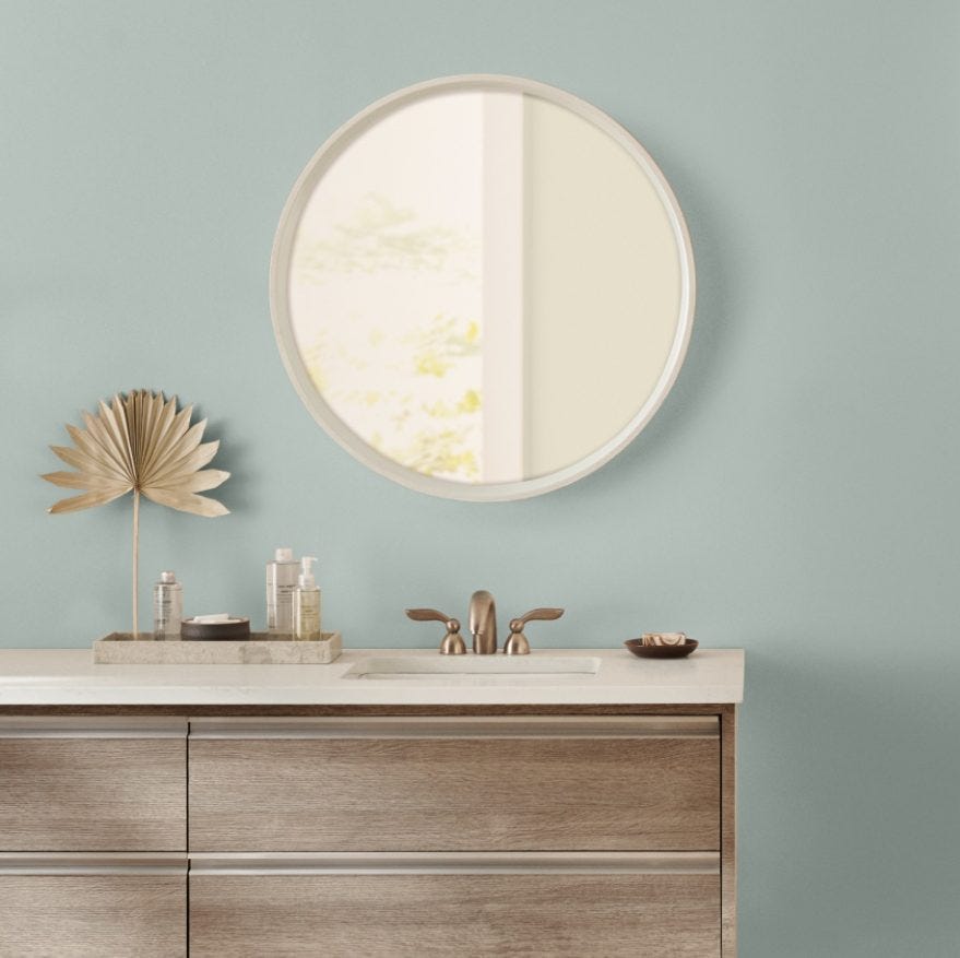
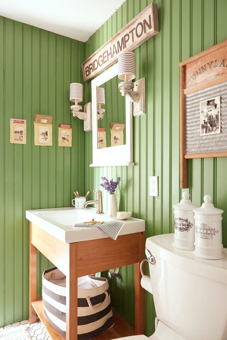
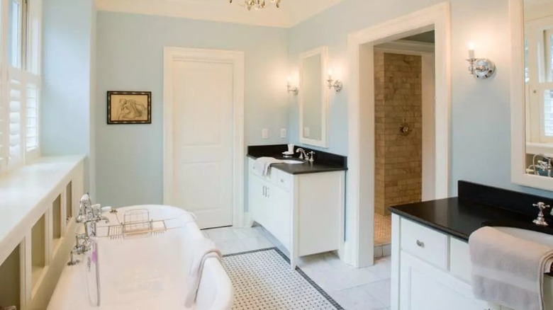
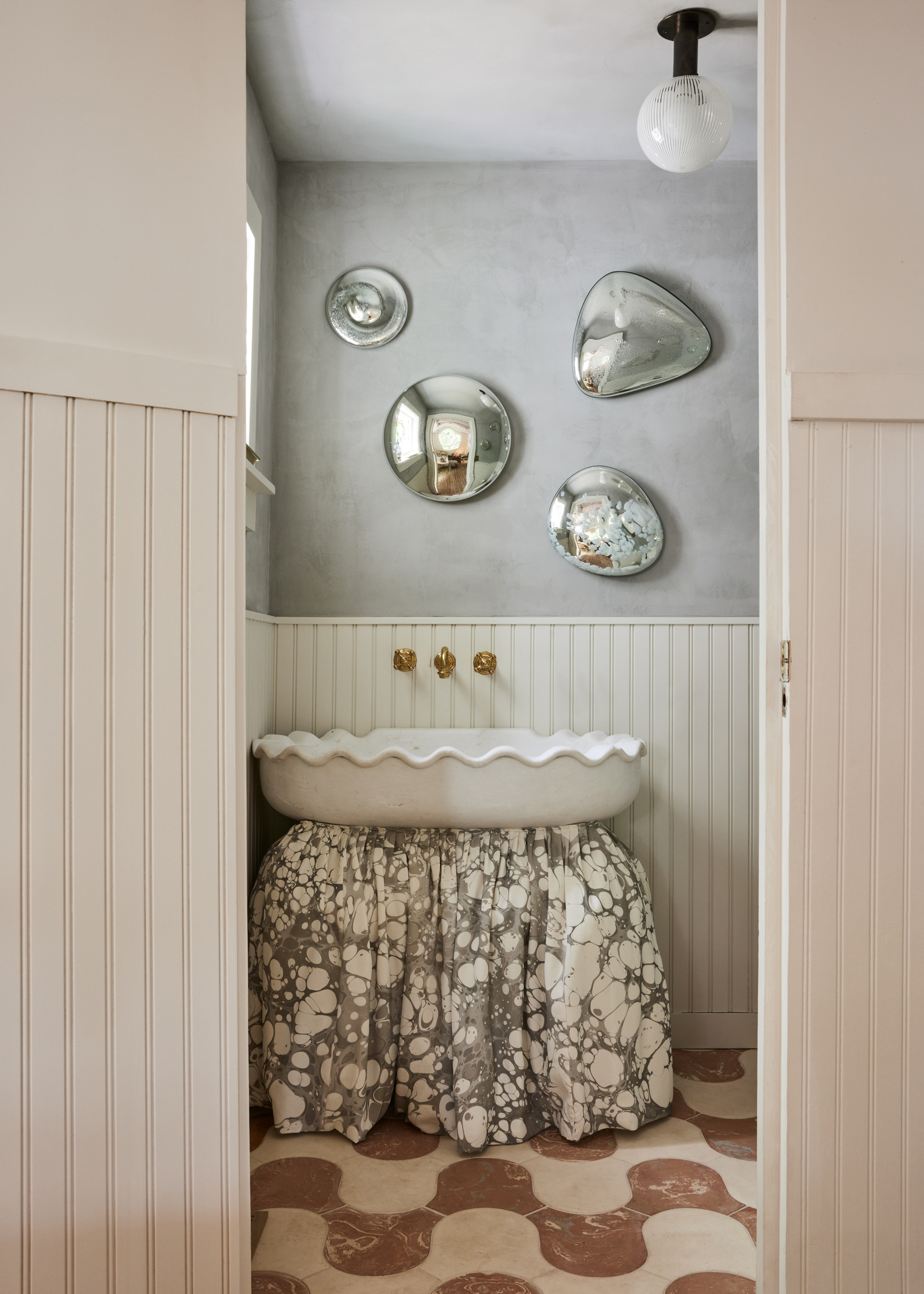
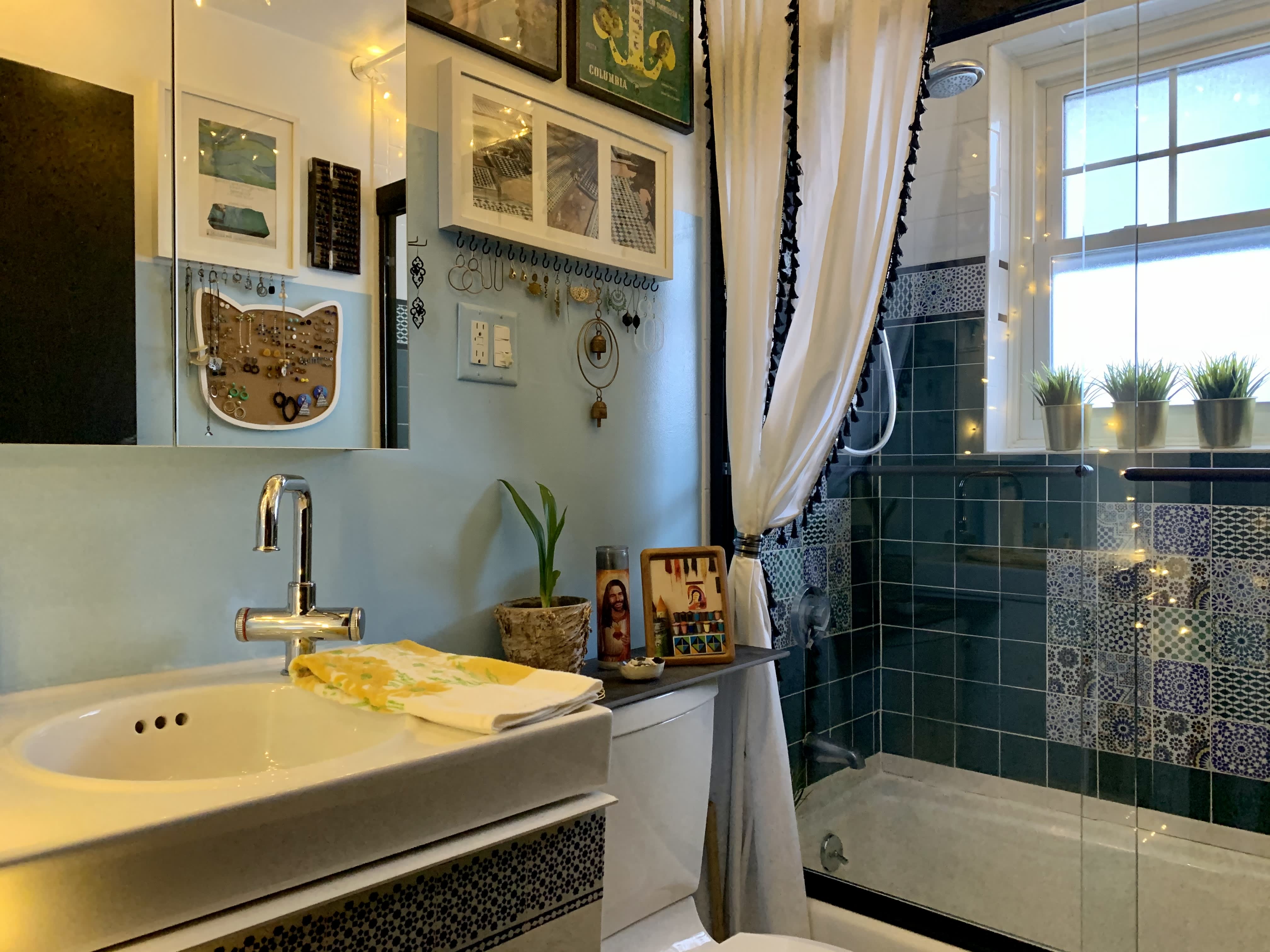
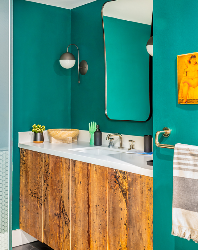
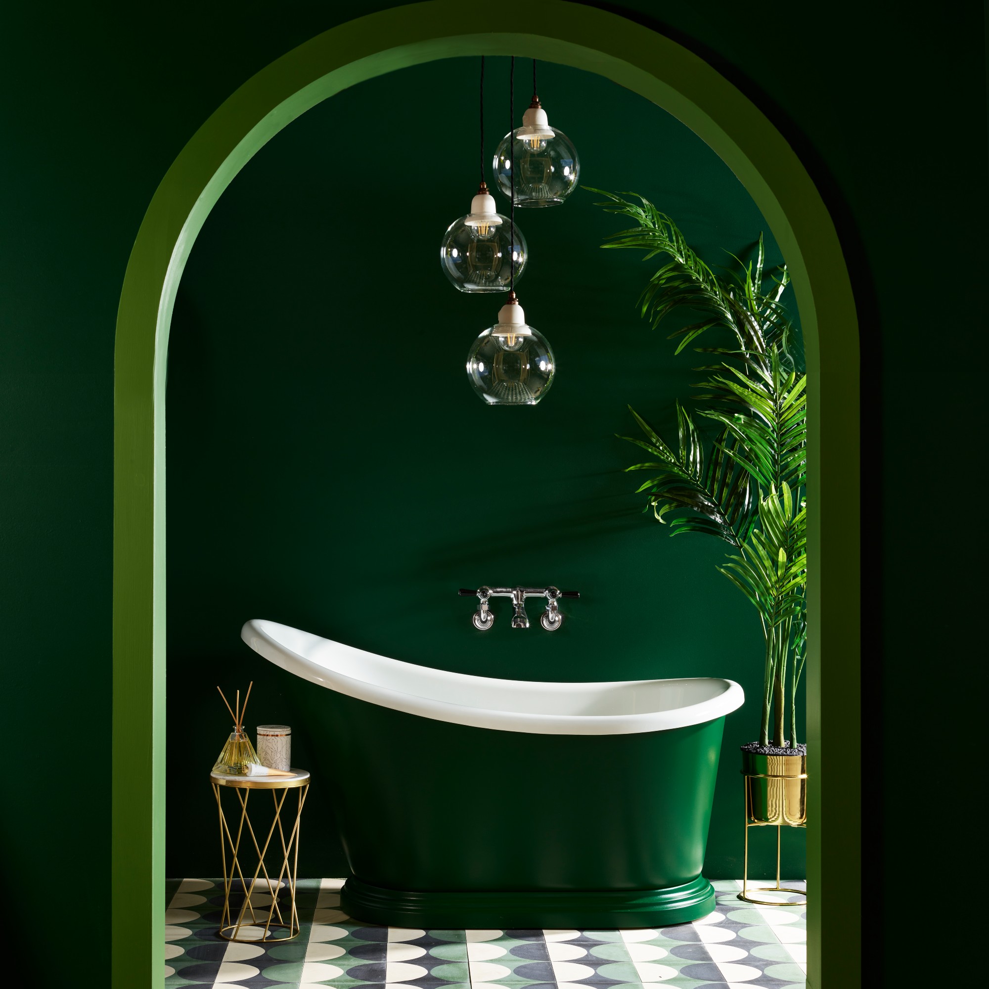
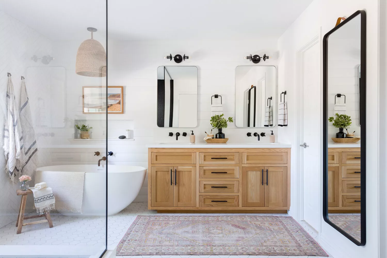
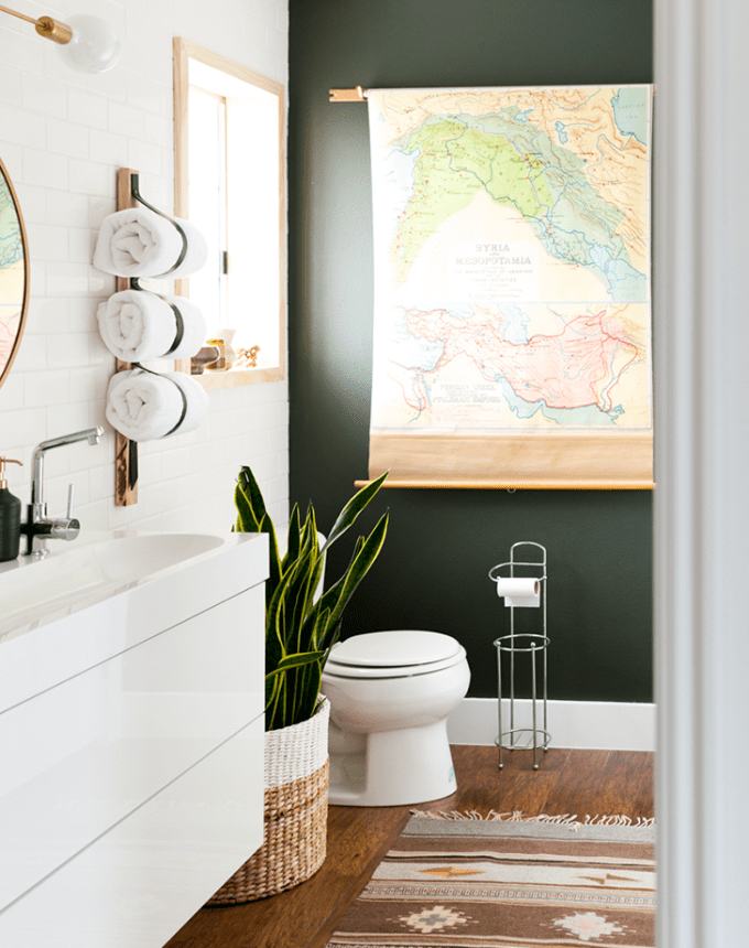
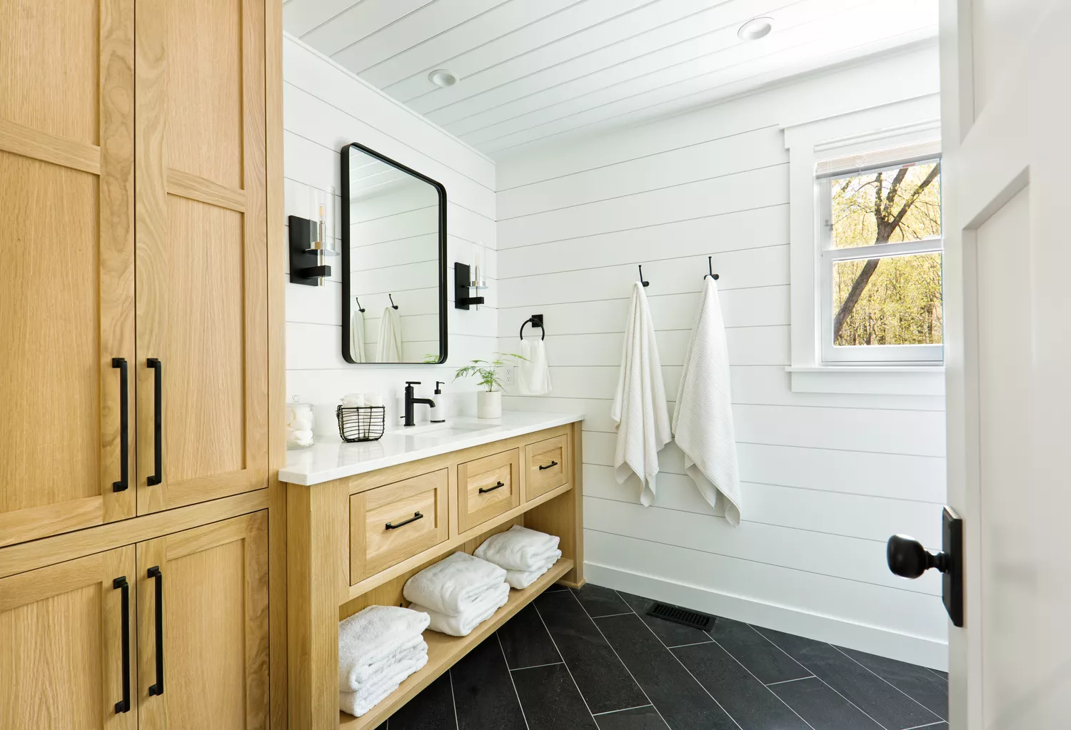
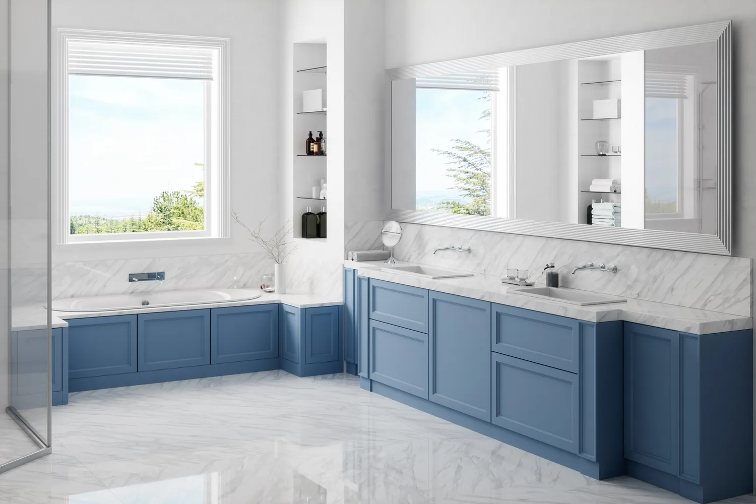
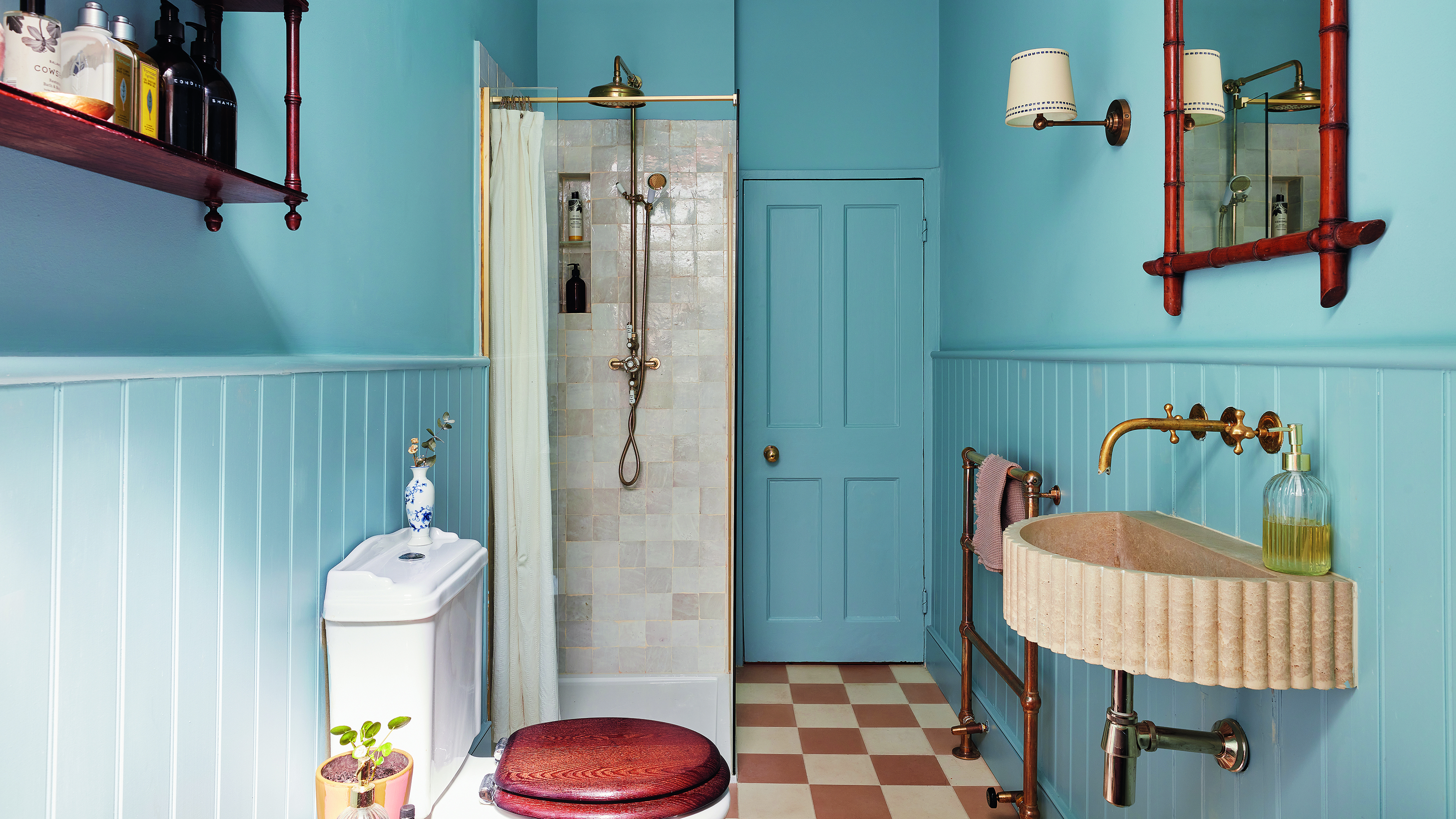
The article presents 20 designer-approved bathroom paint colors, categorized by their aesthetic impact and suitability for various styles. For a light and ethereal feel, 'Borrowed Light' by Farrow & Ball offers a soft, luminous pale blue. When seeking a classic, crisp white that allows natural textures to stand out, 'Simply White' by Benjamin Moore is a favored choice, particularly for larger primary bathrooms. To infuse a sense of luxury and warmth, darker hues like 'Green Grove' by Benjamin Moore are recommended, with its deep, earthy tone making rooms feel cozy and organic.
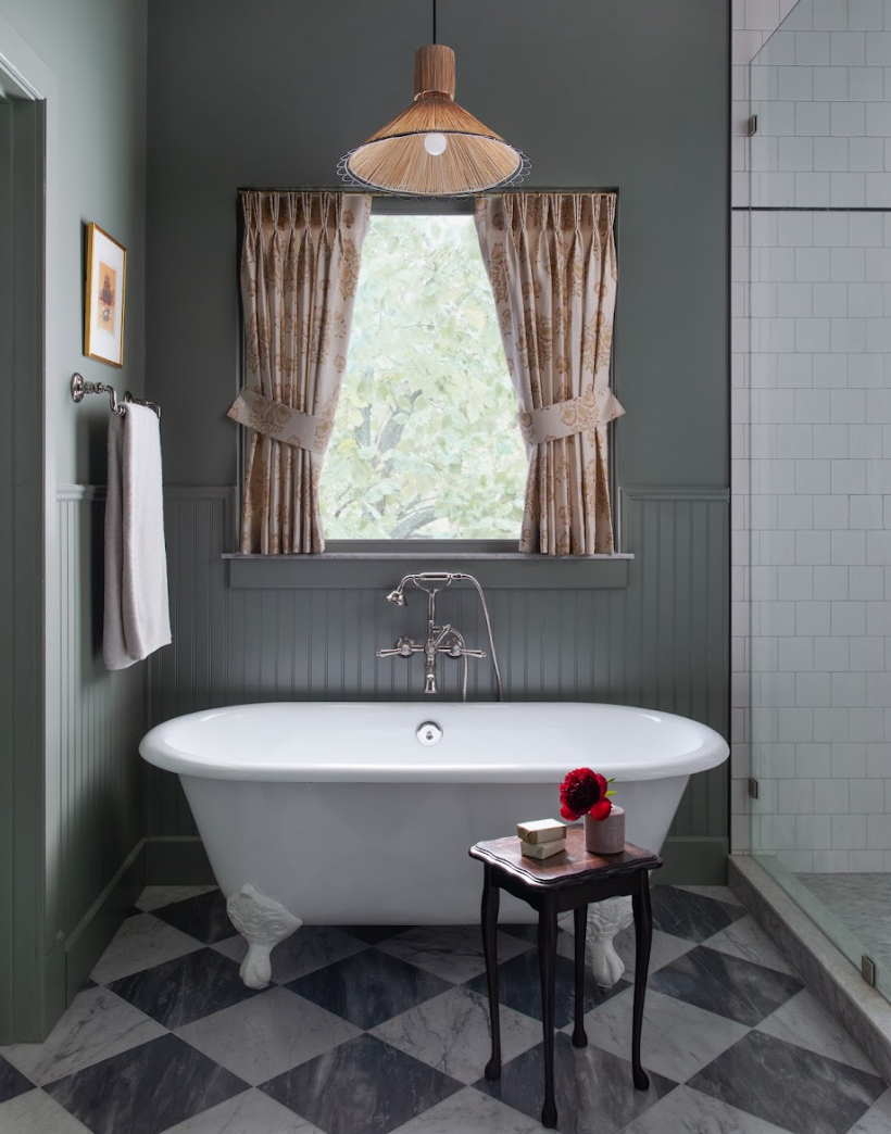
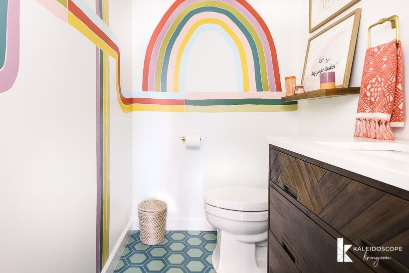
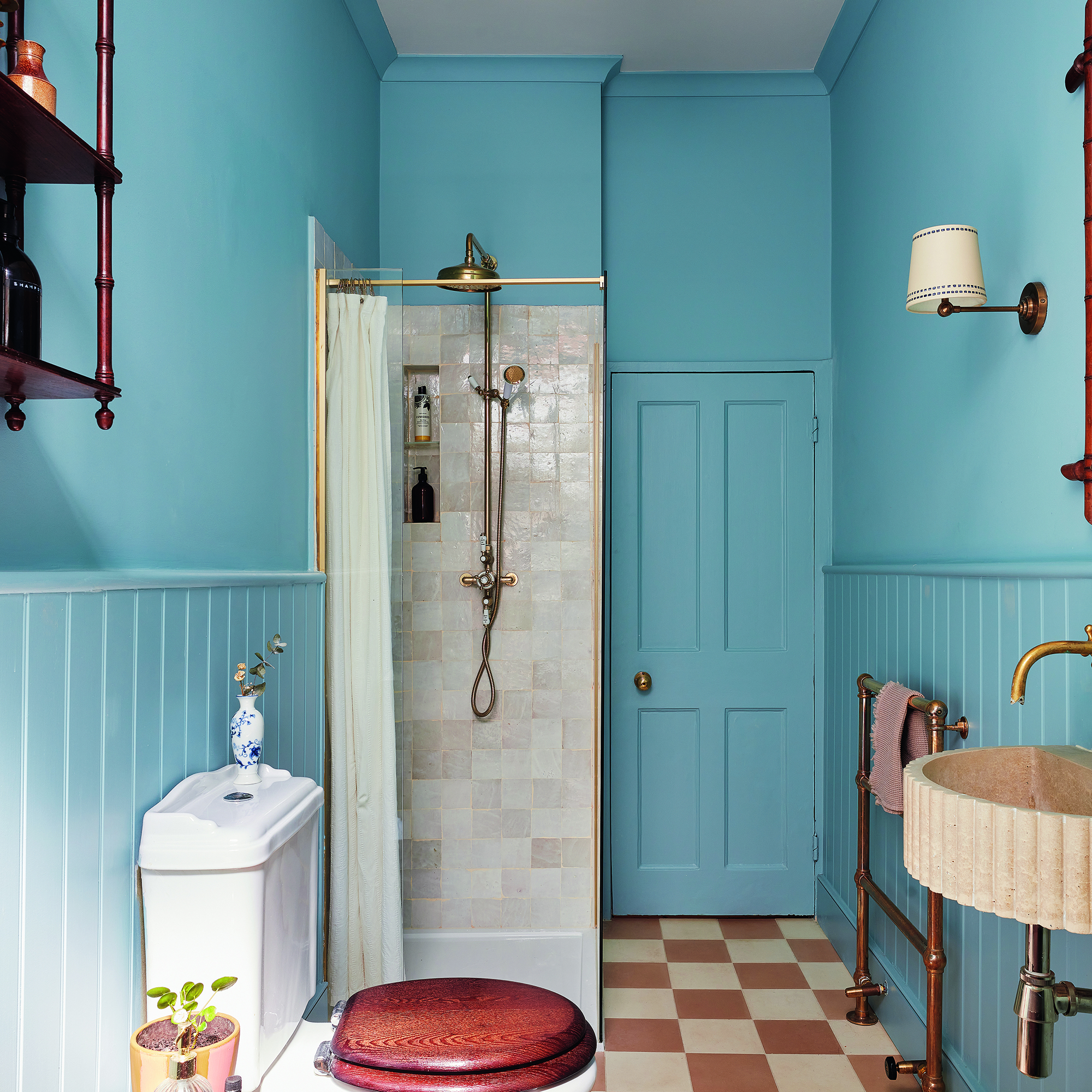
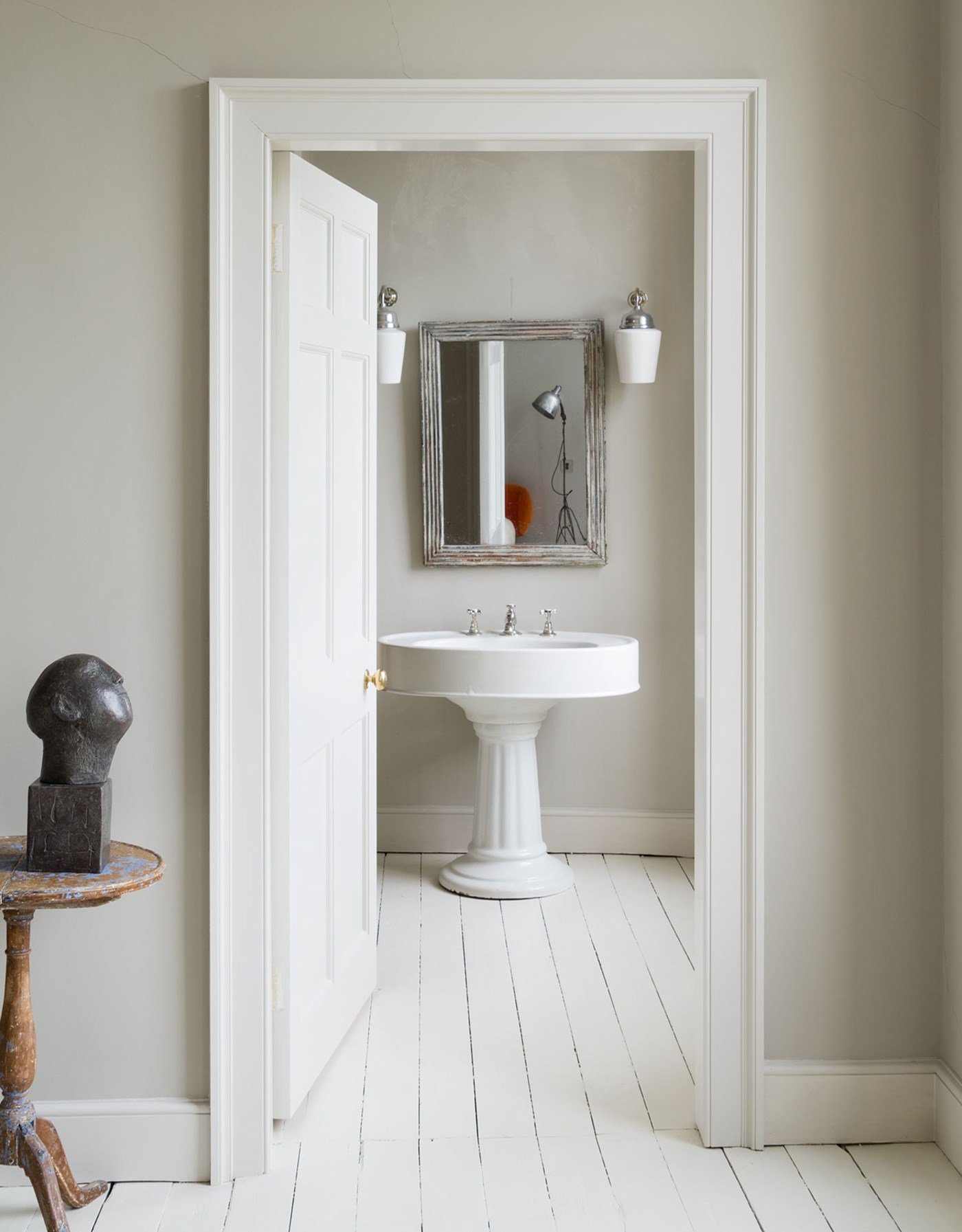
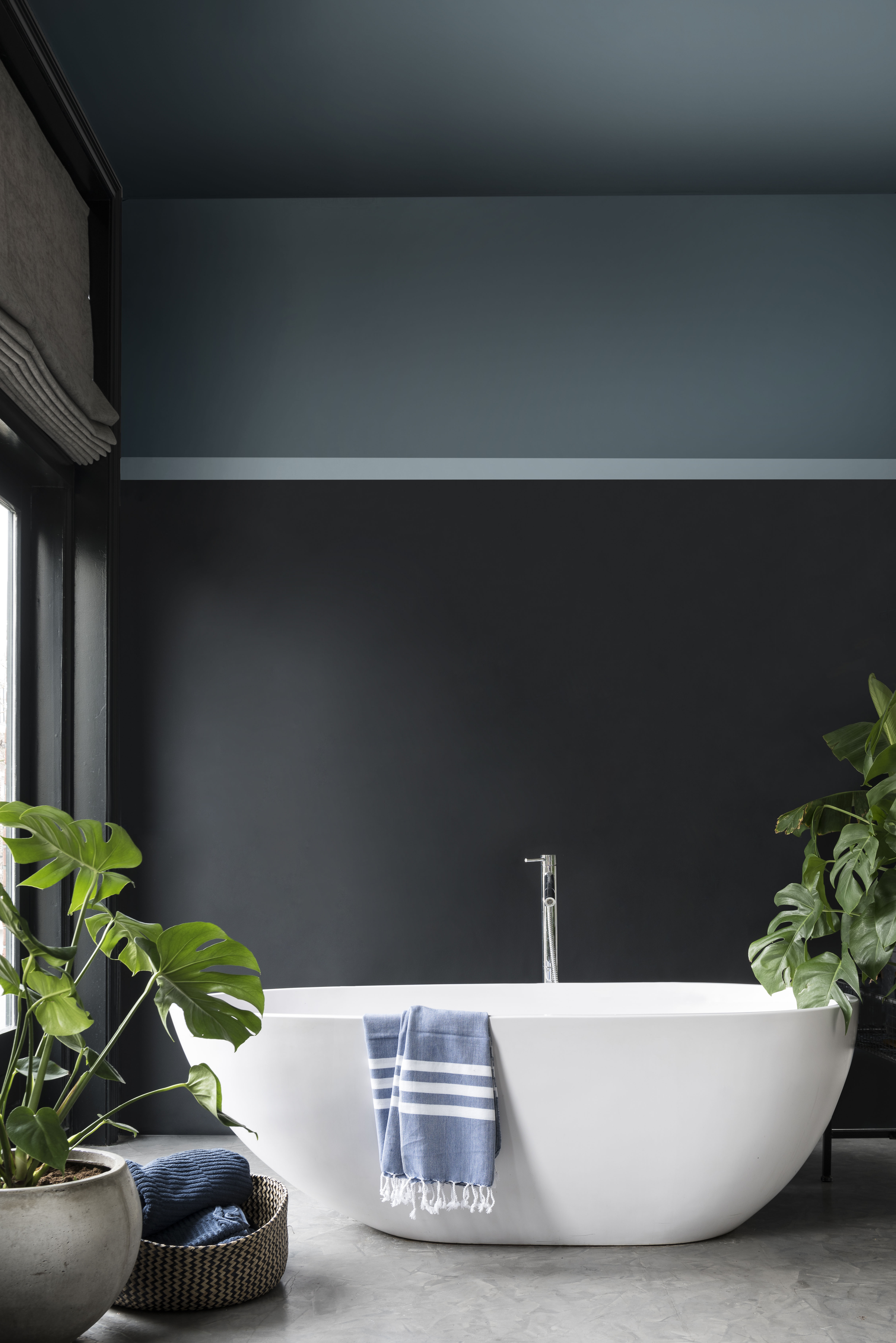
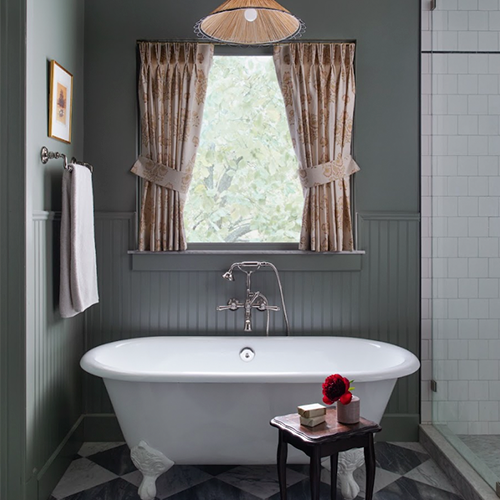
Warm neutrals are addressed with 'Ammonite' by Farrow & Ball, praised for its understated quality that works well with white marble, creating a calming atmosphere. For a moody and romantic vibe, 'Card Room Green' by Farrow & Ball, a dark gray-green, shifts in appearance depending on the light. Playful and vibrant options for spaces like kids' bathrooms include 'Great Falls' by Sherwin-Williams, a bright blue that contrasts effectively with white fixtures. 'Silver Satin' by Benjamin Moore is highlighted for its adaptability, blending seamlessly in both cool and warm settings, offering a less stark alternative to pure white.
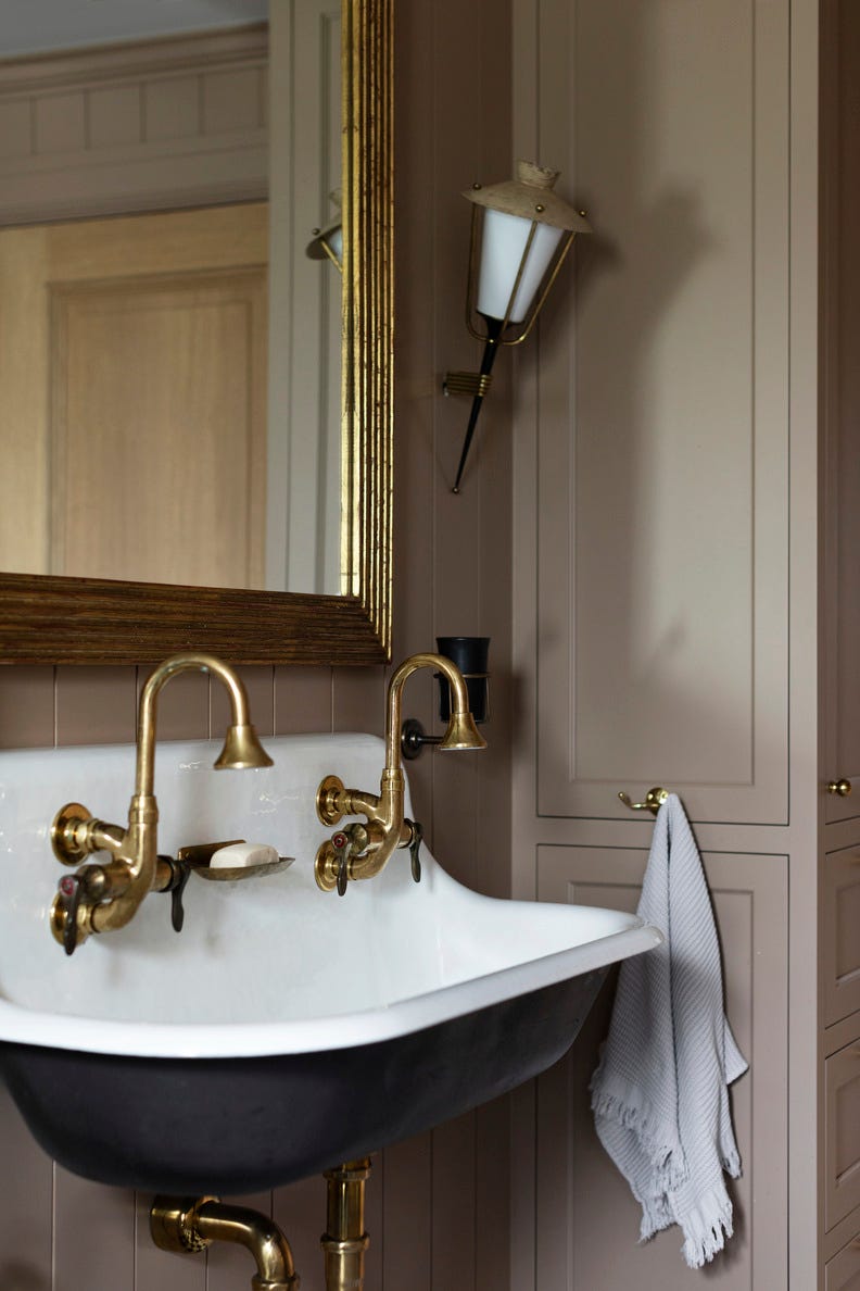
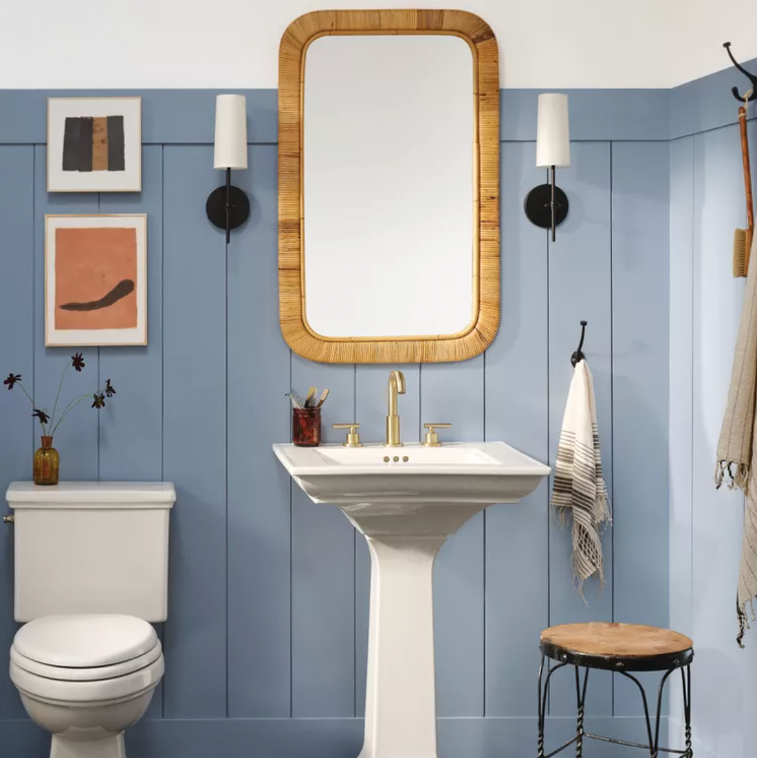
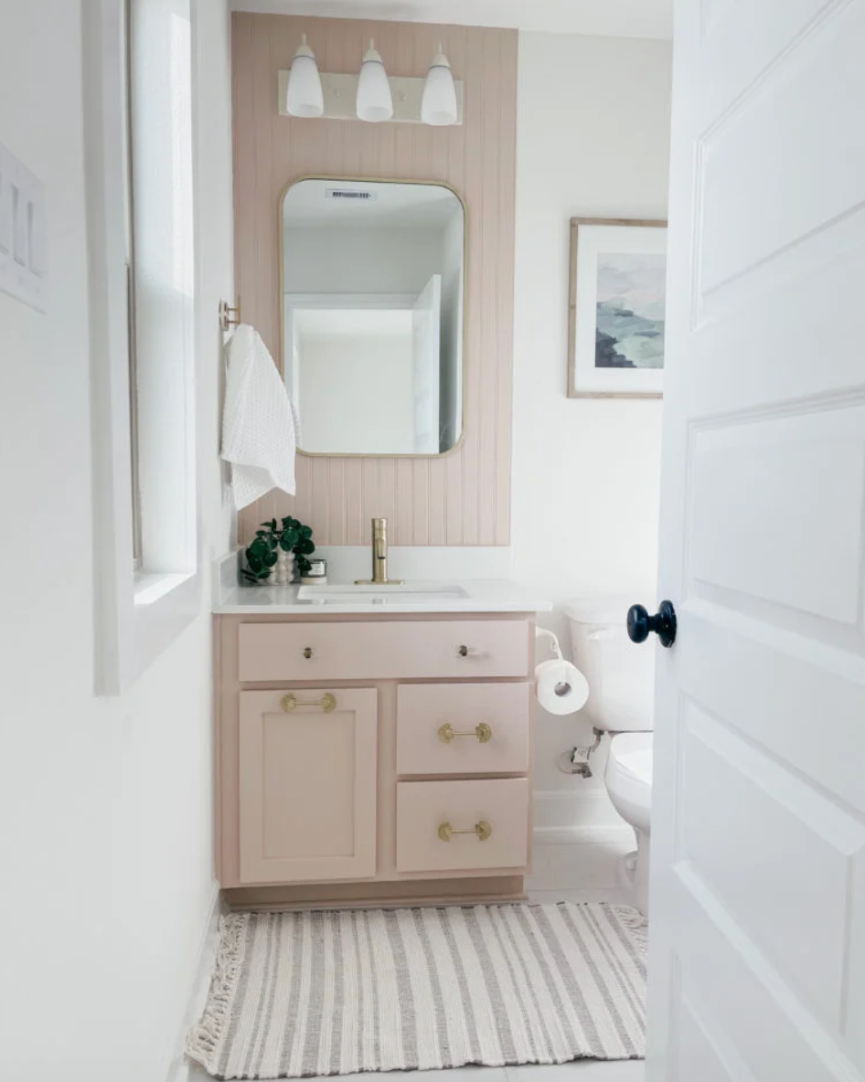
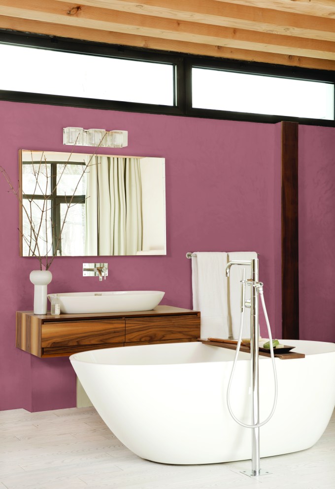
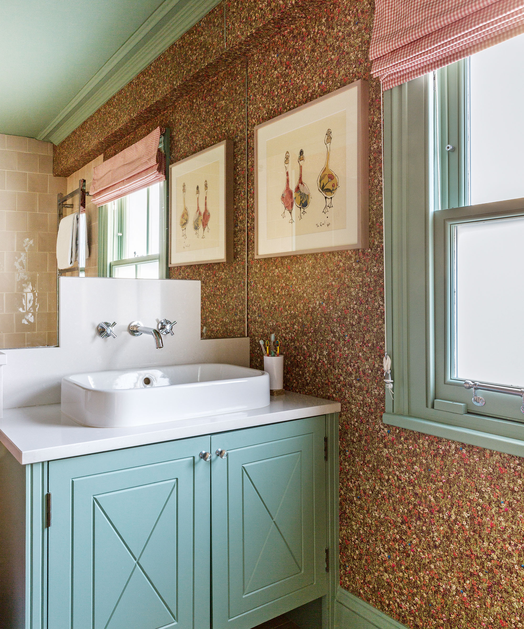
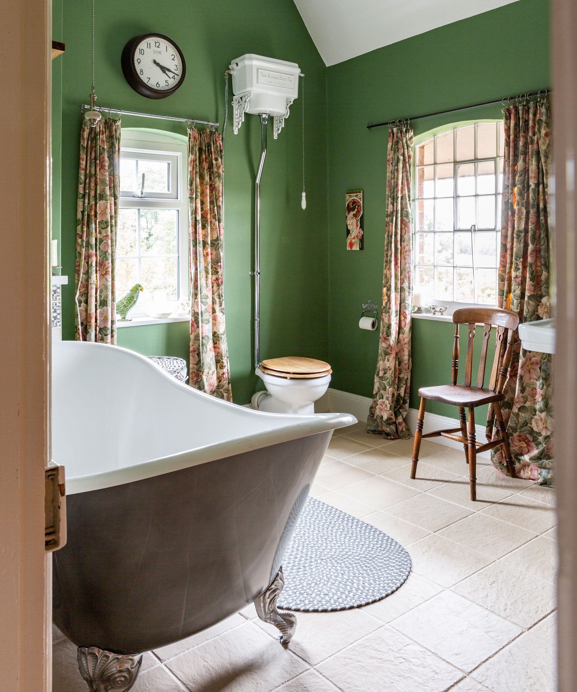
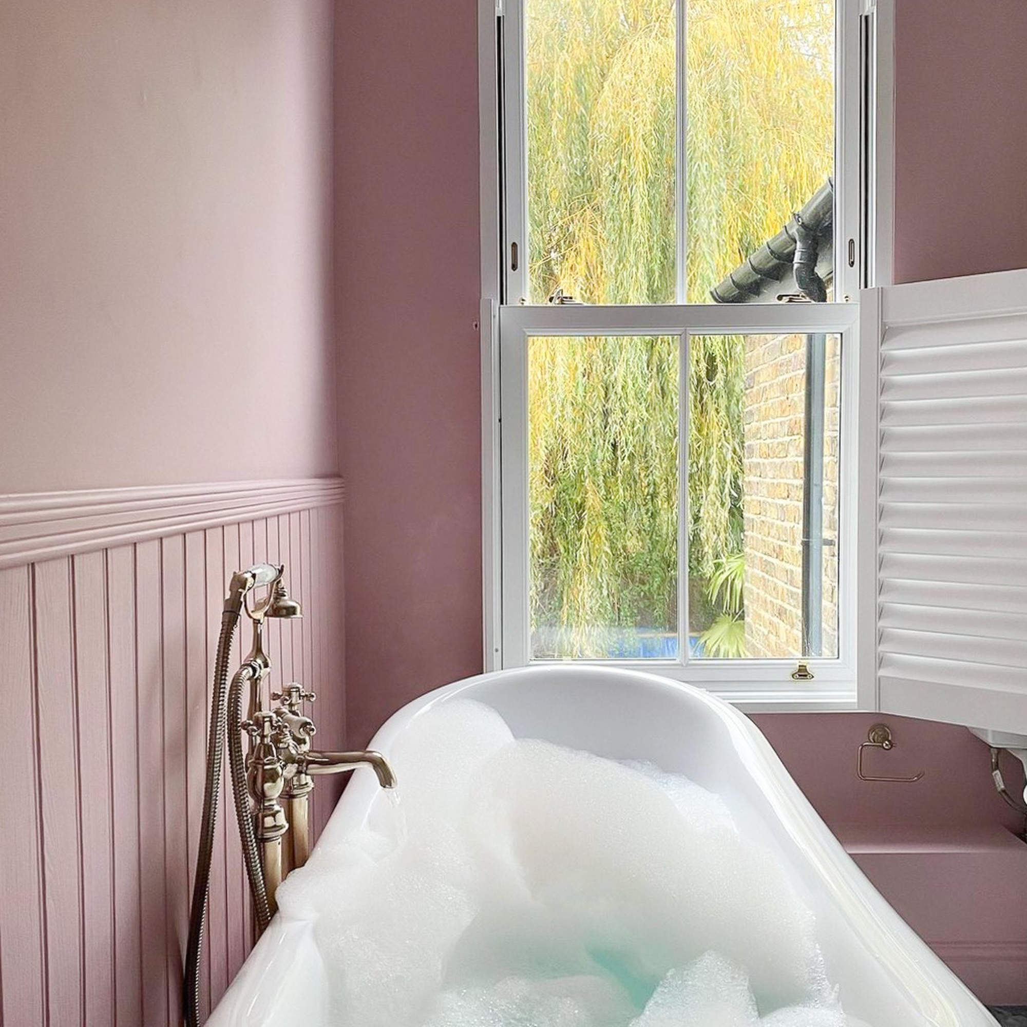
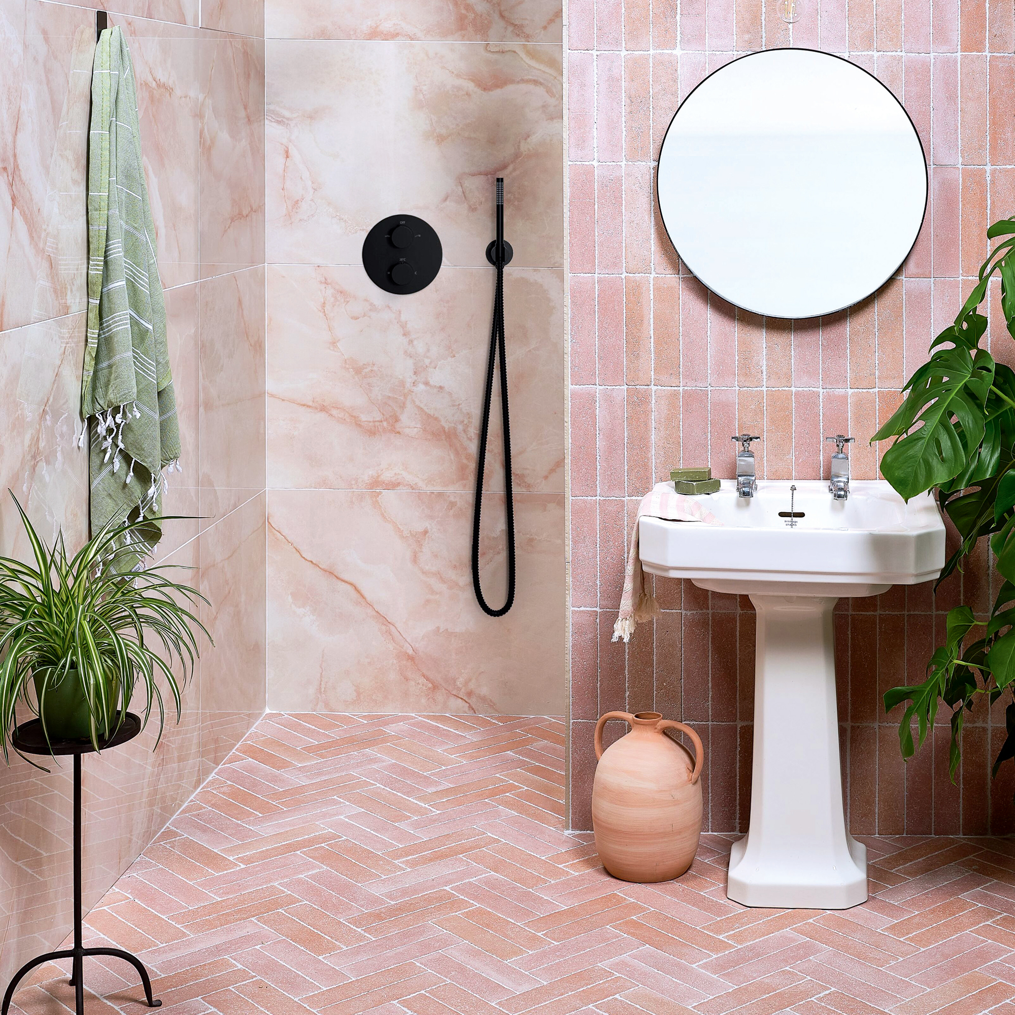
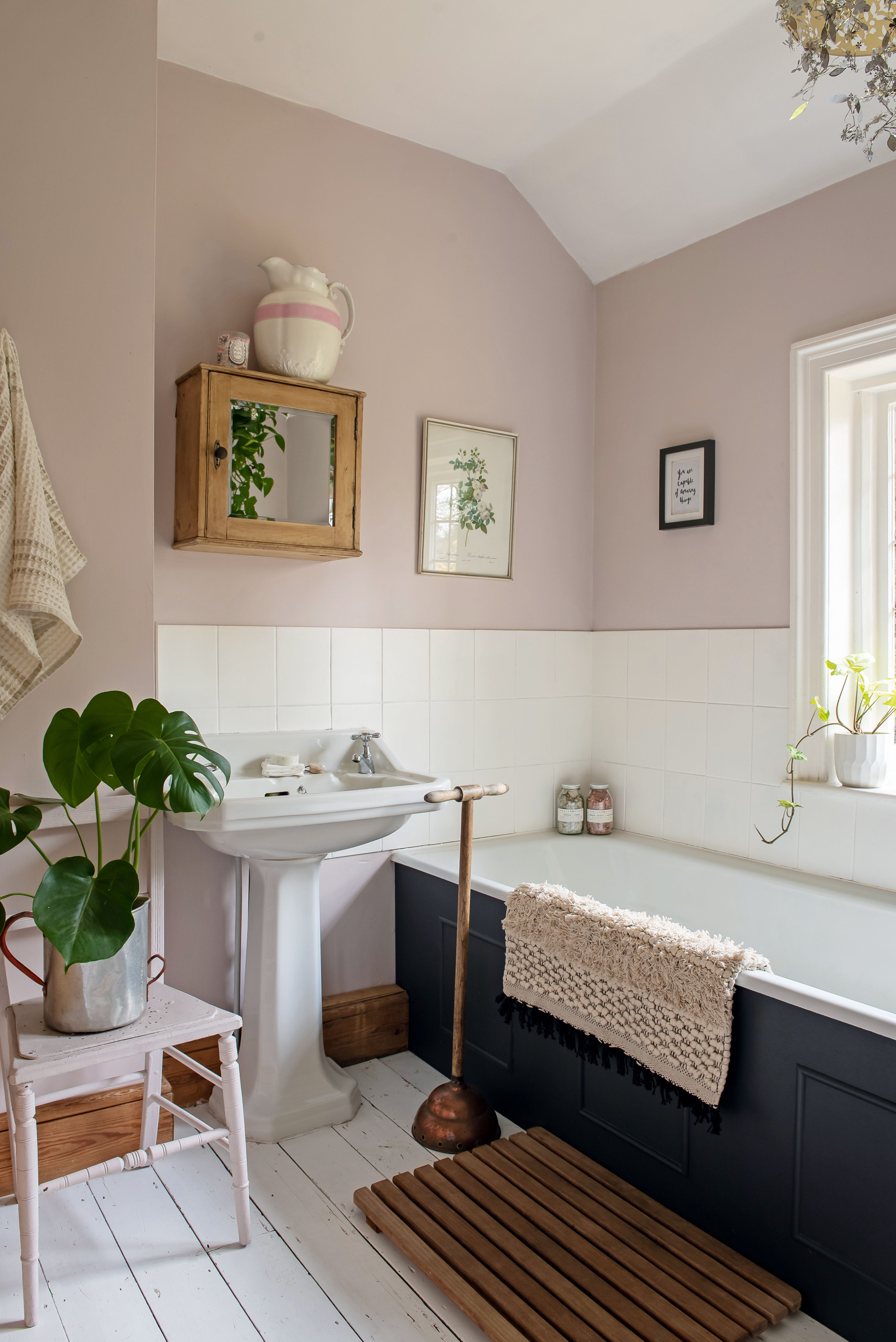
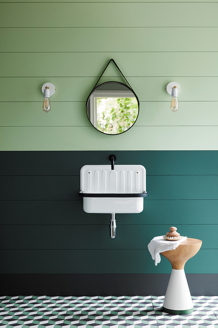
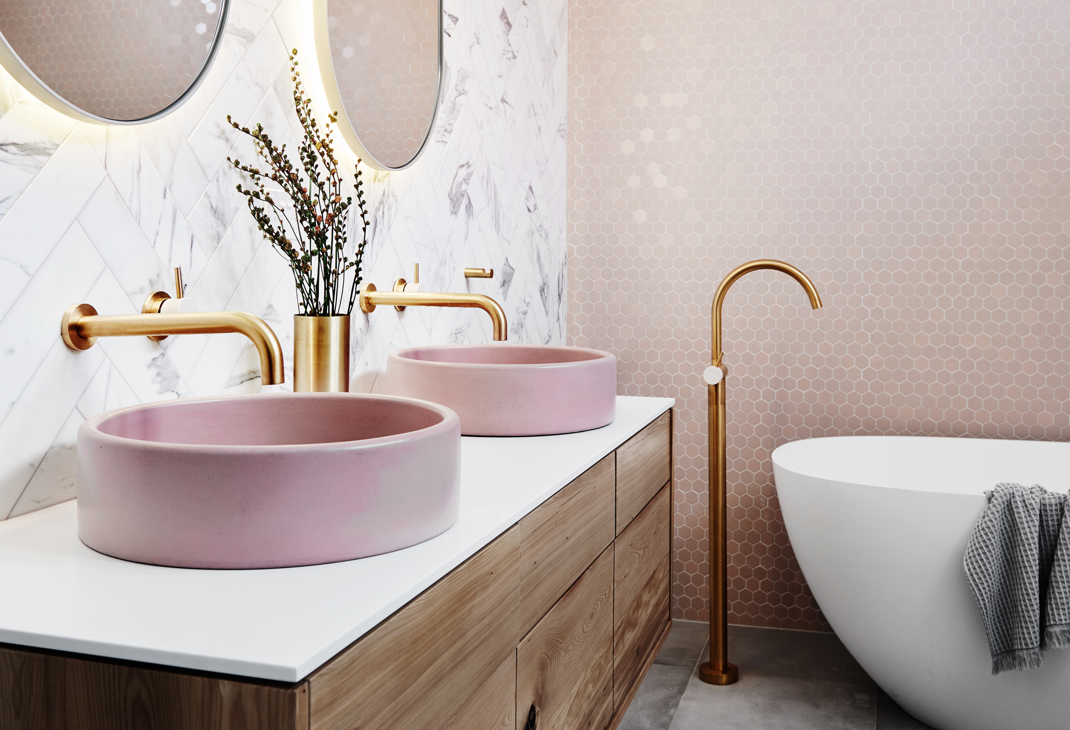
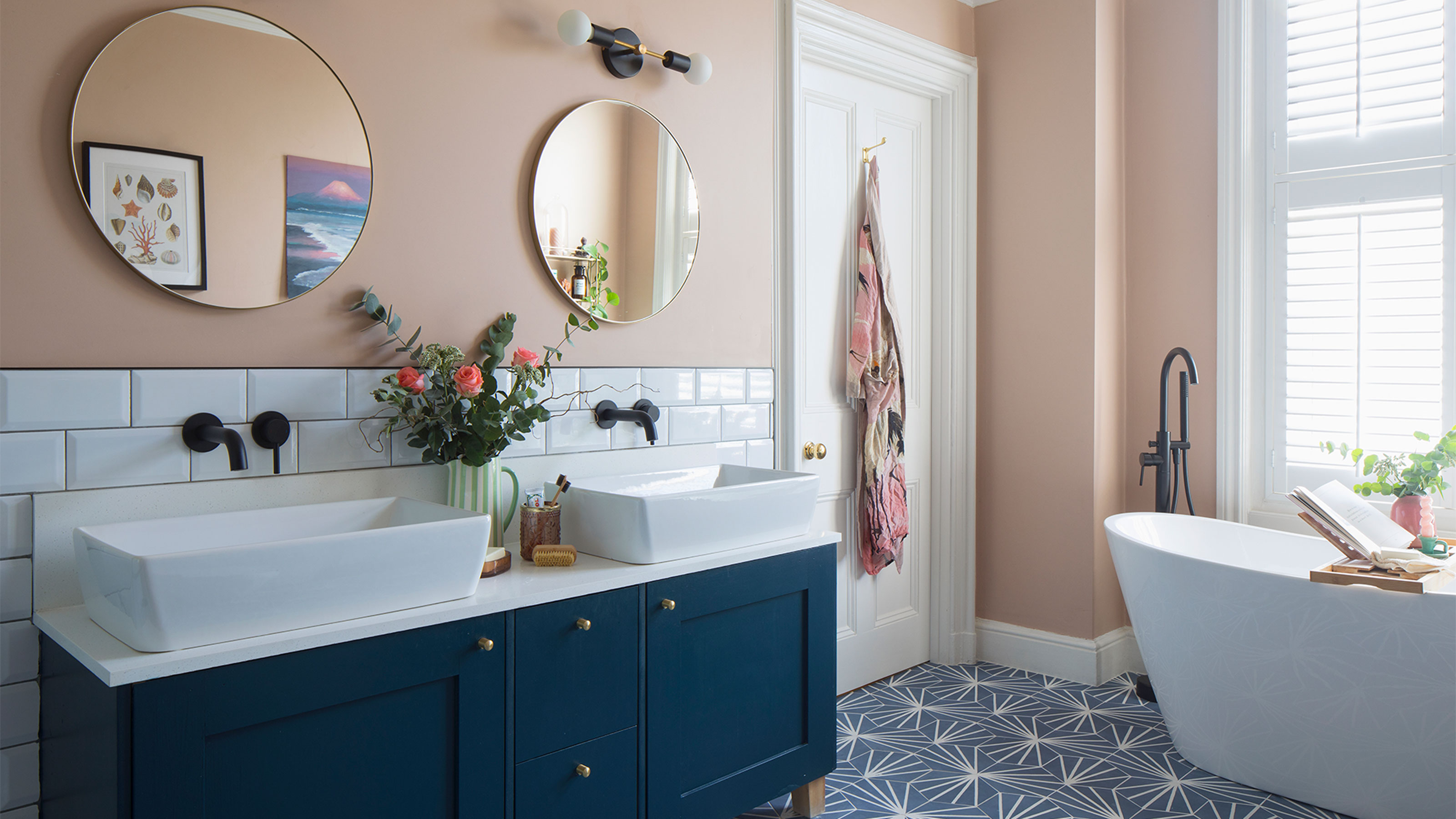
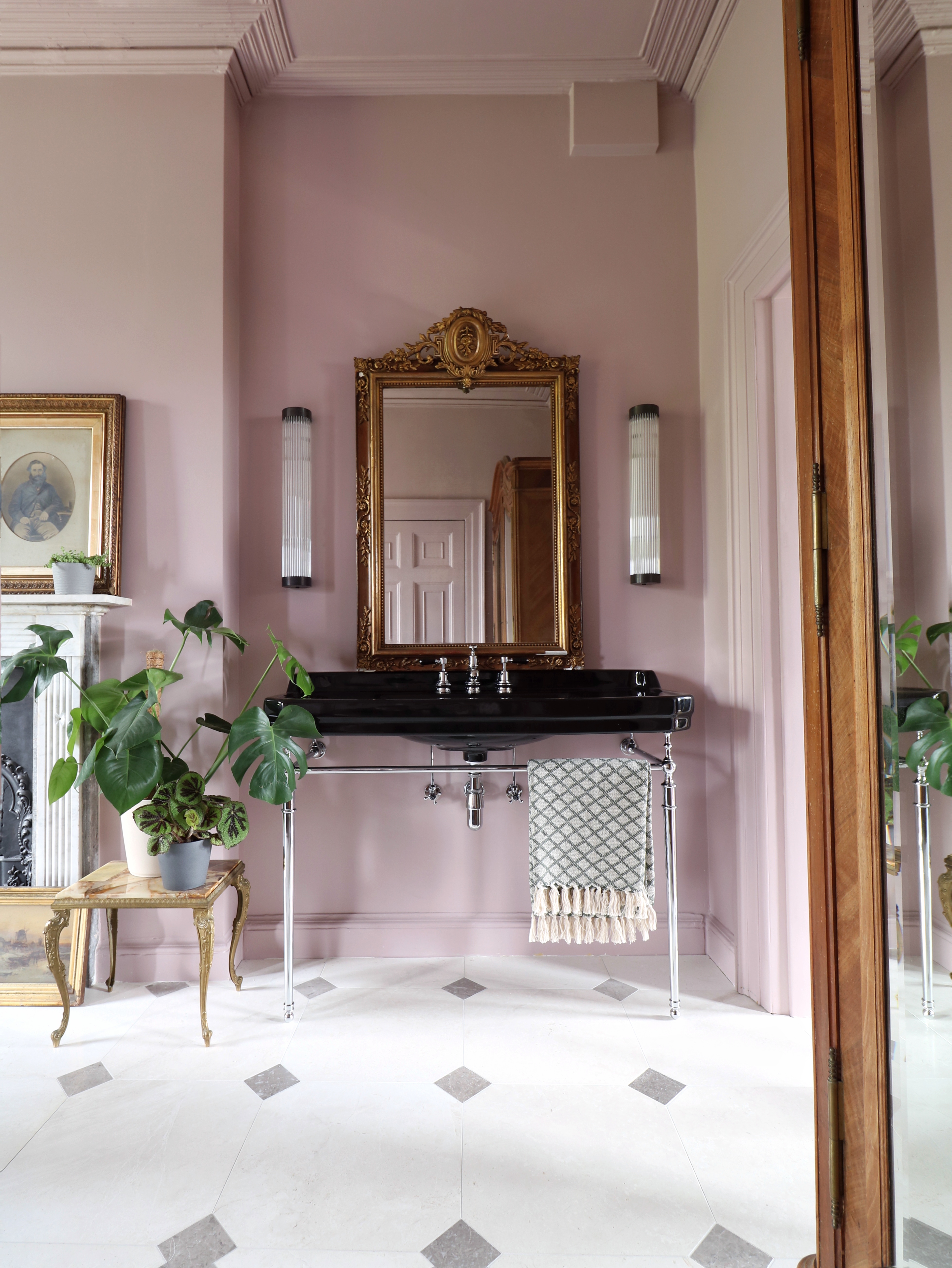
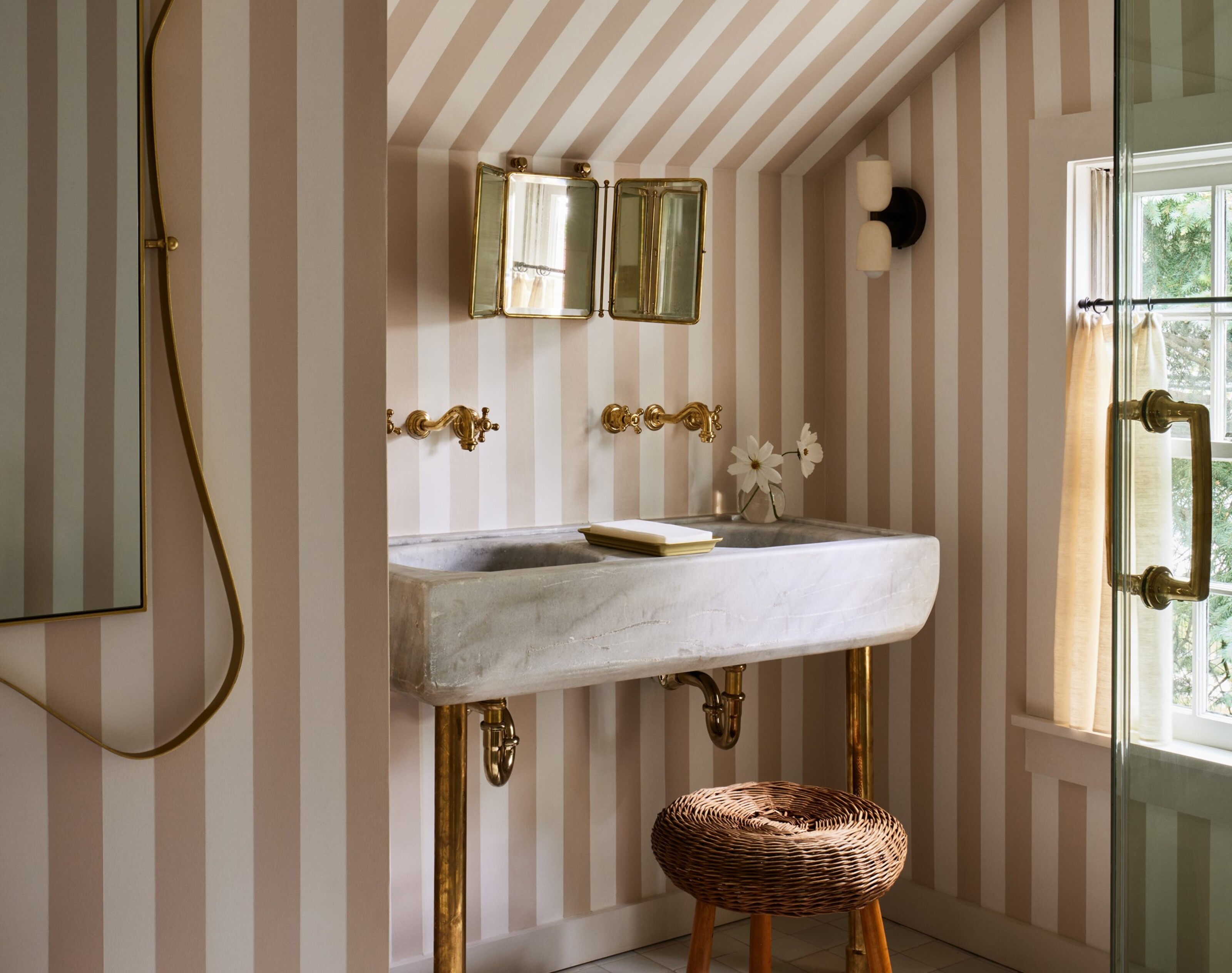
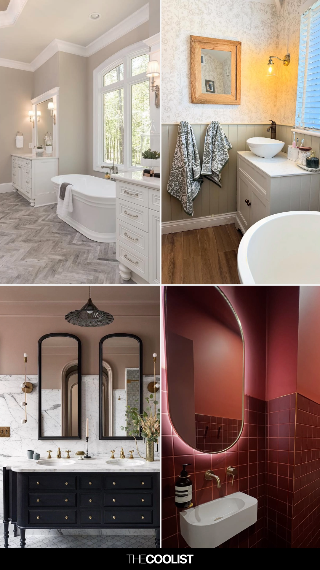
Pink tones are explored with 'Dressy Rose' by Sherwin-Williams, described as a non-overwhelming shade that pairs beautifully with gold accents. 'White Dove' by Benjamin Moore is a widely beloved classic for its warm, creamy undertones, making bathrooms inviting and allowing fixtures to shine. For elegant spaces, 'Parma Gray' by Farrow & Ball, a cool blue-gray, complements marble countertops. Tranquility can be achieved with sage greens like 'Lichen Green' by Dunn-Edwards, a refreshing and natural light green, or 'Lullaby' by Sherwin-Williams, a powder blue that creates a spa-like feel.
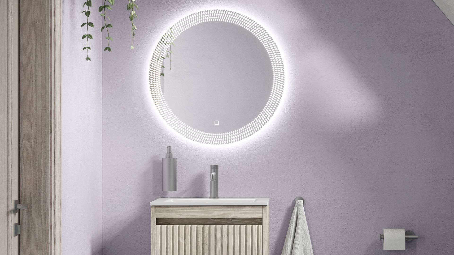
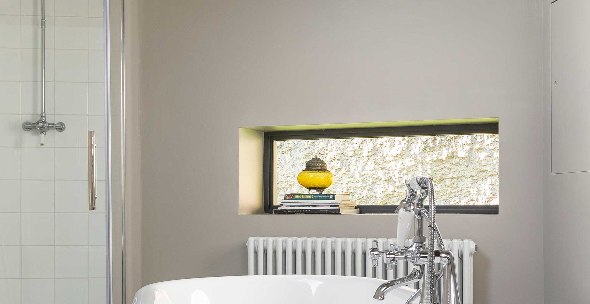
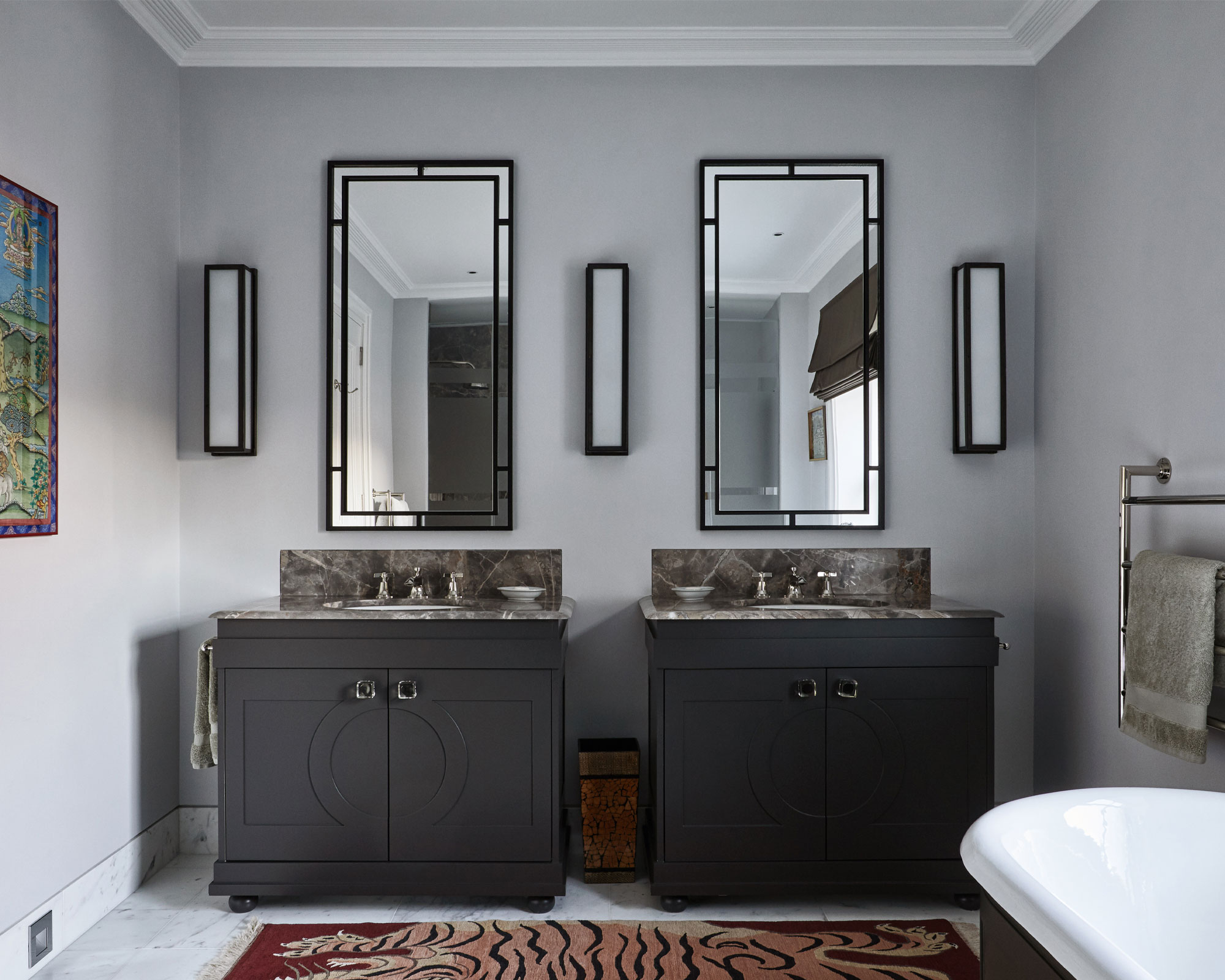
Subtle yet striking purple is introduced with 'Lavender Mist' by Benjamin Moore, a shade that offers femininity and charm while maintaining serenity. For high-impact statements in small bathrooms, rich charcoal grays like 'Cheating Heart' by Benjamin Moore can add drama and make brass tones pop. Warm greiges, such as 'Shoji White' by Sherwin-Williams, provide a welcoming creamy tone that contrasts with woodwork, keeping the space light and fresh. For a balanced, airy gray, 'Drift of Mist' by Sherwin-Williams is recommended for its neutrality and ability to serve as a backdrop for bolder design elements.
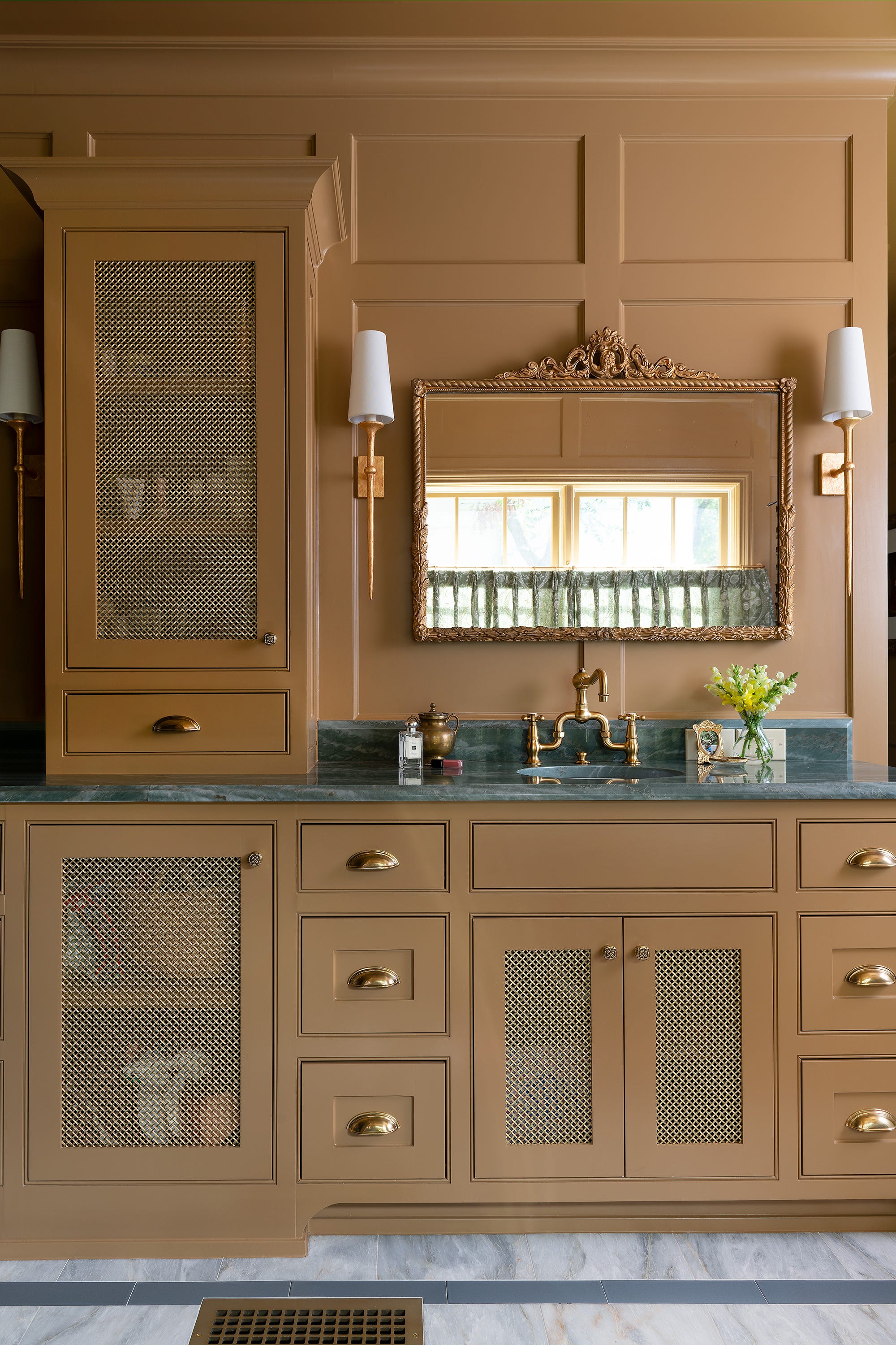
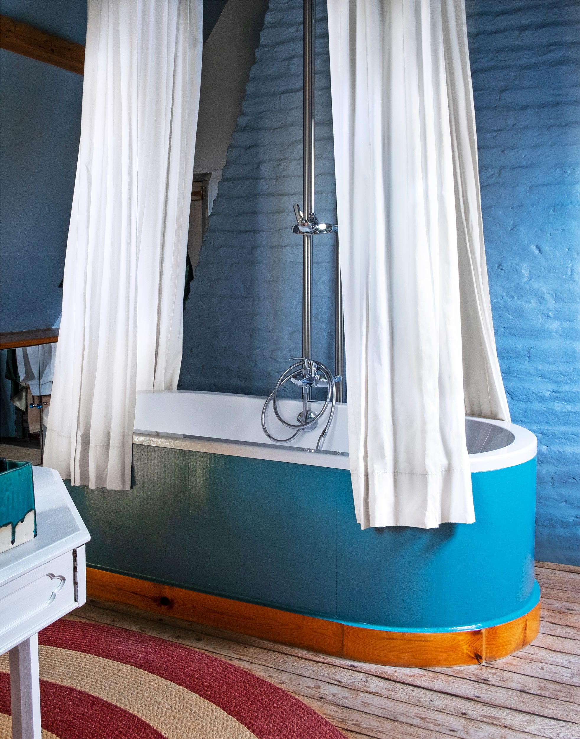
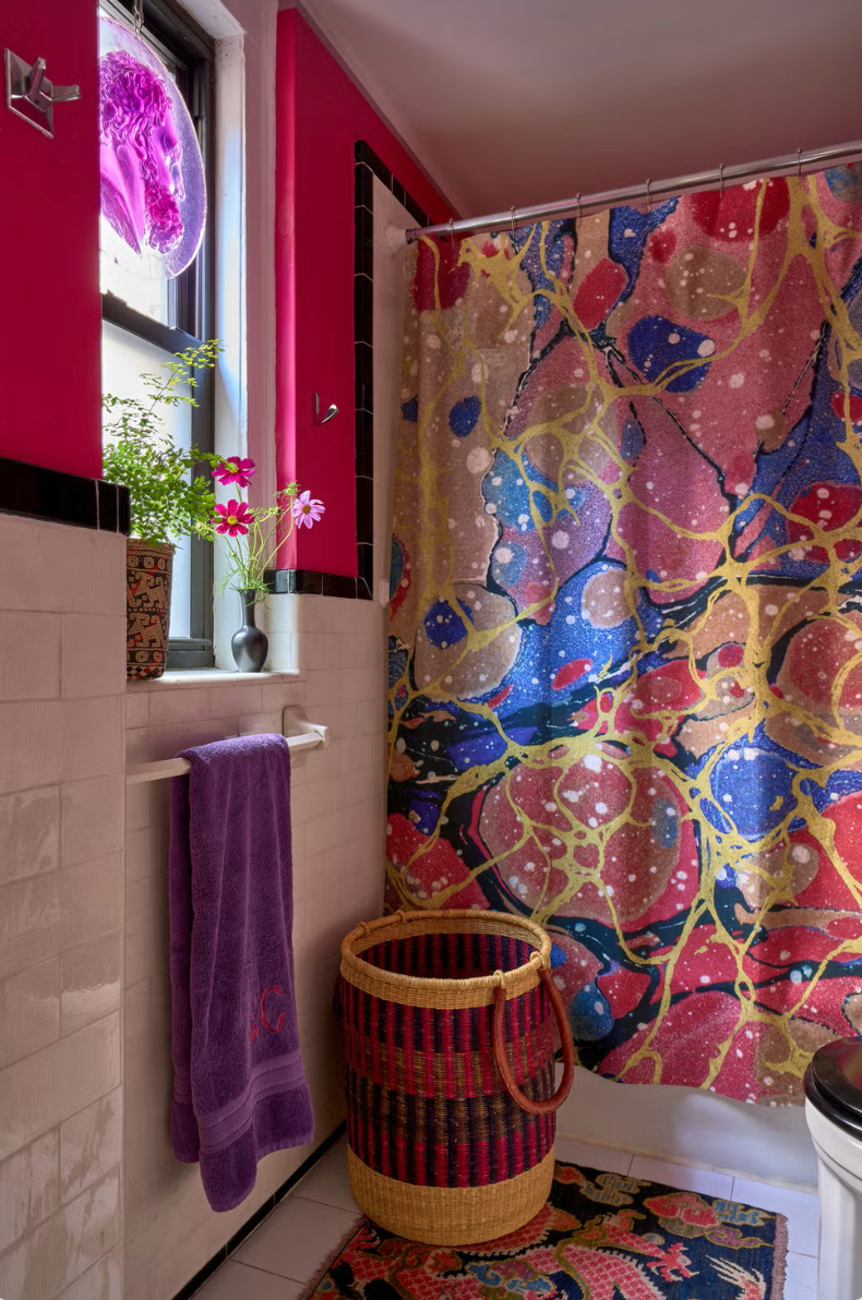
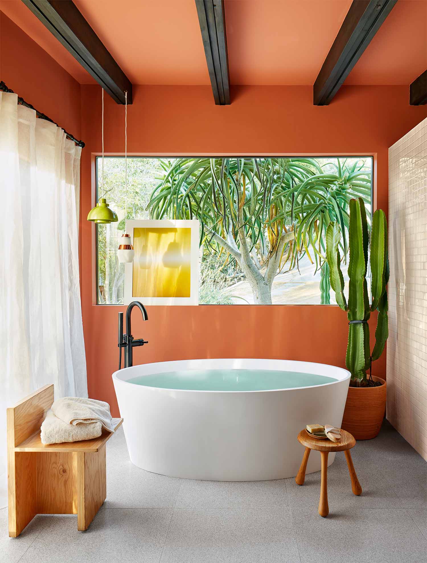
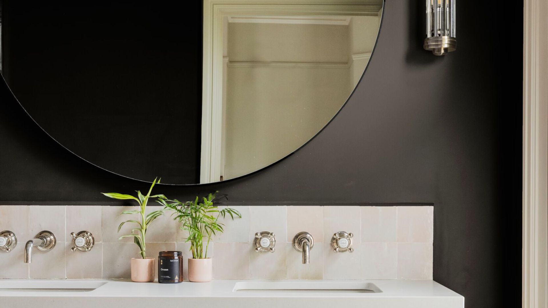
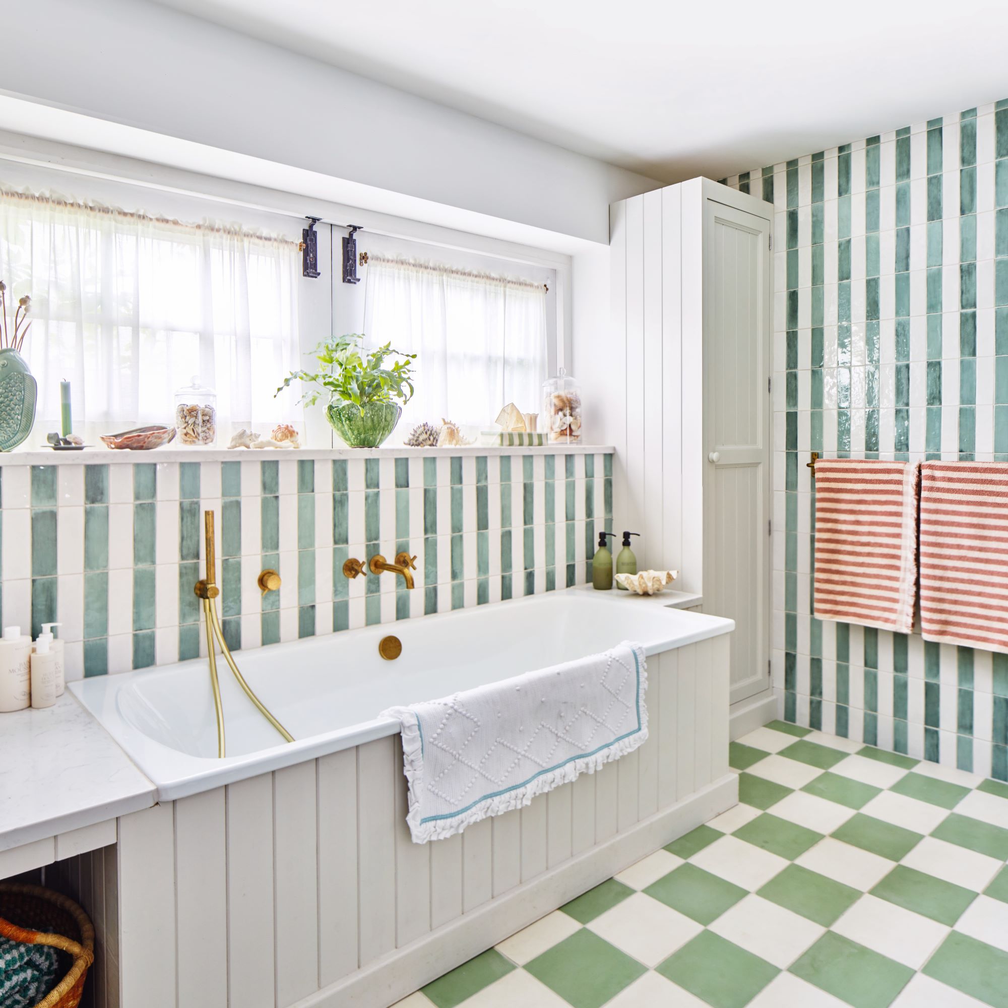

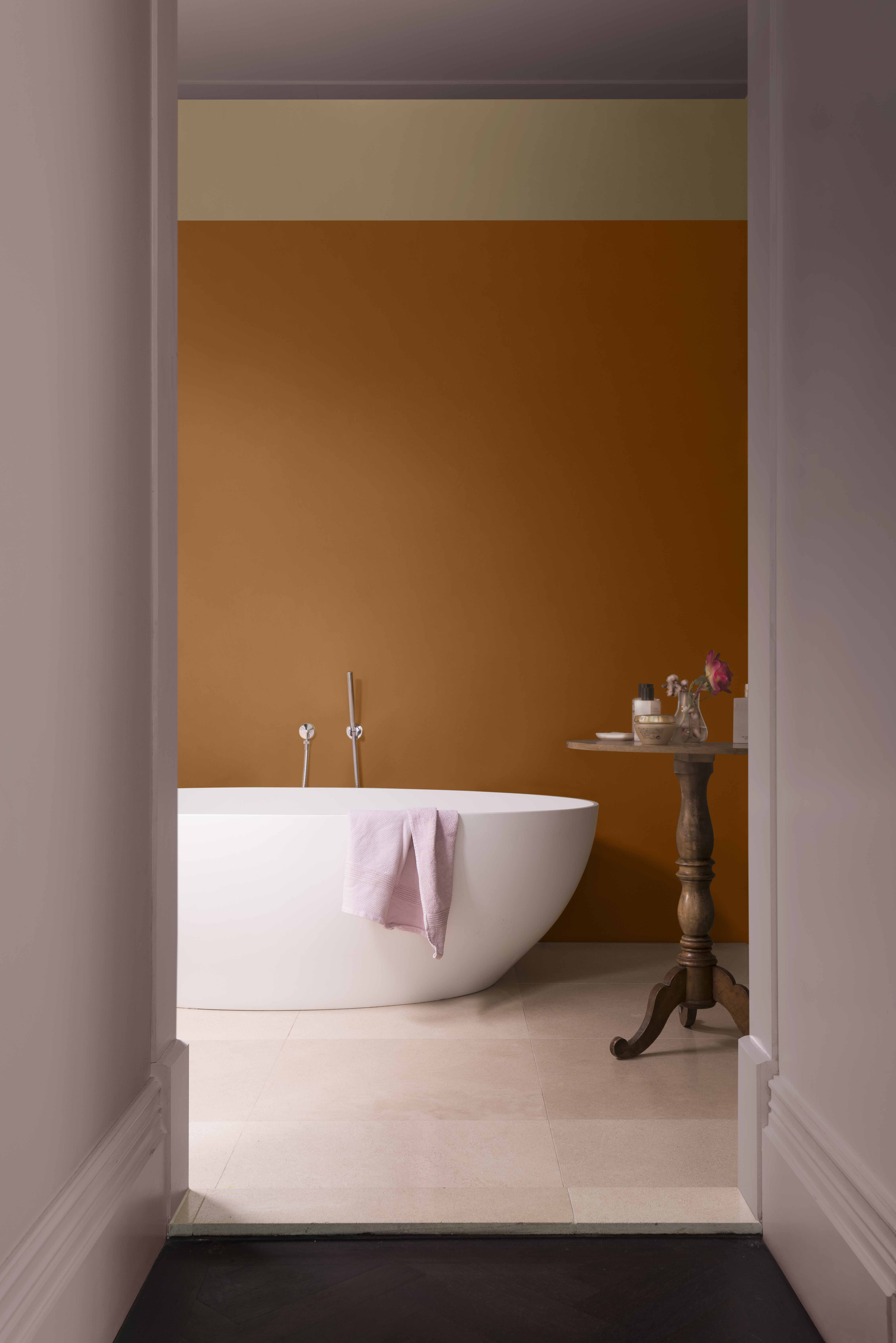
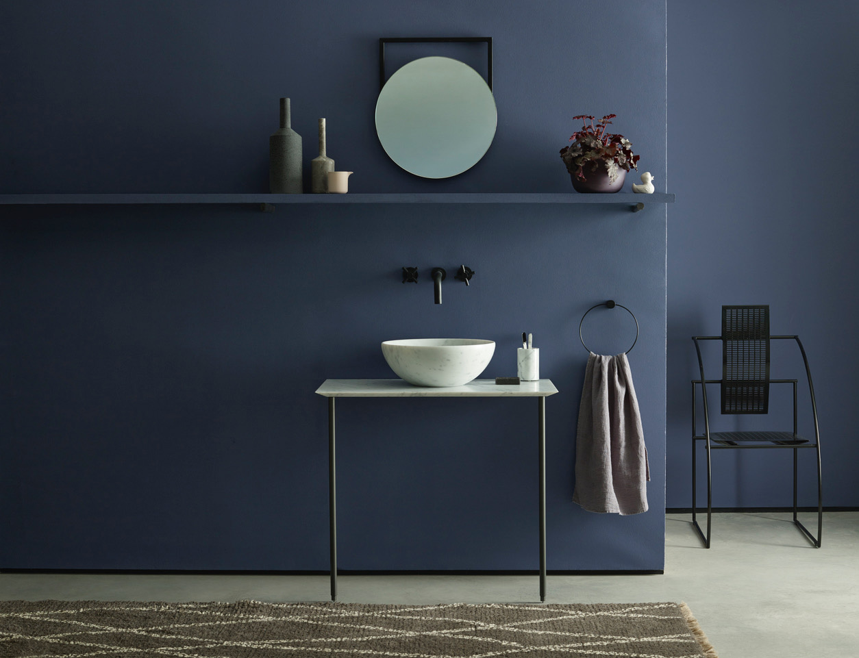
Earthy yet unexpected options include 'Redend Point' by Sherwin-Williams, a clay red that adds warmth, particularly to traditional black-and-white checkerboard floors. Deep, moody blues like 'New Providence Navy' by Benjamin Moore are presented as viable options for those hesitant to use dark colors, proving that any color can work with careful application. Finally, other timeless whites like 'Pure White' by Sherwin-Williams, with a hint of warmth, are suggested for complementing woodwork, and dramatic reds such as 'Fine Wine' by Sherwin-Williams are highlighted for creating a luxurious, jewel-box effect.
#BathroomDesign #PaintColors #InteriorDesigners #HomeDecor #ColorPalettes #FarrowAndBall #BenjaminMoore #SherwinWilliams #DesignTrends #BathroomDesign #PaintColors #InteriorDesigners #HomeDecor #ColorPalettes #FarrowAndBall #BenjaminMoore #SherwinWilliams #DesignTrends
0 comment in total
 No comments yet
You may also like
25 Designer-Approved Bathroom Paint Colors to Refresh Your Retreat

Paint color ideas for bathrooms: expert advice for choosing the best shades

12 Bathroom Paint Color Ideas You Haven't Thought of Before
7 Bathroom Vanity Color Trends That Aren't Going Anywhere in 2026, Designers Say

Try These Expert-Approved Bathroom Paint Colors for Your Next Home Makeover

20 Gorgeous Shades Of Paint That Will Make Your Bathroom Feel Like A Relaxing Spa

6 Outdated Bathroom Paint Colors Designers Say You Should Never Use
25 bathroom color ideas to add character to your washroom space

The Bathroom Paint Colors Interior Designers Swear By

The One Bathroom Paint Color Experts Say Will Never Be Outdated

19 Bathroom colour schemes to inspire tranquil retreats, on-trend looks and standout schemes
25 bathroom paint ideas to brighten up your color scheme fast

5 Paint Colors You Should Never Use in a Bathroom, Designers Warn
5 colors designers say are outdated for bathrooms - and what they're choosing instead for 2024

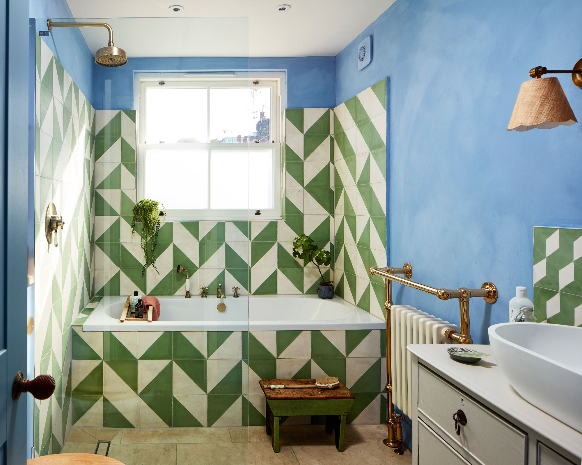
Bathroom paint ideas – 11 best paint schemes for your bathroom

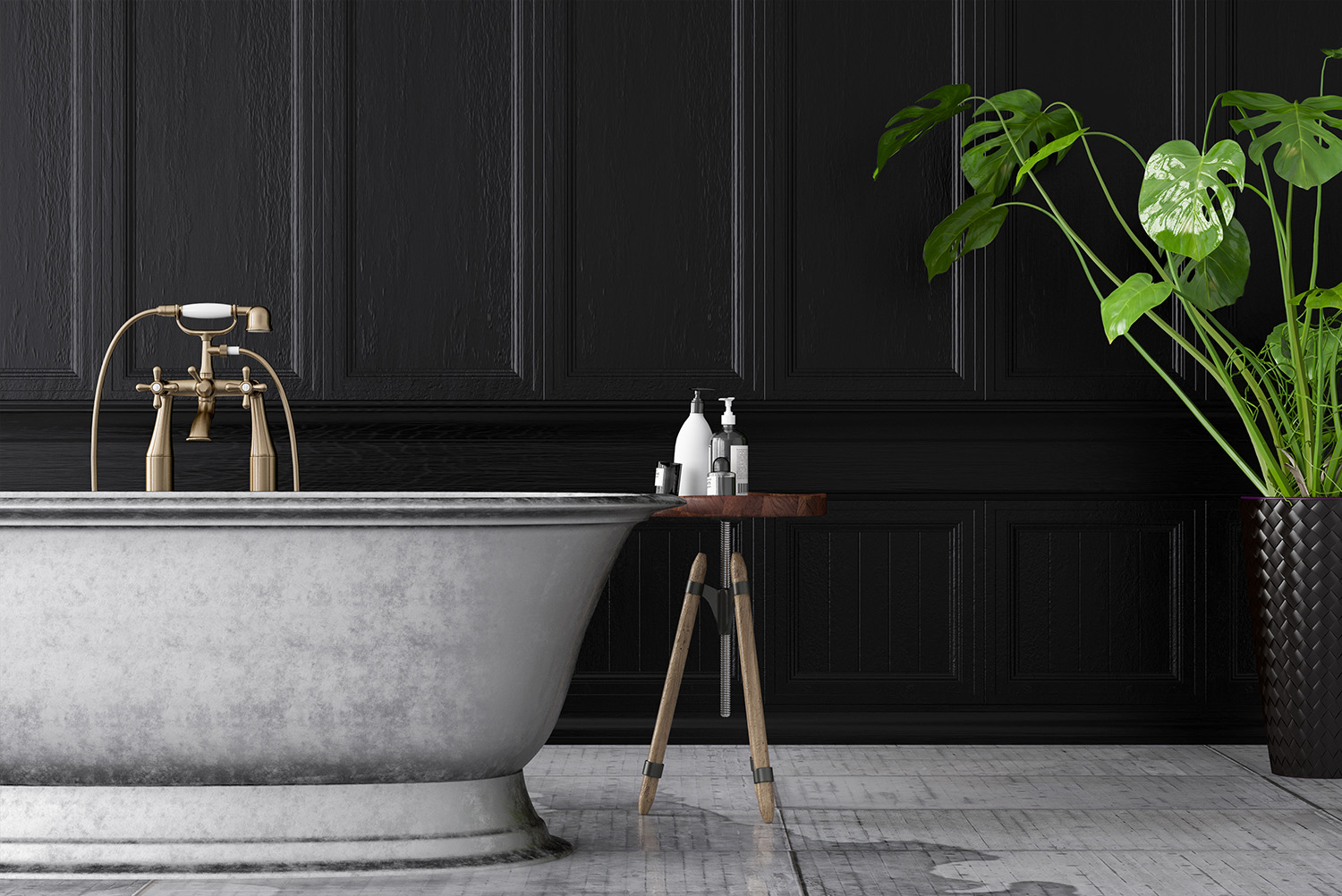
Bathroom paint - the ultimate guide to the right colors and finishes for walls, ceilings and radiators
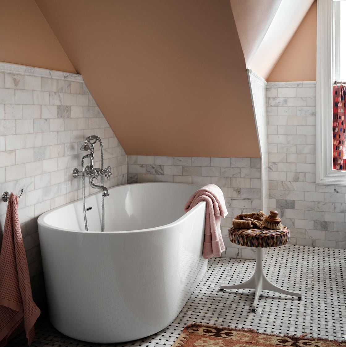
30 Paint Colors to Help You Create the Bathroom of Your Dreams
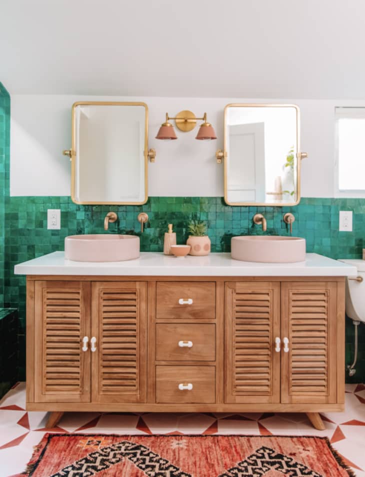
A Bathroom Is the Perfect Place for Color, and These 20 Spaces Are Proof
Colour drenching is the biggest trend in bathrooms - here are 6 ways to make it work in your home
30 Bathroom Paint Colors Ideas That Will Make You Want to Repaint This Weekend