1/7
Martha Stewart's Dining Room Has Made Me Rethink This Controversial Color
Martha Stewart’s former Lily Pond Lane cottage in East Hampton, a coastal dreamland dating back to the 1870s, continues to inspire with its timeless design. One particular space that stands out is the porch, which Stewart transformed into a three-season dining room. While one might expect a prominent dining table to be the focal point, it is an unexpected feature that truly captures attention: a set of vibrant teal blue floor tiles, complemented by a display of vintage ceramics in the same striking hue. This combination effectively showcases the elegance of a shade that some might initially hesitate to incorporate into their homes.
The teal Zellige tiles, reminiscent of Moroccan zellige, provide a rustic yet vibrant foundation for the room. This bold choice aligns with the 'color drenching' trend, where a single color is used extensively throughout a space. The floor-to-ceiling windows illuminate these tiles, enhancing their brightness and contributing to an uplifting atmosphere. The deliberate matching of the shelving display with the flooring reinforces a sense of intentionality in the design, preventing the space from feeling like an afterthought despite its origin as a porch.
Beyond the tiles, Stewart's collection of matching vintage McCoy ceramics is equally noteworthy. These pieces, produced by an American brand in the early 20th century, contribute to the room's distinctive character. While a large collection of matching ceramics might seem controversial to some, their historical significance and the thoughtful integration into the overall design elevate them beyond mere decor. The mahogany shelving and earthy walls provide a warm backdrop, creating a striking contrast that allows the teal elements to truly pop.
Experts highlight the unique qualities of teal, describing it as a color that merges the calm of blue with the vitality of green. In this dining space, teal establishes a grounding presence without feeling heavy and offers a reflective quality without being flashy. Its interaction with natural light throughout the day further enhances its appeal. The warm tones of the mahogany shelving act as a natural counterbalance to the cool teal, creating a visual tension that adds depth and prevents the room from appearing flat.
Furthermore, the textural details of the ceramic collection, such as grooves and scoring, contribute to the room's dimension. The repetition of the teal tone in these ceramics reinforces the overall color story while introducing variations in texture and finish. This layered approach ensures the space feels rich and cohesive rather than overly uniform. Martha Stewart’s design demonstrates that incorporating blue, even in a rustic setting, can evoke a joyful and airy ambiance, offering a masterful example of colorful dining room ideas that are striking yet never garish.
#MarthaStewart #TealDecor #DiningRoomDesign #VintageCeramics #HomeDecor #InteriorDesignTrends #ColorDrenching #CoastalDesign #TileDesign #MarthaStewart #TealDecor #DiningRoomDesign #VintageCeramics #HomeDecor #InteriorDesignTrends #ColorDrenching #CoastalDesign #TileDesign
0 comment in total
 No comments yet
You may also like

Martha Stewart’s ’90s home library shows a rare, refined twist on color-drenching that designers should revisit in 2026
This Fiery Hue Is All Over Street Style—These 24 Designs Bring It Home

From Quiet Luxury to the Sad Beige Baby, When Will ‘Beigification’ End?

Martha Stewart says this classic cabinet color is timeless

Martha Stewart’s 1980s Powder Blue Kitchen Is the Design Blueprint for the Modern Maximalist Movement – It's Never Felt More Inspiring
Creative, Captivating Use of Color Helps This Home Redesign Shine

This Controversial Interior Paint Color Is My All-Time Favorite

Incorporate Color Drenching Into Your Home Design
This "Controversial" Bedroom Color Is a Designer Favorite—Here's Why


Martha Stewart Credits Cabinet Color For Making 20-Year-Old Kitchen Look Good As New
Timeless Paint Colors HGTV Stars Love Using In Kitchens
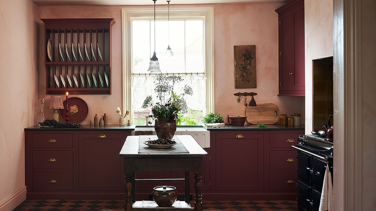
This Unexpected Luxury Color Is Quietly Taking Over Kitchens Everywhere
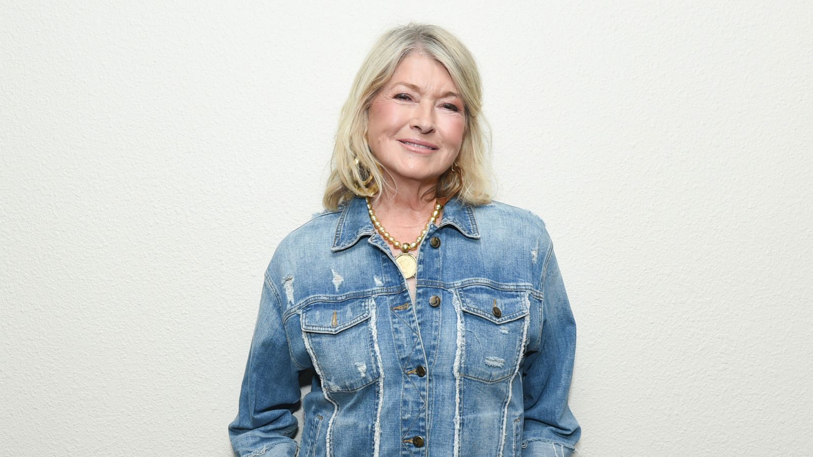
Martha Stewart's 20-year-old kitchen looks like 'it was made yesterday' – and it's all thanks to her timeless cabinet color choice
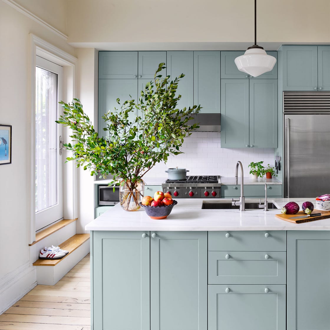
20 Kitchen Paint Colors to Try in 2024

Colour experts share their top paint trends for 2024

The designer totally transformed this kitchen with an unexpected color combination and a controversial decorating technique

Gwyneth Paltrow's dining room breaks a cardinal color rule
This surprising color trend is having a comeback

3 'small but impactful' paint updates to try in 2024, according to a color expert
I Tried This Controversial Color Rule in My Living Room, and I Wish I’d Done it Sooner