1/2
This Bold 1960s Color Is The Most Talked-About Hue In Our 2025 Idea House
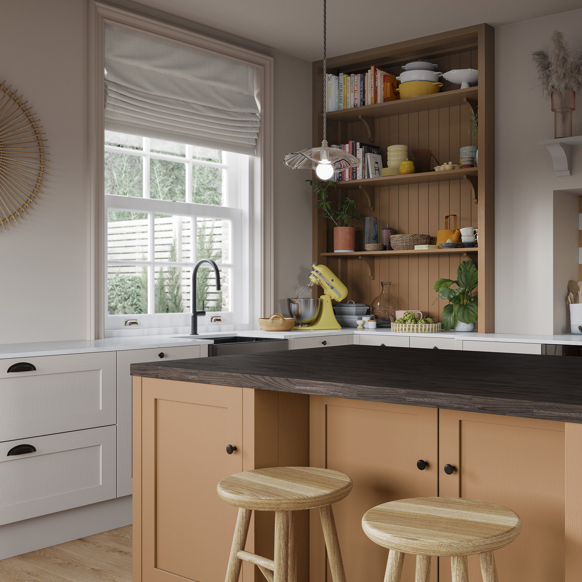
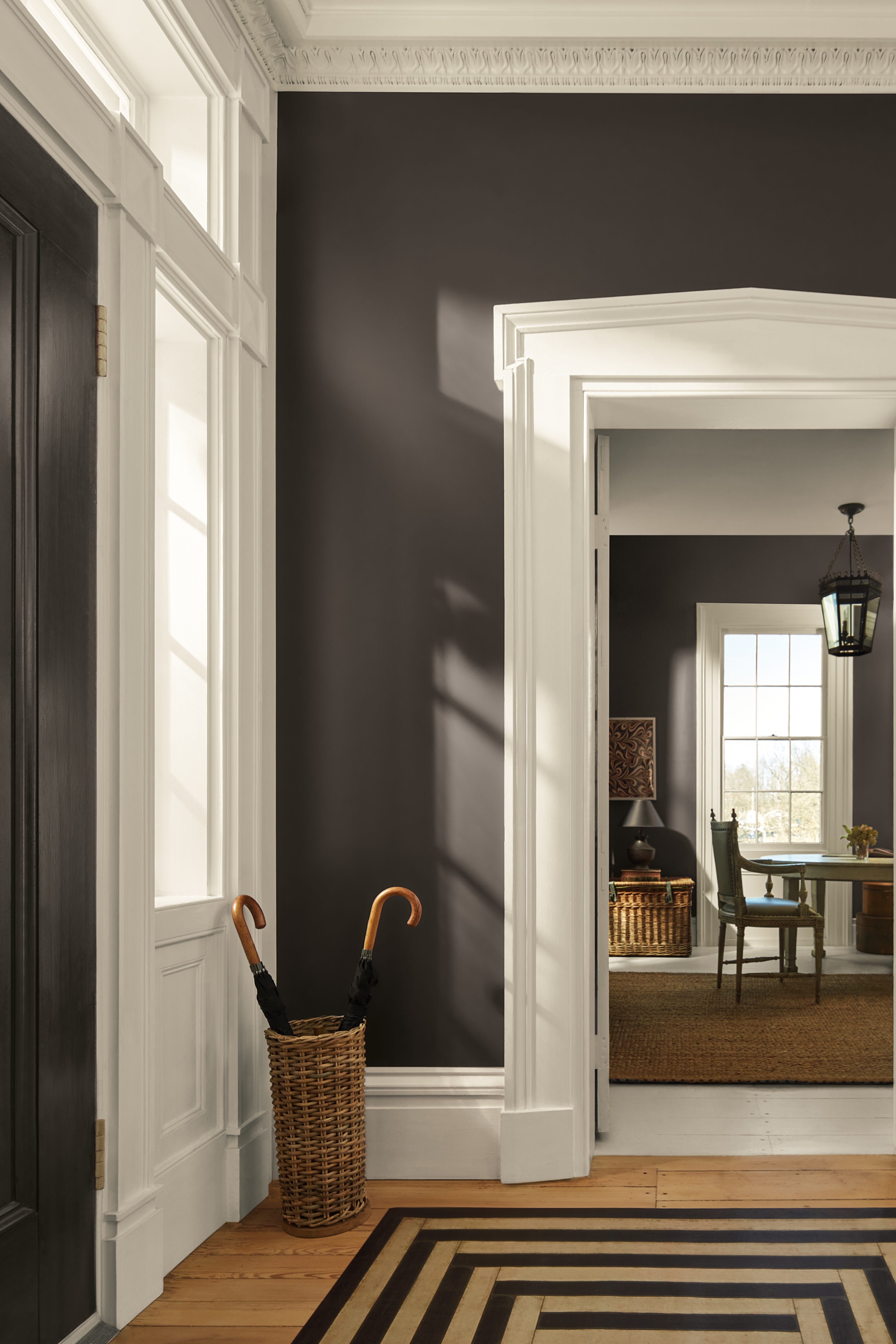
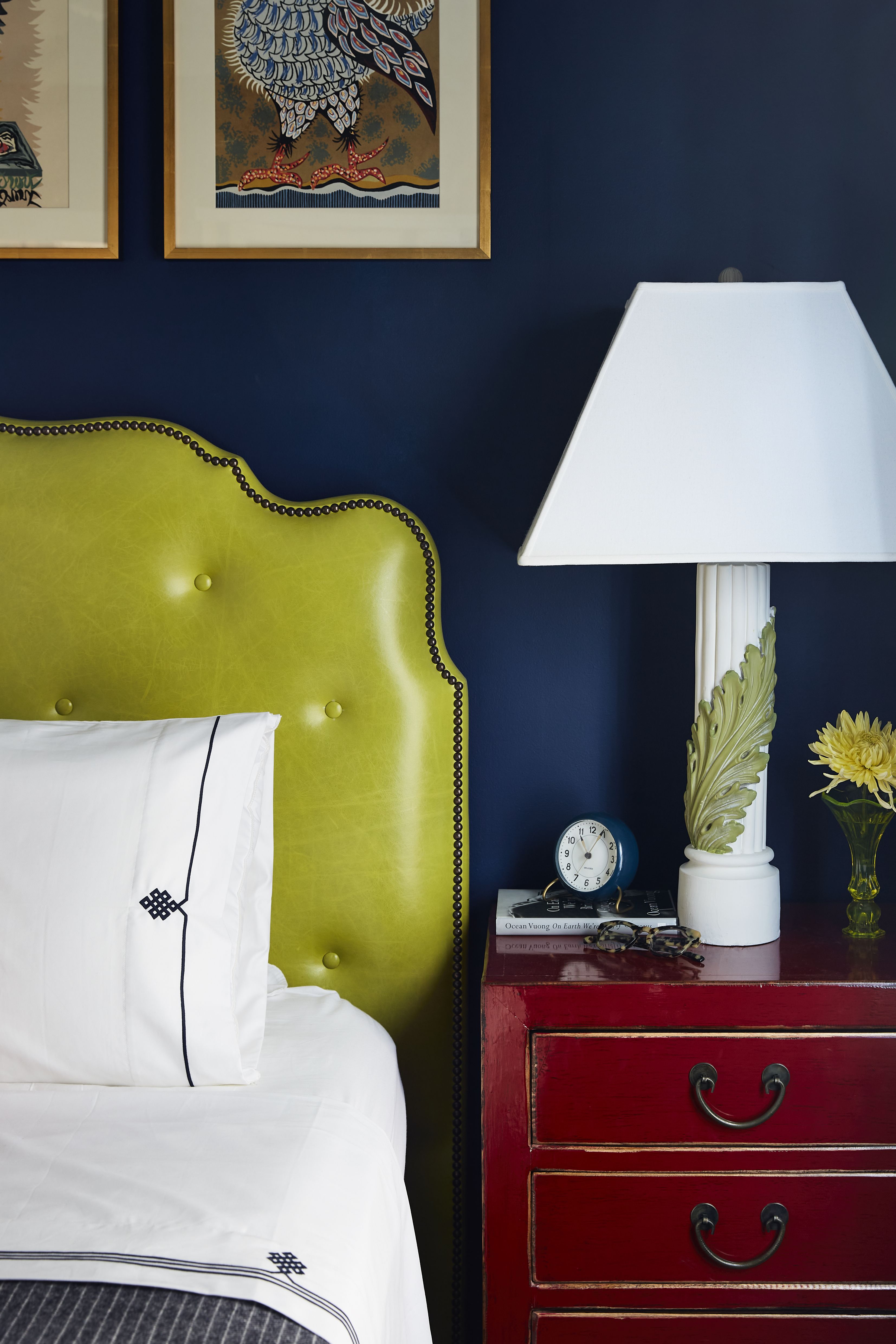
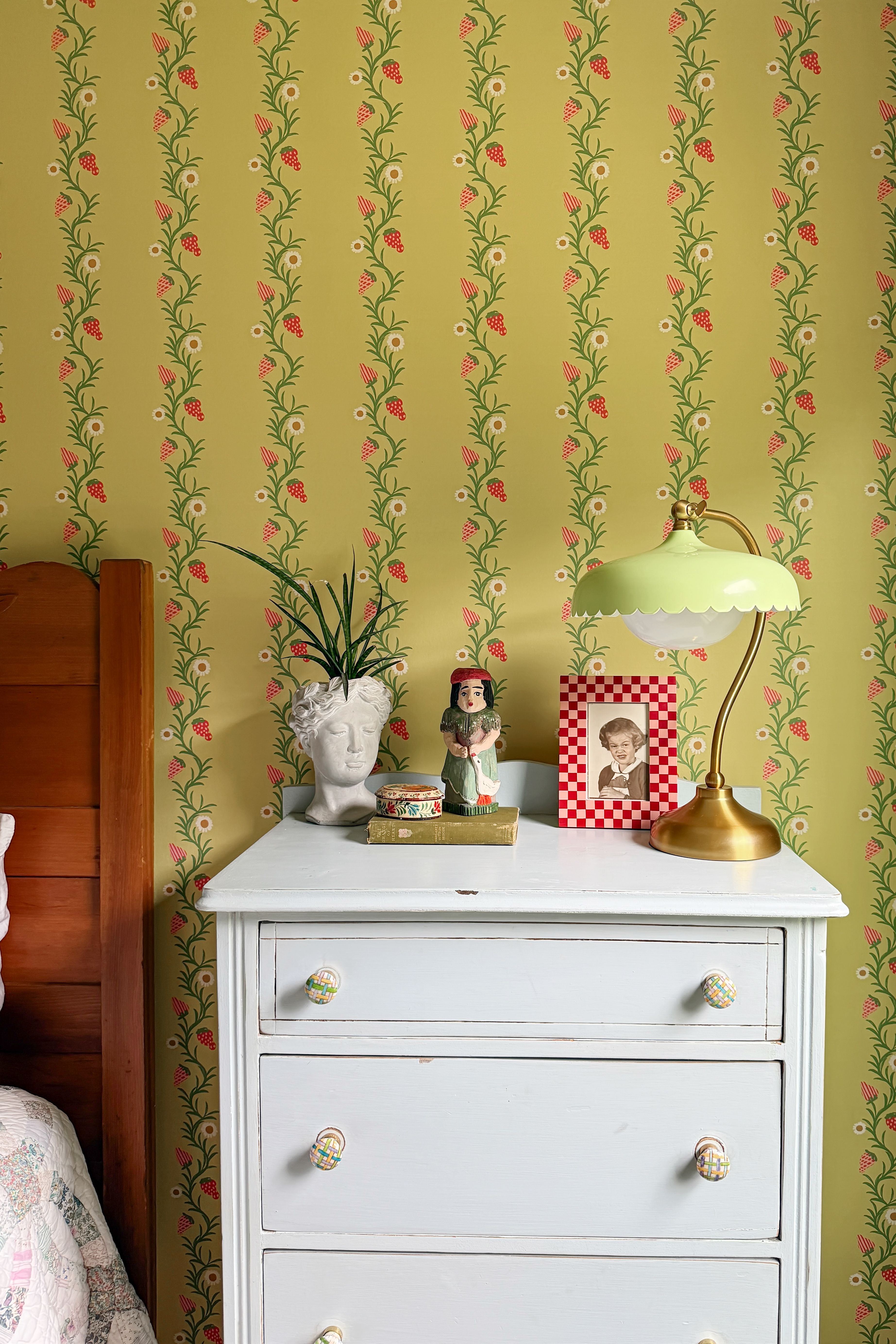
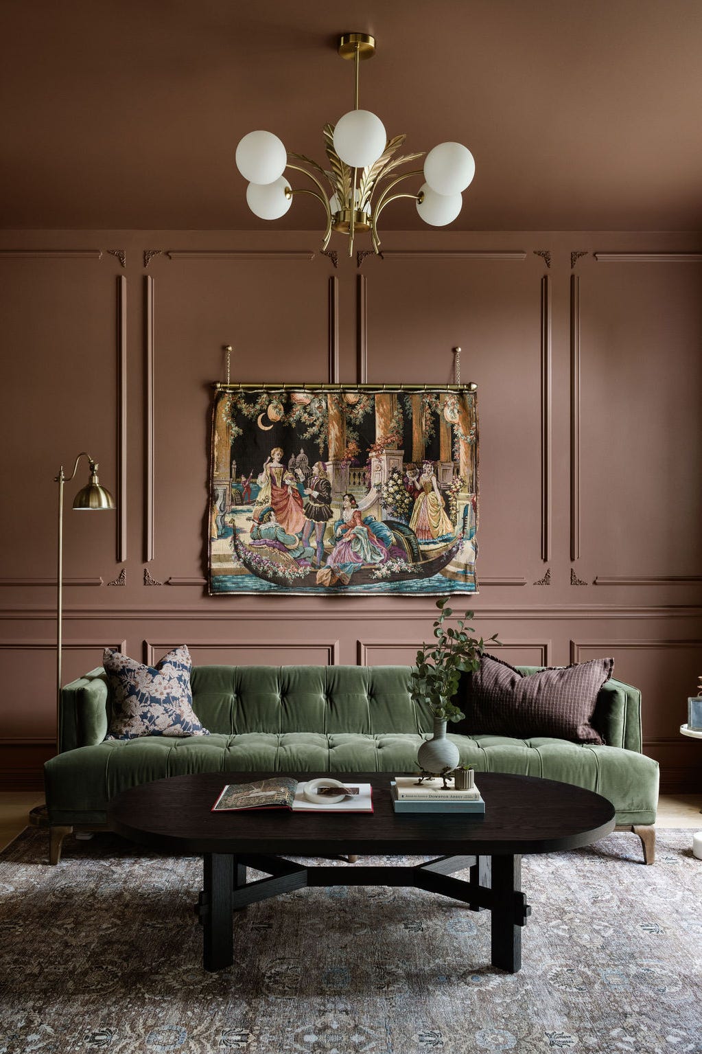
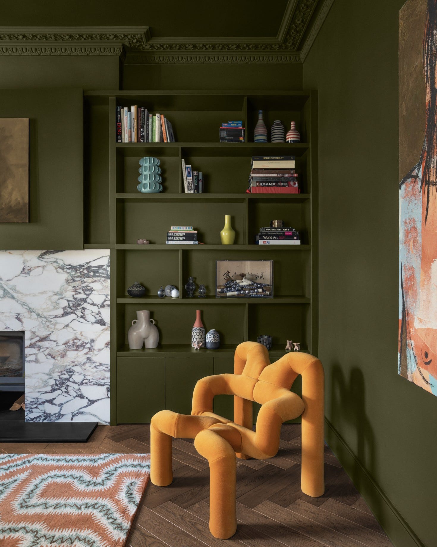
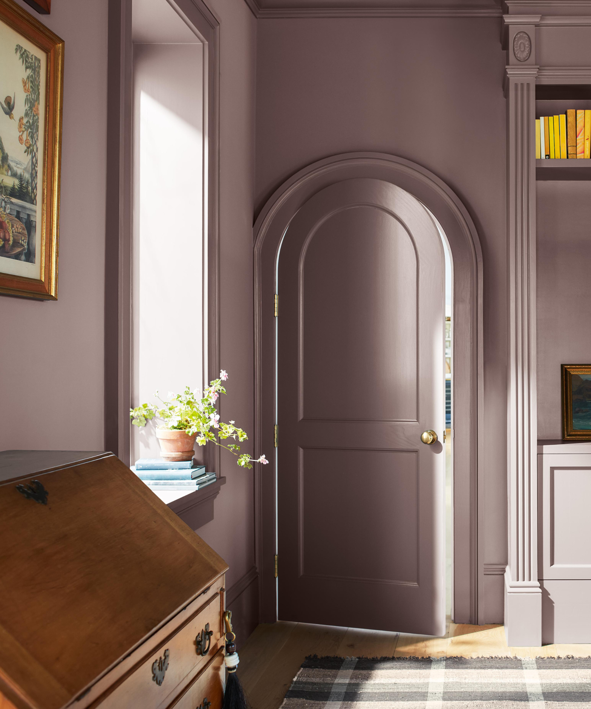
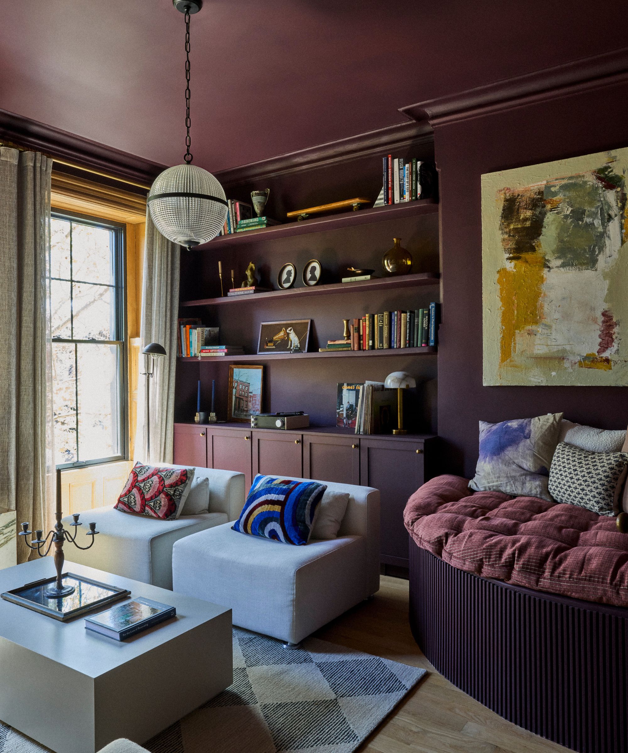
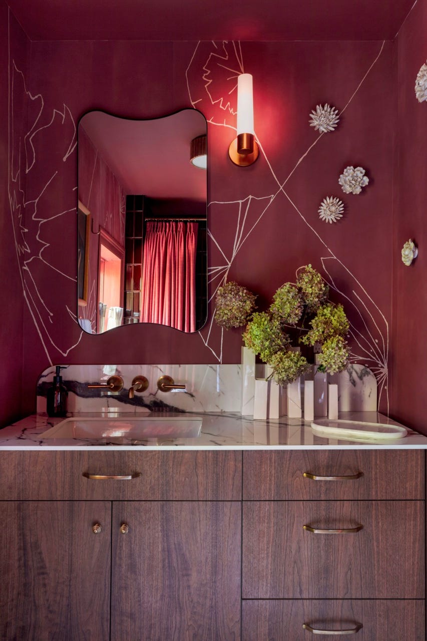
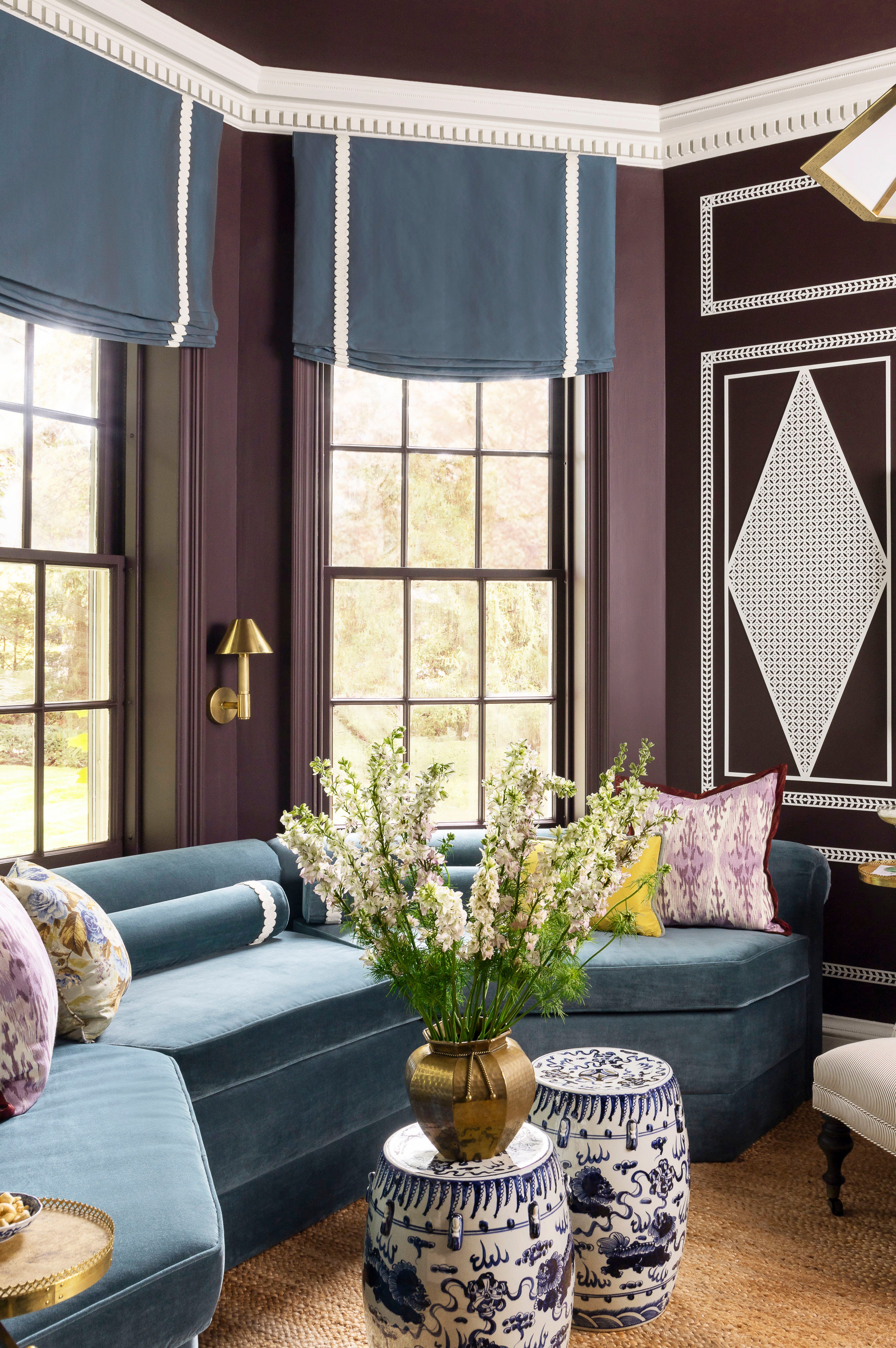
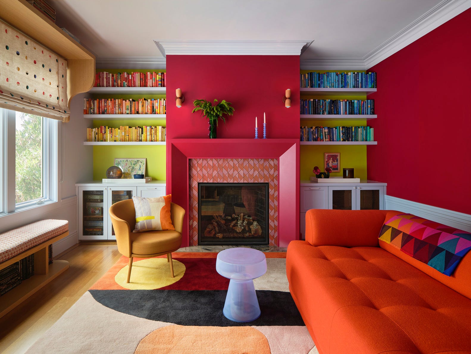
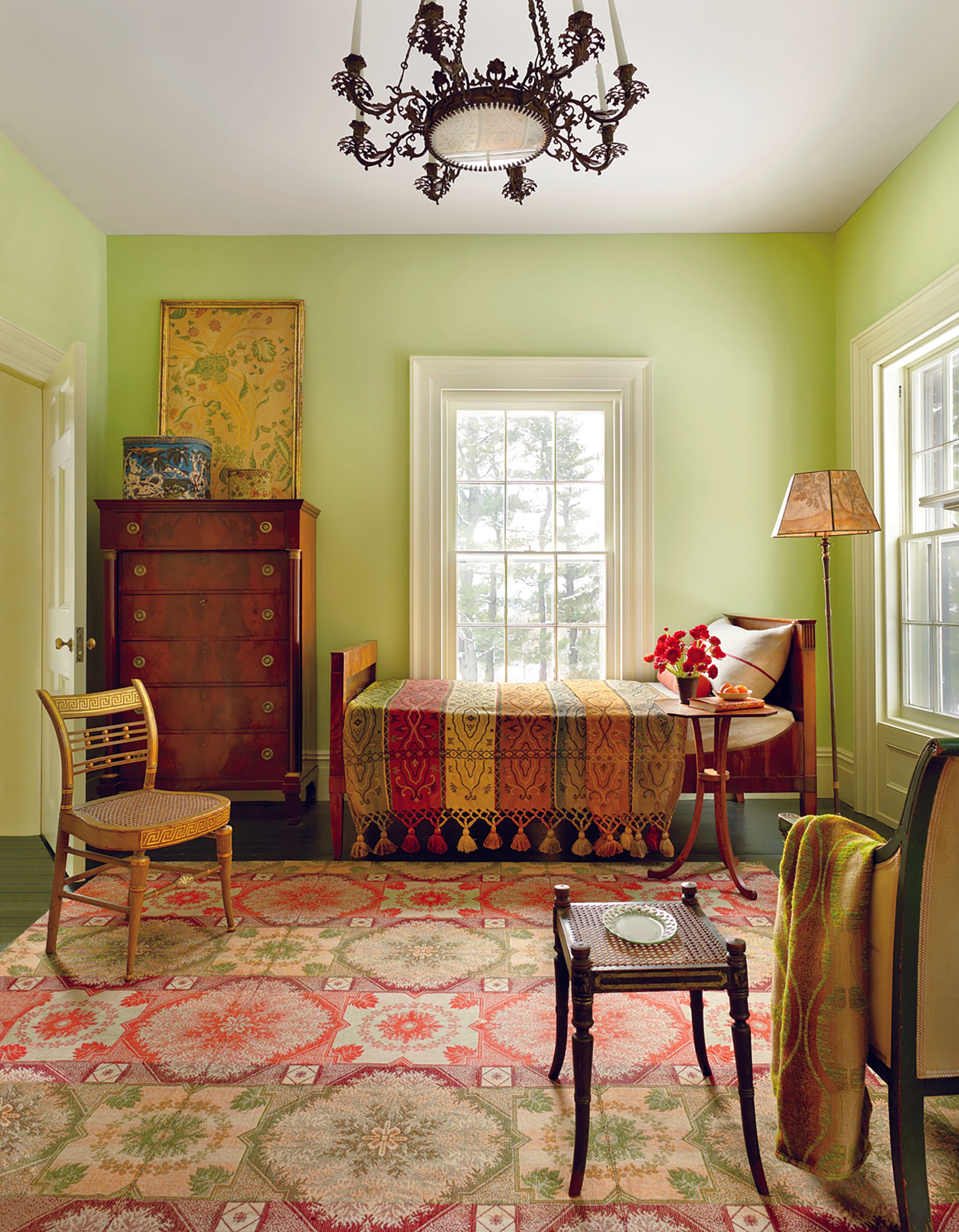
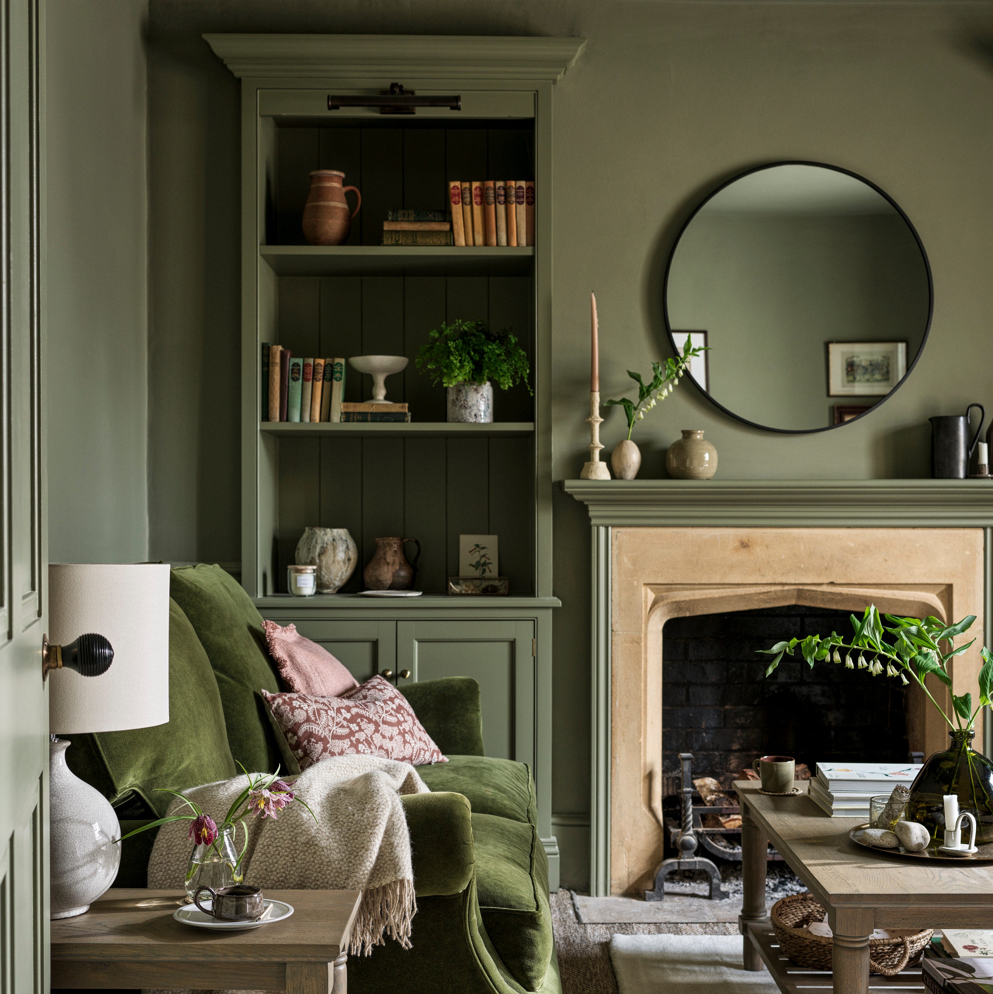
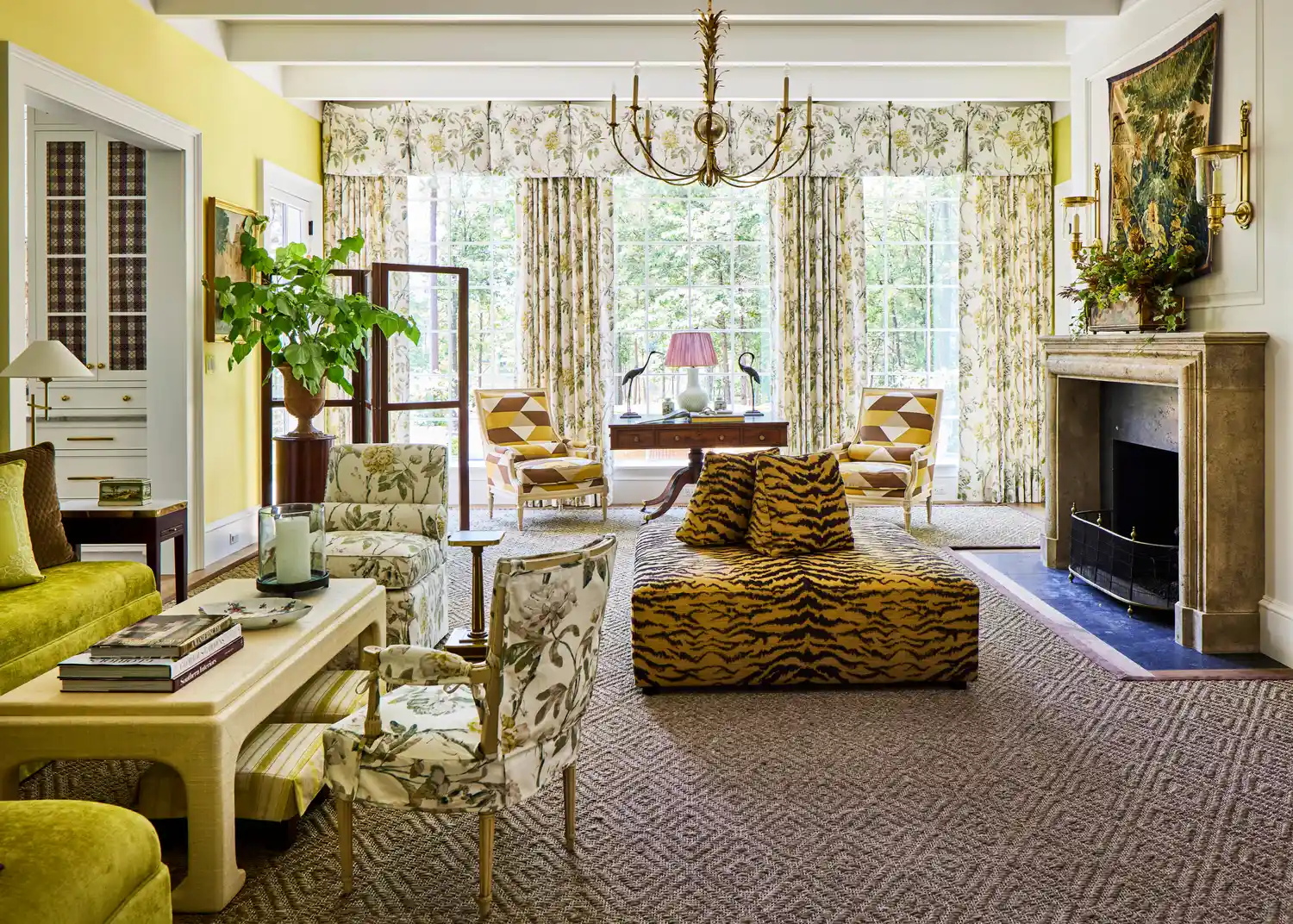
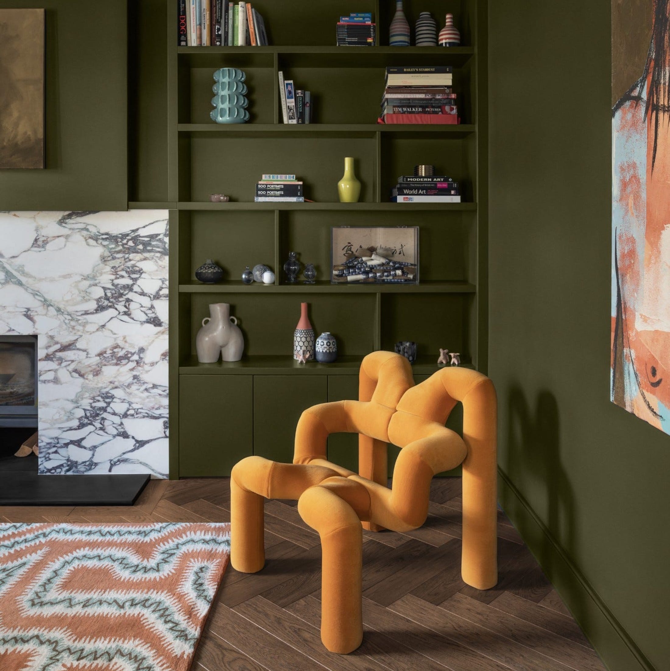
The 2025 Idea House, a collaborative effort with Southern designers, architects, and builders, aims to inspire and encourage residents to explore diverse design choices. For this project, the living room walls feature a vibrant chartreuse paint, a color that has seen fluctuations in popularity since the Victorian era, notably experiencing revivals in the 1960s and 2000s. The designers involved believe chartreuse is on the brink of another sustained comeback.
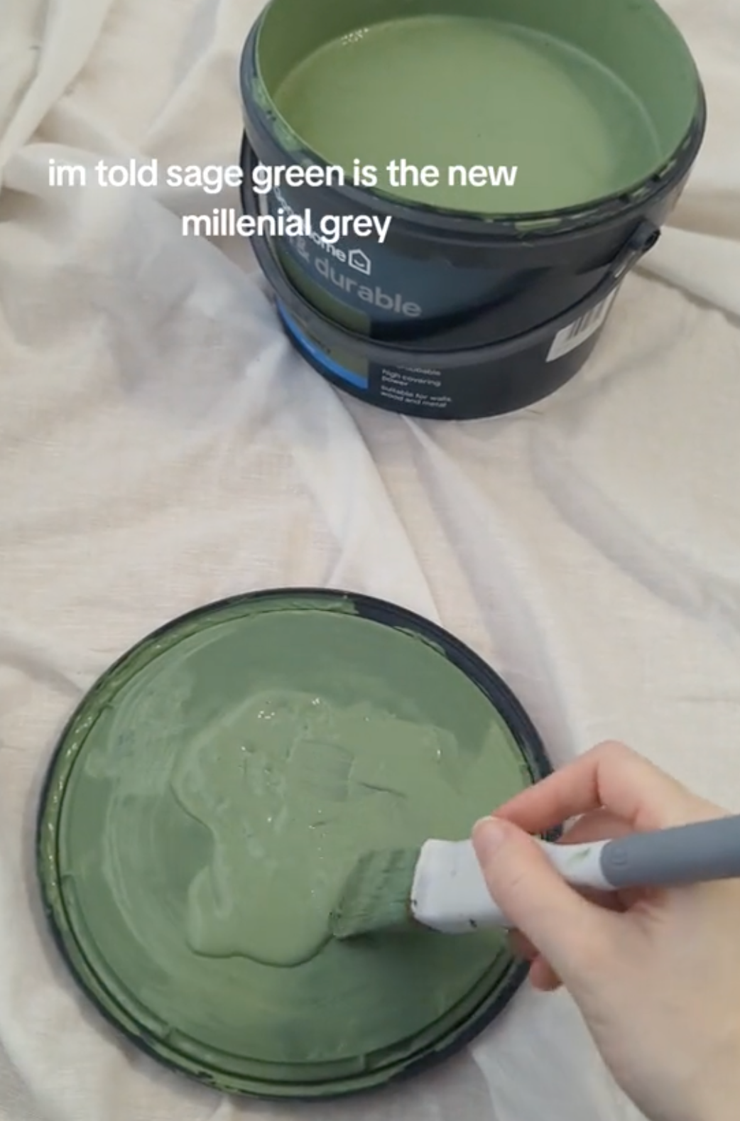
Several design experts weigh in on the resurgence of chartreuse. Jenna Gross, founder of Colordrunk Designs, attributes its renewed appeal to a shift away from minimalist aesthetics like millennial gray. She notes that after years of beige, gray, and safe design choices, people are now seeking more energetic and fearless colors. Chartreuse, with its bold vibrancy, is seen as leading this charge, signaling an end to cautious color palettes in home decor. Russell Goldman, founder of More Wow, highlights that chartreuse has maintained a timeless presence in certain Southern regions, particularly Palm Beach, Florida. He explains that bold colors are inherently suited to the local light and landscape, making them appear expressive rather than merely trendy in these areas. For Goldman, chartreuse sparks curiosity and imbues a space with personality without being apologetic.
The specific chartreuse chosen for the living room of the 2025 Idea House is Chartreuse 0073 by Sherwin-Williams. This particular shade is described as an approachable iteration of the bold hue and is favored by Southern designers for its more subdued quality. Nina Dekay Grauer and Eleanor Tate Trepte, owners of Dekay & Tate Interiors, commend this choice. Another popular chartreuse among designers, mentioned by both Goldman and Gross, is Frolic 6703 by Sherwin-Williams, which is slightly darker and more saturated. It is recommended to swatch both colors due to their differing appearances on a larger scale.
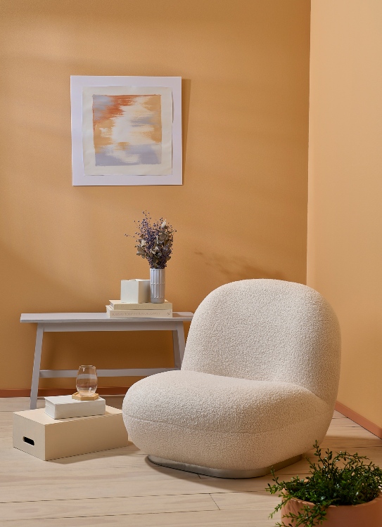
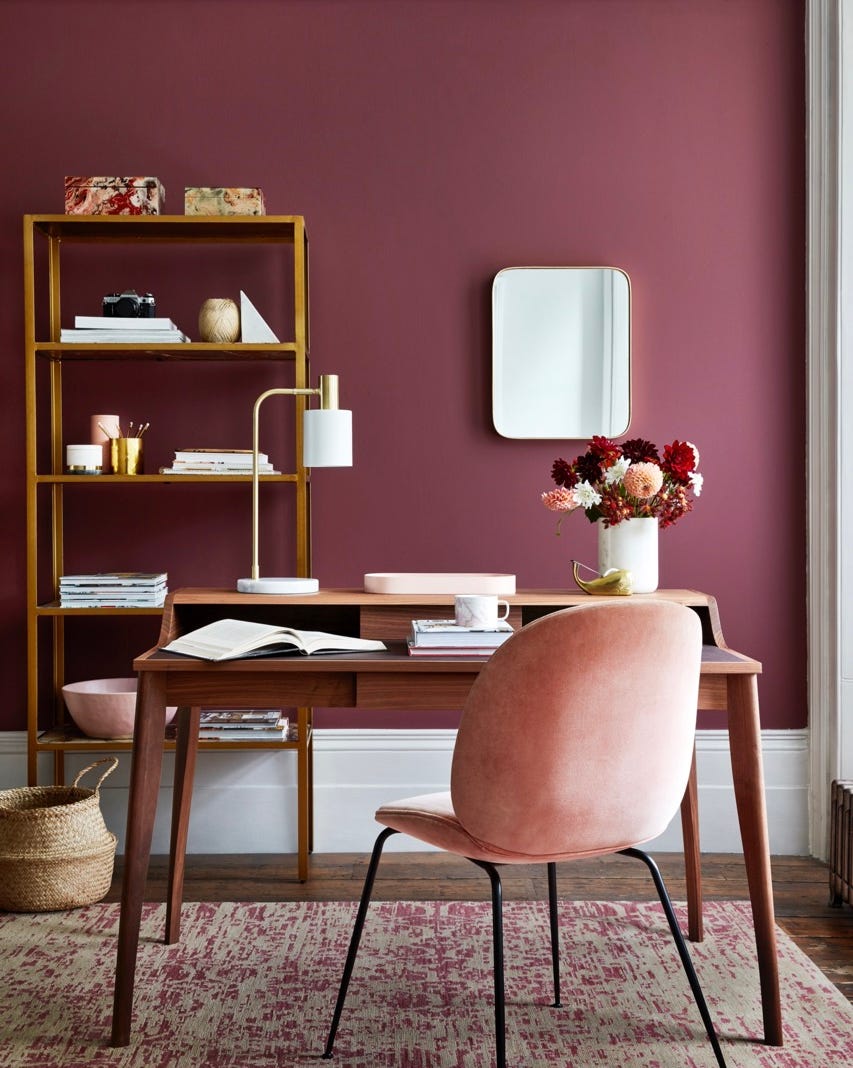
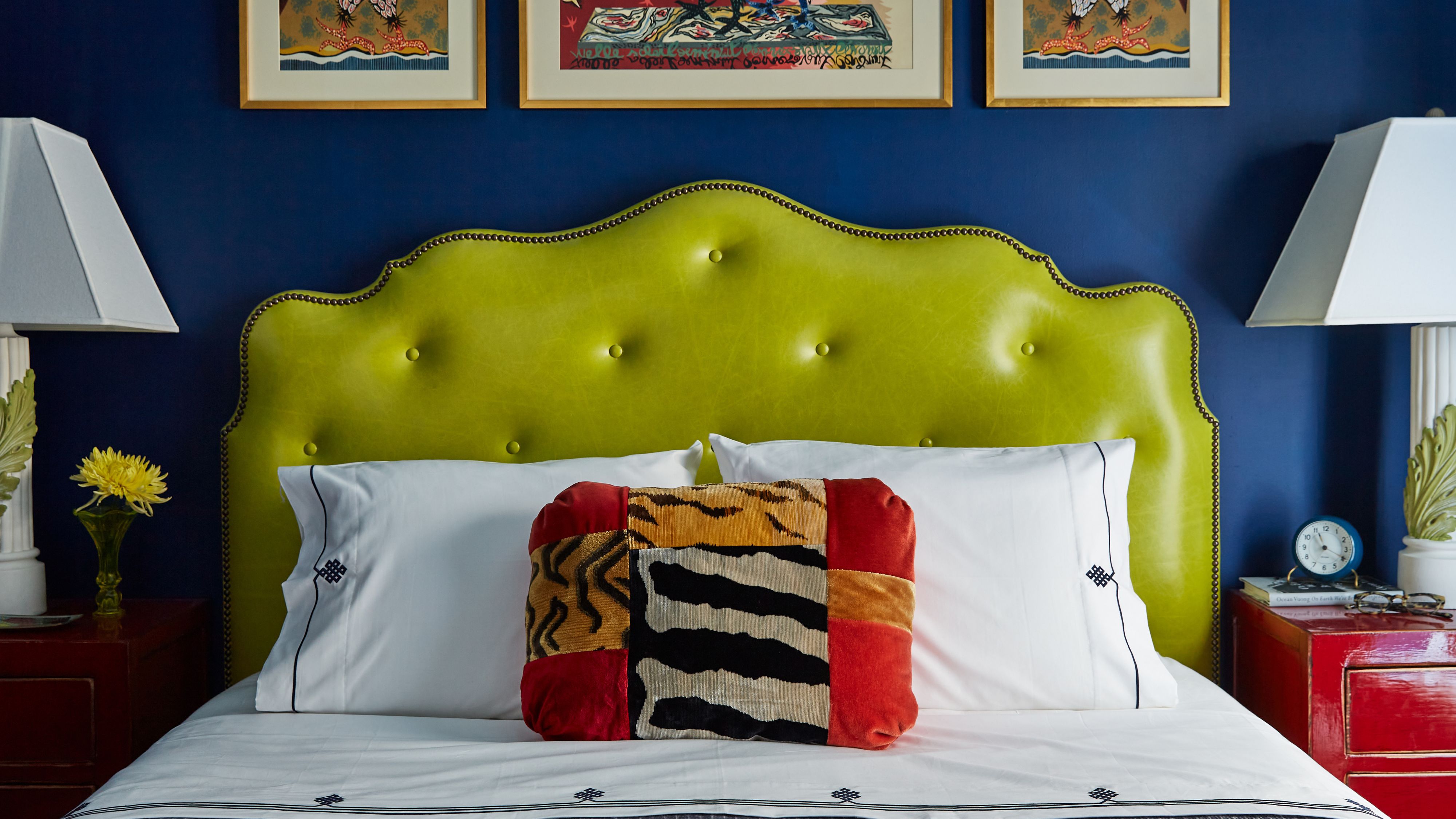
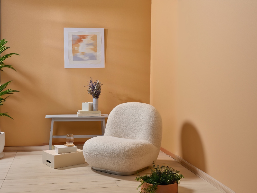
For those hesitant to commit to chartreuse on a grand scale, the article suggests incorporating it as an accent color. Tate Trepte draws a parallel between chartreuse and the 'unexpected red theory,' which posits that a small pop of red can elevate a space's design. Similarly, a vibrant chartreuse accent can introduce energy and contrast to an otherwise neutral environment. Goldman also endorses using chartreuse as a highlight in strategic areas, such as the back of a bookcase, a lacquered side table, or in upholstery. He emphasizes that its impact doesn't rely on dominating the space.
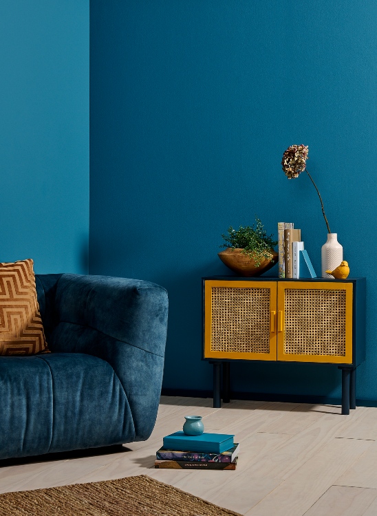
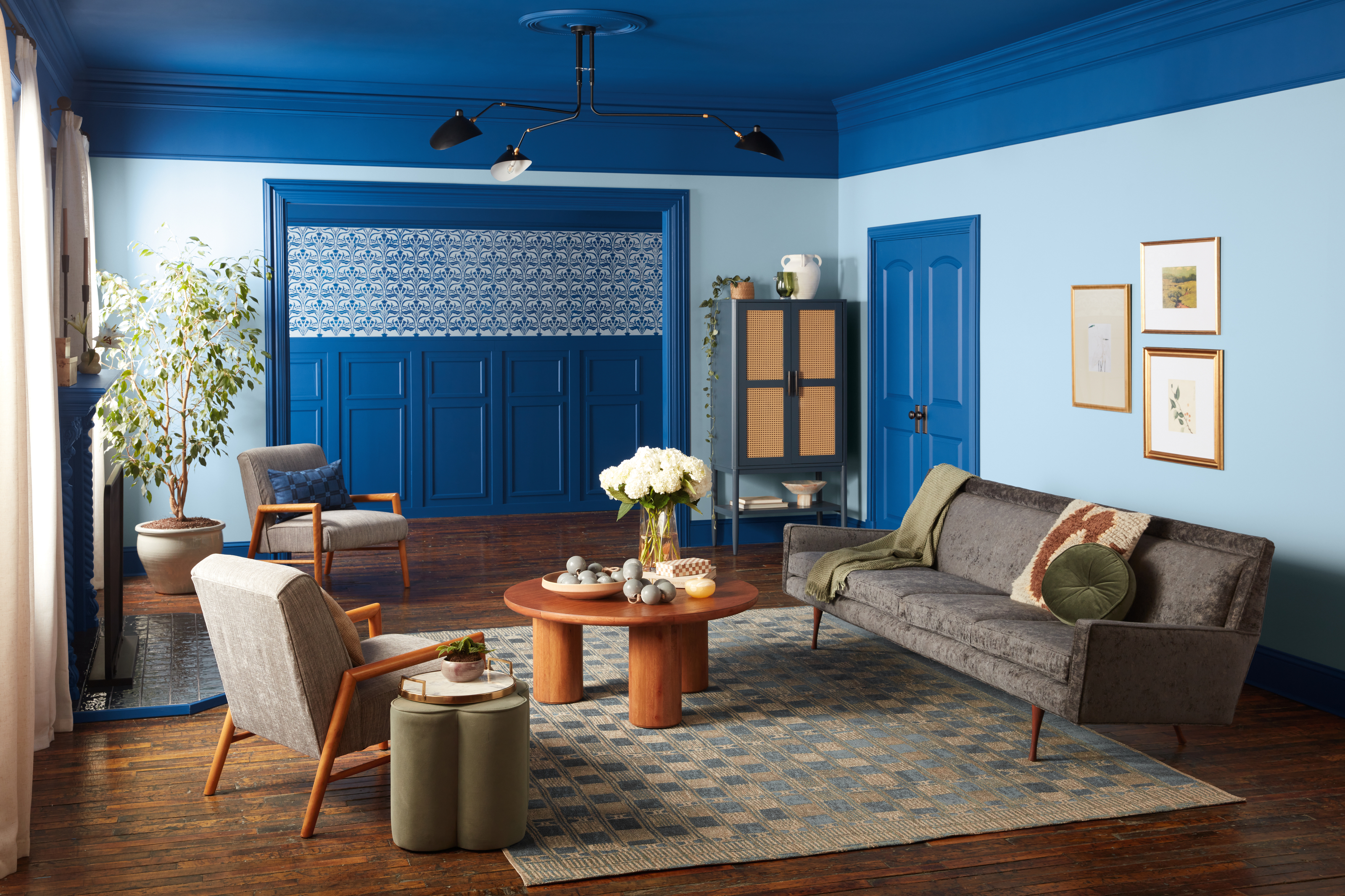
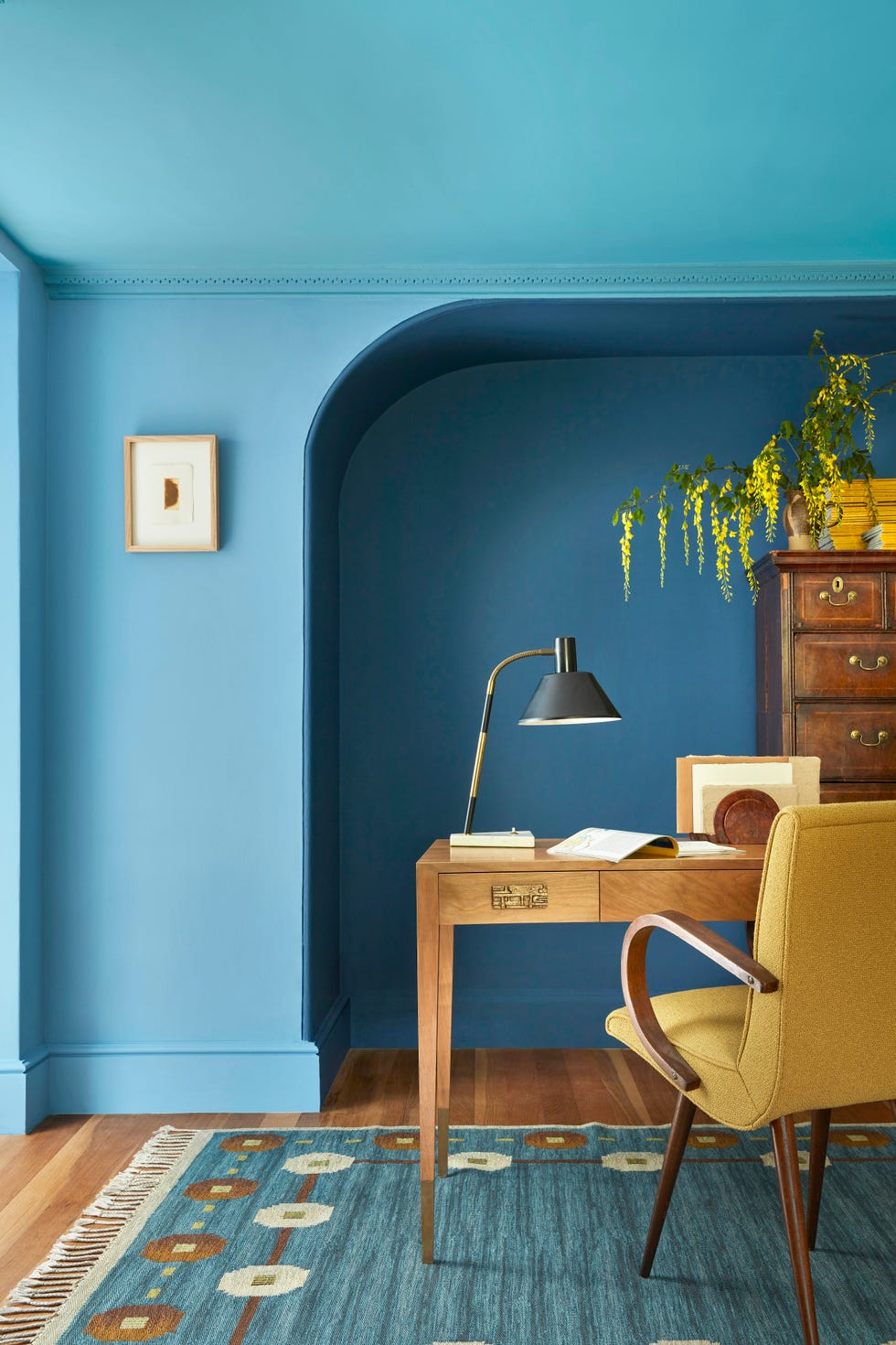
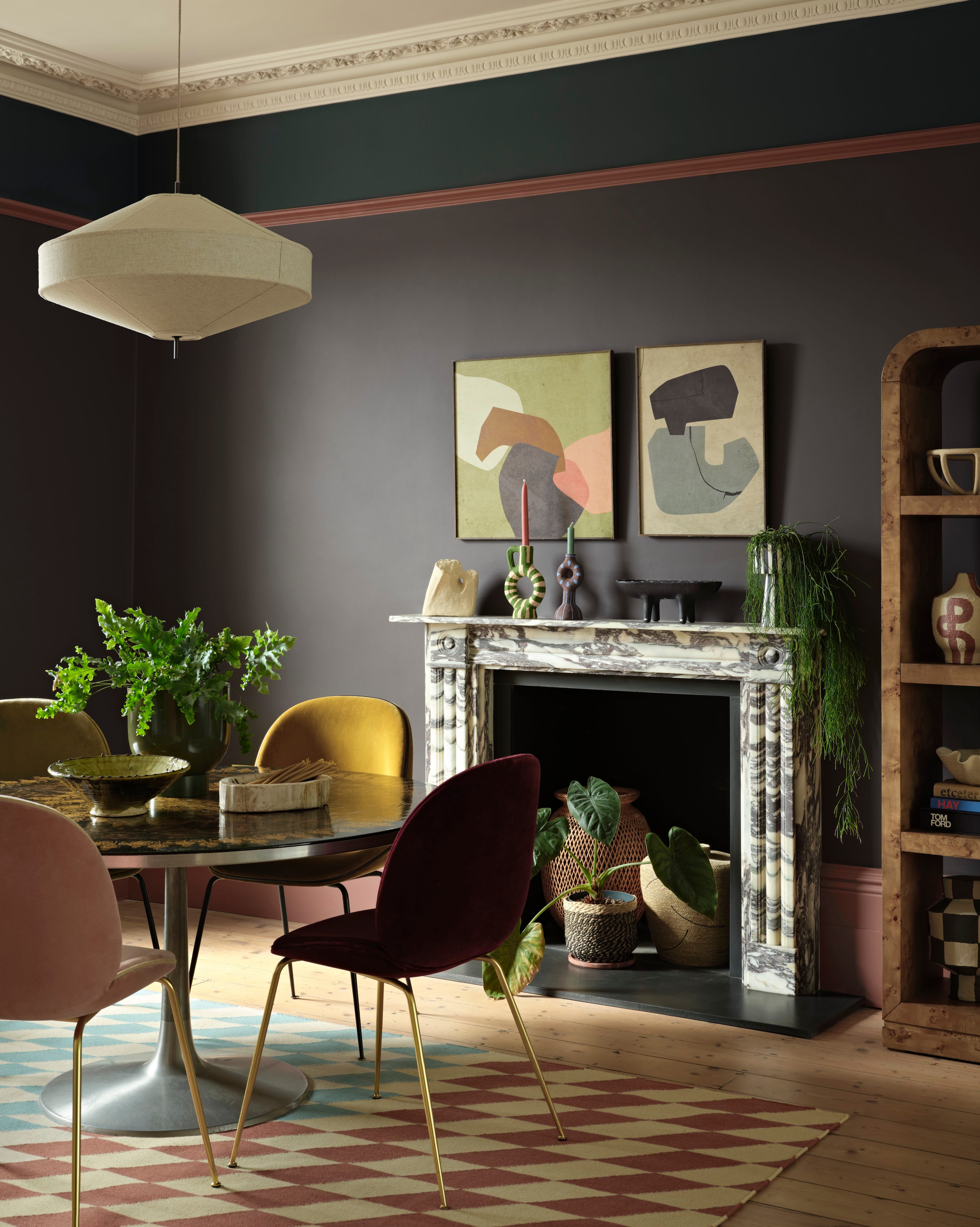
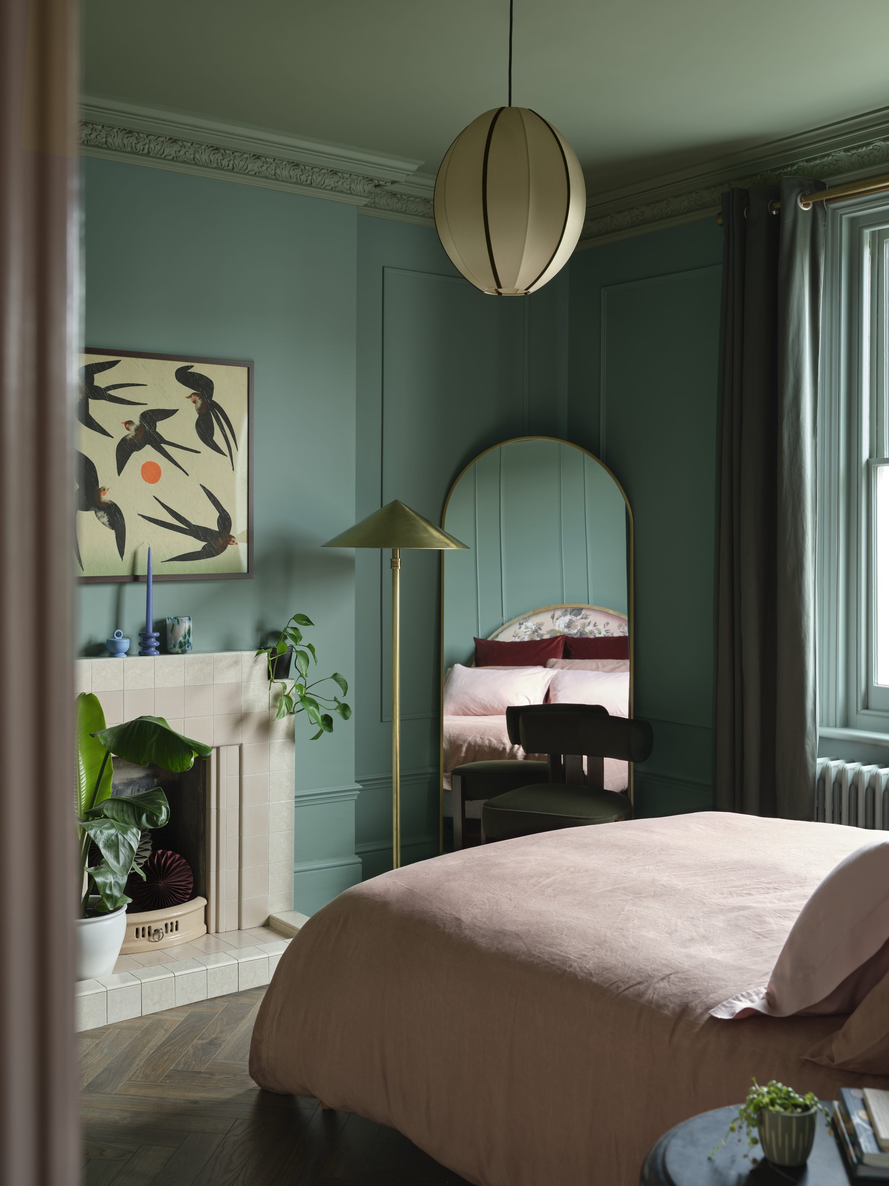
A key design tip for pairing chartreuse is to combine it with blue, especially teal. Jenna Gross notes that chartreuse’s cool and warm undertones contribute to its versatility. She particularly favors teal as it complements the yellow undertones of chartreuse, enhancing the cooler blue hues. This combination creates a modern and vibrant palette that is fresh without being overwhelming.
#HomeDesign #InteriorDesign #ColorTrends #ChartreusePaint #2025IdeaHouse #AccentColors #SouthernDesign #PaintChoices #DesignTips #HomeDesign #InteriorDesign #ColorTrends #ChartreusePaint #2025IdeaHouse #AccentColors #SouthernDesign #PaintChoices #DesignTips
0 comment in total
You may also like
Kitchen colour experts are calling this the 'it' colour of 2024 that will go down as a future classic
These Colors Will Be Everywhere in Interior Design in 2026
Interiors experts predict this will be the biggest paint trend of 2026

The Latest Color Trend You'll Be Seeing Everywhere In Fall 2025
Experts Say These 5 Paint Colours Will Be Everywhere In 2026
The #1 Paint Color Trend of 2025, According to Designers

The Soothing Paint Color Everyone’s Adding To Their Homes In 2025, According To Designers
Designers Predict You'll Use AT LEAST One of These Colors in Your Home in 2025

This electric 1960s shade is making an unexpected return – and designers say it’s the key to lifting darker, moodier interiors this fall

This Bold 1960s Color Is Making A Comeback In Our Idea House
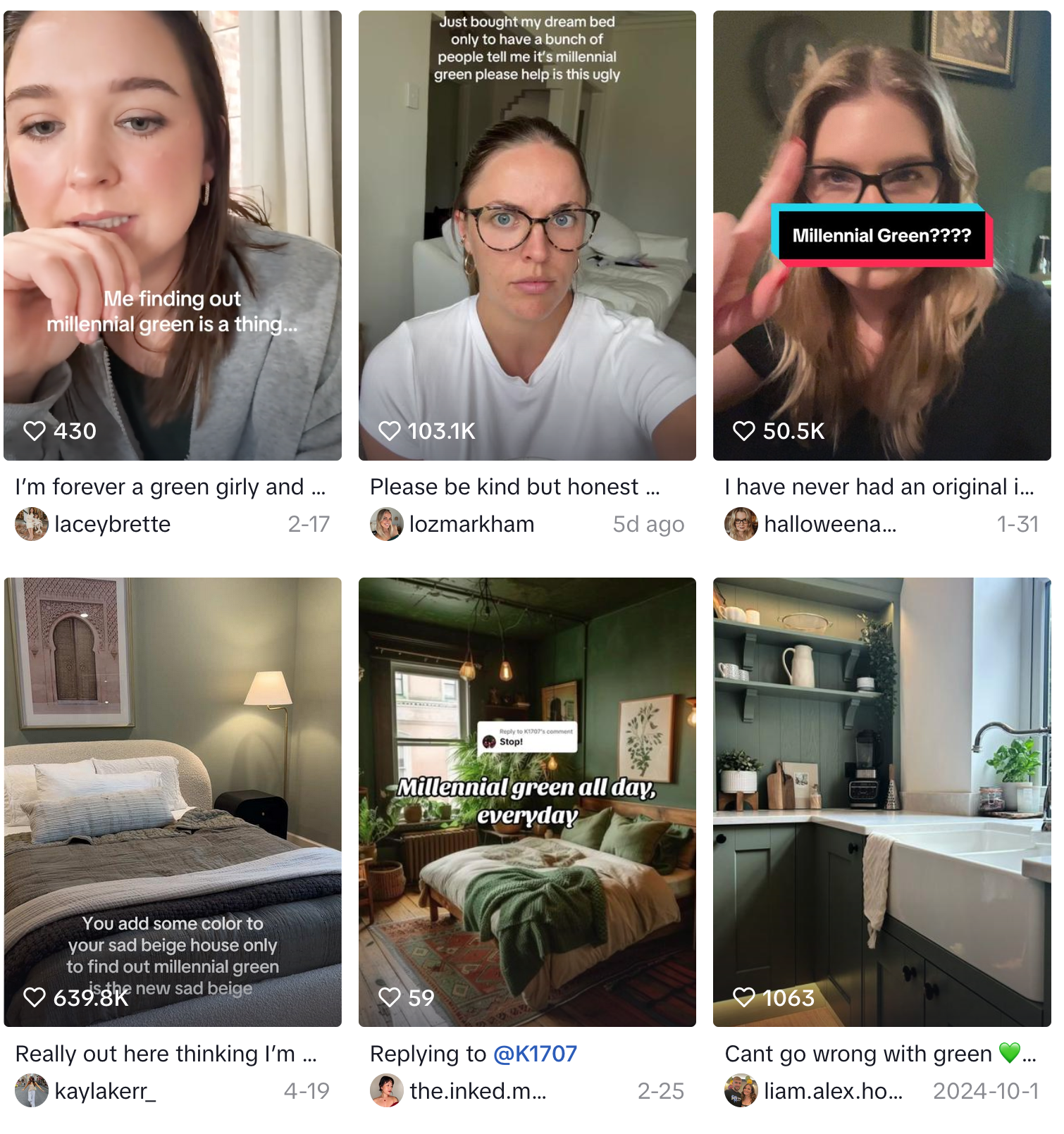
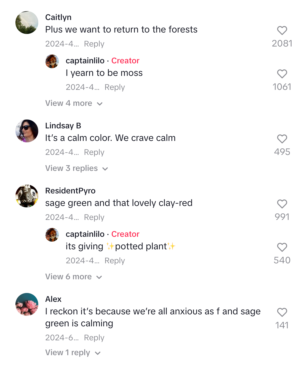
Is millennial green the new ‘sad beige’?
2026 Color of the Year Announcements Have This In Common

This Bold 1960s Color Is The Most Talked-About Hue In Our 2025 Idea House
Interior Design Trendwatch: Colour is coming home
What Paint Colours will Rule 2026? The Experts Make Their Predictions
Jewel Tones Are Trending for Living Room Paint Colors, According to Designers

The colour trends 2026 that will define our homes next year

What is Color Forecasting? Experts Explain How to Map Trends |

Is purple making a comeback for 2025? Designers and color experts weigh in on this divisive and nostalgic shade
Goodbye Gray—This Soothing Paint Color Will Dominate Interiors in 2026, Designers Say