1/11
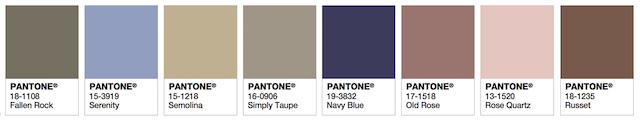
Every Pantone Color Of The Year For The Last Decade
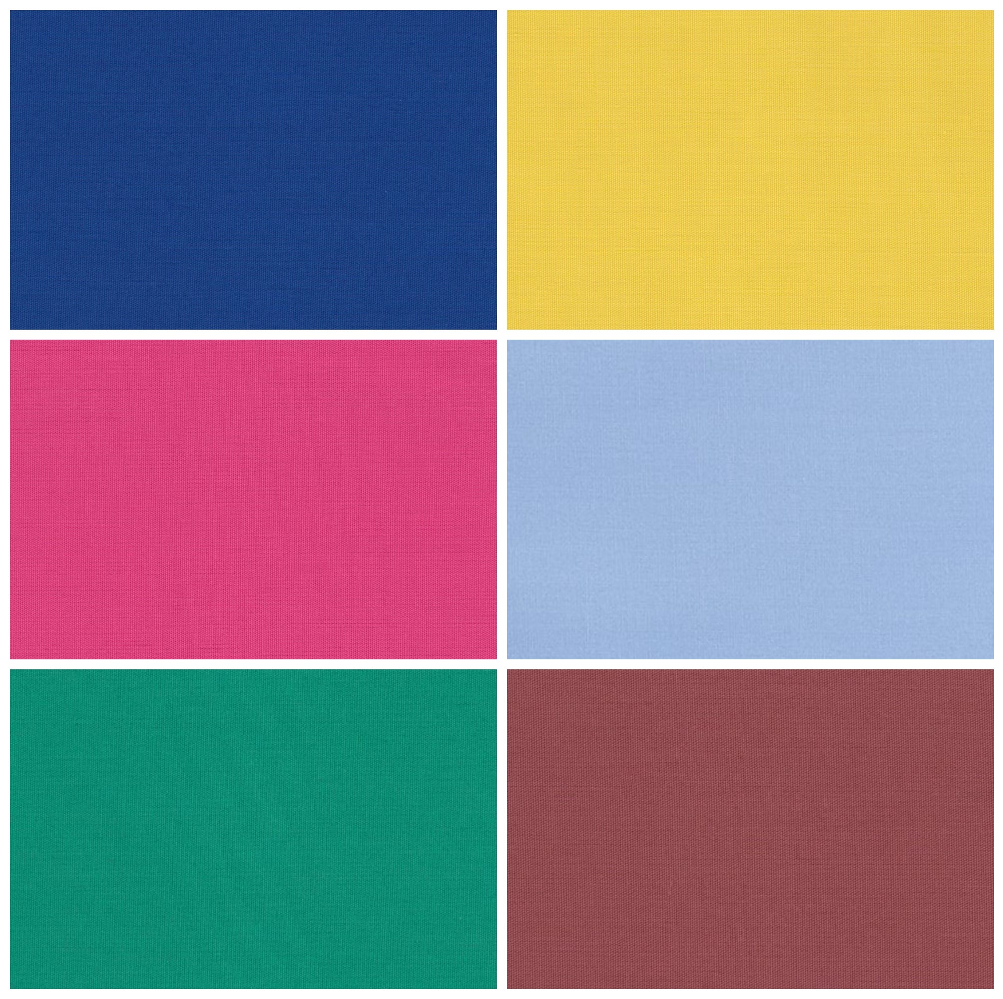
The Pantone Color of the Year program significantly influences various industries, including interior design, fashion, cosmetics, and graphic design, by predicting dominant hues and moods for the upcoming year. Since its inception in 1999, the program has mirrored global shifts and events, with each color selection capturing the zeitgeist of its respective year. A review of the past decade's choices reveals how these selections reflect societal changes and consumer desires.
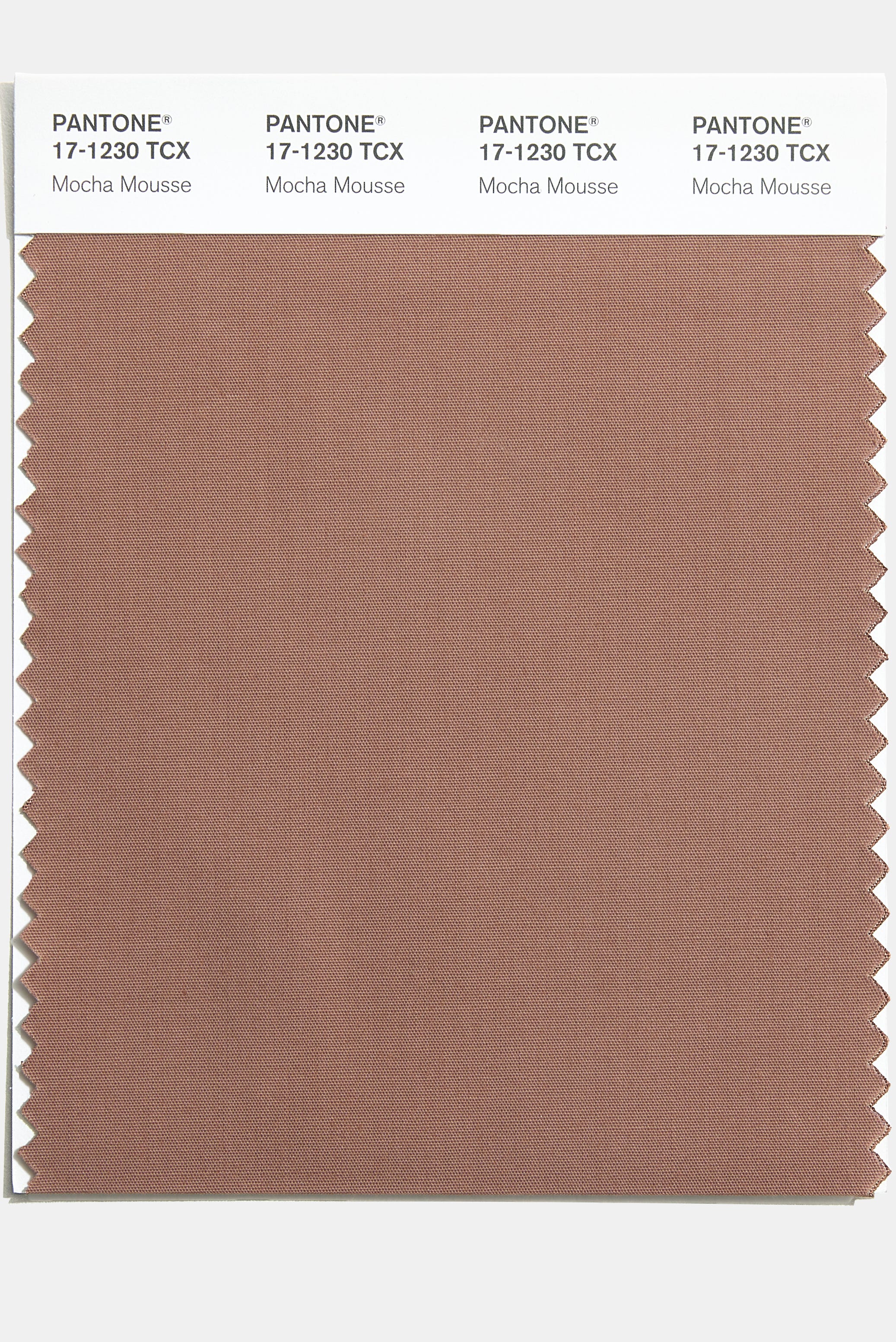
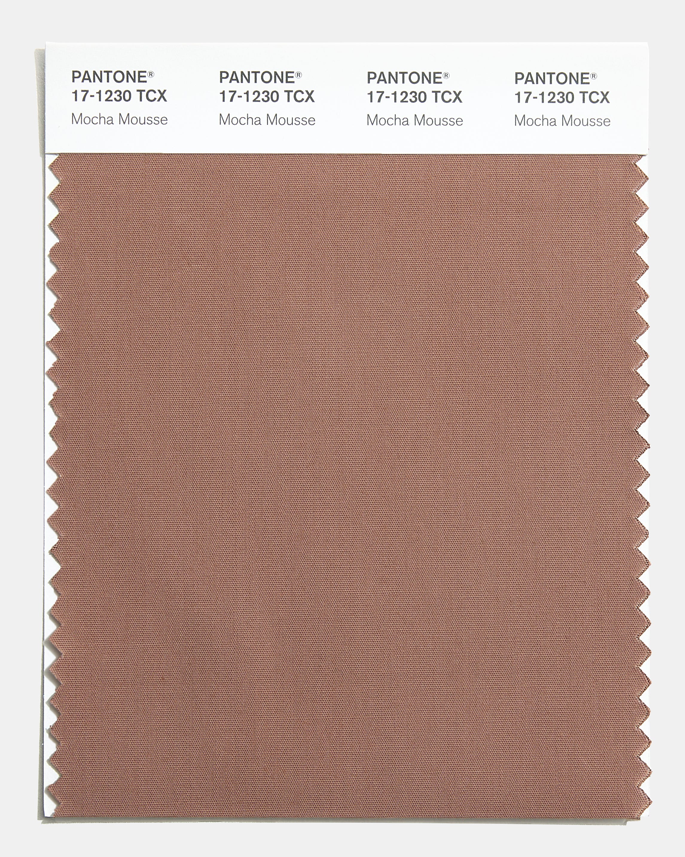
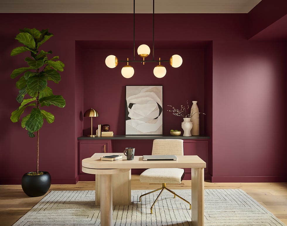
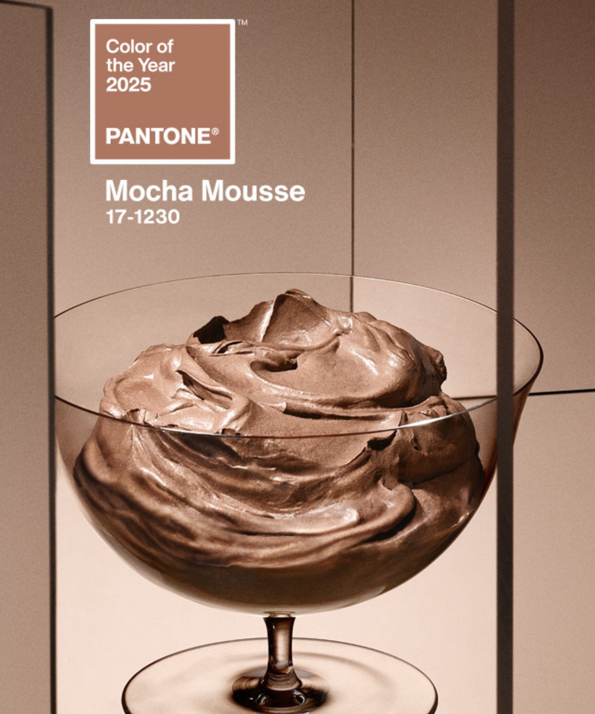
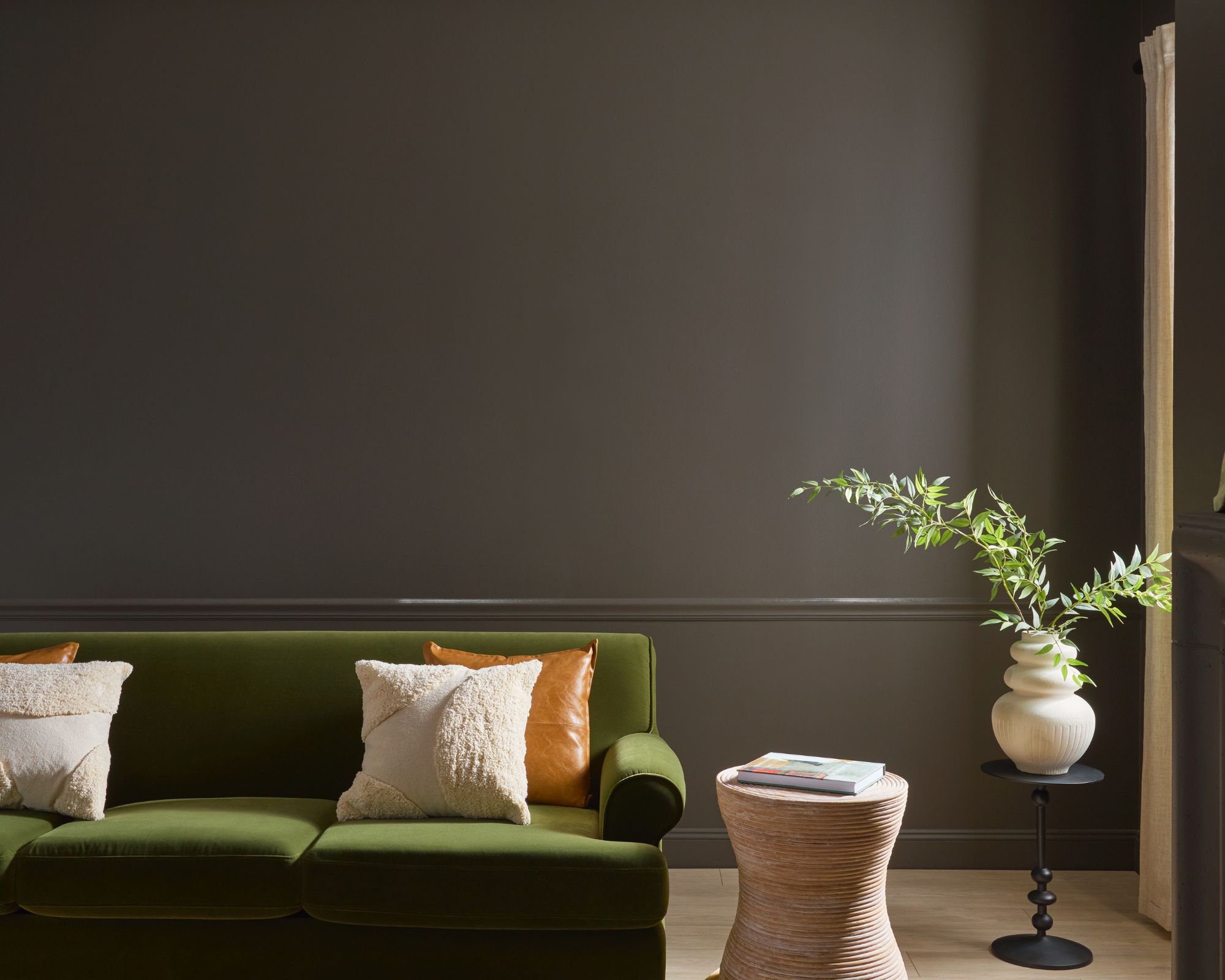
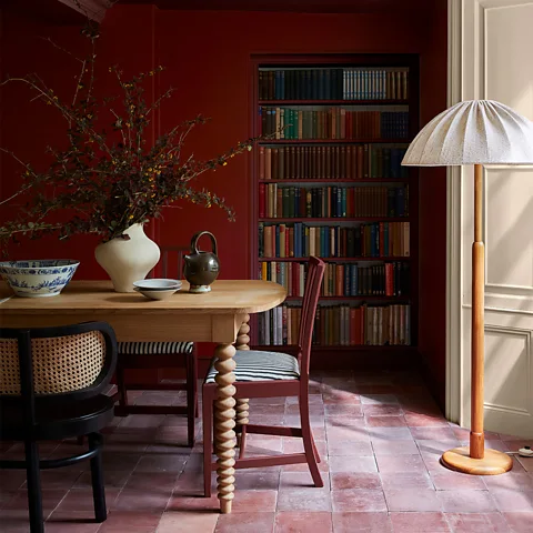
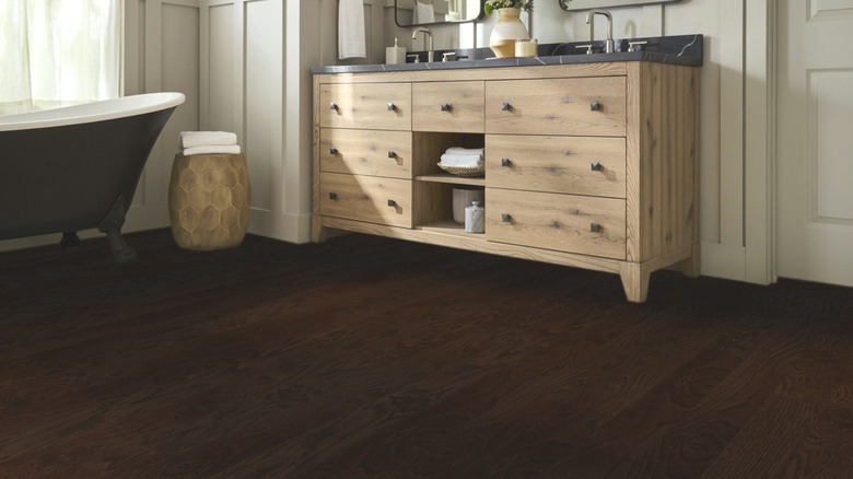
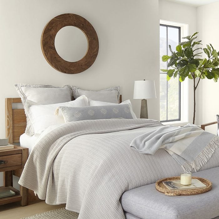
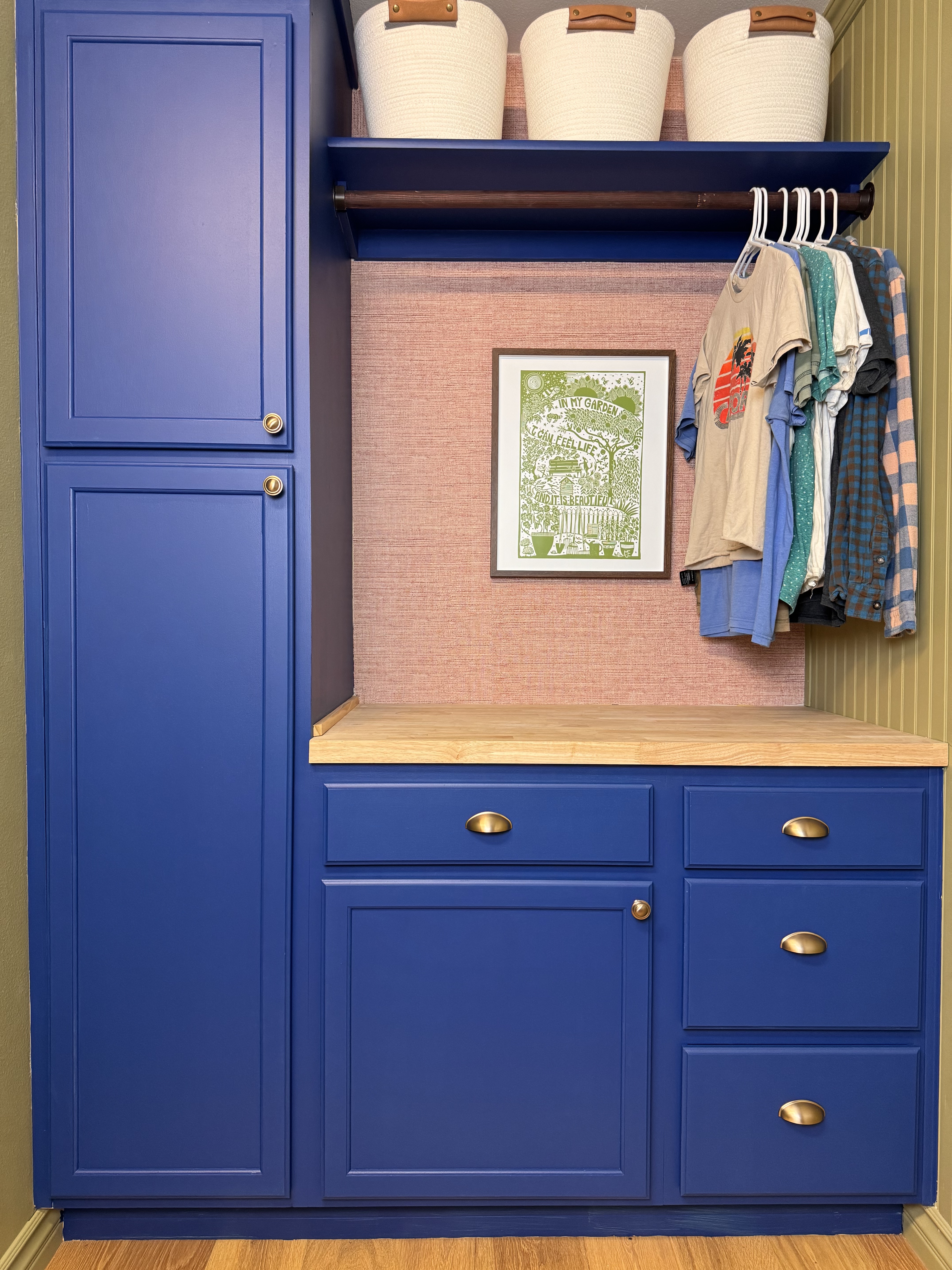
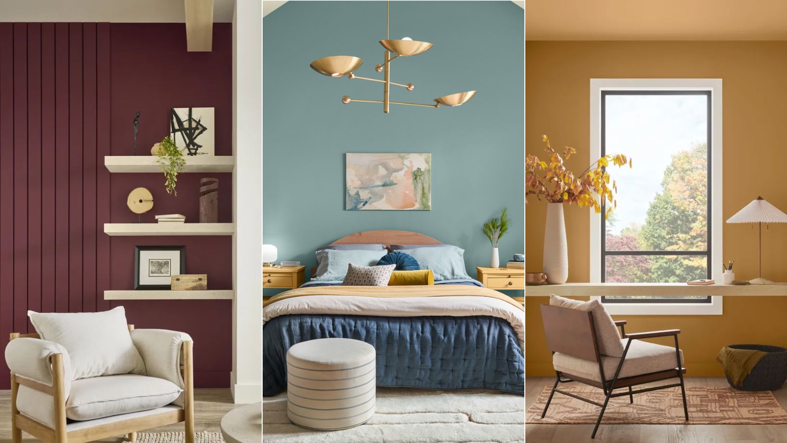
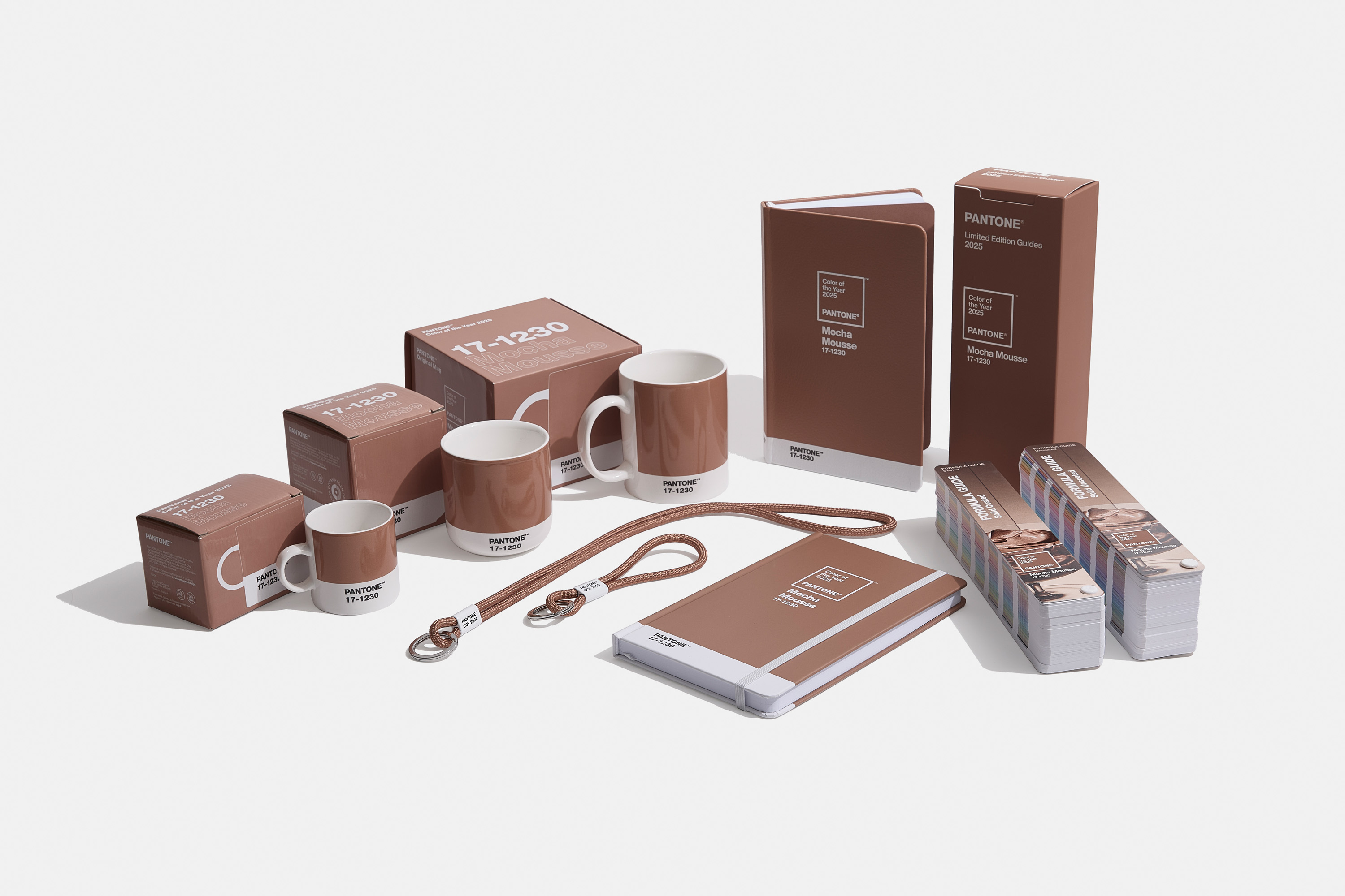
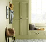
In 2025, Pantone introduced Mocha Mousse, a soothing brown hue inspired by comfort food and "little treat culture." This color aimed to promote personal comfort and wellness, reflecting a consumer need for balance and tranquility amidst increasing world complexities. It was chosen to help transform homes into quiet, balanced havens, emphasizing harmony. The versatility of Mocha Mousse allowed for various applications in home decor, from color-drenching rooms with cream and dark brown accents to incorporating pieces from collaborations, such as the one with Joybird, for timeless sofas and chairs.
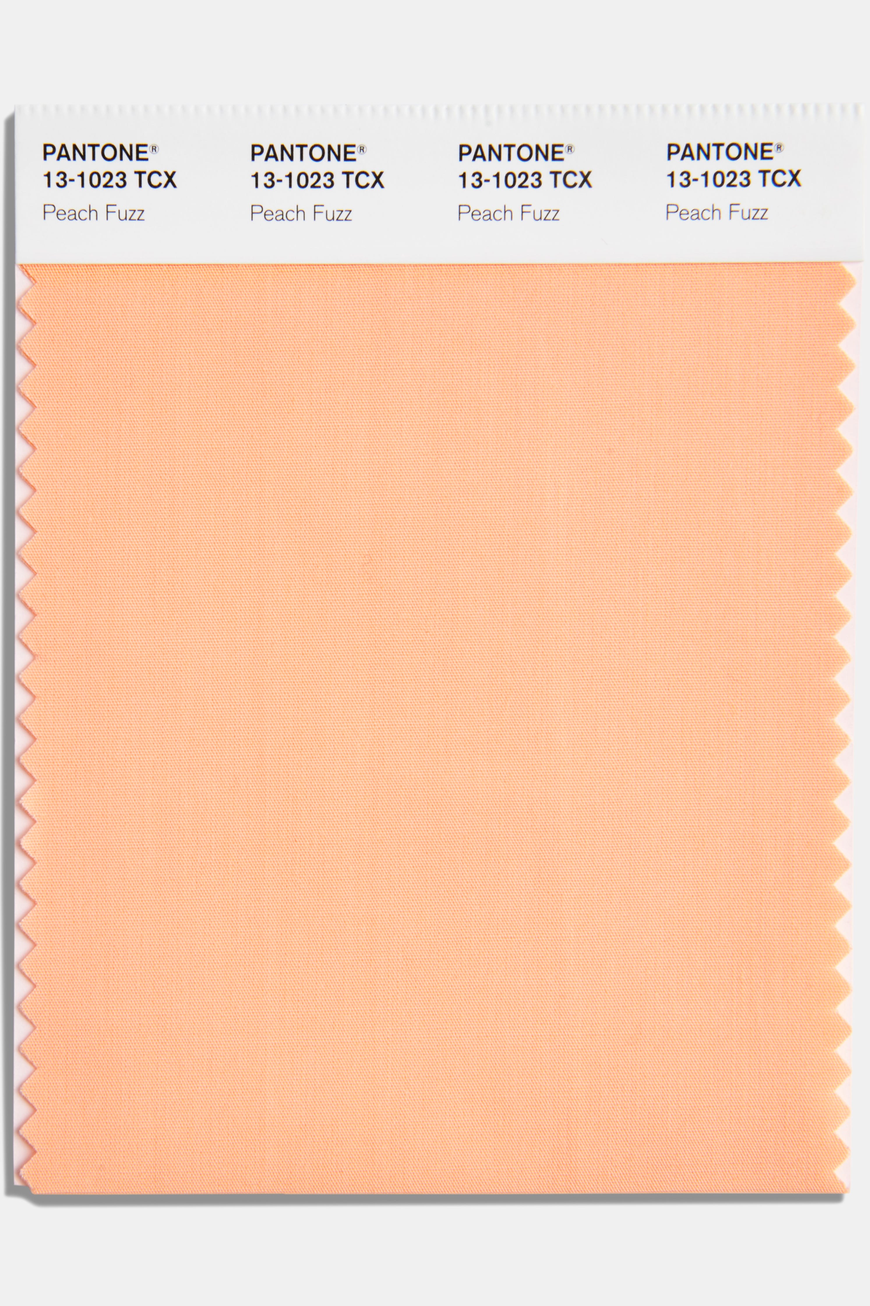
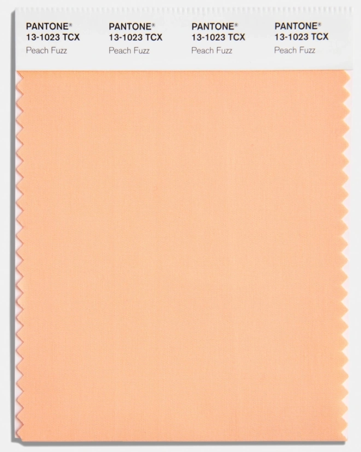
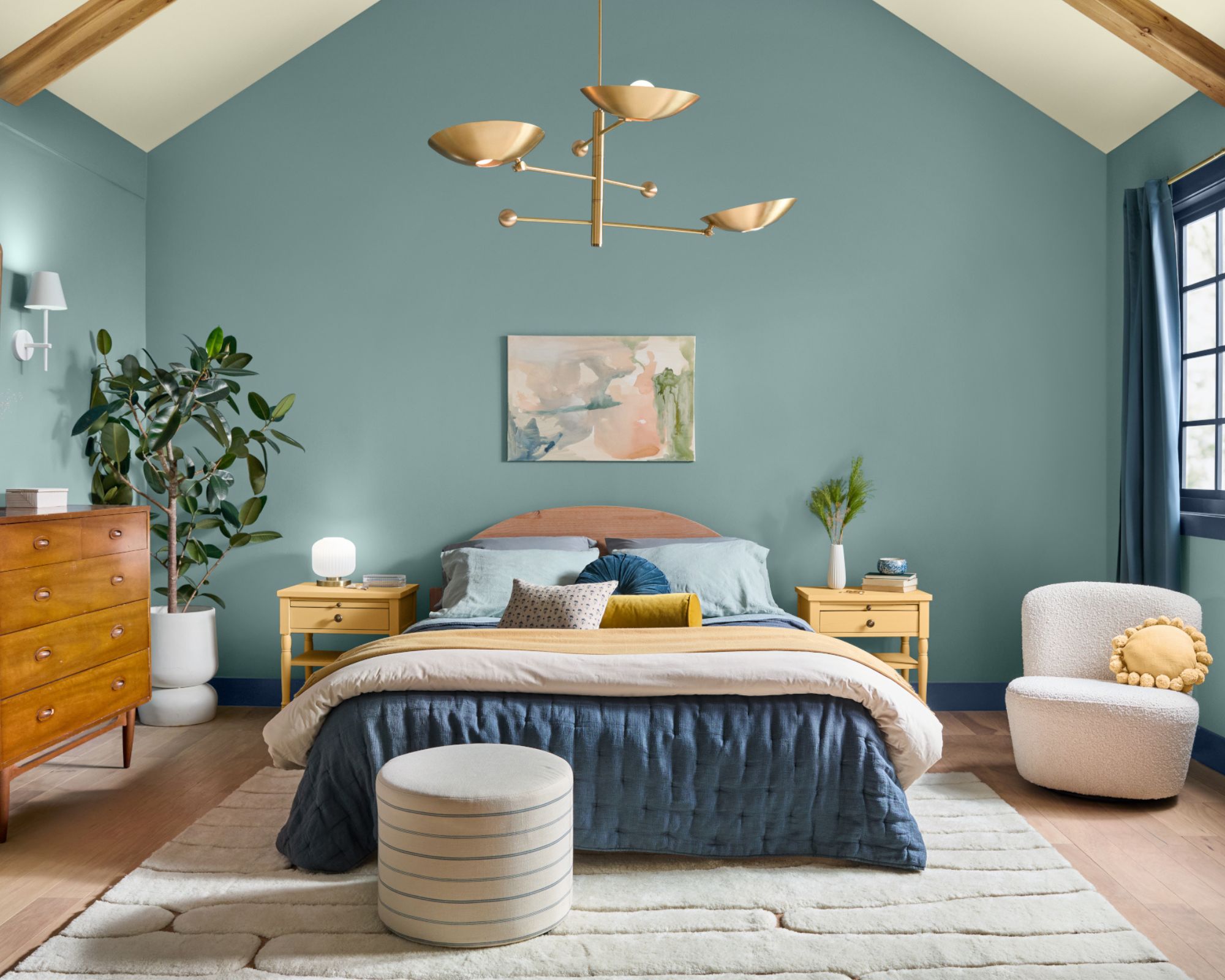
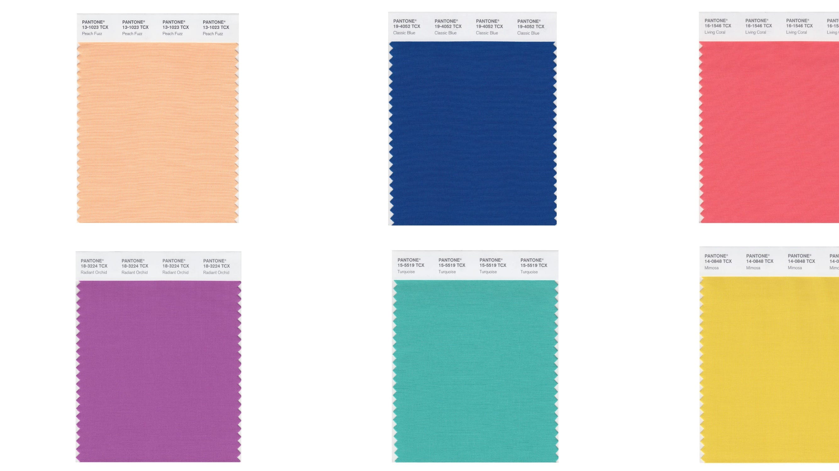
Peach Fuzz, the 2024 color, was a calming yet cheerful peach, chosen as society emerged from the COVID-19 lockdowns. It symbolized a desire for reconnection, community, and nurturing, aiming to create spaces for healing and togetherness. This hue was often used in gathering areas like living rooms and kitchens, either color-drenching spaces with sugary pastel accents or paired with dark furniture and cooler tones for a modern feel.
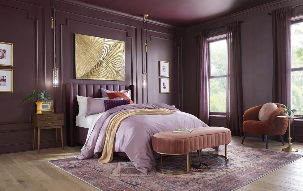
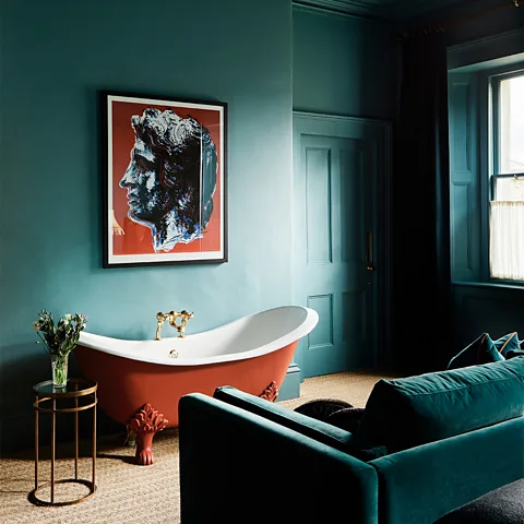
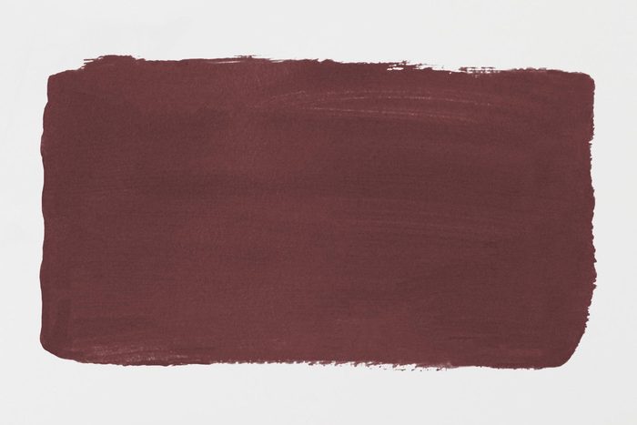
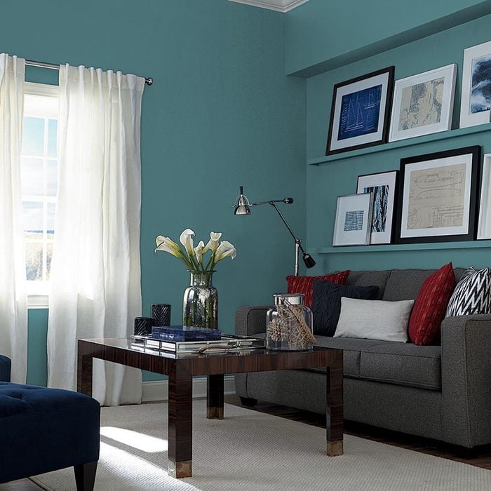
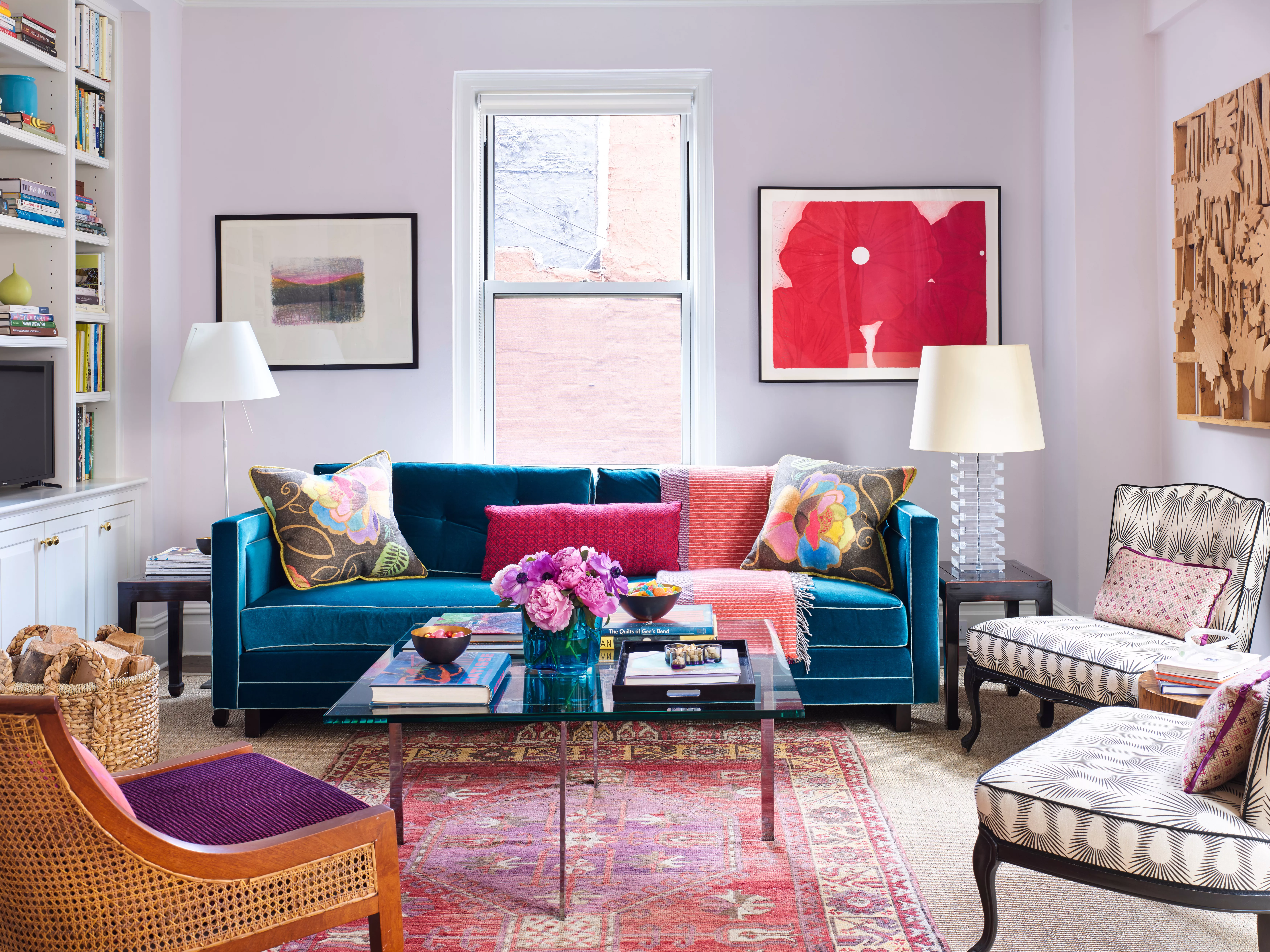
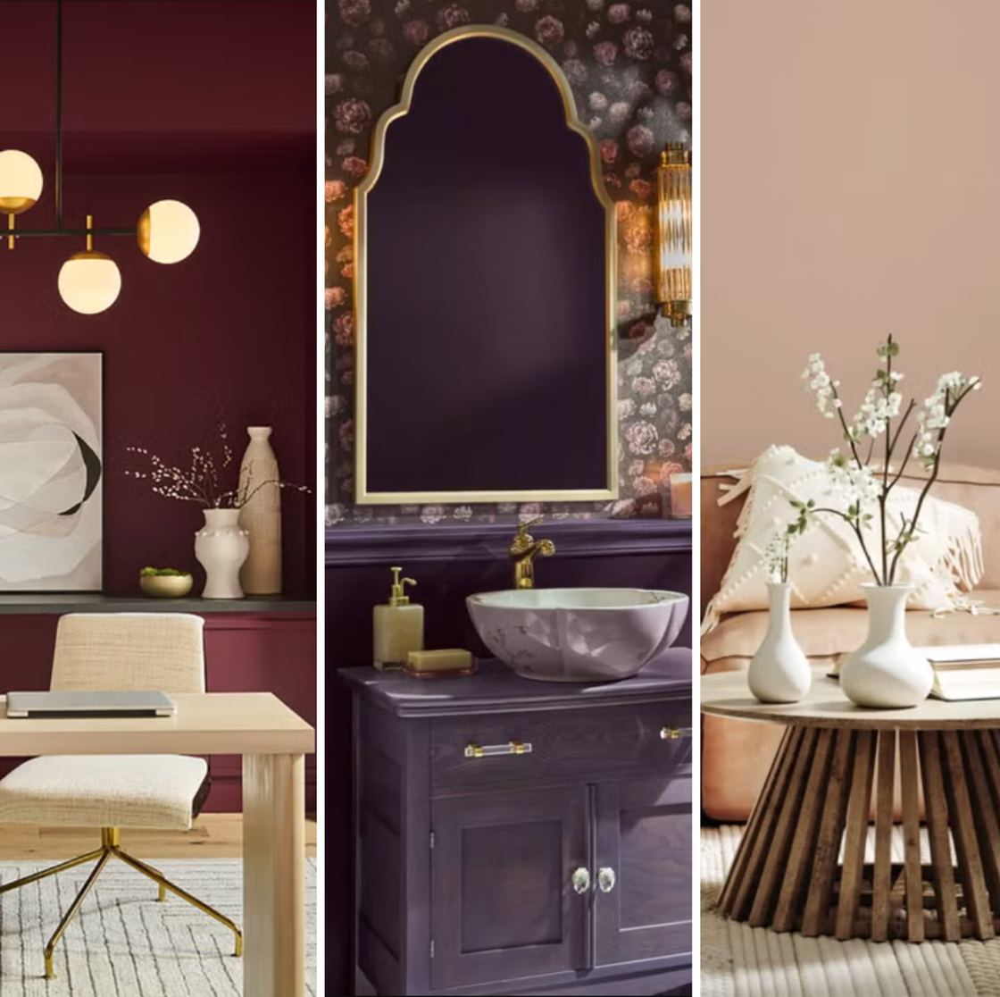
For 2023, Viva Magenta, a vibrant reddish-purple, emerged, inspired by a post-pandemic craving for nature. This color drew inspiration from the cochineal beetle's bright natural dye, reflecting a trend towards incorporating natural elements in homes and prioritizing outdoor spaces. The color galvanized a spirit of rebuilding and celebrating life, influencing home decor with bold accents like wall art, throw pillows, or even color-drenched accent walls.
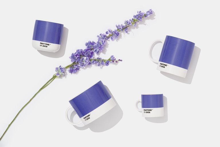
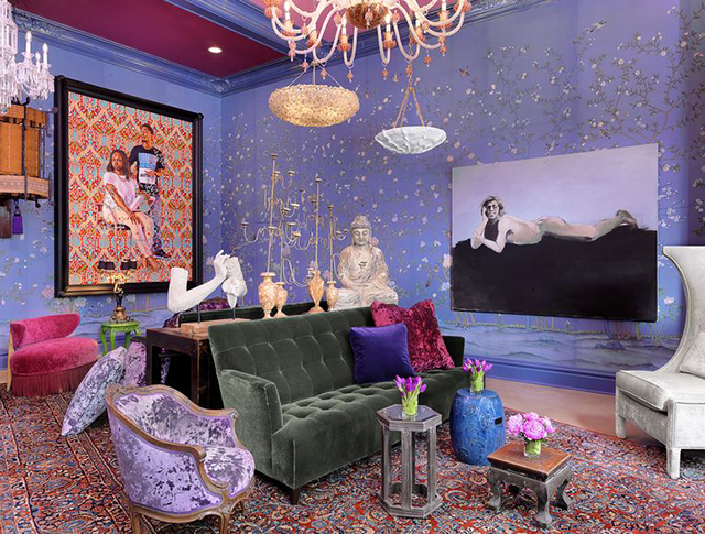
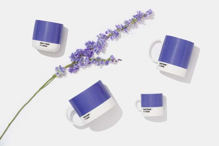
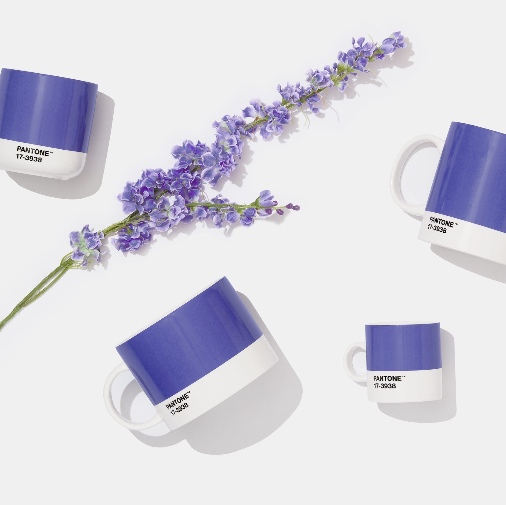
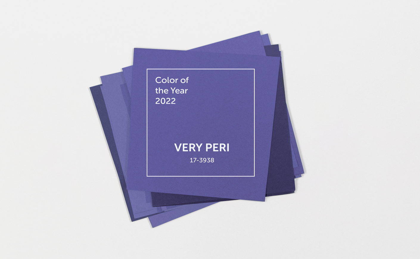
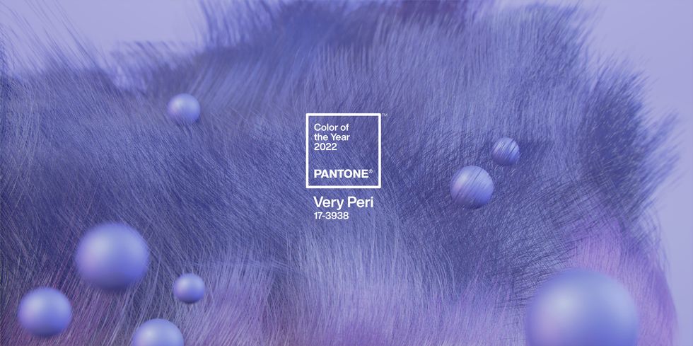
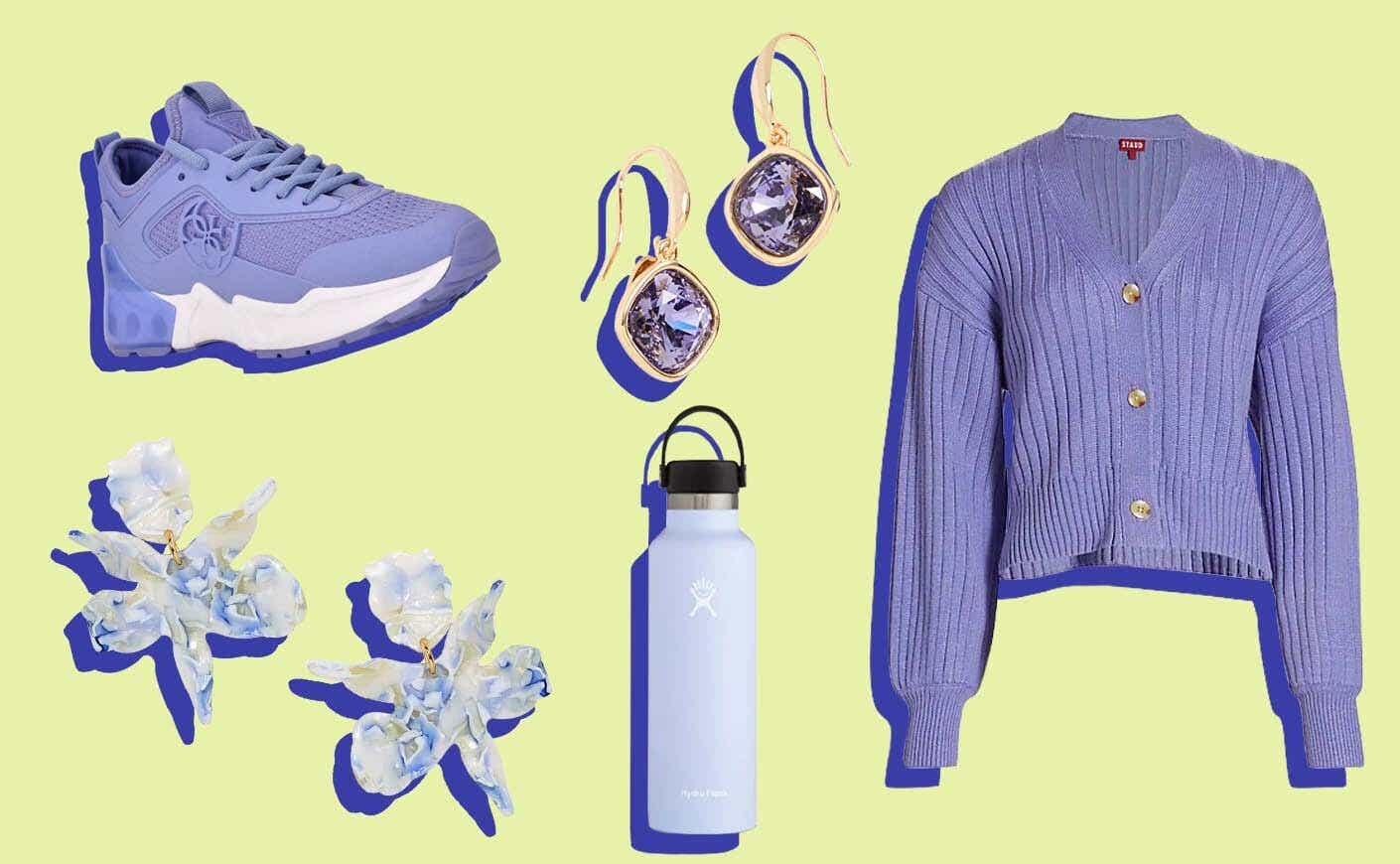
Very Peri, the 2022 color, was a unique lavender-like hue with red undertones, created specifically by the Pantone Color Institute to symbolize the optimistic merger of physical and digital lives during a period of intense isolation. This innovative color highlighted the expansive possibilities of digital transformation and communication through color. It was used to add cool vibrancy to rooms, paired with greens and yellows for playful palettes, or with gold fixtures for a regal aesthetic.
In 2021, Pantone presented a dual selection: Ultimate Gray and Illuminating. Ultimate Gray, a reliable neutral, represented resilience and endurance, while Illuminating, a vivid yellow, signified hope and optimism. This combination mirrored the world's challenging yet hopeful state amidst the pandemic, emphasizing strength and upliftment. The pair was used to add life to homes, with gray serving as a base accented by citrusy yellow elements or through accessories like throw pillows and wall art.
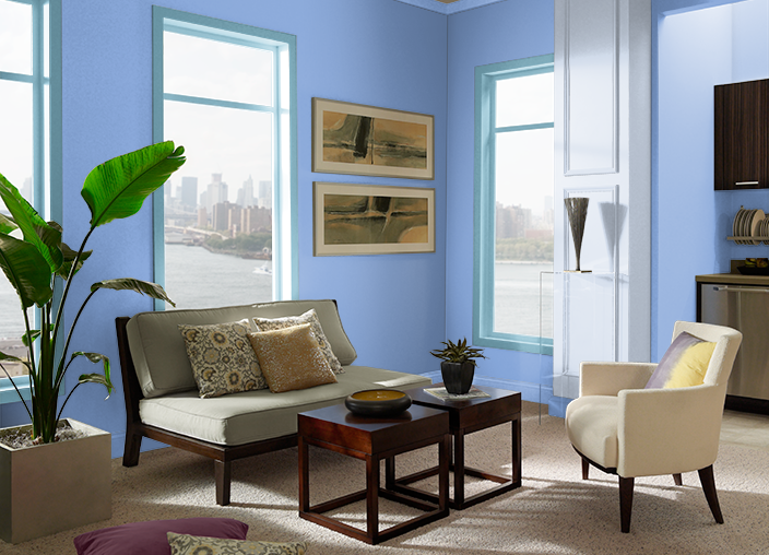
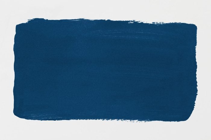
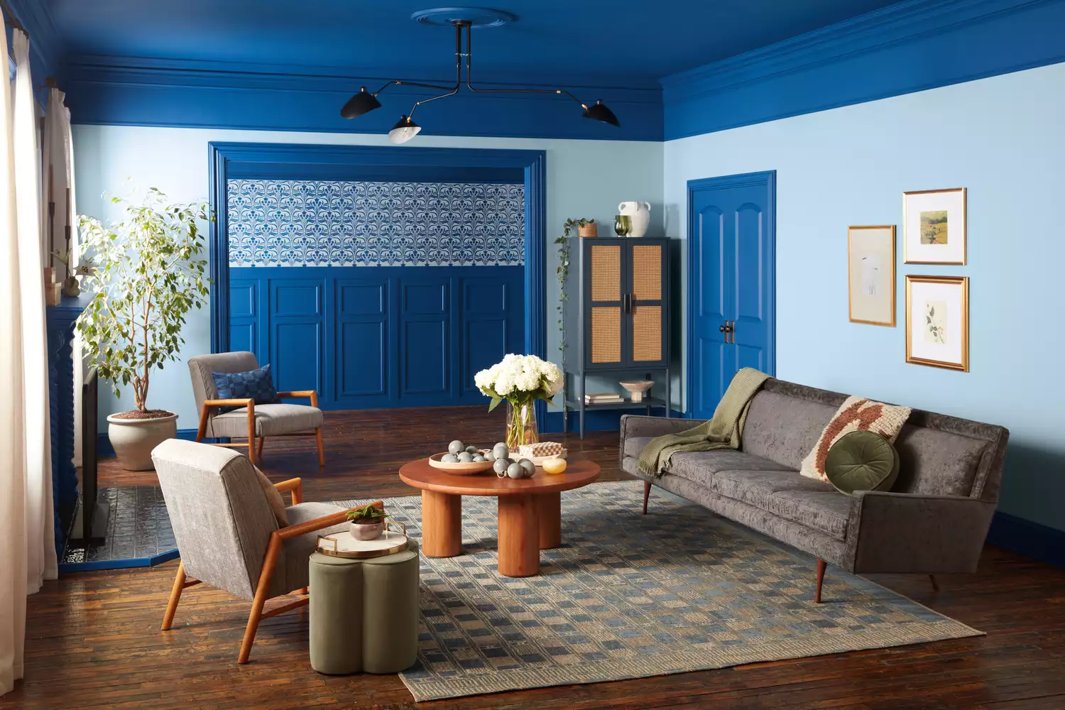
Classic Blue, the 2020 Color of the Year, was a dependable, mid-tone blue chosen to instill peace and comfort during an uncertain time. It represented constancy and confidence, providing an anchoring foundation. Its timeless versatility allowed for integration into various home decor styles, from wall paint paired with white or navy furniture to subtle accents like area rugs and curtains.
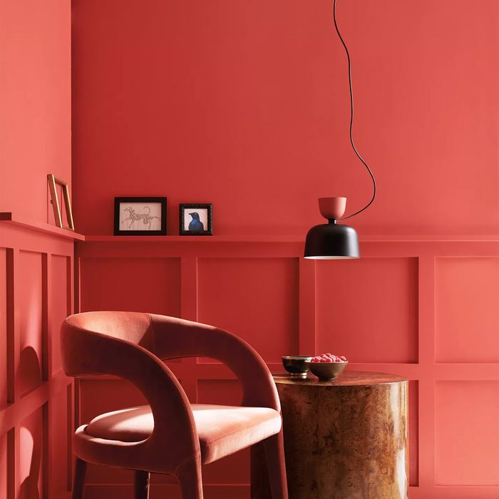
Living Coral, chosen in 2019, was a warm and playful orange infused with pink, inspired by marine life. It aimed to counteract the isolating effects of social media by promoting humanizing qualities and connection. This cheerful pastel-neon blend brought levity to rooms and was often paired with blues—lighter shades for coastal vibes or cobalt and royal blues for a modern, elevated look.
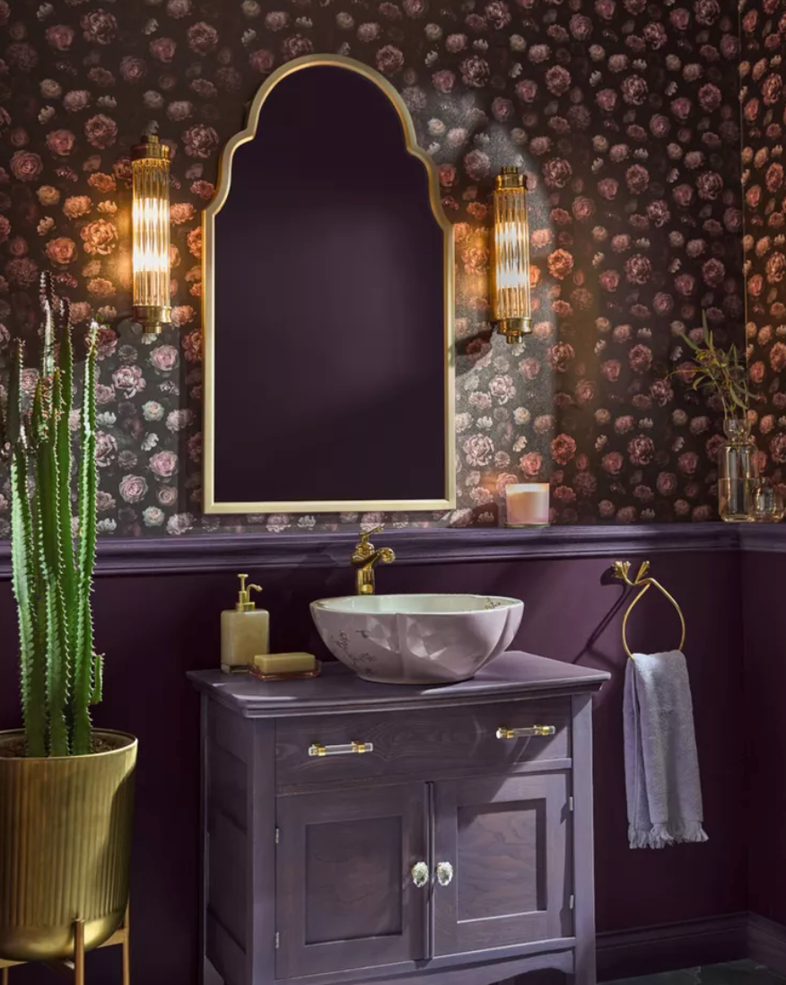
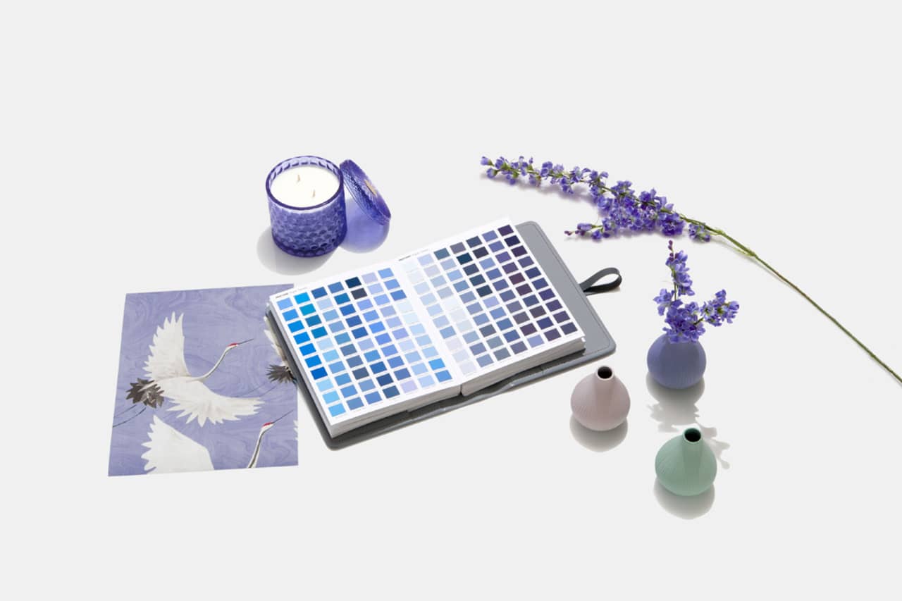
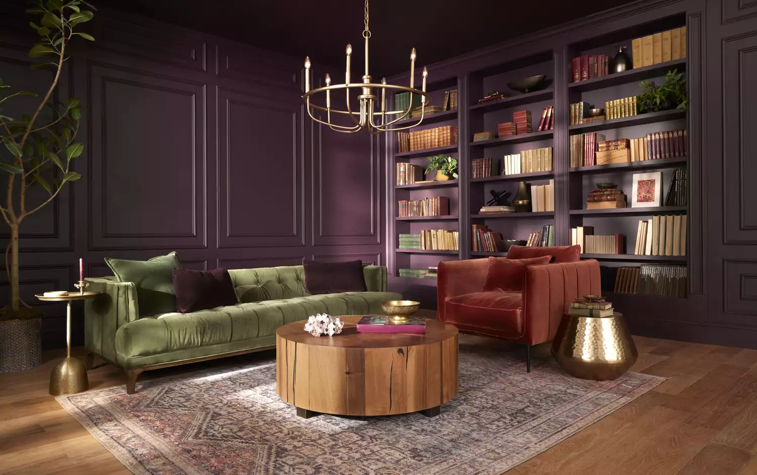
Ultra Violet, the 2018 color, was a mystical purple inspired by pop culture icons and the vastness of the solar system. It conveyed a message of boundless creativity and non-conformity, and was seen as a subliminal message for bipartisanship and finding peace in complex times. Despite its perceived difficulty in decor, it was used with gold accents and plush textiles for luxurious, jewel-toned rooms or with lavender and lilac for calmer, monochromatic retreats.
Finally, Greenery, the 2017 Color of the Year, was a vivid, citrusy green selected to generate fresh energy and connect with nature. Pantone partnered with Airbnb to create an immersive, biophilic vacation rental in London featuring this color, symbolizing new beginnings and vitality. It served as a base for biophilic decor, with walls painted in the hue and spaces filled with actual plants, or used sparingly through foliage prints and leafy textiles to create a cheerful atmosphere.
#PantoneColorOfTheYear #InteriorDesignTrends #HomeDecor #ColorPsychology #DesignInfluence #LifestyleTrends #DecorInspiration #ColorPalette #DesignHistory #PantoneColorOfTheYear #InteriorDesignTrends #HomeDecor #ColorPsychology #DesignInfluence #LifestyleTrends #DecorInspiration #ColorPalette #DesignHistory
0 comment in total
You may also like
Every Single Pantone Colour Of The Year From 2000 – 2026

Designers Weigh in on 'Very Peri'—Pantone’s Color of the Year 2022
10 Types Of Flooring Inspired By Pantone's Color Of The Year
Ever Wonder How a Color of the Year Is Selected? Experts Spill the Secrets

A Guide to All the Pantone Colors of the Year and What They've Represented
Colors of The Year – get to know every shade revealed by leading paint brands for 2025

Do “Color of the Year” Announcements Actually Influence Trends?

How to Use Pantone’s 2016 Color of the Year
Homes With This Color Inside Are Worth More

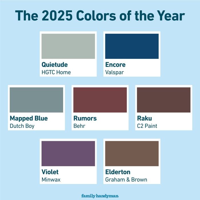
The 2025 Colors of the Year Are Here—and They All Have One Thing in Common

Compare All the Paint Colors of the Year for 2023

What is Color Forecasting? Experts Explain How to Map Trends |

Every 2025 Color of the Year We Know So Far
'Cloud Dancer' to Claret: Eight paint colours that can easily transform your home

Pantone created a brand new colour for its COTY 2022

Two Experts Weigh in on the Best Way to Use Behr’s Color of the Year in Your Kitchen or Bathroom
A Guide to Every Color of the Year for 2025 (So Far)
2025 Colors of the Year, and How to Use Them
16 Gorgeous Products in Pantone’s Color of the Year: Very Peri
Every 2025 Color of the Year We Know So Far—and Inspiration for How to Use Each in Your Home