Earth Tones Will Be the Most Popular Colors of 2025—Here's How to Decorate With Them
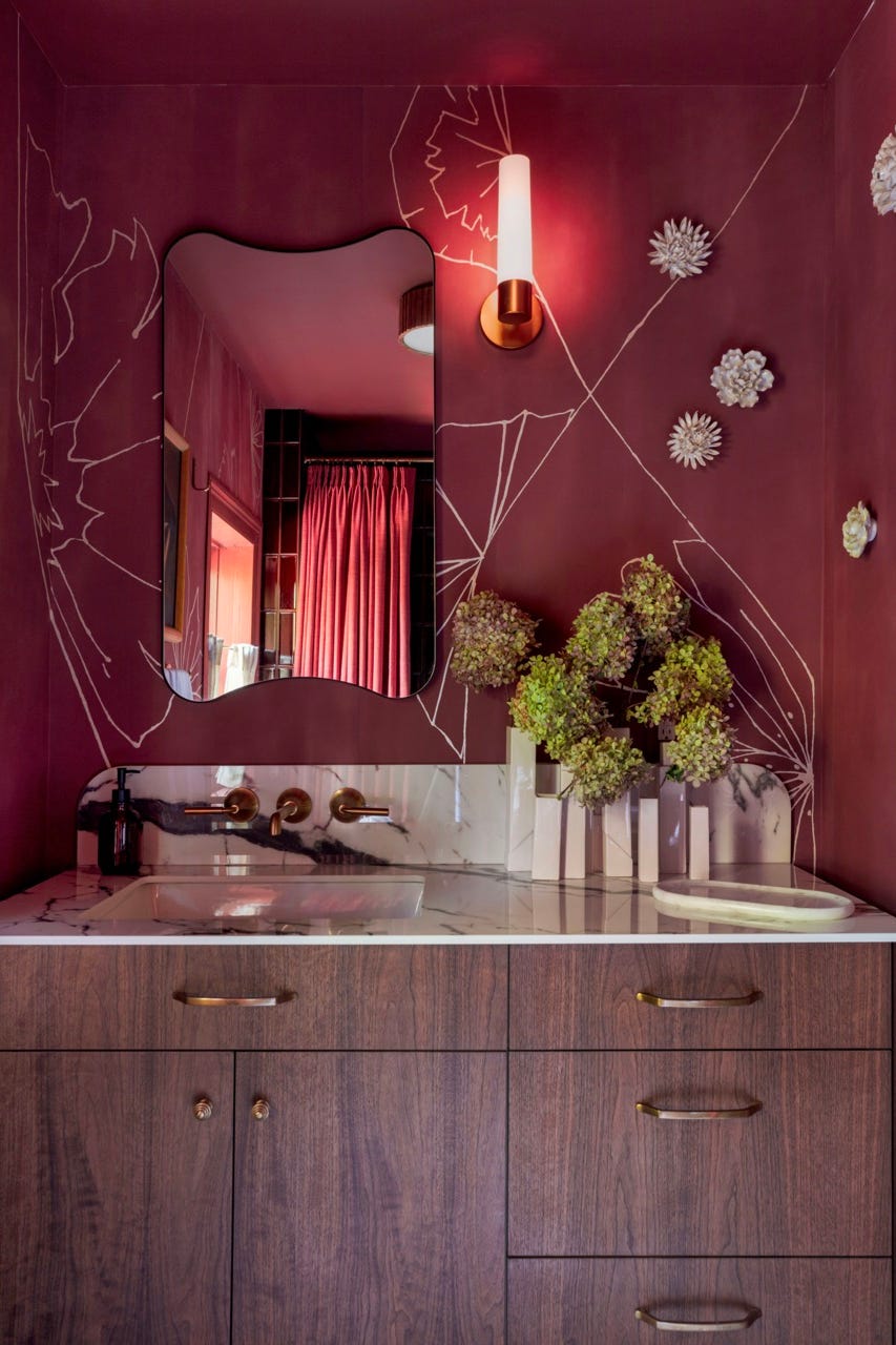
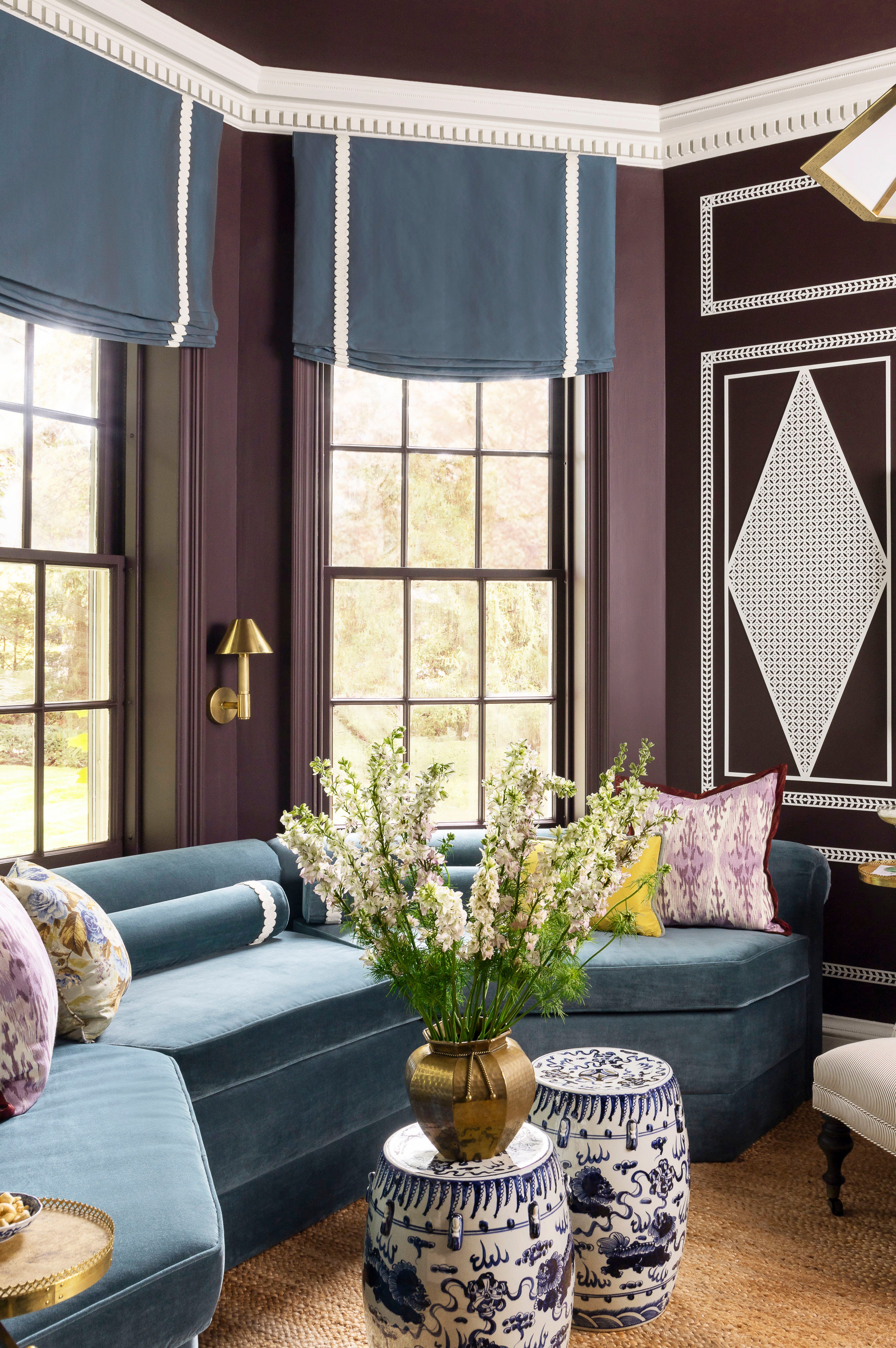
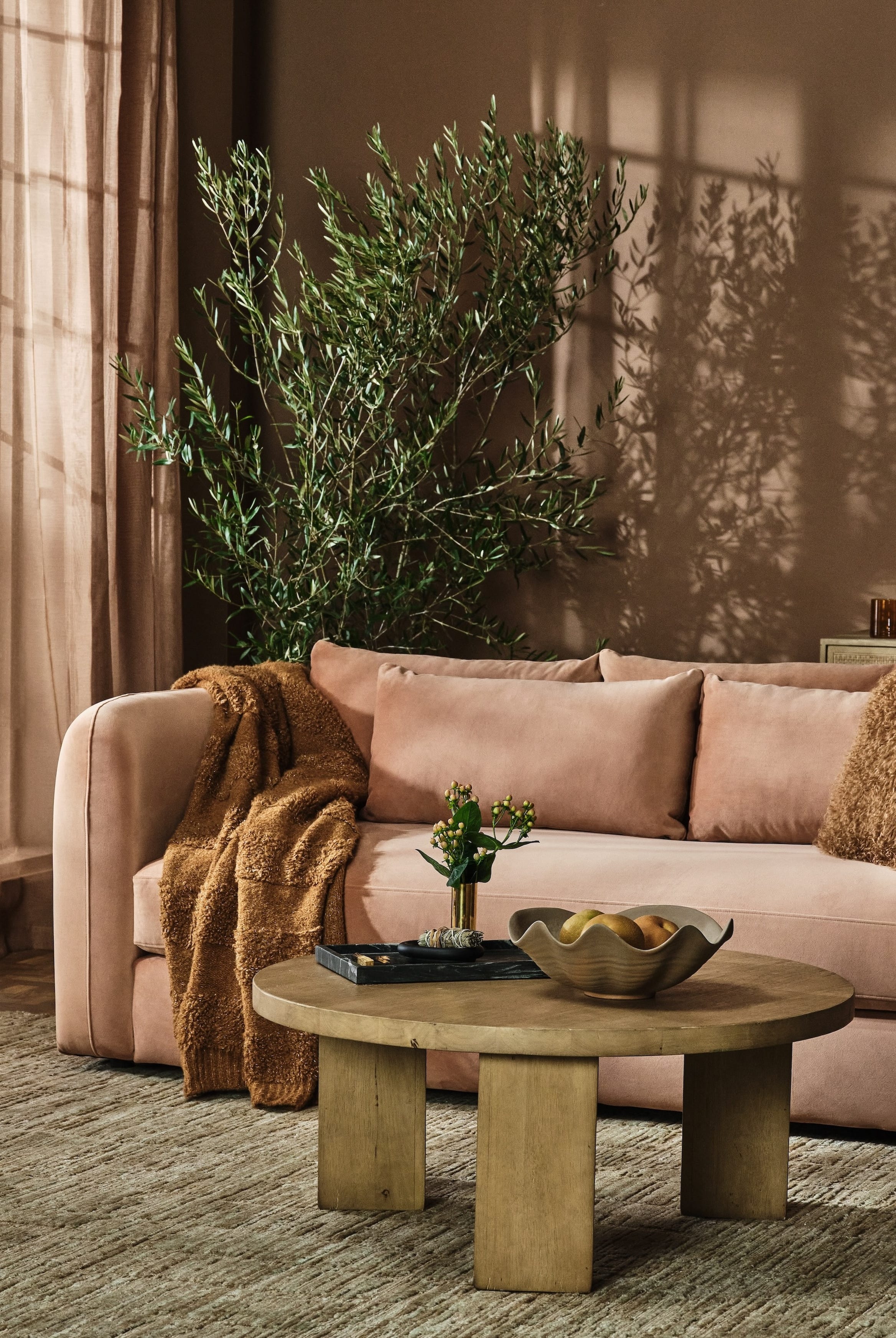
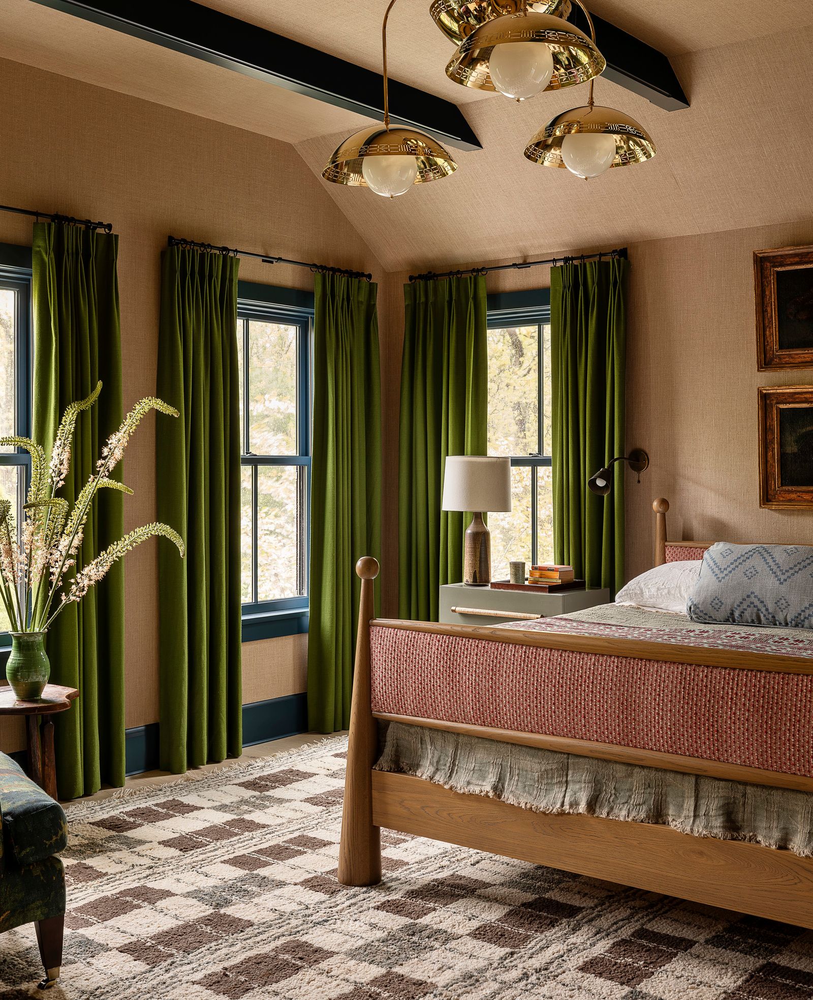
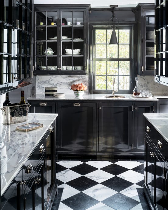
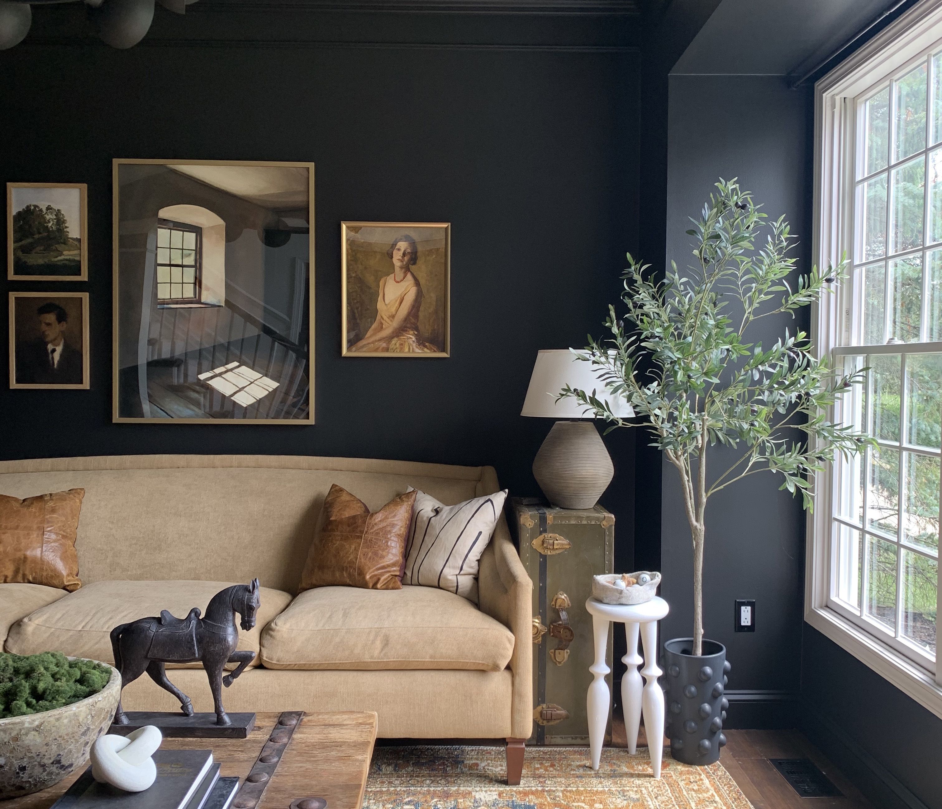
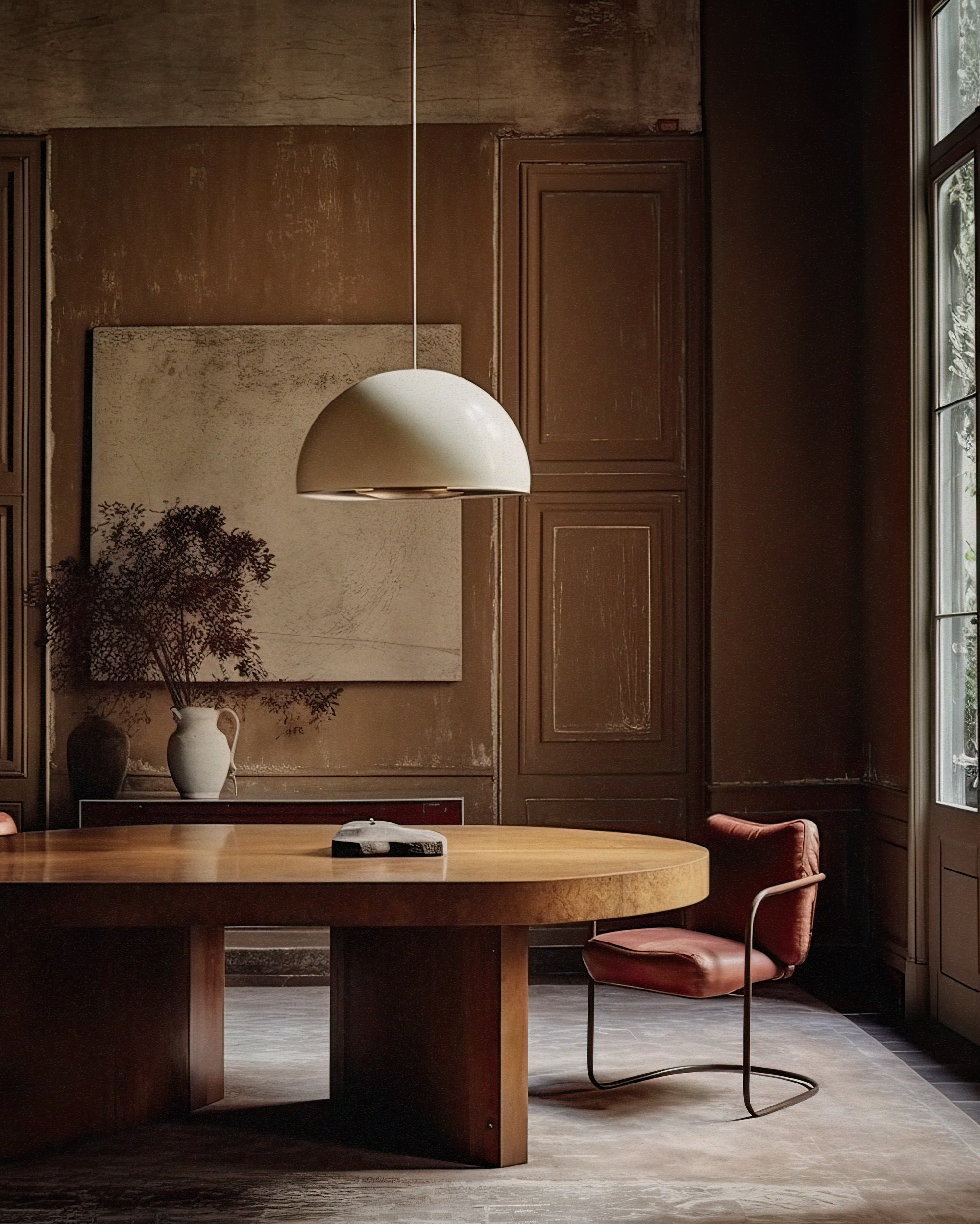
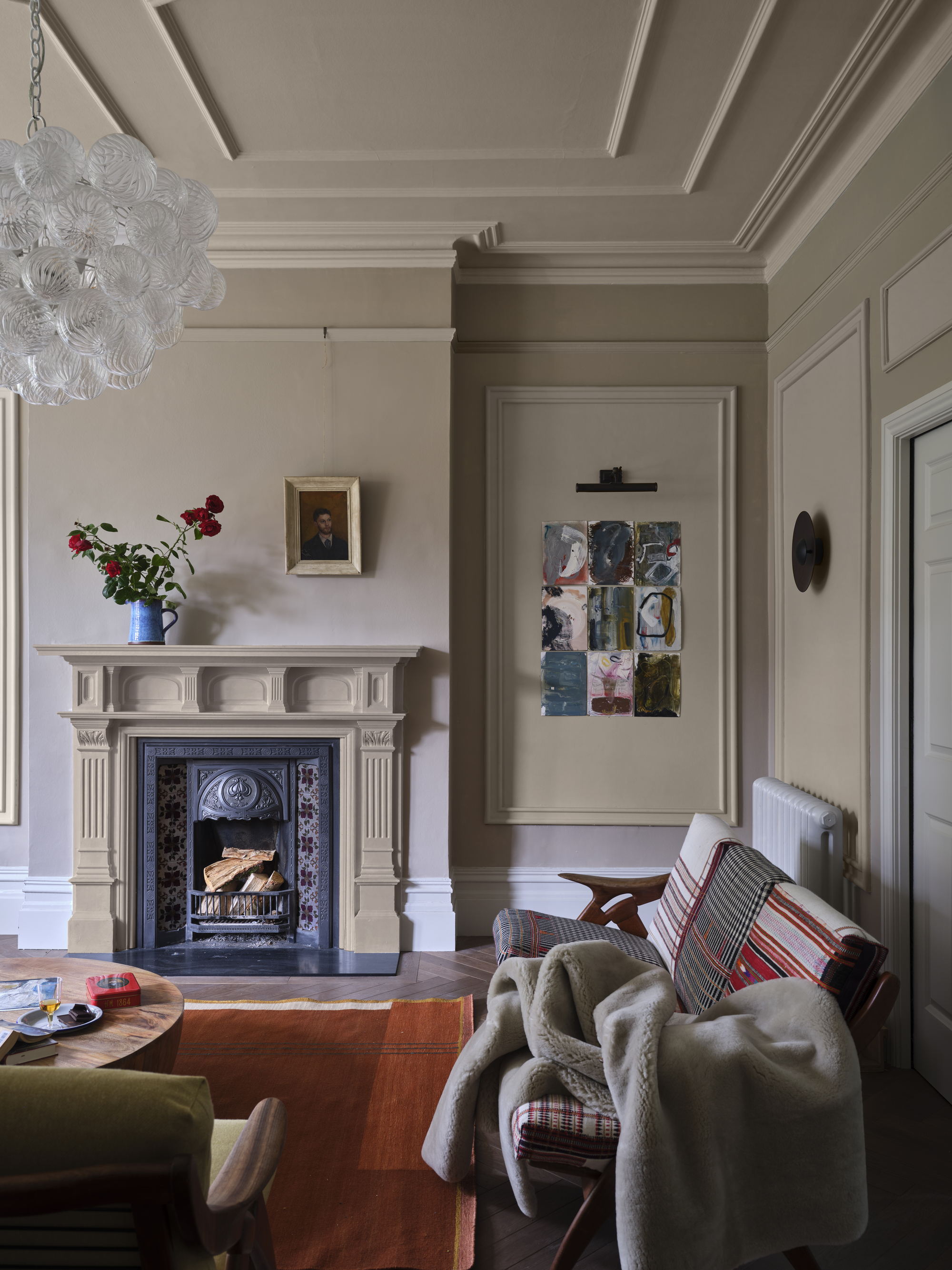
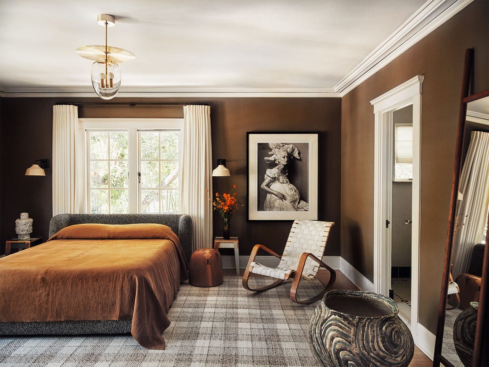
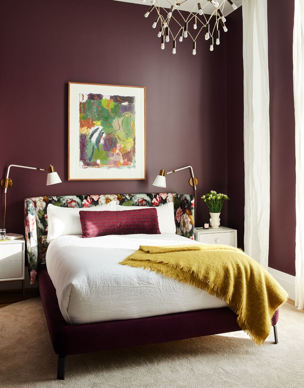
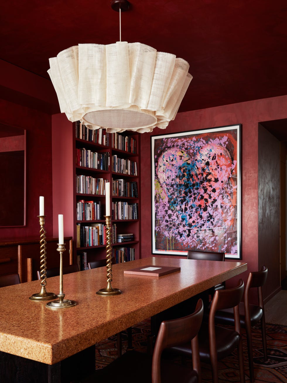
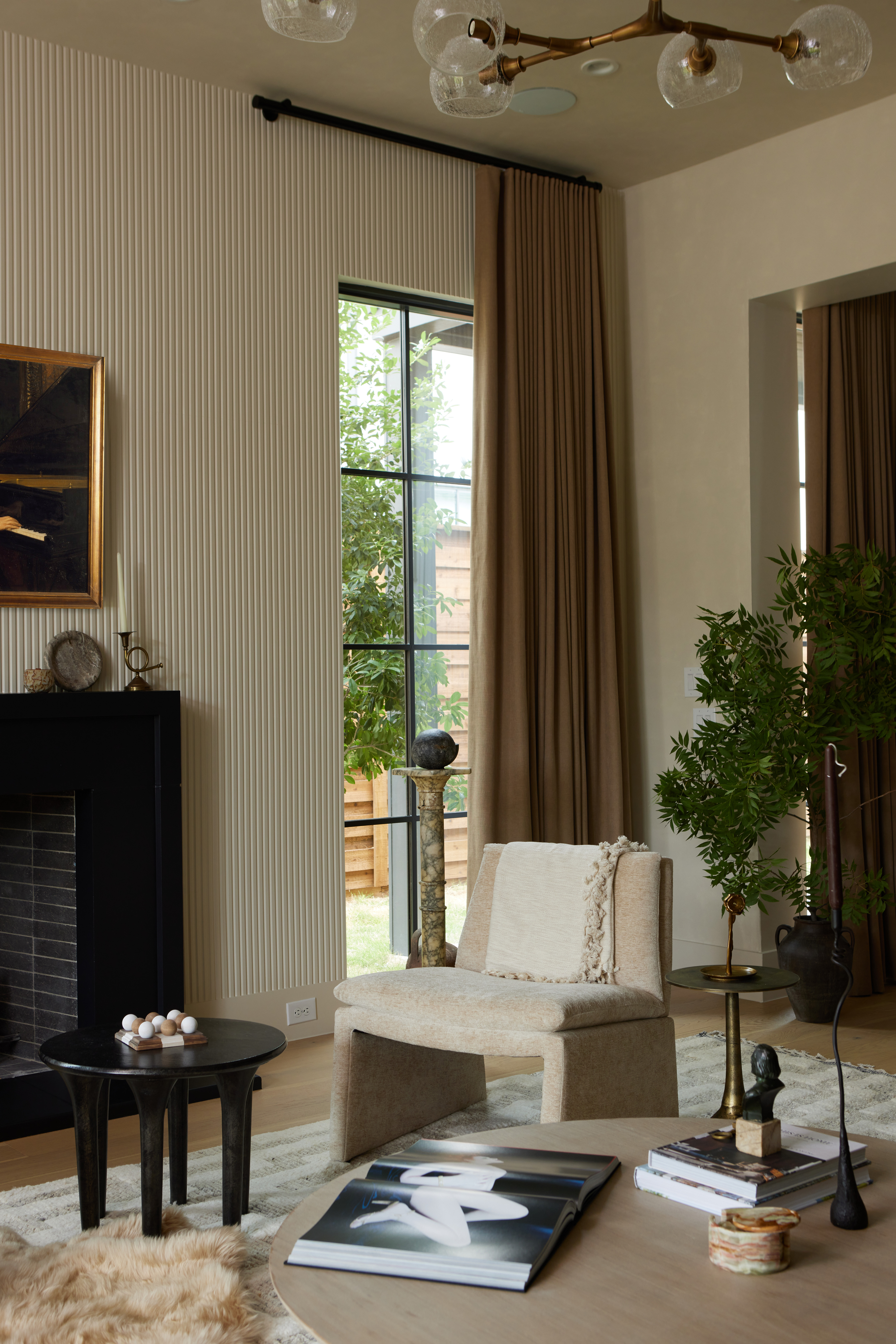
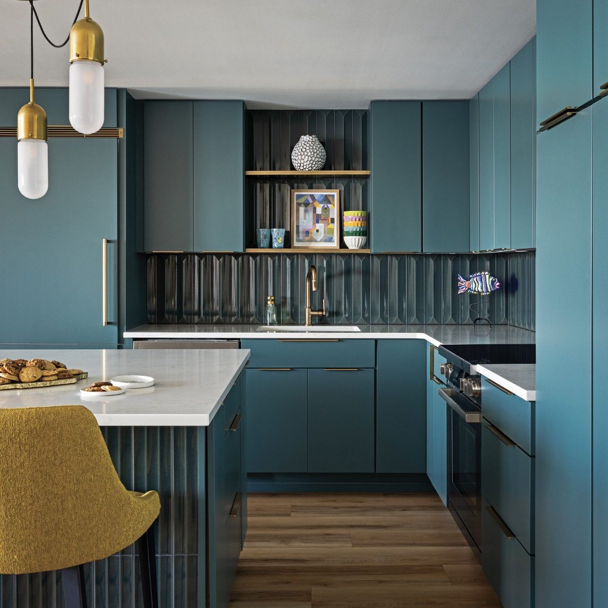
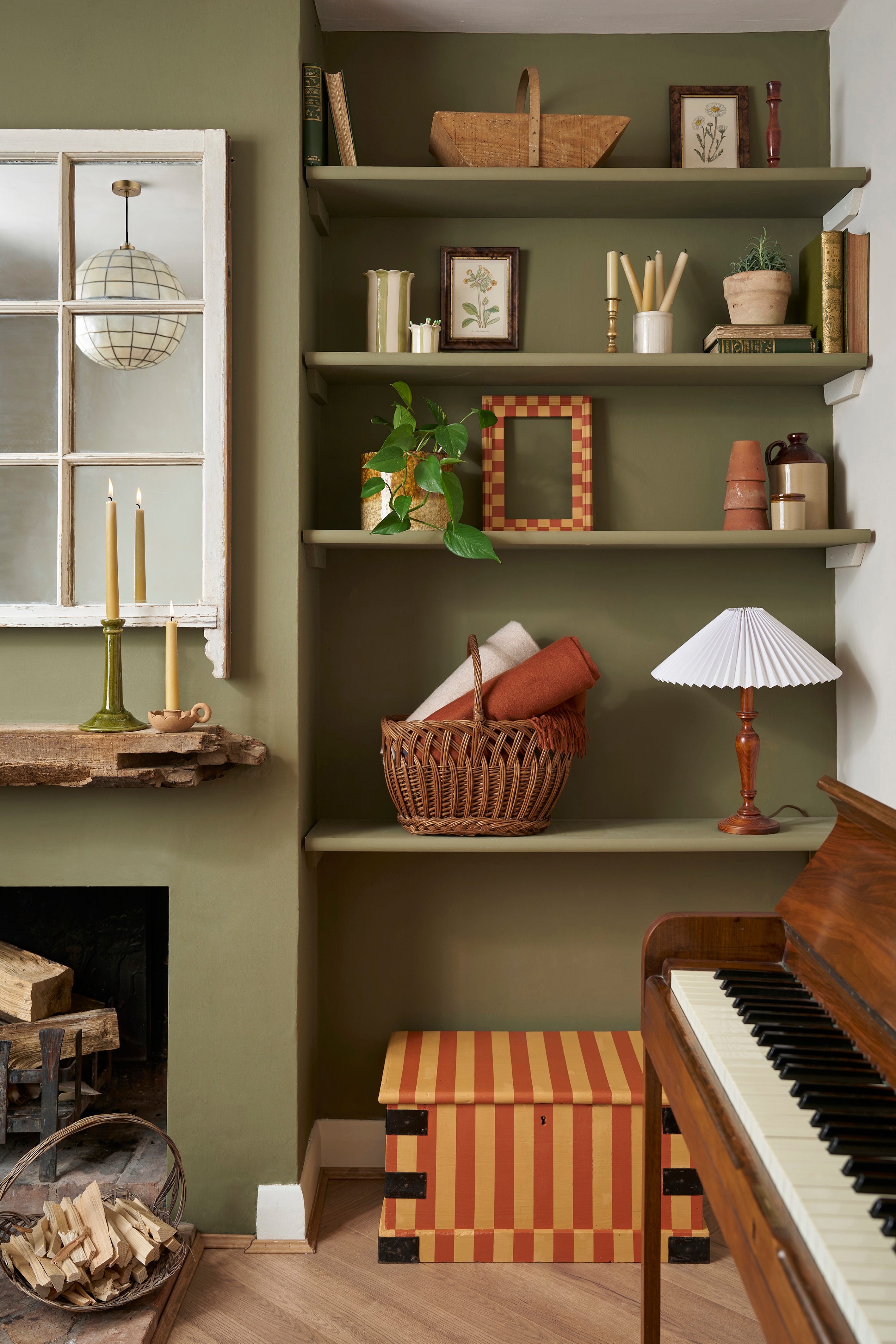
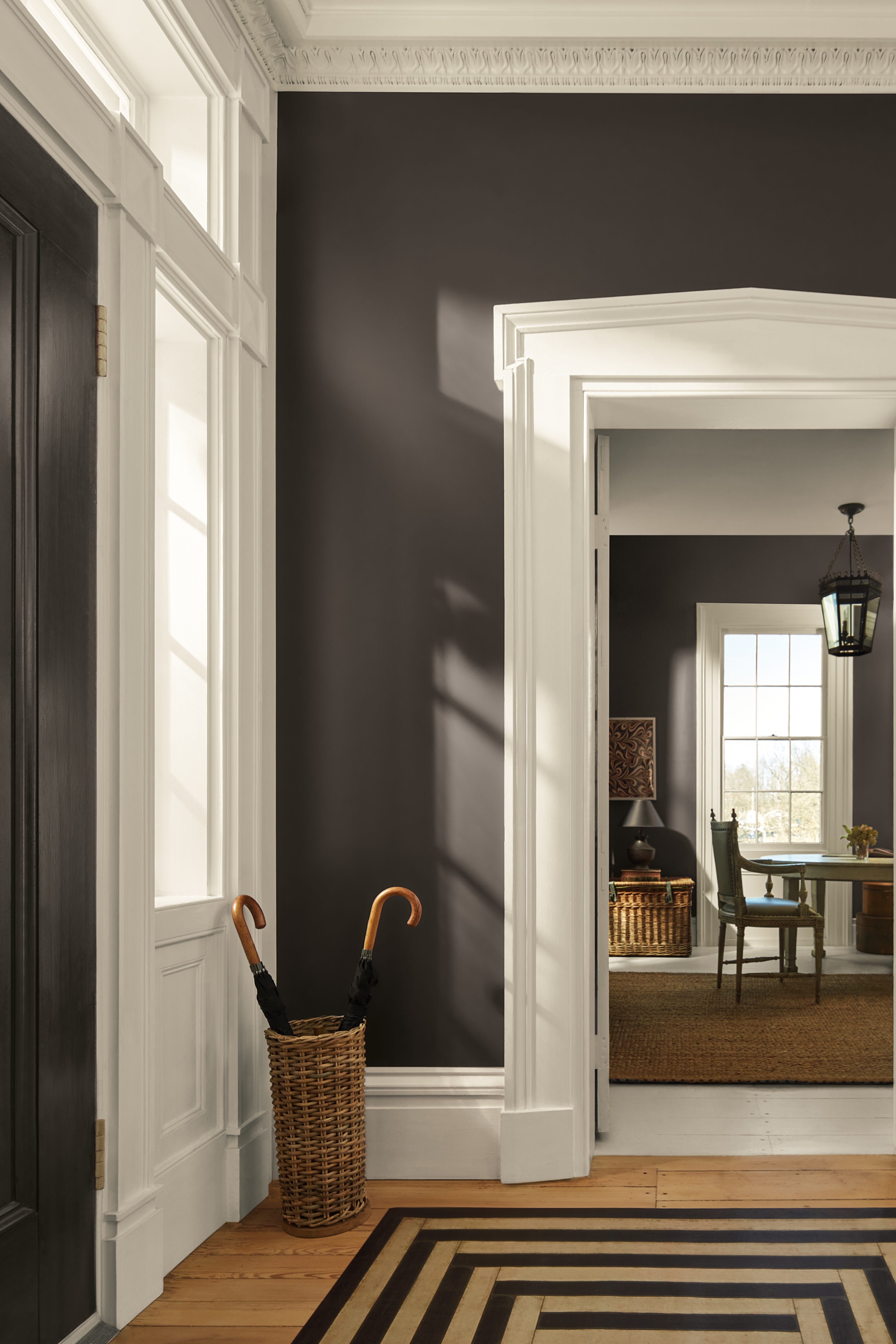
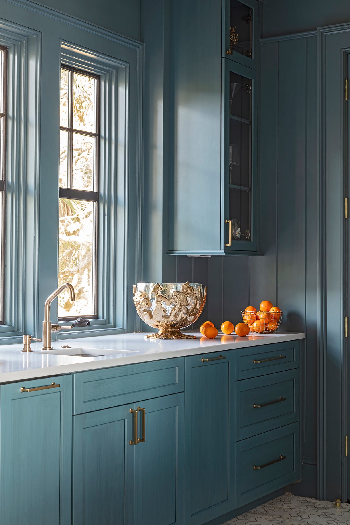
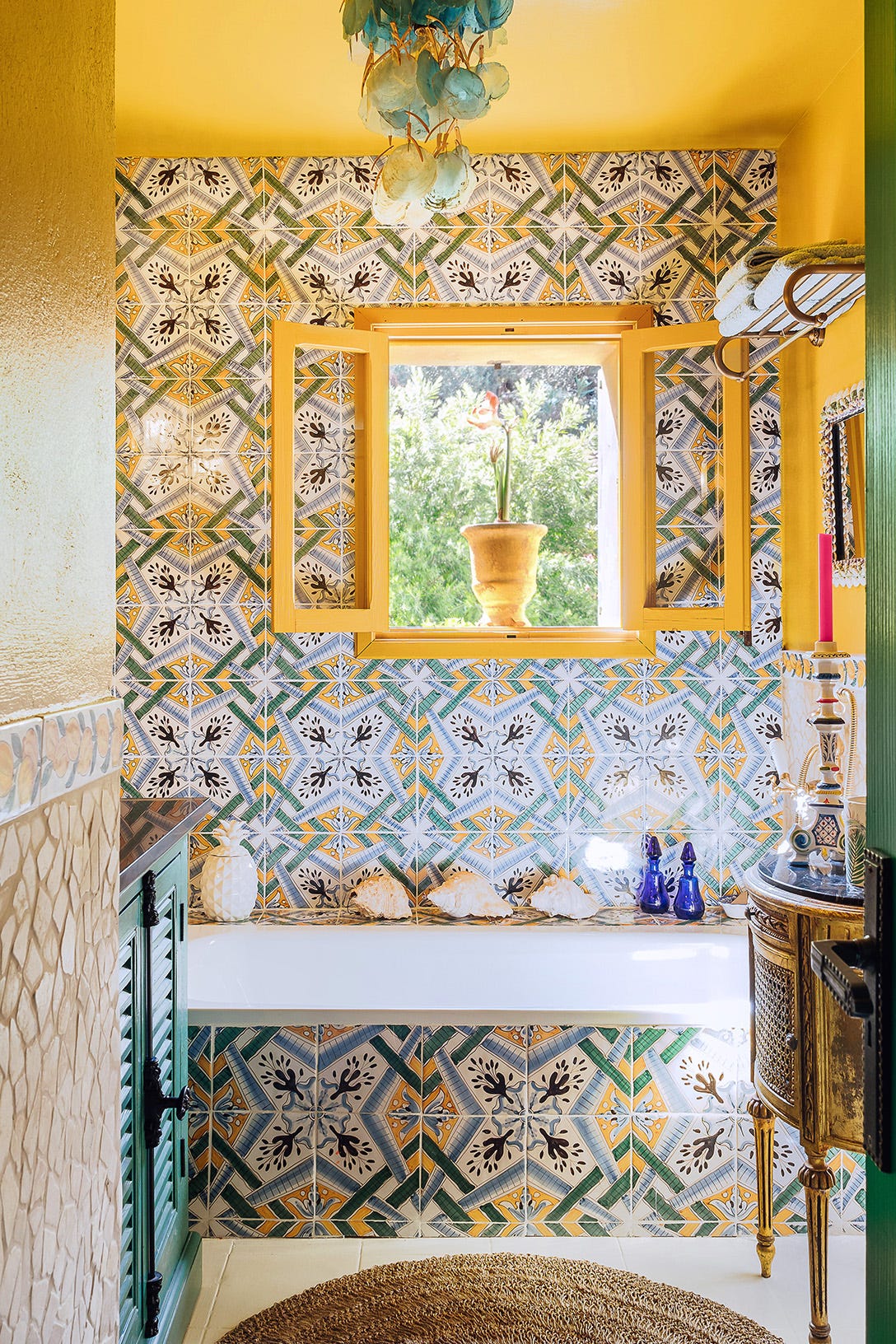
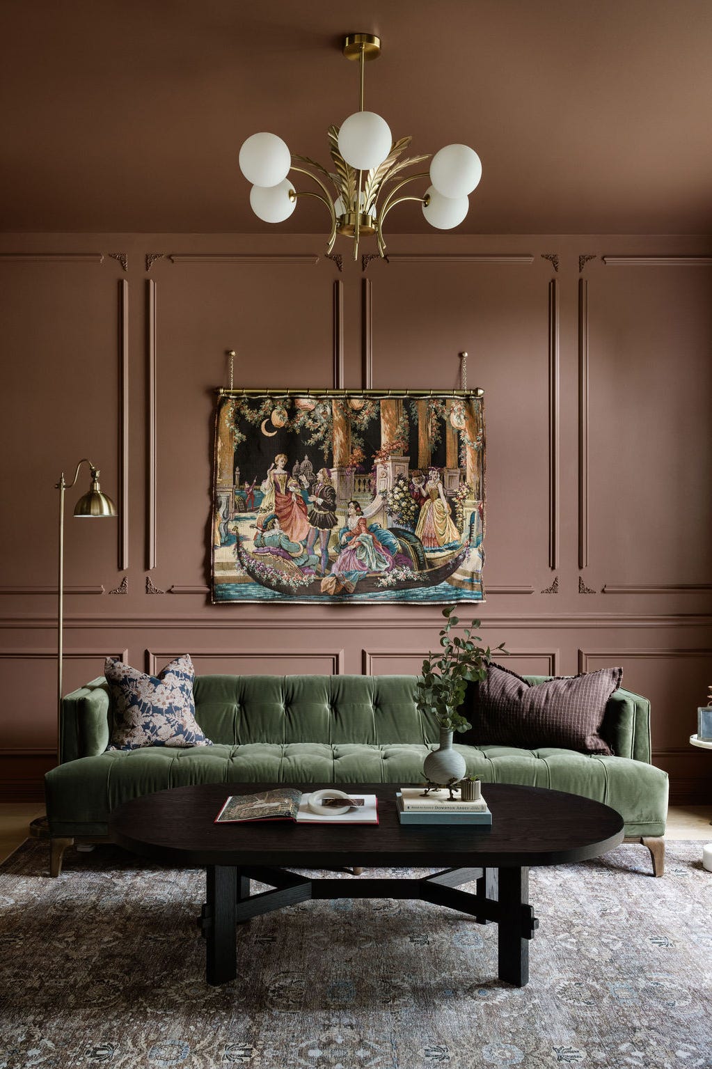
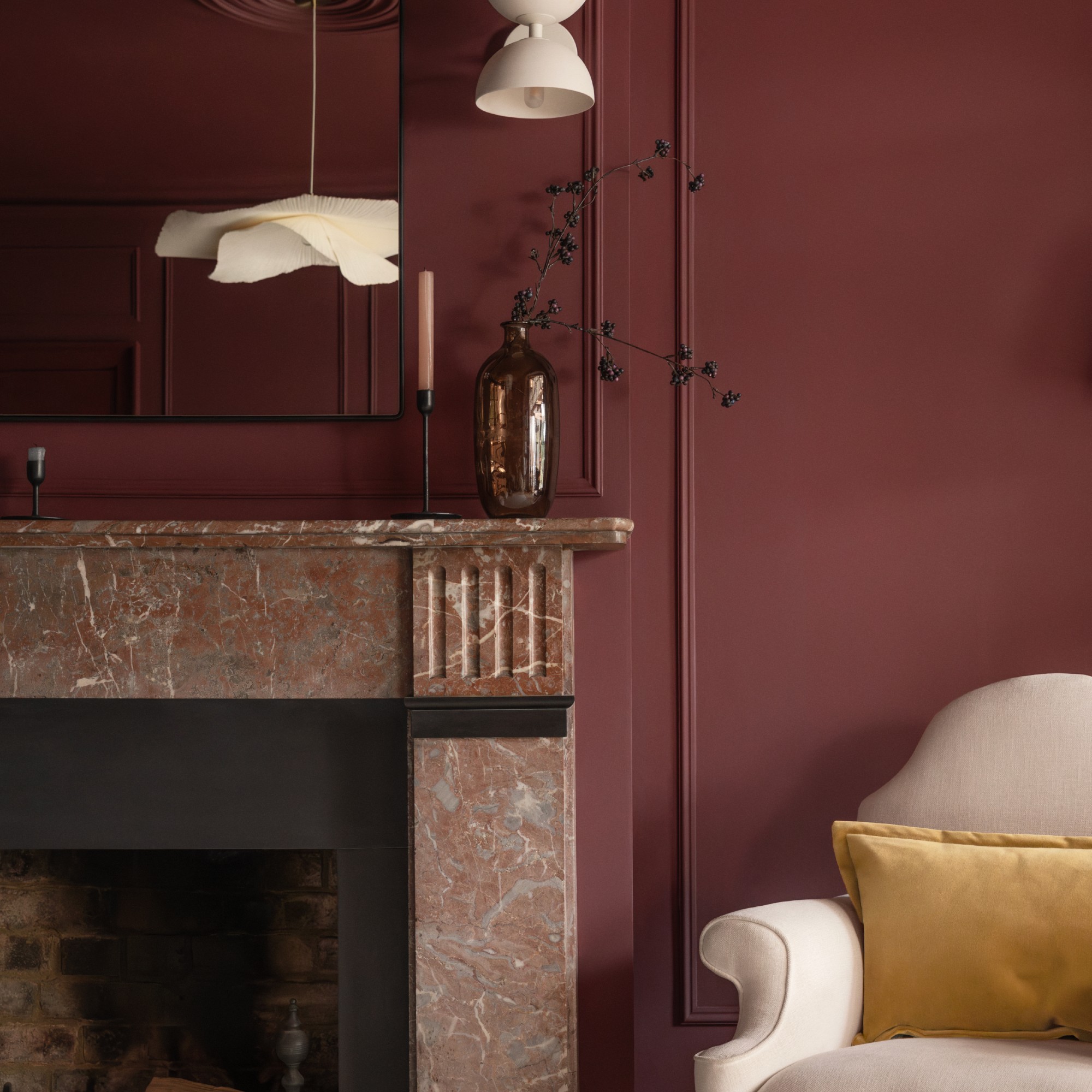
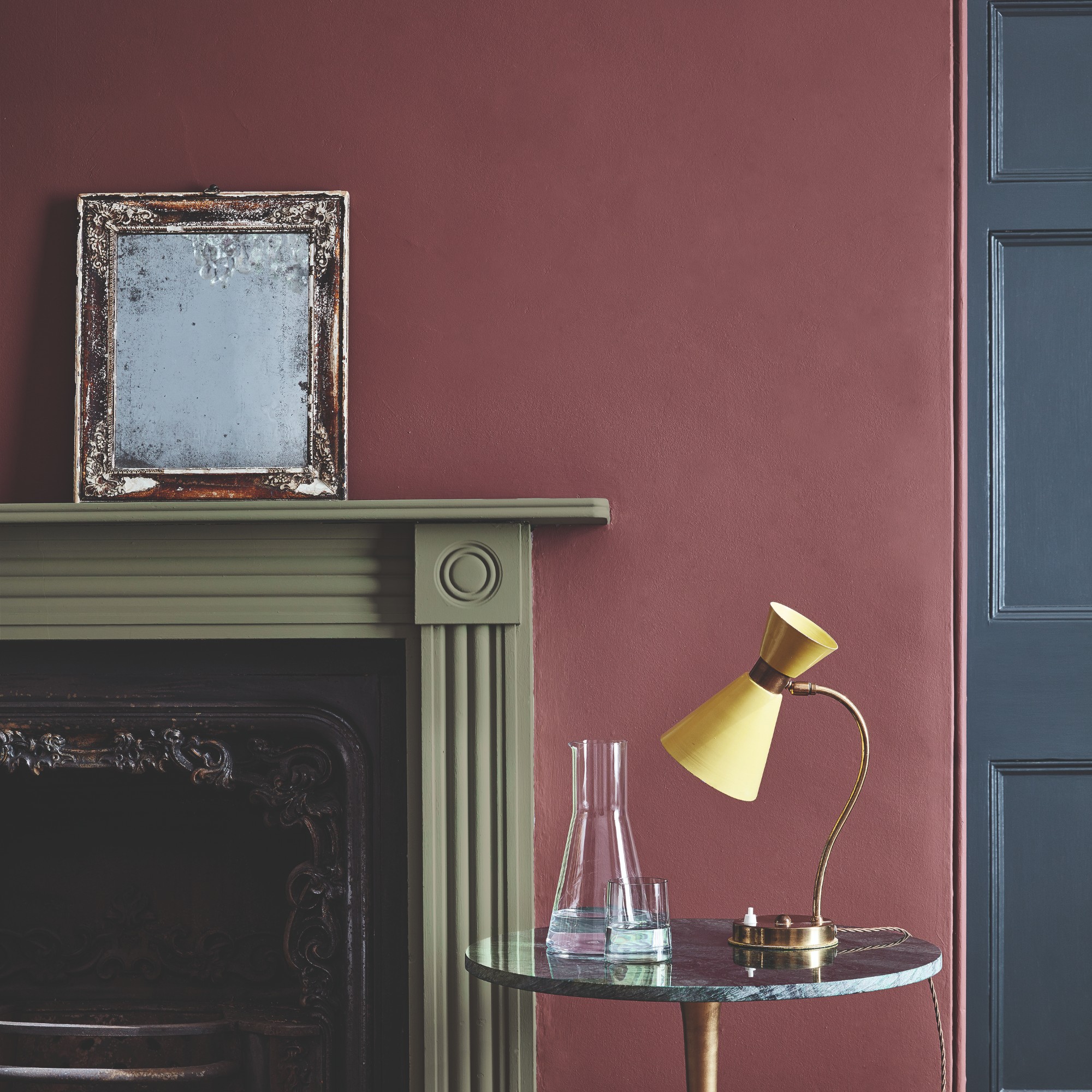
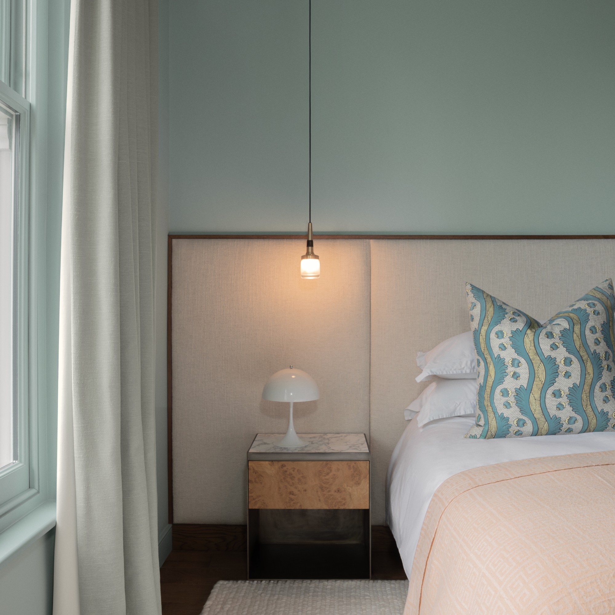
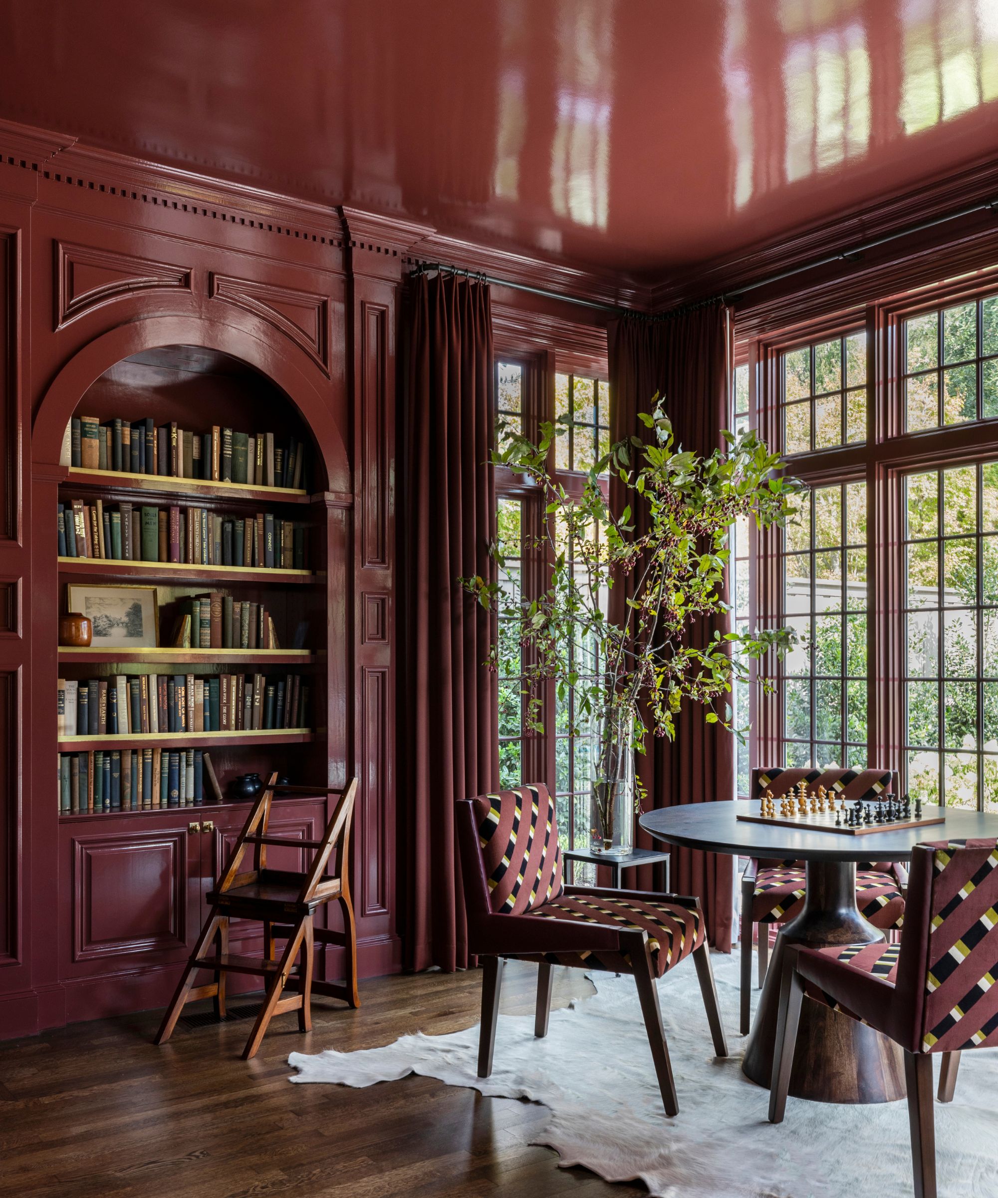
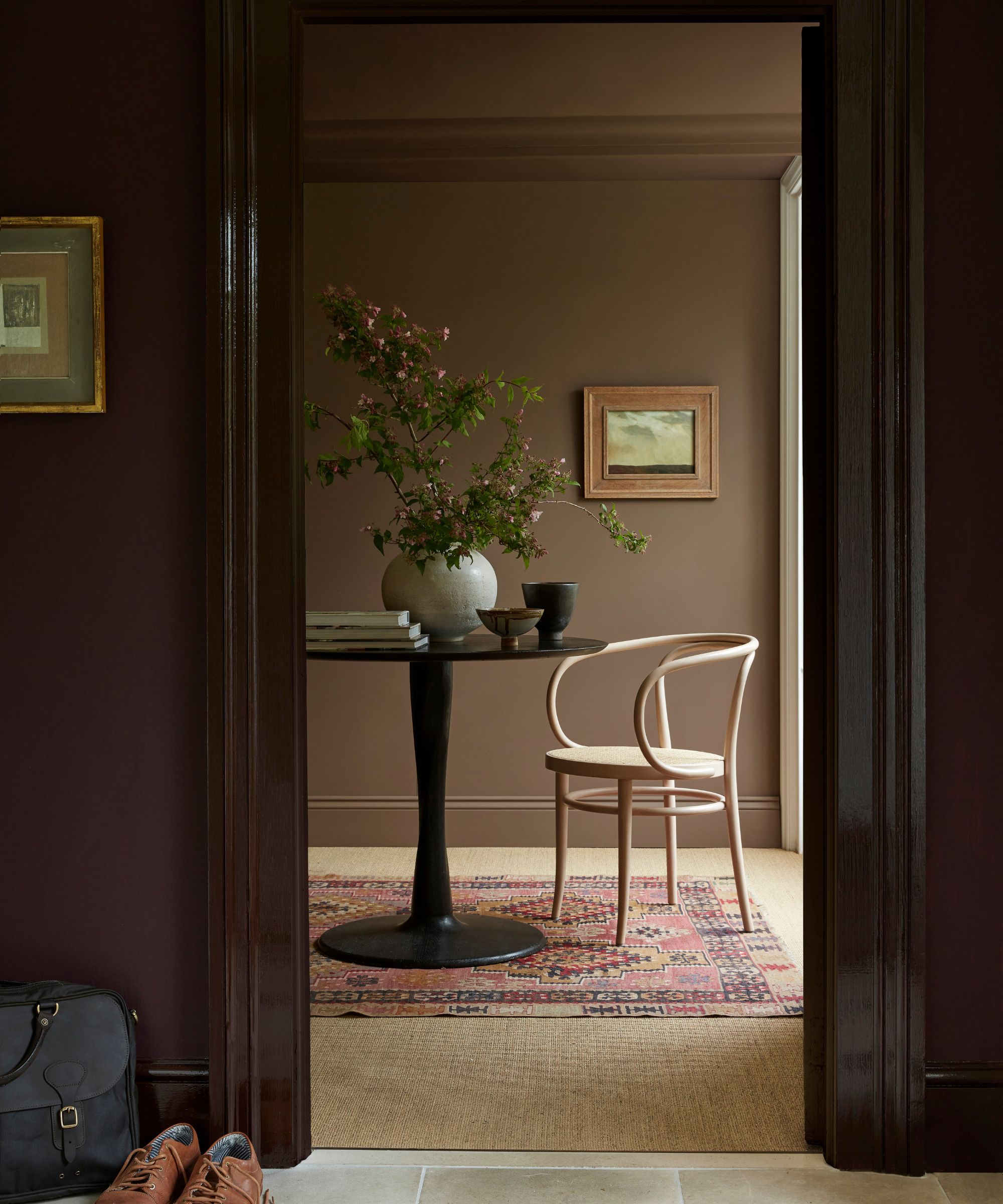
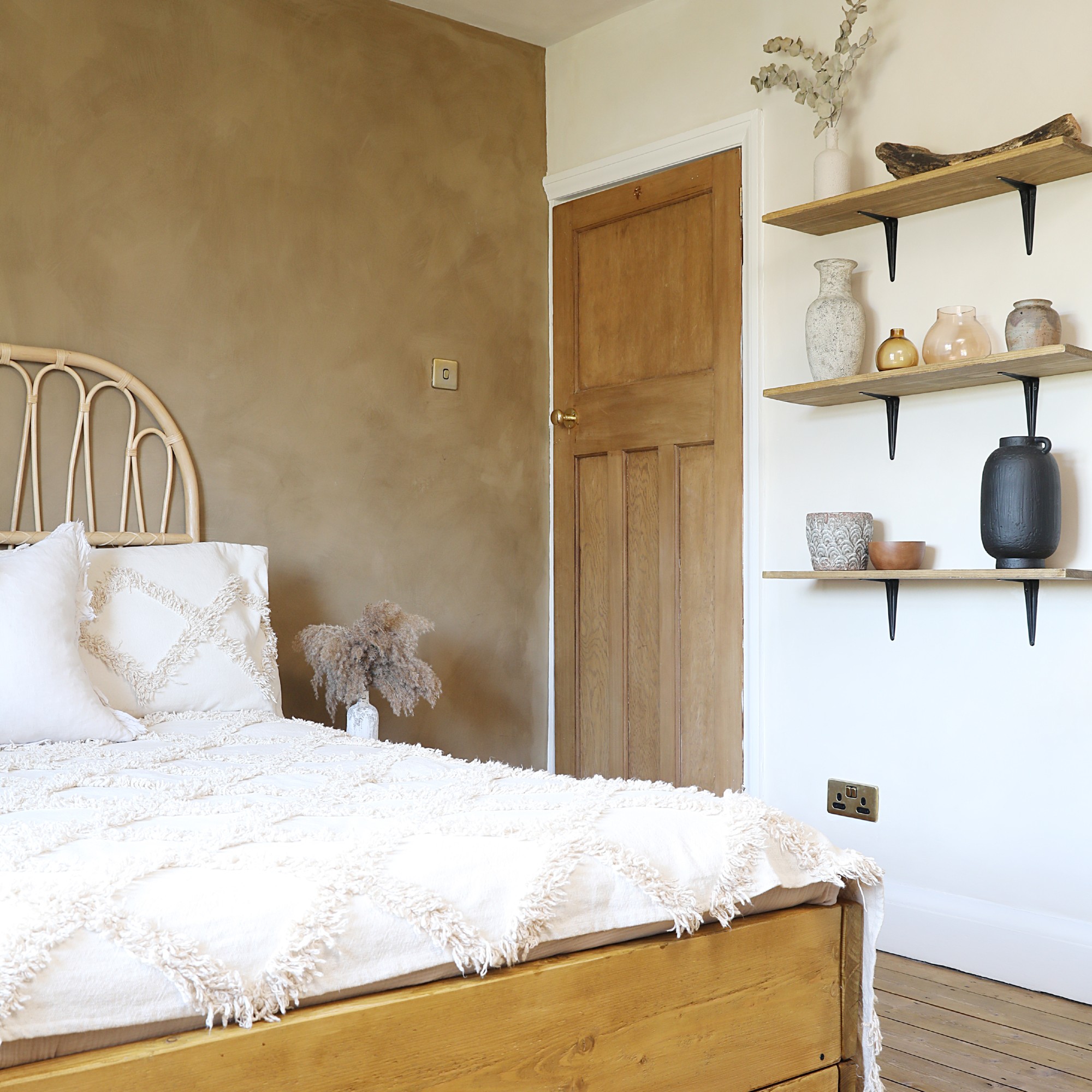
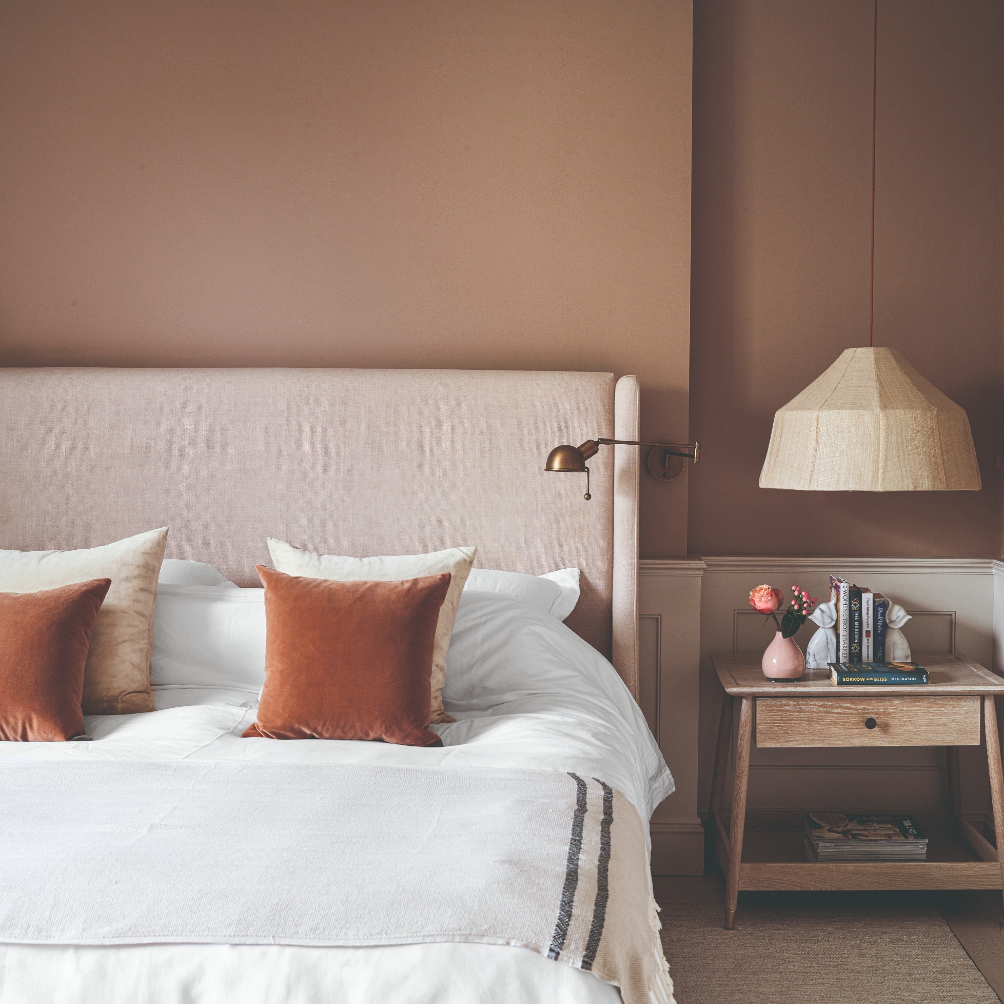
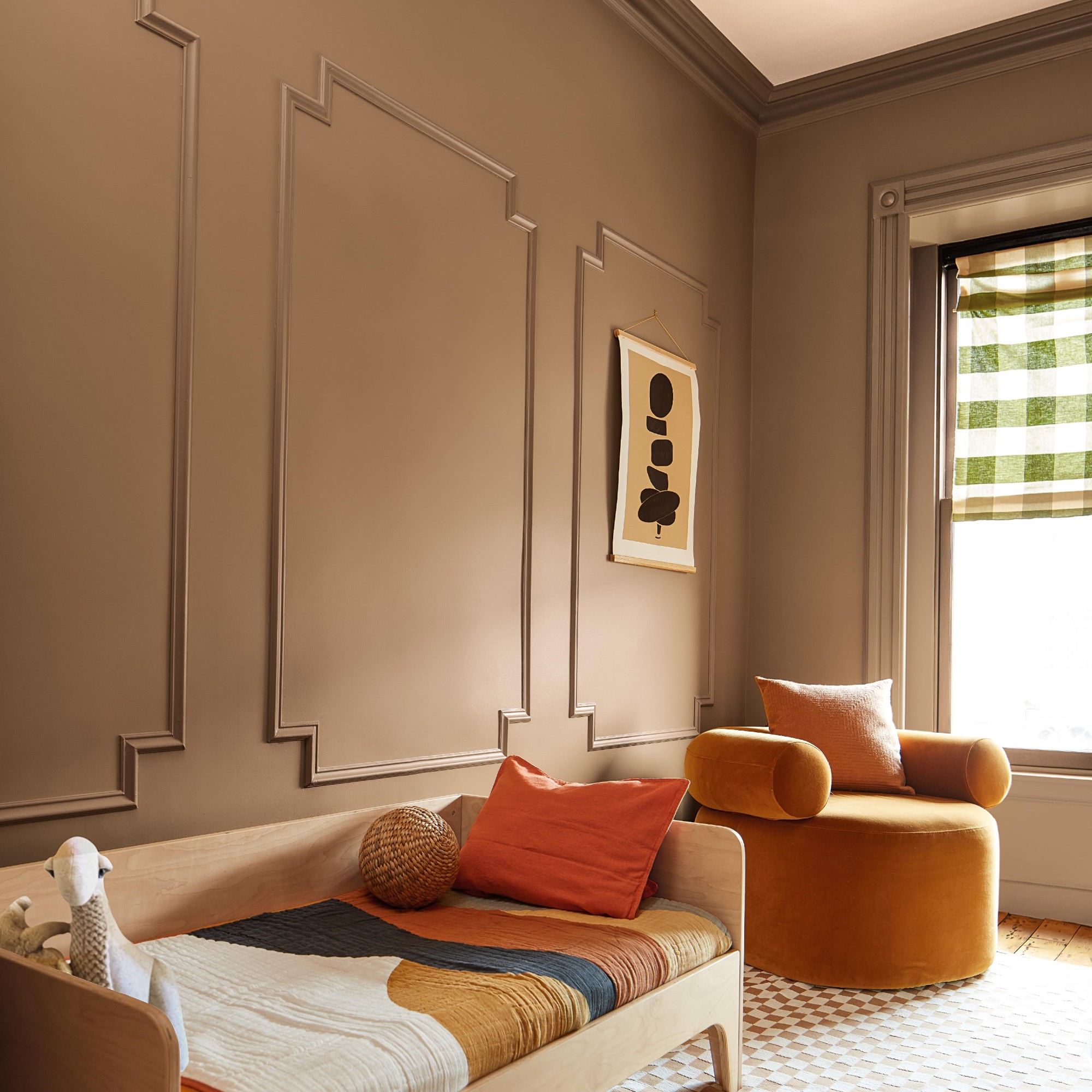
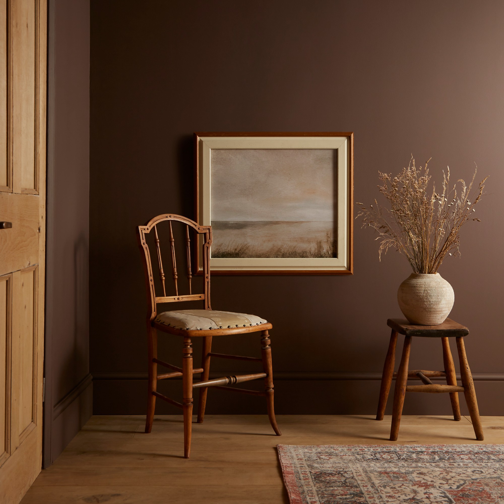
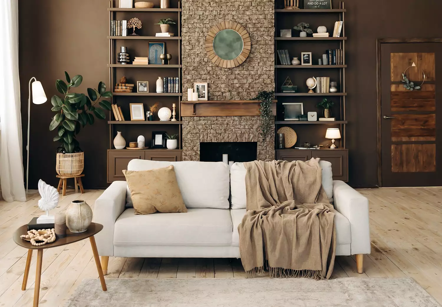
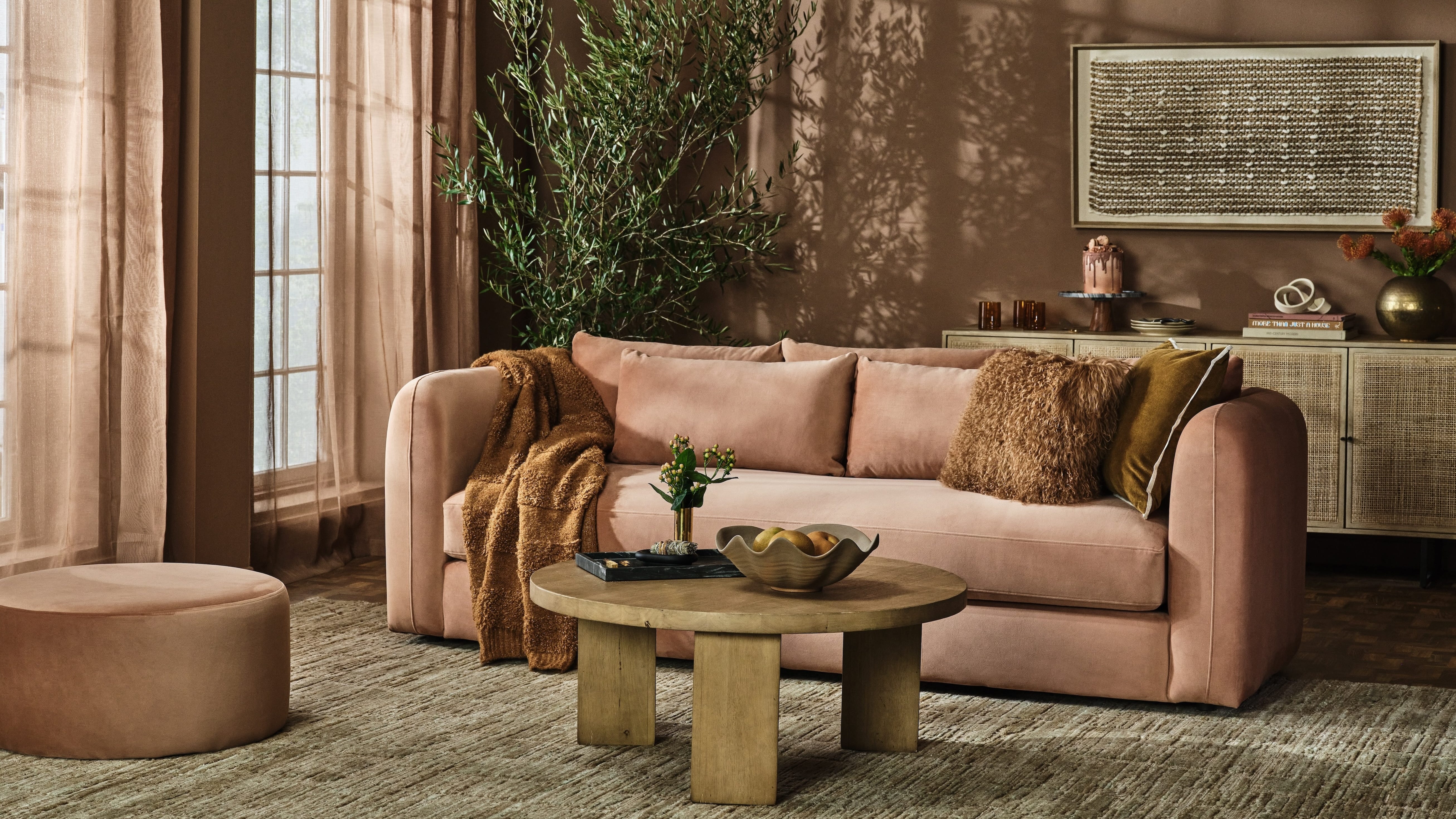
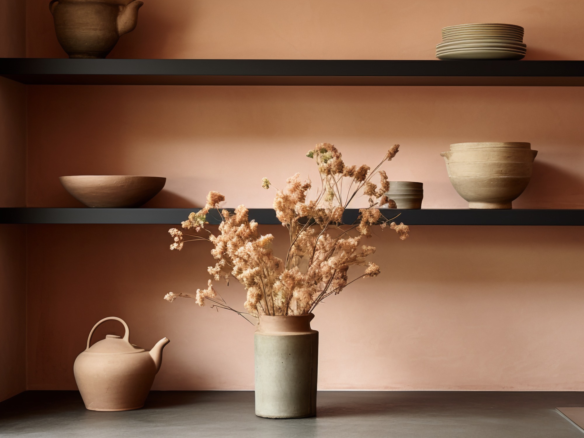
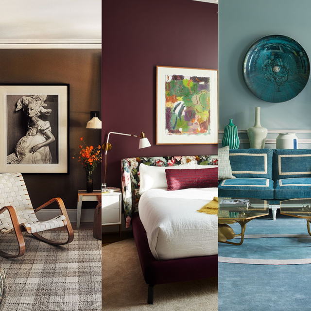
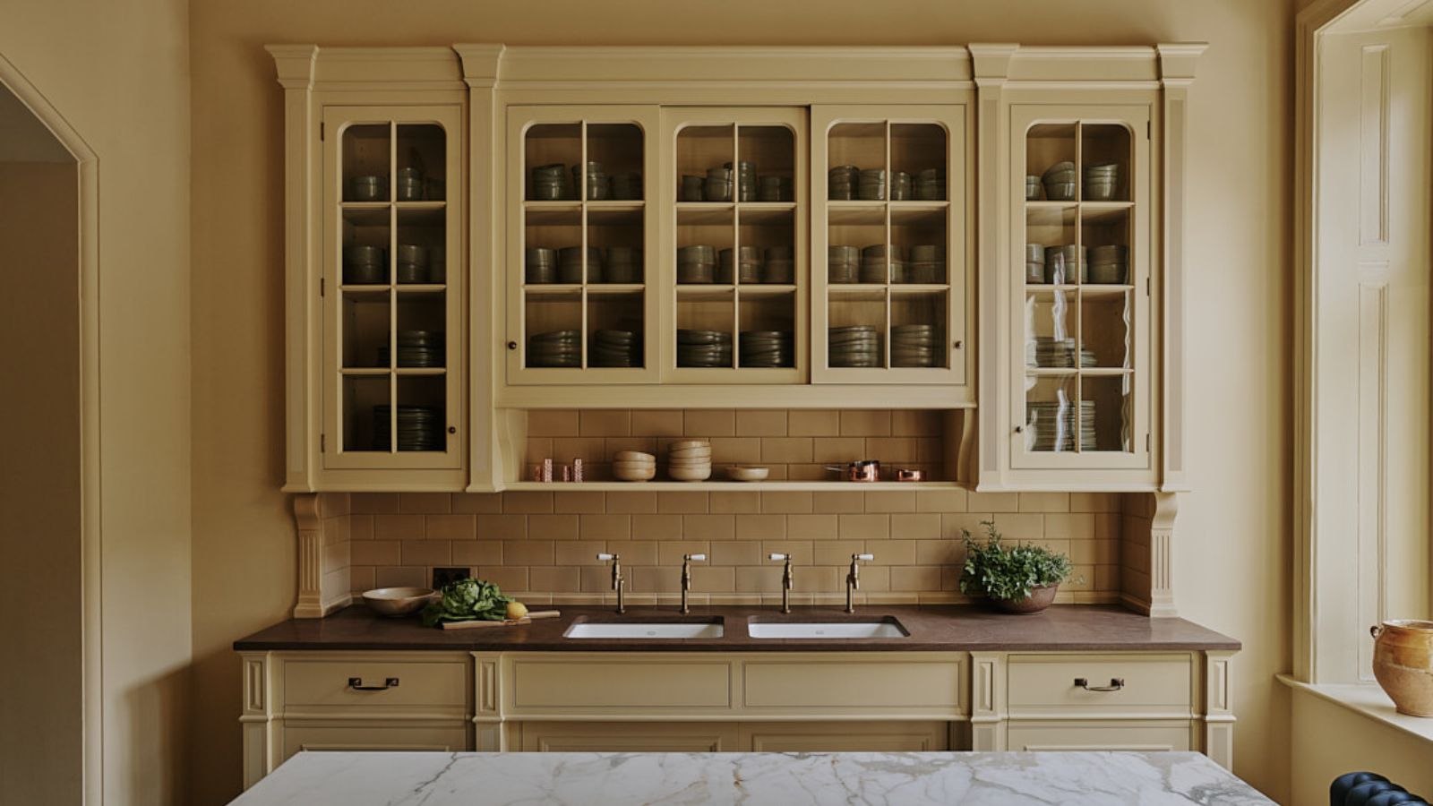
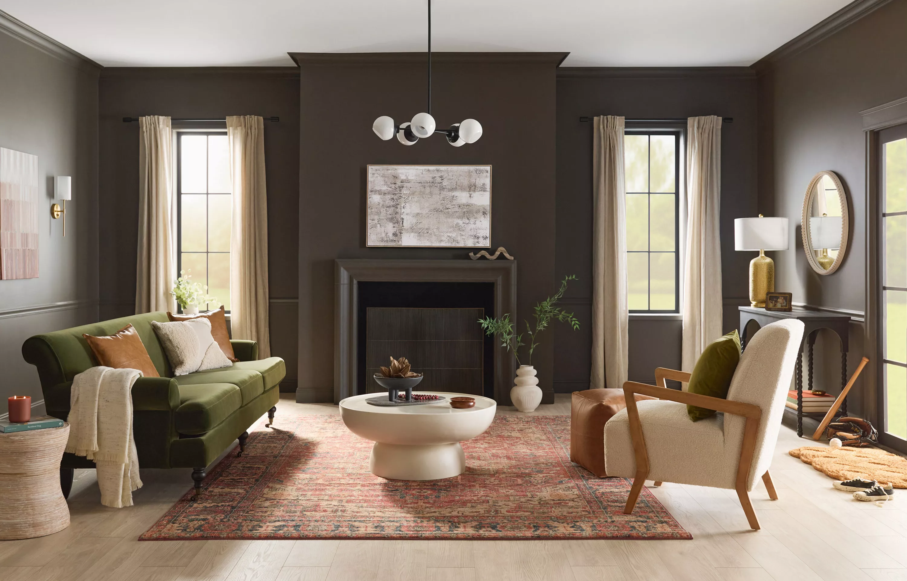
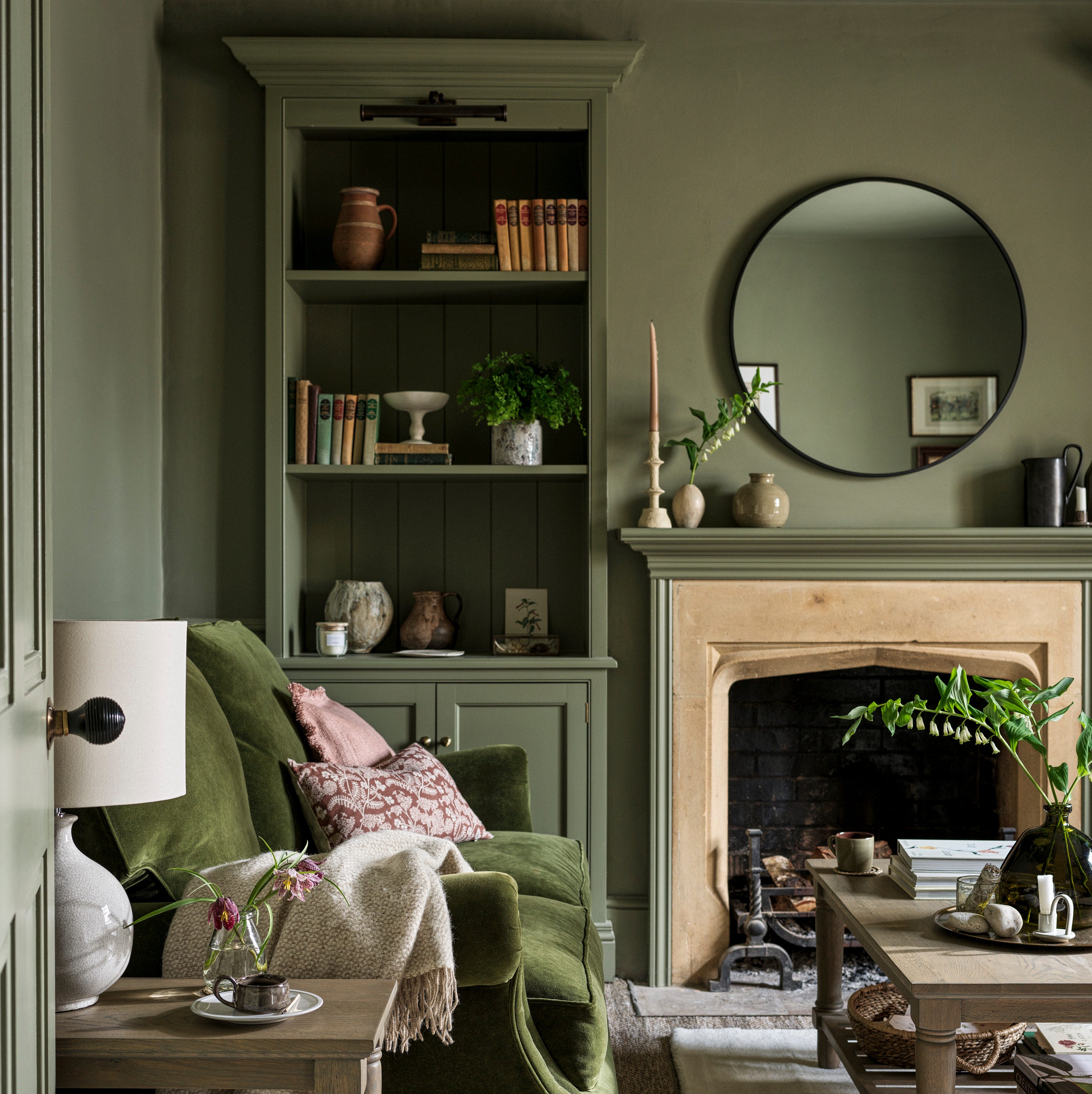
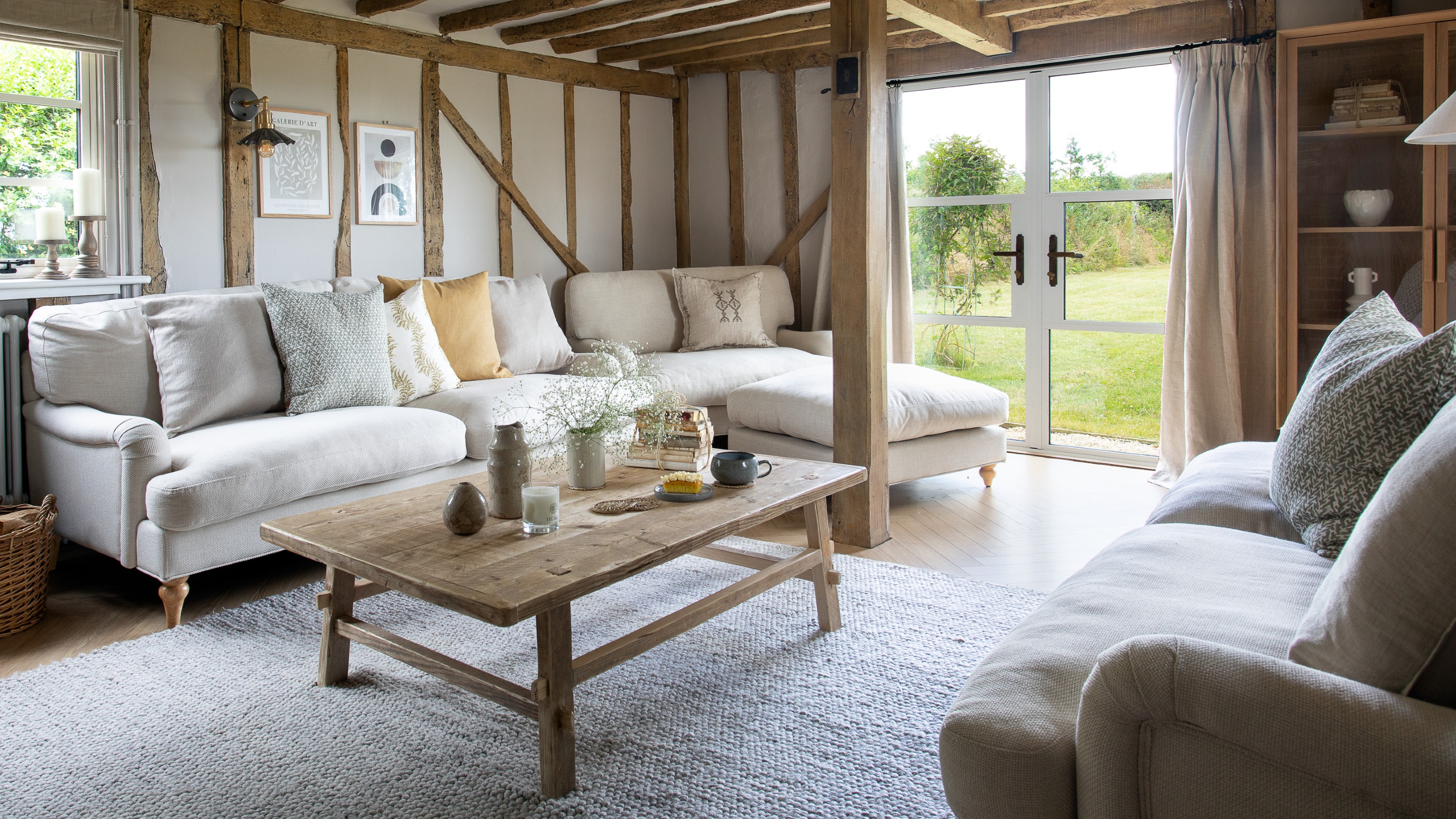
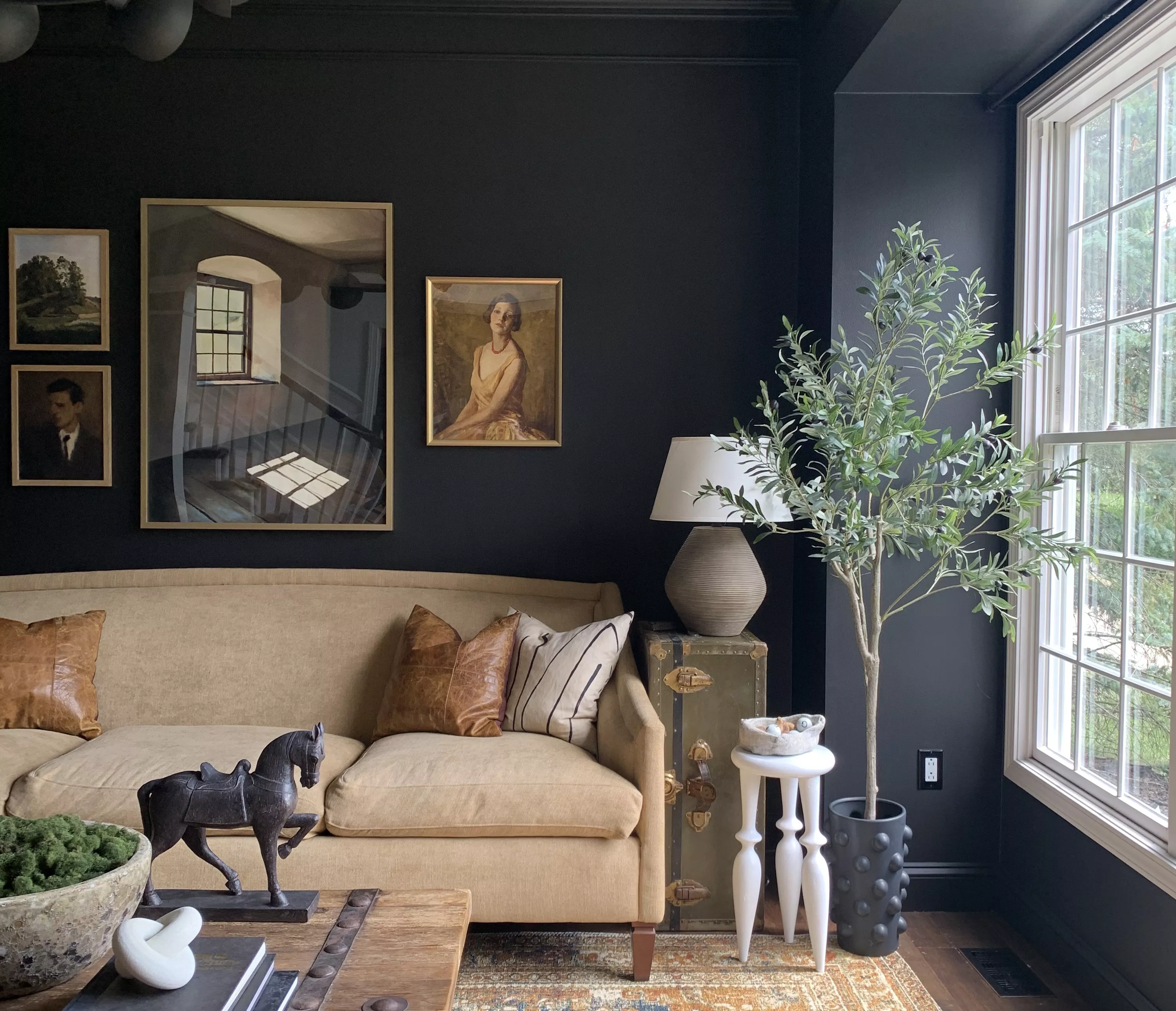
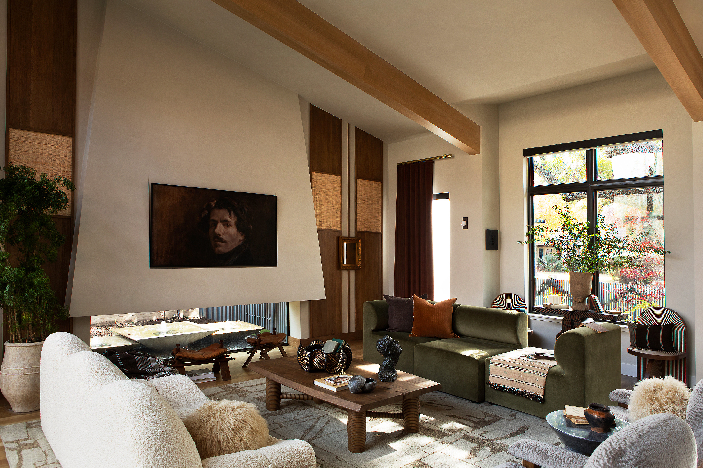
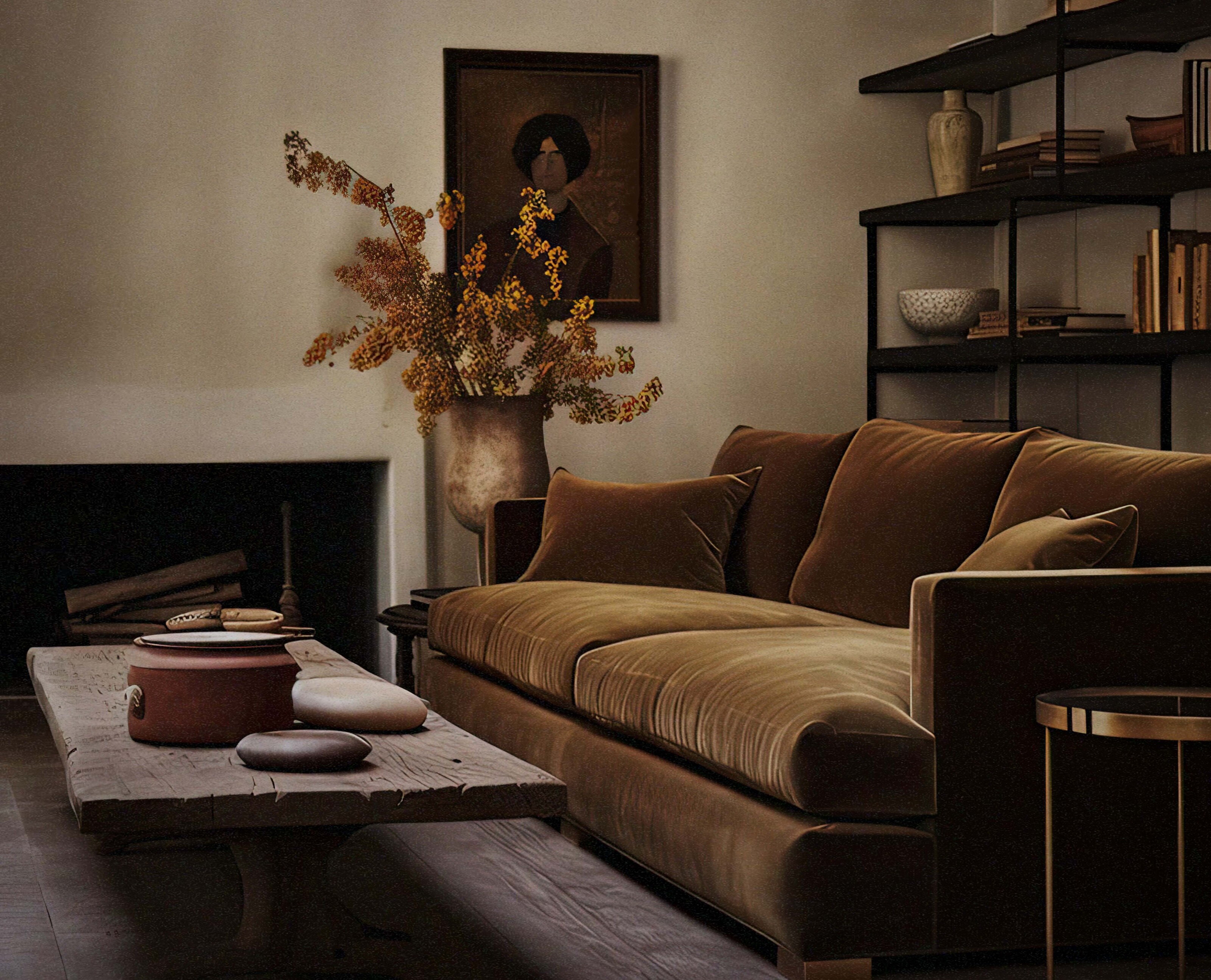
In 2025, interior design is experiencing a notable resurgence of earth tones, marking a widespread shift toward natural hues across various living spaces, including kitchens, living rooms, and bedrooms. This movement, characterized by colors such as cool browns, warm terracottas, greens, beiges, and burnt reds and oranges, emphasizes shades found in nature. Experts highlight the growing popularity of dark browns, with Emily Kantz, color marketing manager at Sherwin-Williams, noting their association with stability, comfort, richness, and tranquility, transforming spaces into personal retreats. Interior designer Dana Wolter also points to the aesthetic appeal of rust and taupe, particularly in smaller areas like butler's pantries.
The widespread appeal of earth tones is deeply rooted in their connection to the natural world, serving as an extension of the biophilic design trend, which aims to integrate outdoor elements into indoor environments. This trend gained significant traction following the Covid-19 pandemic, as individuals sought to create more soothing and natural home atmospheres. The psychological aspect also plays a role, as explained by ecological valence theory; color preferences are often linked to emotional experiences. For example, deep terracotta might evoke memories of family vacations, while rich greens could recall outdoor adventures, adding a layer of personal significance to these shades.
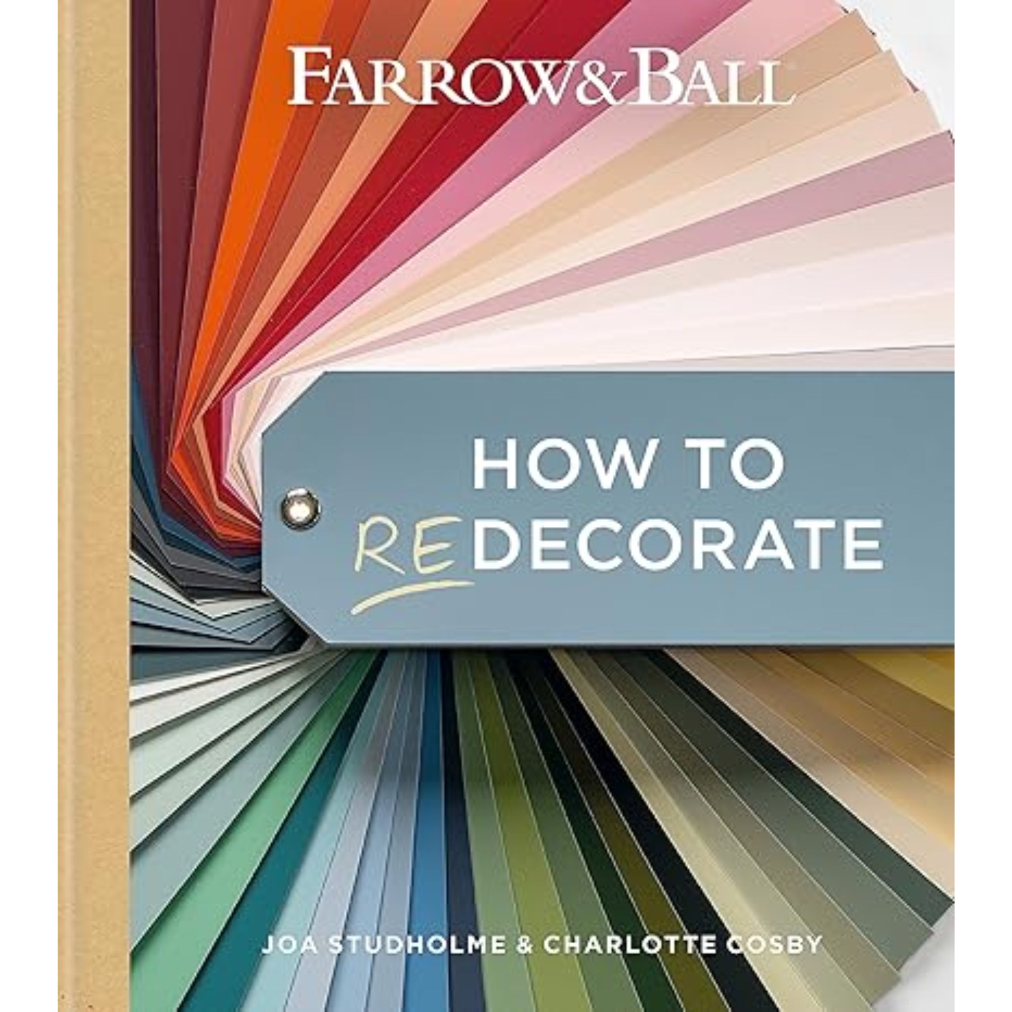
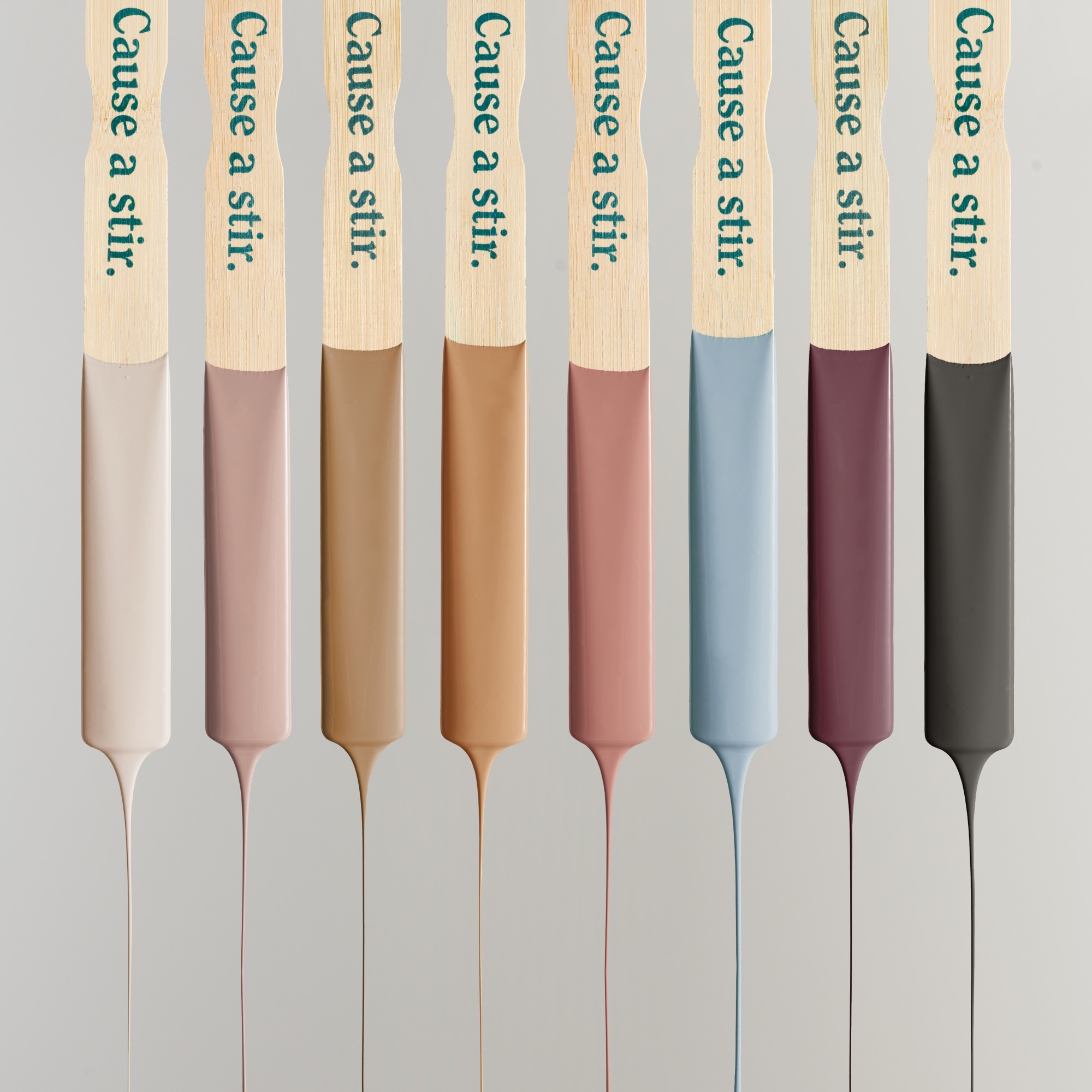
Several product introductions underscore this return to earth tones. KitchenAid's Evergreen stand mixer, paired with a wood mixing bowl, introduced natural elements to a traditionally utilitarian appliance. Farrow & Ball's recent paint collection, featuring earthy hues like Scallop (pink-gray), Dibber (lush green), and Reduced Green, further illustrates the trend. Pantone's choice of Mocha Mousse as the 2025 Color of the Year, a warm and cozy brown, signifies its versatility and widespread applicability. Additionally, textile and wallcovering brands like Perennials, with its "Down to Earth" collection, and Élitis, with sisal wallcoverings in natural shades, are incorporating these colors into their designs, sometimes accented with gold and silver.
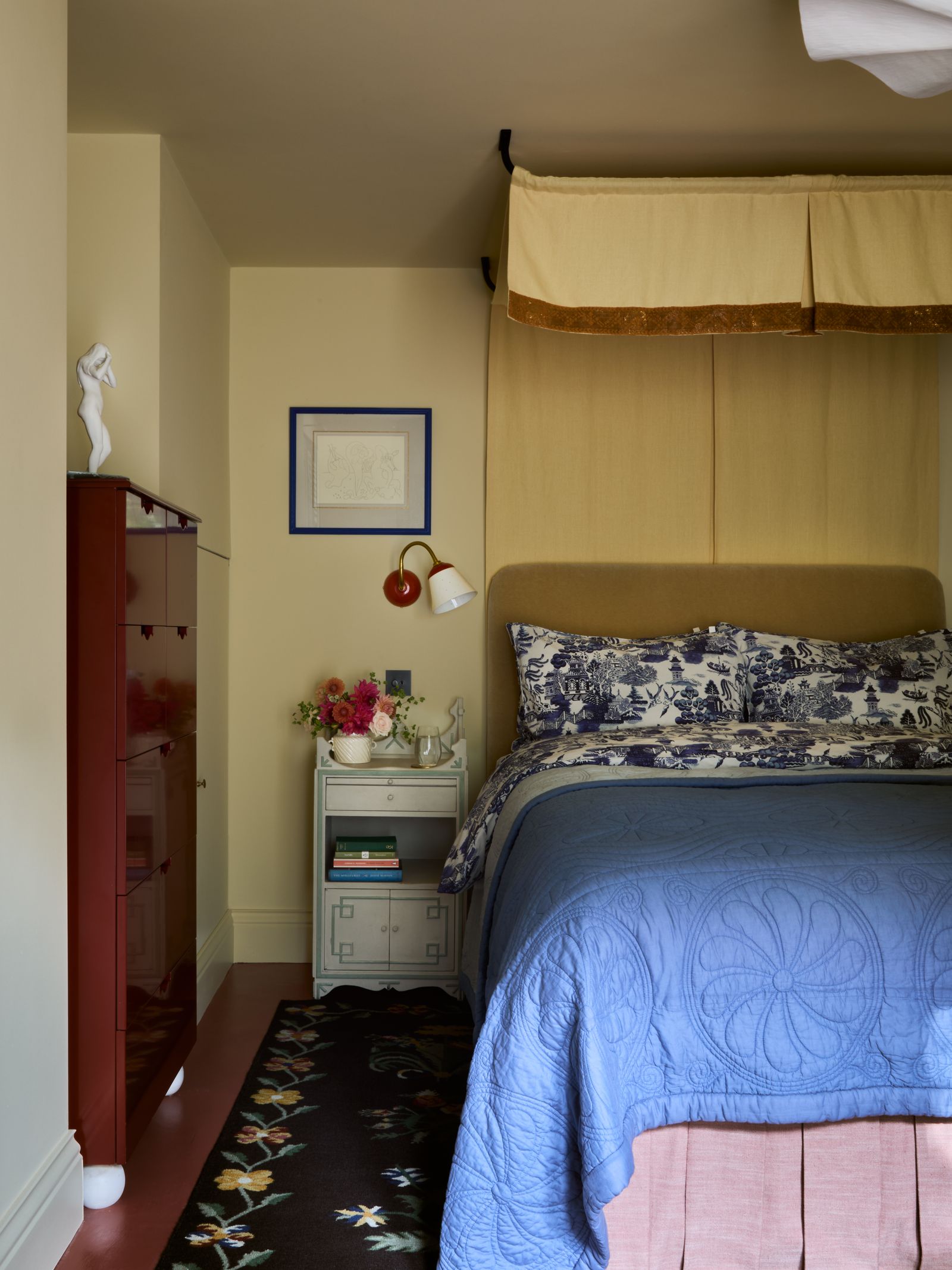
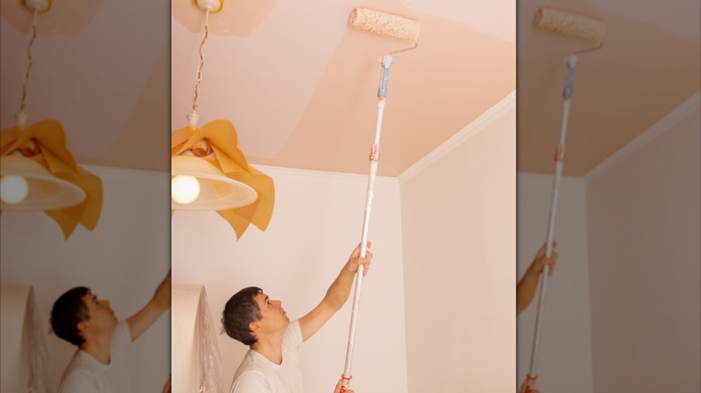
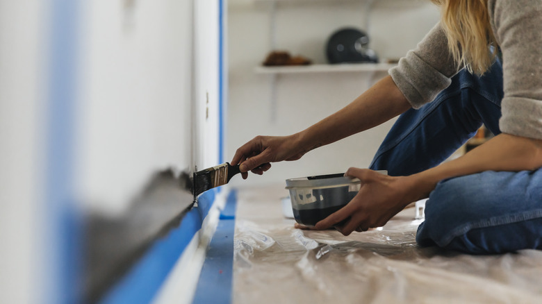
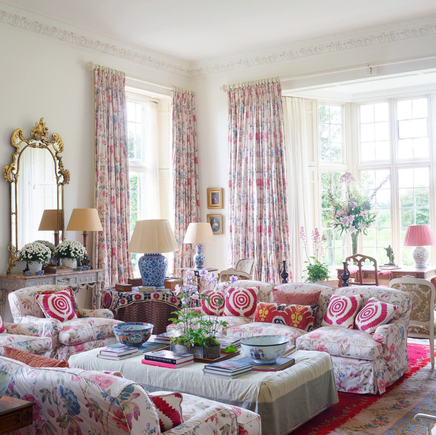
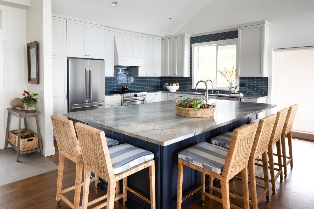
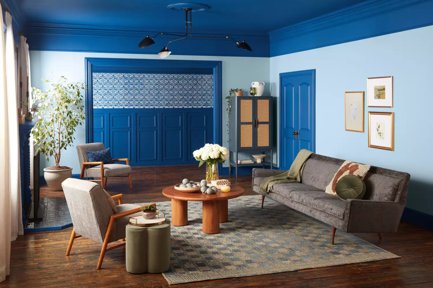
Decorating with earth tones is inherently simple due to their versatility and ability to complement other colors. Interior designer Roger Higgins emphasizes that these tones provide an excellent backdrop for bolder colors and patterns, and that various earth tones can be mixed harmoniously. Kantz suggests using deep green in a living room for a cozy feel or dark watery blue in a bedroom for a restorative environment. For those seeking less commitment, incorporating earth tones through furniture, such as a brown-stained cabinet, or handmade green decor items, allows for experimentation before undertaking more permanent changes like painting walls. This approach enables homeowners to gradually introduce the palette and observe its effects.
#EarthTones #InteriorDesign #ColorTrends2025 #NaturalHues #HomeDecor #BiophilicDesign #PaintColors #HomeStyling #DecoratingTips #EarthTones #InteriorDesign #ColorTrends2025 #NaturalHues #HomeDecor #BiophilicDesign #PaintColors #HomeStyling #DecoratingTips
0 comment in total
You may also like
Designers Predict You'll Use AT LEAST One of These Colors in Your Home in 2025

The Biggest Colour Trends Taking Off in 2025
2026 Color of the Year Announcements Have This In Common
5 Paint Colors That Will Take Over in 2025, According to Interior Designers

These Colors Will Be Everywhere in Interiors in 2025
We’re Calling It: These Are the Official Color Trends of 2025
The Latest Color Trend You'll Be Seeing Everywhere In Fall 2025
The biggest color trends of 2025 – 10 colors designers say will lead the way next year

These 8 Color Trends Will Rule in 2025, According to Color Pros

Every 2025 Color of the Year We Know So Far

Experts Say These 5 Paint Colours Will Be Everywhere In 2026
What’s replacing beige in 2025? Last year's go-to neutral is taking a back seat in favour of these two new earthy colours
Your 2025 Paint Color Forecast Is Here—Say Goodbye to Bold Hues and Hello to Muted Earth Tones
9 colors designers won’t be using in their living rooms in 2025
The #1 Paint Color Trend of 2025, According to Designers

The colour palette for 2025 – these are the shades paint experts say we’ll see everywhere next year
'It can soothe your soul' - 5 earthy paint colors designers say are big trends for 2024

Color Explosion: 2025 Color Trends

The colour trends 2026 that will define our homes next year

Every 2025 Color of the Year We Know So Far—and Inspiration for How to Use Each in Your Home