
1/2
Farrow & Ball Green Smoke: Dupes, matches, coordinating colors, and Sarah’s full review
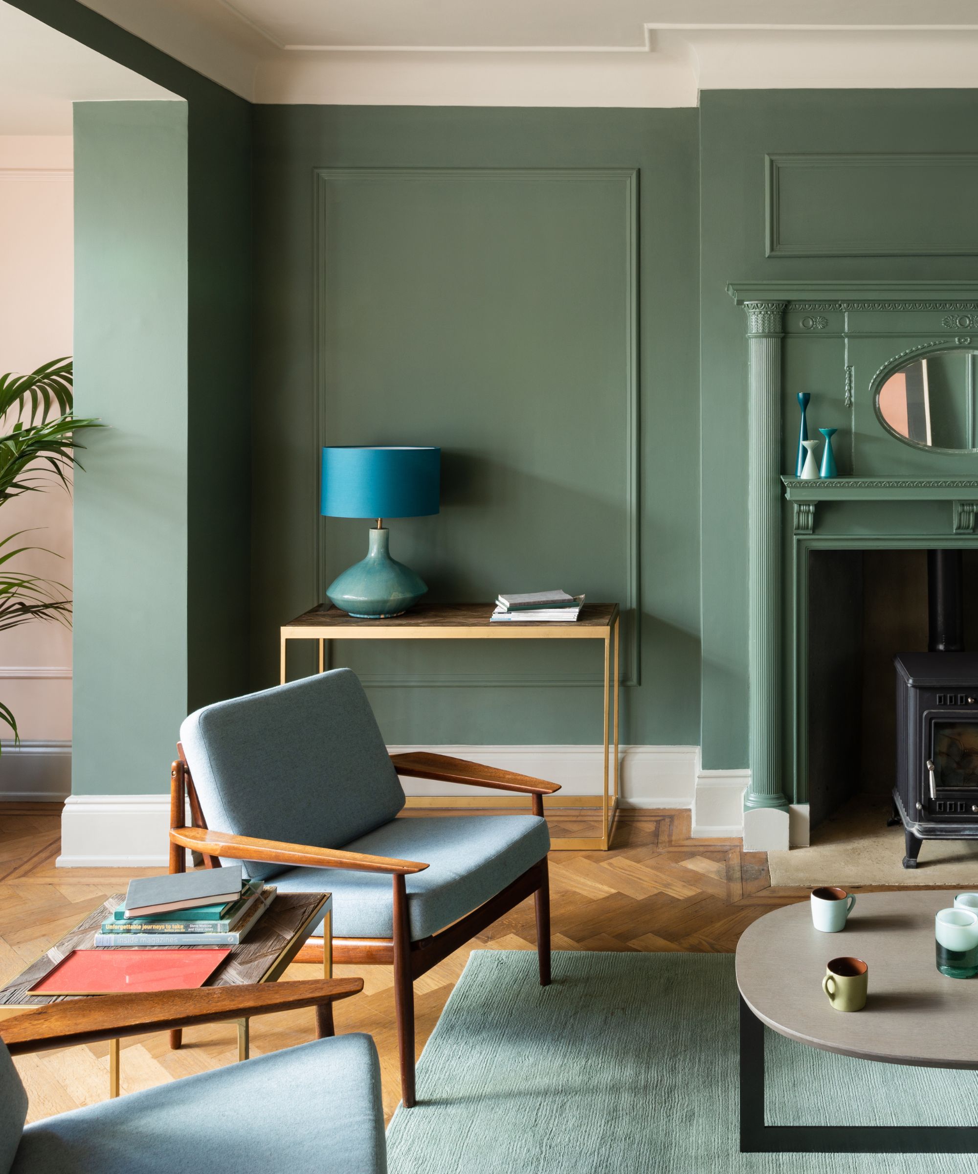
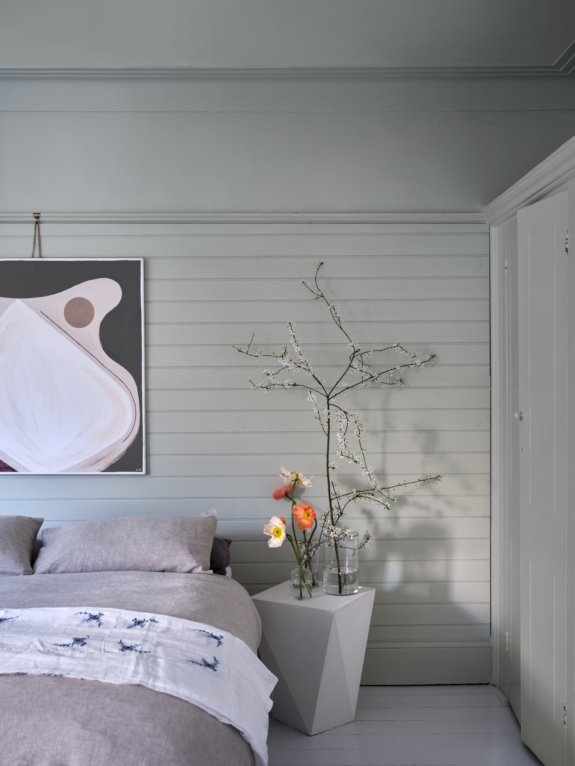
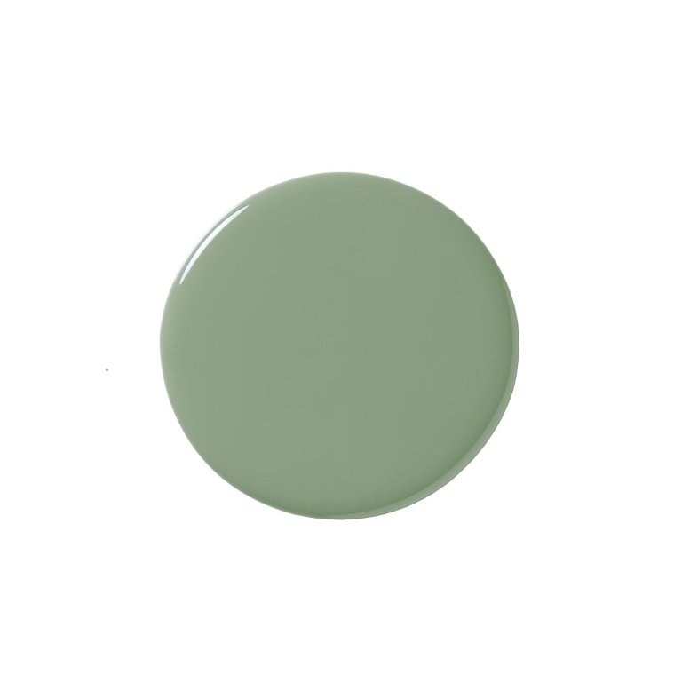
The article explores Farrow & Ball's Green Smoke, a medium-dark smoky green paint color with pronounced blue undertones. Its popularity surged during the pandemic, surpassing even Hague Blue, becoming the brand's most Googled and best-selling green. The color draws inspiration from late 19th-century interiors, evoking calm and serenity. While generally well-received, Green Smoke may not appeal to those who prefer greens without blue undertones, less saturated hues, or colors that are not in the "middle ground" of intensity.
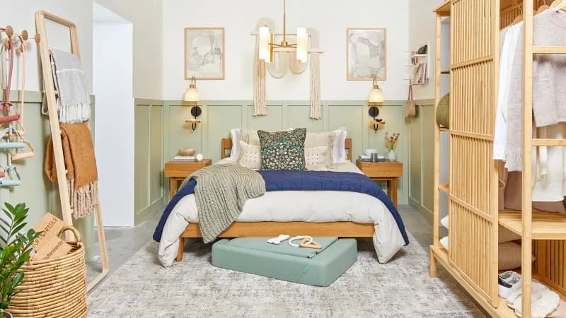
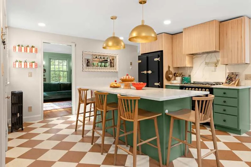
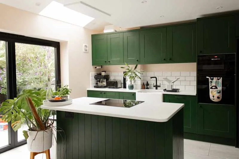
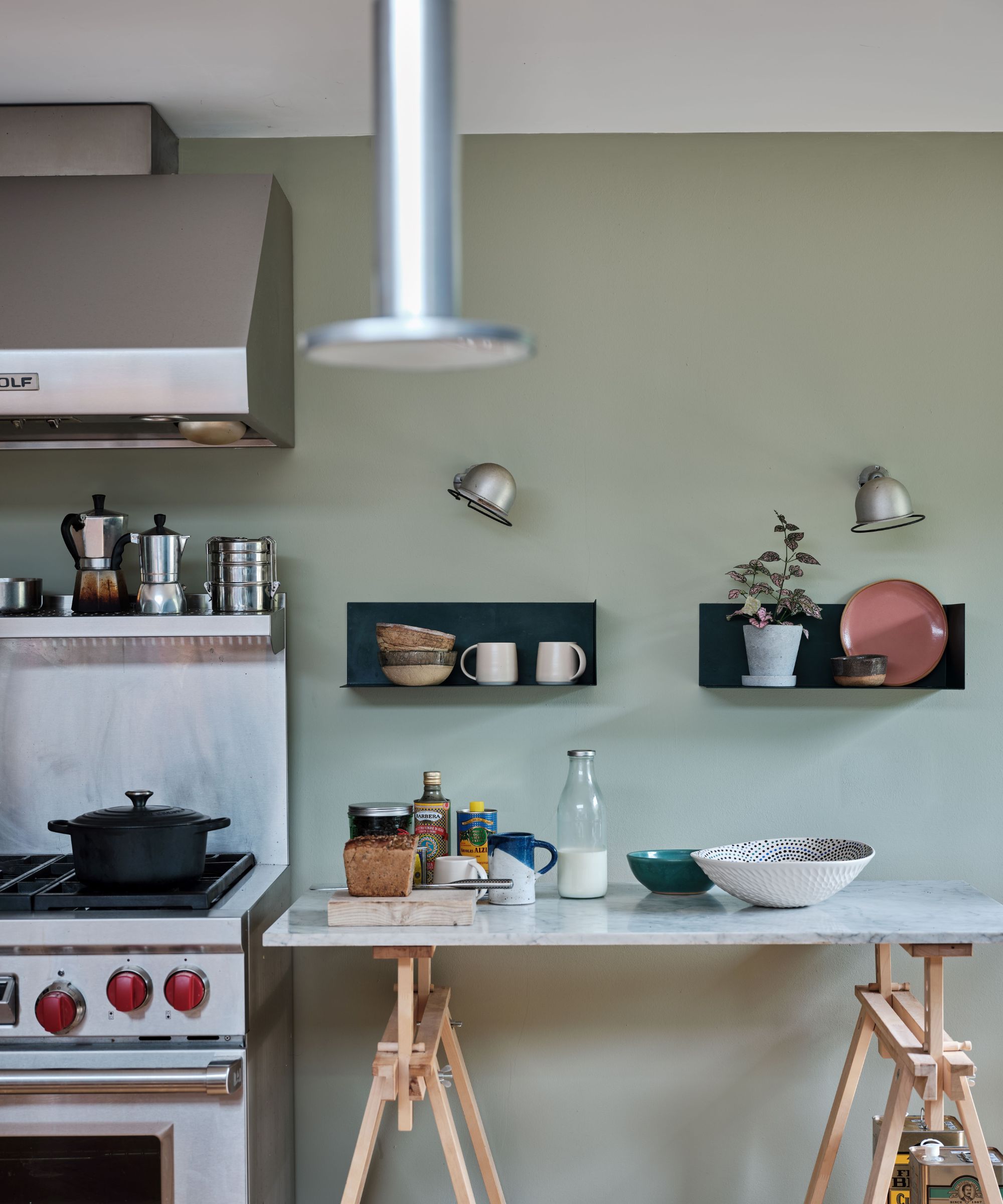
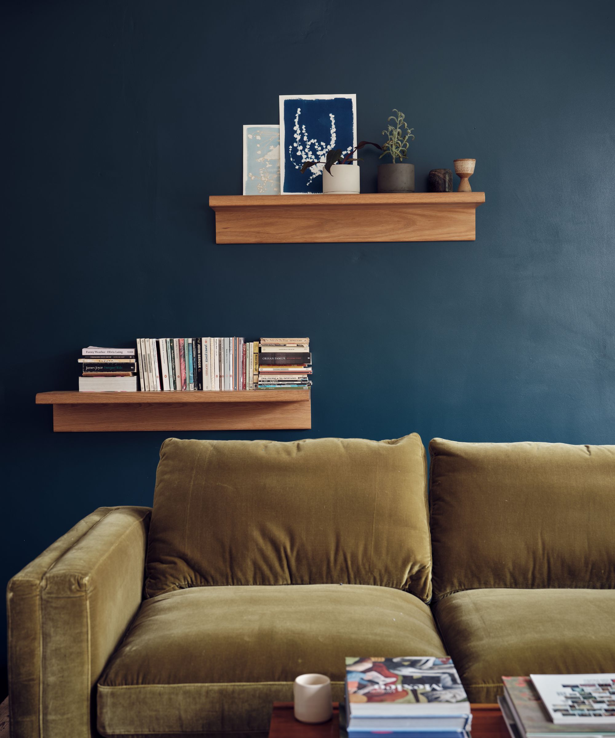
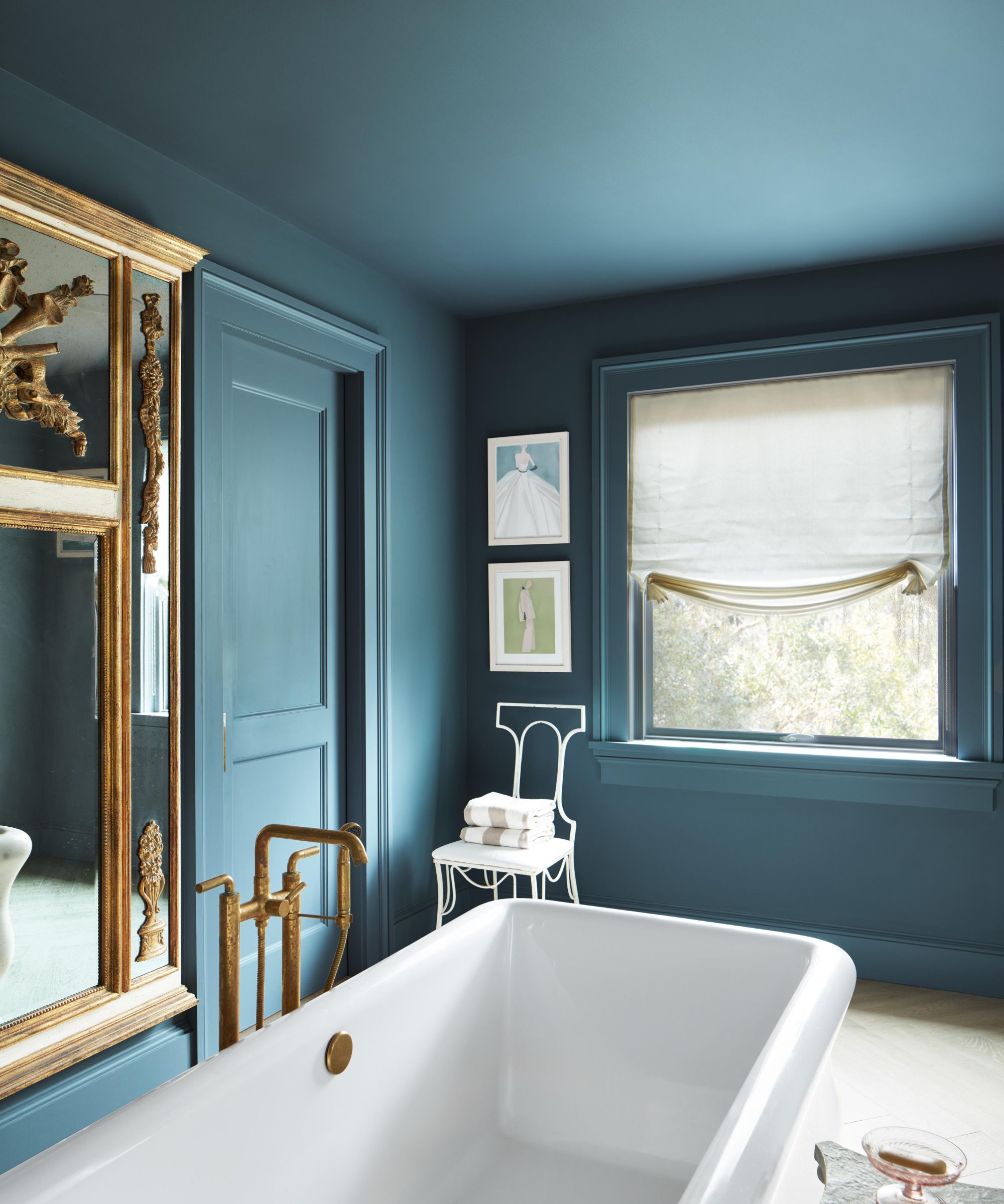
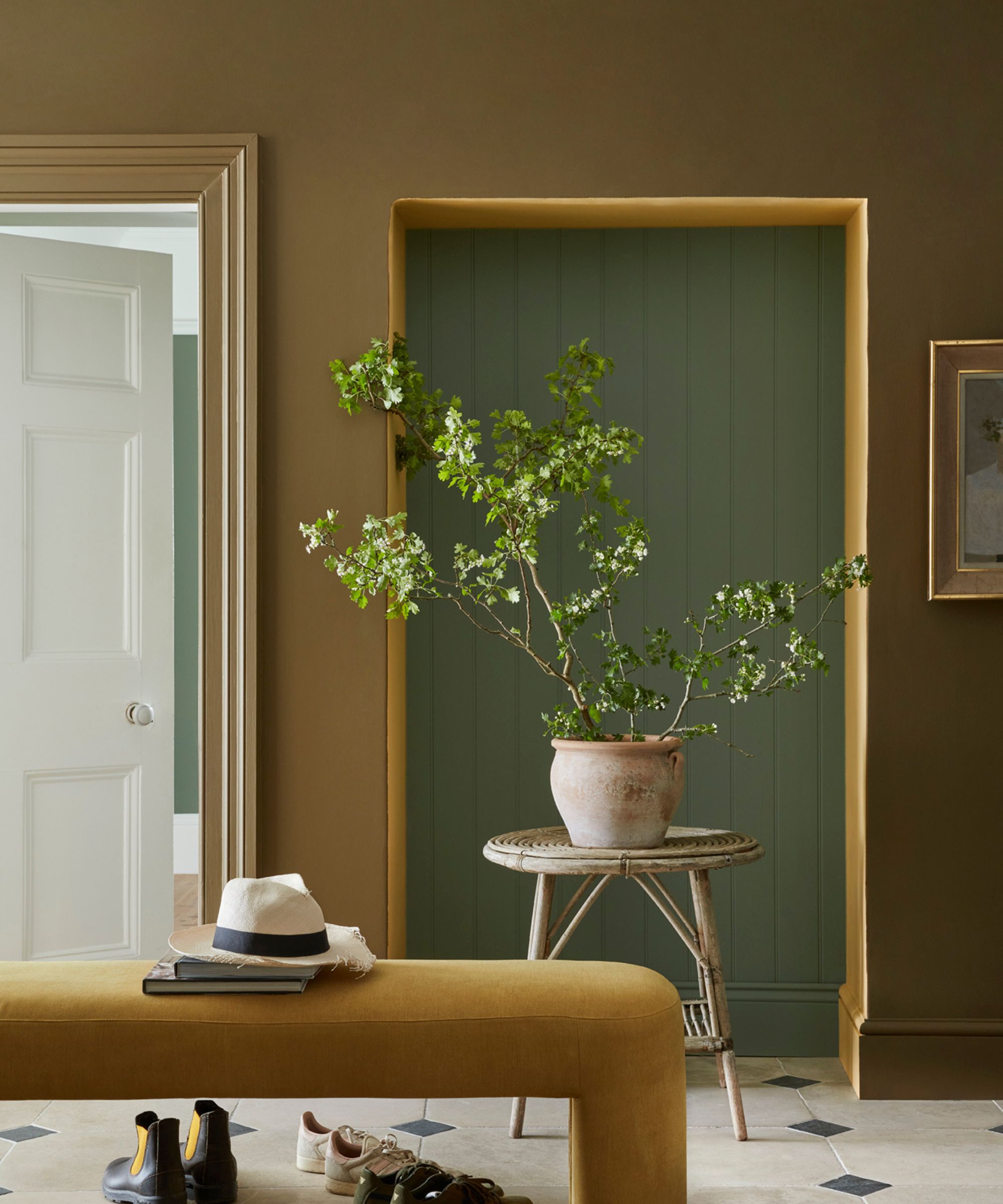
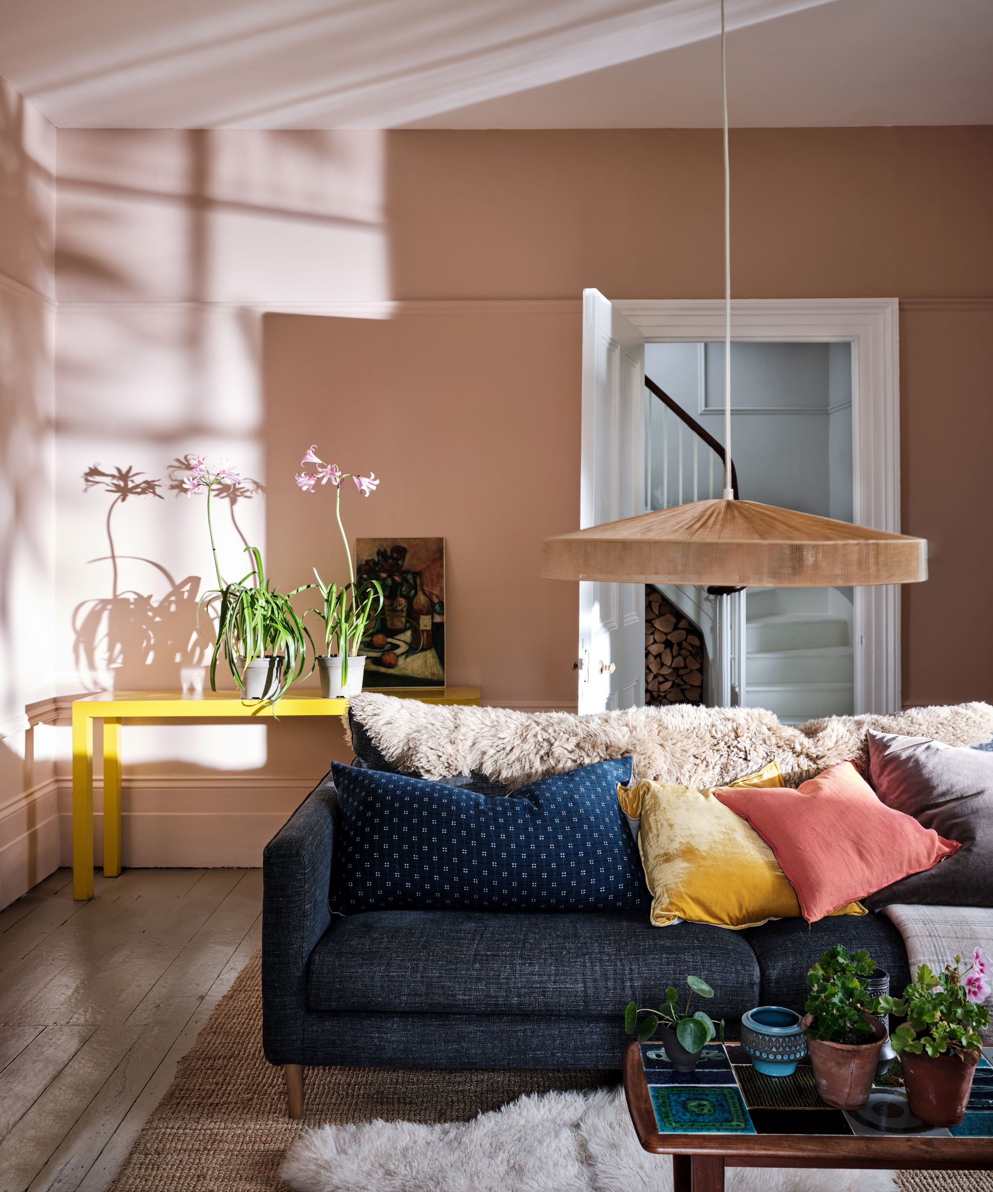
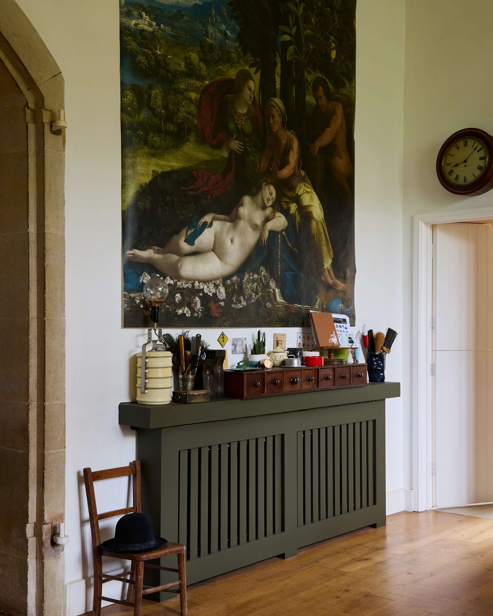
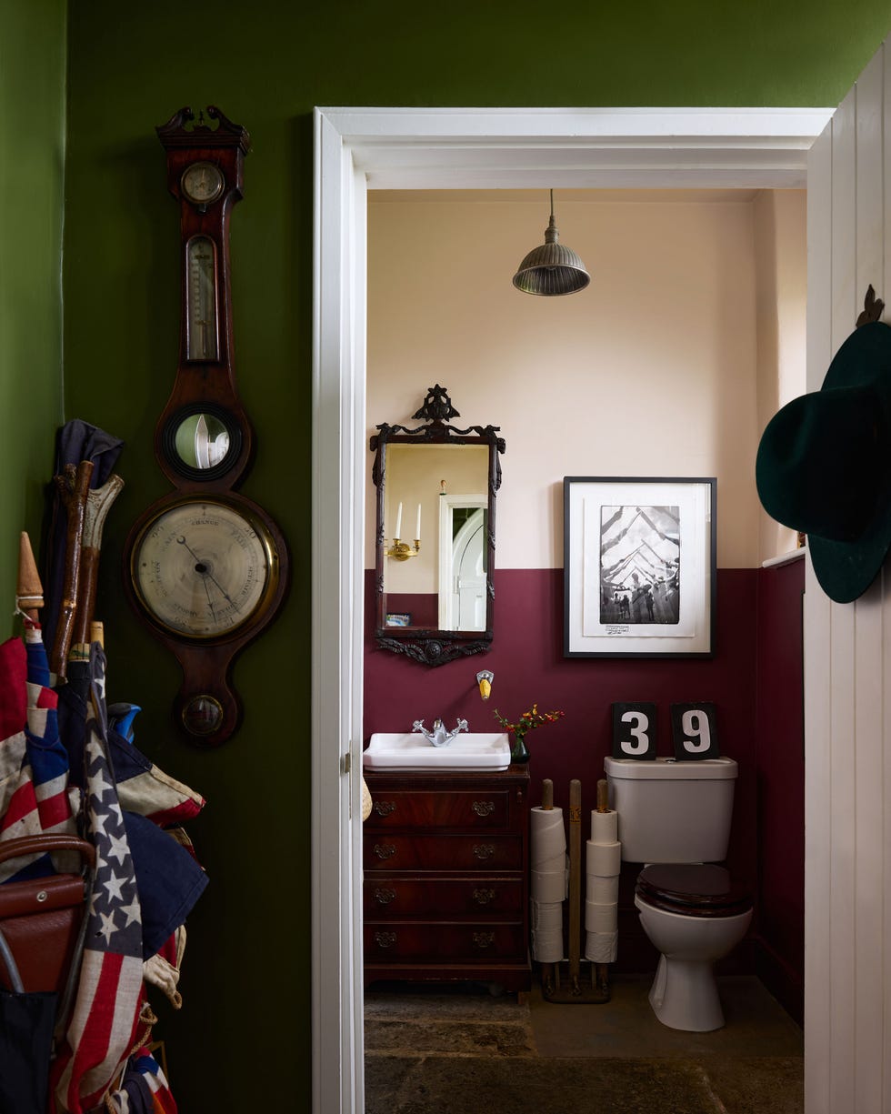
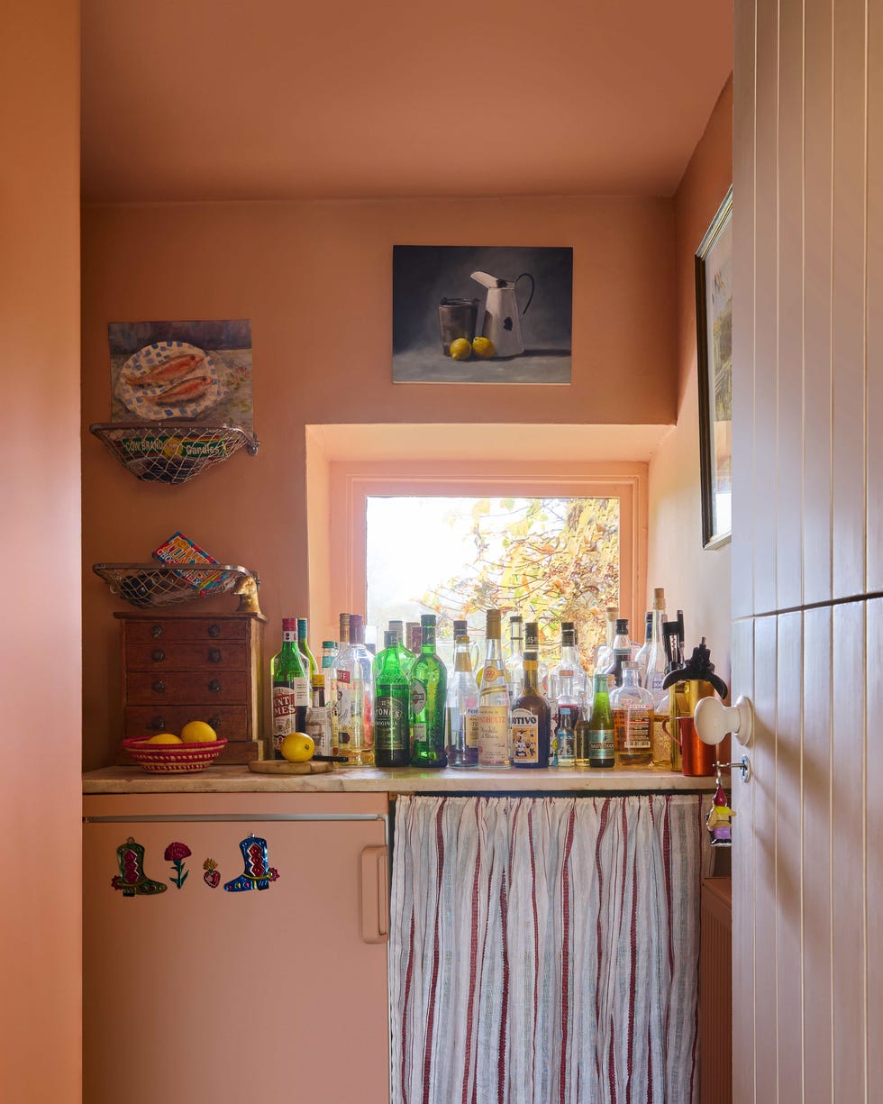
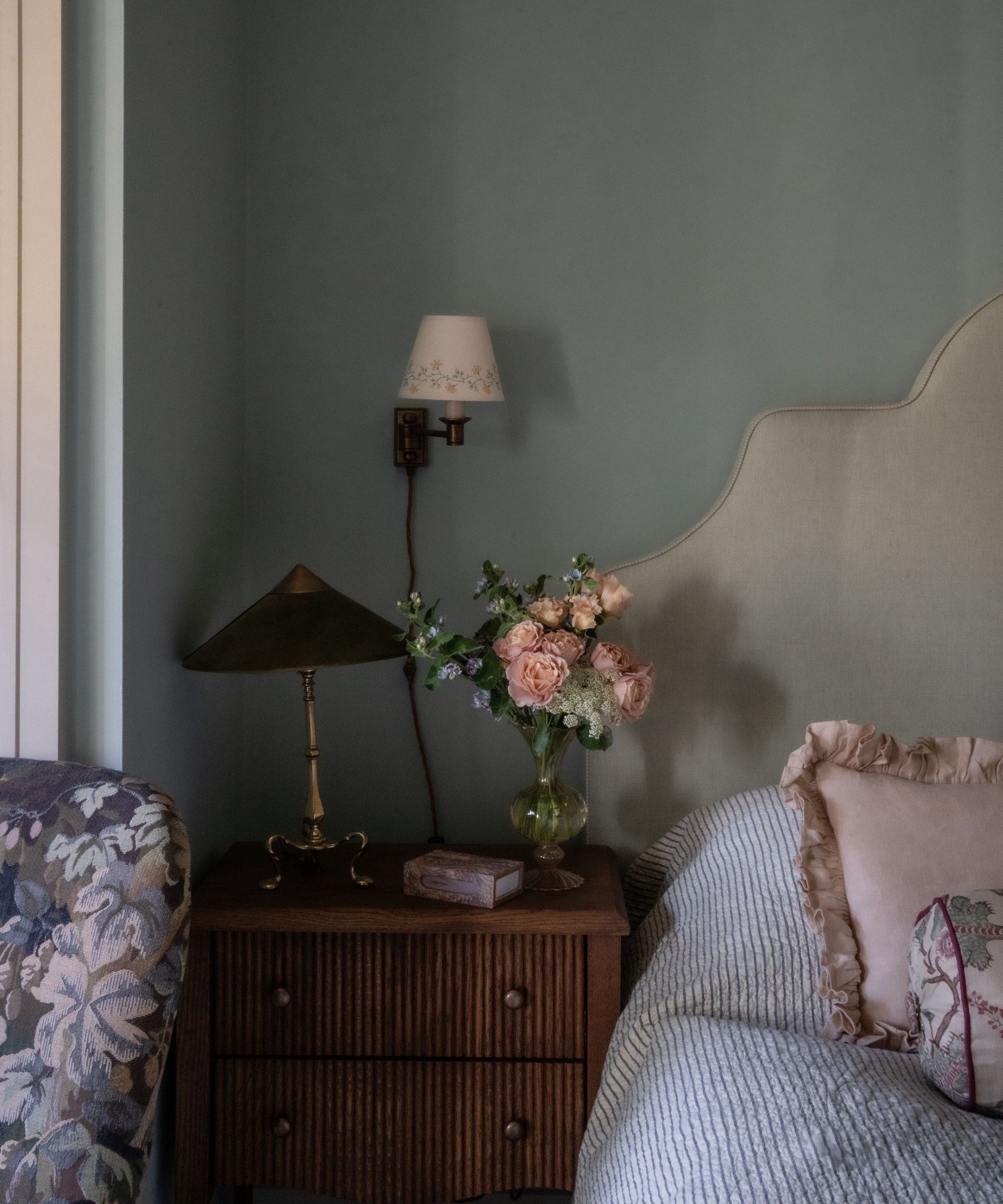
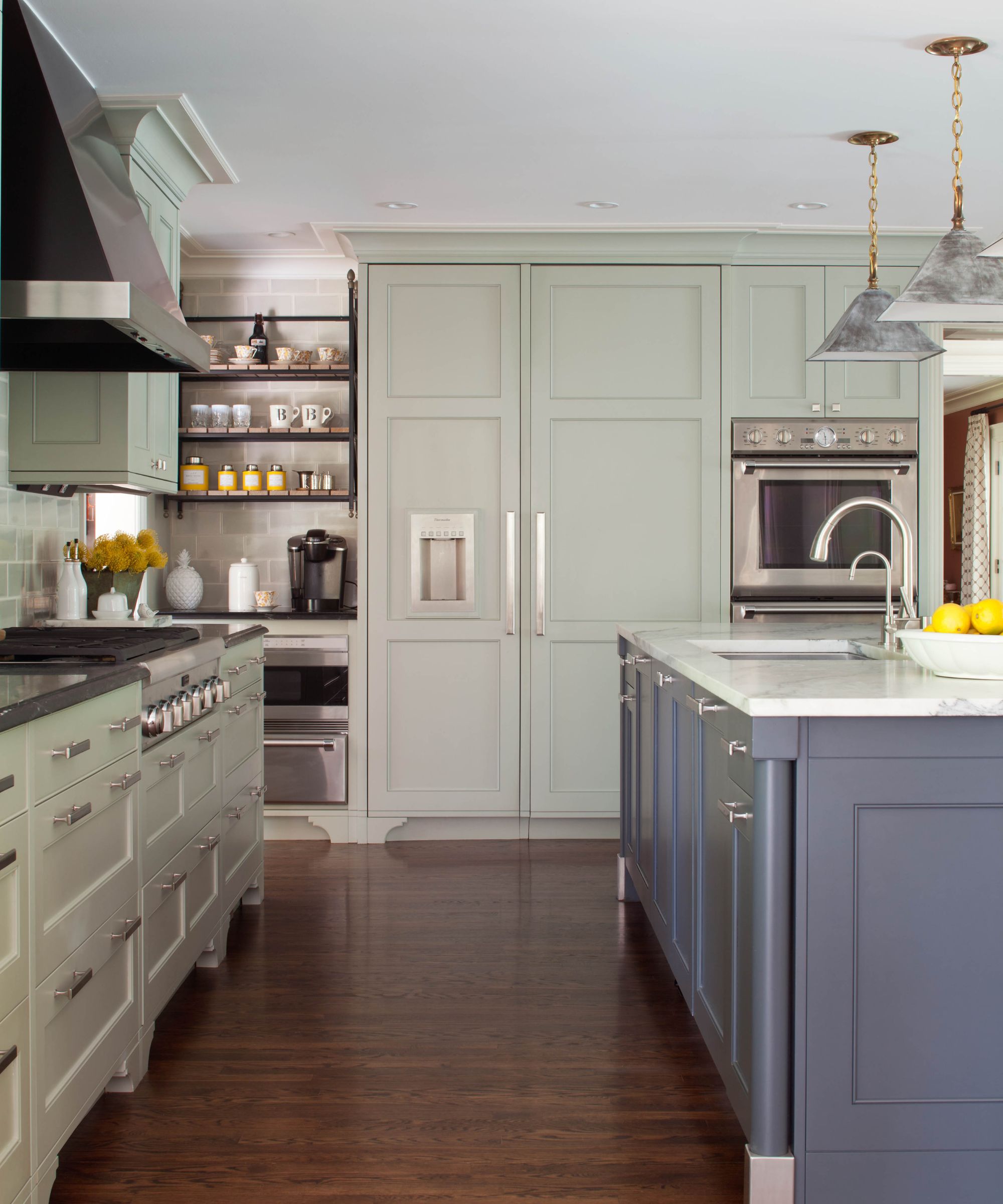
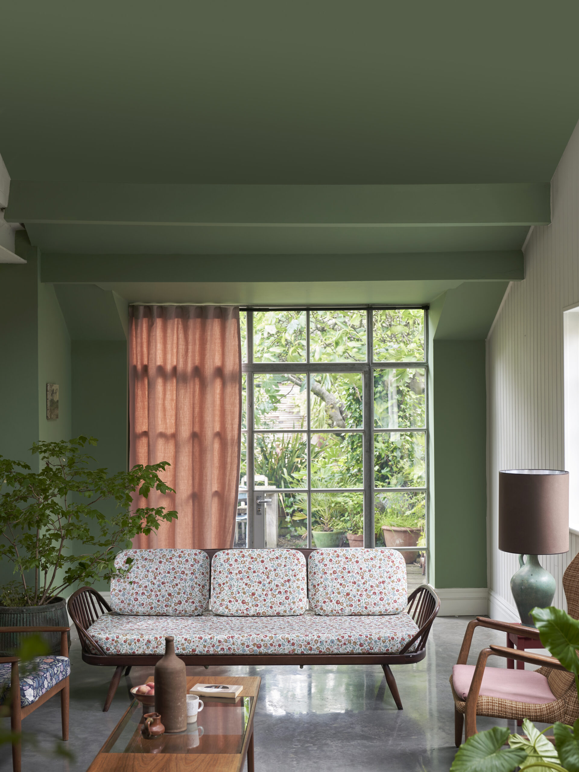
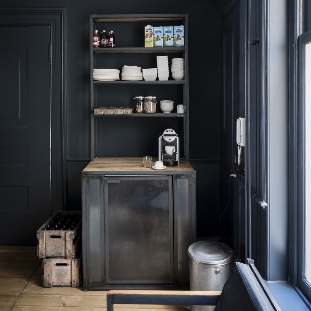
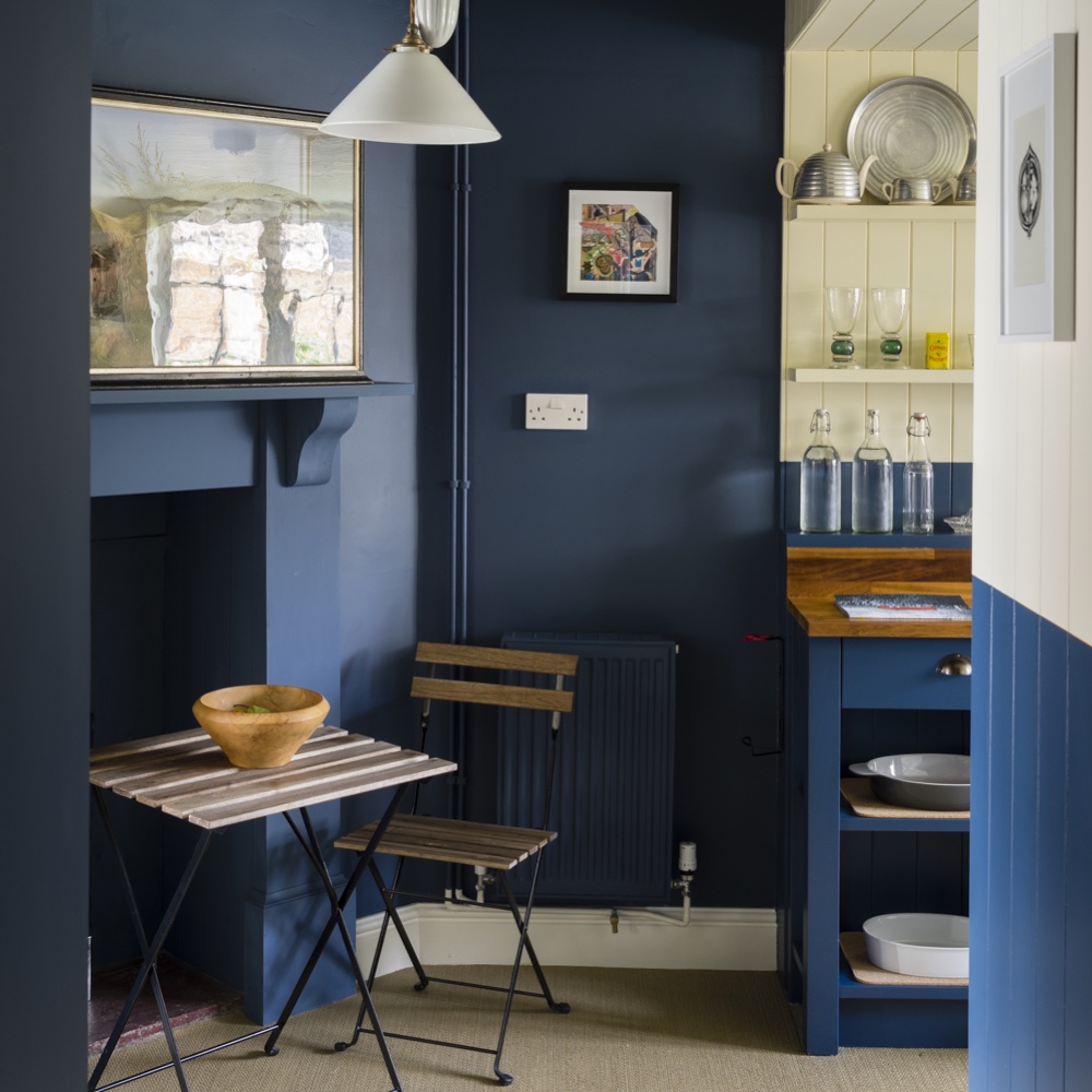
The versatility of Green Smoke is highlighted through its application in various rooms, including kitchen cabinets, living rooms, offices, and bathrooms. Examples include kitchen designs by Bradley Odom, Oak Design Project, and Kate Lester Interiors, showcasing how Green Smoke cabinets add depth and serenity. In utility rooms, it pairs effectively with Card Room Green. Living rooms painted in Green Smoke are described as having a moody depth, with suggestions for pairing it with warm colors like dusty pinks and buttery yellows to add dimension. Offices and libraries utilize Green Smoke on bookshelves and millwork, often complementing wallpaper designs. Bathrooms and powder rooms feature Green Smoke on vanities and walls, creating serene or dramatic effects.
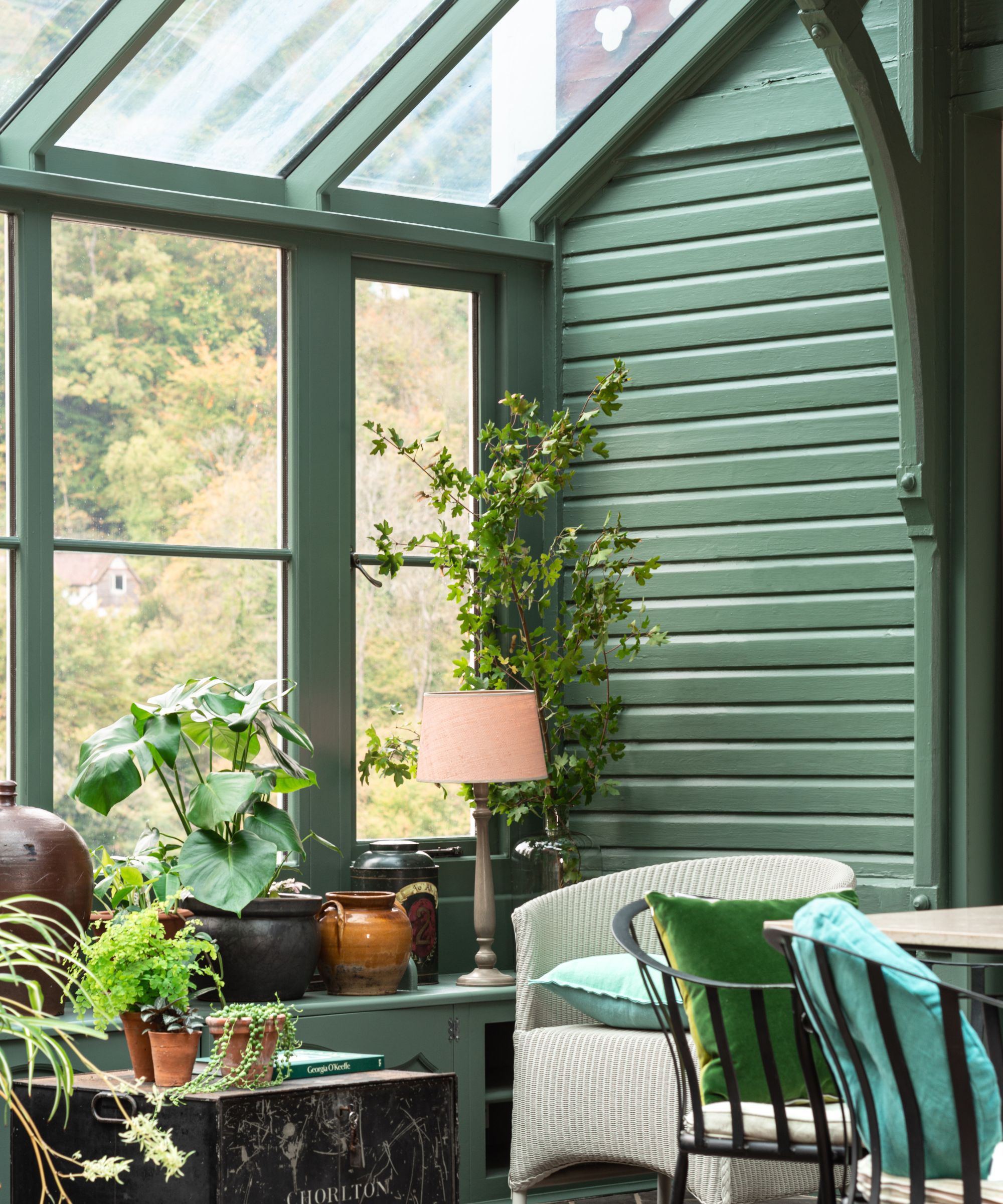
For exteriors, Green Smoke can be used on entire facades or for accents like front doors, sheds, or benches. However, it's noted that exterior applications can make the color appear lighter due to natural light exposure. The undertones of Green Smoke are discussed as being complex, shifting between cooler blue and warmer yellow-green depending on lighting conditions and surrounding colors. This emphasizes the importance of sampling the color in the intended space.
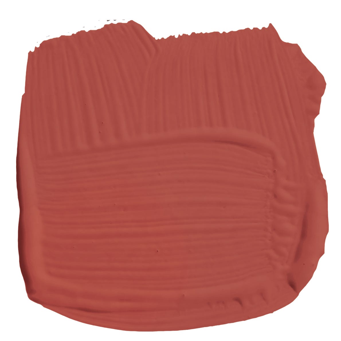
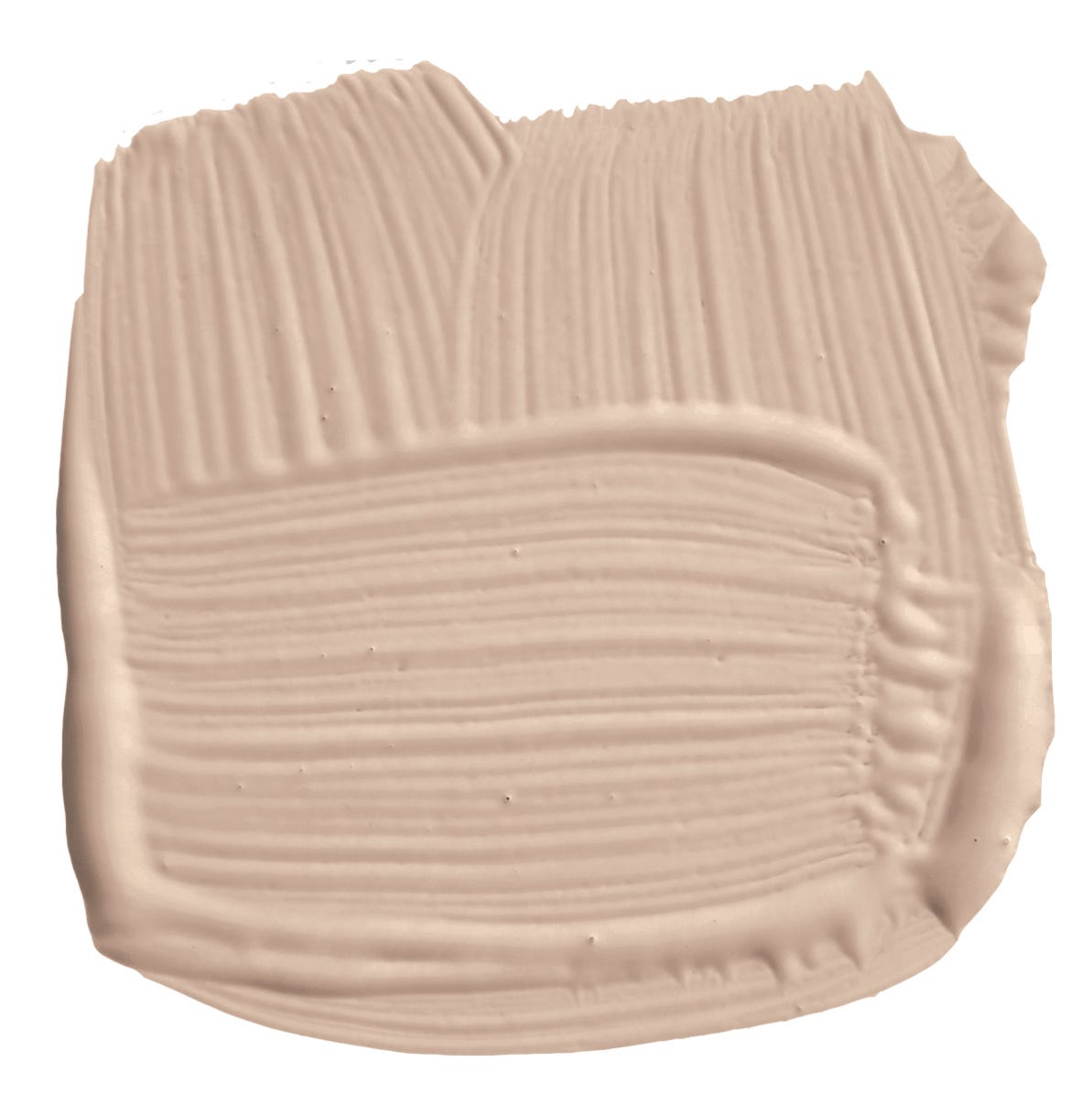
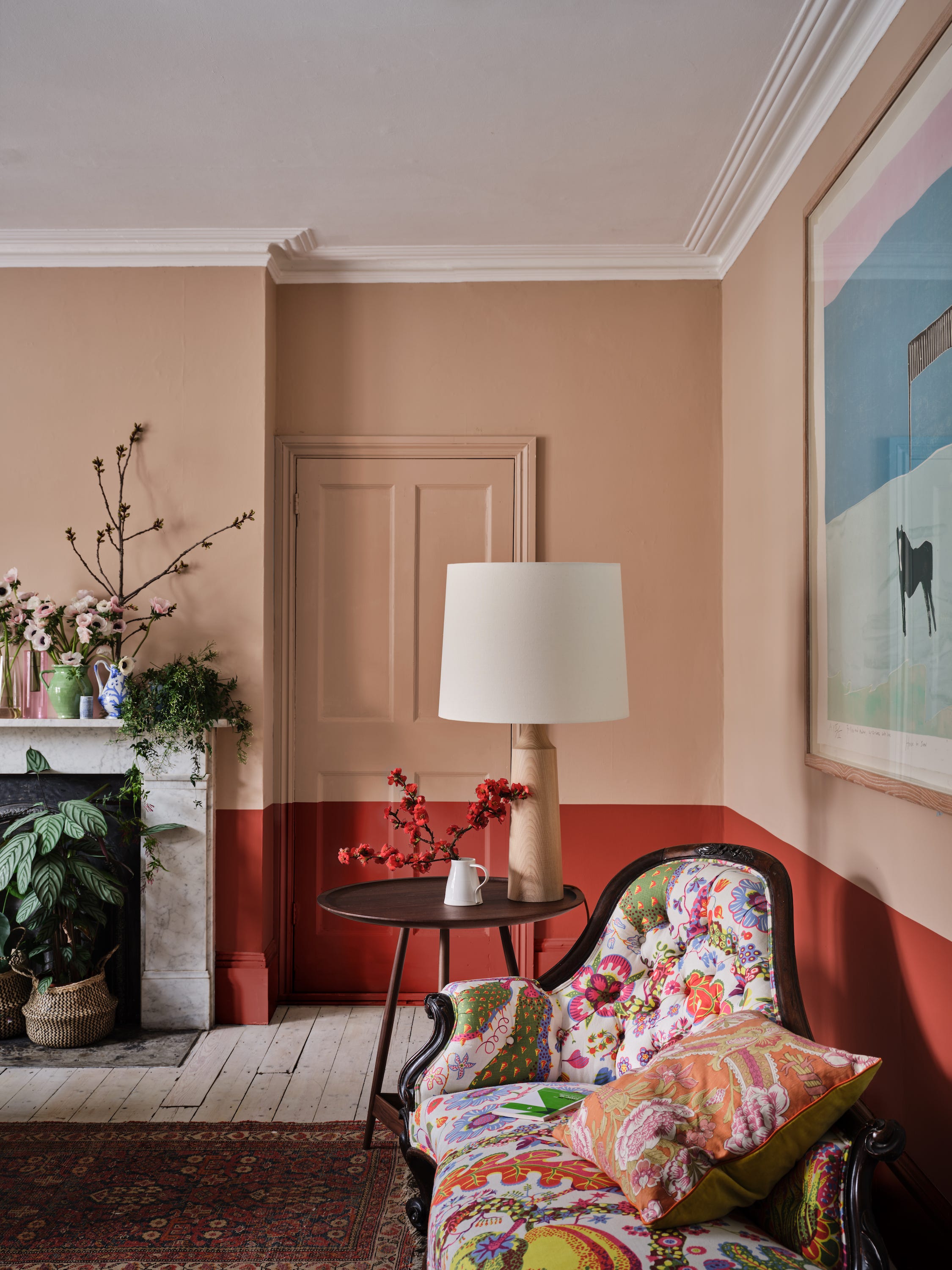
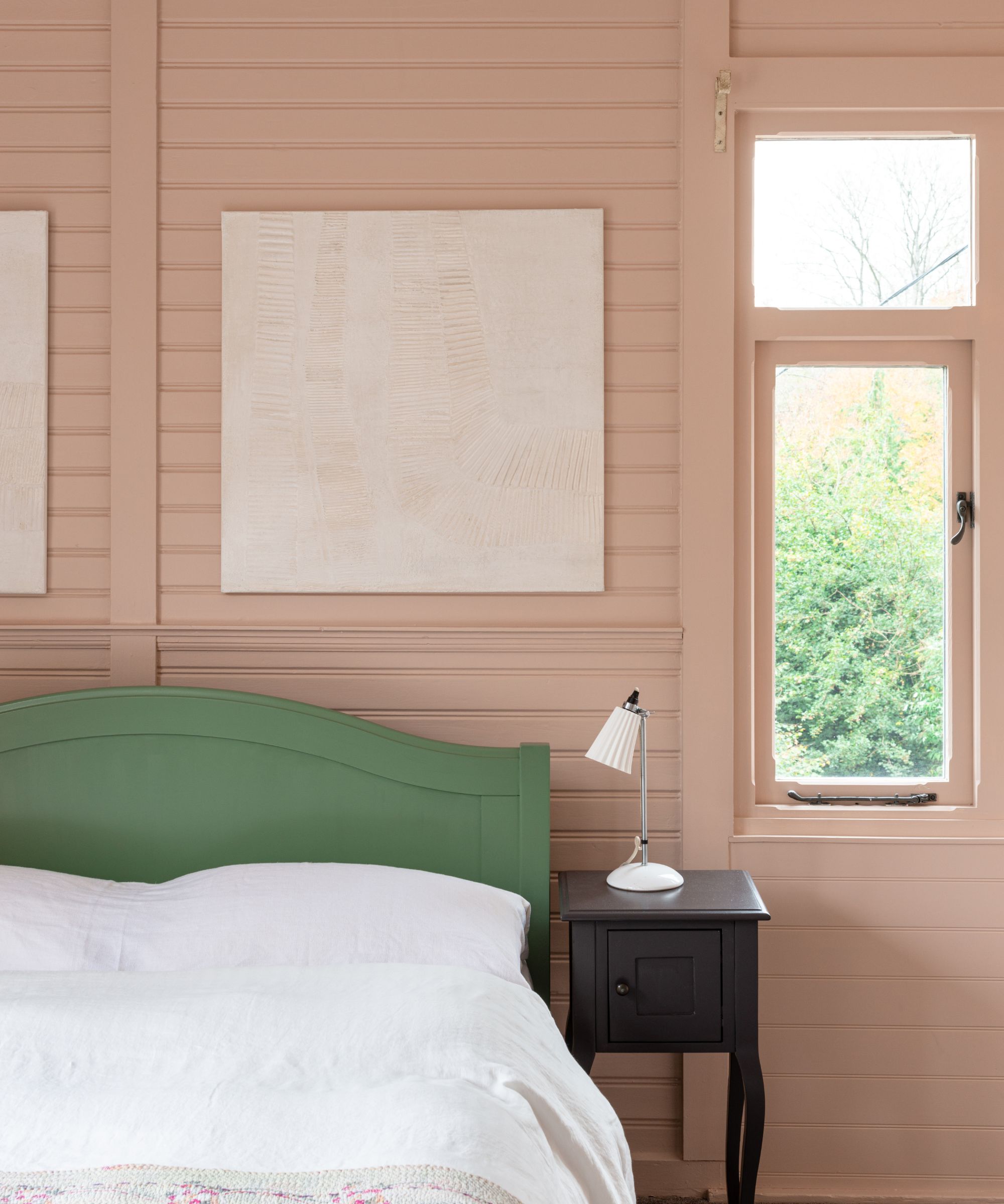
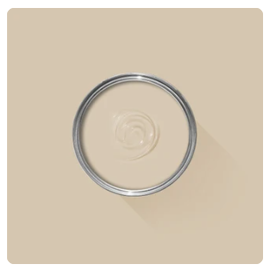
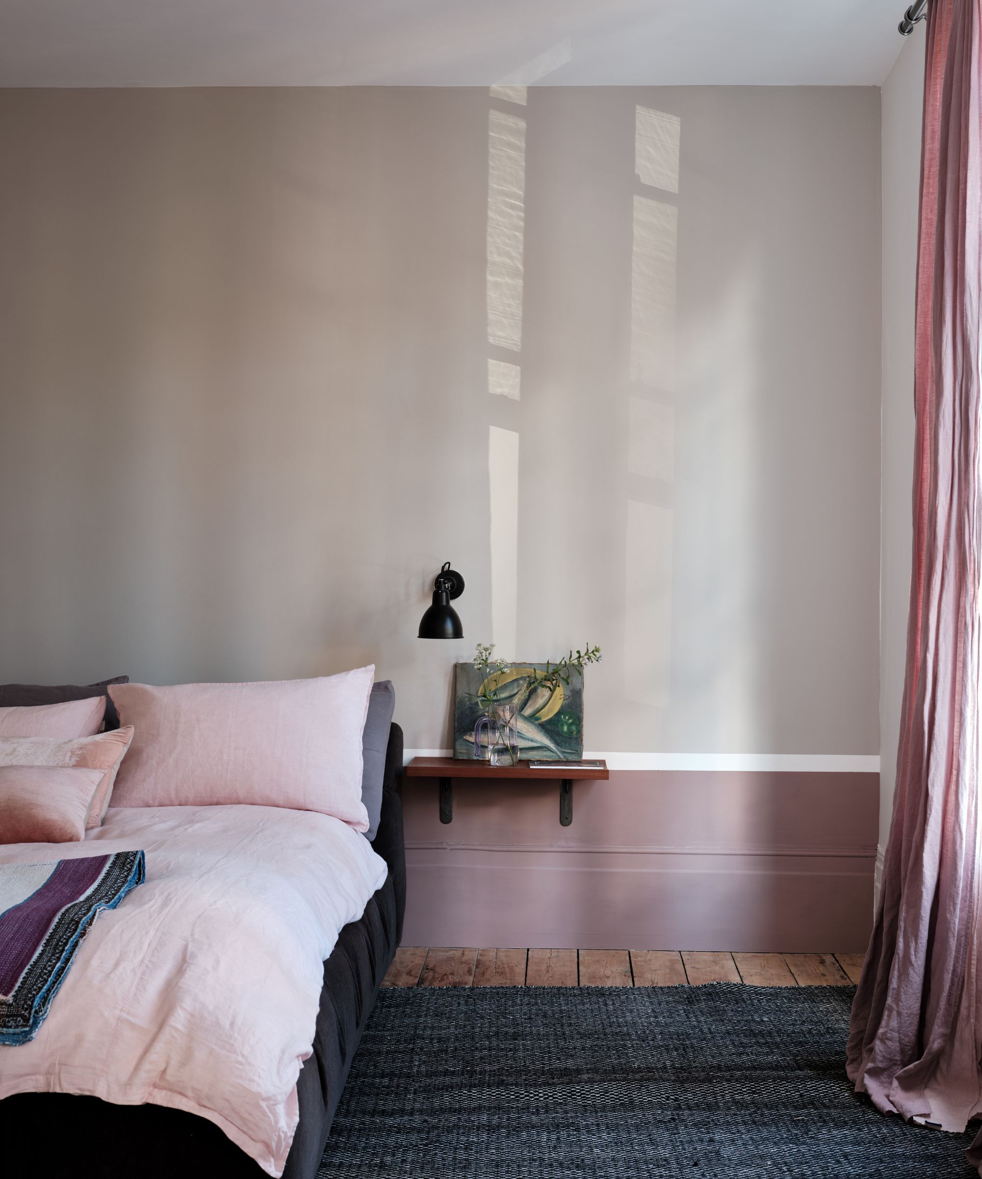
The article strongly recommends using peel-and-stick samples, such as those from Samplize, due to their accuracy (made with real paint), convenience, cost-effectiveness, and environmental benefits compared to traditional paint pots. Coordinating colors for Green Smoke include light gray, warm white, creamy taupe, pale gray-green, and very dark blue, with specific recommendations for Farrow & Ball shades like Shaded White, Schoolhouse White, Strong White, and Railings. The article also suggests pairing Green Smoke with other greens like Mizzle and Lichen, and even with reds or pinks for a cozy and dimensional palette.
An explanation of Light Reflectance Value (LRV) is provided, with Green Smoke having an LRV of 19, classifying it as a medium-dark color. Comparisons are made with other Farrow & Ball greens to help users select a lighter or darker alternative if Green Smoke isn't the perfect fit. For those seeking alternatives from more accessible brands, the article provides "dupes" for Green Smoke from Behr (Boreal, Village Green, Heritage Park), Sherwin-Williams (Taiga, Basil, Retreat), and Benjamin Moore (Intrigue, Caldwell Green, Lush, Cushing Green). While acknowledging that exact matches are rare, these options offer similar aesthetics. The final advice reiterates the beauty and versatility of Green Smoke, the existence of close matches from other brands, and the critical importance of sampling colors before commitment.
#FarrowAndBall #GreenSmoke #PaintColors #InteriorDesign #HomeDecor #ColorCoordination #PaintDupes #LRVExplained #KitchenDesign #FarrowAndBall #GreenSmoke #PaintColors #InteriorDesign #HomeDecor #ColorCoordination #PaintDupes #LRVExplained #KitchenDesign
0 comment in total
 No comments yet
You may also like
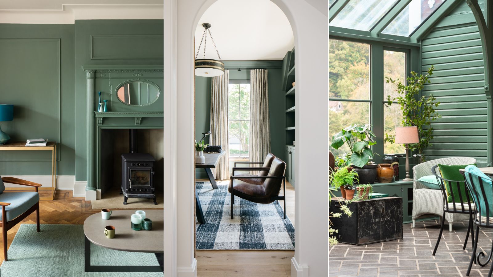
5 ways to decorate with Farrow & Ball's Green Smoke – an endlessly versatile paint color

I asked 3 interior designers for their must-try paint colors in 2025 – they are all the perfect 'in-between' shades
The Woman Behind Farrow & Ball’s Most Iconic Colors Has a New Favorite for 2025
Shea On Farrow & Ball's New Paint Colors
These 13 Green Paint Colors Are the Best We’ve Ever Seen


What's Your Fancy: Farrow & Ball's Color Guru Takes on Entertaining
The 10 Best Farrow & Ball Paint Colors of All Time

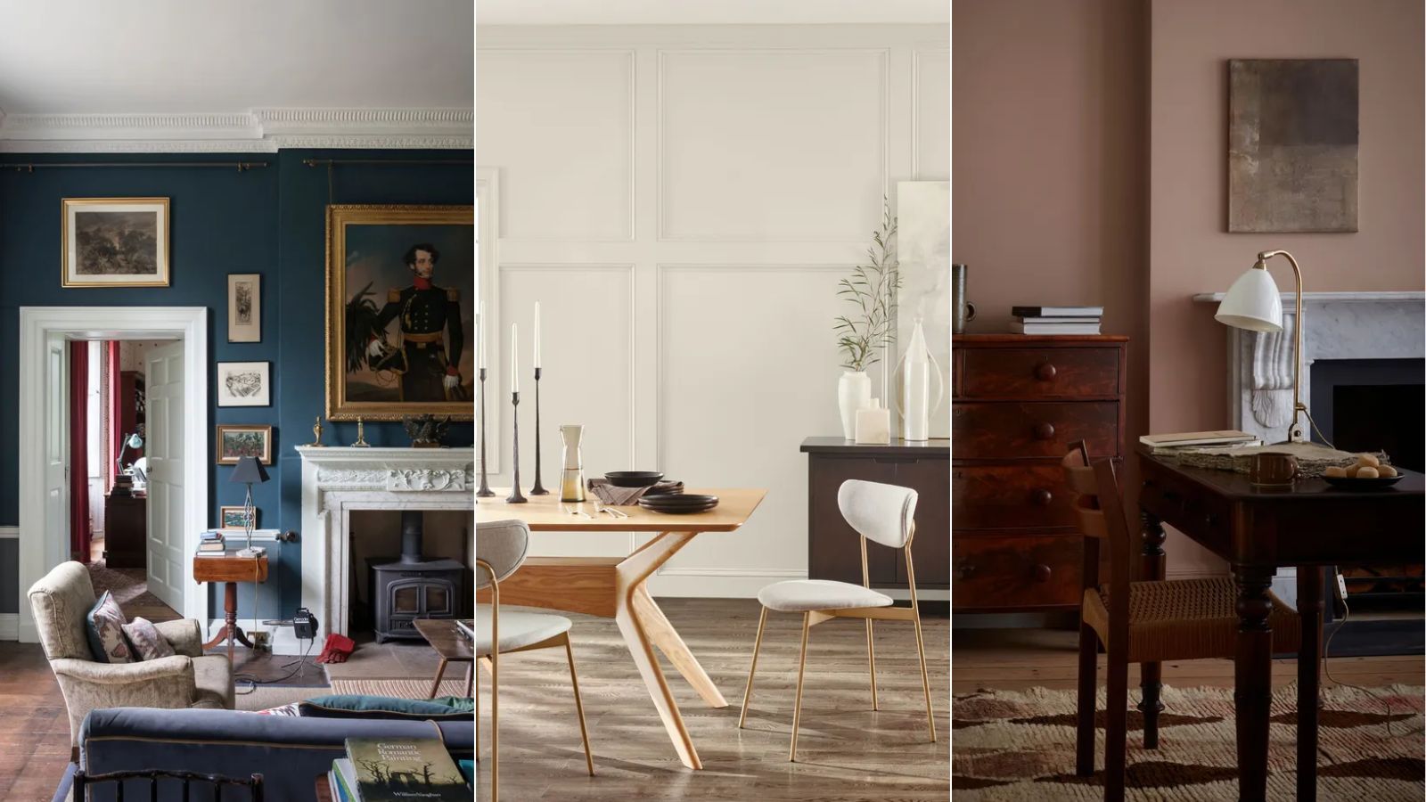
We asked paint brands what their most popular shades of 2024 were – these were the 13 favorites
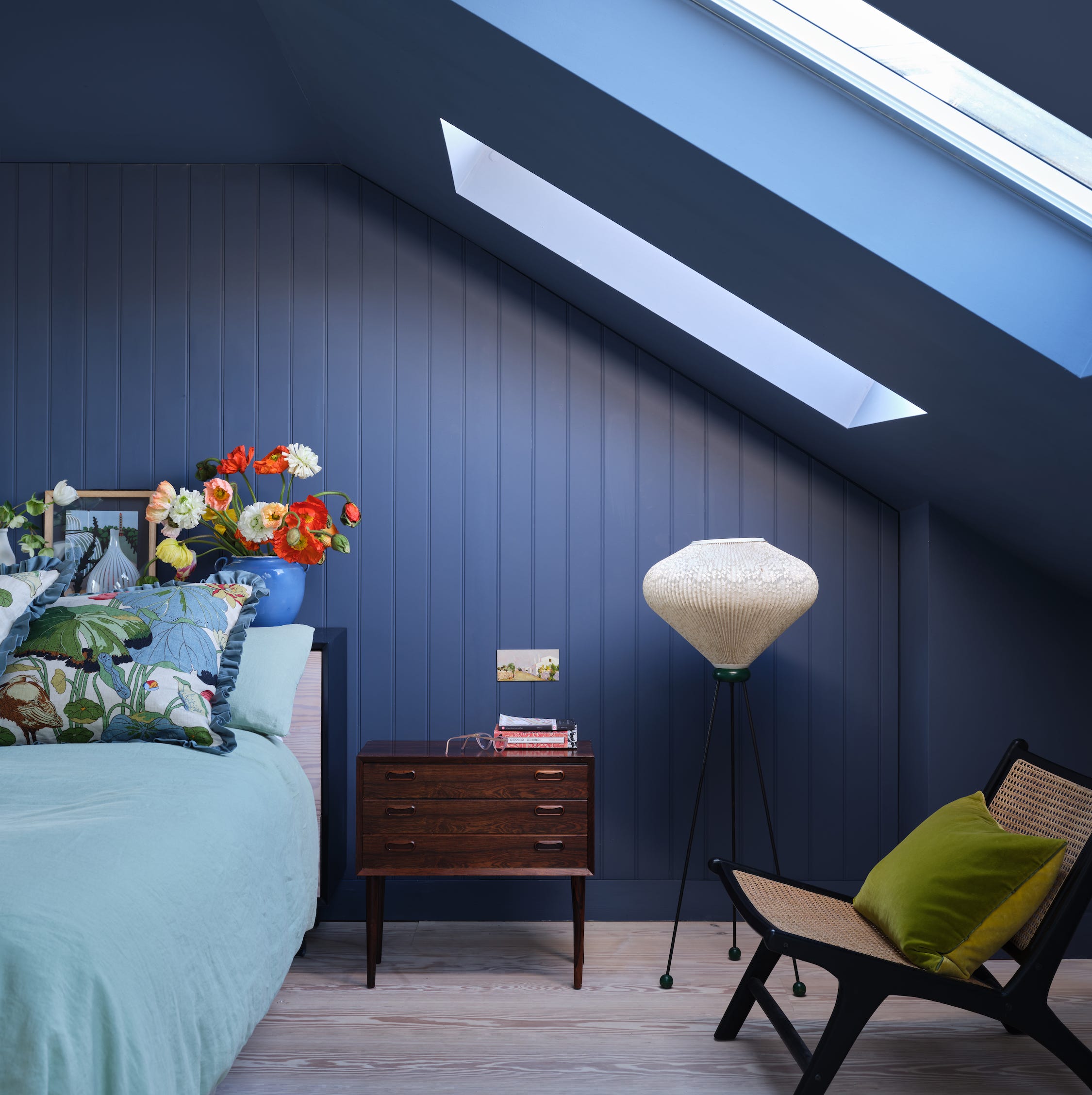
First look! Farrow & Ball has just released 11 new colours

DUPES for Farrow & Ball Scallop, Kakelugn, Marmelo, Naperon, Duster, Sizing, and more
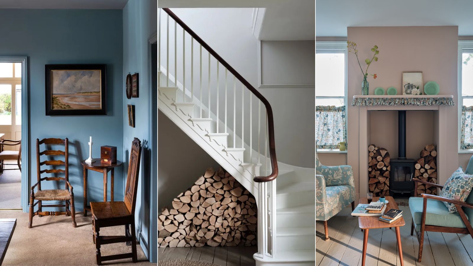
Interior designers' favorite Farrow & Ball paint colors
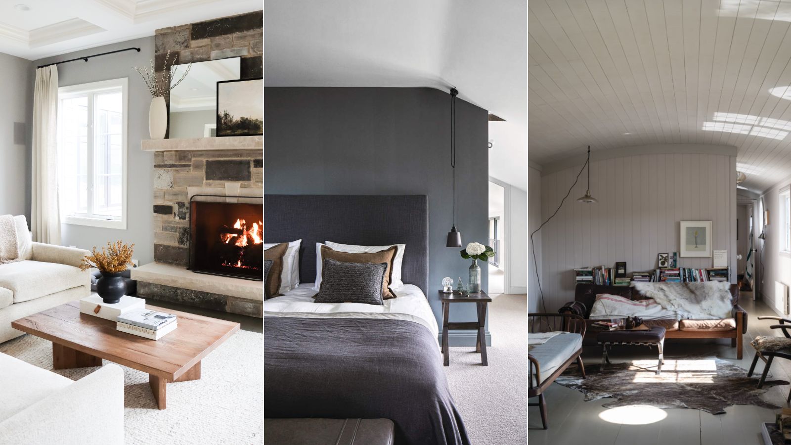
5 of the best gray paints that interior designers love using
Farrow & Ball Purbeck Stone: DUPES, coordinating colors & Sarah’s full review
These 10 Farrow & Ball colors are their most popular paints – from earthy neutrals to deep and dark shades
Farrow & Ball and Liberty Just Made Matching a Paint Color to Your Sofa Infinitely Easier

6 calming and cozy paint colors from Farrow & Ball
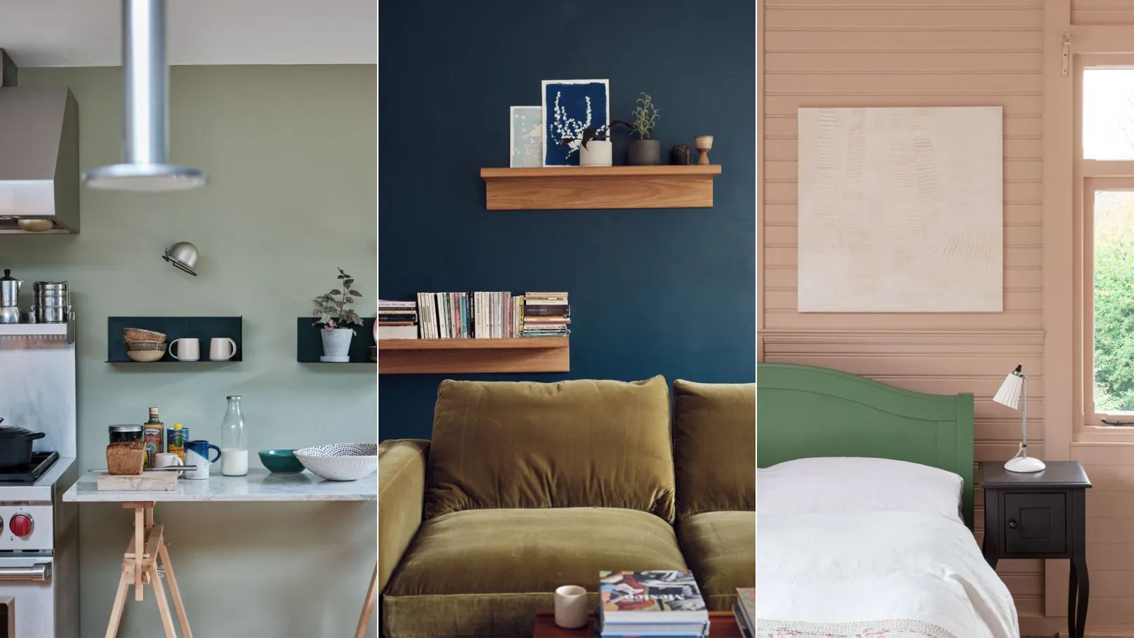
These are Farrow & Ball's current 'most loved' paints – and how to decorate with them throughout the home
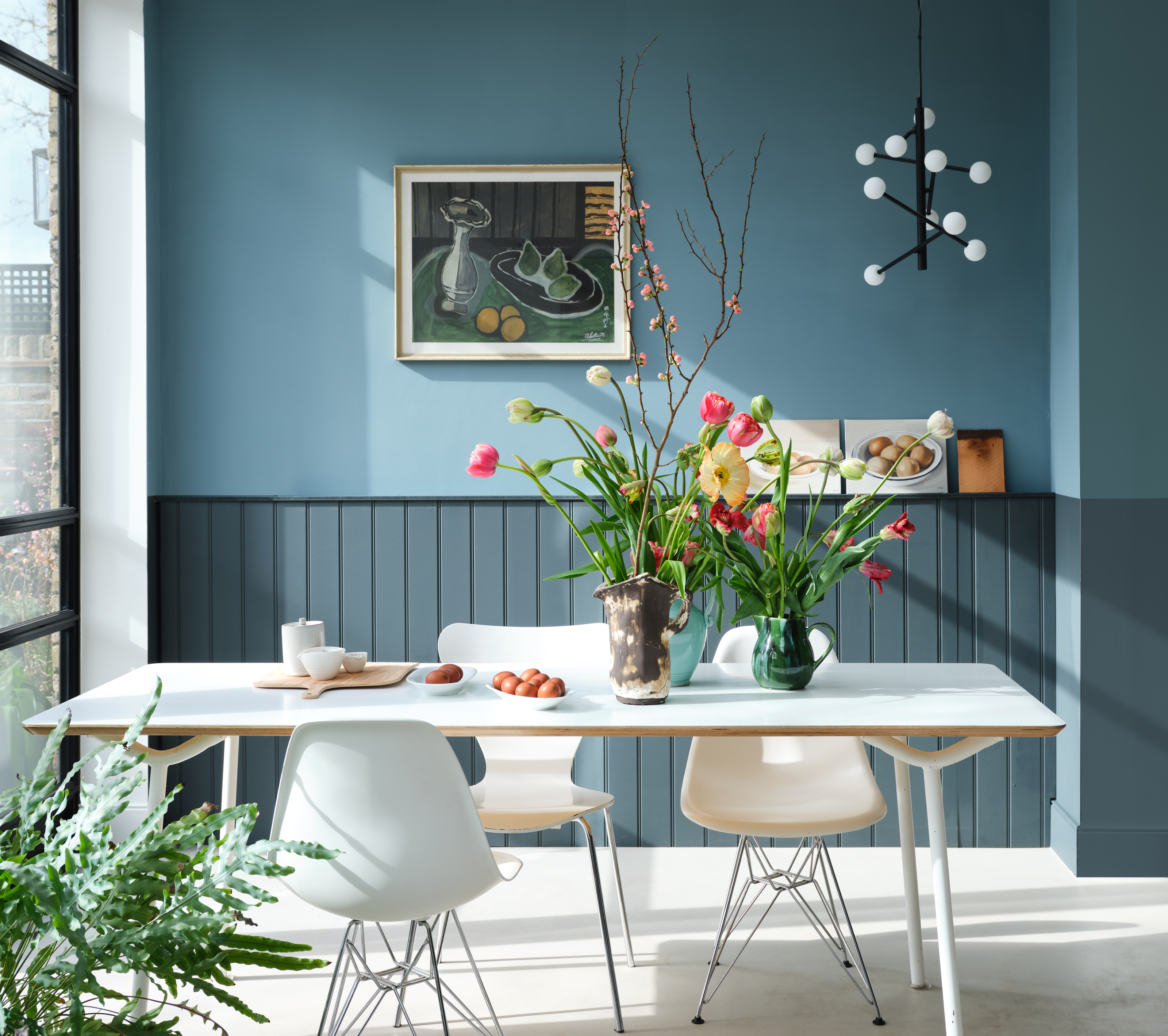
Farrow & Ball's new colors have just launched – we ask designers how to use this calm, yet colorful palette

The top 54 paint colours of the decade – all the shades we couldn't live without
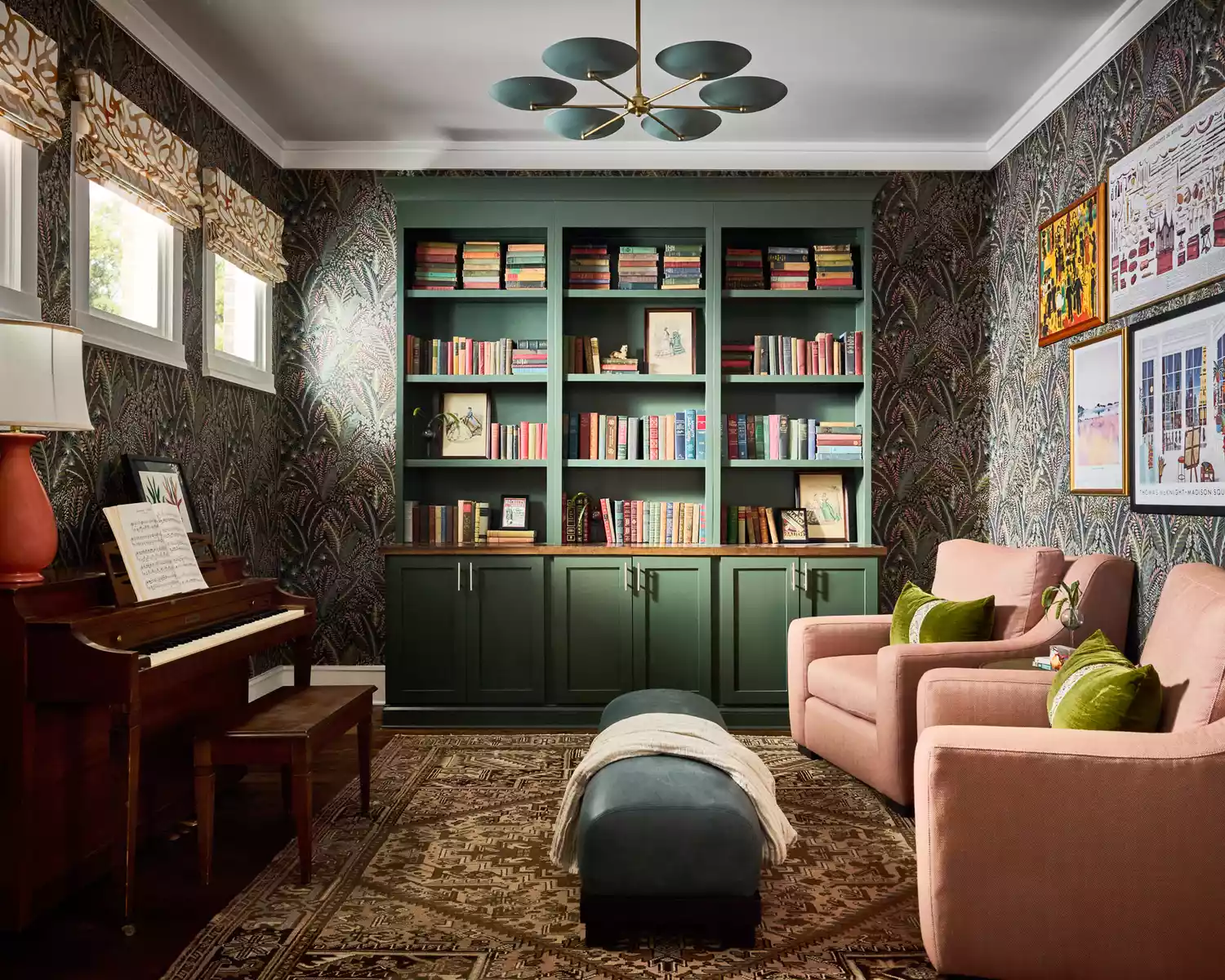
17 Green Paint Colors for Every Room in Your Home, From Soothing Sage to Electric Emerald