1/9
8 Paint Color Trends You'll ACTUALLY Want to Live With in 2026, According to Designers
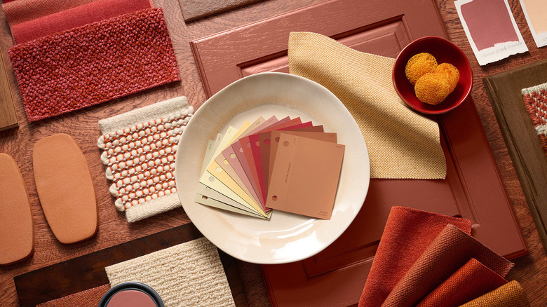
In 2026, paint color selection is shifting from trend-chasing to choosing shades that evoke a desired mood and personal comfort. Designers are moving towards colors that are warm, grounding, and expressive, yet versatile enough to age gracefully within a home. The palette for the upcoming year emphasizes hues that feel inherently personal and enduring, rather than fleeting fads.
One prominent trend is the adoption of 'Oatmeal' neutrals, exemplified by Farrow & Ball’s Stirabout. This soft, warm neutral features subtle red undertones, creating a tranquil and chic backdrop that pairs well with natural woods, soft whites, and muted blues. Designers appreciate its longevity and modern feel, making it a reliable choice for various spaces.
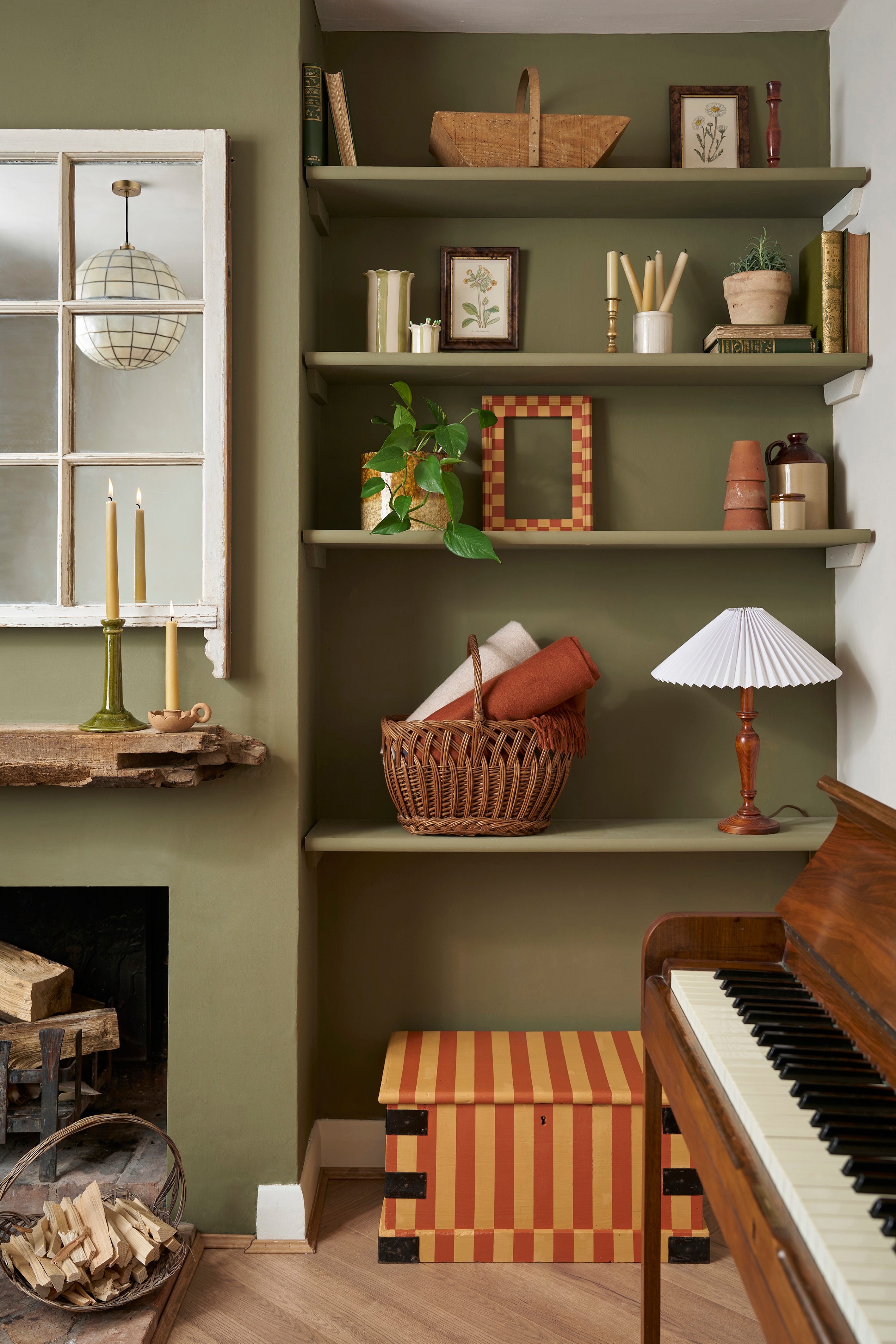
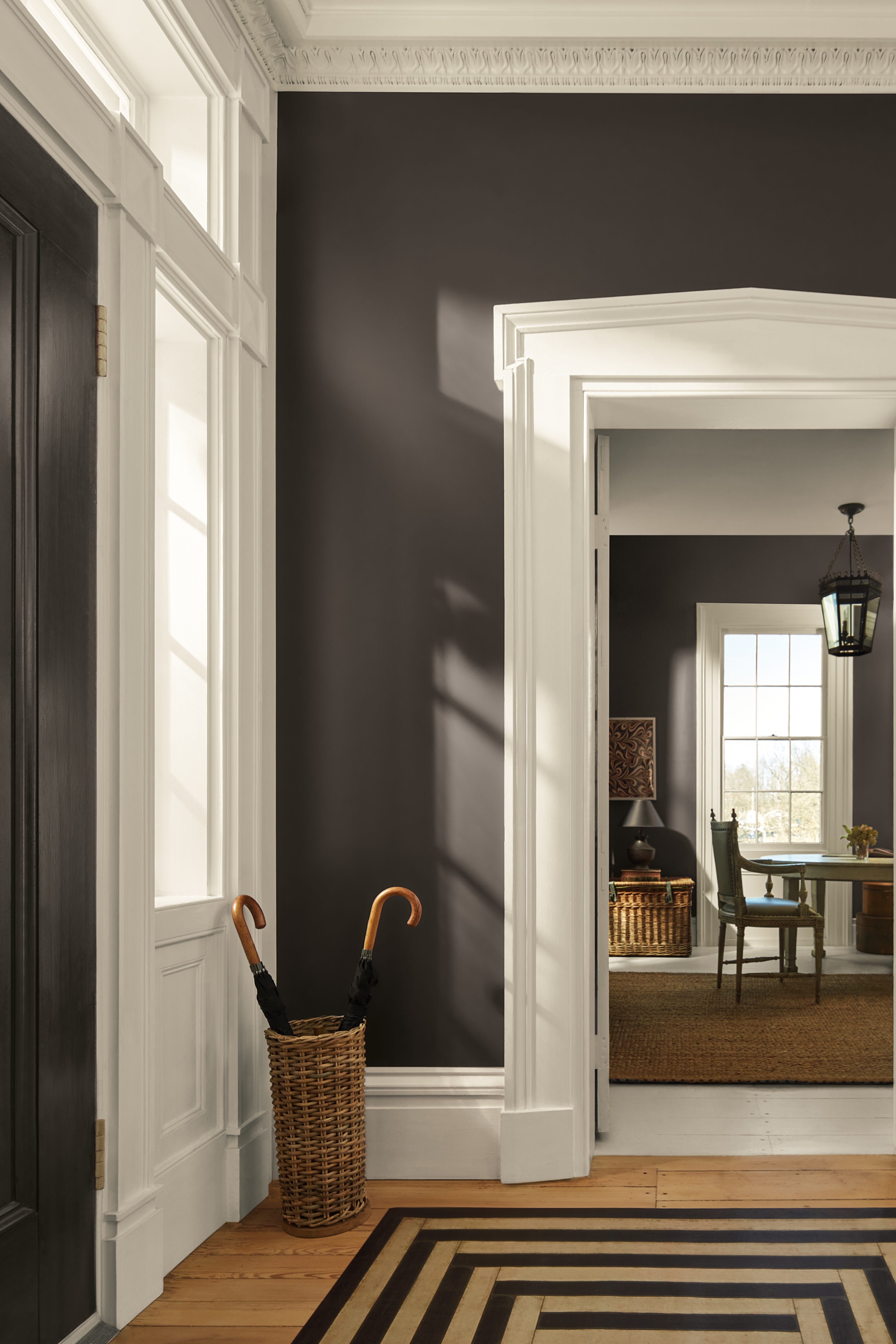
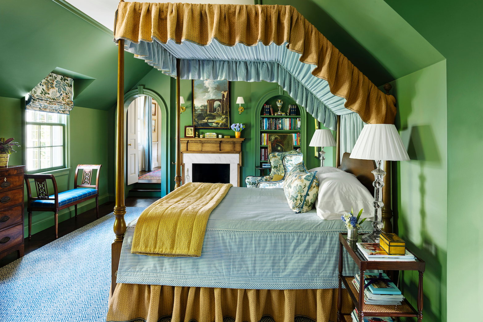
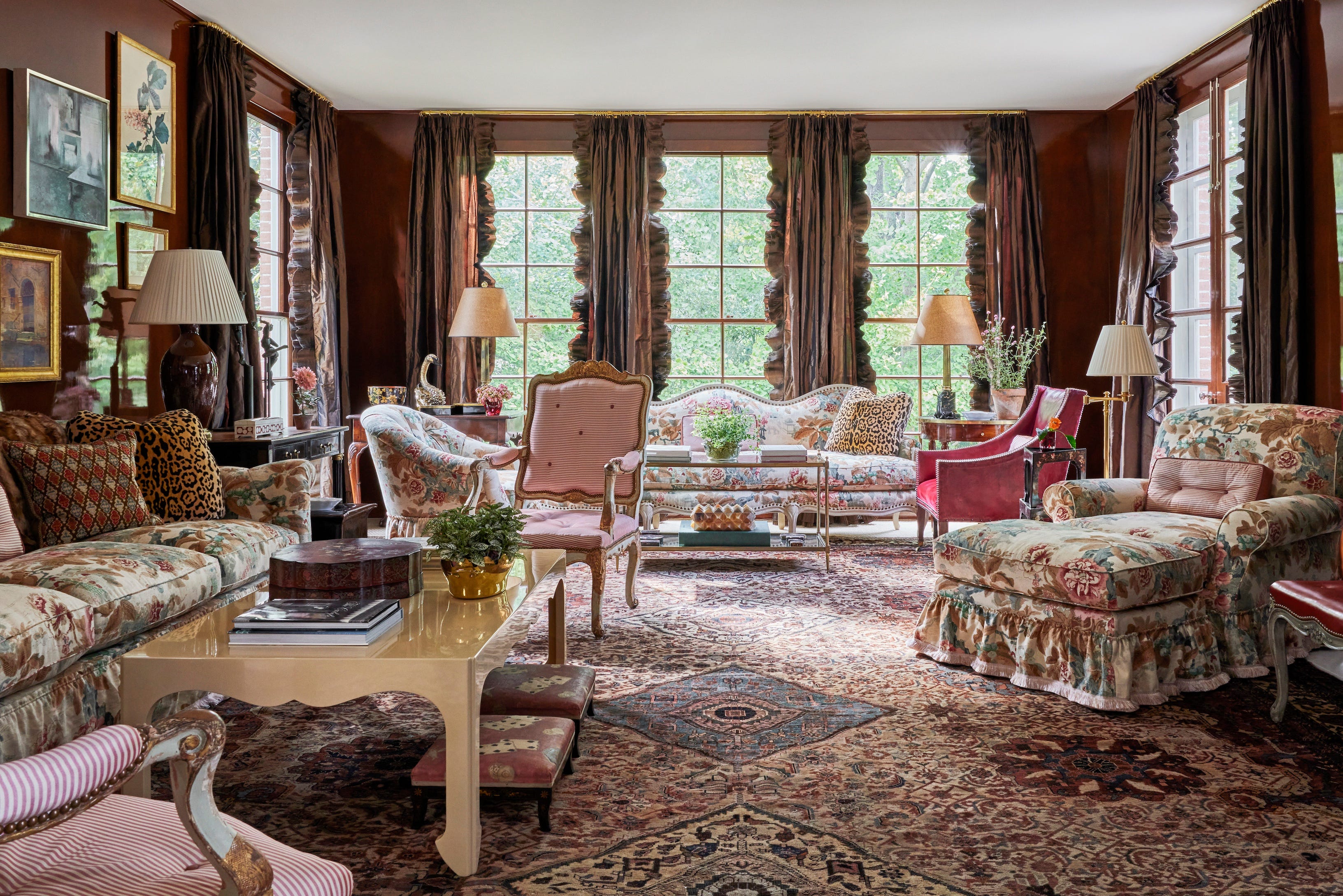
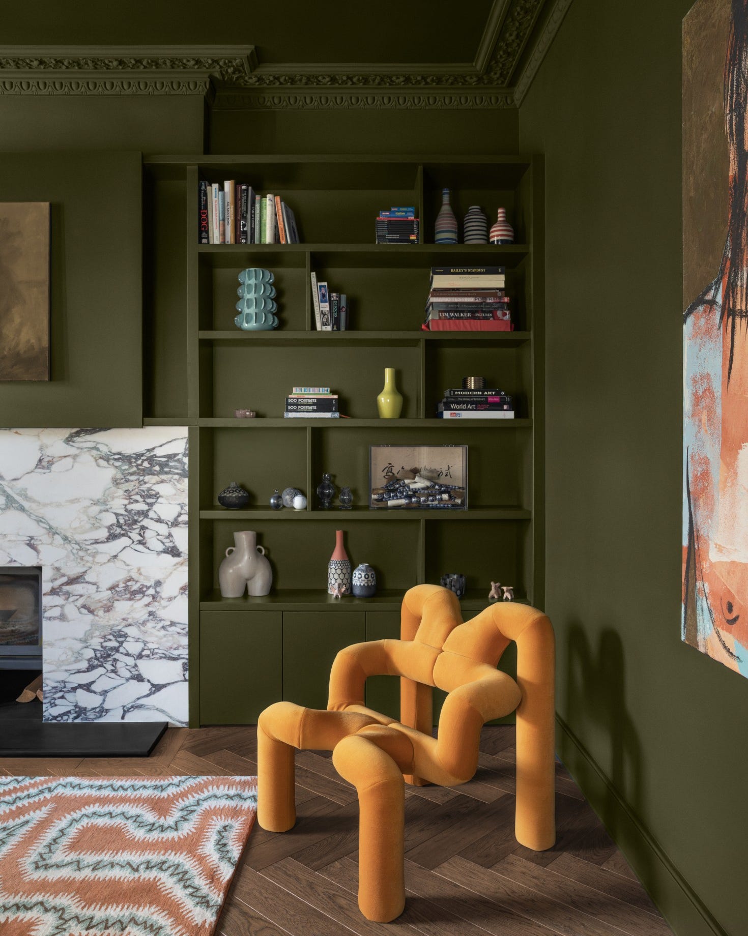
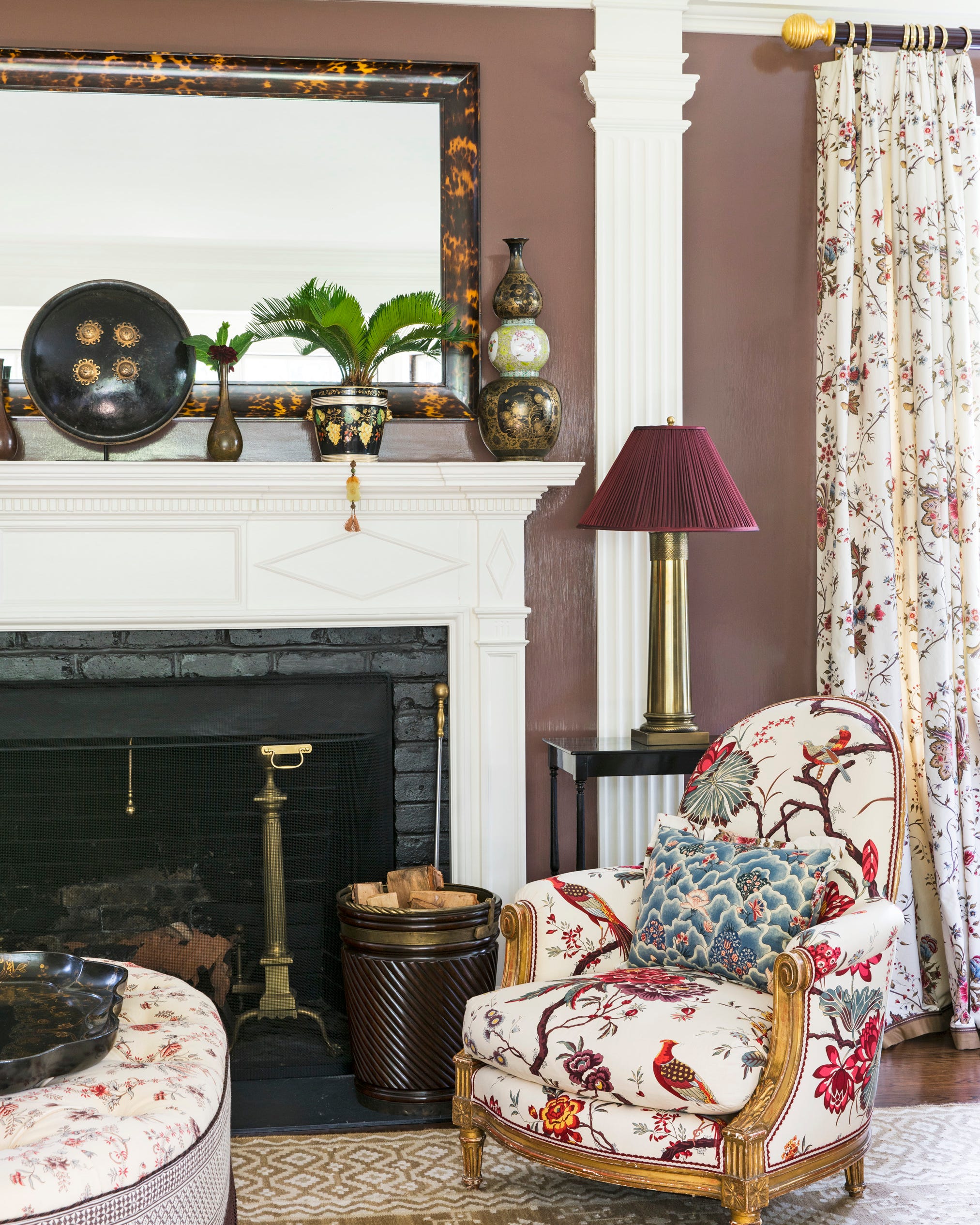
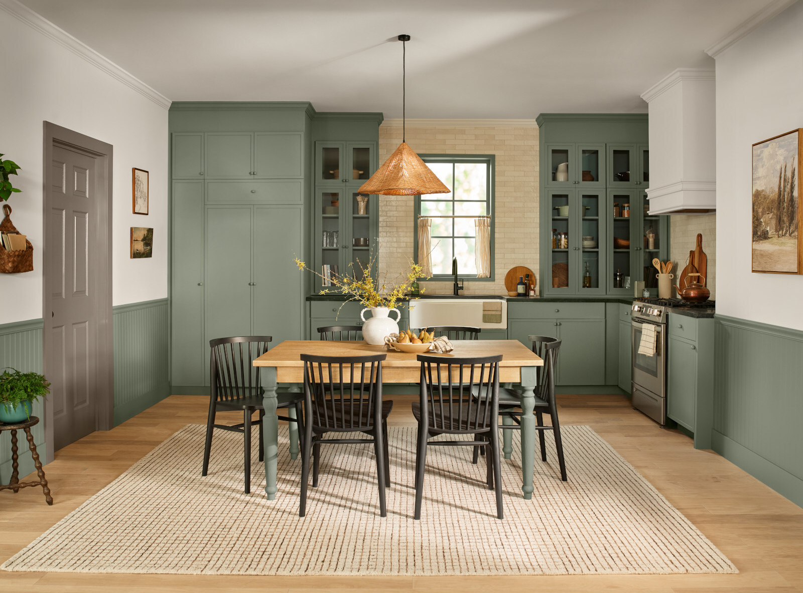
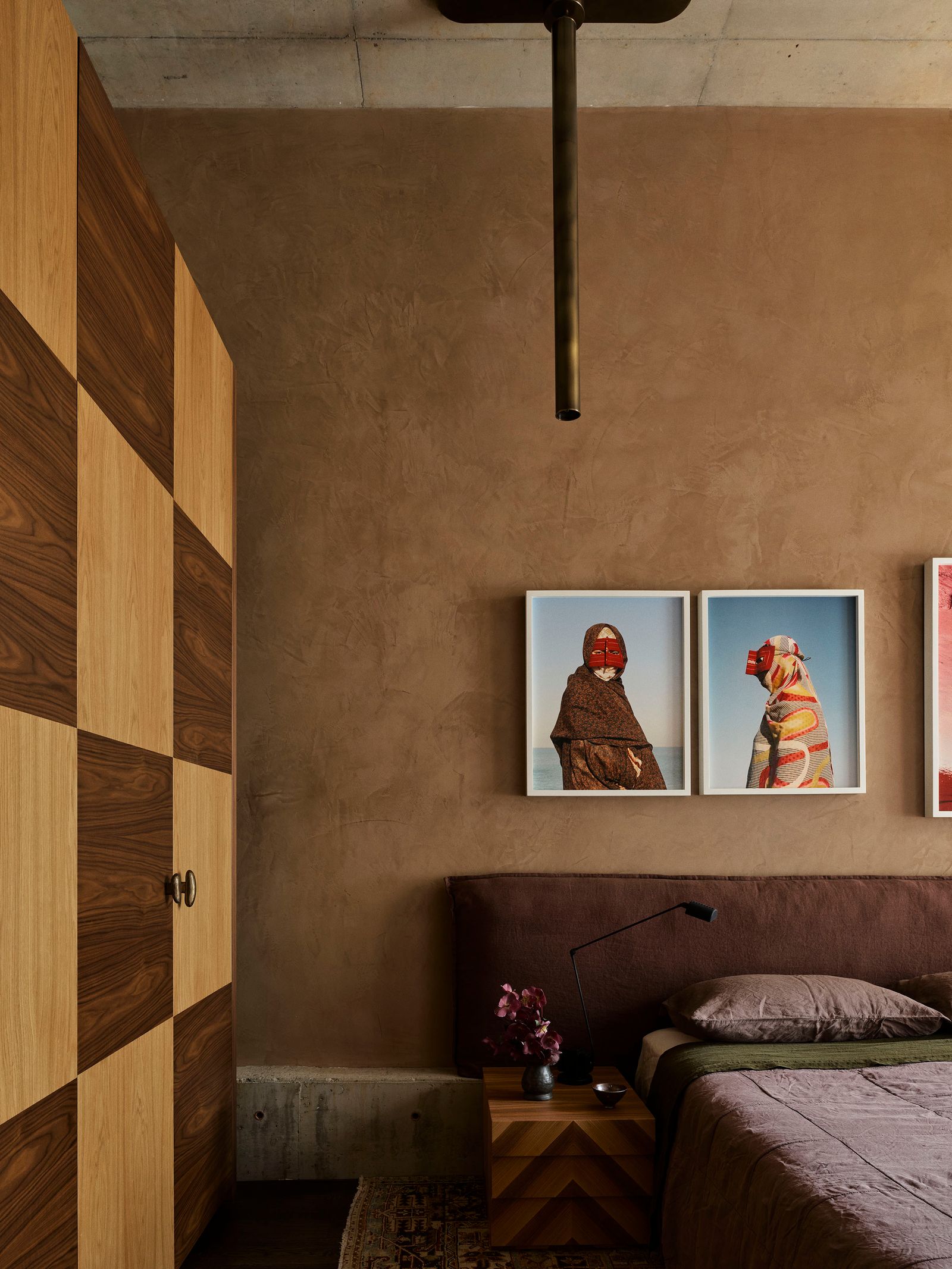
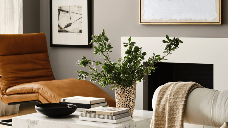
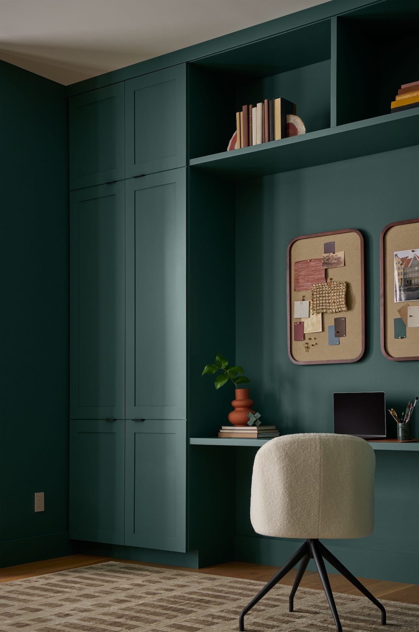
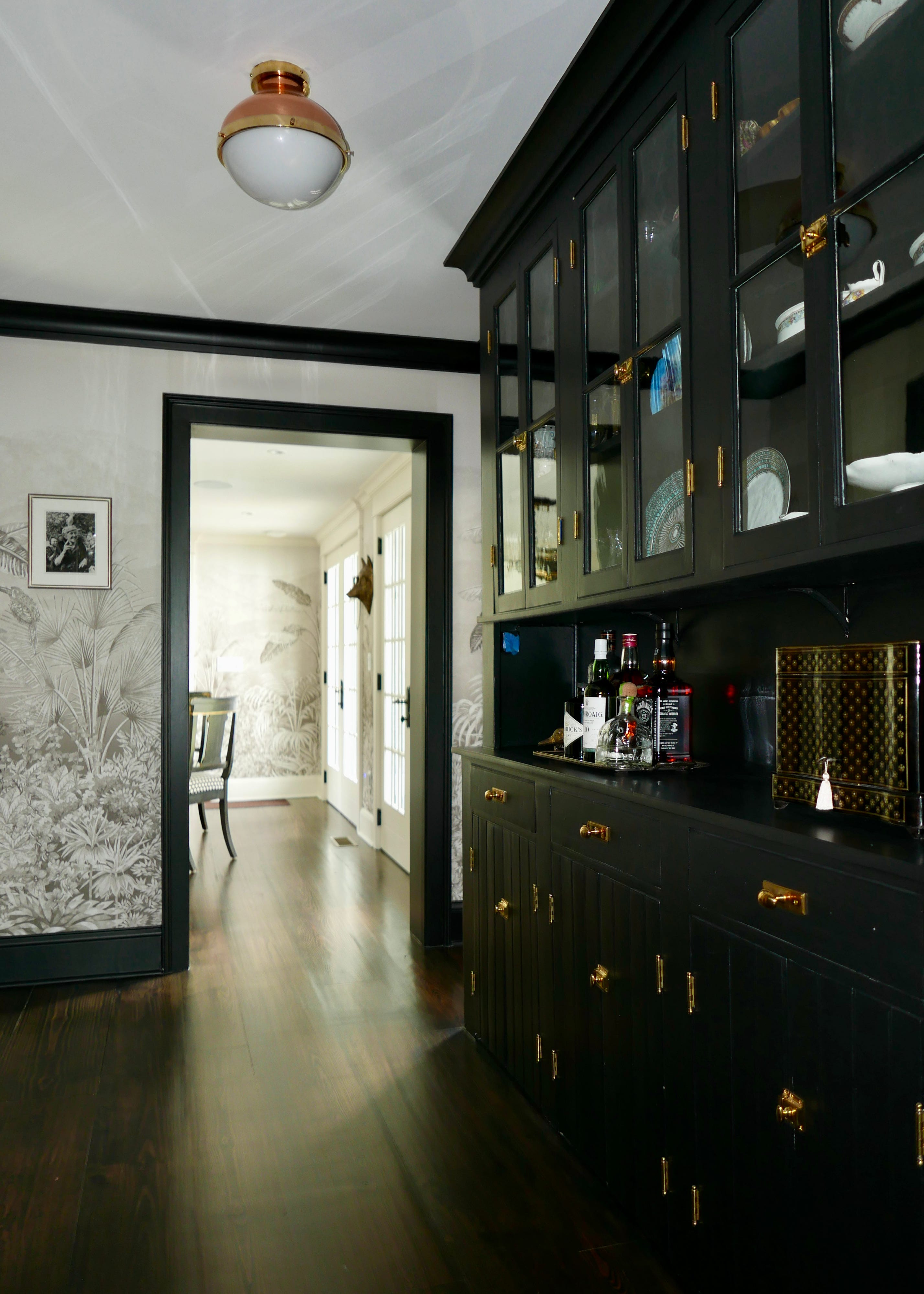
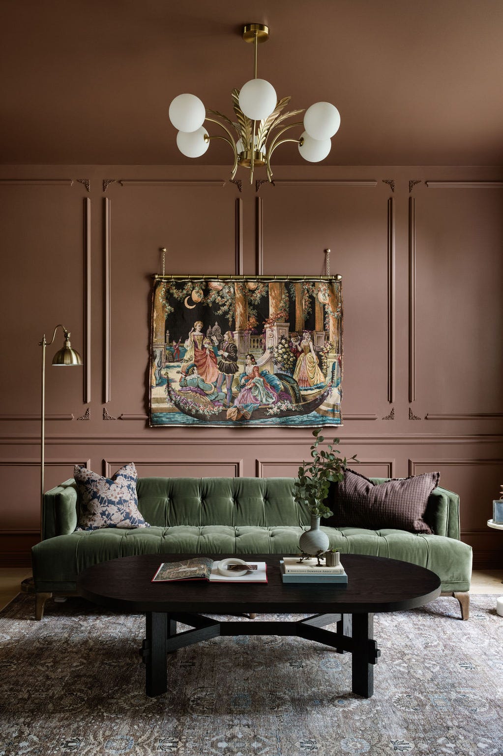
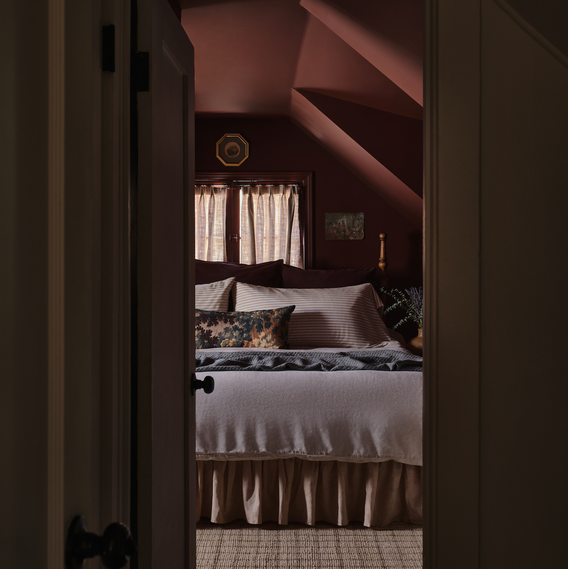
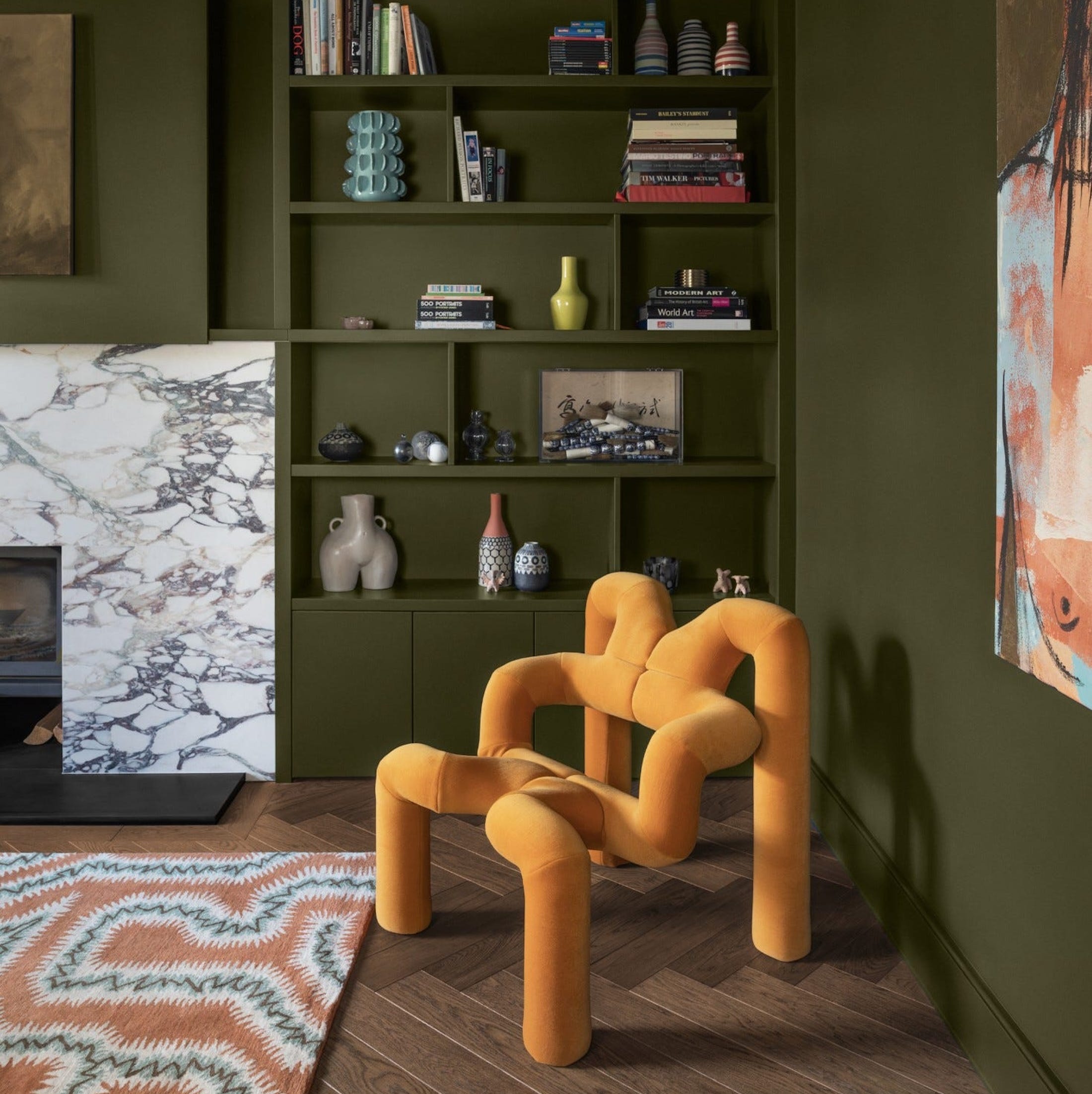
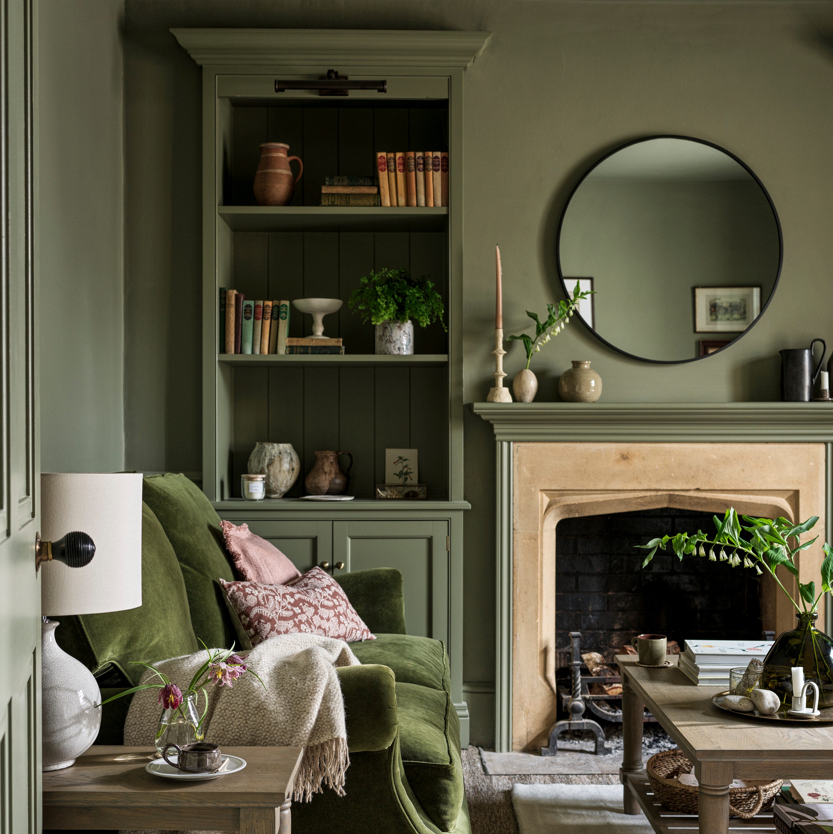
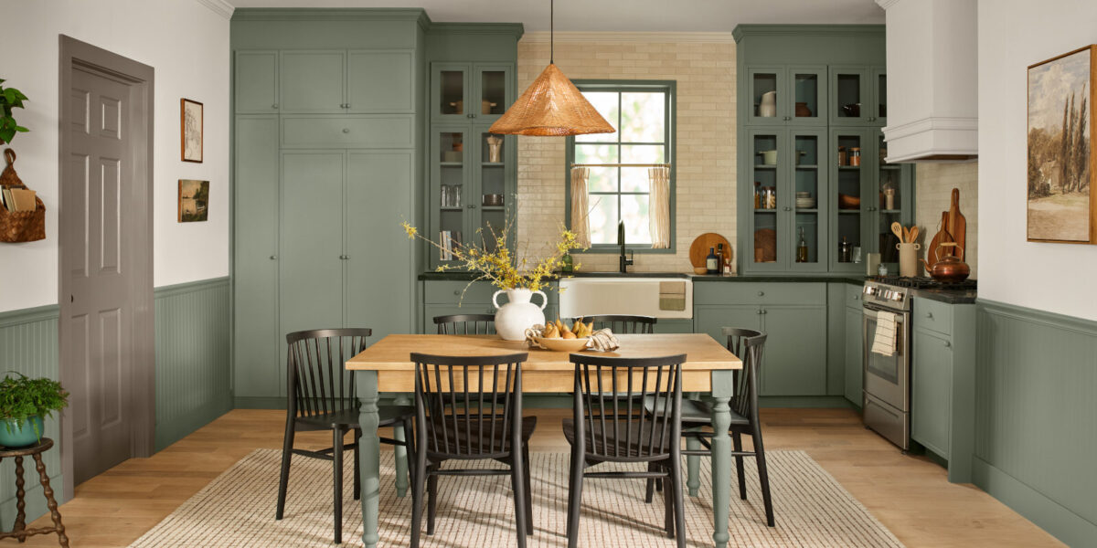
Another significant color gaining traction is 'Tobacco' brown, often seen in shades like Farrow & Ball’s London Clay. This rich, grounding color delivers intimacy and elegance without heaviness, suitable for bedrooms, living areas, or cabinetry. It aligns with a broader movement towards colors deeply connected to the natural world, suggesting homeowners are seeking depth and expression in their interiors.
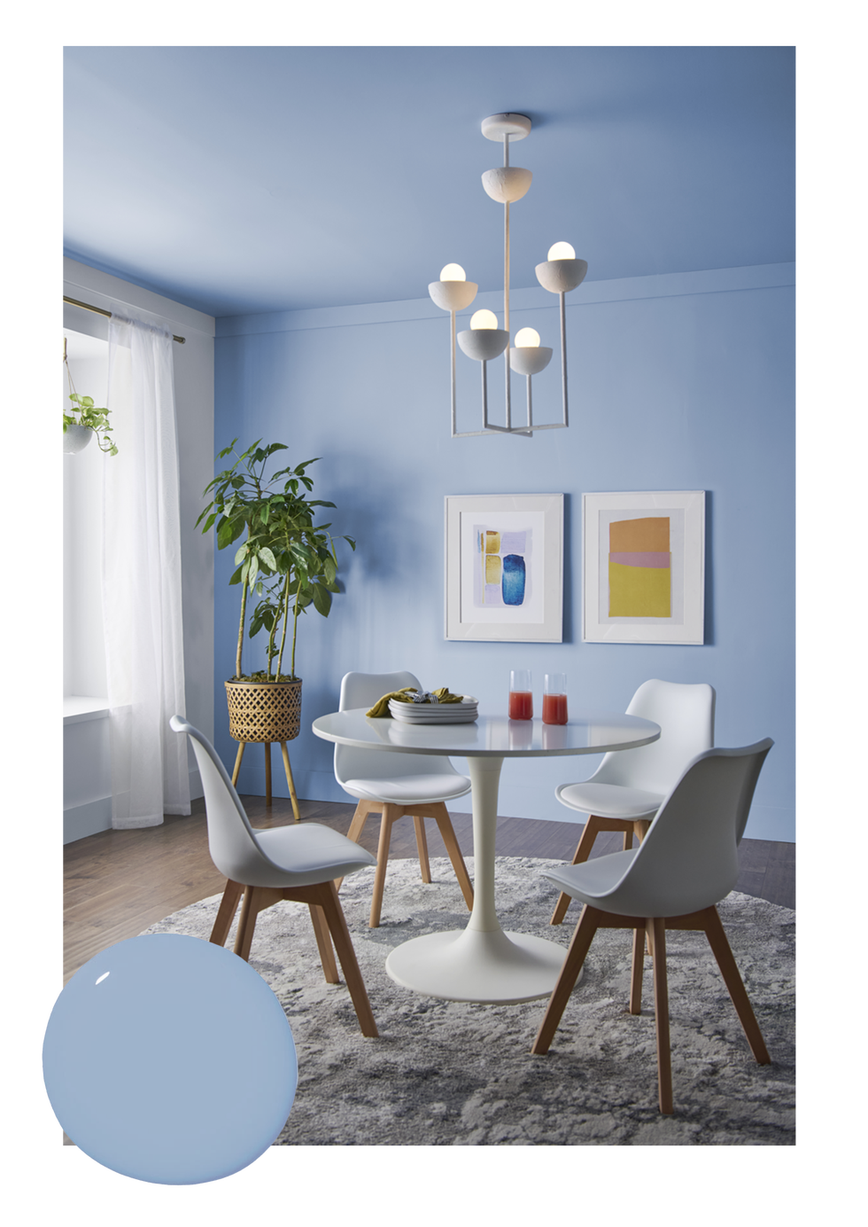
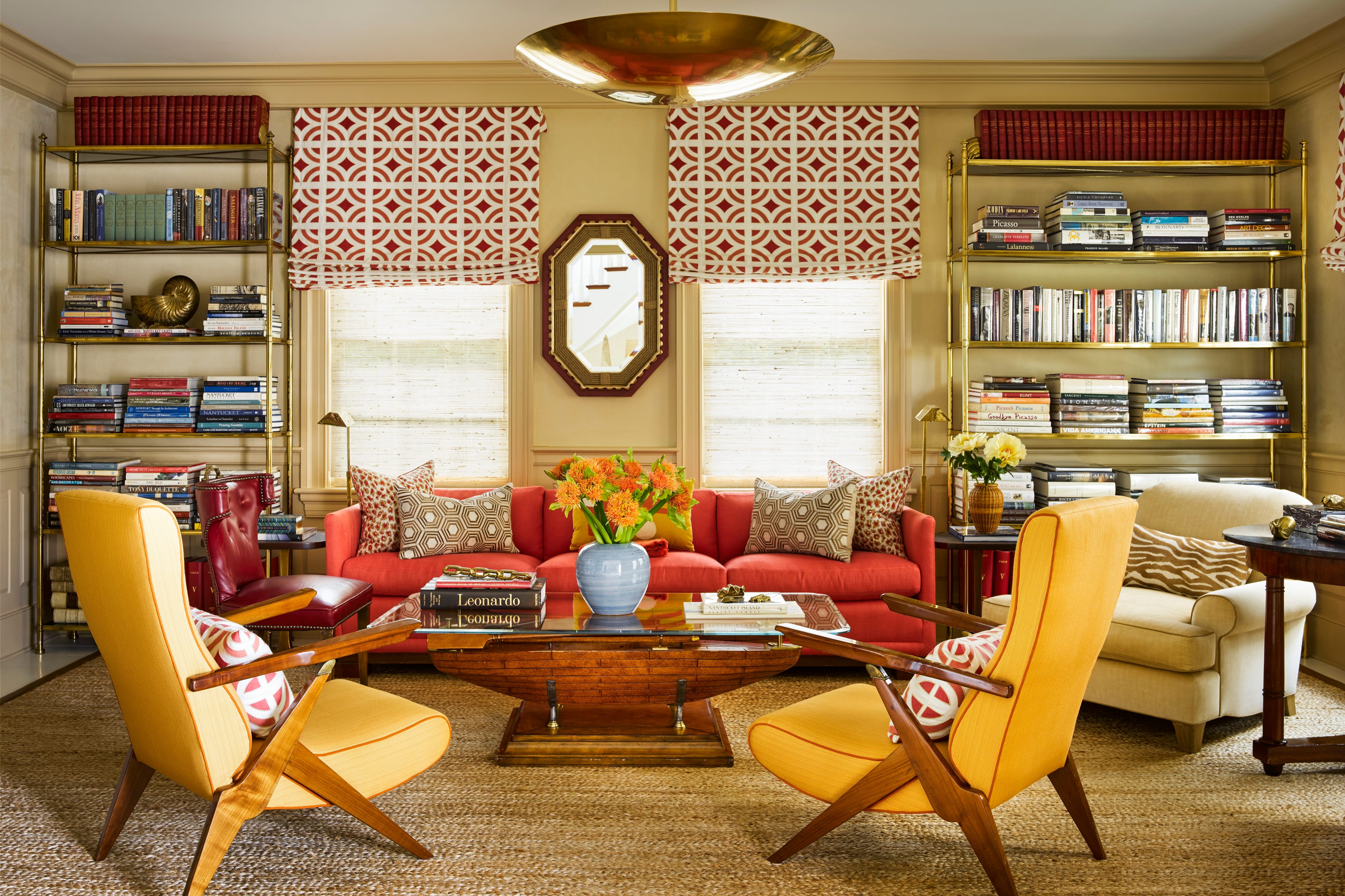
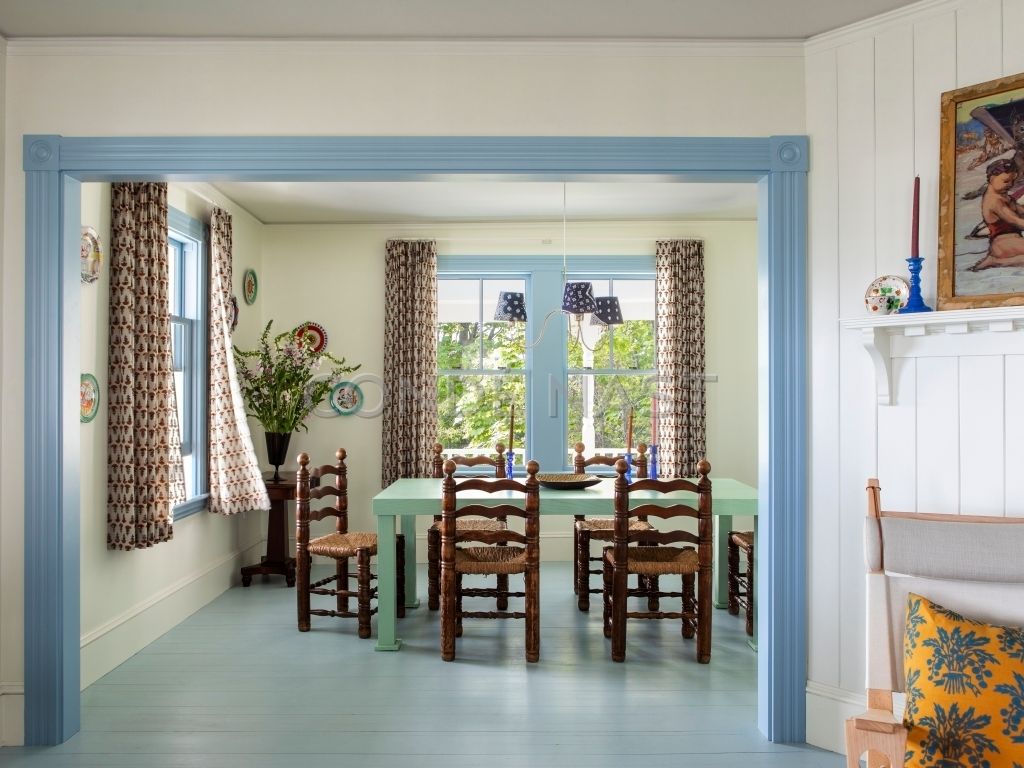
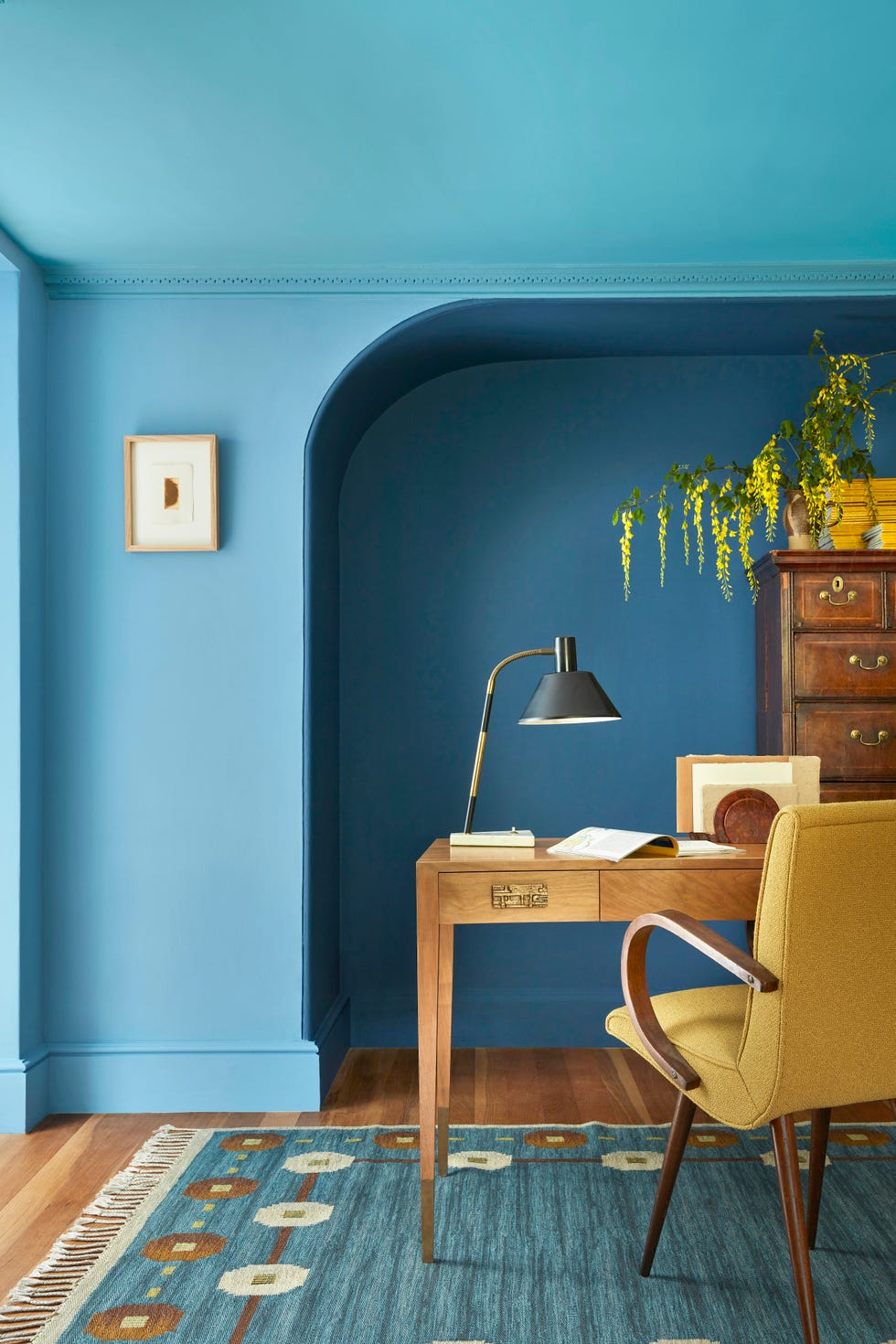
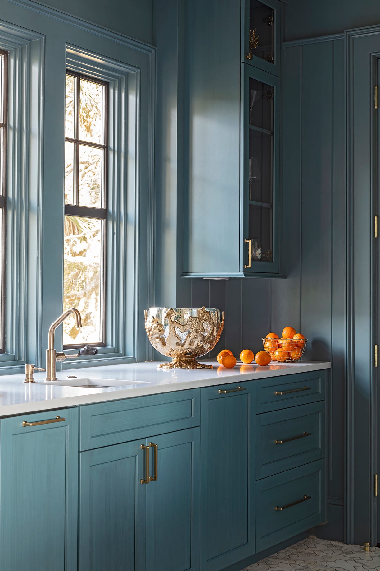
'Coastal Blue' continues its timeless appeal, especially for homes seeking a serene, adaptable aesthetic. Designers favor its versatility, noting its harmonious interaction with yellows, oranges, whites, and greens. Soft, breezy blues such as Benjamin Moore’s Summer Shower and Iceberg are highlighted for their ability to create a calm, clear atmosphere on walls, millwork, and textiles, ensuring a curated look that evolves with the home.
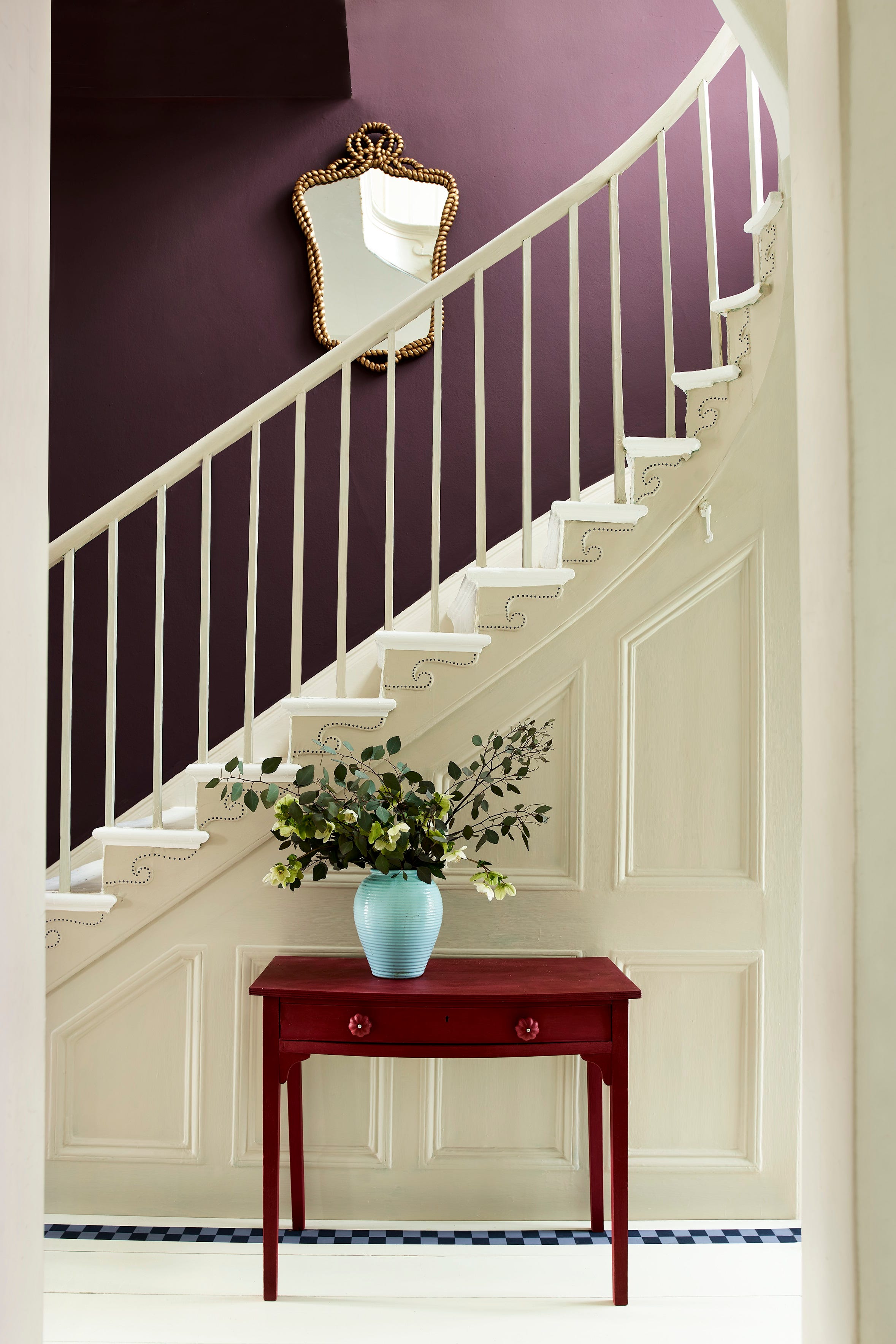
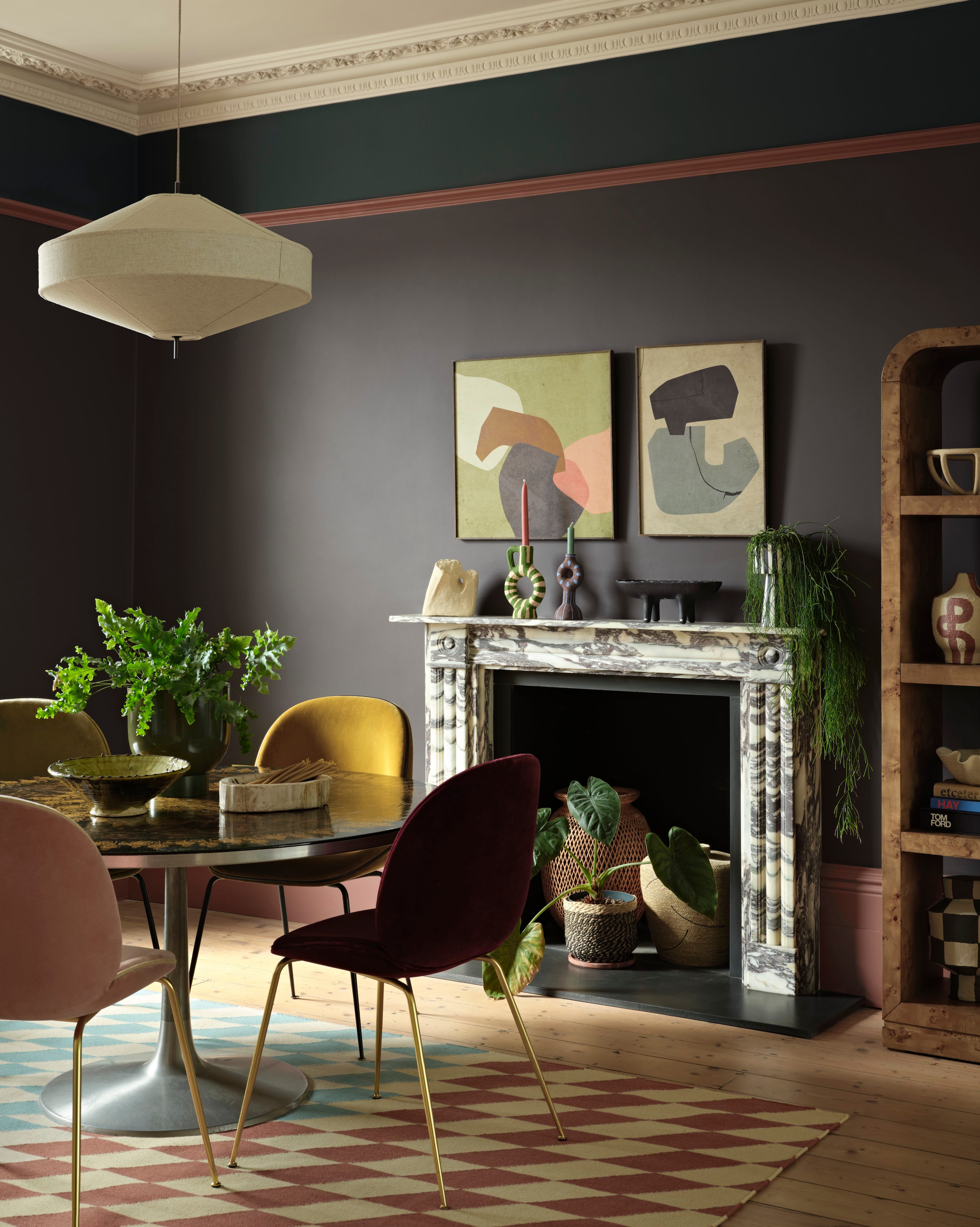
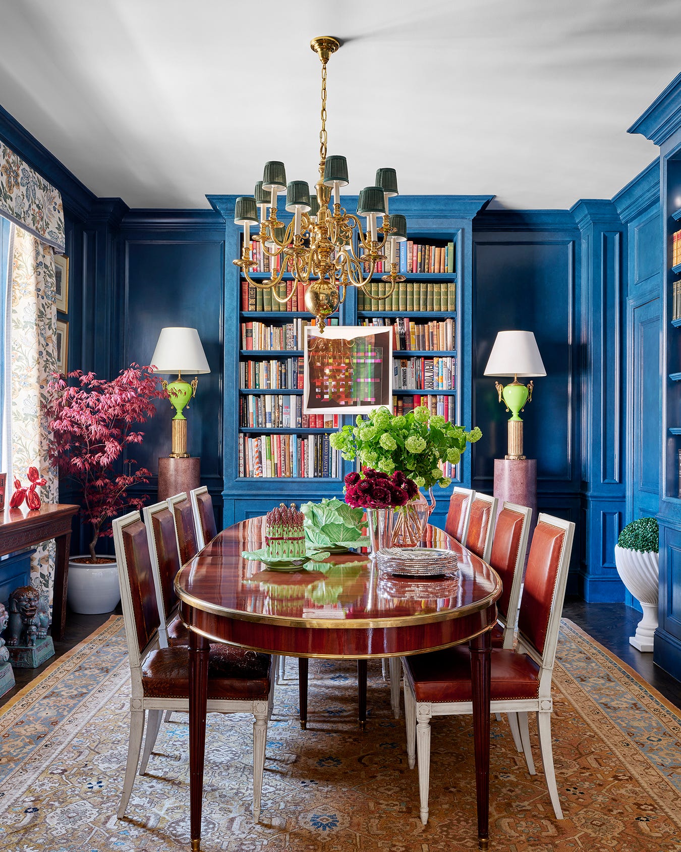
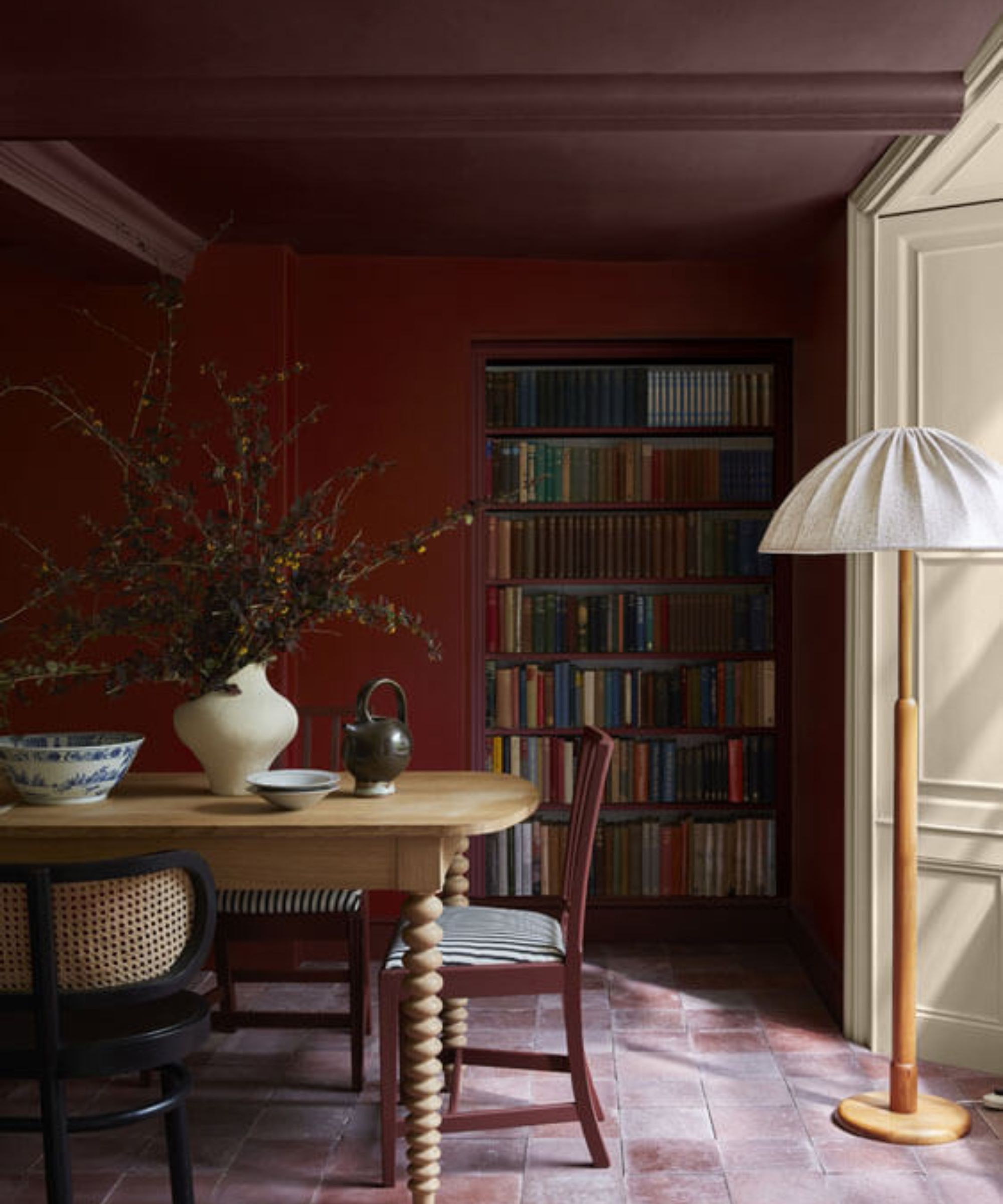
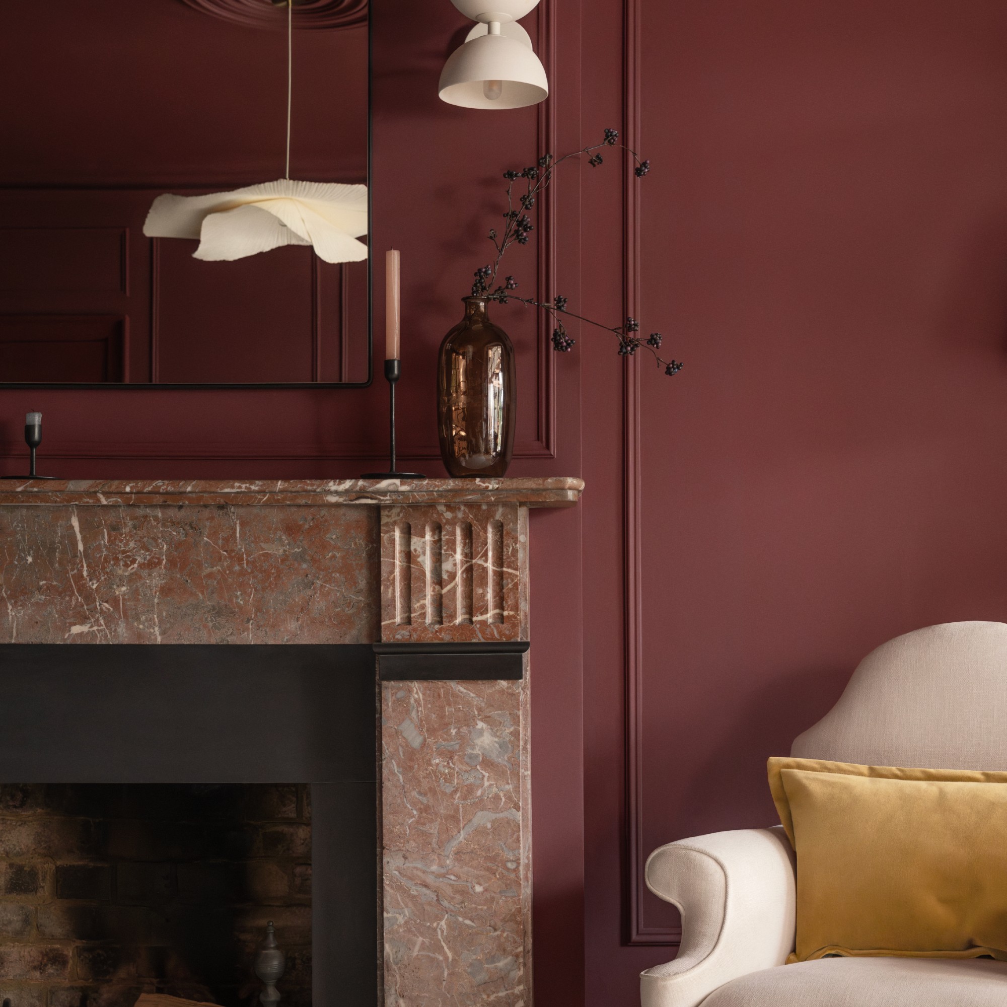
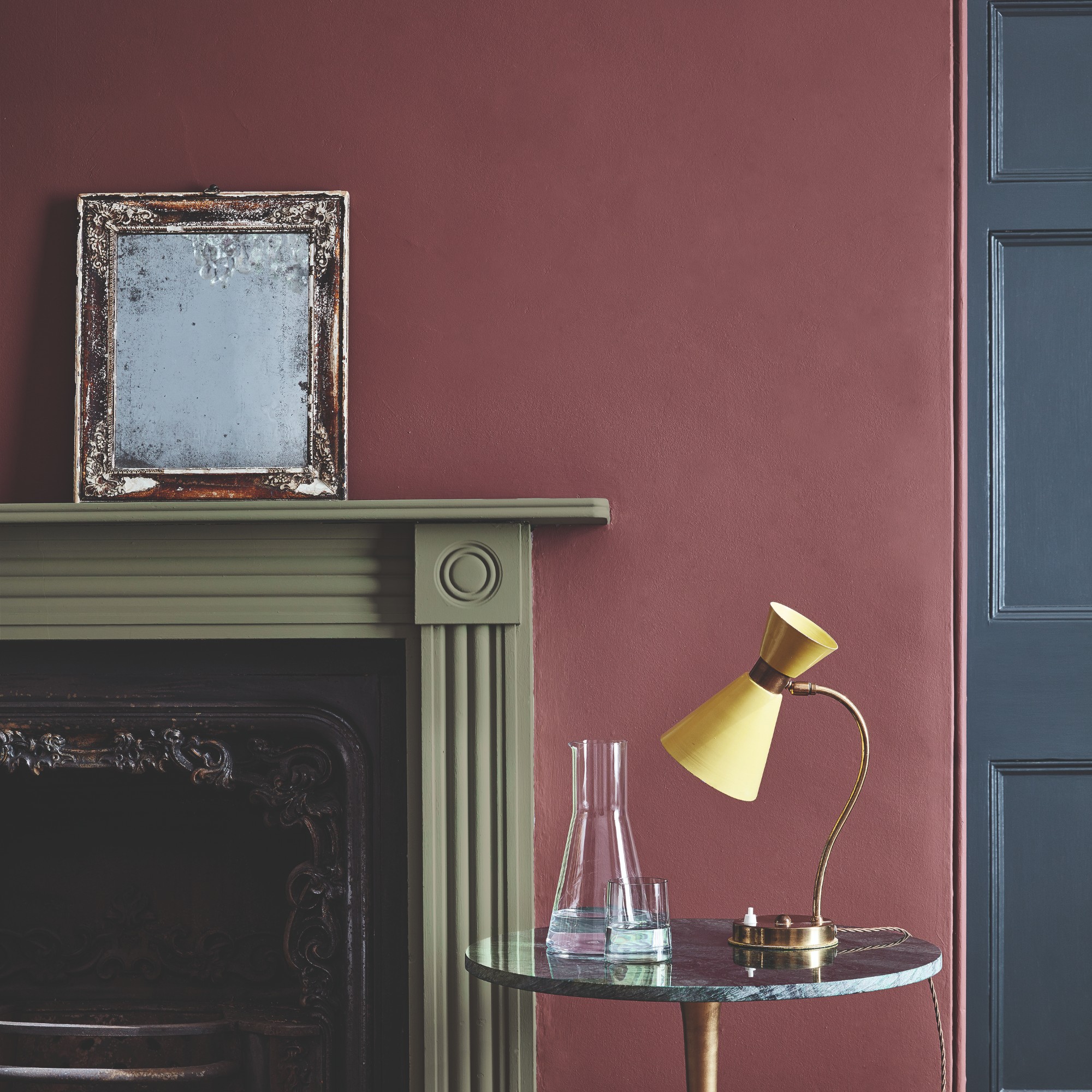
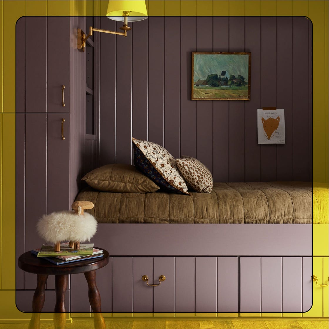
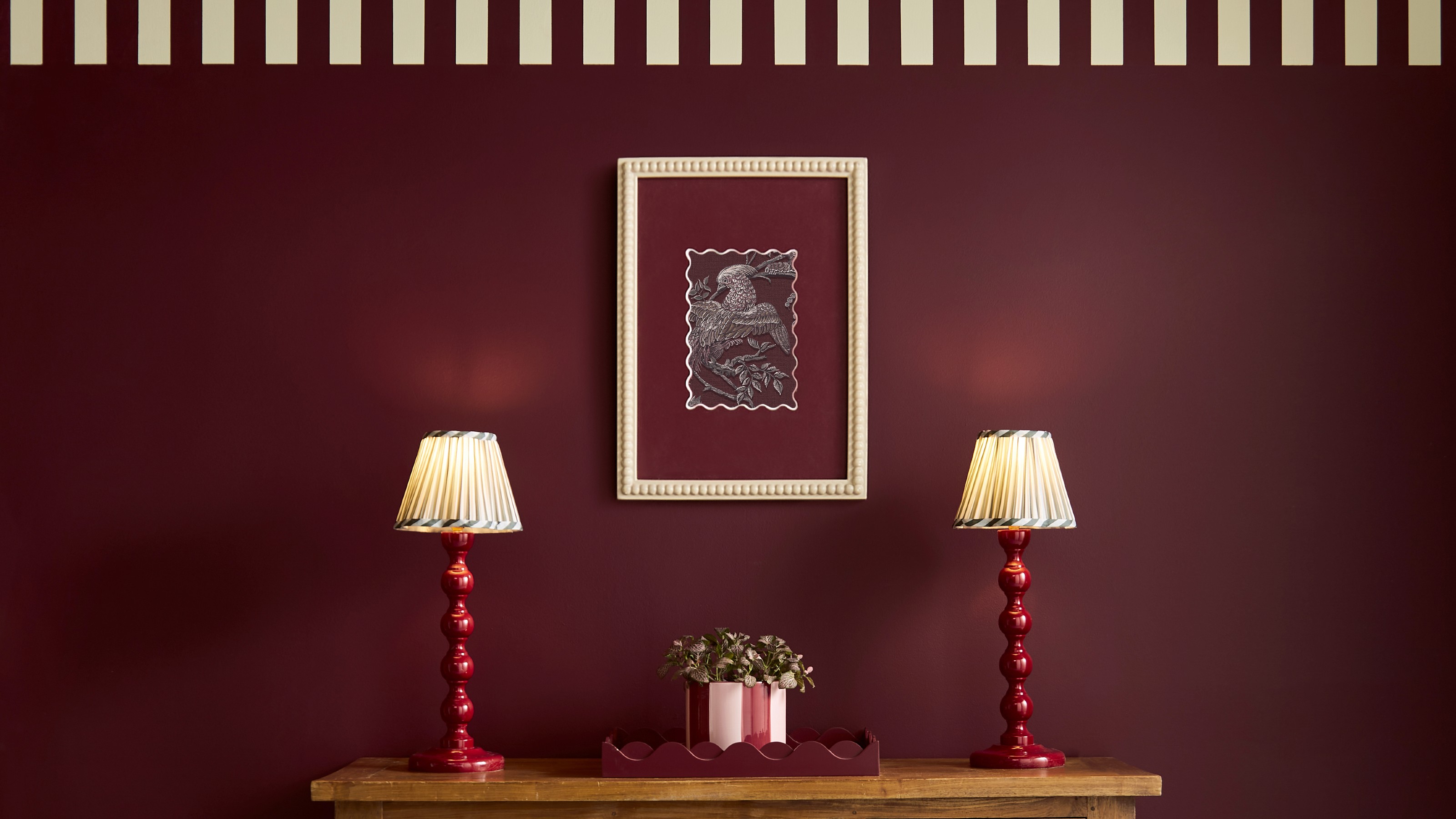
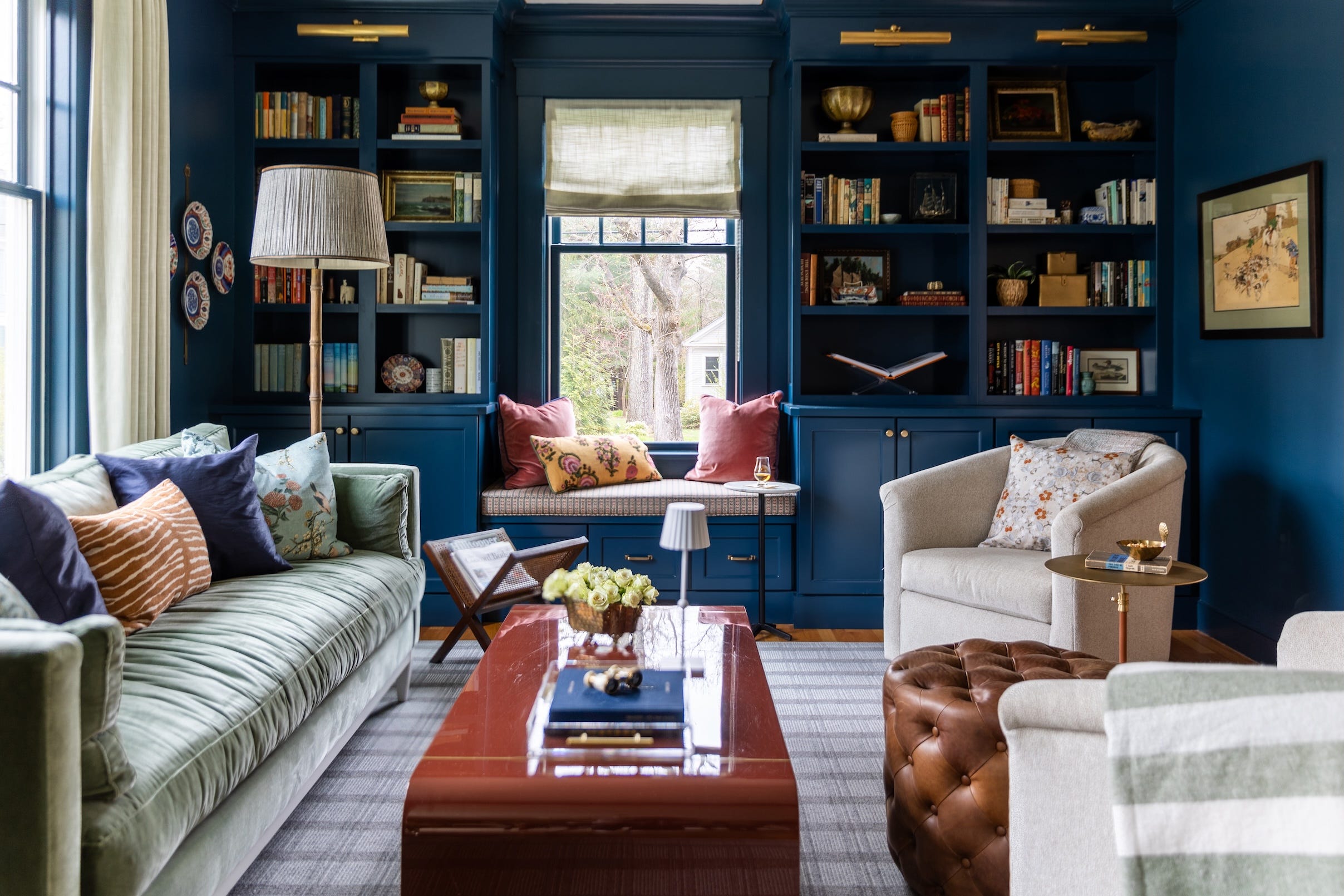
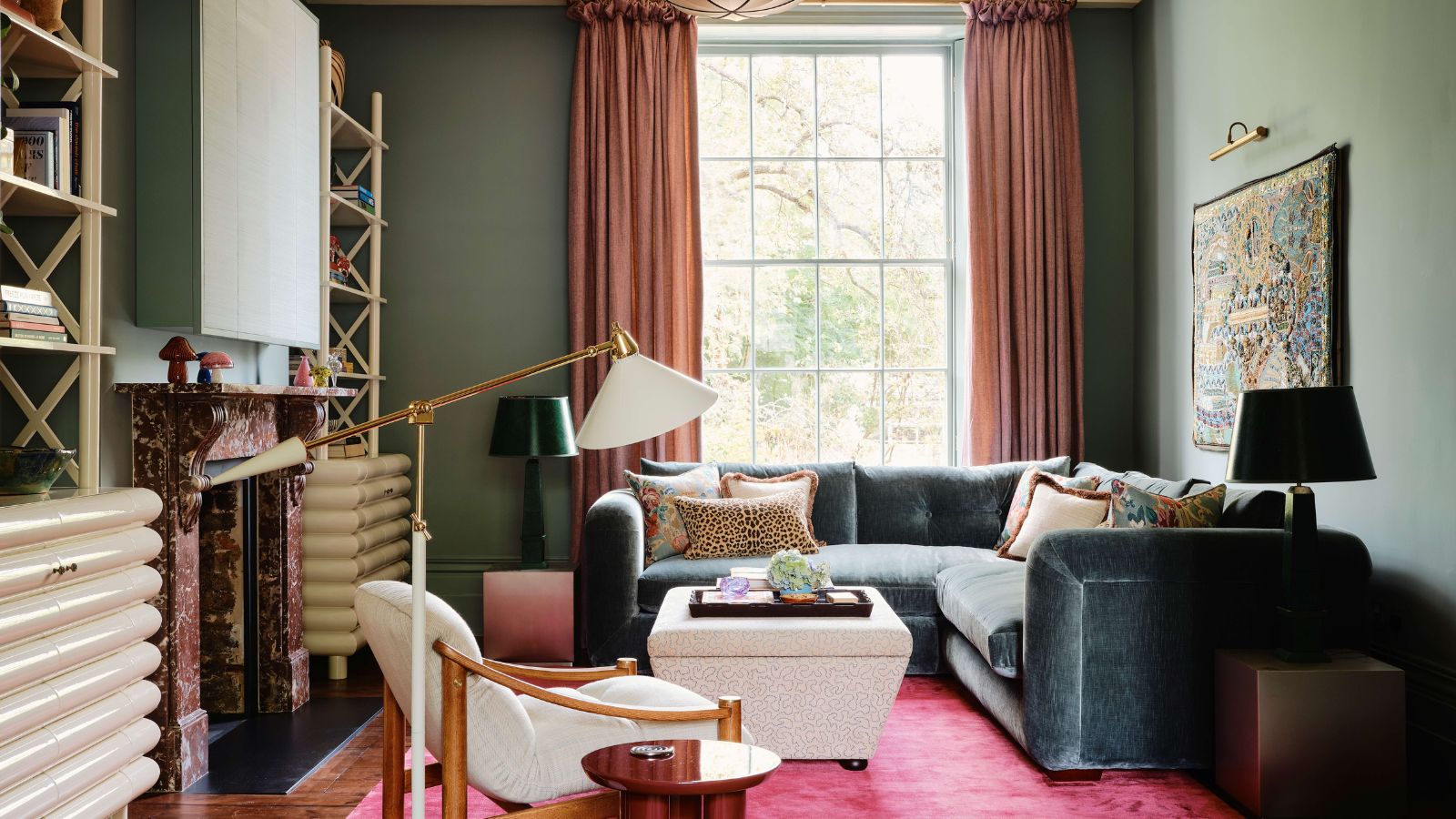
'Plum' introduces a fresh yet enduring depth, providing drama and coziness. Shades like Benjamin Moore’s Cinnamon Slate are lauded for their ability to tell a story without overwhelming a room. This color elevates spaces like dining rooms and libraries, harmonizing with warm woods, aged brass, and creamy neutrals, and can be layered with eucalyptus green or dusty plum for a complex palette.
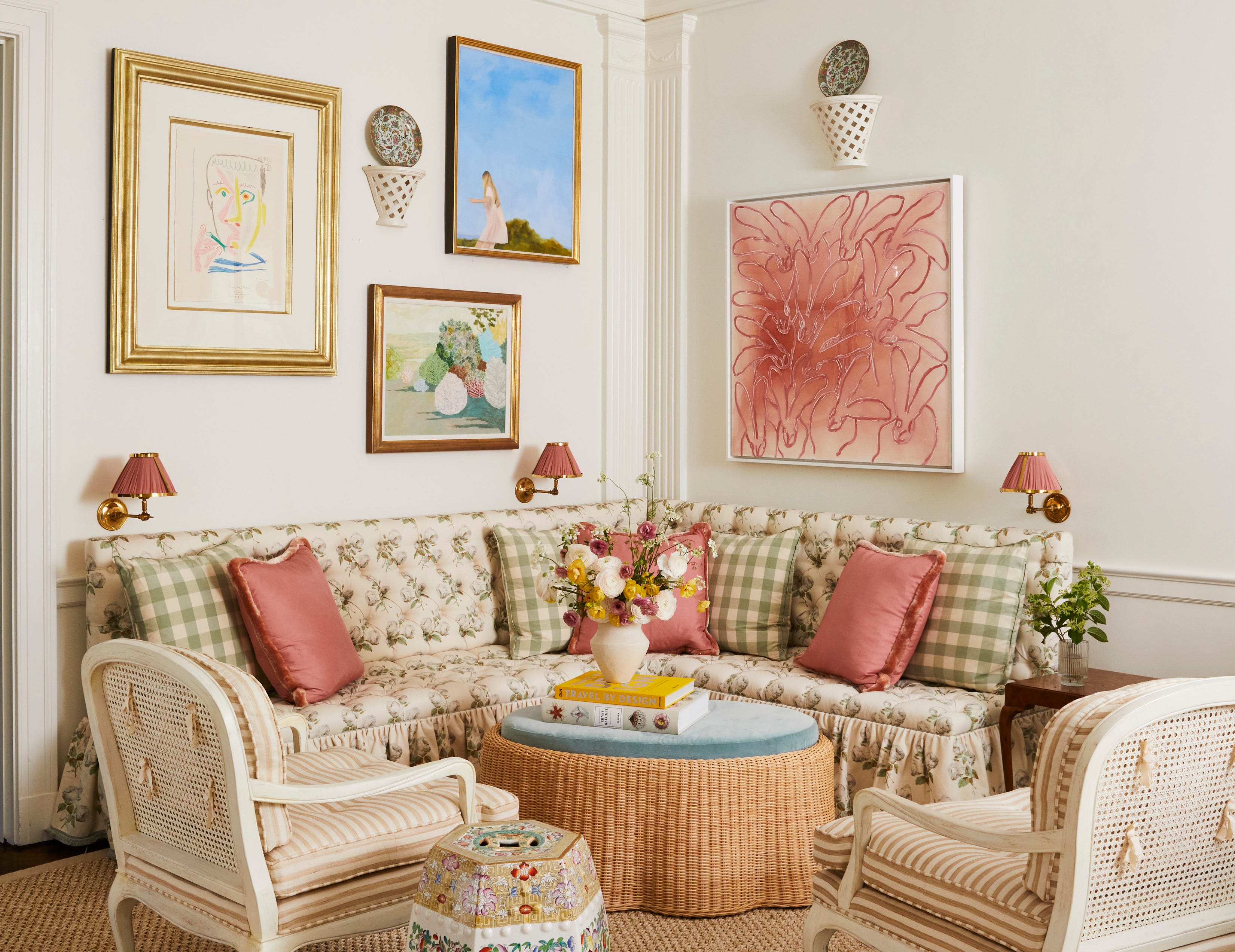
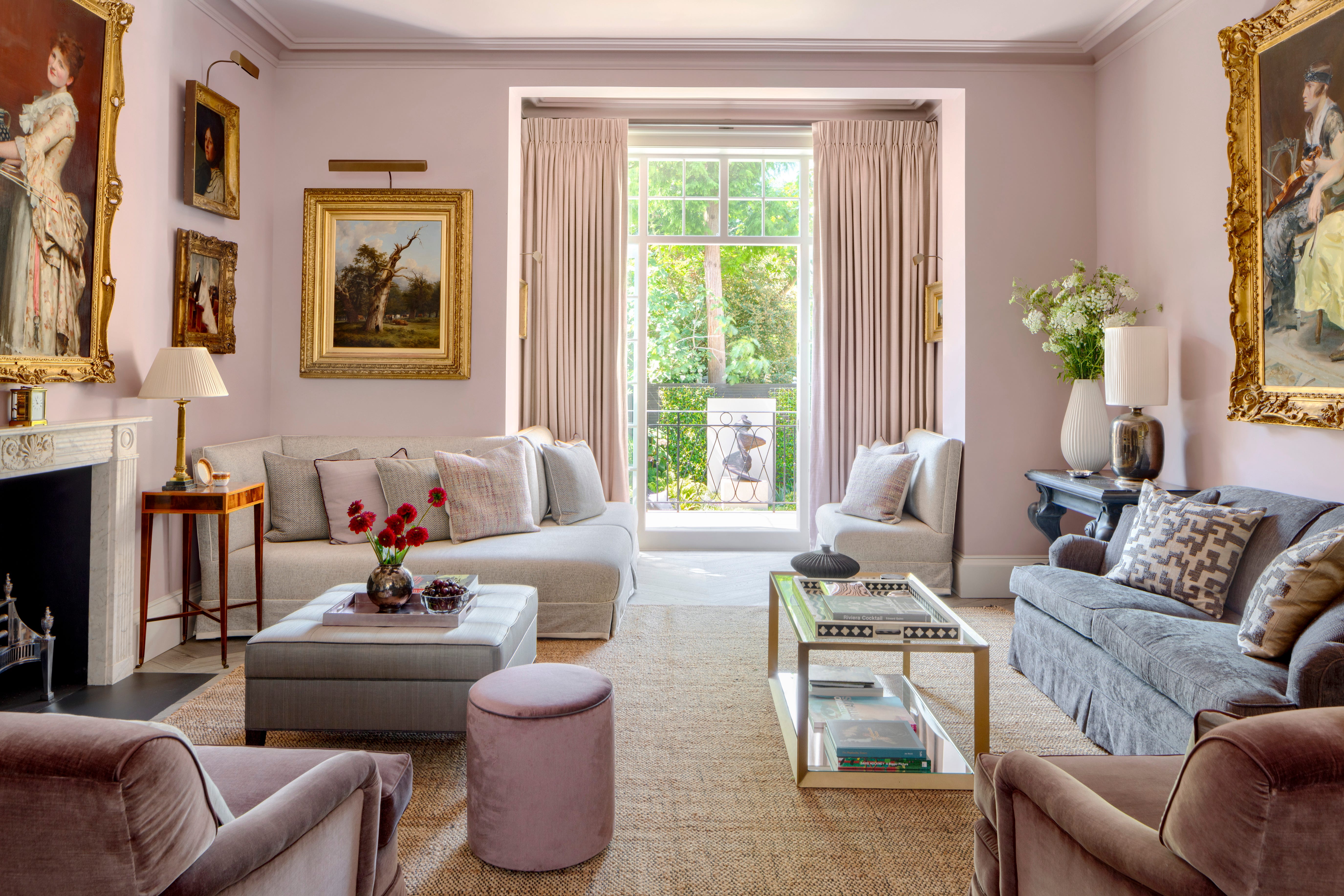
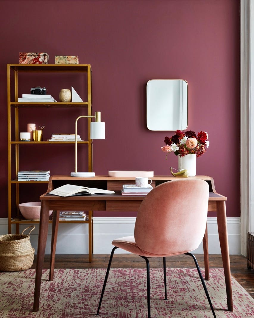
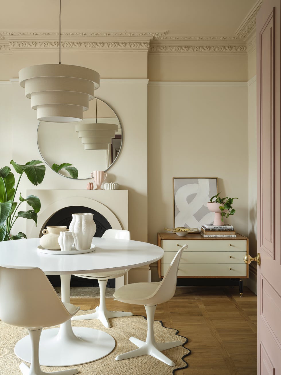
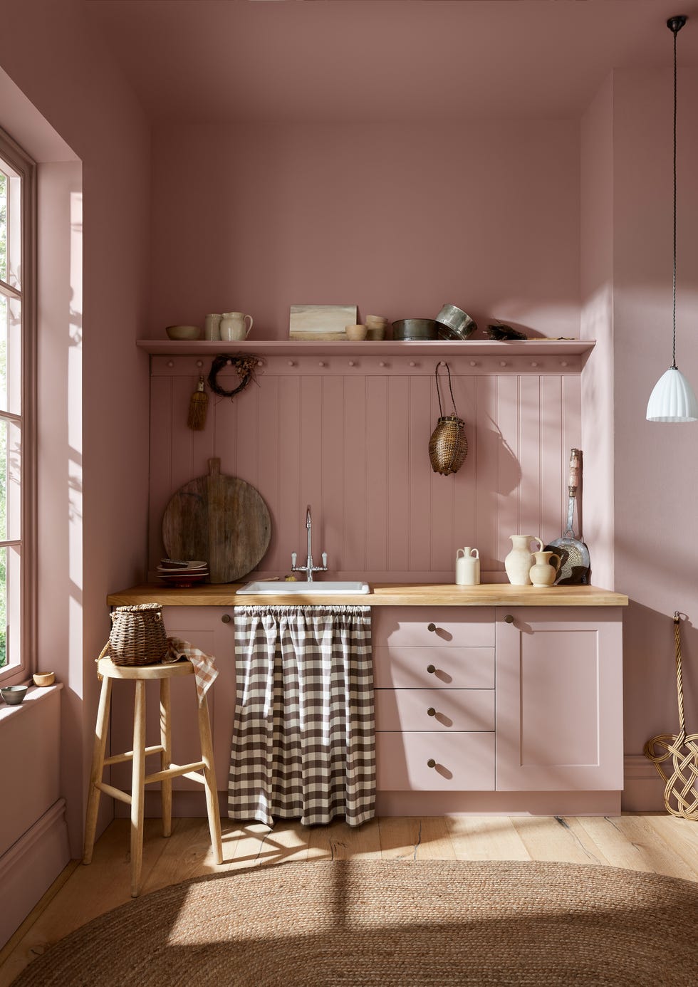
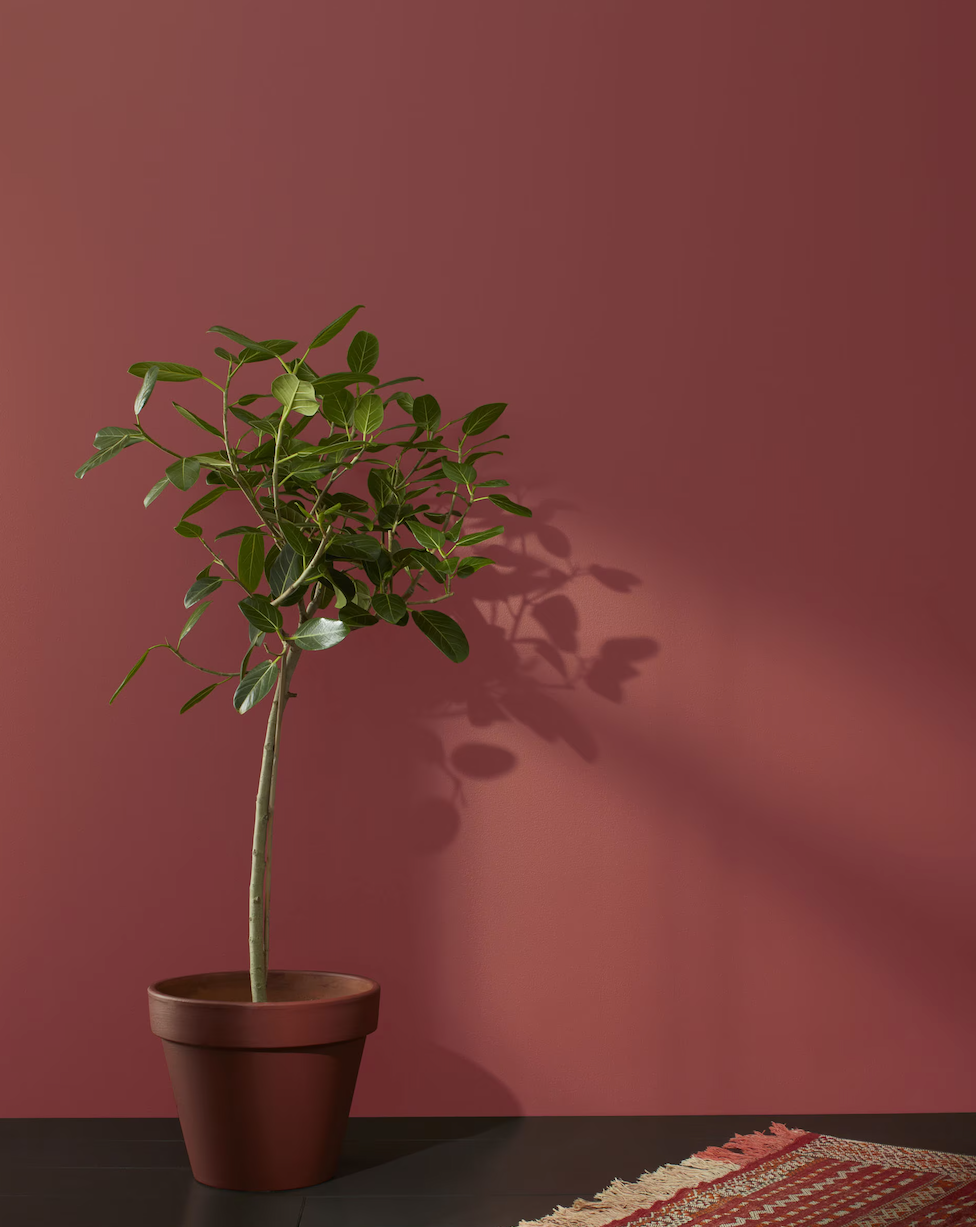
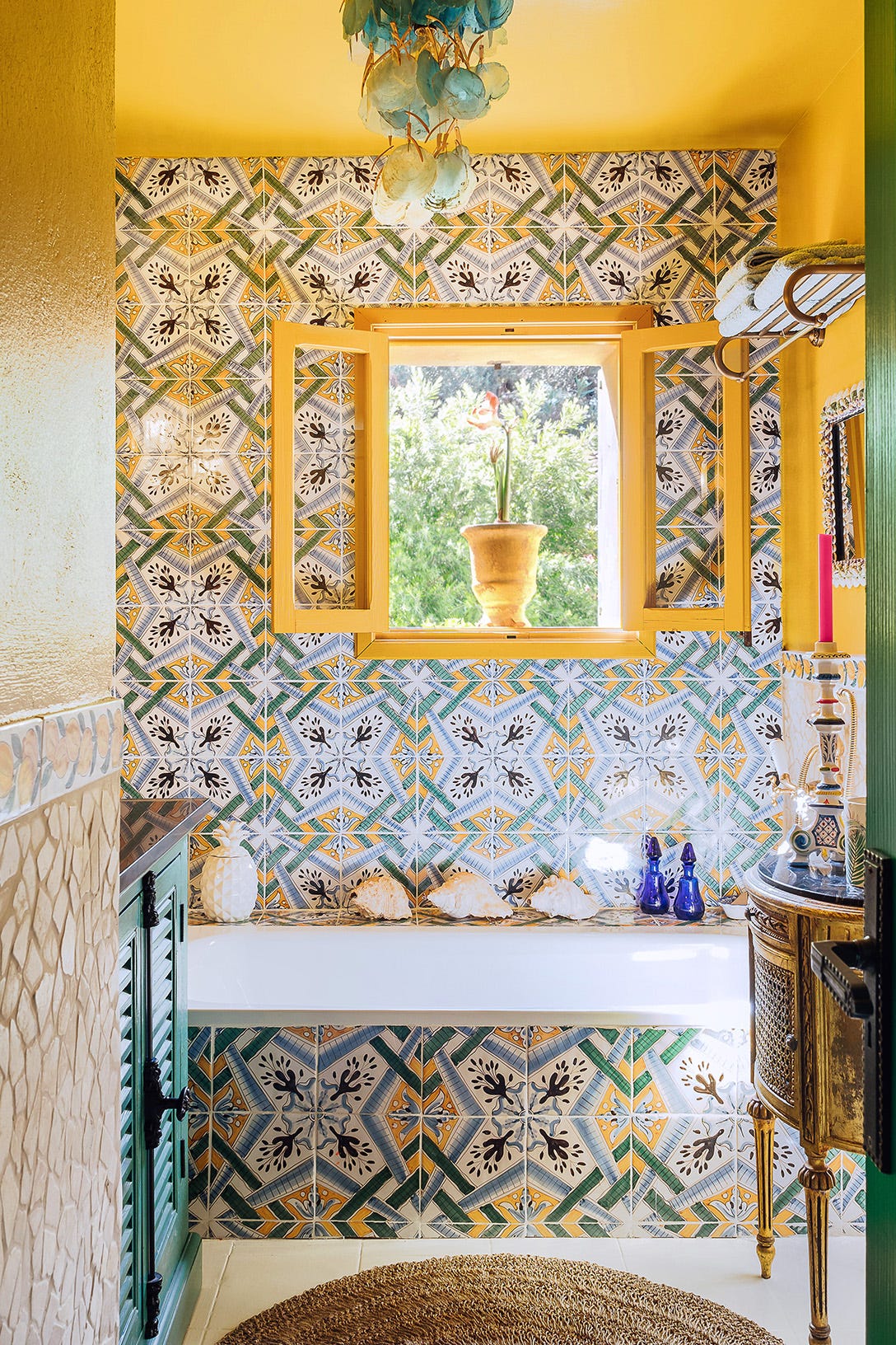
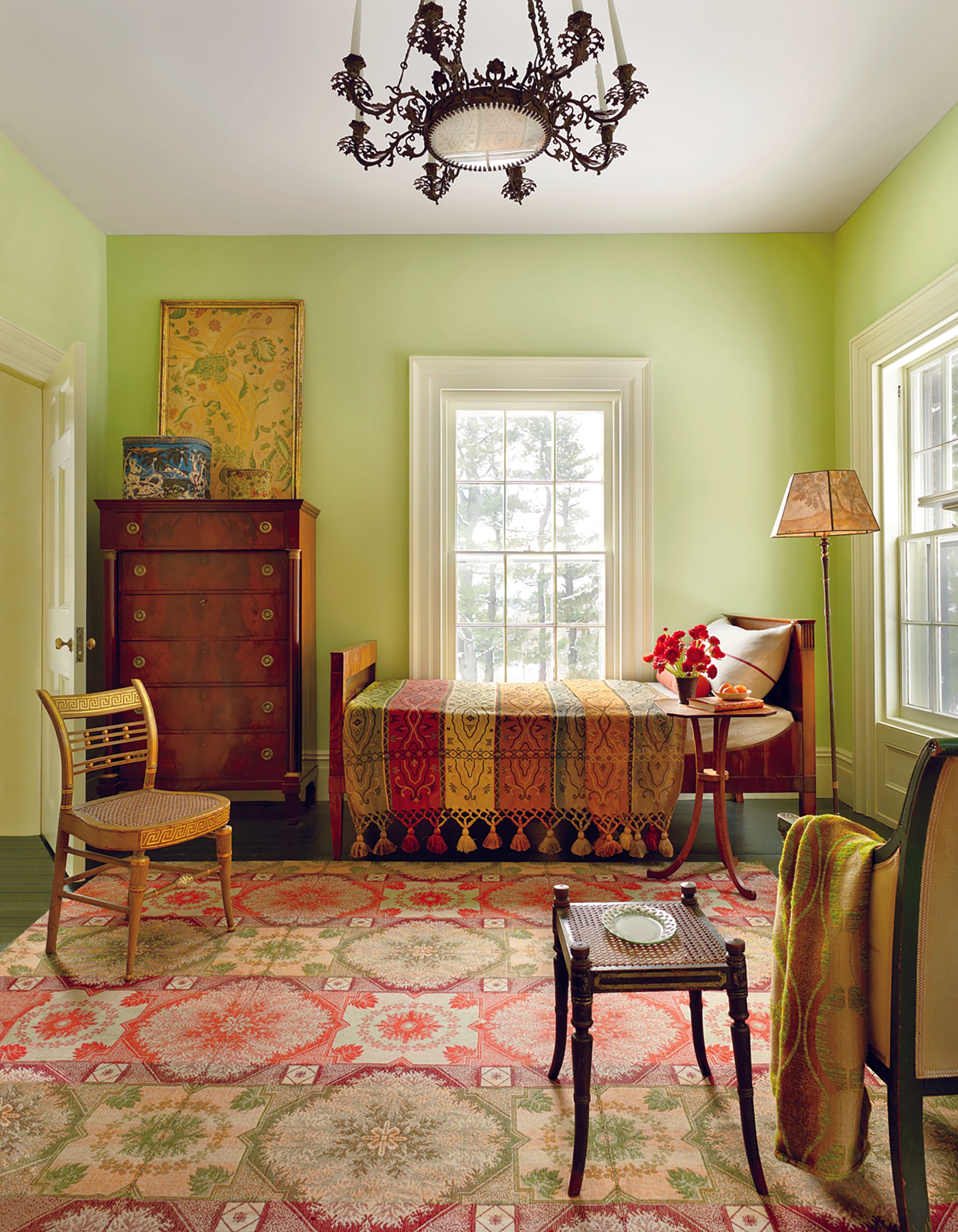
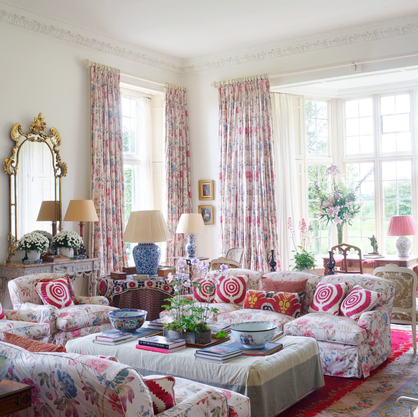
'Dusty Pink' remains a perennial favorite due to its inherent warmth and softness, enveloping rooms in a flattering, sophisticated glow. Muted tones like Farrow & Ball's Pink Ground or Benjamin Moore's Conch Shell evoke emotional comfort and are ideal for calming spaces. For a bolder touch, earthy pinks, such as Little Greene’s Nether Red, offer a chalky, rich hue that provides a serene, color-drenched environment.
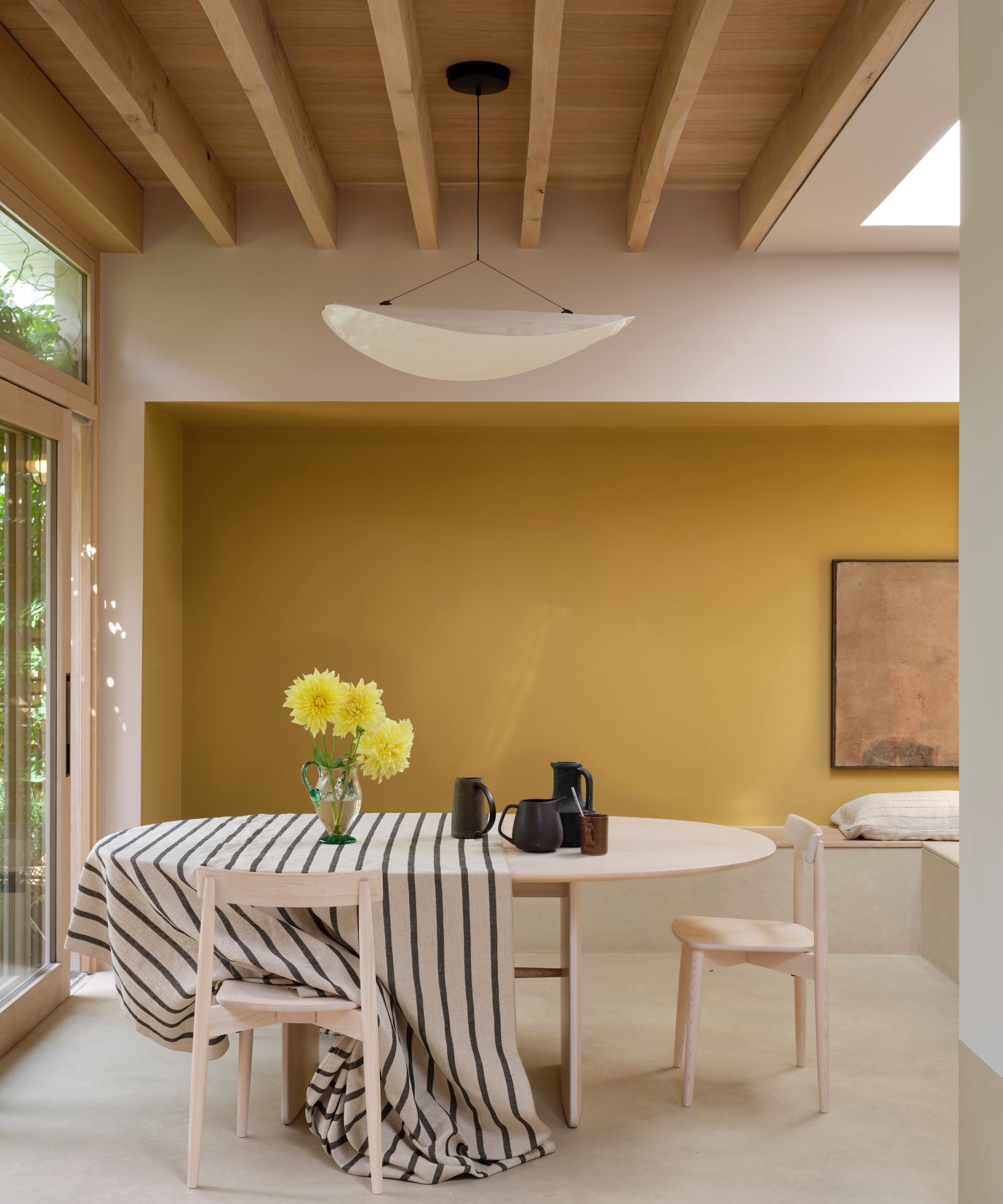
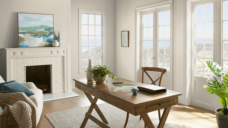
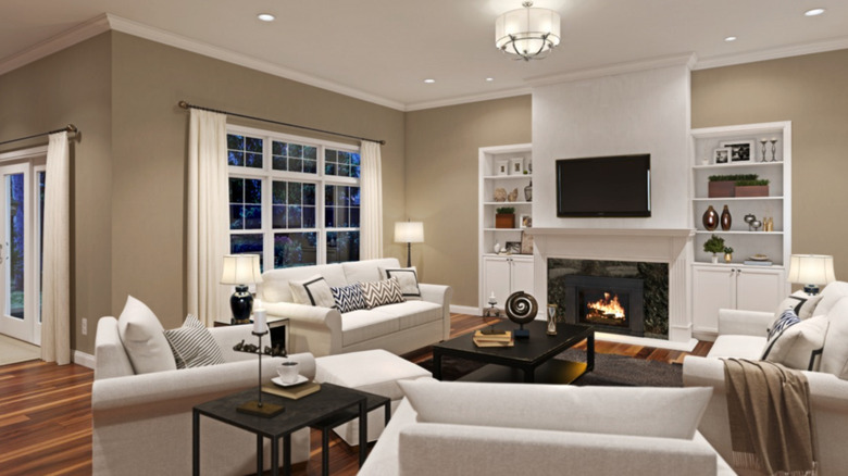
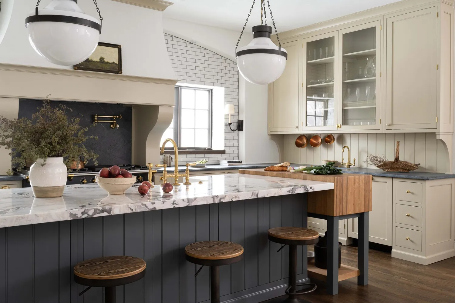
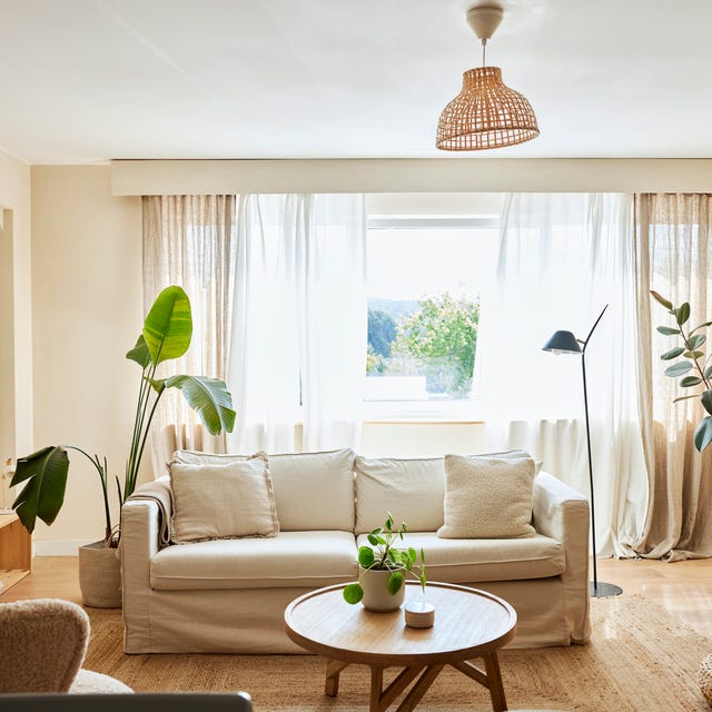
'Buttercream' represents a departure from stark whites, embracing warm, frothy off-whites and deep creams. These hues soften surrounding elements, such as stone, millwork, and upholstery, and pair effortlessly with natural textures like linen or wool, contributing to an elevated and inviting atmosphere.
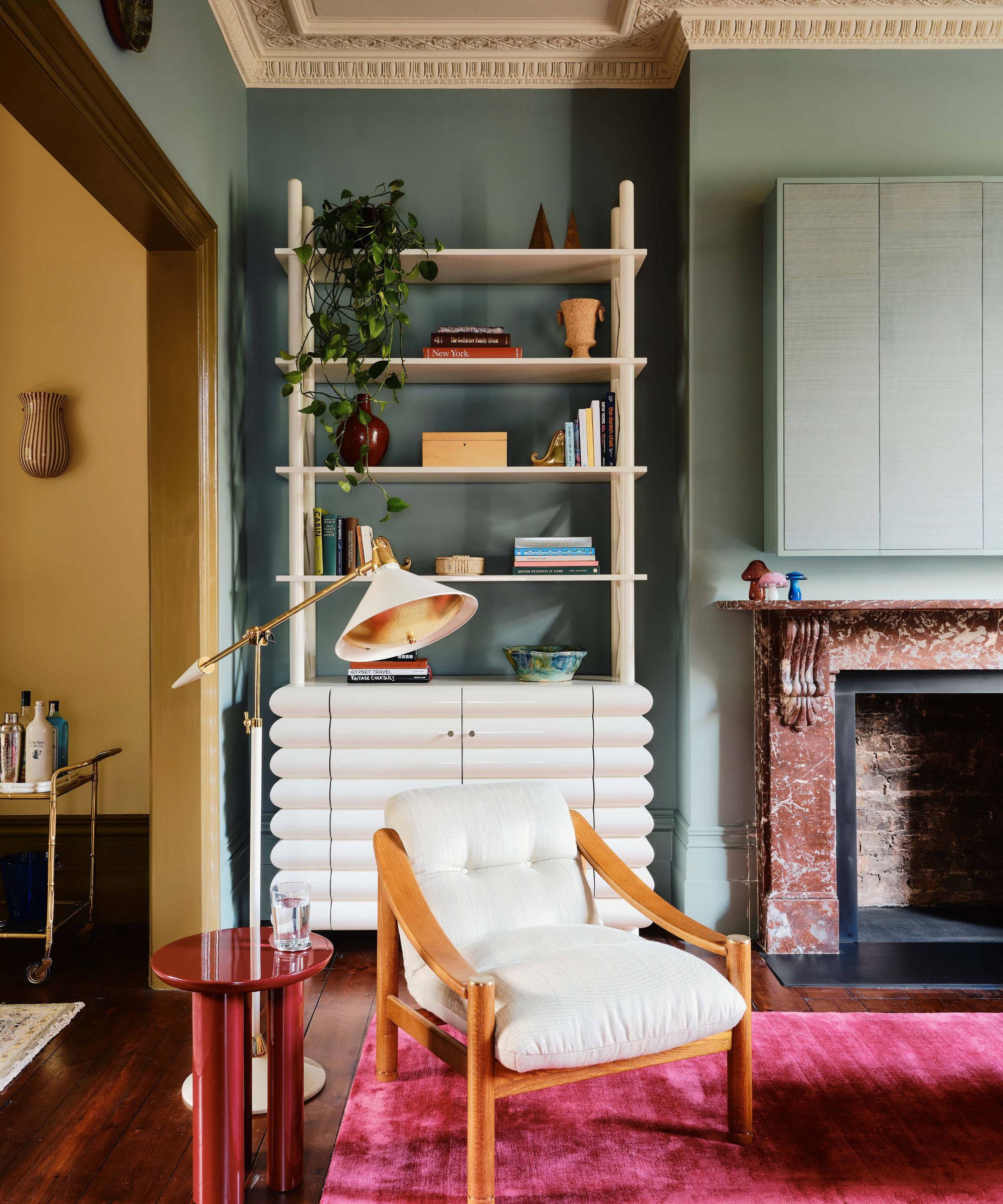
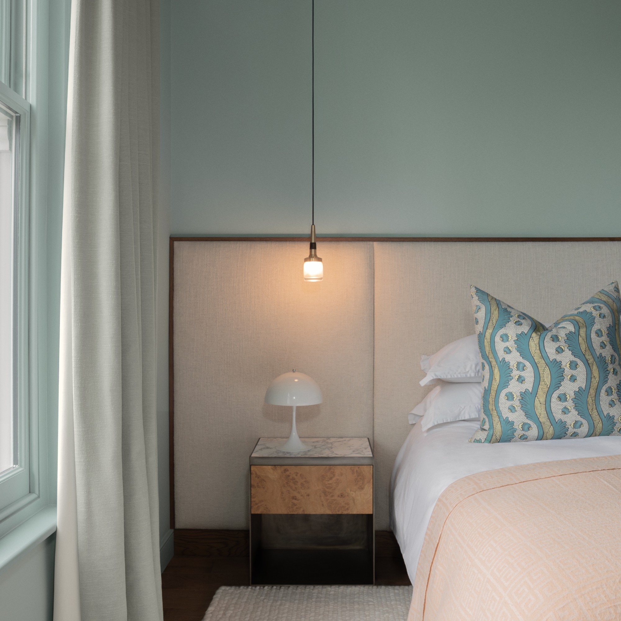
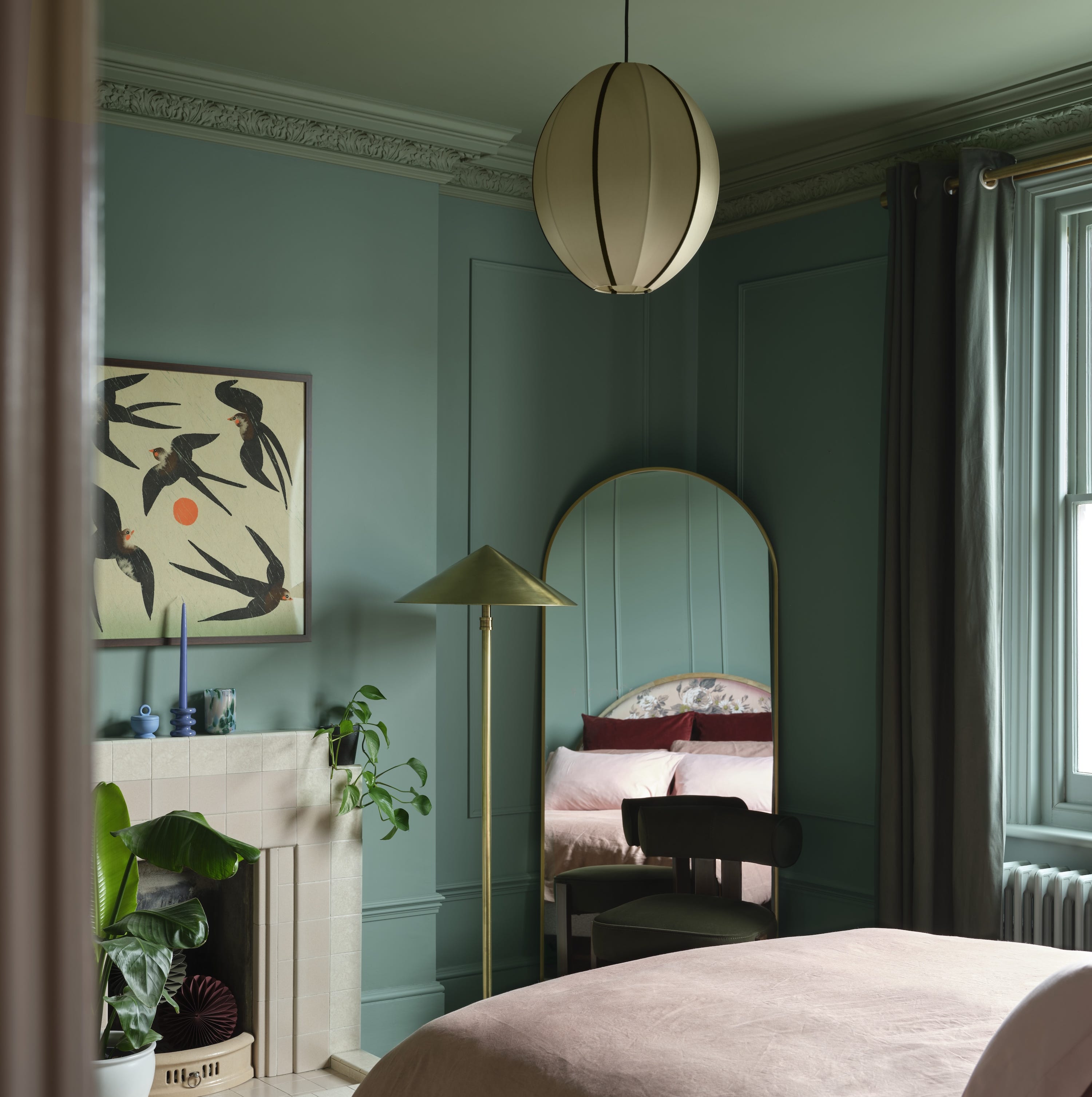
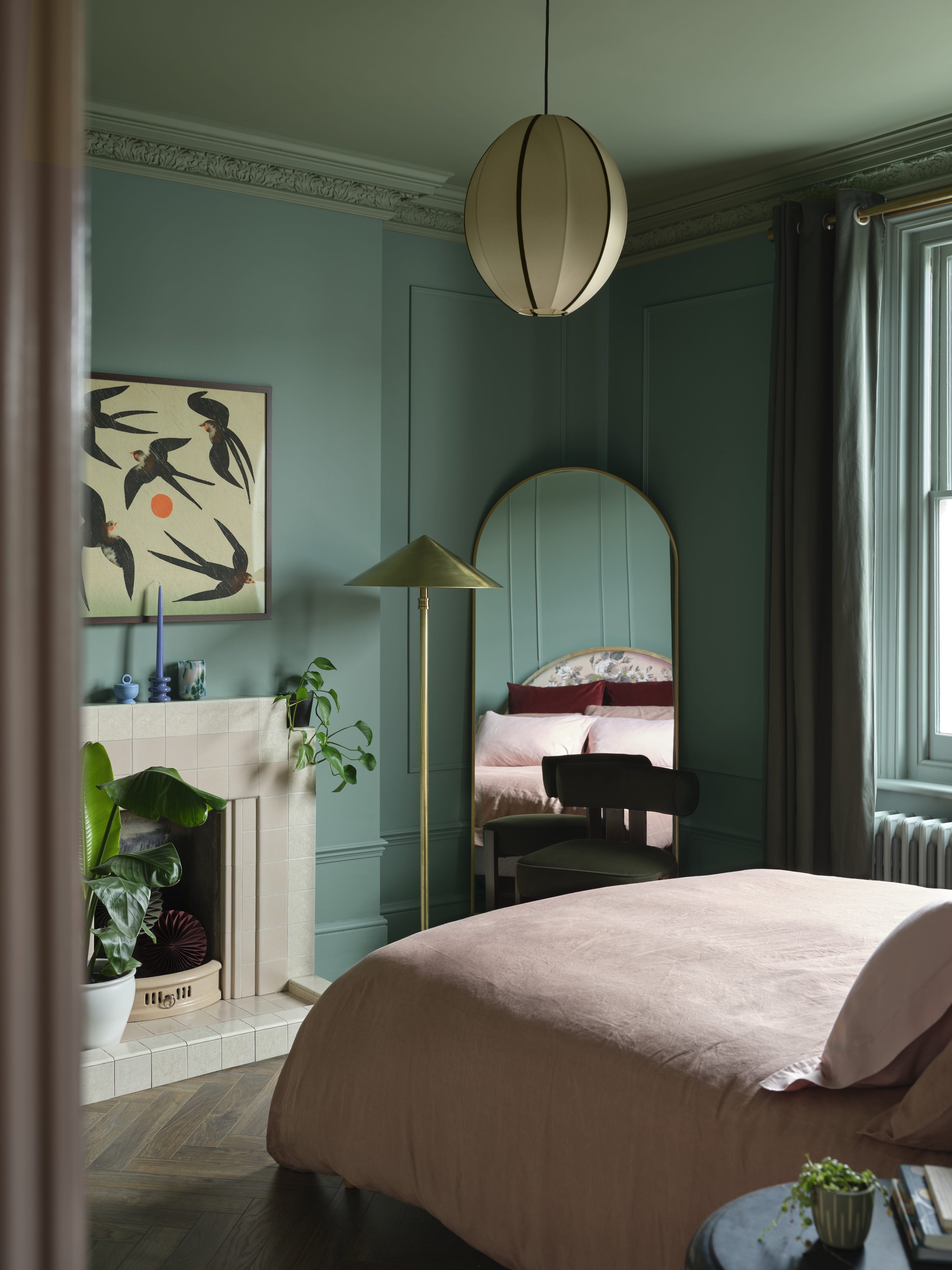
'Misty Blue-Green' shades are becoming a preferred choice for spaces requiring calm without appearing flat. With a hint of gray, these colors create a spa-like ease, making them versatile for almost any room. Sherwin-Williams Sea Salt is a notable example, bringing a serene, easygoing vibe to front doors, cabinetry, bedrooms, or laundry rooms.
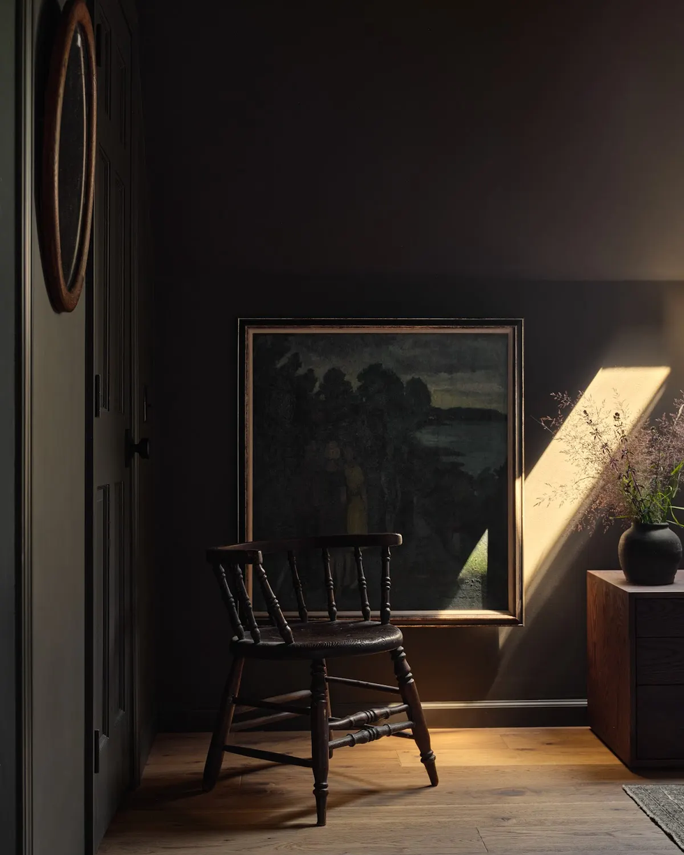
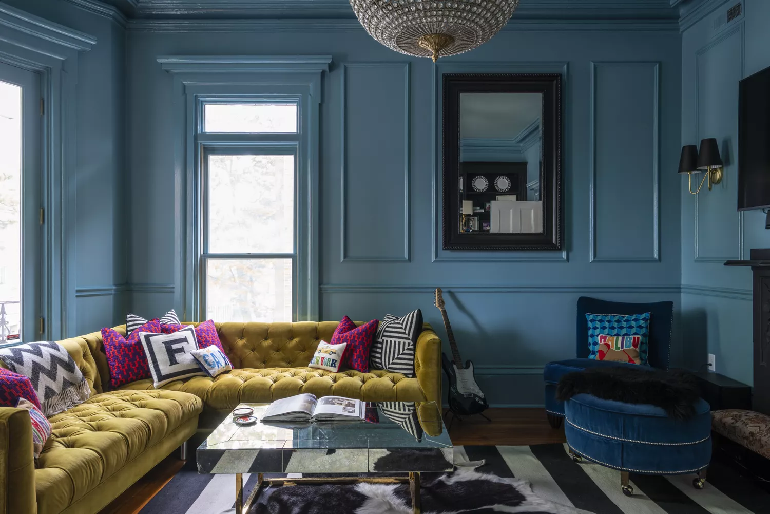
Finally, 'Midnight Blue' is increasingly popular, reflecting a trend towards deeper, more atmospheric blues. Valspar’s Encore and Nightfall are examples of this shift, as homeowners seek to infuse their spaces with authenticity, timelessness, and a sense of calm and optimism. These darker blues serve as a grounding effect in evolving color and design narratives.
#PaintColorTrends #InteriorDesign #HomeDecor #ColorPalette #DesignInspiration #NeutralColors #WarmTones #CoolTones #PaintColorTrends #InteriorDesign #HomeDecor #ColorPalette #DesignInspiration #NeutralColors #WarmTones #CoolTones
0 comment in total
You may also like

These 8 Colors Will Rule Interiors in 2026, According to Experts

What Paint Colours will Rule 2026? The Experts Make Their Predictions
These Colors Will Be Everywhere in Interior Design in 2026
9 Trending Paint Colors You'll See Everywhere in 2025, According to Designers
What Paint Colors Will Rule 2026? Designers Make Their Predictions

These 8 Color Trends Will Rule in 2025, According to Color Pros

9 Paint Colors Experts Predict We'll All Be Using In 2026
The colour trends 2026 that will define our homes next year

Experts Say These 5 Paint Colours Will Be Everywhere In 2026
These Will Be the Most Popular Paint Colors in 2026

Designers Predict This Will Be The Biggest Paint Trend Of 2026
Designers Say These 12 Paint Colors Will Be Everywhere in 2026

7 Trendy Paint Colors for Every Room in 2026, According to Designers

According to Designers, These Are The Outdated Color Trends for 2026

Interiors experts predict this will be the biggest paint trend of 2026

The #1 Paint Color Trend of 2025, According to Designers
These 6 Colors Will Rule Interiors in 2026, According to Experts


These 7 Colors Will Rule Interiors in 2026, According to Experts
These 20 Trendy Paint Colors Will Be Taking Over Walls In 2026

Designers Agree: These 7 Underrated Paint Colors Will Be Huge in 2026