1/8
Paint Colors That Go With Natural Wood — 10 Picks That Bring Out the Beauty of This Organic Material
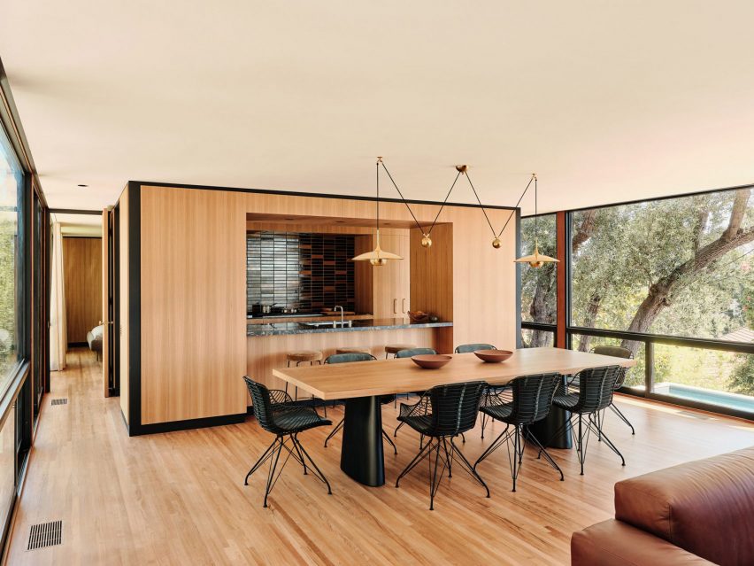
Natural wood, being an inherently versatile material, offers a wide spectrum of possibilities when it comes to complementary paint colors. While many hues can pair effectively with wood, certain selections stand out for their ability to enhance its natural beauty and create a desired aesthetic. Interior designers emphasize that the choice of paint color can either create a subtle, calming atmosphere or introduce a vibrant, energetic feel to a space.
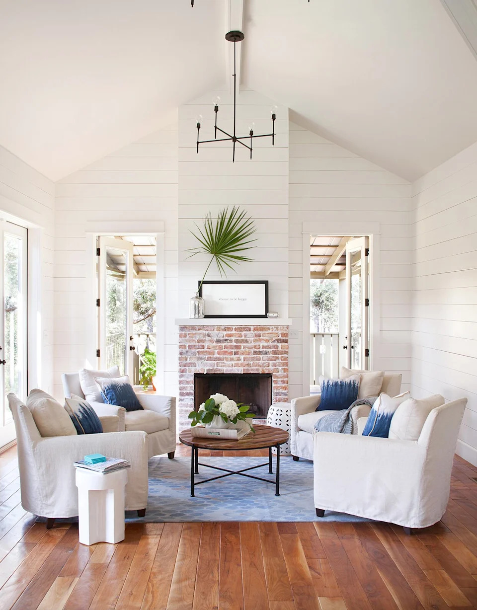
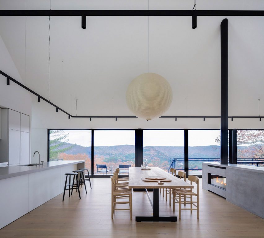
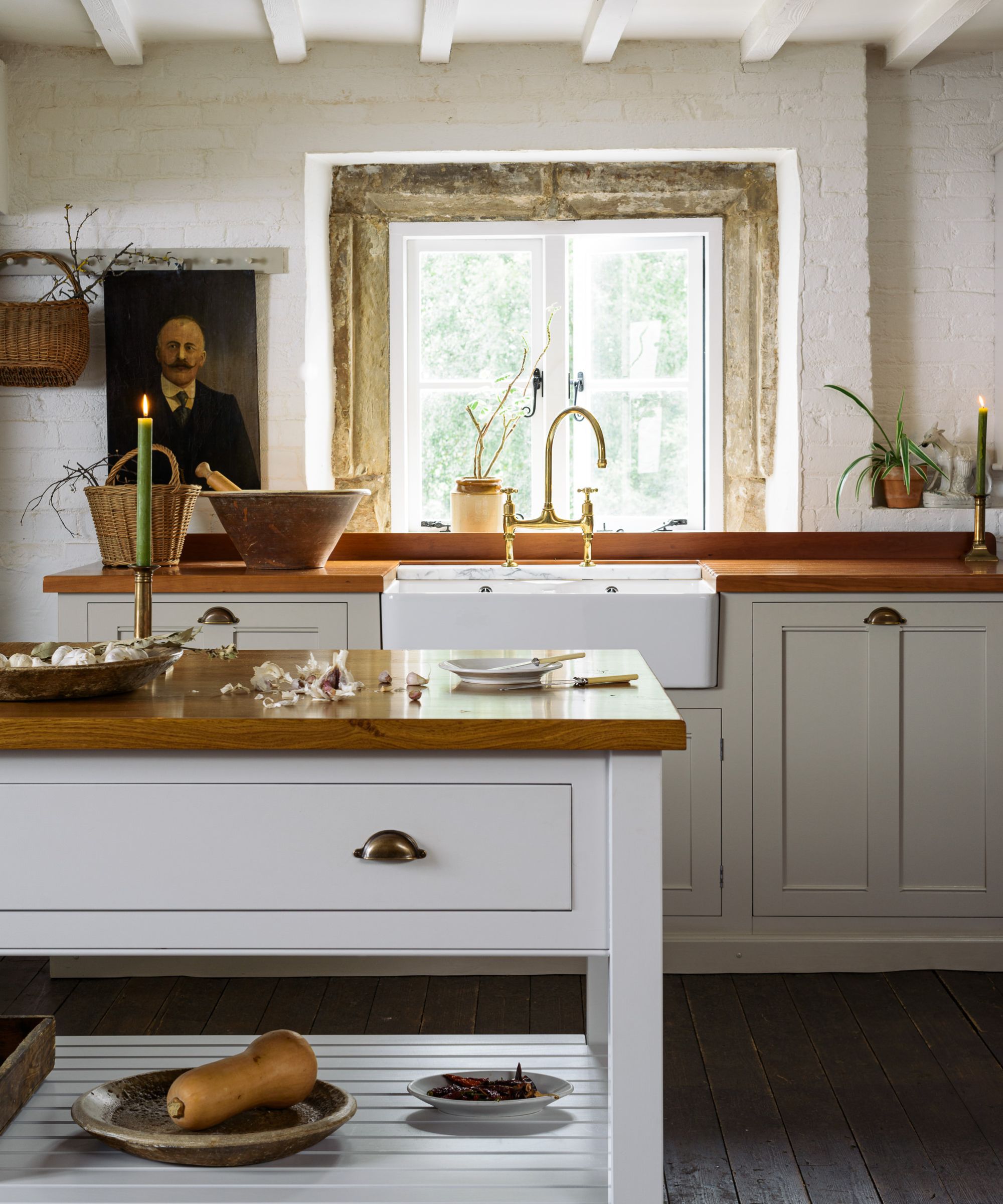
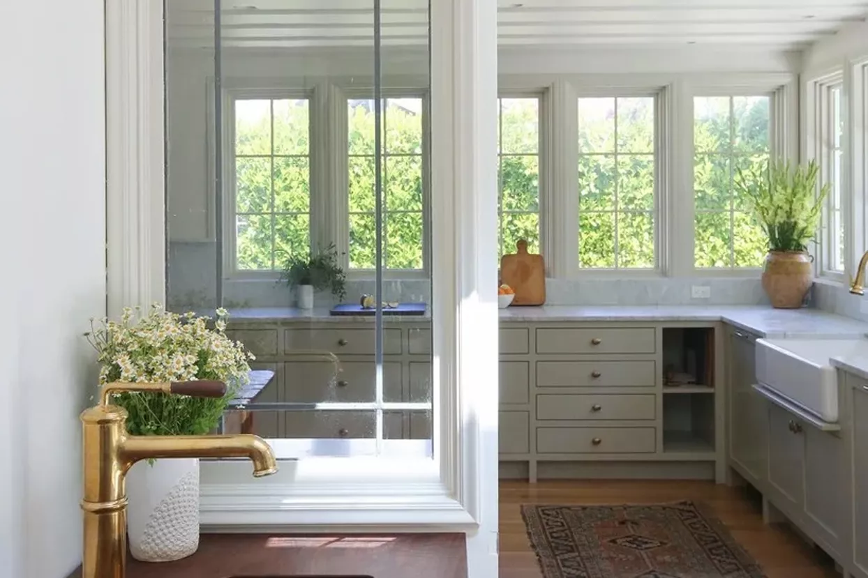
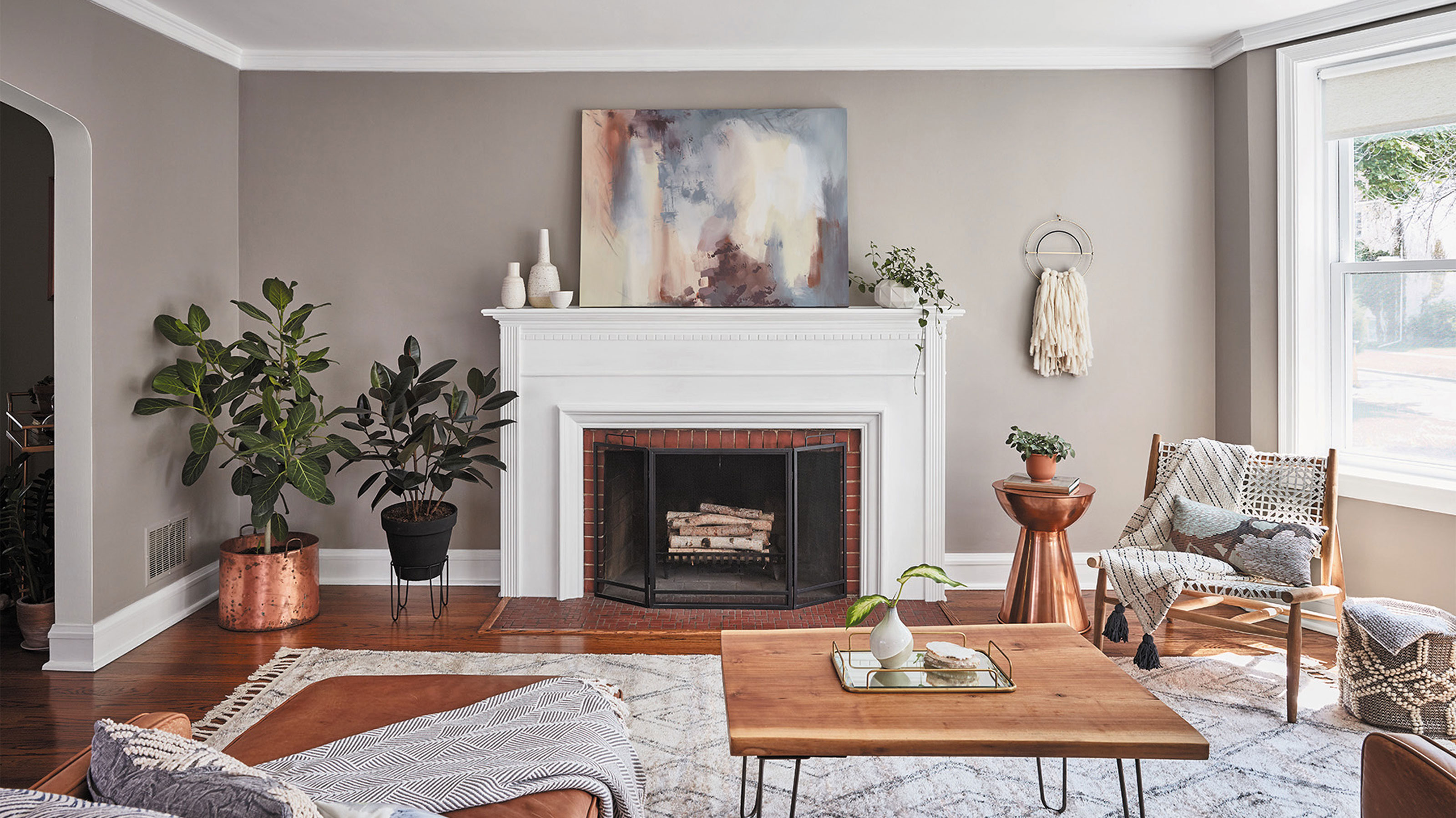
For those seeking a subdued and relaxed interior, neutral tones like grays, beiges, creams, and greiges are highly recommended. These muted colors blend harmoniously with wood tones, contributing to a tranquil environment. However, for those aiming to invigorate a space, bolder options such as red, mulberry, and dark blue are suggested to elevate the room's character. The key, as advised by designers, is to assess samples under various lighting conditions to ensure the chosen paint complements the wood tones throughout the day.
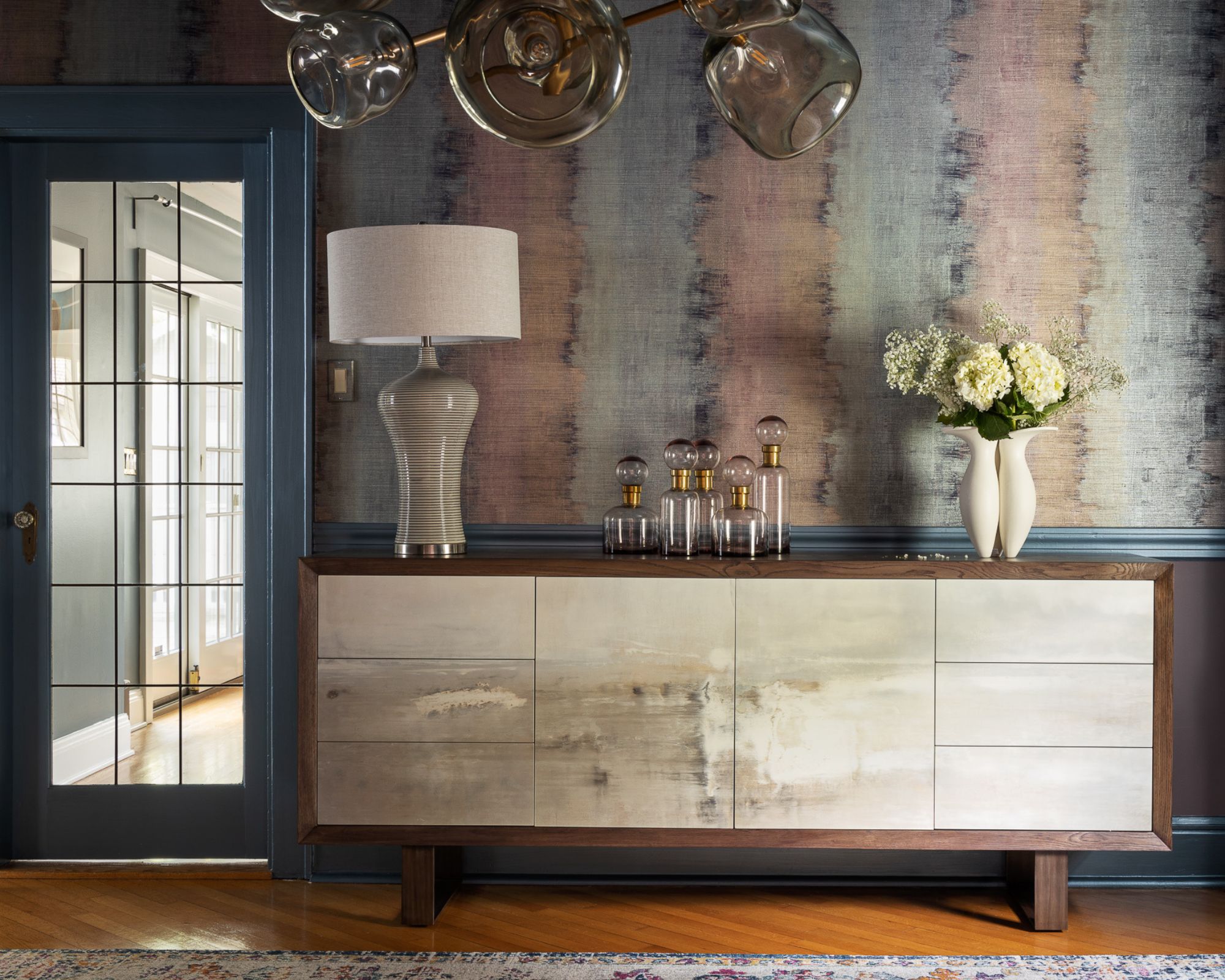
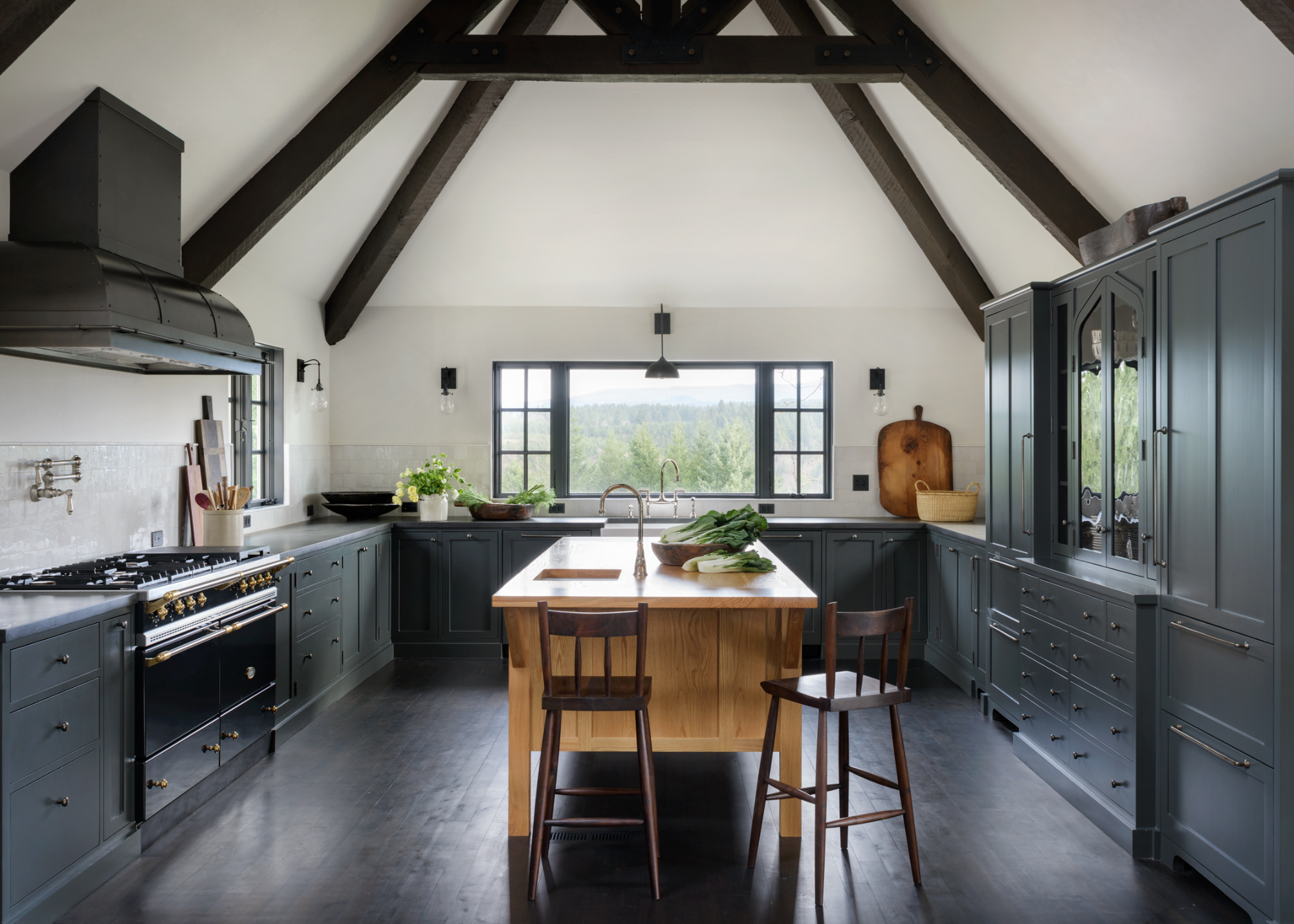
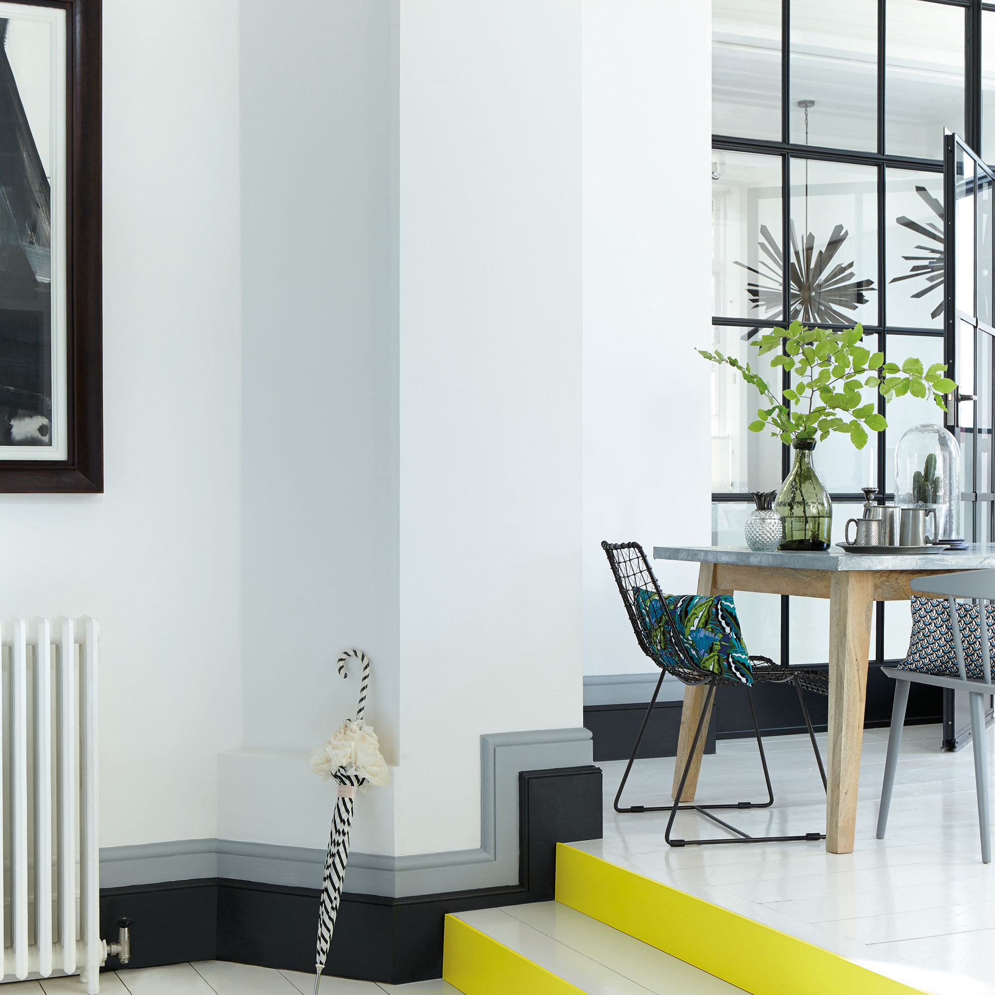
Gray, in its various shades, offers a warm and inviting feel. Lighter grays can create an airy, vintage ambiance, providing a pleasant contrast with dark woods. Conversely, darker grays can warm up rooms featuring light woods. When integrating gray, it is crucial to consider textures and materials to add depth and interest, especially in spaces with dominant dark flooring. Natural light also plays a significant role; rooms with ample light can accommodate darker gray tones, while those with limited light may benefit from lighter shades to prevent the space from feeling oppressive.
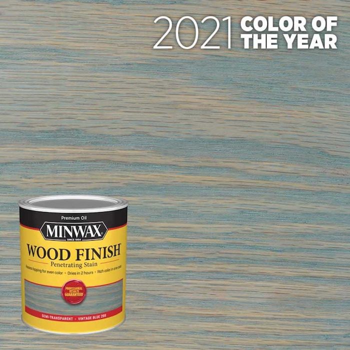
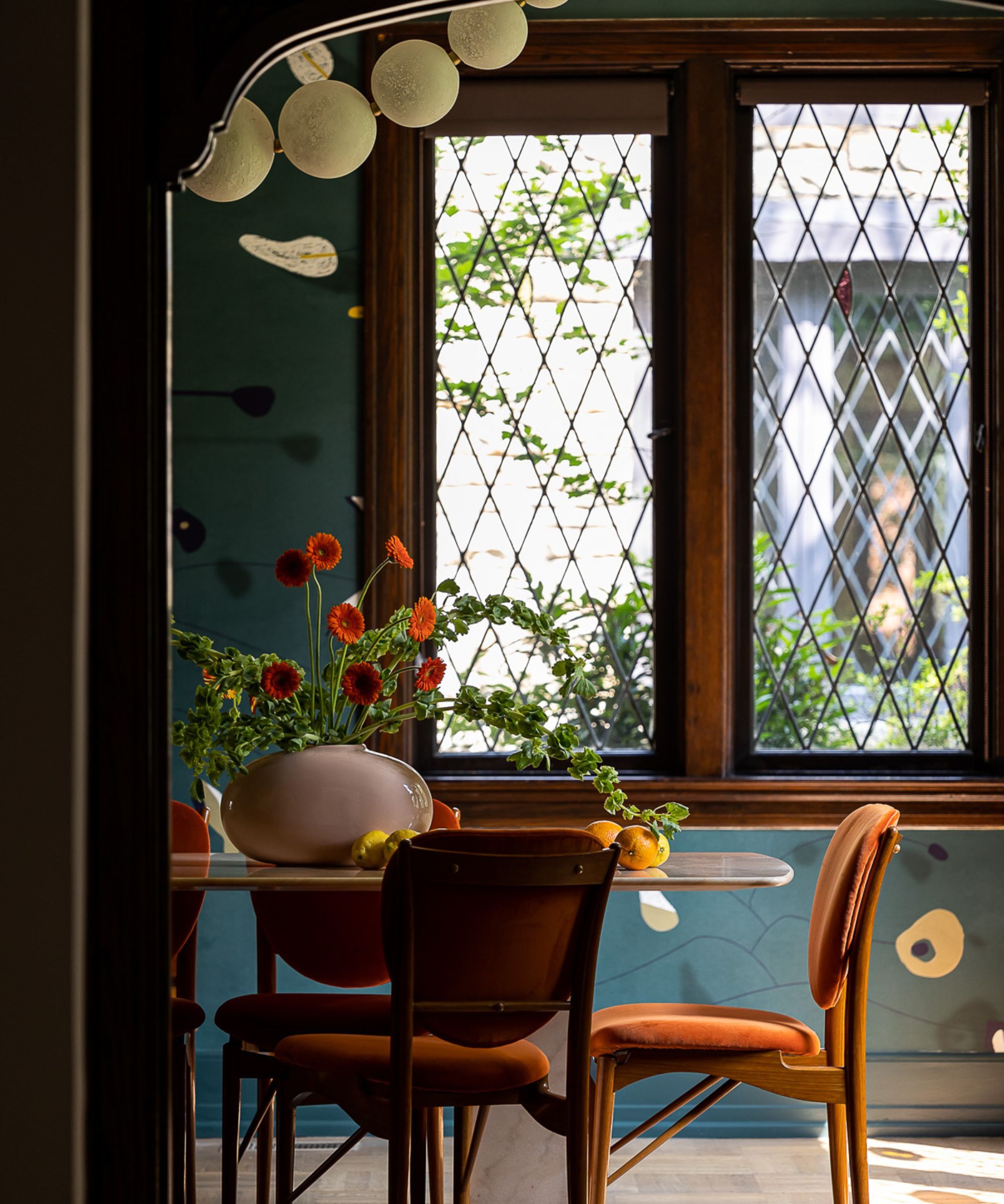
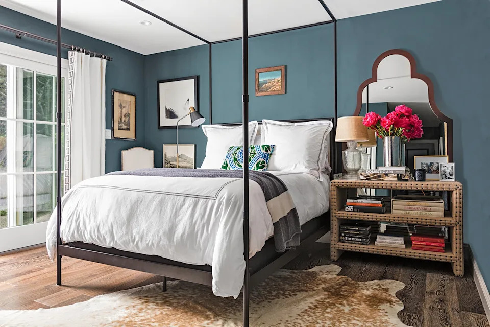
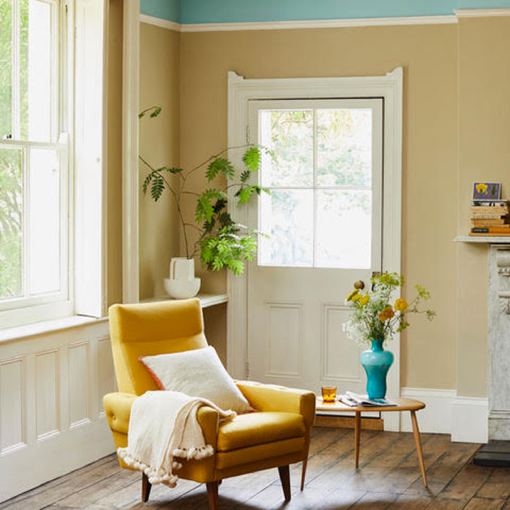
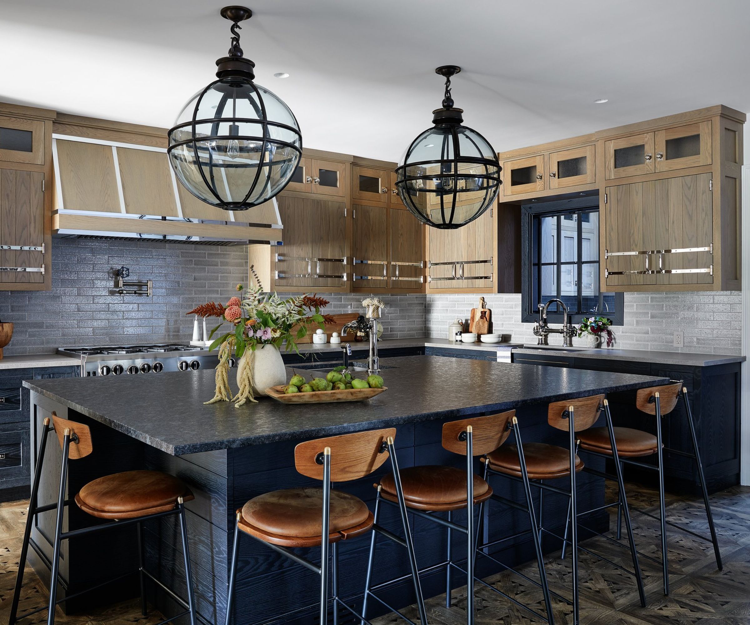
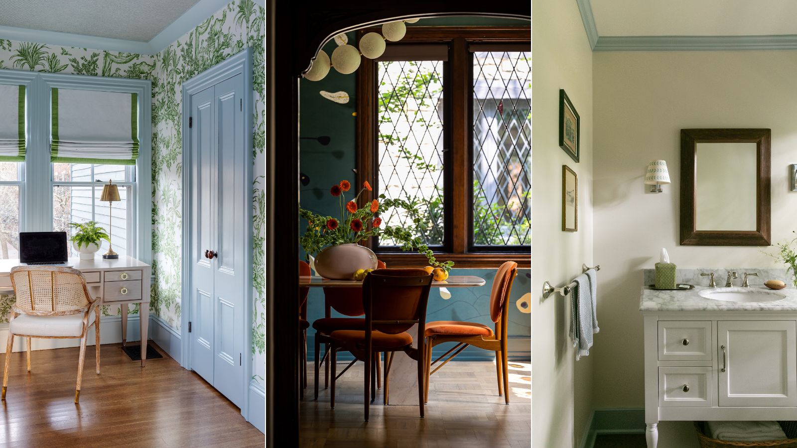
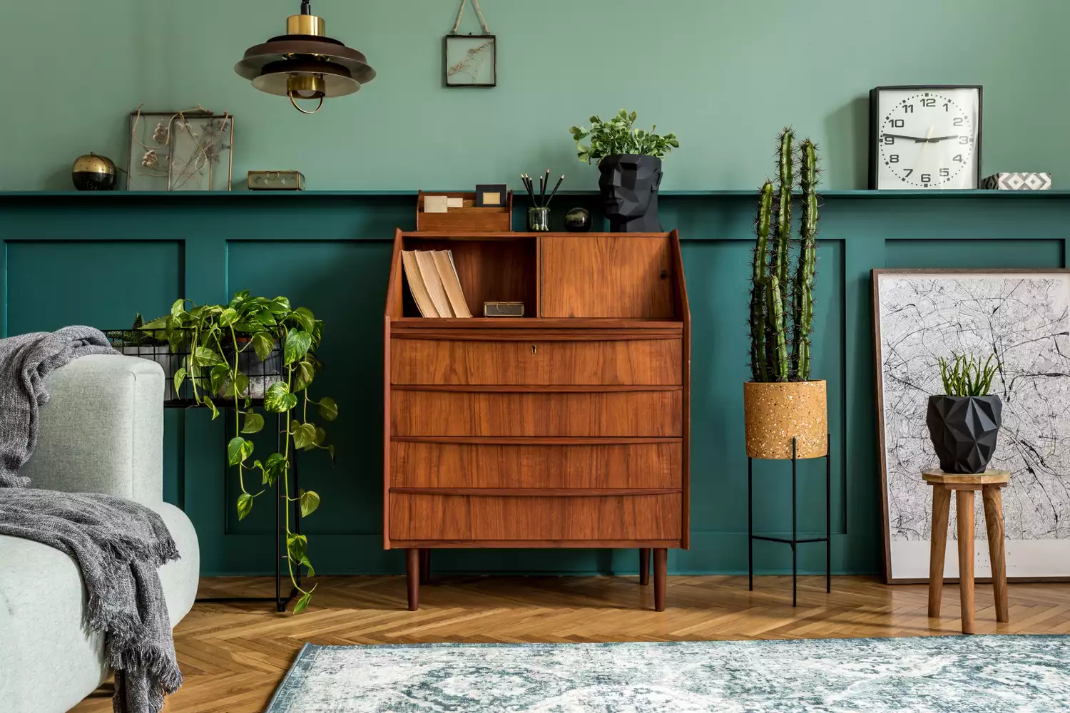
Dark blue, particularly teal, presents a sophisticated alternative to black, imbuing rooms with a sense of warmth. This color pairs well with walnut or lighter woods, contributing to a chic aesthetic. The combination of dark wood floors with vibrant blue cabinetry and light-colored window treatments can create a striking visual contrast, with natural light further enhancing the brightness of the space.
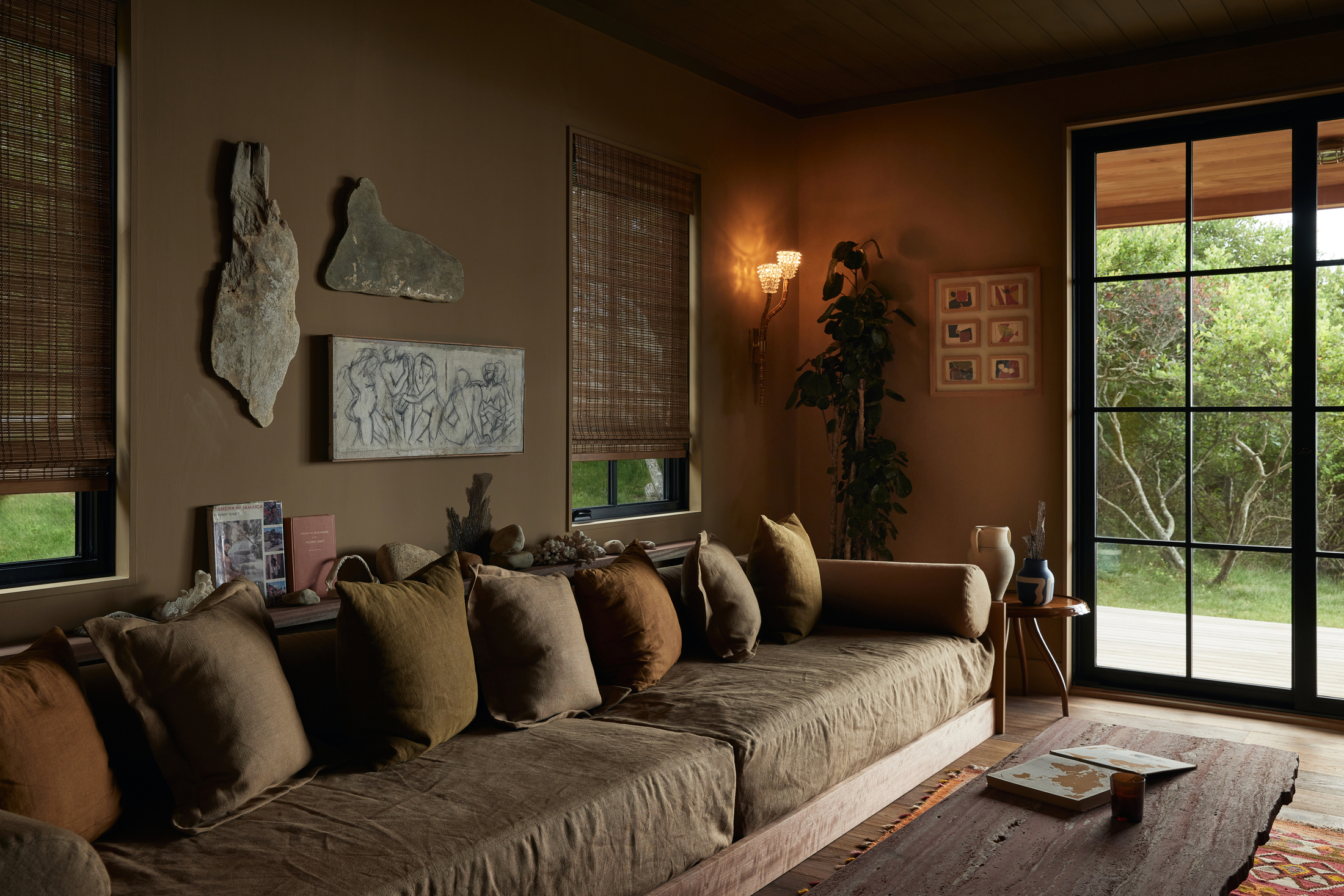
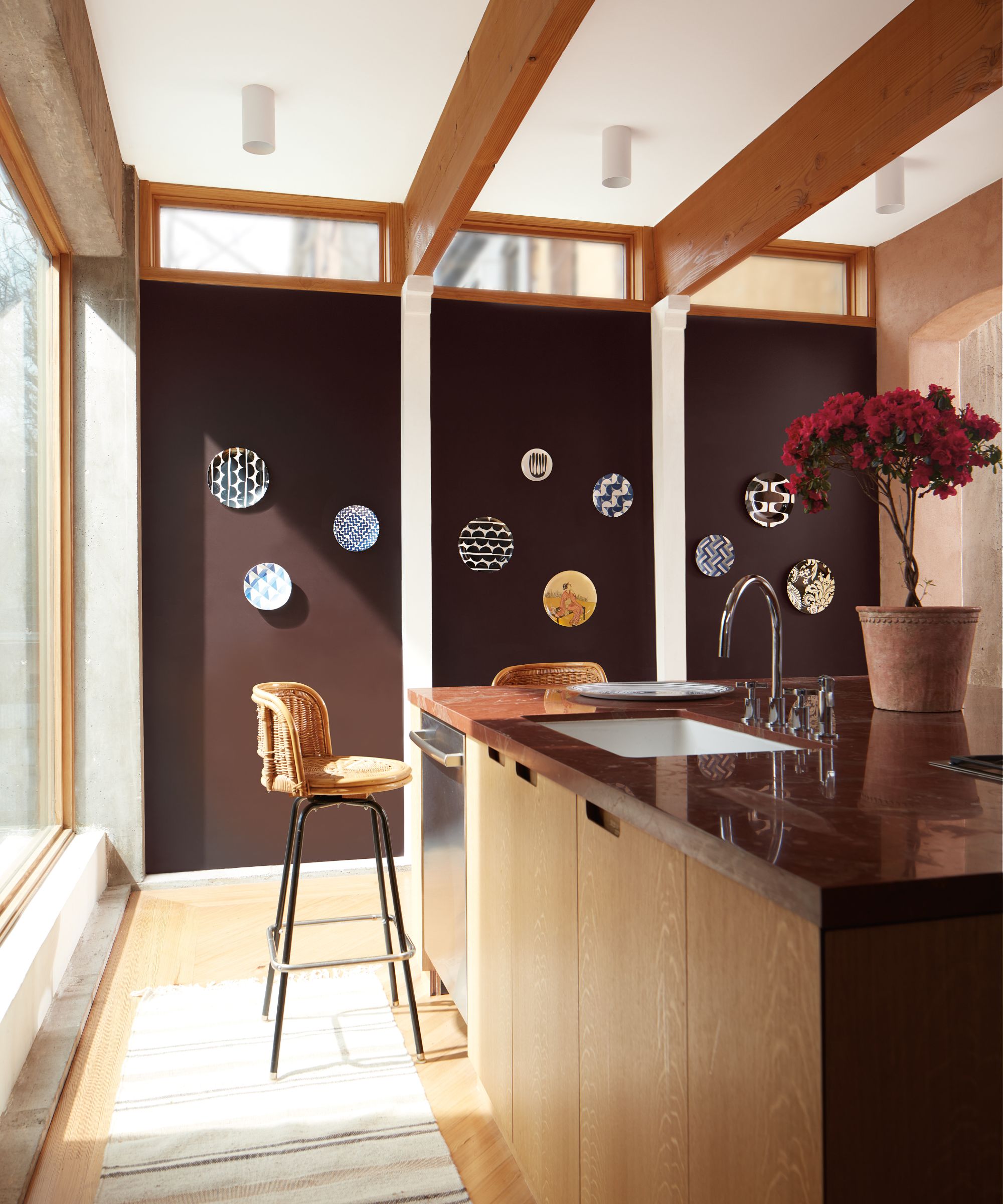
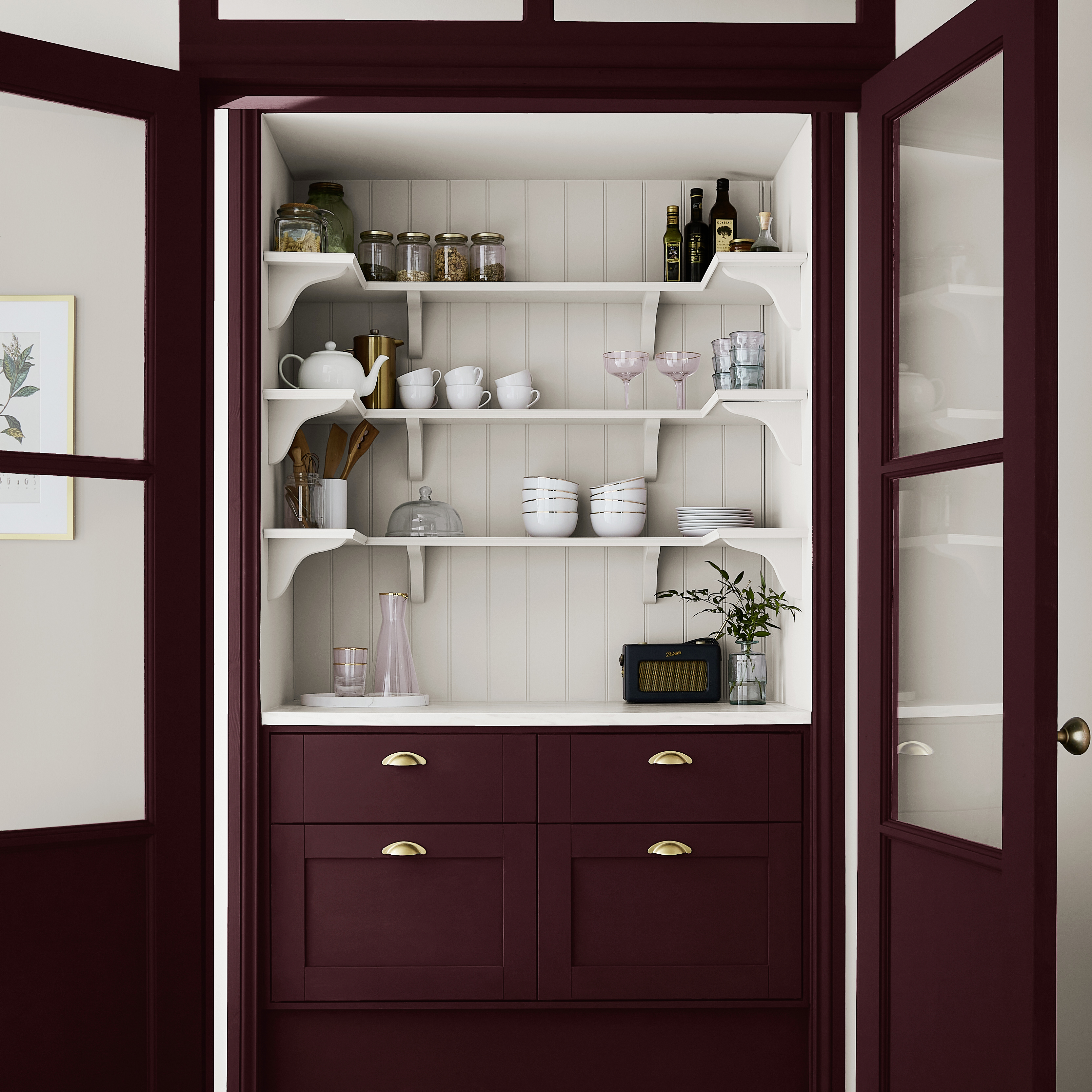
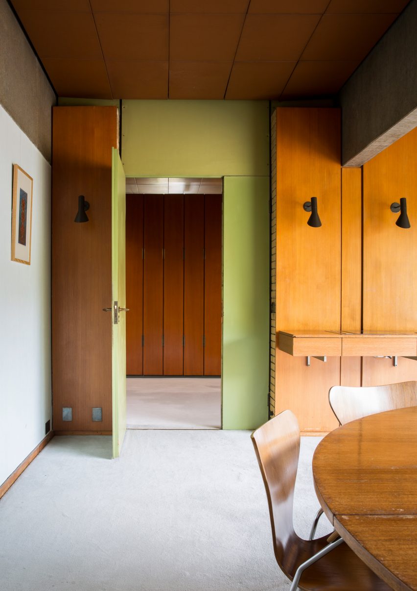
Mulberry, wine, or maroon tones offer a deep and dramatic touch, particularly effective with dark or mid-tone wood trims. These colors evoke a moody yet endearing atmosphere, ideal for smaller bedrooms, hallways, or home offices. To balance the intensity of these earthy reds, incorporating a third, more neutral tone and allowing ample natural light through elements like light curtains can prevent the room from feeling overly dark.
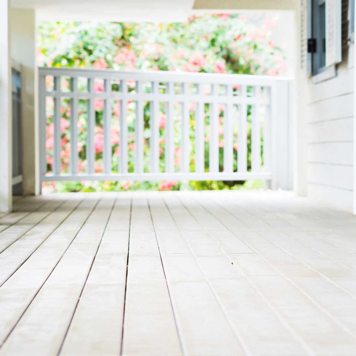
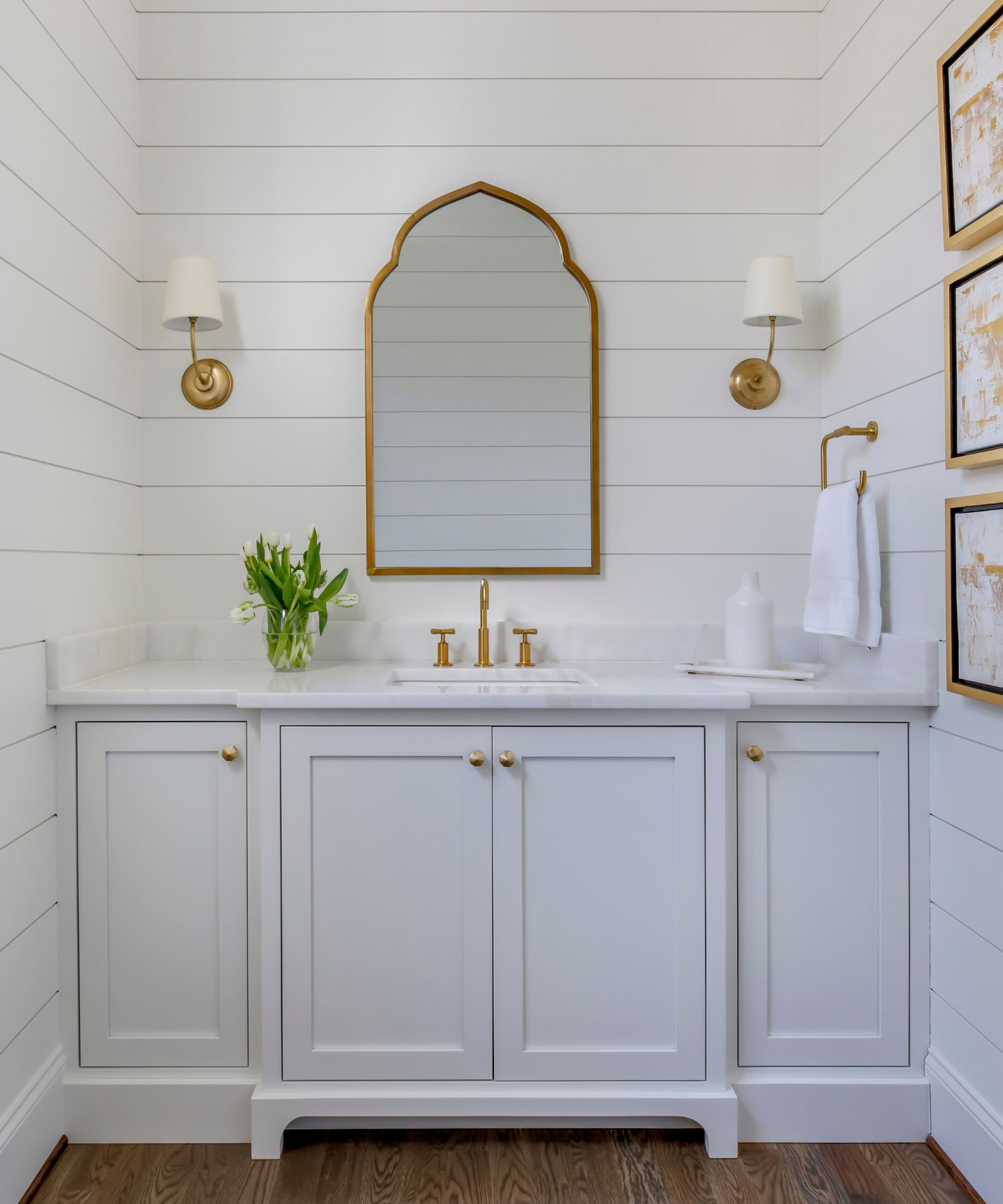
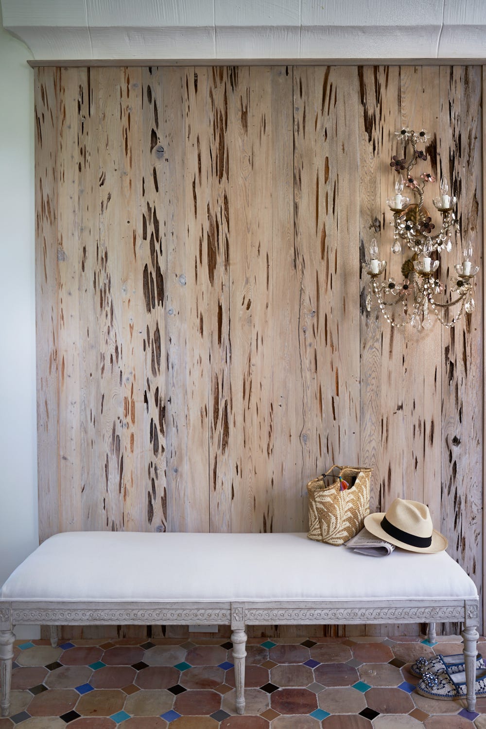
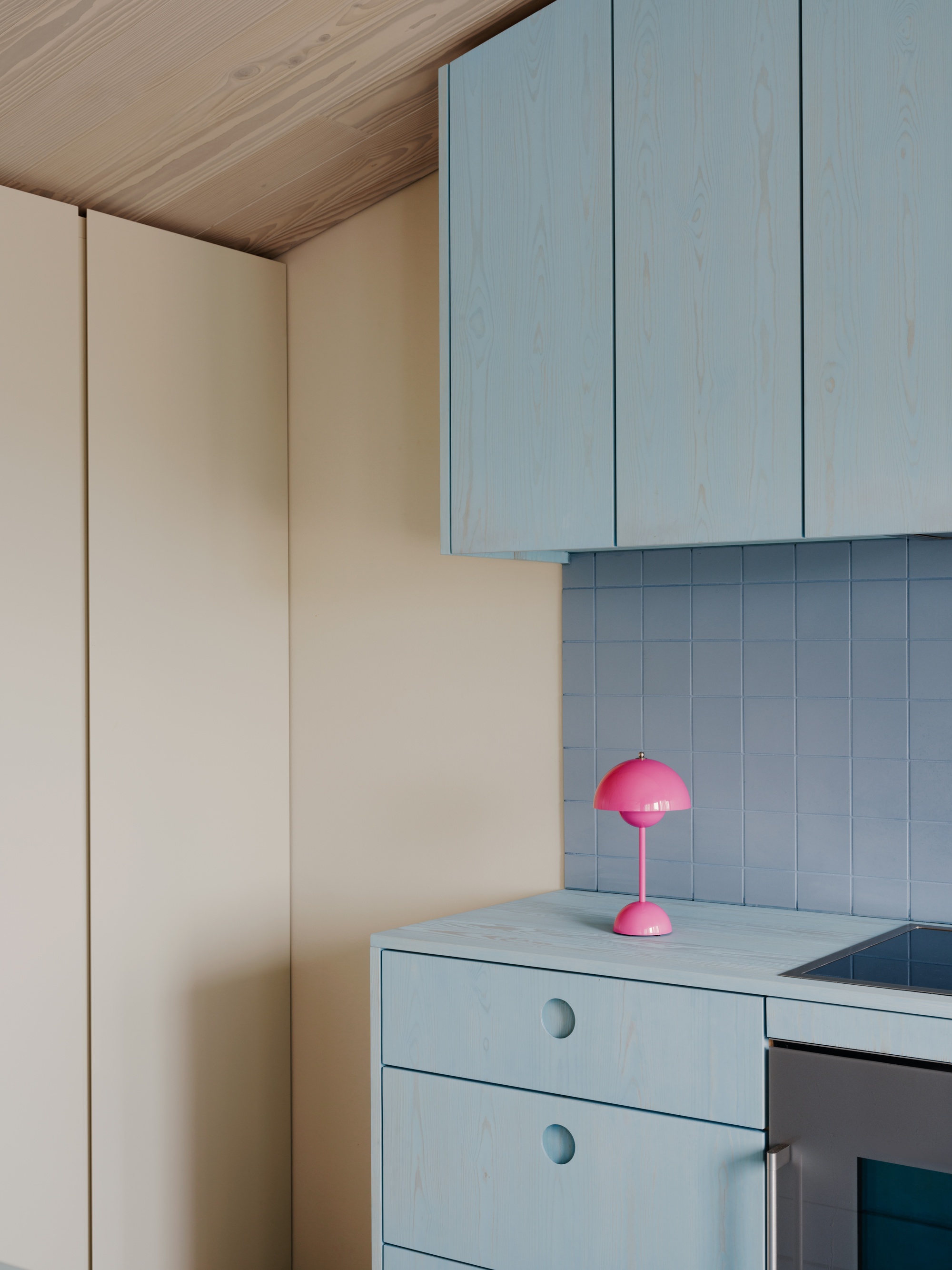
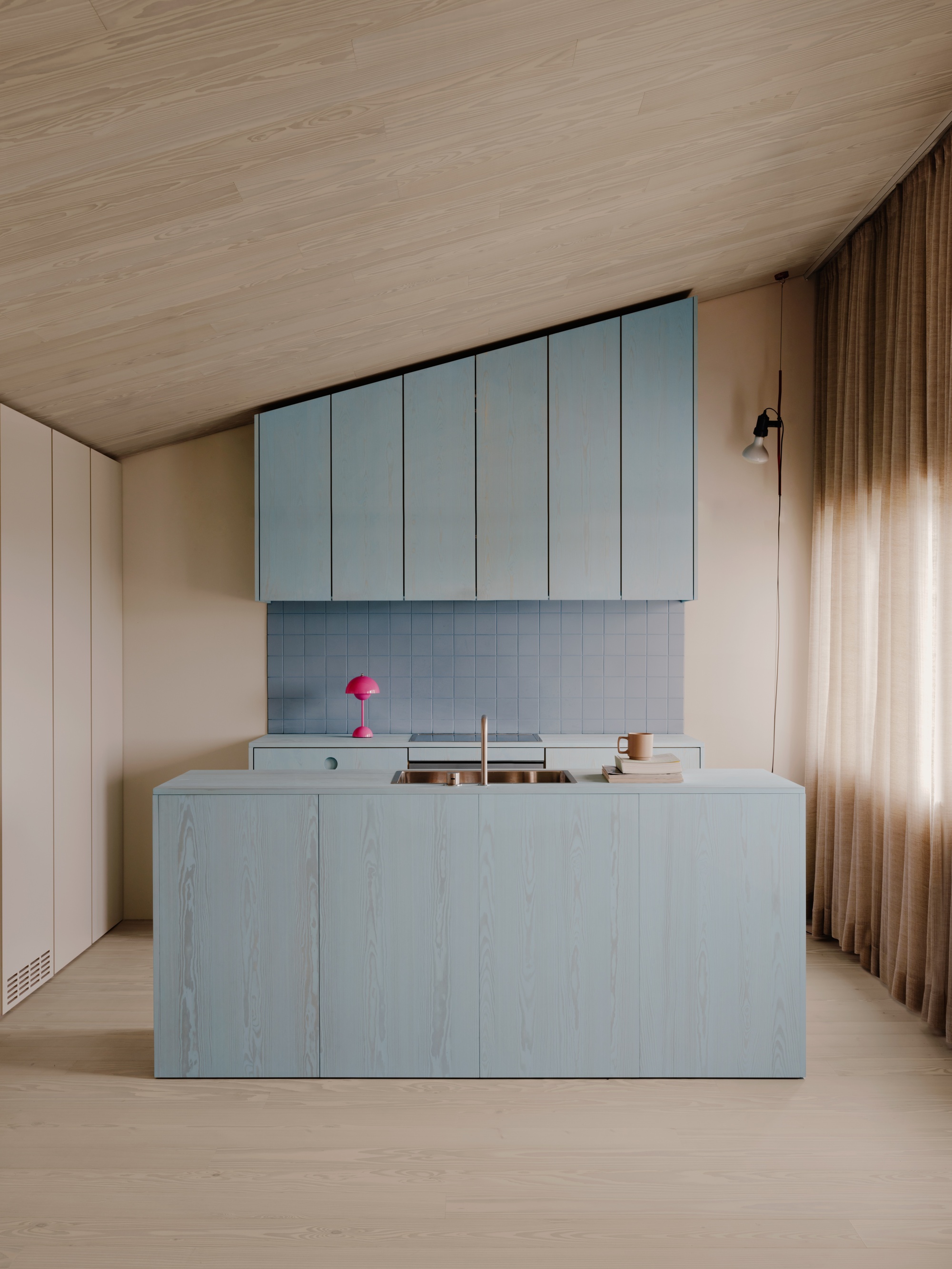
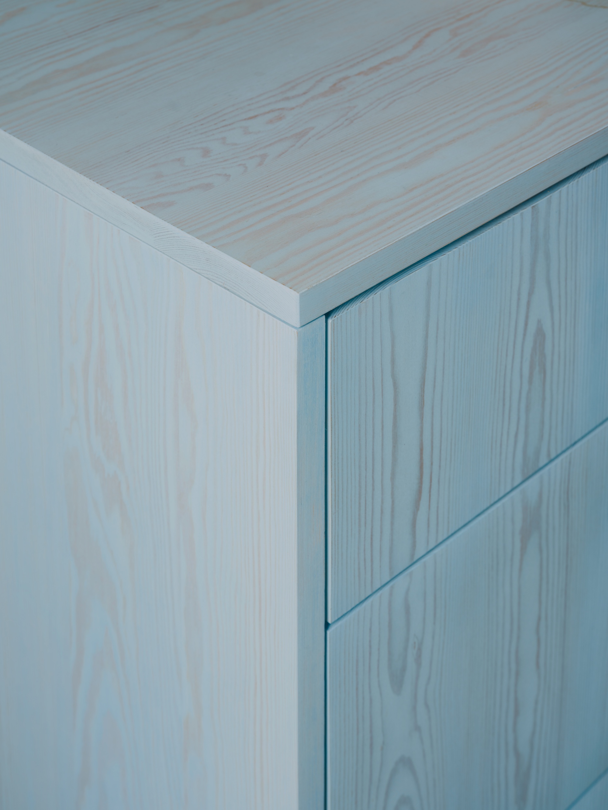
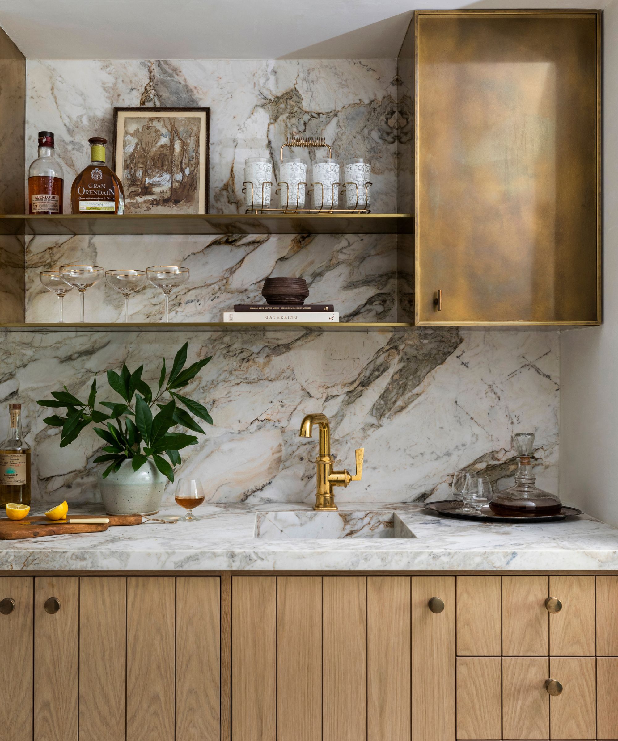
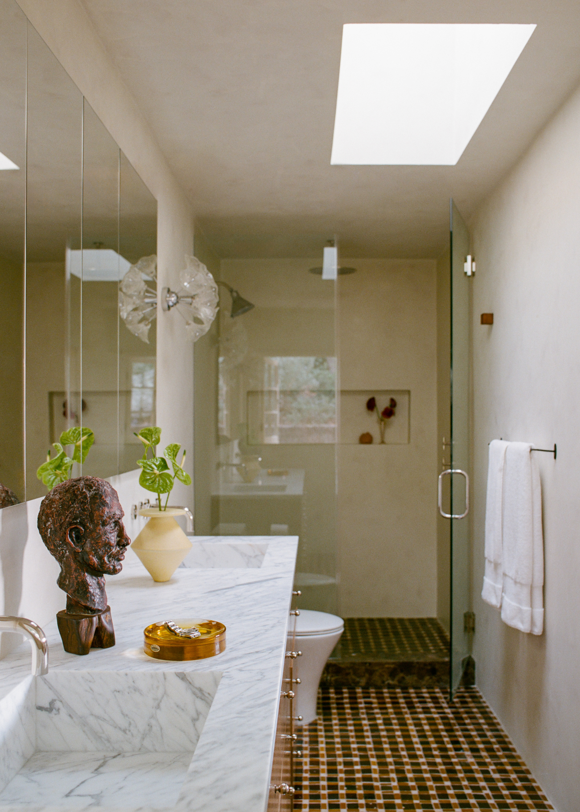
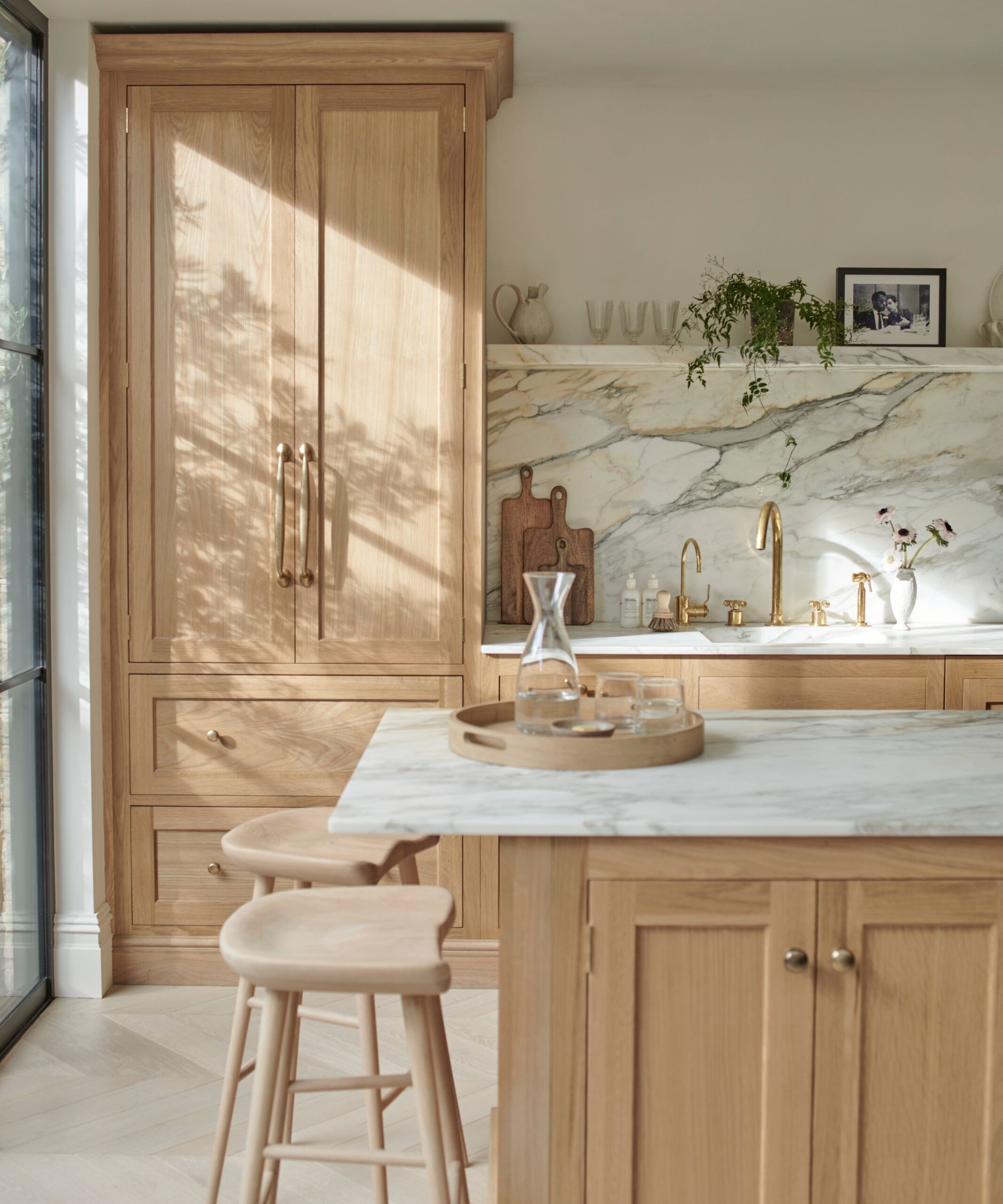
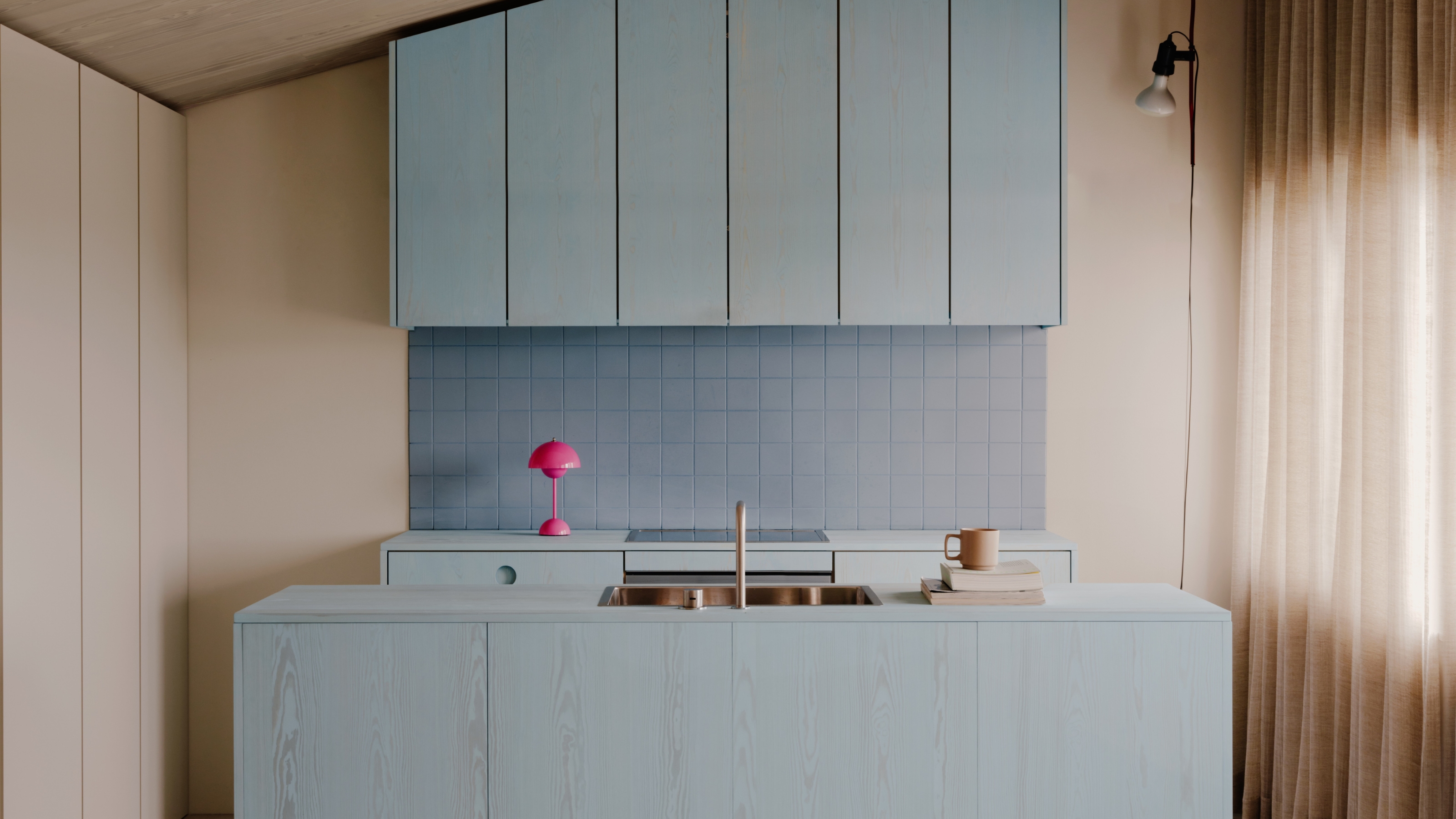
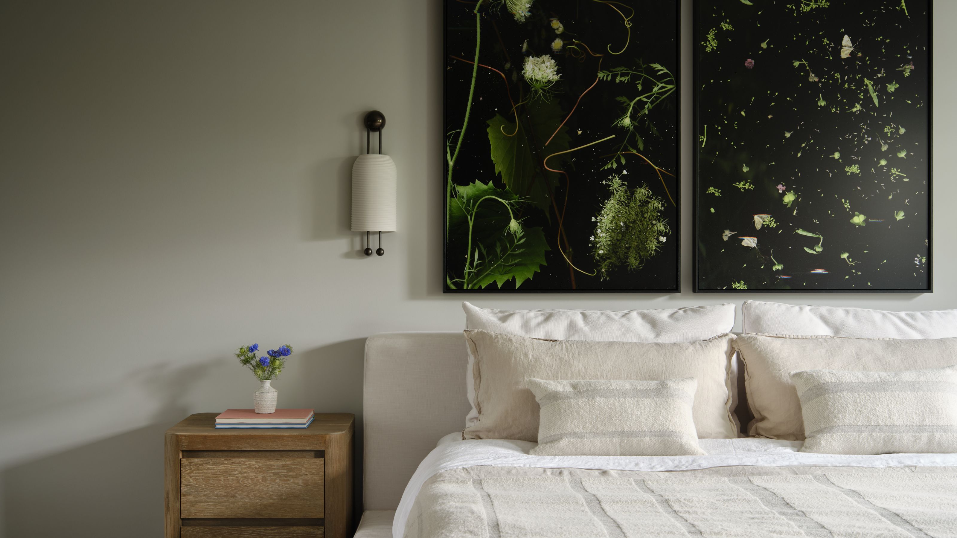
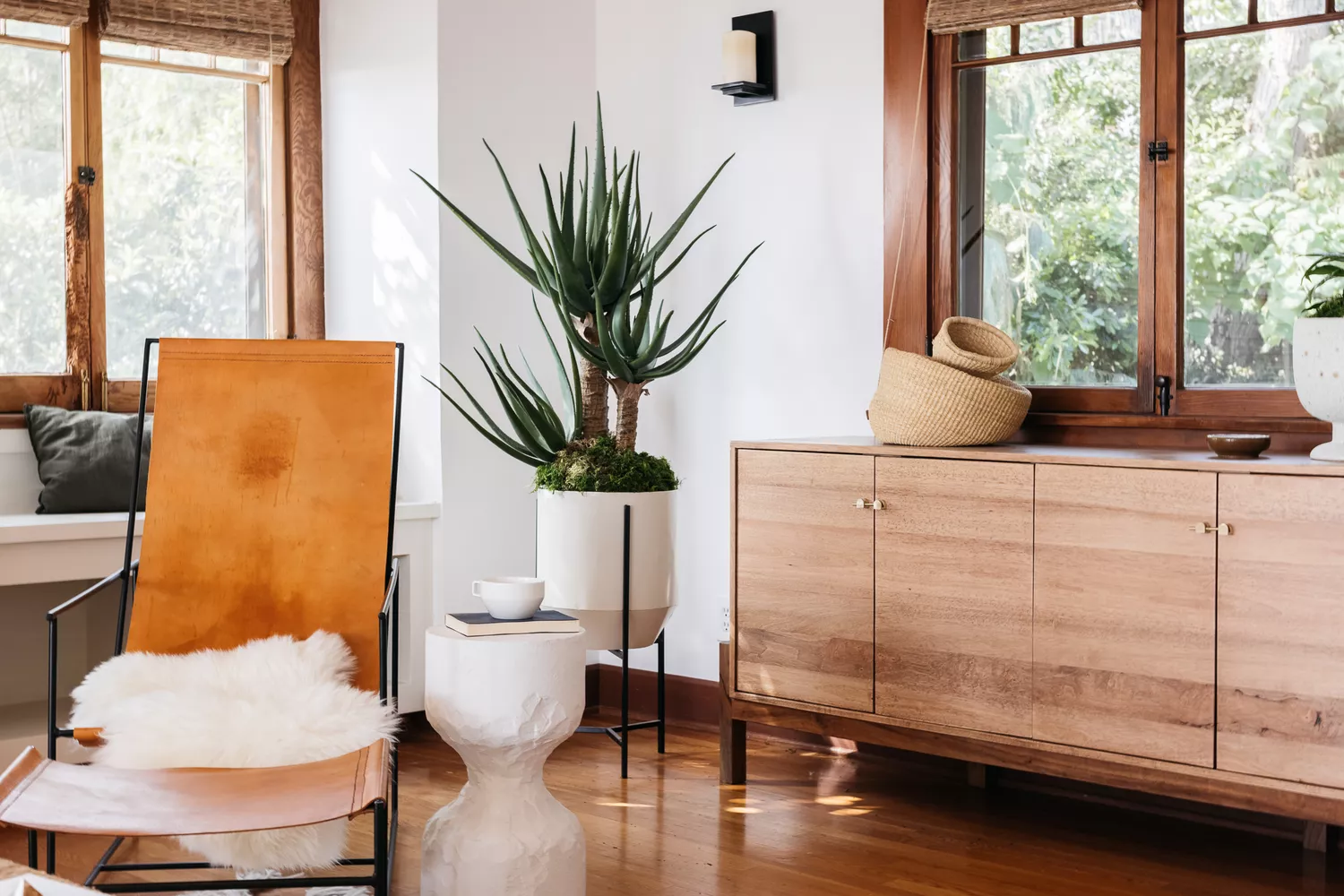
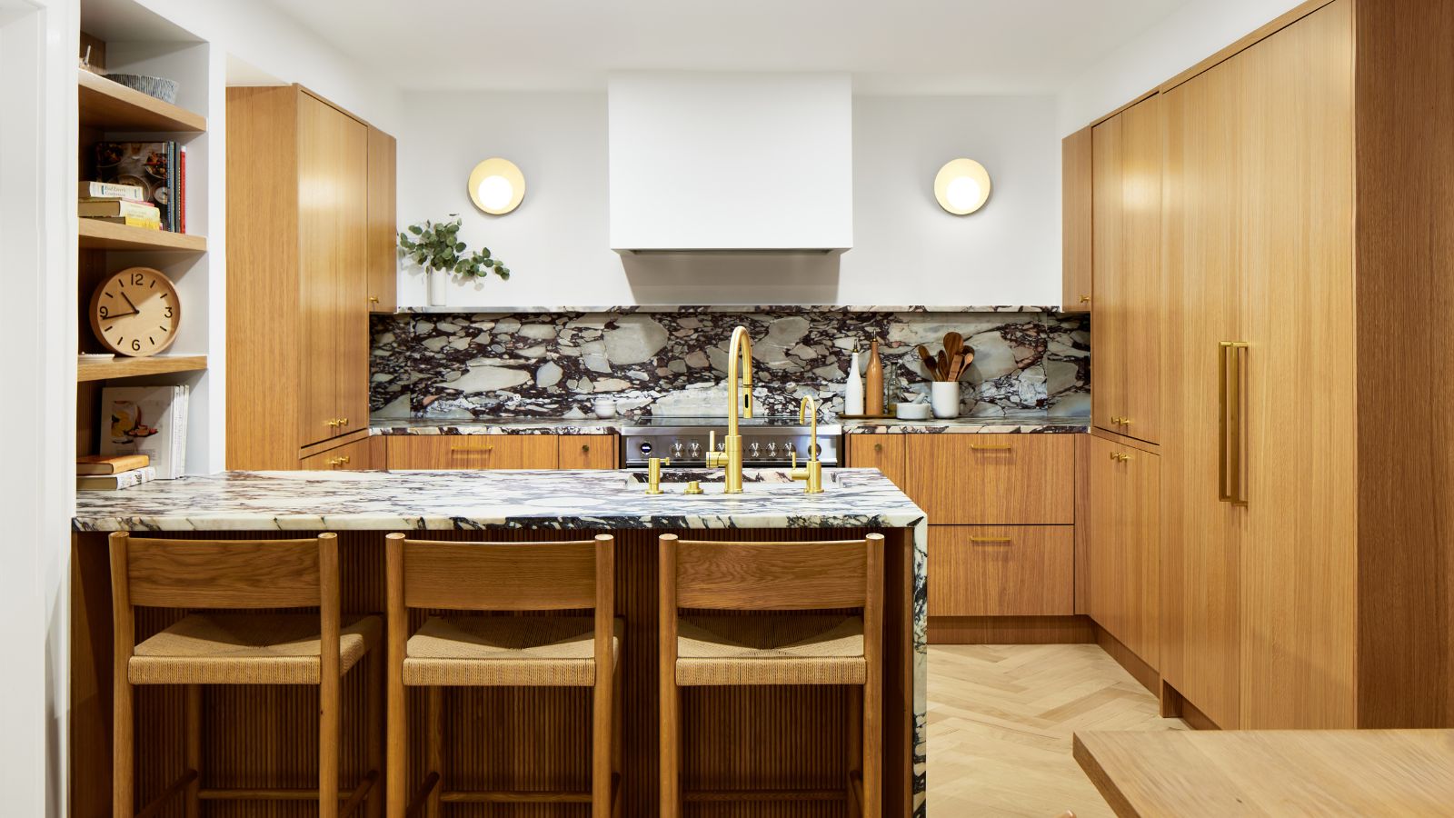
Light blue provides a soft yet impactful color option, especially suitable for light-toned or grainy wood floors. It injects a hint of color into kitchens or hallways without darkening the space, making it a refreshing alternative to standard white or cream. White, particularly creamy off-whites with soft orange or yellow undertones, remains a classic choice, creating a relaxed and calming environment that pairs beautifully with various wood finishes, especially lighter woods like beech, oak, and ash.
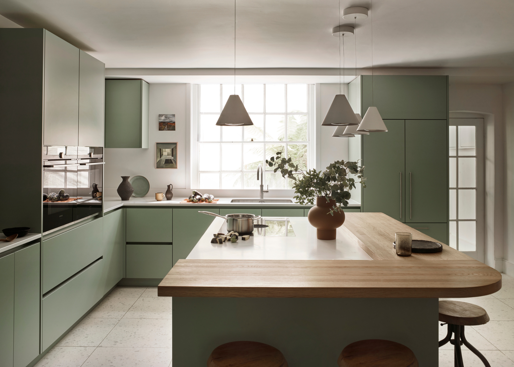
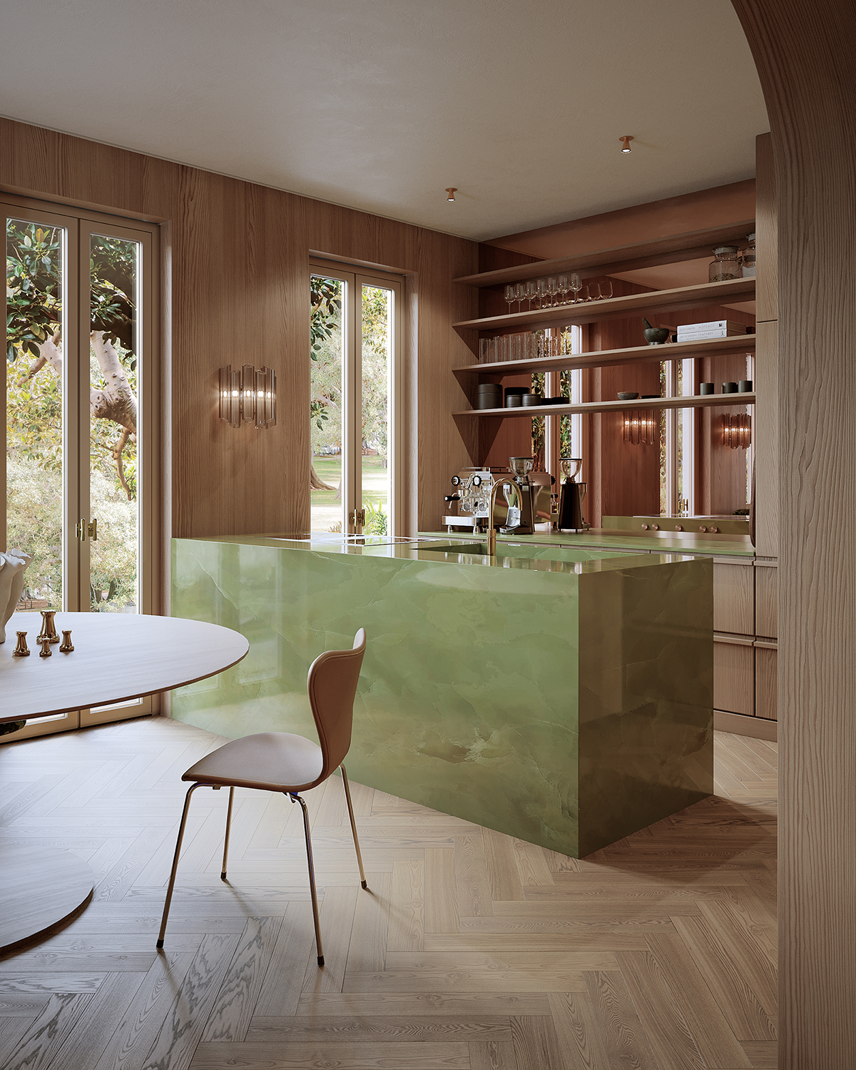
Green, whether fresh or rich, is a natural companion to darker woods such as teak, mahogany, or walnut. Pistachio greens can offer a contemporary feel, while deeper greens like 'Puck' evoke an elegant interior. Pink, ranging from deep shades like 'Templeton Pink' to softer blush tones, can create a bold yet warm contrast with oak or other wood trims. Darker pinks enhance antique oak's rich tones, while blush offers an unexpected and welcoming pairing with both warm and cool wood types.
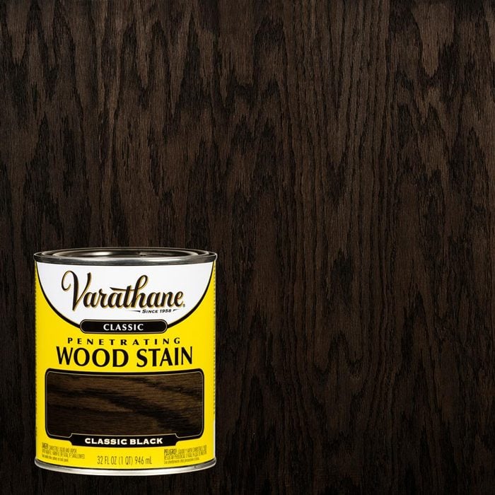
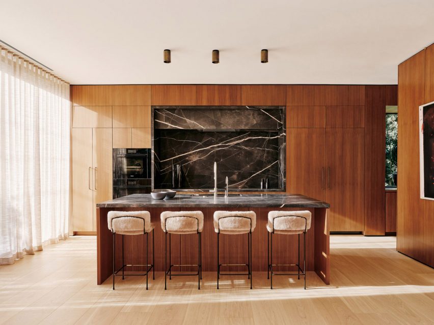
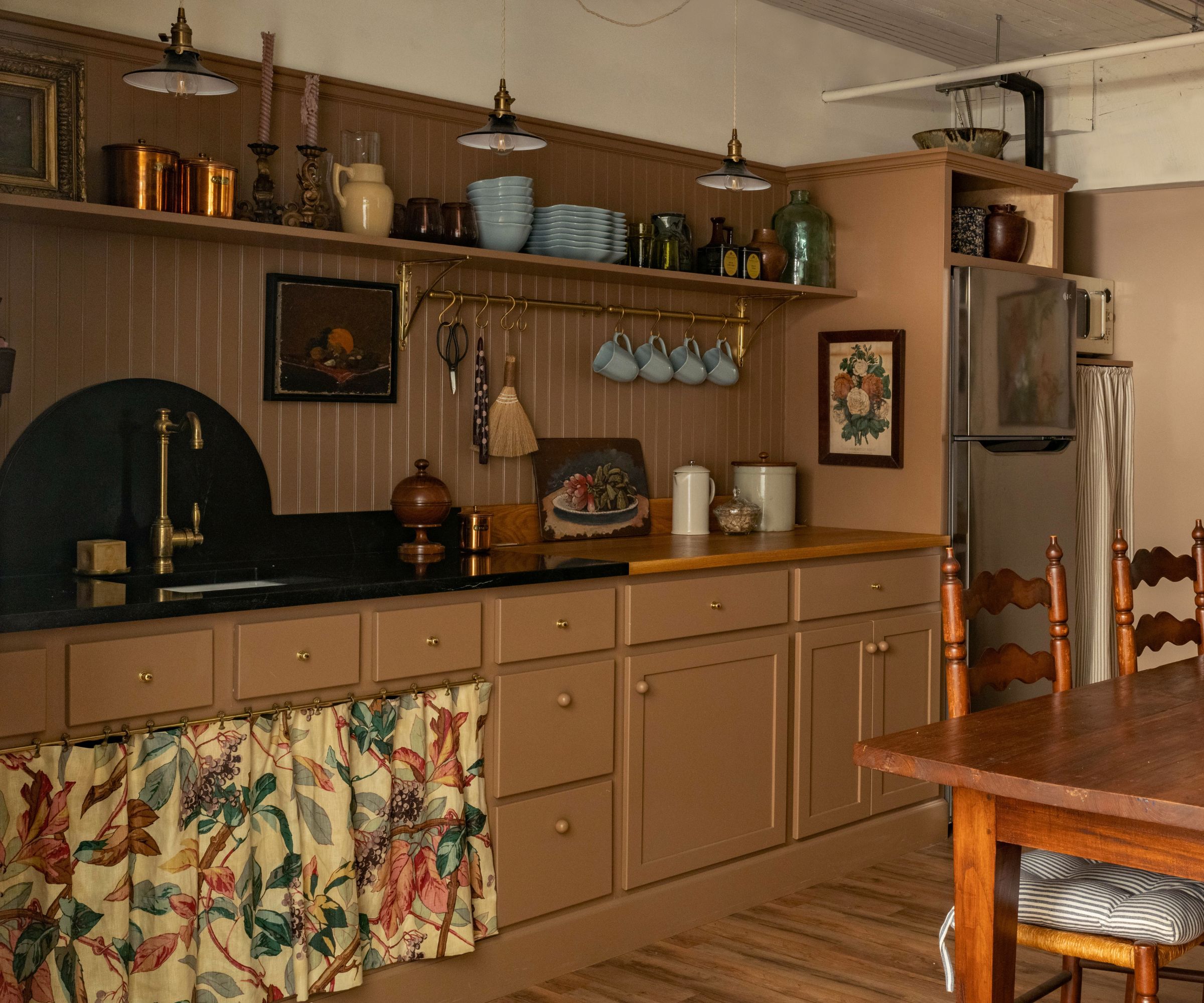
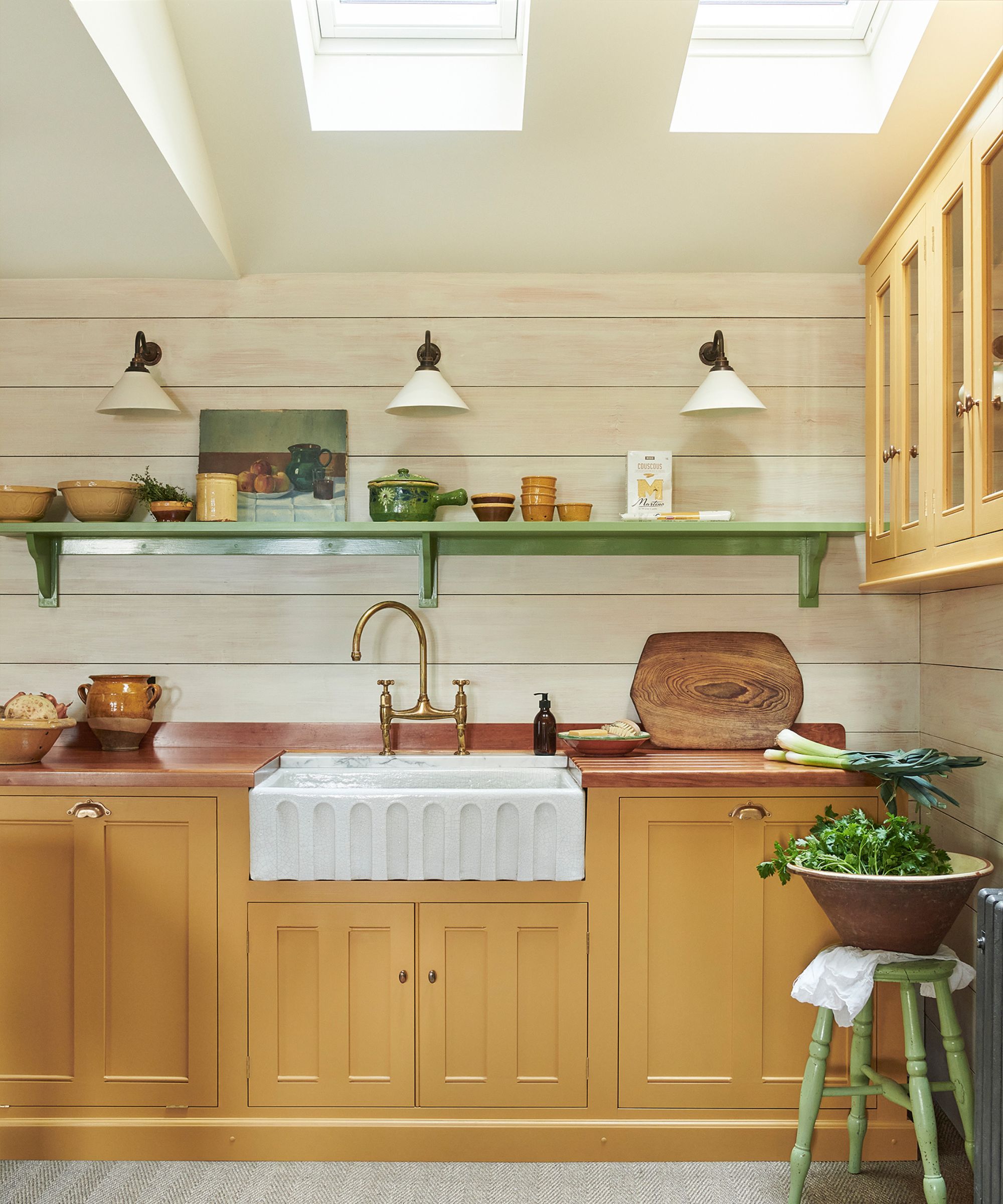
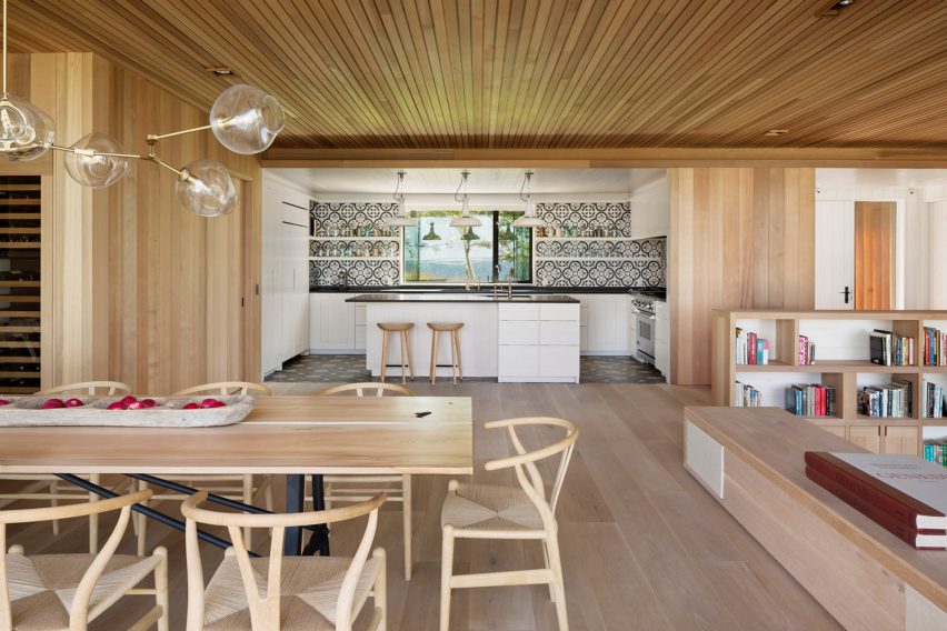
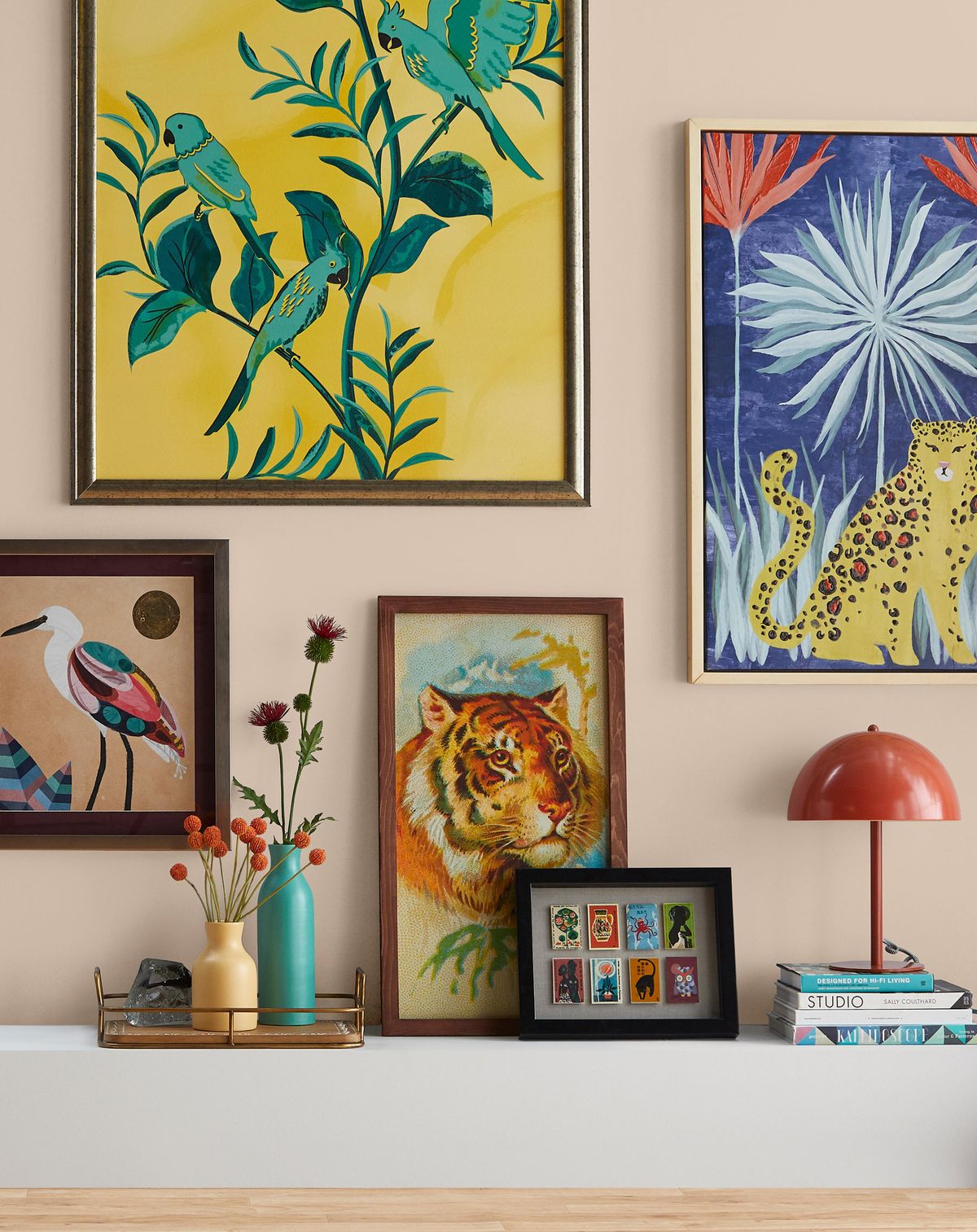
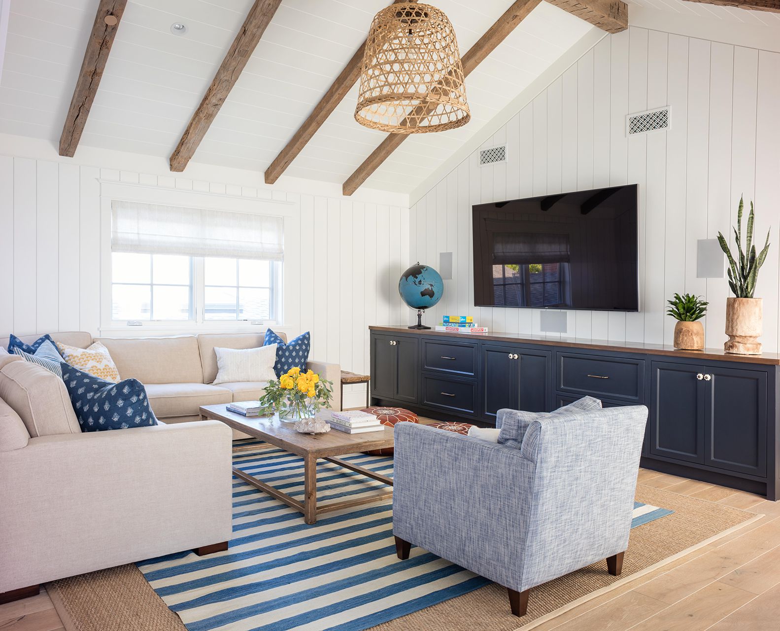
Yellow, particularly soft yellows with underlying green notes, can modernize and warm up spaces with grainy or blond woods, like new oak, making it an excellent choice for living rooms. Bold oranges or strong yellows can further accentuate the warm tones in wood finishes. Red, especially in shades that complement the reddish undertones of woods like acacia, teak, and cherry, can create a harmonious or dramatically bold scheme. Finally, black or charcoal paint colors, often used for specific elements like kitchen islands, offer a striking contrast, particularly with versatile woods like pine, beech, and plywood. Pairing black with lighter furniture and additional neutral colors like gray or cream can provide visual relief and maintain a fresh, crisp look.
#PaintColors #NaturalWood #InteriorDesign #HomeDecoration #ColorSchemes #DesignTips #WoodFinishes #HomeOfficeDesign #KitchenDesign #PaintColors #NaturalWood #InteriorDesign #HomeDecoration #ColorSchemes #DesignTips #WoodFinishes #HomeOfficeDesign #KitchenDesign
0 comment in total
You may also like
Best Wood Stain Colors For Interior And Exterior Surfaces

8 Paint Colors That Pair Beautifully with Yellow Wood Tones
Ten projects that seamlessly integrate wood into the design
20 Nature-Inspired Paint Colors That Bring the Outside In

What color should you paint woodwork? Expert ways to factor this small yet impactful detail into color schemes

Colorful Wood Stains Are the New Way Cool People Are Doing Color in Their Kitchen
8 Paint Colors That Pair Beautifully With Dark Wood, According to Designers

The best colors to pair with oak kitchen cabinets, according to interior designers
Instantly Elevate Your Space with These 10 Wonderful Wood Accent Wall Ideas

How to Choose Paint Colors to Complement Wood Tones in Your Home
The 10 Secrets Behind 'Biophilic Colors' That Bring Nature's Power Into Your Home — And It's Not All Just About Green
12 Home Paint Colors We're Loving for Fall

13 Paint Colors That Pair Well With Wood Trim

Should woodwork be lighter or darker than walls? The rules colour experts use to choose the perfect colour
These are the 5 best colors to pair with a wooden kitchen countertop, according to interior designers
The best paint colours for autumn — and how to style them at home
What Color Kitchen Cabinets Actually Go Well With Wooden Countertops? Designers Share Their Perfect Pairings
10 wooden kitchen ideas for an organic, timeless, and utterly chic design
Ten interiors featuring natural materials and timeless accents
Try These 10 Stylish Ideas to Bring Out the Natural Beauty of Wood Floors