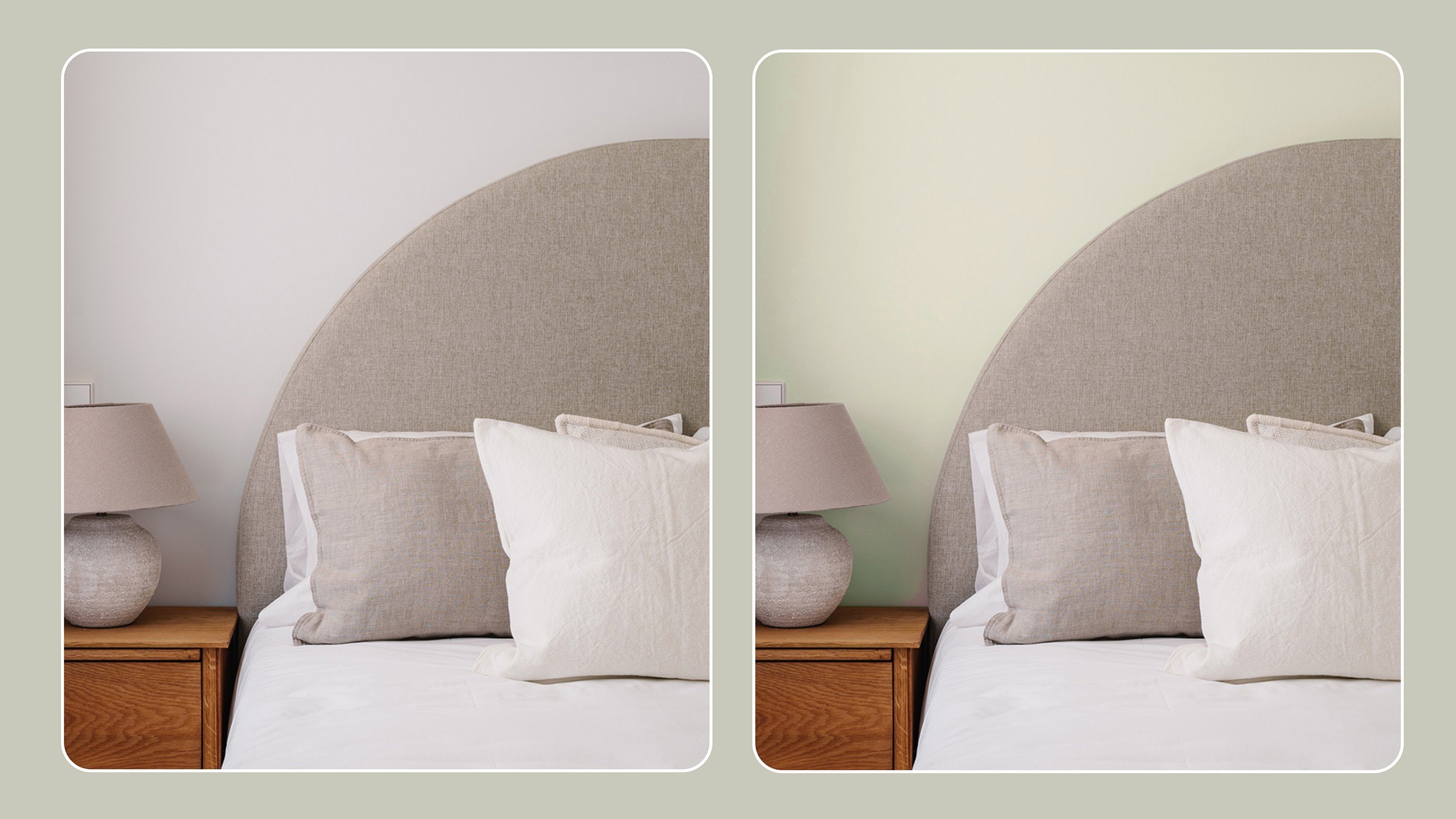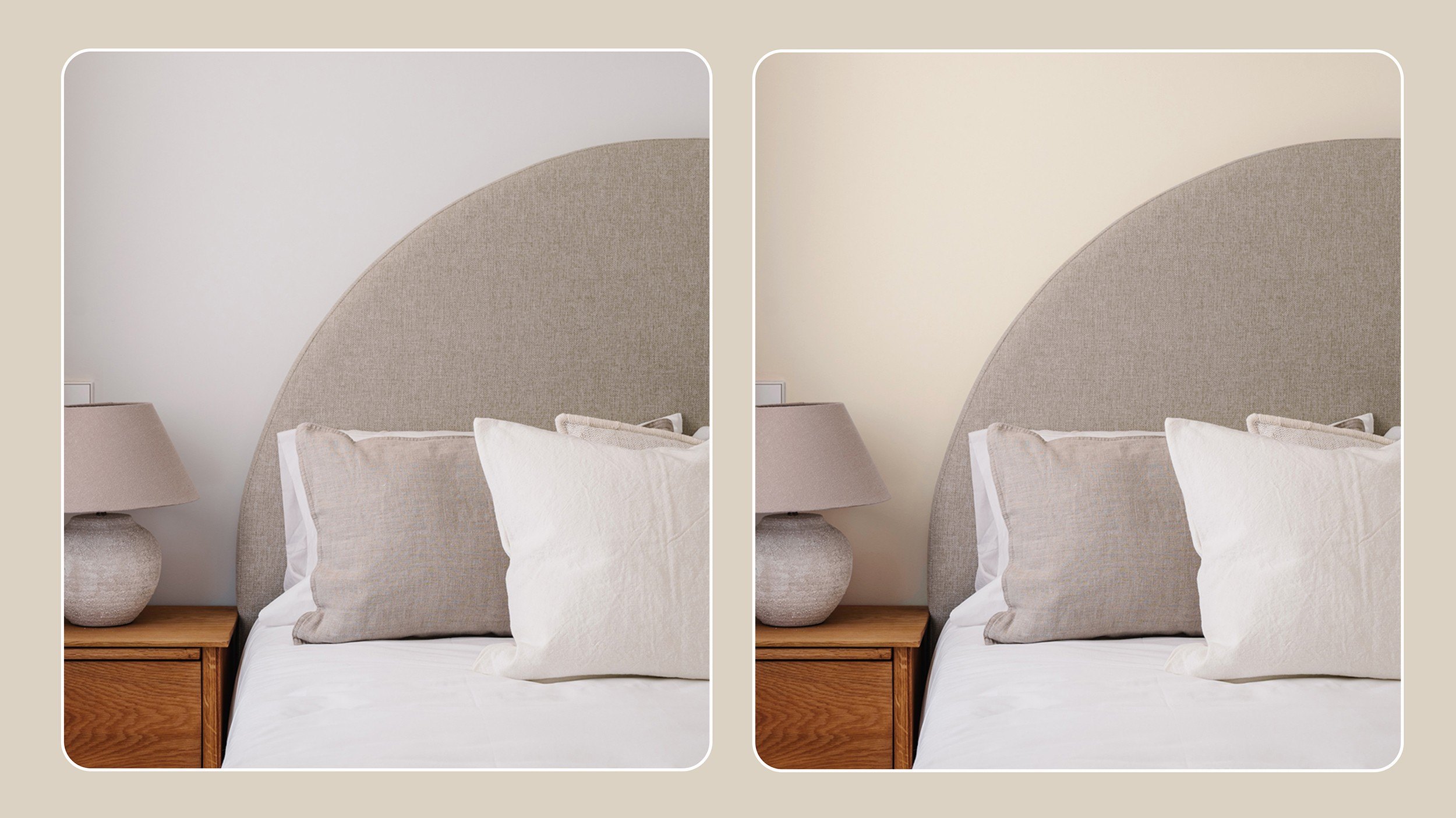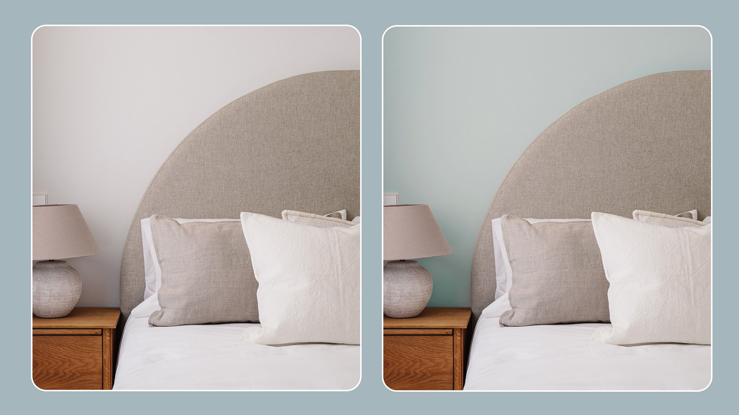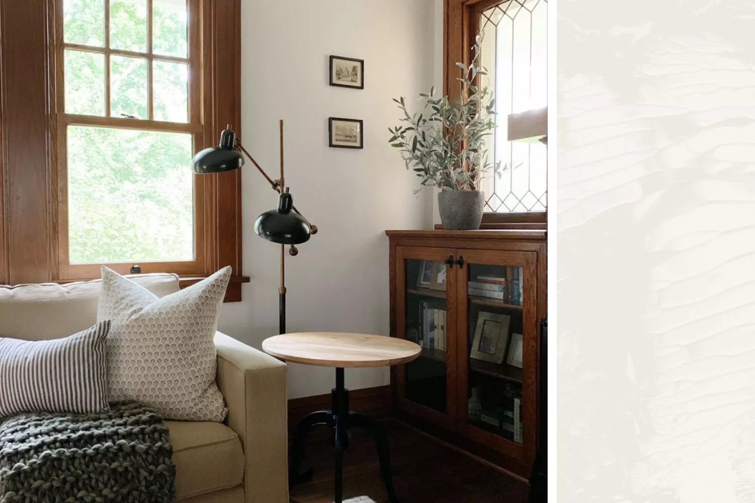
How to Choose Paint Colors to Complement Wood Tones in Your Home
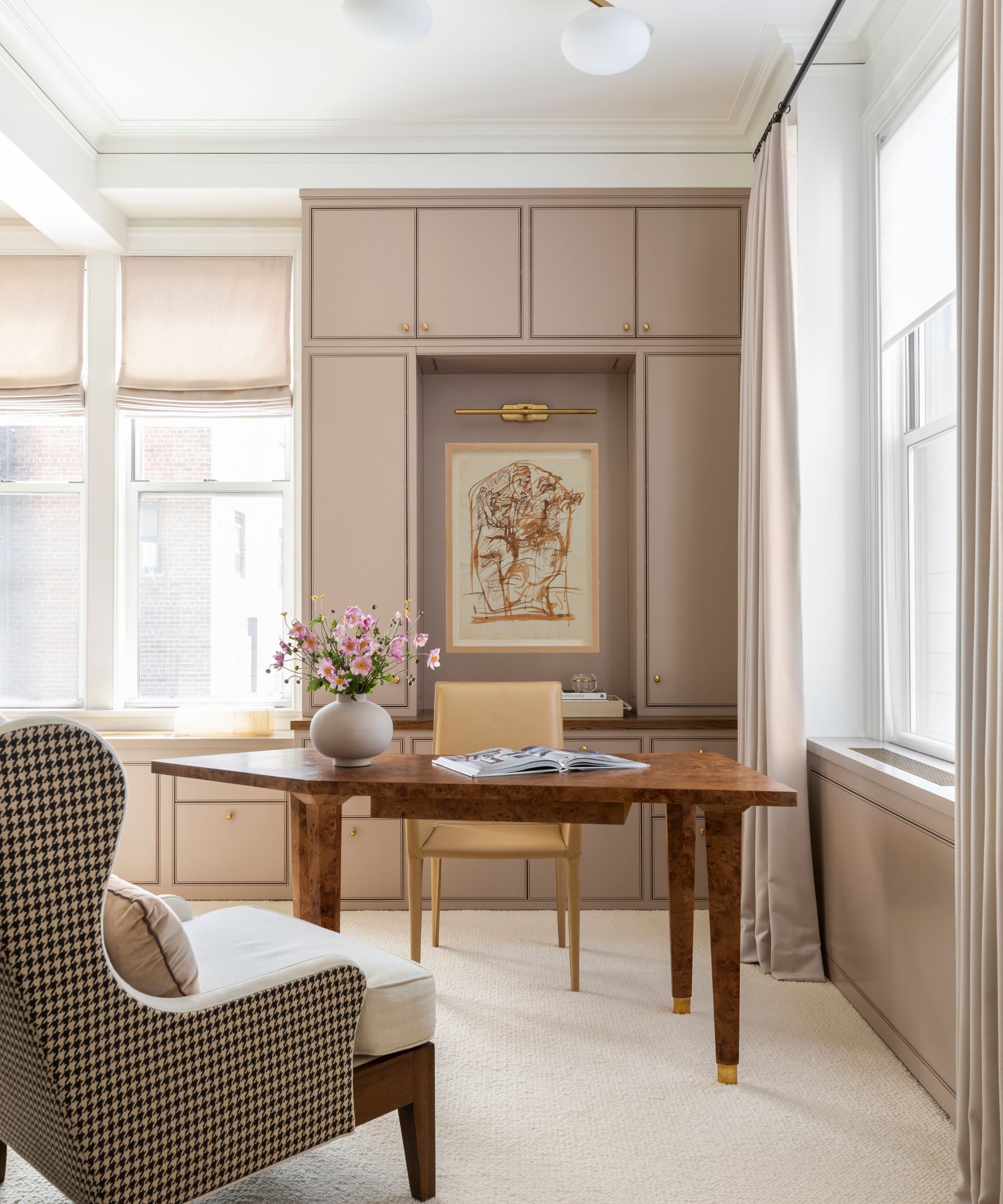
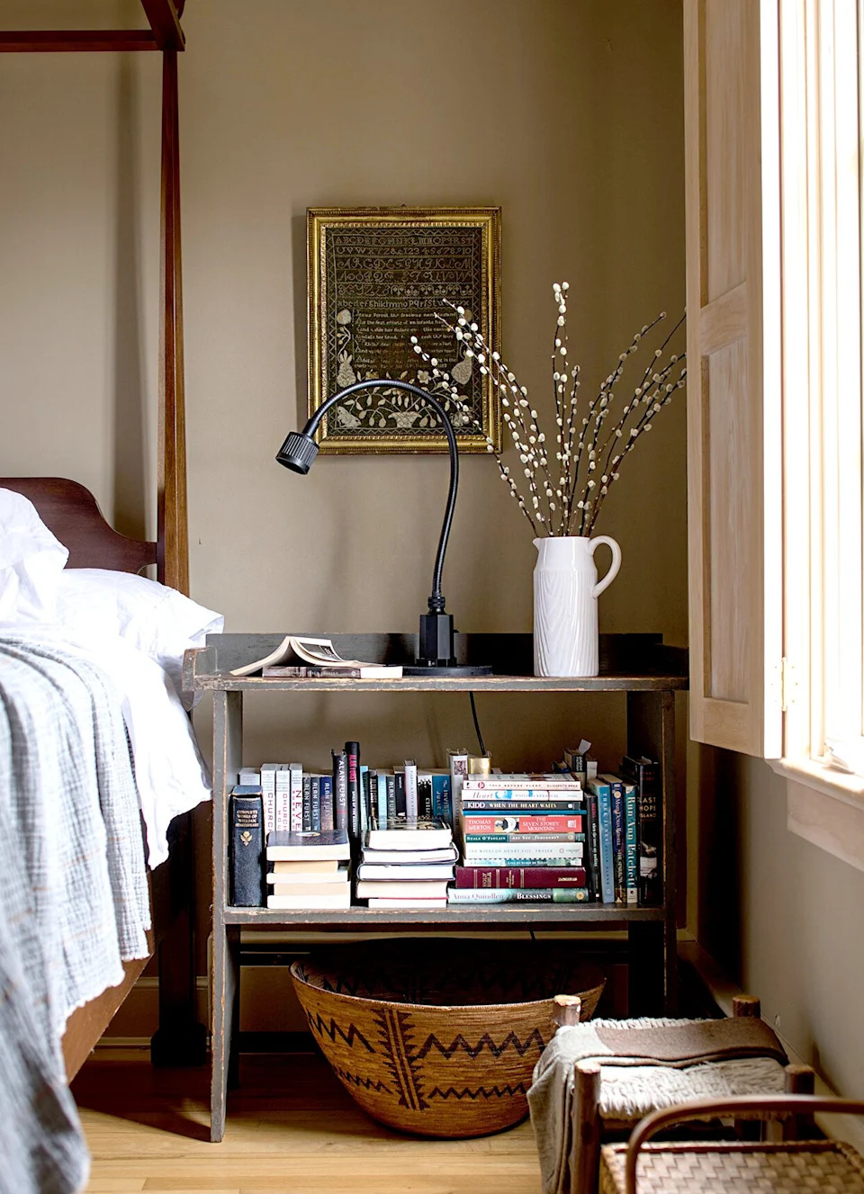
The article offers guidance on selecting paint colors that harmonize with various wood tones in a home, aiming to enhance the overall aesthetic appeal. It emphasizes the importance of considering all room elements, such as flooring, furniture, curtains, architectural details, and light sources, before deciding on paint colors. Creating a mood board, possibly using digital tools like Pinterest or Canva, is suggested as an initial step to visualize how different components will interact.
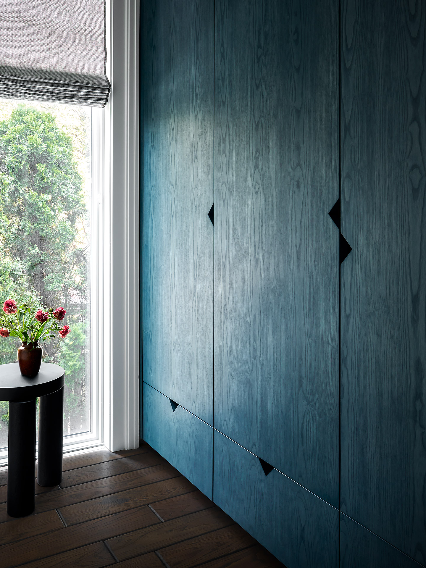
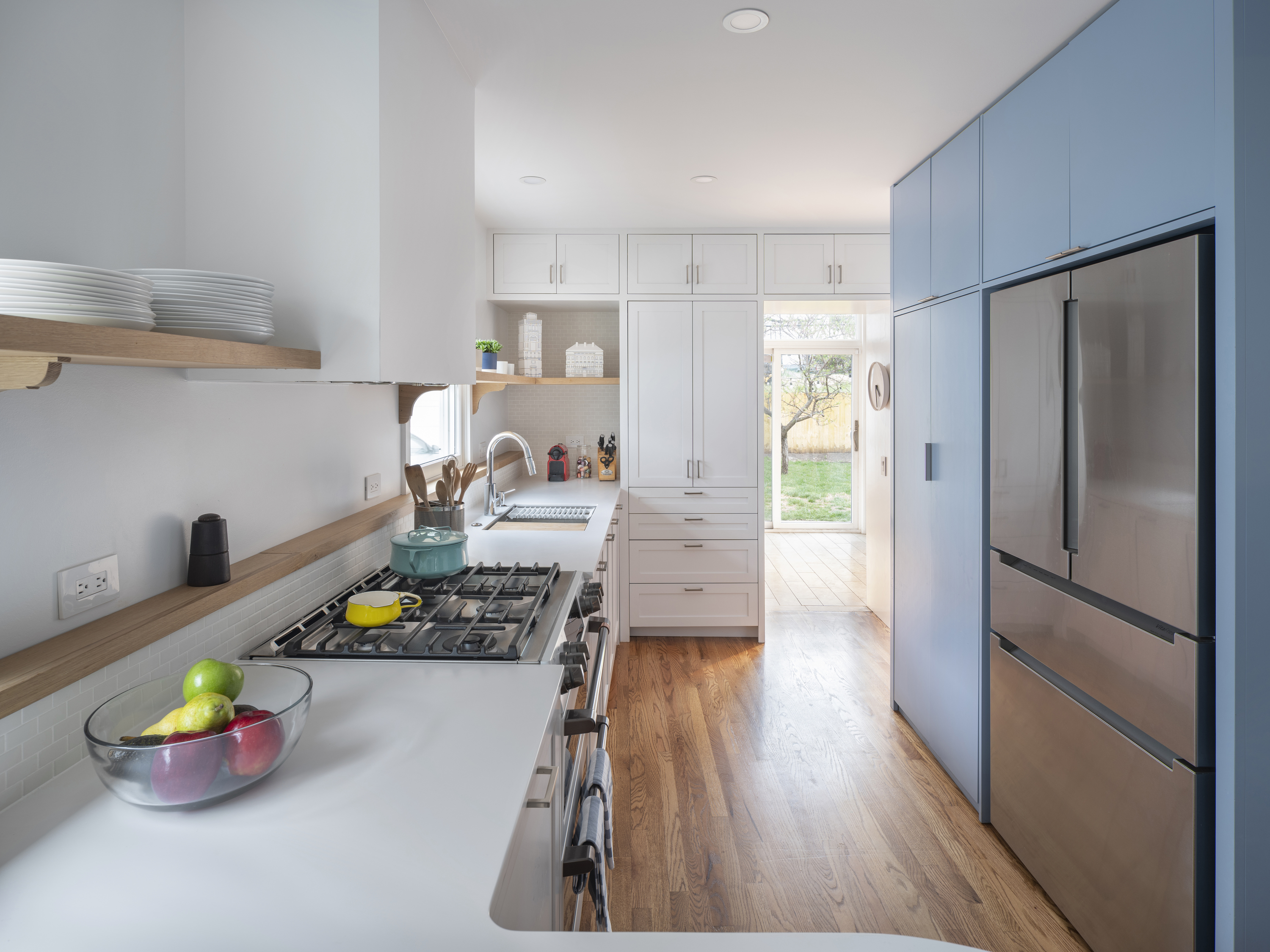
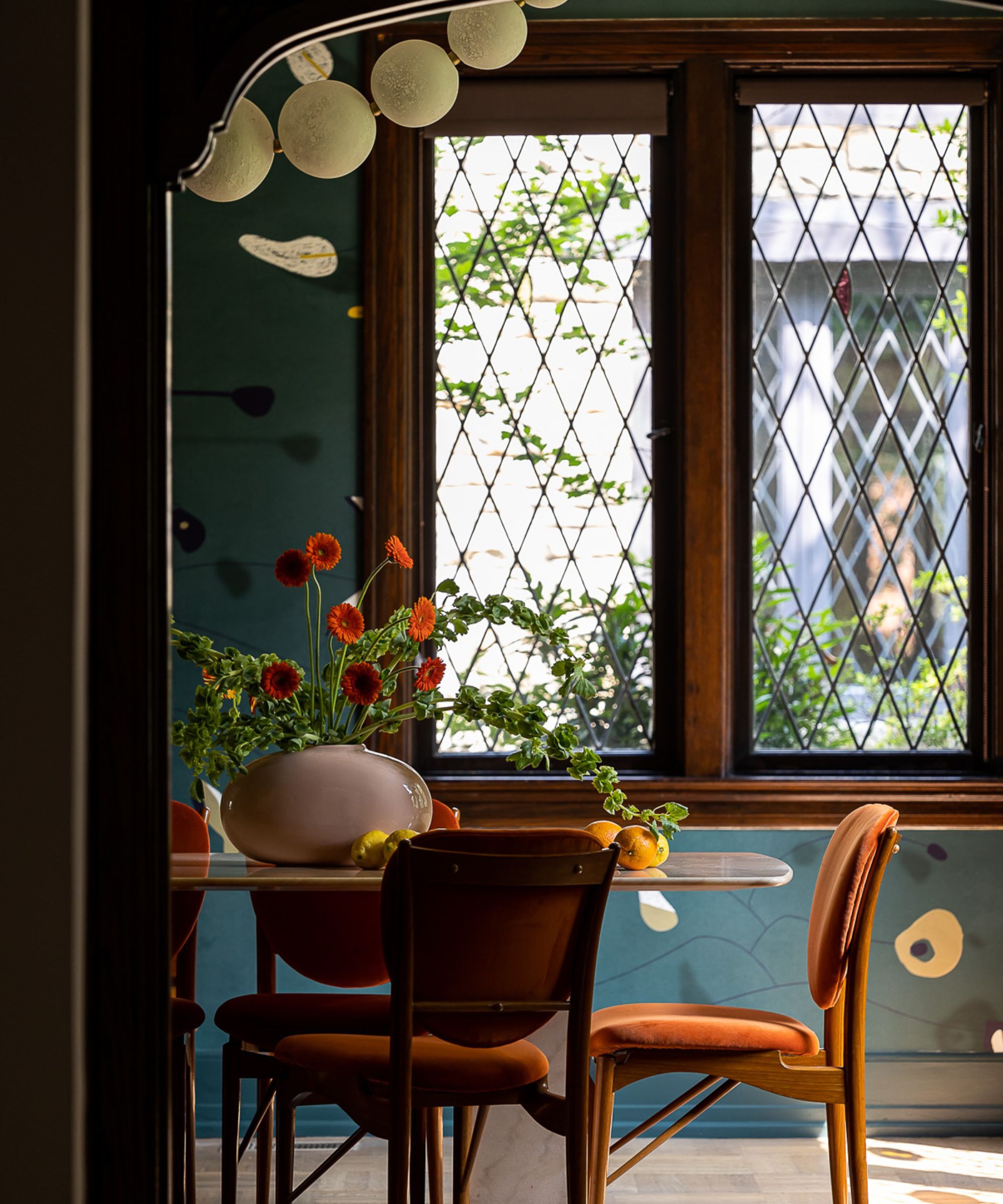
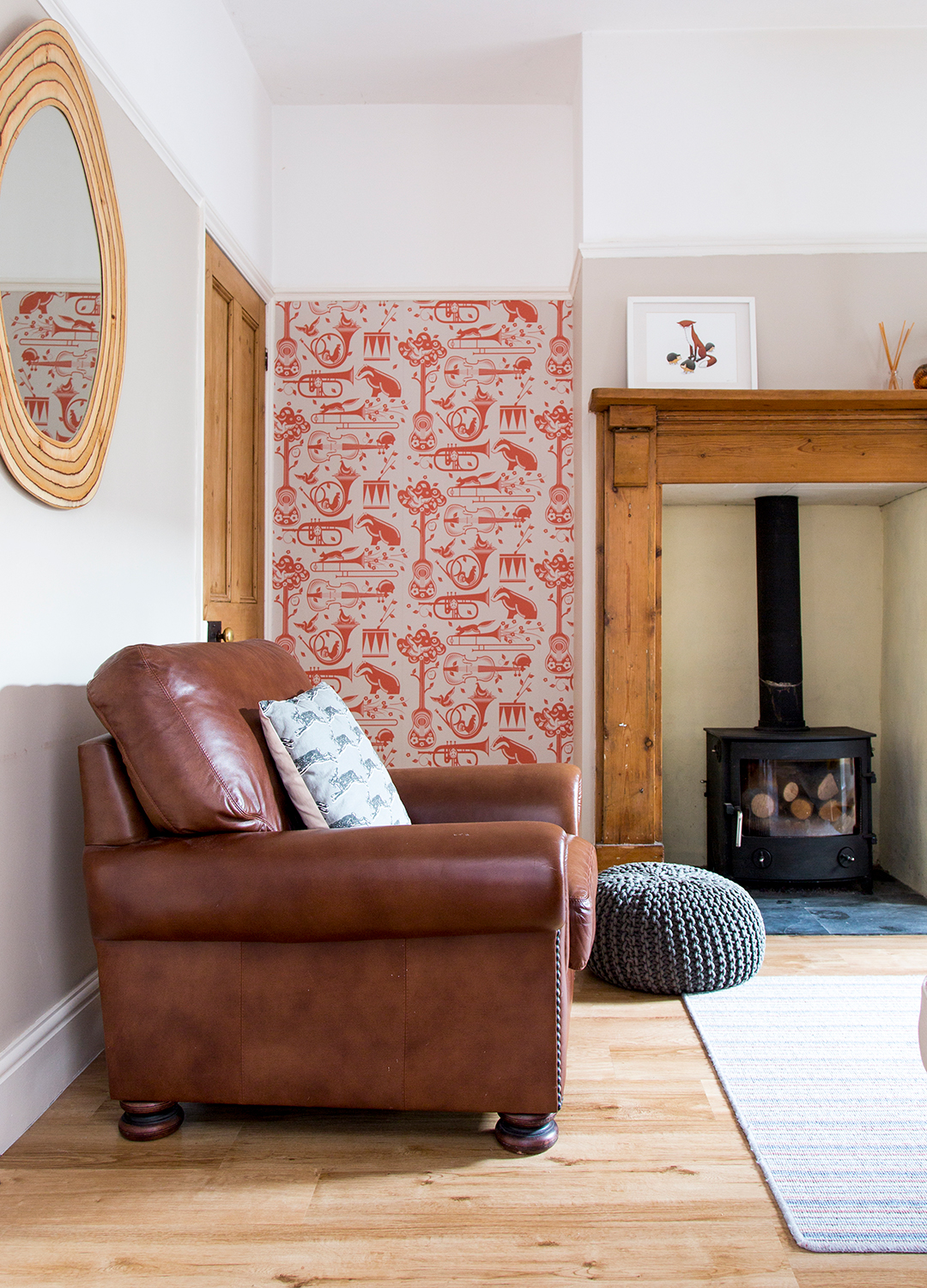
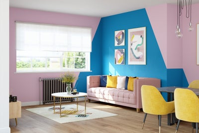
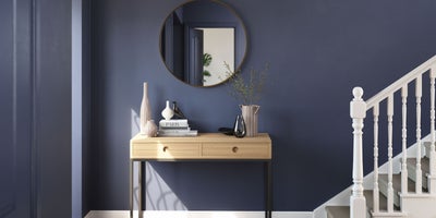
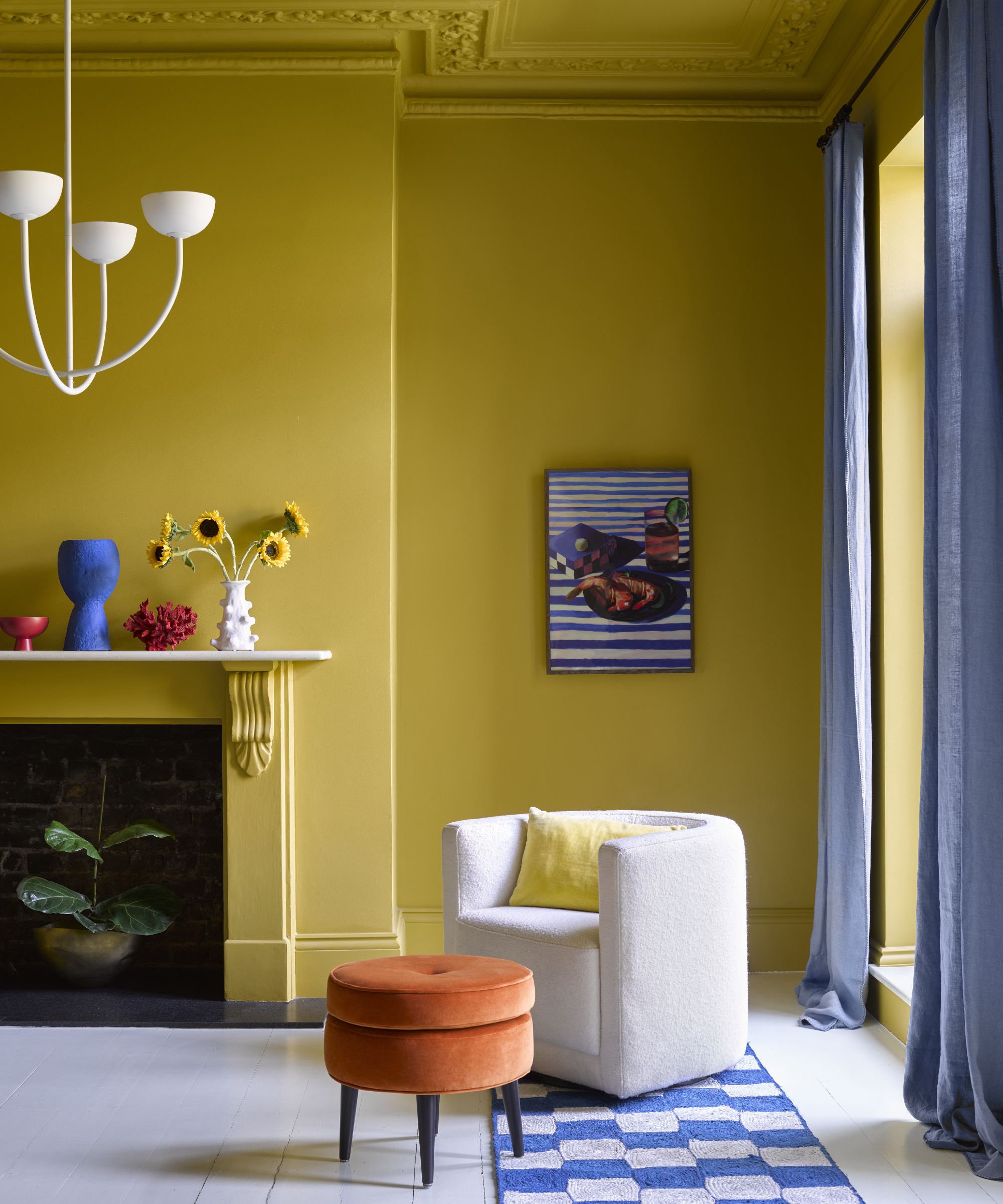
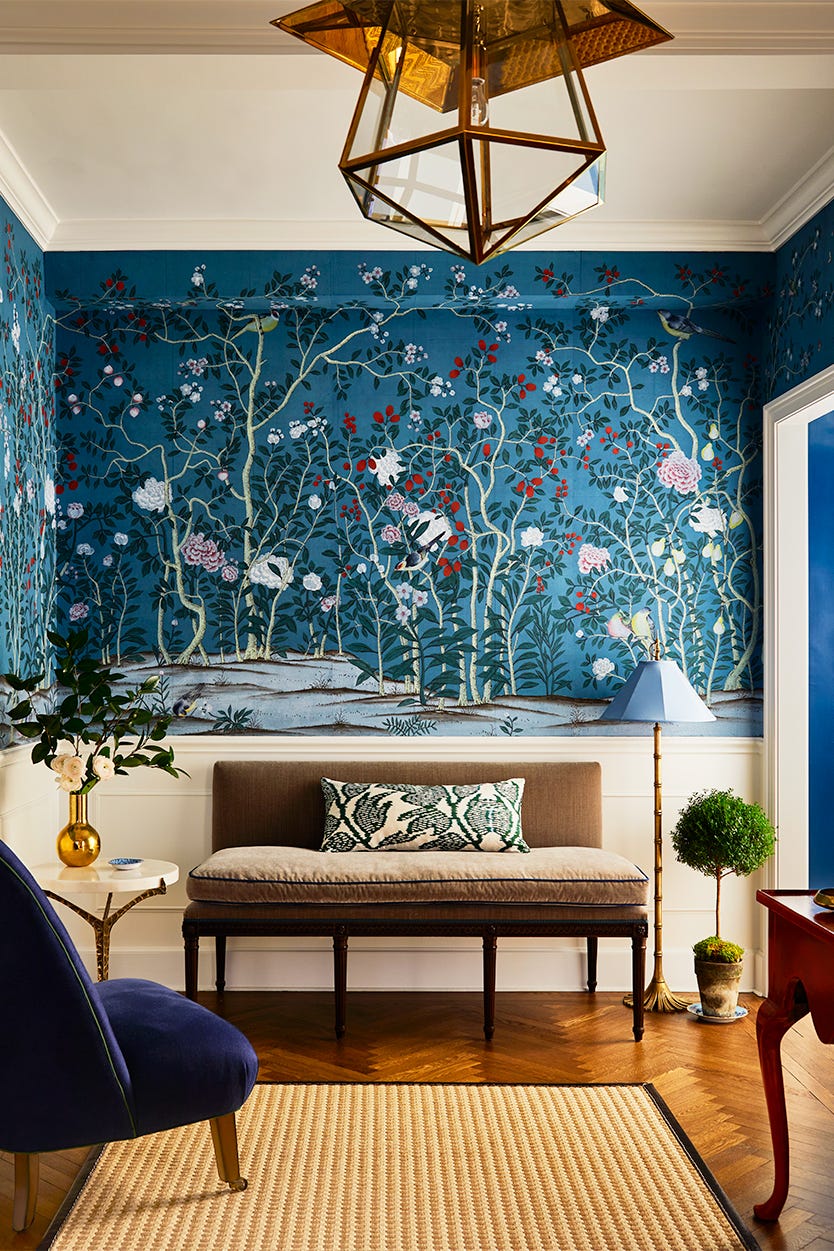
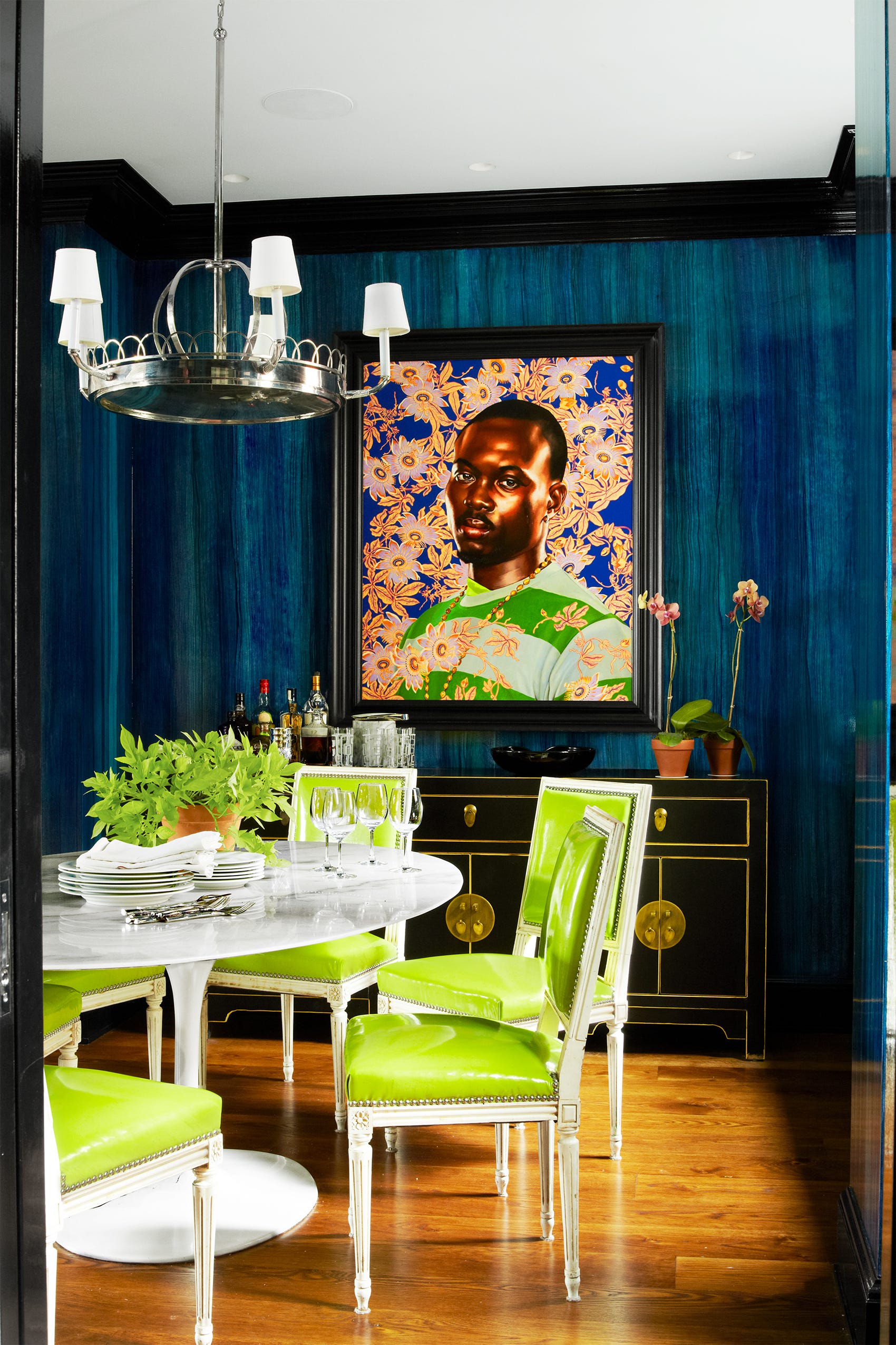

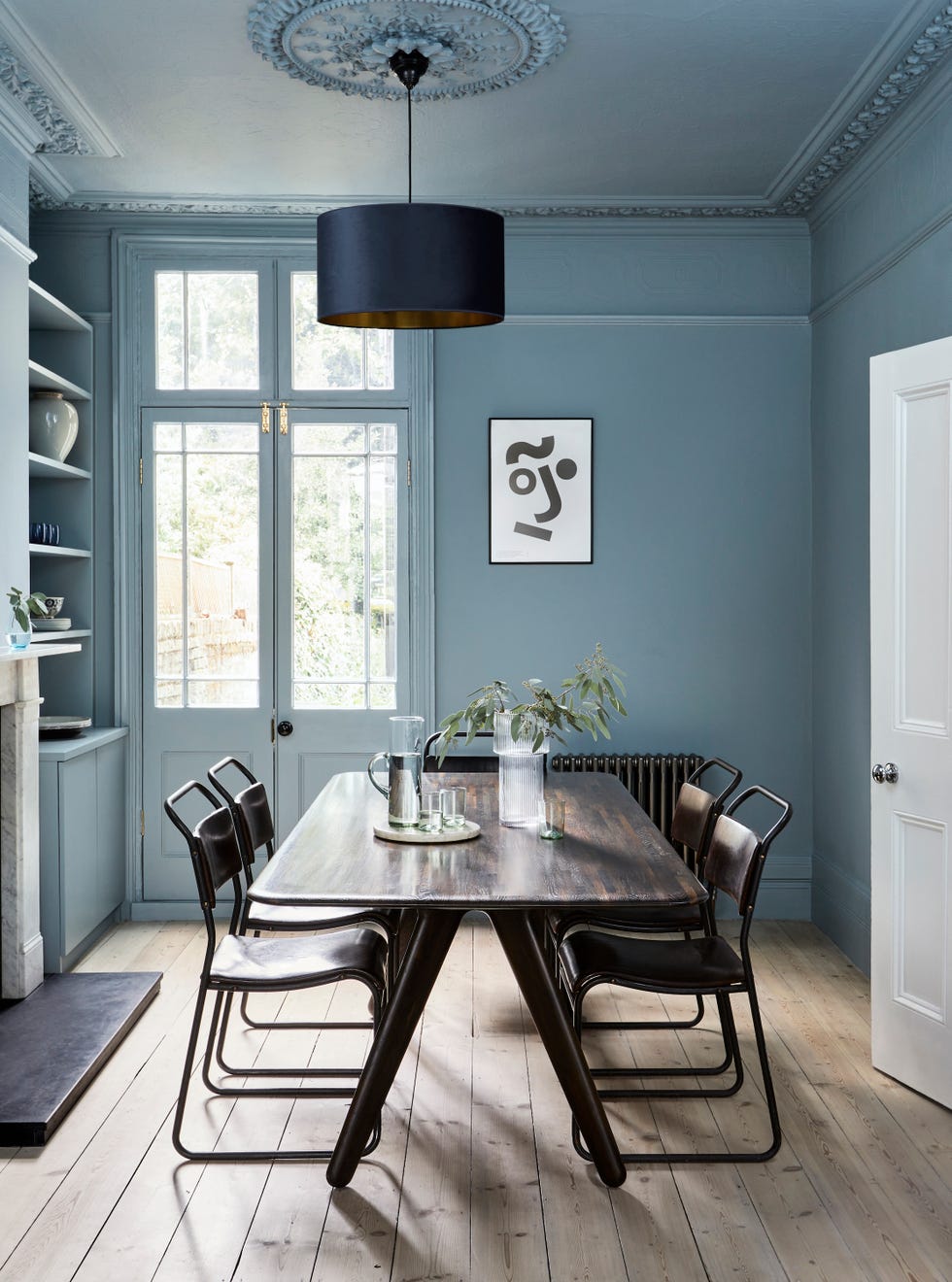
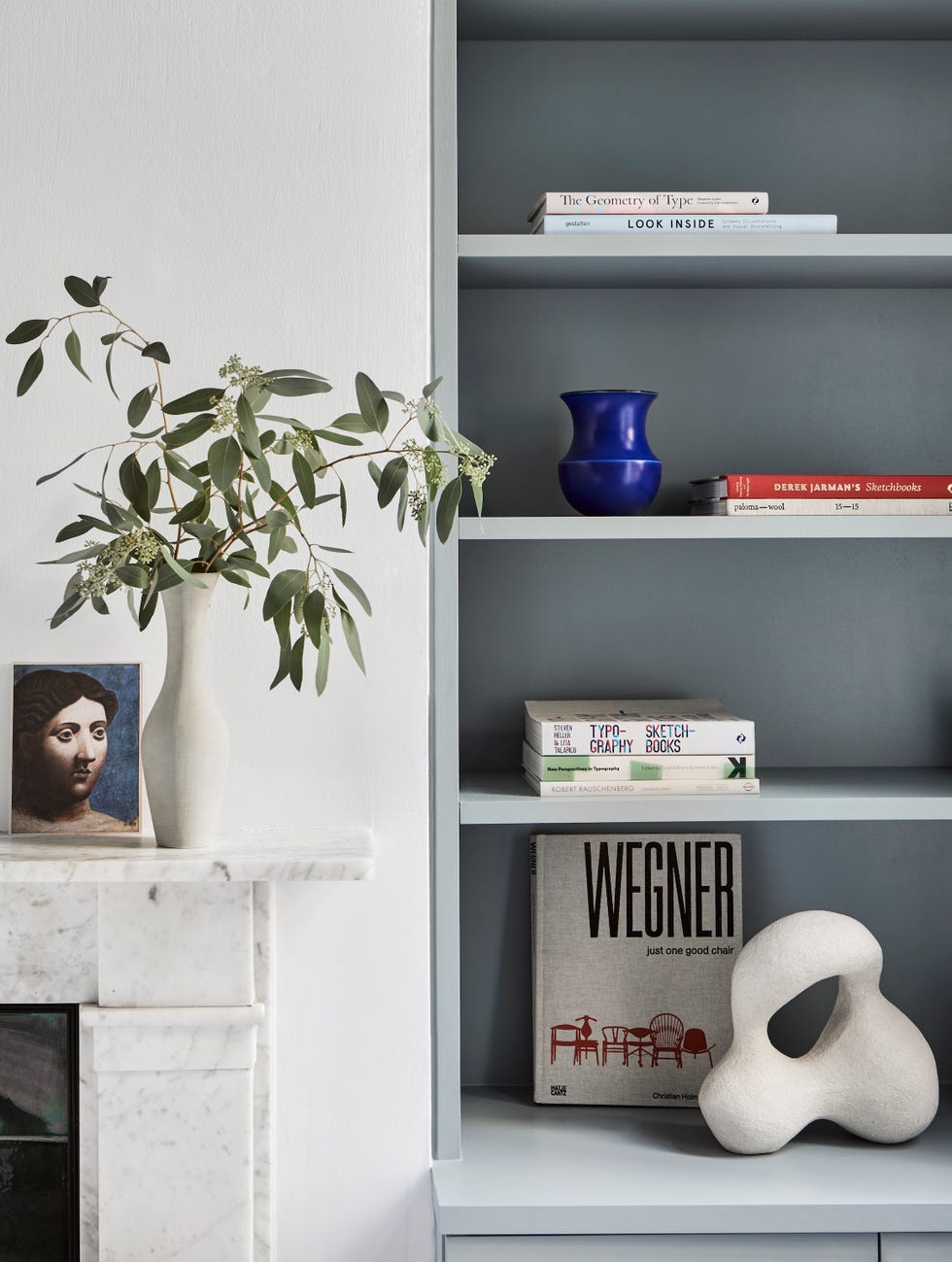
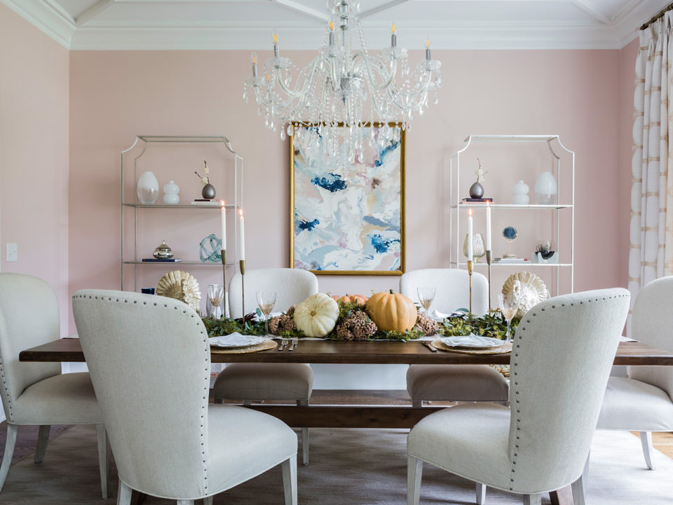
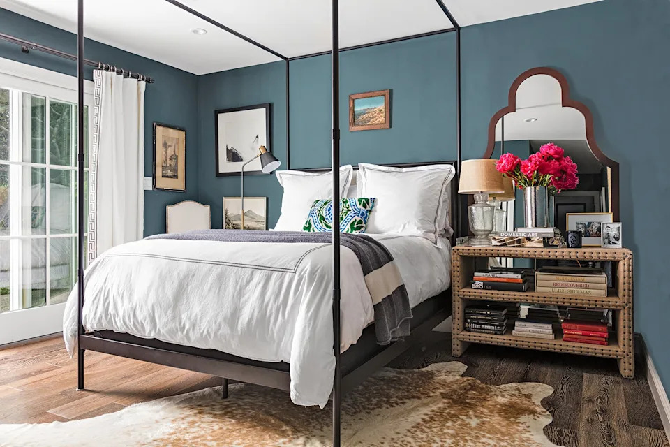
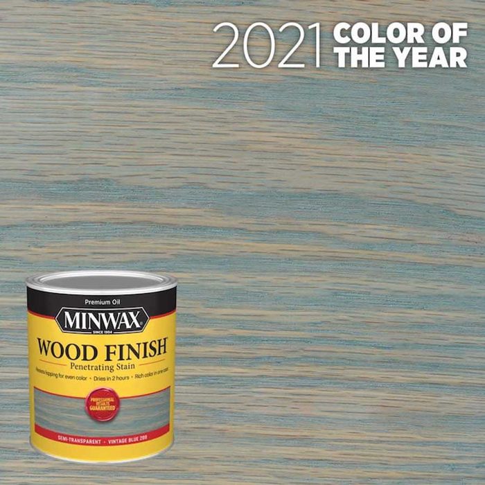
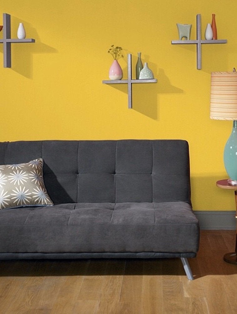
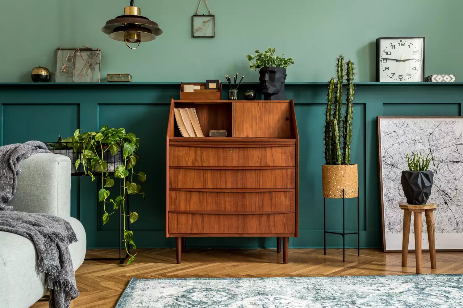
A key recommendation involves understanding the undertones of the wood, which typically include red, yellow, or gray hues. Matching paint colors to these undertones can create a cohesive look; for instance, cool paint colors like subtle blues or soft grays are advisable for wood with gray undertones. Conversely, for those desiring a more dynamic and striking appearance, contrasting shades are recommended. Lighter wall paints can create a significant contrast with dark wood elements, drawing attention to the wood's natural beauty. For an even more dramatic effect, bold colors such as teal or blue are suggested.
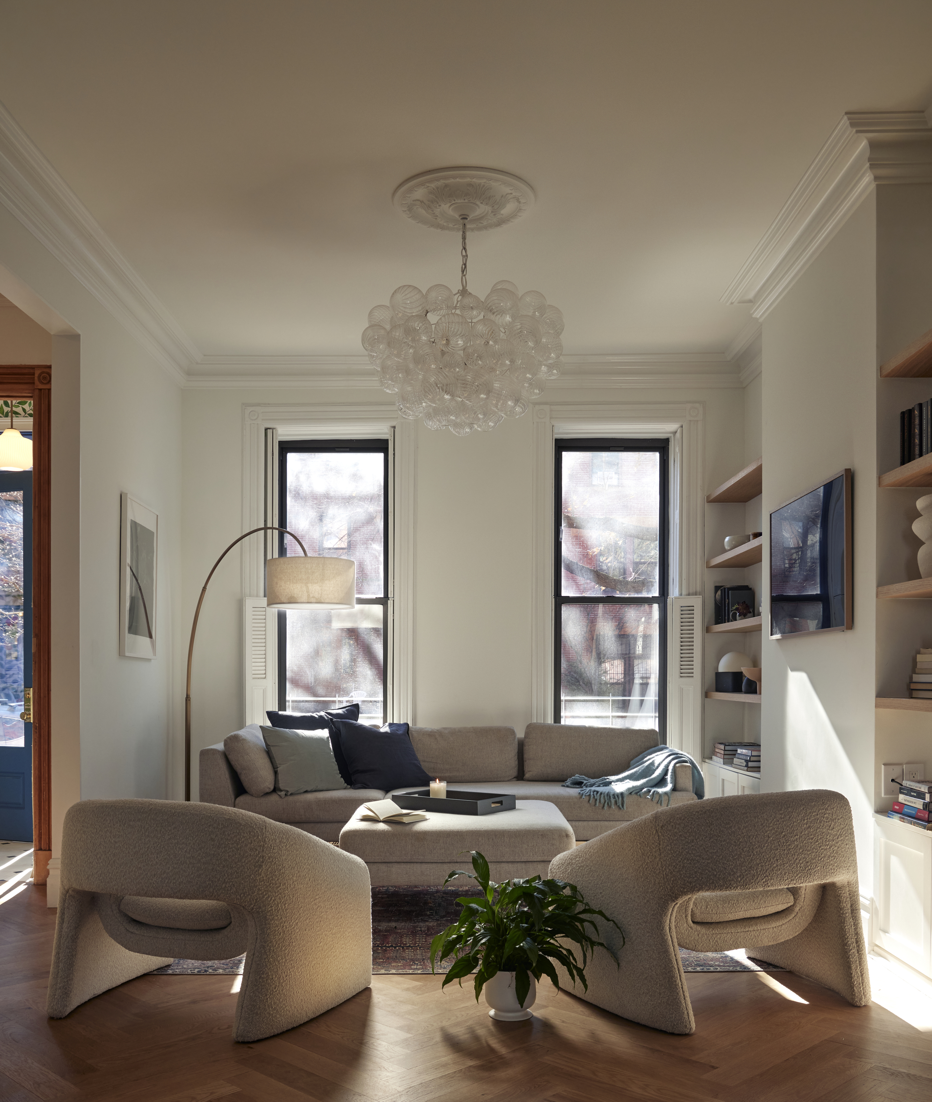
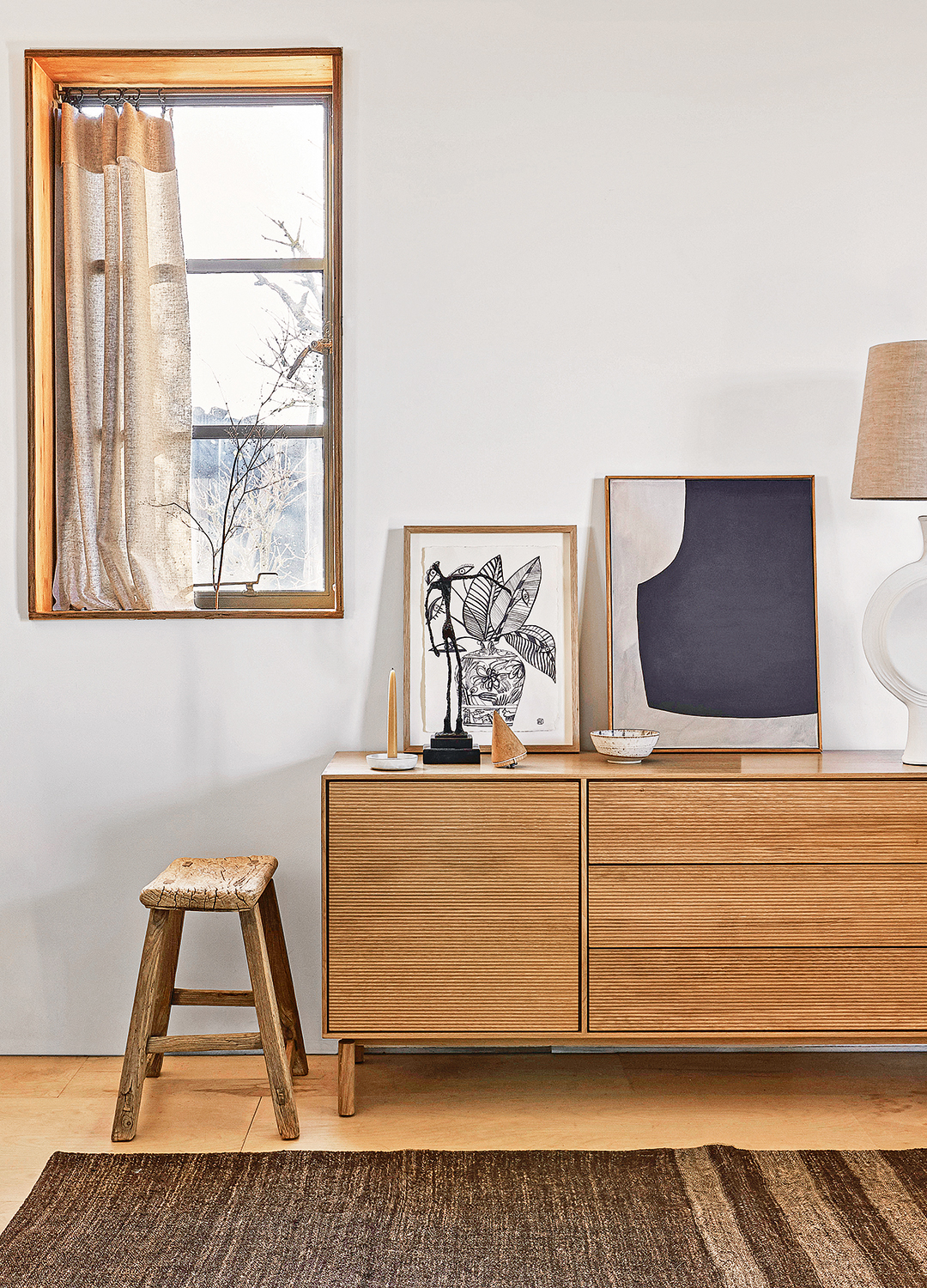
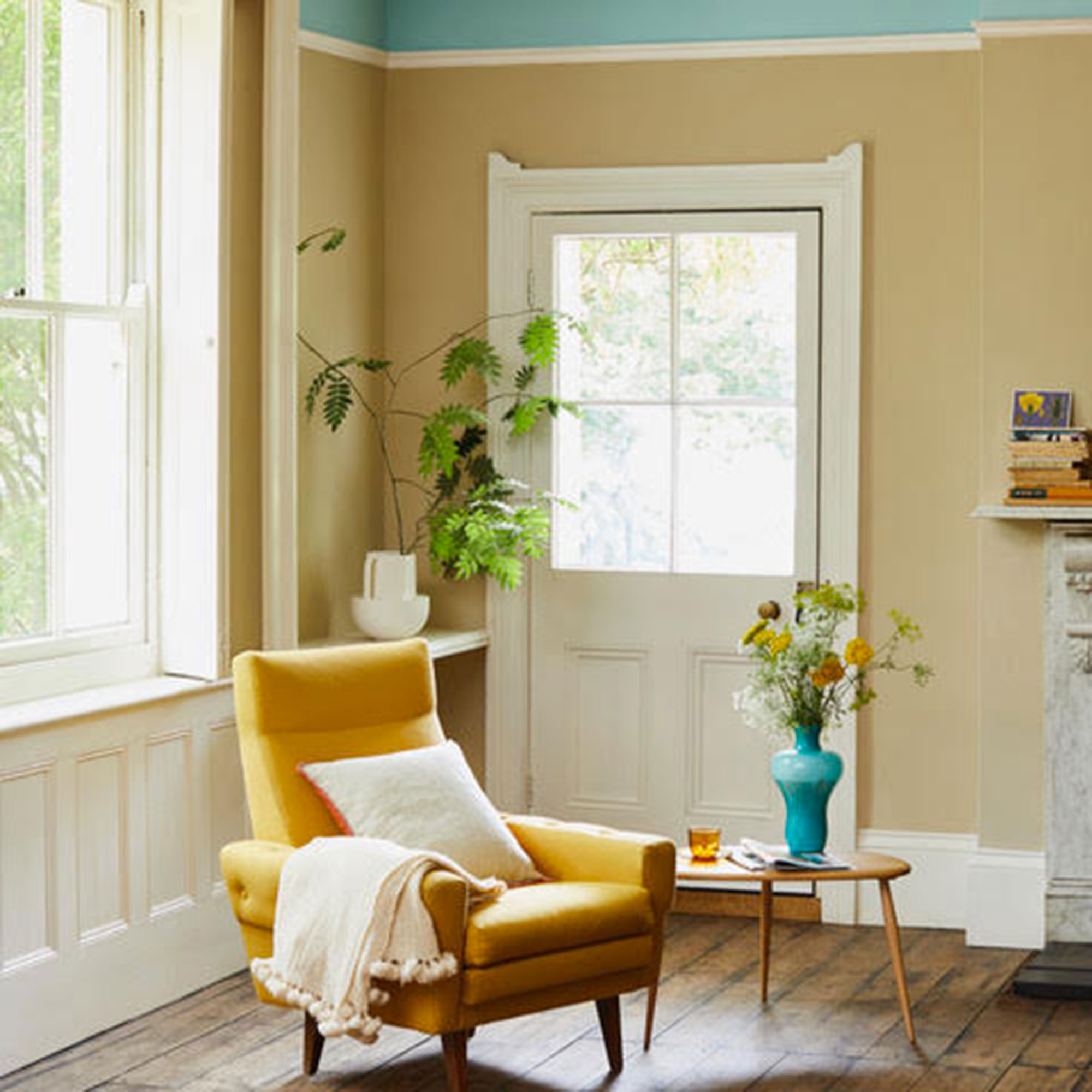
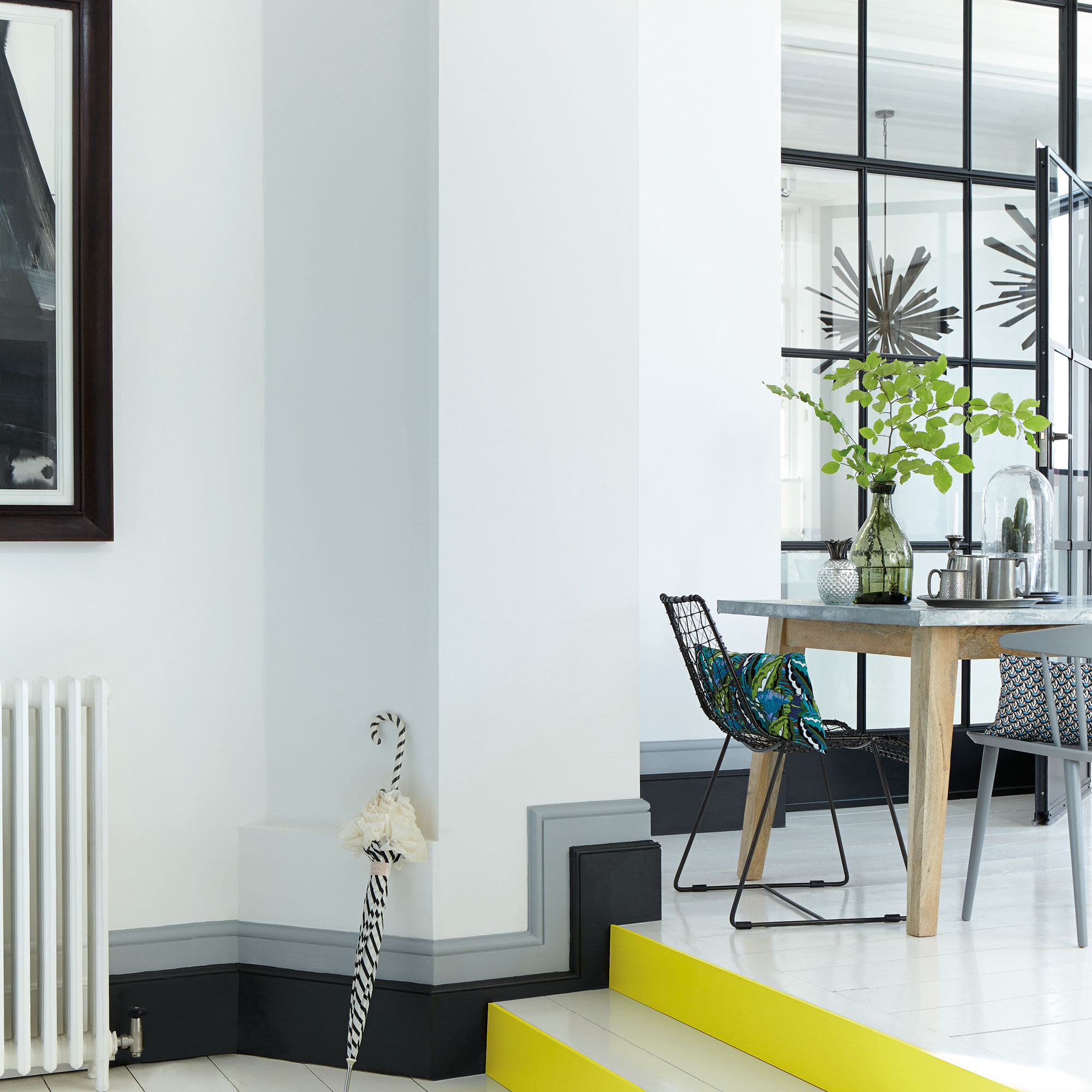
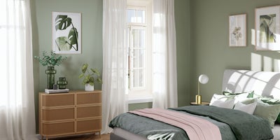
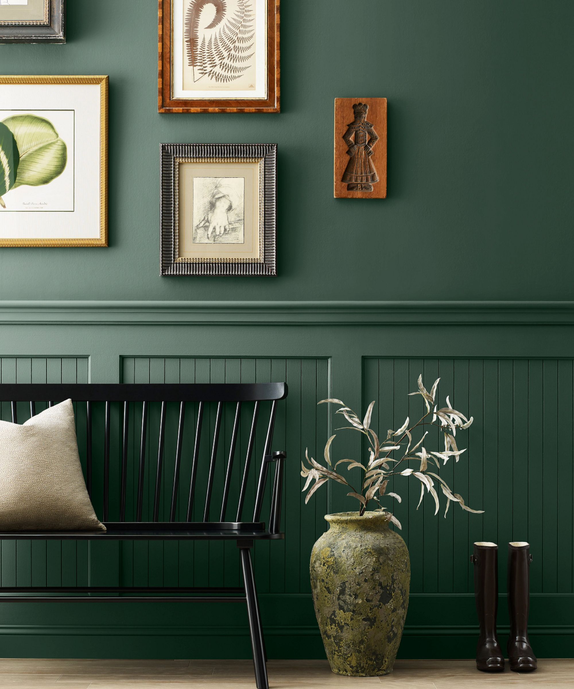
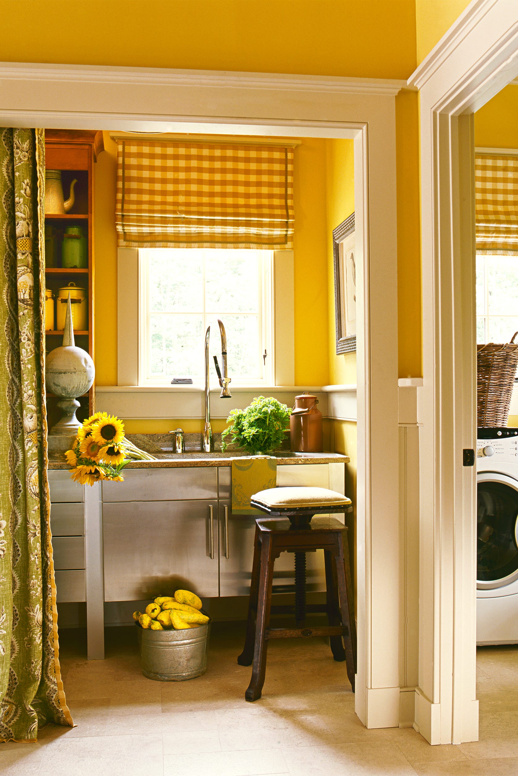
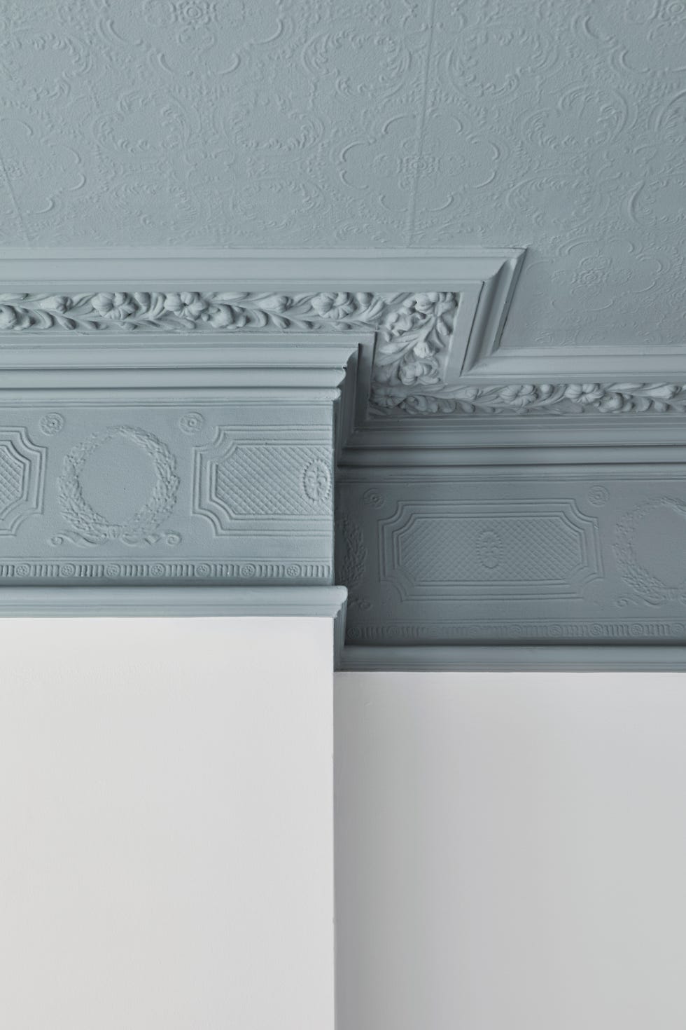
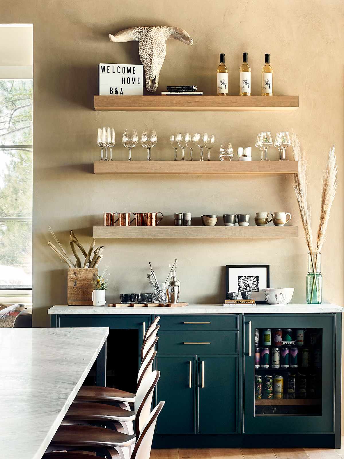
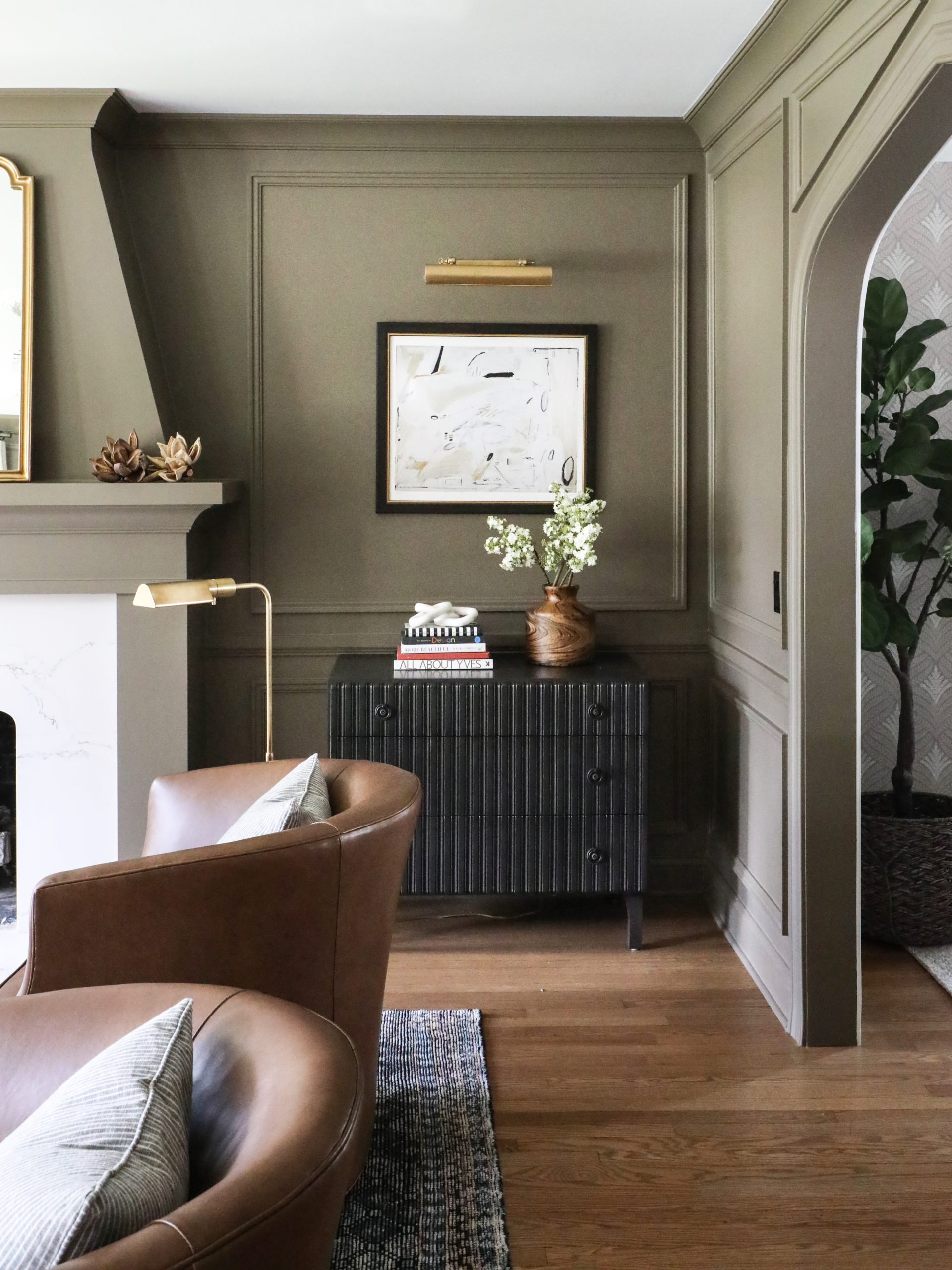
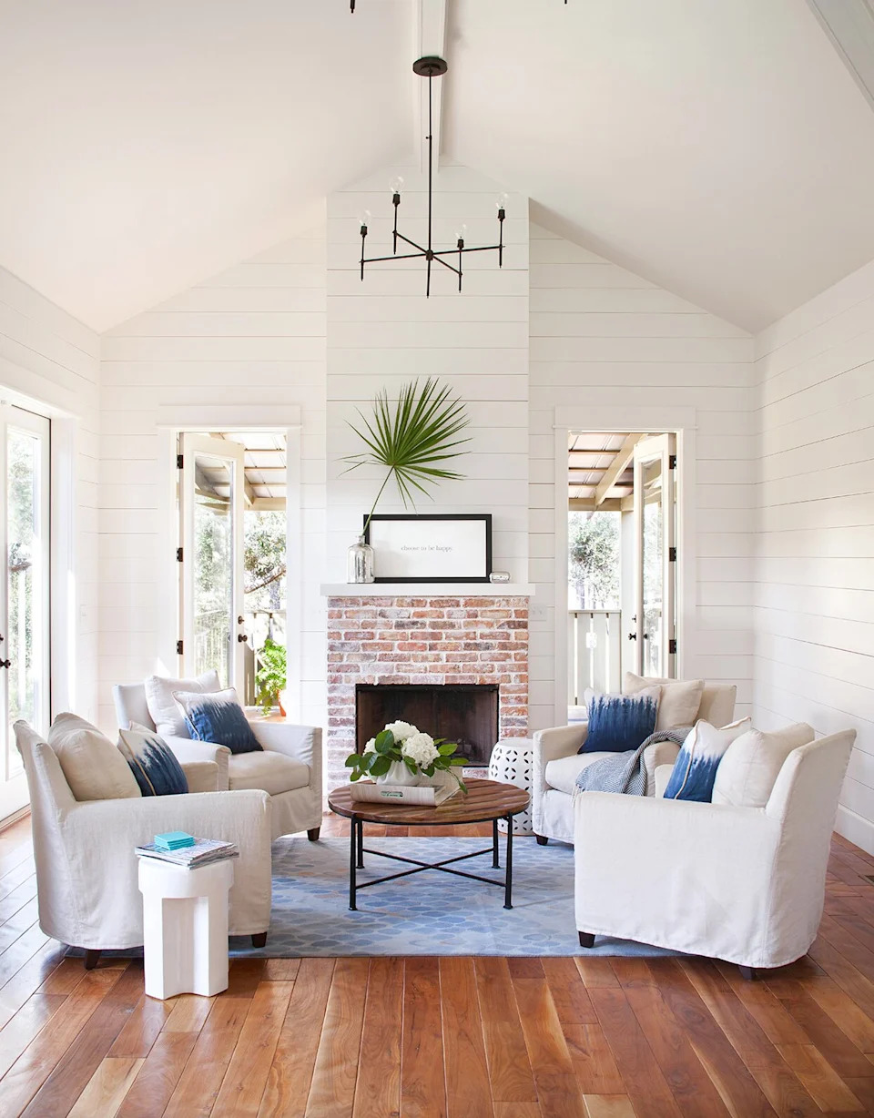
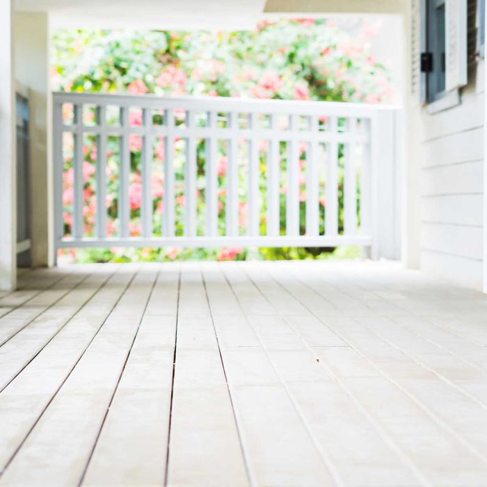
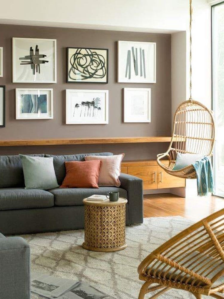
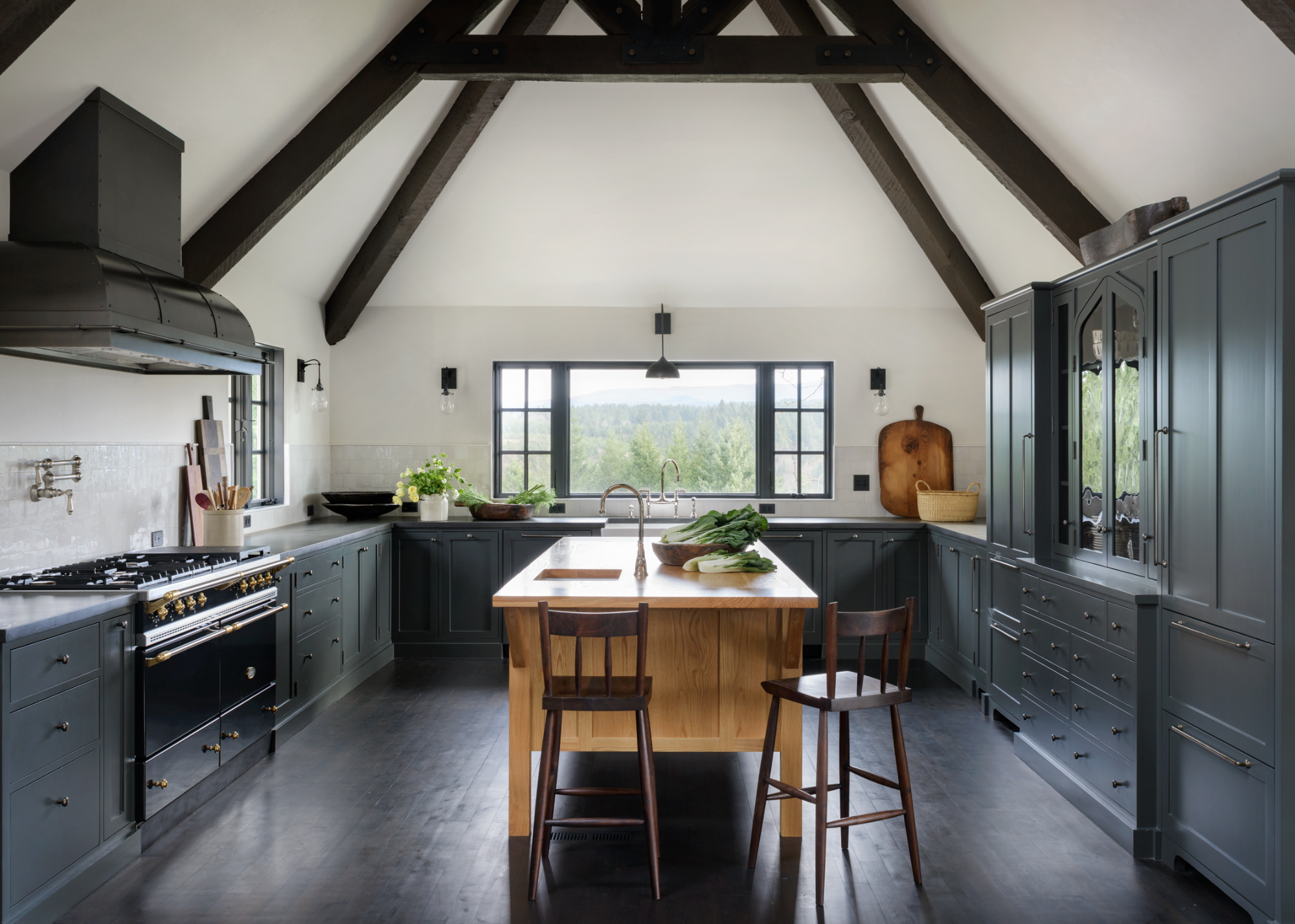
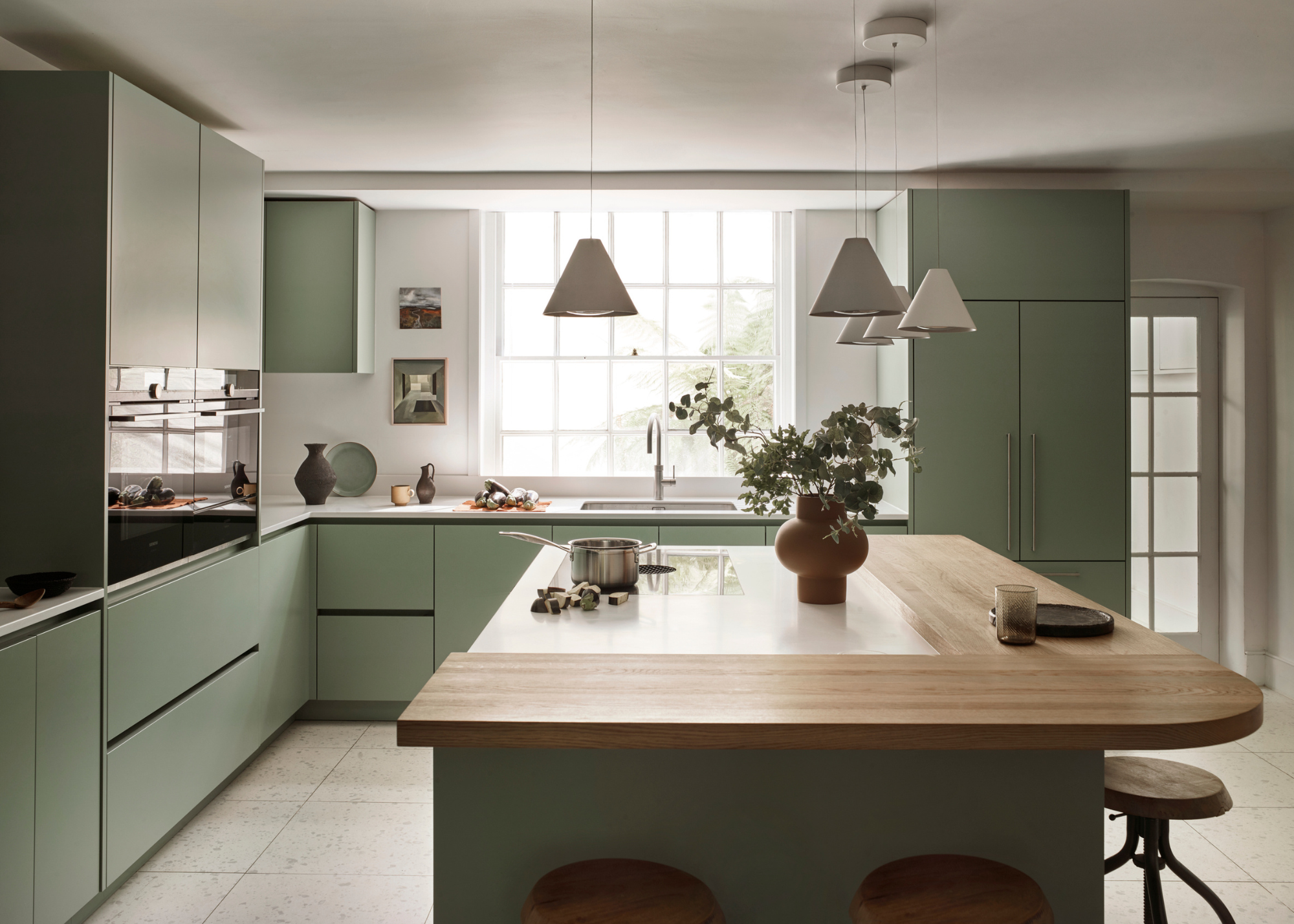
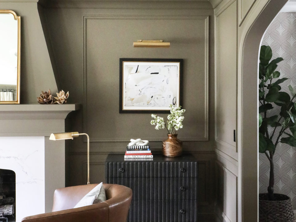
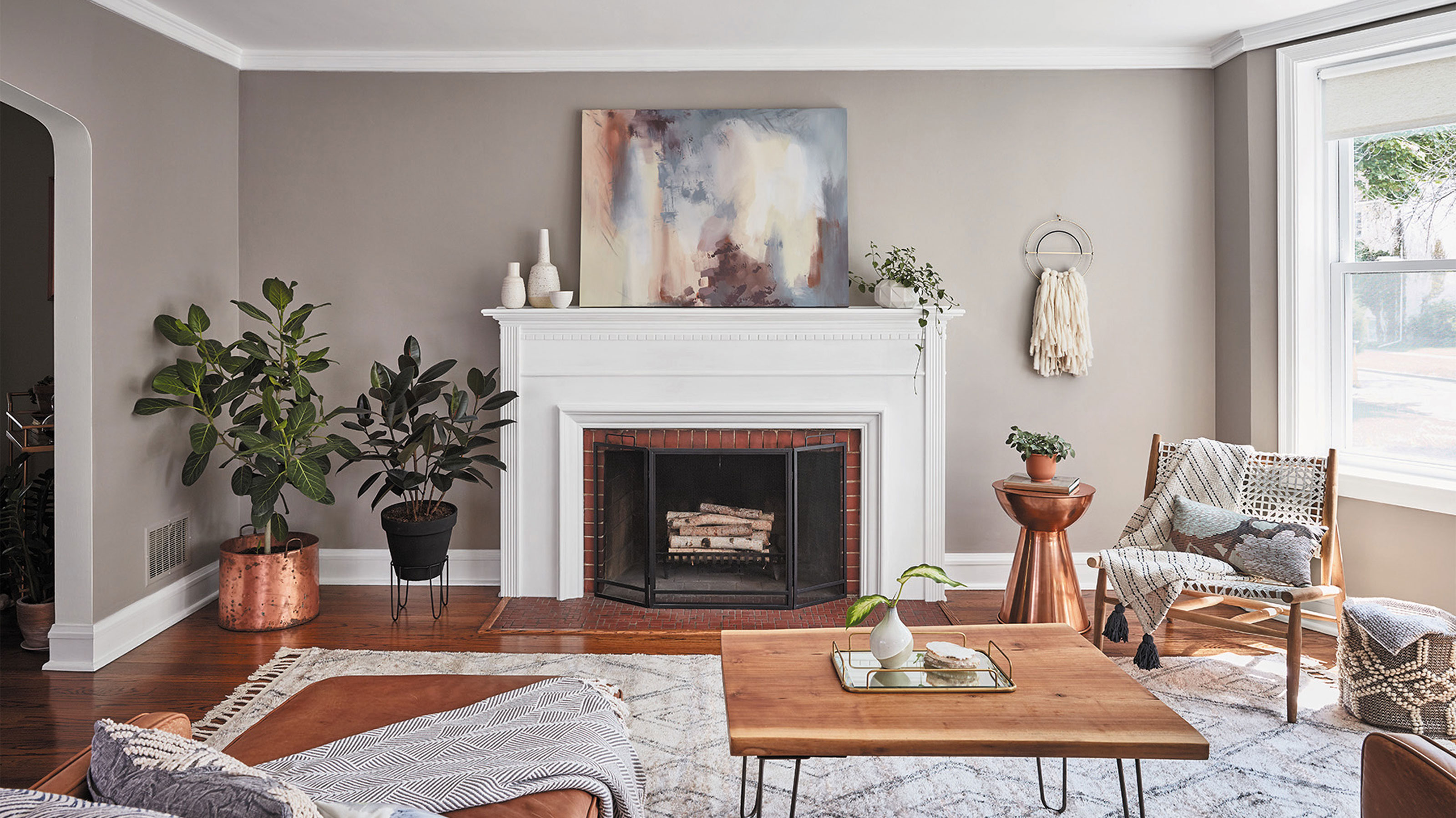
Neutral paint colors, including white, cream, gray, or beige, are presented as a safe and versatile option. These provide a flexible backdrop that allows the wood's natural characteristics to stand out without competing for attention. Specific neutral recommendations include "French Grey" and "Slaked Lime" for their adaptability across various wood types. Another approach to color selection is to draw inspiration from nature. Earth tones, such as greens, blues, and browns, are noted for their ability to blend seamlessly with wood, creating a tranquil and organic atmosphere. For dark woods like walnut or mahogany, green shades, ranging from fresh hues to richer, more sumptuous tones, are proposed to either create contrast or contribute to an elegant interior.
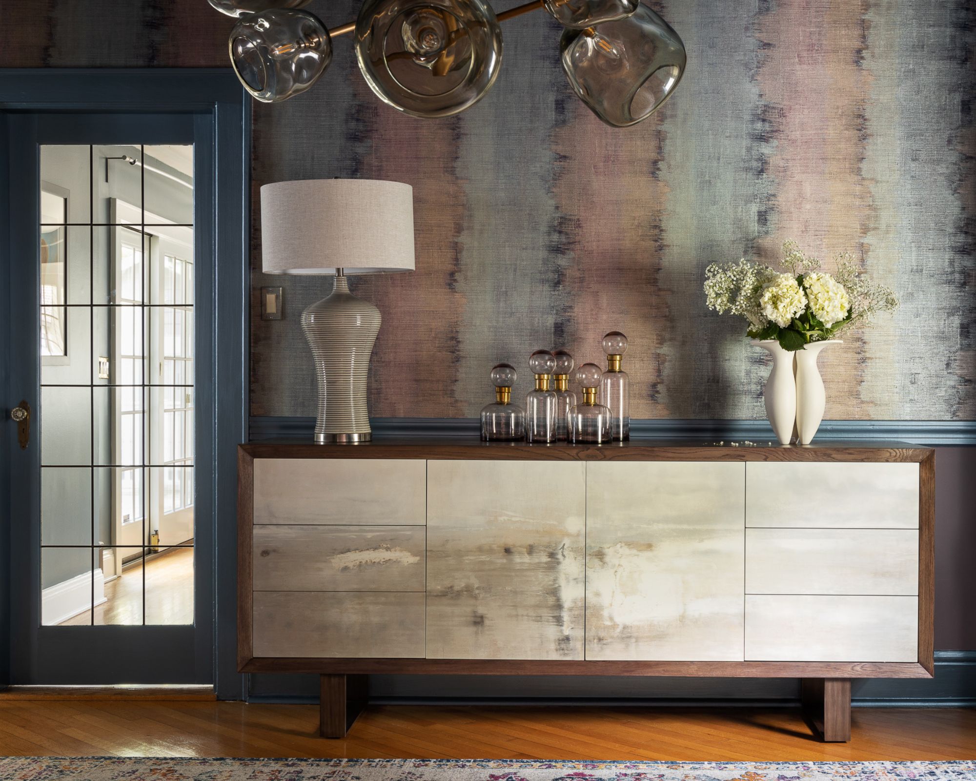
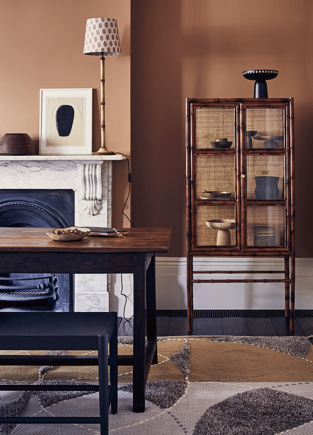
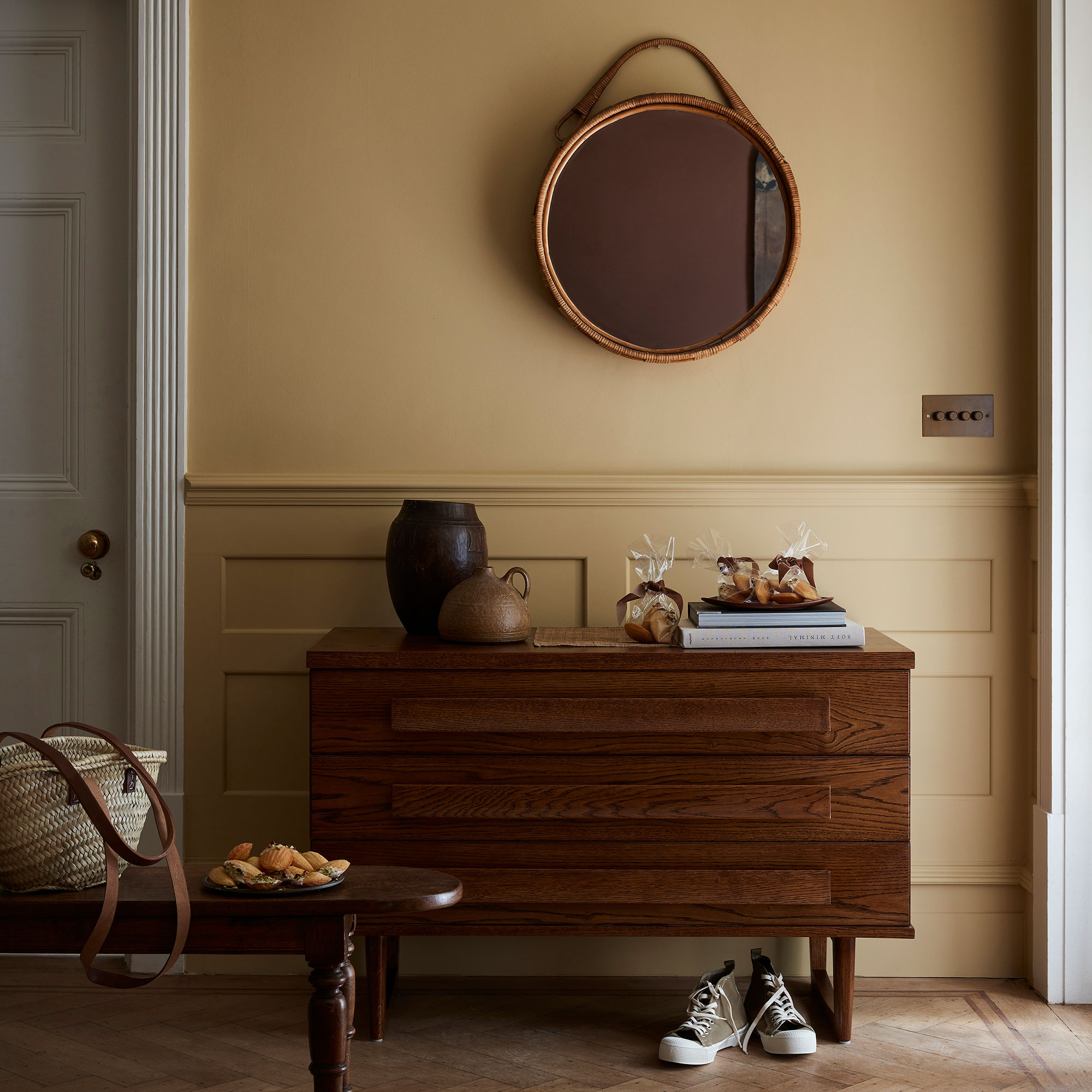
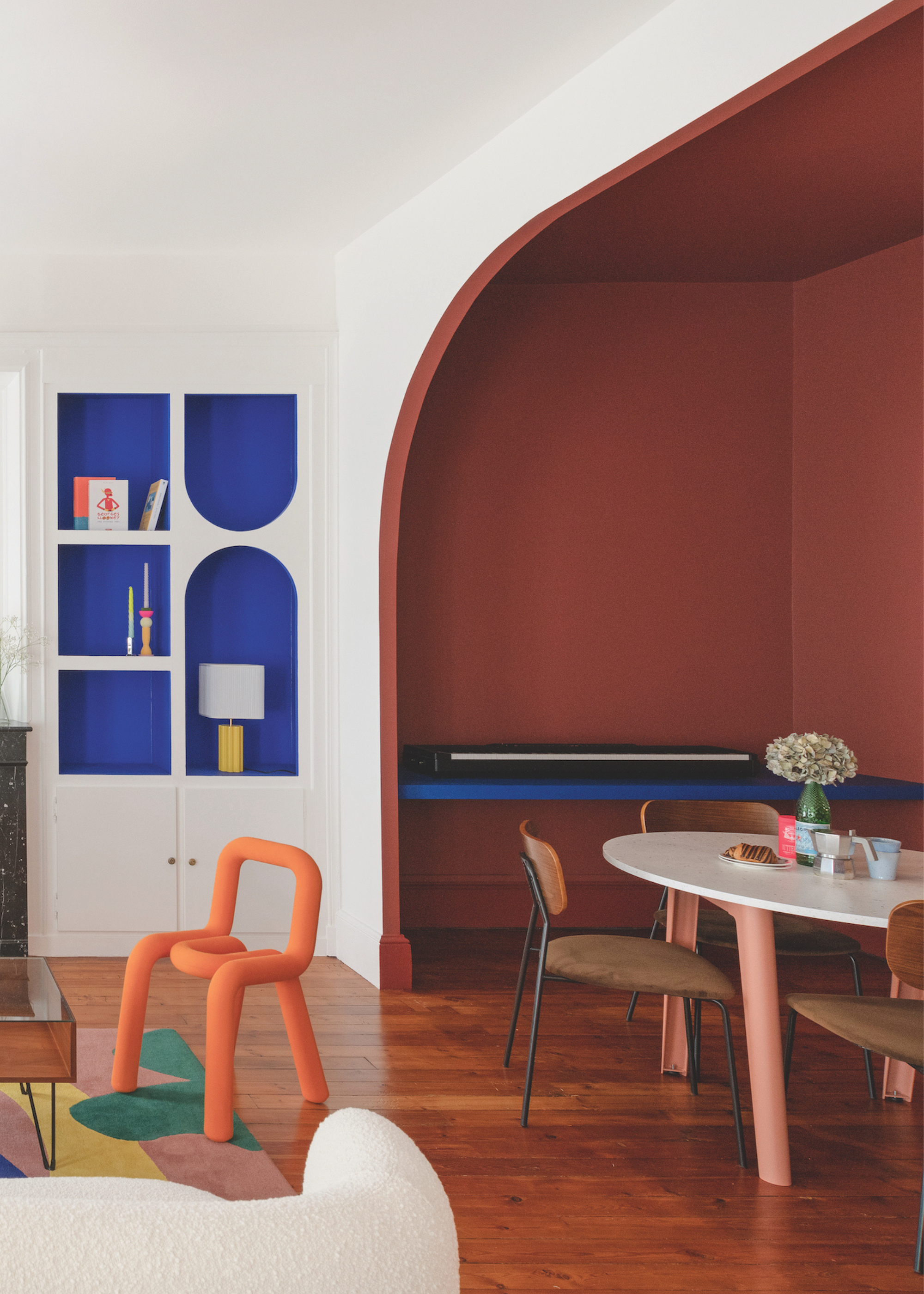
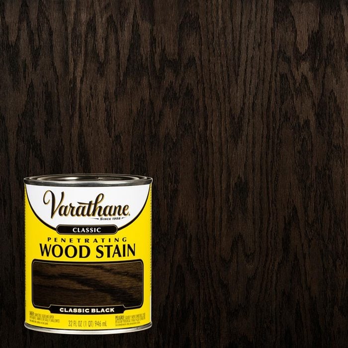
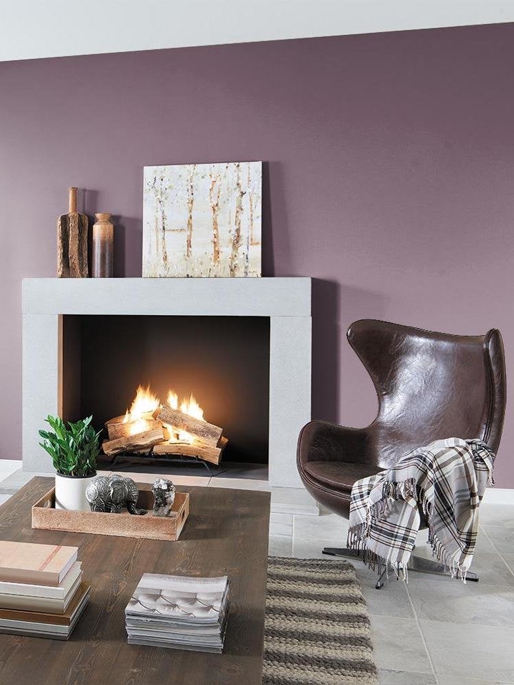
Finally, for individuals who appreciate the warmth and depth of dark woods, selecting a similarly deep and warm paint shade for the surrounding walls can create a cozy and romantic ambiance. "Baked Cherry" is highlighted as an example of such a color, suitable for spaces like dining rooms and dens where a warm, inviting feel is desired. By following these expert tips, homeowners can effectively choose paint colors that complement their home's wood tones, ensuring a harmonious and aesthetically pleasing interior.
#PaintColors #WoodTones #InteriorDesign #HomeDecor #ColorSchemes #DecoratingTips #NeutralColors #EarthTones #ContrastingColors #PaintColors #WoodTones #InteriorDesign #HomeDecor #ColorSchemes #DecoratingTips #NeutralColors #EarthTones #ContrastingColors
0 comment in total
 No comments yet
You may also like
Paint Colors That Go With Natural Wood — 10 Picks That Bring Out the Beauty of This Organic Material

Decorating with paint

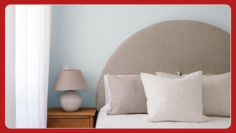
Millennial Gray Is So Over—Here Are 5 Paint Colors to Try Right Now
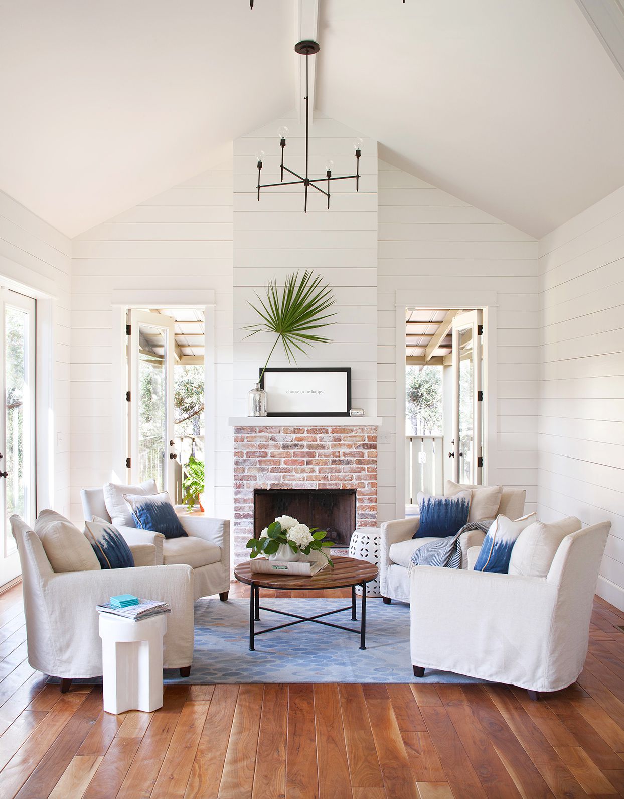
10 Paint Colors That Pair Beautifully with Yellow Wood Floors

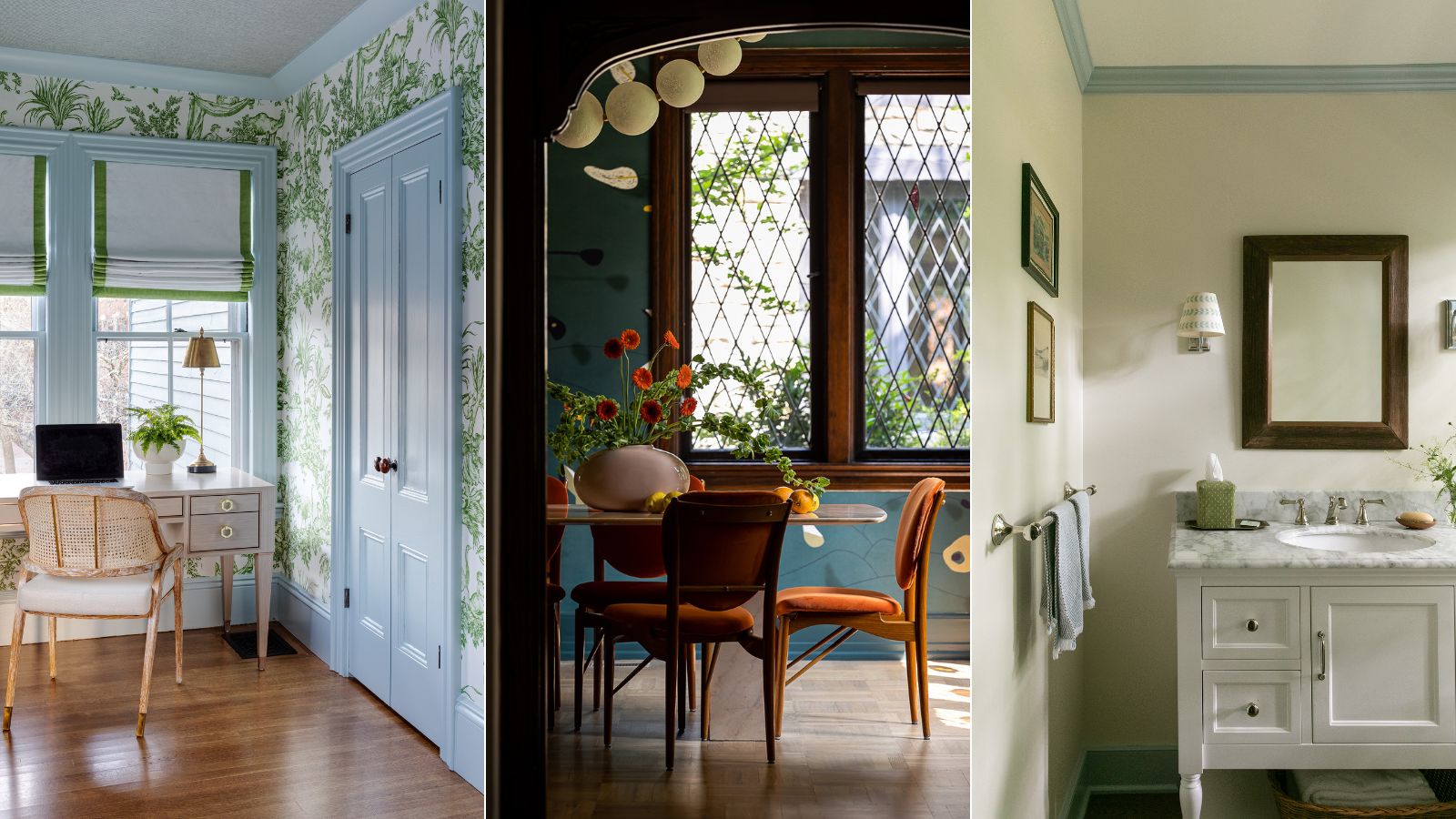
What color should you paint woodwork? Expert ways to factor this small yet impactful detail into color schemes

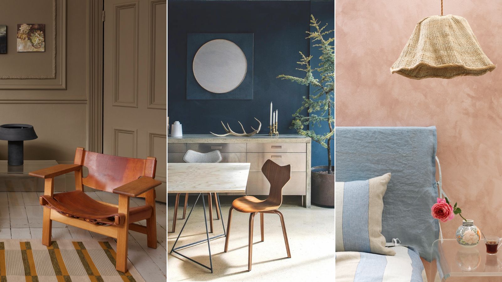
Professional painters reveal the secret to color matching a paint shade from an image alone
Make Wood Trim Shine By Pairing It With One Of 15 Hues

Best Wood Stain Colors For Interior And Exterior Surfaces

5 rules of thumb for mixing wood tones around your home, shared by interior designers

8 Paint Colors That Pair Beautifully With Dark Wood, According to Designers
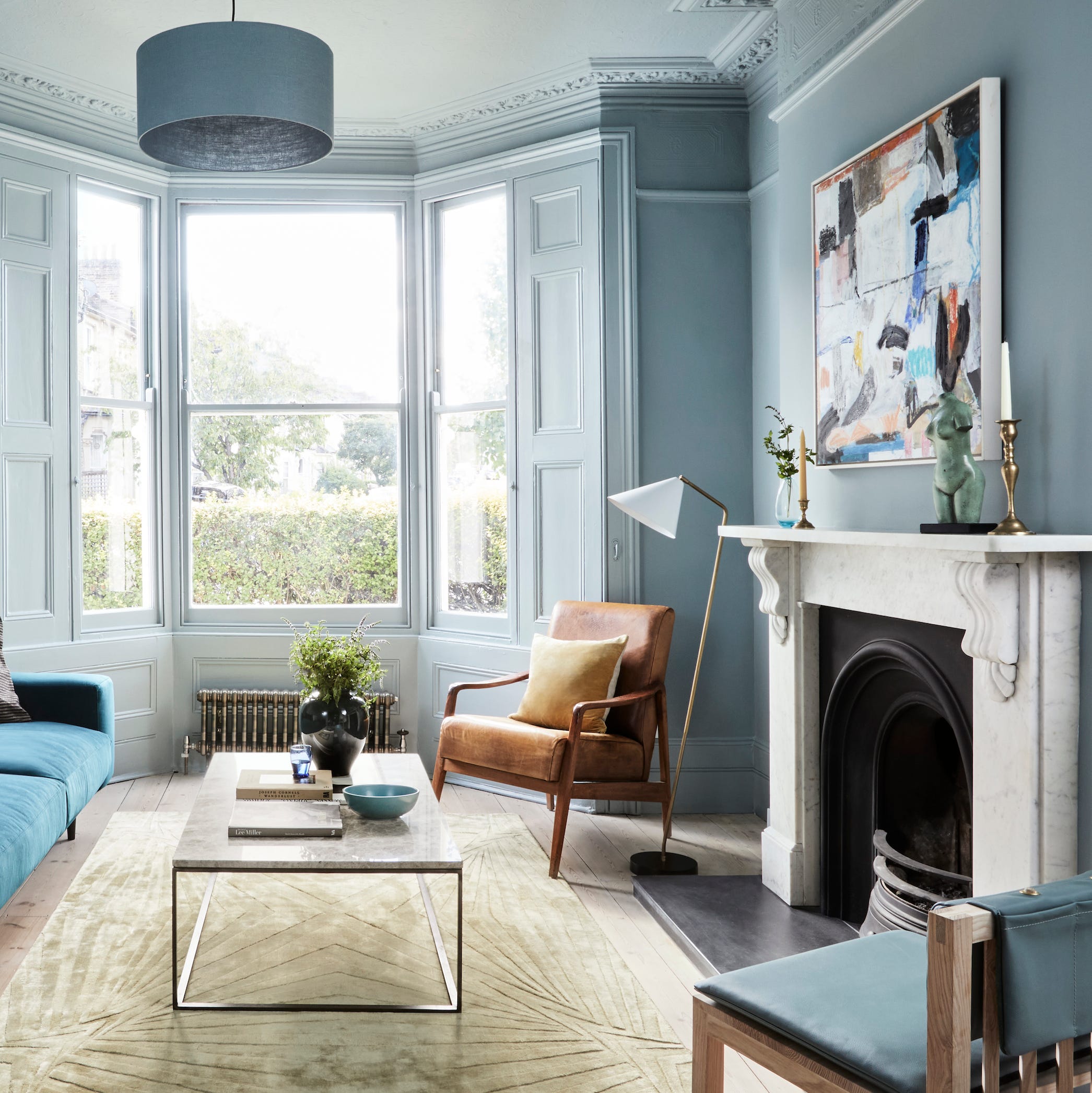
Trending: 4 new ways we're painting our homes

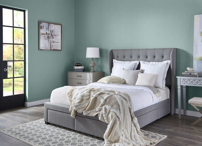
14 Paint Colors That Can Make a Room Feel Instantly Cozy

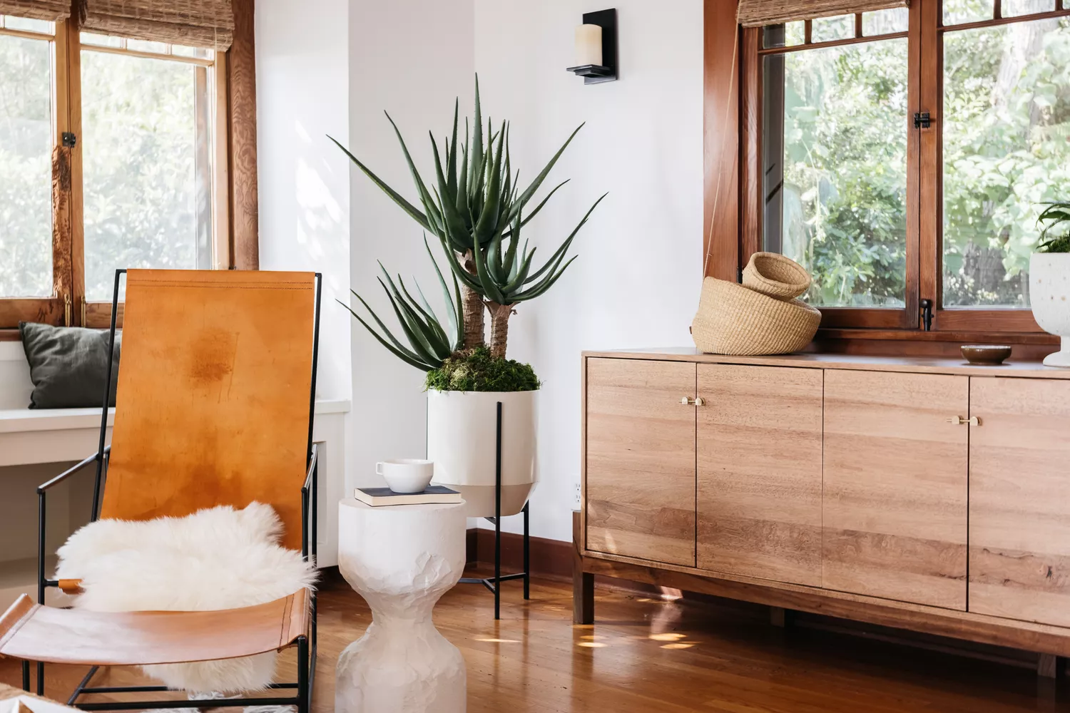
13 Paint Colors That Pair Well With Wood Trim
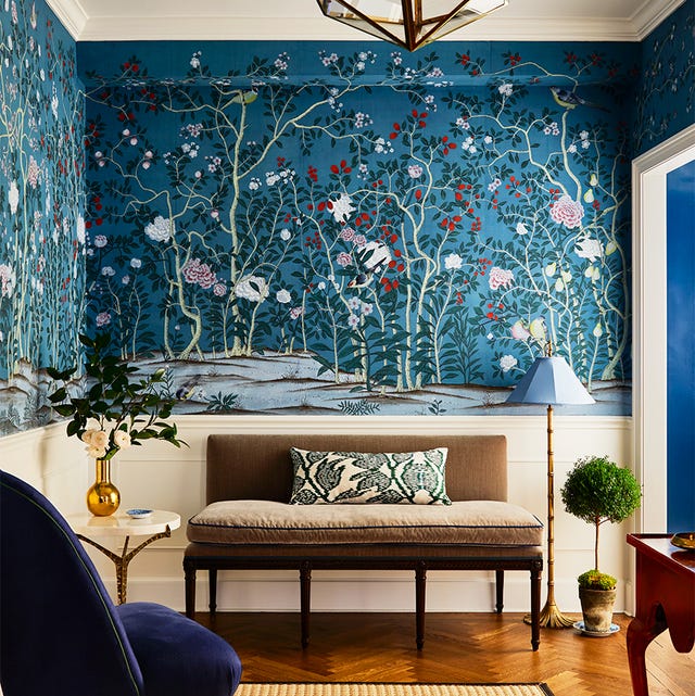
35 Unexpected Color Combos We Can't Get Enough Of

How to Pick the Best Paint Colors for Every Space in Your Home

What Color Kitchen Cabinets Actually Go Well With Wooden Countertops? Designers Share Their Perfect Pairings
Should woodwork be lighter or darker than walls? The rules colour experts use to choose the perfect colour
Here's How to Coordinate Paint Colors Throughout Your Home, so That It Looks Cohesive, Curated, but Still Creative
8 Paint Colors That Pair Beautifully with Yellow Wood Tones
Can You Mix and Match Wood Furniture? What Designers Actually Think of the Trend