1/6
5 Vibrant Color Palettes Designers Are Using to Add Energy and Excitement to Decor
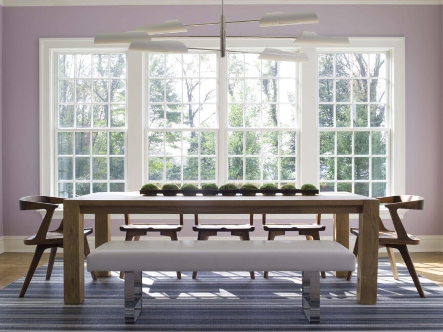
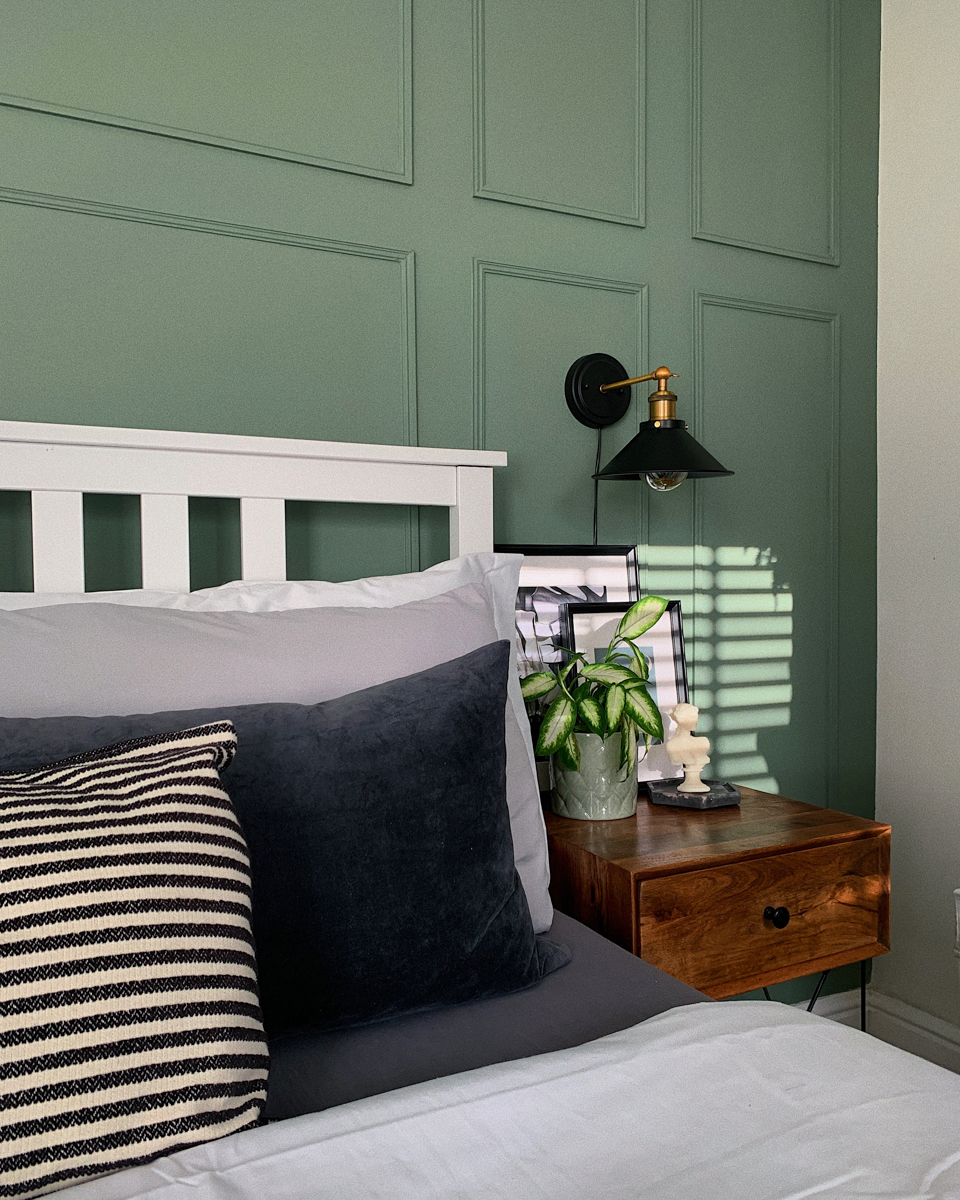
Vibrant color palettes are increasingly central to contemporary interior design, with designers embracing bolder choices and discarding traditional rules to infuse homes with ebullience. The deliberate use of color can personalize spaces and reflect individual design sensibilities, making a room feel unique and luxurious. However, successful integration of vibrant hues requires careful consideration to maintain livability and harmony within a space.
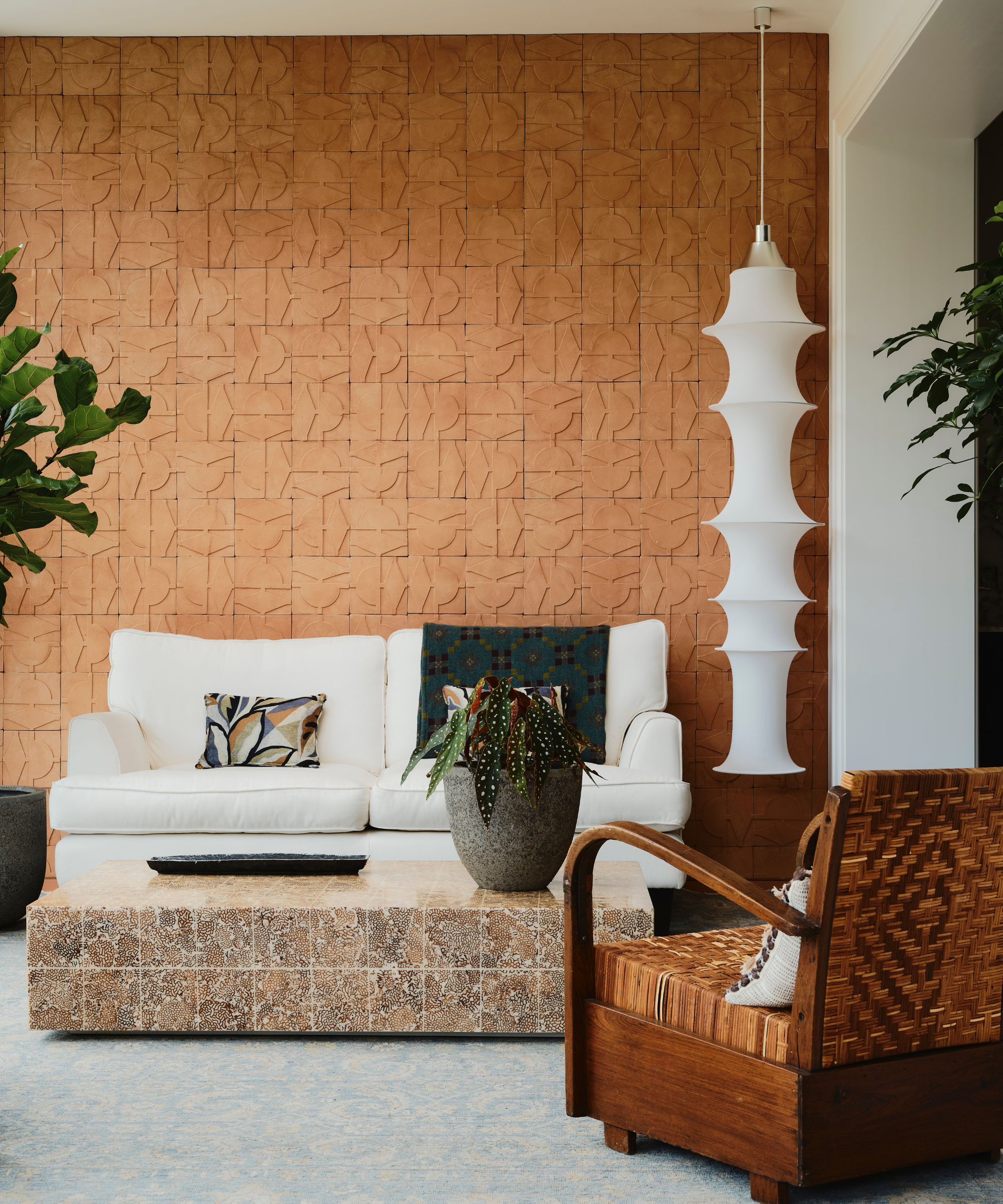
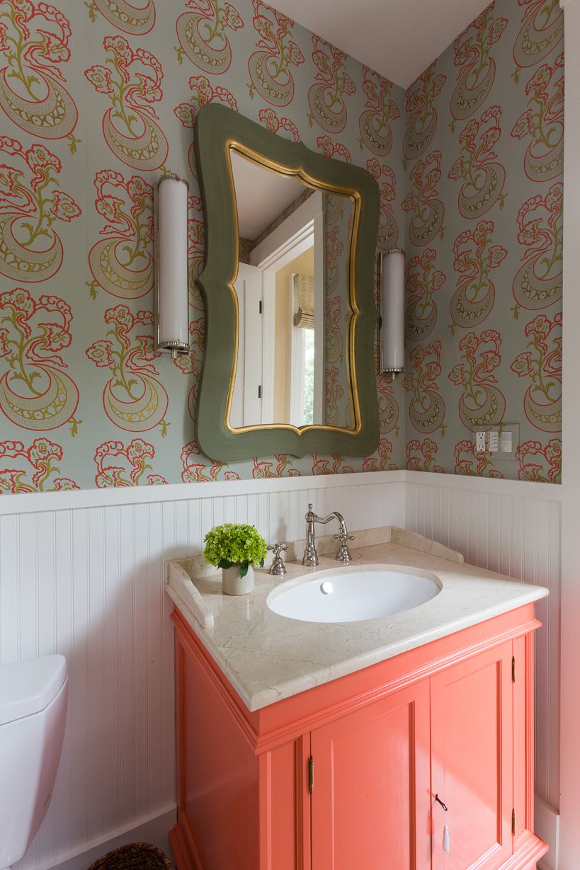
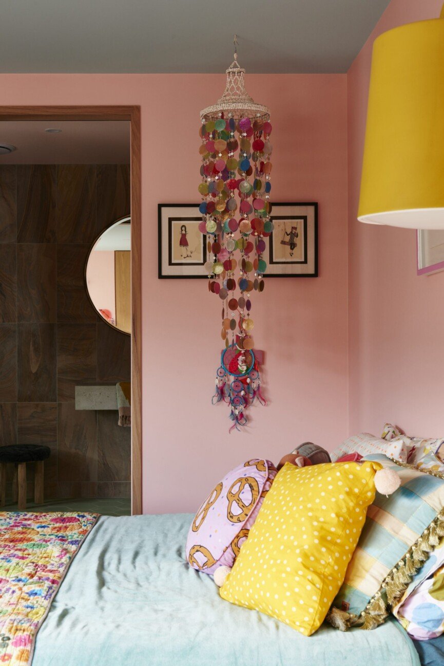
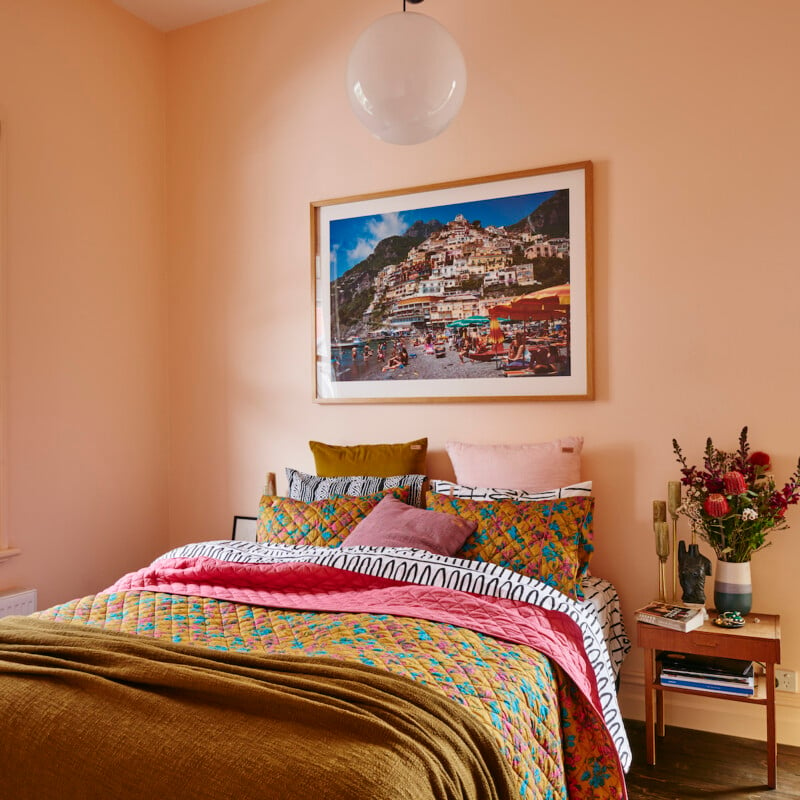
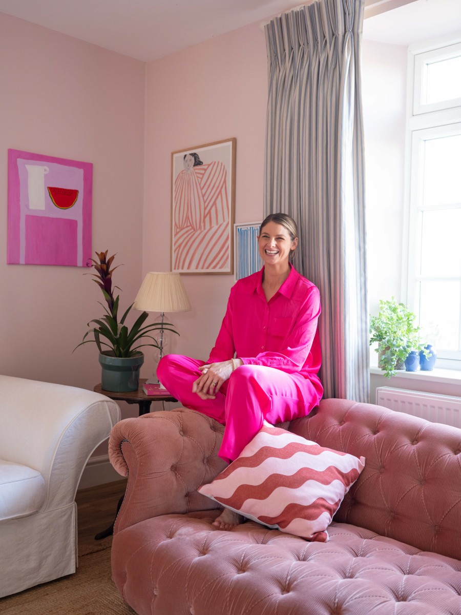
One approach involves the combination of yellow and pink. This pairing is considered an accessible entry point into vibrant palettes due to its inherent ease of integration. When executed with softer pink tones and primrose rather than intense yellows, the combination creates a comfortable aesthetic. The strategy often involves saturating a room with consistent color levels, allowing patterns and various shades to blend seamlessly rather than clashing.
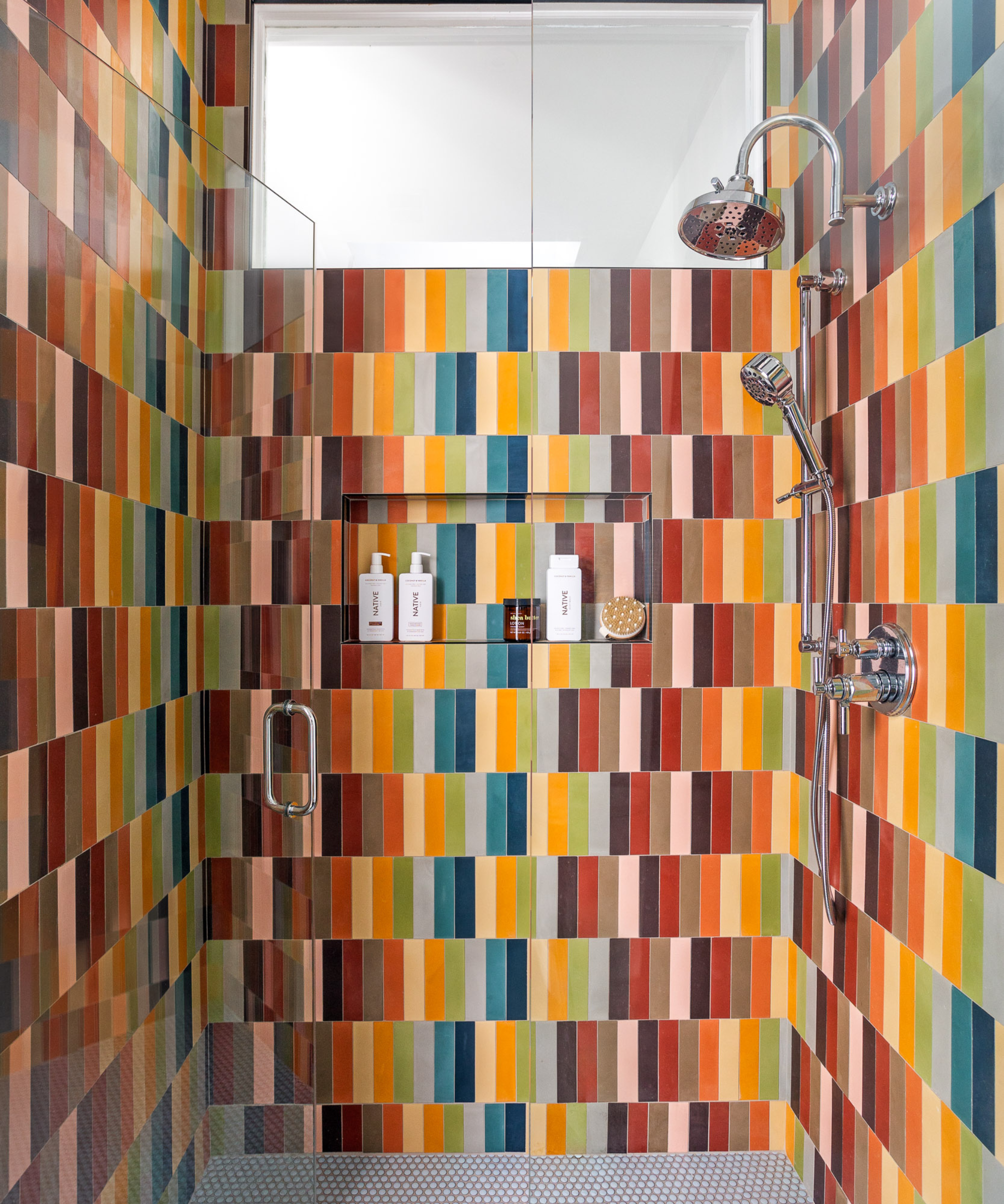
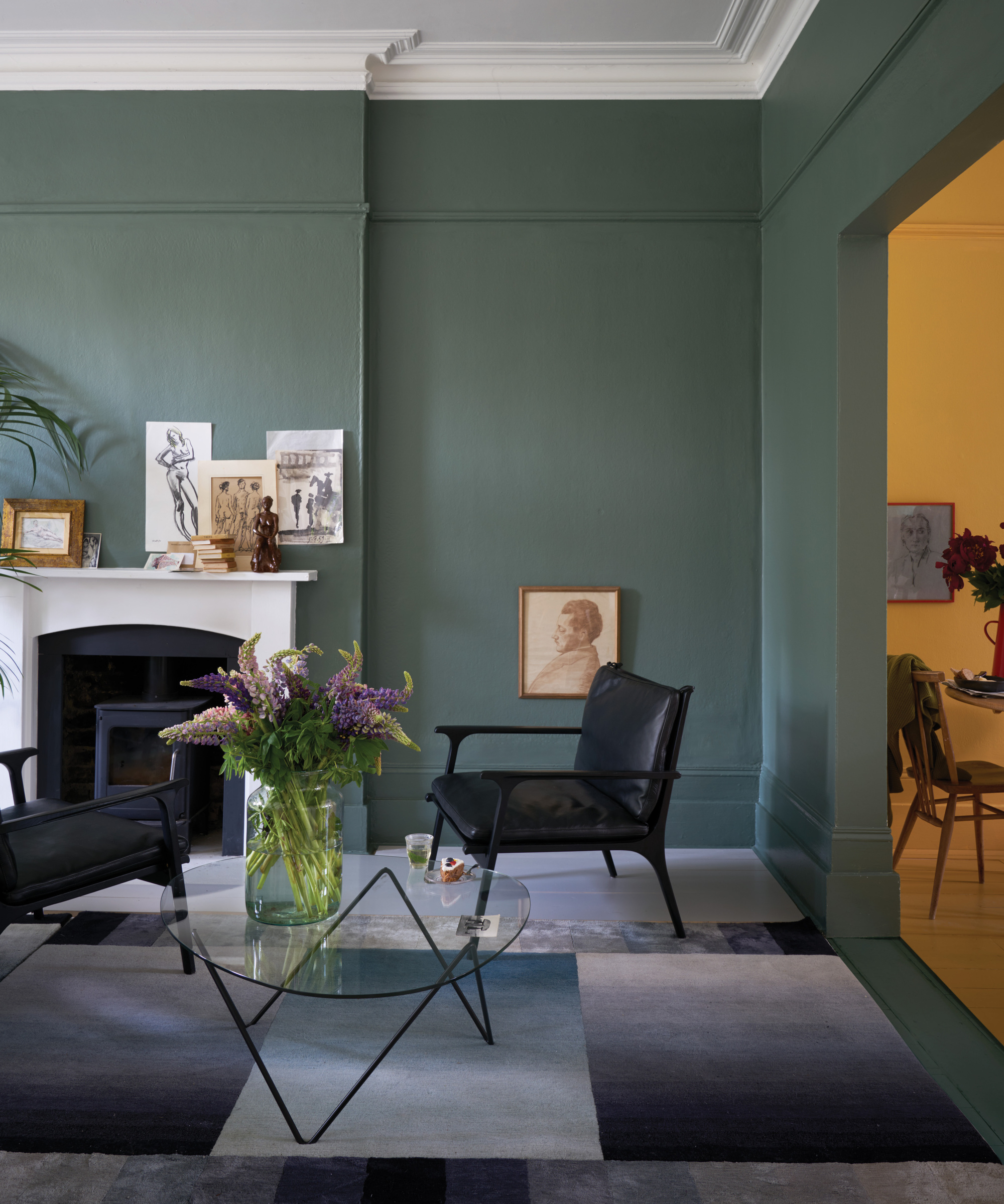
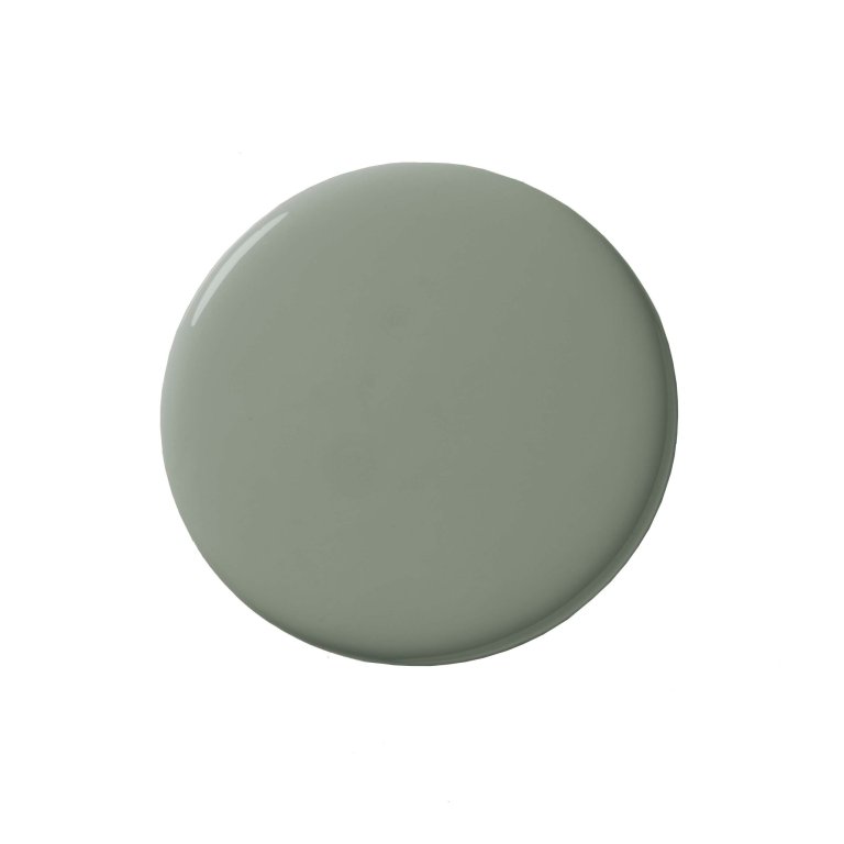
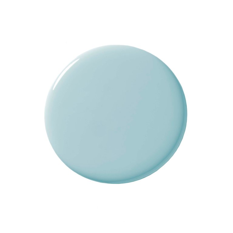
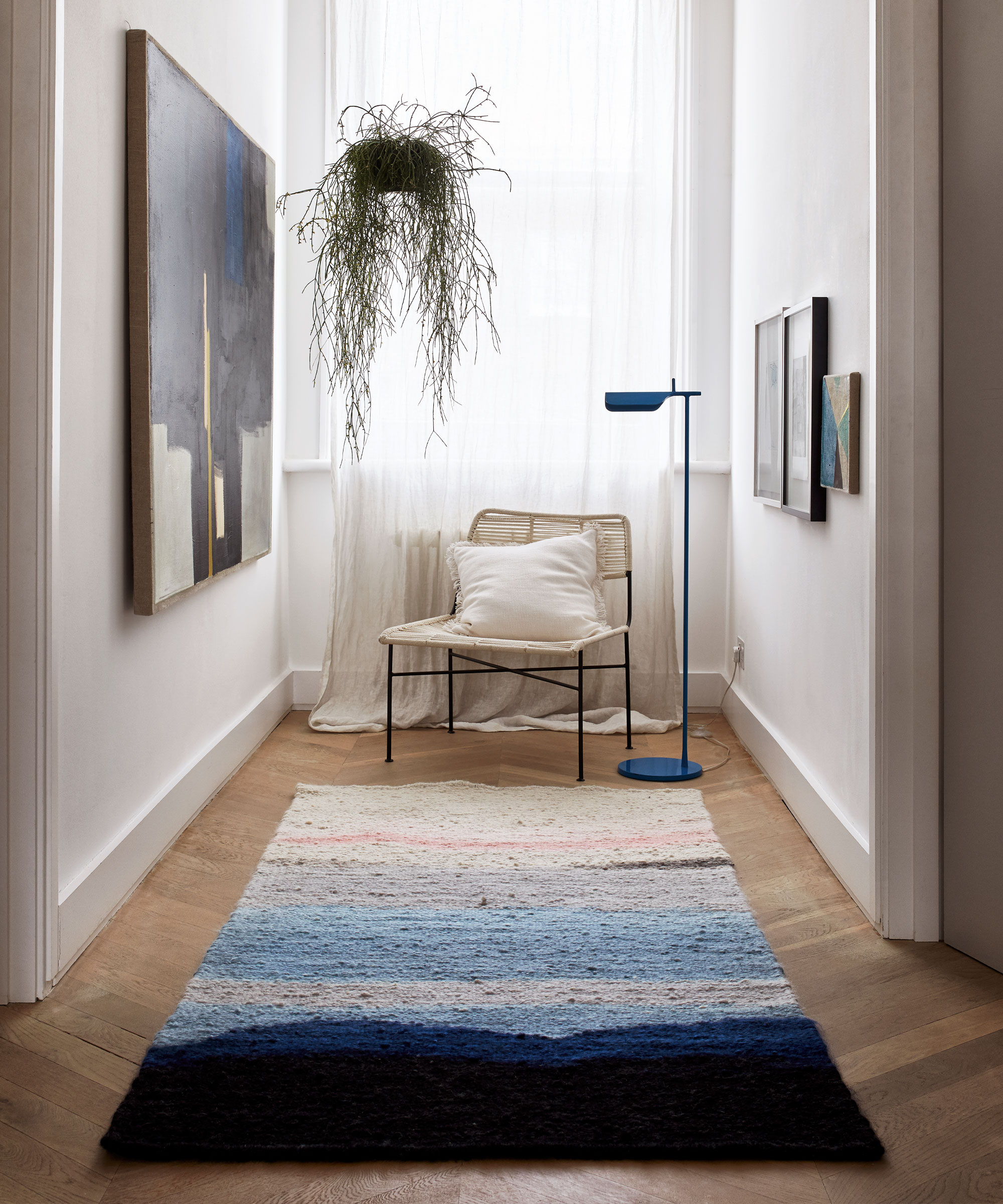
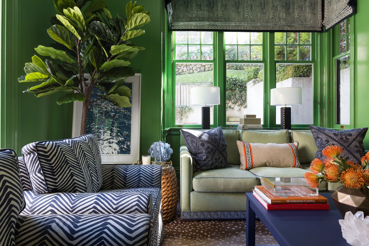
Another method employs green, blue, and red, as seen in an entryway designed to transform a transient space into an engaging area. The key to this palette's success lies in ensuring all chosen colors share similar undertones. This commonality prevents the palette from becoming overwhelming, creating a sophisticated and harmonious environment. For instance, pairing cool blues and greens with a red that also possesses cool undertones results in an evocative and balanced scheme.
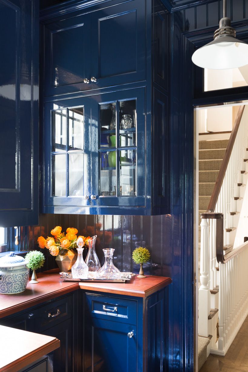
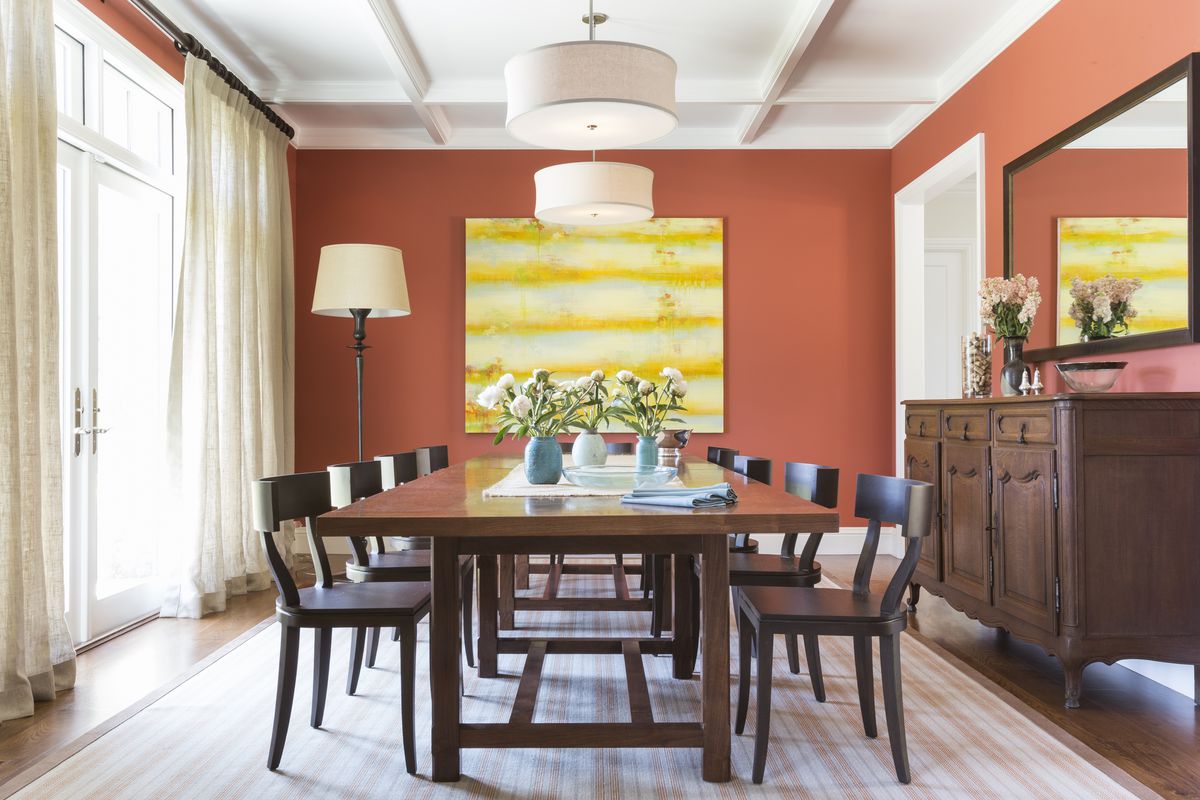
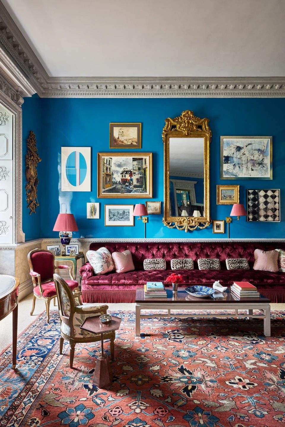
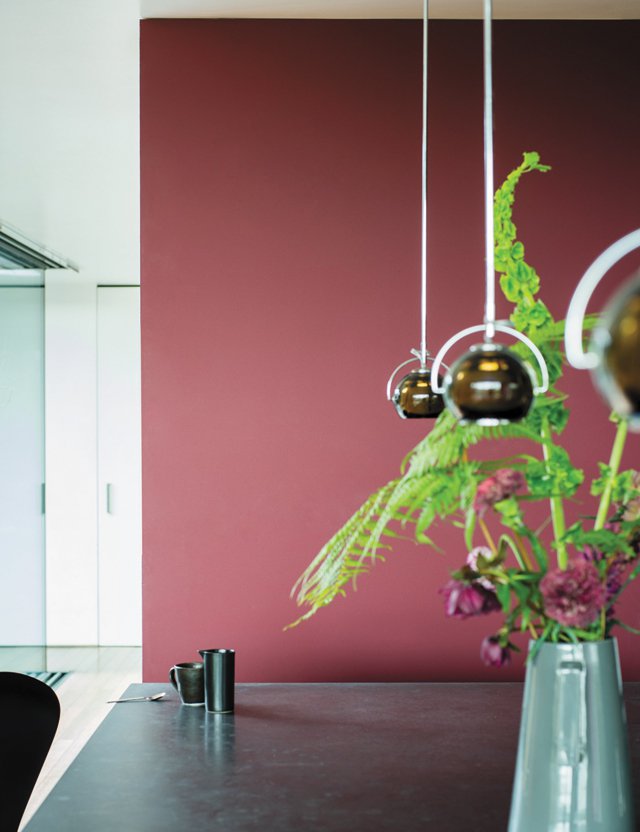
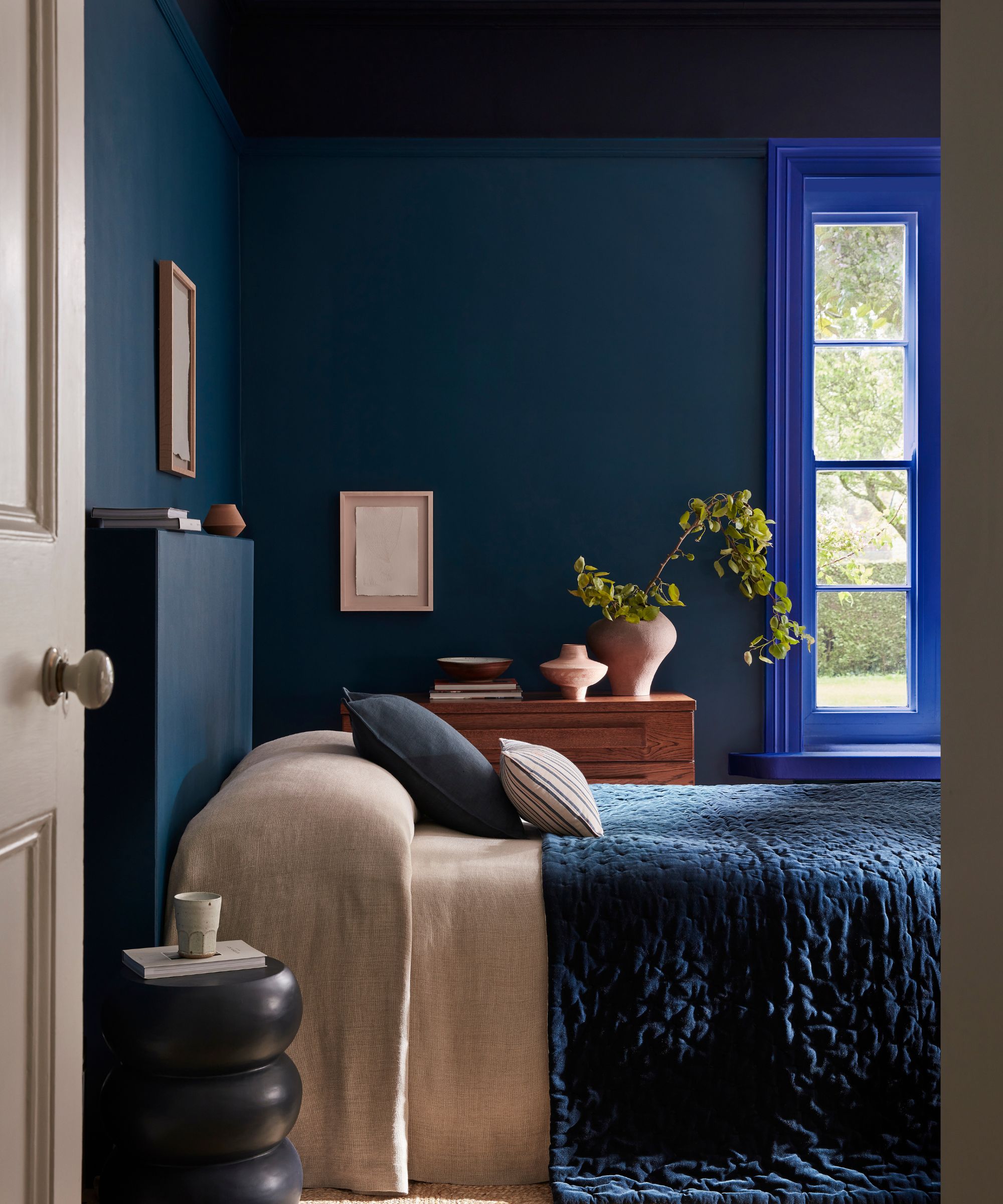
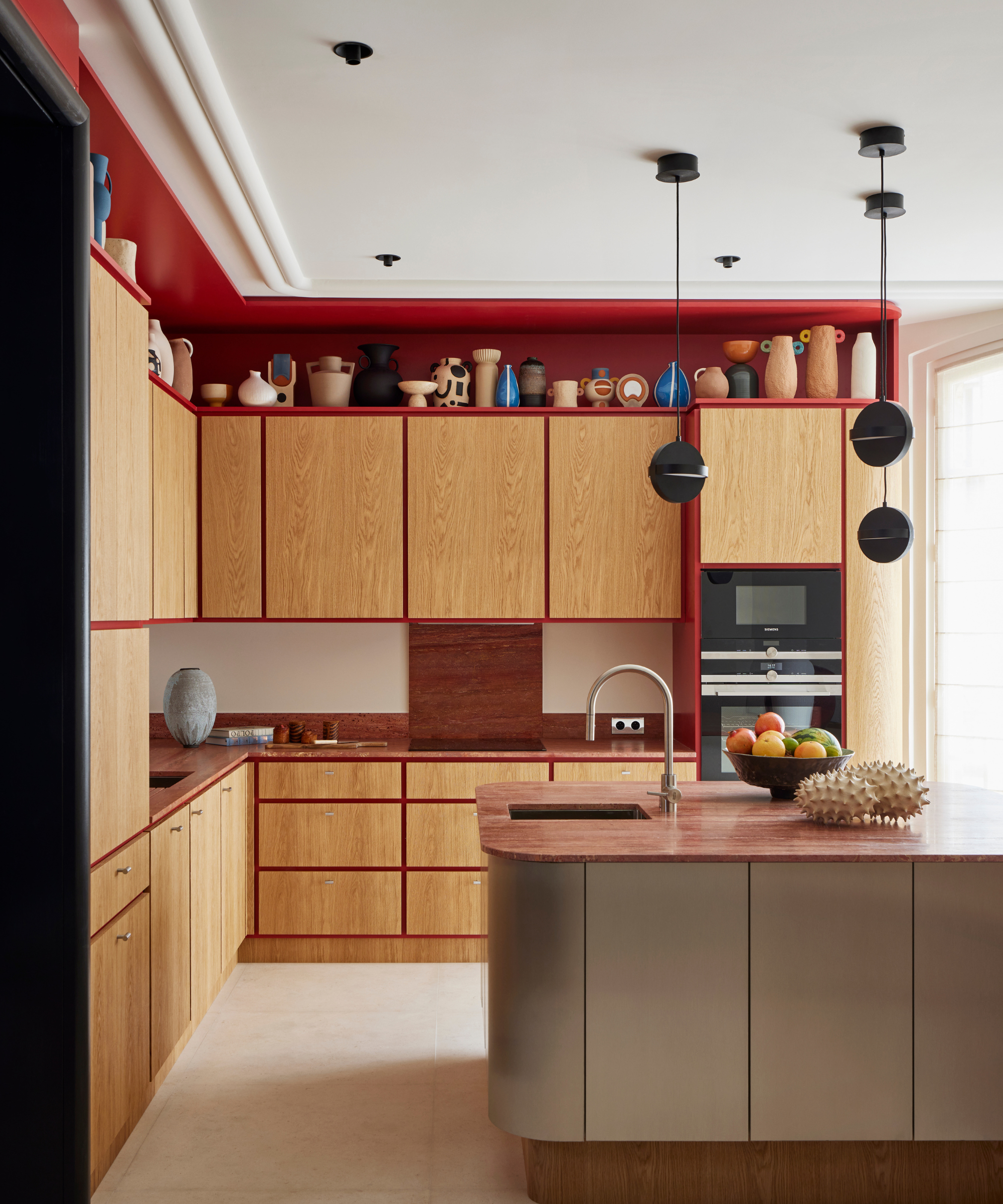
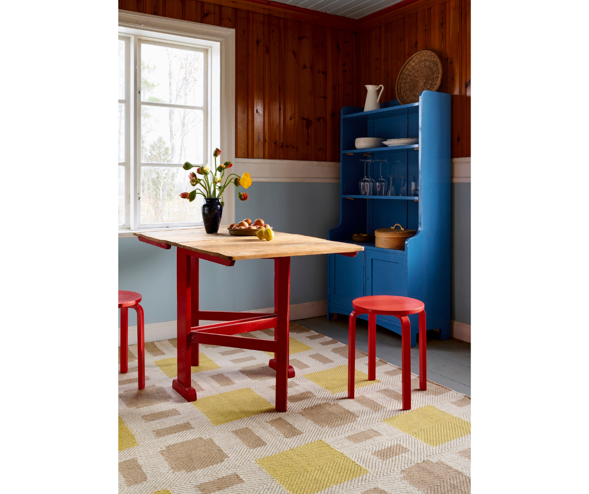
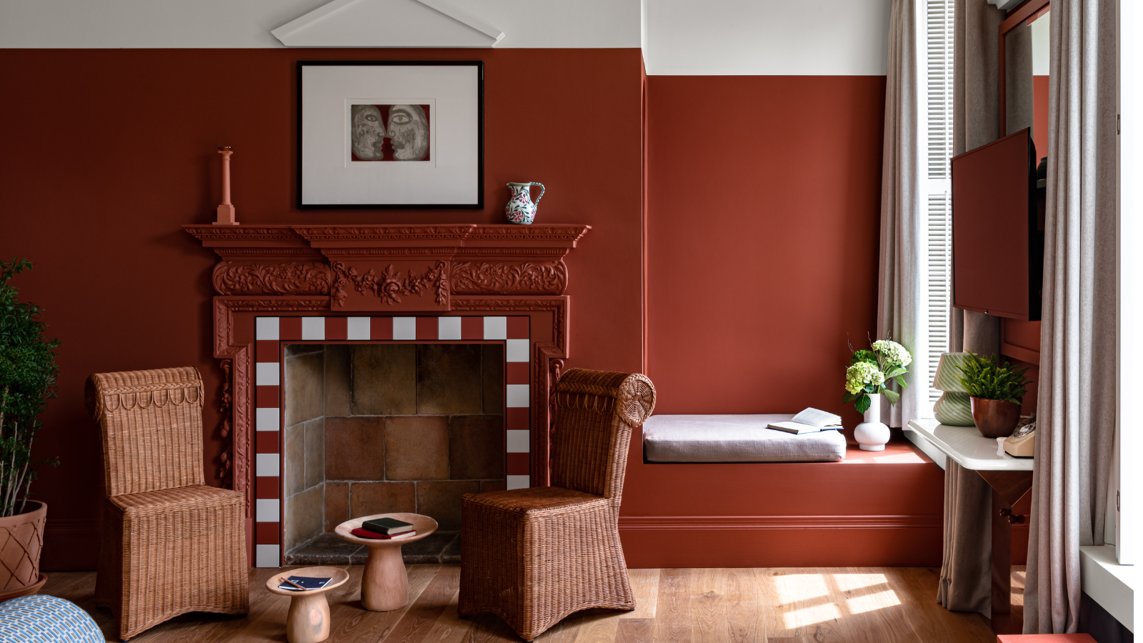
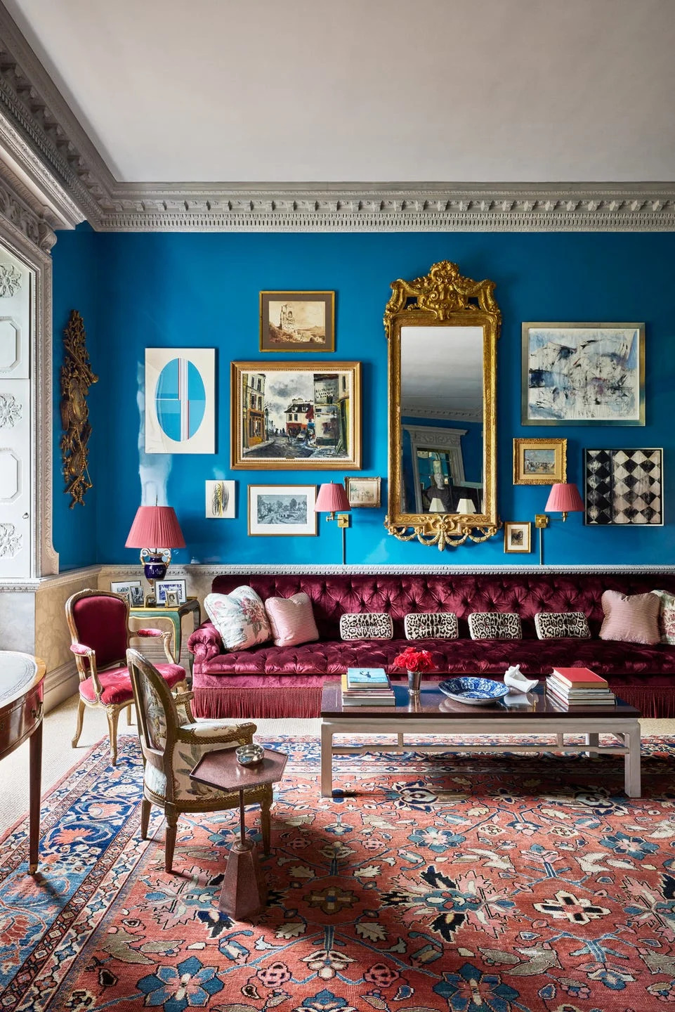
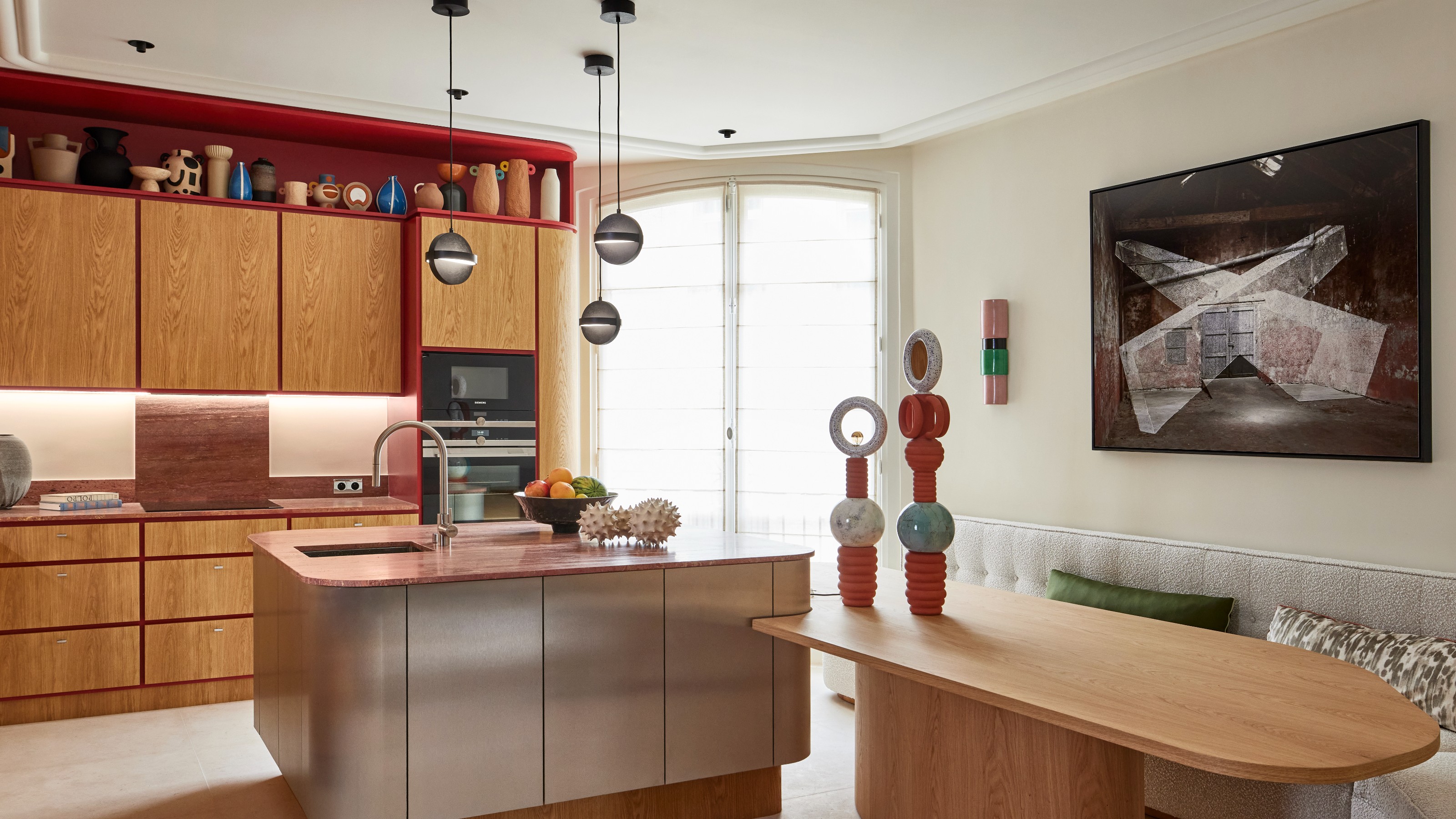
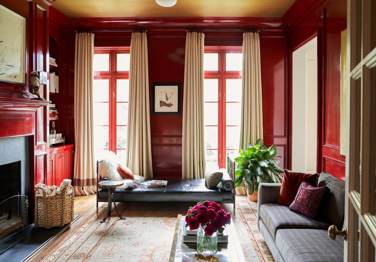
Red and blue can form a vibrant palette, particularly when red is used in a high-gloss finish. The reflective quality of glossy paint helps to bounce light around the room, preventing the deep red from feeling too heavy or light-absorbing, which might occur with a matte finish. The introduction of a contrasting, softer color, such as a cornflower blue in fabric choices, can effectively break up the intensity of the red, providing soothing notes that temper the overall potency of the color scheme. This technique allows for a powerful color statement while maintaining a sense of calm.
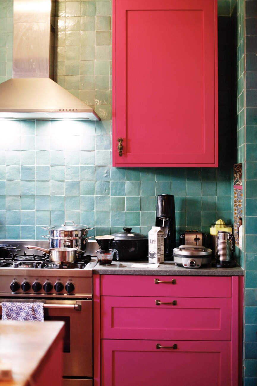
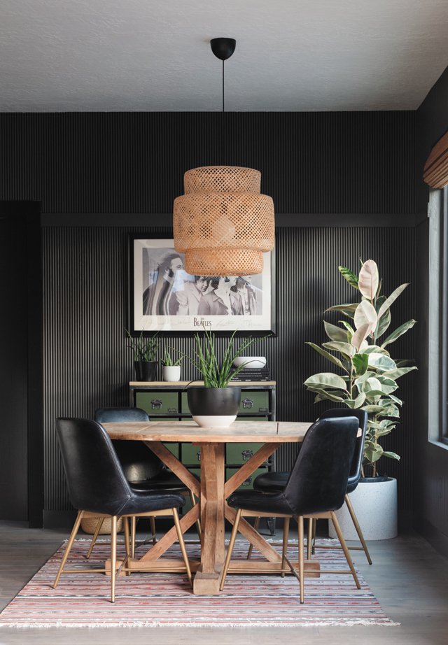
The inclusion of black in vibrant color schemes might appear counter-intuitive, but it serves as an excellent foundational base for layering more striking hues. Black has the ability to elevate the perceived value and sophistication of other colors. When hot pink, for example, is set against a dark background, it acquires a more luxurious and considered appearance. The stark contrast provided by a black element, such as a painted brick fireplace, allows vibrant shades like pink to truly stand out and make an impact.
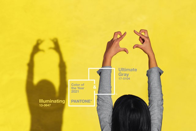
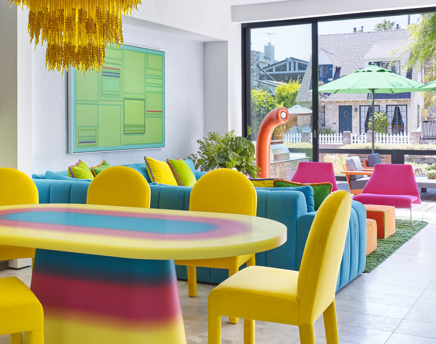
Finally, a comprehensive palette incorporating yellow, blue, pink, and green can achieve vibrancy without being overpowering. This is often accomplished by using a neutral base, such as gray on the walls, to anchor the bolder colors. Even with saturated pops of pure color, the strategic inclusion of a shade like hot pink can soften the overall effect. Hot pink, while maintaining vibrancy and energy, helps to modulate the primary colors, resulting in a lively yet balanced palette that avoids visual fatigue.
#VibrantColorPalettes #InteriorDesignTrends #ColorTheory #HomeDecor #DesignInspiration #ContemporaryDesign #ColorSchemes #ModernInteriors #ResidentialDesign #VibrantColorPalettes #InteriorDesignTrends #ColorTheory #HomeDecor #DesignInspiration #ContemporaryDesign #ColorSchemes #ModernInteriors #ResidentialDesign
0 comment in total
 No comments yet
You may also like
6 'Energetic Colors' for Vitality and "Sophisticated Interiors", According To Psychologists And Design Experts
The Brighter, the Better—These Vibrant Paints Will Infuse Your Home With Positivity


The #1 Paint Color Trend of 2025, According to Designers

Color Drenching Might Be Everywhere, But My Mom’s Been Doing It Since the ’90s
15 high-risk high-reward paint hues

These Colors Will Be Everywhere in Interiors in 2025
Designers Swear By These 55 Living Room Paint Colors

What Colors Go With Red? 10 Colors That Hold Their Own Alongside This Fiery Hue

6 key colors to decorate with in May 2025, according to interior design and color experts in the know

12 Paint Colors That Interior Designers Are Buzzing About—See the Gorgeous Hues Here
2021’s Palette of Possibilities

Deeper, moody colours and precious jewel tones are in style this year
3 local designers on how to use vibrant color to transform your home
5 Cozy Paint Colors Interior Designers Use to Warm Up Cool Rooms and Create "Snug" Spaces

5 rooms that prove color drenching your bedroom is a good idea
Outdated color trends – 5 overdone colors that designers no longer love, and what to use instead
Incorporate Color Drenching Into Your Home Design

A Color Psychologist Says This Is the Most Relaxing Paint Color

Is colour drenching really a radical new way to decorate, or is it just lazy decorating?
Why This Hue Is Suddenly Dominating Every Designer's Wishlist—Plus, How to Style It