1/4
Is This the Most Expensive-Looking Color? Meet 'Phthalo Green', the New It Hue for Decorating Luxuriously
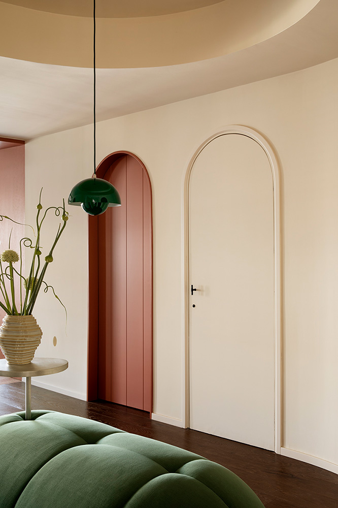
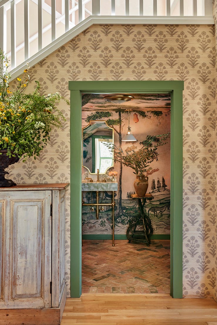
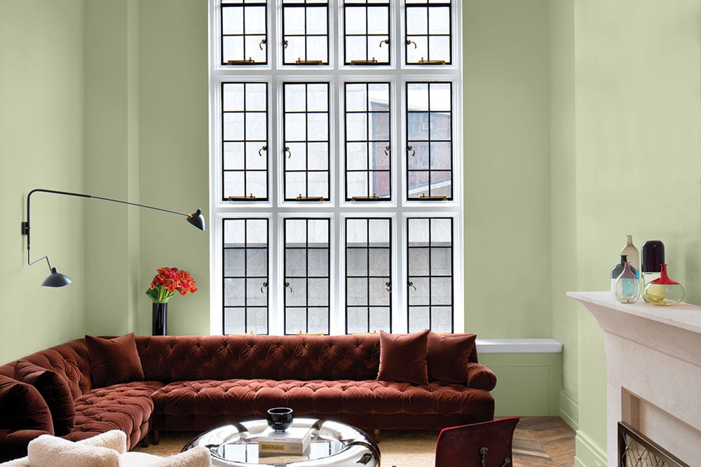
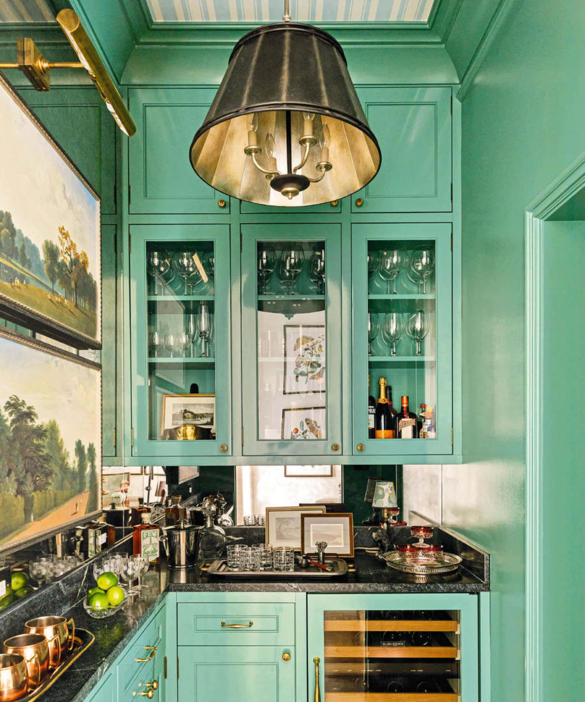
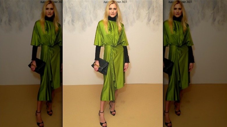
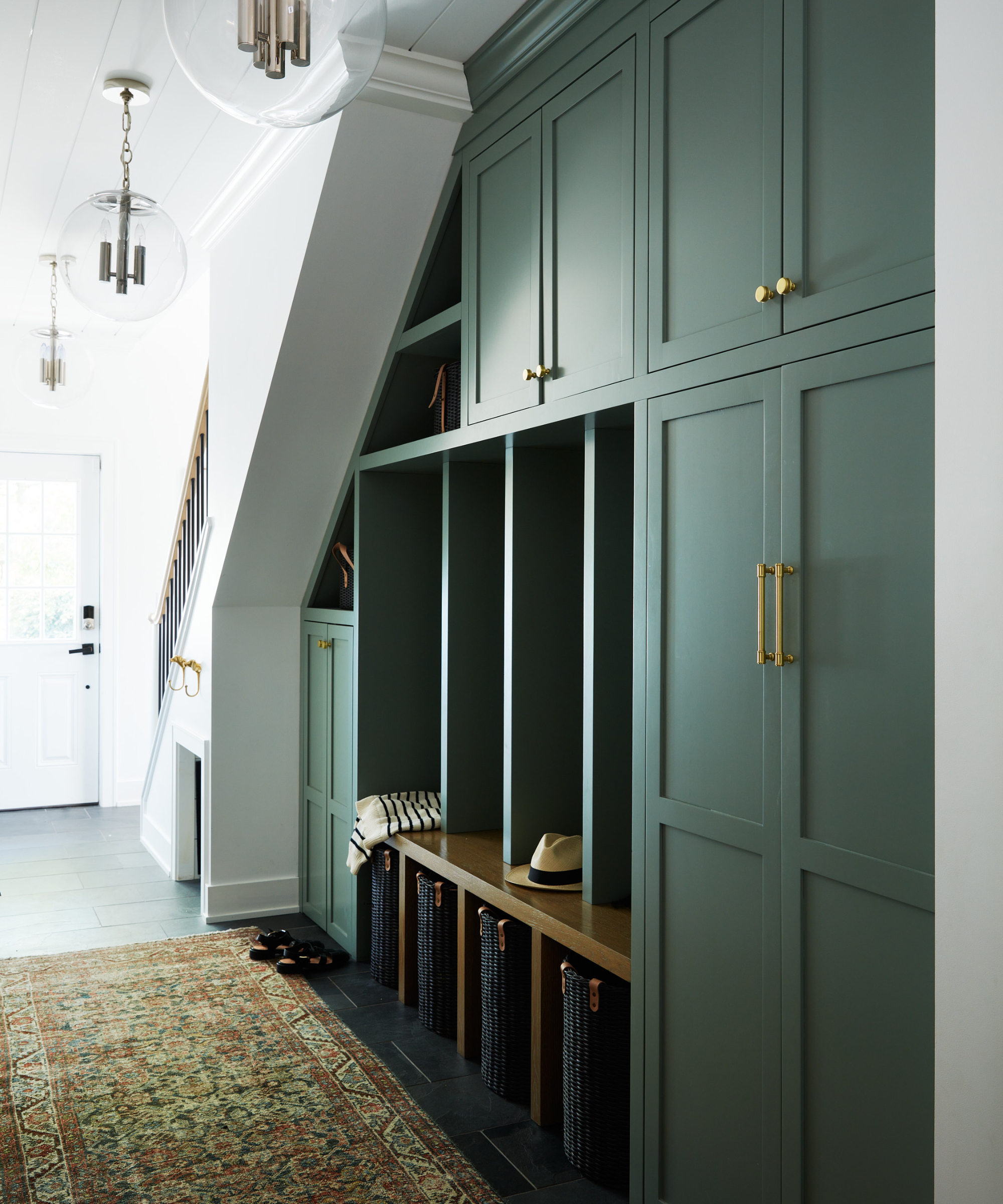
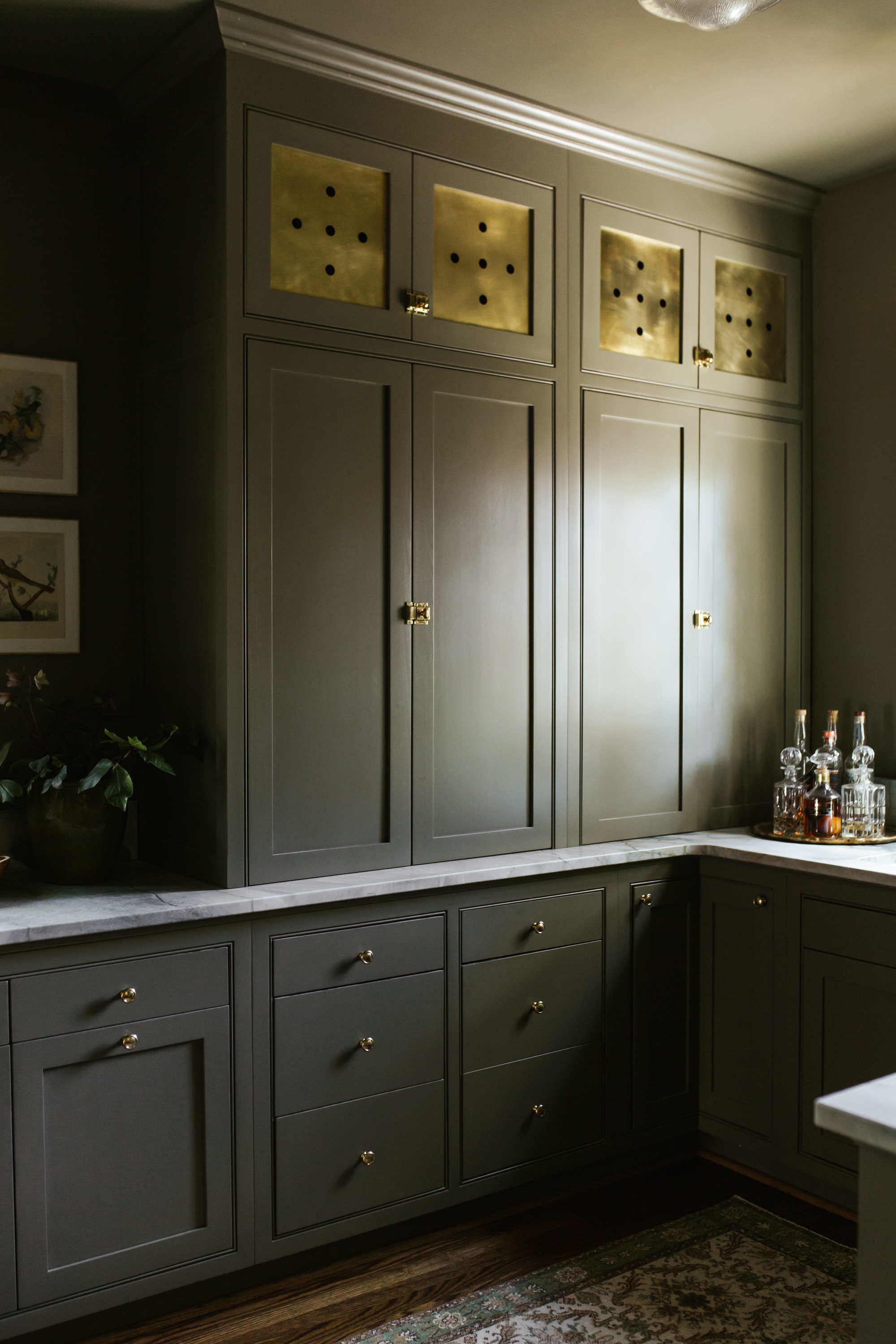
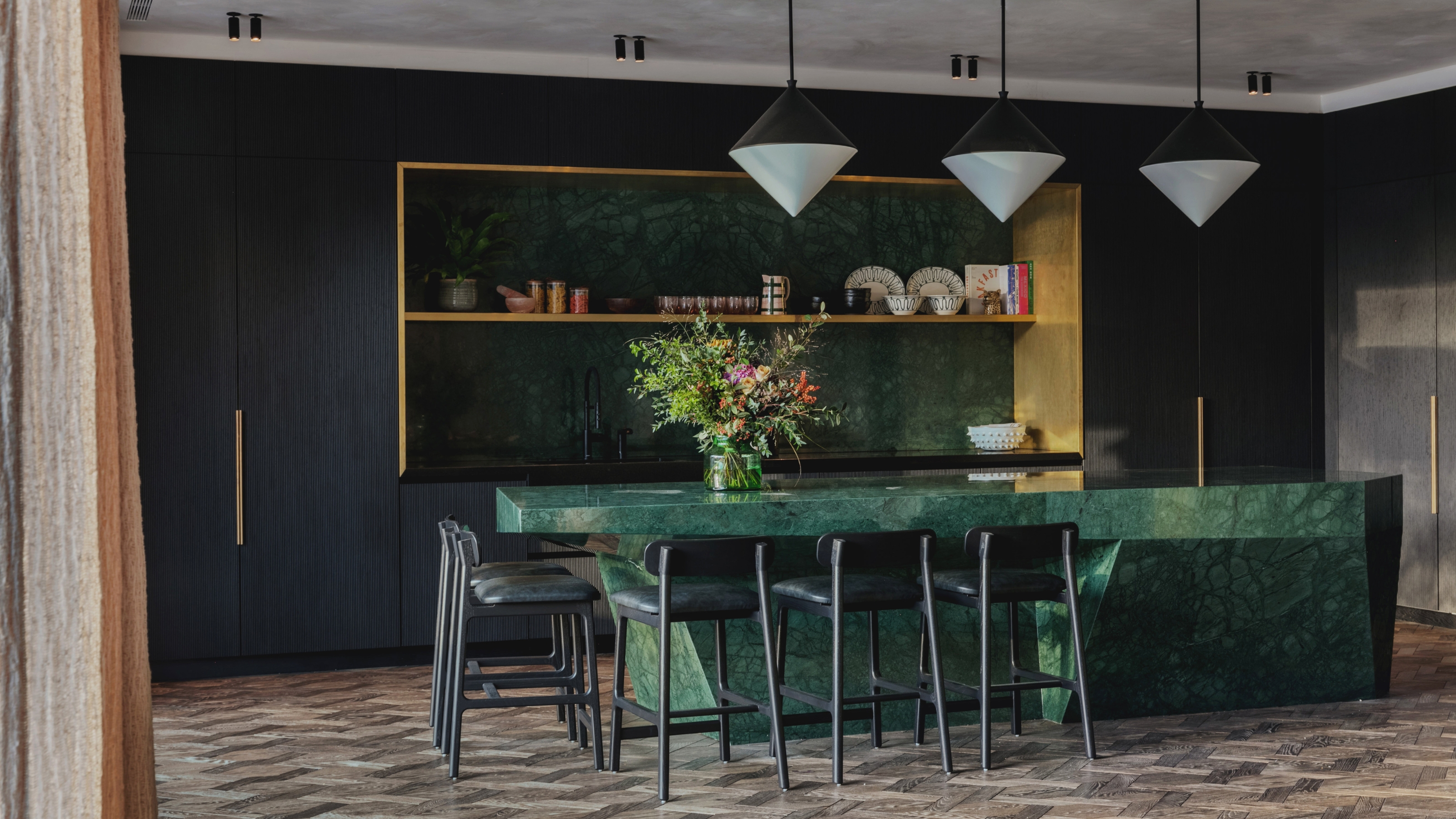
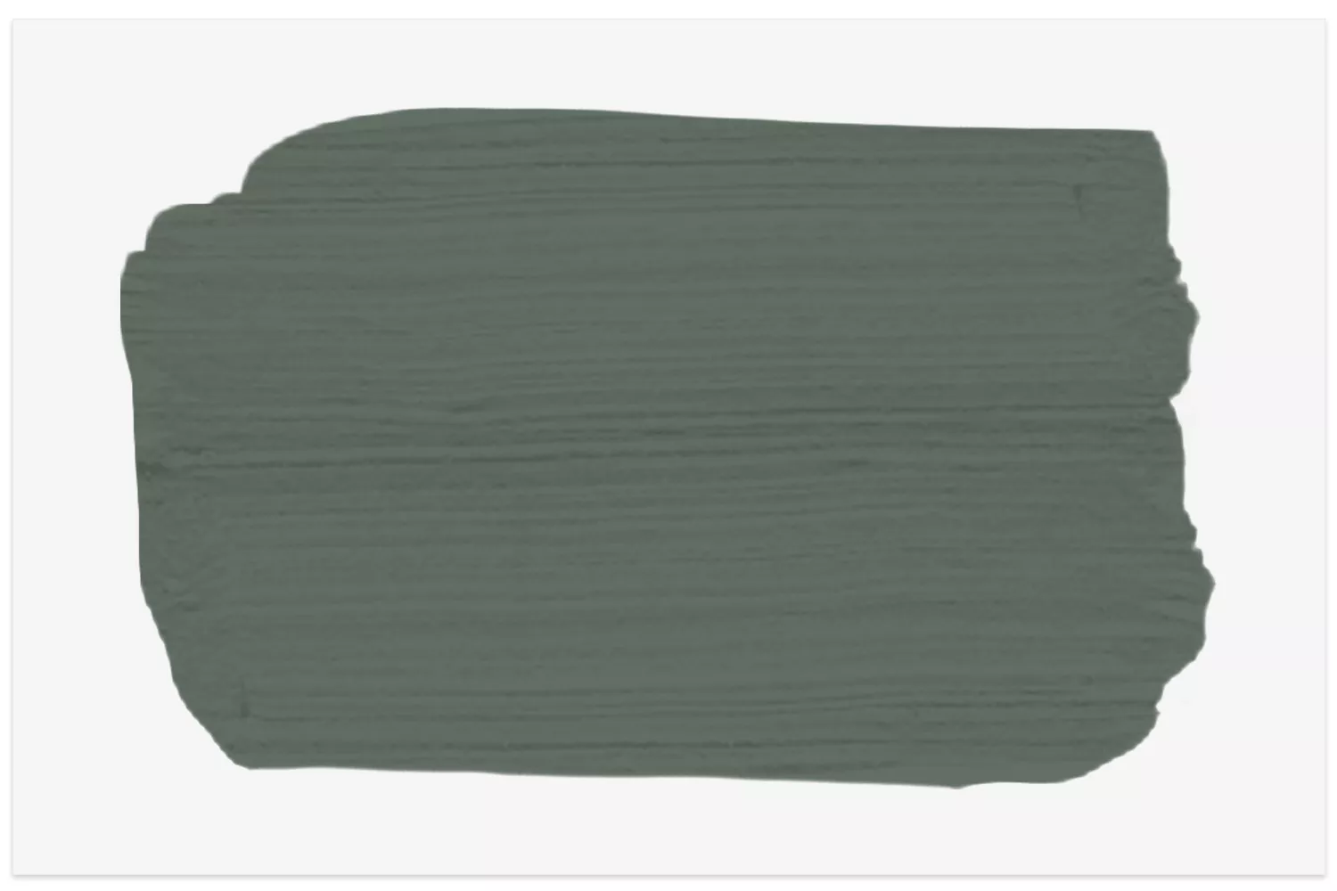
Phthalo Green, a deep, rich jewel-toned green, is emerging as a prominent color trend in both fashion and interior design, often associated with luxury and elegance. This hue, pronounced 'THAL-oh', is gaining recognition for its ability to make spaces appear more expensive and refined. Amy Moorea Wong, a color expert, highlights Phthalo Green's deepness and its association with jewel tones and historical luxury, referencing European royalty adorned in rich green garments. This connection instills a sense of occasion and sophistication.
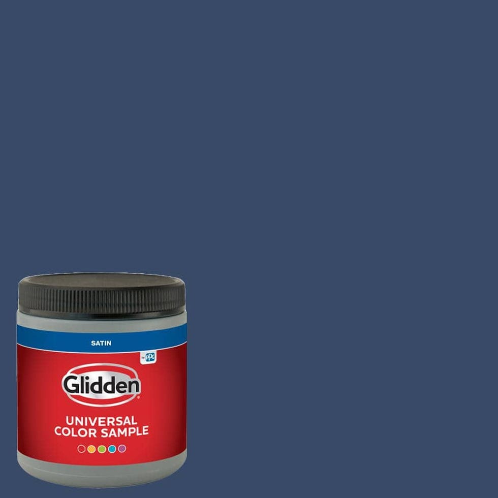
The historical context of Phthalo Green, short for "phthalocyanine," traces back to the 1960s, where it was used as a pigment for blues and greens. Ryan Mahoney, creative director at Workstead Buildings and Interiors, describes Phthalo Green as an excellent choice for chic interiors due to its rich, vibrant tone and its neutral ambiguity, blending elements of green, blue, and black. This unique balance of undertones contributes to its versatility, allowing it to function as a complementary neutral backdrop that draws inspiration from natural environments. Mahoney further notes that unlike dark grays, which can sometimes feel detached, Phthalo Green is a vibrant neutral that effectively brings the outdoors inside. Wong emphasizes its pure intensity and lushness, describing it as a subtly powerful take on emerald green, with a touch of blue that makes it alluring, hypnotic, mysterious, yet grounding and familiar.
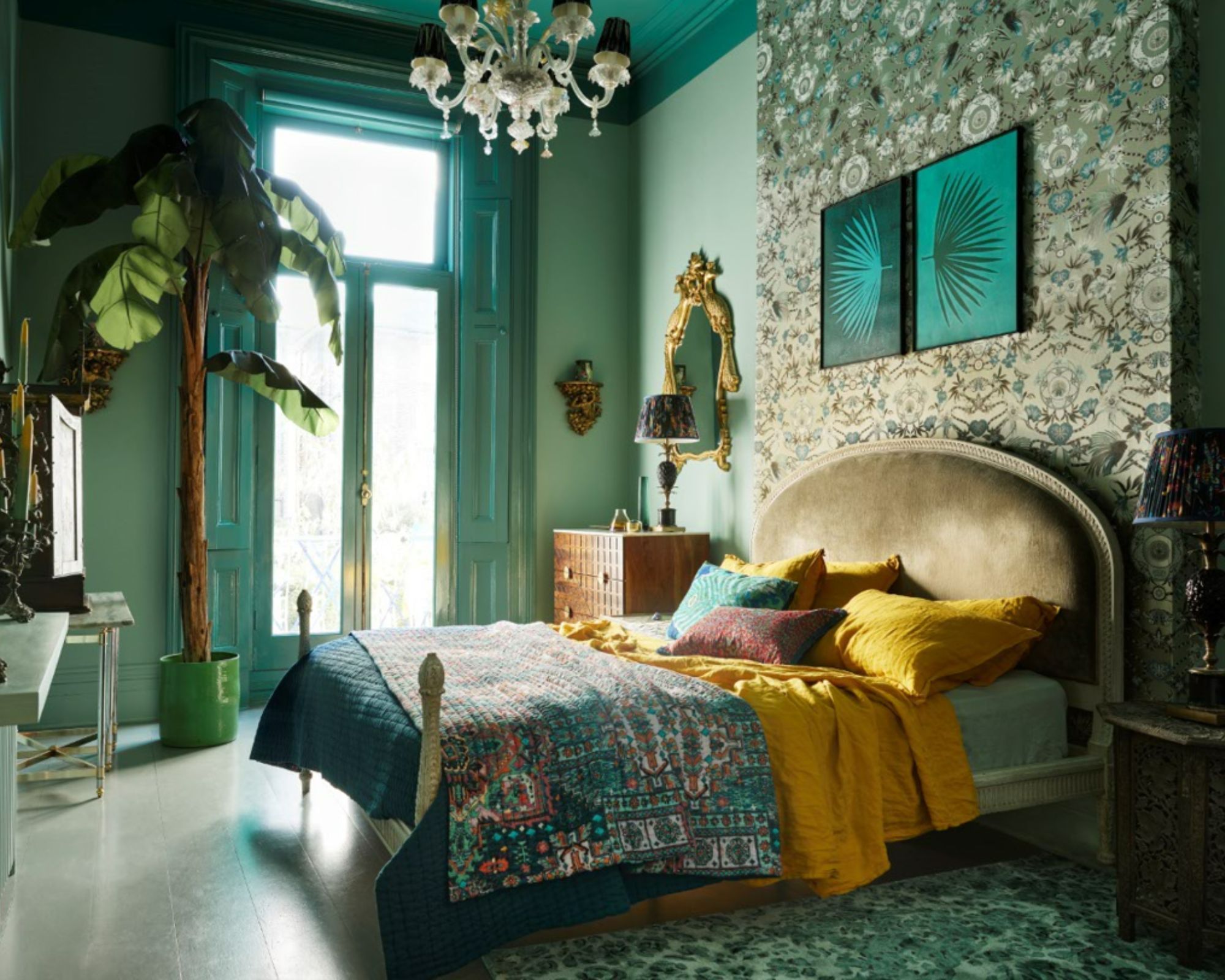
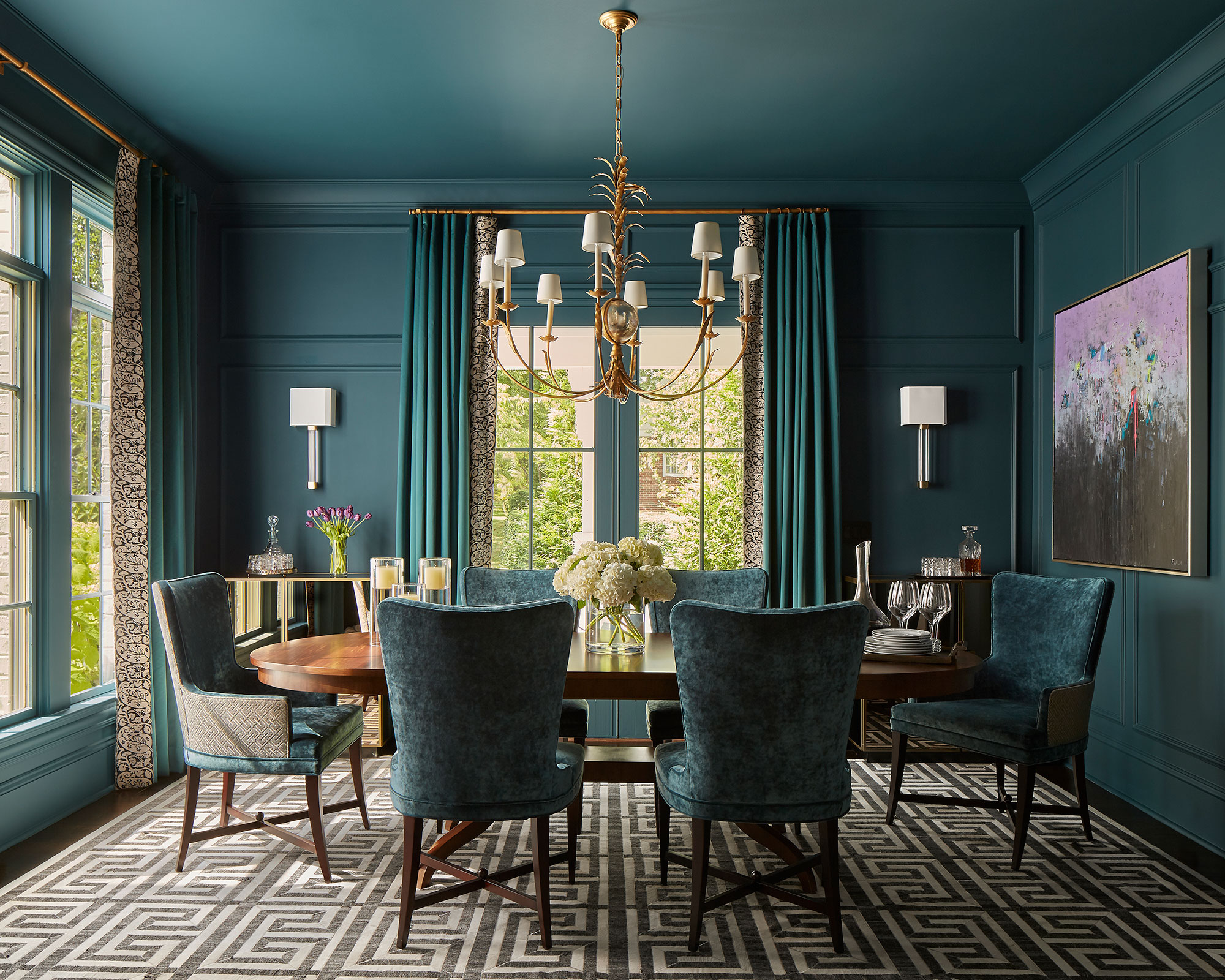
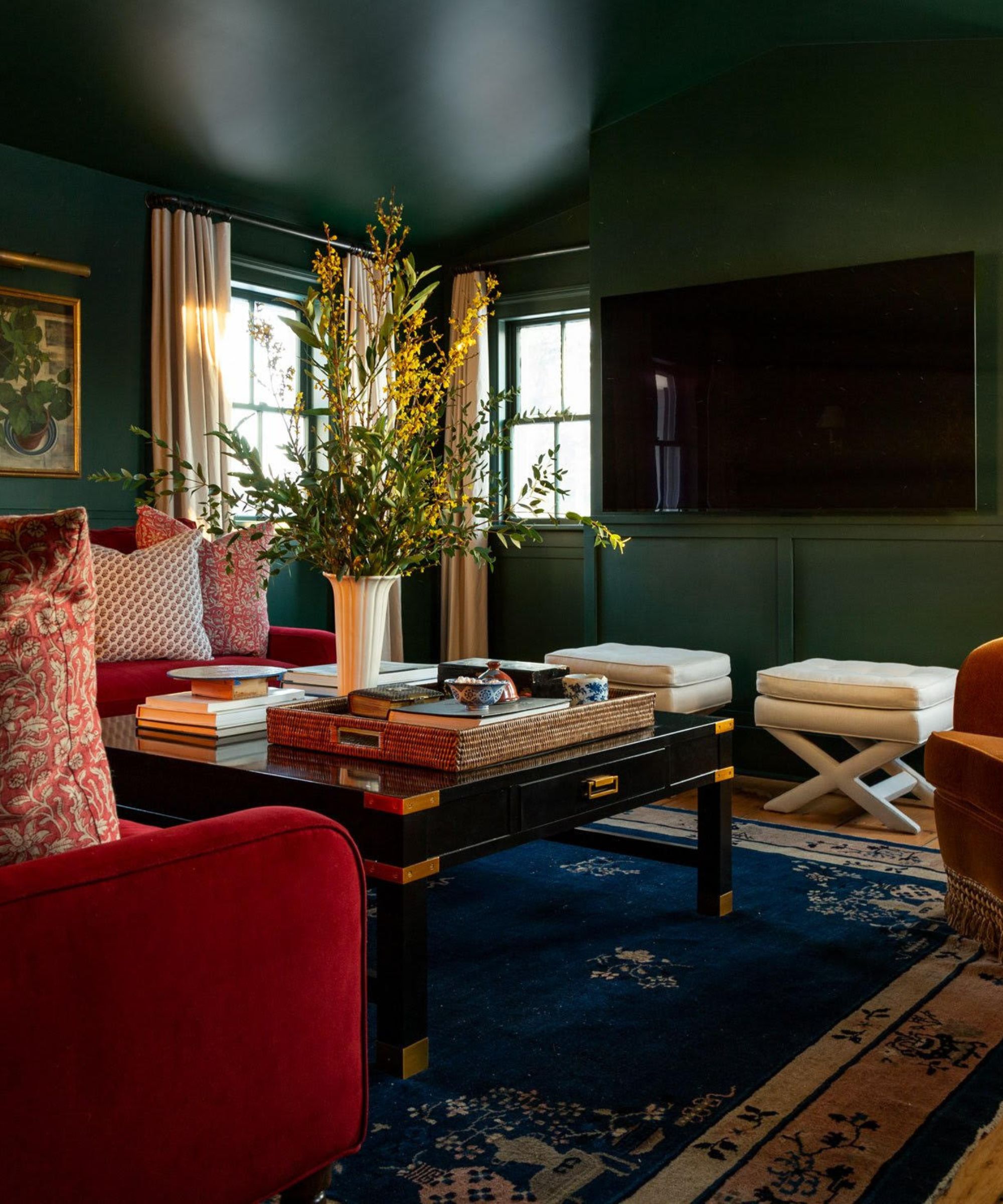
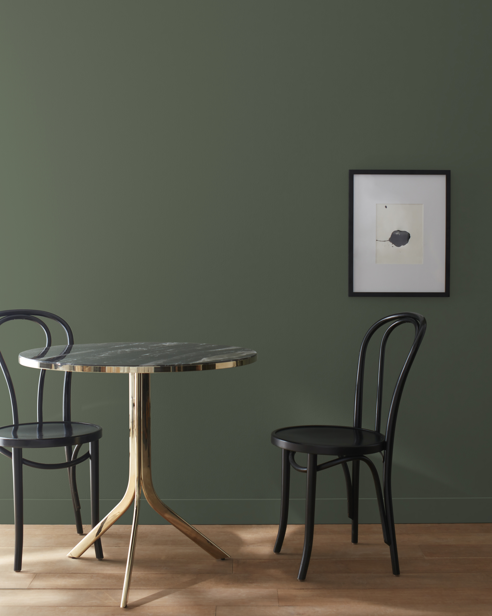
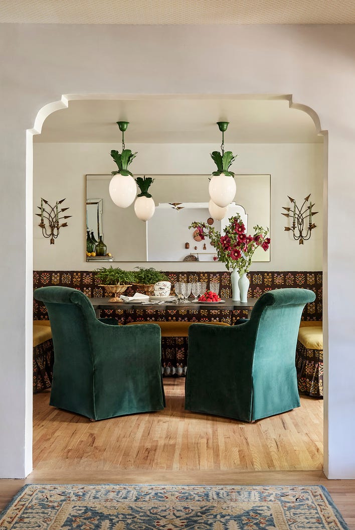
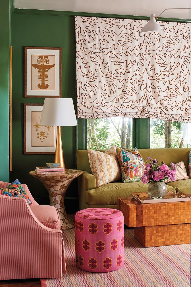
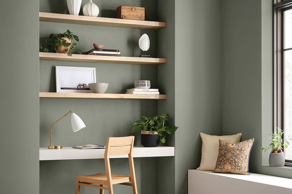
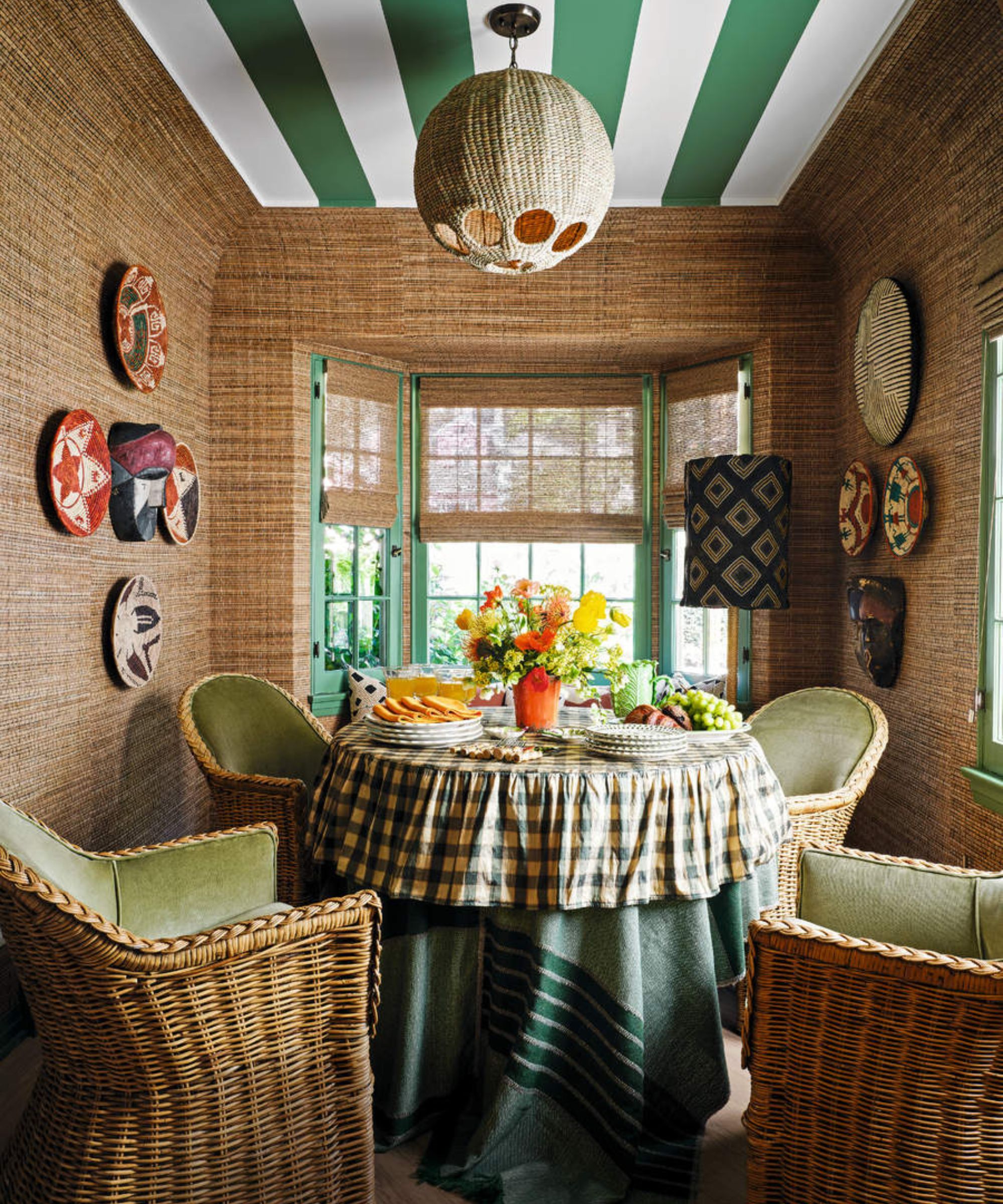
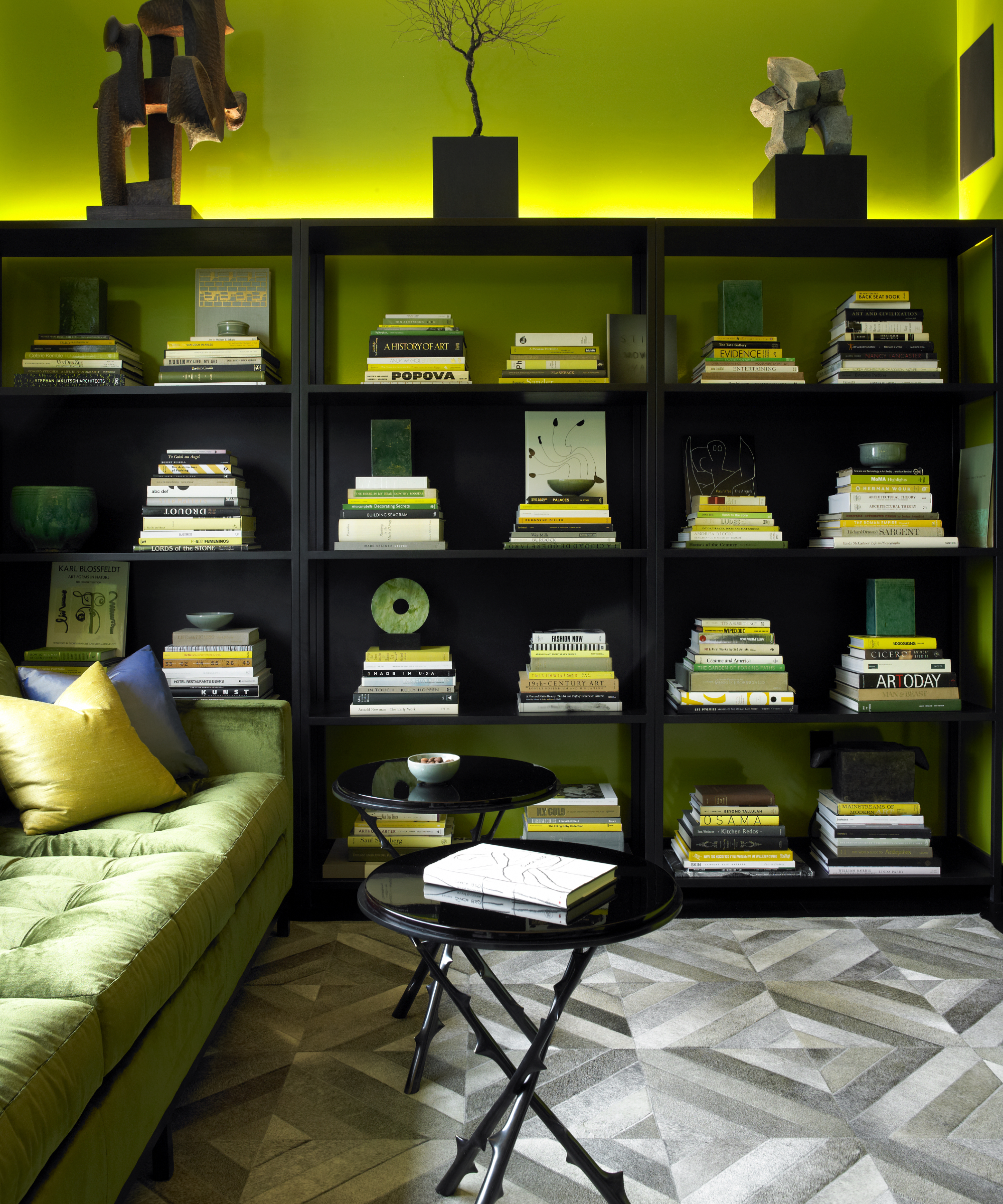
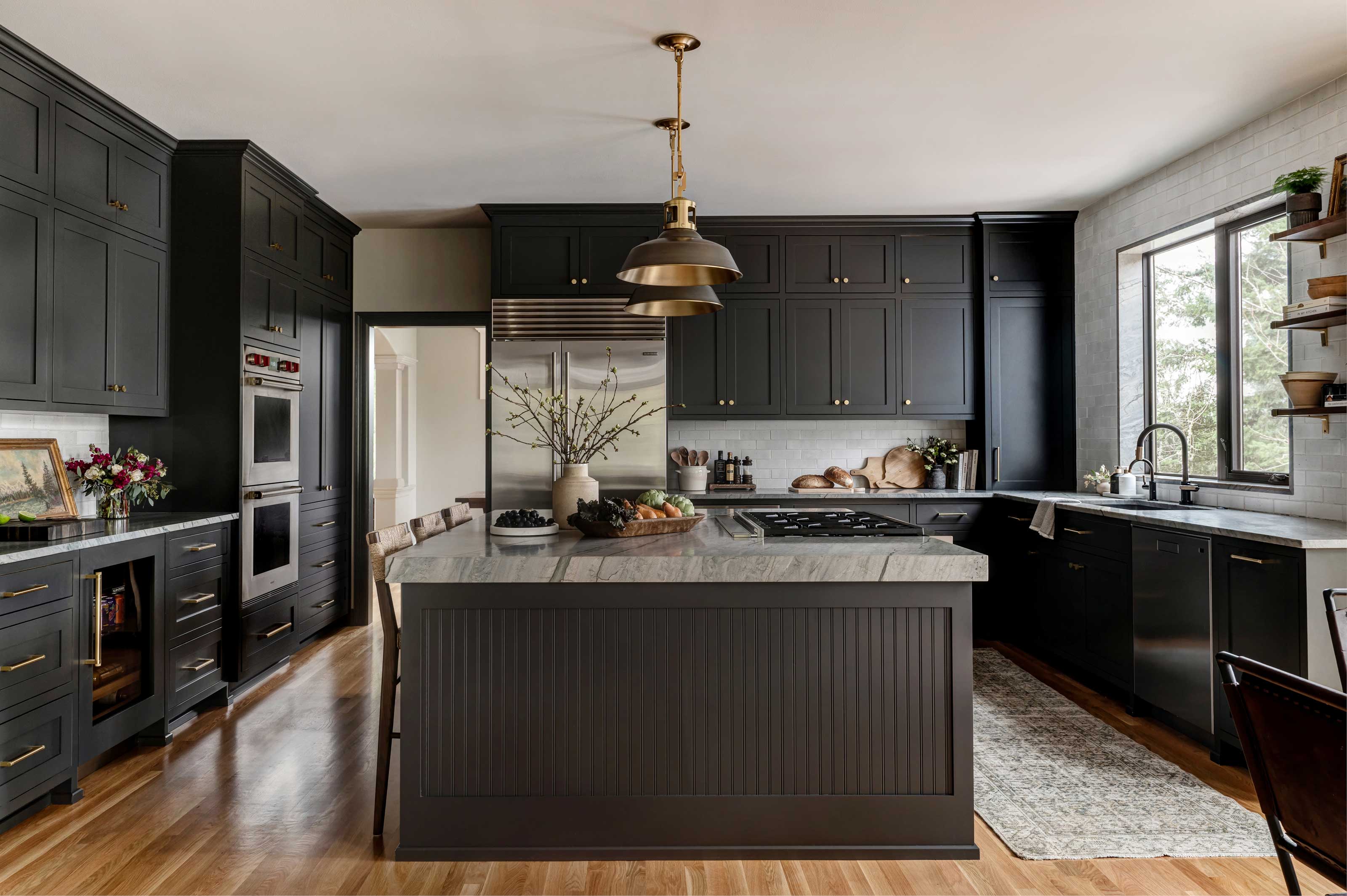
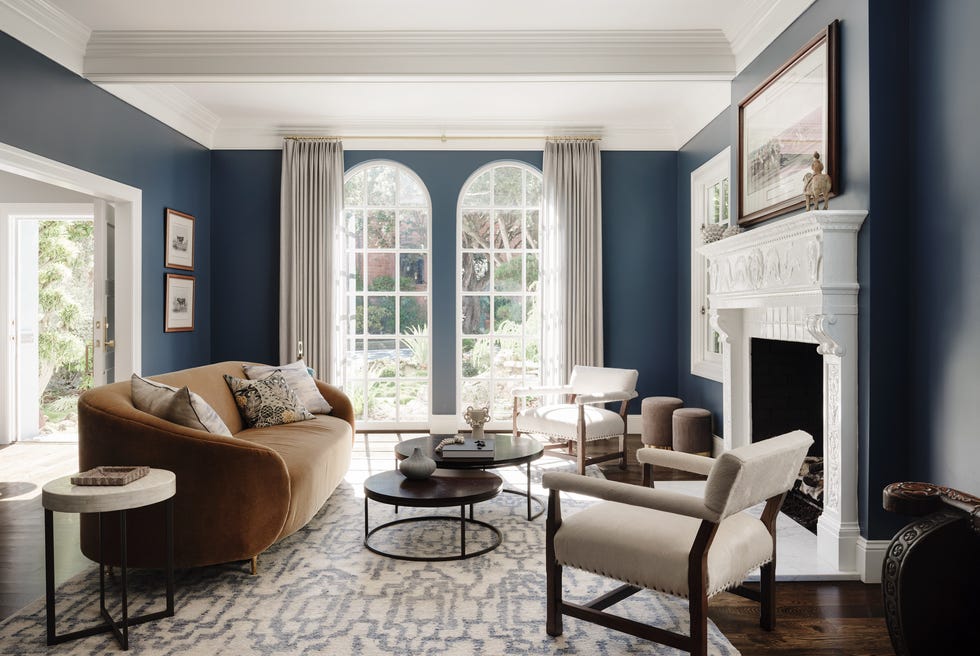
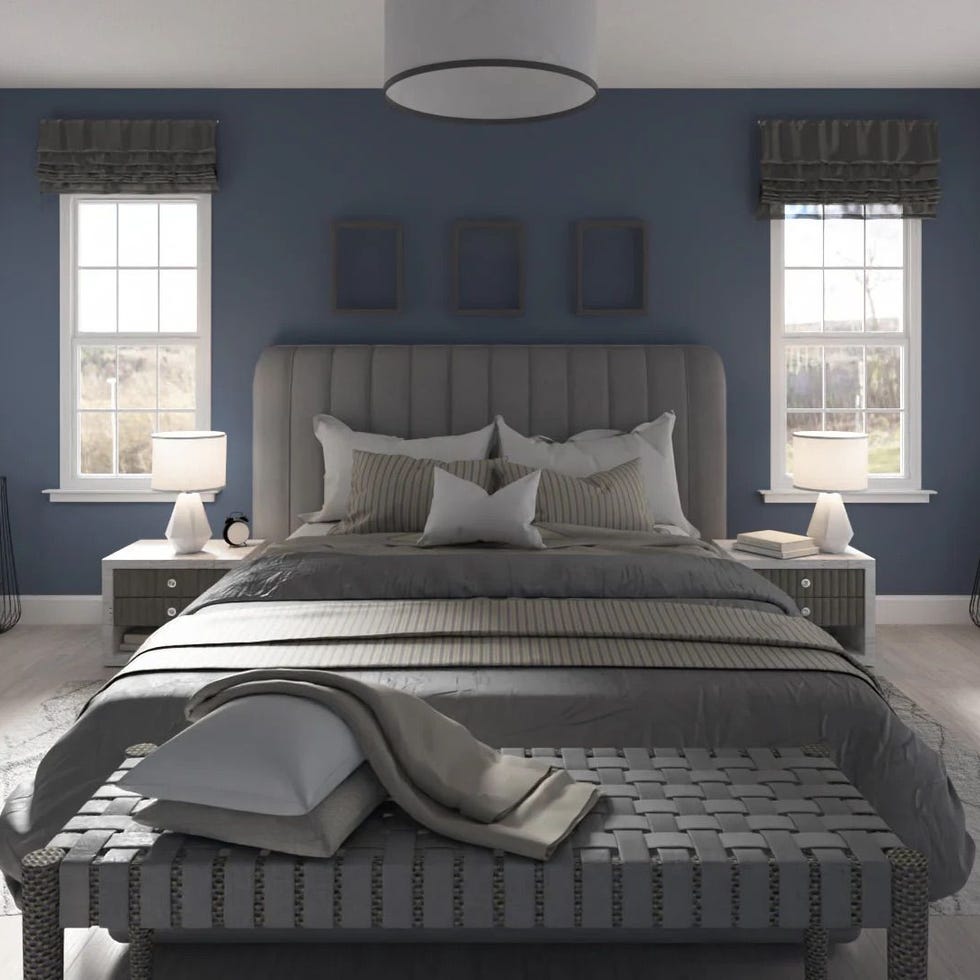
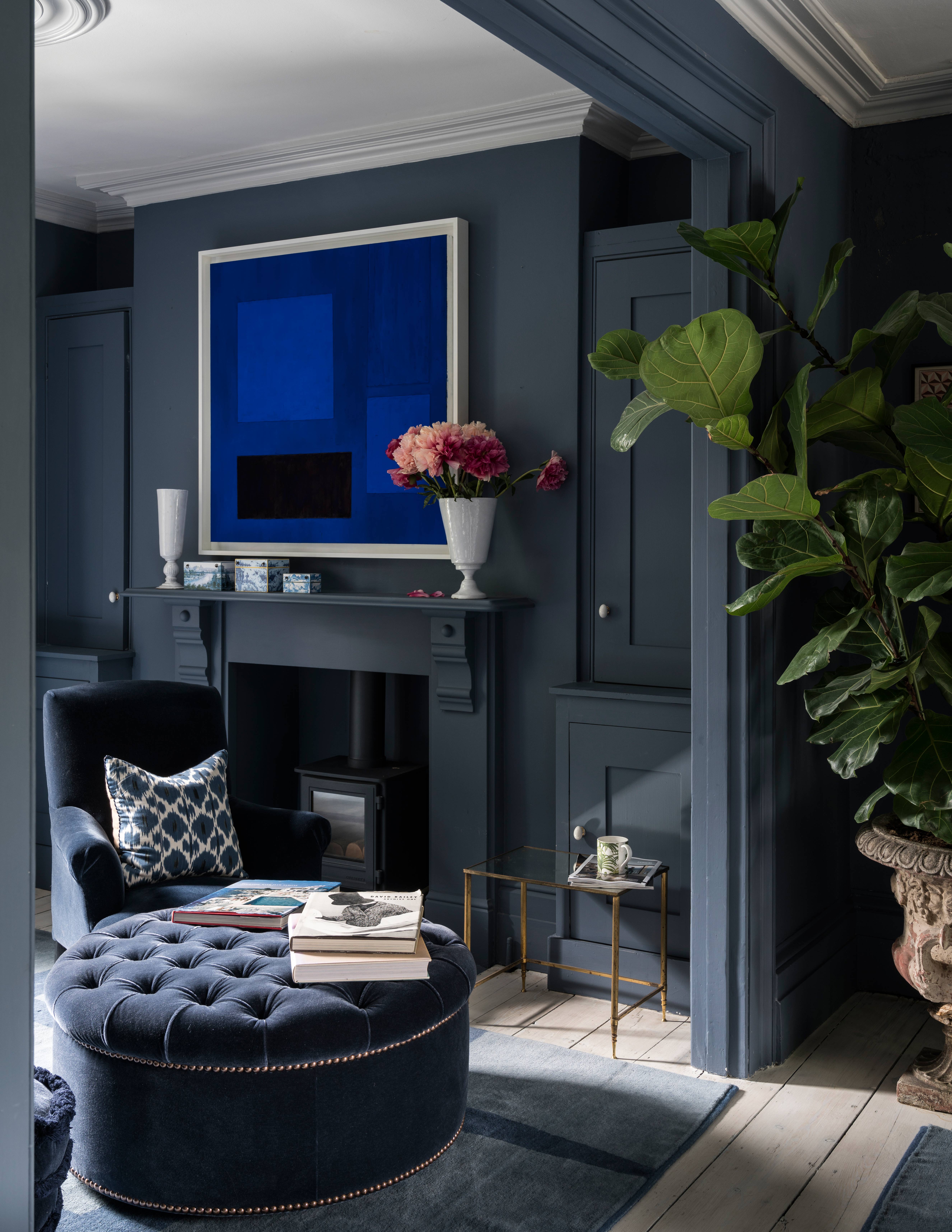
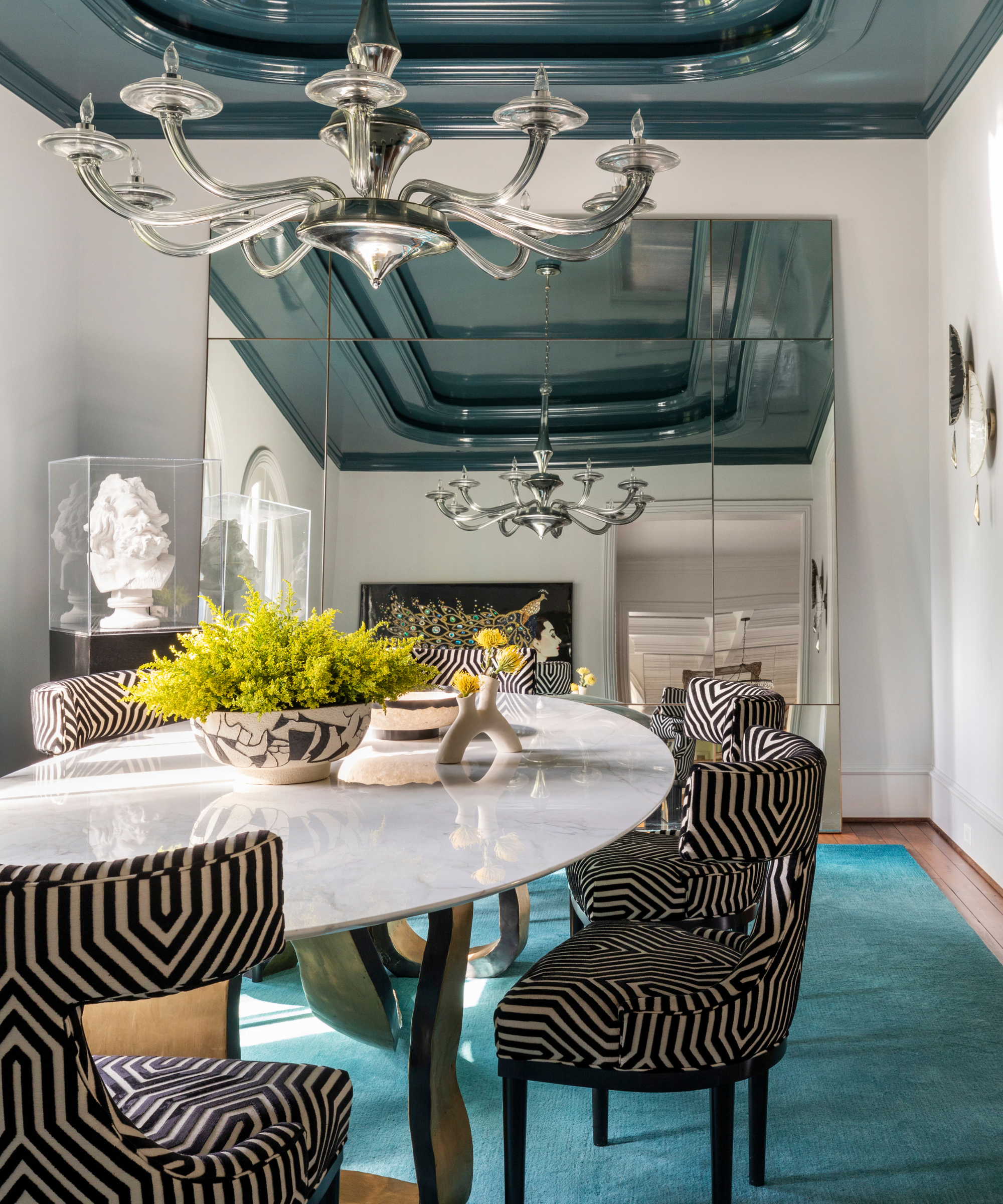
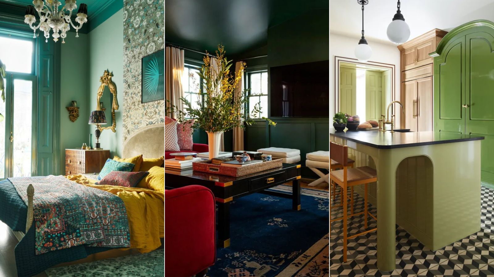
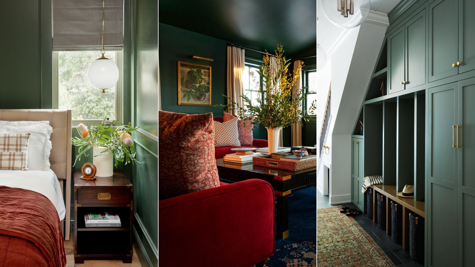
This intriguing versatility allows Phthalo Green to be utilized in both bold, statement-making designs and more immersive, serene environments, always maintaining a refined edge. For instance, in a home office, Phthalo Green can be used extensively on walls, and despite its dark appearance, it recedes to allow furnishings and external views to stand out. The color aligns well with the 'Castlecore' design trend and can suit sophisticated formal sitting rooms. However, its application is not limited to intimidating schemes; it can also bring a sophisticated, grounded feeling to cozy living room ideas when combined with warm woods or in dining areas complemented by sleek whites and brass accents.
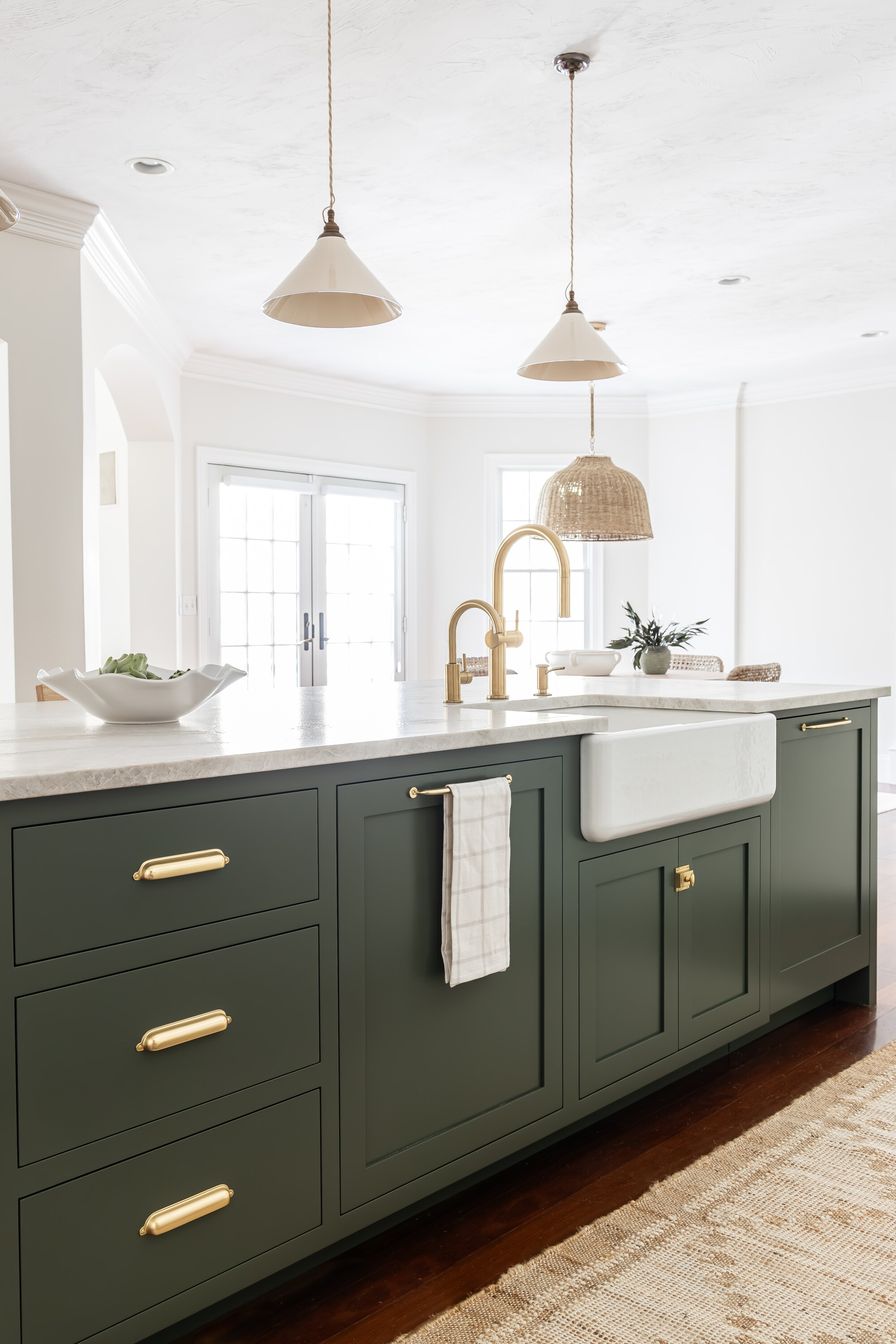
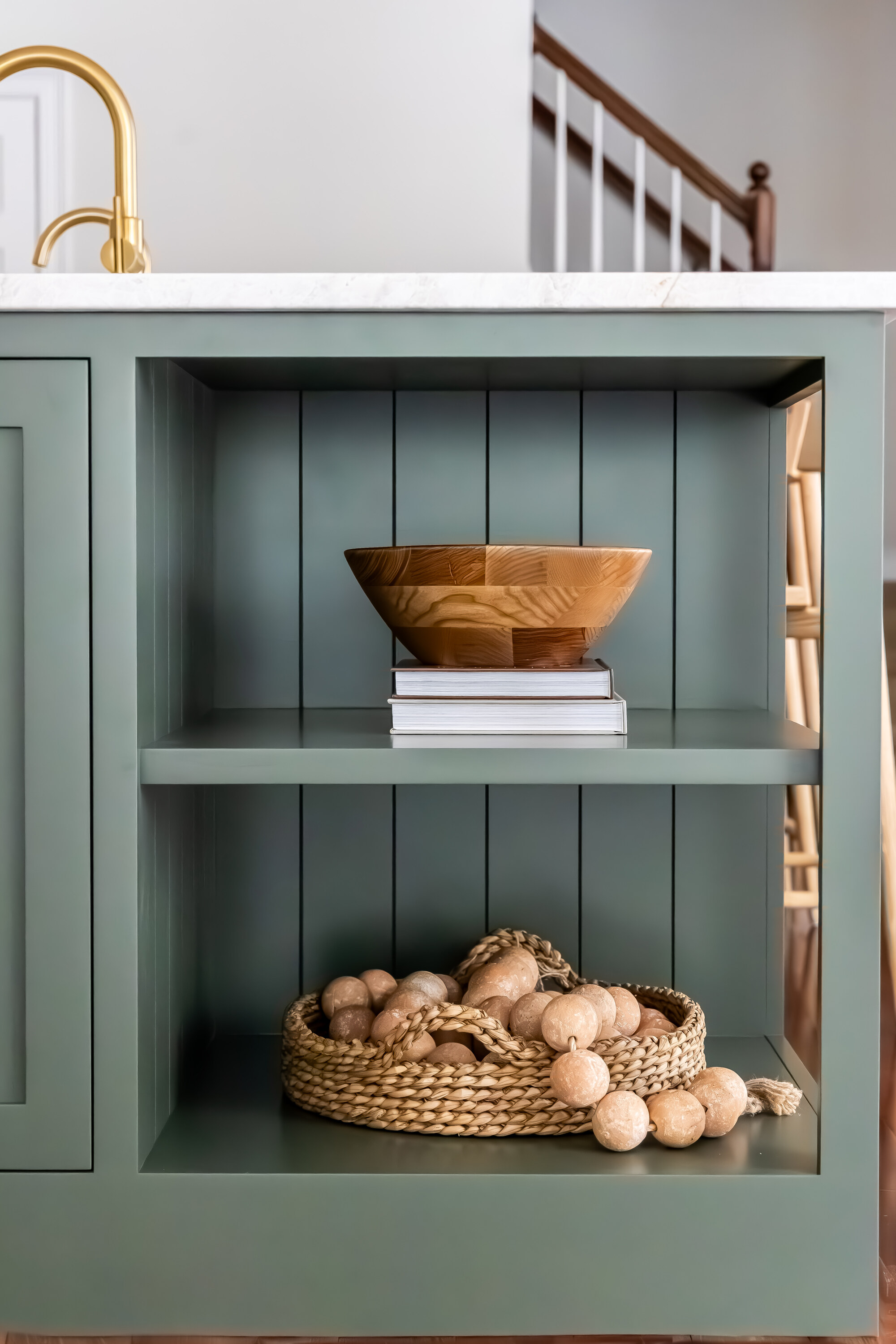
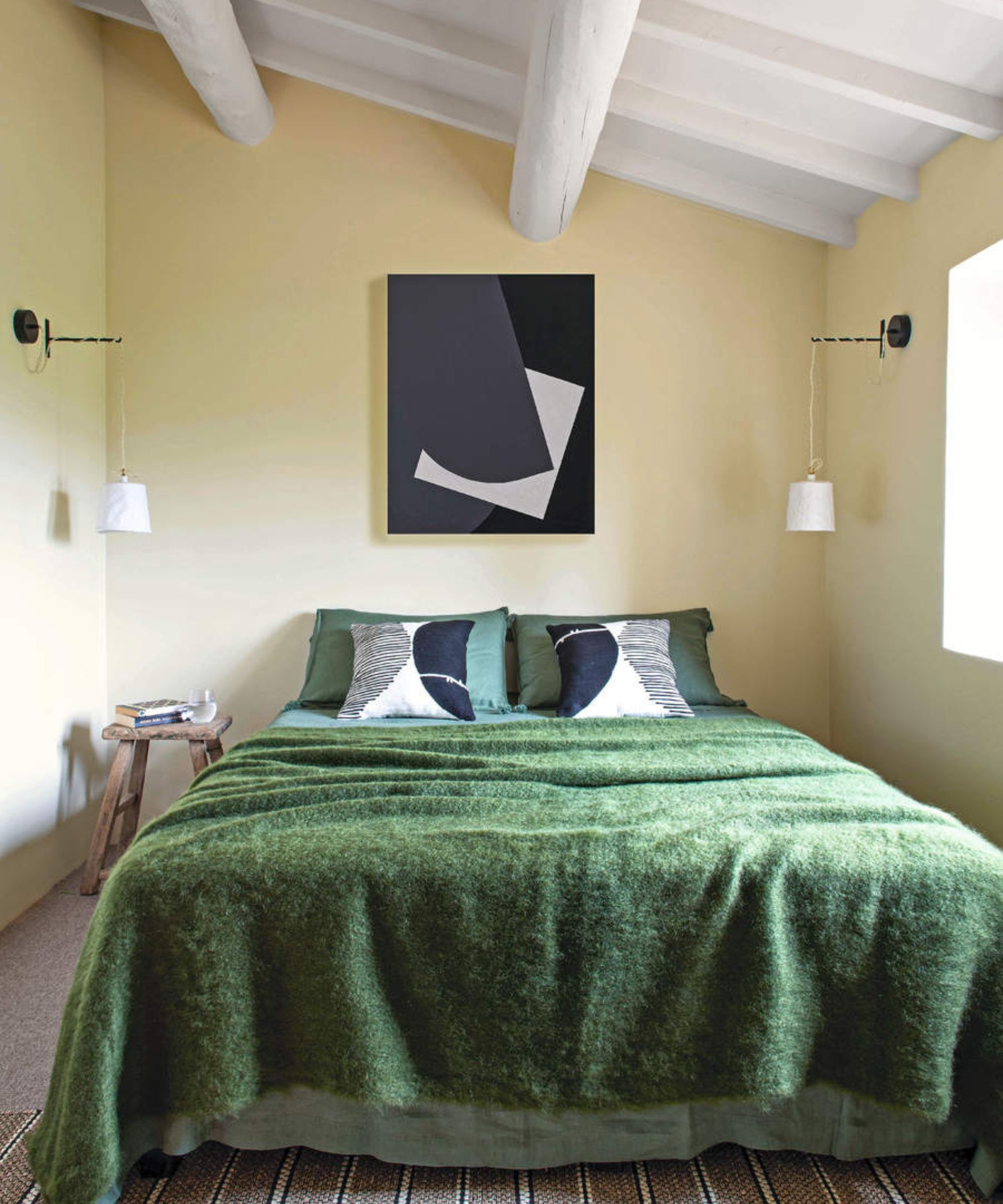
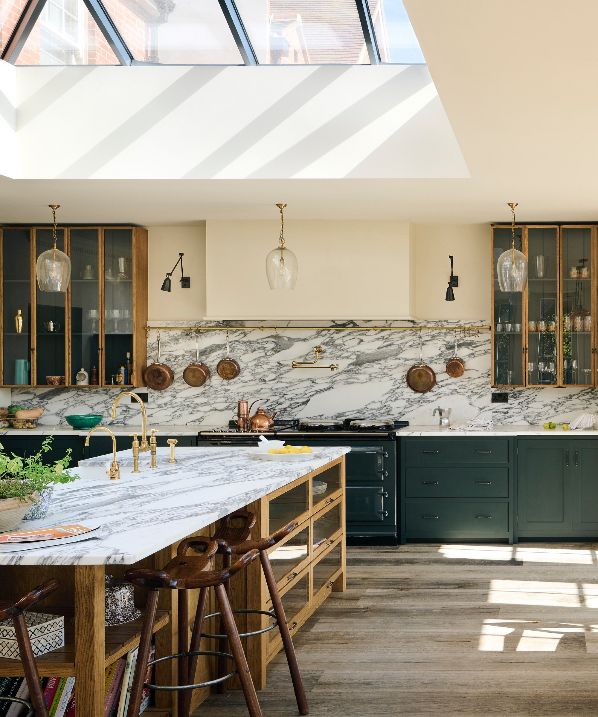
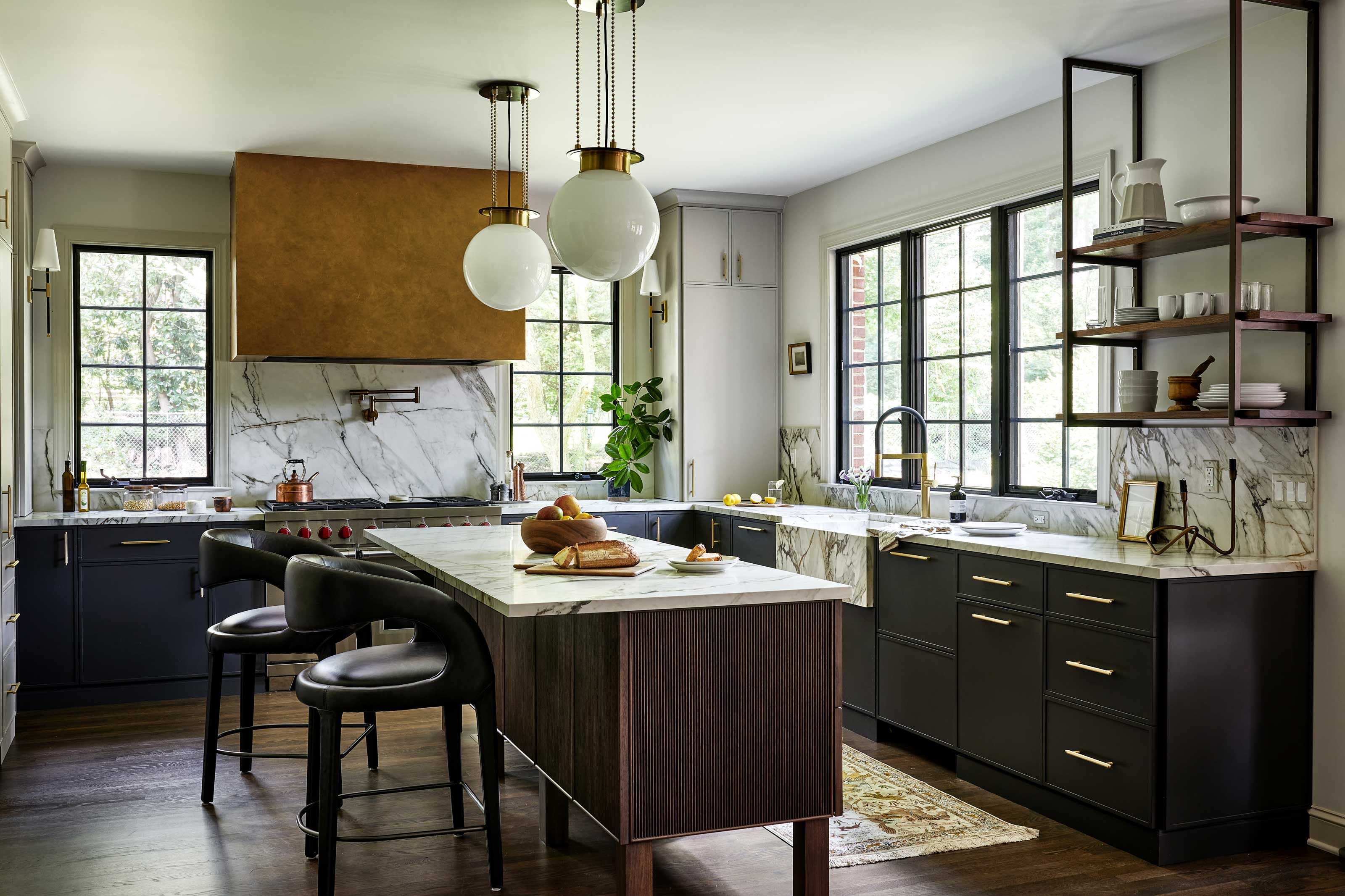
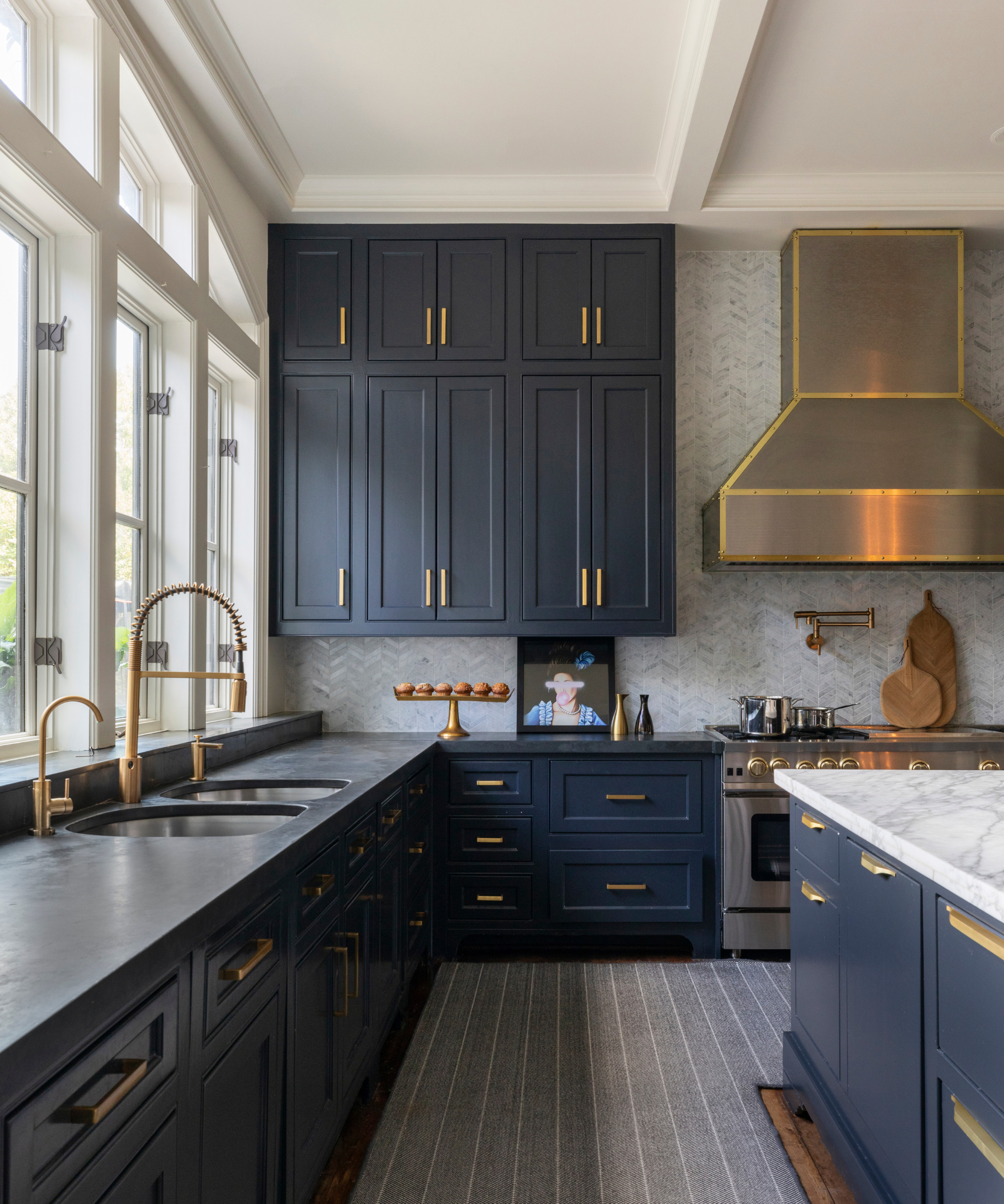
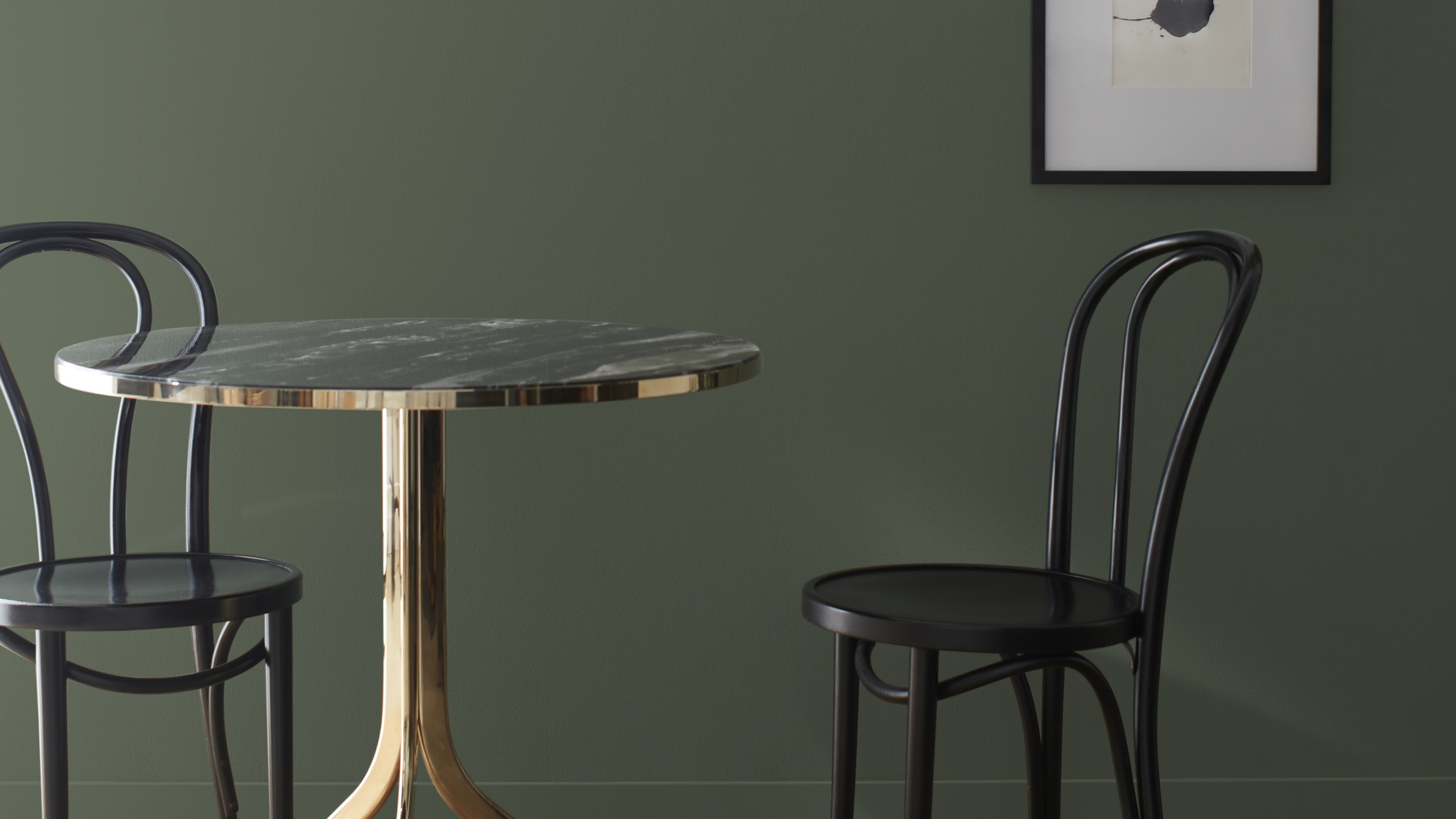
Stylistically, Phthalo Green pairs effectively with traditional homes and minimalist interior designs. To enhance its elegance, it can be combined with luxe natural materials such as dark marbles, warm woods, bronzes, and crisp whites. These pairings create a harmonious balance of earthy, natural tones and clean contrasts. Mahoney suggests that the richness of warm woods and bronzes beautifully complements Phthalo Green, while crisp whites provide a fresh, bright backdrop that highlights its lush and moody depth. This makes it particularly suitable for spaces with direct views of windows, plants, or vistas, integrating the indoors with the natural world.
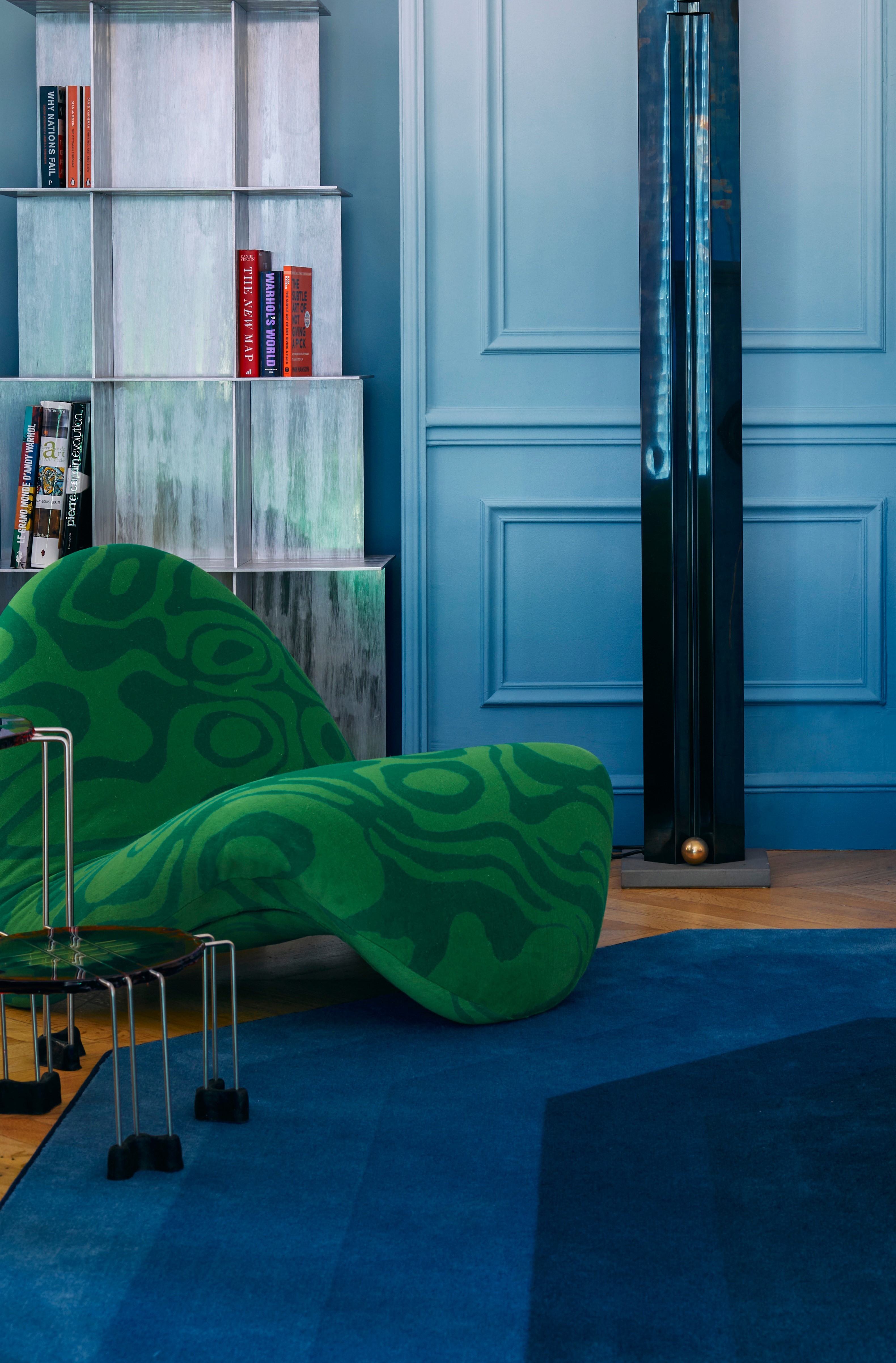
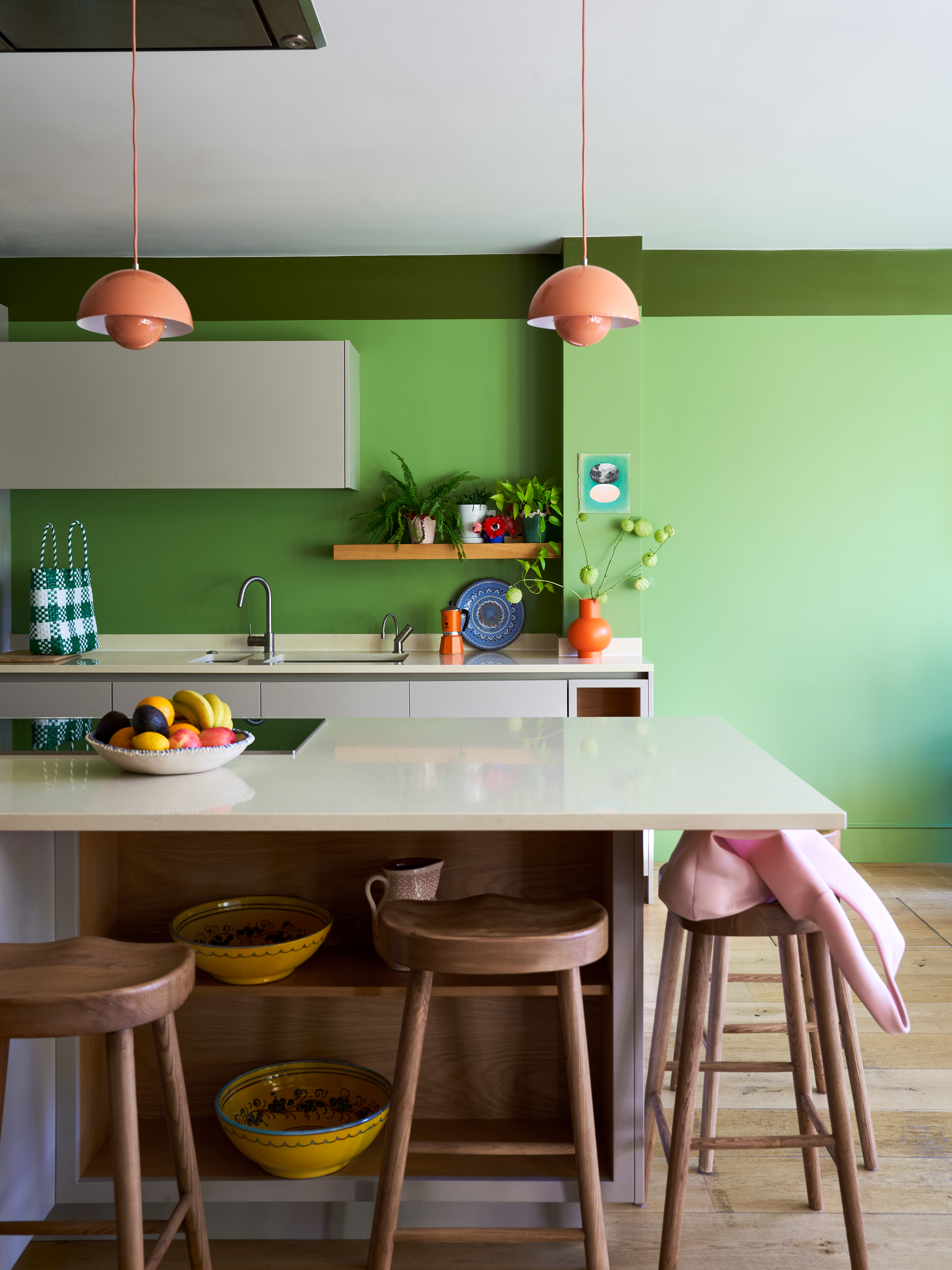
The versatility of Phthalo Green extends to its compatibility with other colors. Most greens and blues can be easily incorporated for a bold natural palette. For dramatic effects, colors like petrol blue, cobalt, oxblood red, or charcoal can be layered. To achieve balance in interior design, Phthalo Green's richness can be matched with clean lines, matte finishes, and minimalist materials, accented by cobalt, mustard, rose, or sage for a playful touch. Ultimately, Phthalo Green is presented as a color choice that impresses and inspires, standing out from emerald or hunter green with its moody, chic, and undeniably expensive-looking appeal.
#PhthaloGreen #InteriorDesign #LuxuryDecor #ColorTrends #HomeDecor #DesignTrends #JewelTones #NeutralColors #ElegantInteriors #PhthaloGreen #InteriorDesign #LuxuryDecor #ColorTrends #HomeDecor #DesignTrends #JewelTones #NeutralColors #ElegantInteriors
0 comment in total
 No comments yet
You may also like
This Shade of Green is a Designers' Secret for an Expensive-Looking Space — Here's What to Pair With It

How To Incorporate The Latest Color Trends in Your Home

Designers Weigh in on 'Very Peri'—Pantone’s Color of the Year 2022
The Best Luxury Paint Brands
What's replacing sage green in 2024? 5 on-trend variations of this nature-derived hue

A New Interior Color, “Hyper Green” is Here — And if It's Good Enough for Gucci, You've Got Our Attention
14 Best Green Paint Colors

Lick Paint Will Transform the Mood in Your Home Through Color Psychology

I Think I May Have Just Discovered the Most Timeless Green Paint Color
8 Green Paint Colors Interior Designers Swear By for a Bold and Fresh Home

5 best green paints that will always be classics, according to interior designers

These 6 Colors Will Rule Interiors in 2026, According to Experts

Going Green: Inside This Year’s Color Craze
Green is the color of 2023 – these designer-approved ways to use it are bold and beautiful
This "trend-defying" kitchen color could make your home sell for thousands of dollars more, say experts
What Is the Most Expensive-Looking Blue? 7 Specific Shades to Paint Walls That Will Always Elevate Your Home
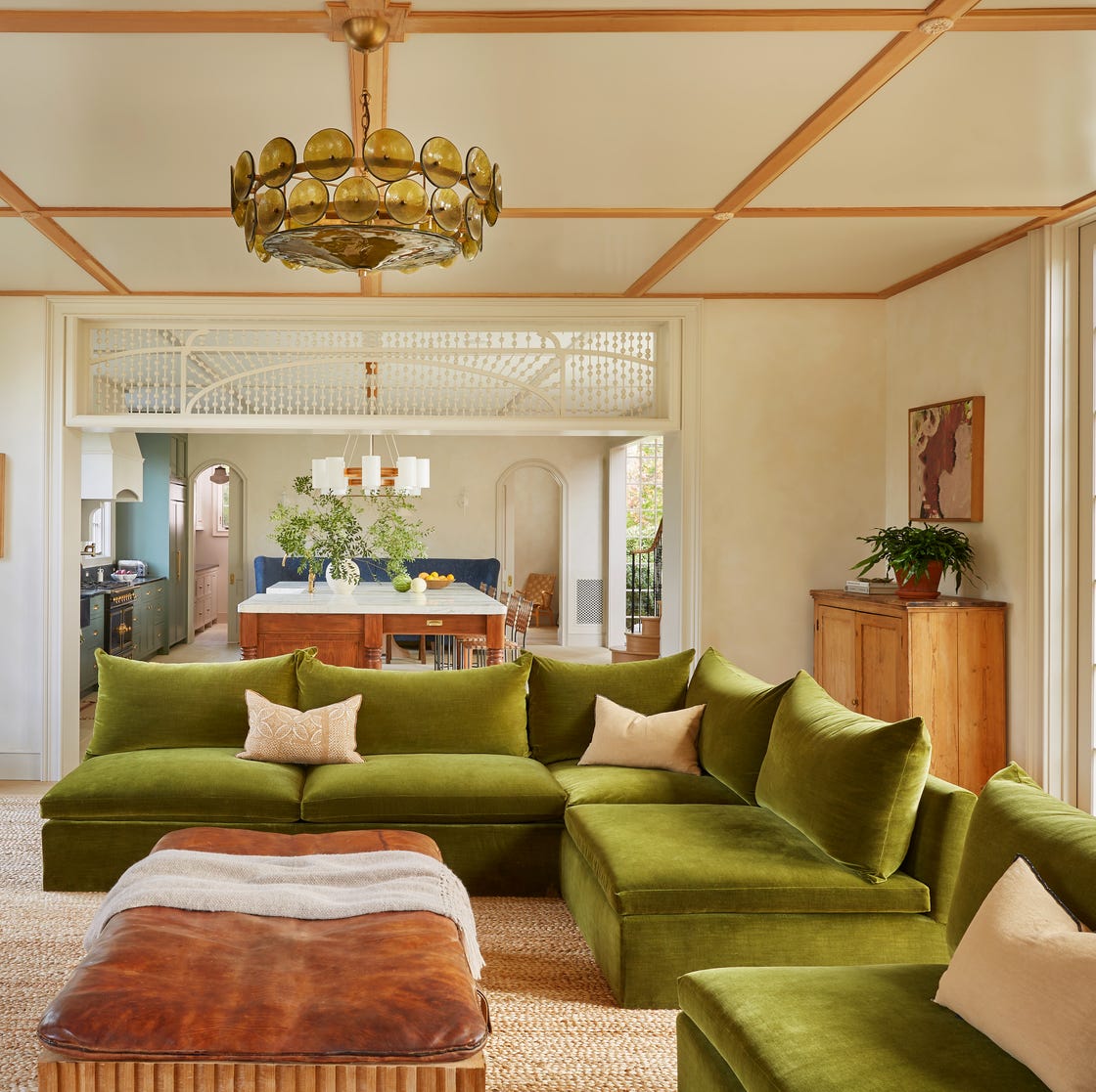
37 Unexpected Colors That Pair Perfectly With Green, According to Designers
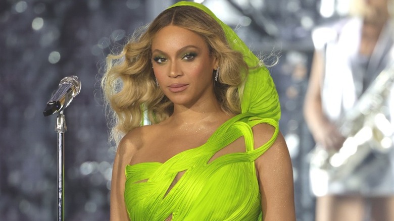
Vibrant Green Is The Color Trend That Comes Celeb Approved


10 of the best green wallpapers
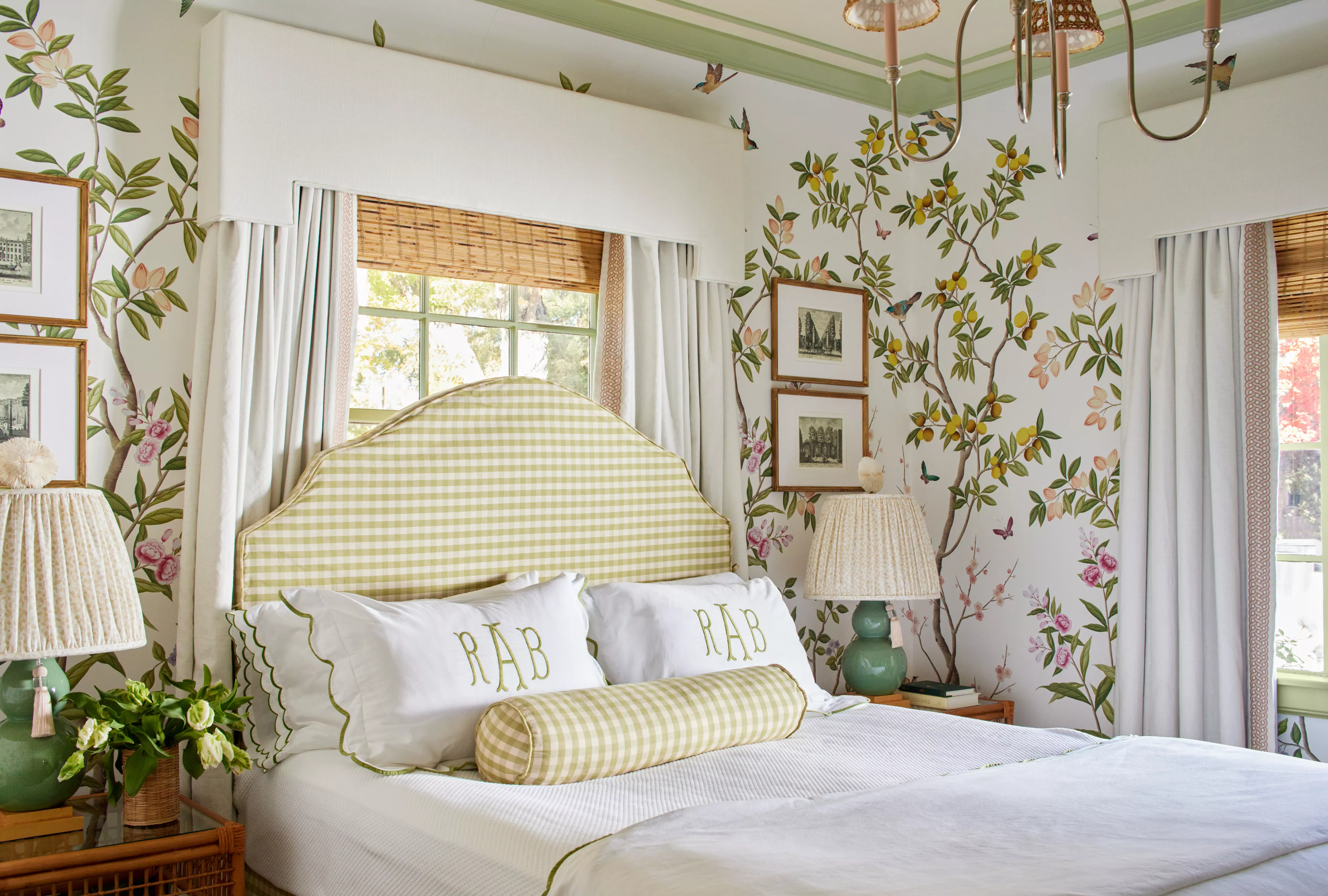
51 Green Color Schemes Perfect for Living Rooms, Bedrooms, and More