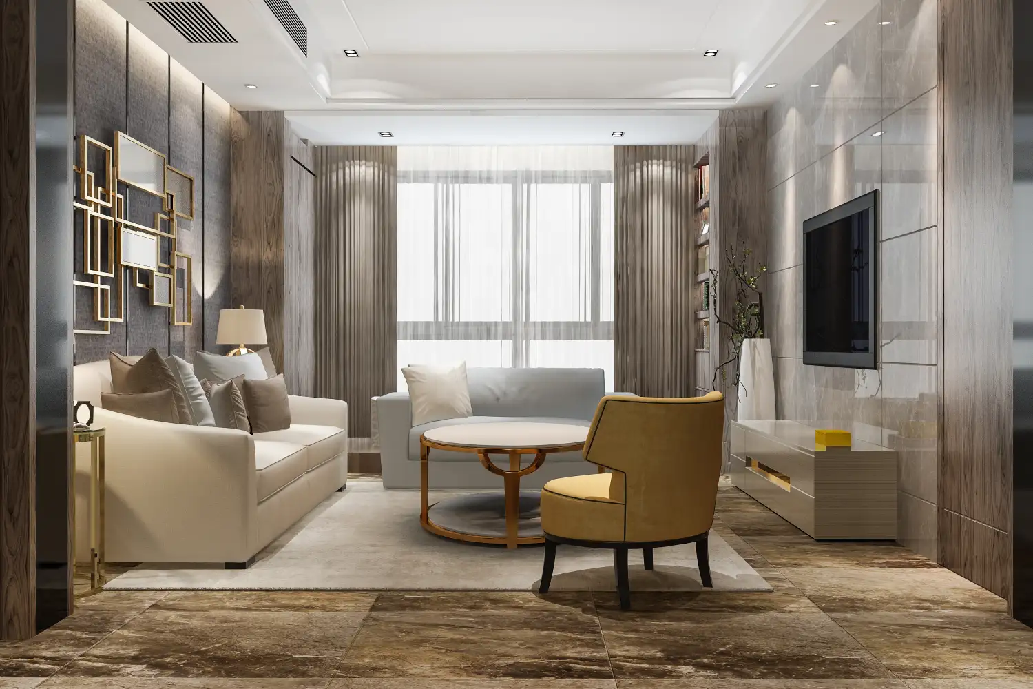
This Paint Sheen Makes Any Room Look Tacky, Designers Say—No Matter the Color
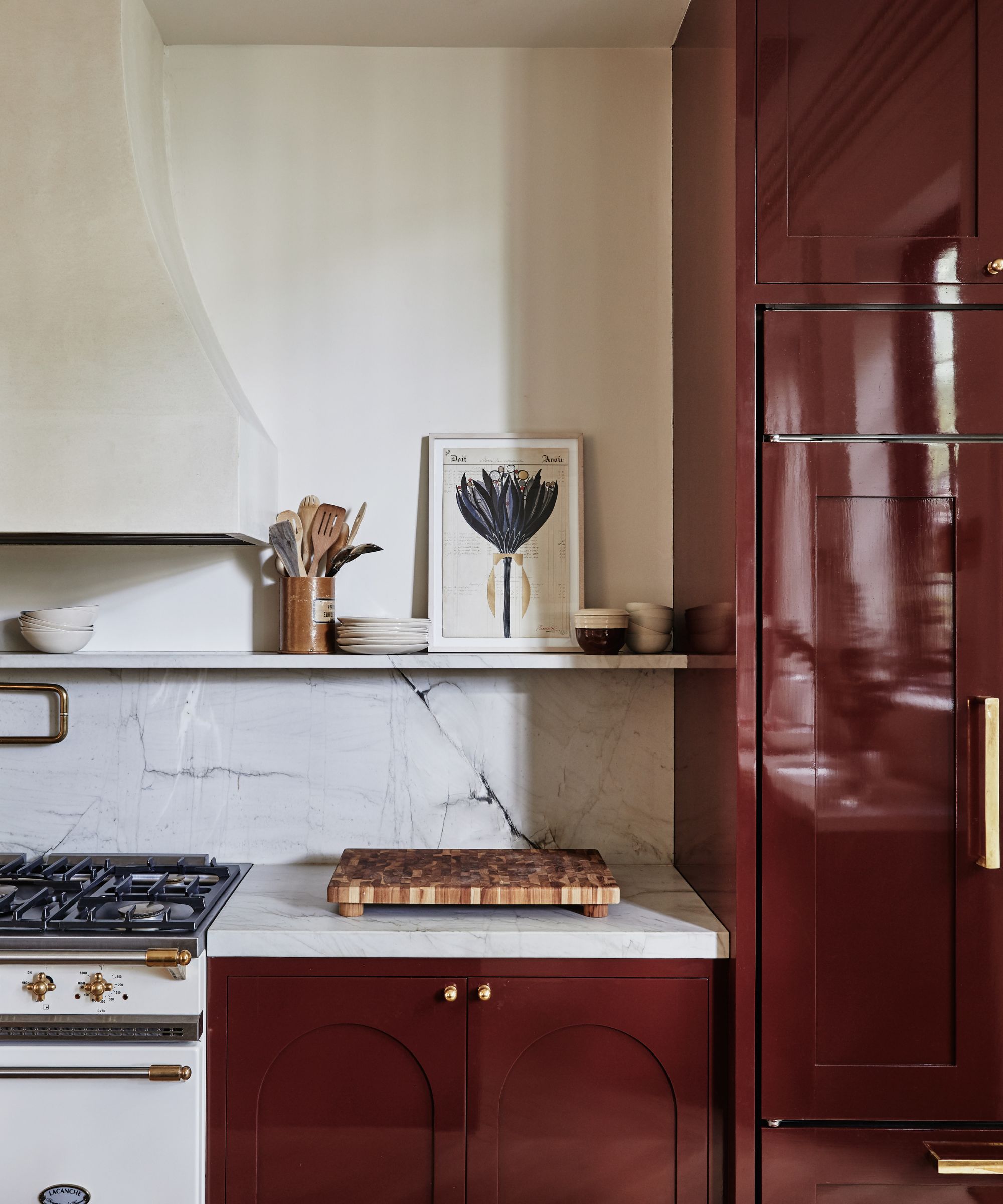
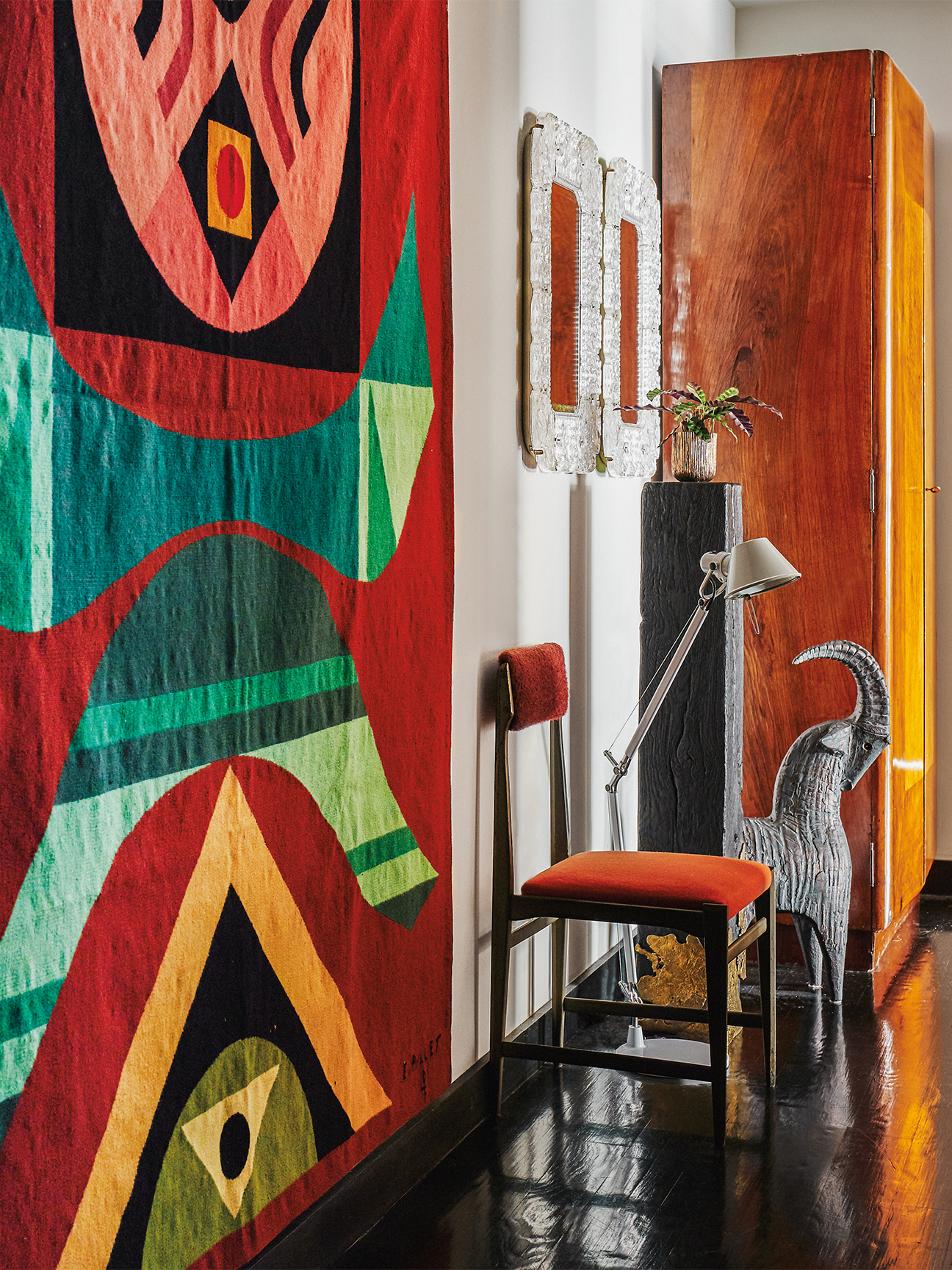
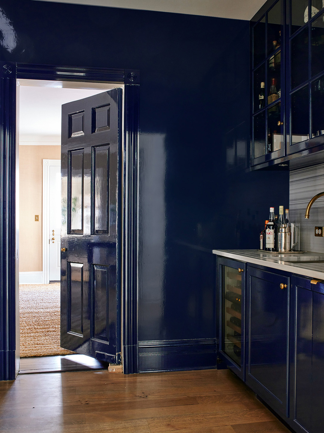
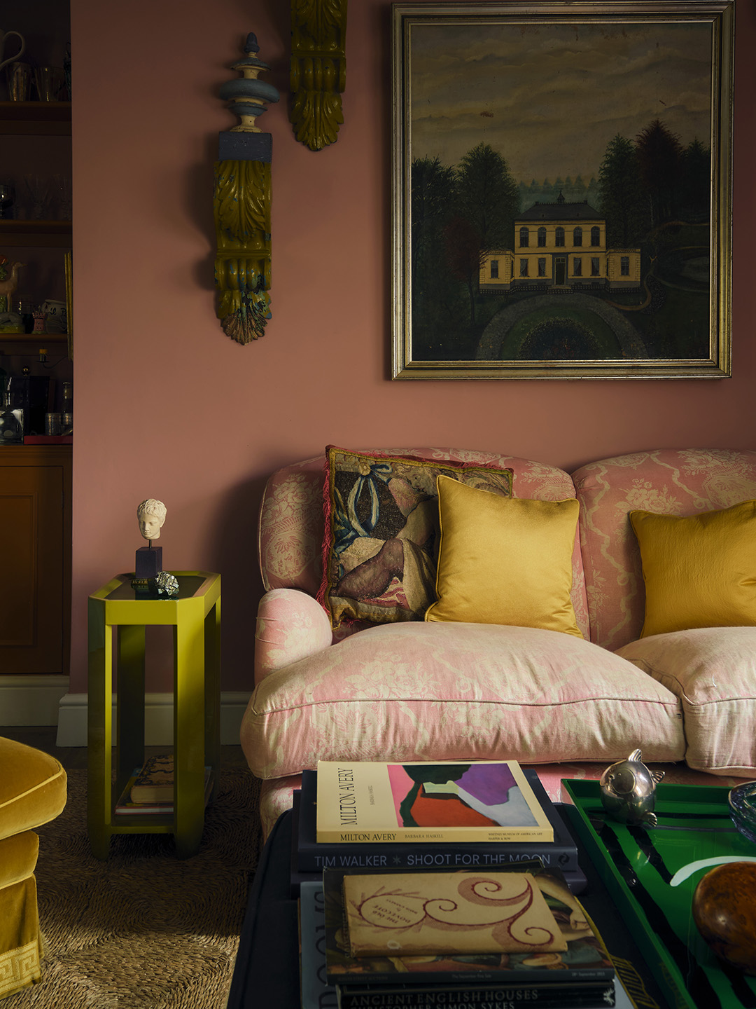
Choosing the right paint finish is as crucial as selecting the perfect color for a home's interior, yet it often presents unique challenges due to how different finishes can appear in various settings and lighting conditions. Designers highlight that certain paint sheens can inadvertently diminish a room's aesthetic, making it look less refined or even tacky. One particular finish that designers consistently advise against for large wall surfaces is high-gloss paint.
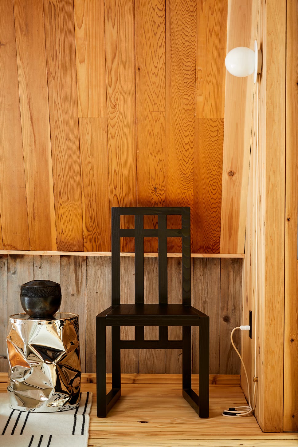
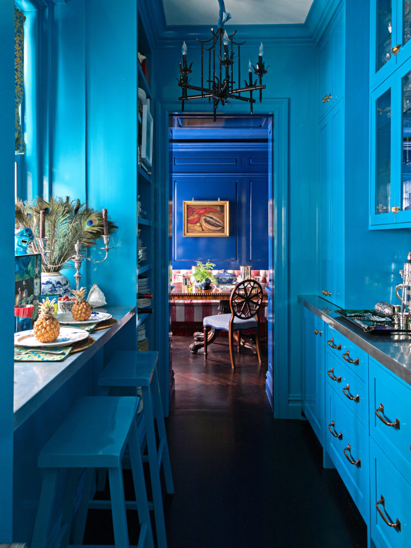
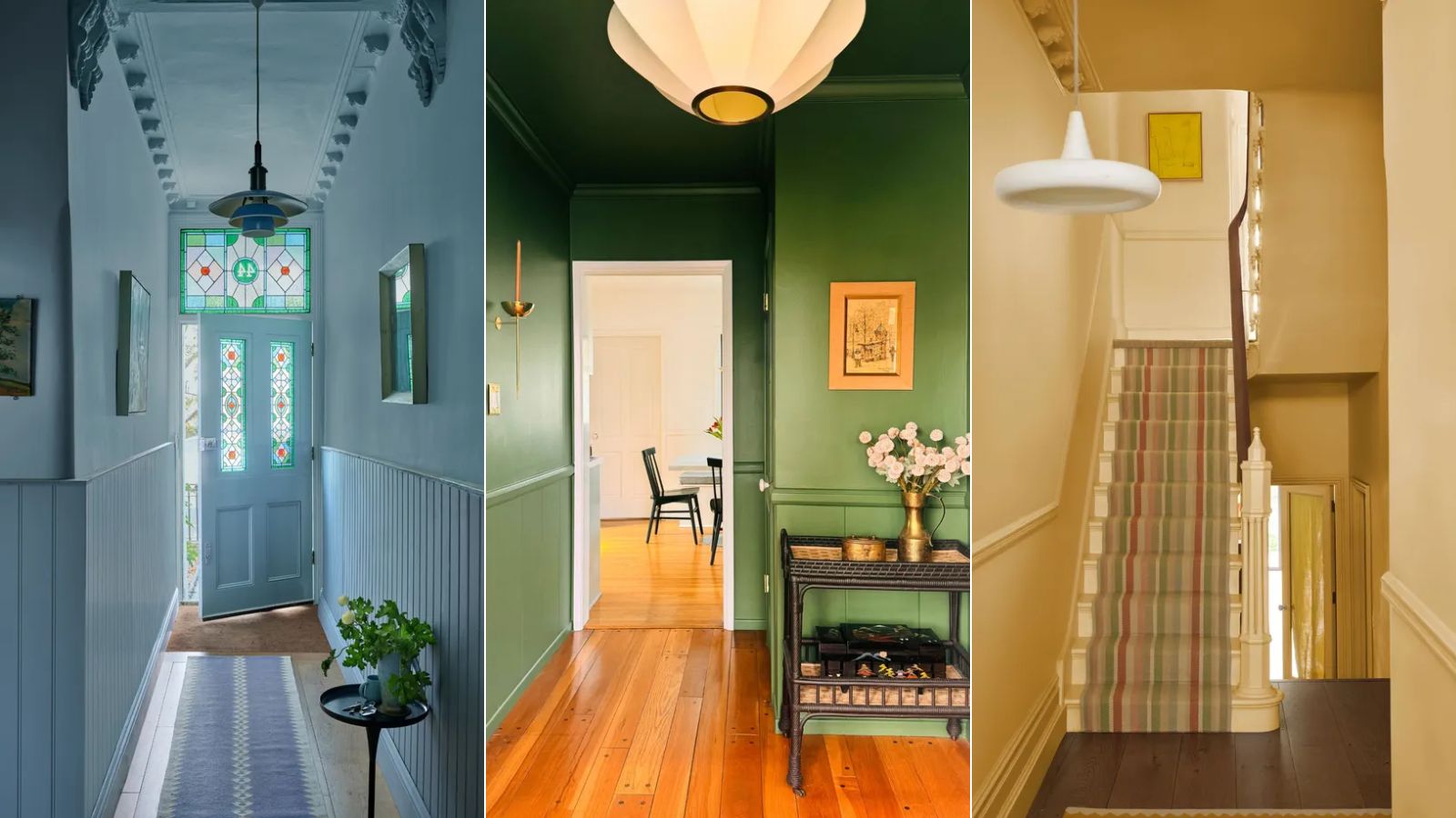
High-gloss paint is problematic primarily because its reflective nature magnifies every imperfection on a wall. Uneven seams, previous repairs, and even minor texture variations become highly visible, undermining the perceived quality of the surface. This unforgiving characteristic also makes touch-ups exceedingly difficult, as achieving a seamless repair requires exceptional precision and expertise. Consequently, applying high-gloss paint on walls is generally not a suitable DIY project and is best left to professional painters experienced with such demanding finishes. Despite its drawbacks for expansive areas, high-gloss can be effectively utilized to accentuate specific features, such as a banister, where its reflective quality can create a statement-making moment.
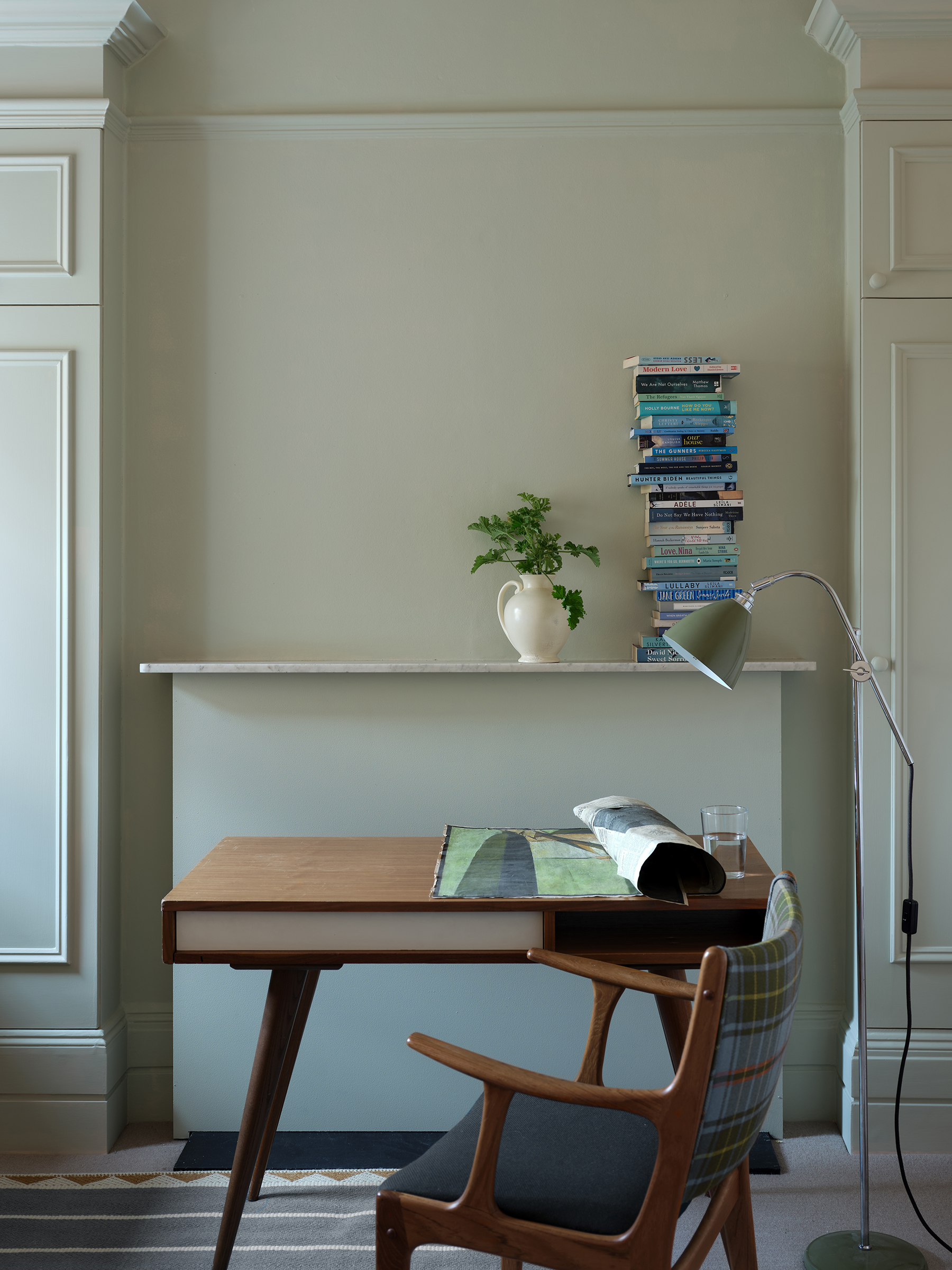
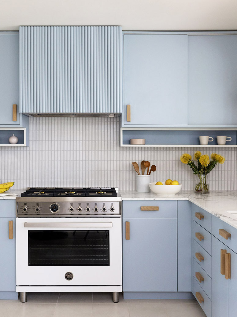
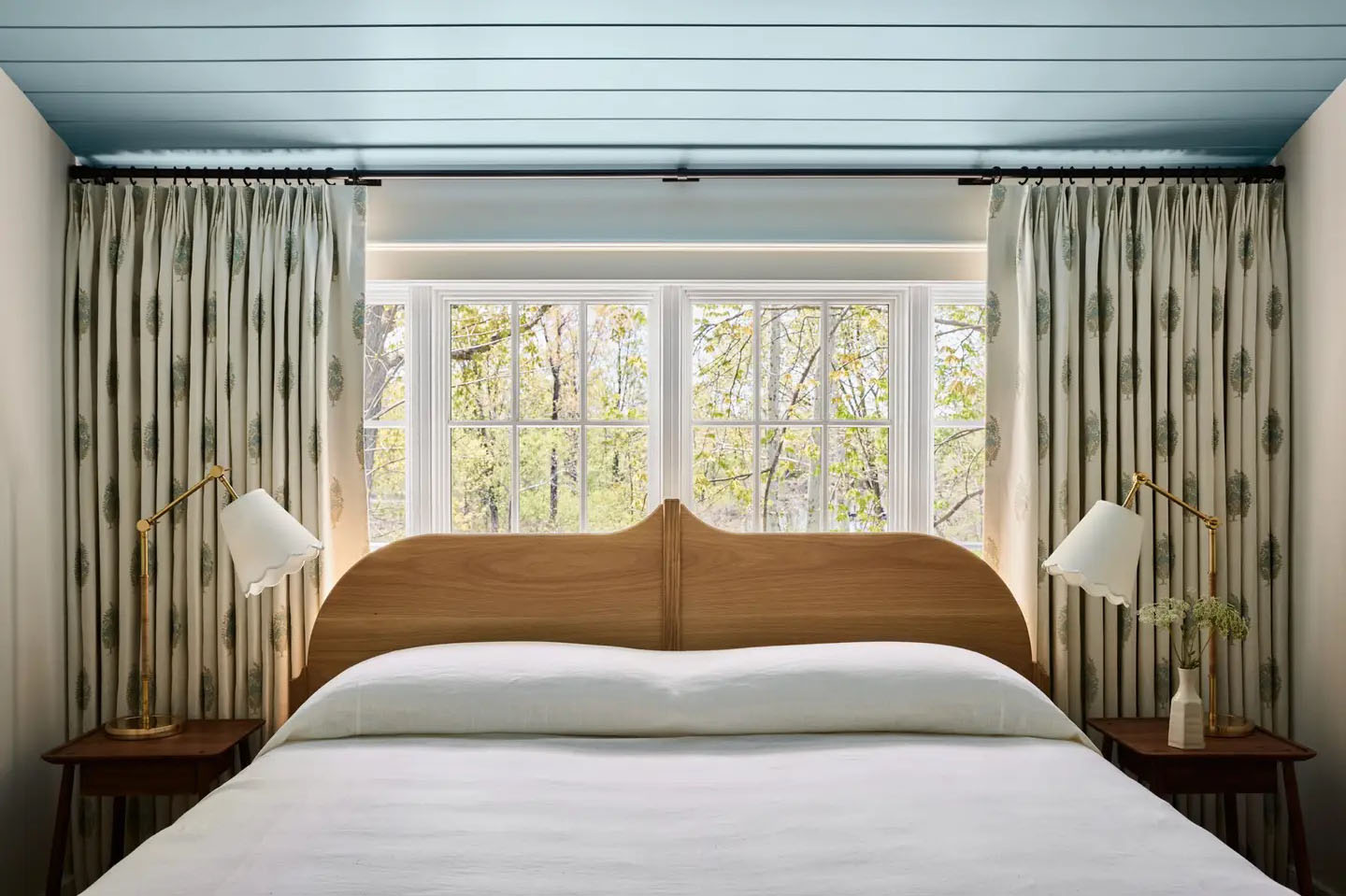
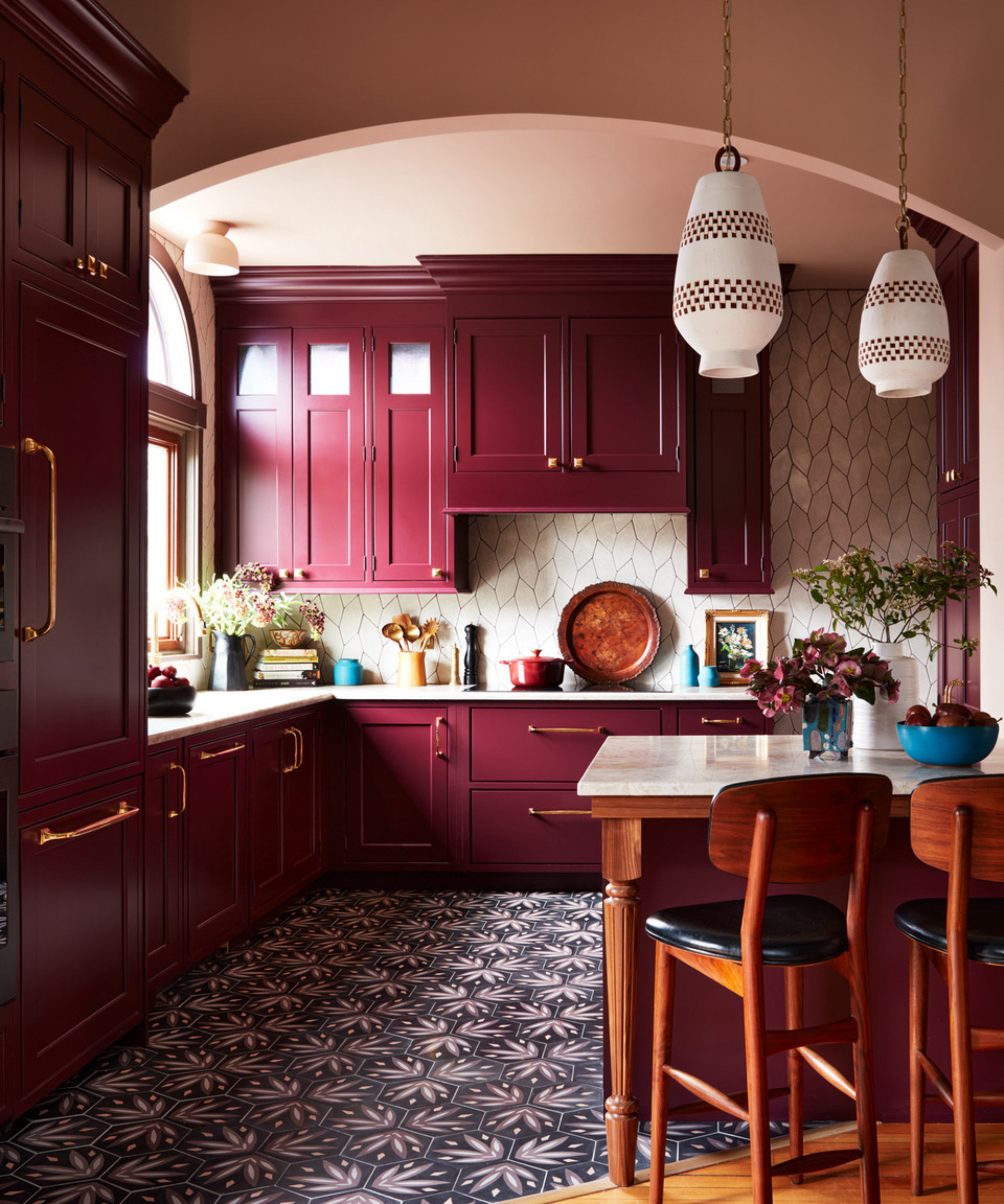
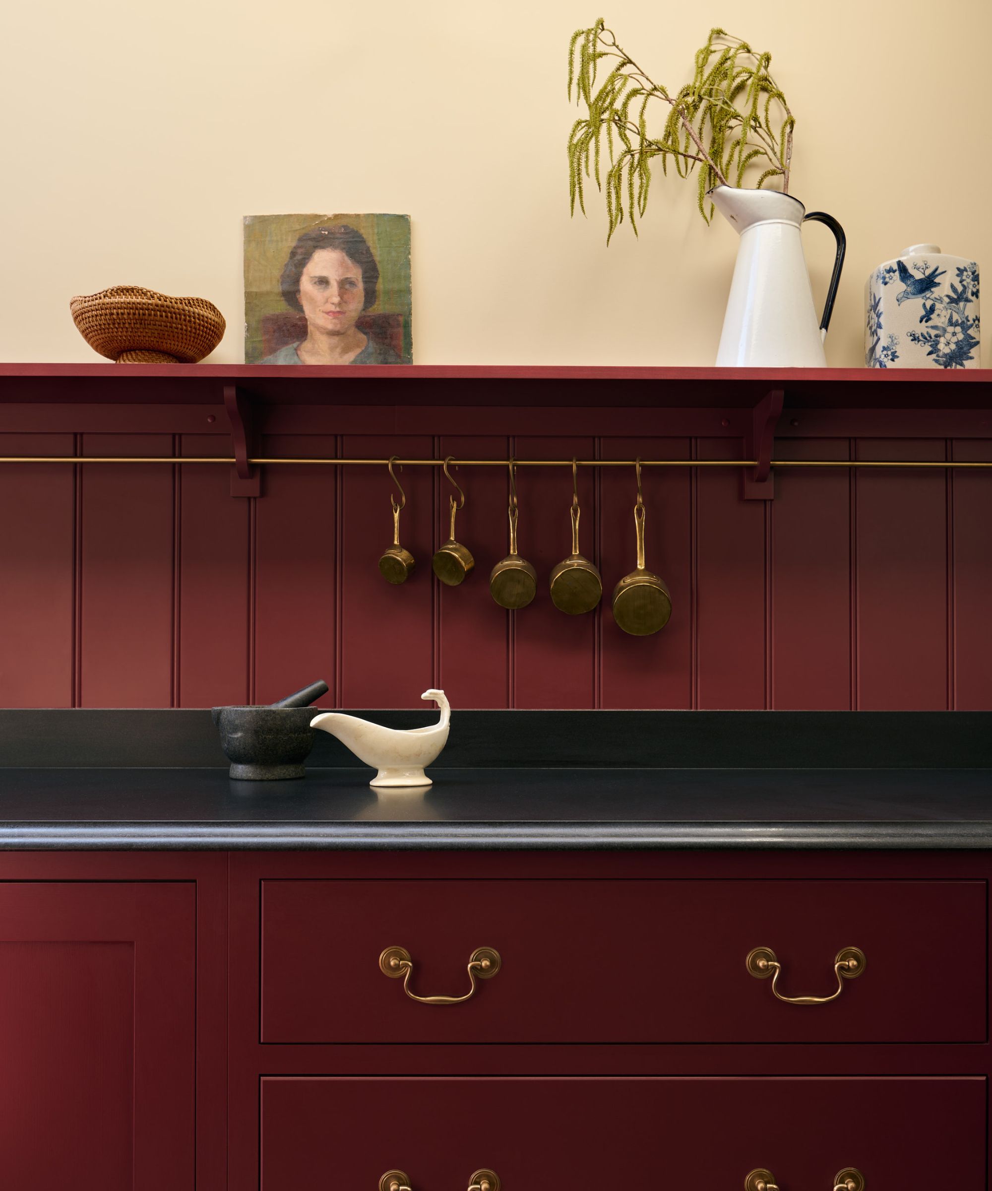
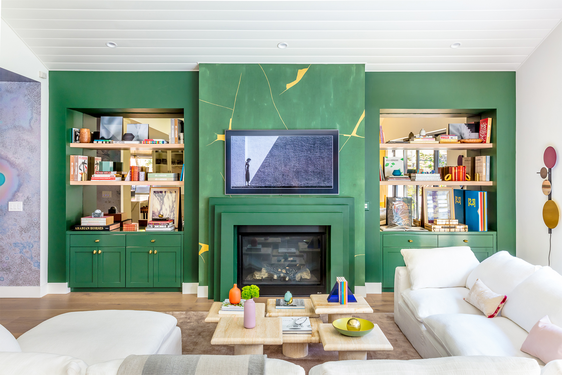
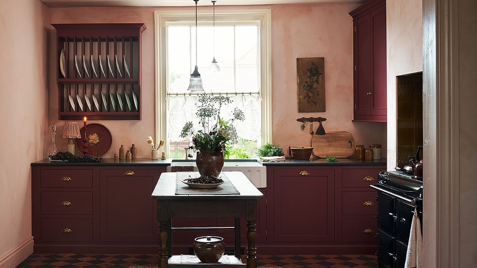
Designers recommend tailoring paint finishes to the specific needs of each room. For instance, high-traffic or moisture-prone areas like kitchens and bathrooms benefit from durable and easy-to-clean satin or semi-gloss finishes. In contrast, bedrooms and living rooms are better suited for matte or eggshell finishes, which diffuse light, fostering a calm and sophisticated atmosphere. If high-gloss walls are already present and repainting is not an immediate option, light sanding can help reduce the excessive shine. For renters or those seeking a less permanent solution, peel-and-stick wallpapers offer an alternative to cover and transform the appearance of high-gloss surfaces.
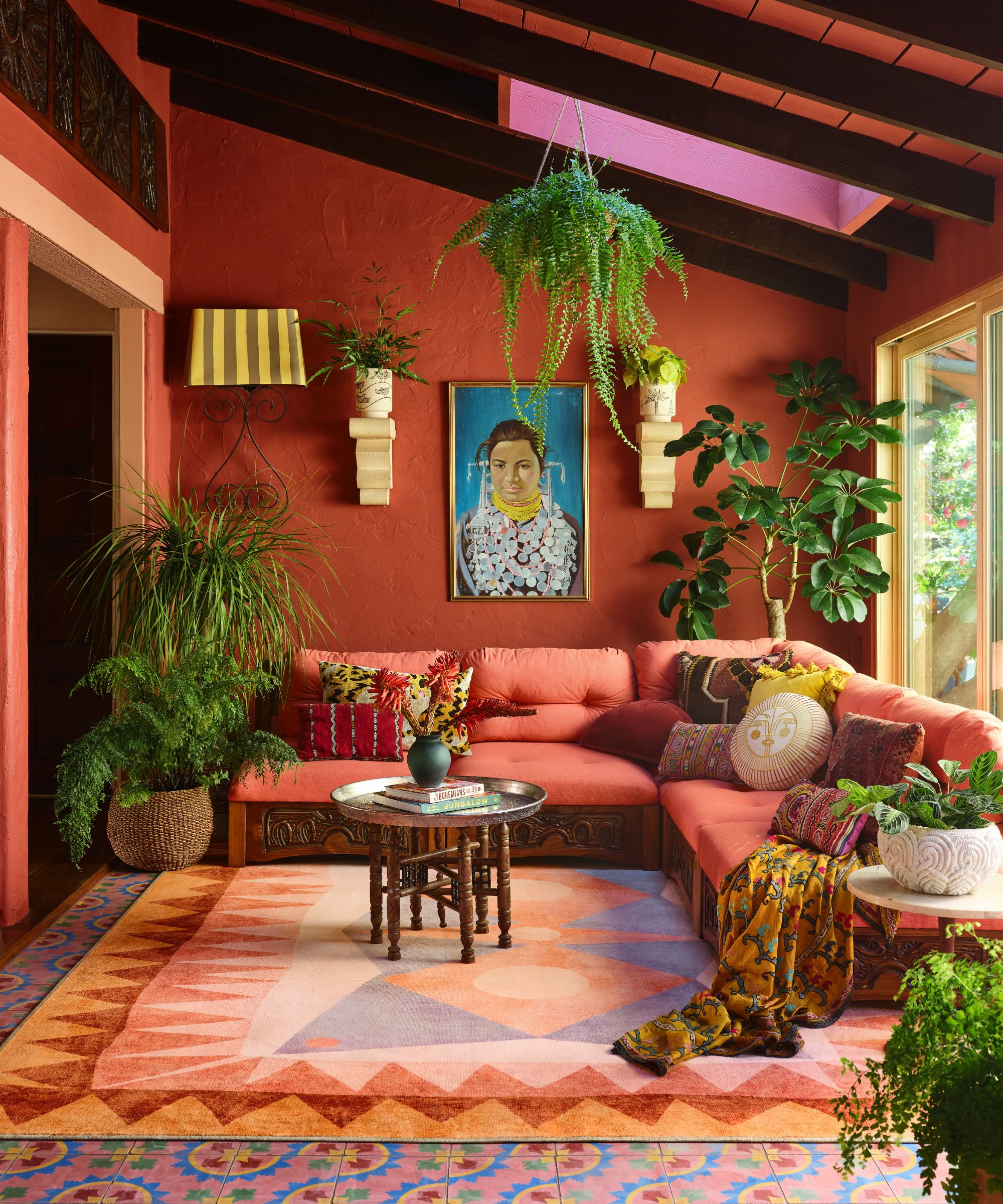
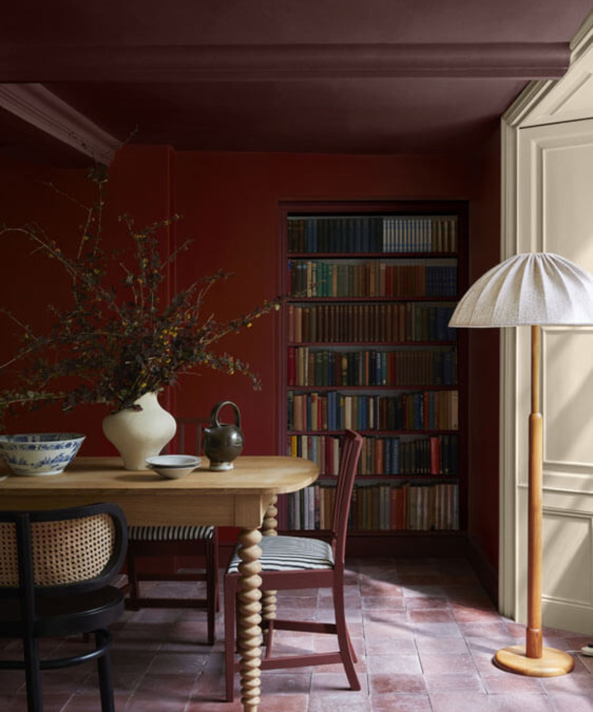
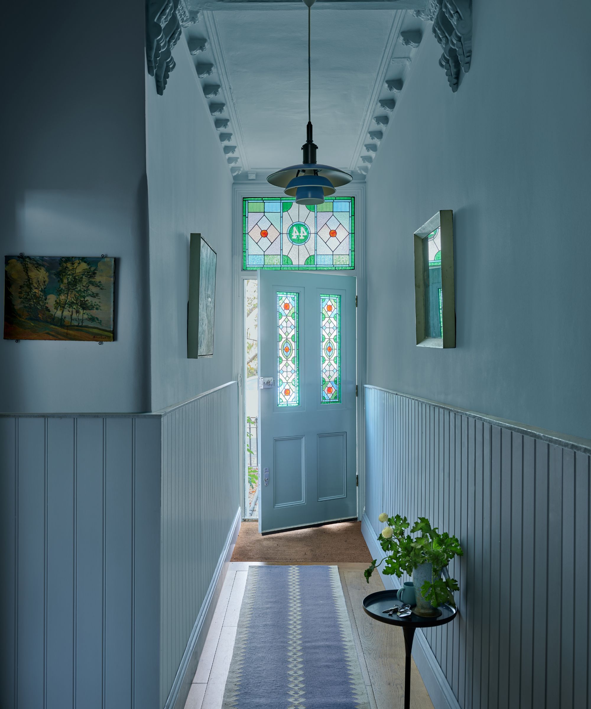
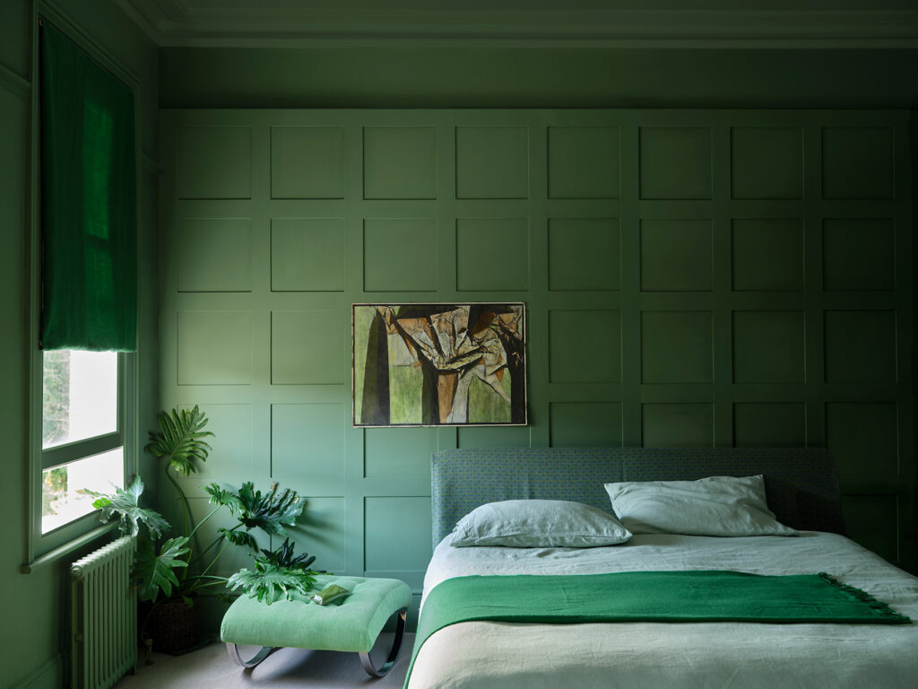
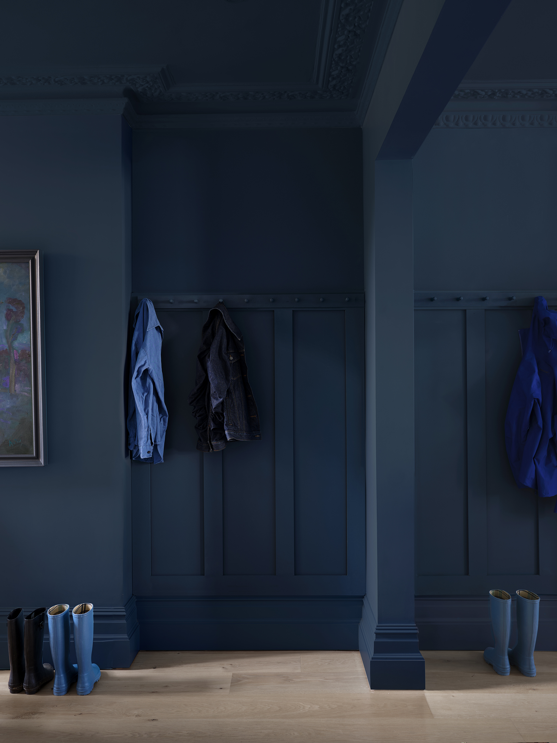
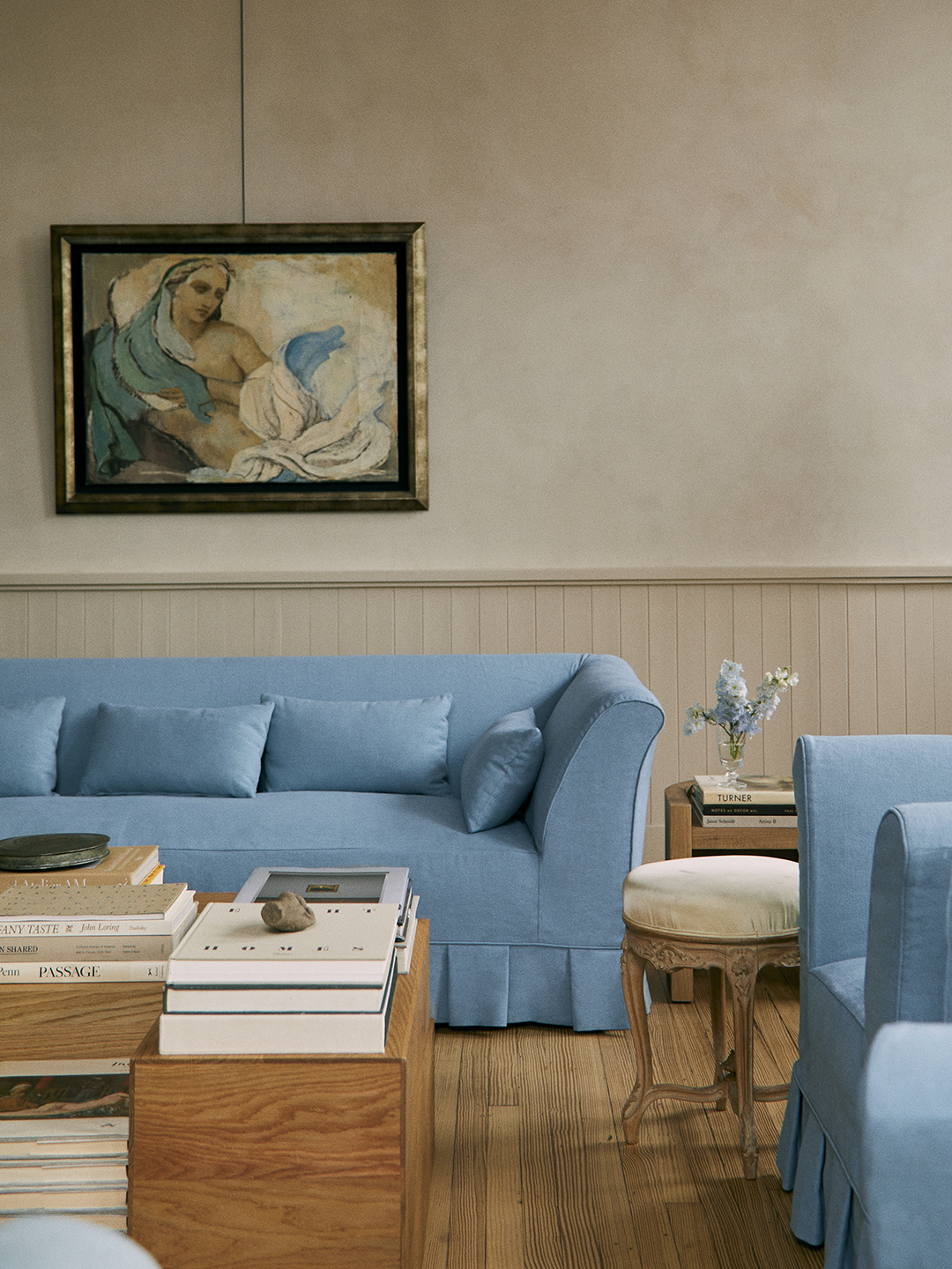
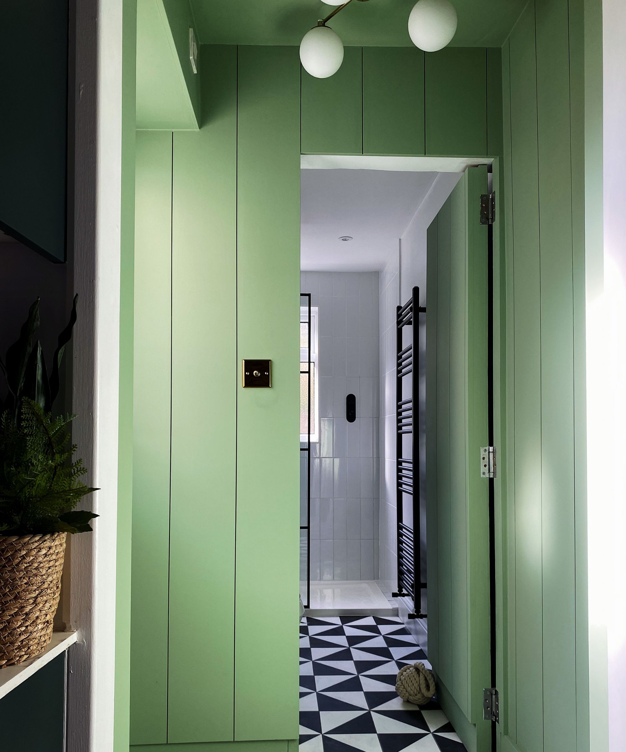
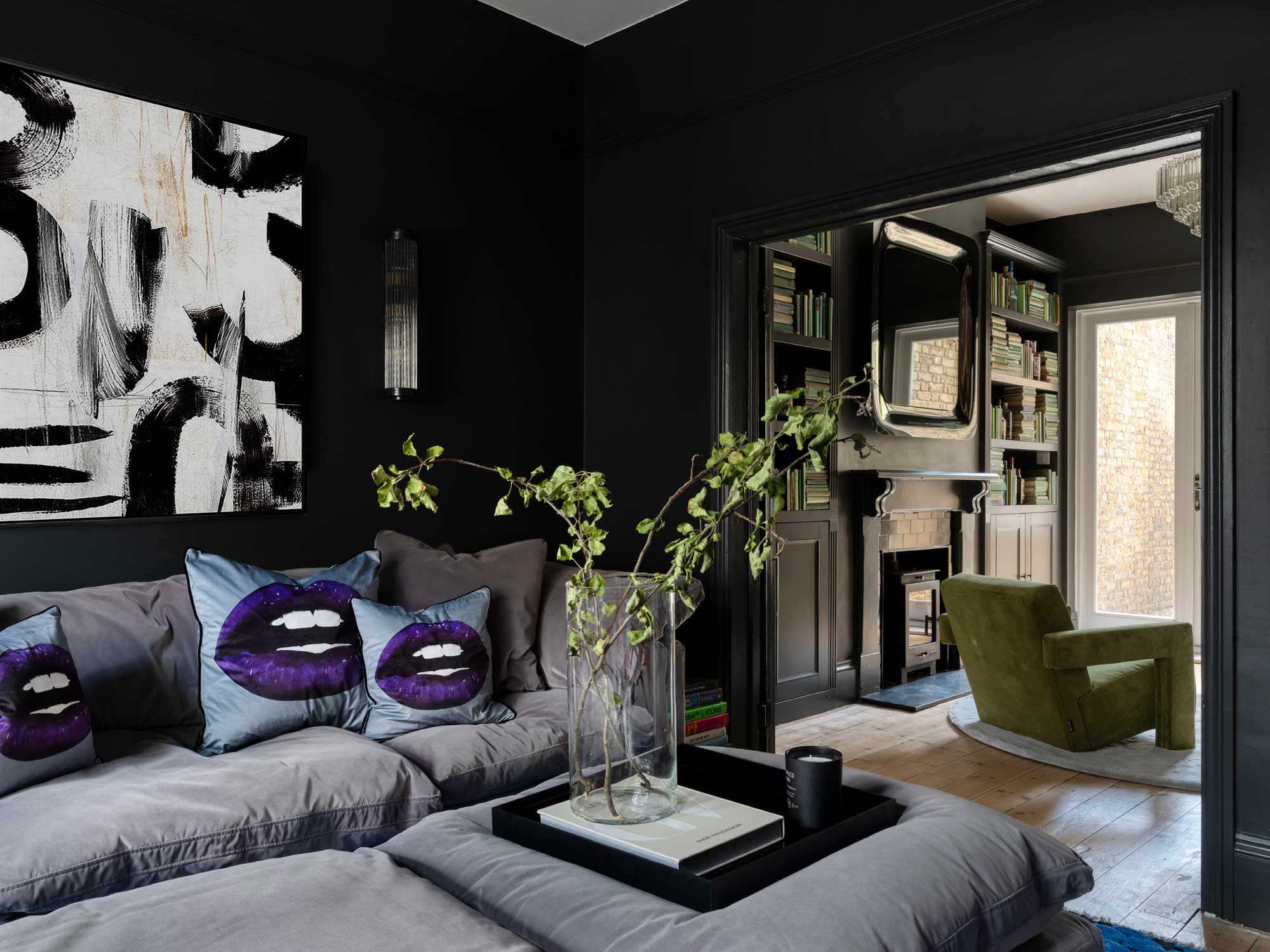
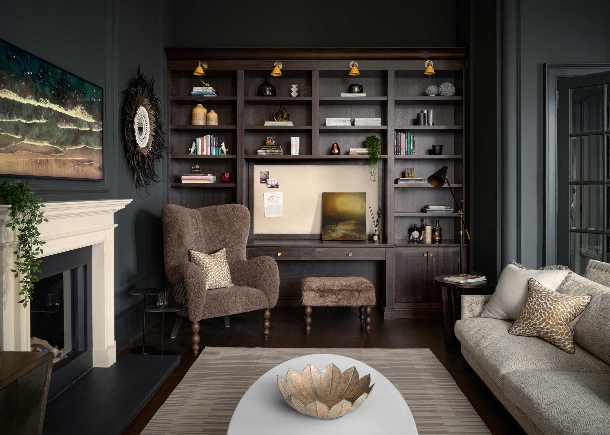
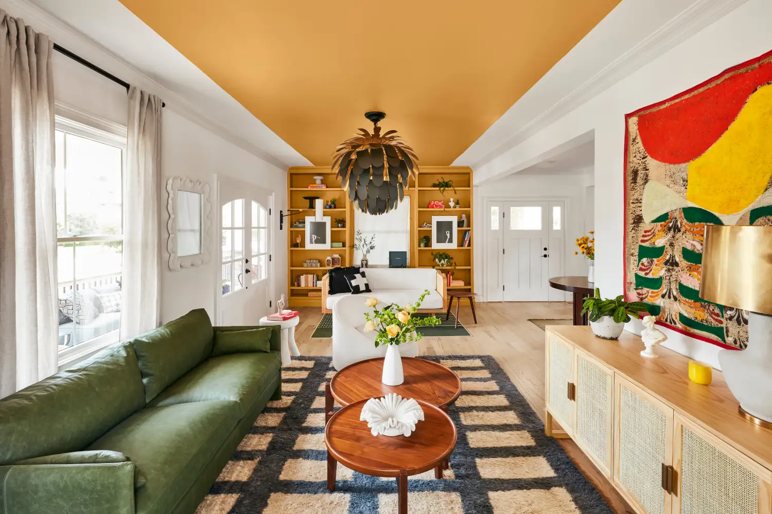
Beyond high-gloss, other paint choices can contribute to an unappealing aesthetic. Ultra-bright white, while often chosen to make rooms appear larger, can instead create a clinical and unwelcoming environment. Designers suggest that deep, rich hues can paradoxically make a space feel more expansive by absorbing light and blurring boundaries, adding depth. The widespread 'millennial gray' is also noted as an outdated choice; designers now favor richer, more dramatic colors like inky navies or blues with green undertones, which offer layered depth and sophistication without making a room feel closed off.
Finally, harsh, flat hues that lack nuance can leave a room feeling devoid of depth and character. The selection of colors with subtle undertones that reflect light gently is encouraged to ensure the palette remains fresh, timeless, and prevents the space from appearing sterile or uninspired. Ultimately, a thoughtful approach to both color and finish selection is essential for creating a cohesive and appealing home interior.
#InteriorDesign #PaintFinishes #HomeDecor #DesignTips #WallPaint #HighGlossPaint #HomeImprovement #PaintColors #InteriorDesign #PaintFinishes #HomeDecor #DesignTips #WallPaint #HighGlossPaint #HomeImprovement #PaintColors
0 comment in total
 No comments yet
You may also like
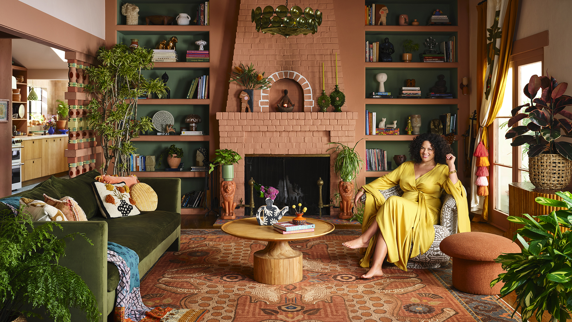
Designer Justina Blakeney Says This Paint Color Flatters Everyone and Is Perfect for Drenching Rooms
This Game-Changing New Paint Finish Should Only Be Used If You Want to Drench Your Space in Color (and You Absolutely Should)

Rich colors and sumptuous textures are on designers' minds
Matte vs glossy

For a "Cool-Looking" Home, Designers Say Use This Finish

From Cabinetry to Upholstery, This Soothing Color Is About to Upstage Sage

Color makes a splash like never before in kitchens, baths
Designers Are Taking Lacquer Way Beyond Trays and Dressers | domino

If you color drench any room make it this one

4 Paint Colors That Magically Make Low Ceilings Look Higher

This Unexpected Luxury Color Is Quietly Taking Over Kitchens Everywhere
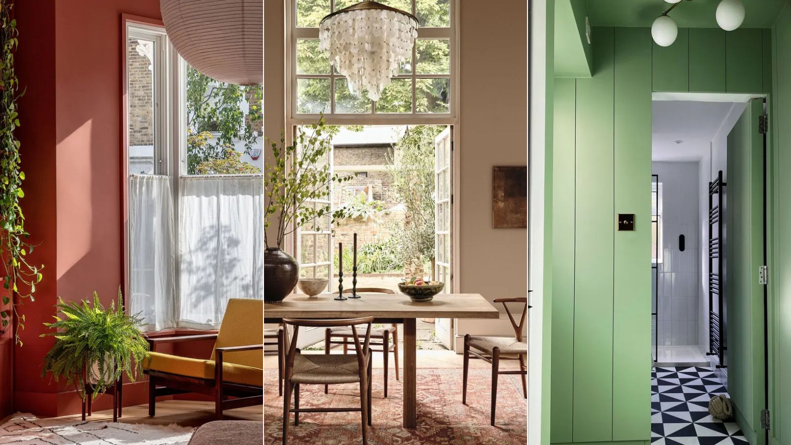
Interior Designers Say the Key to Creating a Joyful Space Is to Add in This One Color
This One Color Instantly Boosts Joy in Any Room, According to Interior Designers
Color drenching has never been simpler with this color expert's one-paint-finish approach for the whole room
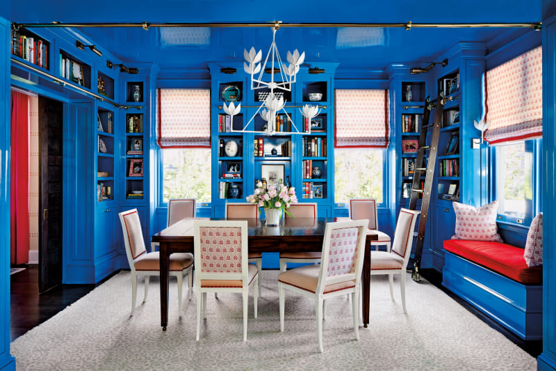
This Once-Fussy Finish Is Getting a Reputation Revamp

Styling Shelves: Your Expert (Five-Point) Guide

Deeper, moody colours and precious jewel tones are in style this year
How to use paint to change the size and shape of your room

Designers LOVE Pairing These Unexpected Colors With This Sophisticated Hue

We Asked Designers Which Paint Colors Are Best for Brightening a Dark Room—6 Top Picks