1/2
How to Nail This Tricky But Surprisingly Trendy Farrow & Ball Paint Color

The blog post focuses on Babouche No. 223, a yellow paint color by Farrow & Ball, which the brand's color curator, Joa Studholme, describes as "uncomplicated" and capable of making rooms feel full of sunshine. Despite yellow's reputation for being a challenging color to use in interiors, particularly in paint form, the article argues for the appeal of Babouche No. 223. It suggests that while yellow can be tricky, this specific shade offers a cheerful alternative to more muted tones like sage or greige.
A key recommendation for effectively incorporating Babouche No. 223 is to integrate the paint into a pattern, such as a checkered floor. The article highlights an example of a plant-filled bathroom featuring a yellow checkered floor where the design extends up onto the tub, creating a modern optical illusion. This technique is presented as a budget-friendly alternative to expensive marble or tile, achieved with paint and stencils. The resulting aesthetic is described as evoking "spa vibes" rather than an overwhelming "Big Bird" effect, indicating a sophisticated use of the color.
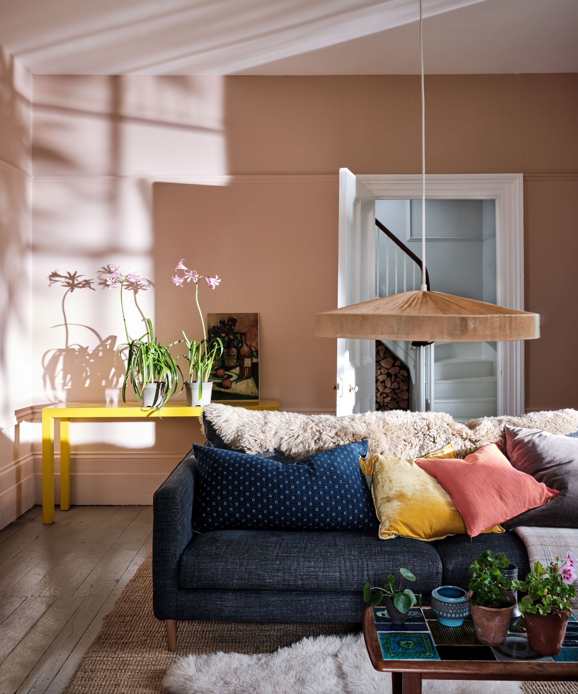
For those hesitant to apply the bold yellow shade across large surfaces, the article provides alternative ways to introduce the color into their decor. It suggests incorporating smaller, sunny-colored items to infuse light and cheer on a more manageable scale. The author then curates a selection of products that embody the bright and cheerful essence of Babouche No. 223 without requiring a full room repaint. These items include a Palo Modular 2-Seater Sofa + Armrest, a Trellis Planter in yellow, a 14in Pleated Daun Cotton Lampshade, and Pill Switch Plates. Each product offers a distinct way to bring the sunny hue into a living space, ranging from furniture to decorative accents.
The article also touches upon the general perception of yellow as a cheerful color, while acknowledging its common challenges in interior design. It encourages readers not to be intimidated by the vibrancy of Babouche No. 223, presenting it as a classic take on the hue that can be successfully integrated into various home settings with thoughtful application. The discussion aims to demystify the use of this particular shade and empower readers to experiment with it, whether through extensive painted patterns or subtle decorative elements.
Ultimately, the piece serves as a guide for embracing a vibrant, trending paint color, offering practical advice and product suggestions to help readers navigate its application effectively. It reassures potential users that a bold color choice like Babouche No. 223 can be both stylish and accessible, provided it is approached with creative and strategic design considerations.
#FarrowAndBall #PaintColor #YellowDecor #InteriorDesignTrends #HomeDecor #BaboucheNo223 #ColorInspiration #DIYDecor #DesignTips #FarrowAndBall #PaintColor #YellowDecor #InteriorDesignTrends #HomeDecor #BaboucheNo223 #ColorInspiration #DIYDecor #DesignTips
0 comment in total
 No comments yet
You may also like
This Farrow & Ball paint color is trending, but it's tricky to decorate with – here's how the experts make it work

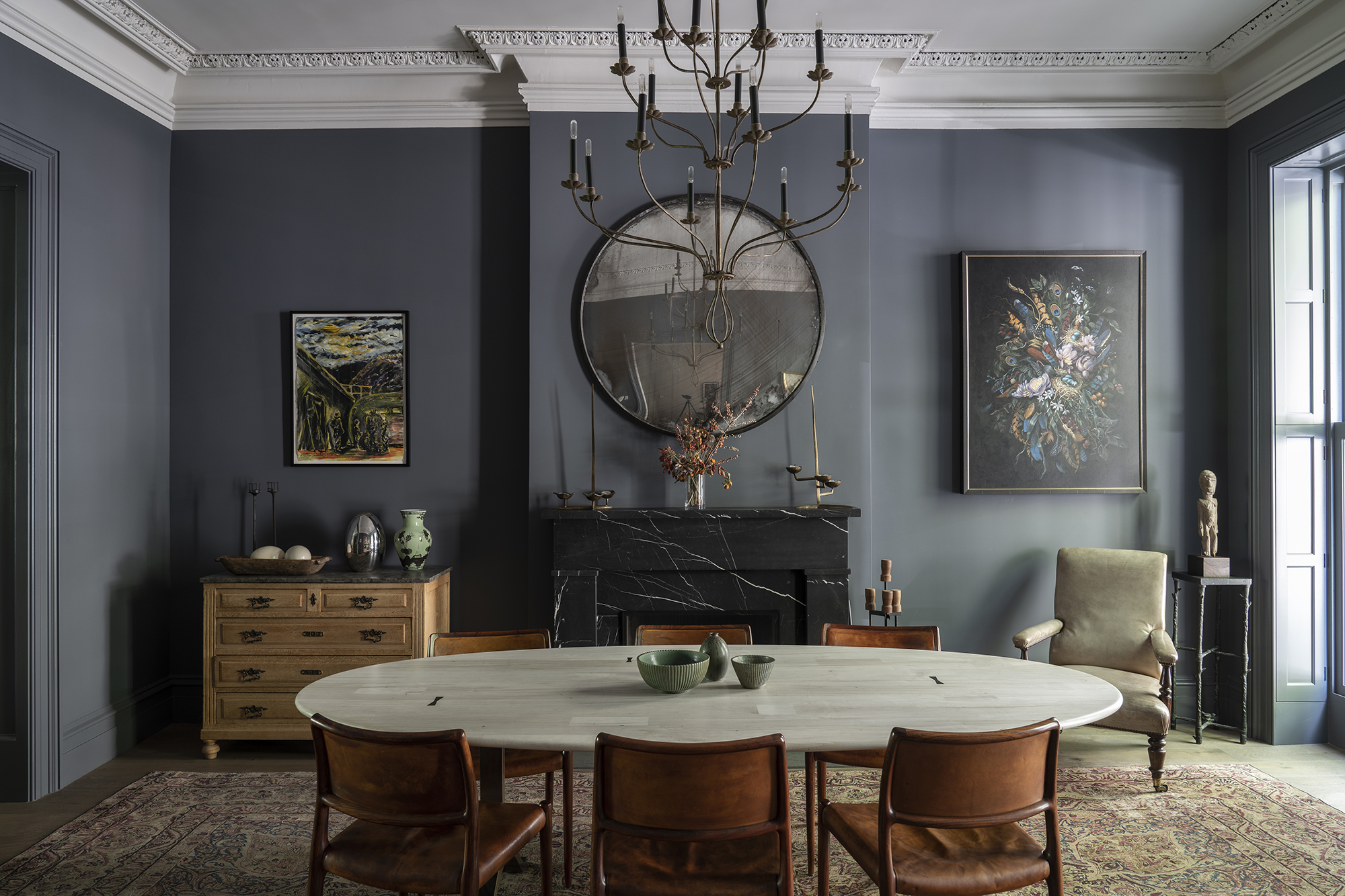
6 ways to decorate with Farrow & Ball Down Pipe, a dramatic black paint

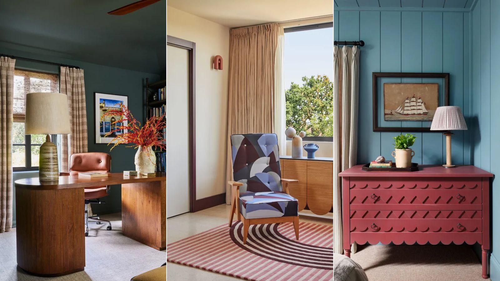
15 Farrow & Ball paint colors in real homes – from calming blues to warm neutrals

DUPES for Farrow & Ball Scallop, Kakelugn, Marmelo, Naperon, Duster, Sizing, and more

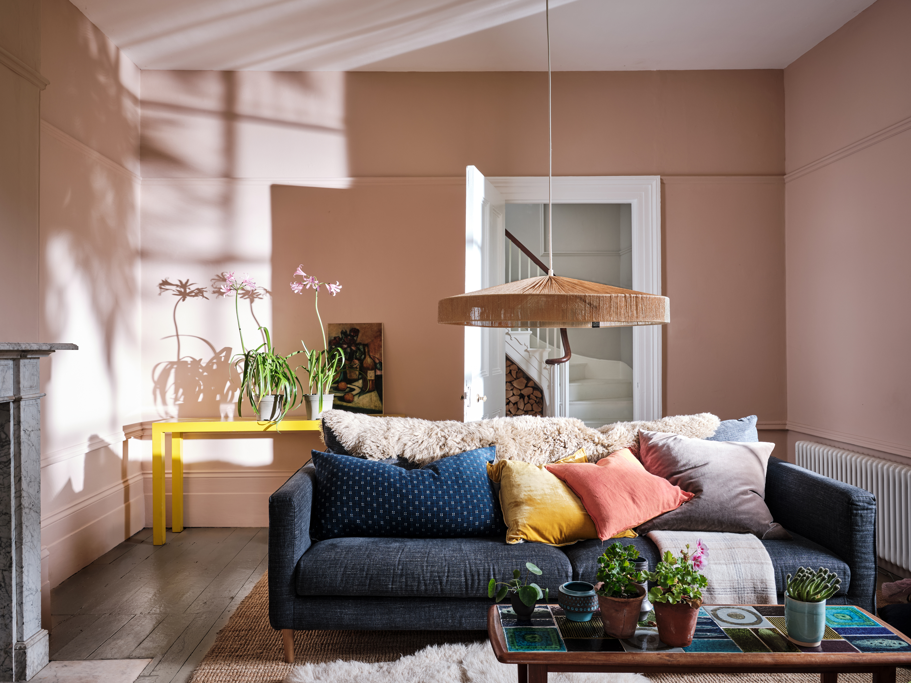
Farrow & Ball Setting Plaster ideas – how to use this muted pink paint color
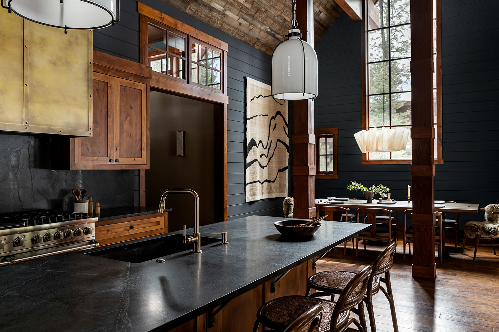
How to Use One of the Trickiest Paint Colors in Your Home

How to Bring the Milky Nail Trend to Your Decor for a Glowing, Iridescent Space

Farrow & Ball's new colors have just launched – we ask designers how to use this calm, yet colorful palette
How to decorate with Farrow & Ball Railings, the best-selling soft black paint
The 10 Best Farrow & Ball Paint Colors of All Time
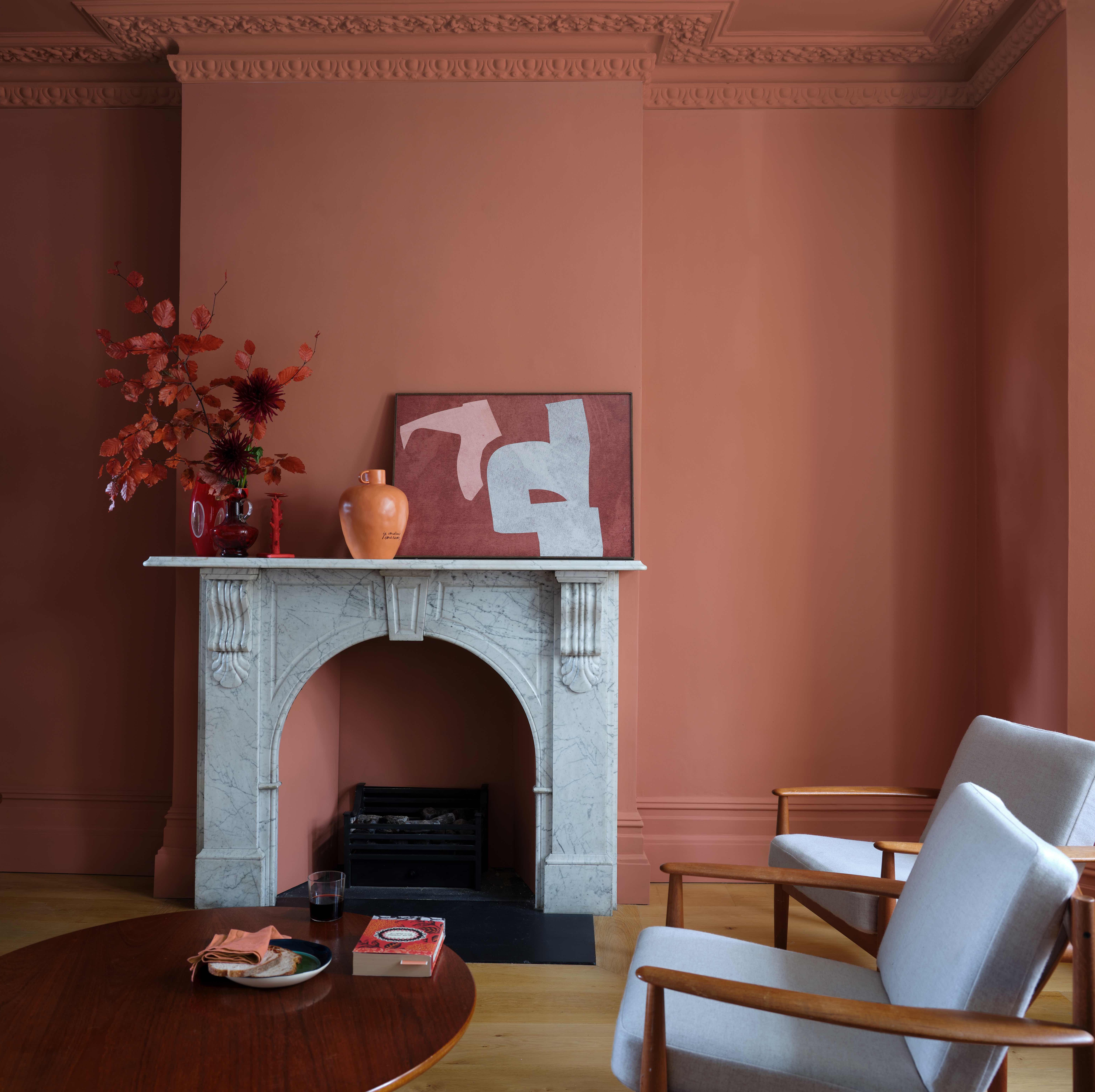
6 great ways to use colour drenching in your home
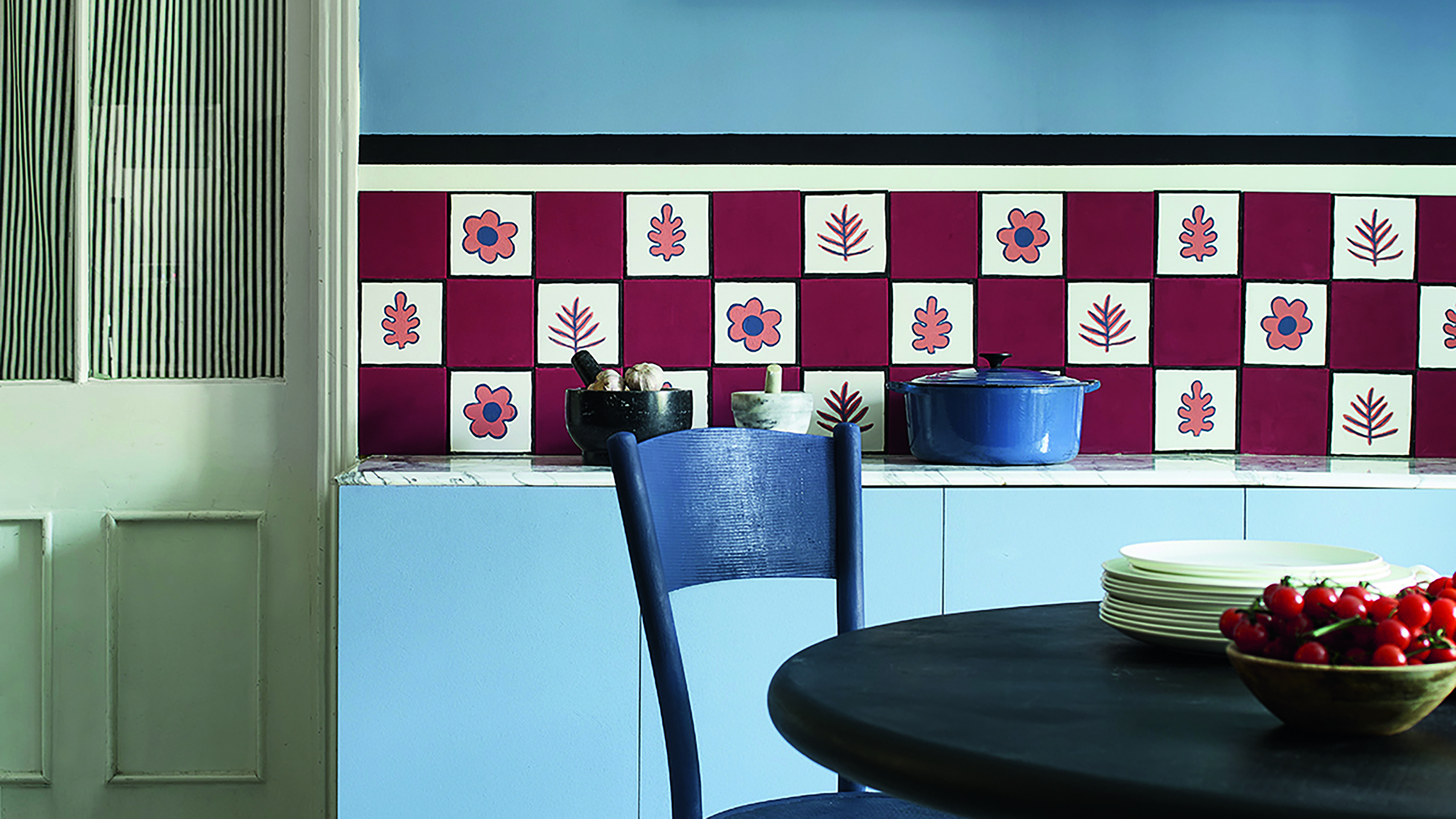
Primary colours are having a moment - but the secret to styling them is through 'unexpected' touches
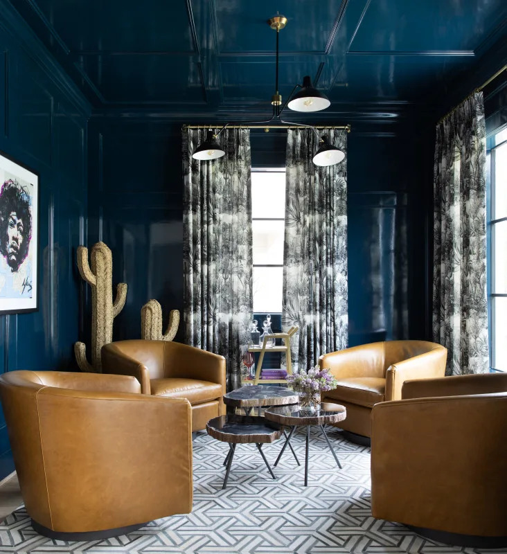
Color Drenching Is the Bold Paint Trend Taking Over—Here’s How to Nail It
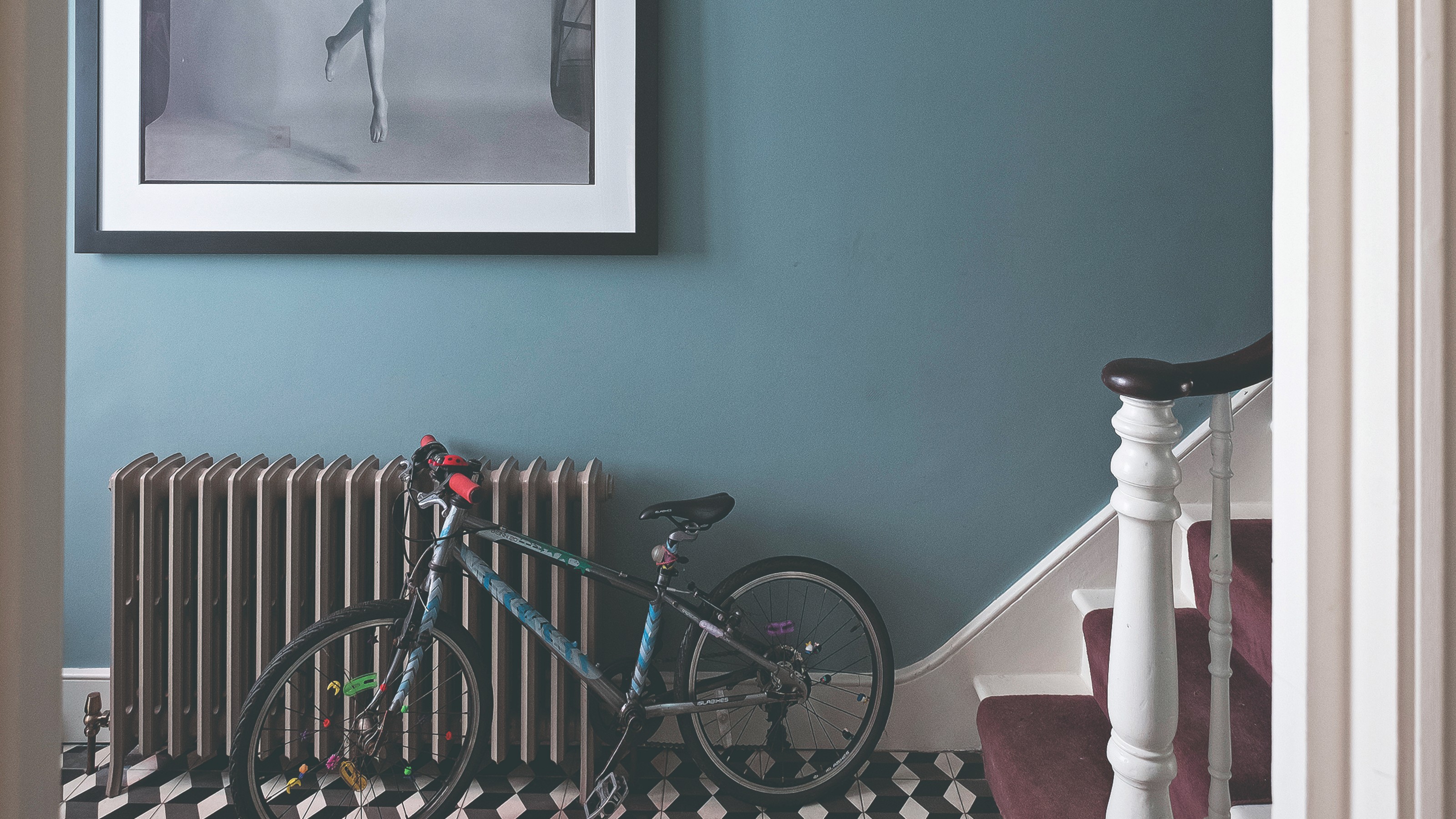
The 3 best Farrow & Ball paint colours for a hallway – the unexpected shades the experts recommend
These are Farrow & Ball's current 'most loved' paints – and how to decorate with them throughout the home
Interior designers' favorite Farrow & Ball paint colors
These 10 Farrow & Ball colors are their most popular paints – from earthy neutrals to deep and dark shades
'It is a shade we return to time and time again' – why designers love Farrow & Ball's quietly indulgent Pointing
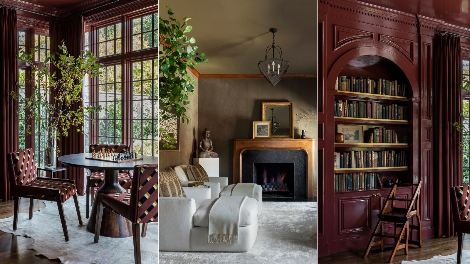
This designer-approved color drenching hack will ensure the look never falls flat – the key is in the finish
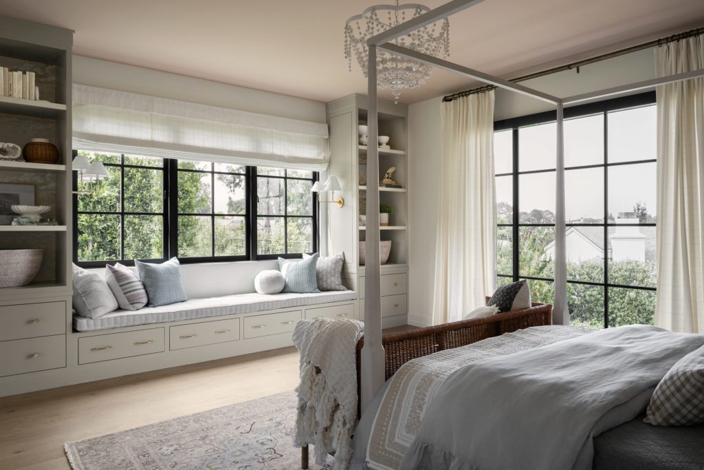
Shea On Farrow & Ball's New Paint Colors