Butter Yellow Is the Deliciously Soft Shade Your Home Needs
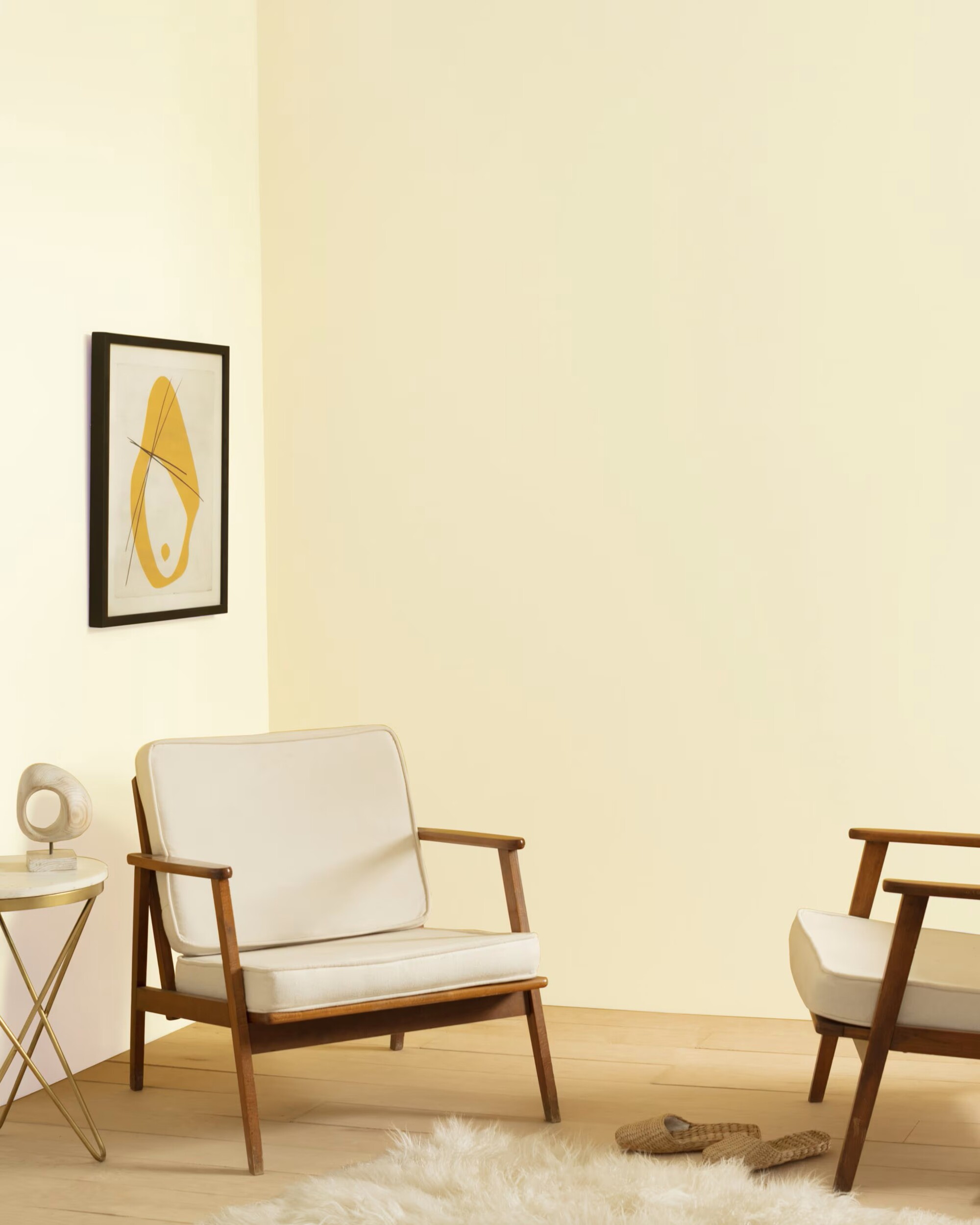
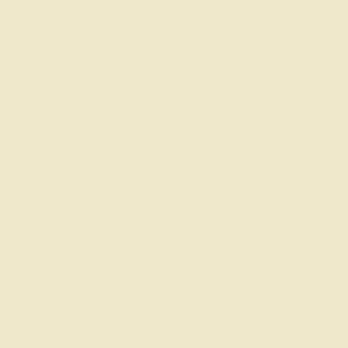
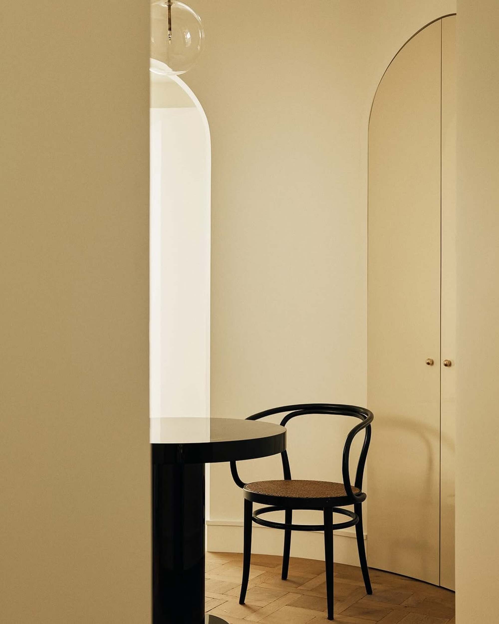
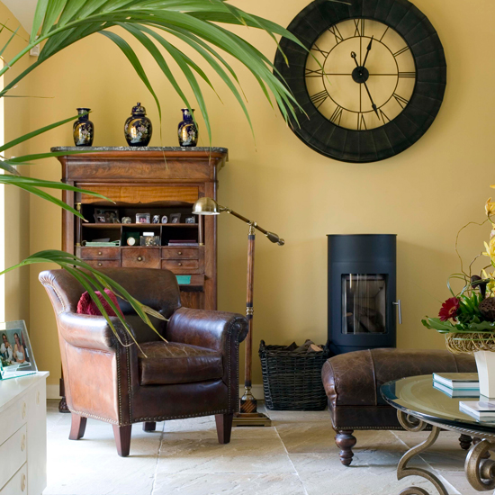
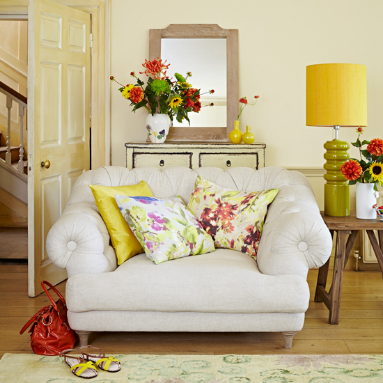

The article explores the rising popularity of butter yellow in home decor, a soft and inviting shade positioned between pale yellow and creamy off-white. This color is noted for its ability to add cheer and comfort to any space while complementing other hues. Designers are increasingly shifting towards warmer shades like butter yellow, which evokes a sense of nostalgia, comfort, and familiarity. The color is also believed to boost mood, as studies suggest exposure to yellow can increase serotonin levels.
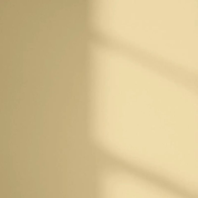
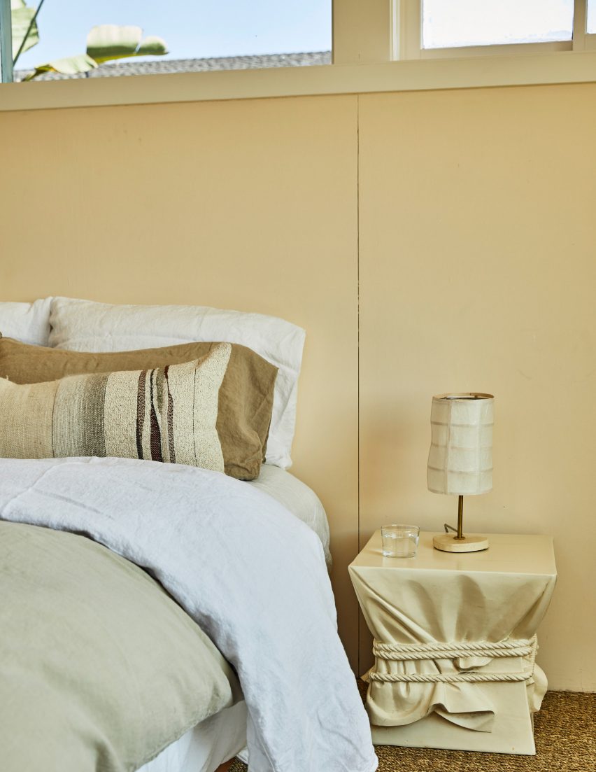
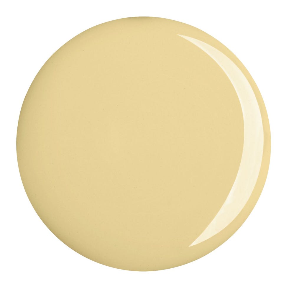
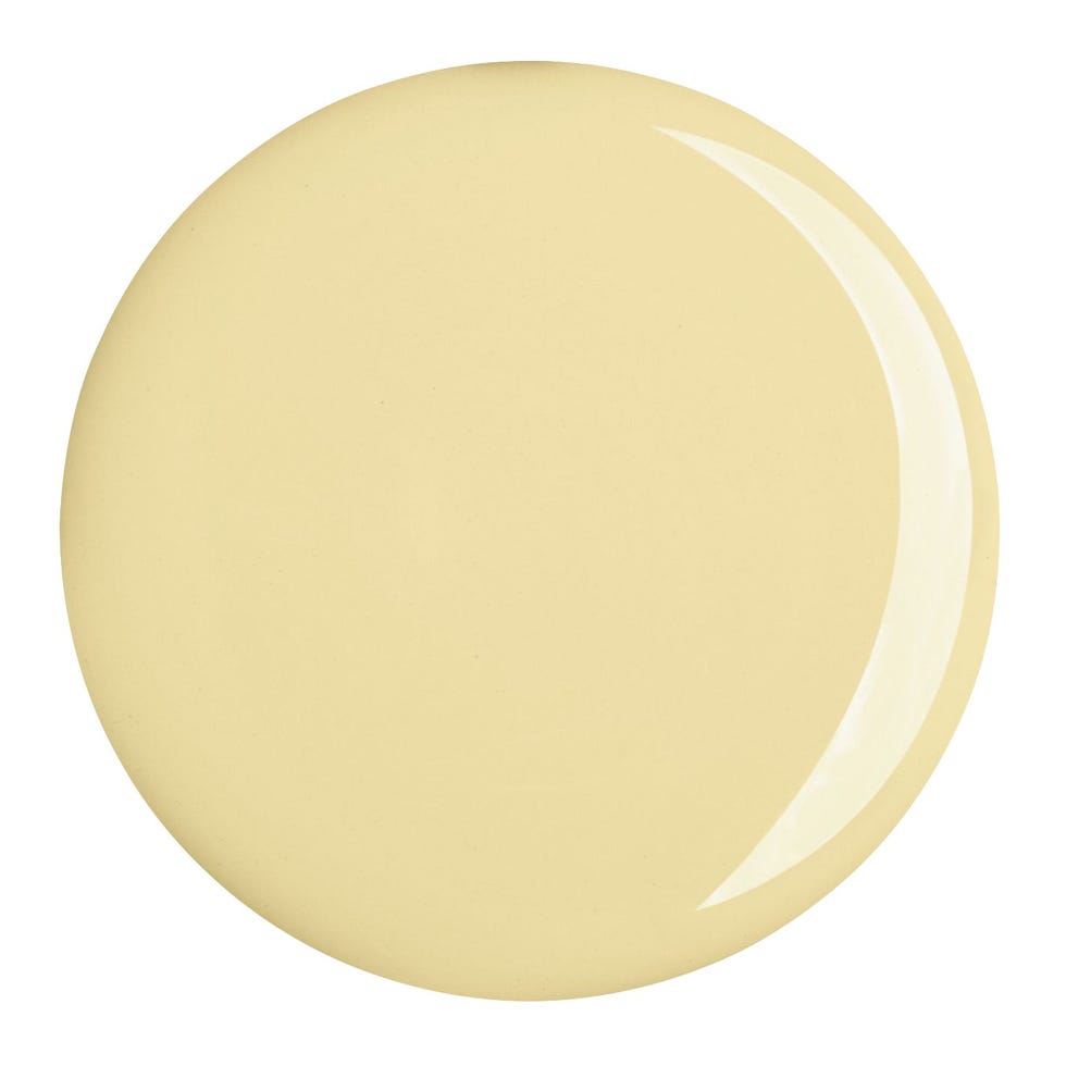
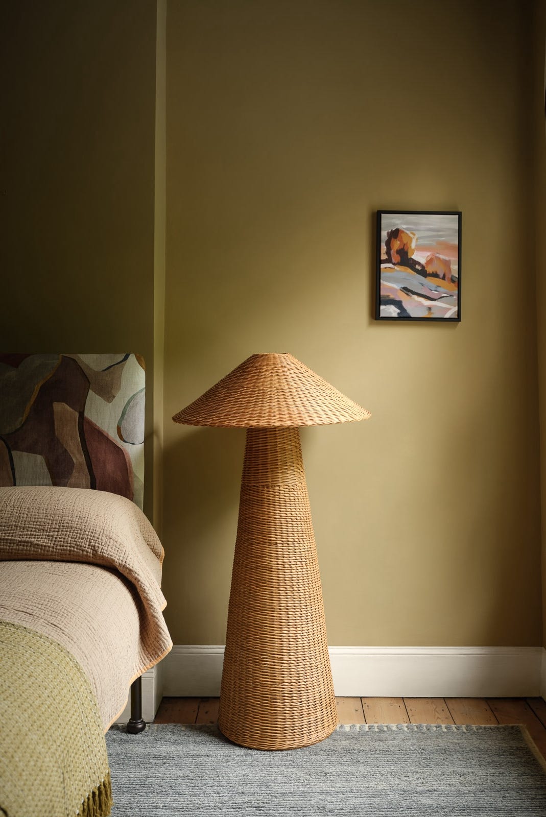
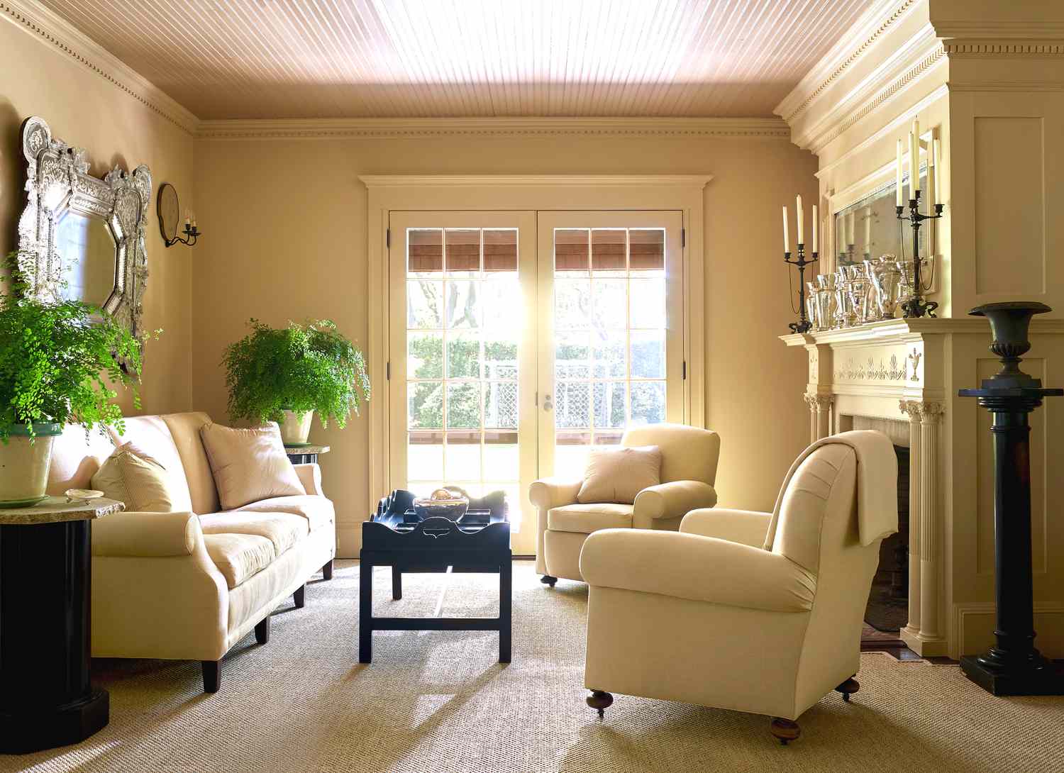
Choosing the right shade of butter yellow is crucial, with experts recommending unobtrusive tones that read as sophisticated warmth rather than overtly yellow. Golden beiges within paint decks are suggested, as paint colors tend to appear brighter on walls. Glidden's selection of "Limitless," a buttery yellow, as its 2024 paint color of the year, highlights its versatility as both a primary color and a modern neutral.
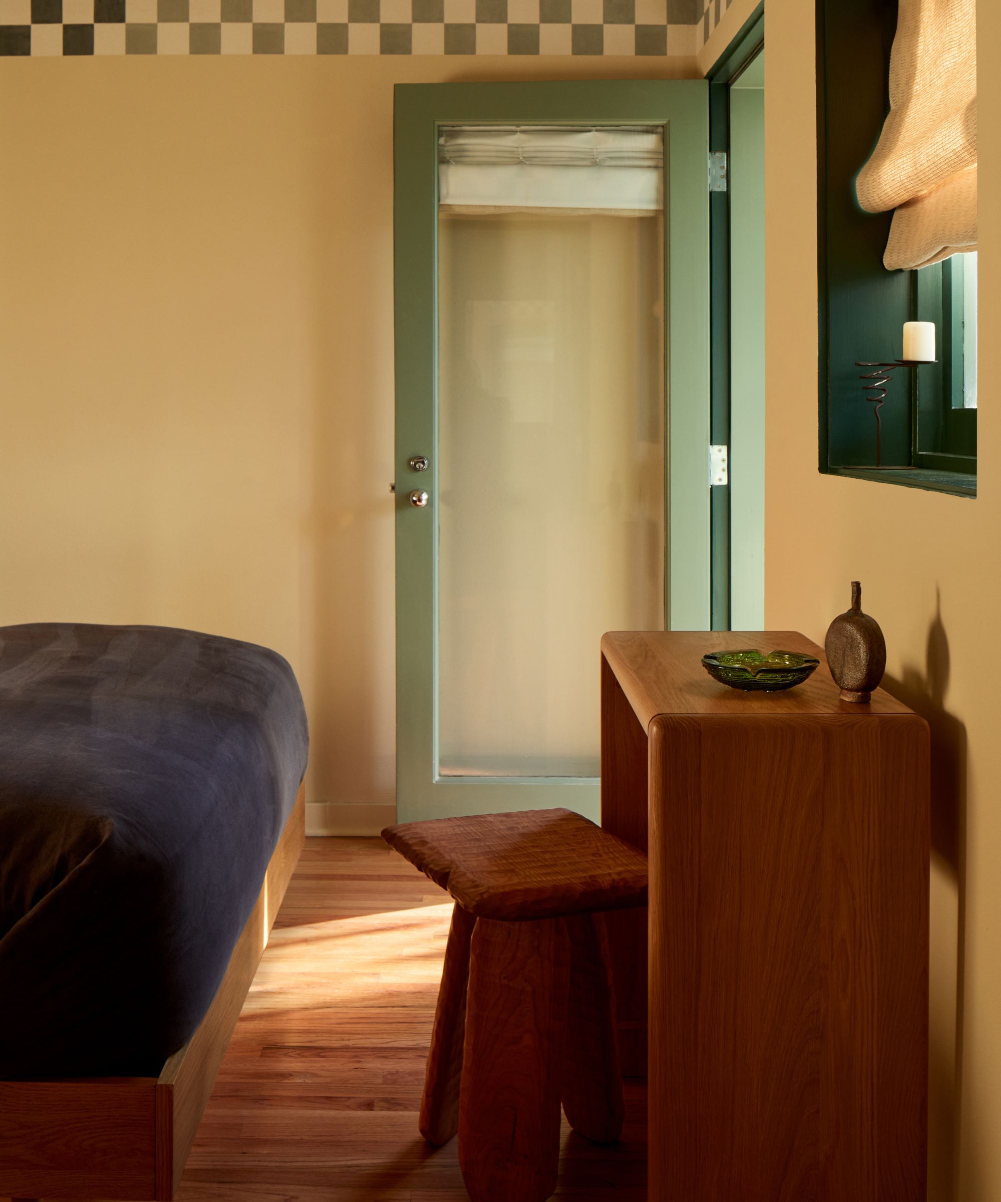
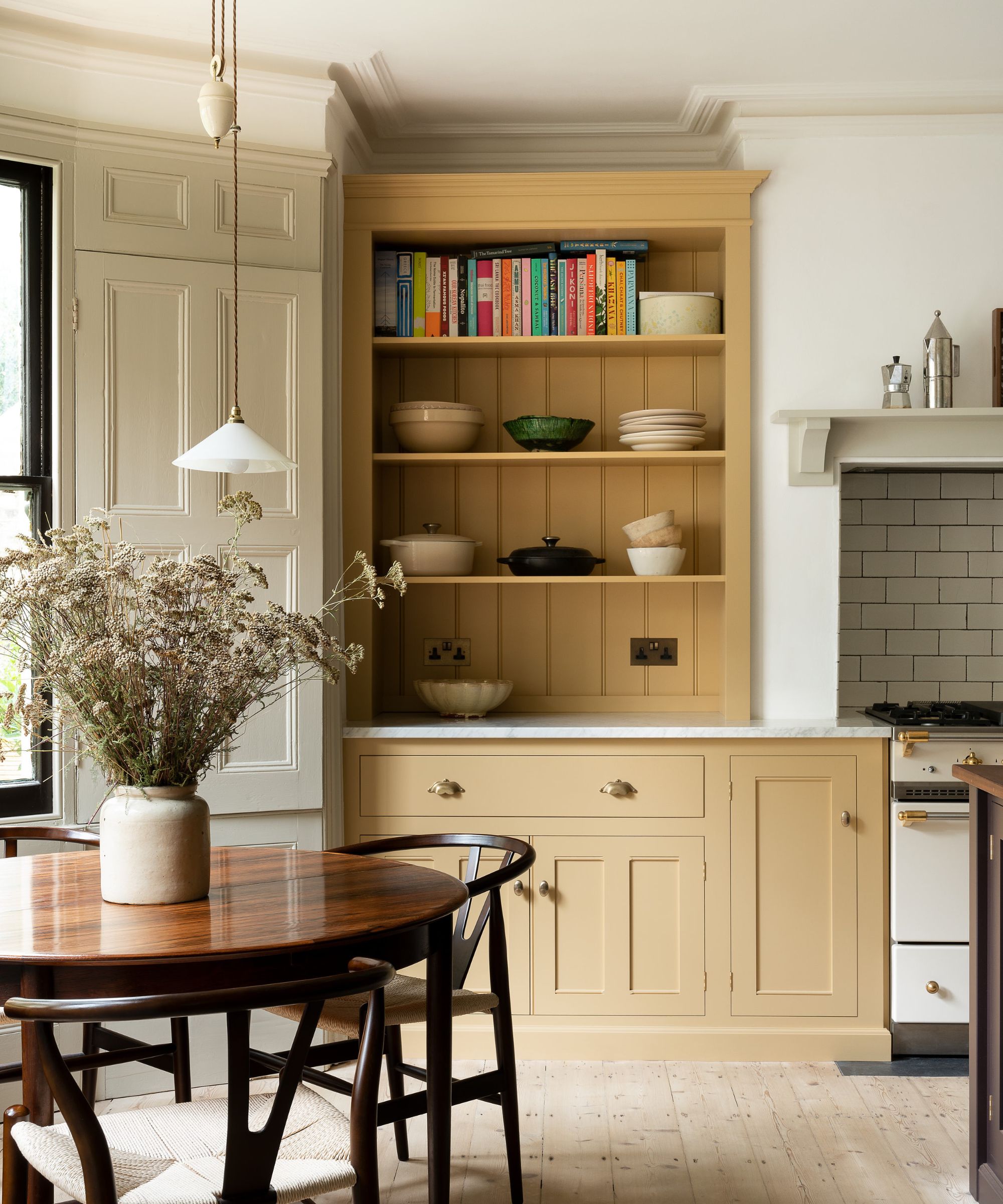
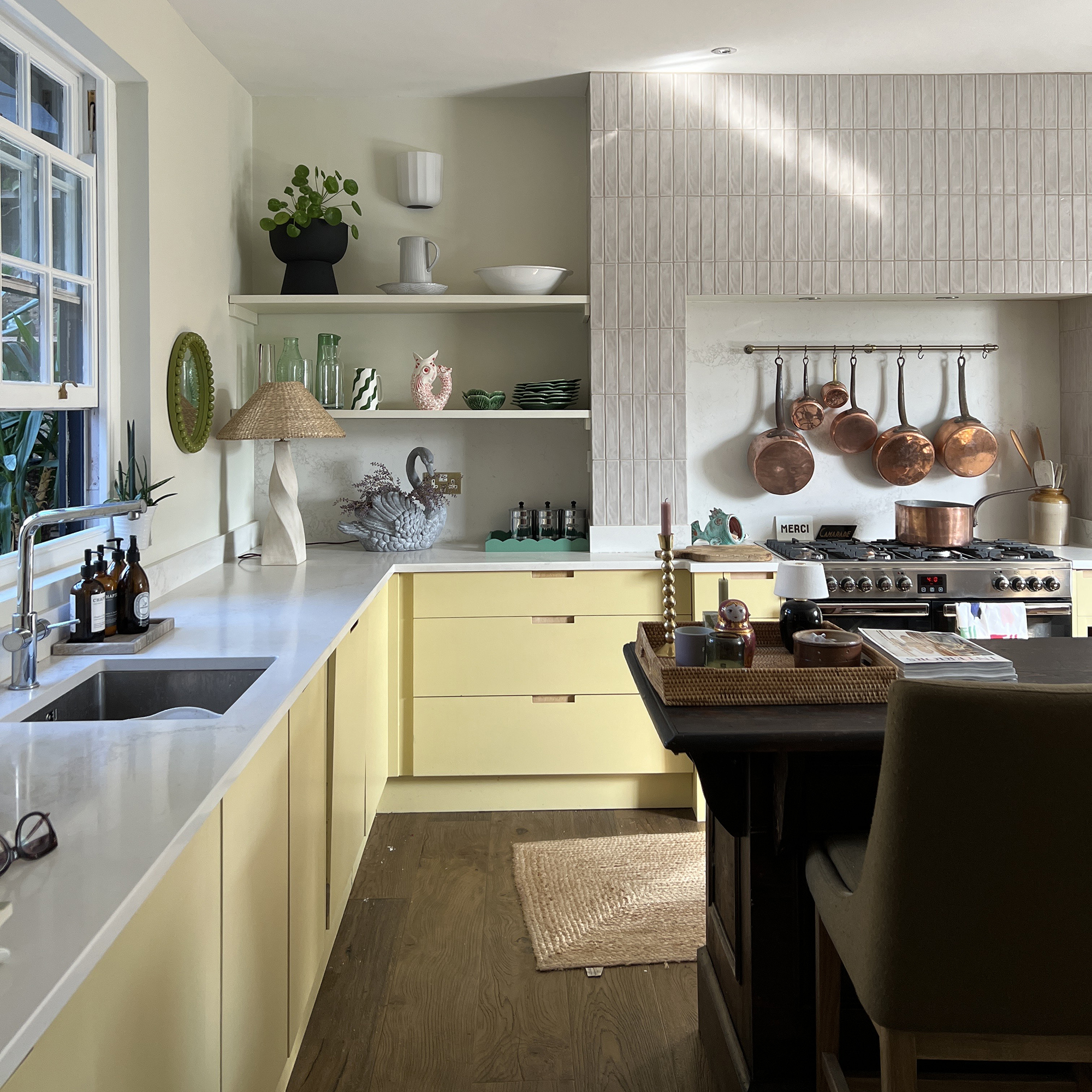
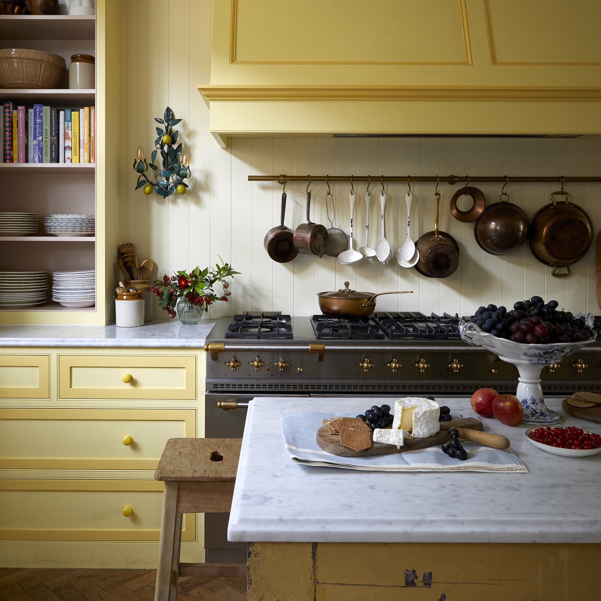
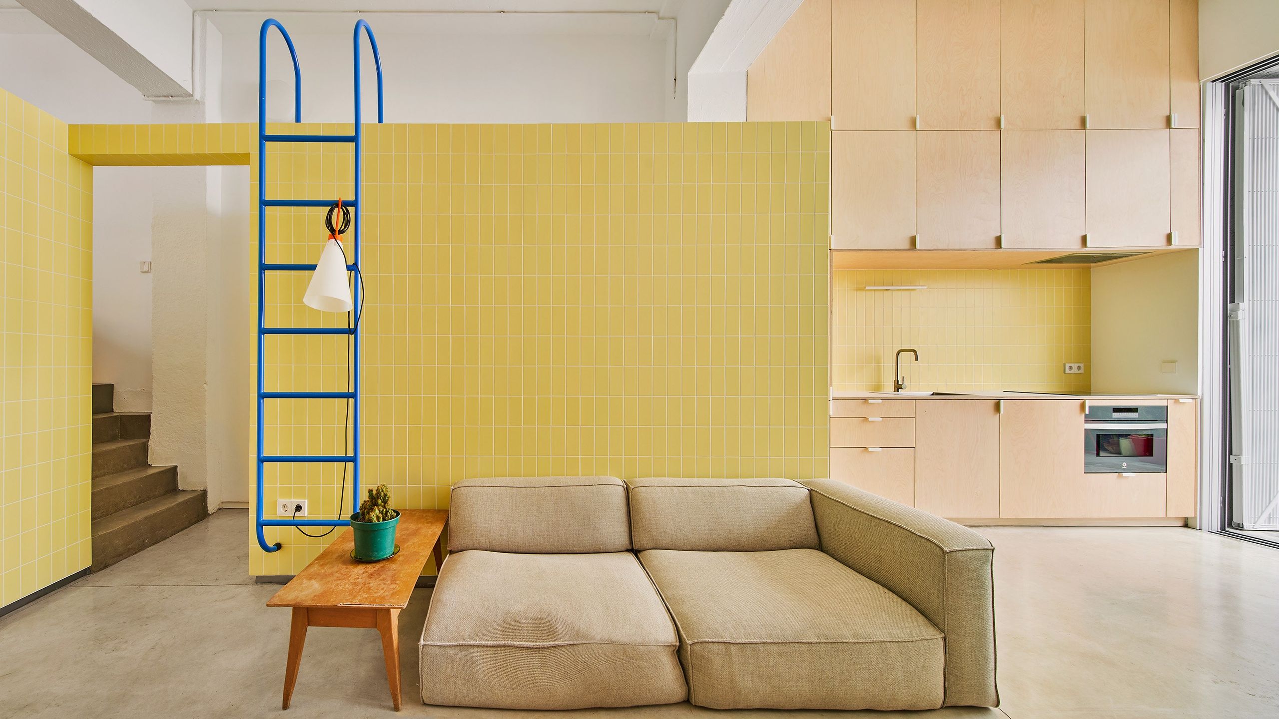
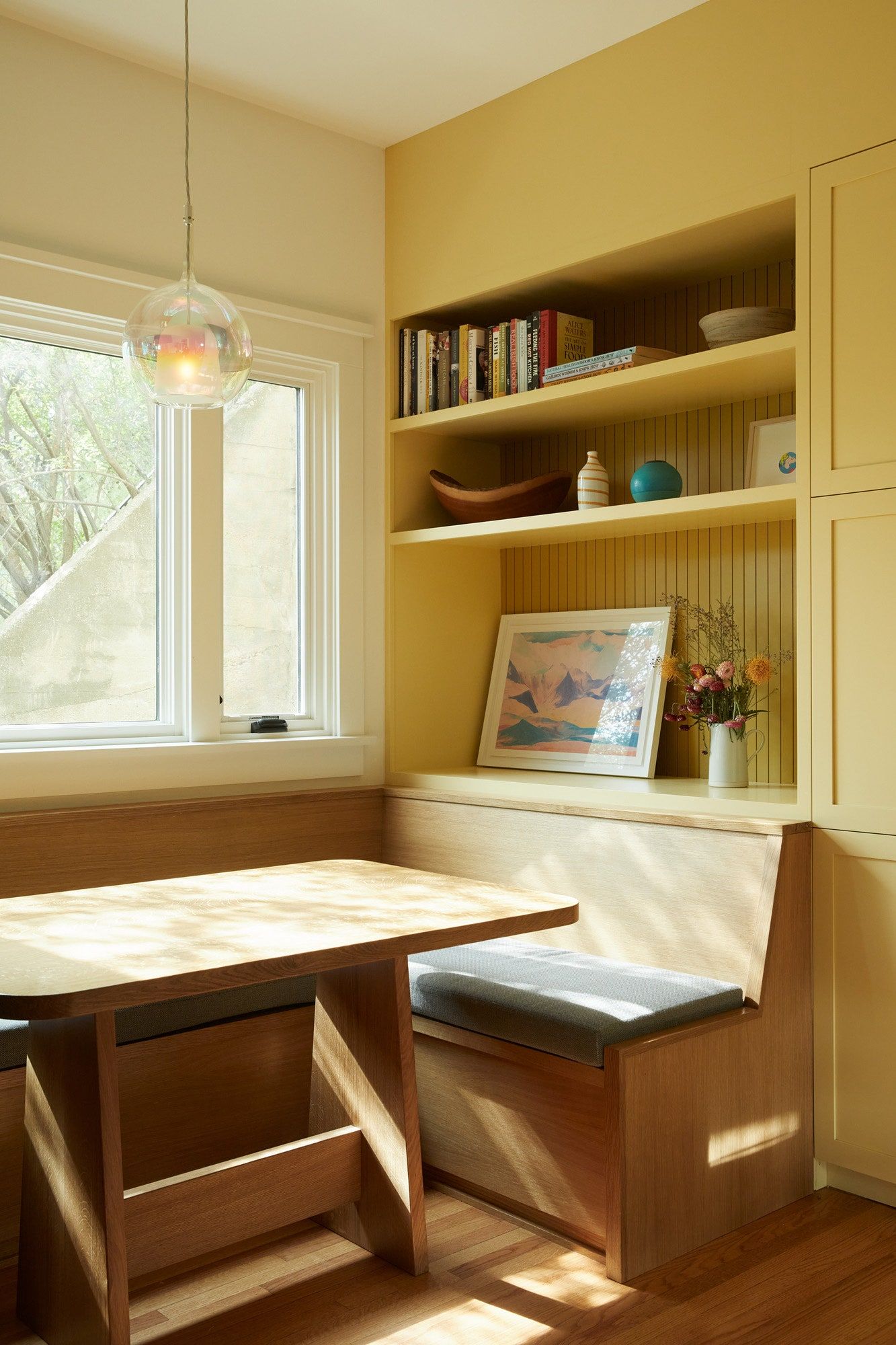
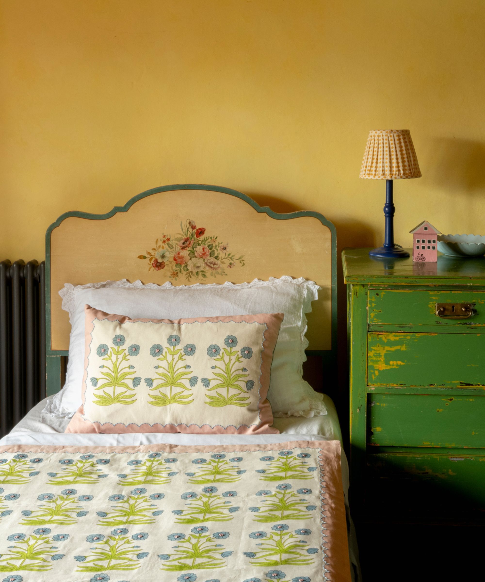
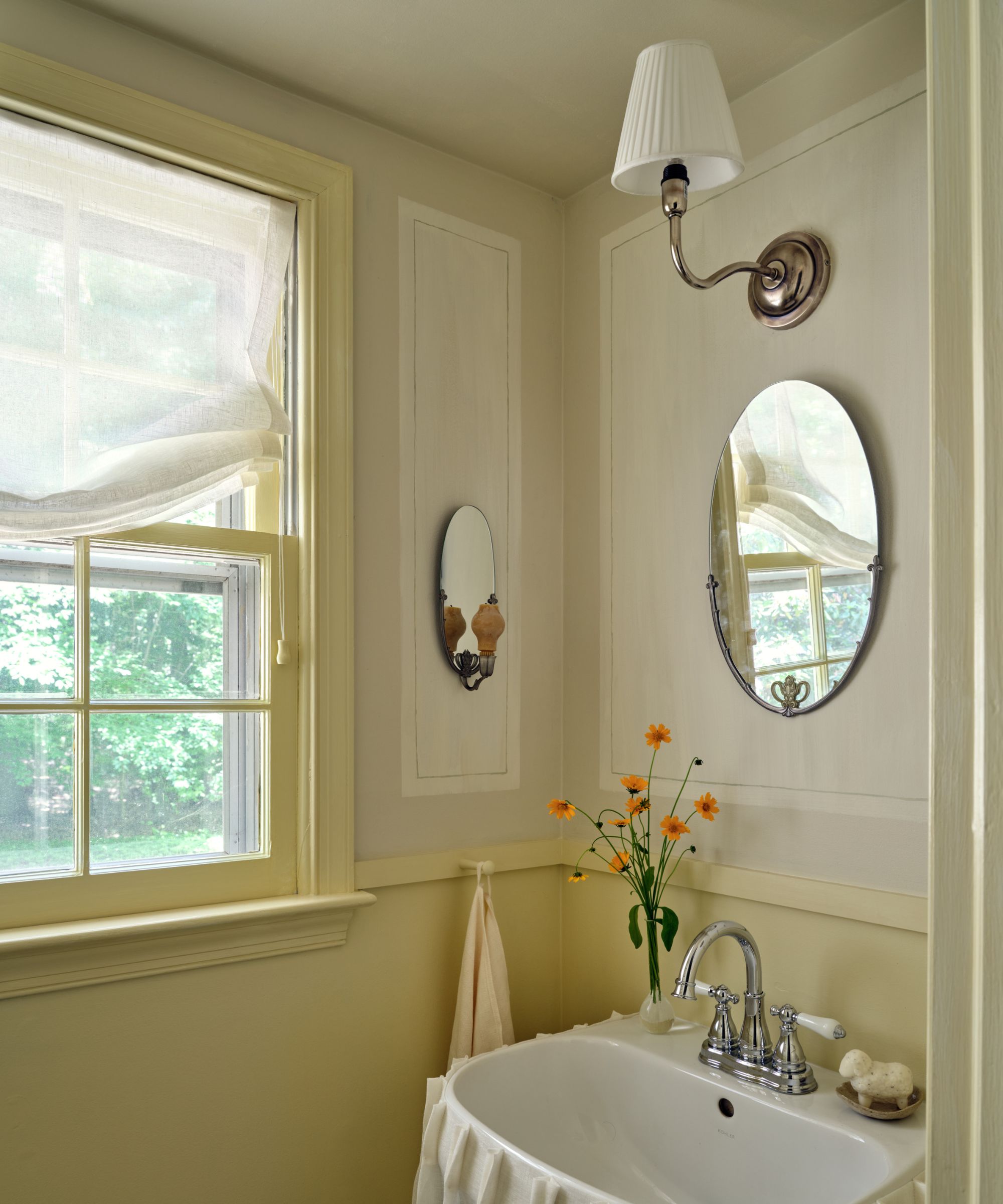
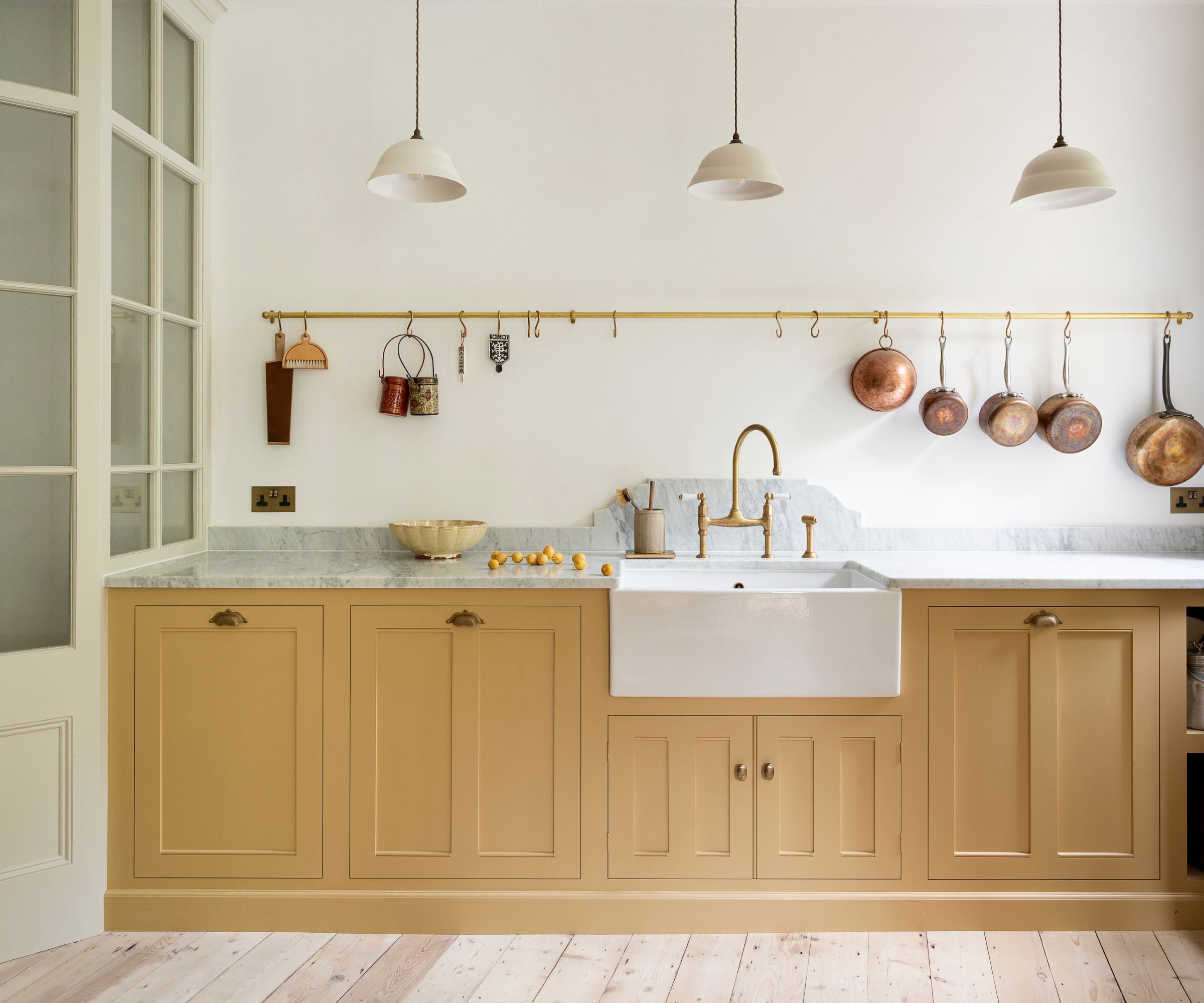
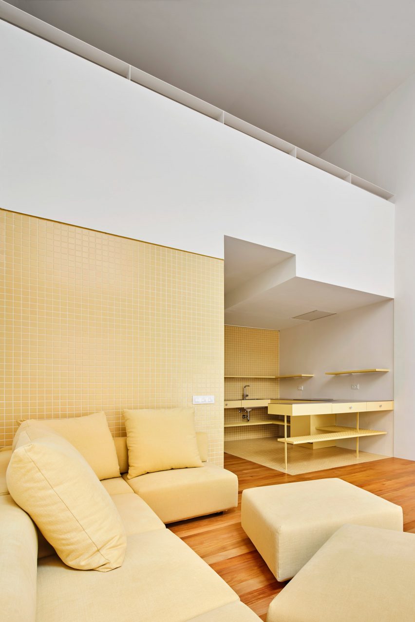
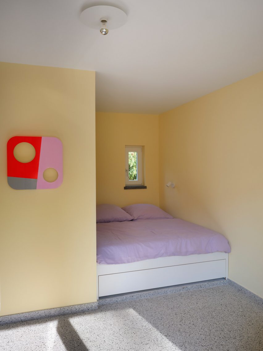
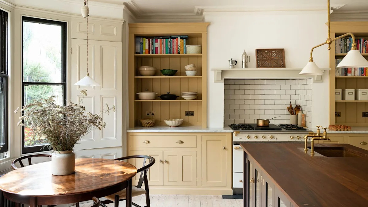
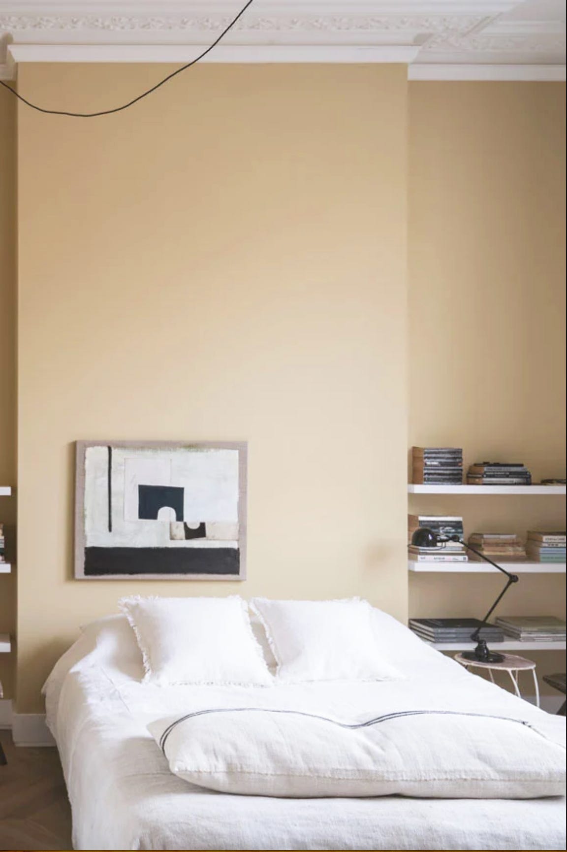
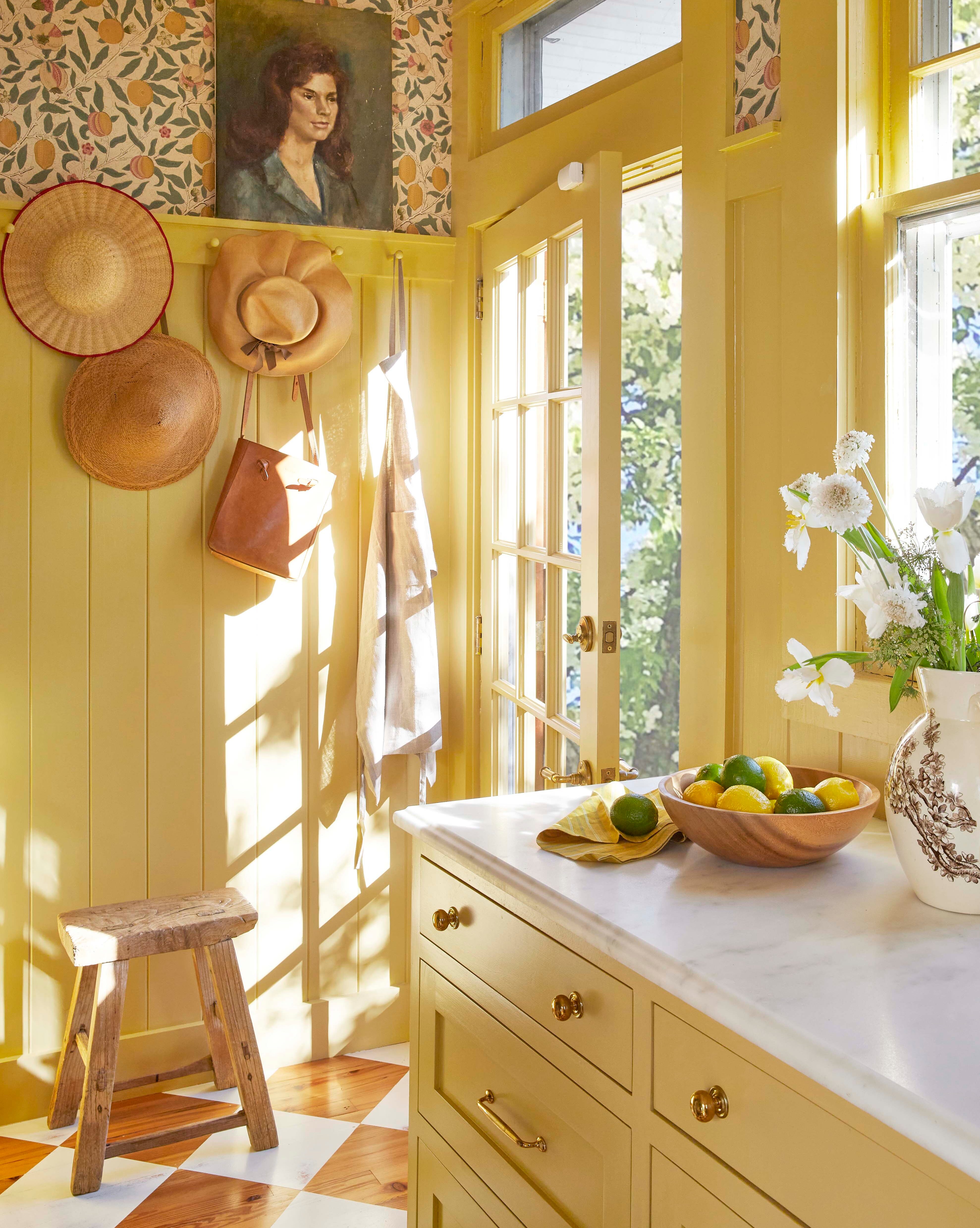
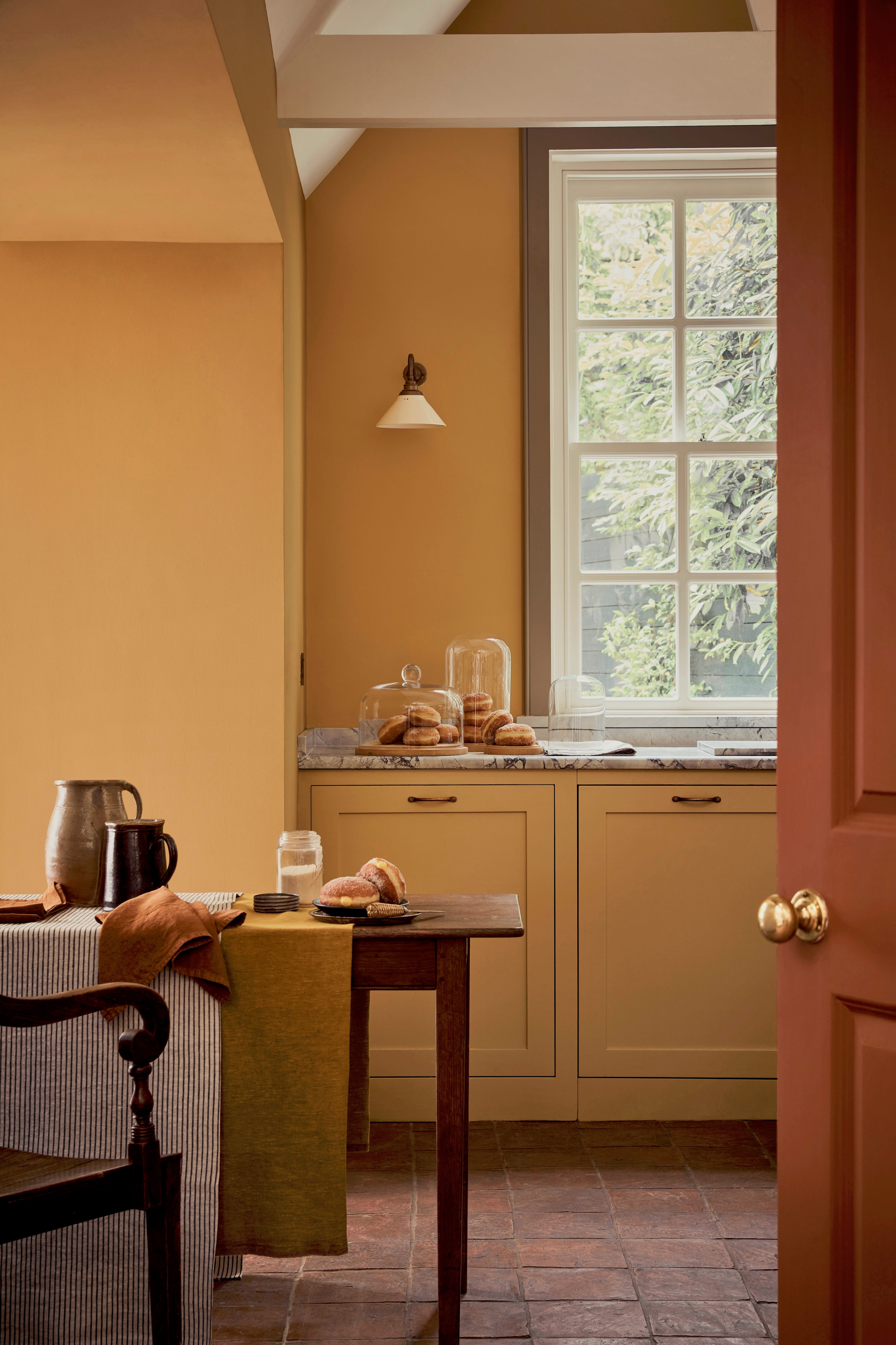
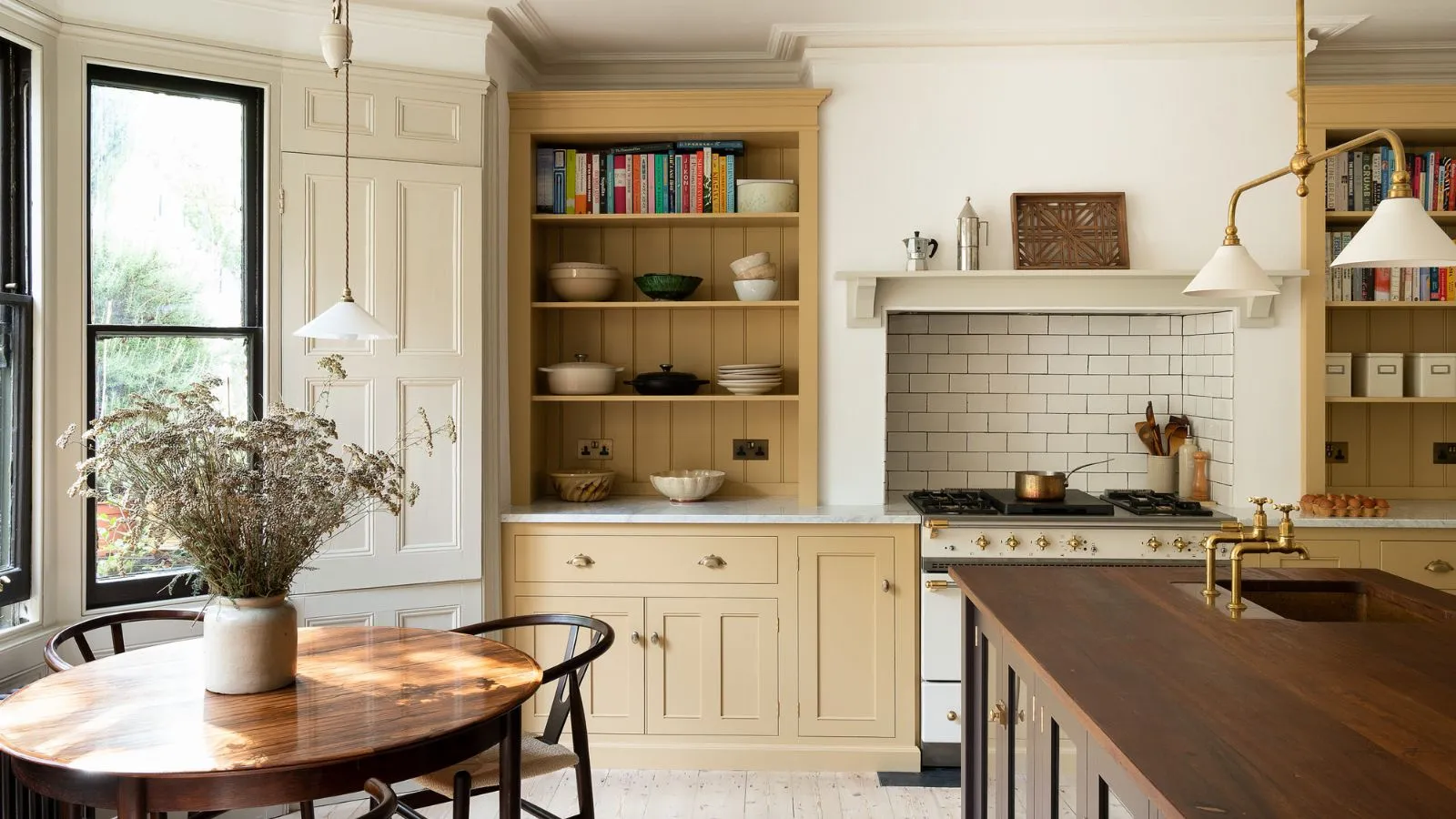
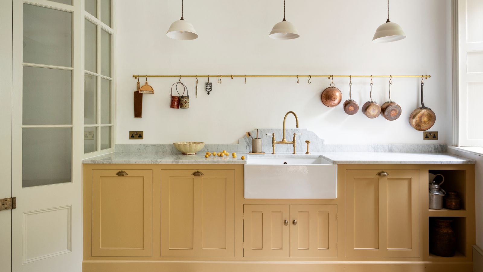
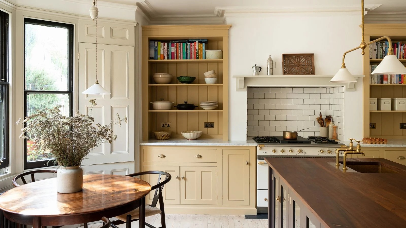
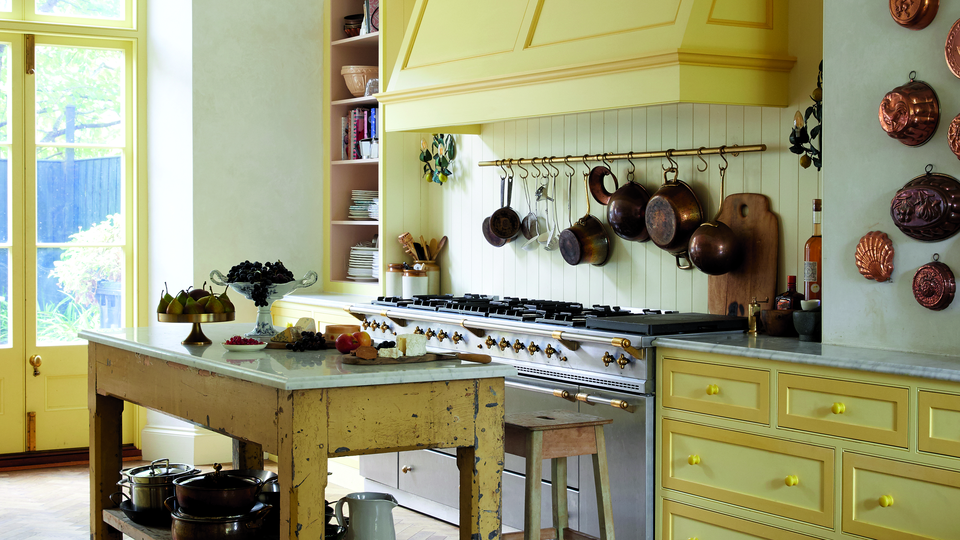
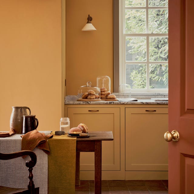
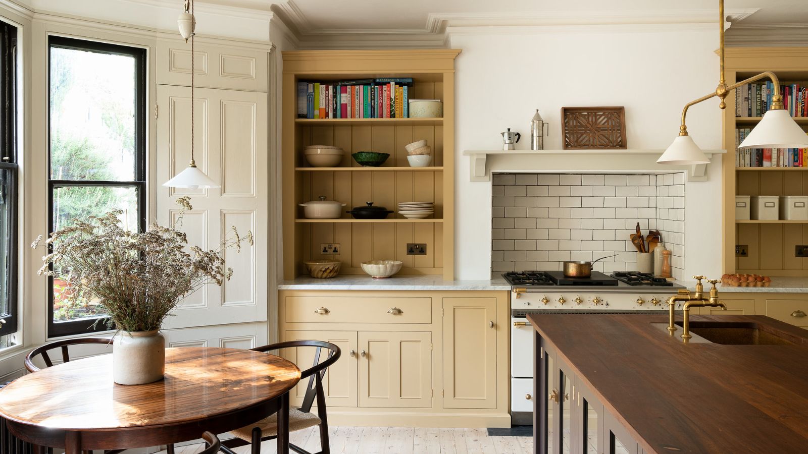
Butter yellow is suitable for almost any room in the house, from guest bedrooms and nurseries to kitchens, offices, bathrooms, living rooms, and dining rooms, due to its inherent warmth and ability to infuse optimism. It can brighten a light-starved hallway or create a soft embrace in a sun-drenched bedroom. The color's association with increased appetite makes it a good choice for kitchens. It's also favored for kids' rooms as it transitions well from toddler to teenage years.
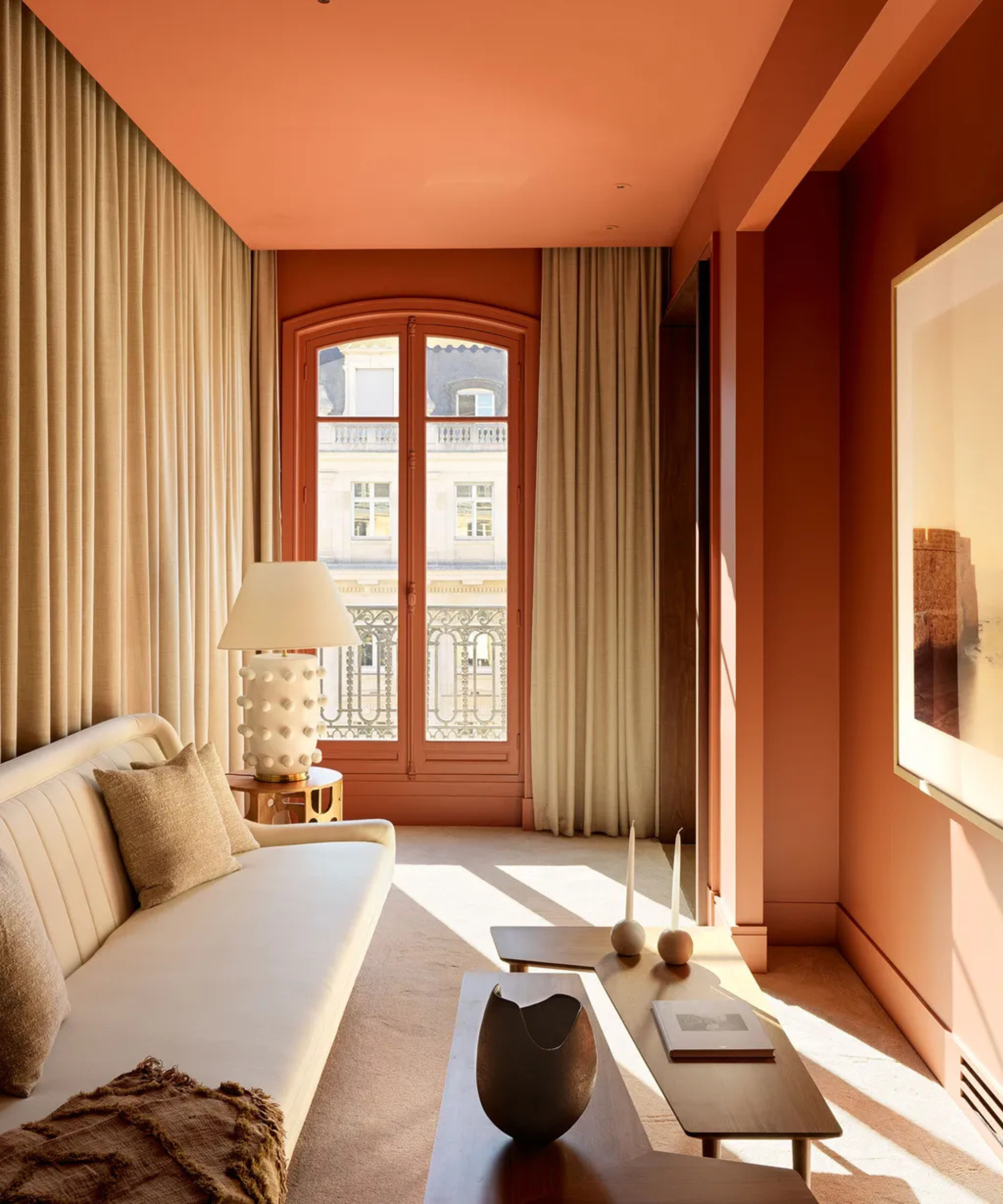
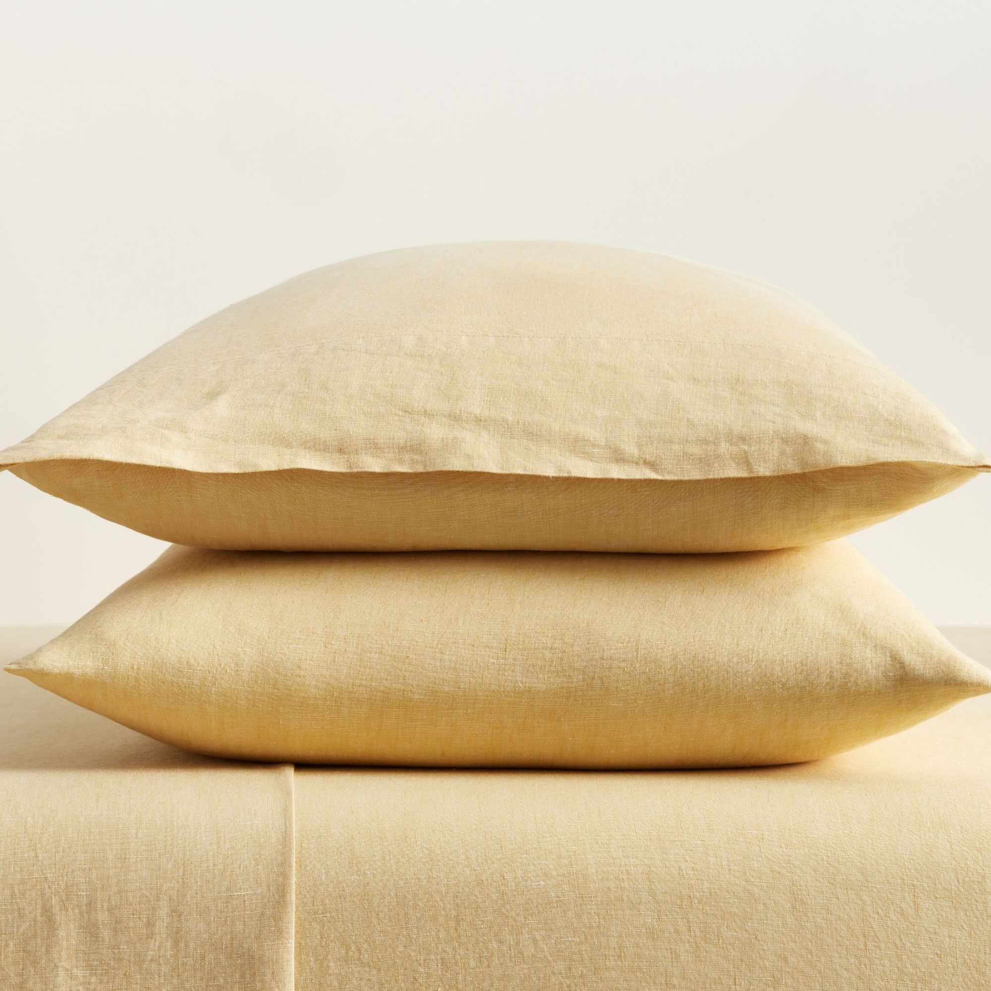
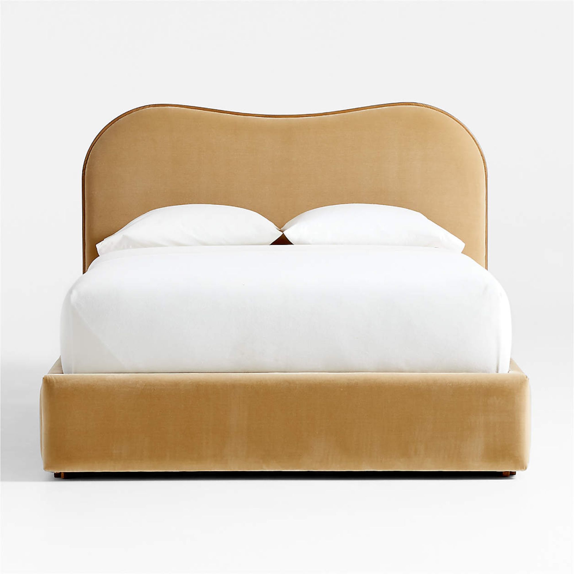
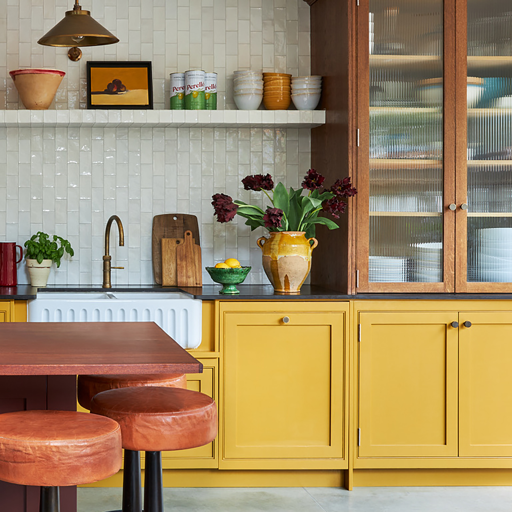
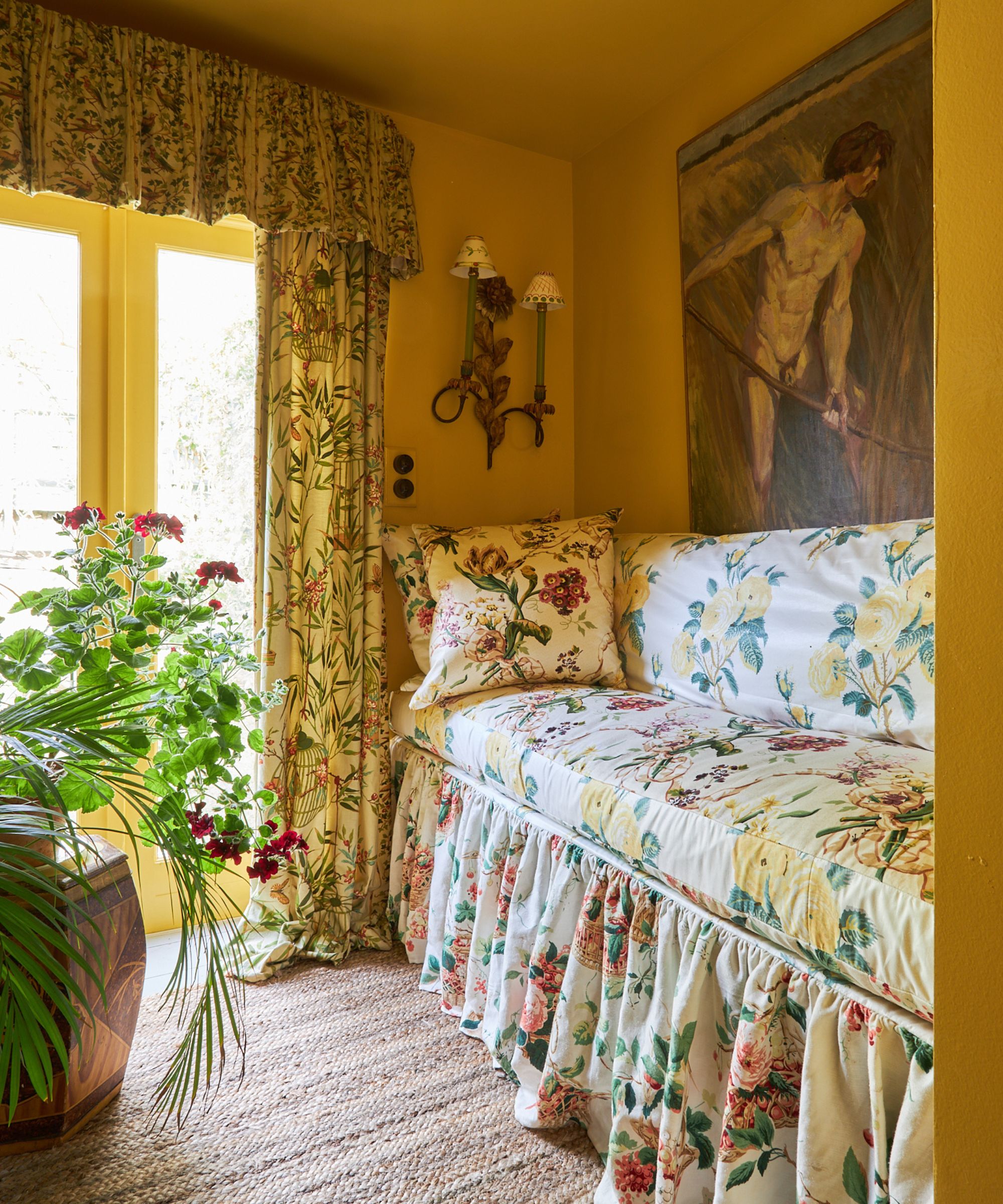
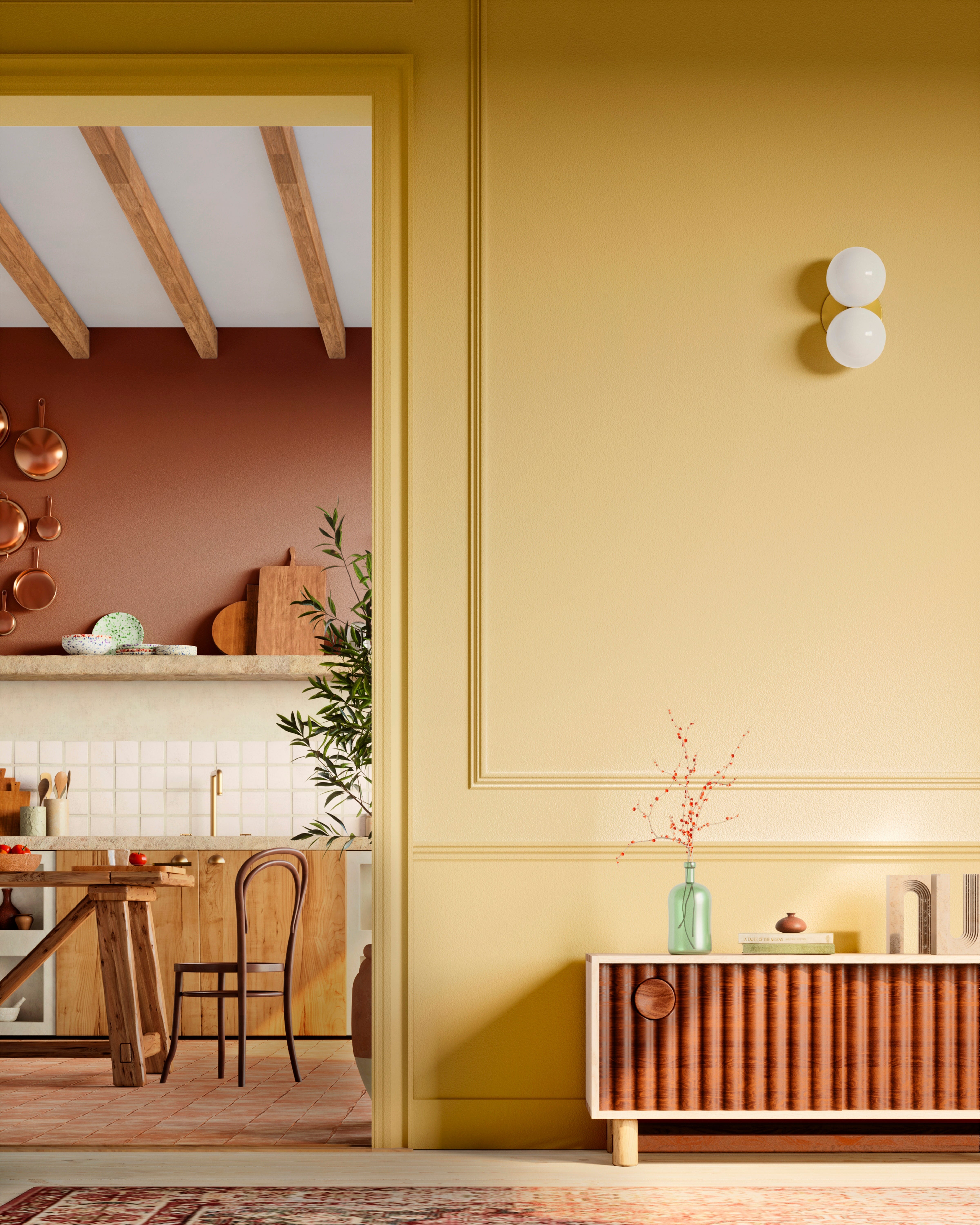

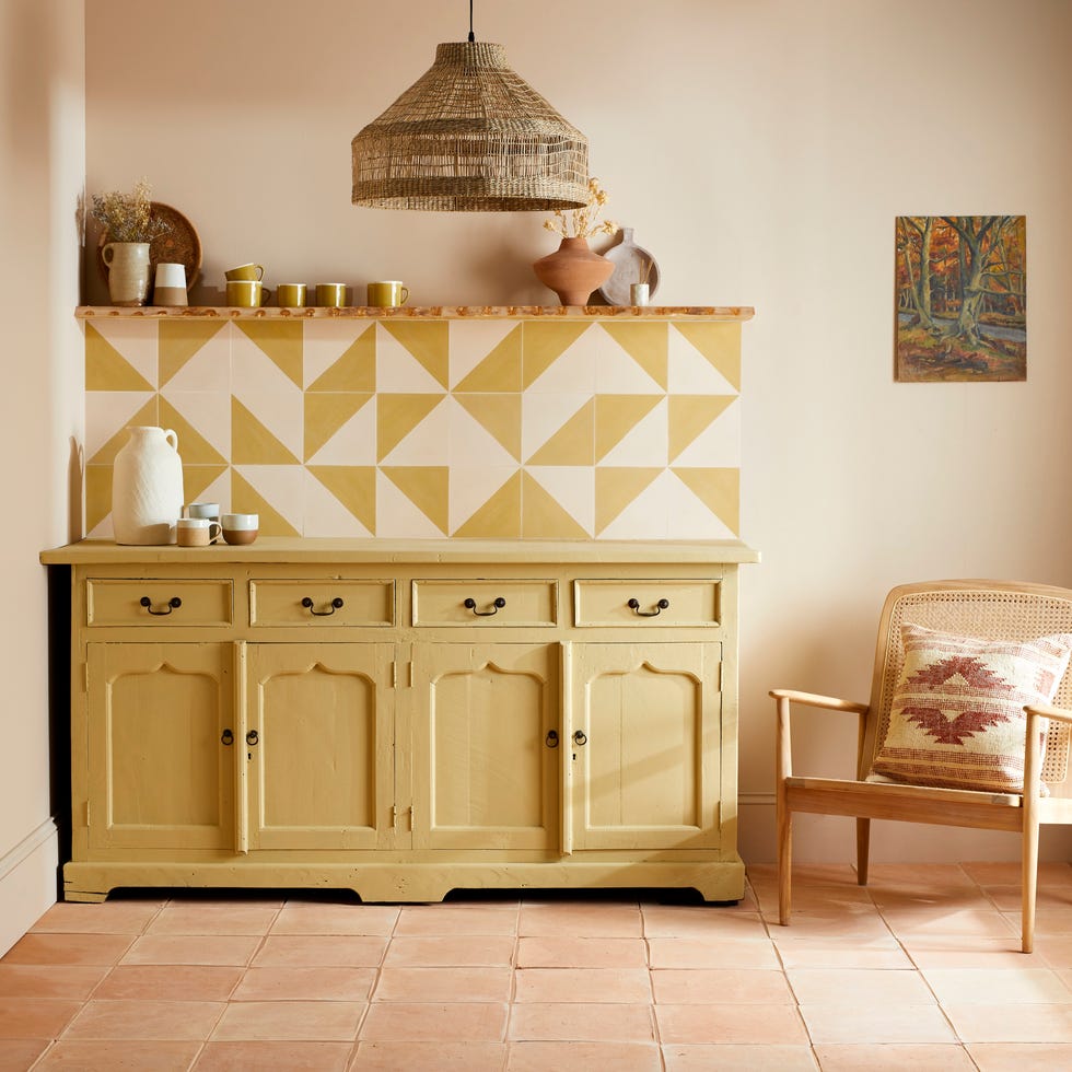
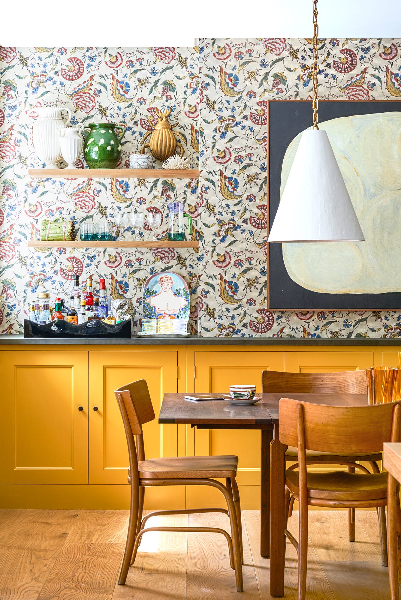
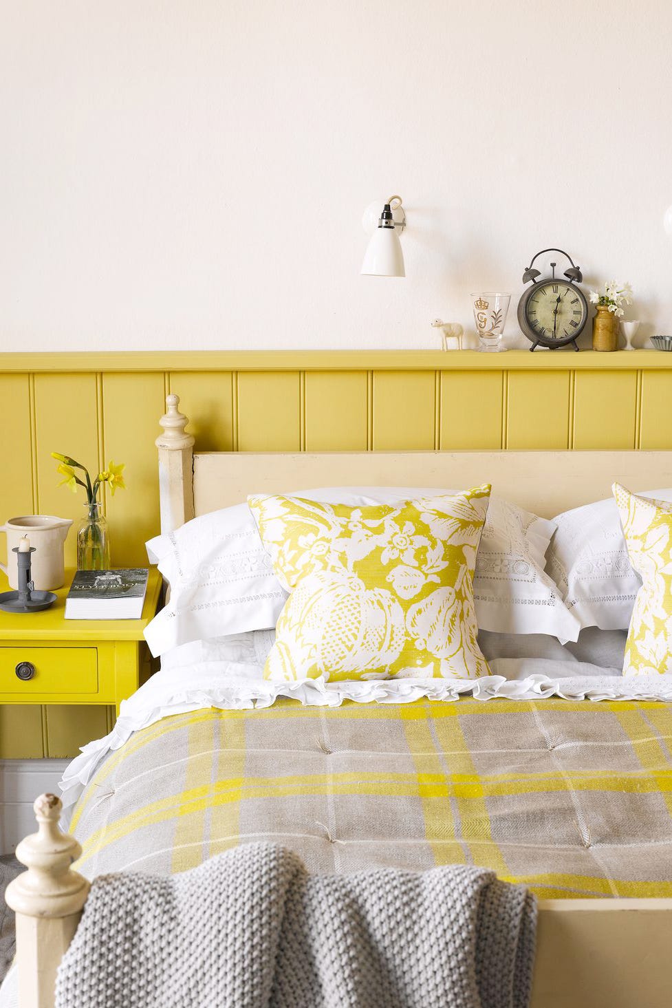
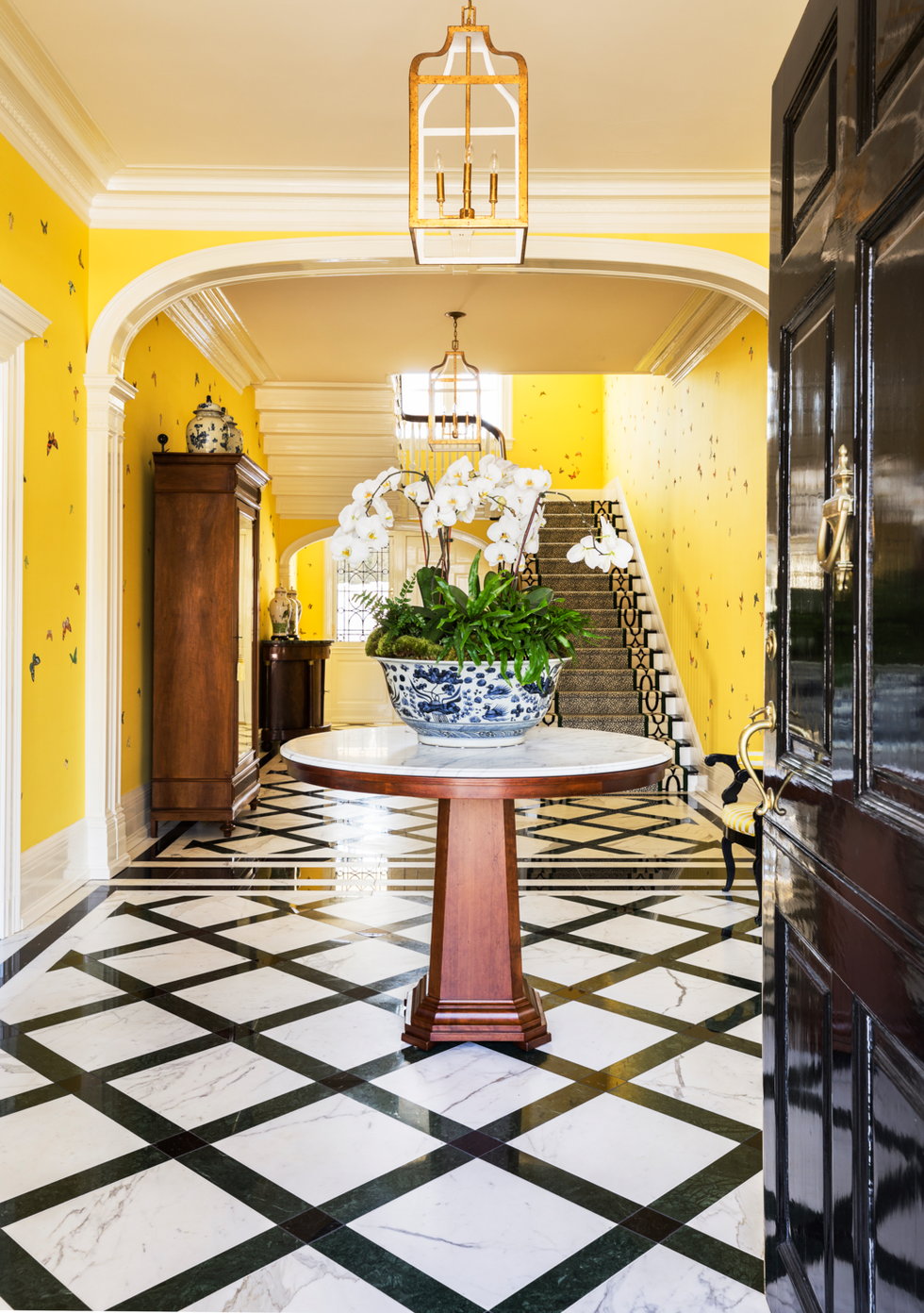
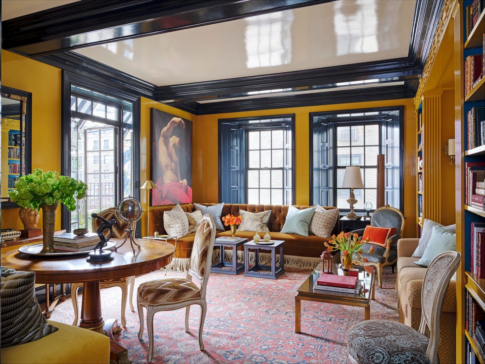
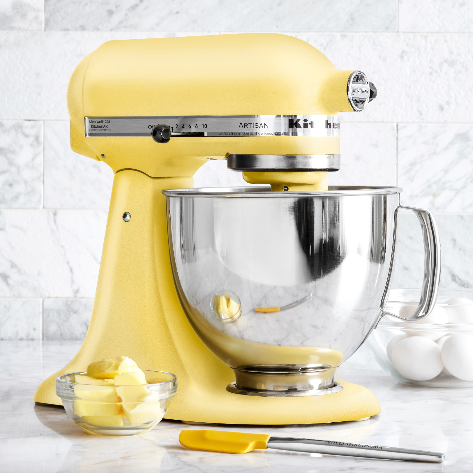
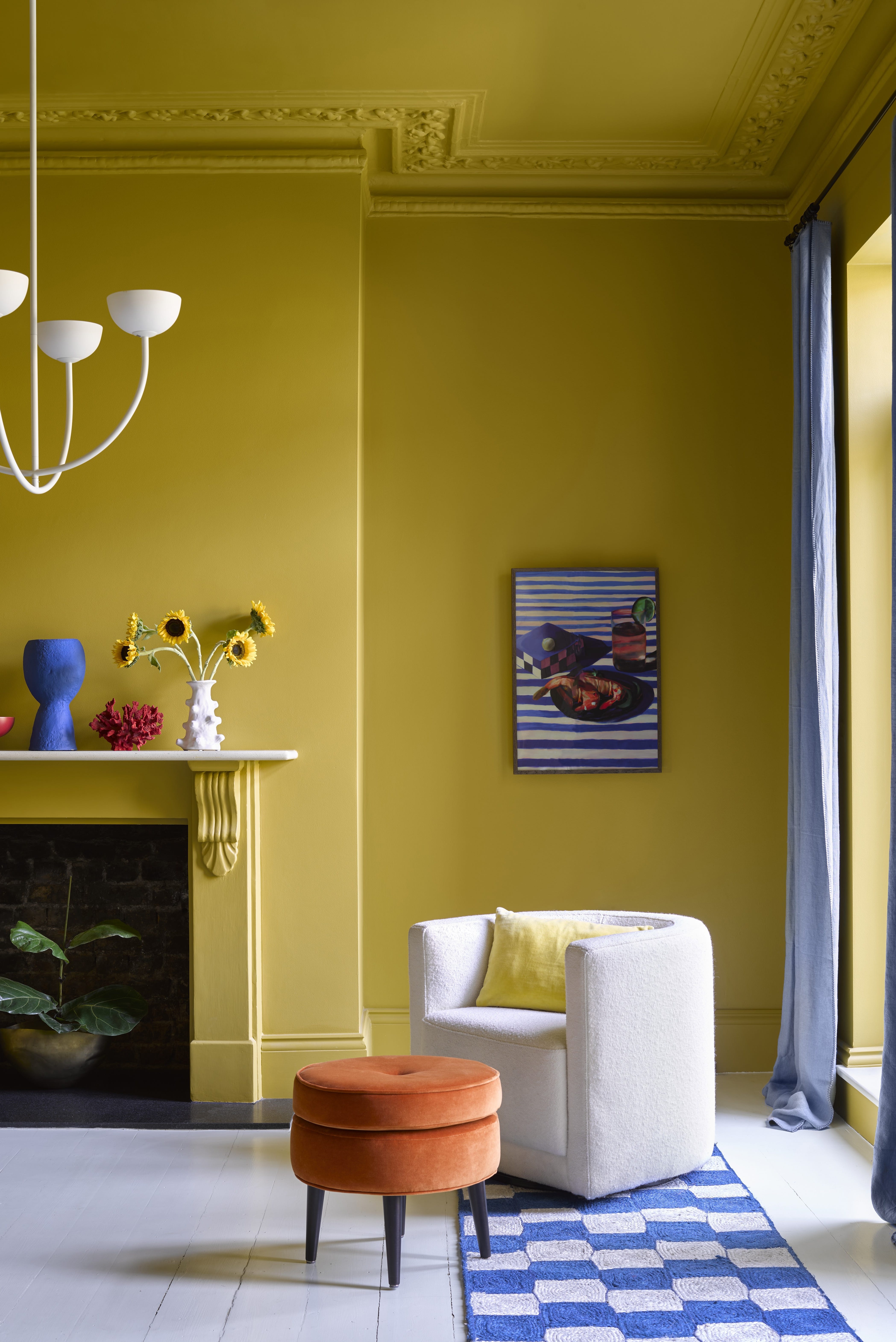
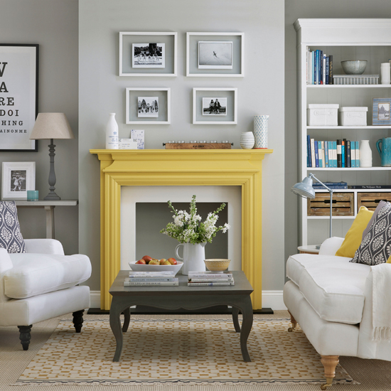
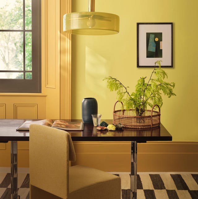
Homeowners can use butter yellow as either a primary color or an accent. For a bold statement, it can be used on all four walls, ceiling, and trim to create a unified, sun-filled effect. Alternatively, as an accent, it can add warmth without overwhelming, appearing on pillows, trays, drapery, rugs, or highlighting architectural features like window mullions, door trim, or kitchen cabinets. Painting the inside of cabinets or drawers offers a hidden touch of sunshine.
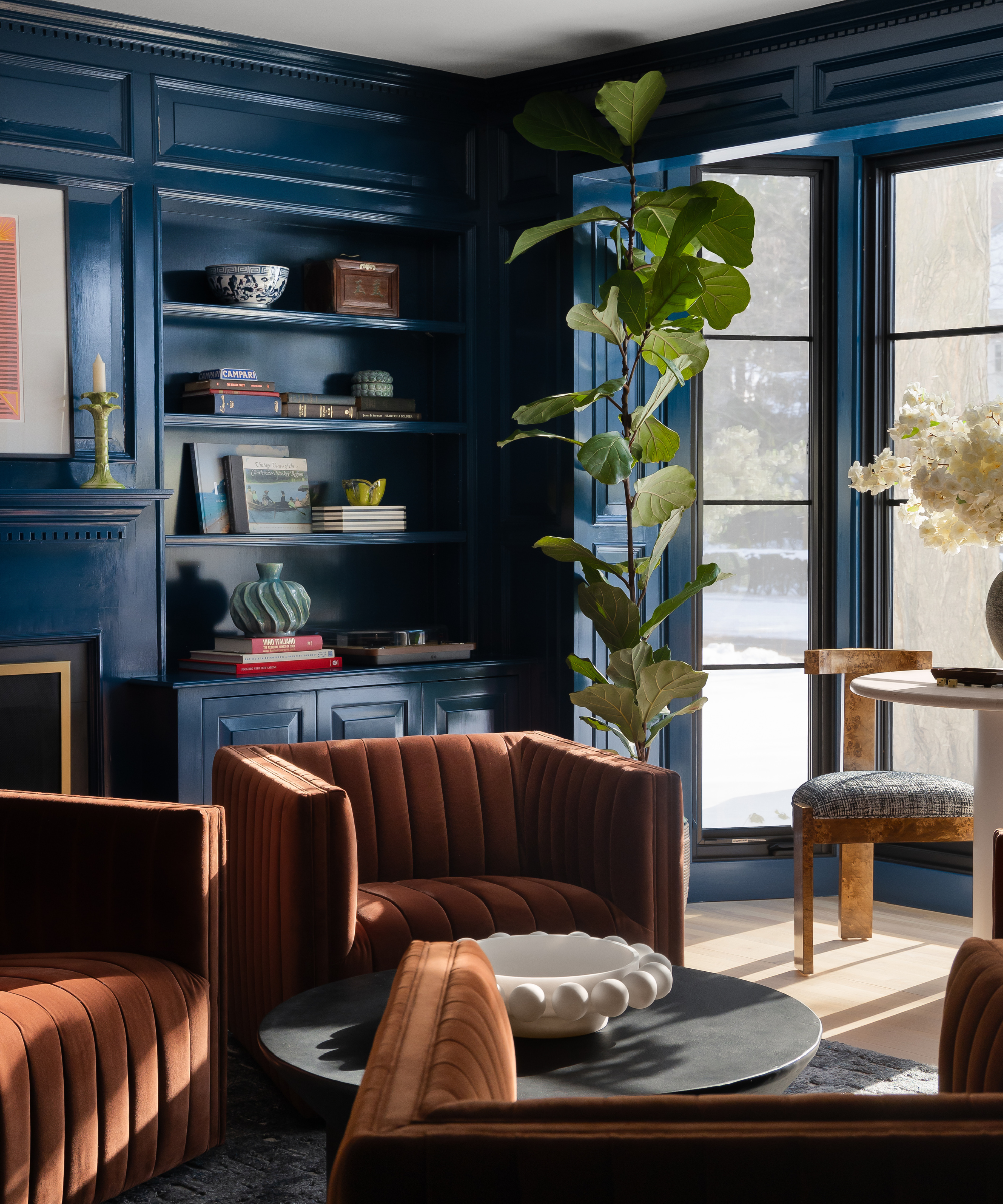
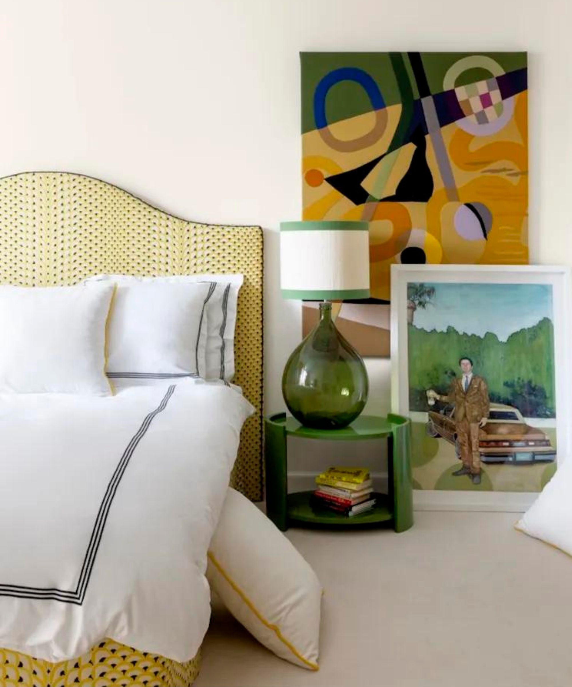
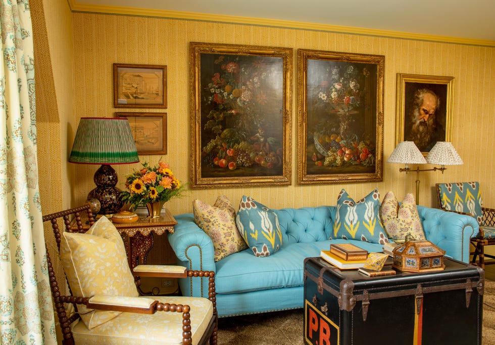
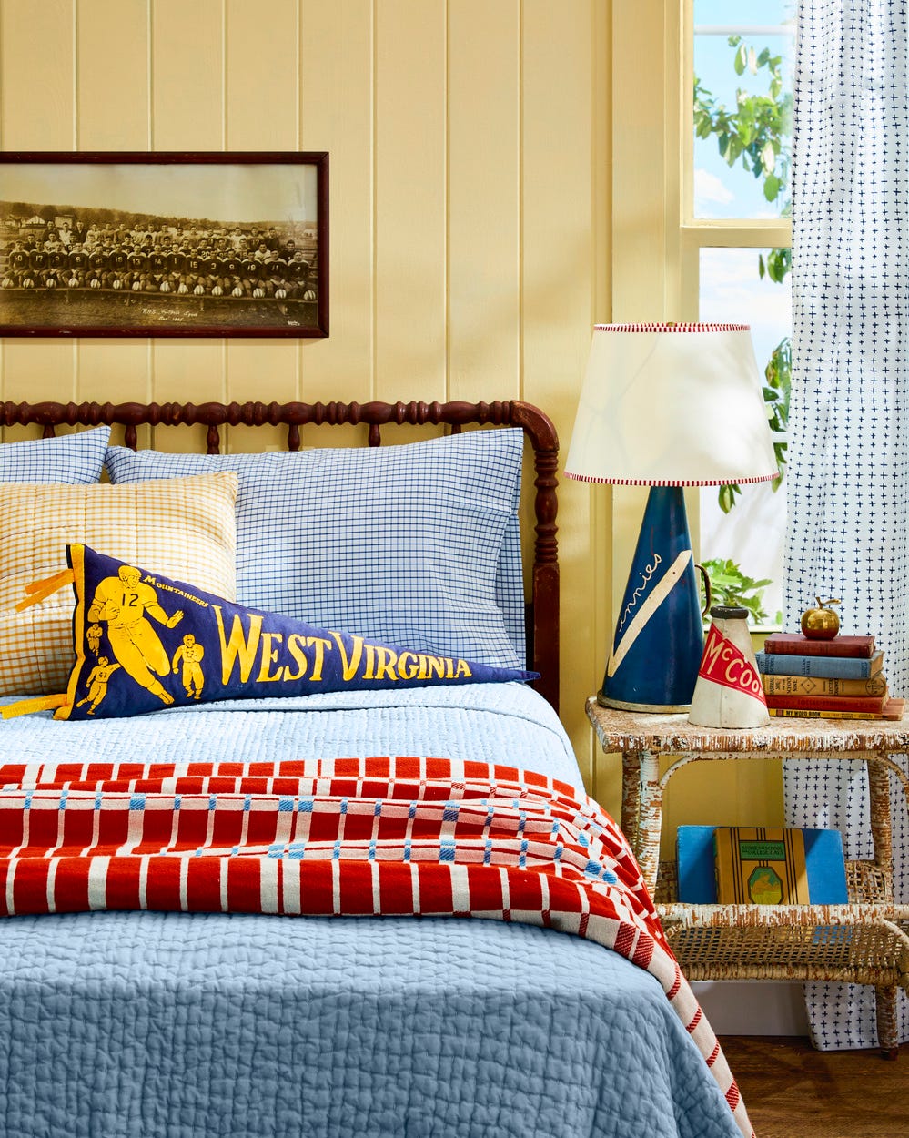
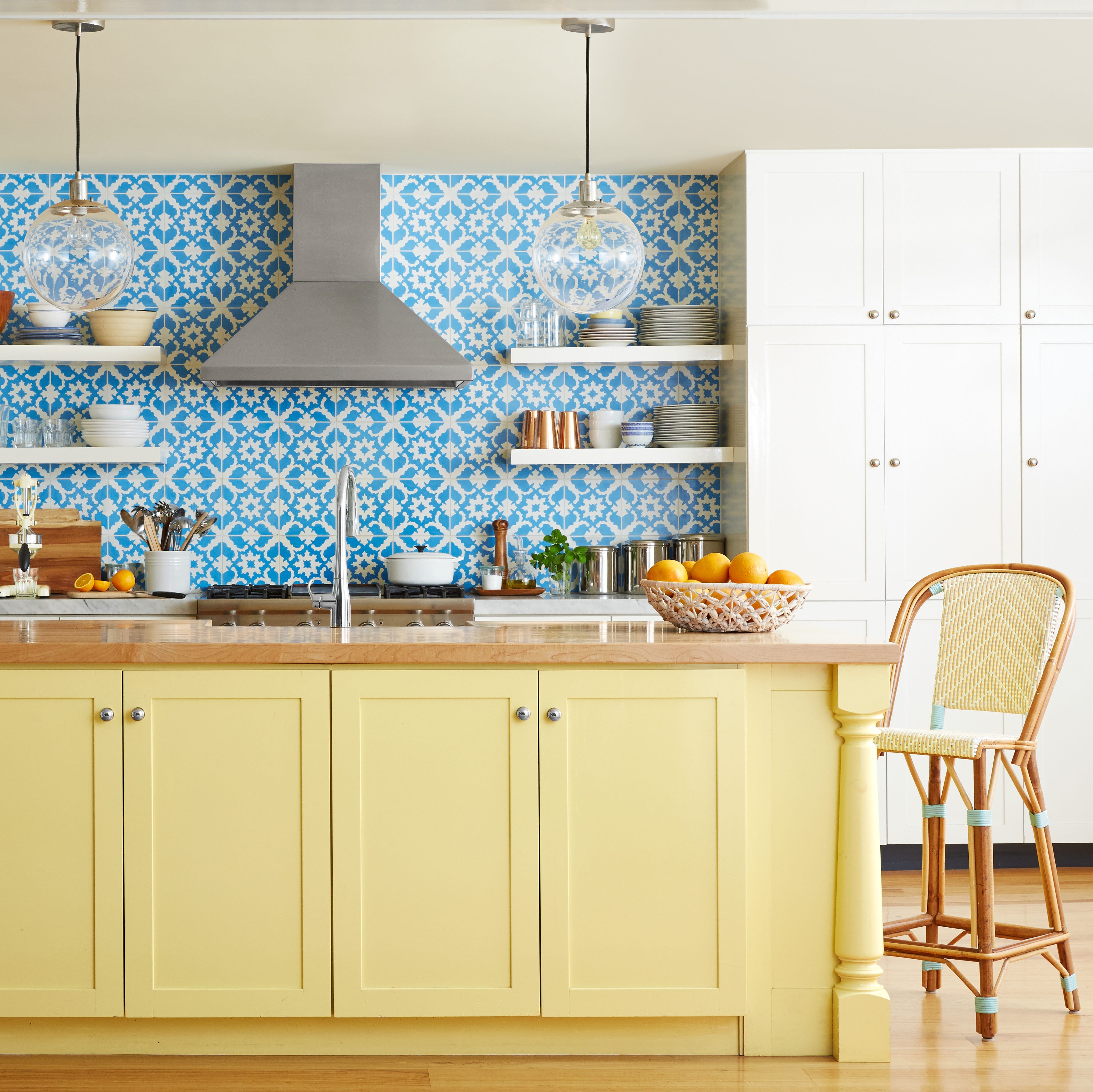
The versatility of butter yellow allows it to pair well with a wide array of colors. It can create a feminine and youthful look with soft baby pink, a sophisticated feel with crisp white, or a stylish ambiance with charcoal gray. Paired with blue, it adds sophistication. Mint green, lavender, or blush pink create a whimsical atmosphere, while coral or peach offer a cheerful palette. Olive green promotes a nature-inspired feeling, and chocolate brown creates coziness. Teal or turquoise evoke sunny skies and ocean waves, while black offers a bold, contemporary aesthetic. Bright pink provides an unexpected pop of color.
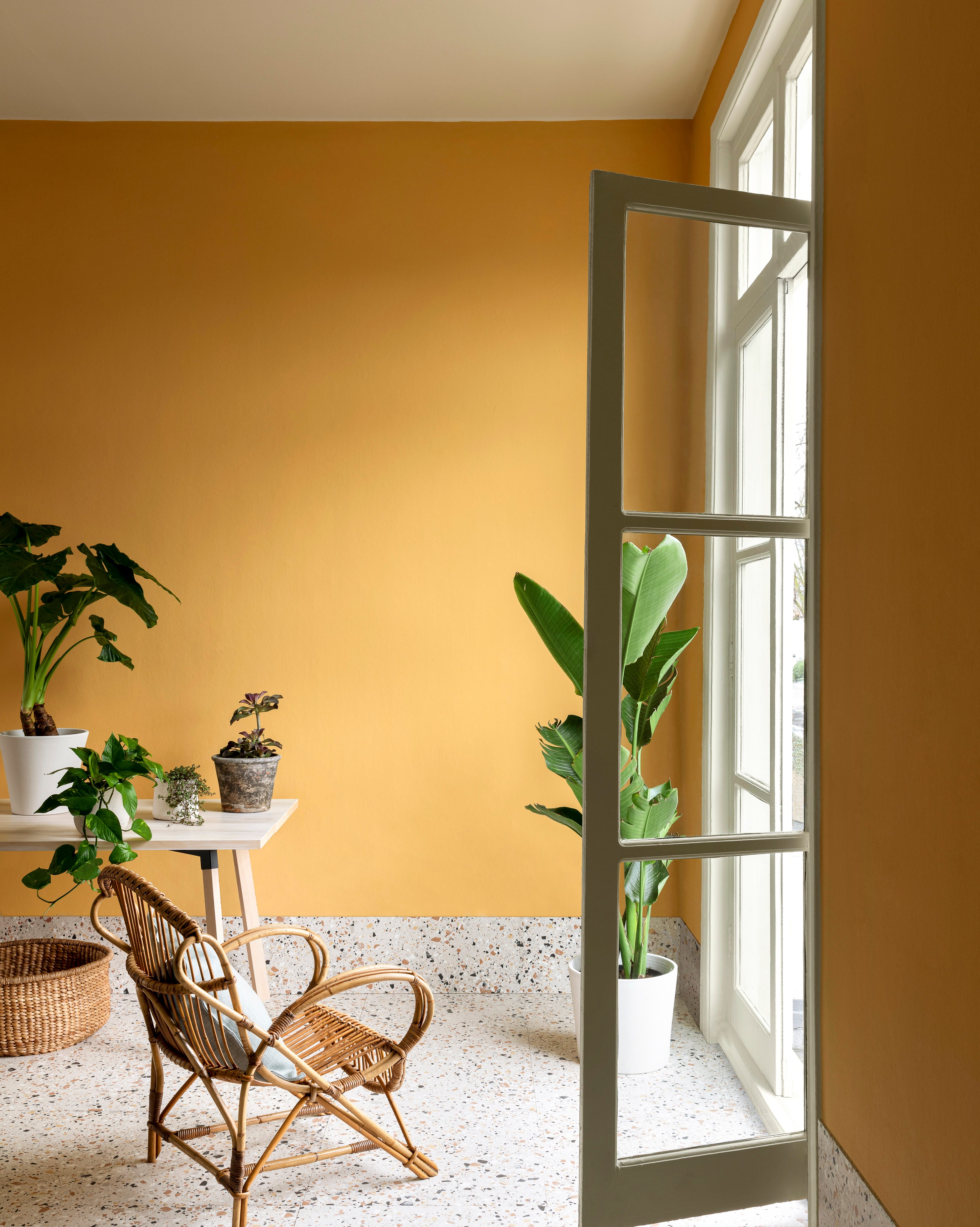
To ensure butter yellow looks fresh and not dated, it should be integrated into spaces that need brightening and combined with contemporary design elements. Modern wallpaper, curtain, or pillow patterns, sleek furnishings, natural textures like light woods, and botanical elements can invigorate the color. Using crisp white as an offset can balance the yellow's warmth. Outdoors, butter yellow can add vintage charm through furniture, patio umbrellas, planters, wreaths, outdoor rugs, pillows, or by painting shutters or exterior doors. The color adapts well to various styles, from cottage and coastal to midcentury and modern. However, designers suggest avoiding large, high-traffic areas like staircases or hallways for wall color or runners due to wear and tear, and generally not painting an entire home exterior with it, preferring accents instead.
#ButterYellow #HomeDecor #ColorTrends #InteriorDesign #PaintColors #DecoratingTips #AccentColors #WarmHues #ColorPsychology #ButterYellow #HomeDecor #ColorTrends #InteriorDesign #PaintColors #DecoratingTips #AccentColors #WarmHues #ColorPsychology
0 comment in total
 No comments yet
You may also like
Has butter yellow's reign come to an end? Designers have mixed opinions, but think these are the new colors that might dethrone it

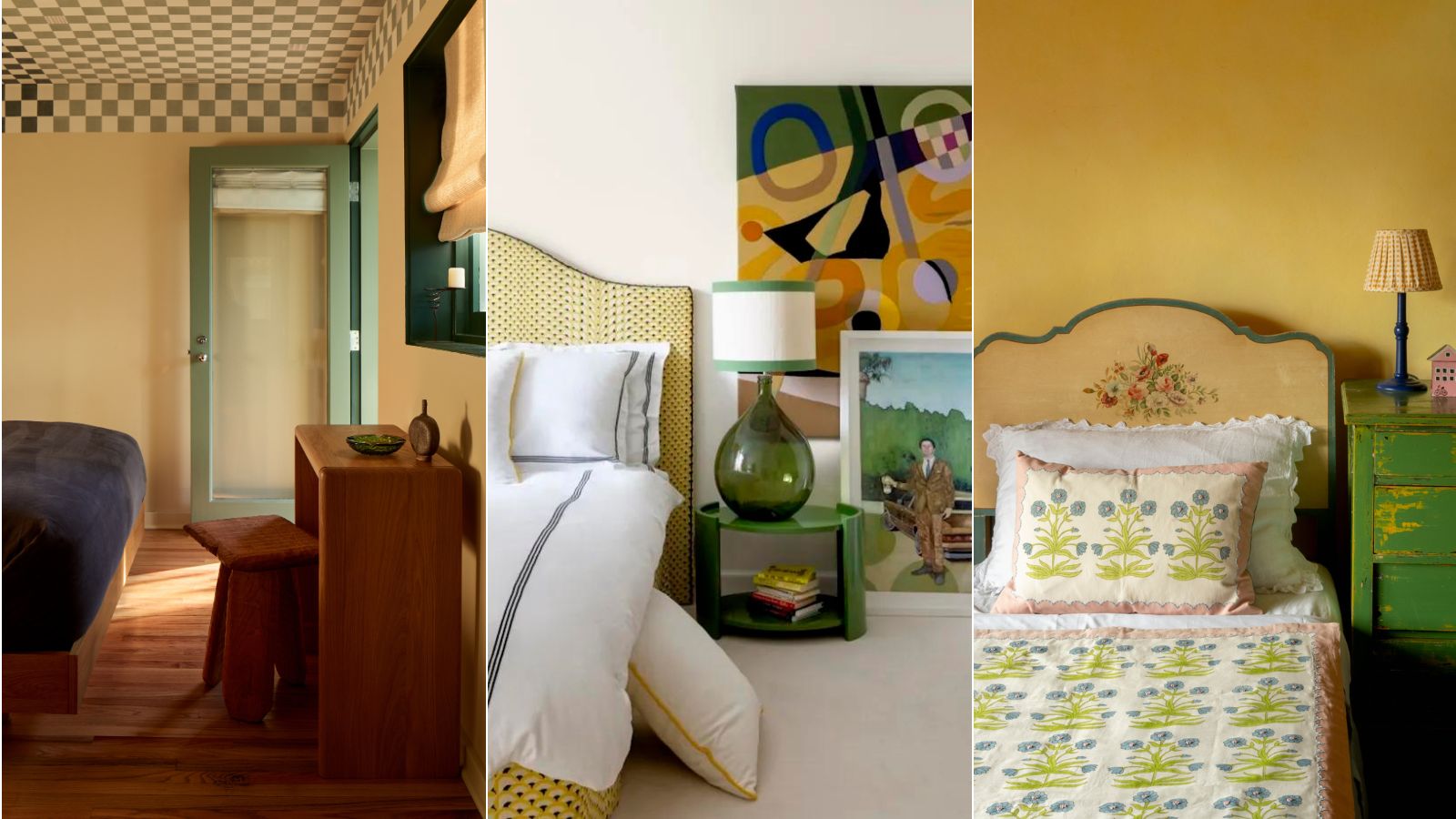
5 sunshine yellow bedroom ideas to cheer up your sleep space
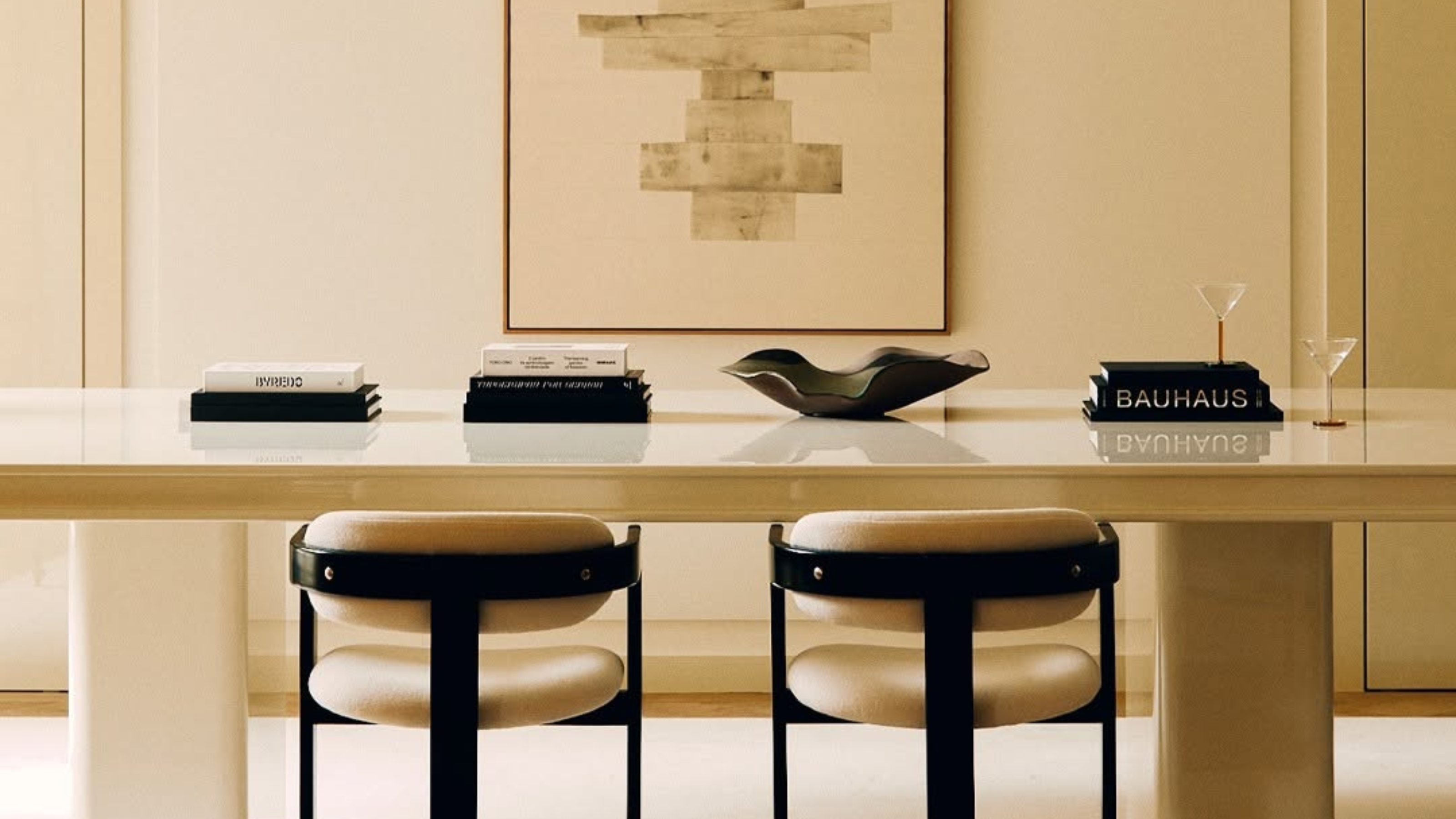
5 Butter Yellow Paints That Designers Swear By — So You Can Get This Trending Color on Your Walls With Confidence

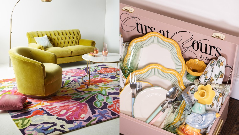
Experts Explain the Butter-Yellow Home Decor Trend for 2025

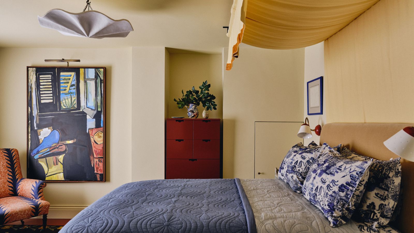
Butter yellow is 2025's new neutral – and these 12 delicious pale yellow buys have convinced me it beats my once-loved beige
What colors go best with butter yellow? 8 equally delicious shades to pair with spring's hottest color trend
Not beige, not grey –this perfect 'new neutral' is what Josh Brolin, Gwyneth Paltrow, and Martha Stewart are decorating with instead

Butter Yellow Is the Hottest Color of the Year and the Met Gala Just Proved It
Butter yellow is the kitchen colour of the season - this is how to make the delicious shade work
8 Butter Yellow Paint Colors That Will Bring a Charming, Serene Aesthetic to Every Room in Your Home
9 On-Trend Yellow Paint Colours For 2025

Decorating with yellow: 13 ways to use this sunshine shade at home
Butter yellow is the perfect 'new neutral' that celebrities are decorating with
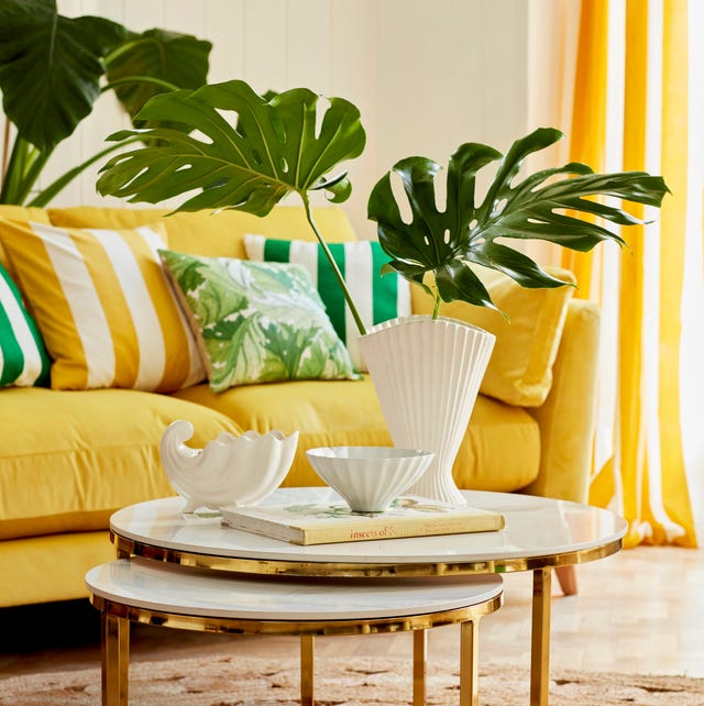
8 Bold Yellow Decorating Ideas That Will Brighten Any Room

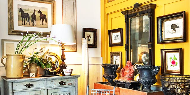
14 Happy Shades of Yellow You Never Expected to Fall In Love With
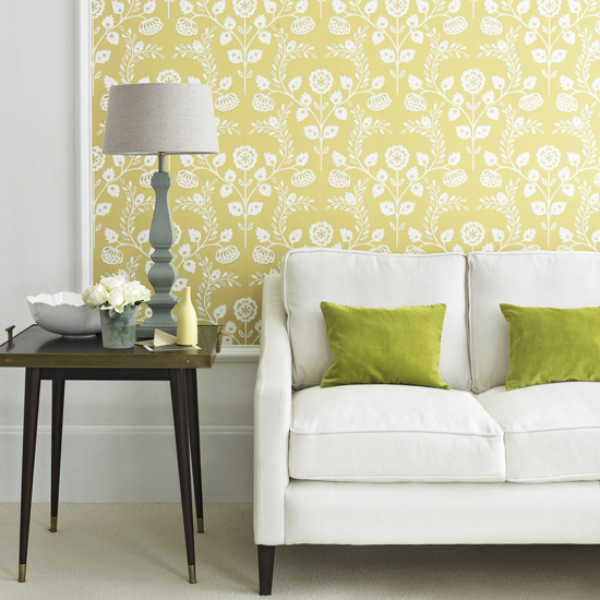
How to decorate with yellow – 10 of the best ideas

Butter Yellow and the Foodification of Color

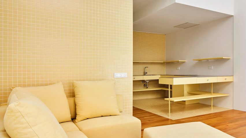
Eight eclectic home interiors spread with buttery yellow tones
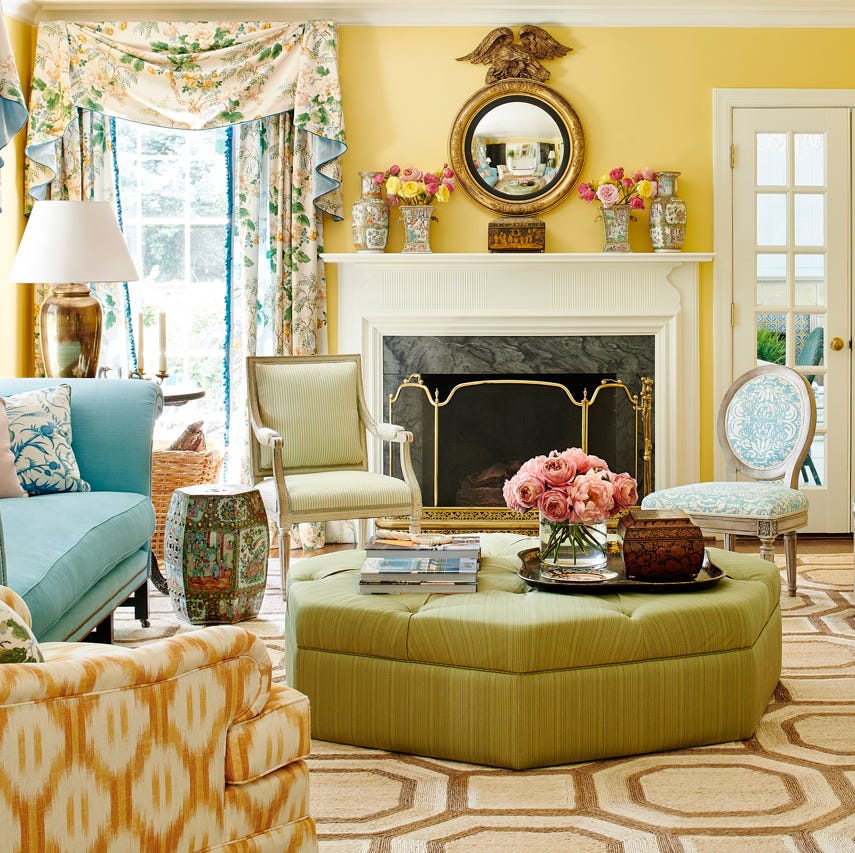
How to Decorate with Yellow the Right Way, According to Designers

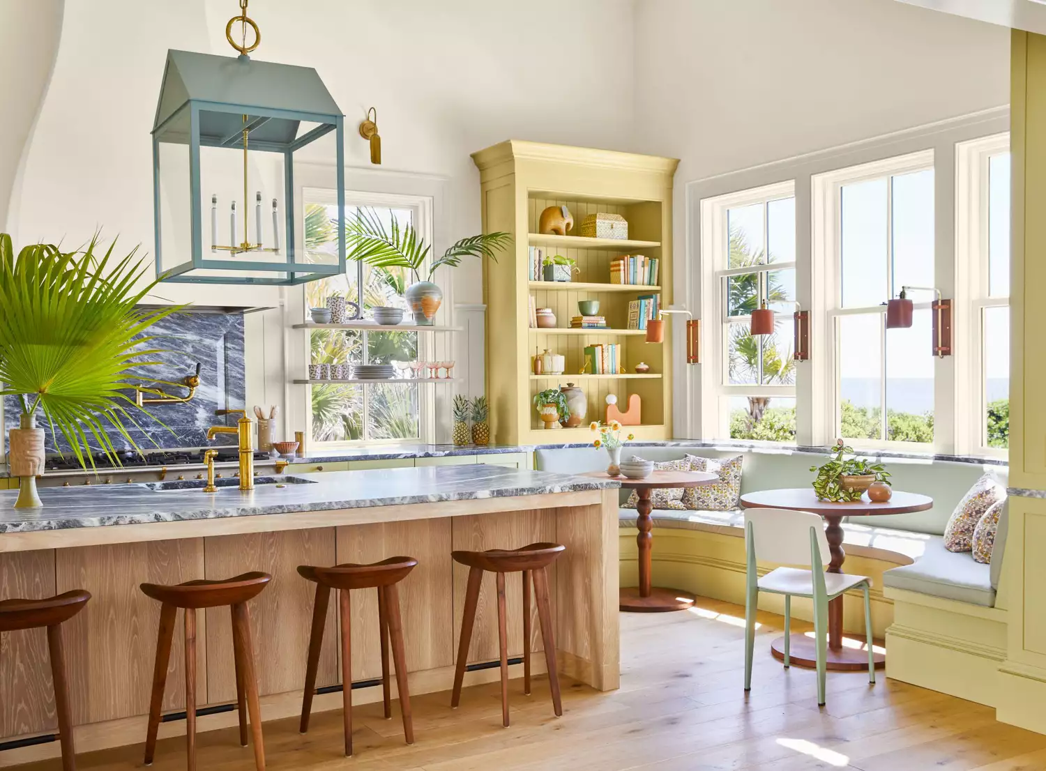
The 1950s Paint Color Trend Taking Over In 2025 That Designers Call ‘Refreshing’ And ‘Nostalgic’