1/9
How to Decorate with Yellow the Right Way, According to Designers

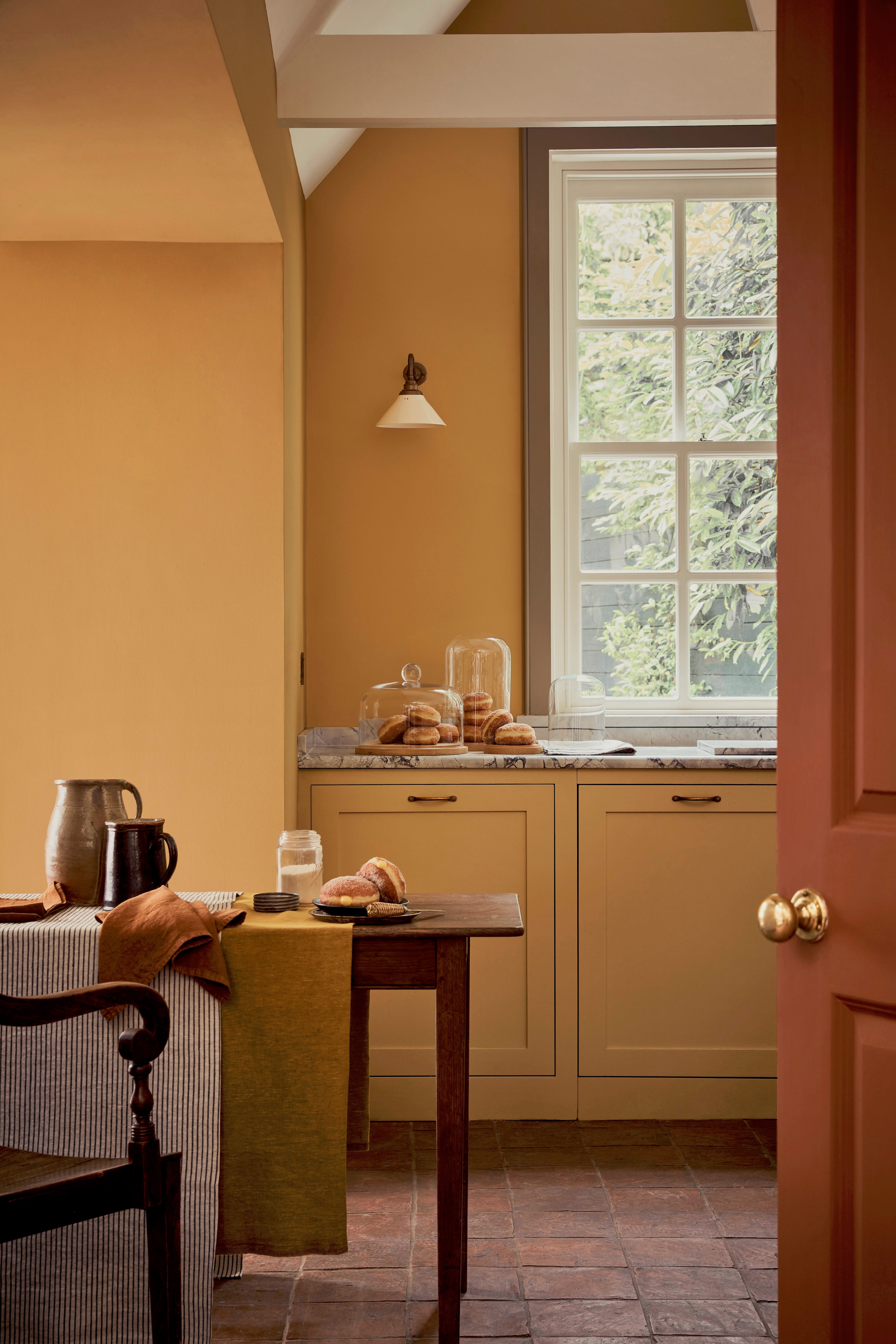
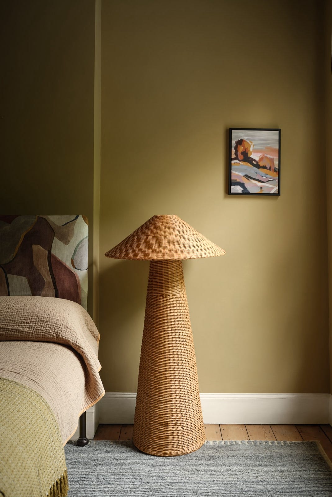
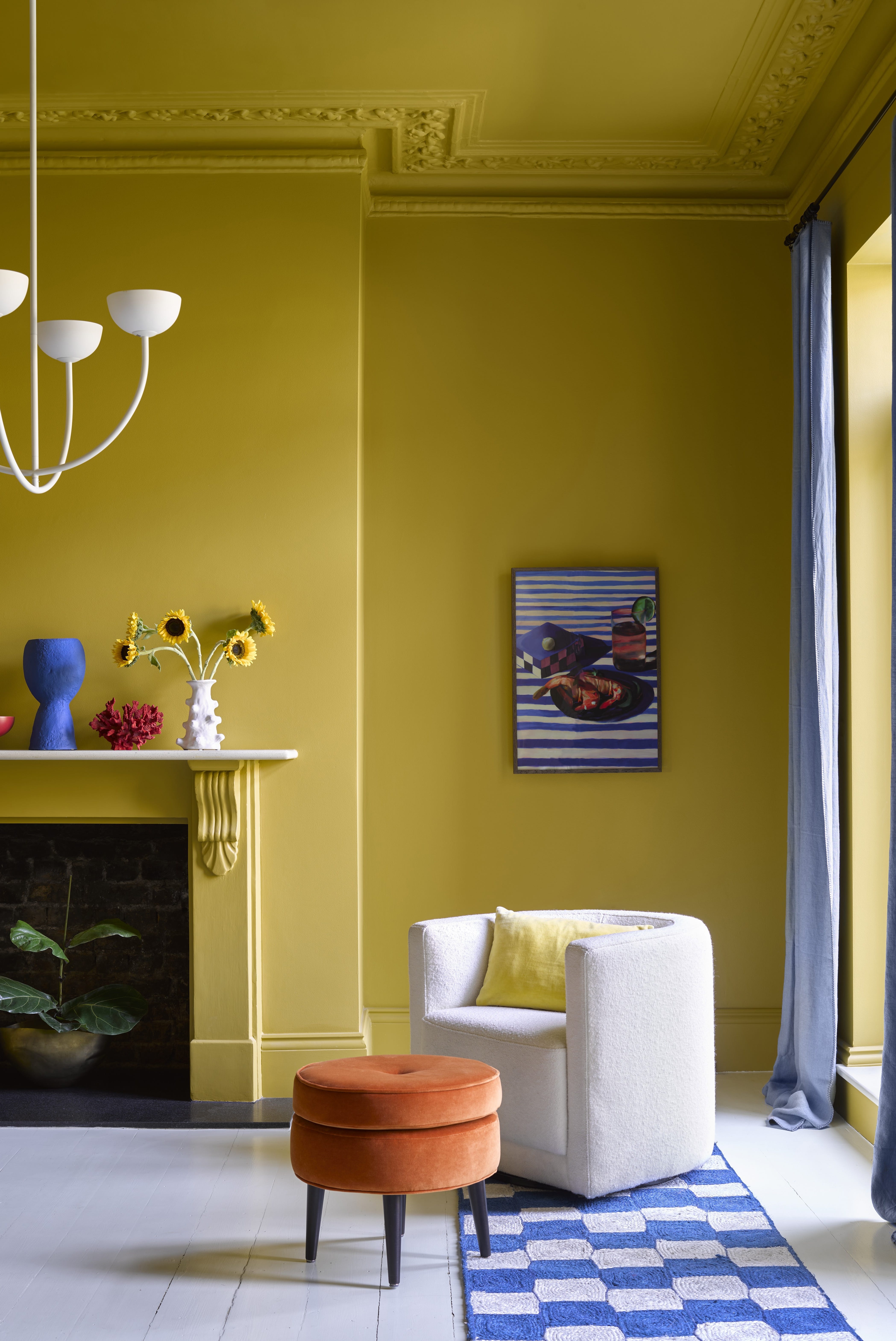
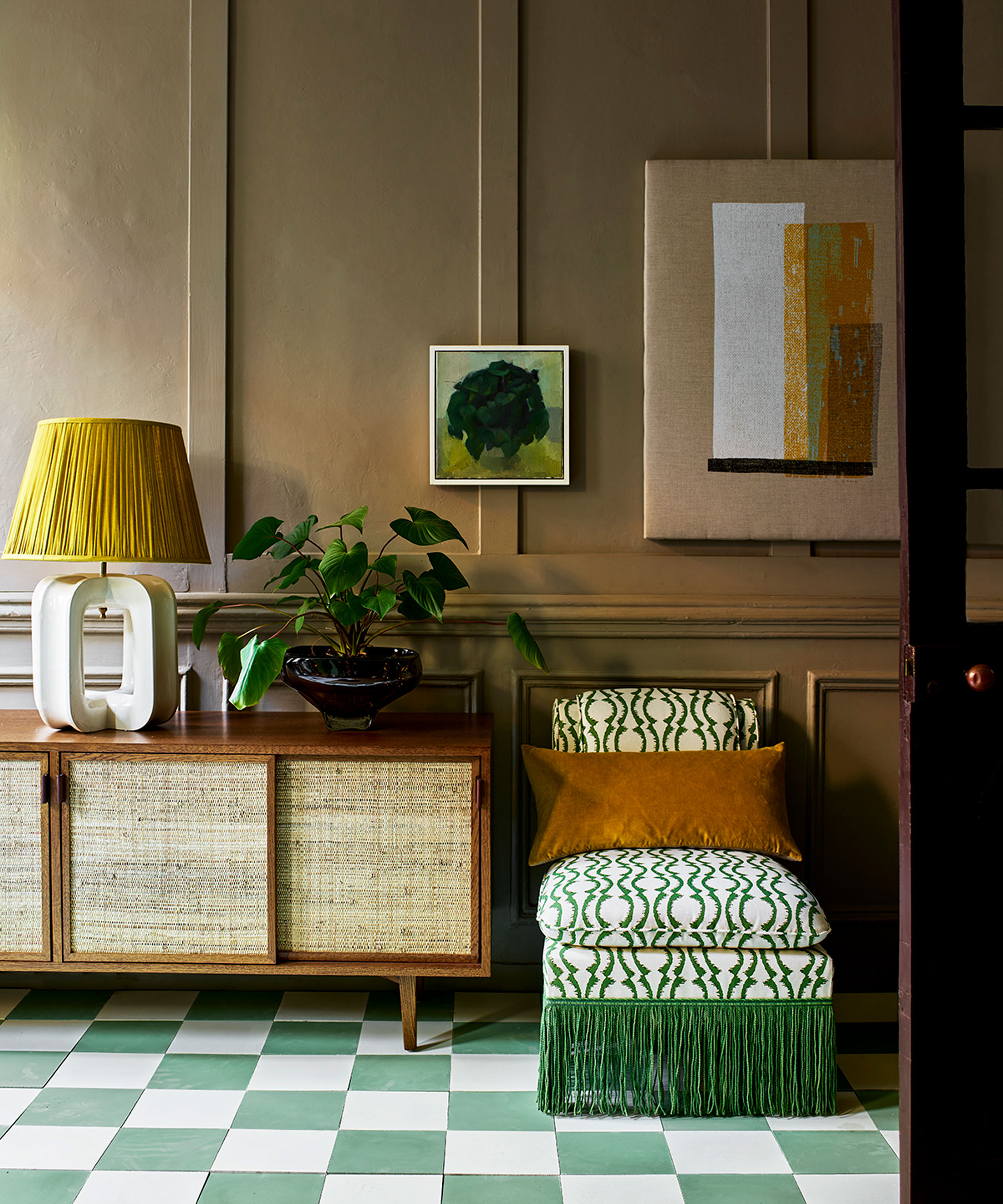
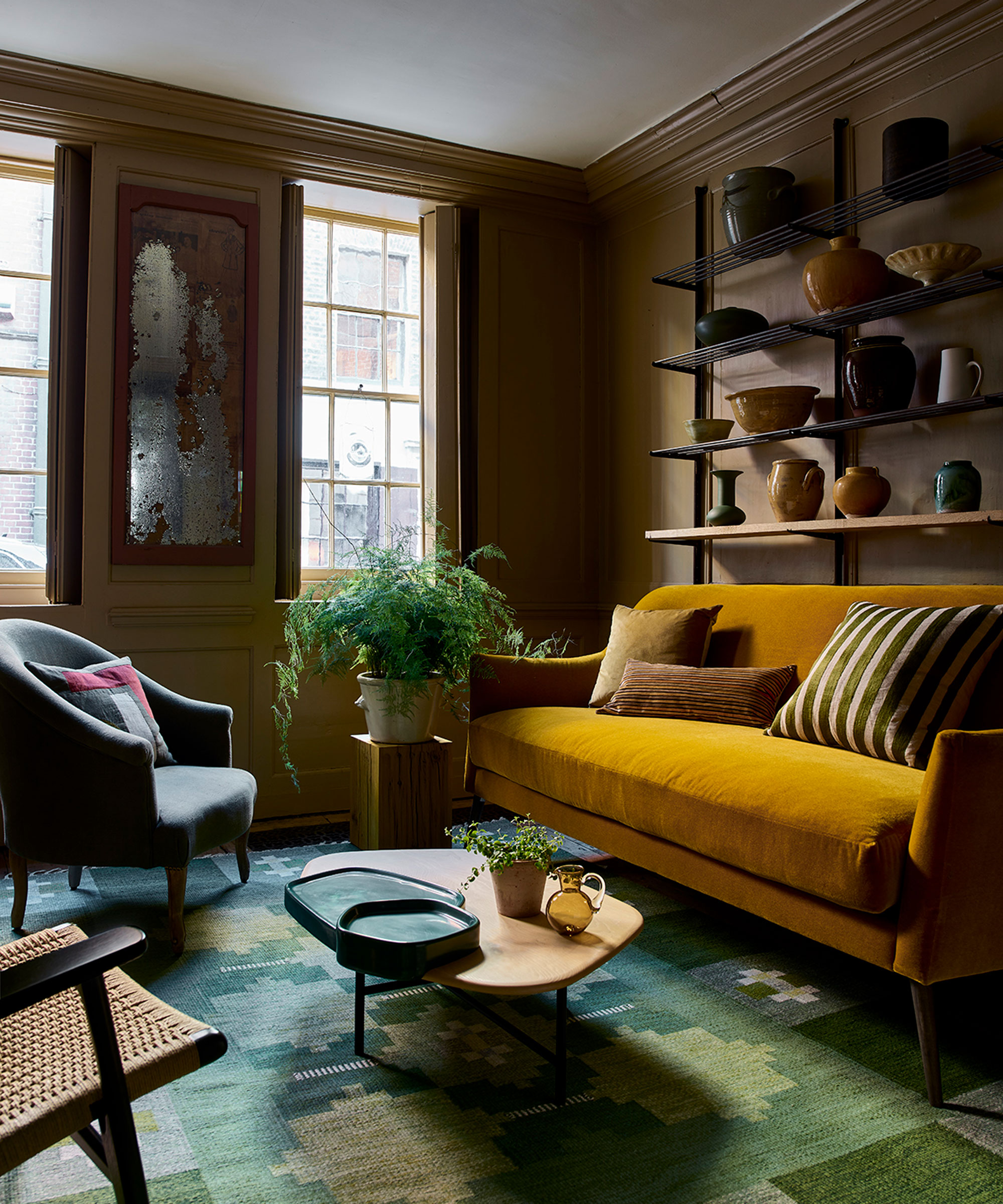
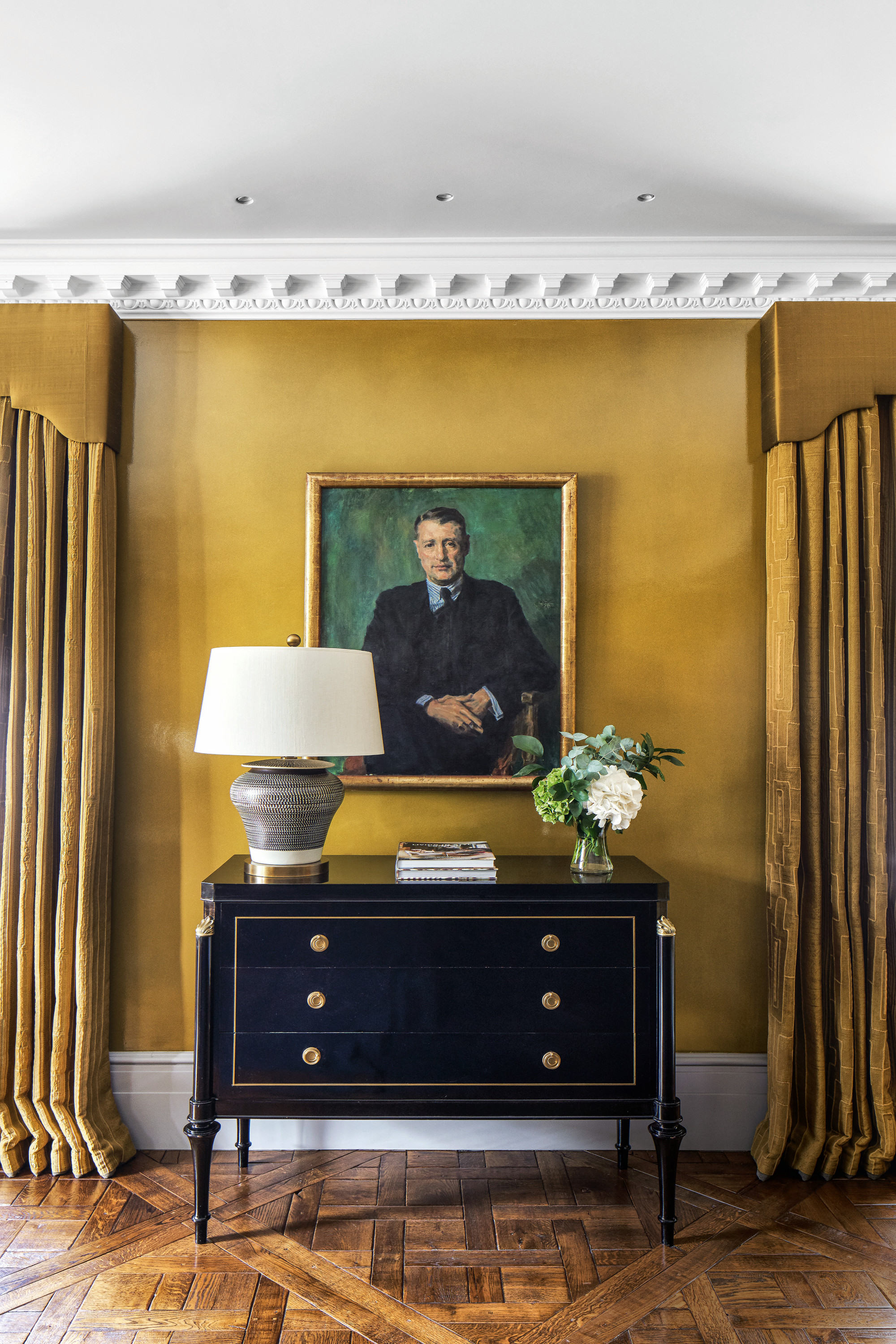
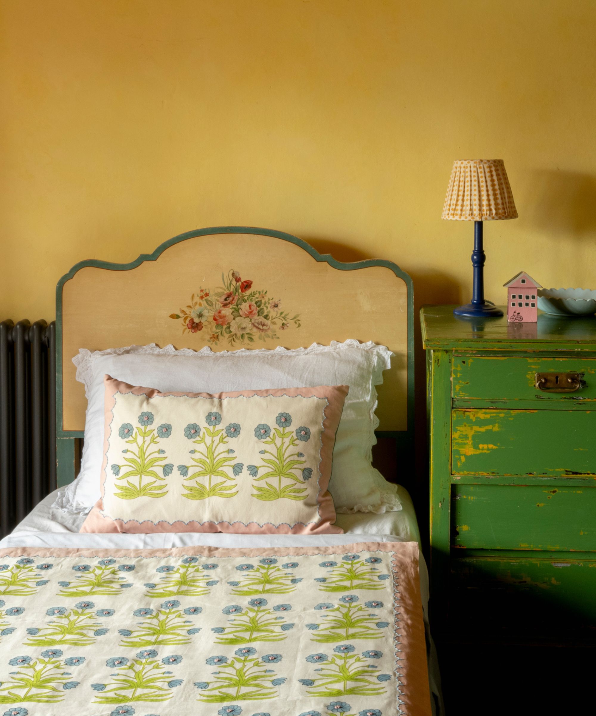
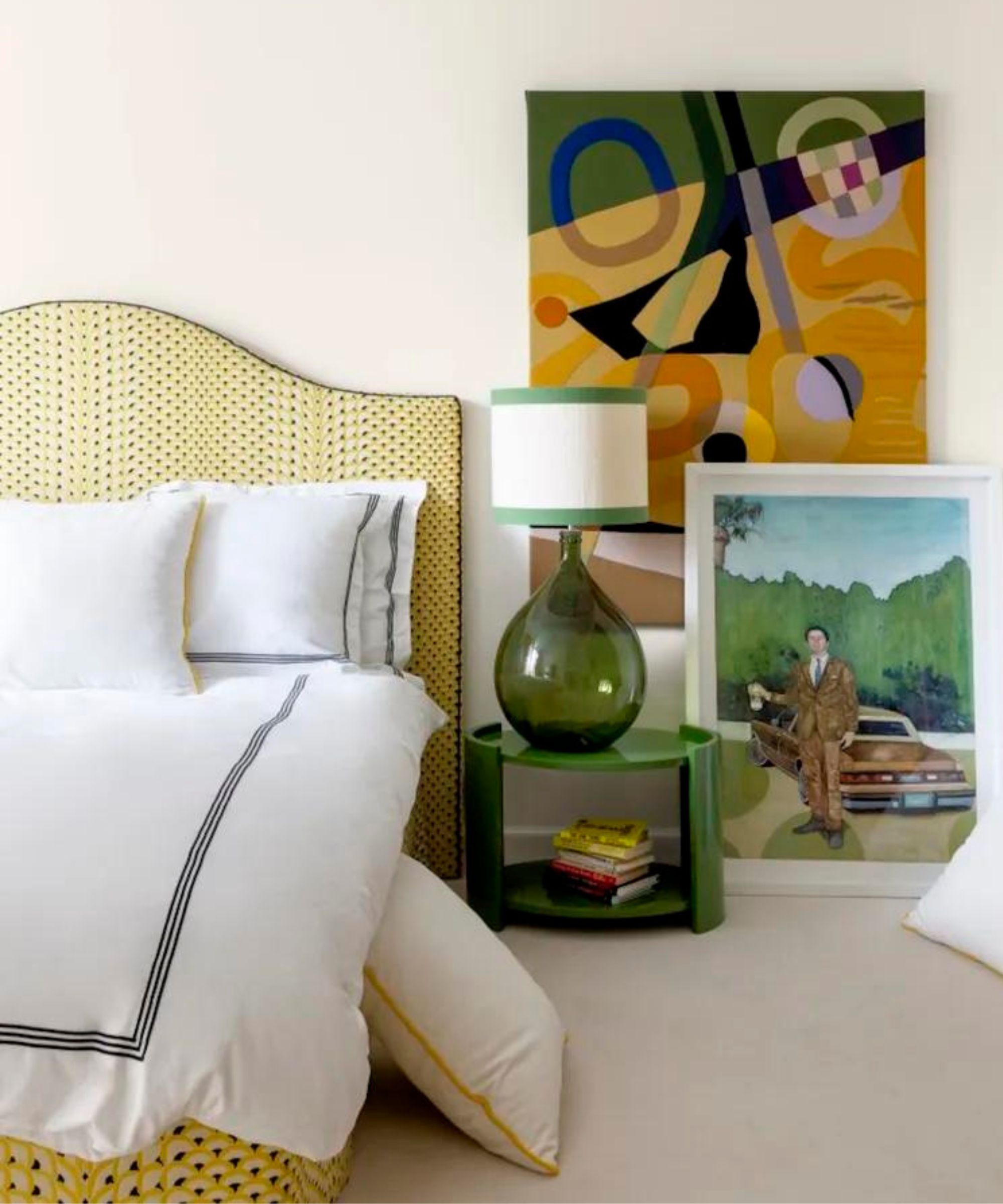
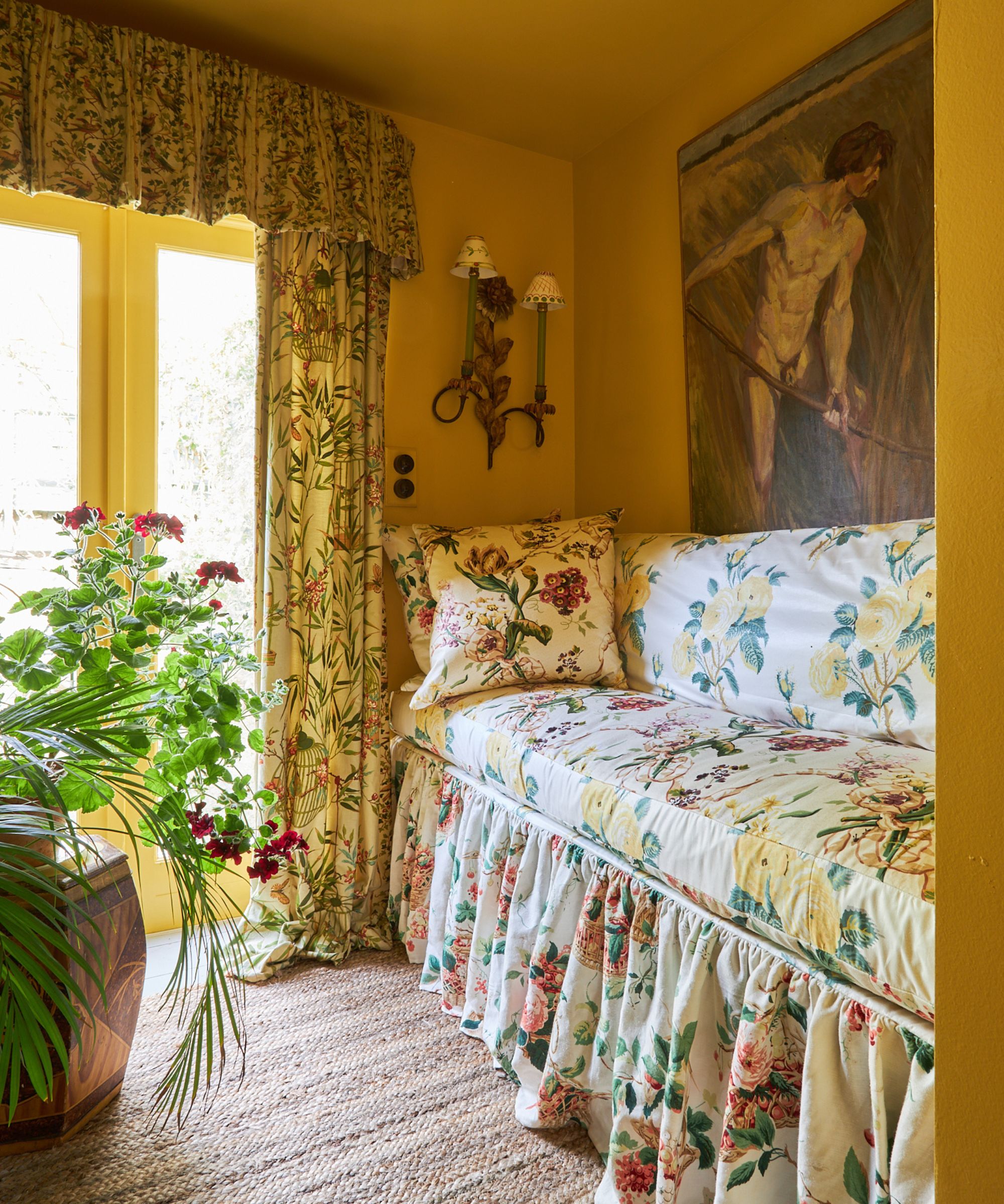
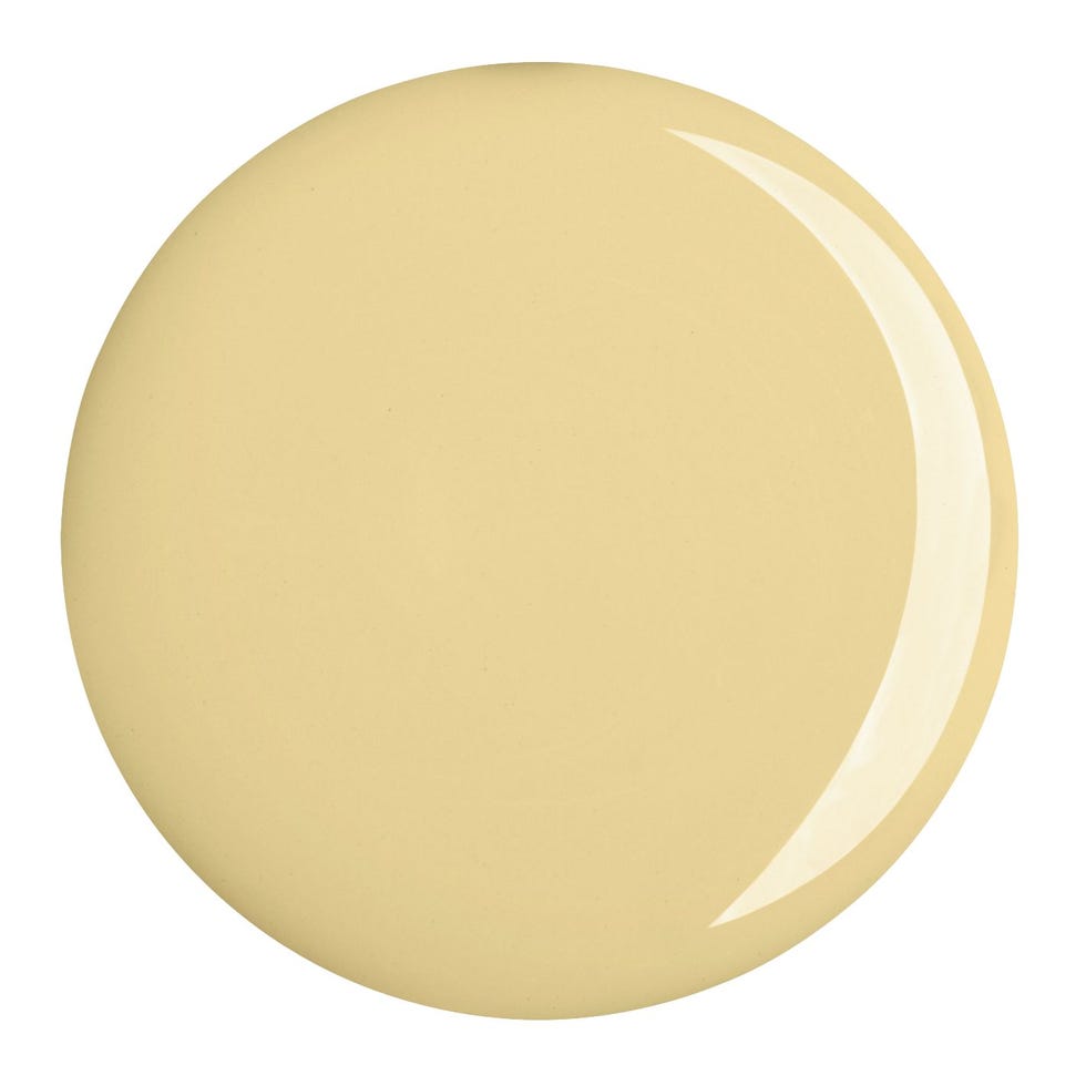
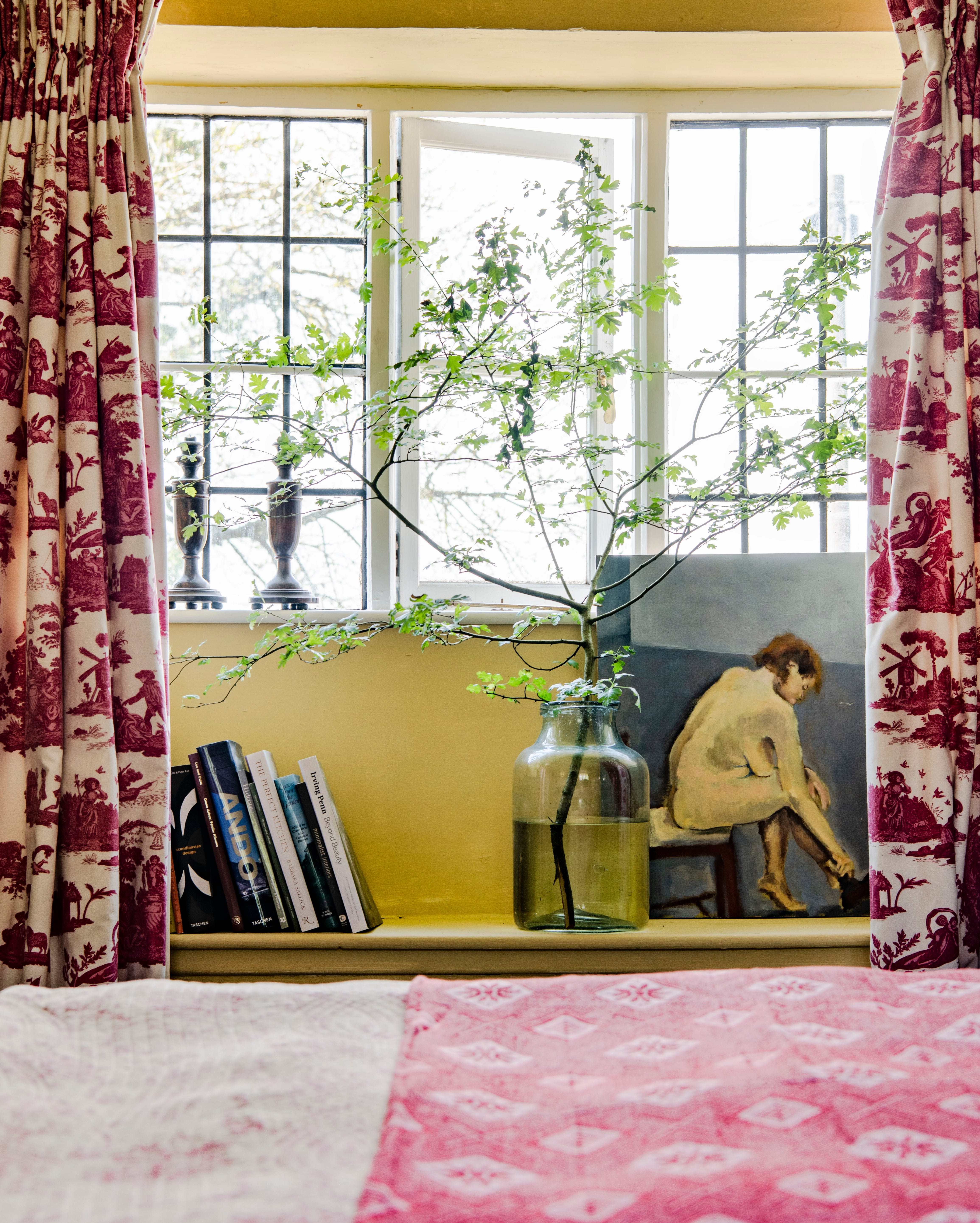
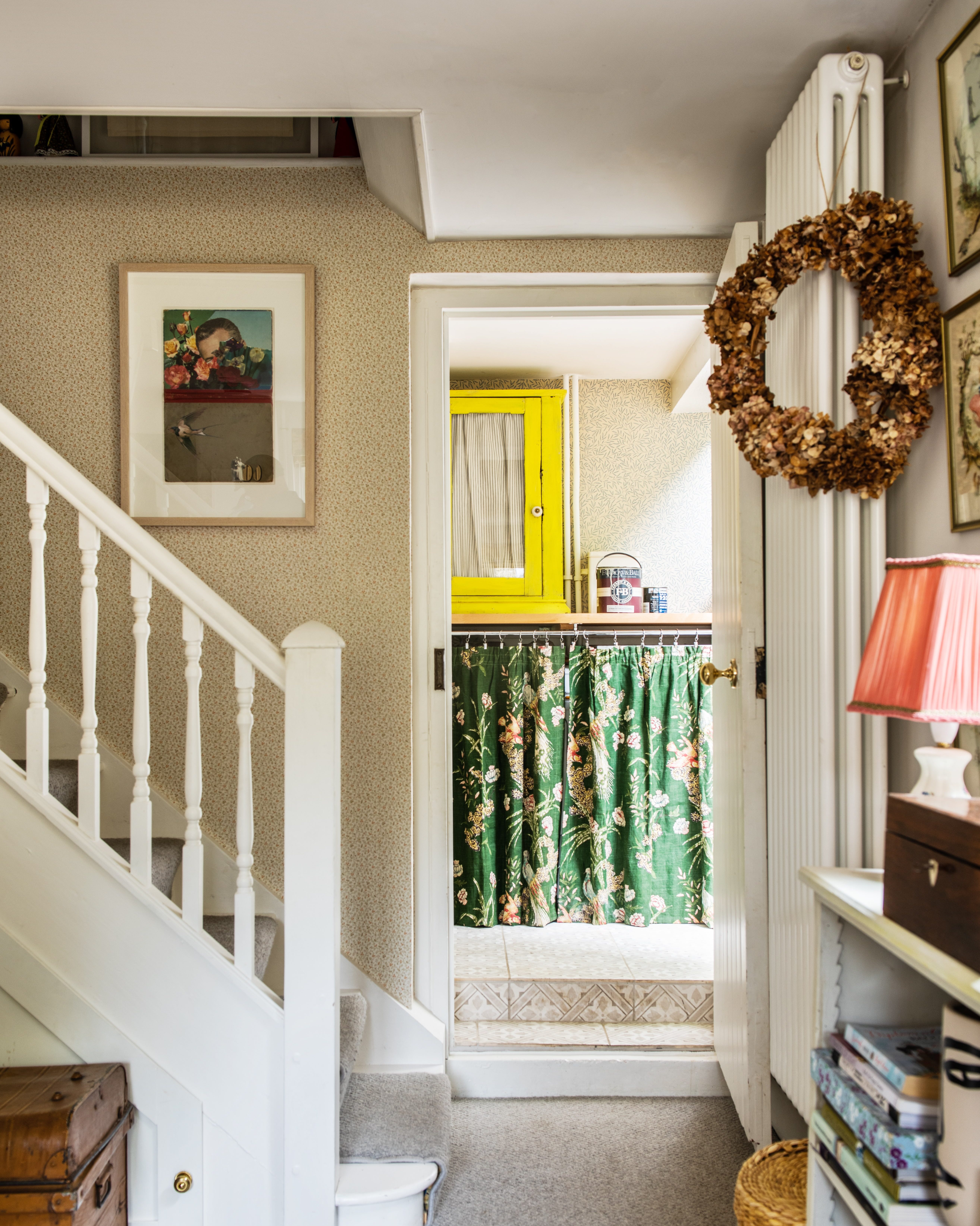
Yellow, in its various shades from ochre to buttercup, can significantly impact interior decor. This versatile color can be used as a dominant feature or as a subtle accent, offering numerous design possibilities. Several top interior designers provide insights and tips for effectively incorporating yellow into different spaces.
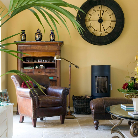
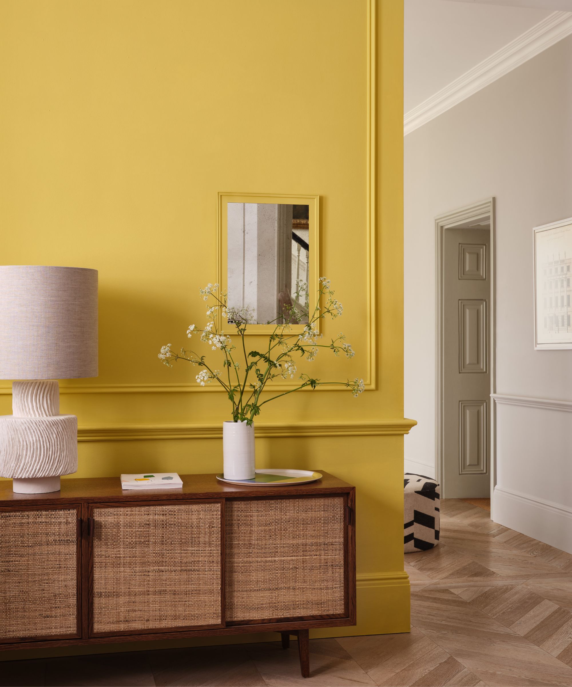
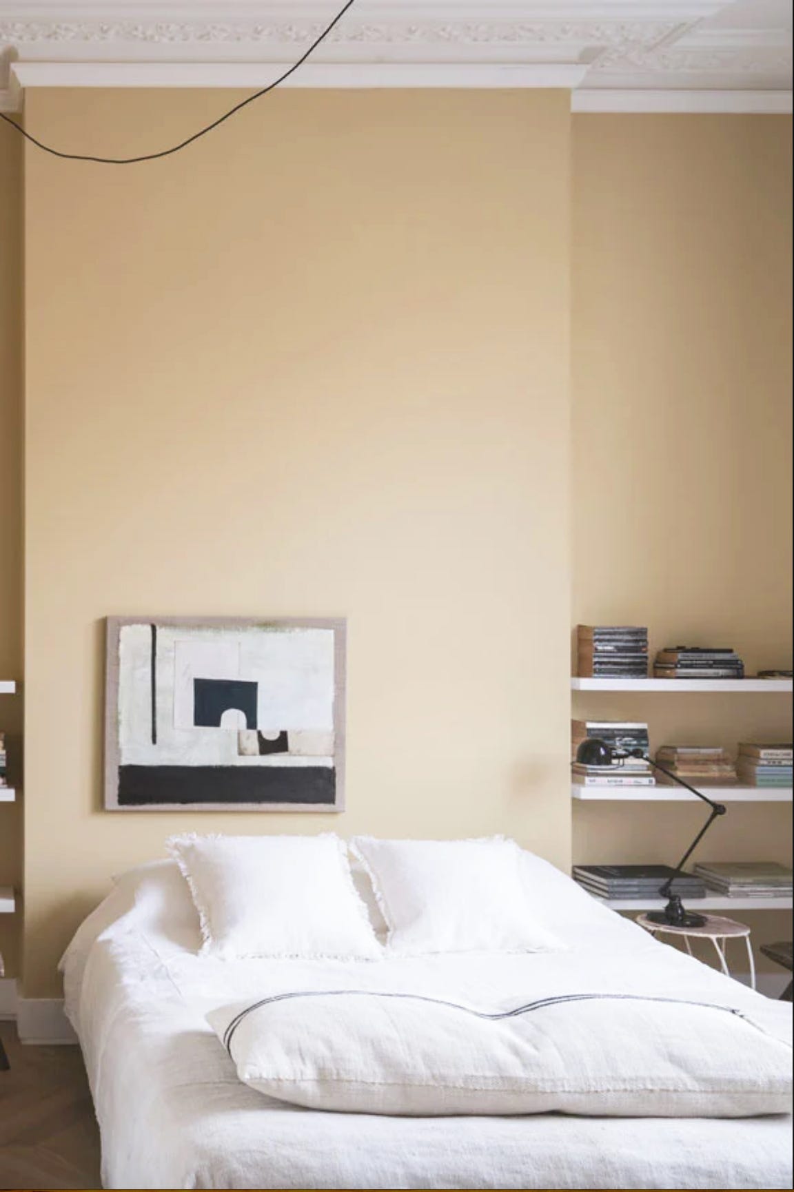
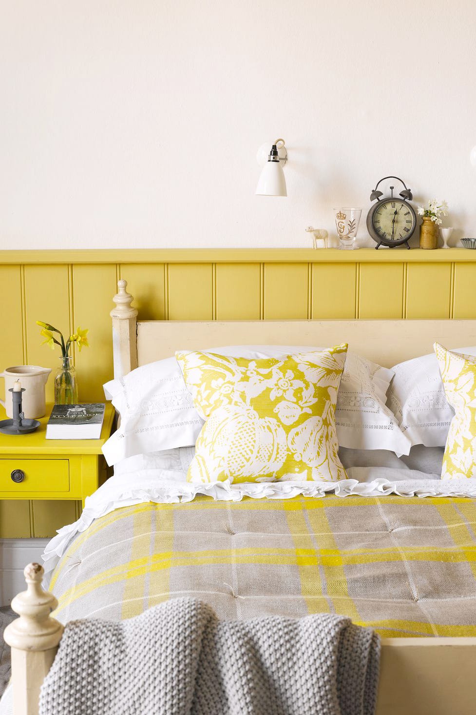
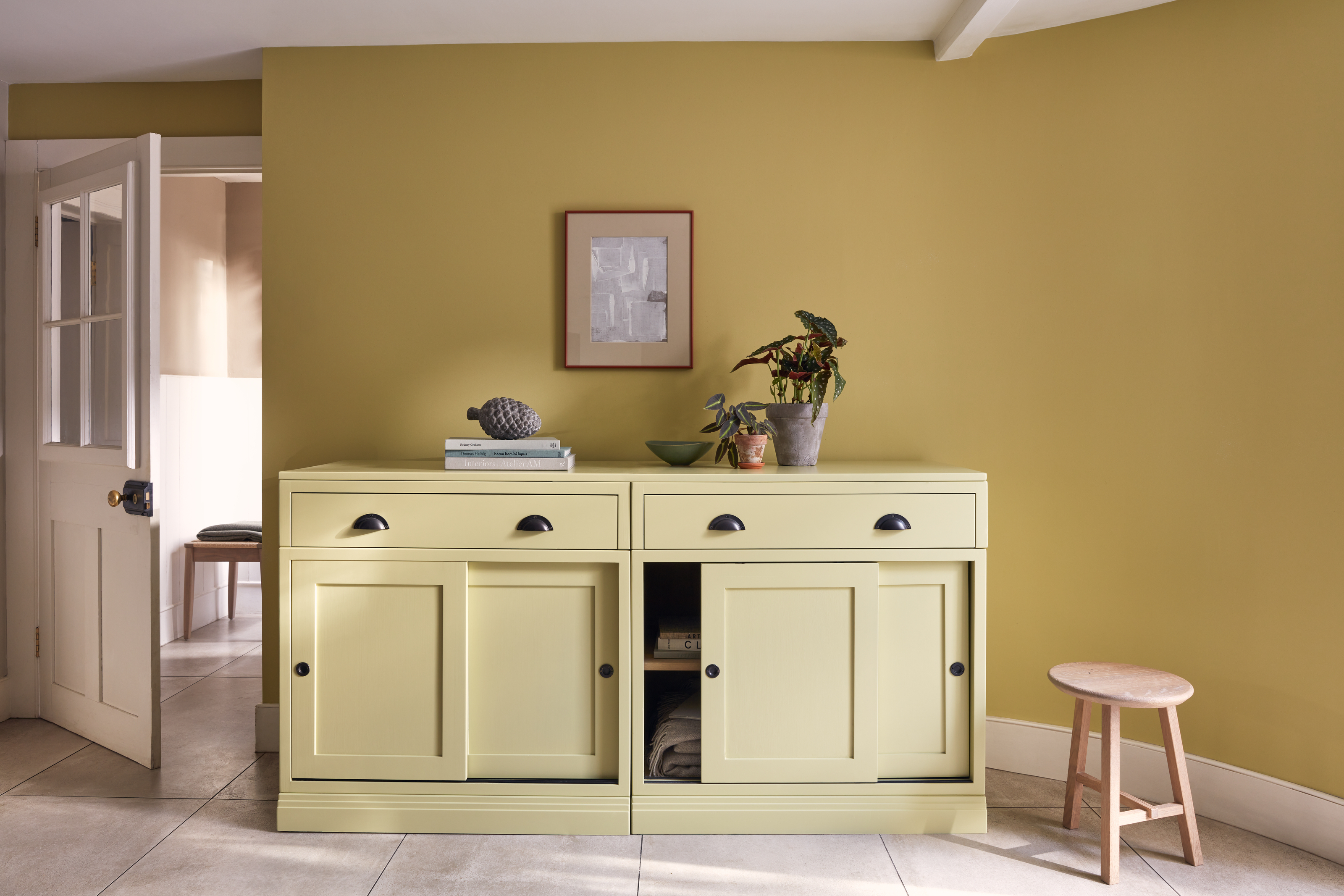
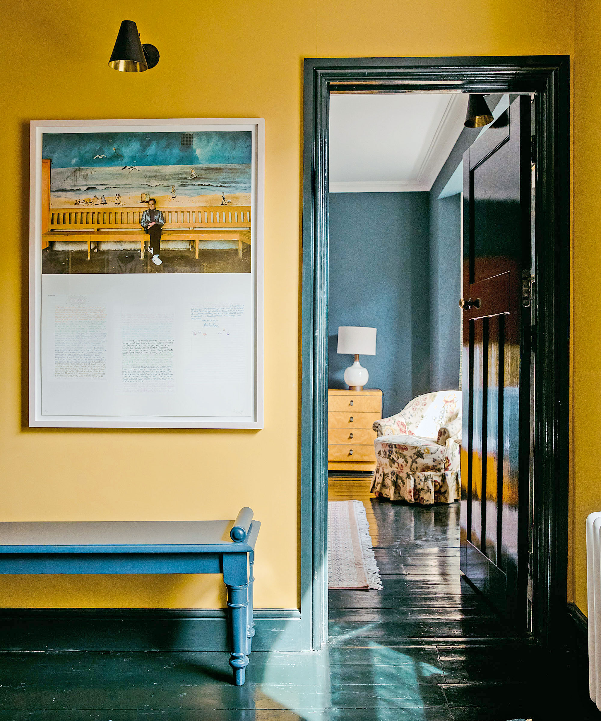
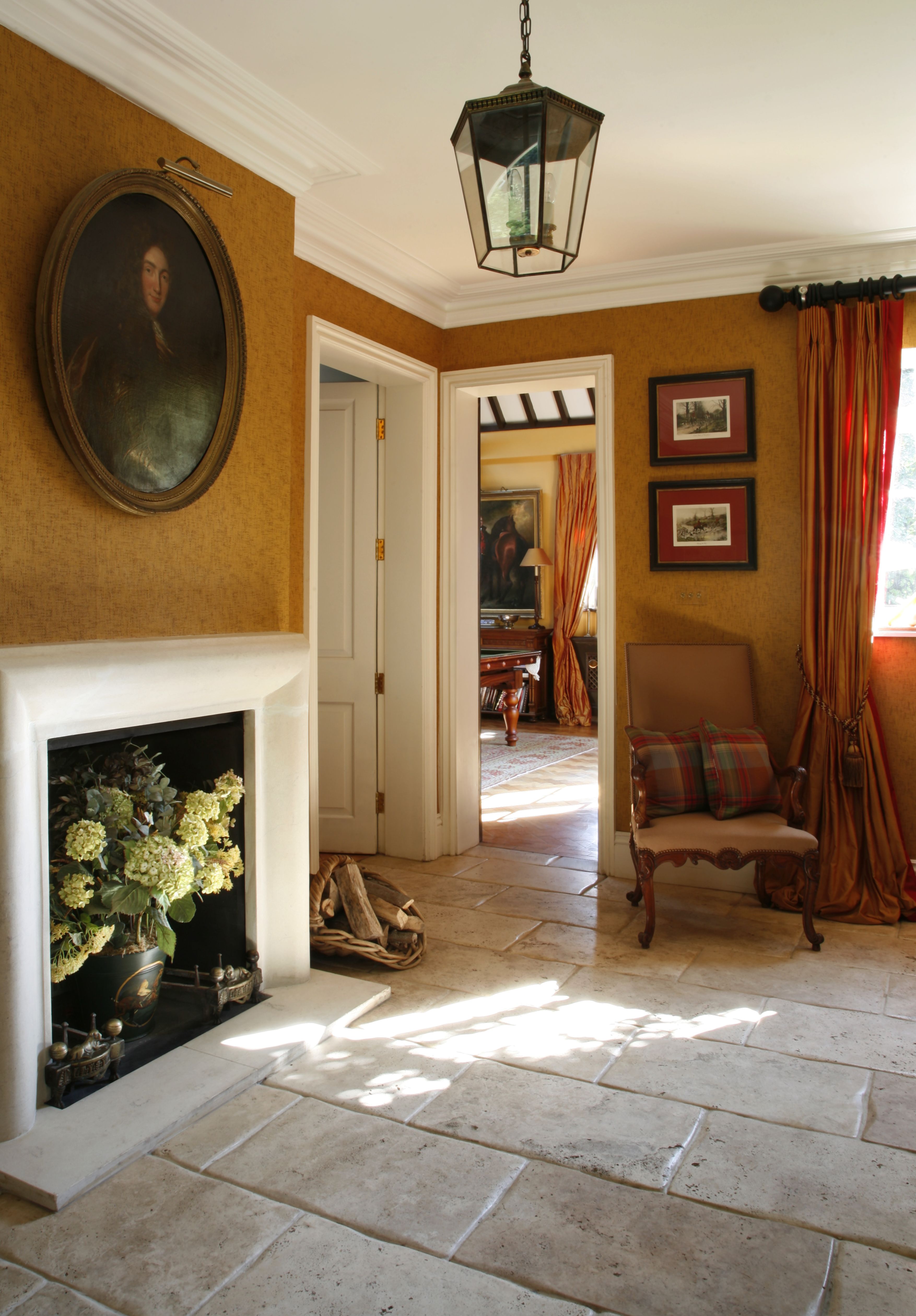
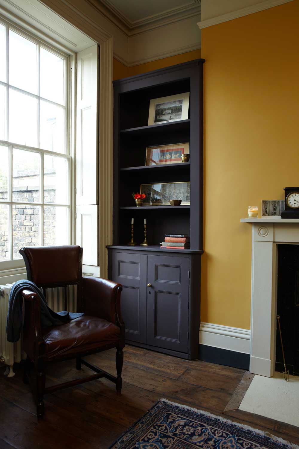
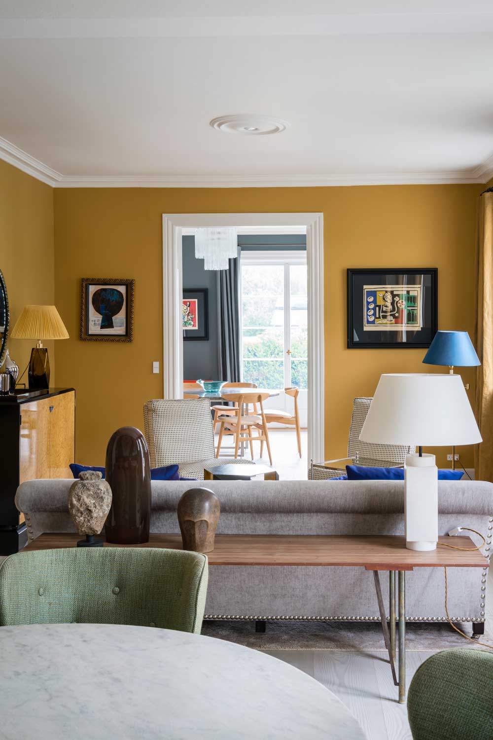
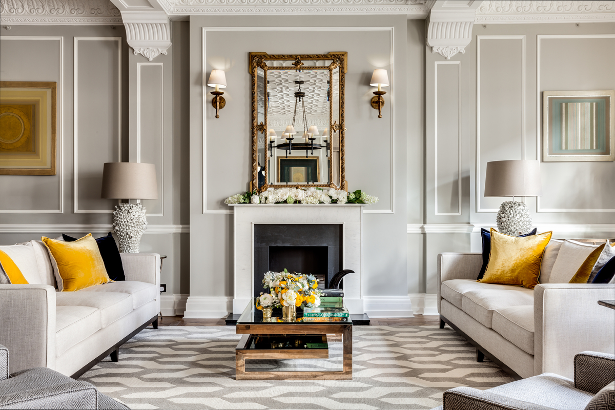
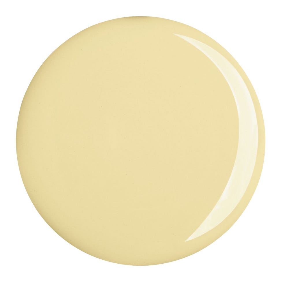
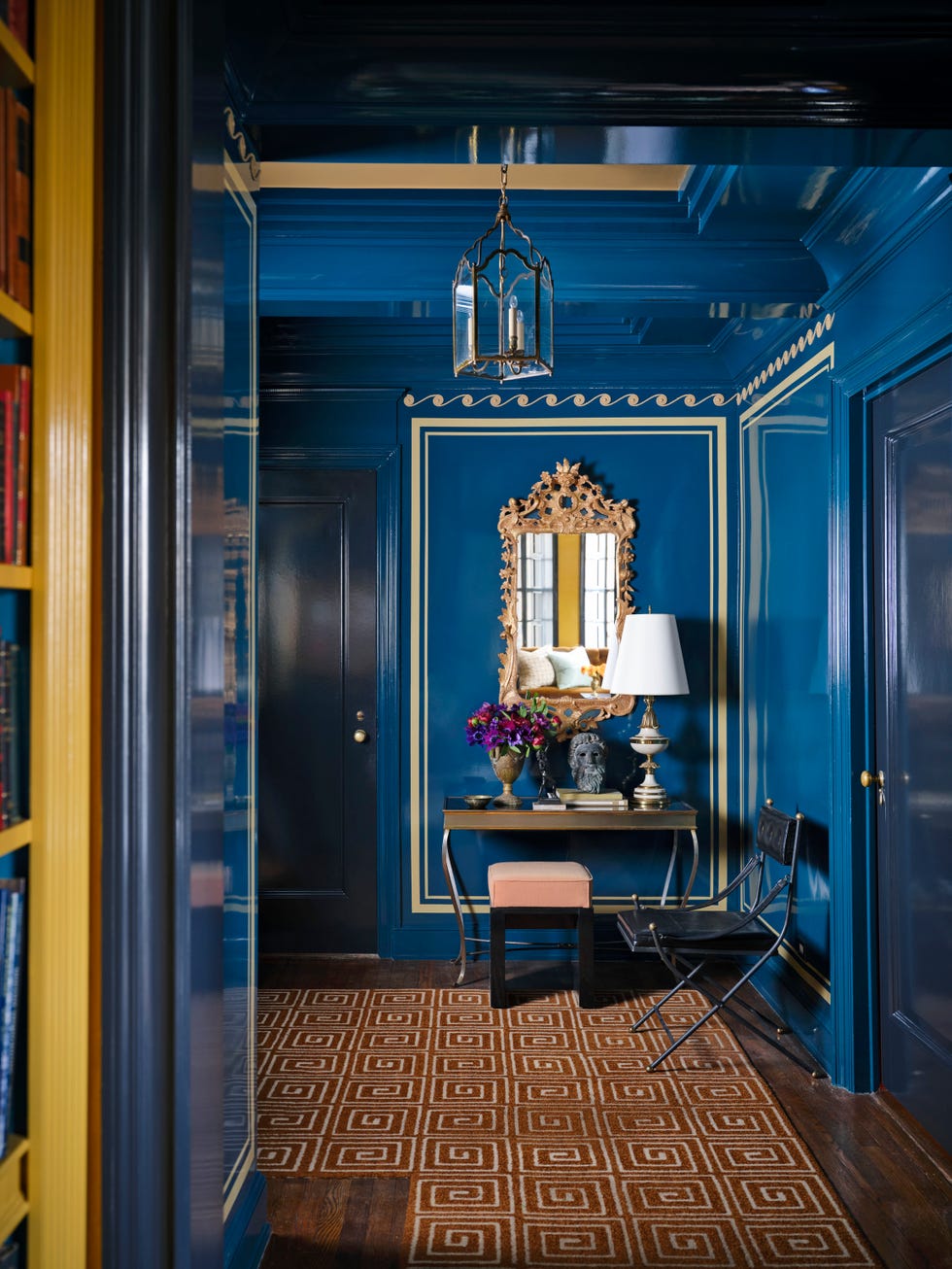
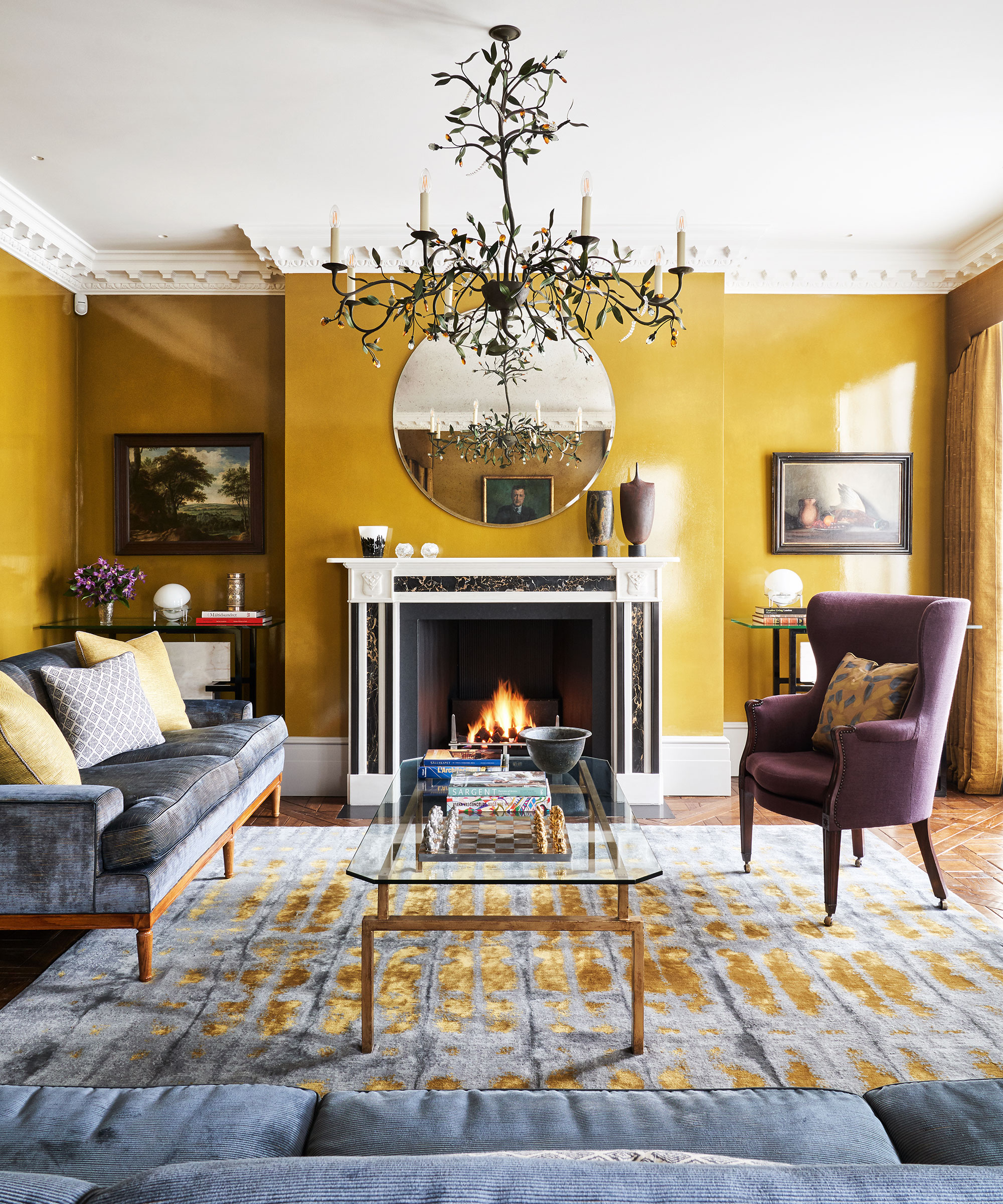
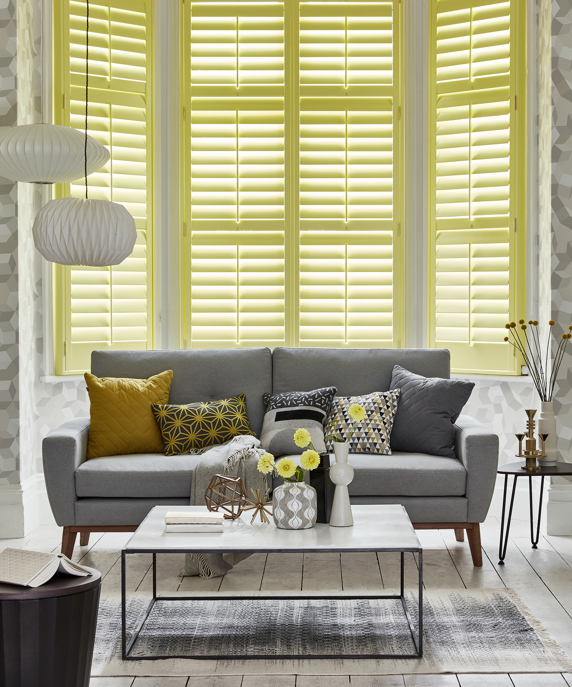
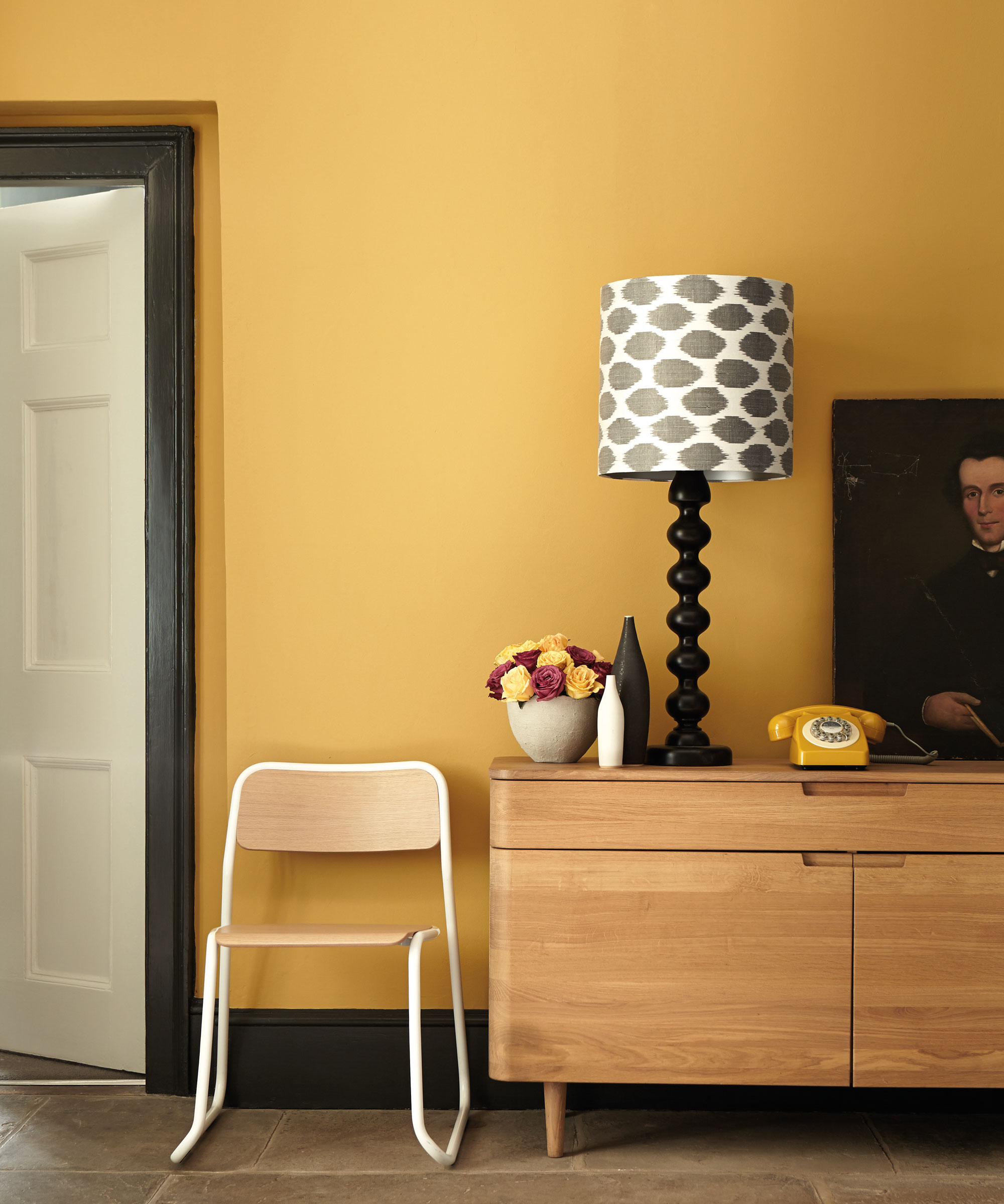
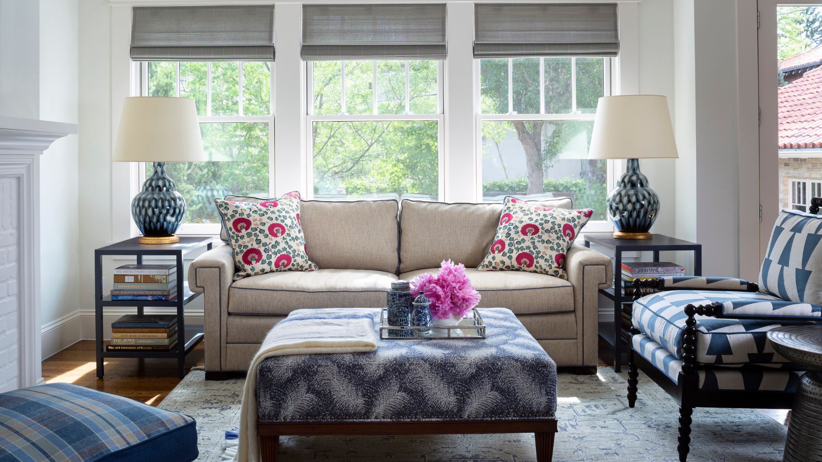
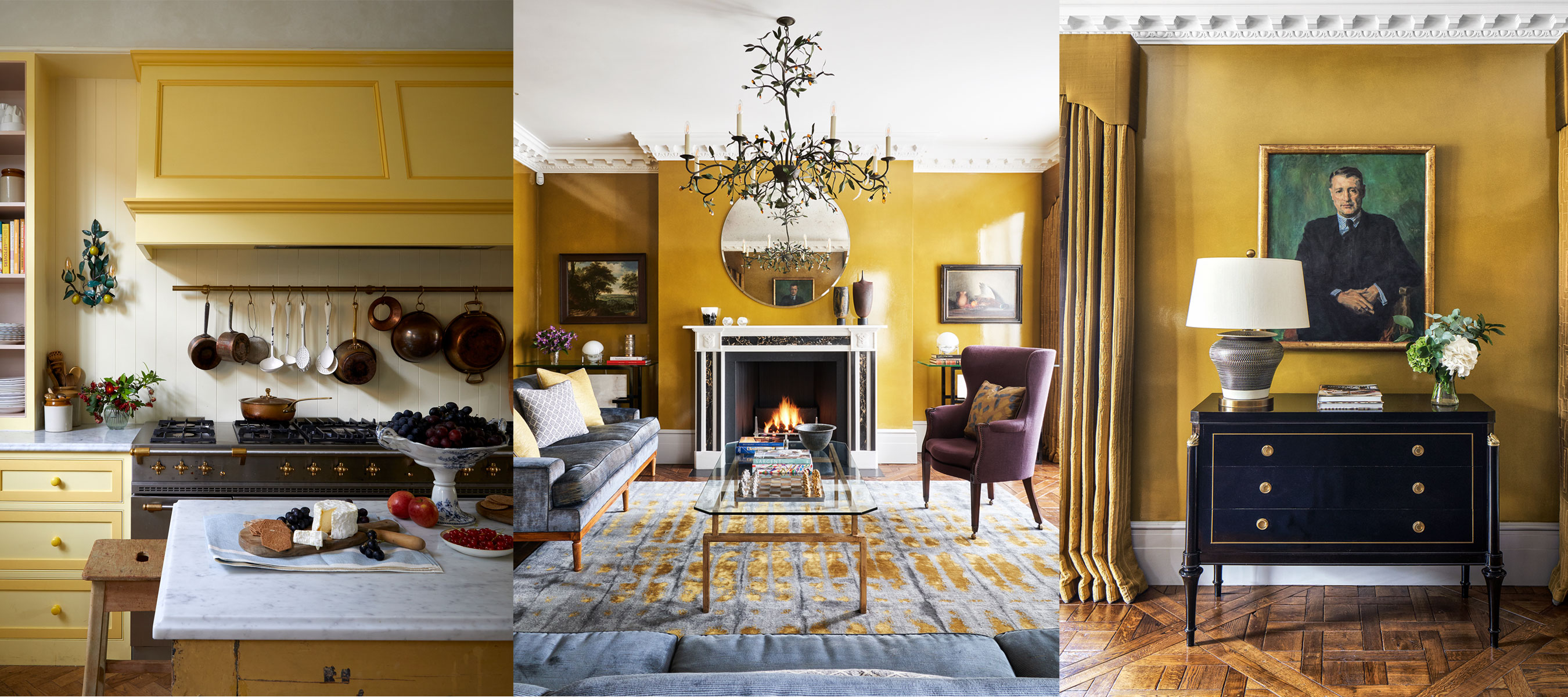
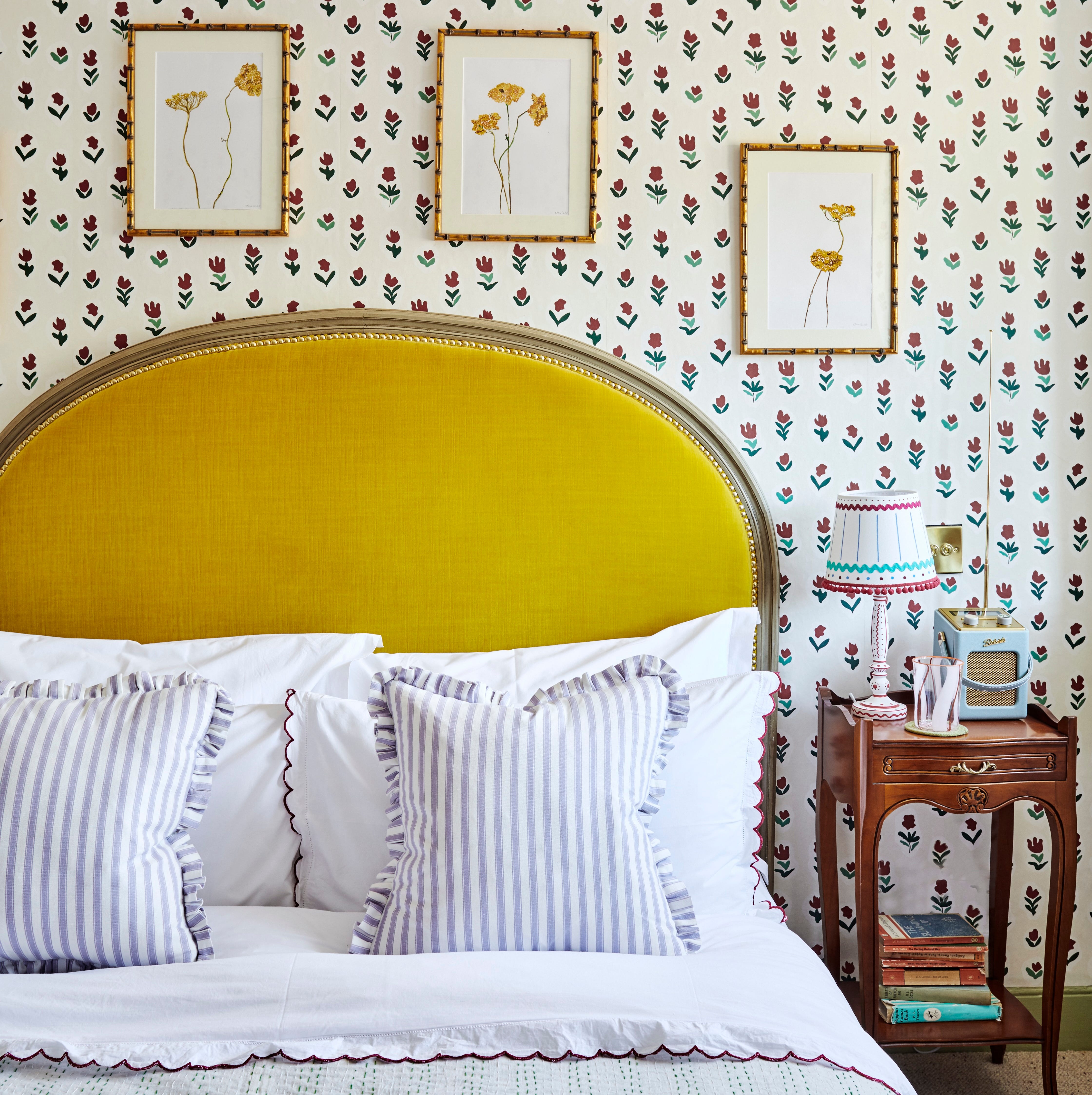
Designers often have preferred yellow shades and color pairings. Bryan Frost favors ochre, a rich, earthy hue, which he often uses for accent chairs and pillows, particularly when combined with navy for a striking contrast. Beth Kooby prefers more muted yellows like mustard or soft yellow, suggesting they pair well with deep gem colors such as teal and cranberry or merlot for an exciting yet balanced look. Mark Cutler categorizes his favorite yellows into two types: soft pale yellows for a bright and romantic ambiance, exemplified by Farrow and Ball's Dayroom Yellow, and deep saturated yellows that evoke sunflowers or a retro feel. He recommends Portola Paints' Yellow Queen as a neutral alternative to white for a radiant children's room. For bolder statements, Benjamin Moore's Buttercup can enliven spaces like laundry rooms, while Golden Retriever by Benjamin Moore offers a rich, desert-inspired vibe reminiscent of Louis Barragan's aesthetic.
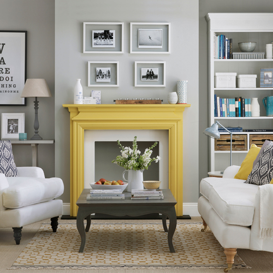
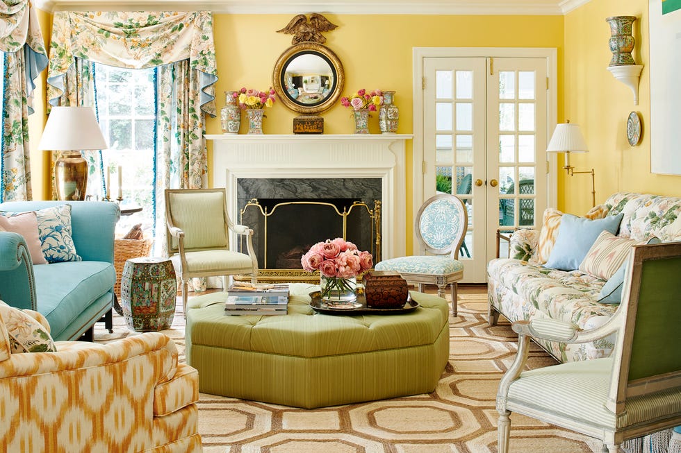
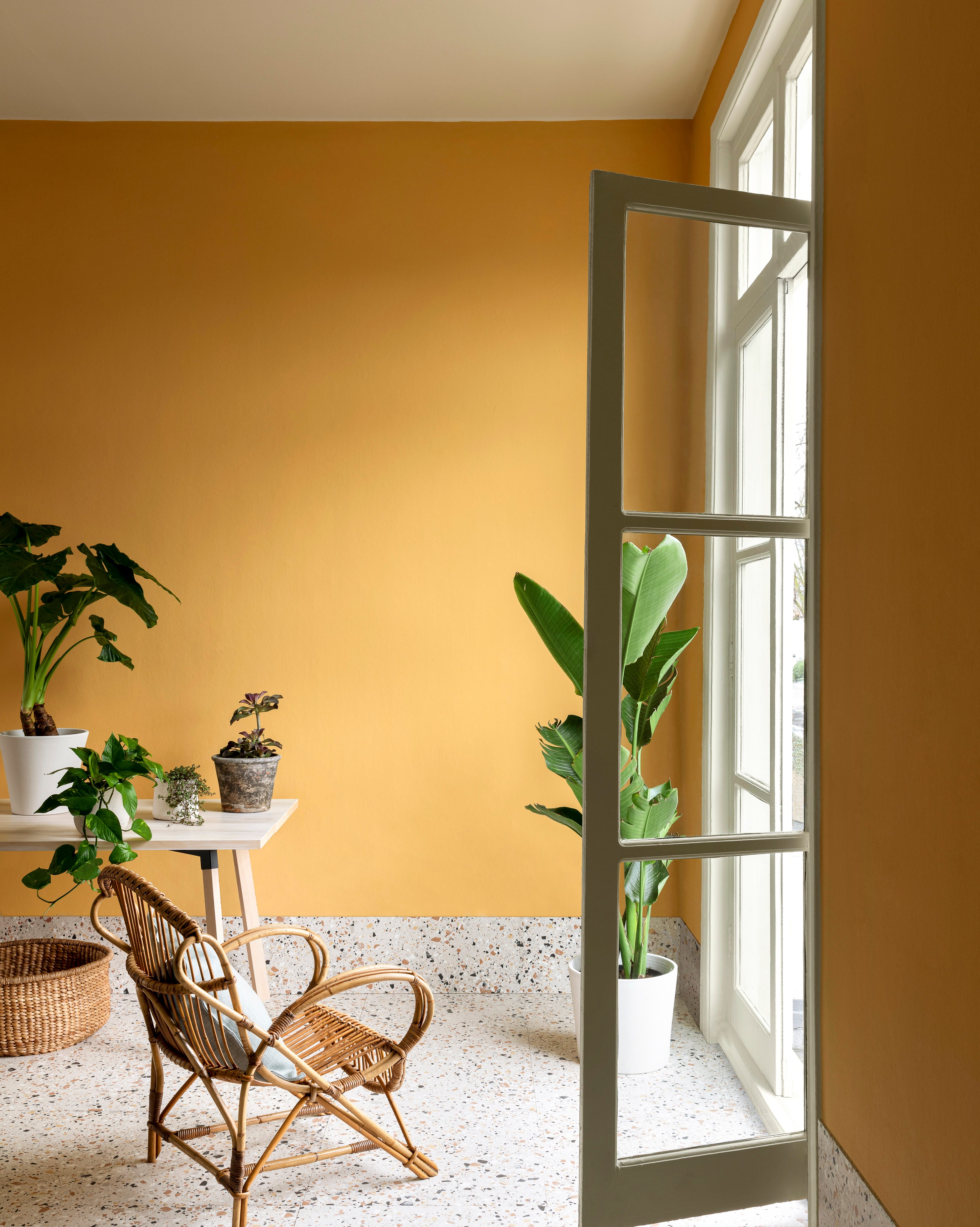
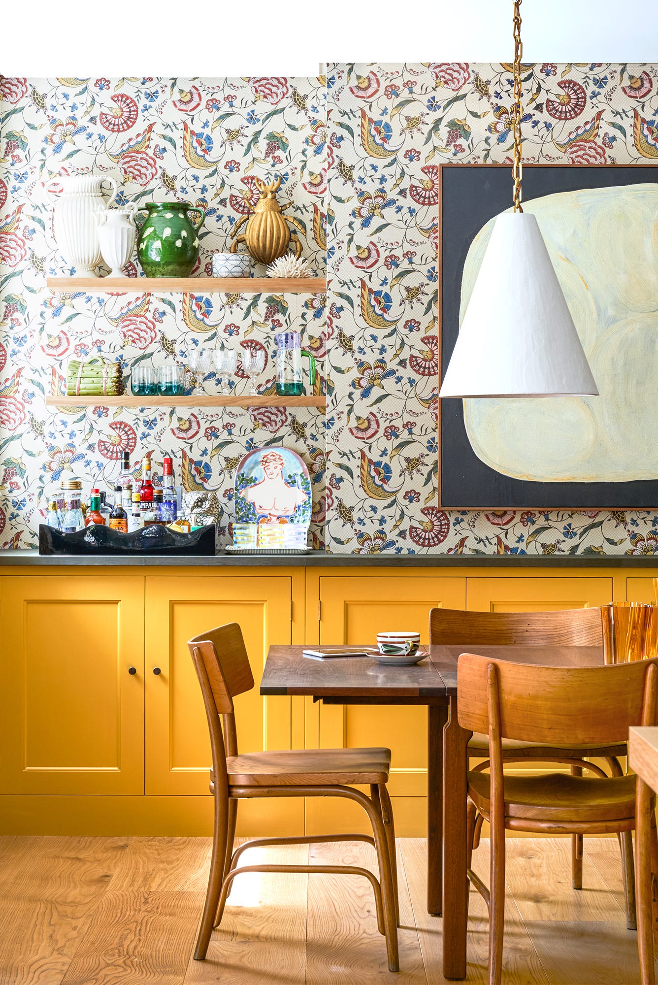
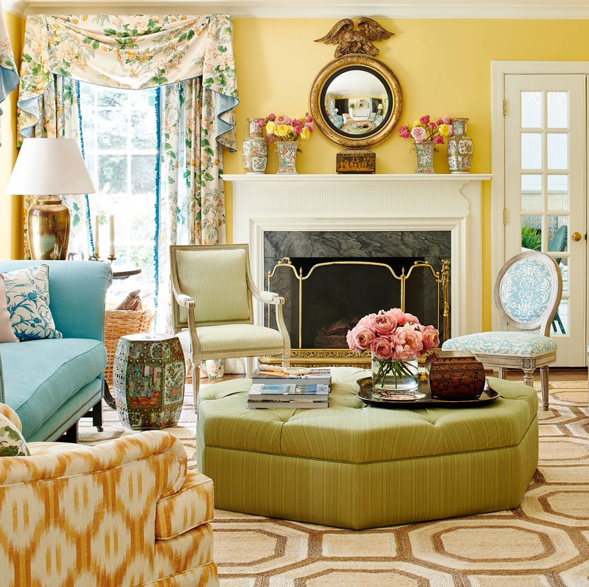
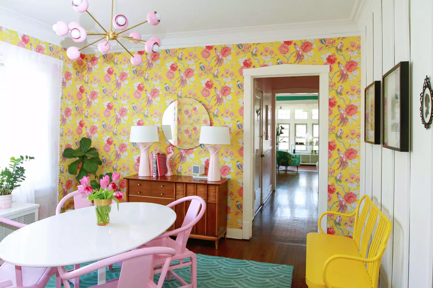
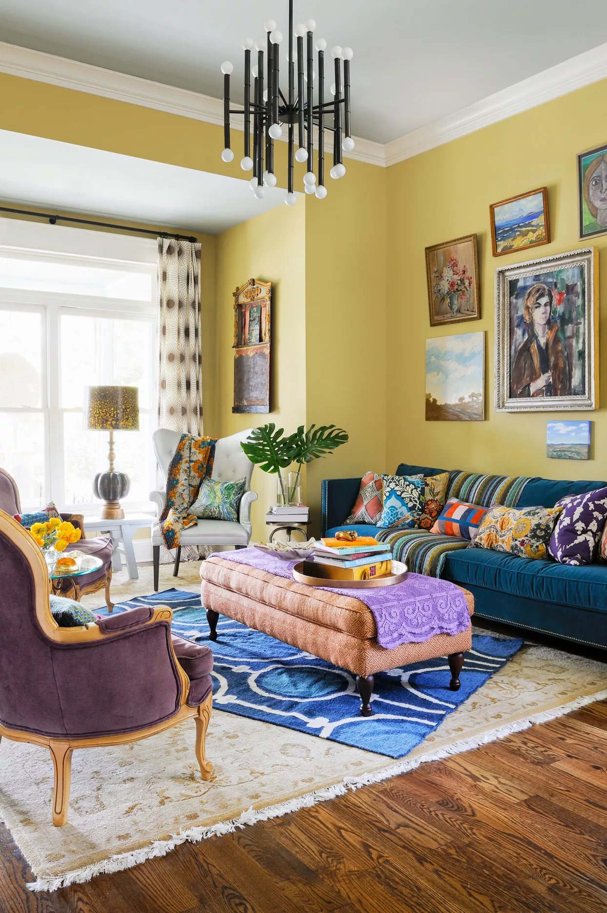
When decorating with yellow, several guidelines emerge from design experts. Yellow can be a fun and playful choice for a home's exterior, especially for front doors, and pairs well with navy and colorful florals in planters to create cohesion. Pale yellow in sunrooms or screened-in porches can create a happy and inviting atmosphere when complemented with green plants and white wicker. Homeowners should not be intimidated by yellow paint on walls; even a dominant yellow can be balanced with mossy greens, black, white, and medium-toned woods, as demonstrated by Beth Kooby. Jena Salmon praises Farrow and Ball's India Yellow for creating divine, entirely yellow rooms, and Mark Cutler notes that deep yellow tones can vibrate with energy, guiding the eye and adding drama.
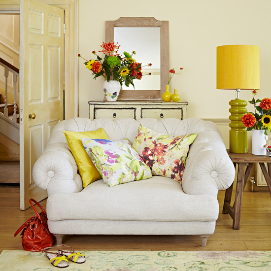
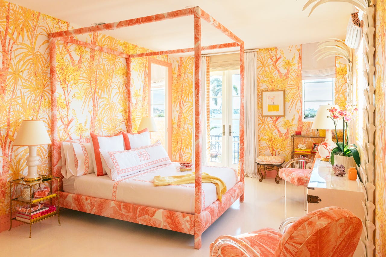

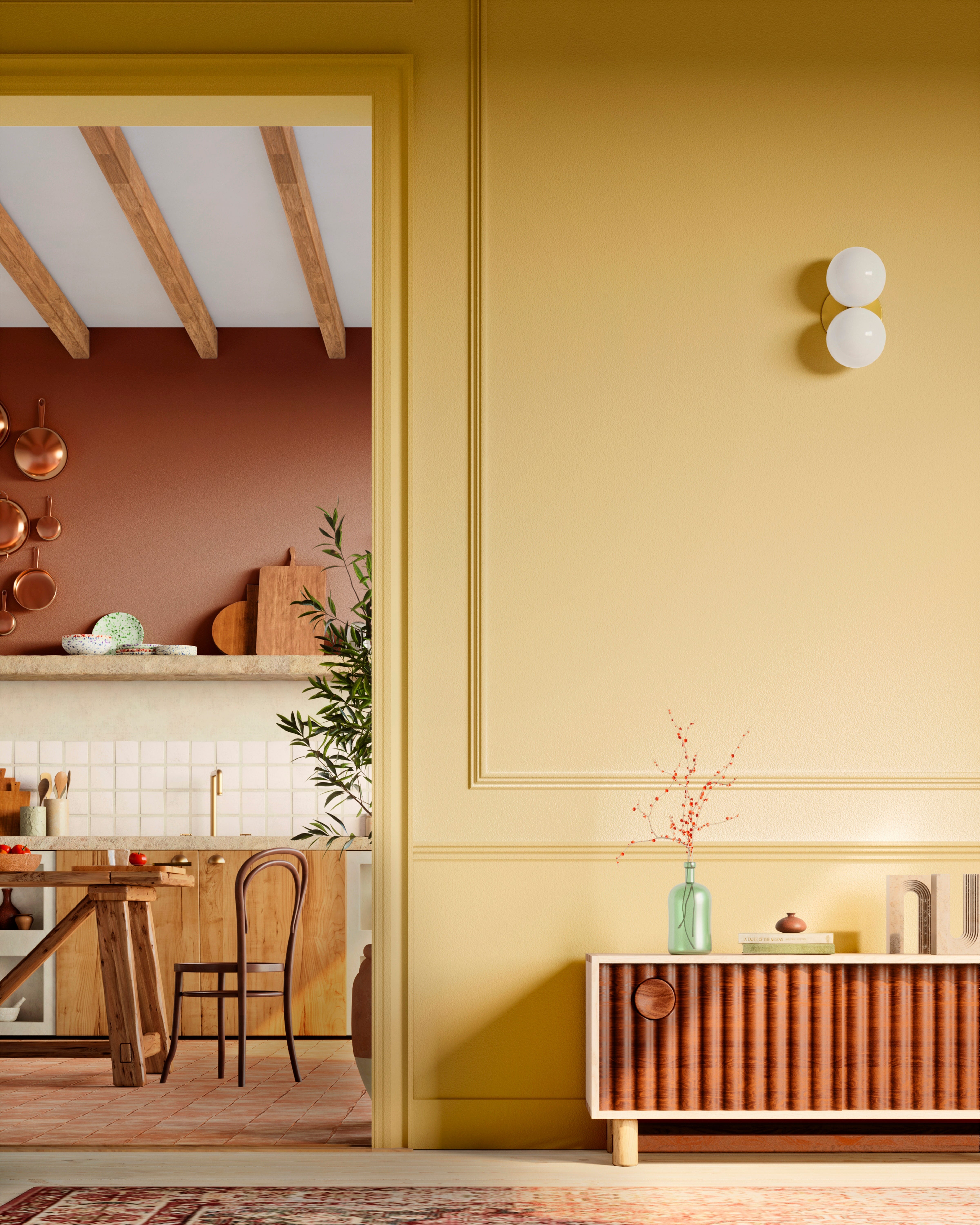

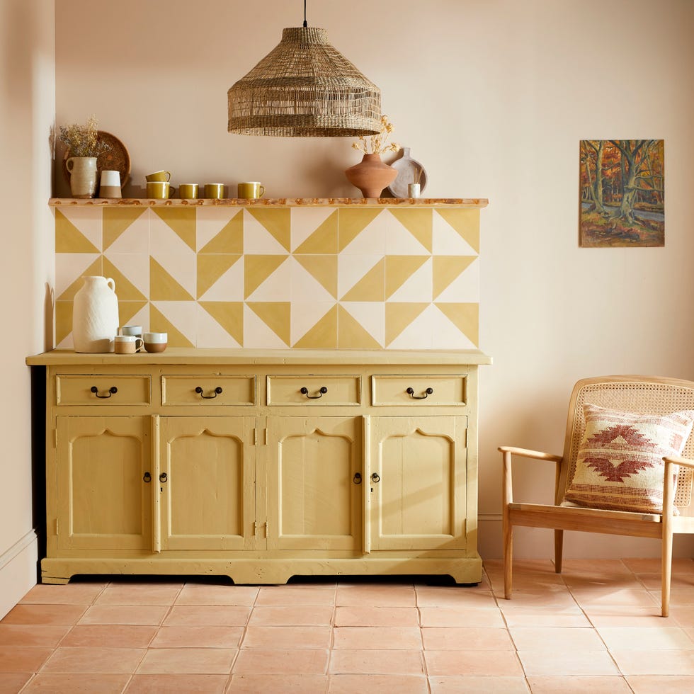
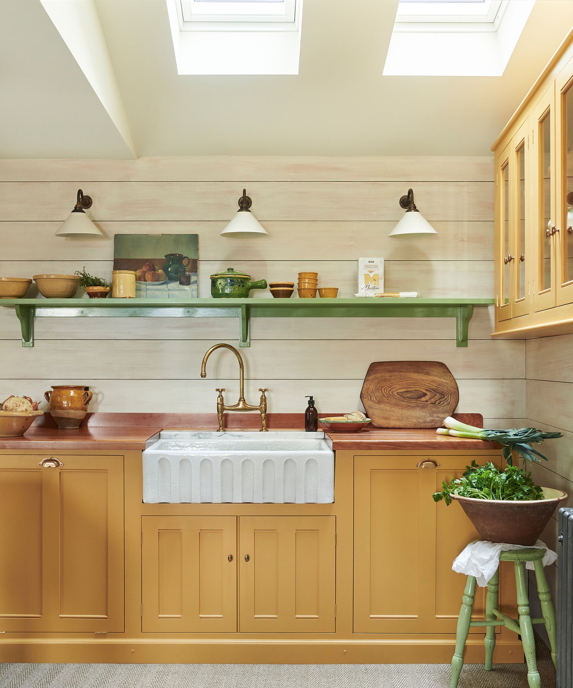
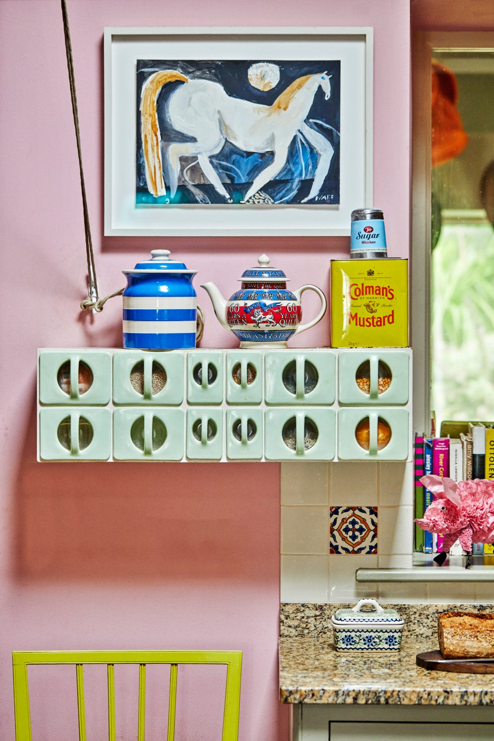
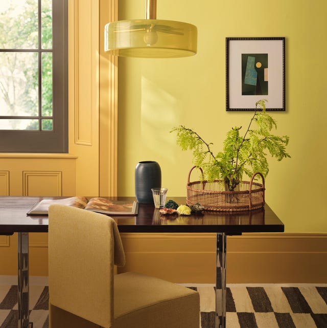
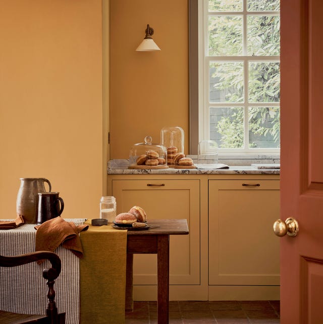
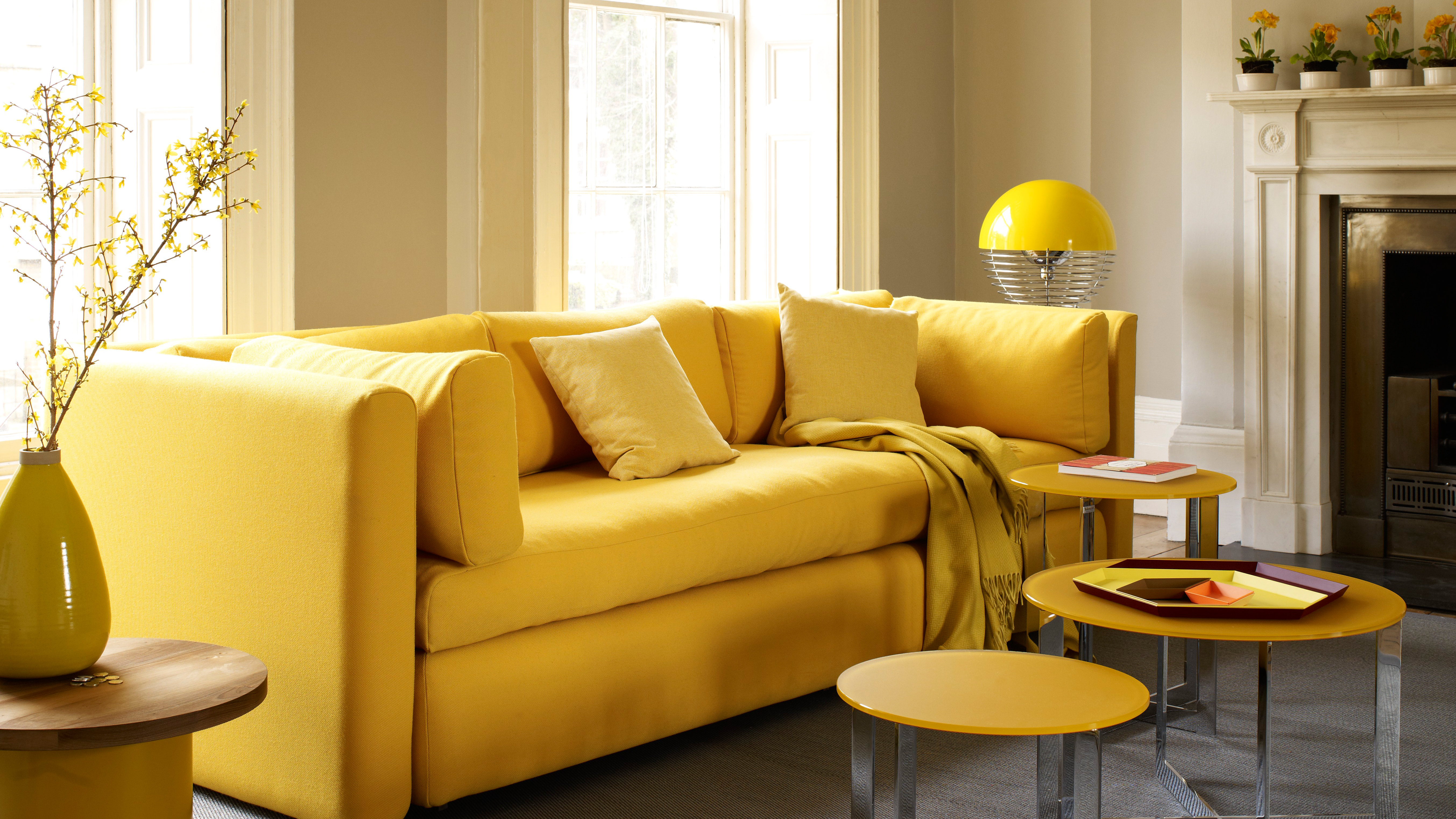
Considering geography is crucial when choosing yellow shades, as natural light varies. In Southern California's clear light, stronger deep yellows soften, while the Southwest benefits from warm earth tones, and the Southeast from bright, almost daisy yellows. Light yellow can also be used to brighten rooms lacking natural light, creating the illusion of sunshine. The article also addresses yellow kitchens, moving away from all-white trends. Designers suggest pale yellow as a wall color in kitchens to motivate productivity due to its reflective nature. Yellow can also be used in unexpected ways, such as an ochre light fixture or the back of a chair, creating a unique pop of color. Nikki Klugh often uses yellow accents to balance bolder colors like blue and purple through elements like flowers, decorative napkins, throw pillows, and dining chairs. For European-inspired rooms, pale yellow is a recurring theme, working well with navy, gray, or terracotta, and can be enhanced through Venetian plaster techniques to create warmth and patina. For those hesitant to commit, temporary elements like fresh yellow flowers or artwork offer an easy, non-committal way to introduce the cheerful hue. These options allow for brightness without permanent alteration, as artwork can be rotated or moved. Ultimately, incorporating yellow, whether through a bold painted kitchen or subtle accent pillows, can instantly make a home feel happier and more vibrant.
#DecoratingWithYellow #ColorSchemes #InteriorDesignTips #YellowPaintColors #HomeDecor #AccentColors #DesignInspiration #HomeExterior #KitchenDesign #DecoratingWithYellow #ColorSchemes #InteriorDesignTips #YellowPaintColors #HomeDecor #AccentColors #DesignInspiration #HomeExterior #KitchenDesign
0 comment in total
 No comments yet
You may also like
How to decorate with yellow – 10 of the best ideas
8 Bold Yellow Decorating Ideas That Will Brighten Any Room

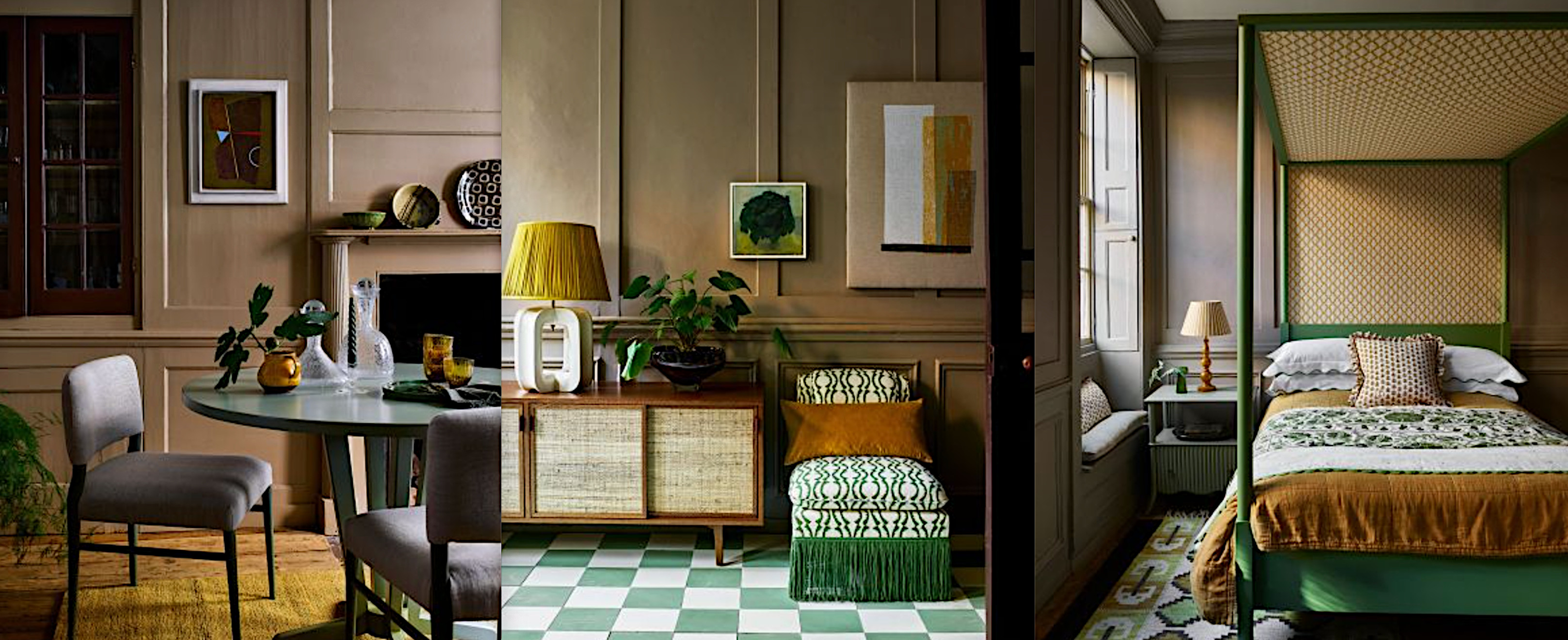
Yellow and green room ideas – 10 ways to decorate with natural tones

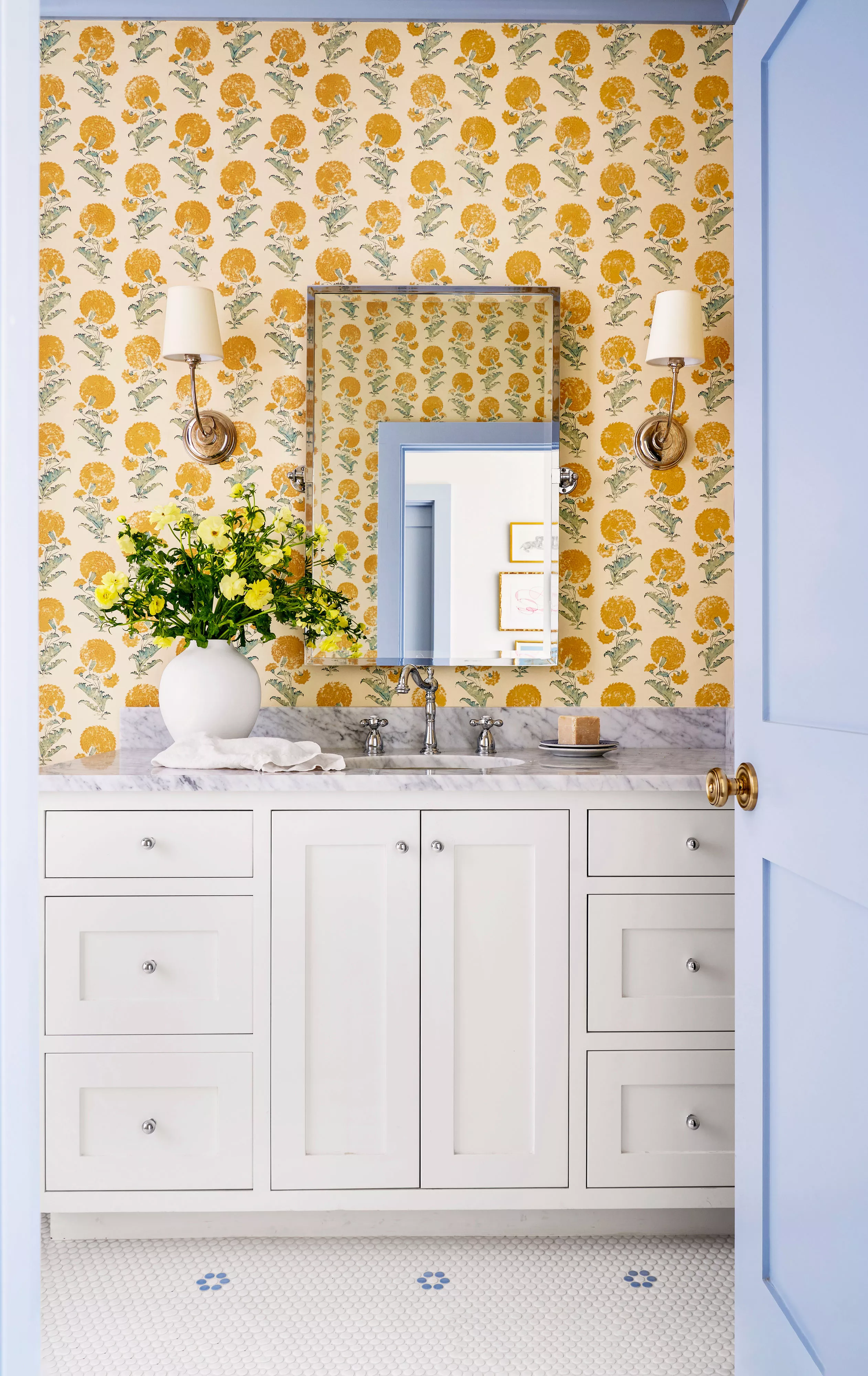
What Colors Go With Yellow? 15 Shades for Your Home
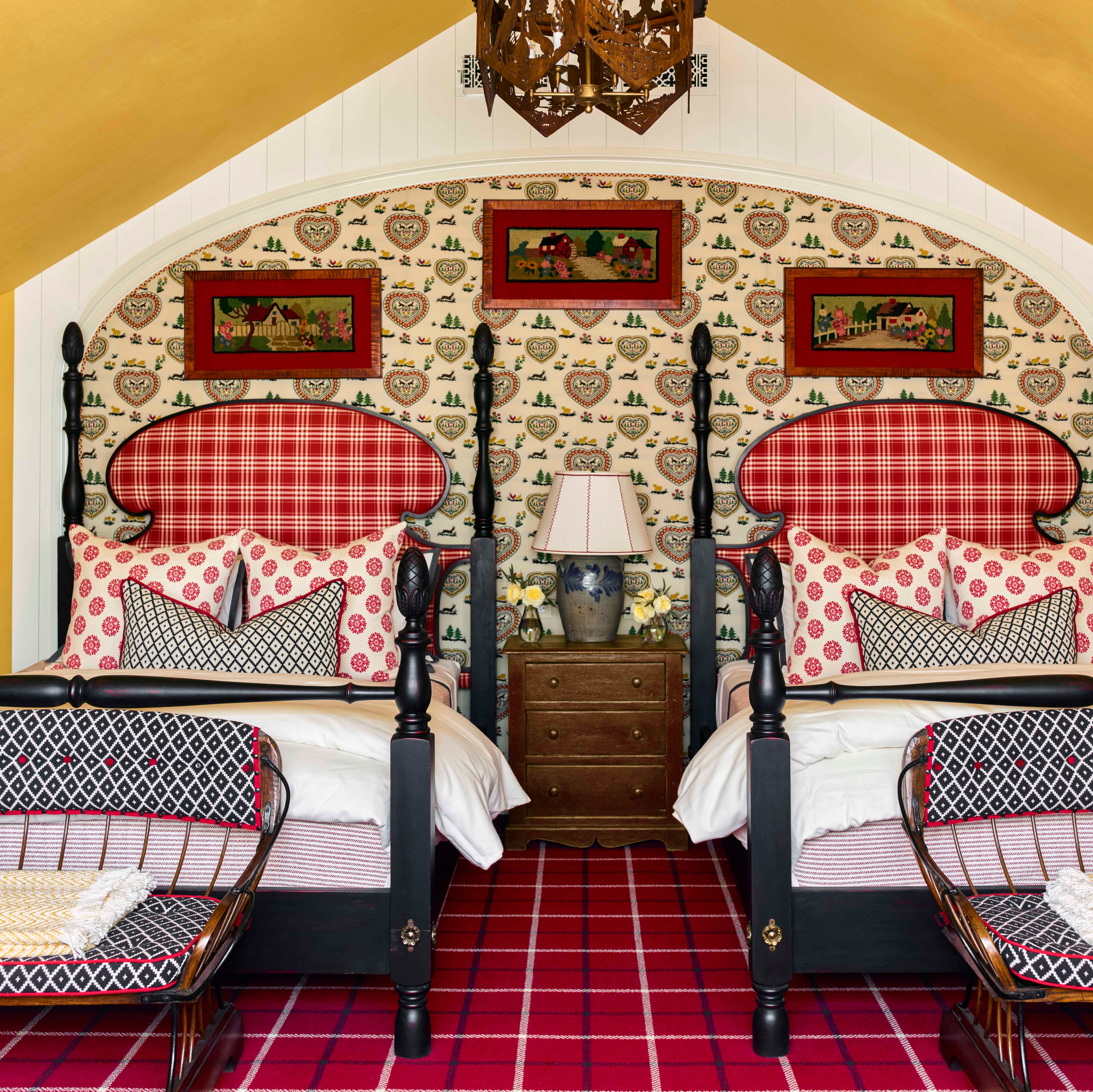
9 Colors That Pair Perfectly with Yellow, According to Designers
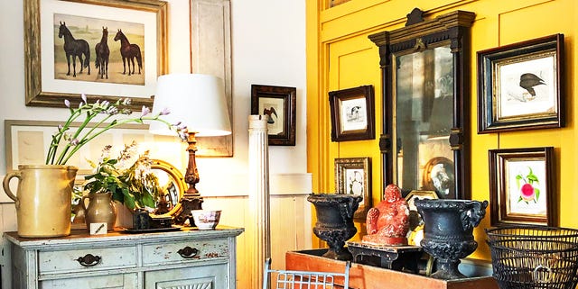
14 Happy Shades of Yellow You Never Expected to Fall In Love With
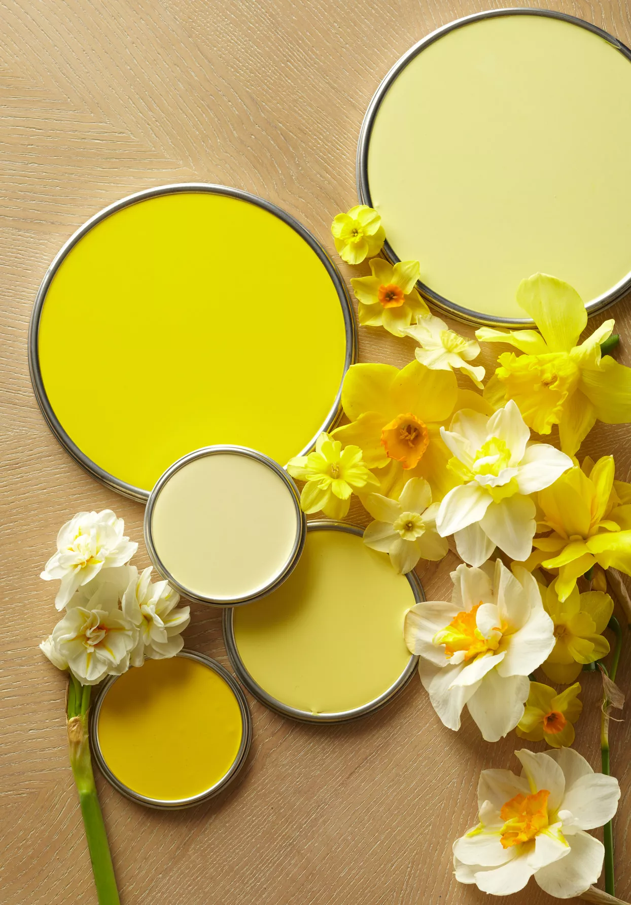
These Are the 16 Yellow Paint Colors Interior Designers Love to Use

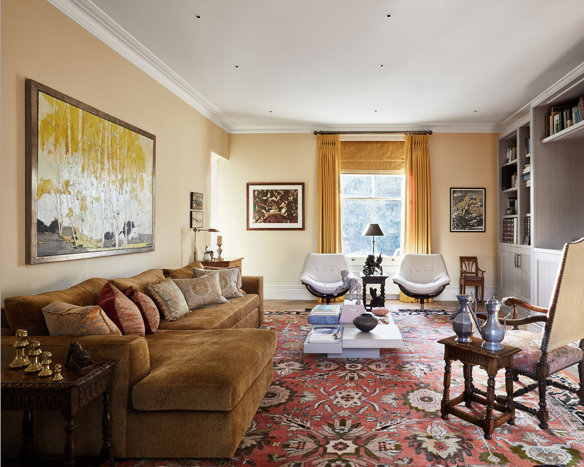
Yellow living room ideas — 11 designs, from buttercup to ochre
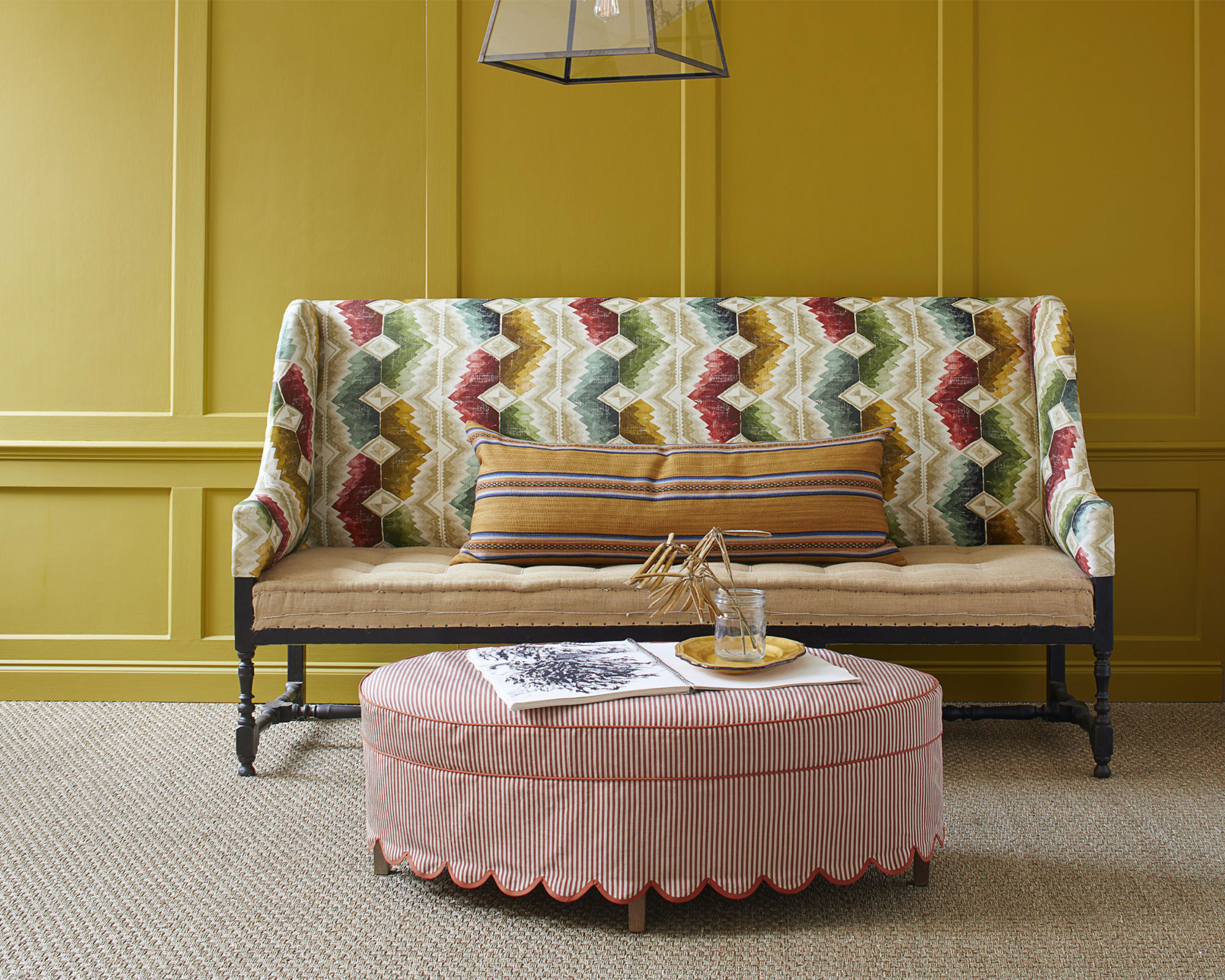
Decorating with yellow – 20 ways to use this sunshine shade

16 Yellow Color Schemes to Refresh Every Room in Your House
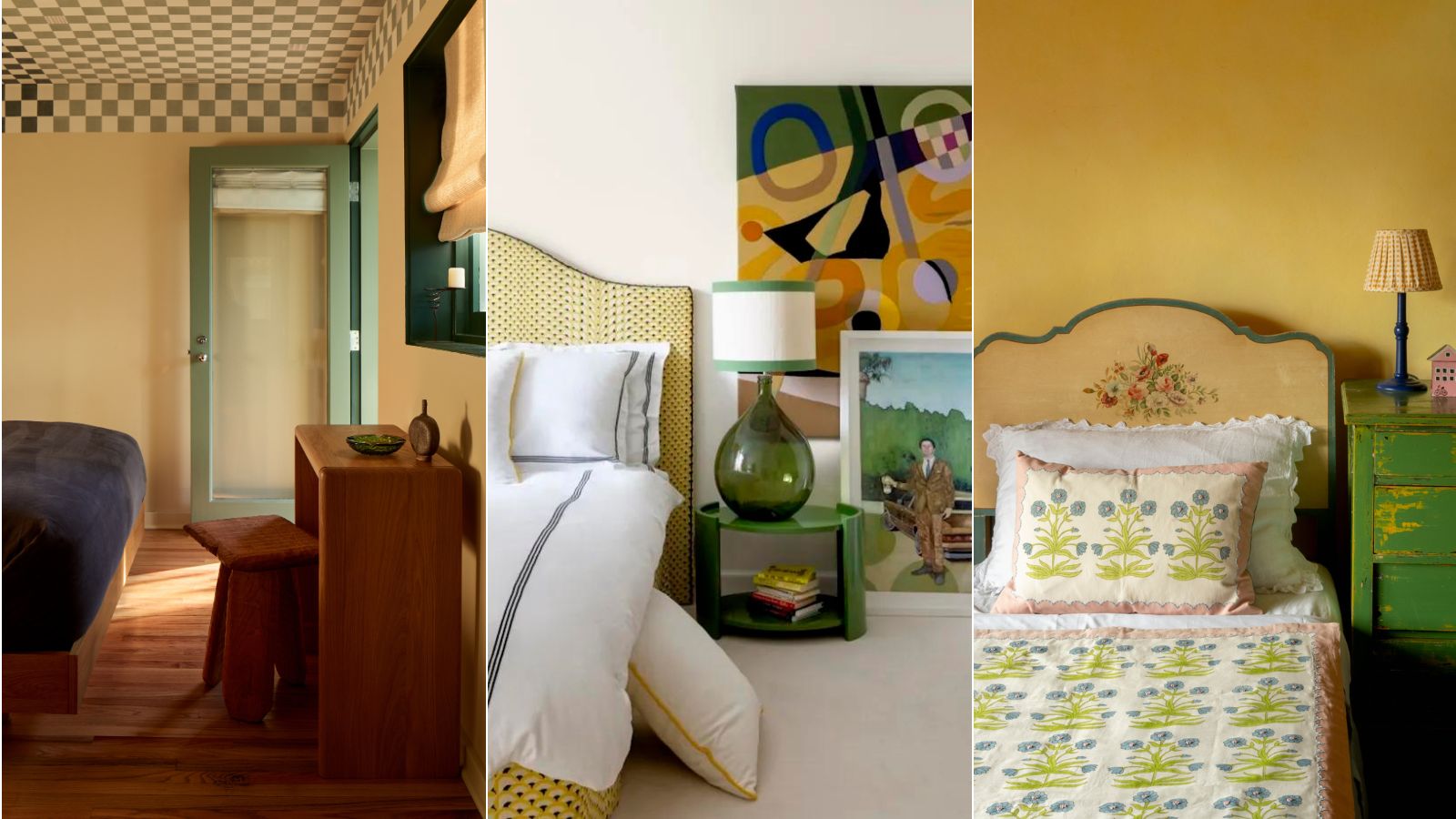
5 sunshine yellow bedroom ideas to cheer up your sleep space
I asked interior designers what color they include in every project – these 5 enduring shades were the favorites
16 Colors That Go With Yellow at Home

Yellow room ideas – 28 guaranteed ways to turn up the heat
9 On-Trend Yellow Paint Colours For 2025

‘Unexpected Yellow Theory’: The Bold New Interior Trend Replacing Red in 2025
Decorating with yellow: 13 ways to use this sunshine shade at home
10 yellow living room ideas - how to do the sunshine shade stylishly

How to Decorate with Cobalt Blue the Right Way, According to Designers

23 Yellow Living Room Ideas for a Bright, Happy Space