1/9
“Purple Basil” Is the Paint Color That Looks Shockingly Good with Brat Green
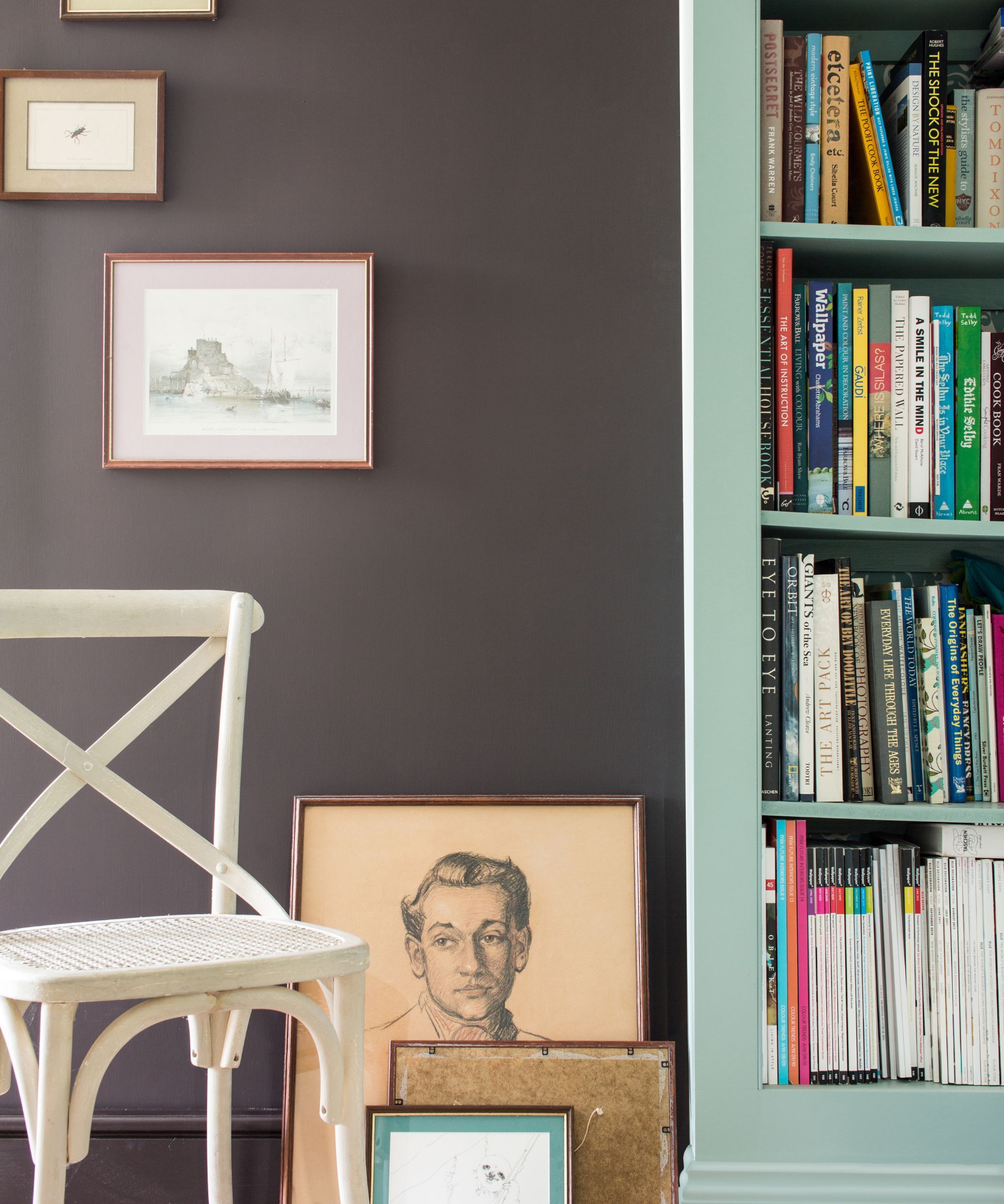
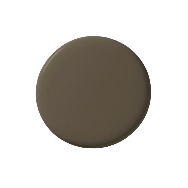
Trend forecasters annually announce the paint color of the year, with various companies presenting their selections. Behr chose Rumors, a deep ruby red, while Valspar opted for Encore, a bold blue. PPG recently joined this trend by introducing Purple Basil, a dusty purple hue, as their color of the year. This shift indicates a move away from the muted blue-grays, sages, and off-whites prevalent in the early 2000s towards more maximalist and dramatic paint colors.
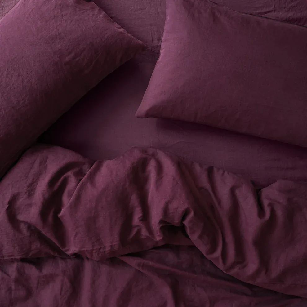
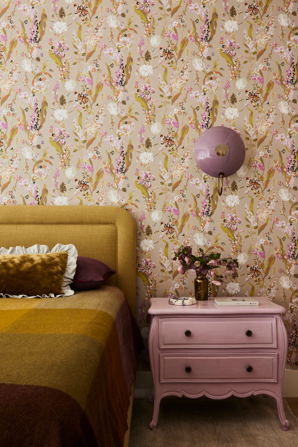
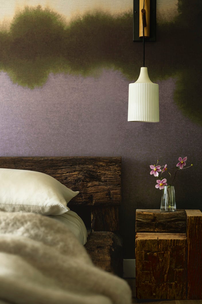
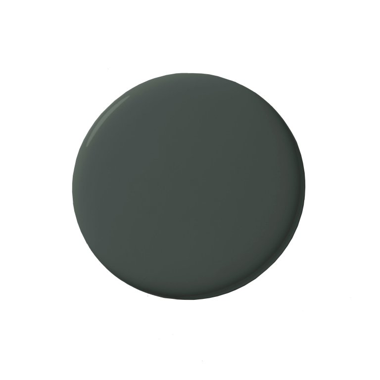
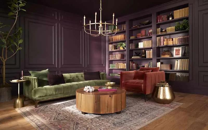
Ashley McCollum, PPG’s color marketing manager, describes Purple Basil as a bold yet versatile shade. She clarifies that it is not an "in-your-face purple" but rather a balanced blend of warm and cool tones. Its appearance can vary significantly depending on the accompanying colors and lighting conditions, potentially skewing towards red, eggplant, blue-violet, or even brown. This versatility makes it suitable for a wide range of applications, both indoors and outdoors.
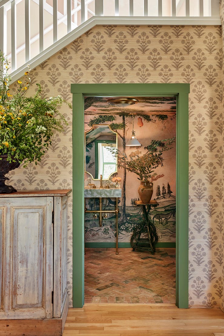
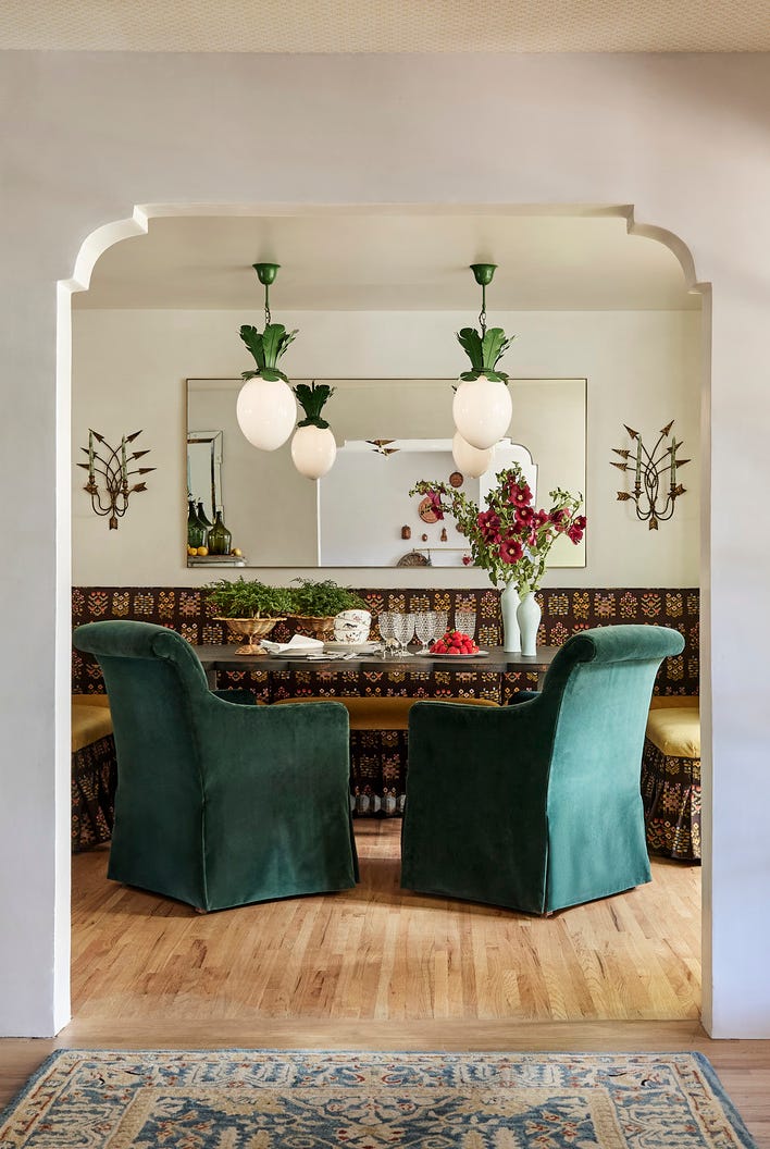
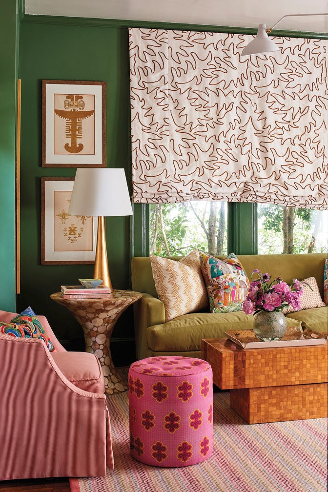
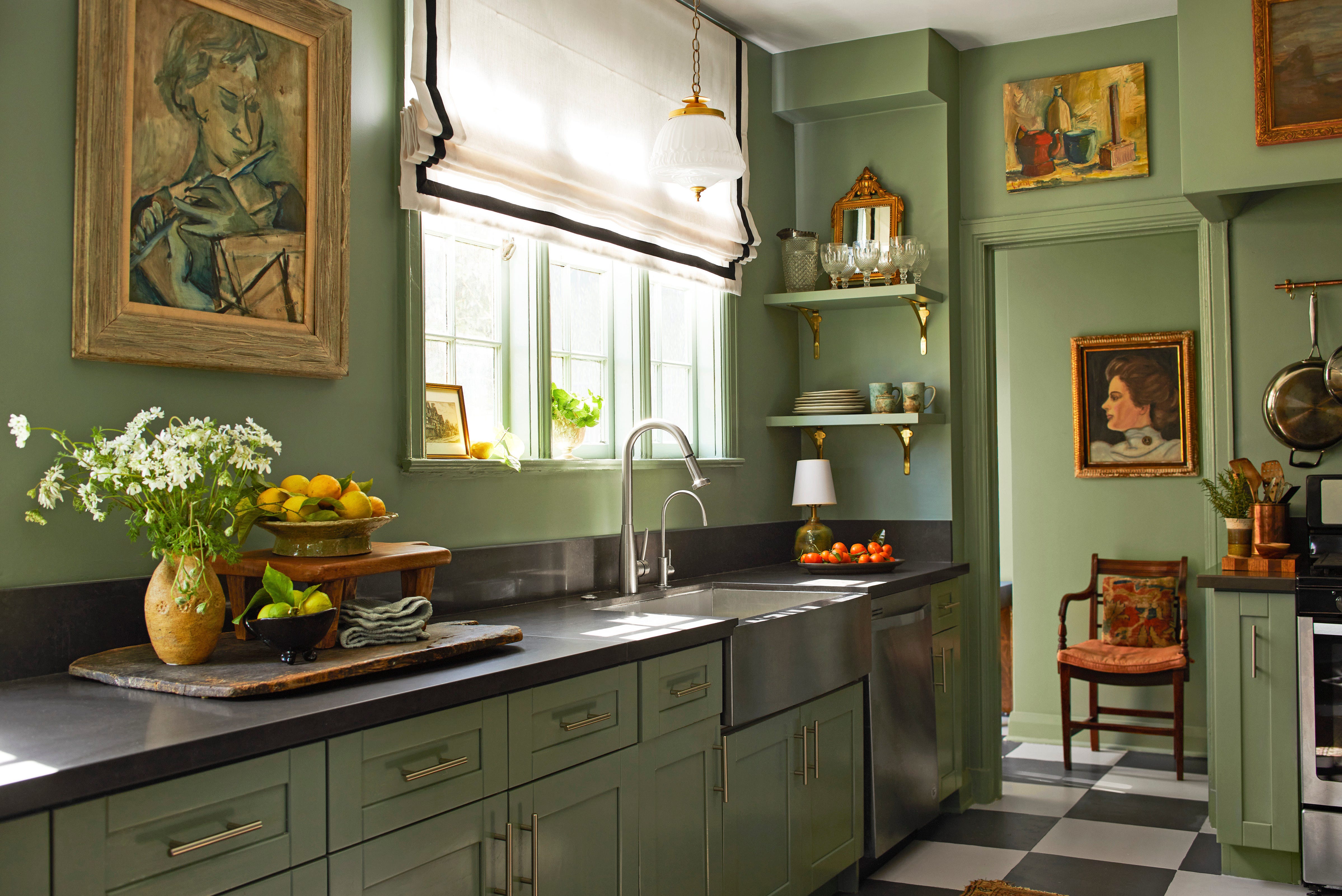
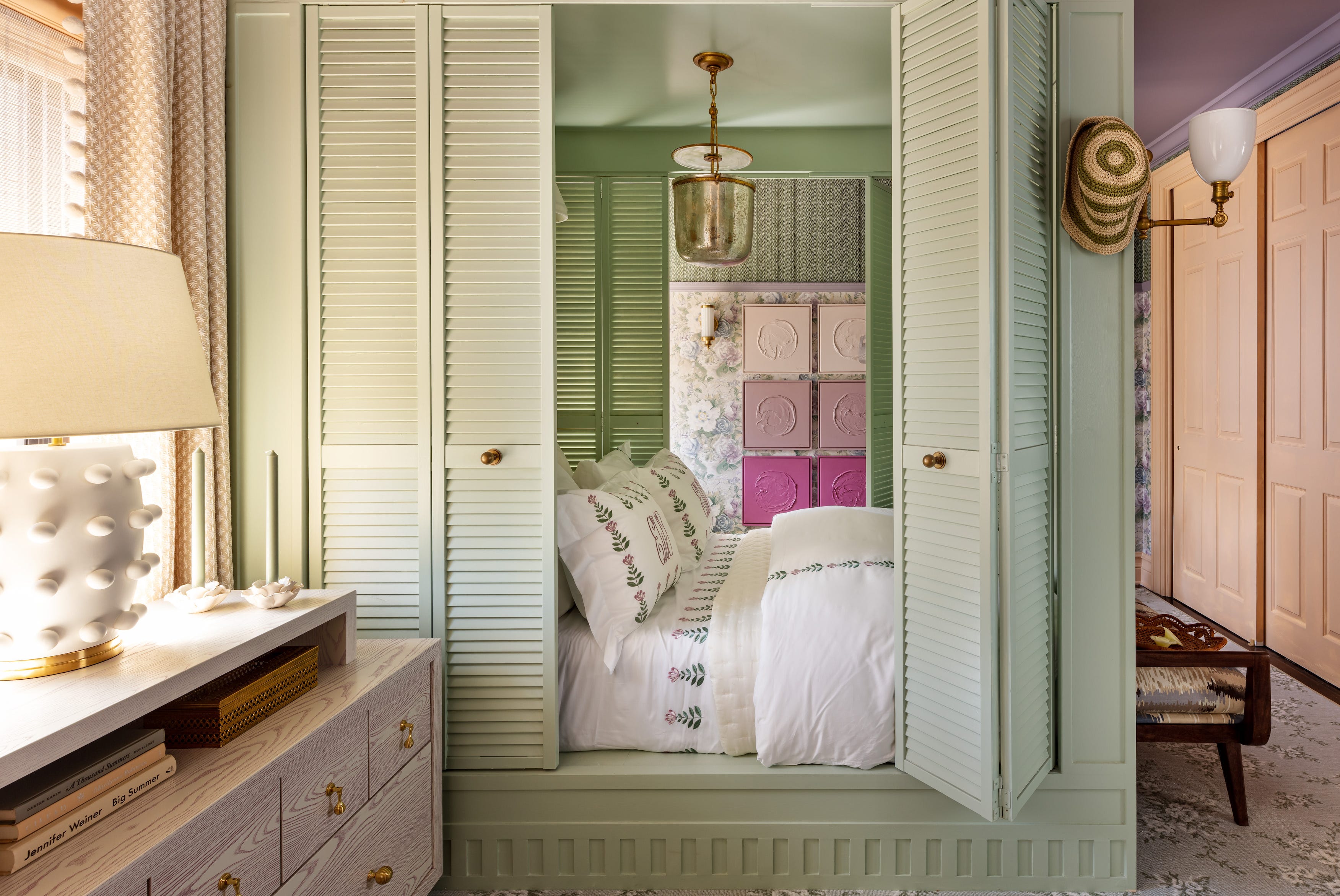
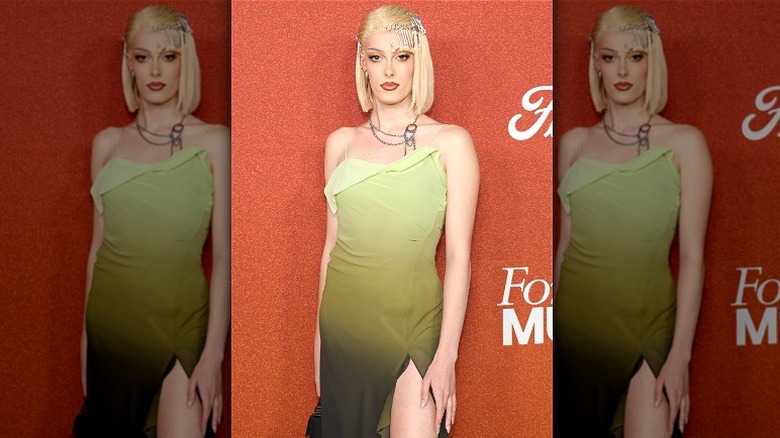
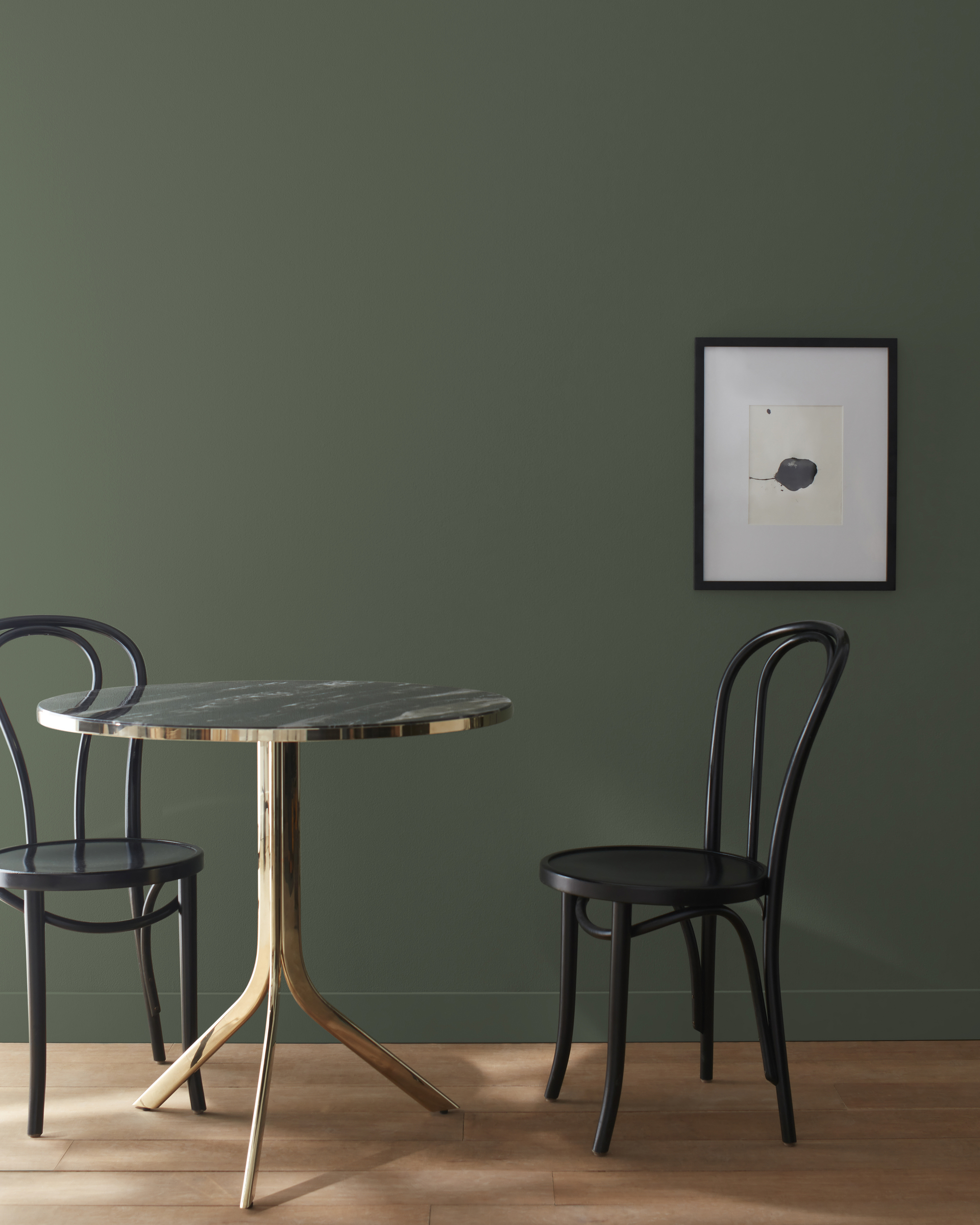
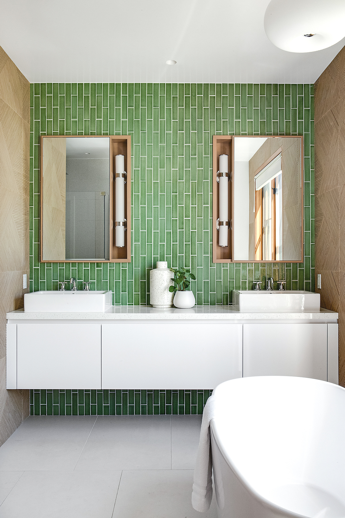
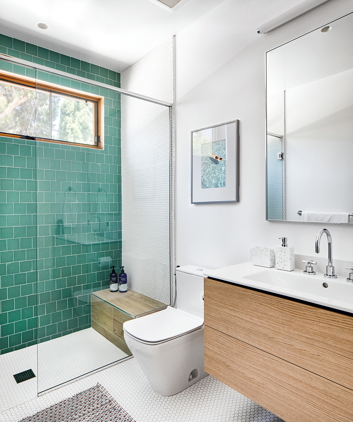
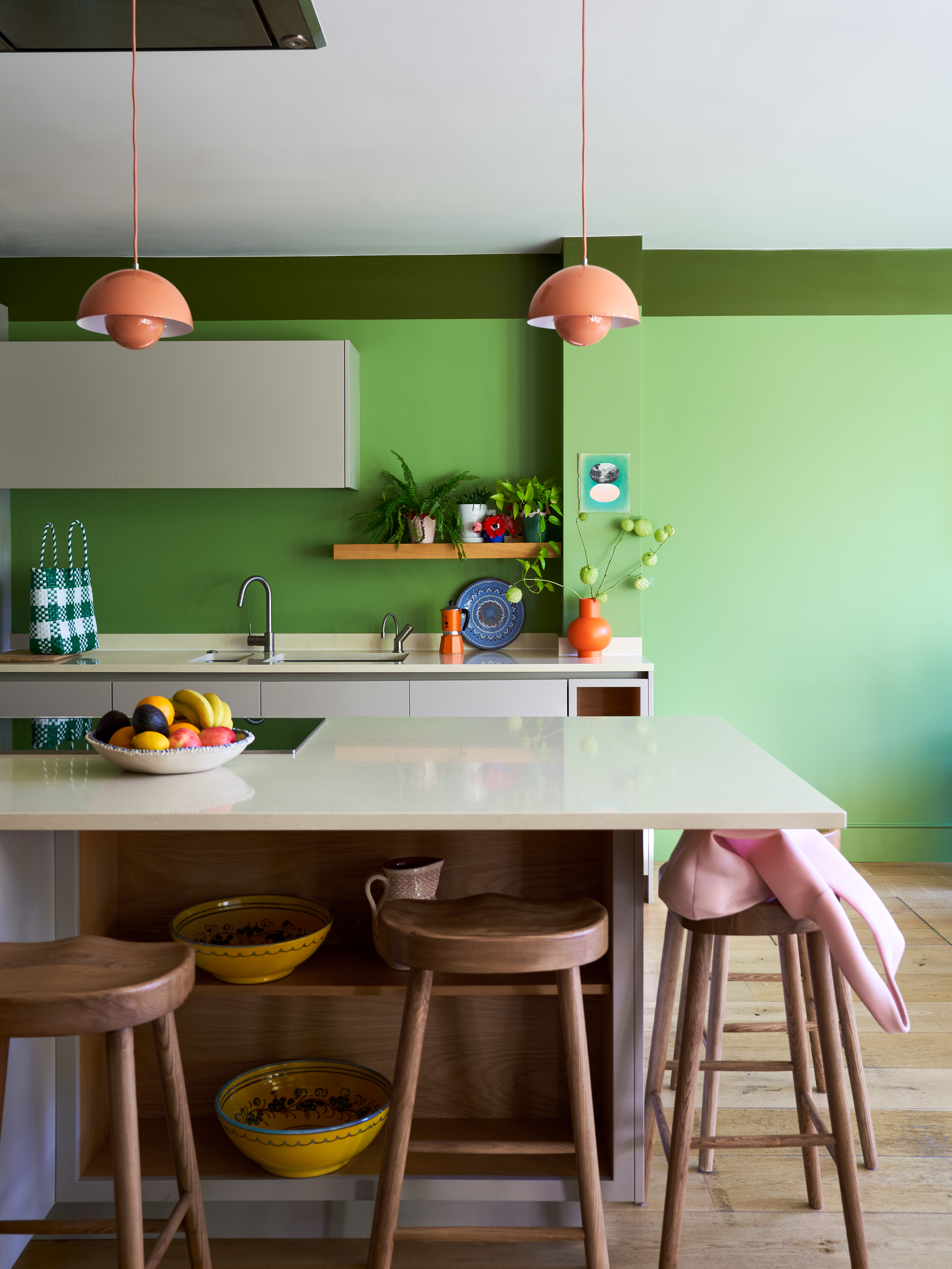
McCollum anticipates that Purple Basil will extend beyond home interiors, influencing other sectors such as fashion, car exteriors, electronics, and even food, referencing its namesake's culinary appeal. A notable characteristic of this color is its striking compatibility with a "brat-like green," exemplified by PPG’s Do Not Disturb paint. This unexpected pairing creates a chic and modern aesthetic.
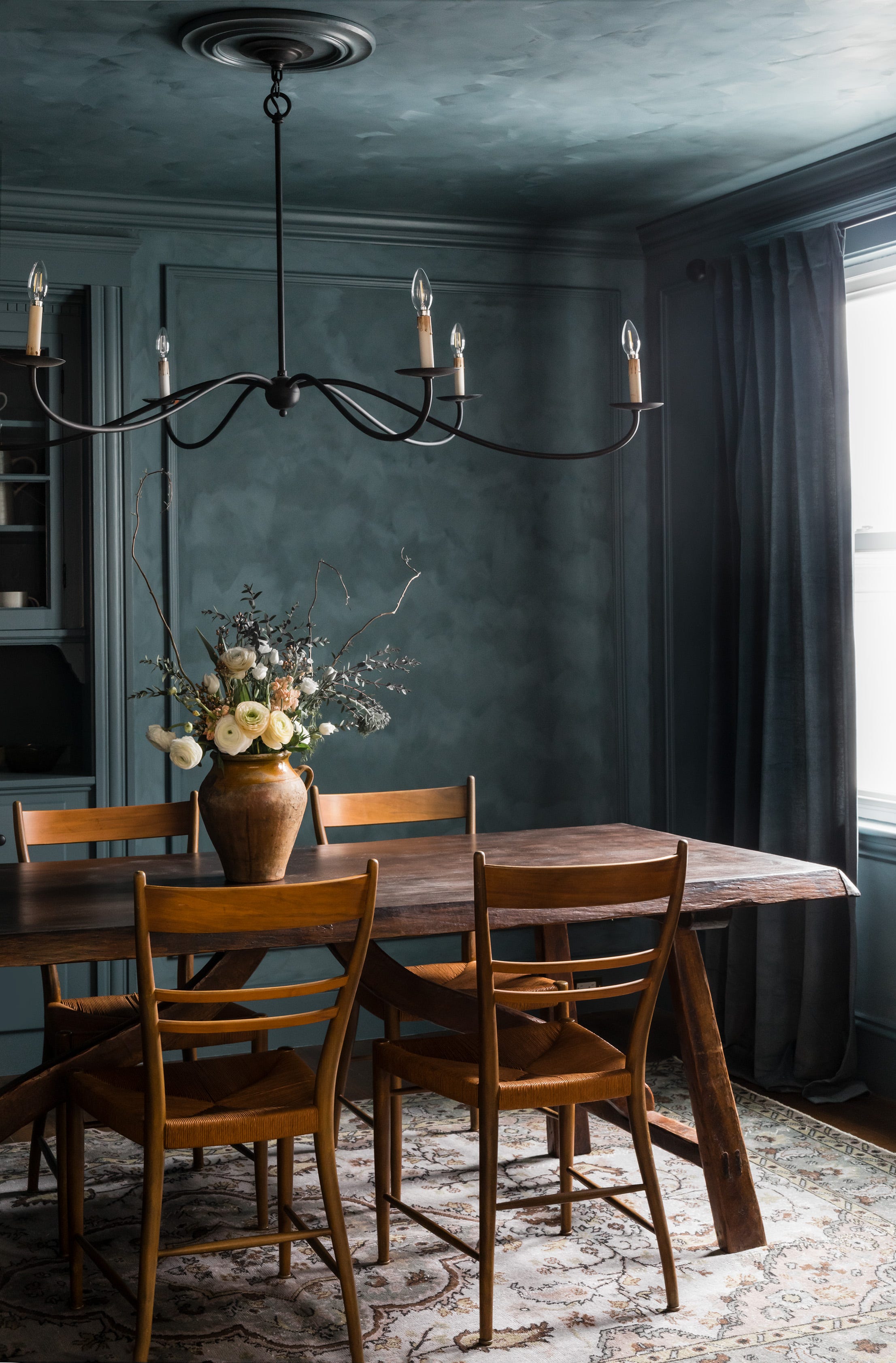
Furthermore, Purple Basil is particularly well-suited for the "color-drenching" trend, where walls, ceilings, and trim are painted in the same color. Its inherent darkness allows it to create a dramatic and enveloping backdrop. The paint is available in various finishes, including Semi-Gloss, Eggshell, and Satin. McCollum suggests that using different sheens within a color-drenched space can add depth, dimension, and visual interest to the room.
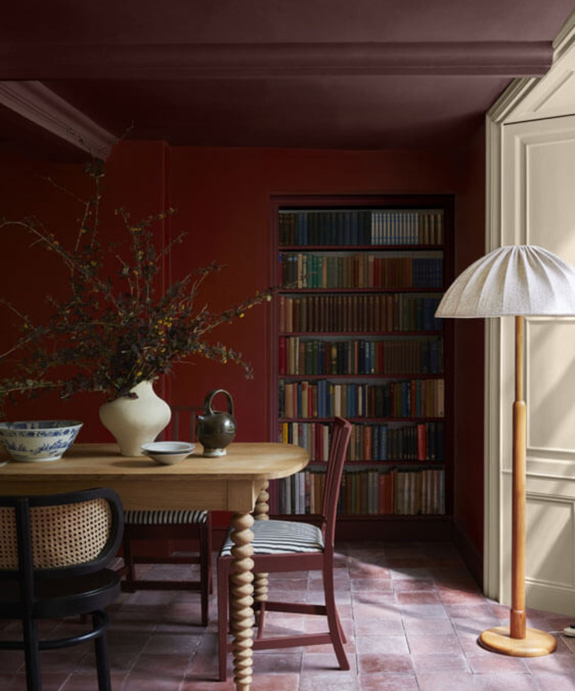
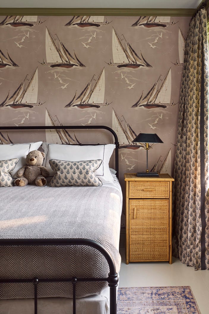
The article also showcases how similar purple paints have been incorporated into past DIY projects by Apartment Therapy contributors. One example features a purple-meets-red dining room in homeowner Katherine Thewlis’s home, where the color acts as a neutral against a pink mural, and is also applied to kitchen cabinets. Another instance highlights a cozy purple bedroom by Tricia Collins, where the darker, dustier purple complements existing patterns and textures, creating a comforting retreat. Finally, the article presents an idea for those hesitant to commit to painting entire walls: using dark purple to transform furniture pieces, such as once-brown bookshelves, demonstrated by DIYer Randi Froug. These examples illustrate the diverse applications and aesthetic potential of dark purple hues in home decoration.
#PaintColorTrends #PurpleBasil #InteriorDesign #ColorDrenching #PPGPaint #HomeDecor #VersatileColors #DIYHome #PaintColorTrends #PurpleBasil #InteriorDesign #ColorDrenching #PPGPaint #HomeDecor #VersatileColors #DIYHome
0 comment in total
 No comments yet
You may also like
Designer Justina Blakeney Says This Paint Color Flatters Everyone and Is Perfect for Drenching Rooms
37 Unexpected Colors That Pair Perfectly With Green, According to Designers

I Think I May Have Just Discovered the Most Timeless Green Paint Color

The best green paint colors for a soothing, sophisticated home

Designers LOVE Pairing These Unexpected Colors With This Sophisticated Hue


Designers LOVE Pairing These Unexpected Colors With This One Timeless Hue
15 Blue-Green Paint Colors the Experts Recommend

Blue and brown is the unexpected pairing that's more livable than you think

The Color Combo You’re About to See Everywhere
17 Green Paint Colors for Every Room in Your Home, From Soothing Sage to Electric Emerald

These are the 6 must-have colors to decorate with in April 2025
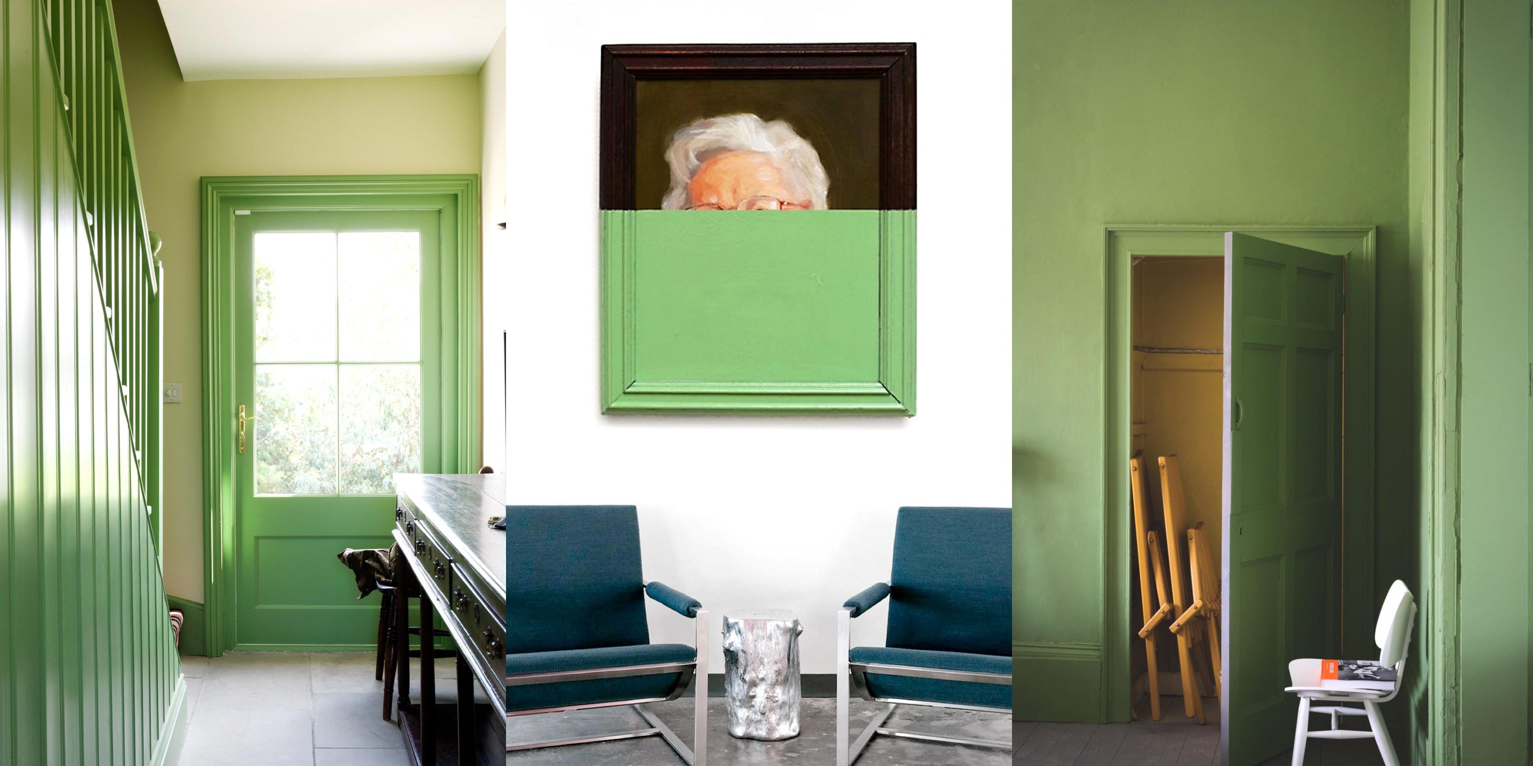
A New Interior Color, “Hyper Green” is Here — And if It's Good Enough for Gucci, You've Got Our Attention
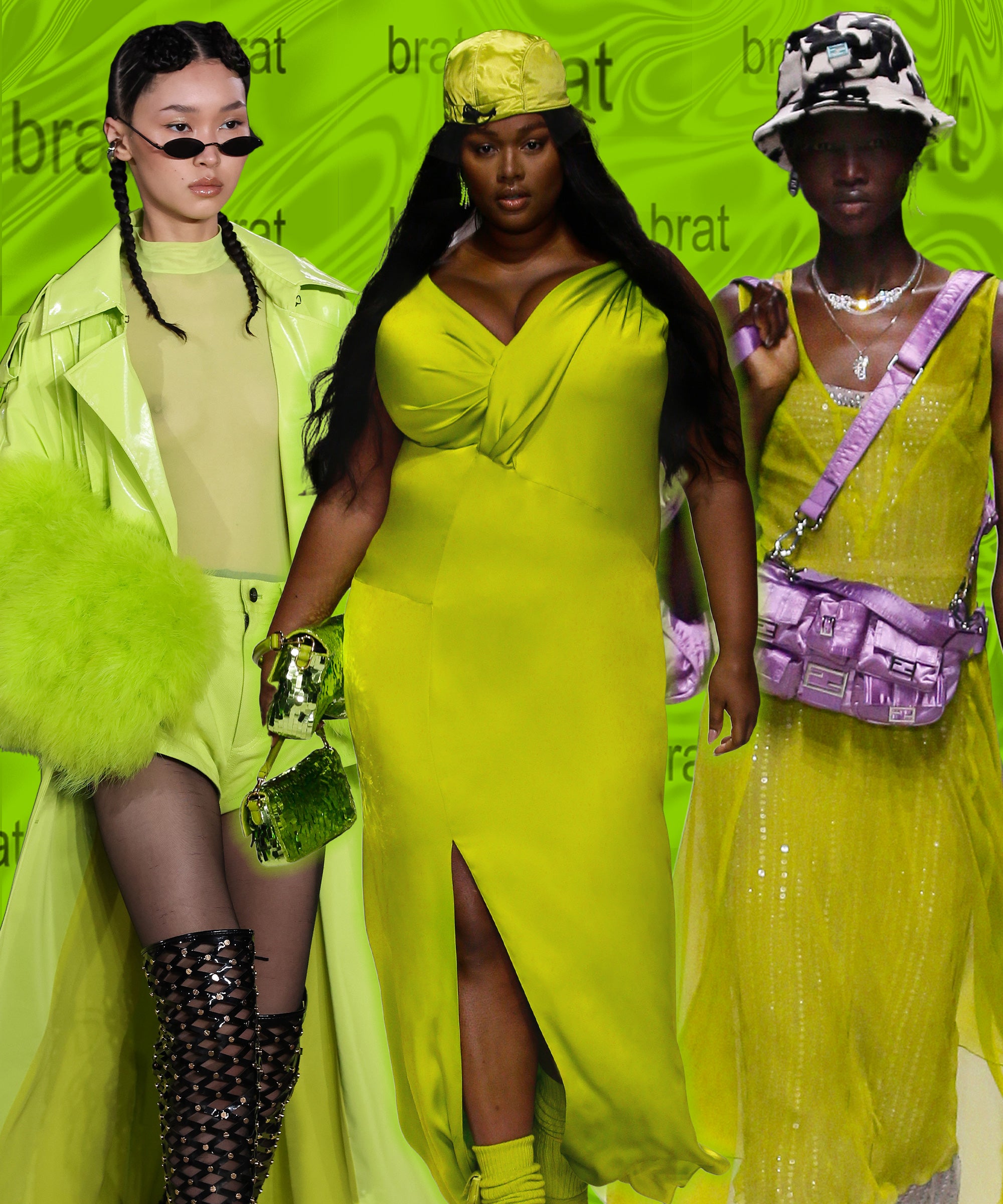
It’s A Brat Green Summer: What’s The Appeal Of The Hue?

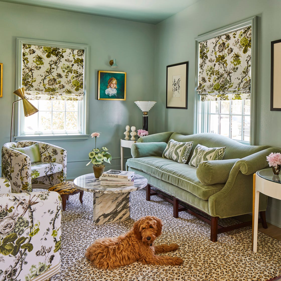
Designers Swear By These 11 Sage Green Paint Colors

The 10 Best Blue-Green Paint Colors Designers Can't Stop Using
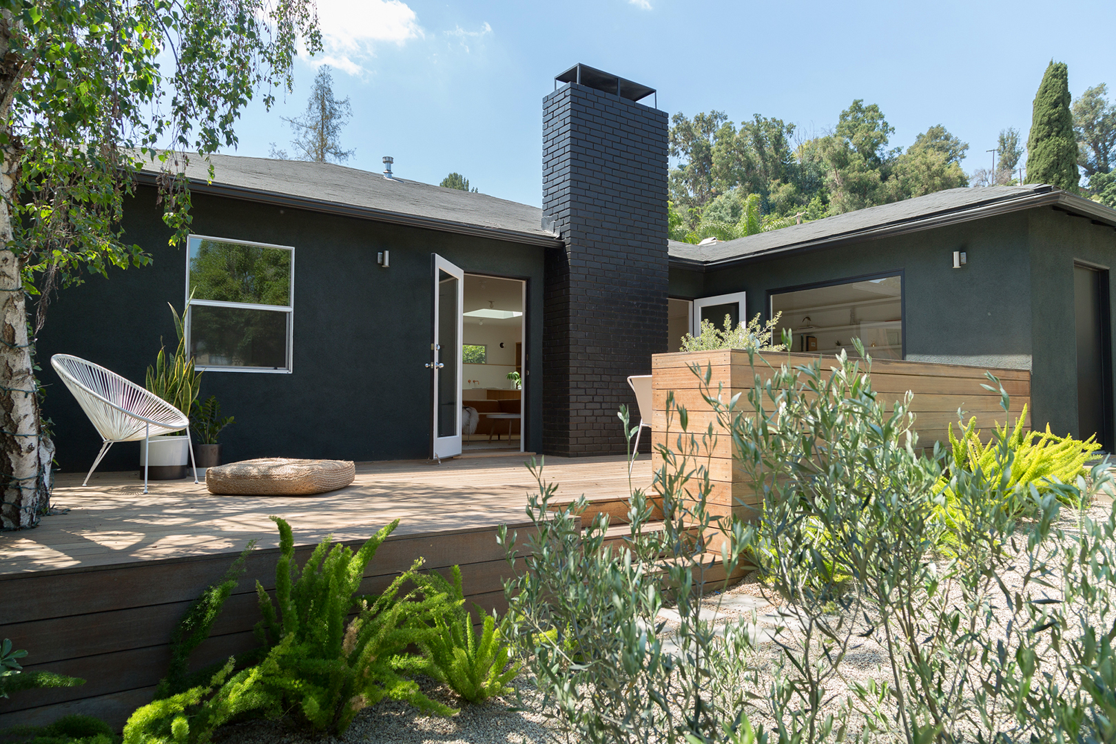
The Best Green House Colors for Moody Curb Appeal

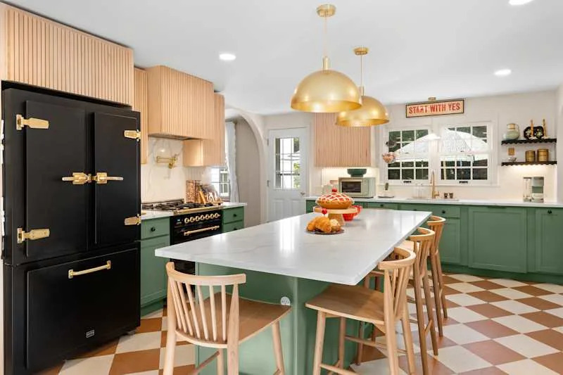
These 13 Green Paint Colors Are the Best We’ve Ever Seen

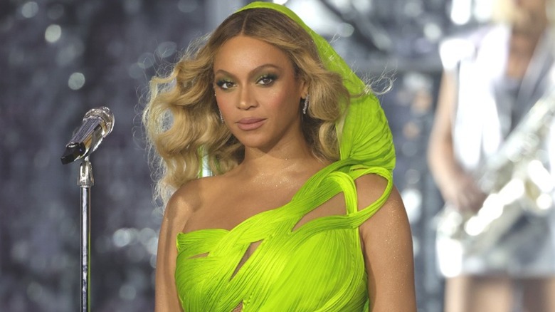
Vibrant Green Is The Color Trend That Comes Celeb Approved

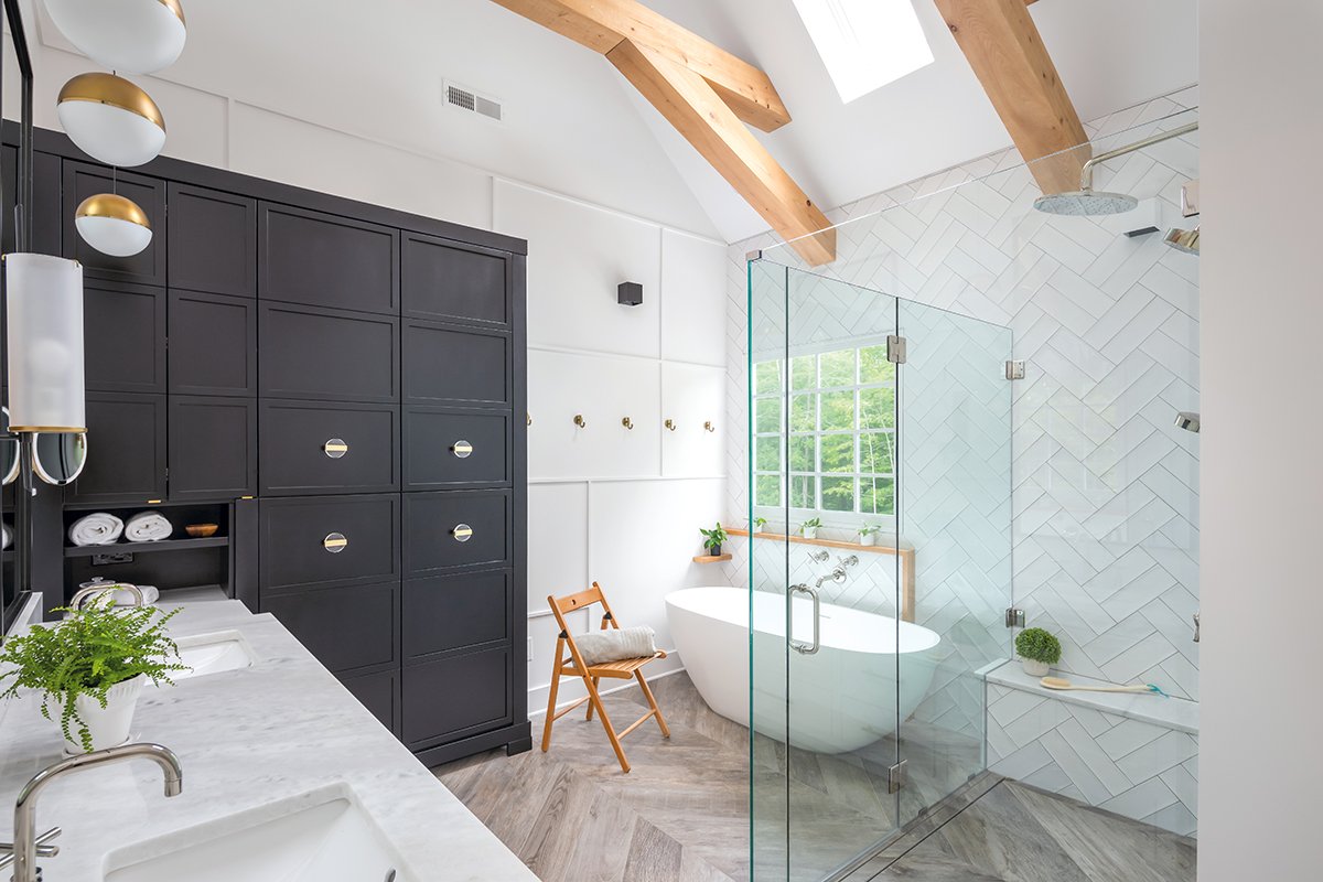
Cool Colors, Fab Finishes

14 Best Green Paint Colors