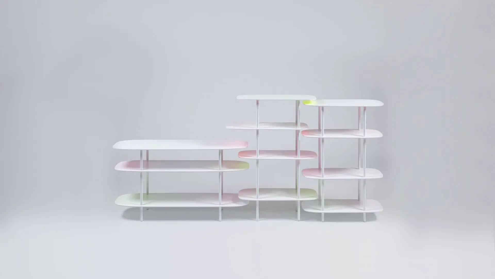
These shelves reveal colour gradients when brought together
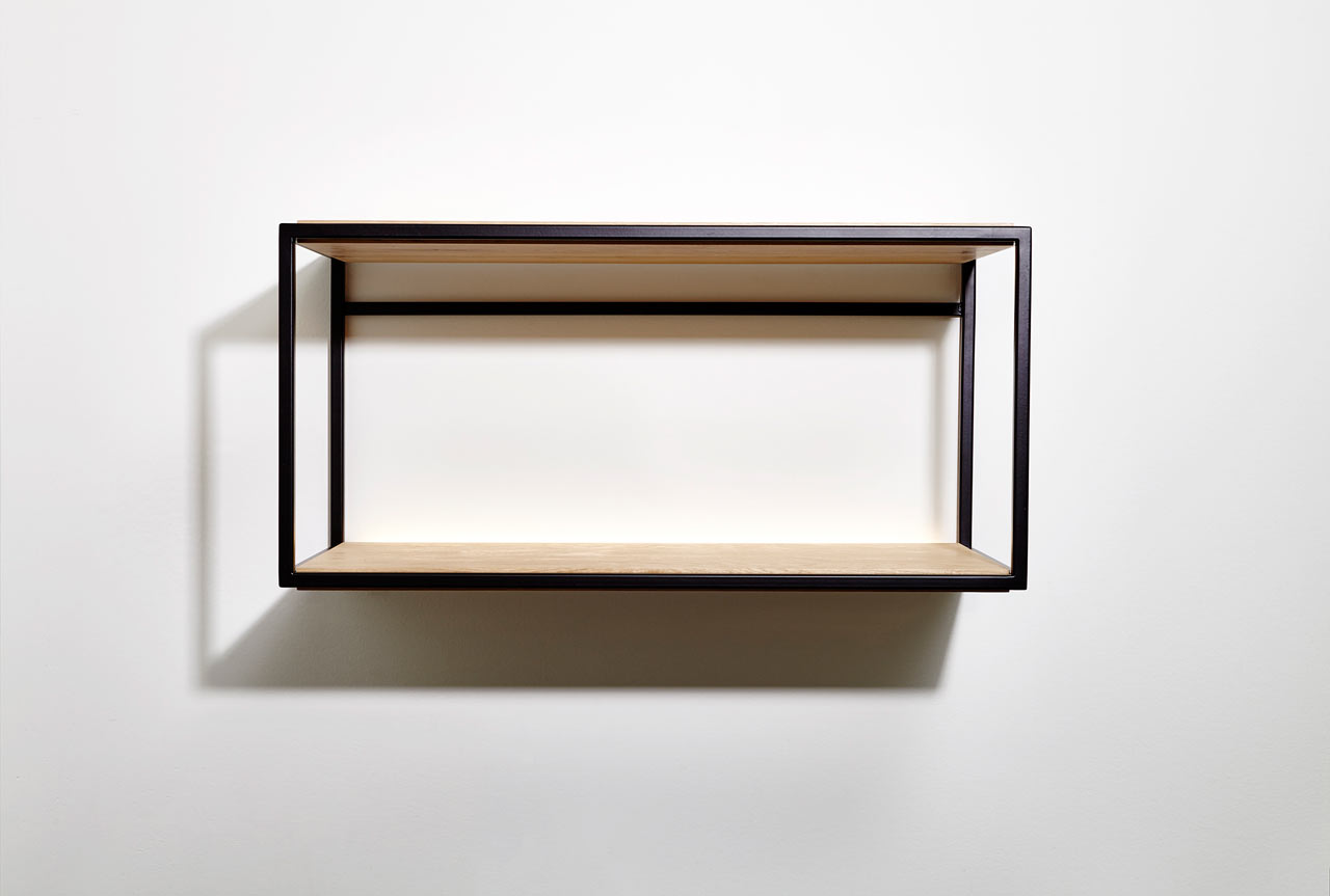
The "for a fleeting moment" project, conceived by Tokyo-based designer Bijin Davis, introduces a collection of mobile shelves capable of illuminating each other with gradients of color. The name of the collection directly references the transient nature of these color gradients, an effect that manifests only when the shelves are brought into close proximity. Each shelf, individually, maintains a standard white appearance. However, upon being juxtaposed or overlaid, a hidden gradient color beneath each shelf reflects onto the white surface of another, creating a luminous, colored shadow effect.
The inspiration for this unique design emerged during the COVID-19 pandemic, as Davis observed the subtle interplay between everyday objects within her home. She noted a faint red tint appearing on her white wall when a red computer mouse was placed against it. This observation led her to explore the relationships between objects, particularly how light and color can interact in unexpected ways. The minimalist construction of the shelves facilitates easy disassembly, utilizing aluminum pipes to support sturdy aluminum composite boards. These boards are precisely shaped using a water jet cutter and are attached through a simple turning mechanism.
Crucial to the shelves' interactive function is their mobility, achieved through seamless ball casters affixed to the base of each pipe. A significant challenge in the design process involved the hand-painting of the gradients. This aspect required extensive trial and error to perfect a softly diffused reflection, one that convincingly mimics the glow of an LED light, rather than a direct, harsh reflection. This meticulous approach ensures the subtle and ephemeral quality of the color effects.
The design draws on fundamental elements like light and shadows, reflecting Davis's experimental methodology. Conceived as her Master's Graduate project in 2021, the collection aims to highlight the positive impact that minor interactions in design can have on the user experience. The project serves as a reminder of how small moments of visual magic can create a sense of connection and brighten one's environment. Davis explains that the design narrates the experience of isolation, suggesting that life appears brighter when in good company. When the shelves are separated, their colors fade, symbolizing solitude. Conversely, when brought together, they shed colors upon each other, illuminating their surroundings, much like humans who thrive on social interaction and friendship. This metaphorical representation underscores the emotional and functional role furniture can play in our lives, transforming inanimate objects into a reflection of human needs and interactions.
#FurnitureDesign #InnovationDesign #BijinDavis #InteractiveDesign #ColorGradients #ProductDesign #MinimalistDesign #HomeDecor #ExperimentalDesign #FurnitureDesign #InnovationDesign #BijinDavis #InteractiveDesign #ColorGradients #ProductDesign #MinimalistDesign #HomeDecor #ExperimentalDesign
0 comment in total
 No comments yet
You may also like
Styling Shelves: Your Expert (Five-Point) Guide
The Melange Tile Collection Showcases Artistic Ombré Effects

Cool Colors, Fab Finishes

2,000 IKEA Hangers Upcycled Into Dynamic Chromatic Screen Room Divider
Curves and Color-Blocking Collide in One Far-Out Floating Shelf Display
5 reasons I'll always paint my shelving the same color as the wall – it's the secret to more cohesive decorating schemes

Restyling Your Shelves With Shea

Lily Collins uses this unconventional bookshelf styling tip

5 shelf styling trends for 2024 designers are using now to create rooms full of personality
gridded panels + illuminated tiles make up this booth for herman miller’s collection
Shelving ideas – how to add personality, style and storage to any room

Beauparlant Launches Open, Wall-Mounted Shelves
Two Wall Panel Collections Experimenting with Surfaces and Textures

Trueing's Cerine lighting hangs from chunky coloured glass chains
Fresh finds: stools, linen, shelving and more
11 vases that will be the star of the shelf
Putting a Collection on Display
REN: A Series of Room Dividers United by Materiality

5 shelf styling trends for 2024 designers are using now to create rooms full of personality
Color walls act as consumer magnet