1/6
These four paints used in this Seattle home are the perfect shades to create an instantly luxe decor scheme
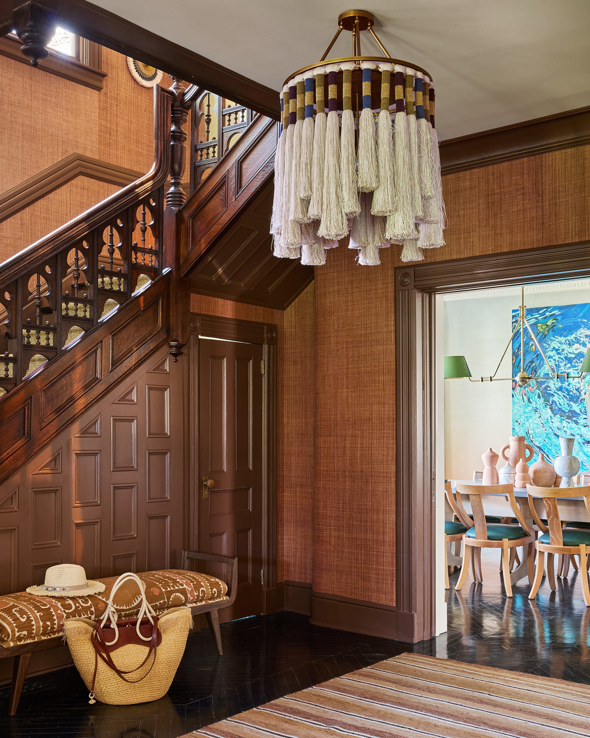
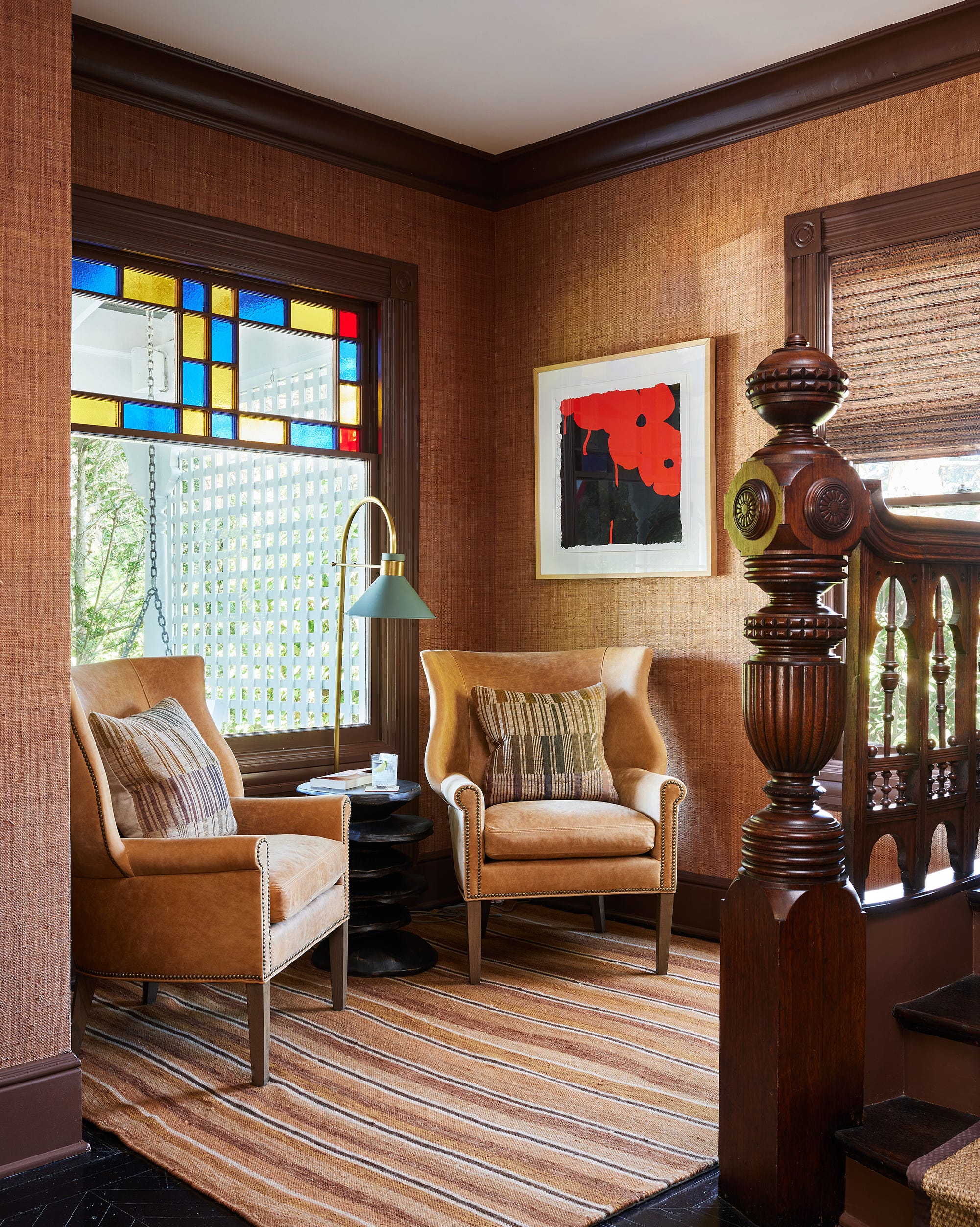
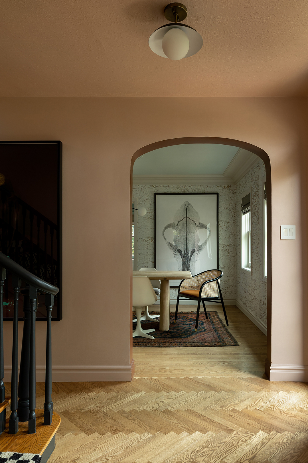
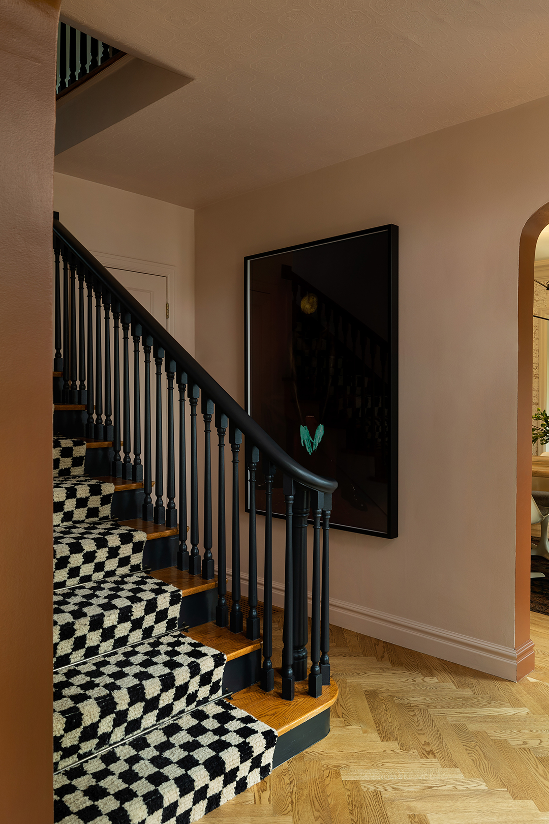
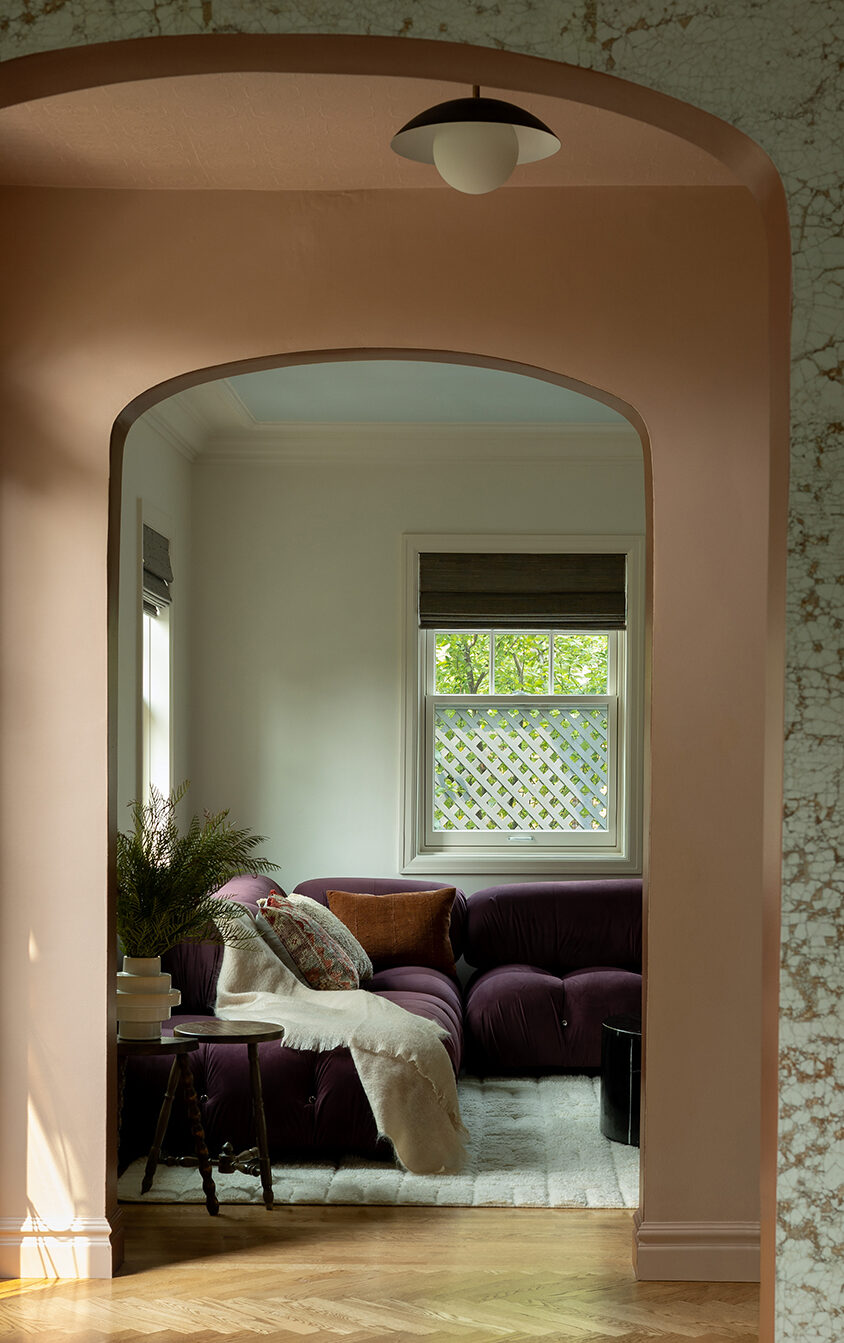
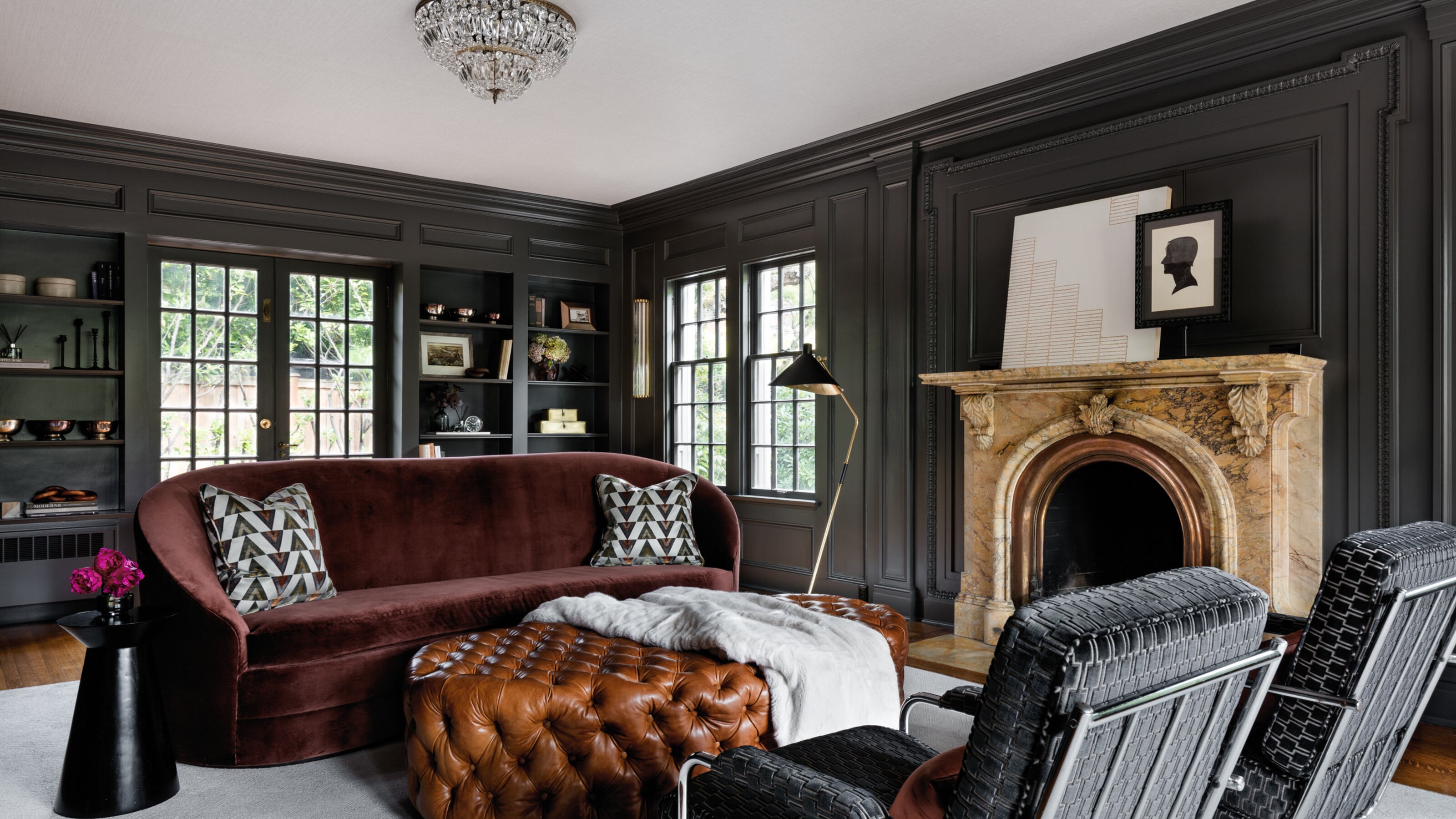
This article highlights a historic 20th-century Jacobethan mock Tudor home in Seattle, designed by Shannon Adamson Interior Design, which effectively blends Art Deco influences with statement 1970s furniture. The design strategy centers on the use of dark paint colors to infuse depth and a luxurious feel, a departure from traditional bright spaces, aiming for a cozier atmosphere. The designer explains that rooms were painted with a consistent wall color from top to bottom, avoiding busy contrasts between walls and trim, thereby allowing the historic interior architecture and moldings to recede into a more textural role.
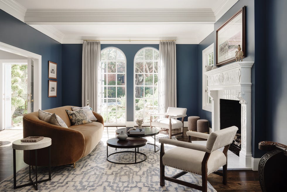
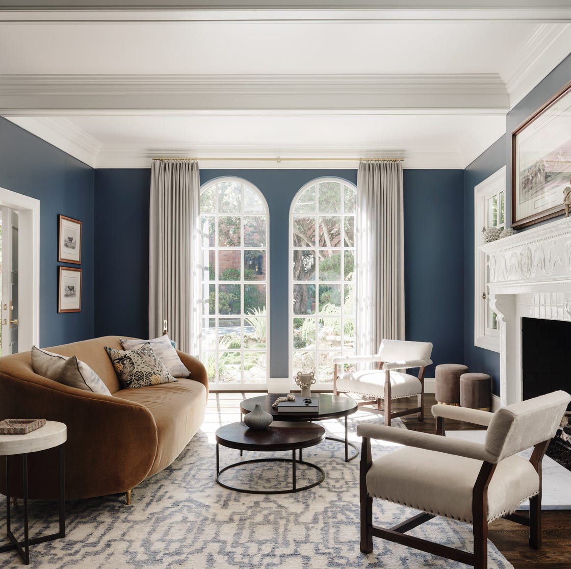
The sitting room, for instance, features Sherwin Williams' Iron Ore, a cool charcoal shade that brings sophistication and highlights the historic crown molding through its satin finish. This choice complements the original quarter-sawn oak flooring. The furniture and fabrics, including cognac leather, sienna velvet, and dark metals, were carefully selected to prevent the dark palette from feeling cold or oppressive. The room's low ceilings were also a factor in choosing dark colors, as they contribute to a cozy feeling, which might not be achievable in spaces with very tall ceilings. The sitting room's design incorporates various textures and shapes, with a carved Italian marble fireplace as its focal point, surrounded by 1950s Italian crystal chandeliers, a custom curved velvet sofa, and 1930s Gilbert Rohde chairs.
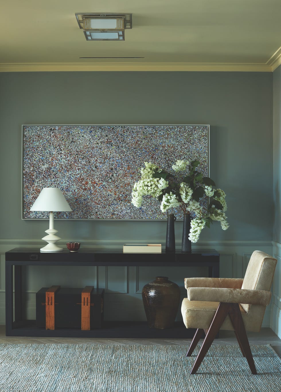
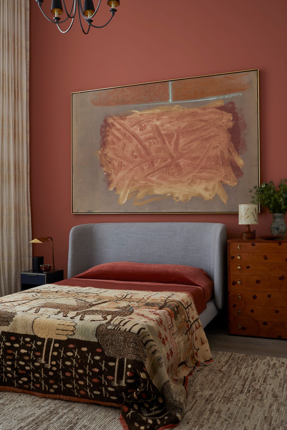
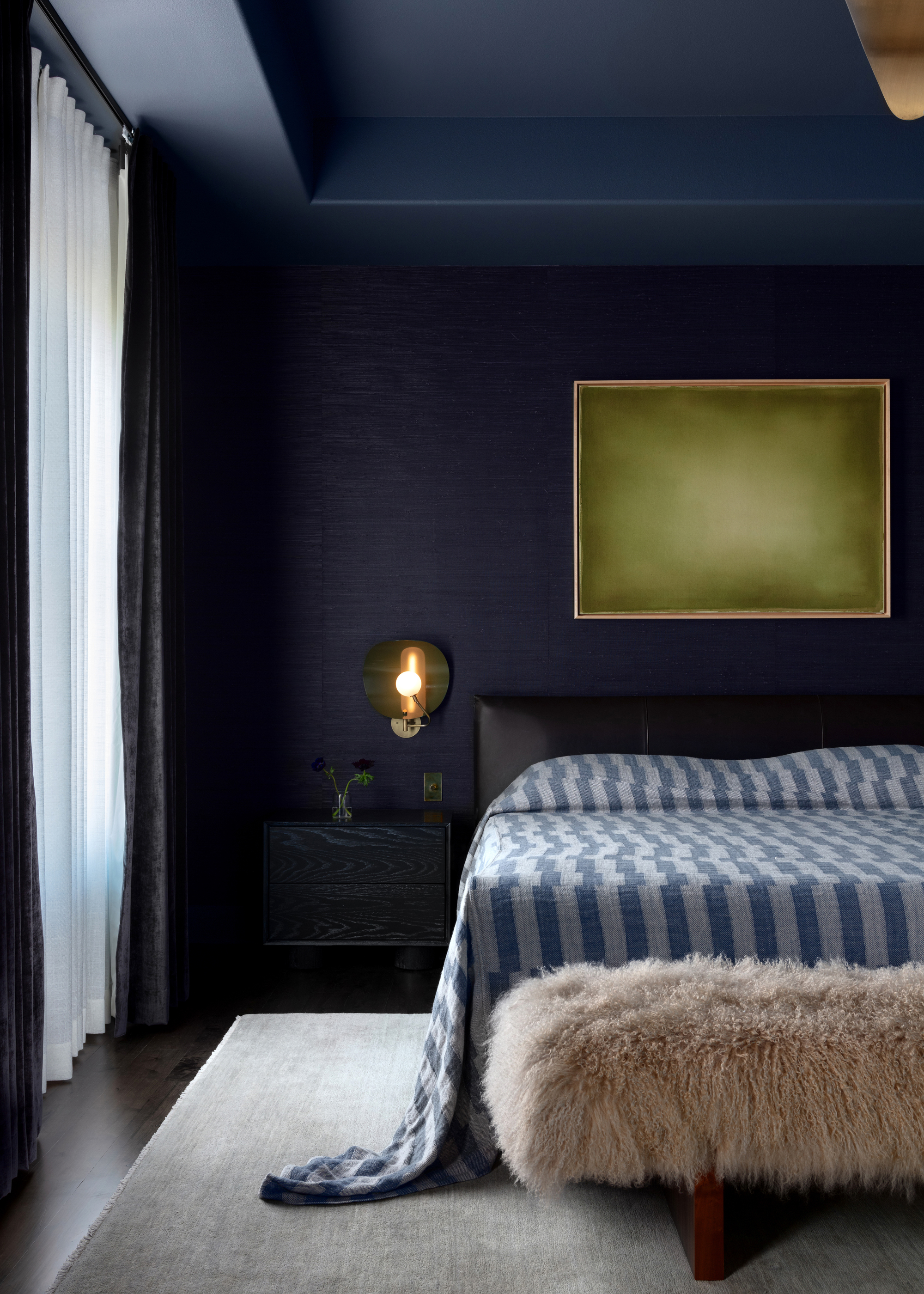
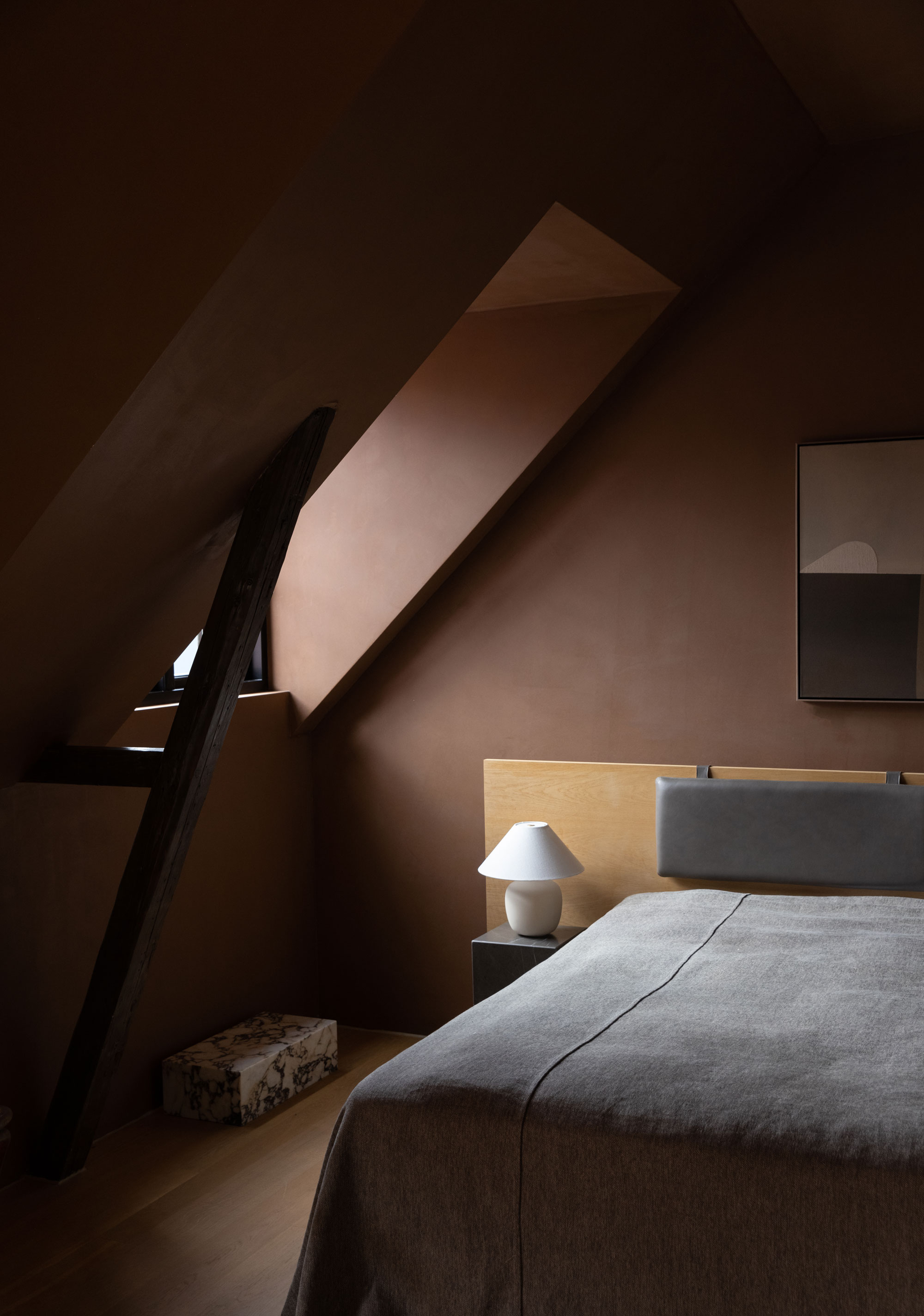

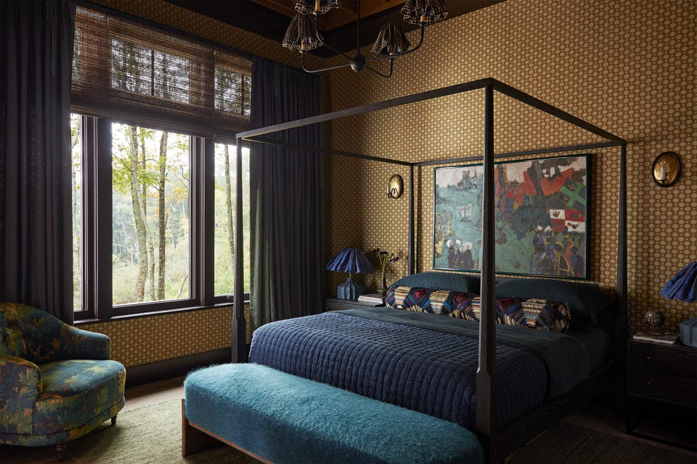
In the breakfast room, Benjamin Moore's Galapagos Turquoise, a deep teal with both depth and warmth, was used. The designer notes that dark color schemes are particularly effective in areas with gloomy weather, like Seattle, as they beautifully complement filtered natural light. The main bedroom employs Sherwin Williams' Classic French Grey, a warm tone that prevents the room from feeling cold, especially when exposed to south-facing light, creating an inviting and cozy atmosphere. Darker colors are deemed suitable for bedrooms, where an enveloping environment is desired.
The wet bar area, designed for a sleek and sophisticated look, is painted in Sherwin Williams' Outerspace, a mysterious blue with grey undertones. This space features walnut cabinets, honed Nero Marquina marble countertops, locally-made antiqued mirror panels, an aged brass footrail, and Tom Dixon pendants. Bespoke linear lighting was inlaid into the bookcases, which are lined with textural Arte wallcovering, to showcase the clients' liquor collection, all complemented by the warm acacia wood floor. The article also touches upon the 1970s decorative vibe found in the house, which, while not explicitly intentional, arose from the designer's inspiration from Jean Michel Frank's work, contrasting traditional ornamentation with streamlined furnishings, and incorporating elements like Arteriors wing-back chairs, retro geometric wallpaper, and sculptural lamps, creating a playful reinterpretation of historically accurate home furnishings.
#InteriorDesign #PaintColors #ModernHome #SeattleHome #LuxuryDecor #HomeRenovation #ColorScheme #HistoricHome #DesignInspiration #InteriorDesign #PaintColors #ModernHome #SeattleHome #LuxuryDecor #HomeRenovation #ColorScheme #HistoricHome #DesignInspiration
0 comment in total
 No comments yet
You may also like
Color, Pattern, and Texture Rule in This Brooklyn Home

At This Accessories Designer’s NYC Home, Design Rules Go Out the High-Gloss Purple Window

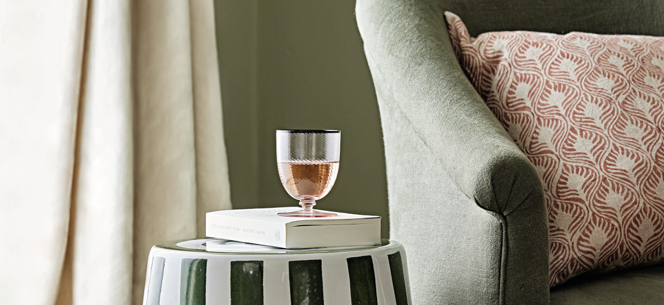
Interiors expert reveals 5 reasons why you should be decorating with stripes

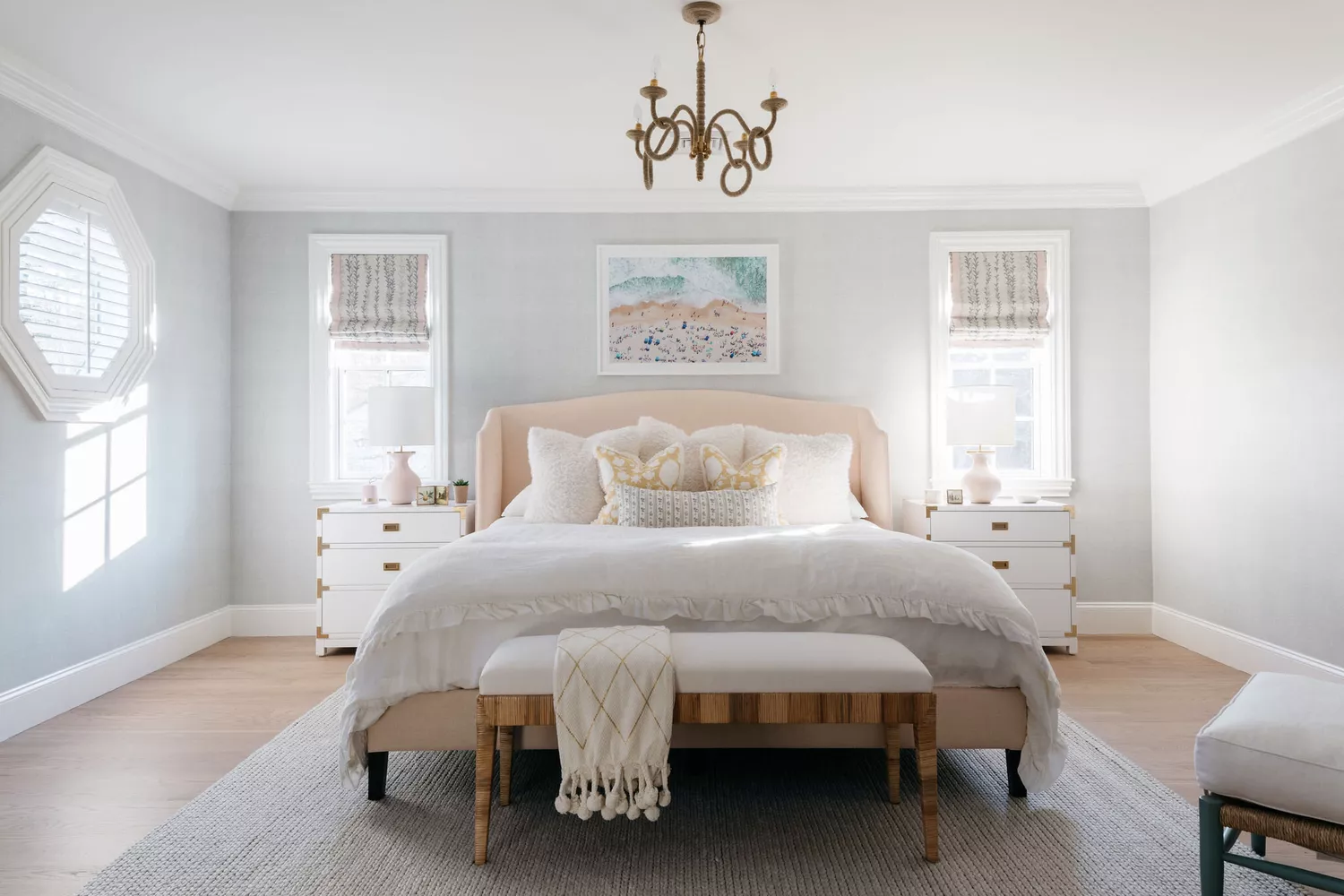
We Asked Designers Which Paint Colors Are Best for Brightening a Dark Room—6 Top Picks

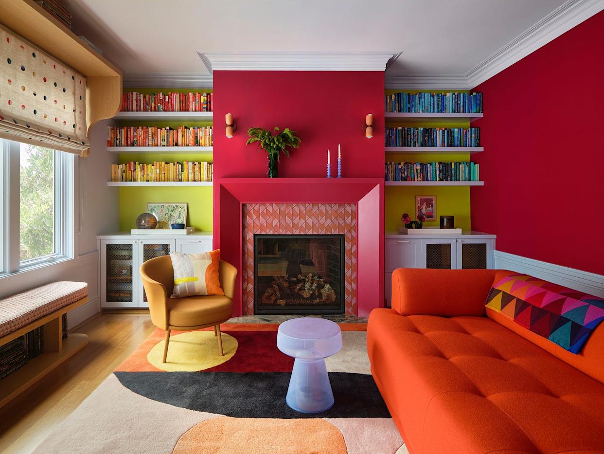
Vibrant “Personal Style” Inspired This Home’s PUNCHY Color Palette

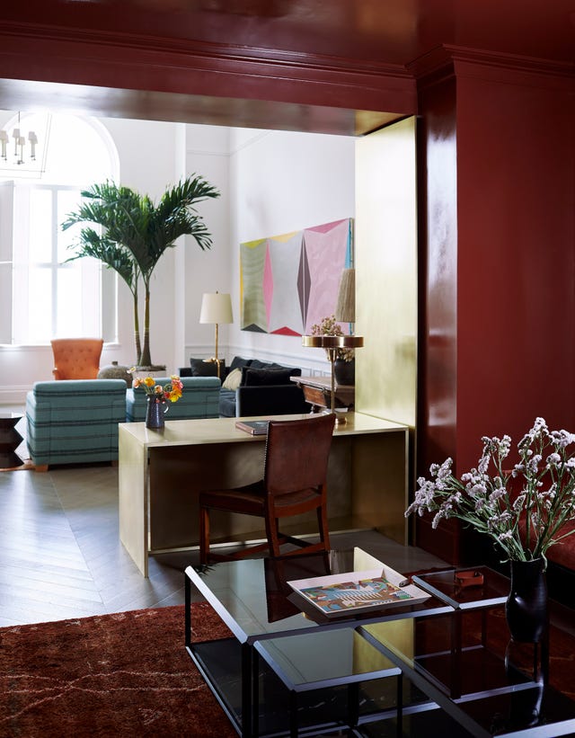
How This A-List Interior Designer Transformed a Luxury Manhattan Penthouse With Color
Home design: Moving from an all-beige condo to full color

Creative, Captivating Use of Color Helps This Home Redesign Shine

Lick Paint Will Transform the Mood in Your Home Through Color Psychology

The Best Luxury Paint Brands
Burnt Cinnamon Arches and a Glass Slipper Ceiling—The Paint in This Home Looks as Cool as It Sounds | domino

9 Design Trends From 2024 You’ll Still See Everywhere in 2025, According to Experts

Texture Takes Over: Why Matte Finishes Are the New Luxury

This Seaside Victorian Is a Lesson in Layering Textures

11 Paint Colors That INSTANTLY Make Your Home Look "Expensive," According to Designers
Mixing and Matching Has Never Looked Better Than in This NYC Apartment
14 Paint Colors That Can Make a Room Feel Instantly Cozy


Timeless Paint Colors The Stars Of Fixer To Fabulous Love Seeing In Homes
'Colorful Quiet Luxury' Isn't an Oxymoron, It's a Vibe
Room We Love: Palette Perfection