1/48
The top 54 paint colours of the decade – all the shades we couldn't live without
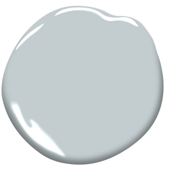
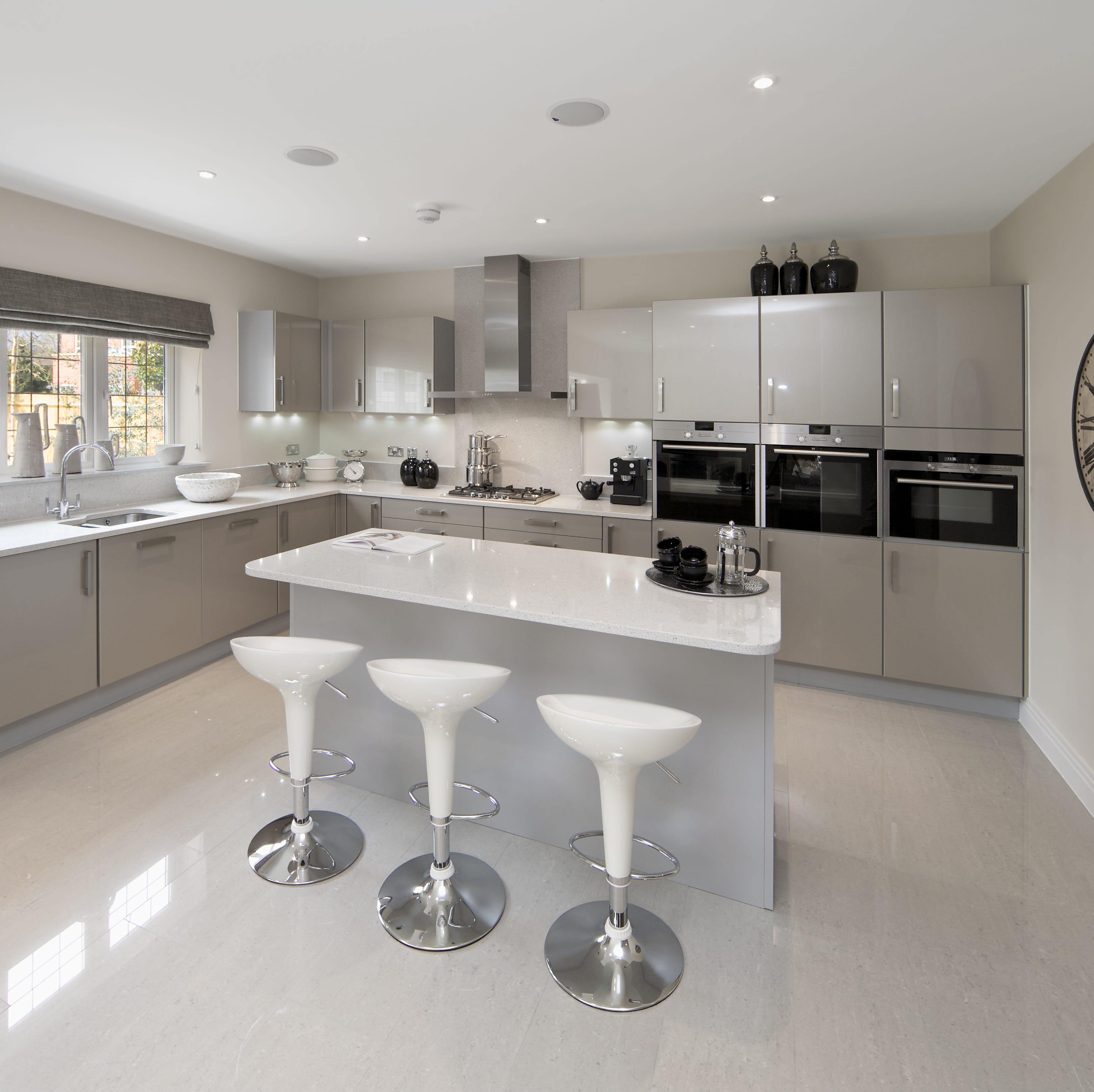
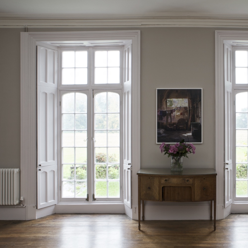
The article delves into the most popular paint colors that defined interior design trends over the last decade, highlighting a shift in homeowner confidence and preferences. Initially, the early part of the decade saw a move away from warm neutrals towards grey tones, exemplified by the widespread appeal of Farrow & Ball's 'Elephant's Breath.' This shade offered a contemporary feel without being excessively cool or industrial, striking a balance that resonated with many.
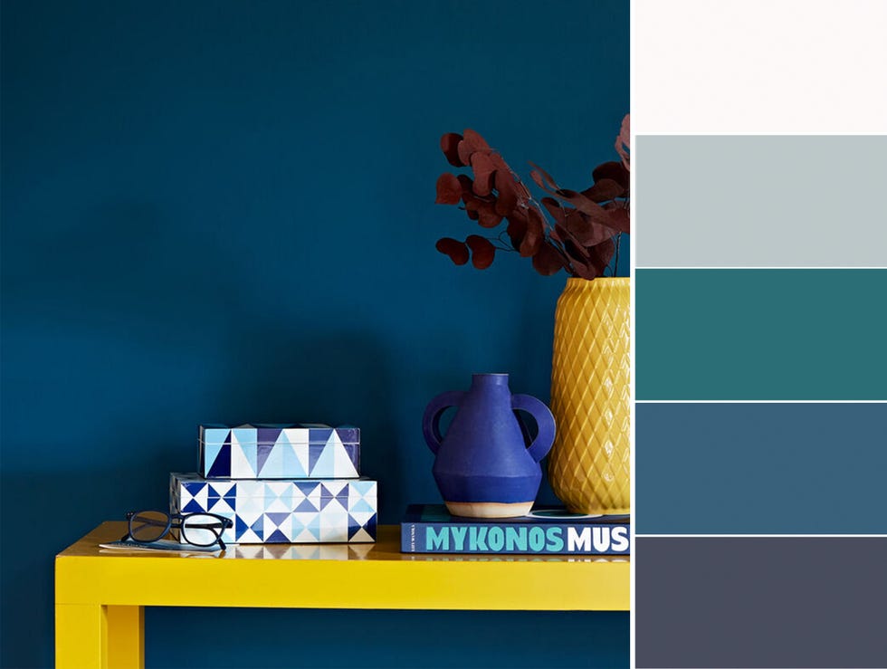
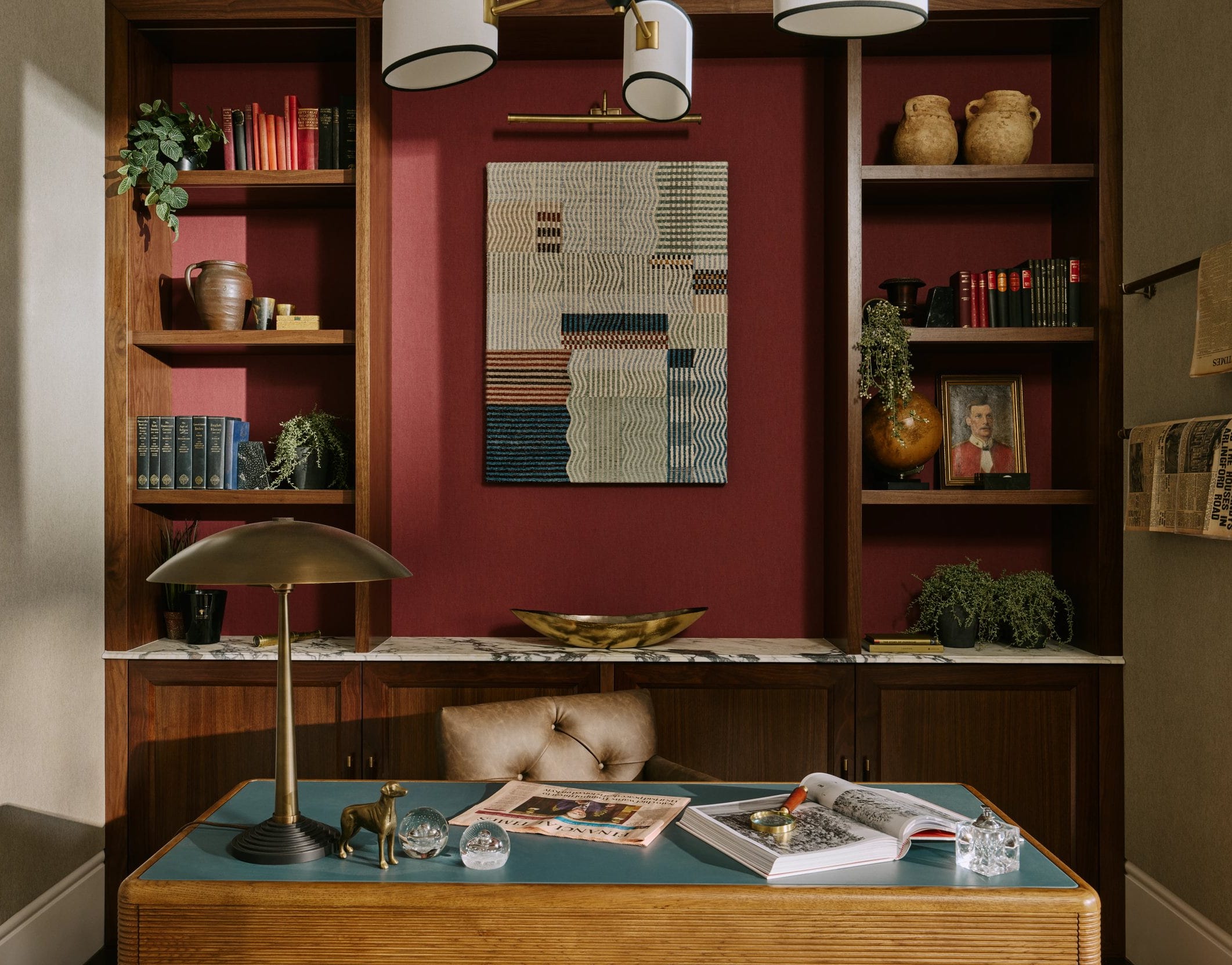
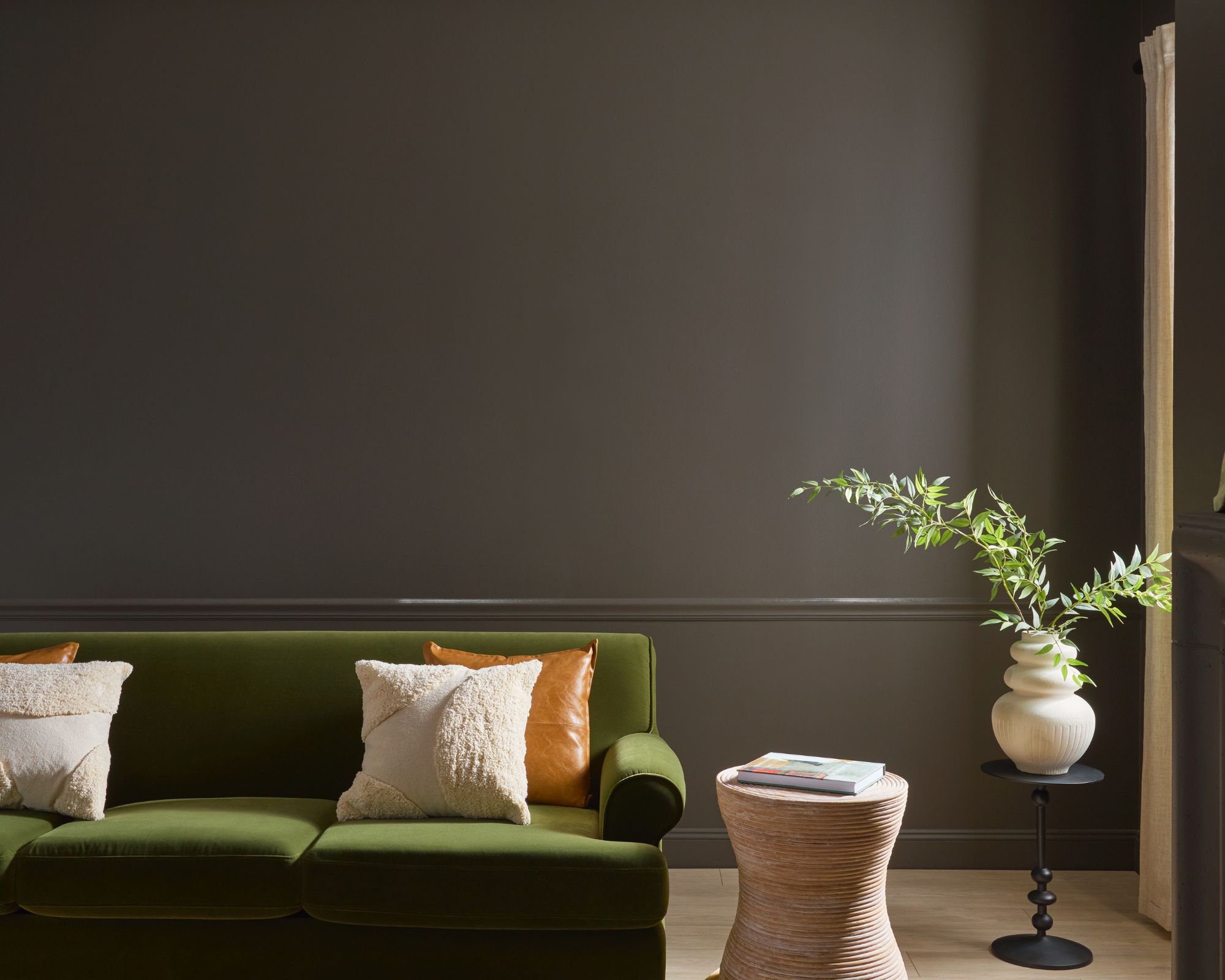
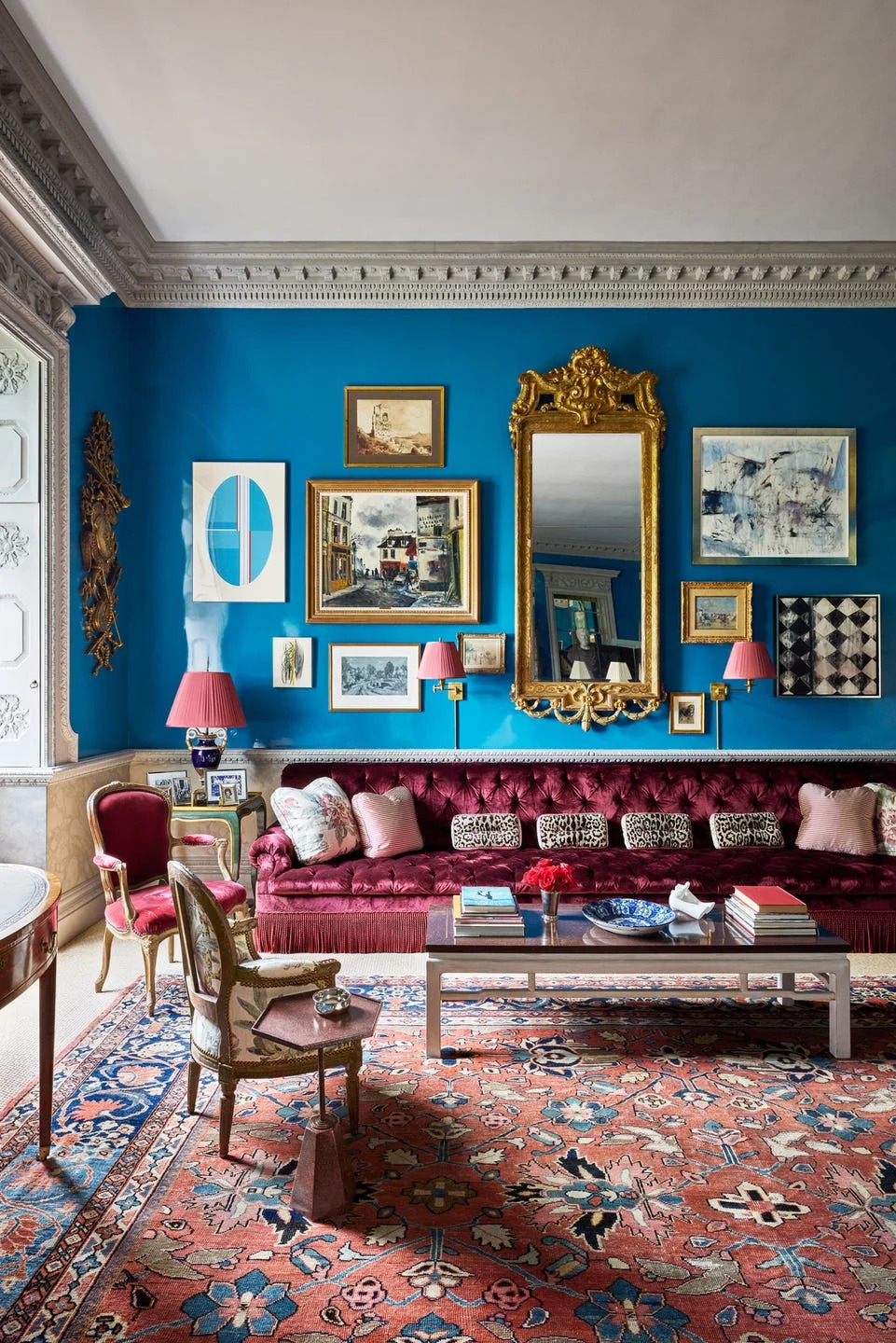
As the decade progressed, there was a noticeable increase in boldness, with individuals opting for richer, deeper colors. This evolution led to the embrace of 'dark side' hues such as midnight blues like Farrow & Ball's 'Stiffkey Blue,' deep greys like Benjamin Moore's 'Kendall Charcoal,' and even blue-black to full-black shades like Farrow & Ball's 'Railings' and Little Greene's 'Jack Black.' Experts noted a more sophisticated approach to interior design, involving layered color schemes, painted ceilings, and consistent color application across all four walls. This increased confidence in using darker, more dramatic colors was attributed to a desire for mood and individuality over concerns about space.
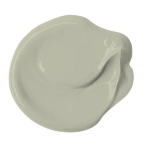
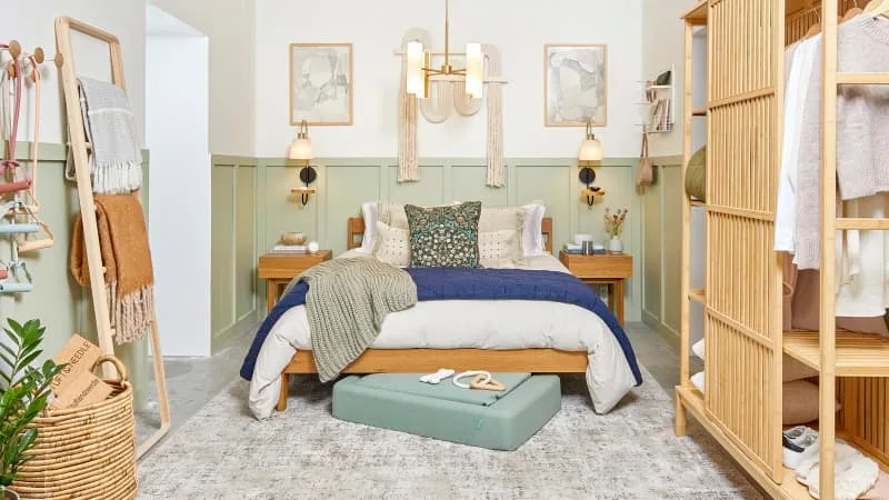
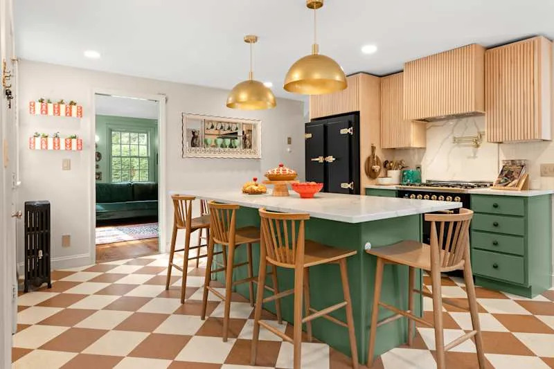
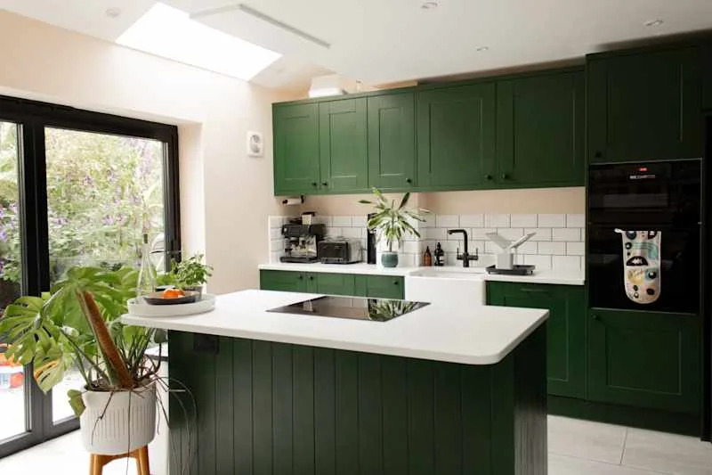
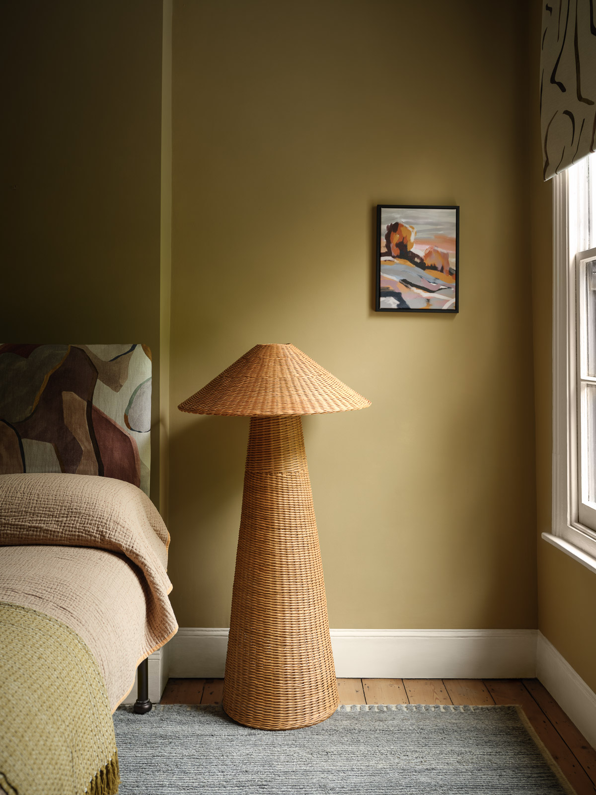
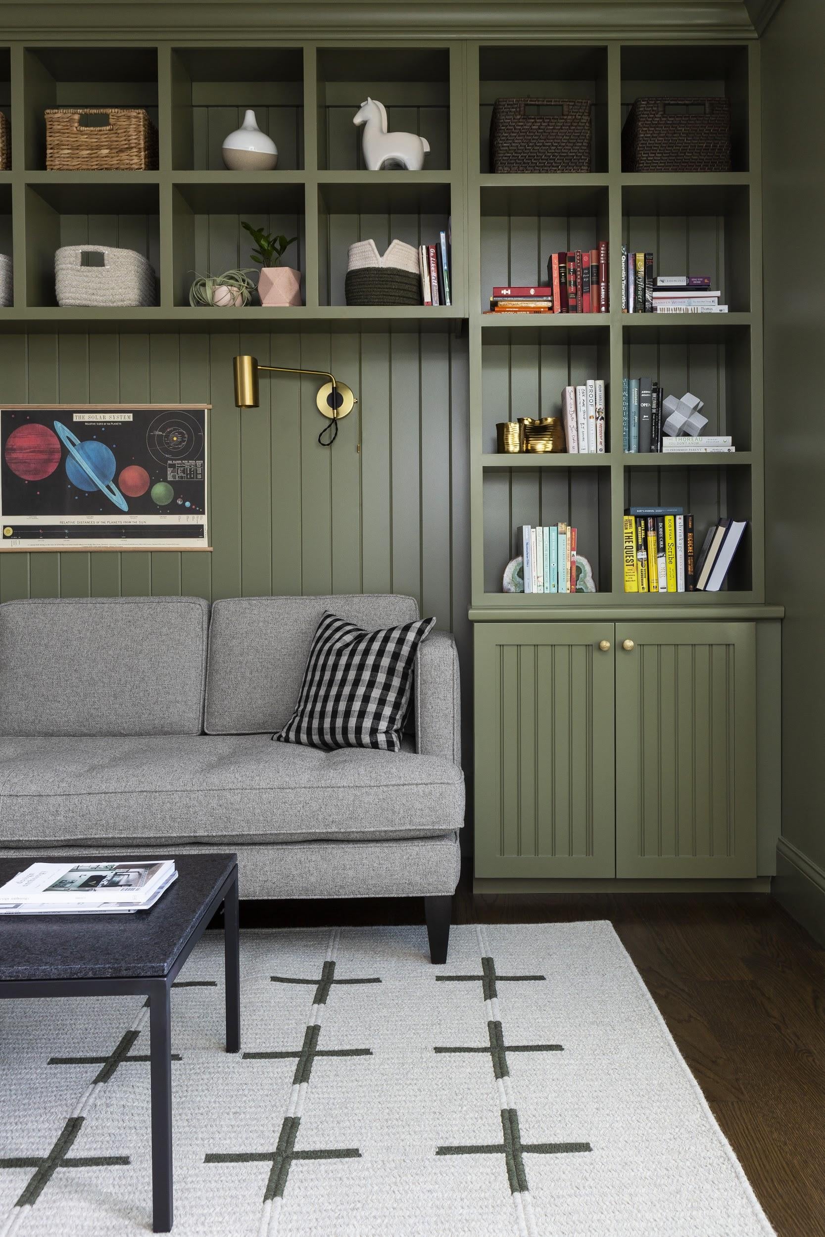
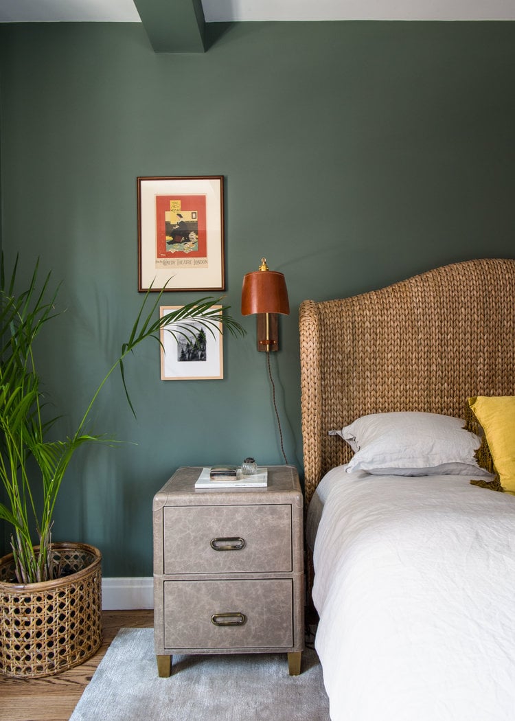
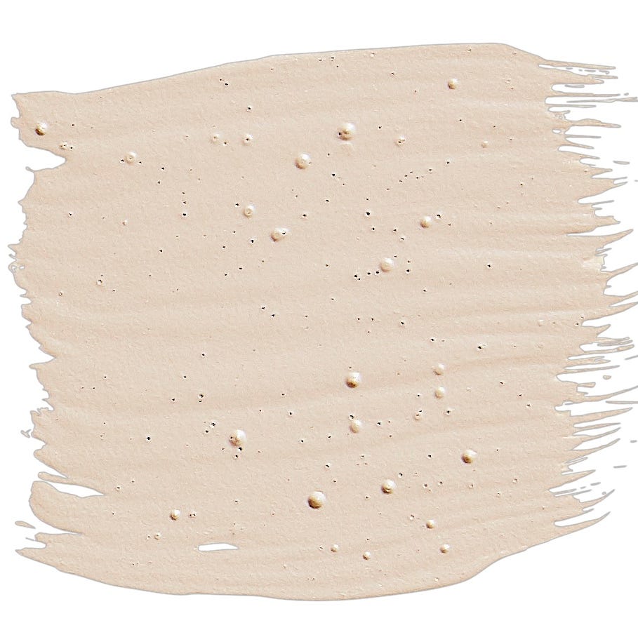
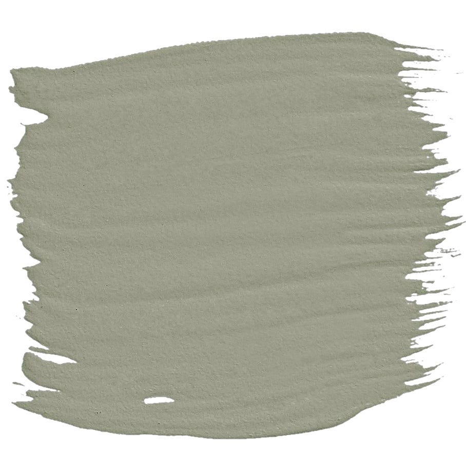
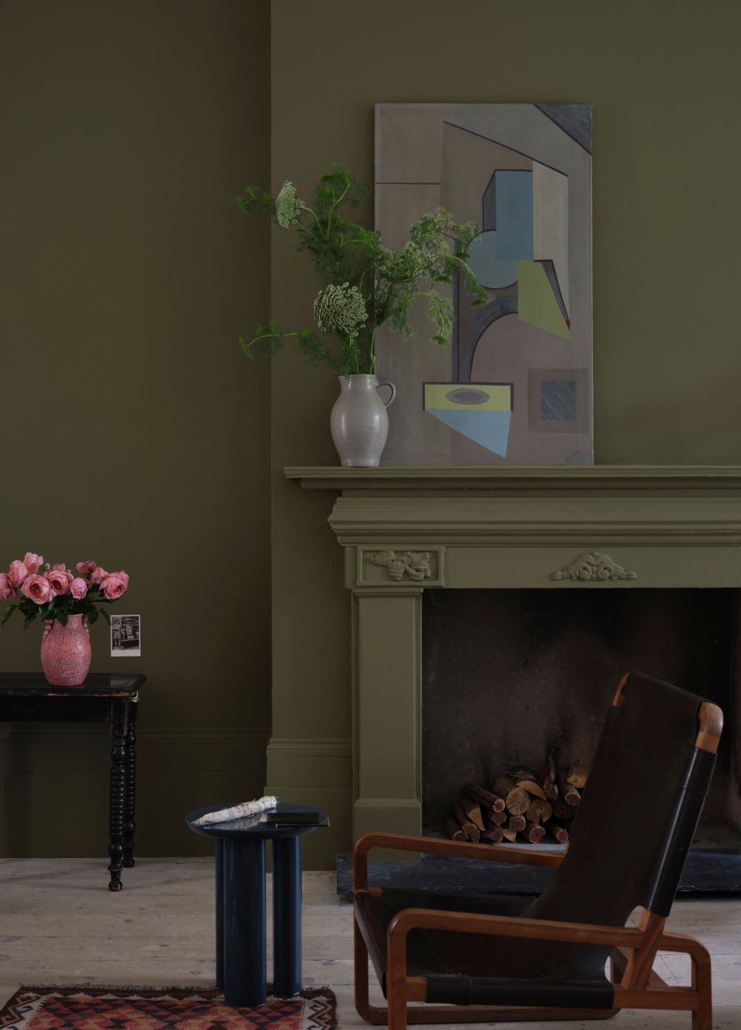
Alongside this shift towards darker tones, softer shades also maintained popularity. Plaster tones and dusty pinks, such as Farrow & Ball's 'Setting Plaster,' provided a comforting and soothing aesthetic, making pink acceptable beyond bedrooms and creating warm, welcoming spaces. The latter part of the decade also saw a growing eco-consciousness, which translated into a focus on earthy colors and a connection with nature. This included various shades of green, ranging from olives like Farrow & Ball's 'Sap Green' to khakis like Annie Sloan's 'French Linen,' reflecting a desire to bring the outdoors in.
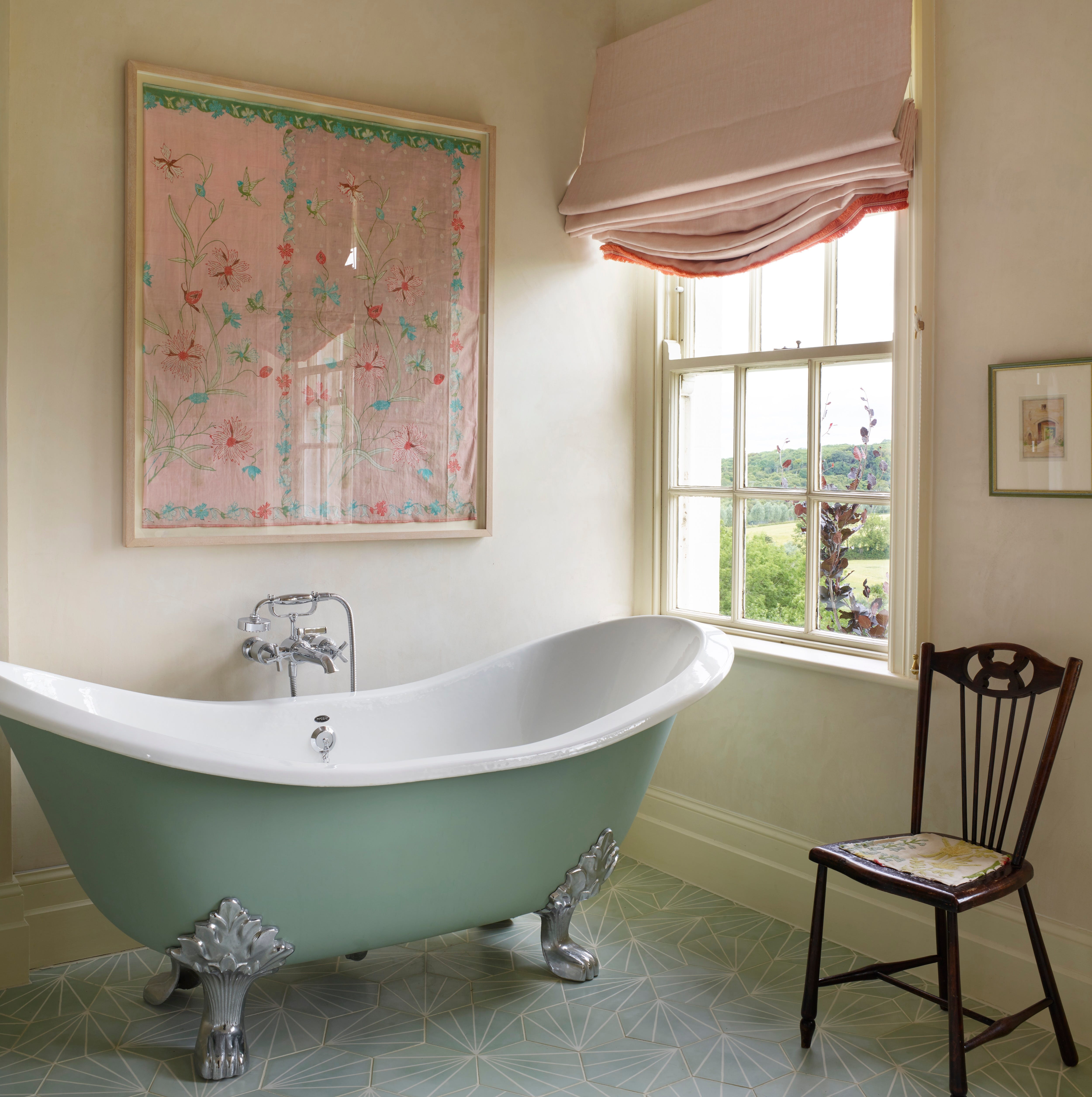
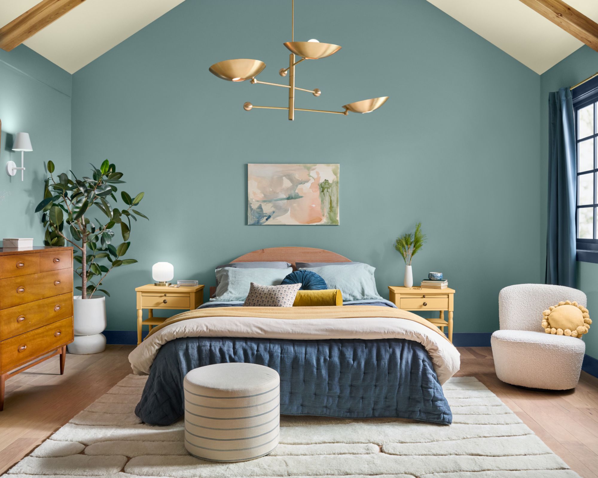
The article compiles a comprehensive list of 54 top paint colors, featuring popular choices from brands like Farrow & Ball, Little Greene, Dulux, Mylands, Annie Sloan, Benjamin Moore, Laura Ashley, Zoffany, Sanderson, Graham & Brown, Crown, and Neptune. Each color is presented with insights from design experts and anecdotal evidence from homeowners, explaining its appeal and how it contributes to different interior styles. For instance, 'Aquamarine Light' by Little Greene was favored for its fresh, bright, and calming Scandi-inspired feel, while Dulux's 'Chic Shadow' offered a versatile mid-grey ideal for pairing with vibrant furniture. Mylands' 'Burlington Arcade' was praised for its timeless robustness, and Farrow & Ball's 'Railings' became popular for creating dramatic yet sophisticated interiors.
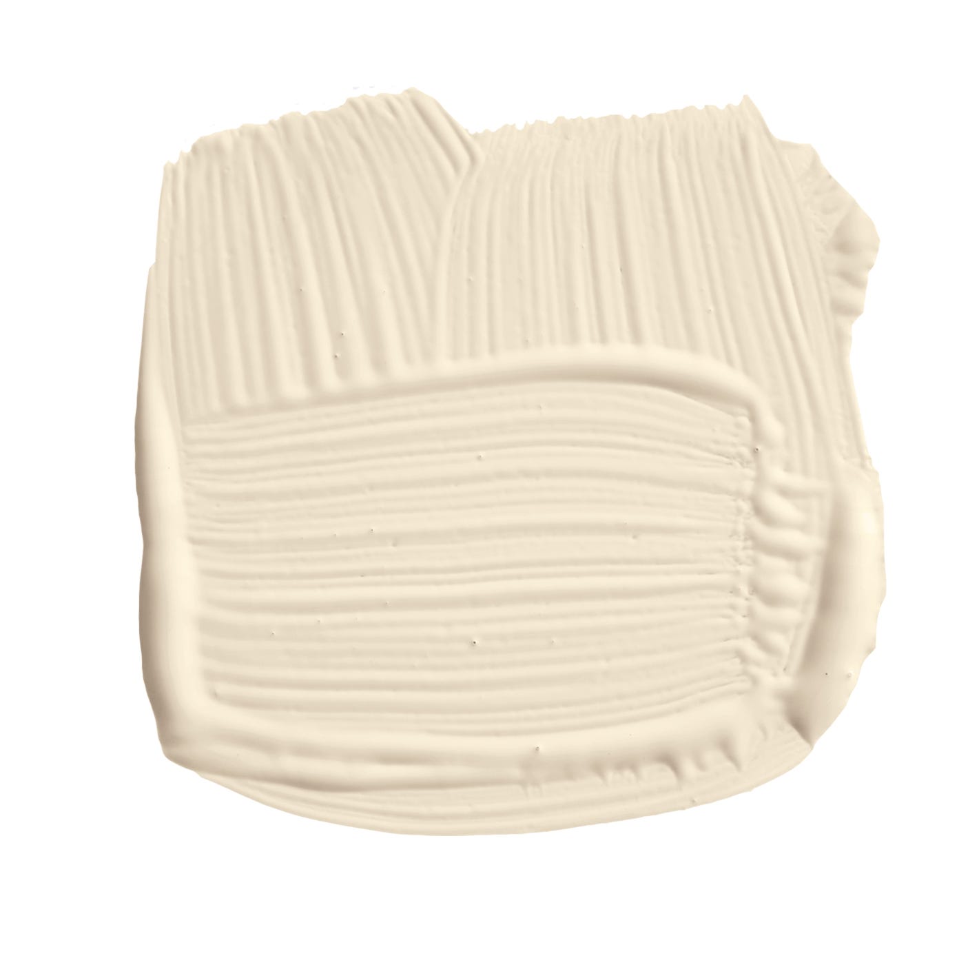
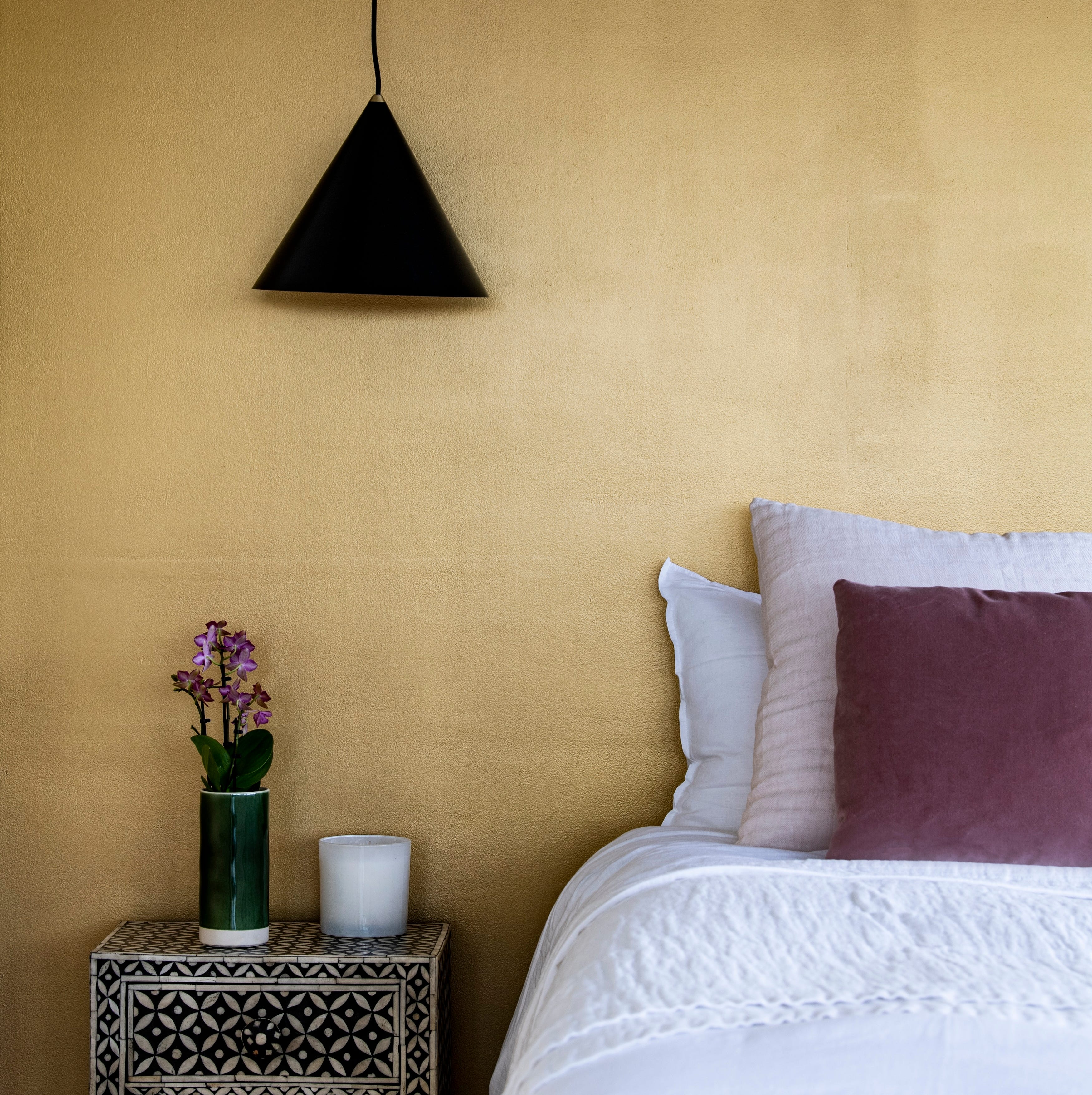
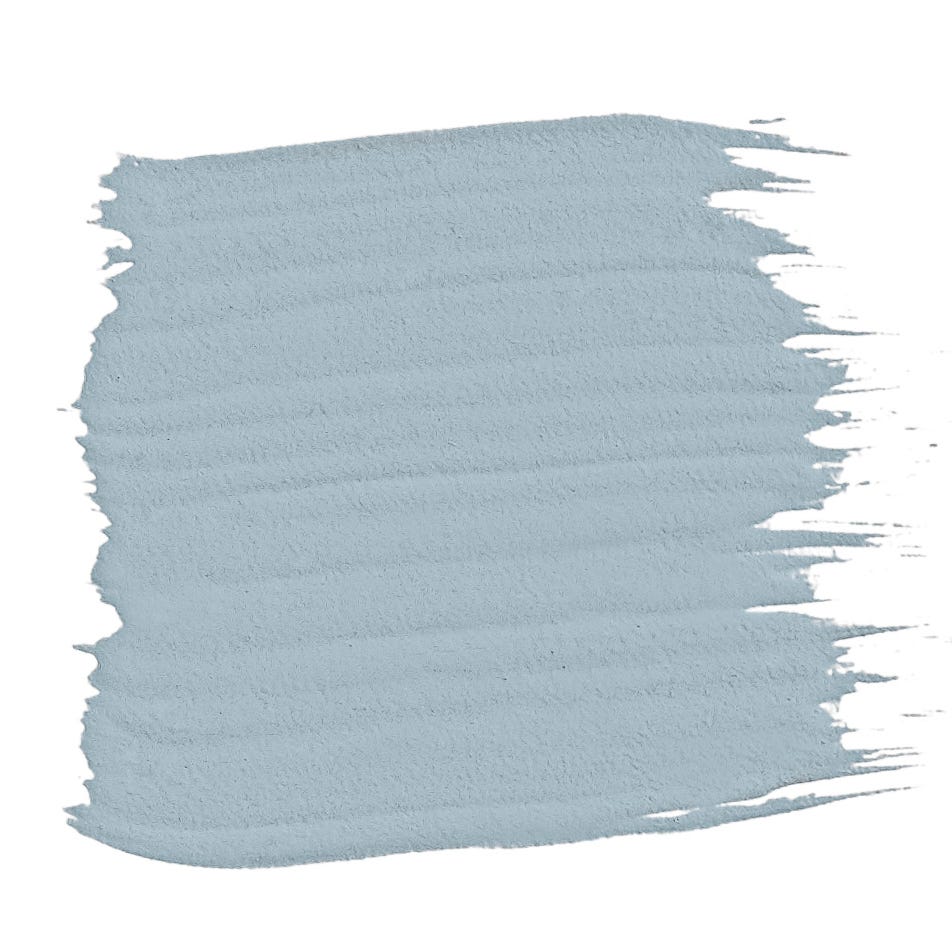
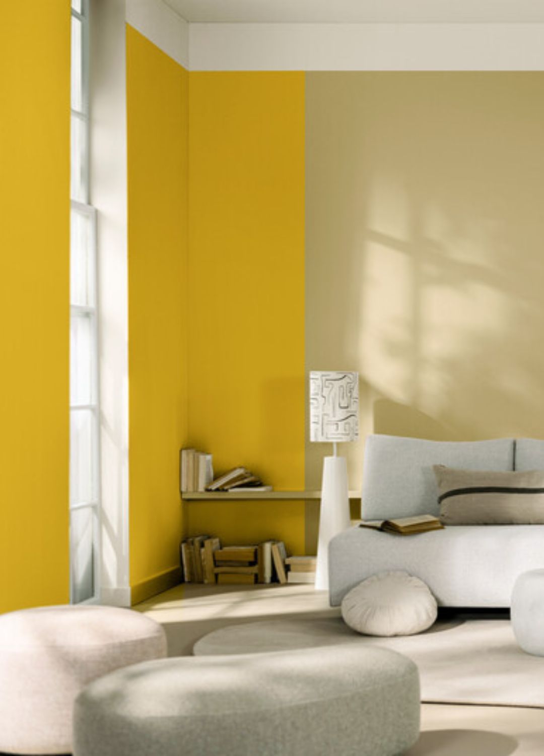
Further exploration includes the widespread adoption of specific blues like Benjamin Moore's 'Hale Navy' for kitchen cabinets and living rooms, and Dulux's 'Denim Drift' for its natural, sky-like quality. Soft greys such as Dulux's 'Goose Down' were appreciated for their versatility and ability to create relaxing environments. Whites like Farrow & Ball's 'All White' and Benjamin Moore's 'White Dove' remained popular for their clean, minimalistic, and warm undertoned appeal, avoiding a clinical feel. Unique shades like Zoffany's 'Koi Carp' (vibrant tangerine) and 'Tigers Eye' (full-bodied yellow) were also noted for their ability to add unique signature spots and energy to rooms. The article concludes by acknowledging the continued dominance of neutrals, such as Neptune's 'Silver Birch' and 'Shingle,' as foundational elements in both colorful and subdued homes, hinting at evolving trends for the upcoming decade.
#PaintColors #InteriorDesignTrends #HomeDecor #ColorPalette #FarrowAndBall #Dulux #BenjaminMoore #LittleGreene #Zoffany #PaintColors #InteriorDesignTrends #HomeDecor #ColorPalette #FarrowAndBall #Dulux #BenjaminMoore #LittleGreene #Zoffany
0 comment in total
 No comments yet
You may also like
These 20 Paint Colors Will Never Go Out of Style, According to Designers

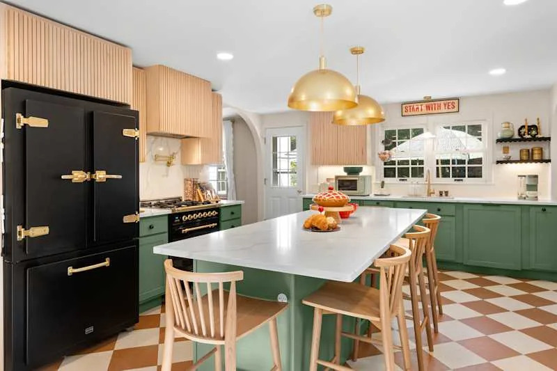
These 13 Green Paint Colors Are the Best We’ve Ever Seen

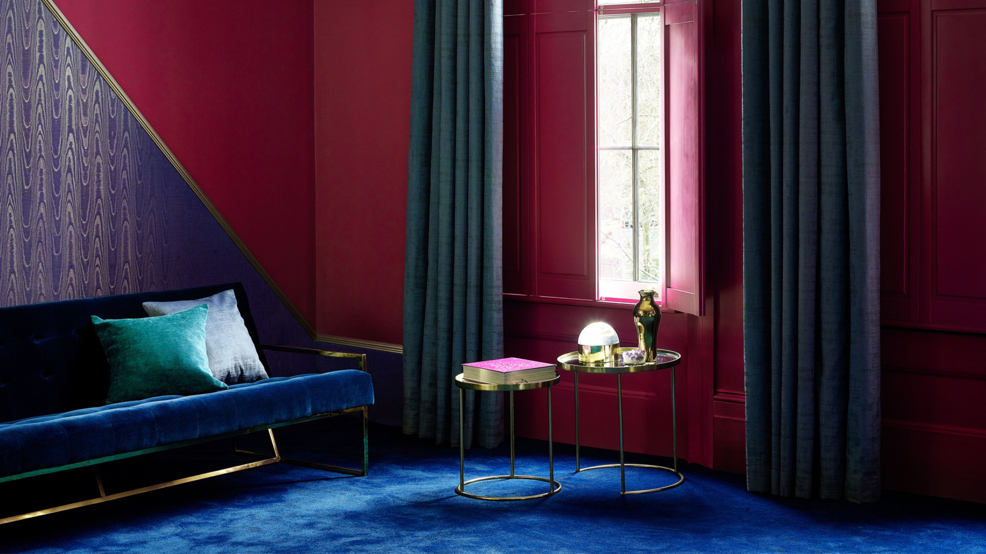
5 Paint Colors Going Out of Style in 2025 — And What You Should Replace Them With Before Then

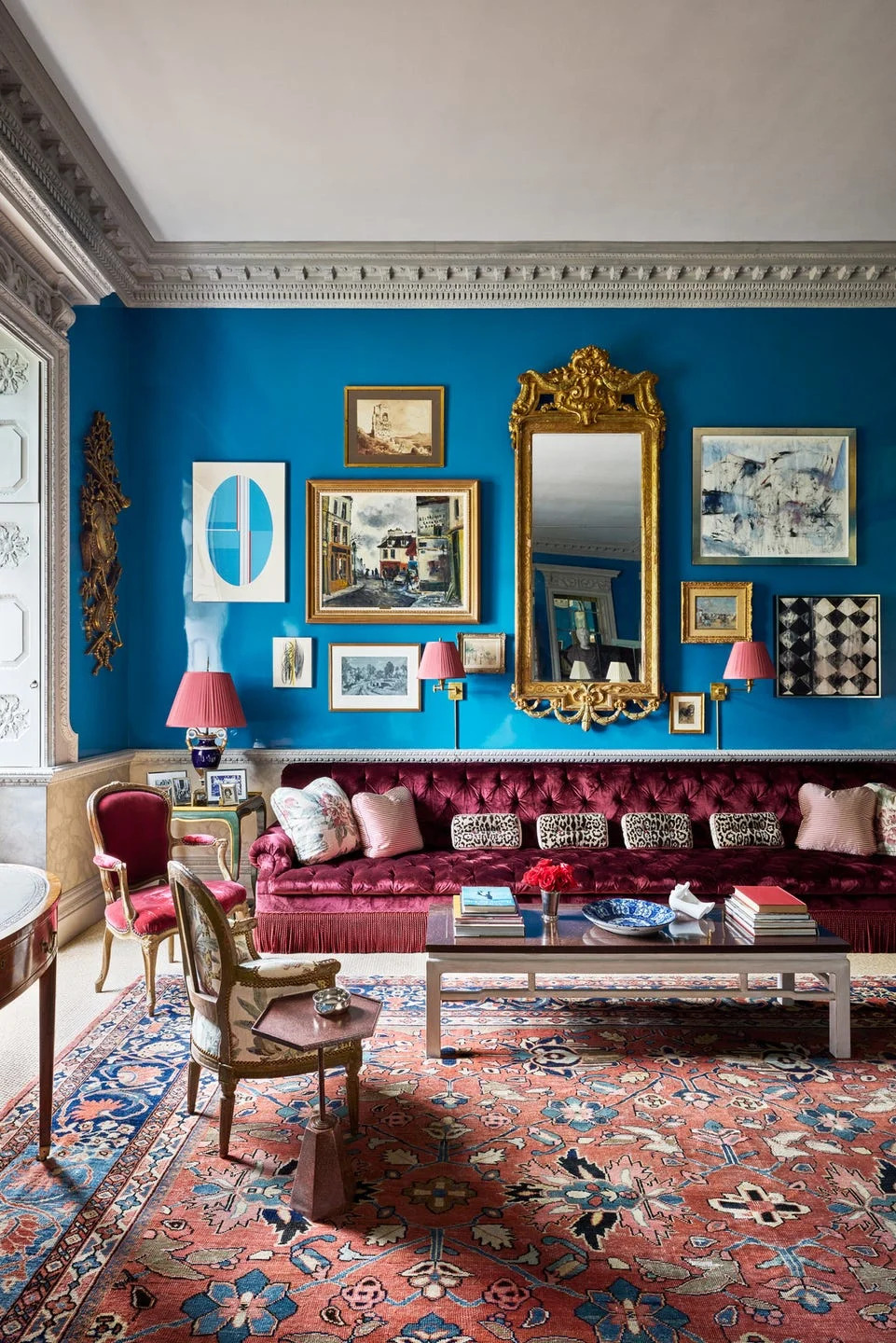
Designers Swear By These 55 Living Room Paint Colors

5 Timeless Paint Colors That Will NEVER Go Out of Style, According to Designers

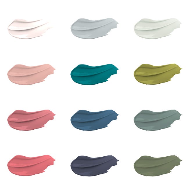
30 on-trend paint colours for every room in your home
5 Timeless Paint Colors That Go With Absolutely Everything, According to Color Experts

10 Kitchen Paint Colors You Won’t Regret in 10 Years, According to Designers

The most timeless paint colors according to designers

15 Timeless Paint Colors You’ll Never Tire Of, According To Designers
These Are The 12 Best-Selling Paint Colors From All Your Favorite Brands

Interior paint colour trends 2025: 10 hues you'll be seeing everywhere this year

The 18 Most Popular Paint Colors of All Time


7 Most Underrated Paint Colours, According To Colour Experts
We Can’t Get Enough of These 13 Paint Color Trends for 2021
26 Most Popular Kitchen Paint Colors Throughout the Decades

10 Timeless Living Room Paint Colors Designers Swear By
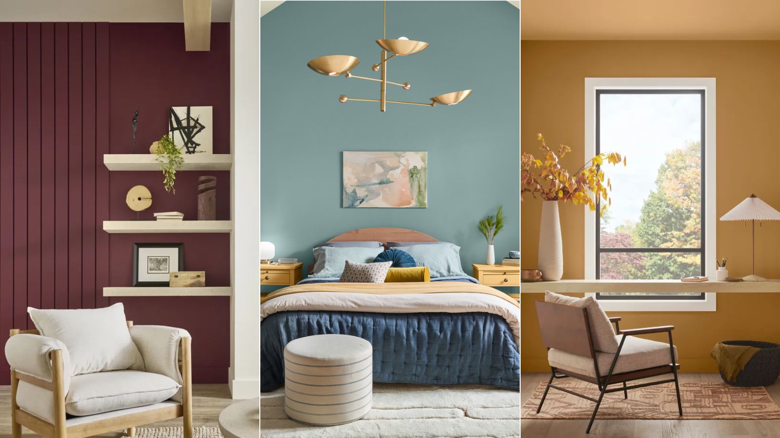
Colors of The Year – get to know every shade revealed by leading paint brands for 2025

4 Interior Designers Share the Biggest Paint Color Trends Right Now (and What’s Out!)

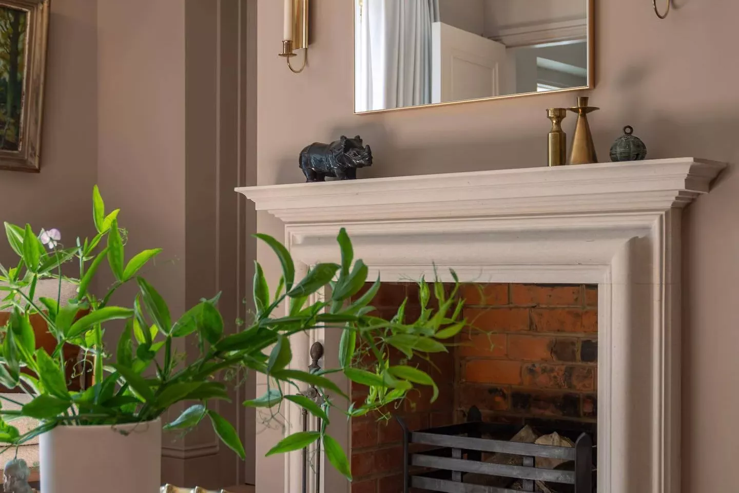
33 Absolutely Perfect Paint Colors Designers Love