1/5
8 Paint Mistakes That Make Your House Look Dingy (and How to Fix Them)
Applying a new coat of paint is a common and relatively inexpensive method to refresh a room, but selecting the incorrect hue or finish can inadvertently lead to a dingy appearance. Expert designers and home stagers offer insights into common paint mistakes that can make a house look less clean and vibrant, along with recommendations for better alternatives.
One significant mistake is the use of warm earth tones. Interior designer Jerith Bailey advises against tans and browns, explaining that their foggy tones can make a space appear unclean and dull, despite their versatility in pairing with furniture. For a clean neutral, Angela Hall, a certified home stager, suggests greige tints such as Sherwin-Williams’ Accessible Beige.
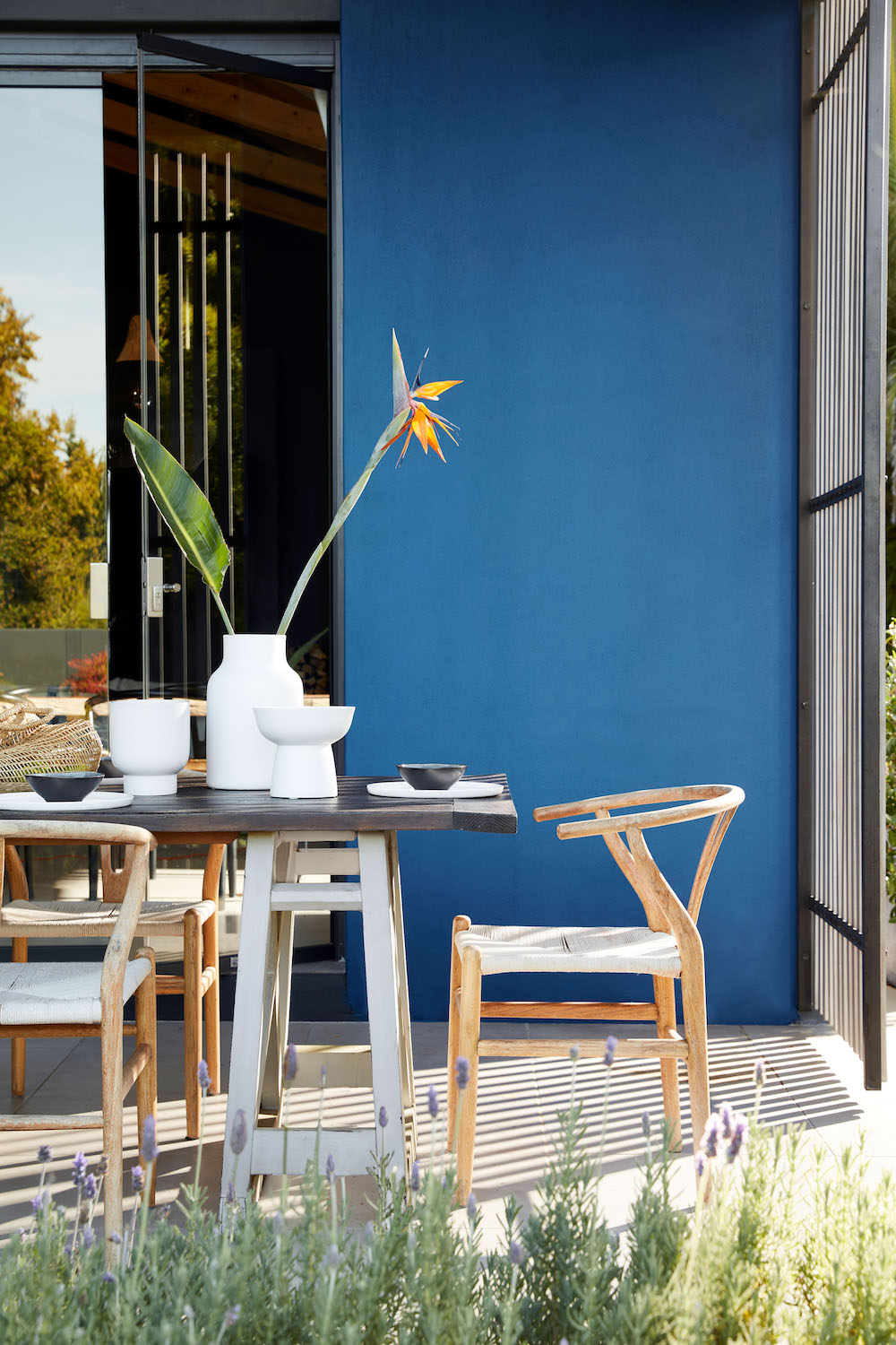
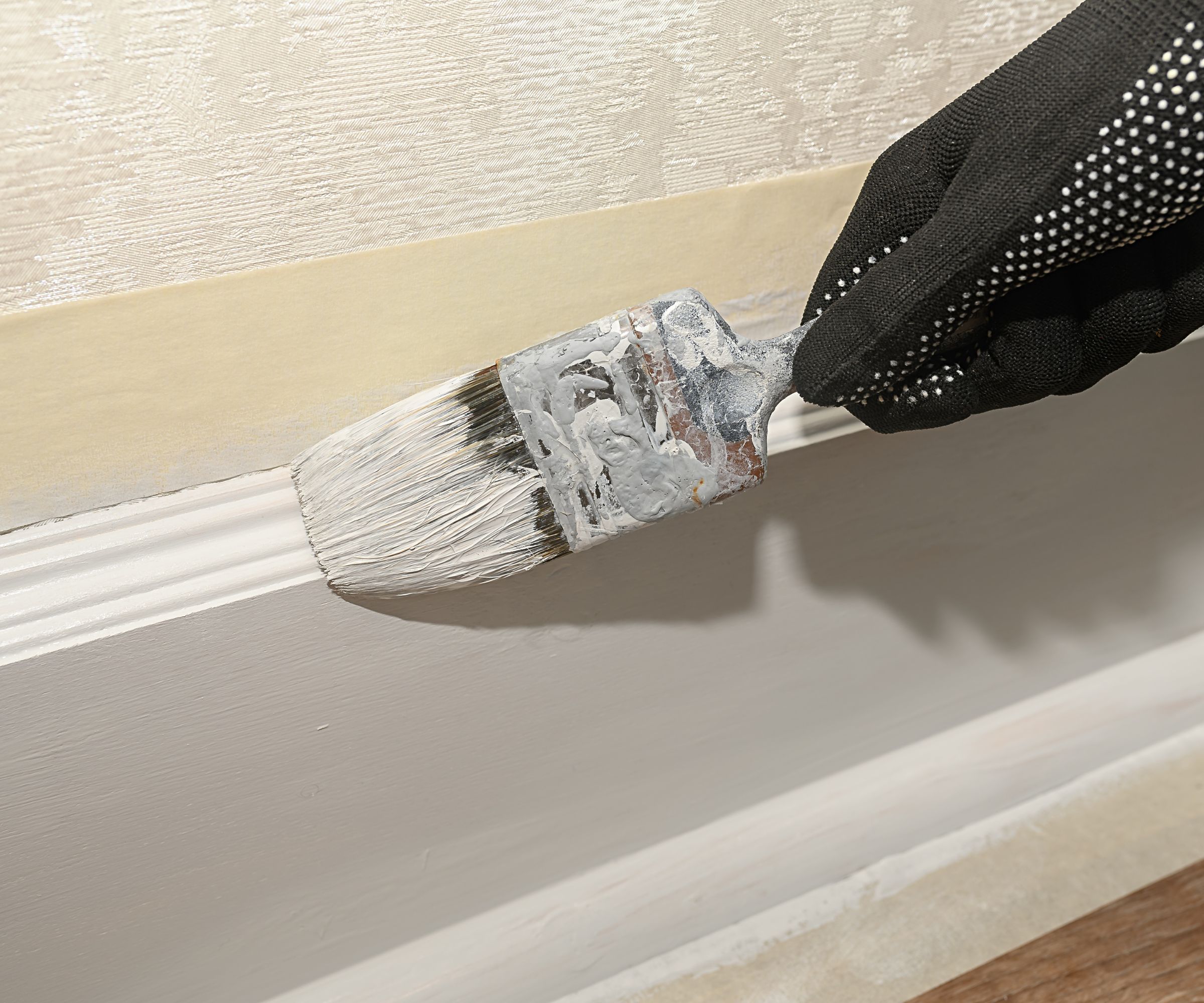
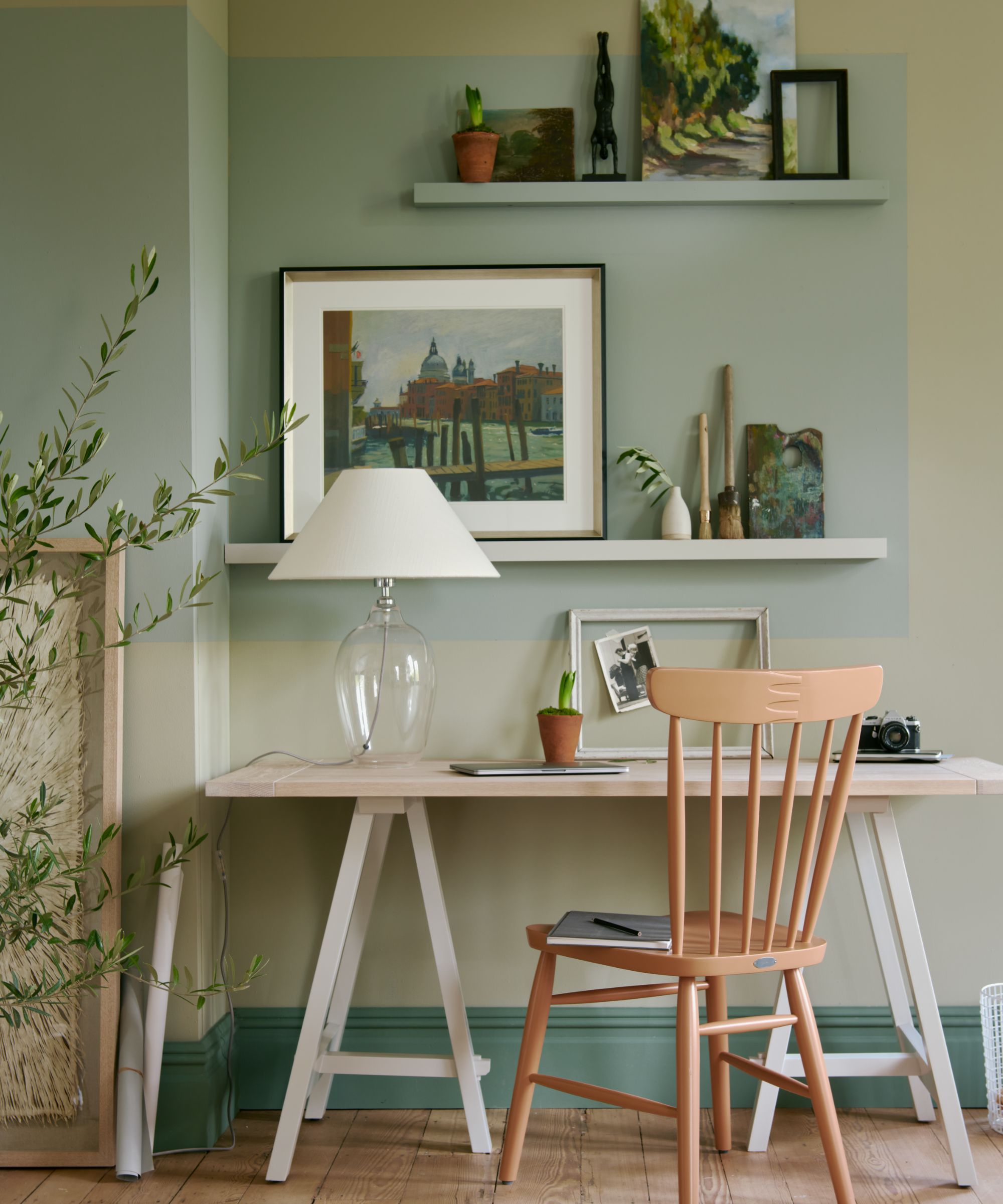
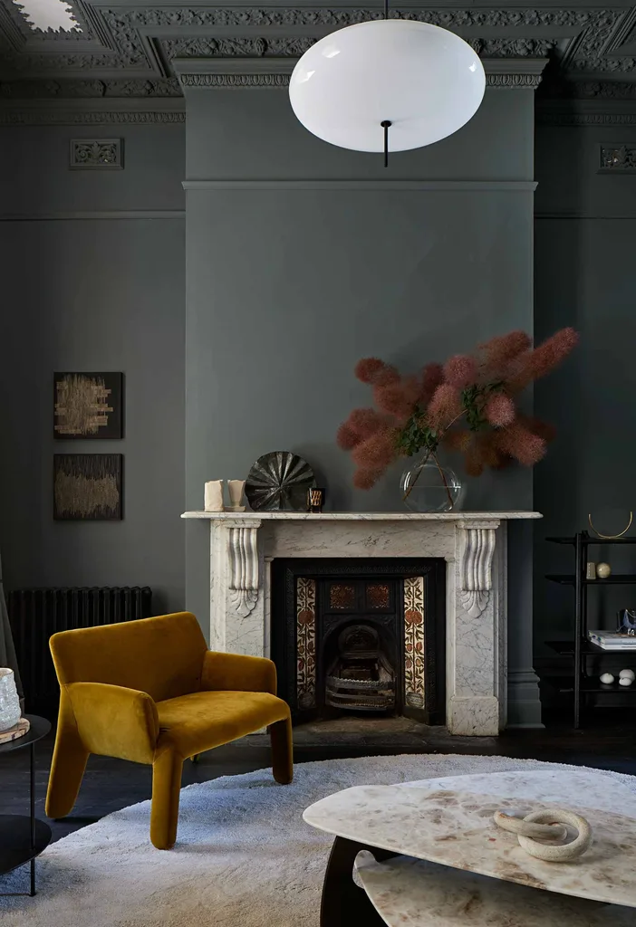
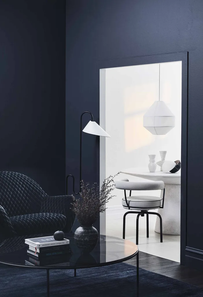
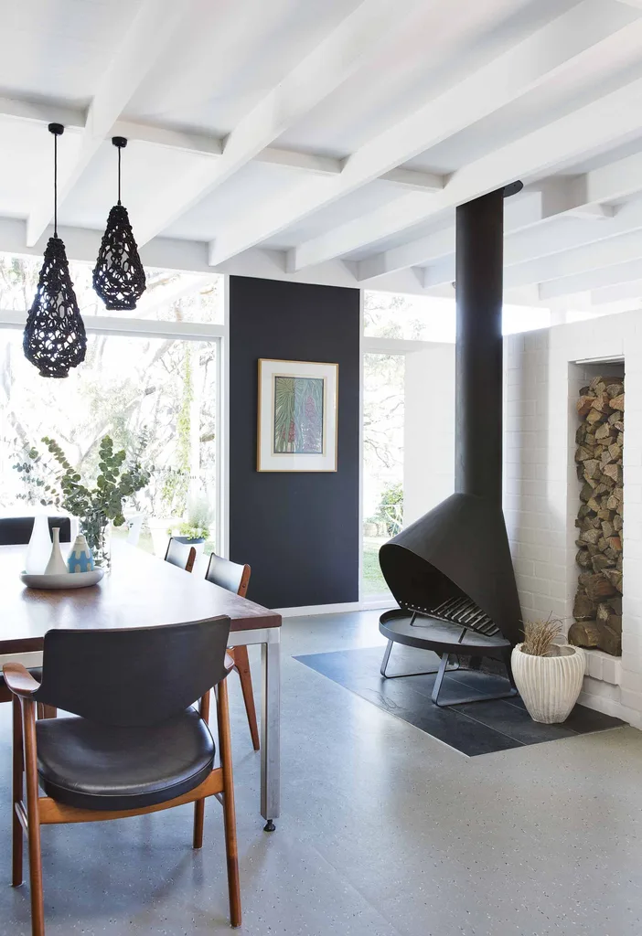
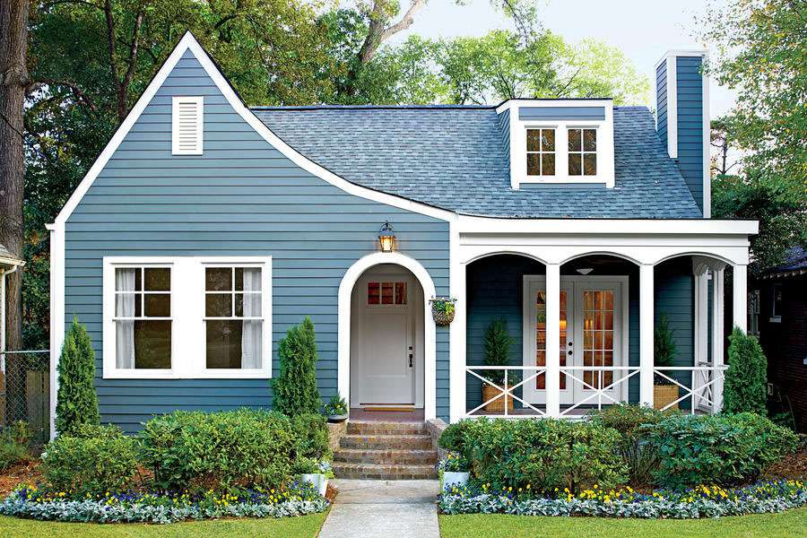
Another common error involves painting wood trim in colors other than crisp white. Bailey emphasizes that white trim is crucial for a clean aesthetic, recommending classics like Benjamin Moore’s Chantilly Lace or Decorator’s White. However, she cautions against pairing clean white trim with earthy, warm wall colors, as this can make the walls look dirty by creating a stark contrast. Instead, she suggests wall colors that complement white trim, such as Benjamin Moore’s Hale Navy, Sherwin-Williams’ Mineral, or Behr’s Silver Drop.
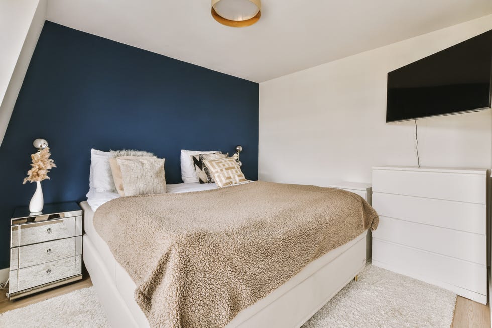
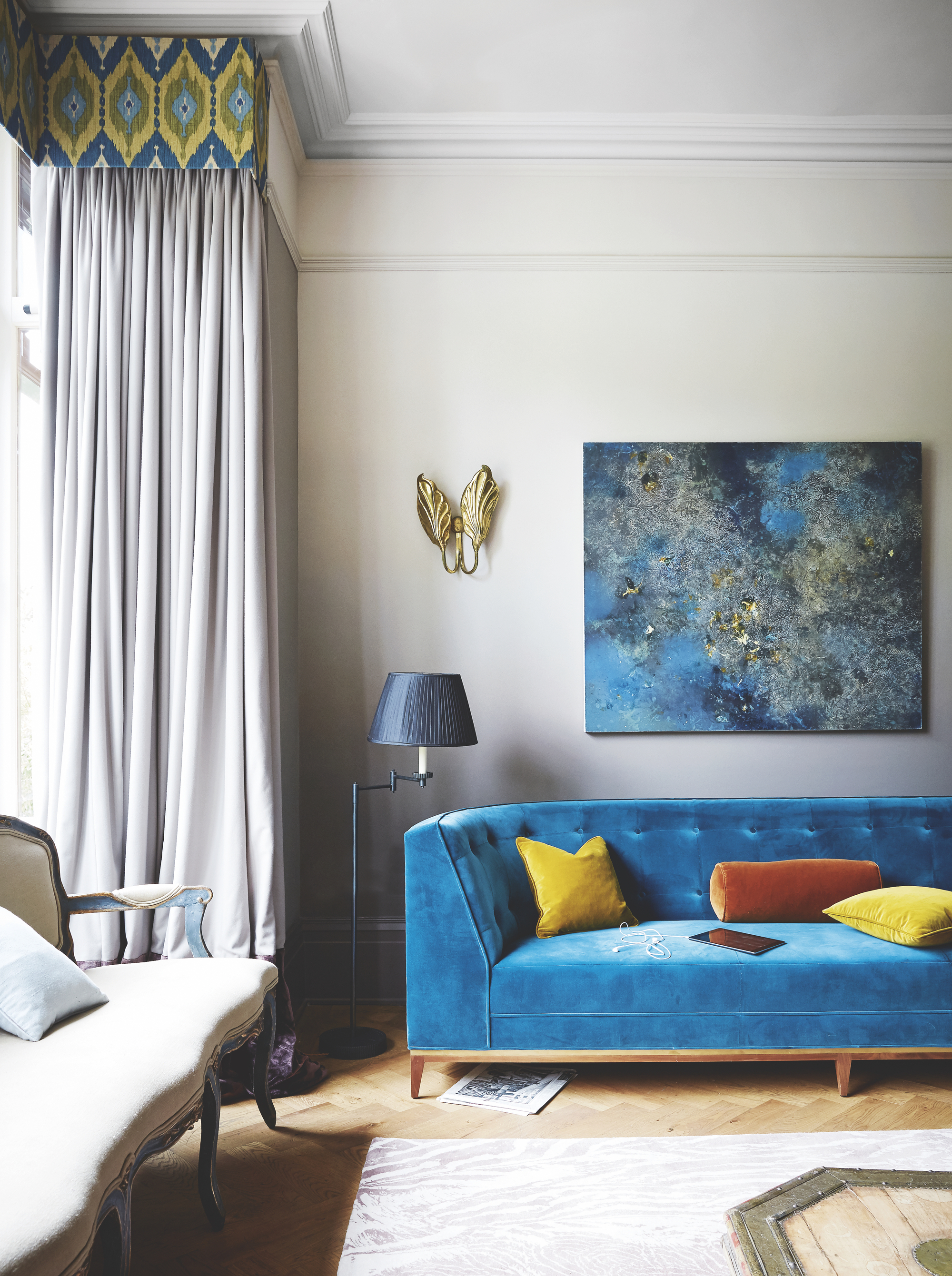
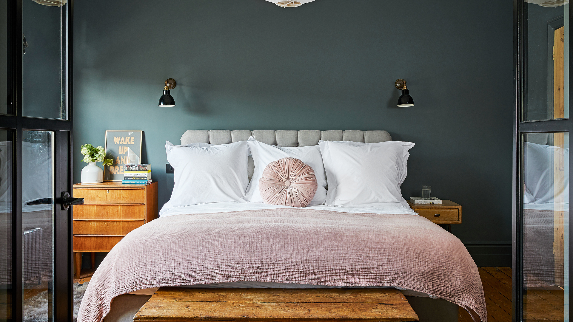
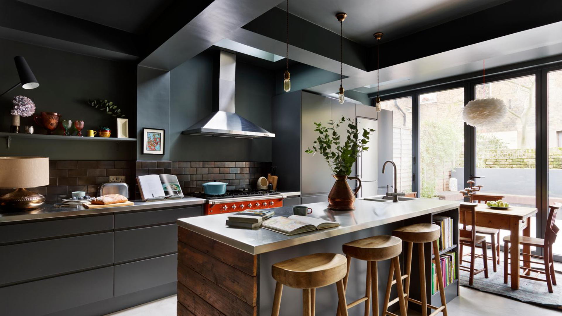
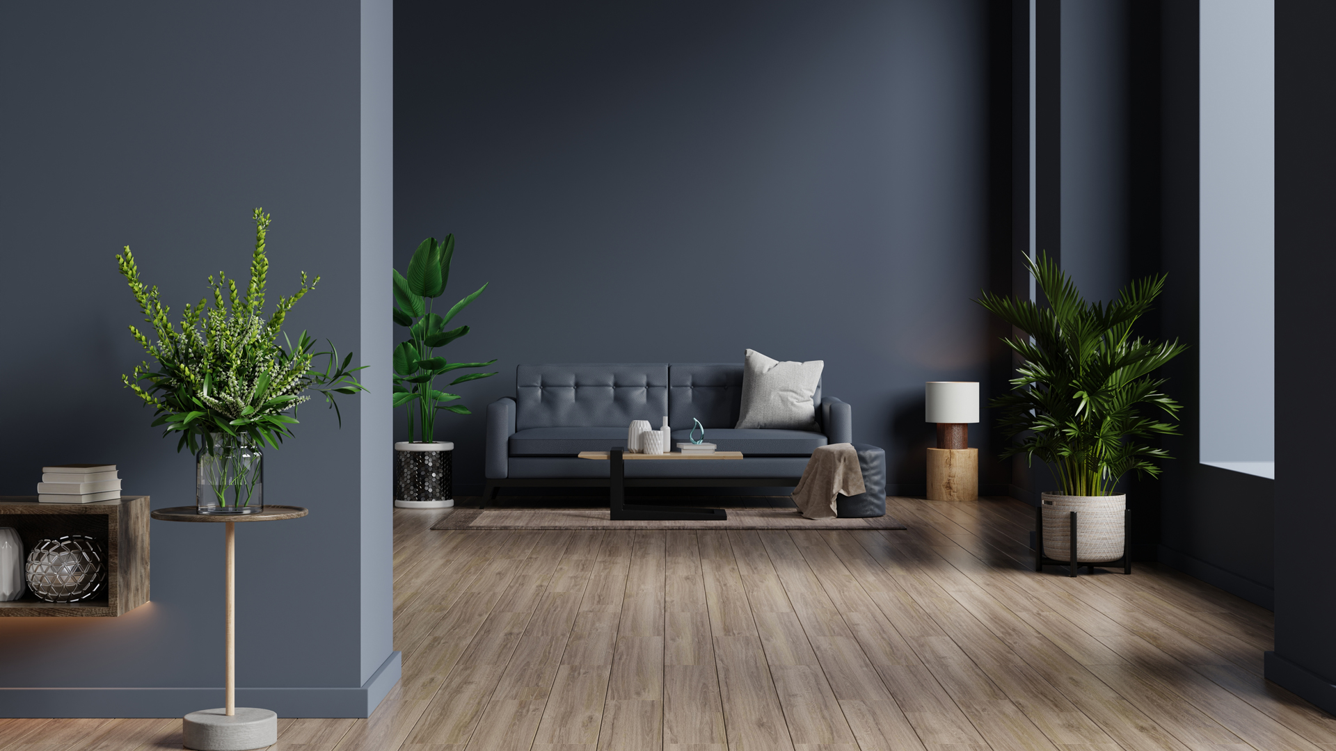
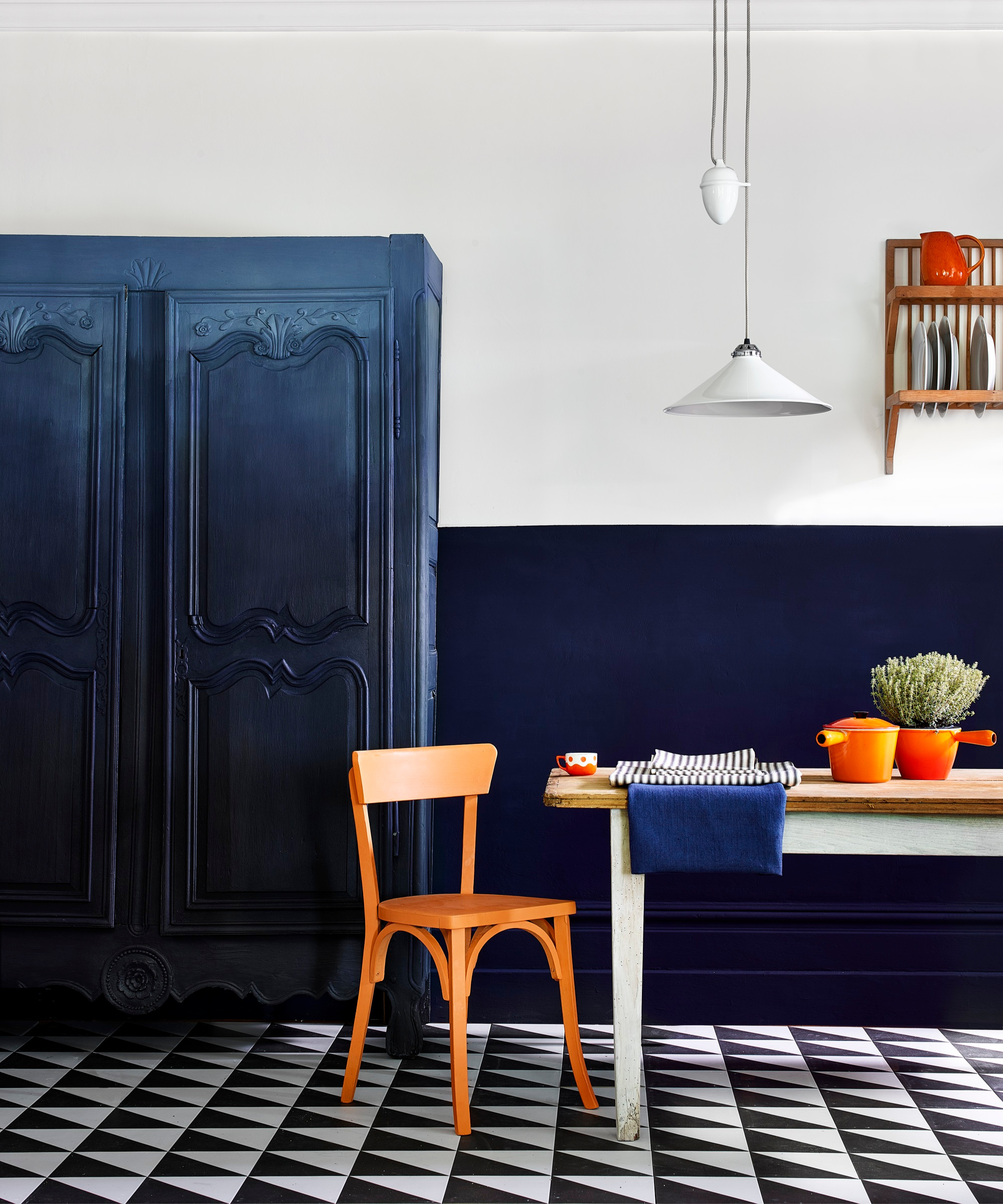
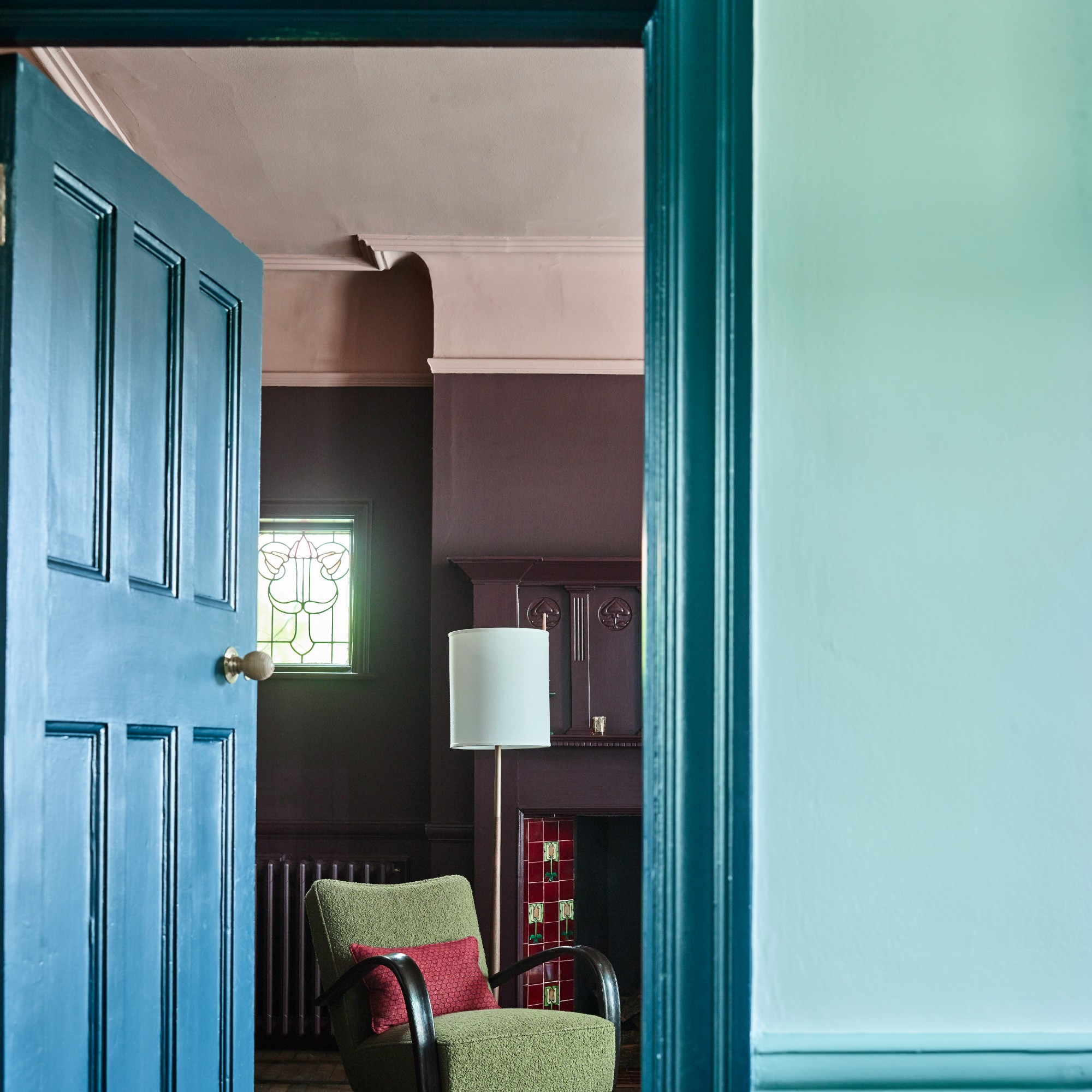
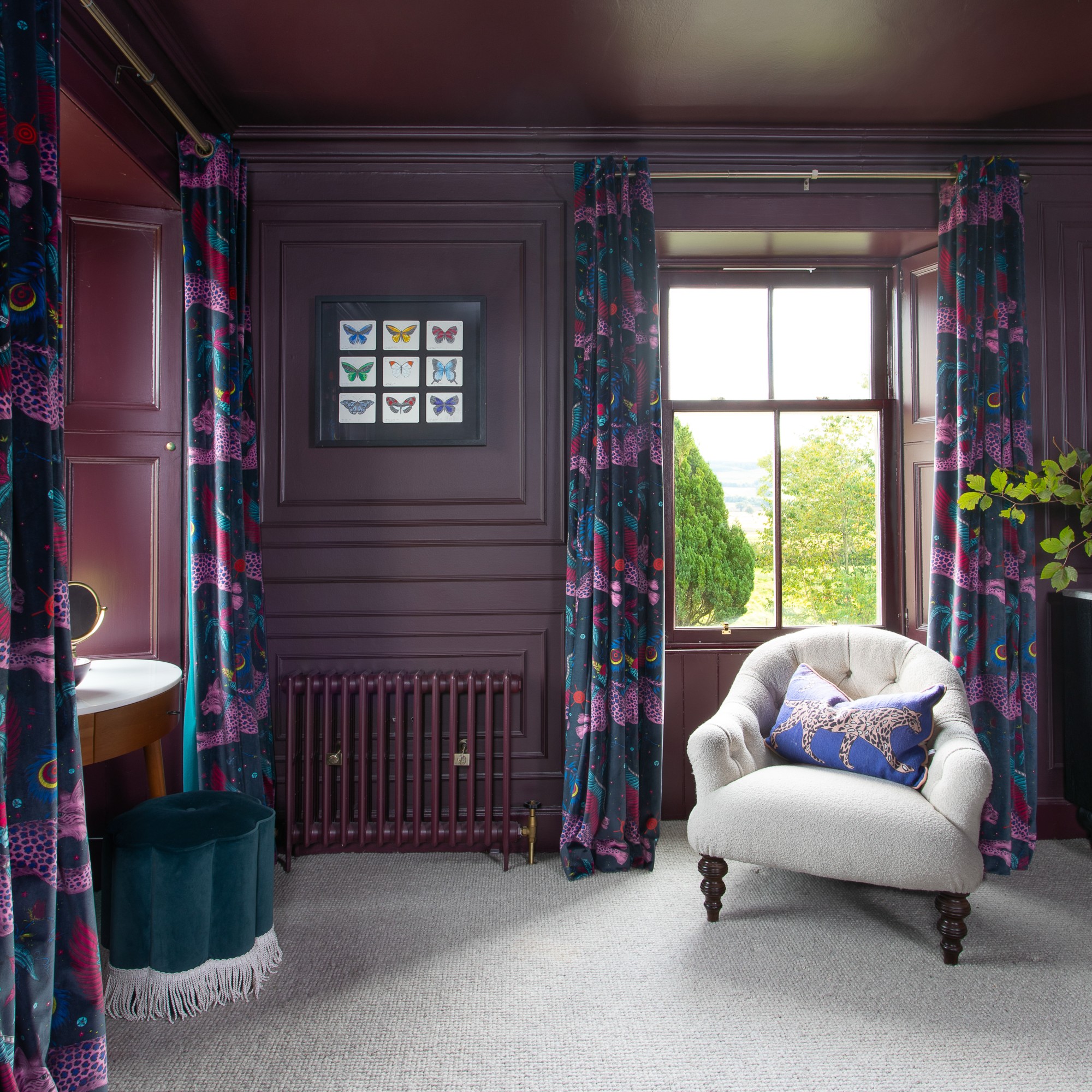
The paint’s light reflectance value (LRV) and sheen also play a critical role. Bailey notes that lower LRV colors, like deep plums and navys, are effective at concealing dirt and smudges and contribute to a clean-looking room. Conversely, higher LRV colors, such as whites and cool grays, brighten a space. When it comes to sheen, a middle ground is preferable; ultra-matte paints are difficult to clean, while very high-sheen paints accentuate imperfections. An eggshell finish is often the best choice for most walls.
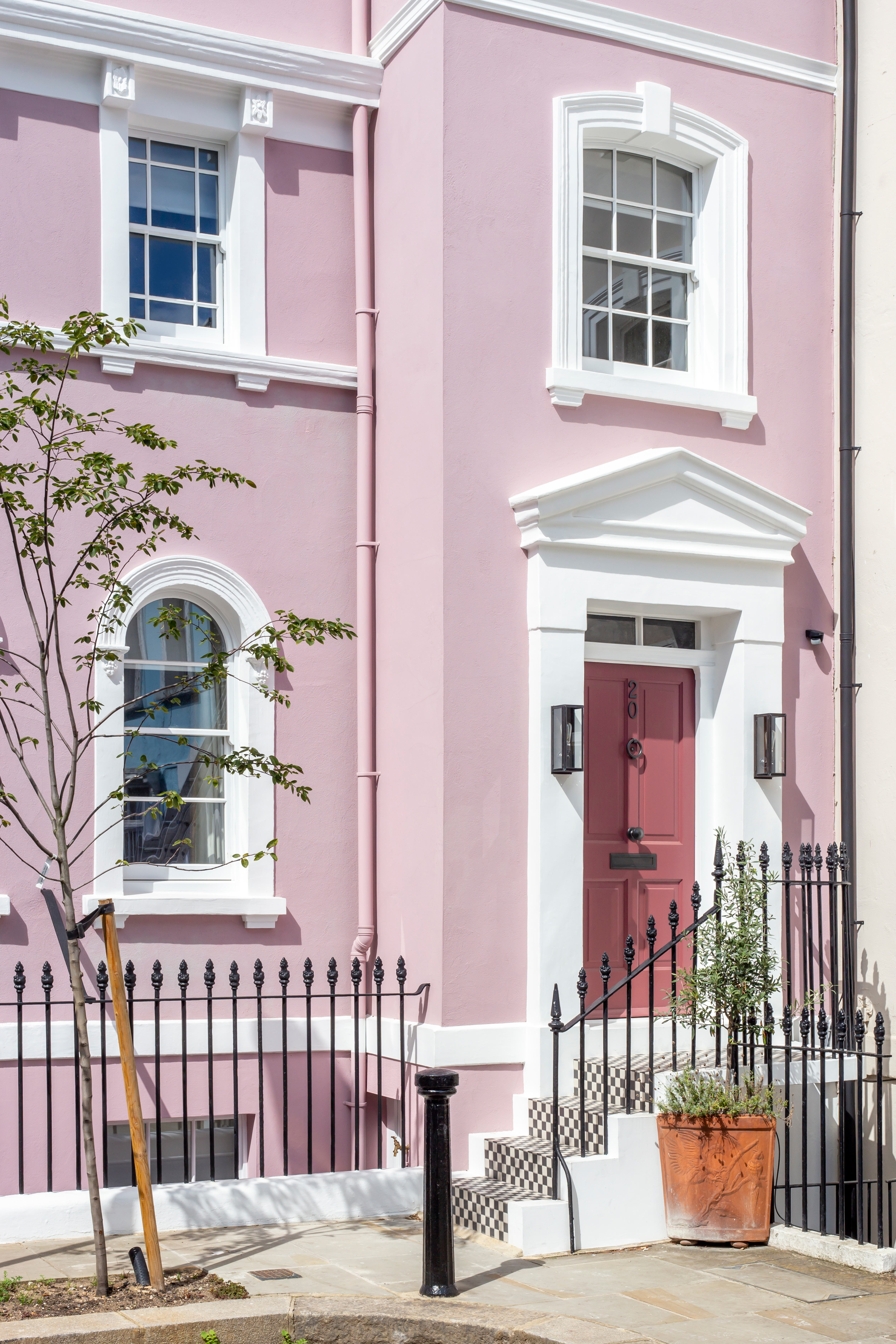
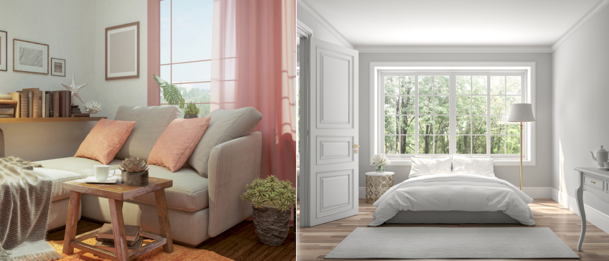
Outdated or incorrect shades of pink, specifically dusty rose hues, can also make walls appear dull. Andra DelMonico, a lead interior designer, suggests that if pink is desired, lighter undertones, like Behr’s Rose Sorbet, are more effective. Similarly, yellowy-white paints can leave walls looking dirty, especially when contrasted with bright, cool whites. Hall prefers neutral whites or those with cool undertones, mentioning Benjamin Moore’s Simply White as a good option.
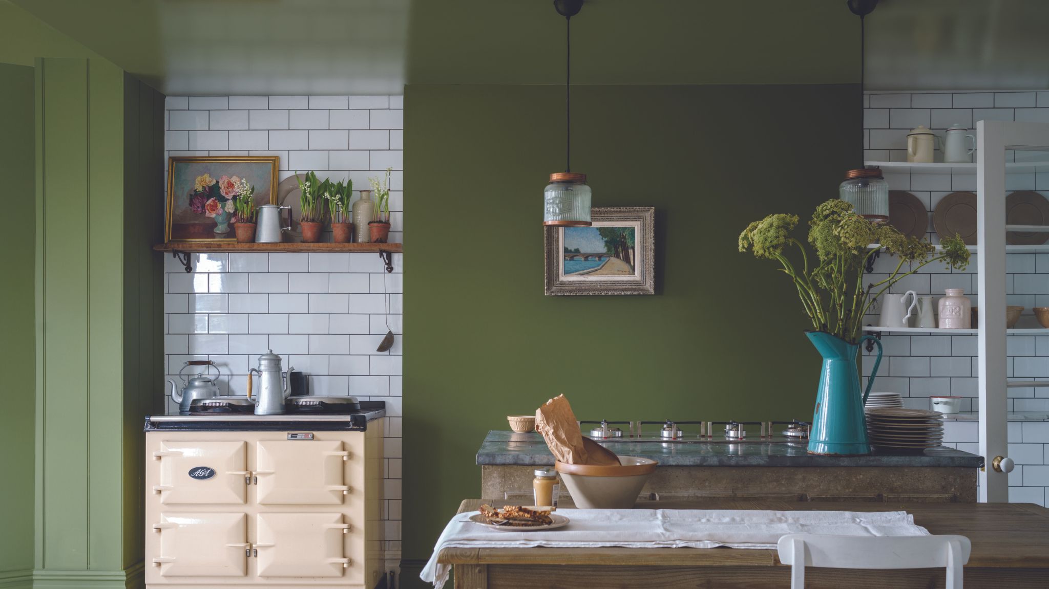
Purple-based grays are another color family to approach with caution. Bonnie Kespohl, owner of KASA Interior Design, explains that these tones can appear fuzzy and dull, sometimes taking on a pink overtone that enhances a drab effect. She recommends Benjamin Moore’s Winter Orchard for a lighter gray and Kendall Charcoal for a darker option. Colors with brown undertones also contribute to a dingy look, as they can create a dusty or shadowy effect. Donella Olson of Two Island Design Build suggests drawing inspiration from nature’s bold and vibrant colors, recommending Behr’s Scallion for a deep green.
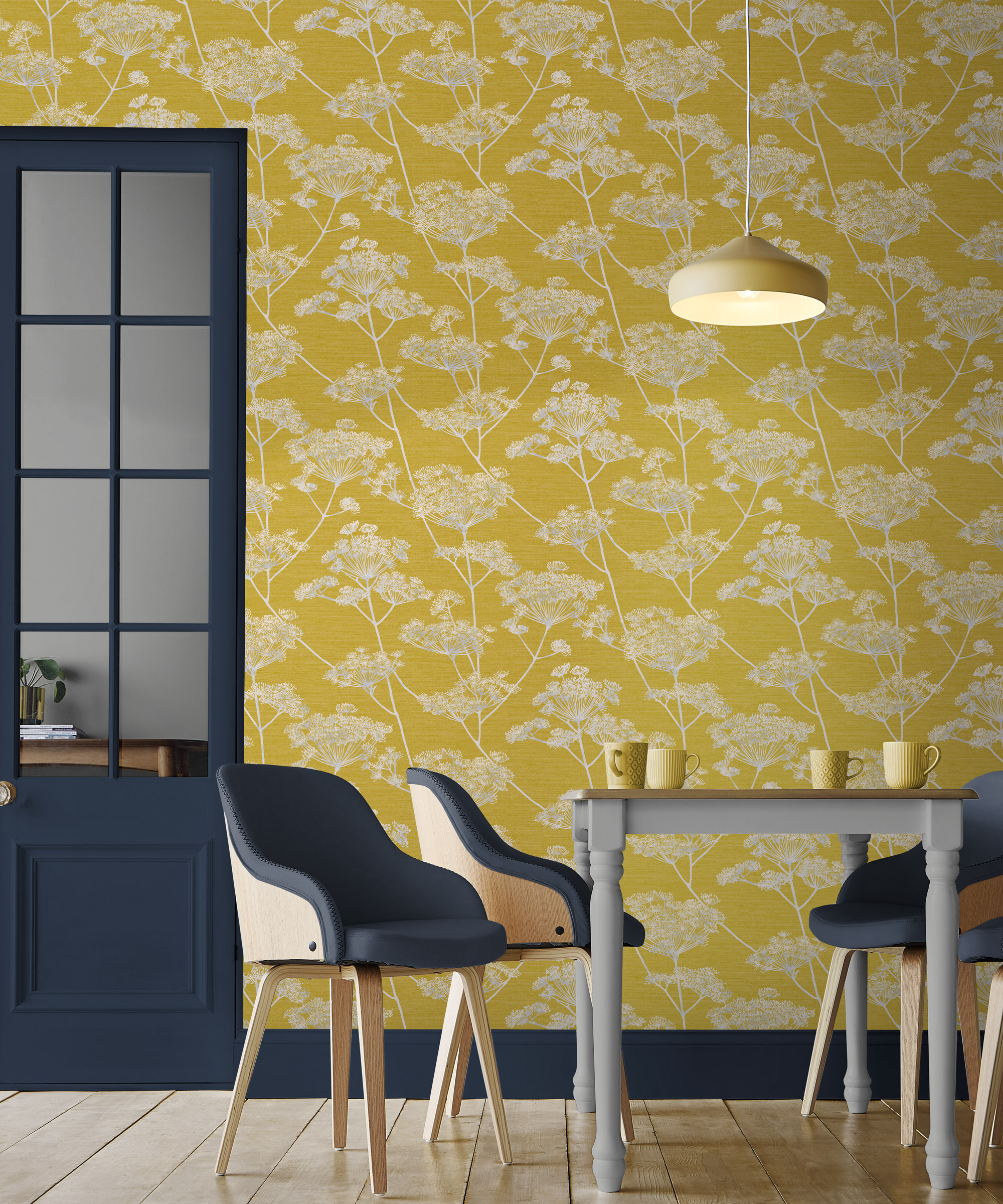
Finally, yellow-green shades can also be problematic. Kespohl warns that these hues can often appear as puce, lacking depth in lighter tones and becoming overly bright and unnatural in more intense shades. She advises testing samples on walls over several days to observe how colors change under different lighting conditions. For green, she recommends Sherwin-Williams’ Crooked River, and for yellow, Backdrop’s Stardust. By avoiding these common painting errors and opting for thoughtfully chosen colors and finishes, homeowners can ensure their interiors appear fresh, clean, and vibrant.
#PaintColor #HomeInterior #DesignTips #WallPaint #ColorSelection #HomeDecor #PaintFinish #NeutralColors #PaintColor #HomeInterior #DesignTips #WallPaint #ColorSelection #HomeDecor #PaintFinish #NeutralColors
0 comment in total
 No comments yet
You may also like
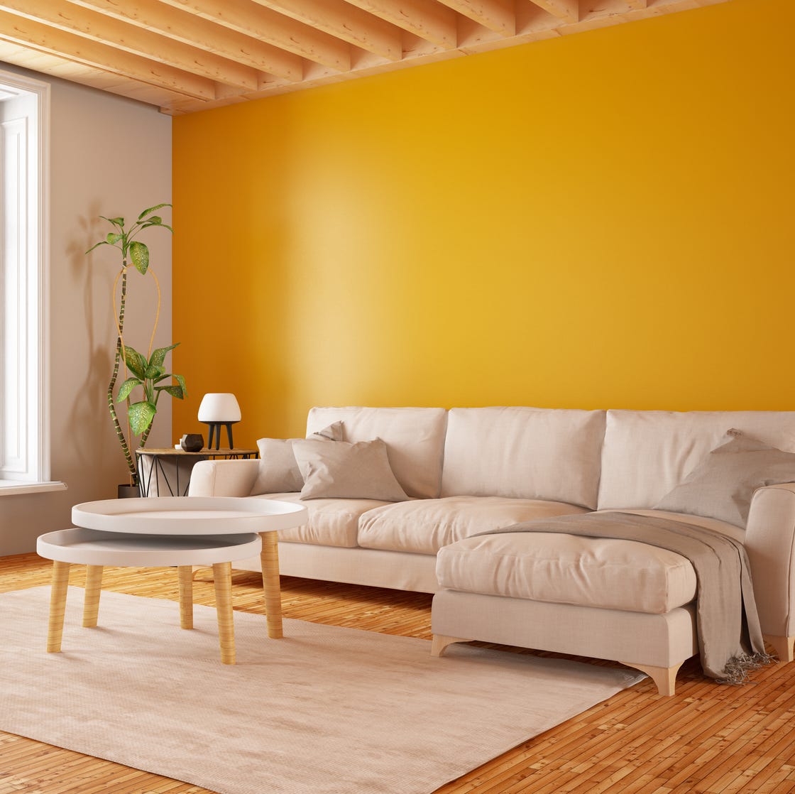
7 Paint Mistakes That Make Designers Instantly Cringe When They Walk Into Someone's Home

Update your home with these paint tips!

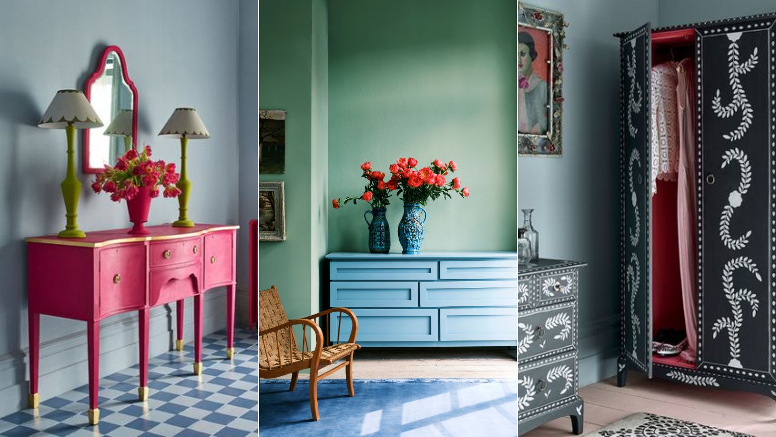
10 mistakes to avoid when painting wooden furniture, according to experts

The 10 Worst Paint Colors for Your Home, Experts Say

6 painting mistakes that are making your walls look 'dirtier' – and what you should be doing instead

10 baseboard painting mistakes to avoid – and what experts say to do instead
11 Decor Mistakes That Always Make Your Home Look Tacky, According to Designers

10 Interior Design Mistakes Experts Avoid In Their Own Homes

5 Exterior Paint Mistakes to Avoid If You Don't Want Your House to Become the Worst-Looking on the Street
5 Painting Mistakes That Are Actually Ruining Your Projects, According to Reno Pros
Understanding paint finishes

Are YOU guilty of these living room layout mistakes? Decor expert reveals the 8 sins people make
10 Decorating Mistakes That Make Your Home Look Messy
An interior designer reveals the 5 mistakes to avoid when painting with dark colours

6 mistakes design experts instantly notice in your home – and how to fix them

7 places in your home you’re probably forgetting to paint – but design experts say you really shouldn’t
8 common design mistakes that make your home look dated — and how to avoid them
8 of the best dark paint colours for your home and how to use them


11 Paint Colors That INSTANTLY Make Your Home Look "Expensive," According to Designers
5 Paint Mistakes Your Realtor Wishes You Wouldn't Make