1/43
Just In: These 11 Kitchen Color Trends Are Going to be Everywhere in 2026
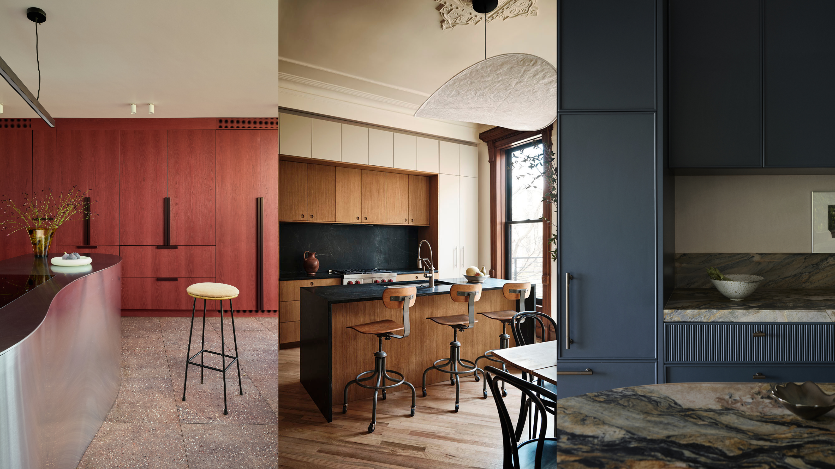
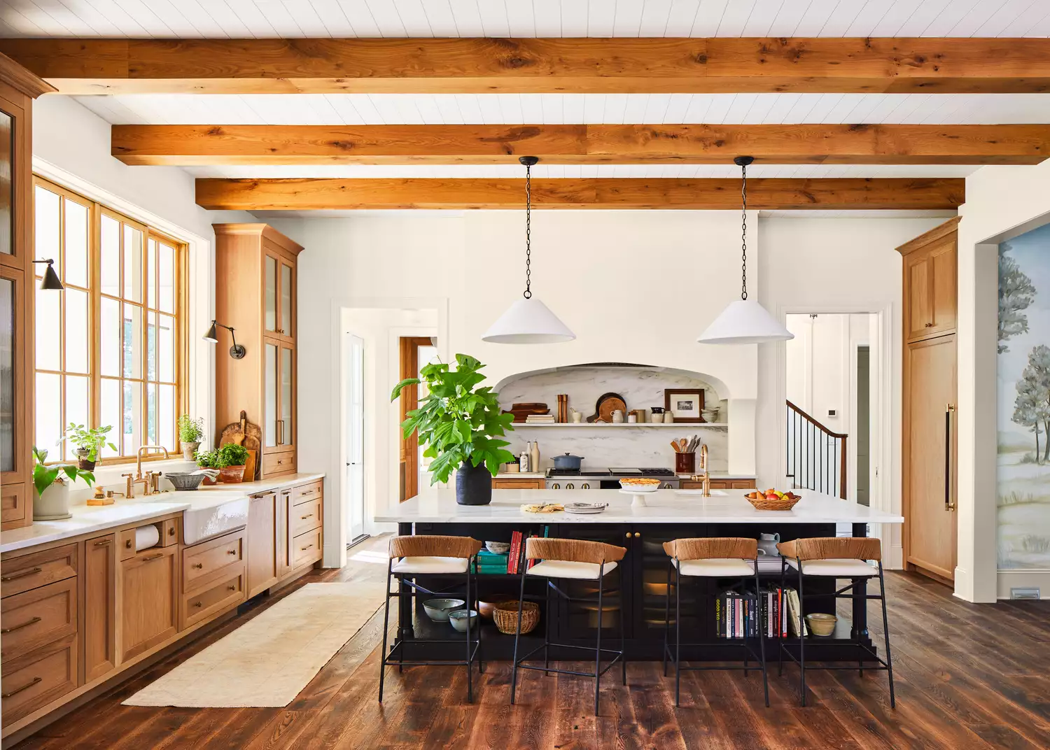
In 2026, kitchen design is moving beyond mere functionality to embrace personalization, craftsmanship, and thoughtful color choices, blending tradition with modern living to create spaces that are both timeless and unique. The era of stark white and gray kitchens is fading, giving way to cozier palettes that pair seamlessly with warm woods and rich materials. Natural, nurturing, and refined color schemes, ranging from hushed neutrals to lush, saturated shades, are gaining prominence. Designers are particularly excited about 11 key color trends.
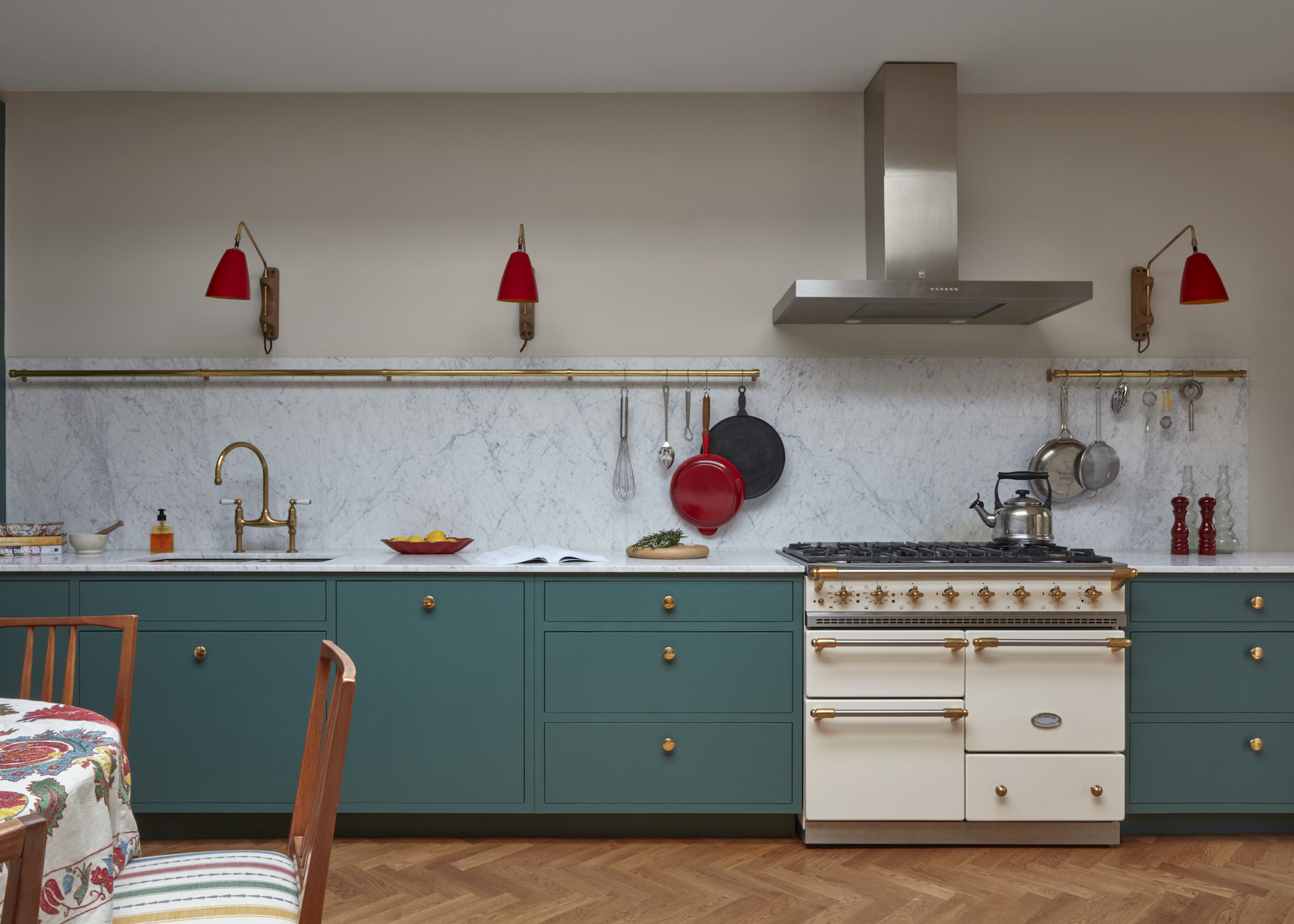
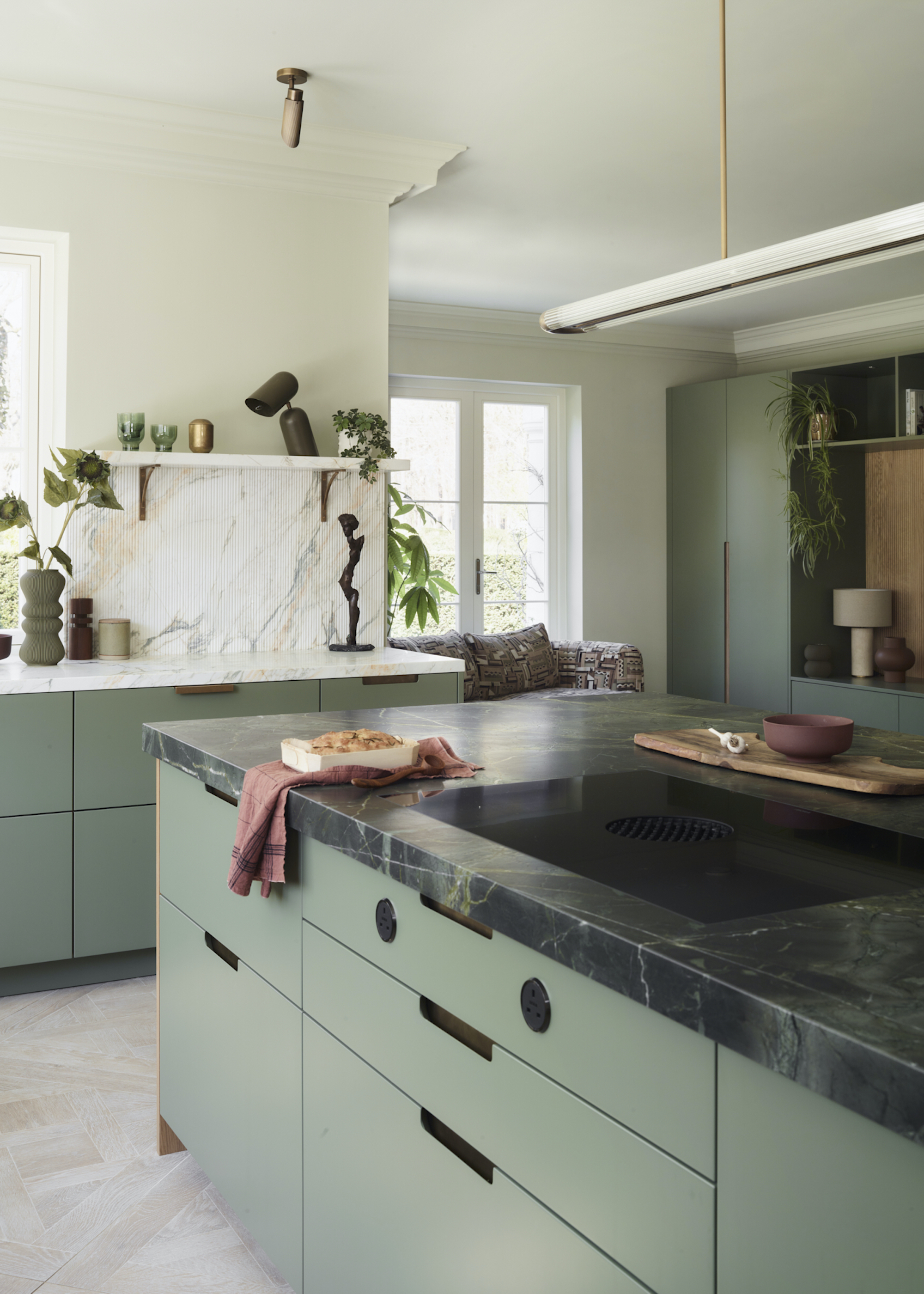
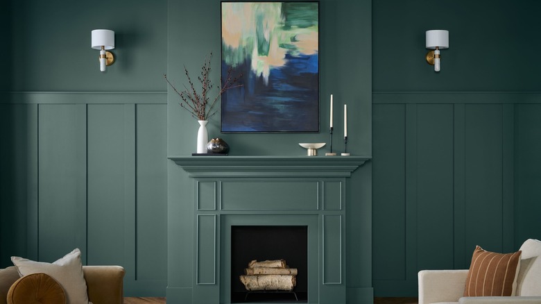
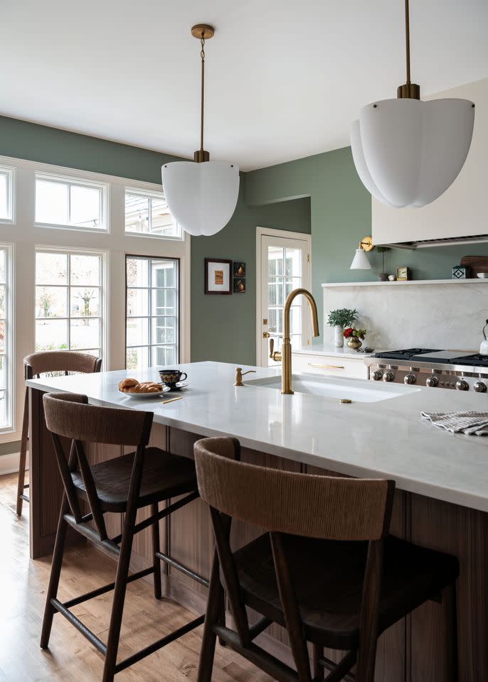
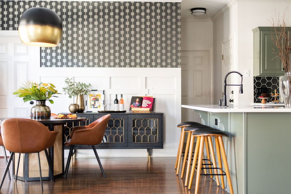
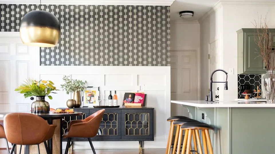
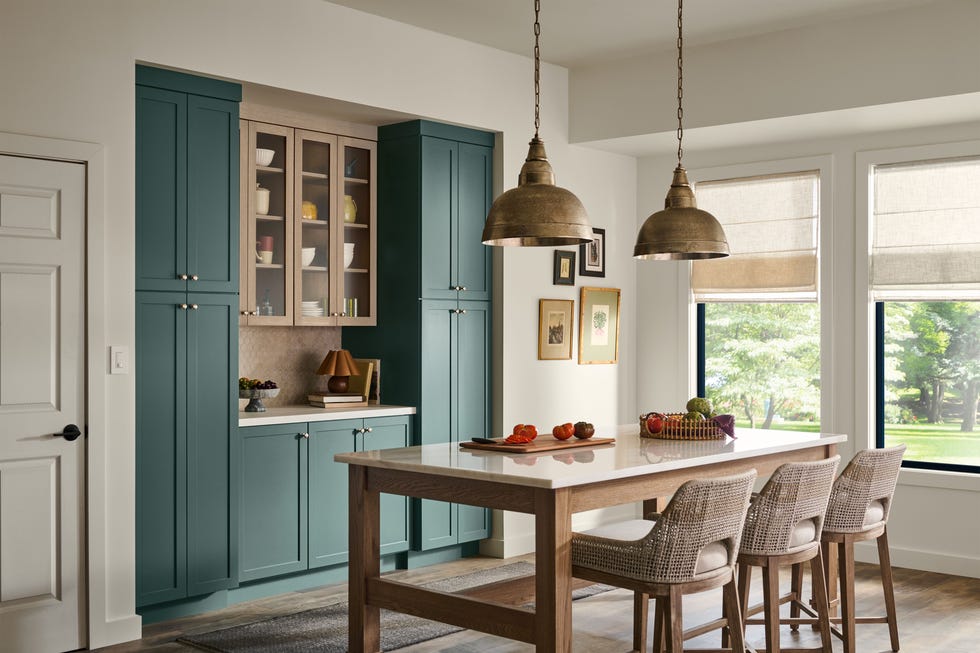
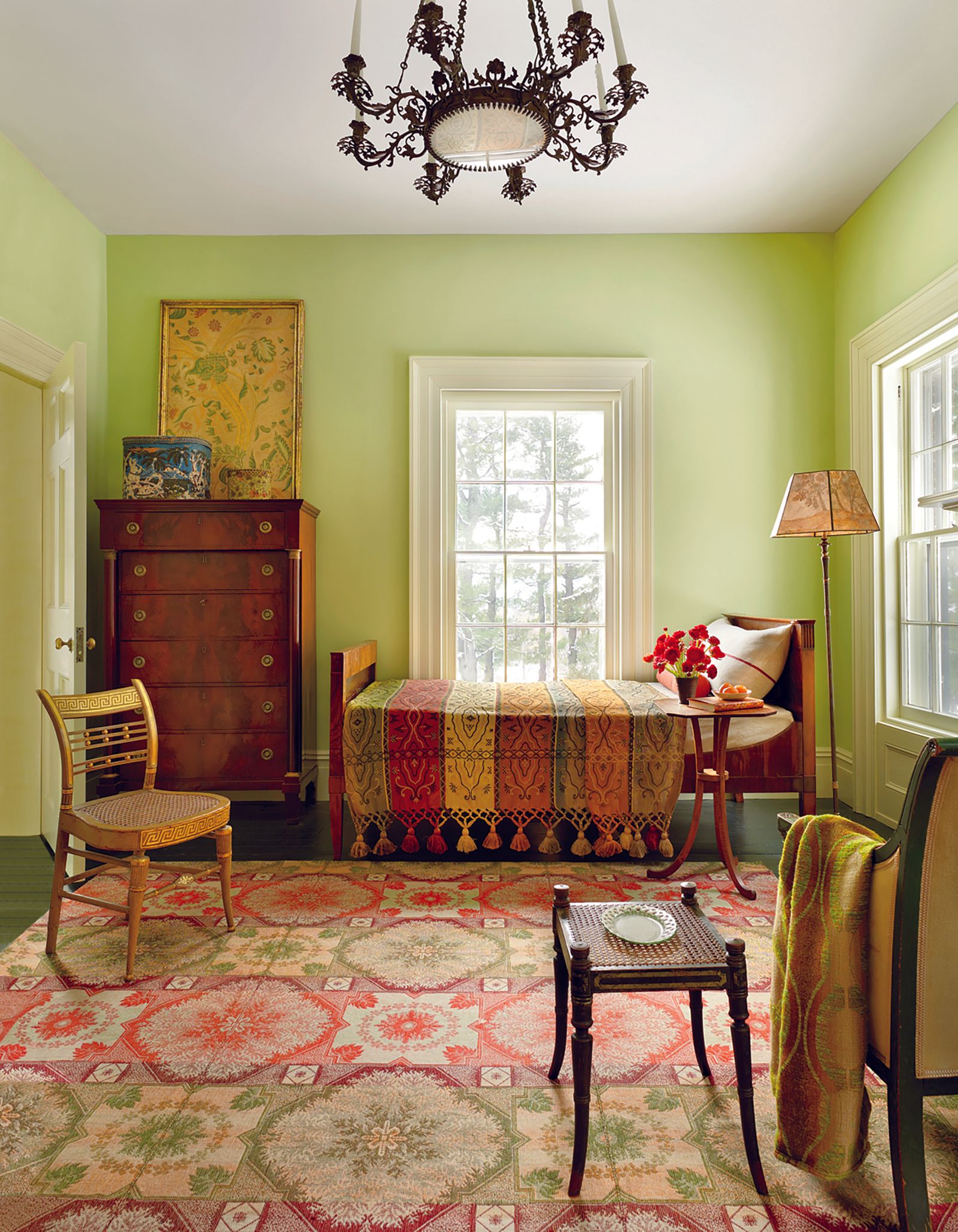
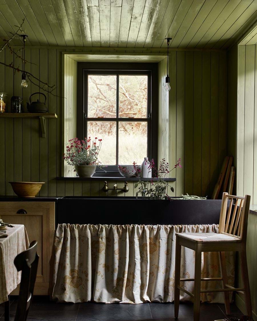
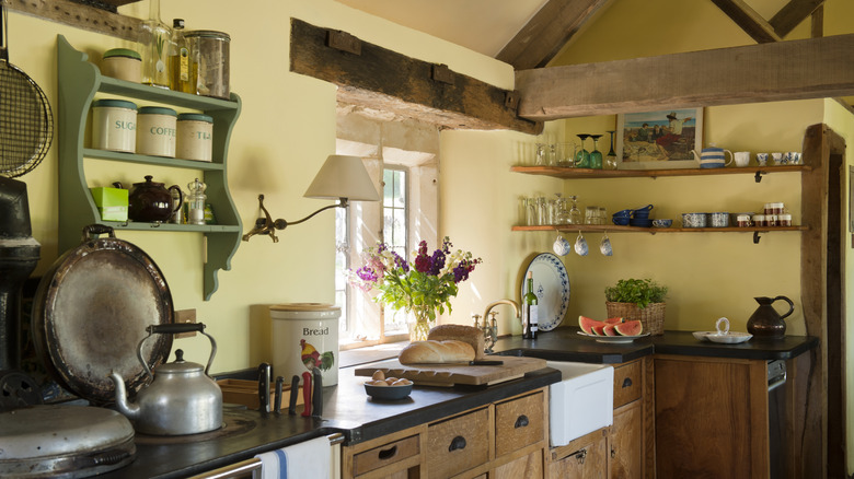
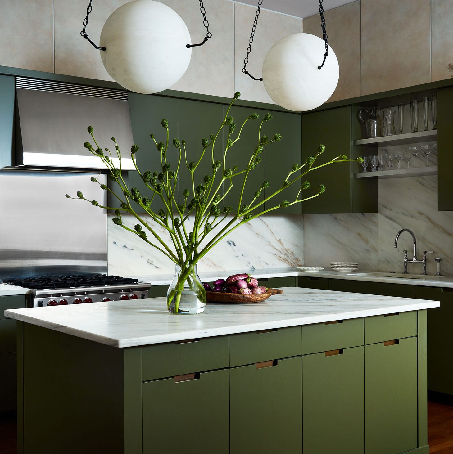
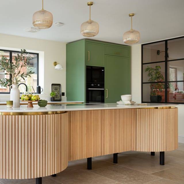
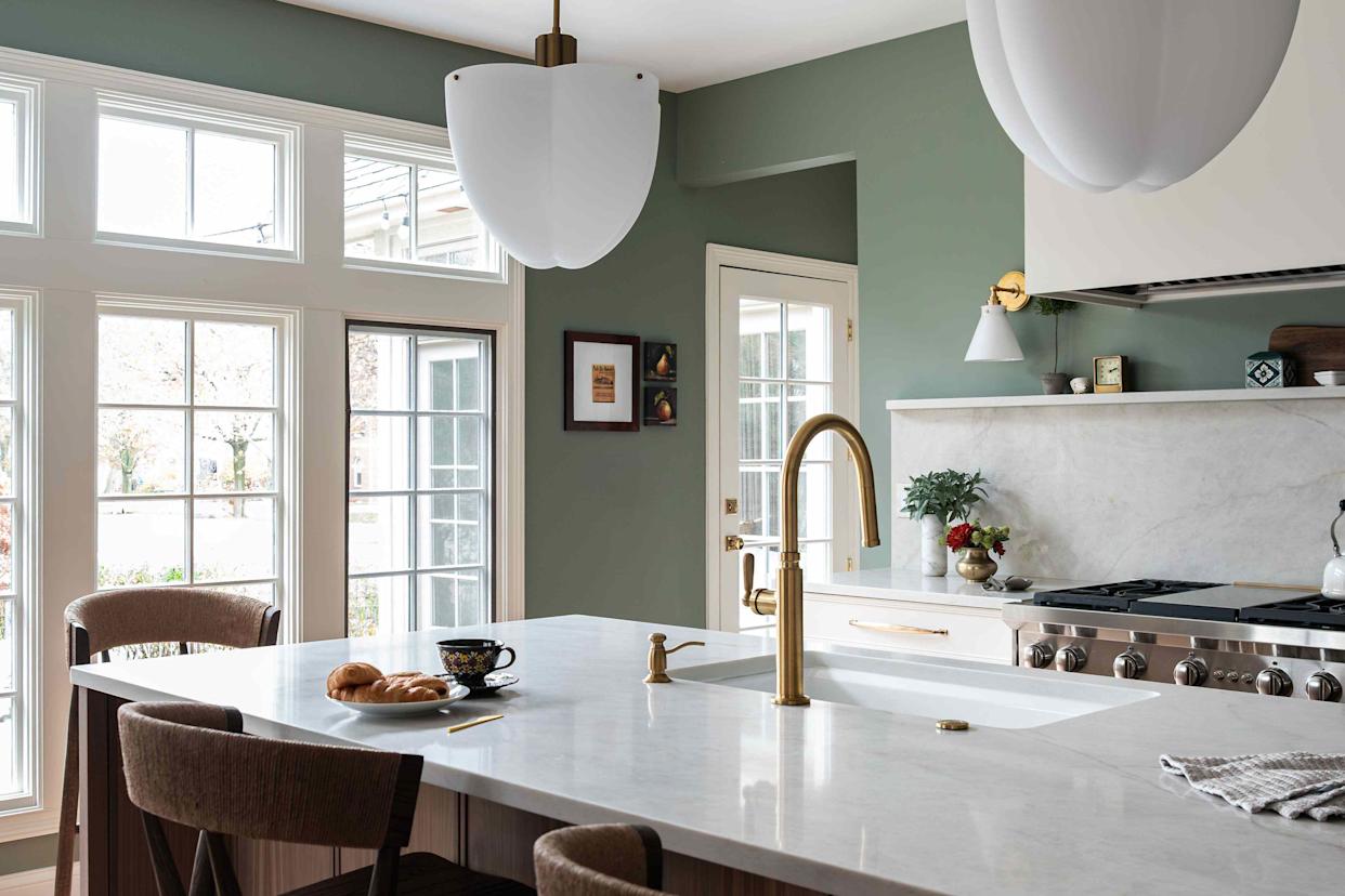
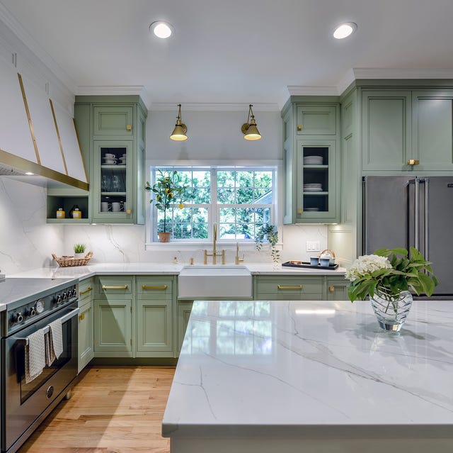
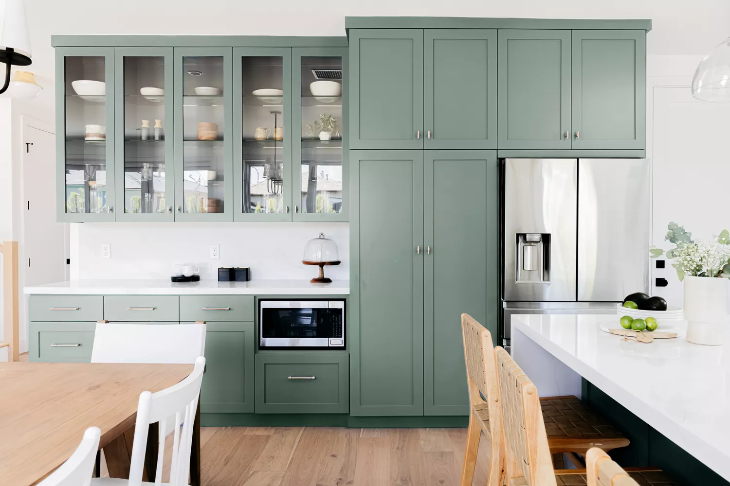
Green kitchens are making a significant comeback, with warm, earthy olive tones providing a reassuringly heritage feel that suits both contemporary and traditional settings. These greens, often with yellow undertones, pair beautifully with natural wood finishes for a balanced and restful scheme. Benjamin Moore's Rosepine 461 or Narragansett Green HC-157 are recommended for adding depth and personality.
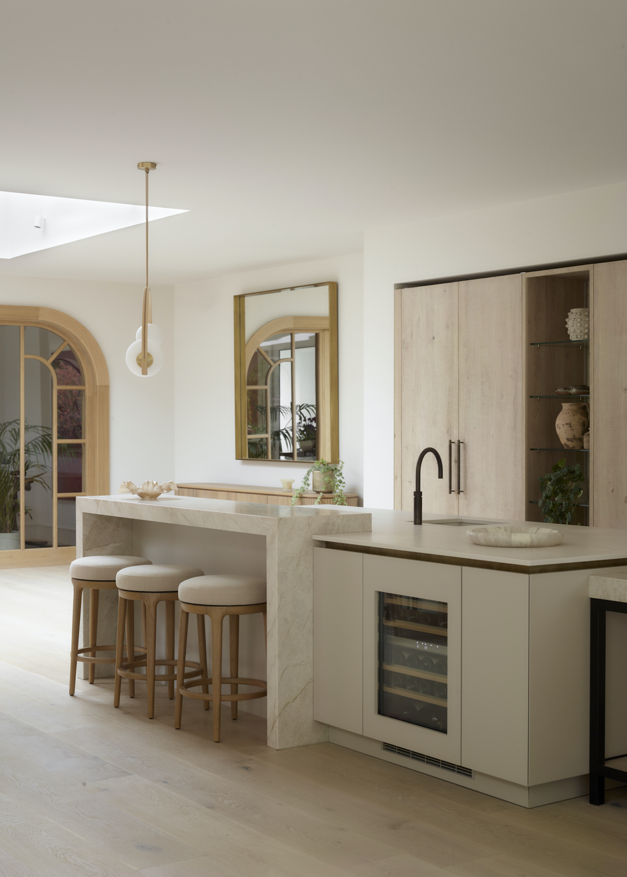
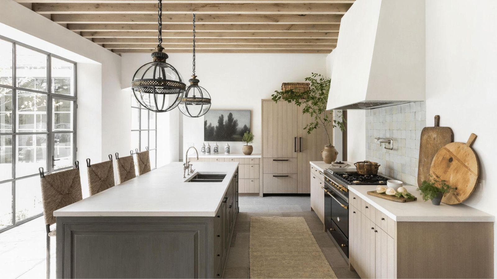
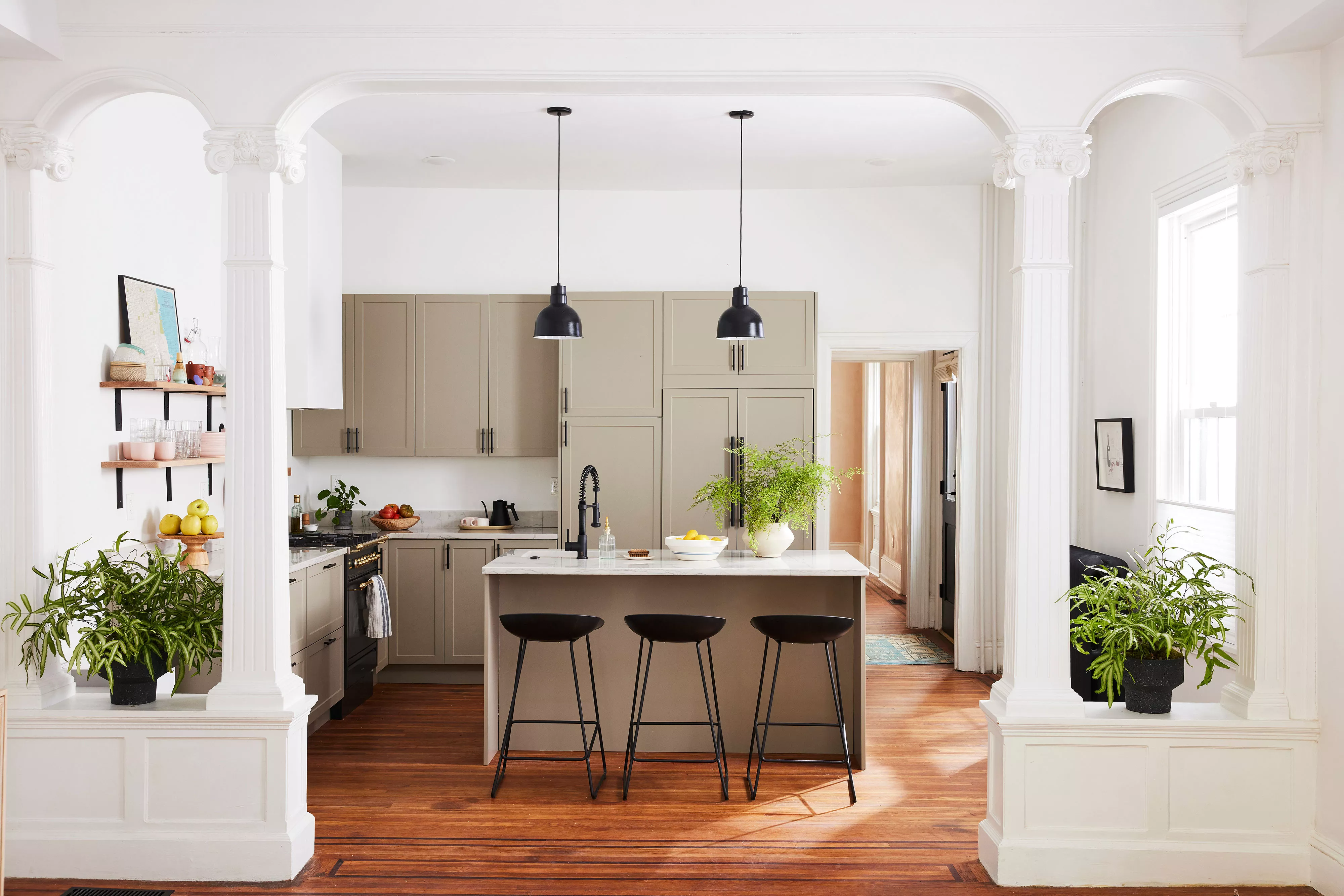
Warm mushroom shades are emerging as a new neutral, offering more depth than traditional beige or greige. These soft, deep hues, described as warm putties and gentle mushroom tones, are being embraced for their ability to bring a grounded calm while feeling elevated. They layer effortlessly with modern and traditional design elements, creating inviting, tactile spaces.
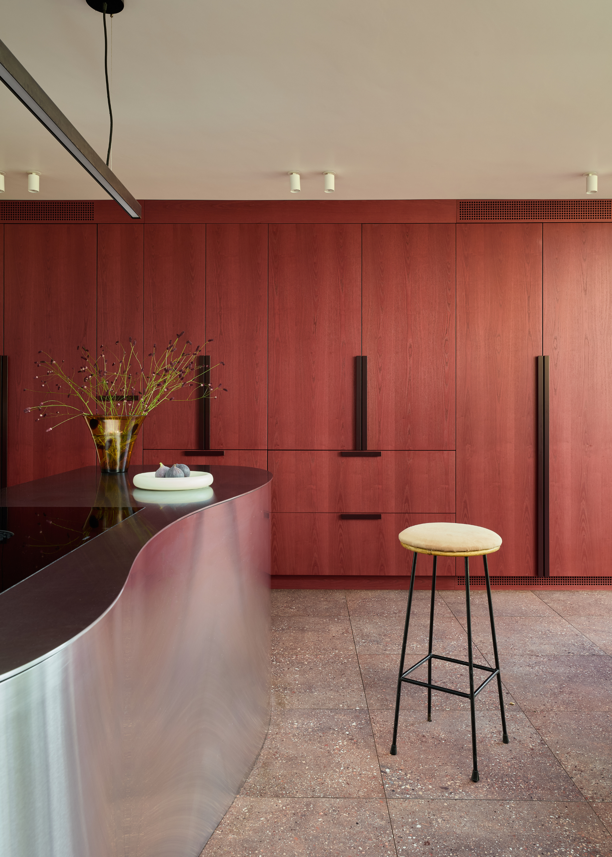
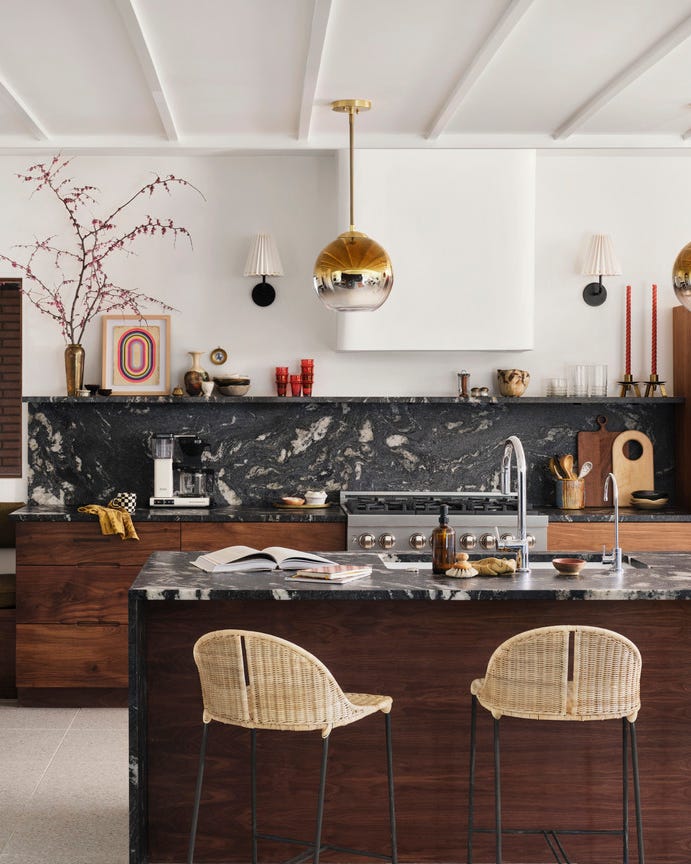
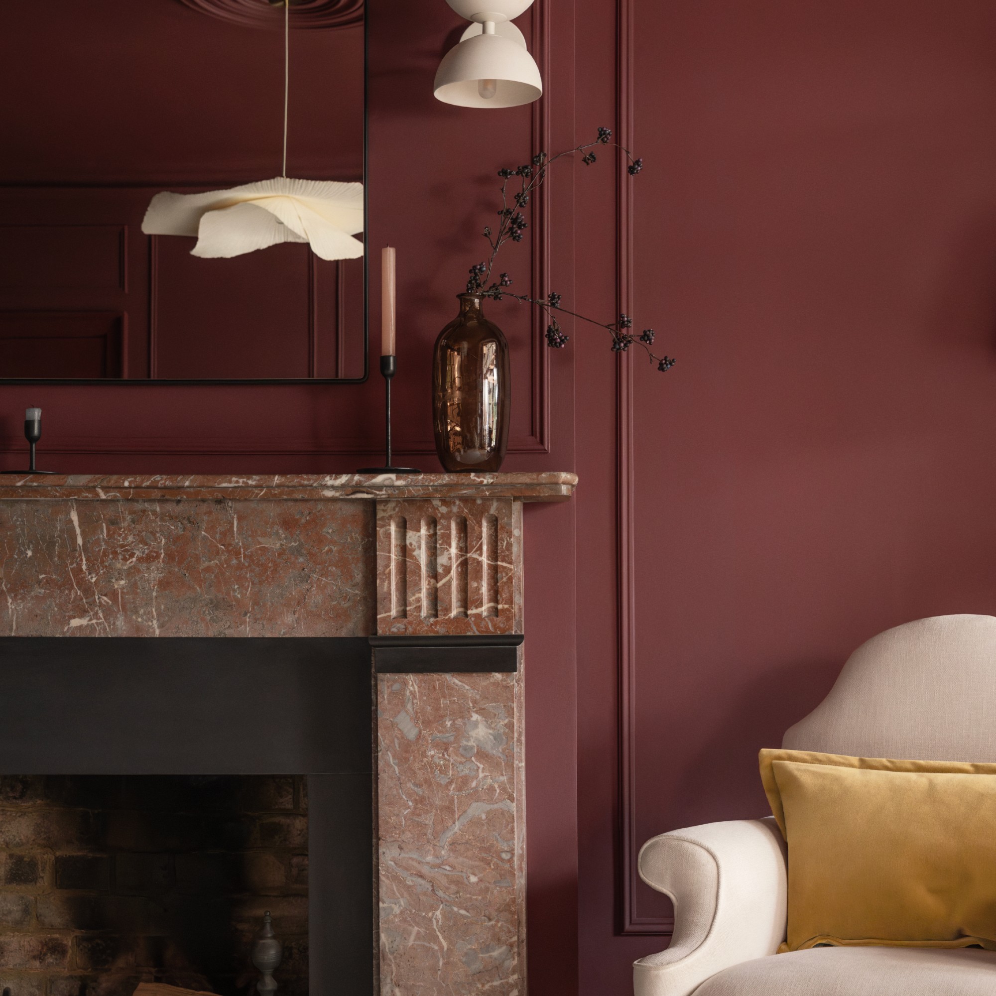
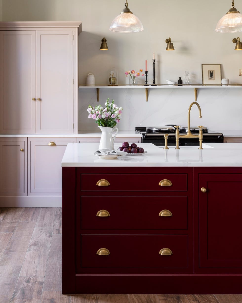
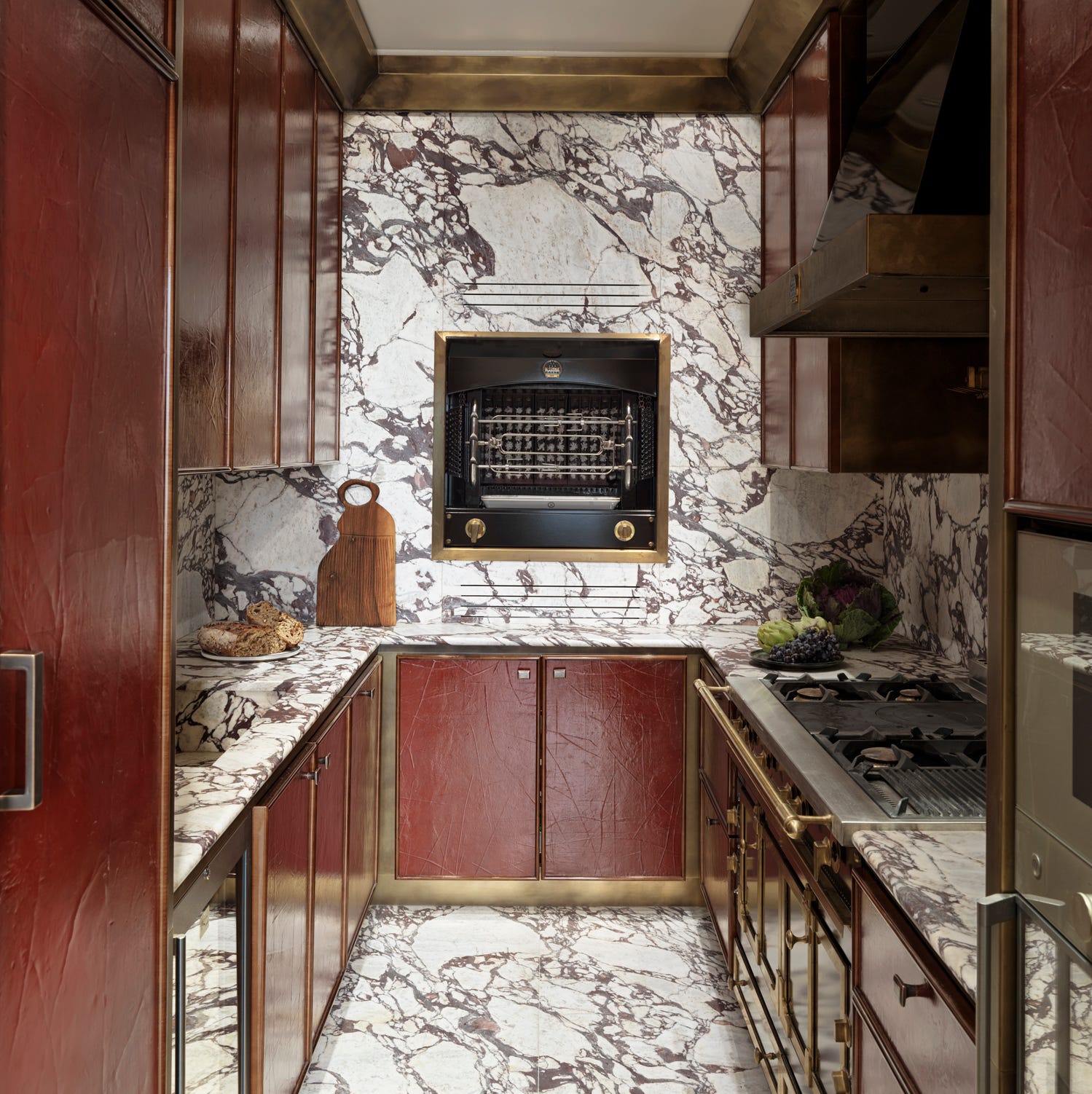
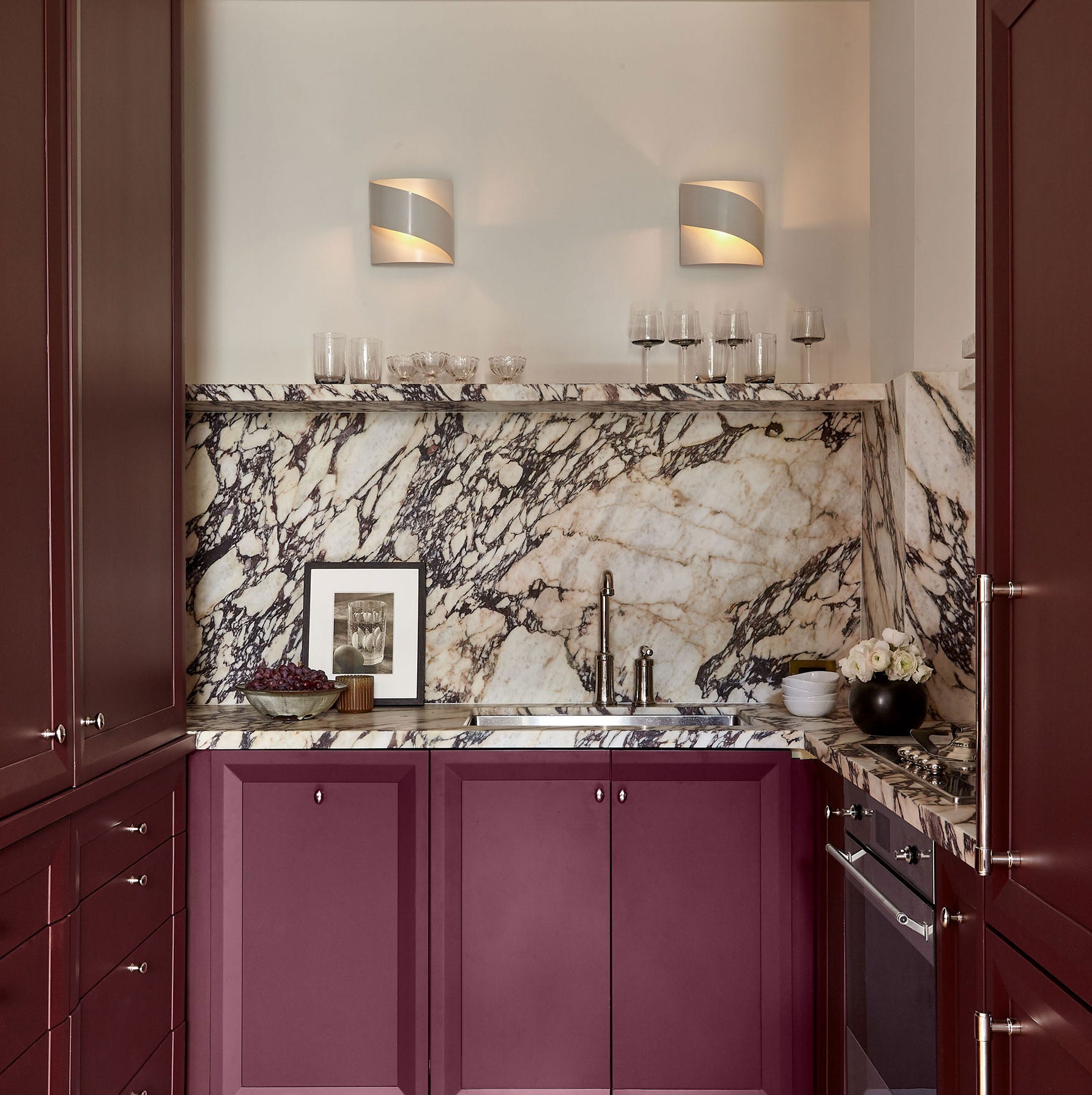
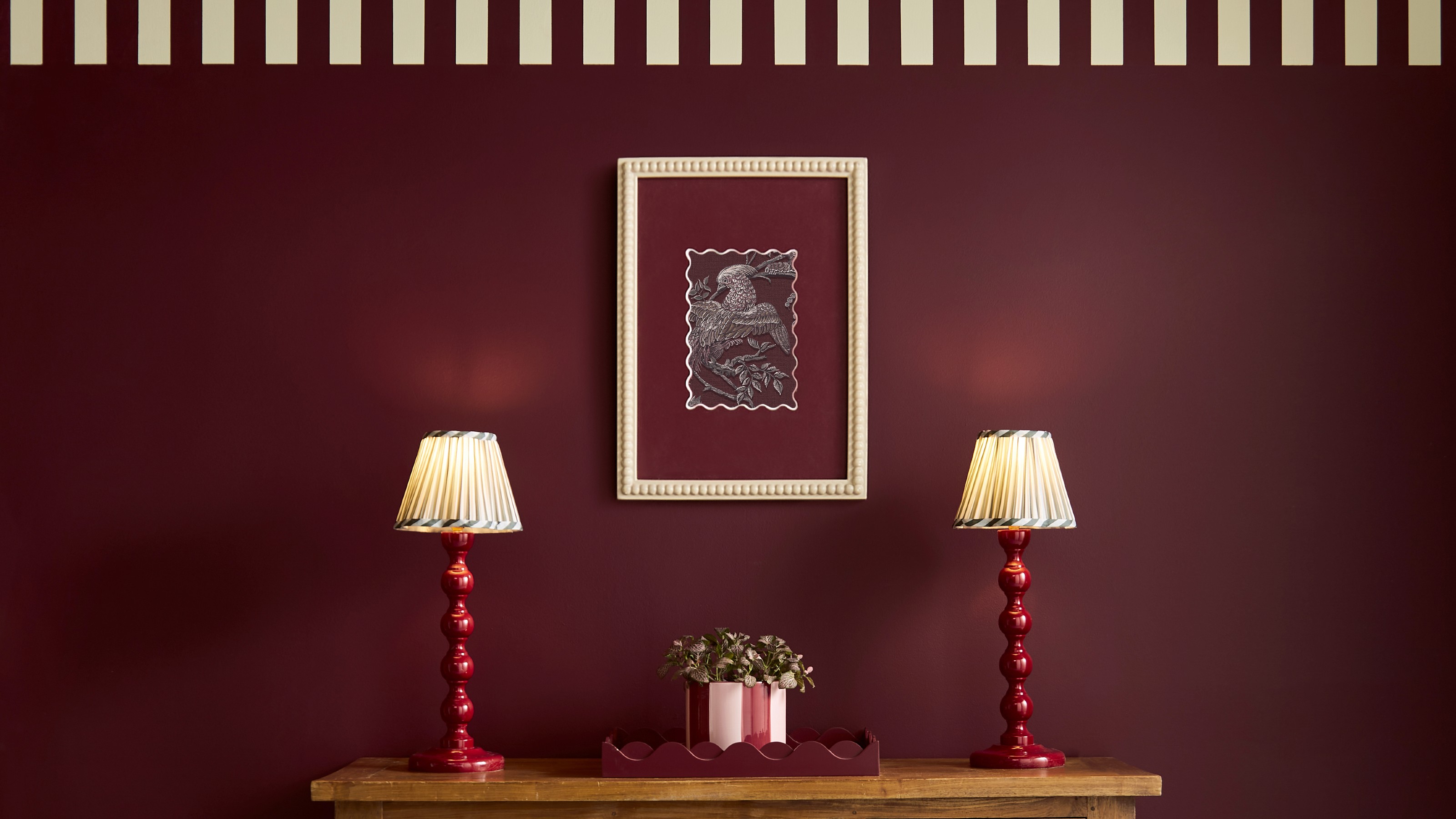
Plum, burgundy, and deep purple hues are enjoying a revival, particularly aubergine, which brings understated opulence and atmosphere. These bold colors are often paired with dark wood tones, mixed metals, and natural materials like walnut and antique brass, creating dramatic and elevated aesthetics, especially when combined with veined marbles.
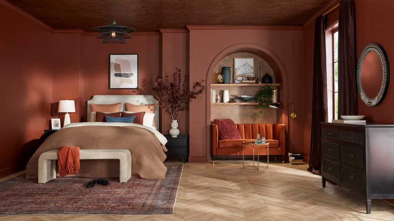
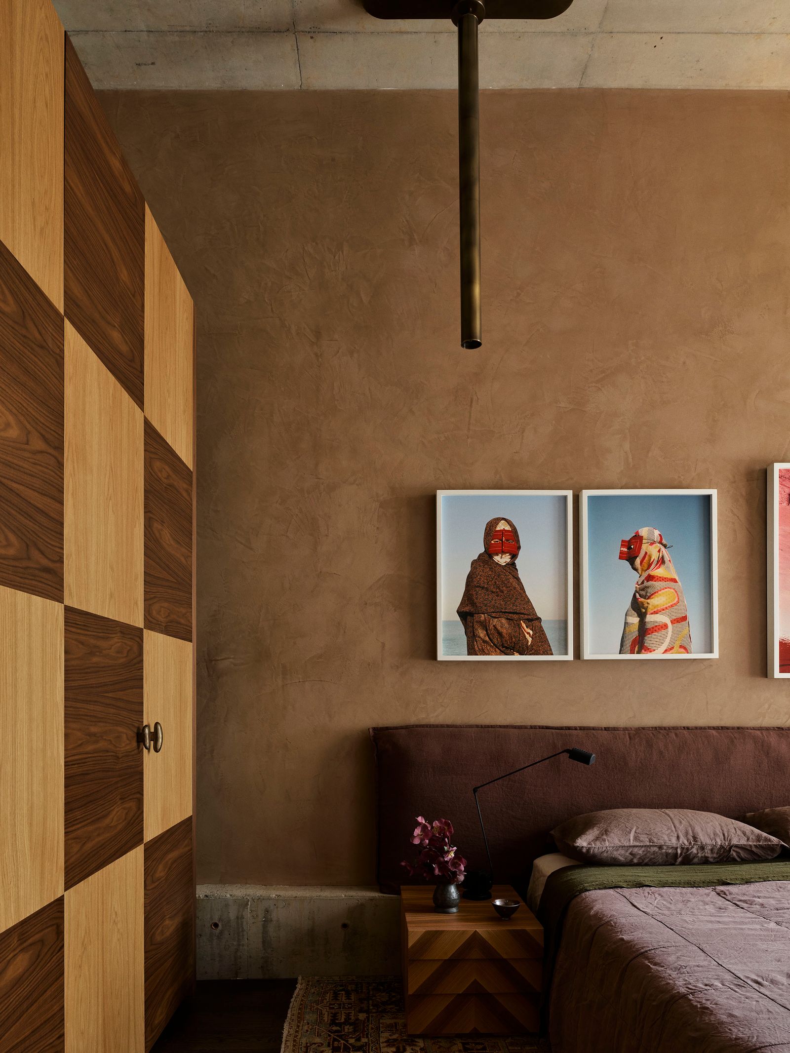
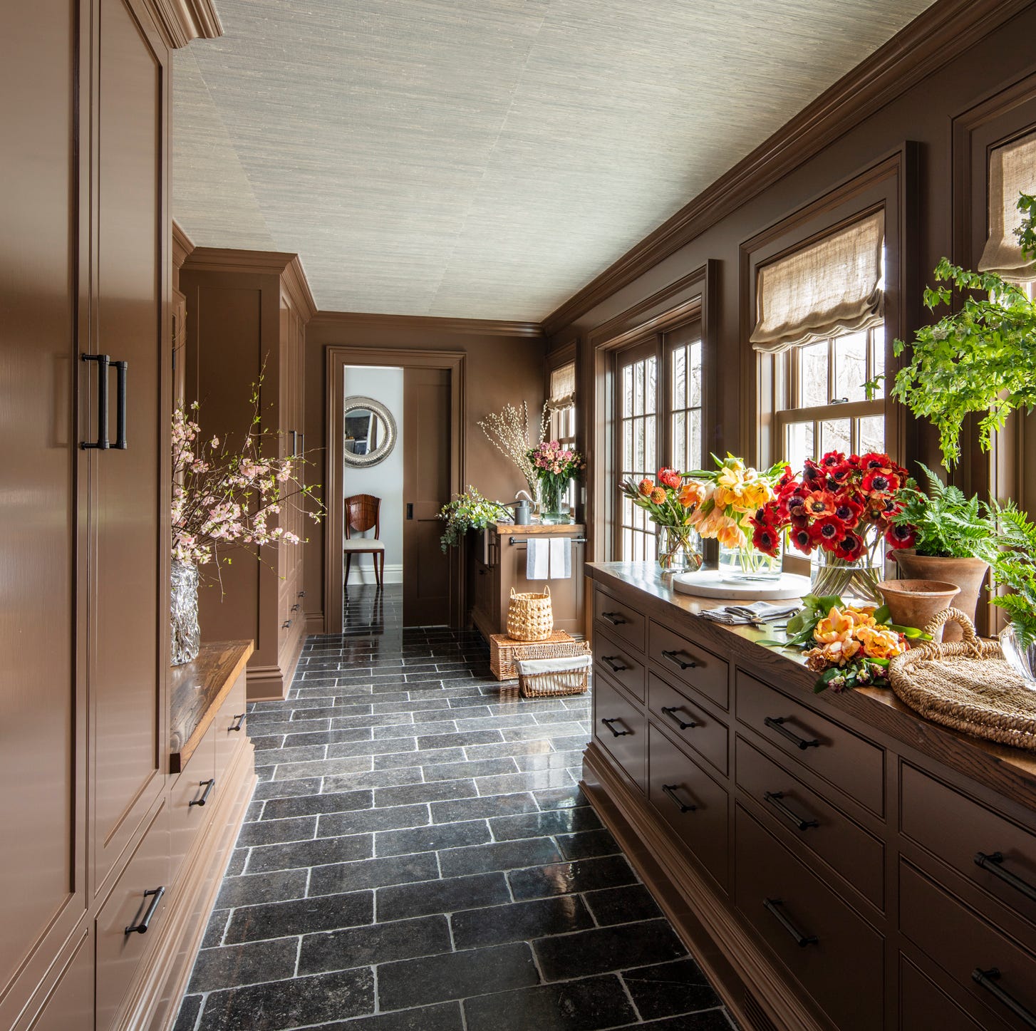
Earth tones are evolving into muddier, more complex shades, moving beyond the rich browns of 2025. Drab greens, deep reddish browns, and muted purples are gaining traction, providing grounded yet sophisticated looks. These shades work well with brass, which enhances their warmth, and tactile materials such as natural stone, characterful woods, and aged metals.
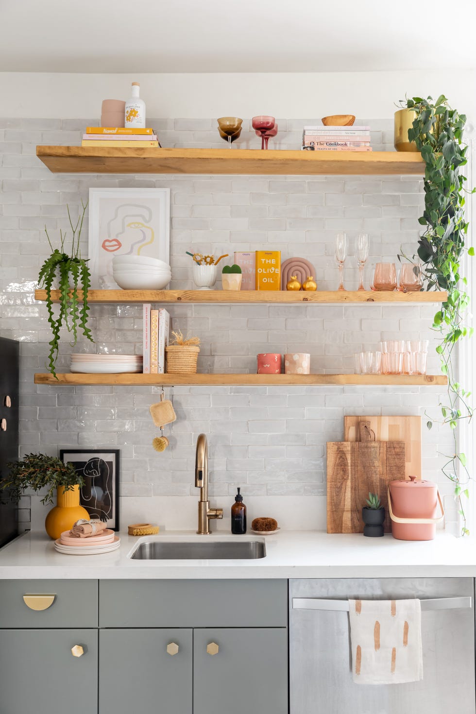
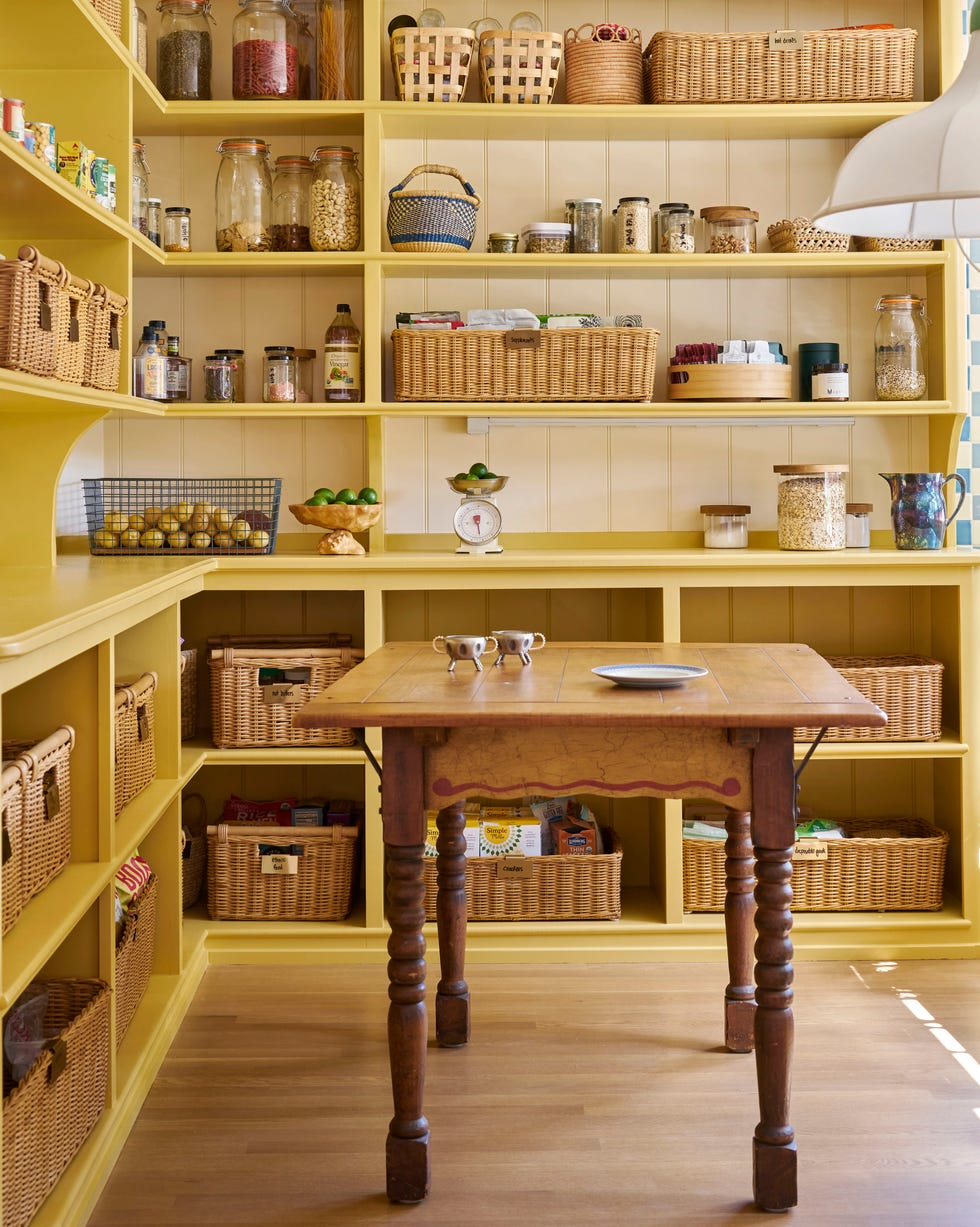
Muted pastels are returning, but in a more tailored and architectural manner. Soft, pale pinks, gentle lilacs, and buttery yellows are being used to create serene, contemporary backdrops, pairing effortlessly with crisp white marble for a clean and structured aesthetic. These gentle colors bring a lightness without being overly sweet.
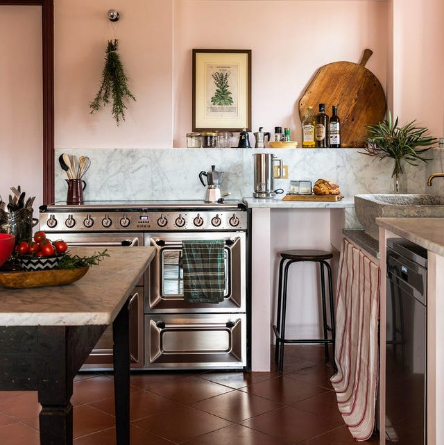
Softer shades of pink are becoming popular, moving away from bold Barbie pinks towards dappled tones that evoke calm and serenity. Farrow & Ball's Scallop is cited as an example, offering a gentle alternative to white when applied in smooth, matte finishes.
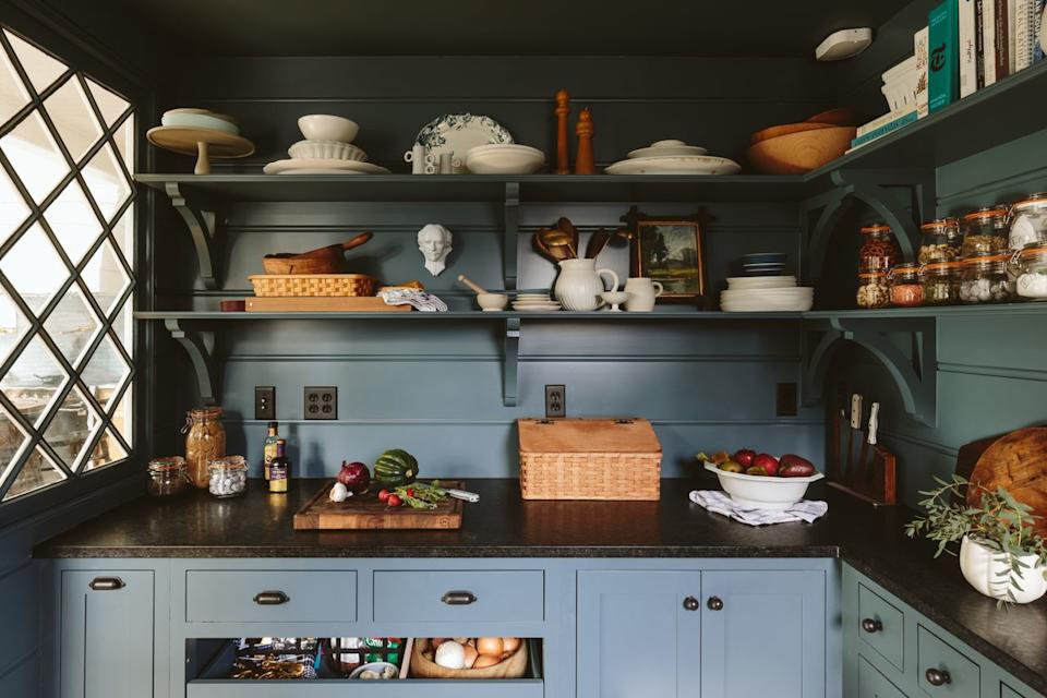
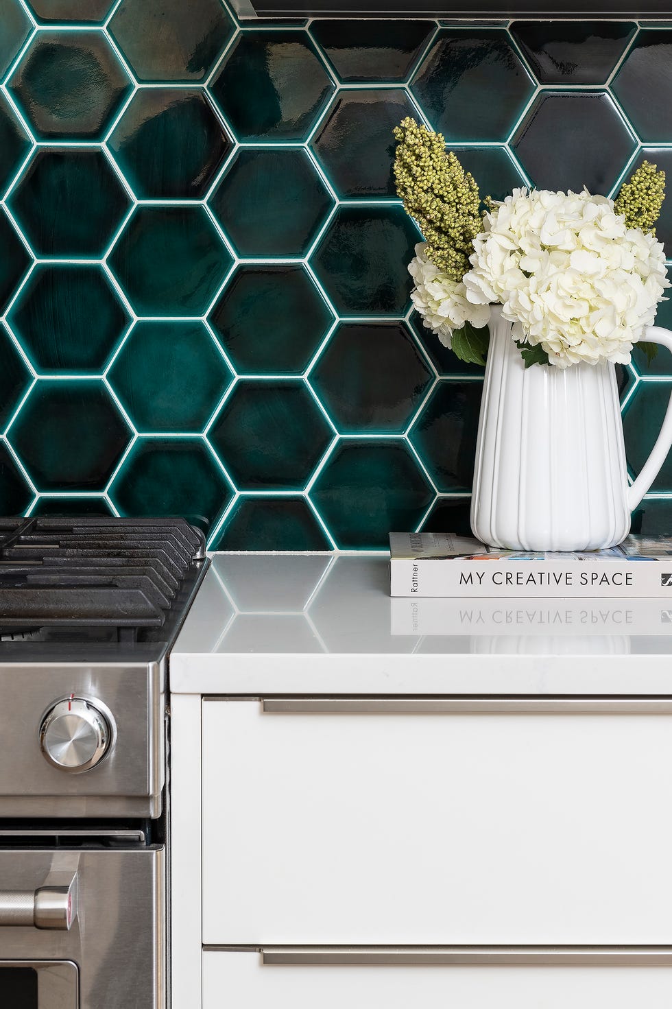
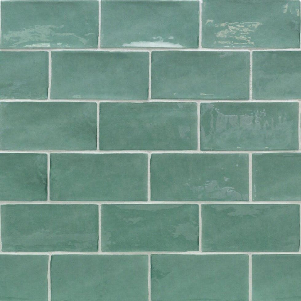
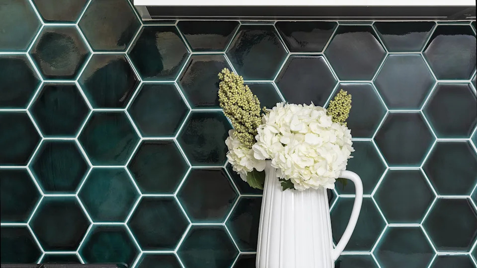
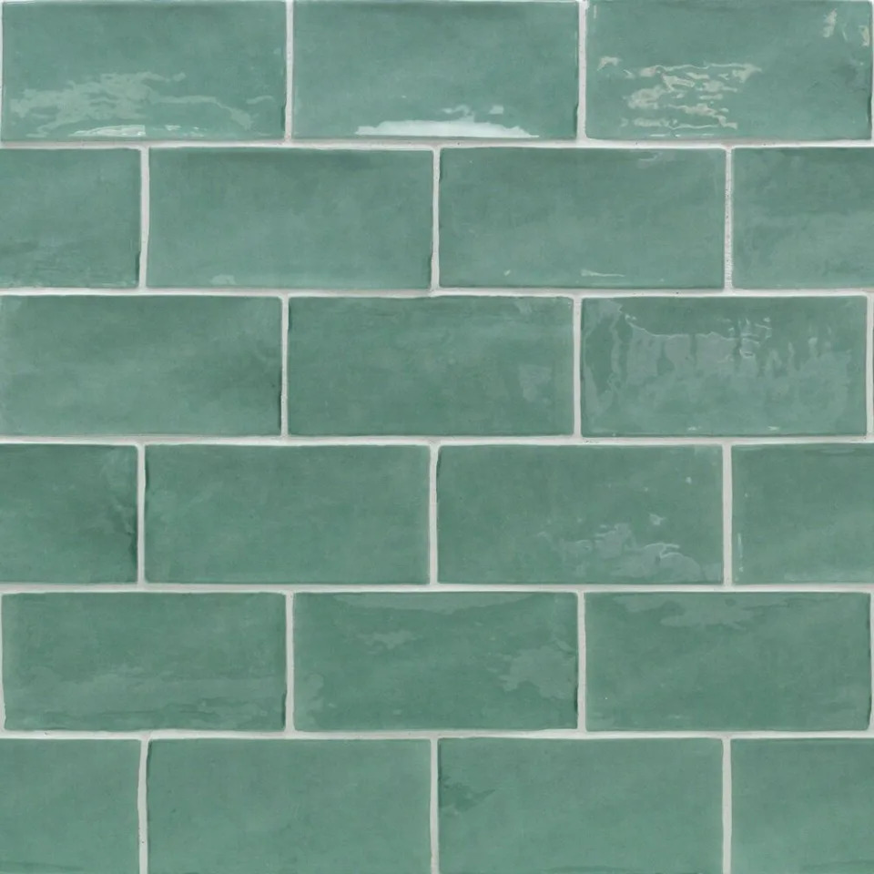
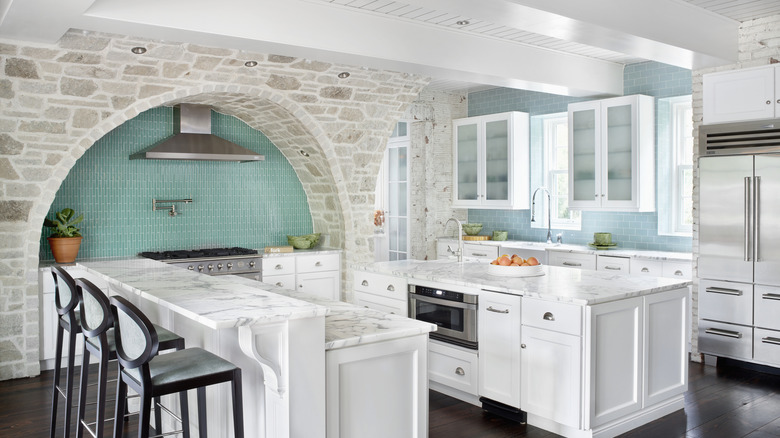
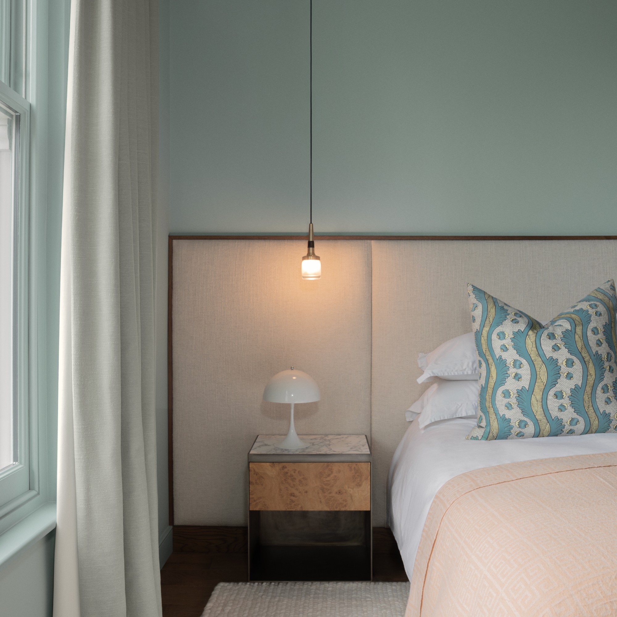
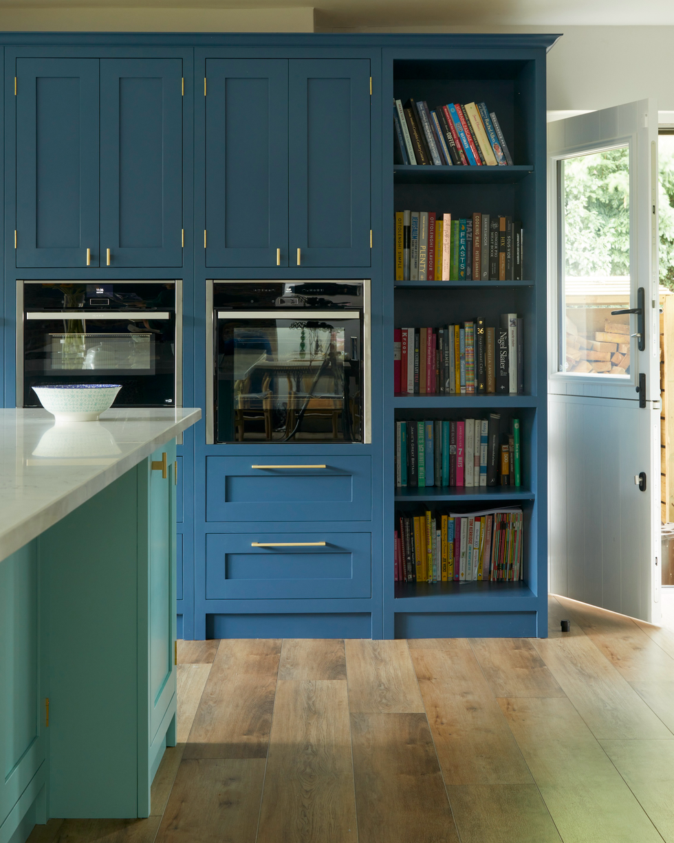
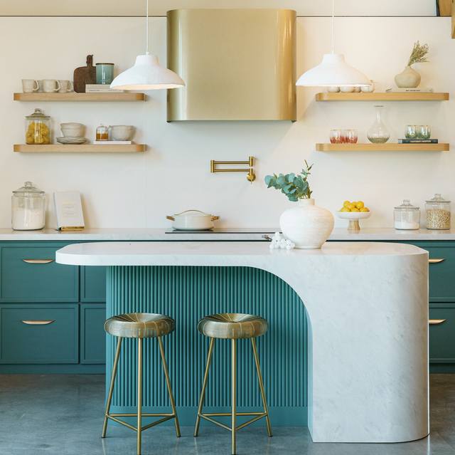
Blue-toned greens, such as blue-greens, teals, and emerald-adjacent hues, are anticipated to be new favorites. Shades like moss, eucalyptus, and lichen capture the essence of nature, bringing a grounding effect into interiors. Deeper palettes of these colors create a rich, profound impact, especially when contrasted with soft neutrals like warm off-whites or beige-taupes.
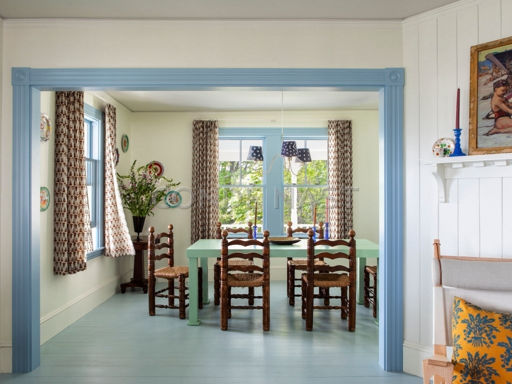
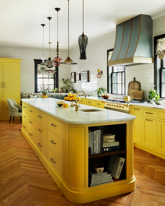
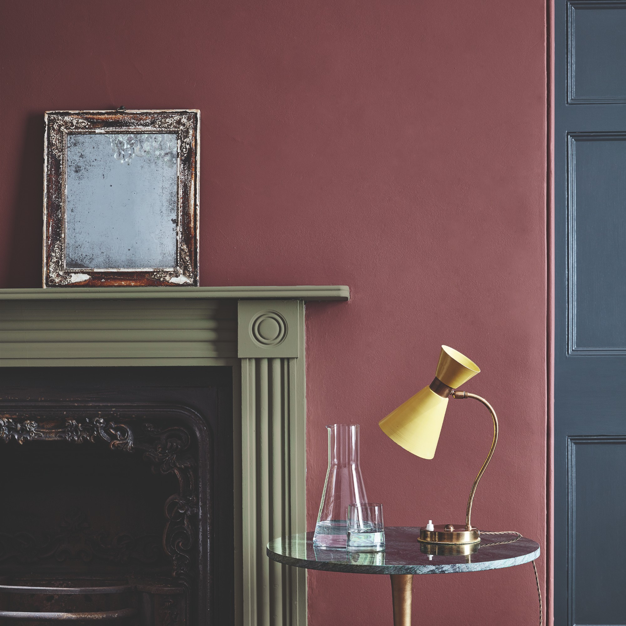
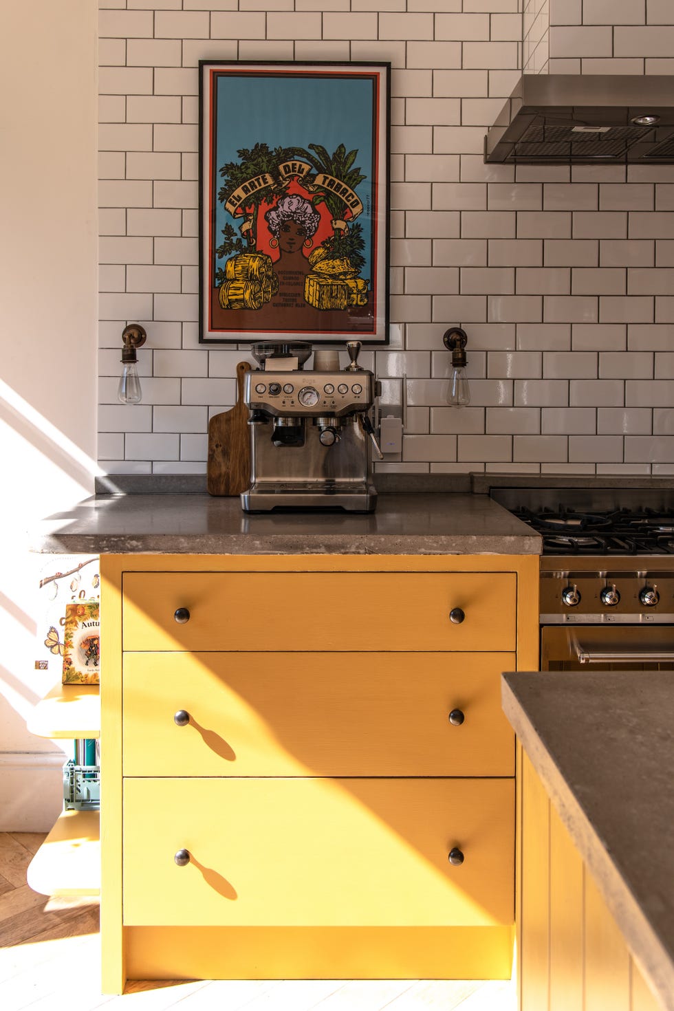
Unexpected color pairings are a significant trend, focusing on how shades are combined rather than individual colors. Bold combinations like deep purples with blues, or deep and vibrant yellows with teals, are creating characterful designs. Even traditional pairings, like yellow and burgundy, are being reimagined for contemporary appeal. Accents in contrasting colors offer a less committal way to embrace this trend.
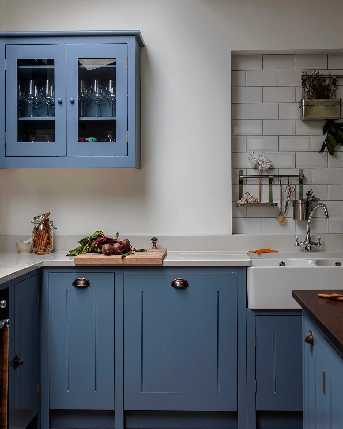
Richer jewel tones are becoming a focal point, replacing brighter hues with deeper, more sophisticated shades like peacock-inspired navy or intense sage green. This approach moves away from grey and white, drenching spaces in color, warmth, texture, and personality to create a sense of grandeur.
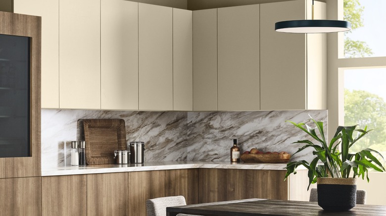
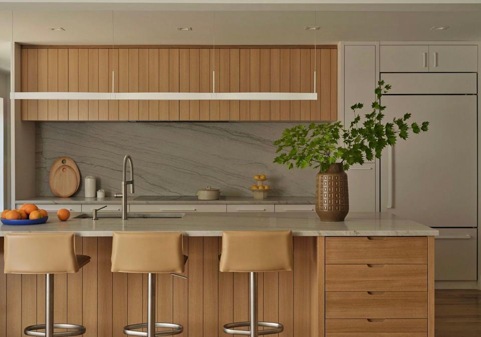
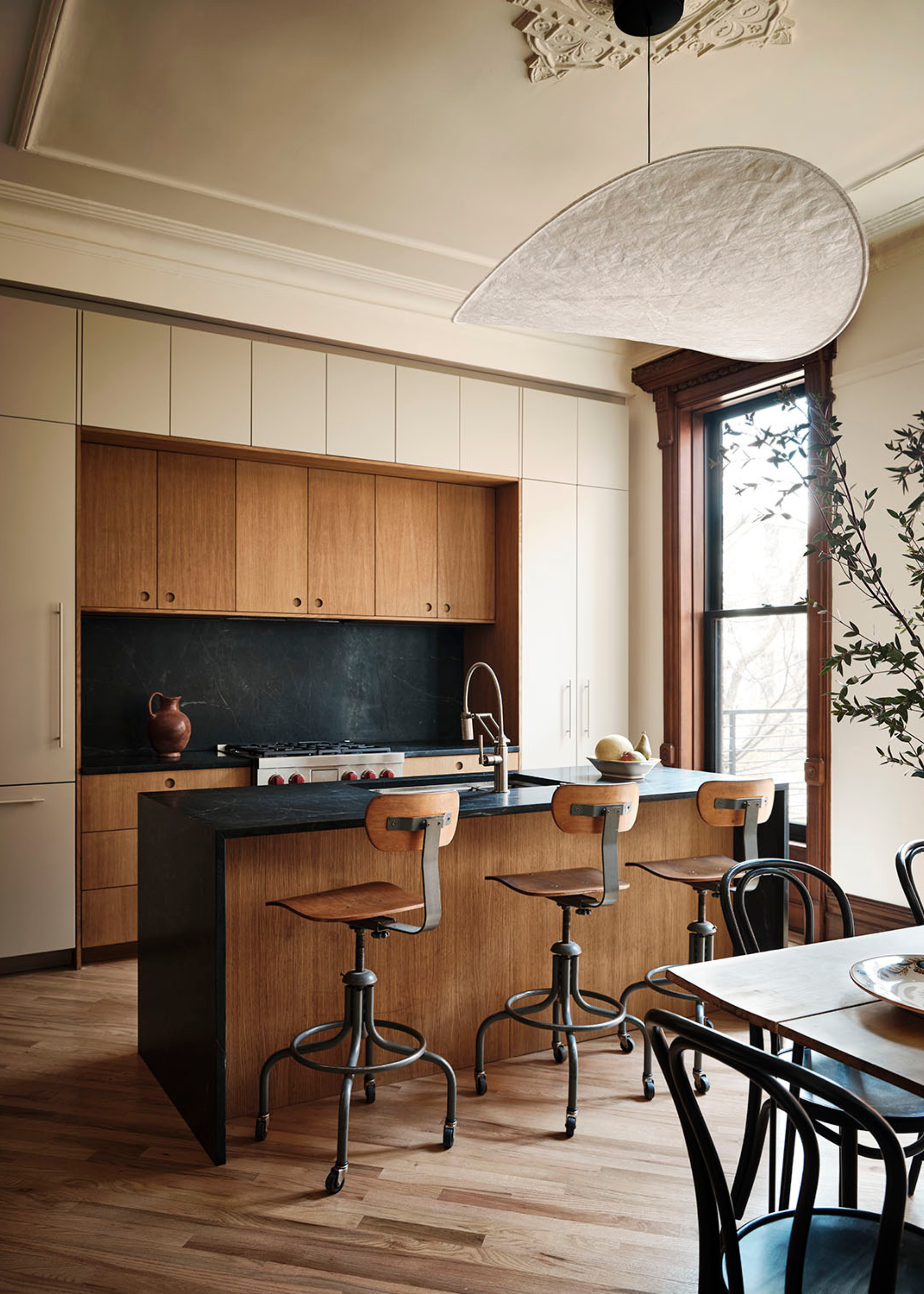
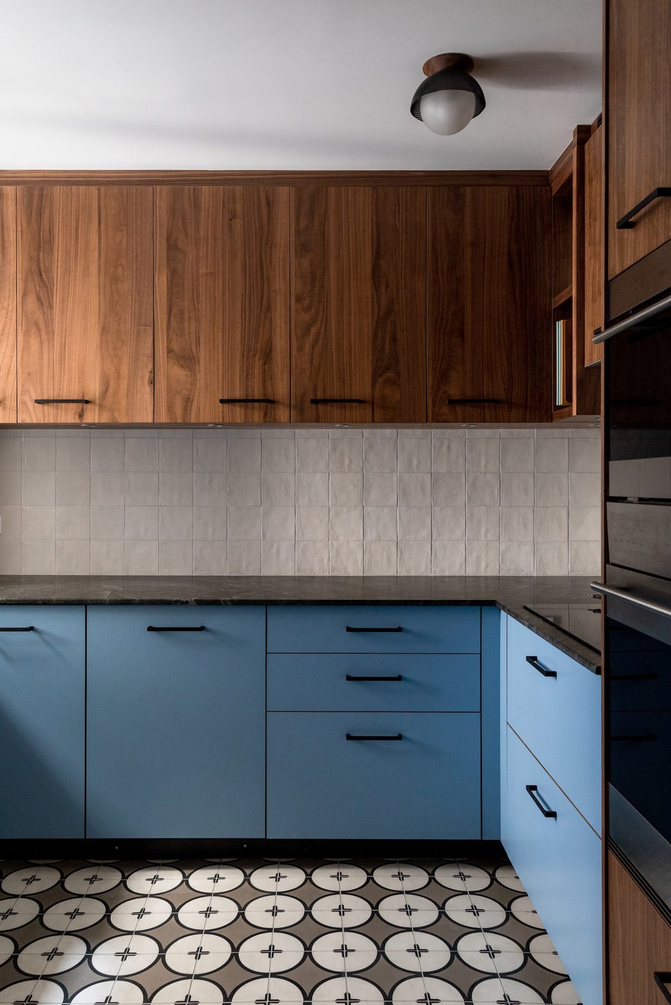
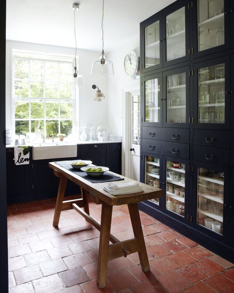
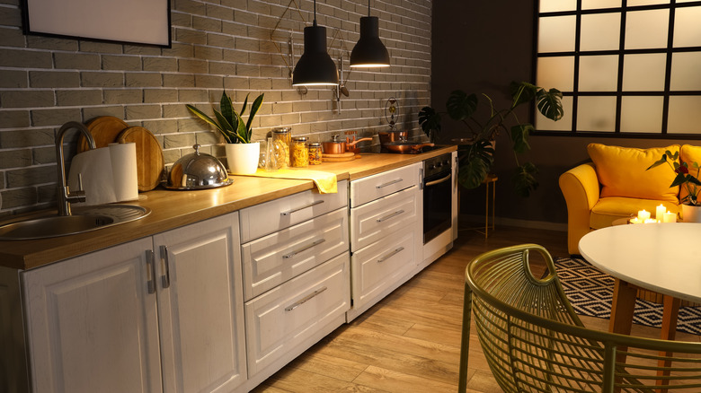
Natural wood kitchens continue to be popular, but the trend is shifting towards creating tonal contrast within wood, rather than using a single wood tone throughout. This involves pairing different woods or combining wood with painted elements, or light uppers with darker lowers, to add visual interest and tactile richness. Wood accents, such as cutting boards or pedestals, are also key.
Finally, stark white schemes are out, replaced by warmer cream hues with a focus on textured finishes. These rich, pale creams, often described as clotted cream, work subtly with muted butter yellow tones and are complemented by authentic, darker shades like mossy green or greeny brown. The success of this trend lies in textural applications, such as limewash, which bring depth and interest to neutral palettes, reminiscent of Victorian and Georgian kitchens.
#KitchenColorTrends #InteriorDesign2026 #GreenKitchens #MushroomShades #PlumAndBurgundy #EarthyTones #MutedPastels #SoftPinks #BlueGreenHues #UnexpectedColorPairings #JewelTones #NaturalWoodKitchens #CreamKitchens #TexturedFinishes #KitchenColorTrends #InteriorDesign2026 #GreenKitchens #MushroomShades #PlumAndBurgundy #EarthyTones #MutedPastels #SoftPinks #BlueGreenHues #UnexpectedColorPairings #JewelTones #NaturalWoodKitchens #CreamKitchens #TexturedFinishes
0 comment in total
 No comments yet
You may also like
7 Kitchen Color Trends That Are Set to Take Over 2026

The Kitchen Color You're Going to Be Seeing Everywhere in 2024
These Kitchen Paint Colors Will Be Everywhere in 2025

We're Calling It: 6 Kitchen Cabinet Paint Colors That Will Be Huge in 2026

11 Trendy Kitchen Paint Colors To Try In 2026

The Kitchen Cabinet Colors Experts Predict Will Dominate 2026

6 Kitchen Trends You'll See Everywhere In 2026
These kitchen paint colours will be everywhere in 2025 – and there's even one for neutral lovers
6 Kitchen Paint Color Trends That Are Already Taking Over Walls in 2026
Designers Say These 6 Cabinet Colors Will Be Taking Over Kitchens in 2026

Top 13 kitchen colours for 2025
These 2025 Kitchen Color Trends Are Unexpectedly Chic

The Bold And Unexpected Color Combo You'll Be Seeing In Kitchens Everywhere In 2026
6 Kitchen Cabinet Colors Design Pros Say Will Be Huge in 2026

13 Unique Kitchen Color Combinations To Try Out In 2025

These 6 Colors Will Rule Interiors in 2026, According to Experts

The Kitchen Color You're Going to Be Seeing Everywhere in 2024
These Colors Will Be Everywhere in Interior Design in 2026
The colour trends 2026 that will define our homes next year

8 Kitchen Color Trends You'll See in Every Home in 2025, According to Designers