8 Paint Colors You Should Never Use For Your Front Door
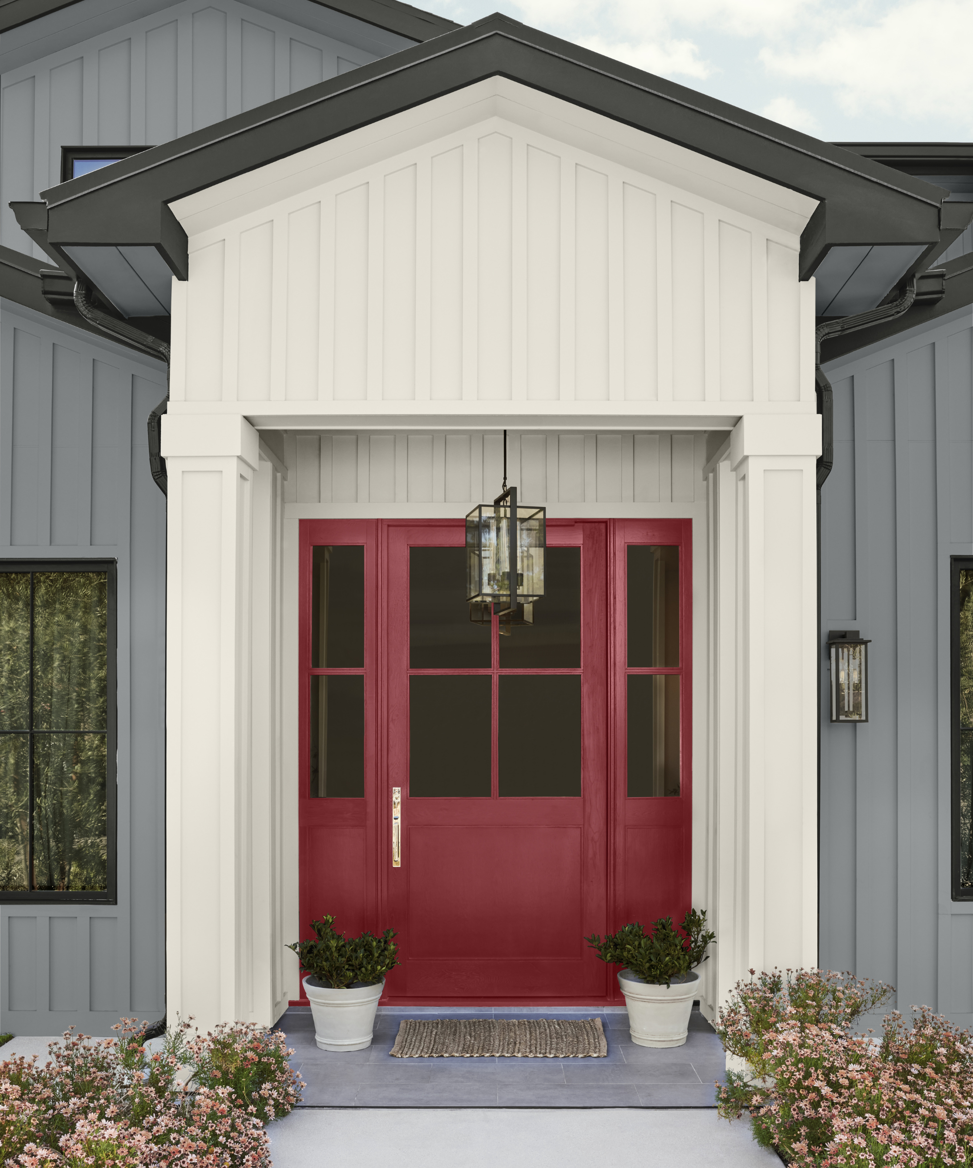
The front door serves as a crucial element in establishing the aesthetic tone for a home's exterior. Selecting an appropriate paint color for this feature is a significant decision, as designers emphasize the importance of choosing a shade that complements the surrounding architecture and reflects personal style without dominating the facade. The objective is for the front door to enhance, rather than detract from, the overall appeal of the house.
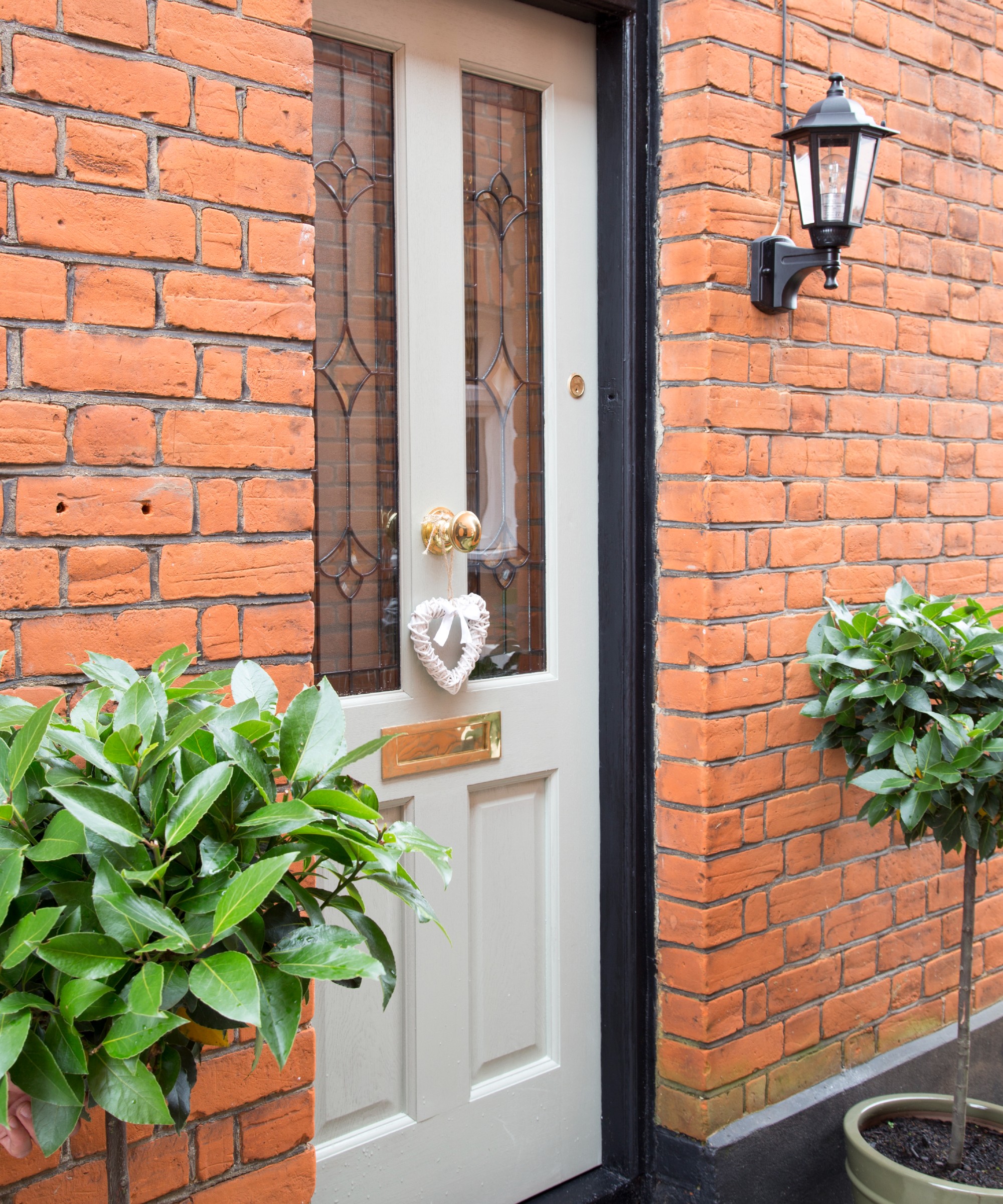
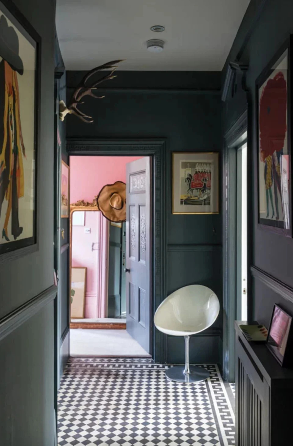
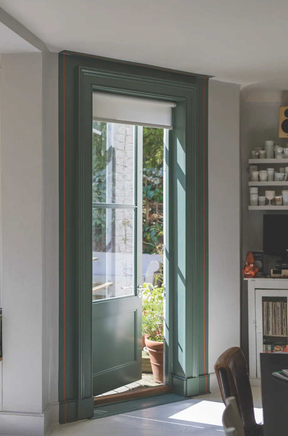
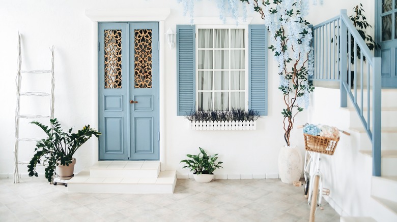
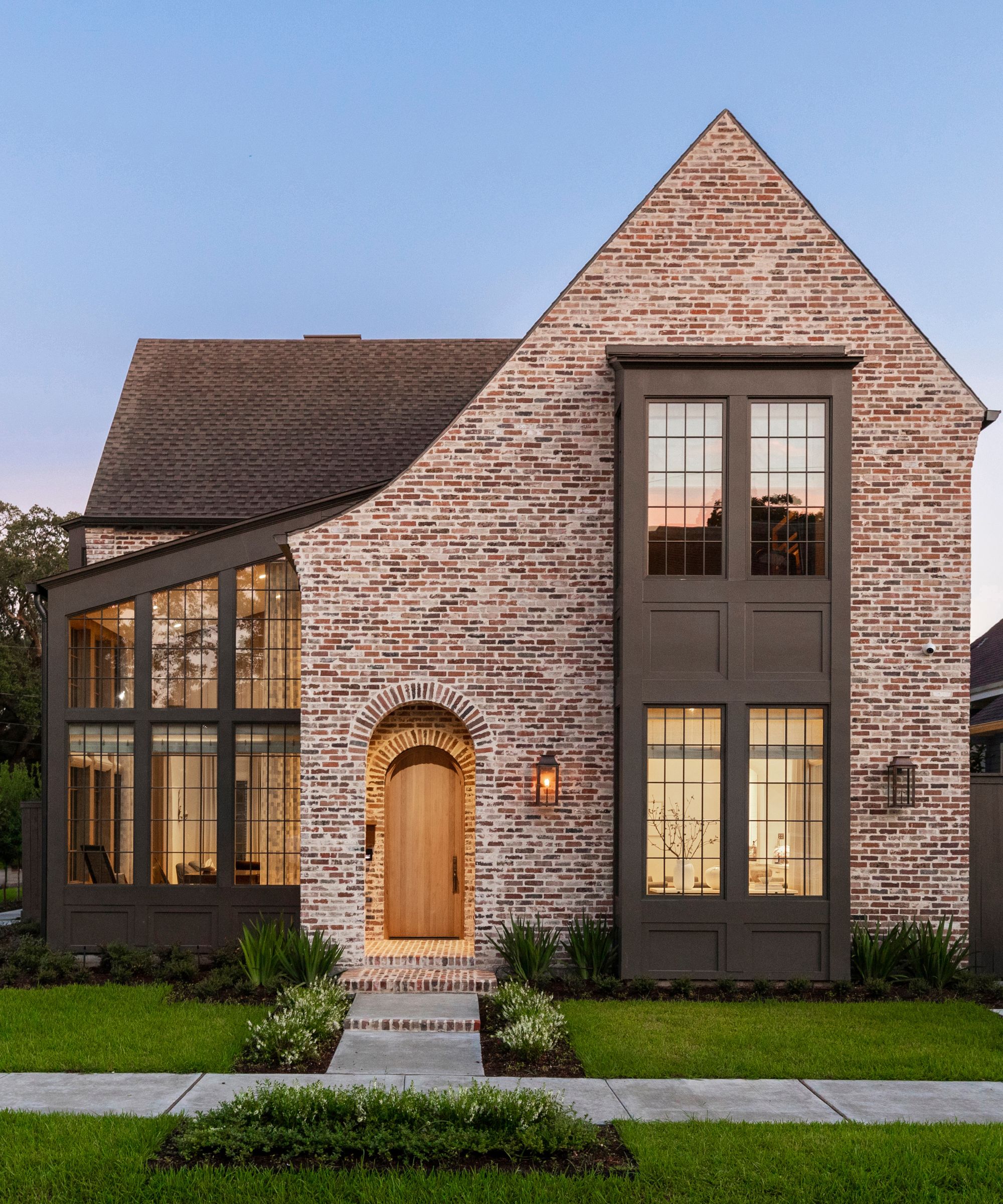

Designers advise against a variety of colors for front doors due to their potential to create an uninviting impression, clash with architectural styles, or lead to practical issues. Cool grays and steely blues, for instance, are often deemed unsuitable, particularly for homes with warmer architectural elements like brick, wood, or natural stone. While these colors might work in modern interiors, on a front door, they can appear cold or out of place.
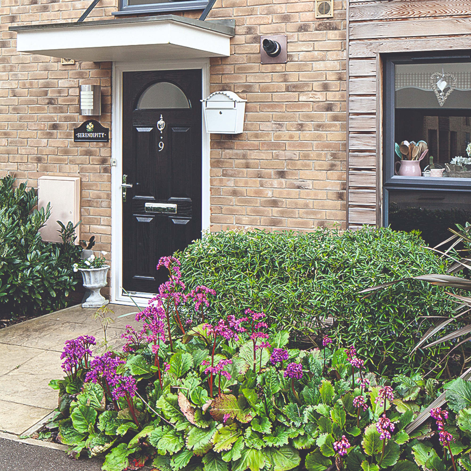
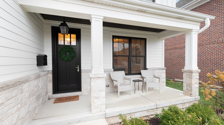
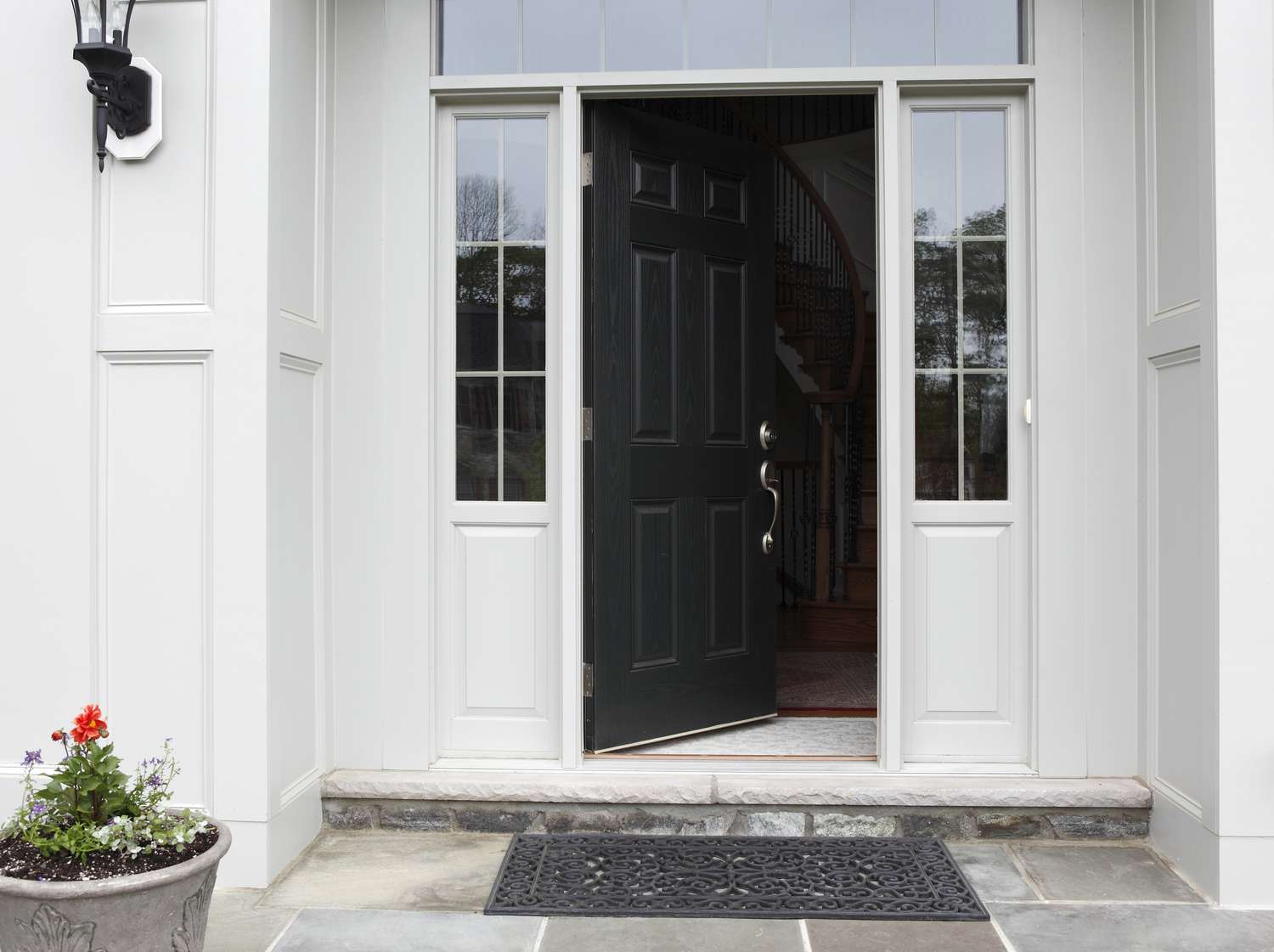
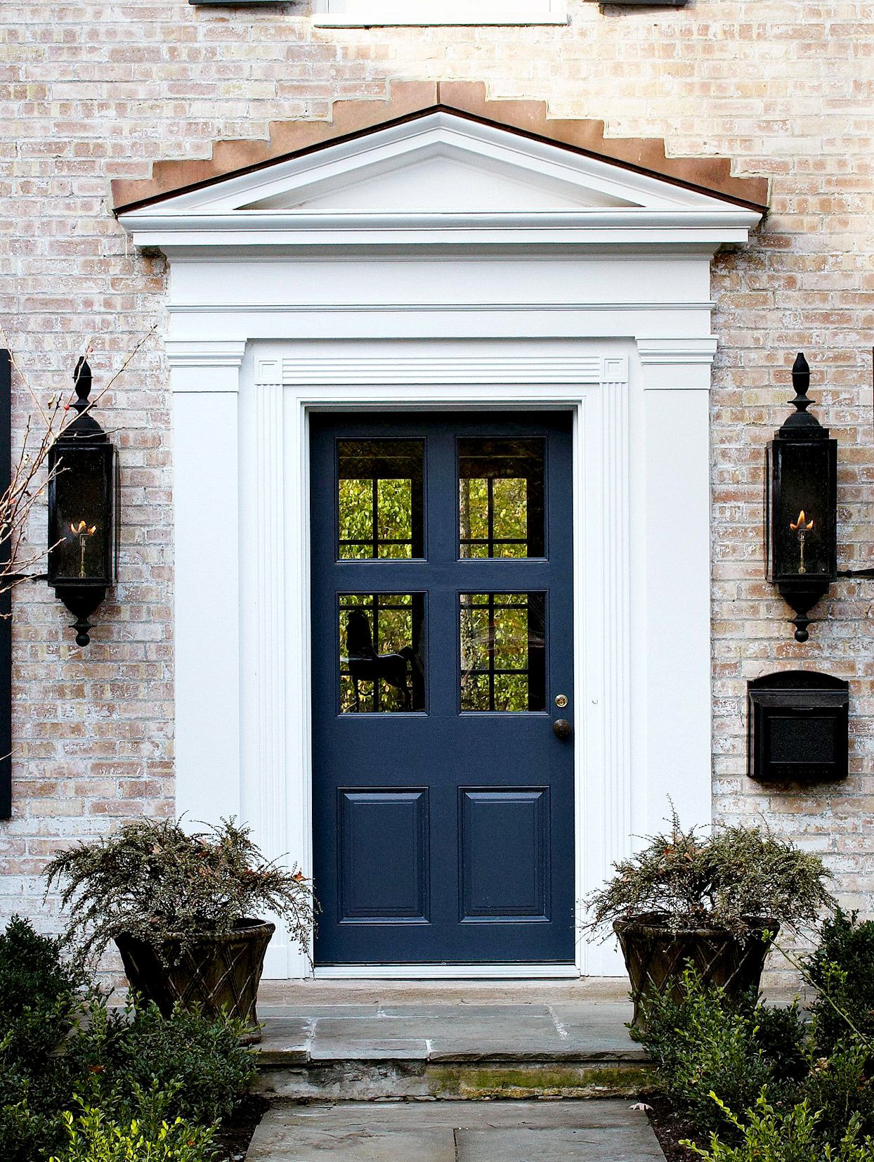
Dark colors such as black and navy blue also present challenges. These shades are known to absorb significant amounts of heat, which can cause the door material to expand and contract excessively. This thermal stress can lead to damage such as splits, cracks, or warping over time. Additionally, dark doors can become uncomfortably hot to the touch.
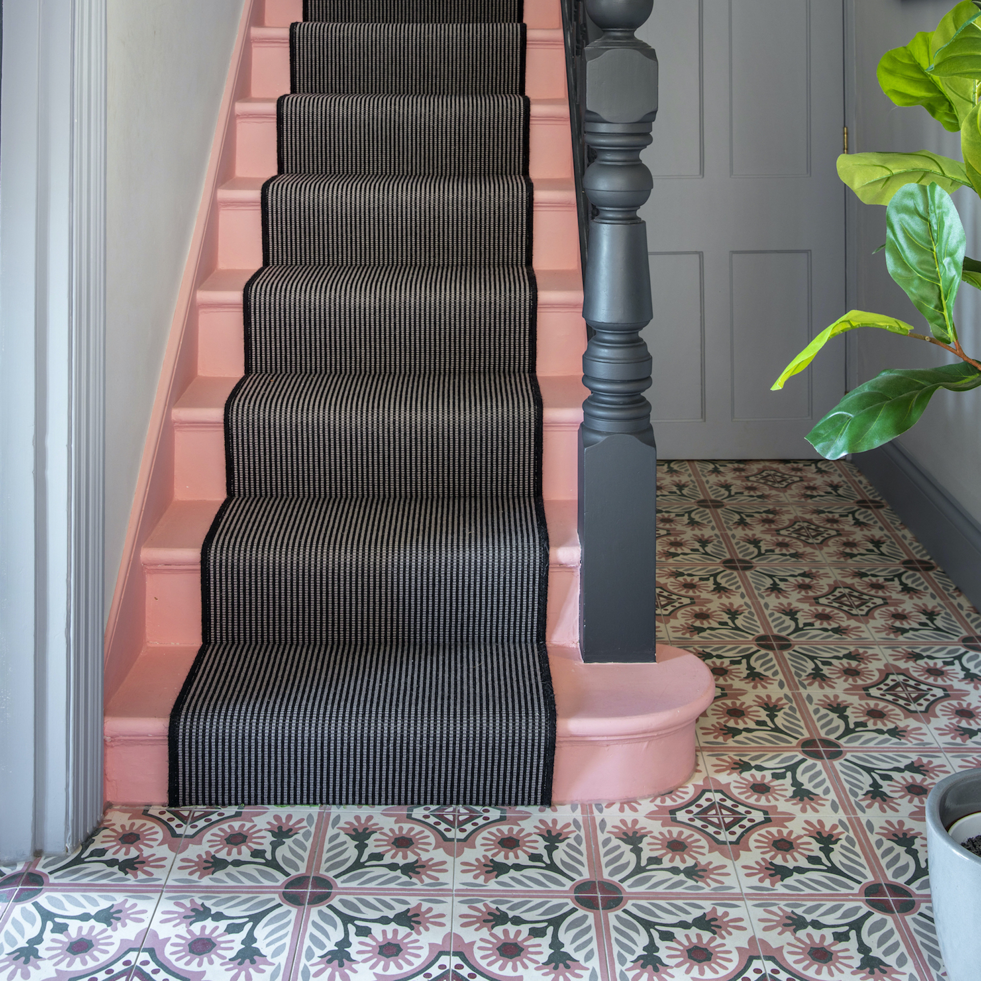
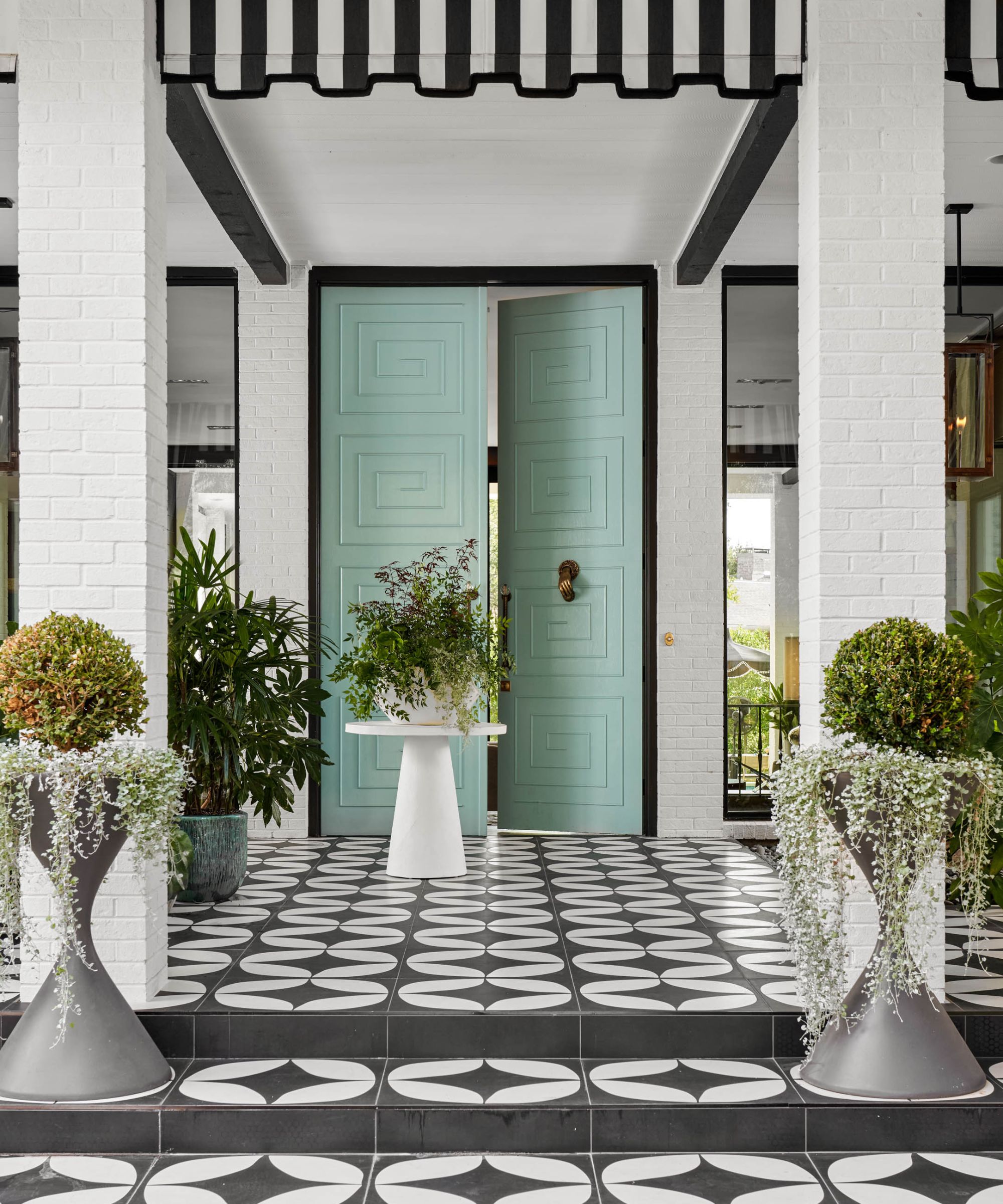
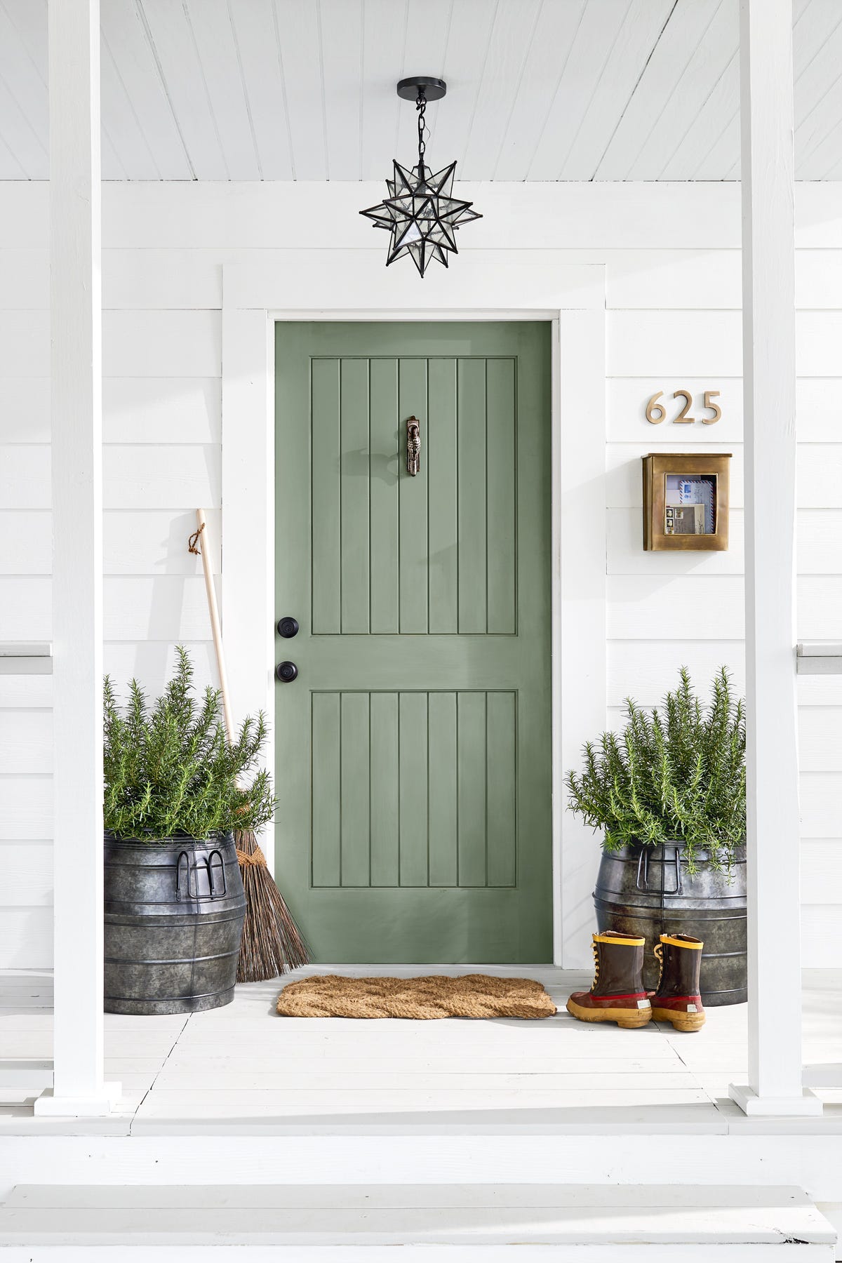
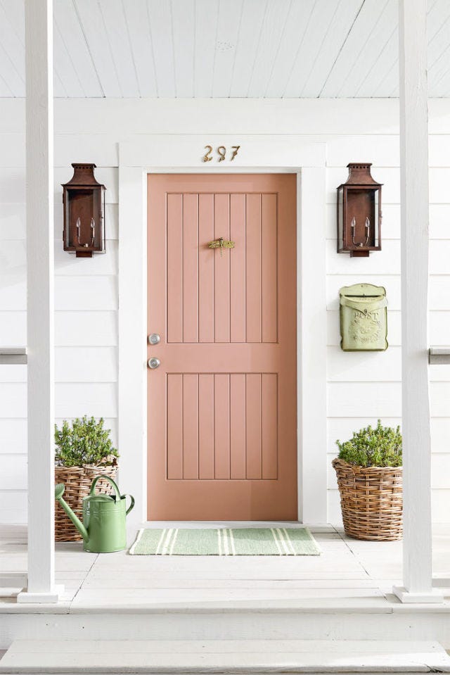
Pastel tones, despite their inherent prettiness, are generally not recommended for front doors. Melanie Bryant notes that pastels often fail to provide the necessary visual weight to establish the entrance as a focal point. Christopher Boutlier further explains that muddy pastels like dusty lilac or pale mint green can appear faded or underwhelming, especially when paired with more traditional or richly toned exterior materials.
Pure white, while seemingly a classic choice, is often problematic. It tends to show dirt and grime easily, requiring frequent maintenance. Designers also suggest that pure white often lacks the contrast and personality needed to make a purposeful statement, appearing plain and missing an opportunity for impact. Lauren Connor highlights that white can quickly get dirty from heavy use, pets, or traffic pollution.
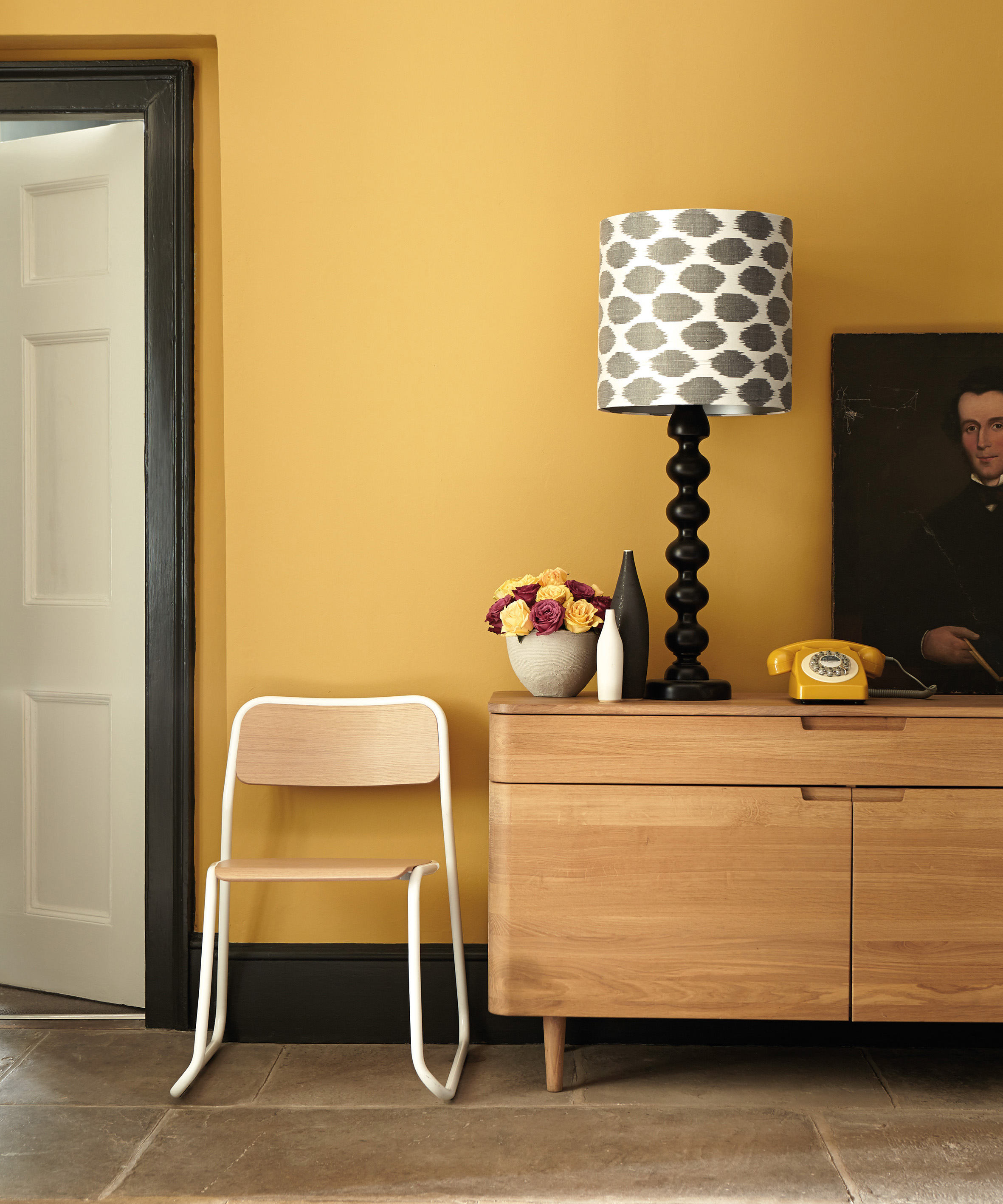
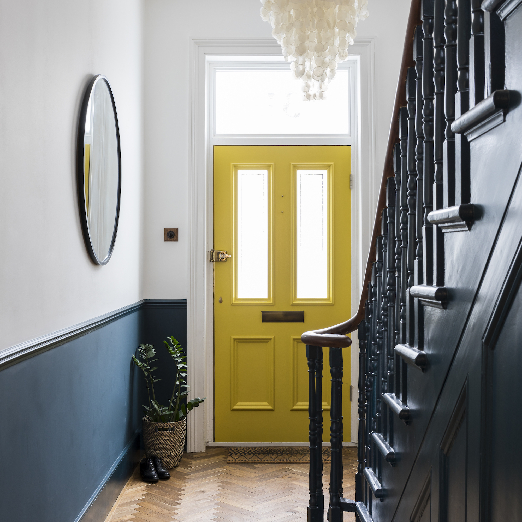
Primary yellow is another color that designers advise against. Bradie Fisher describes it as akin to a "school bus" color, challenging to execute effectively. If a sunny hue is desired, deeper ochre or muted mustard tones are suggested as more appealing alternatives.
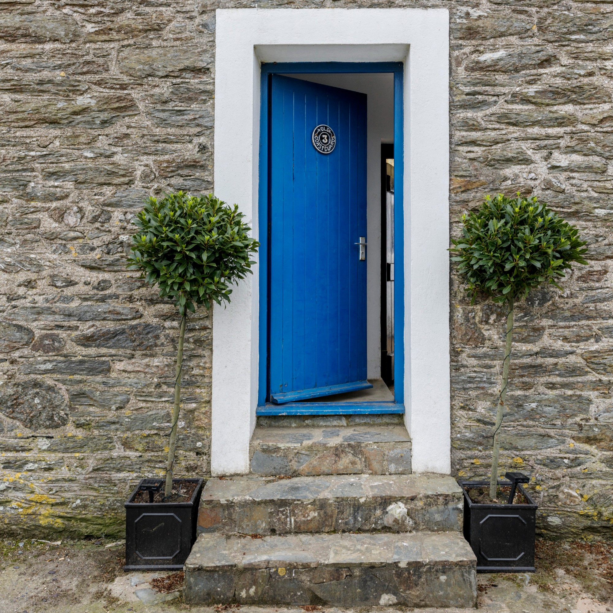
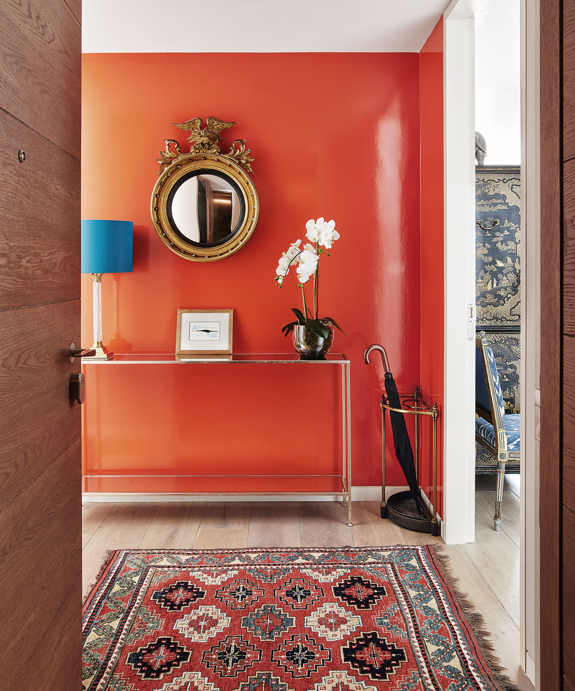
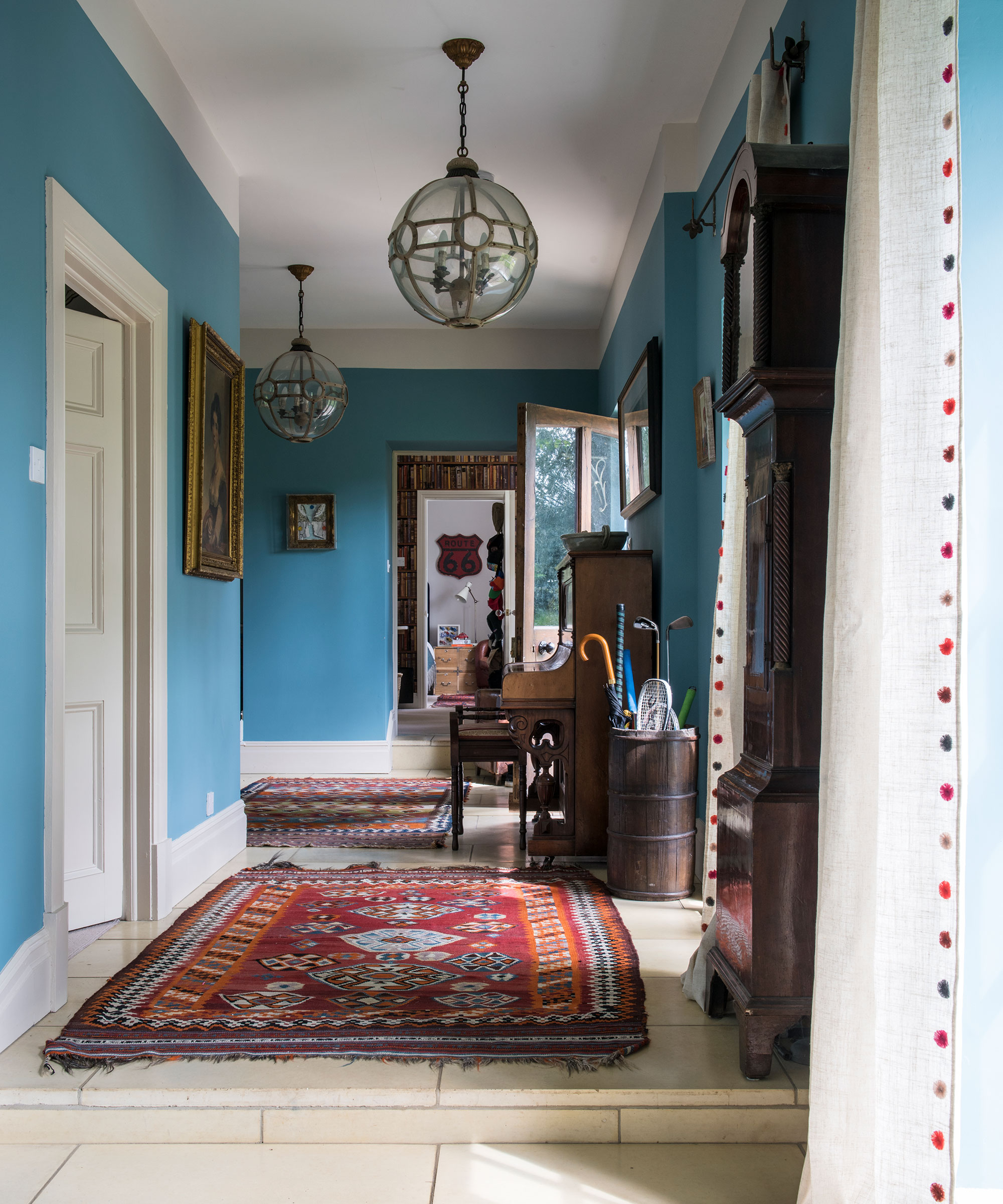
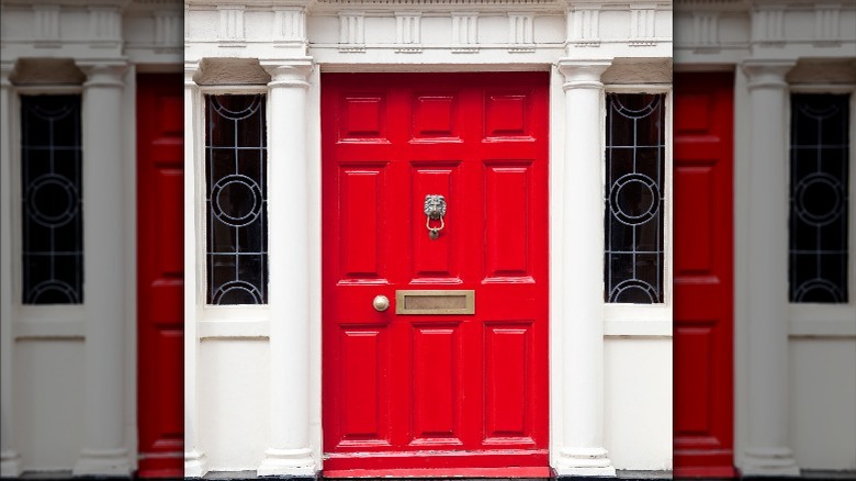
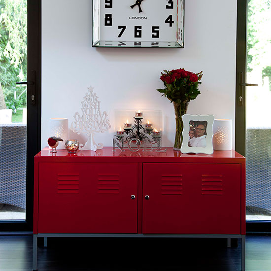
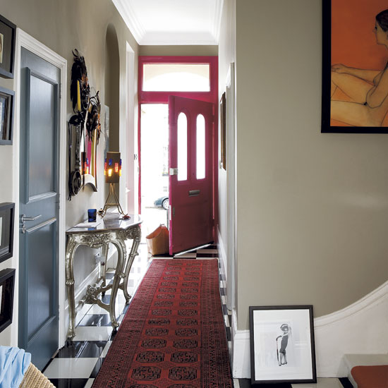
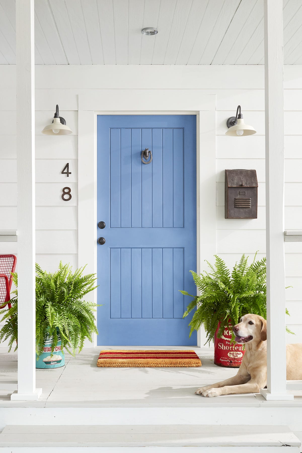
Excessively bright hues are also cautioned against. Such colors can feel jarring and unwelcoming, and they are susceptible to fading over time, especially in strong sunlight. Specific examples include neon or overly saturated brights, which can clash with traditional Southern architecture and quickly appear dated. Blue is identified as a color frequently chosen too brightly by mistake.
Certain brown shades also require careful consideration. Mid-tone or muddy browns can look outdated or blend into the background, particularly if the siding or brick is of a similar hue. For those interested in brown, richer or wood tones are recommended to achieve a deeper, more intentional appearance.
Finally, designers strongly recommend avoiding colors that are overly trendy. Fashion-driven hues can quickly become outdated and prove difficult to coordinate with evolving seasonal decorations, landscaping, or hardware finishes. The consensus is to opt for a front door color that is timeless, harmonizes with the home's existing exterior palette, and conveys a welcoming ambiance, rather than making a fleeting fashion statement.
#FrontDoorPaint #HomeExterior #PaintColors #InteriorDesignTips #CurbAppeal #HomeMaintenance #ArchitecturalHarmony #ColorSelection #FrontDoorPaint #HomeExterior #PaintColors #InteriorDesignTips #CurbAppeal #HomeMaintenance #ArchitecturalHarmony #ColorSelection
0 comment in total
 No comments yet
You may also like
13 front door colours mistakes you might be making

What are the worst colors to paint a room? The shades experts say you should never use


5 colors you should never paint a pantry – designers share the shades they swerve
Interior Designers List the Worst Paint Colors for Your Entryway

5 colors you should never paint your entryway – according to interior experts
How to decide what color to paint the inside of your front door
5 Paint Colors to Never Use on Your Front Porch, According to Interior Designers
Outdated Entryway Paint Colors To Avoid In 2025 (And What To Try Instead)
8 colors you should never paint kitchen cabinets according to the experts

4 Paint Colors You Should Never Use For Exterior Trim
Trust us, these are the colours to avoid when painting a small hallway

5 colors you should never paint a small room – designers warn us to steer clear of these hues, and what to pick instead
6 Colors You Should Never Paint Your Entryway, According to Color Experts

The 5 Best Front Door Colors For A White House (And 5 To Avoid)
19 front door color ideas that are sure to boost your home's curb appeal
5 Easy Ways To Give Your Front Door a Colorful Makeover
The colors you should never paint your hallway – and what really works
You should never paint your hallway this colour, according to colour psychologists
6 colors to avoid in an entryway – and the ones designers know make a better first impression

These Are the Top 10 Dos and Don'ts for Choosing Front Door Colors