1/6
Farrow & Ball's Joa Studholme explains exactly how to use color at home for 2022
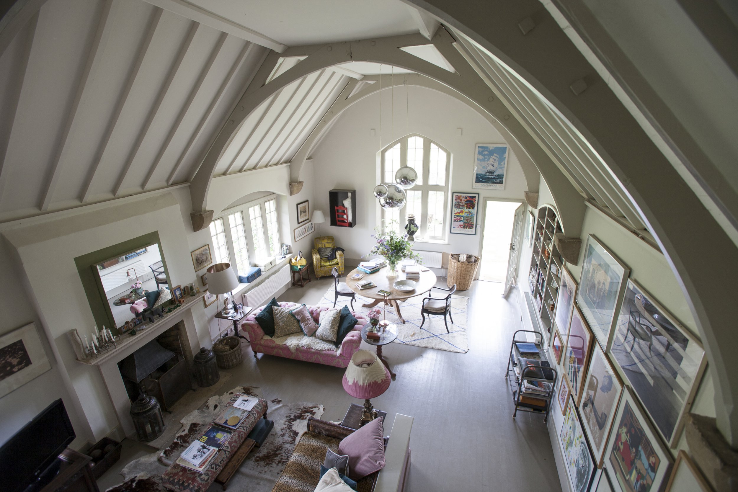
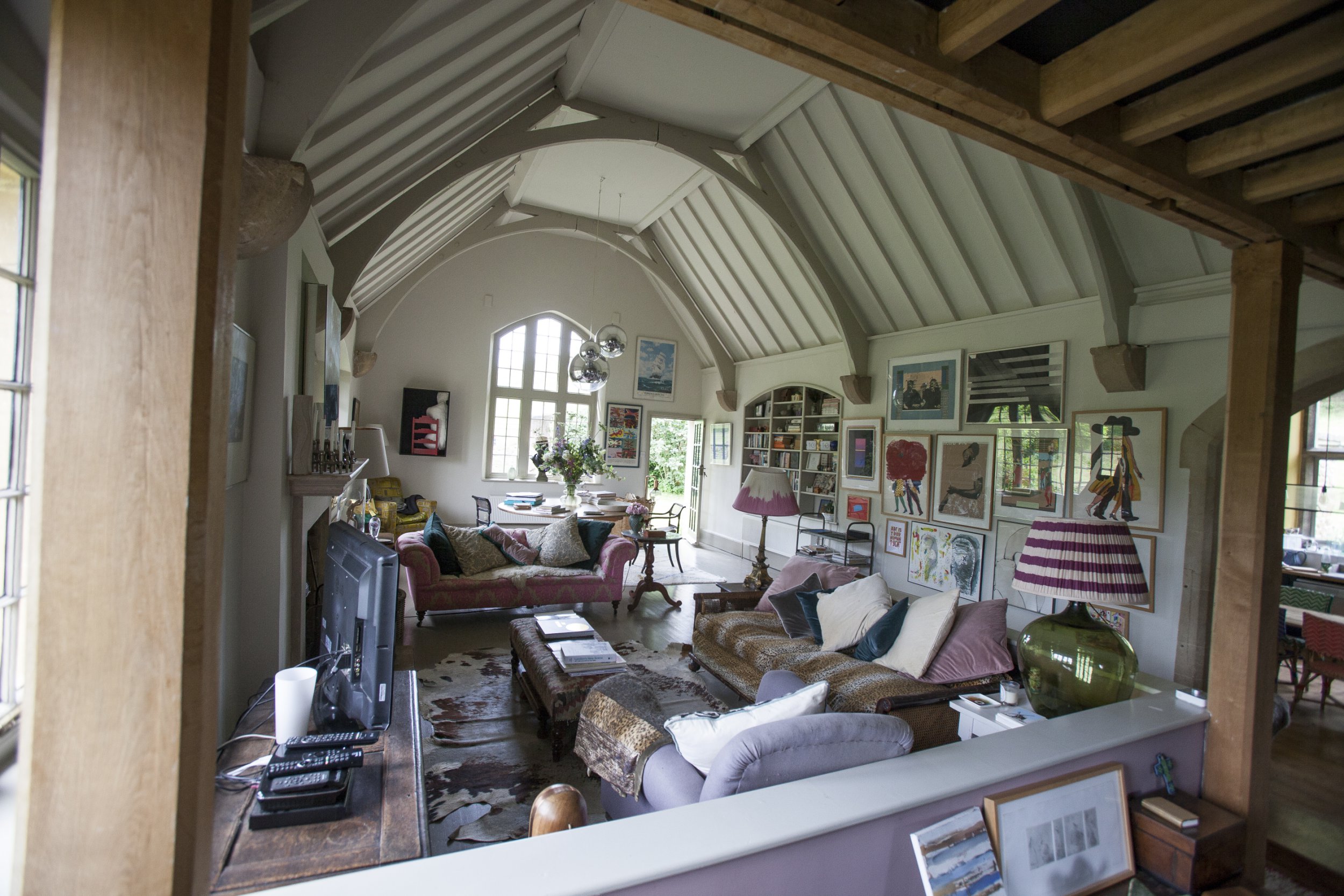
This article features an interview with Joa Studholme, a color expert from Farrow & Ball, who shares her insights and recommendations on how to effectively use color in home decor for 2022. Studholme, known for creating iconic Farrow & Ball shades like Stiffkey Blue, Sulking Room Pink, and Joa's White, discusses evolving trends in interior design and offers practical advice for homeowners.
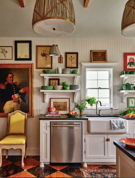
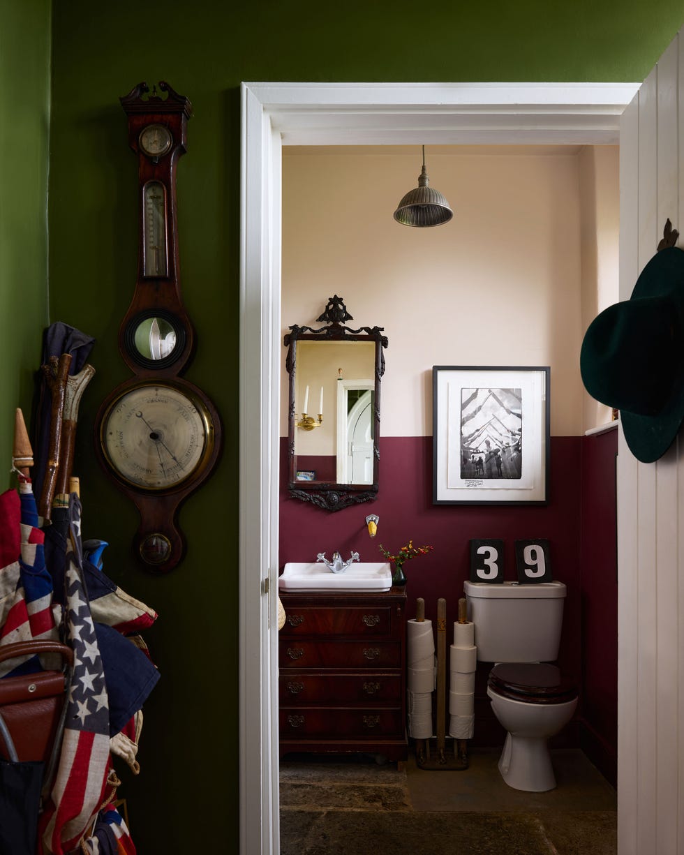
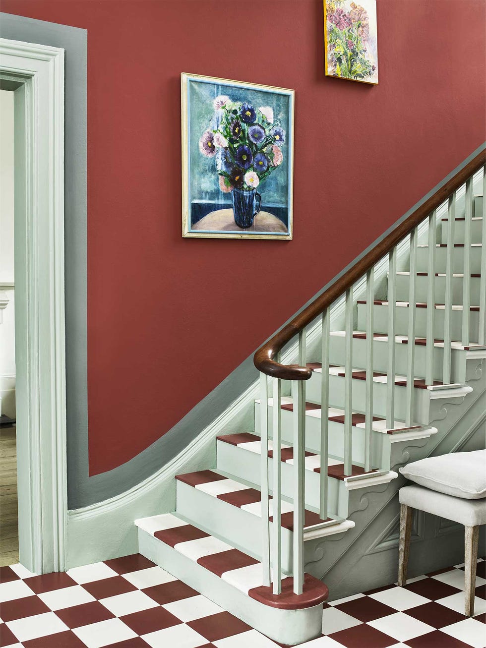
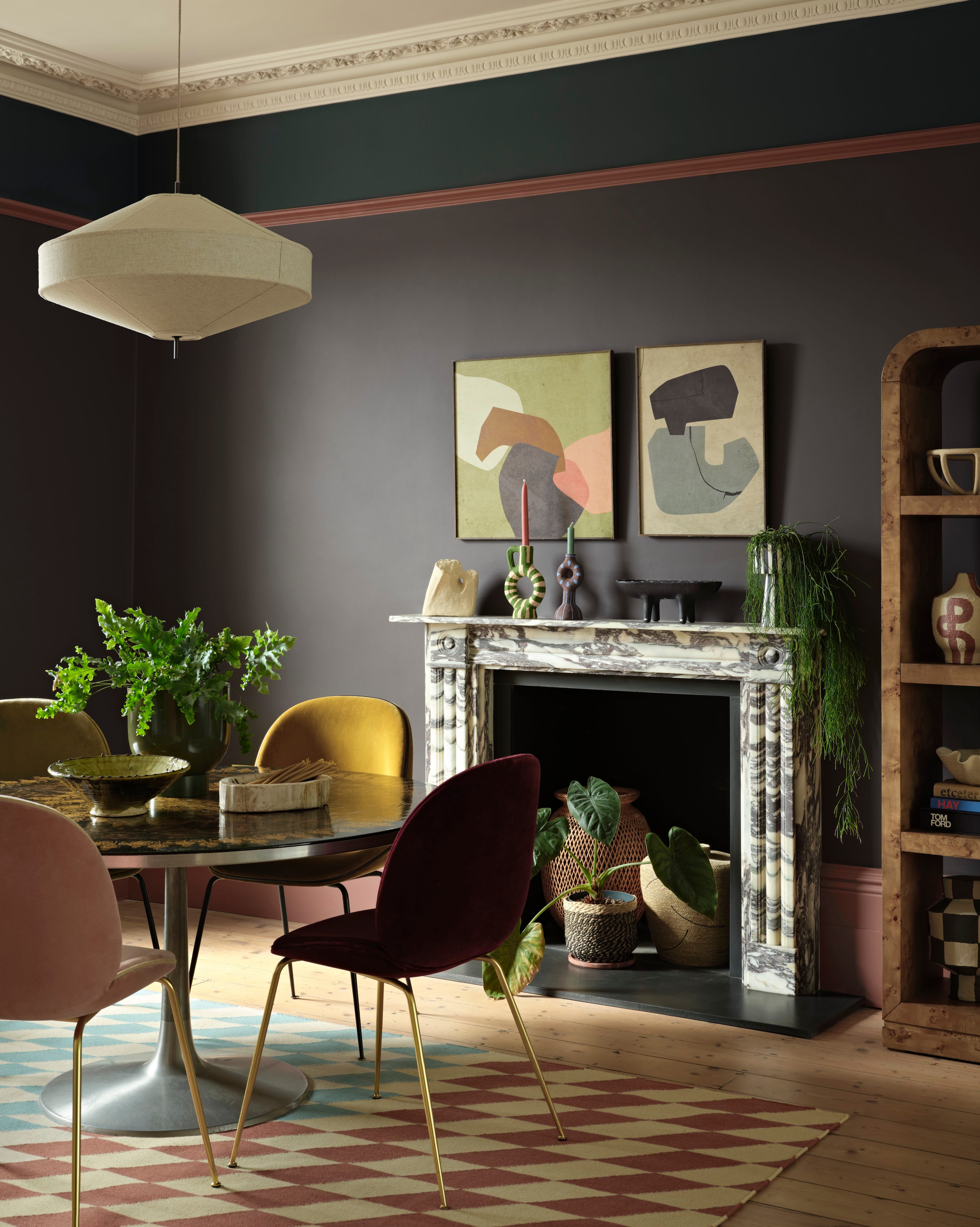
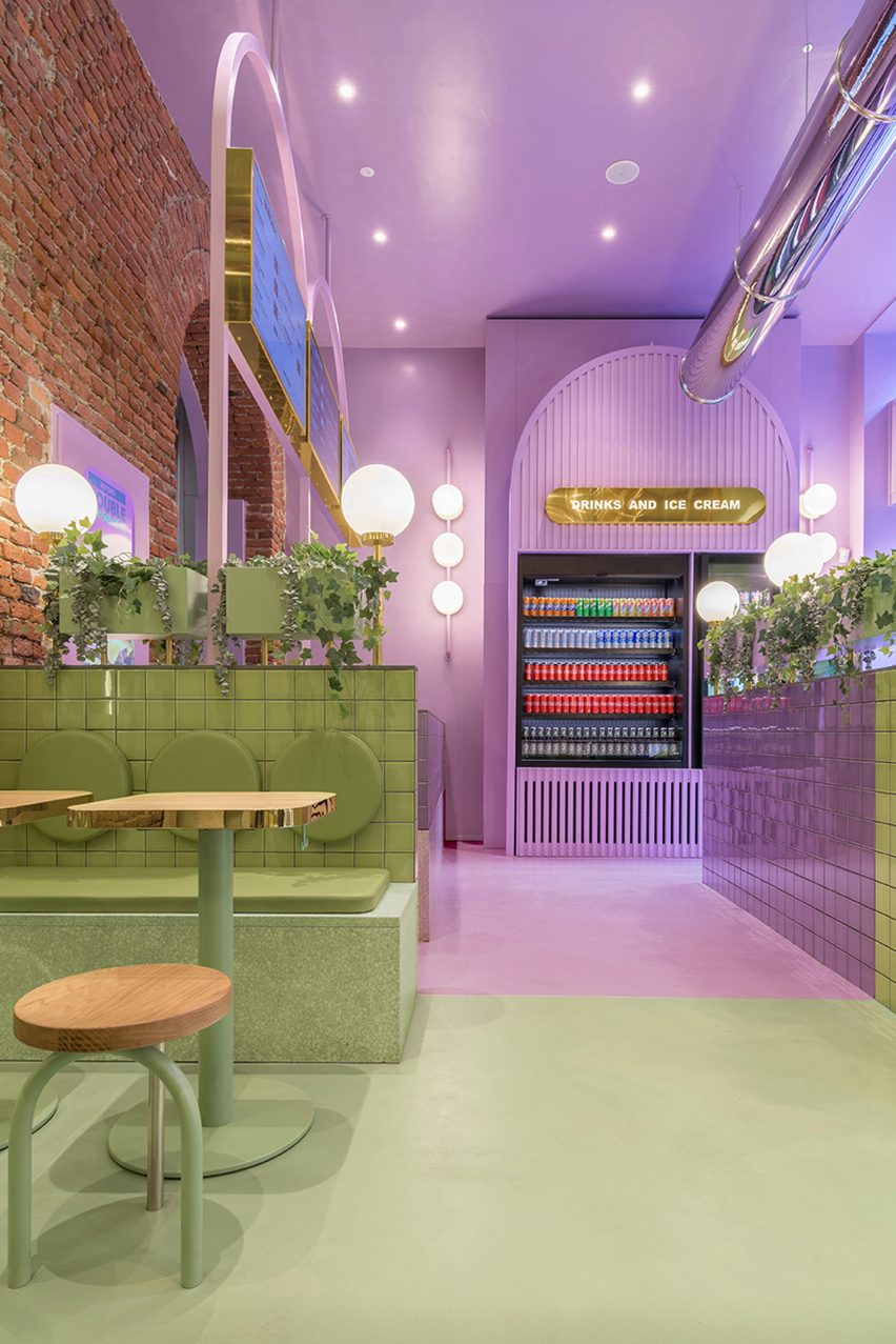
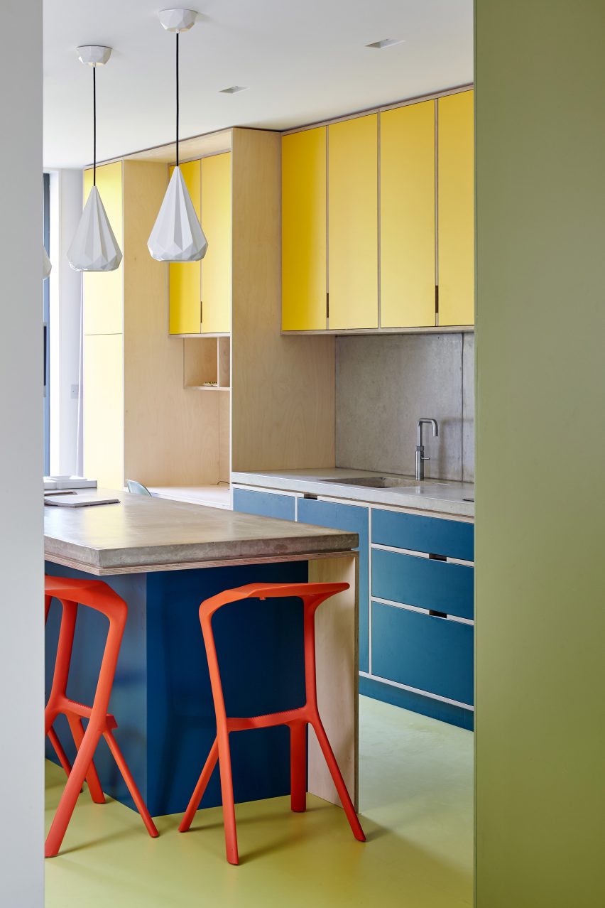
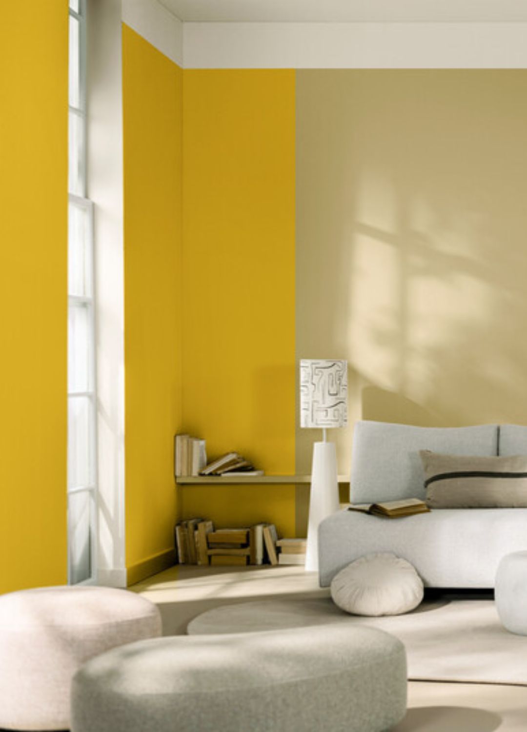
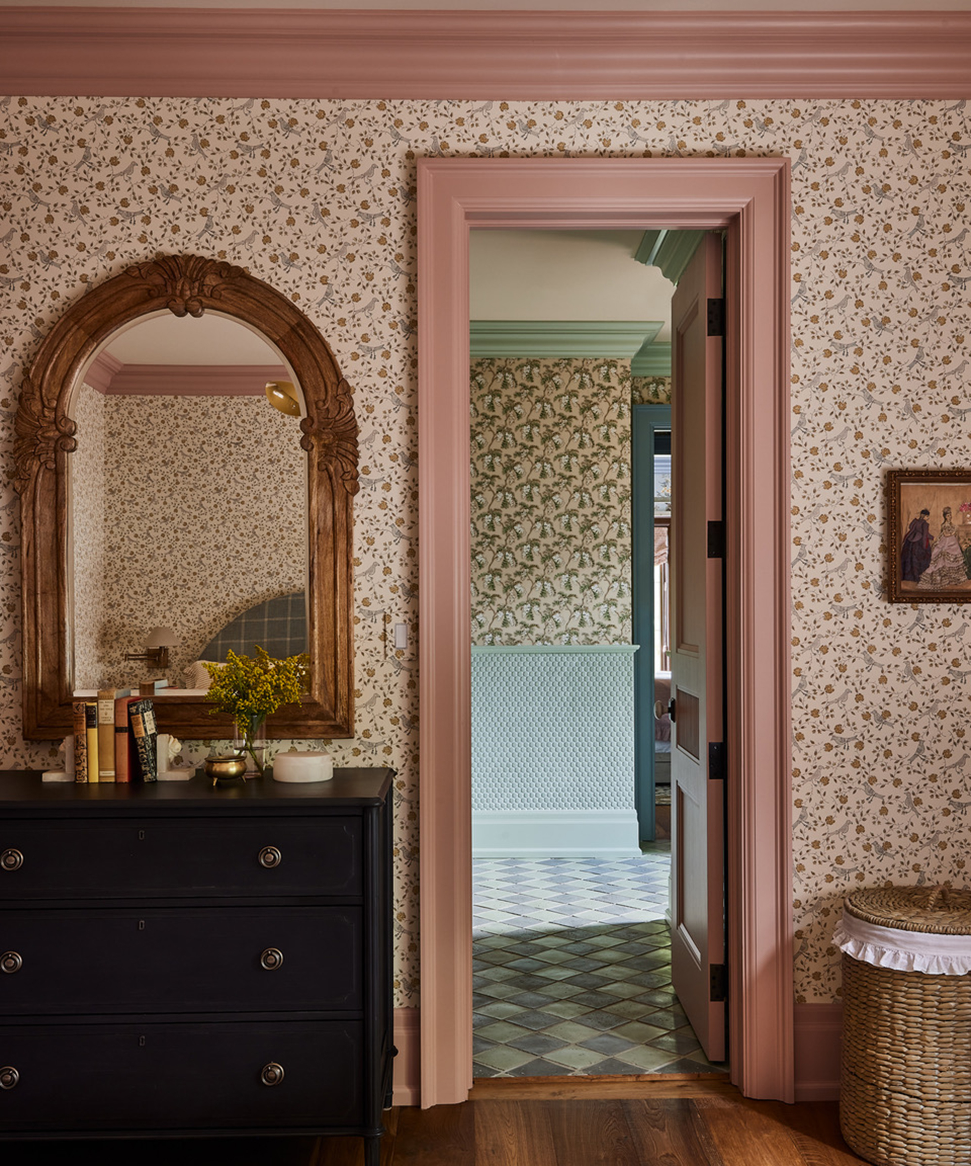
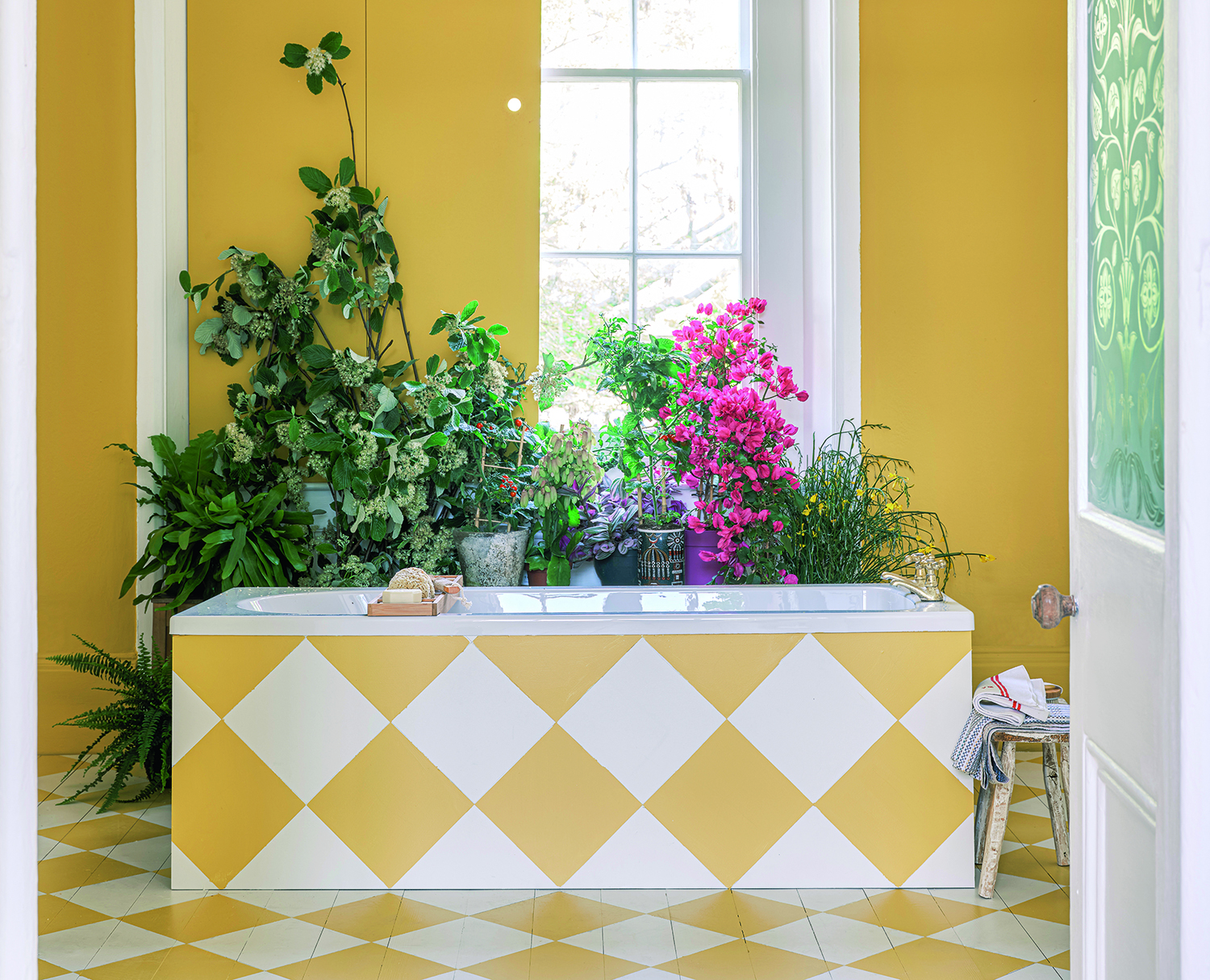
The conversation begins with Studholme noting a shift in consumer preferences, moving away from creating mere sanctuaries to embracing more fun and bold stylistic choices in their homes. She encourages a brave approach to color, highlighting the increasing popularity of patterns like checkerboards. Studholme suggests using checkerboard designs not only on floors but also extending them to bath surrounds for a cohesive and playful look. She elaborates on the practicality and cost-effectiveness of painted floors, describing them as easy to maintain and contributing to a relaxed, informal home atmosphere. For those considering a checkerboard floor, her advice includes starting with the lighter color first.
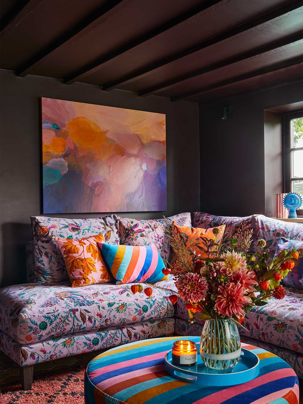
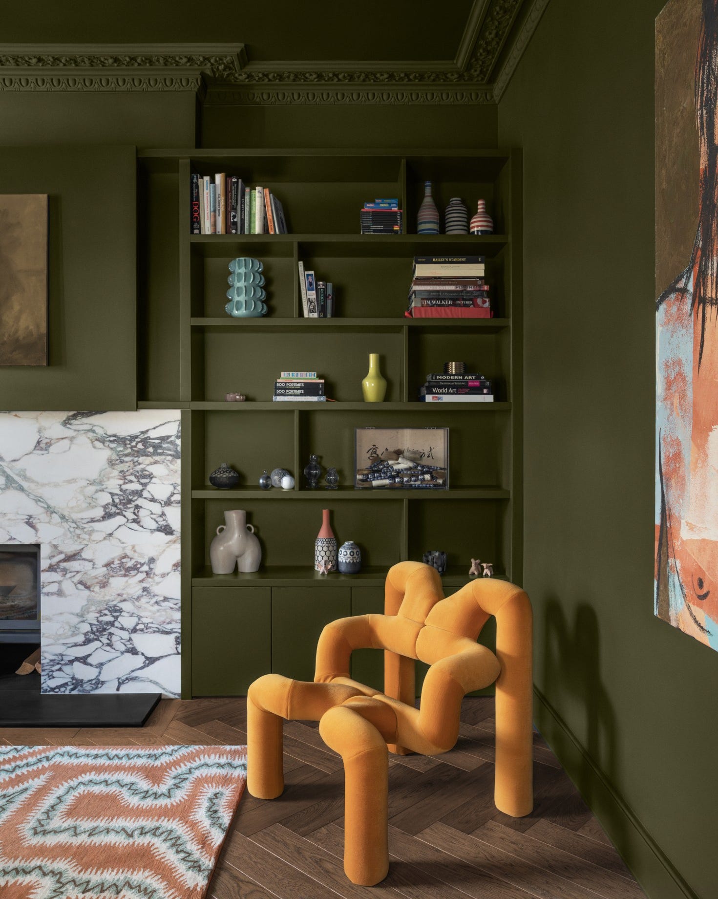
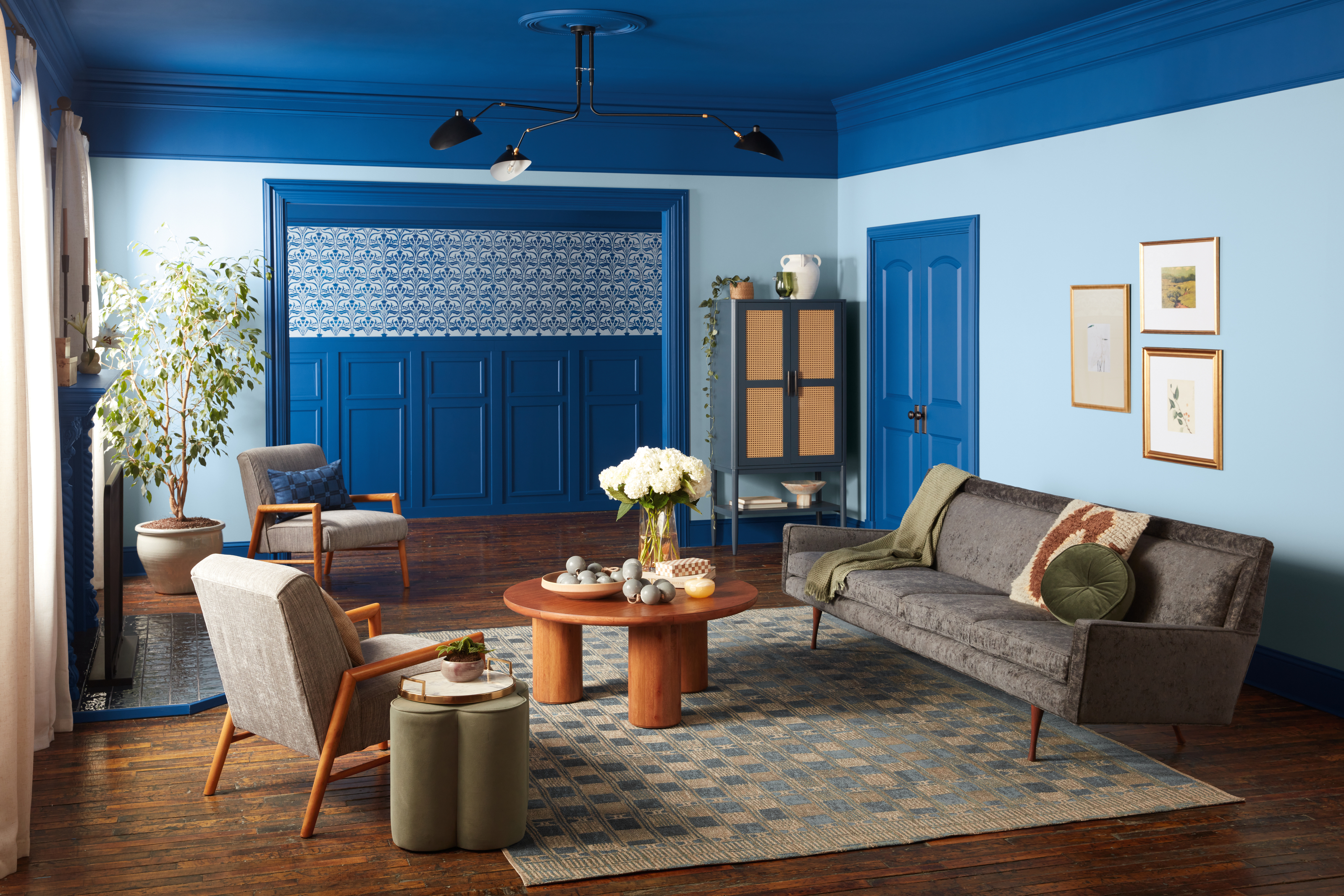
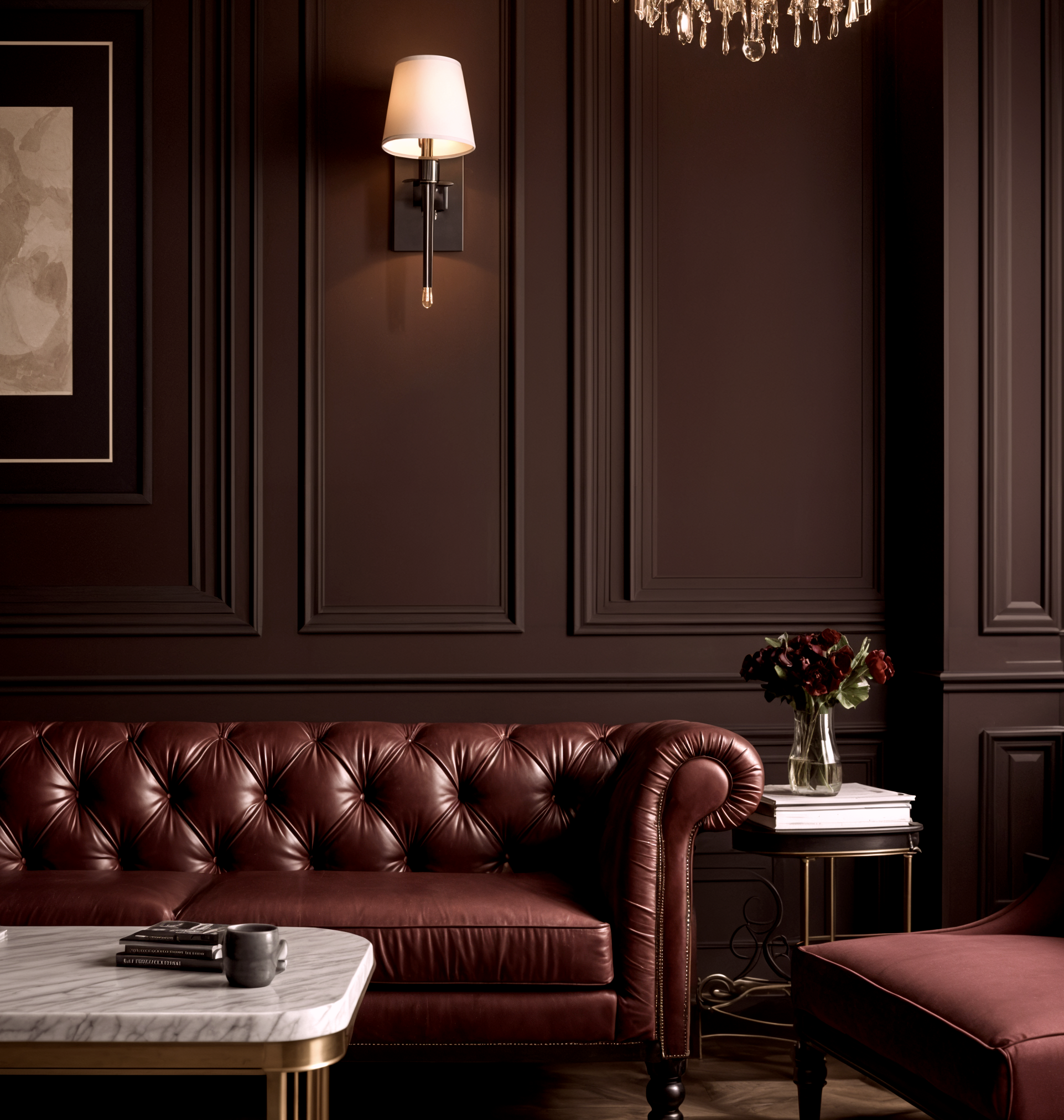
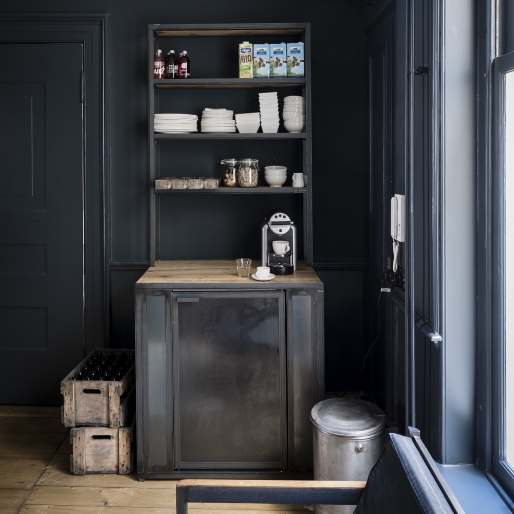
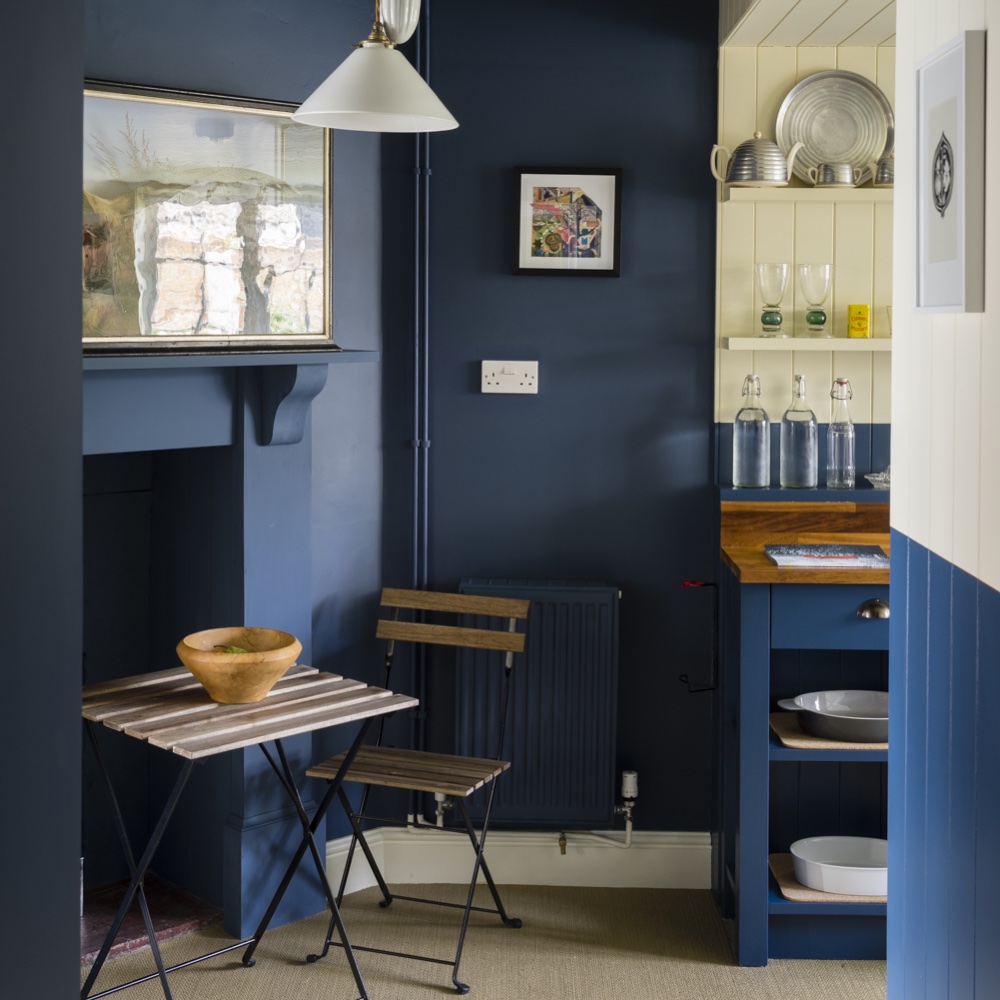
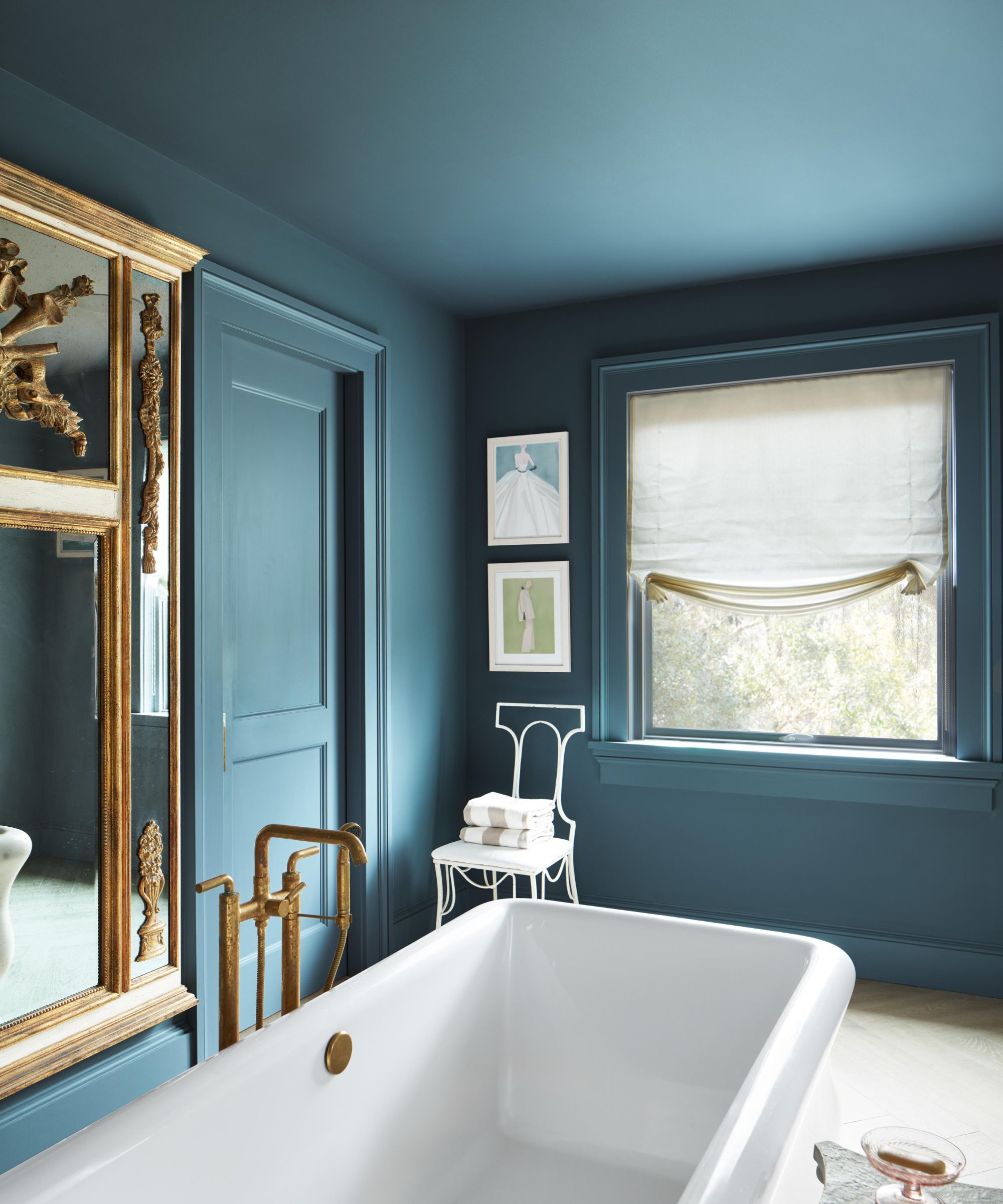
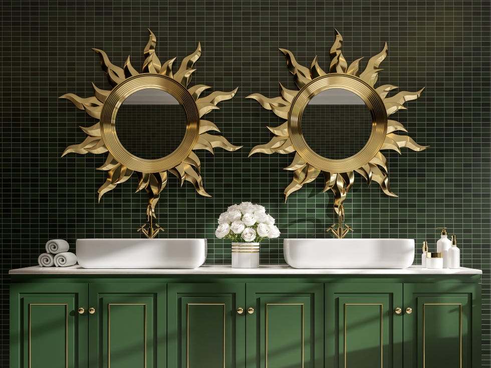
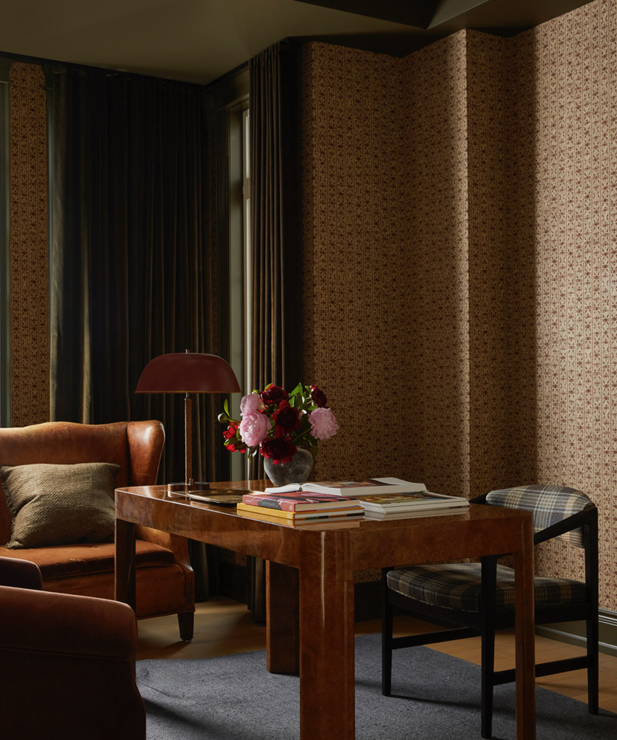
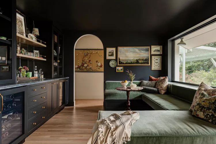

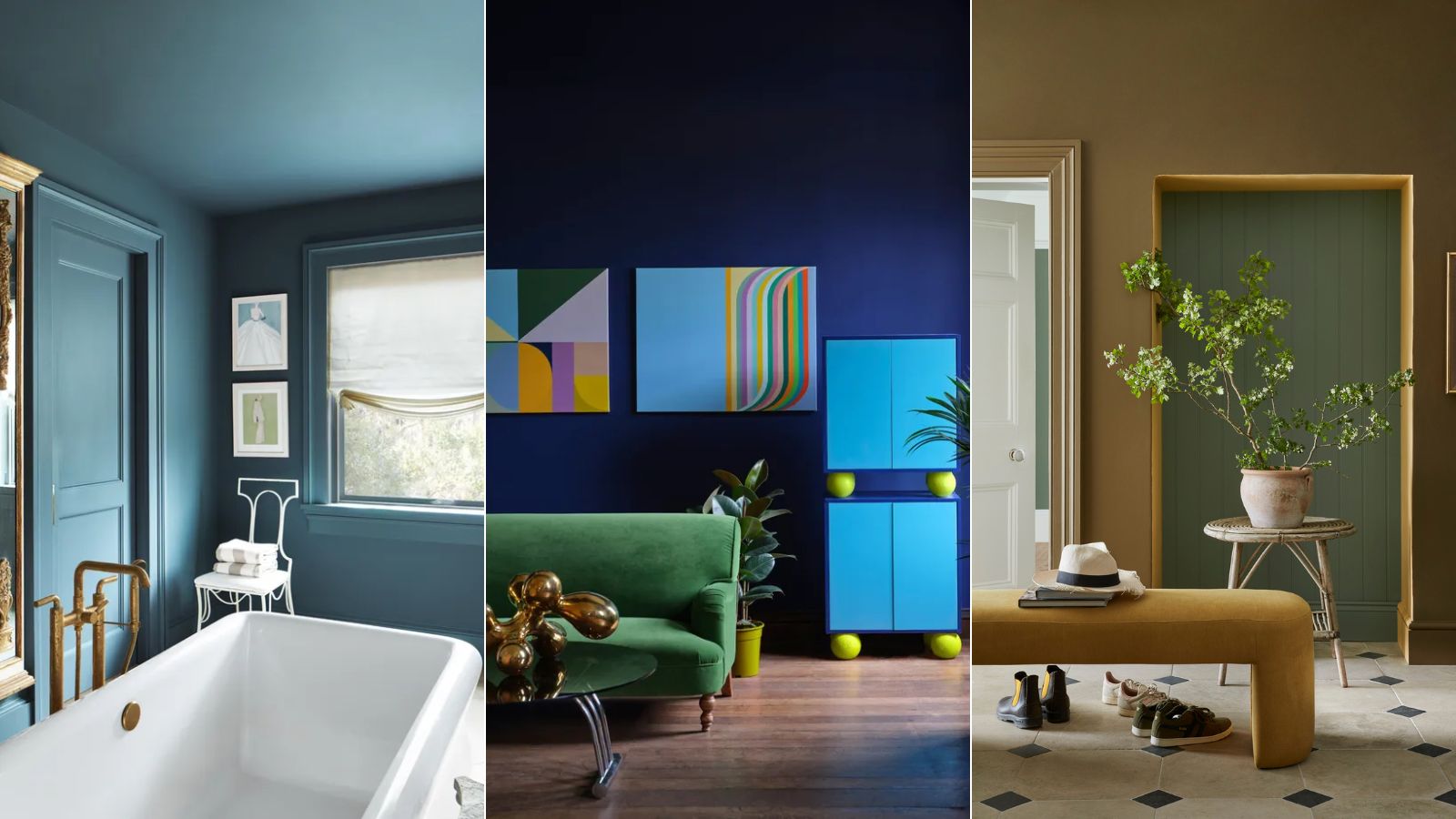
When discussing living room ideas, Studholme observes a trend towards sophisticated, cocktail lounge aesthetics. Her key recommendation for achieving this look is to embrace a gloss finish, which she believes adds immediate glamour to any space. She suggests painting both walls and ceilings in a bold, glossy shade like Stone Blue to create a dramatic and immersive effect.
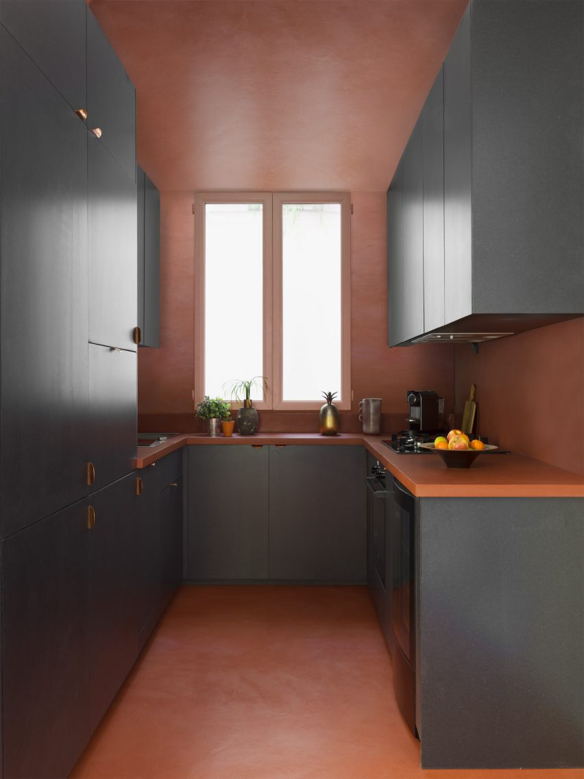
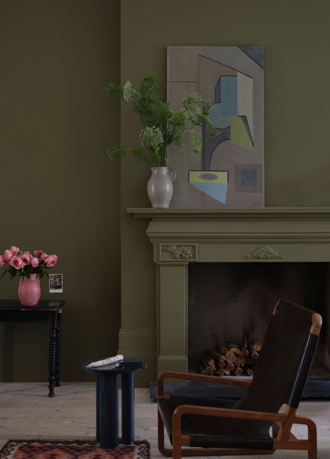
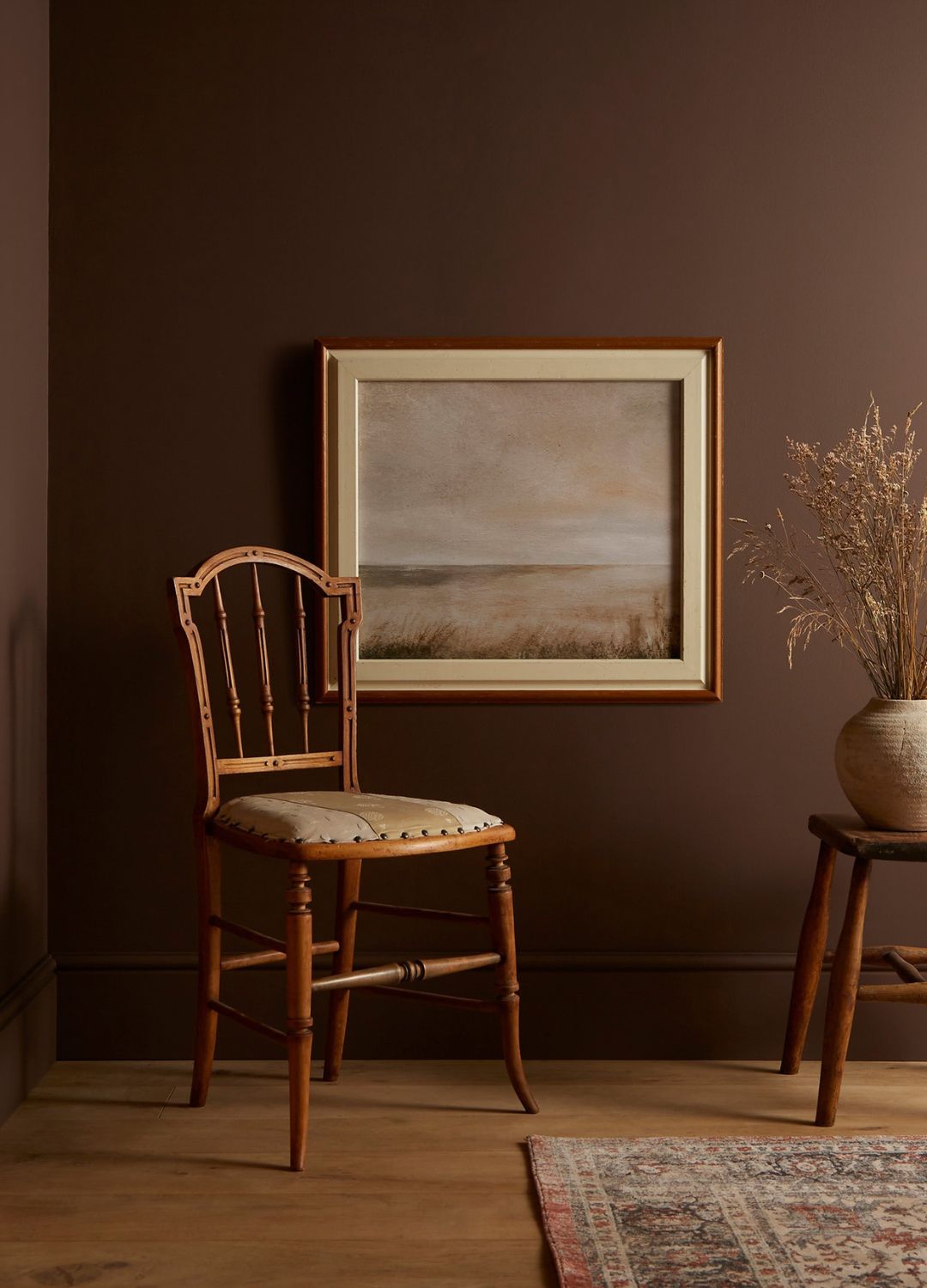
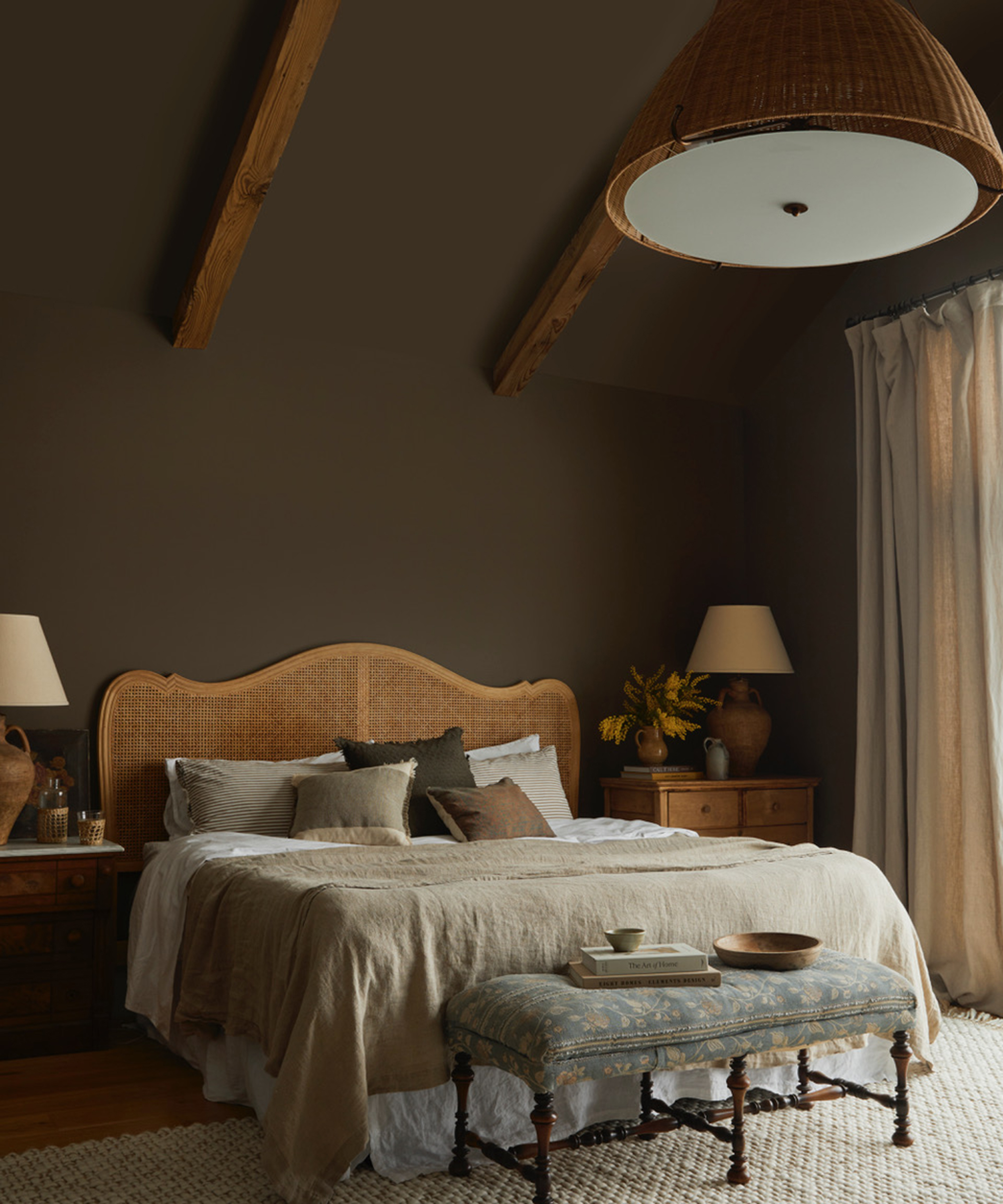
The interview also touches upon the strategic use of color on ceilings. Studholme explains that for rooms with lower ceilings, using the same color on both walls and ceilings can visually extend the height by blurring the boundary between them. Conversely, for taller spaces, she advises using different colors to highlight the height and architectural features. She shares a personal anecdote about the editor's dining room, where a color called Jitney was used, evoking a comforting retro vibe reminiscent of childhood memories. This leads to Studholme's philosophy that the best colors are often those that trigger happy memories, suggesting that personal connection can simplify the overwhelming process of choosing from numerous color charts.
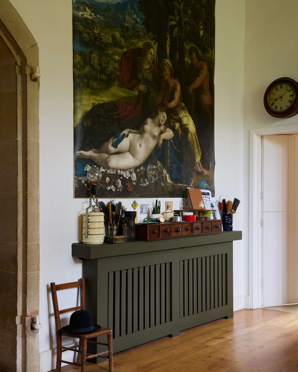
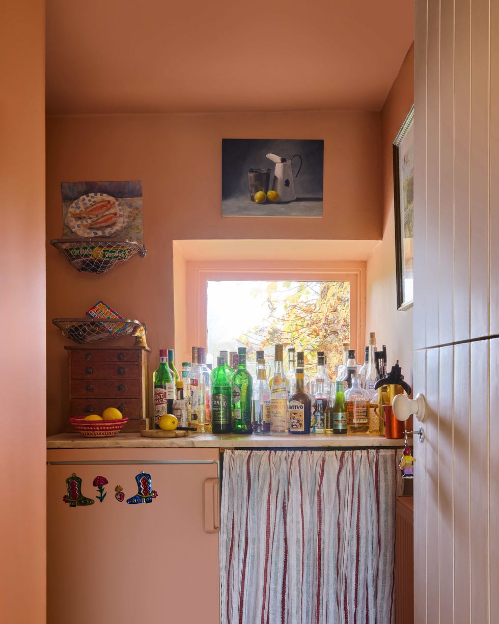
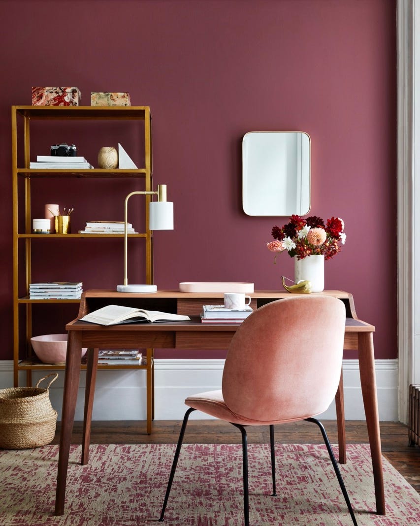
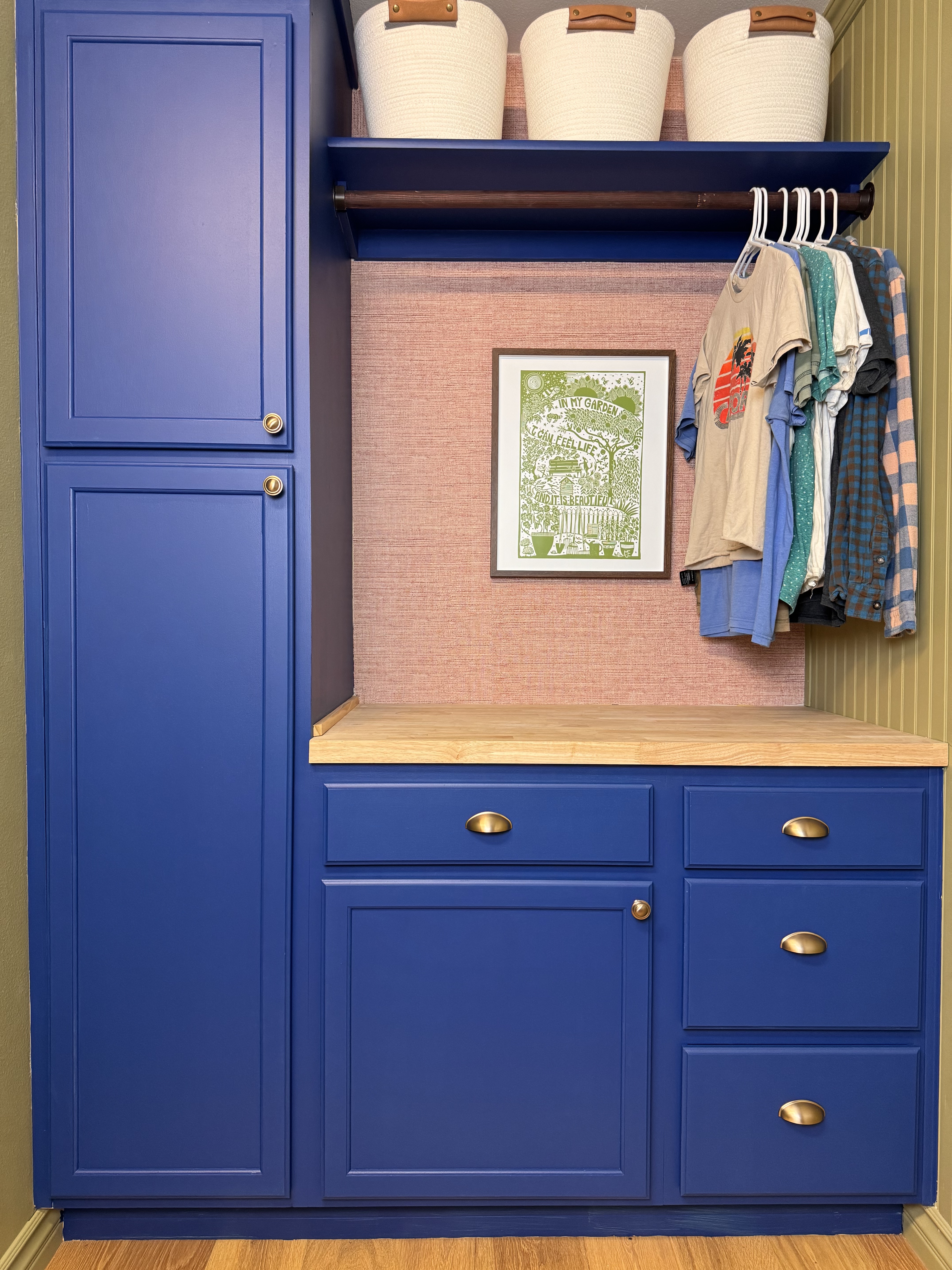
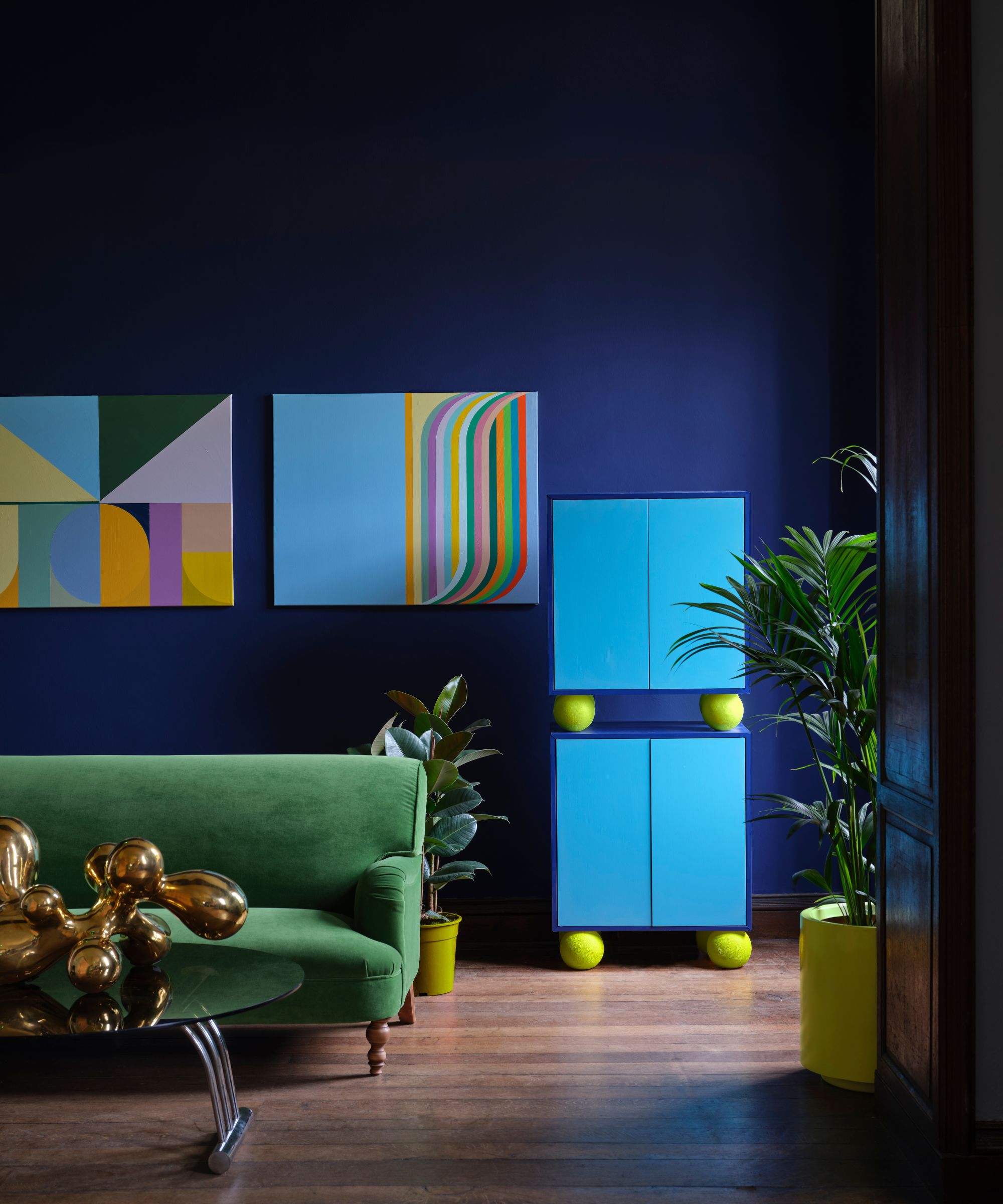
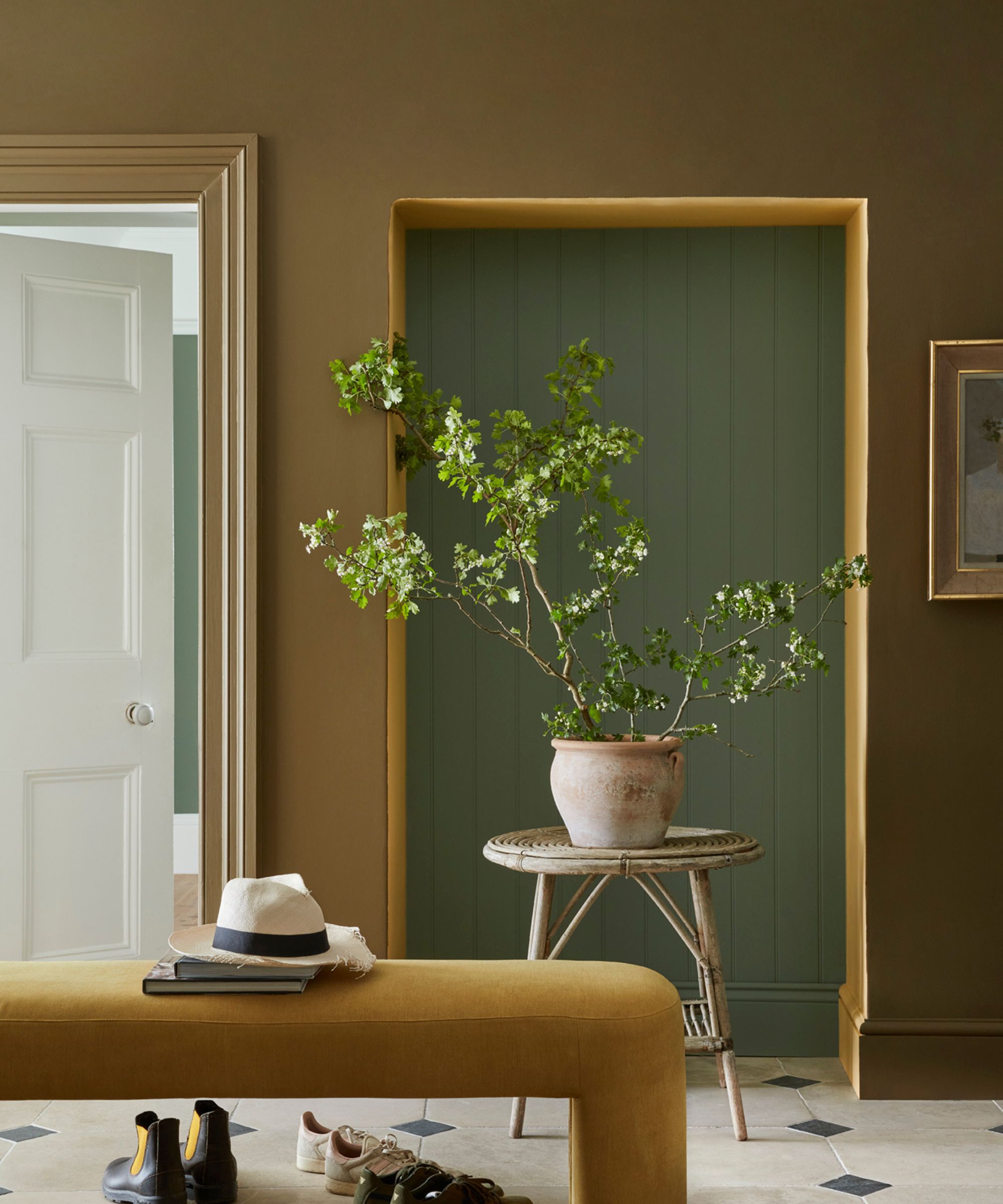
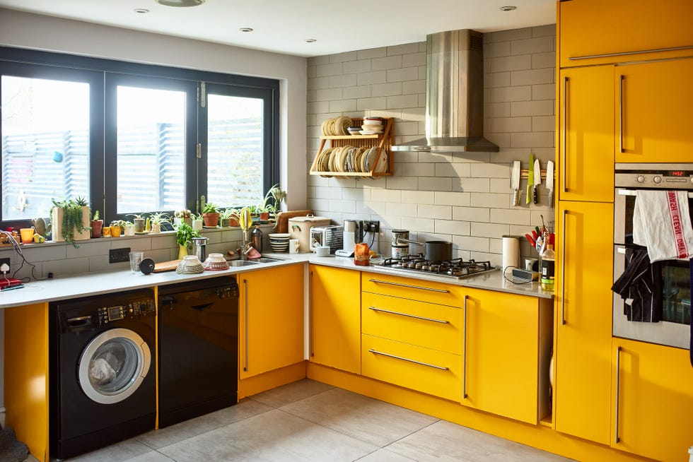
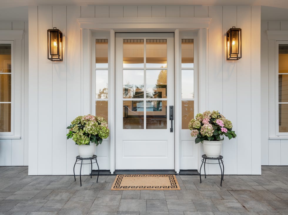
The discussion then shifts to selecting white paints, a task often perceived as challenging due to the vast array of options. Studholme reiterates her established guidance for choosing white: blueish whites for cool, urban settings; reddish whites for warmer urban spaces; green whites for cool country homes; and yellow whites for traditional country aesthetics. She also introduces a new collection of whites—School House White, Shaded White, Shadow White, and Dropcloth—all characterized by a stony base, designed to be universally flattering and easy to use without the risk of misapplication. She concludes by expressing her current fondness for incorporating bold 'hits' of color, such as red doors or using fiery orange shades like Harissa for radiators and window reveals, to inject personality into homes, contrasting with the neutral grey palettes prevalent in the past. This emphasis on bold details underscores the broader theme of confident and expressive color use in modern interior design.
#FarrowAndBall #ColorTrends #InteriorDesign #HomeDecor #JoaStudholme #PaintedFloors #GlossFinish #CeilingColors #WhitePaint #FarrowAndBall #ColorTrends #InteriorDesign #HomeDecor #JoaStudholme #PaintedFloors #GlossFinish #CeilingColors #WhitePaint
0 comment in total
 No comments yet
You may also like
8 Kitchen Trends Designers Predict Will Be Everywhere in 2025

Peek inside the vibrant dream home of Farrow & Ball's colour curator

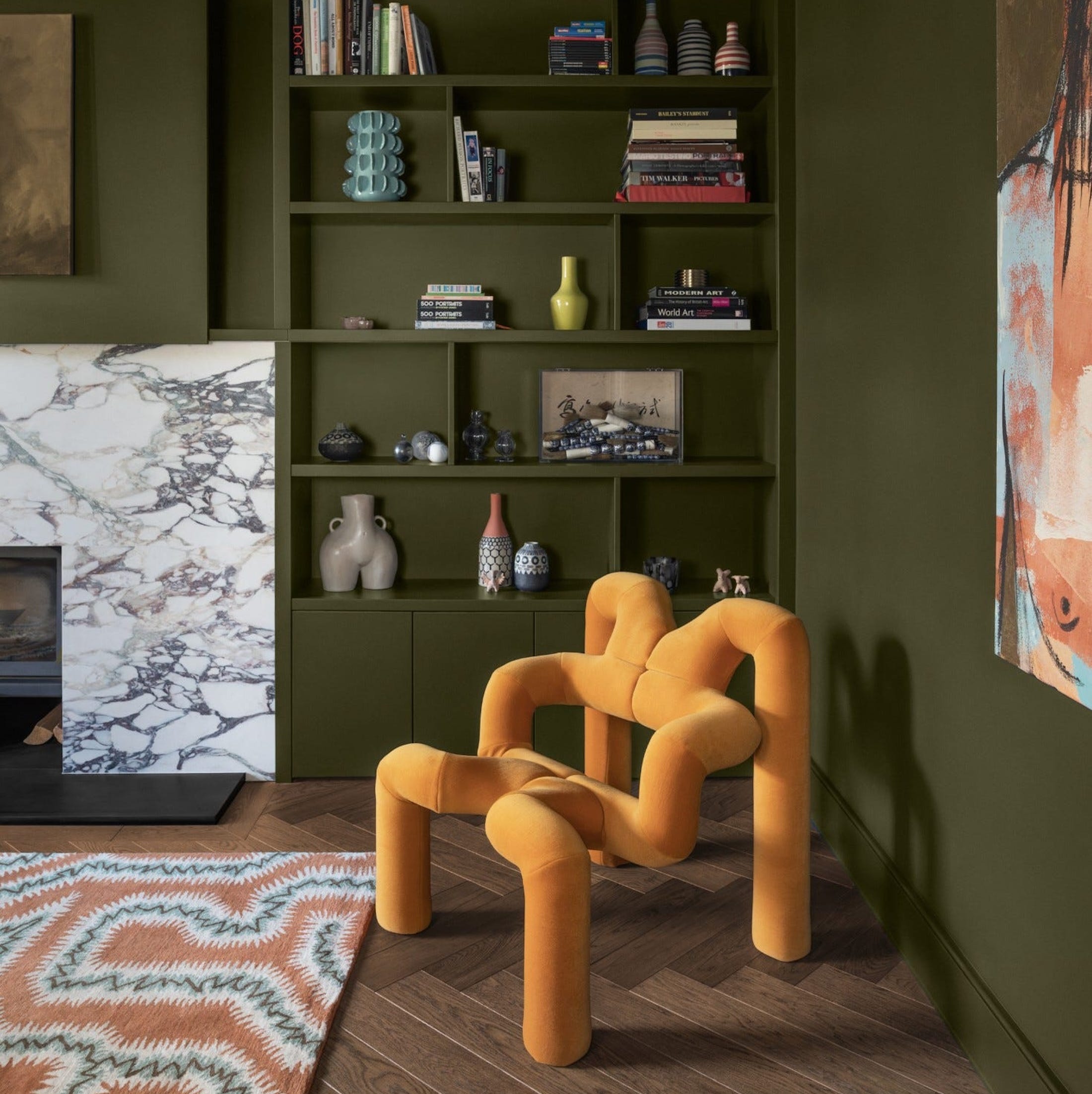
What is Color Forecasting? Experts Explain How to Map Trends |
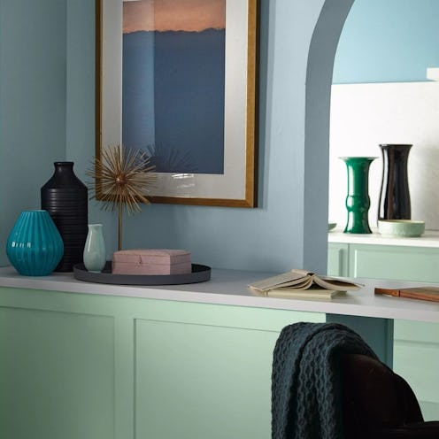
This Serene Paint Trend Is Set To Take Over In 2022
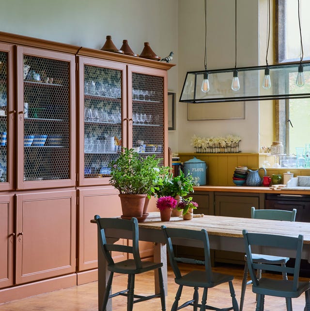
The Woman Behind Farrow & Ball’s Most Iconic Colors Has a New Favorite for 2025
What Paint Colours will Rule 2026? The Experts Make Their Predictions

Home Trends

Interior paint colour trends 2025: 10 hues you'll be seeing everywhere this year

From Quiet Luxury to the Sad Beige Baby, When Will ‘Beigification’ End?

Ever Wonder How a Color of the Year Is Selected? Experts Spill the Secrets
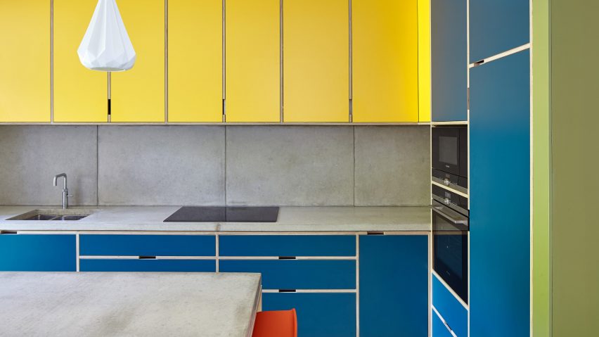
Ten bright and bold interiors that make use of colour theory
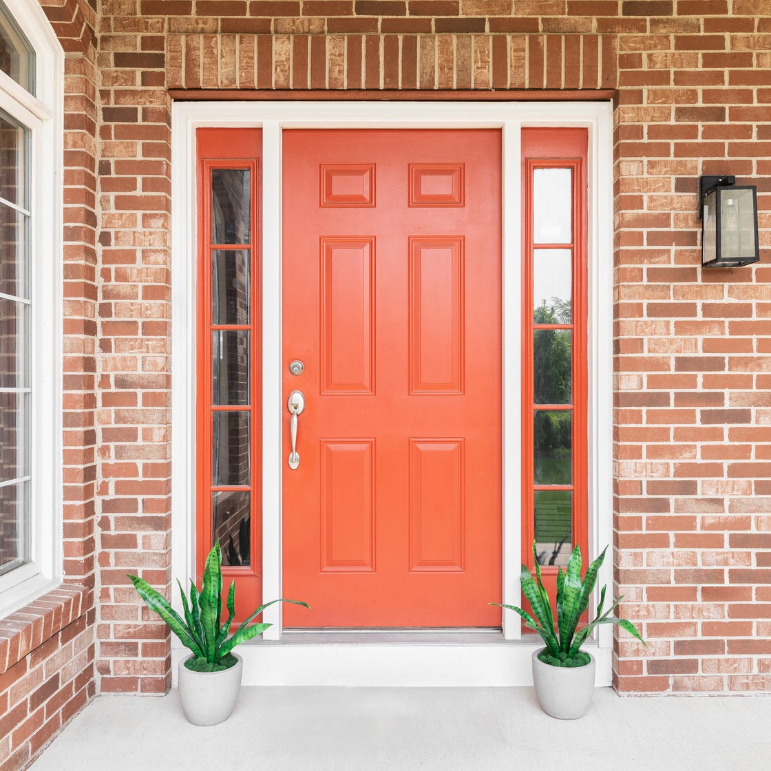
8 Surprising Colors That Will Decrease Your Home's Value, According to Experts

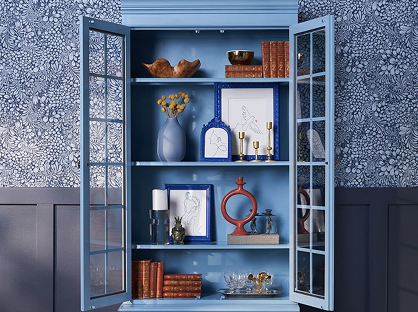
Here's Every 2024 Color of the Year We Know So Far
These Paint Colors Will Dominate Our Homes in 2022

The top 54 paint colours of the decade – all the shades we couldn't live without
As a designer, I can tell you: this one simple change can transform any home’s decor
Colour experts share their top paint trends for 2024

10 Horrifying Home Design Trends: 2024 Edition
I asked 3 interior designers for their must-try paint colors in 2025 – they are all the perfect 'in-between' shades

Want to Sell Your Home for More? Don't Skip This Color Trend Buyers Want to See in Every Listing