1/11
The best colour for ceilings as recommended by interior designers and colour specialists
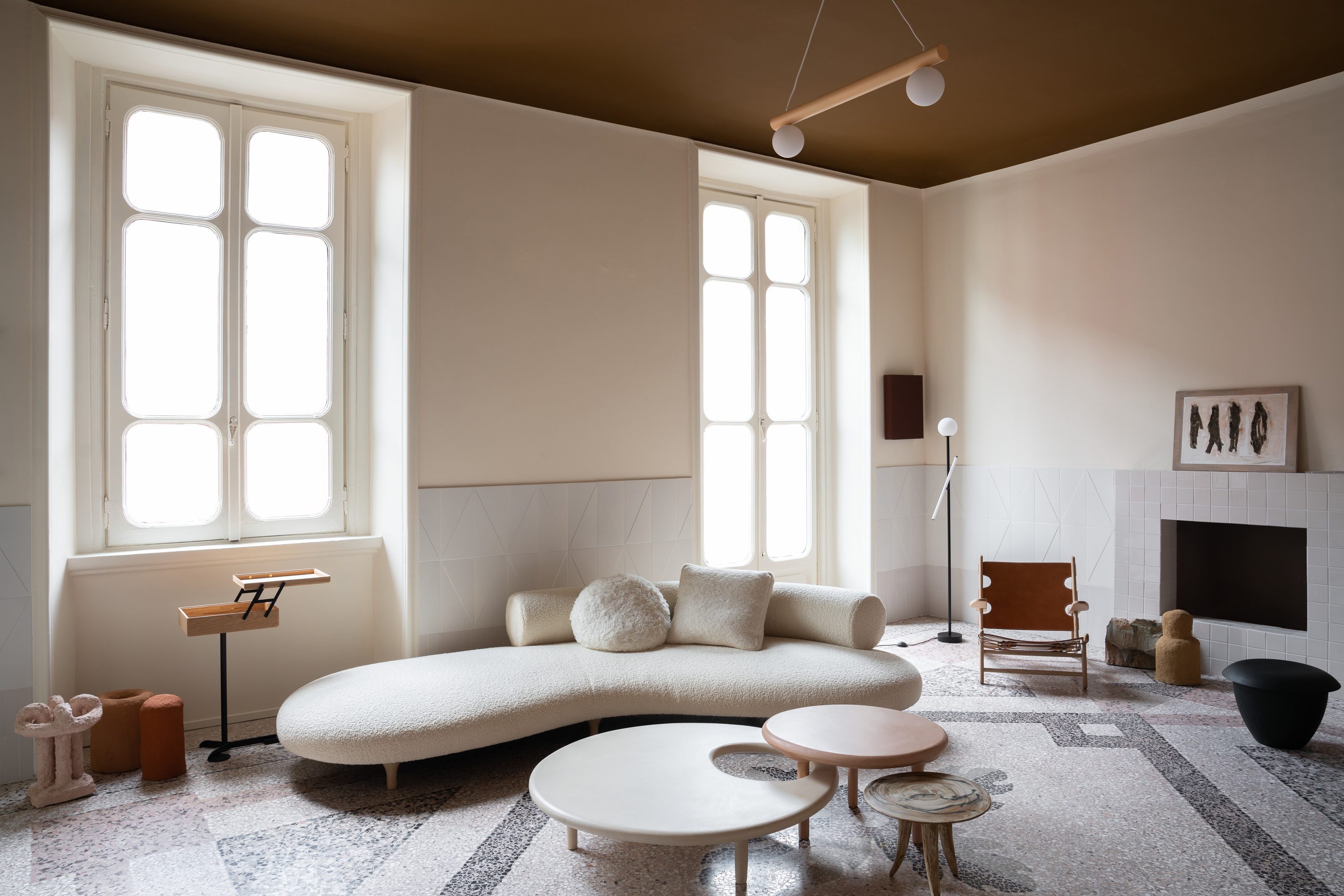
The article discusses the best colors for ceilings, moving beyond the traditional white, and offers insights from interior designers and color specialists. It highlights that the choice of ceiling color can profoundly affect a room's atmosphere and should harmonize with the overall design scheme, including wall colors and natural materials. Ruth Mottershead, creative director at Little Greene, emphasizes integrating ceiling color into the design for a significant impact. Betsy Smith, a color consultant at Graphenstone, notes that ceiling color reflects onto walls and floors, influencing the colored light in the space, and suggests drawing inspiration from surroundings or complementary materials.
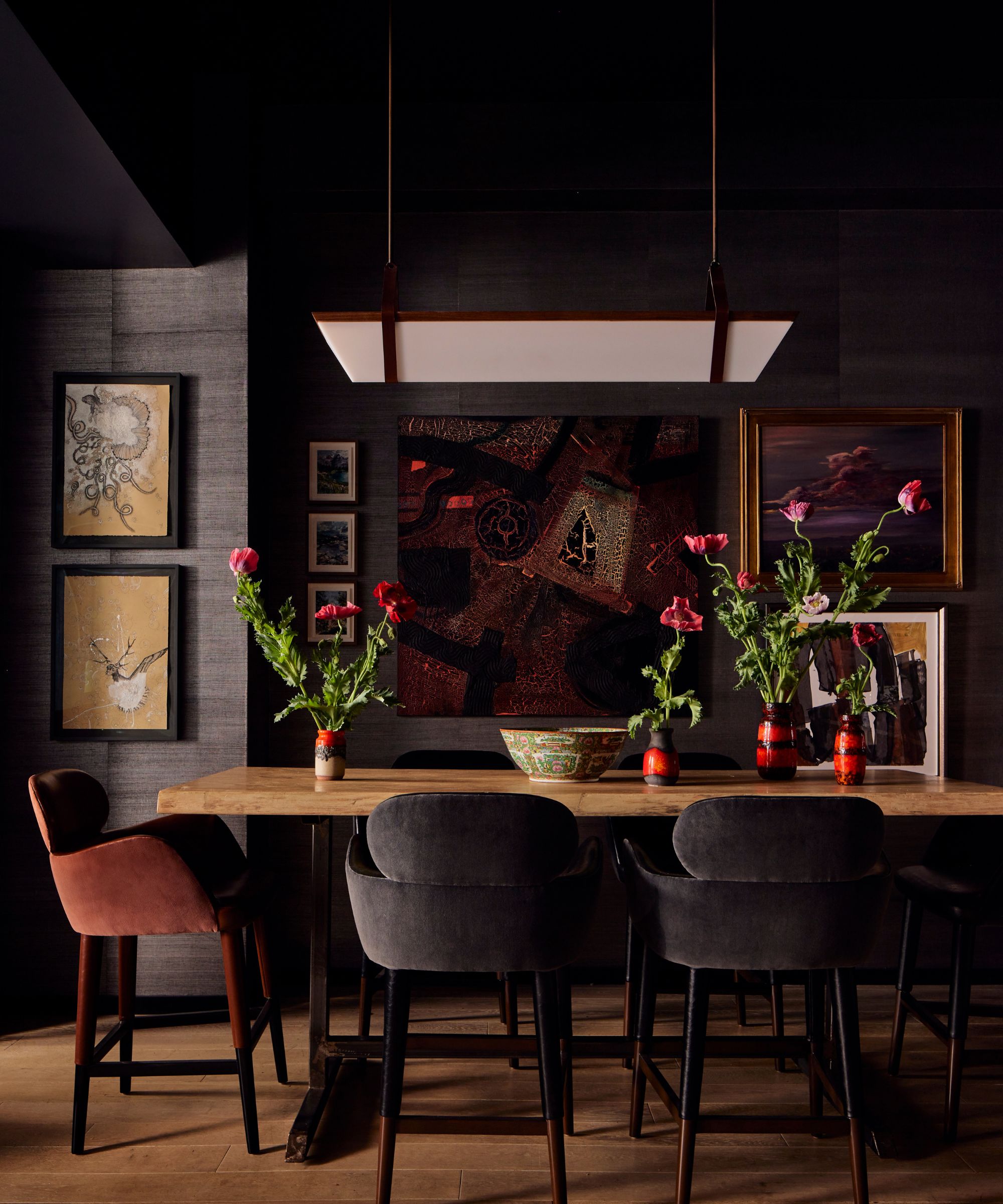
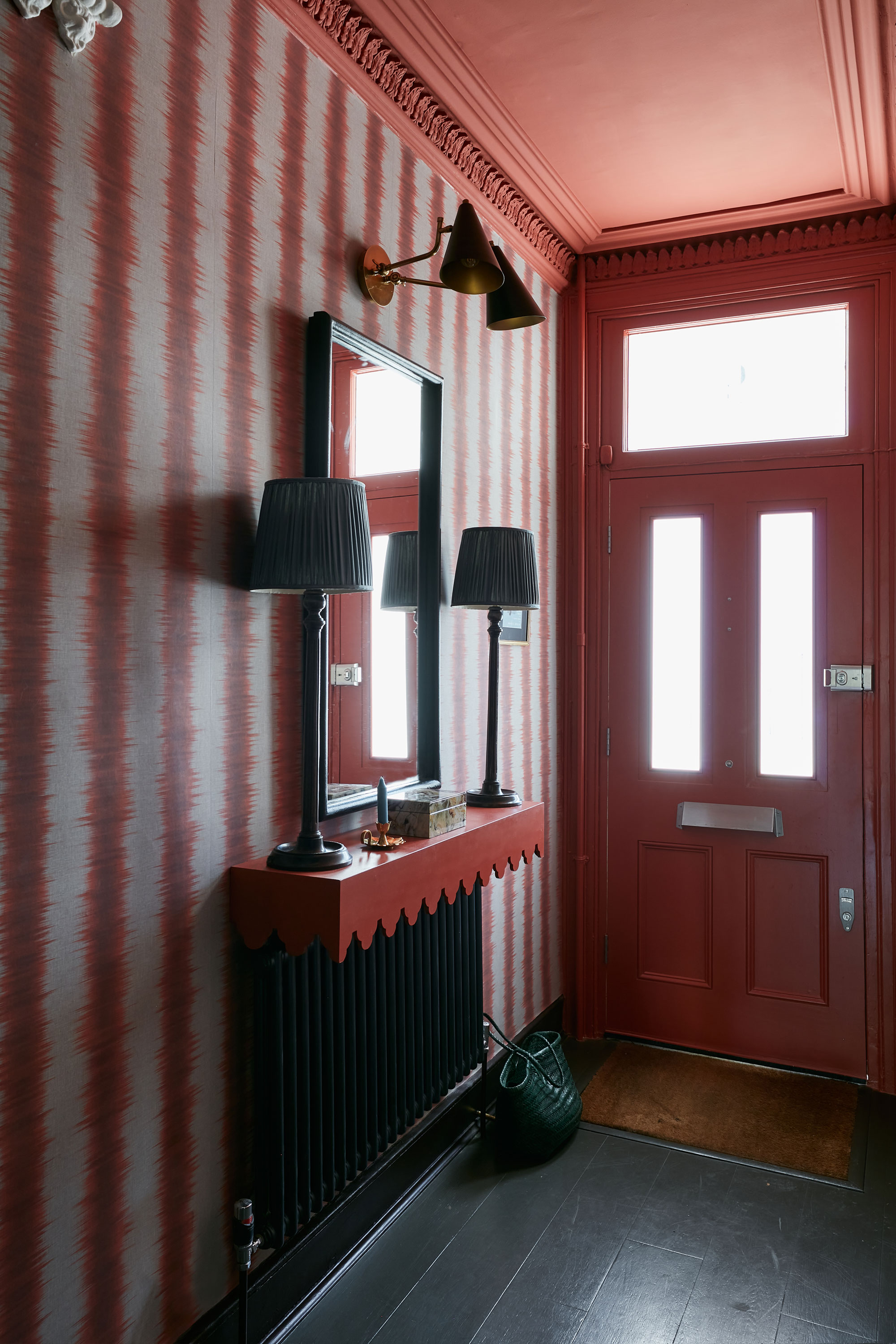
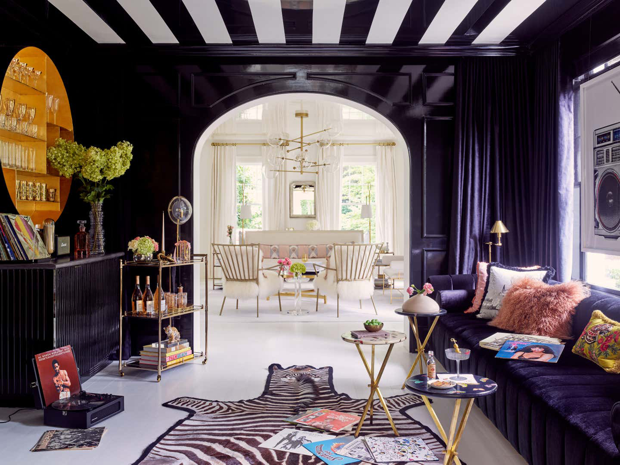
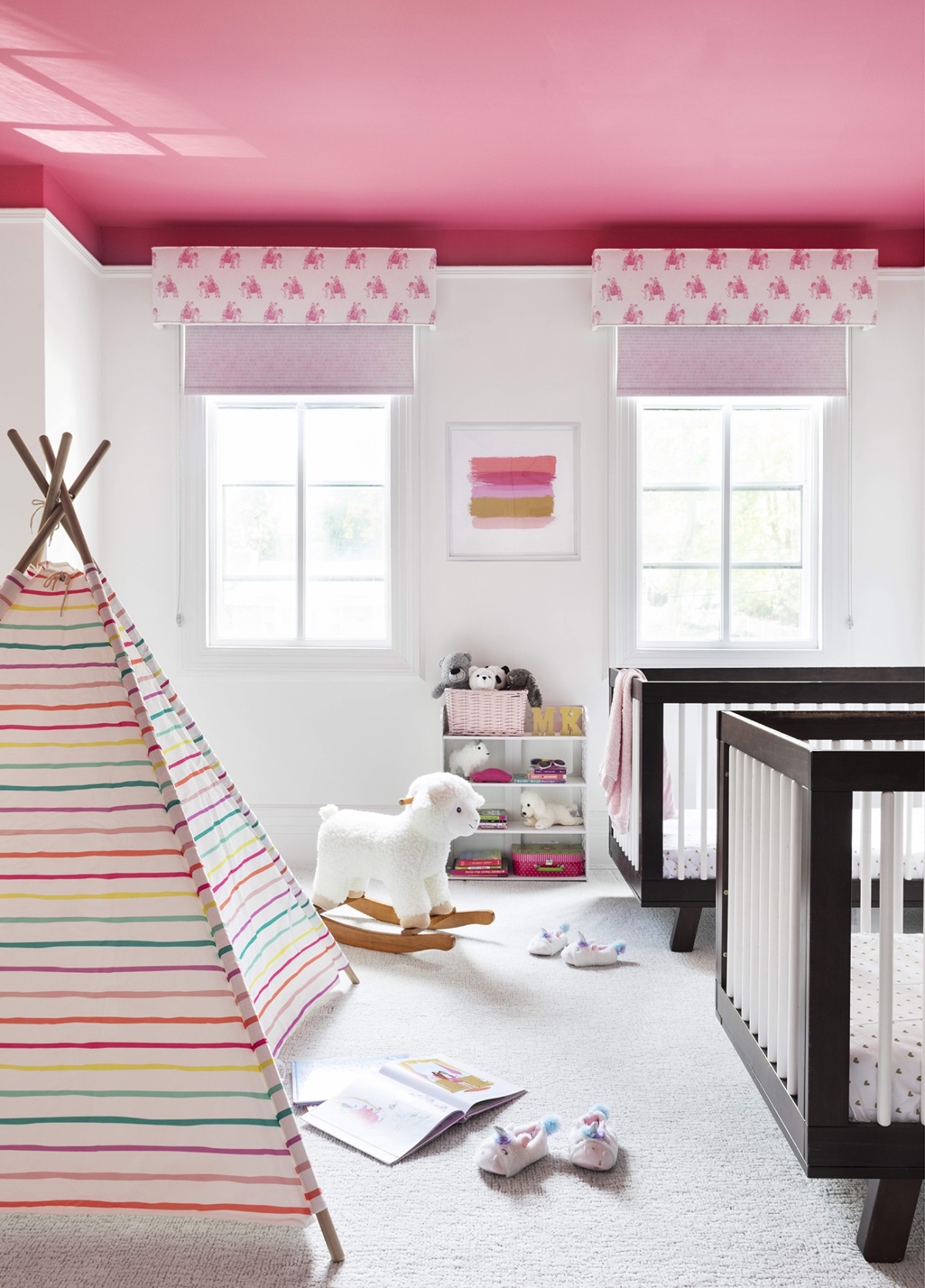
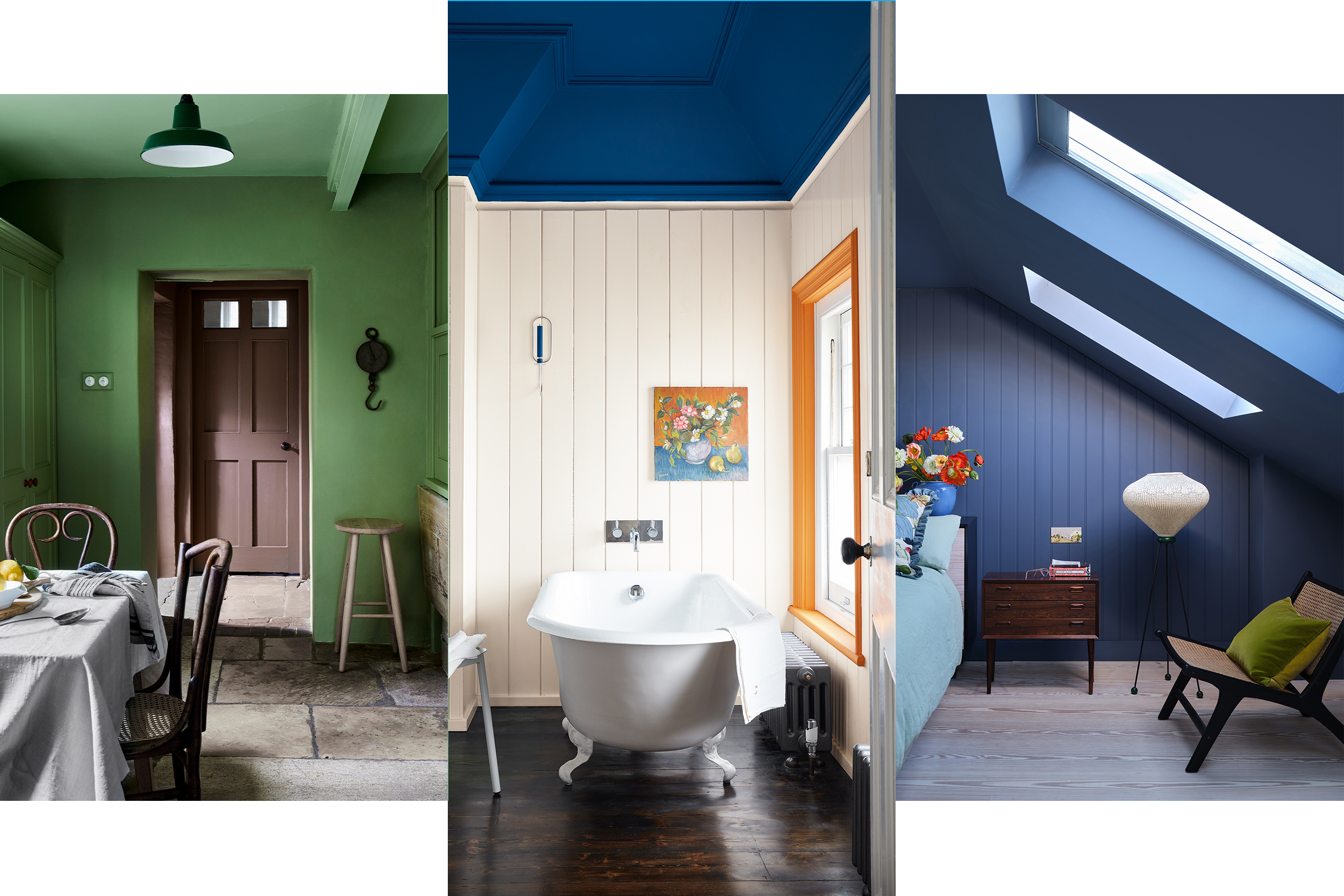
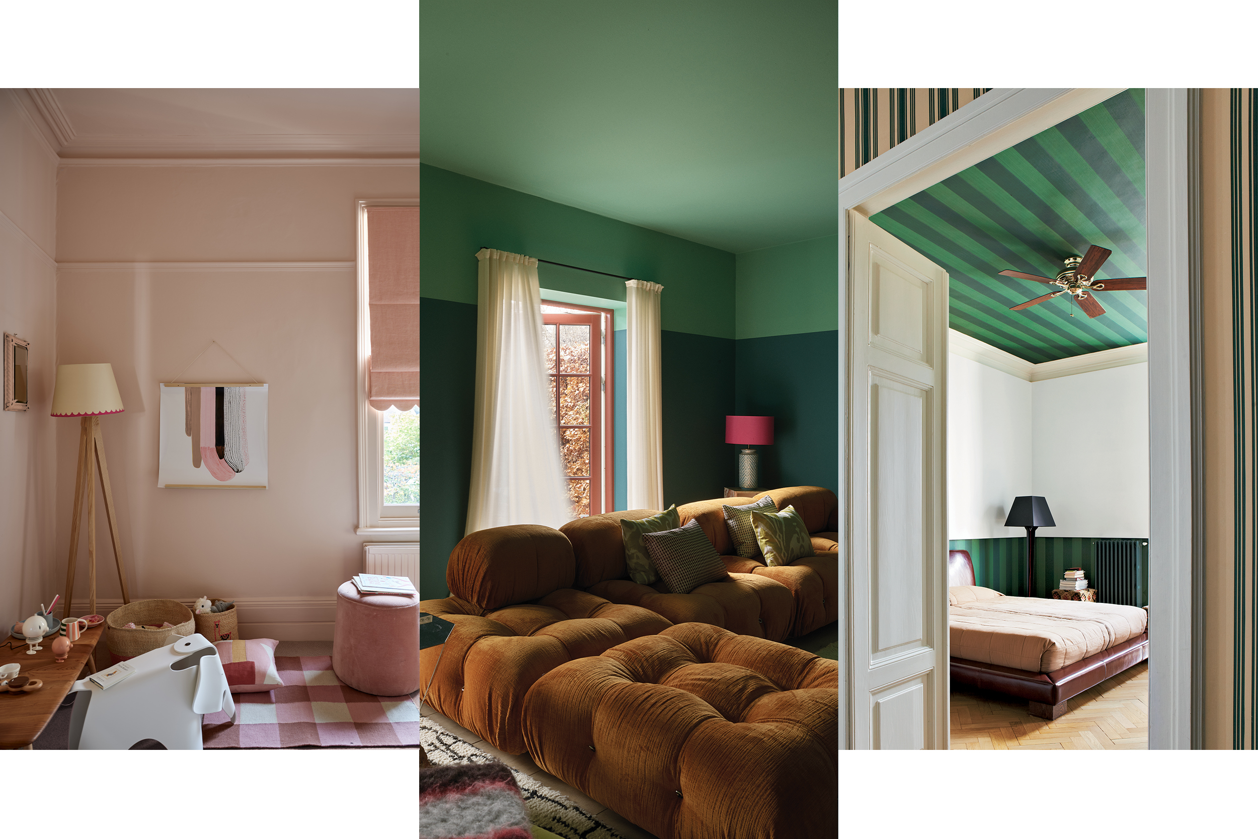
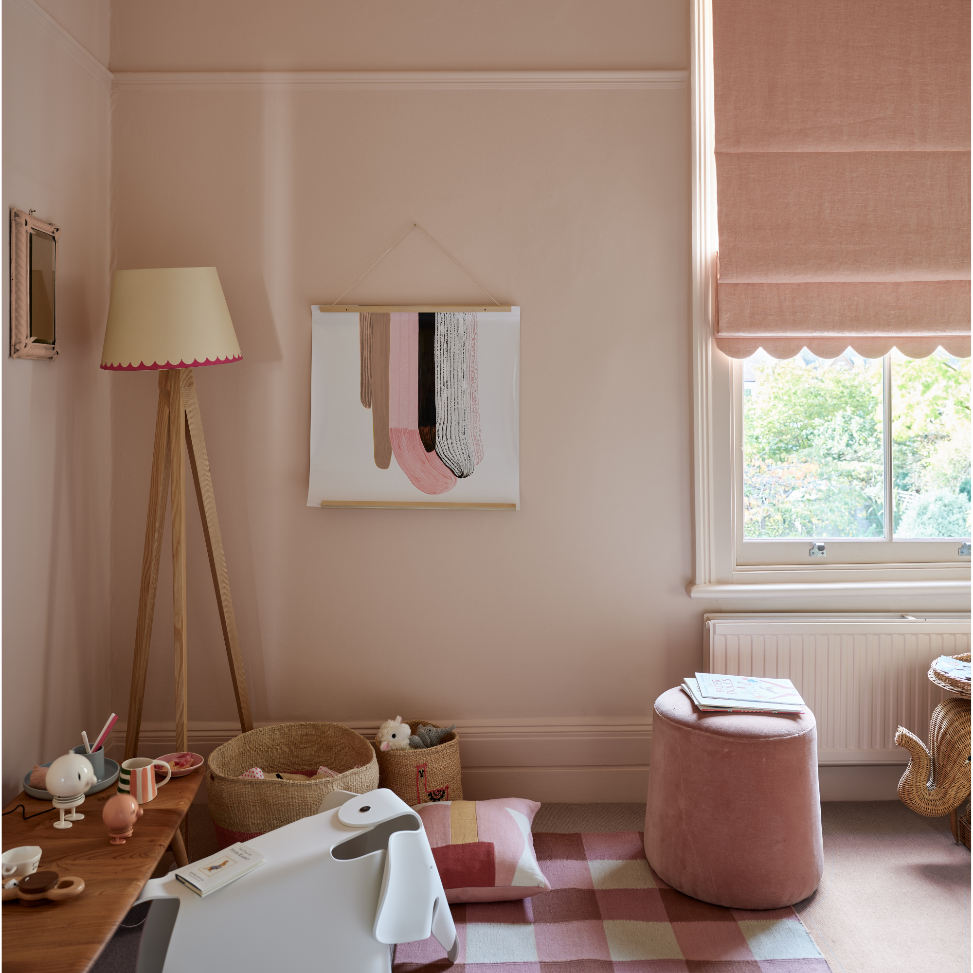
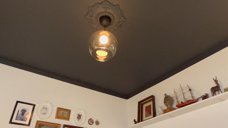
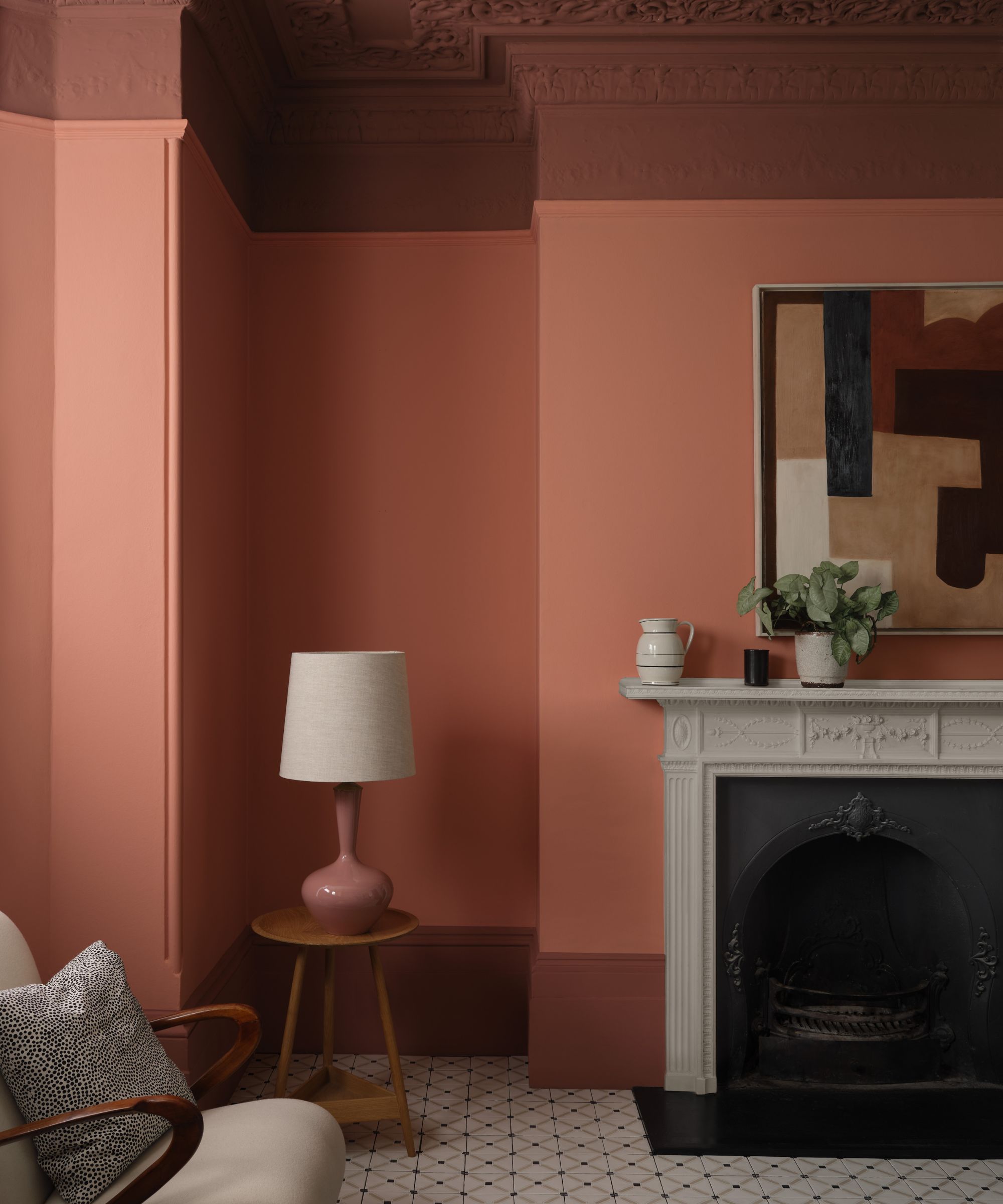
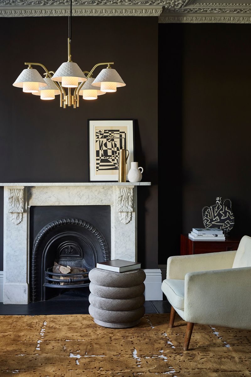
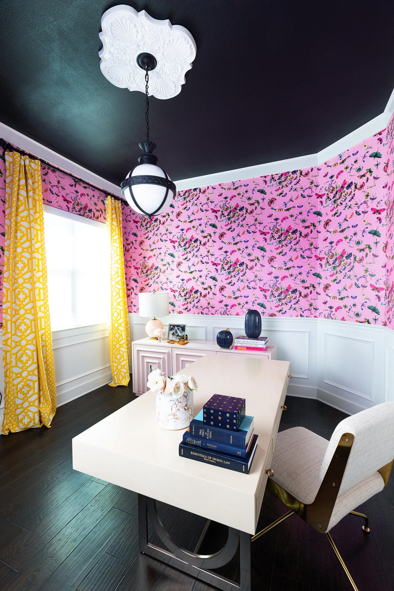
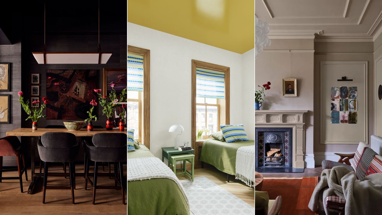
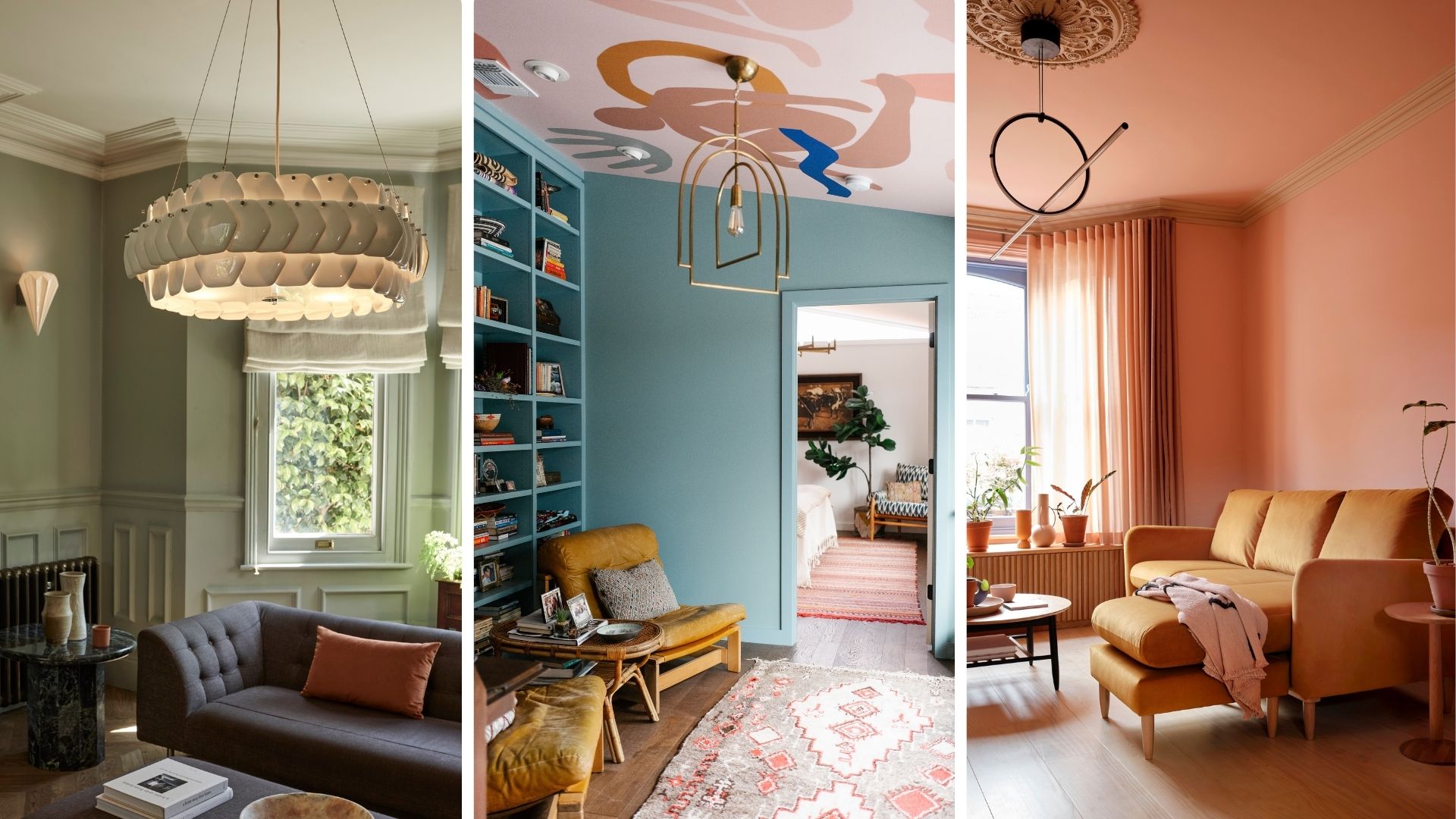
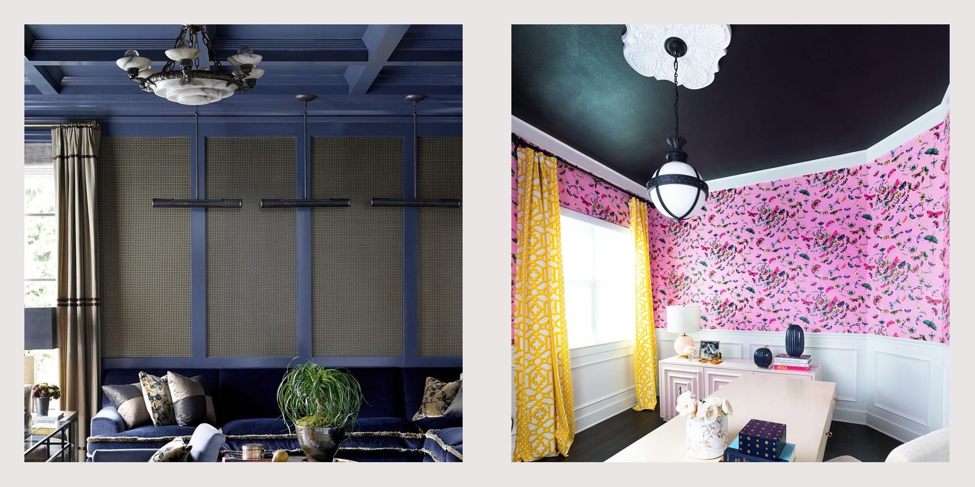
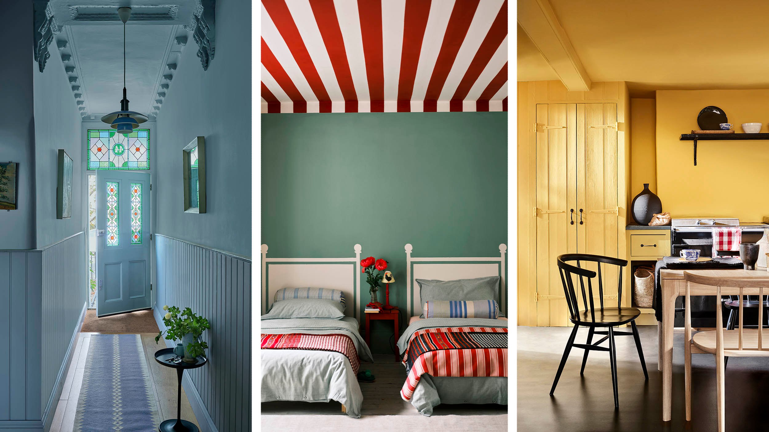
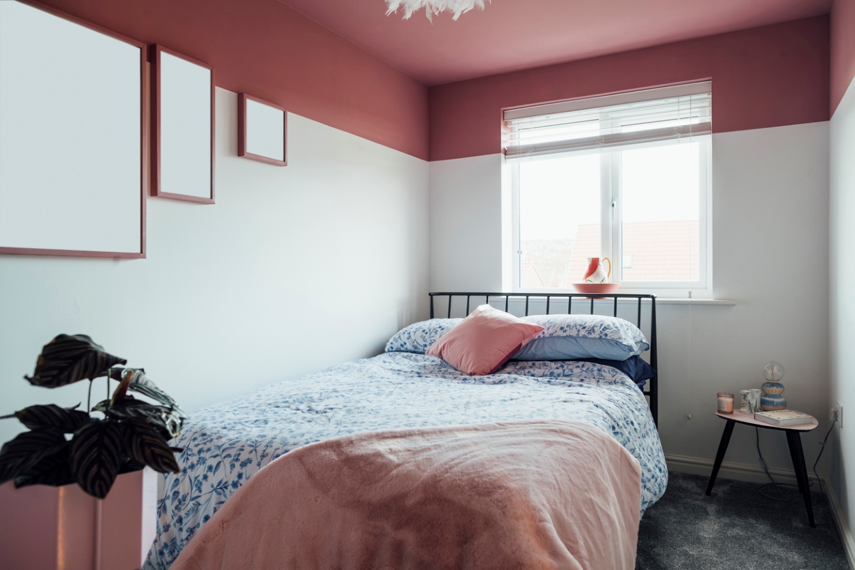
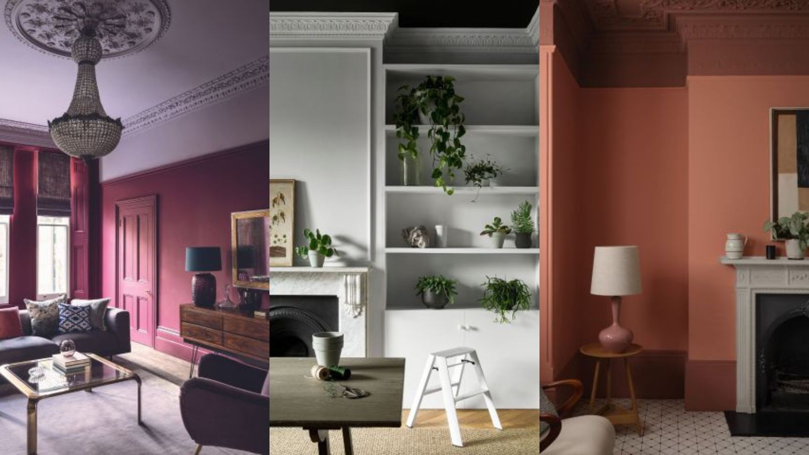
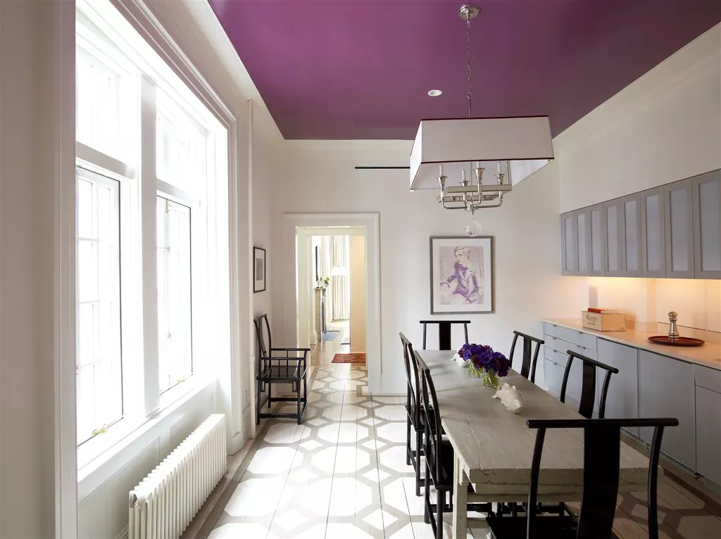
One recommendation is using soft pink paint shades for warmth, particularly in north-facing rooms that tend to be cooler and receive less natural light. Rachel Forster, an interior designer, suggests painting both walls and ceilings in colors like Lakeland Pink Pastel to create a cohesive and warm environment. The article also presents black as a striking choice, especially when paired with white walls, to create a restful yet dynamic scheme. Andy Greenall from Paint & Paper Library advises considering the undertone of wall colors to match black appropriately, suggesting combinations like the palest white with the darkest black for a monochrome look.
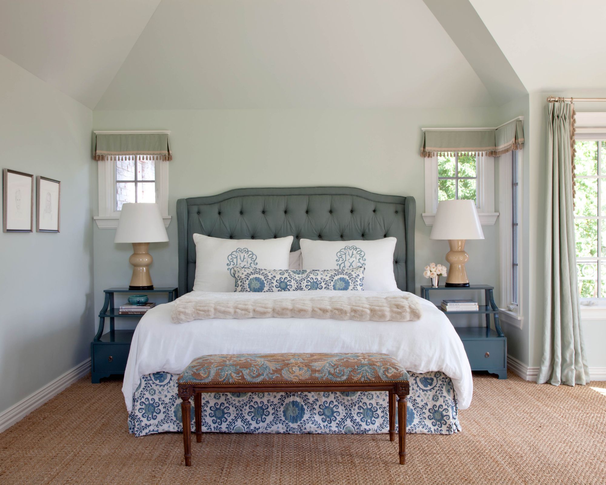
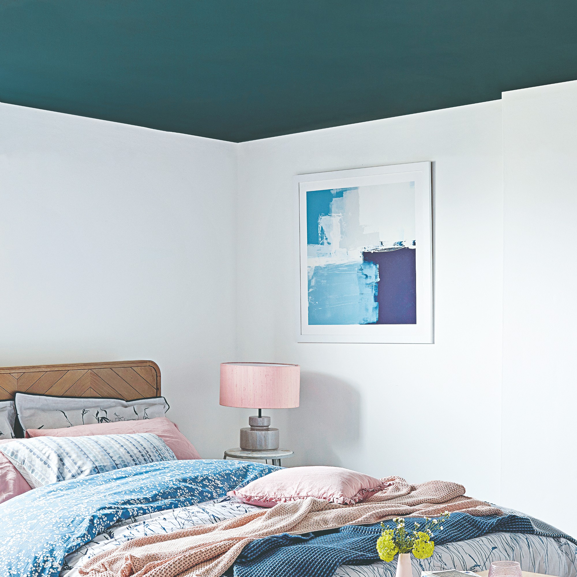
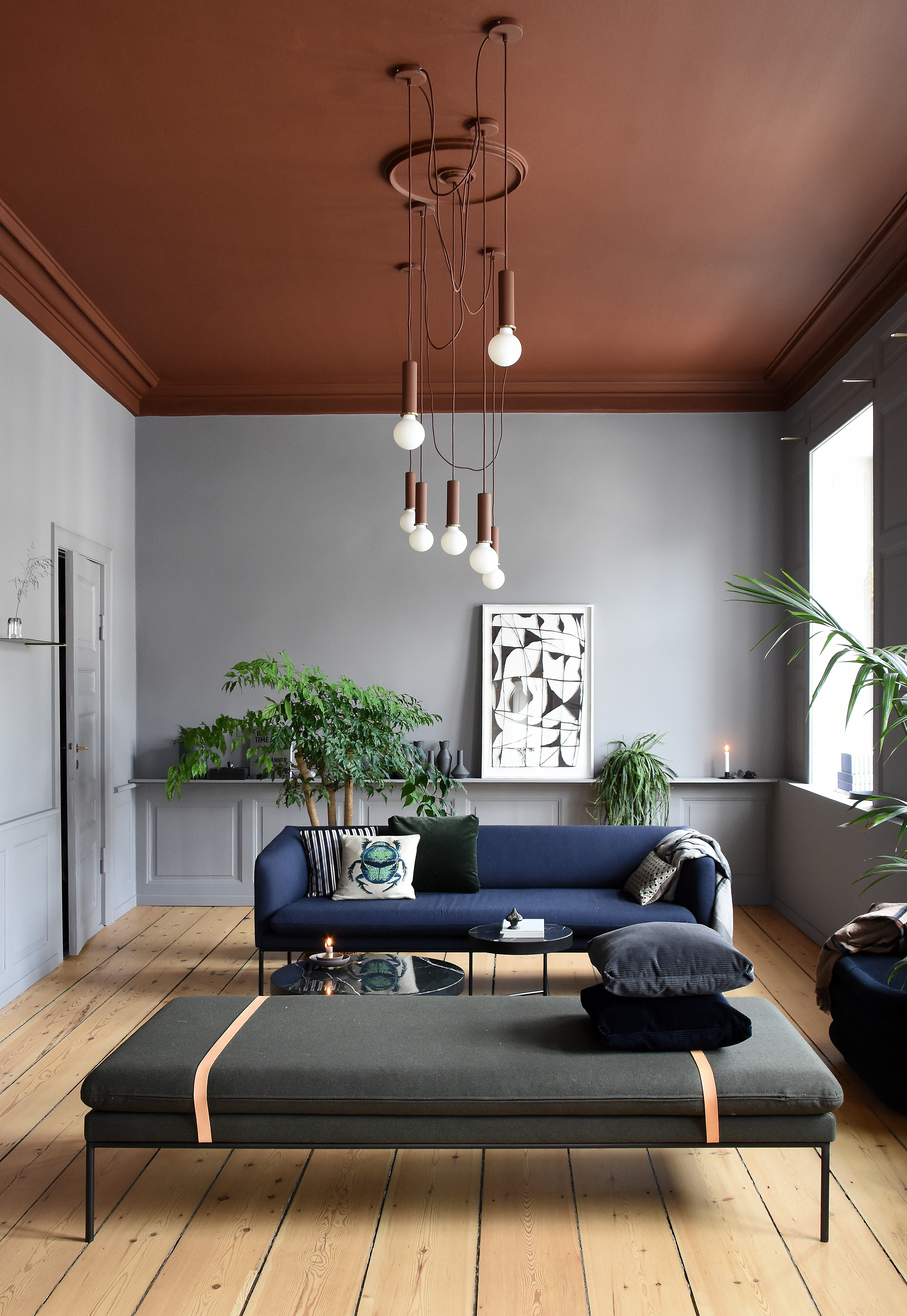
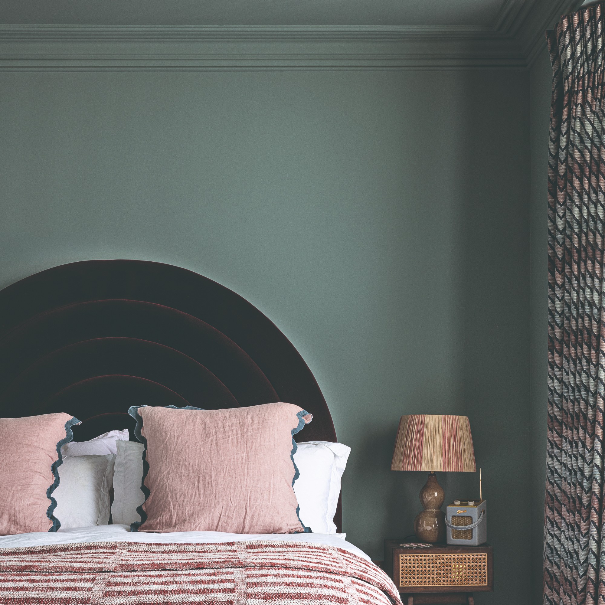
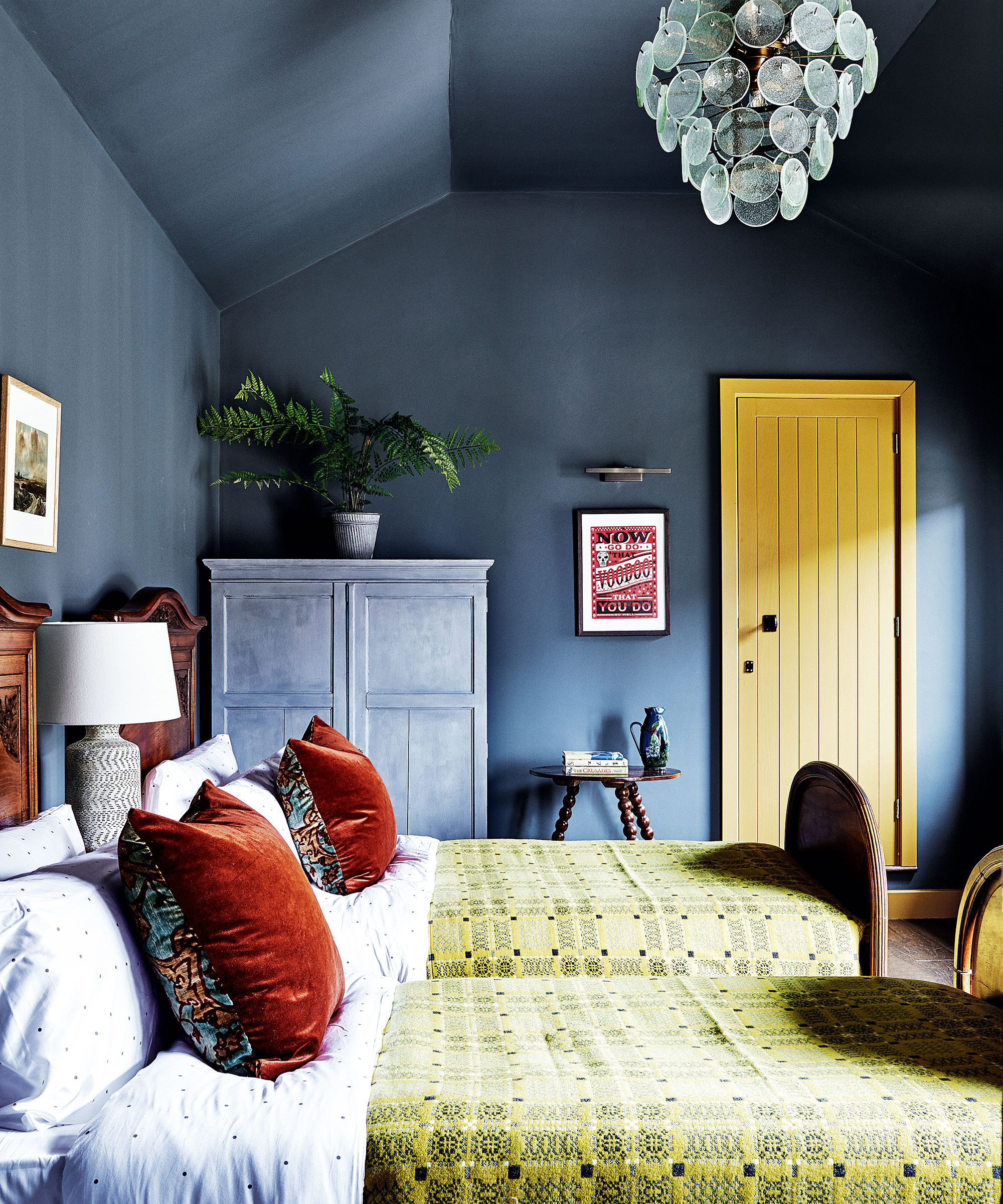
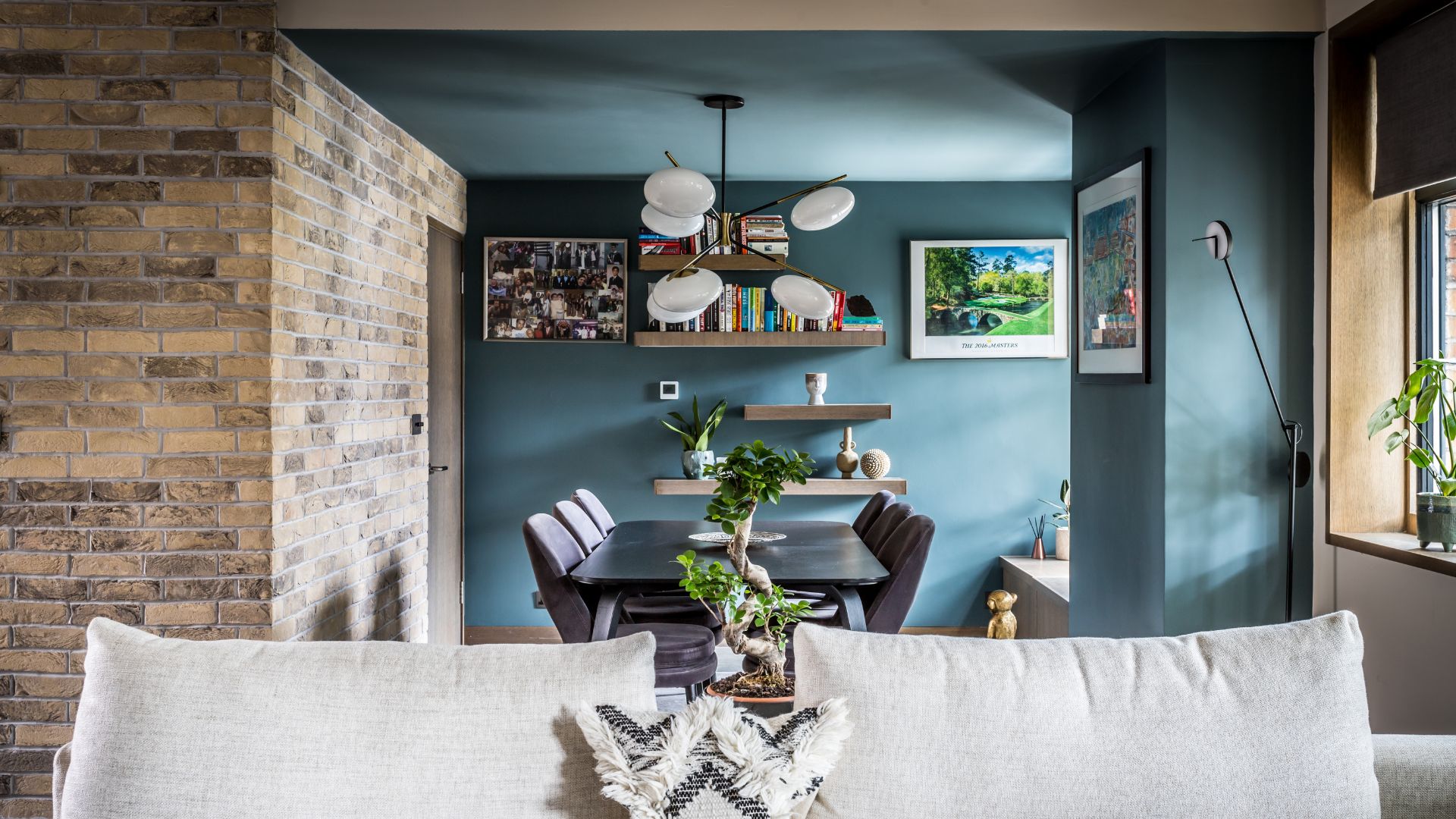
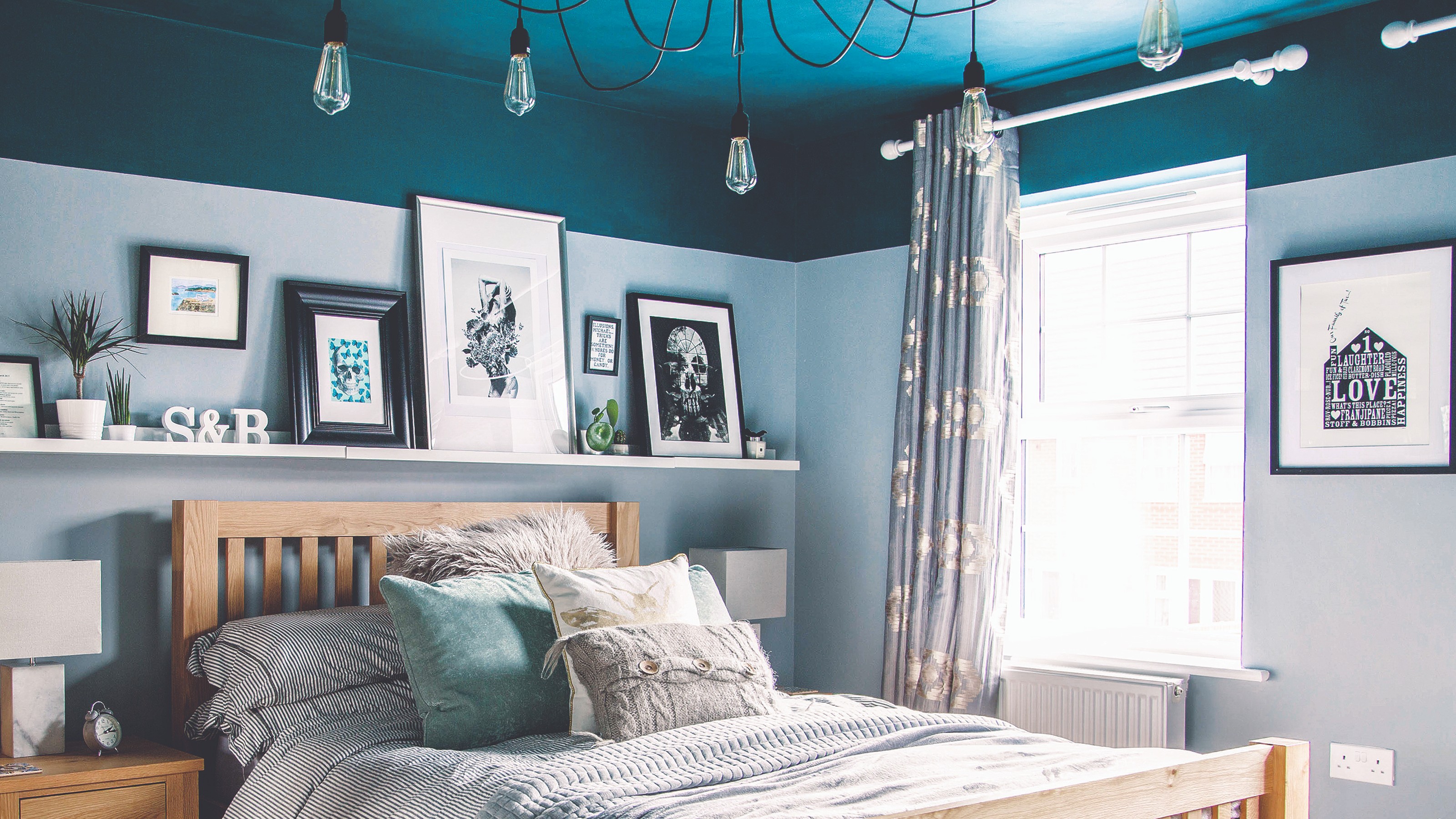
For living spaces, muted tones are recommended as a safer alternative to stronger hues, providing a soothing ambiance. Betsy Smith points out that cooler colors recede, making a room feel airier when combined with lighter wall shades. Dark, rich colors like midnight blue are suggested for bedrooms to create a cocooning effect, either on all surfaces or on the ceiling and upper wall sections, as advised by Rachel Forster.
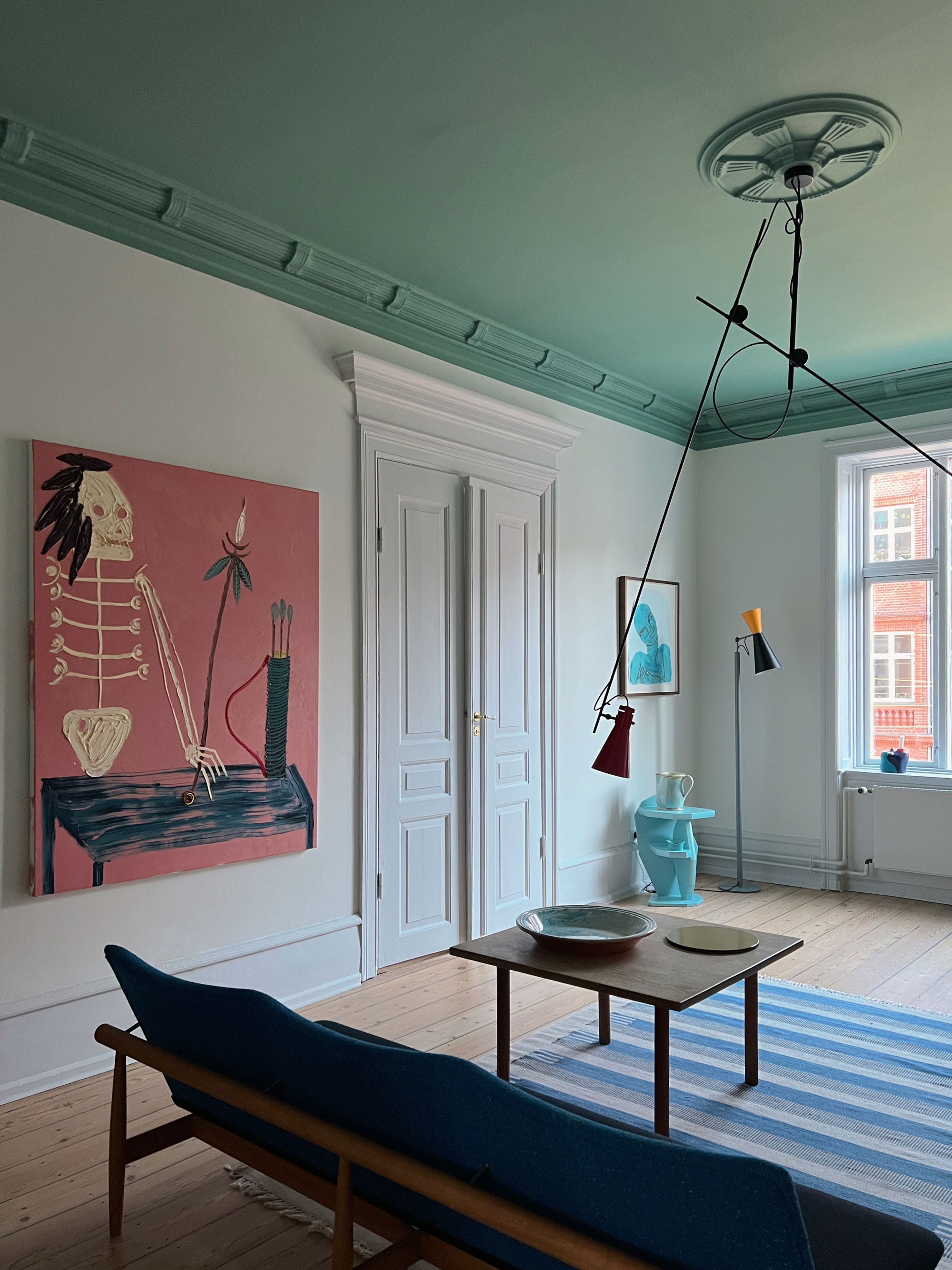
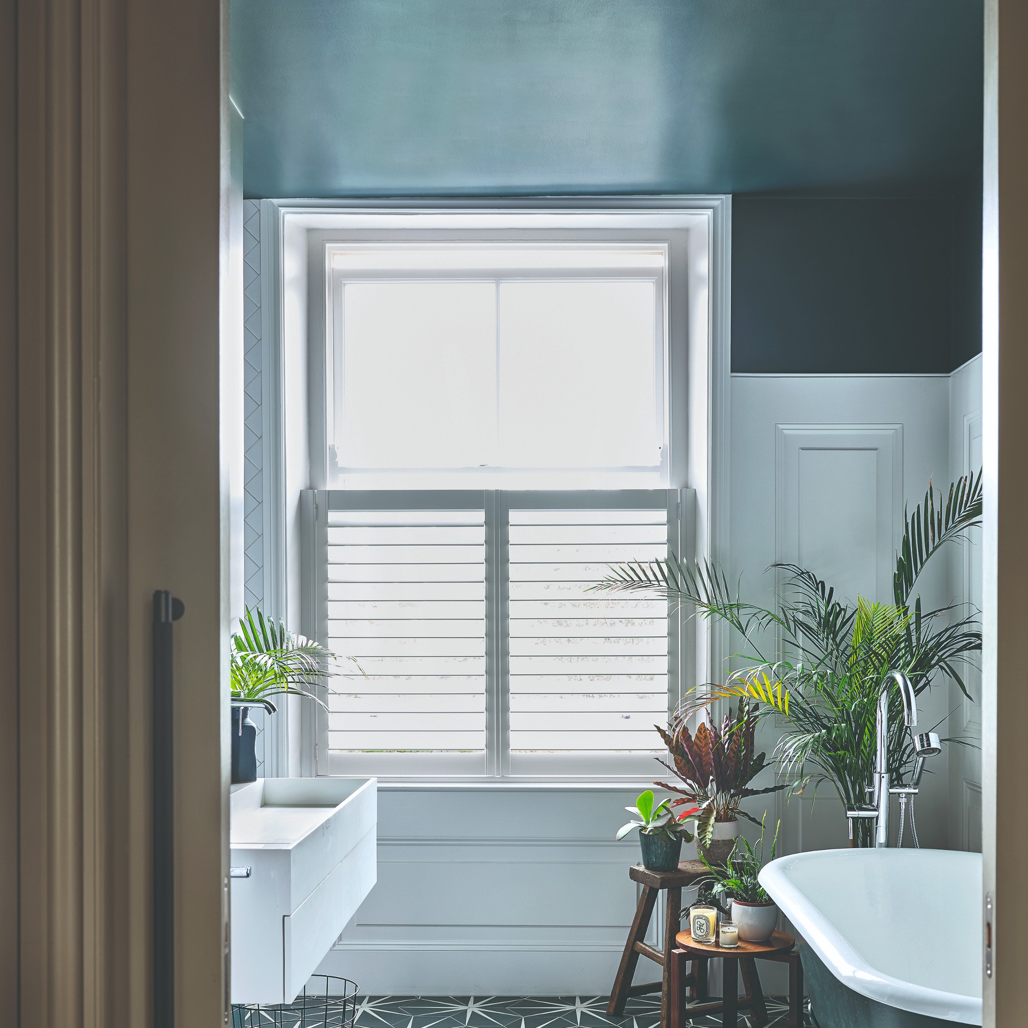
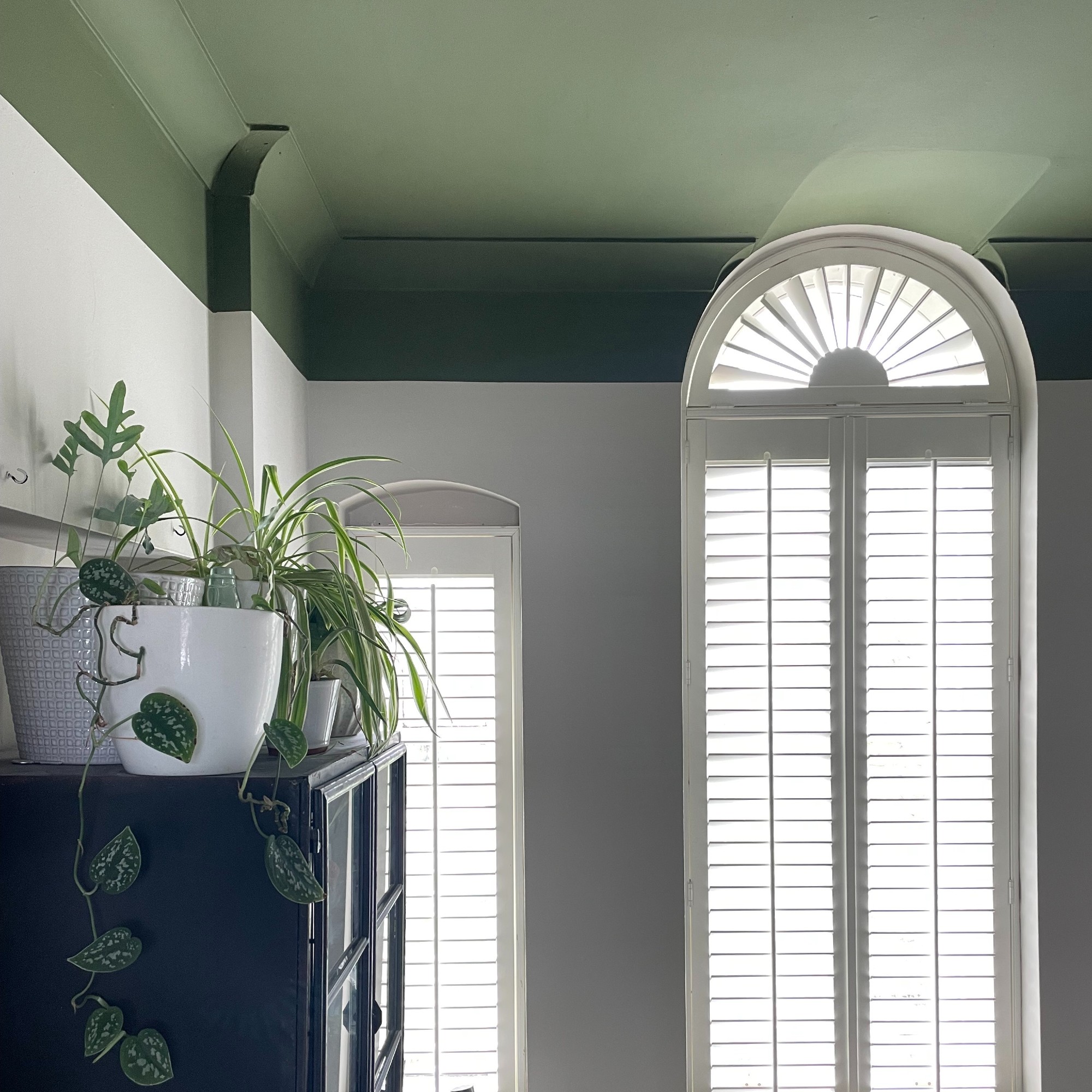
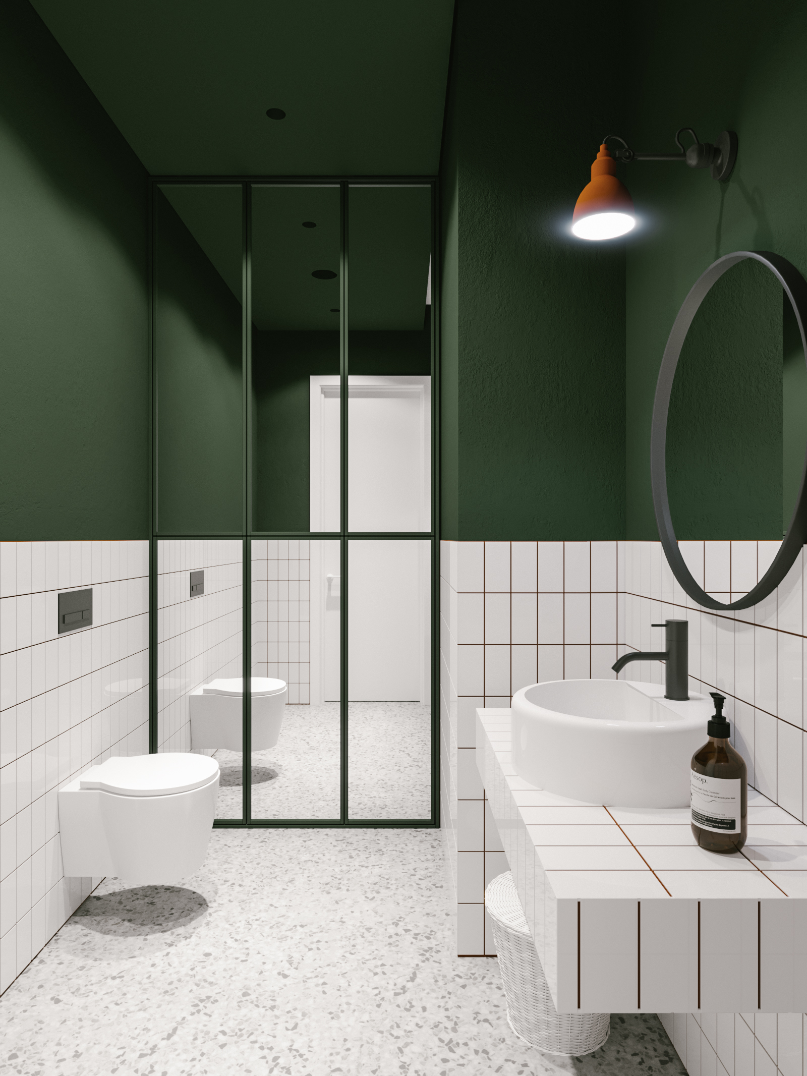
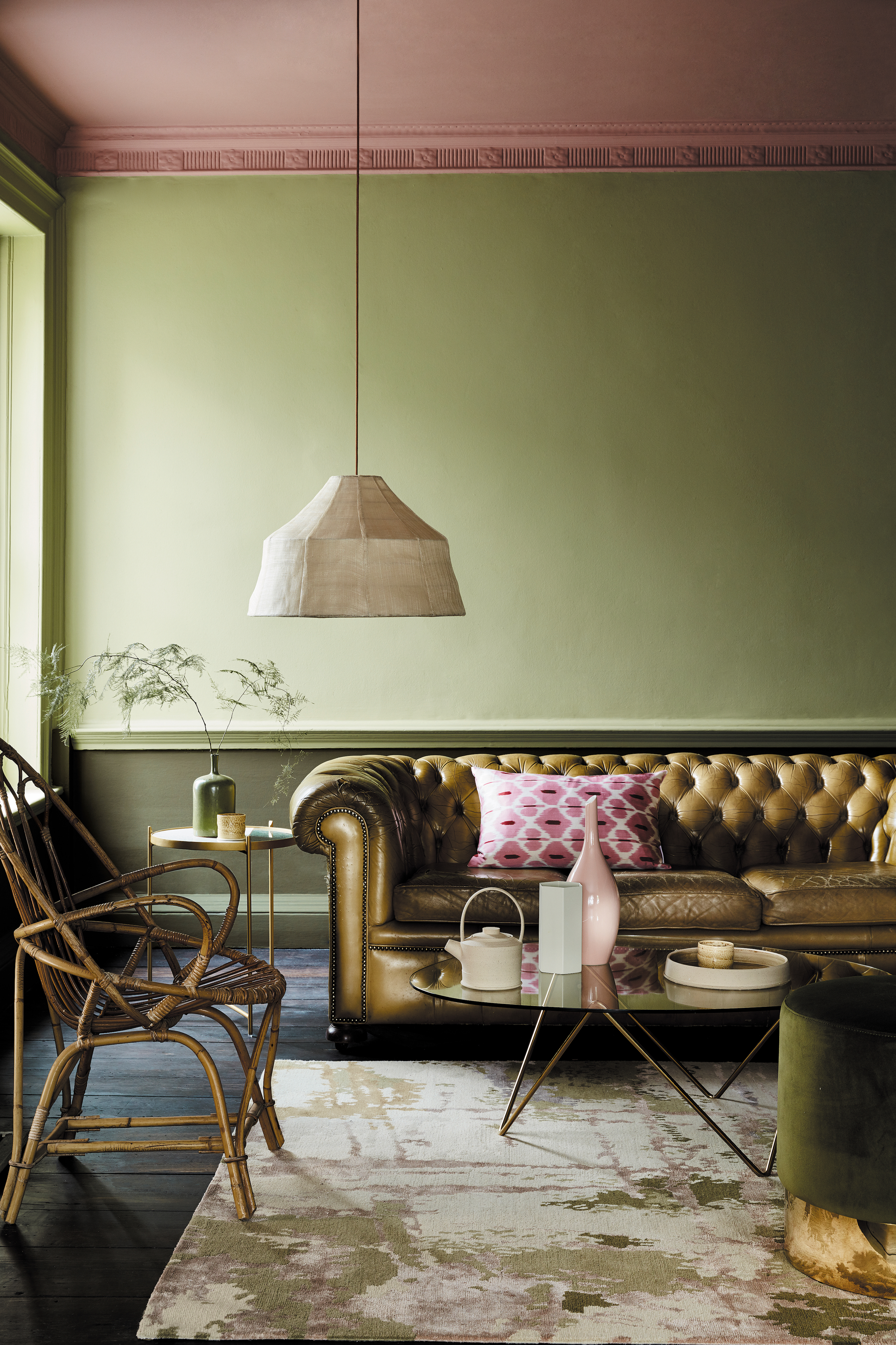
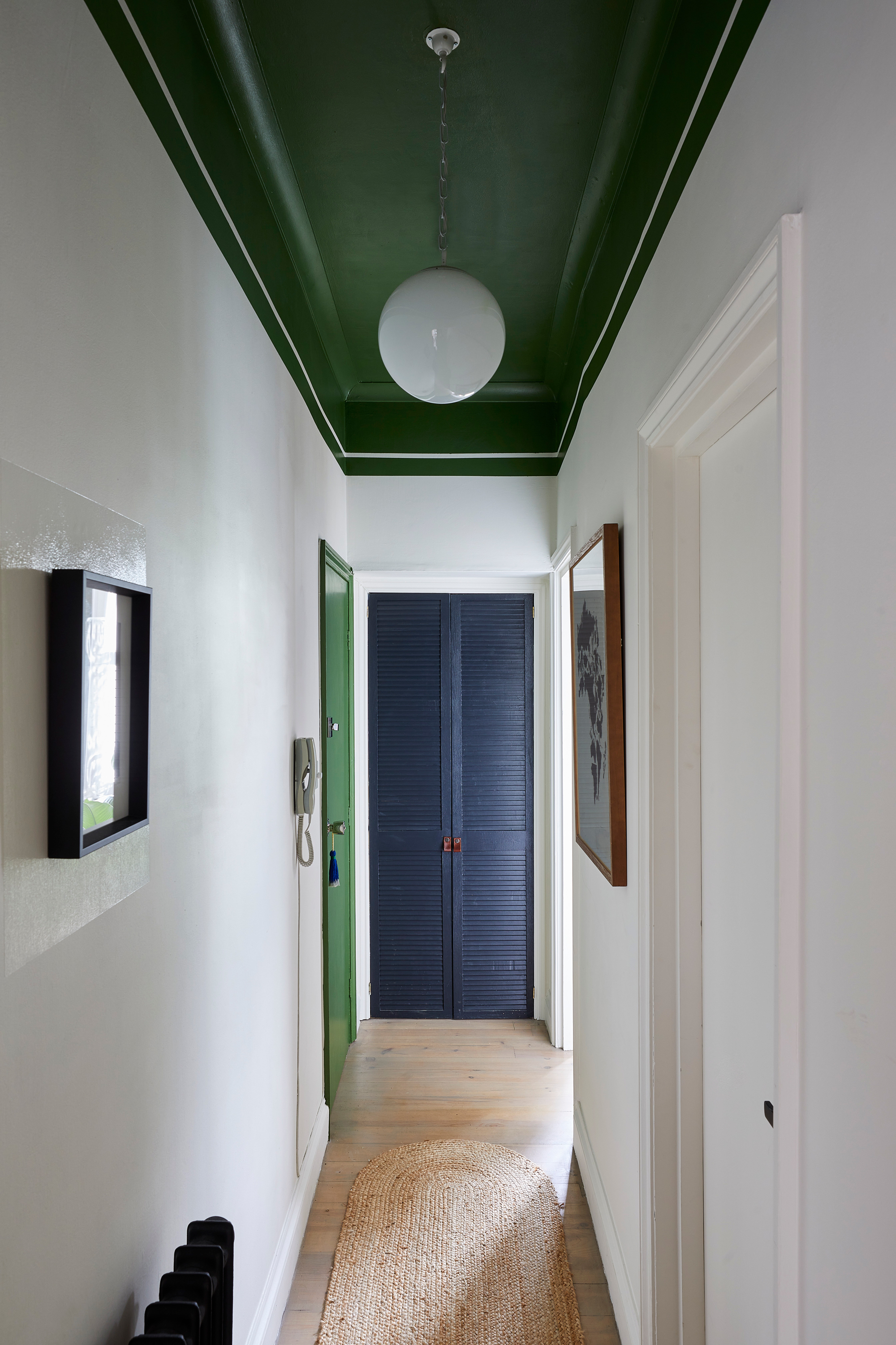
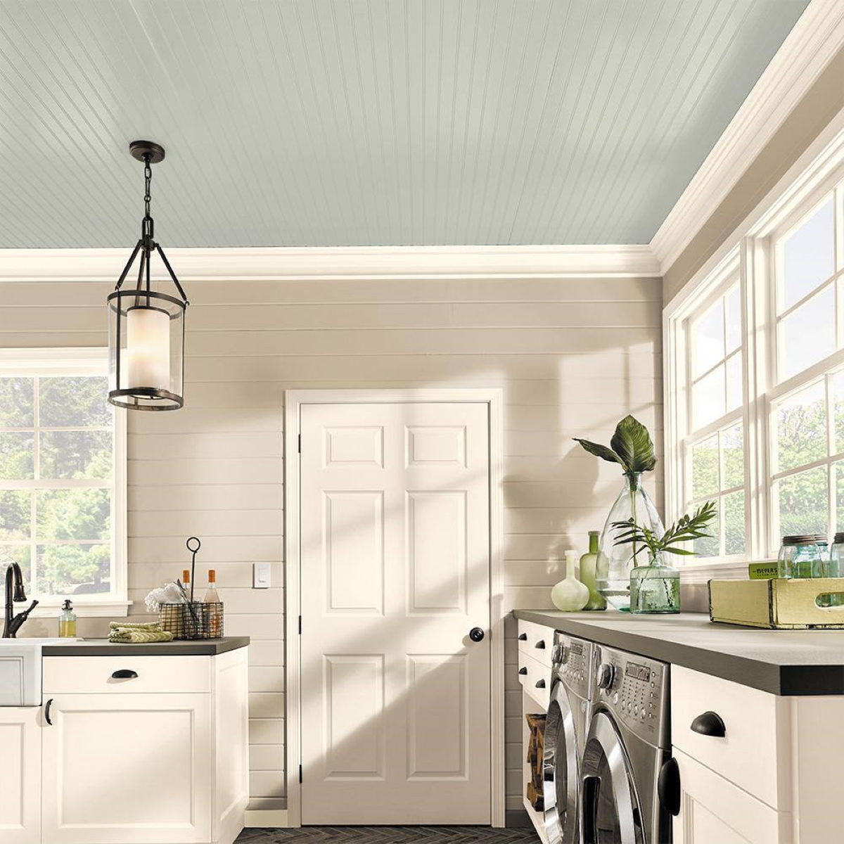
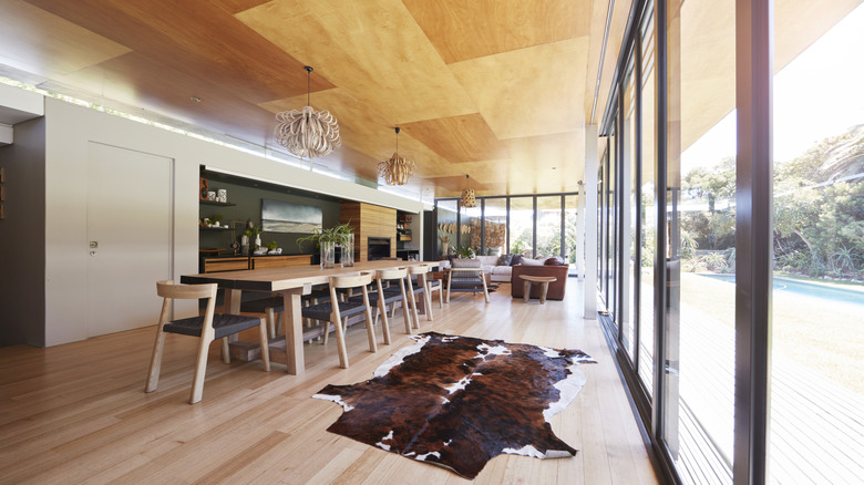
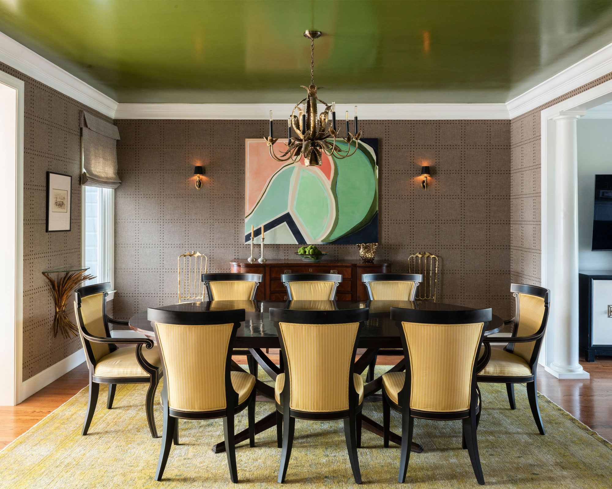
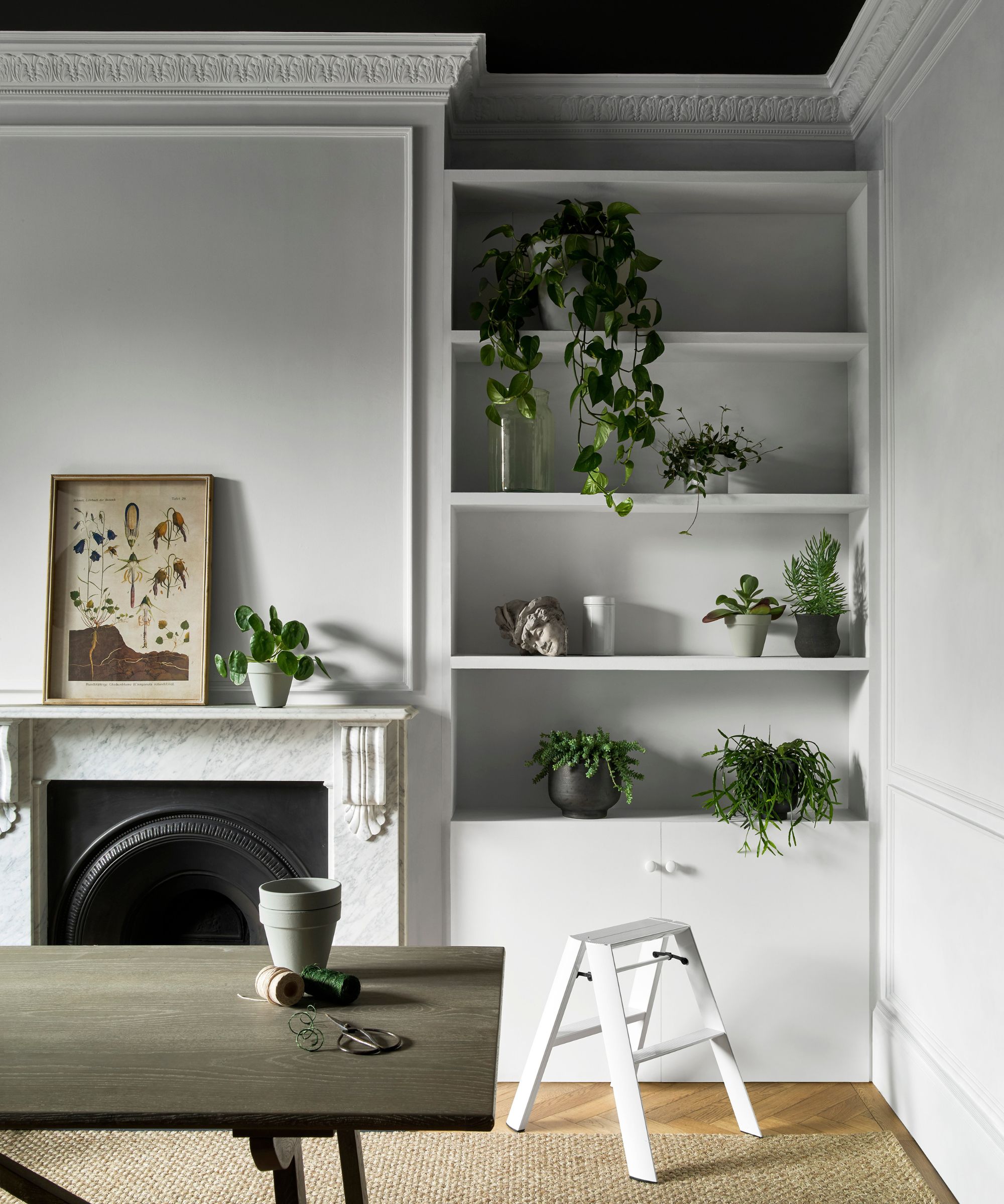
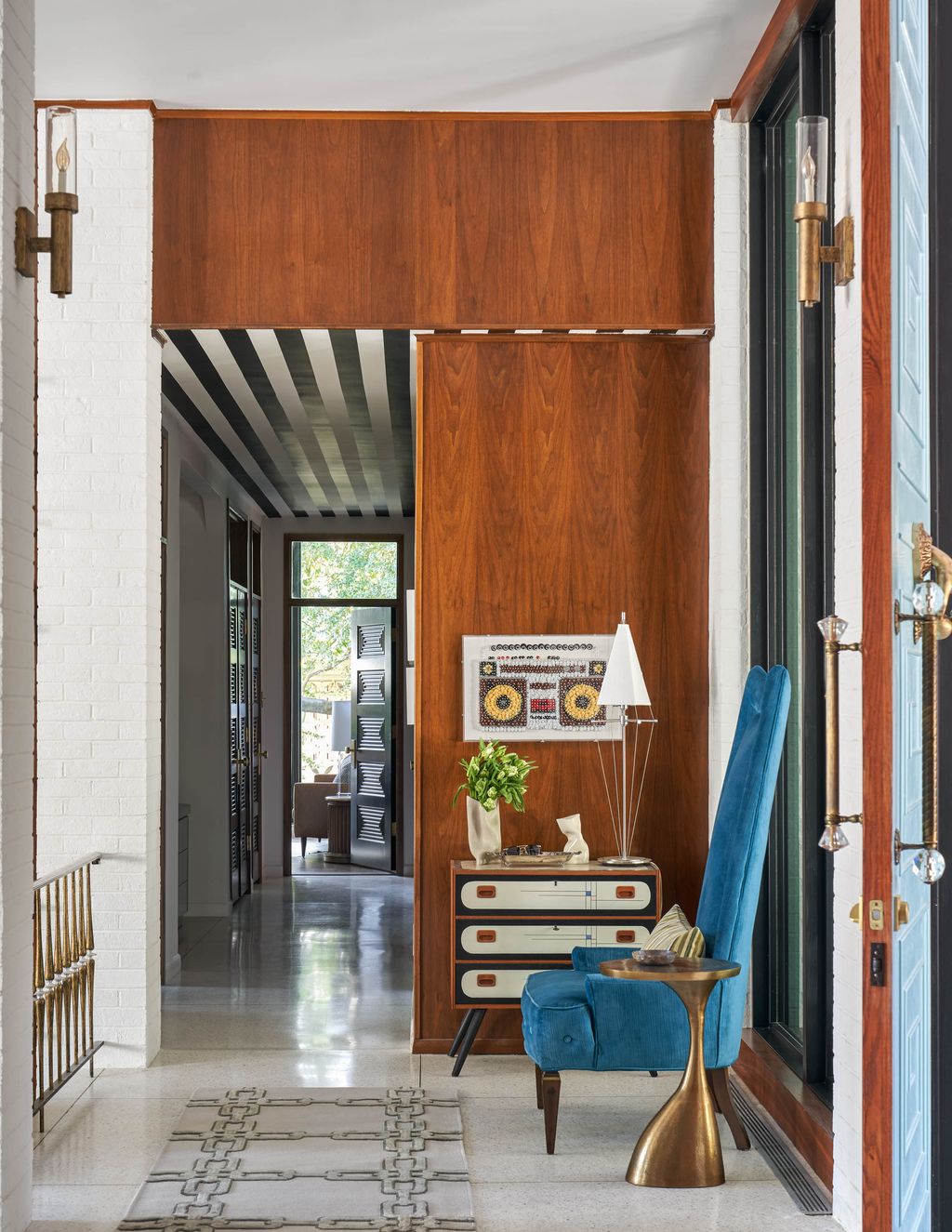
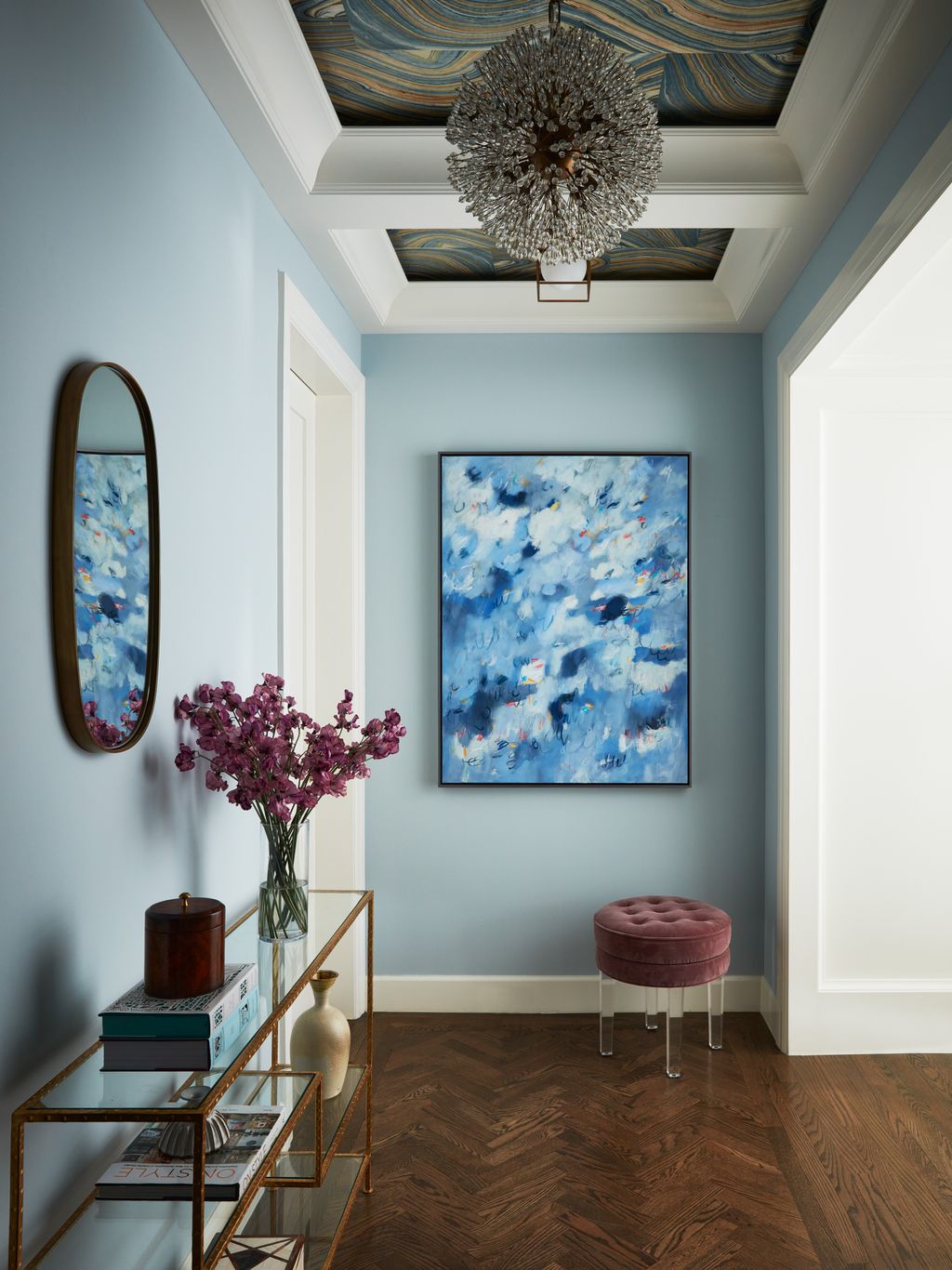
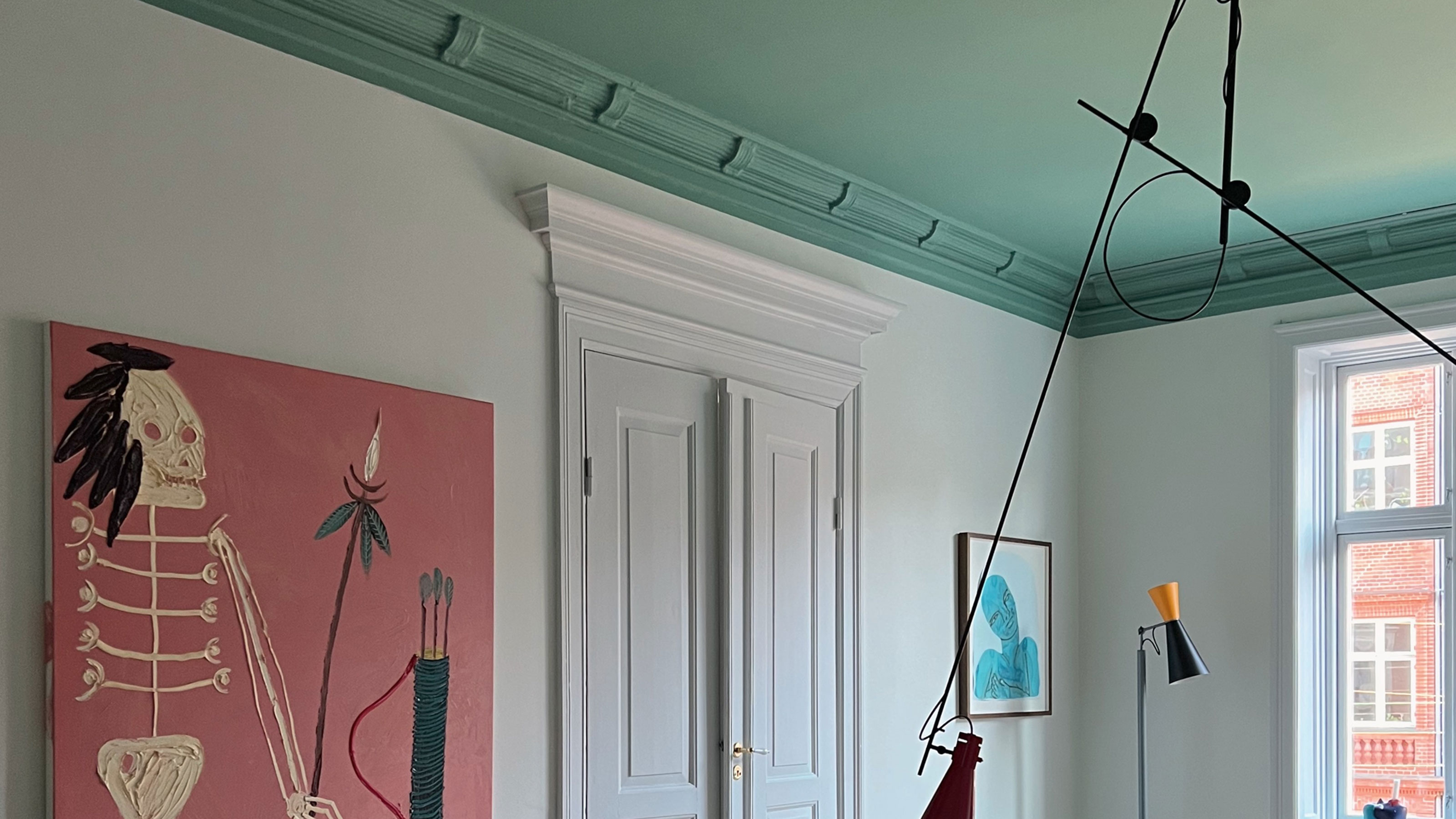
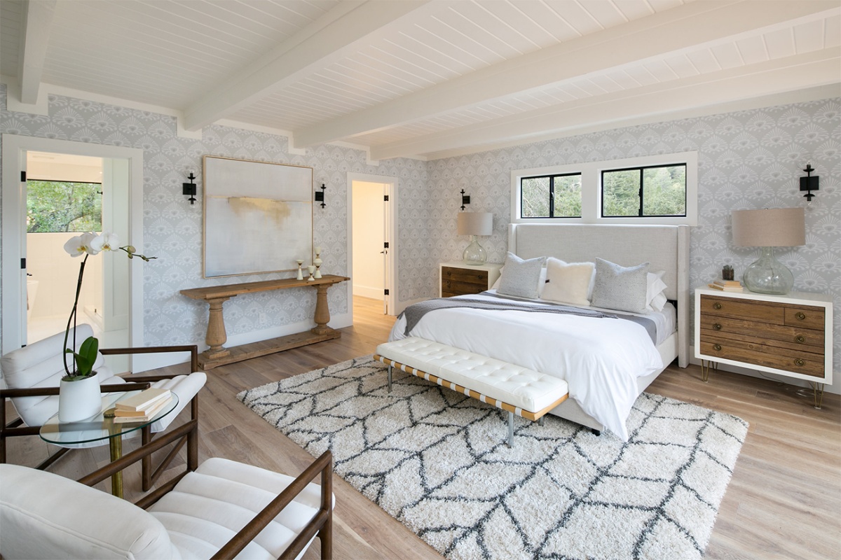
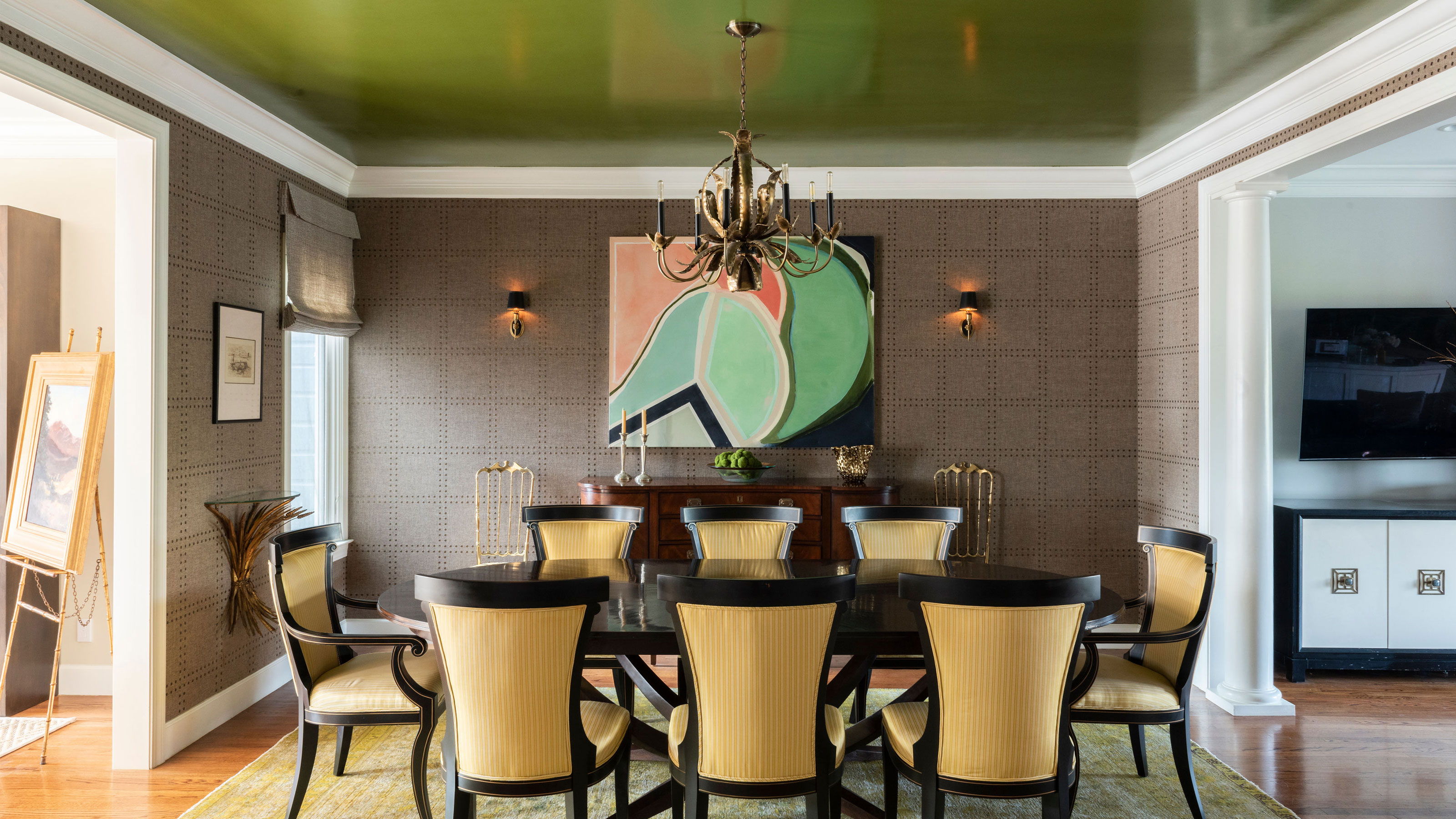
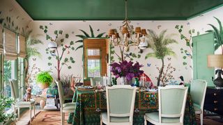
Soft grey is presented as a neutral choice that creates cohesion when extended from walls to ceilings, especially in rooms with low ceilings, making the space appear larger by blurring boundaries. Cat Dal, an interior designer, notes that this approach can make a ceiling feel higher and accentuate architectural details. Verdant tones, such as sage green, are also popular for their soothing qualities. Betsy Smith suggests using a saturated green on the ceiling with a paler tint on the walls for a dramatic yet airy feel. Ann Marie Cousins of AMC Designs advises coordinating ceiling color with wallpaper for a harmonious and impactful look.
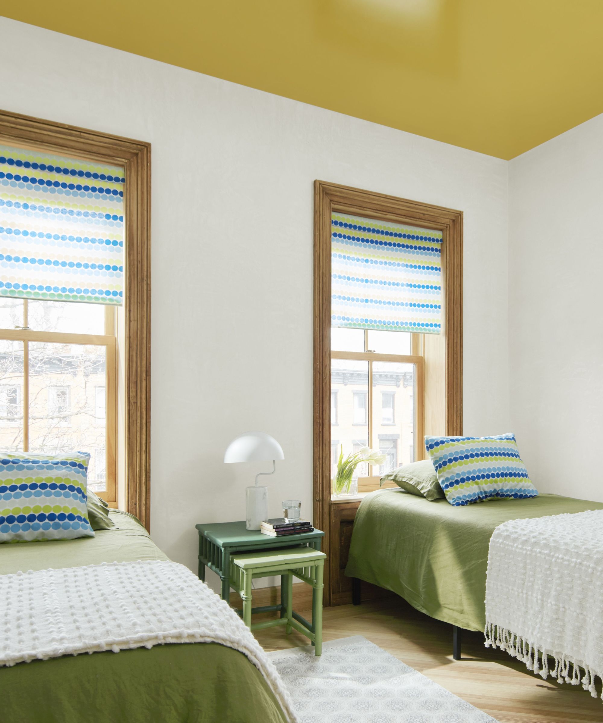
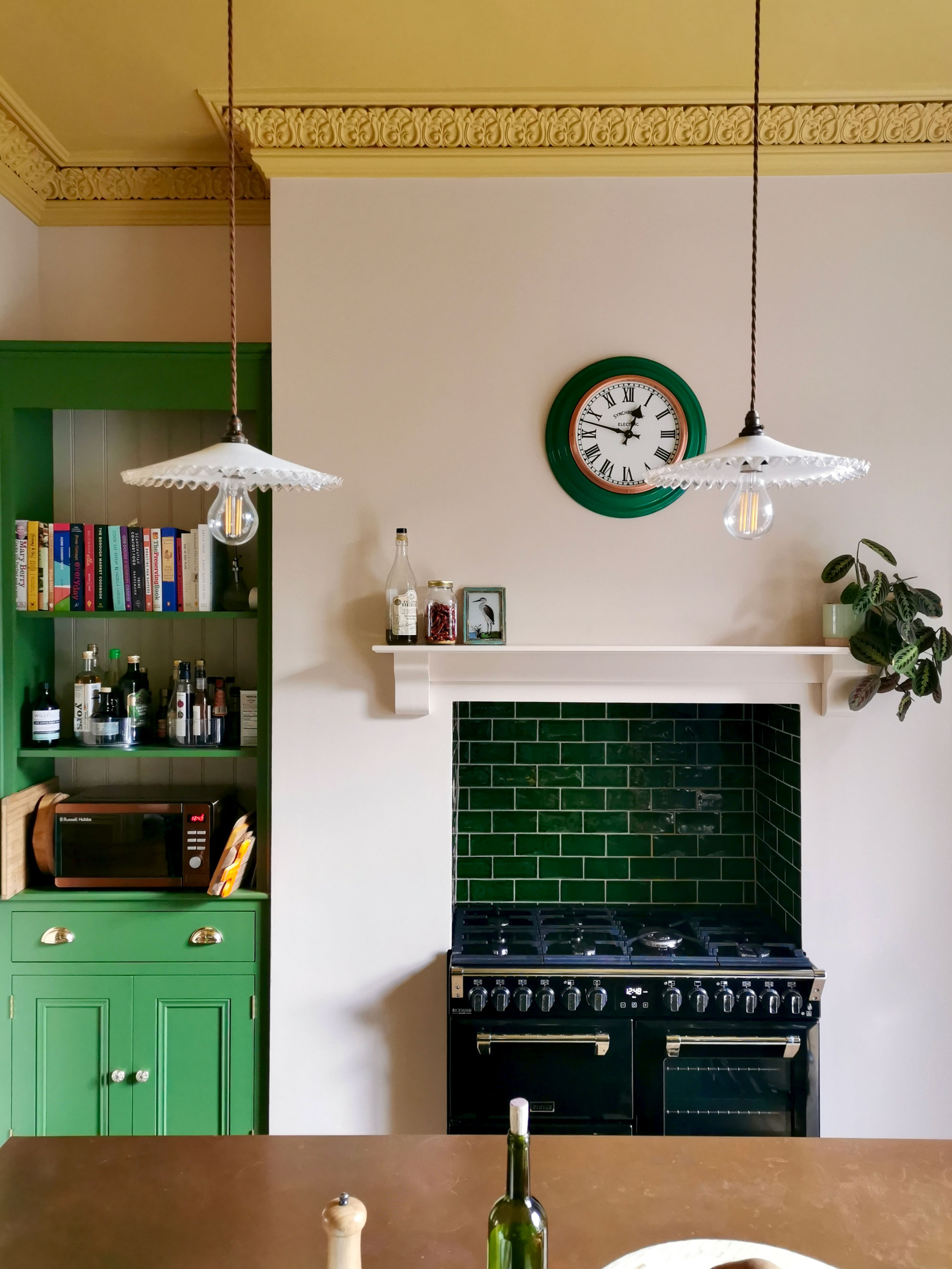
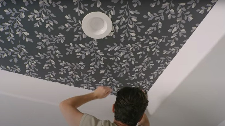
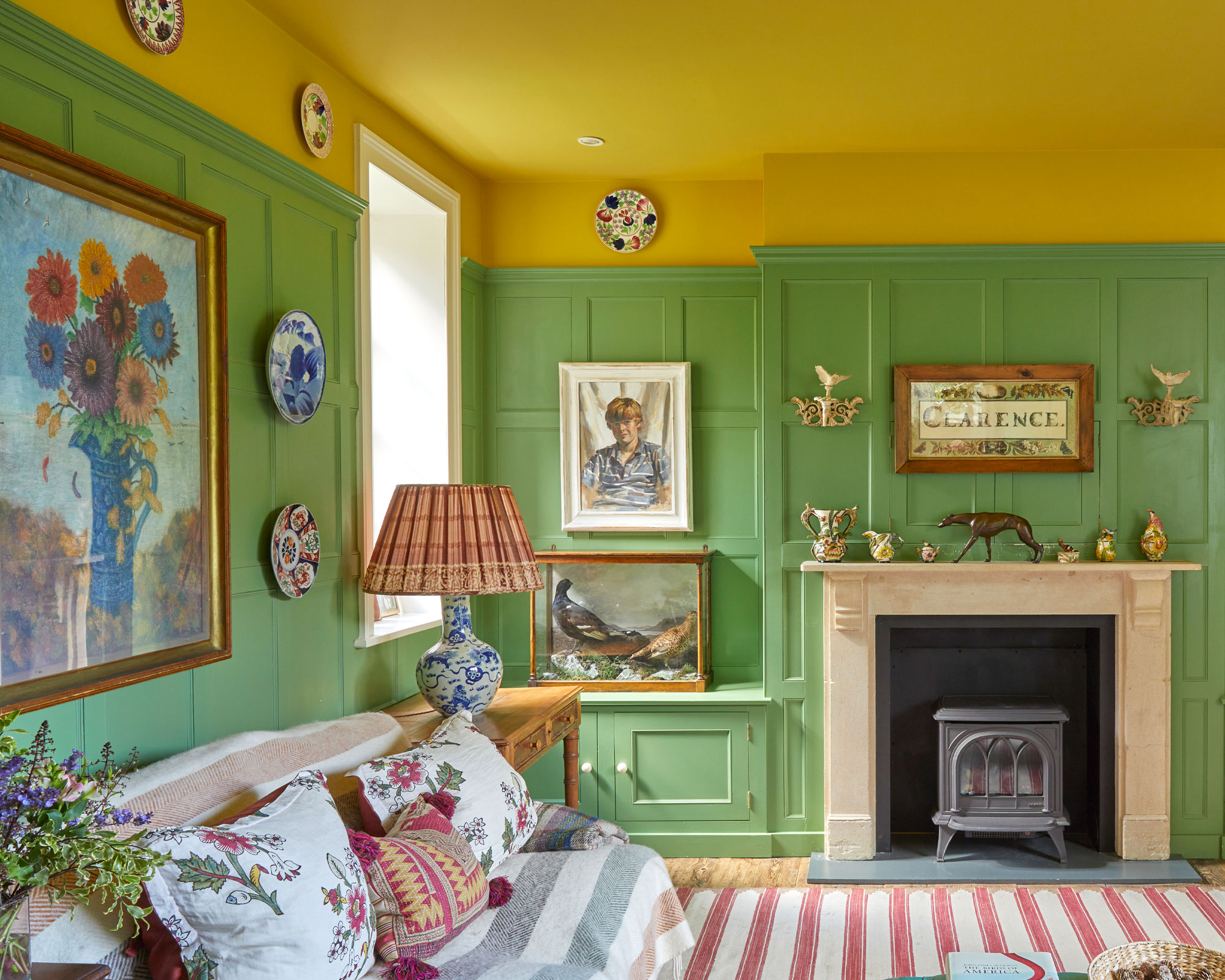
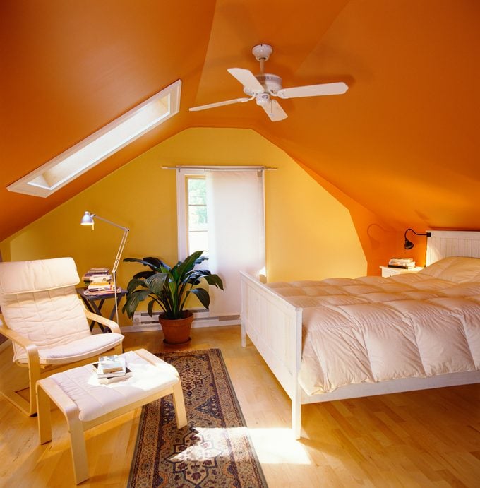
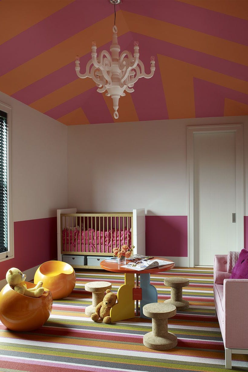
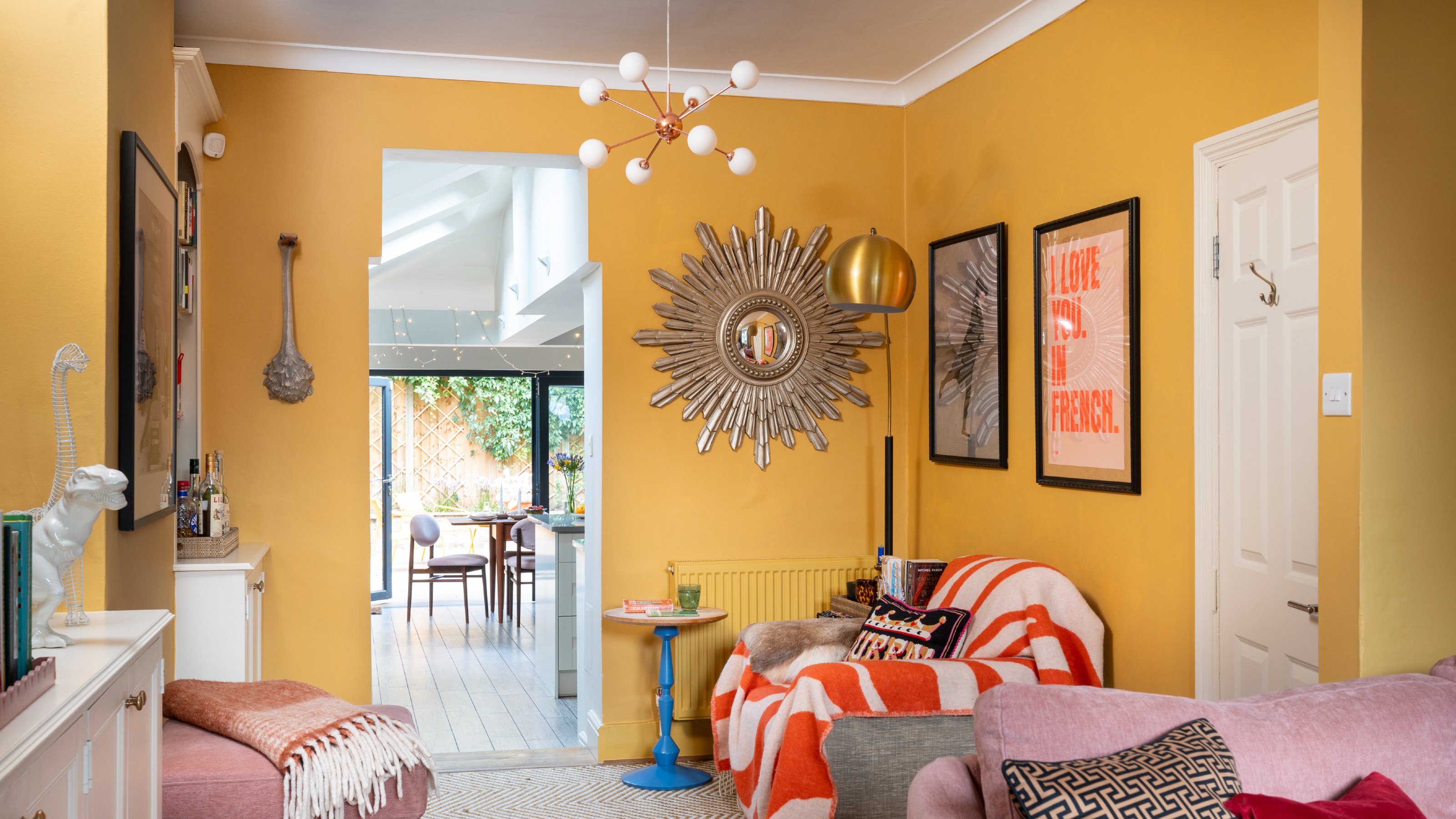
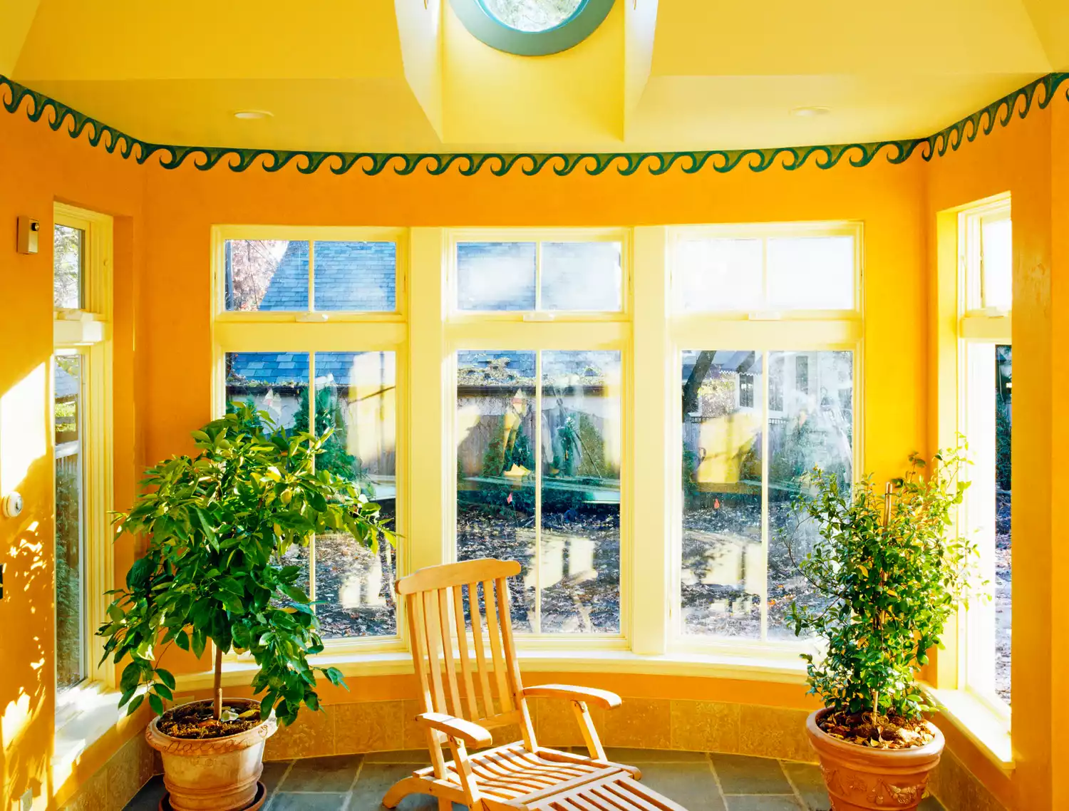
For smaller rooms, extending wall paint onto the ceiling can create the illusion of taller walls, as explained by Emma Bestley, creative director at Yes Colours. Sunny yellow is suggested for kitchens to add cheerfulness and openness. Metallic gold is proposed for small, less-used spaces like studies or cloakrooms to add warmth, drama, and light-bouncing reflectivity. Ann Marie Cousins recommends using gold in smaller rooms to avoid it being overpowering. Finally, sky blue is highlighted for bathrooms or small spaces to make them appear larger, as cooler colors recede, creating an effortlessly stylish feel.
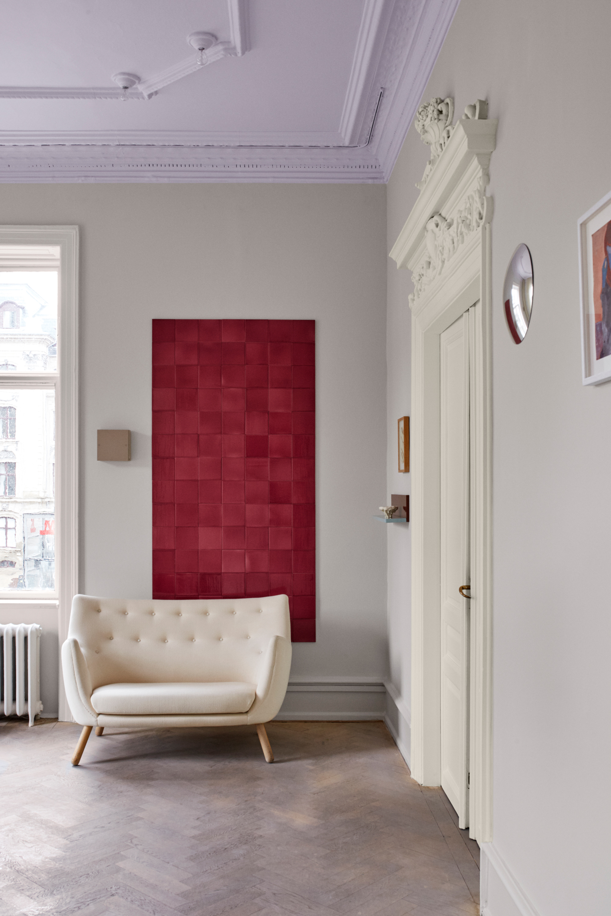
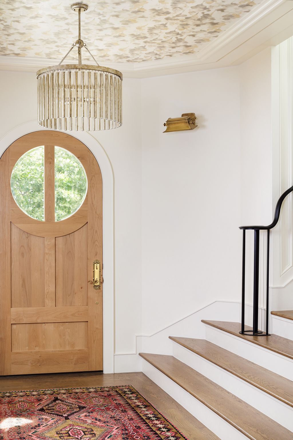
The article also addresses common questions about ceiling colors. It suggests avoiding bright whites in favor of softer off-whites to prevent a cold, stark appearance, especially in north-facing rooms. The most popular ceiling color remains white, but there's a growing trend towards nuanced whites and color drenching, where a single or closely related color is used across all surfaces. When choosing white, factors like room orientation and other design elements should be considered to ensure the desired effect.
#InteriorDesign #CeilingColors #HomeDecor #PaintTrends #ColorPsychology #RoomAesthetics #DesignTips #ModernHome #SpaceEnhancement #InteriorDesign #CeilingColors #HomeDecor #PaintTrends #ColorPsychology #RoomAesthetics #DesignTips #ModernHome #SpaceEnhancement
0 comment in total
You may also like
5 best colors to paint a ceiling according to designers – from colorful hues to classic white


Yes, You Should Absolutely Paint Your Ceiling
What paint finish is best for walls and ceilings?
This Painted Ceiling Trend For 2023 Is So Chic

Best ceiling colors – 8 paint shades that work perfectly overhead, according to interior designers

Painted ceiling ideas – 10 of the best ways to give this decorating trend an unexpected twist
The Ceiling Paint Color Trend That's Making A Splash In Interiors
When you should and shouldn't paint your ceiling, according to interior designers

5 Best Ceiling Paints
Hot Home Trend: Painted Ceilings
Top Ceiling Trends You Can Expect To See More Of In 2025
Trend Alert: Here’s How To Perfect The Painted Ceiling Look

7 Paint Colors to Never Use on Your Ceiling, According to Interior Designers
Painting the ceiling with colour is a trend that is looking up
Ceiling paint ideas – 10 ways to make your fifth wall wonderful
12 Stunning Ceiling Design Ideas That Will Have You Looking Up All Day Long

Should you paint your ceiling a different colour to the walls? Experts explain why everyone should consider it
8 Ceiling Paint Color Trends to Consider for Your Next Home Refresh

5 reasons why you should never paint a ceiling white, reveals a leading paint and color expert
12 Ceiling Paint Colors That Add Drama to Any Room, According to Interior Designers