1/6
Sherwin-Williams' Designer Color Collection: 5 bright white paints
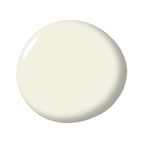
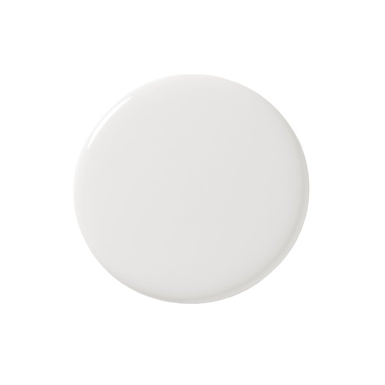
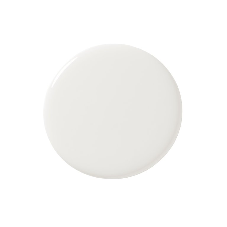
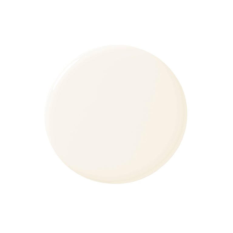
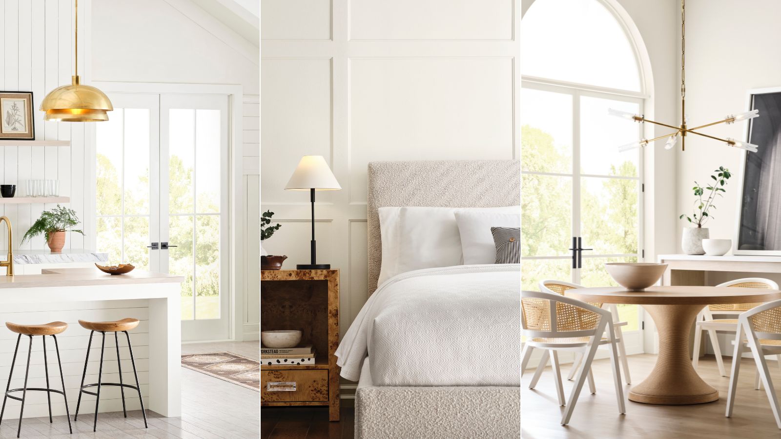
Selecting the right white paint can be a challenging task due to the myriad of options available and the subtle differences in their undertones. Sherwin-Williams, a prominent paint brand, has simplified this process by highlighting five of its brightest white paints from its recently launched 'Designer Color Collection' that are highly favored by interior designers. The collection features six distinct color palettes, with the 'Pure & Pristine' palette specifically dedicated to bright white shades, offering reliable choices for various room aesthetics.
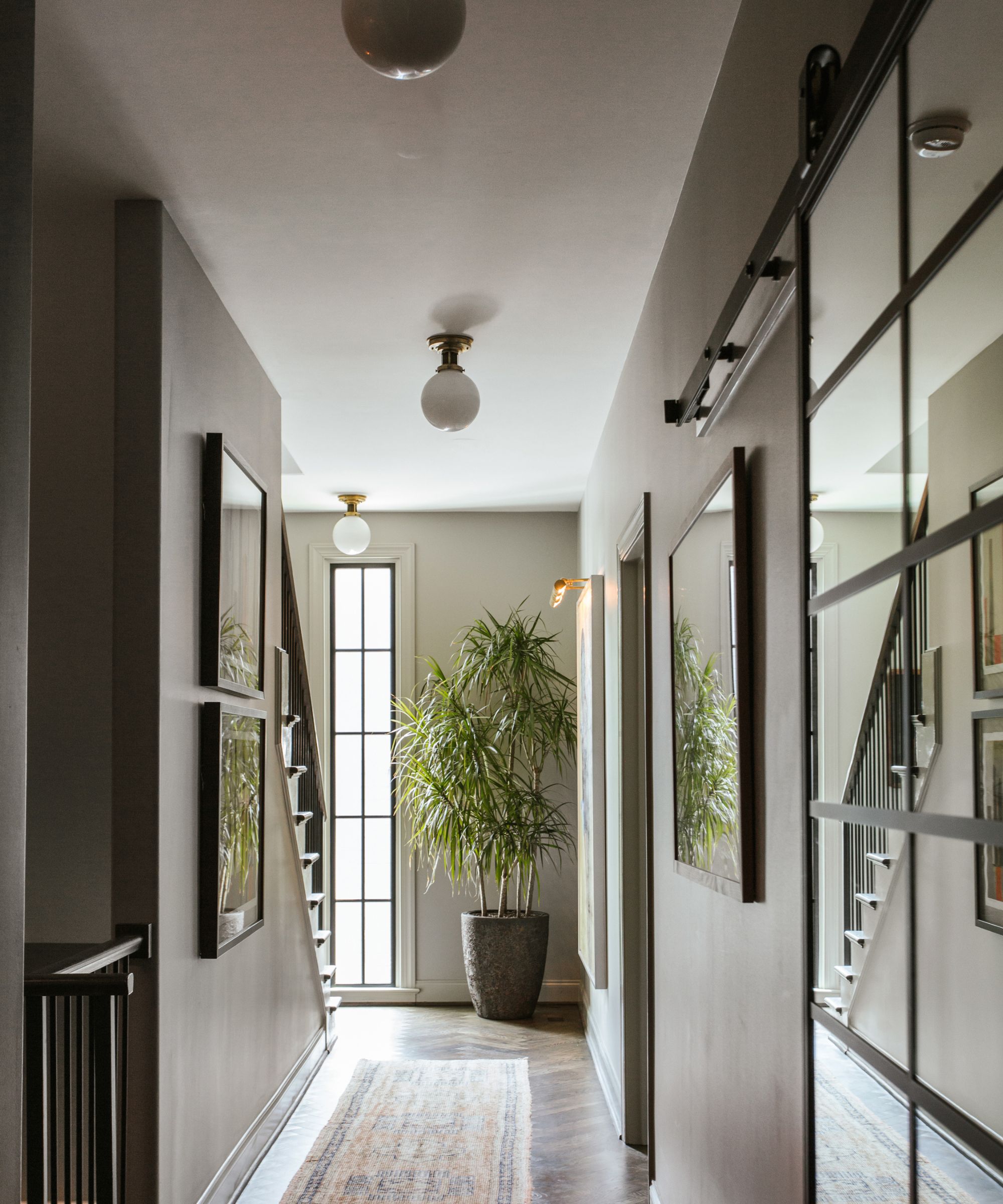
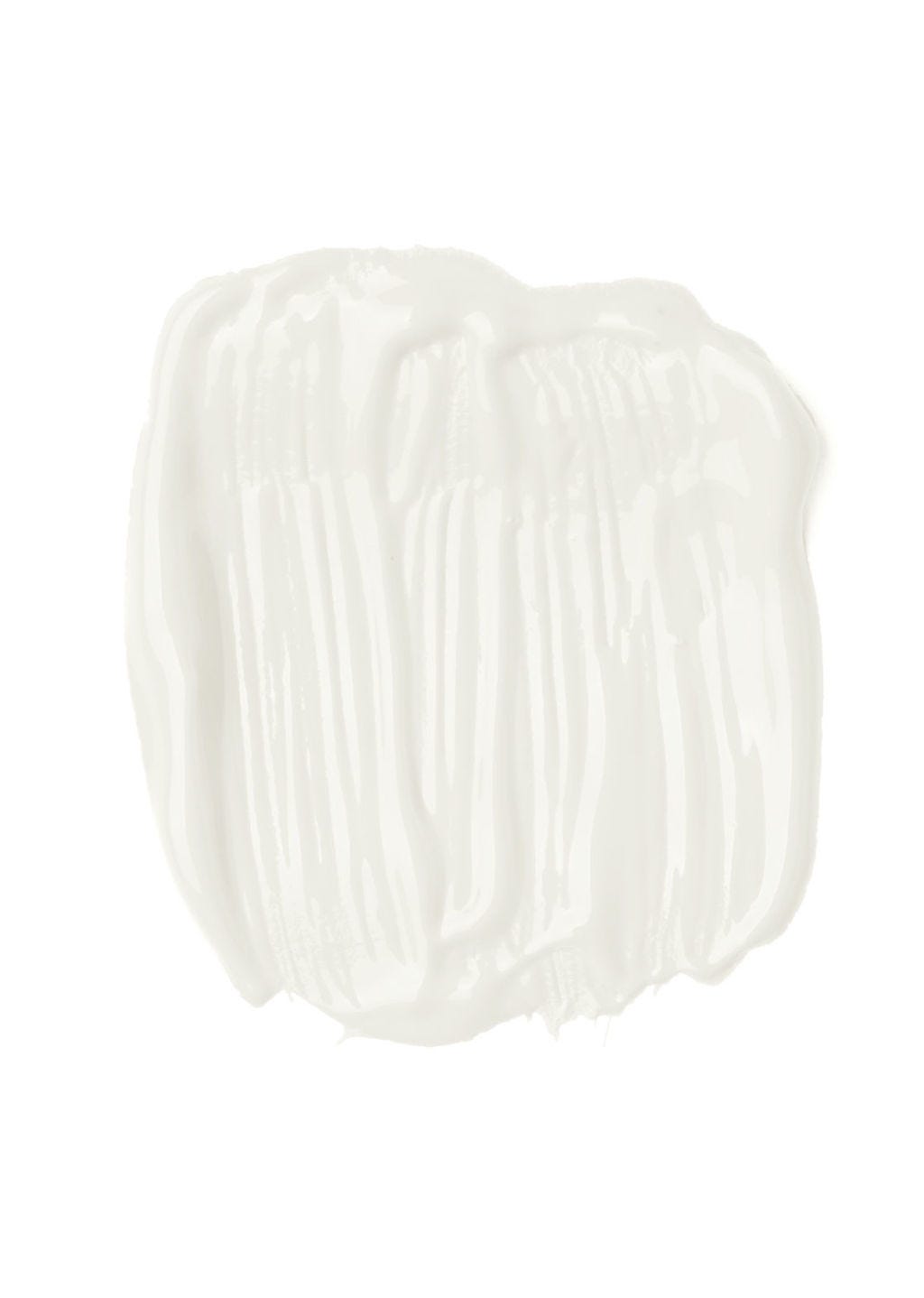
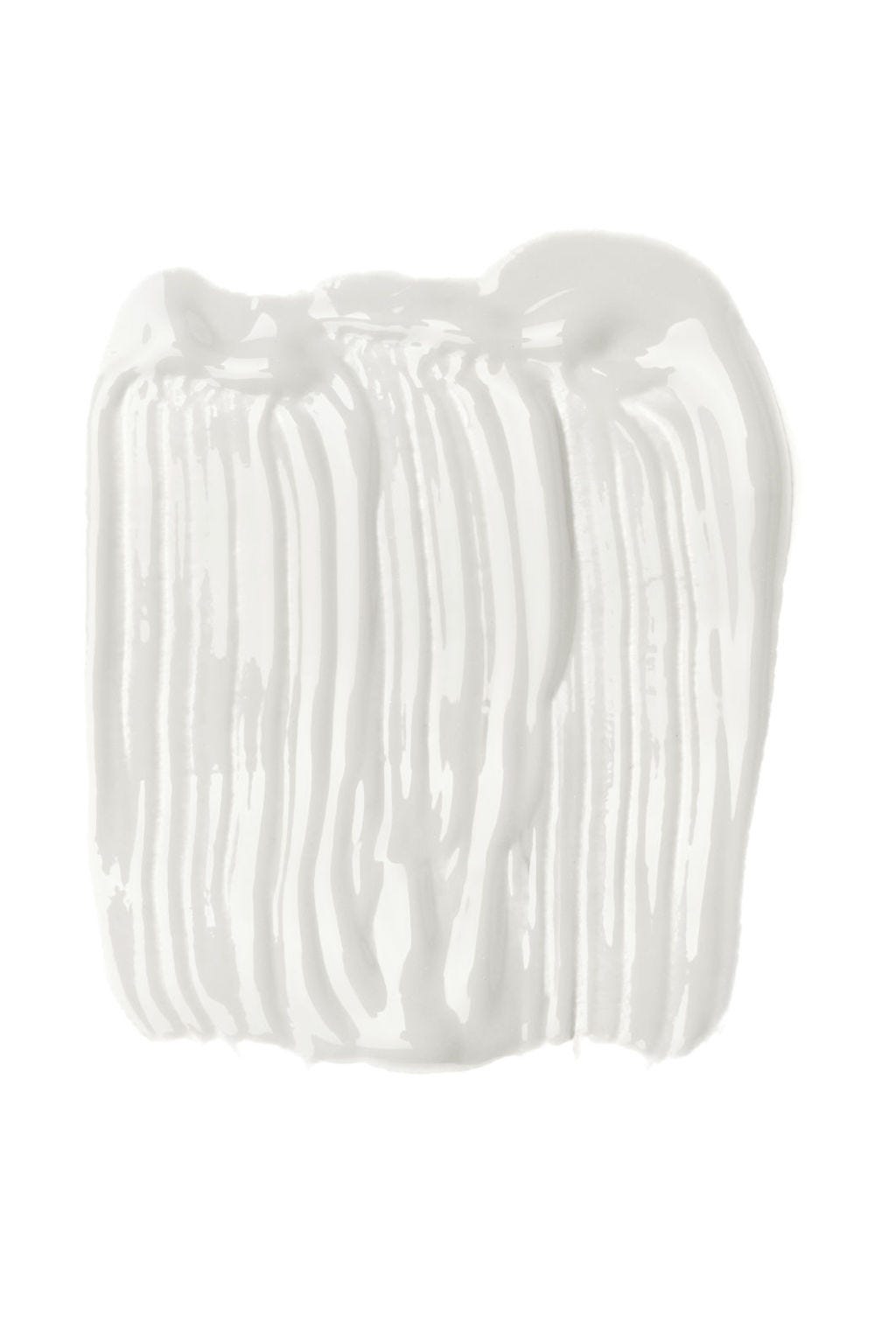
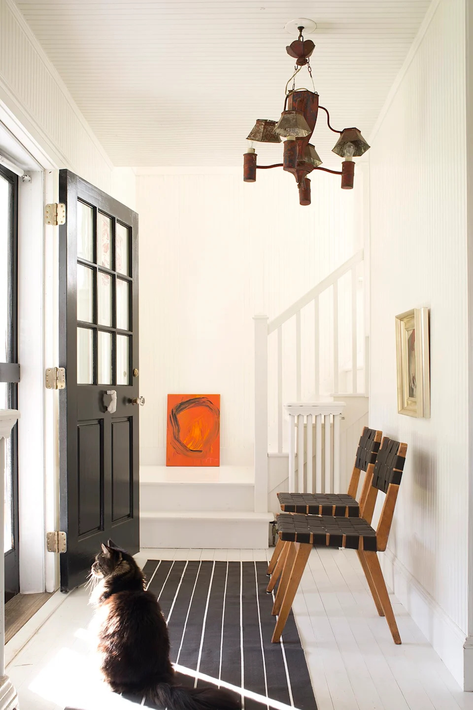
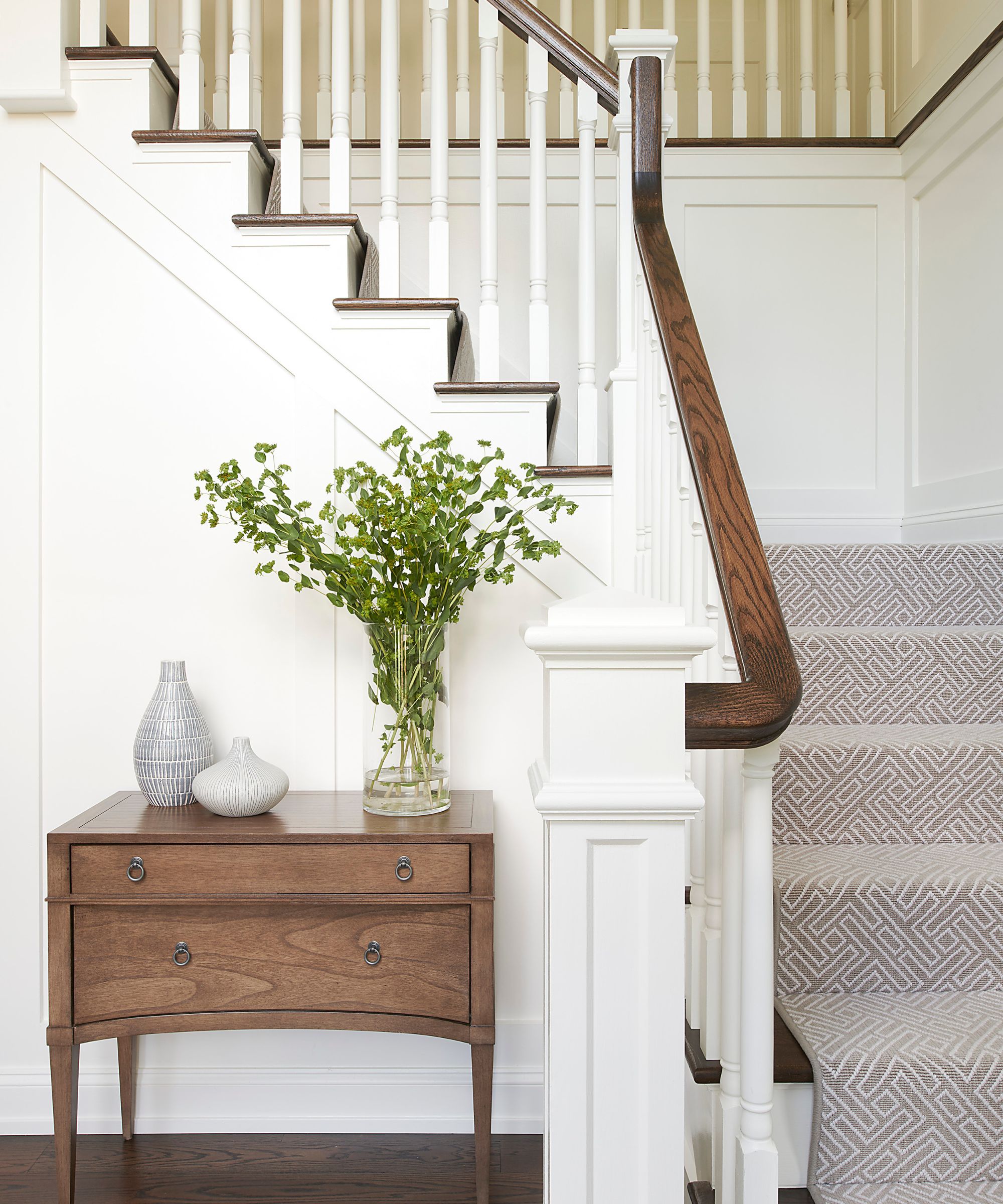
One of the recommended shades is **Snowbelt SW 9263**, a classic white with cool green undertones. This color is ideal for entryways, creating an understated coolness that pairs well with neutral wood tones, offering a clean and inviting first impression. For south-facing rooms that receive abundant warm sunlight, cooler whites like Snowbelt can balance the light and prevent a yellowish cast on the walls.
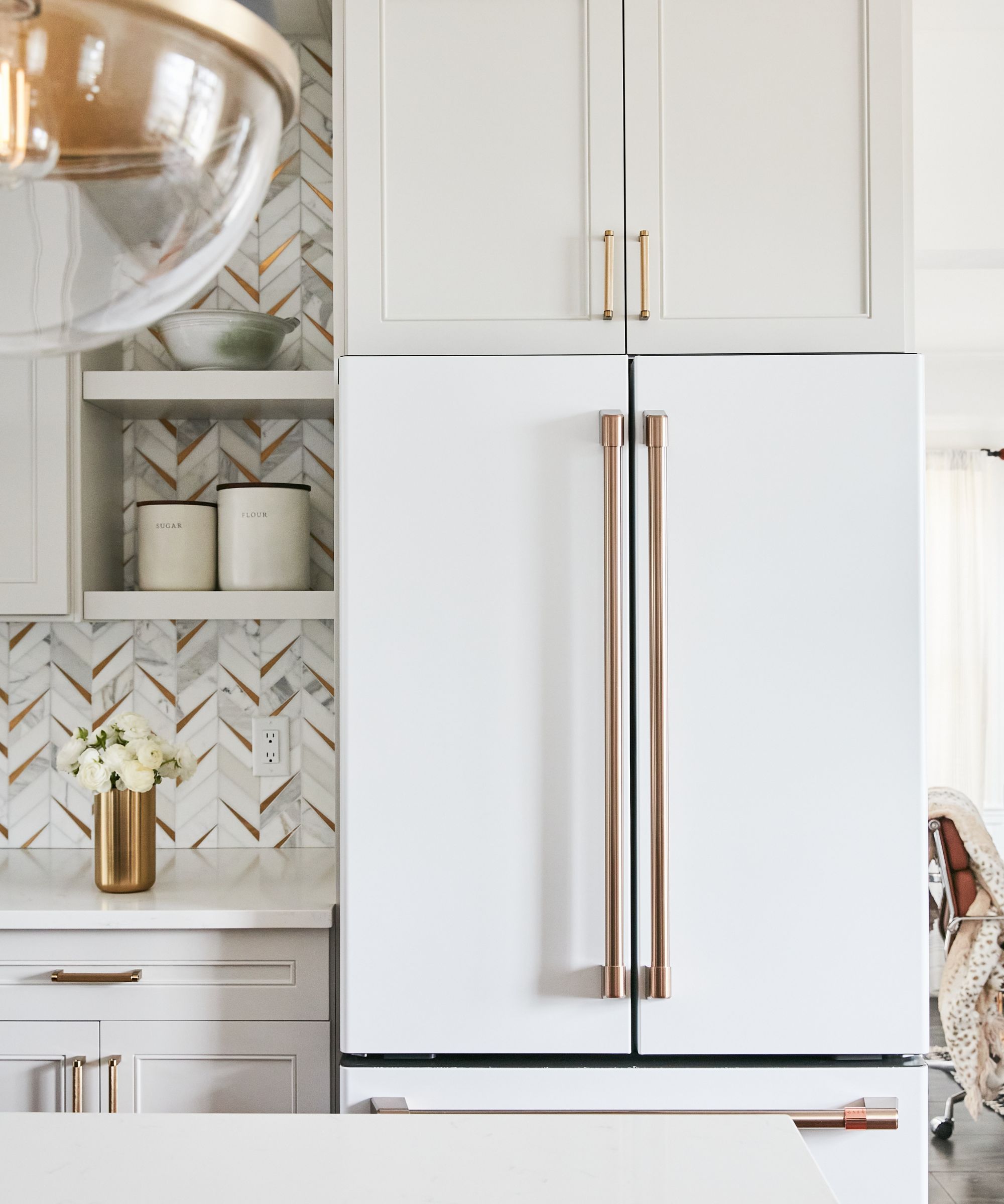
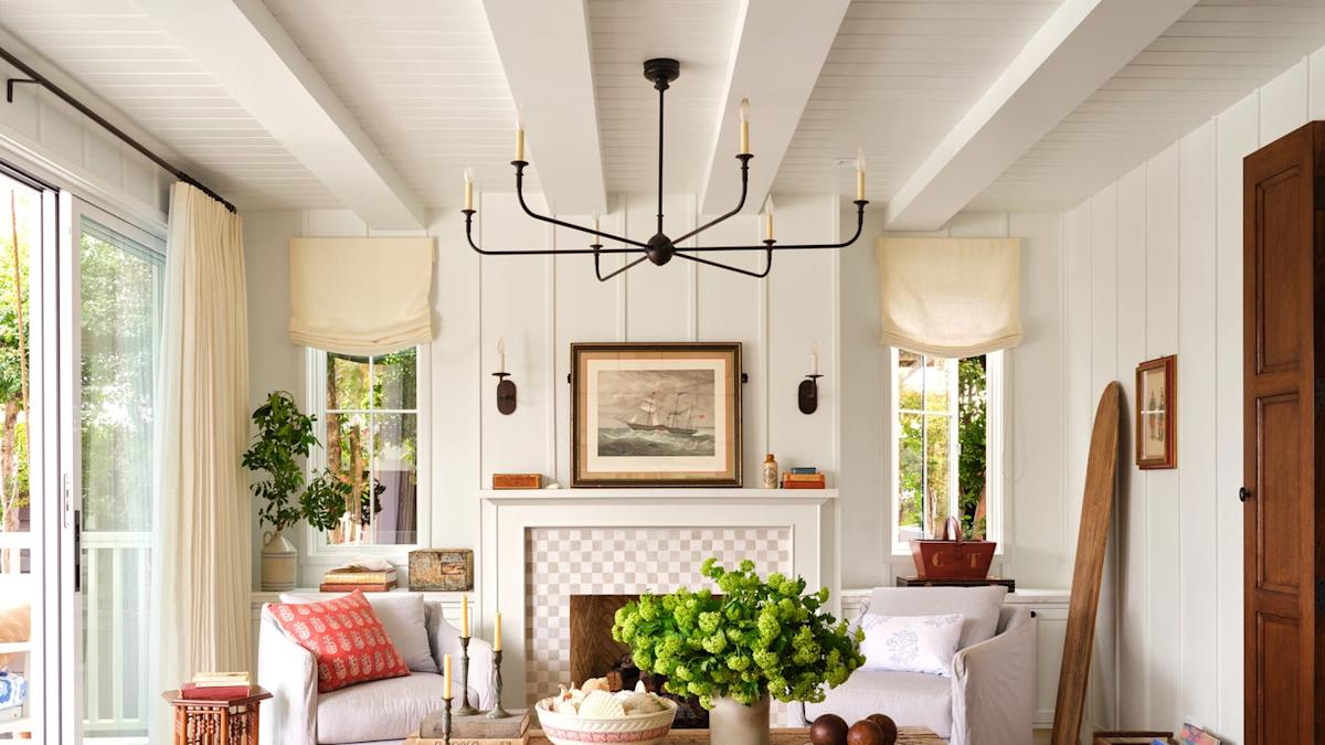
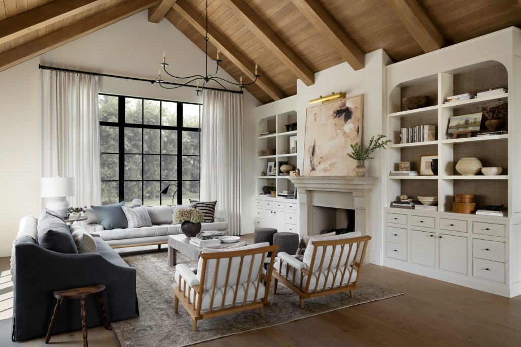
Next, **White Snow SW 9541** is characterized by its high light reflective value and very subtle warm undertones, preventing it from appearing too stark. Its ability to reflect light makes it an excellent choice for living rooms, contributing to a more spacious and inviting atmosphere. While it offers a touch of warmth, those seeking a more pronounced warm white might consider other options like Alabaster SW 7008.
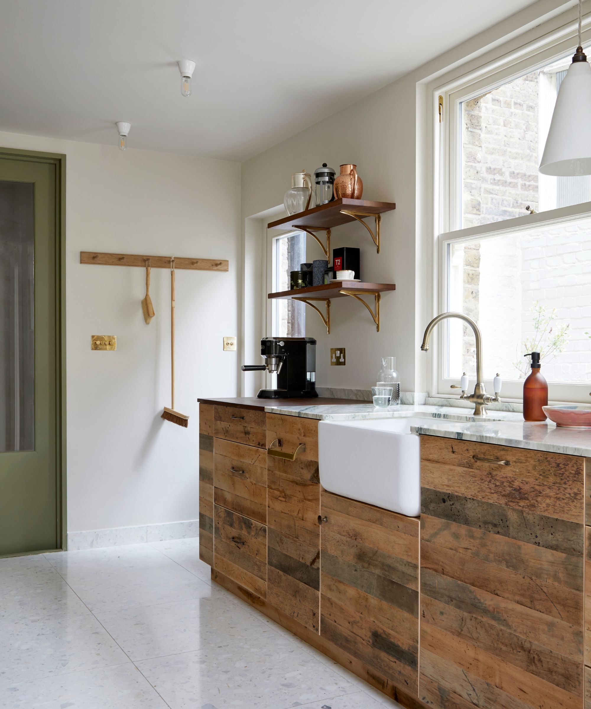
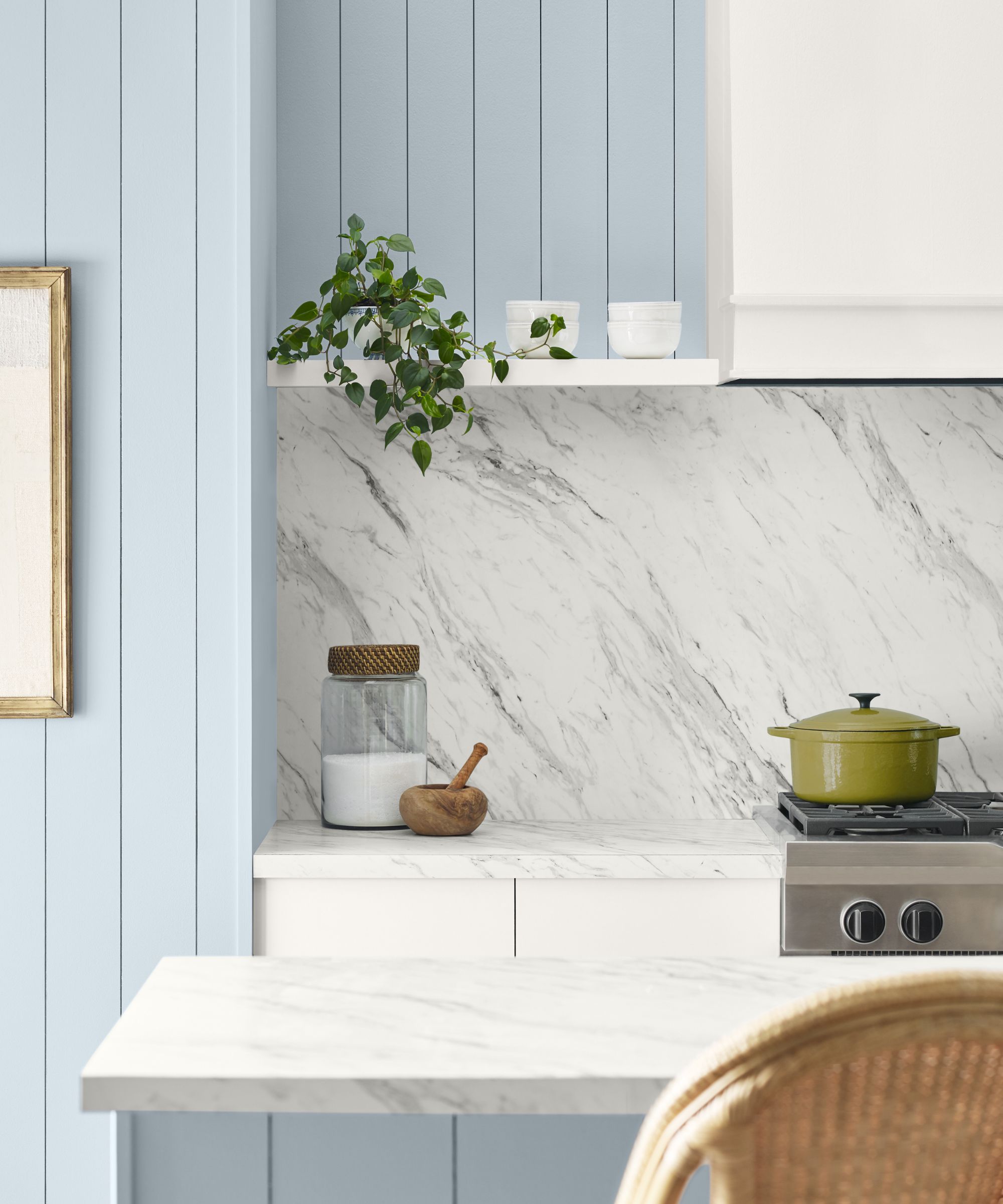
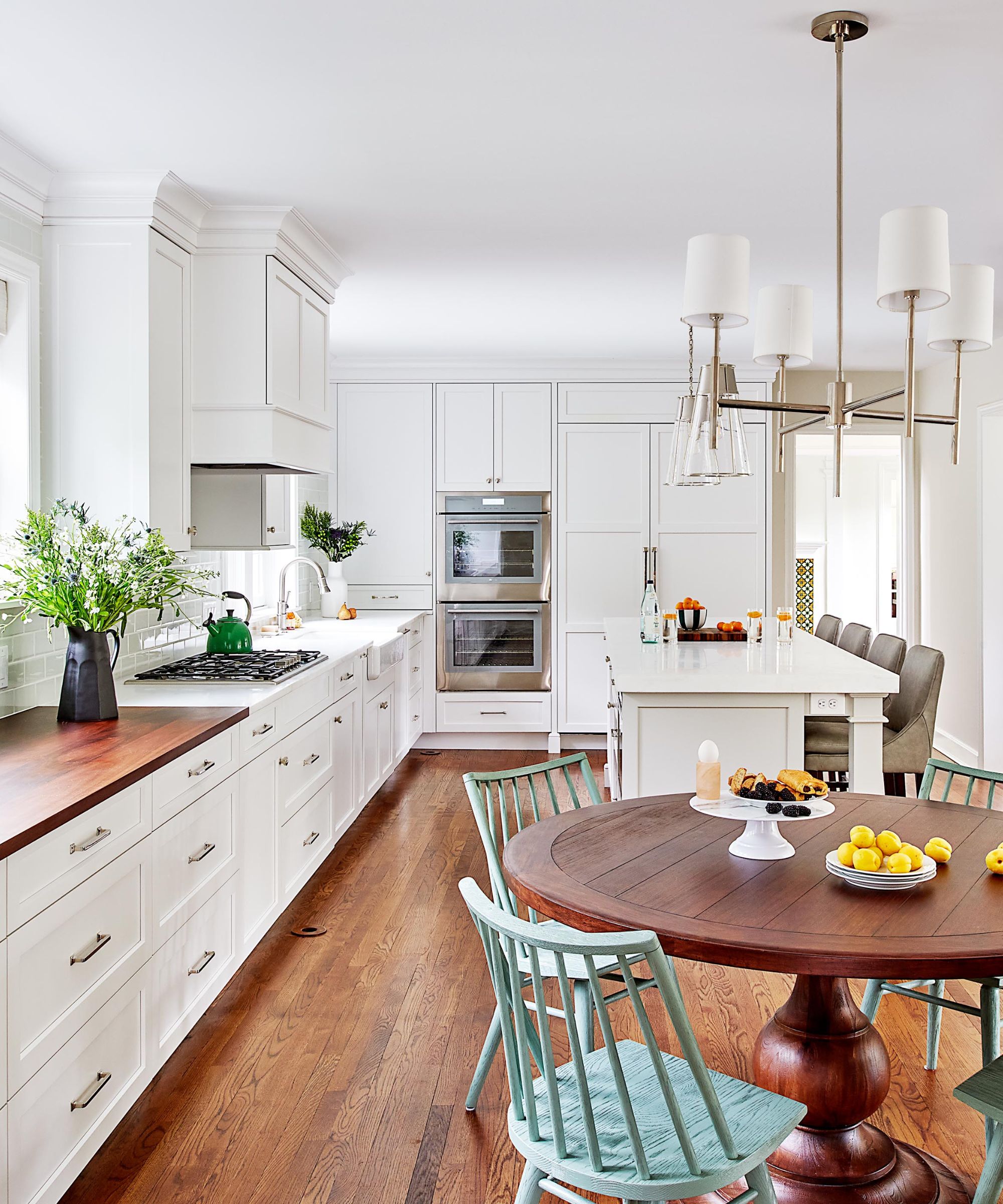
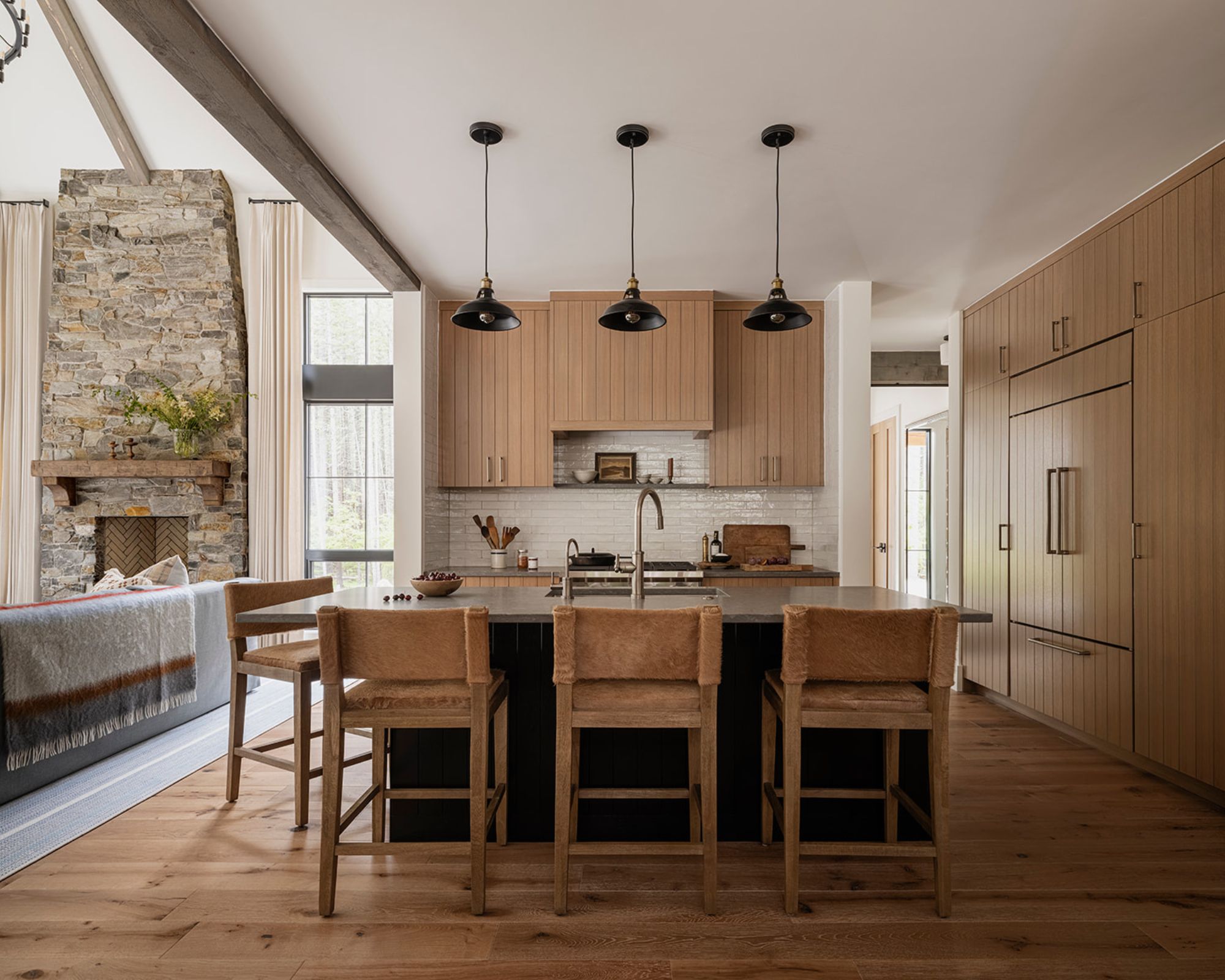
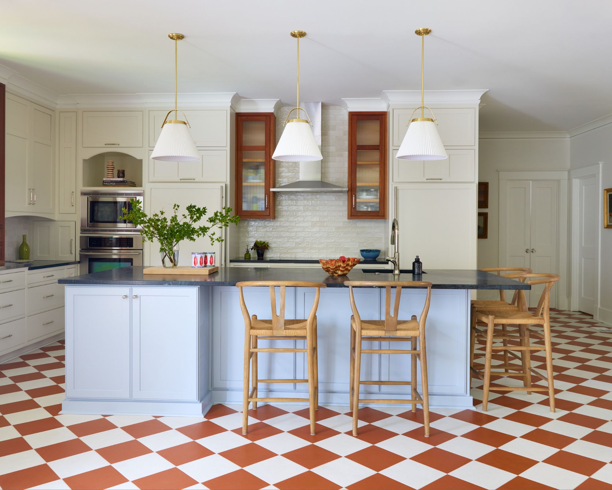
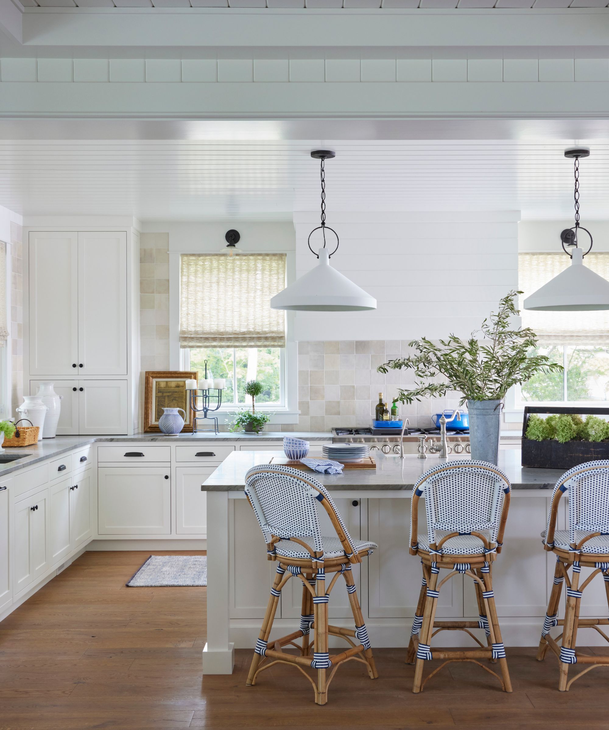
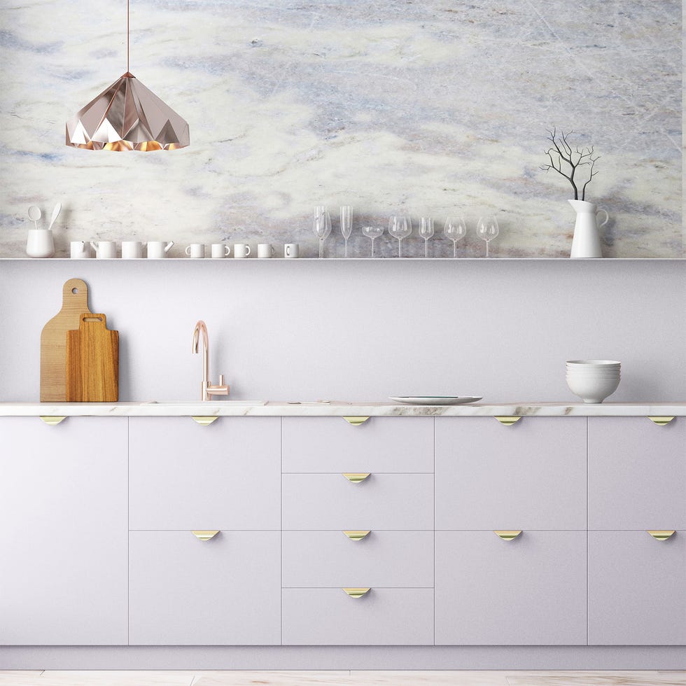
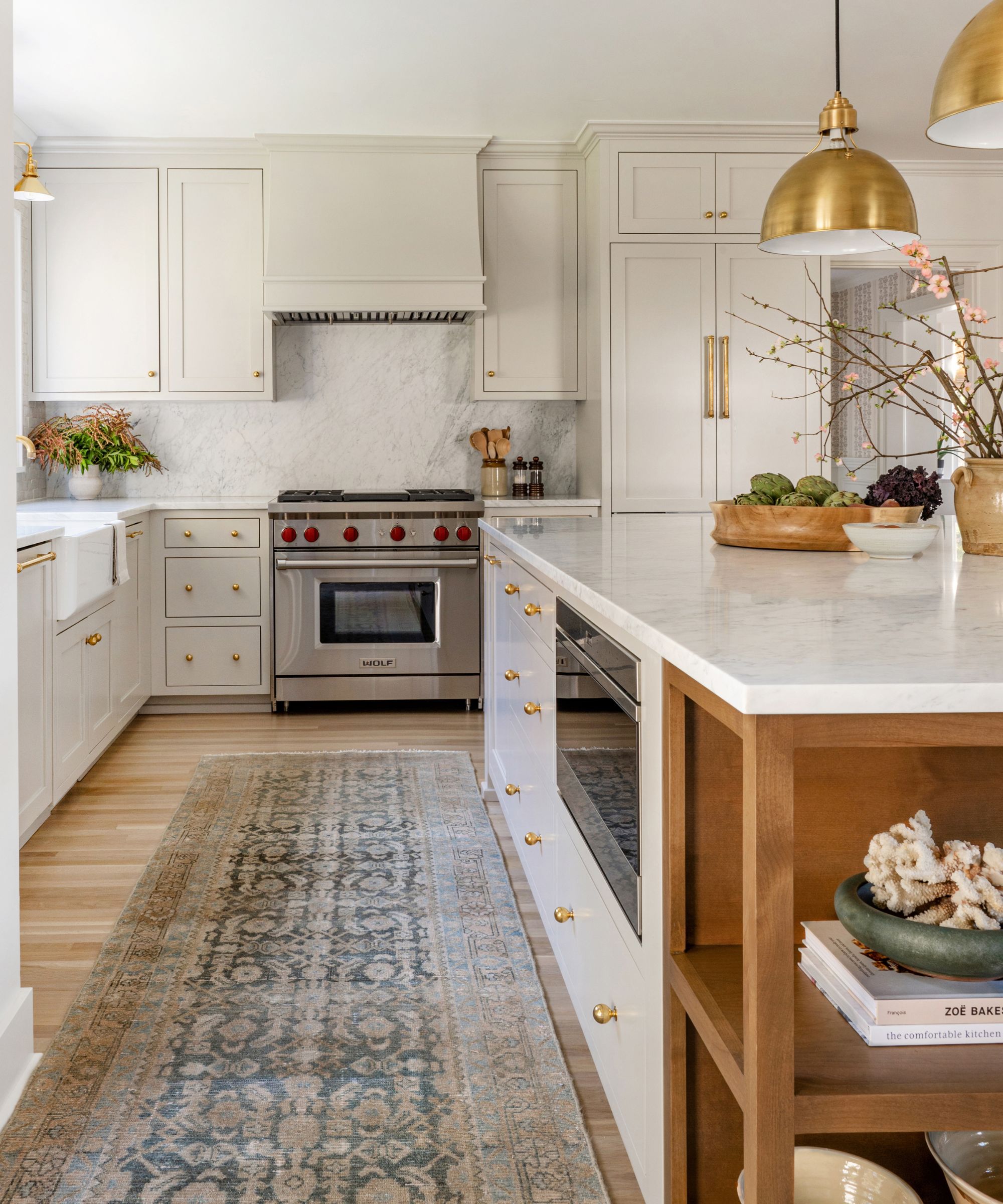
**Cheviot SW 9503** is another warm and welcoming white with delicate yellow undertones, resulting in a soft and cozy feel. This shade is particularly well-suited for kitchens, as its subtle warmth prevents a clinical appearance. It harmonizes effectively with various kitchen elements, including countertops, backsplashes, and wood tones, accommodating diverse design styles.
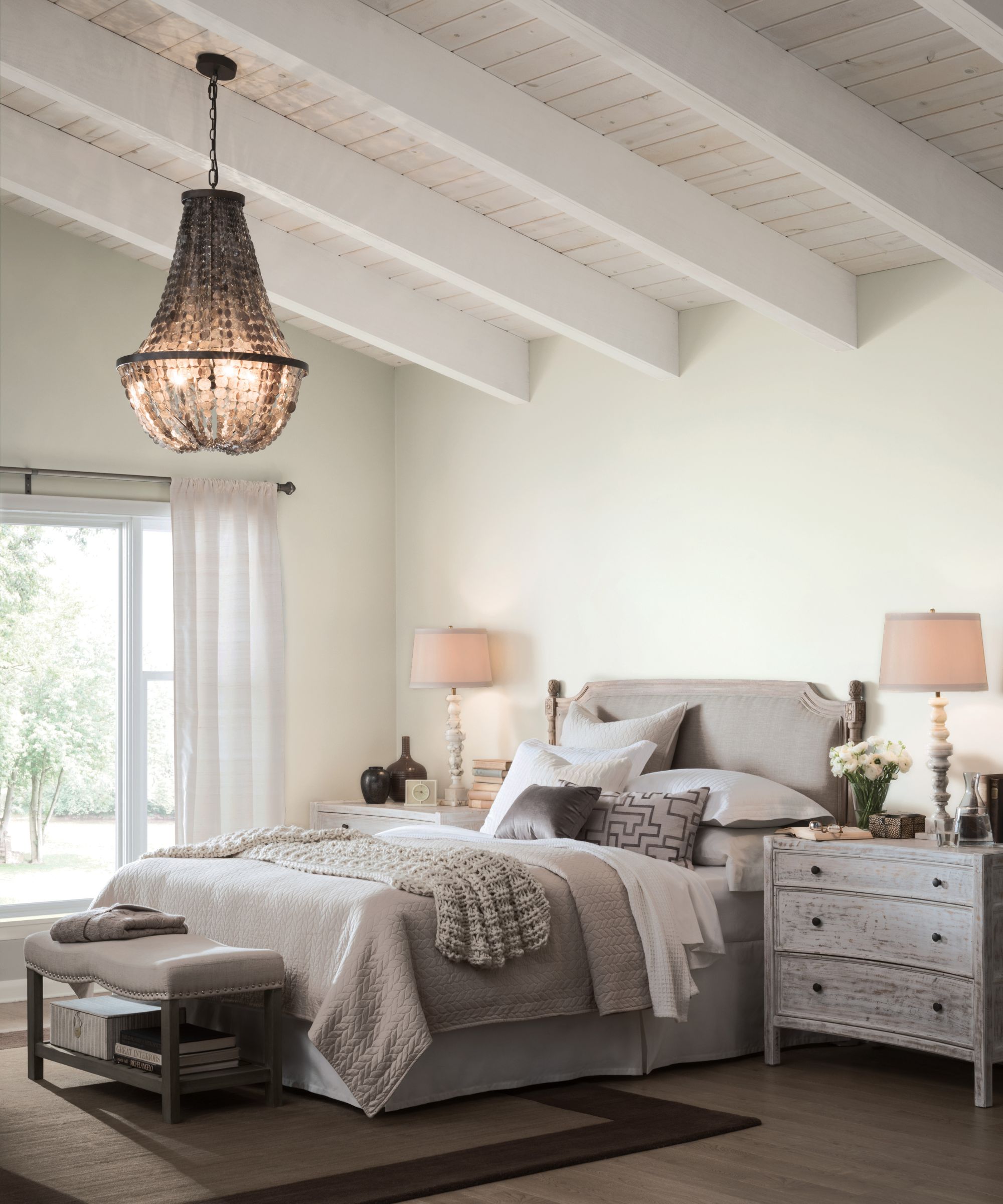
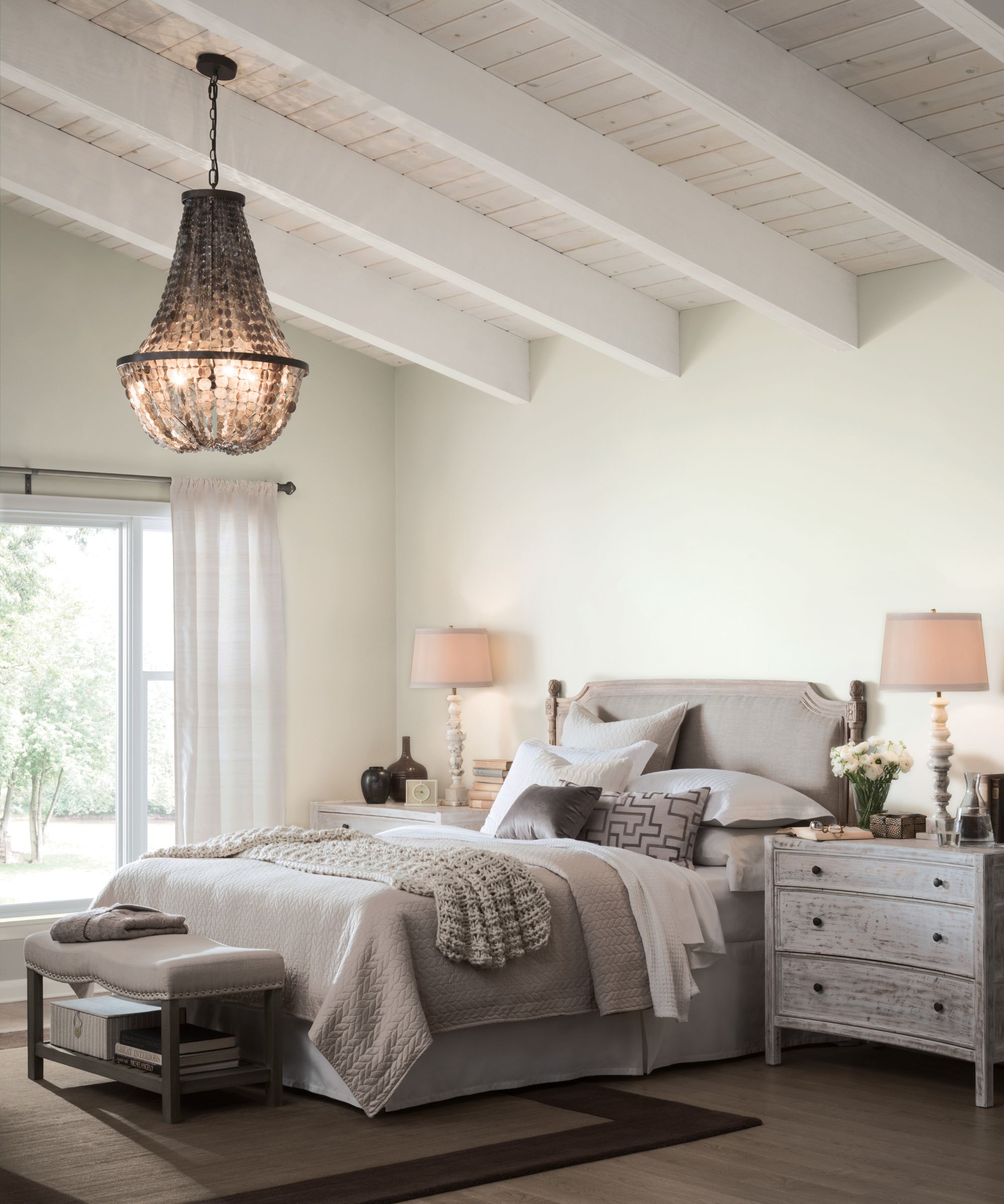
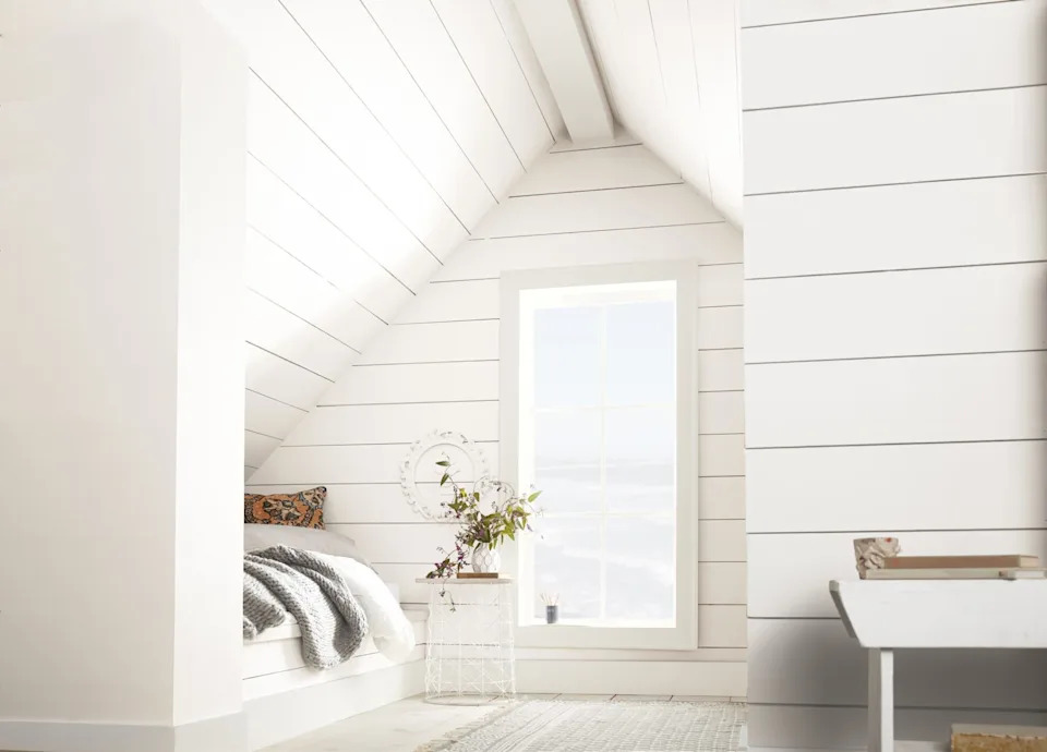
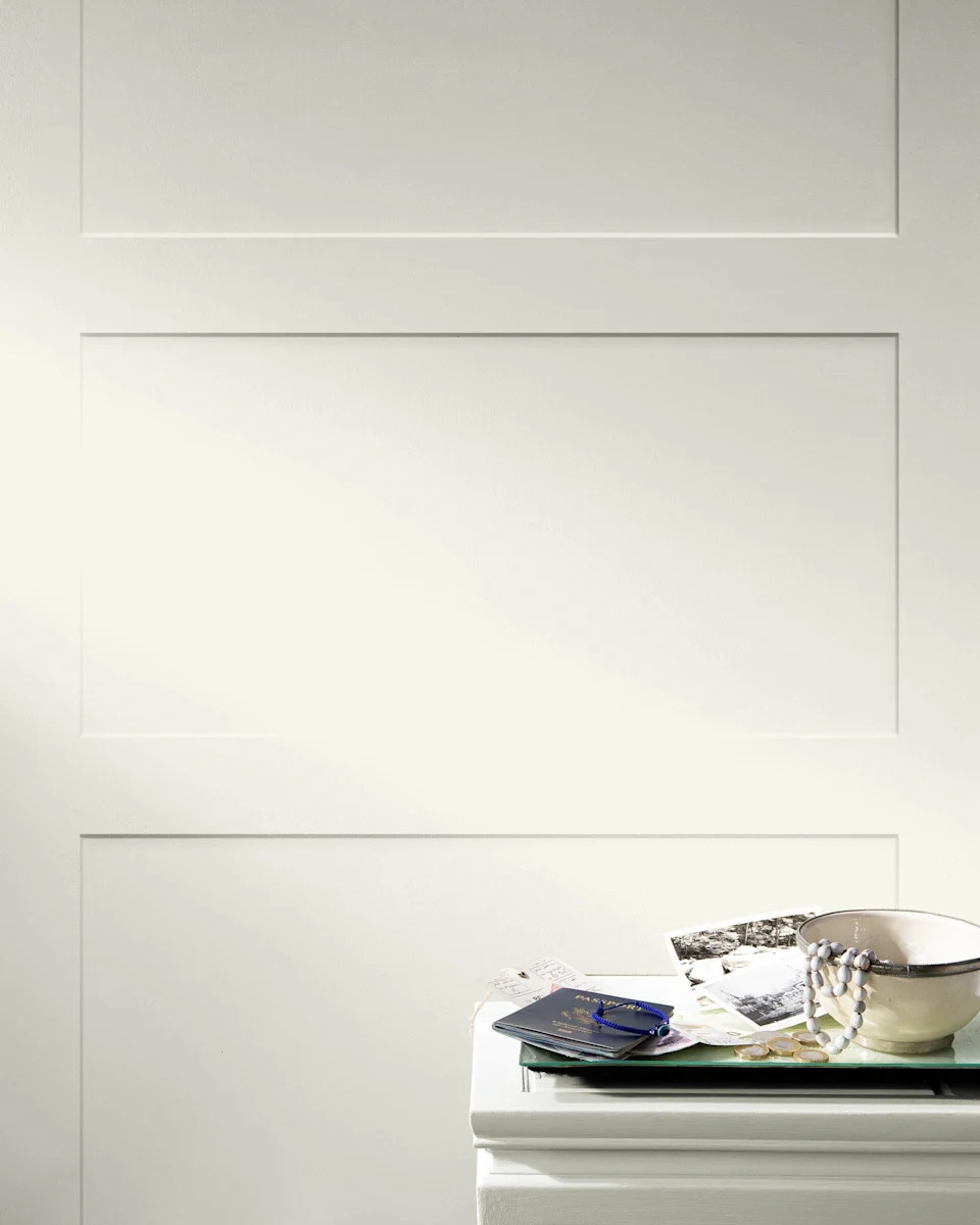
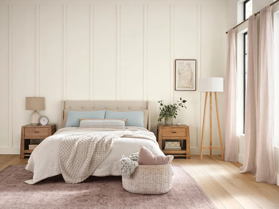
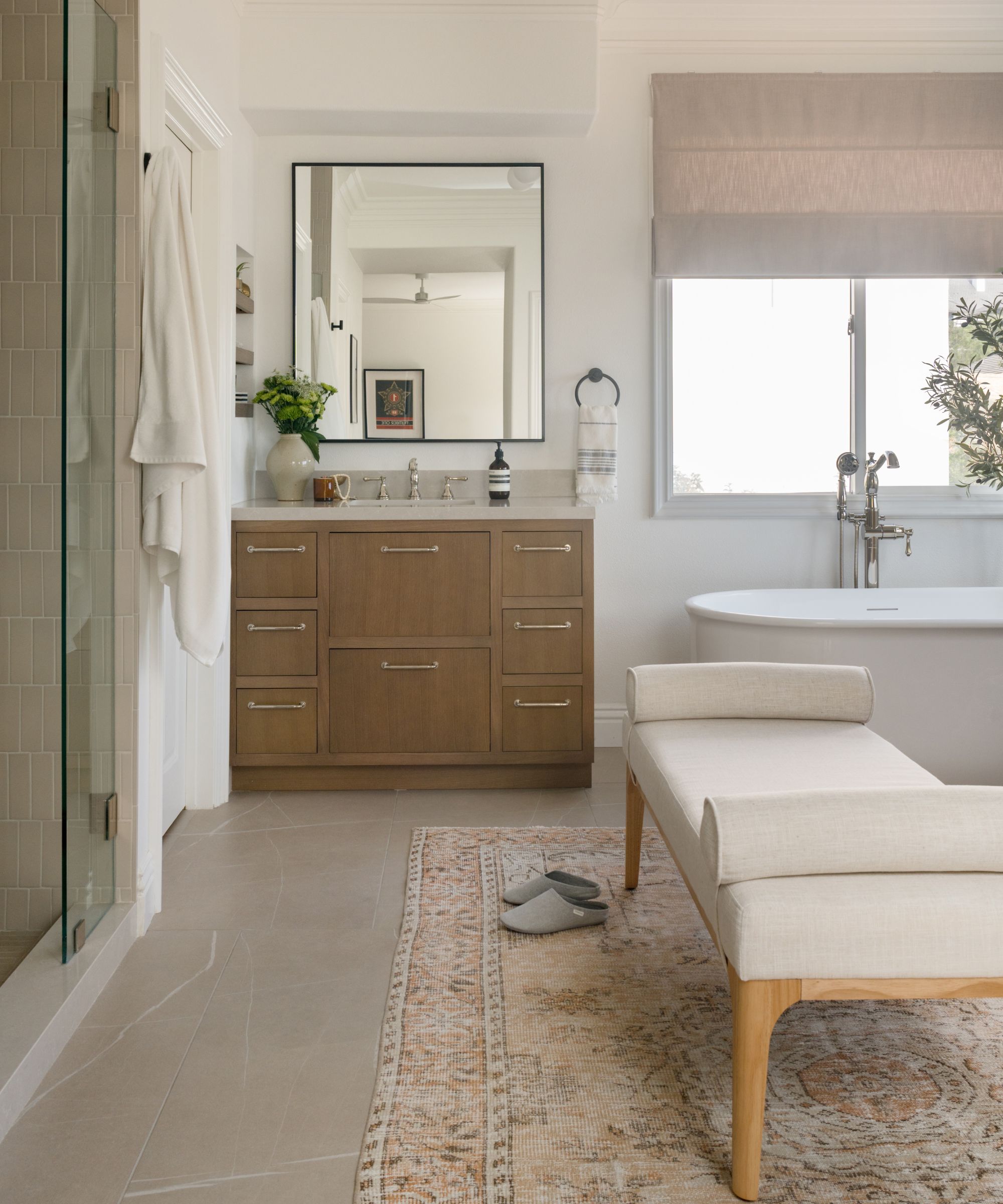
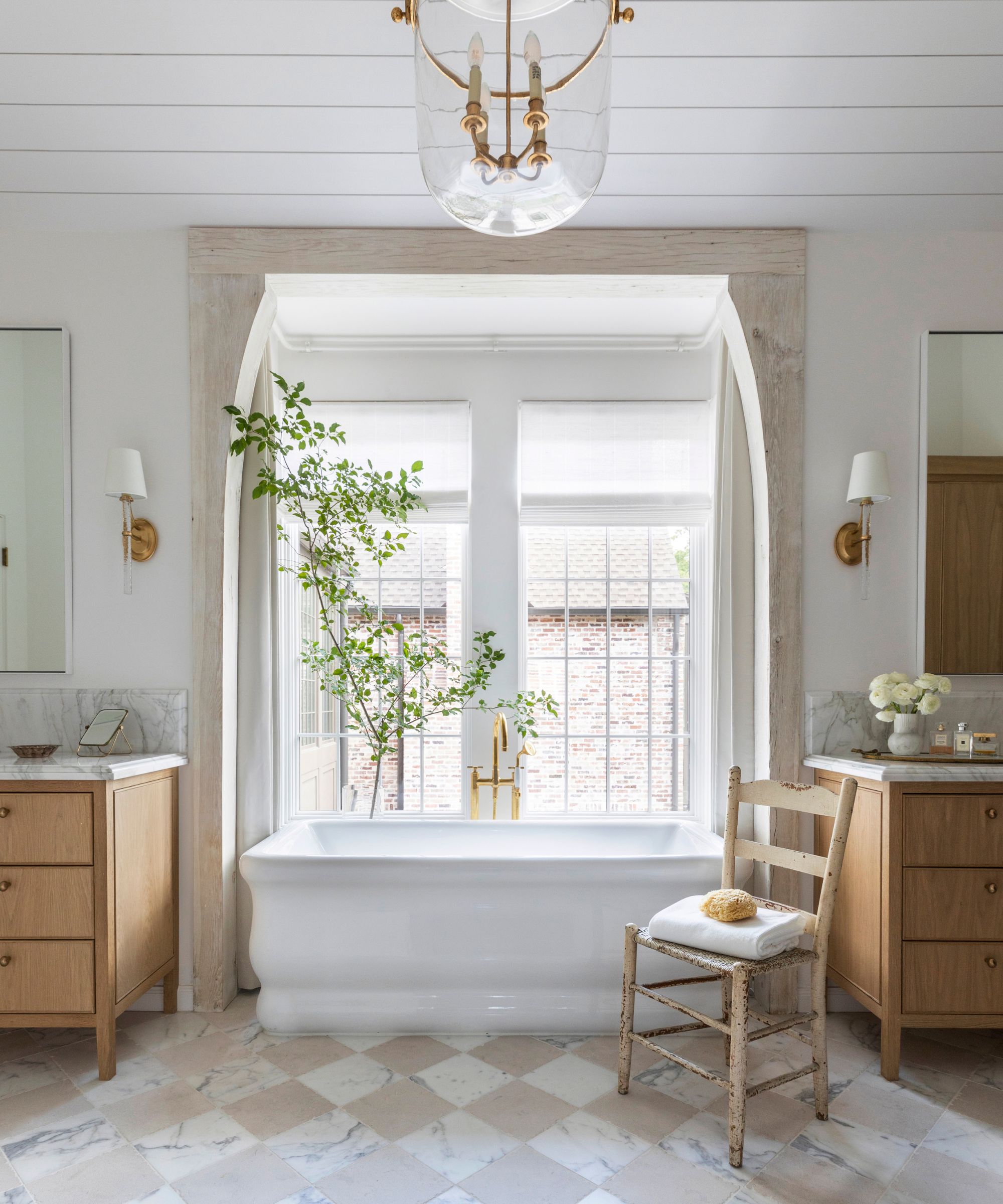
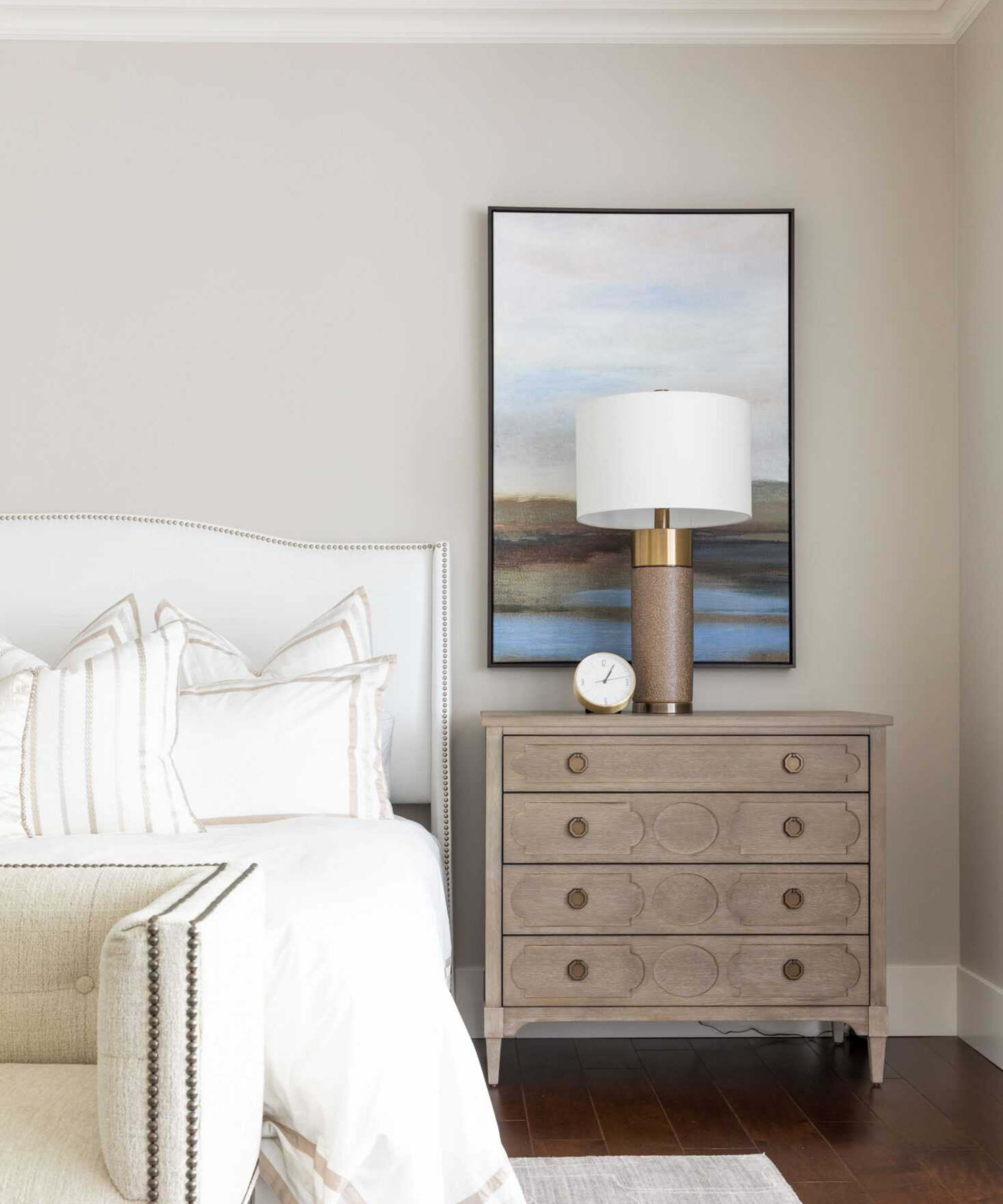
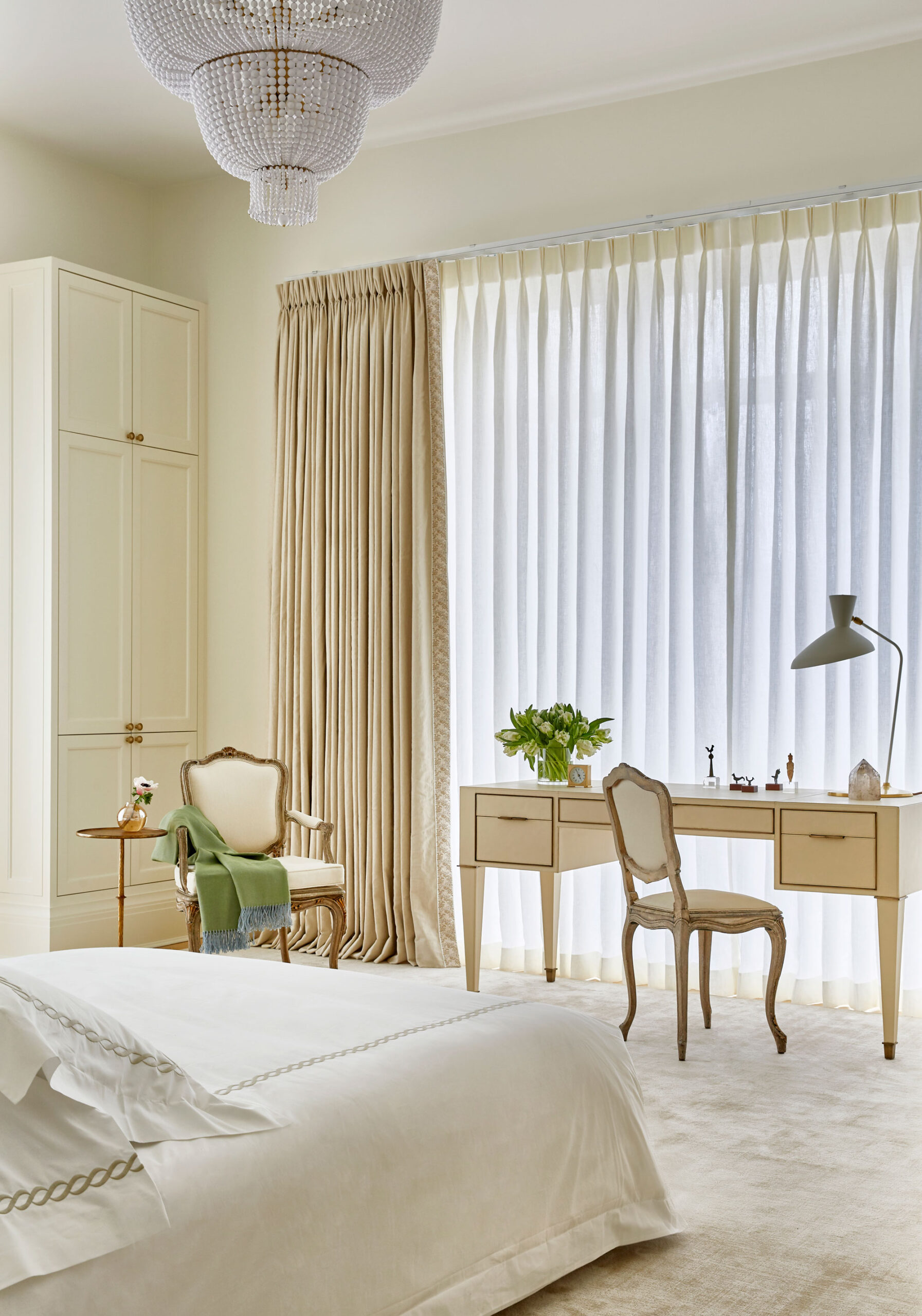
**Snowbound SW 7004** is a consistently popular choice among interior designers. This best-selling white features a subtle gray undertone, which imparts a light and airy quality to rooms. It creates a calming atmosphere, especially in bedrooms, and also works effectively in bathrooms for a timeless and balanced color scheme. The gray undertone adds sophistication without making the space feel cold.
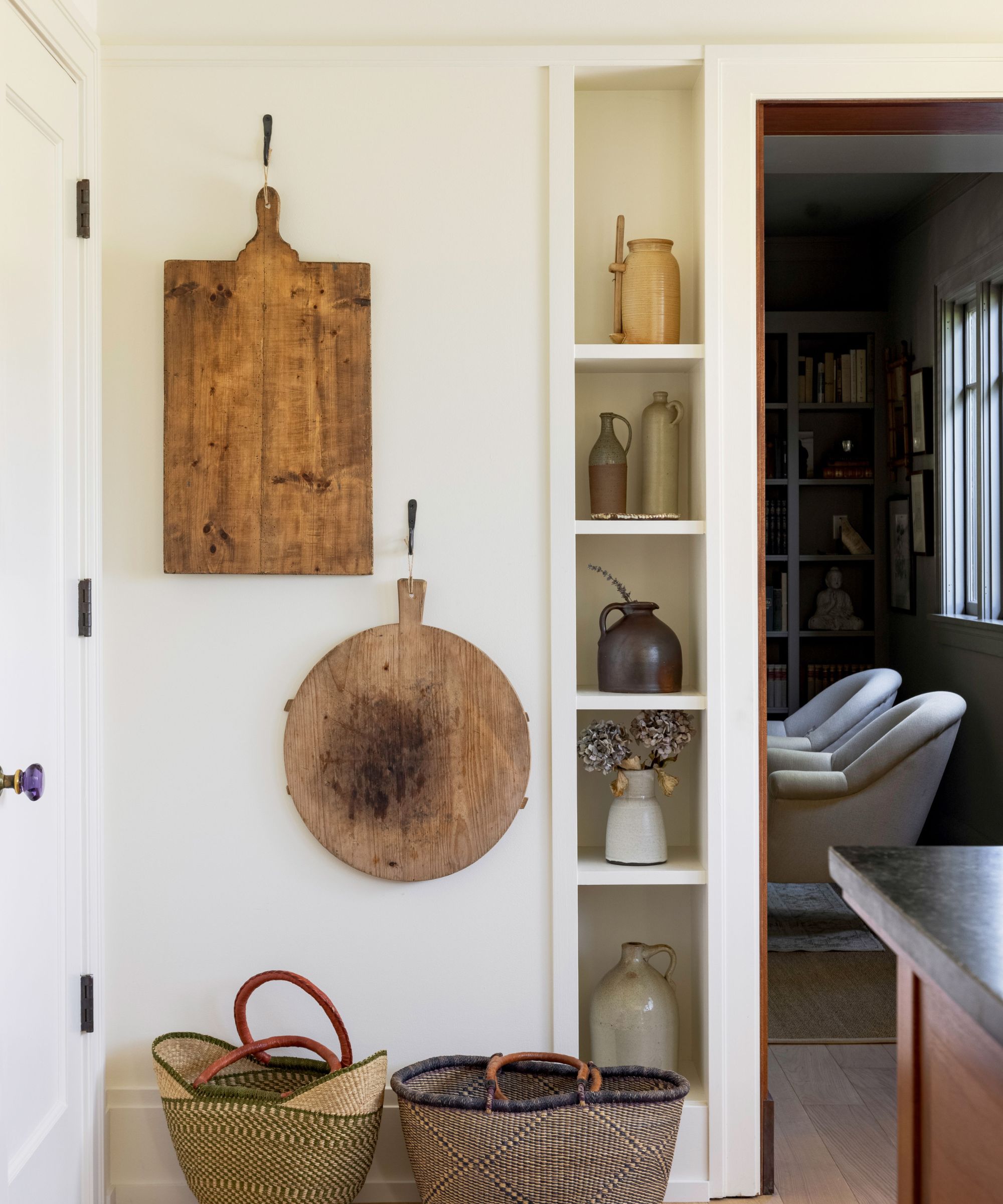
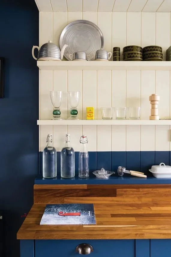
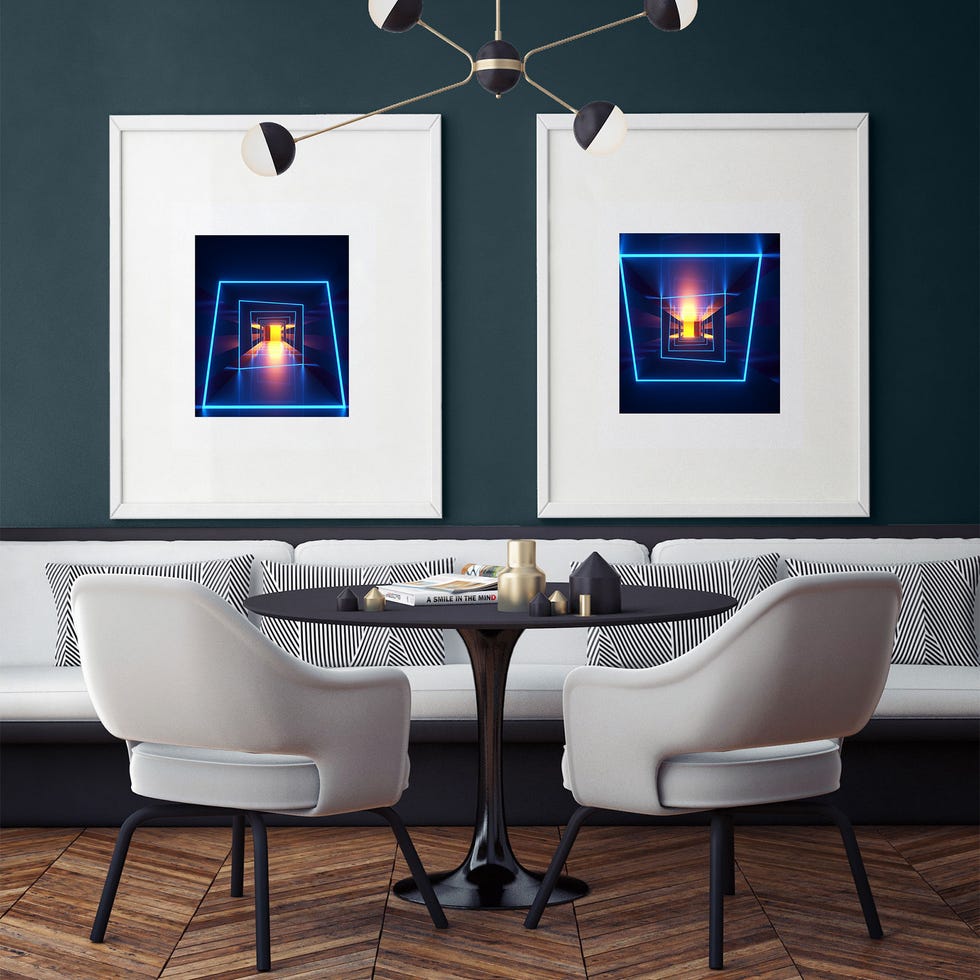
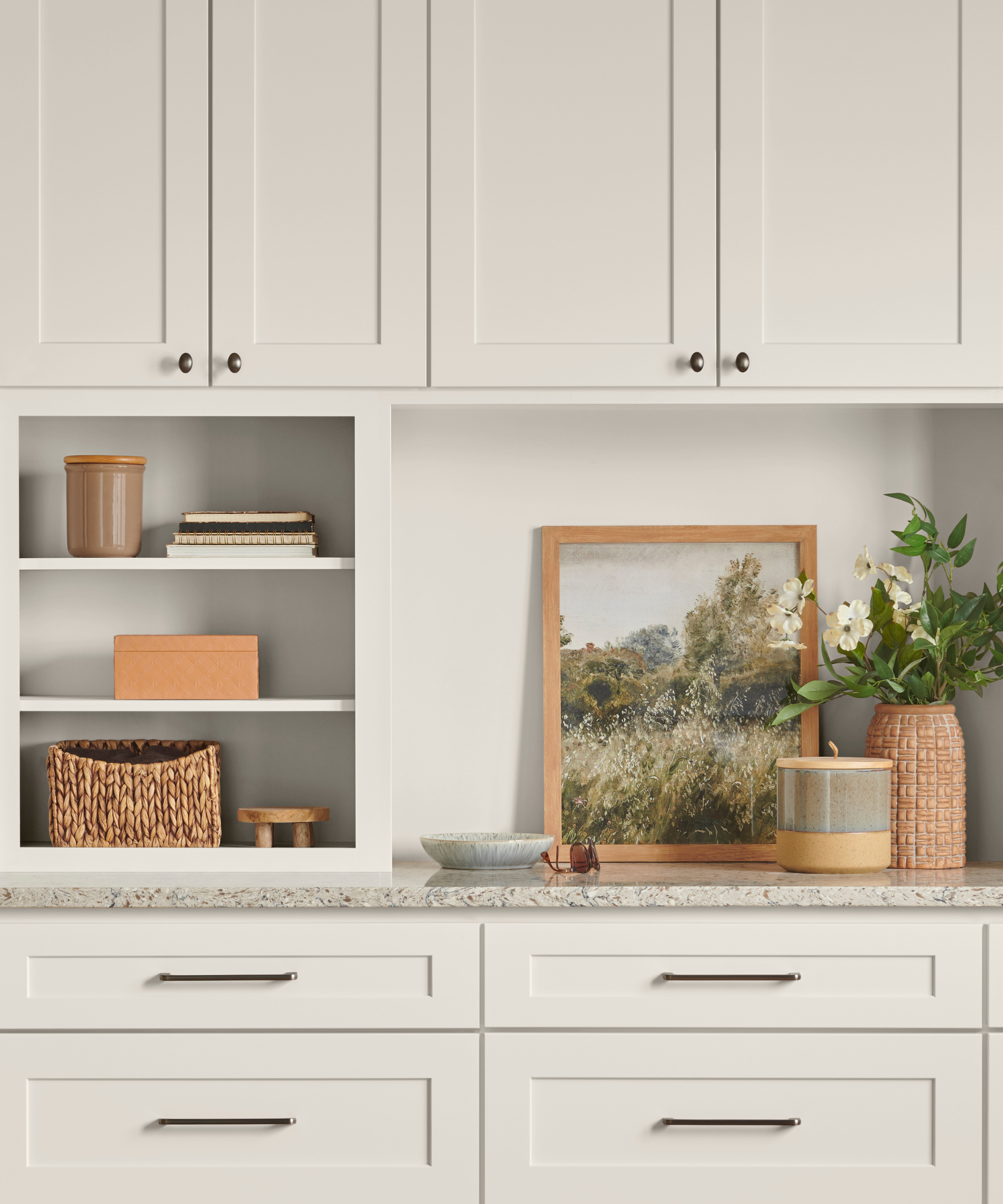
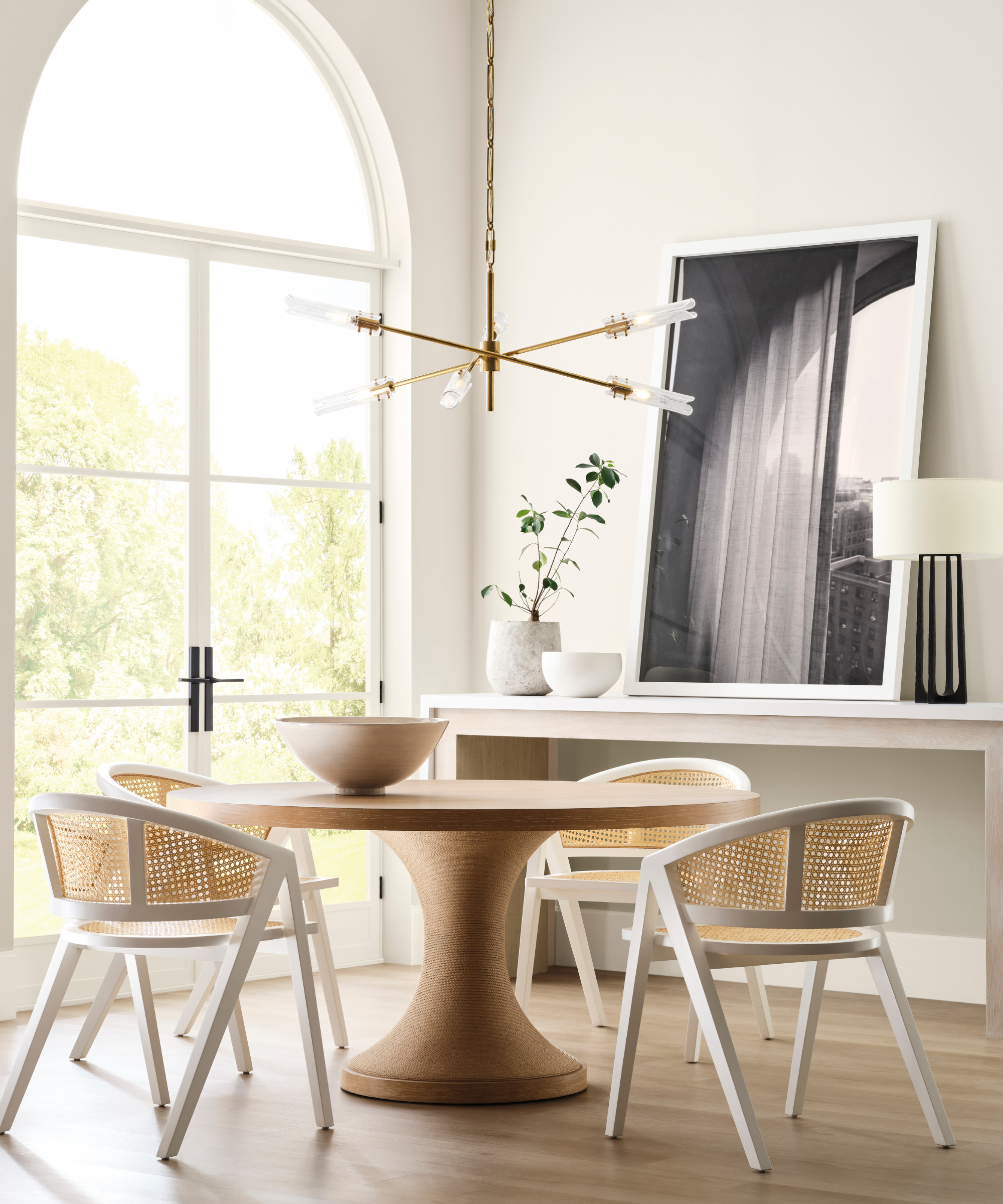
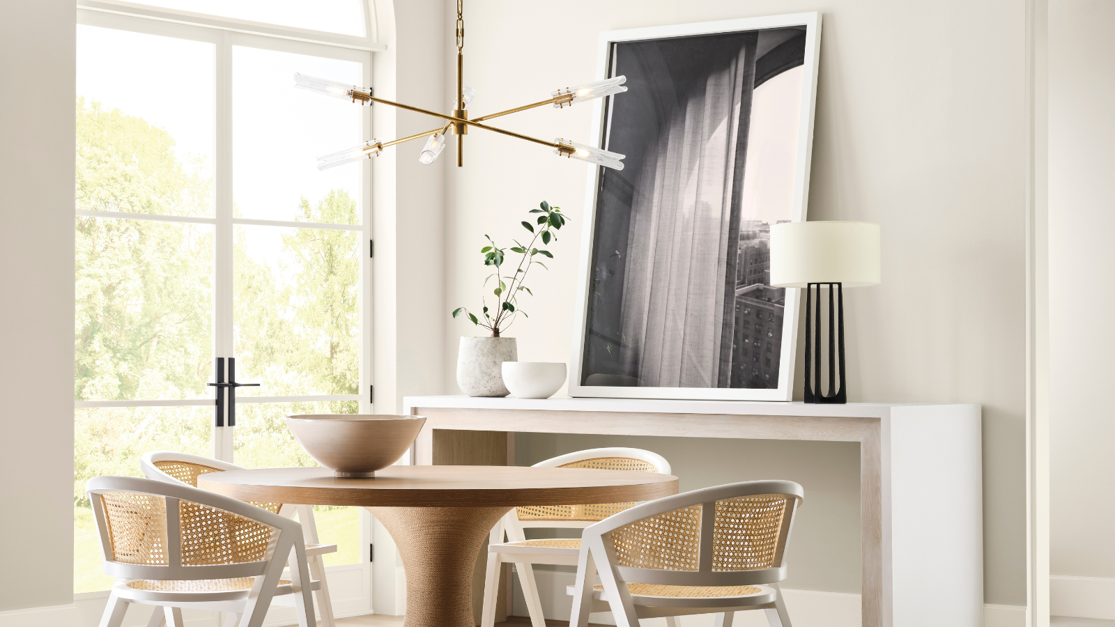
Finally, **Westhighland White SW 7566** offers a creamy bright white with soft yellow undertones. Despite its brightness, it avoids appearing as a true cream, striking a balance between neutral warmth and brightness. This makes it an excellent choice for dining rooms, fostering a comfortable and welcoming ambiance. It serves as a versatile backdrop color, suitable for those who find some neutrals too warm and some whites too stark.
When selecting a white paint, it is crucial to obtain swatches and observe how the color appears throughout the day, as natural light—influenced by the room's orientation—can significantly alter its perception. These five Sherwin-Williams white paints provide a strong starting point for achieving a light, airy, and timeless aesthetic in any home.
#SherwinWilliams #WhitePaint #InteriorDesign #HomeDecoration #PaintColors #DesignTips #RoomColorIdeas #BrightWhites #SherwinWilliams #WhitePaint #InteriorDesign #HomeDecoration #PaintColors #DesignTips #RoomColorIdeas #BrightWhites
0 comment in total
 No comments yet
You may also like
What are the best Sherwin-Williams white paints? 6 favorite shades amongst interior designers
The 40 Best White Paint Colors, According to Designers
What are the best white paints for kitchens? 6 light and airy picks from interior designers
7 Sherwin-Williams Paint Colors Interior Designers Can’t Stop Using

5 best warm white paints, as chosen by interior designers

The Best White Paint Colors Experts Turn to Again and Again
How to Pick the Best White Paint Color—Without the Headache
The ultimate guide to choosing the right shade of white for your walls

5 of the Most Calming Paint Colors From Sherwin-Williams
Sherwin-Williams Predicts These 4 Color Palettes Will Dominate Homes in 2026—and One May Surprise You


The 11 Best Warm White Paint Colors, According to Designers
'It's one of those rare neutrals that feels both effortless and elevated' – how designers use Sherwin-Williams soothing shade Sunbleached
15 White Paint Colors Interior Designers Reach for Time and Again
We asked 12 interior designers for their favorite Sherwin-Williams paints – these are the colors that came out on top
These Are the Colors You'll Be Obsessed With Next Year, Based on Your Personality

The Best Warm White Paint Colors, as Seen in 8 Designers’ Favorite Spaces
5 White Kitchen Paints Designers Swear By
Designers’ Favorite White Paints Are Always Changing—We Asked 3 for Their Latest Pick

What are Sherwin-Williams' best-selling paints? And how interior designers put them to use
Studio McGee's Most Commonly Used White Paint Colors