Say Goodbye to Gray? Saturated Hues Dominate 2025 Paint Color Trends
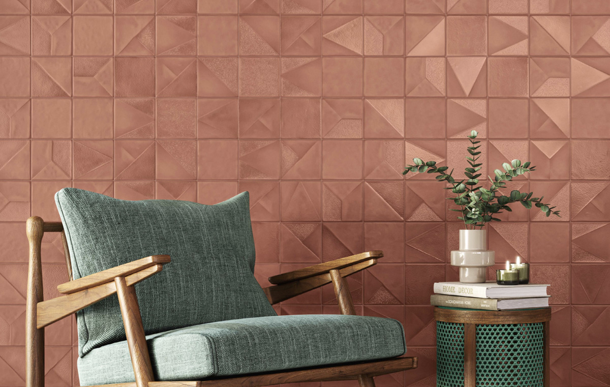
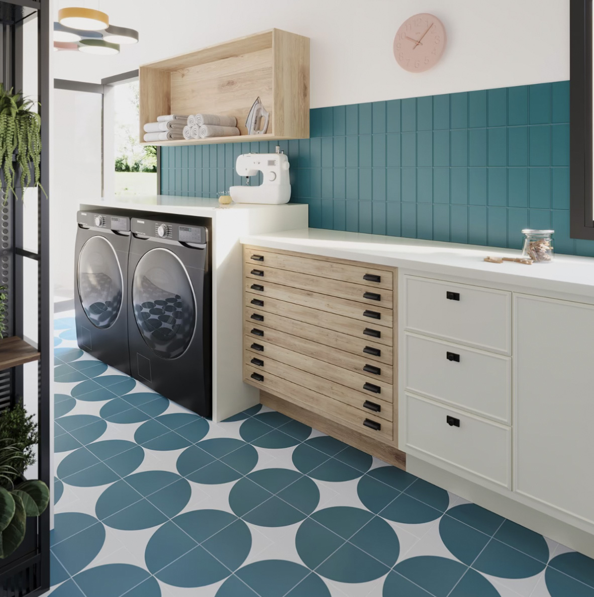
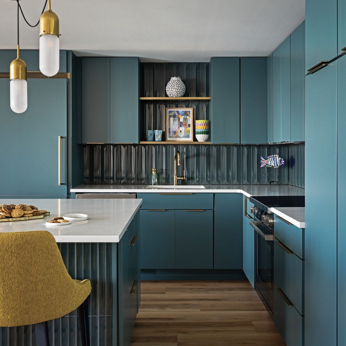
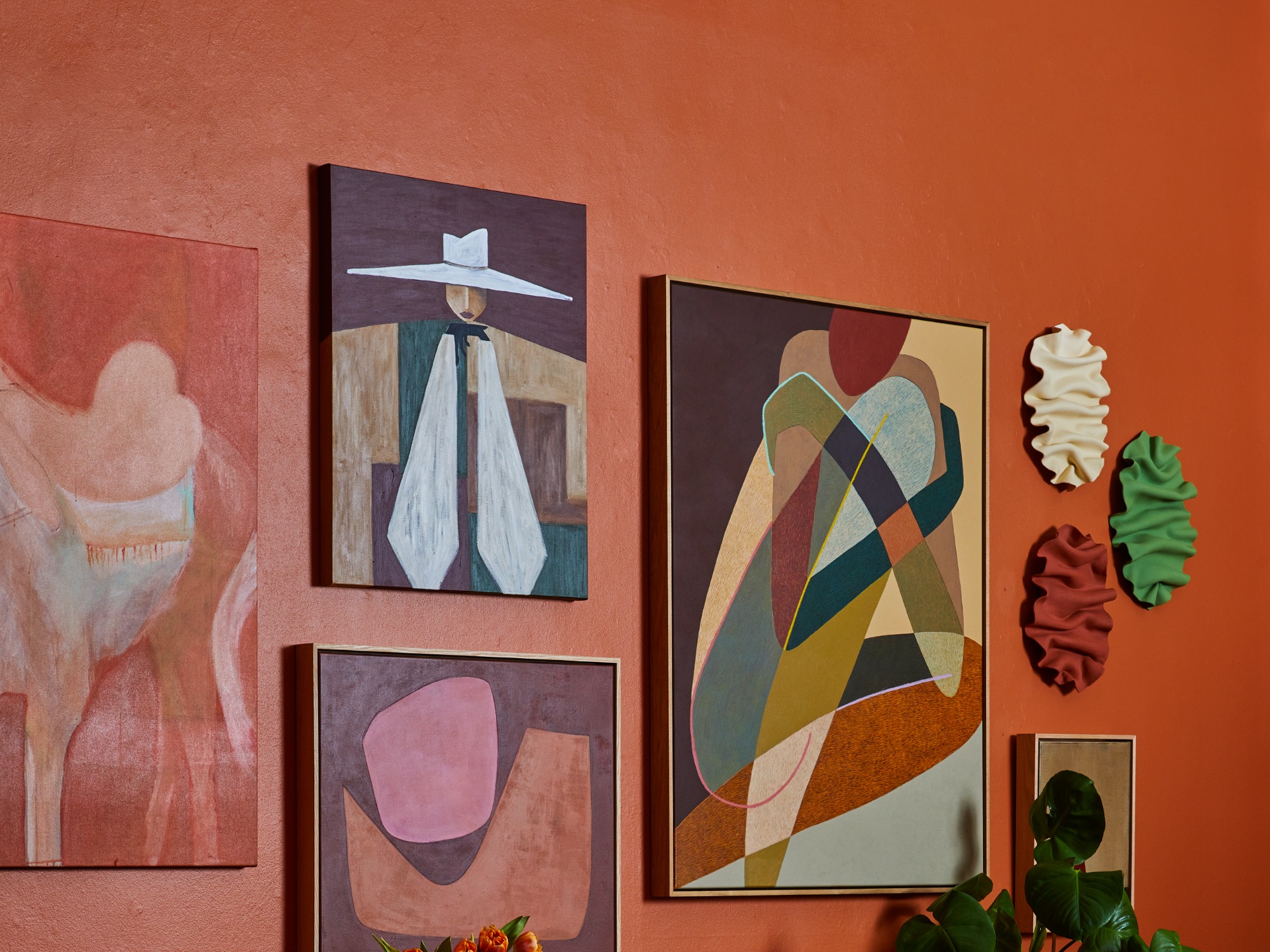
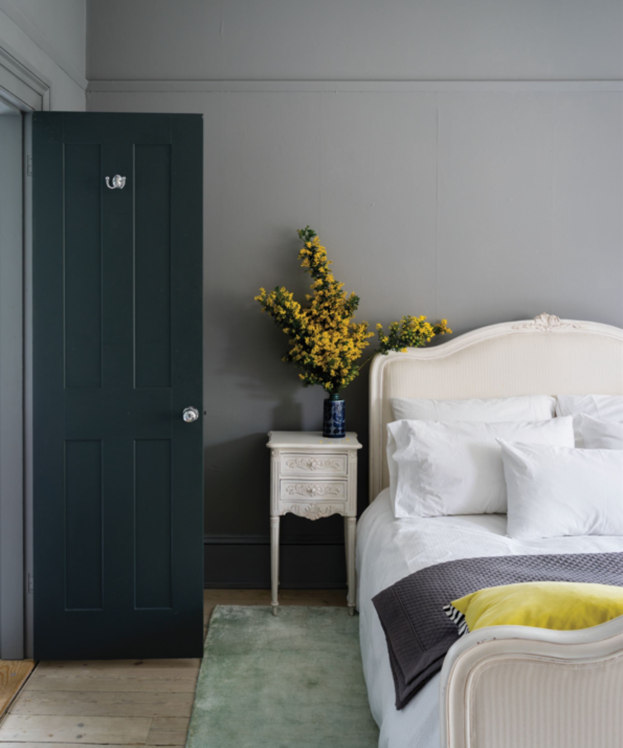
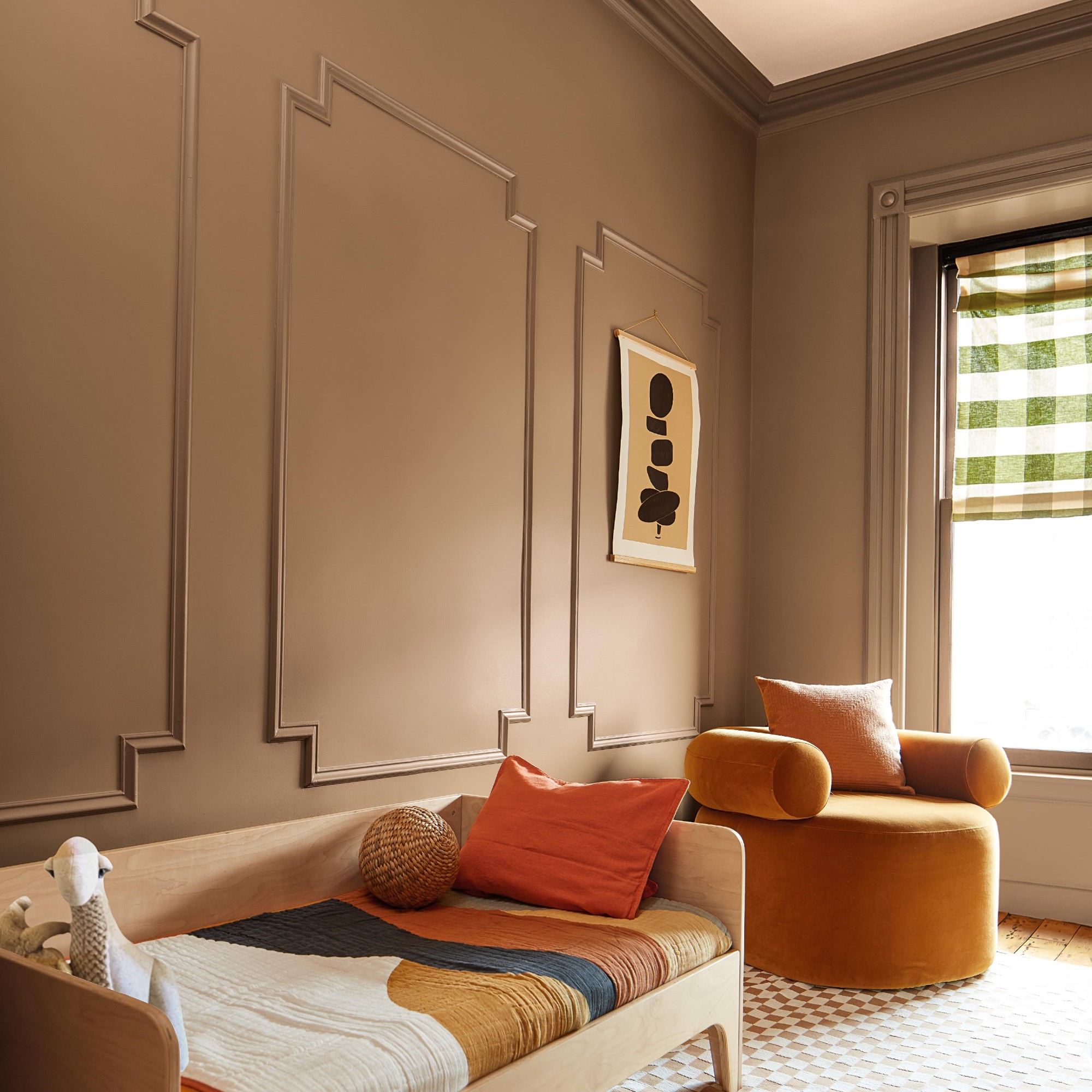
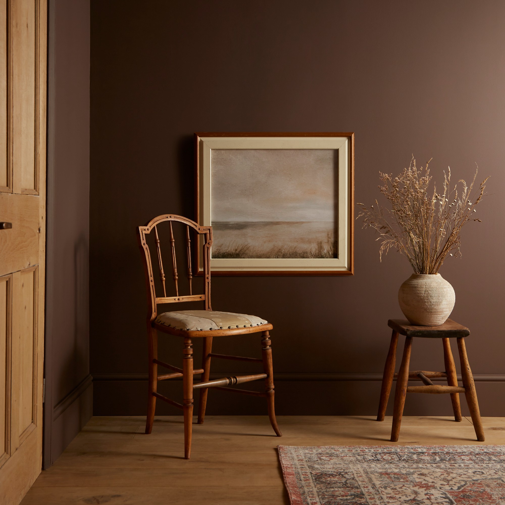
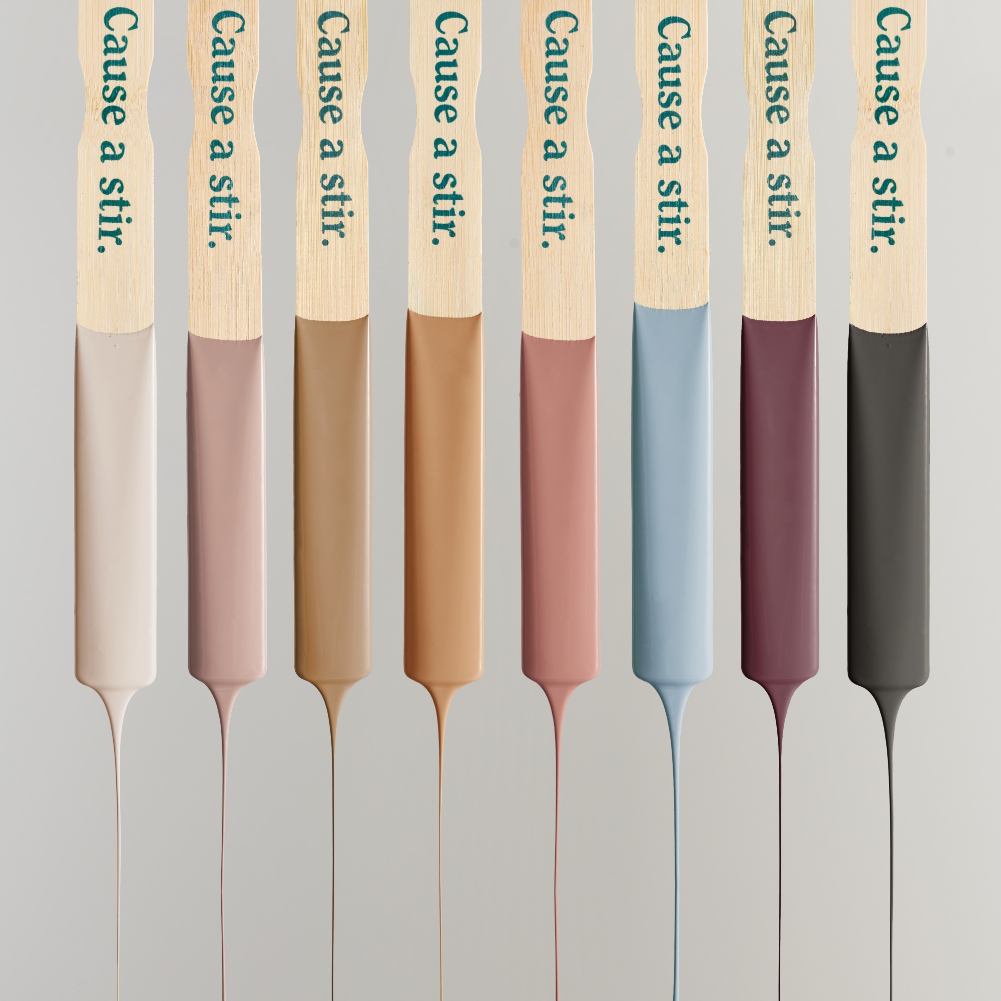
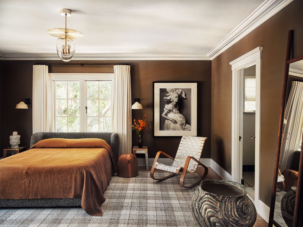
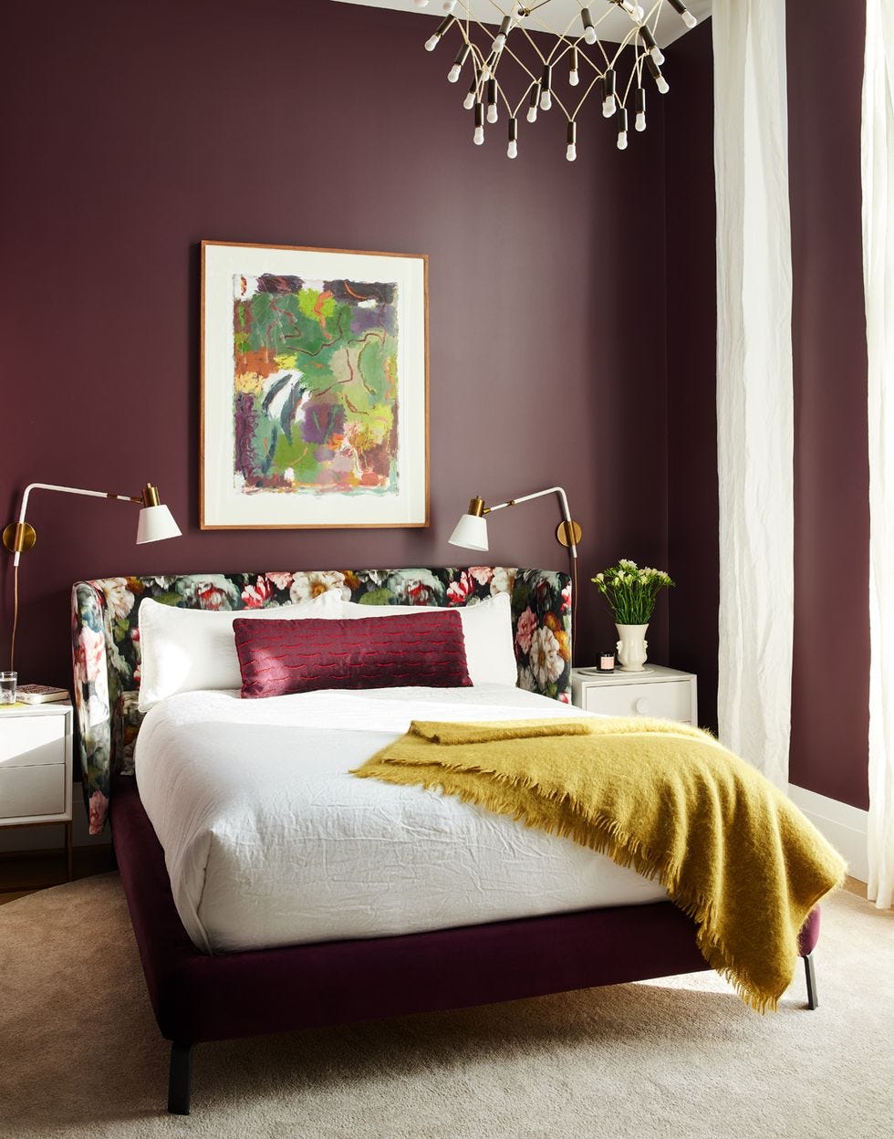
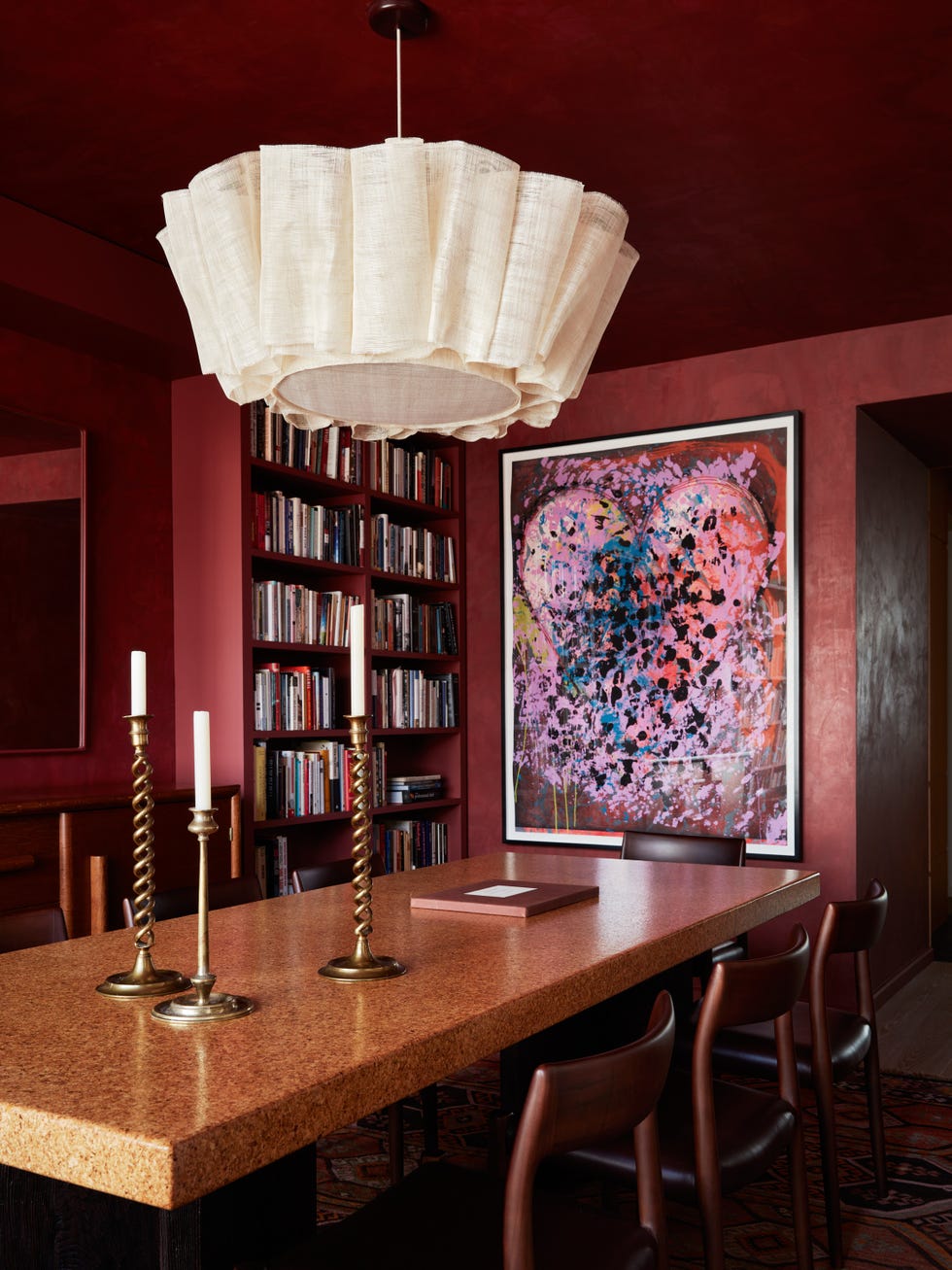
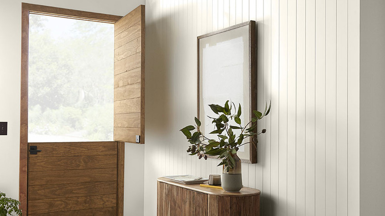
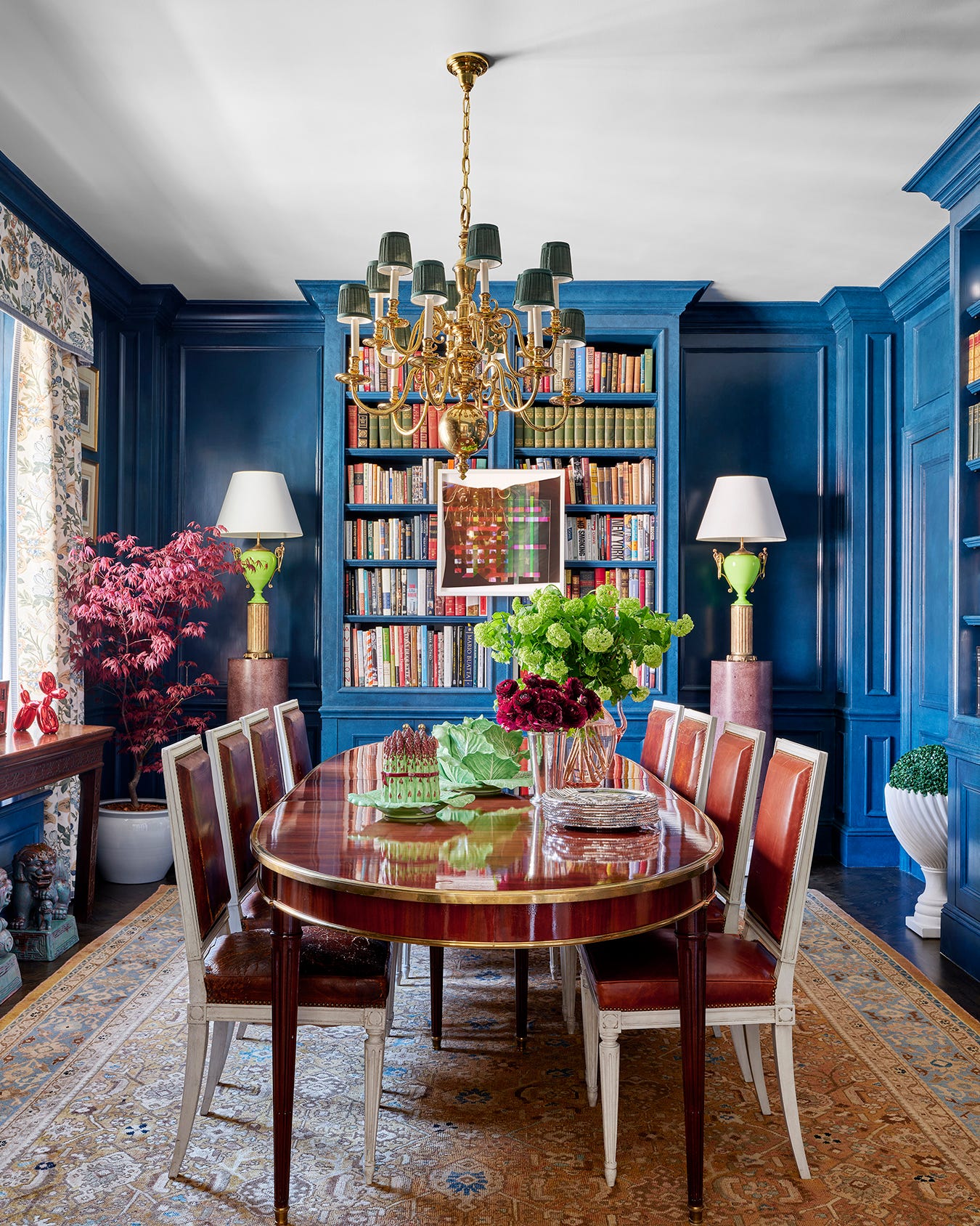
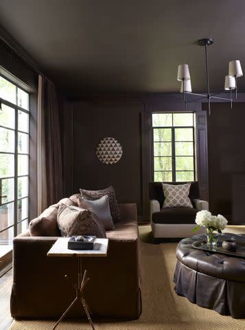
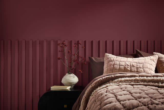
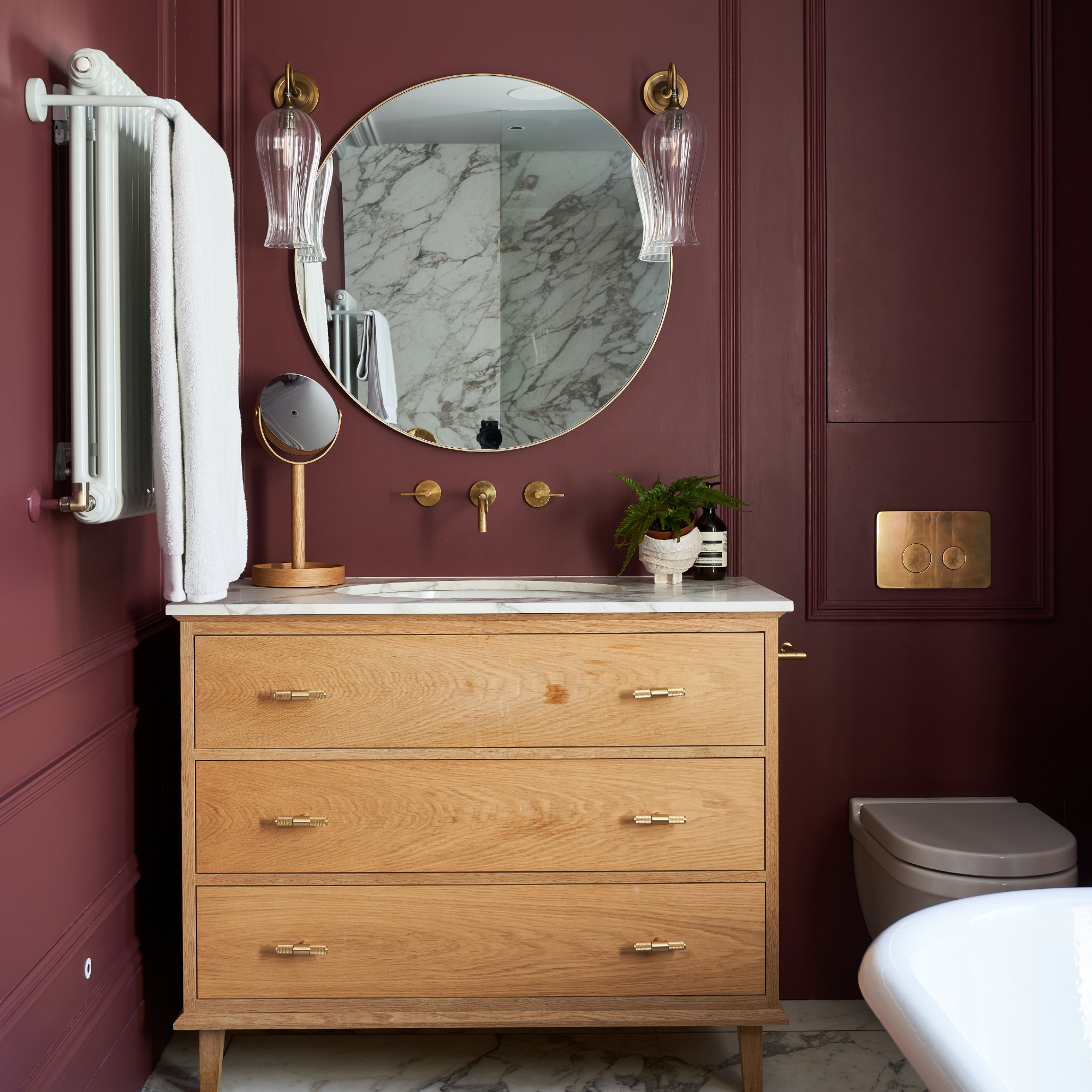
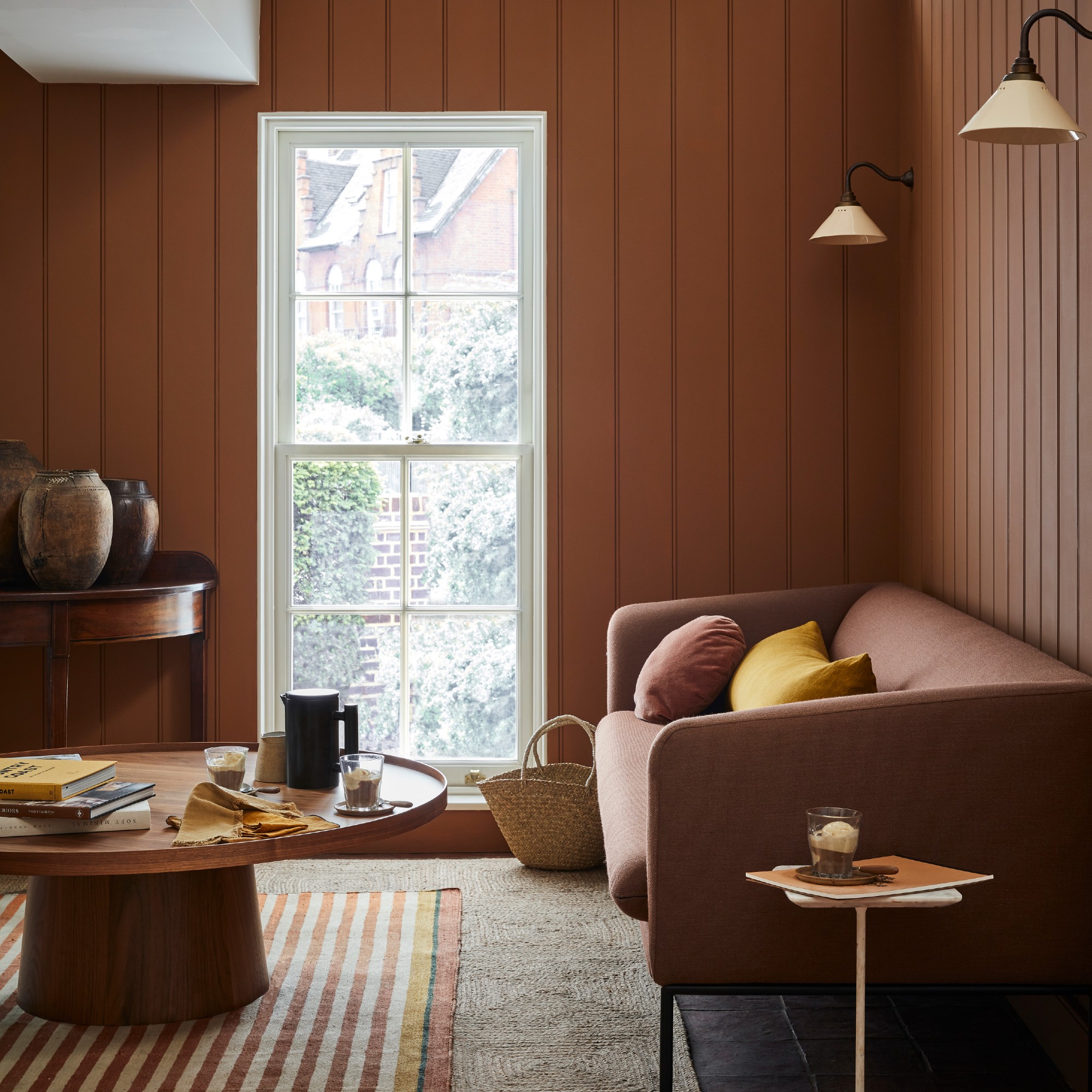
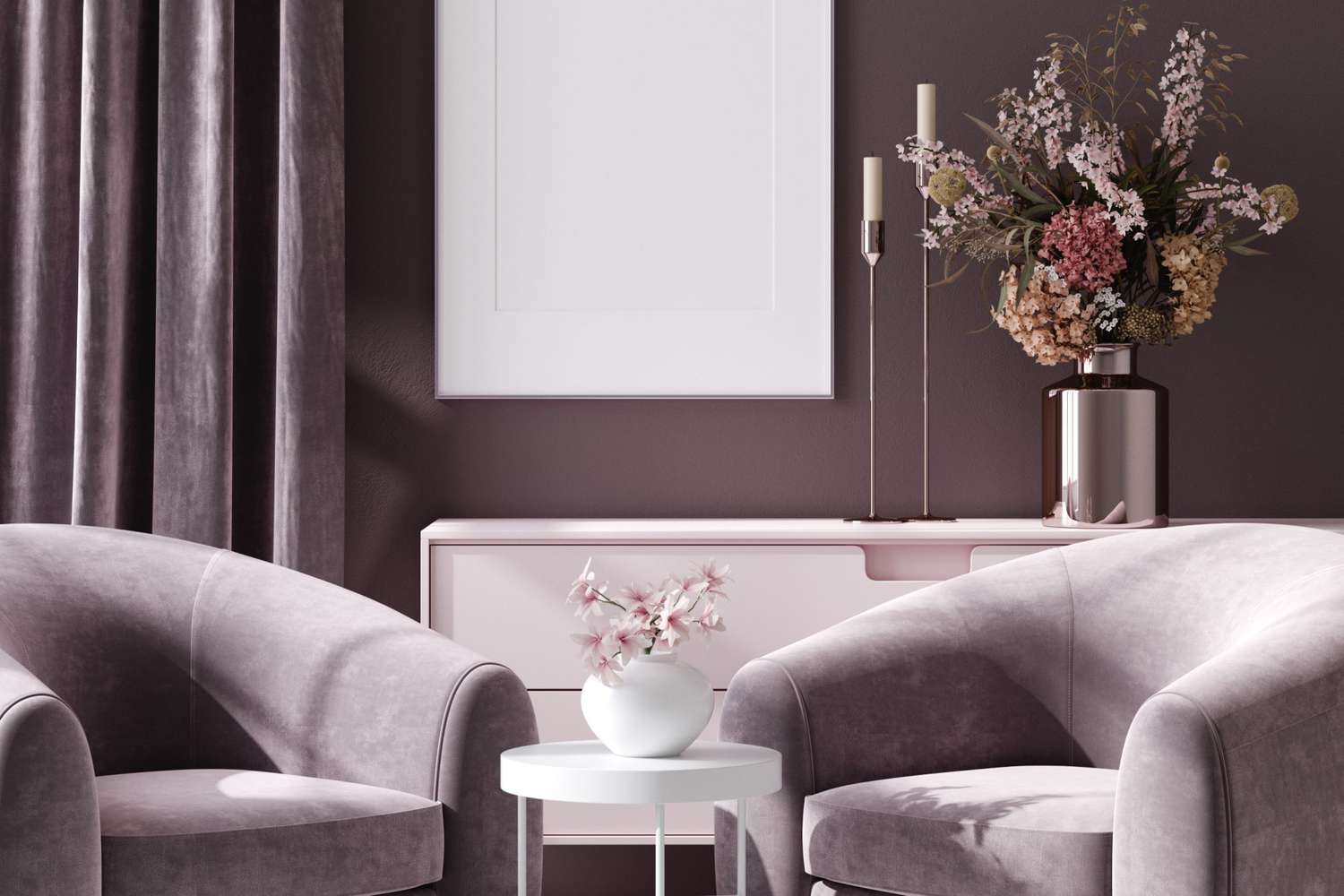
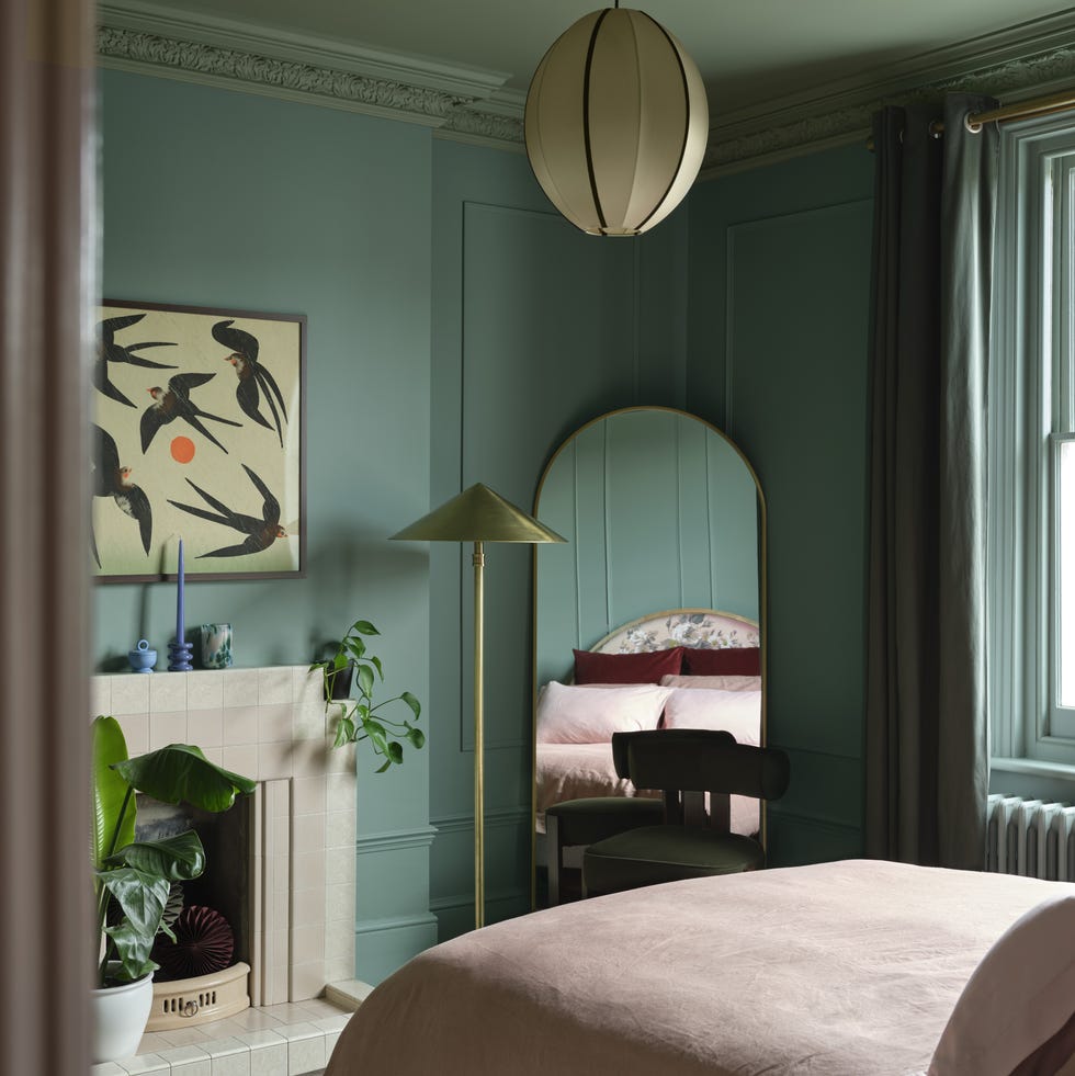
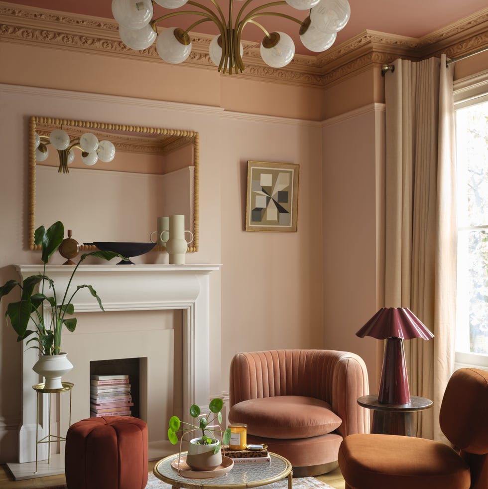
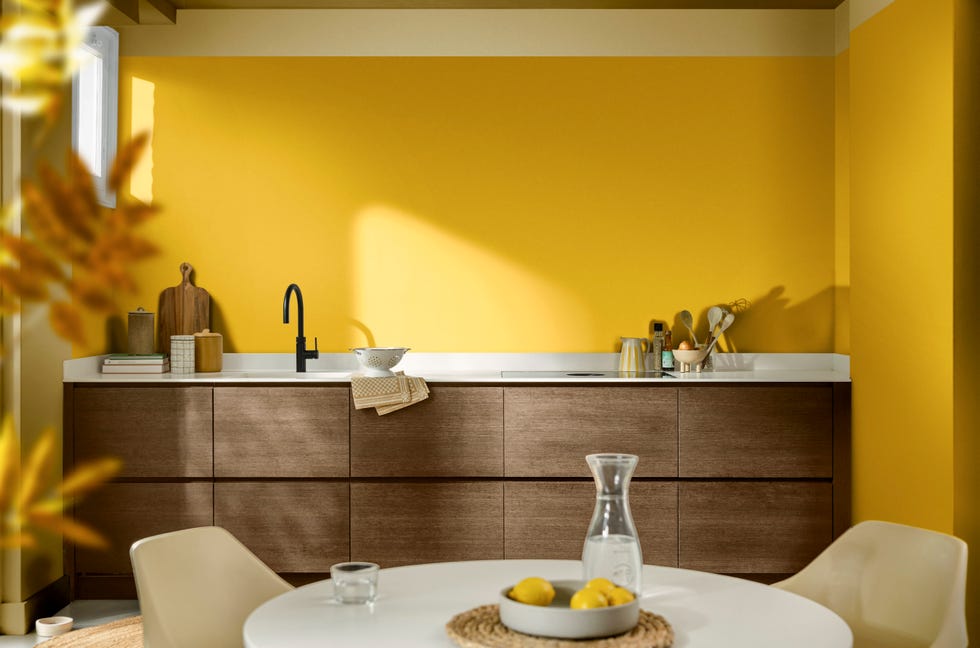
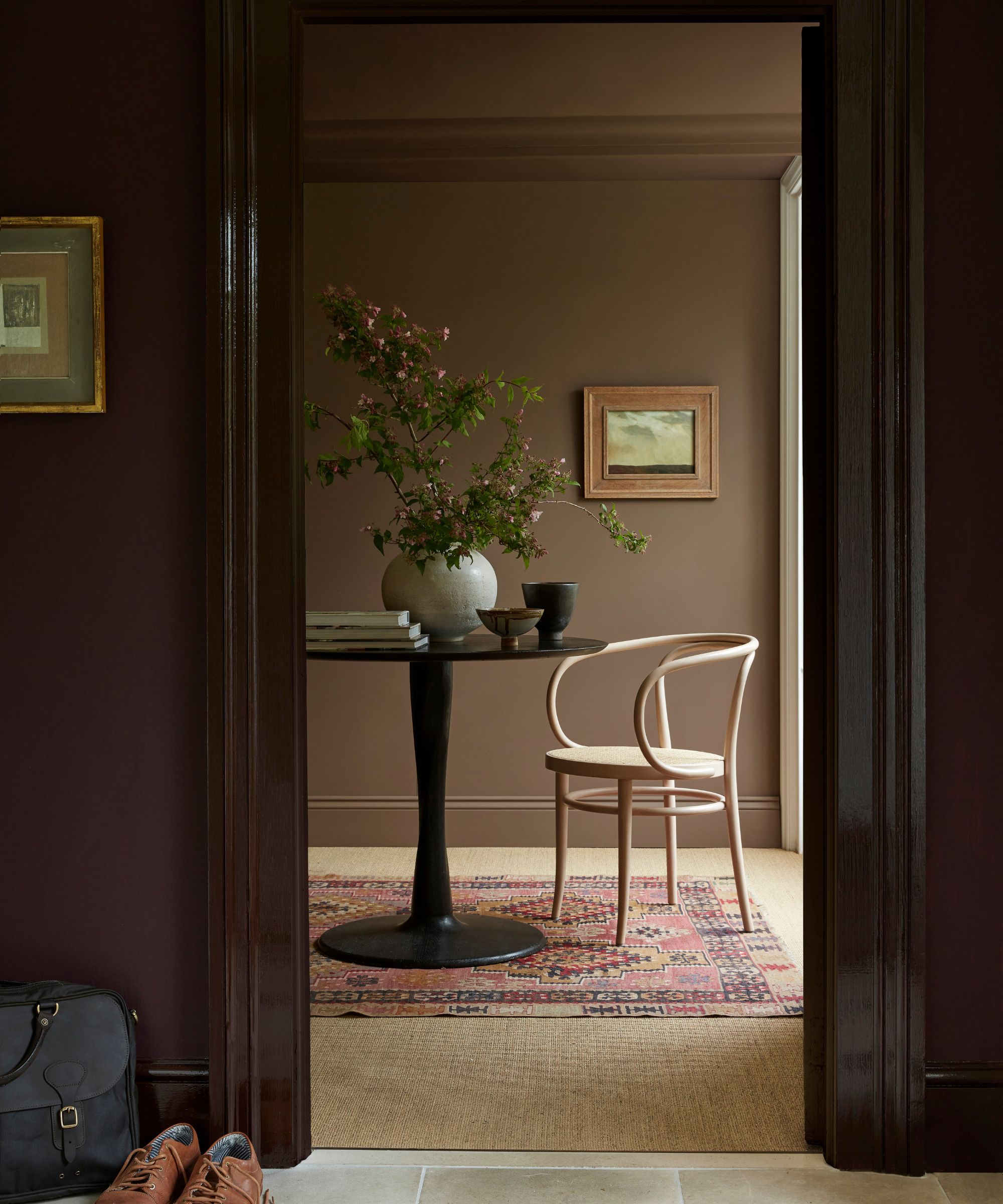
The year 2025 marks a significant shift in interior design, moving away from the dominance of cool gray and neutral paint colors towards more vibrant, saturated hues. Major paint companies have announced their Colors of the Year, reflecting this trend. Behr selected Rumors MQ1-15, a ruby red, while Glidden chose Purple Basil. C2 Paint opted for C2 Raku, a brownish-red with mahogany undertones, and Valspar presented Encore, a rich sapphire. Benjamin Moore’s pick is Cinnamon Slate, a plum and brown blend. Sherwin-Williams' 2025 Color Collection features Quietude, a soft sage with a hint of blue, and their Chrysalis palette emphasizes warmer neutrals, incorporating ochres and browns. Little Greene also embraced this shift with Mochi, a warm brown.
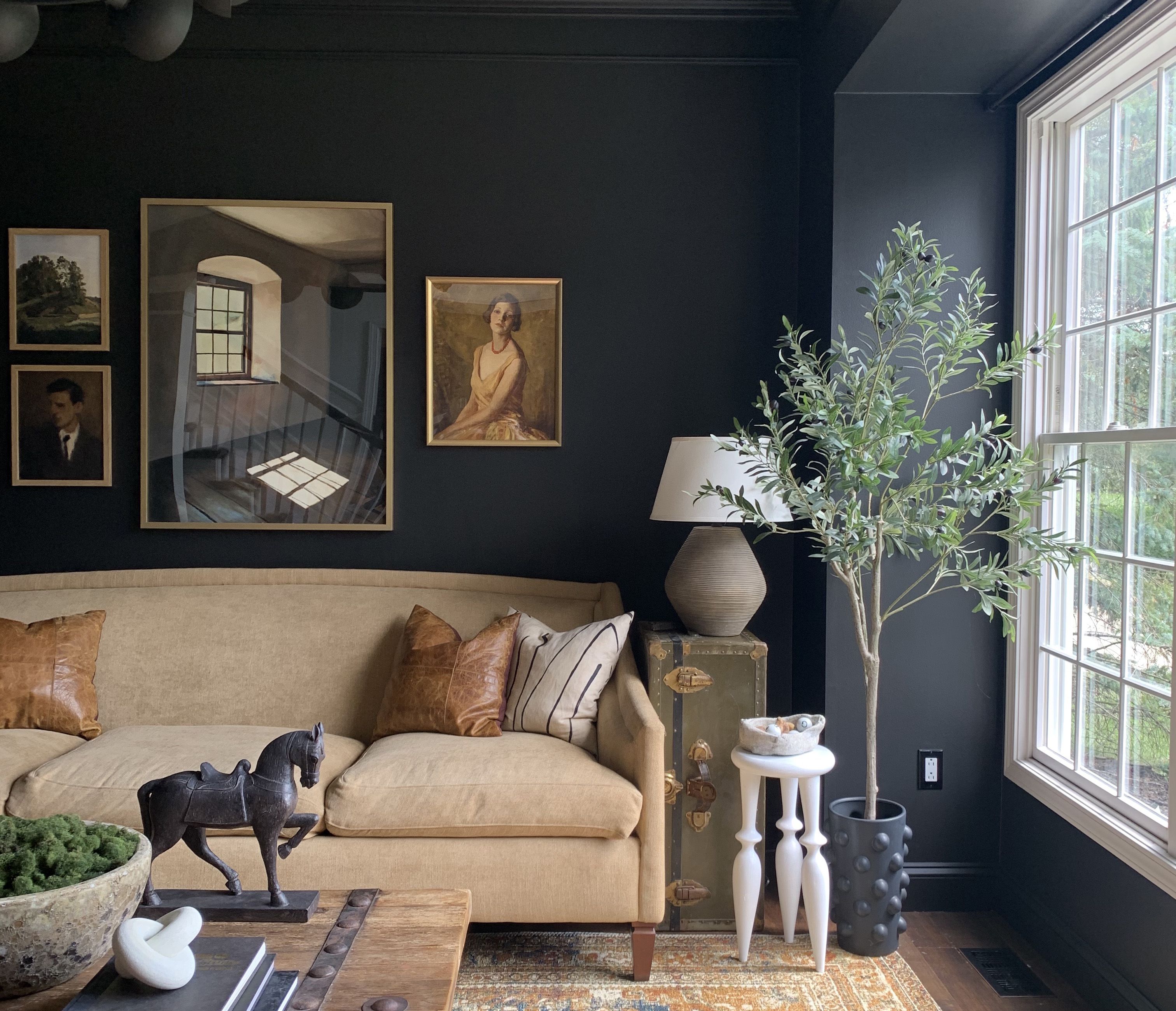
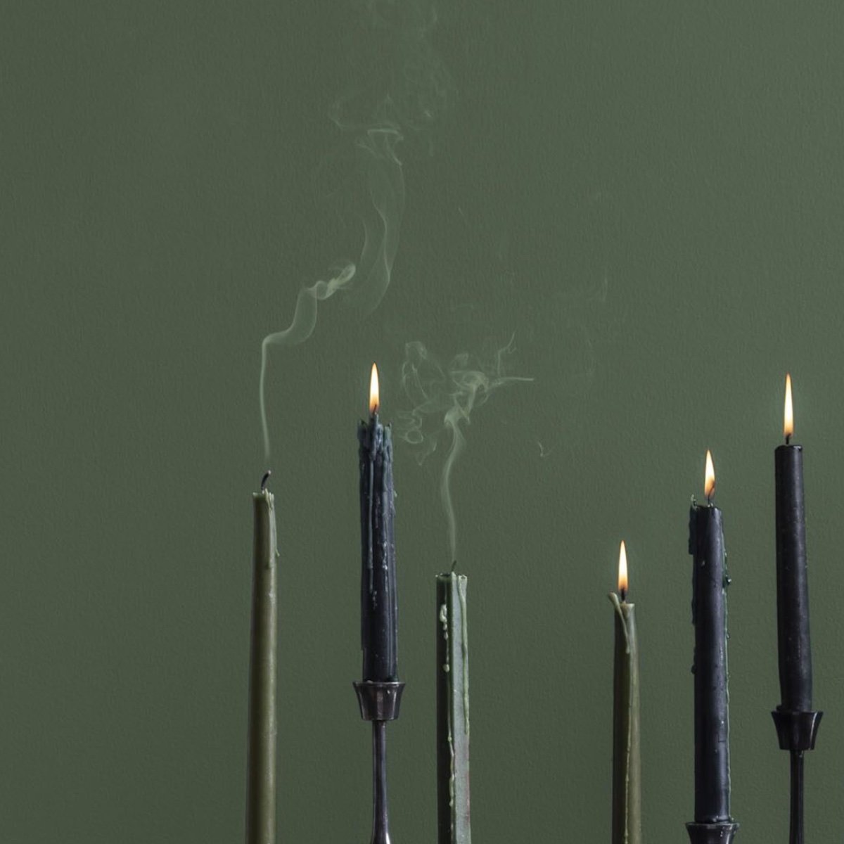
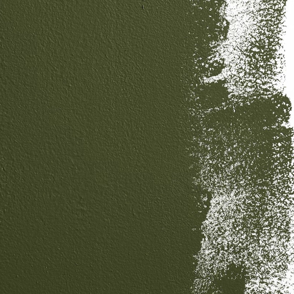
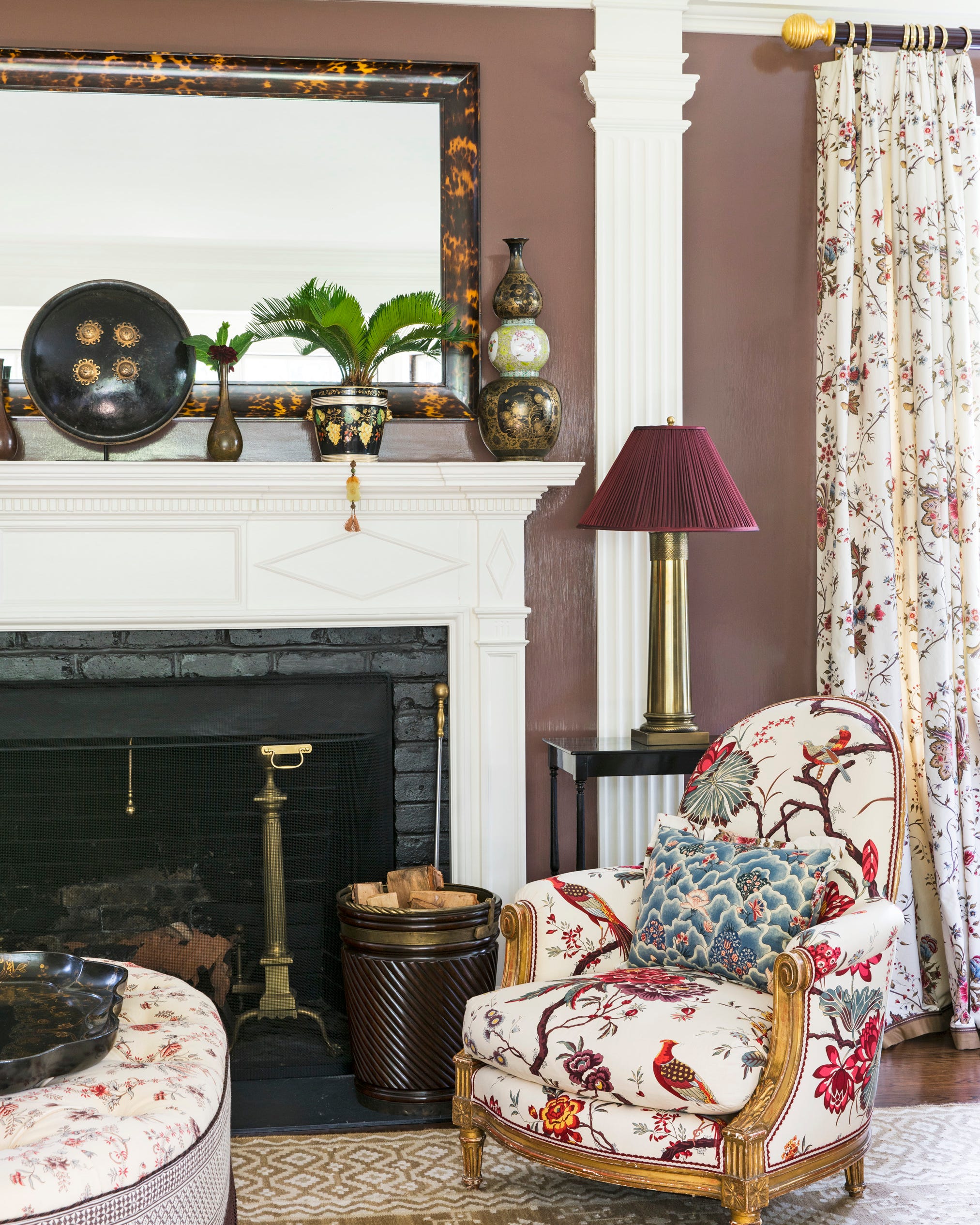
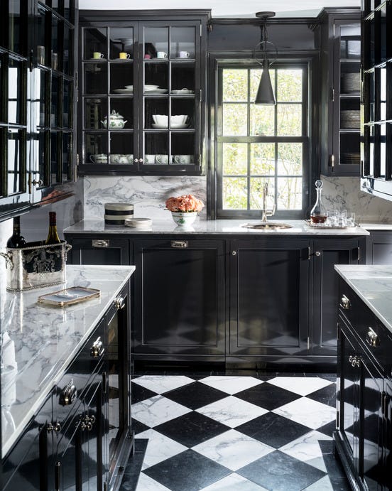
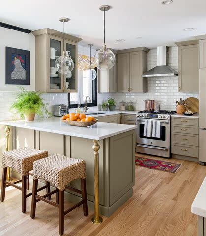
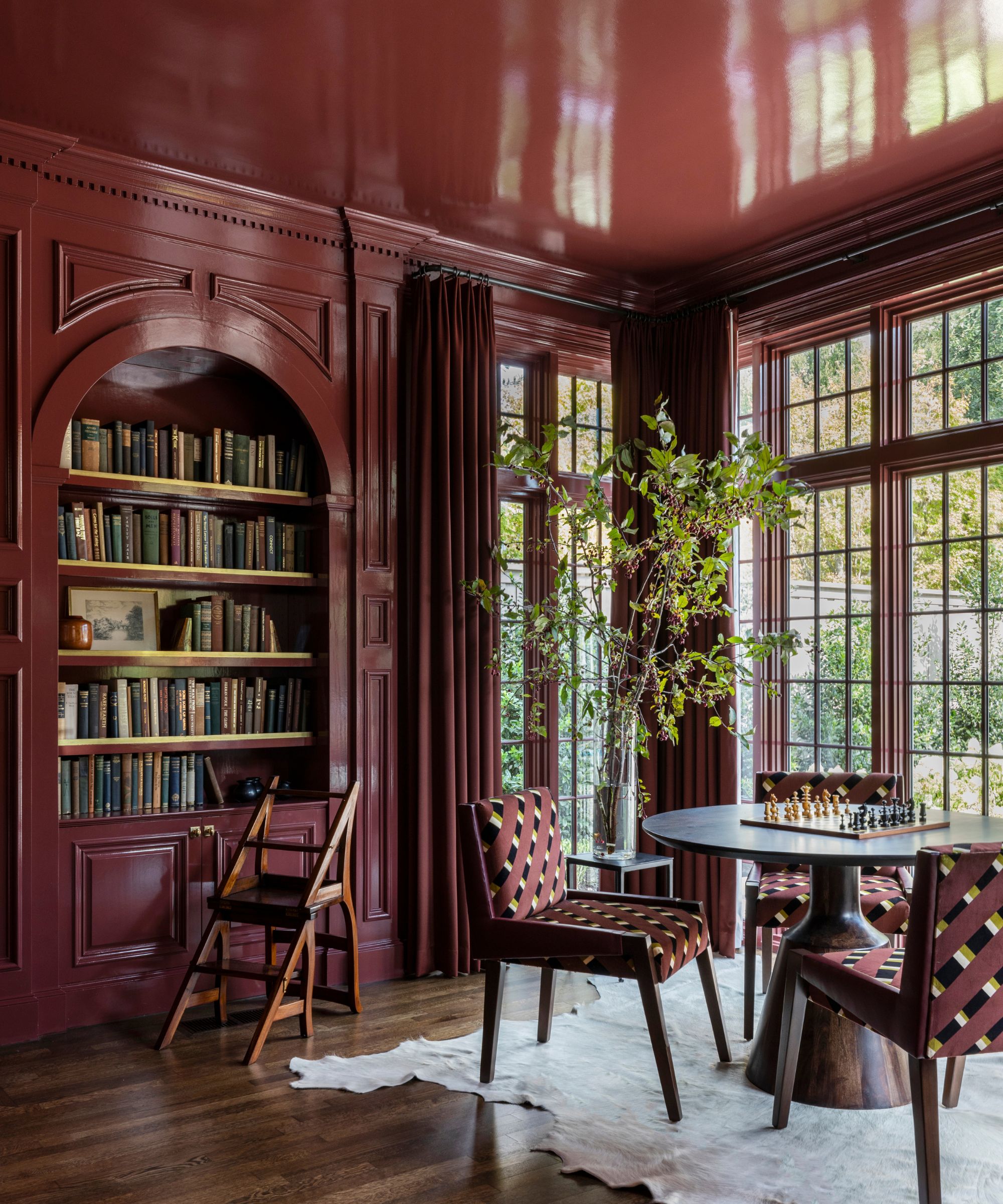
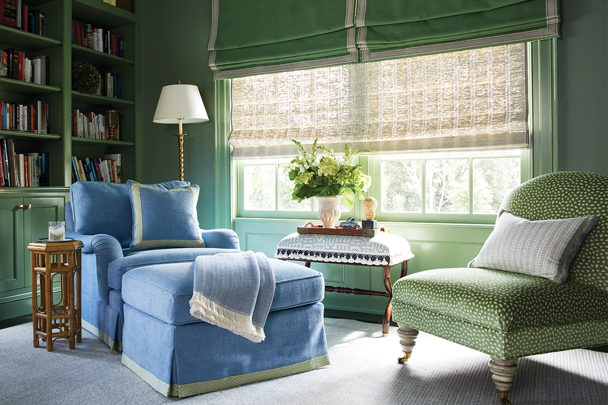
Local Northern Virginia designers acknowledge these trends but note that their impact on client choices is not immediate. Susan Sutter of Susan Sutter Interiors and Kelley Proxmire both highlight the role of color in establishing a room's mood. Sutter suggests using darker, saturated tones like deep blues and ochres in spaces intended for relaxation or retreat, such as TV rooms, powder rooms, bar areas, and libraries, rather than in functional spaces like kitchens. Proxmire observes a growing willingness among clients to paint entire rooms in a single, concentrated color, often leaning towards darker shades for a more dramatic and enveloping effect. She cites an example where Farrow & Ball's Calke Green No. 34 was used for both bookcases and walls in a library and family room, creating a striking yet well-lit space.
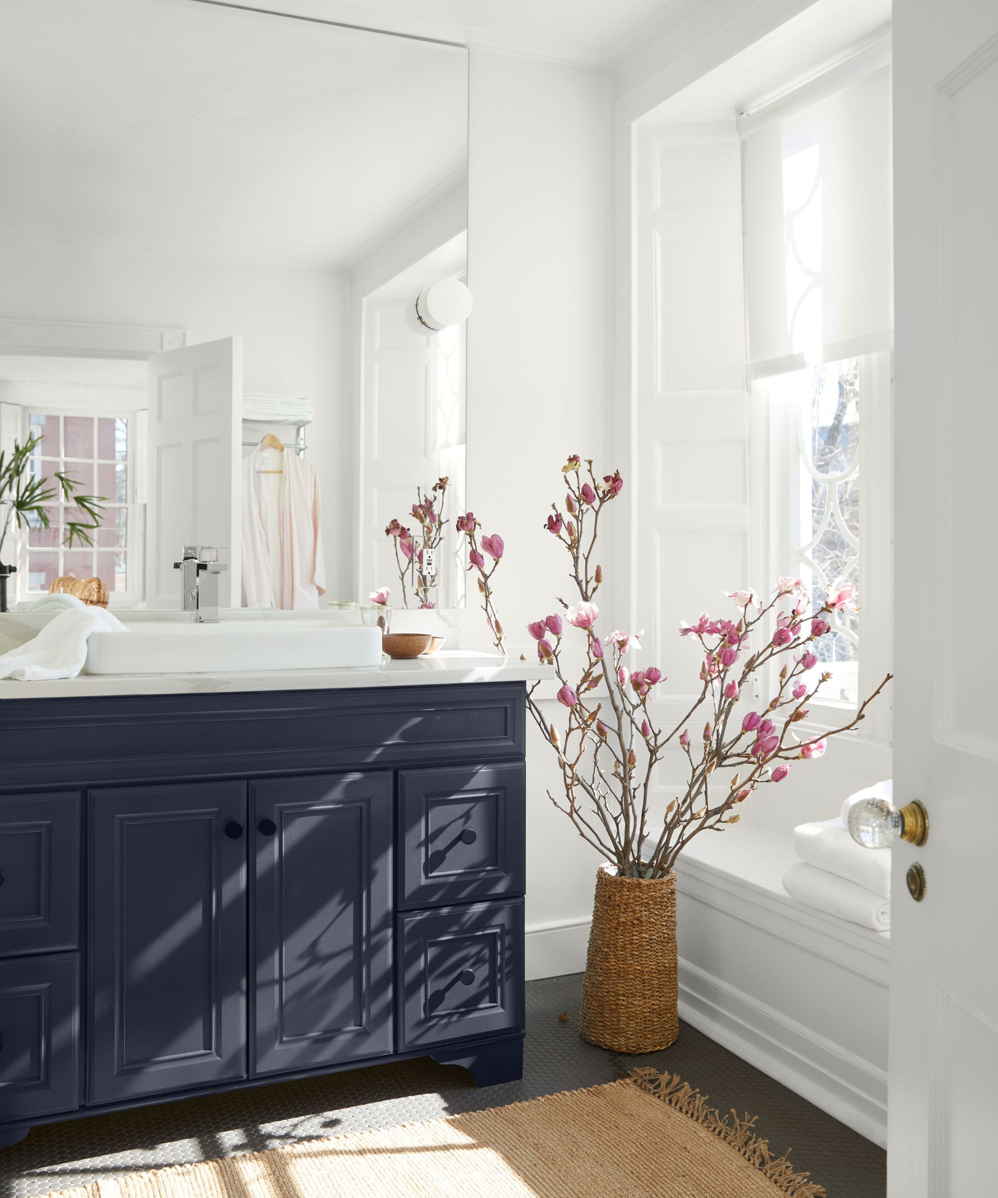
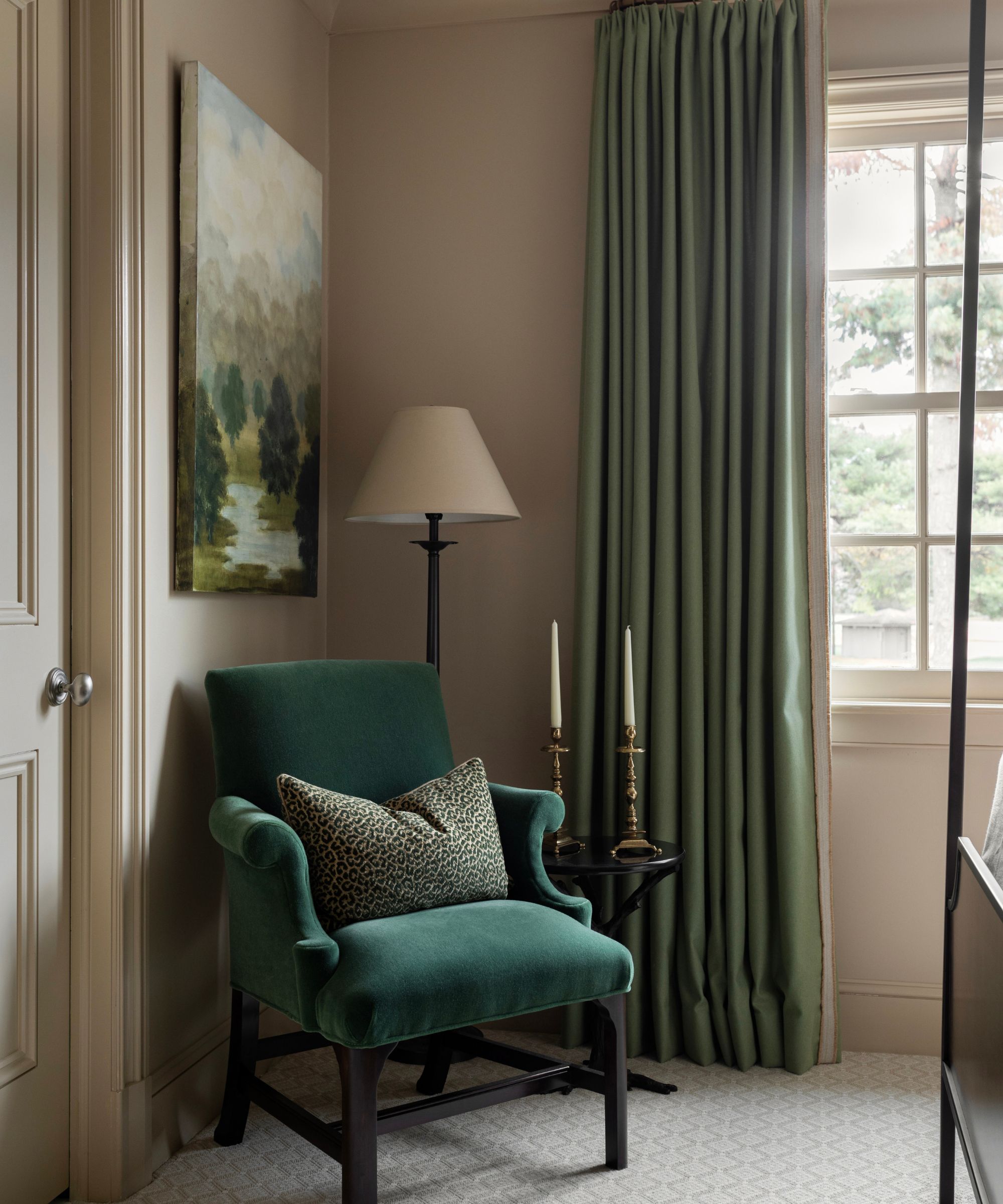
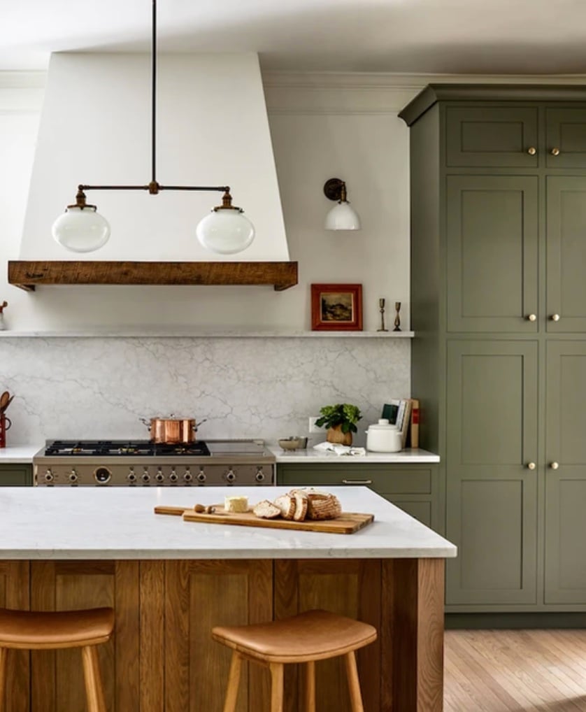
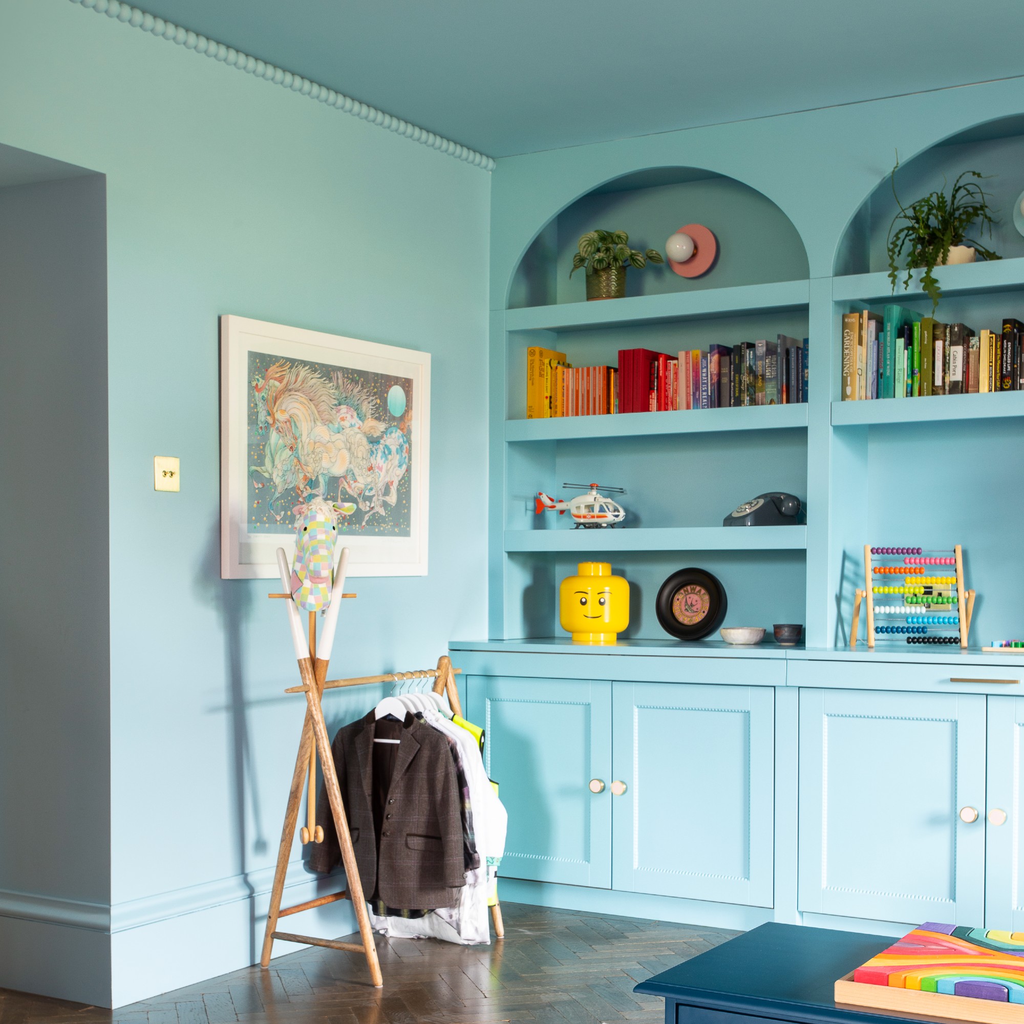
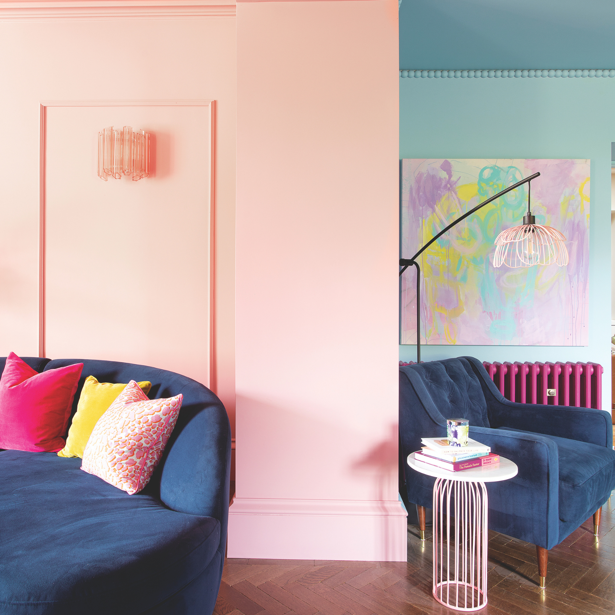
Accent walls are also gaining popularity as a way to introduce pops of color. Sutter utilized a red coral paint on a client's TV wall, coordinating it with accents and wallpaper in a powder room, along with blue. Another project featured a custom-painted dark blue bathtub, contributing to a Southern, preppy, and luxurious aesthetic. Designers typically avoid suggesting specific colors upfront, instead focusing on understanding the client's desired feeling and function for the room. Jessica Parker Wachtel of GTM Architects emphasizes asking whether clients desire a light and bright, cozy, intimate, or energetic space to determine the room's personality. She supports clients' bold choices, such as using various shades of green throughout a home to ensure flow, highlighting green's versatility as a neutral that can range from saturated to a more natural, sage-like tone.
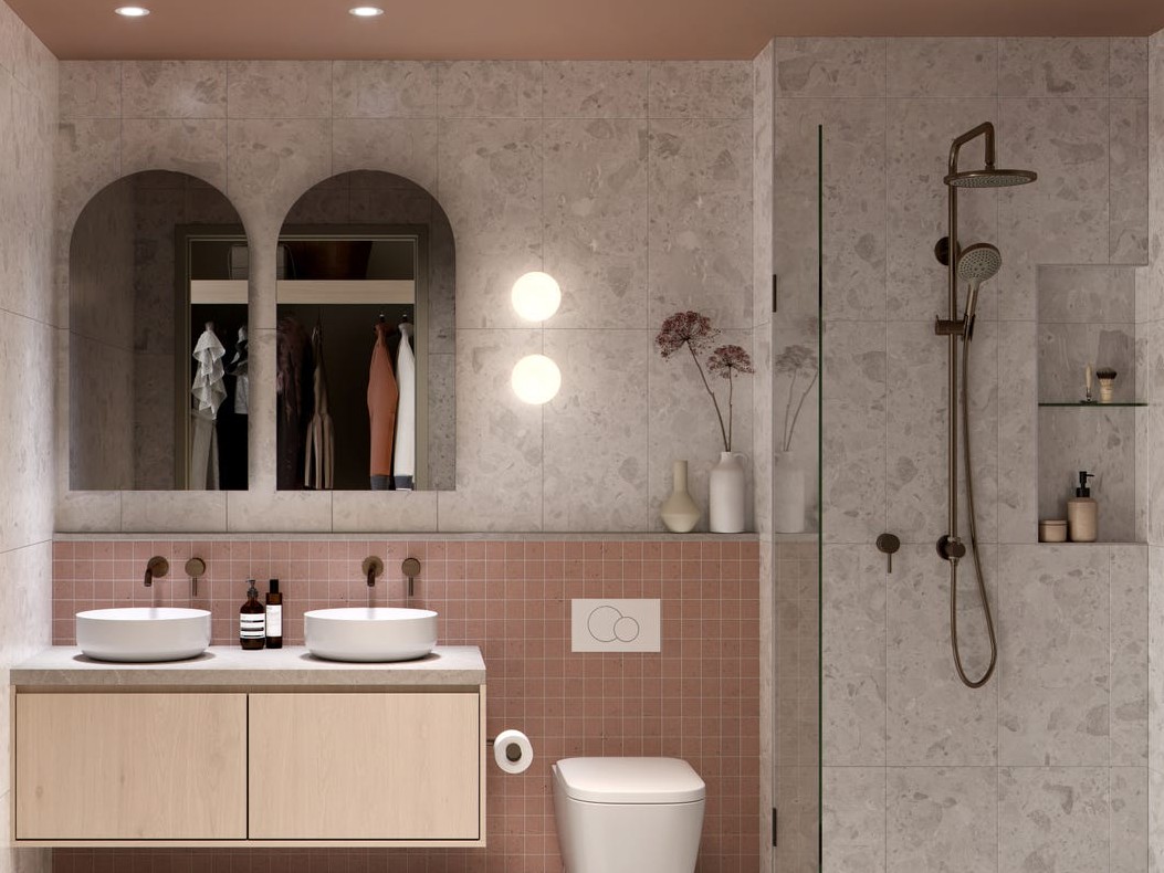
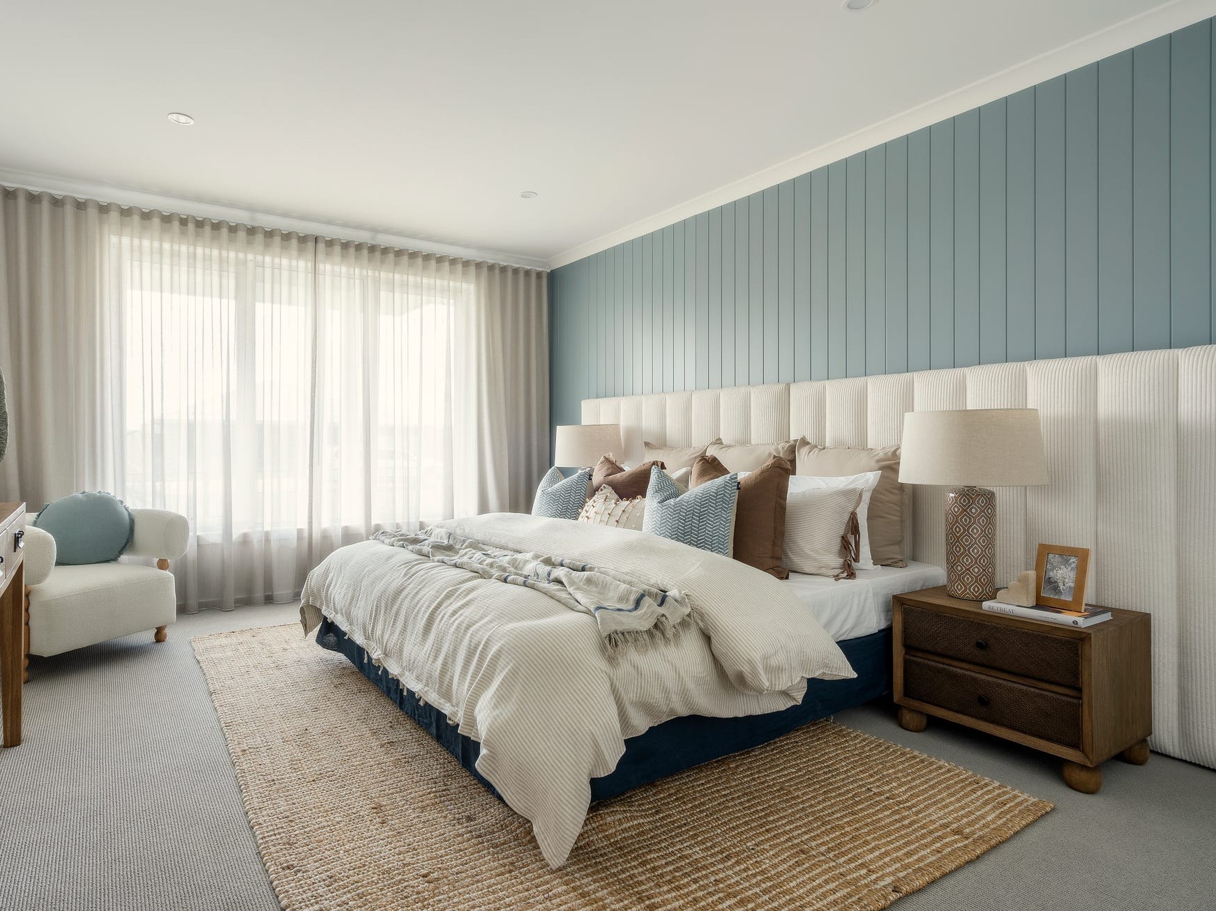
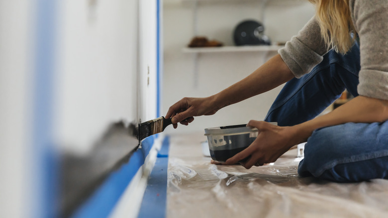
Both Proxmire and Wachtel confirm the trend away from cool grays, with clients increasingly opting for warmer neutrals and even slightly warmer whites. Regardless of the chosen color, designers unanimously stress the importance of testing paint samples directly on the walls of the actual room. Sutter recounted a personal experience where a beloved light blue-gray paint appeared muddy in her windowless guest bathroom, illustrating how different lighting conditions can drastically alter a color's appearance. Proxmire adds that the paint's finish is crucial, as gloss finishes can highlight imperfections in older homes unless significant wall preparation is done.
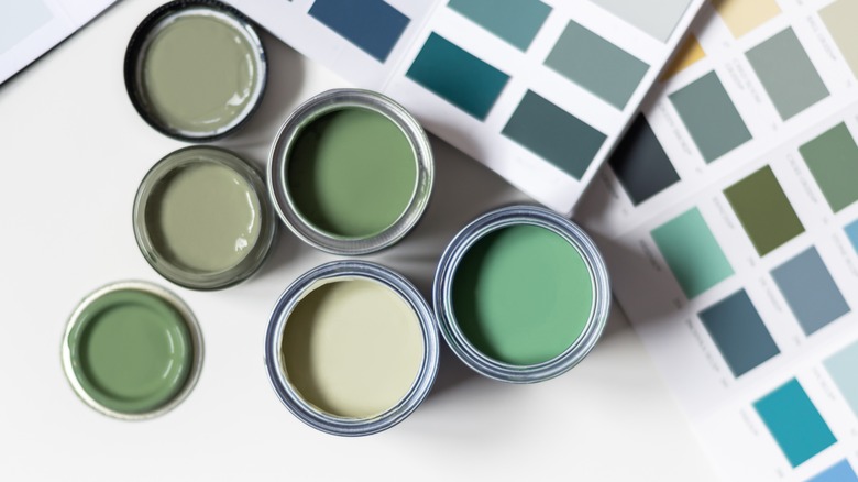
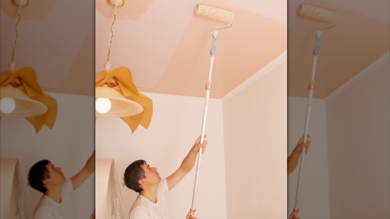
All three designers recommend applying paint samples to every wall and observing them at different times of the day to see how natural light affects them. It is also vital to consider the room's artificial lighting. Wachtel warns against selecting a color solely based on a paint store swatch, as its appearance will vary significantly in a home environment. Finally, designers emphasize the need to ensure that new colors integrate cohesively with the rest of the home's existing color scheme, contributing to an overall harmonious design.
#PaintColorTrends #InteriorDesign #HomeDecor #SaturatedHues #ColorPsychology #DesignConsultation #AccentWalls #WarmNeutrals #PaintApplication #PaintColorTrends #InteriorDesign #HomeDecor #SaturatedHues #ColorPsychology #DesignConsultation #AccentWalls #WarmNeutrals #PaintApplication
0 comment in total
 No comments yet
You may also like
Color Explosion: 2025 Color Trends

The colour palette for 2025 – these are the shades paint experts say we’ll see everywhere next year
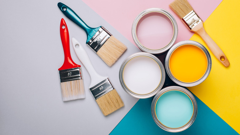
What To Expect For 2023 Paint Color Trends

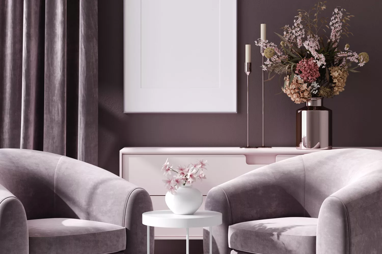
5 Paint Colors That Are Out for 2025, According to Interior Designers

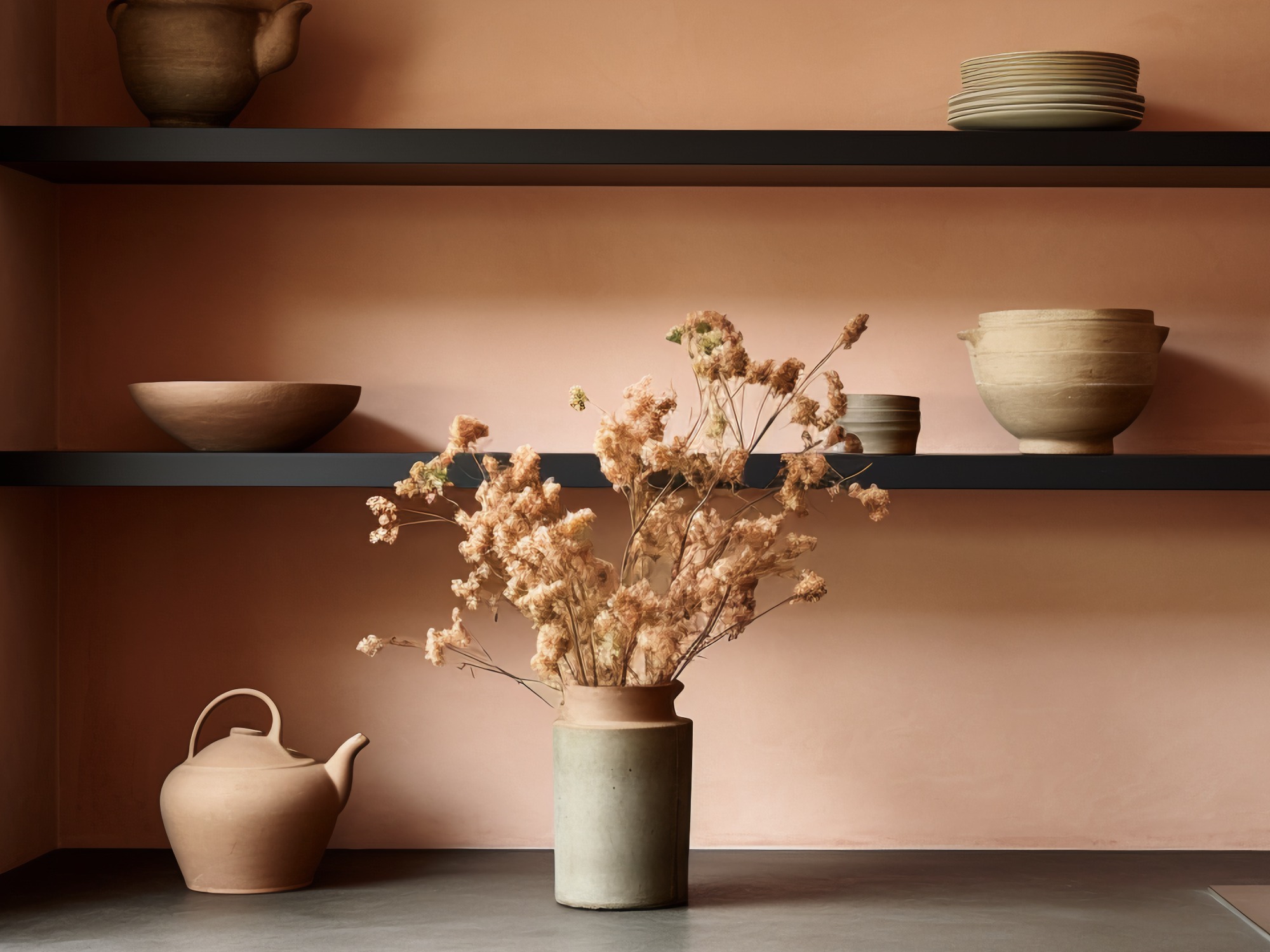
The Biggest Colour Trends Taking Off in 2025
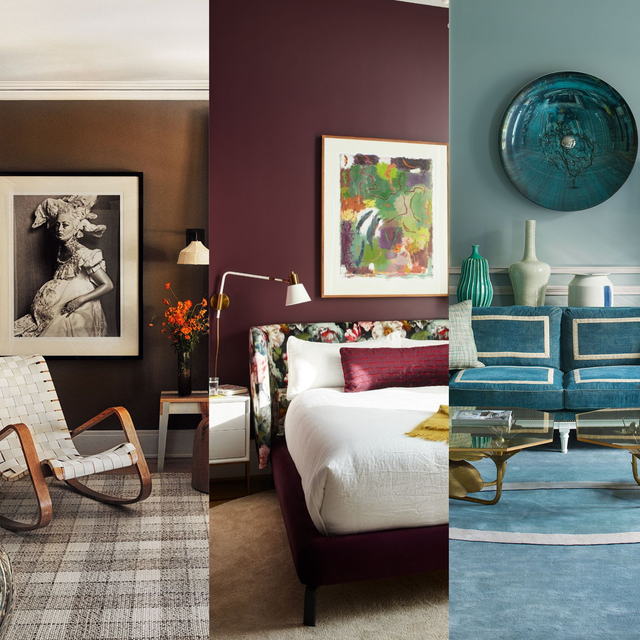
We’re Calling It: These Are the Official Color Trends of 2025

The Latest Color Trend You'll Be Seeing Everywhere In Fall 2025
Meet 'colour capping', the paint trend set to take over 2026

The #1 Paint Color Trend of 2025, According to Designers

9 Trending Paint Colors You'll See Everywhere in 2025, According to Designers
These 8 Color Trends Will Rule in 2025, According to Color Pros

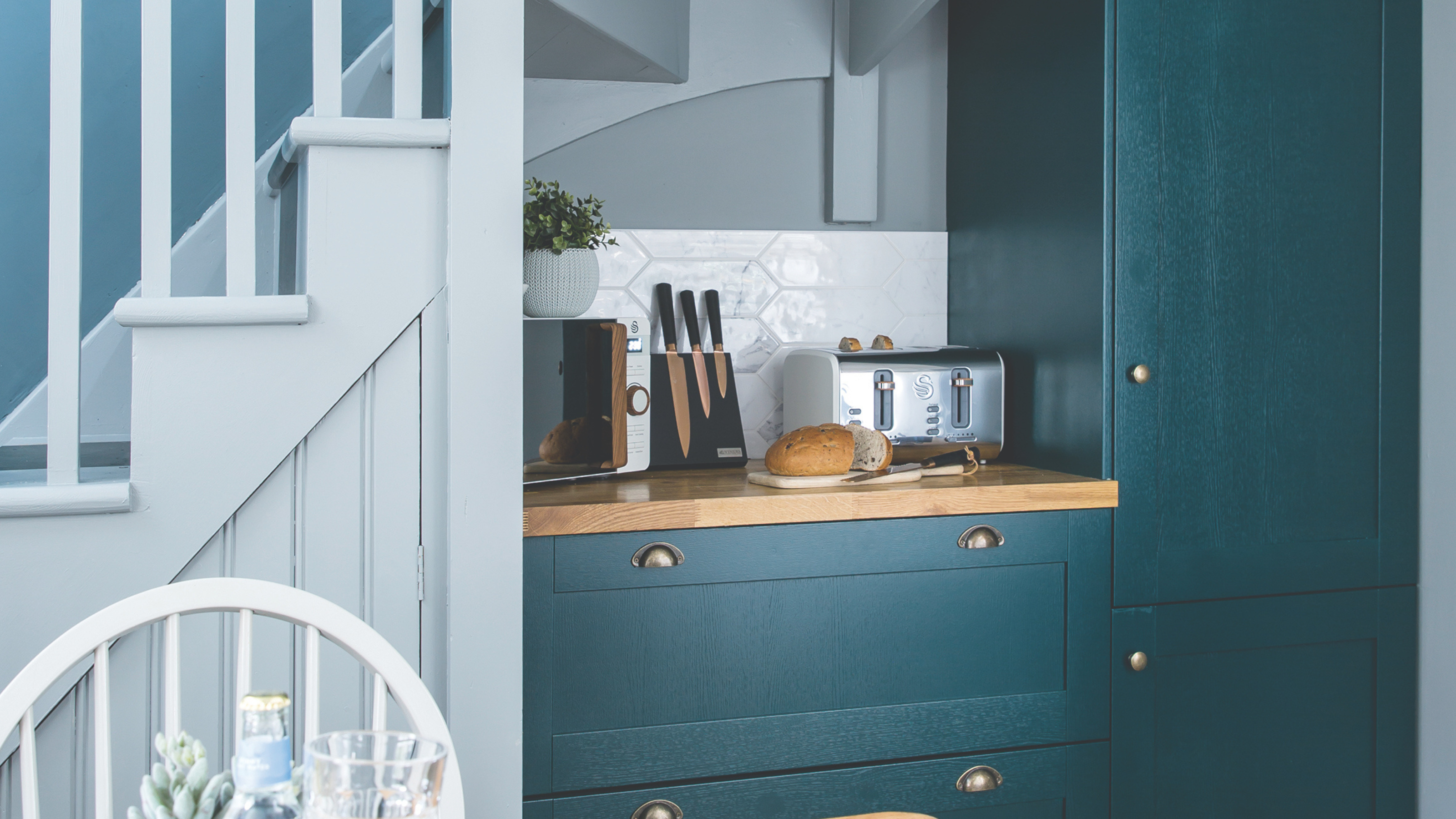
Is colour drenching still on trend for 2025? Experts reveal how the popular paint trend is evolving in the new year
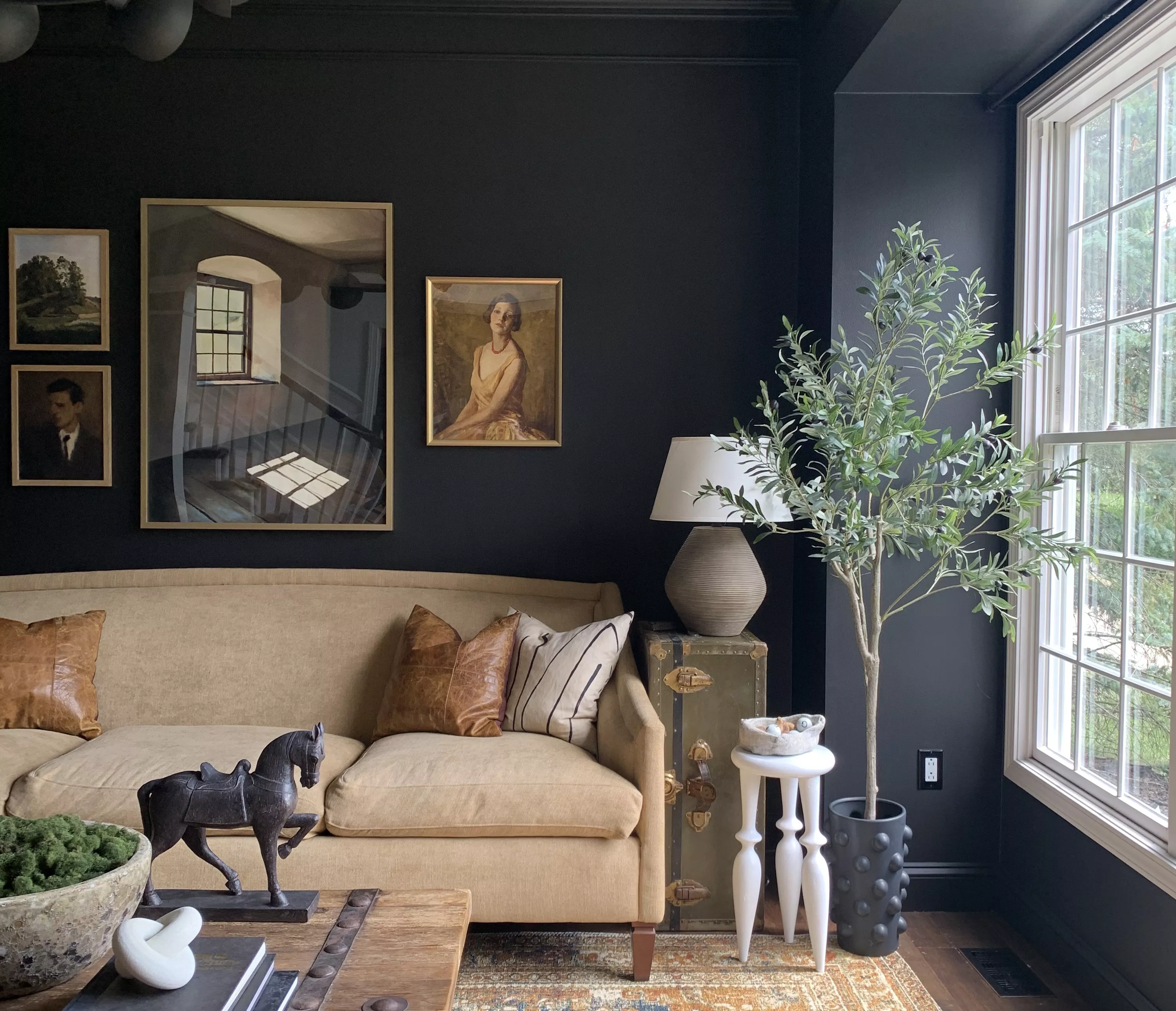
Your 2025 Paint Color Forecast Is Here—Say Goodbye to Bold Hues and Hello to Muted Earth Tones

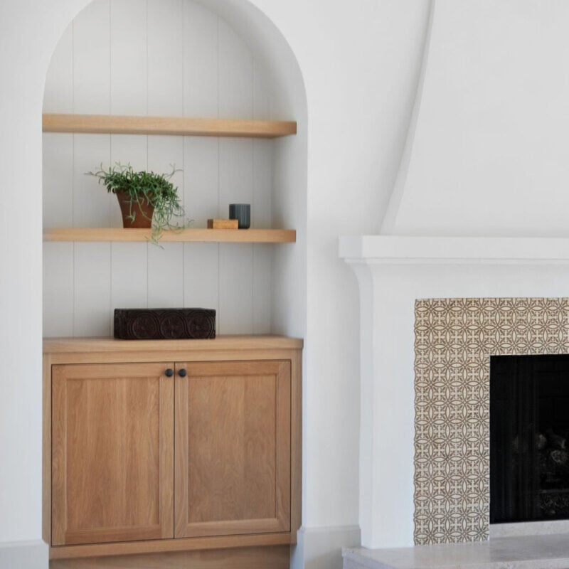
The Paint Color Trends of 2023 Are in—And They’re Gorgeous
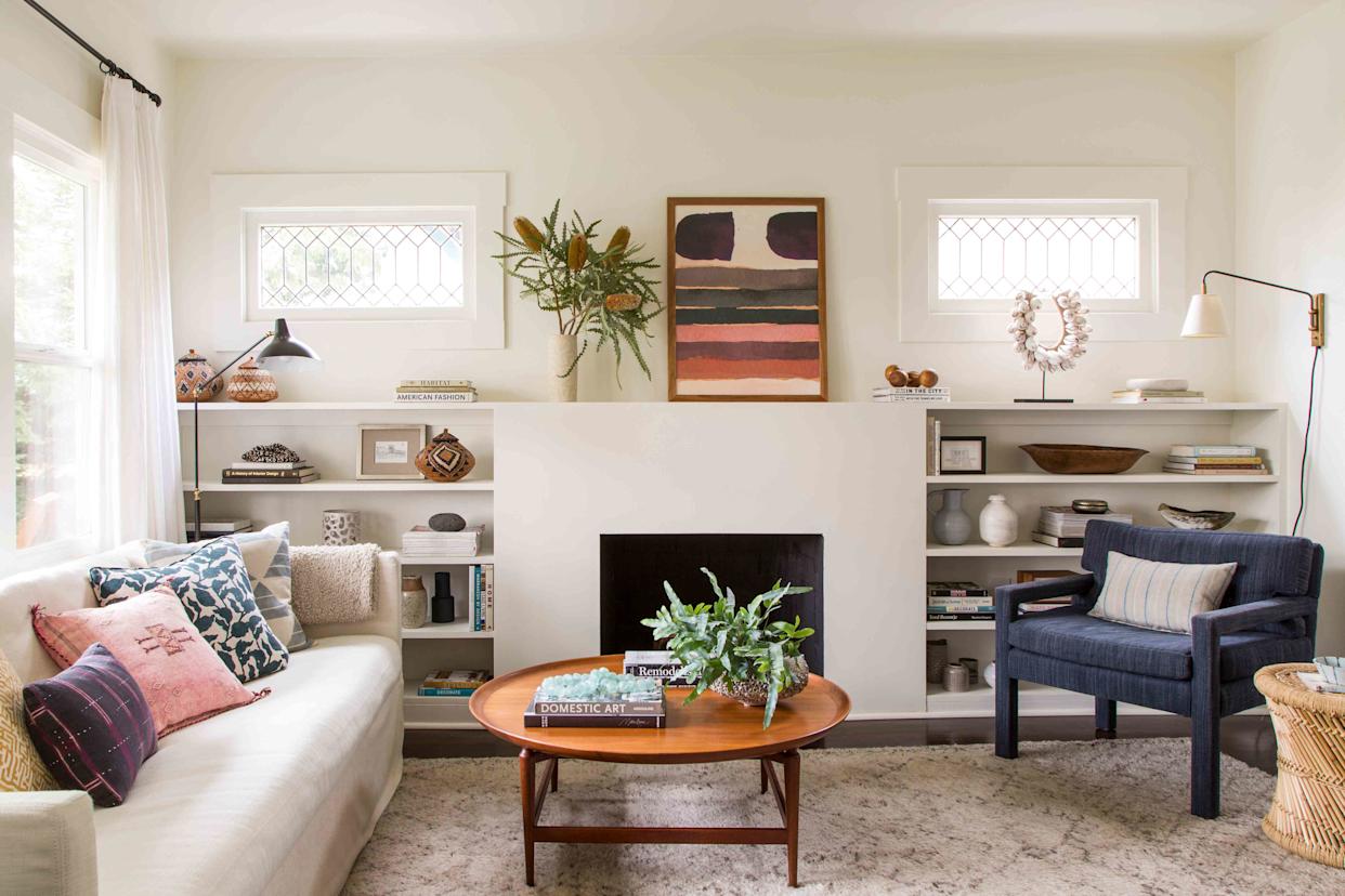
5 Paint Colors That Experts Say You Shouldn't Use in 2025

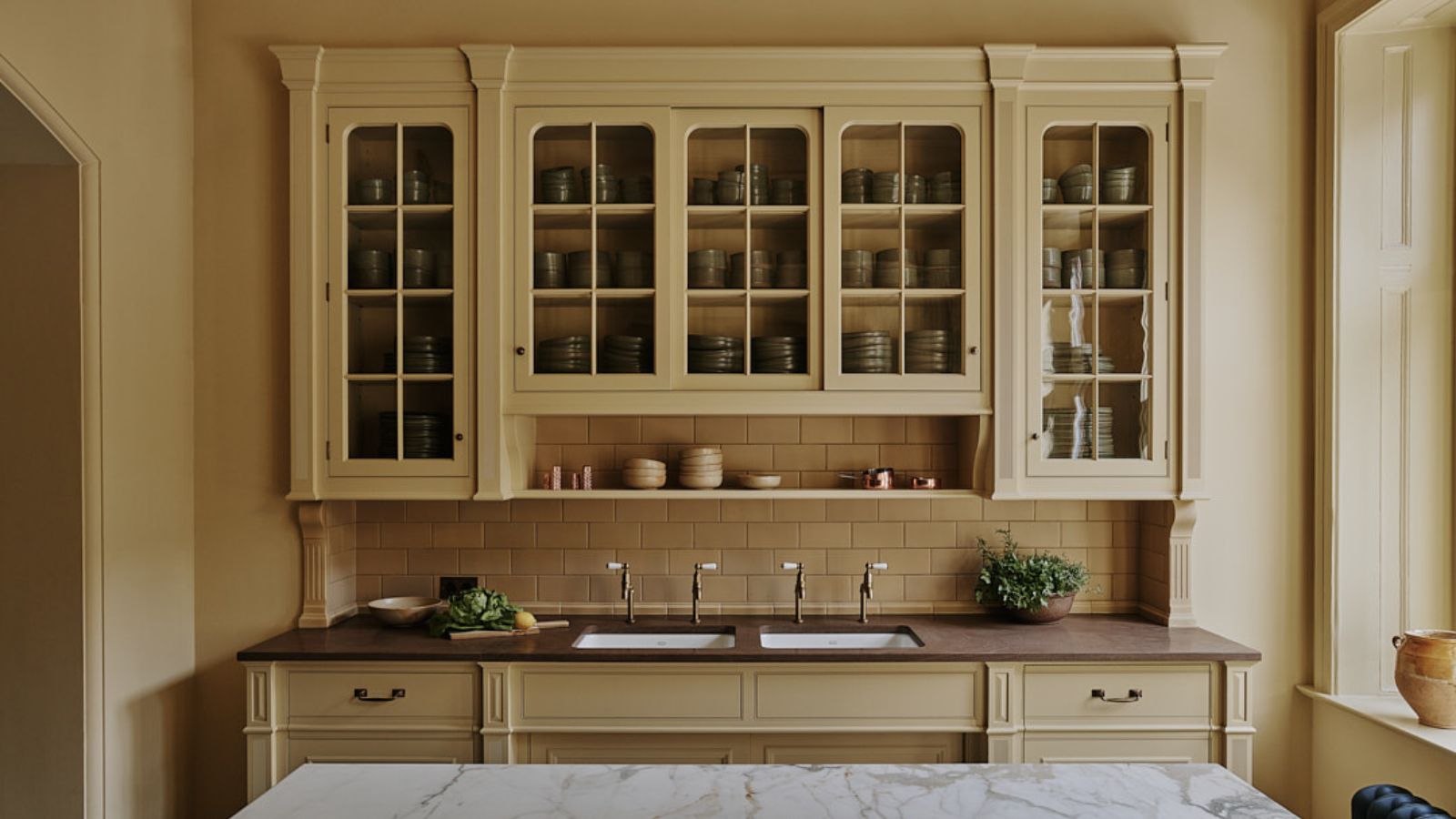
The biggest color trends of 2025 – 10 colors designers say will lead the way next year

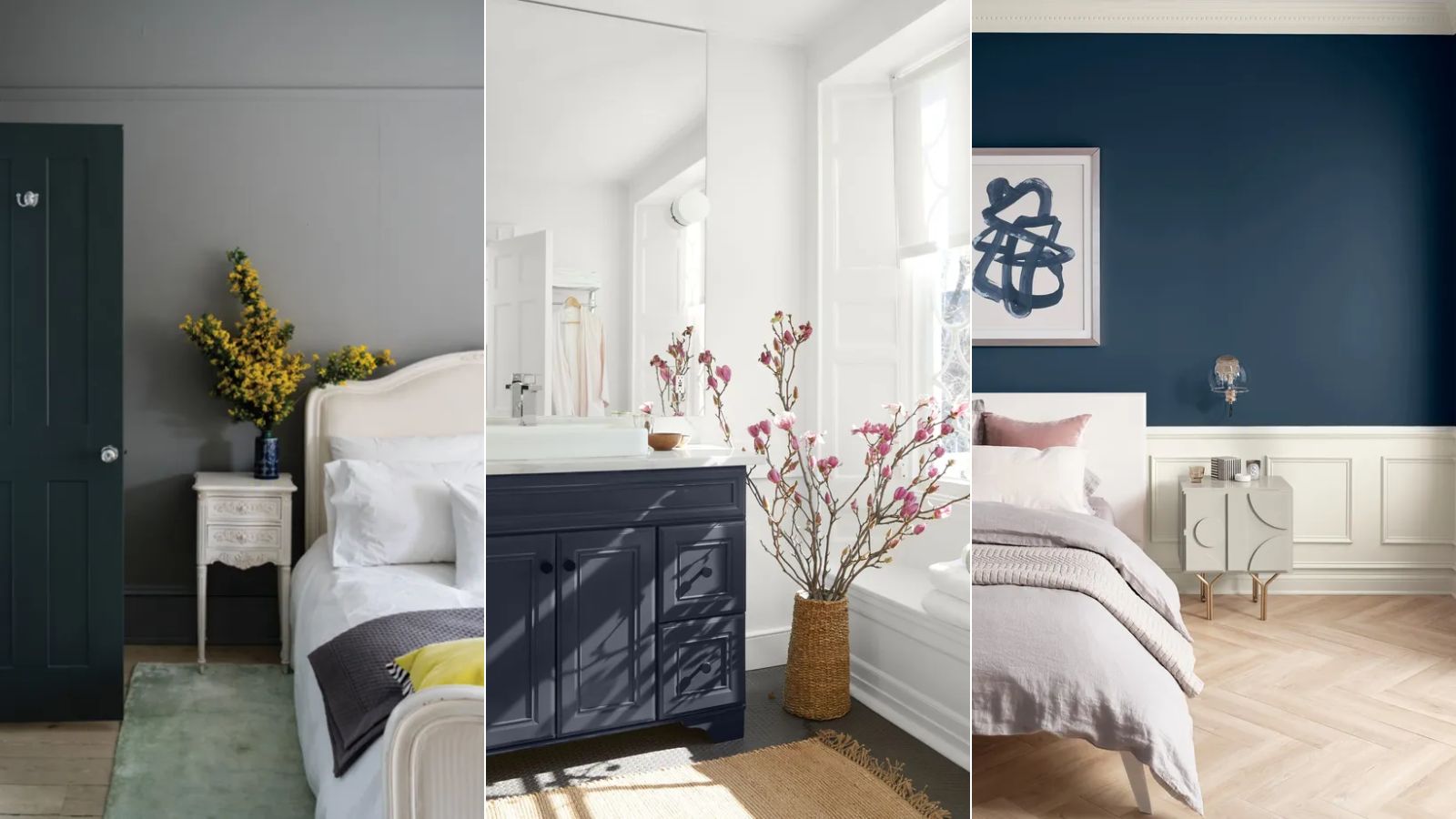
Paint colors going out of style in 2025

Experts Say These 5 Paint Colours Will Be Everywhere In 2026
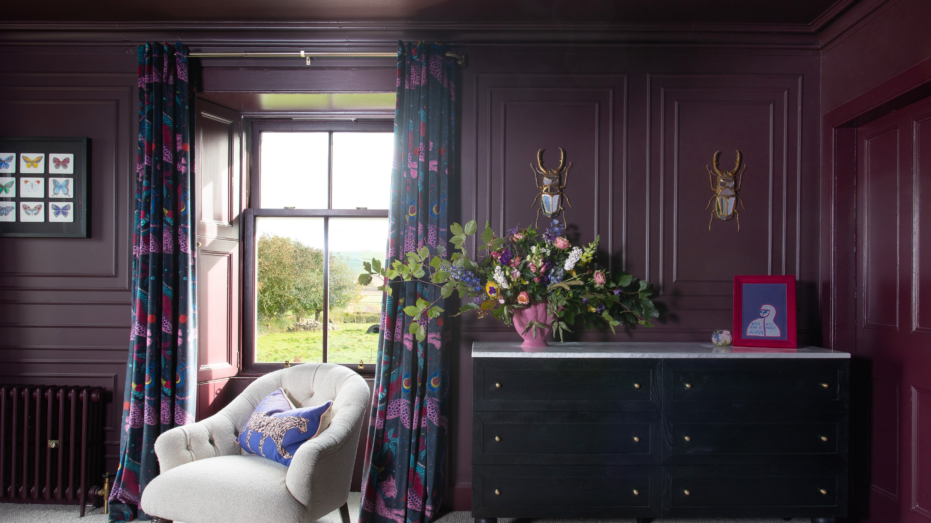
Paint trends 2025 – the 9 shades, colour schemes and paint techniques you’ll be obsessed with this year
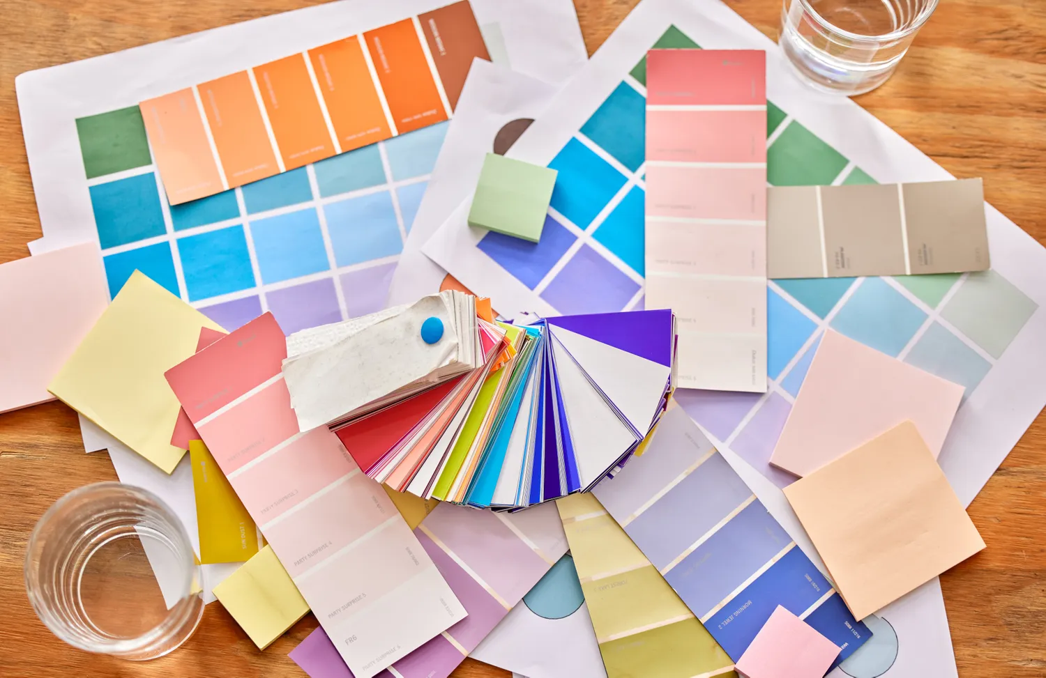
Goodbye Gray—This Soothing Paint Color Will Dominate Interiors in 2026, Designers Say