1/2
Joanna Gaines' Top Tip For Embracing Bold Paint Colors
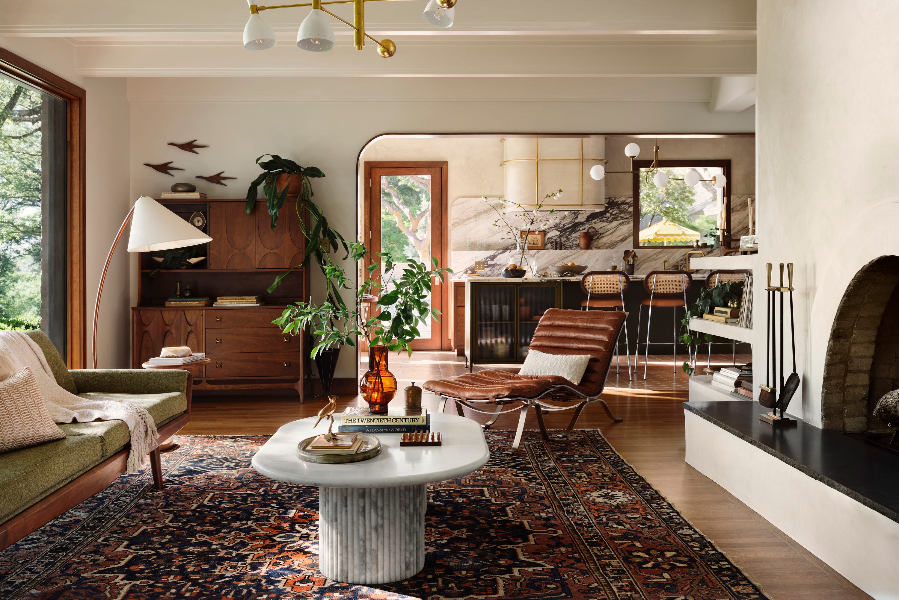
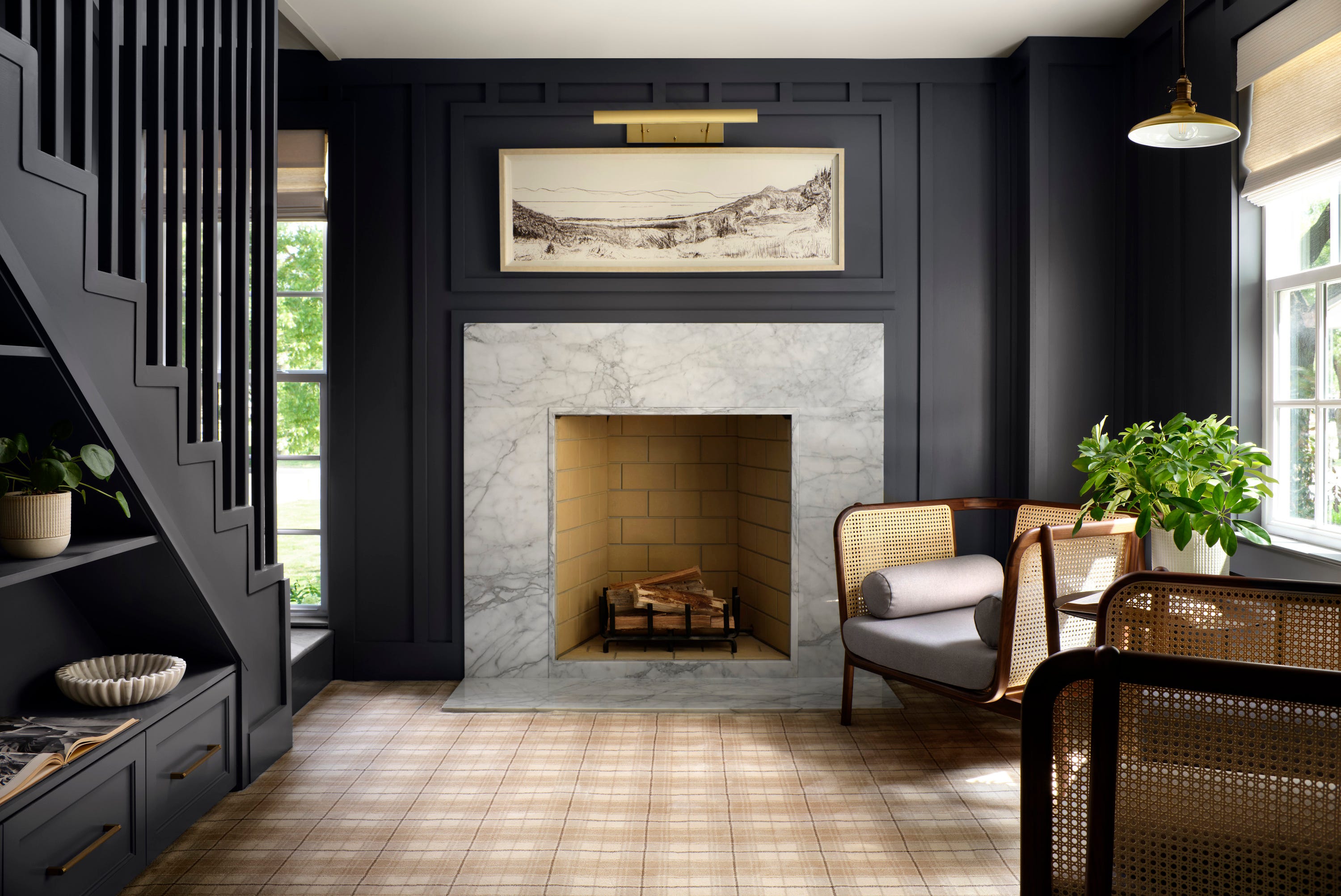
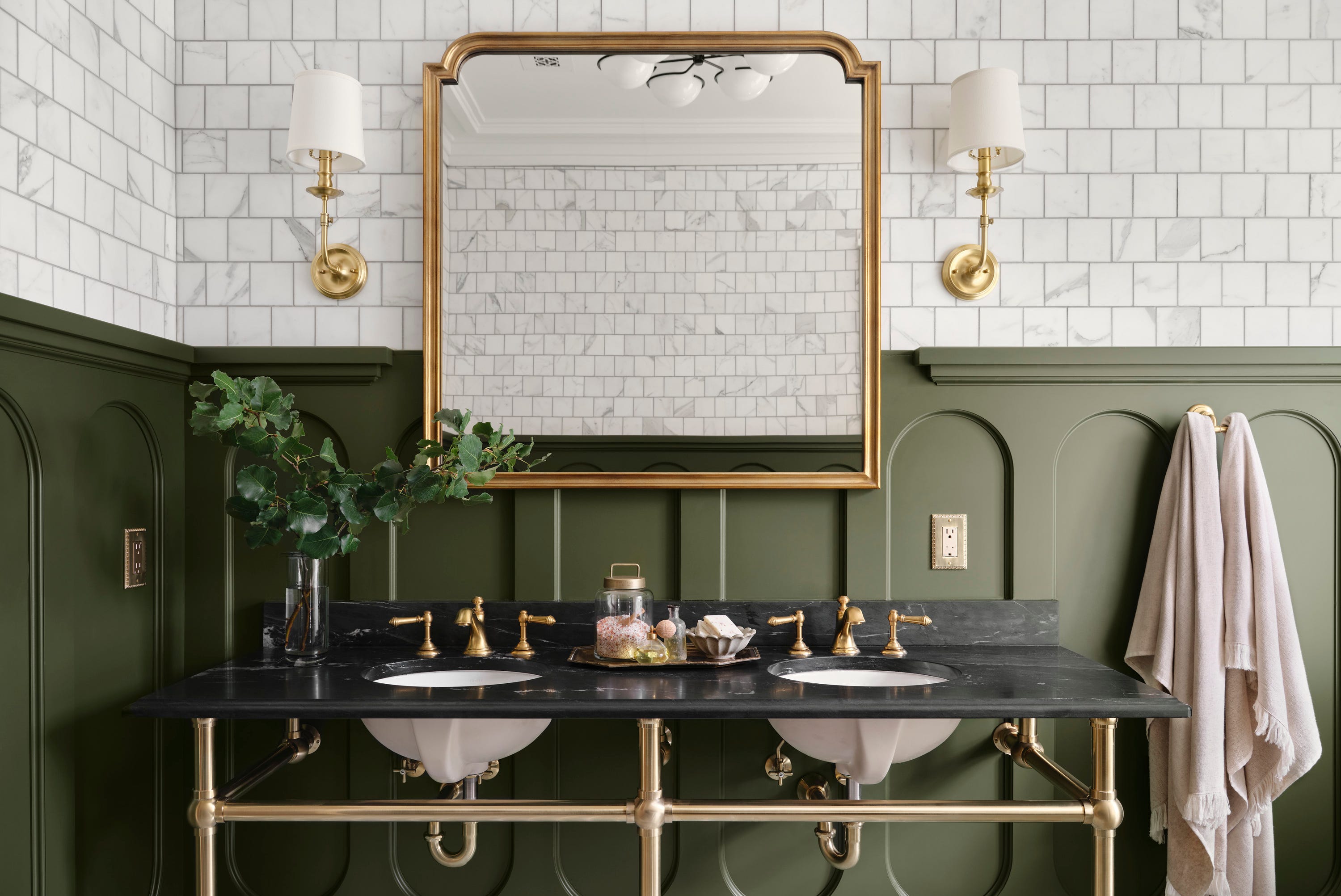
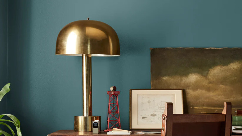
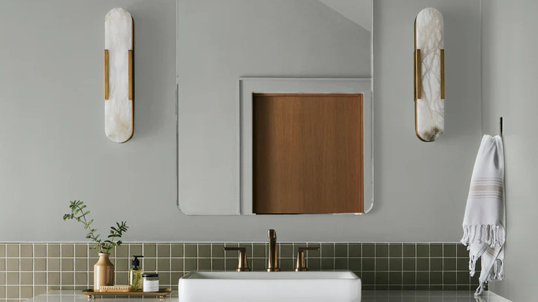
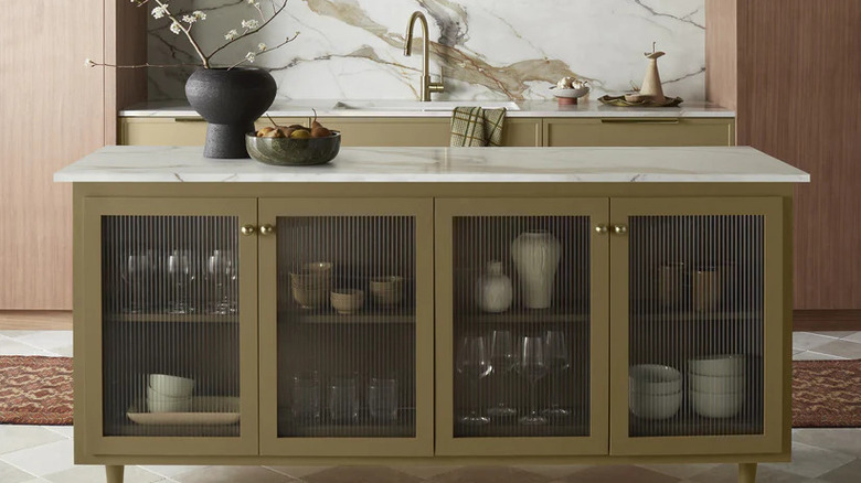
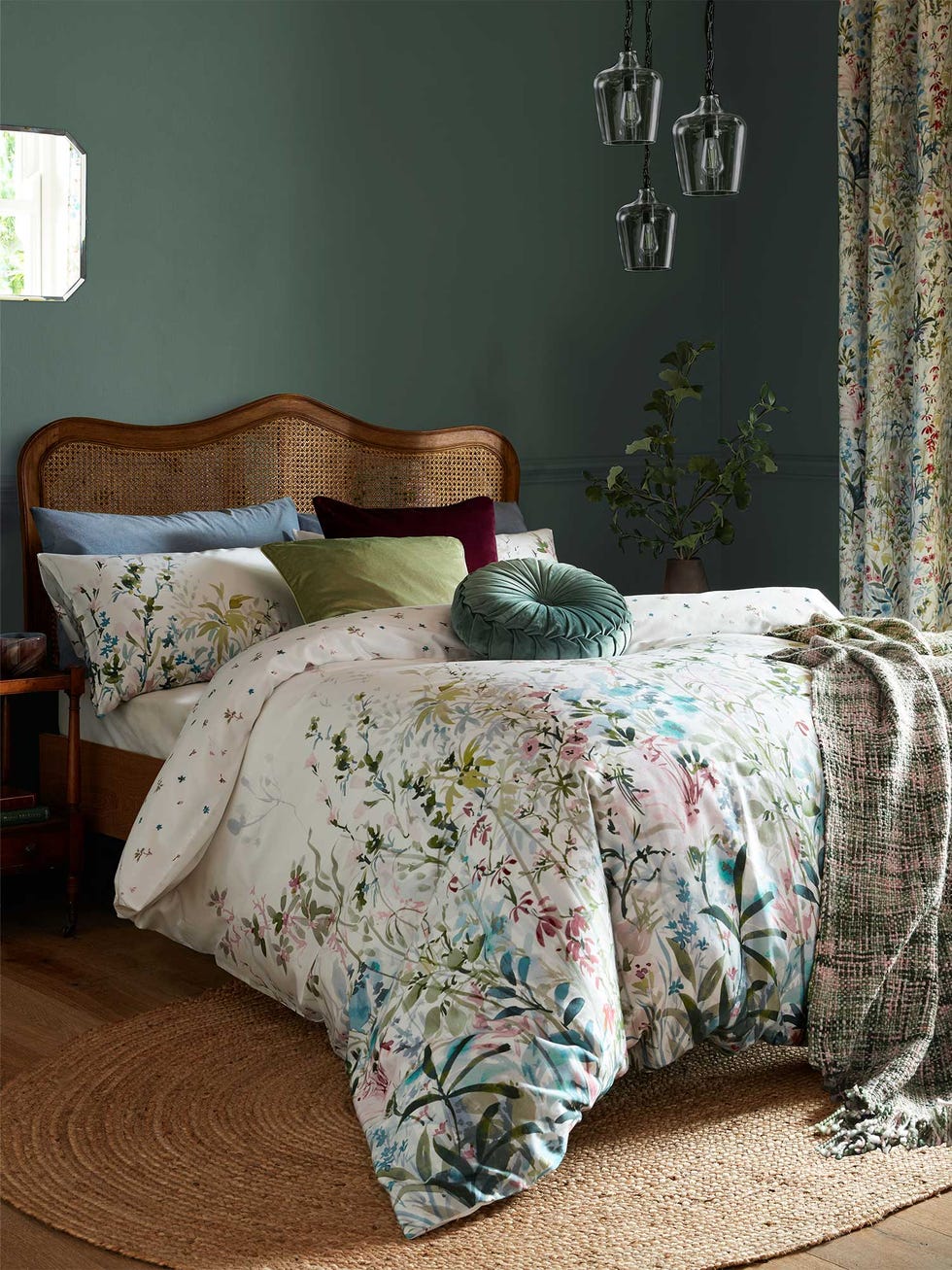
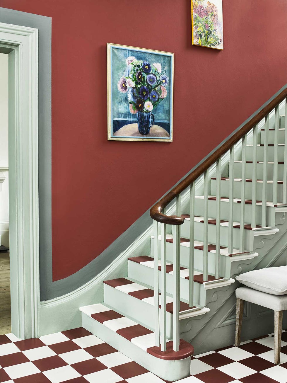
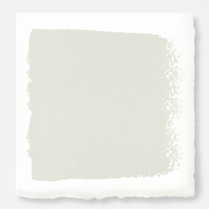
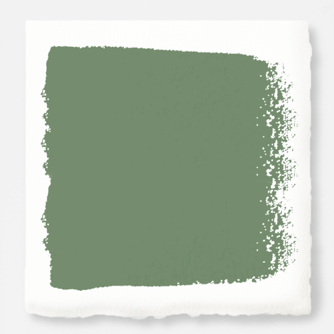
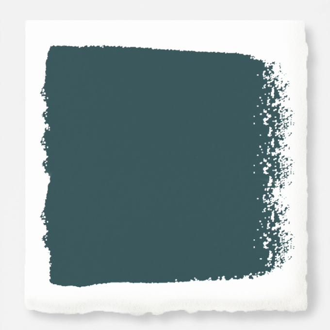
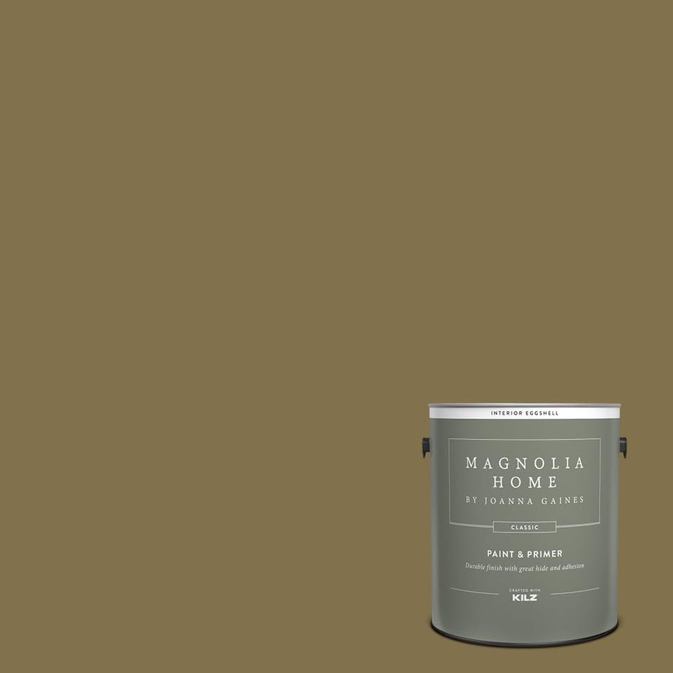
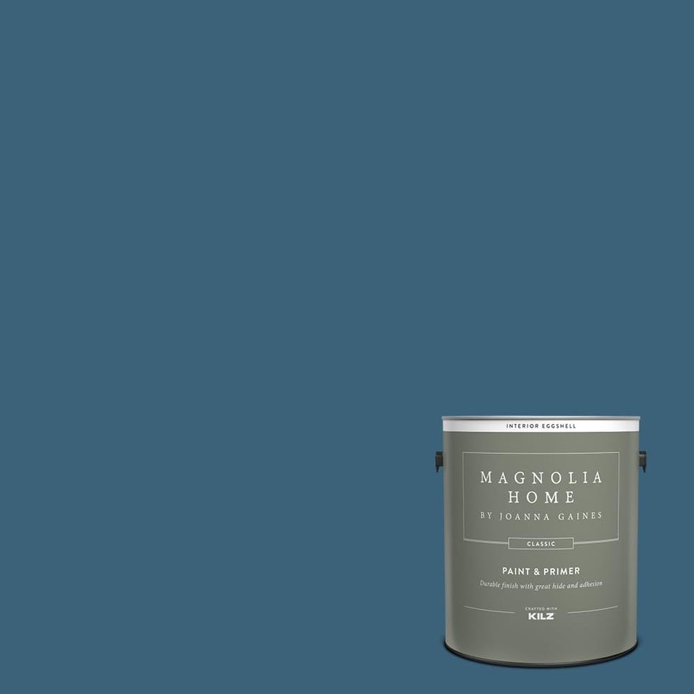
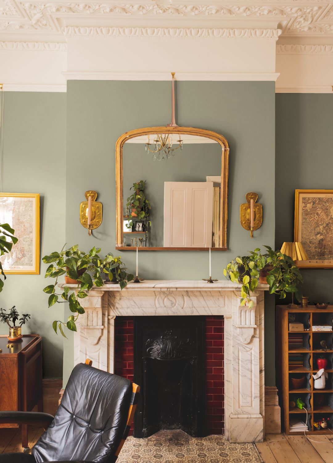
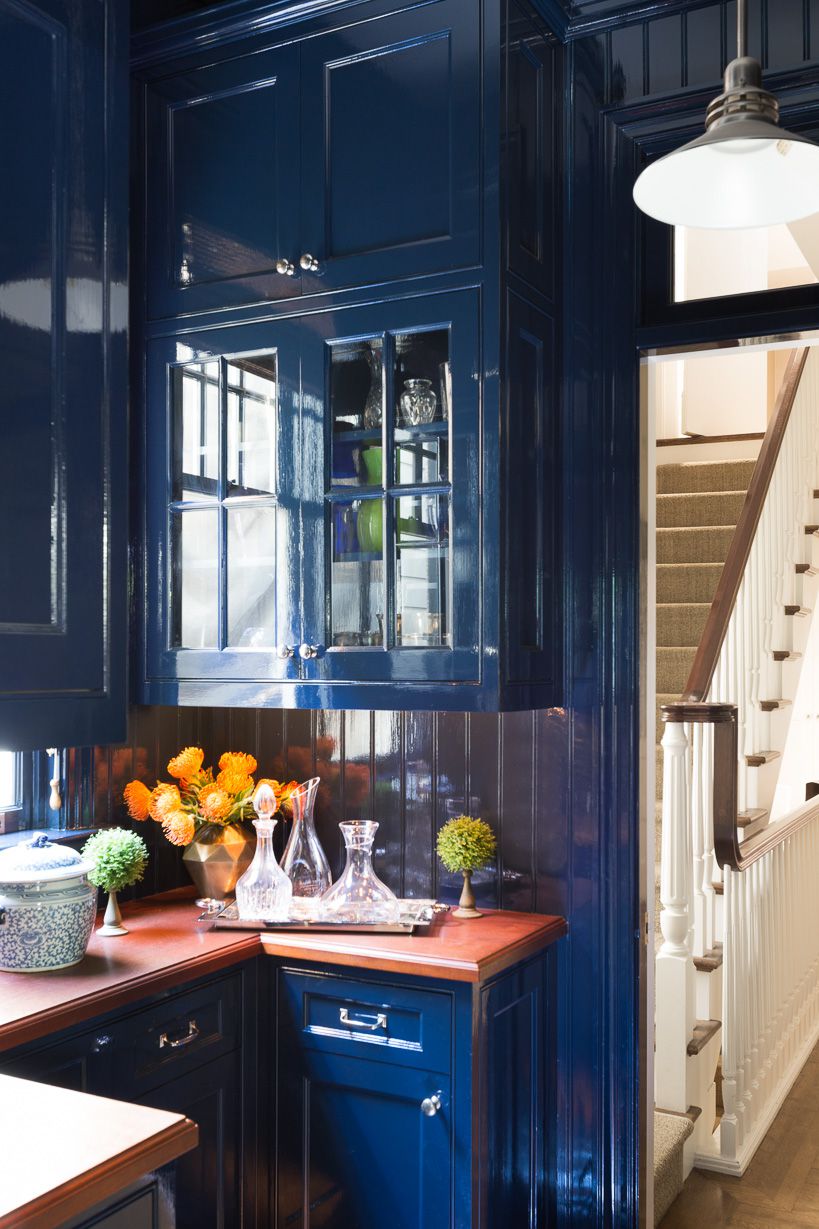
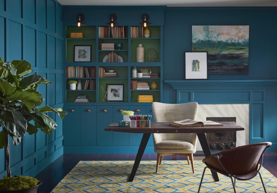
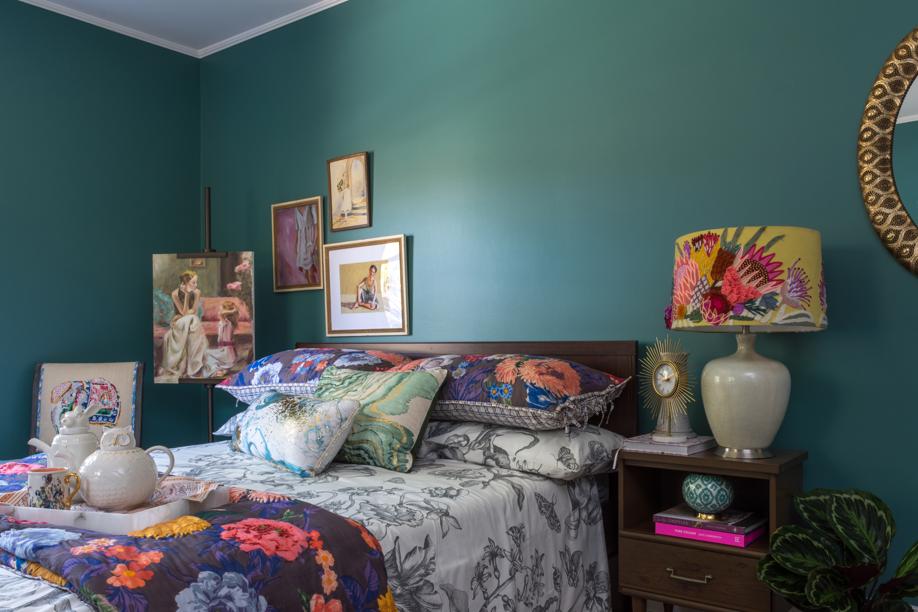
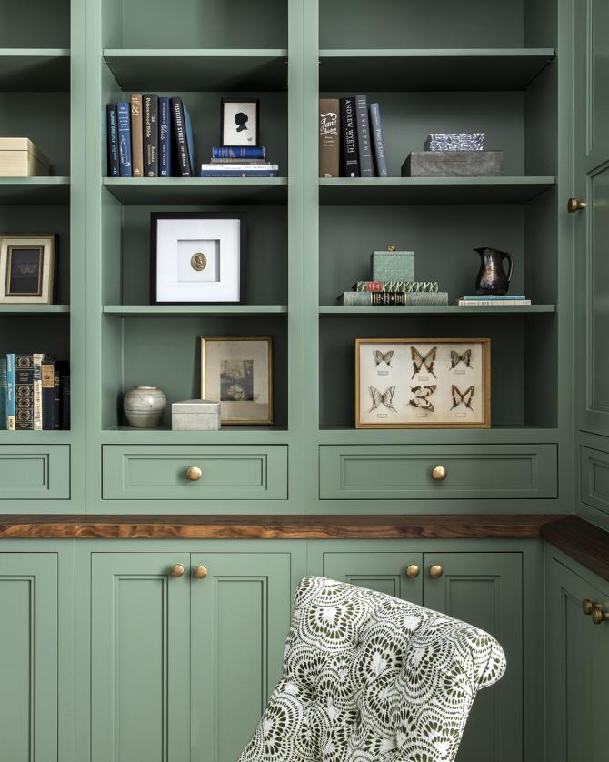
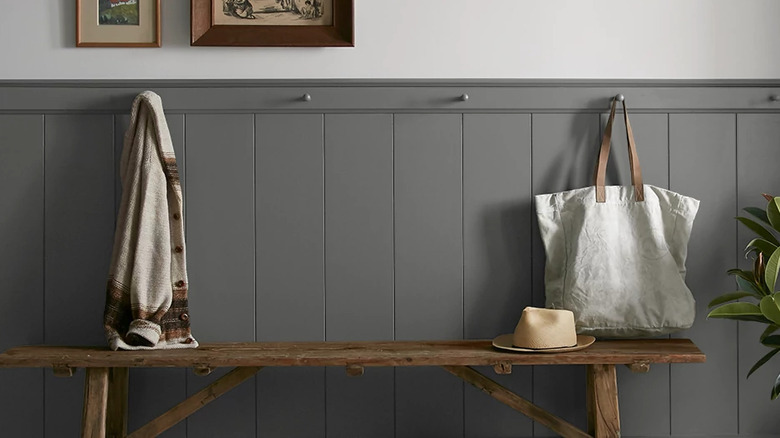
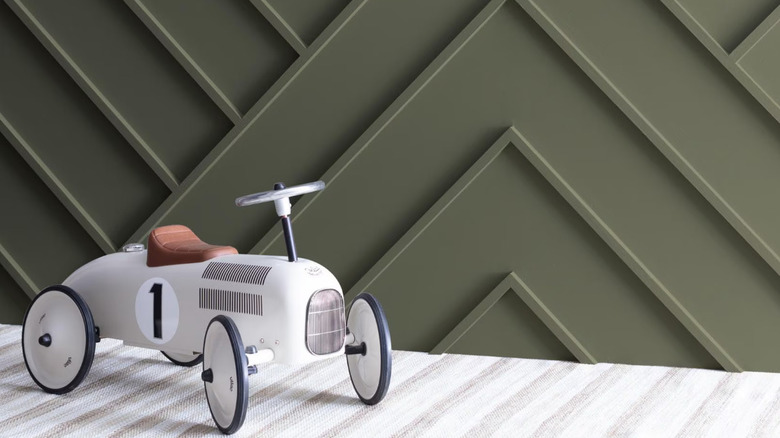
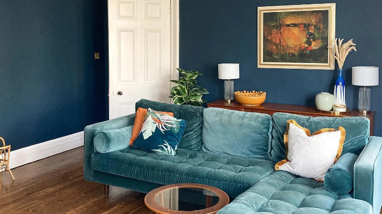
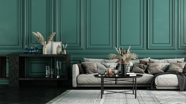
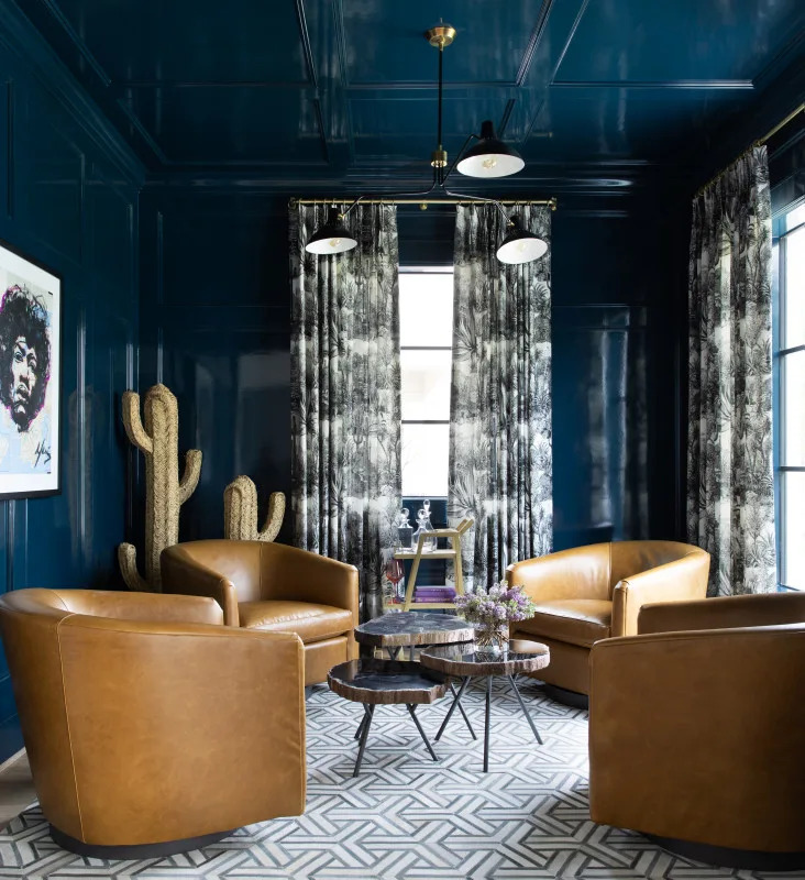
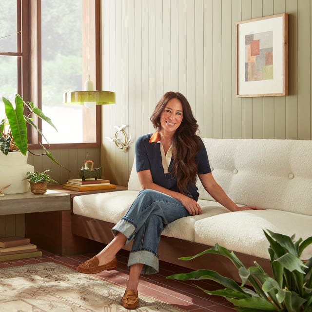
Joanna Gaines, renowned for her neutral-heavy design aesthetic, particularly in modern farmhouse style, has a surprising tip for homeowners considering bolder colors in their interiors. In an interview with Elle Decor, Gaines encourages individuals to "just go for it" when drawn to certain bold shades. This advice reflects an evolution in her own design tastes, moving towards a richer palette that includes deep greens, forest green, sage green, slate blue, and midnight blue, which are increasingly appearing on walls, trim, painted furniture, and cabinetry.
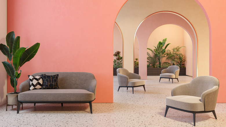
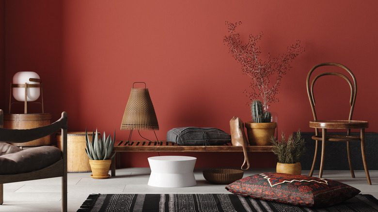
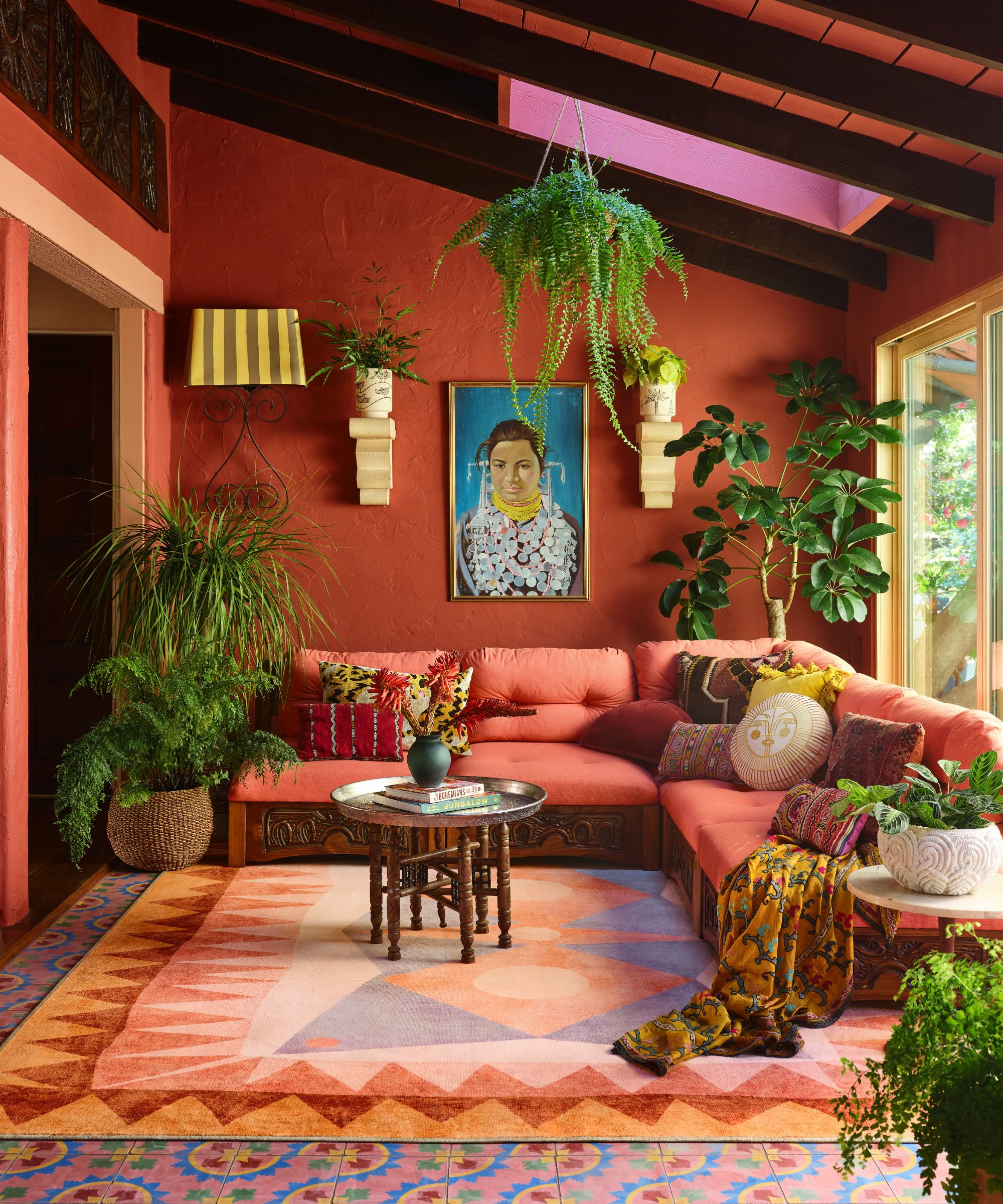
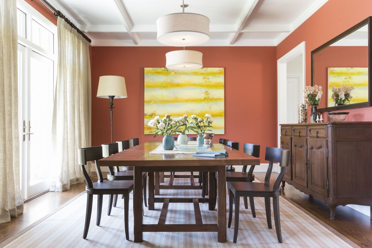
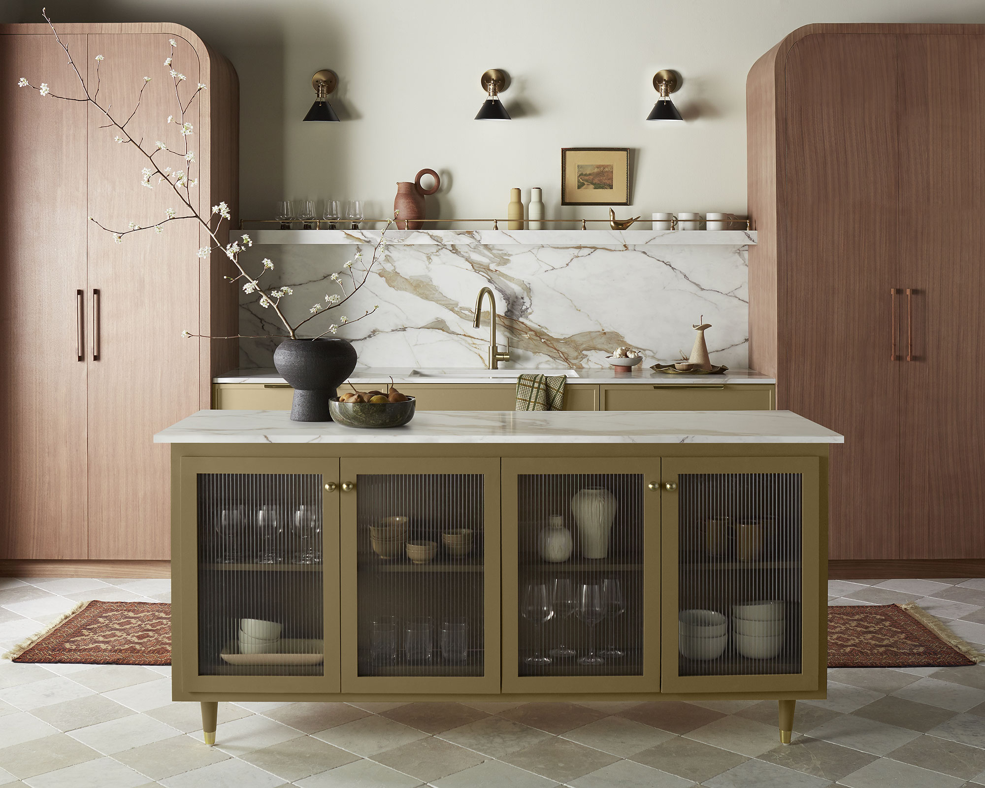
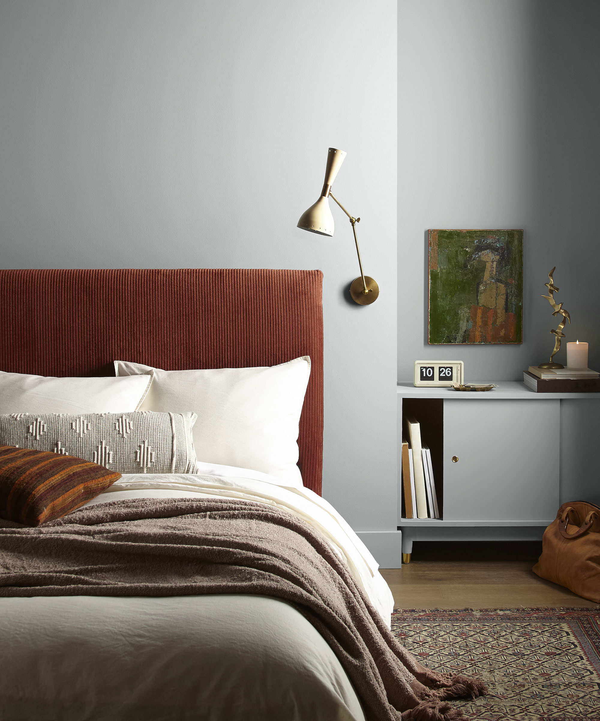
The past decade has seen a dominance of minimalist, chic, neutral spaces featuring whites, creams, taupes, and blacks. However, Gaines observes an exciting shift towards more color, an evolution she has personally embraced as a designer. She highlights that color is a significant expression of personality and style, and her work now incorporates more vibrant hues not only on walls but also through textiles, accents, and wallpaper. This trend is widely reflected in the design community, with many considering nature-inspired colors like green, blue, and terracotta as the "new neutrals." These adaptable shades serve as a gateway to more colorful design schemes due to their compatibility with traditional neutrals and various accent colors. They offer greater depth and dimension compared to traditionally neutral spaces and are prominent in aesthetics such as grandmillennial, cottagecore, and other maximalist styles that utilize color more liberally.
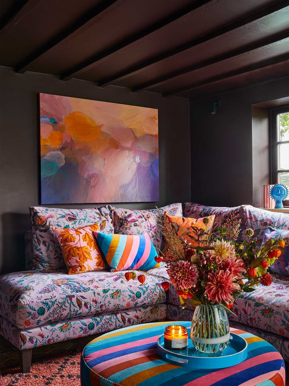
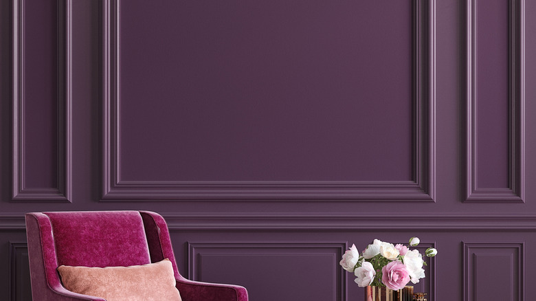
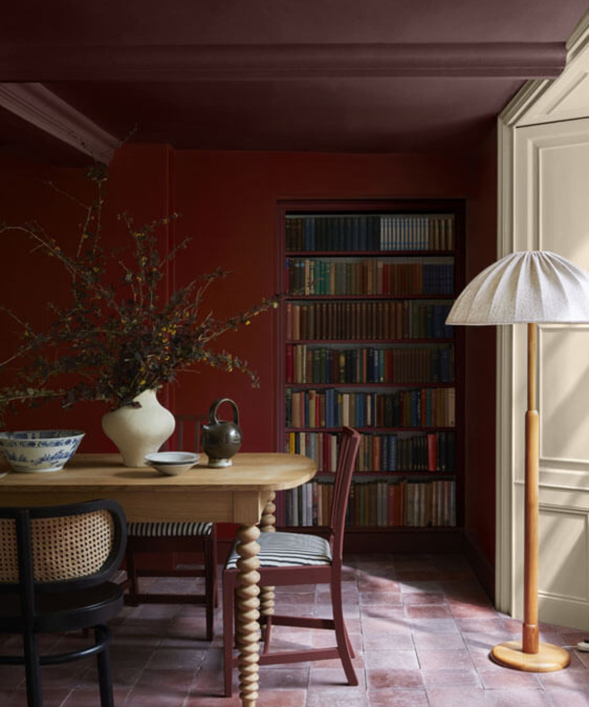
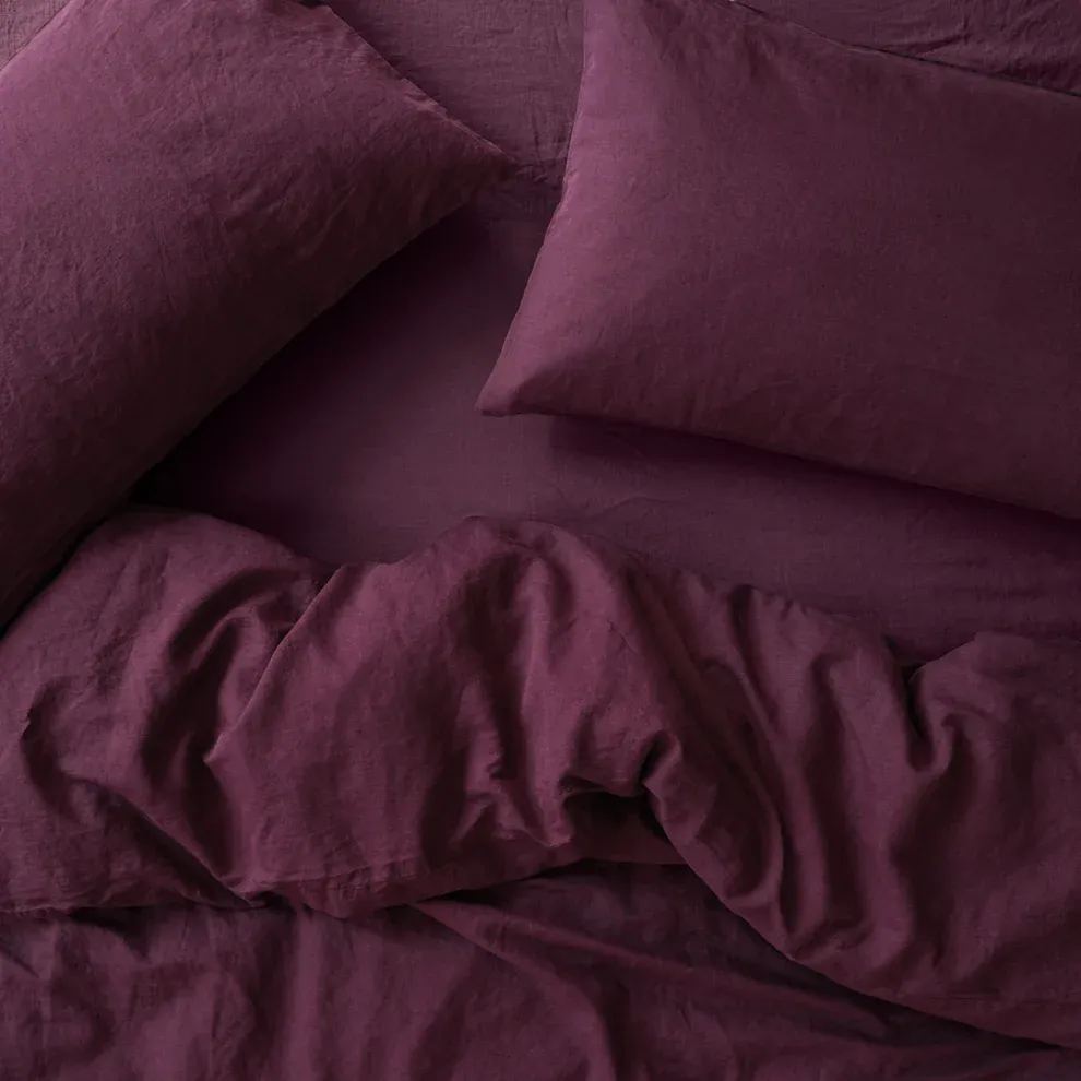
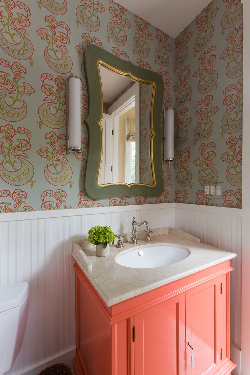
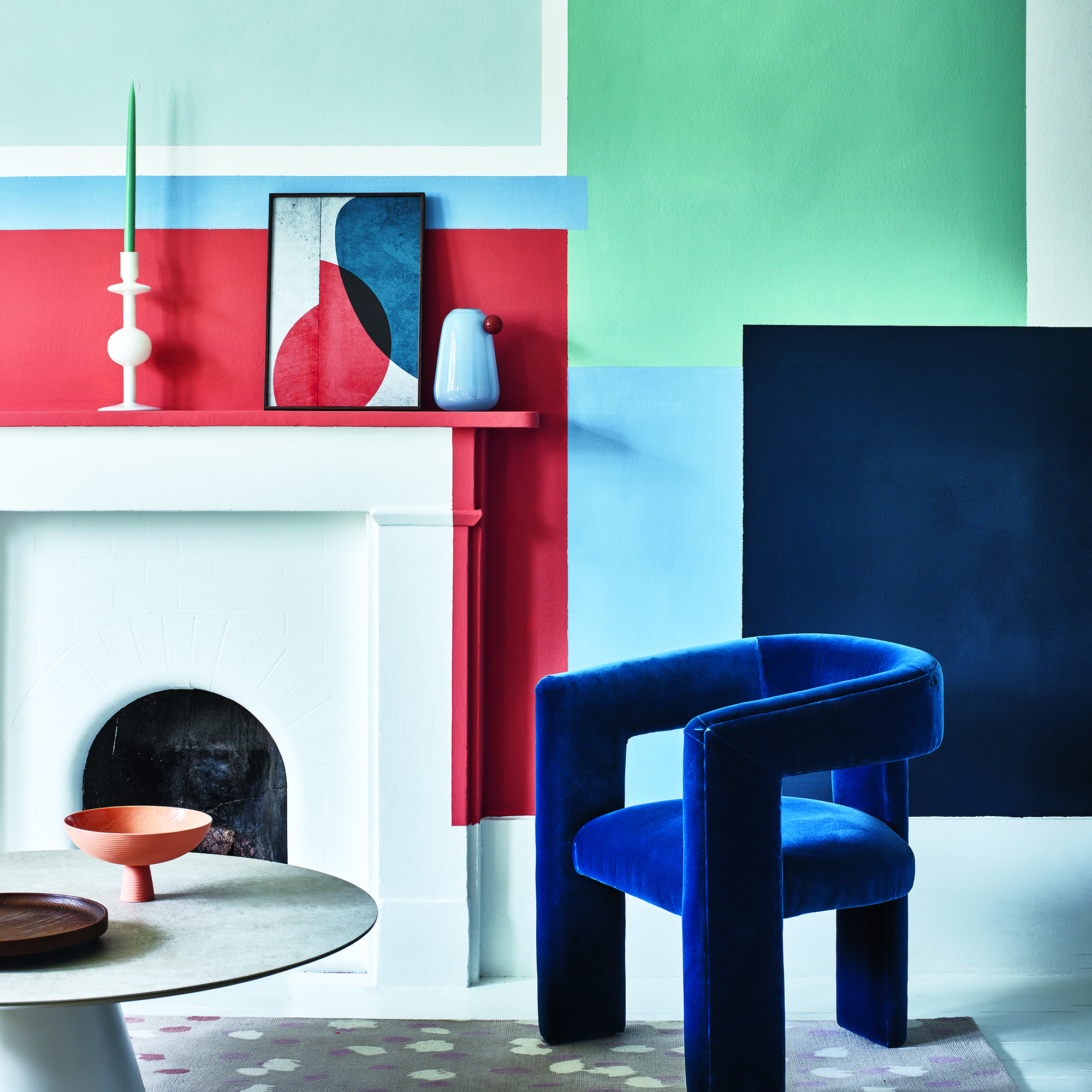
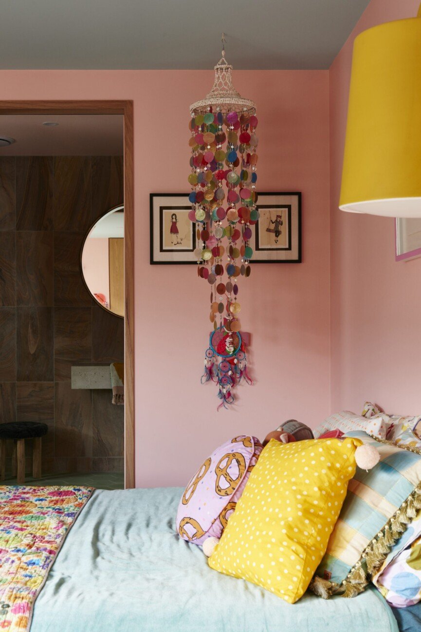
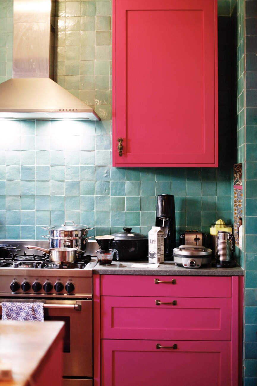
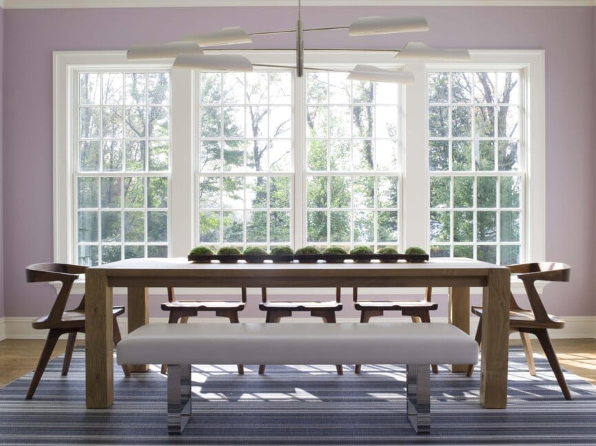
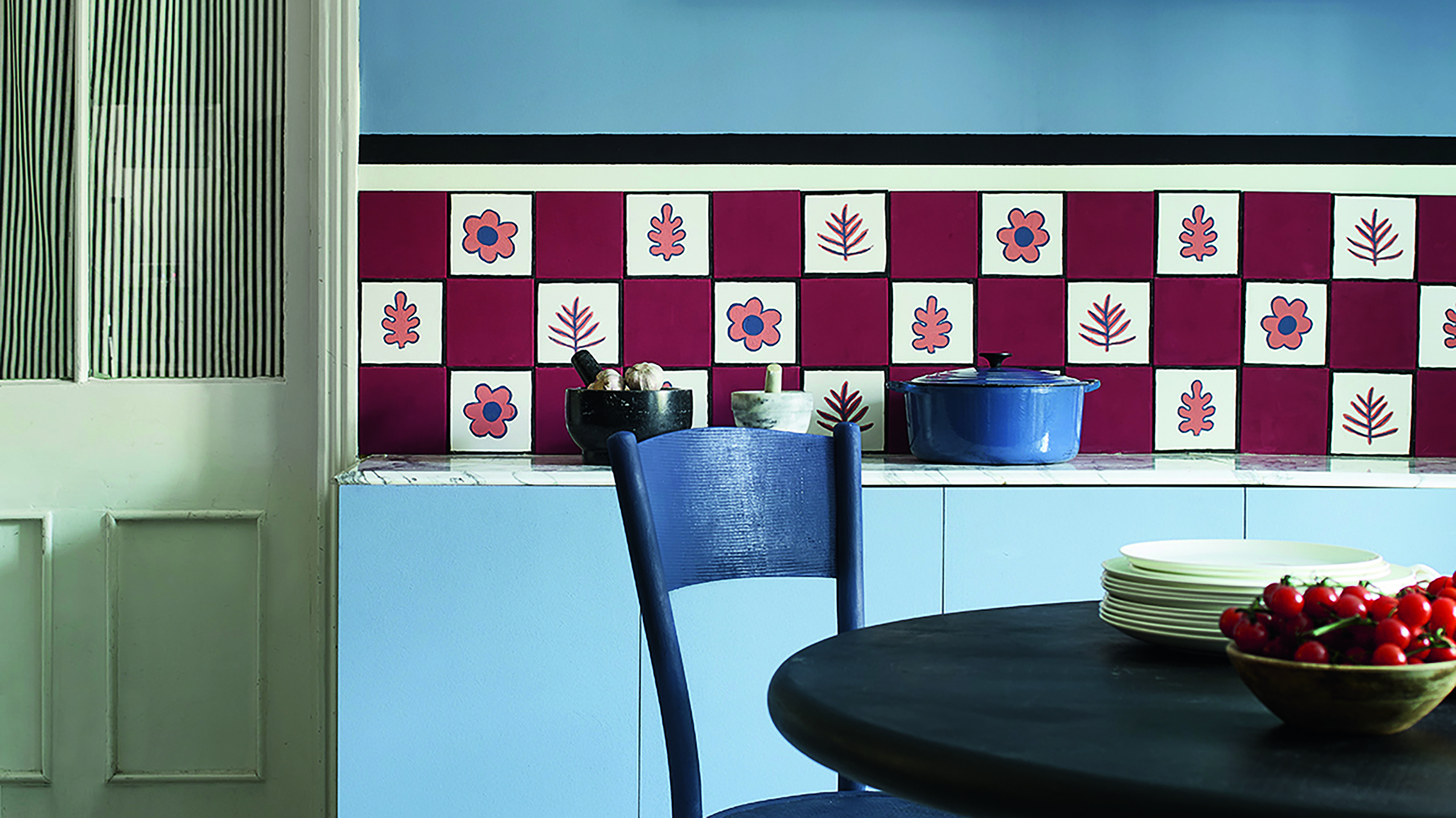
For homeowners who might feel apprehensive about introducing bolder colors, Gaines suggests starting small if the idea seems daunting. Even minimal touches of color can significantly impact a room's depth and dimension, making a home feel more personal and distinctive. She recommends experimenting with a favorite bold or dramatic color in smaller areas like a hallway, powder room, or entryway. Another approach is to gradually integrate painted furniture pieces such as tables, dressers, and cabinets in richer colors into an otherwise neutral environment. Opting for shades within the new nature-inspired neutral spectrum can also provide a smooth transition, as colors like soft green and pale blue retain the calming qualities of traditional neutrals. Furthermore, Gaines notes that darker, more vivid colors can temper each other when placed in proximity, as exemplified by the stunning combination of jewel tones like deep purple, magenta, and plum, which add drama without overwhelming the visual space.
#JoannaGaines #BoldPaintColors #HomeDesignTrends #InteriorDesign #ColorPalette #ModernFarmhouse #DesignTips #HomeImprovement #JoannaGaines #BoldPaintColors #HomeDesignTrends #InteriorDesign #ColorPalette #ModernFarmhouse #DesignTips #HomeImprovement
0 comment in total
 No comments yet
You may also like
Joanna Gaines Swears By These 12 Stunning Paint Colors
3 Things To Consider When Painting With Bold Colors
Make choosing paint easy with new 'natural light' colours

10 Greige Paint Colors Designers Recommend Again And Again

Fixer Upper's Joanna Gaines Shares The Perfect Paint Colors For Every Area Of Your House
3 Paint Colors That Will Never Go Out of Style, According to Joanna Gaines

12 Jewel-Tone Paint Colors Designers Say Are Always On-Trend
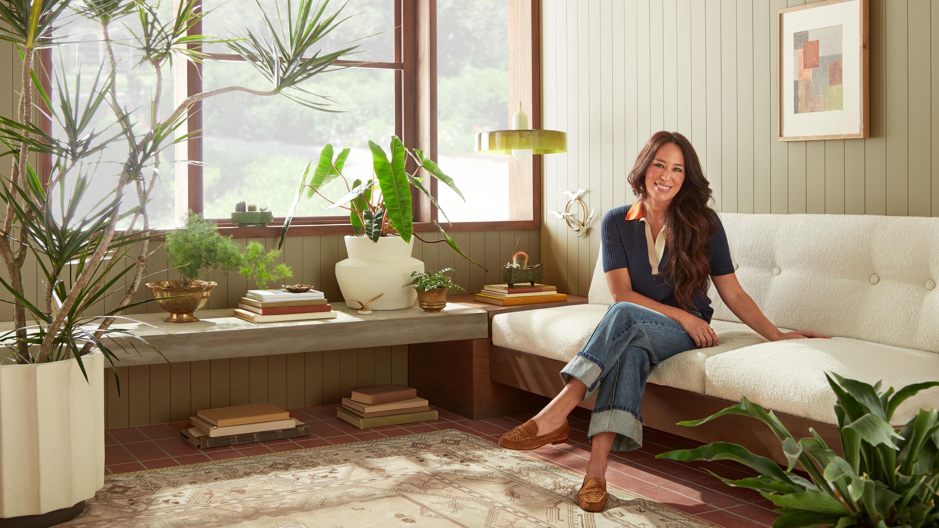
My 5 favorite Joanna Gaines paint colors prove that retro '70s palettes are back and better than ever


An A-List Designer’s Secrets To Picking Perfect Paint Colors

to choose paint colors.
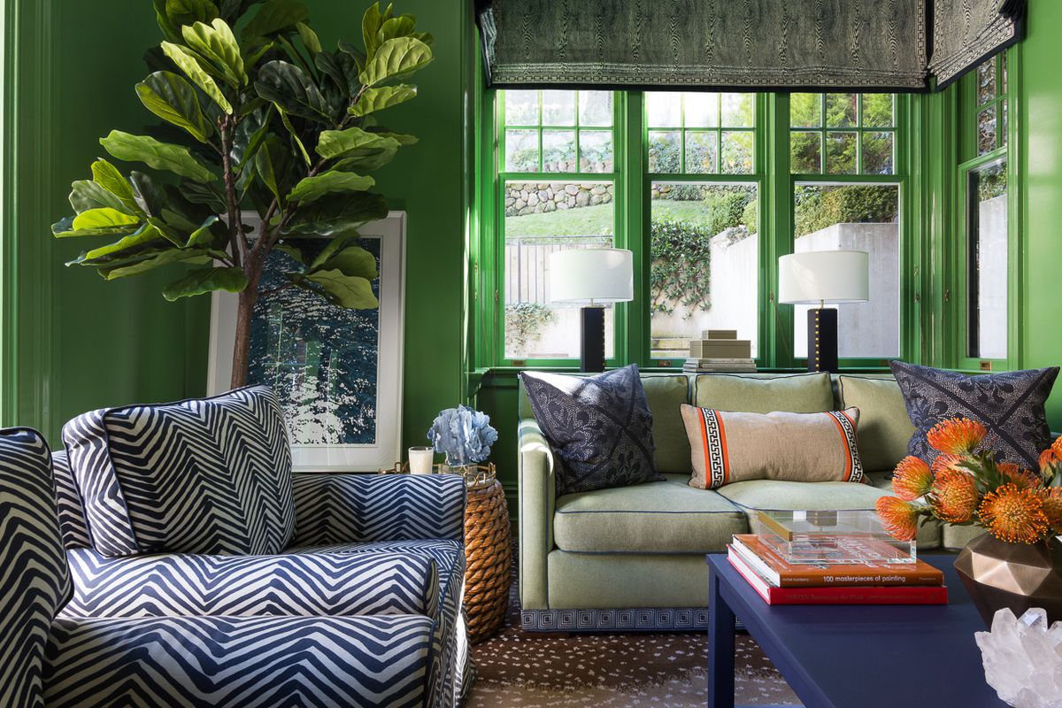
15 high-risk high-reward paint hues
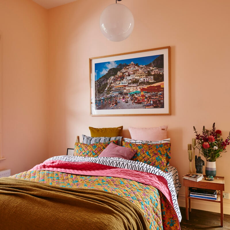
The Brighter, the Better—These Vibrant Paints Will Infuse Your Home With Positivity

Color Drenching Is the Bold Paint Trend Taking Over—Here’s How to Nail It
Joanna Gaines Says She Never Uses These Four Paint Colors—Here's Why

Primary colours are having a moment - but the secret to styling them is through 'unexpected' touches
Dark Paint Colors HGTV Stars Love Using In Homes
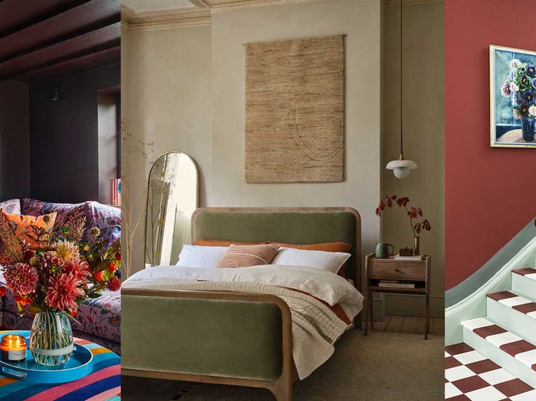
Colour experts share their top paint trends for 2024

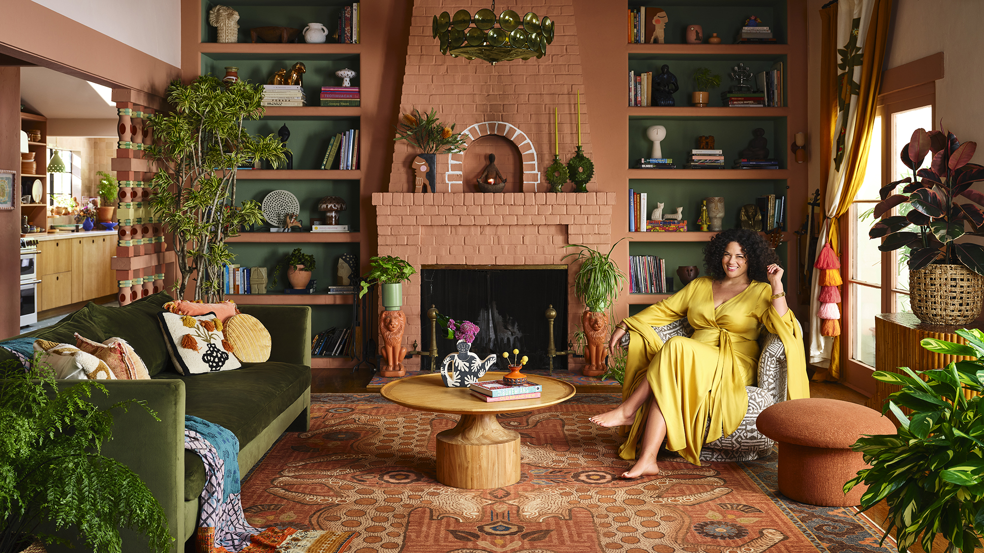
Designer Justina Blakeney Says This Paint Color Flatters Everyone and Is Perfect for Drenching Rooms
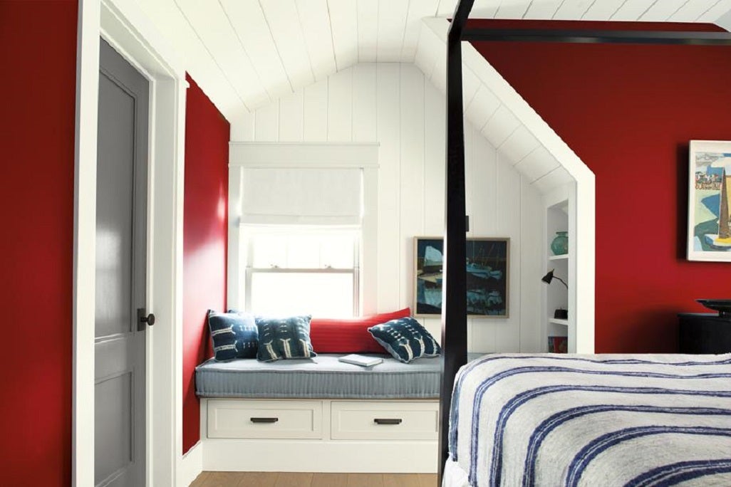
Tips for adding the hottest paint colors to your decor

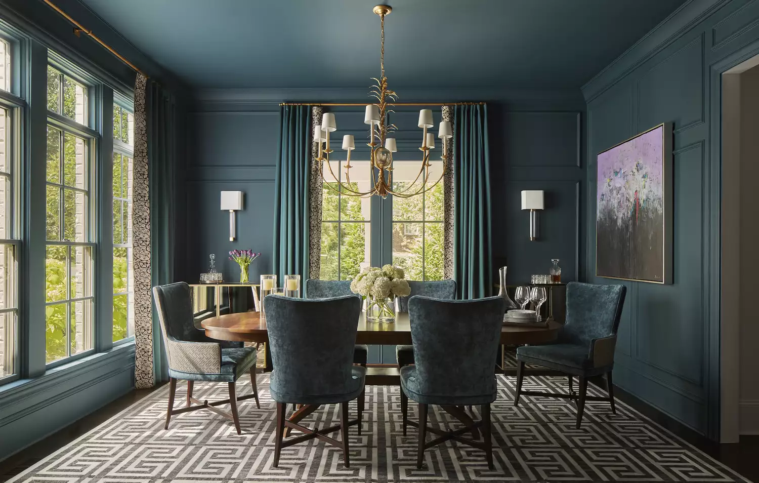
10 Color Drenching Ideas That Highlight the Beauty of This Paint Trend