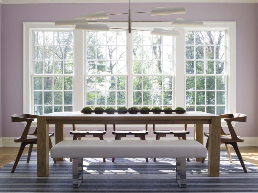
1/8
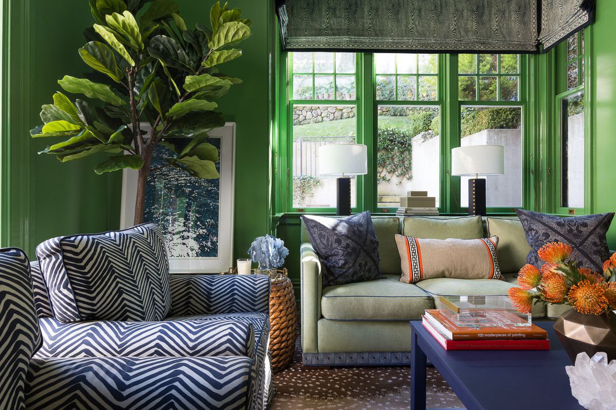
15 high-risk high-reward paint hues
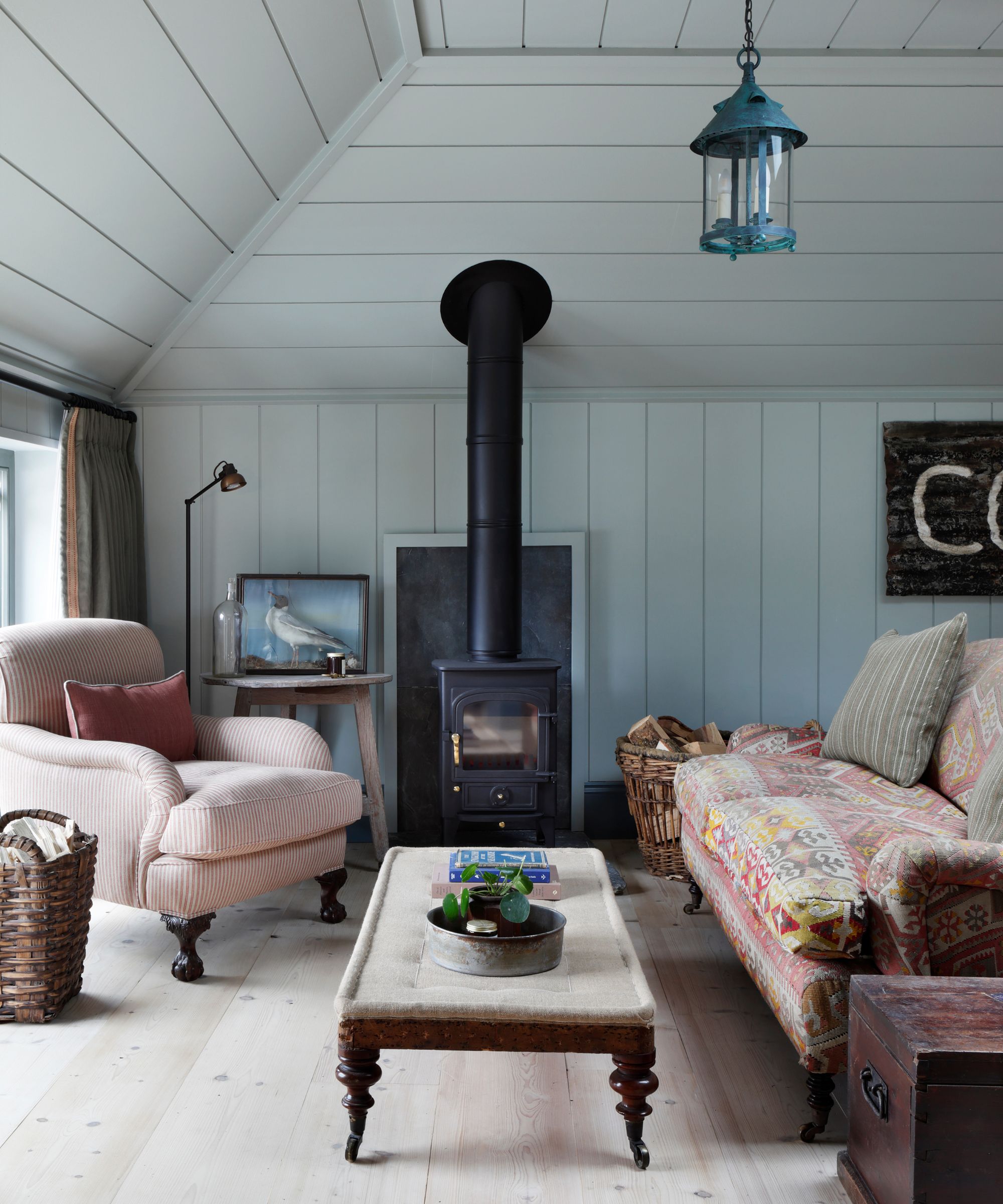
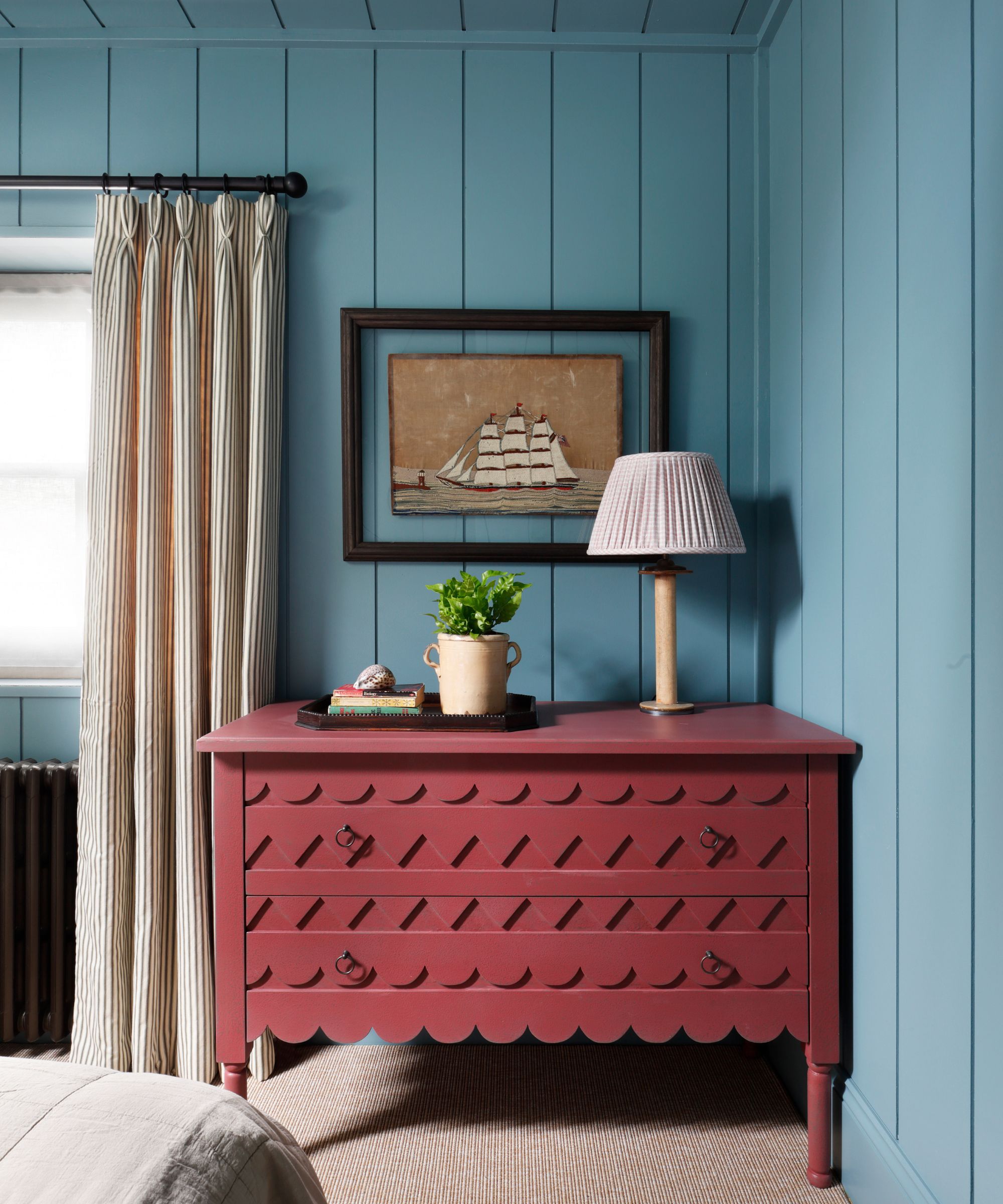
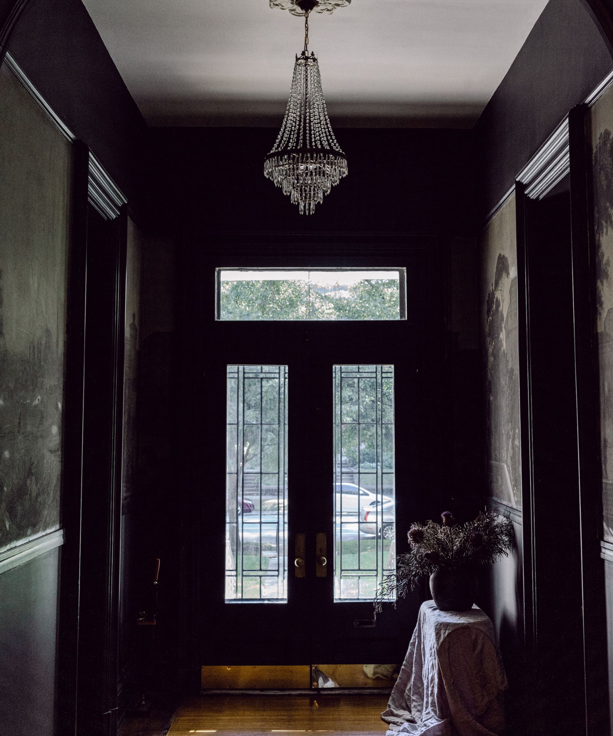
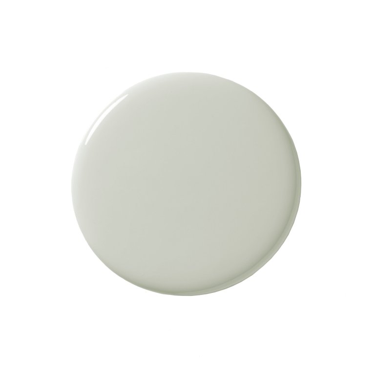
The article explores the use of bold interior paint colors in home design, highlighting that while many individuals are hesitant to experiment with vibrant hues, professional designers embrace them for their transformative potential. It begins by acknowledging the common apprehension associated with selecting bold colors, referencing a journalist's 'harrowing color selection process' that involved stress over gray and white shades. In contrast, the article presents designers who view color as an opportunity for creativity and significant impact.
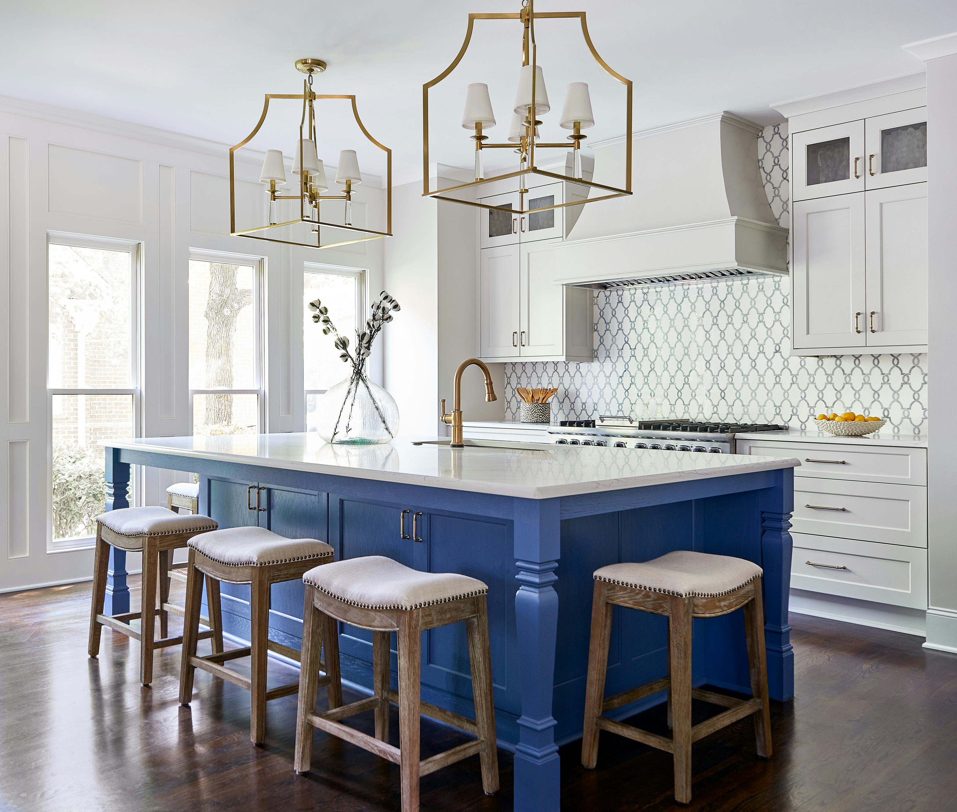
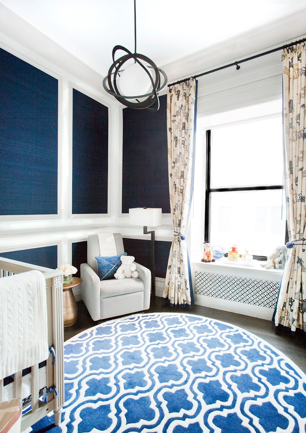
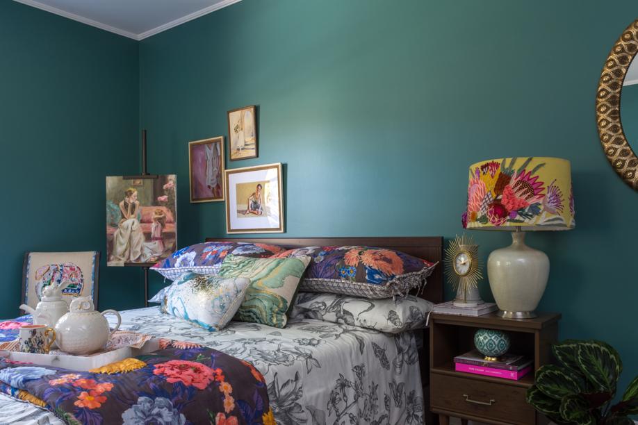
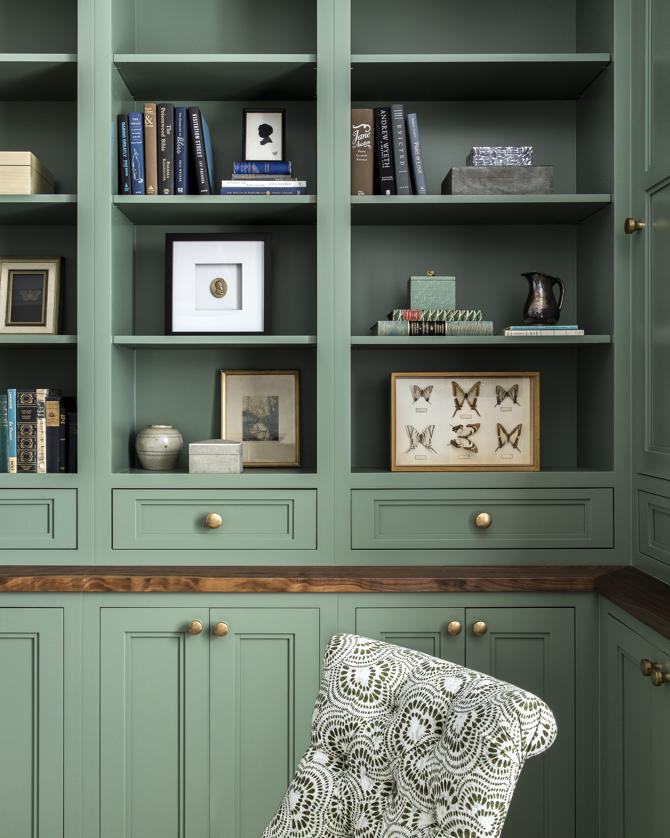
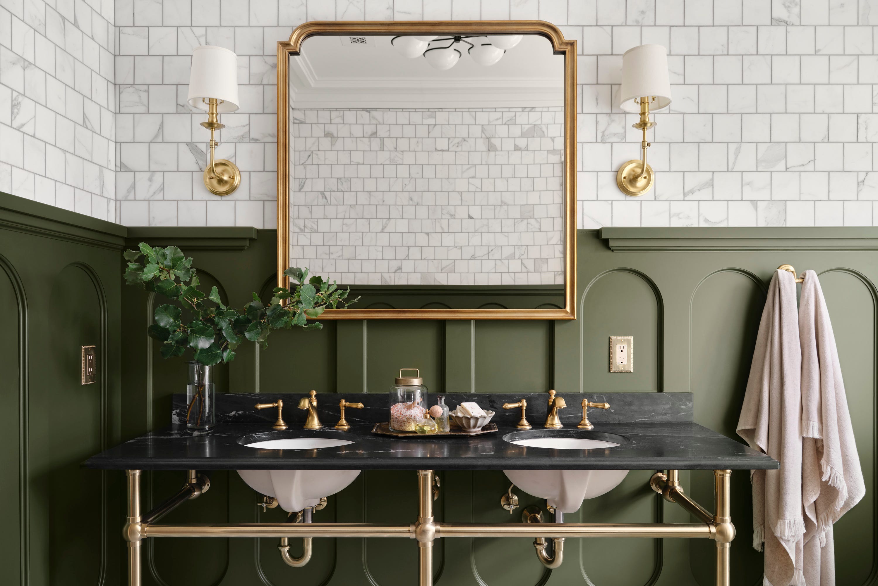
Several examples illustrate the successful application of bold colors. Ann Lowengart, for instance, used Benjamin Moore's Richmond Green to fully immerse a living room, including walls, trim, and bookshelves, in the client's favorite color. She notes that the saturated color created a vibrant, lively, and calming space, demonstrating the 'wow' factor and soothing effect achieved through a bold choice. Similarly, Lowengart used Fine Paints of Europe's Navy Blue in a high-gloss finish for kitchen cabinets and a paneled wall, transforming a typically staid color into something rich and bright.
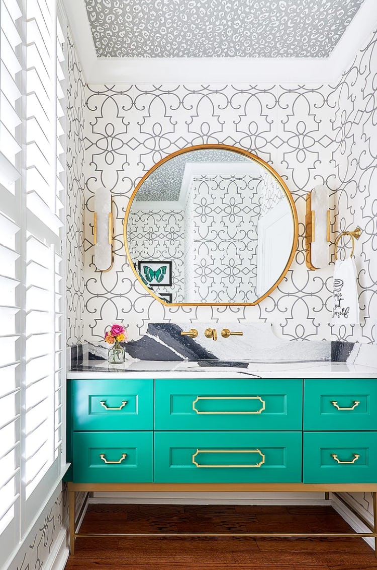
Julie Rootes opted for Benjamin Moore's Orange Parrot, a blend of orange popsicle and sherbet, for a bathroom vanity cabinet. She describes it as a 'delicious' and bold choice that makes a significant impact in a small powder room. Lowengart also anticipates using Benjamin Moore's Sunshine, a chrome yellow, to add a serious punch to future projects.
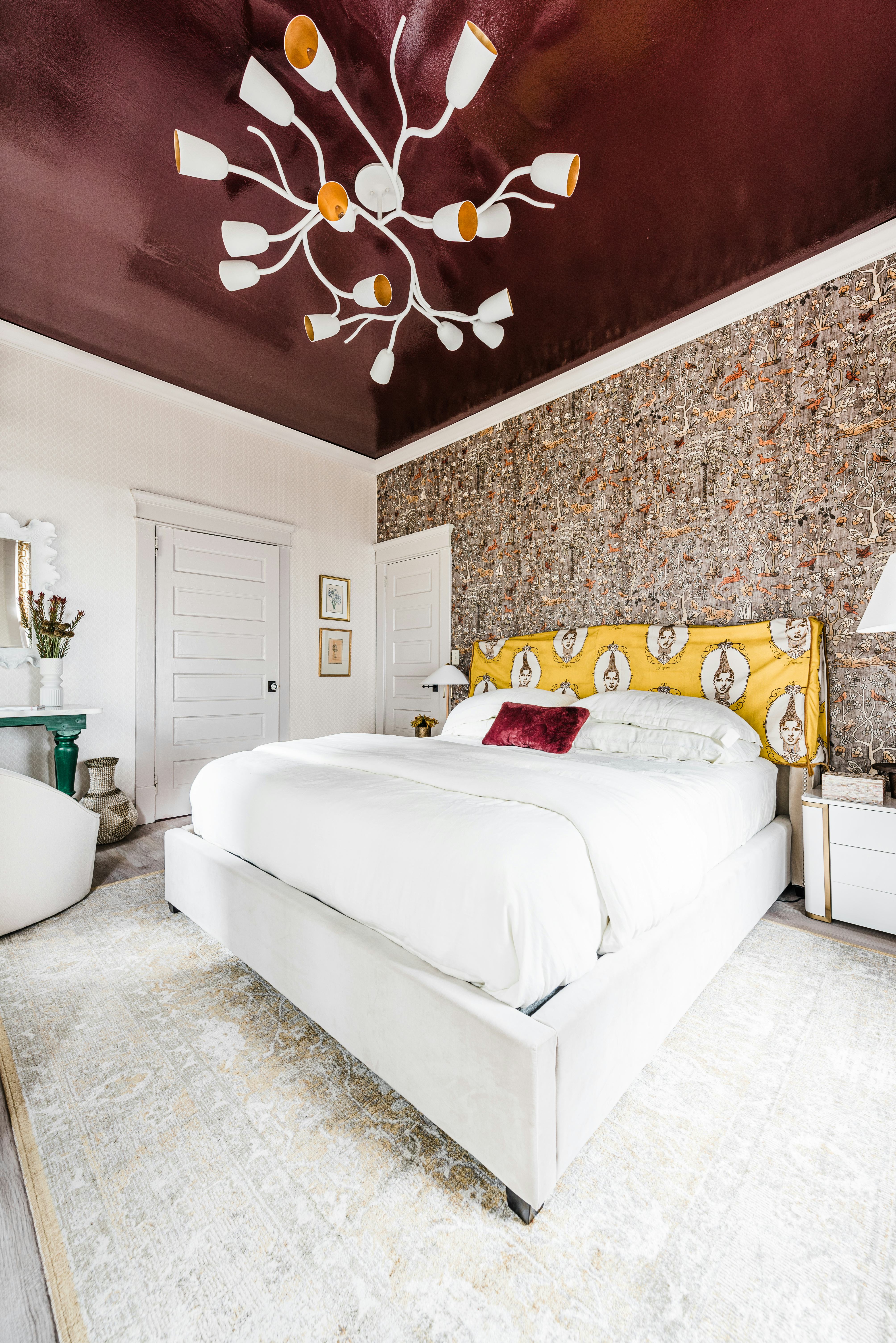
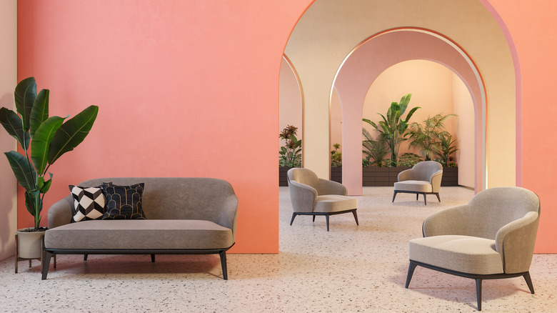
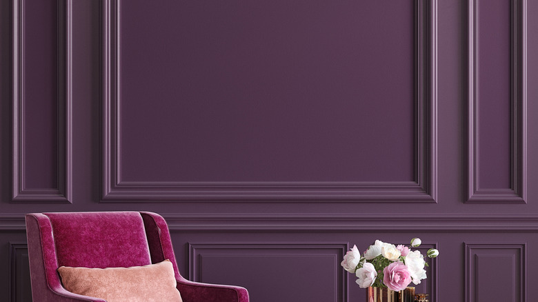
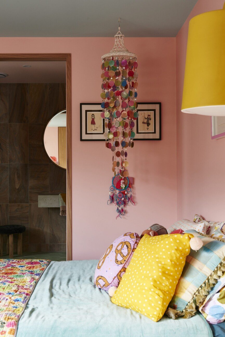
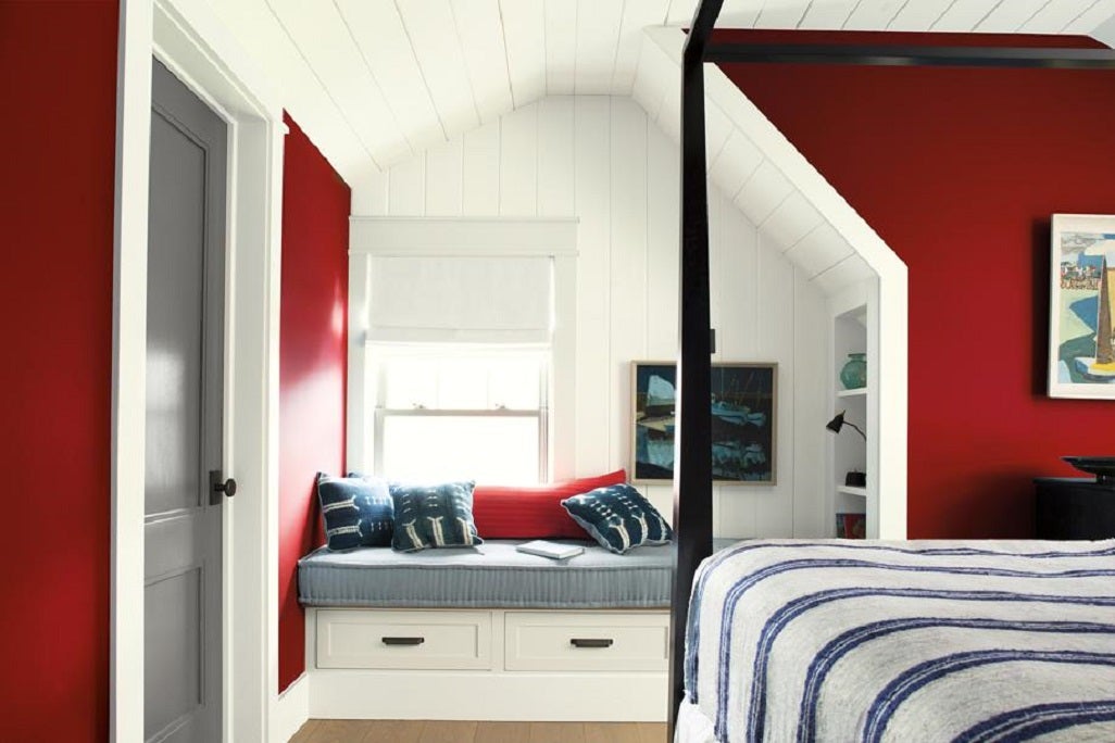
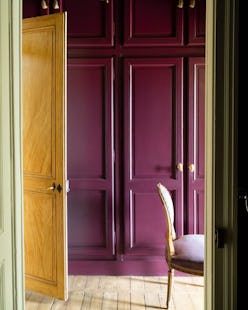
Alden Miller introduced Benjamin Moore's Crimson into a dining room, which stood out amidst the home's largely neutral palette. This risky decision resulted in a space with a 'casual formality,' feeling both special and inviting. Miller also chose Benjamin Moore's Chambourd, a deep wine color, for a front door to make a statement. Noz Nozawa's approach to color is described as 'nothing ventured, nothing gained.' She used Benjamin Moore's Peony, a 'chic take on Barbie pink,' in a living room, making a petite space feel larger and more vibrant.
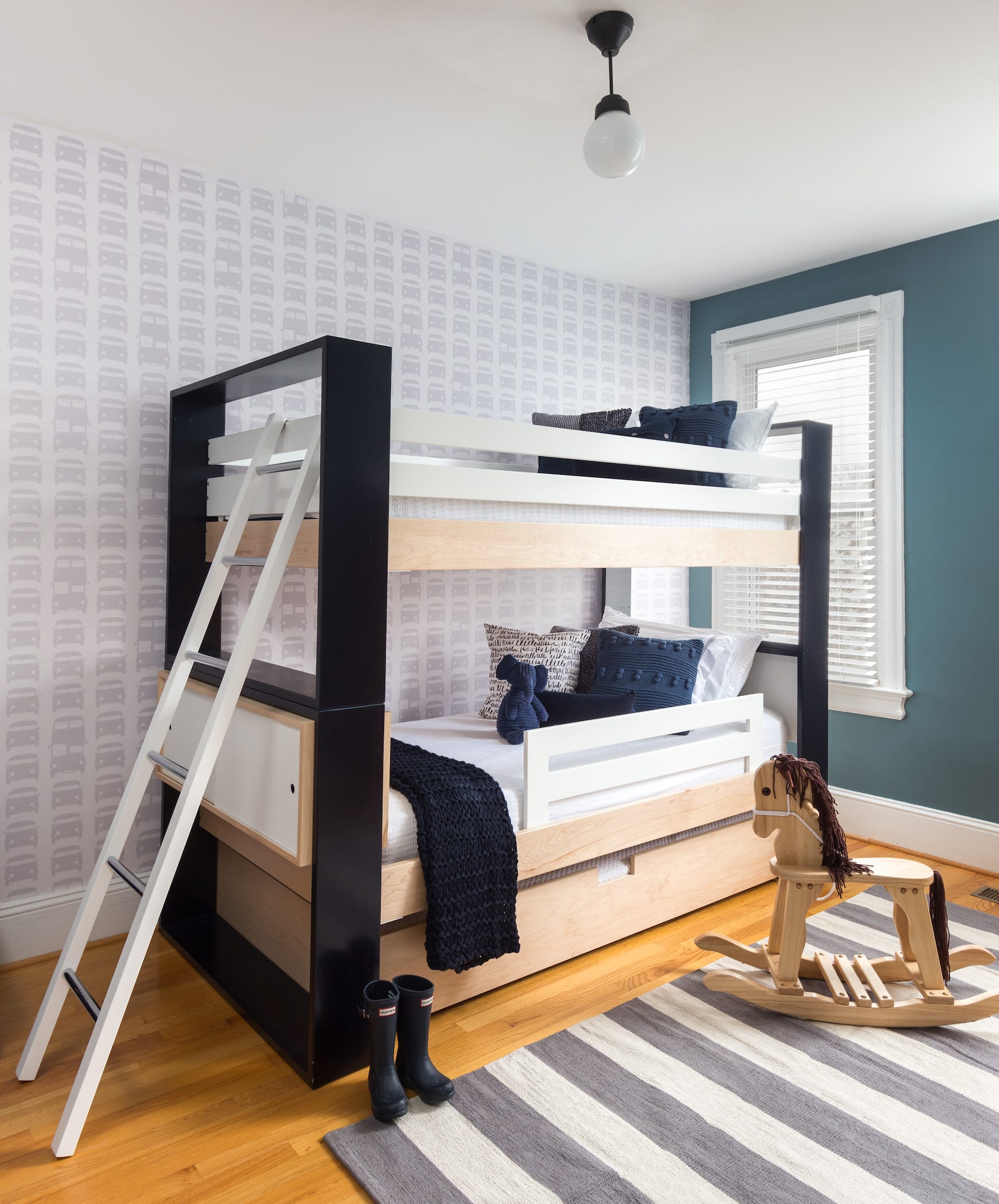
In another instance, Miller allowed clients' daughters to choose their room colors, a decision that proved successful when one selected Benjamin Moore's Utah Sky. This bright blue reflected her personality and fostered a personal connection to her room. Nozawa also favors Farrow & Ball's Charlotte’s Locks, a 'rad, incredibly saturated, and vibrant shade of orange.' Fannie Allen combined Benjamin Moore's Pinch of Spice (aubergine cabinets) with Palladian Blue walls, creating a dynamic contrast and showcasing colorful dishware.
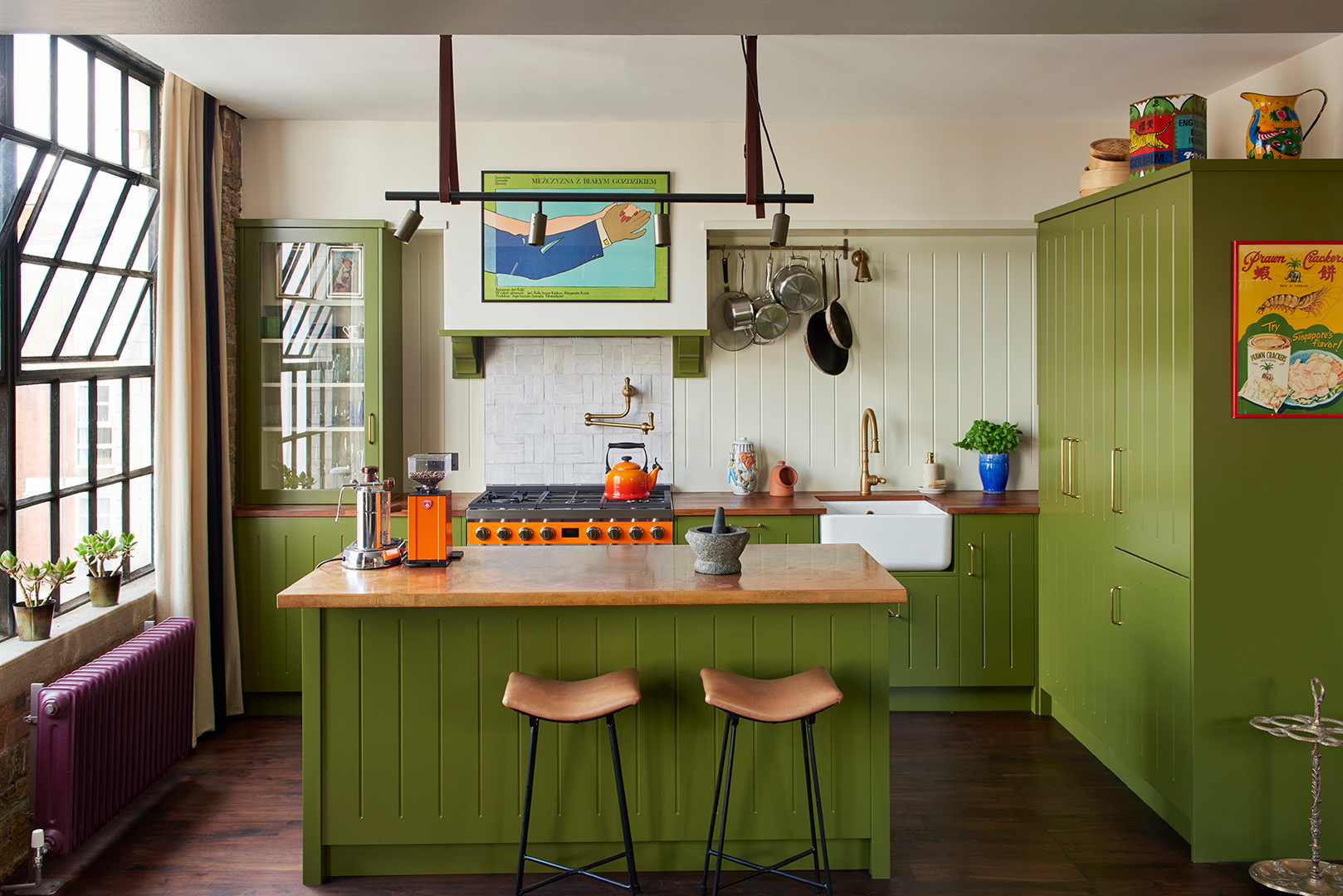
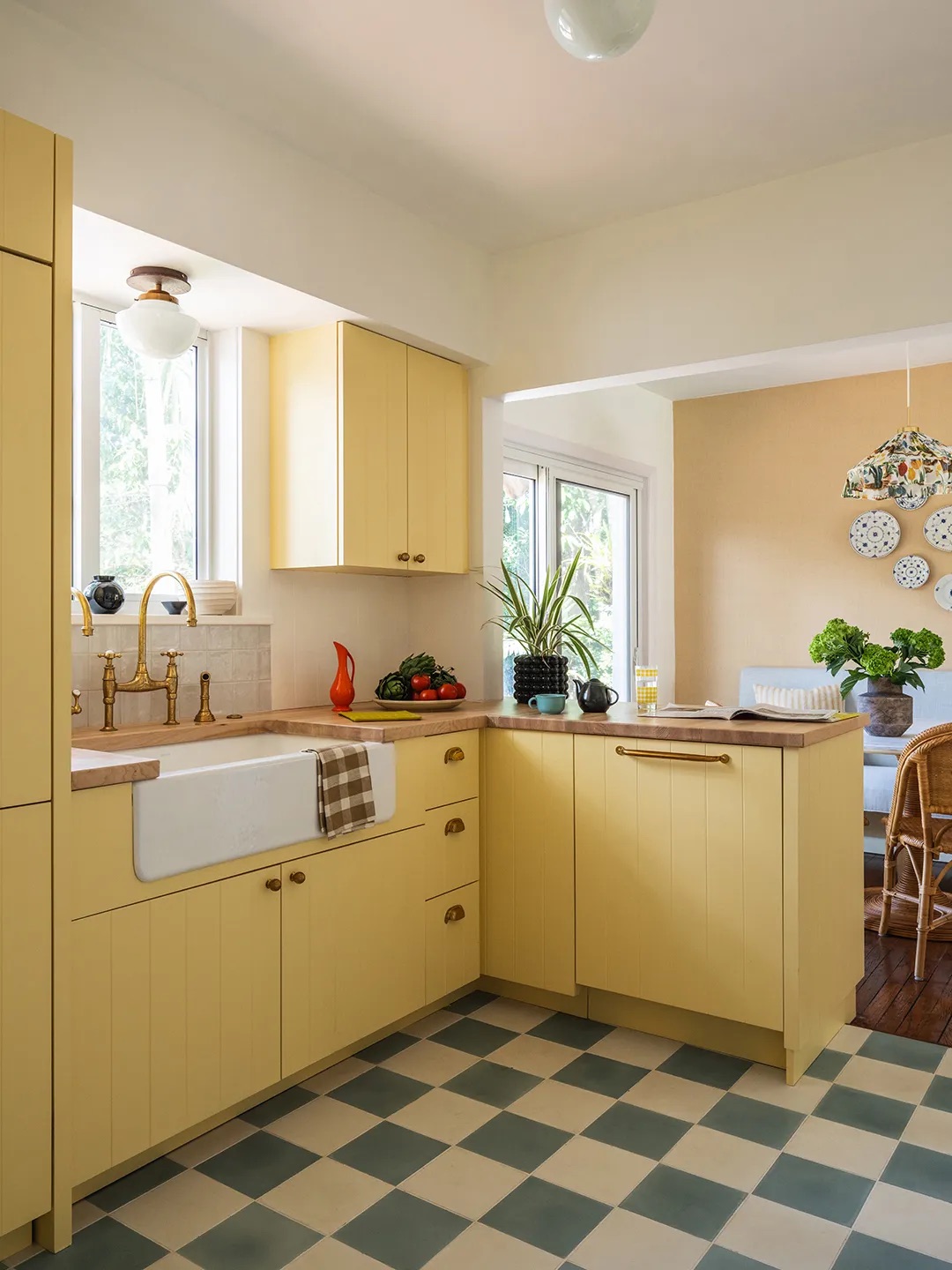
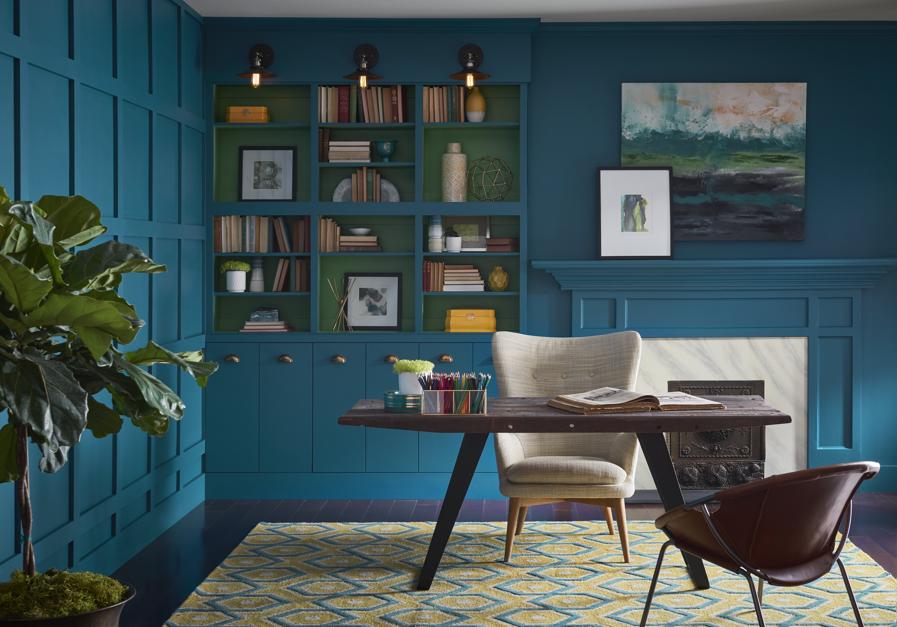
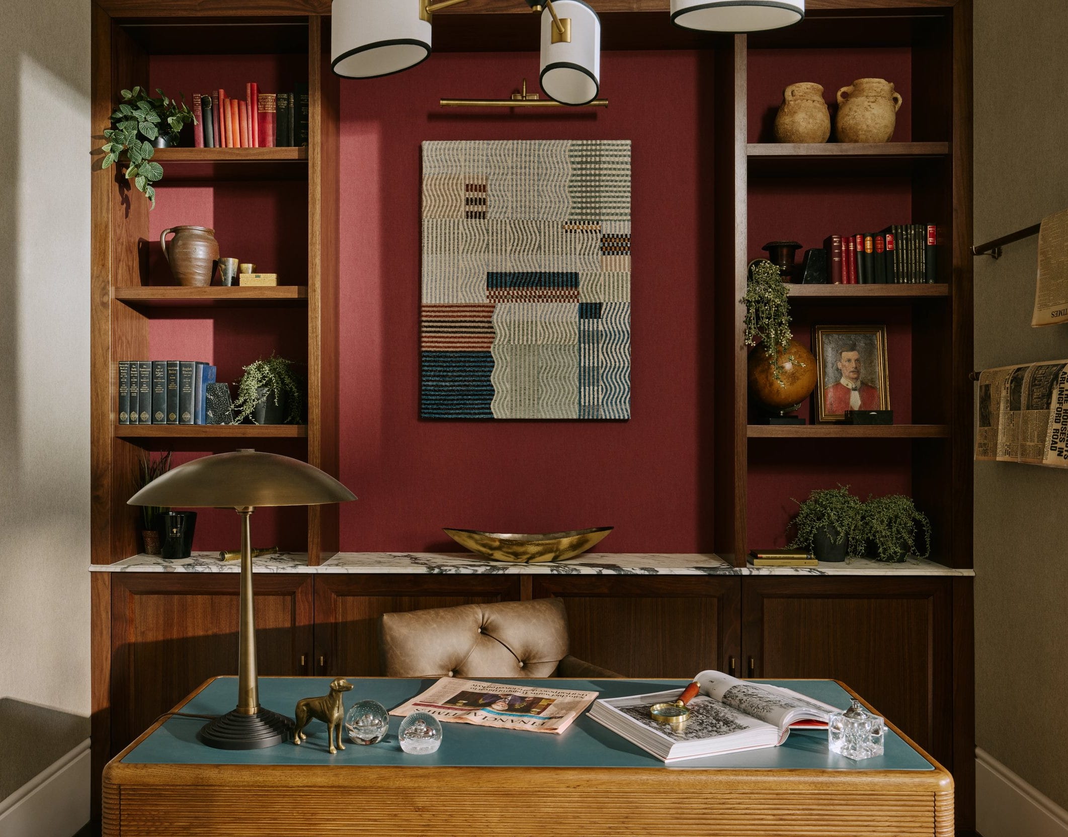
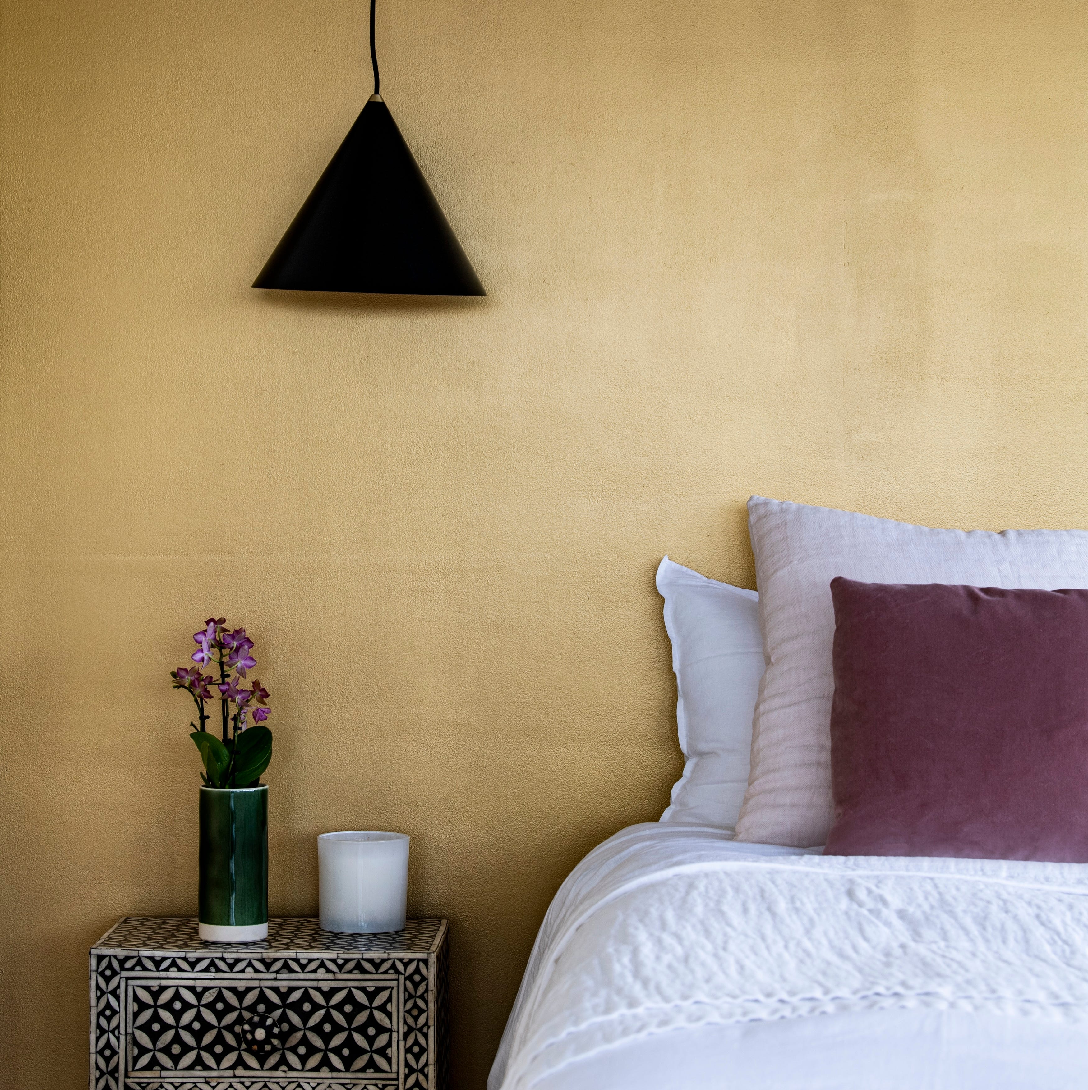
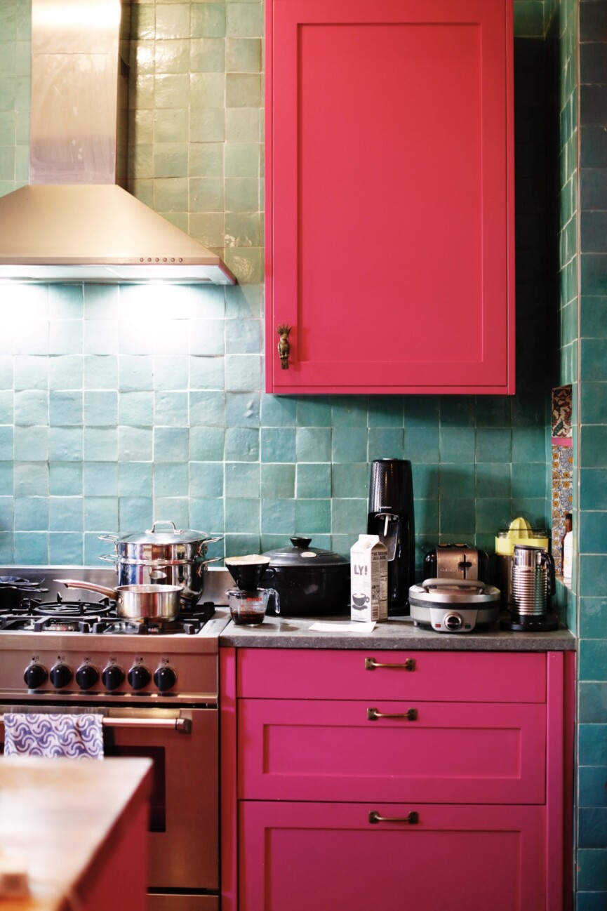
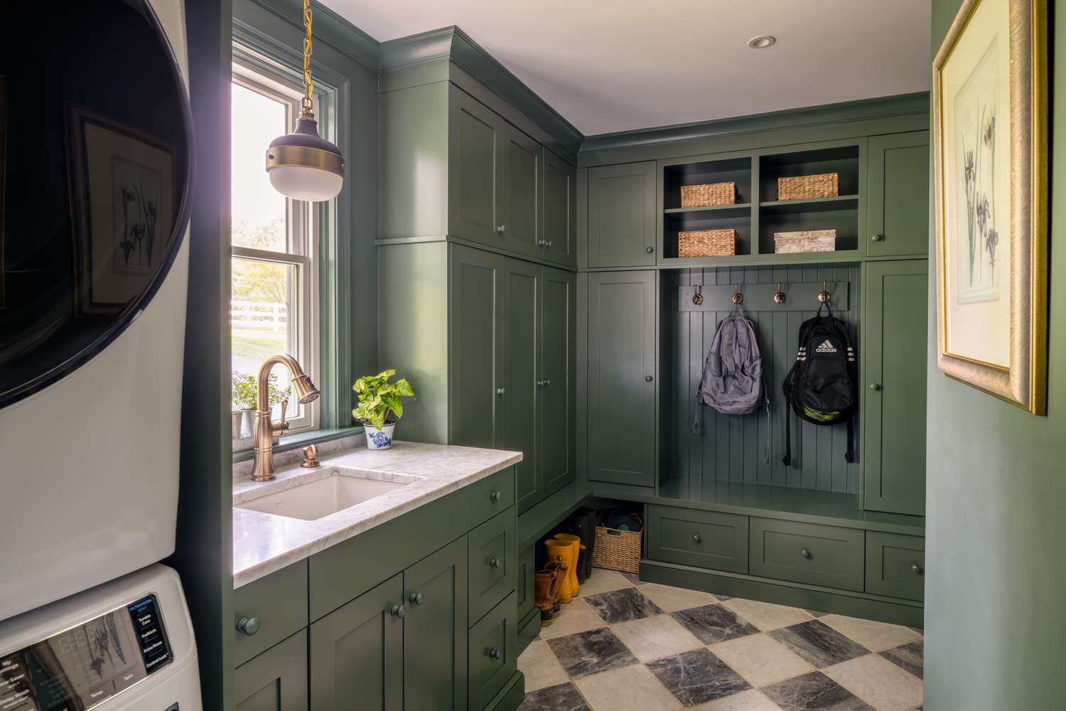
Steven Favreau showcased a fearless approach by combining Benjamin Moore's Crushed Cherries (hot pink), Barista (chocolate brown), and Bavarian Cream (white) in wide horizontal stripes in an entry. This bold combination, initially conceived from a discontinued wallpaper, generated significant online interest. Favreau emphasizes that paint is an inexpensive way to push design boundaries, as it can always be repainted. He also highlights Farrow & Ball's Yellowcake, a yellow with green undertones that 'soars' in the right light, and Sherwin Williams' Houseplant, a mossy green that works well in high gloss, though caution is advised with certain wood tones. For red, Favreau often selects Kelly Moore's Relief, a 'true red' despite the general difficulty in handling red's various undertones.
#InteriorDesign #BoldColors #PaintHues #HomeDecor #ColorSelection #DesignerTips #VibrantInteriors #HomeRenovation #InteriorDesign #BoldColors #PaintHues #HomeDecor #ColorSelection #DesignerTips #VibrantInteriors #HomeRenovation
0 comment in total
 No comments yet
You may also like
Designers Say These 5 Paint Colors Can Dramatically BOOST Your Resale Value

This Cheery Kitchen Color Could Hurt Your Home Value

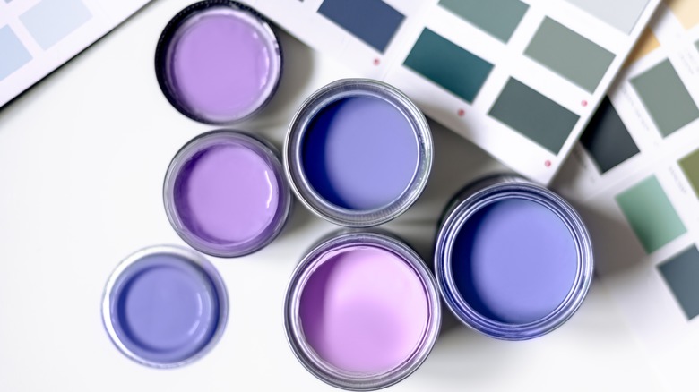
3 Things To Consider When Painting With Bold Colors
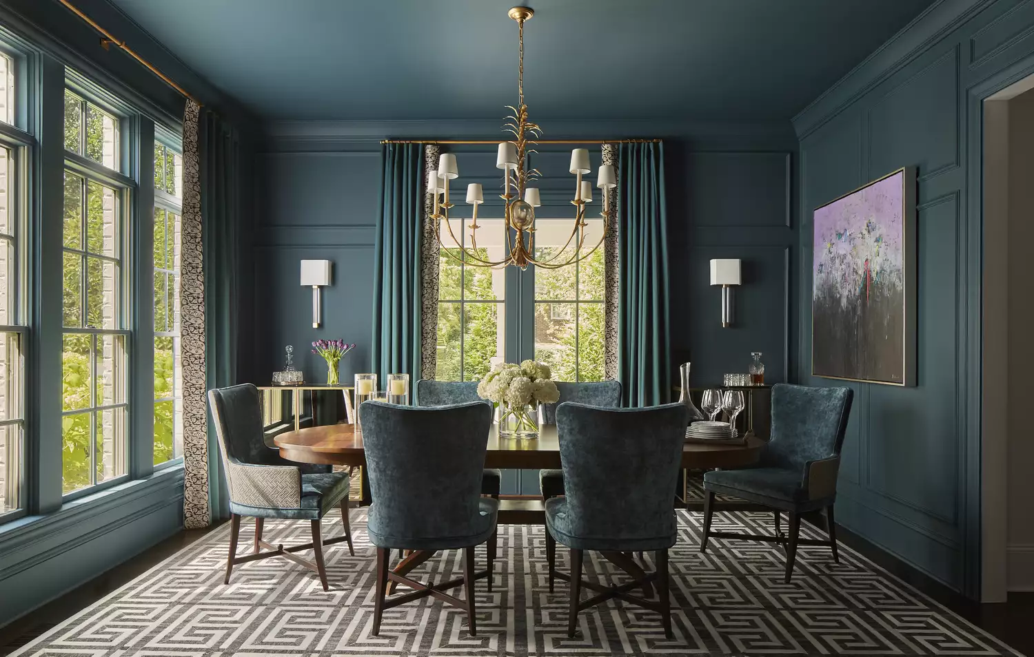
10 Color Drenching Ideas That Highlight the Beauty of This Paint Trend
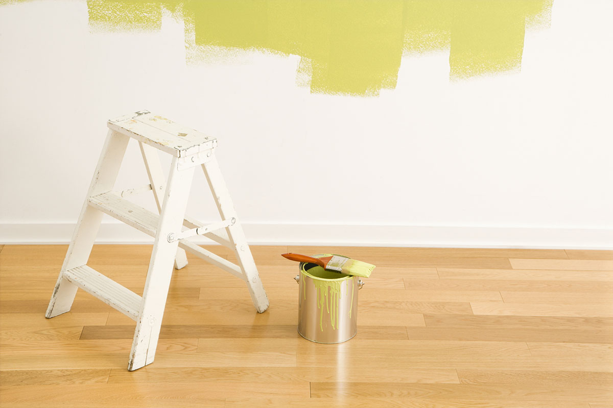
The 15 Best Paint Brands

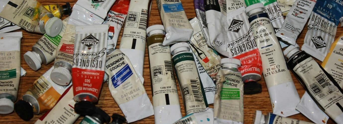
15 Best Oil Paint Brands

Tired of Touch-Ups? These 9 Paint Colors Are Forgiving and Designer-Approved

15 Farrow & Ball paint colors in real homes – from calming blues to warm neutrals

Make choosing paint easy with new 'natural light' colours

15 Navy Paint Colors the Pros Swear By for a Sophisticated Space

Tips for adding the hottest paint colors to your decor

130 New Paint Colors Just Dropped, Including an Ultra-Fast-Drying Exterior Finish

to choose paint colors.
These Unusual Paint Colors May Not Be An Obvious Choice, But Designers Can’t Get Enough

7 Most Underrated Paint Colours, According To Colour Experts

The Brighter, the Better—These Vibrant Paints Will Infuse Your Home With Positivity

These Are The 12 Best-Selling Paint Colors From All Your Favorite Brands
15 Designer-Approved Kids' Room Paint Colors
Joanna Gaines Swears By These 12 Stunning Paint Colors
15 Blue-Green Paint Colors the Experts Recommend