1/2
Make Wood Trim Shine By Pairing It With One Of 15 Hues
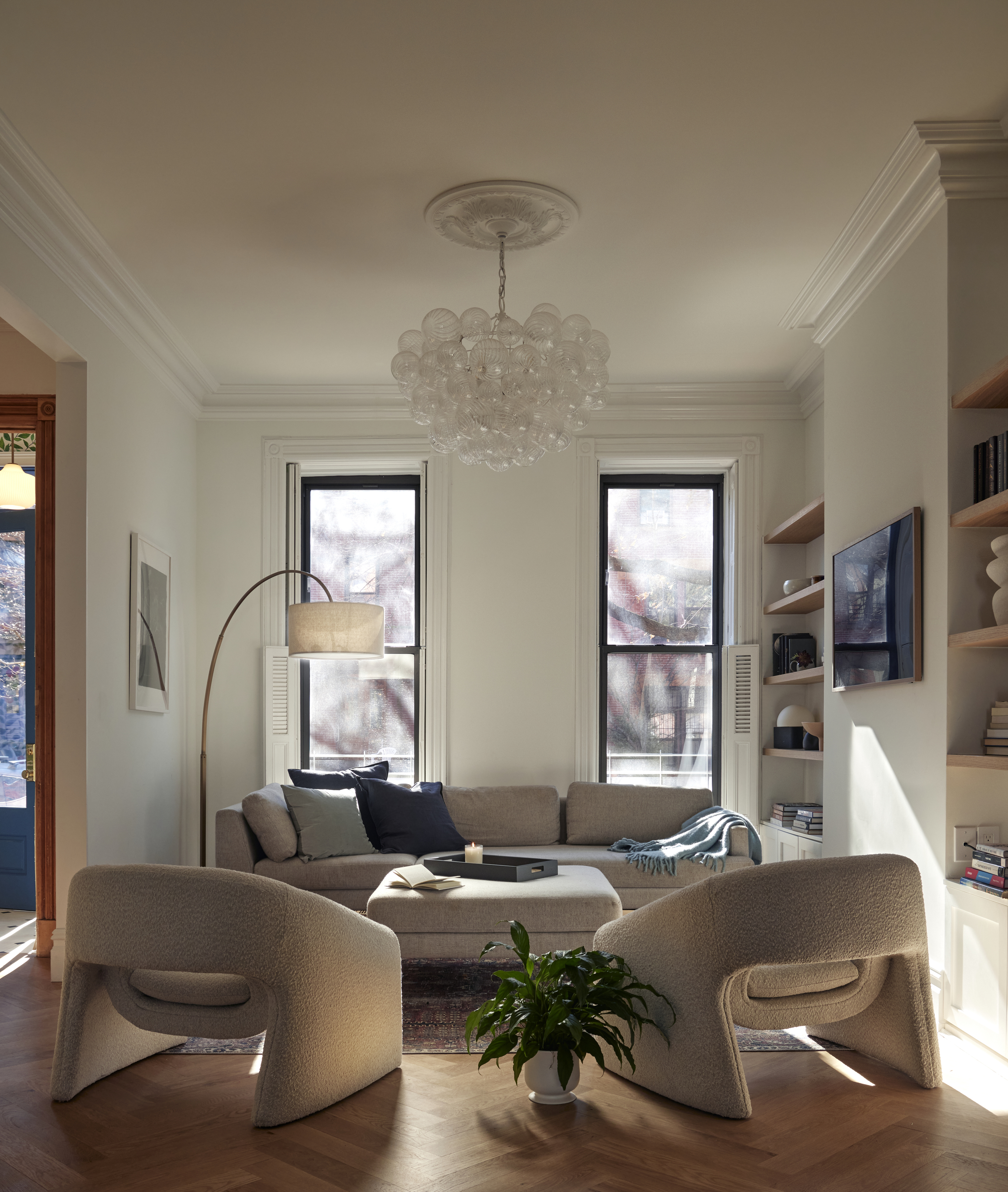
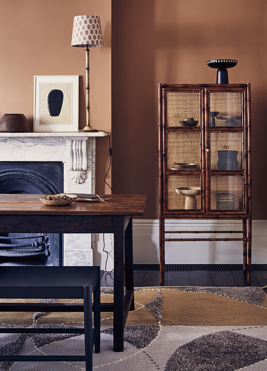
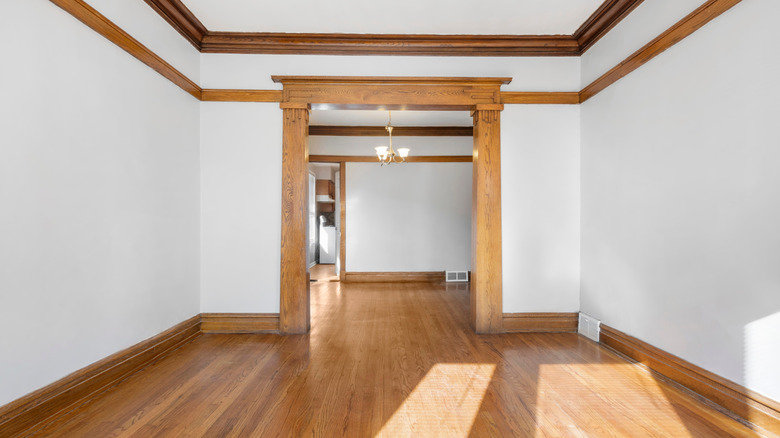
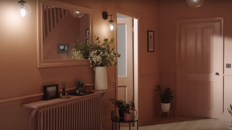
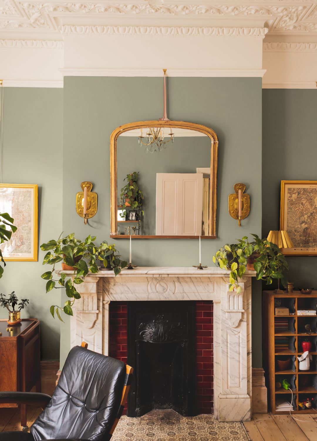
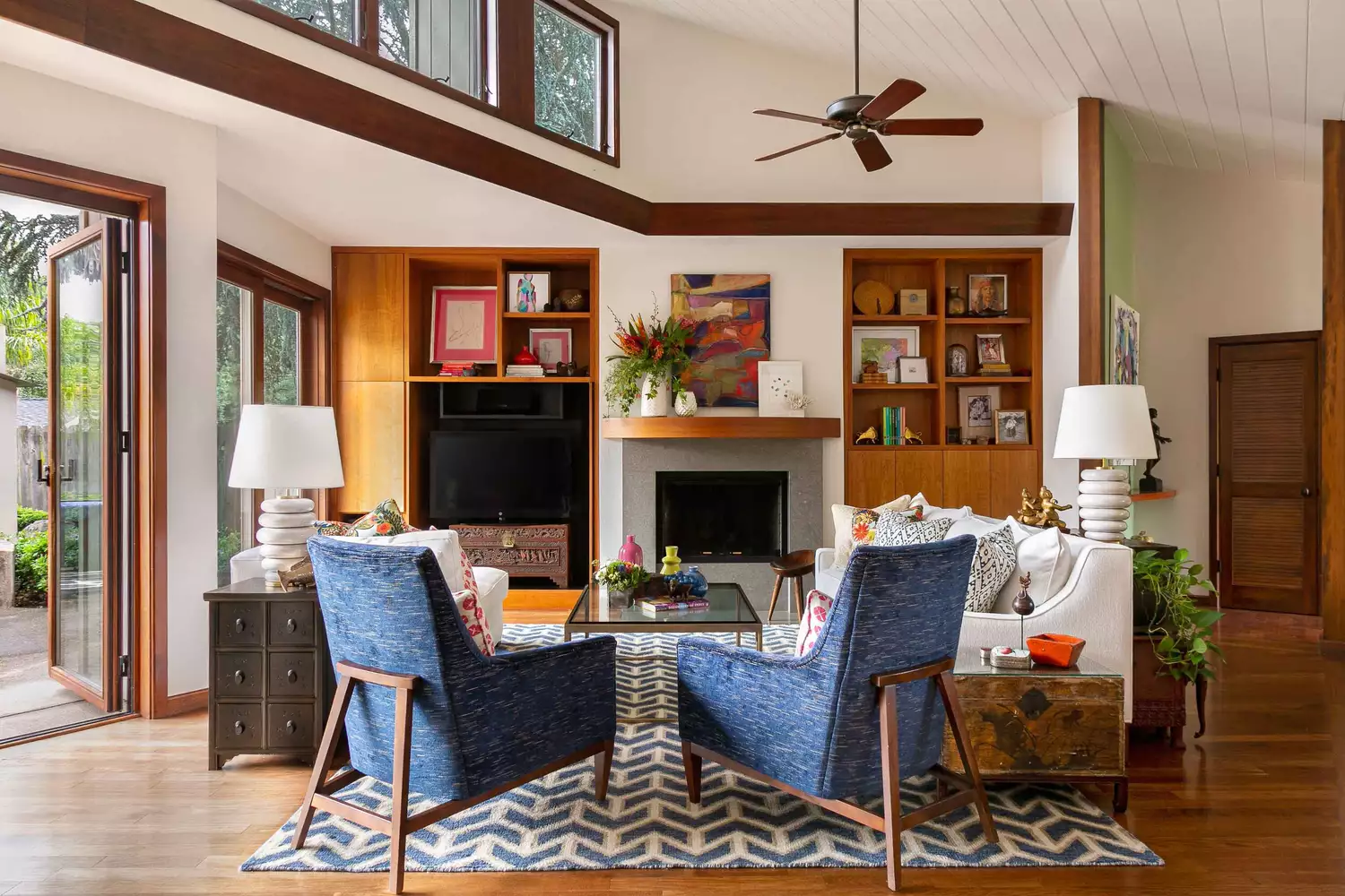
This article explores various paint color schemes that complement dark wood trim, offering solutions for homeowners seeking to enhance the aesthetic appeal of their spaces. It features insights from interior designers Carrie Leskowitz and Lacy Hughes, who provide expert recommendations on selecting appropriate hues. The guide showcases 15 distinct paint colors from prominent brands like Sherwin Williams, Benjamin Moore, Farrow and Ball, Clare, PPG, and Behr, detailing how each color interacts with dark trim to create different moods and styles within a room.
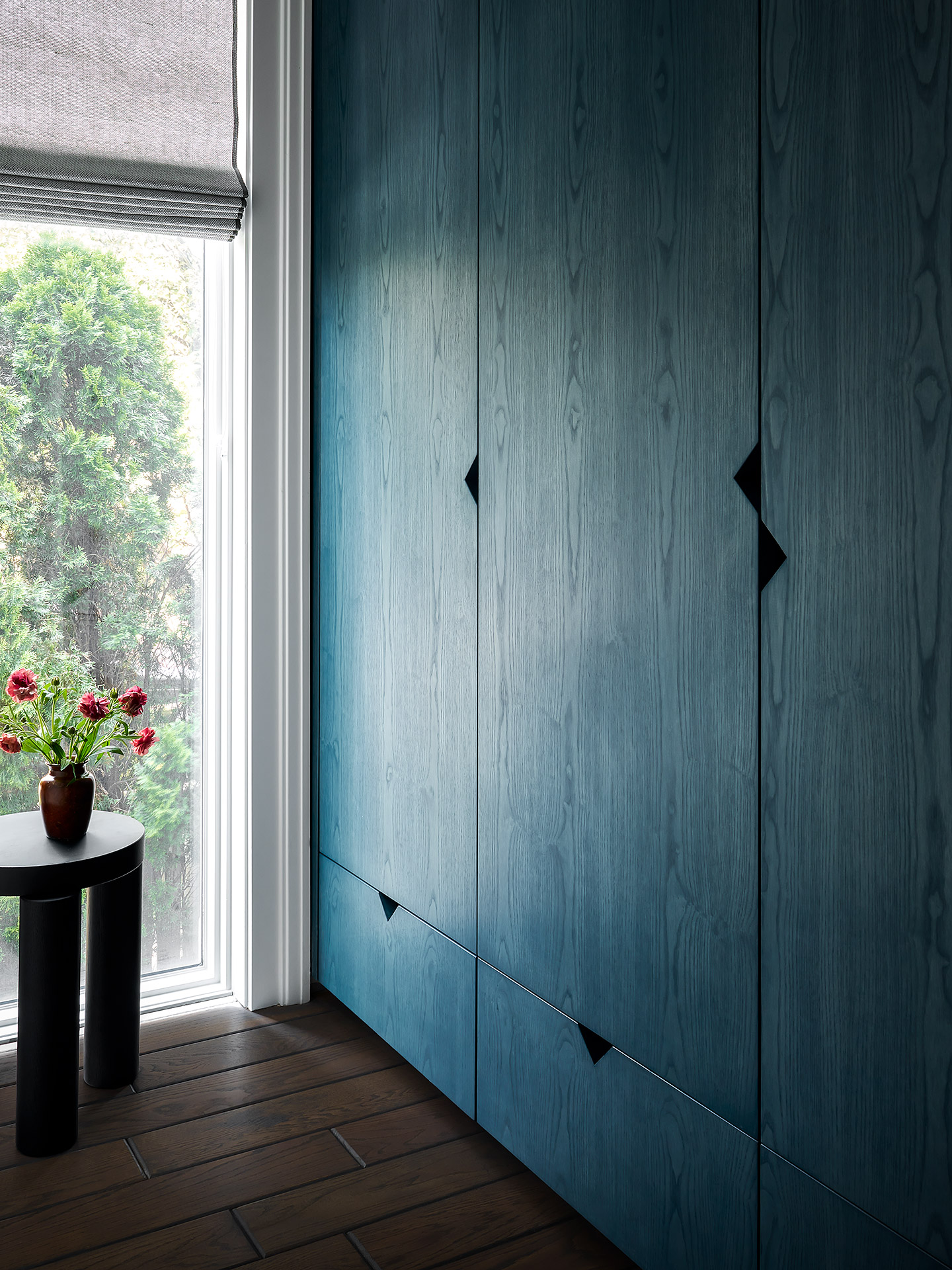
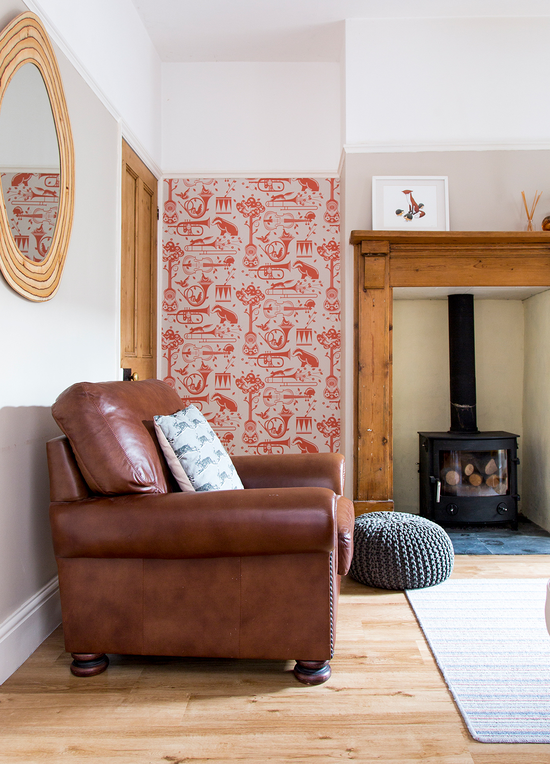
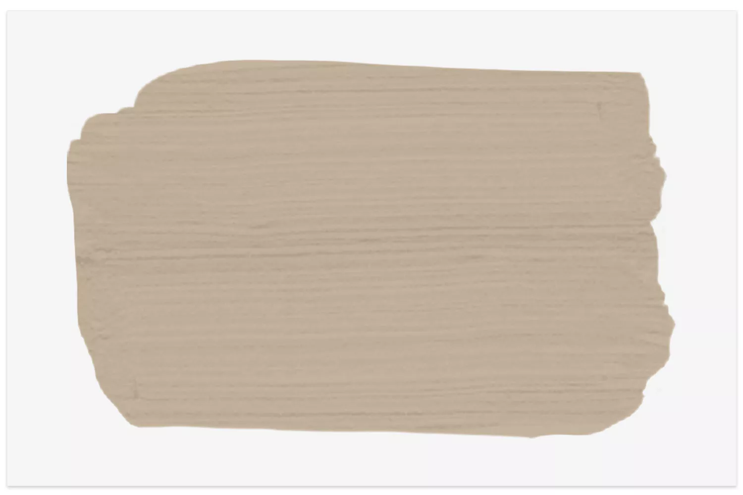
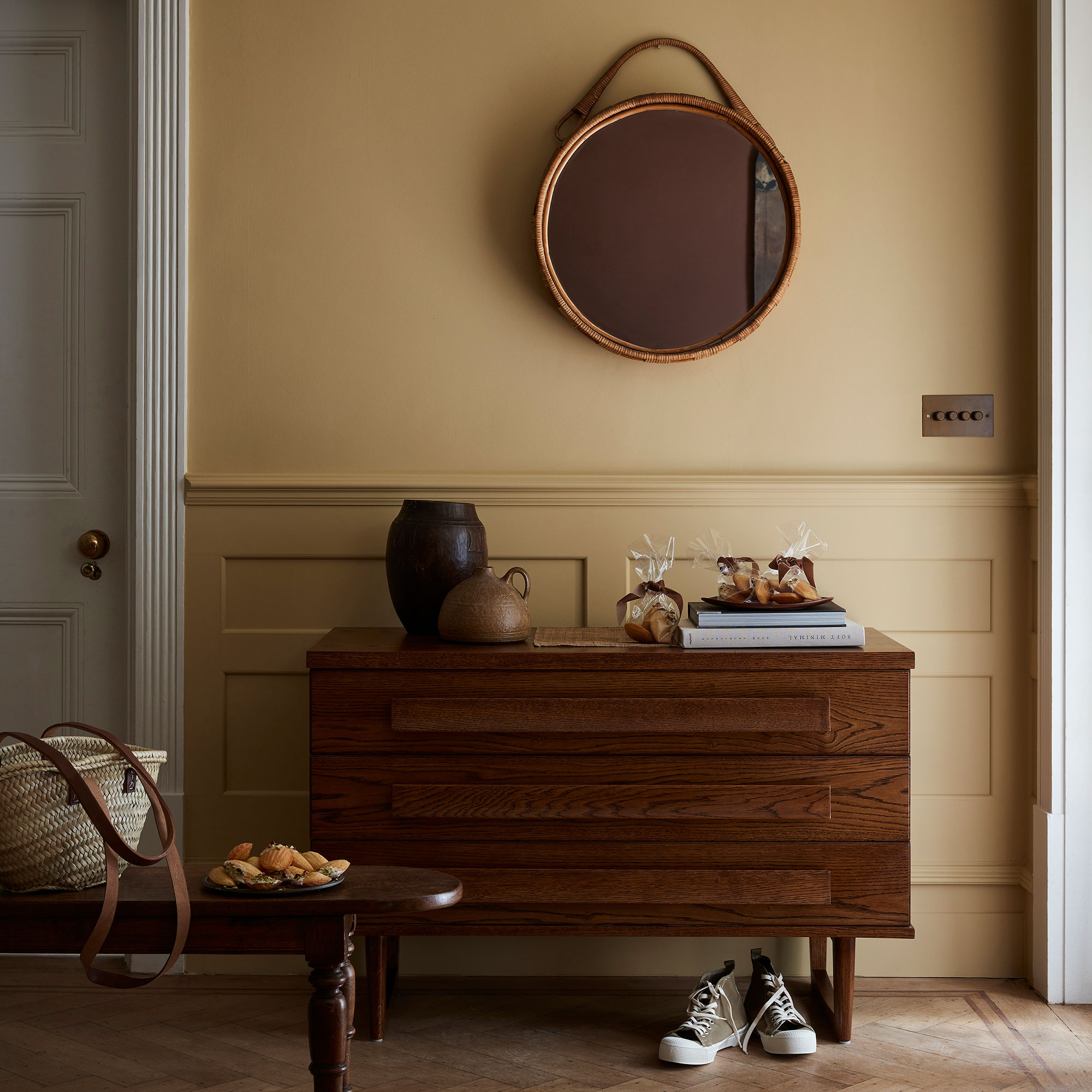
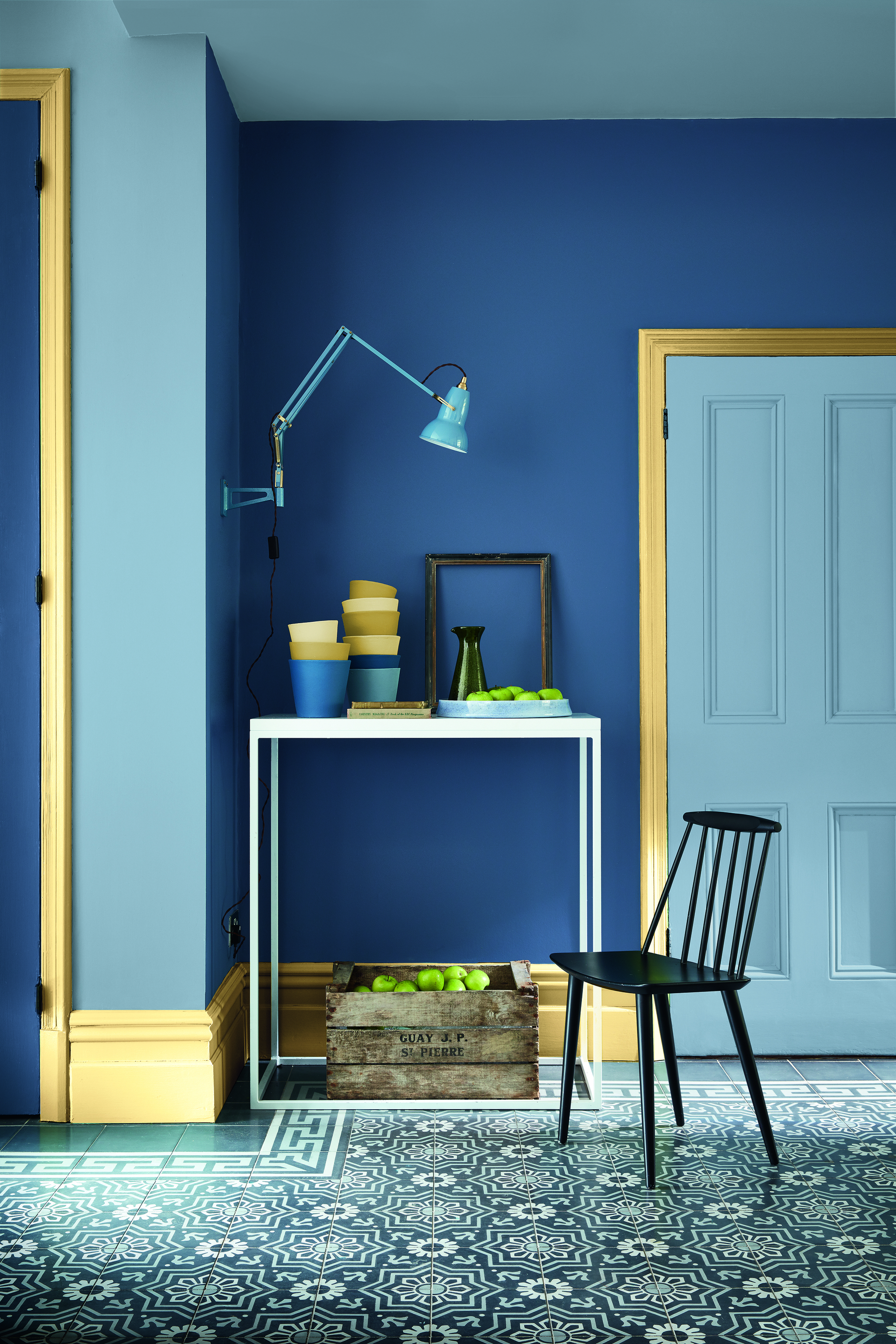
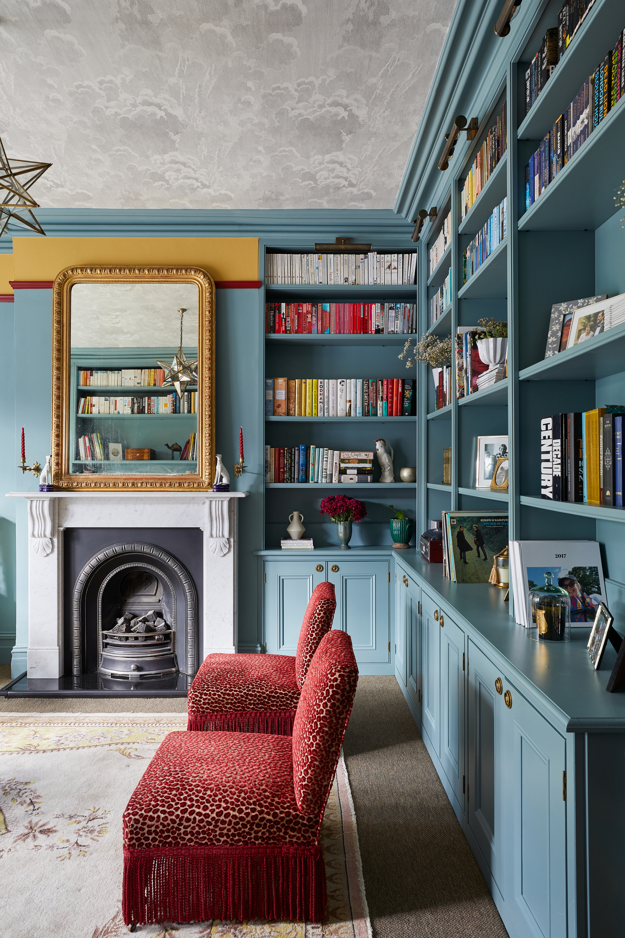
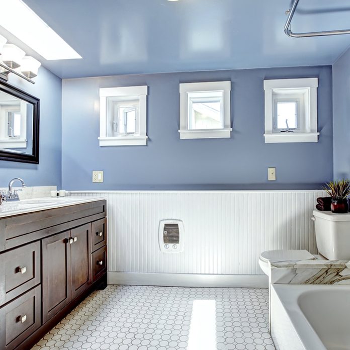
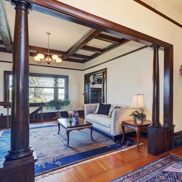
The selection begins with Sherwin Williams' Alabaster, a neutral tone that creates a cozy atmosphere, especially when paired with black, white, and gray accents. Benjamin Moore's Blue Note introduces sophistication with its deep blue, ideal for dining rooms and vintage settings, complemented by shades of green and navy. Gettysburg Gray, another Benjamin Moore option, is presented for a two-toned wainscoting effect, offering a neutral yet intriguing classic look. Farrow and Ball's Blue Ground provides a calming, light turquoise ideal for various settings, not just beachfront homes. Clare's Wing It, a peachy-pink, offers a sweet contrast to built-ins and paisley wallpaper, demonstrating versatility with leather seating in traditional and green finishes.
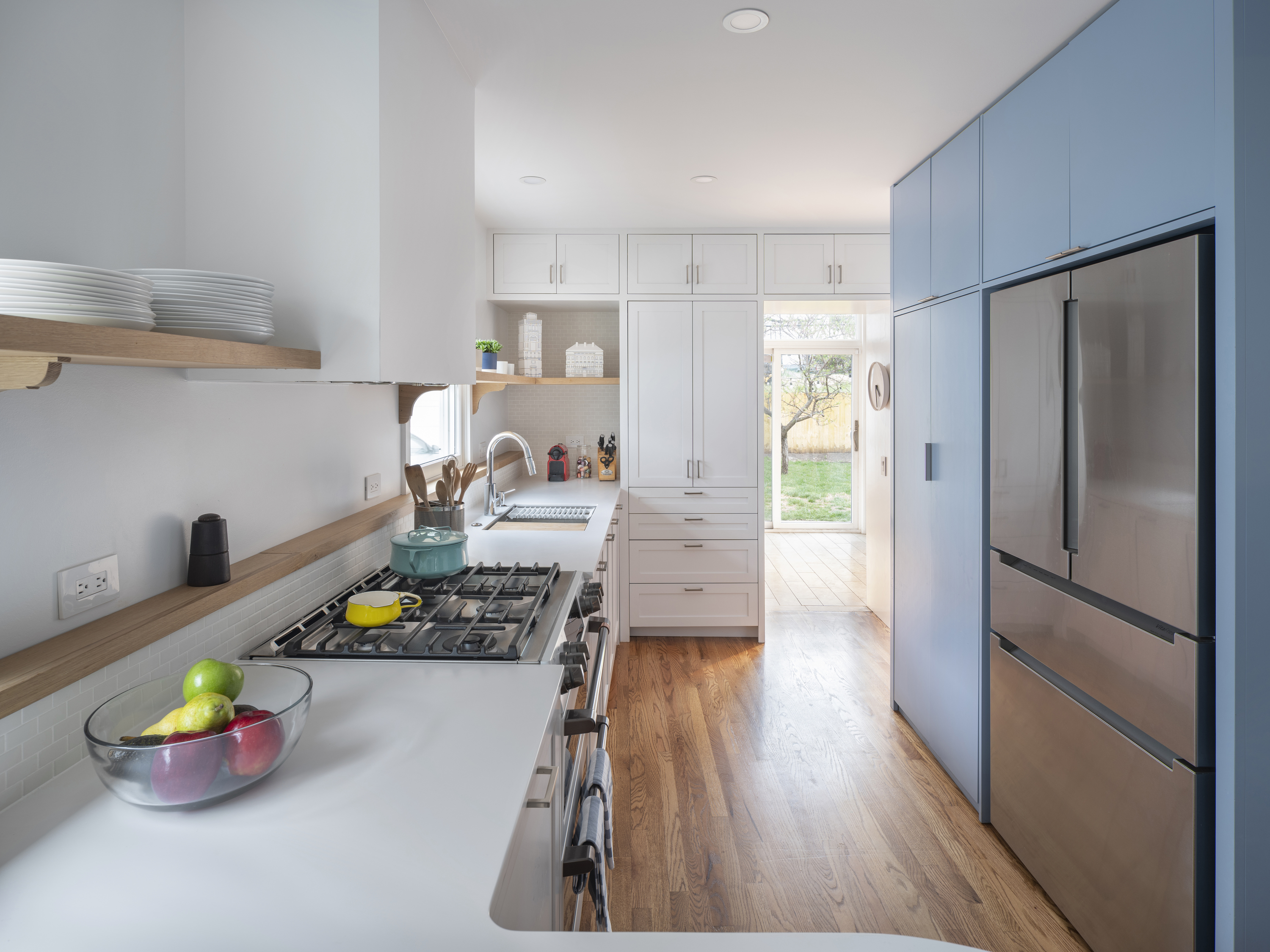
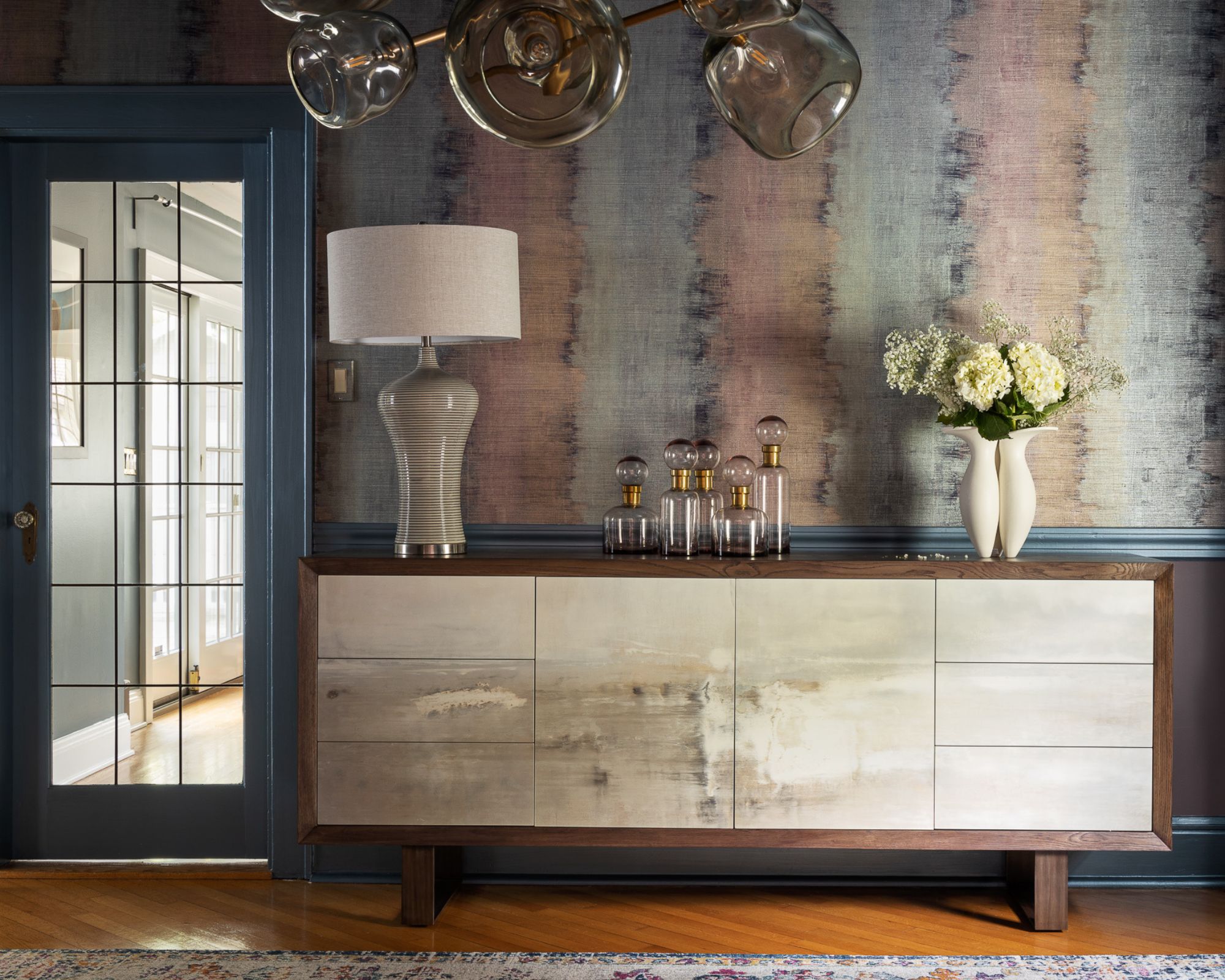
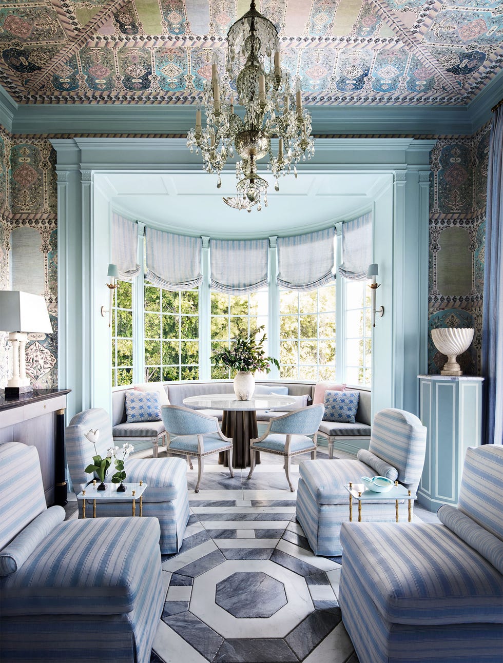
Benjamin Moore's Normandy, a sky blue, is highlighted for its ability to brighten any room and pairs well with modern accents, with the suggestion to paint the ceiling for a dramatic effect. Farrow and Ball's Pitch Black is recommended for a moody accent wall in primary bedrooms, suggesting that darker shades can also create cozy sleep spaces. Benjamin Moore's Peale Green brings a fresh, natural, and British-inspired elegance to interiors. PPG's Subtle Blue is featured for a light, barely-there blue on the lower half of walls, offering a soothing and subdued option for two-toned designs.
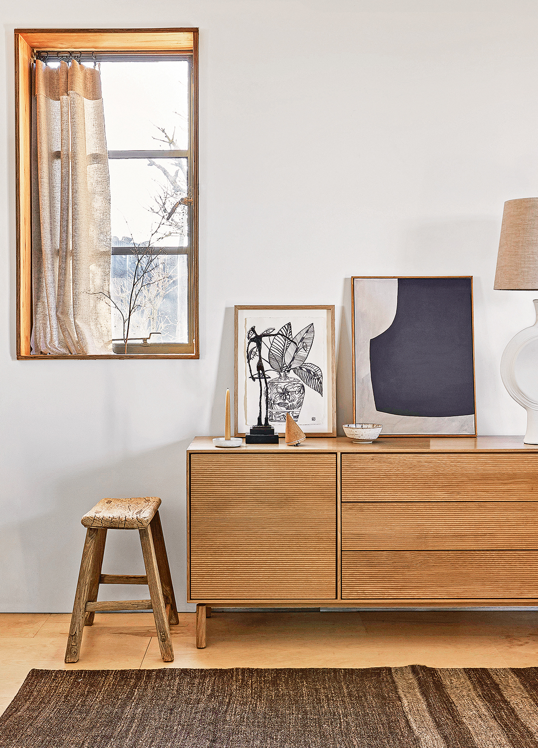
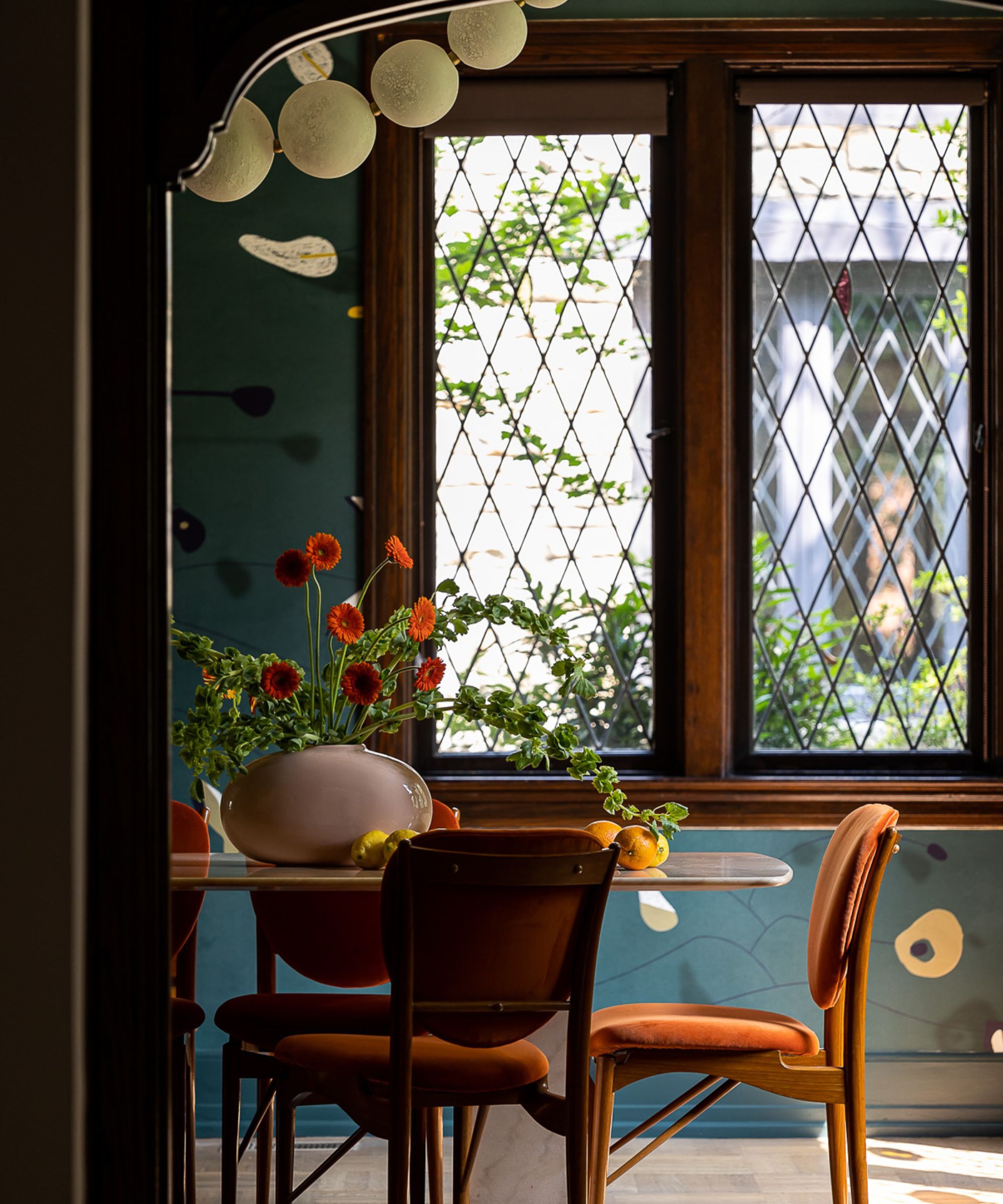
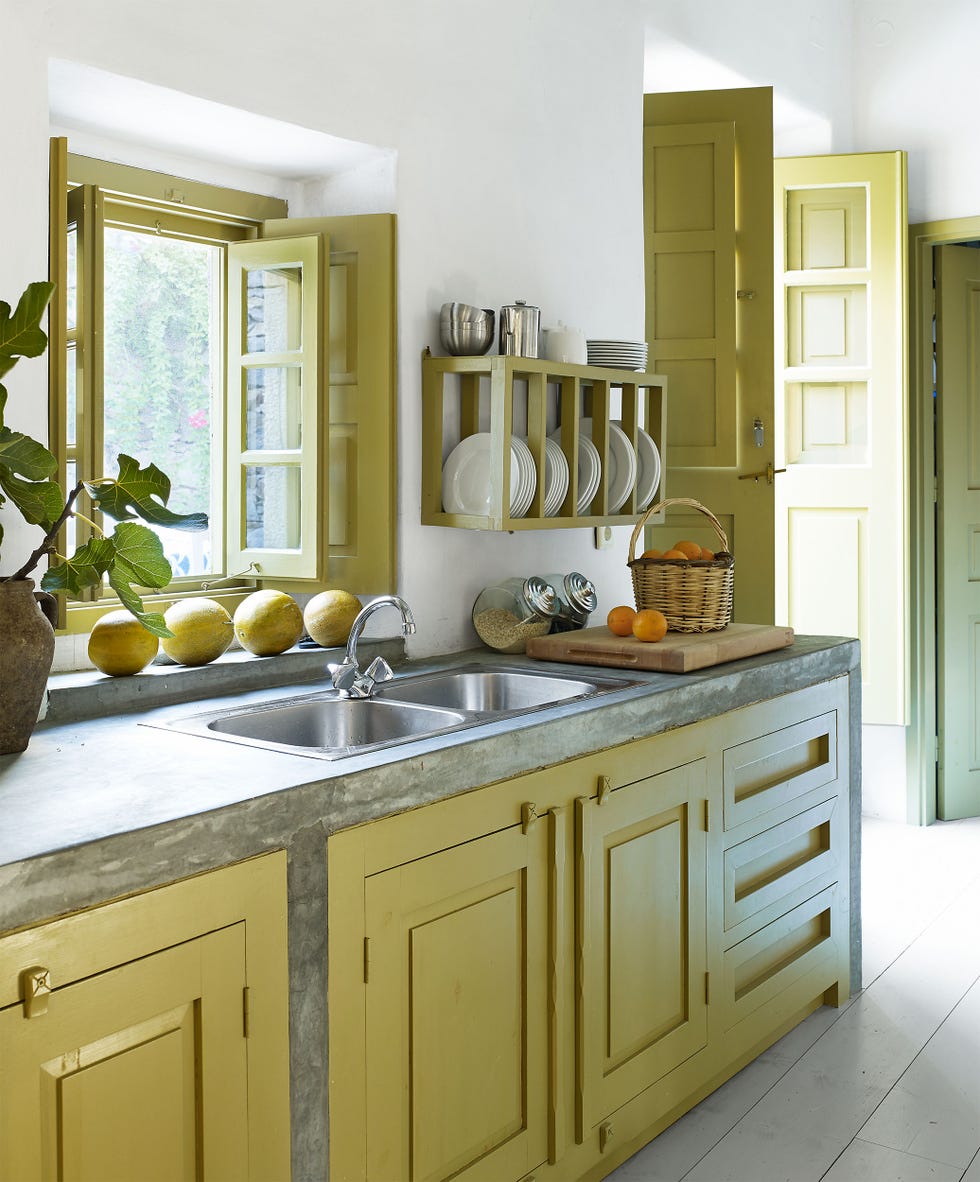
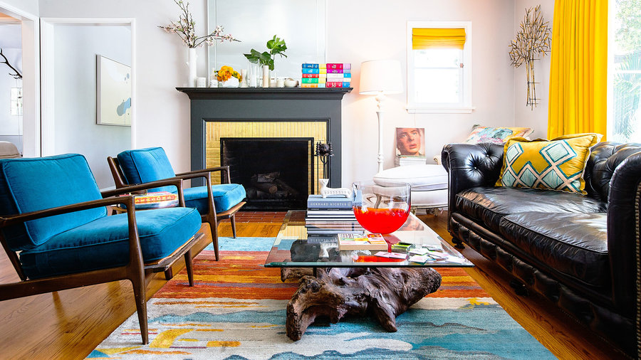
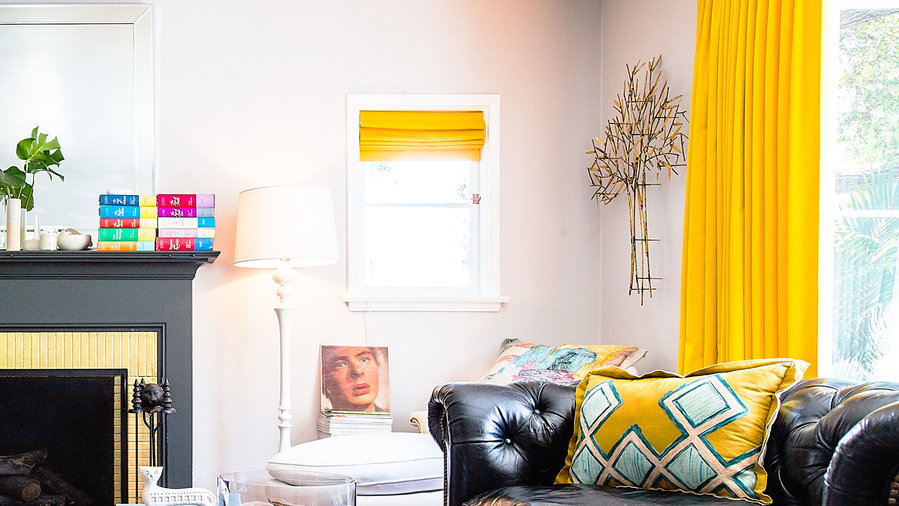
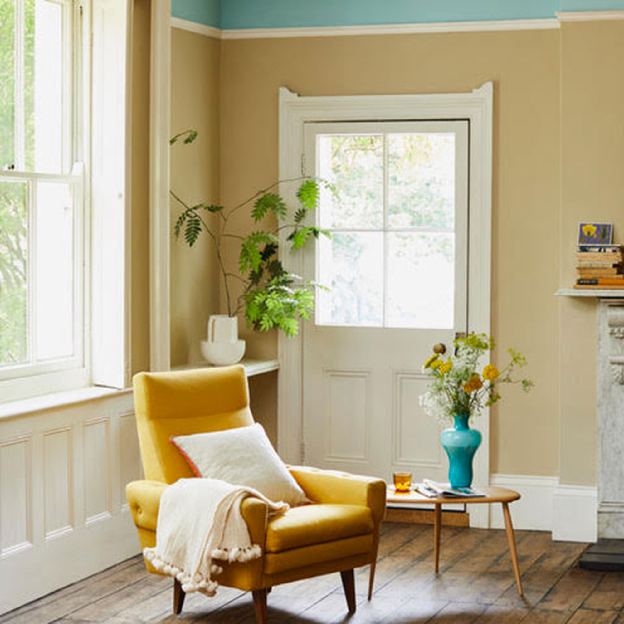
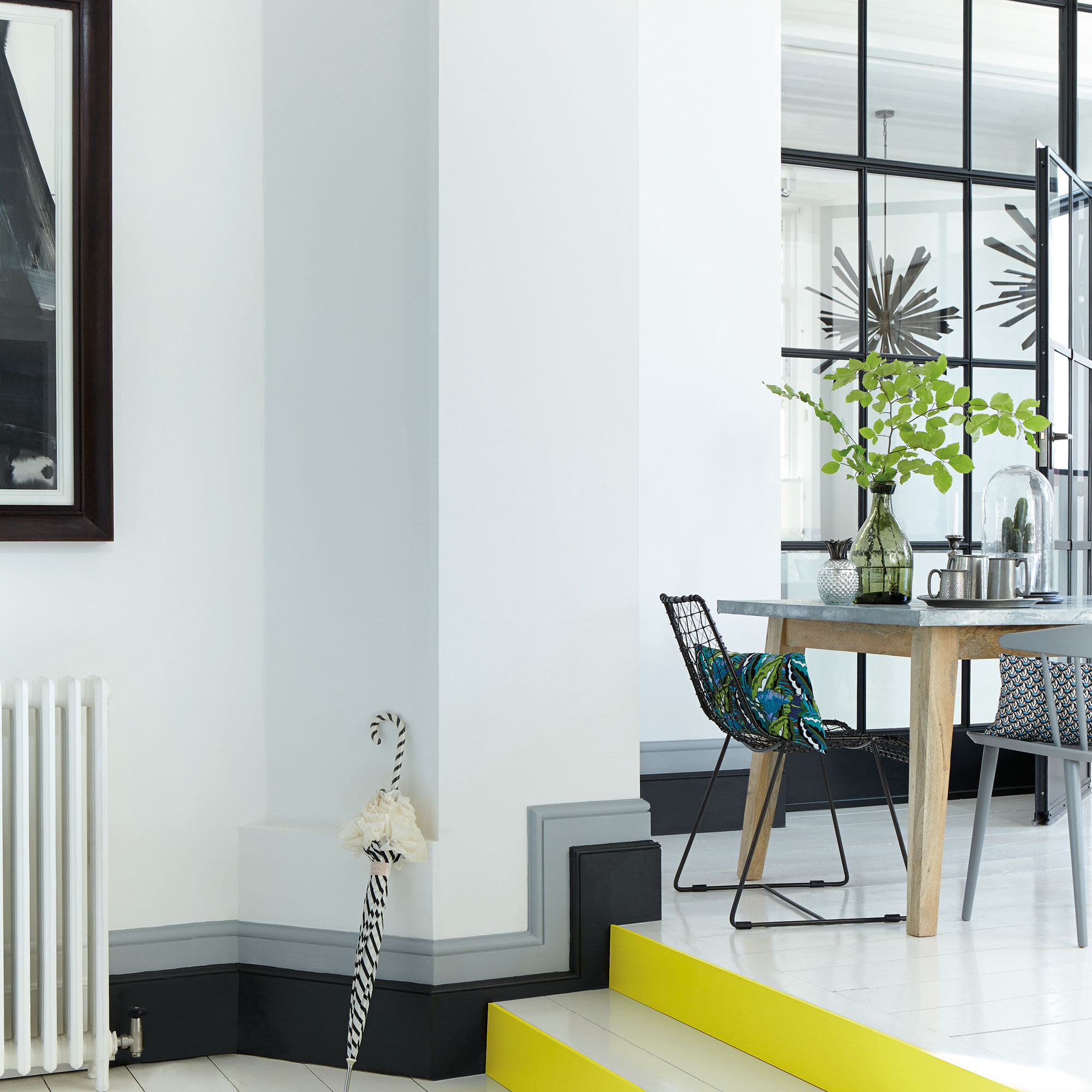
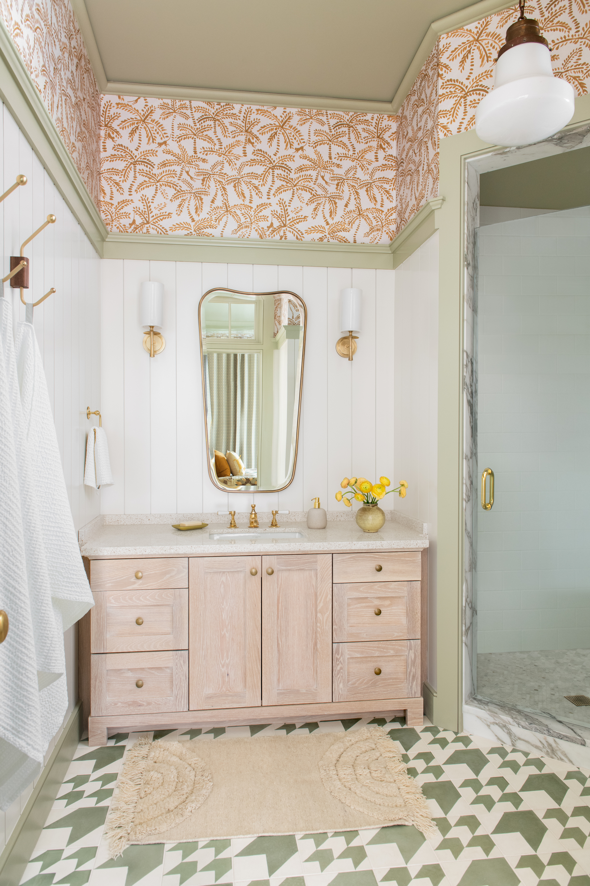
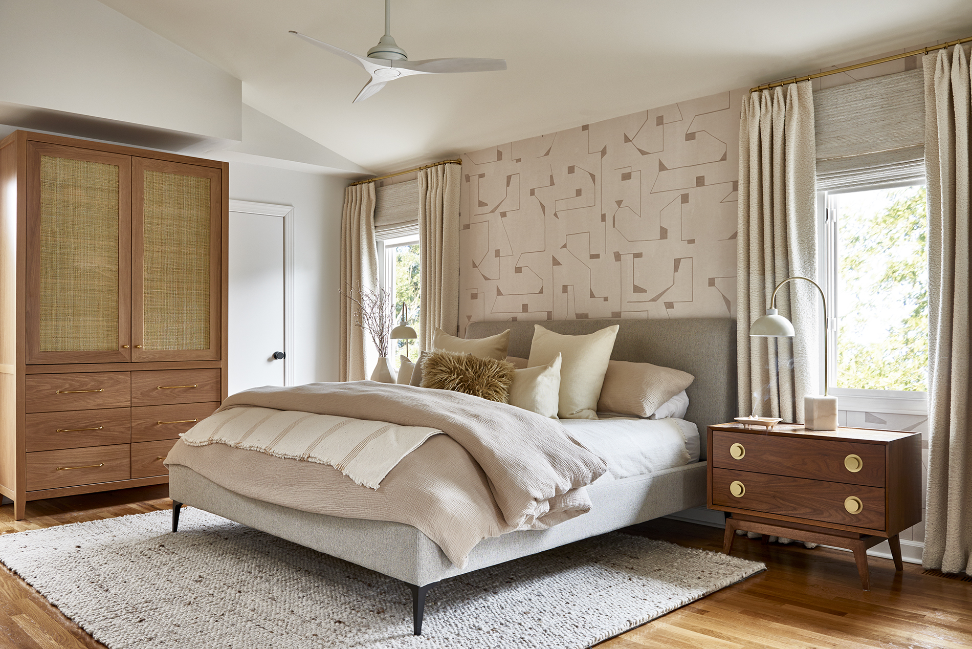
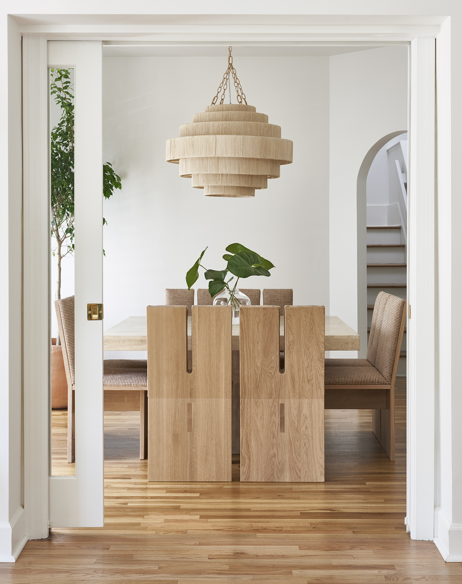
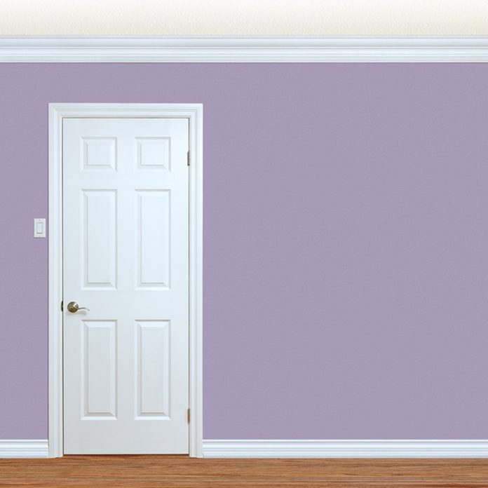
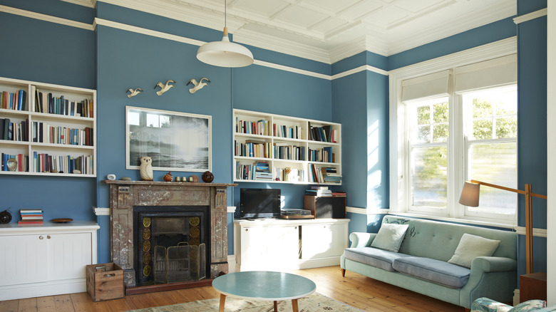
Farrow and Ball's Downpipe, a deep blue with gray undertones, is shown to pair beautifully with wood furnishings. Clare's Seize the Gray, a soft gray, is presented as ideal for farmhouse or shabby chic-style spaces, allowing white accents to stand out. Benjamin Moore's Silver Gray, a lighter gray-blue, is suggested for creating contrast, particularly with orange elements, adding a fun and funky vibe. Behr's King Salmon encourages bold color mixing, demonstrating how salmon pink can stunningly complement a deeper blue. Benjamin Moore's White Dove is praised as a classic white, offering a traditional yet modern contrast to dark wood, a look approved by designer Carrie Leskowitz for its ability to establish modernity. Finally, Sherwin Williams' Lily, a sunny yellow, is recommended by designer Lacy Hughes for its ability to make rooms feel open, bright, and allow wall colors to stand out against the trim.
#InteriorDesign #PaintColors #HomeDecor #WoodTrim #ColorSchemes #DecoratingTips #NeutralTones #AccentWalls #RoomDesign #InteriorDesign #PaintColors #HomeDecor #WoodTrim #ColorSchemes #DecoratingTips #NeutralTones #AccentWalls #RoomDesign
0 comment in total
 No comments yet
You may also like
Best Wood Stain Colors For Interior And Exterior Surfaces

Make Cedar Shine: Our Favorite Wood Stains

How to Paint Wood Paneling and Its Best Friend, the Trim

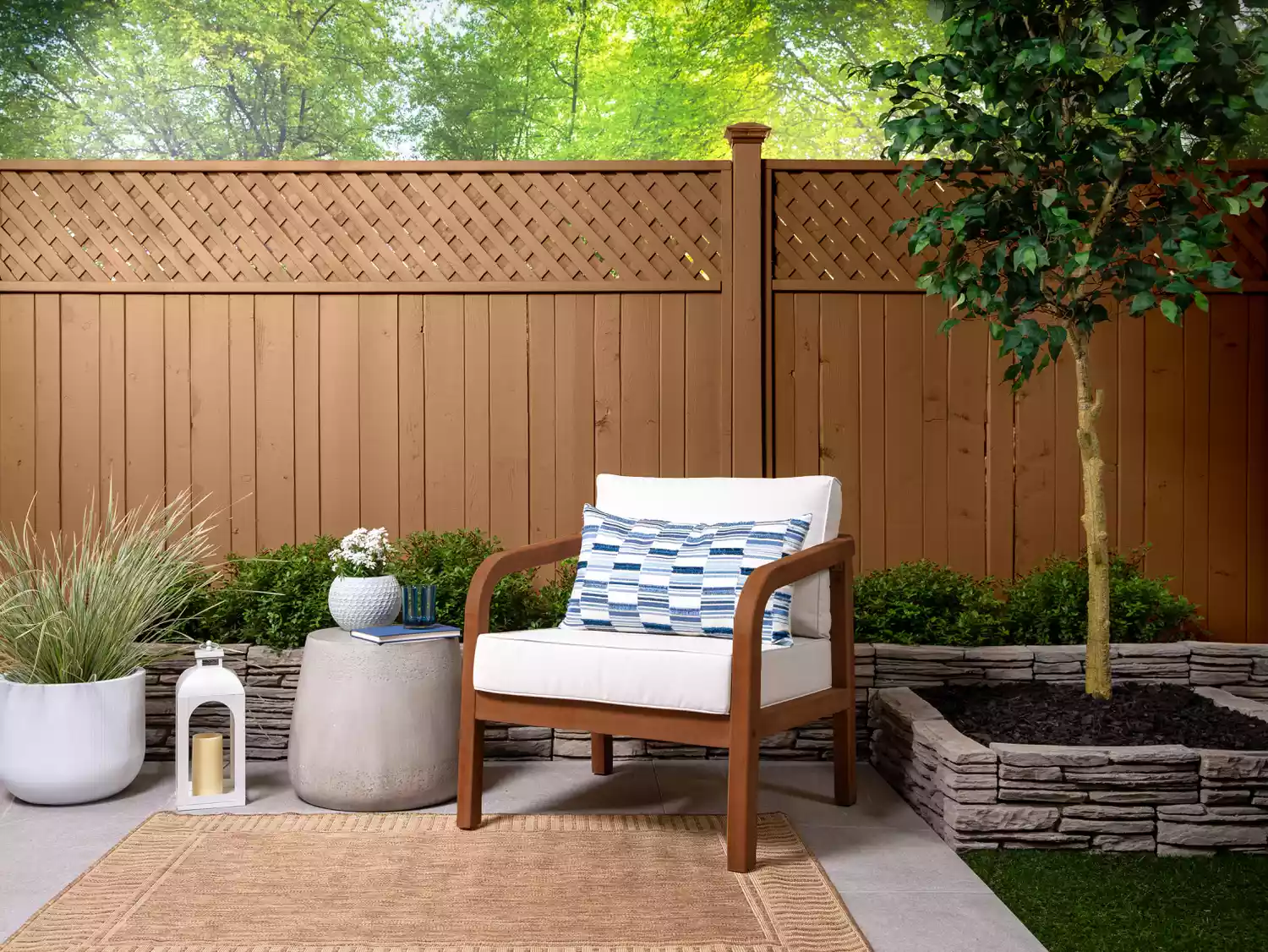
We Found Every Wood Stain Color of the Year to Refresh Your Outdoor Space in Style

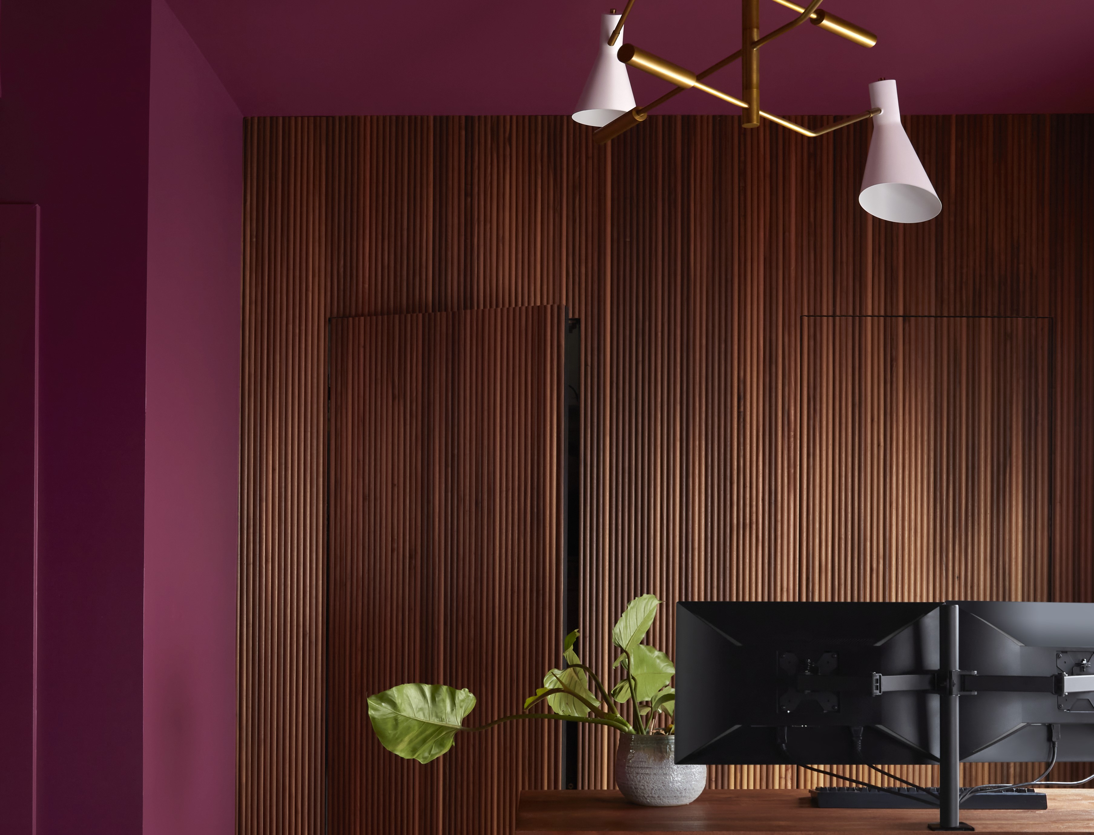
Paint Colors That Go With Natural Wood — 10 Picks That Bring Out the Beauty of This Organic Material

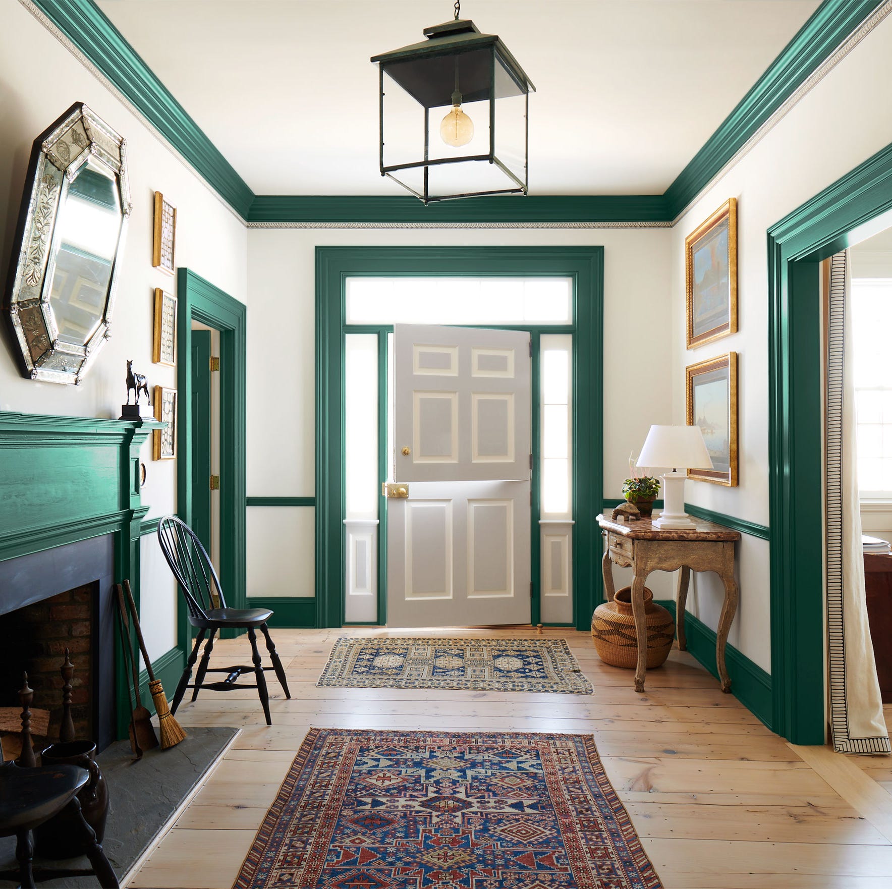
Why the Correct Trim Color Can Totally Transform Your Home
Our Favorite Wood Stains Will Make Your Furniture Look Like a Million Bucks
8 Stunning Paint Trends To Keep Your Home's Interior Fresh In 2025
5 rules of thumb for mixing wood tones around your home, shared by interior designers

How to Choose Paint Colors to Complement Wood Tones in Your Home


What are the best trim colors? 7 alternatives to white paint to elevate your room's palette
Make choosing paint easy with new 'natural light' colours

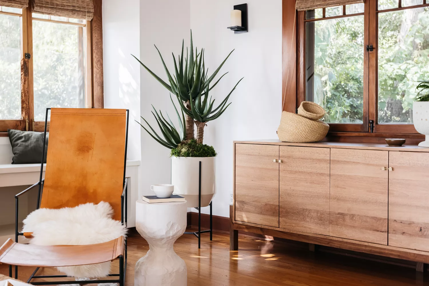
13 Paint Colors That Pair Well With Wood Trim

15 Ways to Add Bold Color to Your Home
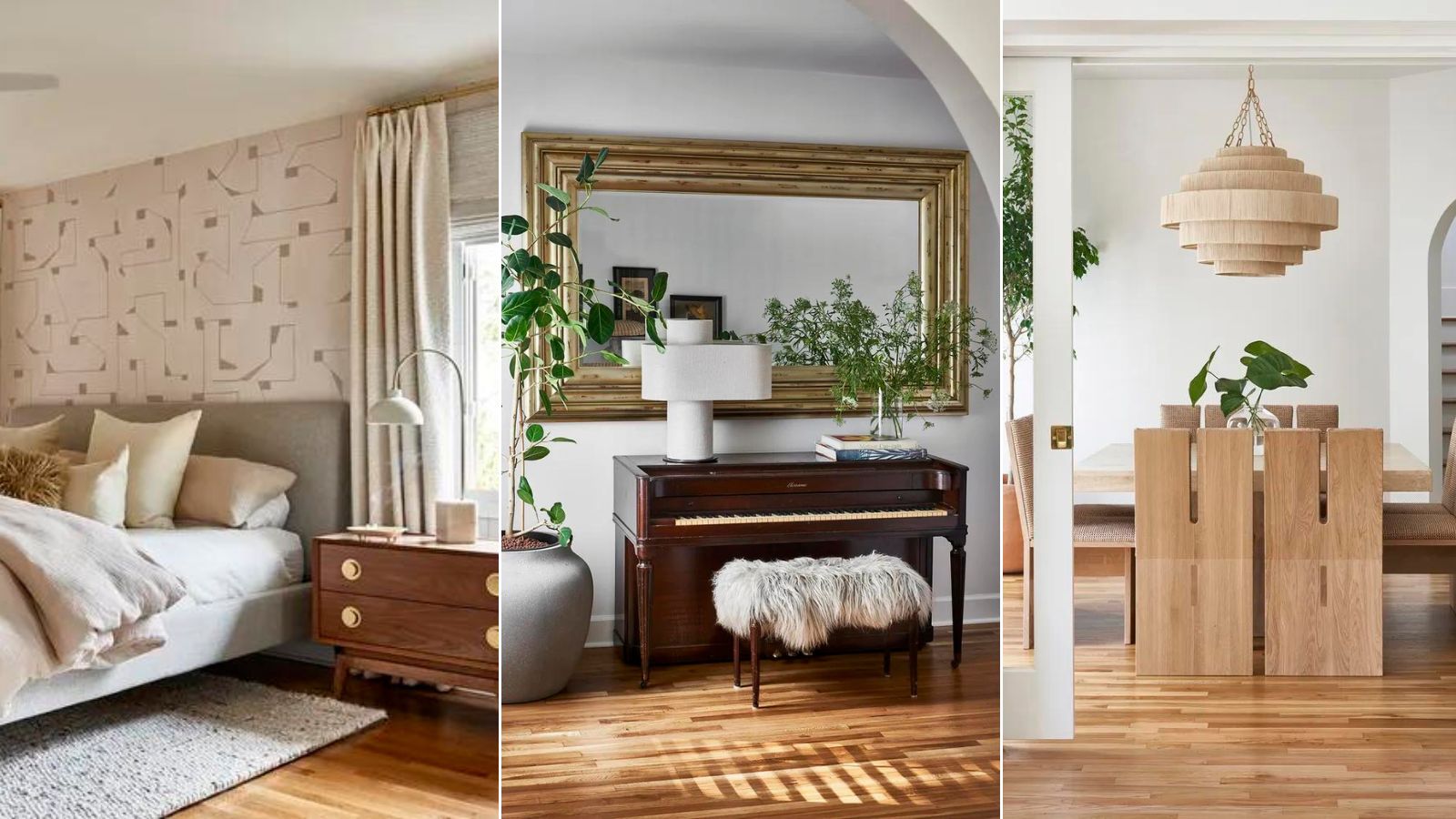
How to mix different wooden tones like an interior designer – 'It makes spaces feel more collected'


Wood Dyes & Waxes | Wax for Unfinished Wood

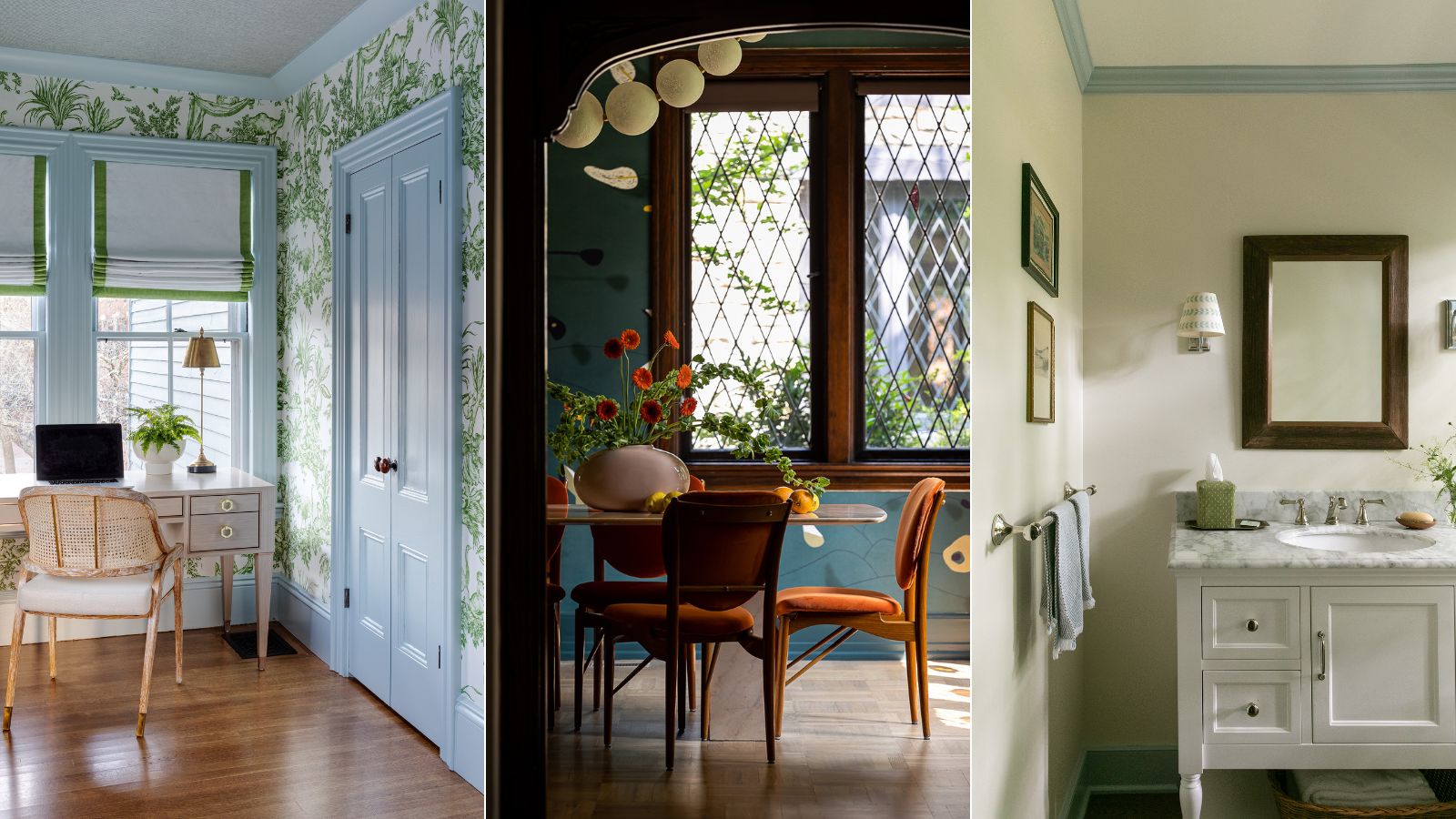
What color should you paint woodwork? Expert ways to factor this small yet impactful detail into color schemes
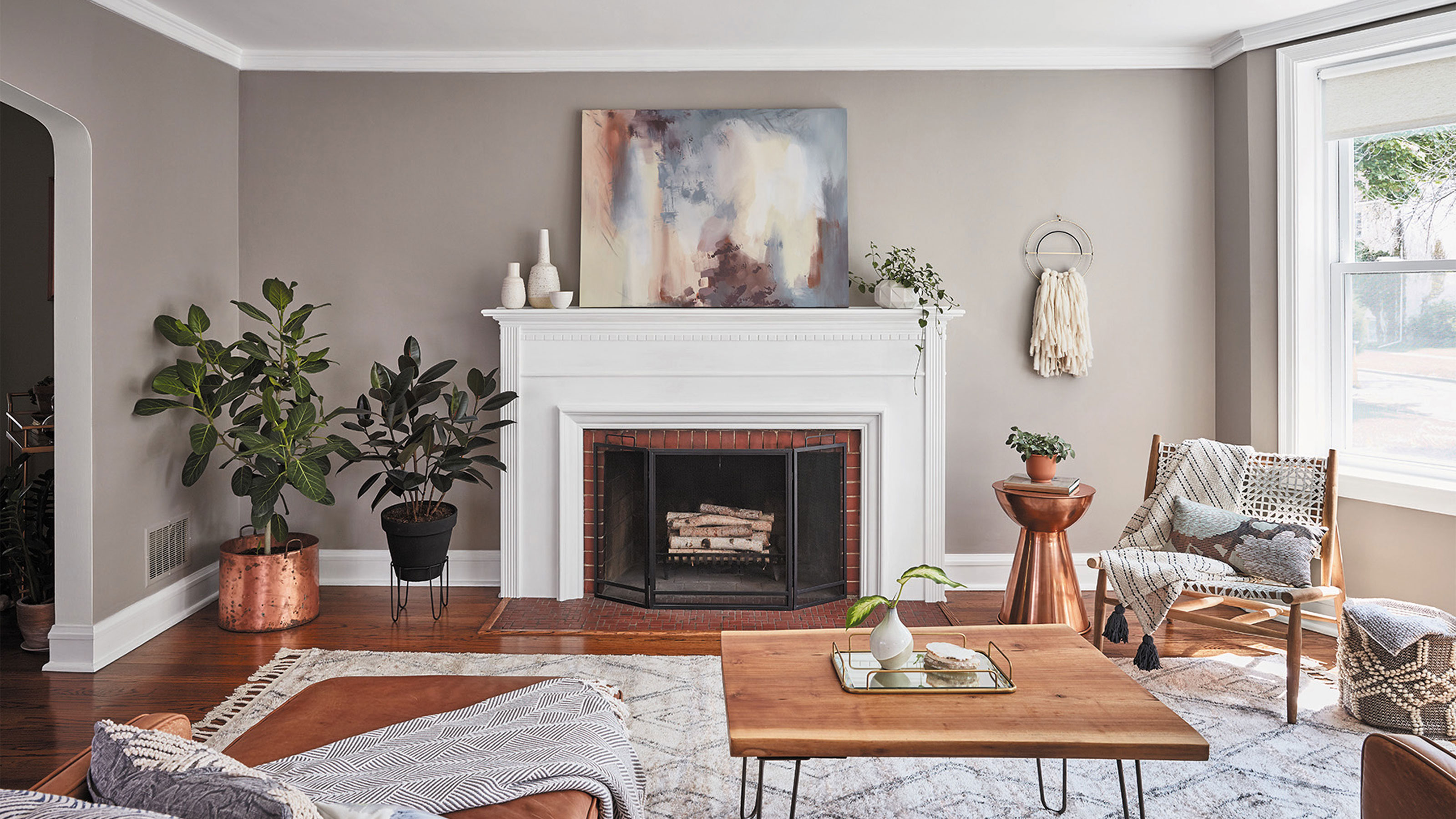
Should woodwork be lighter or darker than walls? The rules colour experts use to choose the perfect colour
10 New Trends in Wood Trim for 2018
How to Remove Orange Tones From Wood Furniture for a Modern Look