1/10
What color should a pantry be? 8 ideas that'll give your kitchen storage some unexpected wow-factor
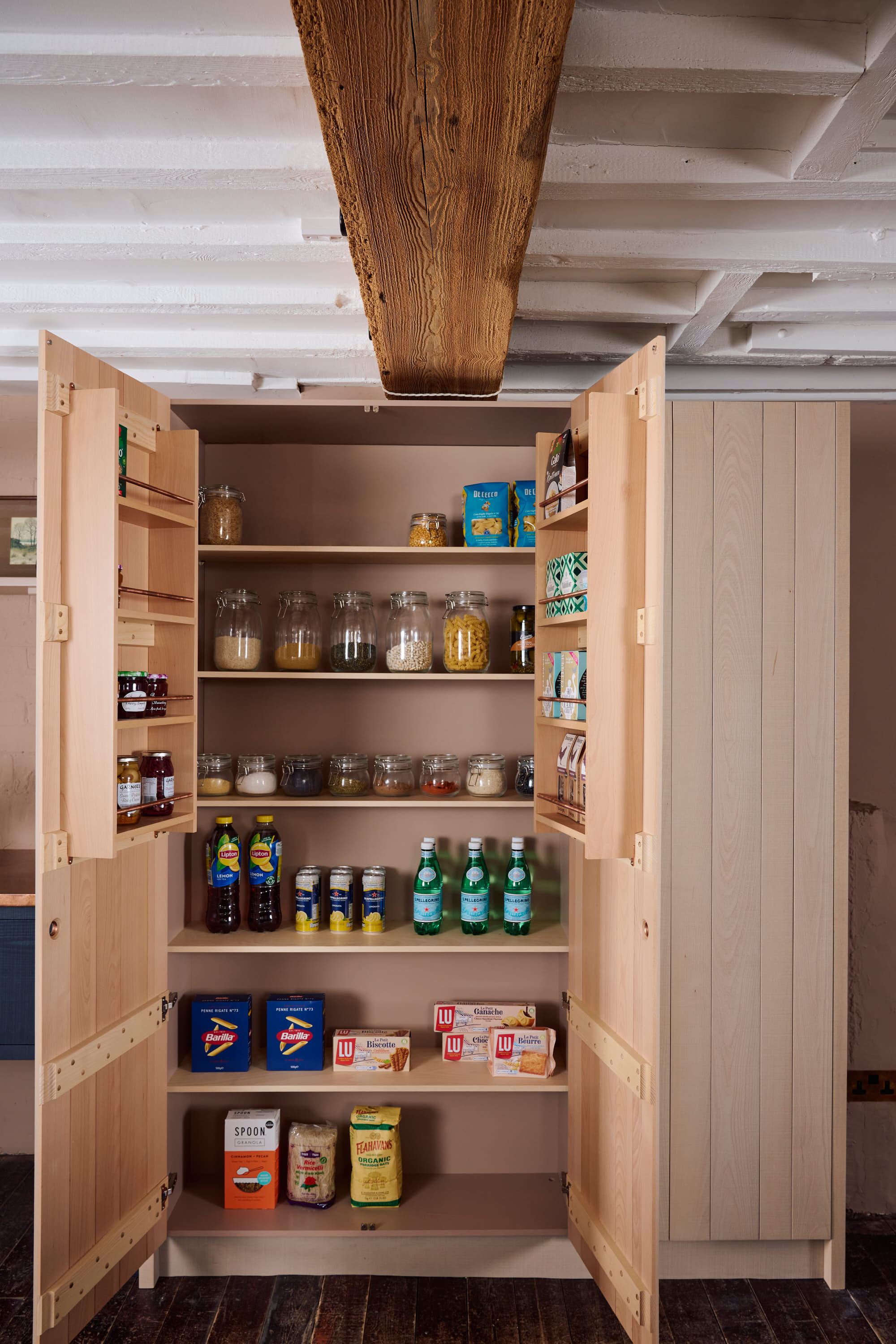
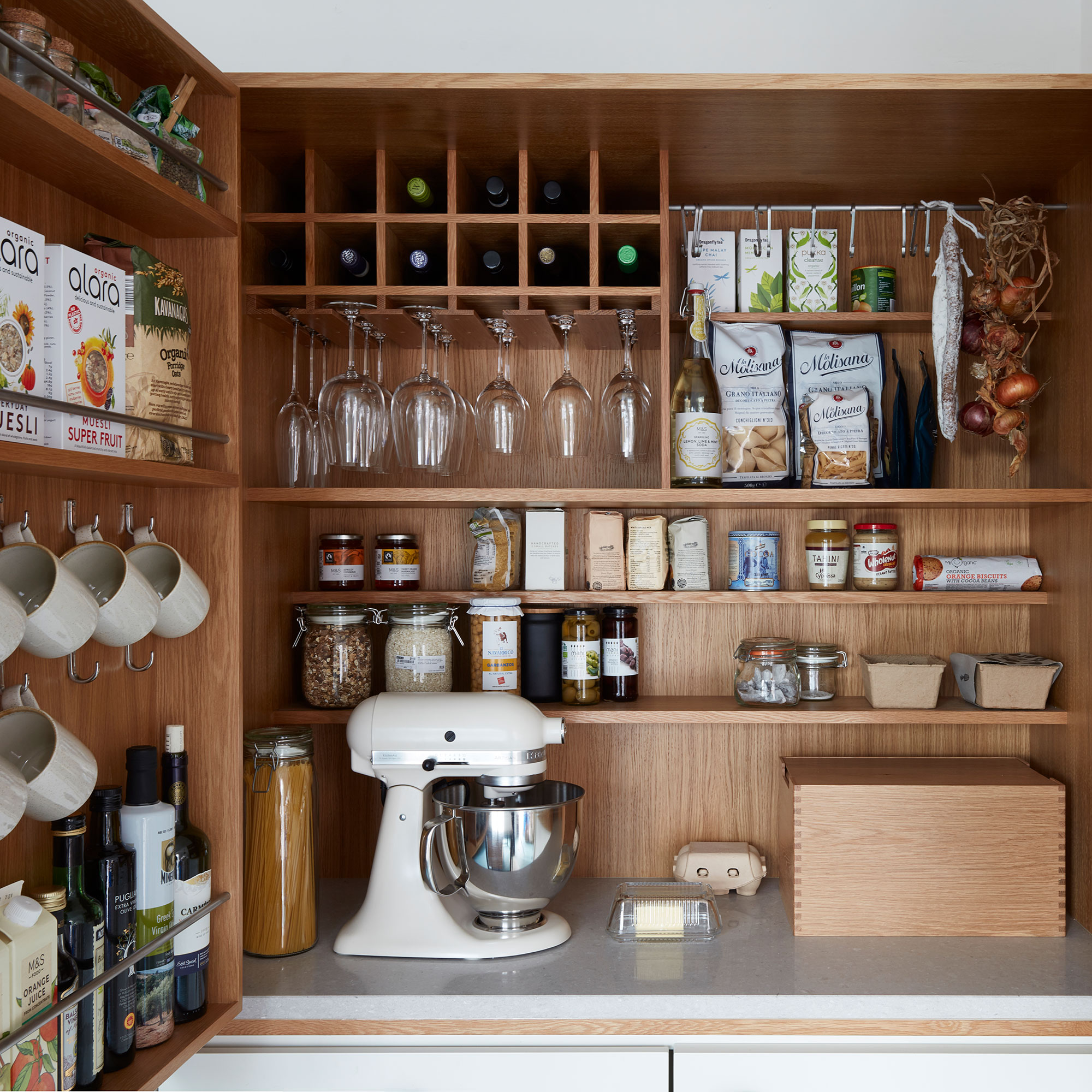
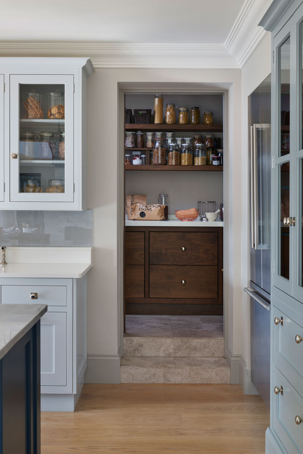
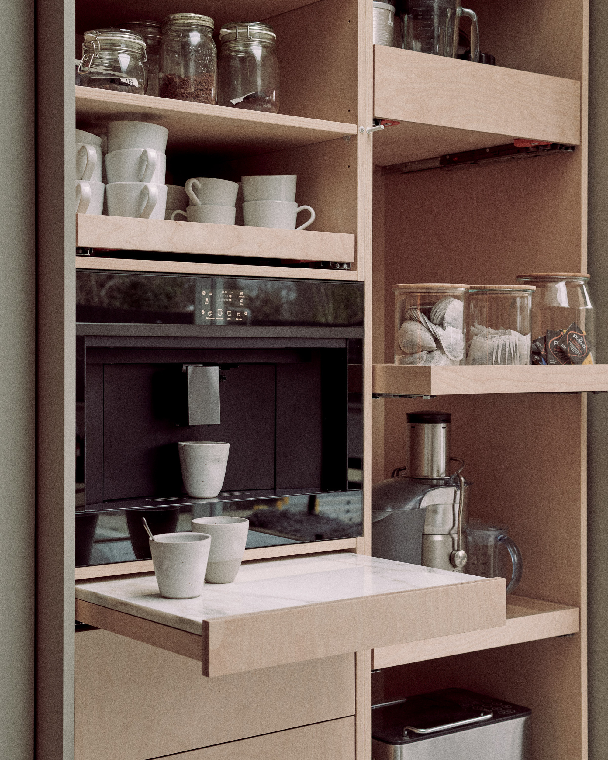
The article explores how integrating color into a kitchen pantry can transform this often-overlooked utilitarian space into a vibrant and personality-filled design feature. It emphasizes that pantry colors can diverge from general kitchen trends, advocating for timeless and personally beloved hues rather than transient fads. The focus is on colors that offer longevity and functionality, especially given the significant investment in kitchen and pantry areas. The author advises considering colors that avoid rapid wear and tear, such as those that are neither too white nor too dark, as these tend to highlight imperfections more quickly.
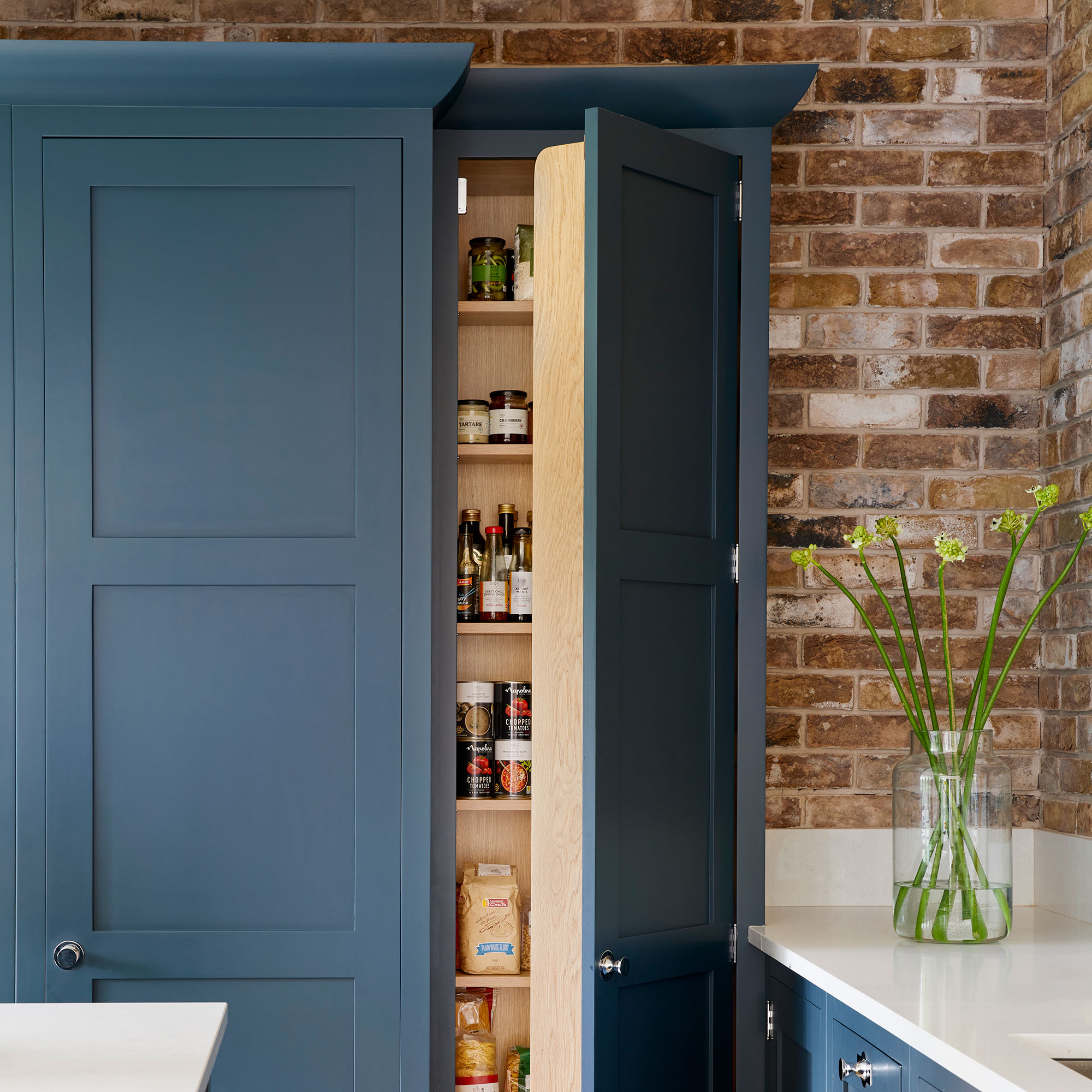
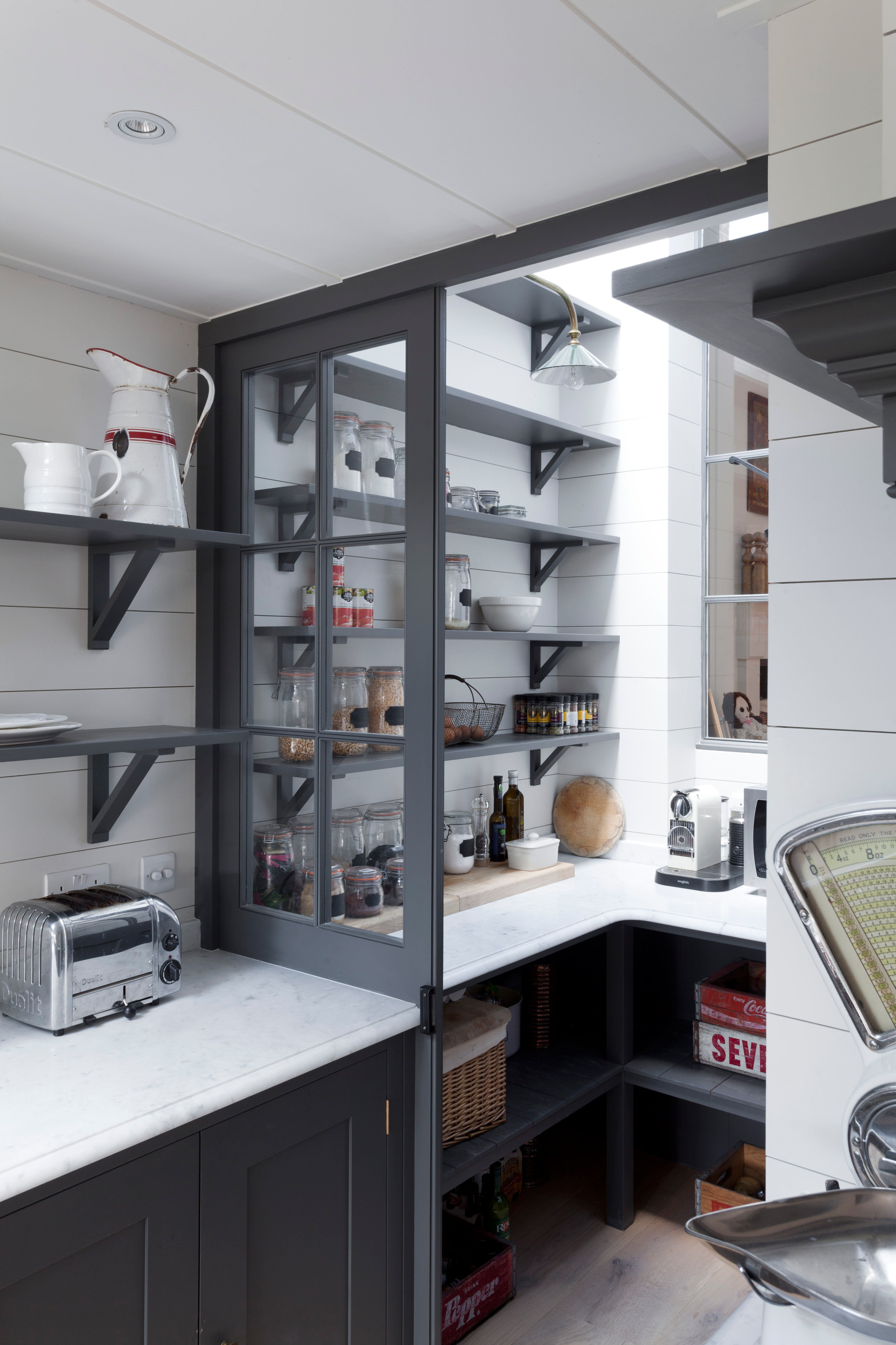
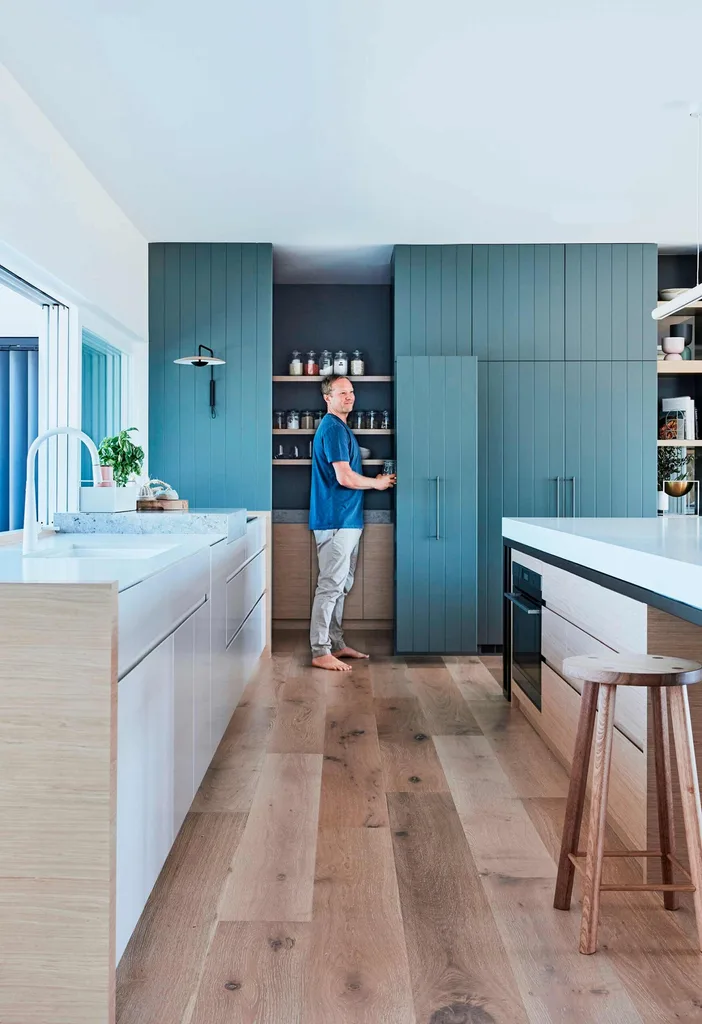
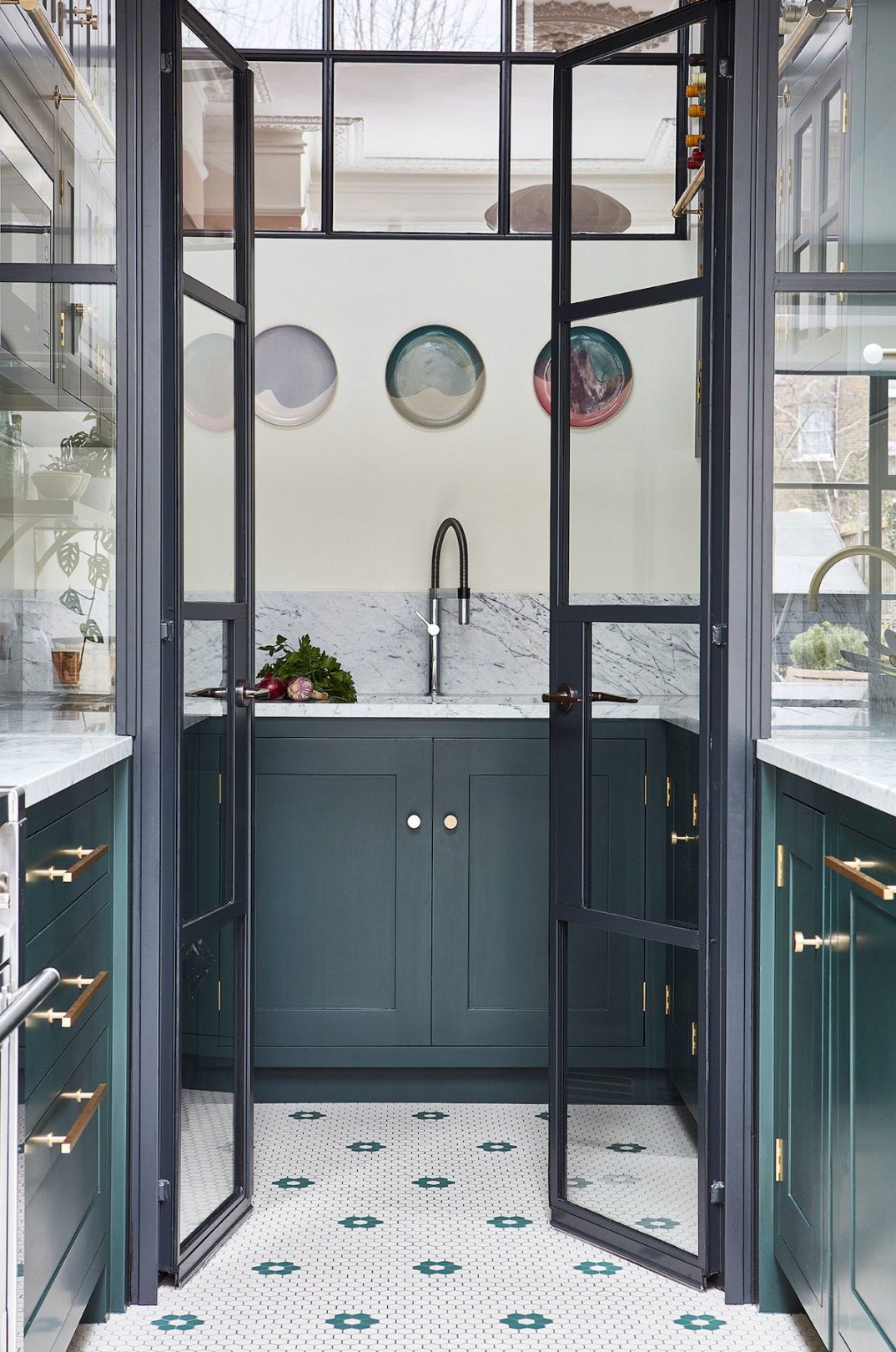
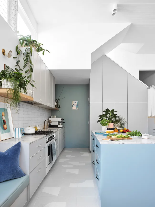
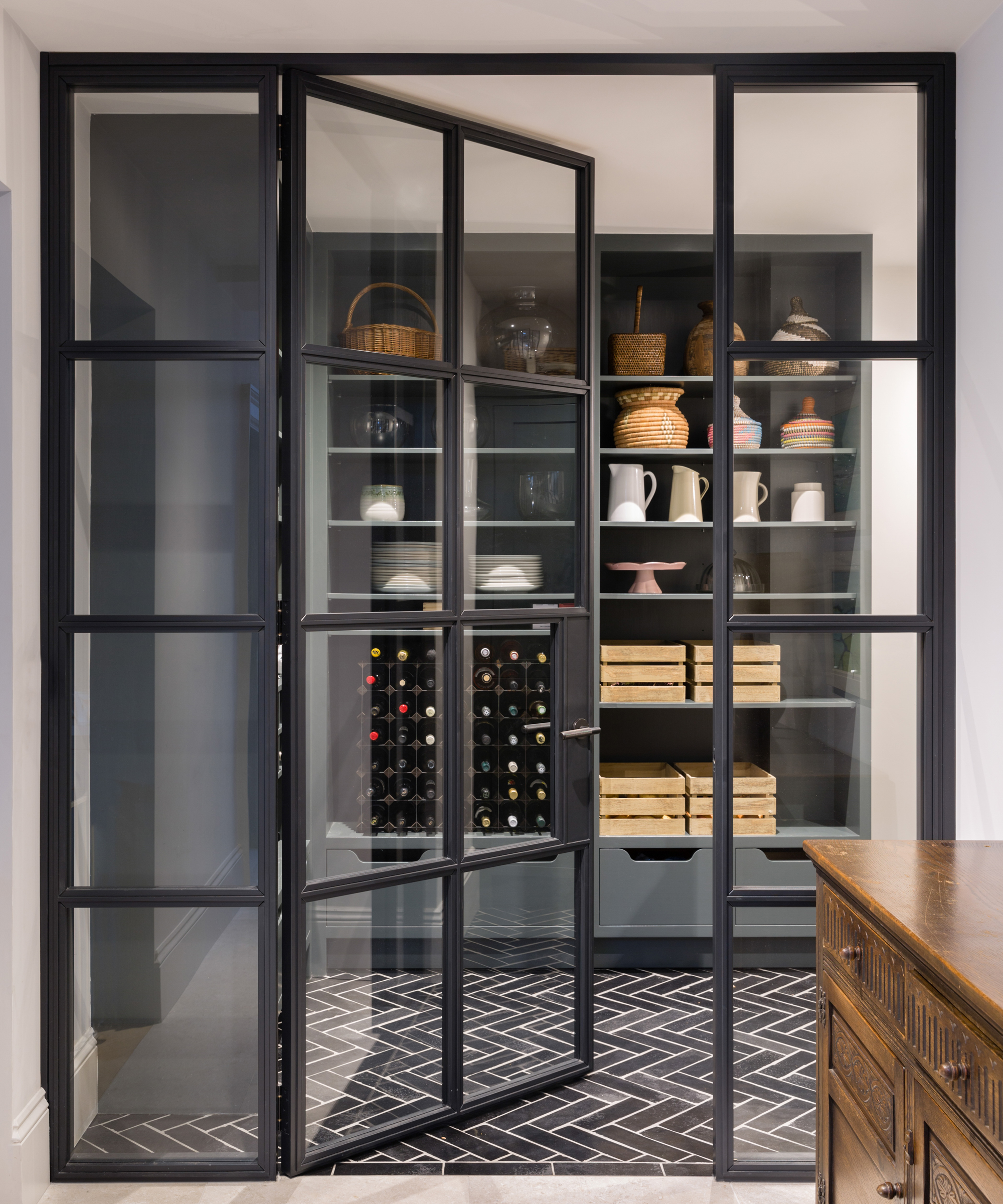
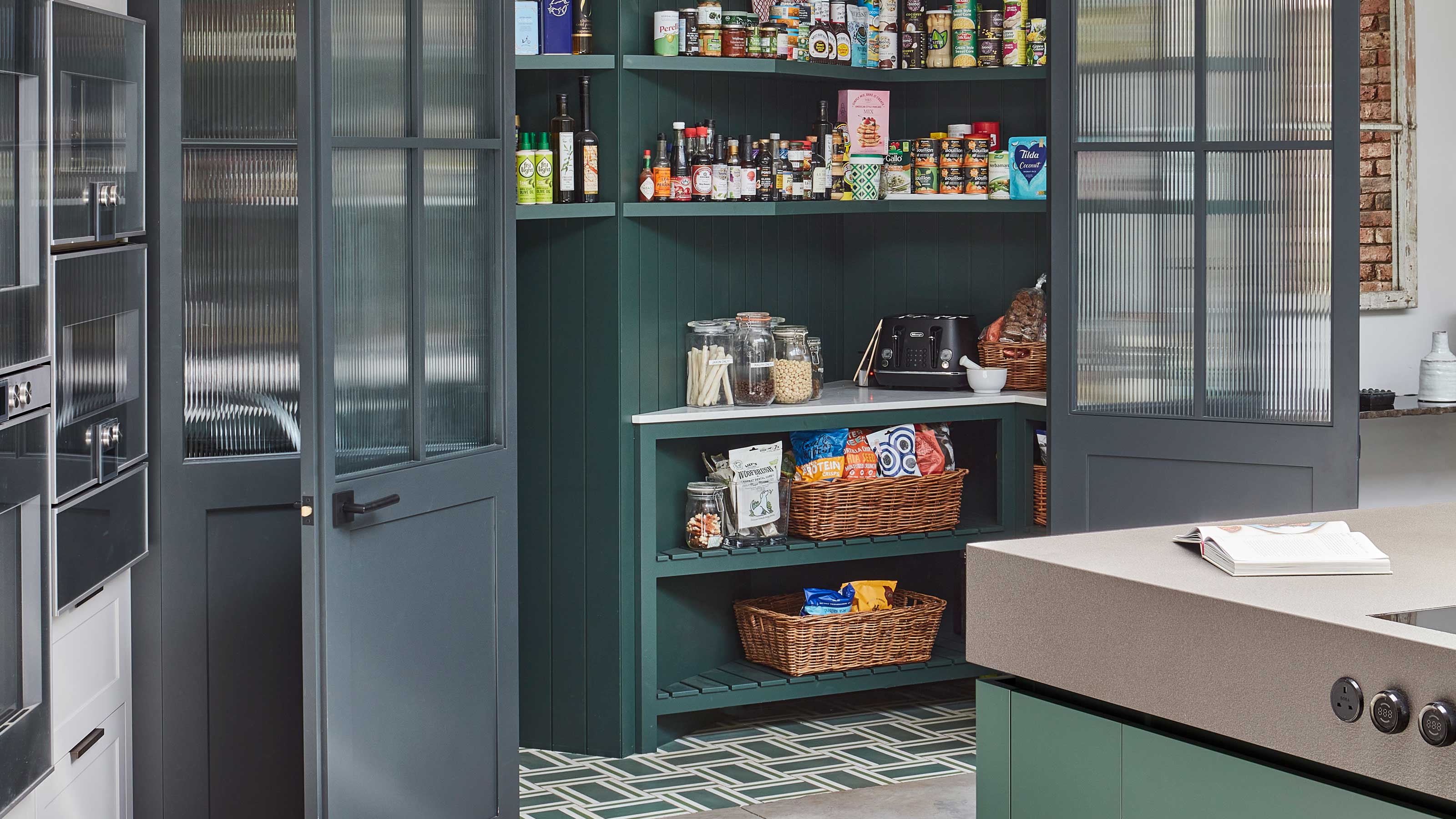
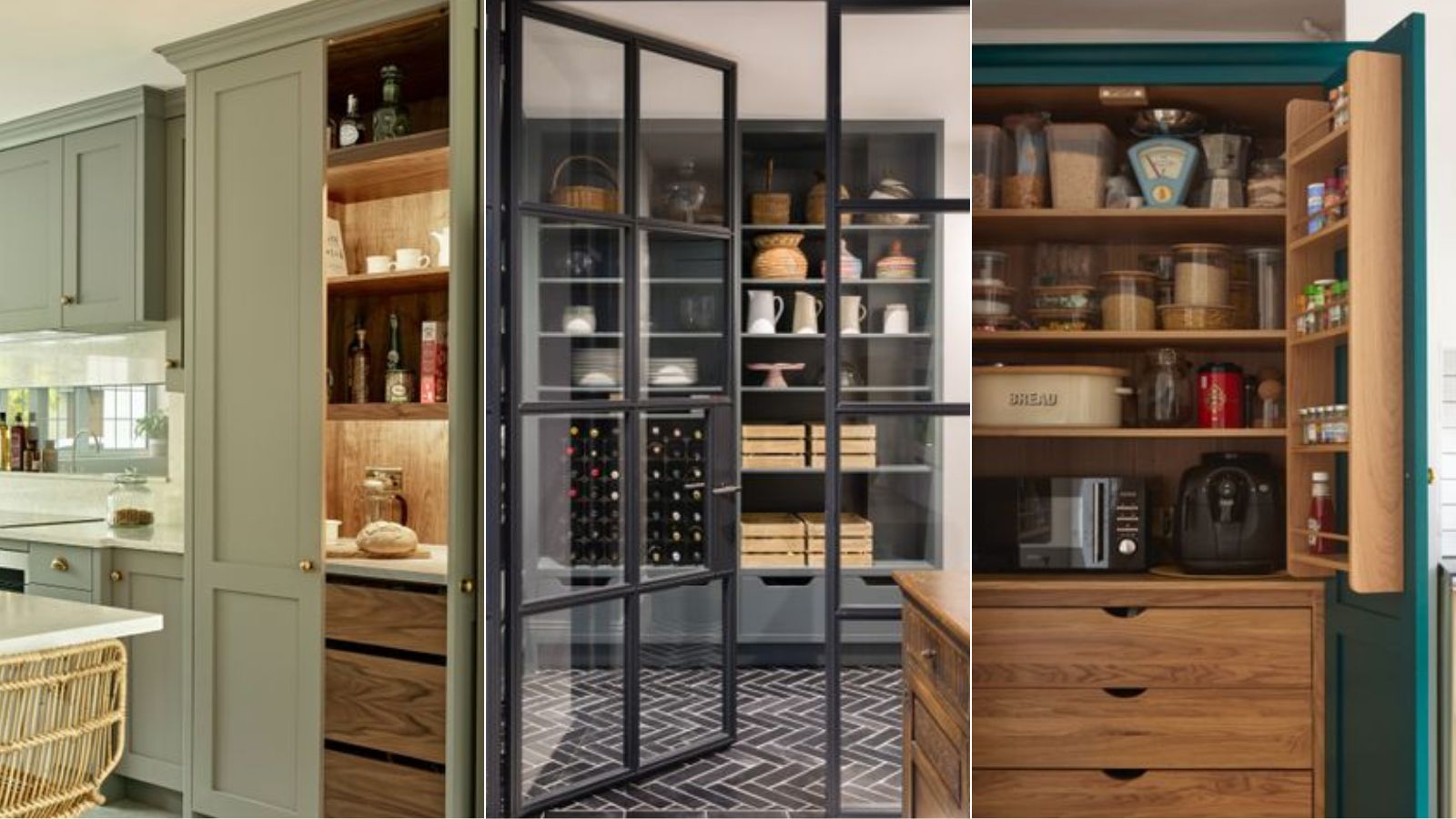
Eight distinct pantry color ideas are presented, ranging from bold statements to more neutral and muted tones, each offering unique aesthetic and psychological benefits. Teal is suggested for a sophisticated and timeless look, particularly when paired with metallic accents. This deep green-blue hue harmonizes well with black, peach, white, and honey tones, creating an organic and elegant feel. Dark grey is recommended for those seeking a bold yet neutral statement, providing depth and a touch of class while highlighting architectural details. Sky blue is highlighted for its uplifting and spacious qualities, especially beneficial for windowless pantries, evoking tranquility and making small spaces appear larger.
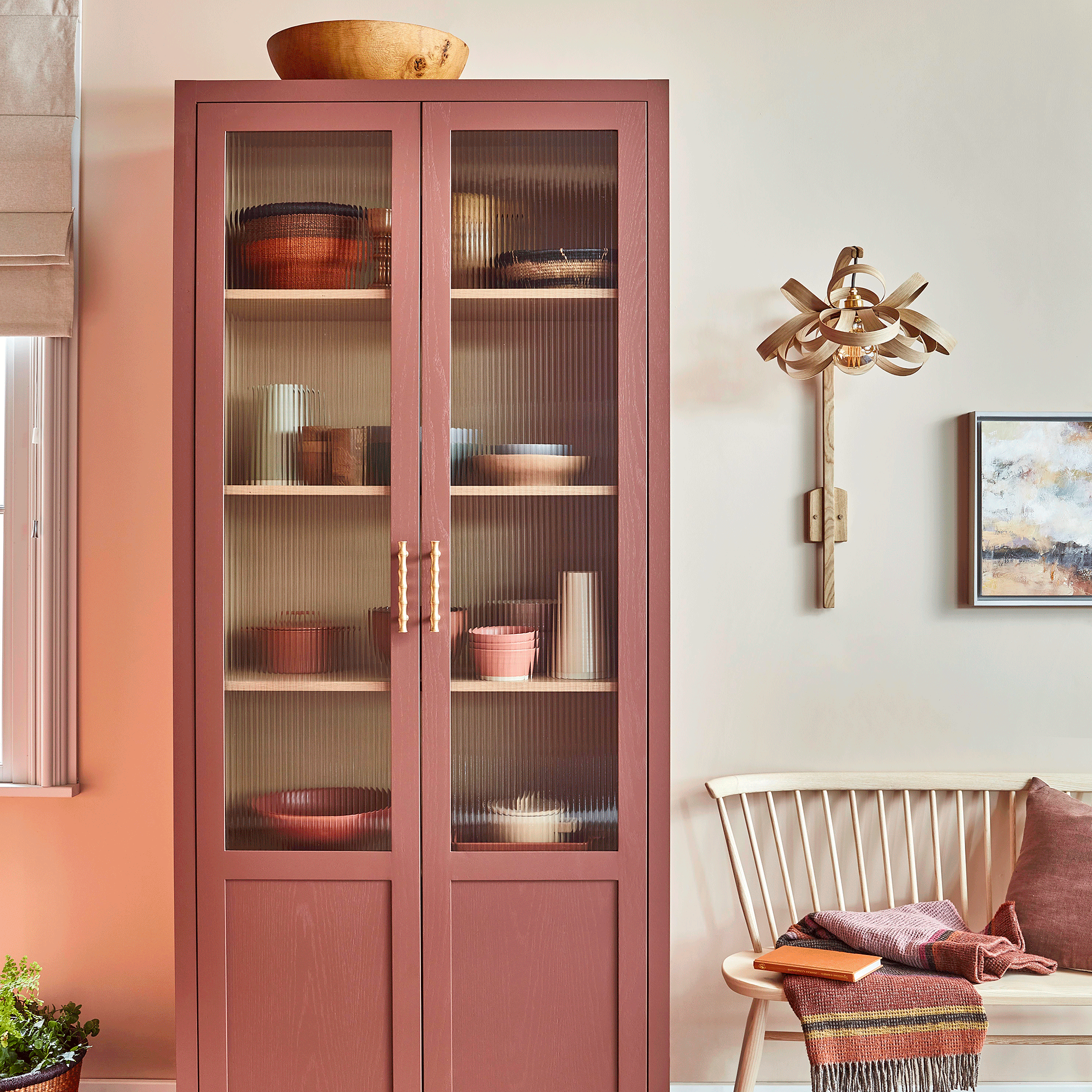
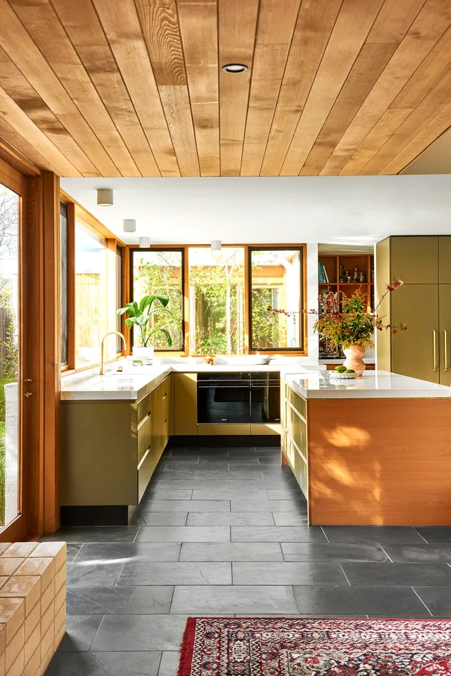
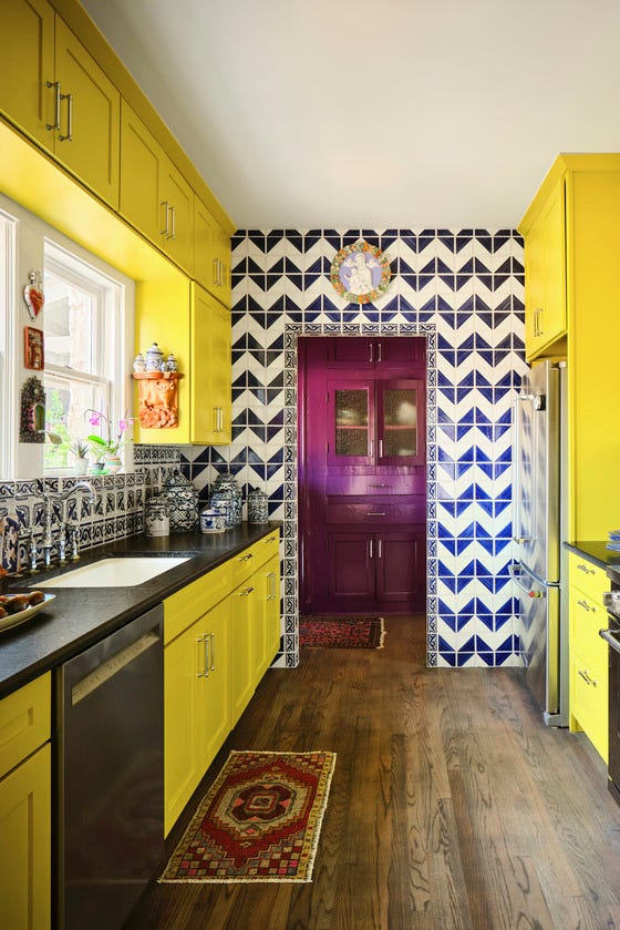
Yellow, particularly those with brown or grey undertones, is proposed for injecting cheerfulness and creativity, ideal for pantries that share space with open kitchen shelving. The article suggests that yellow can effectively distinguish the pantry area and add warmth, particularly if it avoids overly bright tones that might clash with a kitchen's overall cozy ambiance. Red is presented as a daring option for making a strong visual impact, especially within a white kitchen, where its color-drenching application can make small rooms feel expansive and stimulating. This choice is noted for its ability to increase appetite, a relevant psychological effect for a kitchen space.
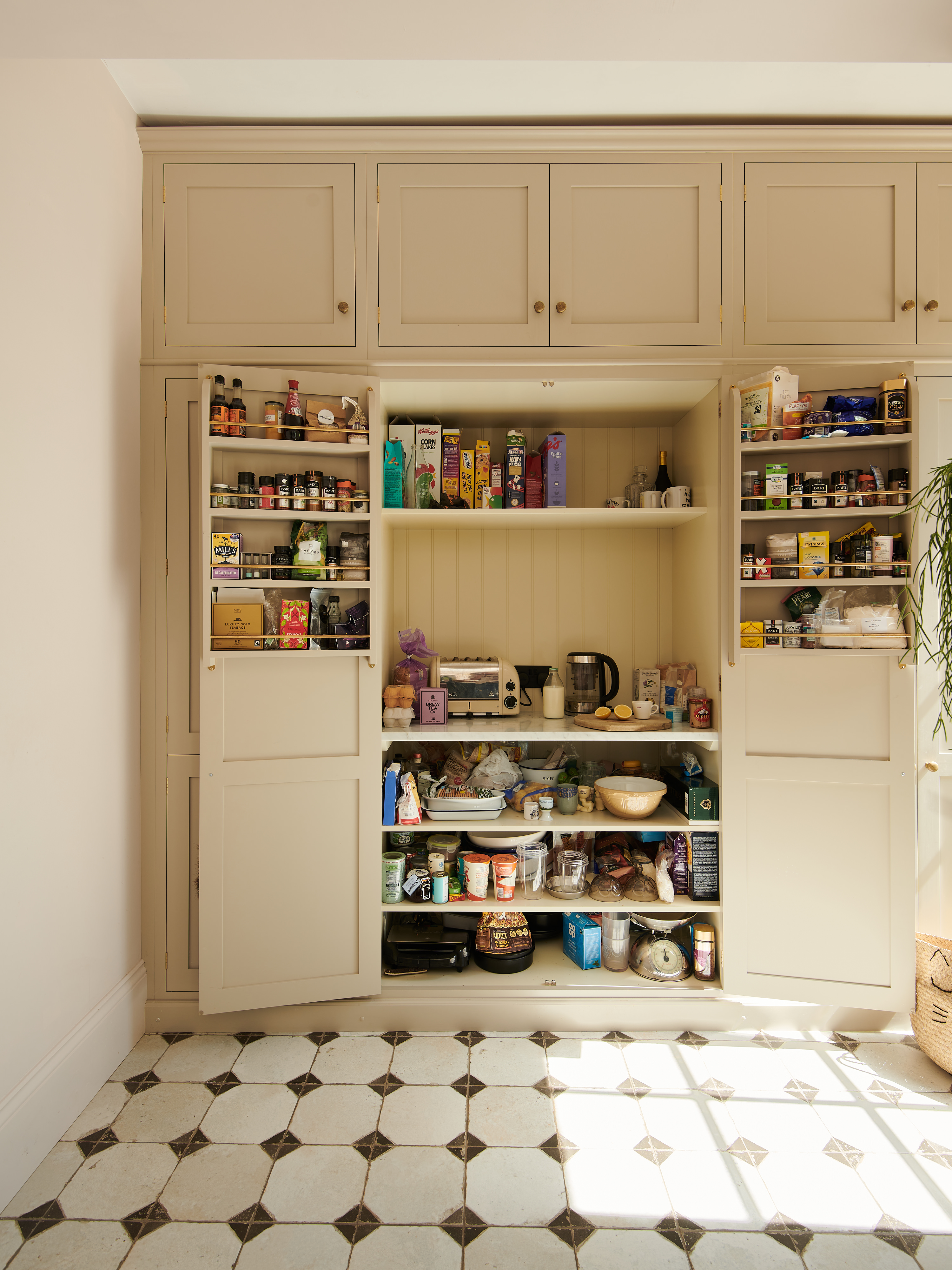
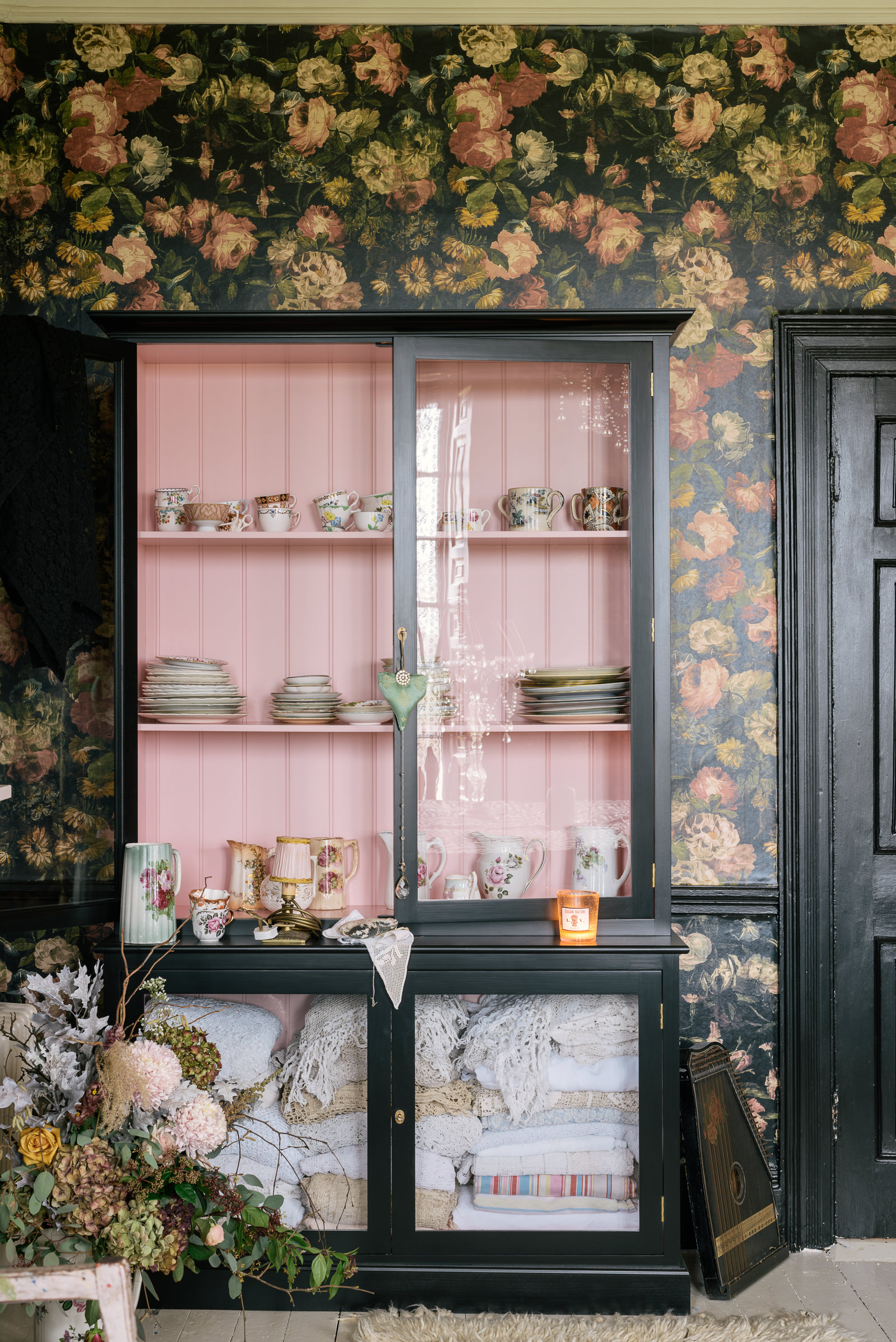
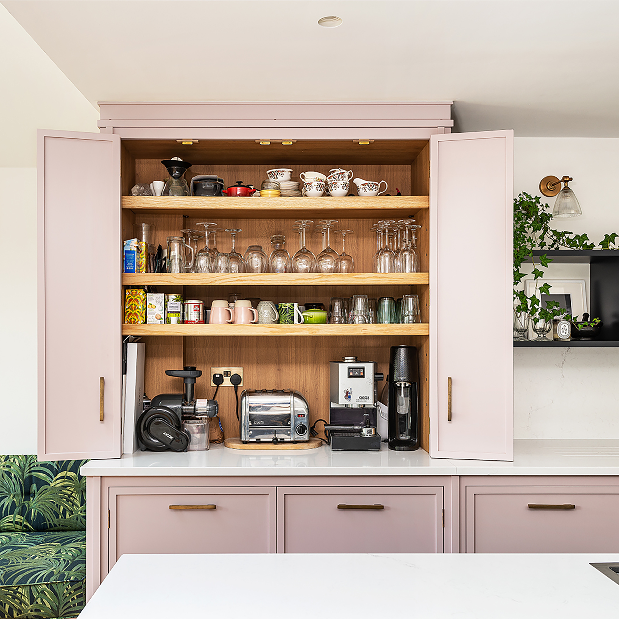
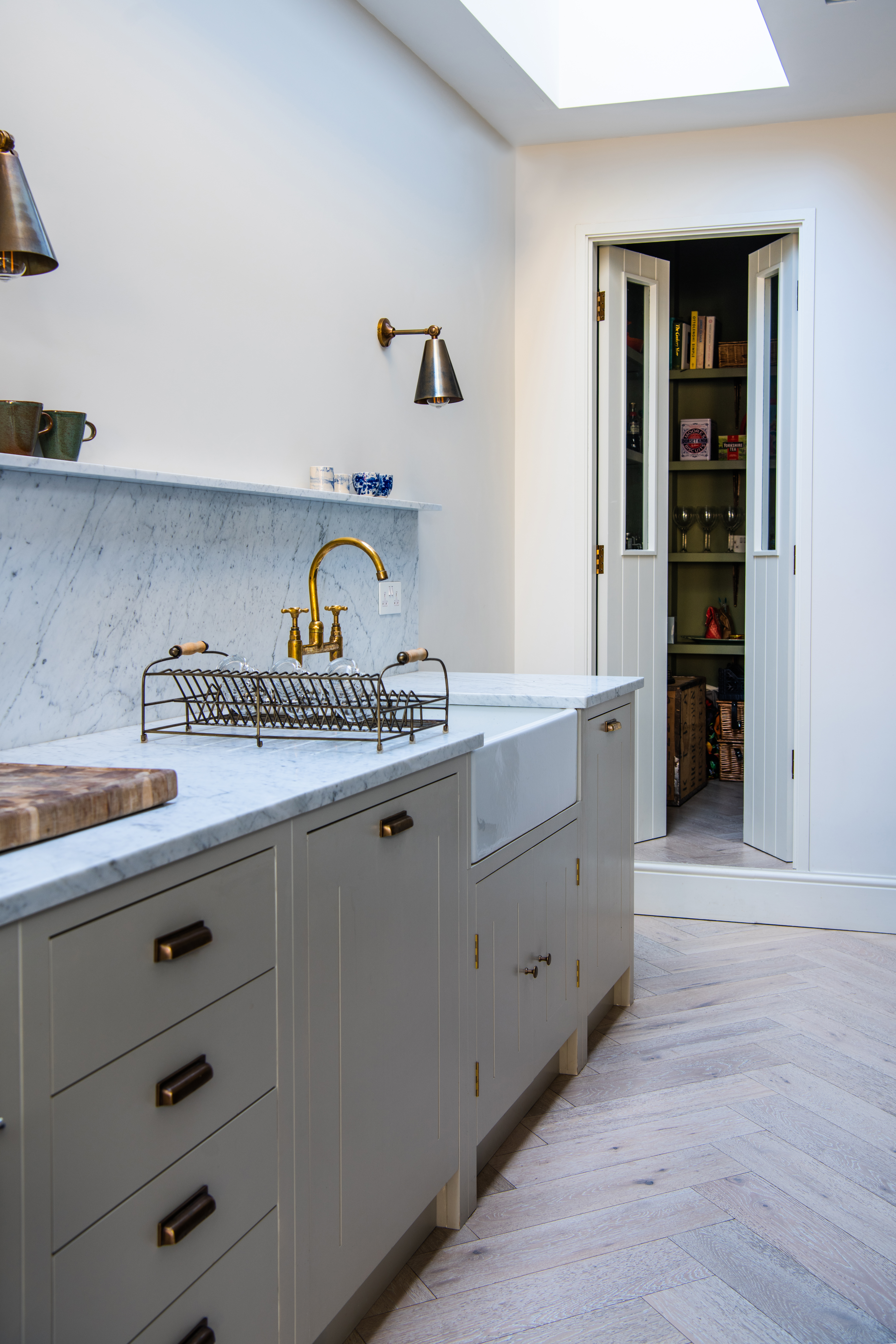
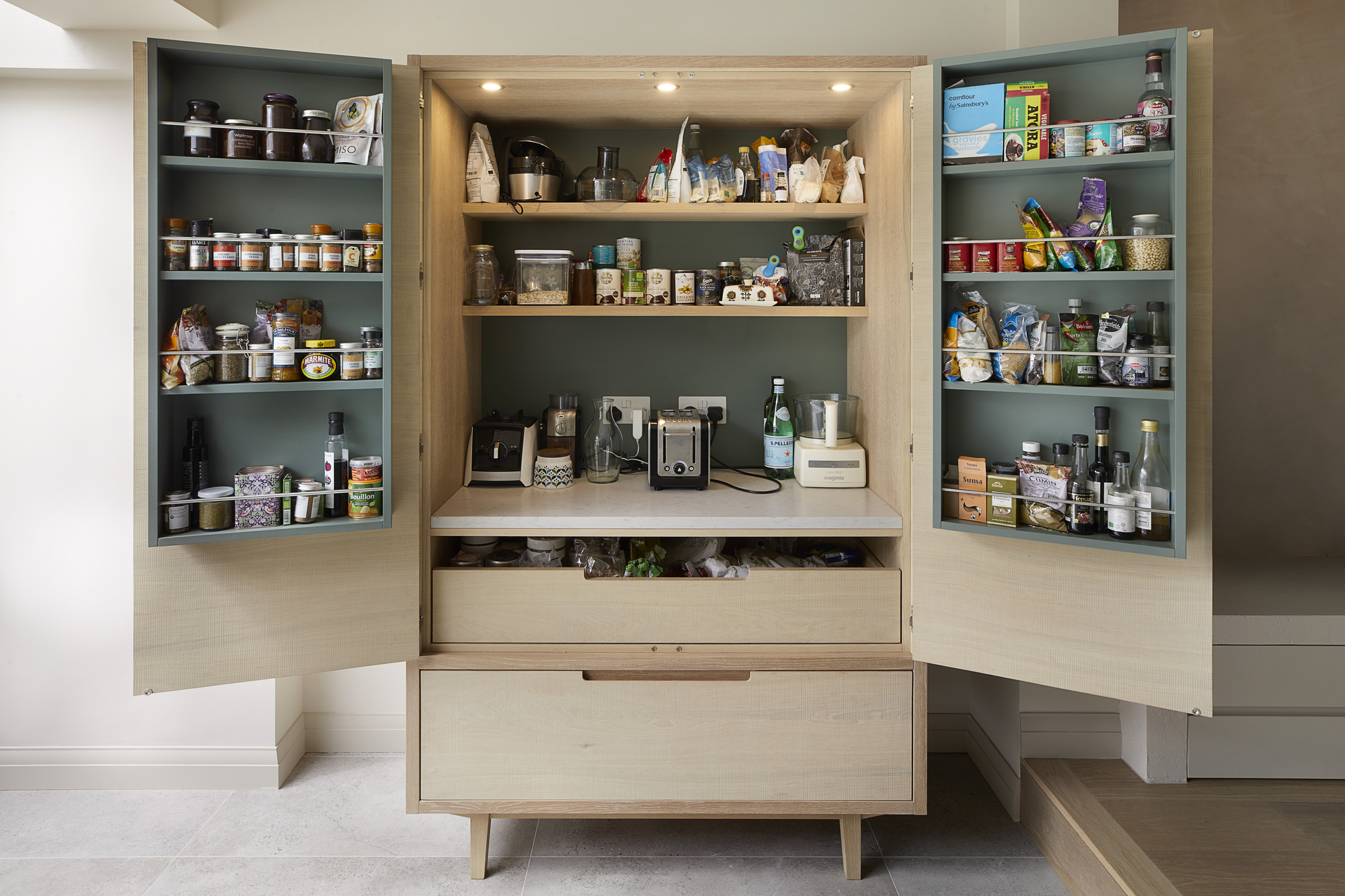
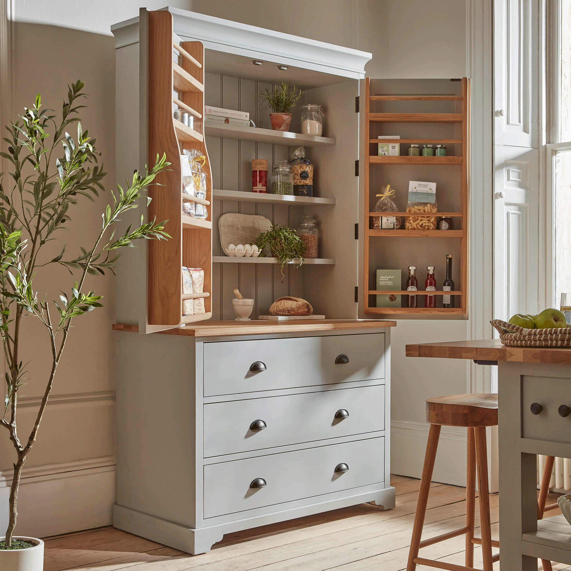
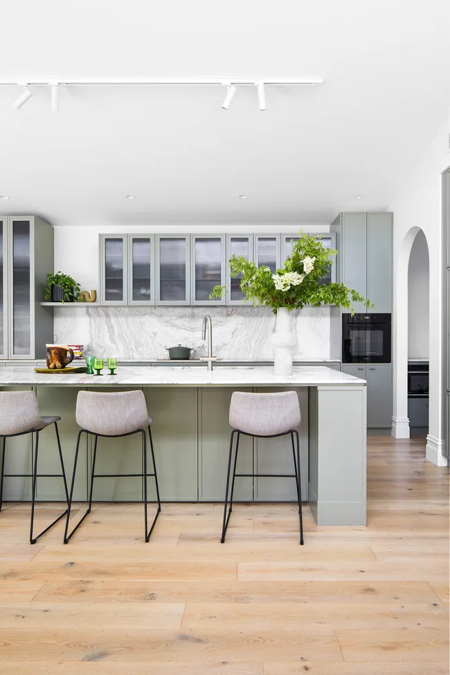
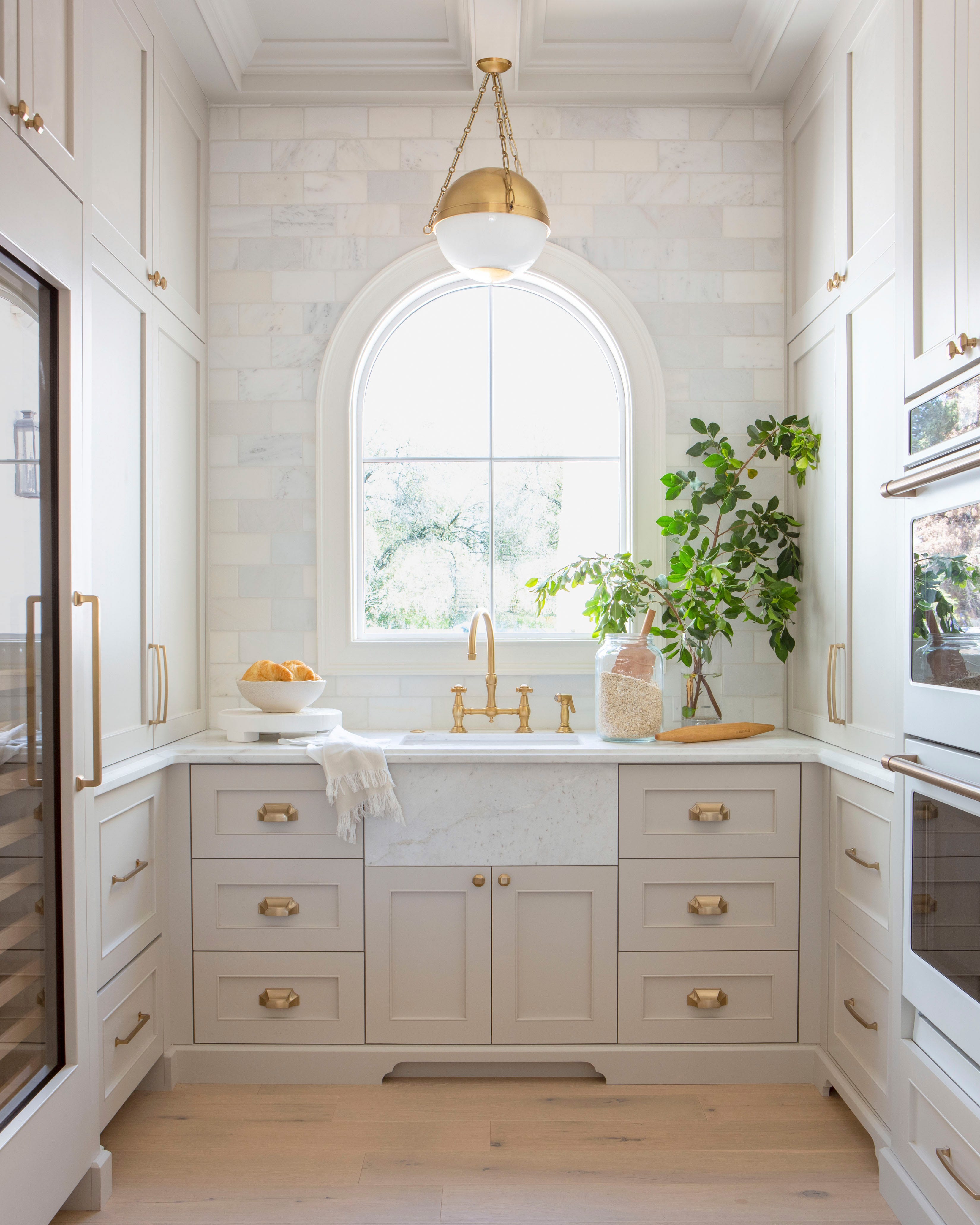
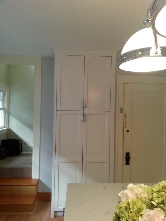
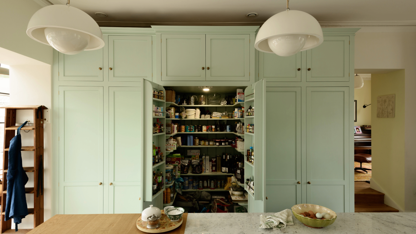
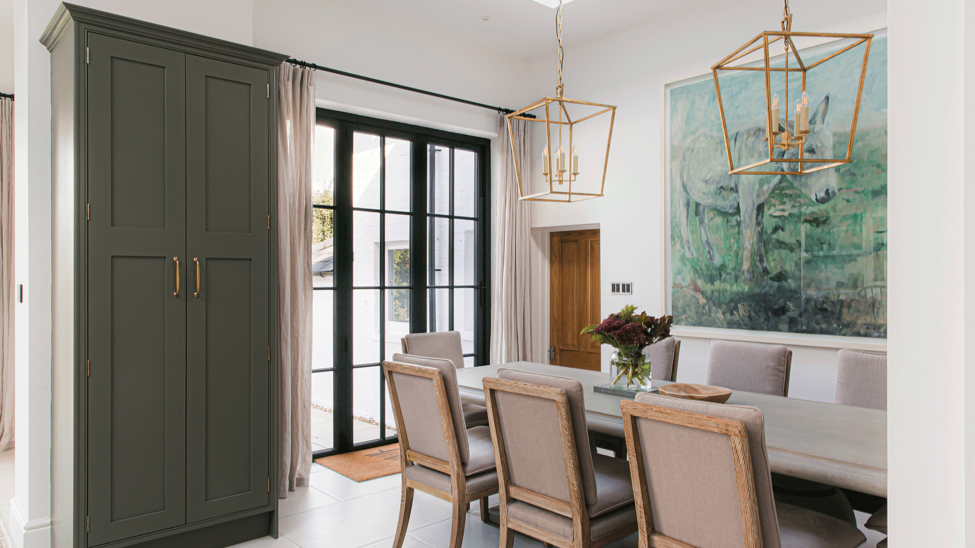
Off-white is recommended for its muted versatility, offering a balance between bright and dark while being less prone to showing wear. This shade ensures the pantry remains light and bright, making items easily identifiable. Pink provides a sweet and charming aesthetic, creating a smile-inducing space that can be balanced with wooden tones, grey, or concrete. Lastly, green is celebrated for its calming, nature-reminiscent qualities, pairing well with various colors and wood tones. A matte finish is suggested for green pantries to avoid an overwhelming glossy effect, and specific shades like Benjamin Moore's Waterbury Green are noted for their modern feel with blue-grey undertones.
#PantryColor #KitchenDesign #InteriorDesign #HomeDecor #ColorPsychology #TimelessDesign #StorageSolutions #ModernKitchen #DesignTrends #PantryColor #KitchenDesign #InteriorDesign #HomeDecor #ColorPsychology #TimelessDesign #StorageSolutions #ModernKitchen #DesignTrends
0 comment in total
 No comments yet
You may also like
Colorful pantries are the new statement island
10 small kitchen pantry ideas for stunning storage — you won’t want to miss this

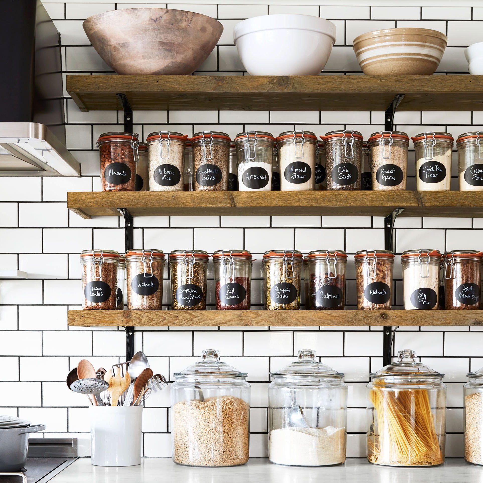
These Storage Containers Will Give Your Pantry the Organized Aesthetic You Crave

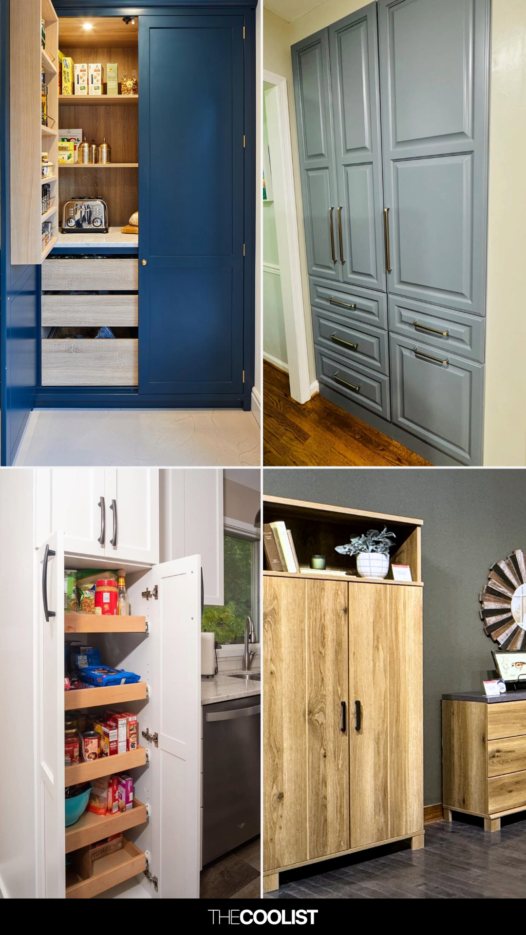
28 Pantry Cabinet Ideas That Will Make You Embarrassed About Your Messy Shelves
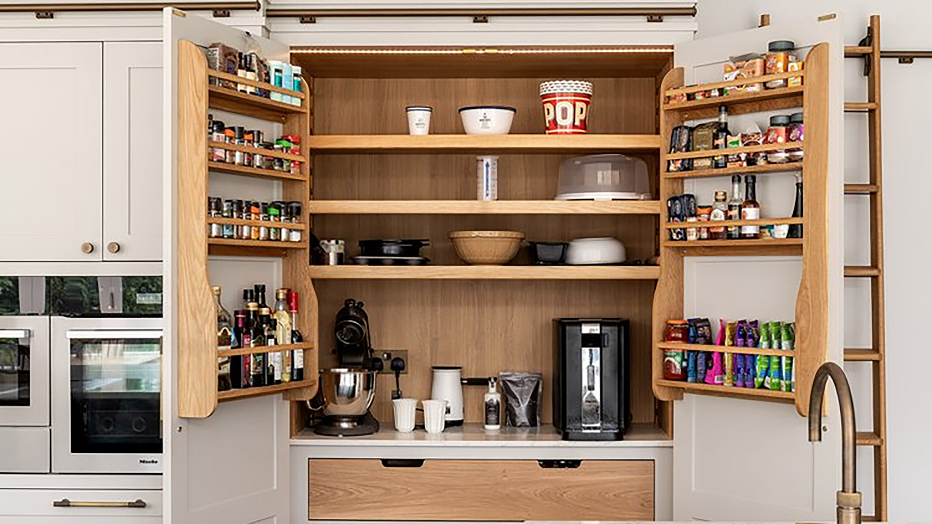
30 kitchen pantry ideas for the most stylish storage around
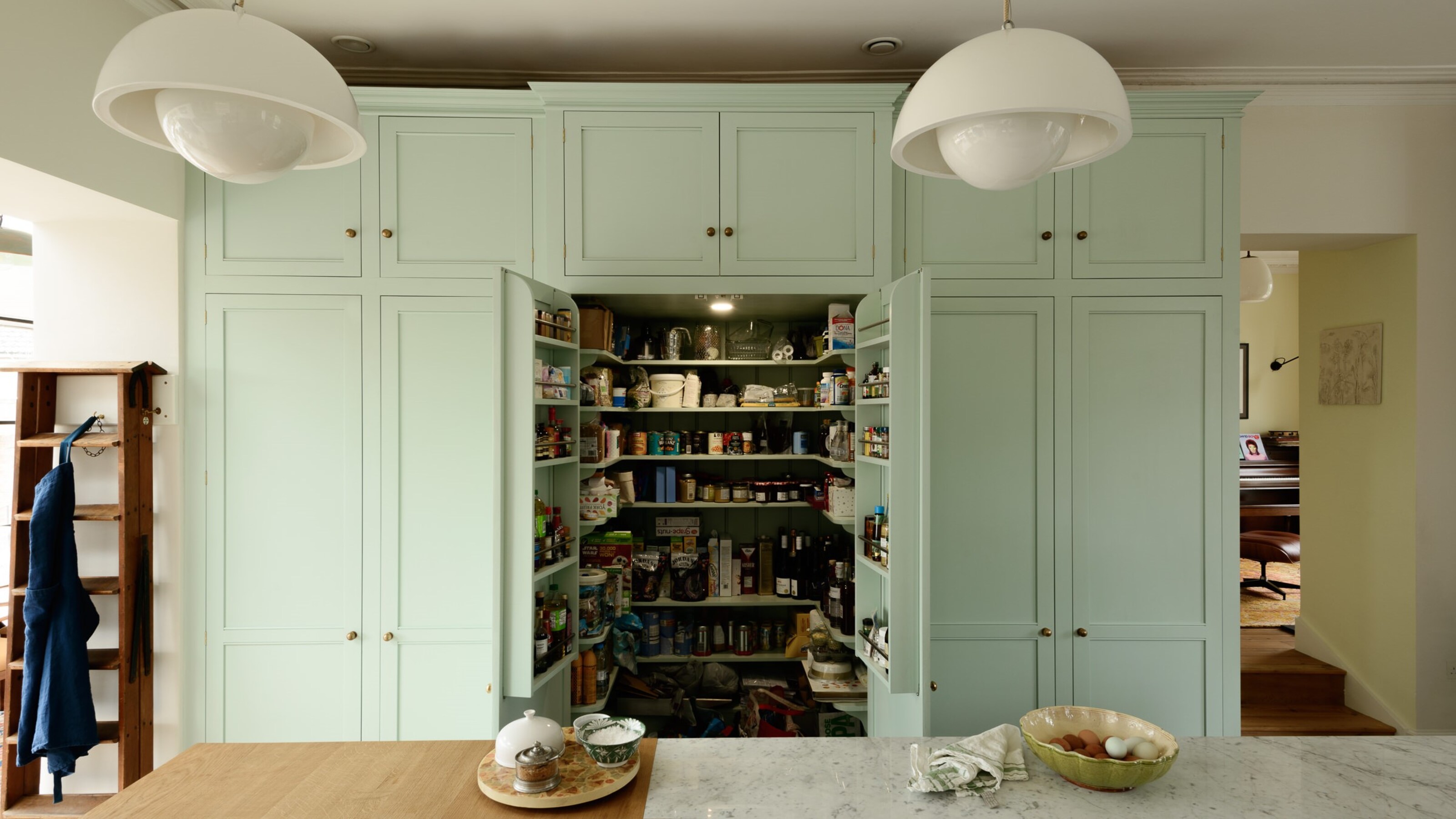
Perfect pantry ideas for an organized and space-saving kitchen
29 Corner Kitchen Pantry Ideas That Reveal How Much Storage You’re Losing Without Realizing It

5 Genius Kitchen Pantry Trends That Will Help You Get (and Stay!) Organized

Pantry shelving ideas – 10 ways to add style and storage to a pantry
18 of the Best Pantry Storage Ideas for Creating a Tidy Space
Sorry, open shelving, but this is the beautiful and practical storage trend taking over kitchens in 2025
8 pantry organizers professionals always buy

8 Pantry Shelving Ideas For Storing In Style
Pantry design tips: how to organise your kitchen storage

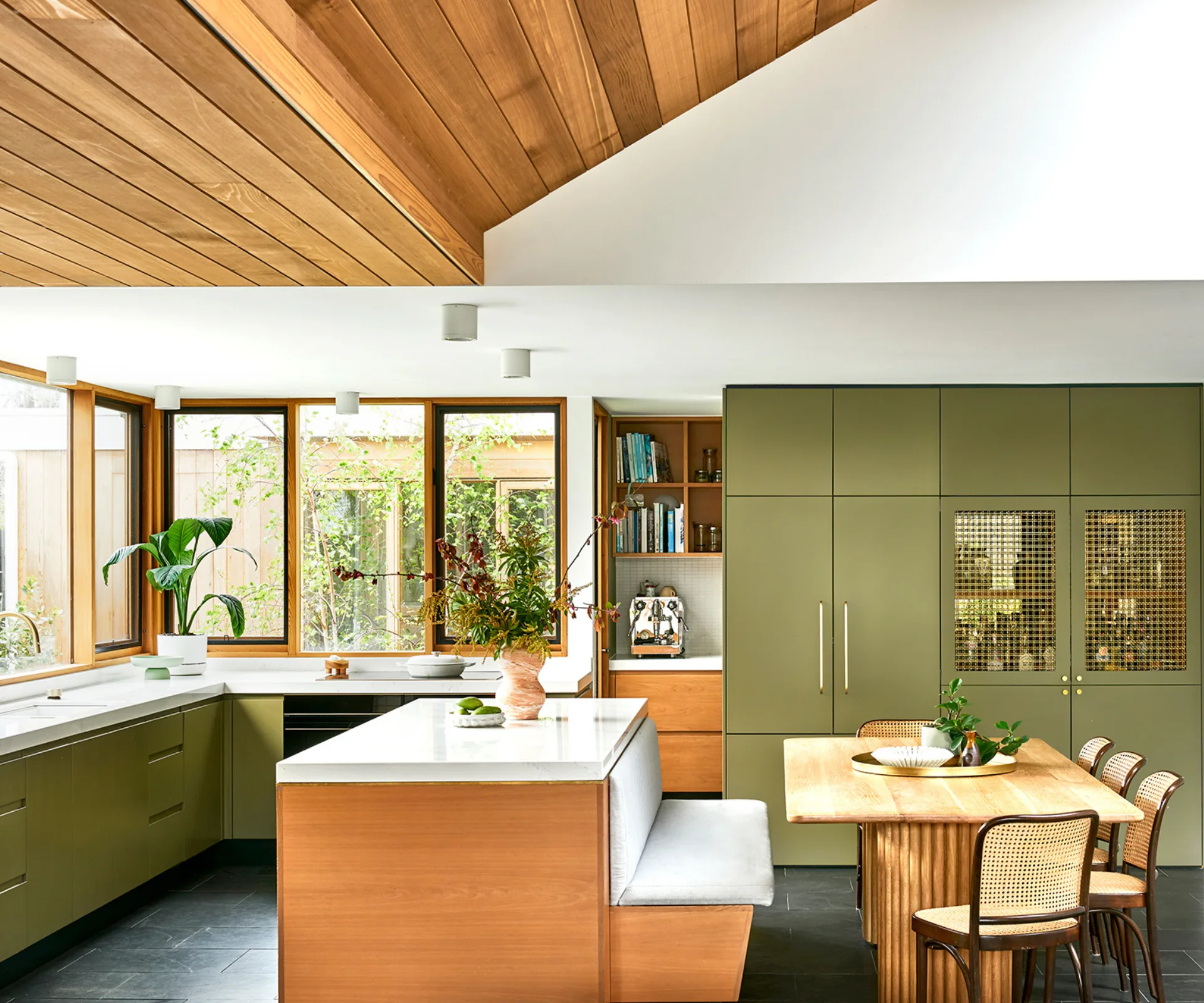
17 bright kitchen cabinet colour ideas to try in your home

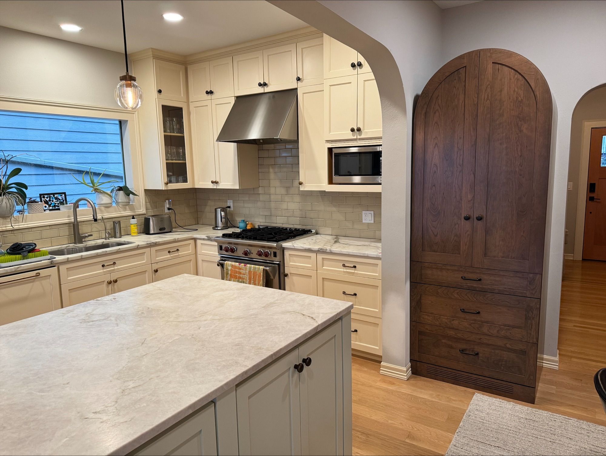
Converting unused kitchen space into a pantry


5 colors you should never paint a pantry – designers share the shades they swerve
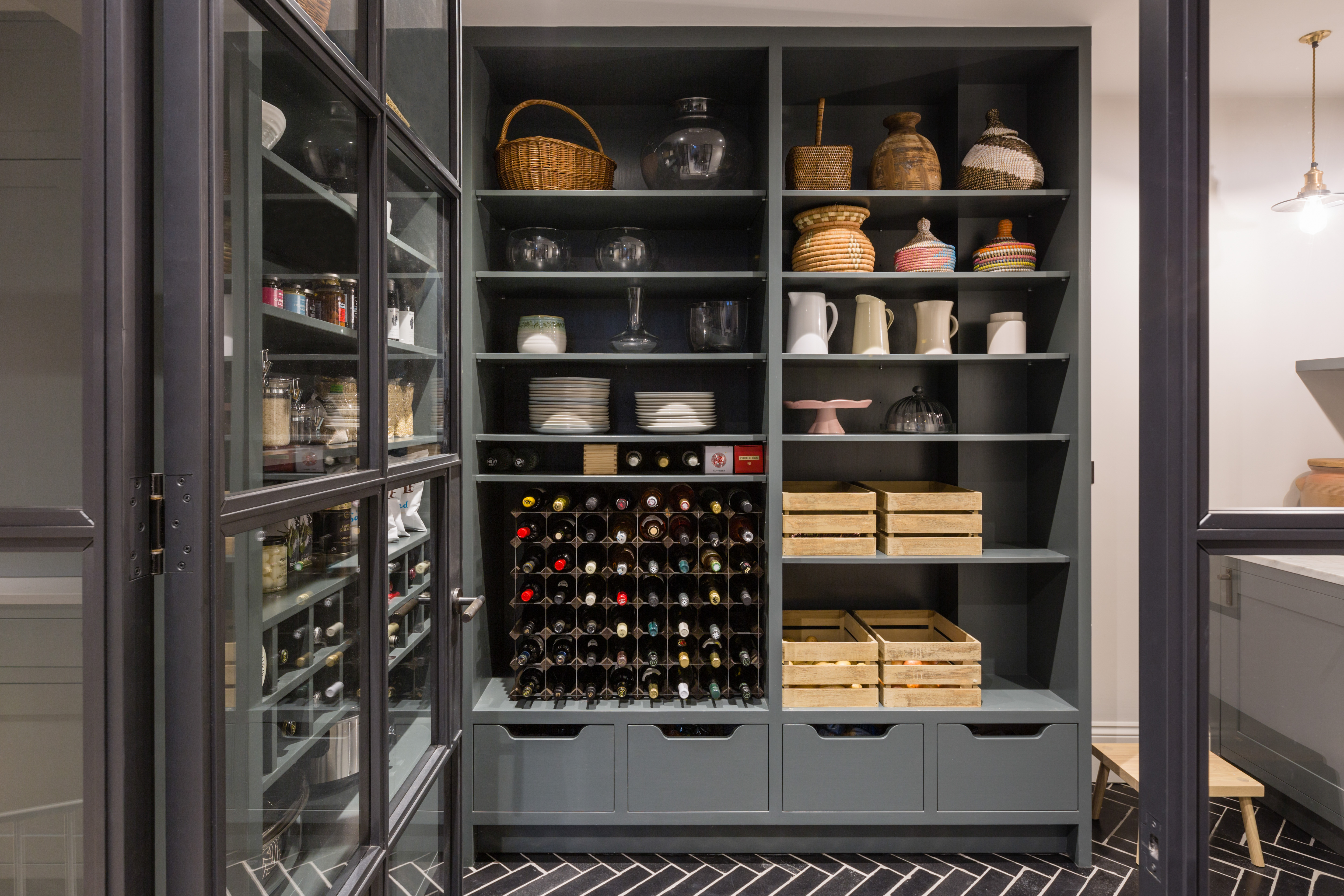
Walk-in pantry ideas – 10 stylish ways to add extra storage to your kitchen
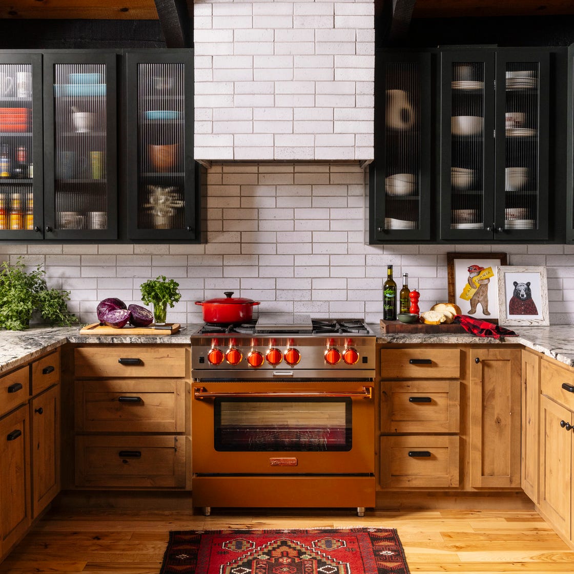
69 Stylish Kitchen Cabinet Ideas to Solve All Your Storage Problems
6 Kitchen Cabinet Colors Designers Advise Against—and the Alternatives They Recommend Instead