1/4
Amber Lewis Shares the Best Neutral Paint Colors for Every Room
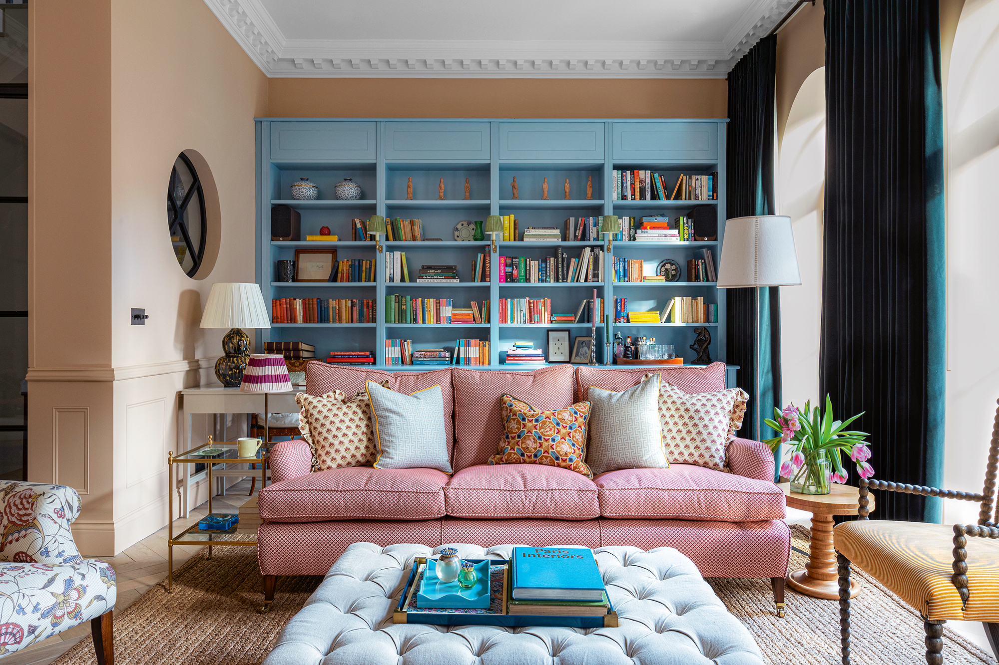
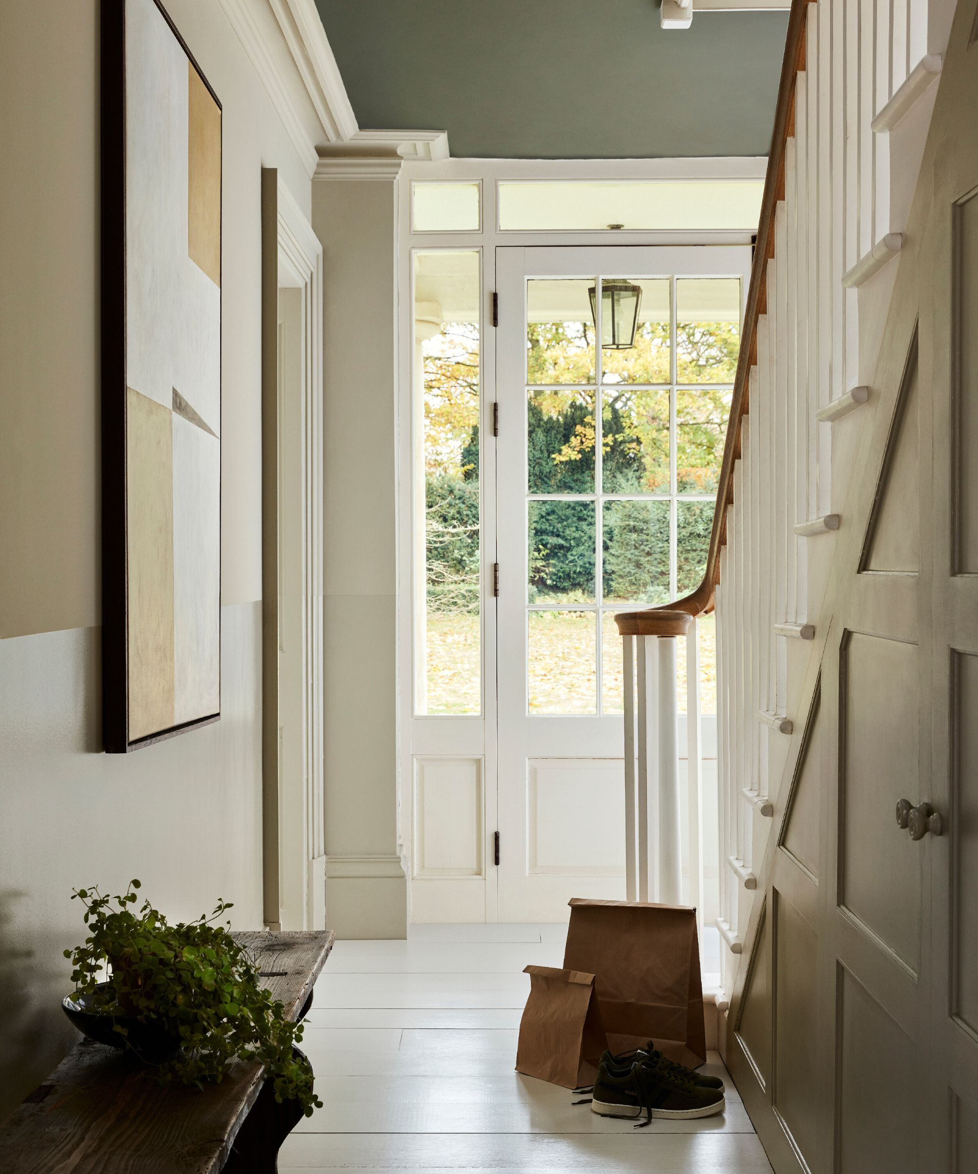
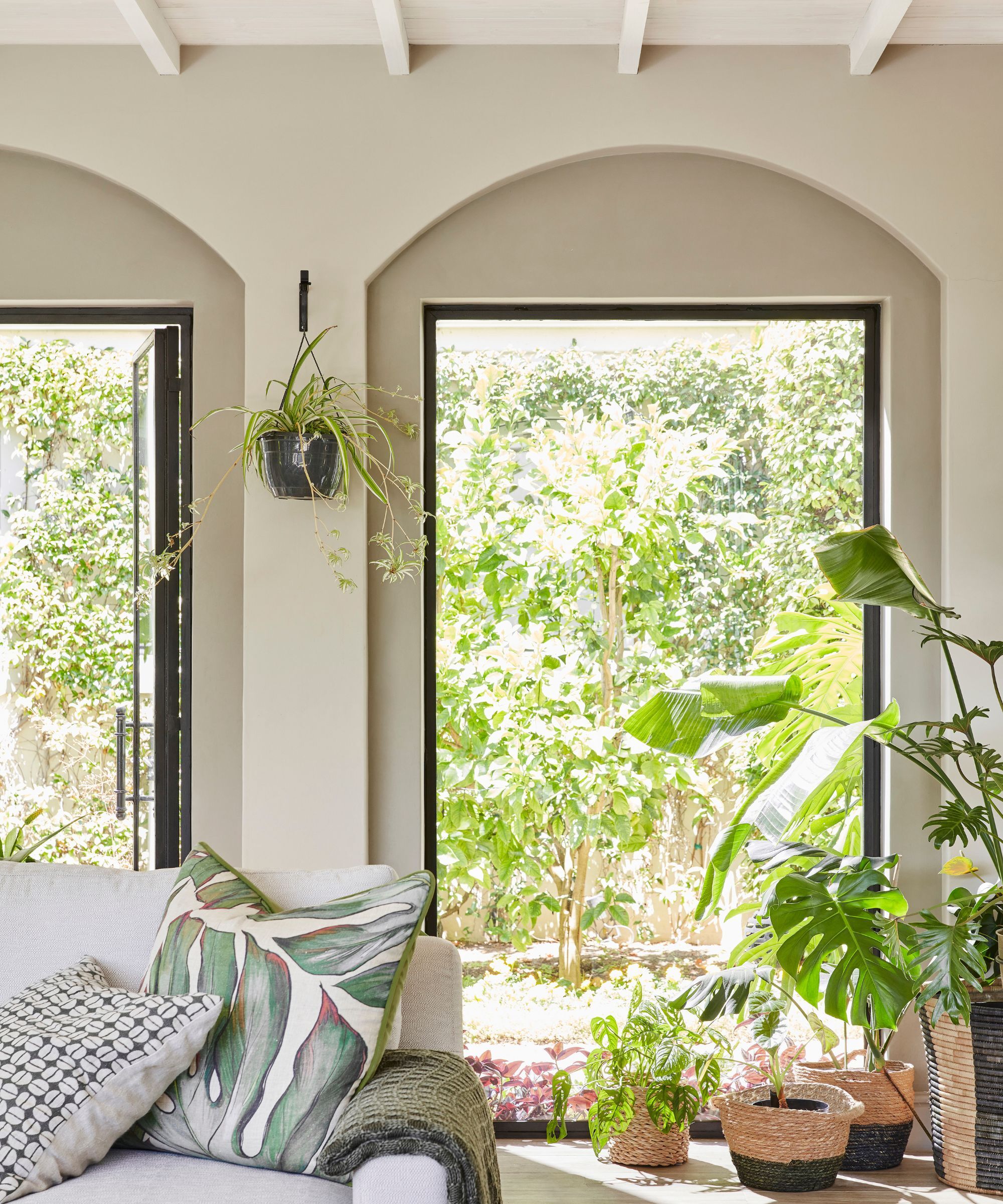
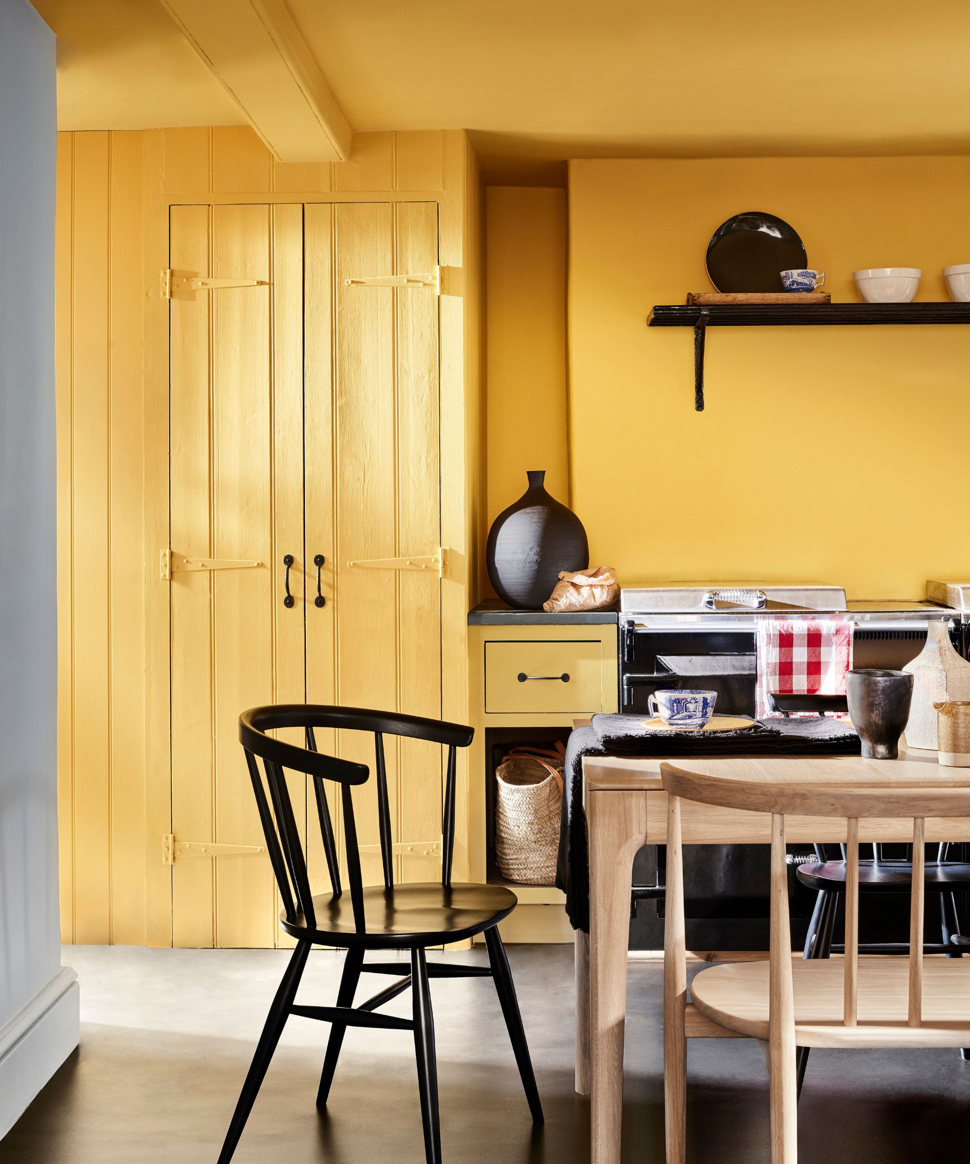
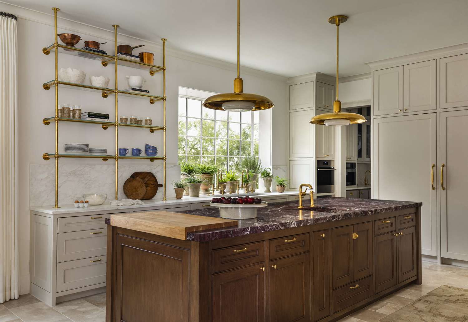
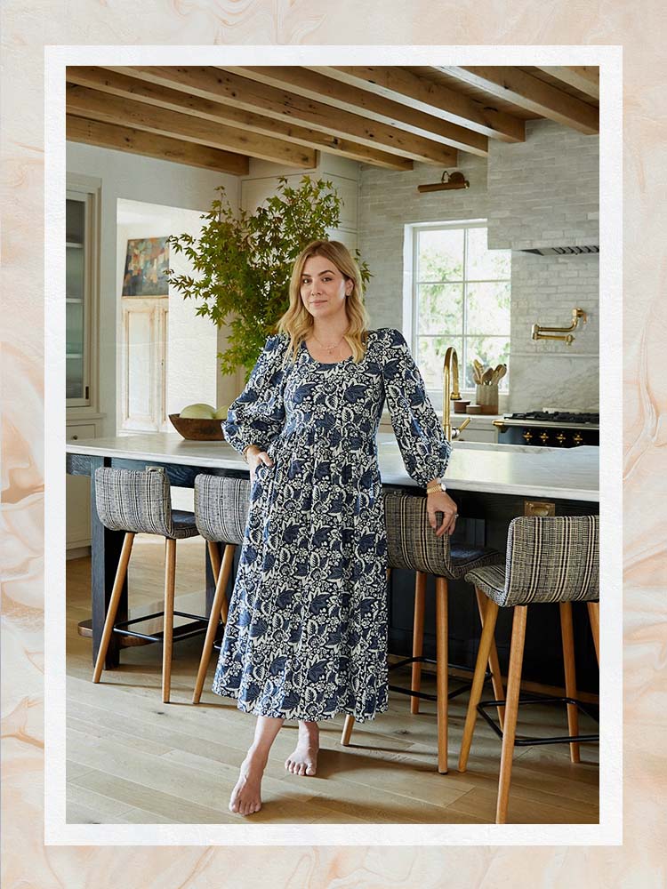
Interior designer Amber Lewis, known for her California-cool style, offers her expertise on selecting neutral paint colors. While she previously favored white, she has recently embraced a broader spectrum of neutrals, even coating her own home in Portola Paints’s Piano Room, a gray-green plaster. Lewis emphasizes that choosing the right white paint is particularly challenging due to its layered nature and subtle undertones, which can drastically alter its appearance. She details various neutral shades, categorizing them into best whites, best darks, and best in-between paints, providing specific brand and color recommendations from her book, "Made for Living."
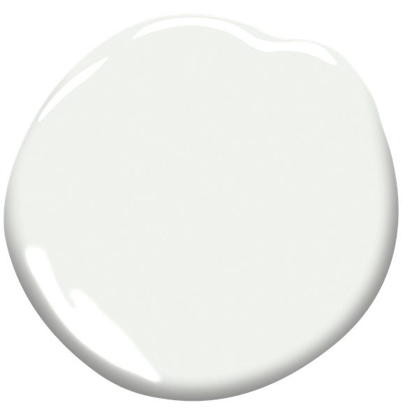
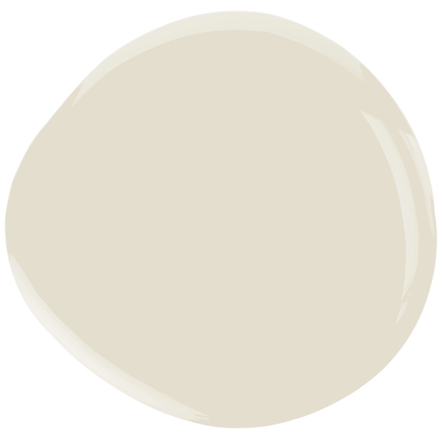
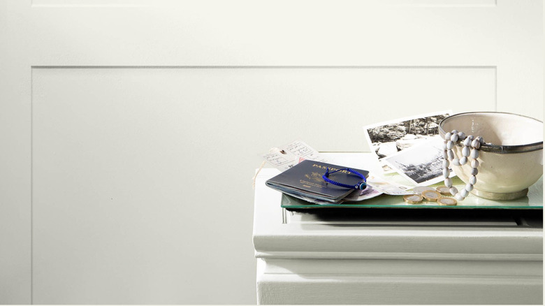
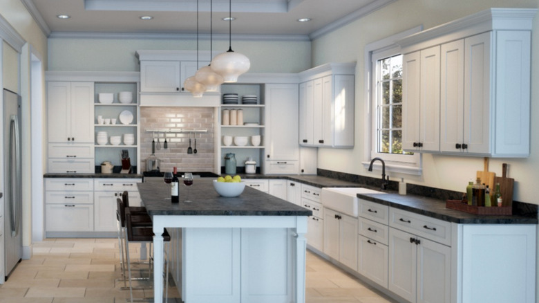
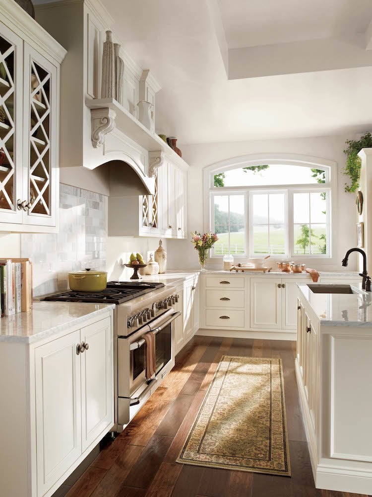
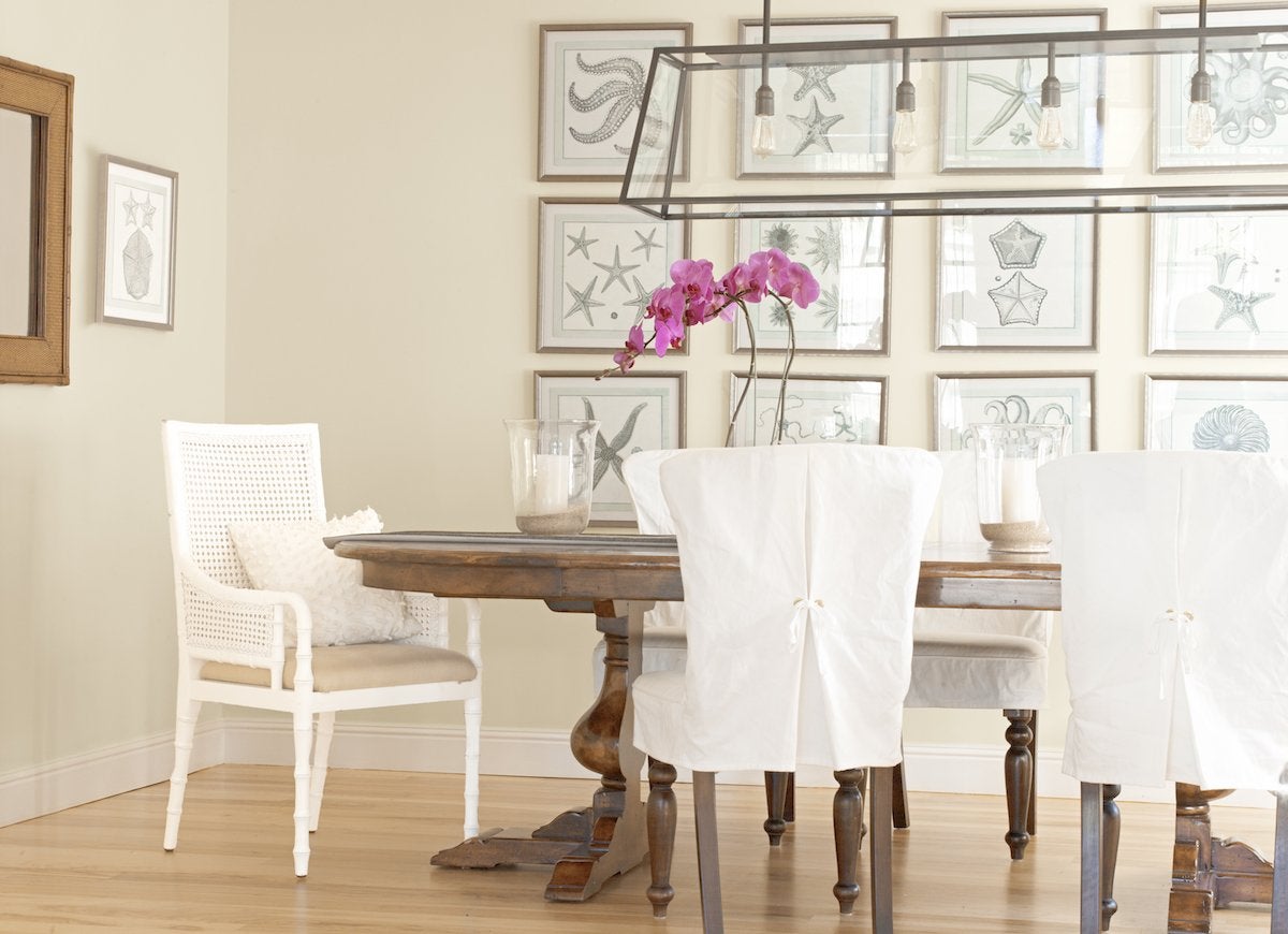
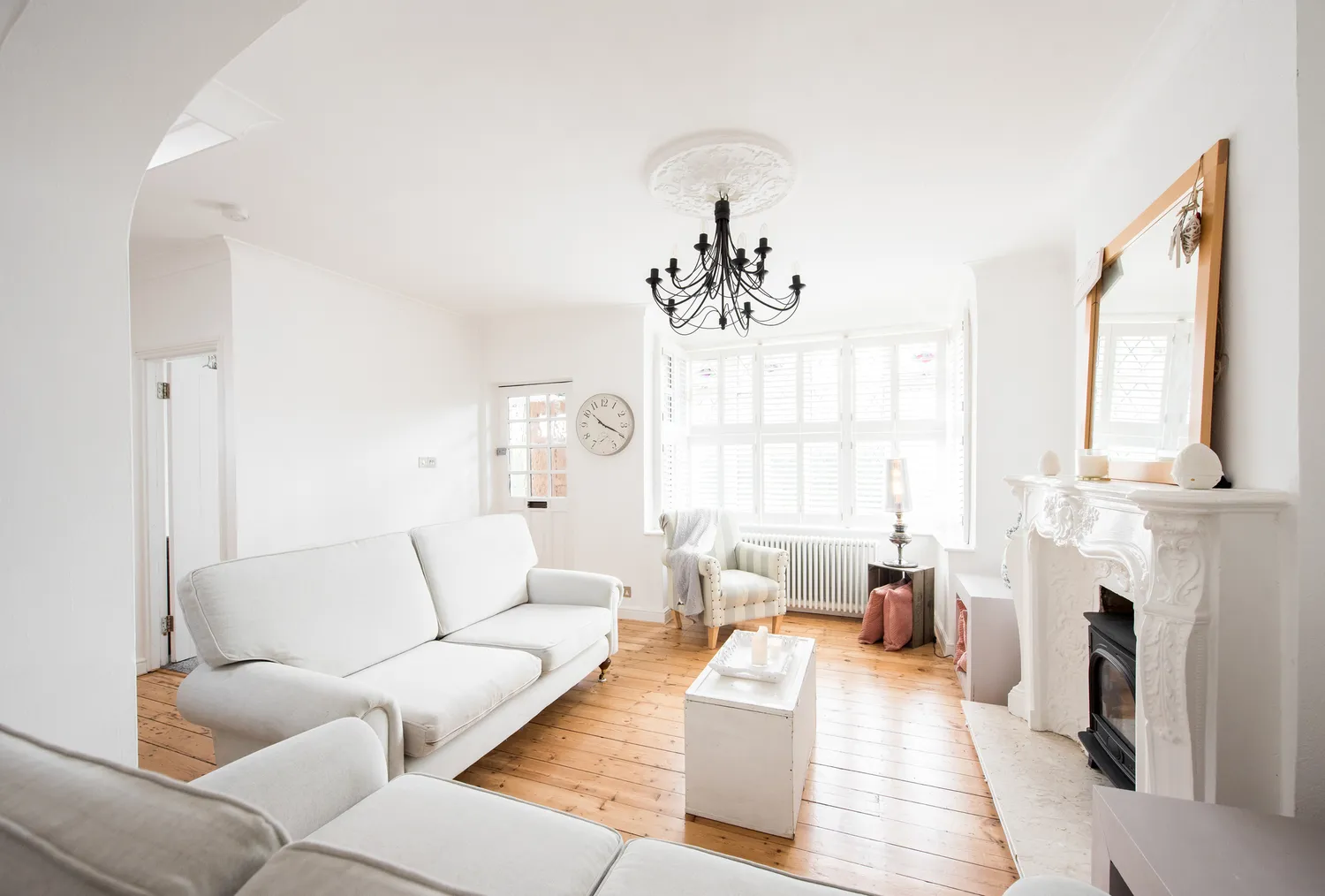
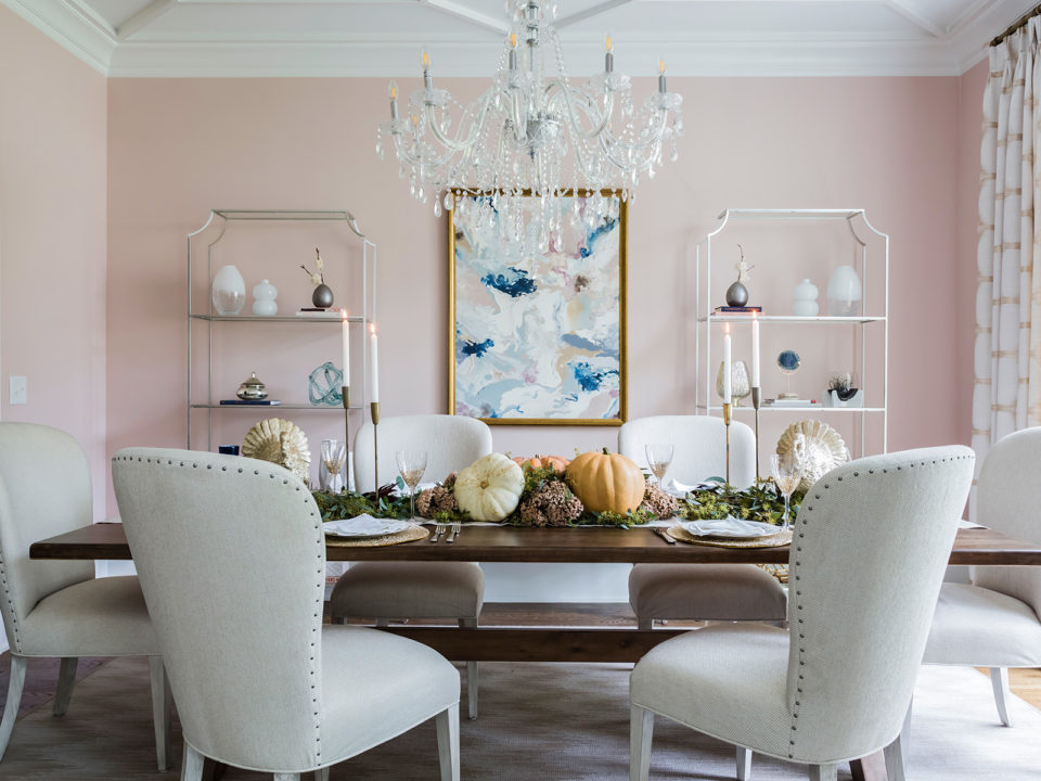
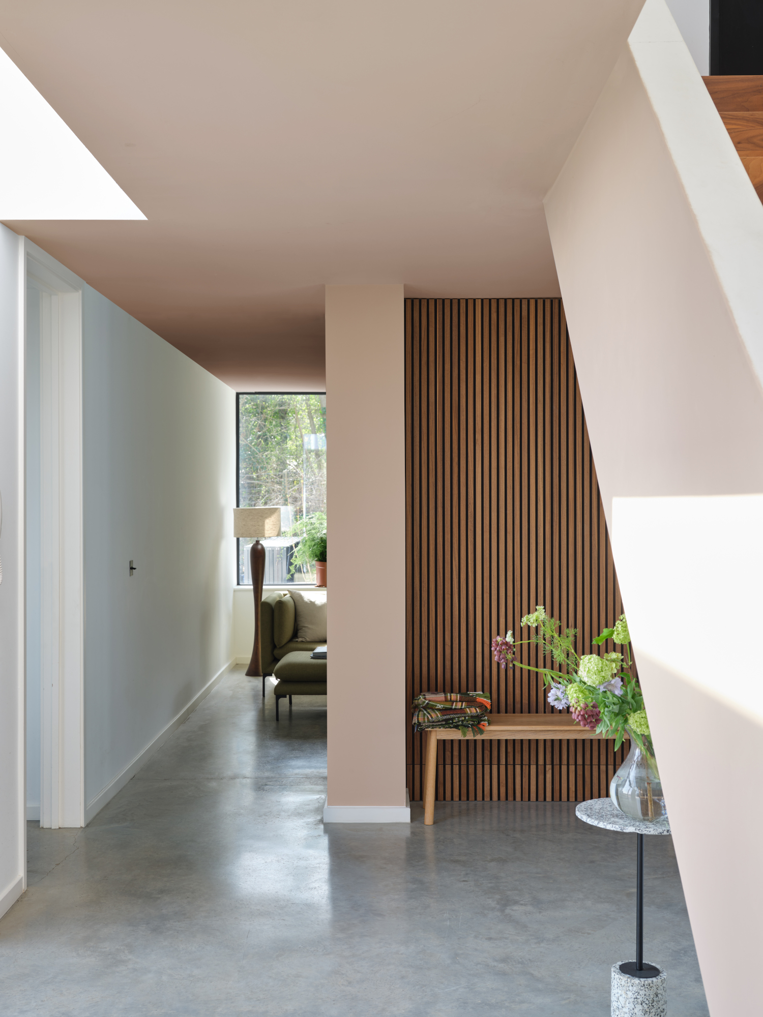
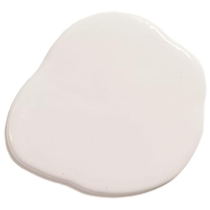
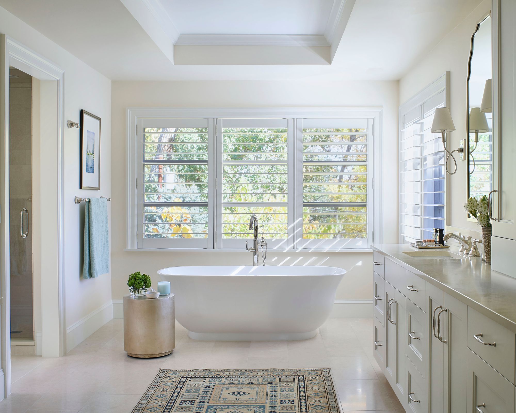
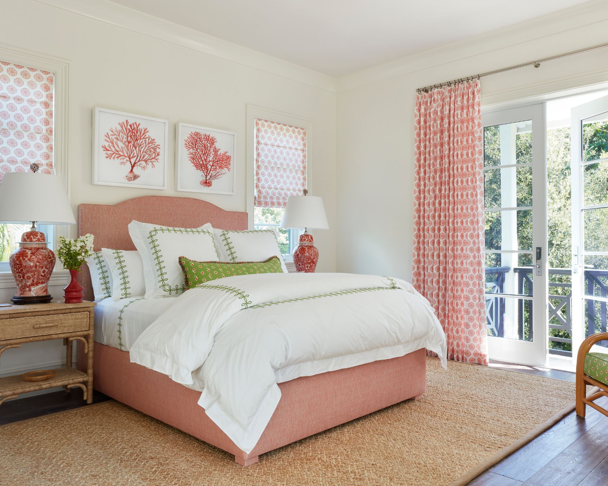
For white paints, Lewis recommends Farrow & Ball Wevet for crisp, contemporary spaces due to its translucent quality and gray undertones, suggesting painting trim the same color for a cohesive look. Dunn-Edwards Milk Glass is another creamy white choice, ideal for pairing with earthy tones and warm wood accents, though she advises against its use in rooms where green or blue reflections might occur. Farrow & Ball Wimborne White is described as a moody white, suitable for Spanish-style homes or spaces desiring a sense of history, but less so for modern homes or rooms lacking natural light. Benjamin Moore Chantilly Lace, a linen-like hue, is perfect for a cozy farmhouse aesthetic, brightens dark spaces with its green and gray hints, but might not be ideal for bathrooms with mirrors. Dunn-Edwards Warm White is suggested for millwork due to its slight luster in velvet or satin sheen, which helps mask imperfections while offering contrast.
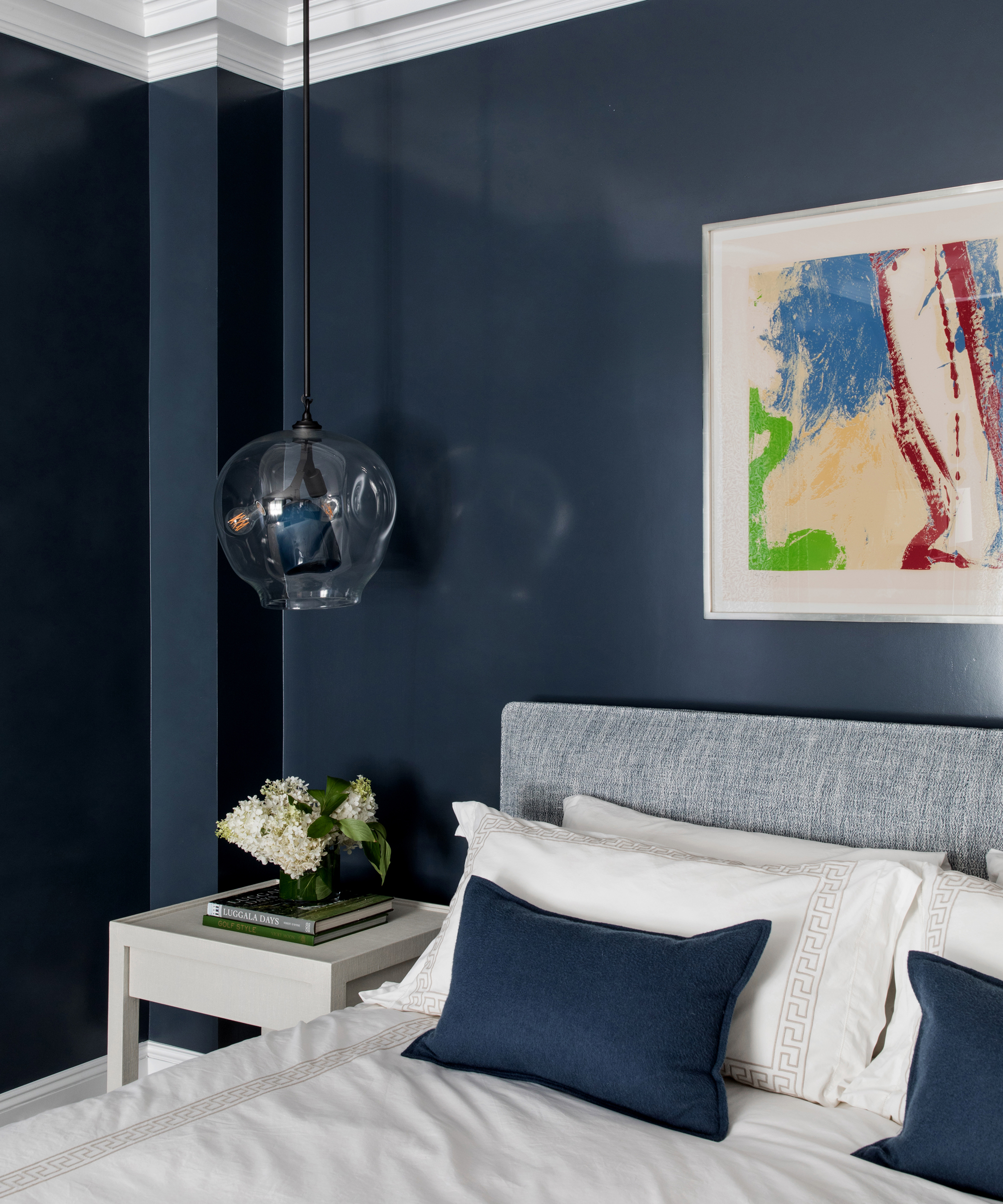
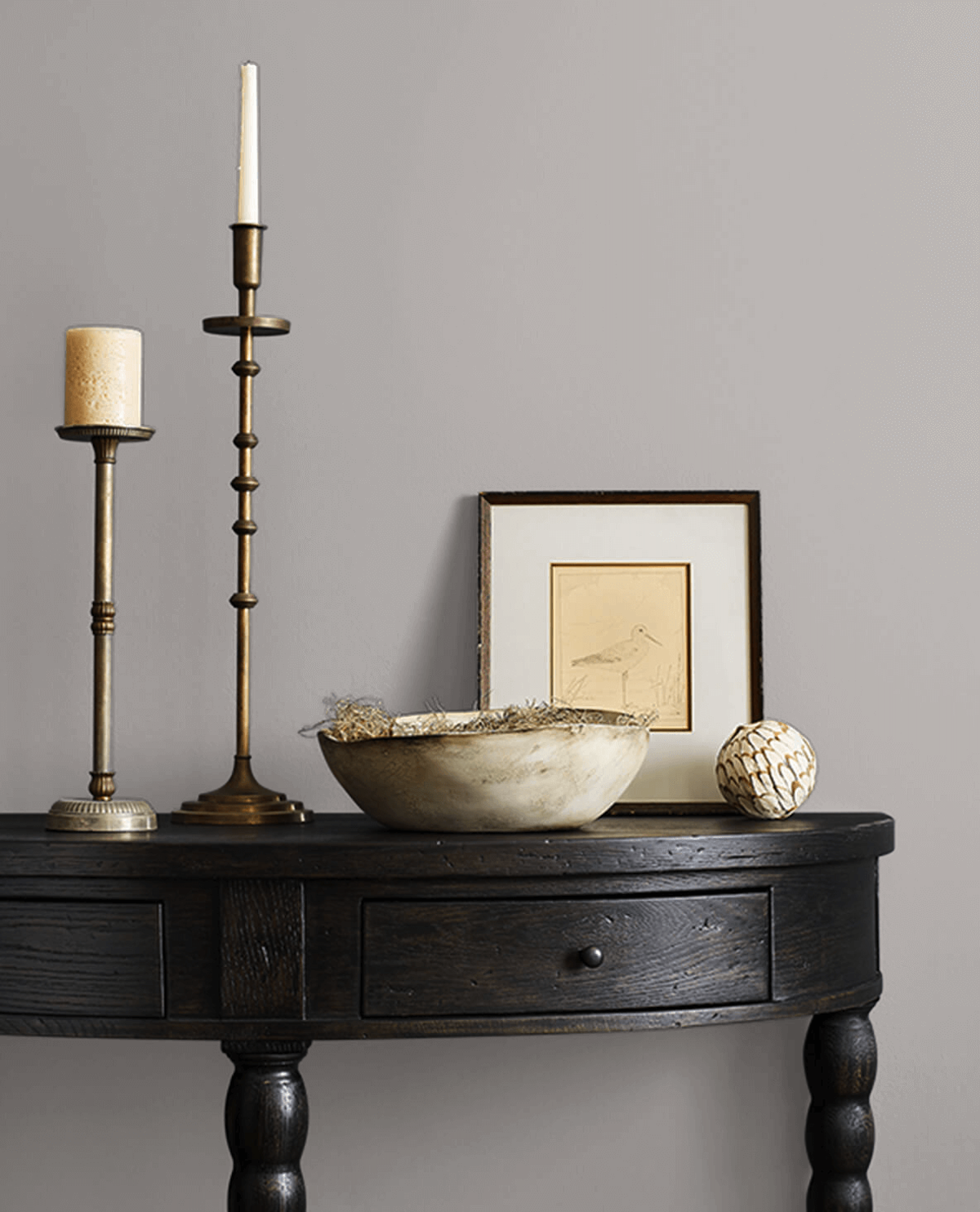
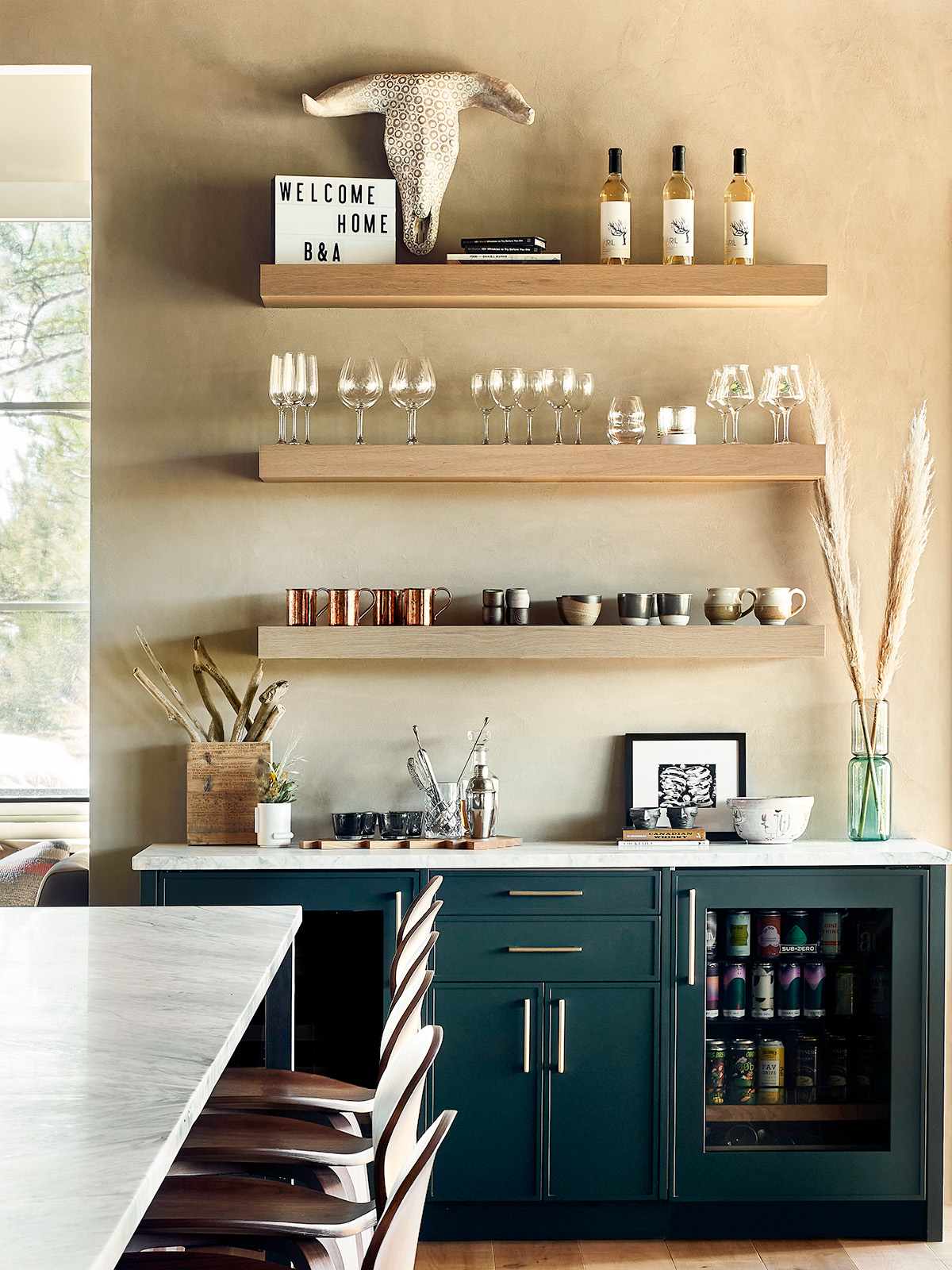
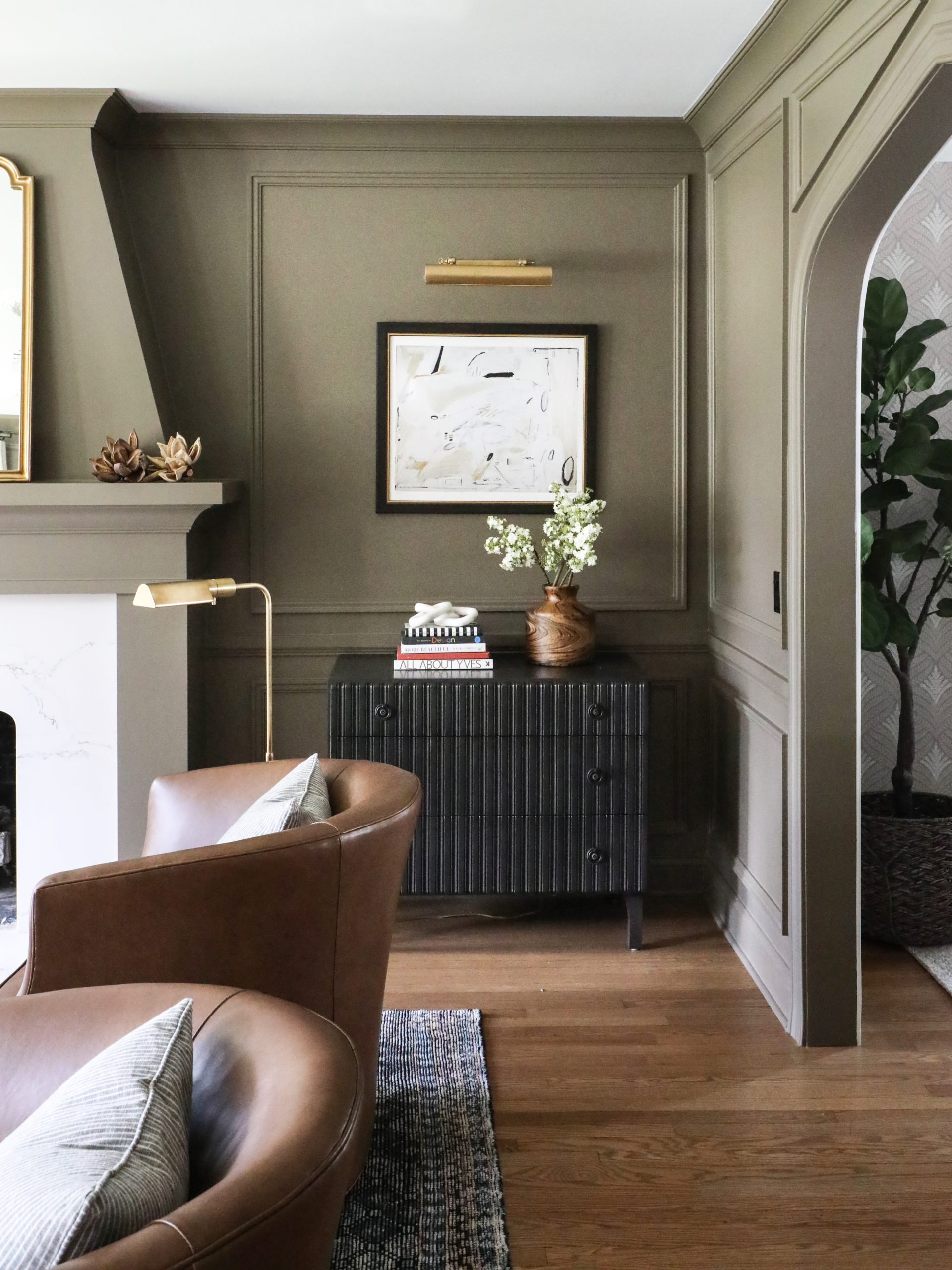
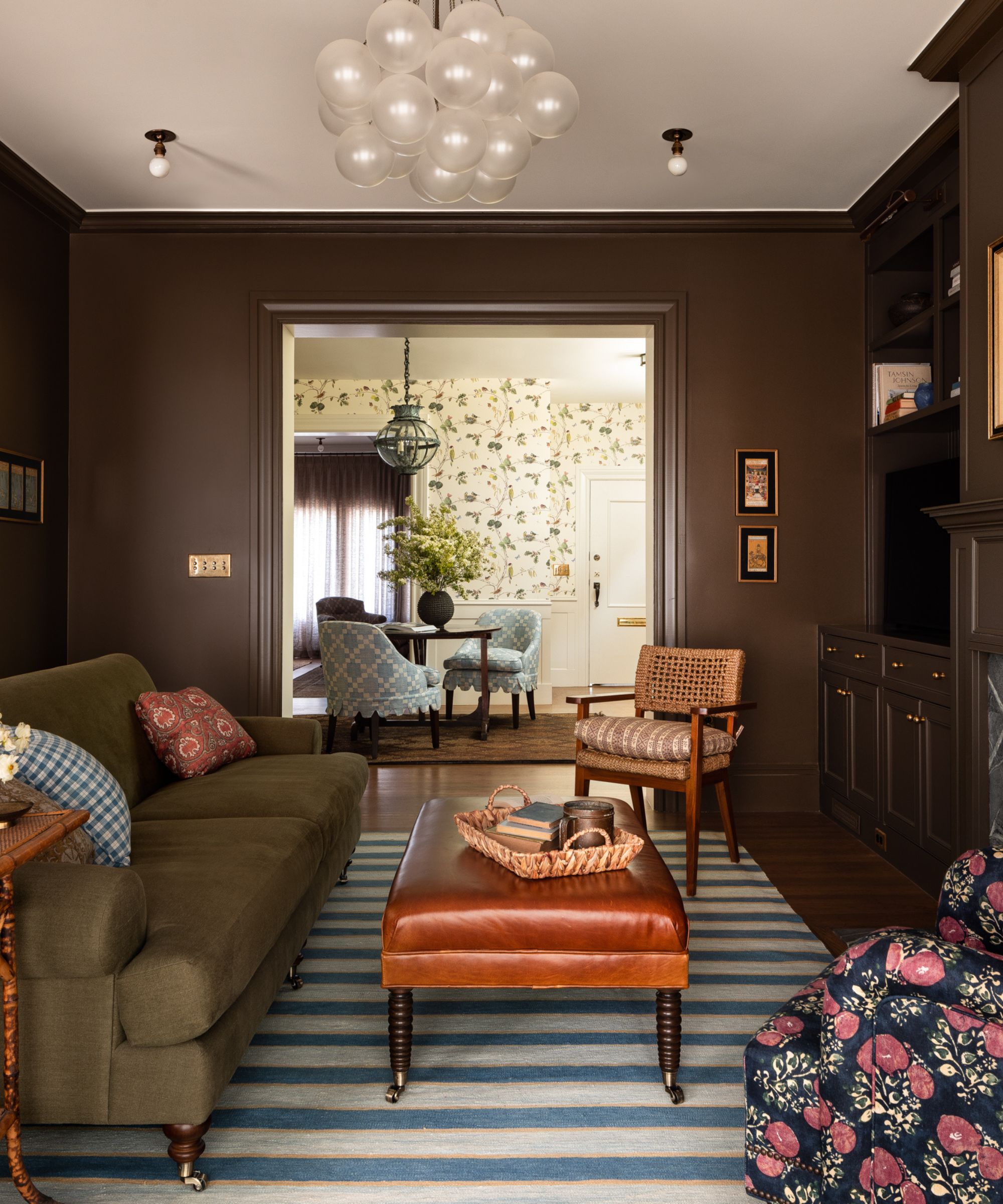
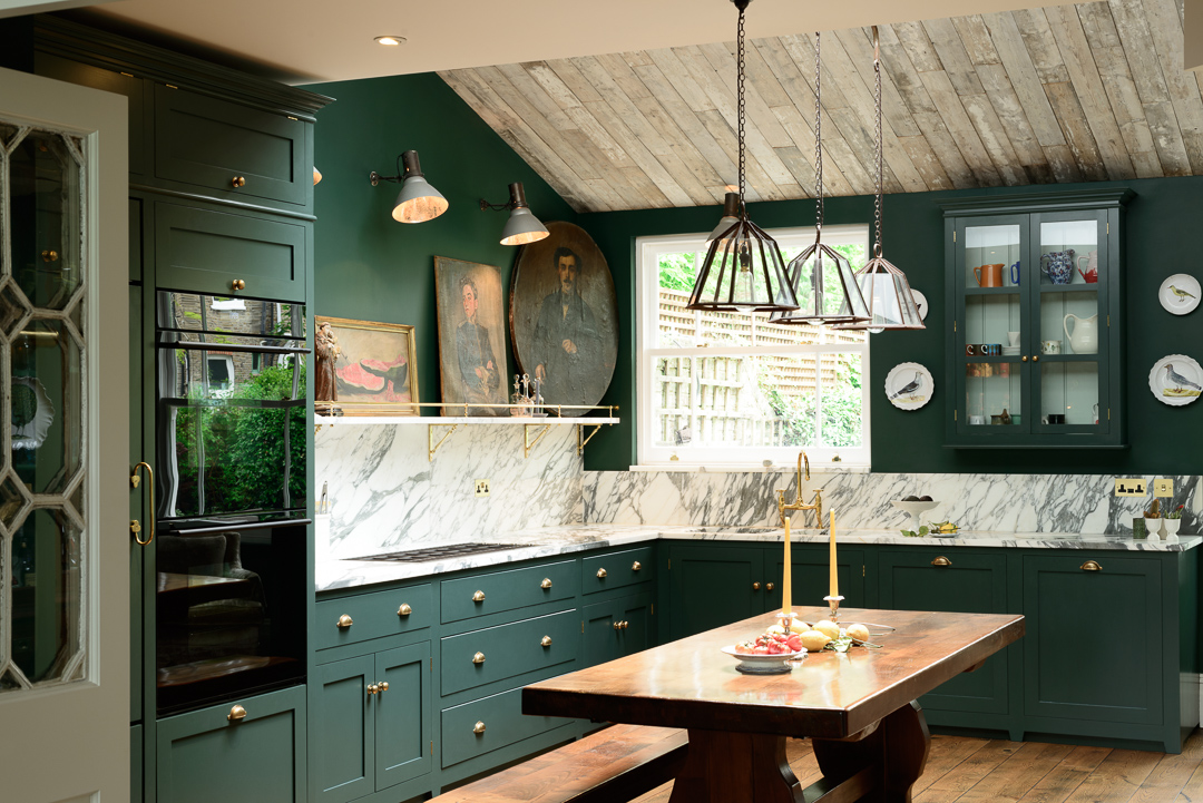
In the category of dark paints, Sherwin-Williams Green Black is presented as an alternative to bold black, offering depth and drama with a green undertone, perfect for front doors or kitchen cabinets. Portola Paints Nitty Gritty, a smoky, dusted green with a Roman Clay finish, is recommended for adding rustic texture to powder rooms or children's bedrooms. Dunn-Edwards Black Pool is a versatile color that appears black, dark navy, and even green in different lighting, making it suitable for library millwork or bathroom vanities. Farrow & Ball Down Pipe, a daring blue-black and gray blend, is considered universally appealing for cabinetry or exteriors. Portola Paints Maison, a deep gray with subtle blue hints and a textural clay finish, is ideal for creating a cool cement look, particularly in powder rooms.
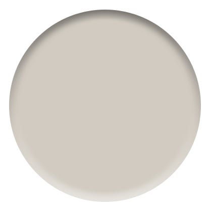
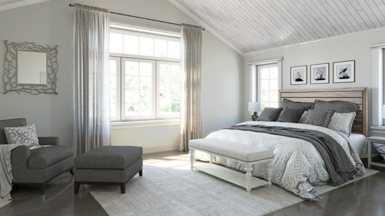
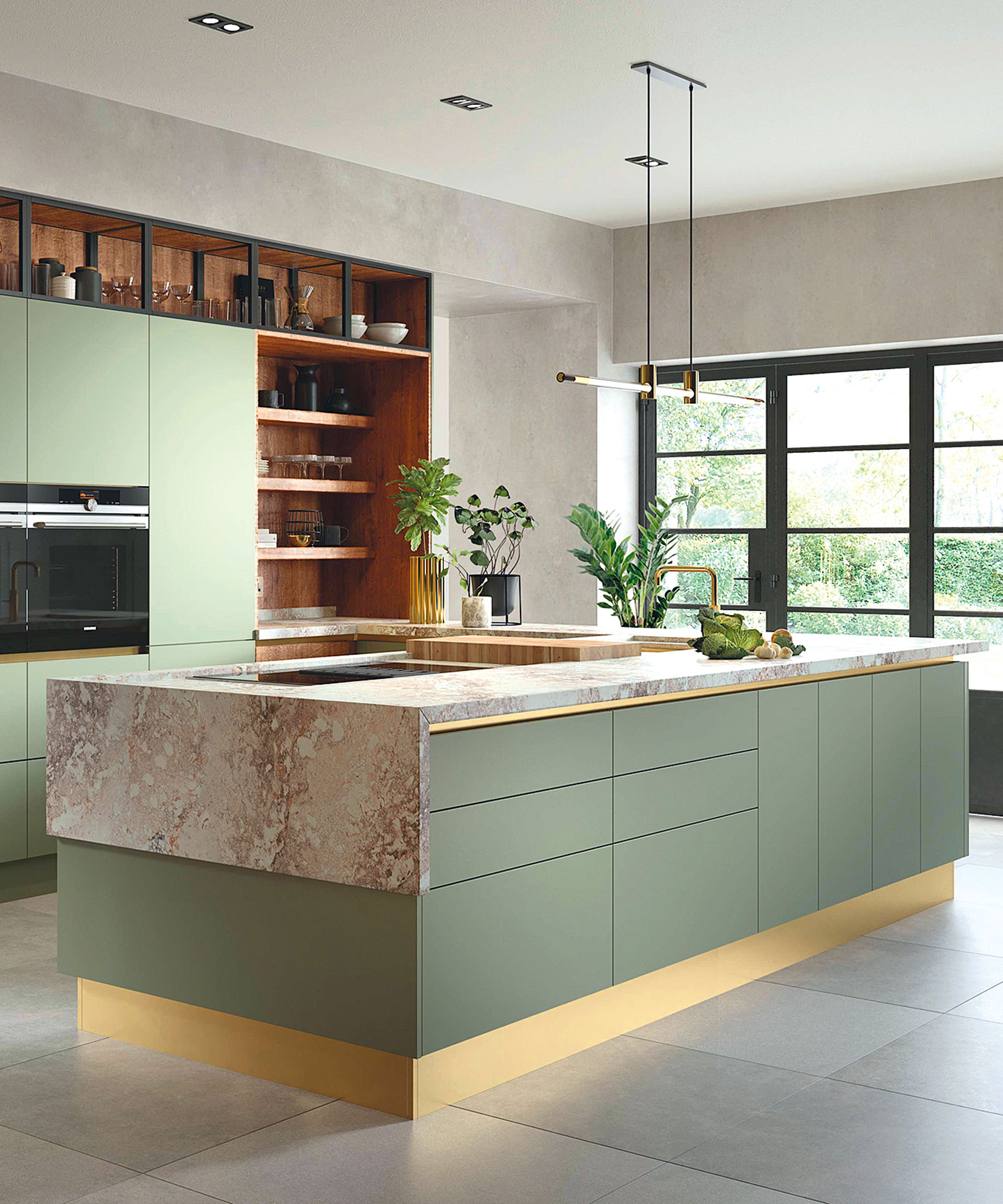
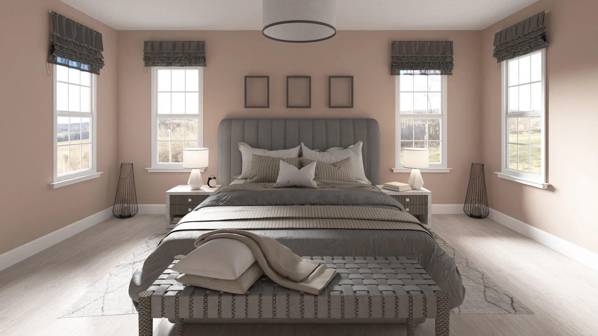
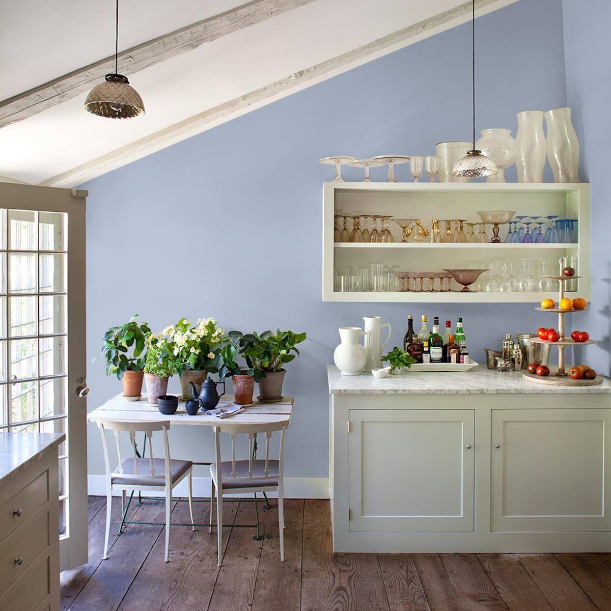
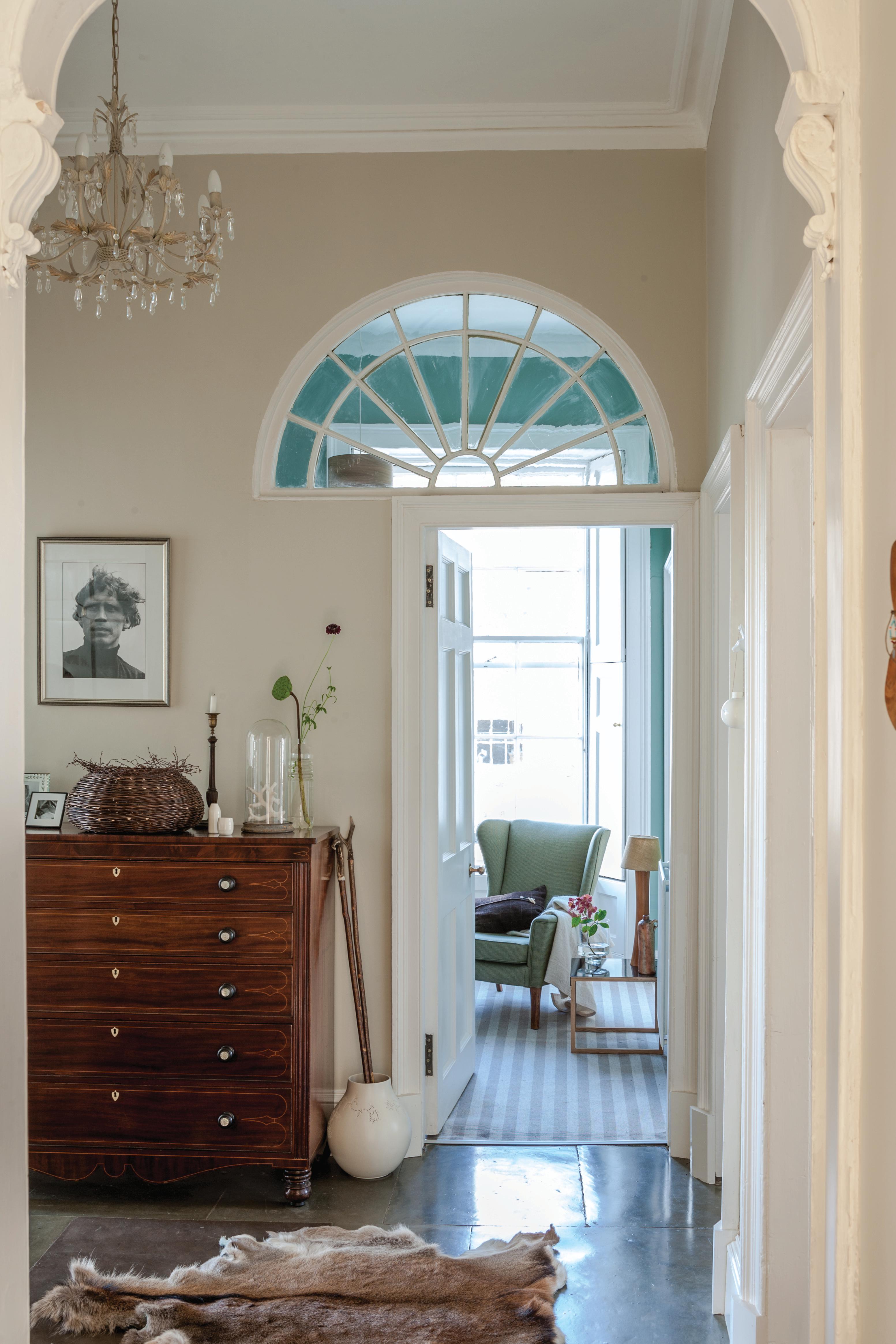
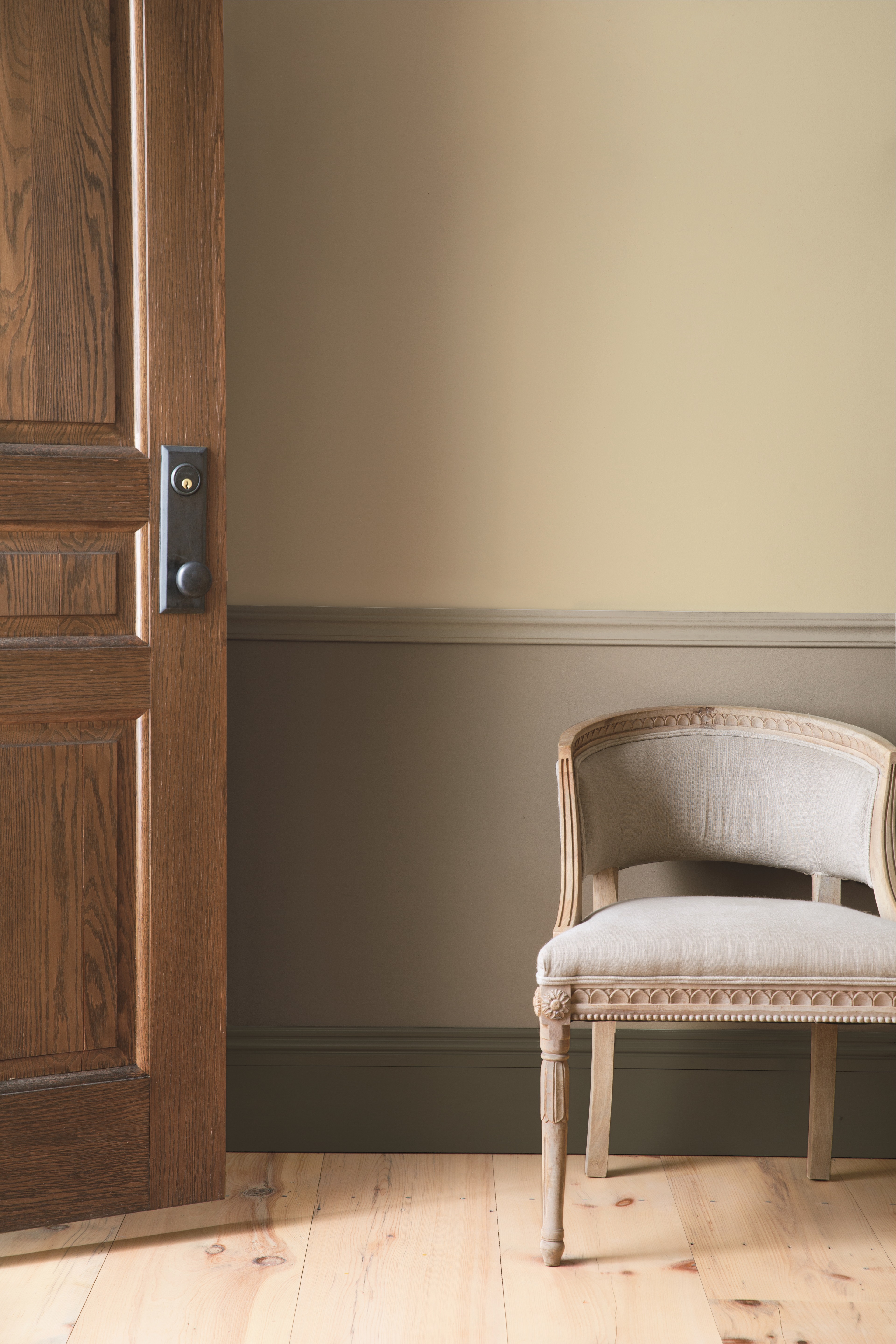
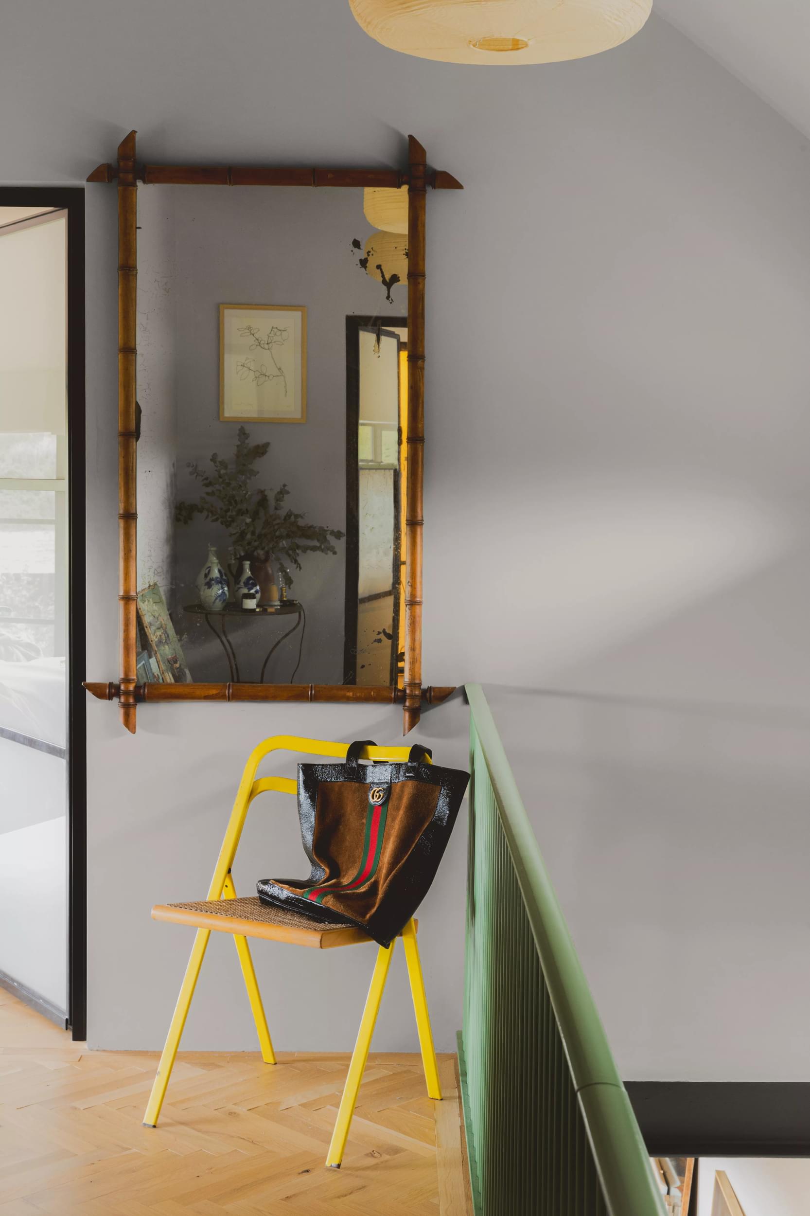
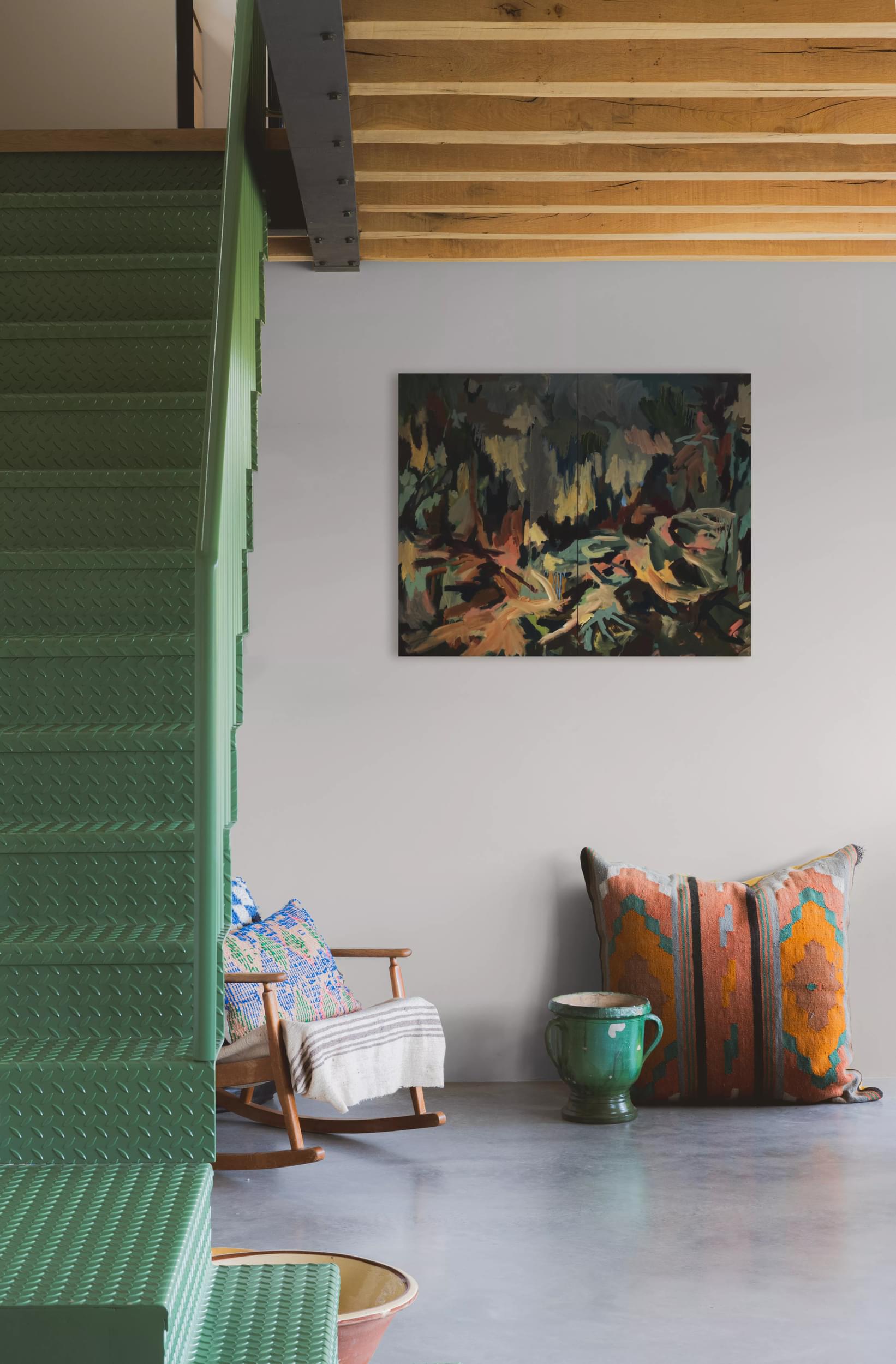
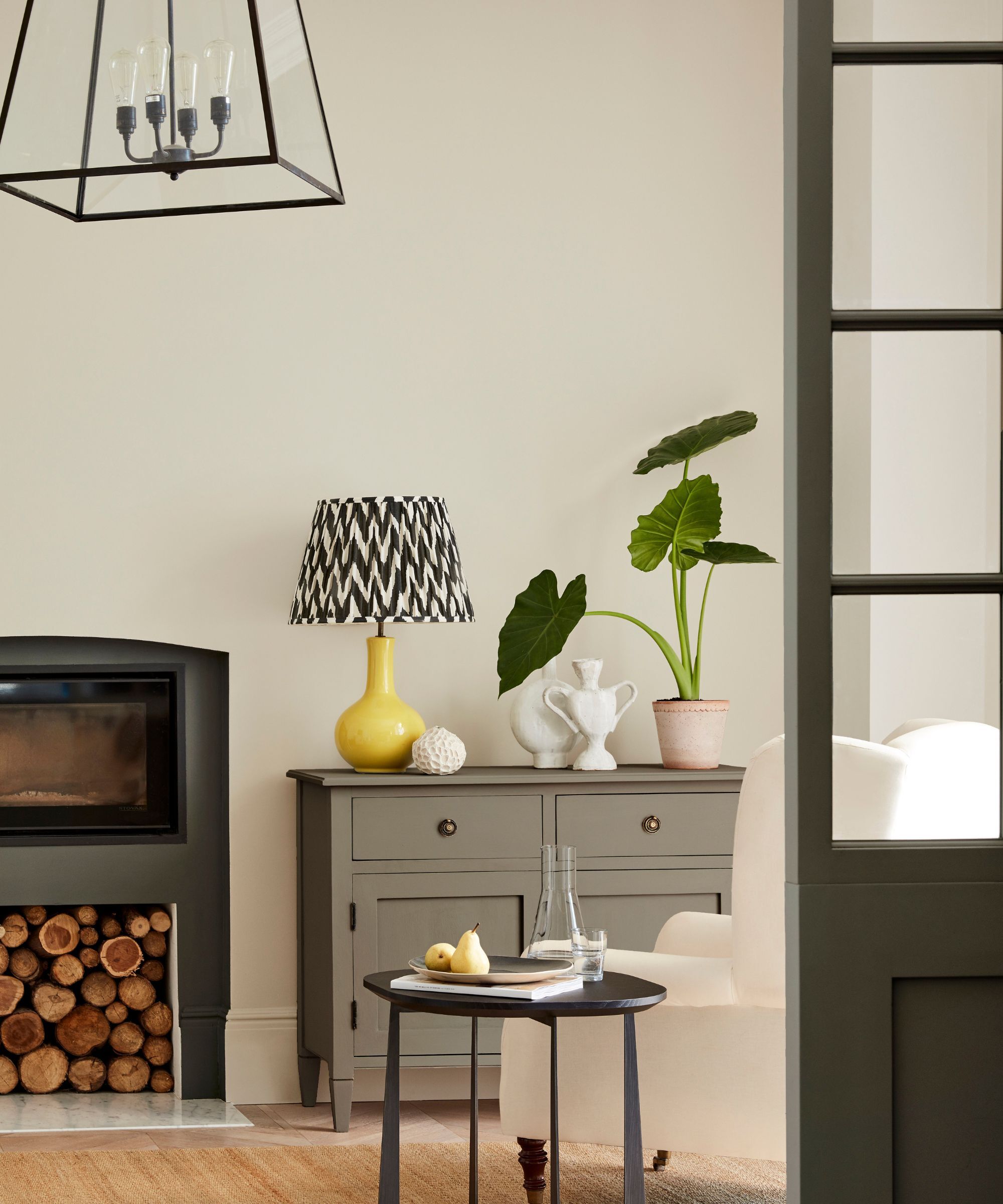
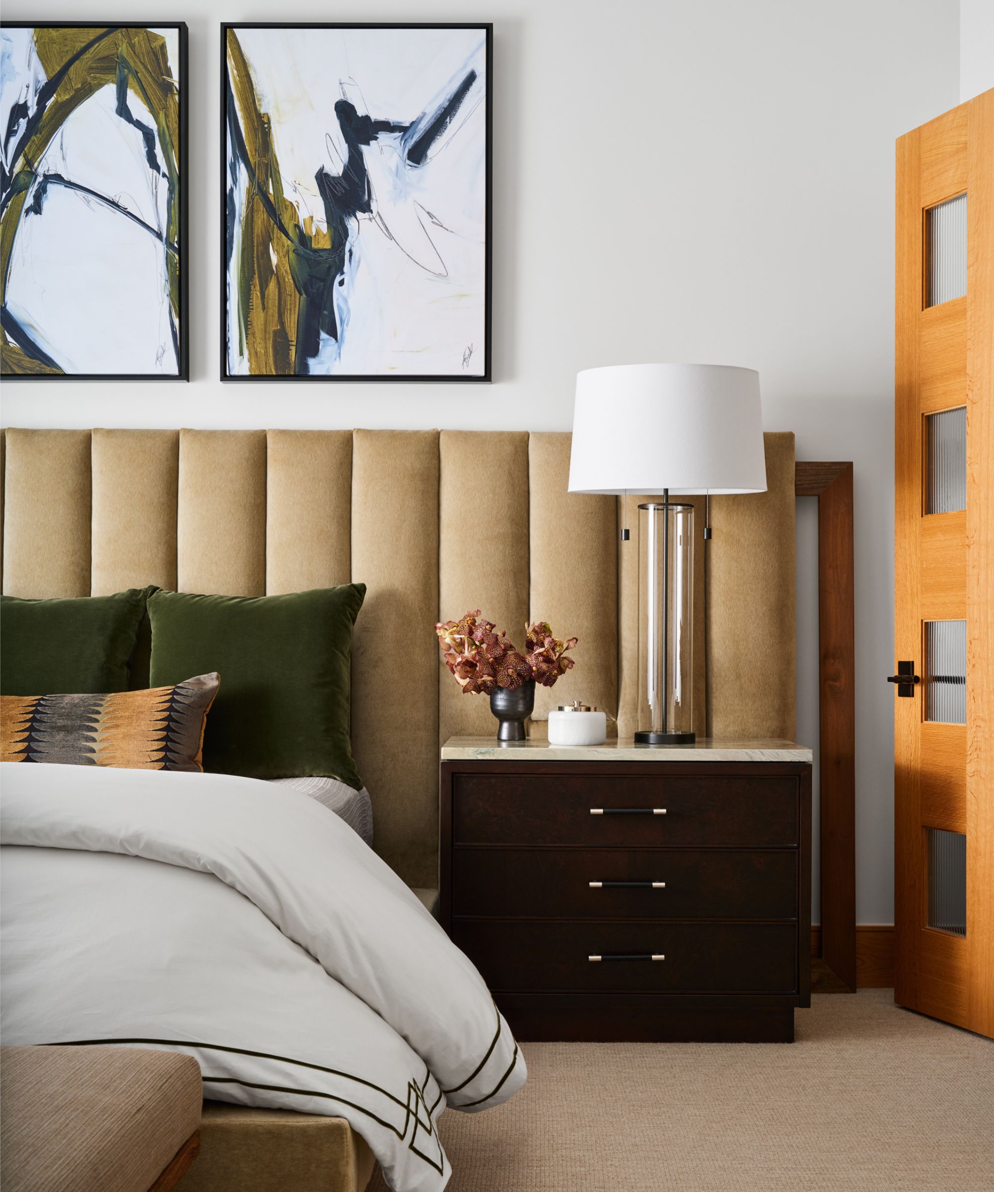
For in-between neutrals, Dunn-Edwards Midnight Spruce, a dark forest green with an olive hint, is a classic choice for cabinetry or furniture. Farrow & Ball Manor House Gray is a true gray that maintains its hue regardless of lighting conditions, making it a reliable option for various decor styles. Farrow & Ball Purbeck Stone, a calming midtone gray, evokes British design vibes and is suitable for traditional homes. Portola Paints Revere, a greige with blue and green hints and a plaster-like finish, adds texture and depth. Finally, Farrow & Ball Hague Blue, a deep blue with green undertones, provides a glamorous and timelessly moody statement. Lewis also provides general tips for selecting paint, emphasizing the importance of considering undertones, avoiding primary hues for bold choices, and assessing how natural and artificial light interact with the chosen finish.
#NeutralPaintColors #InteriorDesign #AmberLewis #PaintSelection #HomeDecor #ColorTheory #PaintFinishes #DesignTips #HomeRenovation #NeutralPaintColors #InteriorDesign #AmberLewis #PaintSelection #HomeDecor #ColorTheory #PaintFinishes #DesignTips #HomeRenovation
0 comment in total
 No comments yet
You may also like
35 Neutral Paint Colors Interior Designers Can't Get Enough Of

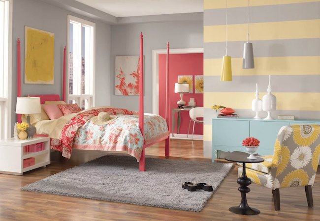
The Most Popular Paint Colors in America


8 Paint Color Trends You'll ACTUALLY Want to Live With in 2026, According to Designers

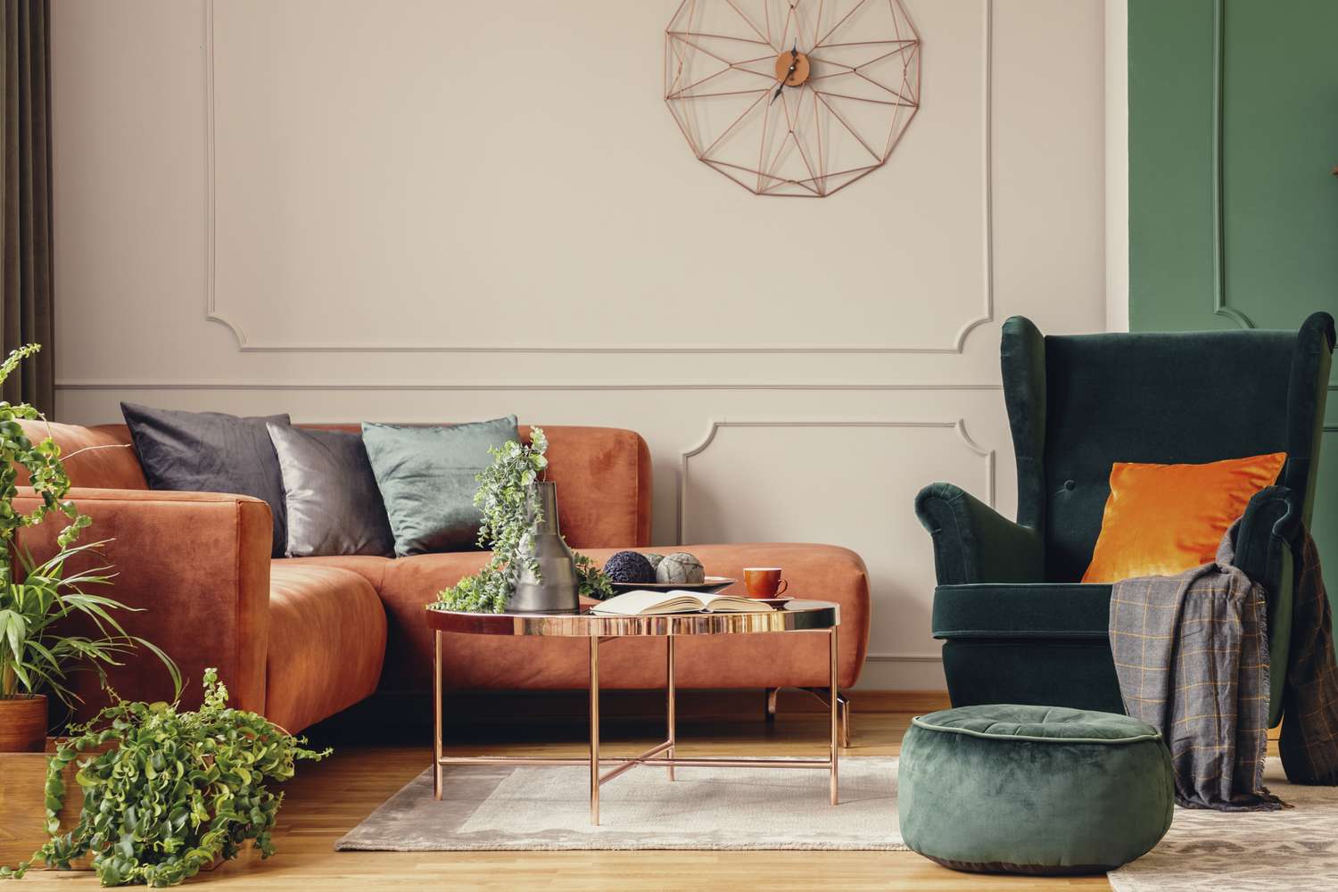
5 Timeless Paint Colors That Go With Absolutely Everything, According to Color Experts

The All-Time Favorite Light Neutral Paints Of HGTV Stars
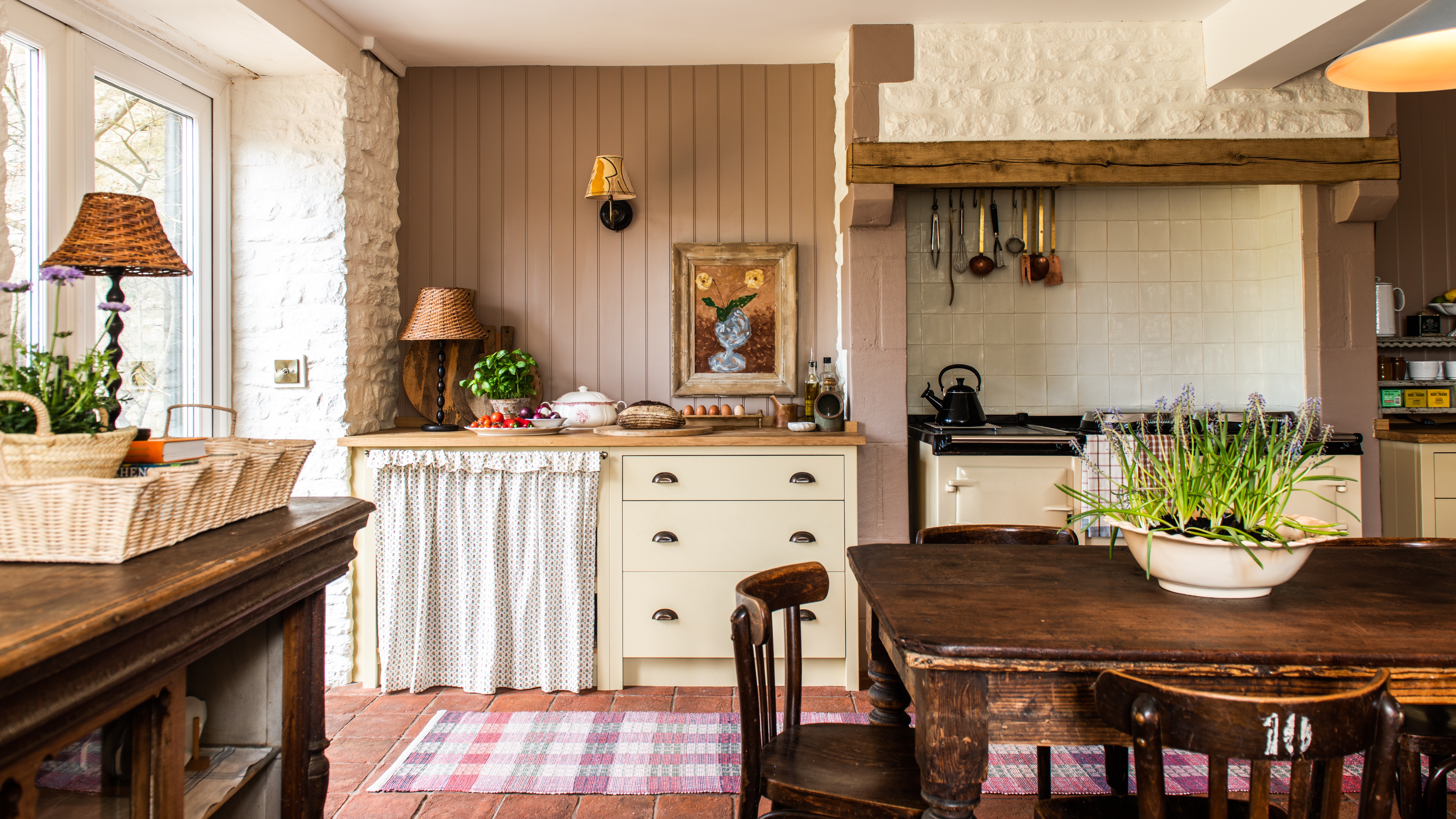
Creamy neutral paint colours are back — just don’t call it magnolia
Bored With White Walls? Try One of These Designer-Recommended Neutral Paints Instead

Is Little Greene's Portland Stone the perfect neutral paint?

Real estate agents reveal which room colors sell a house the fastest – for the highest price
We Asked Designers Which Living Room Paint Colors People Regret Most—And We're All Guilty

Beige-grey – the timeless paint color perfect for a barely-there backdrop
White vs Cream: designers weigh in on these enduring neutrals
12 Neutral Paint Colors That Will Look Beautiful in Every Room
How to Pick the Best Paint Colors for Every Space in Your Home

8 Paint Mistakes That Make Your House Look Dingy (and How to Fix Them)
The biggest paint trends of 2025 – 17 stylish ways to decorate with paint, according to designers
The 20 Best Neutral Paint Colors for Your Home in 2025

The 3 Best Neutral Entryway Paint Colors to Set the Right Tone for a Sophisticated Home

Find your perfect neutral with COAT Paints' new Polite Palette

The Trendiest Neutral Of The Year Is A 2000s Classic—But Better