1/6
I'm a Color Expert — This Is How I Think You Should be Decorating with Blue
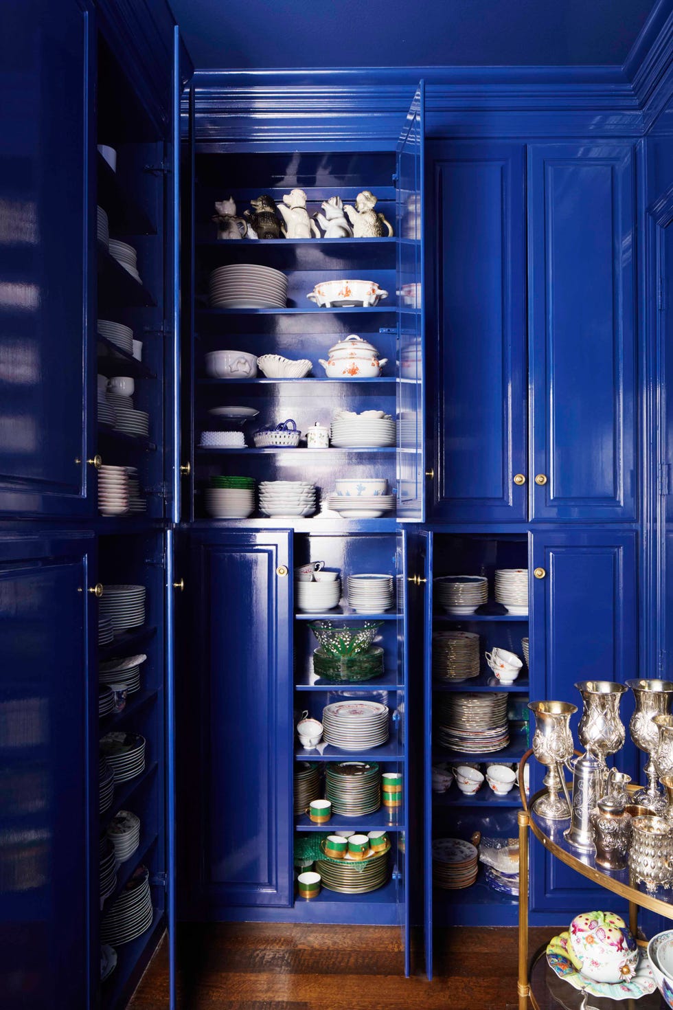
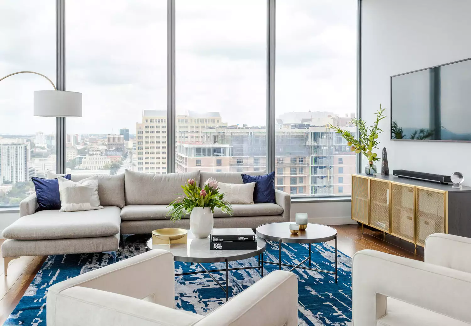
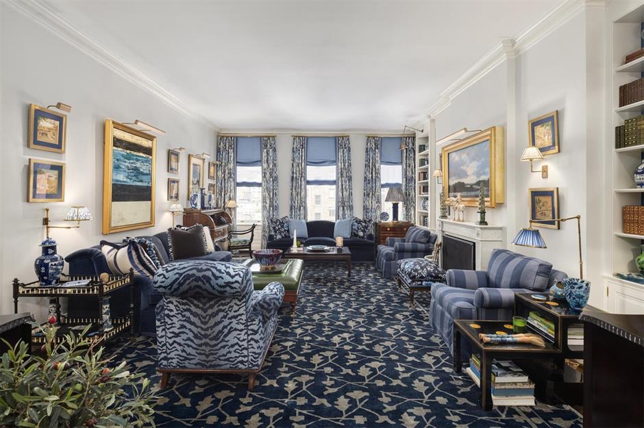
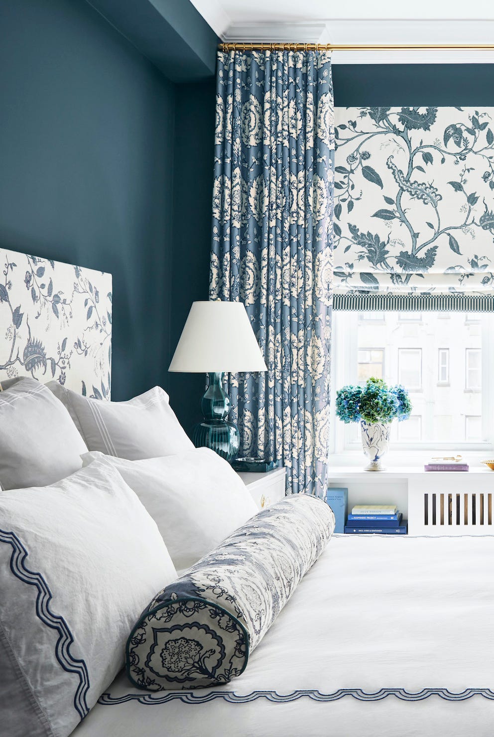
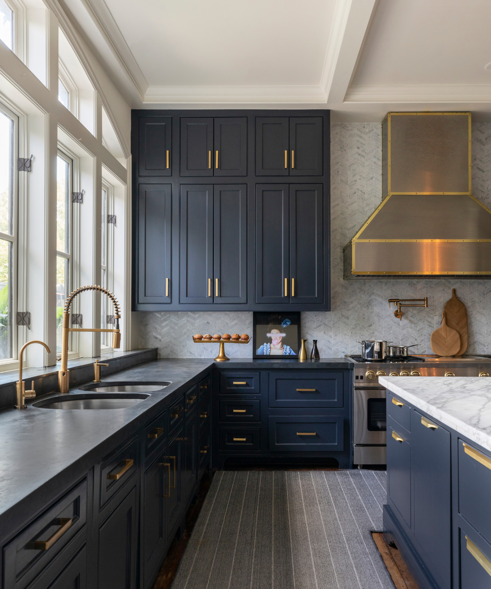
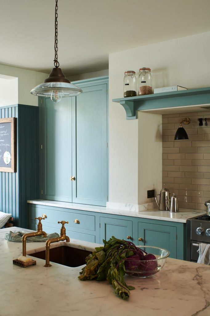

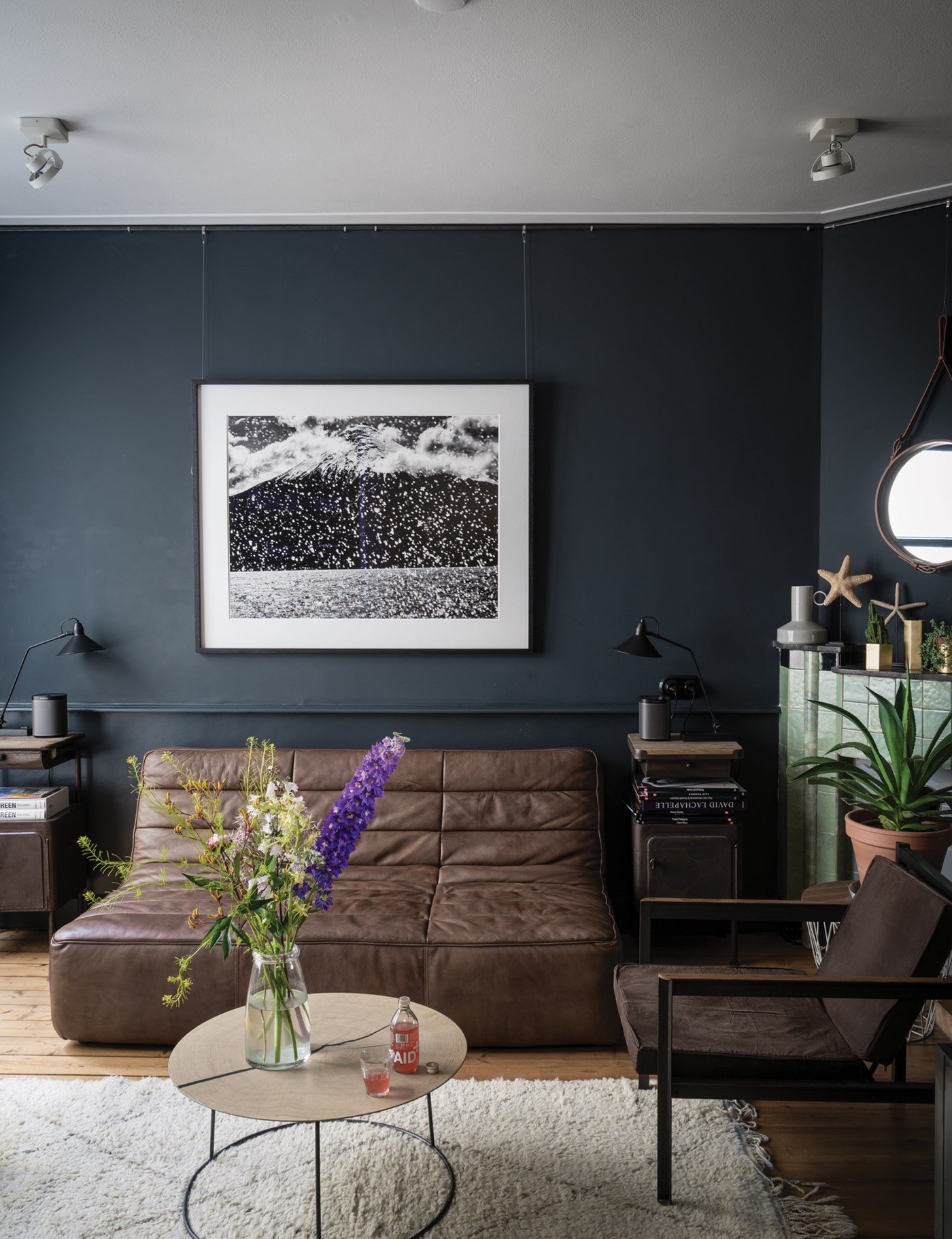
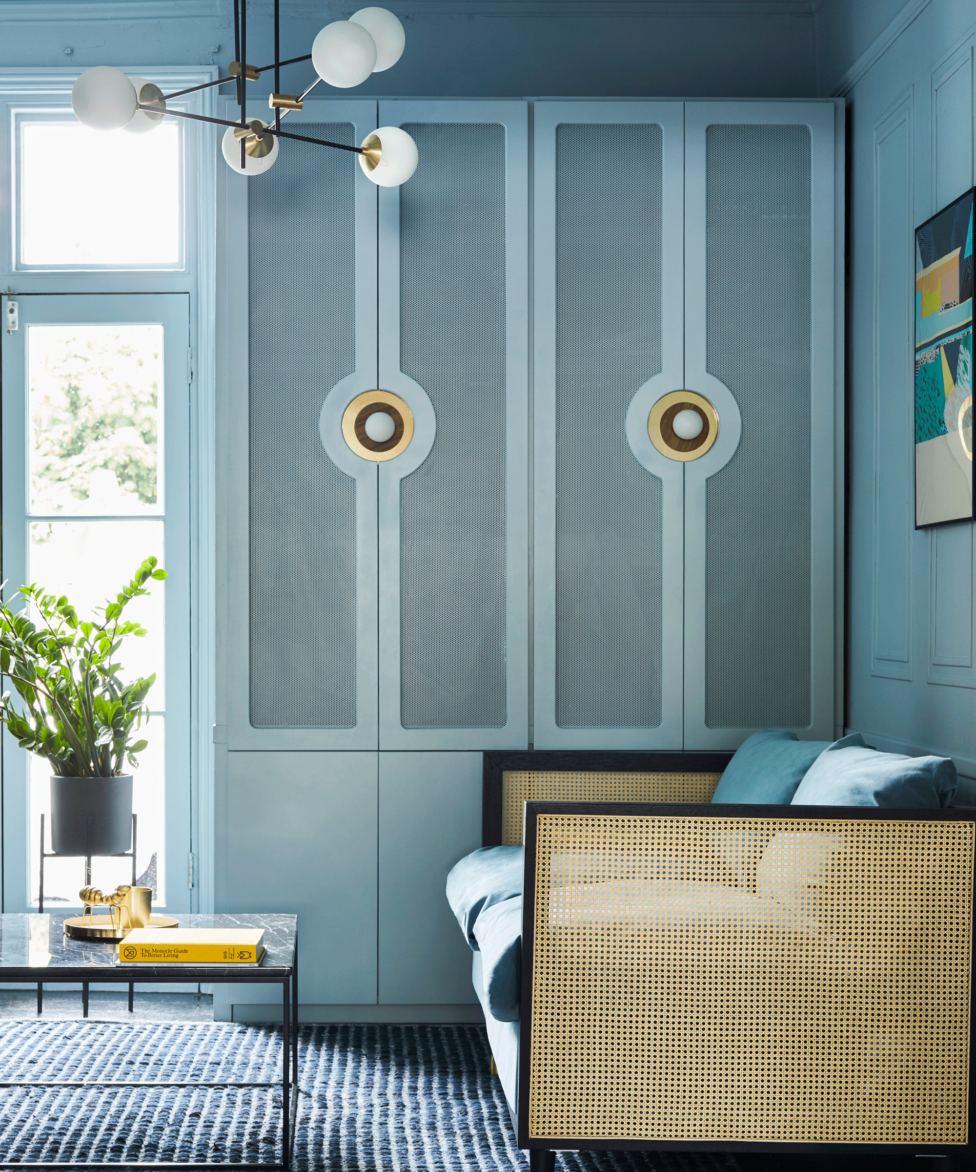
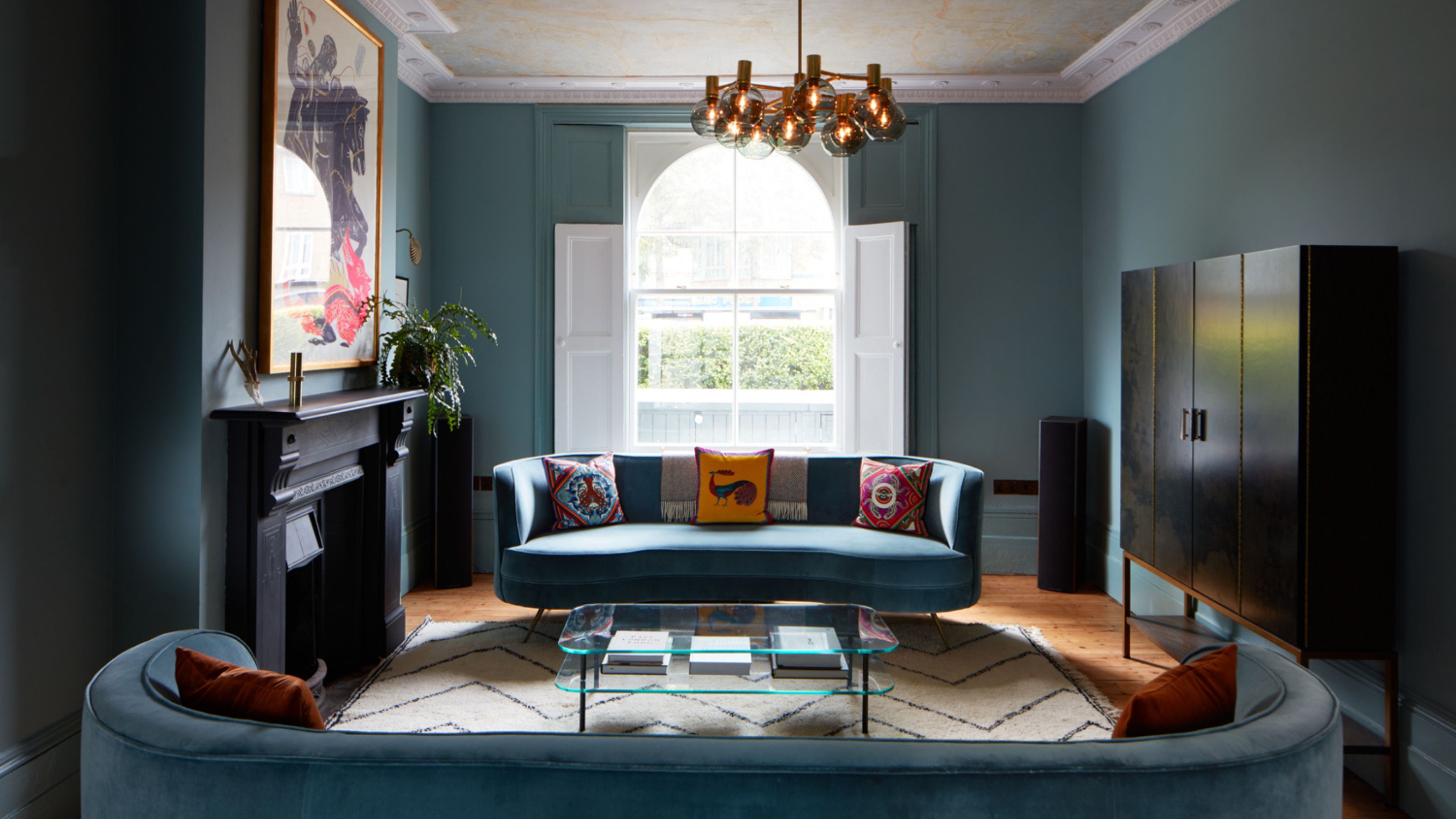
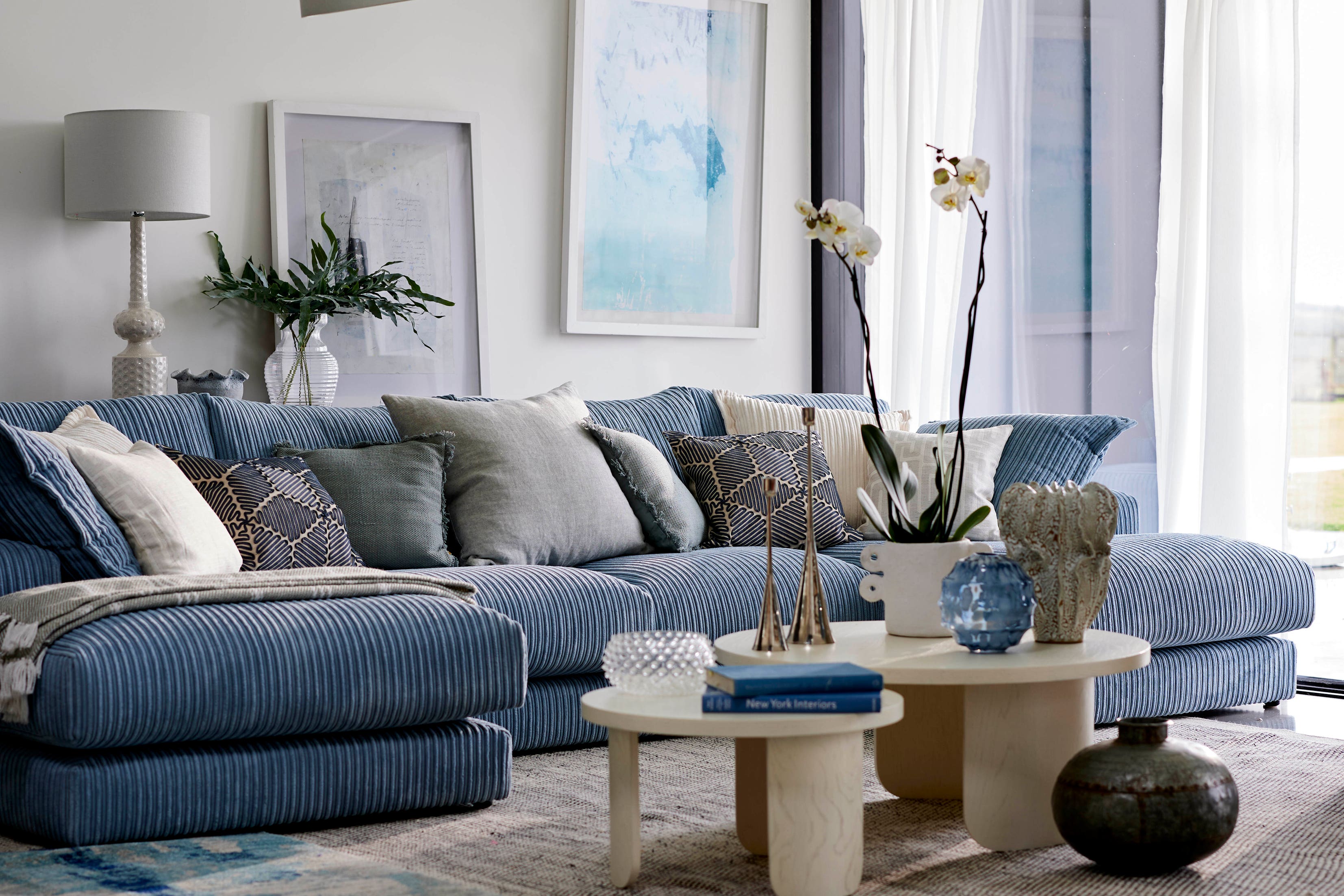
The article emphasizes the underestimated power of decorating with blue in home interiors, moving beyond outdated coastal themes and navy feature walls. Blue is a color deeply ingrained in our natural environment, often taken for granted despite its vast range and versatility. It evokes serenity, calm, and coolness, with a spectrum spanning from pale duck egg to deep navy, and vibrant cobalt to azure, offering a blue for every mood.
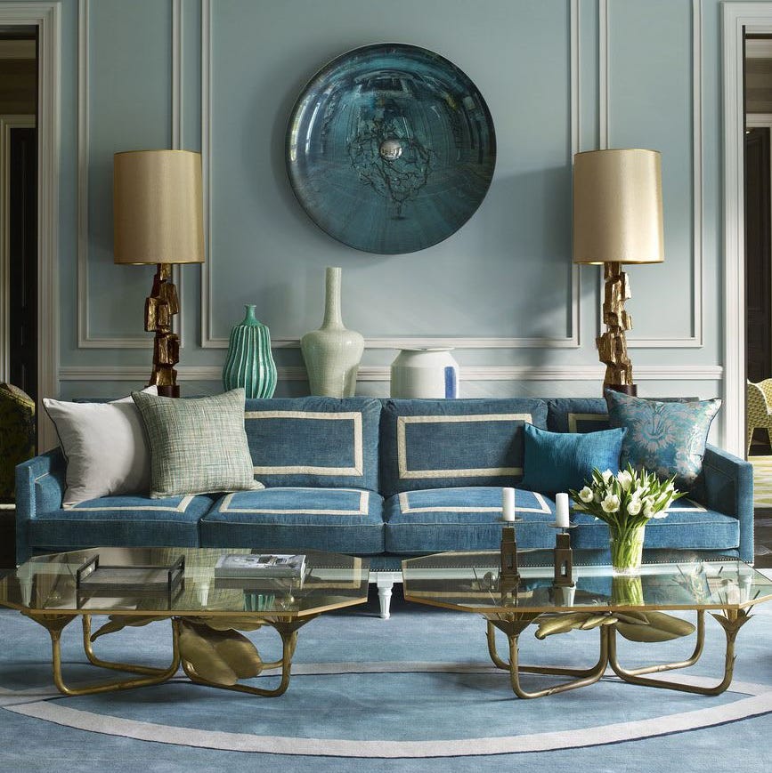
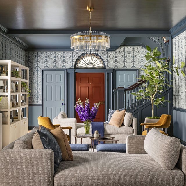
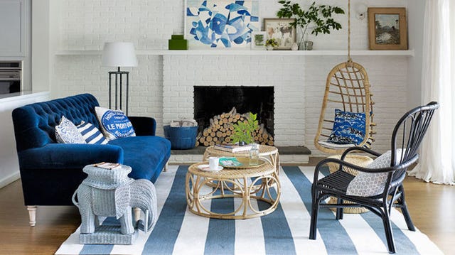
Historically, blue has been a reliable, almost neutral shade in decor. However, a contemporary approach is needed to unleash its full potential. The inherent link between blue and nature provides a meditative quality, evoking feelings of calm and expansiveness, similar to gazing at the ocean or sky. This makes blue one of the most adaptable color choices for interiors, capable of conveying both tranquility and tenacity across various styles, from joyful Swedish blues to opulent jewel tones. Alice Bettington, co-director of Golden Design, highlights blue's adaptability, noting its suitability for diverse interior moods and styles, and emphasizes its welcoming nature.
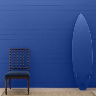
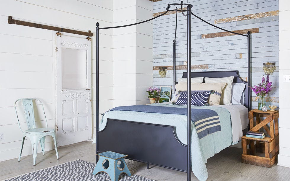
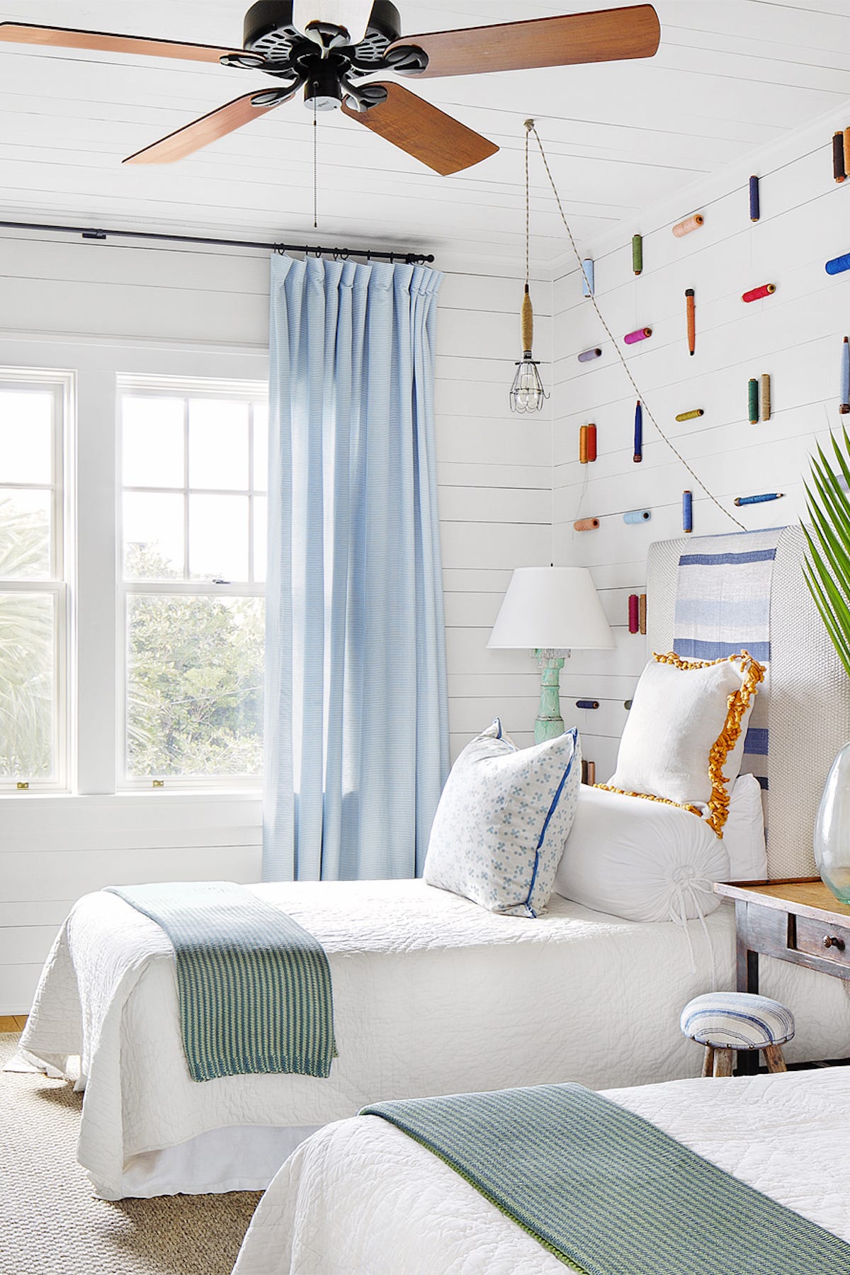
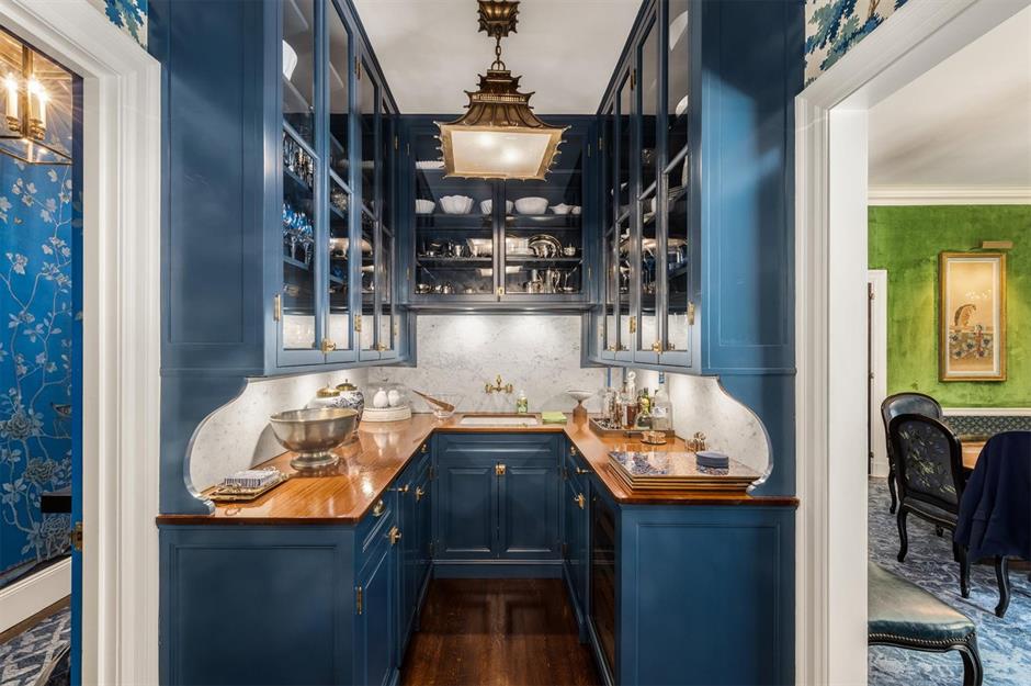
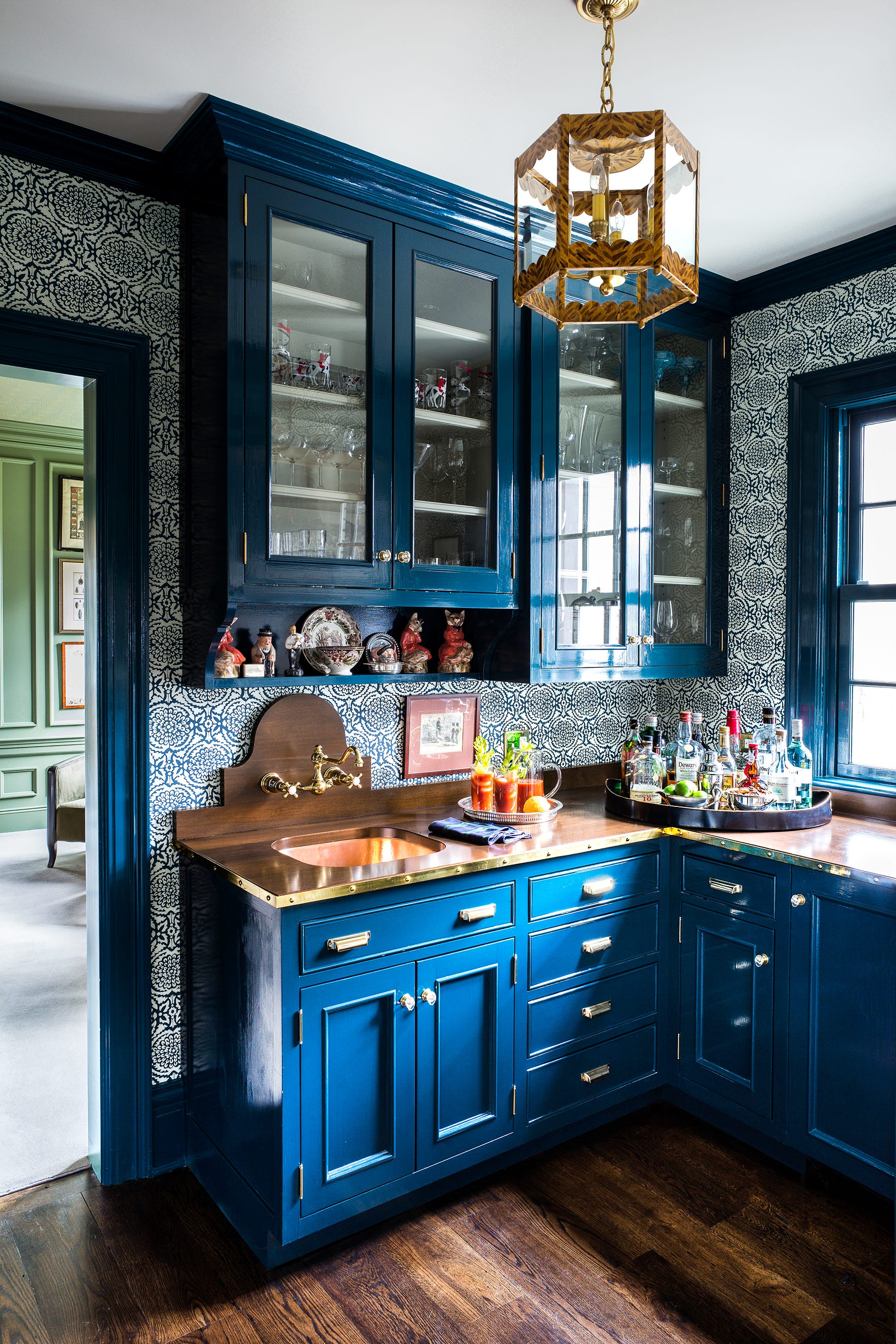
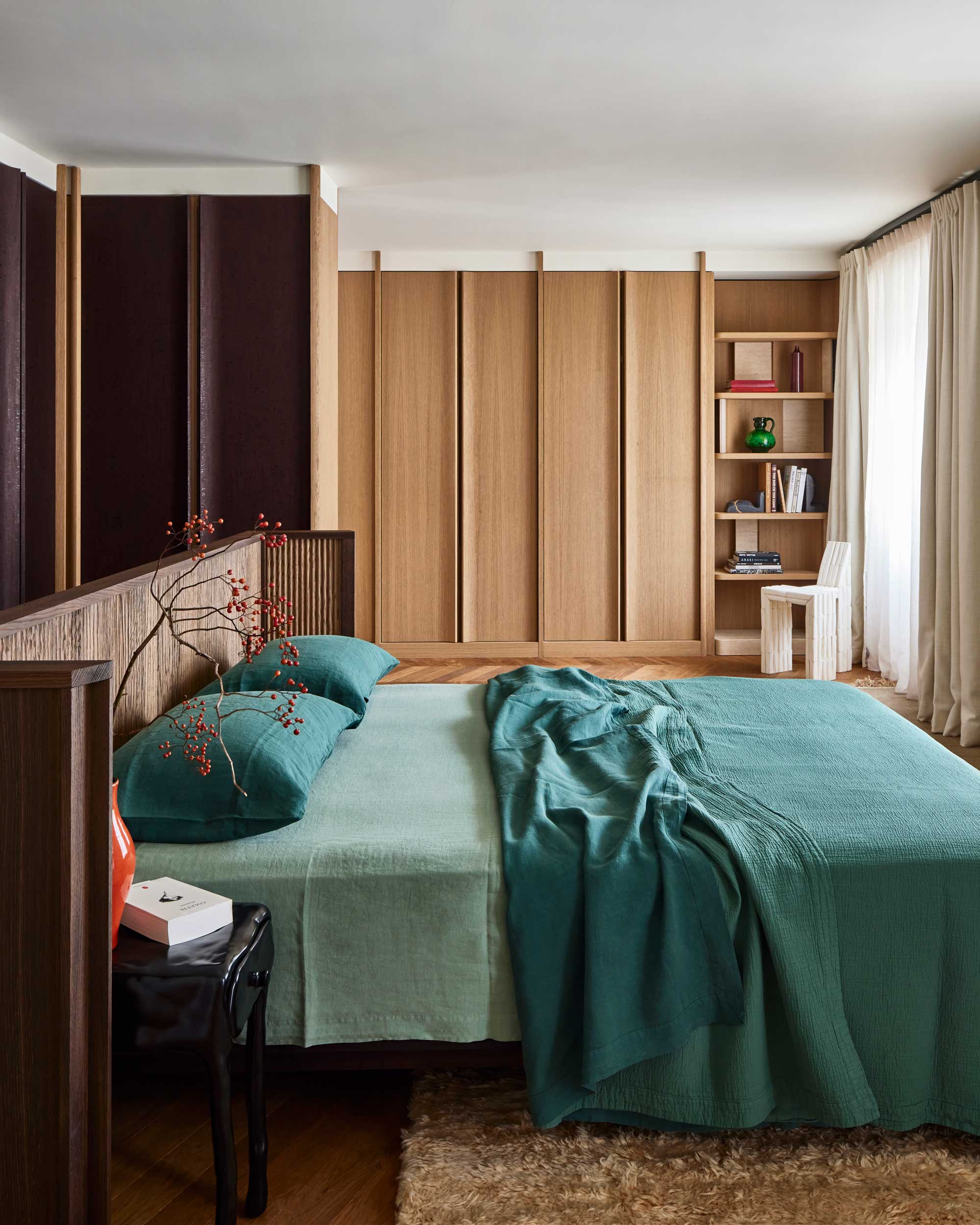
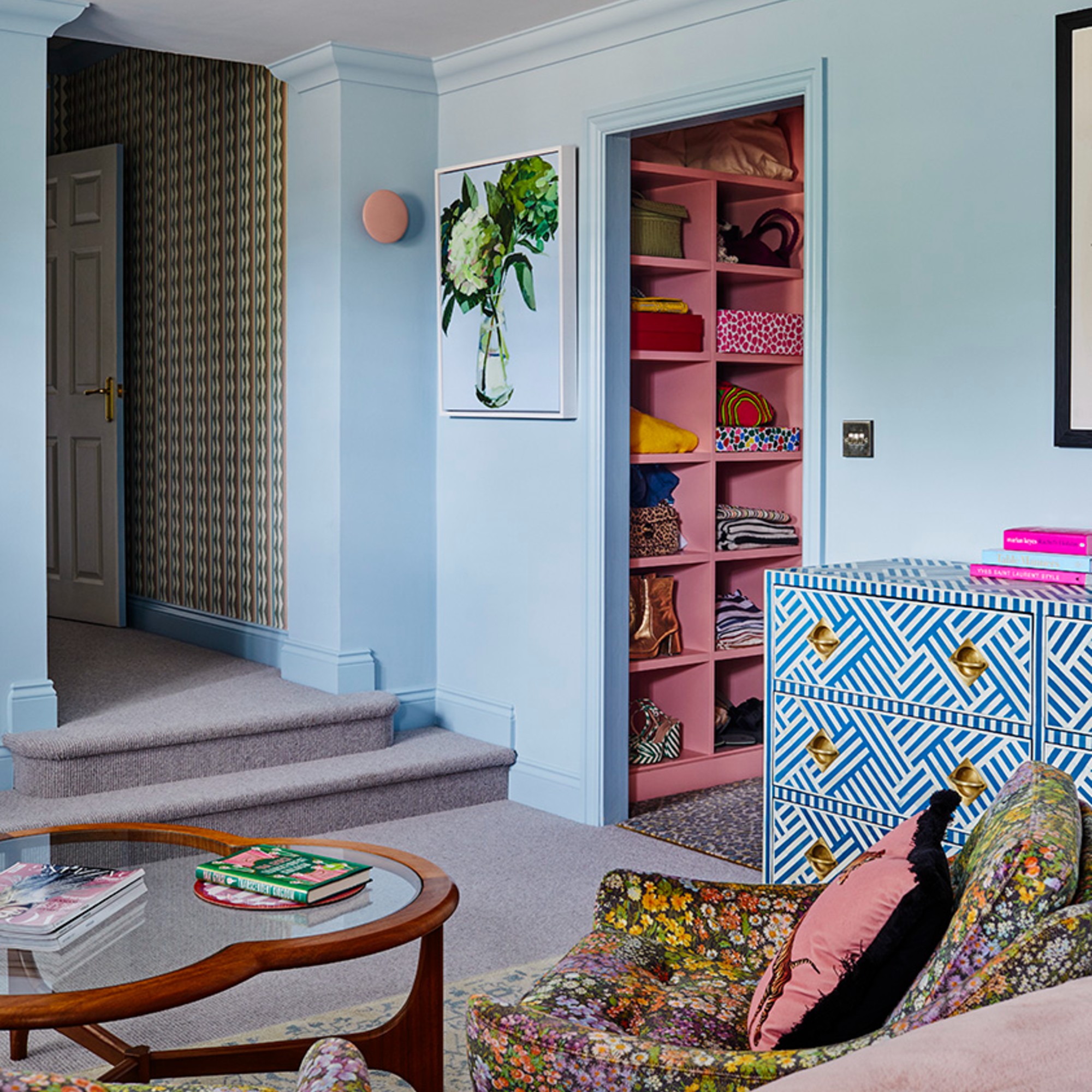
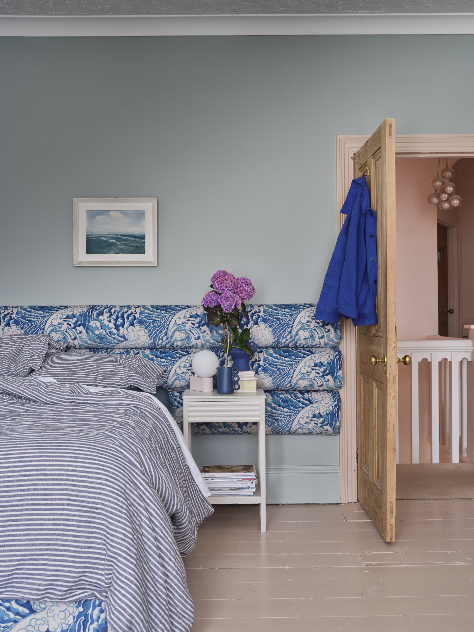
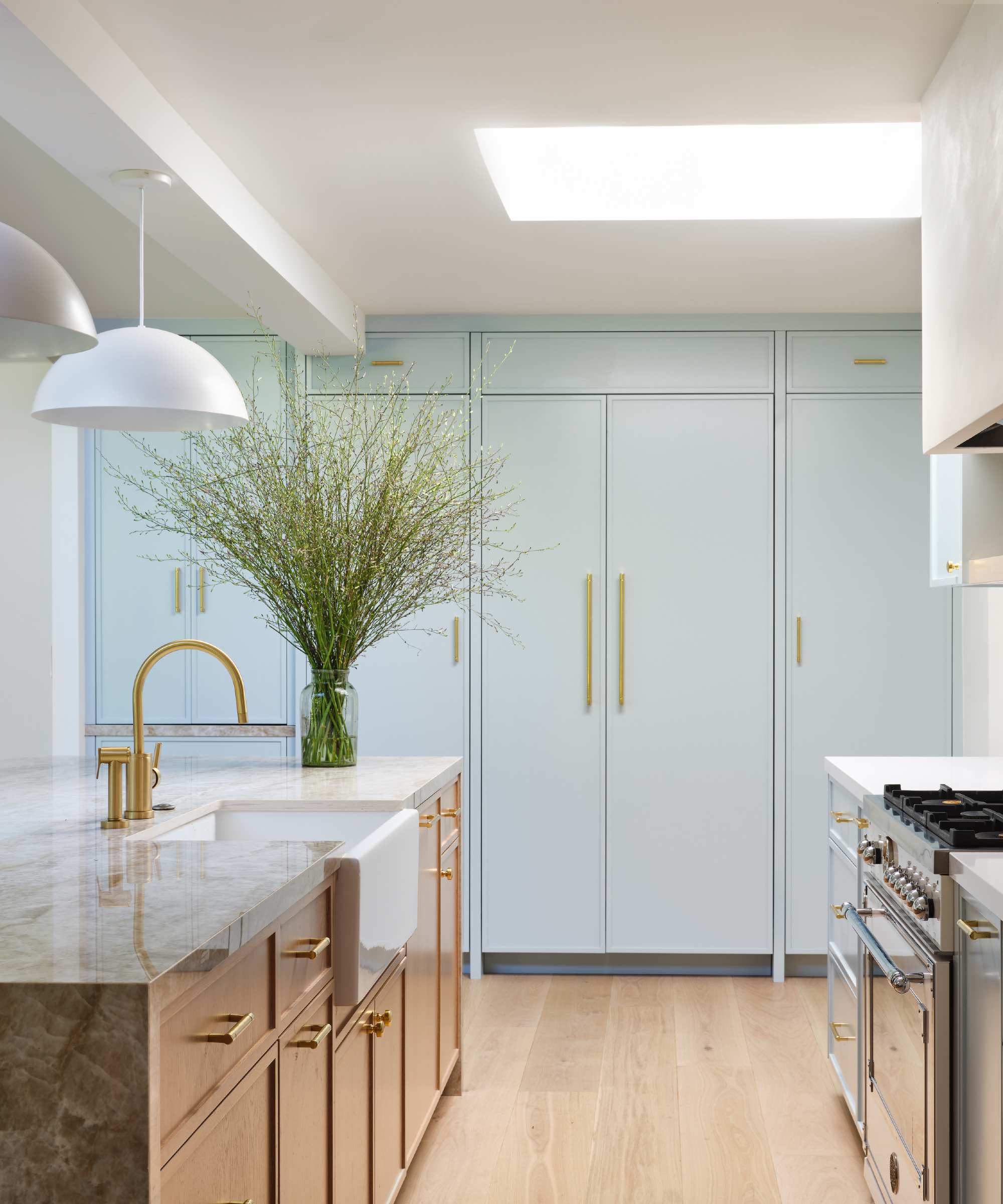
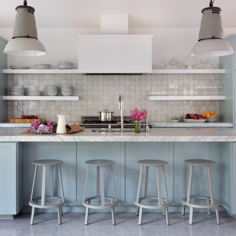
Despite its common association with practicality and neutrality, blue possesses significant depth, richness, and personality, carrying a distinct spirit and soul. Even muted blues maintain a palpable presence, offering freshness and subtle energy. Saturated blues deliver impact, while mid-tone blues provide nuance without overwhelming the space. Venetia Rudebeck, co-founder of Studio Vero, points out blue's calming effect while still being powerful enough to make a statement. She suggests using paler shades for light and welcoming rooms, especially in bedrooms and woodwork, and encourages bold experimentation with richer color combinations for more vibrant blues.
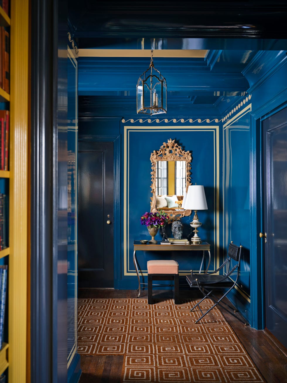
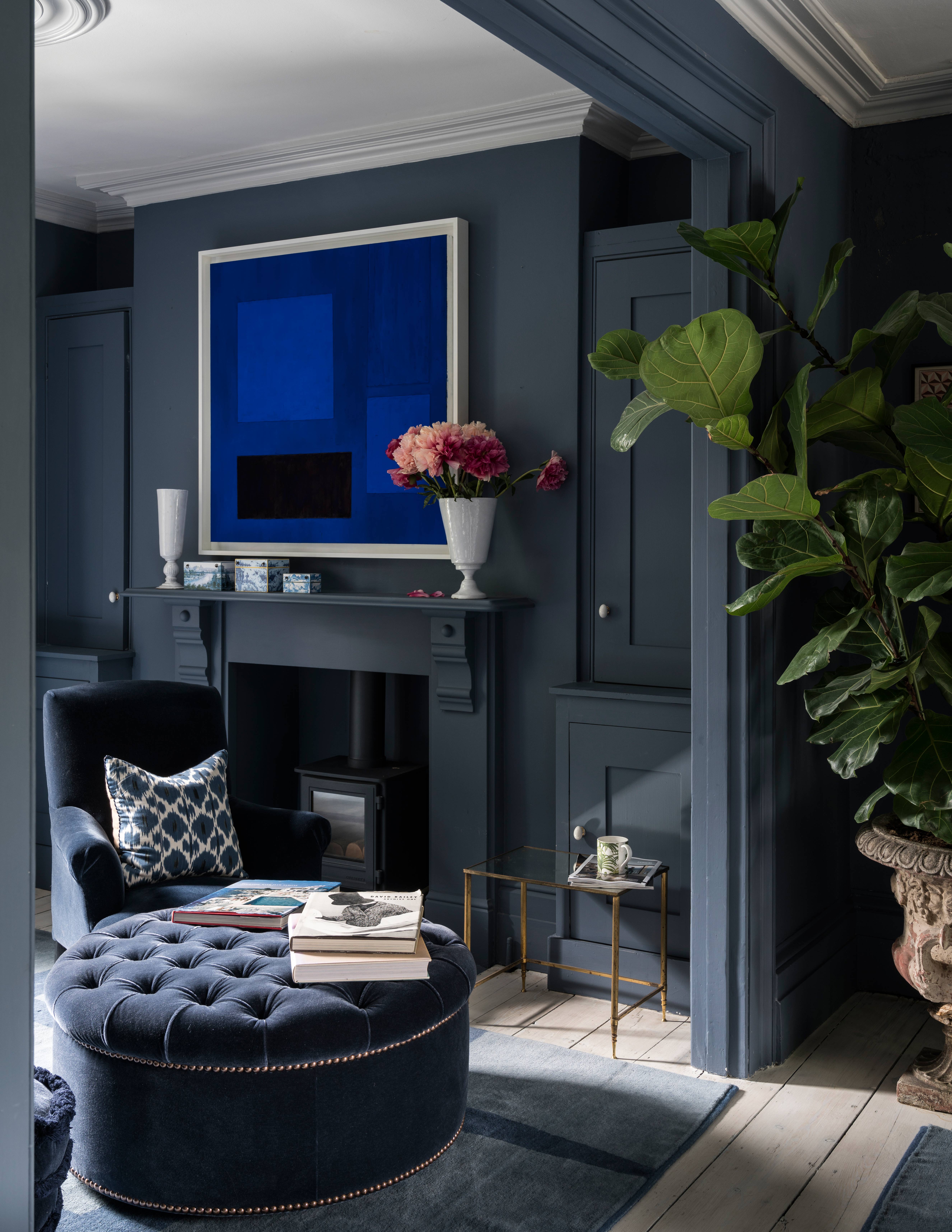
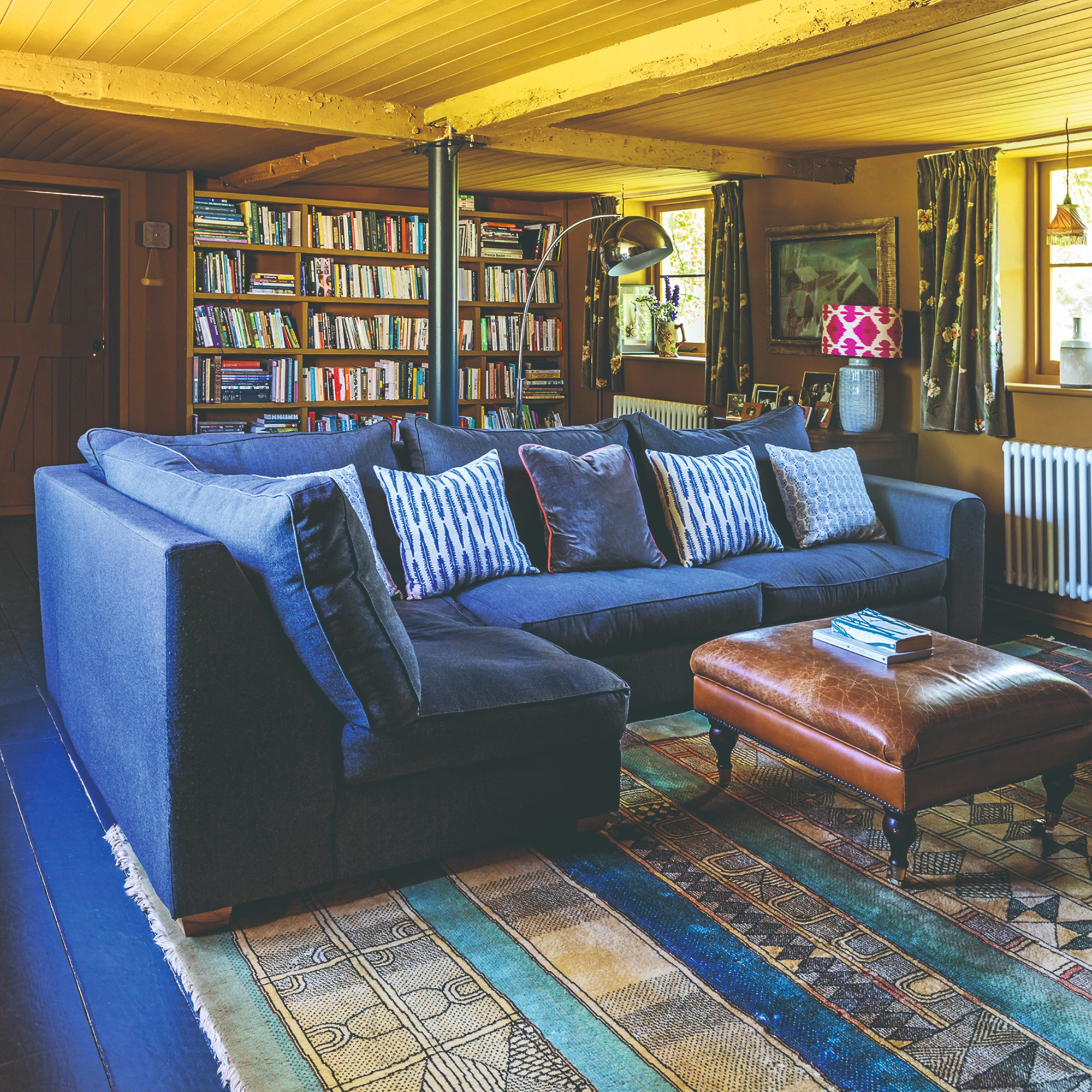
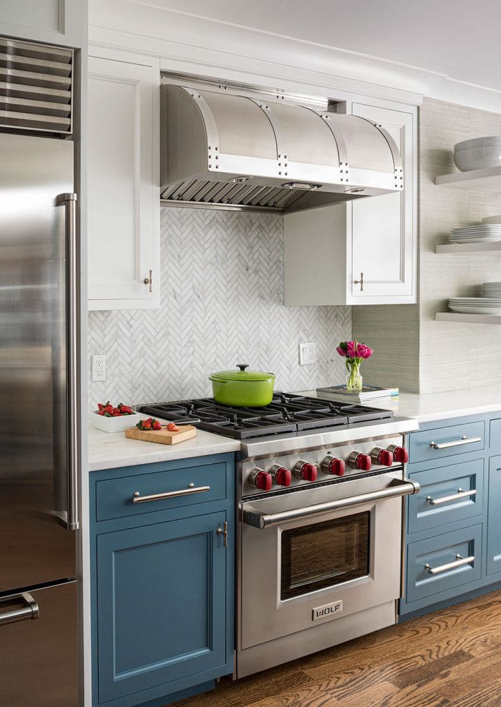
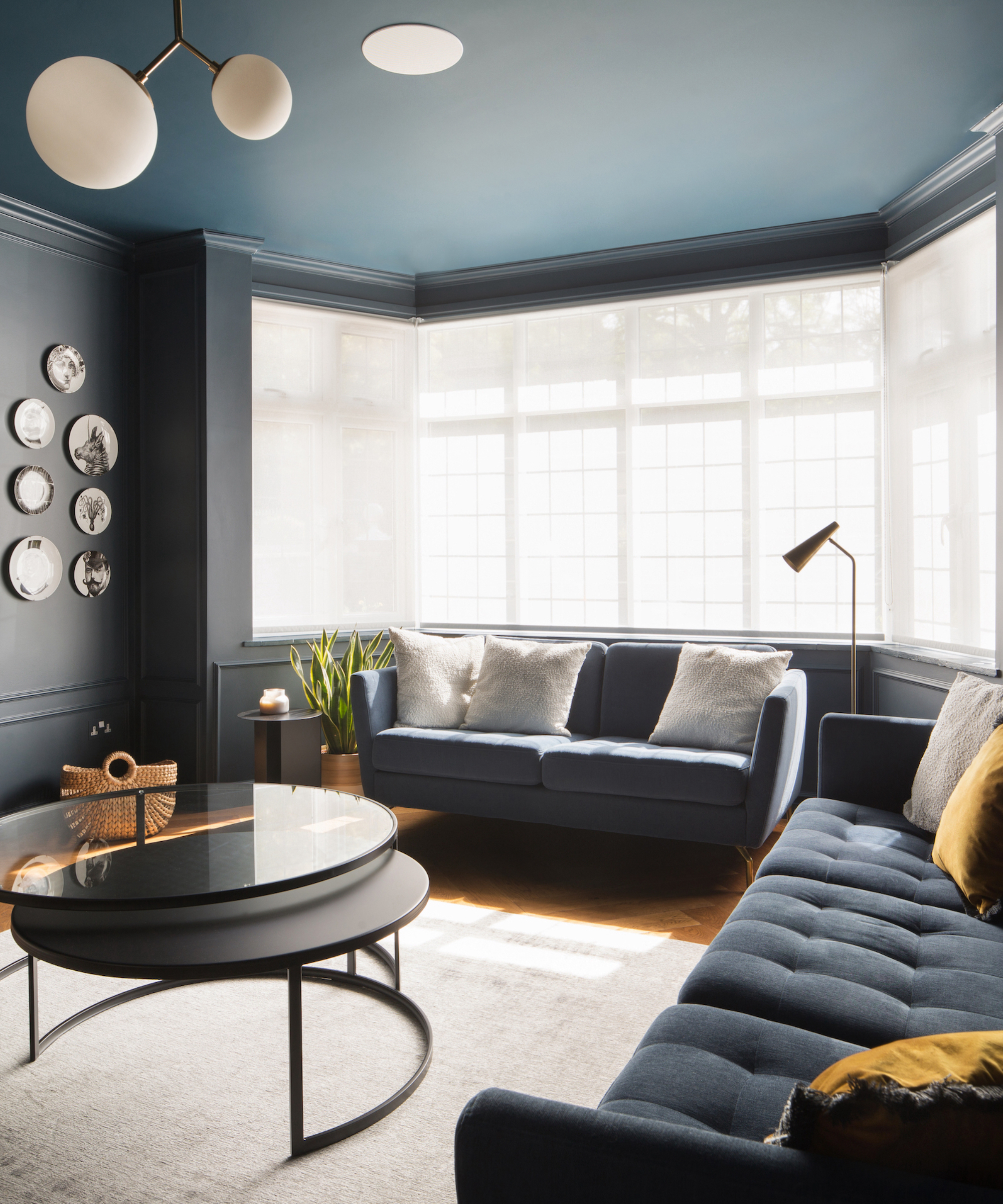
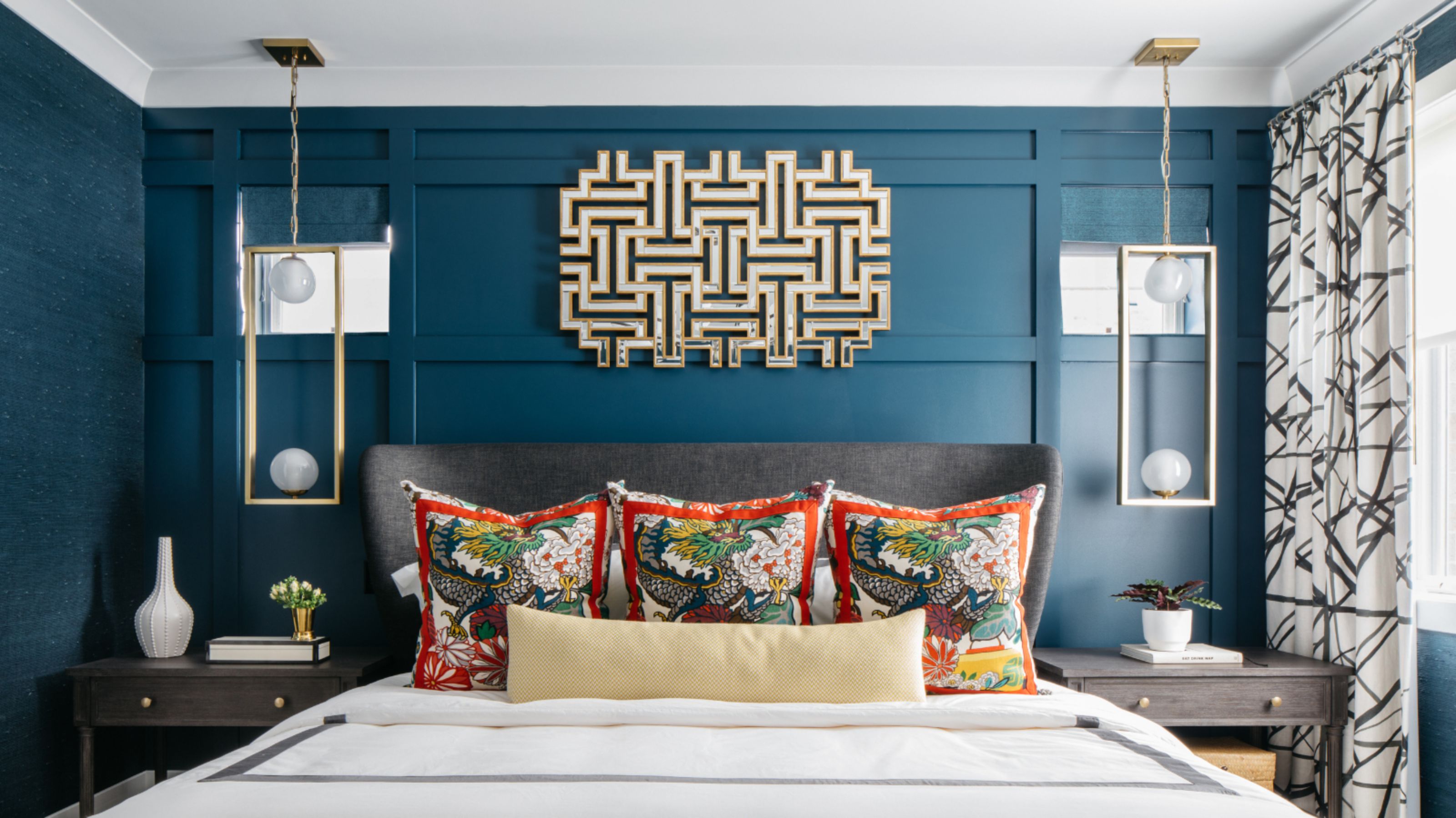
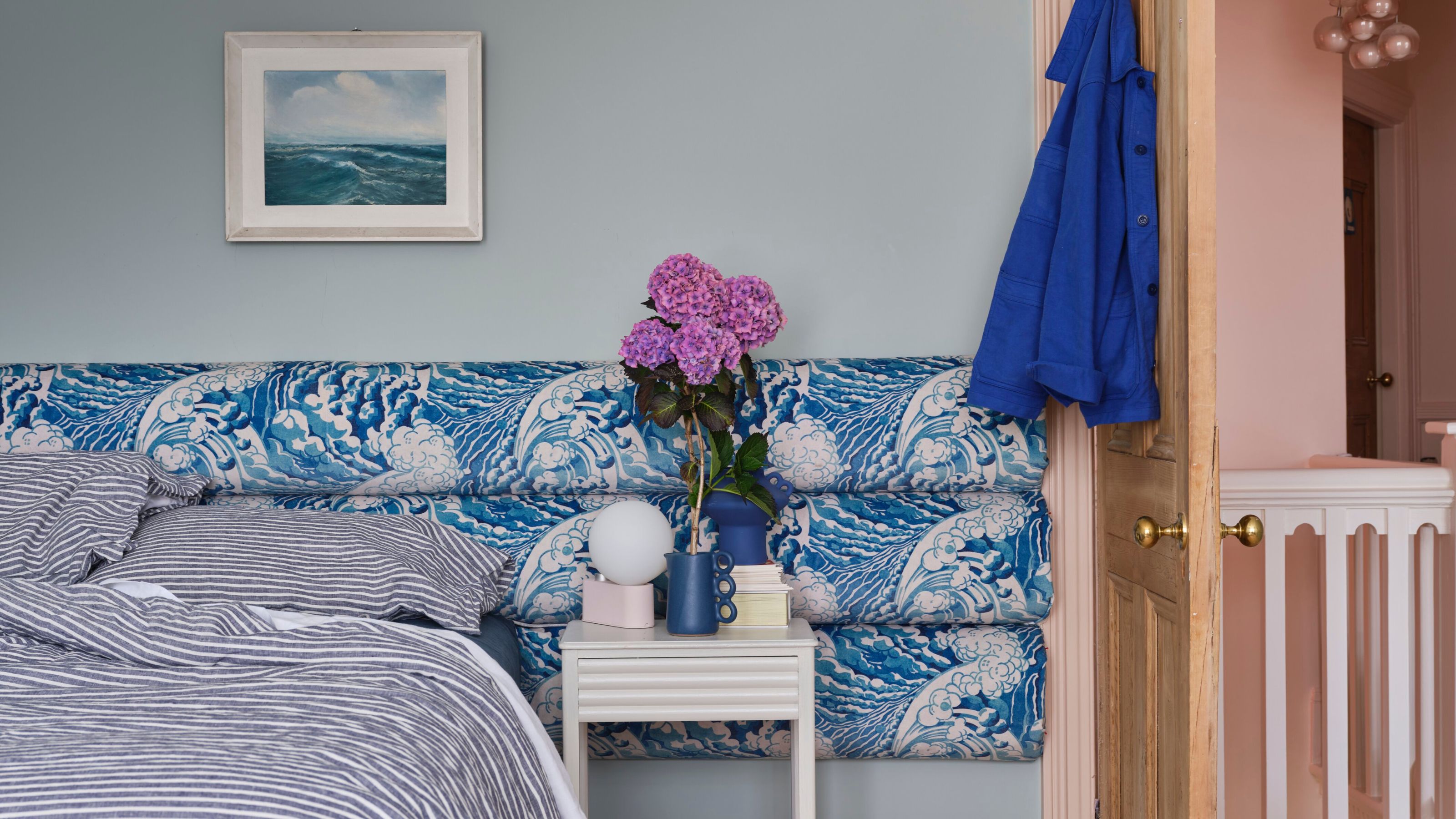
Decorating with blue is presented as an act of self-care, as the hue is innately soothing and capable of slowing the heart rate. Blue seamlessly connects indoor spaces with the ever-changing natural light outside, making it an effortlessly fitting color for any home. The article encourages reflection on the emotional impact of different blue shades, as there is a blue to match every mood and room. Kate Guinness, director and founder of Kate Guinness Design, explains that strong blues create a dramatic effect, mid-blues offer warmth and calm, and lighter blues provide freshness. Layering different blues can create a calming backdrop with added nuance.
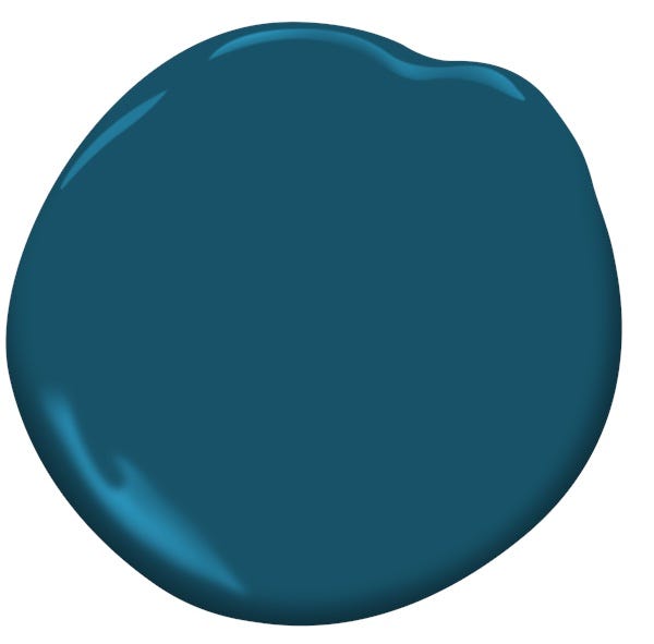
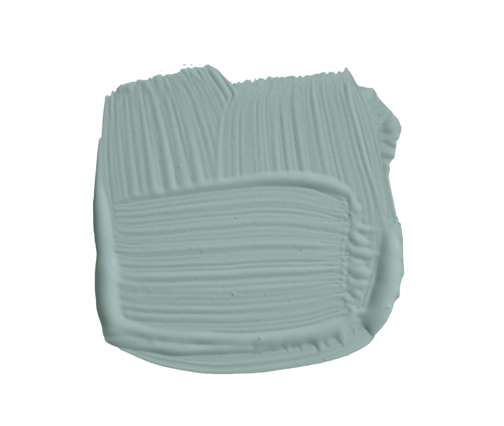
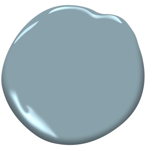
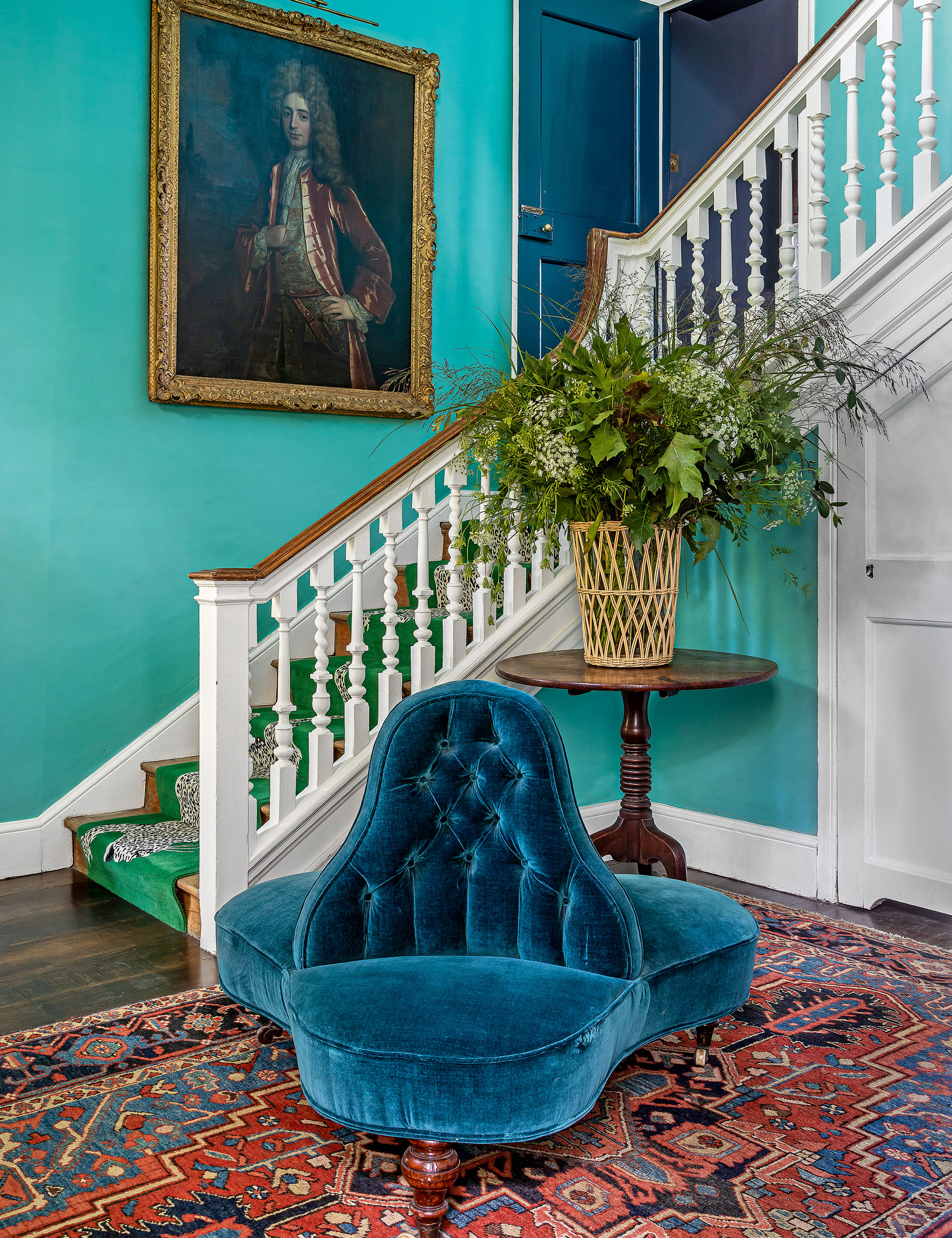
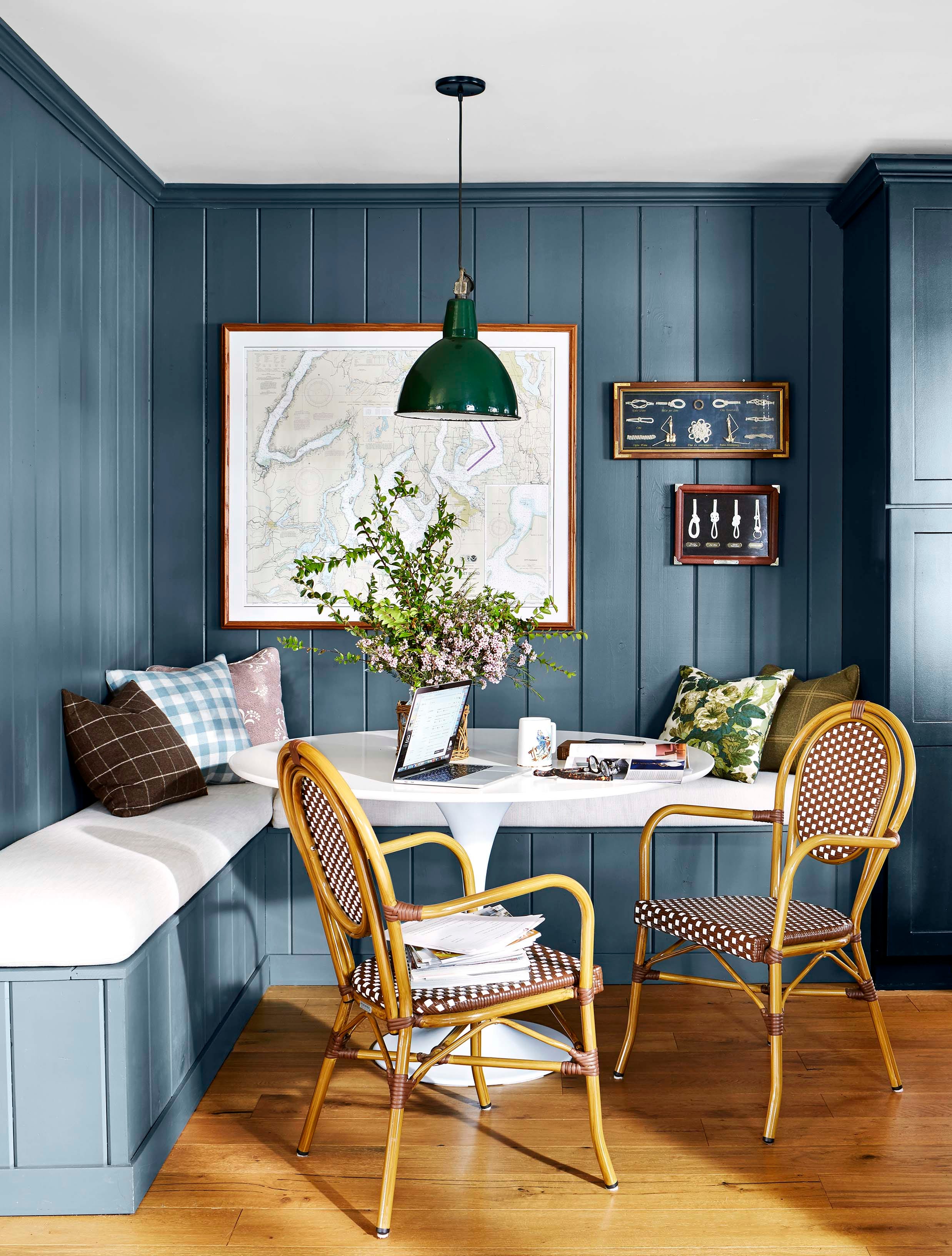
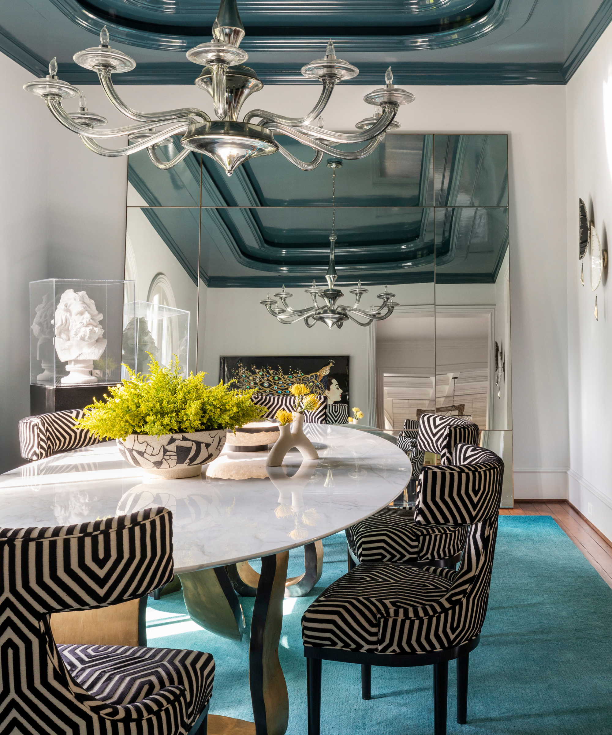
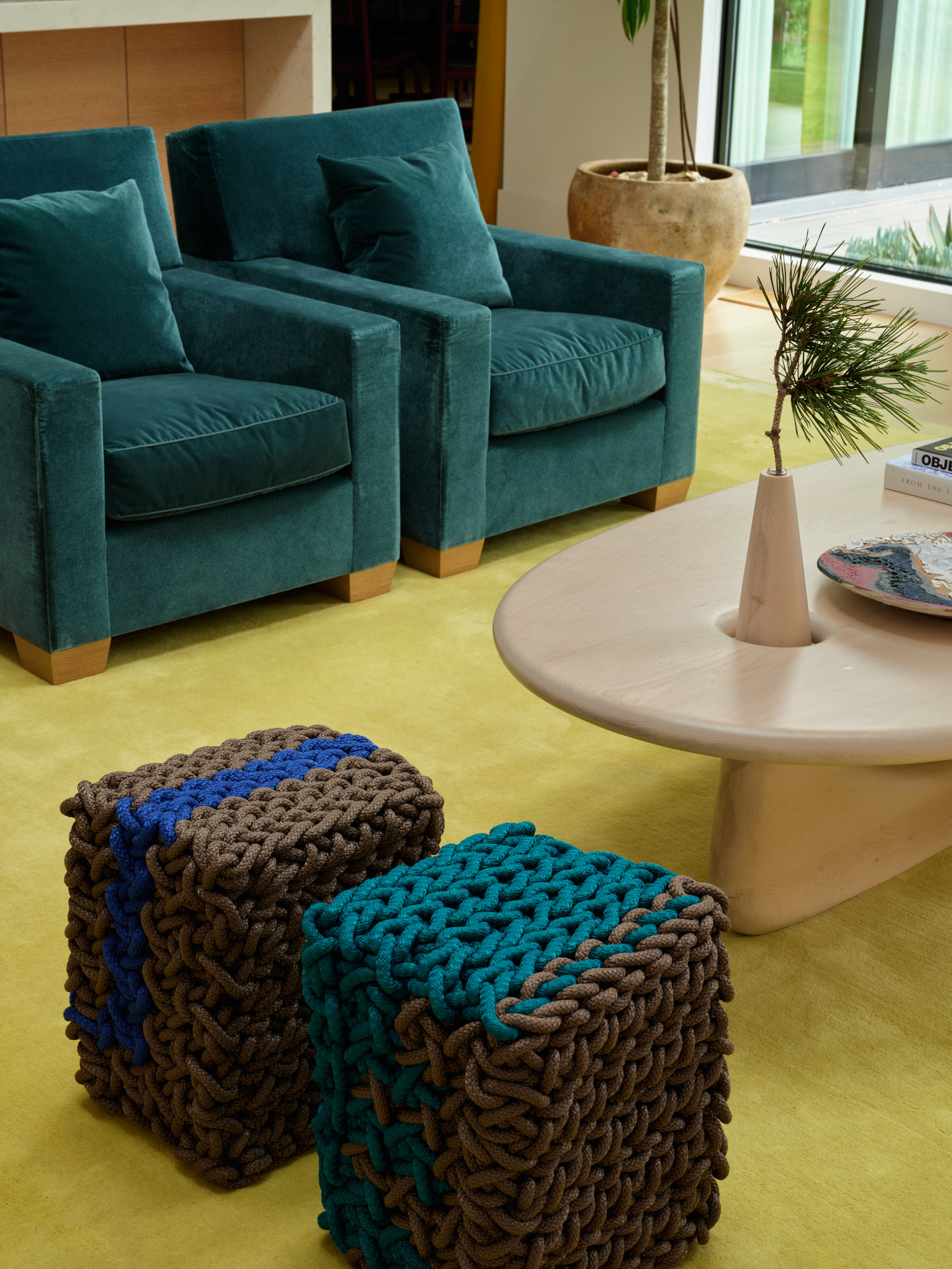
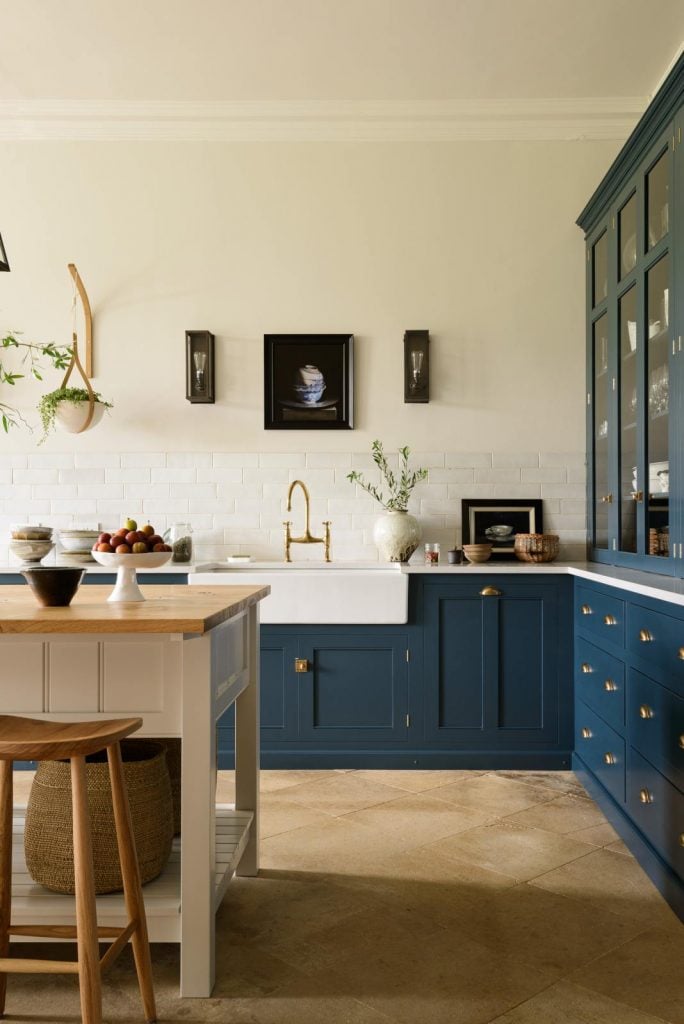
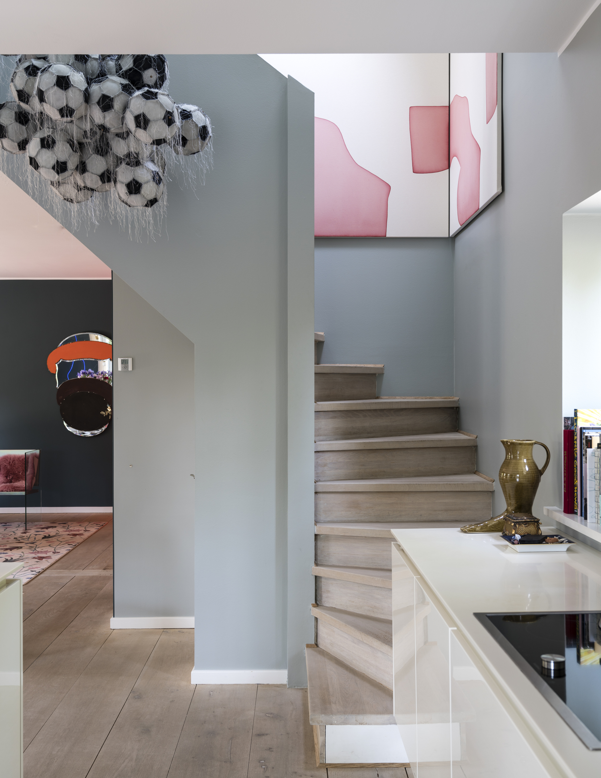
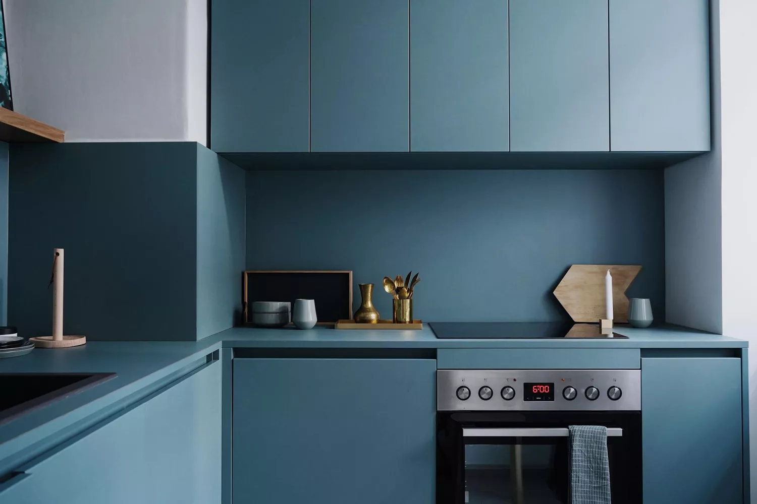
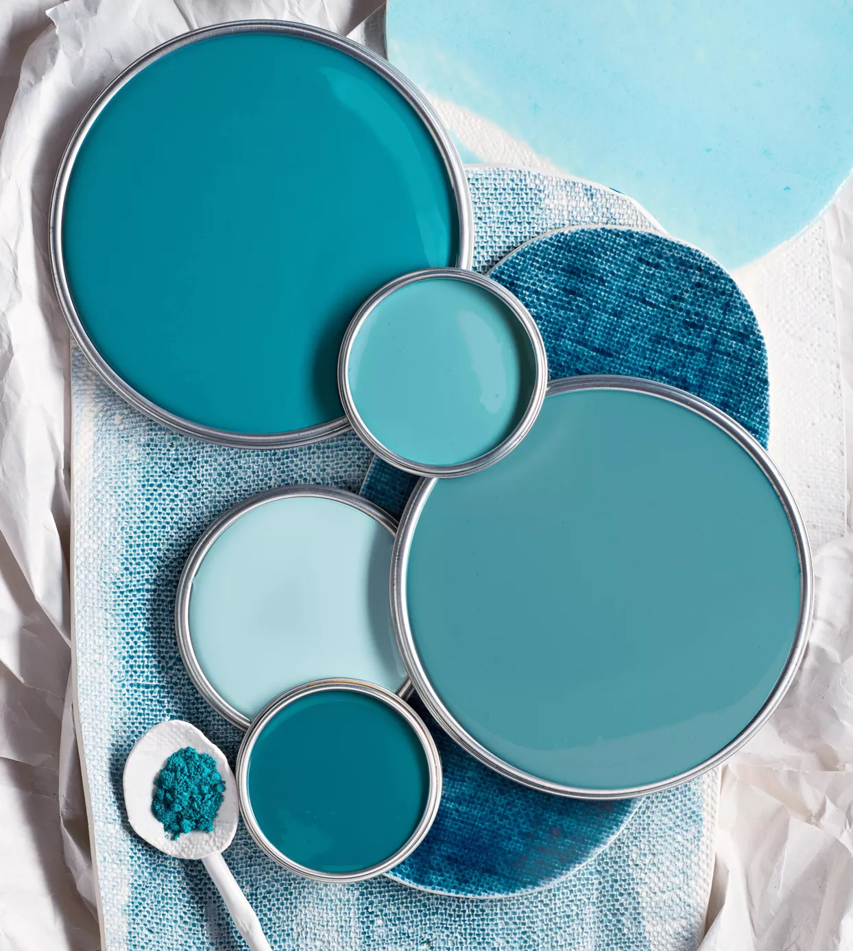
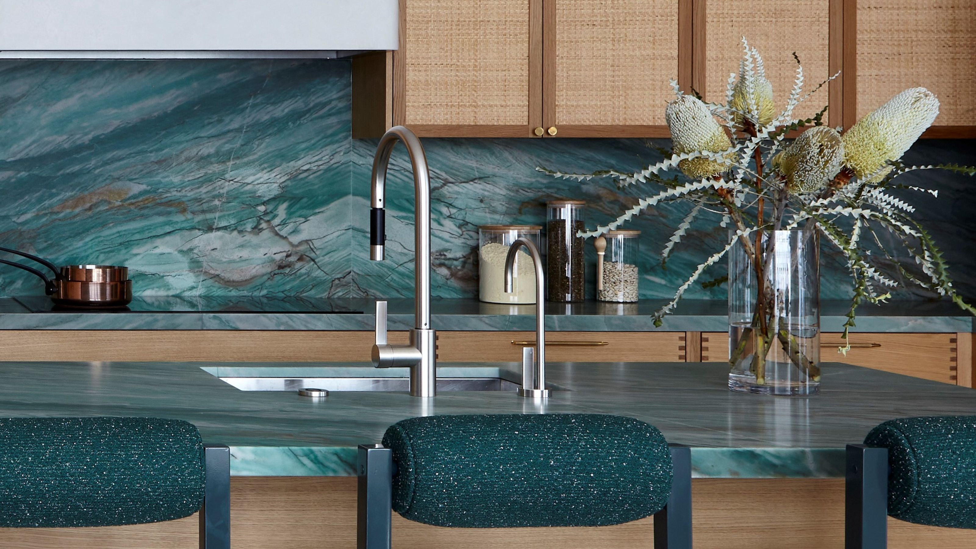
Understanding blue's undertones is crucial for successful decoration. Blues with green undertones, such as seafoam and turquoise, offer an organic and relaxing feel. Purple undertones in shades like periwinkle and indigo create an evocative mood. Gray undertones, as seen in steel blue, result in peaceful and muted spaces. Warmer undertones include red, which makes colors like cobalt and aquamarine intense; violet, found in sapphire or French blue, adds soft depth; and muted yellow, as in cornflower, emits a gentle warmth. The direction of natural light, particularly for north or south-facing rooms, is essential in selecting the right blue to balance temperature. Layering different color types, such as combining cool blues with warm woods or spicy colors, and balancing warm blues with cool whites or silvers, is key to creating varied and natural spaces.
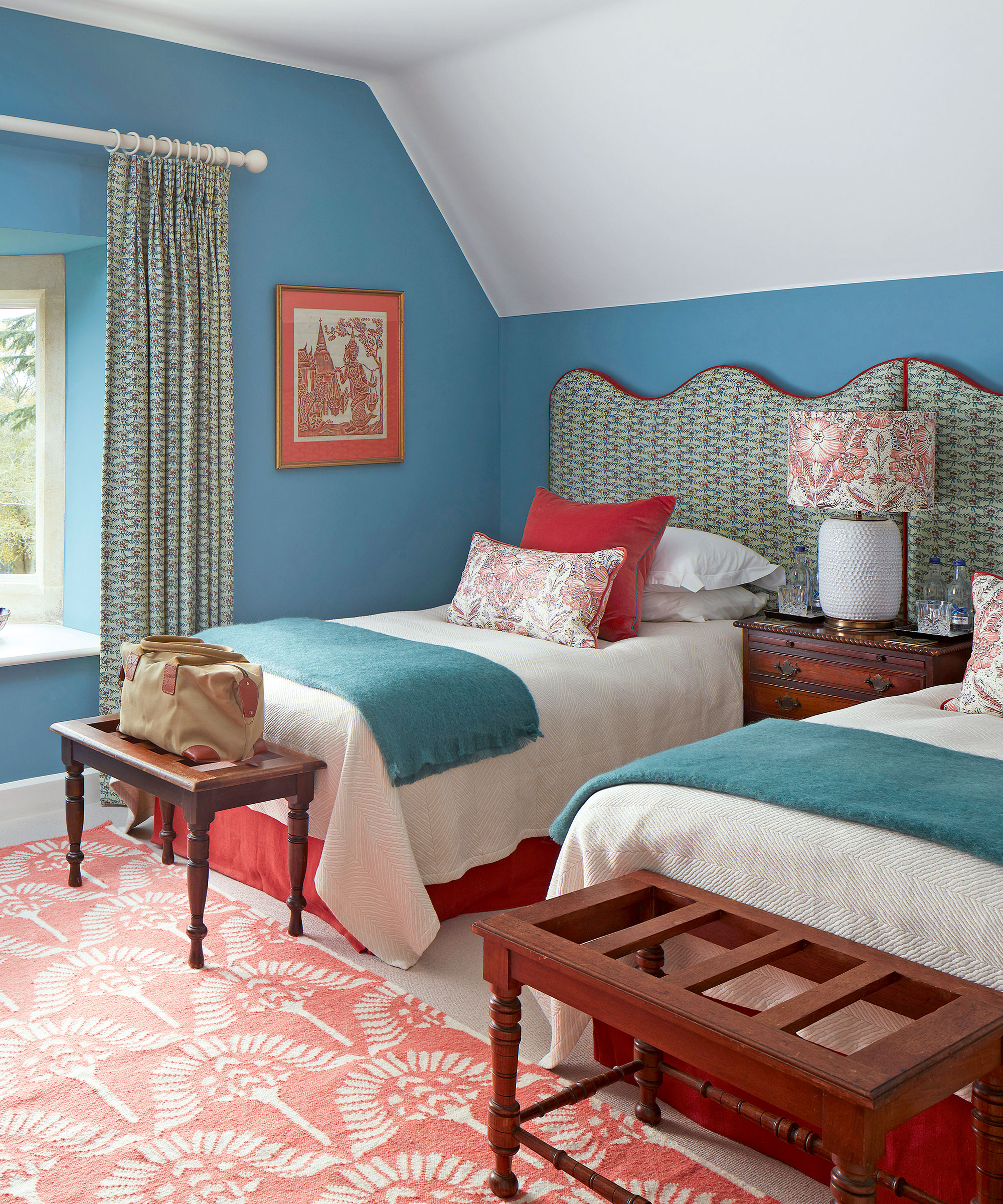
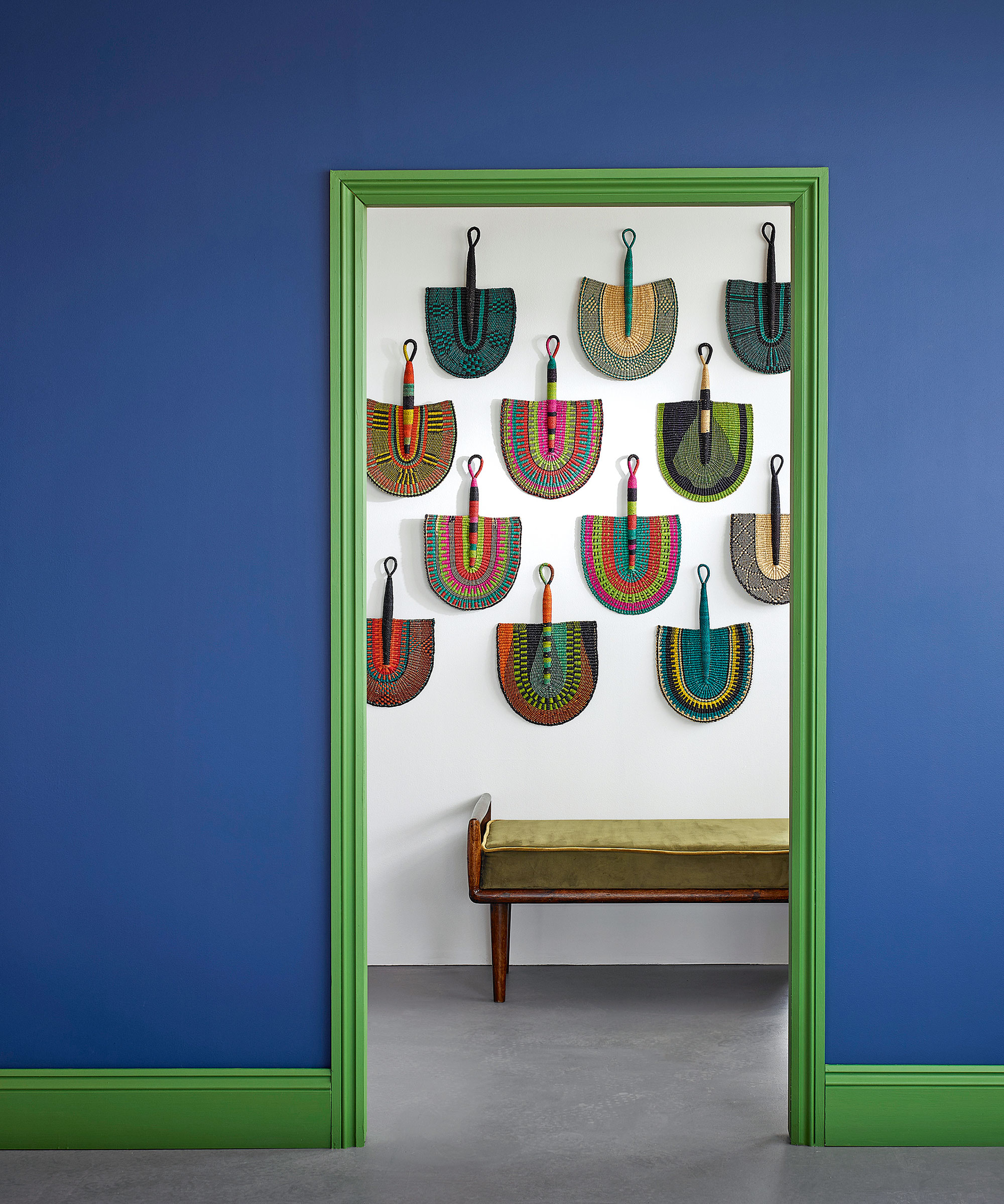
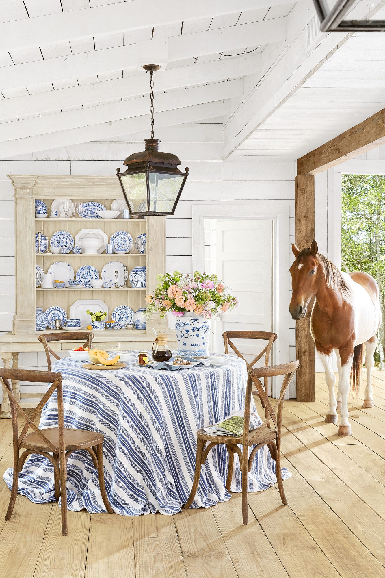
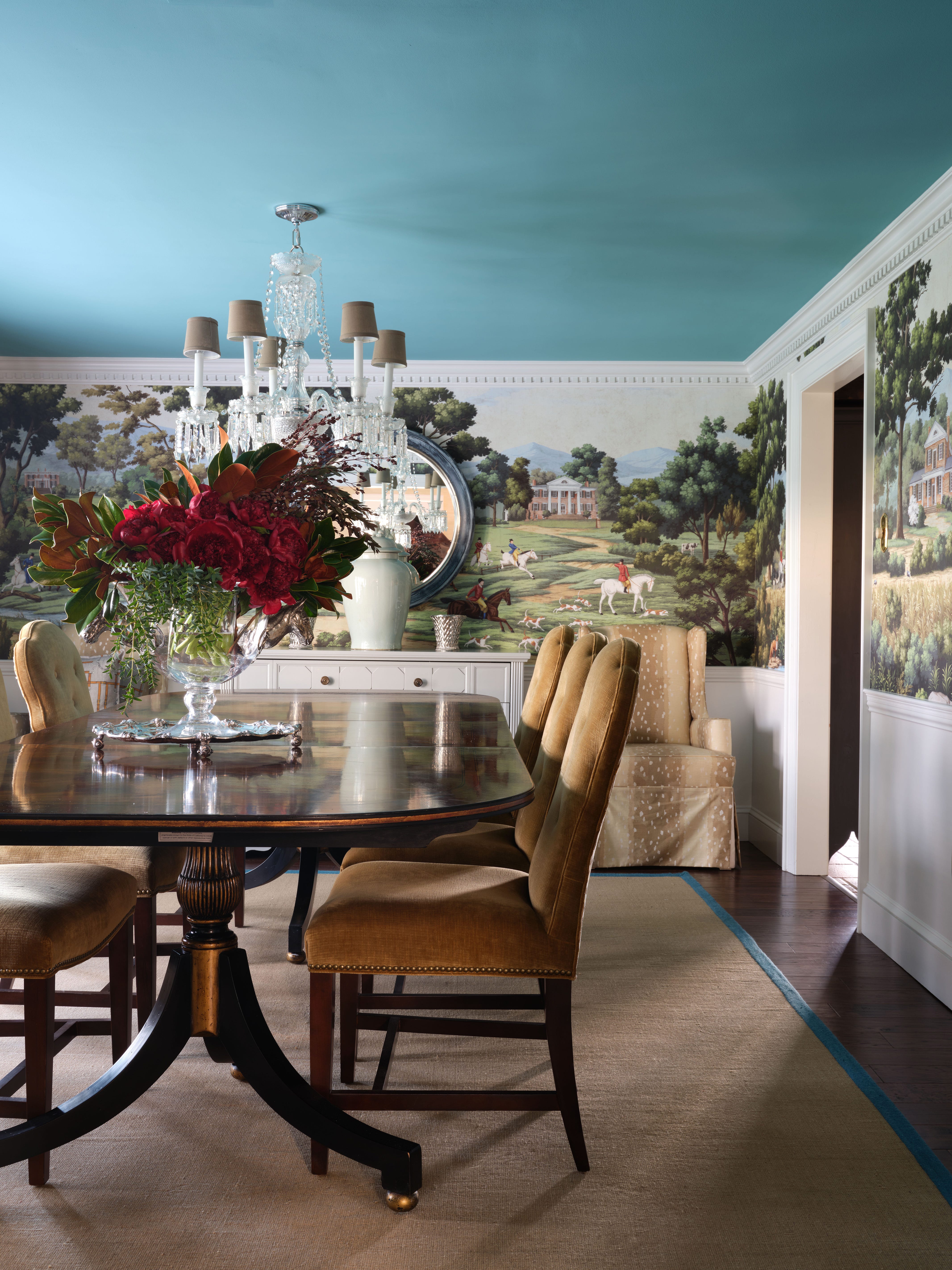
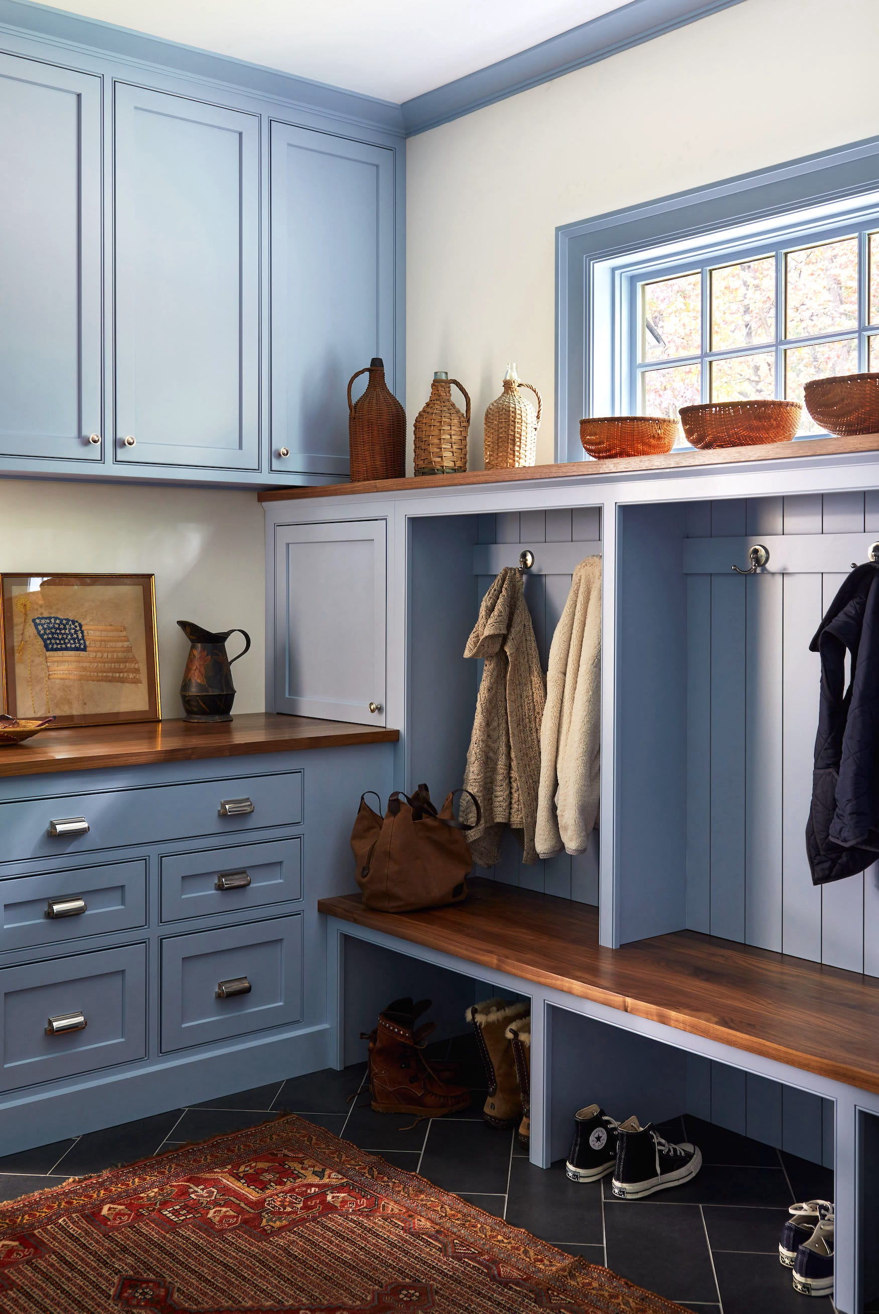
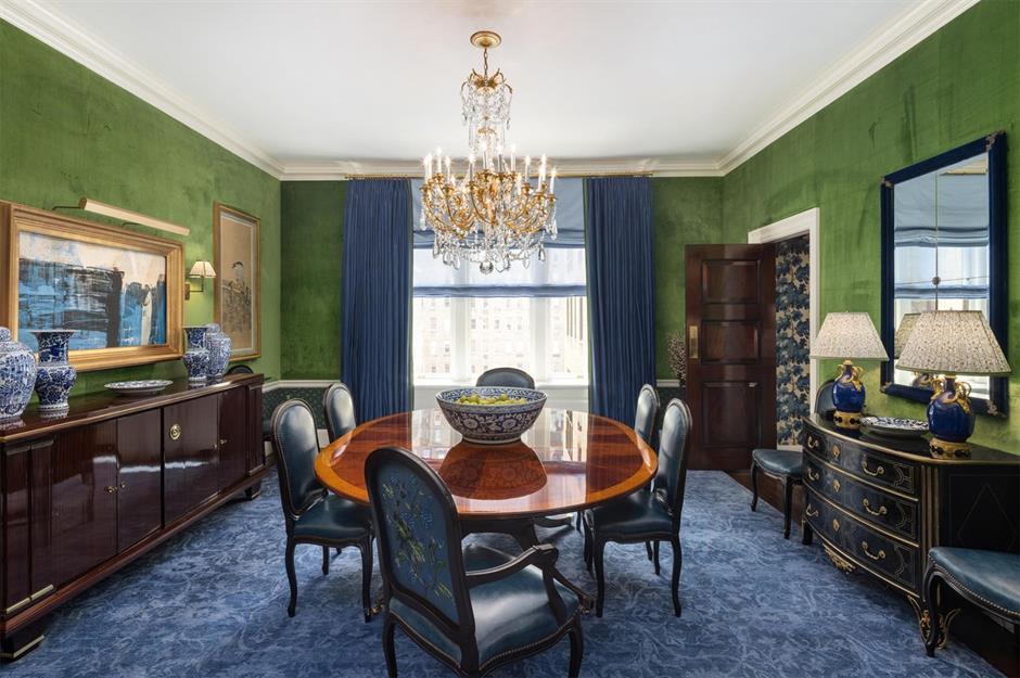
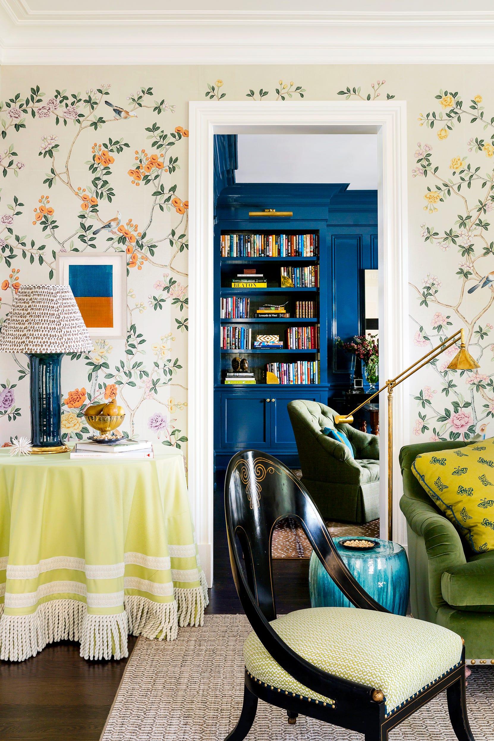
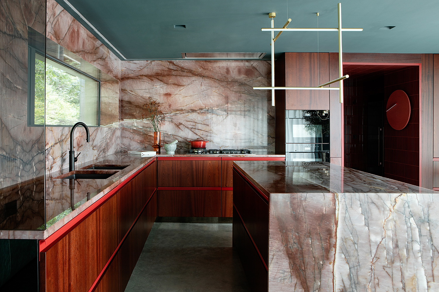
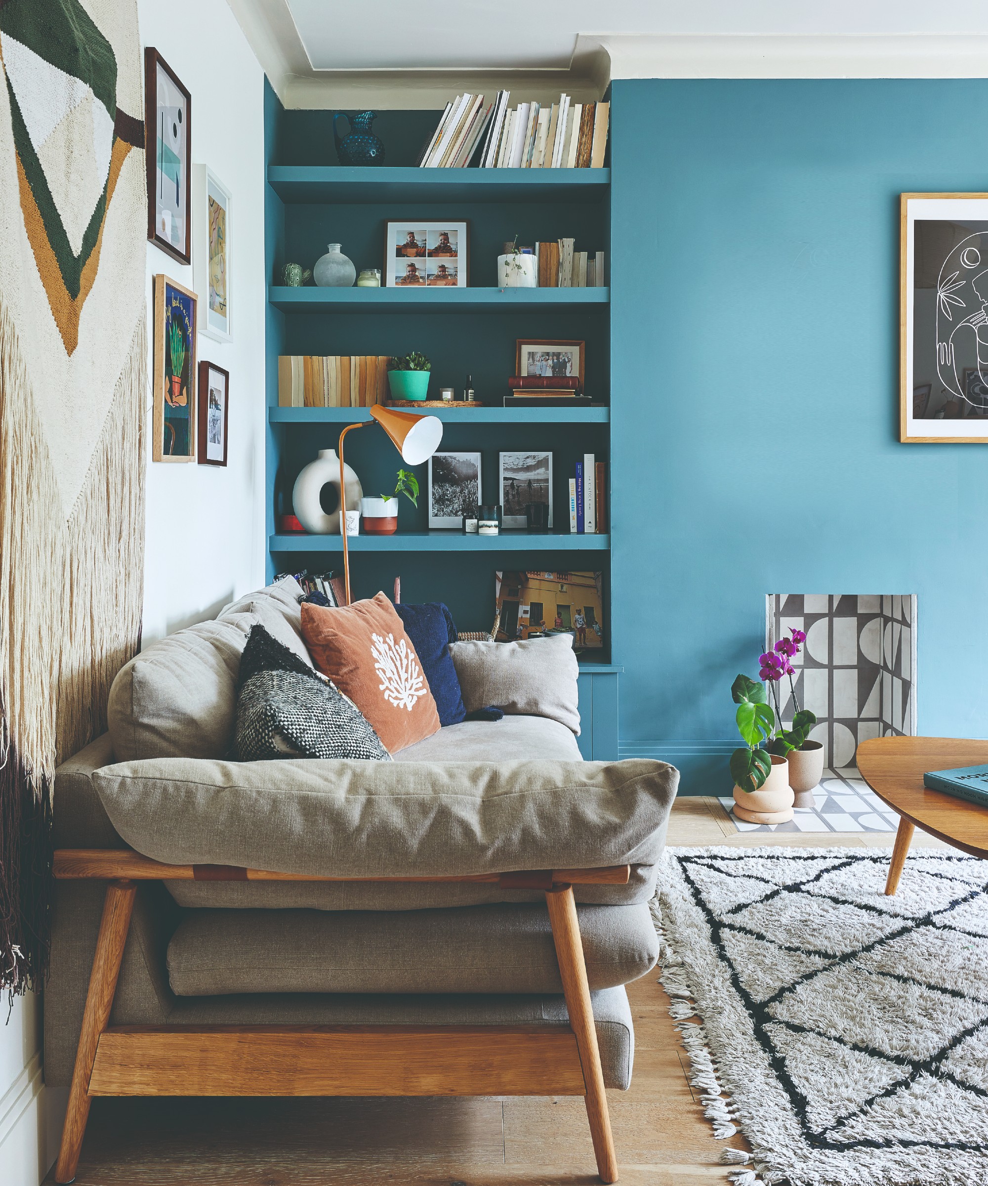
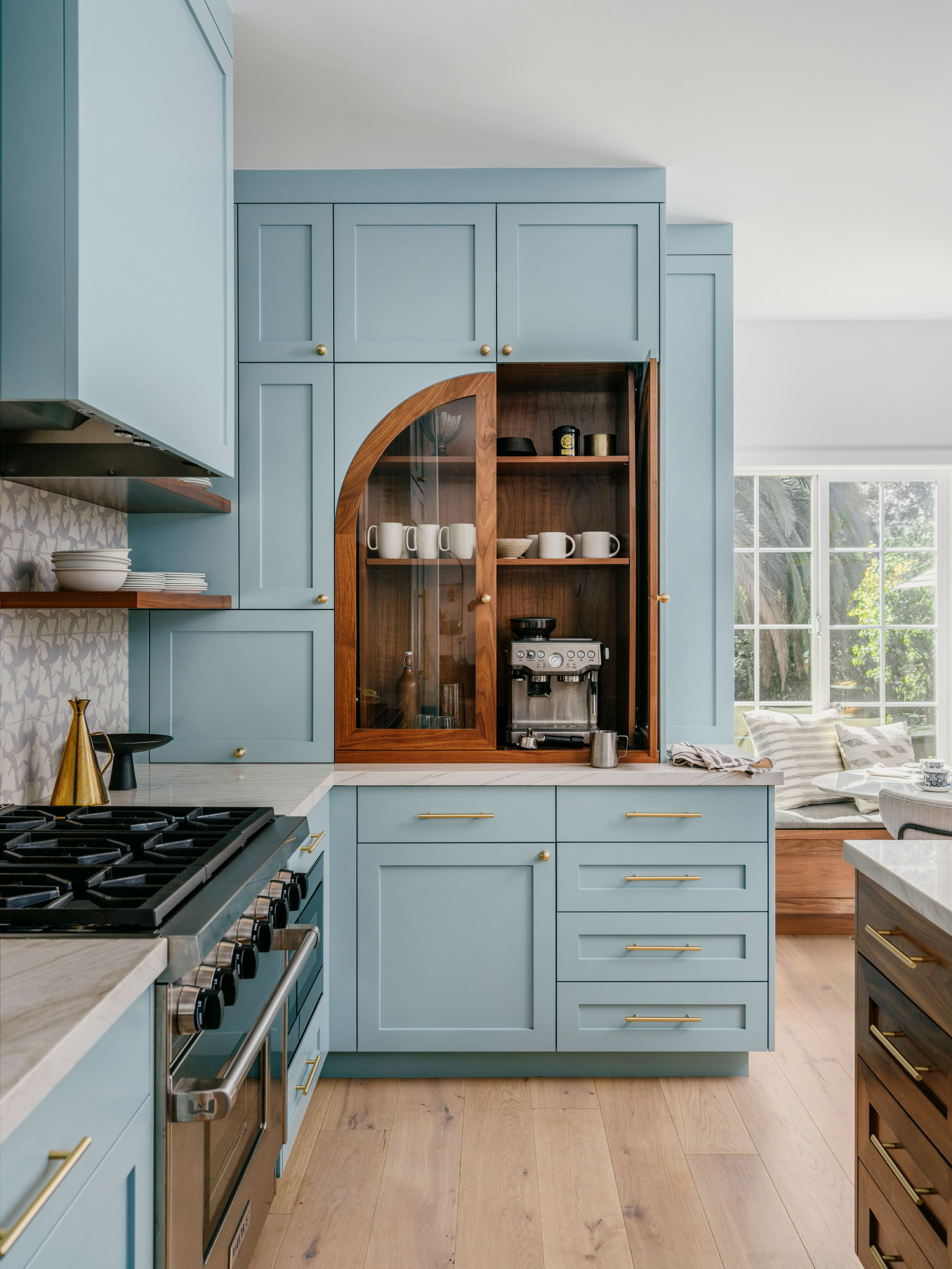
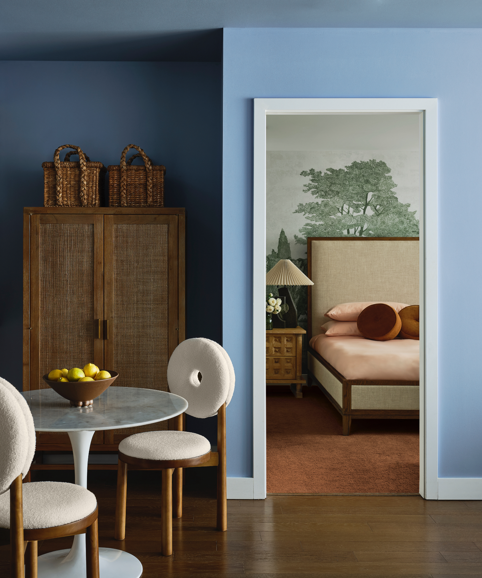
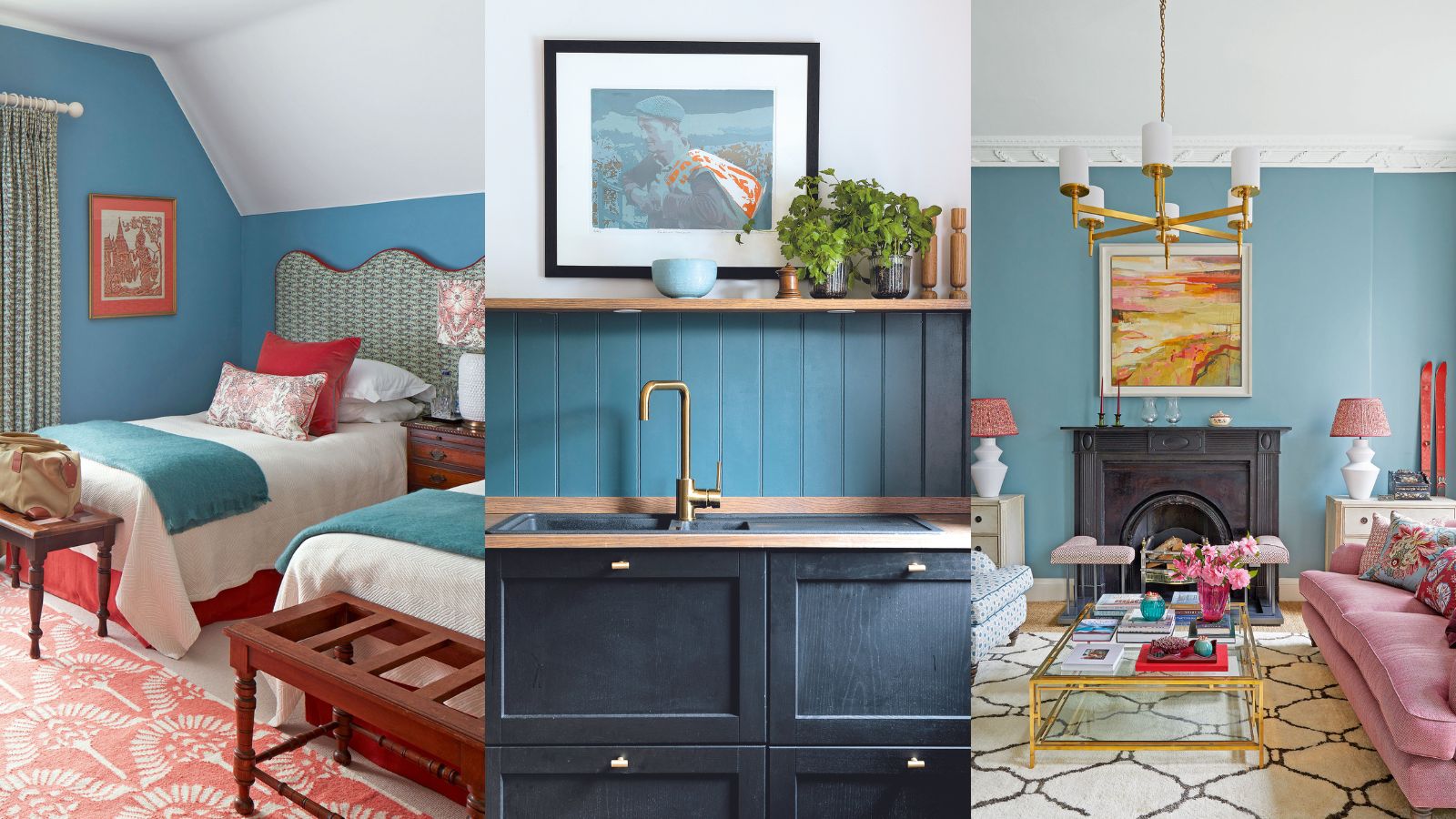
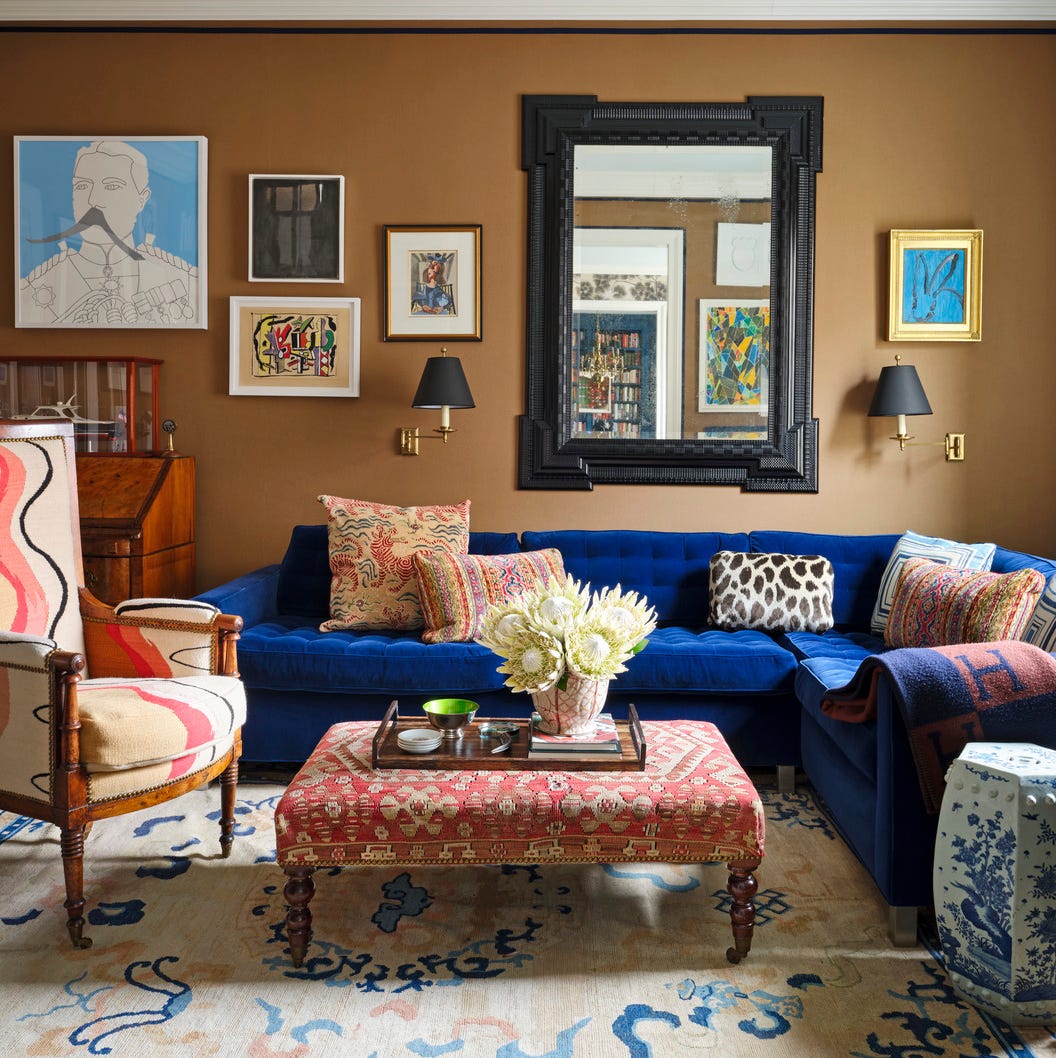
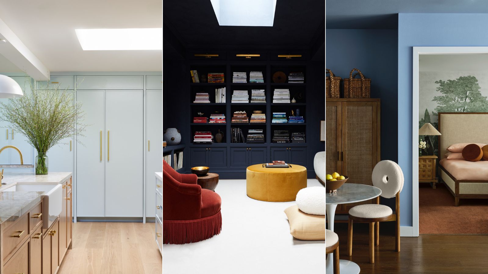
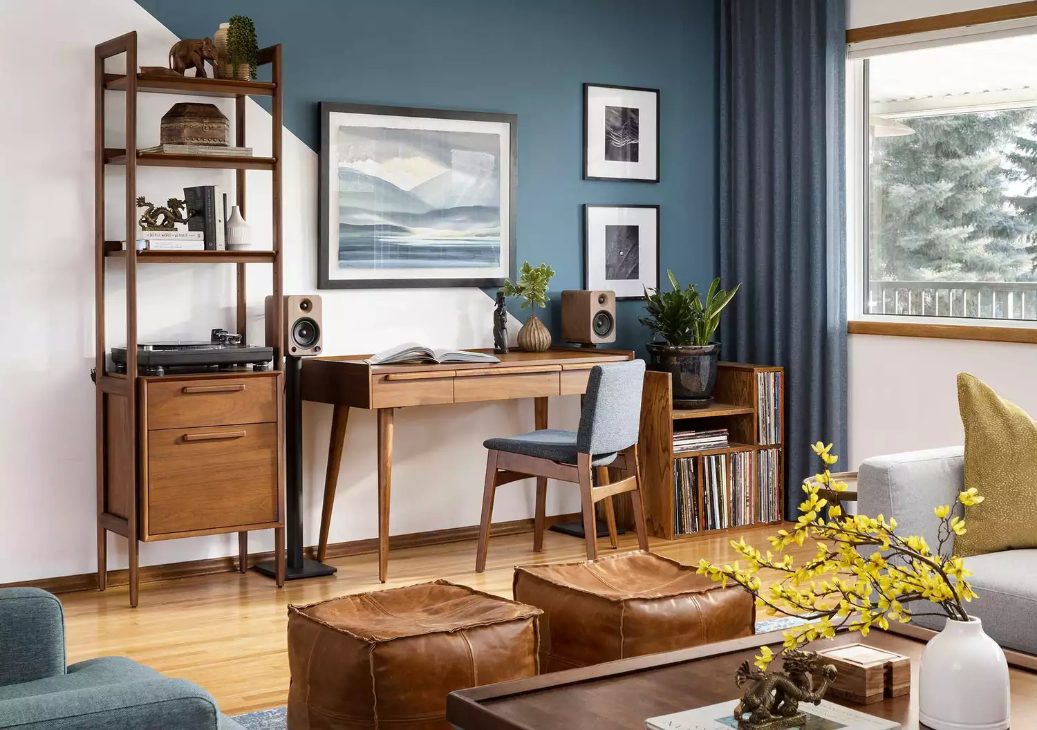
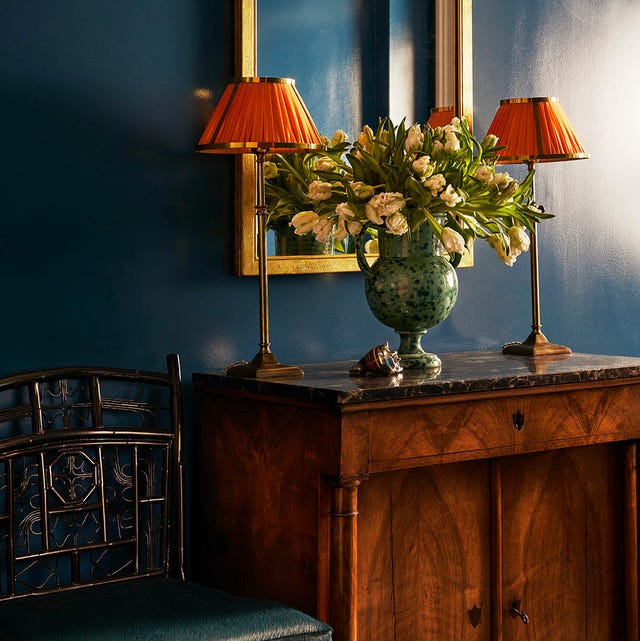
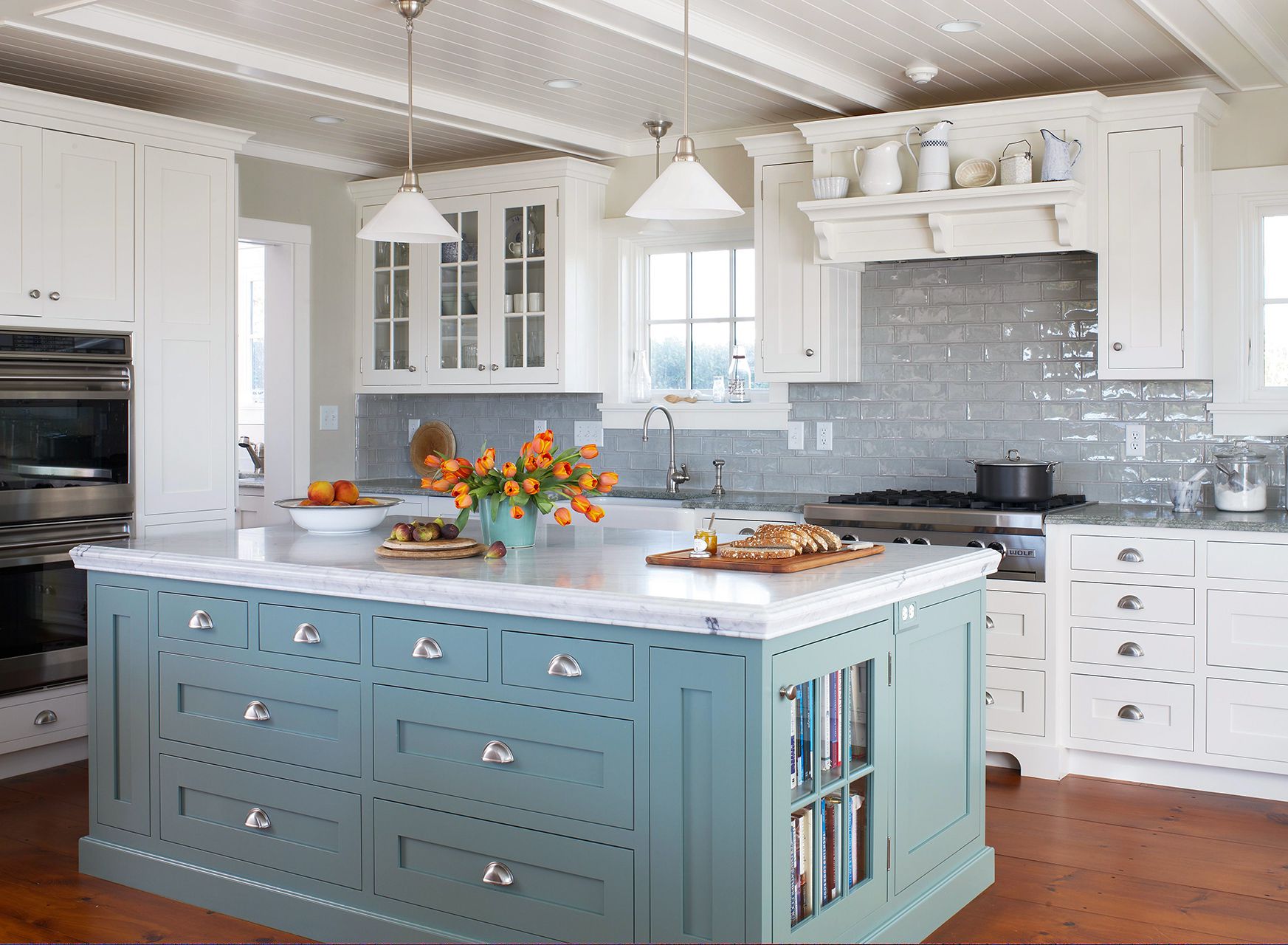
Blue's natural occurrence in nature means it pairs well with many other colors. The article advises considering other desired tones first and then selecting the blue shade. Complementary colors, often found opposite on the color wheel, can create impactful contrasts; for example, burnt orange can sing in a blue room. Blue also harmonizes beautifully with browns, serving as an excellent backdrop for antique timber furniture. Softer oranges like peach, apricot, and coral, or earthier tones such as terracotta and cinnamon, also complement blue. Analogous pairings, found adjacent to blue on the color wheel, include teals, greens, violets, and indigos. Designers suggest pairing pale blues with rich colors like burgundy, purple, and red. The article also encourages breaking traditional color rules, such as combining blues and greens for a harmonious, cool mood. Experimentation with pastels like buttery yellow, opulent emerald or malachite, and even playful candyfloss or watermelon, is encouraged. Ultimately, for those who love blue, layering a variety of blues, from navy to sky blue and teal, with added texture, allows for endless options and depth, asserting that with blue, more is more.
#HomeDecor #ColorPsychology #InteriorDesignTrends #BluePalette #ColorPairings #DecoratingTips #HomeStyling #AccentColors #DesignInspiration #HomeDecor #ColorPsychology #InteriorDesignTrends #BluePalette #ColorPairings #DecoratingTips #HomeStyling #AccentColors #DesignInspiration
0 comment in total
 No comments yet
You may also like
55 Tried-and-True Blue Paint Colors


Designers LOVE Pairing These Unexpected Colors With This One Timeless Hue
What Is the Most Expensive-Looking Blue? 7 Specific Shades to Paint Walls That Will Always Elevate Your Home
47 Stunning Blue Room Ideas for Every Style

Blue room ideas – 27 timeless and fresh ways to use blue at home

This Is the Best Blue Paint Color, According to Designers

29 Best Blue Paint Colors for Perfectly-Hued Walls

What a Paint Color Expert Would Pair With Light Blue Walls
How to Decorate with Cobalt Blue the Right Way, According to Designers

9 must-have brilliant blue homewares and decor
Decorating With Teal — I'm a Color Expert and Know How to Make It Work for Your Home
5 best blue paints as chosen by interior designers
These 10 Colors Always Look Beautiful With Blue
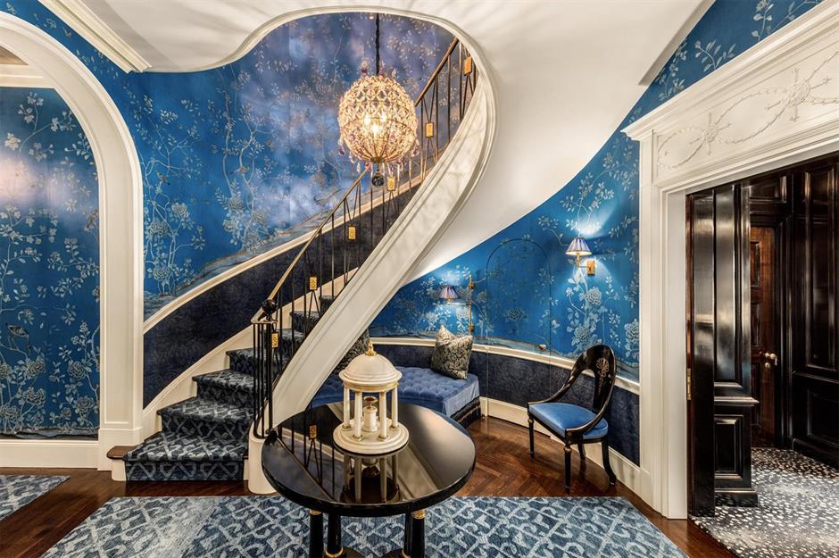
Beautiful blue decorating ideas for every room | loveproperty.com
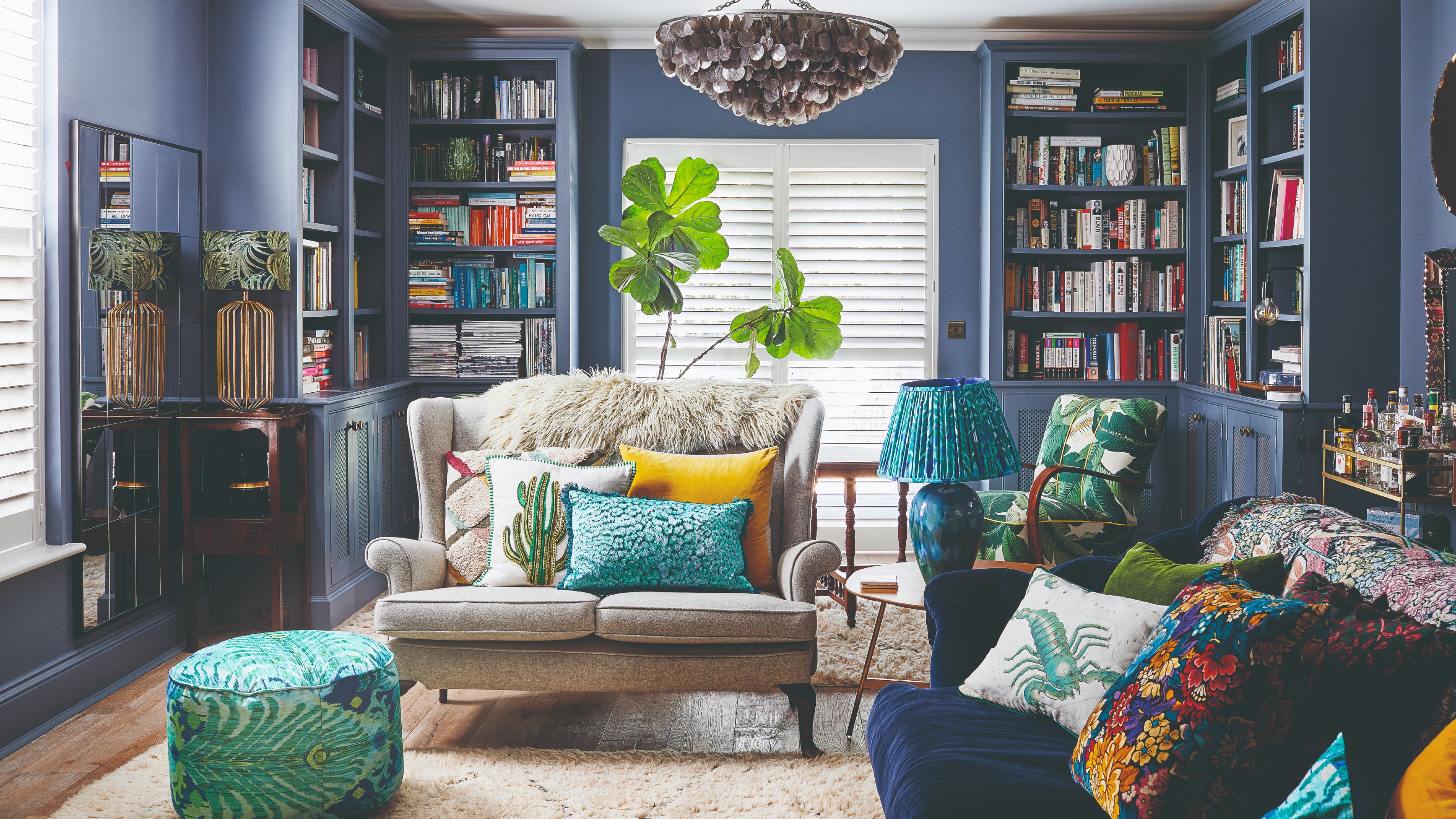
Blue is one of the UK’s most popular living room colours – this is how to elevate your lounge with the timeless hue
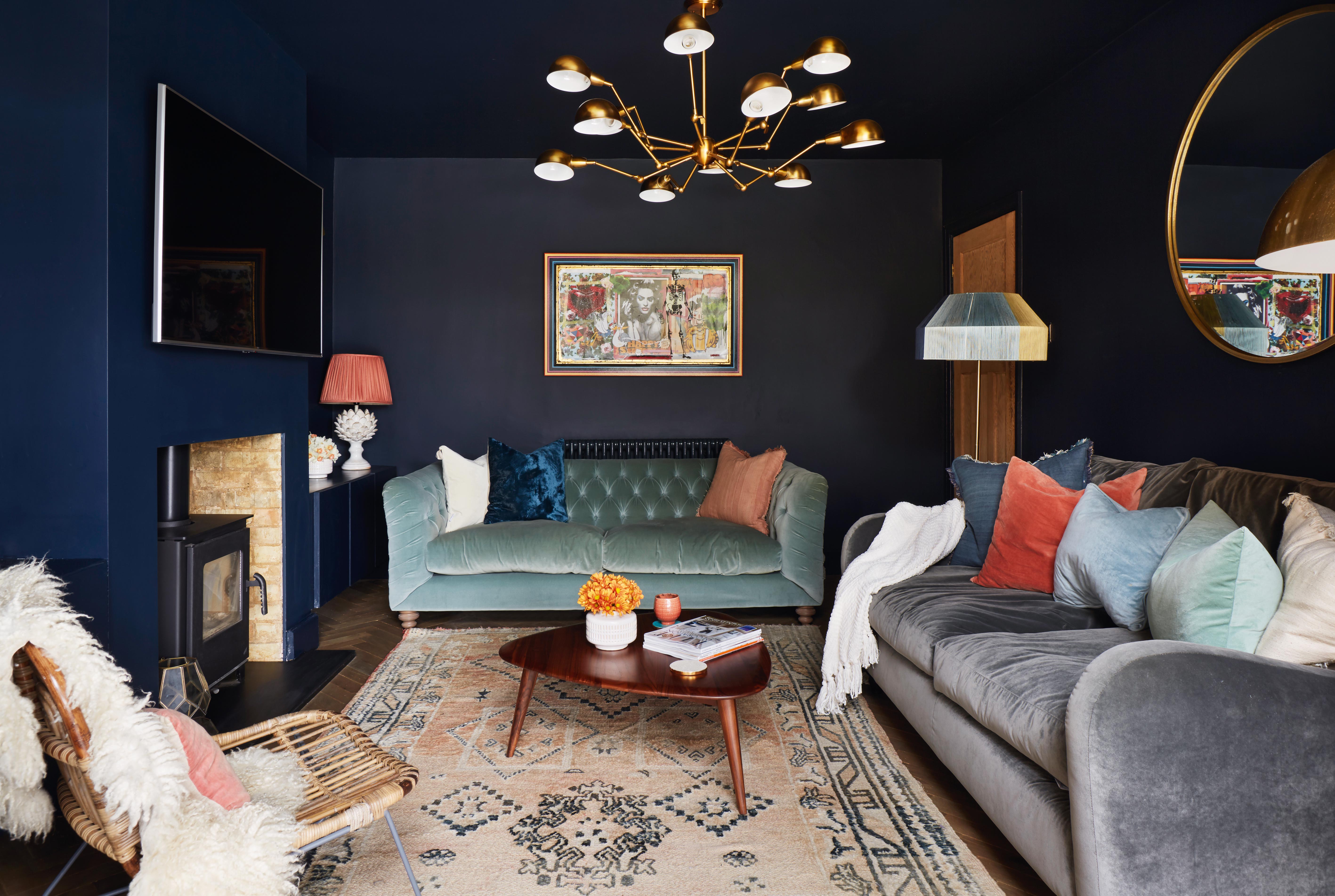
11 blue living room ideas to show to how to work with this on trend hue

25 Reasons Why Blue Is the Best Color for Decorating Your Home
Why Designers Love This Shade of Blue Paint for Just About Any Room In the House
Which Color is Sexy, Daring, and “a Craze” Right Now? An Expert Fills Us In

The Best Light-Blue Paint Colors for Every Room, According to Designers