1/18
18 sophisticated pink paint colors recommended by interior designers
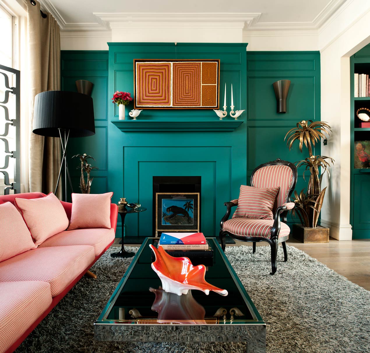
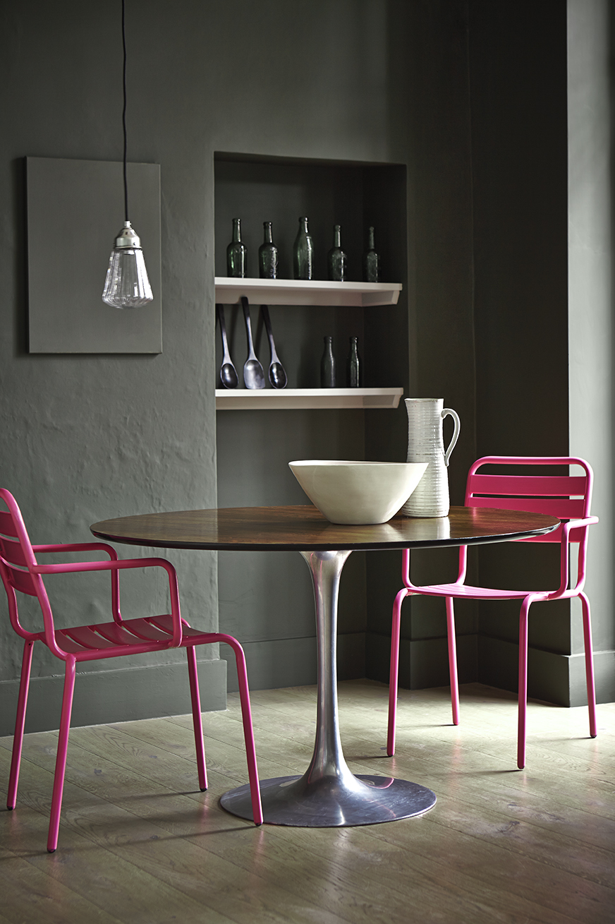
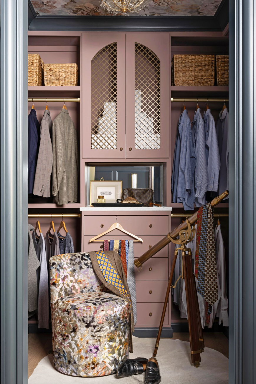
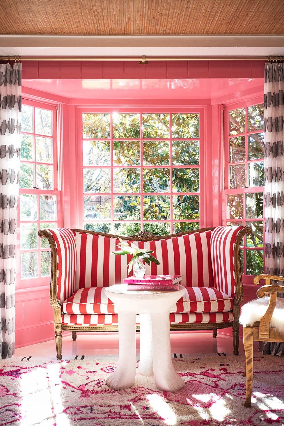
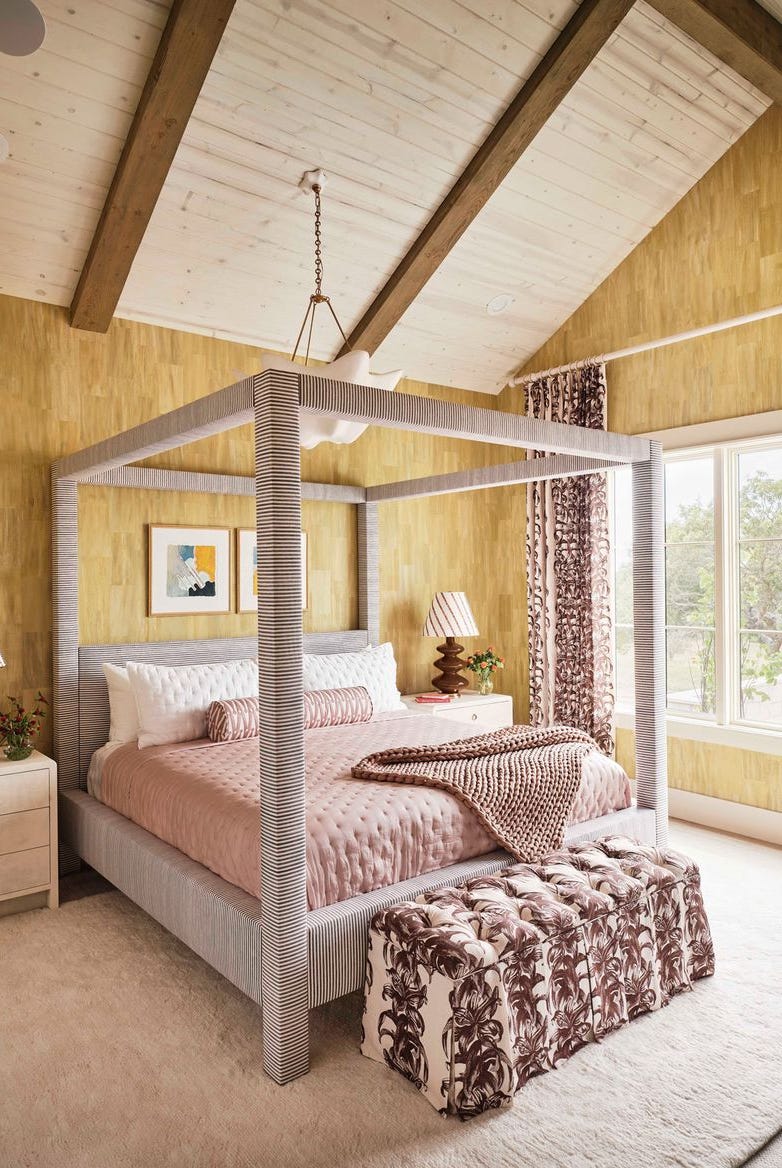
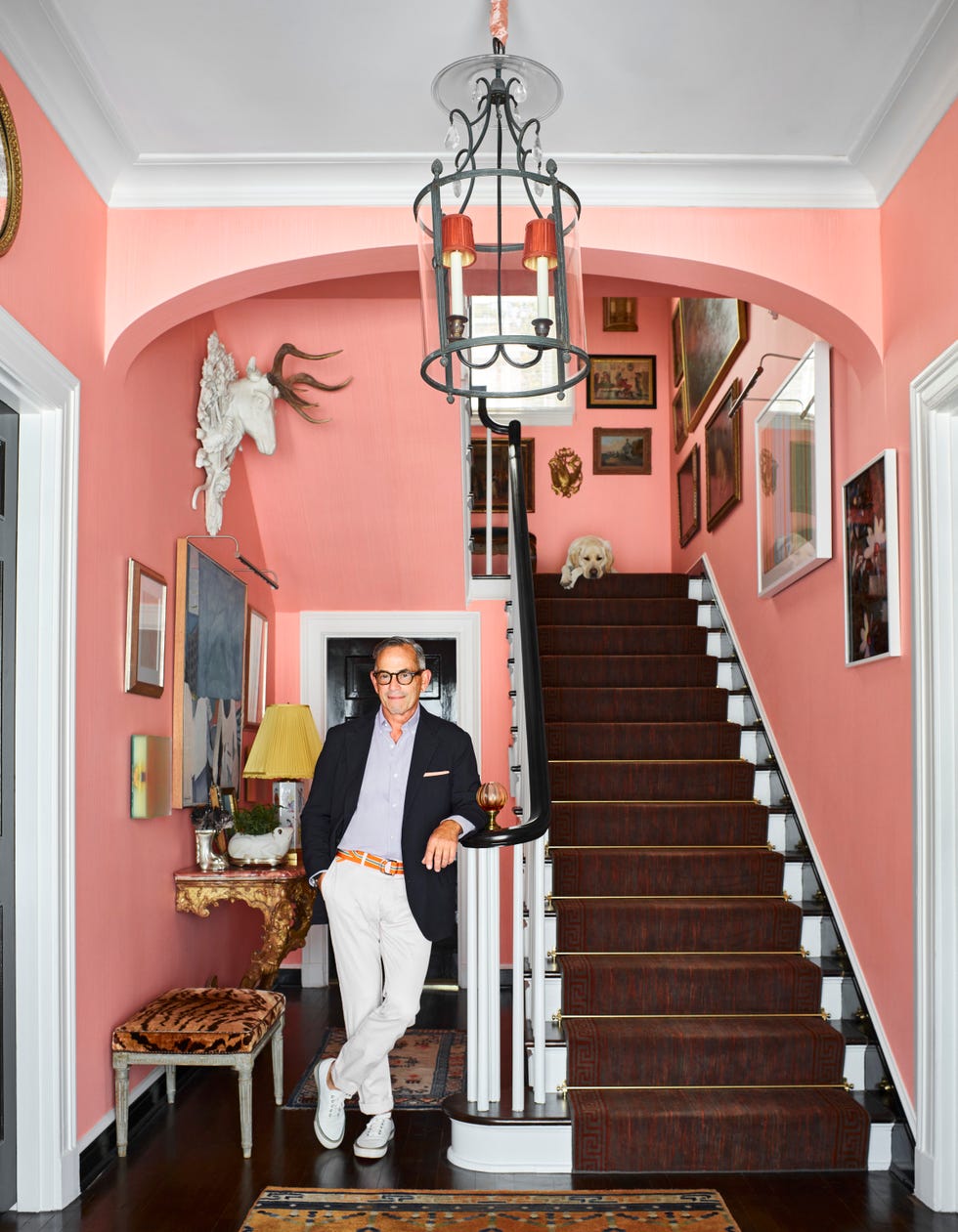
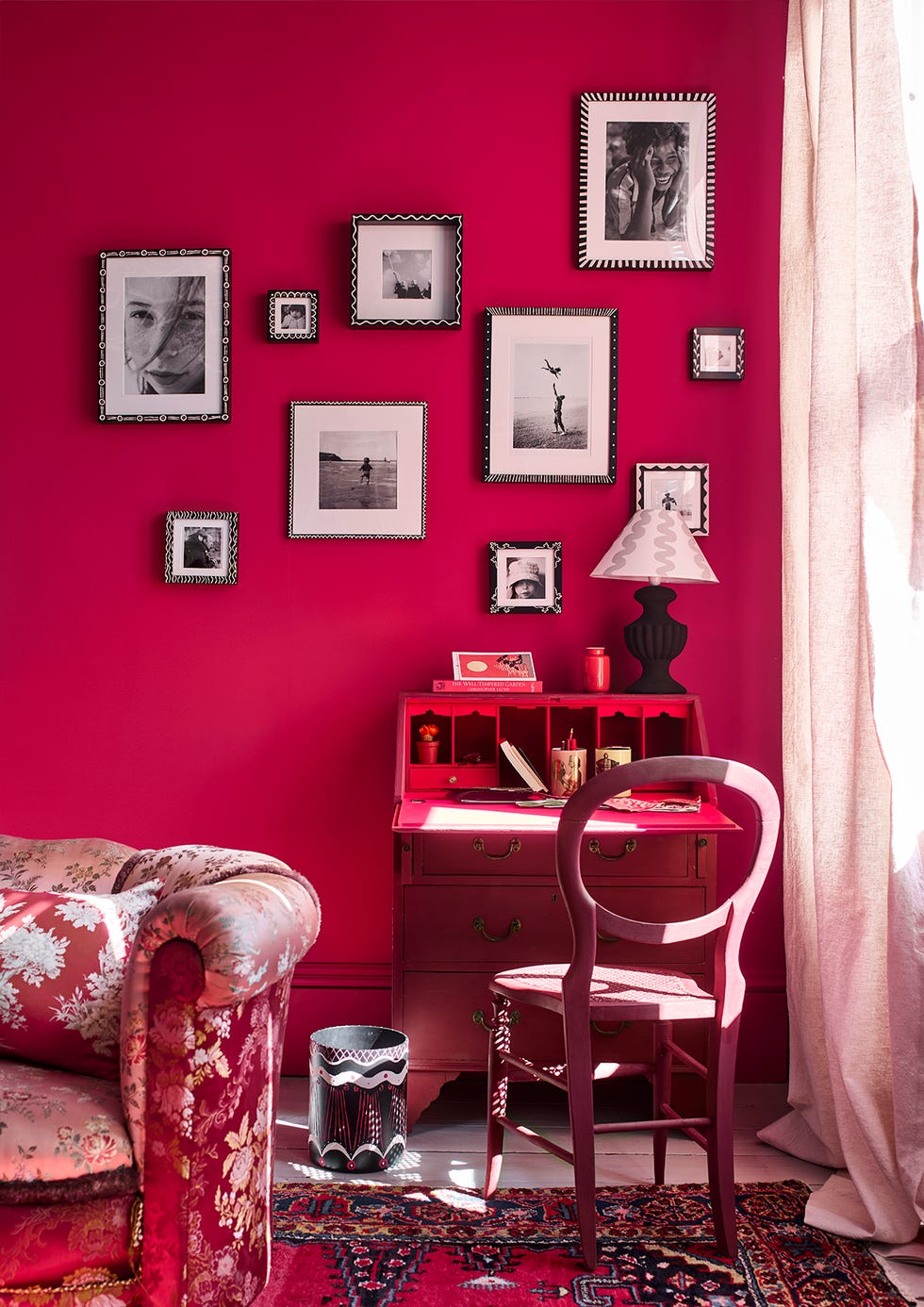
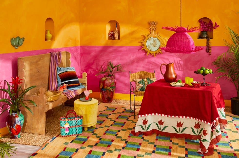
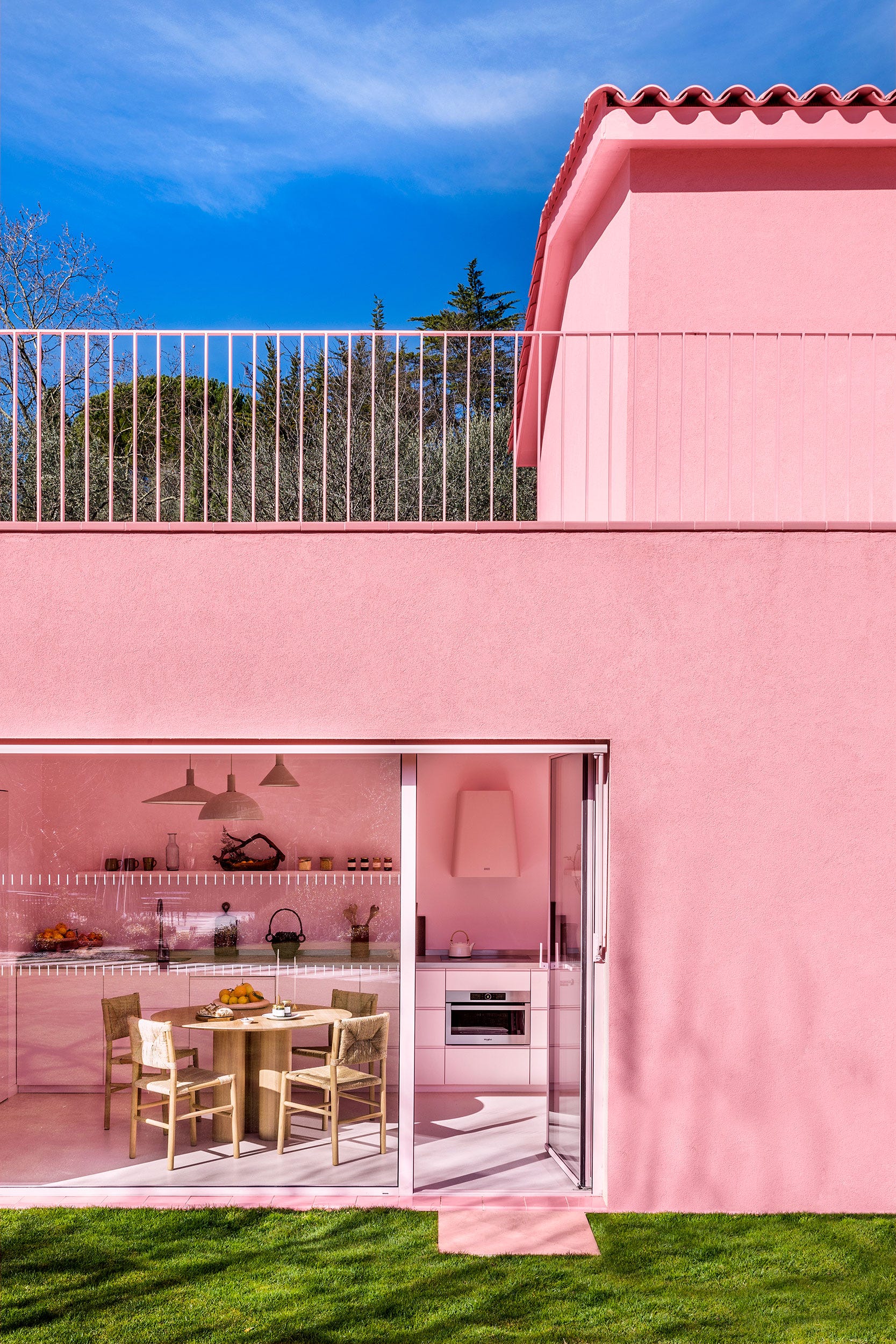
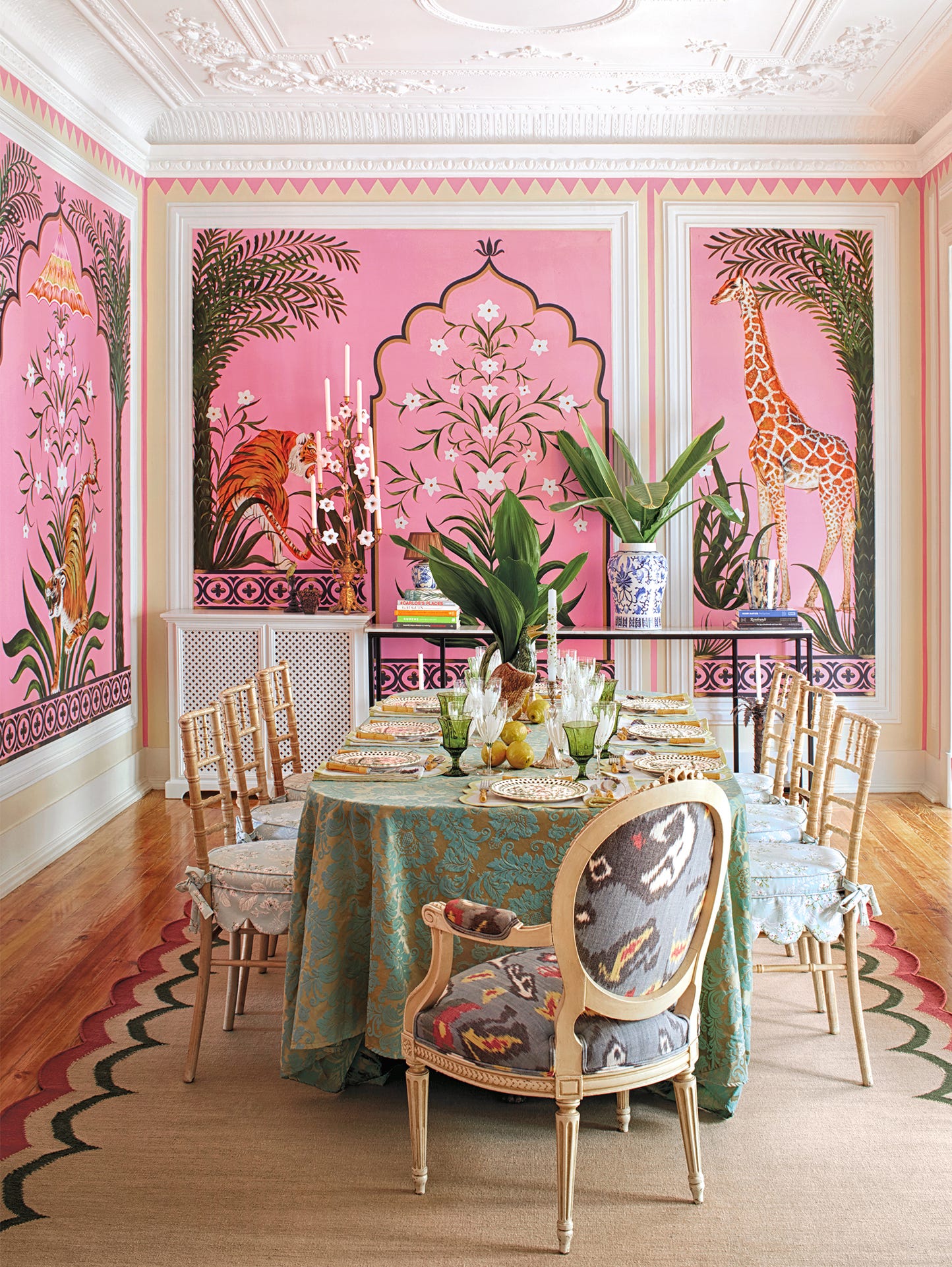
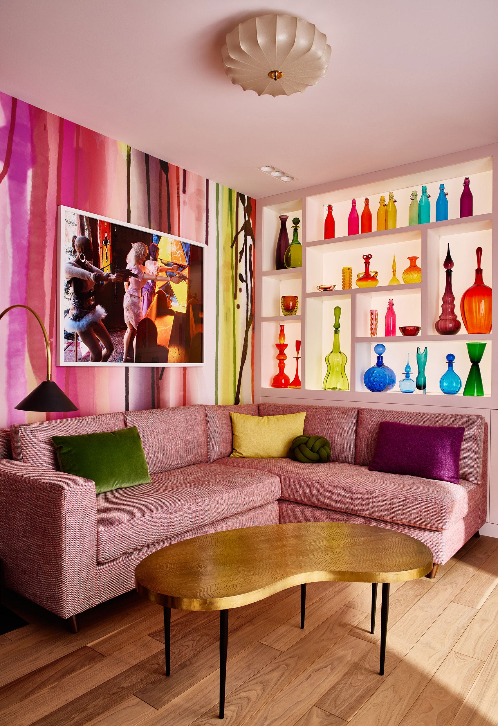
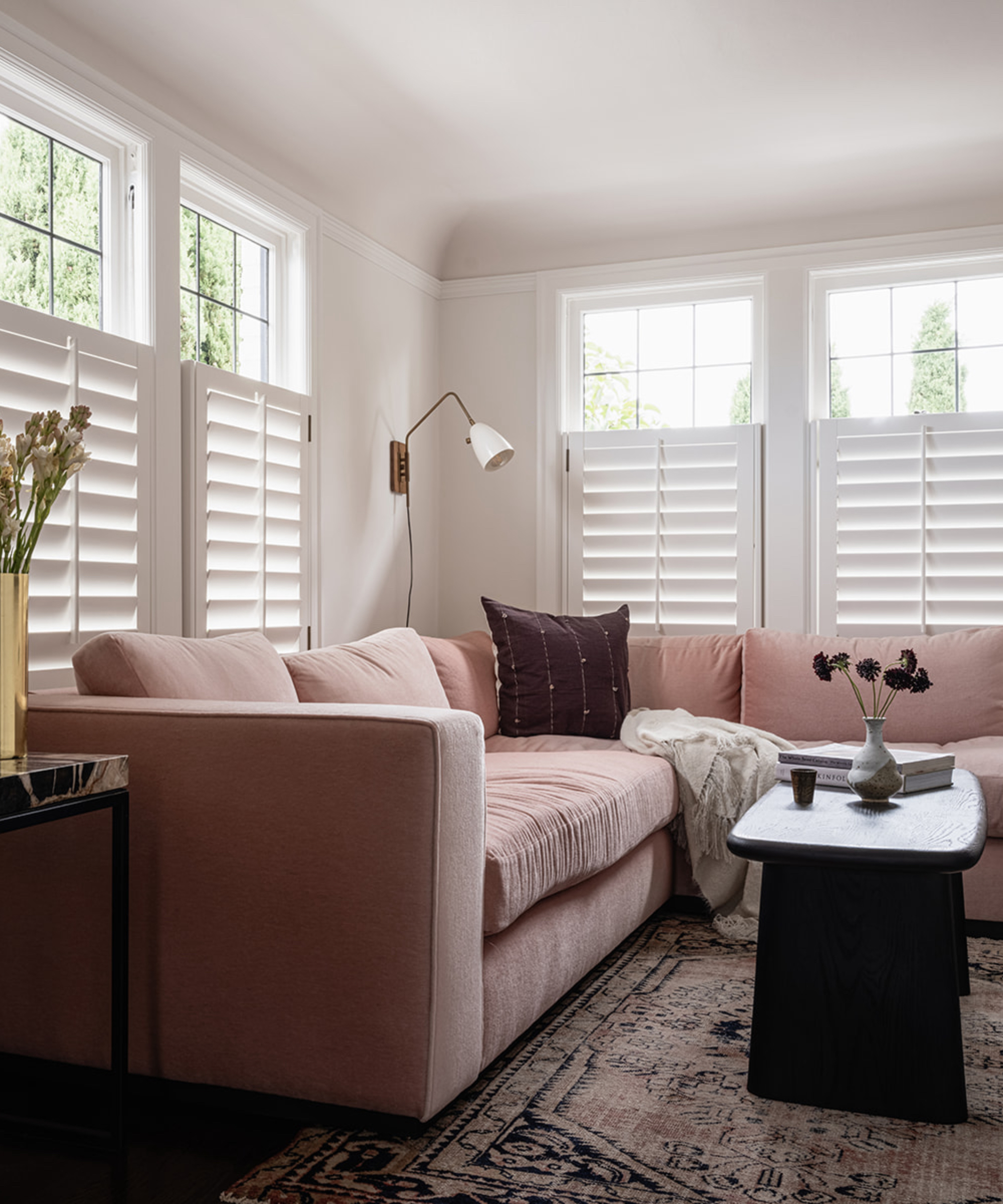
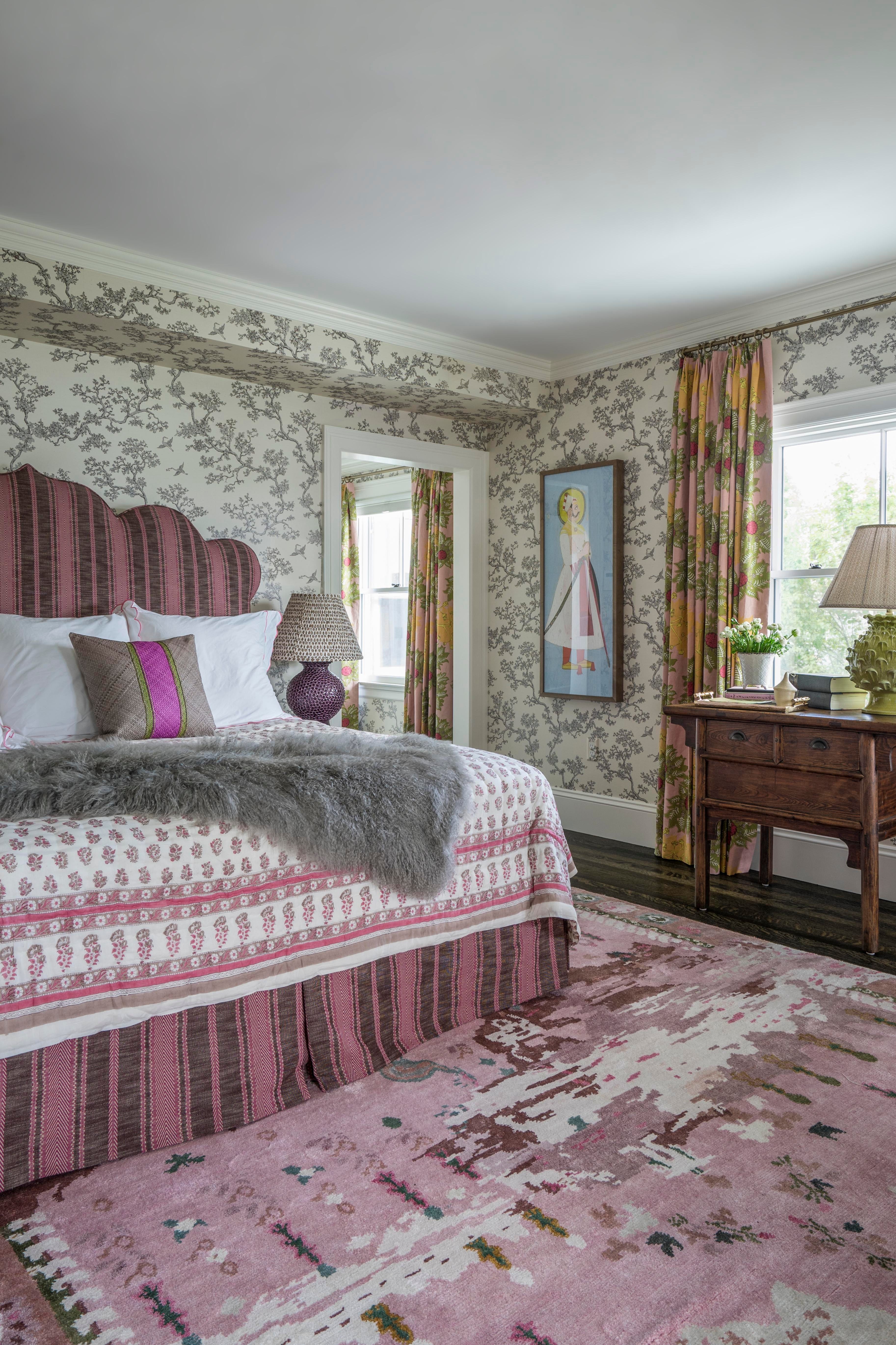
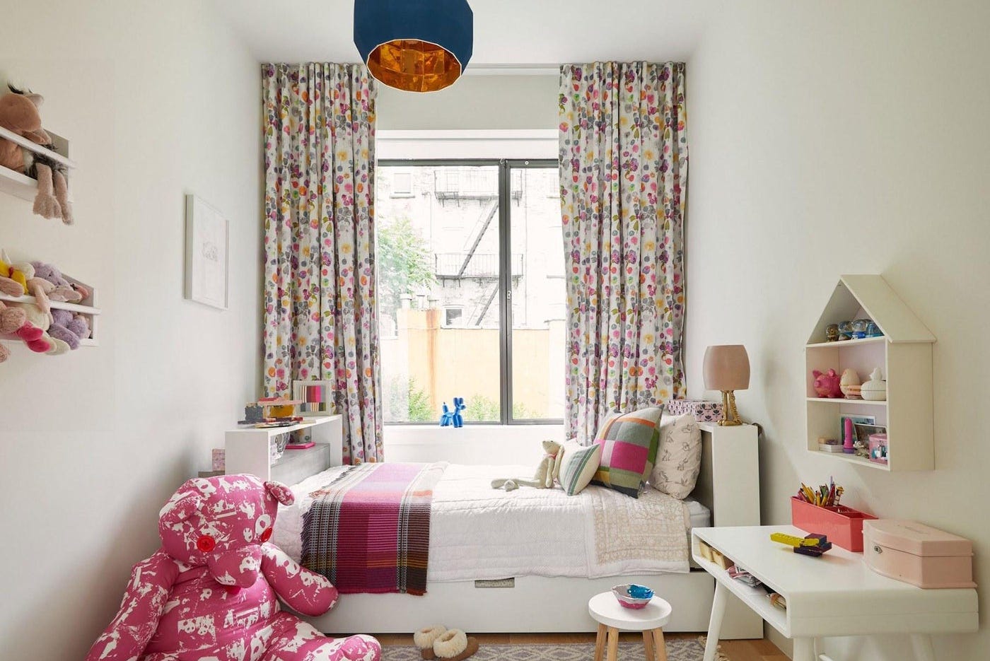
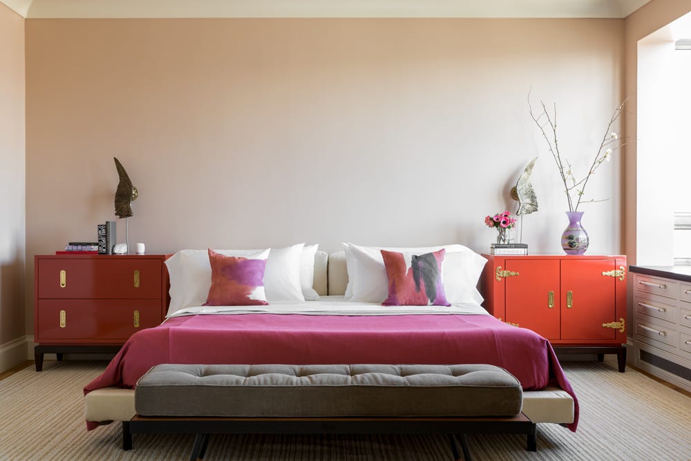
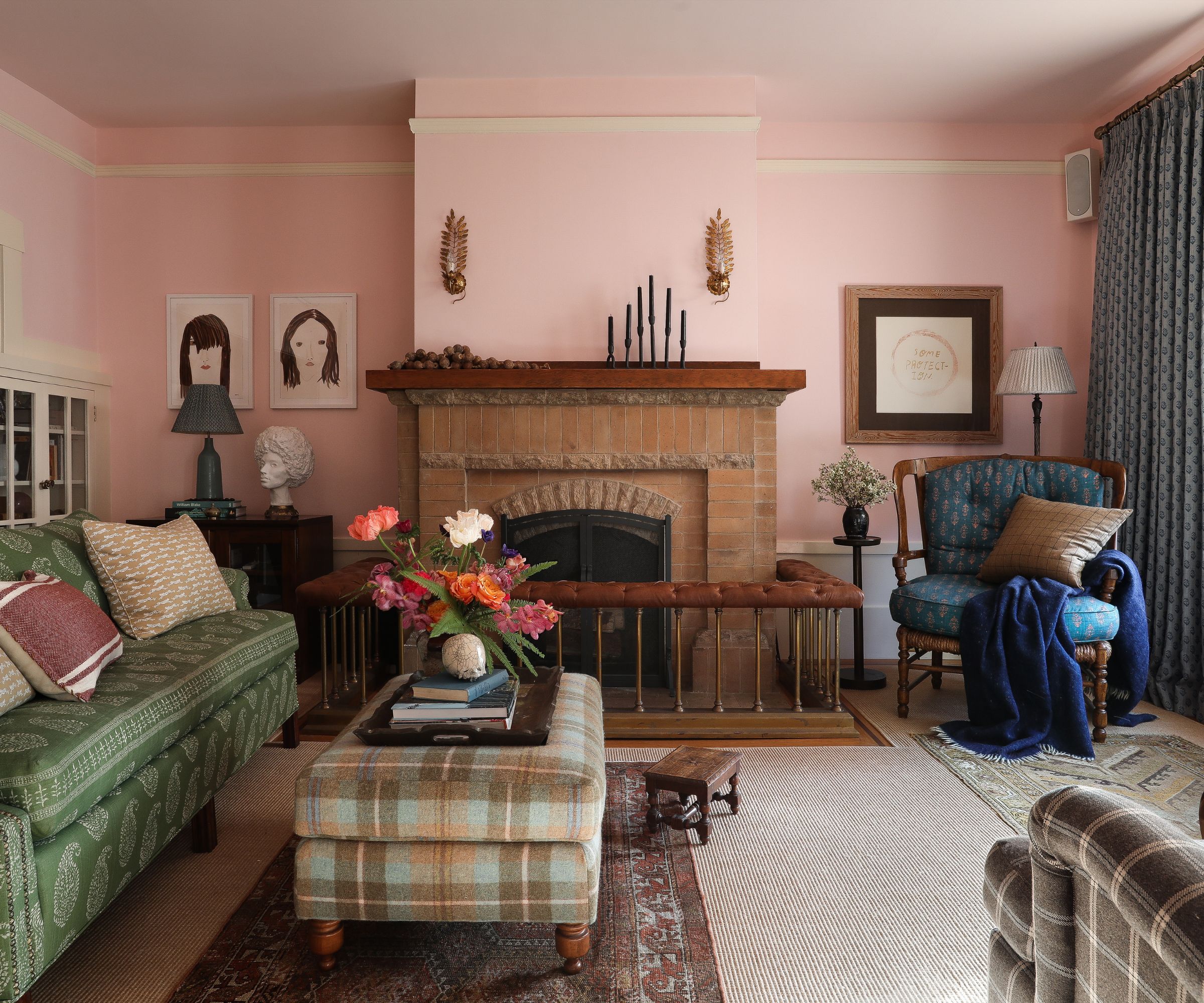
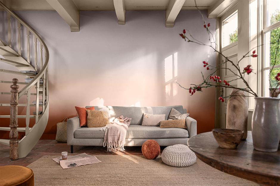
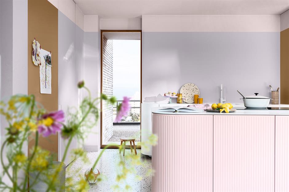
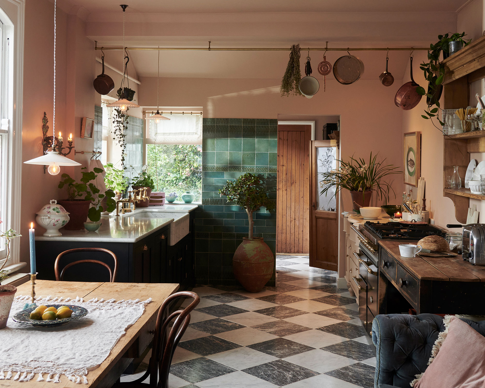
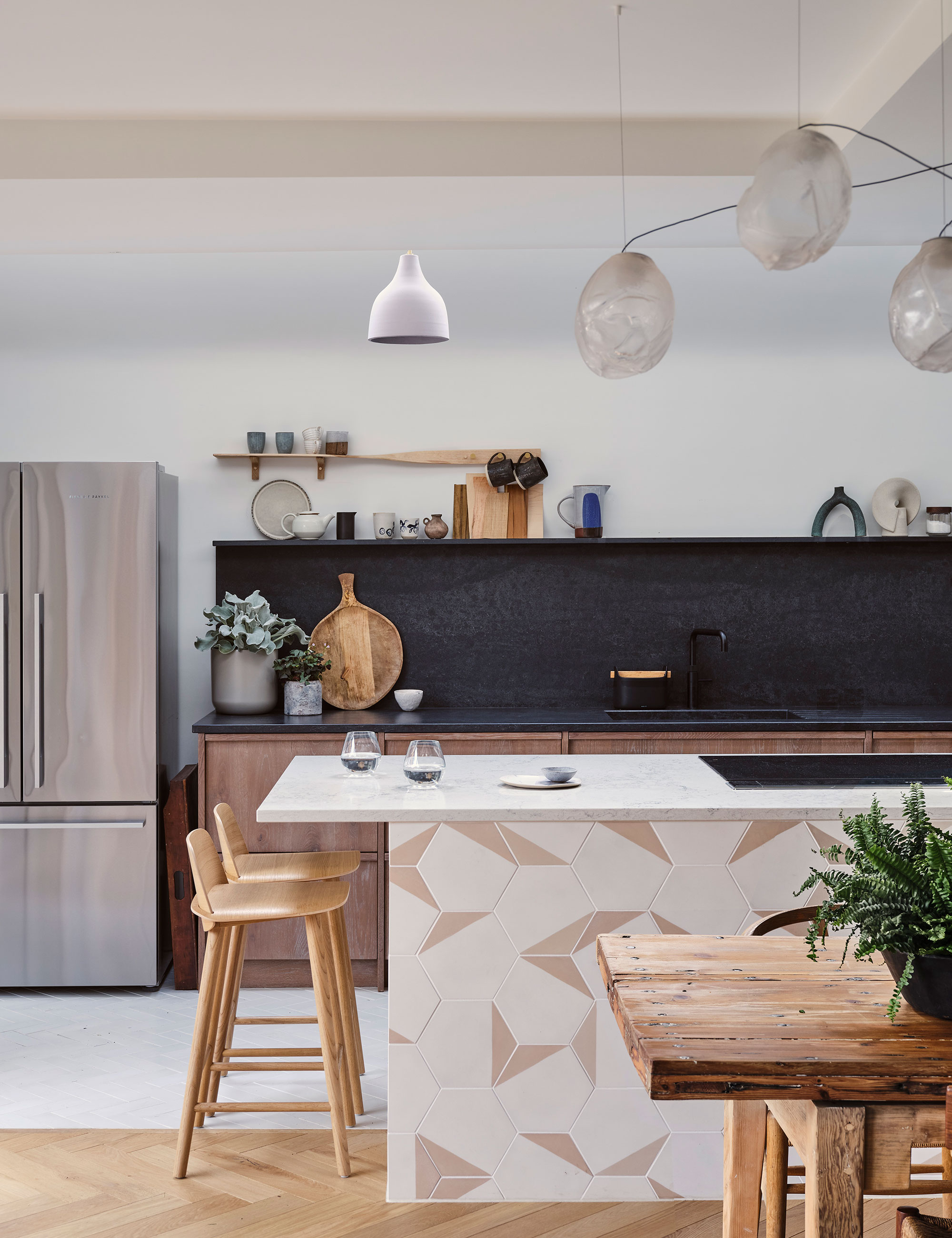
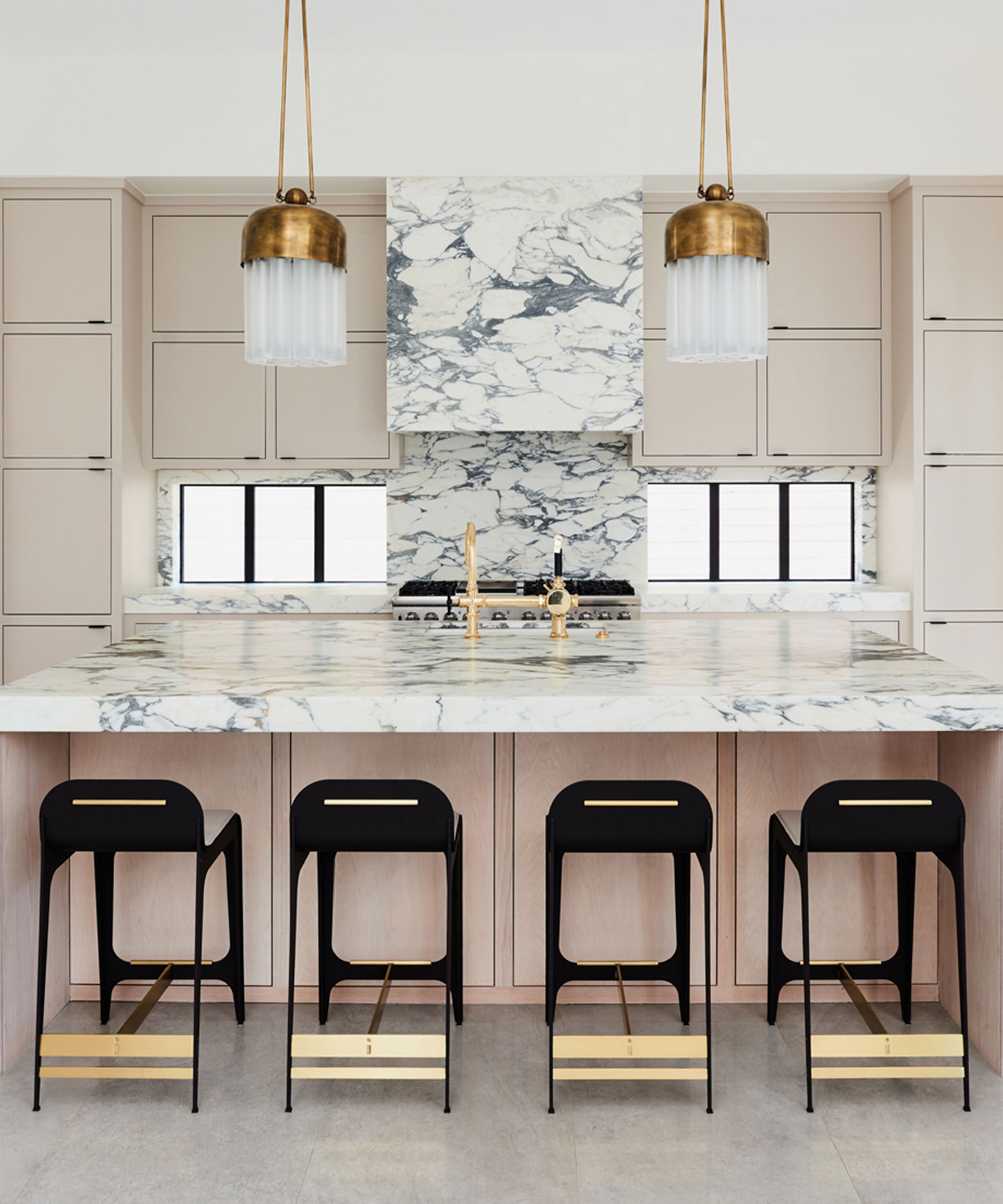
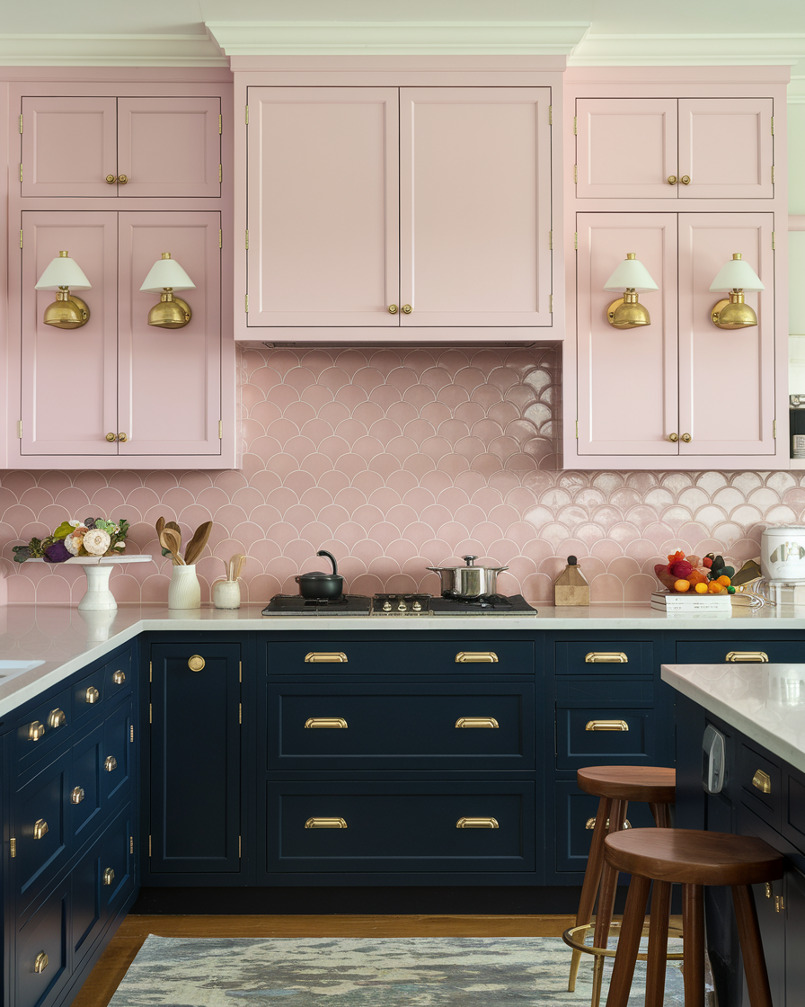
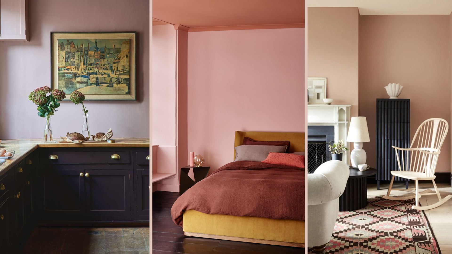
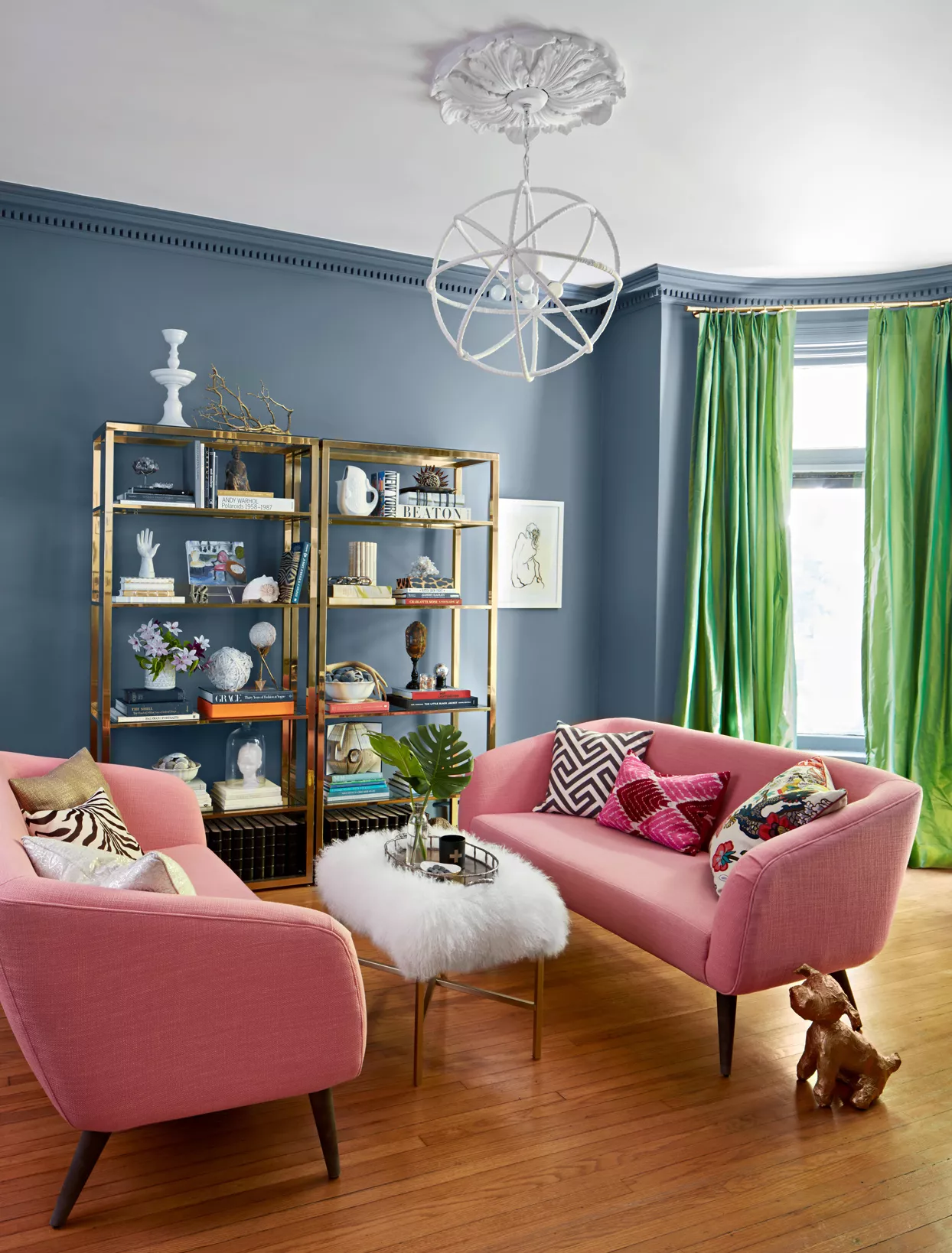
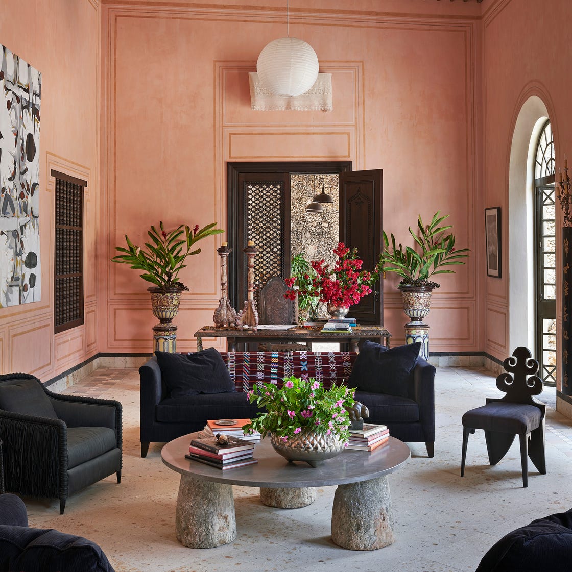
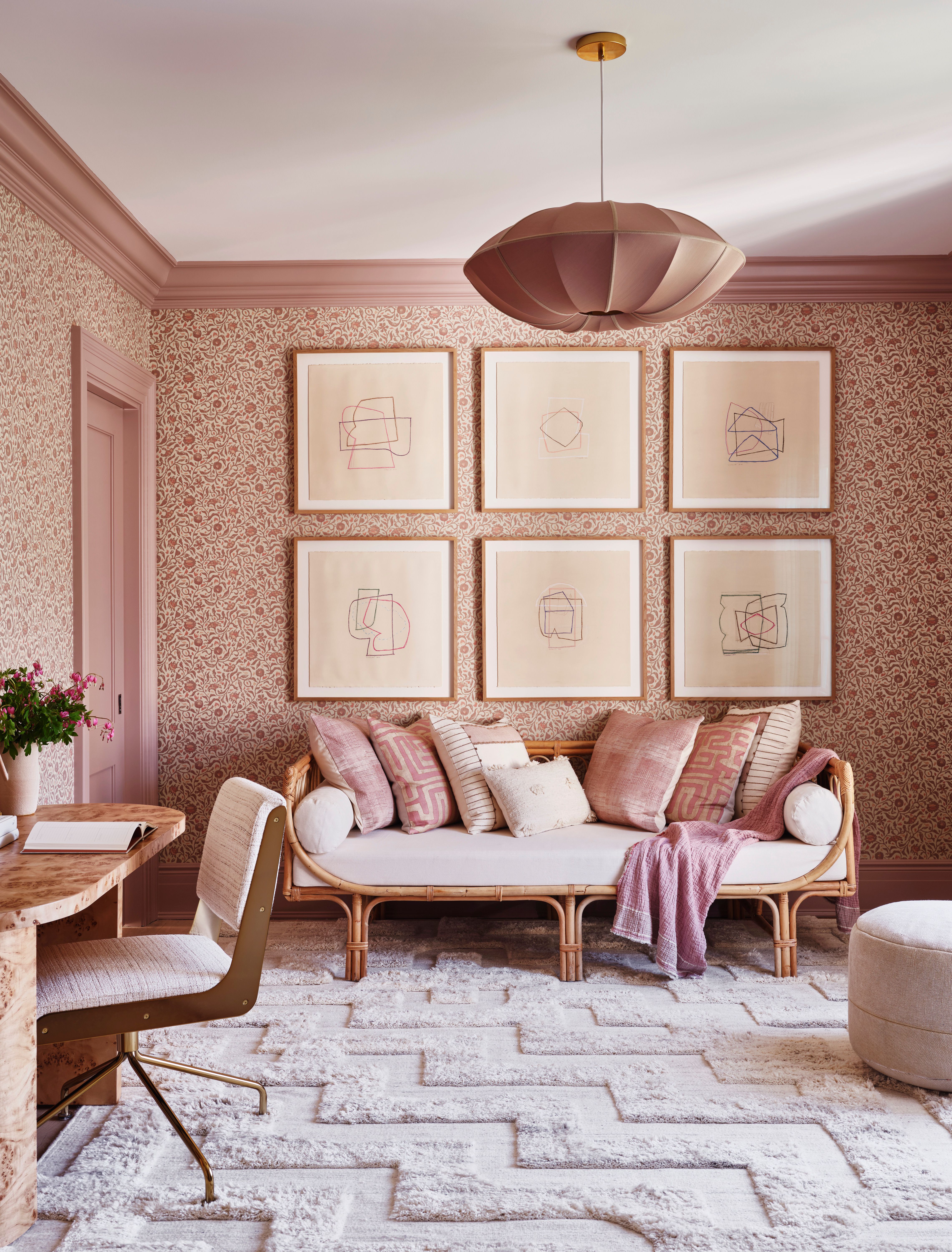
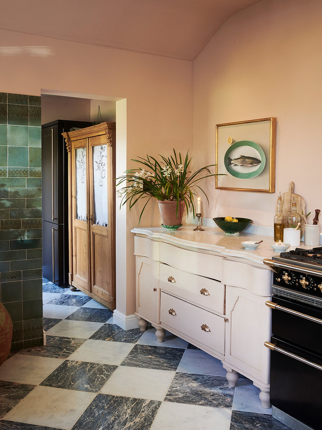
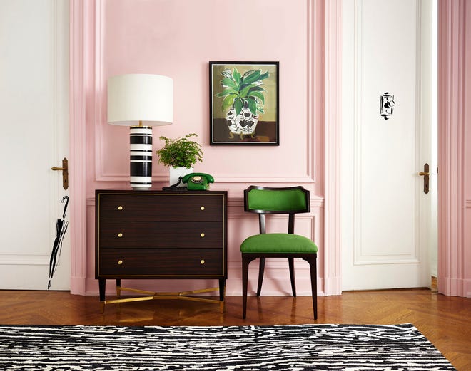
Pink paint colors have transcended their traditional association with children's bedrooms to become a versatile and sought-after choice for various areas of the home. Their wide range of tones, from gentle plaster-like hues and warm peachy shades to vibrant statement pinks, allows for diverse design schemes. When selecting a pink paint, considering the undertones and the room's natural light is crucial, as this influences whether the shade appears warm or cool. While all pinks are inherently warm due to their position on the color wheel, cleaner tones can feel cooler than muted ones.
Interior designers and color experts recommend a variety of pink shades for different moods and spaces. Benjamin Moore's 'First Light,' a soft, airy pink, is a bestseller, offering a refreshing alternative to whites and beiges, particularly popular in bedrooms and relaxed living areas. It pairs well with various whites and stronger colors like Hint of Mauve and Northwood Brown. Dulux's 'Potters Pink' is another versatile choice, described as gentle and sweet, enhancing both north-facing rooms by adding warmth and south-facing rooms by creating a cozy ambiance. It complements dark wood and gold accents.
Farrow & Ball's 'Cinder Rose' is noted for its chameleon-like quality, adapting to light conditions to appear moodier in darker spaces and vibrant in brighter ones. It suits powder rooms or children's playrooms and harmonizes with colors such as black, Great White, and Skimming Stone. Little Greene's 'Masquerade' is a sophisticated, grown-up pink that offers calming yet joyful vibes, available in graduated tones for cohesive design across rooms. Benjamin Moore's 'Ballet Slippers' is a balanced, pretty pink suitable for all rooms, creating a warm atmosphere in bedrooms and softening contemporary materials like concrete and metal.
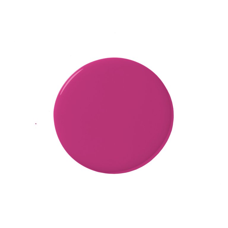
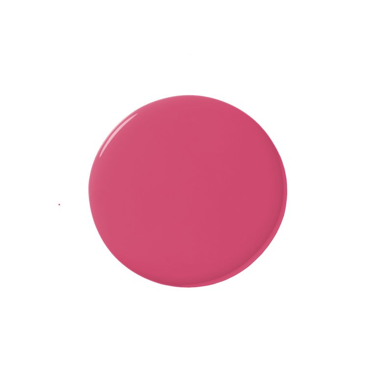
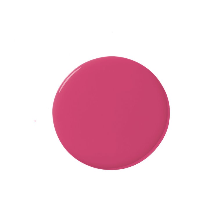
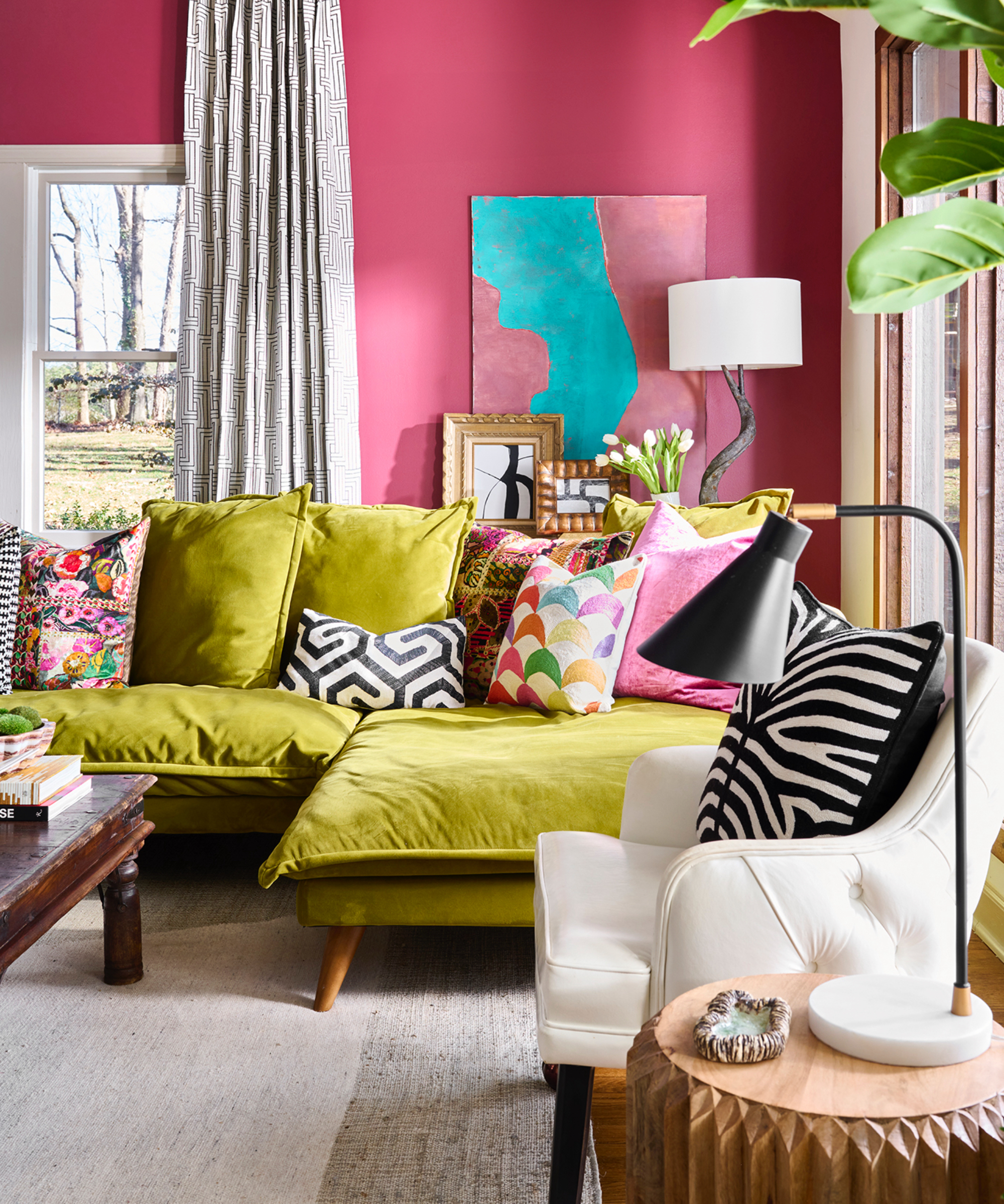
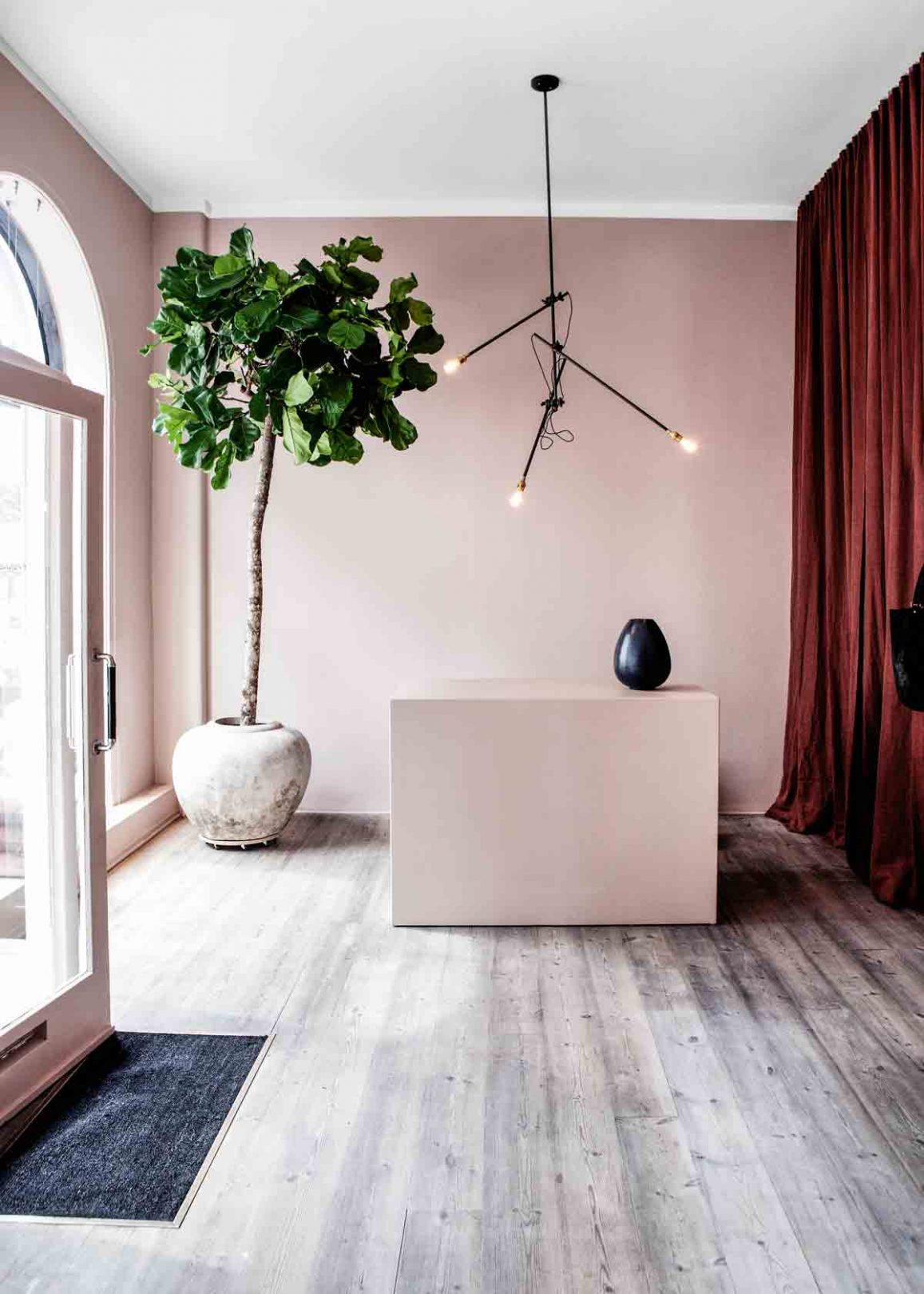
Graham & Brown's 'Highland Rose' provides a stately presence in smaller spaces like powder rooms, dining rooms, and home offices, evoking feelings of softness, romance, and chic Scandinavian style. Their 'Lille Pink' creates dramatic, bold rooms, ideal for areas with ample natural light, and can be accented with jewel tones for a maximalist feel. Farrow & Ball's 'Pink Ground' is a muted and neutral pink that brightens spaces and pairs well with colors like sage green.
'Popsicle' by Graham & Brown is an uplifting coral-hued pink that adds a tropical feel when combined with deep greens or a sophisticated calm with neutral grays, especially effective in north-facing rooms due to its yellow undertones. Crown's 'Crème de la Rose' is a versatile, light, and creamy soft pink that acts as a neutral backdrop, fitting both contemporary and traditional settings and complementing deep rich blues and greens. Benjamin Moore's 'Foggy Morning' is a muted pale pink with a red undertone, appearing almost neutral and pairing well with violet, Just Beige, and Stone Harbor.
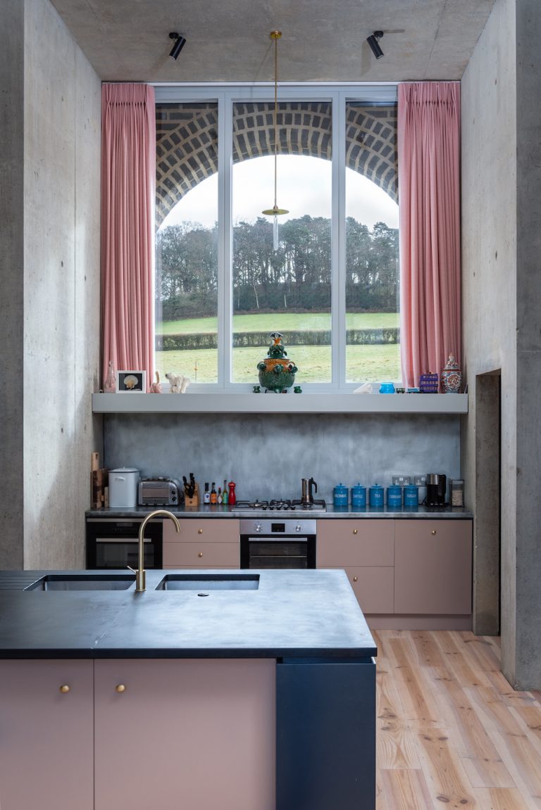
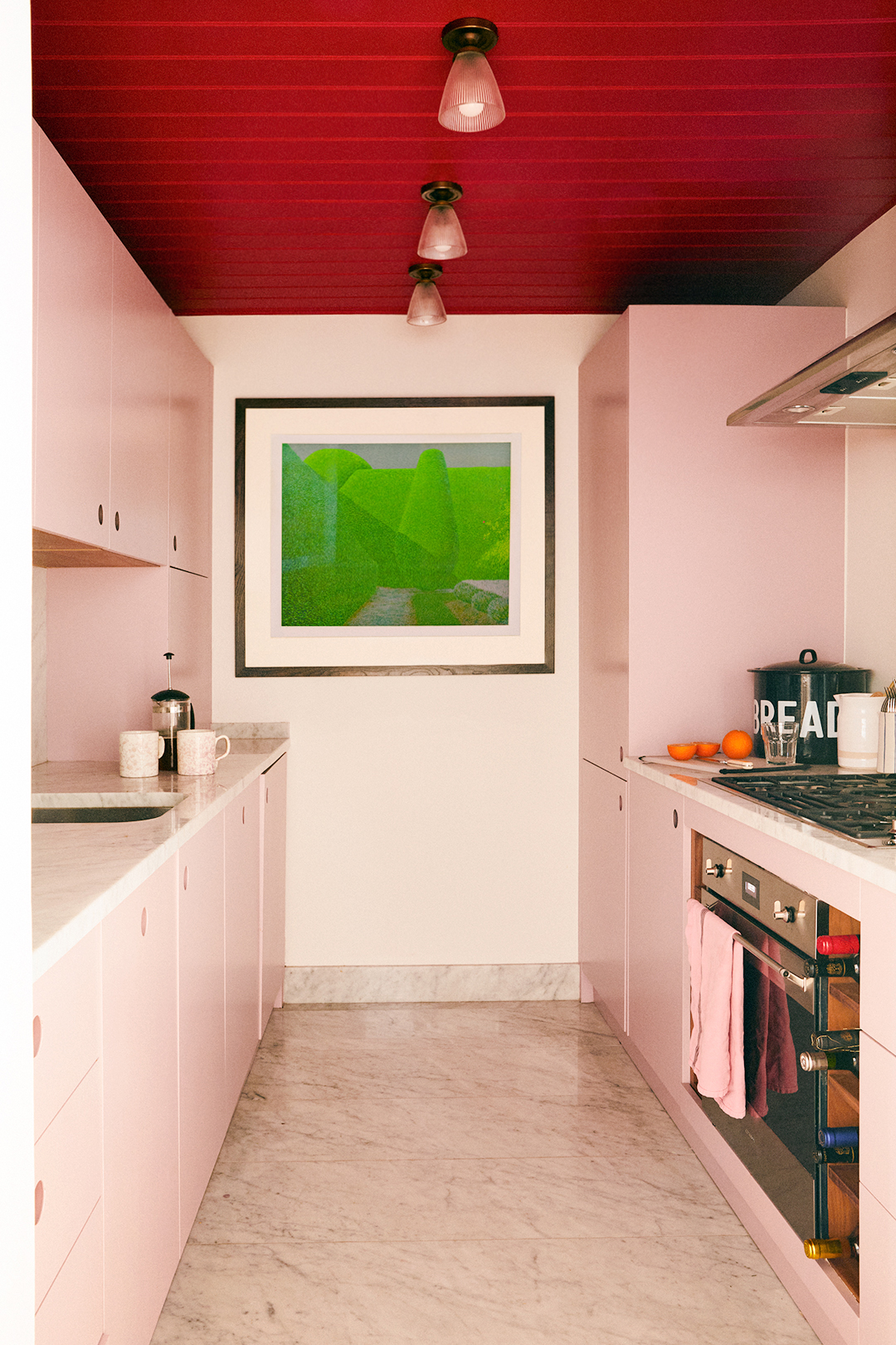
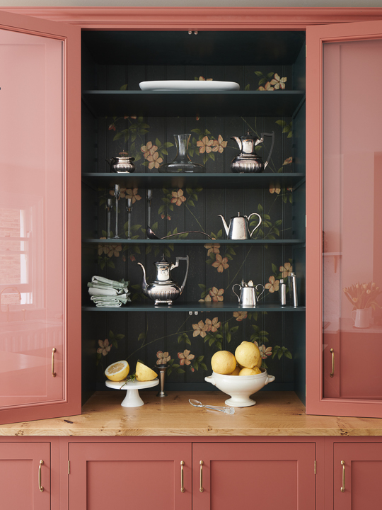
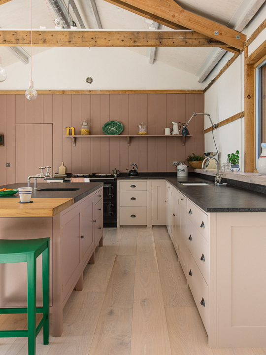
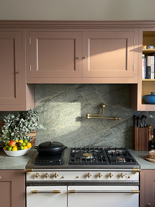
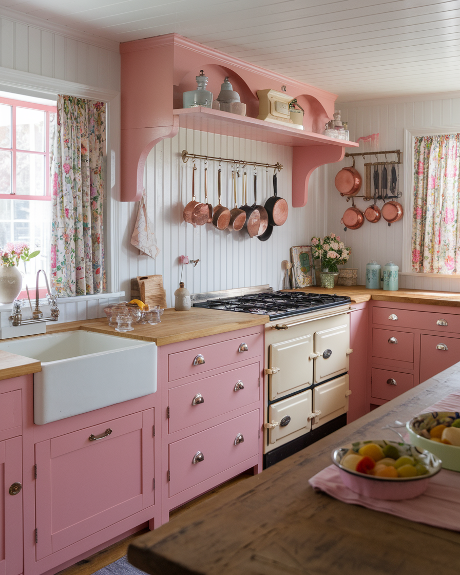
Sherwin-Williams' 'Dishy Coral' offers a nostalgic, peachy tone that evokes ocean and beach serenity, best in well-lit rooms. Crown's 'Cross Stitch' is a mid-toned, muted rose that provides warmth and is ideal for north-facing rooms, pairing with Quiet Space or Soft Scribbles. Benjamin Moore's 'Pink Dynasty' balances boldness and subtlety, perfect for bathrooms, kitchens, and living rooms, and is a popular choice for kitchen cabinets. Little Greene's 'China Clay' is a subtle, almost neutral pink that warms spaces as an alternative to white, dramatically contrasting with rich aubergine.
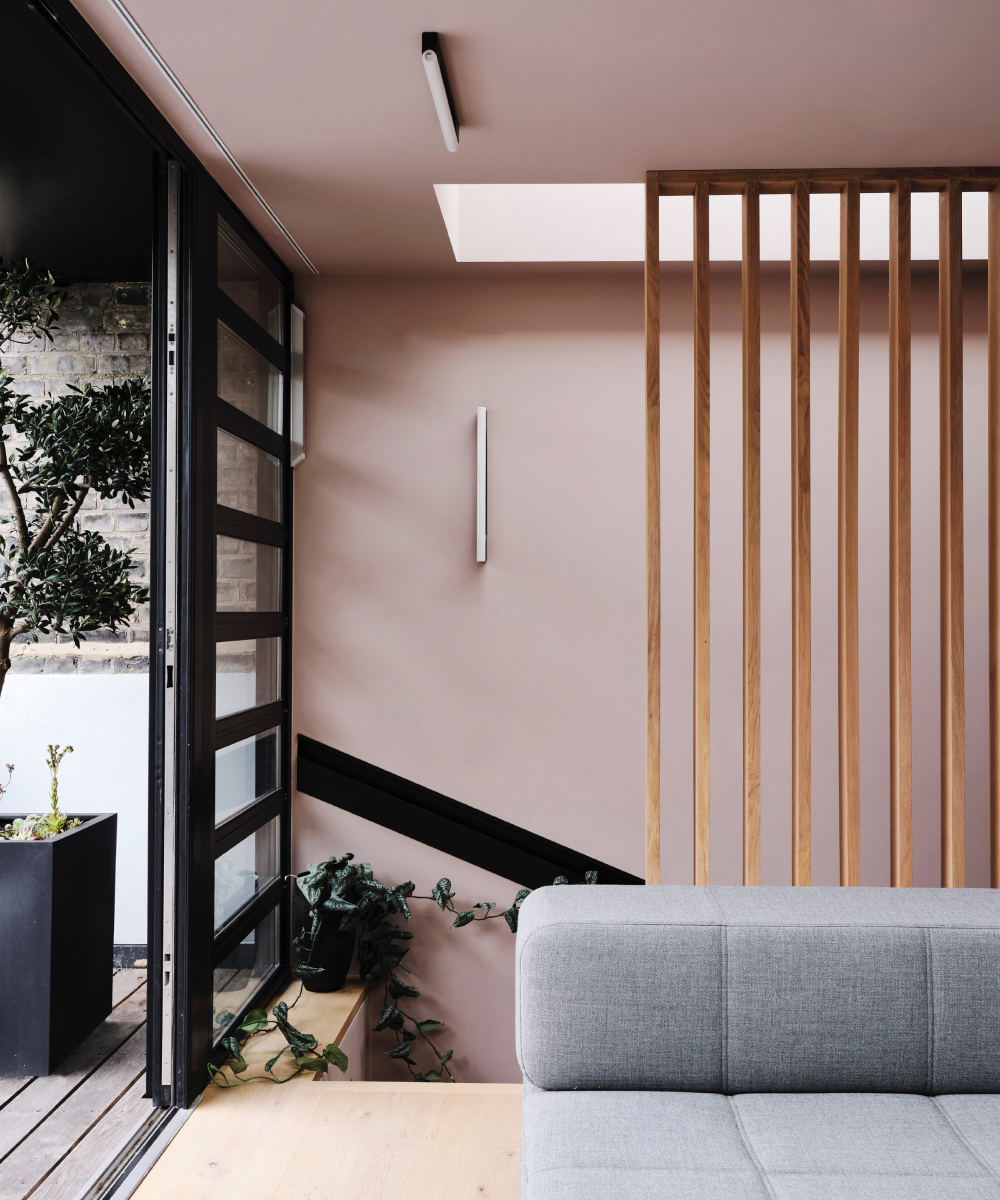
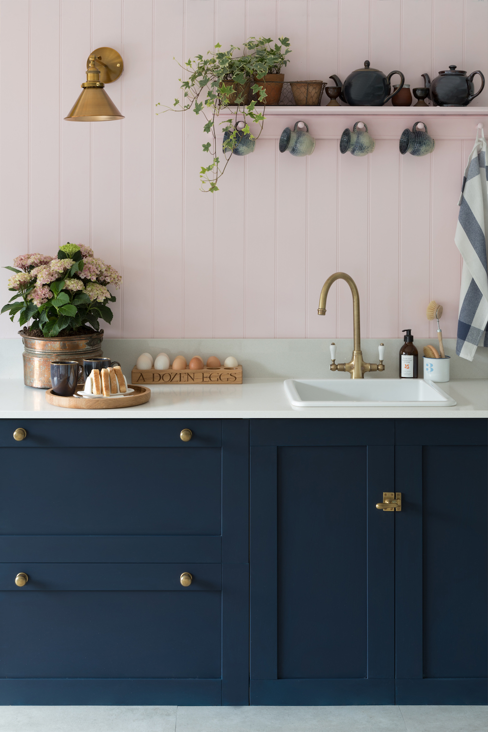
Farrow & Ball's 'Sulking Room Pink' is a hearty, earthy pink that deepens in bright environments, transforming from a brownish hue when wet to a sophisticated muted rose. Edward Bulmer's 'Cuis de Nymph Emue' is a neutral pink suitable for both urban and country homes, with lighter coral or plaster tones recommended for darker areas. Farrow & Ball's 'Templeton Pink' is a warm, historic shade with yellow pigments, bringing coziness to north-facing rooms and kitchens. Pink generally pairs well with most colors, particularly green, creating fresh and soothing combinations. Antique brass hardware and gray tones also complement pink effectively.
#PinkPaintColors #InteriorDesign #HomeDecor #ColorTrends #PaintSelection #LivingRoomIdeas #BedroomDesign #KitchenTrends #PinkPaintColors #InteriorDesign #HomeDecor #ColorTrends #PaintSelection #LivingRoomIdeas #BedroomDesign #KitchenTrends
0 comment in total
 No comments yet
You may also like
11 Colors That Go With Pink That Work in Homes Now

After This Design Trend Took Off, These Paint Colors Became 40% More Popular

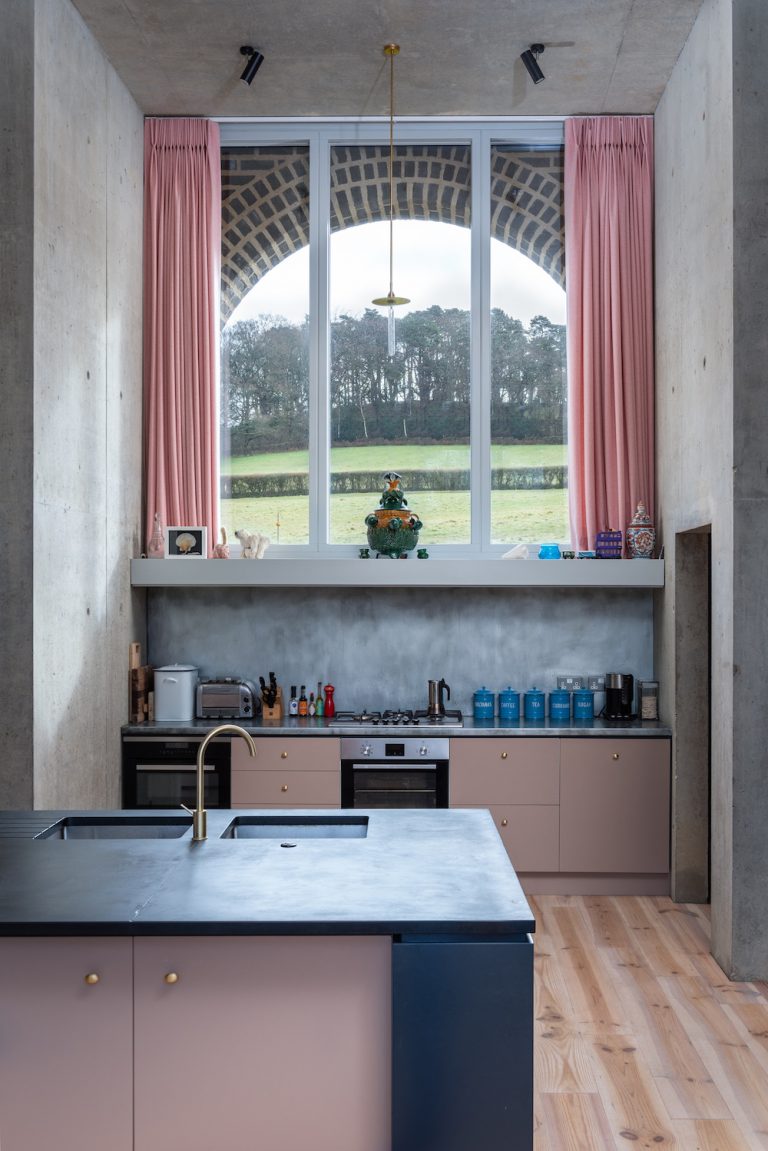
21 Pink Kitchen Ideas: How to get the on-trend kitchen colour right |
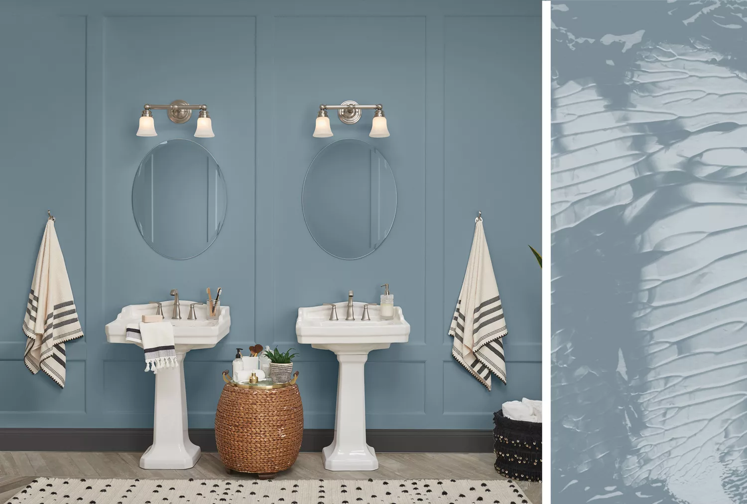
20 Interior Paint Colors Decorating Experts Love

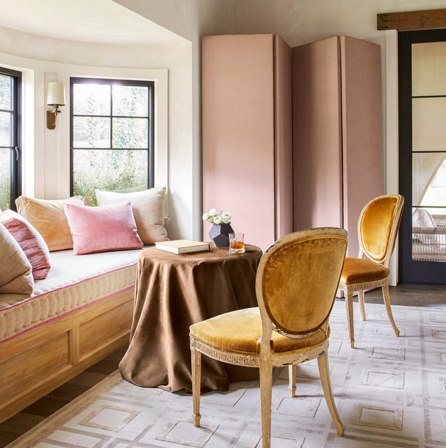
14 Chic Pink Color Combinations Designers Swear By

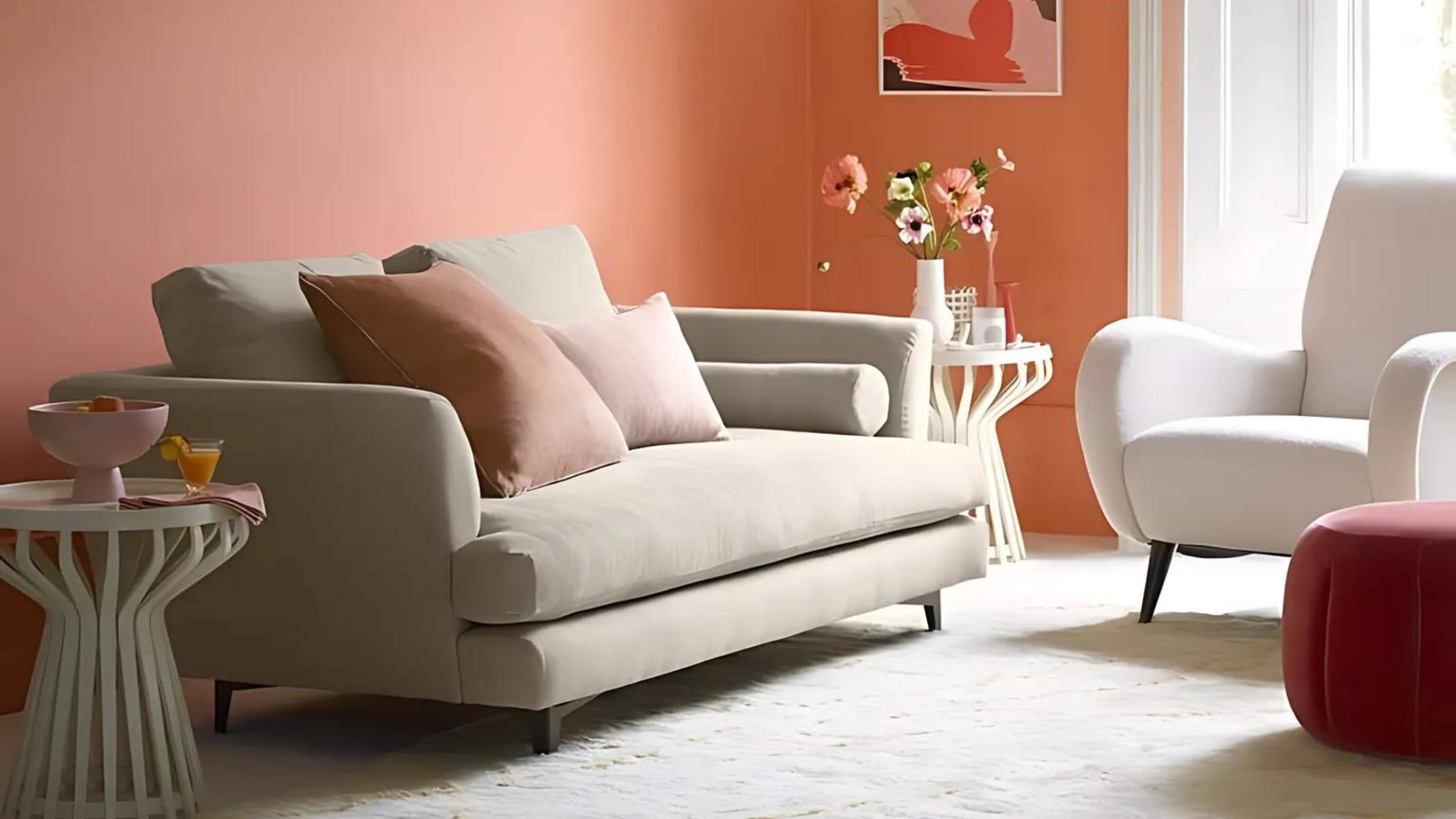
8 pink living room ideas – liven up your space with this joyful color

What Color Goes with Pink? 16 Pretty Pairings to Try


11 Paint Colors That INSTANTLY Make Your Home Look "Expensive," According to Designers
The *Right* Way to Decorate with Pink, According to Design Experts

Pink Room Decor Ideas: 39 Ways to Use the Shade Throughout Your Home
Some People “Can’t” With This Cabinet Color, But There’s No Denying It’s on the Rise

And the Next It Kitchen Cabinet Color Is…
12 Colors That Go With Pink: Classic and Modern Ideas
34 Dreamy Bedrooms That Will Make You Rethink Pink

Pretty in pink: decorating ideas for this year's hottest colour | loveproperty.com
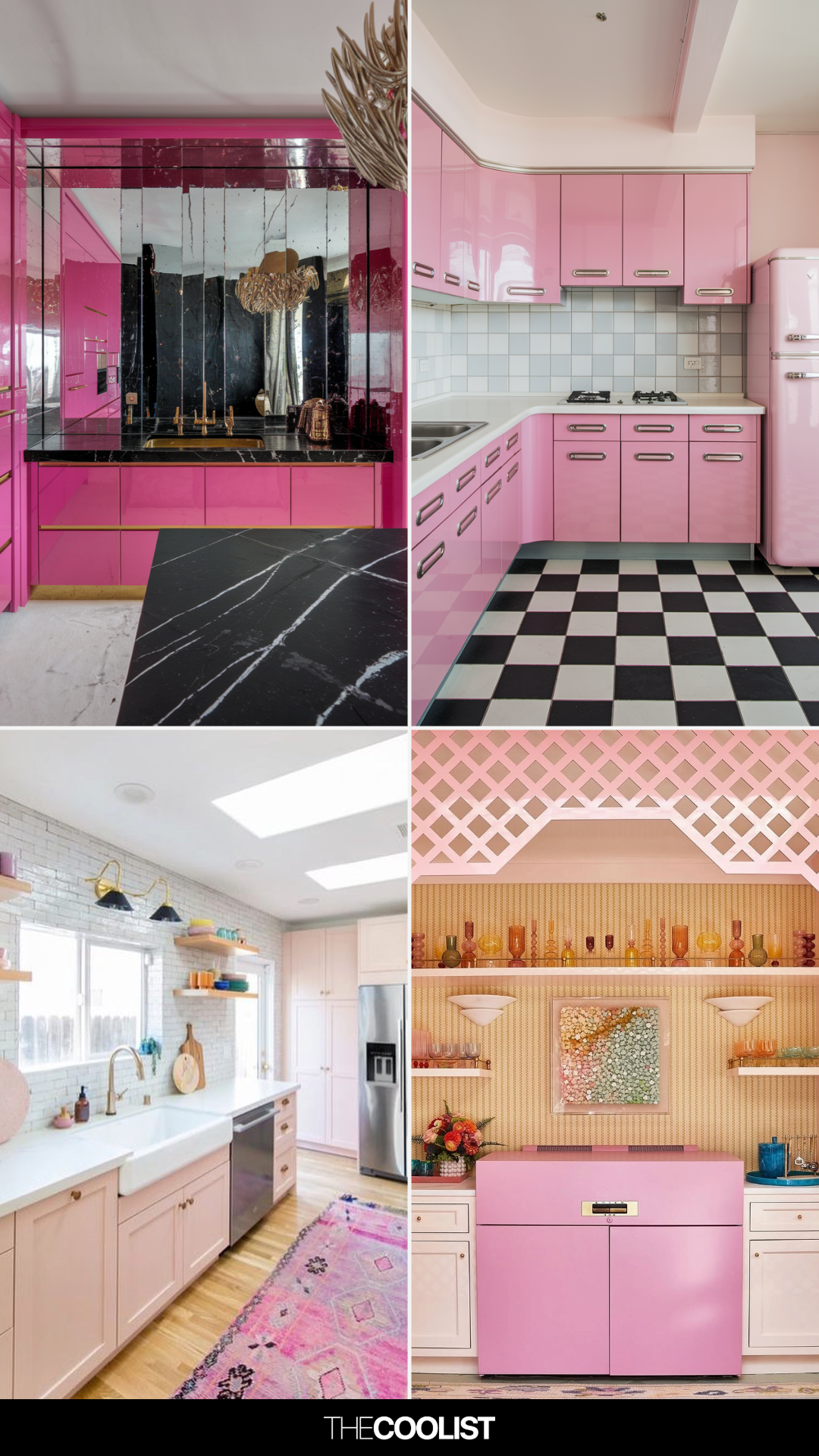
19 Pink Kitchen Ideas That Feel Stylish, Not Over-the-Top

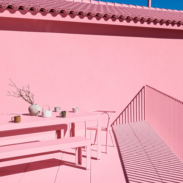
25 Pink Room Ideas to Satisfy Your Barbiecore Dreams

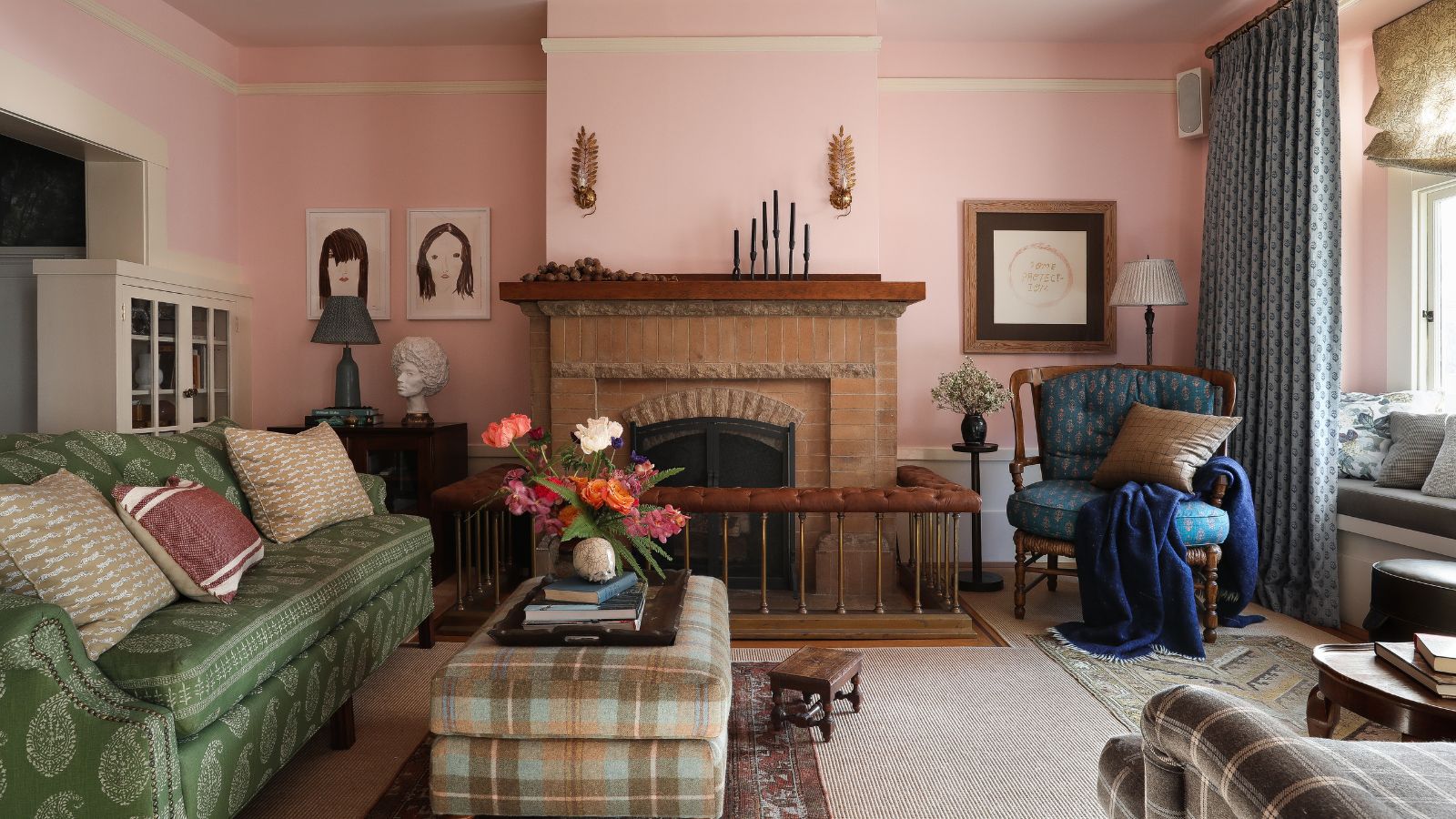
I never thought I would be decorating with pink and brown – but designers have convinced me this is the most sophisticated color combination for 2025 and beyond
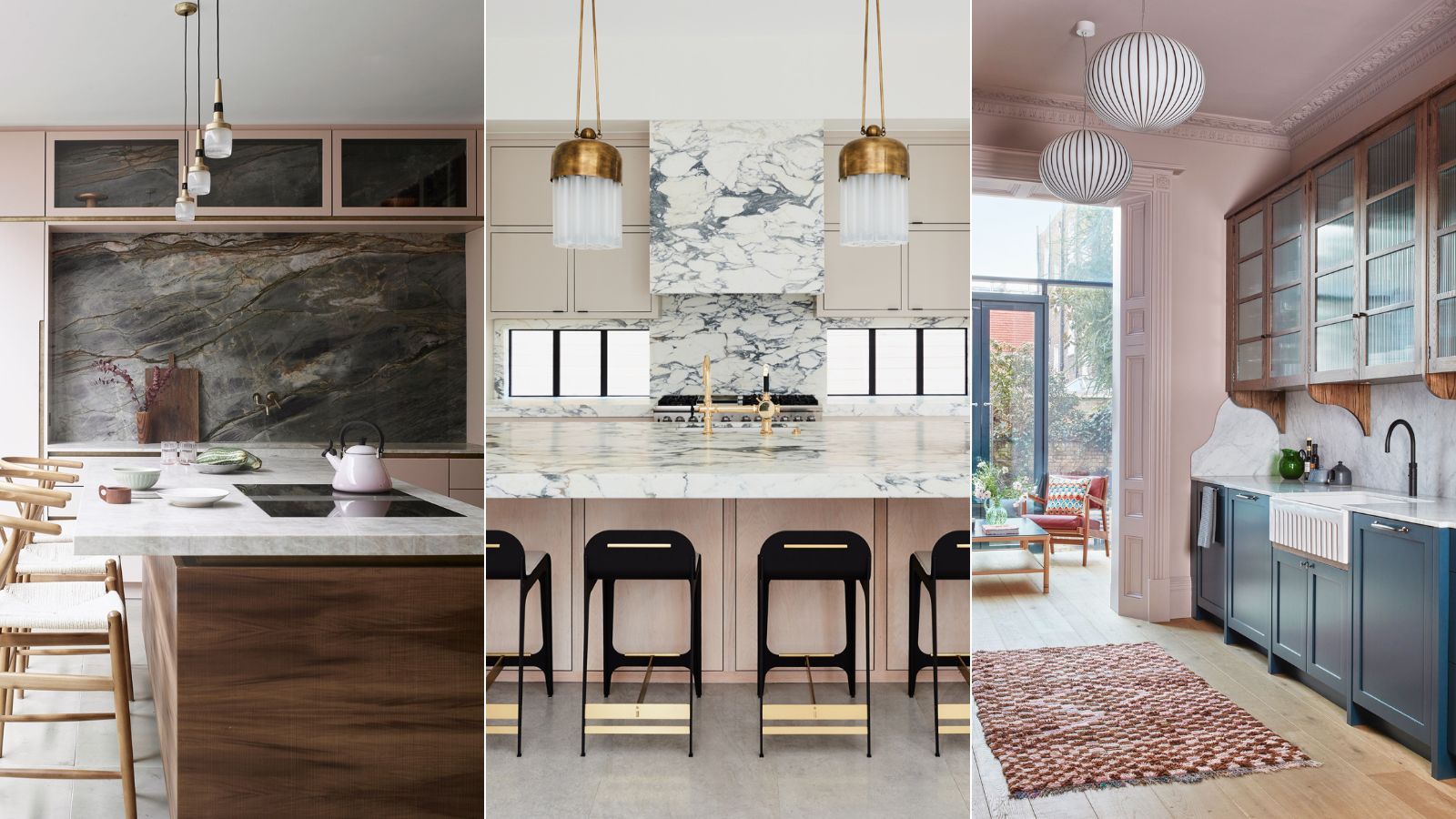
'The renaissance of this color is not surprising' – 11 pink kitchens that are timeless and soothing

Home design: Add some pink