1/13
Orange Deserves a Spot in Your Home—Here's How Designers Use It
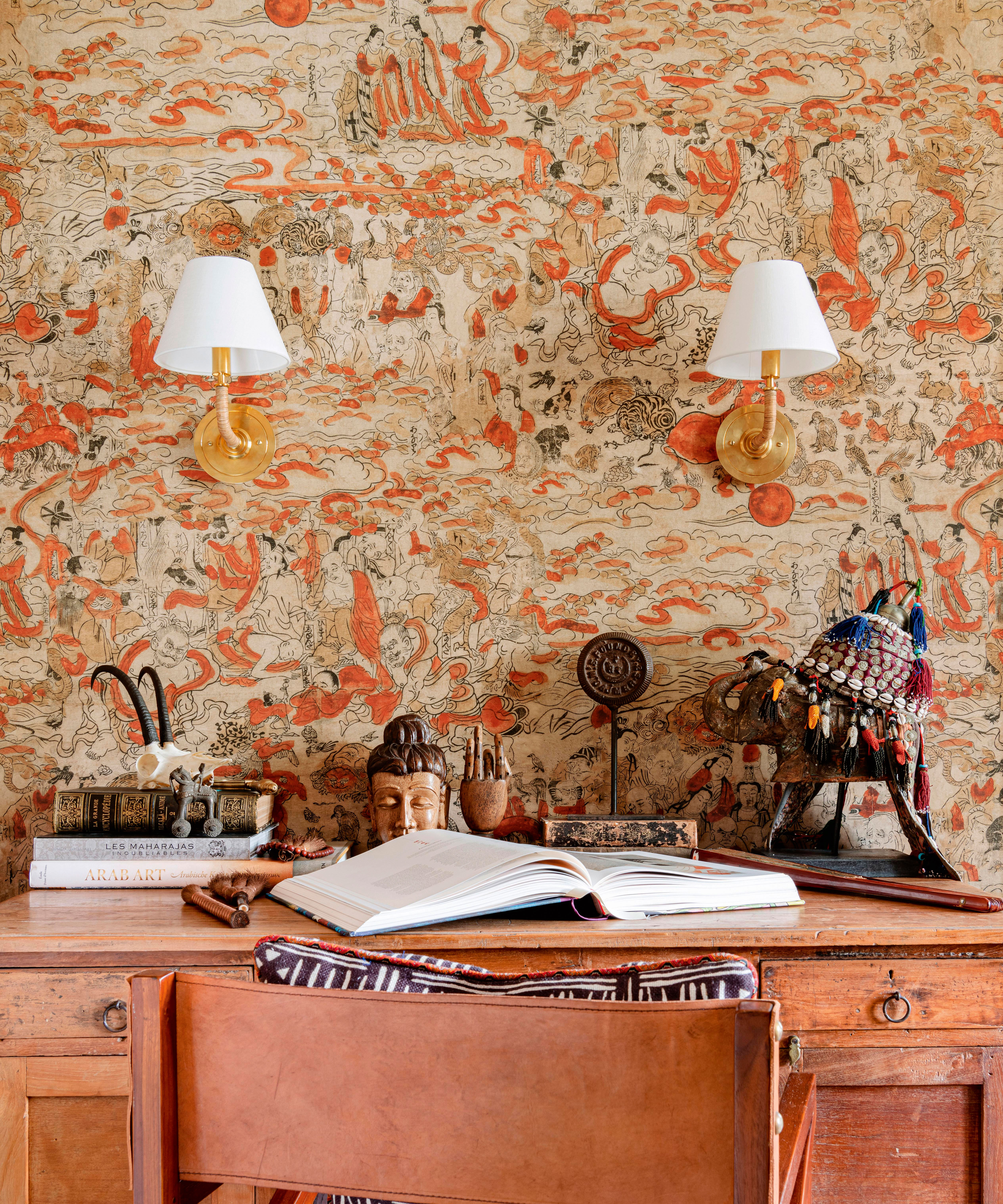

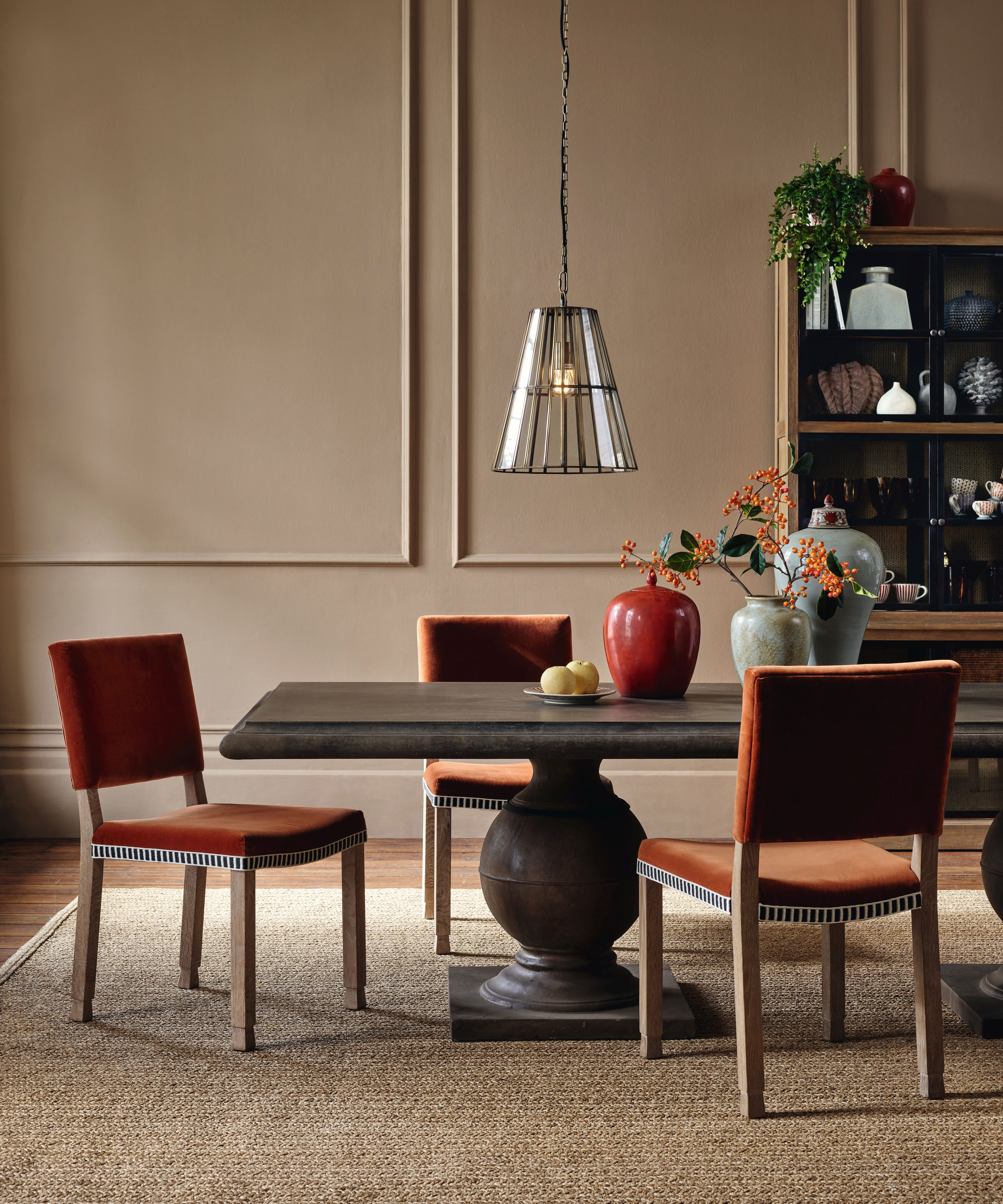

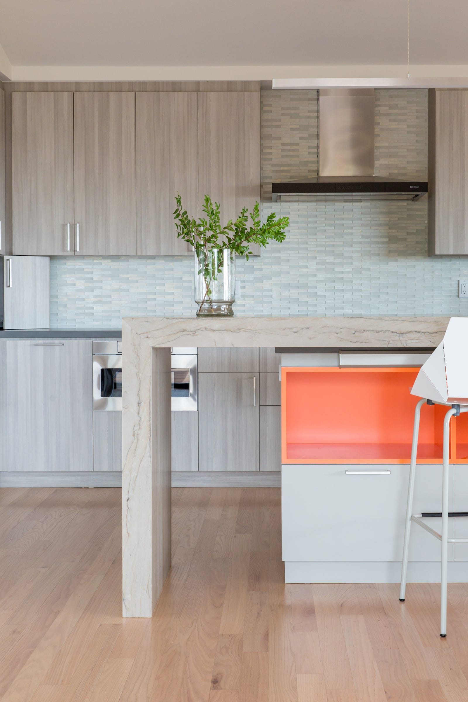
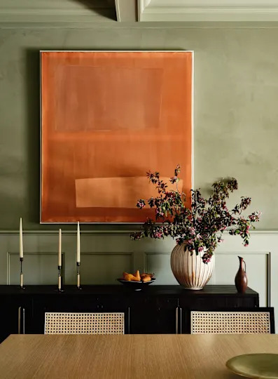
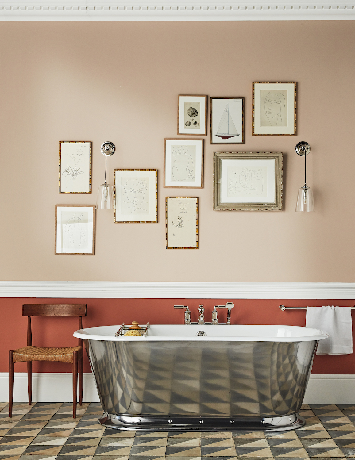
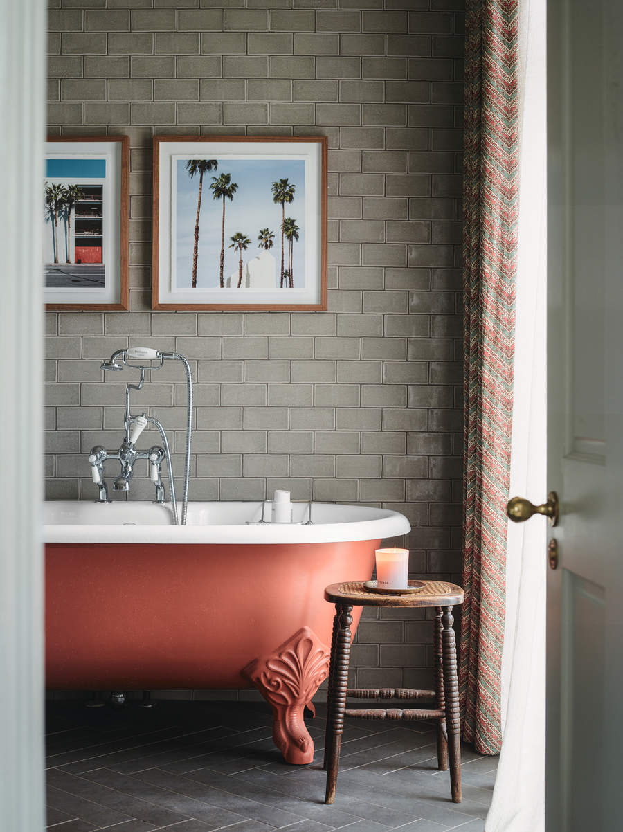
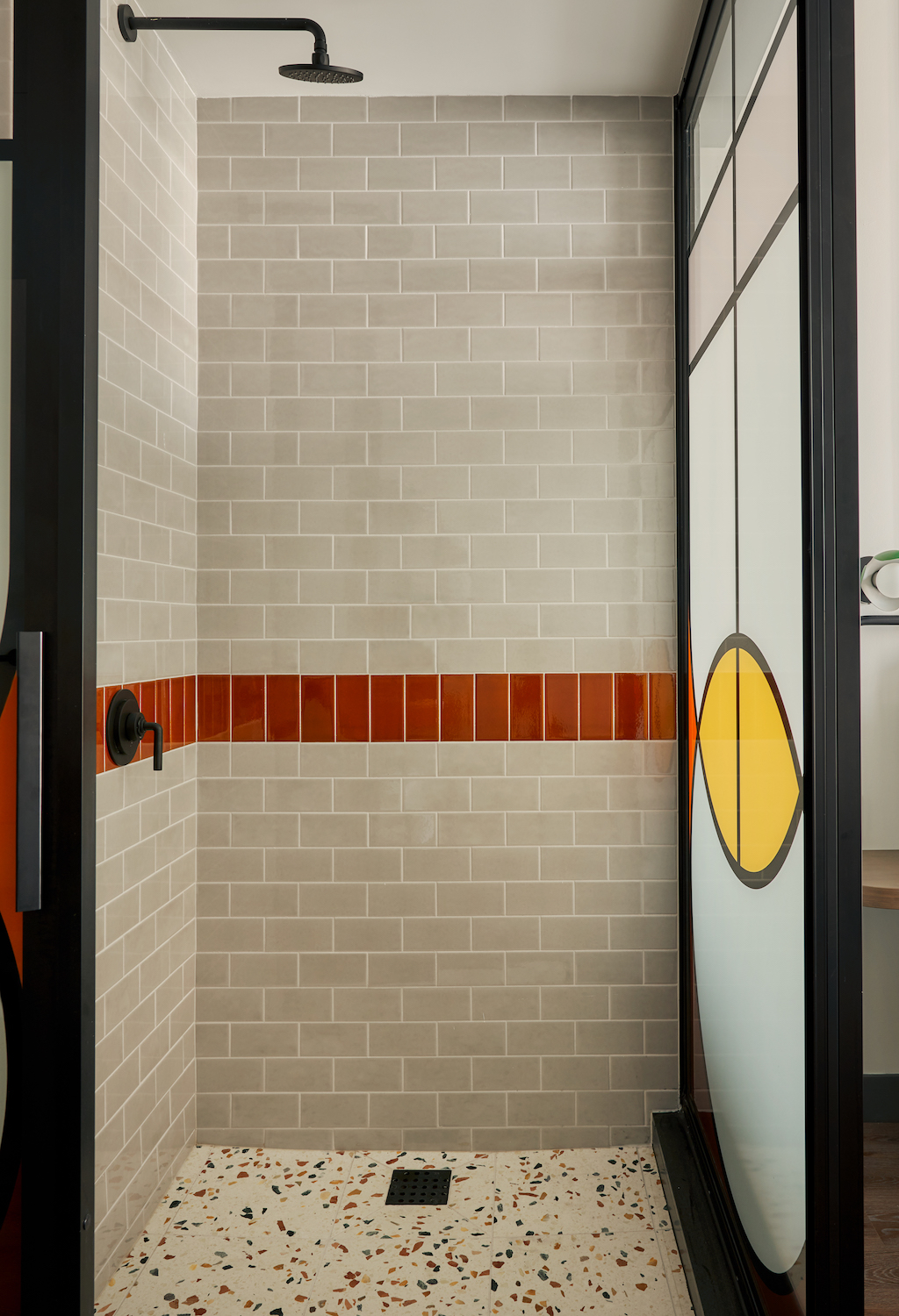
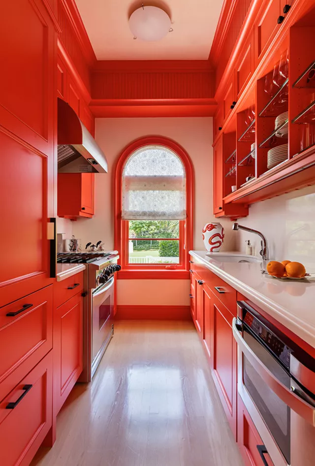
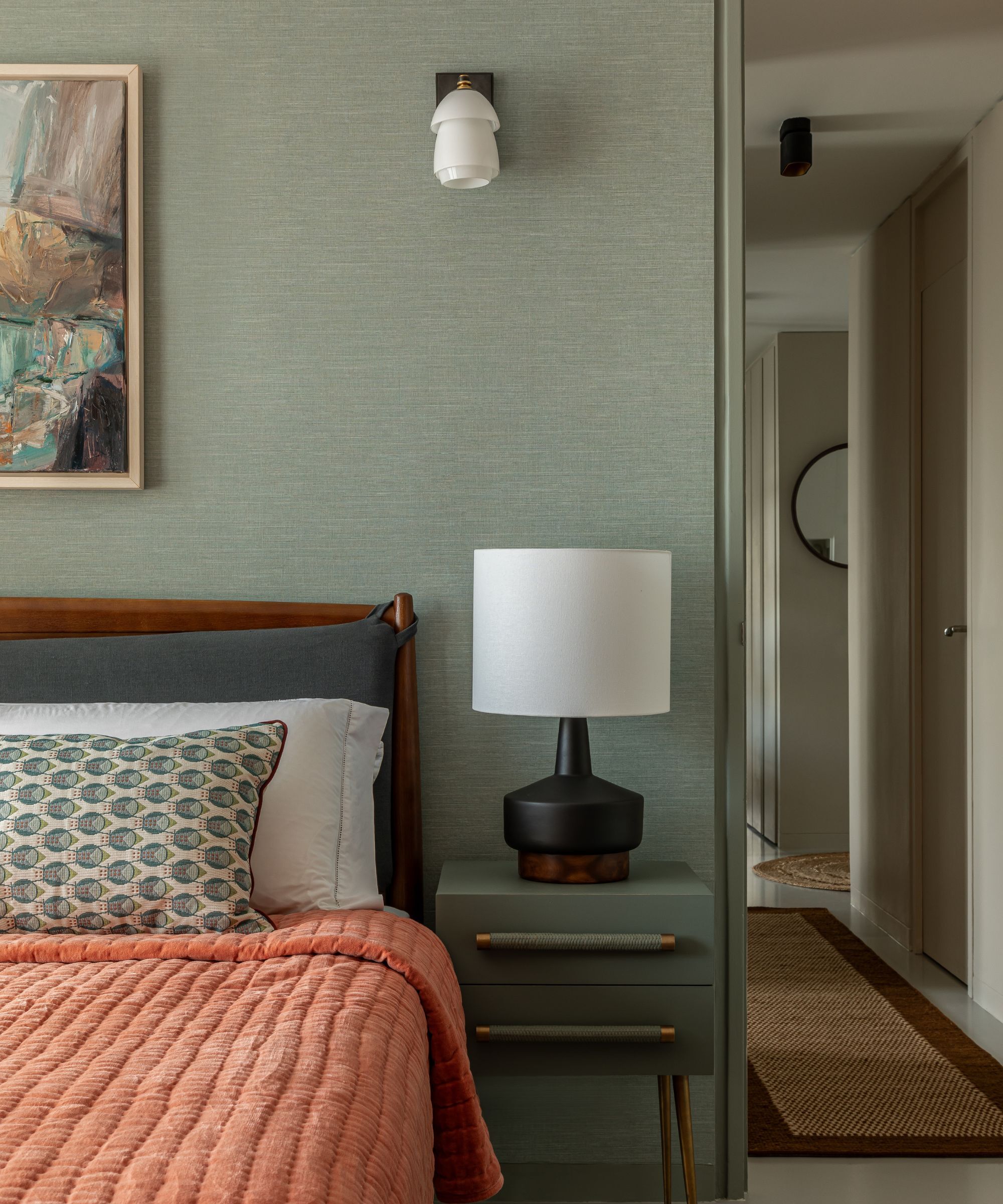
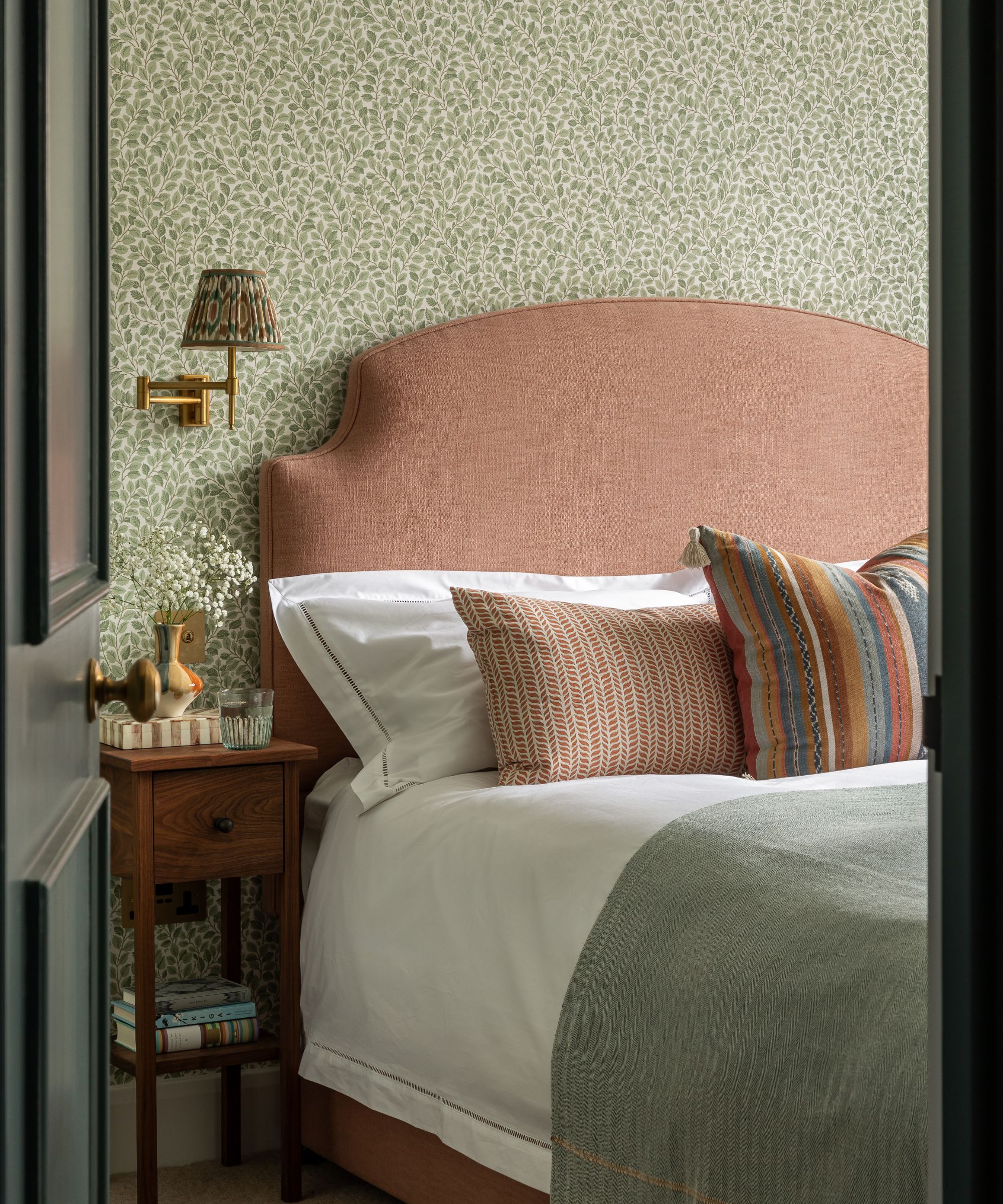
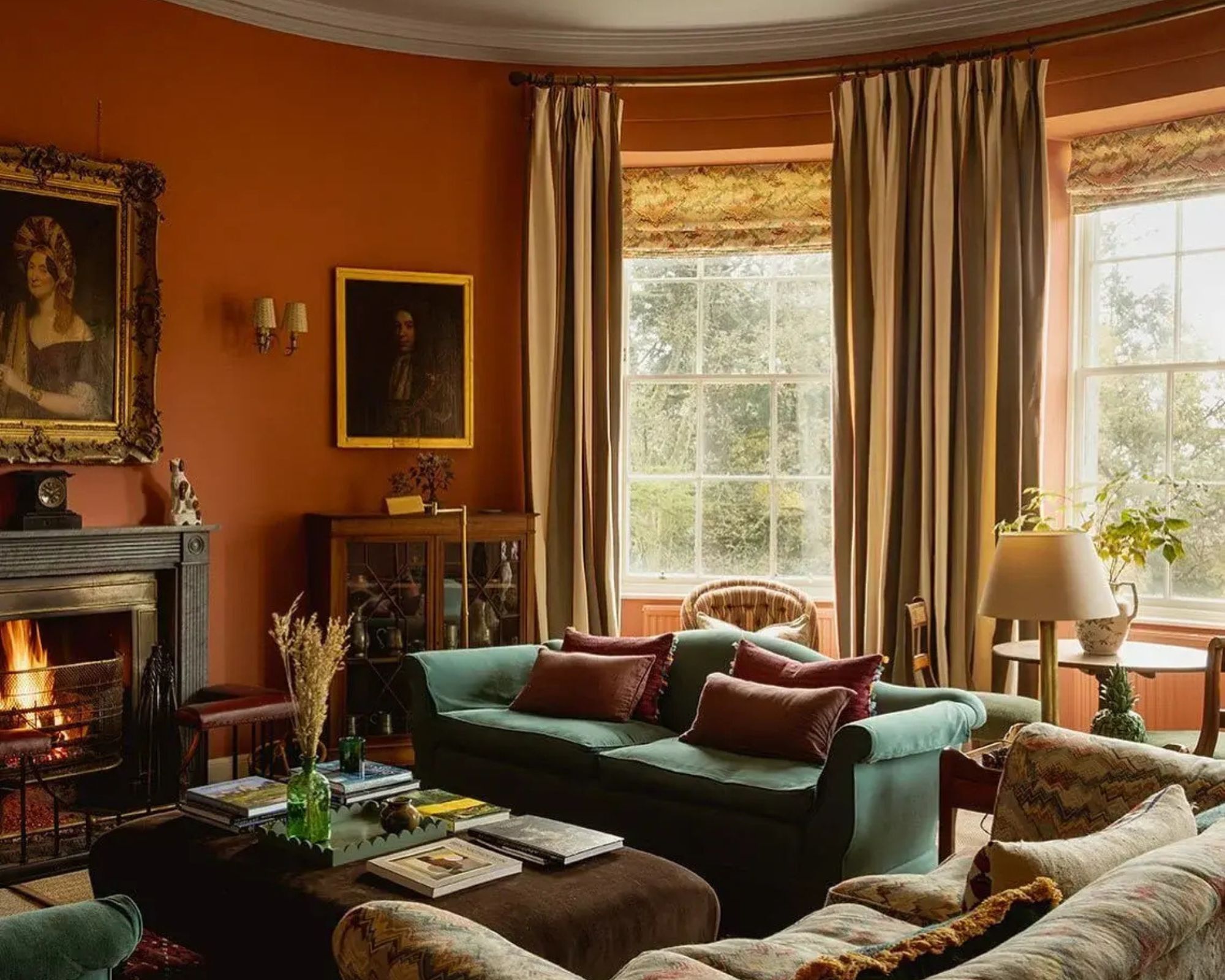
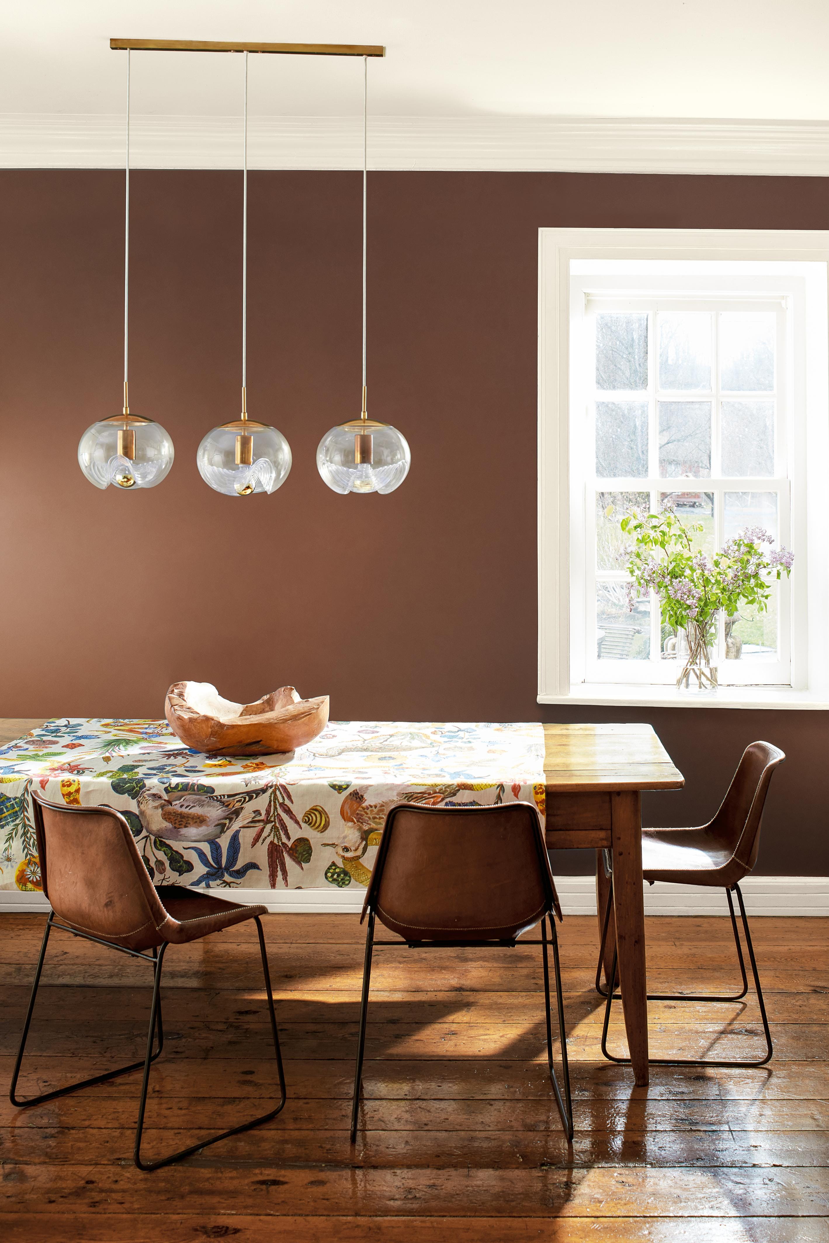
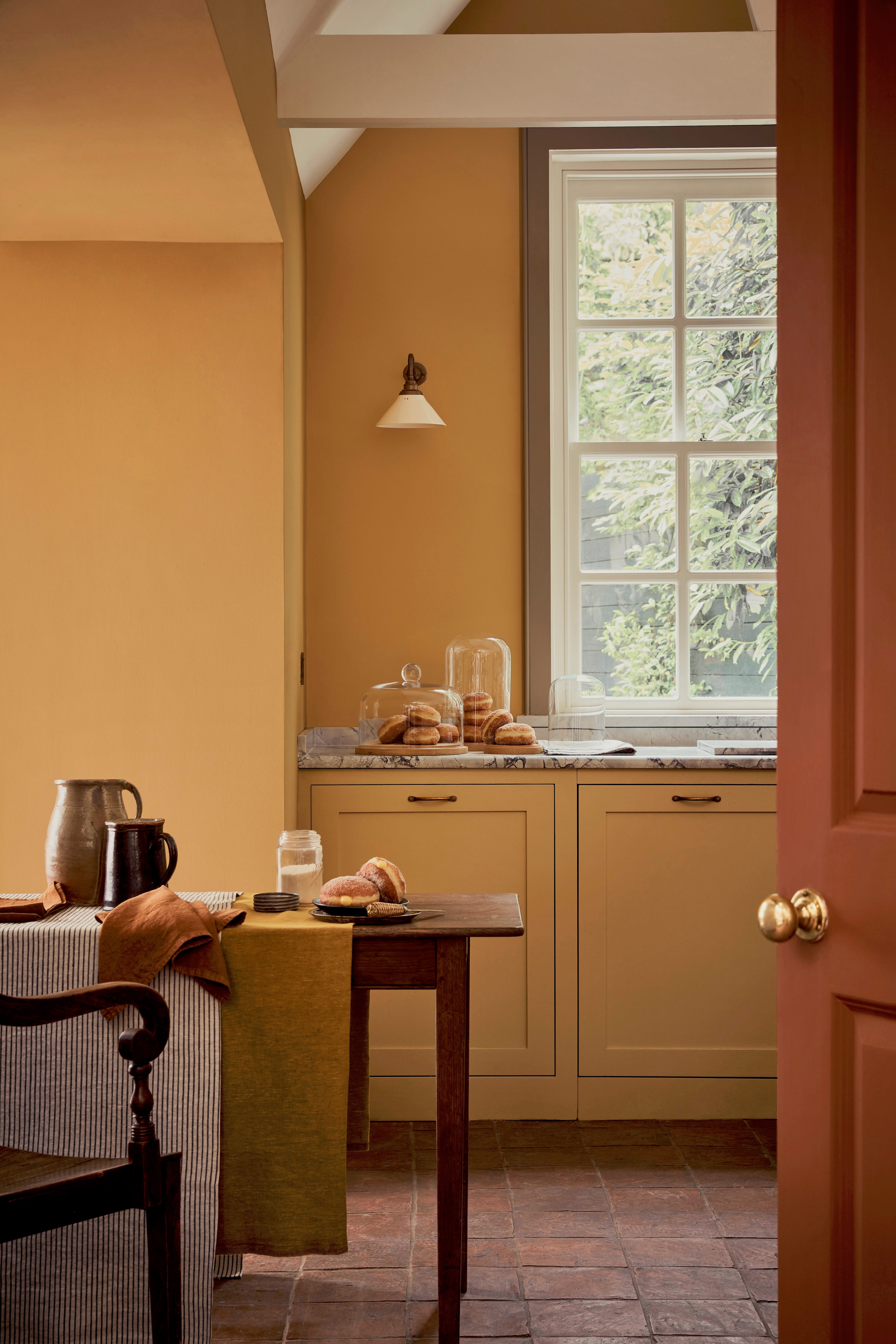
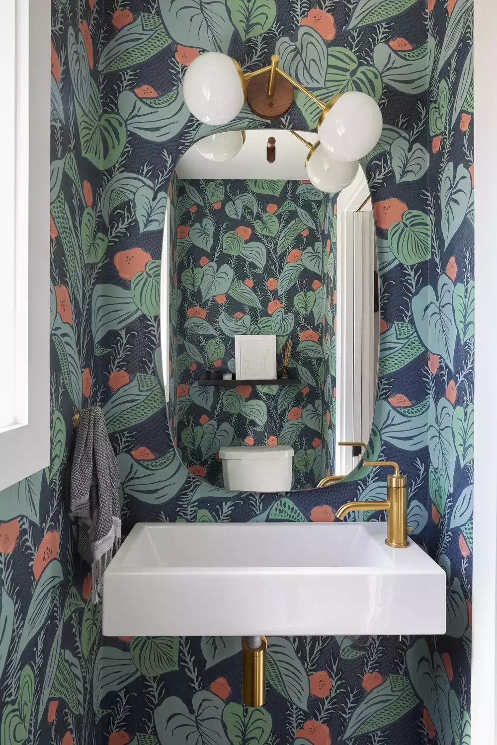
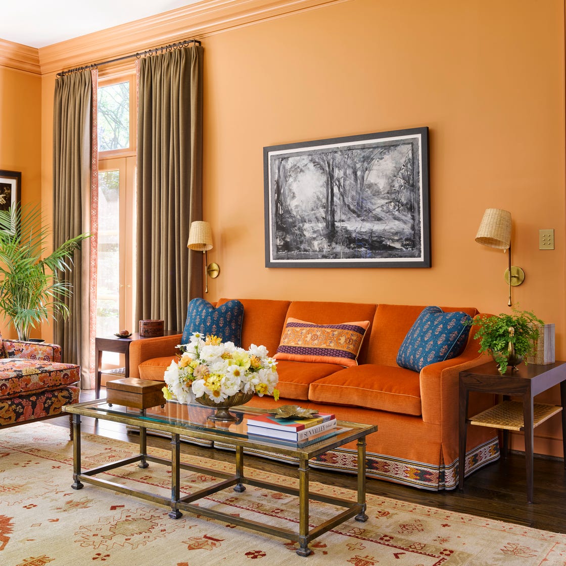
Orange, a vibrant hue combining the confidence of red and the playfulness of yellow, can infuse enthusiasm and optimism into any room. Despite some perceiving it as too bright, its diverse shades offer surprising versatility for home decor. New York-based designer Garrow Kedigian notes that orange can both brighten and anchor a room, serving as a prominent color or an accent in artwork and upholstery, asserting that it "exudes great energy" and can create "design drama." Fellow New York decorator Katie Ridder emphasizes orange's effectiveness as a secondary color, pairing well with complementary and contrasting hues, including brown, green, red, and colors opposite on the color wheel. This article explores various color combinations with orange, providing expert insights for decorating.
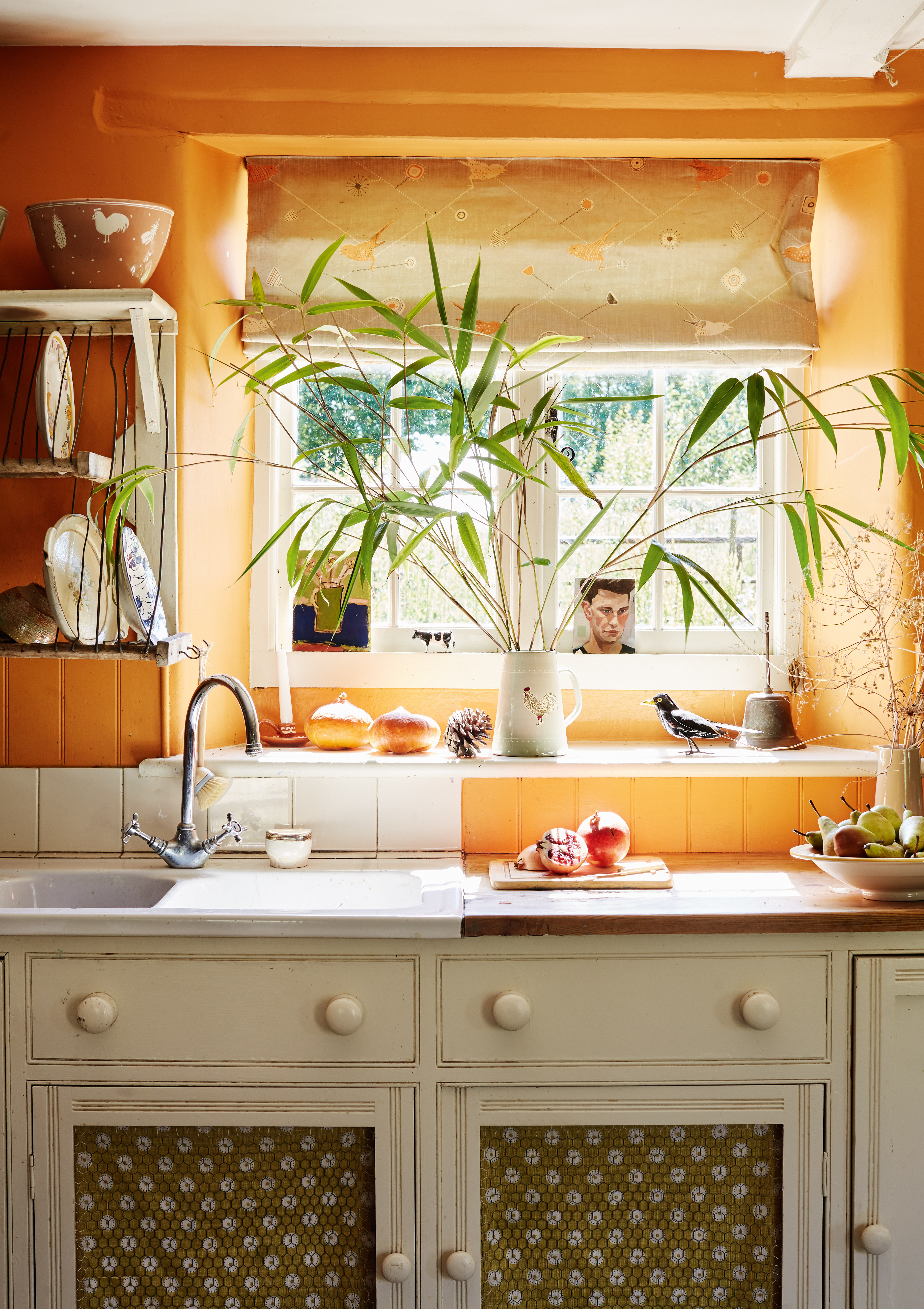
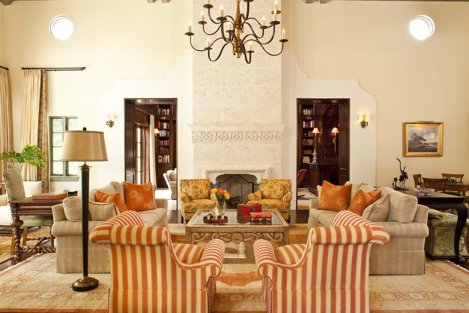
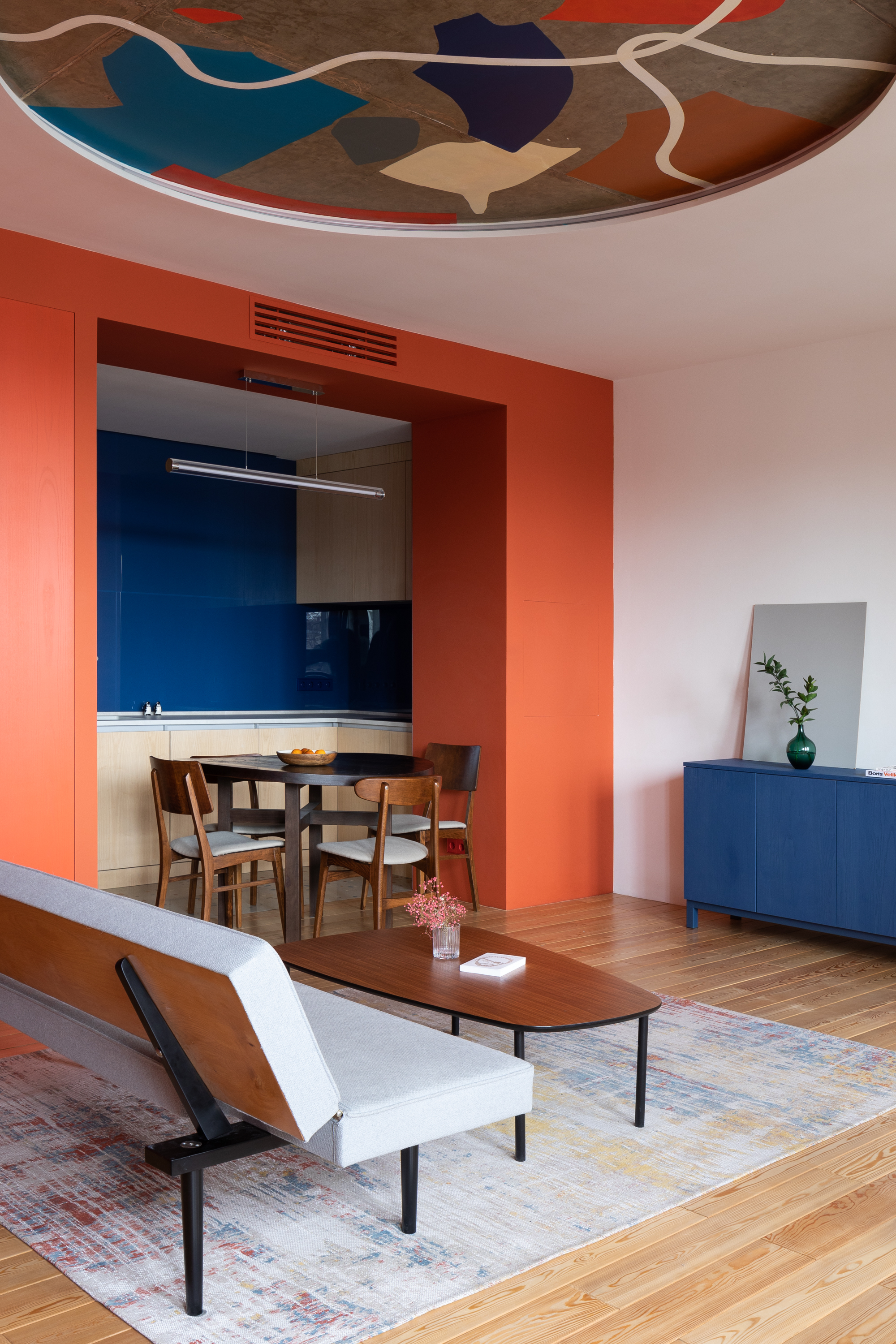
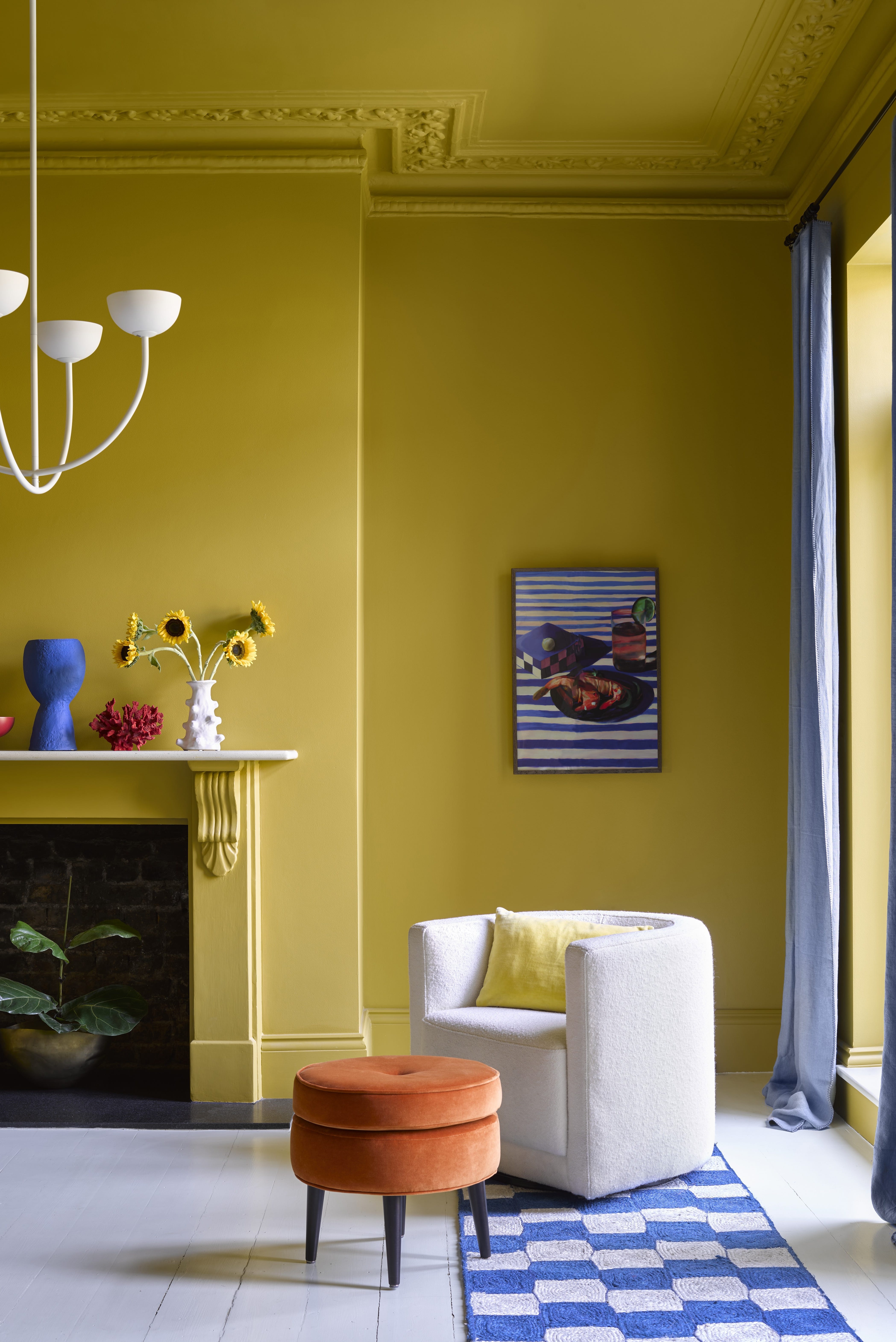
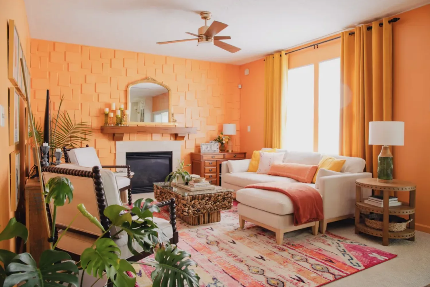
One striking combination is orange and cobalt blue. Blue, being directly opposite orange on the color wheel, creates a high-energy contrast. Saturated blues like Cosmic Cobalt and marine blue complement cantaloupe and tangelo shades without being overshadowed. An example includes a New York library with lacquered salmon walls harmonizing with deep blue window valances and sofa fabric. Another pairing involves orange and yellow, particularly muted tones like peachy oranges and buttery yellows, which foster a welcoming atmosphere. Ridder advises against overly graphic combinations to avoid a dated '70s aesthetic, instead suggesting sunset hues in fabrics to subtly enhance the room. A Bel Air living room, inspired by an antique Spanish rug, exemplifies this with Lee Jofa’s Hollyhock chintz and apricot silk draperies.
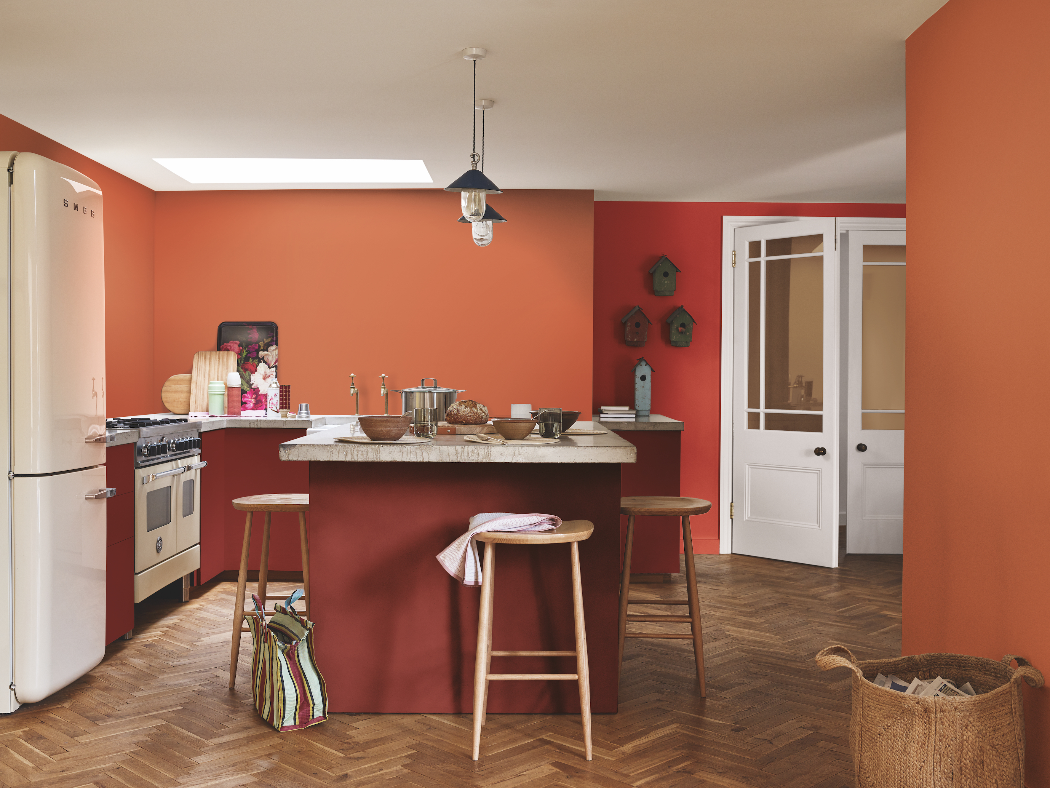
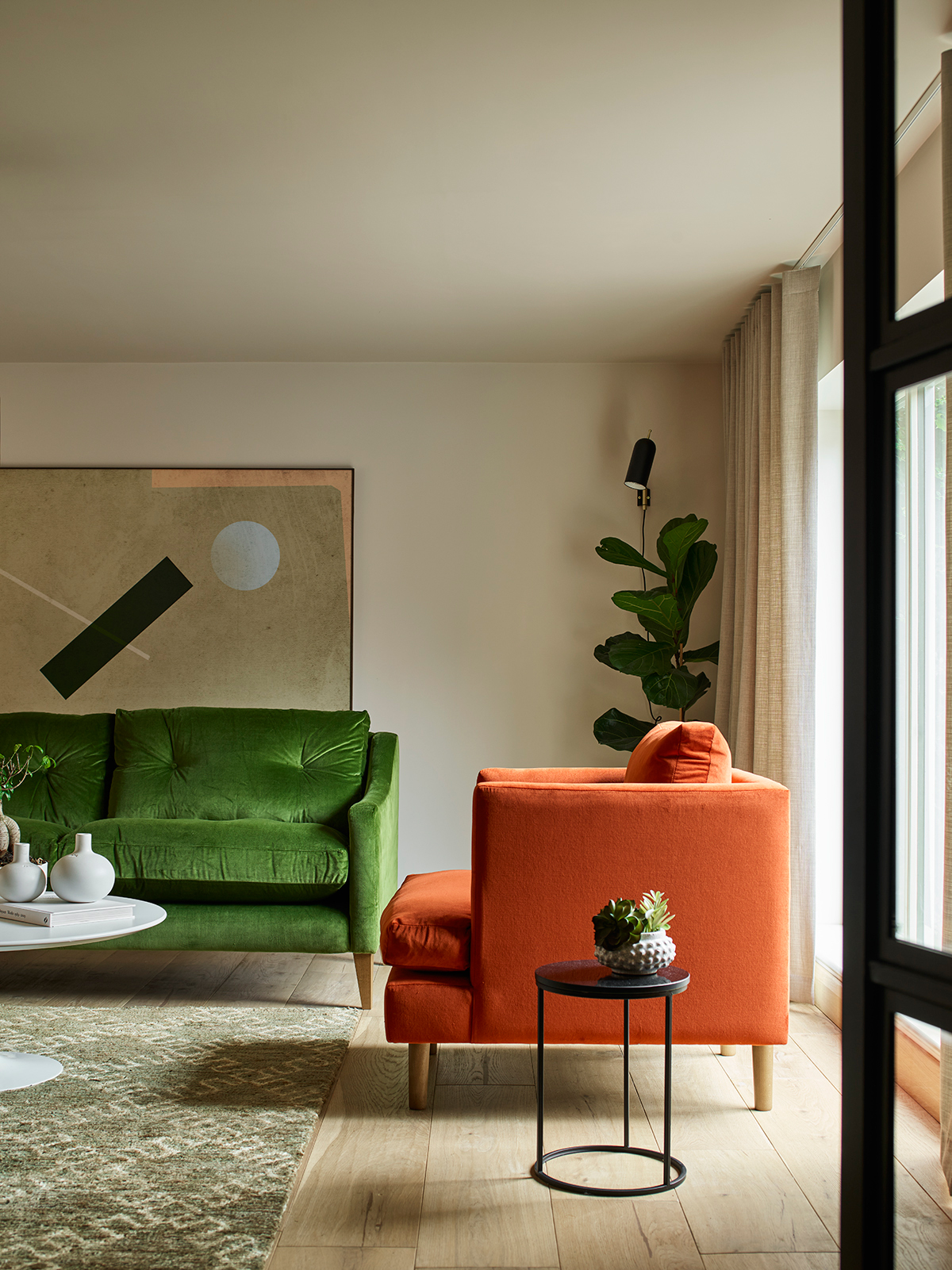
The article further suggests pairing orange with black, noting that careful tone selection is crucial to avoid a 'Halloween' theme. Deep ebony with tangerine or burnt oranges creates a contemporary and striking scheme, especially when grounded by a third neutral shade like cream or muted gold. For a dramatic effect, orange and chartreuse are recommended for smaller spaces, with an example of orange-red drapery against lime lacquered walls. Monochromatic approaches, such as orange and apricot, involve drenching walls in a melon hue and adding furnishings in similar orange shades, with subtle tonal differences preventing boredom. Orange and white offer a crisp, invigorating contrast, making a bold statement in areas like a foyer with custom Gracie wallcovering, balanced by natural brown accents.
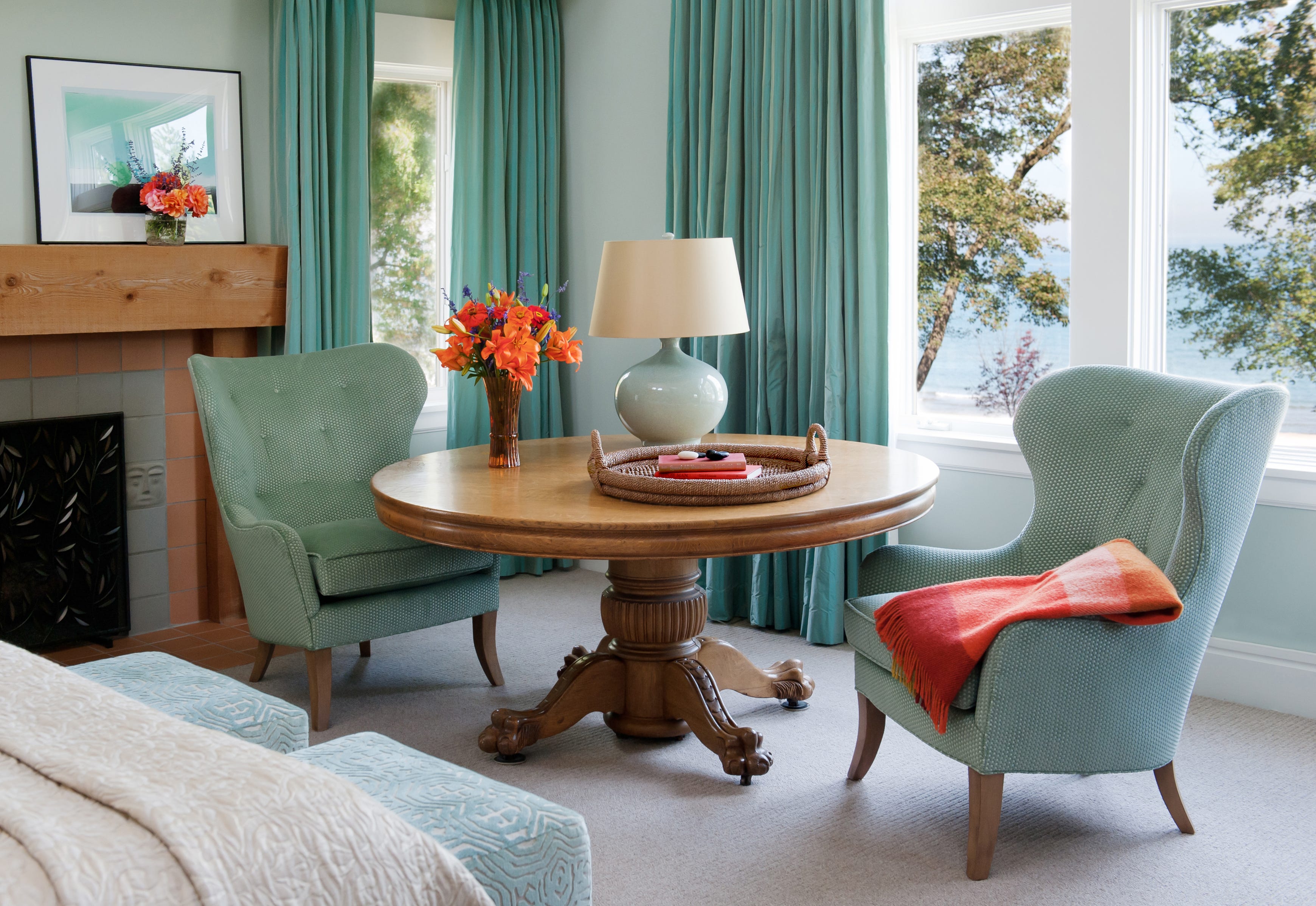
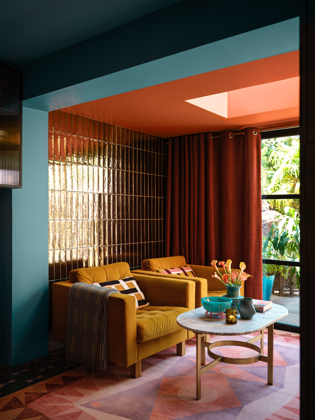
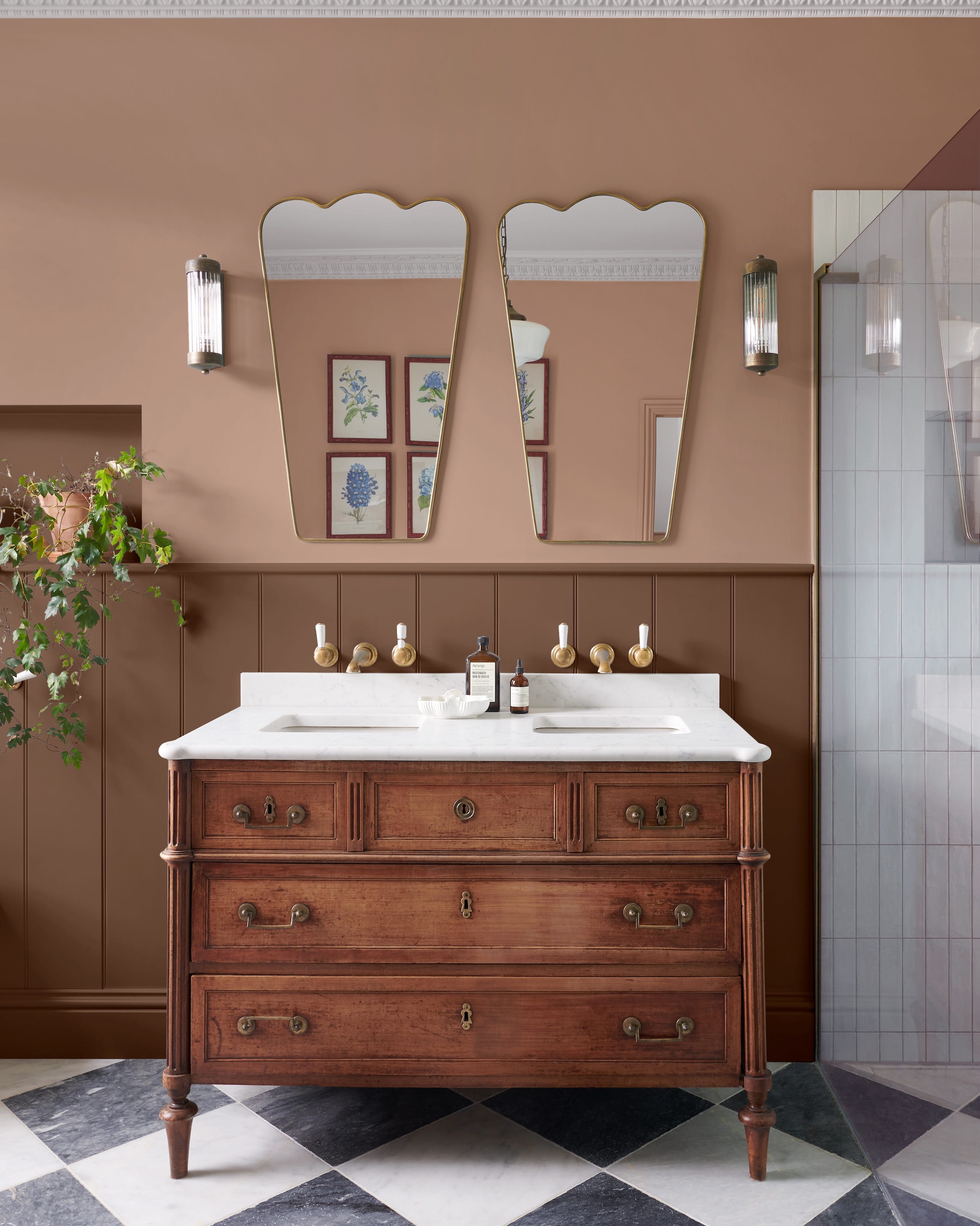
For a touch of opulence, orange and gold combine a rich, vibrant orange-red with radiant gold, ideal for dining rooms or bar areas, as seen in a Manhattan apartment with fiery study walls and a golden ceiling. Muted beige-y oatmeal with a soft melon or peach shade creates a balanced look in powder rooms or wellness spaces, exemplified by a tangerine and taupe wallcovering in a Kips Bay Decorator Show House powder room. Unexpected yet whimsical, orange and pale lilac make an impact in living rooms, with a Birmingham den featuring a persimmon breakfast banquette and lilac sofa tied together by fabric accents. Finally, pastel blues with orange create a sweet and feminine ambiance, such as a romantic dining room with a tangelo settee against a backdrop of Gracie wallcovering and blue trim. Chocolate brown, with its formal richness, can temper youthful oranges, as demonstrated in a home bar where fiery orange trim enlivens cabinetry and fretwork, making an electrifying statement in small applications. The article demonstrates orange's versatility through these diverse pairings, emphasizing its potential to energize and transform interiors.
#ColorPalette #InteriorDesign #HomeDecor #ColorTheory #DesignTips #DecoratingIdeas #OrangeDecor #ColorPairings #ExpertAdvice #ColorPalette #InteriorDesign #HomeDecor #ColorTheory #DesignTips #DecoratingIdeas #OrangeDecor #ColorPairings #ExpertAdvice
0 comment in total
 No comments yet
You may also like
Decorating with orange – how best to use this vibrant and versatile color in interior schemes

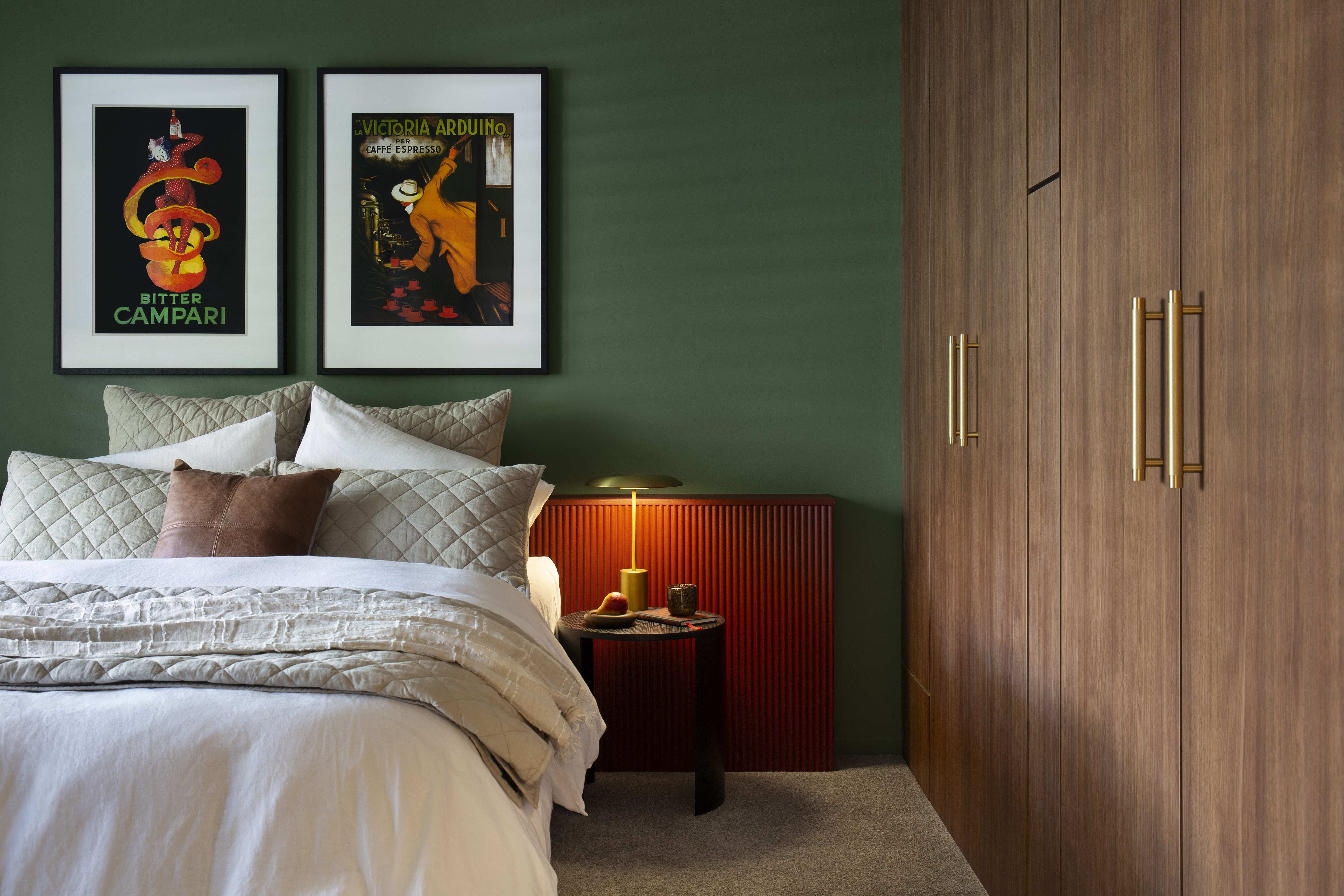
What Colors Go With Orange? 10 Harmonious Hues to Pair With This Zesty Shade

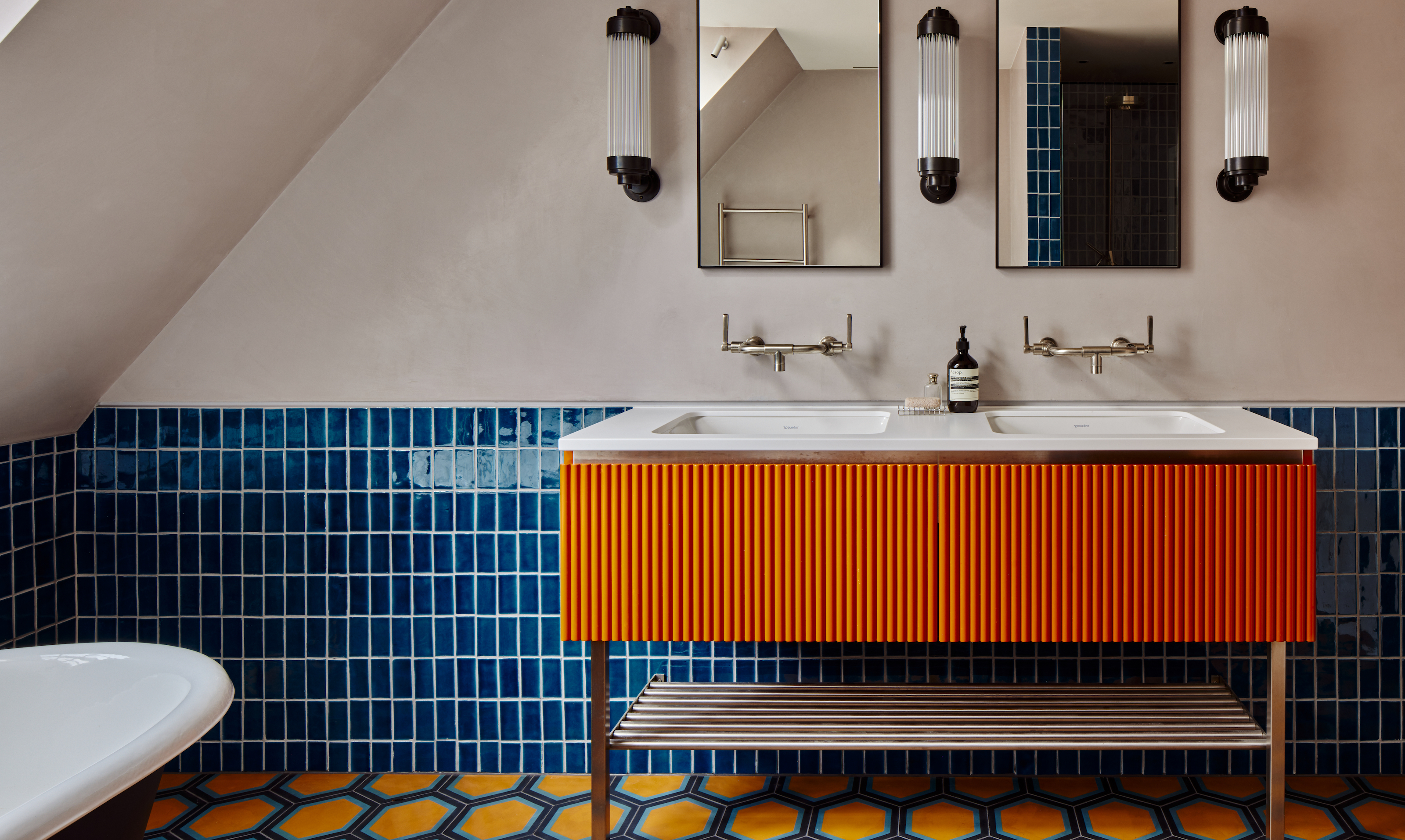
Orange bathrooms are trending - these 10 show how to use this color to create a perfect sanctuary
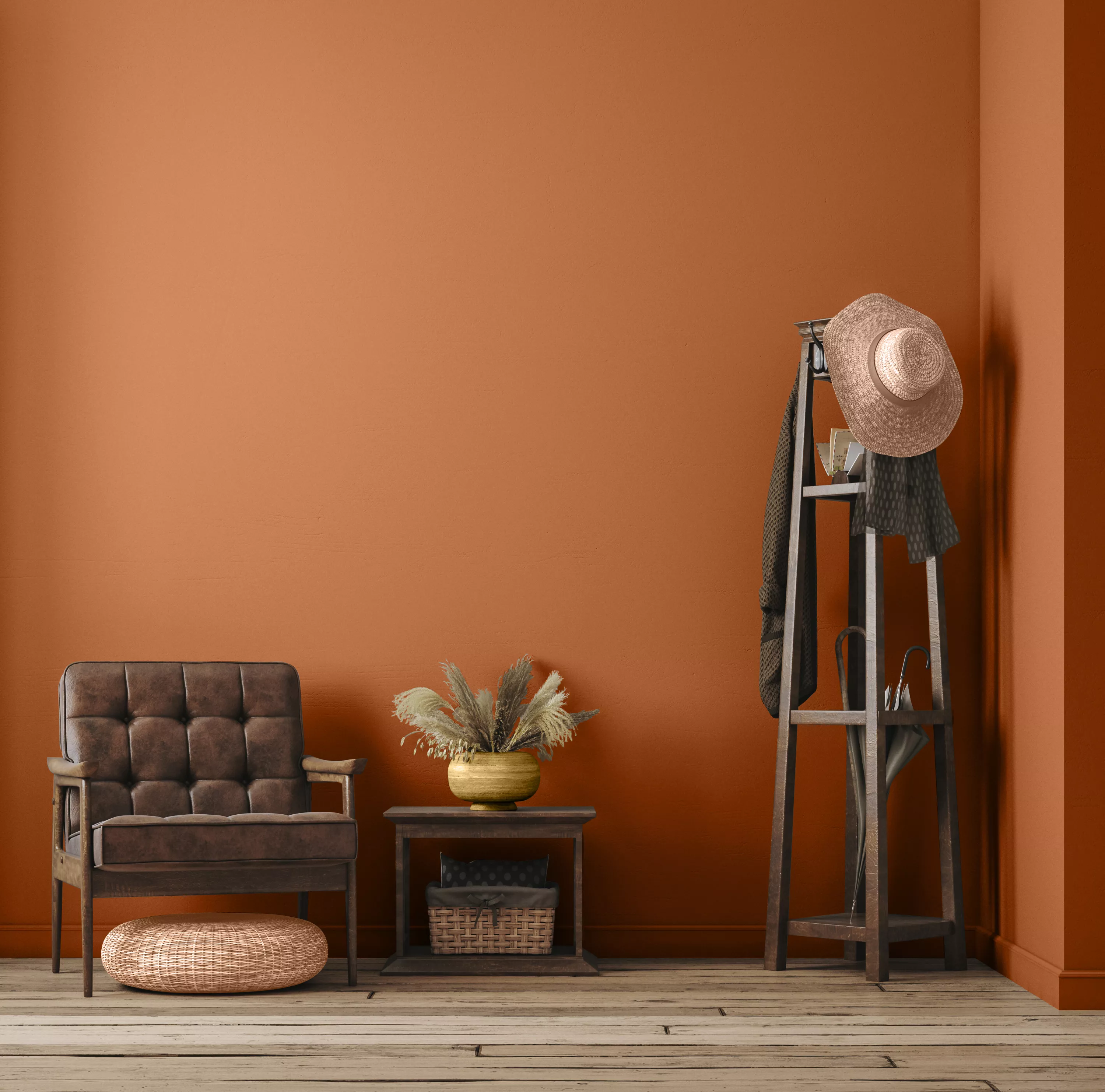
9 Best Orange Paint Colors for a Vibrant Home


20+ Ideas for Styling with Orange as an Accent

How to Make Orange and Green Work Together — It Can Be "Dynamic and Joyful", but Only If You Get It Right

Cheer Up Any Space With These Designer-Approved Orange Paint Colors


These Dreamy Garden Rooms Are a Soul-Soothing Feast for the Eyes
20 orange room design ideas

30 Bright, Bold Combinations of Colors That Pair with Orange
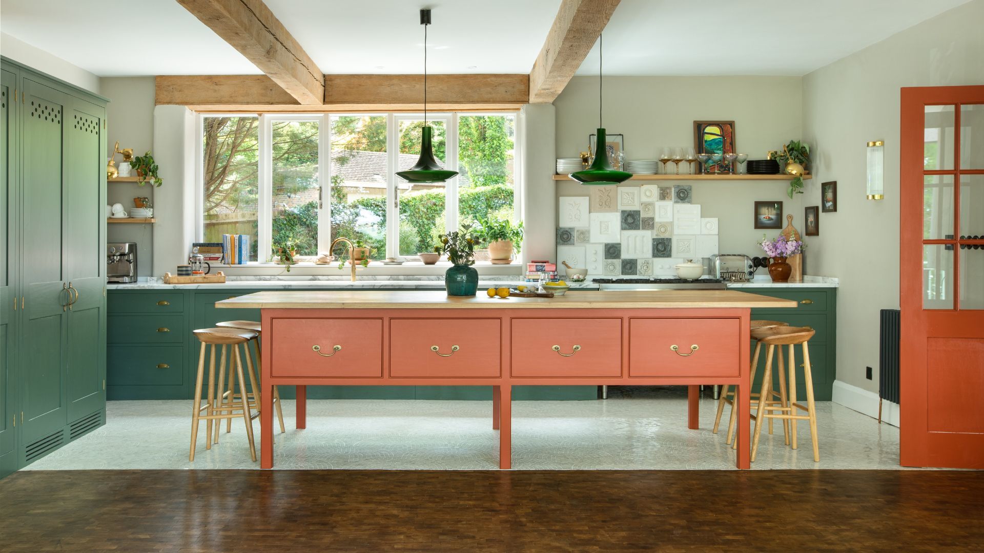
Orange and green is the bold color pairing quietly transforming homes in 2025 – here's 4 reasons why
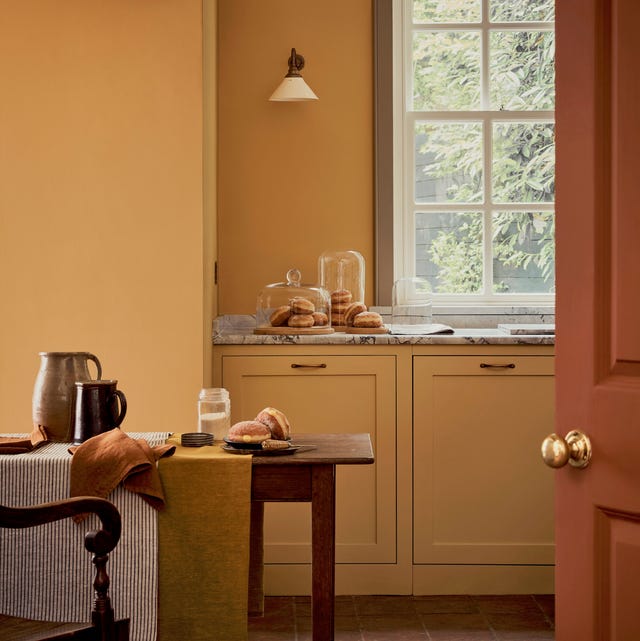
Decorating with yellow: 13 ways to use this sunshine shade at home
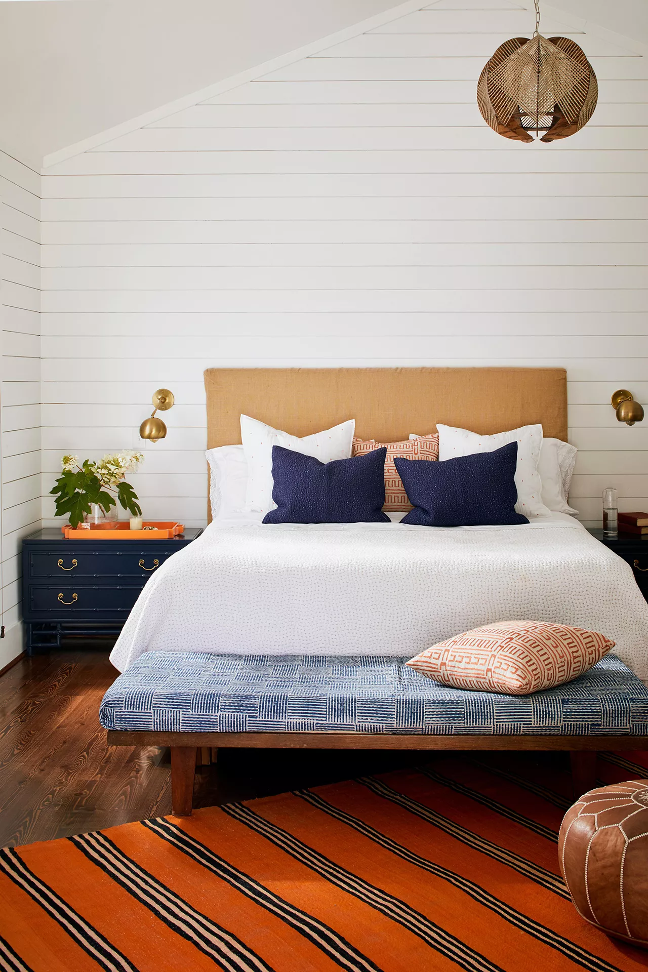
30 Bright, Bold Colors That Go with Orange
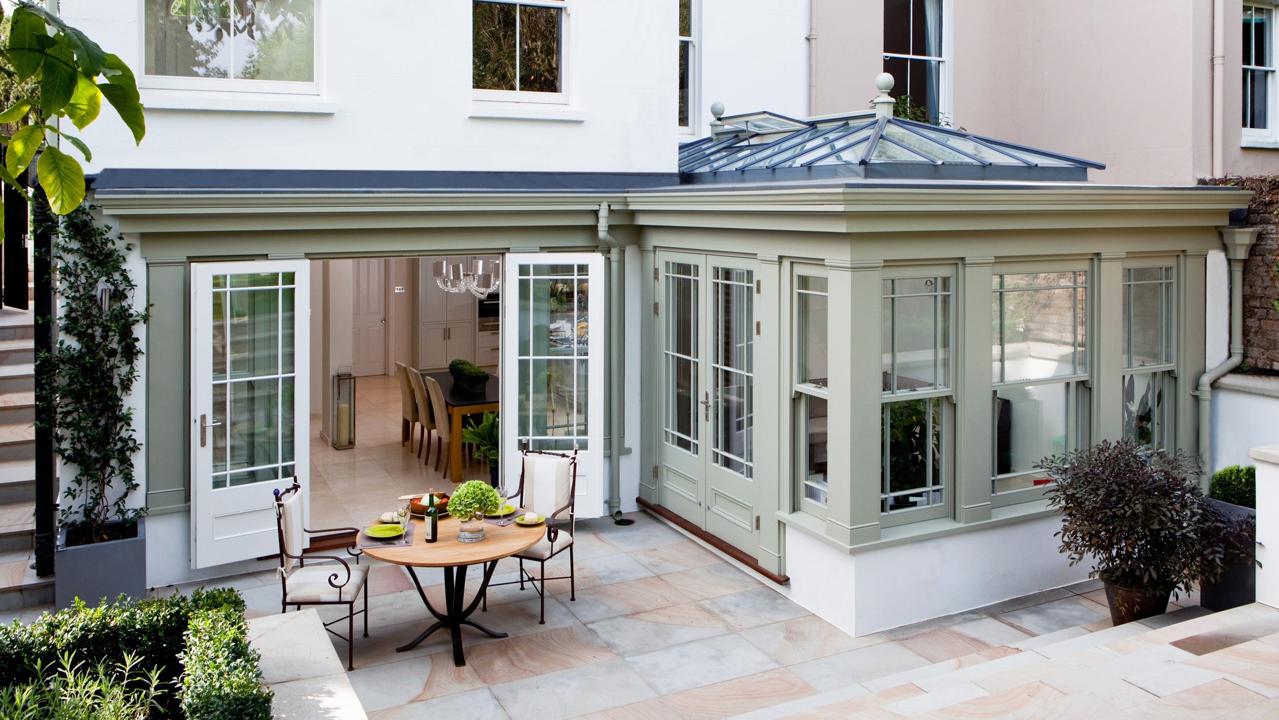
Orangery ideas: 19 designs, plus costs and planning advice

Brown is the colour of the moment — here's how to use it in your home
Incorporate Color Drenching Into Your Home Design

15 Energizing Orange Paint and Decor Ideas
We Found the Chic Orange Sofas of Your Dreams
15 ways to add color to your home, according to interior designers
30 Best Colors That Go With Orange