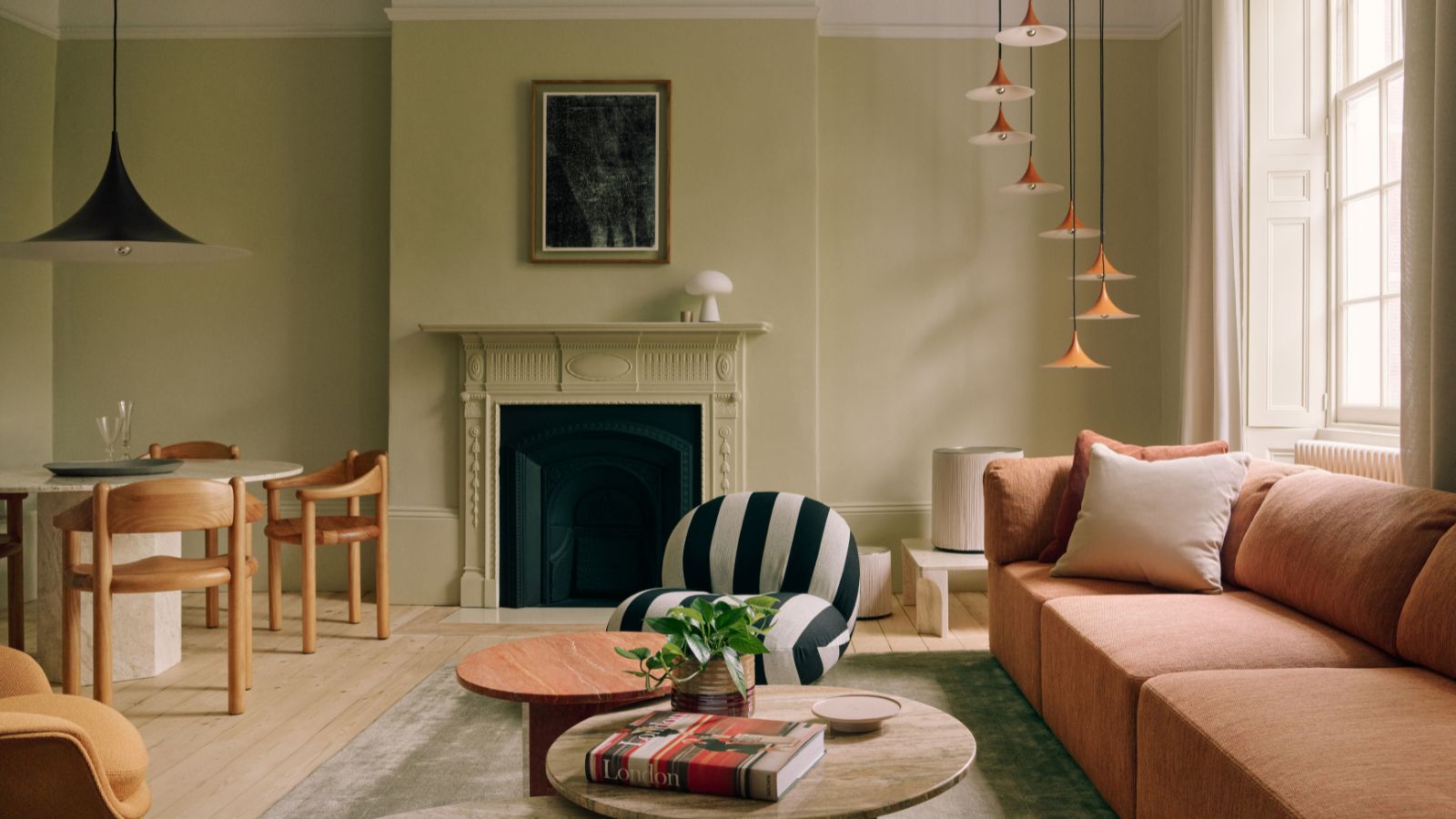
1/4
How to use bold color in a neutral design scheme, according to global homeware brand GUBI
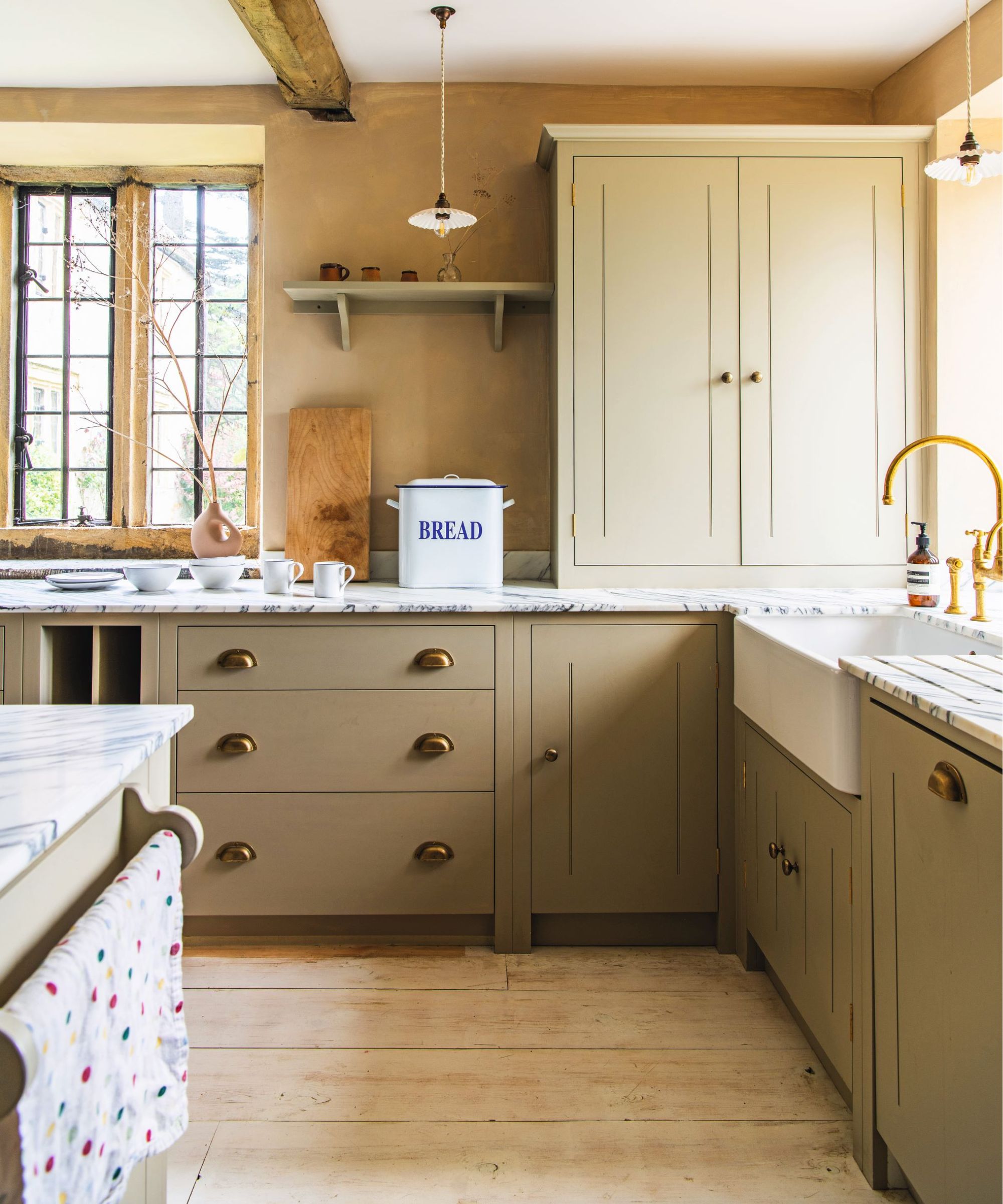
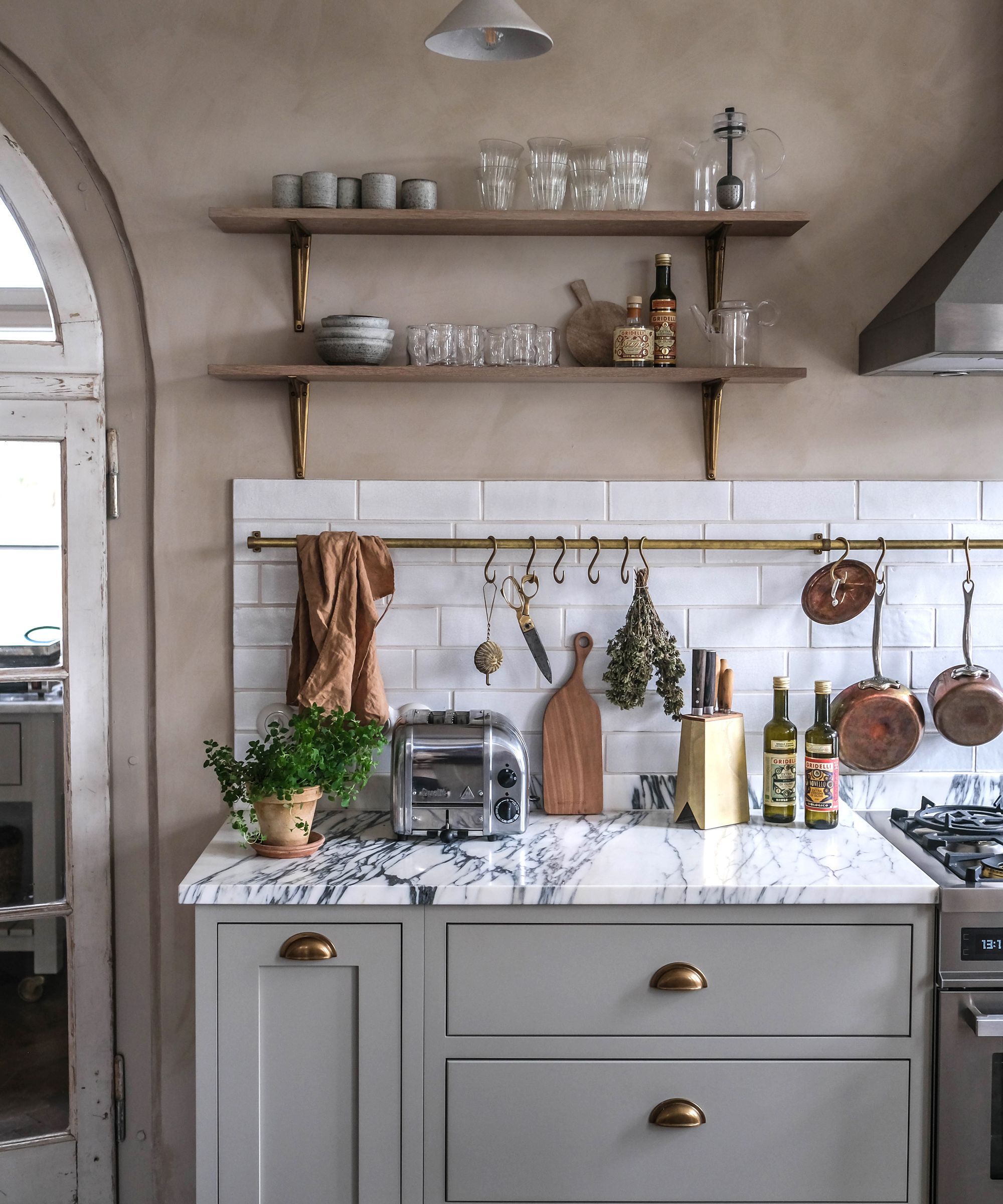
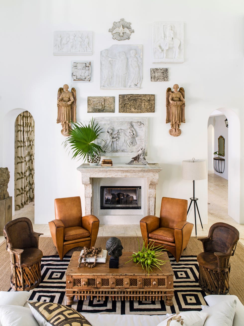
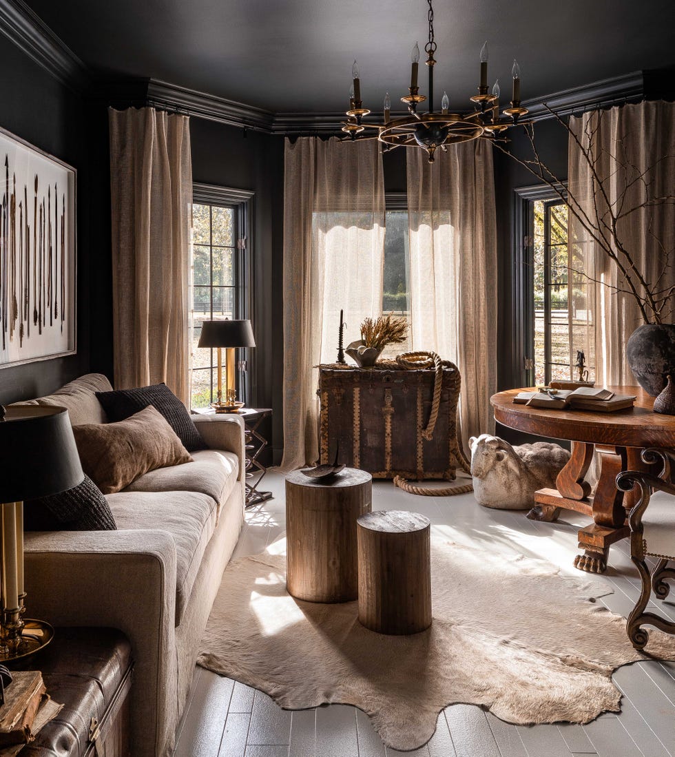
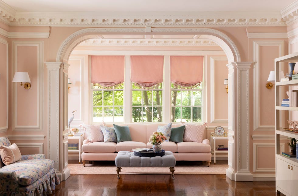
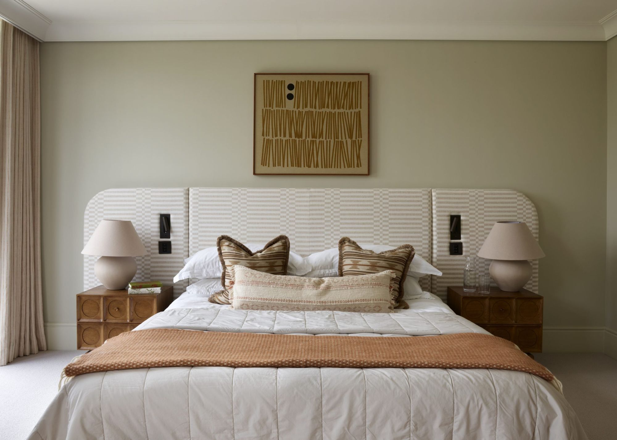
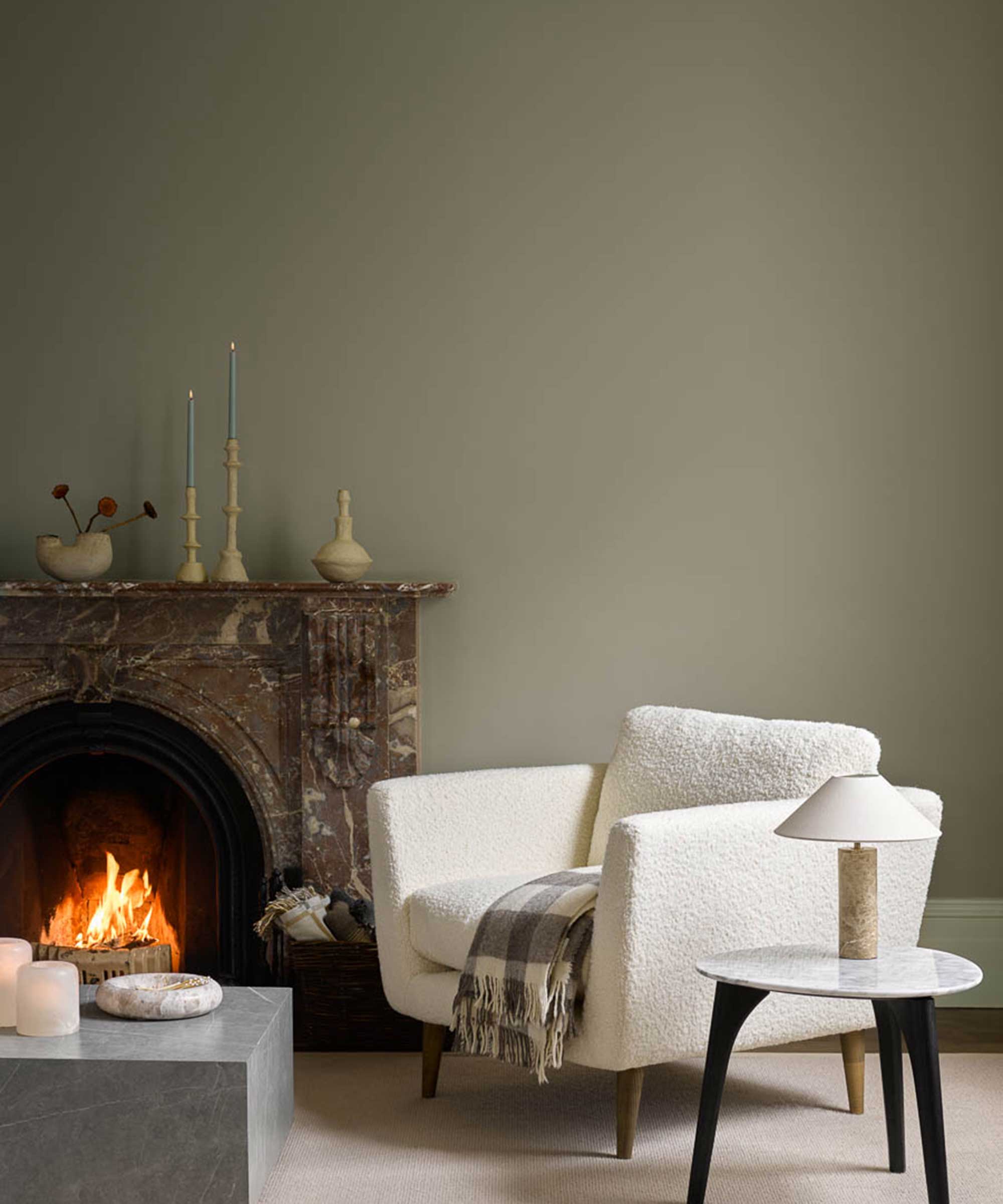
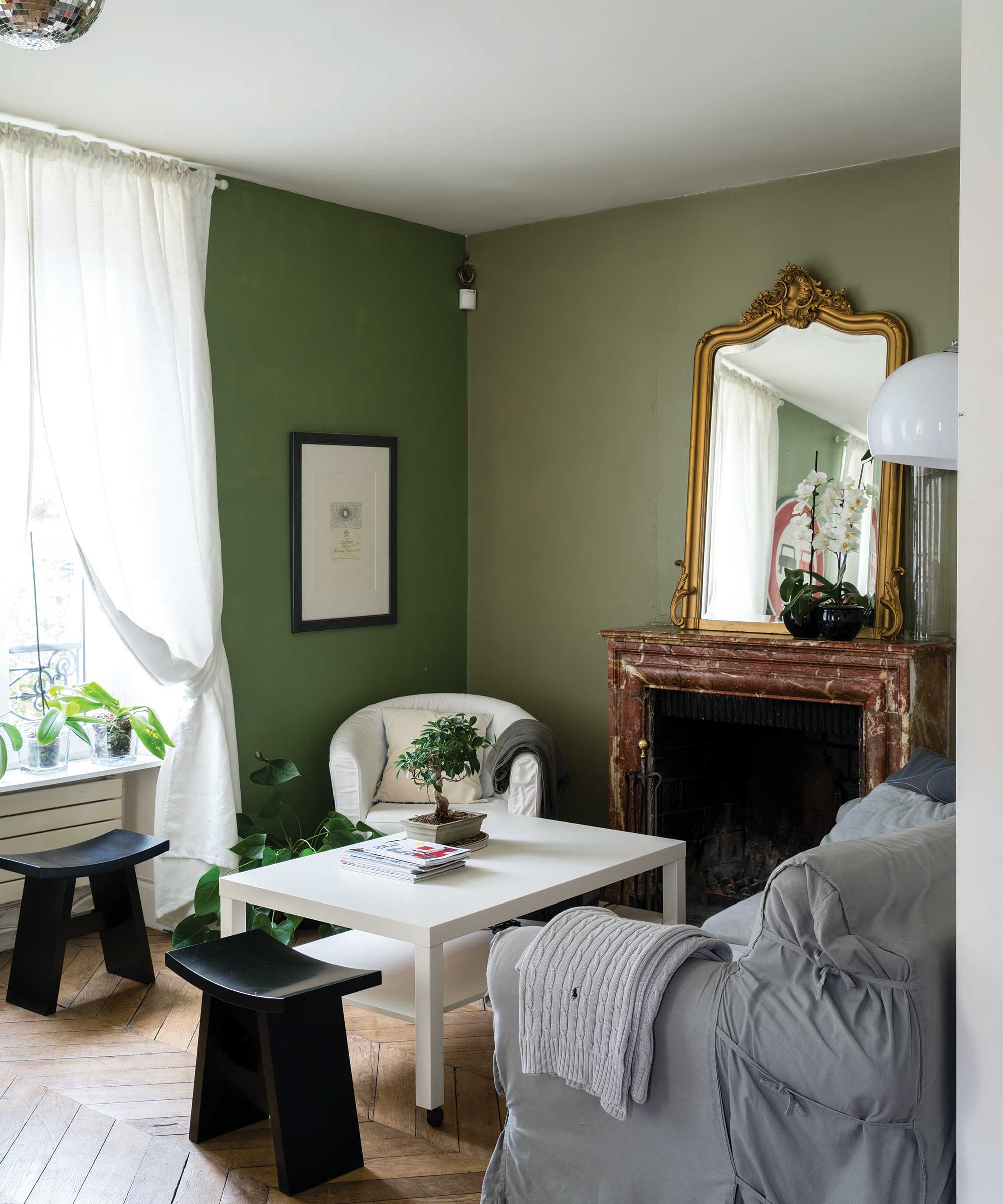
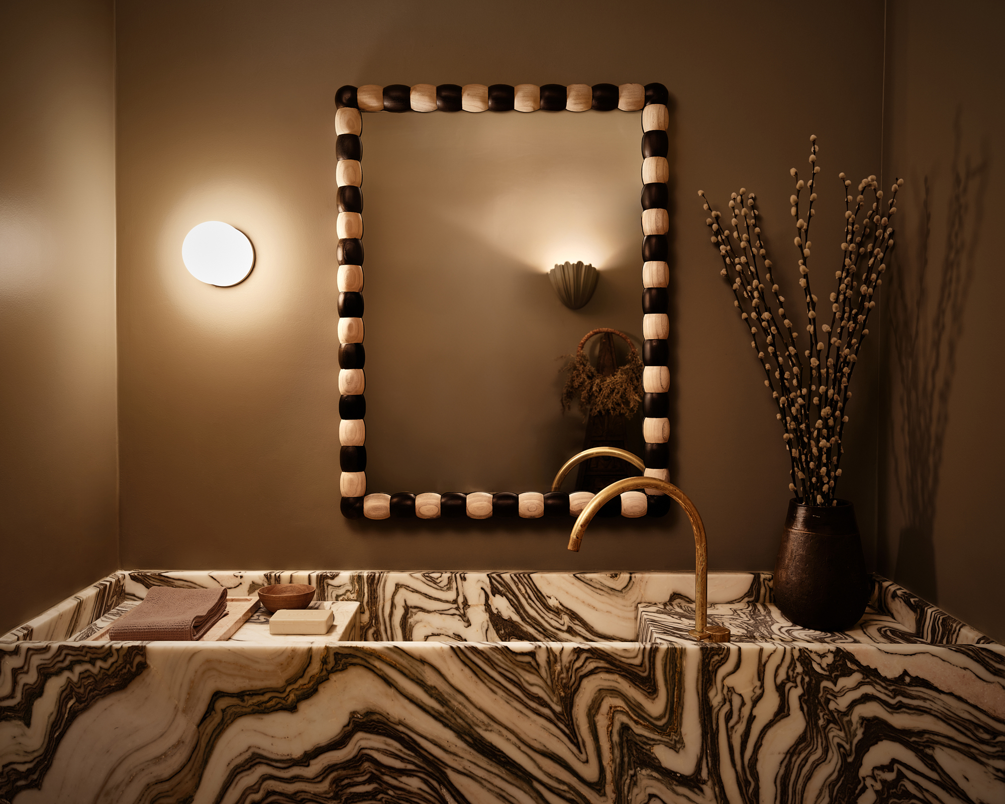
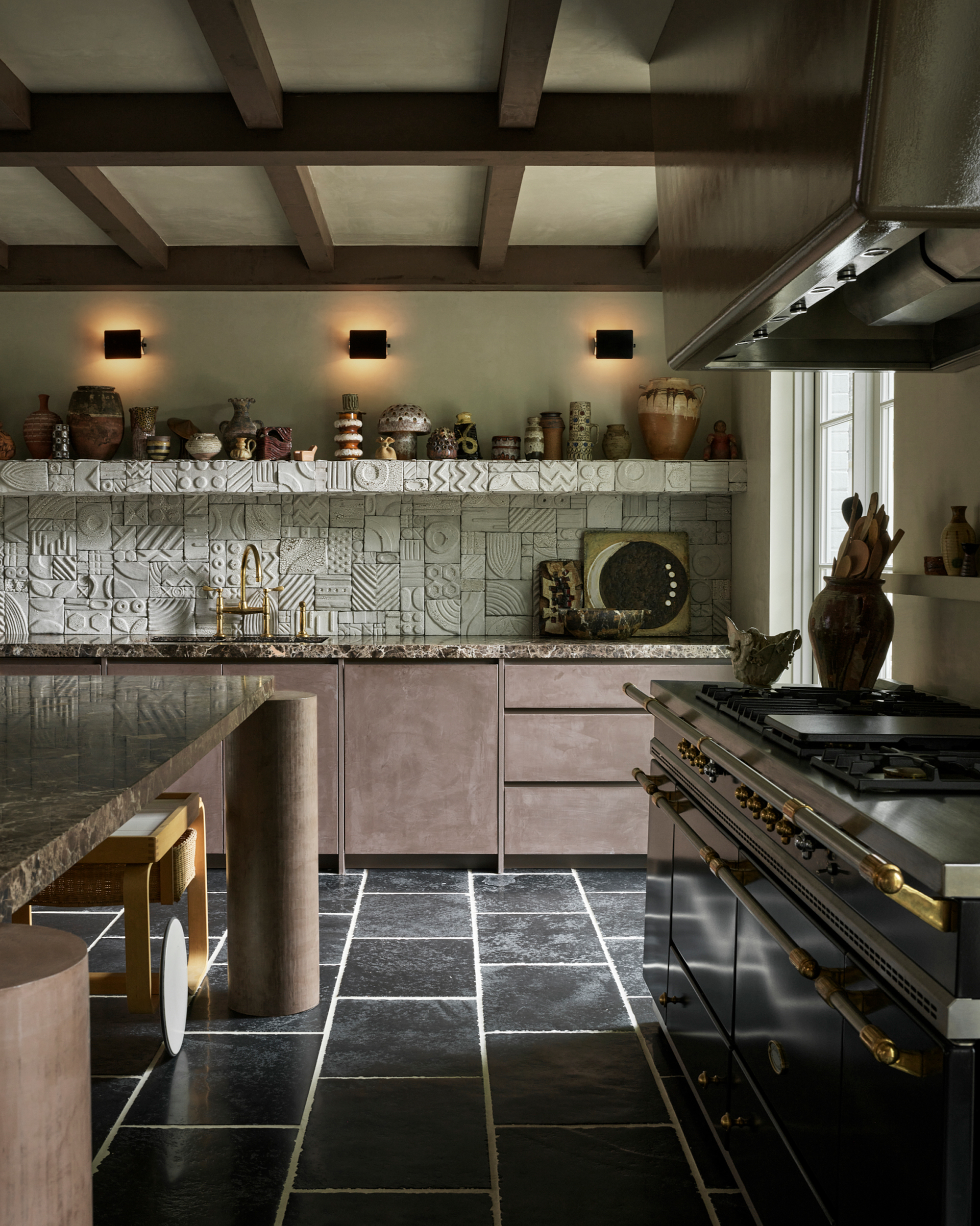
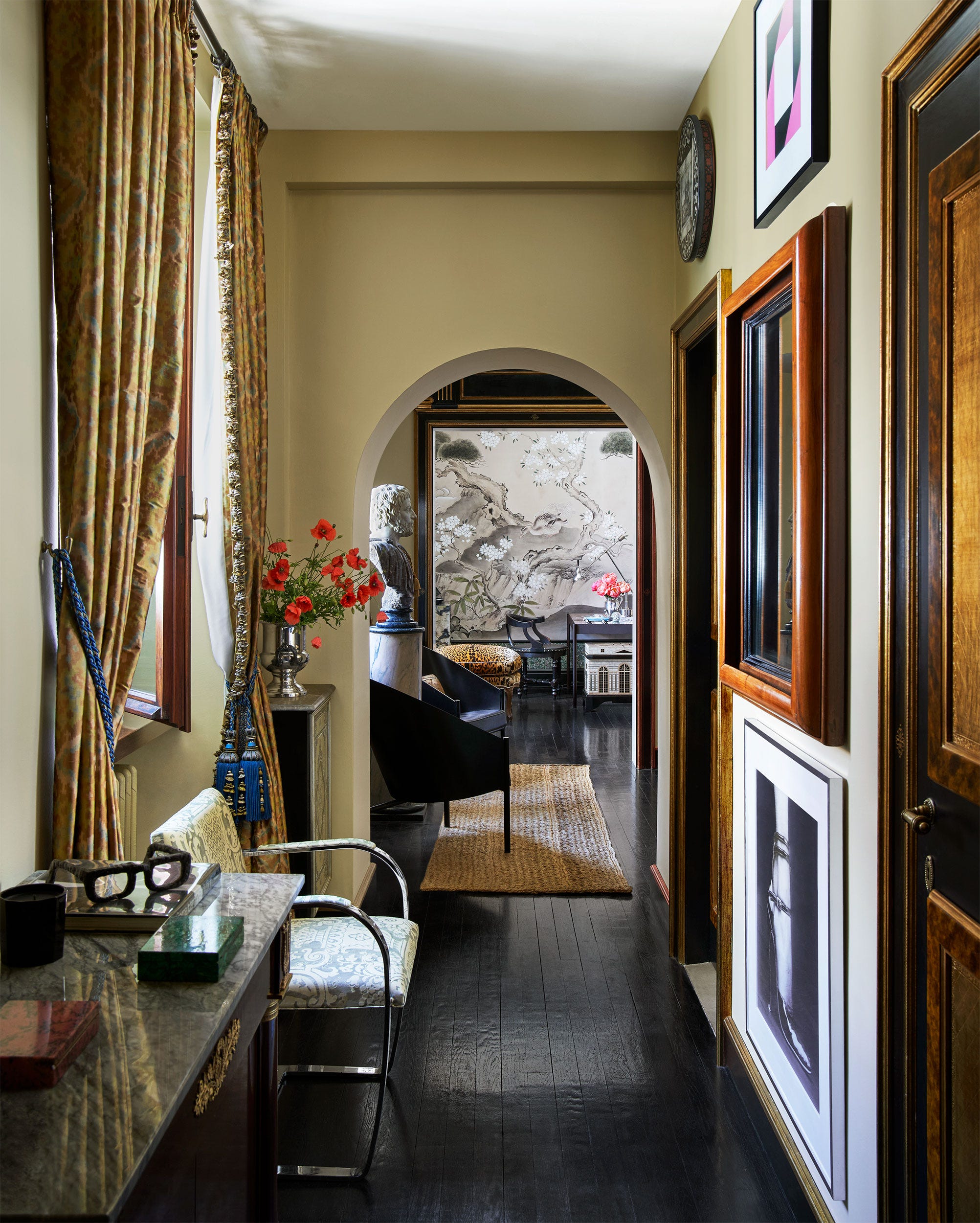
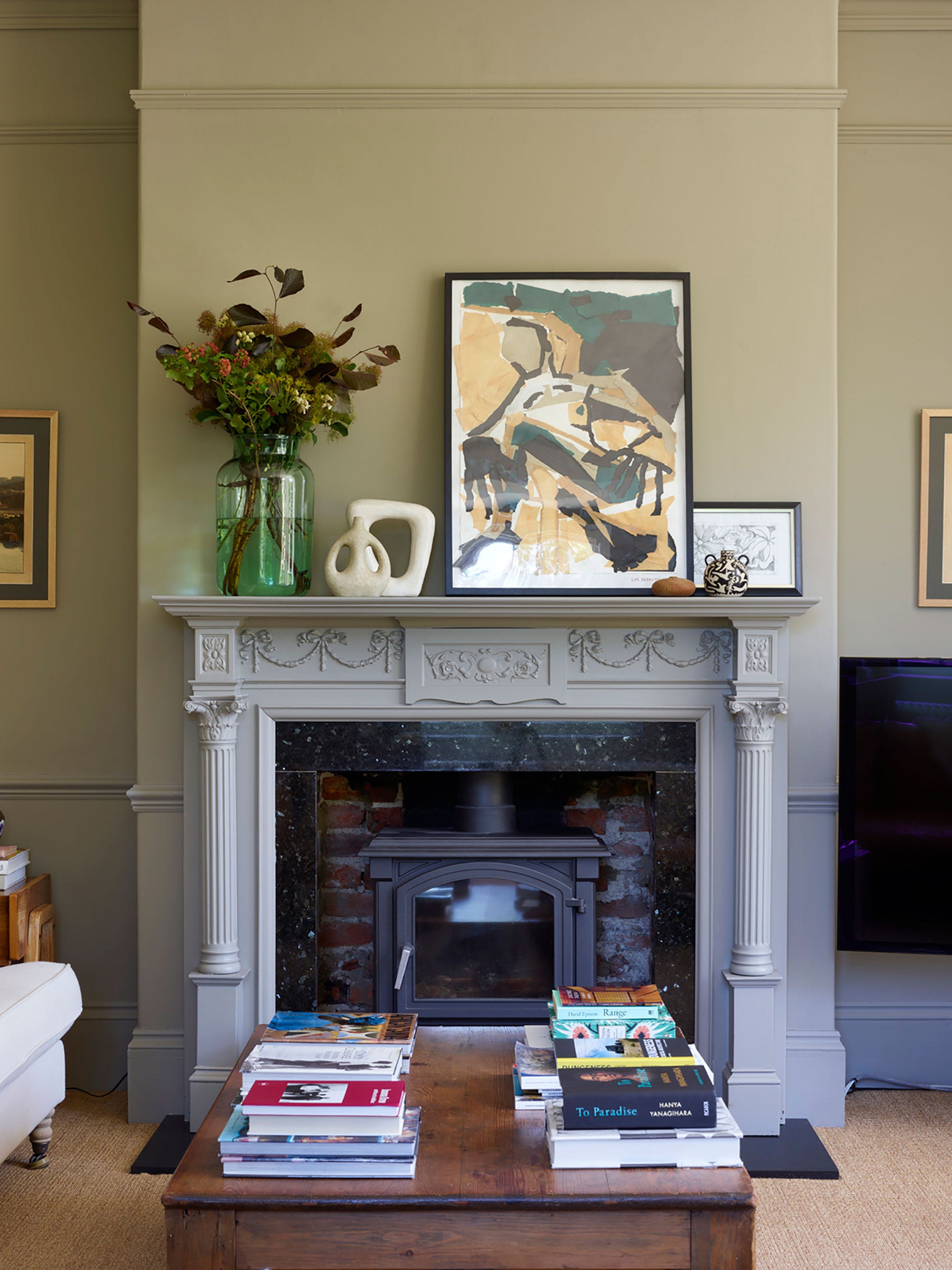
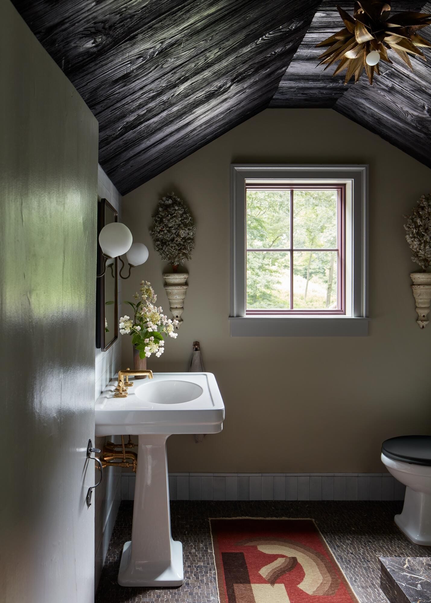
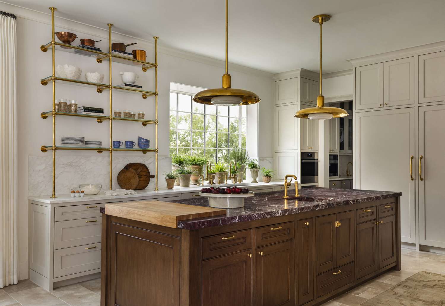
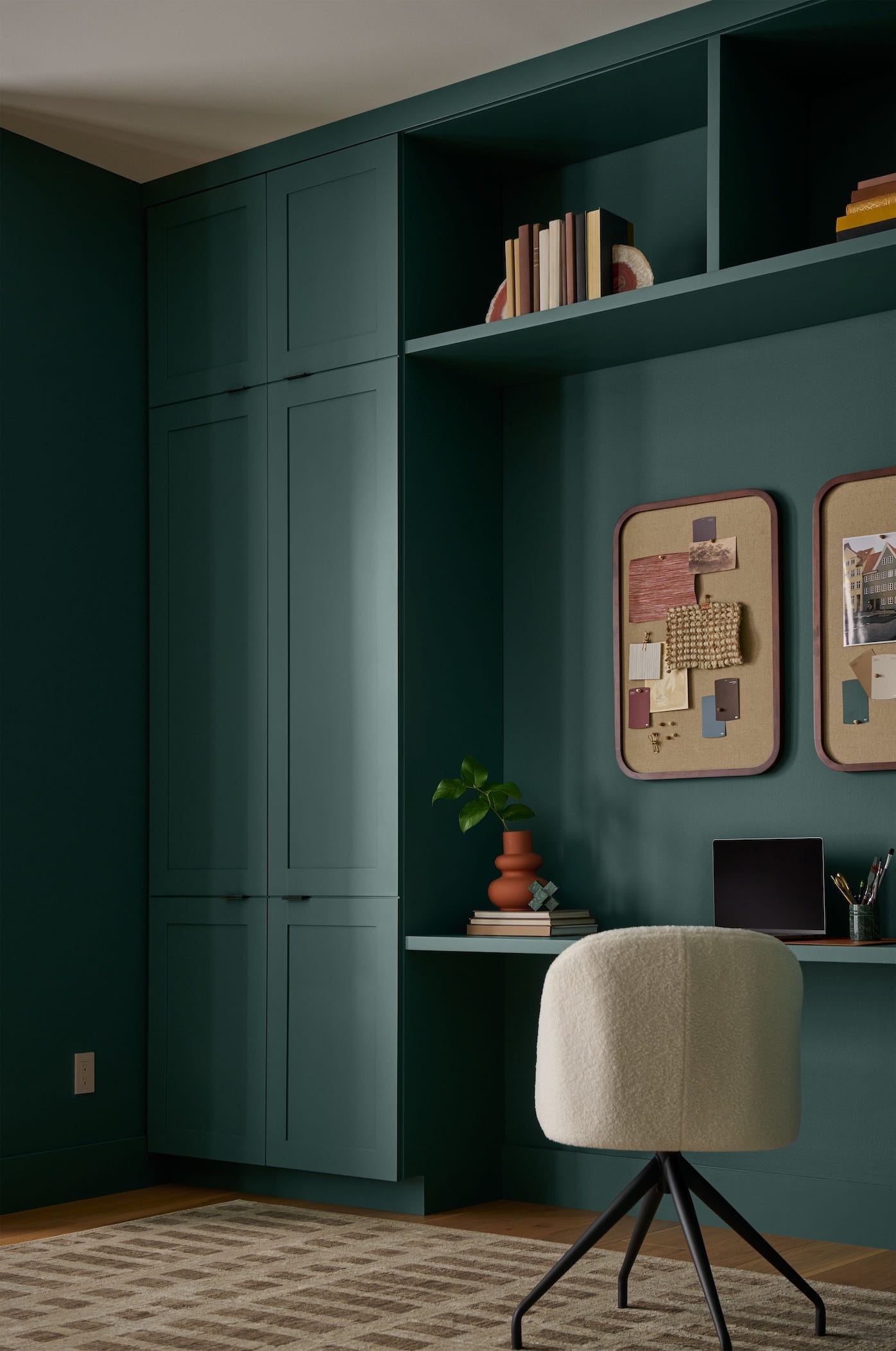
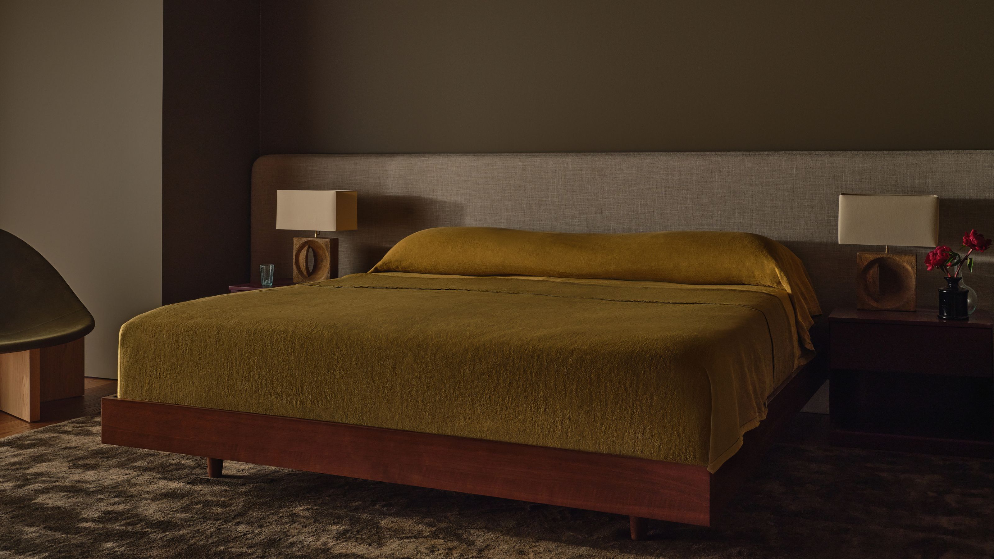
The article explores how to effectively integrate bold colors into a neutral design scheme, drawing inspiration from the new London showroom of the global homeware brand GUBI. It highlights that incorporating vibrant hues doesn't necessitate a maximalist approach but can be achieved through tasteful touches that complement a calming color palette. The GUBI showroom itself exemplifies this philosophy, showcasing a sleek style that is both colorful and neutral within a classic Clerkenwell townhouse across four floors. This approach aims to make bold colors appealing even to minimalists by displaying timeless furniture in carefully arranged settings.
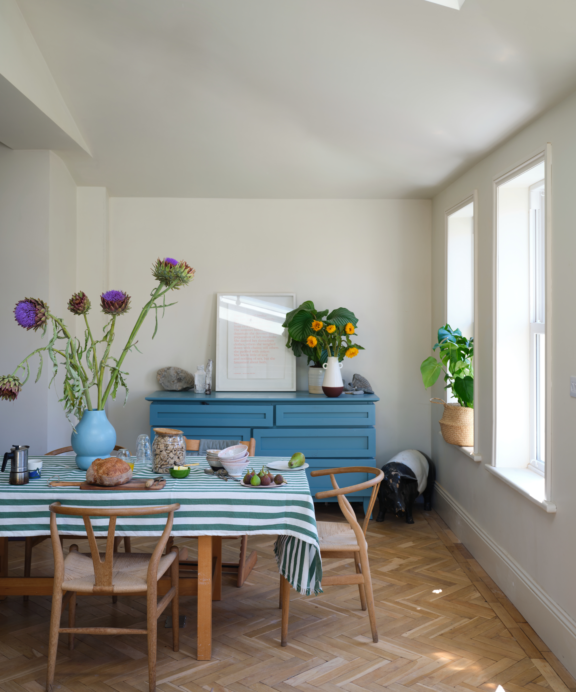
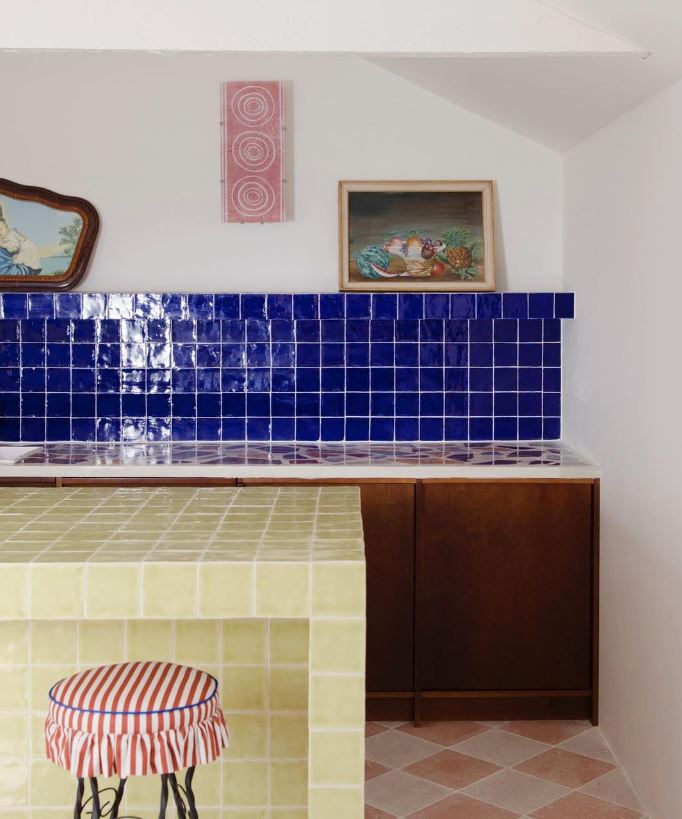
Marie Kristine Schmidt, GUBI's chief brand officer, offers insights into the brand's use of color, the role of furniture in establishing a color scheme, and optimal areas for injecting color. She emphasizes that creating a stylish color scheme involves more than just paint; every piece of furniture and decorative accessory contributes to the overall palette. By thoughtfully selecting hues and considering how they interact, a timeless selection of shades can be achieved. For instance, a navy blue accent wall, when balanced with lighter blue dining chairs and a white, gold, and wood foundation, can add drama without overwhelming a neutral space, maintaining a calm atmosphere. Each room is designed to possess its own distinct identity while contributing to an overarching sense of coherence throughout the space.
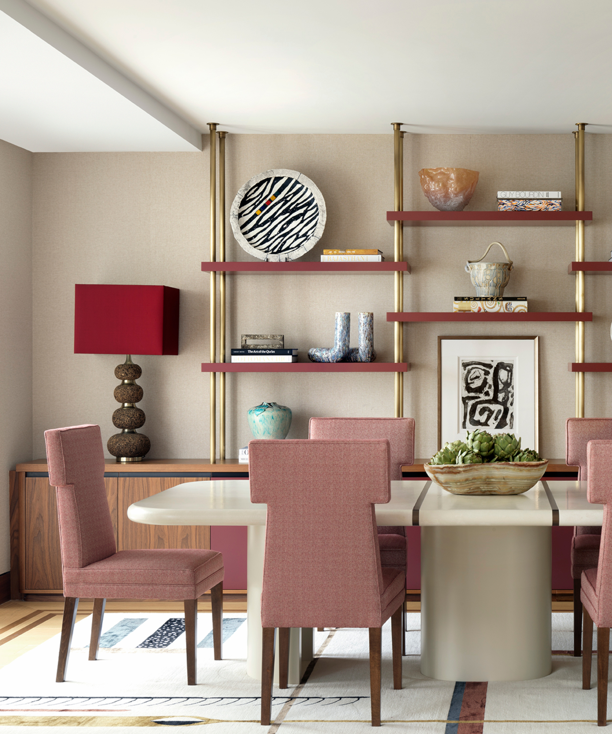
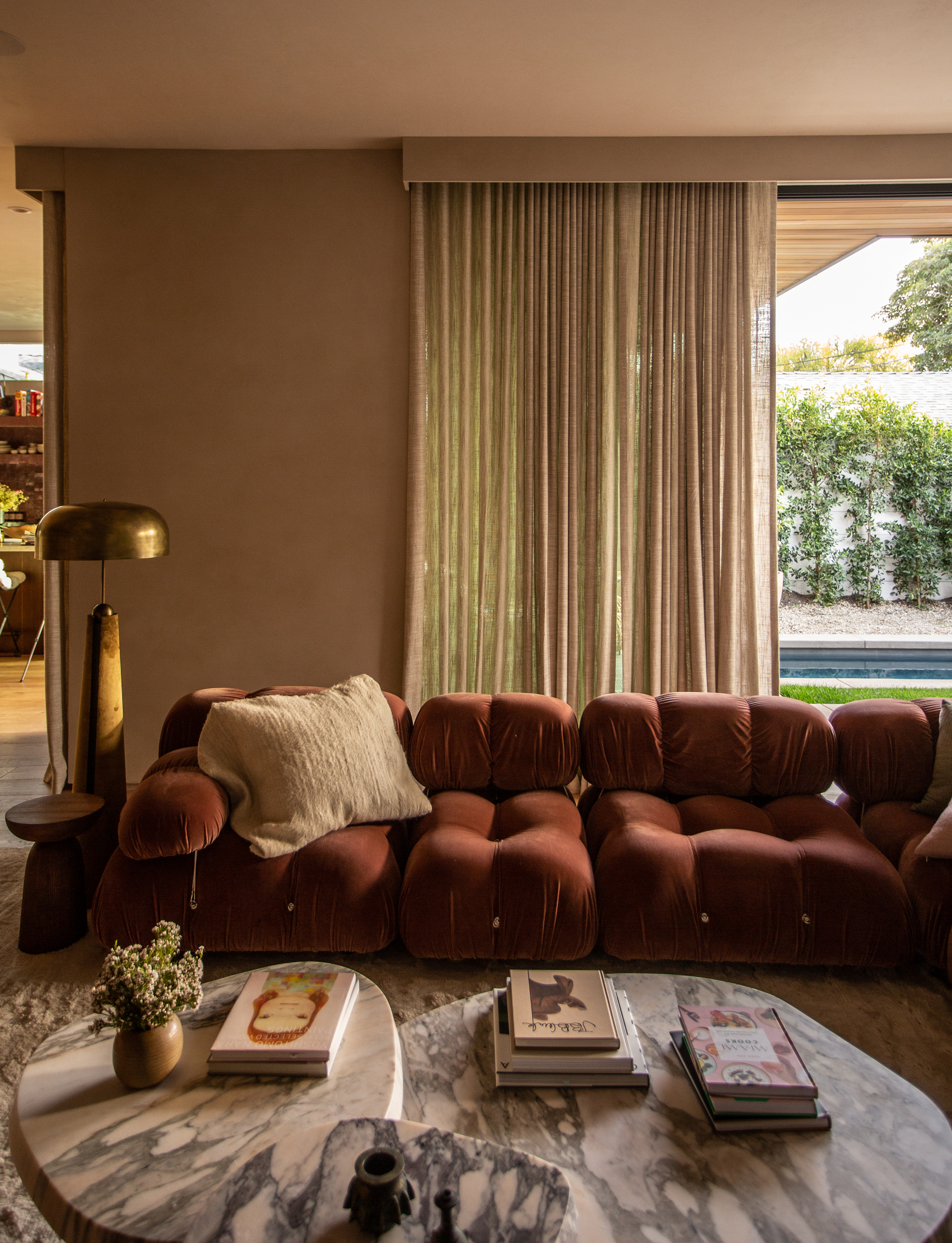
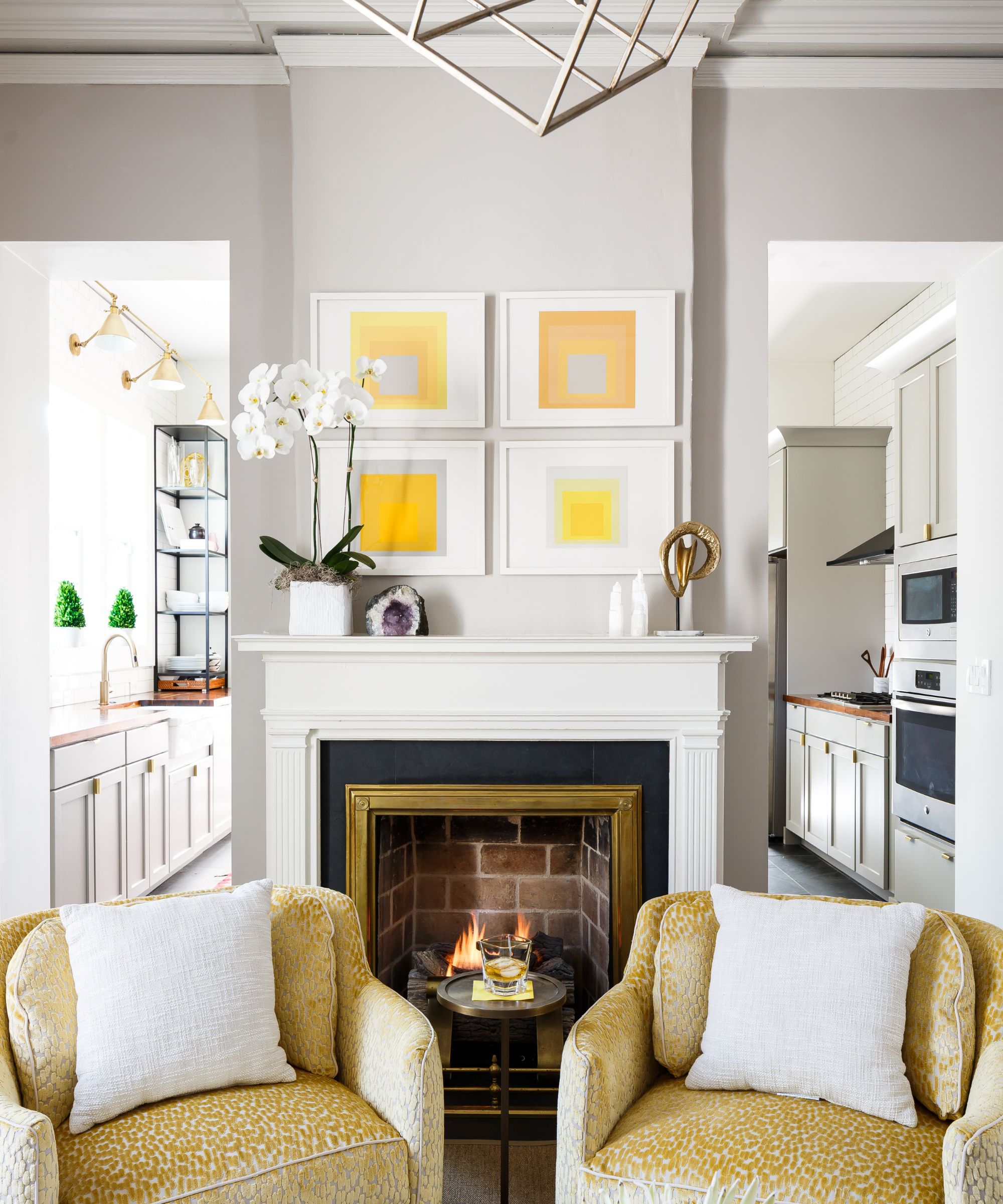
Marie elaborates that harmony is achieved through meticulous curation and a deep understanding of color dynamics, with furniture shapes also playing a crucial role in defining space and cohesion. It is not necessary to saturate a room with color; instead, focusing on a few impactful colorful elements can define the space and unify the design. A bold blue sofa in a neutral setting, for example, can serve as a captivating focal point. Pairing bold hues with sleek, smooth shapes helps to prevent the design from becoming excessive. Additionally, selecting neutral and colorful paints that share similar undertones ensures a coordinated look, preventing even the brightest statement furniture from appearing out of place. This balanced approach ensures depth and visual interest without overwhelming the aesthetic, acknowledging that an exclusively neutral palette can sometimes feel bland.
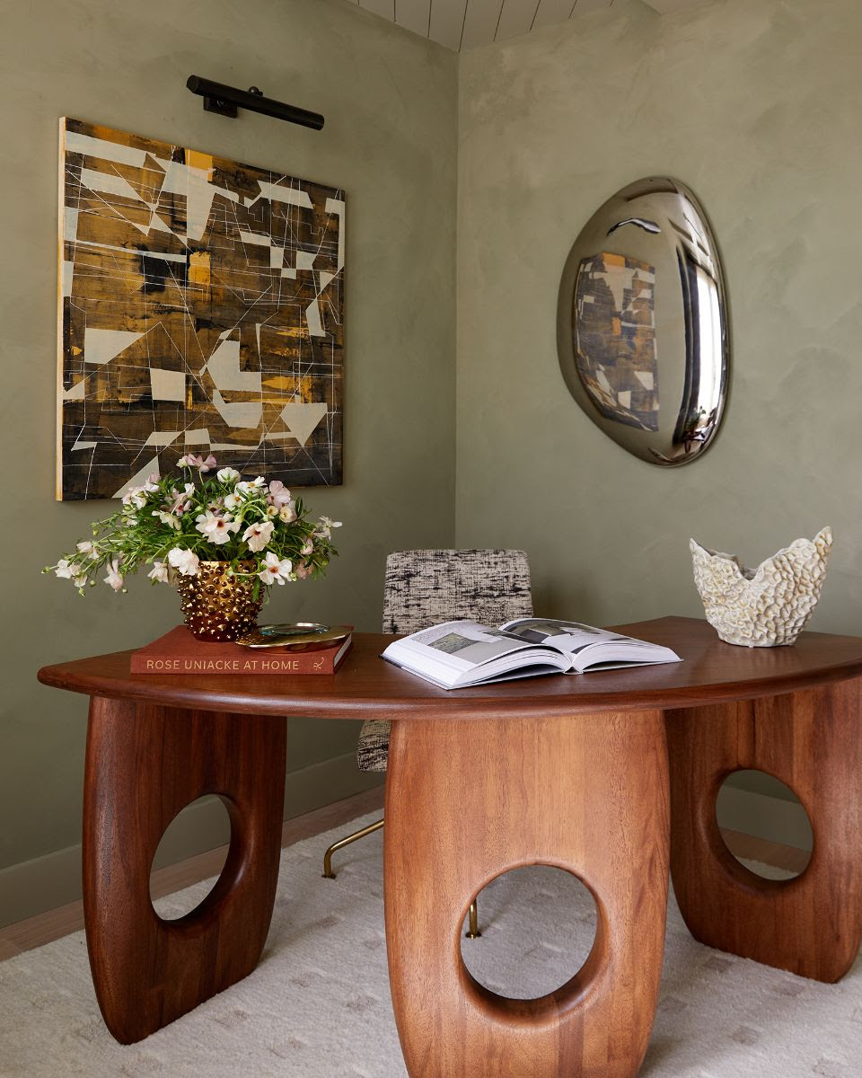
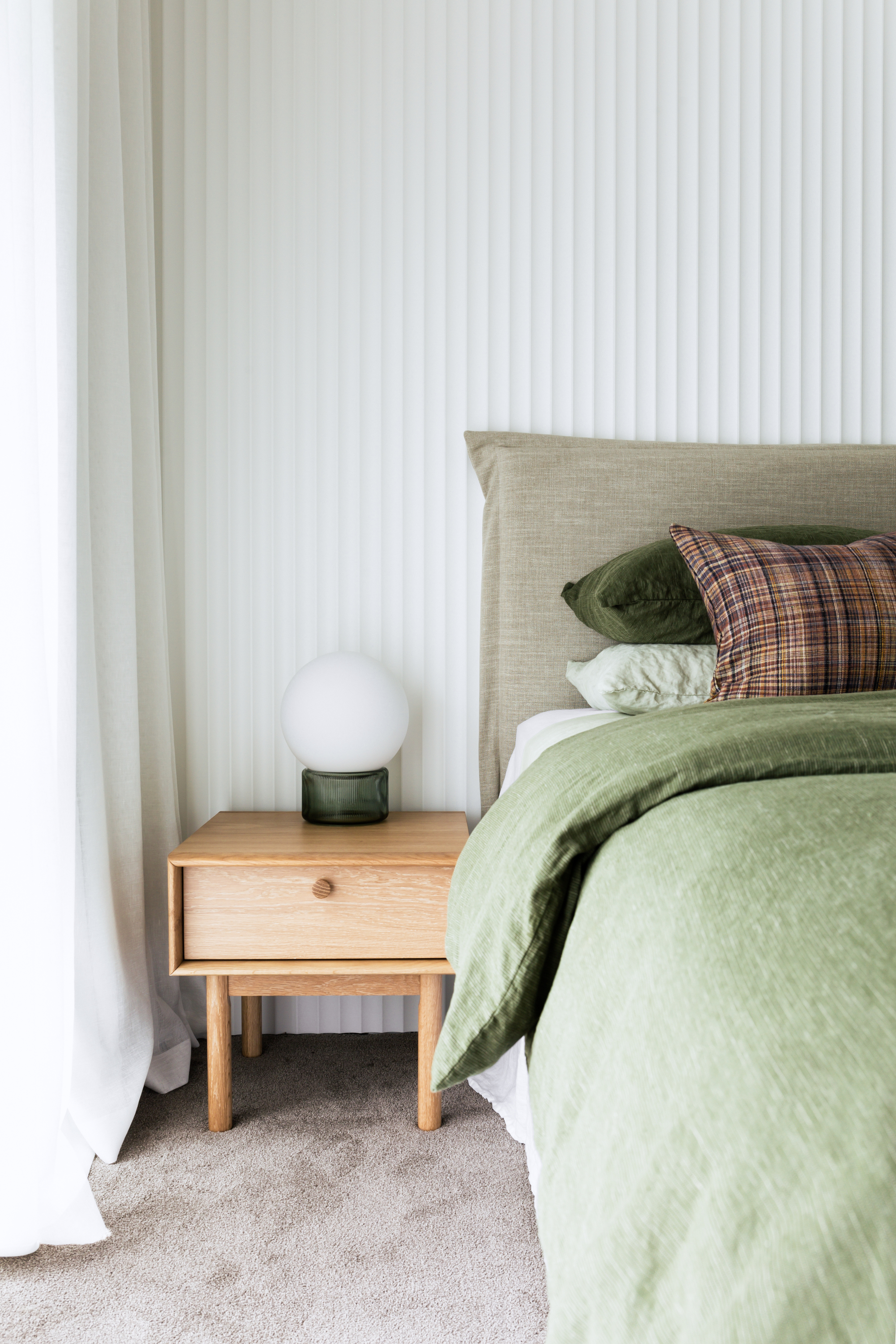
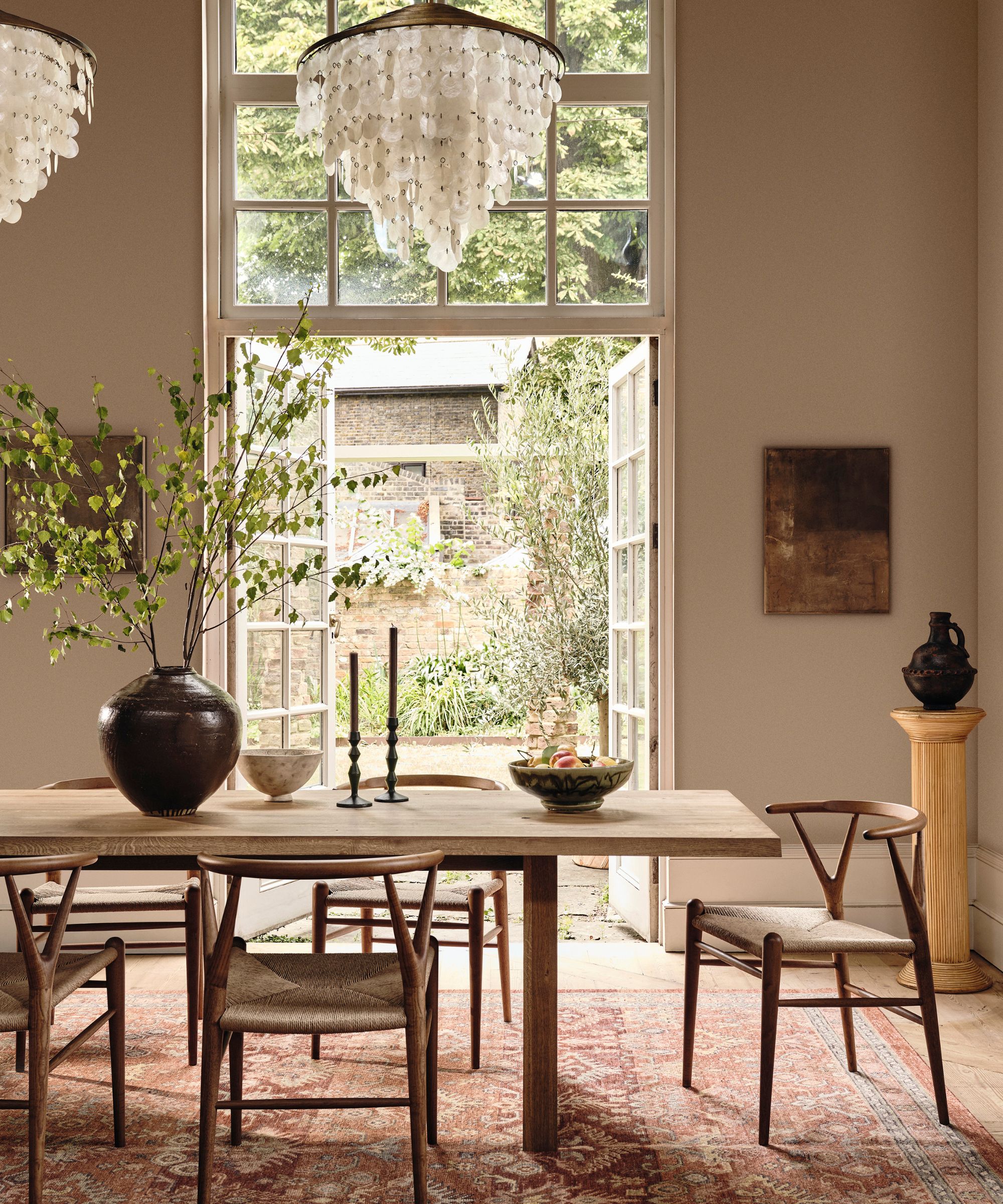
Furniture is presented as a key element in shaping a home's color palette. At the GUBI House, each floor features a unique color scheme, with furniture chosen in complementary hues and textures to create a specific ambiance. For those hesitant to paint walls in bright colors, furniture offers an excellent alternative for introducing vibrancy. Even one or two brightly colored pieces can significantly enhance a space. After selecting furniture, strategic layering of lighting and accessories can further add depth and amplify the room's atmosphere. The ground floor, for example, uses green and blue tones for a cool effect, balanced by warm elements like brass and bamboo-shaded lamps. Upstairs, cooler wall colors are offset by warm-toned furniture, illustrating how diverse materials and textures can elevate the overall feel and create a cohesive, visually stimulating environment. The article concludes by suggesting that elegant, curved furniture in vibrant hues can maintain personal style while tastefully pushing design boundaries.
#ColorSchemes #InteriorDesign #GUBIHomeware #NeutralDecor #BoldColors #FurnitureDesign #HomeDecoration #DesignInspiration #ColorSchemes #InteriorDesign #GUBIHomeware #NeutralDecor #BoldColors #FurnitureDesign #HomeDecoration #DesignInspiration
0 comment in total
 No comments yet
You may also like
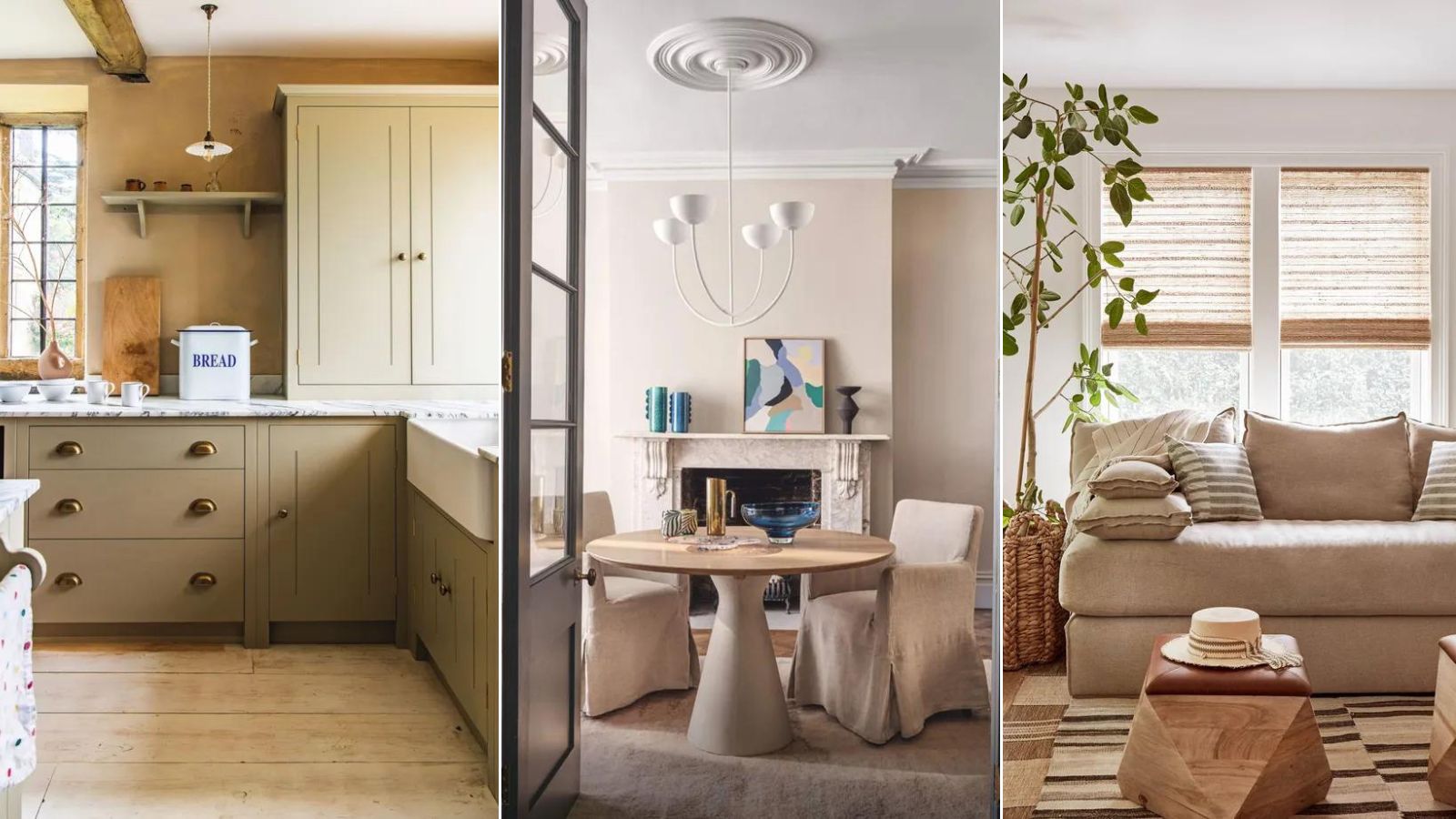
What color is replacing gray? This is the shade designers say is becoming the perennial favorite
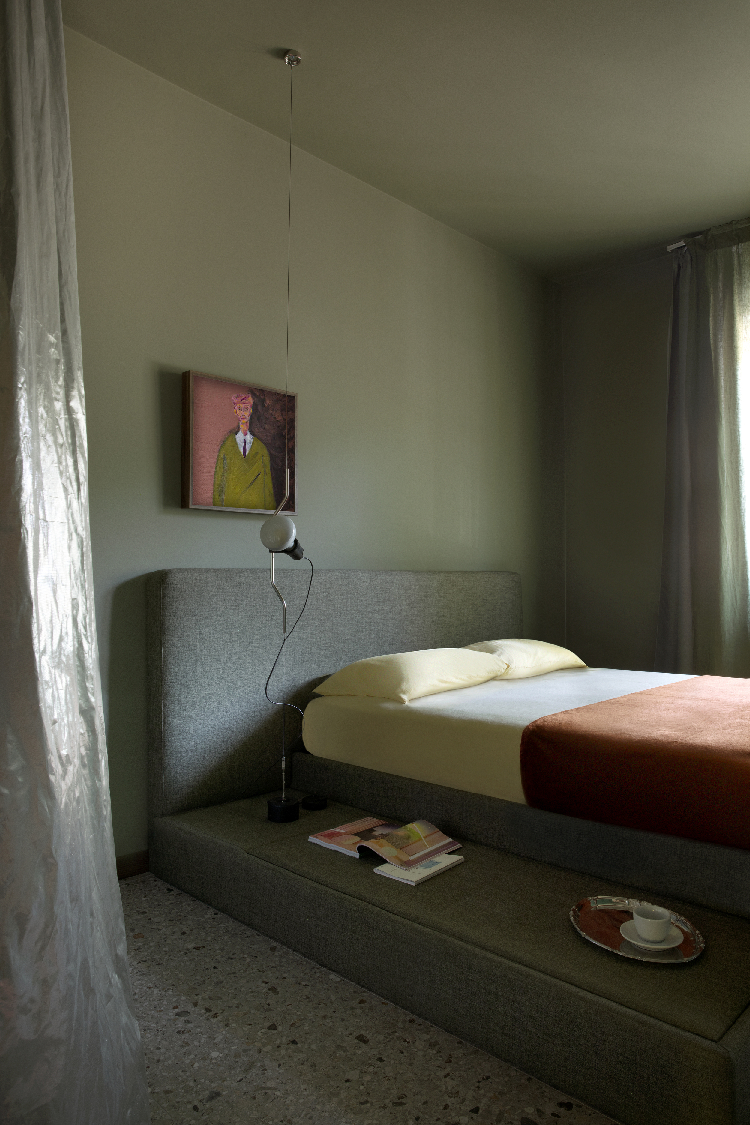
Is Green the New Neutral? Interior Designers Argue We Should All Be Using This Soothing Shade as Our Base Color

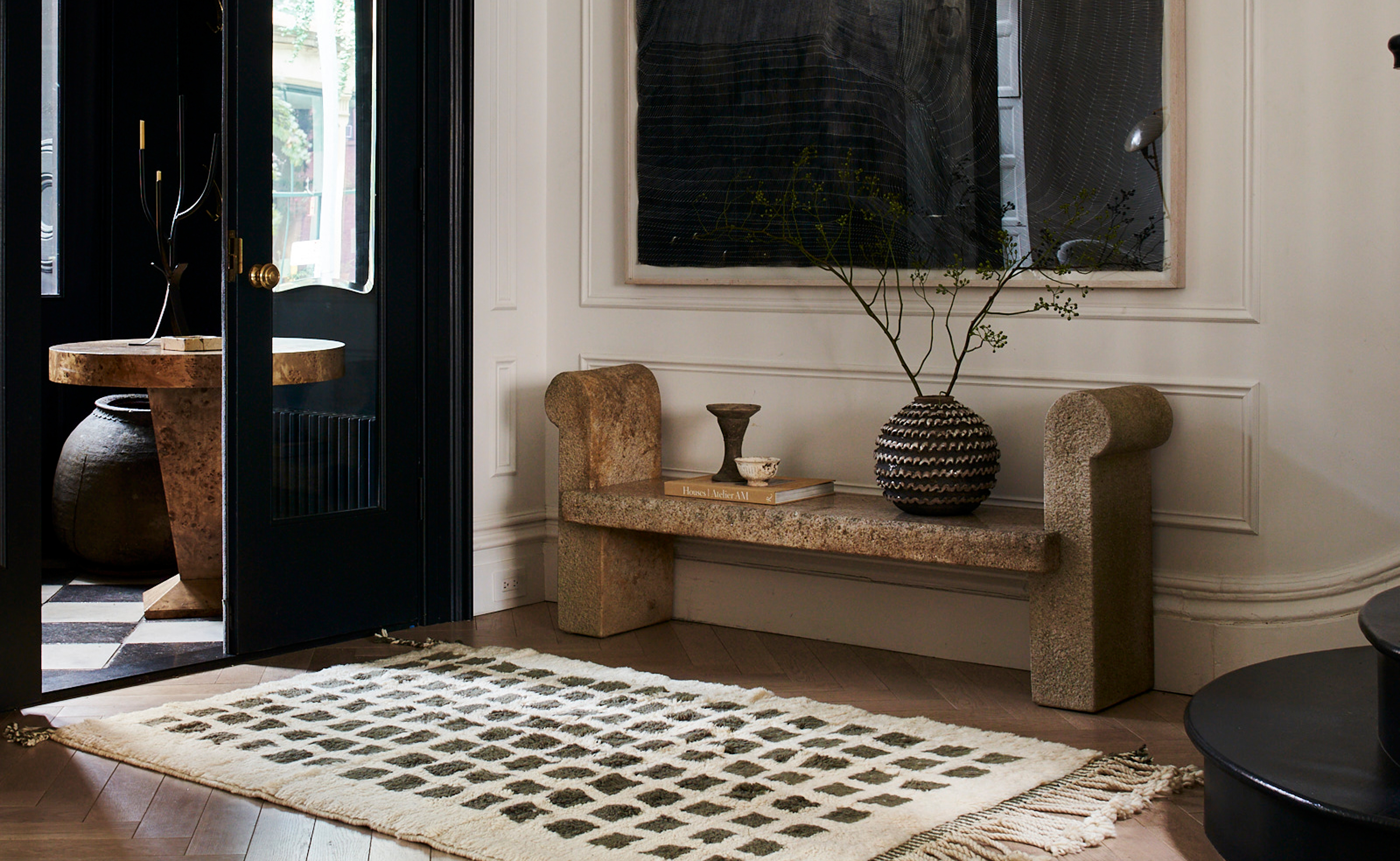
The 3 Best Neutral Entryway Paint Colors to Set the Right Tone for a Sophisticated Home
The Trendiest Neutral Of The Year Is A 2000s Classic—But Better
Which Neutral Is Replacing White in 2025? Experts Reveal
'Neutral Maximalism' Will Teach You How to Decorate Boldly Without Relying on Color
Every Designer I Talked to Said This Popular Paint Color Is on Its Way Out

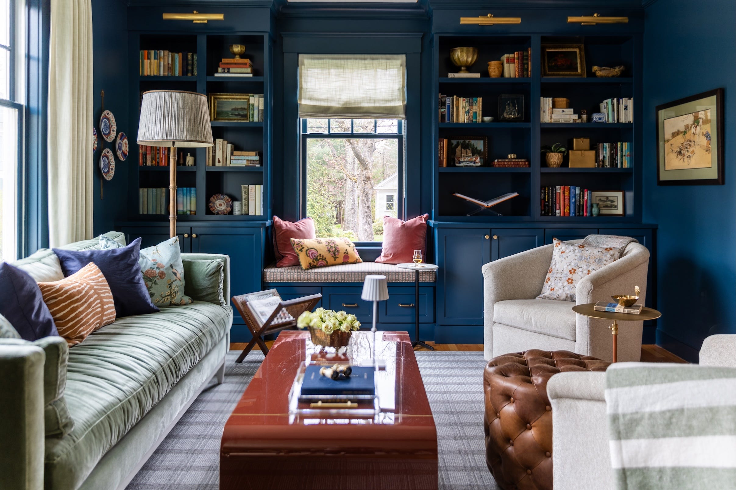
Designers Say These 12 Paint Colors Will Be Everywhere in 2026

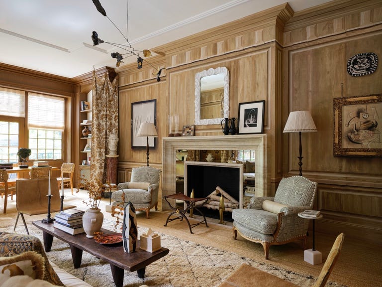
"Neutral Maximalism" Is Trending—Here's How to Make It Work, According to Designers

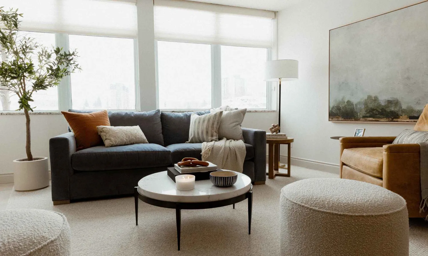
Are Neutral Paint Colors Finally Out of Style? We Asked Designers and They All Agreed

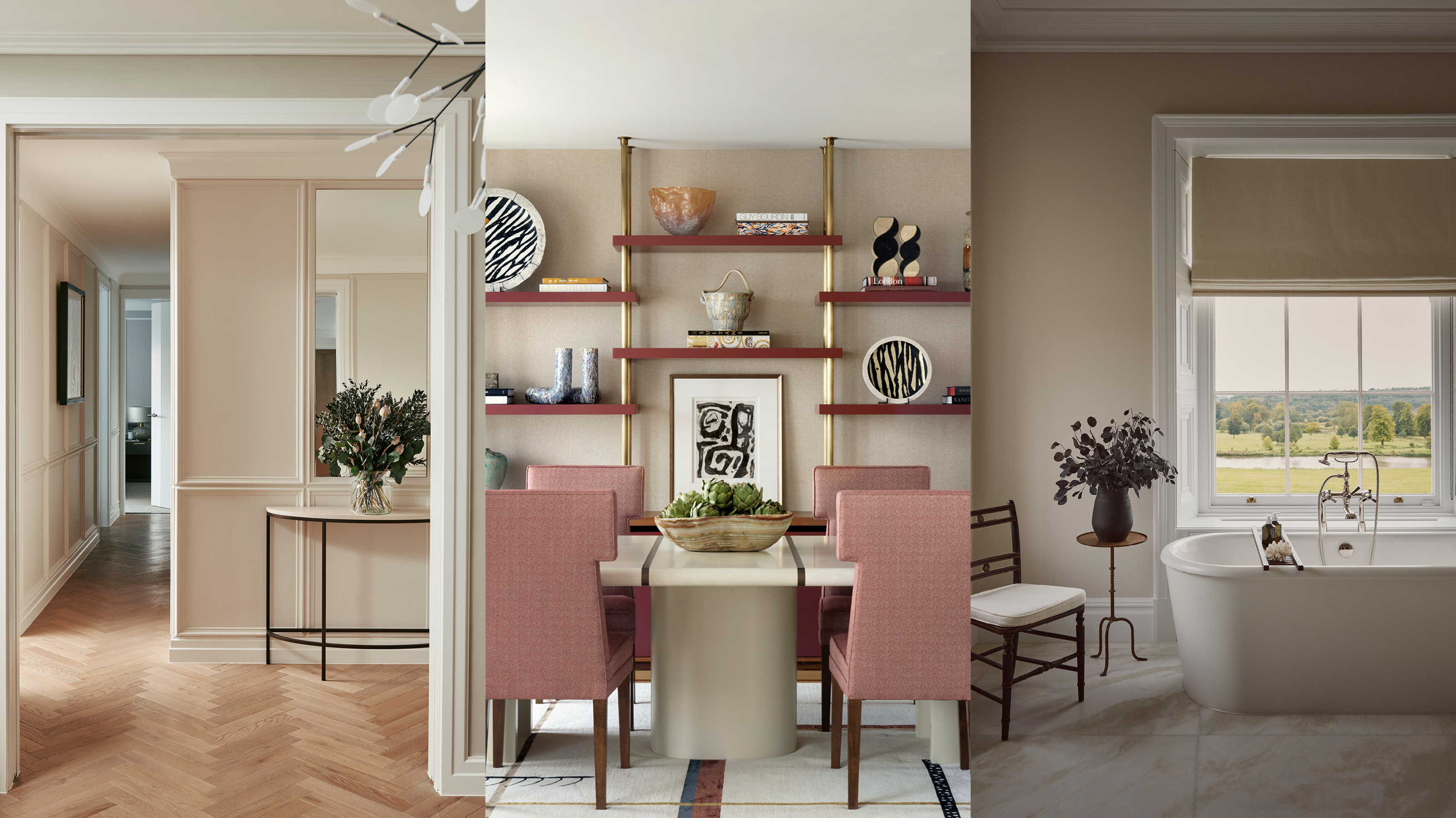
Beige-grey – the timeless paint color perfect for a barely-there backdrop
5 "trend-proof" colors for your home designers think will be just as popular in 10 years' time
Why I'll Never Give Up My Neutral Color Scheme

4 Interior Designers Share the Biggest Paint Color Trends Right Now (and What’s Out!)

10 Neutral Room Ideas That Are Calming, Sophisticated — And Full of Decorative Interest
Is gray or beige more on trend for 2025? Designers share all on these popular neutrals
The 'New Neutrals' Designers Are Choosing for Their 2026 Schemes
White vs Cream: designers weigh in on these enduring neutrals
Why You Should Ditch Gray Walls in Favor of Taupe

We're Calling It: Blues And Greens Are The New Neutrals For 2025