1/18
Why You Should Ditch Gray Walls in Favor of Taupe
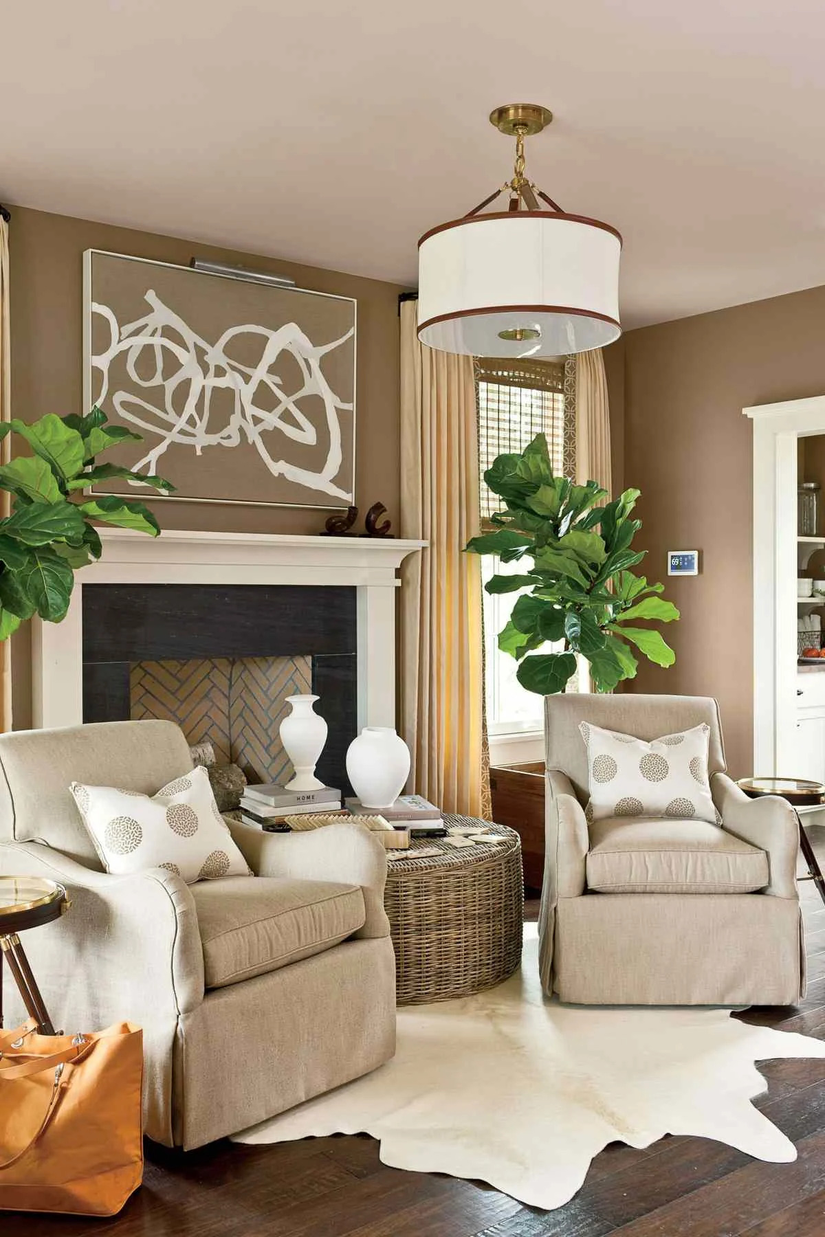
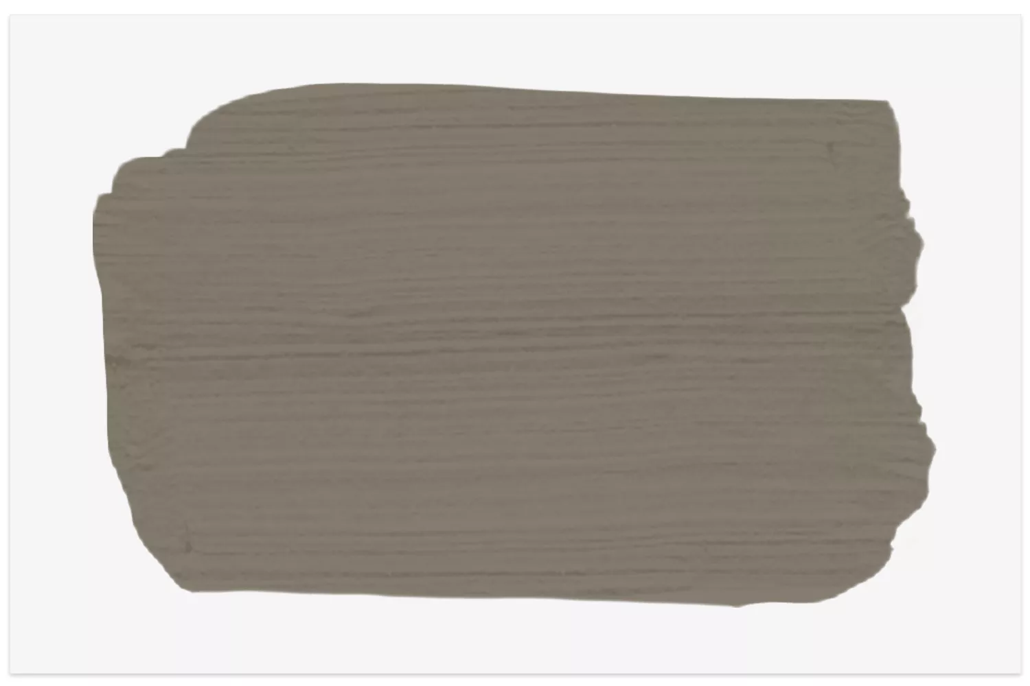
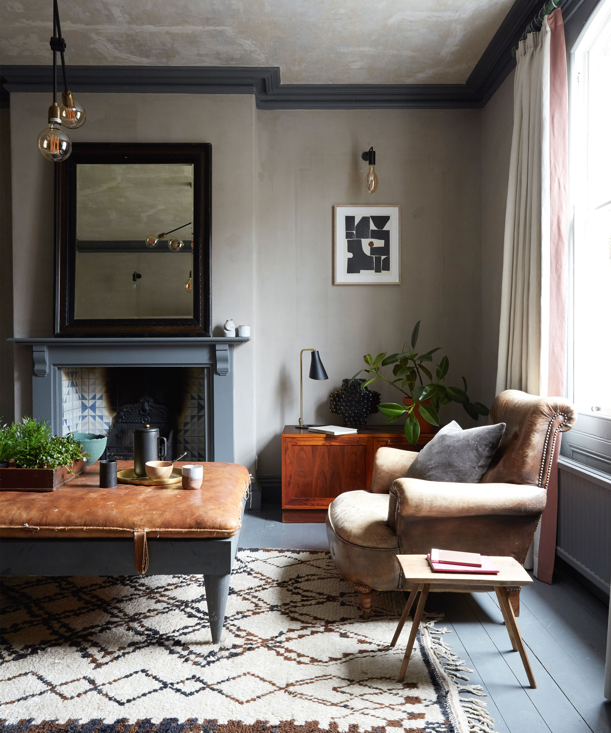
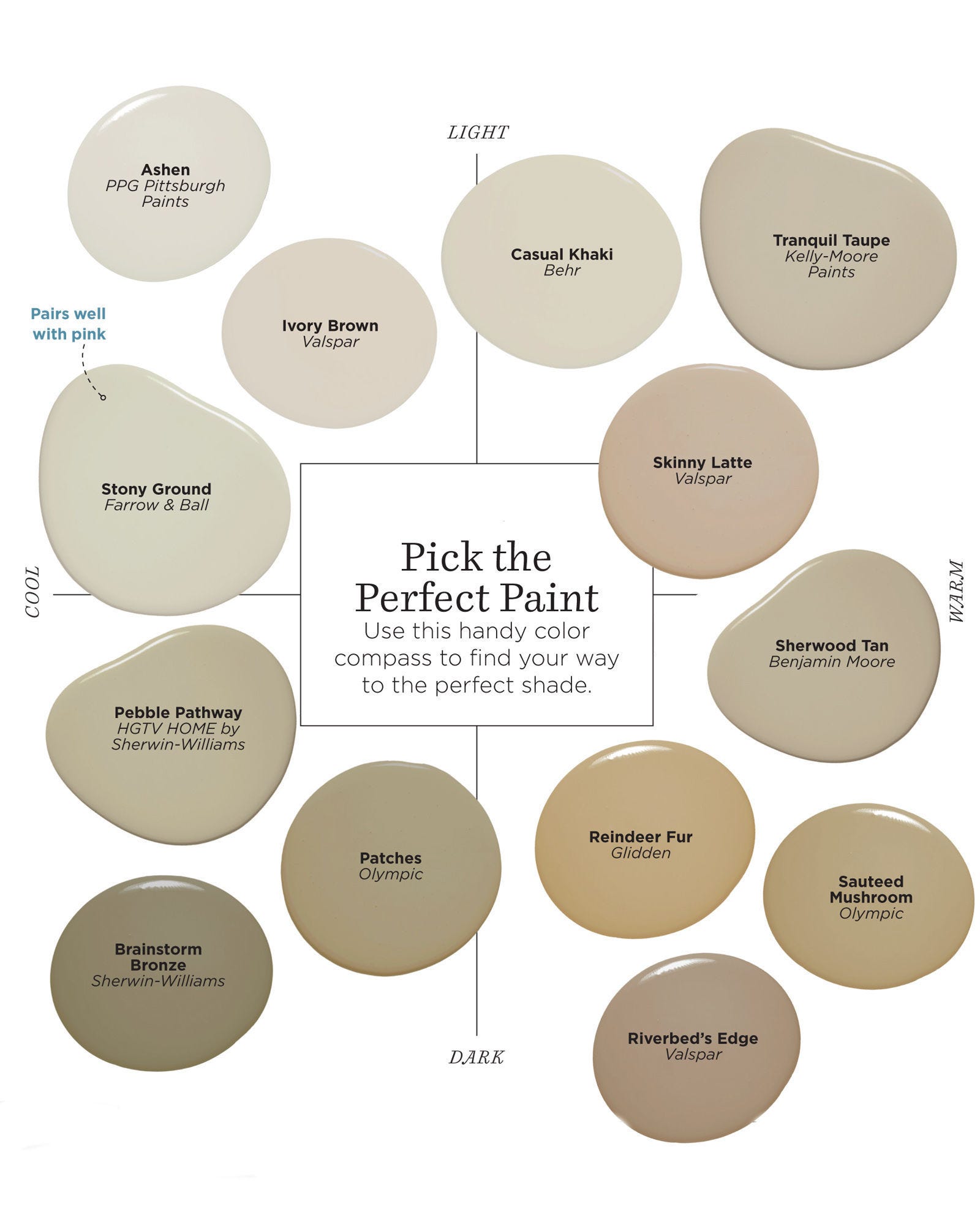
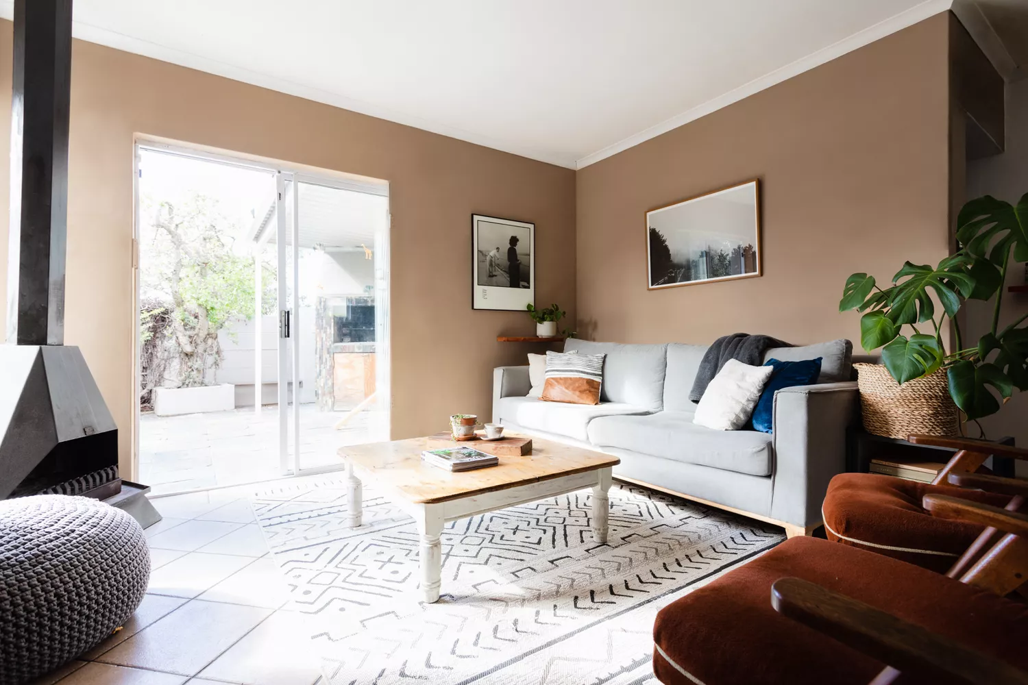
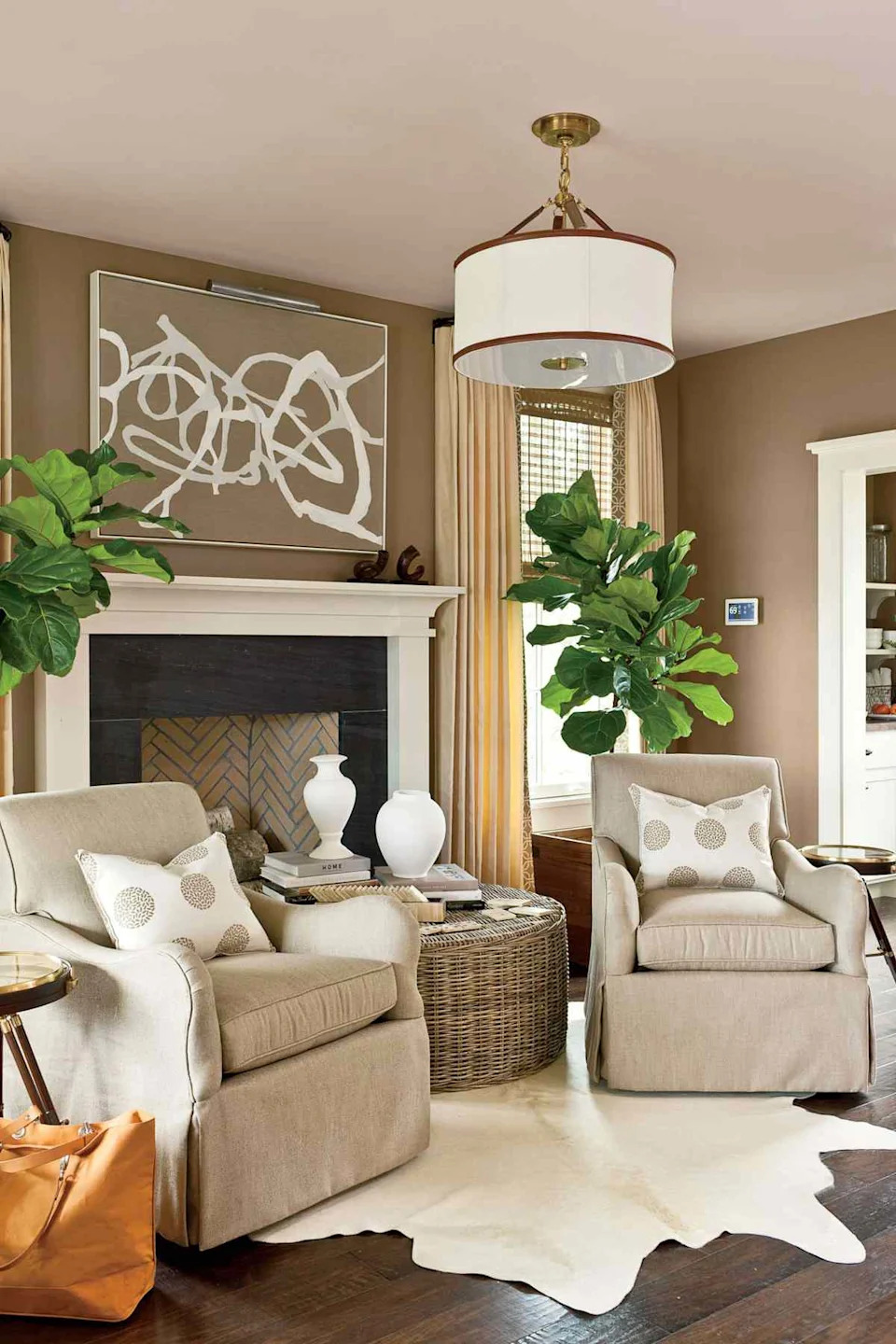
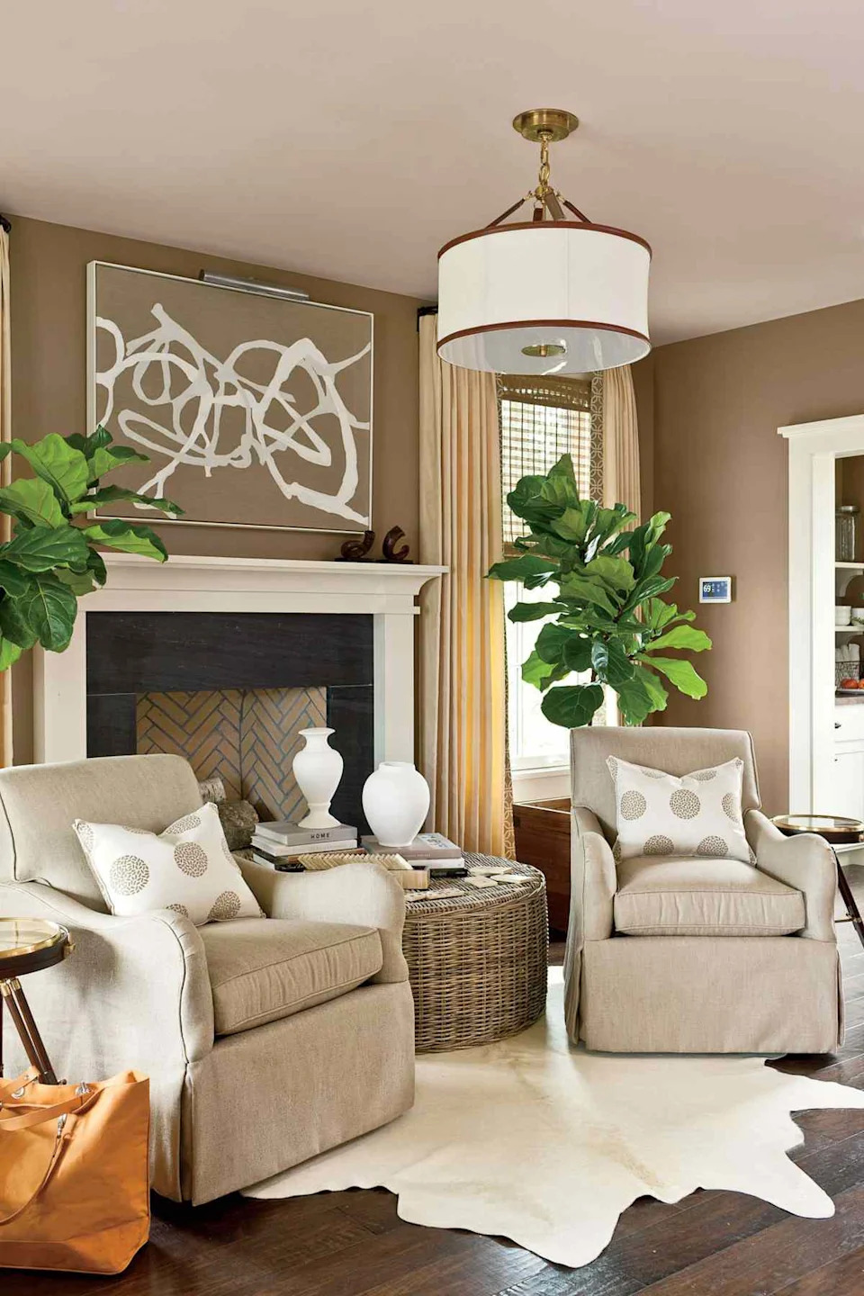
Taupe is currently a highly favored neutral in interior design, described as an “unsung hero” in the color world by Jessica Quintero of Designed by JQ. The color is characterized by its warmth, inviting nature, and versatility, stemming from its blend of gray and beige with a spectrum of undertones, ranging from warmer hints of red to cooler touches of green. This adaptability makes it suitable as a backdrop for various design schemes and ensures its timeless popularity. Quintero notes that taupe is experiencing a significant moment due to its comforting and cozy appeal, comparing it to a “warm hug in a paint can.”
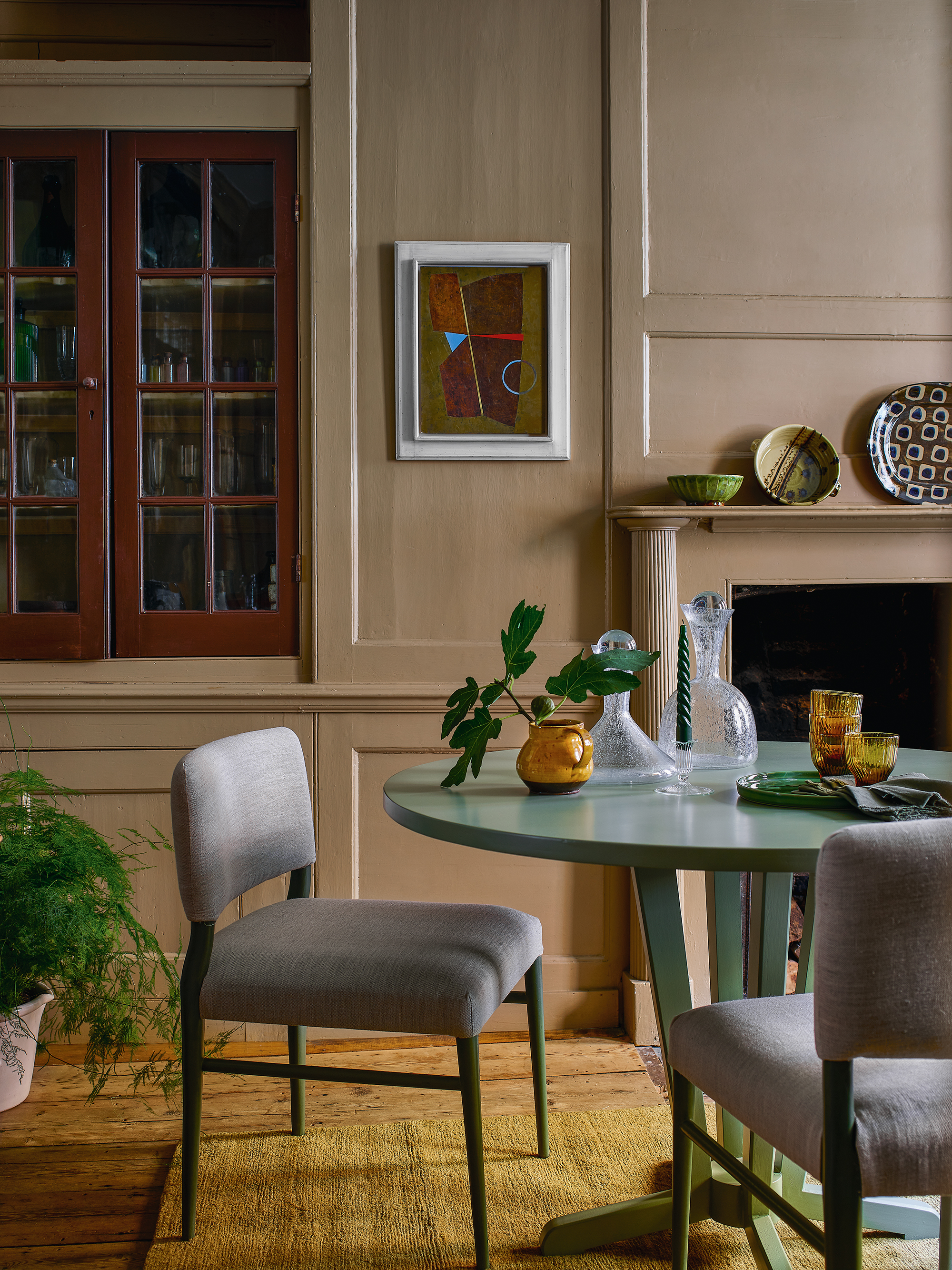
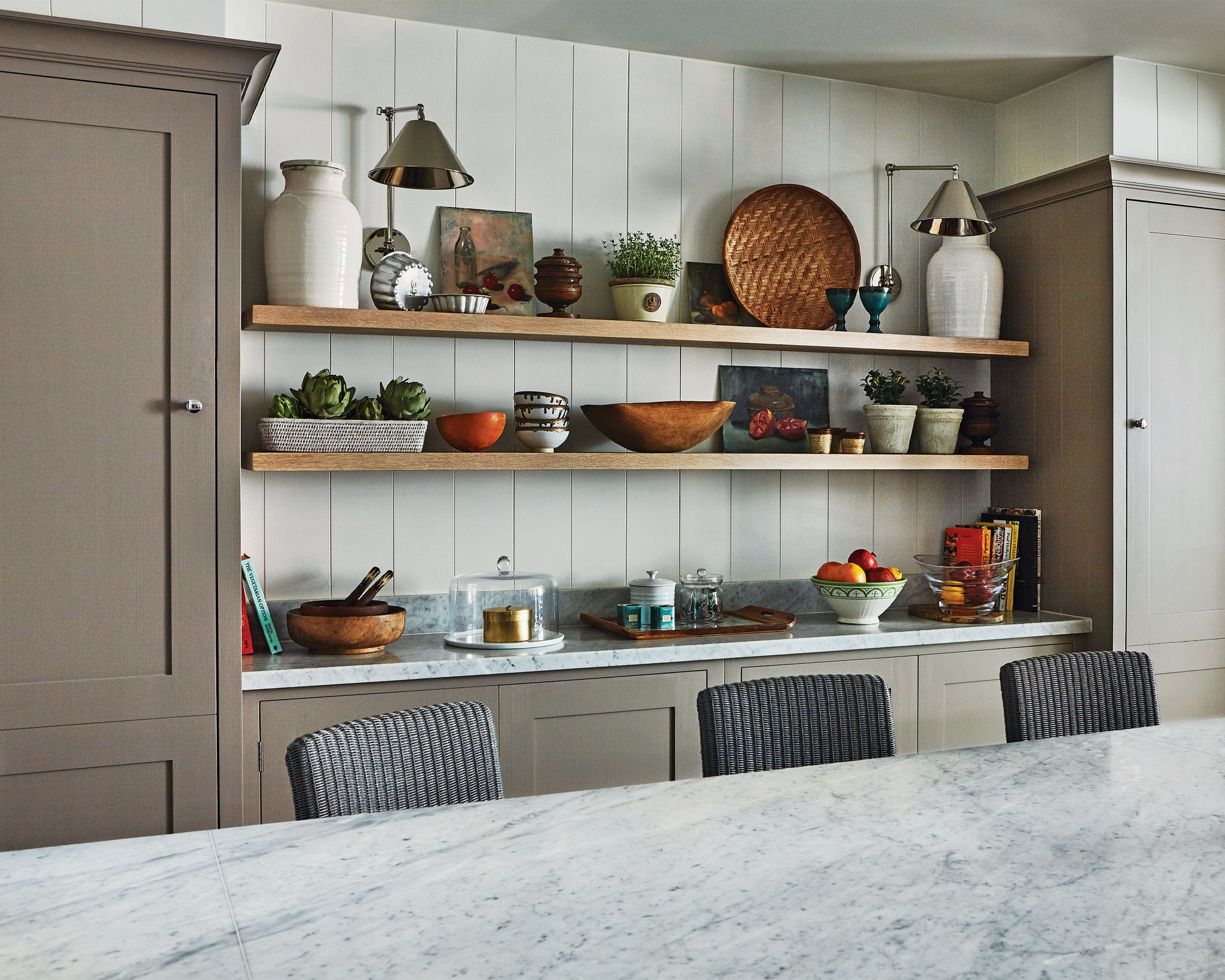
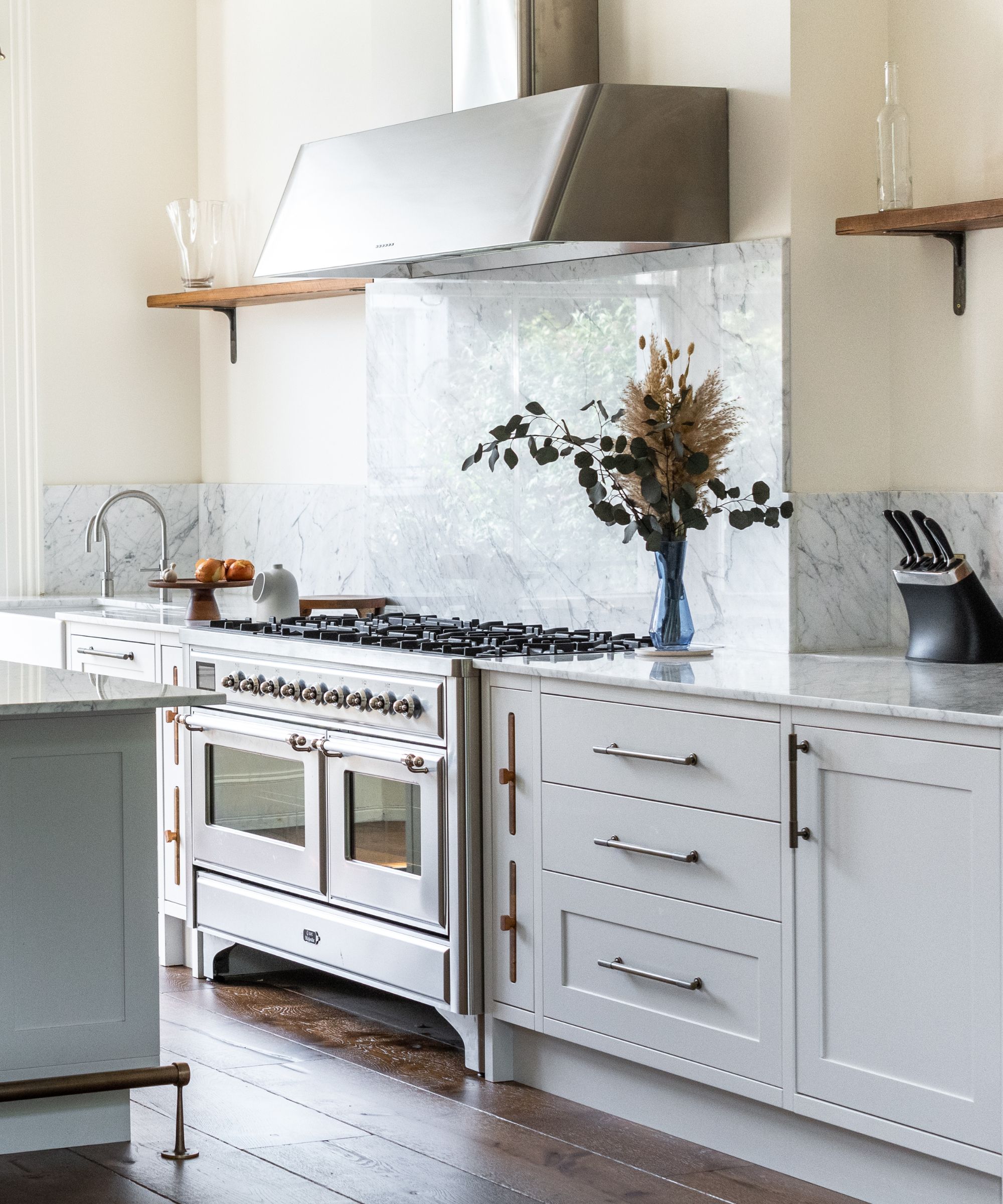
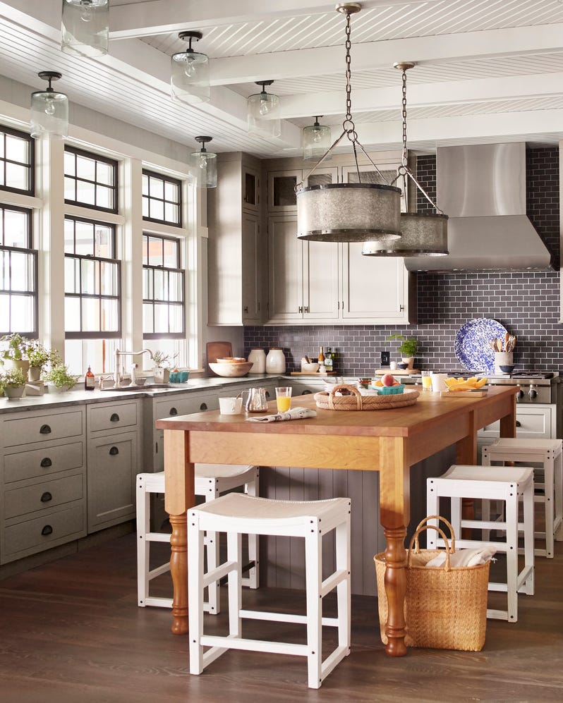
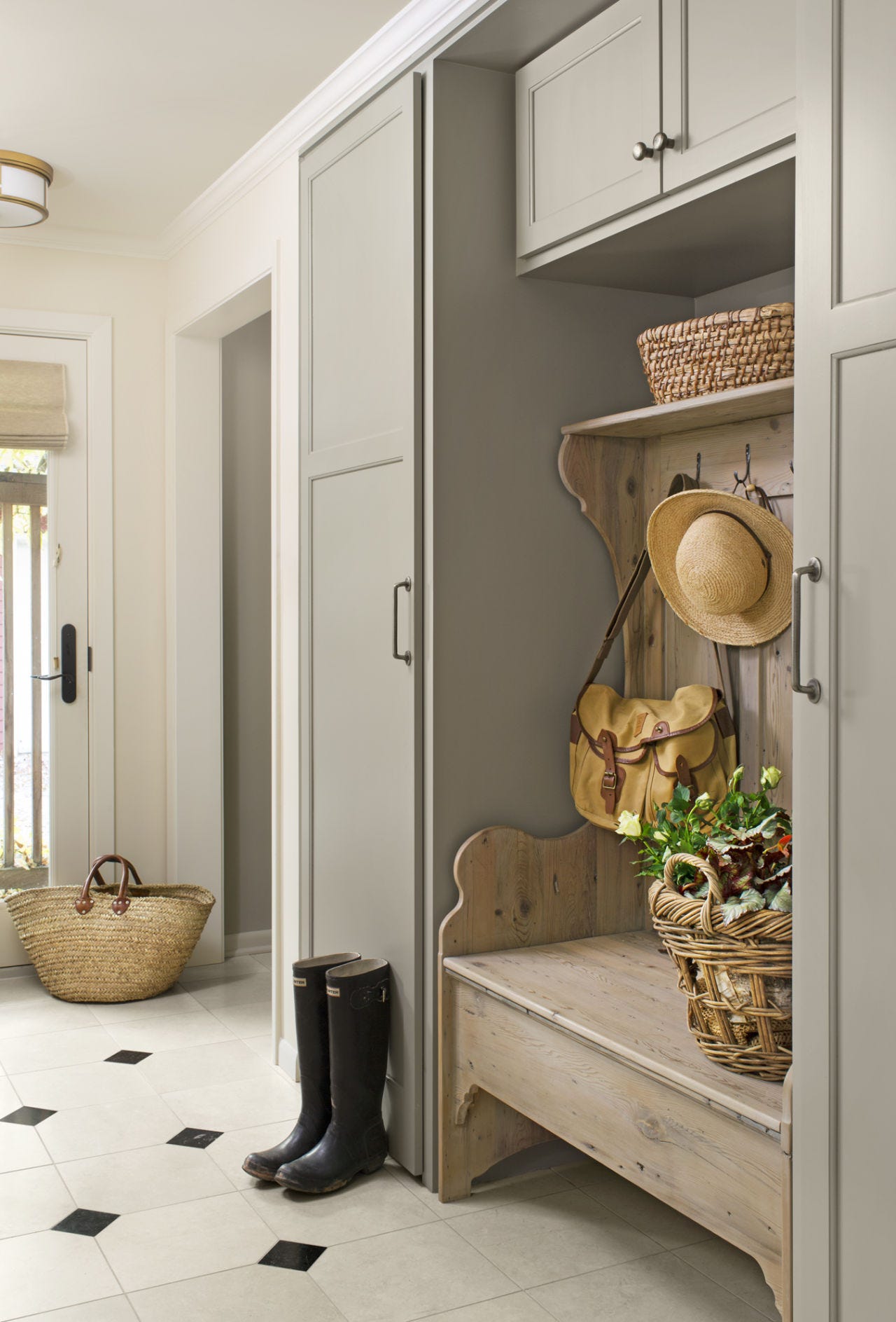
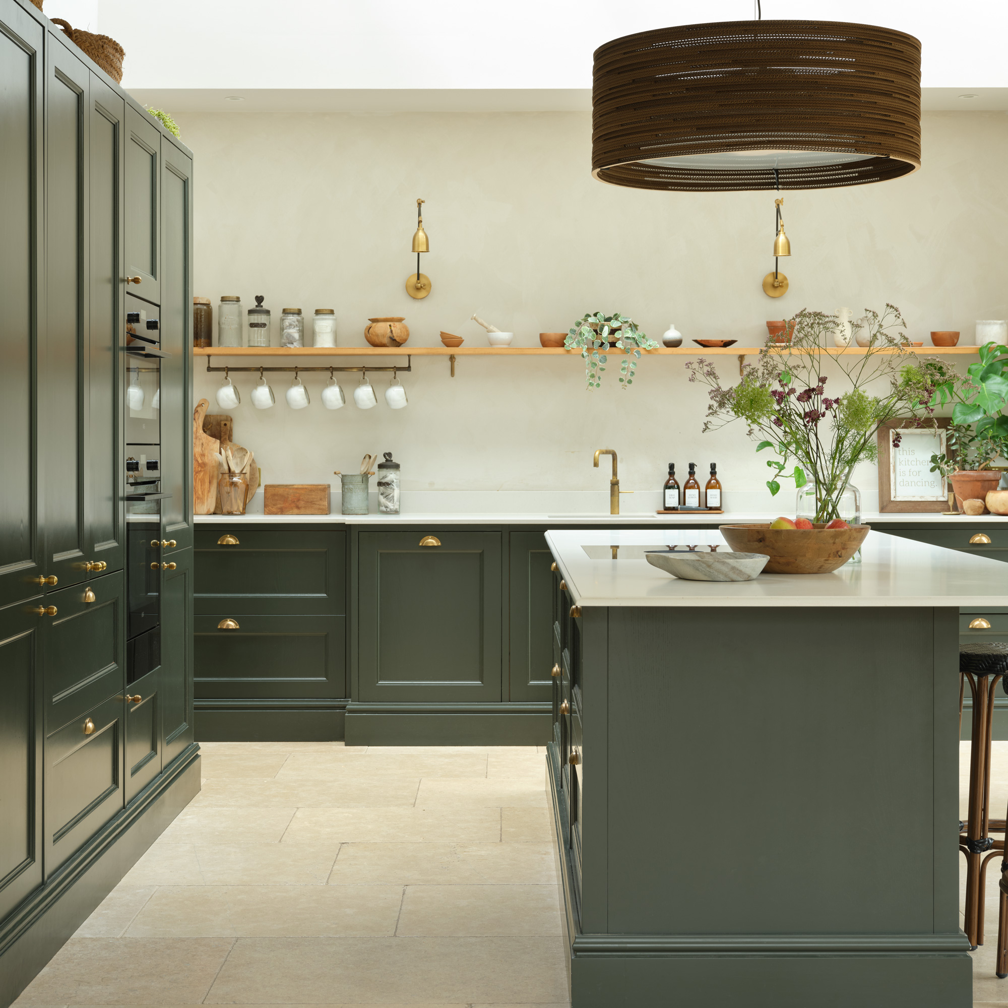
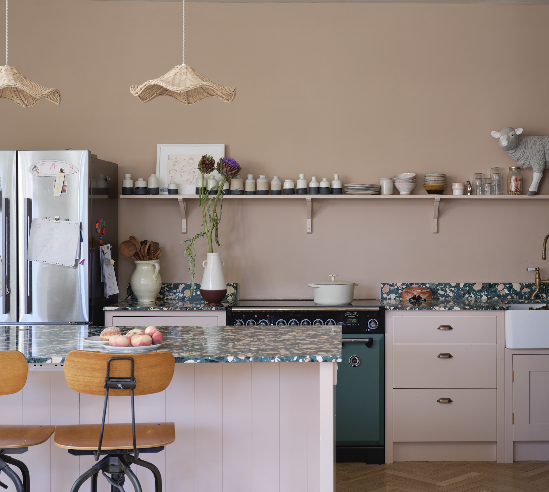
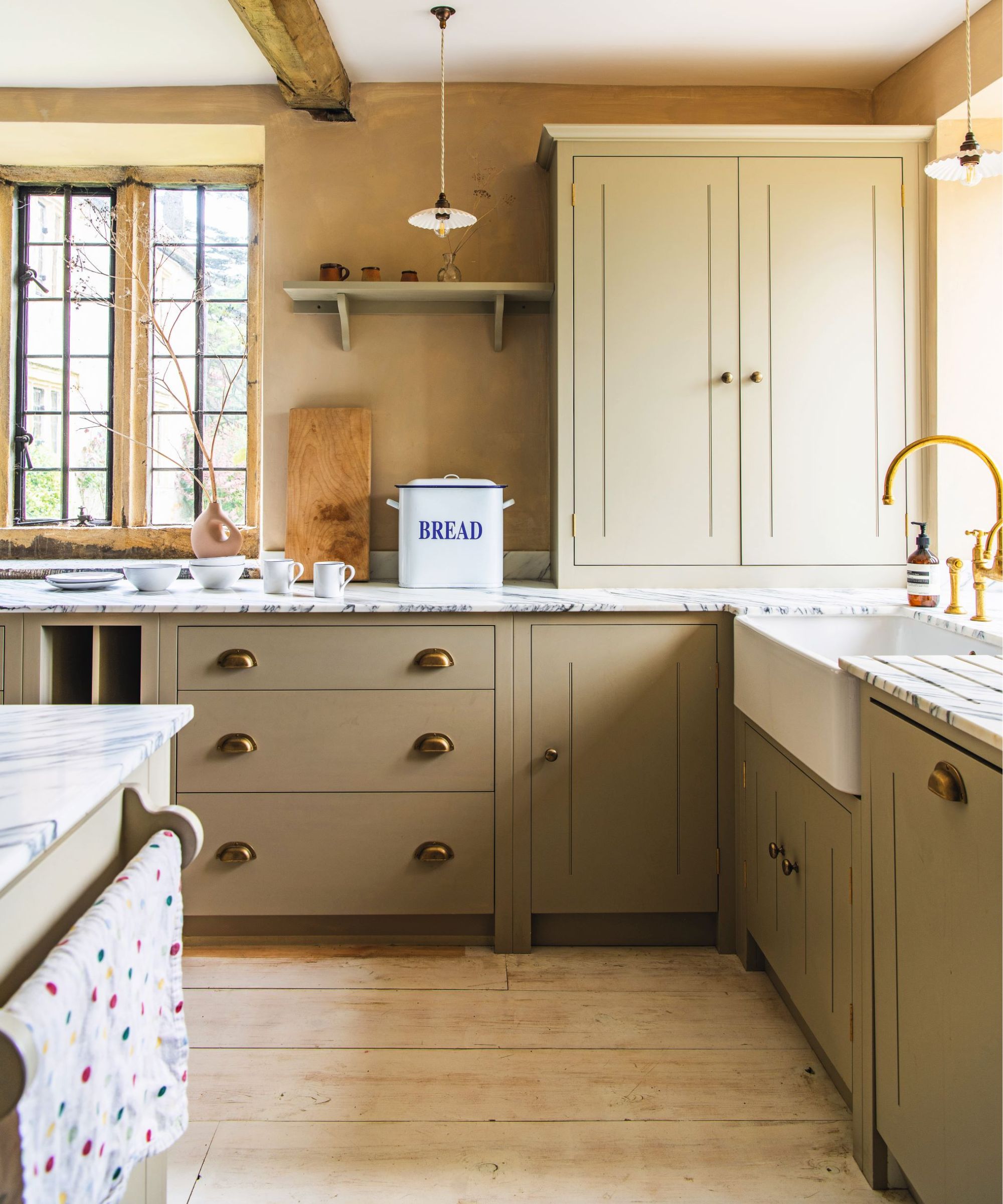
Designers utilize taupe in diverse applications. Quintero suggests incorporating taupe on cabinets, especially when contrasted with cream walls to enhance its presence. She also recommends pairing it with white and black checkered floors, muted accent colors, and richly veined marble like Calacatta Viola, Arabescato Orobico, or Rosso Levanto, which feature dark brown and burgundy hues. Architect and interior designer Crina Arghirescu Rogard advocates for a uniform application of taupe on both walls and ceilings to create a cohesive interior shell. Celeste Robbins, another designer, uses taupe to subtly differentiate a cabinet from a wall while maintaining a neutral aesthetic.
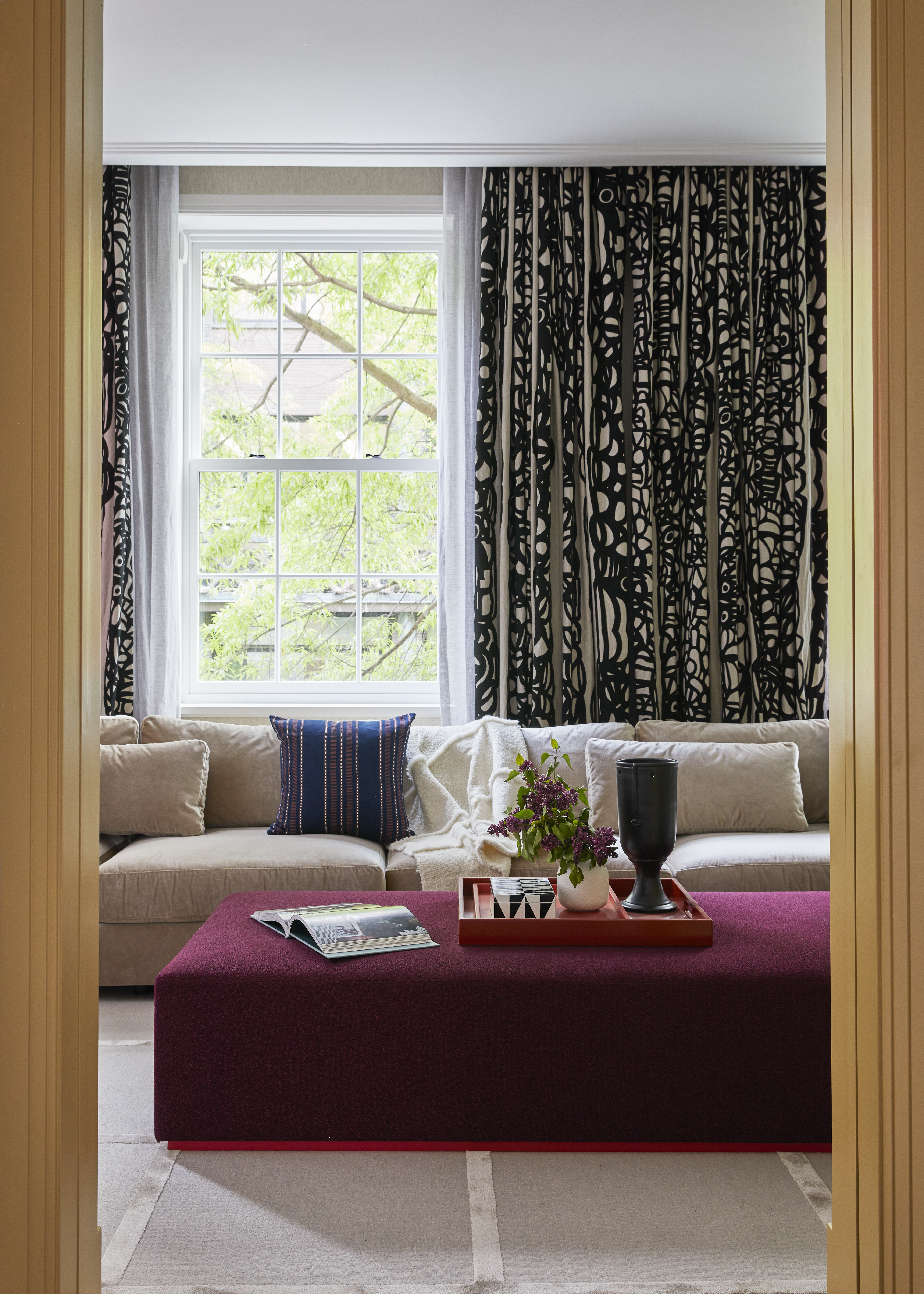
The article emphasizes the dynamic nature of taupe, explaining that its appearance can shift between warm and cool depending on the lighting conditions of a room. Quintero advises homeowners to consider how warm or natural lighting will influence the perception of taupe in their space, encouraging experimentation to find the most appealing effect. She also suggests combining taupe with other neutrals, such as shades of white, cream, and gray, to achieve a layered and sophisticated look. Furthermore, she highlights the importance of incorporating various textures, such as velvet cushions, chunky knit throws, and woven rugs, to add visual interest and coziness when designing with taupe. This approach helps create a rich and inviting environment that maximizes the color's potential.
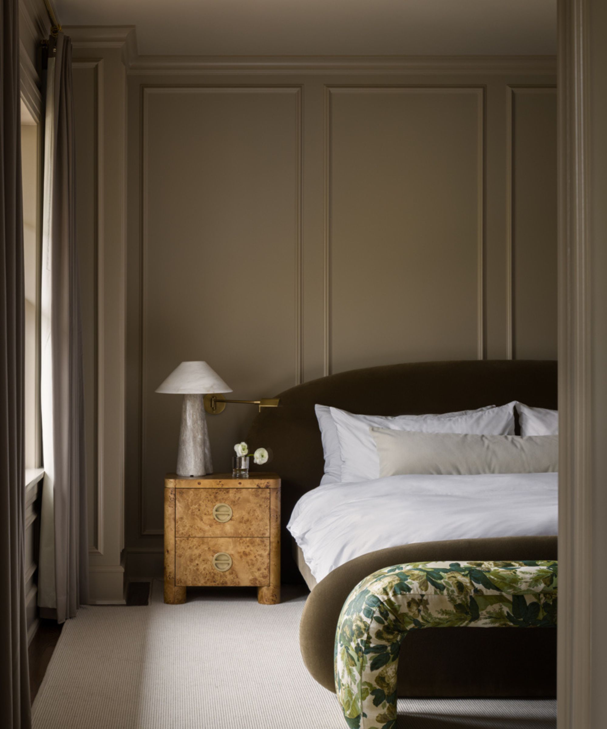
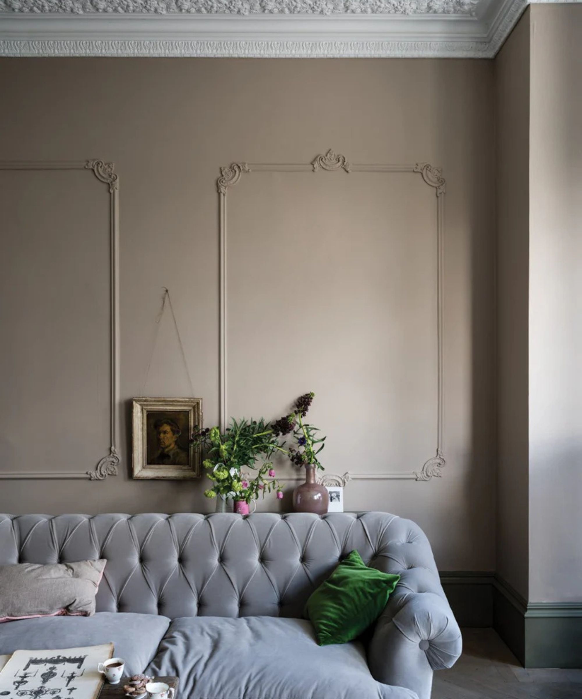
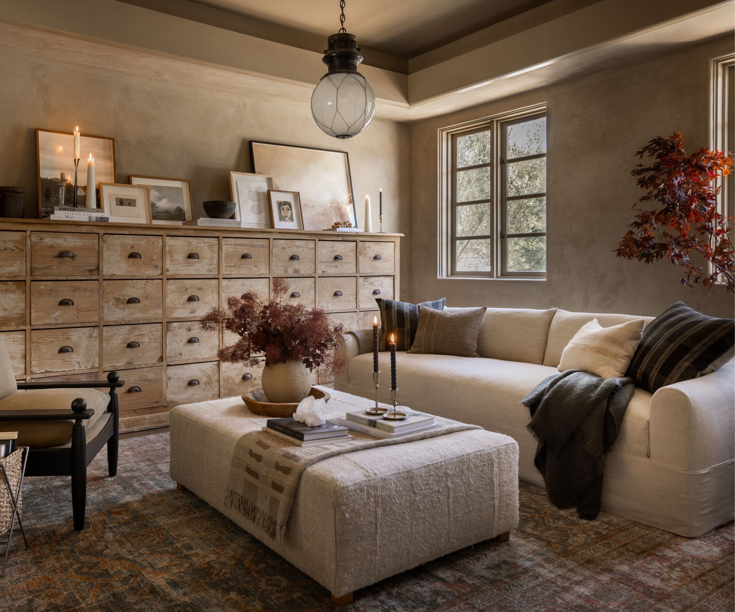
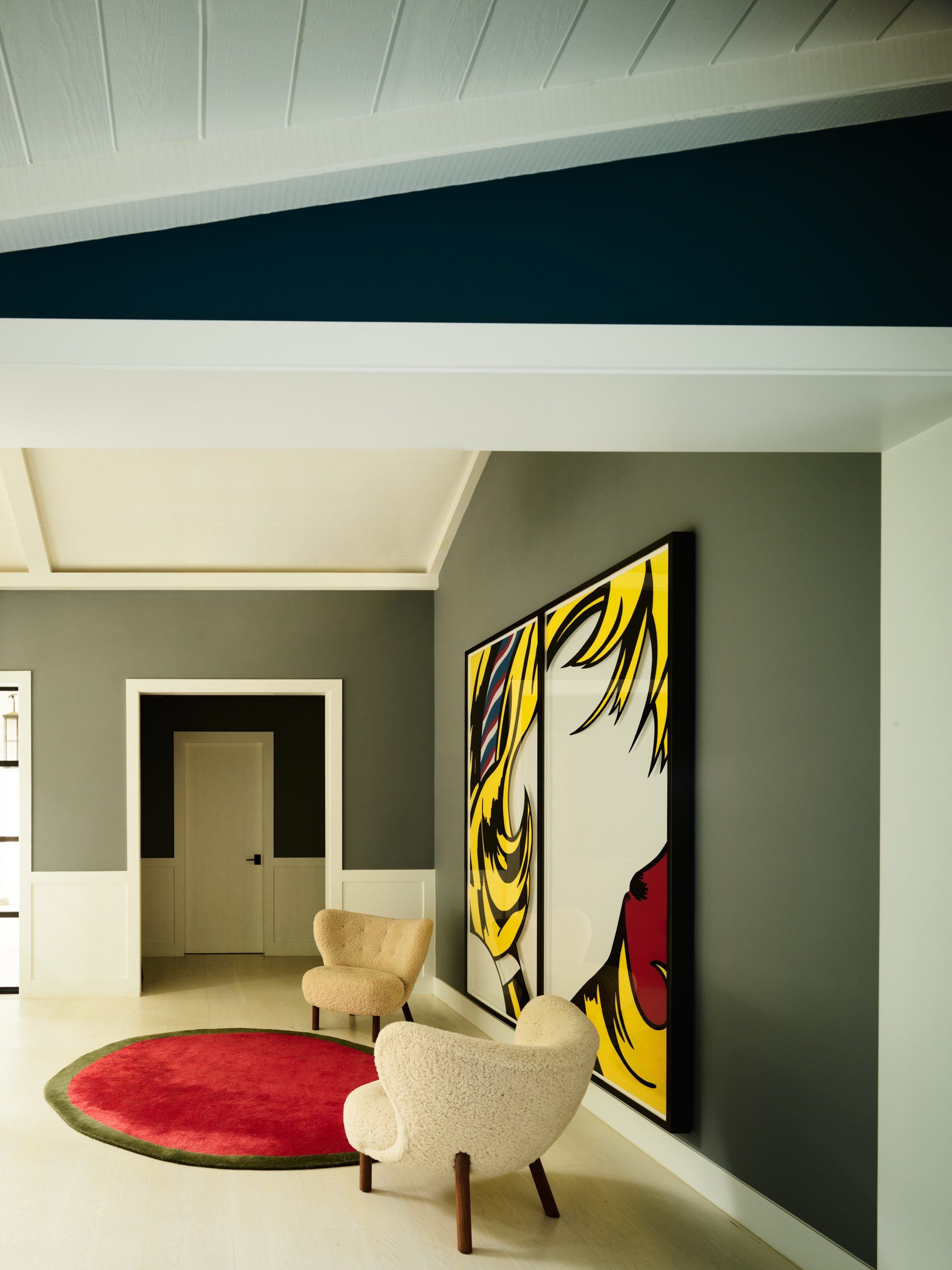
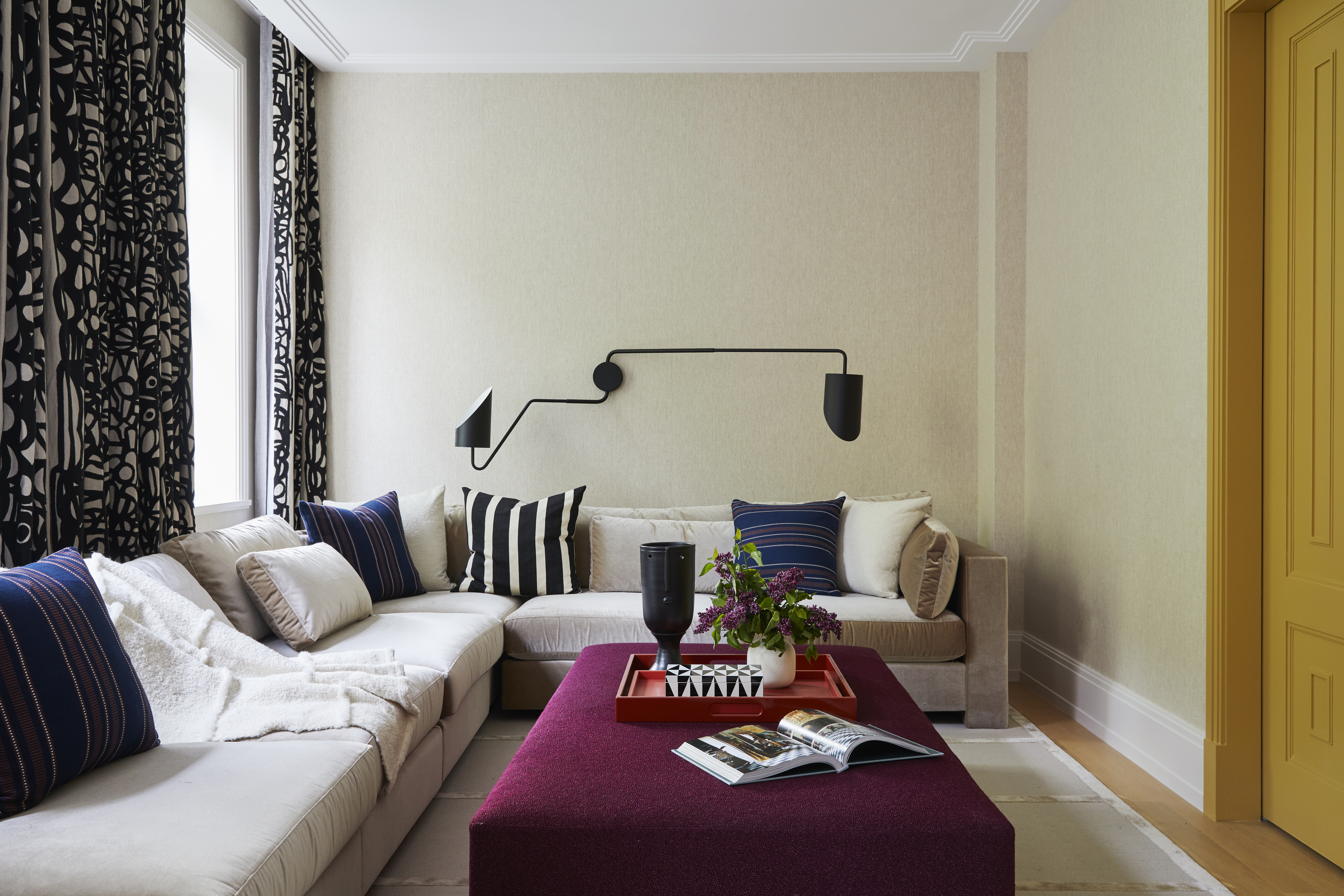
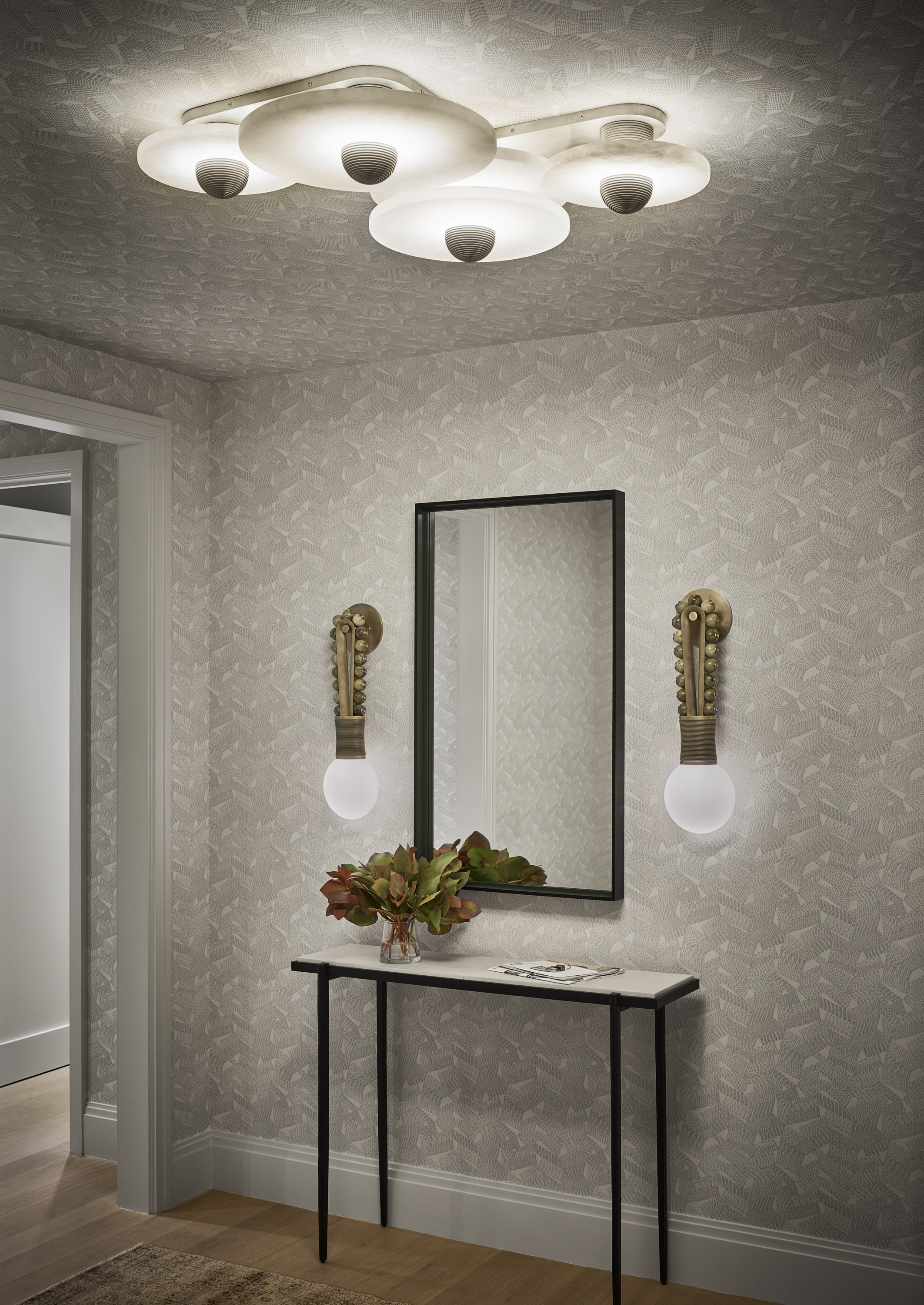
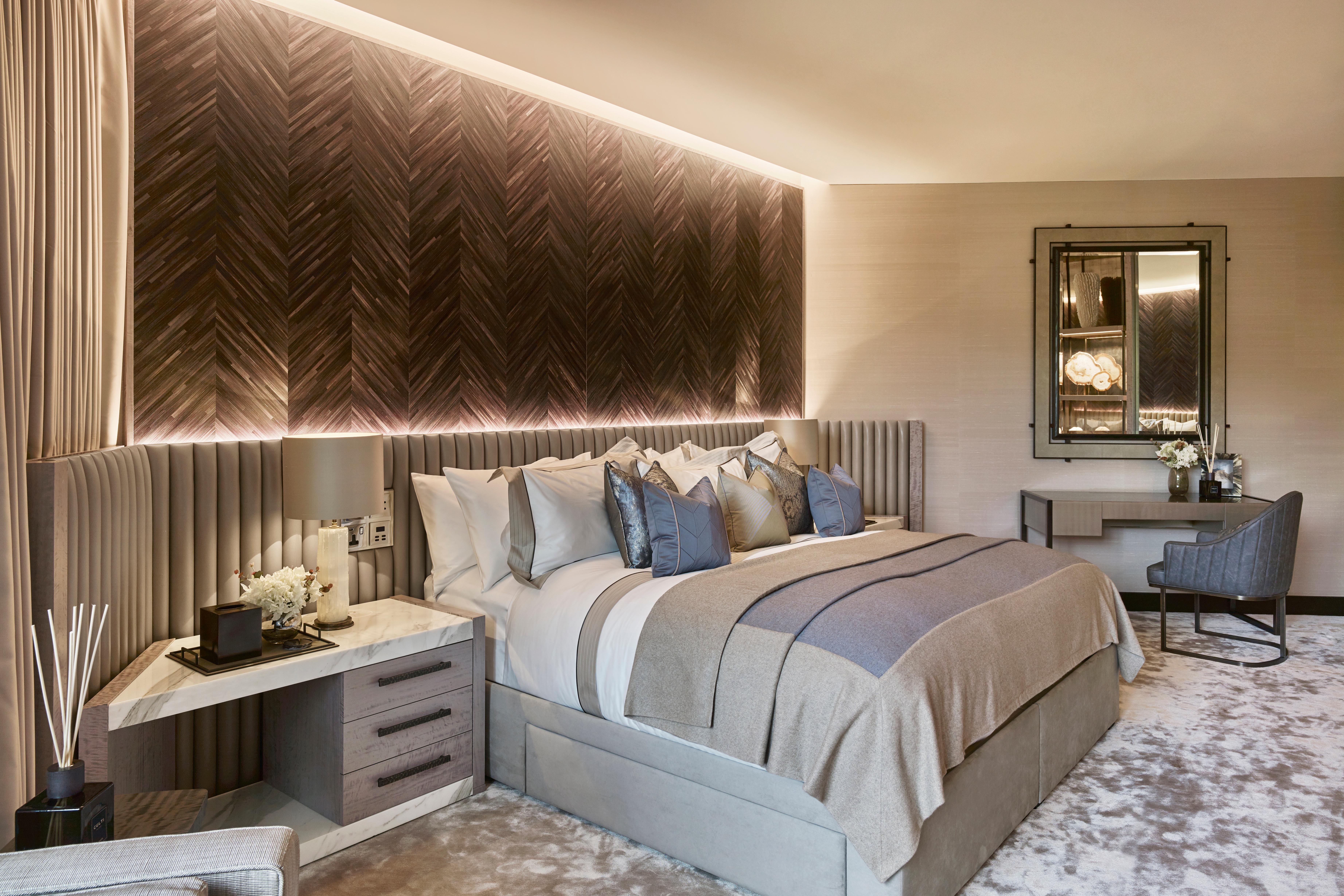
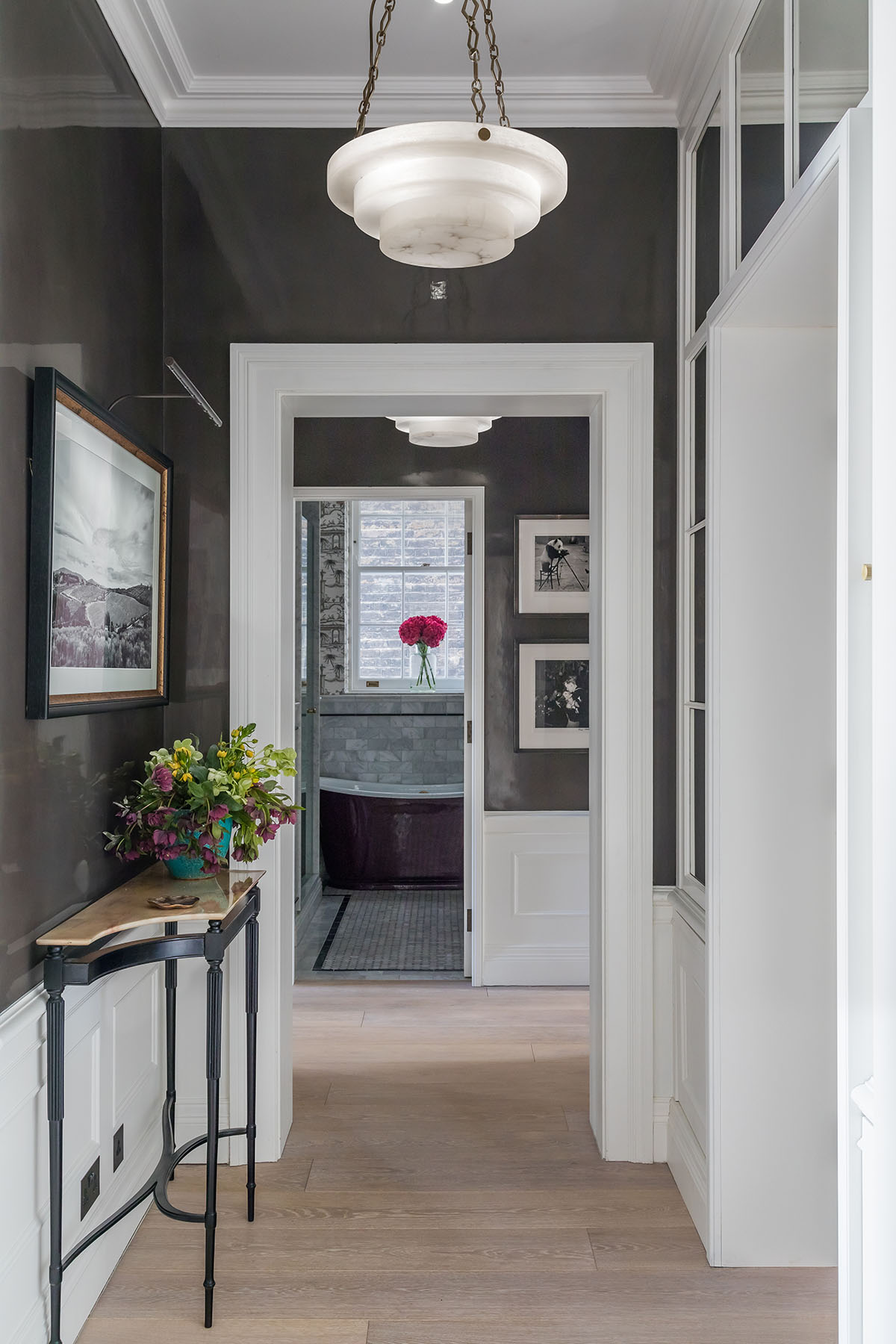
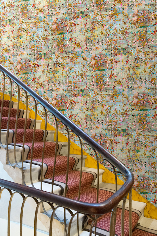
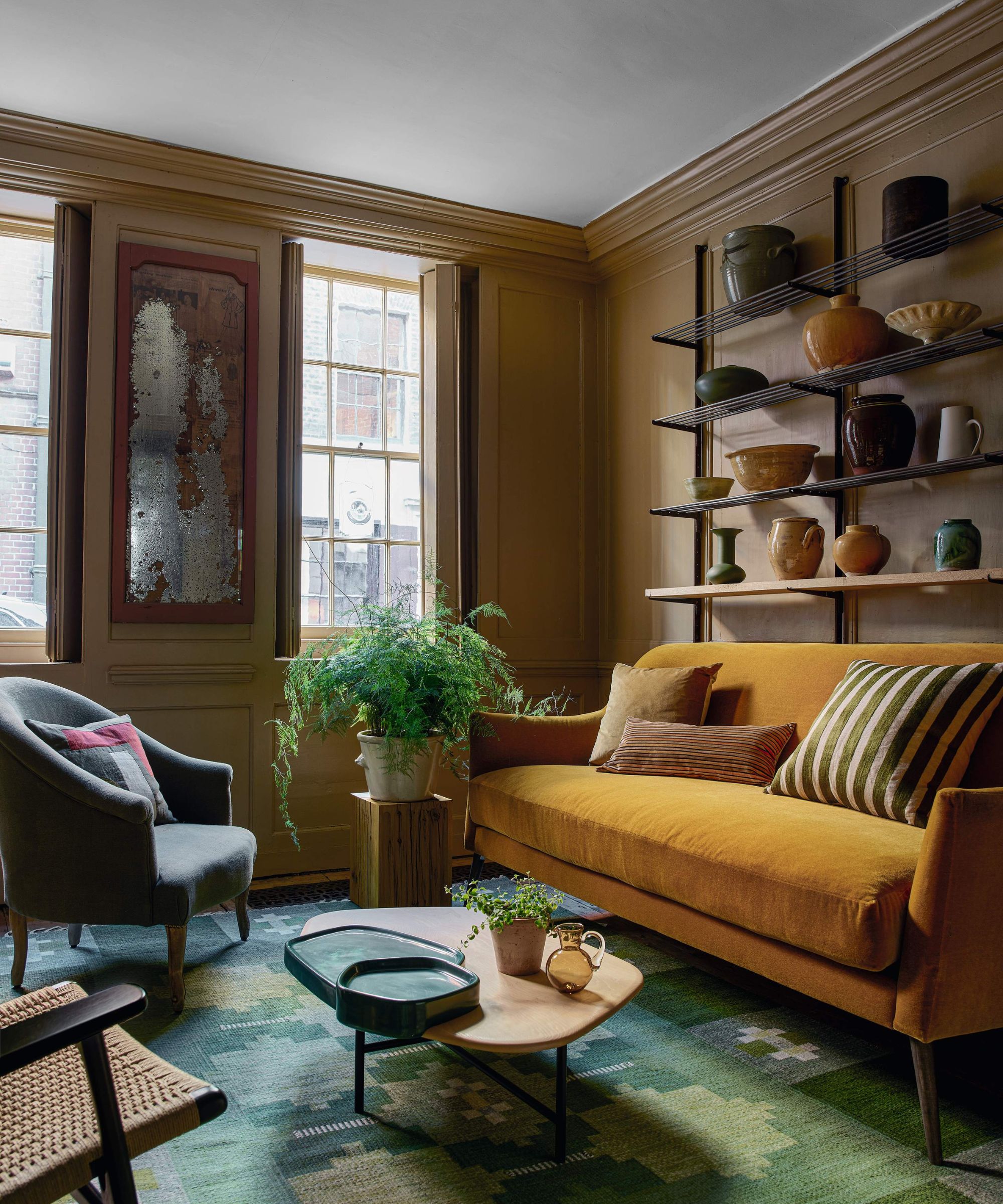
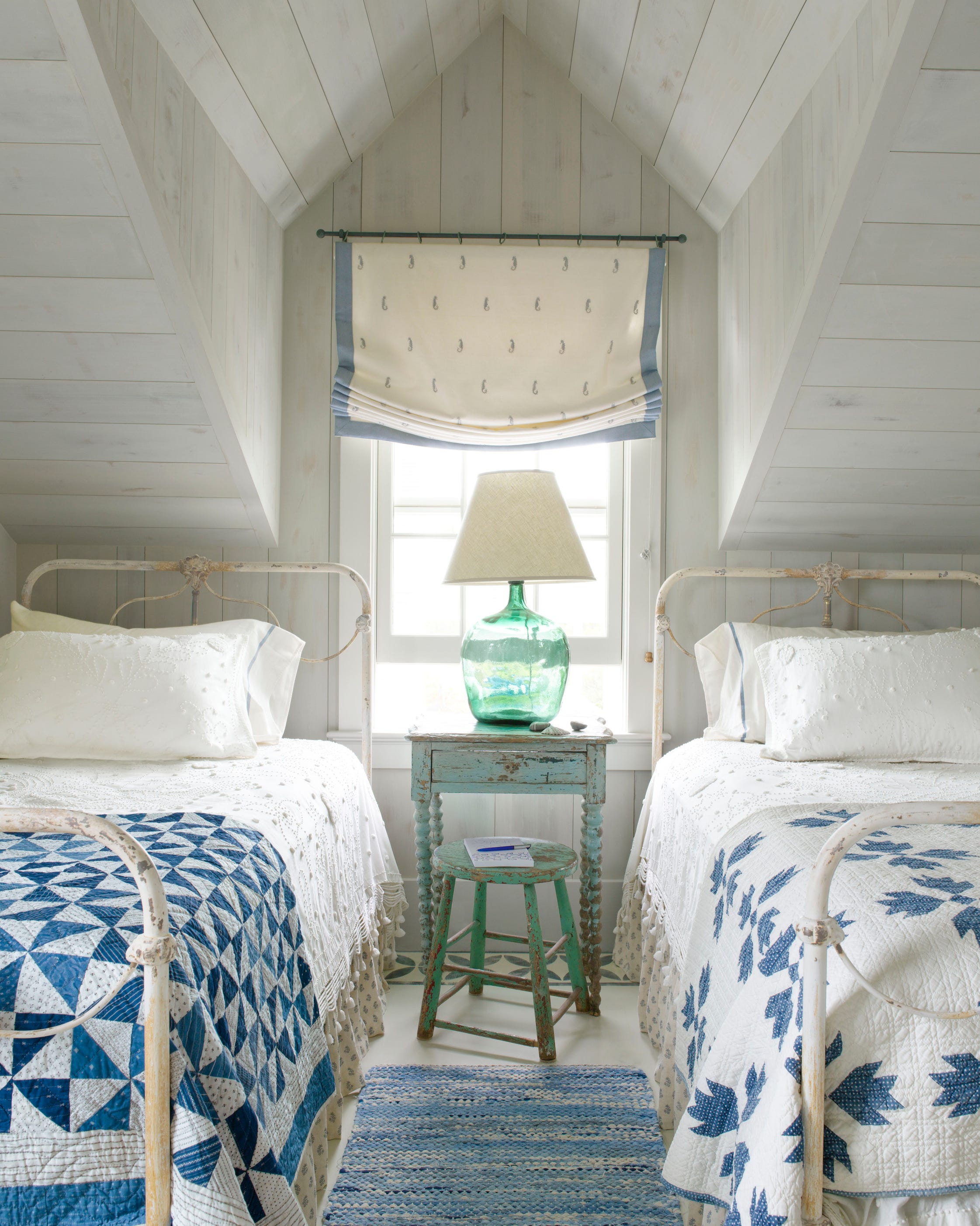
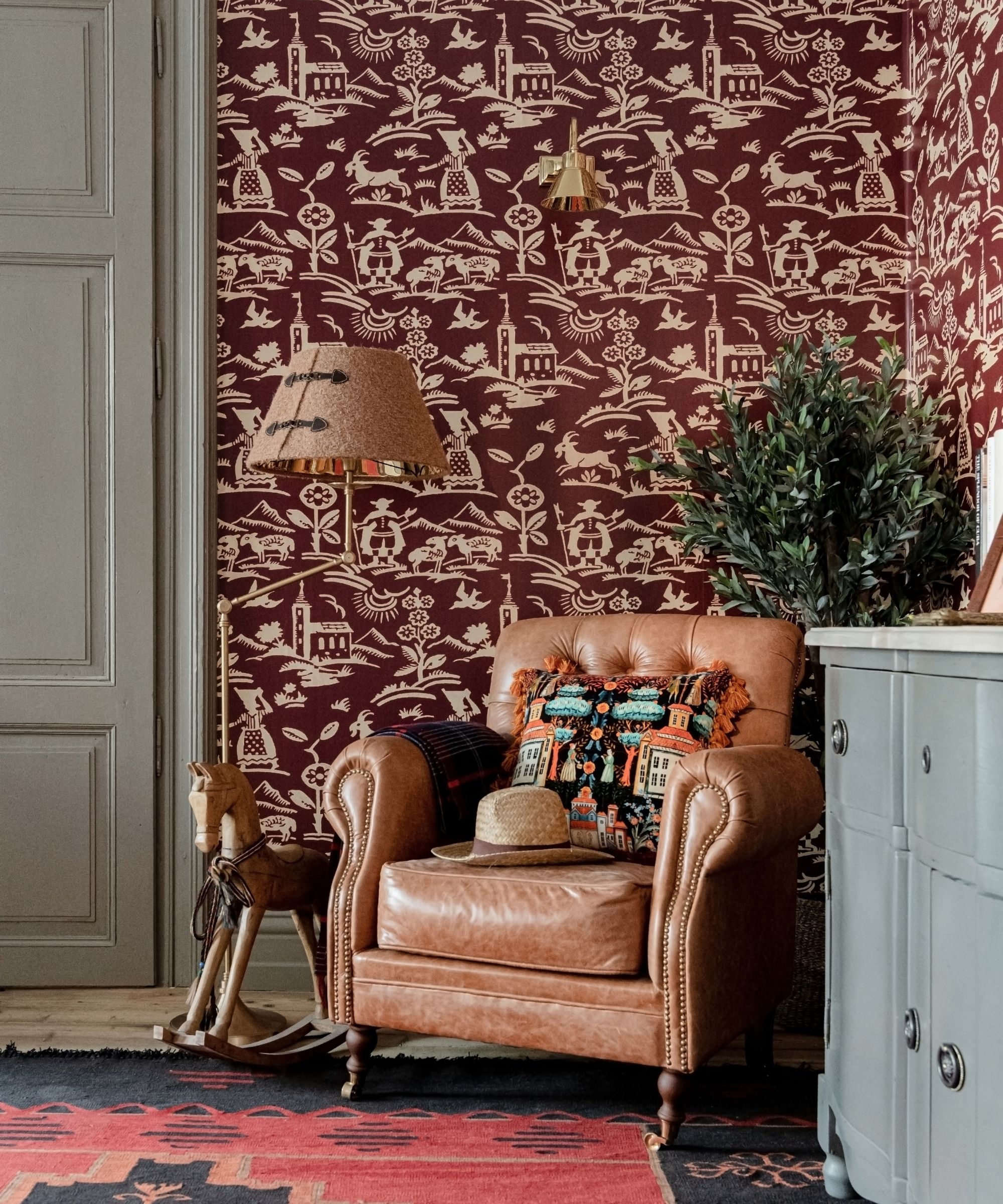
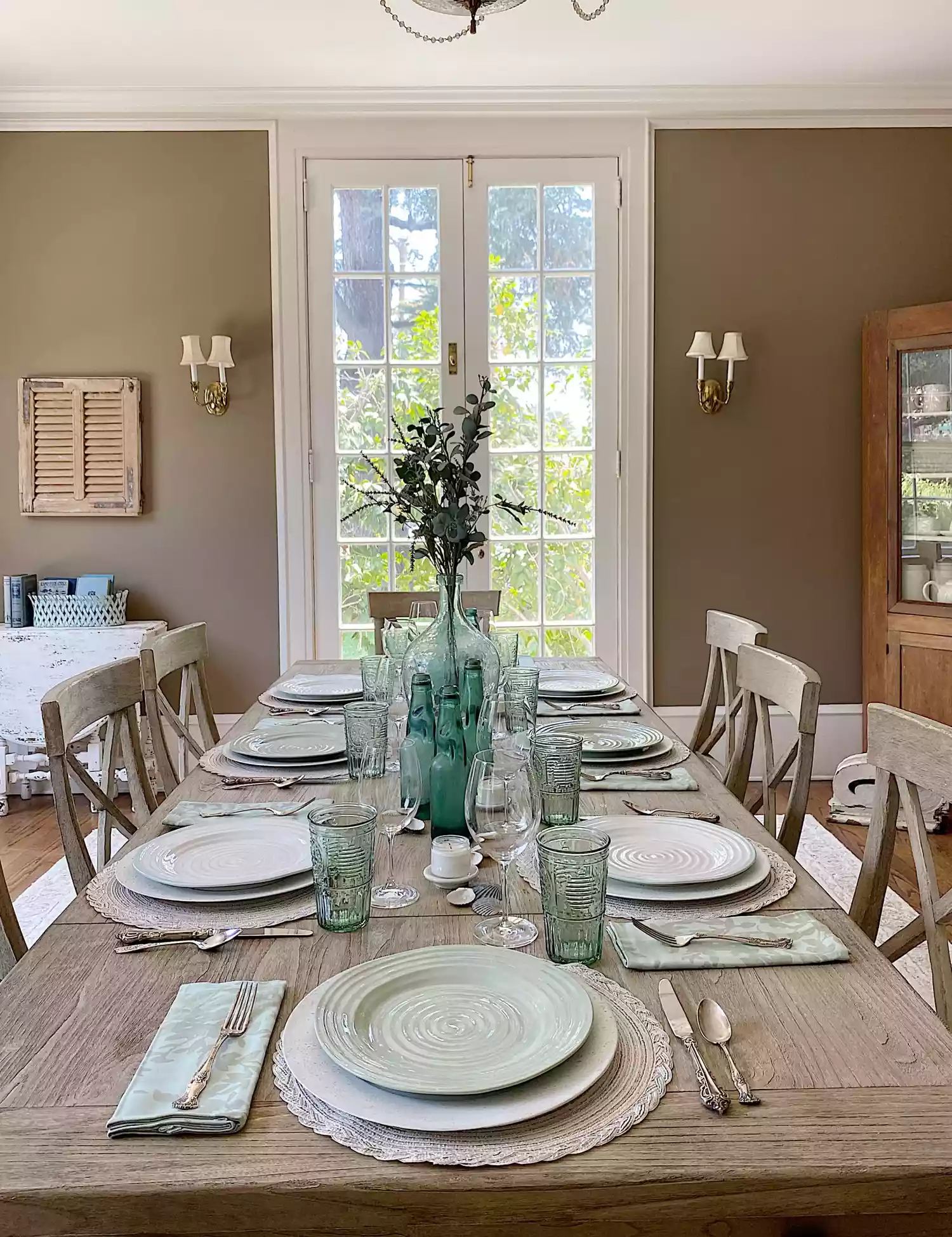
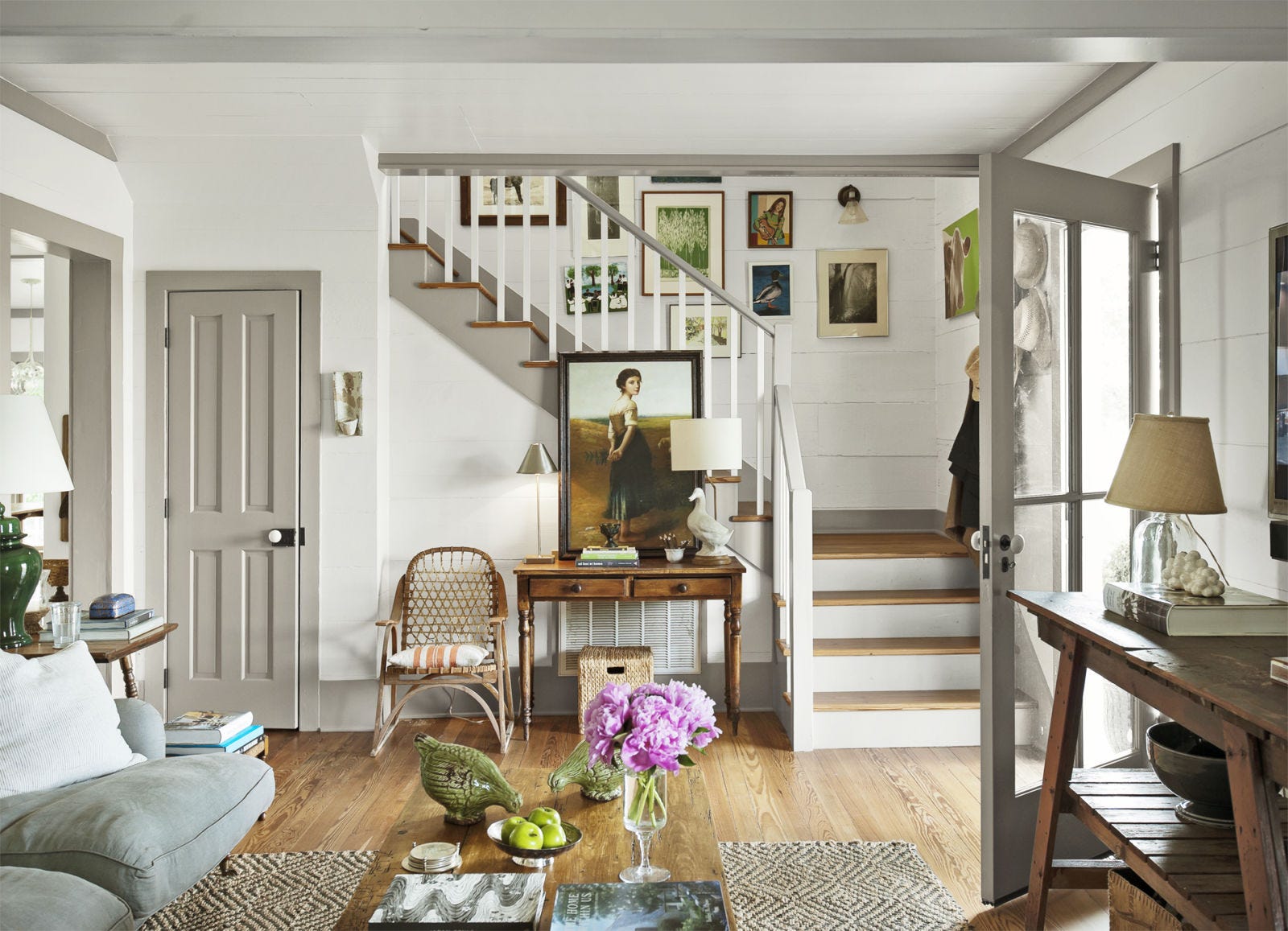
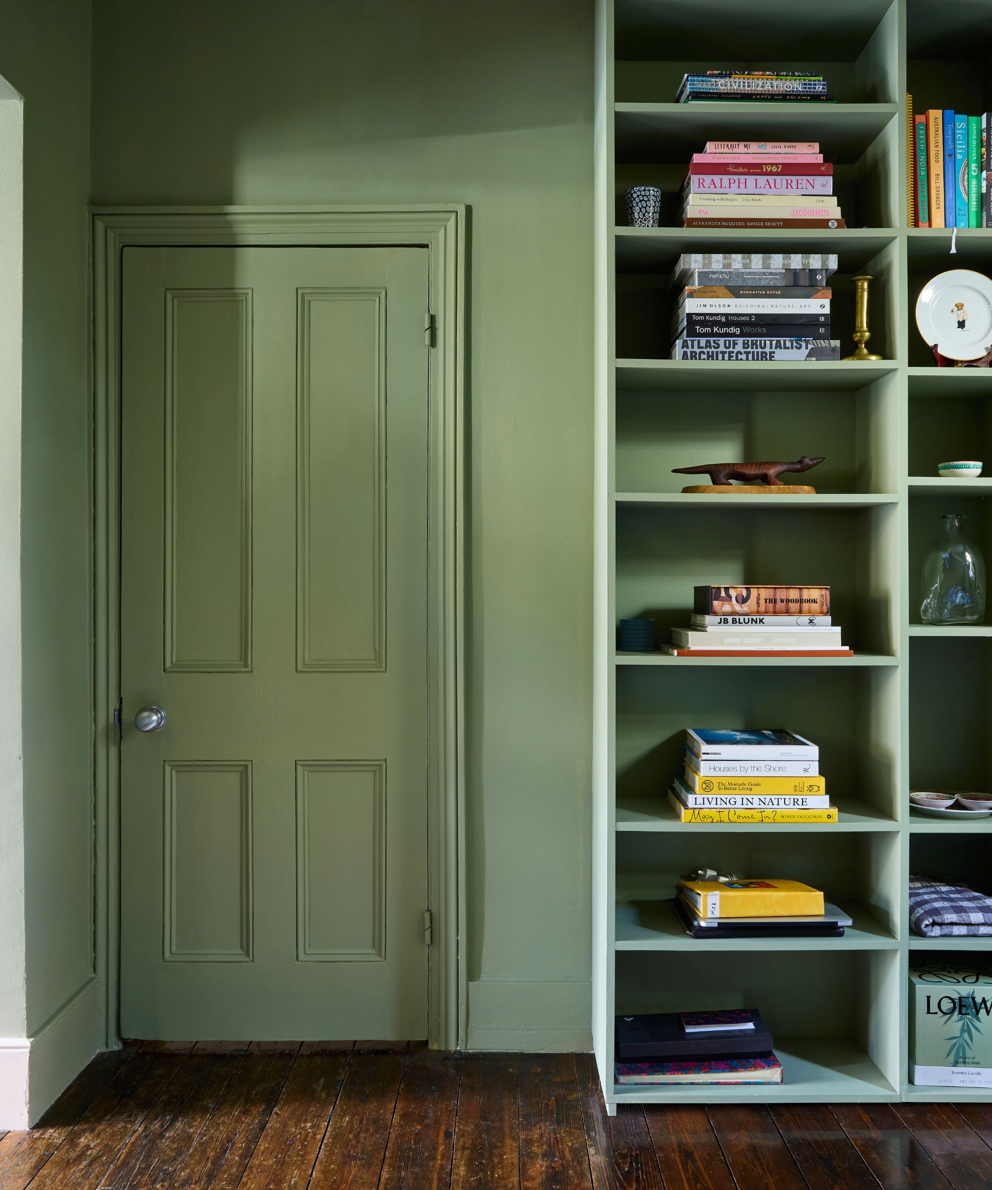
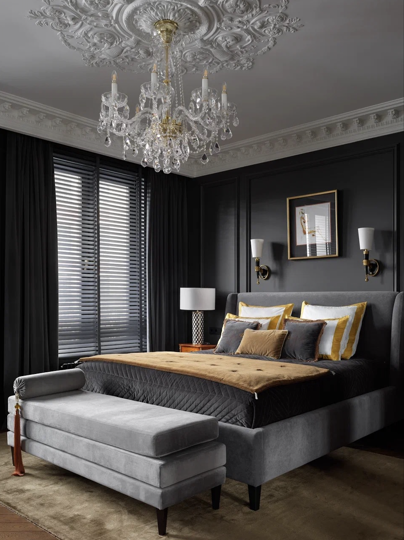
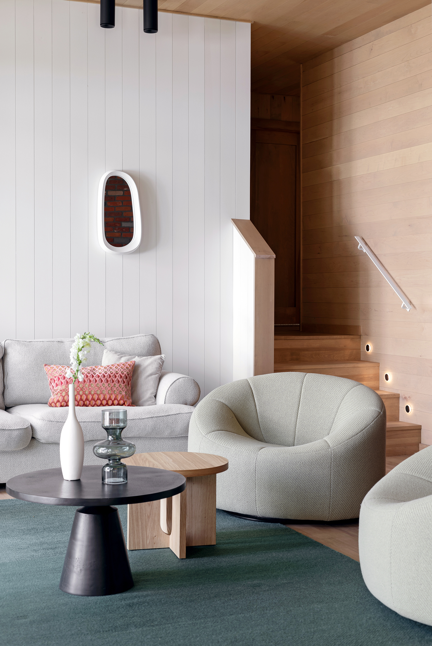
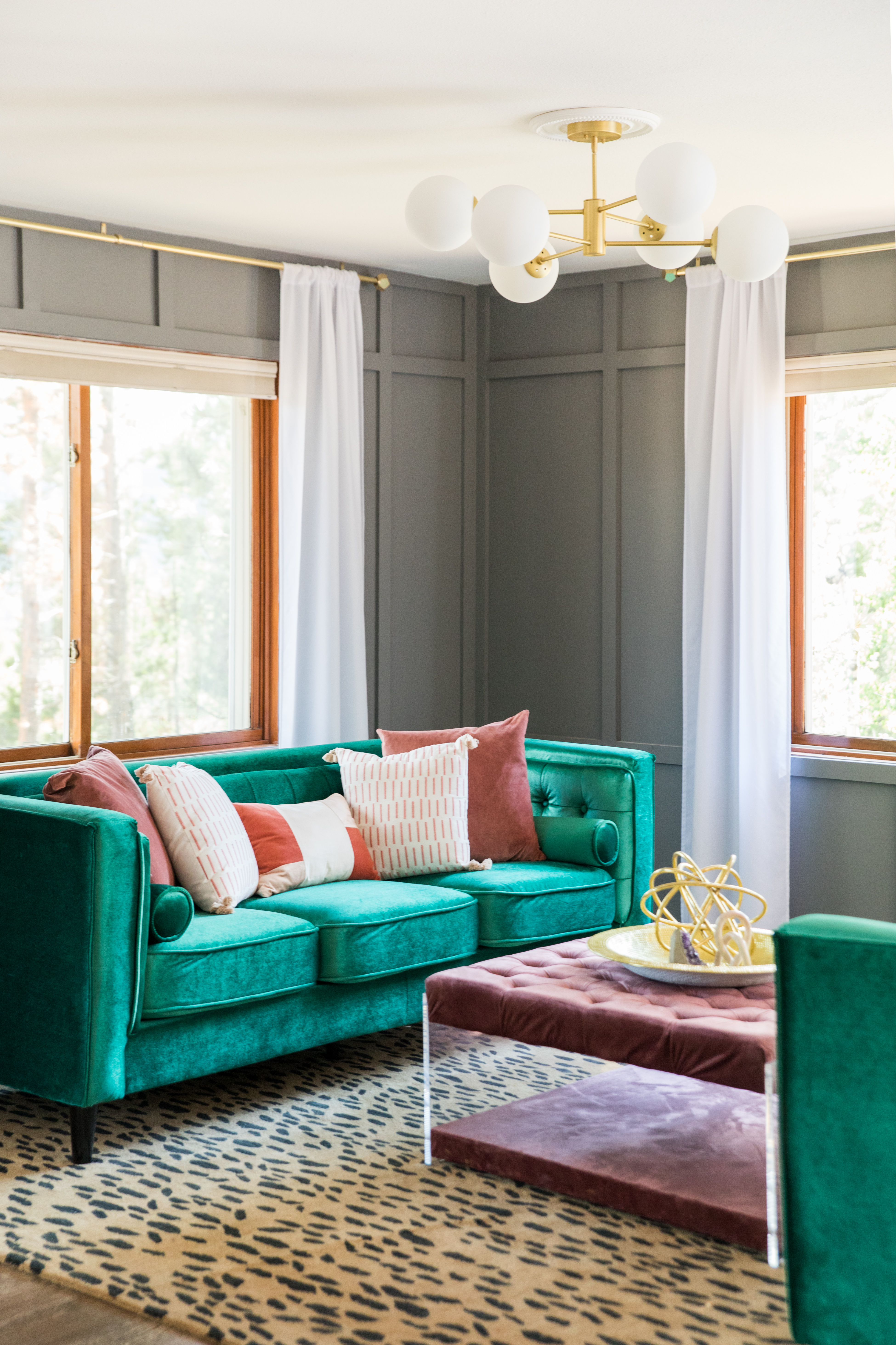
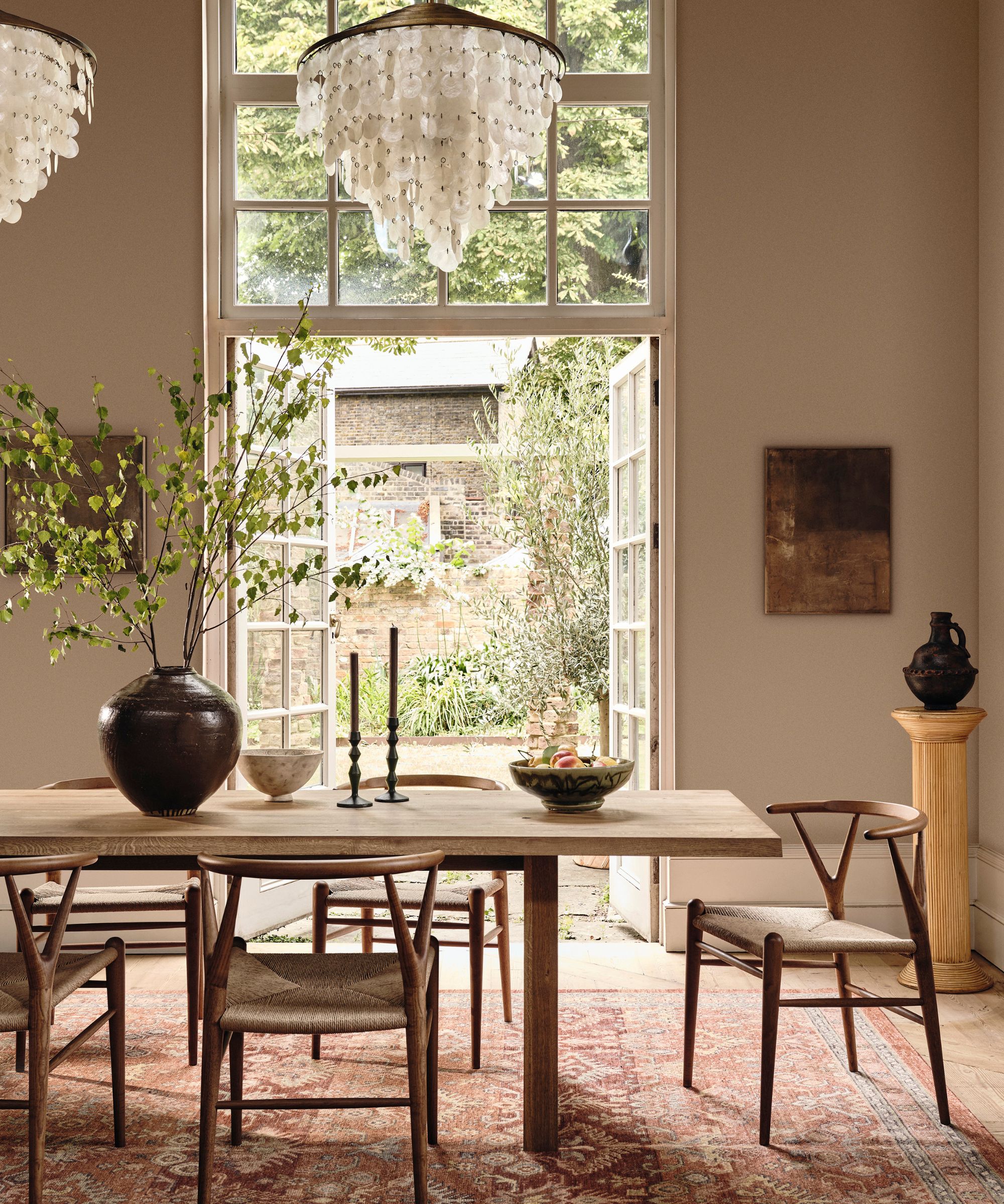
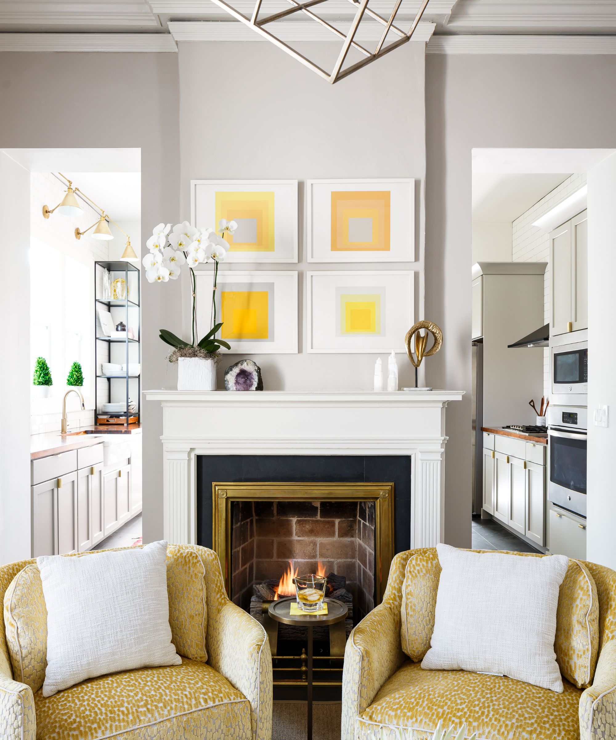
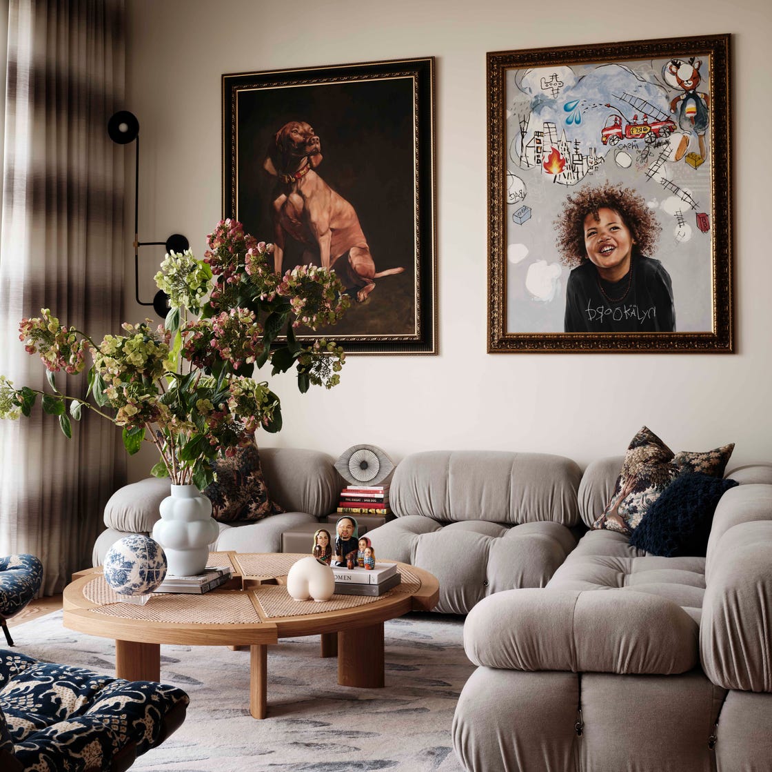
The article presents seventeen examples of rooms where taupe has been effectively utilized, demonstrating its versatility across different styles and tastes. Examples include a Milan entry hall with light taupe walls creating comfort and grandeur, a Georgian farmhouse living room where taupe unifies diverse art and objets, and a Connecticut colonial bathroom using taupe as a foil for a charred mushroom wood ceiling. Other instances showcase taupe in a home bar, a patterned powder room, a soft taupe living room with a Camaleonda sofa, a tented bedroom, and a serene bathroom with tactile taupe walls. The color is also featured in tufted seating, a tranquil outdoor deck, as light trim in a dining room, in an elegant doorway, cool curtains, a vintage living room, shimmery dining room walls, sisal walls, and a bed frame in a Parisian pied-à-terre. These varied applications underscore taupe’s ability to enhance both bold and subdued decor preferences, establishing its role as a fundamental and adaptable color in home interiors. #InteriorDesign #HomeDecor #ColorTrends #NeutralPalette #HomeInteriors #TaupeColor #DesignTips
0 comment in total
 No comments yet
You may also like
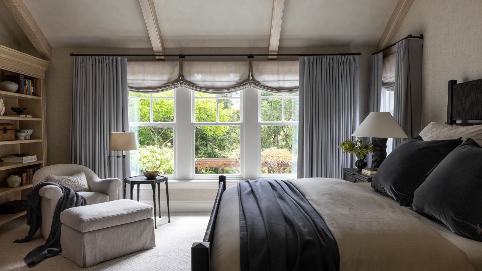
The best colors to pair with taupe, according to designers – 5 shades to complement this grounding neutral

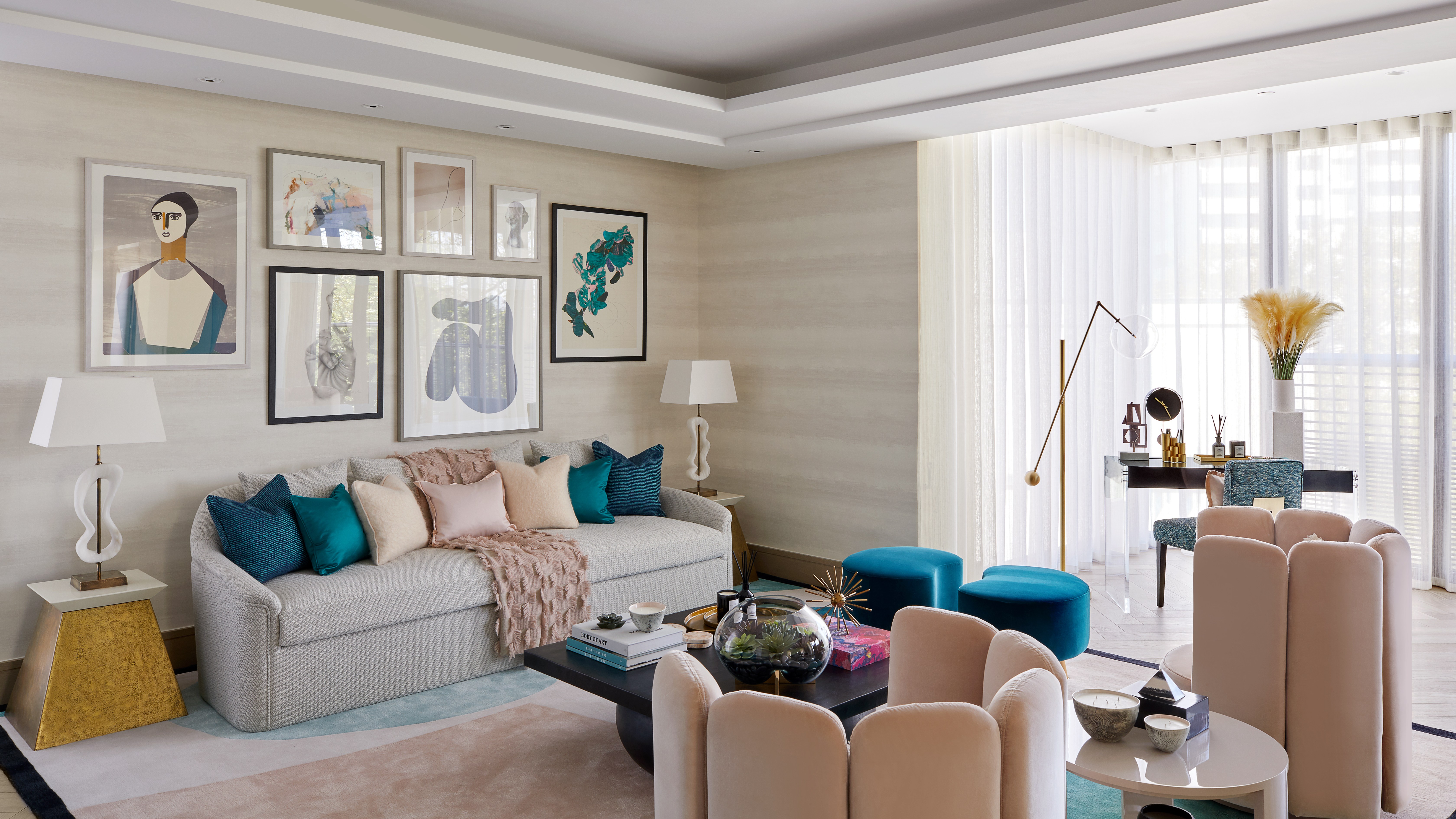
Forget painting your walls grey, it’s time to sparkle
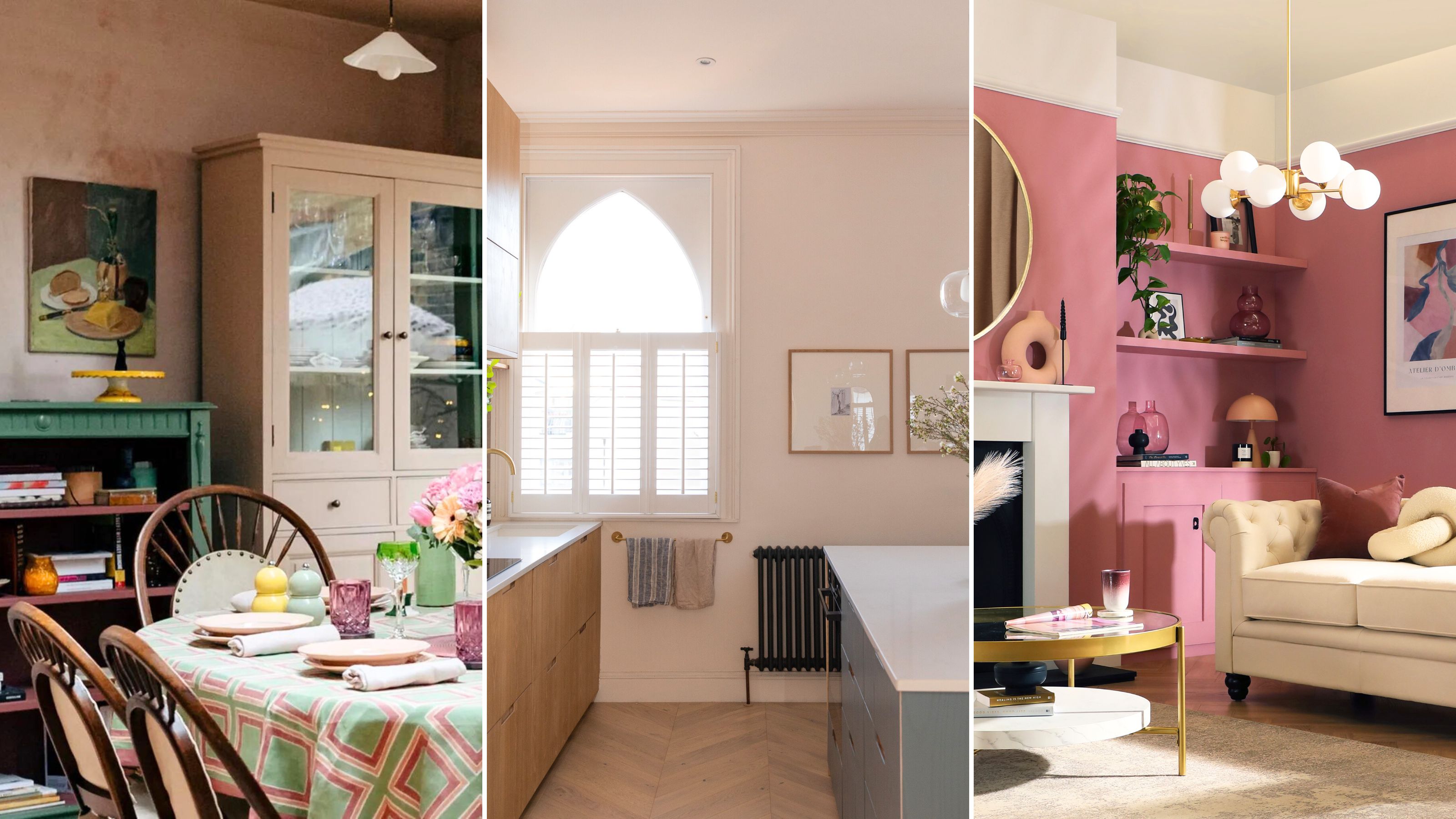
The 5 outdated paint colors of 2024 designers loathe — and what they're loving instead

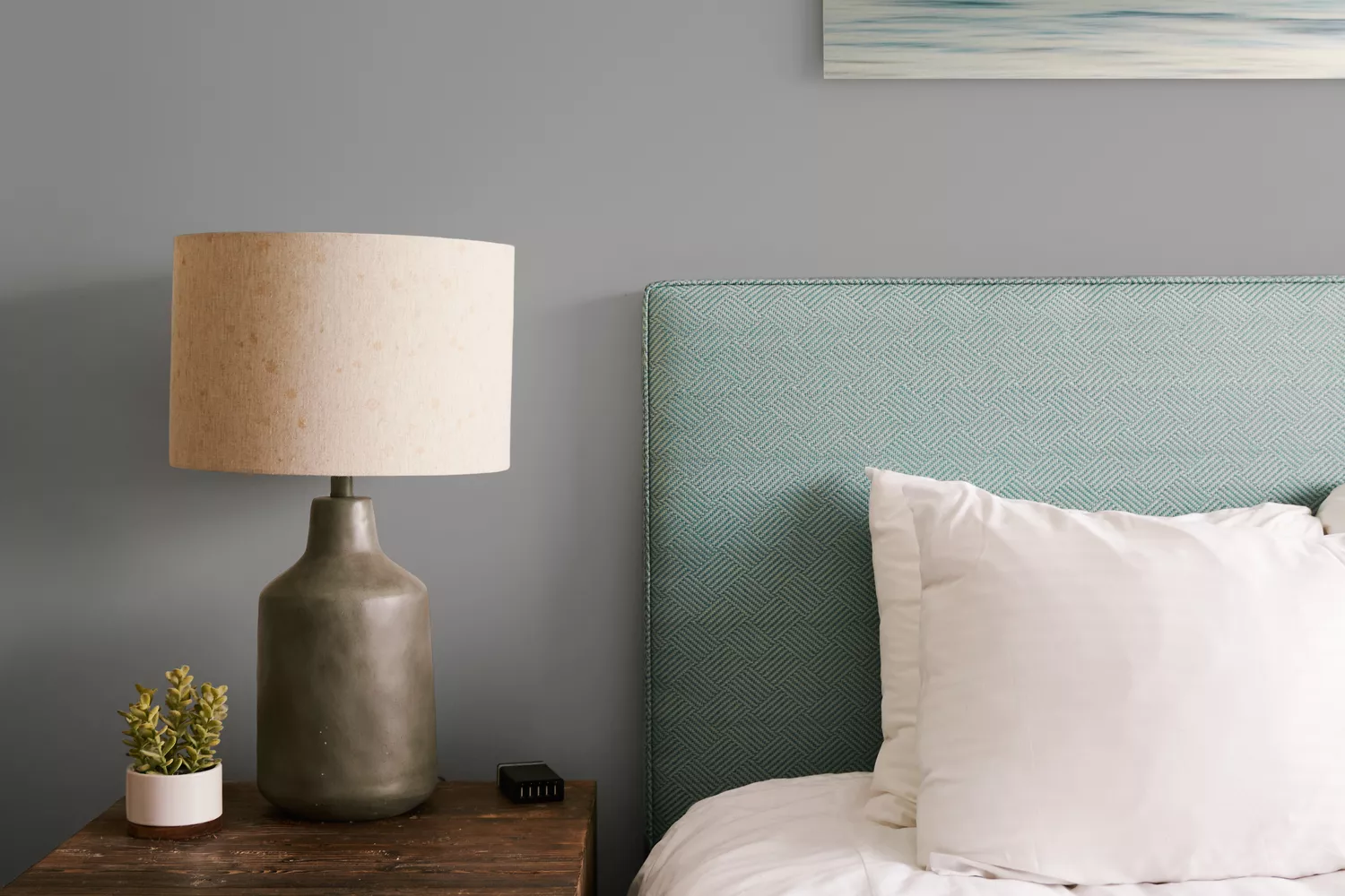
The 11 Best Gray Paint Colors for a Stylish Bedroom


How to decorate with taupe

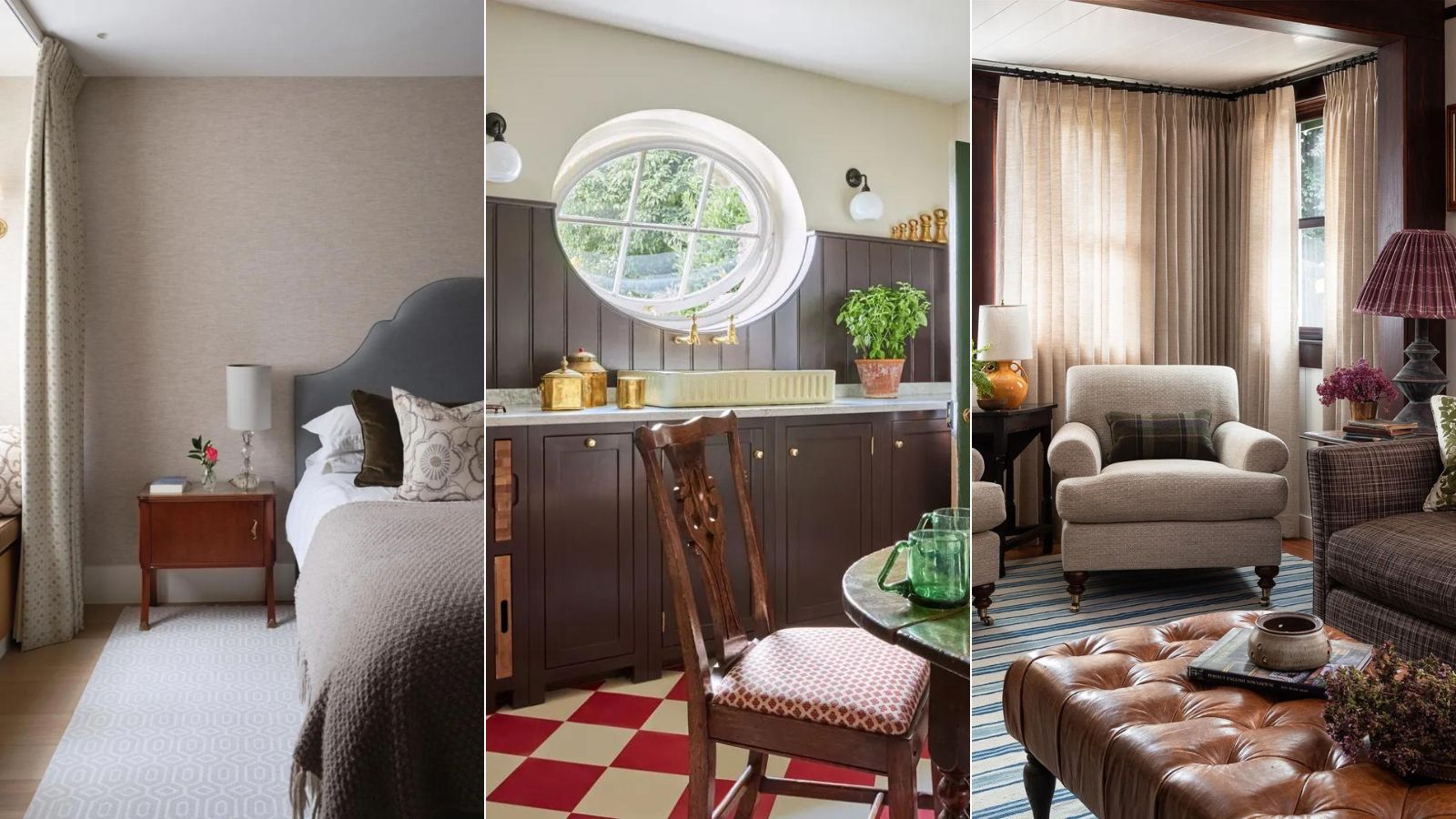
What color is replacing beige? This is the one color we prefer to use instead of beige in 2024, say designers
What Color Is Taupe? 20 Ways to Use This Designer-Favorite Color at Home
What Colors Go With Gray? 19 Arresting Combinations With This Time-Tested Neutral

What Neutral Wall Color Should I Pick in 2024? These are the Big Neutral Color Trends, Say Designers
The 17 Best Taupe Paint Colors, According to Design Experts
Forget Taupe—A New Color Is Taking Over Homes and Pinterest in 2017
5 Reasons You Shouldn't Paint Your Kitchen Walls White — And the Alternatives You Need to Try
10 Taupe Paint Colors That Are Always Right

Are gray interiors really out of style? Interior designers weigh in on how to use this cool shade
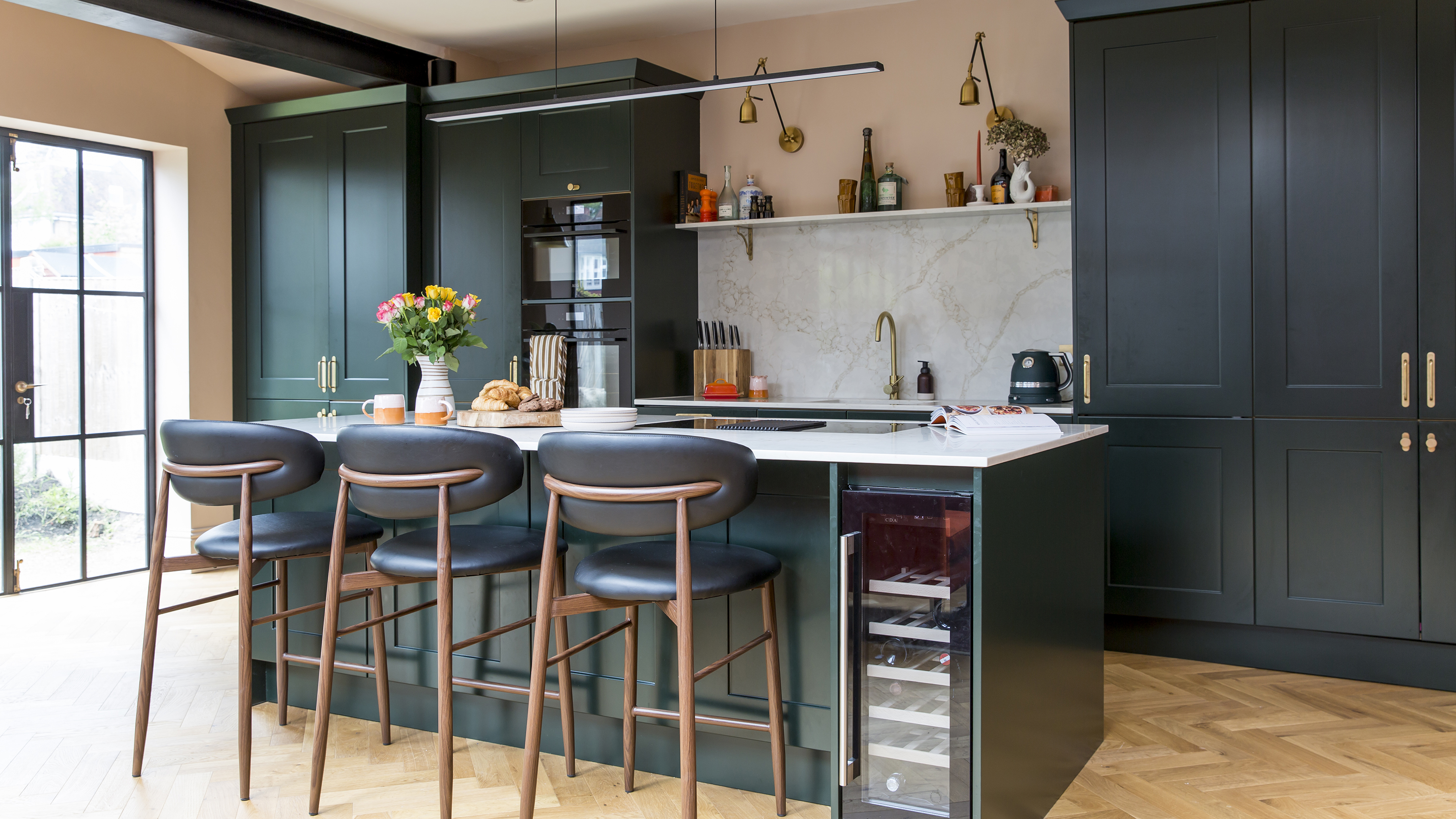
3 reasons you shouldn't paint your kitchen walls white – plus the new neutrals to try instead, according to kitchen pros
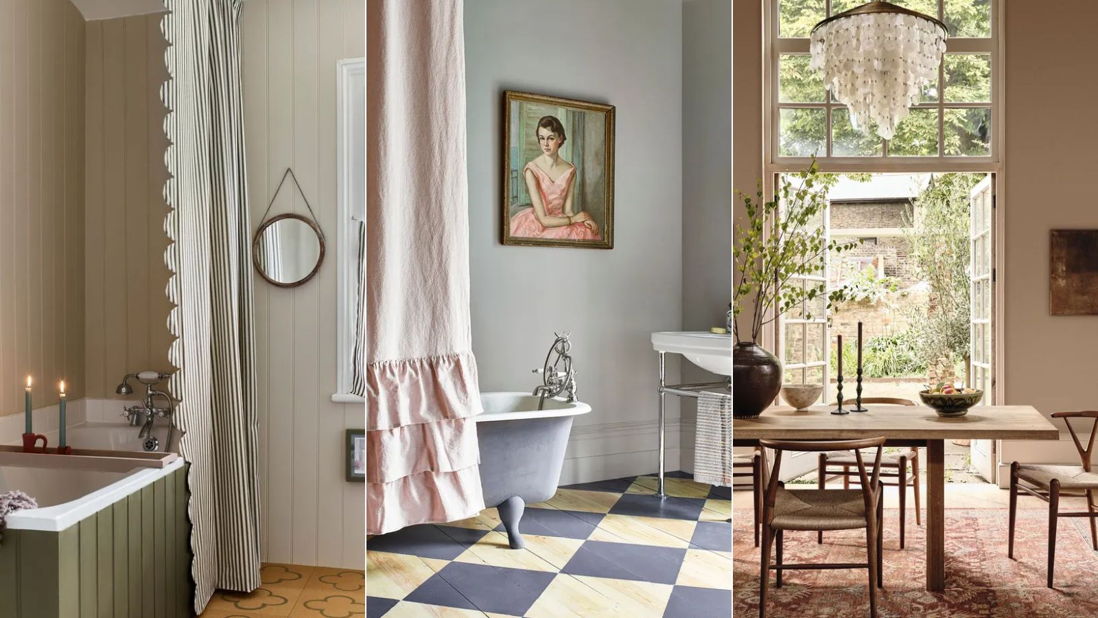
Is gray or beige more on trend for 2025? Designers share all on these popular neutrals
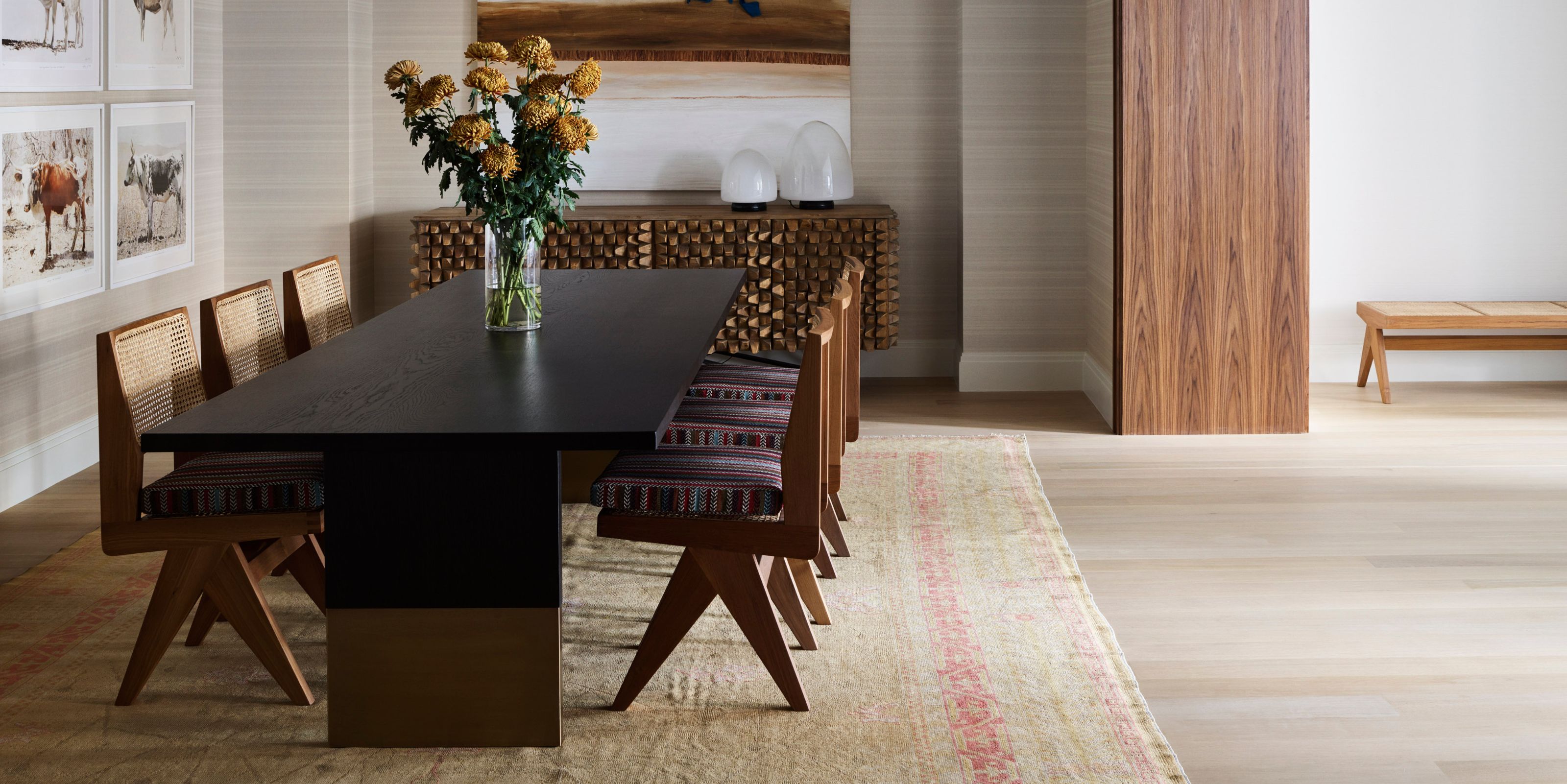
What Color Is Taupe? Plus 5 Ways To Decorate With This "Thoughtful" Shade in Your Home
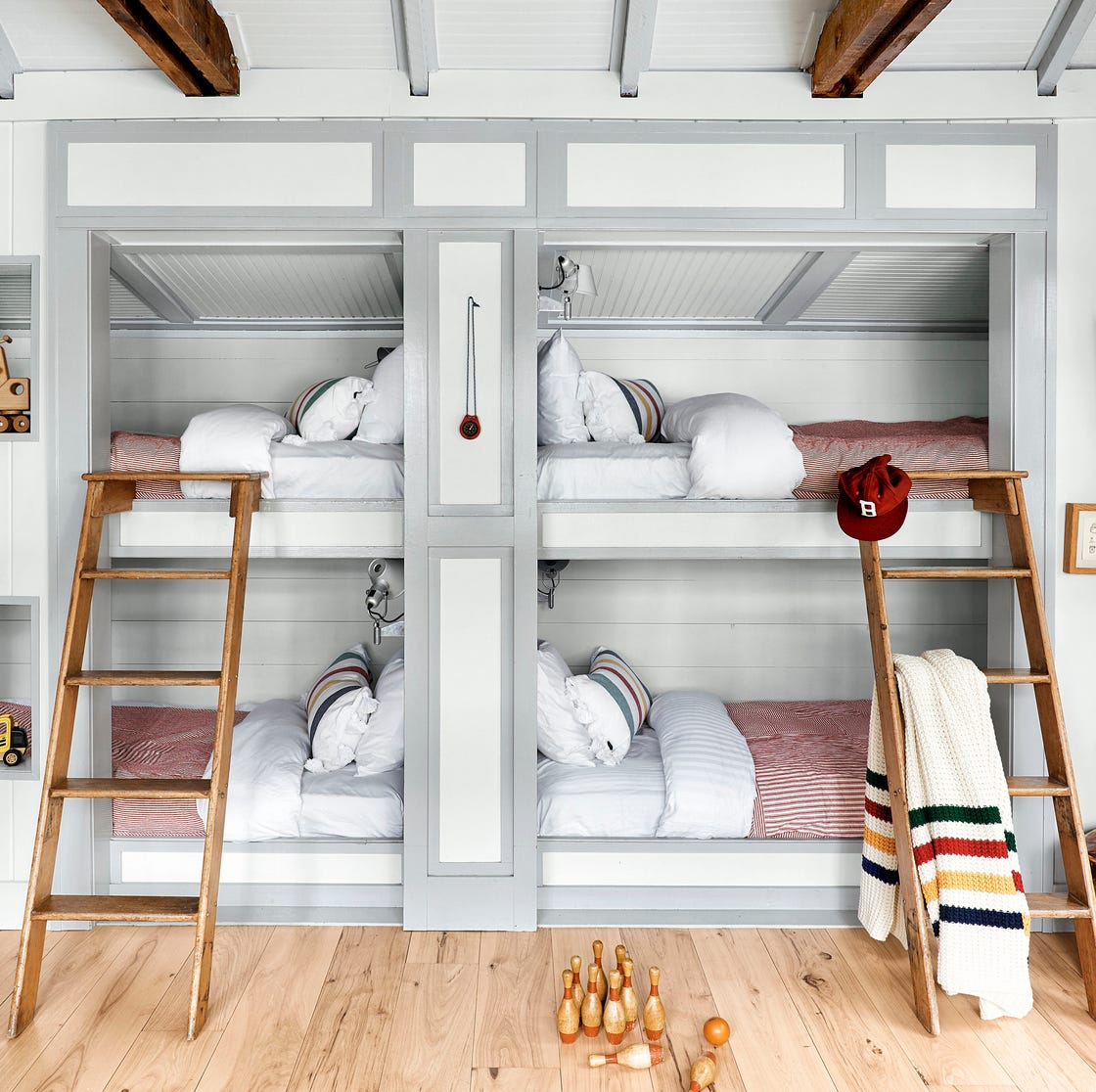
23 Colors, Patterns, & Textures To Pair With Gray
What color is replacing teal? 5 trending alternatives for this versatile shade
10 Taupe Paint Colors That Are Always Right