1/2
Cheer Up Any Space With These Designer-Approved Orange Paint Colors
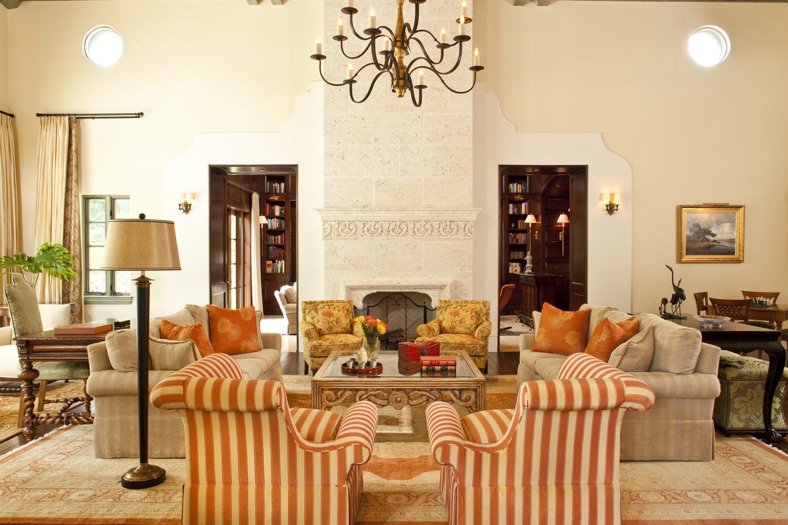
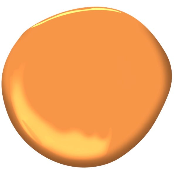
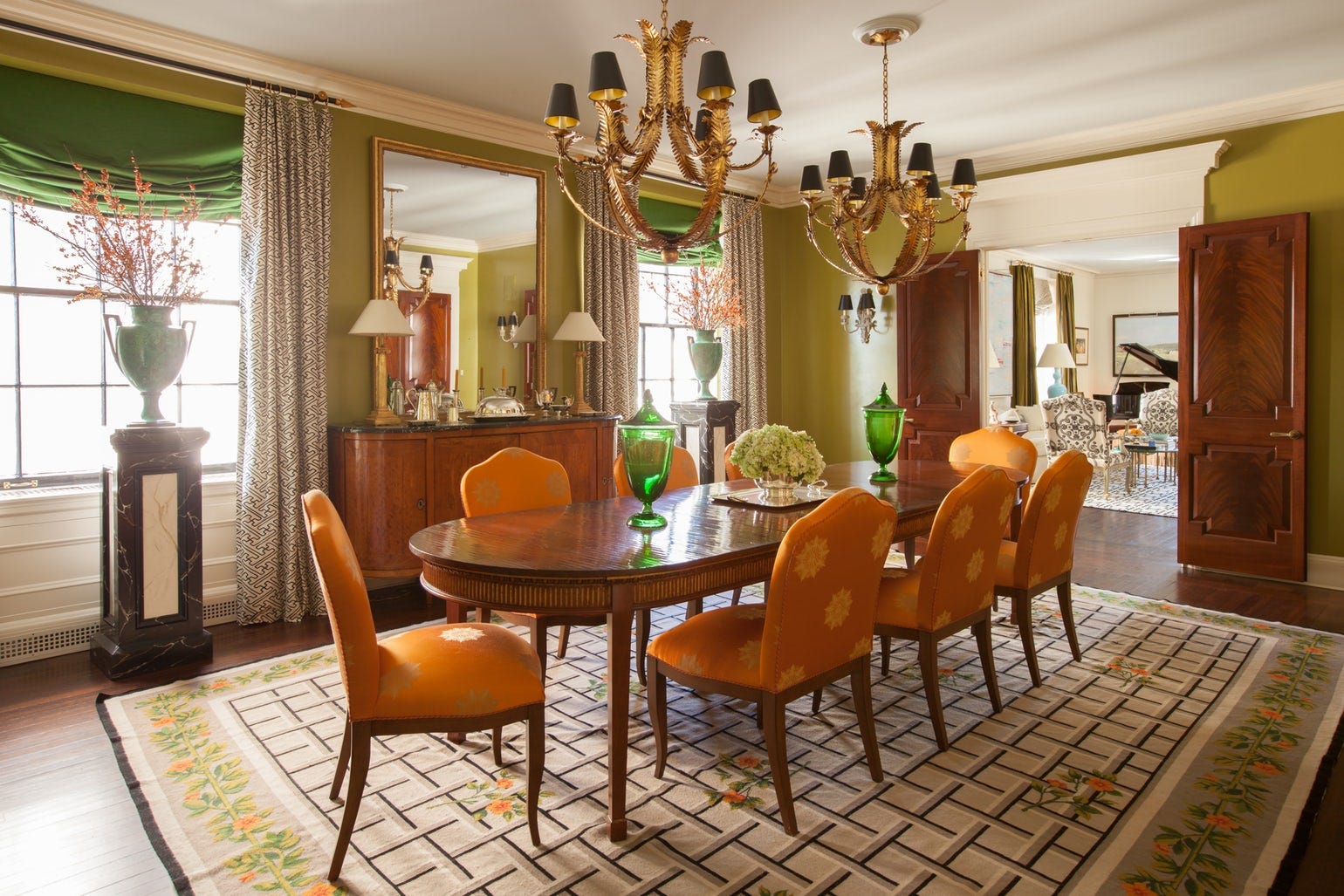

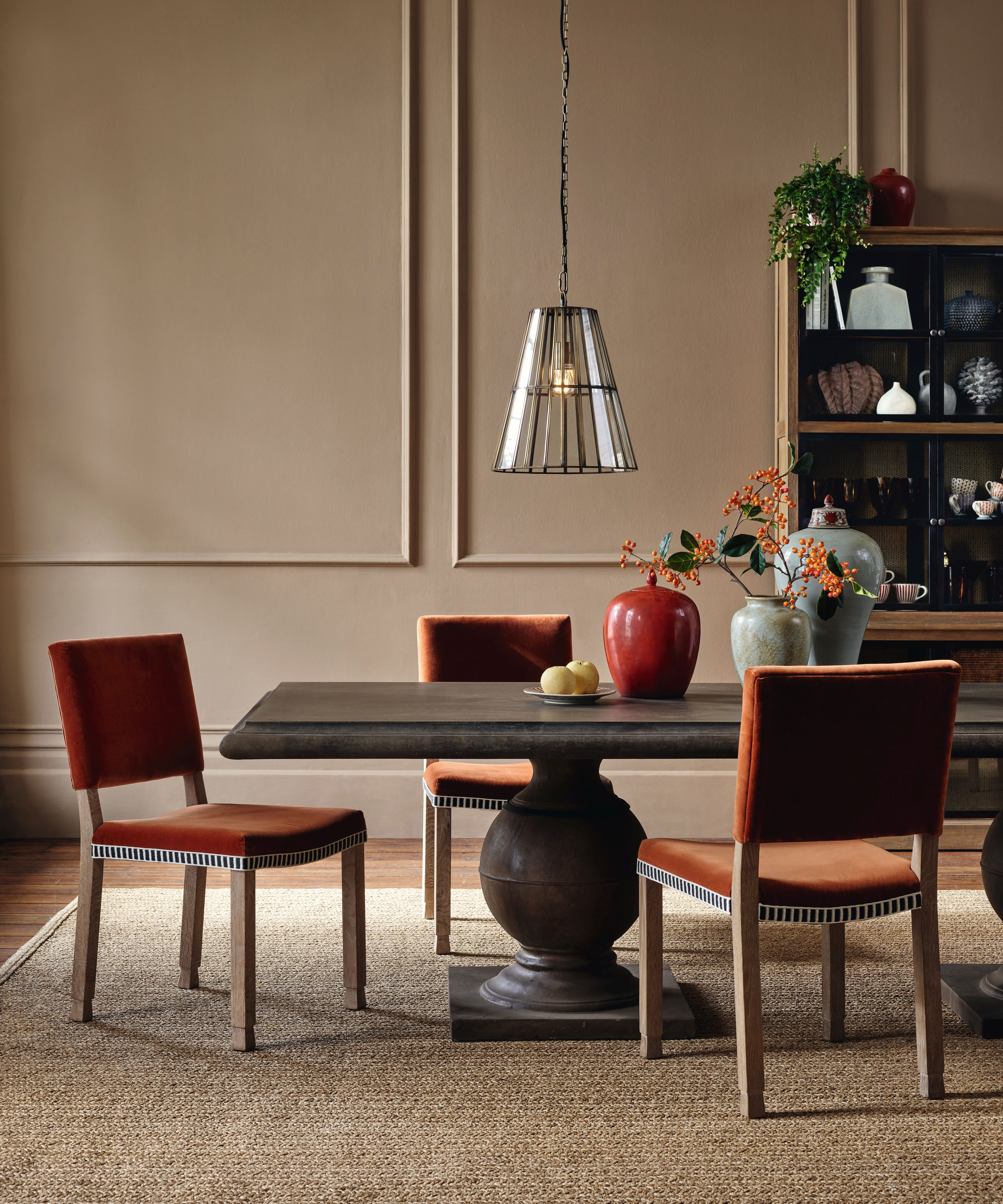
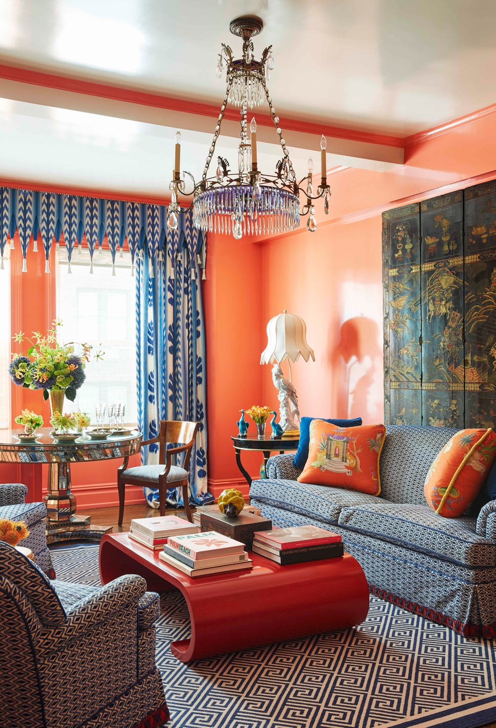
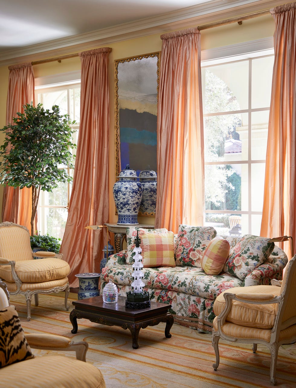
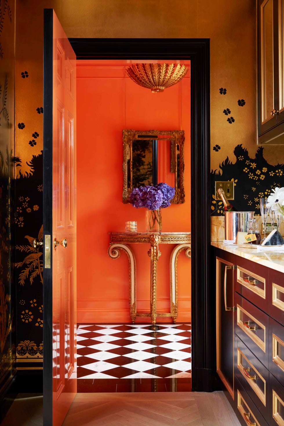
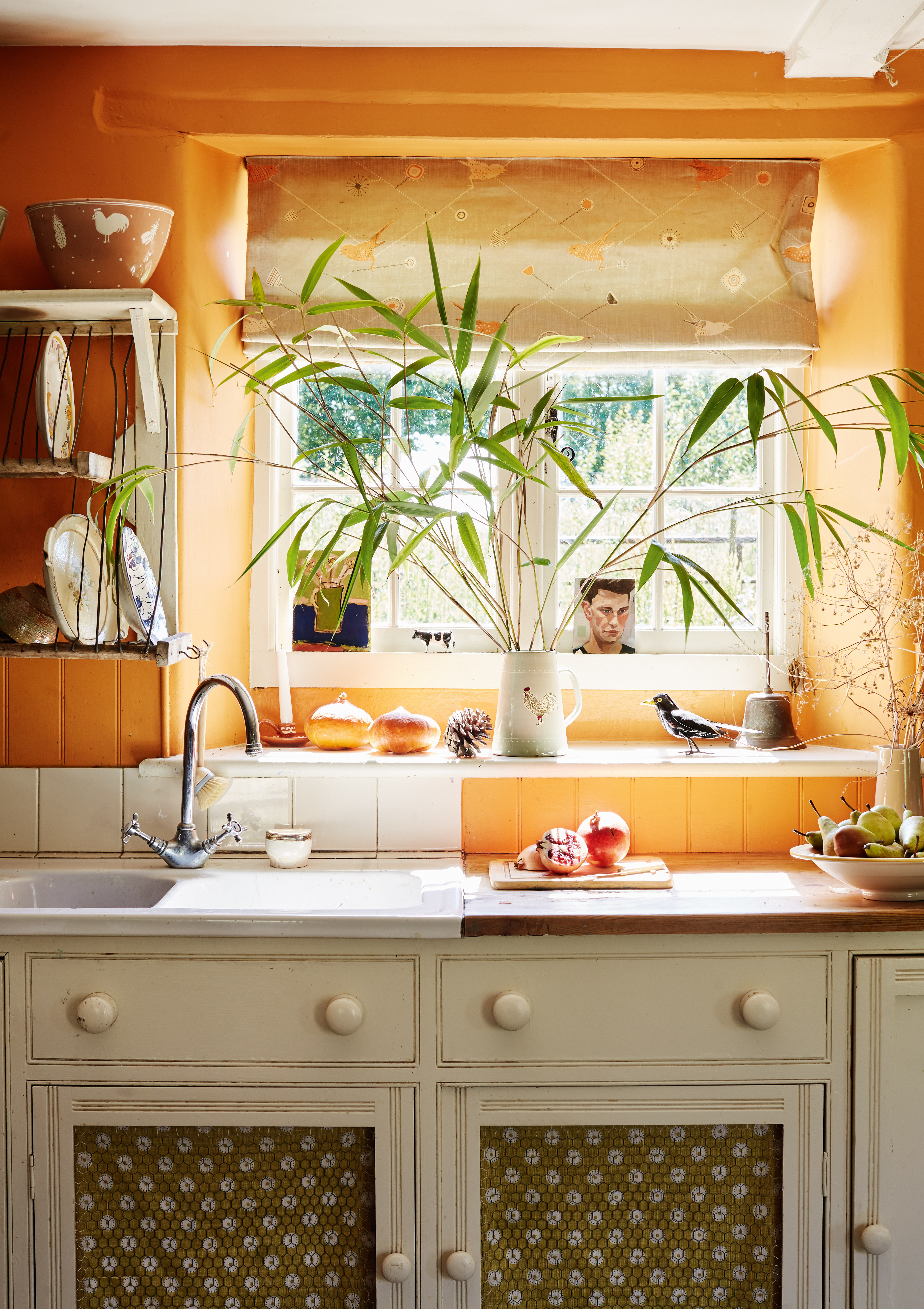
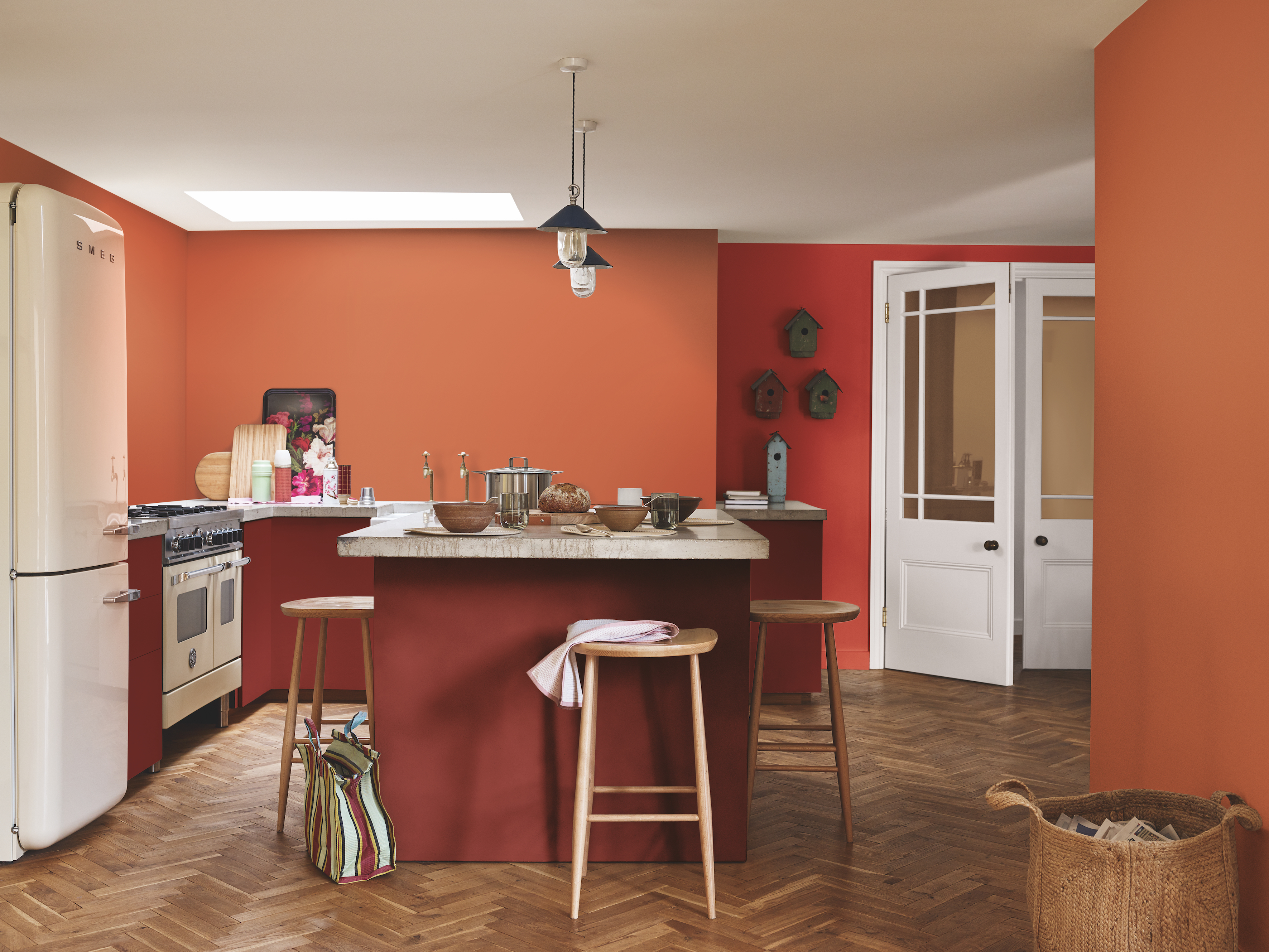
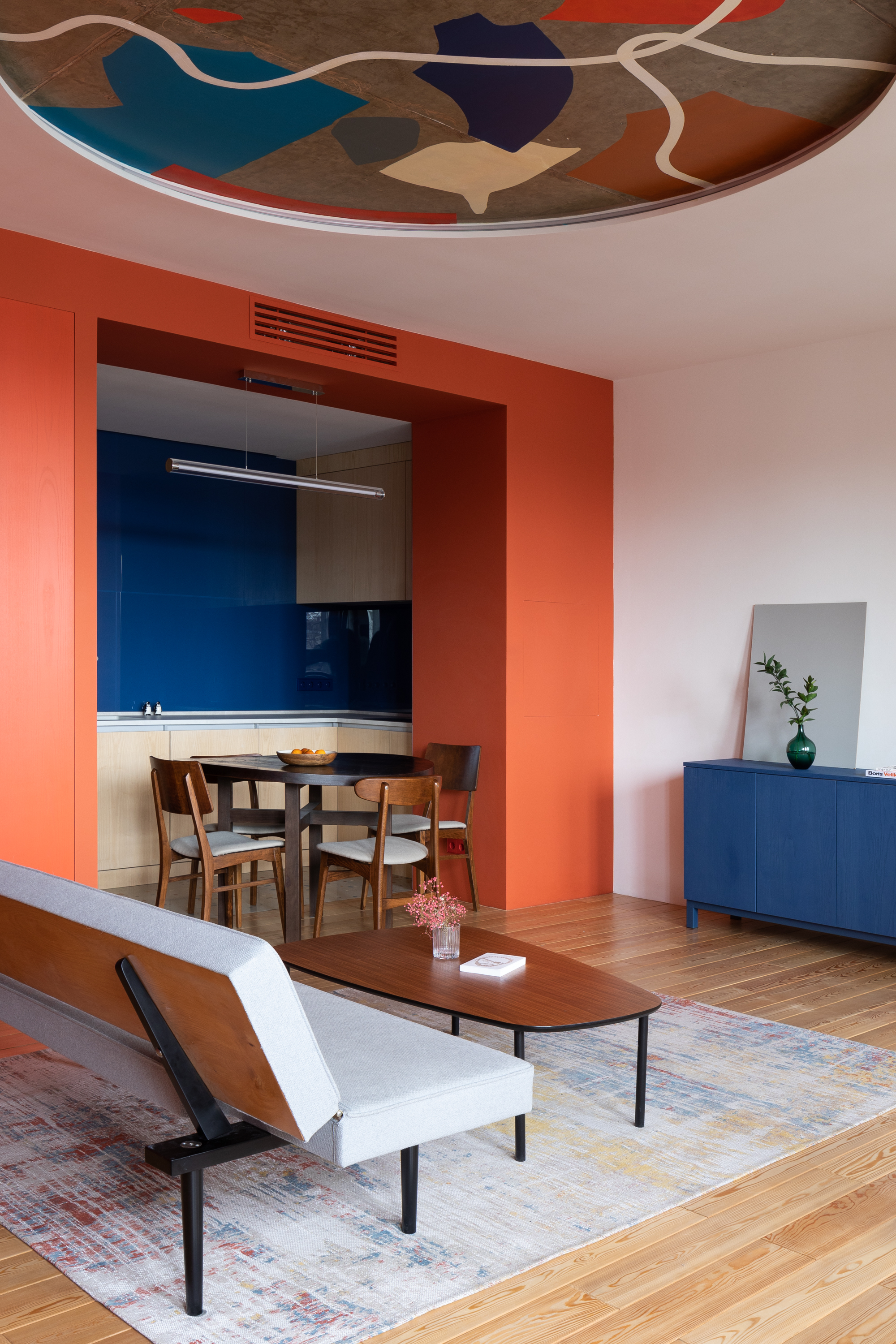
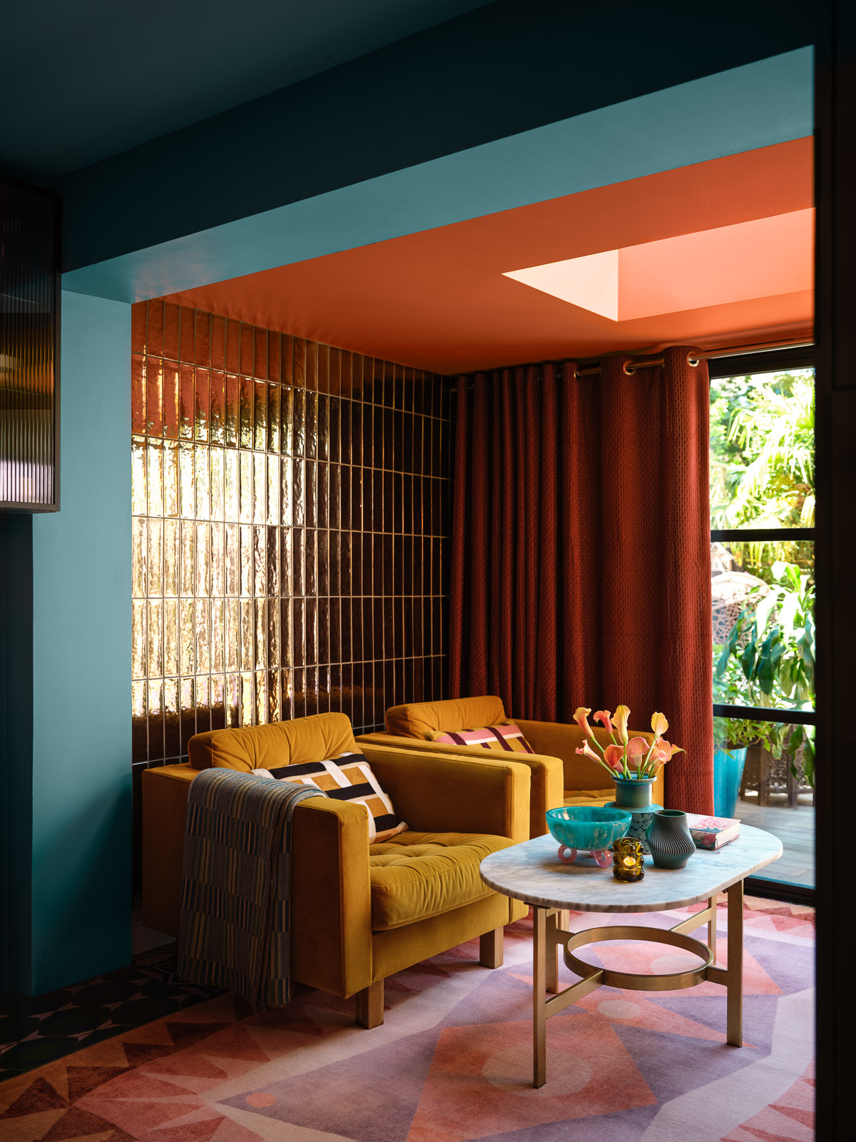
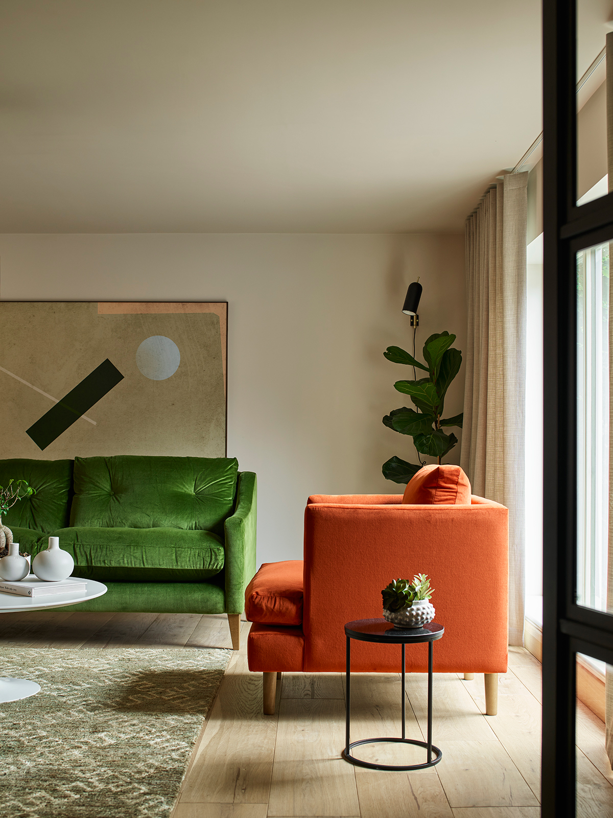
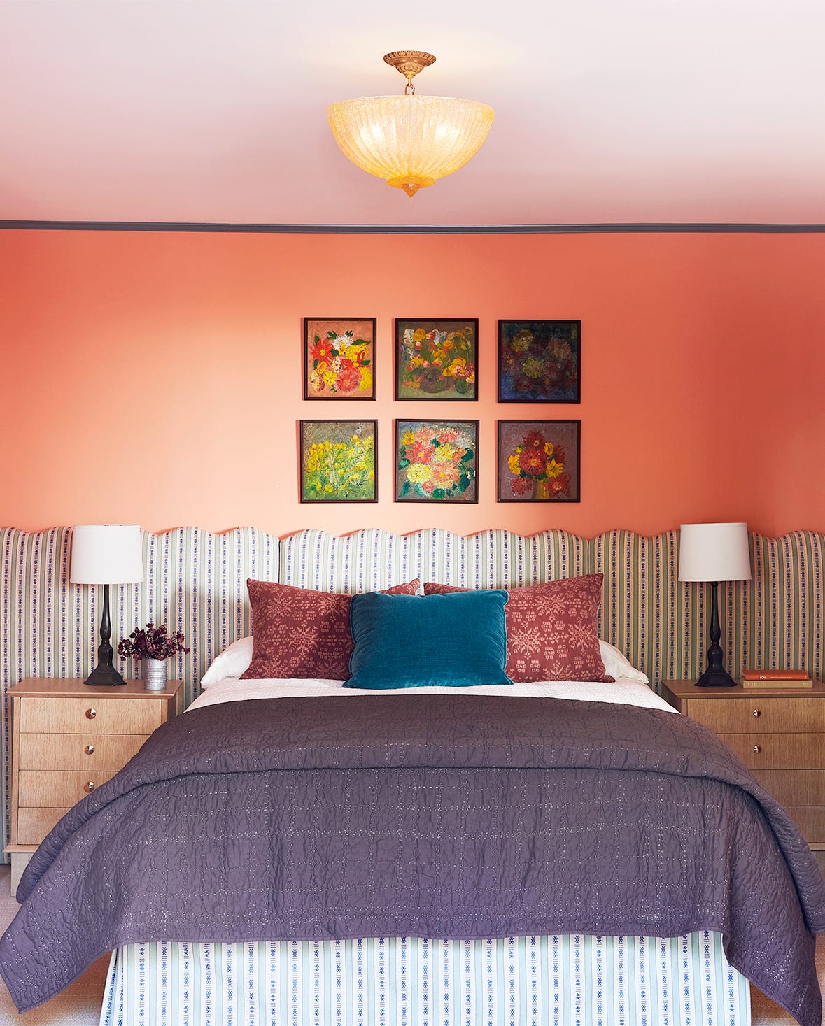
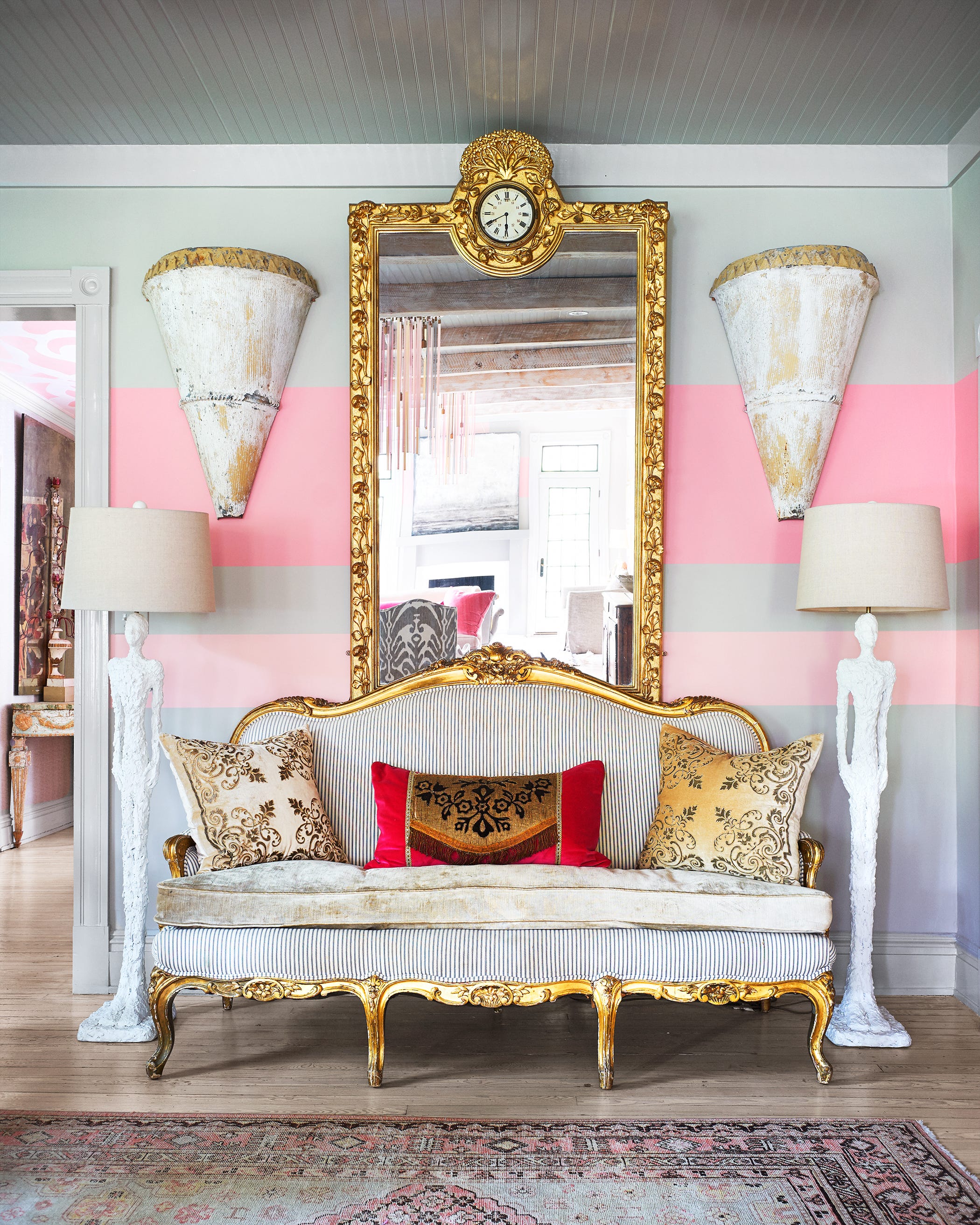
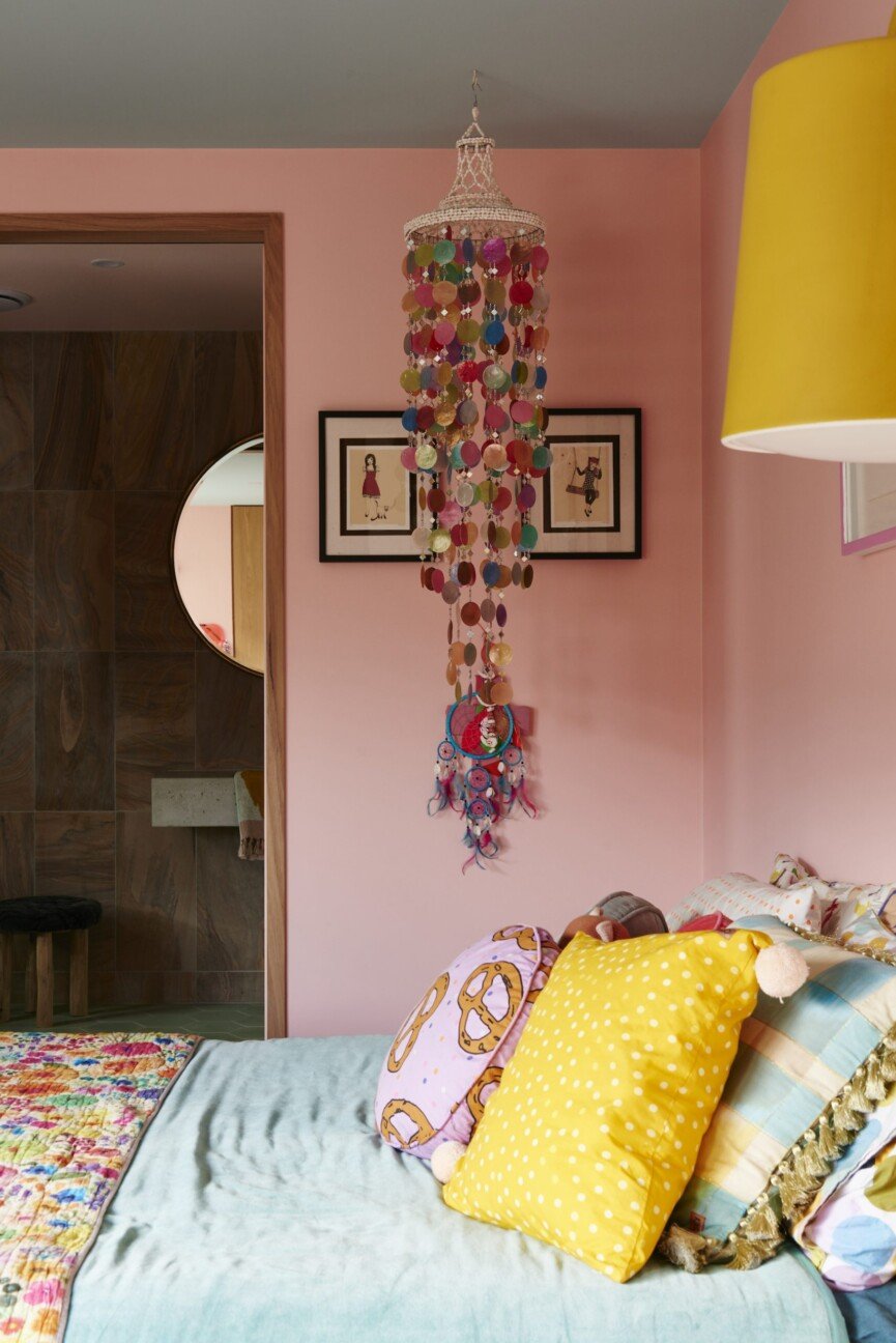
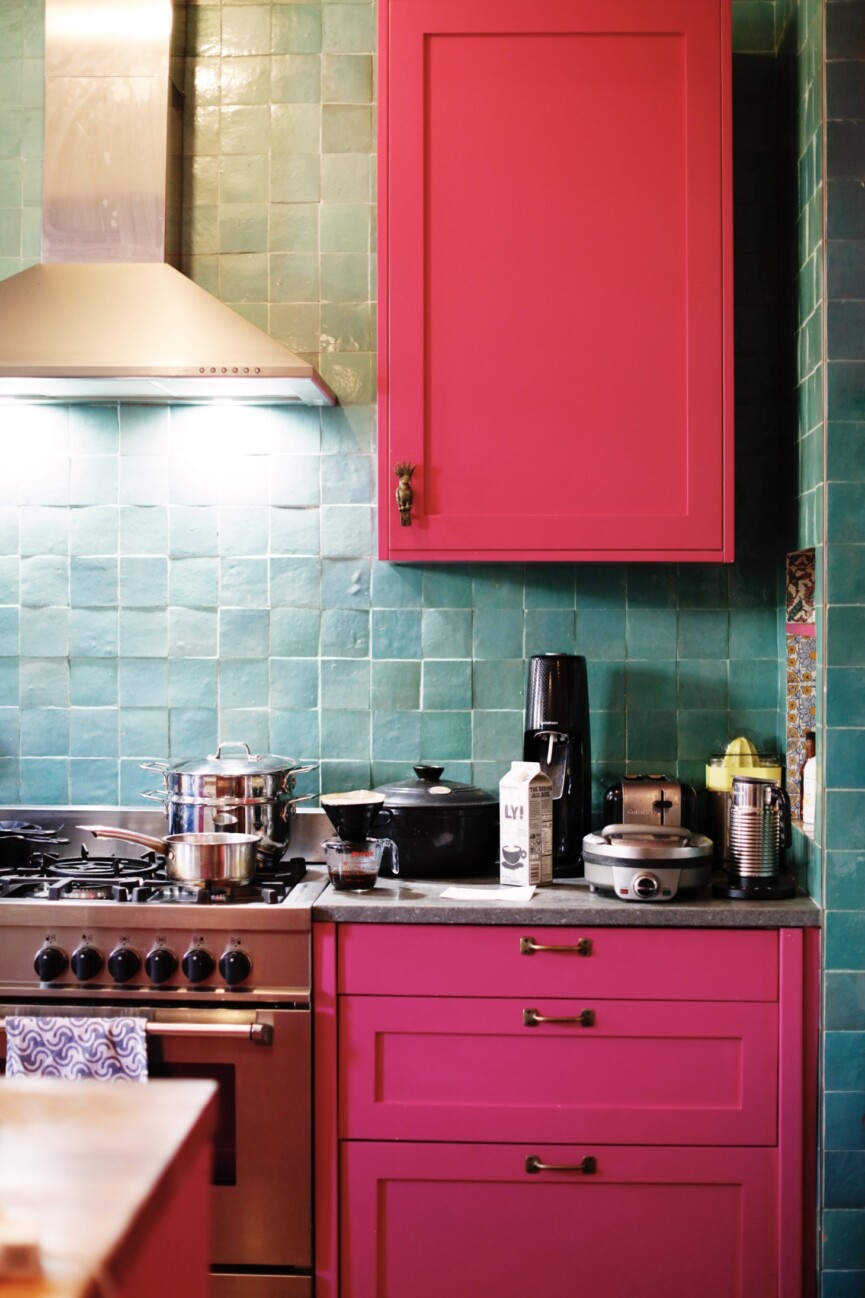
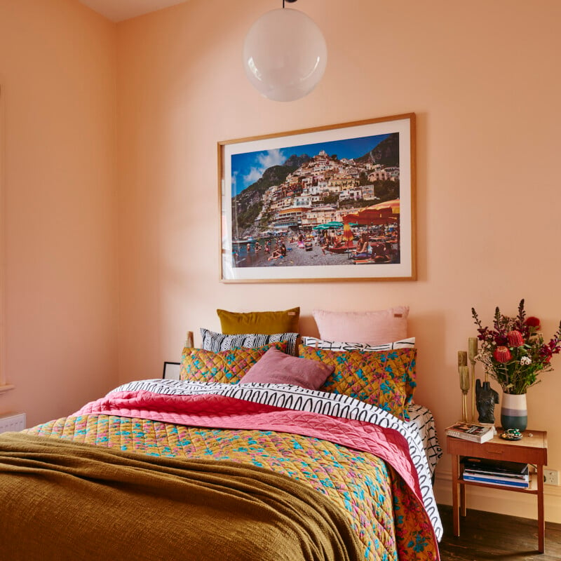
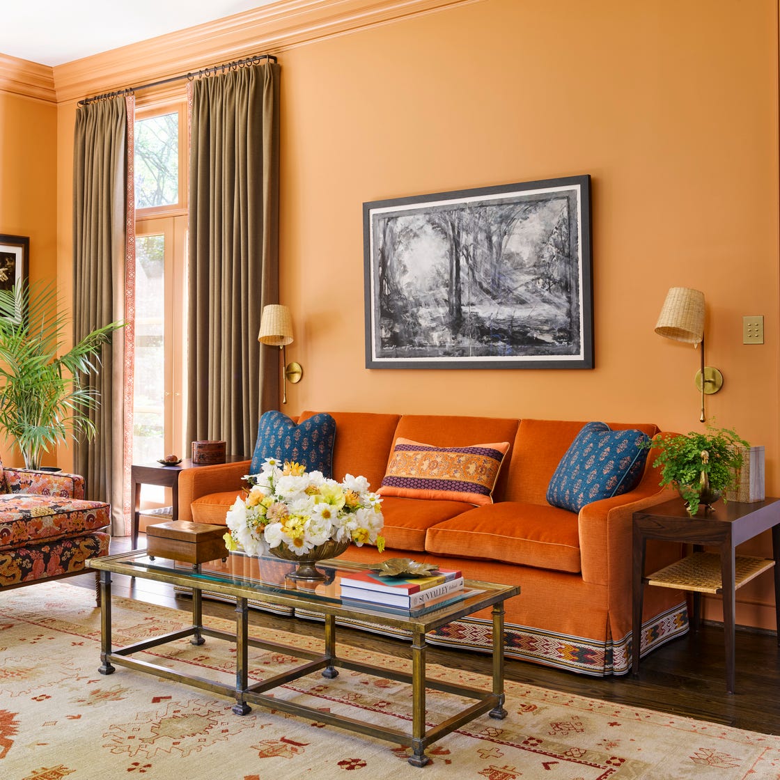
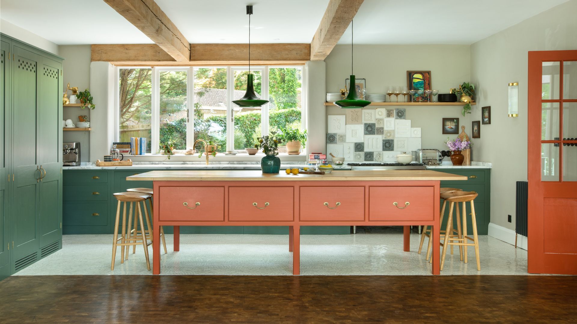
Orange paint, despite not being a conventional first choice for home color palettes, offers surprising versatility. Its range extends from warm apricot and sunny peach to rich rust, making it adaptable to various home aesthetics. The key to successfully incorporating orange lies in pairing it with complementary colors that either tone down its vibrancy or enhance a light and airy feel. This article highlights 14 designer-approved orange paint colors, demonstrating how this citrus hue can be integrated into diverse decor styles.
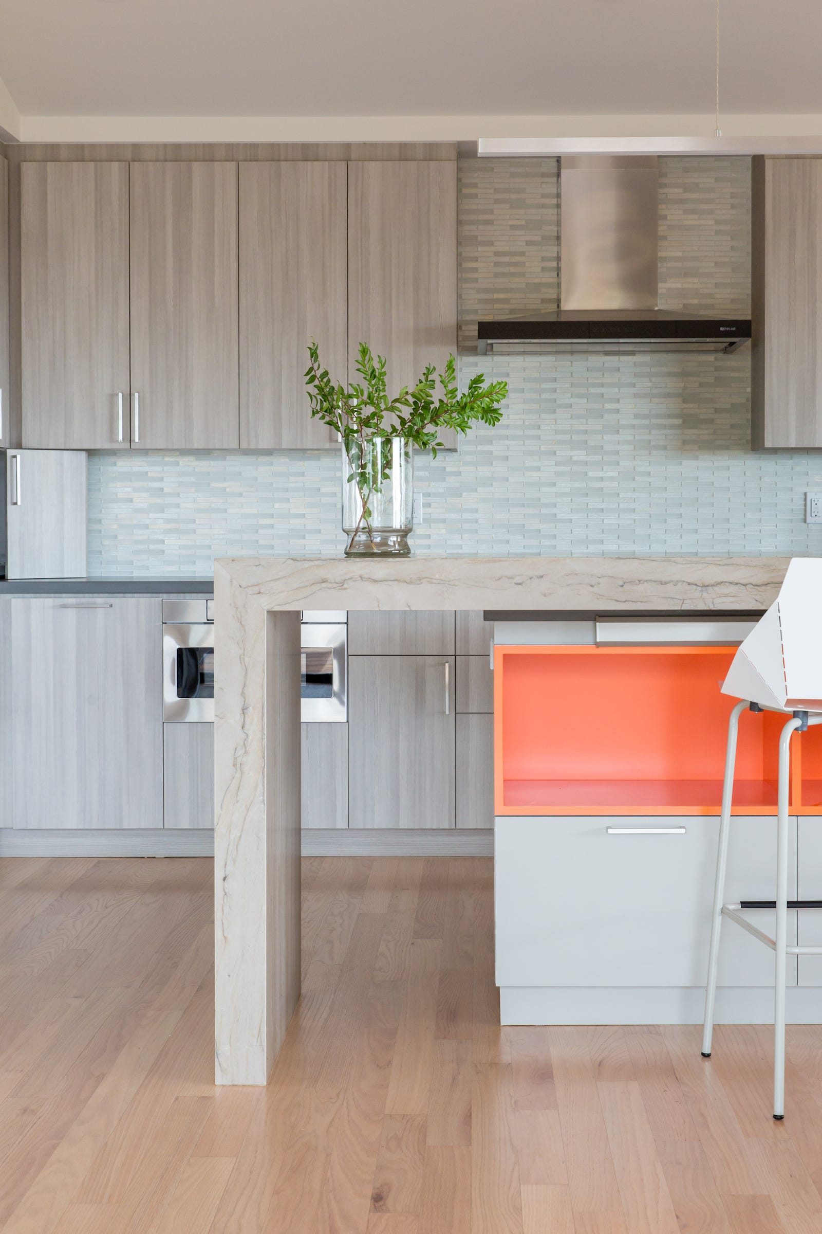
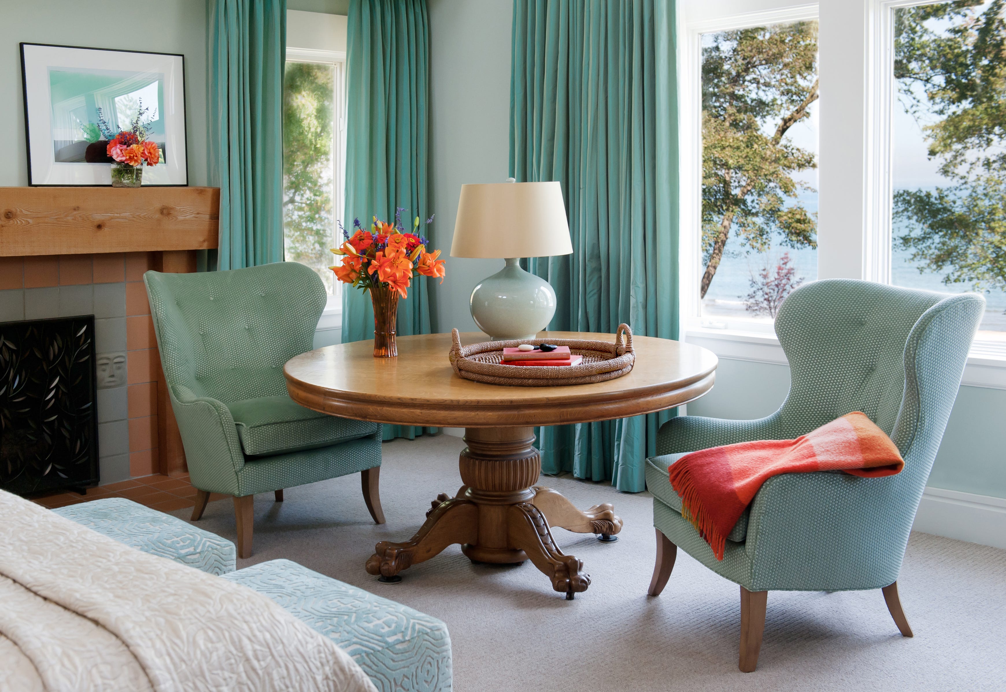
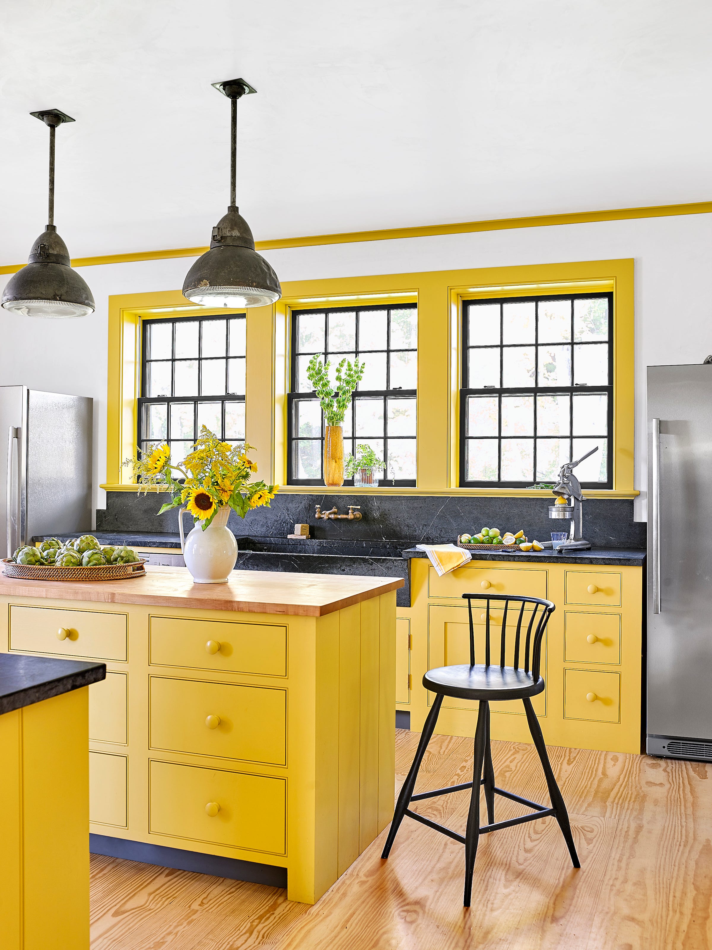
Among the featured selections, Sherwin-Williams Energetic Orange is presented as a bold choice, exemplified in a small kitchen designed by Matthew Boland of MMB Studio. Boland emphasizes that bold colors can expand a small space, creating an unexpected and vibrant atmosphere. Benjamin Moore Tangy Orange is showcased in a room with a custom orange bookcase, where its lively energy is balanced by a light blue wall, as noted by Courtnay Tartt Elias of Creative Tonic. Dutch Boy Paints Harvested Moon offers a sophisticated, serene dusty orange with a hint of brown, ideal for Southwestern-style palettes.

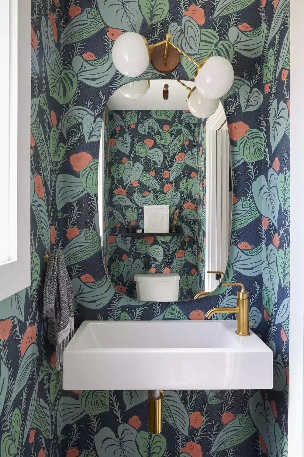
Benjamin Moore Coral Glow provides a traditional touch, perfectly matched to wallpaper in a bathroom vanity, creating a soft coral-tinged orange. For an autumnal feel, Benjamin Moore Greenfield Pumpkin, which can appear orange or brown depending on the light, is recommended for layering with rich jewel tones. Sherwin-Williams Obstinate Orange is described as a timeless shade, adaptable for minimalist, modern settings when paired with dark brown and ivory, or for a fresh look with bright green, white, or blue.
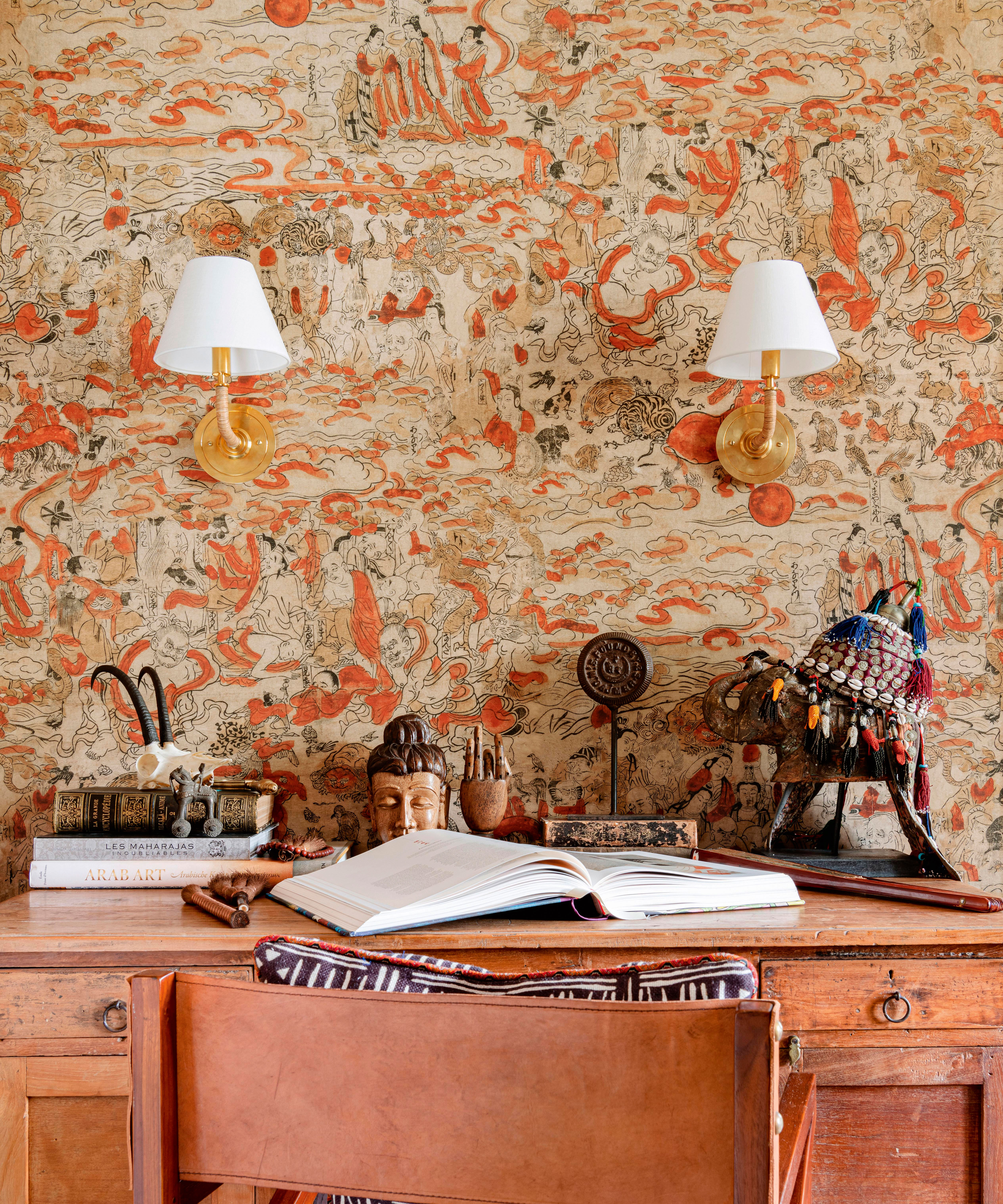
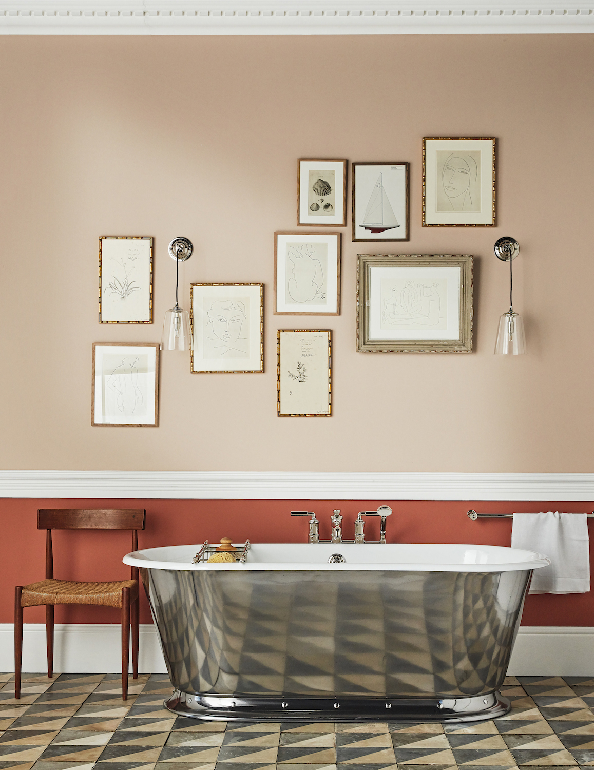
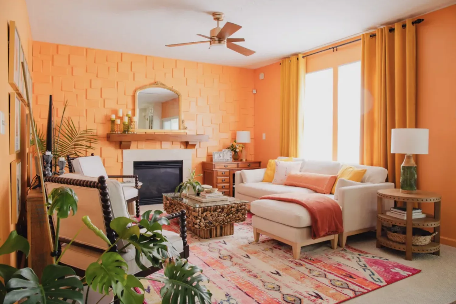
Benjamin Moore Bryce Canyon, an earthy orange inspired by Southwestern landscapes, is given a modern interpretation in an eclectic living room through sculptural lighting and curvy furniture. Dunn Edwards Tangerine Tango brings brightness to a breakfast nook, suggesting its use as an accent wall for those hesitant about an all-orange scheme. Benjamin Moore Peach Brandy, a cognac-tinted orange, is lightened by 50% for a historical effect in a traditional dining room, with a chair rail mitigating its intensity, a technique used by Jen Bienvenu of J. Bienvenu Interiors.
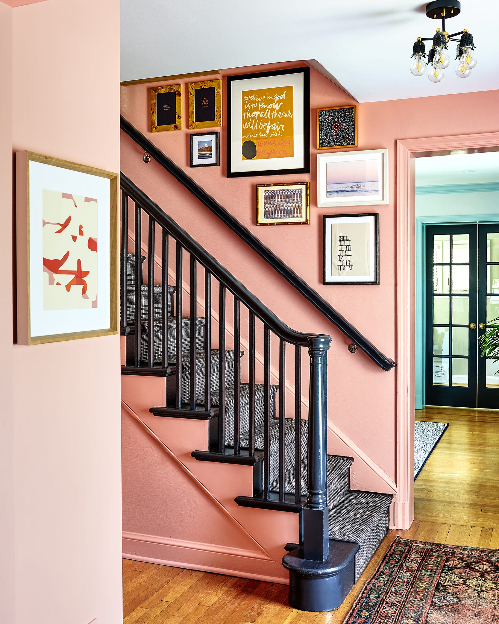
Benjamin Moore Citrus Orange is highlighted for its mood-boosting properties, particularly when color-matched to the iconic Hermès orange, lending a cheerful, invigorating, and slightly cool Palm Beach-inspired vibe, as shared by Marielle Conlon of That Table Lady. Sherwin-Williams Navel creates an immersive, pumpkin-like experience, balancing vividness with natural tones and complementing shades like lime green and pink. Behr Florida Sunrise is suggested for those who fully embrace bright colors, evoking a refreshing creamsicle sensation.
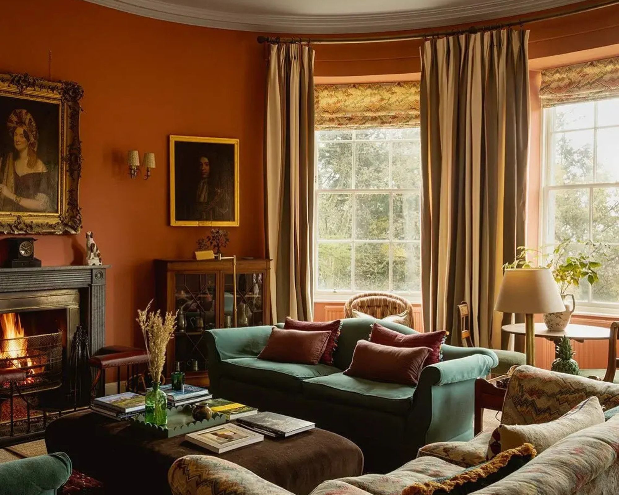
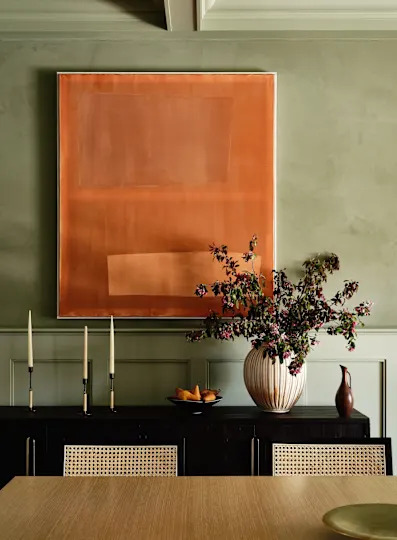
Valspar Cattle Drive is a warmer, cozier orange, chosen by DIYer Imani Keal for her kitchen to add life and interest without feeling overly fruity or Halloween-themed. Dutch Boy Paints Wild Orange, a muted, sherbert-inspired shade, demonstrates how orange can be calming when paired with a rich moss green. The article concludes by addressing common questions, affirming that orange can be a good wall color in its various forms, depending on natural light, room function, and complementary colors. It also outlines diverse color pairings for orange, from calming autumnal palettes with olive green and brown to bold eclectic schemes with purple or royal blue, and even a midcentury Palm Beach aesthetic with white.
#InteriorDesign #PaintColors #HomeDecor #OrangePaint #ColorPalette #DesignerTips #RoomTransformation #AccentWalls #InteriorDesign #PaintColors #HomeDecor #OrangePaint #ColorPalette #DesignerTips #RoomTransformation #AccentWalls
0 comment in total
 No comments yet
You may also like
15 Energizing Orange Paint and Decor Ideas

20 orange room design ideas

How to Make Orange and Green Work Together — It Can Be "Dynamic and Joyful", but Only If You Get It Right

30 Bright, Bold Combinations of Colors That Pair with Orange

20+ Ideas for Styling with Orange as an Accent
What Colors Go With Orange? 10 Harmonious Hues to Pair With This Zesty Shade

30 Bright, Bold Colors That Go with Orange
How to decorate with Dulux Overtly Olive – 7 easy tricks for using the ultimate versatile earthy green shade in any space
Decorating with orange – how best to use this vibrant and versatile color in interior schemes

30 Best Colors That Go With Orange
The Top Coral Paint Colors to Brighten Your Space

We Found the Chic Orange Sofas of Your Dreams
9 Best Orange Paint Colors for a Vibrant Home
Orange bathrooms are trending - these 10 show how to use this color to create a perfect sanctuary
The Brighter, the Better—These Vibrant Paints Will Infuse Your Home With Positivity

Add These Happy Colors to Your Home and Boost Your Mood
Orange Deserves a Spot in Your Home—Here's How Designers Use It

Orange and green is the bold color pairing quietly transforming homes in 2025 – here's 4 reasons why
5 Vibrant Color Palettes Designers Are Using to Add Energy and Excitement to Decor

23 Orange Kitchen Ideas That Feel Bold, Warm, and Unexpectedly Chic