1/18
The biggest paint trends of 2025 – 17 stylish ways to decorate with paint, according to designers
The article explores the top paint trends for 2025, offering 17 stylish ideas for decorating with paint, as explained by interior designers and color experts. It highlights how paint, being a less permanent design choice, allows for creative home elevation through various finishes and trending colors.
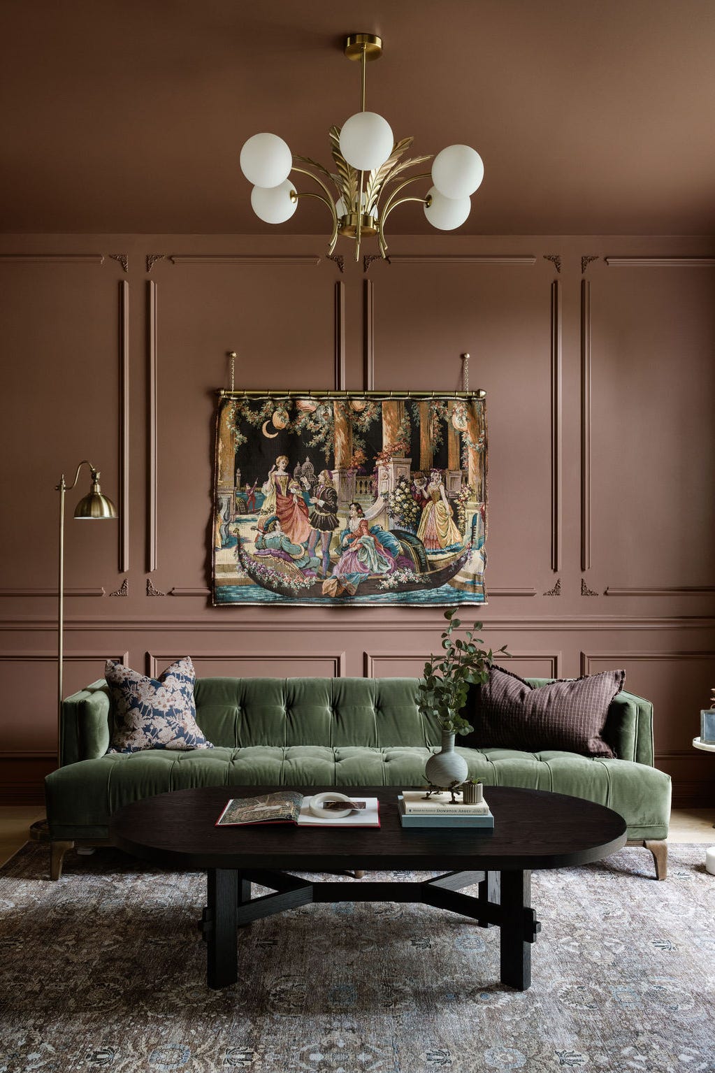
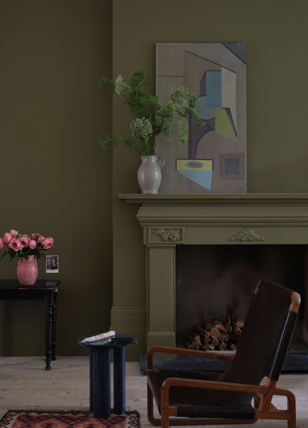
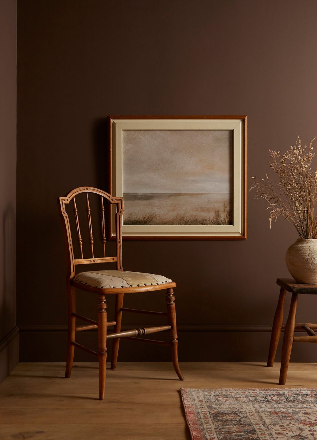
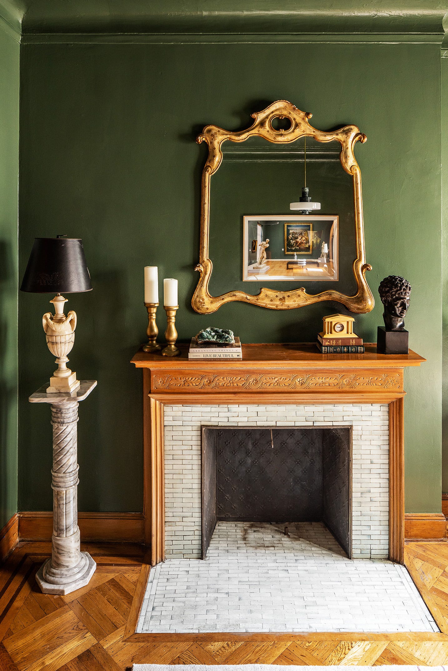
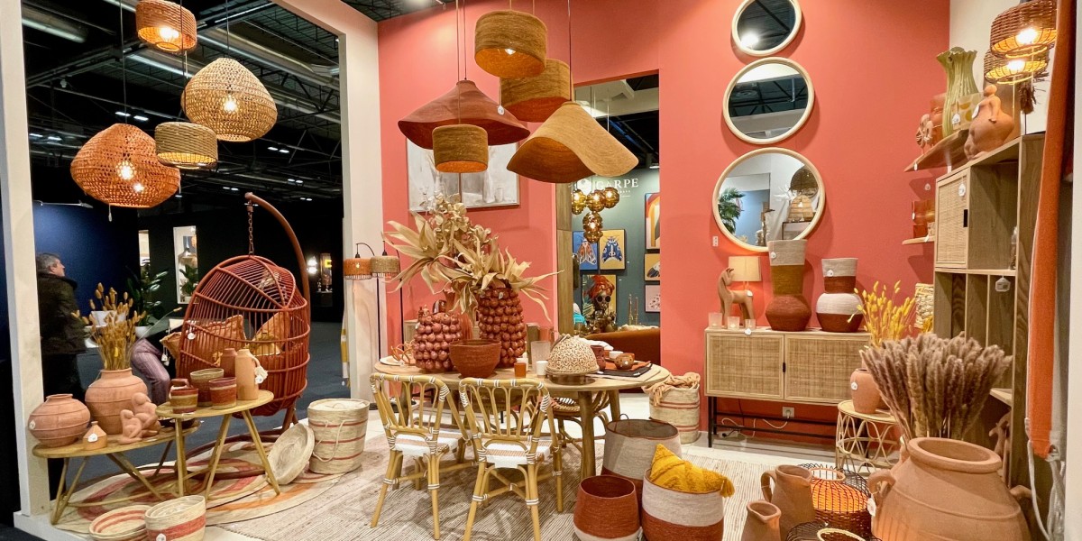
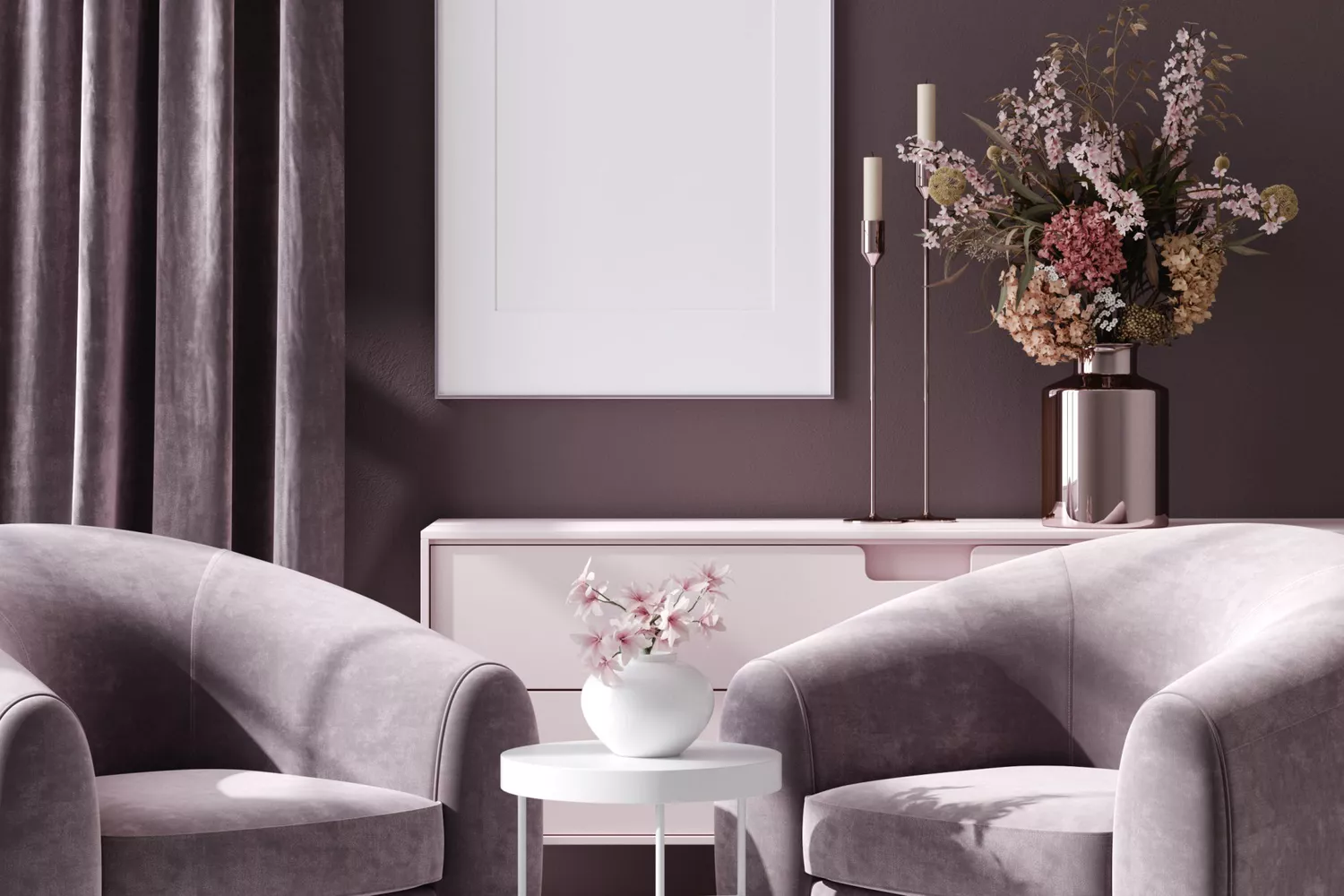
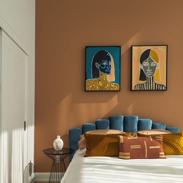
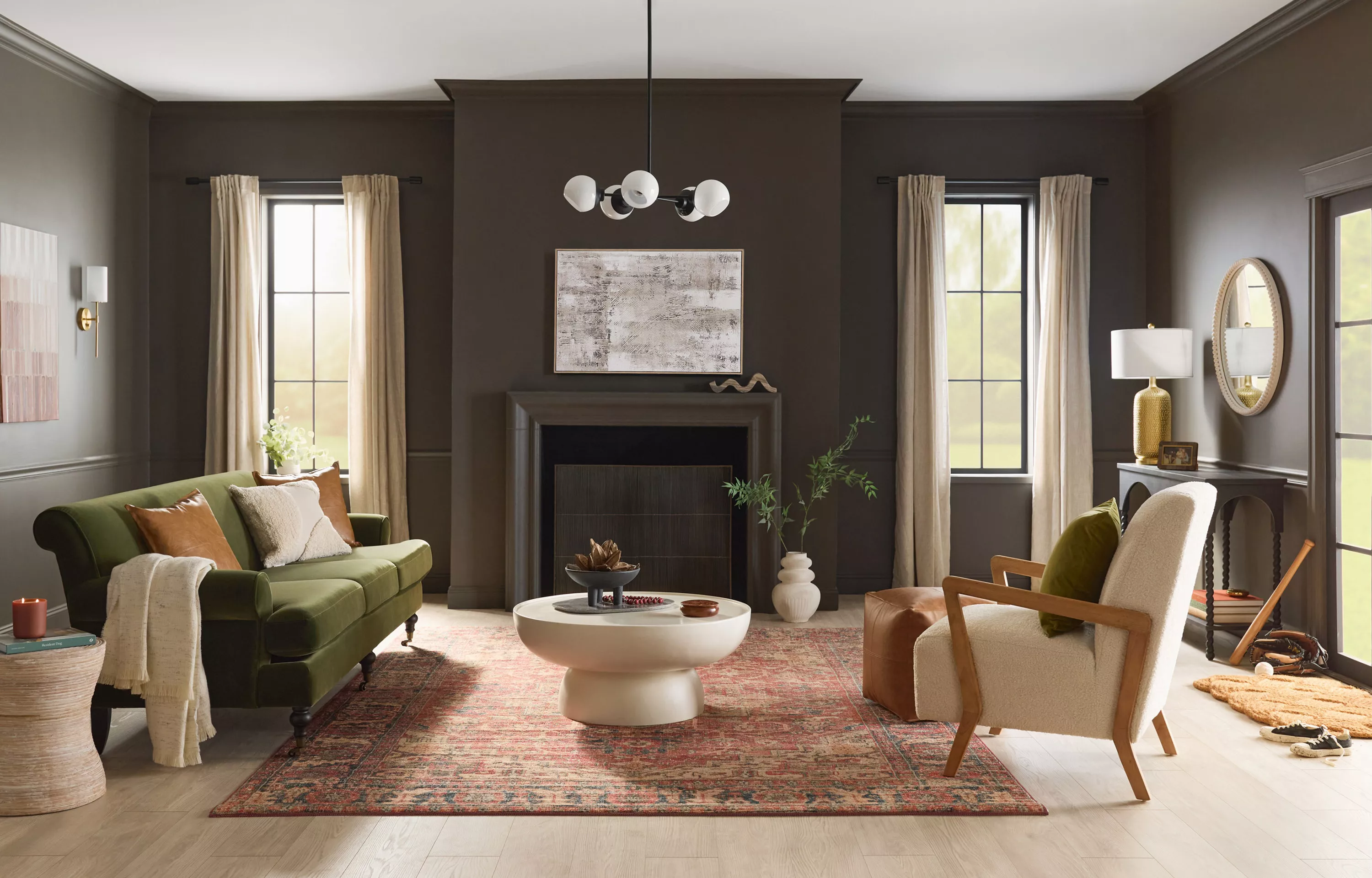
One significant trend is the enduring popularity of brown paints, especially rich, deep shades, which are seen as an elevated neutral. Designers recommend colors like Farrow & Ball's Salon Drab and Annie Sloan's Coco and Honfleur. These browns are versatile, pairing well with soft pastels, neutral creams for a luxurious 70s feel, or bolder colors like vivid red, orange, and pink for a regal effect, or bright greens and blues for contrast.
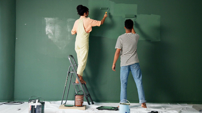
Limewash walls are another key trend for 2025, transforming plain surfaces into textured art with a soft, cloud-like finish. This ancient technique, experiencing a revival, adds depth and an organic feel, complementing natural materials such as wood, linen, and stone. Testing limewash before full application is advised, as it typically dries lighter, and it's suitable for walls with imperfections. However, proper sealing is crucial for use in bathrooms and kitchens.
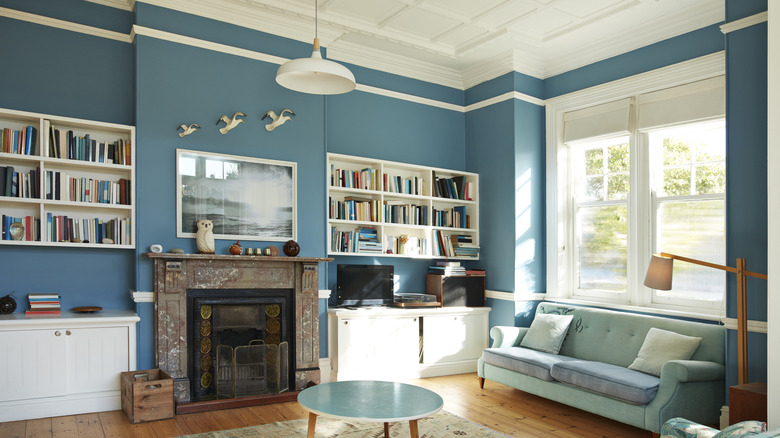
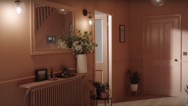
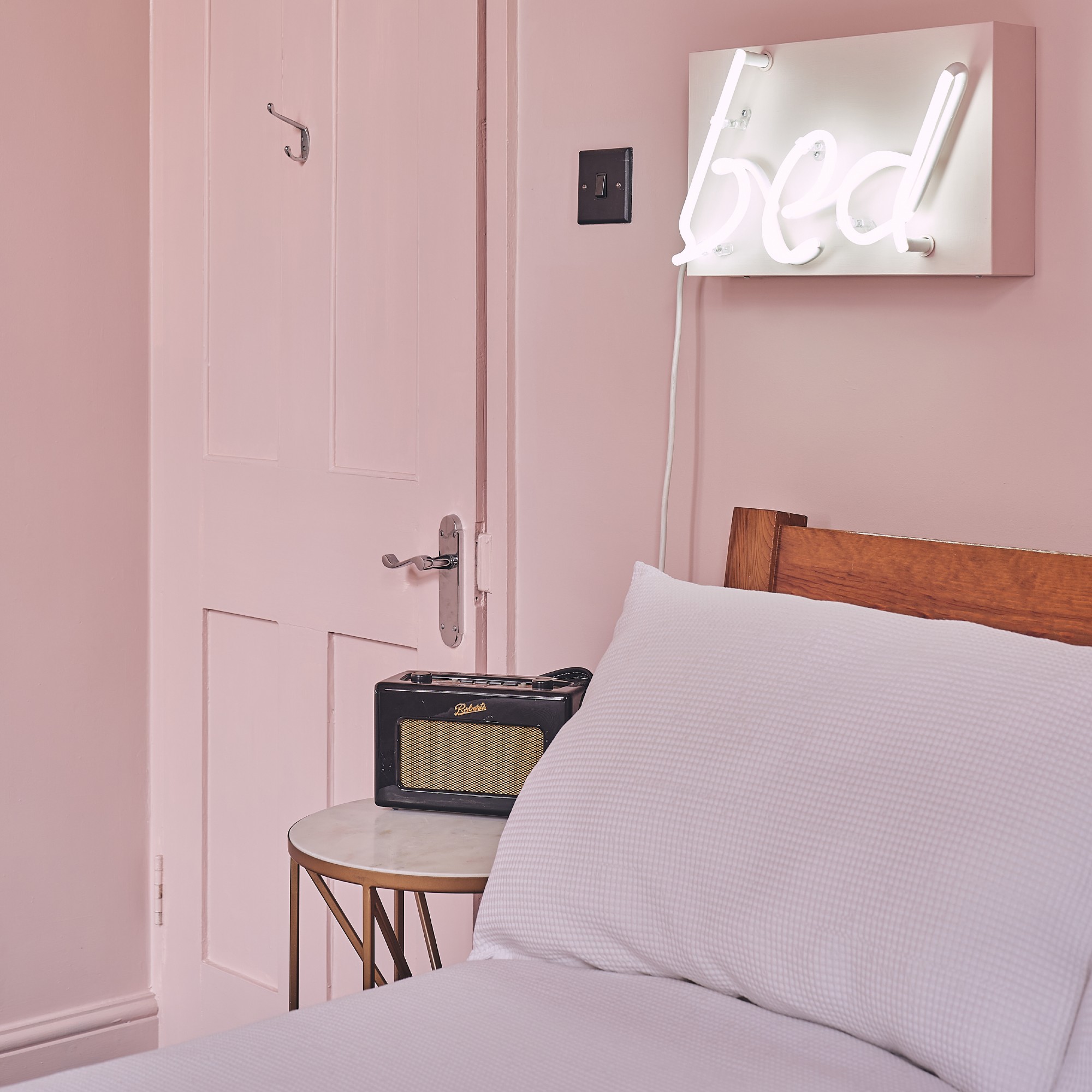
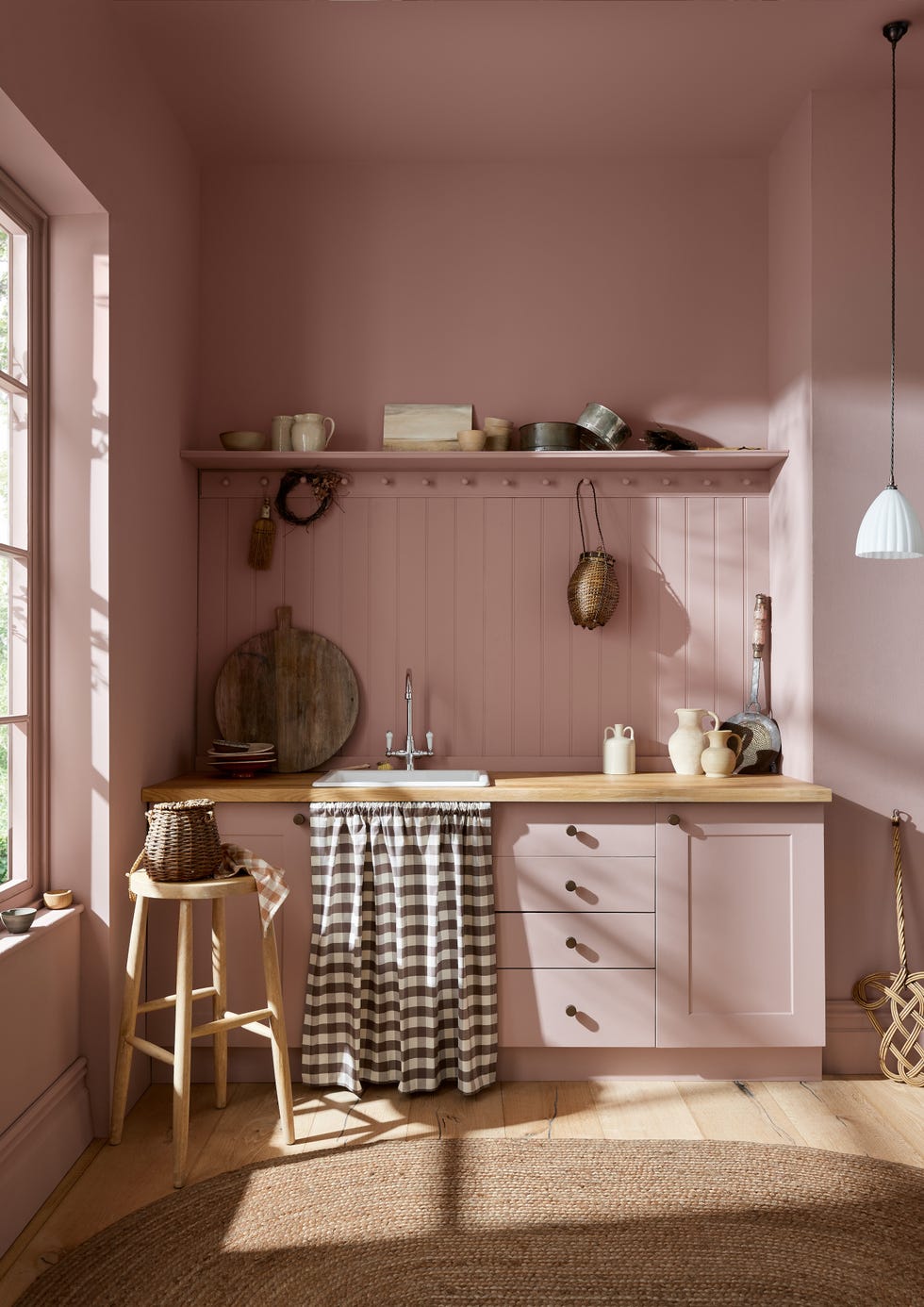
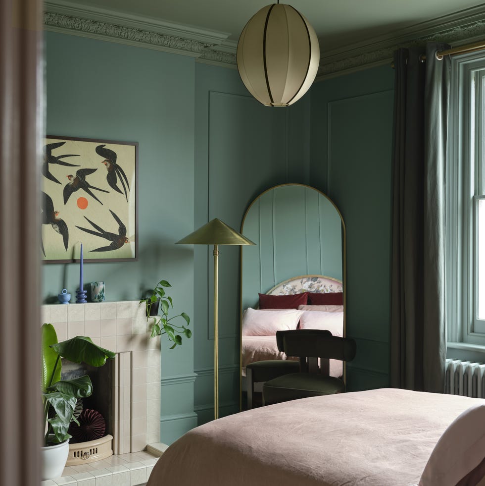
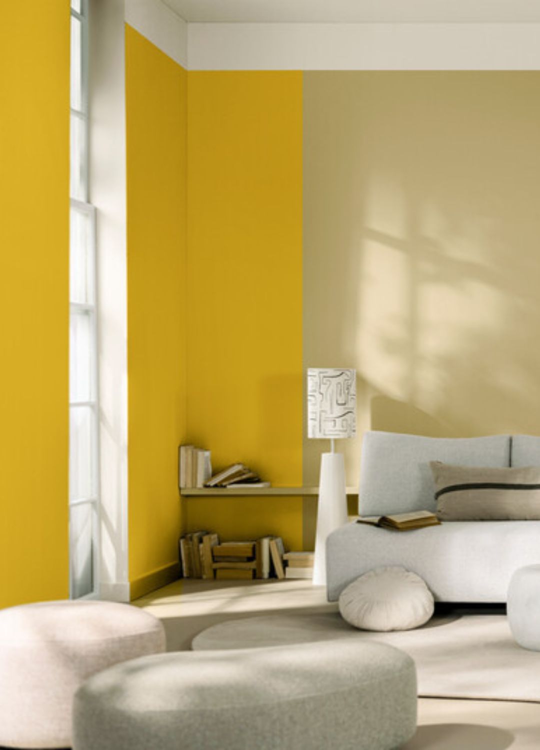
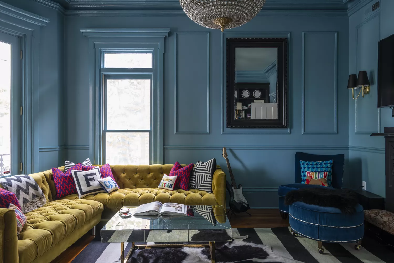
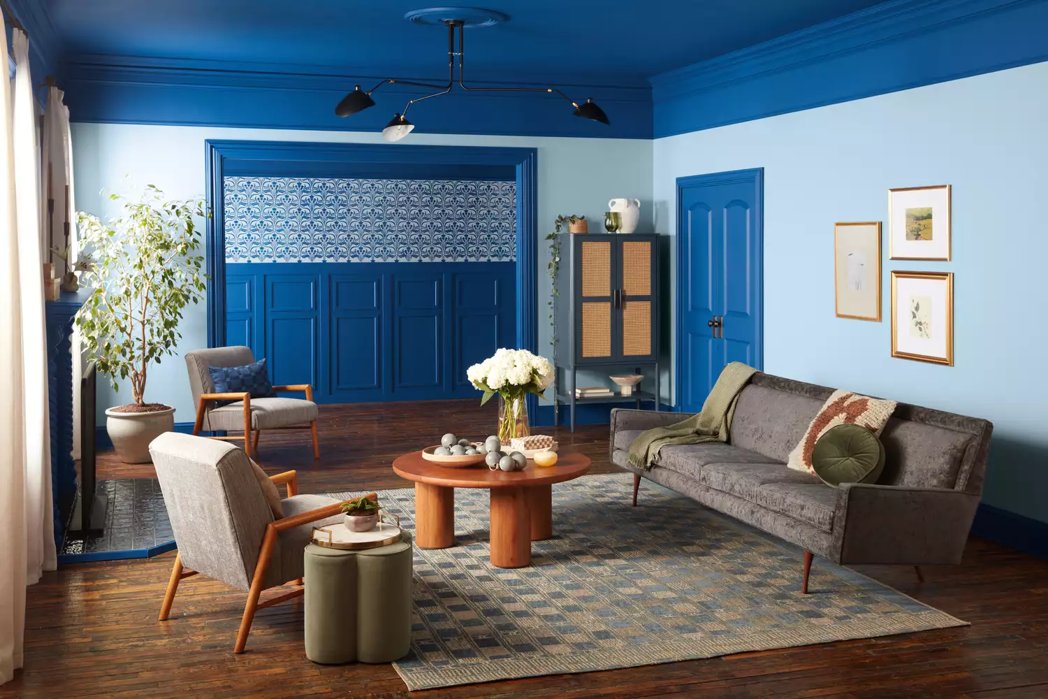
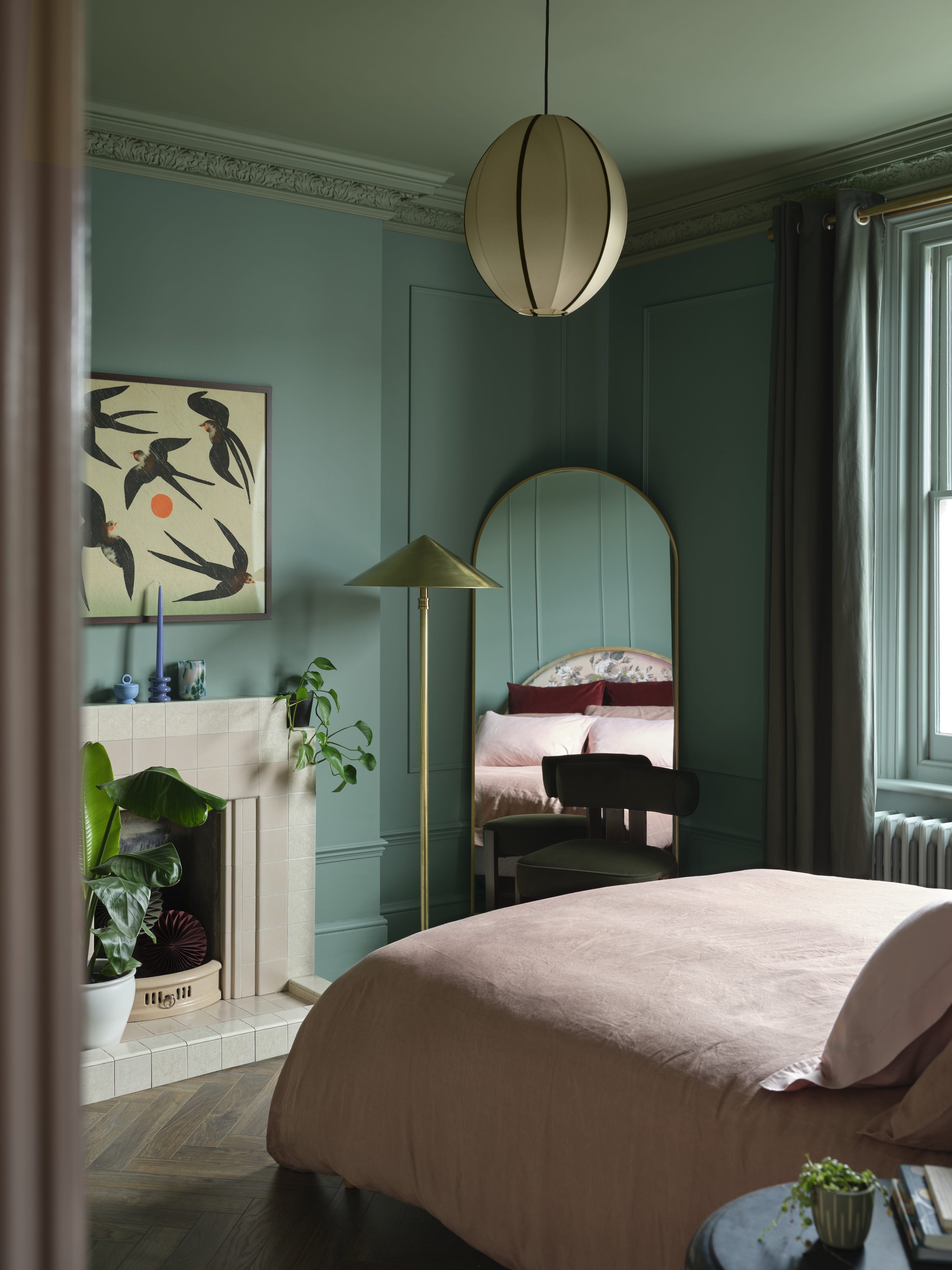
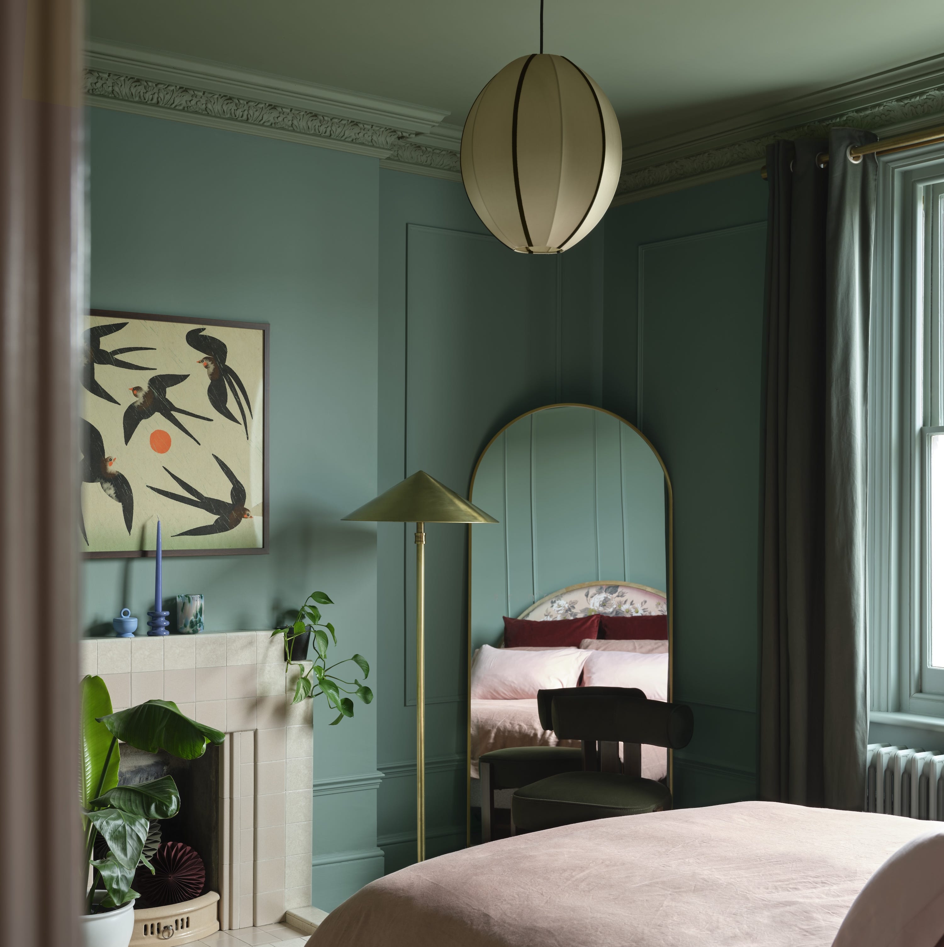
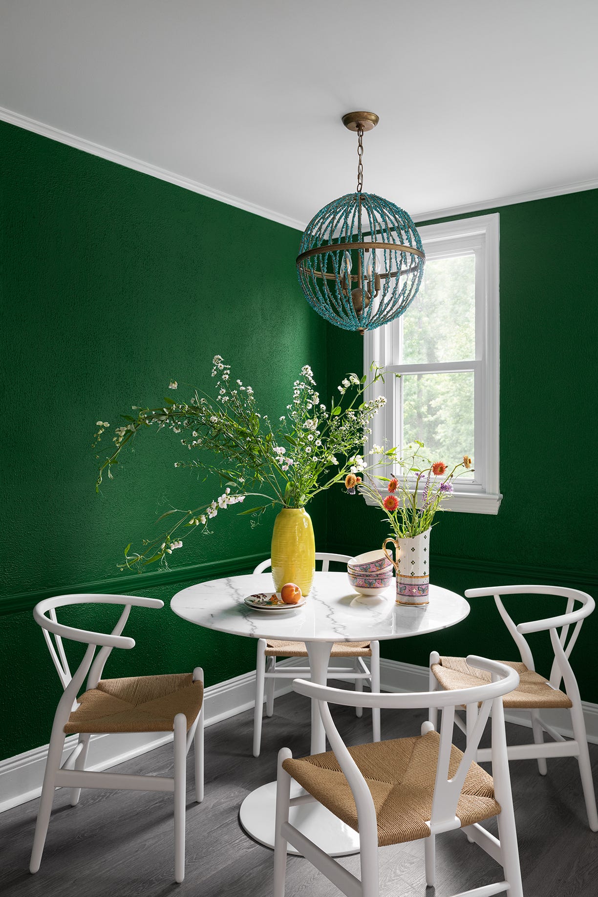
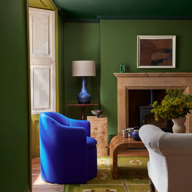
Color drenching, though not new, maintains its appeal for 2025. This technique involves using a single color across walls, ceilings, skirting, doors, and even furniture to create an immersive, cohesive look. It is particularly effective in small rooms, making them appear larger and cozier. Experts suggest matte finishes for walls and eggshell for woodwork to enhance this effect, recommending it for powder rooms, hallways, and studies.
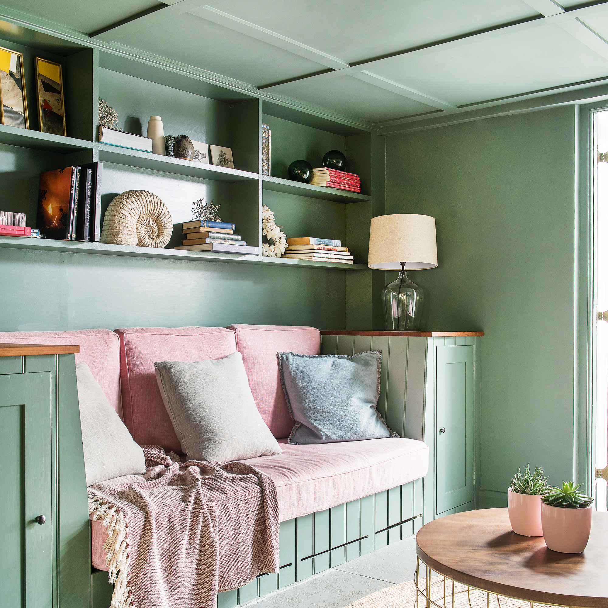
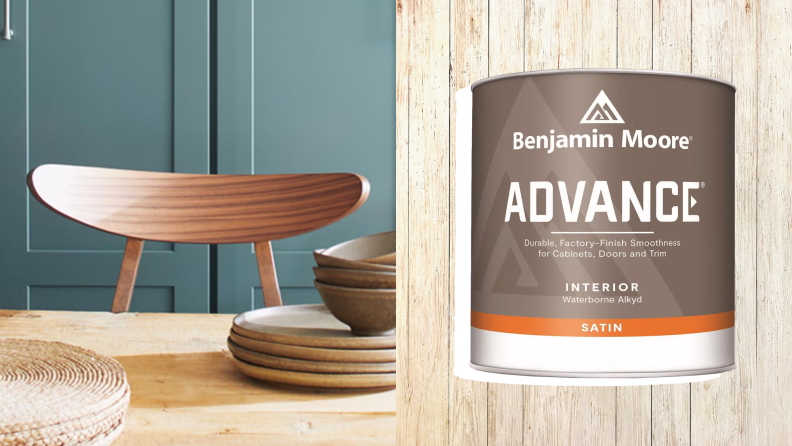
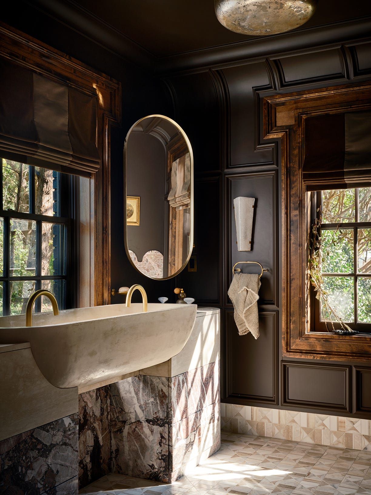
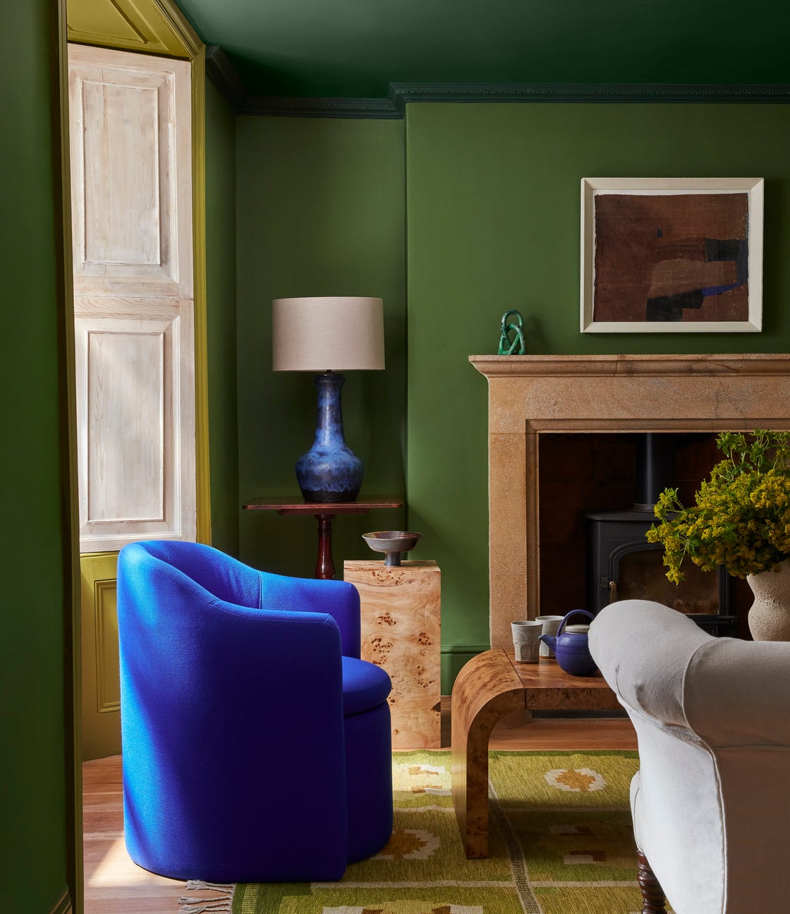
Matte paint finishes are gaining traction due to advancements in durability, making them suitable for almost any space, including high-traffic areas. Brands like Benjamin Moore's Scuff X and Farrow & Ball's Dead Flat offer velvety, modern finishes that absorb light beautifully. Matte finishes are ideal for highlighting architectural details and work especially well with deeply pigmented hues like burgundy or forest green.
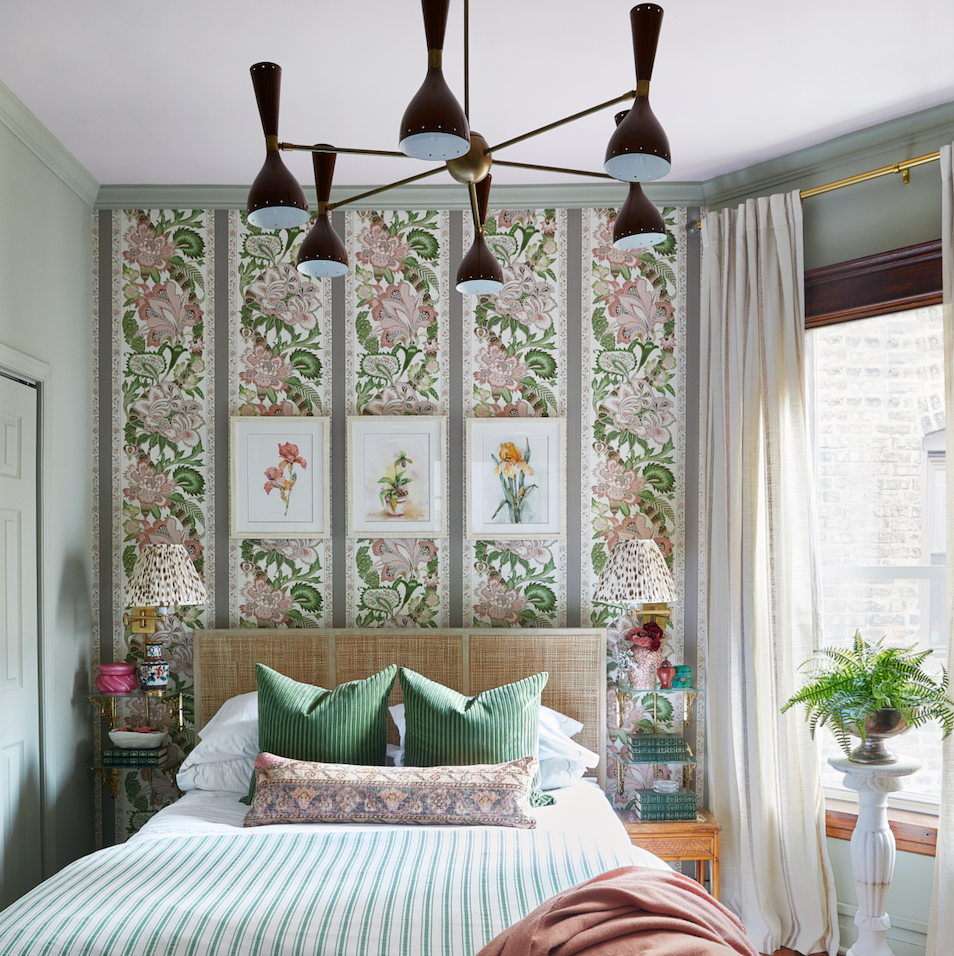
Matching paint colors to wallpaper is highlighted as a trend that creates a seamless, tailored design. By extracting a dominant or subtle tone from the wallpaper, a harmonious and layered aesthetic is achieved. This method makes spaces feel intentional and polished, effectively extending the visual impact of wallpaper, particularly in smaller areas like bars or breakfast nooks.
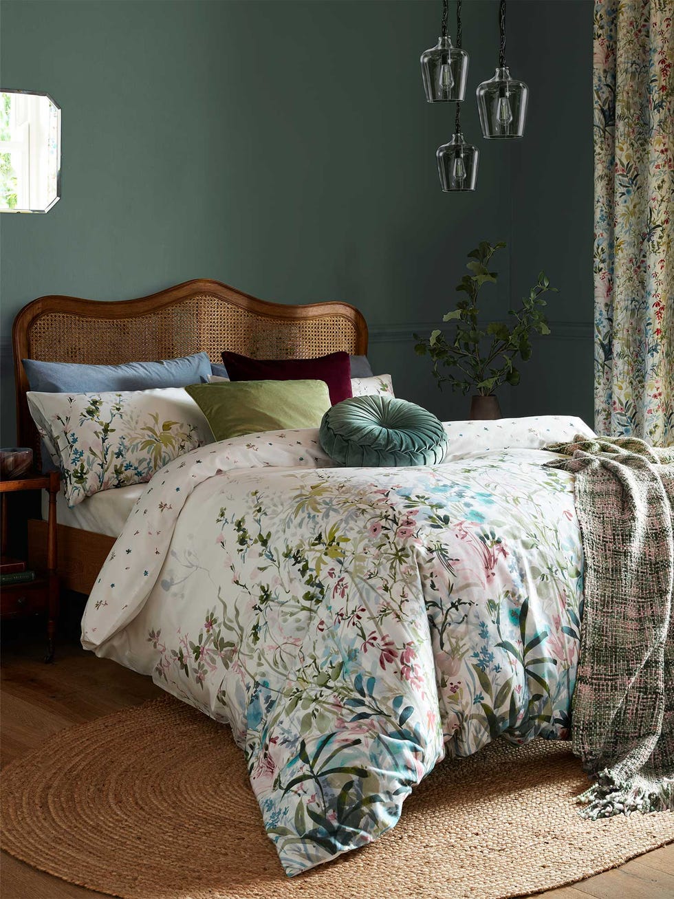
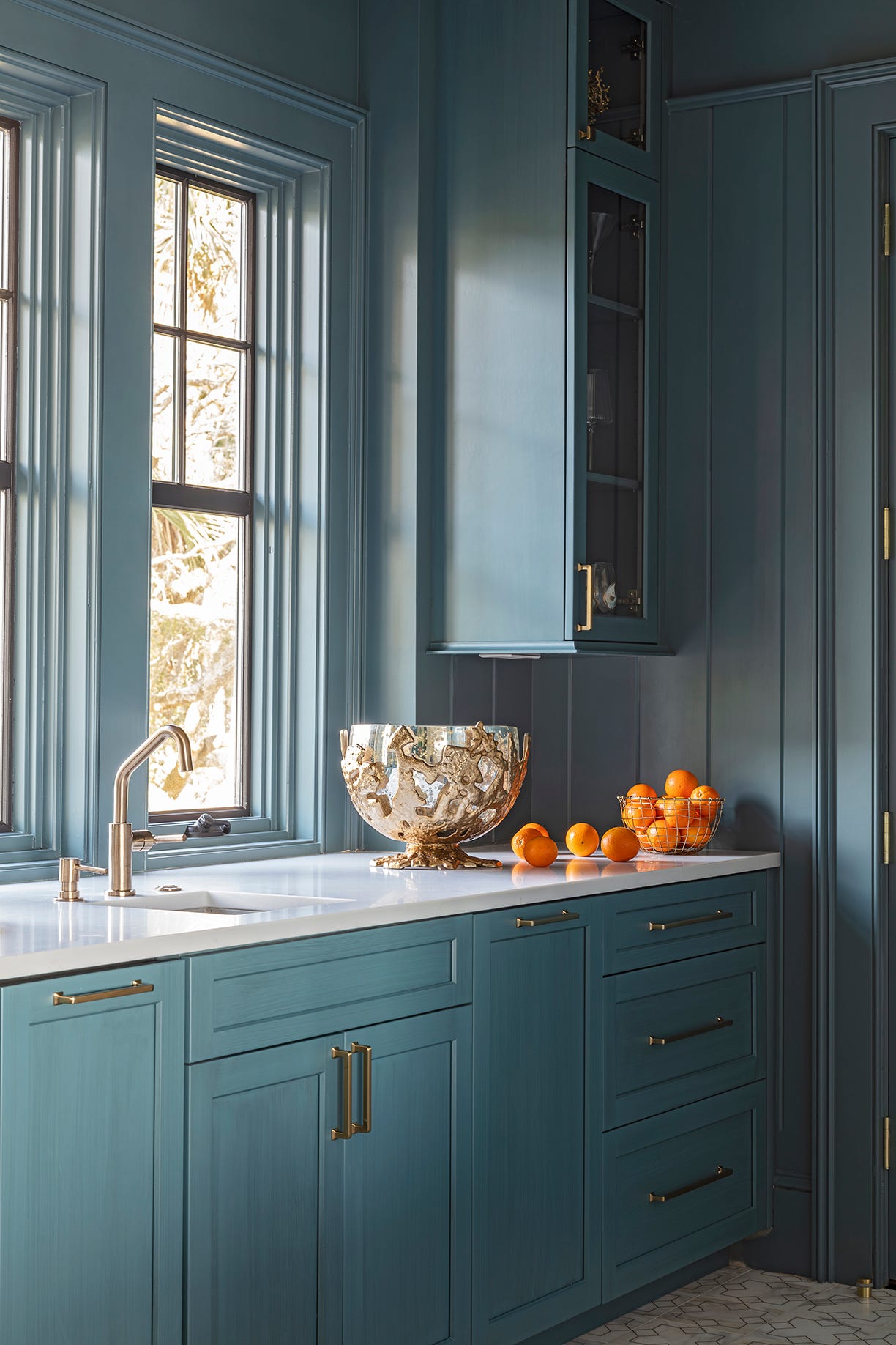
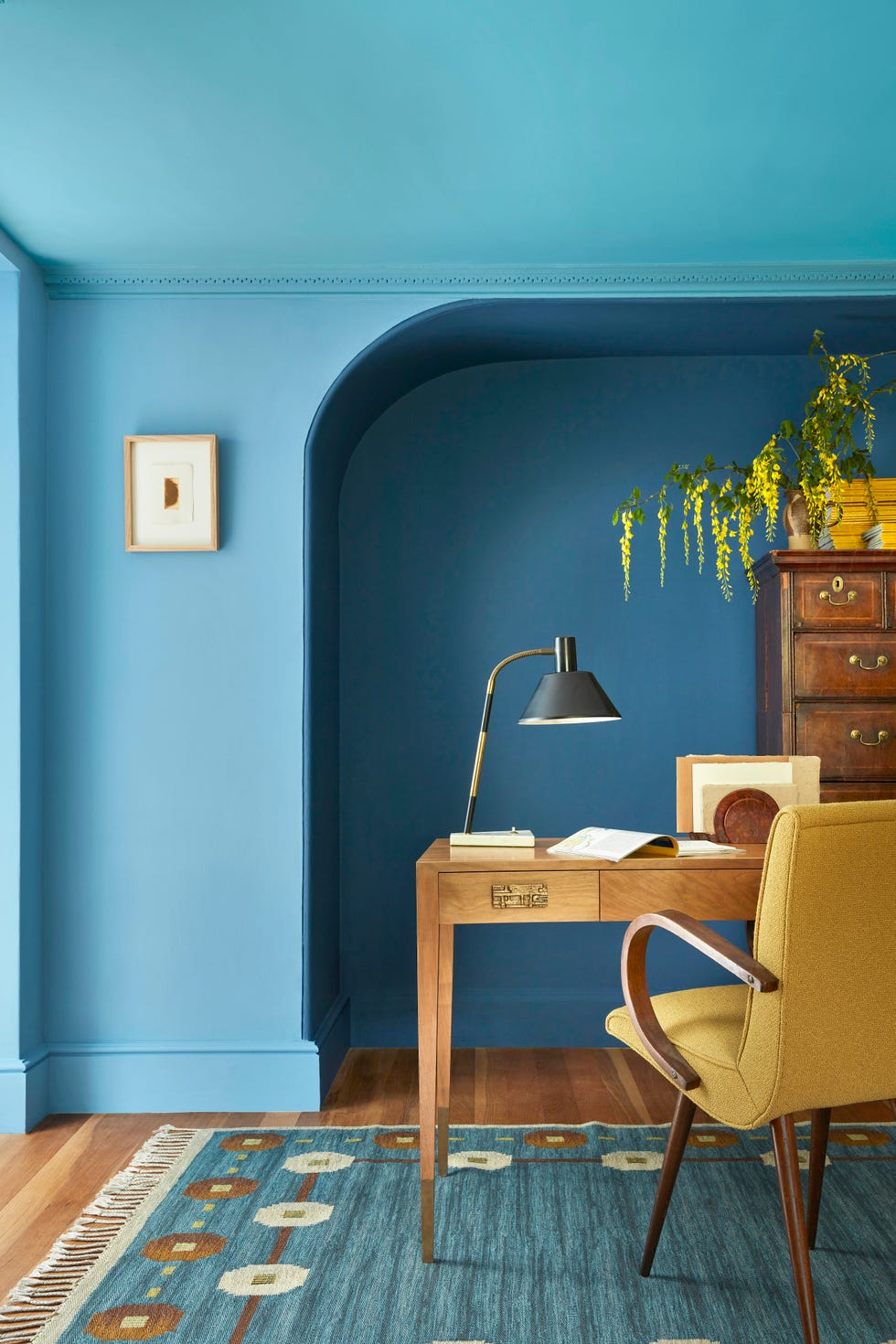
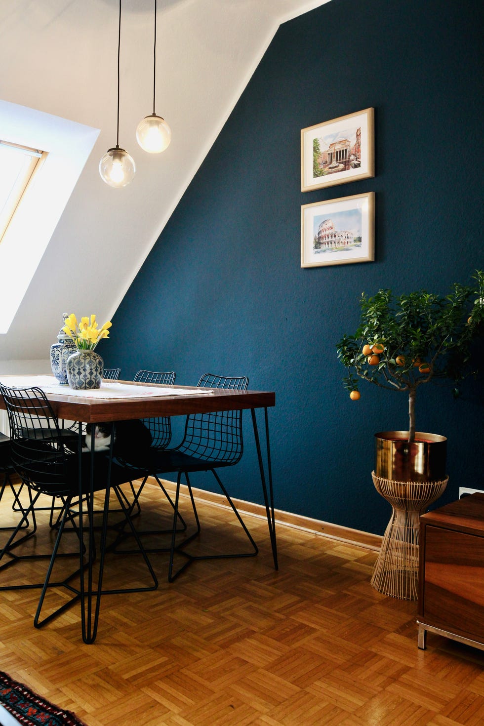
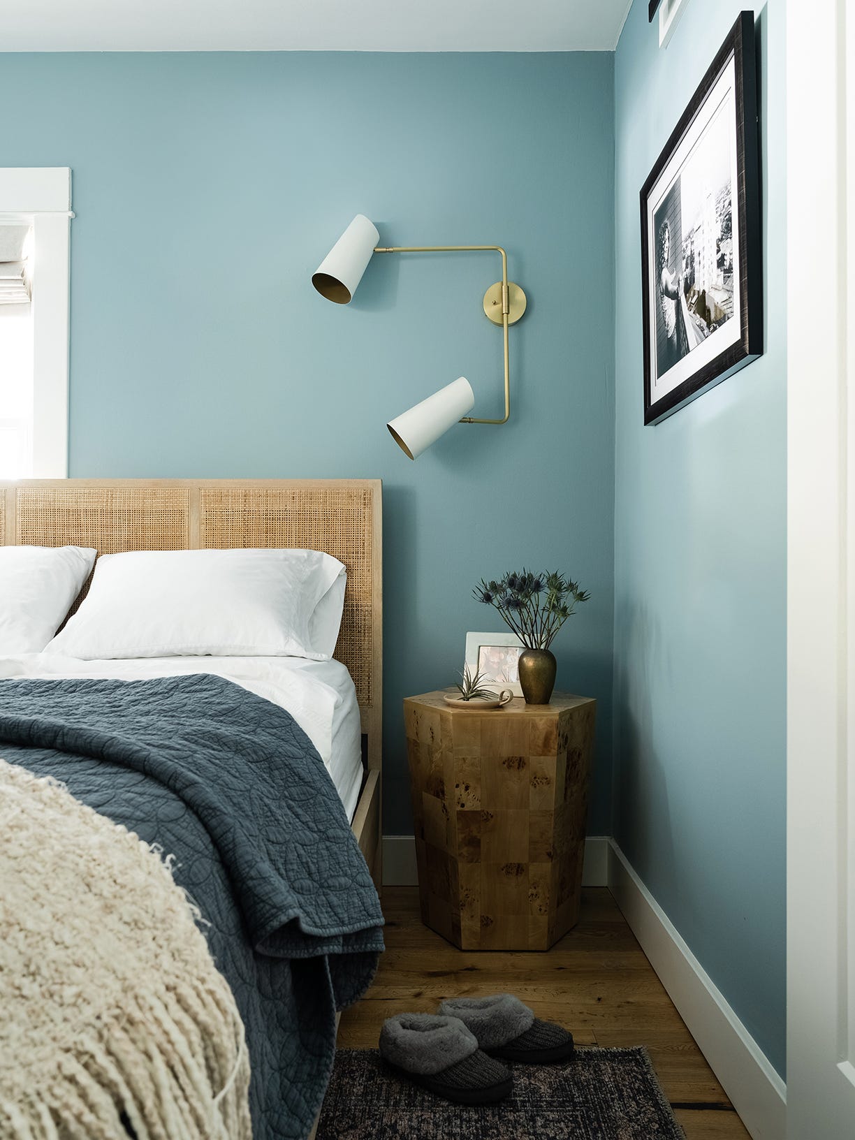
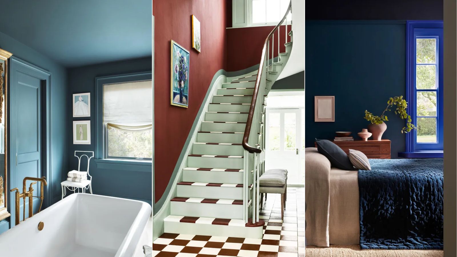
Saturated colors, especially jewel-tone blues and greens, are anticipated to be prominent. Designers emphasize using these rich colors in specific areas such as powder rooms, foyers, laundry rooms, and dining rooms to add character and depth. Examples include Sherwin-Williams’ Seaworthy and Westhaven, and Benjamin Moore’s Jojoba. Bold paint choices, when complemented by the overall design, can significantly enhance a space.
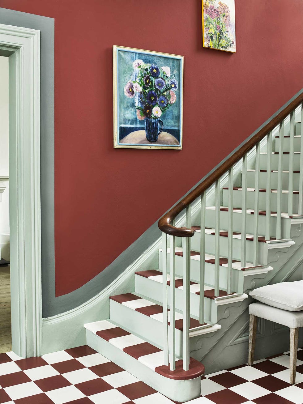
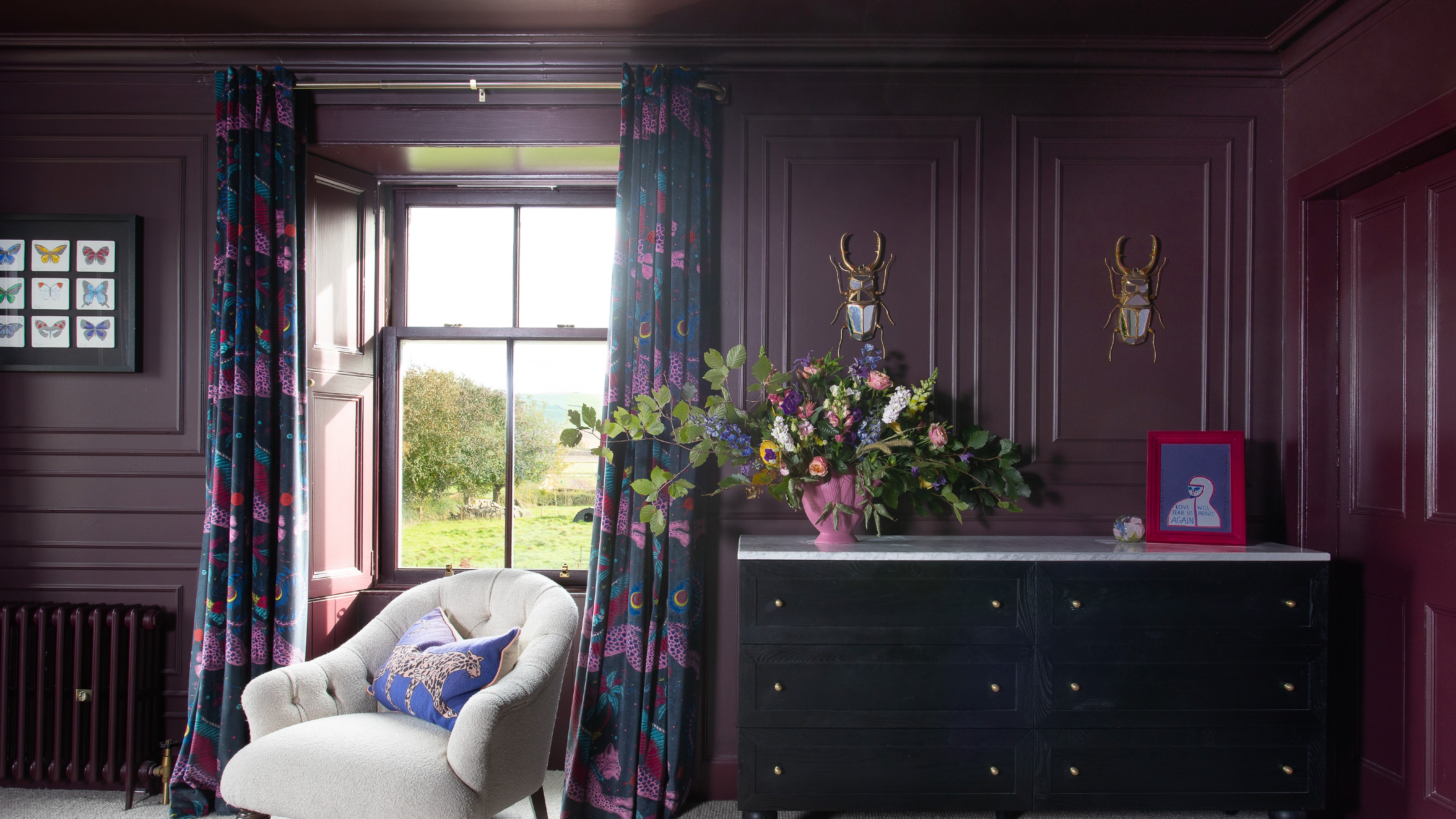
Painted staircases are another way to make a bold statement, whether it involves painting just the riser, the step, or the entire staircase. This technique can modernize antique features or soften contemporary ones, adding a playful twist to entryways or other areas. Rich shades of purple, such as aubergine, maroon, and eggplant, are also trending for cabinetry, wet bars, and other spaces where a bold element is desired, moving away from neutral tones.
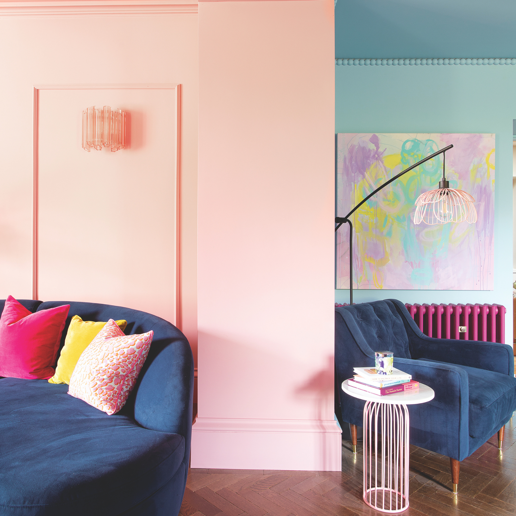
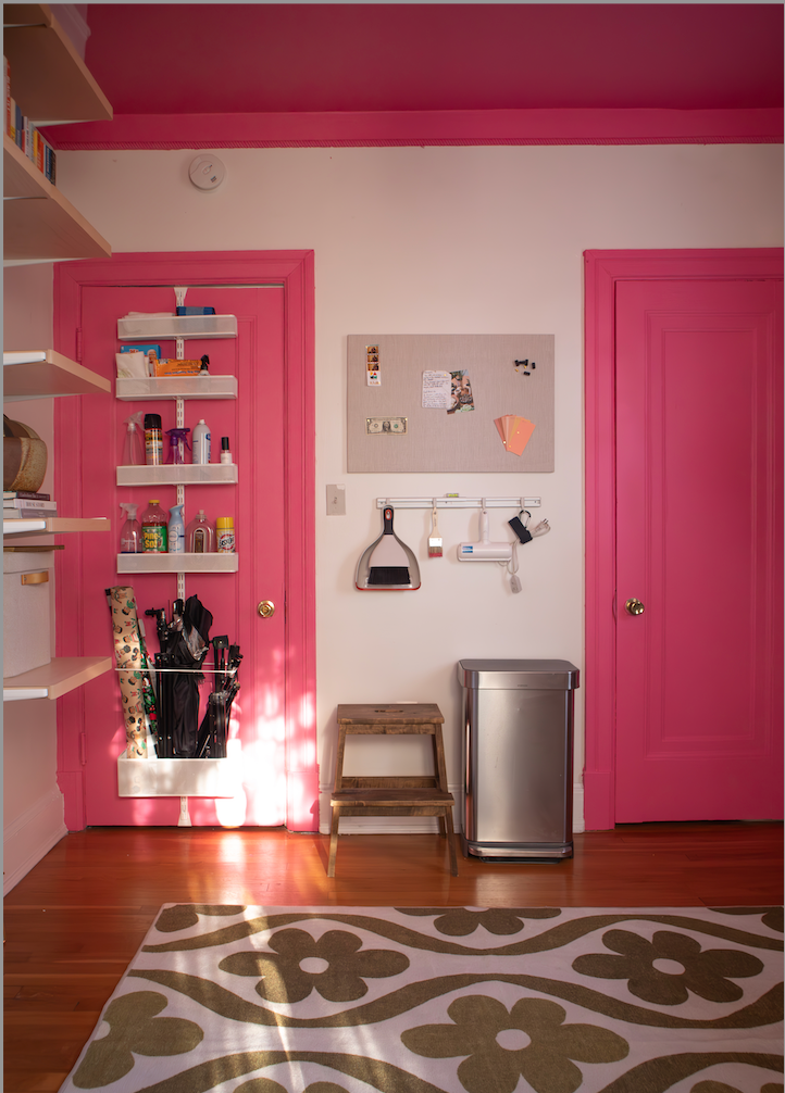
Contrasting paint finishes introduce depth and visual interest by using different sheens within a monochromatic space, such as a flat white wall with a lacquered white trim. Painting woodwork, doors, or trim in a contrasting color to the walls is also a stylish approach to highlight architectural details and add character. This offers a fresh alternative to standard white trim, allowing for subtle color introduction without overwhelming the room.
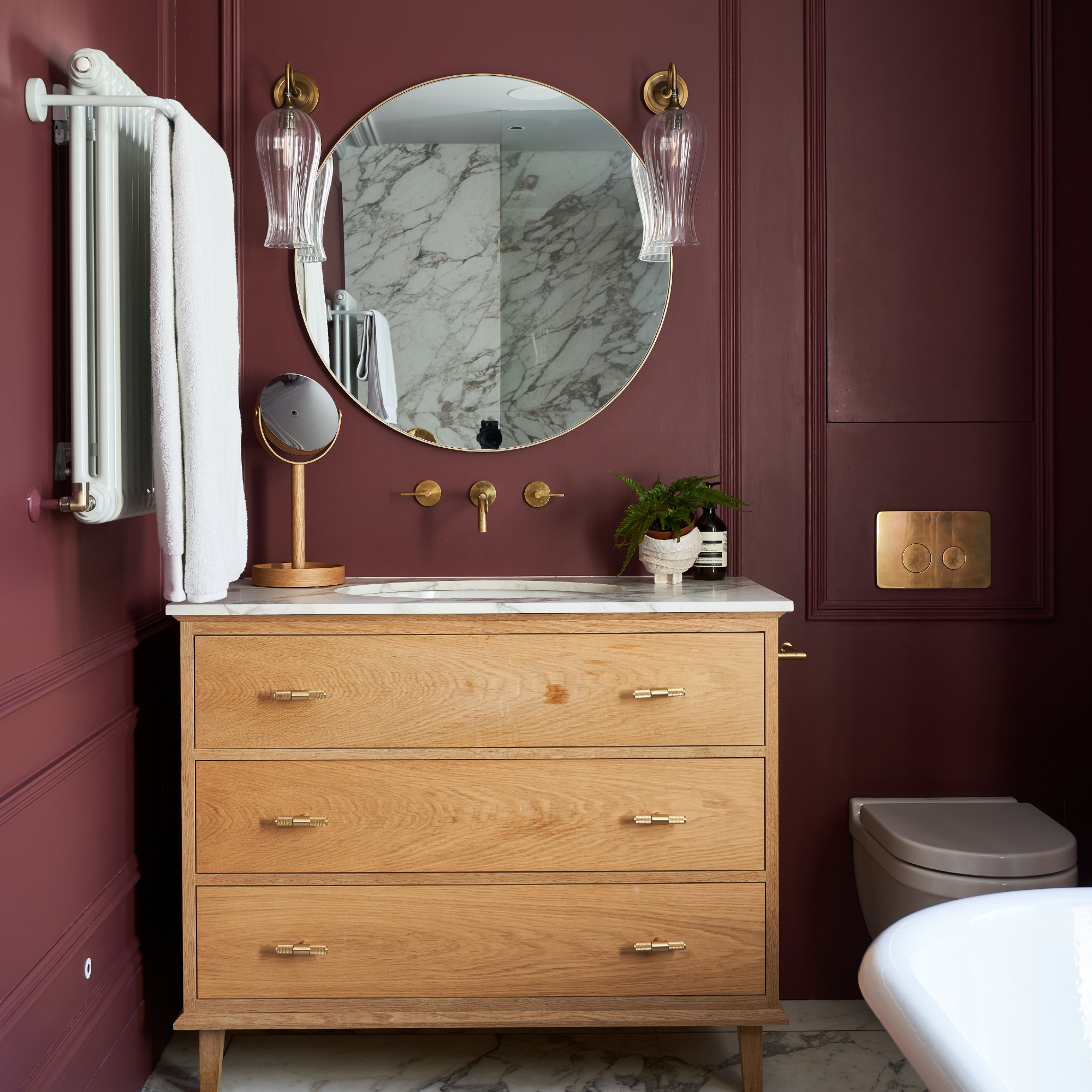
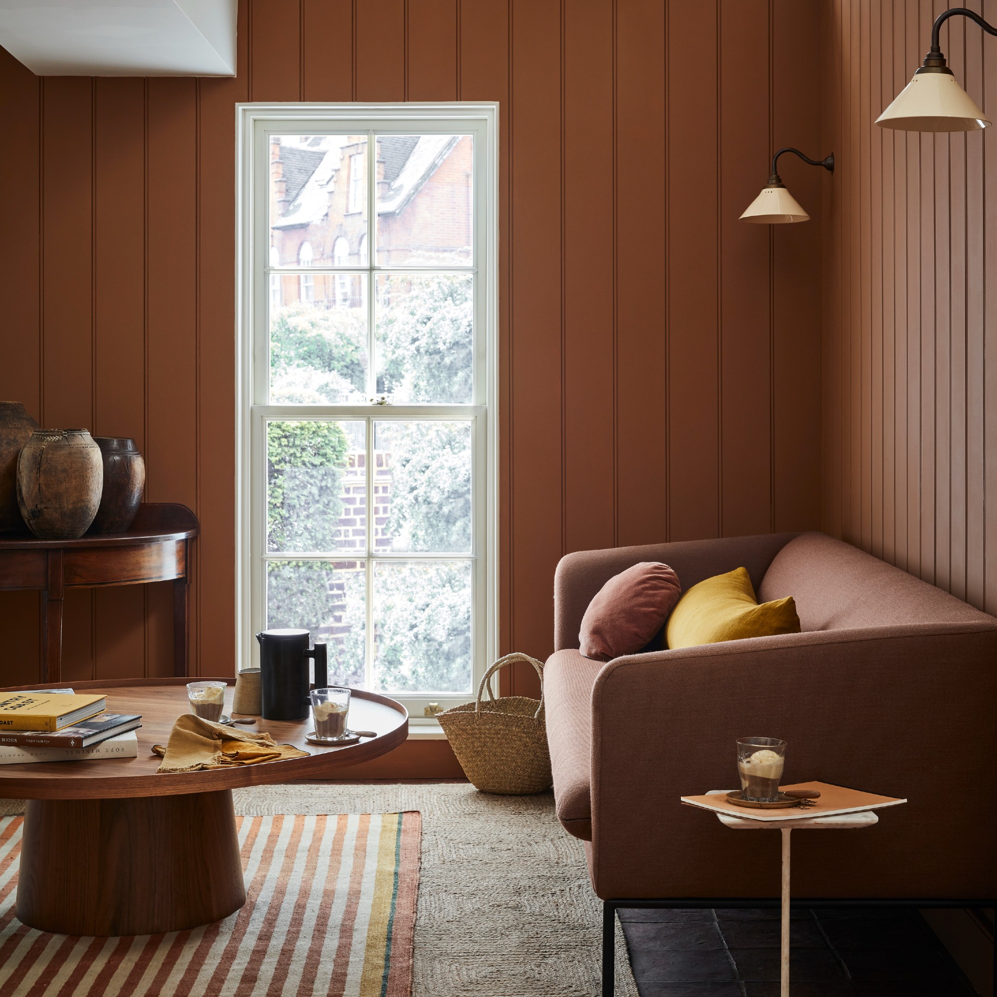
Deep reds and terracotta tones, continuing their popularity from 2024, are expected to remain in vogue. While bold, the "Unexpected Red Theory" suggests that small touches of red can elevate a room, even in neutral schemes. Rich wine reds and burgundy hues like Farrow & Ball's Brinjal are favored for creating moody and sophisticated finishes, particularly in powder bathrooms. Terracotta paints such as Farrow & Ball's Red Earth and Benjamin Moore's Persimmon provide a warmer, less intense alternative.
Darker stains for wood are a notable trend, particularly in kitchens and baths, shifting away from all-white or two-tone schemes. This involves mixing darker woods with lighter ones or opting for richer wood stains over the pale, minimalist Scandinavian styles. Caramels that verge on yellow are gaining popularity as warm neutrals, providing depth and an inviting feel. These sandy shades work well in north-facing rooms or those lacking natural light, blending with natural materials and patterned fabrics.
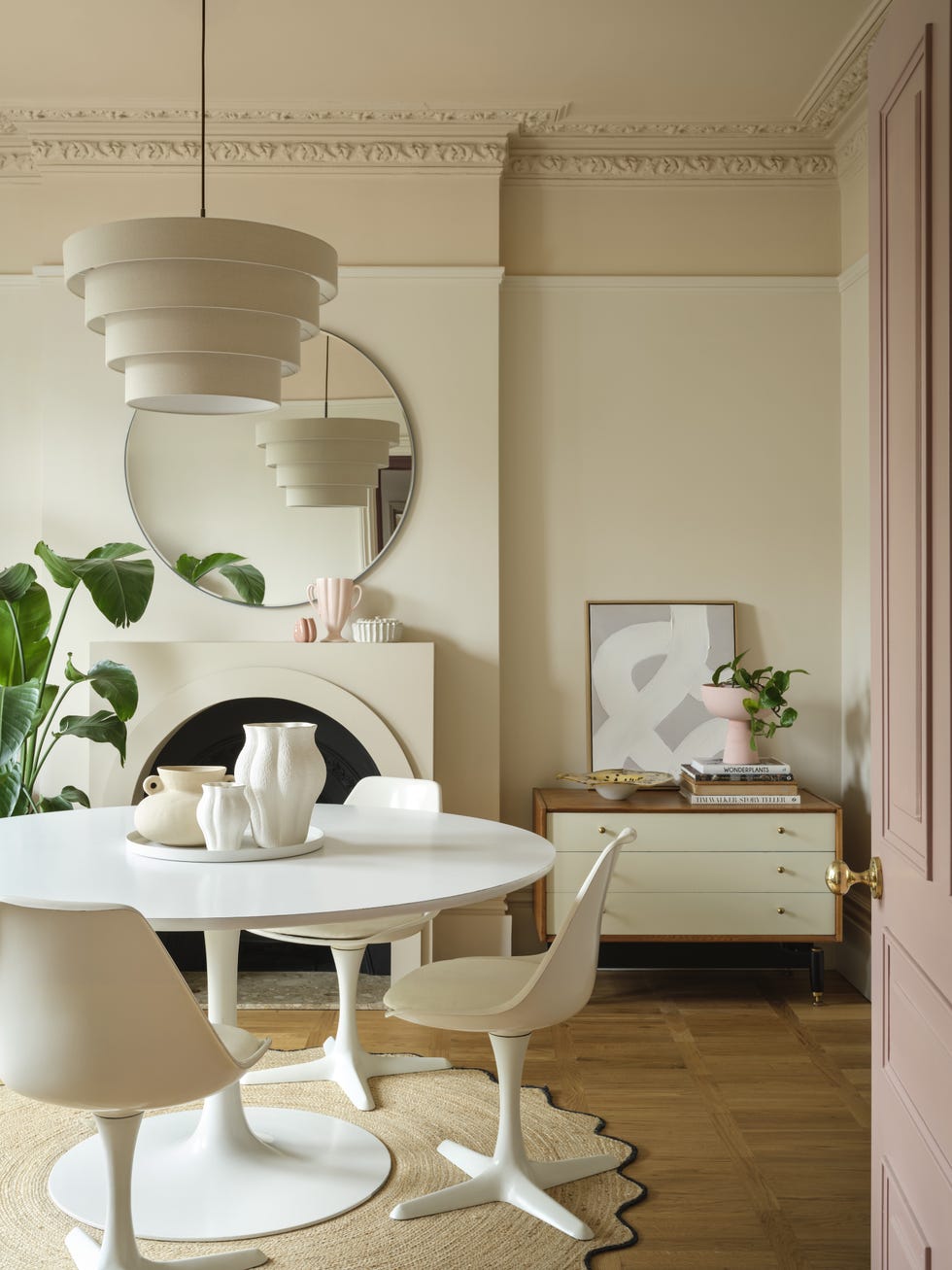
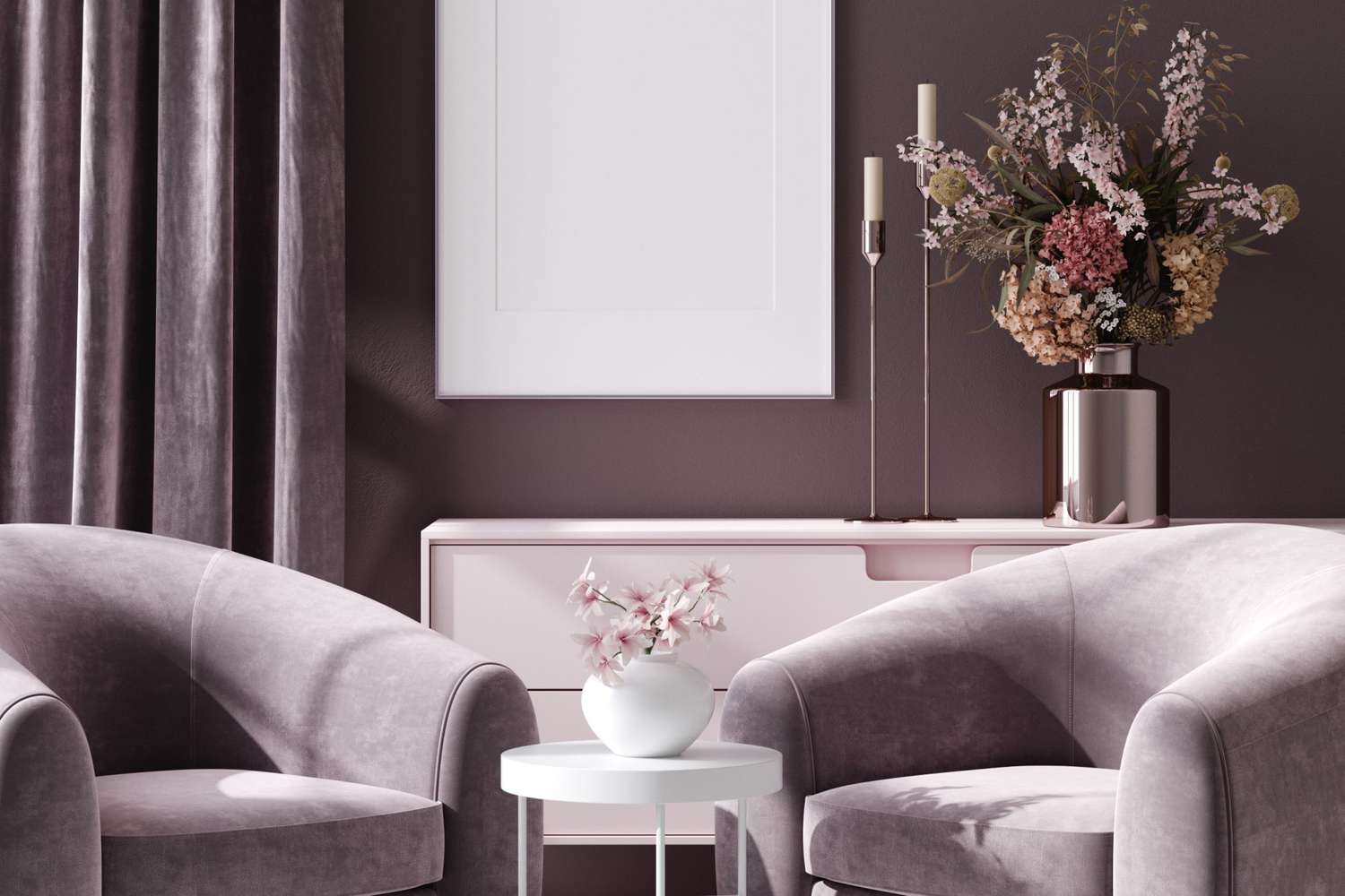
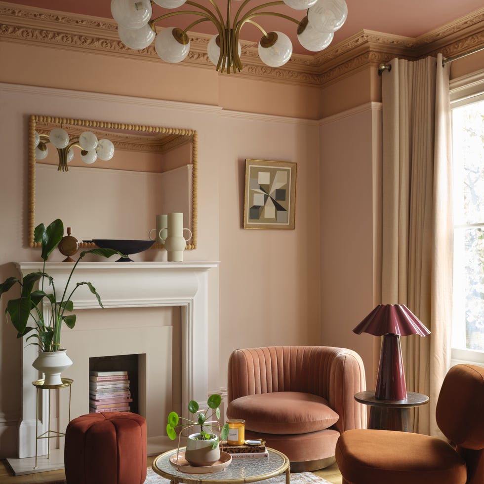
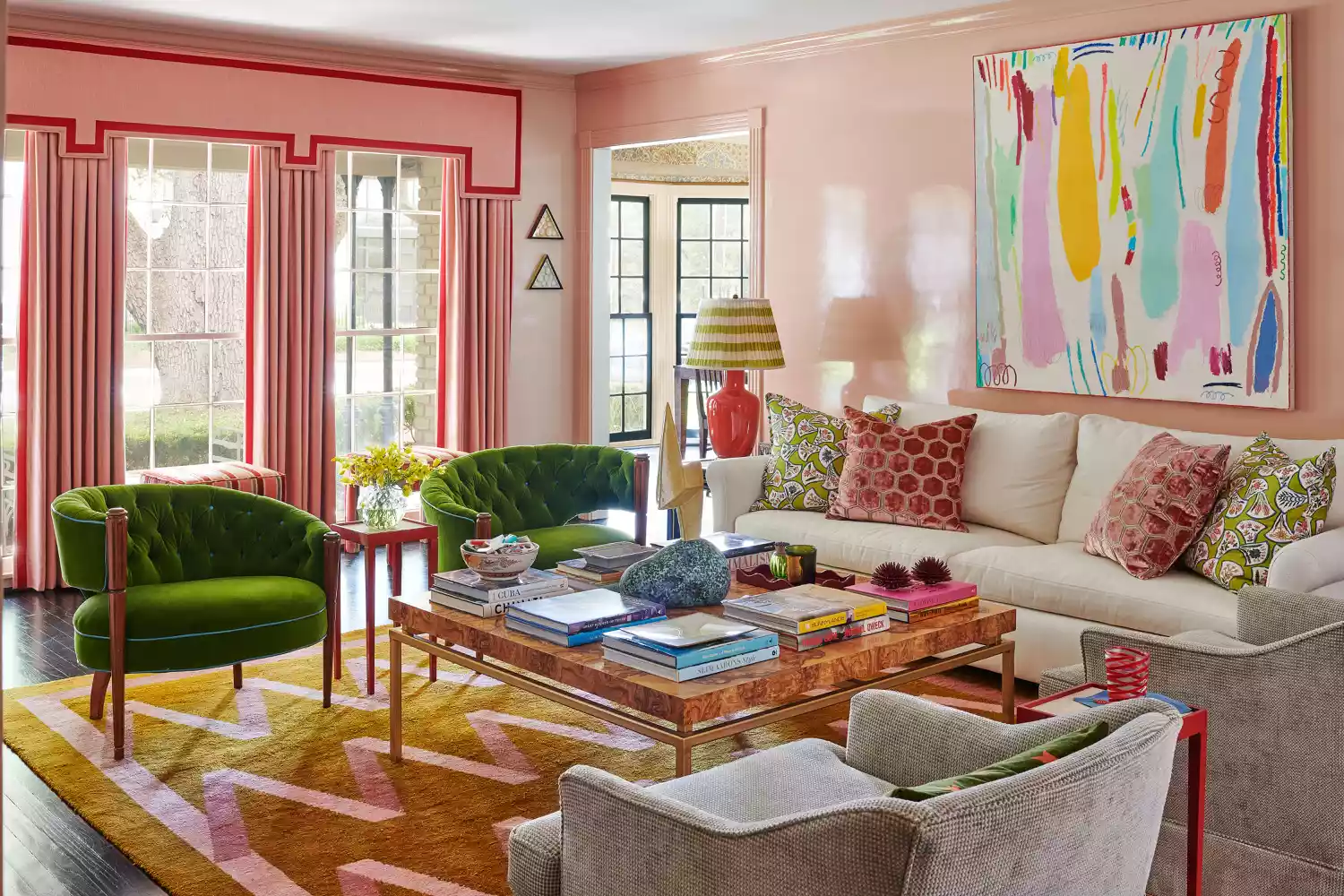
Closely considered shades and tones emphasize curated color pairings that add energy and depth to a space. Monochromatic schemes use shades of the same color for subtle contrast, while analogous schemes employ adjacent tones on the color wheel for a more adventurous look. Complementary tones, taken from opposite sides of the wheel, create drama while maintaining harmony. Clay tones, including plaster pinks, pale beiges, and soft brown-tone grays, are ideal for light neutral rooms, creating calming and spacious environments. Using lighter tones on walls and stronger tones on trim can make rooms feel larger.
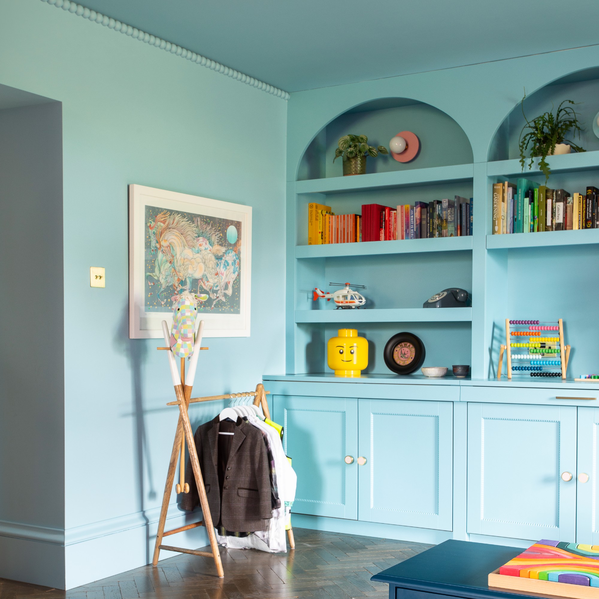
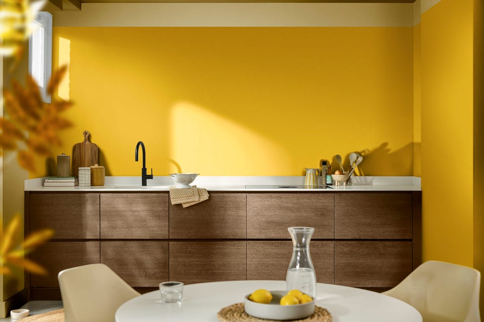
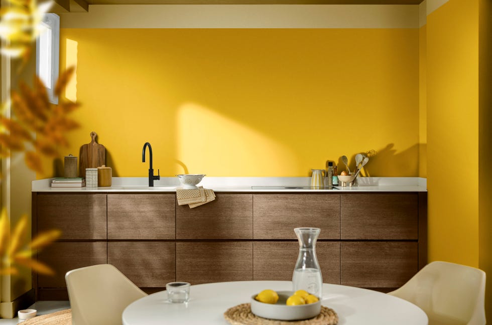
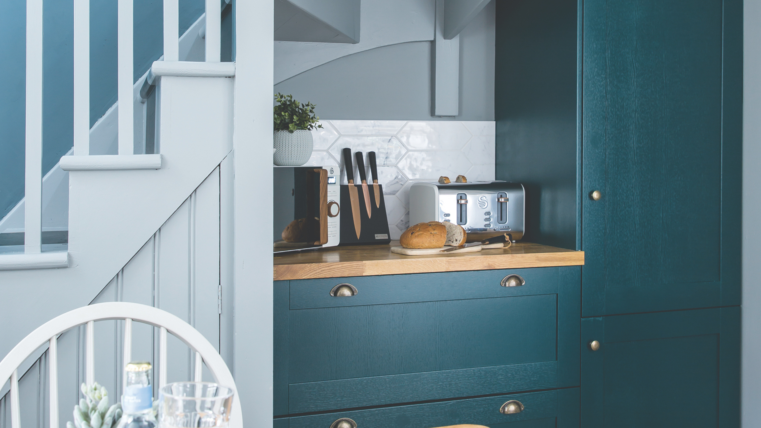
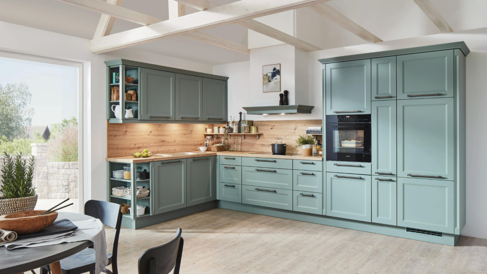
Finally, painting the ceiling, often referred to as the "fifth wall," is emerging as a fun and unexpected trend. This is particularly appealing in children's rooms, adding a vibrant touch without overwhelming the space, and is also recommended for other areas to introduce an element of surprise. Mixing and matching unexpected paint colors, looking to the color wheel for guidance, can create eclectic and individual looks, rich with visual interest, as demonstrated by playful combinations of blue and green in modern kitchens.
#PaintTrends #InteriorDesign #HomeDecor #ColorSchemes #NeutralPalette #SaturatedColors #LimewashWalls #ColorDrenching #MatteFinishes #PaintTrends #InteriorDesign #HomeDecor #ColorSchemes #NeutralPalette #SaturatedColors #LimewashWalls #ColorDrenching #MatteFinishes
0 comment in total
You may also like
Paint trends 2025 – the 9 shades, colour schemes and paint techniques you’ll be obsessed with this year
Is colour drenching still on trend for 2025? Experts reveal how the popular paint trend is evolving in the new year
The 10 decoration trends to watch out for in 2025
9 Trending Paint Colors You'll See Everywhere in 2025, According to Designers
Colour experts share their top paint trends for 2024

The Best Furniture Paint of 2025

5 Paint Colors That Are Out for 2025, According to Interior Designers

The Best Cabinet Paint of 2025
The #1 Paint Color Trend of 2025, According to Designers

Every 2025 Color of the Year We Know So Far—and Inspiration for How to Use Each in Your Home

Interiors experts predict this will be the biggest paint trend of 2026

Interior paint colour trends 2025: 10 hues you'll be seeing everywhere this year

7 Interior Paint Color Trends You'll See Everywhere In 2025
Designers Predict This Will Be The Biggest Paint Trend Of 2026

These 5 Paint Color Trends Will Be Everywhere in 2024, According to Interior Designers
12 Trending Paint Colors for 2024, According to Design Experts
8 Stunning Paint Trends To Keep Your Home's Interior Fresh In 2025
This British Paint Trend Is Set to Take Over 2026
Meet 'colour capping', the paint trend set to take over 2026
Every 2025 Color of the Year We Know So Far