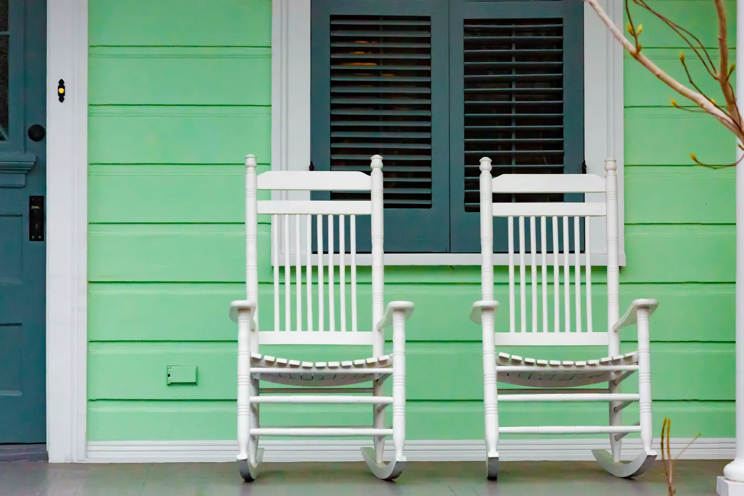
5 Paint Colors to Never Use on Your Front Porch, According to Interior Designers
Choosing the right paint color for a front porch is crucial for enhancing curb appeal and ensuring durability, as interior designers advise against certain hues that can lead to maintenance issues or aesthetic clashes. Dark shades, for instance, absorb more heat and are prone to peeling faster, while excessively bright colors may conflict with the home’s exterior and surrounding natural environment. Even colors that are currently trending can be problematic if they don’t align with the home's architectural style and overall aesthetic. Furthermore, considering the local climate and the amount of sunlight the porch receives is essential before making a paint selection.
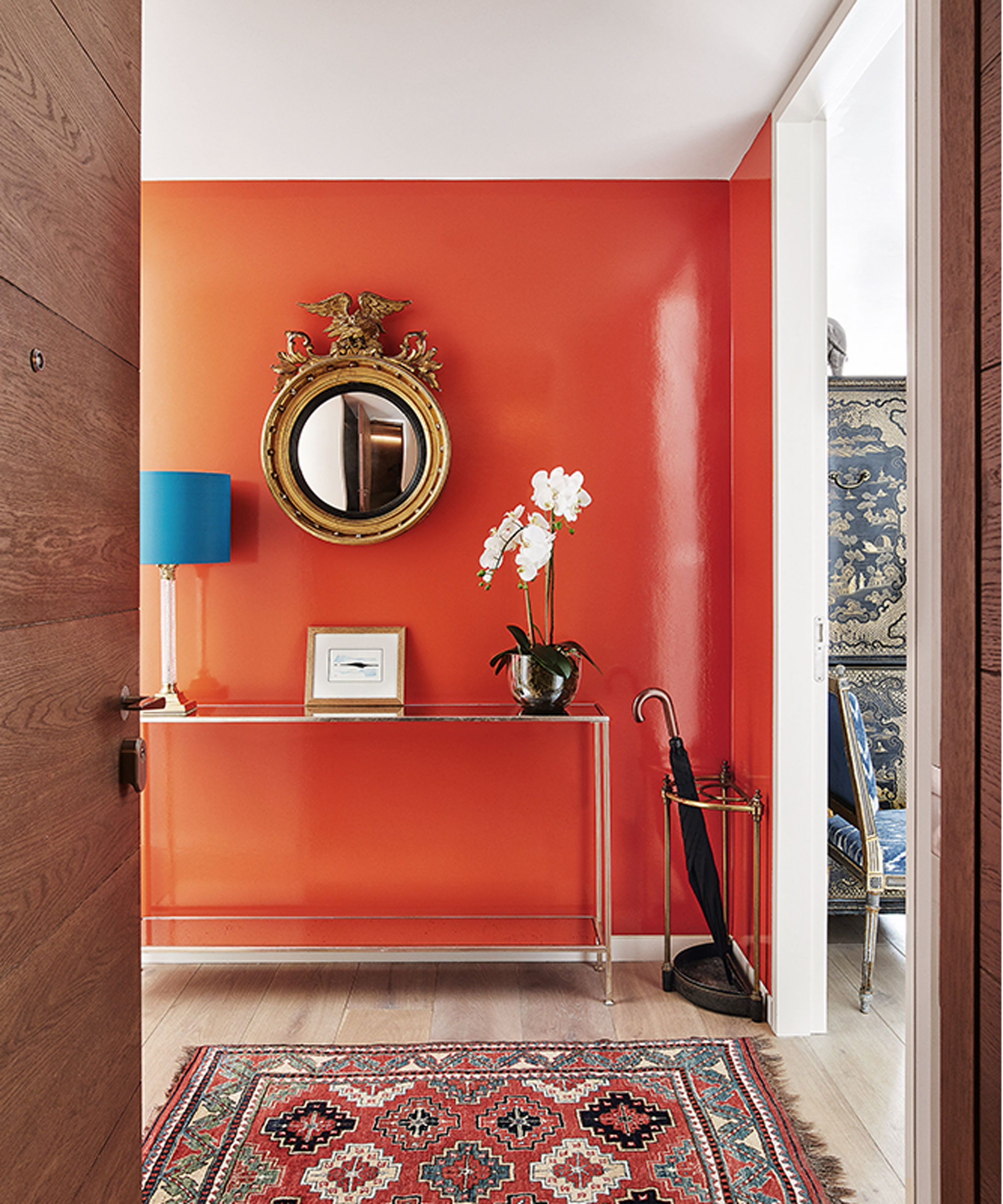
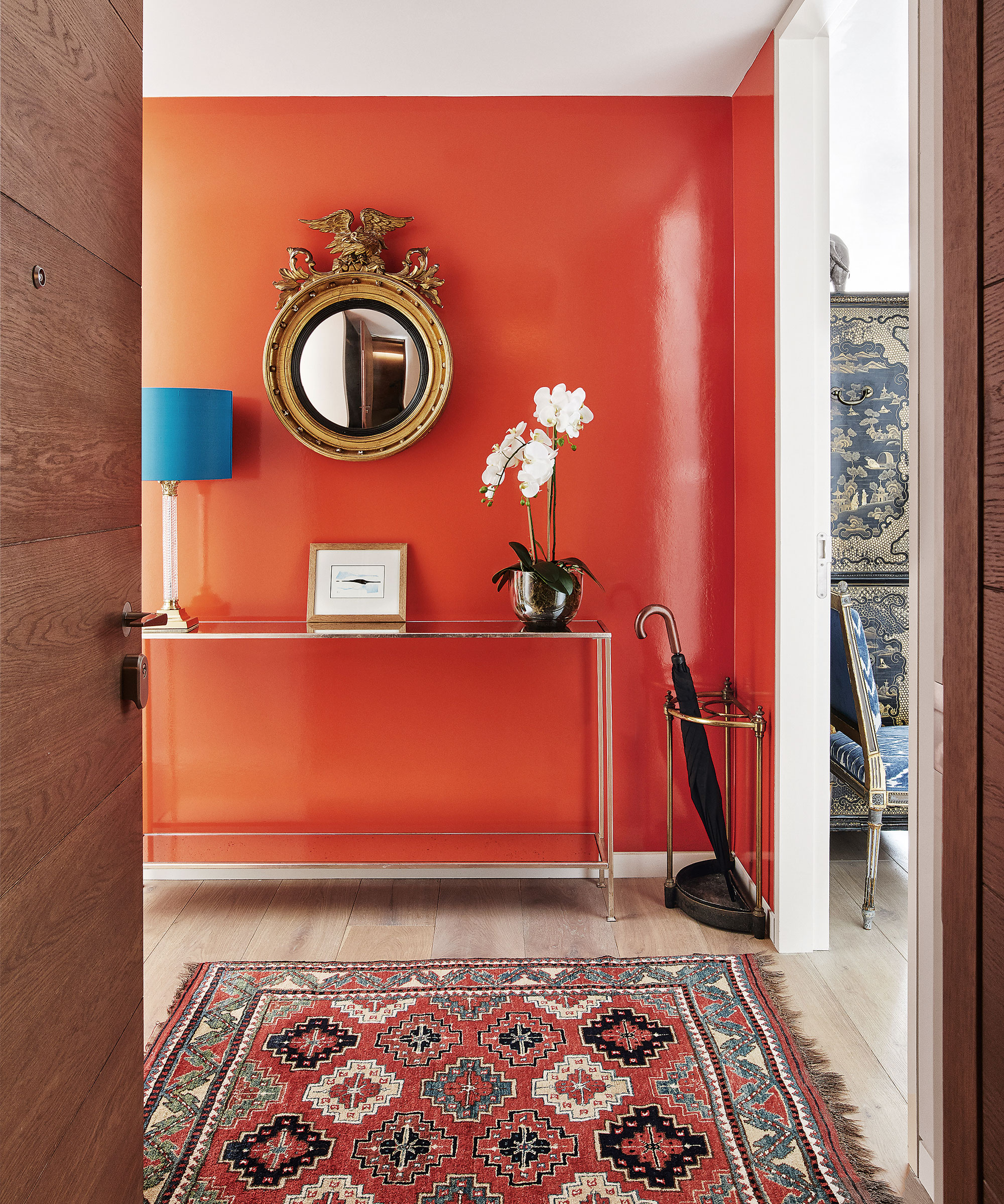
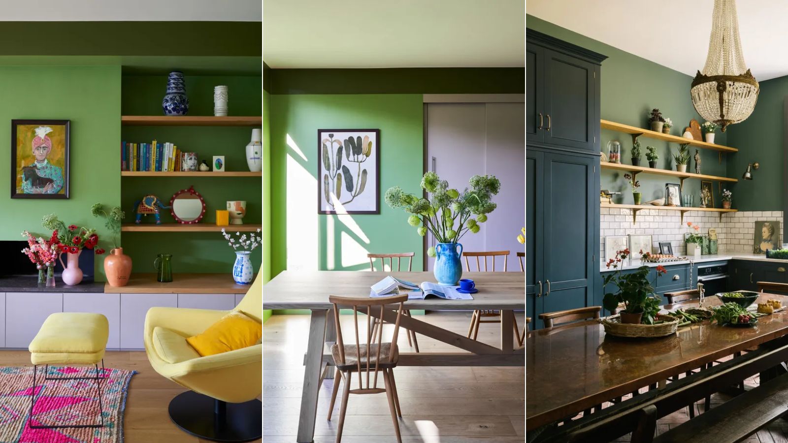
Fluorescent, highly saturated, or extremely bright colors like hot pink are generally discouraged by experts. Such colors rarely complement natural surroundings or neighboring homes and can appear out of place. Beyond aesthetic concerns, these bold hues, including bright reds, yellows, and deep blues, tend to fade quickly due to their lower UV resistance, leading to a less vibrant appearance over time. While some distinctive architectural styles, like Victorian homes, might successfully incorporate vibrant colors, most porches benefit from softer, more neutral tones that offer a timeless and polished look without overpowering the exterior.
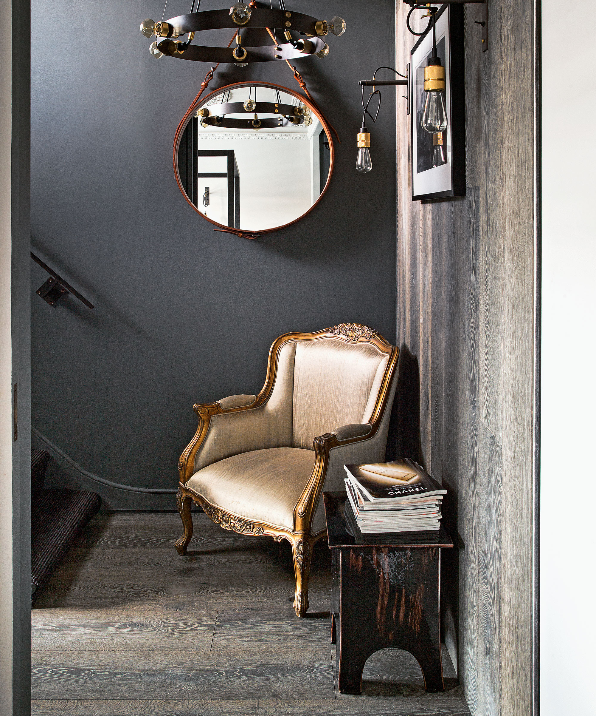
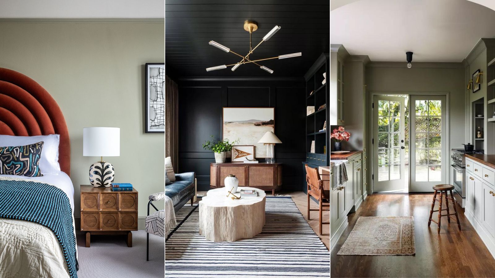
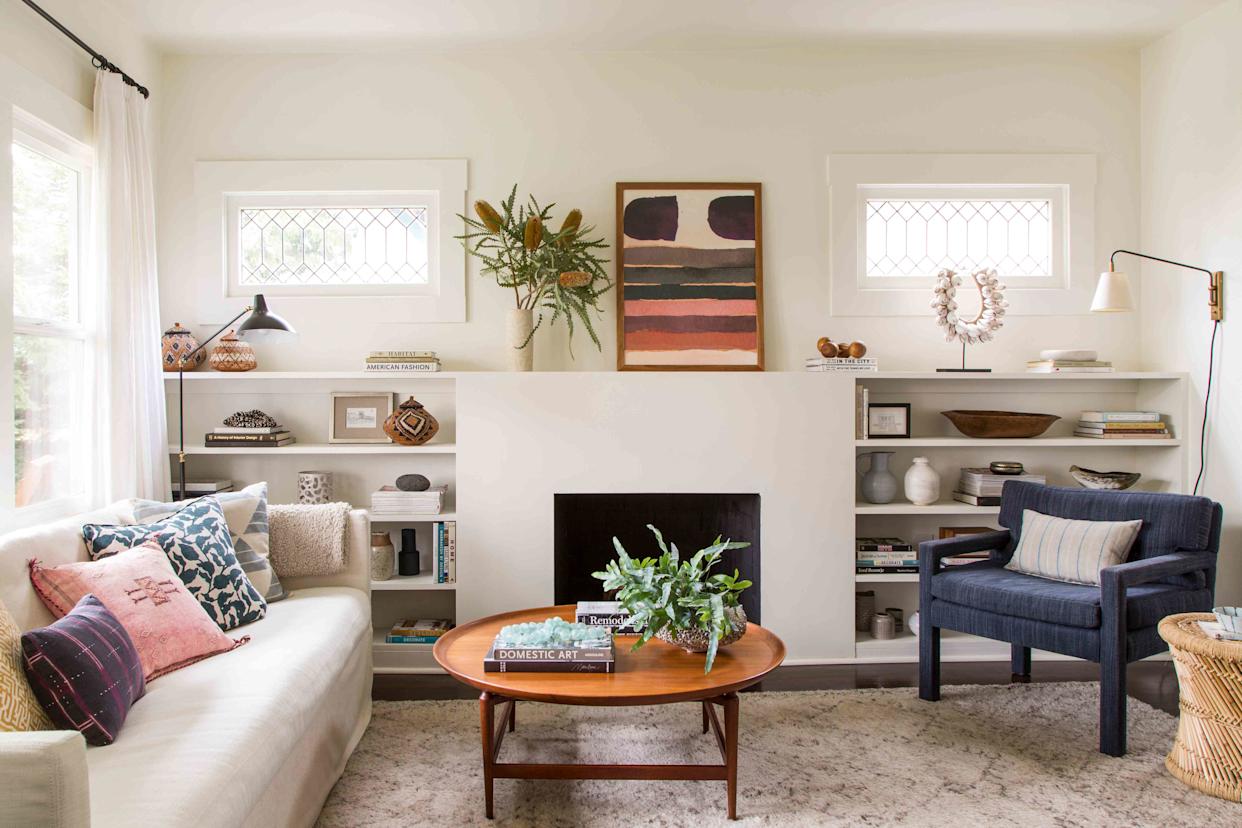
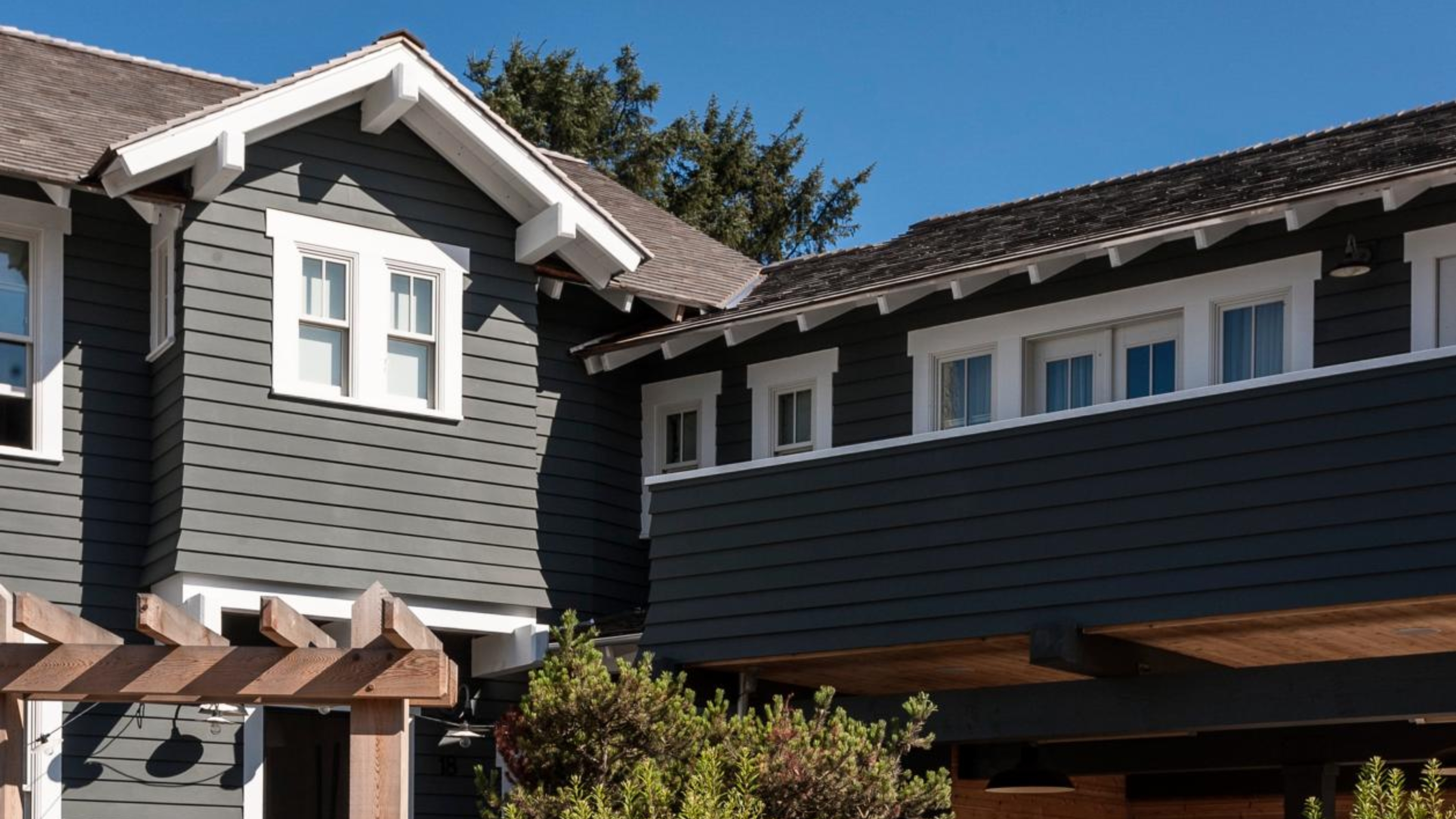
Dark colors, such as charcoal, also present challenges. While they can create a dramatic effect or visually reduce the size of a porch, they absorb and trap heat. This characteristic makes them unsuitable for homes in hot climates, where they can contribute to discomfort and faster paint deterioration. In contrast, lighter colors reflect heat and contribute to an airy feel, though they typically require more frequent cleaning to maintain their fresh appearance. The objective is often to choose a porch color that subtly differentiates itself from the rest of the house, with matching the trim being a classic and reliable approach to achieve a cohesive look.
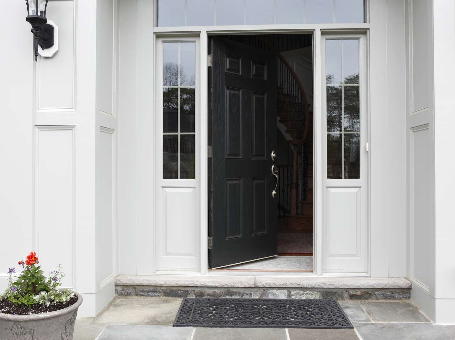
Bright white, despite its classic and clean appeal, is another color interior designers recommend avoiding due to its impracticality. It readily shows every speck of dirt, dust, and grime, demanding constant upkeep. Conversely, very dark shades can highlight mildew and pollen accumulation, particularly in humid conditions. Designers suggest opting for earthy tones, soft neutrals, or muted blues, which not only integrate harmoniously with outdoor settings but also effectively conceal dirt and minimize cleaning efforts. Practical color choices save time and money on maintenance, ensuring the porch remains appealing for an extended period.
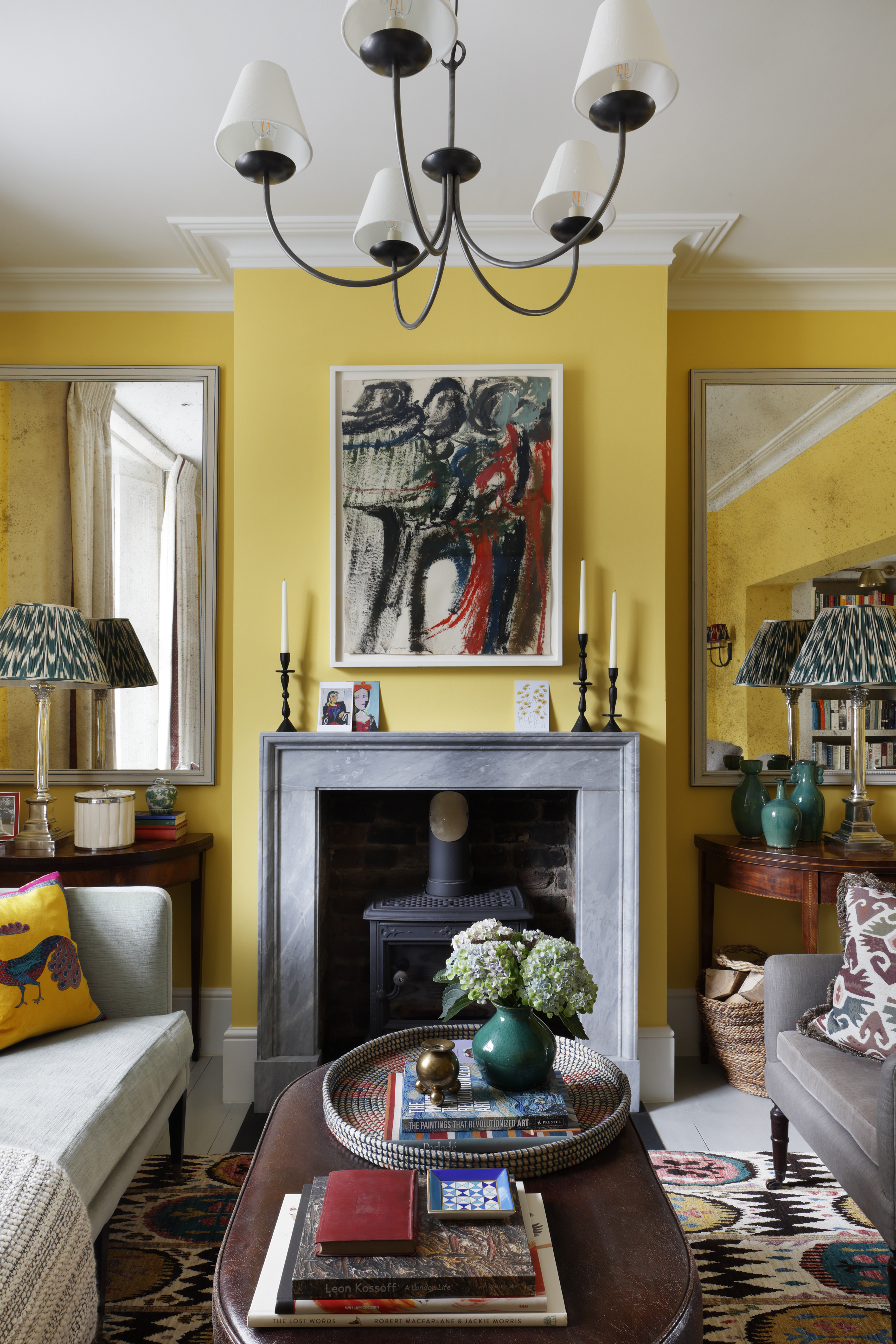
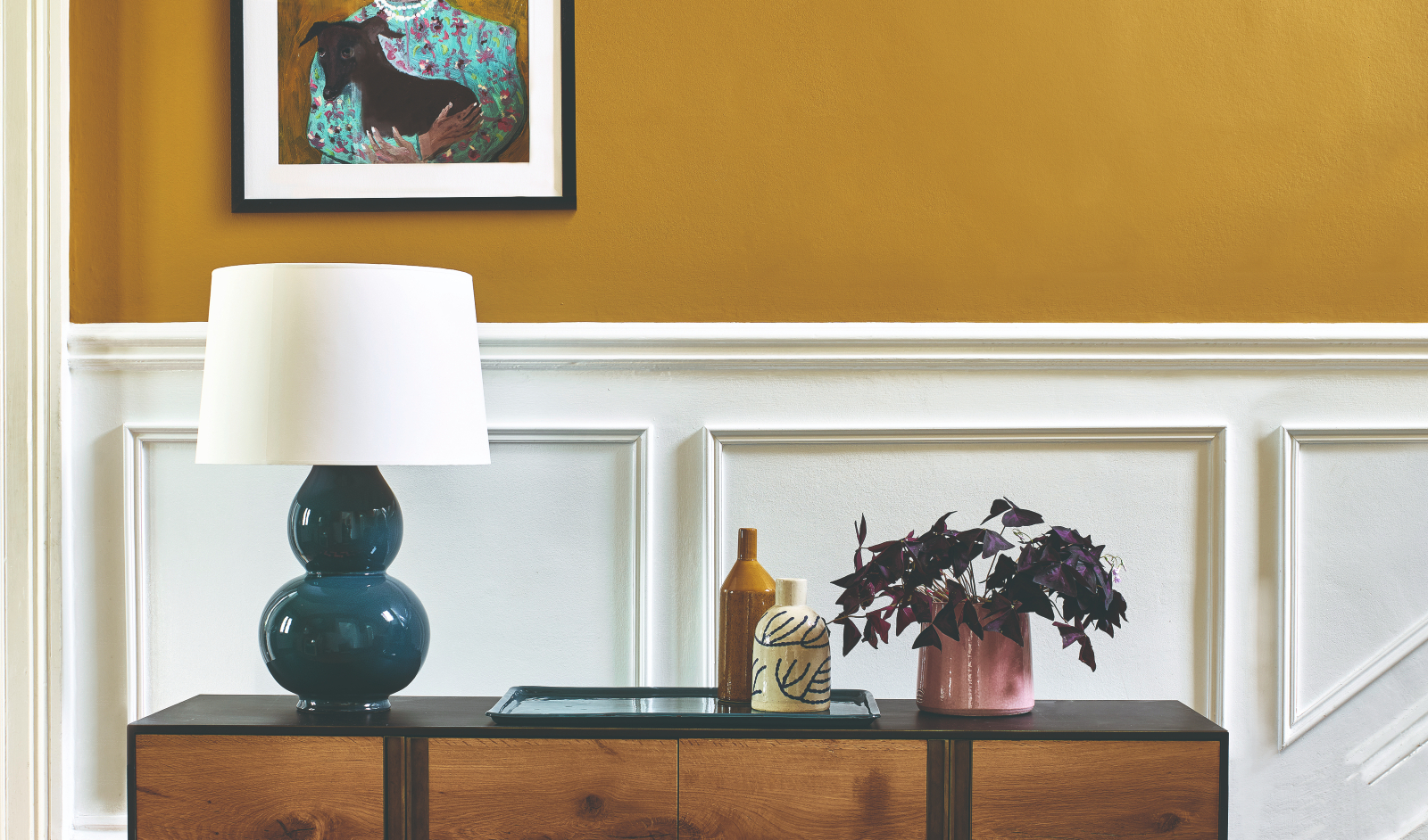
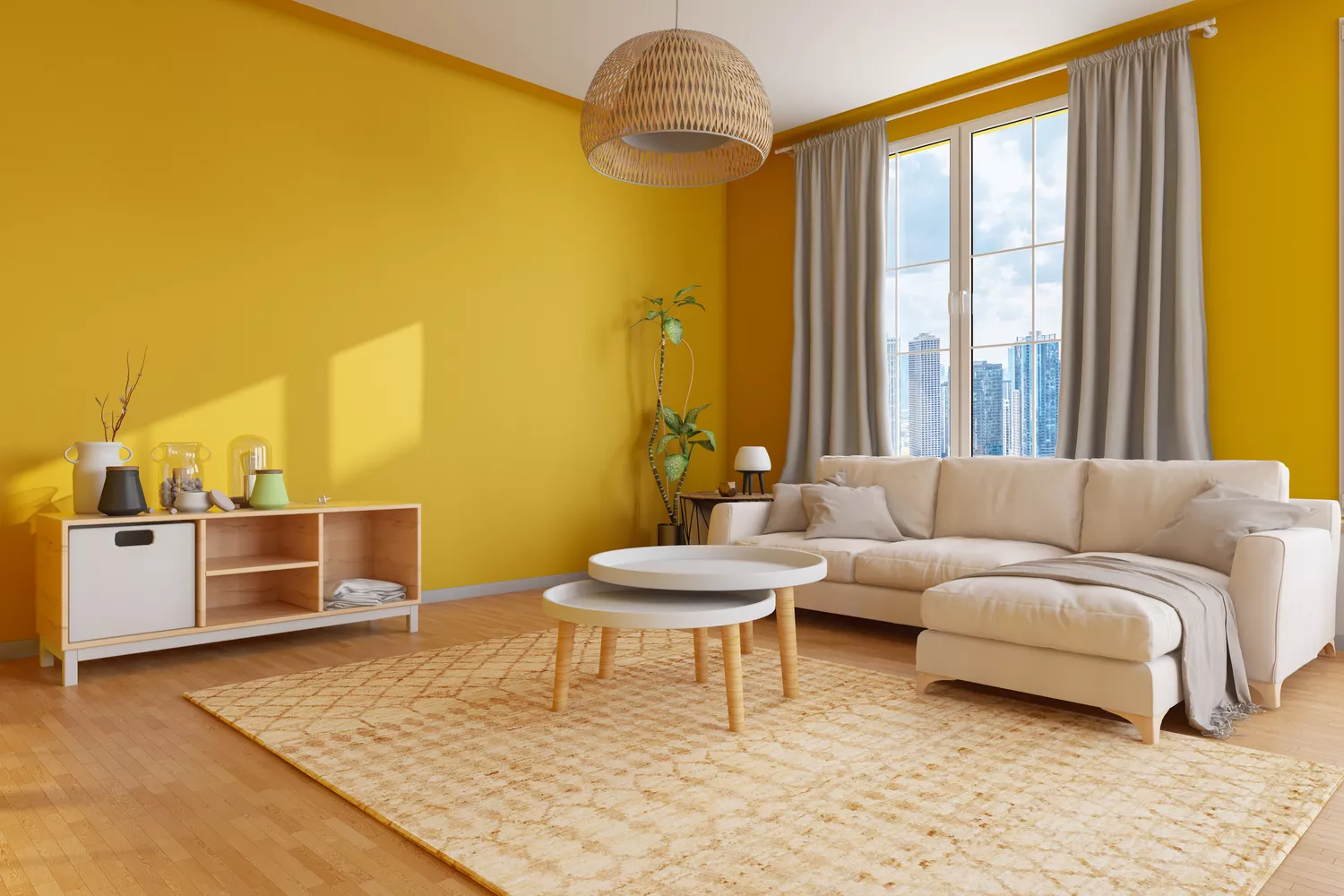
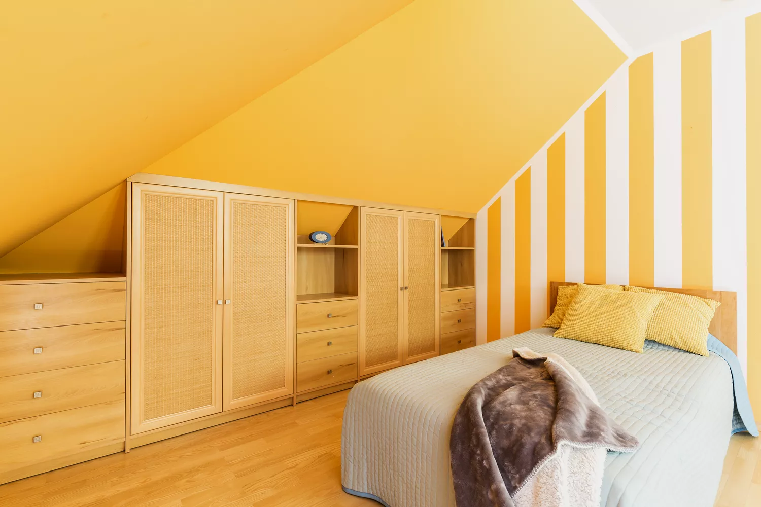
Yellow, while often perceived as cheerful, is a difficult color to execute successfully on a porch. Bright yellows can be overwhelming and visually jarring against the home's exterior, while pale yellows often appear faded or washed out under direct sunlight. Yellow is also notorious for fading rapidly, especially in sun-exposed areas, quickly losing its initial vibrancy. Its versatility in matching with various trim and exterior colors is limited, often making it a high-maintenance option. For those seeking warmth, muted gold shades are recommended as they offer a similar welcoming ambiance without the associated upkeep and fading issues.
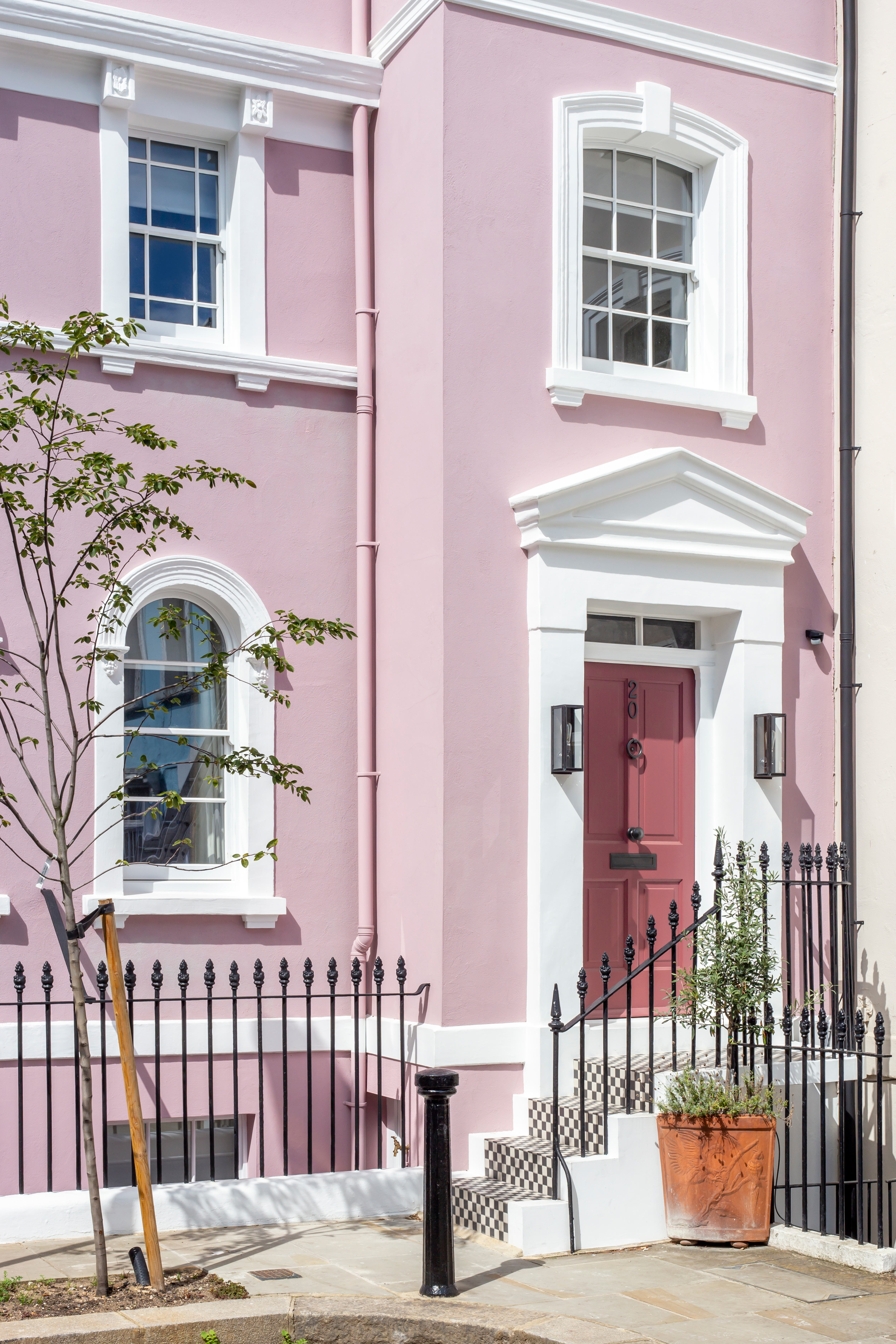
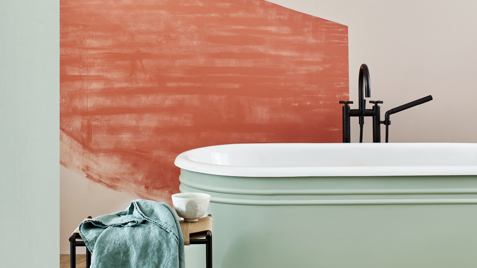
Lastly, light pastels, like pale pink or soft mint, are generally not ideal for porches. When exposed to bright sunlight, these delicate shades tend to look washed out or almost white, diminishing their intended impact. Similar to white, light pastels easily show dirt and scuff marks, necessitating frequent cleaning to preserve their pristine look. Muted pastels, characterized by subtle gray or earthy undertones, provide greater depth and blend more naturally with the outdoor environment, requiring less maintenance. Colors that mimic natural, atmospheric hues, such as an egg blue, can also be effective, creating an illusion of higher ceilings and making spaces feel larger.
#PorchPaintColors #HomeExterior #CurbAppeal #InteriorDesignTips #PaintMaintenance #HomeImprovement #ColorPsychology #ExteriorDesign #PorchPaintColors #HomeExterior #CurbAppeal #InteriorDesignTips #PaintMaintenance #HomeImprovement #ColorPsychology #ExteriorDesign
0 comment in total
You may also like
5 colors you should never paint your entryway – according to interior experts

You should avoid these 5 entryway colors in 2023 – according to top designers
5 colors to avoid in a bathroom – according to designers
6 Colors You Should Never Paint Your Entryway, According to Color Experts

5 colors you should never paint a small room – designers warn us to steer clear of these hues, and what to pick instead
5 colors to never pair with green according to designers – and what to use instead
8 Paint Colors You Should Never Use For Your Front Door
8 colors you should never paint kitchen cabinets according to the experts

5 colors you should never paint a pantry – designers share the shades they swerve
5 Colors You Should Never Paint Your Hallway, According to Designers
What are the worst colors to paint a room? The shades experts say you should never use
Outdated Entryway Paint Colors To Avoid In 2025 (And What To Try Instead)
5 Paint Colors to Never Use in Your Living Room, According to Interior Designers
5 colors to avoid painting a landing – and the secret to choosing the right shades
4 Outdated Colors Designers say you Should Steer Clear of When Decorating a Living Room

An interior designer reveals the 5 mistakes to avoid when painting with dark colours

5 Paint Colors That Experts Say You Shouldn't Use in 2025

5 Exterior Paint Mistakes to Avoid If You Don't Want Your House to Become the Worst-Looking on the Street
5 rug colors to avoid – the hues designers think you should veer away from on floors, plus how to make them work
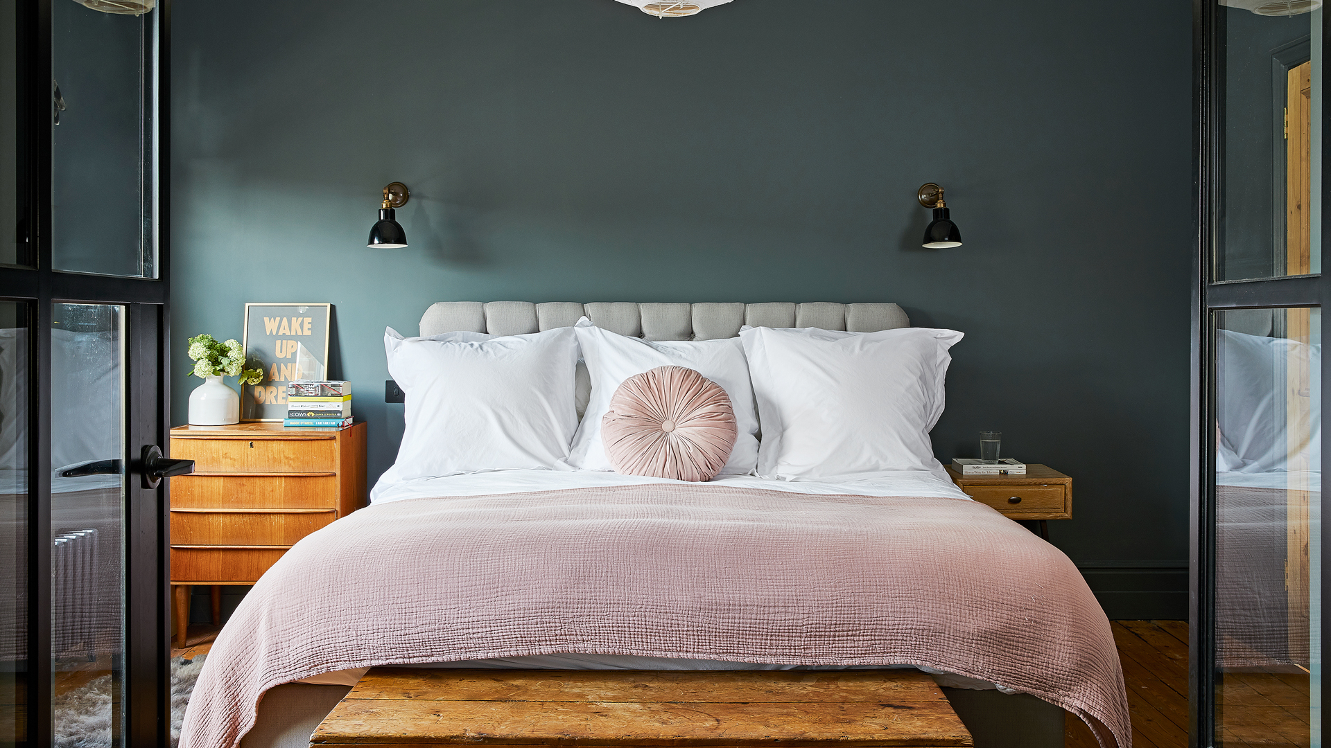
5 Paint Colors You Should Never Use In A Bedroom, According to Designers