Yes, Disney+ Is a Different Color Now
The article discusses the recent visual rebranding of the Disney+ streaming service, which has transitioned from its signature dark blue to a lighter, teal-like hue named 'Aurora.' This change coincides with the full integration of Hulu's content library into the Disney+ platform, effectively merging the two services. Joe Earley, a Disney executive, explained that 'Aurora' is an homage to both the aurora borealis and Disney's classic film *Sleeping Beauty*, created by blending Hulu's distinctive green with the original Disney+ blue.
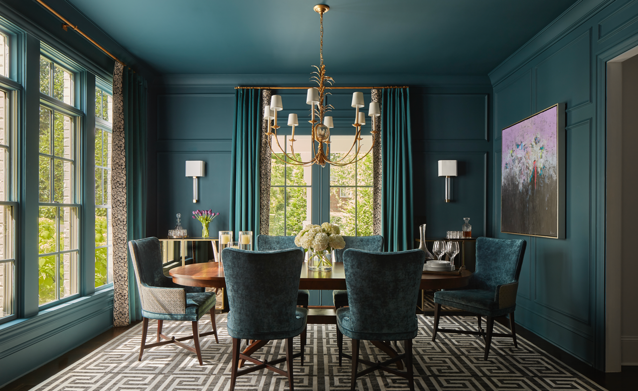
The author expresses a critical view of this color change, suggesting that it lacks the visual appeal expected from Disney. The new 'Aurora' color is unfavorably compared to 'murky pool water,' 'the least-used crayon in the Crayola box,' and a poorly maintained cerulean sweater. This sentiment is contrasted with the general trend in the streaming industry, where blue is a prevalent color. The article points out that other major streaming services, such as Max, have also adopted various shades of blue, with Max even abandoning HBO's unique gradient purple for a more conventional royal blue. While Disney+ is acknowledged for attempting something new, the author believes the execution falls short of being captivating or memorable.
The rebranding reflects Disney's strategic move to consolidate its streaming offerings, bringing Hulu's diverse content under the Disney+ umbrella. This integration aims to create a more comprehensive entertainment hub for subscribers. However, the visual alteration has prompted mixed reactions, with some, like the author, expressing disappointment in the aesthetic outcome. The article implicitly suggests that while the functional integration of content is significant, the visual identity of a brand, particularly one as iconic as Disney, plays a crucial role in user perception and experience. The color change is presented as a notable consequence of this broader business strategy, highlighting how even seemingly minor design decisions can spark considerable discussion among users and critics.
Ultimately, the piece positions the 'Aurora' color as a somewhat underwhelming result of a major corporate merger, indicating that while the rationale behind the blend of colors is understood, the final visual product fails to resonate positively with the author. The article highlights the tension between strategic business decisions and their aesthetic impact, particularly in a visually driven industry like entertainment. It also touches upon the broader landscape of streaming service branding, where blue tones often dominate, making distinctive visual choices a challenge.
#DisneyPlus #Hulu #StreamingServices #Rebranding #AuroraColor #VisualIdentity #EntertainmentIndustry #DisneyPlus #Hulu #StreamingServices #Rebranding #AuroraColor #VisualIdentity #EntertainmentIndustry
0 comment in total
 No comments yet
You may also like

This Very "Controversial" Color Is About To Be Everywhere Again

"It's time to reconsider the whole colour of the year carnival"

This surprising color trend is having a comeback

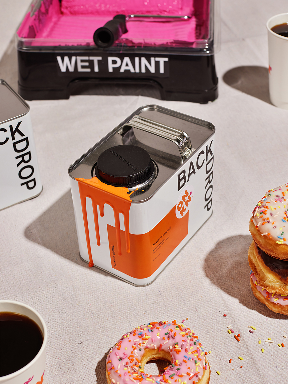
Backdrop’s Newest Paint Colors Totally Clash—But We Love It
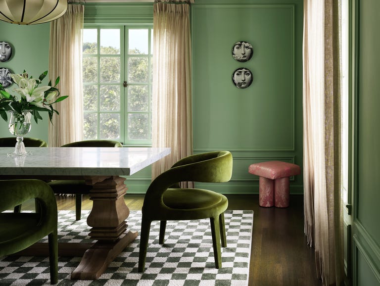
This SURPRISING Color Is About to Be Everywhere, According to Designers


We're Finally Leaving The "Sad Beige Aesthetic" Behind


It’s Official: Designers Are Ditching This Once-Classic Color

Goodbye To Butter Yellow: The Moodier Hue That's On Trend


The Neutral Paint Color You Used To See Everywhere Is Officially Out
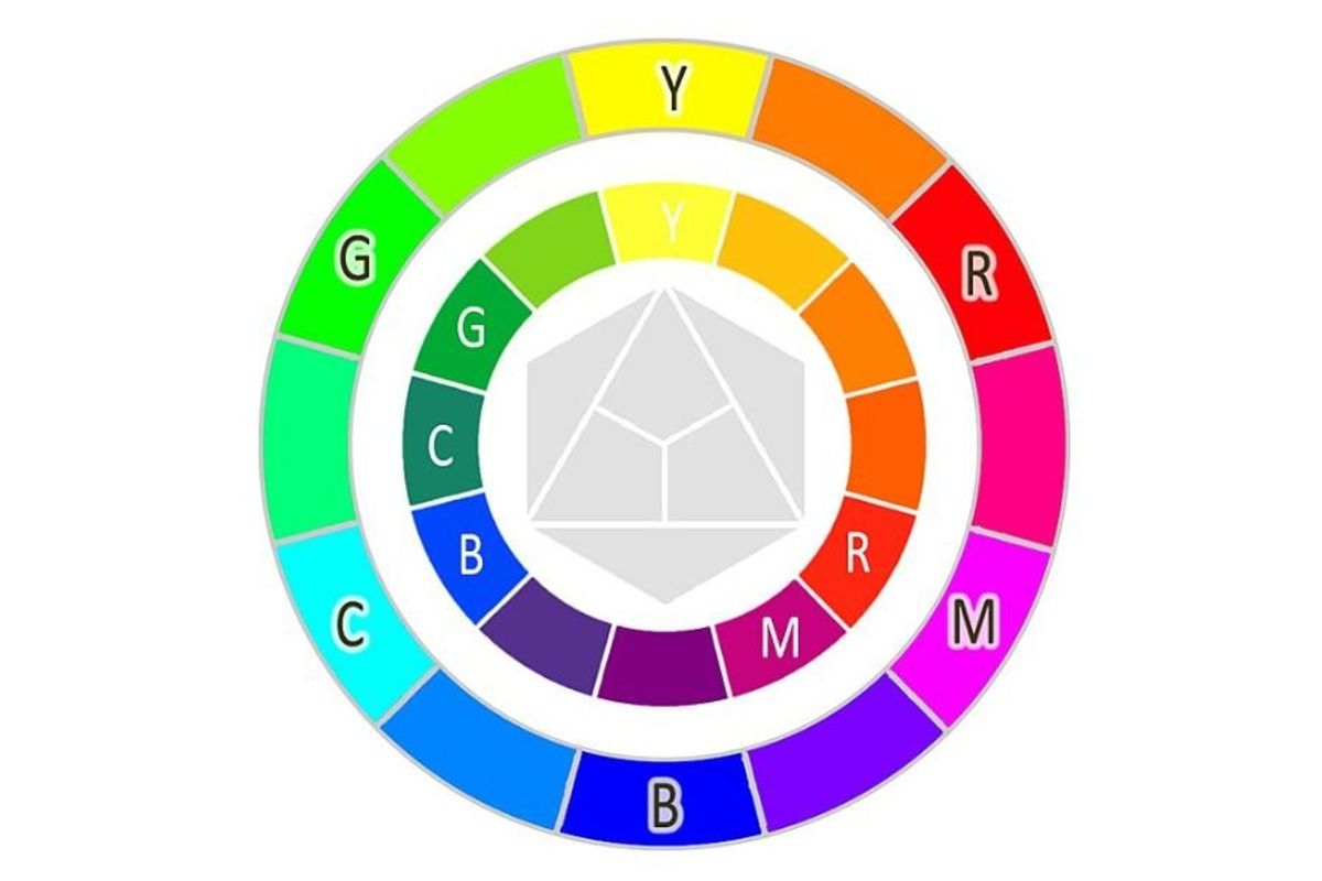
Red, yellow and blue aren't actually primary colors, according to updated color wheel