1/3
The Neutral Paint Color You Used To See Everywhere Is Officially Out
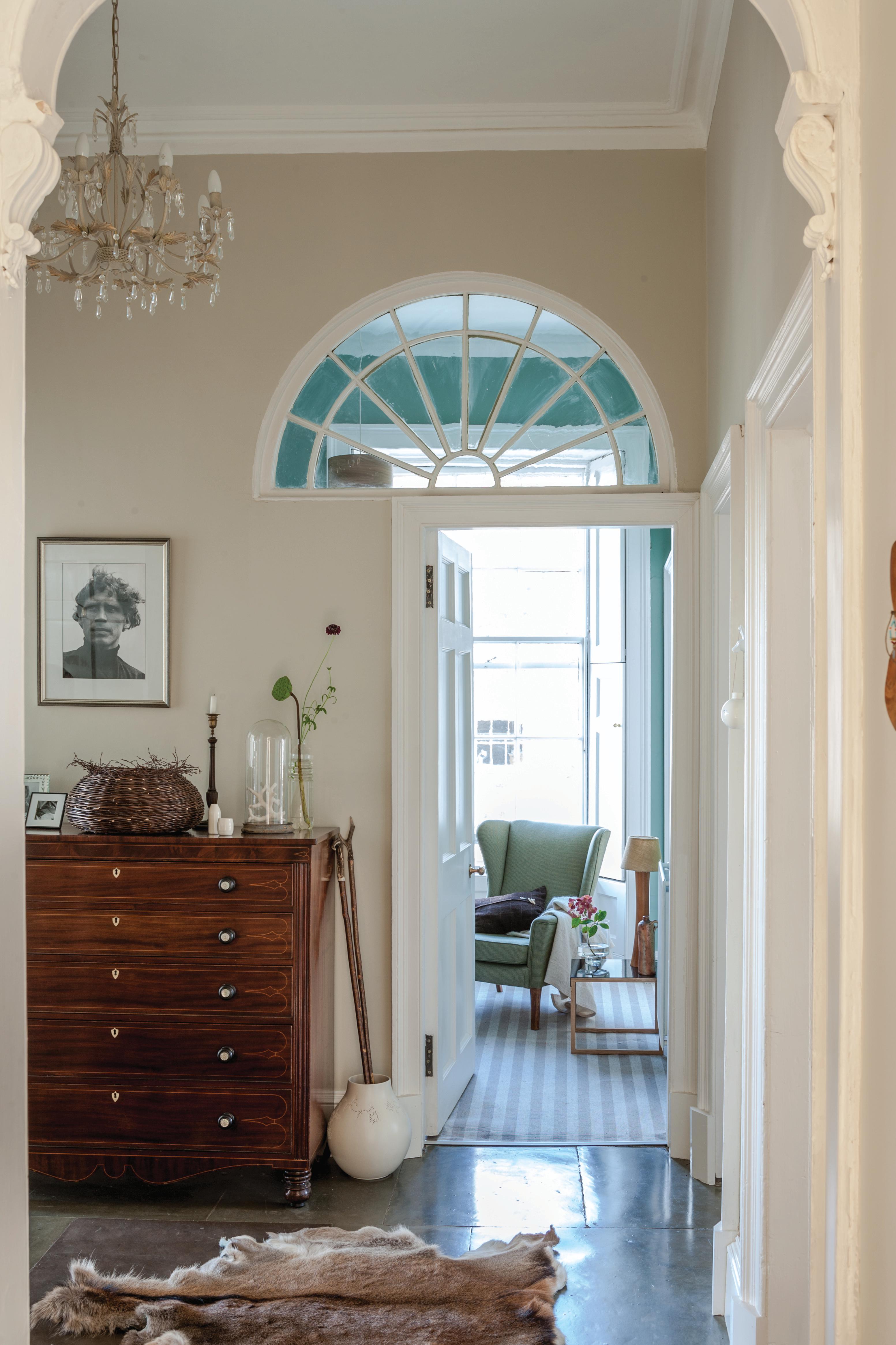
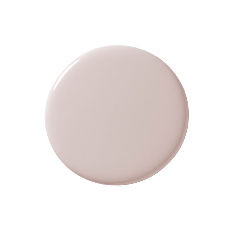
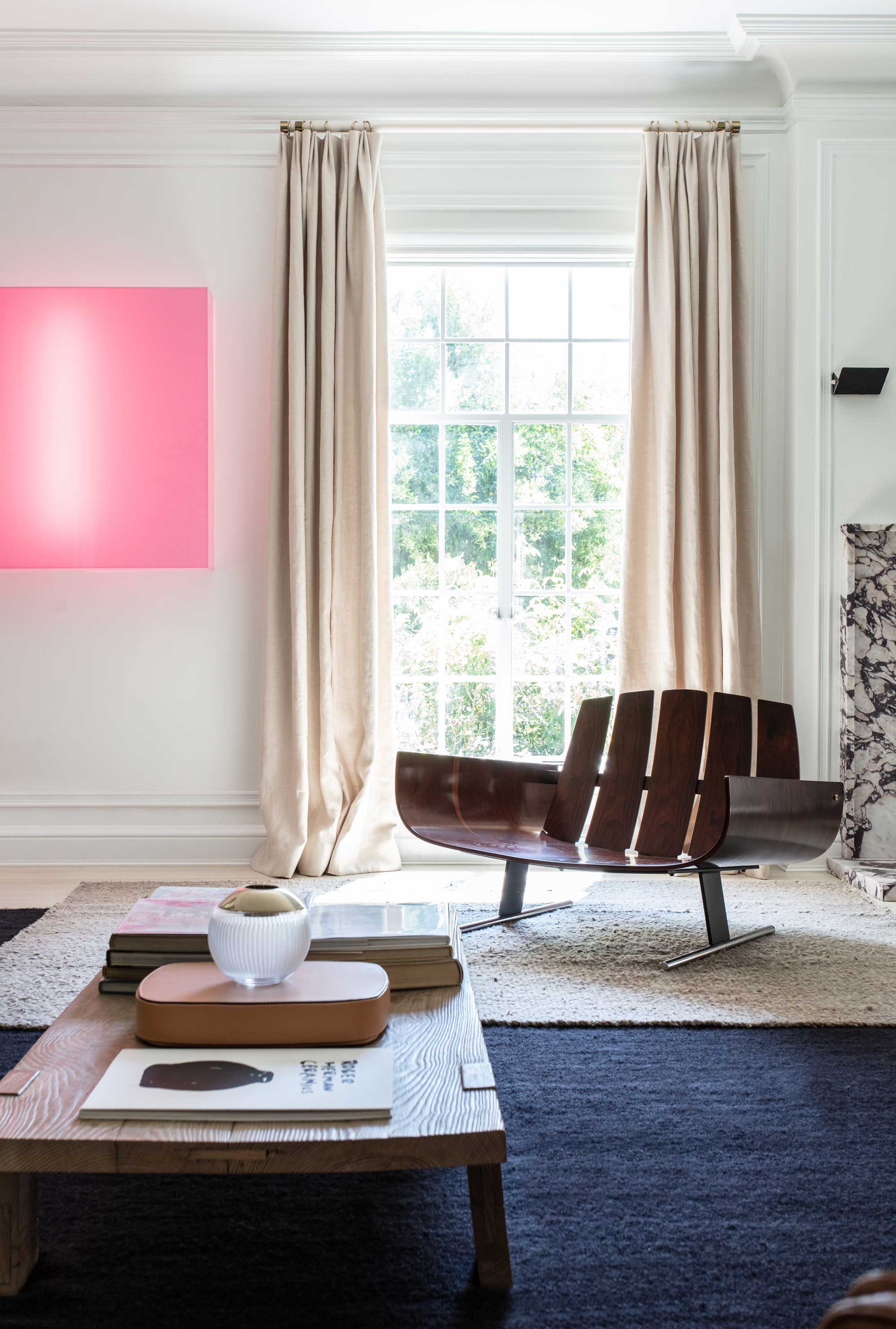
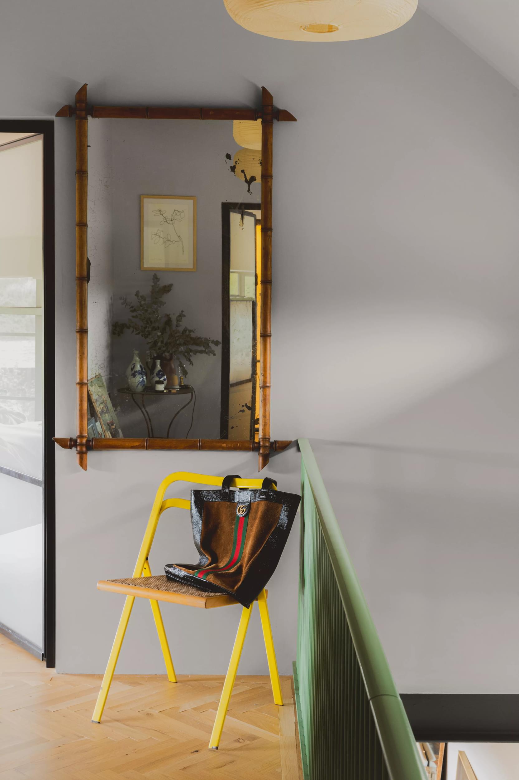
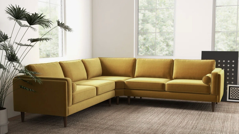
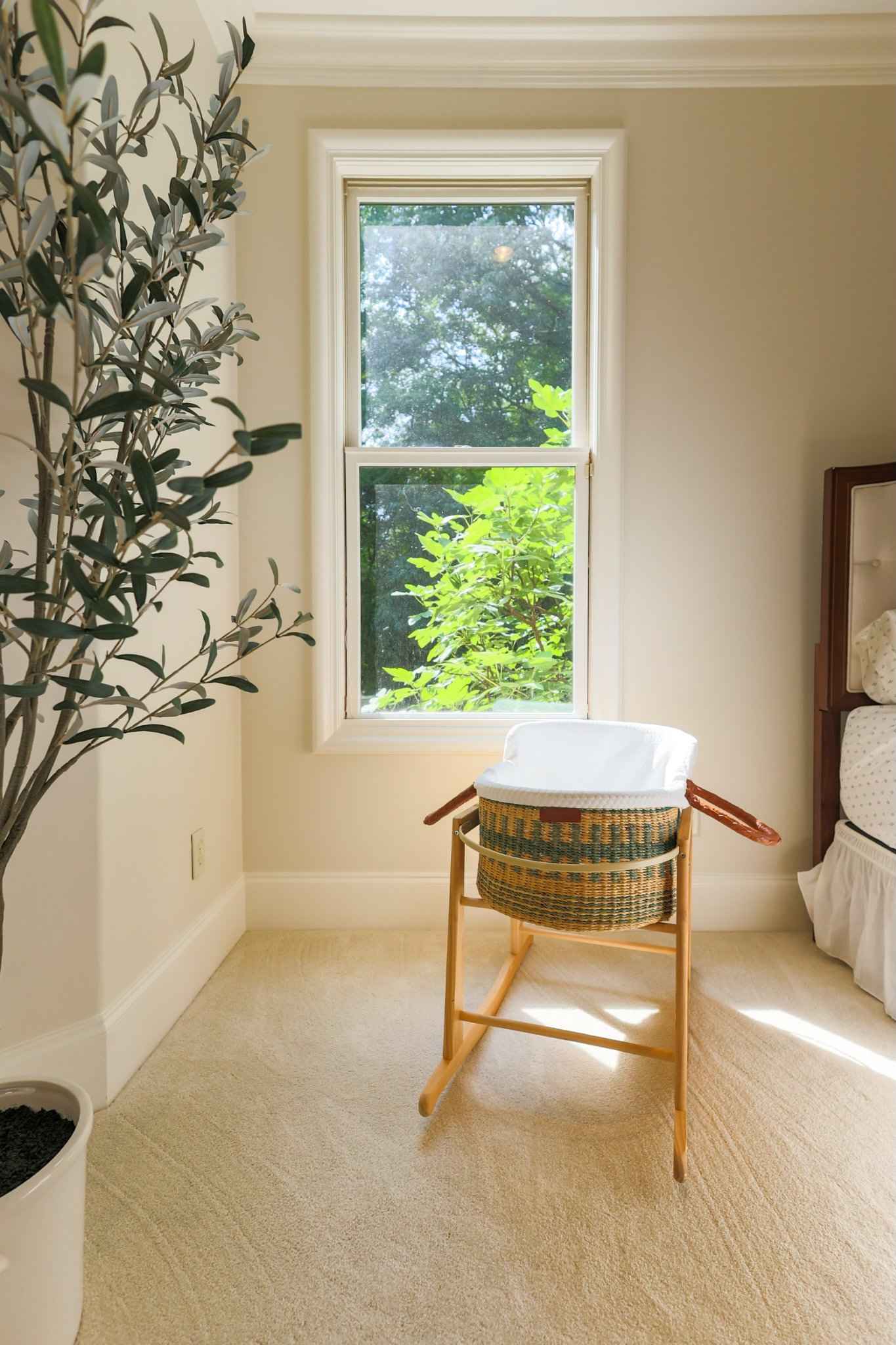
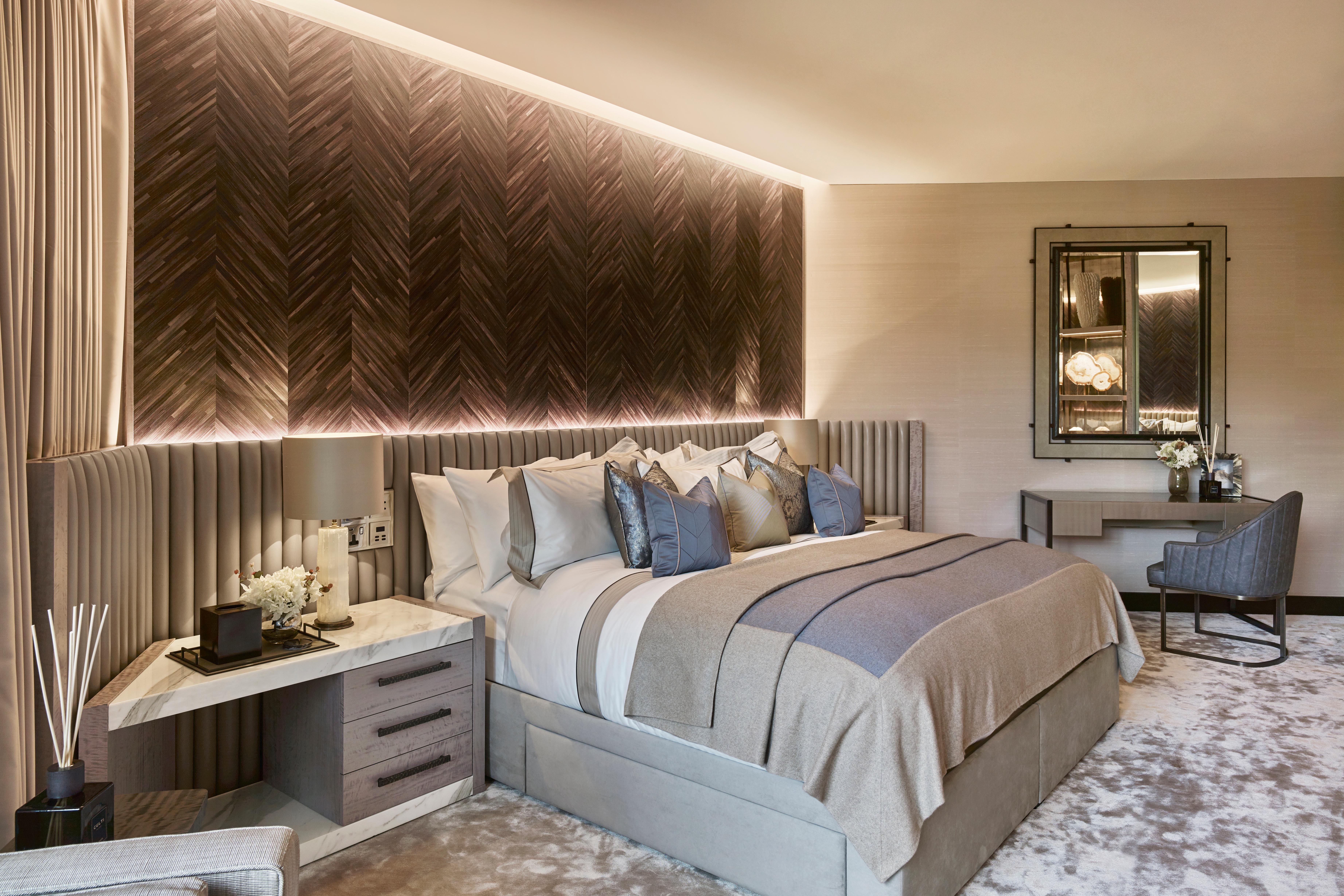
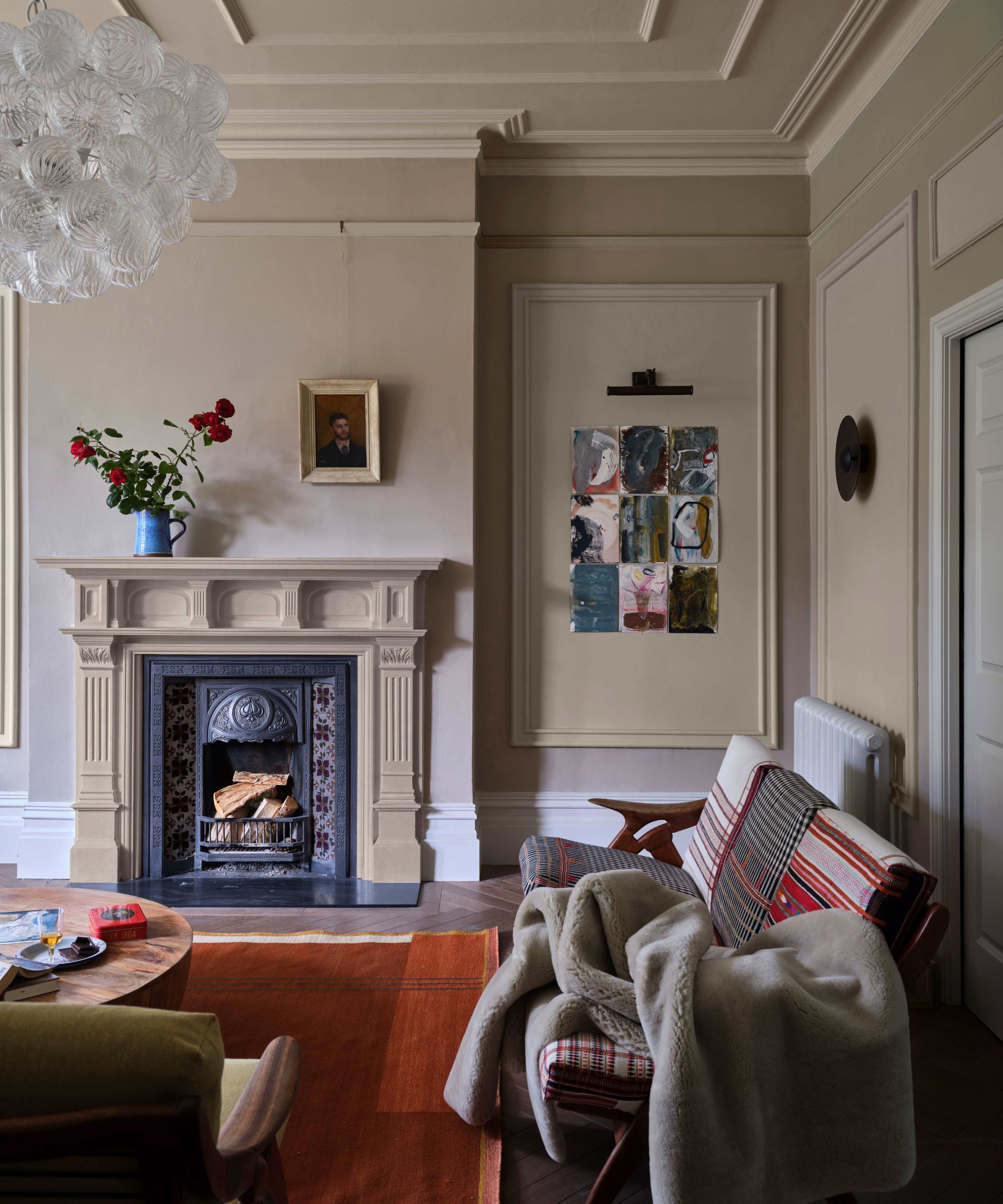
Neutral paint colors are a consistent element in interior design, providing a flexible backdrop that complements various accents and styles without clashing. These subdued tones are also effective in creating a calming living environment, as their understated nature is less jarring than more vibrant colors. However, these neutrals can sometimes be perceived as bland, with popular shades eventually becoming uninspired after prolonged use. Greige, a blend of gray and beige, exemplifies this phenomenon. For years, greige was a dominant choice in interiors due to its versatility, acting as a universal neutral that worked with both warm and cool undertones. Its neutrality meant it wasn't aggressively warm or cool, making it adaptable to almost any color palette, and it offered an easy-to-maintain alternative to pure white.
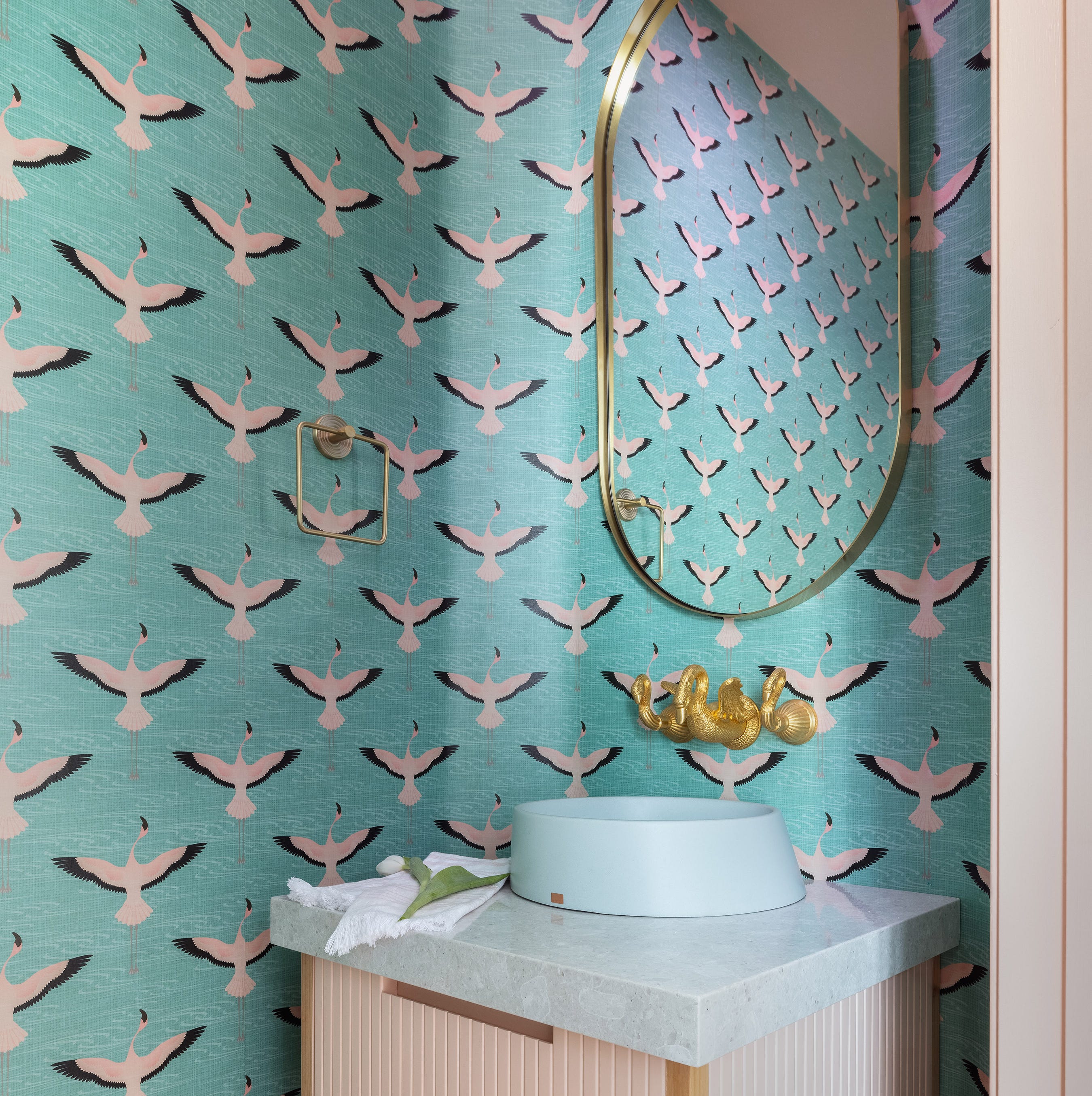
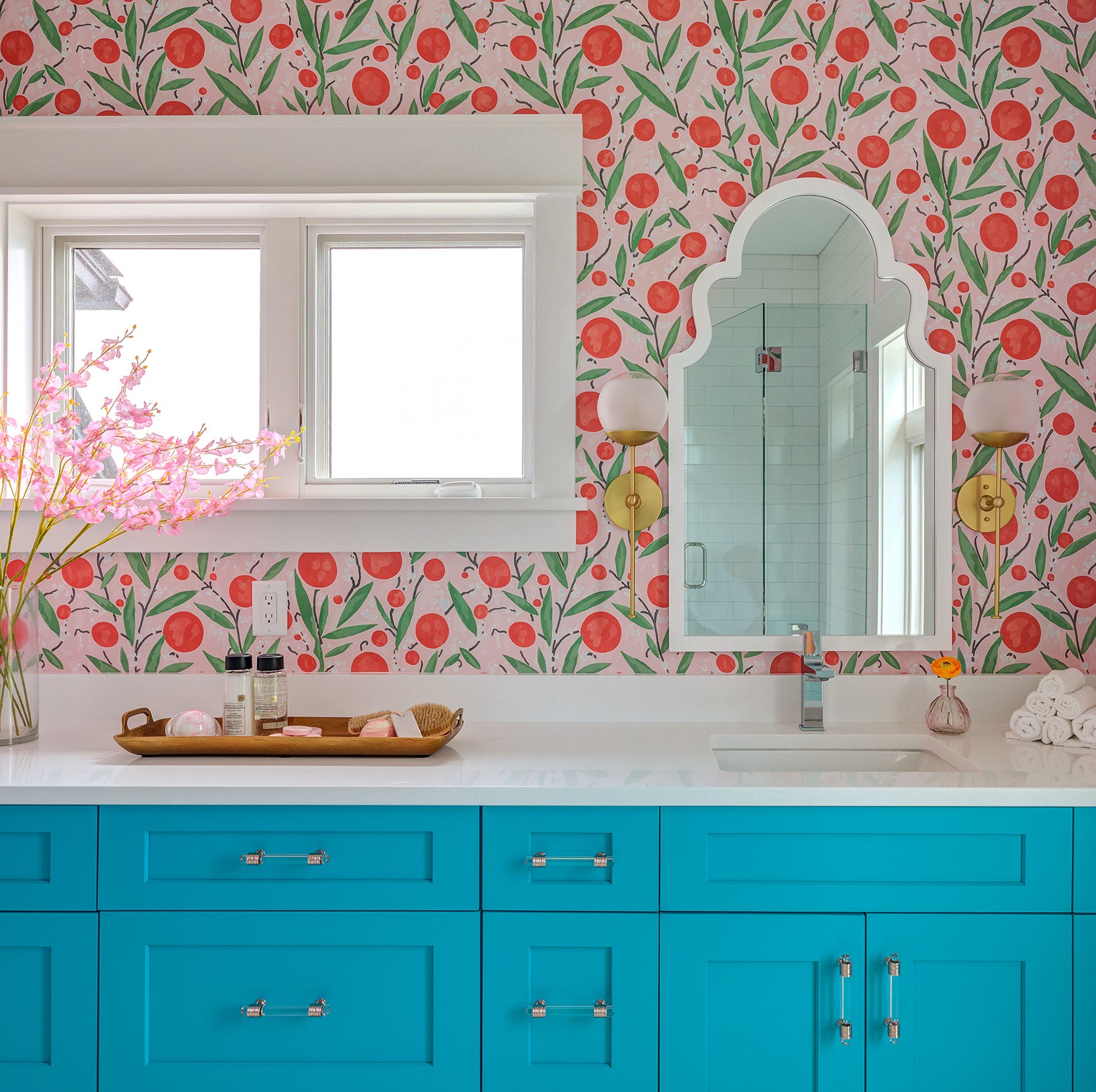
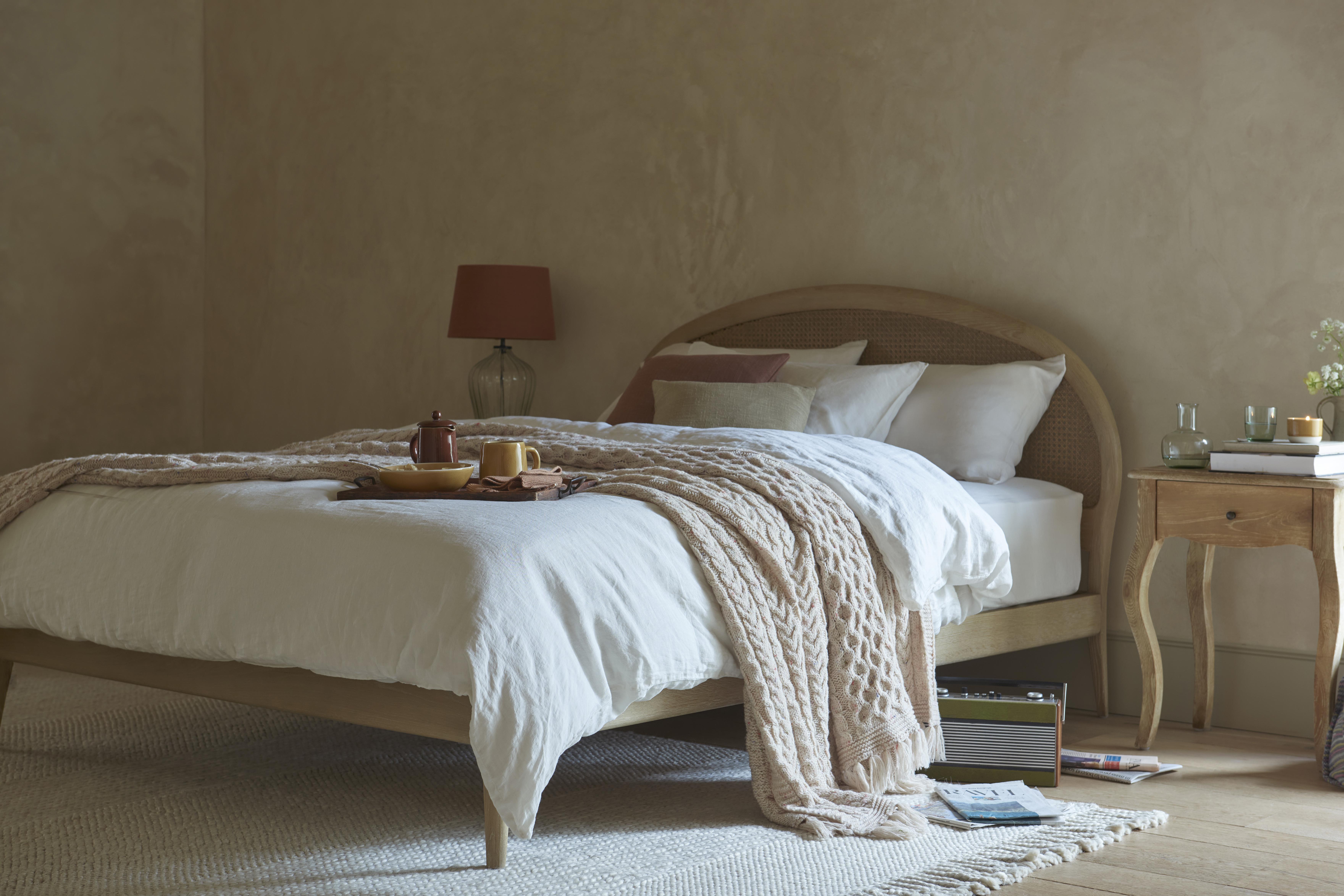
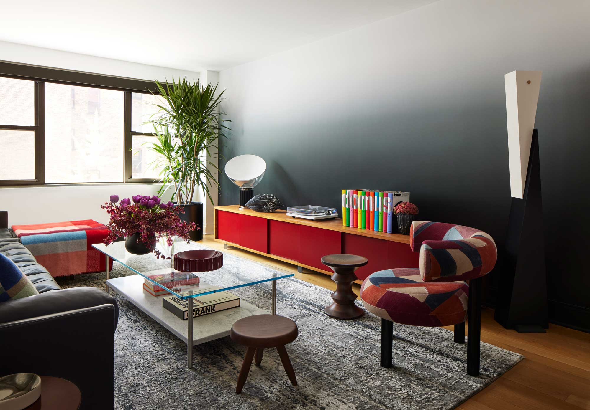
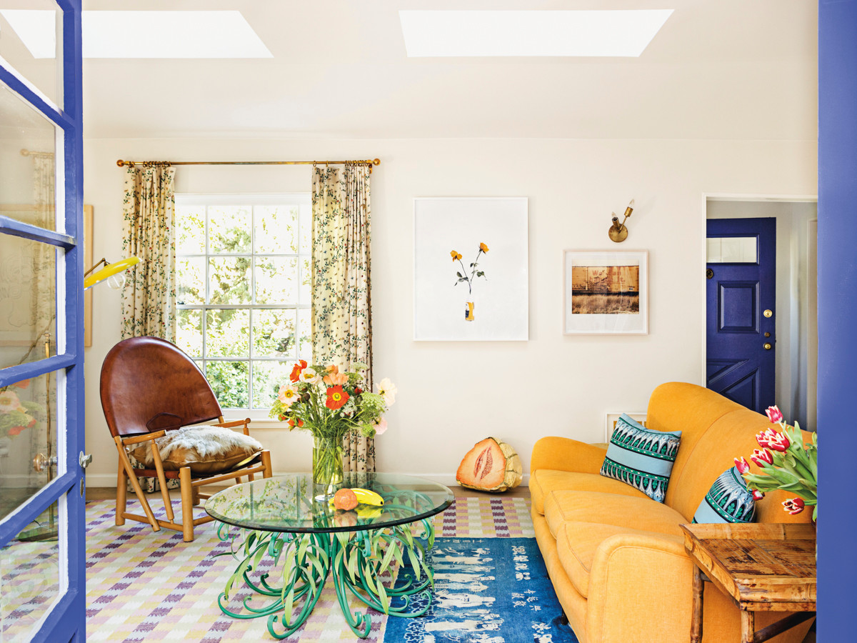
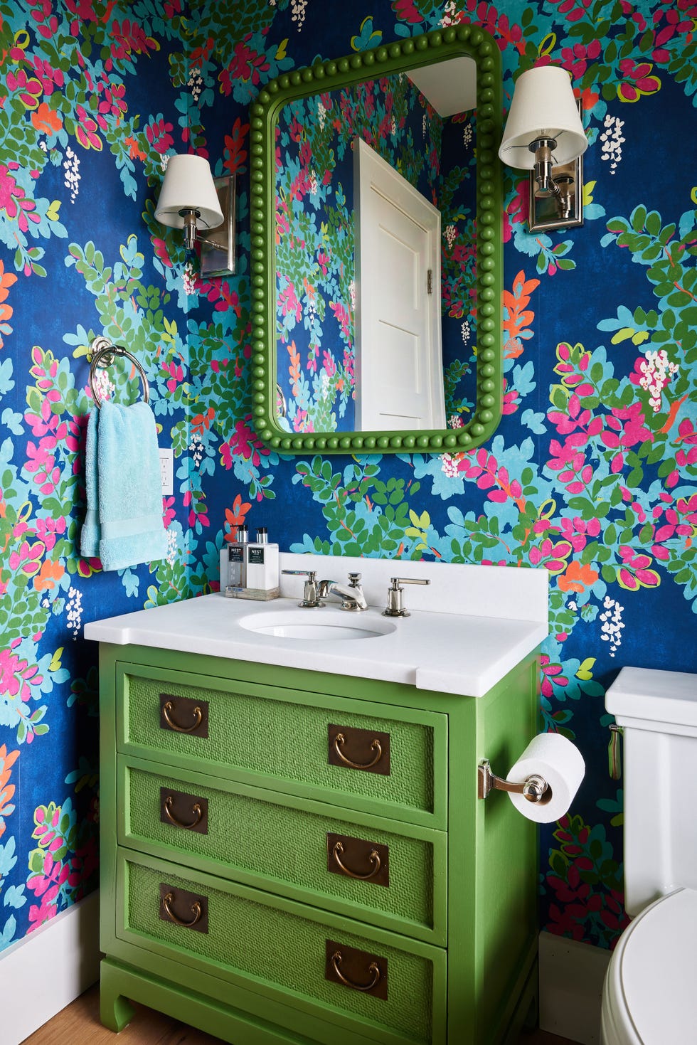
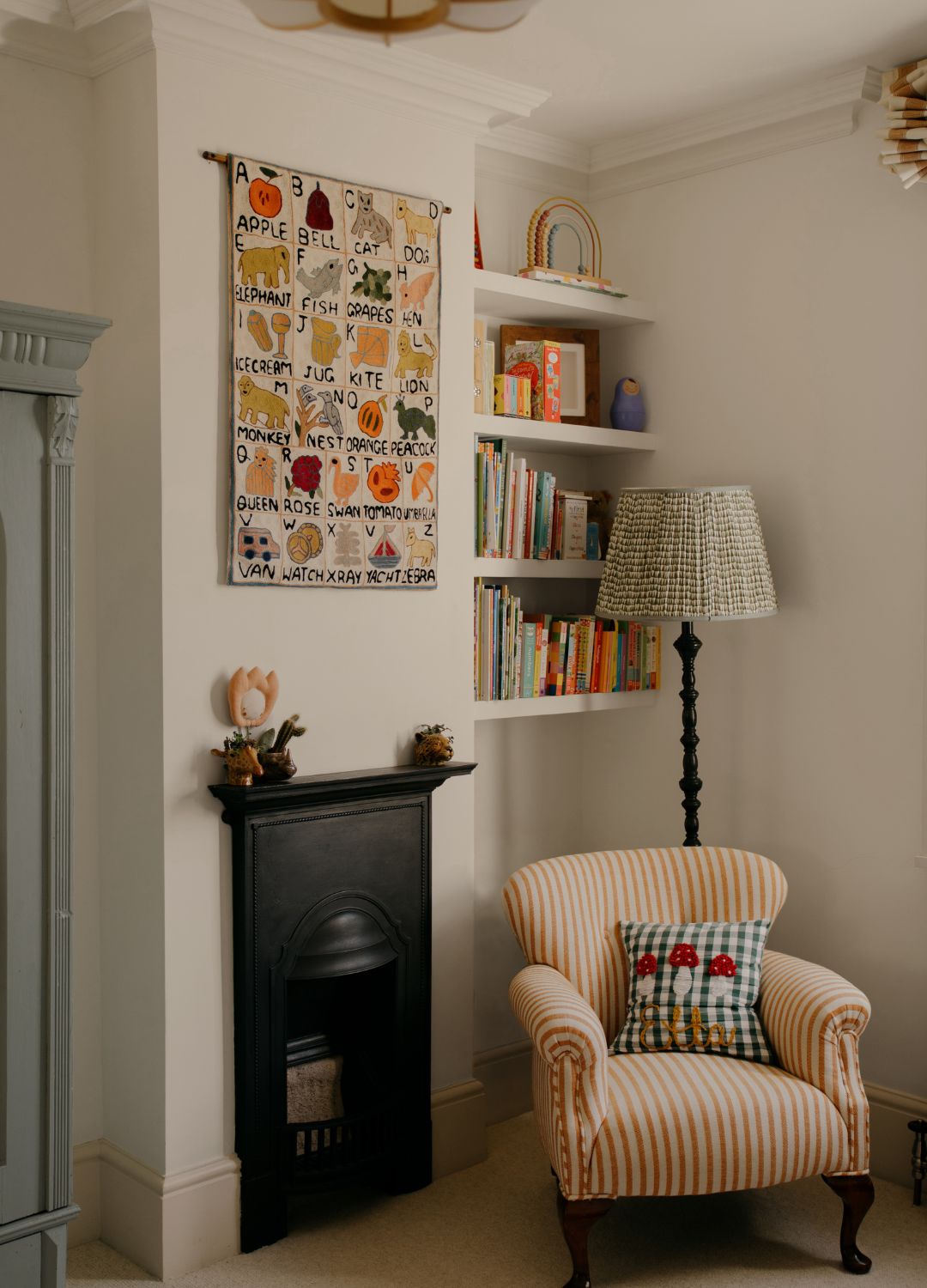
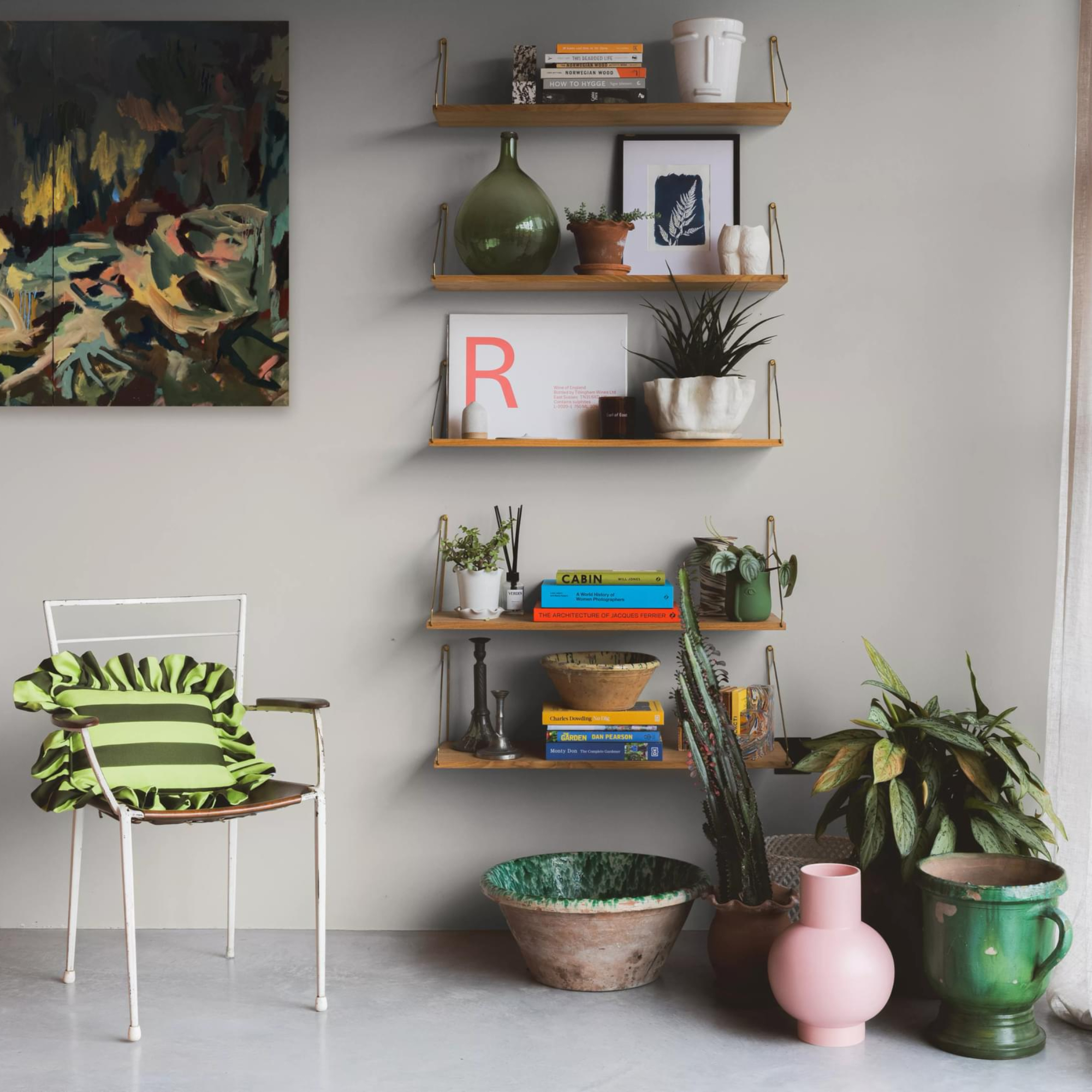
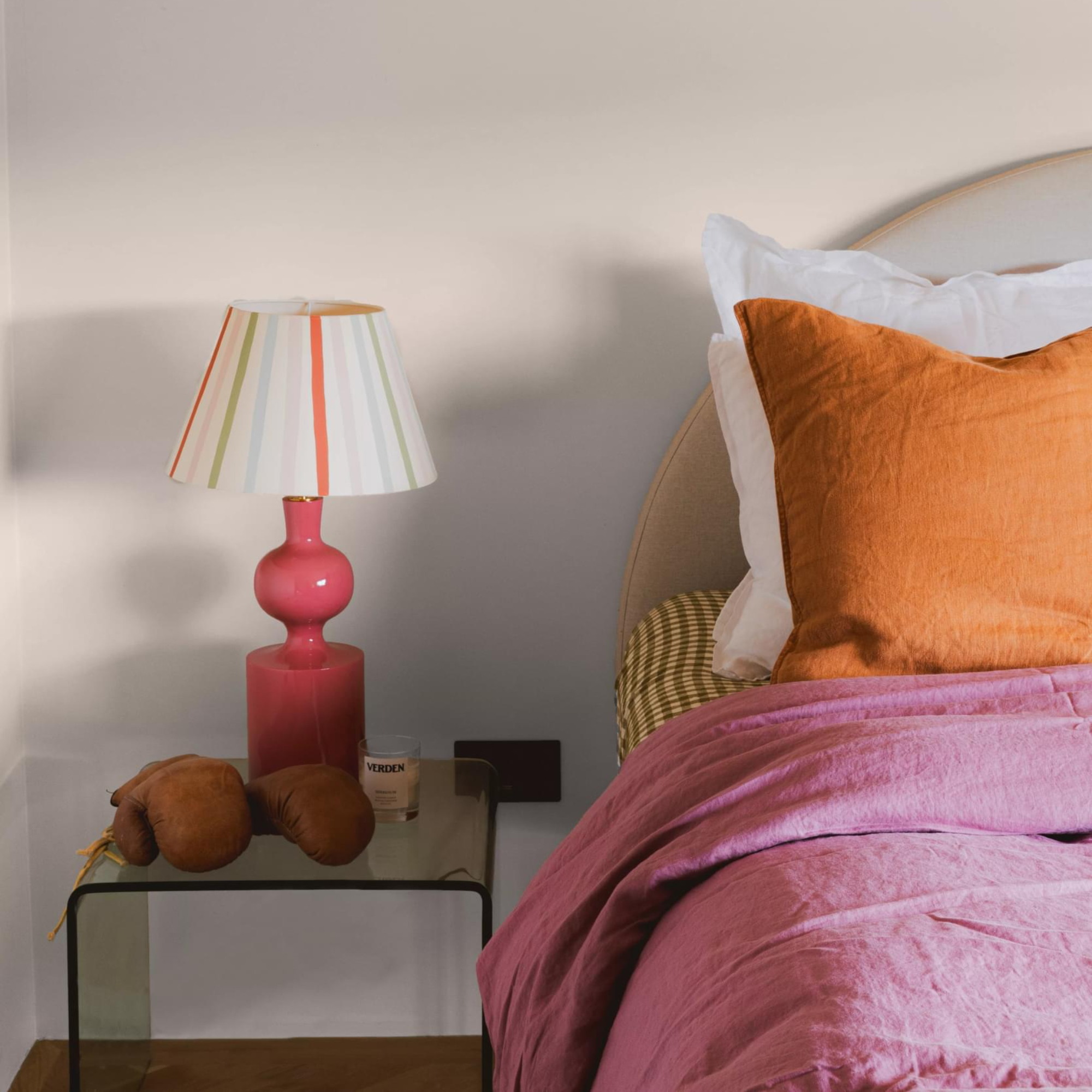
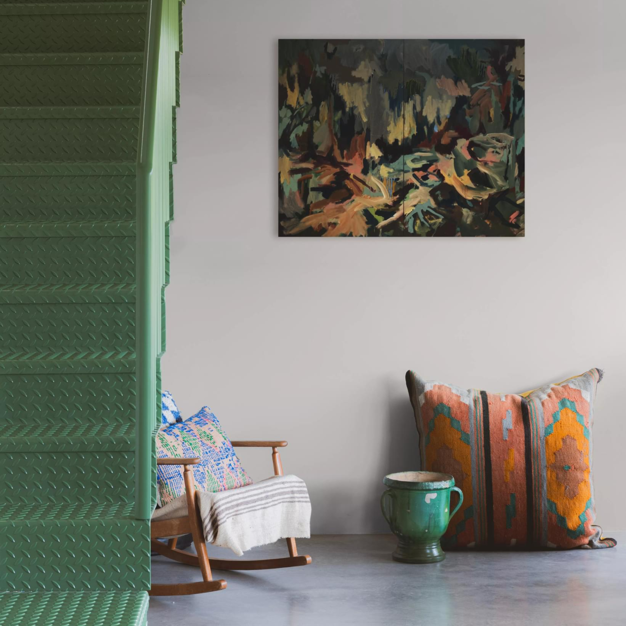
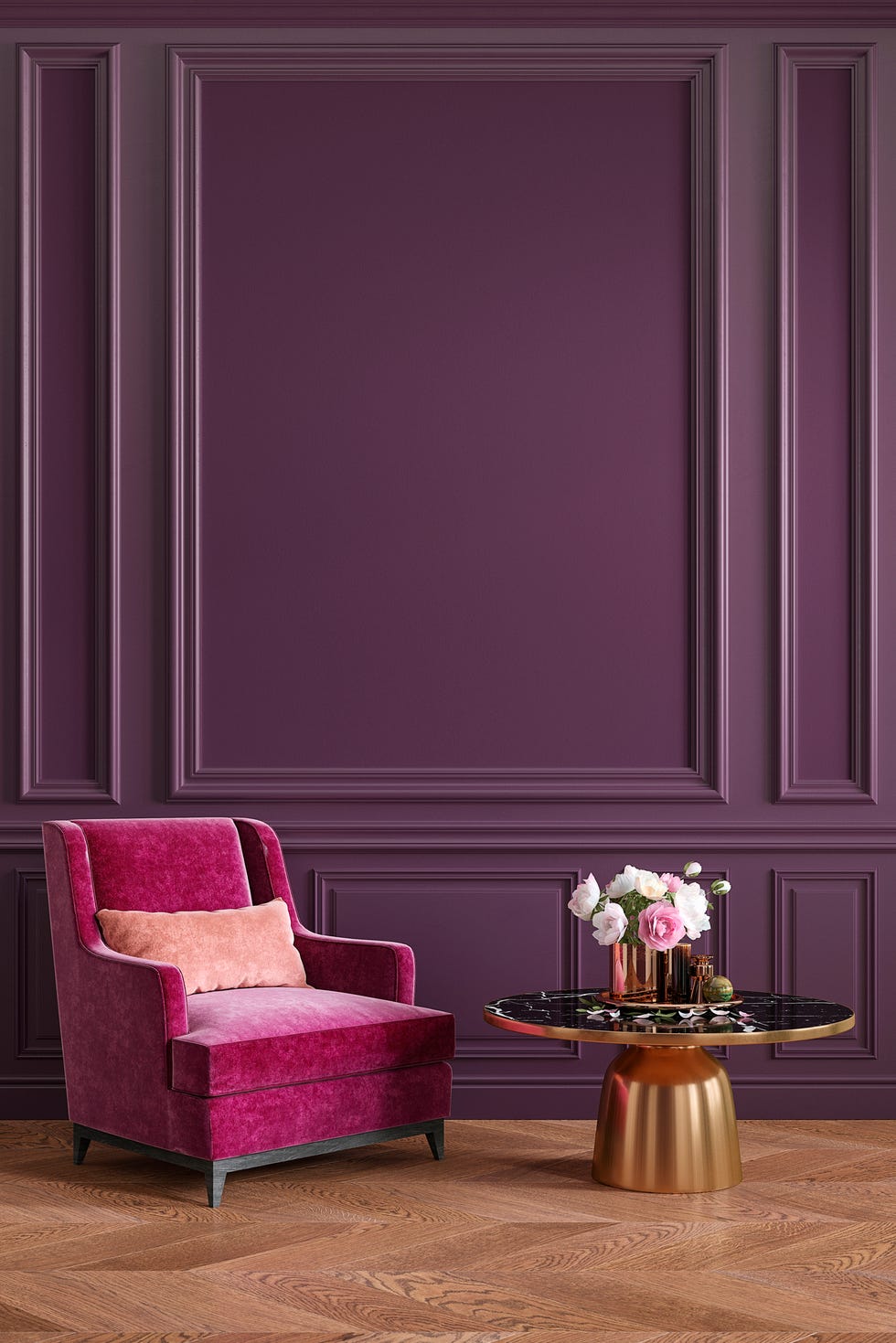
However, the widespread application of greige in countless homes and apartments has led to a desire among many for colors with a more distinctive character. The current design trends are shifting away from universally appealing, 'cookie-cutter' aesthetics towards spaces that reflect individual personality. Greige's peak popularity coincided with a period when design was often formulaic, and its inoffensive nature made it a safe, predictable choice. It was suitable for any room and was unlikely to deter renters, but its lack of distinctiveness meant it rarely elevated a space to a 'great' level. Designer Zoie Brook noted that these overly safe, muted tones are now being replaced by warmer, earthier neutrals that offer greater depth and character. This shift aligns with the 'dopamine decor' trend, which encourages the incorporation of bright colors, personal accents, and bold patterns to create spaces that evoke happiness and reflect individual tastes.
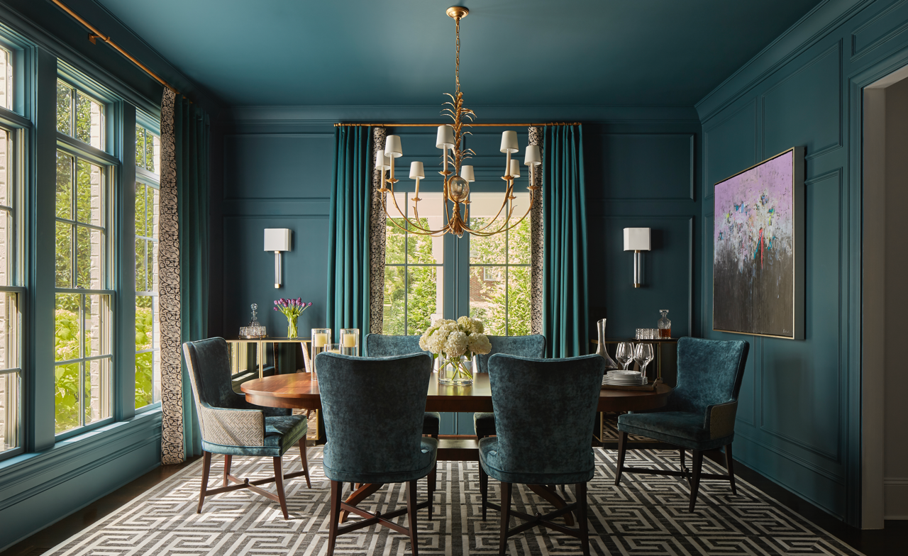
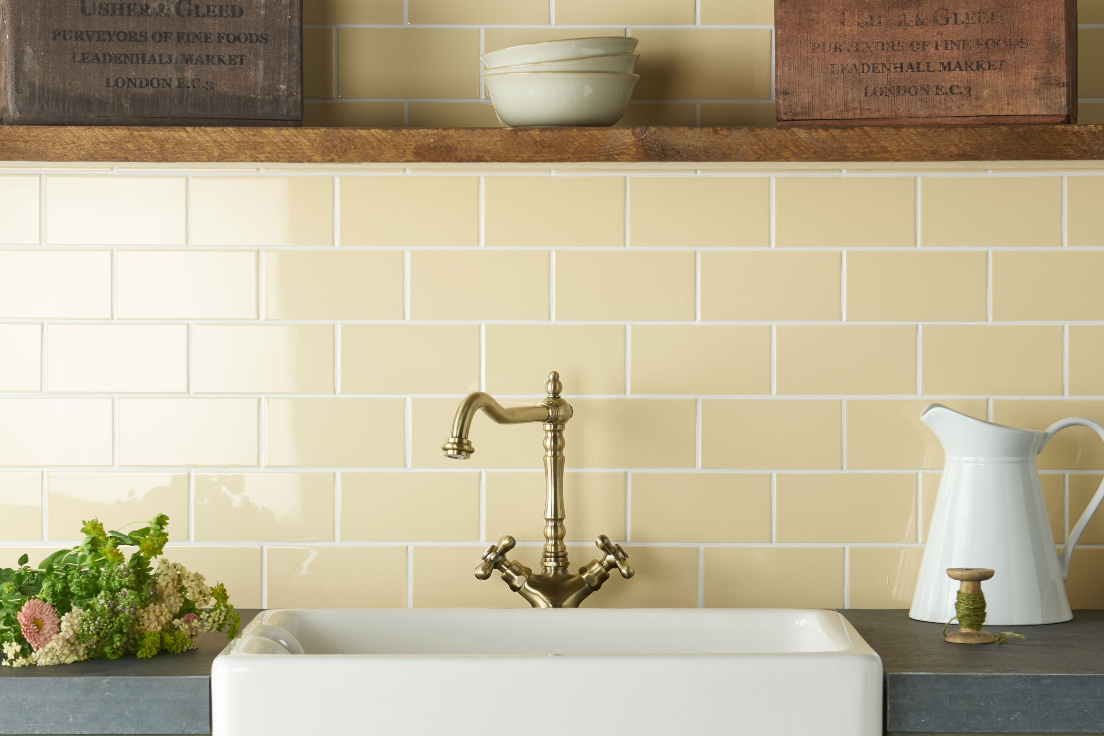
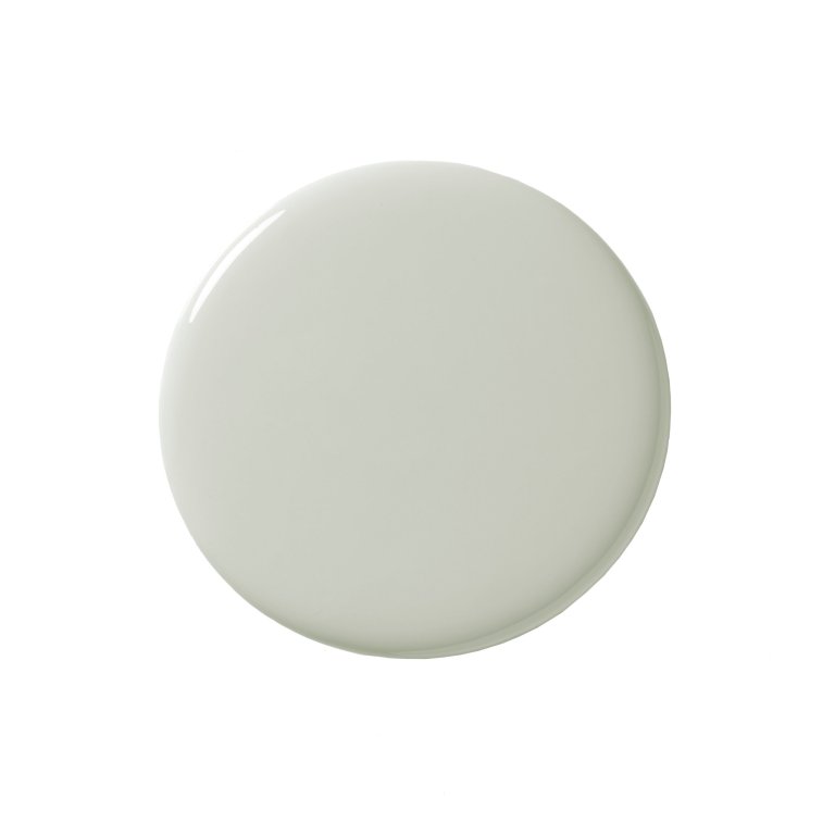
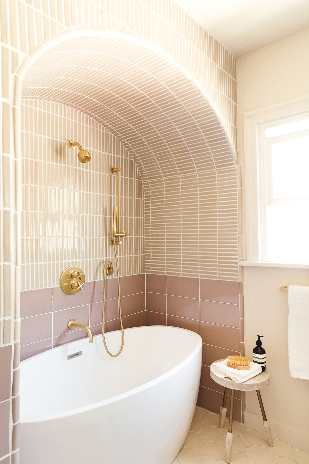
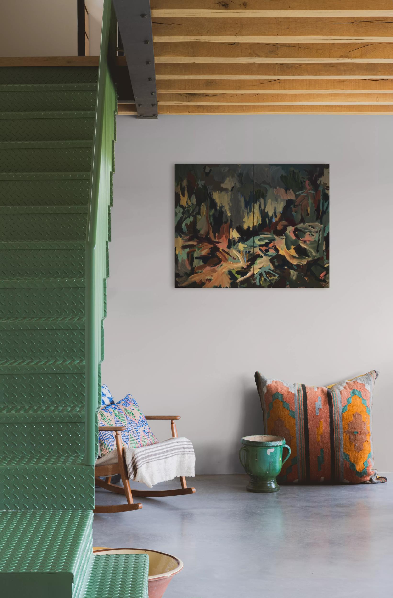
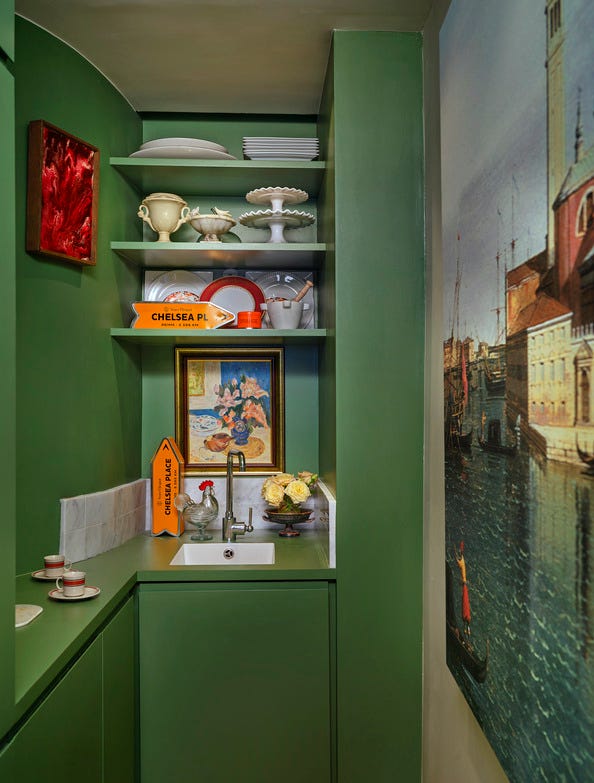
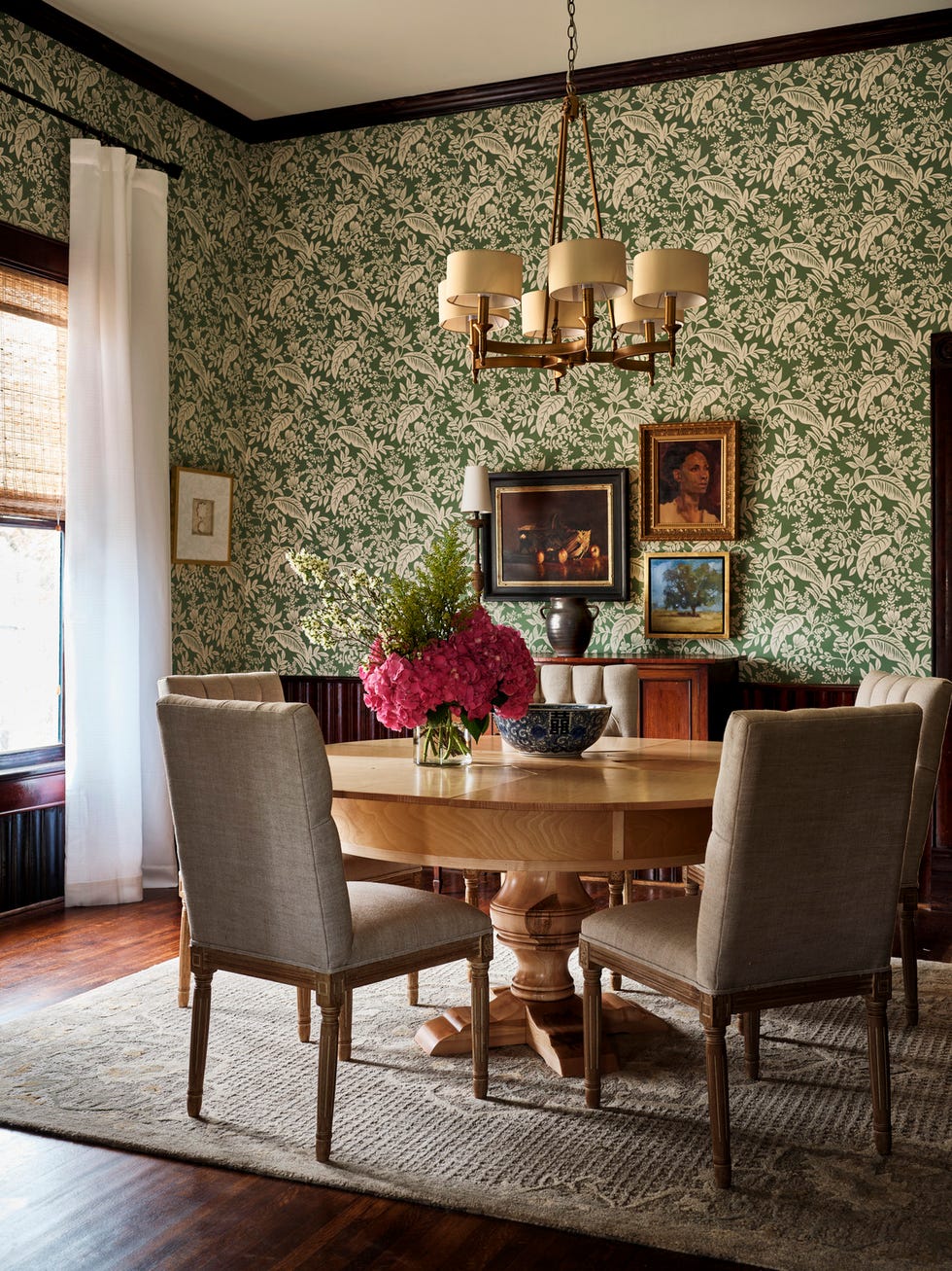
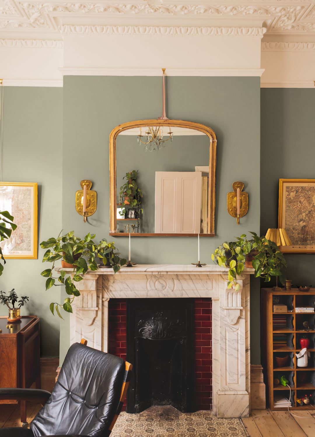
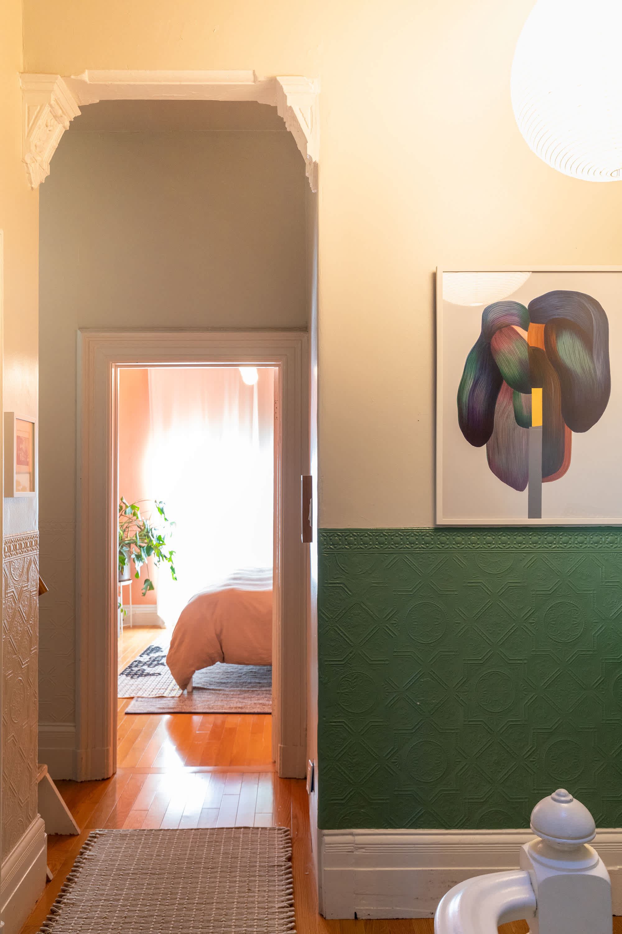
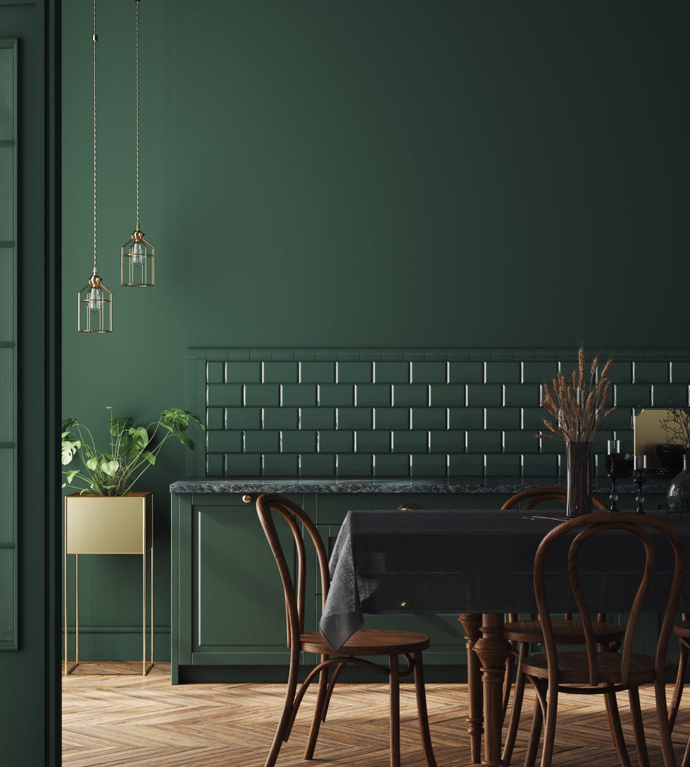
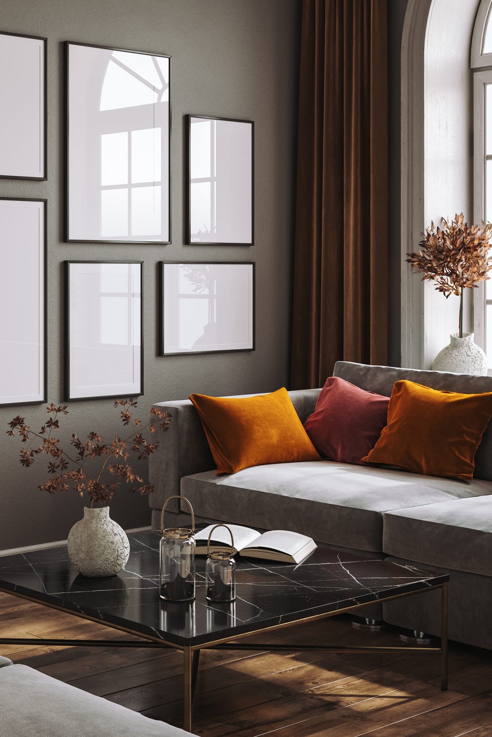
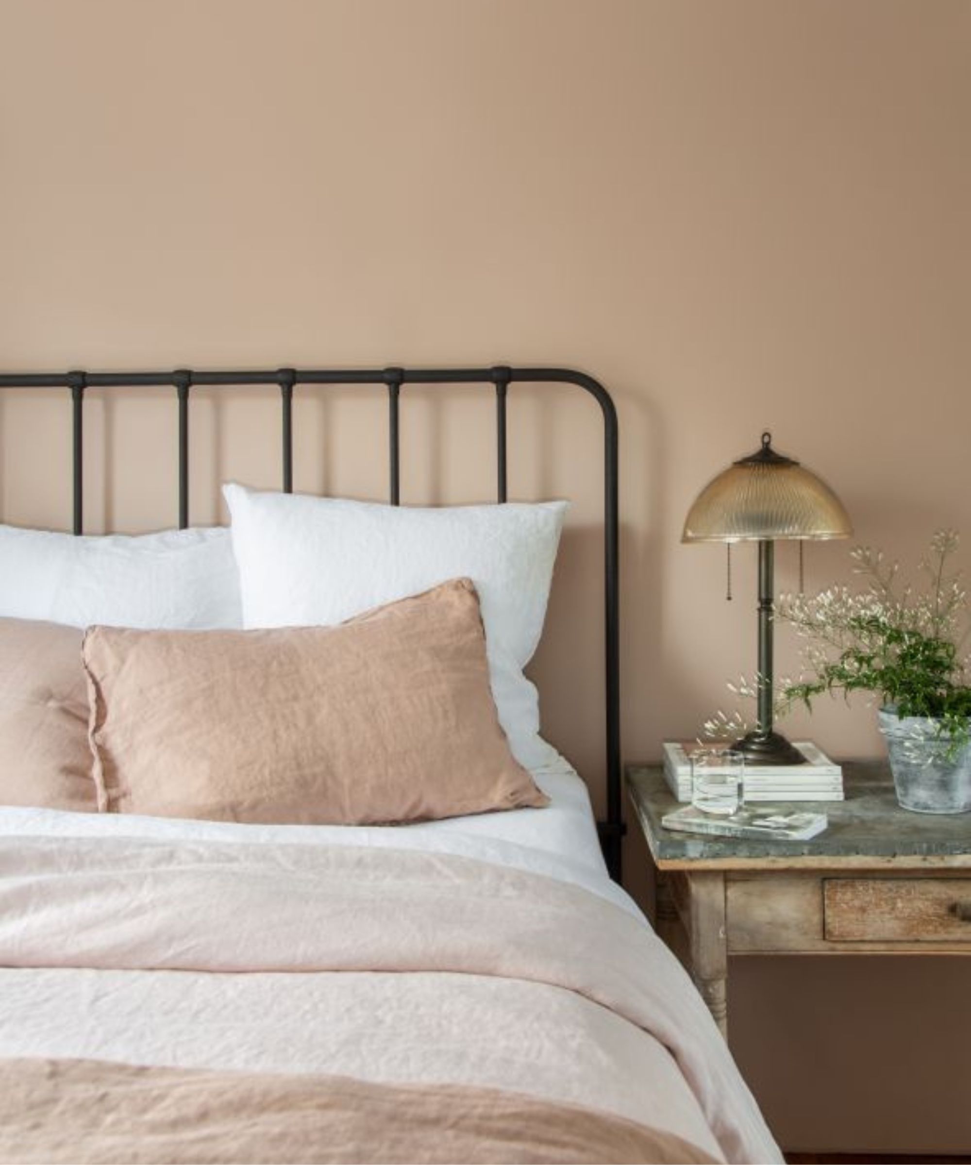
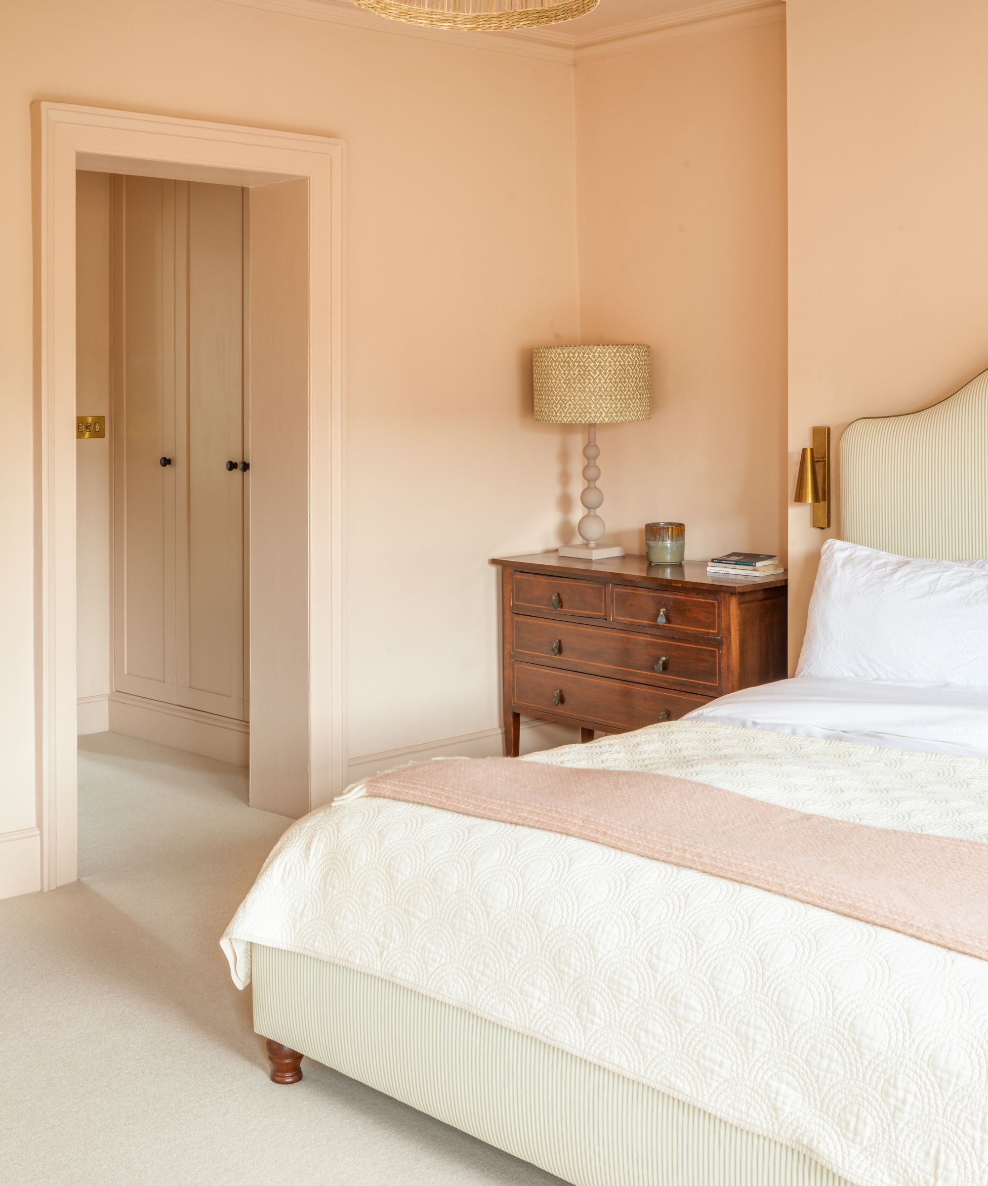
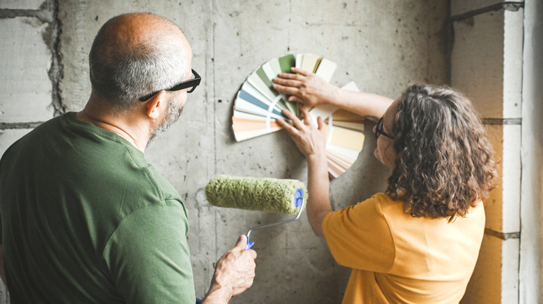
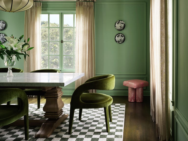
Moving beyond greige does not necessitate adopting extremely bold colors like fire-engine red or neon yellow. Many alternative neutrals exist that can provide a similar soothing effect while adding more interest and depth. Biophilic design, which incorporates elements that mimic nature, is a current trend. This can be achieved through deeper brown shades, such as Pantone's "Mocha Mousse," which can create a cozy atmosphere, or a light sage green, offering a refreshing and light-reflecting option. The key to moving away from the blandness of greige is to select colors that resonate with personal preferences. Individuals can look to their home accents or even their wardrobe for inspiration on preferred color schemes. The desired mood for a room should also be considered; light colors expand a space and create an airy feel, while darker shades contribute to a cozy, moody ambiance. Exploring color psychology can further aid in curating a specific emotional atmosphere. While departing from a safe color choice like greige might seem daunting initially, it is essential for designing a space that truly reflects one's personal style, ultimately leading to a satisfying final result.
#NeutralPaintColors #Greige #InteriorDesignTrends #HomeDecor #ColorPsychology #DopamineDecor #BiophilicDesign #PaintAlternatives #PersonalizedStyle #NeutralPaintColors #Greige #InteriorDesignTrends #HomeDecor #ColorPsychology #DopamineDecor #BiophilicDesign #PaintAlternatives #PersonalizedStyle
0 comment in total
 No comments yet
You may also like
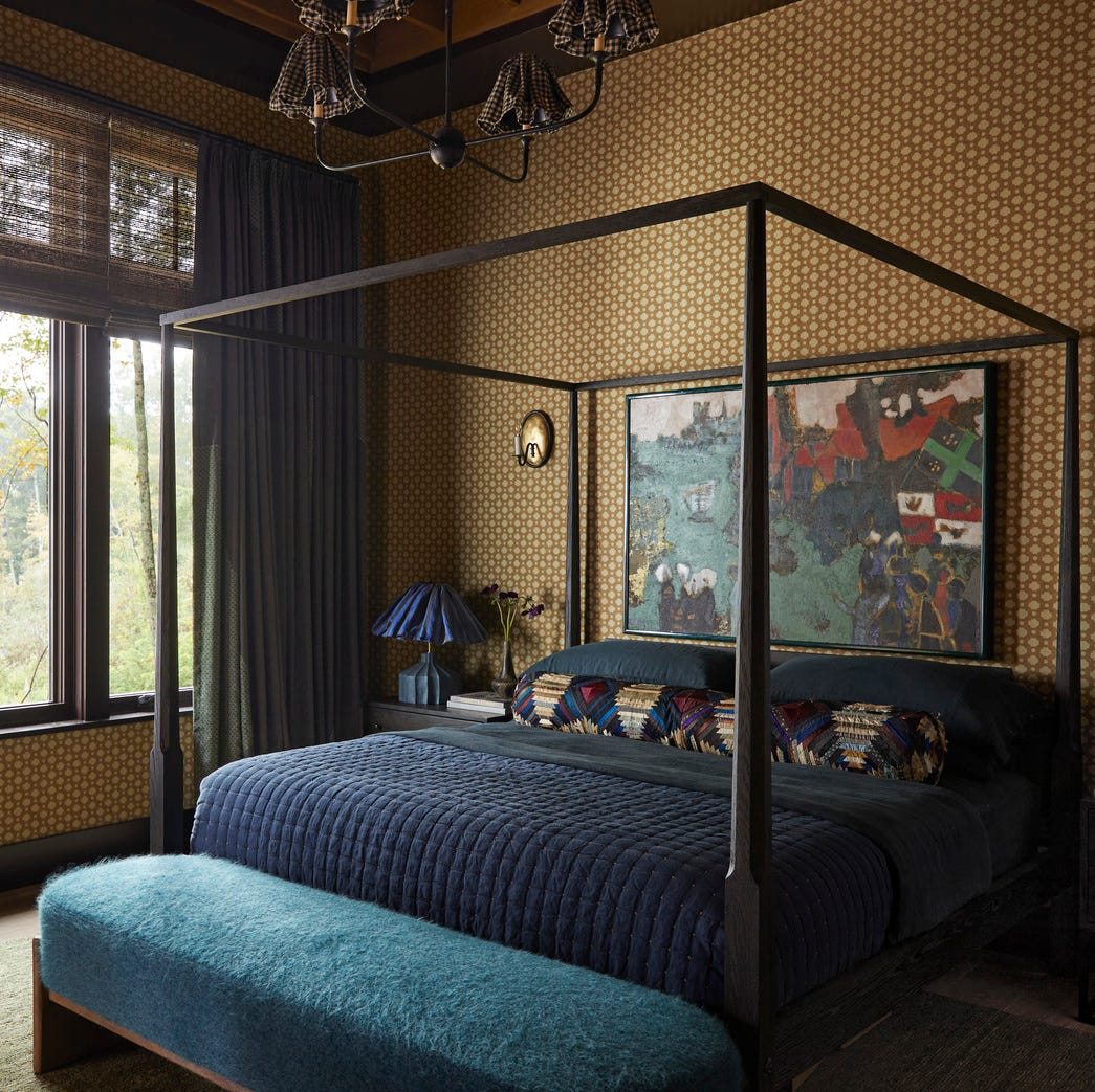
This Very "Controversial" Color Is About To Be Everywhere Again

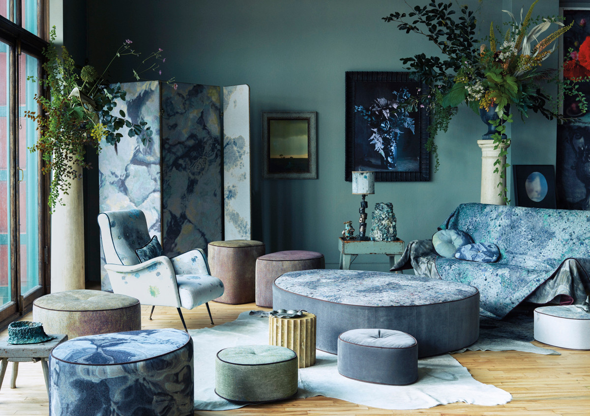
The Color Combo You’re About to See Everywhere

It's Official: Chartreuse Is the New Slime Green
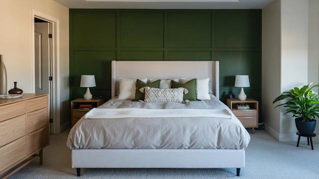
Forget Single Painted Accent Walls: This Stunning Trend Is Taking Over

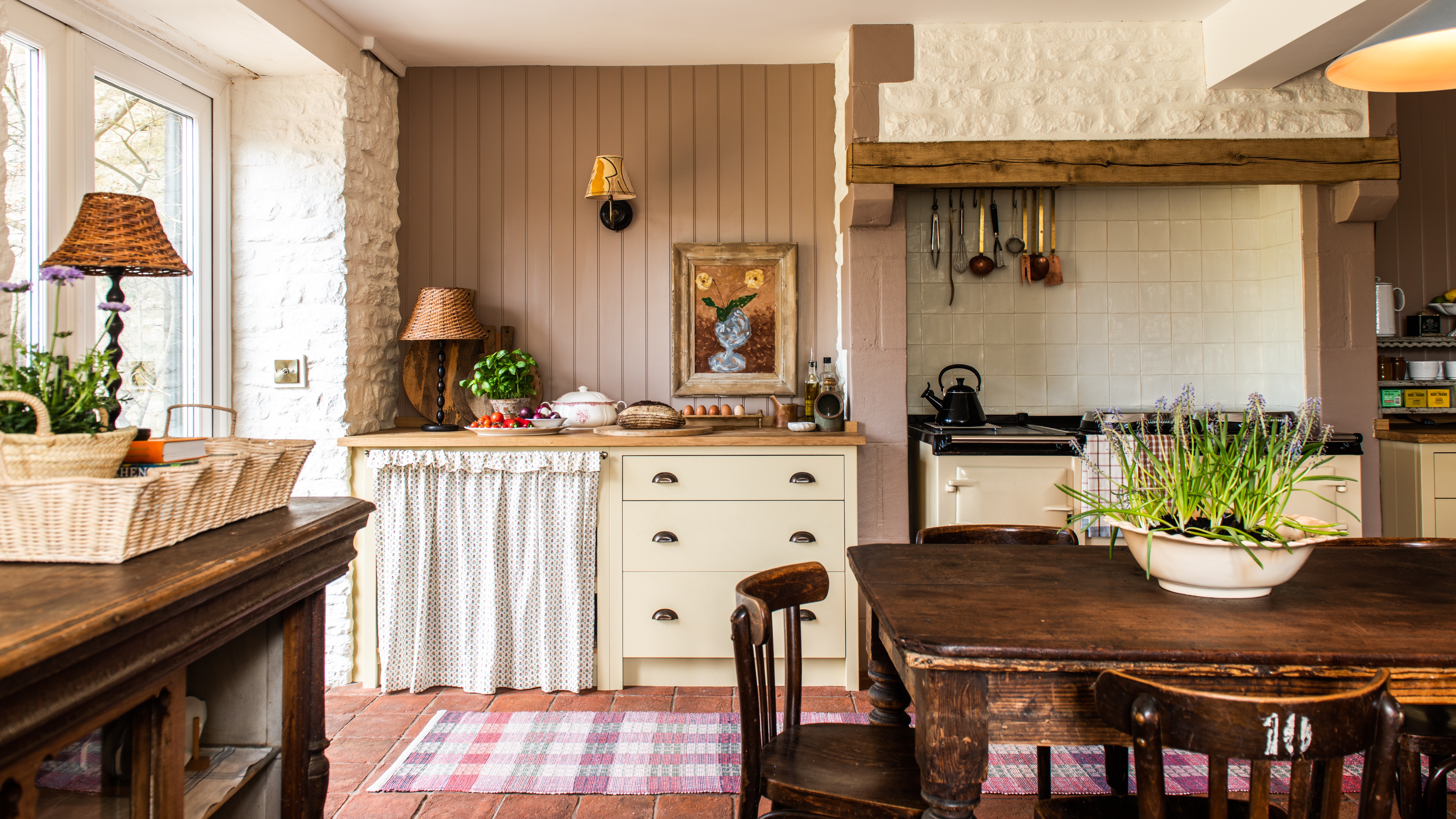
Creamy neutral paint colours are back — just don’t call it magnolia
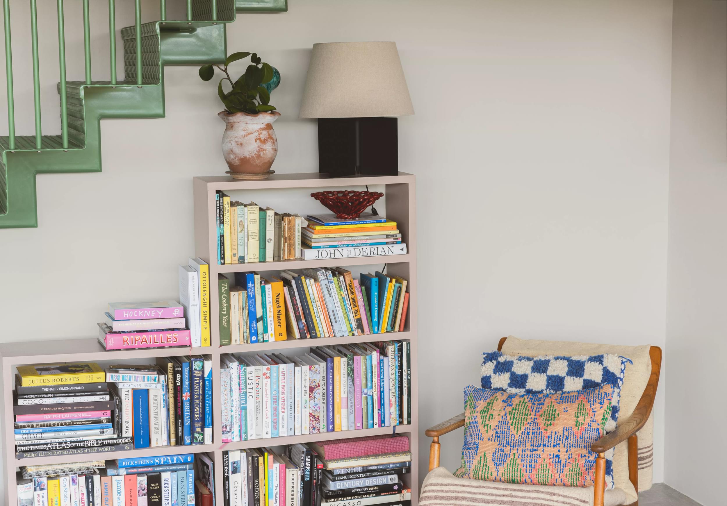
Find your perfect neutral with COAT Paints' new Polite Palette
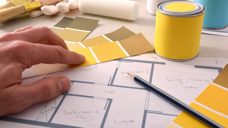
Goodbye To Butter Yellow: The Moodier Hue That's On Trend
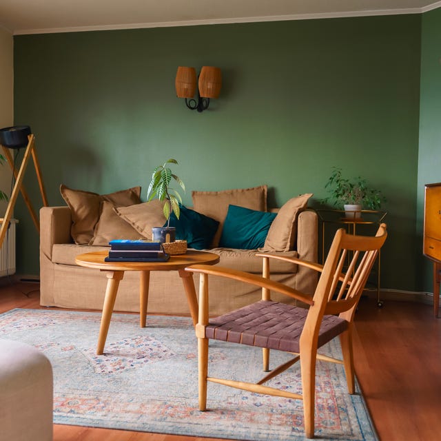
Designers Say These Vintage Paint Colors Are Back

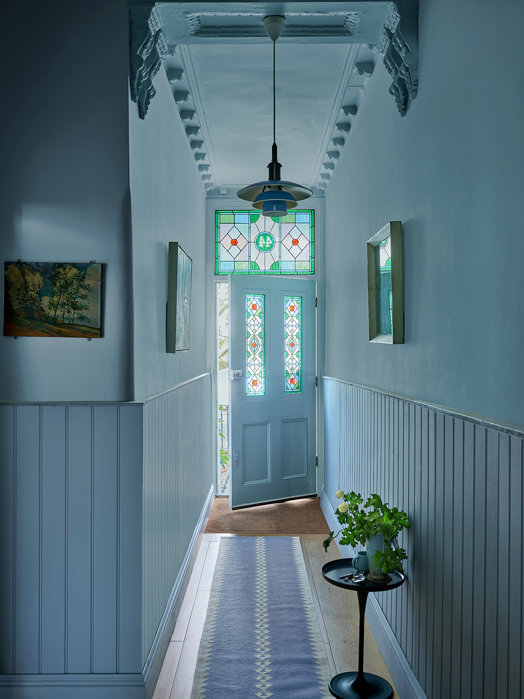
130 New Paint Colors Just Dropped, Including an Ultra-Fast-Drying Exterior Finish

We're Finally Leaving The "Sad Beige Aesthetic" Behind

Forget Millennial Pink: When It Comes to Wall Paint, "Boring" Beige is Back
6 earthy neutral paints that designers say are replacing bland white walls

It’s Official: Designers Are Ditching This Once-Classic Color
This SURPRISING Color Is About to Be Everywhere, According to Designers

Forget painting your walls grey, it’s time to sparkle
Cox & Cox launches its first wall paint range — and it's available in 16 beautiful colours
This surprising color trend is having a comeback

Make choosing paint easy with new 'natural light' colours

COAT Paints' newest palette is an antithesis to the Colour of the Year – embracing 'timeless' over 'trendy'

Say Goodbye to Neutrals: Color-Drenching Will Define 2026 Interiors