1/14
The Best Exterior Paint Colors Designers Have Ever Used
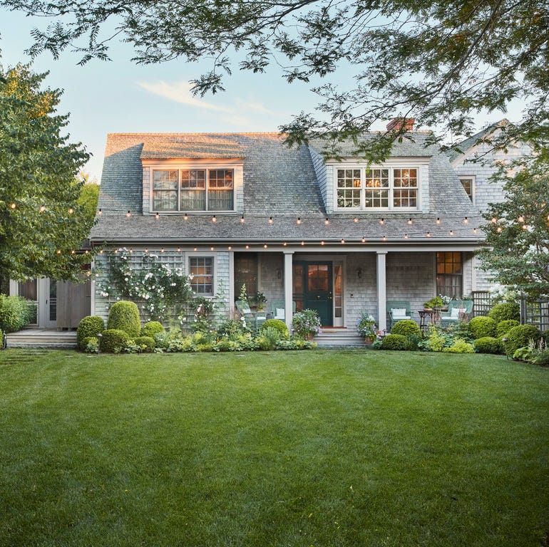
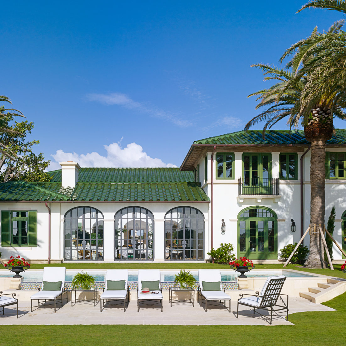
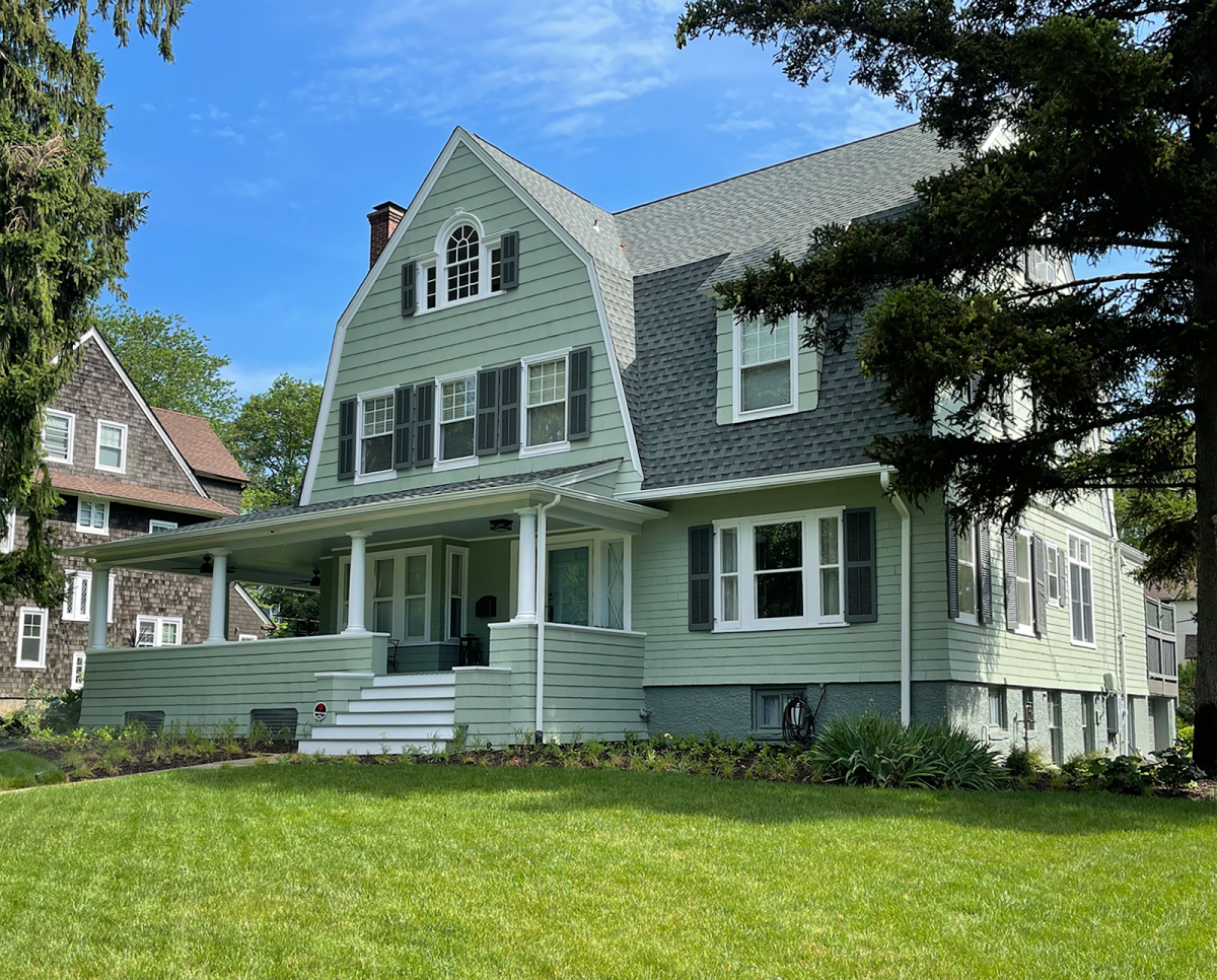
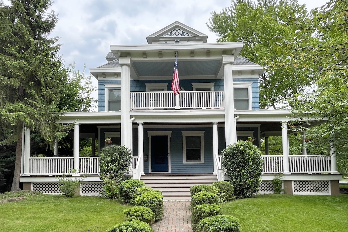
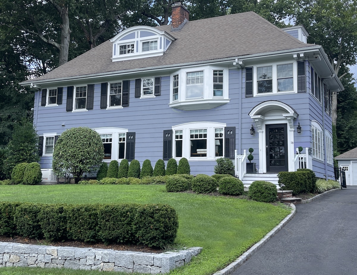
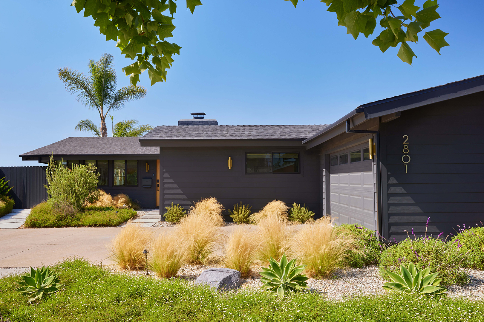
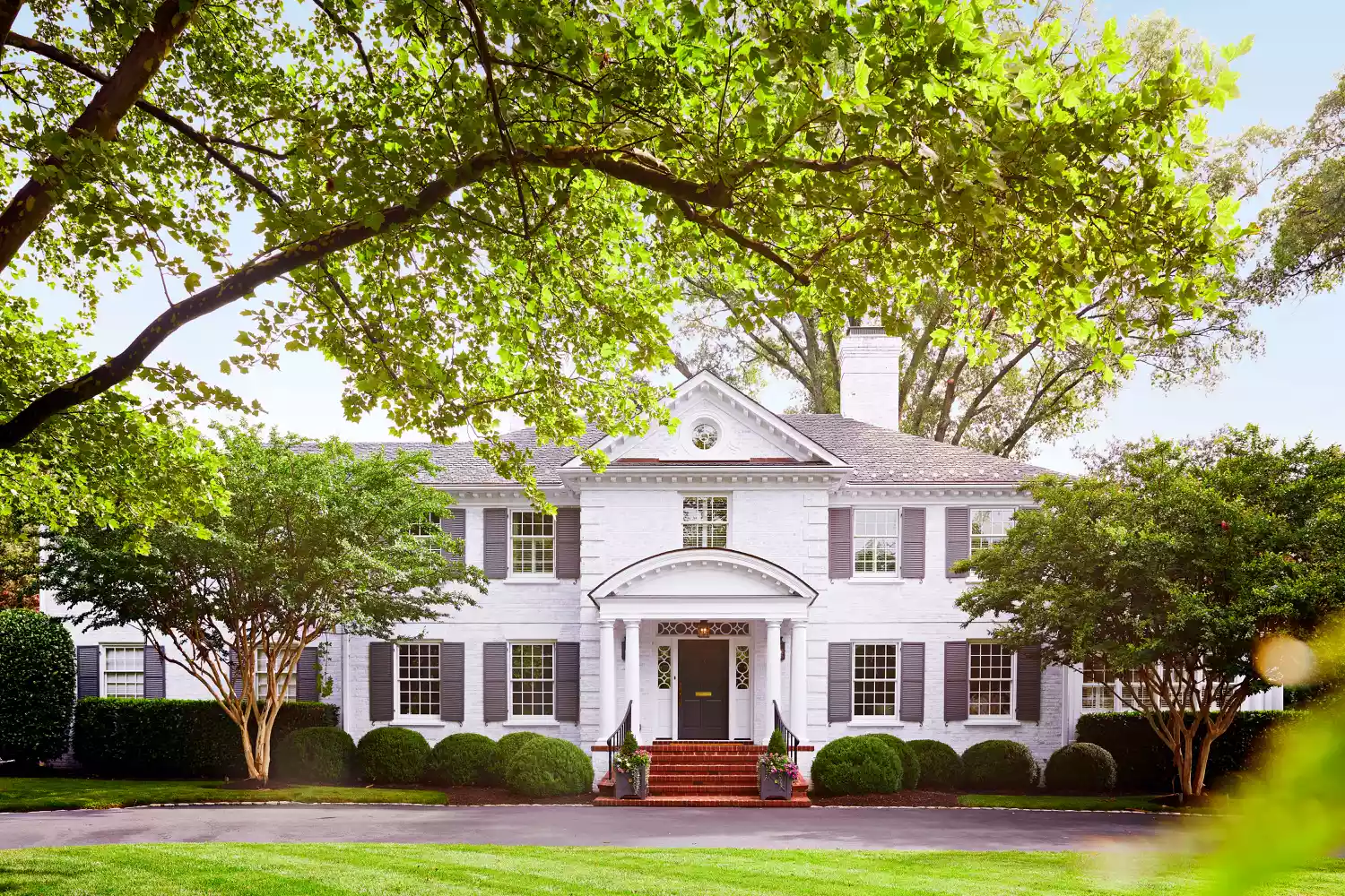
This blog post explores the meticulous process designers undertake when selecting exterior paint colors for homes, moving beyond simple aesthetic appeal to consider factors like natural surroundings and underlying tones. It highlights that designers do not randomly choose colors, but rather employ a systematic approach to ensure the chosen hue harmonizes with various elements of the home and its environment. The article features insights from 13 interior designers who share their top picks for exterior paint colors, along with justifications for their choices.
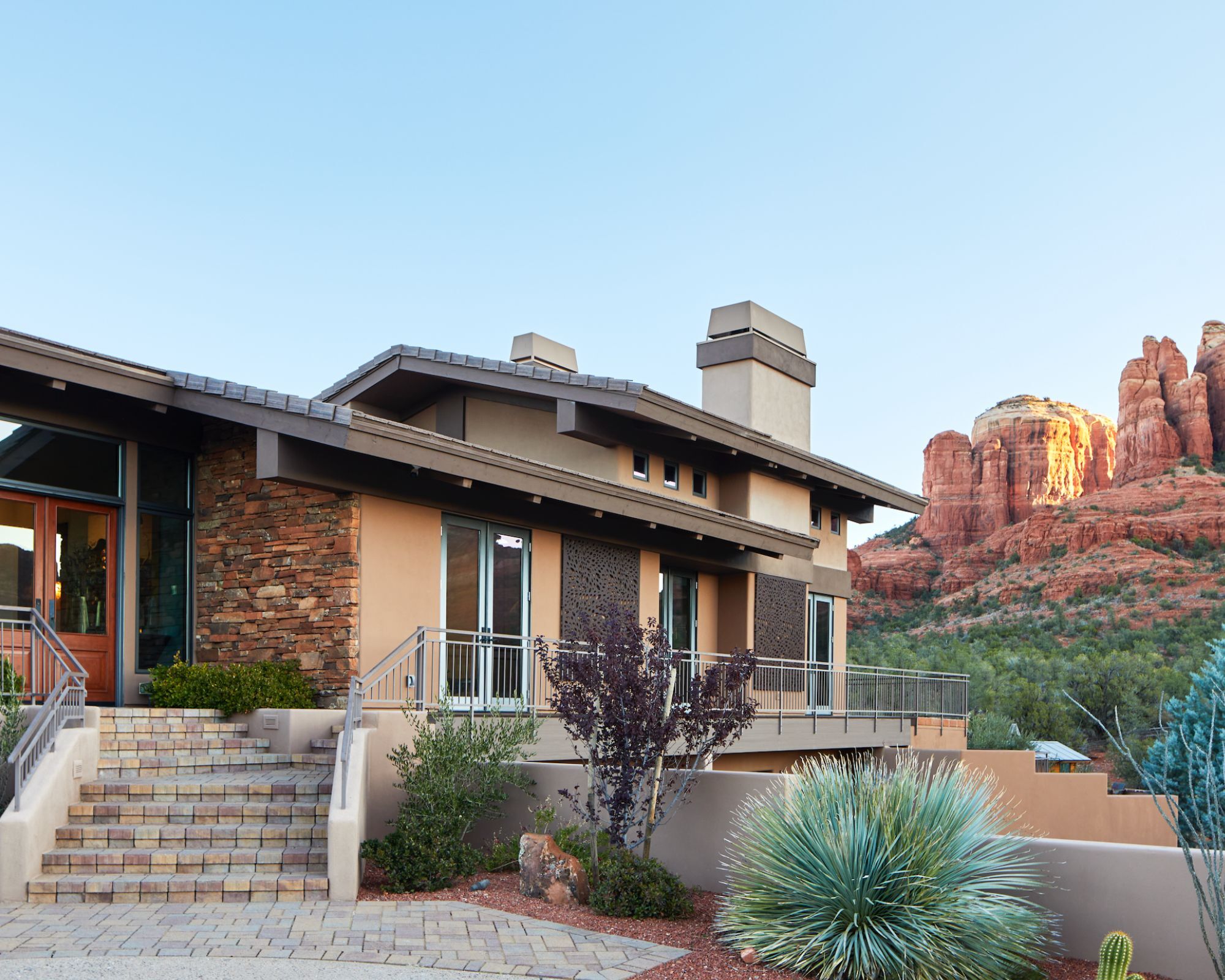
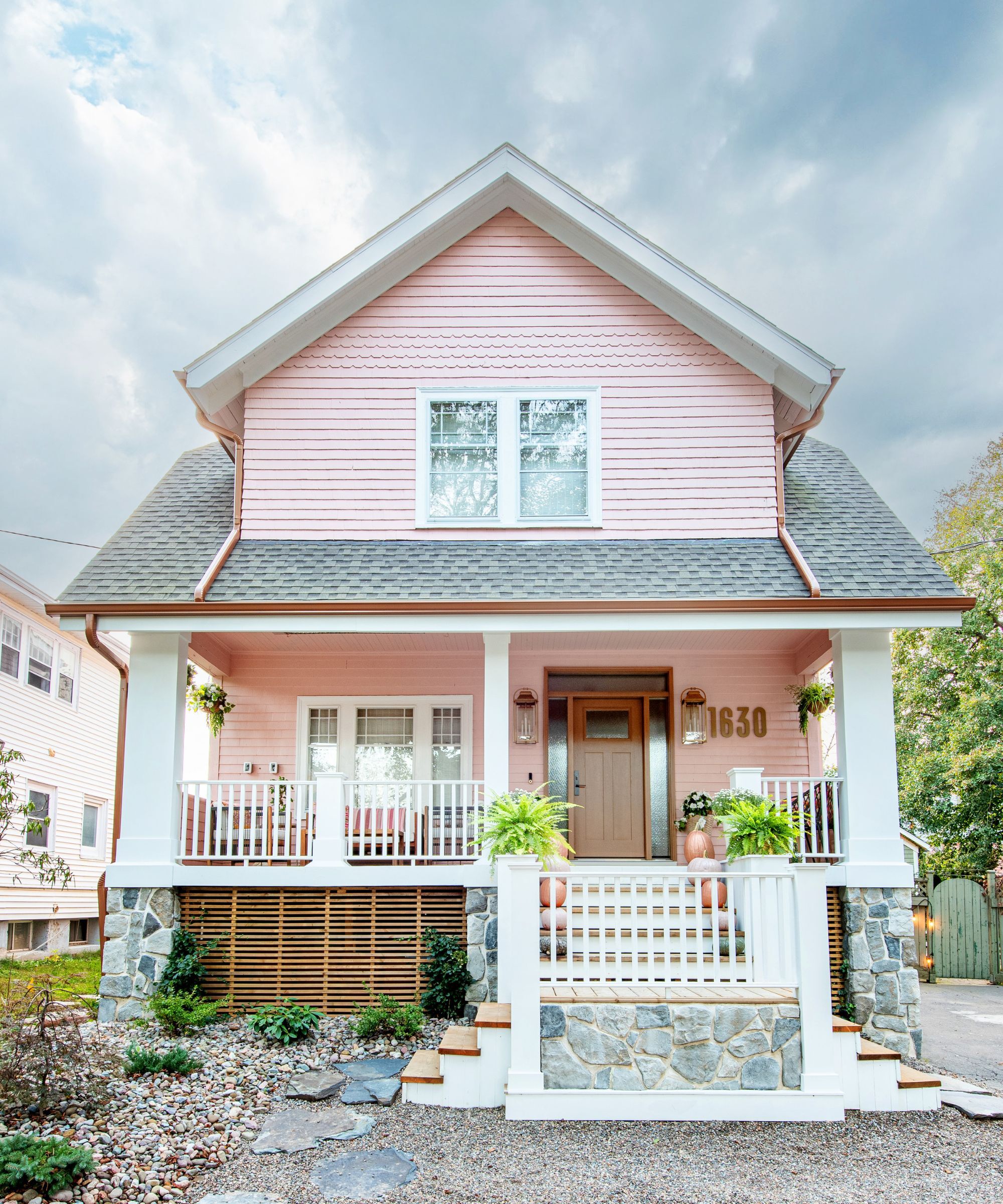
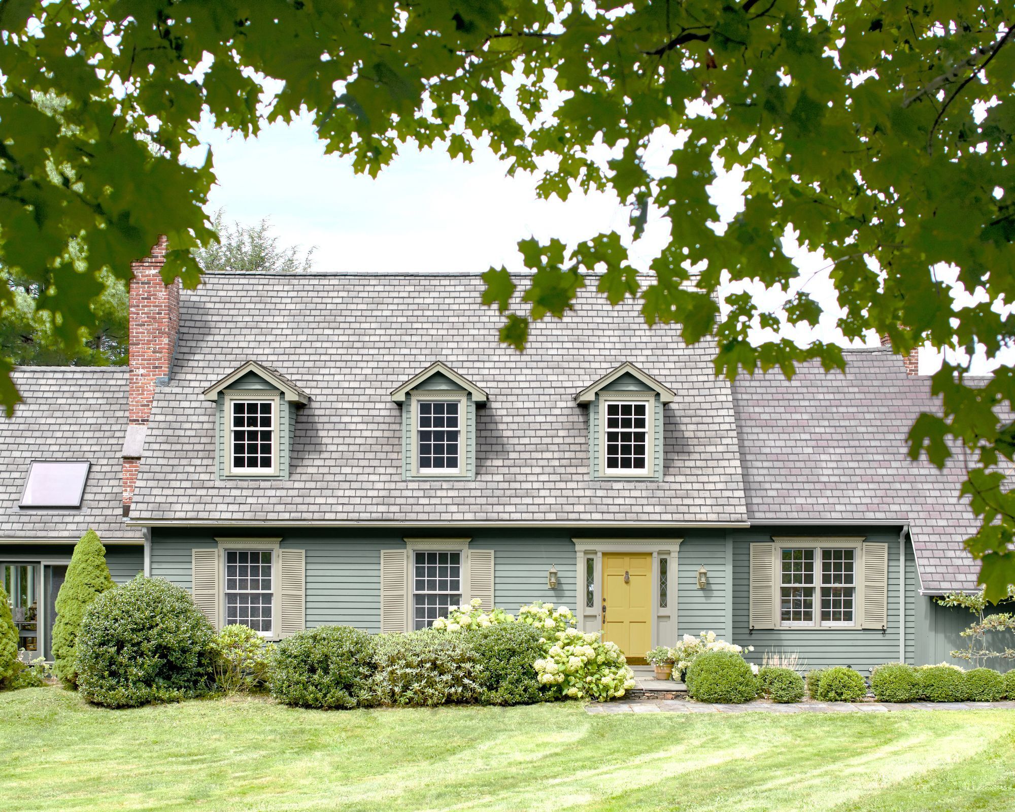
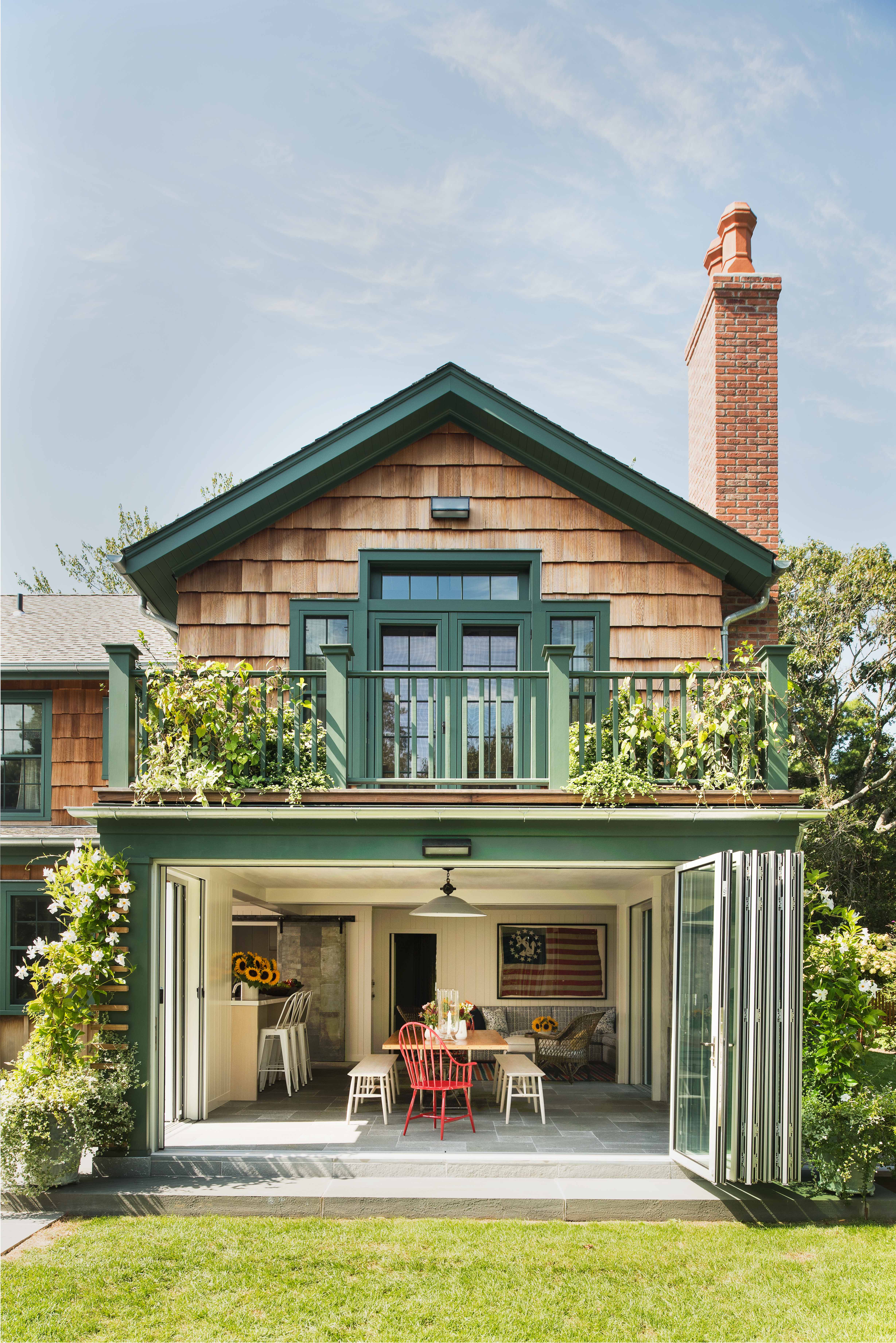
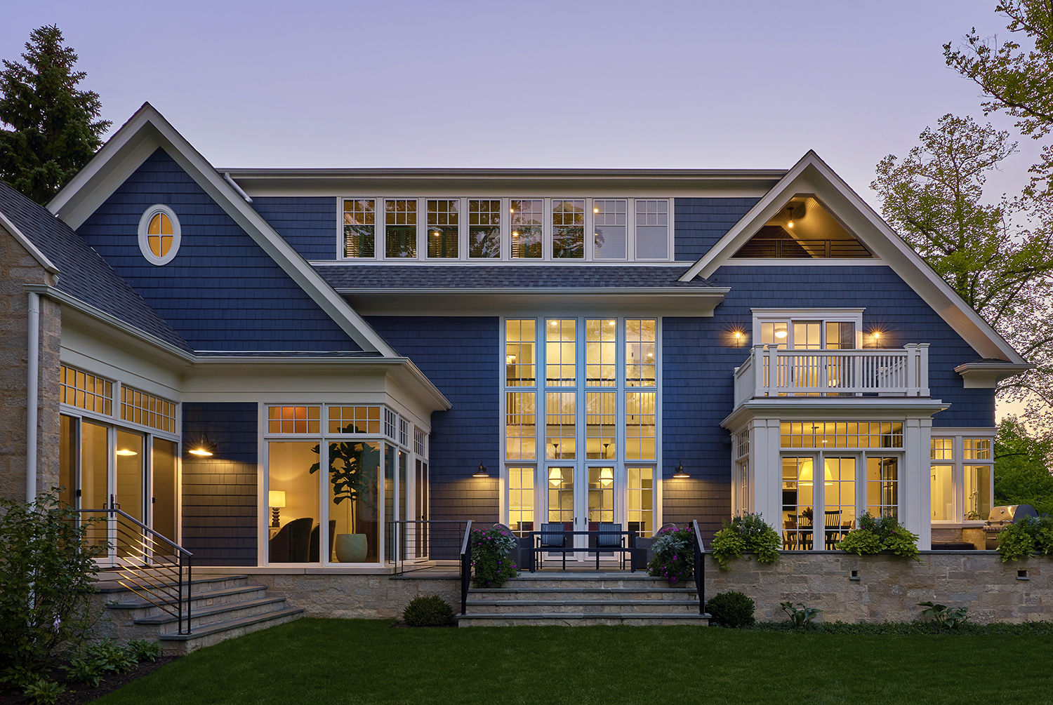
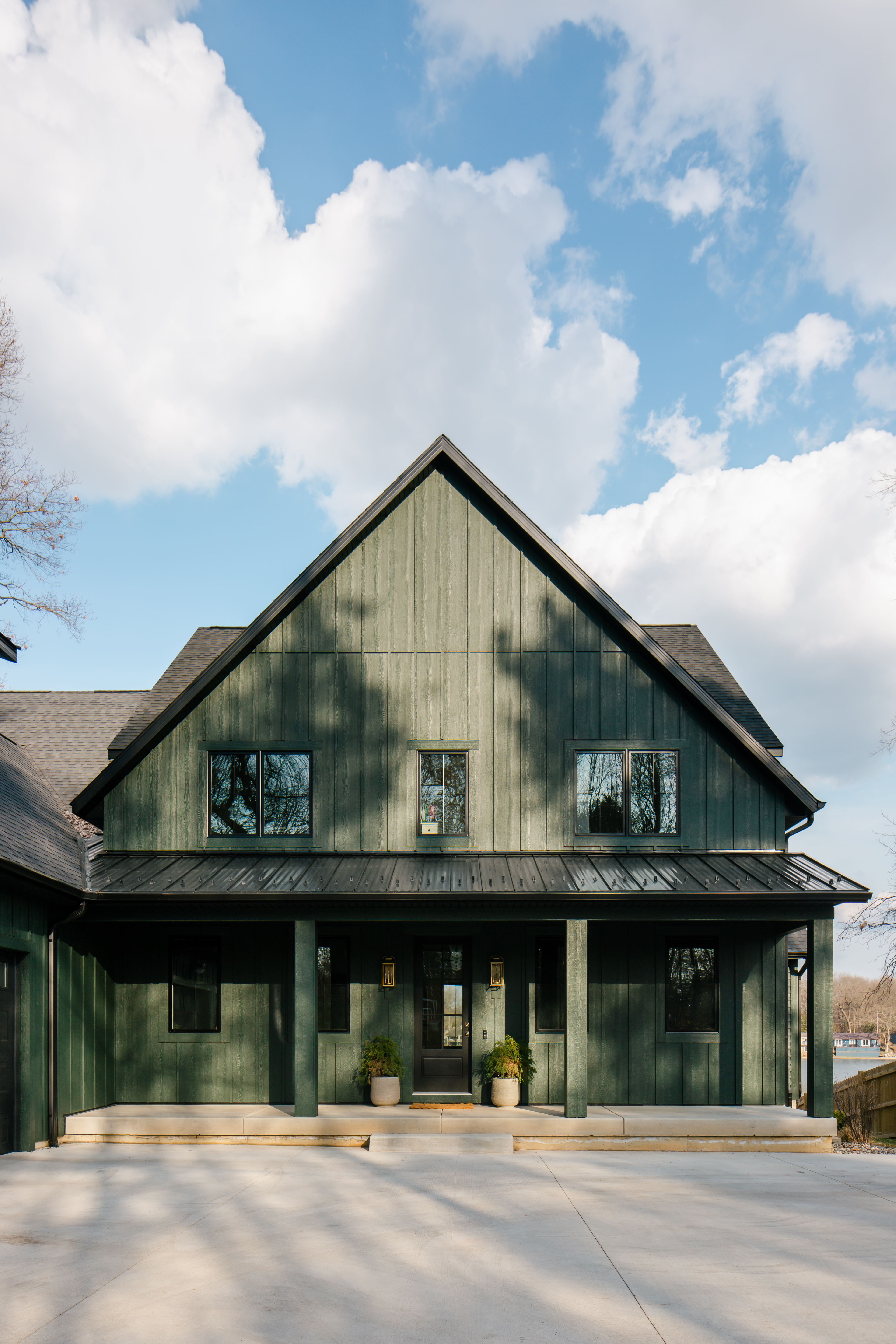
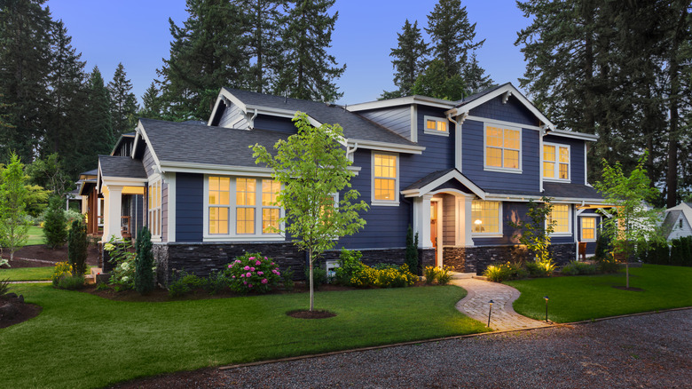
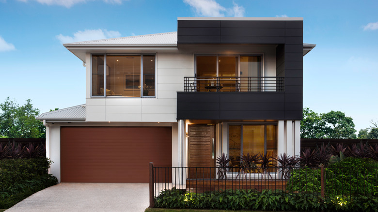
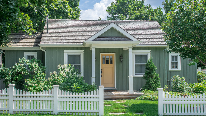
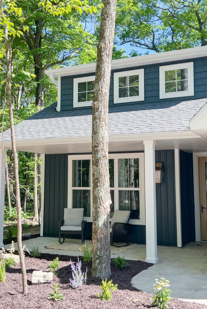
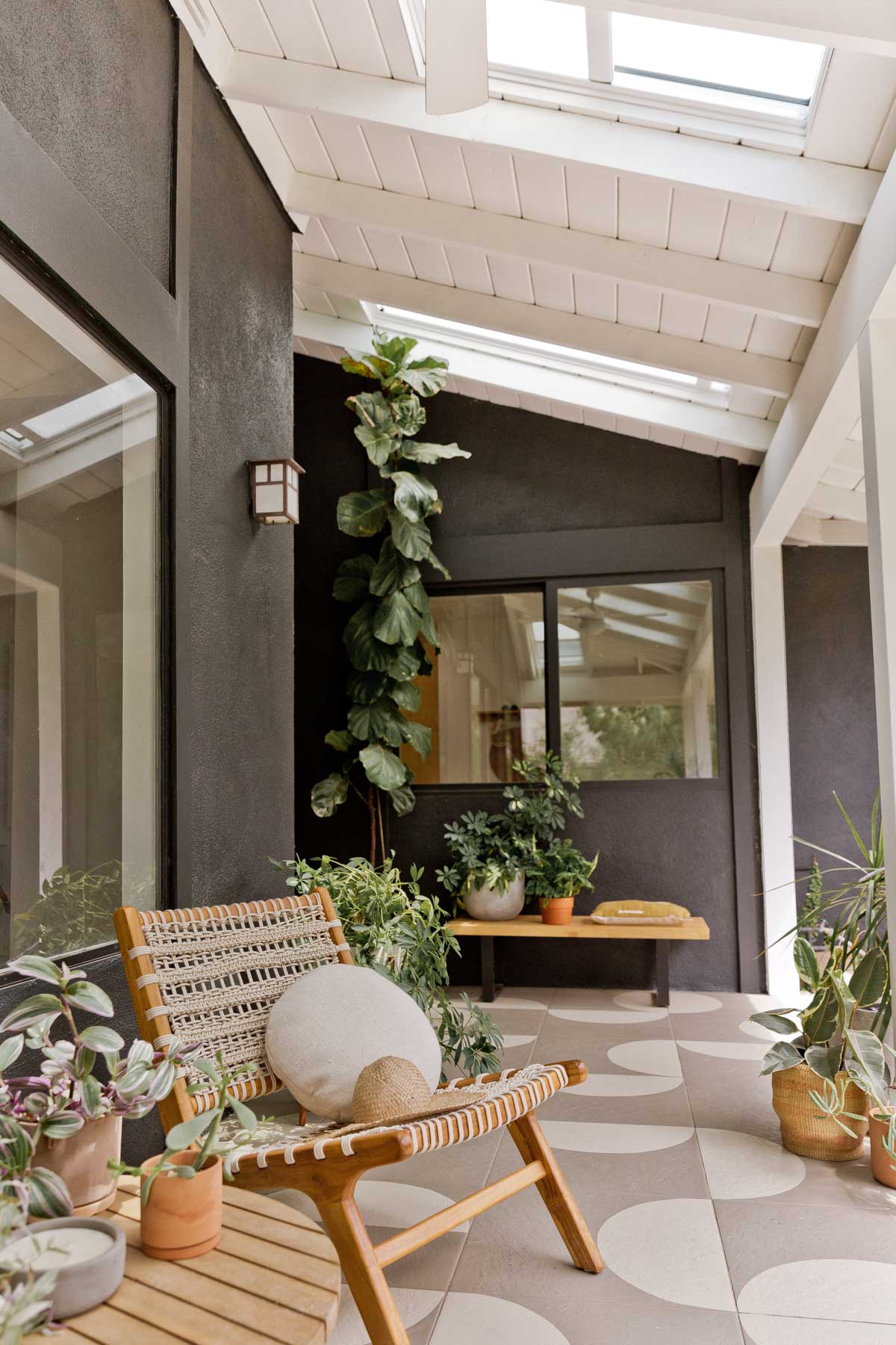
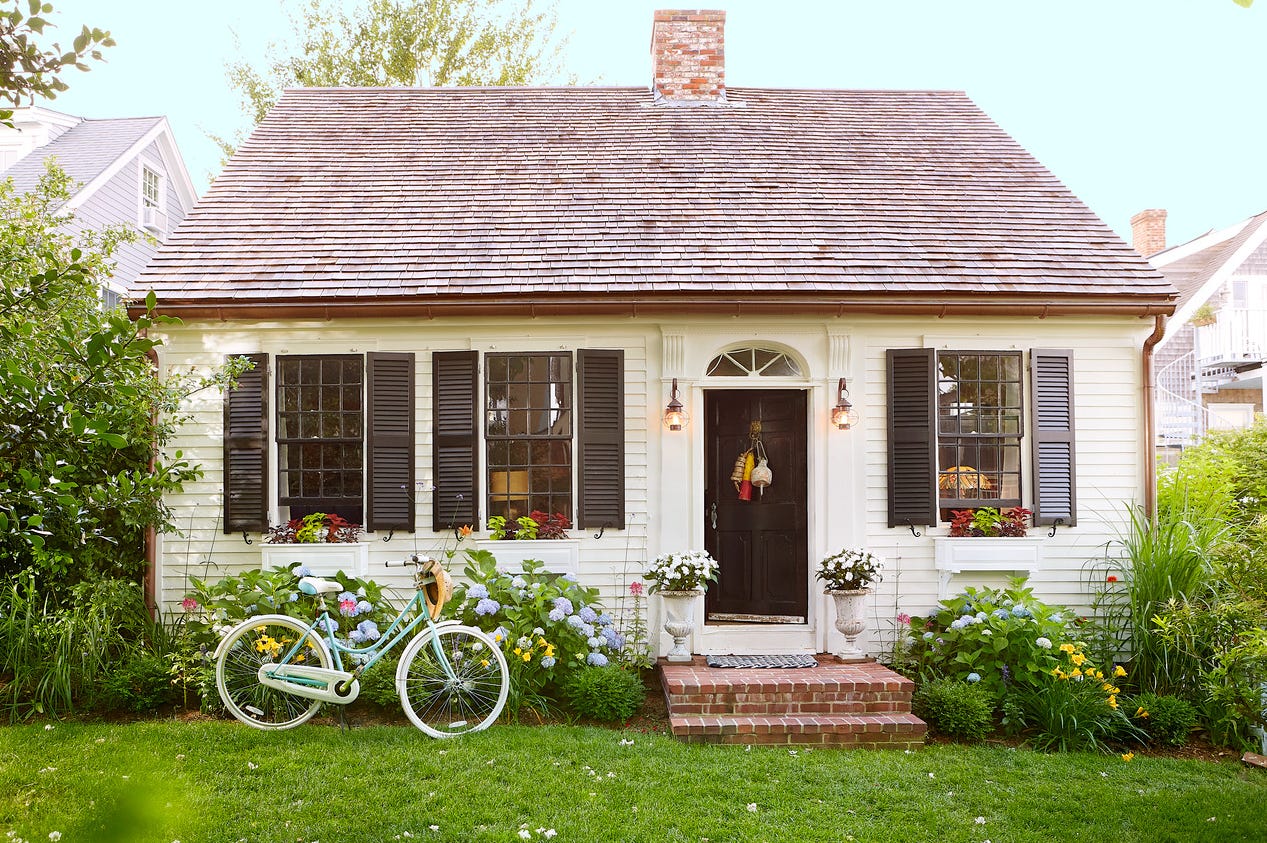
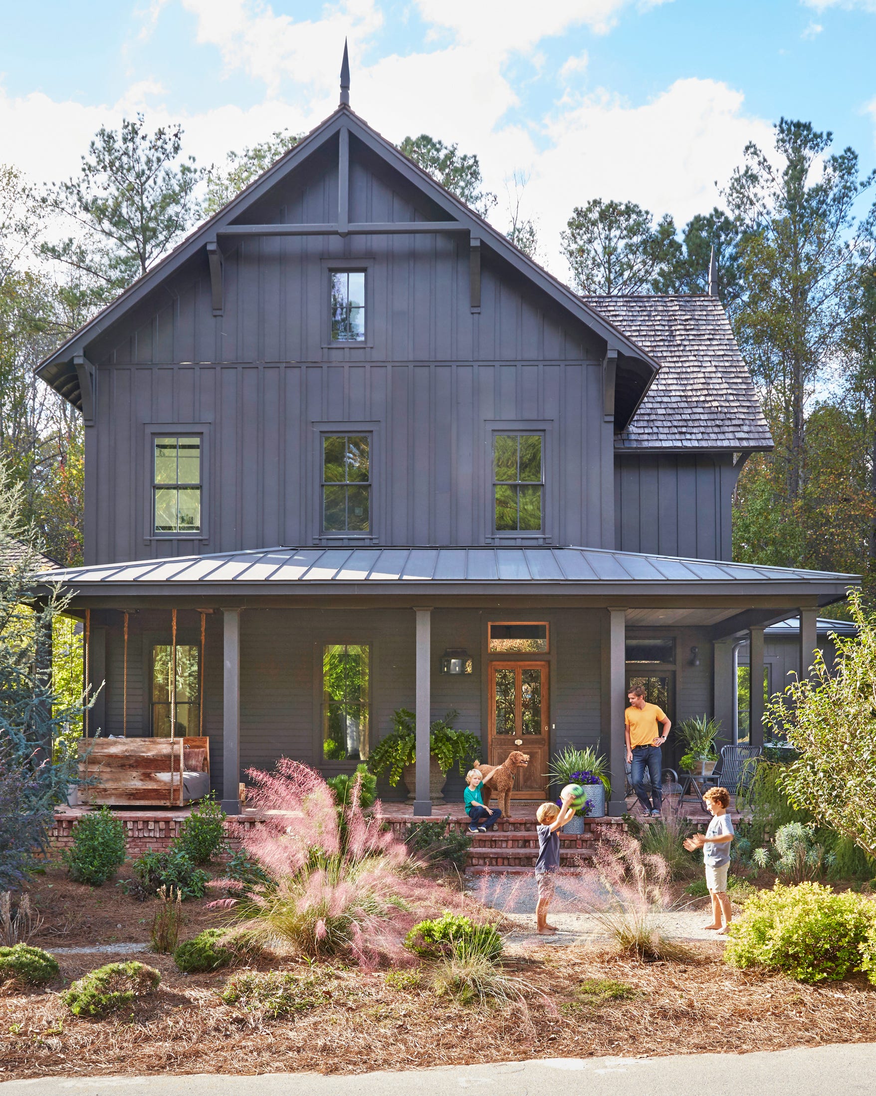
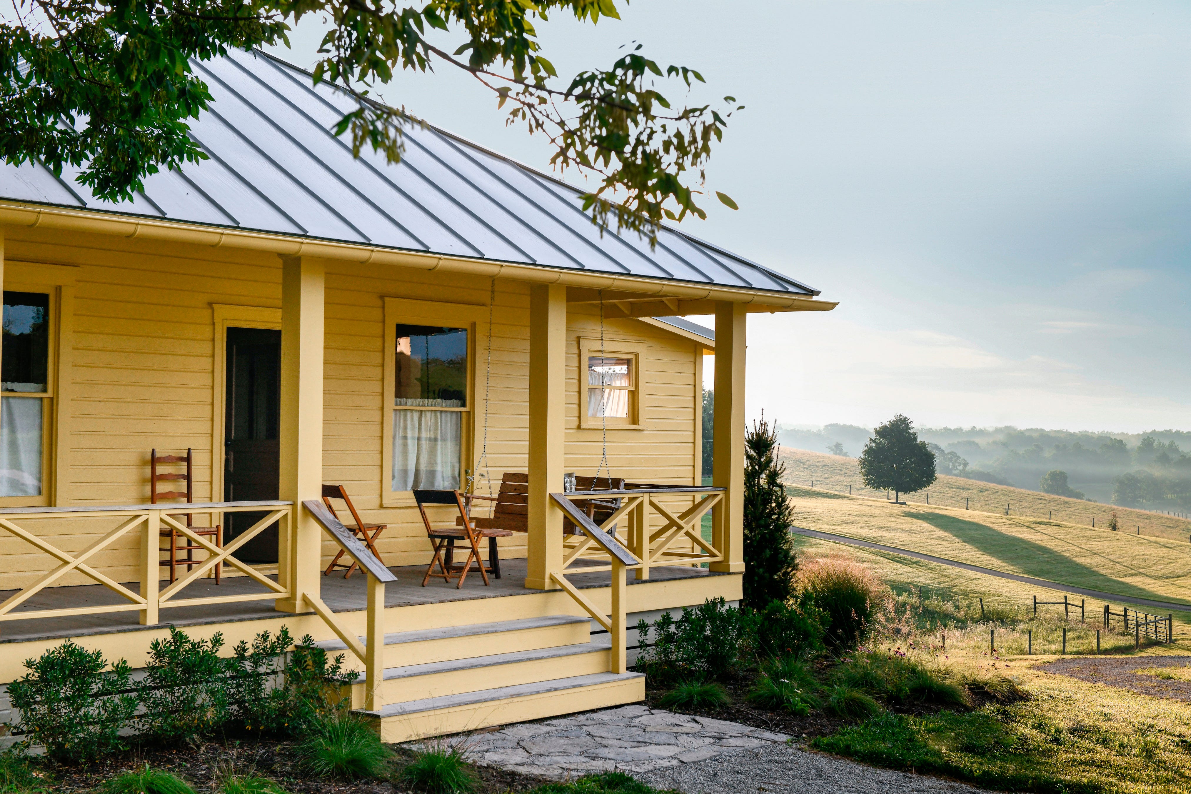
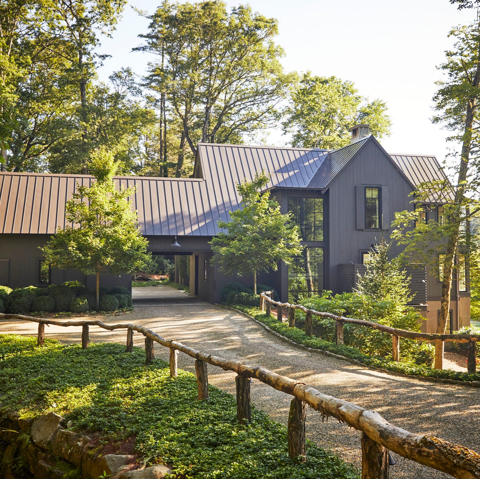
Amber Sokolowski of Soko Design recommends Dunn-Edwards’ Black Tie, a rich, true black that receives frequent compliments for its dramatic effect. Abbie Naber of a. Naber Design suggests Sherwin-Williams Peppercorn, noting its ideal blend of black and gray with blue undertones, which softens its impact and complements warm stucco and nickel window frames. Molly Kidd of Molly Kidd Studio favors Farrow & Ball’s Salon Drab, a moody deep green that pairs well with over-grouted stone. Lauren Lerner of Living with Lolo endorses Benjamin Moore’s Hale Navy for its elegant depth that enhances curb appeal and blends seamlessly with natural stone, wood accents, or white trim. Kerith Flynn of Margali & Flynn Designs praises Benjamin Moore’s White Dove for its versatility, matching any roof color and shutter style due to its soft, warm white tone. Theresa Butler of Theresa Butler Interiors recommends Sherwin-Williams’ Anew Gray, describing it as a perfectly balanced neutral with significant depth, despite its name.
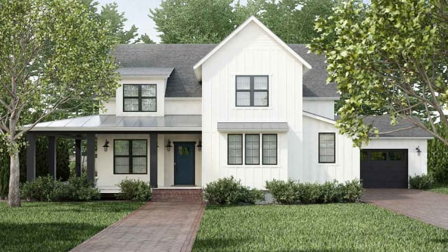
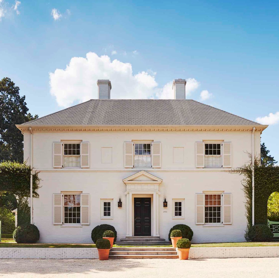
Tara Lenney of Tara Lenney Design highlights Sherwin-Williams’ Alabaster as a fresh, warm white suitable for both modern and traditional homes, which avoids yellow or blue undertones and complements various trim and accent colors. Regan Billingsley of Regan Billingsley Interiors also champions Alabaster, combined with Sherwin-Williams’ Natural Choice for shutters, to create a welcoming facade. Margarita Bravo suggests Sherwin-Williams’ Natural Linen paired with creamy white accents, creating an inviting warmth that shifts gracefully with changing light. Tiffany Glasco of Nahla Madison Home recommends Benjamin Moore’s Kendall Charcoal for its rich dark gray that offers a dramatic yet elegant mood. Audrey Frances Doty of Audrey Frances Design uses Sherwin-Williams’ Hickory Smoke for its warm and rich brown undertones, perfect for accentuating earthy tones and creating an inviting atmosphere for any home style.
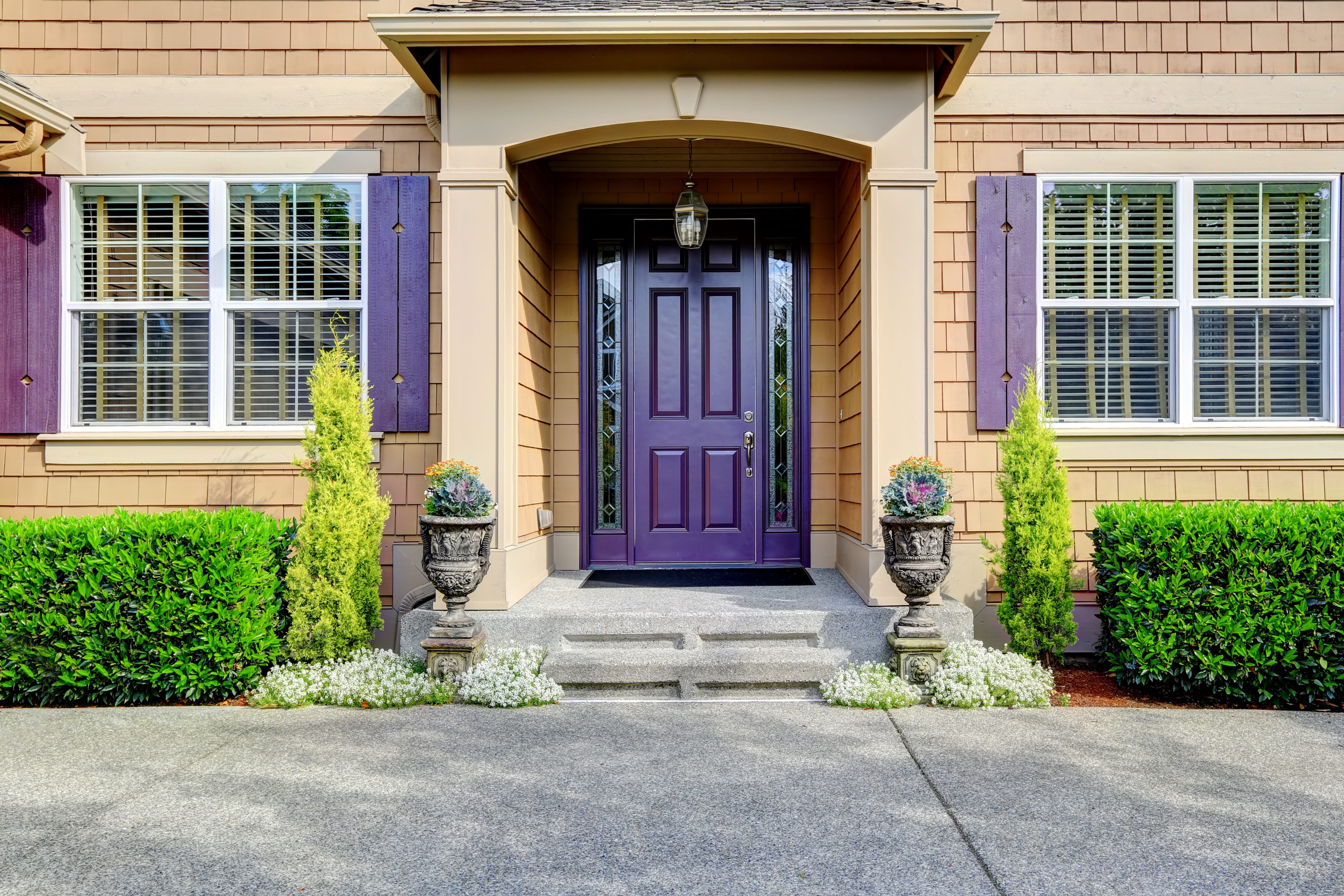
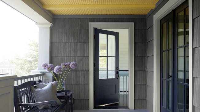
Susan Petrie of Petrie Interior Designs advocates for Farrow & Ball’s Drawing Room Blue for front doors, believing its strong color makes an inviting statement and symbolizes trust and serenity. BettyAnn Kraft of Bella B Home Designs stands by Farrow & Ball’s Decorator’s White for its consistent appearance in varying light conditions and timeless appeal. Finally, Shauna Jones of Shauna Glenn Design recommends Sherwin-Williams’ Tricorn Black, noting its modern appeal without being overly heavy, and its subtle warmth that prevents it from looking like a stark, flat black. The collective advice underscores the importance of considering a paint's undertones, how it interacts with natural light, and its harmony with a home's architectural features and surrounding landscape.
#ExteriorPaintColors #InteriorDesigners #HomeImprovement #ColorSelection #CurbAppeal #ArchitecturalHarmony #DesignTips #ExteriorPaintColors #InteriorDesigners #HomeImprovement #ColorSelection #CurbAppeal #ArchitecturalHarmony #DesignTips
0 comment in total
 No comments yet
You may also like
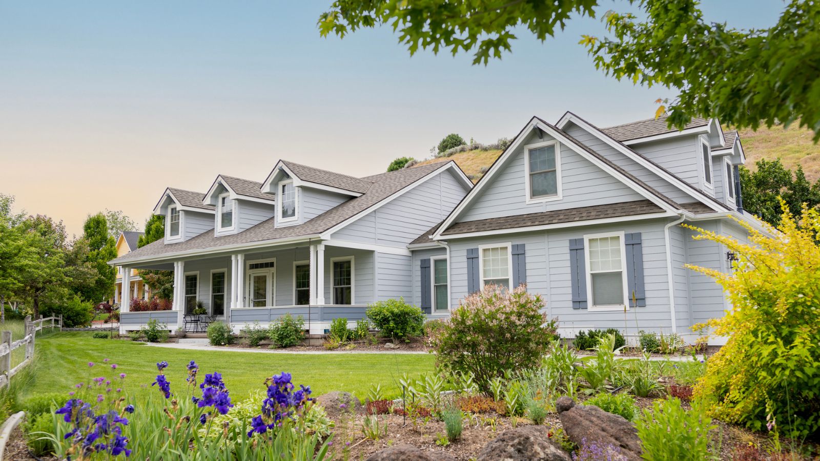
10 of the best exterior paint colors according to designers – these are the go-to shades from tried and trusted brands

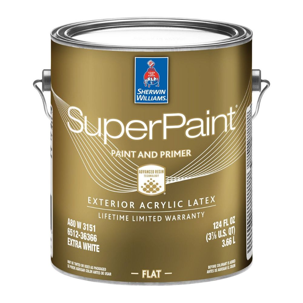
The Best Exterior Paints for Every Outdoor Surface

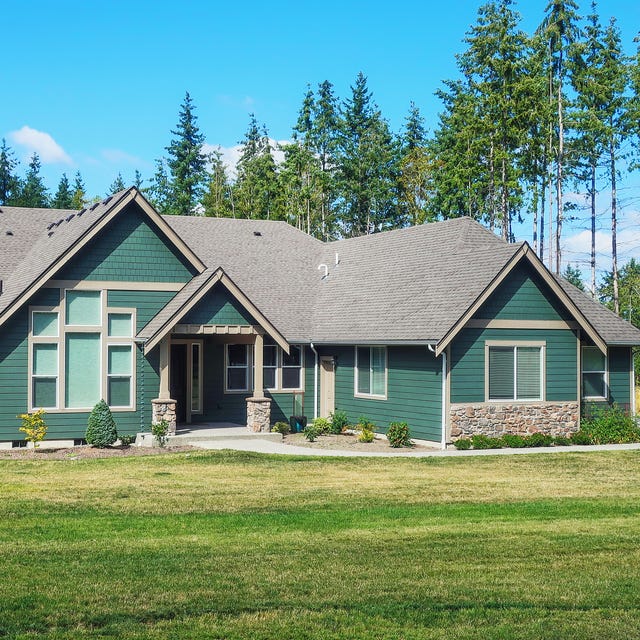
These Exterior House Paint Color Combos Are Bound to Turn Heads

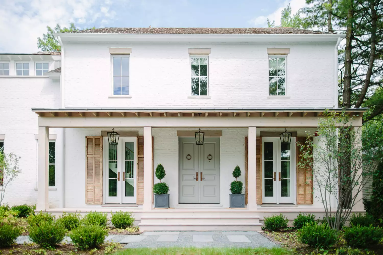
Designers Reveal 7 Exterior Paint Colors They Always Use for Their Projects

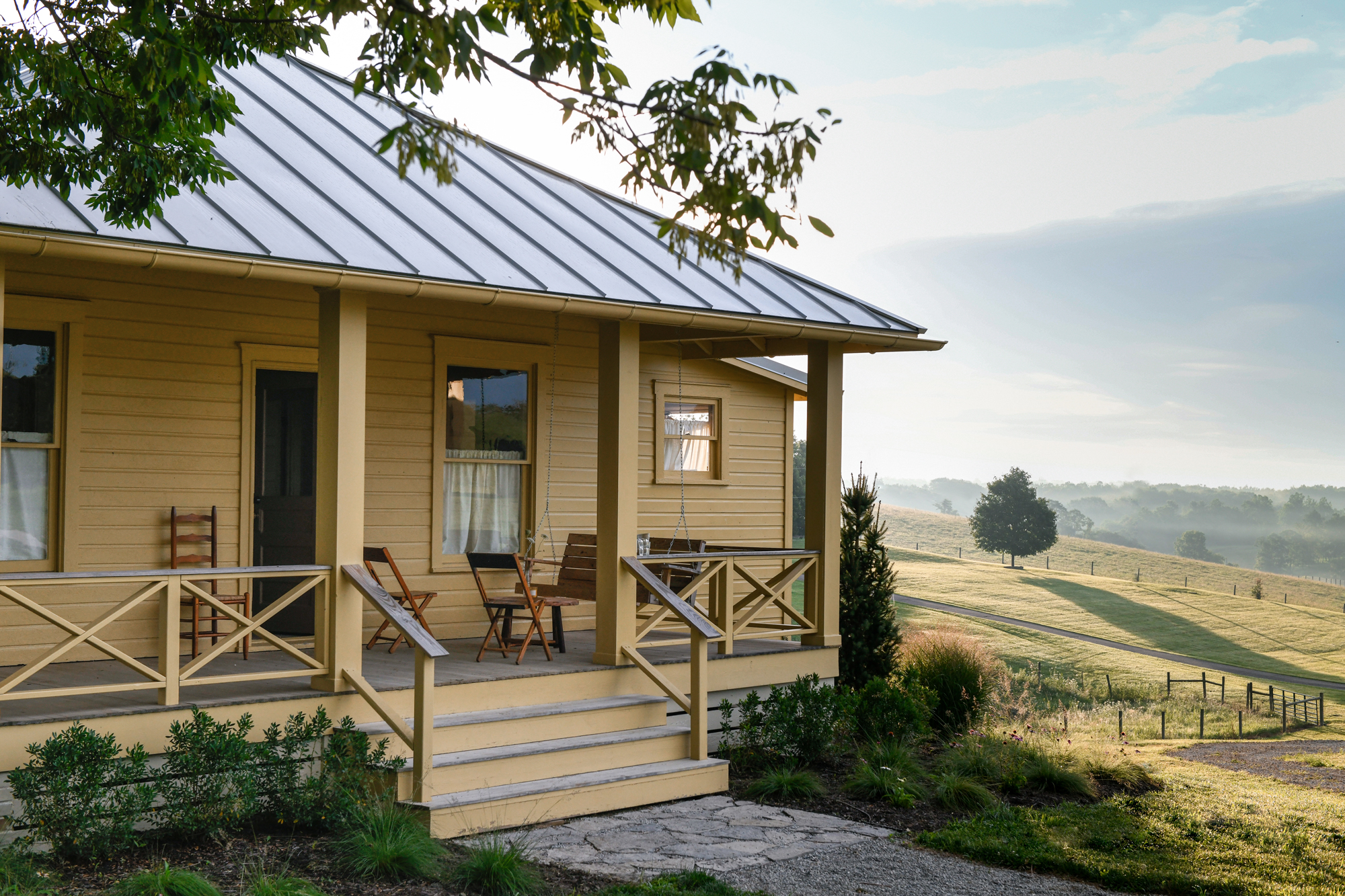
7 rules designers always follow to find the best exterior paint for your home
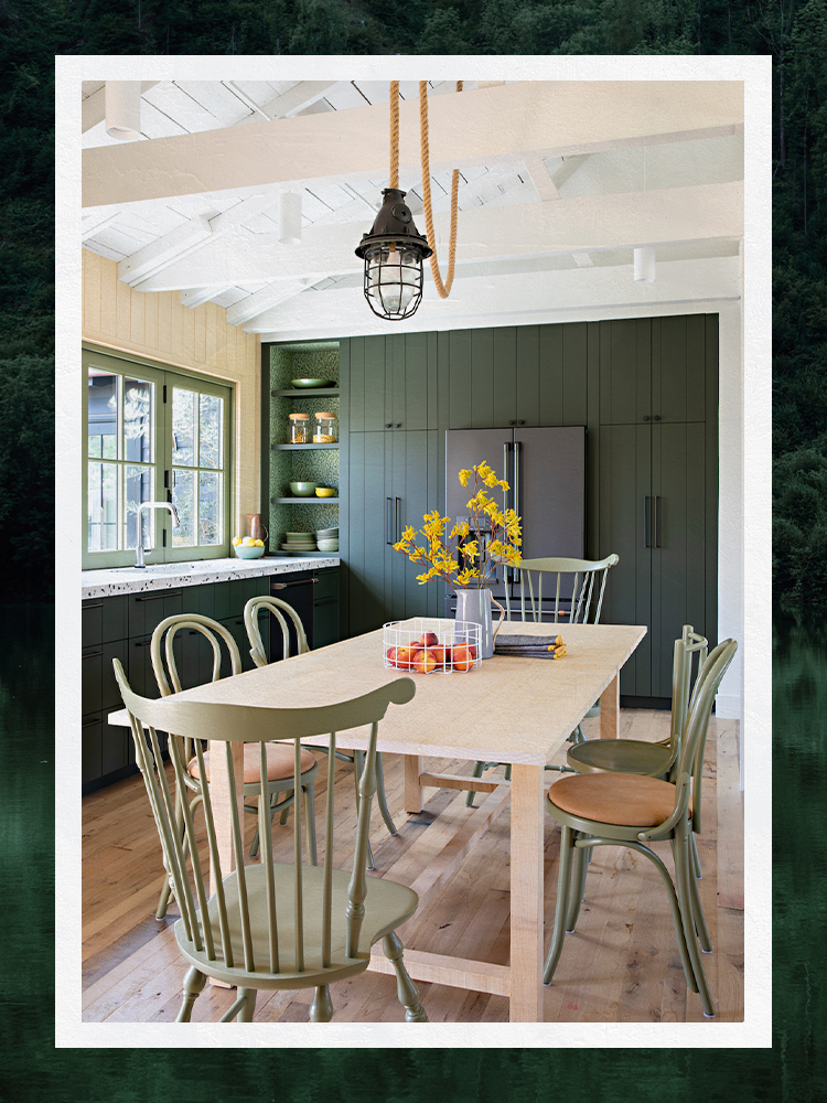
Designers Share Their Tried-and-True Shades From the Best Interior Paint Brands
9 Tips for Choosing Exterior Paint Colors
The 25 Best Exterior Paint Colors To Give Your Home Inviting Curb Appeal for 2025
6 Best Exterior Paints for Your Home, According to Experts
Four Designers Pick Their Fave Exterior Paint Color For Your Abode


The most timeless paint colors according to designers
8 Exterior Paint Colors That Make Your House Look More Expensive, According to Designers

The Best Exterior Paint Colors, According To Designers
Britain's best interior designers on the paint colours you just can't go wrong with
10 Most Popular Exterior Paint Colors for 2025

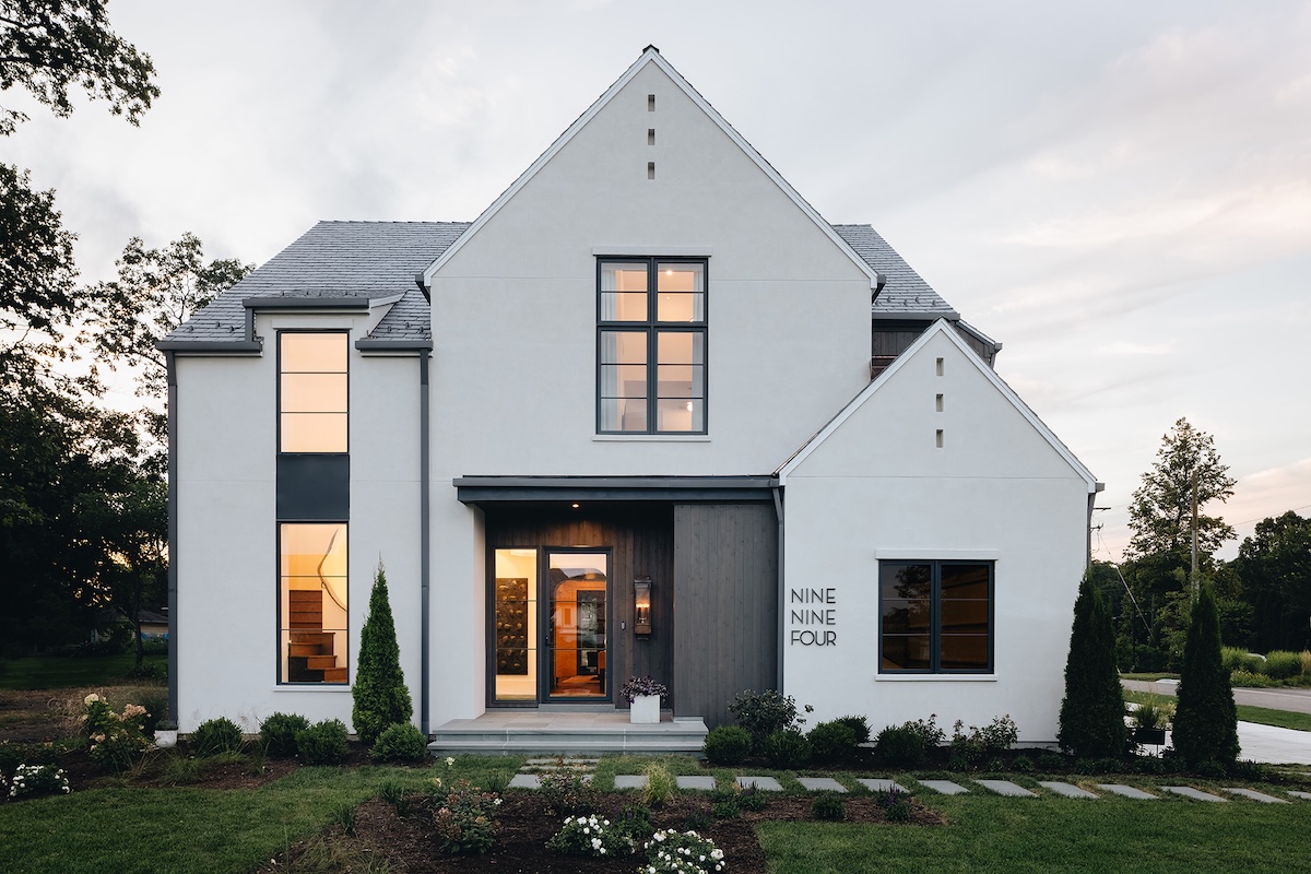
I Asked Three Color Experts How to Choose Modern Exterior House Colors. Here's Their Best Advice.

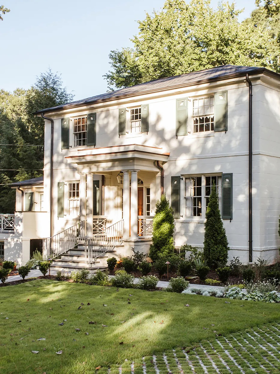
The Moody Shade That Will One-Up White Exteriors in 2026

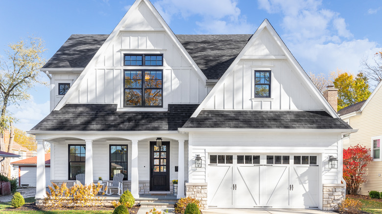
The Most Popular Exterior Paint Colors Of 2021
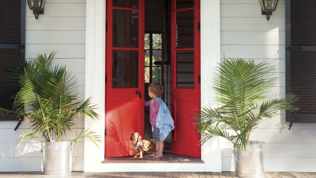
Hottest Exterior Paint Colors of 2020
10 Exterior Paint Color Trends You'll See Everywhere In 2025