1/19
Before & After: Color Runs Wild in This Once-Beige Clinton Hill Apartment
Architect Luki Anderson of Studio Officina undertook a significant renovation of a 1905 Clinton Hill duplex in Brooklyn. The clients, a couple with two children, sought a functional overhaul and a vibrant color palette, moving away from the home's original beige aesthetic. Anderson's initial assessment revealed the owners' existing affinity for color through their textiles and art, with the kitchen cabinets even being self-painted with colorful knobs as an early attempt to personalize the space.
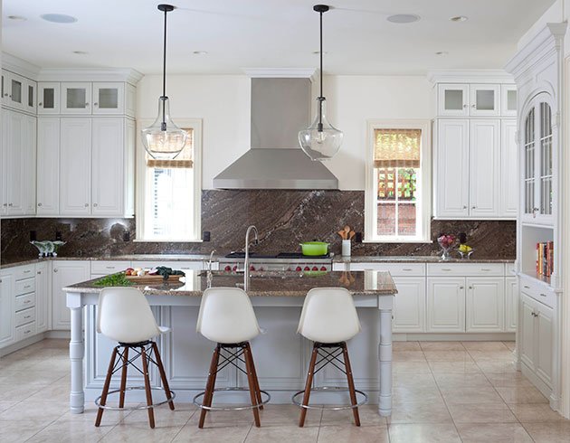
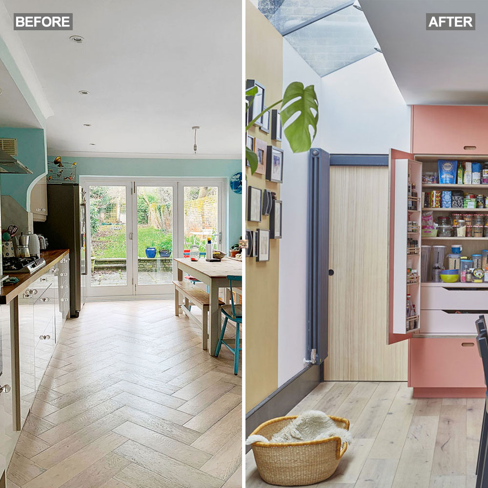
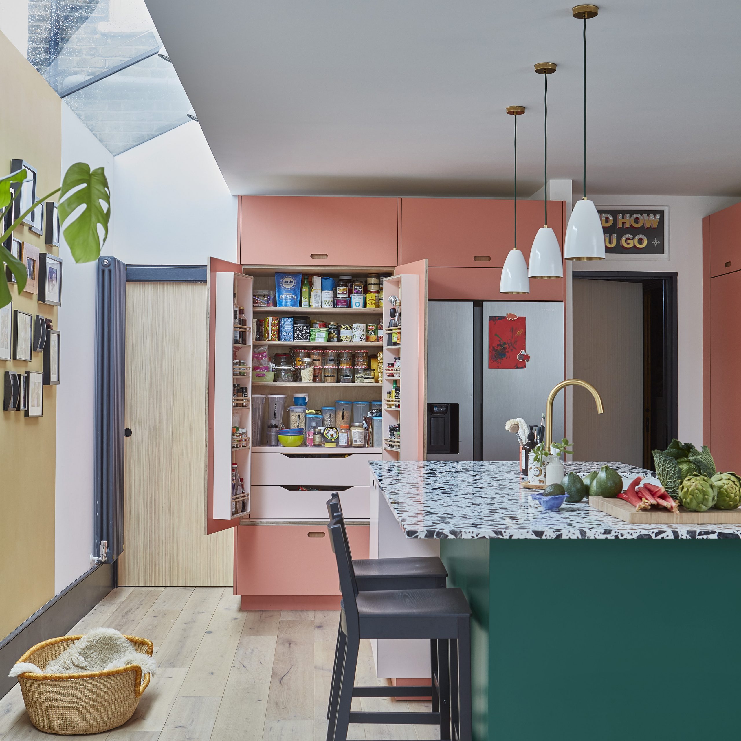
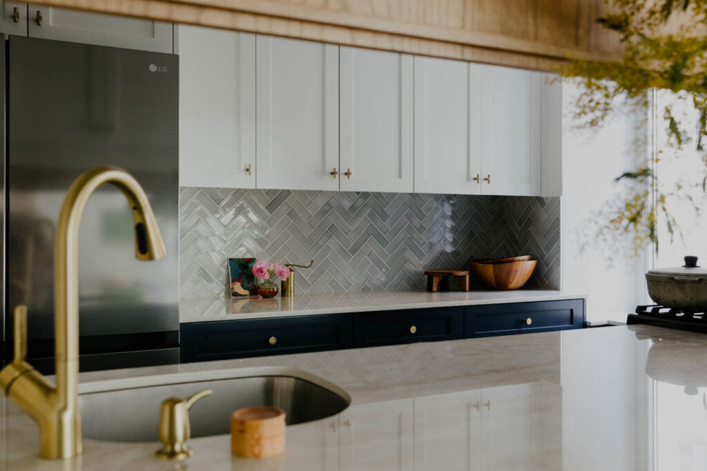
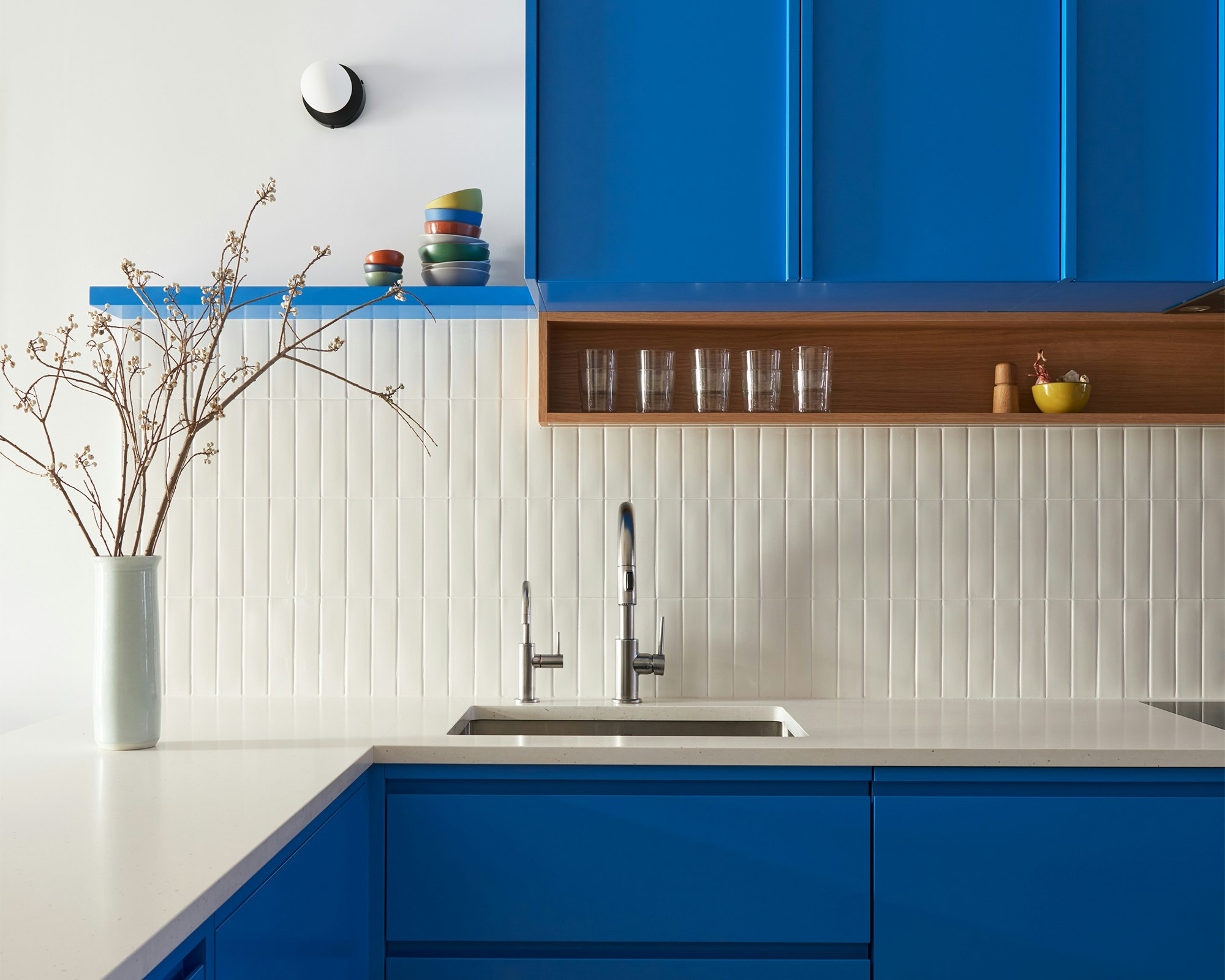
The primary goals for the renovation included expanding the kitchen and adding a third room to the lower garden level. The existing kitchen was found to be worn out and functionally inefficient. After exploring various layouts, Anderson devised a U-shaped kitchen configuration to maximize counter space and cabinetry, while keeping the sink and stove in their original positions. An unnecessary hallway behind the kitchen was re-purposed to expand the space, accommodating pantry cabinets, a refrigerator, and a coffee bar niche on the opposite wall. This design strategy ensured that the space felt open and avoided overwhelming the area with excessive cabinetry, creating a dedicated coffee or children's lunch preparation zone away from the main cooking area.
The lower level of the duplex, which initially comprised two bedrooms and two bathrooms, was also part of the renovation. The previous layout was deemed inefficient, with an imbalance of space. Anderson reconfigured the bathrooms and enhanced the primary suite by adding a proper closet, replacing a wall of wardrobes. A key addition to this level was a flexible room designed to serve as both an office and a guest bedroom. This multi-functional space was equipped with custom-built storage, an integrated desk, and a Murphy bed to optimize its utility.
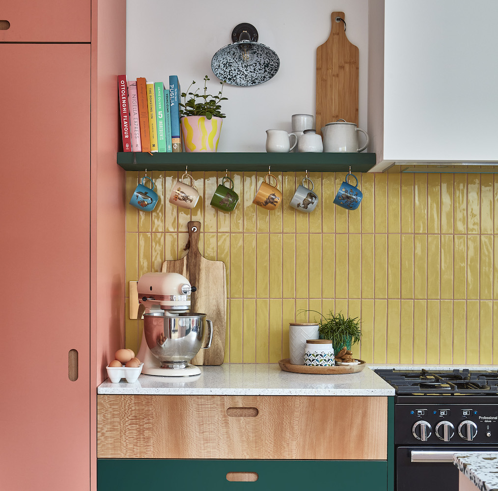
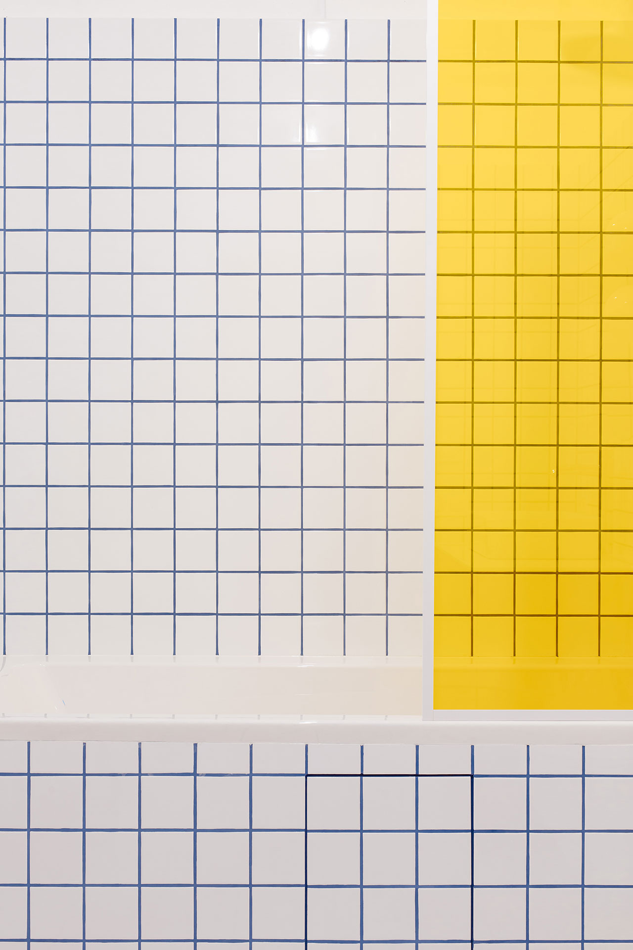
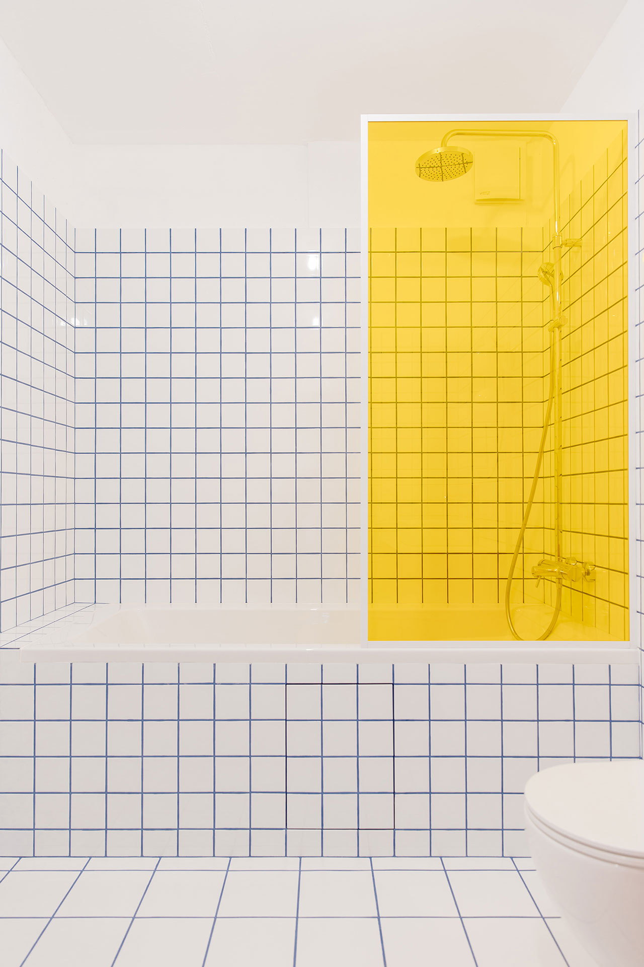
Throughout the renovation, a strong emphasis was placed on integrating color, specifically the clients' preferred blue and green hues, alongside vibrant oranges and reds. This decision was influenced by Anderson's previous work, known for its colorful designs, despite her own home being predominantly white. The design incorporated colorful elements in various areas, such as orange-red triangle tiles and a floral wallpaper in the foyer, brightly painted Farrow & Ball's Pea Flower Tea kitchen cabinets, and a striking red Kappa tile backsplash in the kitchen niche. The children's bathroom features lively Rio Belize tile and Arctic White subway tile with custom white oak vanity and colorful zinc alloy pulls, while the kids' bedroom showcases a two-tone wall with Benjamin Moore's Baltimore Sky and Superwhite. In the primary suite, an almost black hue, Farrow & Ball's Railings, was combined with Benjamin Moore's Superwhite, and the bathroom boasts white and green wall tiles, alongside blue Pixel floor tiles. Anderson highlighted the importance of balancing these bold color choices with neutral tones at eye level to prevent the spaces from feeling overwhelming. This approach aimed to deliver a home that exuded joy and reflected the clients' desire for a colorful, personalized living environment.
#HomeRenovation #InteriorDesign #ColorPalette #KitchenRemodel #BathroomRenovation #DuplexApartment #Brooklyn #BeforeAndAfter #StudioOfficina #HomeRenovation #InteriorDesign #ColorPalette #KitchenRemodel #BathroomRenovation #DuplexApartment #Brooklyn #BeforeAndAfter #StudioOfficina
0 comment in total
 No comments yet
You may also like

Color, Pattern, and Texture Rule in This Brooklyn Home

Spectacular Upper East Side apartment is enlivened with vivid colors and uncommon shapes

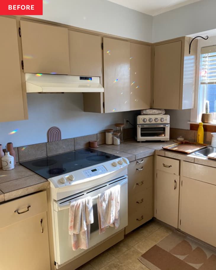
Before & After: This $225 “Outdated Beige” Kitchen Makeover Becomes Bright and Airy
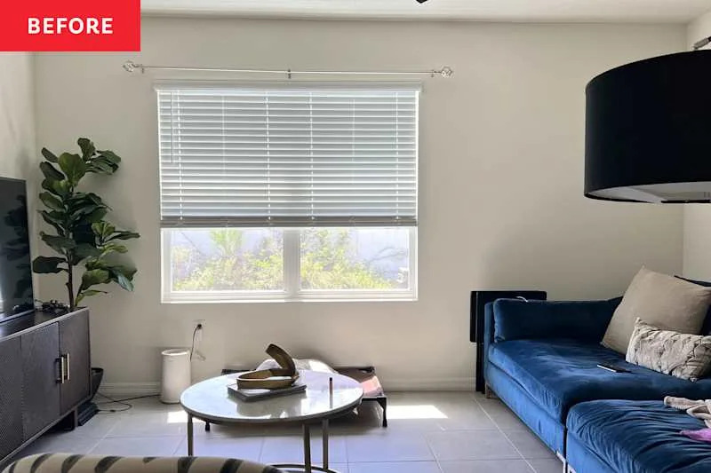
A “Builder Beige” Living Room Gets a Much More Interesting Color Story

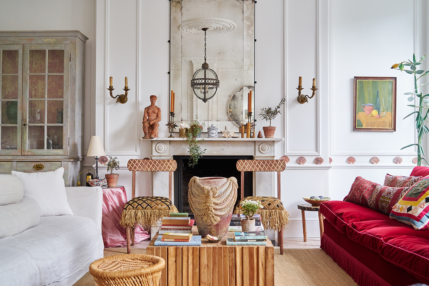
This London Apartment’s Color Palette Changes as the Light Does
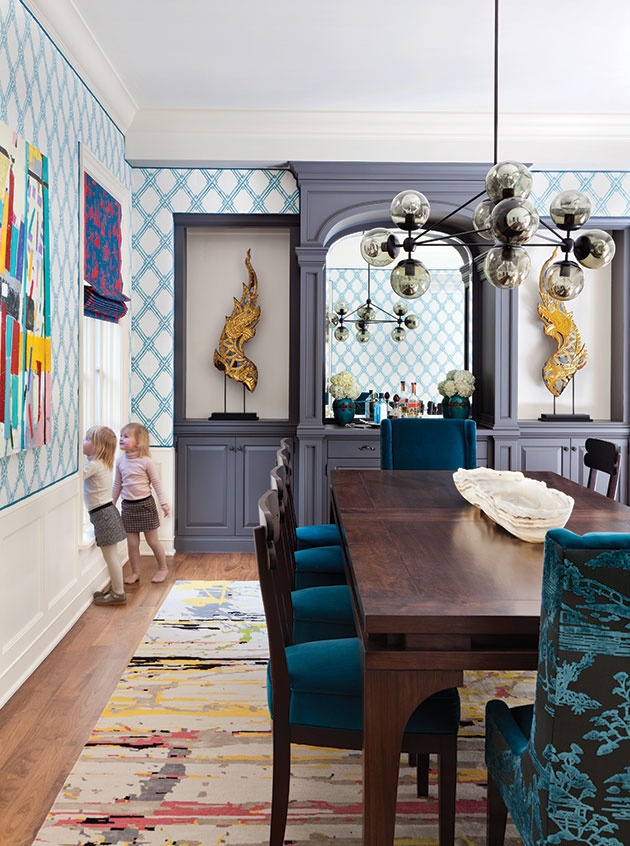
Living In Color

Before & After: A “Dark, Bland” Beige Kitchen Gets an Airy Blue Makeover (It’s So Much Brighter!)

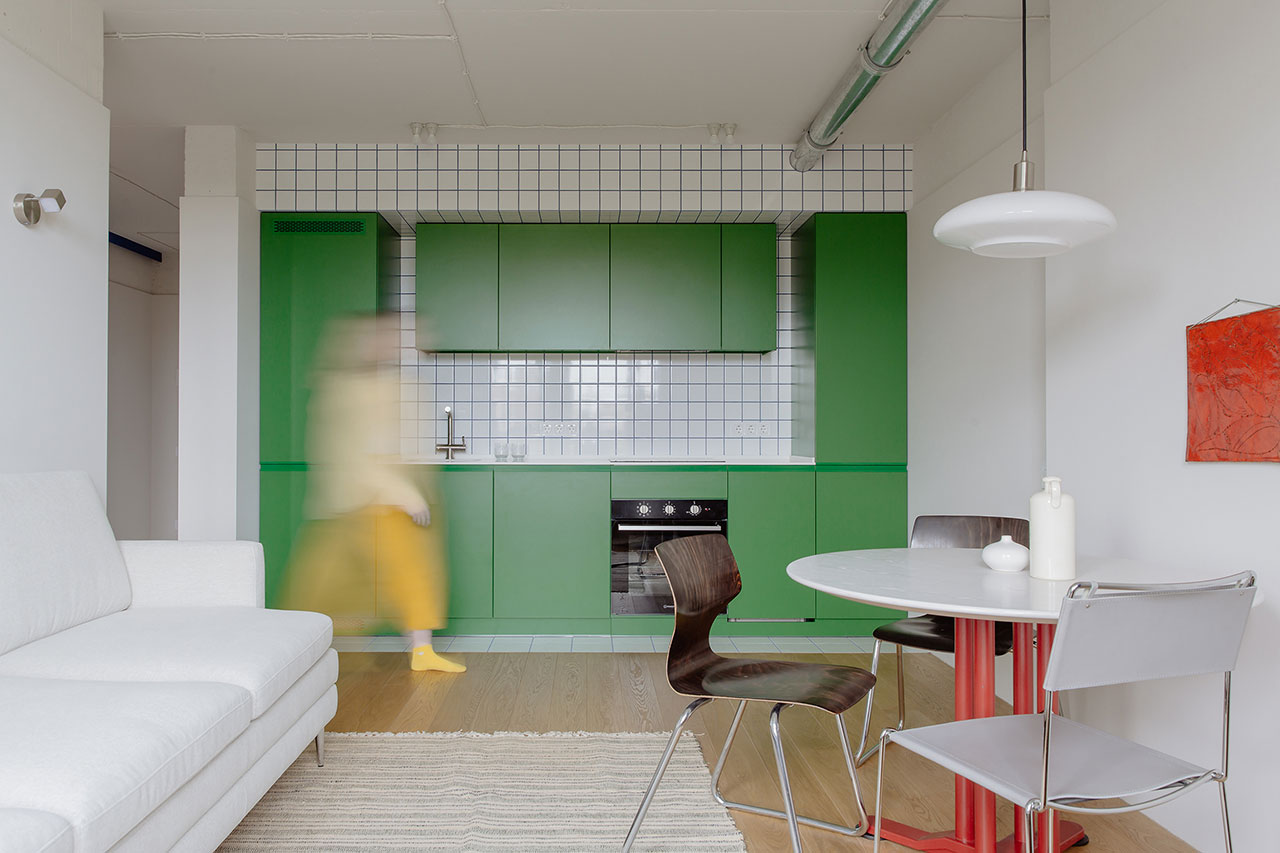
A Small Kyiv Apartment Elevated With a Kaleidoscope of Primary Colors

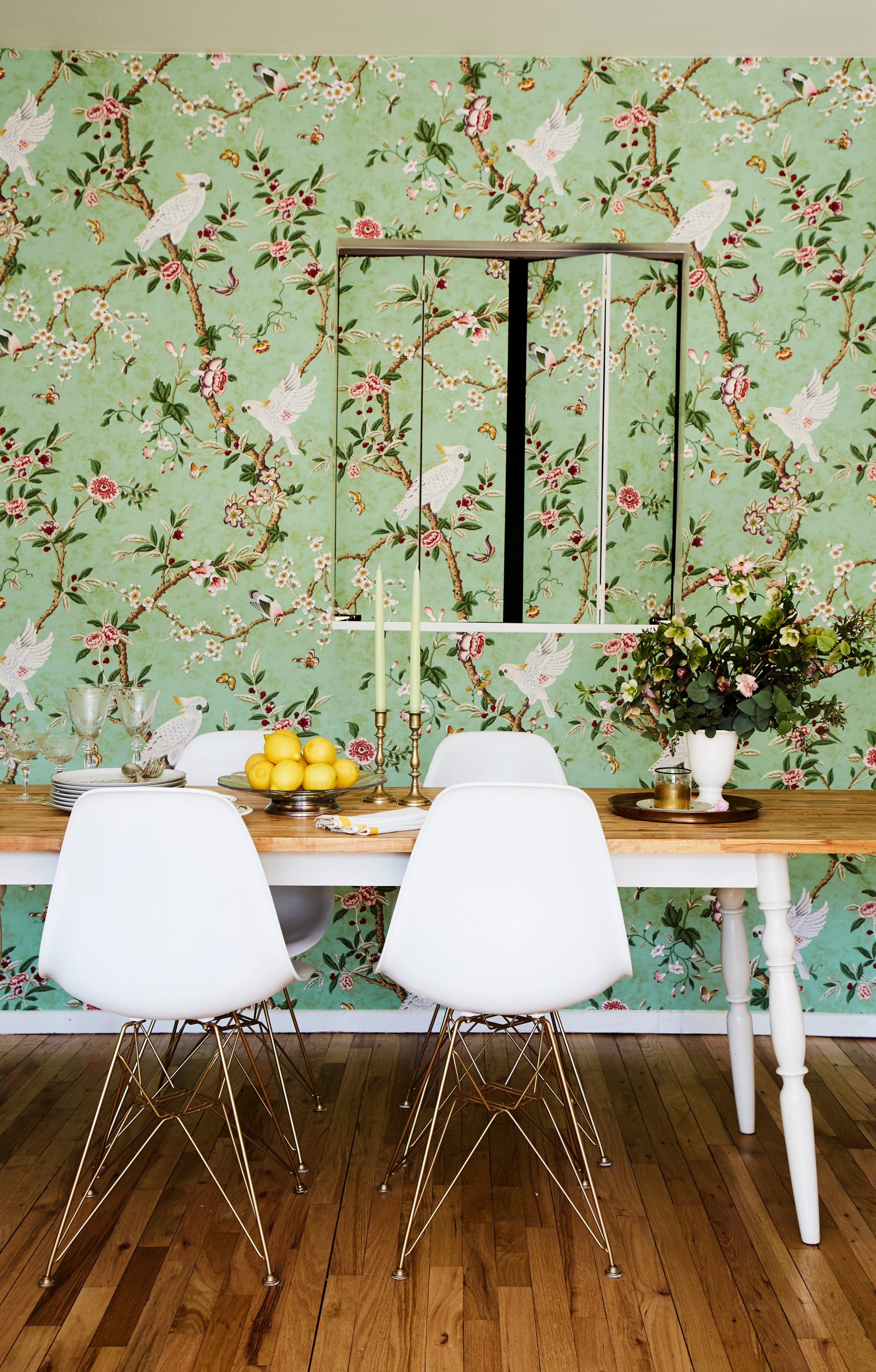
Mixing and Matching Has Never Looked Better Than in This NYC Apartment
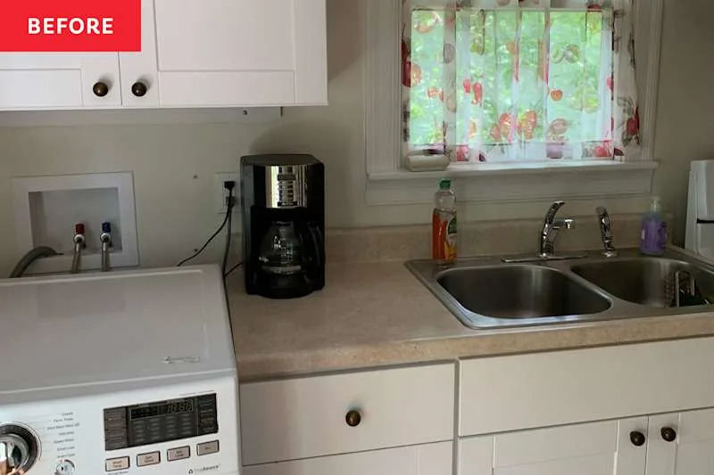
Before & After: A “Dark, Bland” Beige Kitchen Gets an Airy Blue Makeover (It’s So Much Brighter!)
Playful Wallcoverings Enliven This Tranquil Manhattan Apartment

After a Decade of Millennial Gray, This Living Room Looks Like New in Warm Neutrals

Home design: Moving from an all-beige condo to full color

A Minimalist Apartment With a Bright Color Gradient Ranging From Green to Purple
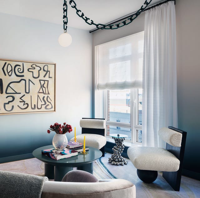
This Ultrachic Apartment Is Serving Us Ombré Vibes All Day Long
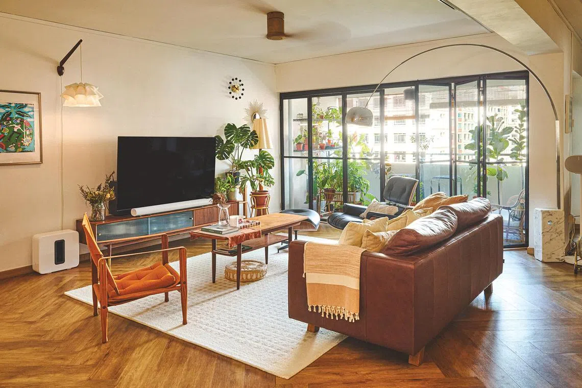
Eclecticism rules in couple’s ochre apartment

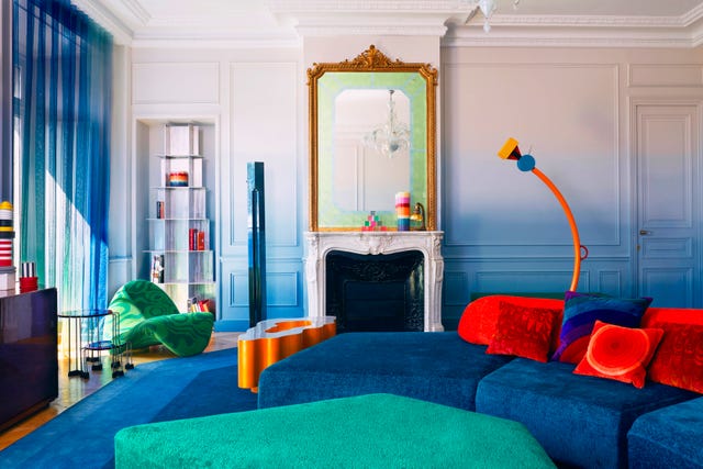
The Paris apartment that takes colour drenching to new ombré heights

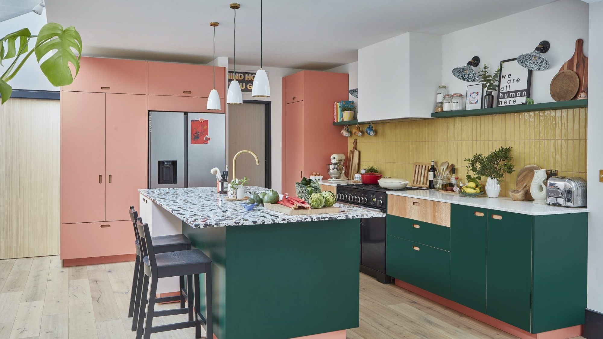
Rainbow colours have transformed a tired kitchen into a vibrant space
A once "unattractive" 1970s home takes a leap with colour and soaring ceilings

A “Builder Beige” Living Room Gets a Much More Interesting Color Story