1/2
17 popular trends interior designers wish would disappear
The article outlines 17 interior design trends that professionals believe are outdated, impractical, or overused. These trends include all-white interiors, open shelving, vessel sinks, midcentury modern furniture, faux-distressed decor, dining benches, accent walls, barn doors, shiplap, palm prints, terrazzo-covered items, matching furniture sets, bold 'pops' of color, lights with paper shades, 'living walls,' gray interiors, and tile countertops.
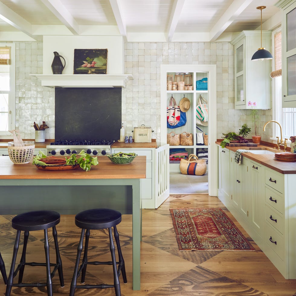
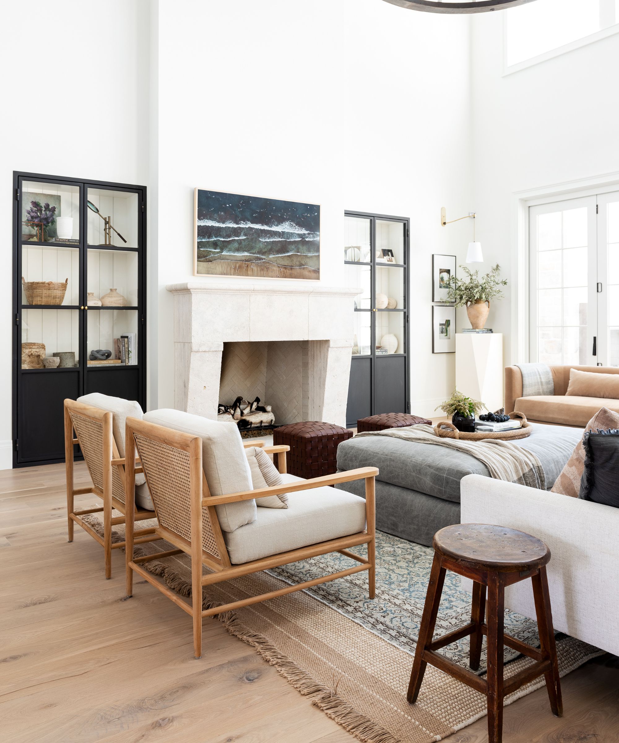
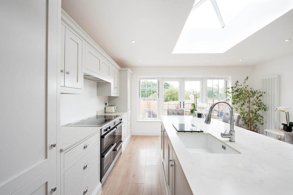
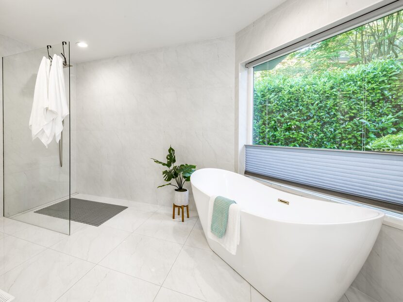
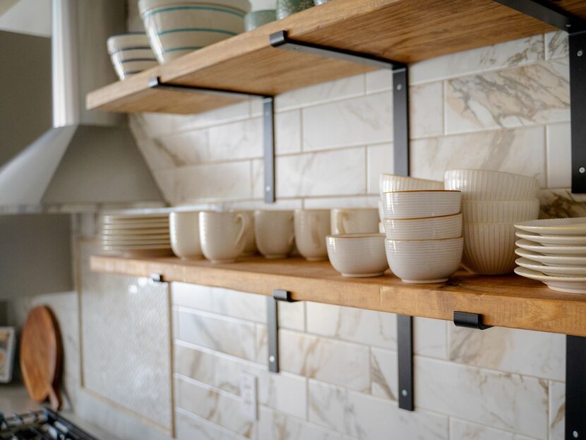
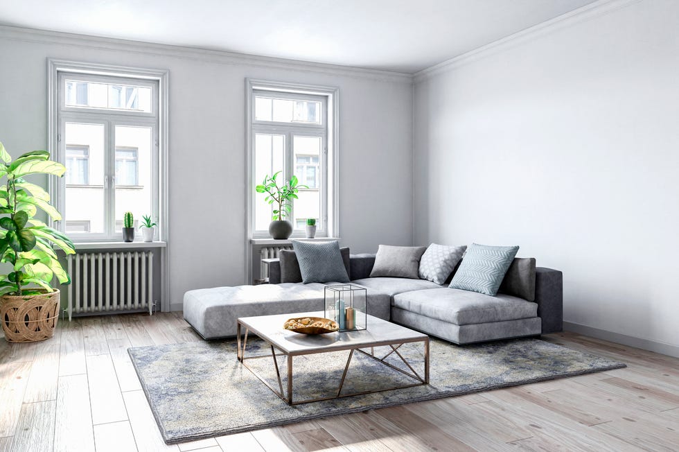
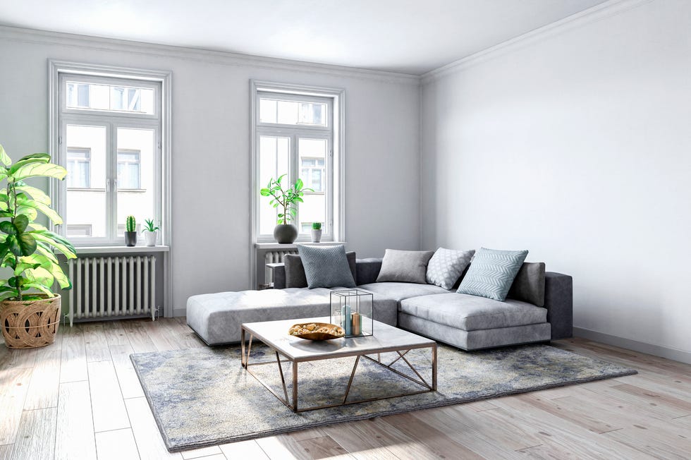
All-white interiors are criticized for being impractical and hard to maintain due to easy staining and high cleaning costs. Kobi Karp suggests alternatives like rich blues or sage greens for a clean aesthetic without excessive upkeep. Open shelving, while popular on social media, is deemed impractical by Jennifer Weisberg due to the constant need for perfect organization. Light-colored wood or frosted-glass cupboards are suggested as more manageable alternatives.
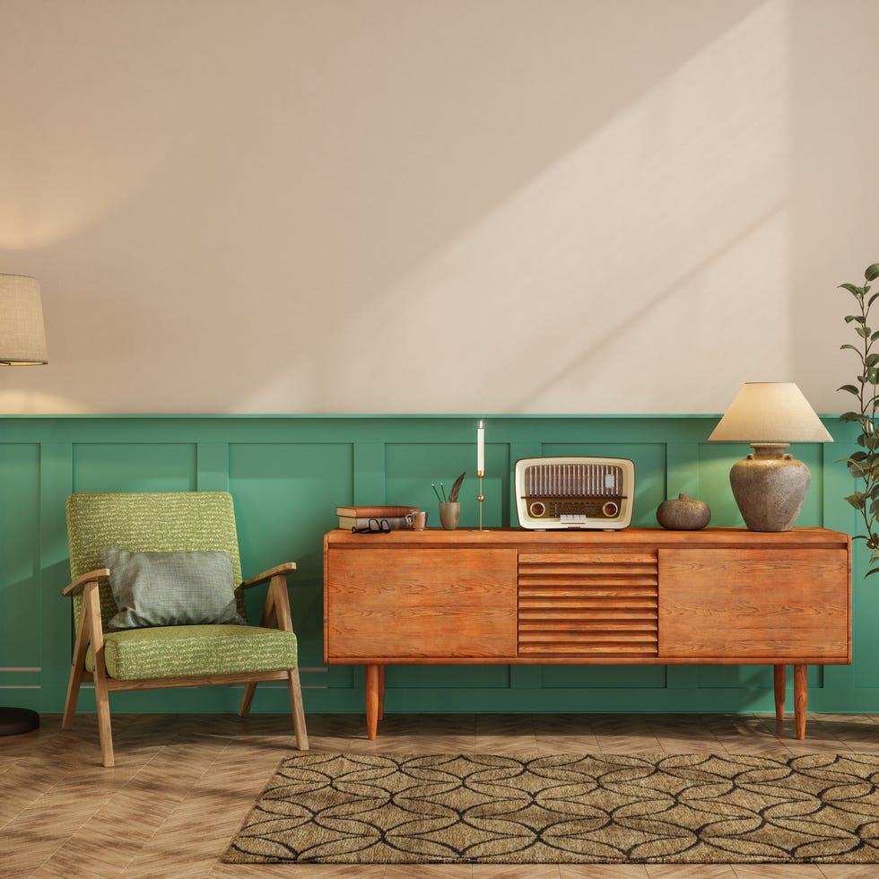
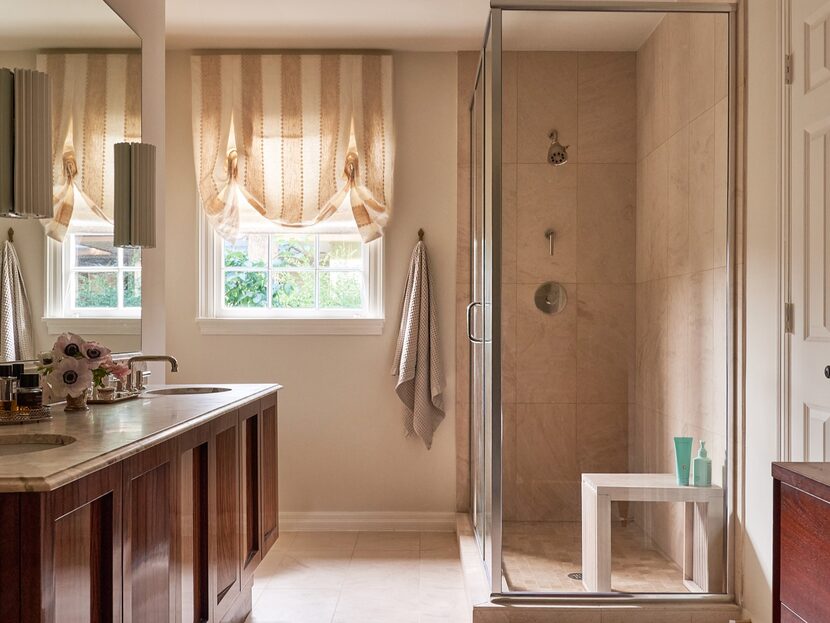
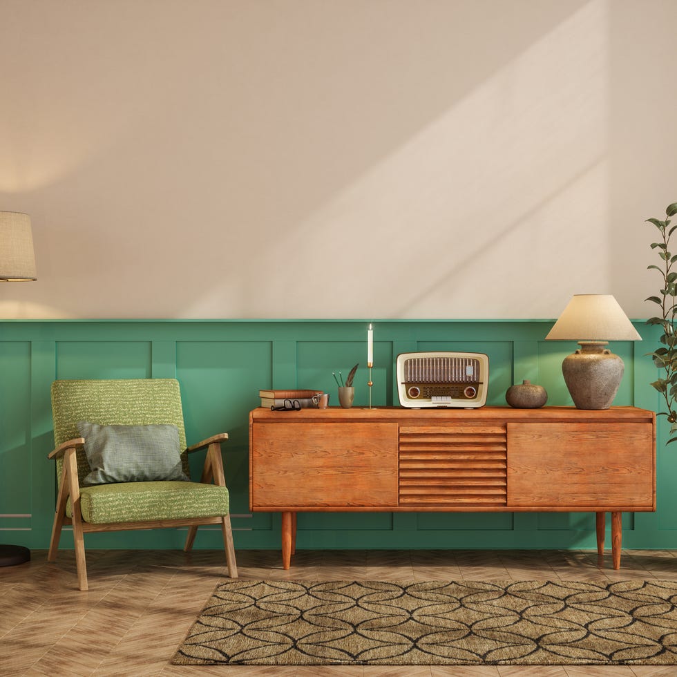
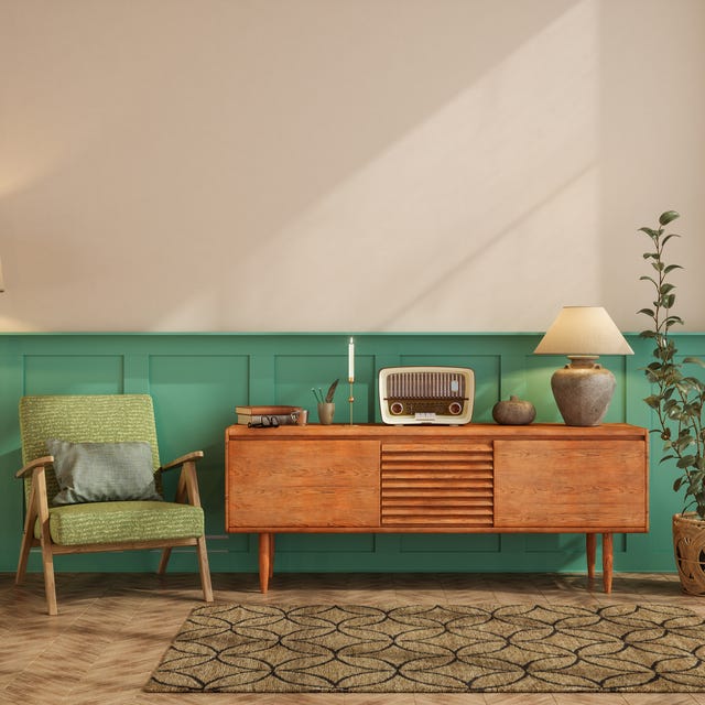
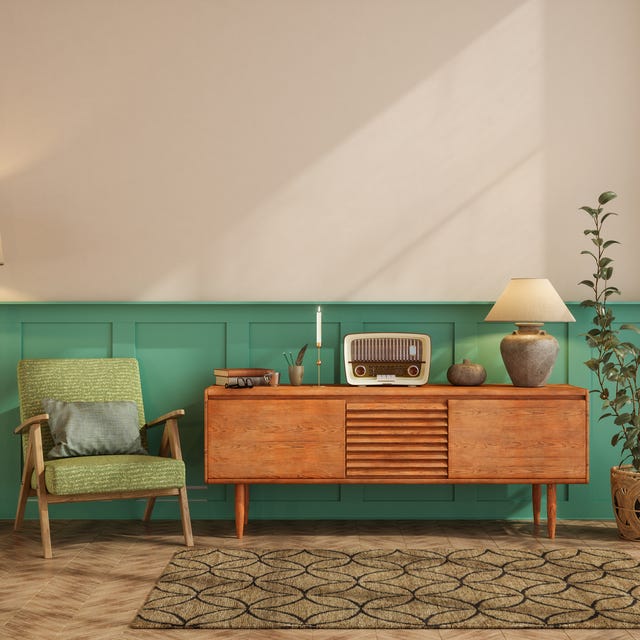
Vessel sinks are problematic for their cleaning difficulties and lack of user-friendliness, especially for certain demographics, as noted by Leslie Markman-Stern. Midcentury modern furniture, despite its recent revival, is considered overused and commonplace, leading to a proliferation of poorly made replicas. Markman-Stern advises buying from reputable antique dealers for quality vintage pieces.
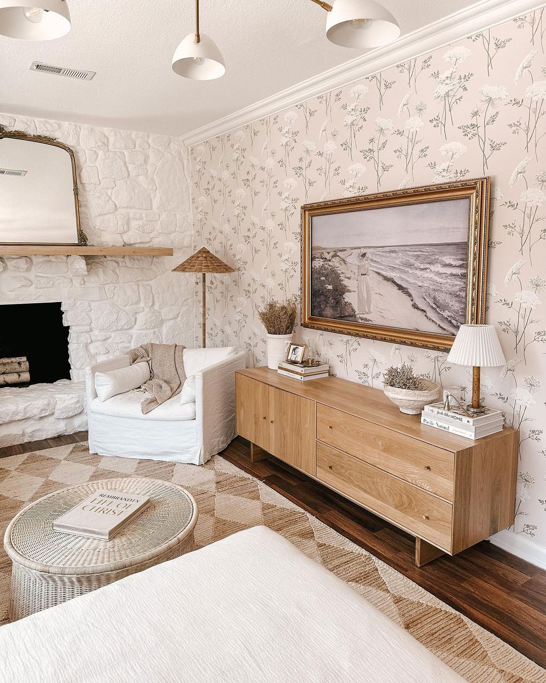
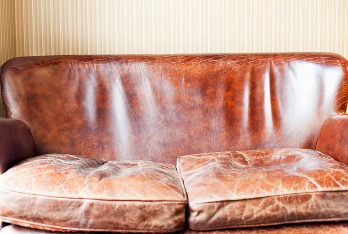
Faux-distressed decor, particularly chalk-painted furniture, is described by Sally Soricelli as tacky and cheap-looking. Authentic antiques or upholstered items with interesting fabrics are recommended instead. Dining benches, while aesthetically pleasing for rustic decor, are highlighted by Karp as uncomfortable and inconvenient for group seating.
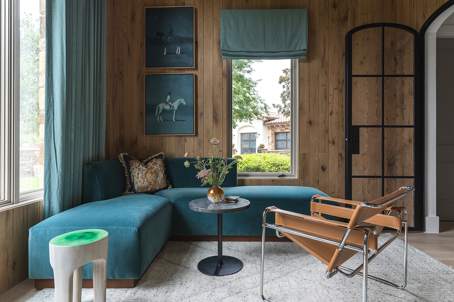
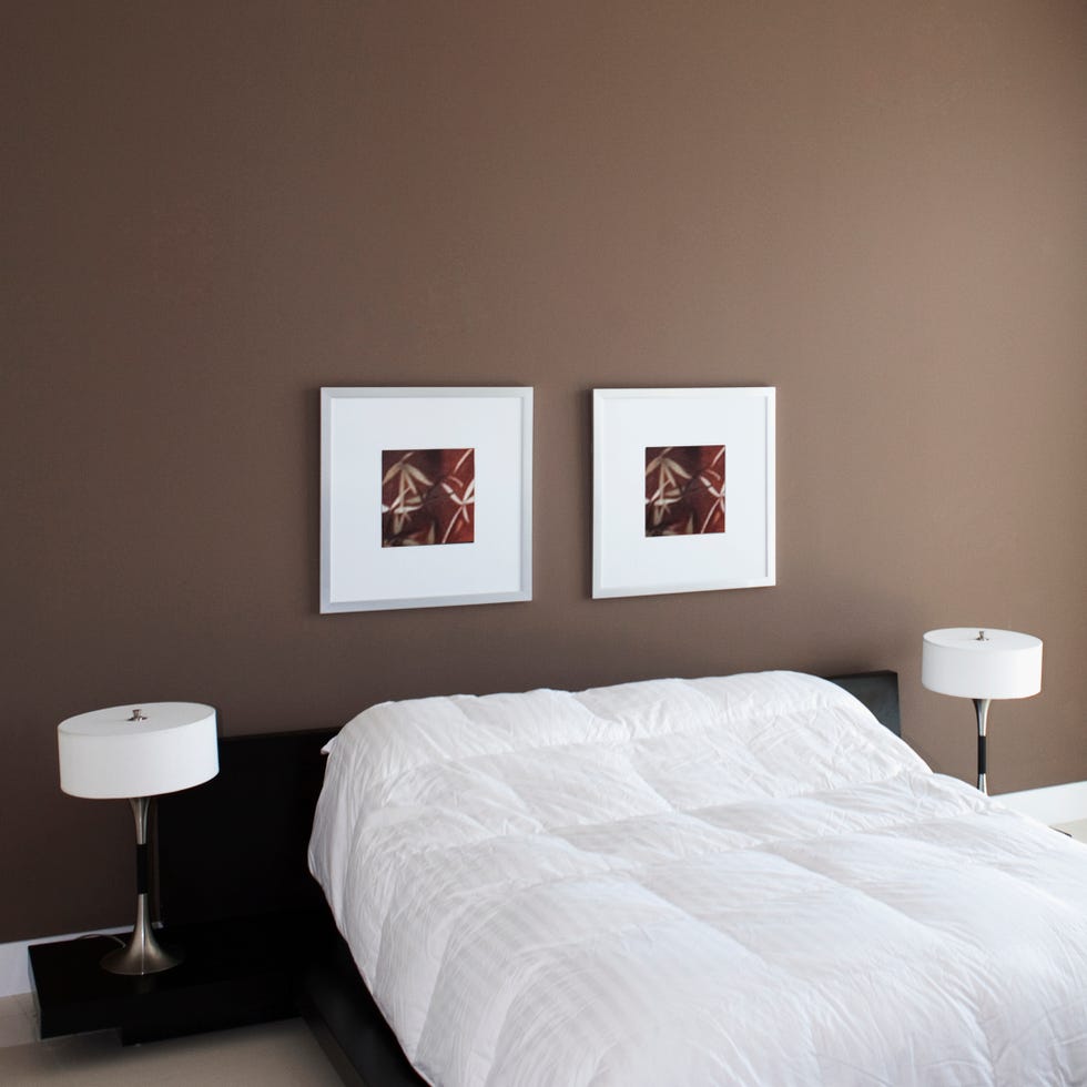
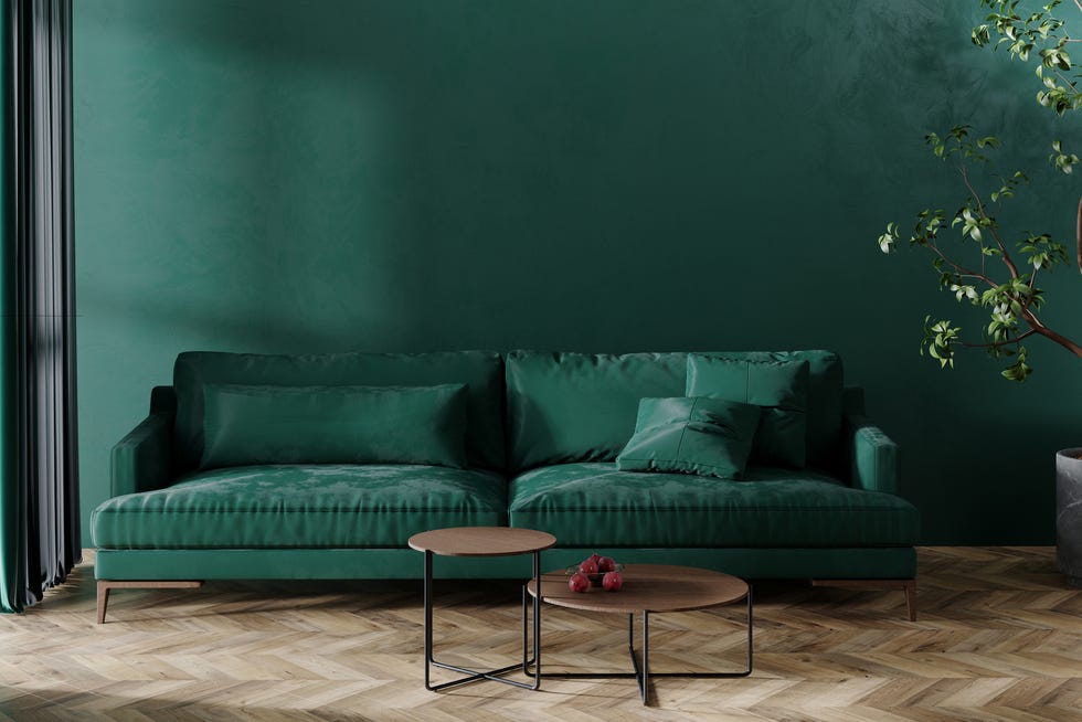
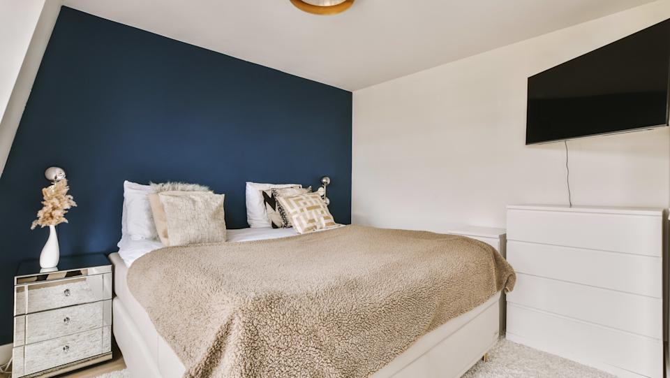
Accent walls are viewed as outdated by Soricelli, who recommends painting an entire room a desired color or using accessories for color accents. Barn doors, despite their farmhouse-chic appeal, are functionally poor as they fail to block sound, light, or odors, according to Karp.
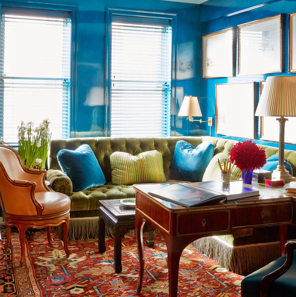
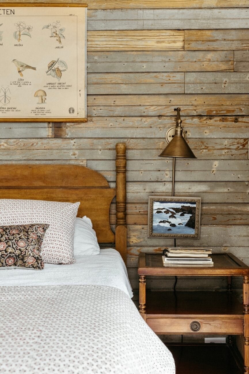
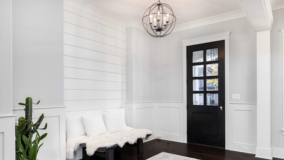
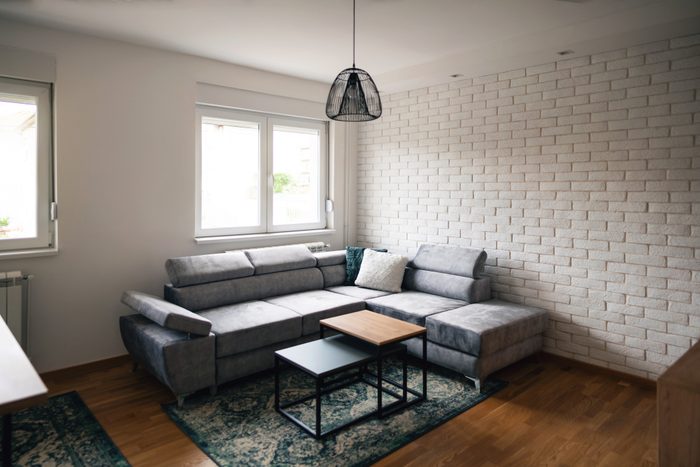
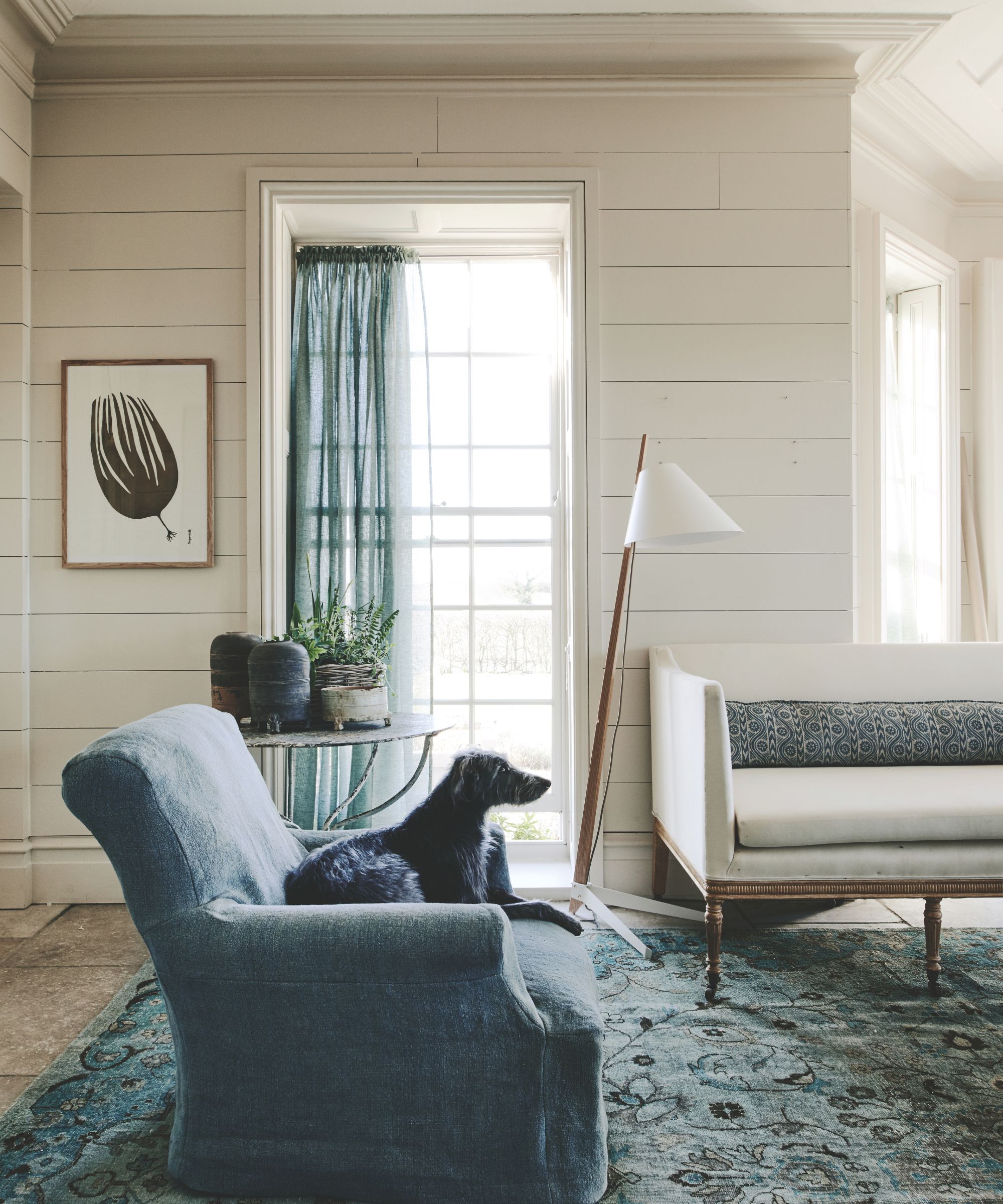
Shiplap, popularized by renovation shows, is considered overdone by Soricelli, who encourages exploring other woodwork options. Palm prints are seen as oversaturated and losing their appeal by Alessandra Wood. Terrazzo patterns on items other than actual flooring are also considered overplayed, with Weisberg noting that the busy pattern can lead to quick client fatigue, especially in bold colors.
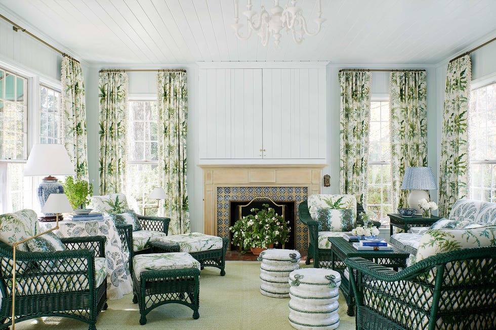
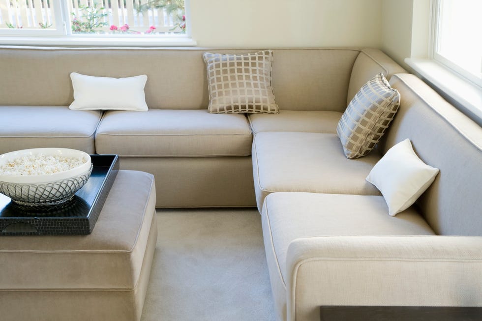
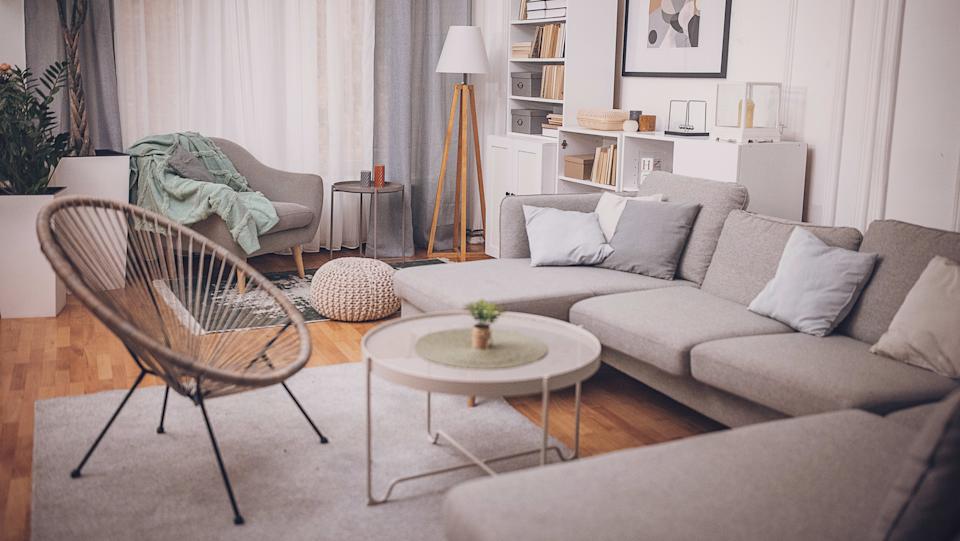
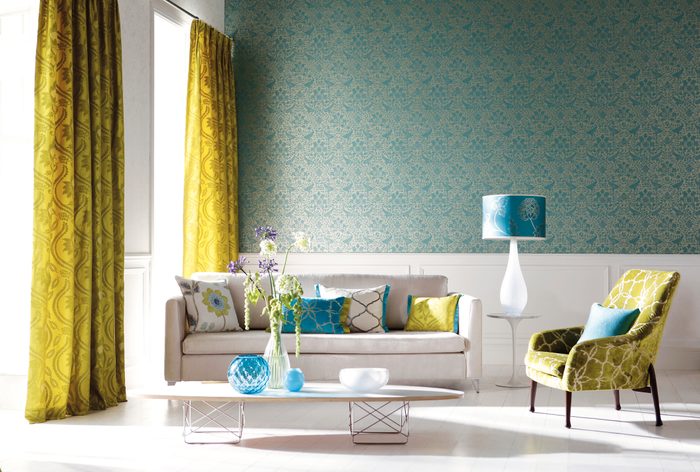
Matching furniture sets are identified as a financial and design mistake by Colin Haentjens, who advocates for mixing and matching unique pieces. Bold 'pops' of color are perceived as dated and childish, with Haentjens suggesting painting entire walls in interesting colors instead. Lights with paper shades are ubiquitous and uninspired, prompting the suggestion for more unique lighting fixtures.
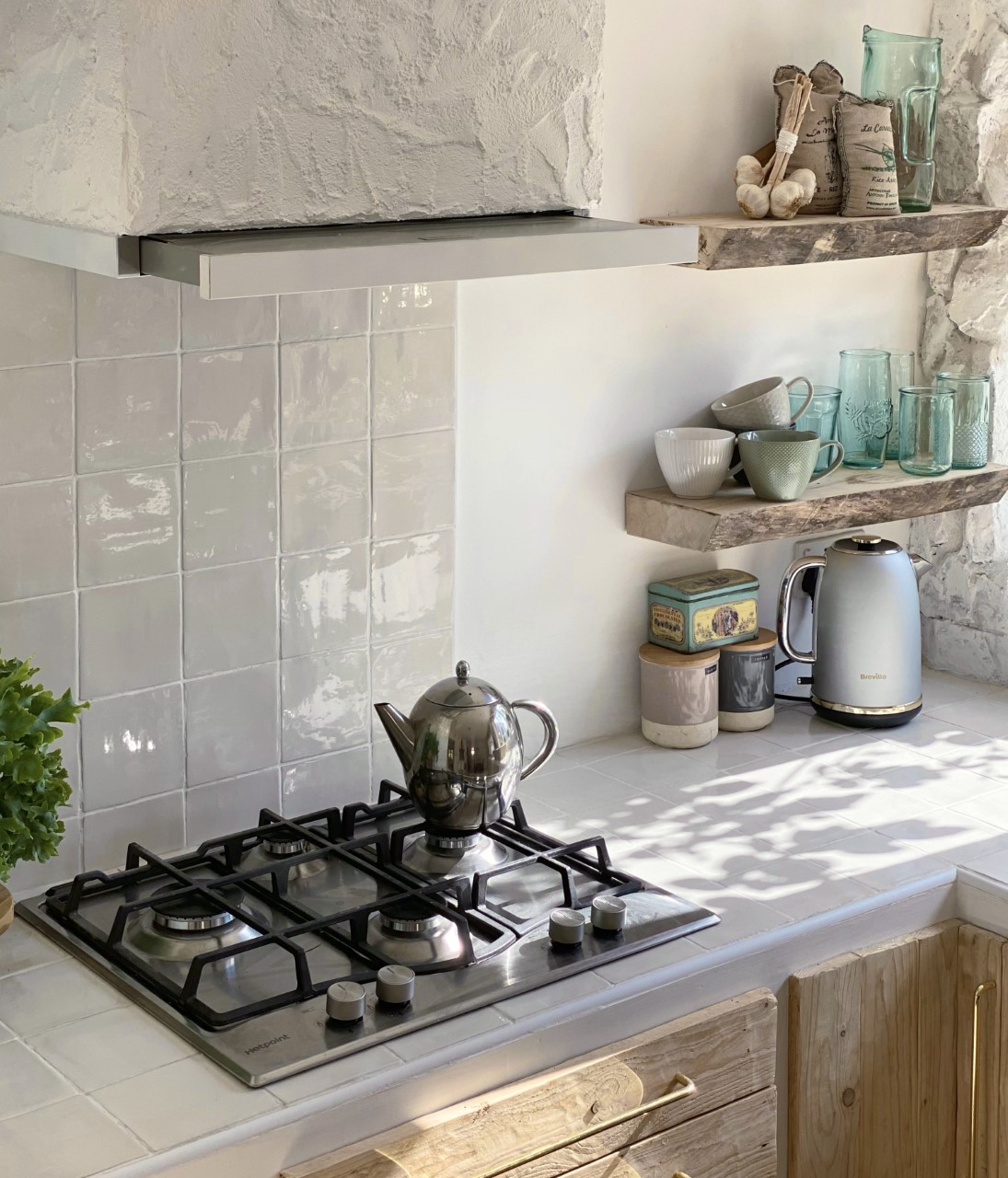
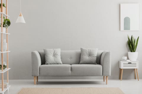
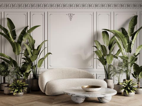
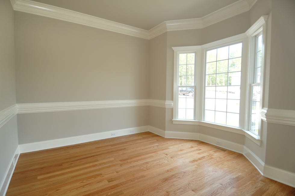
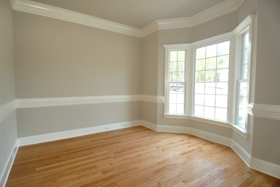
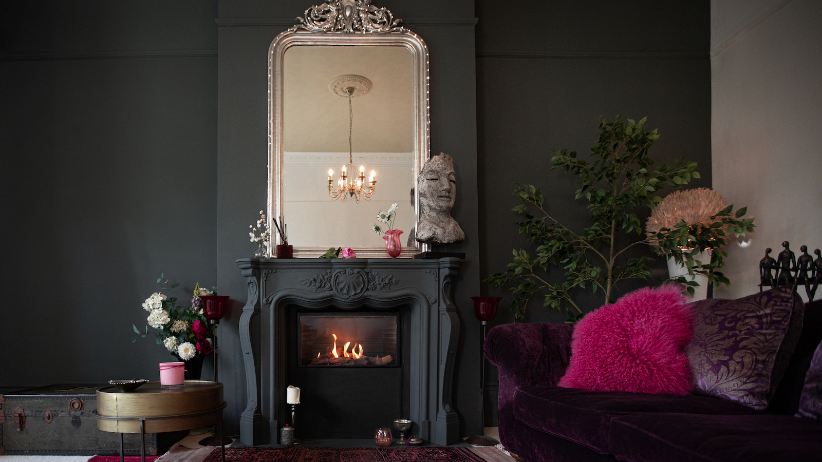
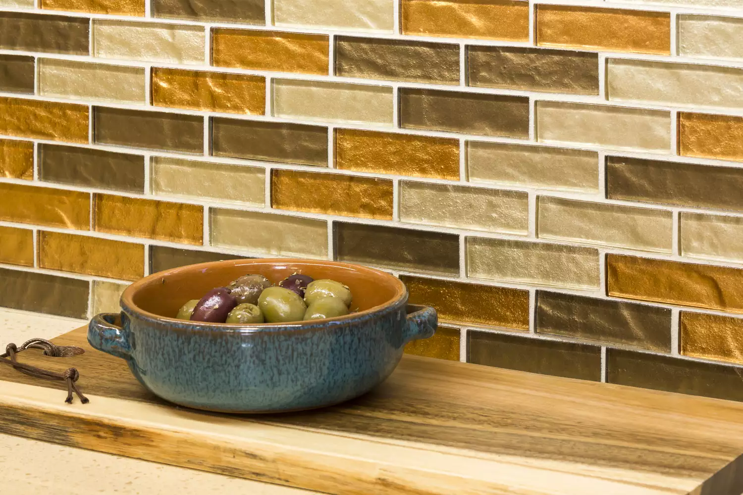
'Living walls' or 'green walls' are criticized by Weisberg for their high maintenance, potential for mold, allergens, and insects. Karp also notes that artificial green walls lack air-cleaning benefits and contribute to plastic waste. Gray interiors are seen as potentially gloomy and sterile by Soricelli, who suggests incorporating warmer neutral tones like beige or blush. Finally, tile countertops are deemed unhygienic and impractical by Karp due to their porous surface, proneness to staining, and difficulty in cleaning grout, in addition to not providing a smooth surface and being prone to cracking.
#InteriorDesign #HomeDecor #DesignTrends #DecoratingMistakes #ResidentialDesign #Practicality #Aesthetic #Furniture #Renovation #InteriorDesign #HomeDecor #DesignTrends #DecoratingMistakes #ResidentialDesign #Practicality #Aesthetic #Furniture #Renovation
0 comment in total
 No comments yet
You may also like
12 bedroom trends interior designers wish would disappear
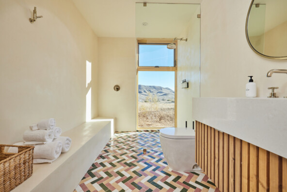
Interior Designers are Ditching These Home Trends in 2024
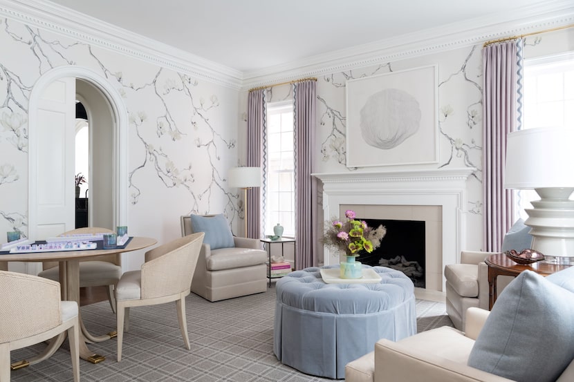
7 home design trends to skip (and what to do instead)

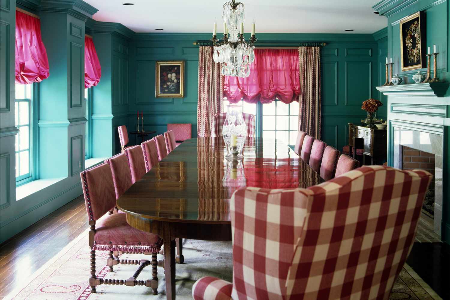
7 Home Décor Trends Designers Say Are a Waste of Money
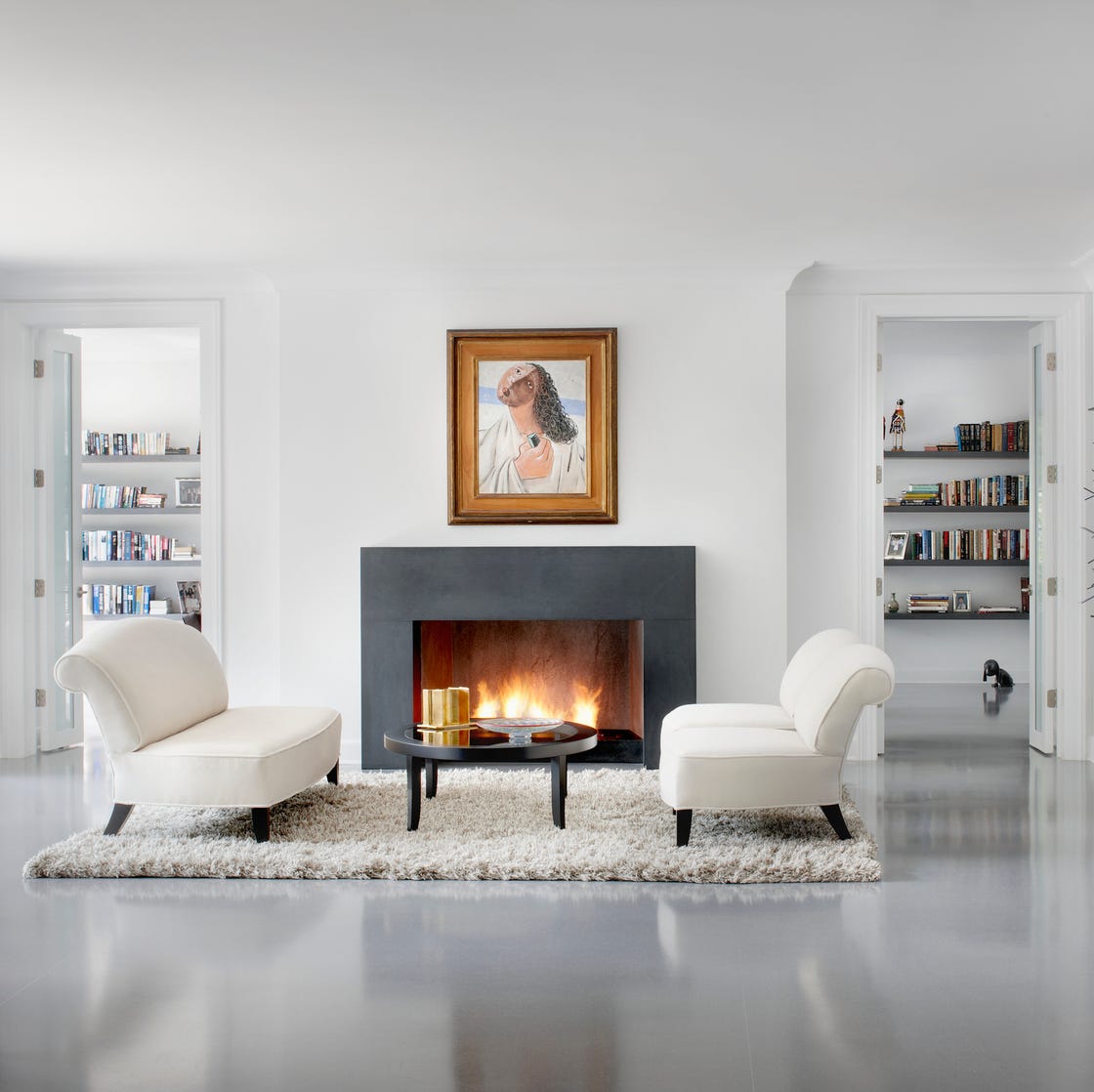
8 Decorating Trends Designers Wish Would Go Away in 2025

10 Interior Design Trends Going Away In 2025

The Home Trend Interior Designers Hope Never Comes Back—and What to Do Instead
16 Home Décor Trends on Their Way Out

5 trends that look good right now but interior designers warn they won't last
6 Furniture Trends Interior Designers Are Tired of Seeing Everywhere

The #1 Home Trend You Should Avoid, According to Designers

I asked interior designers what trends they are already sick of seeing in 2025
17 Trends That Need to Disappear Forever , According to Interior Designers

8 Tacky Home Trends That Designers Say Are TRAGICALLY Dead

8 Home Trends That Are Tragically DEAD to the Design World
9 Popular Home Trends Interior Designers Say Won't Age Well
9 CONTROVERSIAL Decor Choices Designers Secretly Wish You’d Stop Making
5 outdated home decor trends interior designers want you to kiss goodbye in 2024, and what to do instead

How to decorate in 2025: Skip these tired trends, interior designers say
5 Outdated Kitchen Trends Interior Designers Hope Never Come Back