1/2
10 Interior Design Color Palettes Inspired By Real Royal Palaces
The article explores ten distinct interior design color palettes inspired by famous royal palaces and castles around the world, presenting each location's unique aesthetic. The exploration aims to provide inspiration for creating regal and sophisticated home interiors.
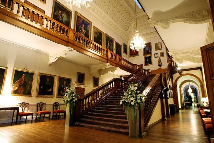
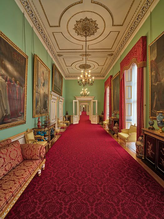
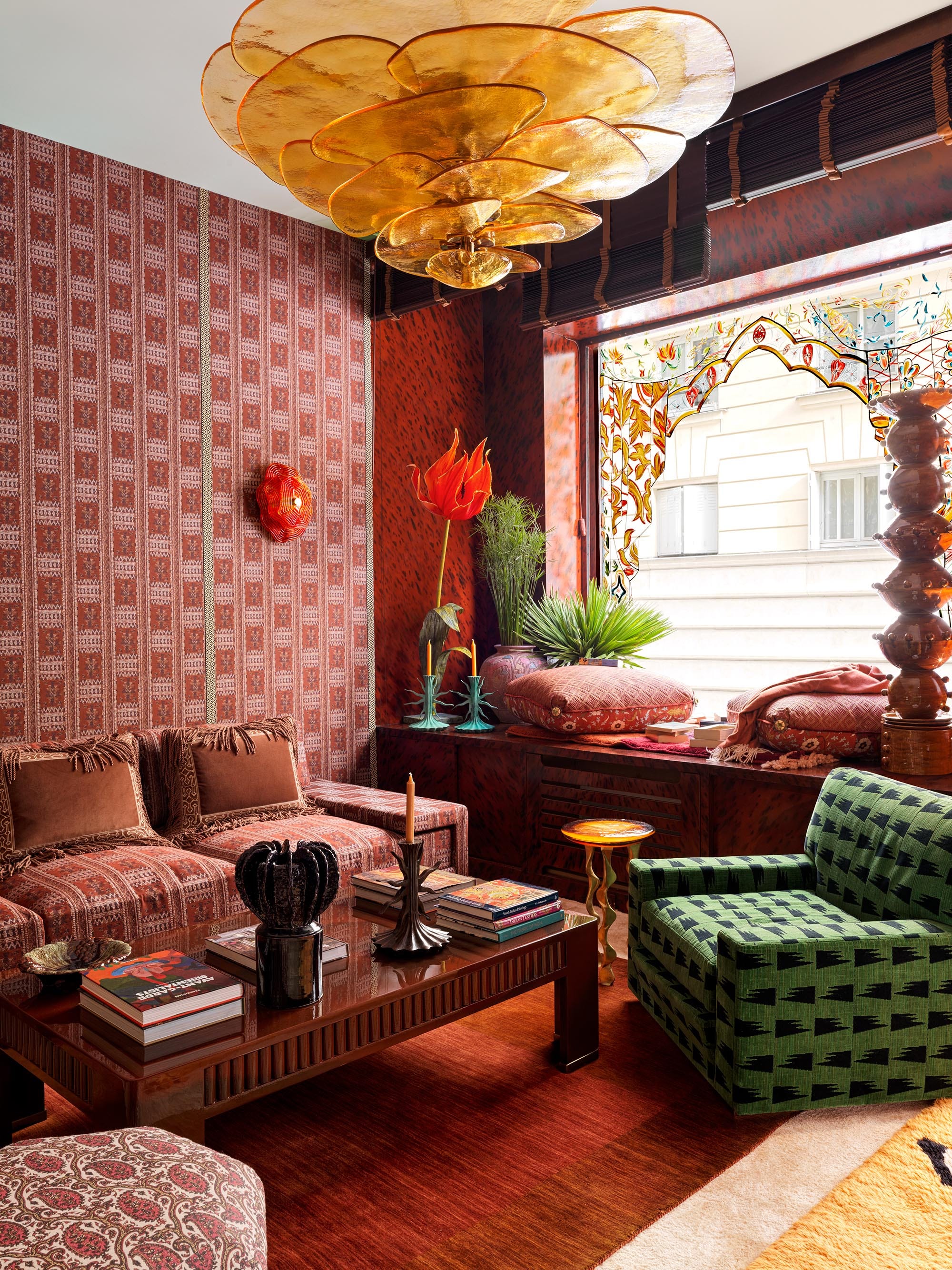
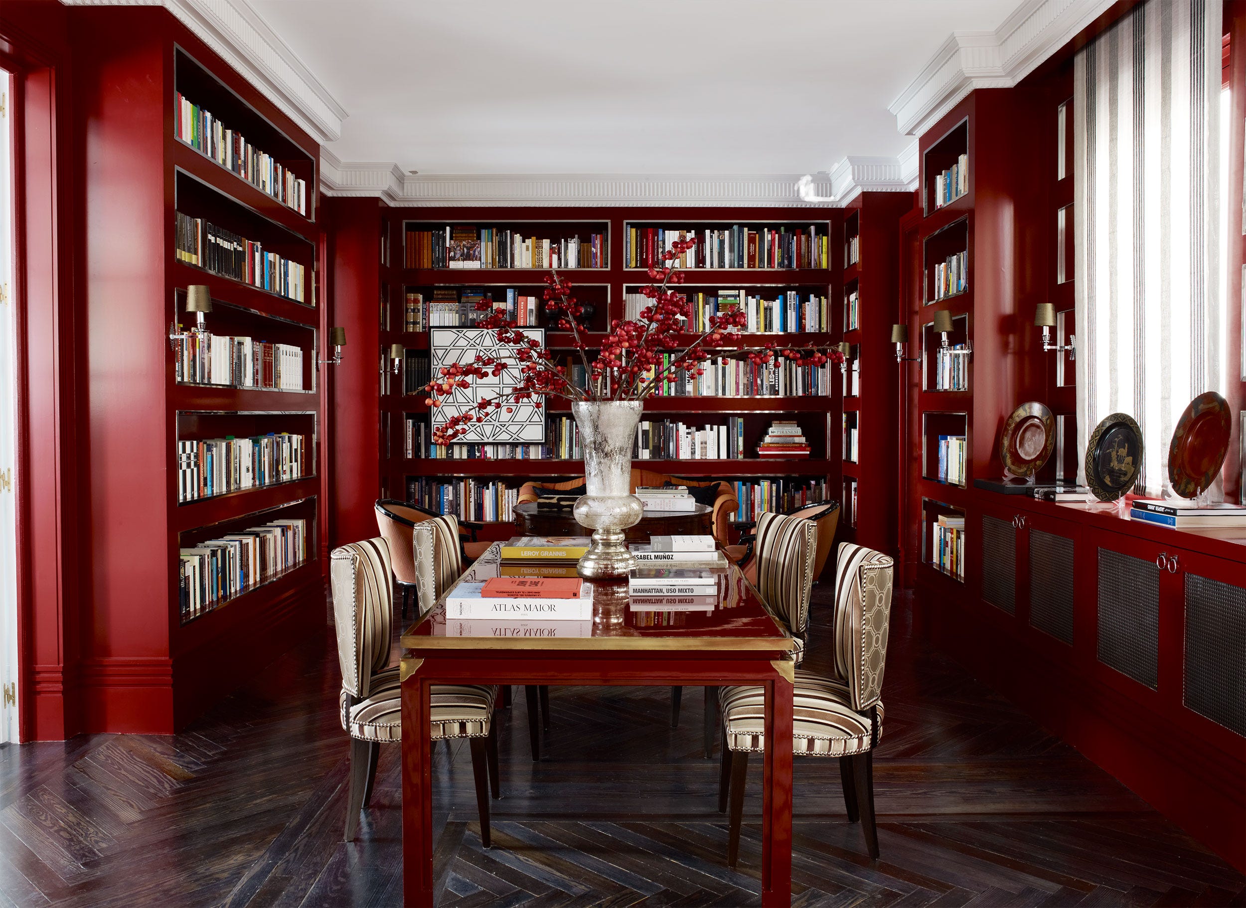
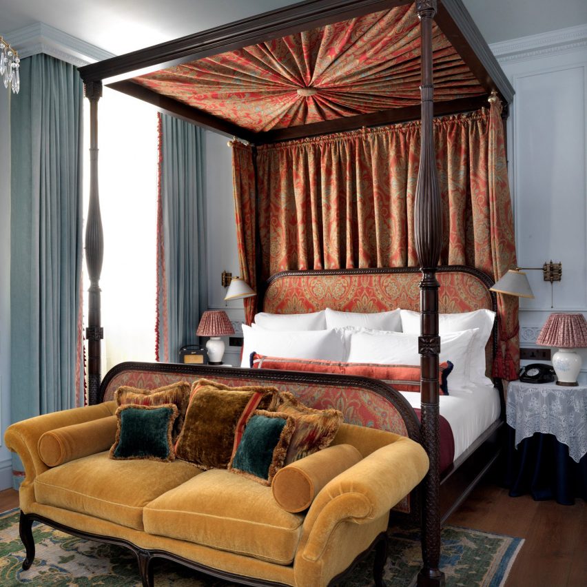
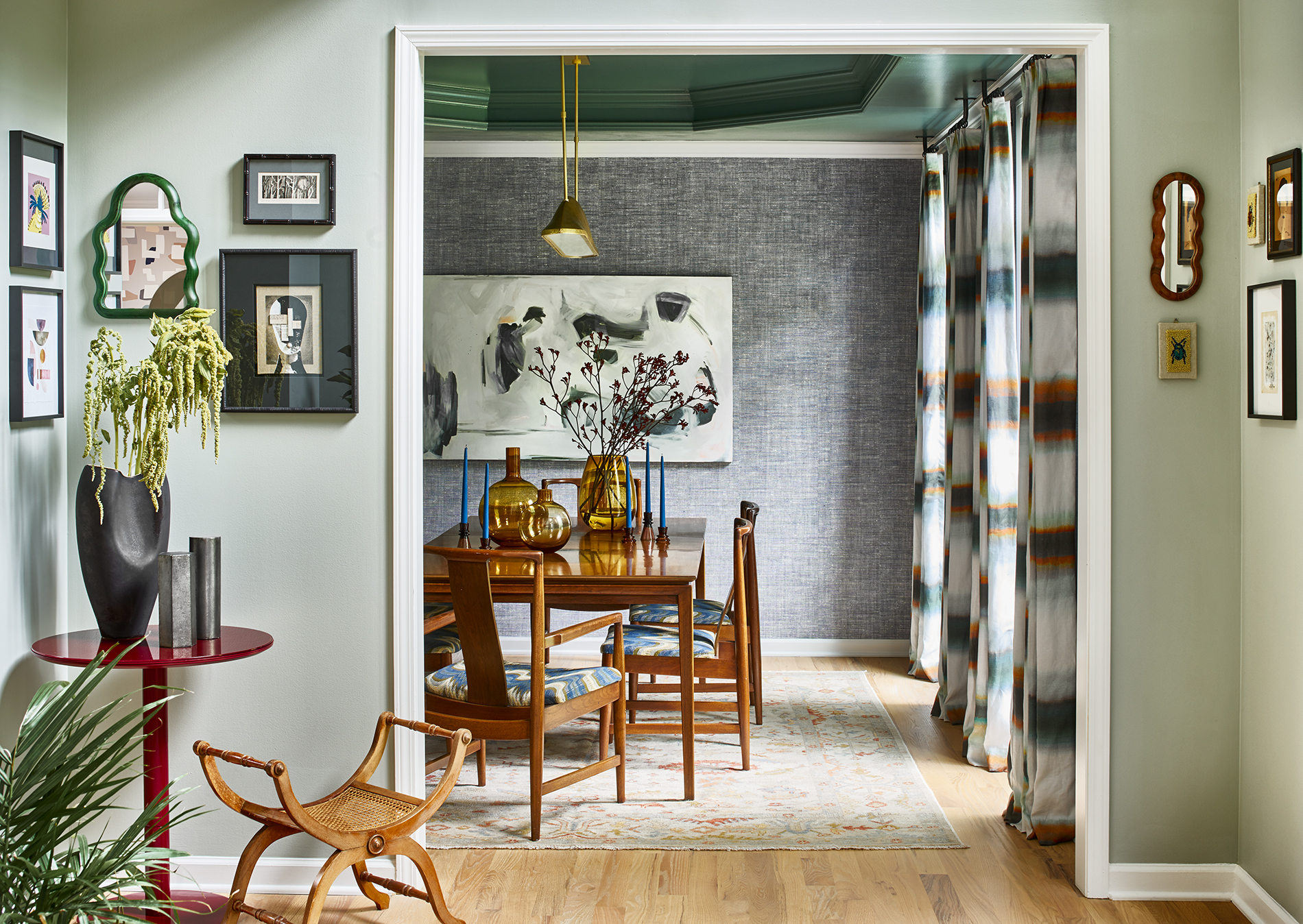
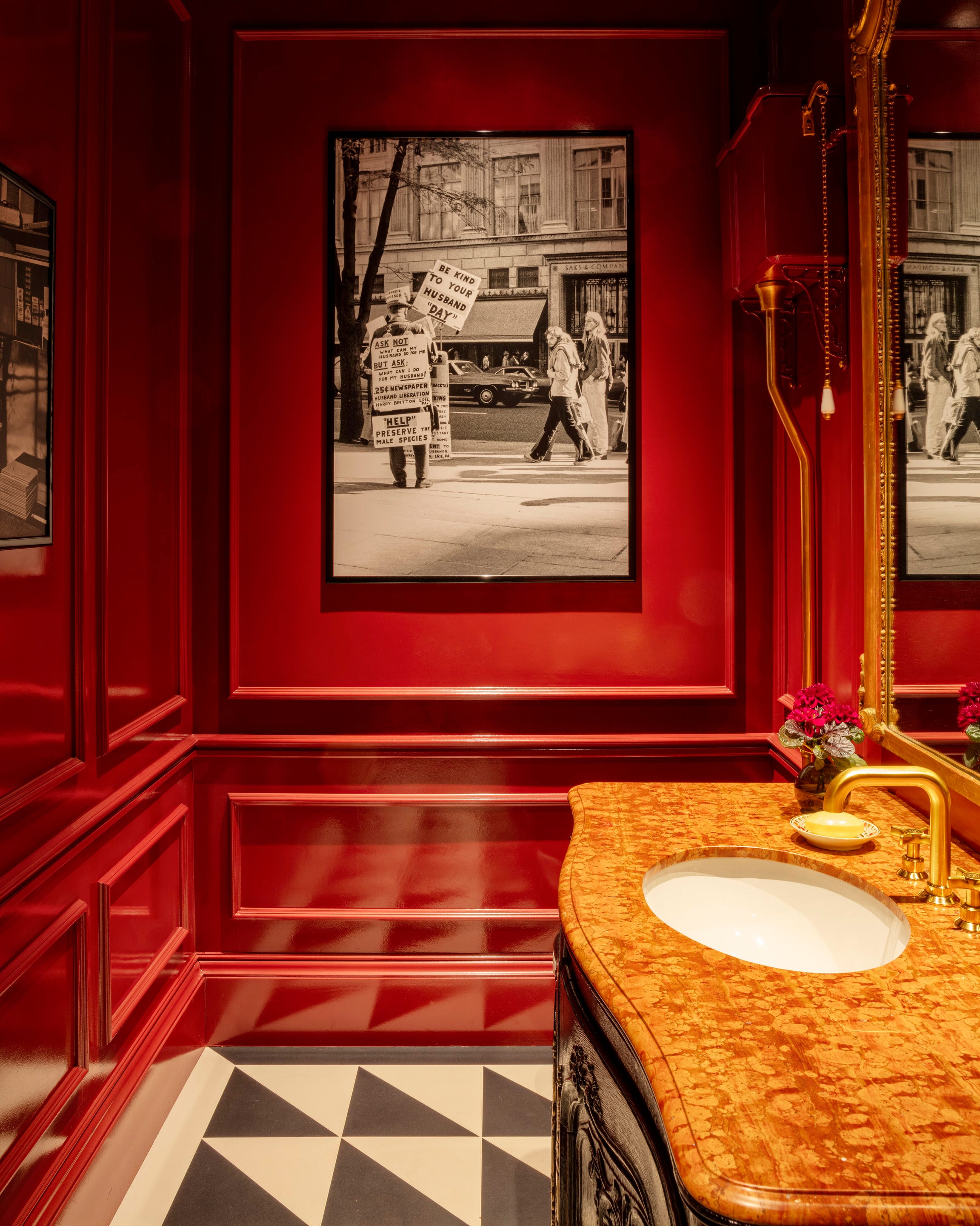
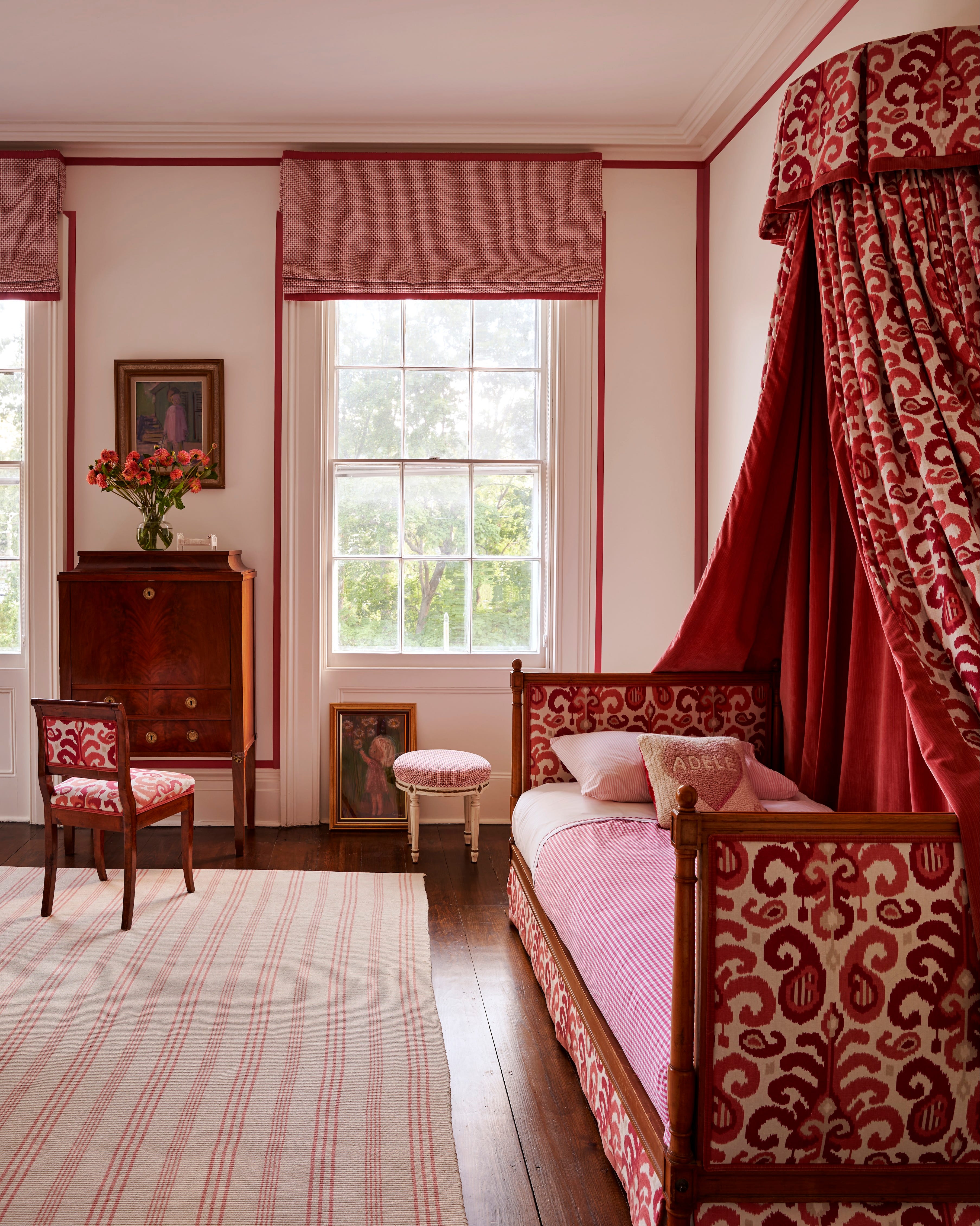
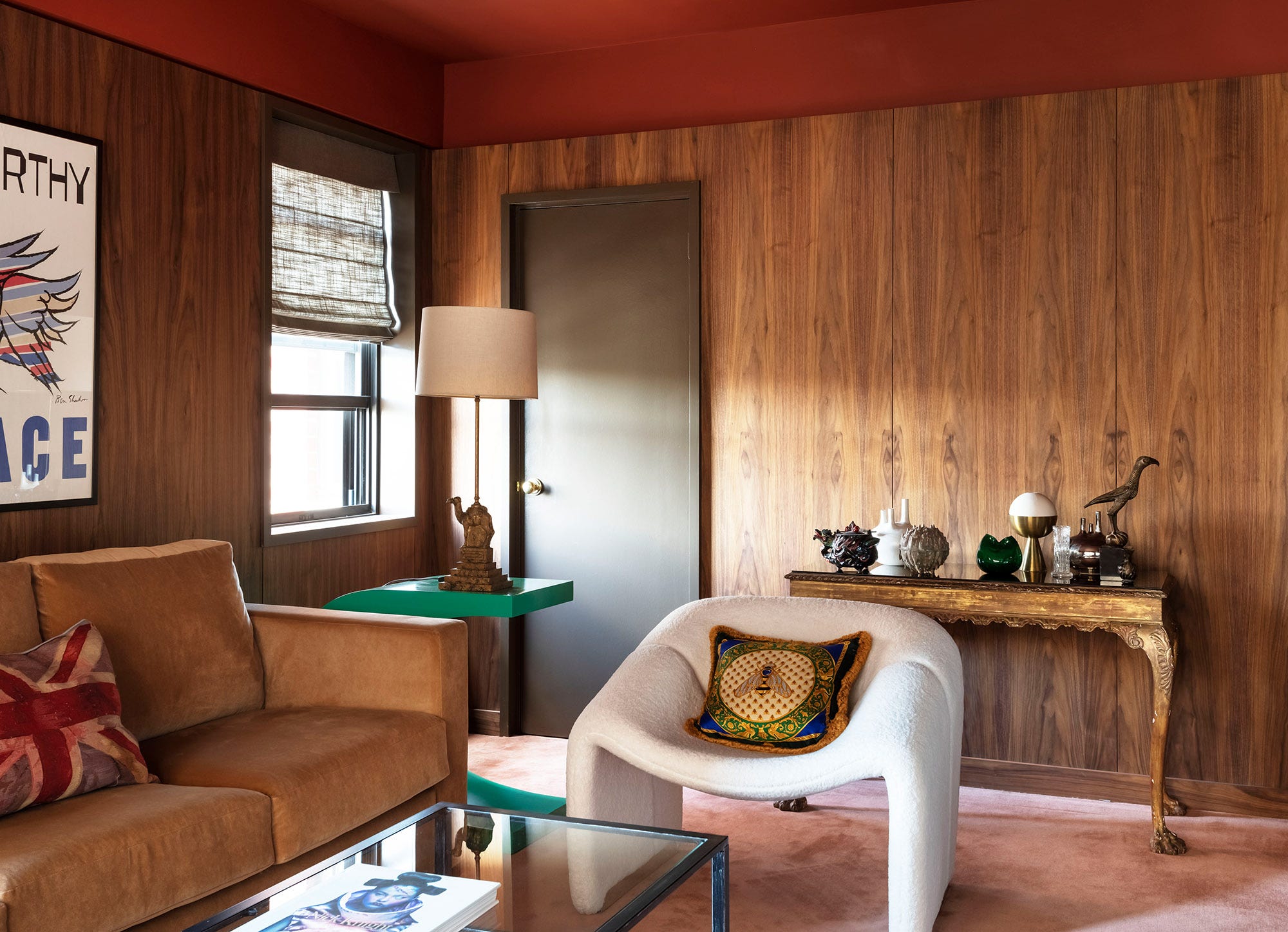
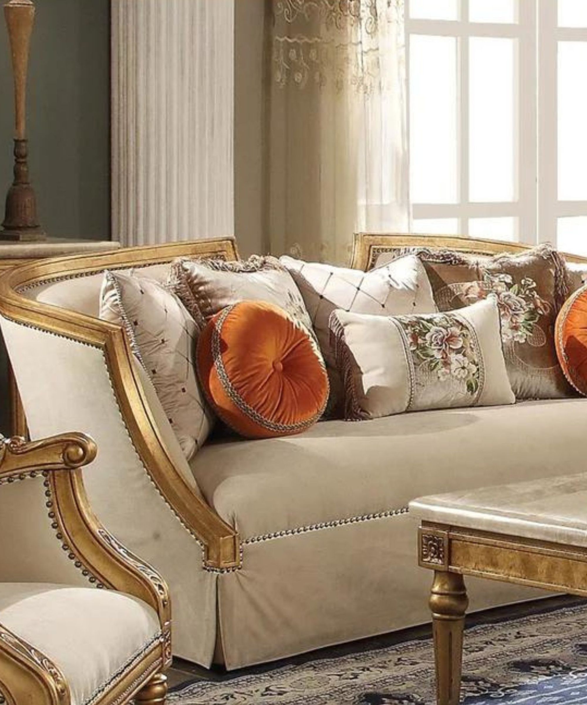
Buckingham Palace in London, UK, the official residence of the British royal family since 1837, features a rich, warm, and inviting color scheme. Its palette echoes Baroque and Rococo designs, incorporating shades from burgundy to mustard and muted grey-blue, embodying upscale taste with a welcoming ambiance.
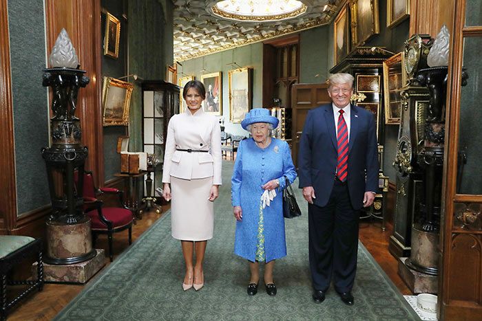
Windsor Castle, also in the UK and a staple property of the British royal family, showcases a brighter and more vibrant scheme. It utilizes emerald green, various pinks and purples, pops of orange, and abundant gold, creating a regal and eye-catching environment.
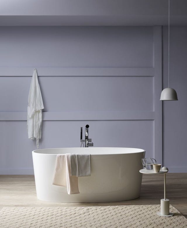
Prague Castle in the Czech Republic, renowned for its beauty, employs muted tones that evoke images of angels, art, and historic grandeur. Its neutral palette includes creams, greys, golds, and subtle hints of blue, offering a serene yet grand atmosphere.
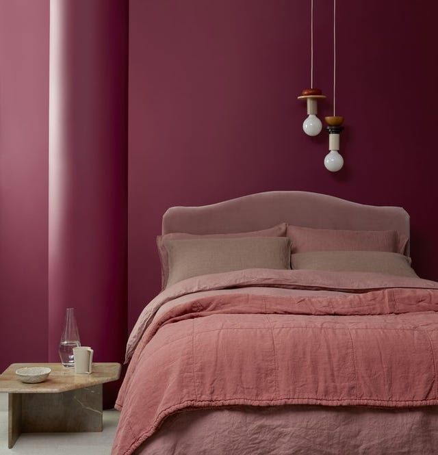
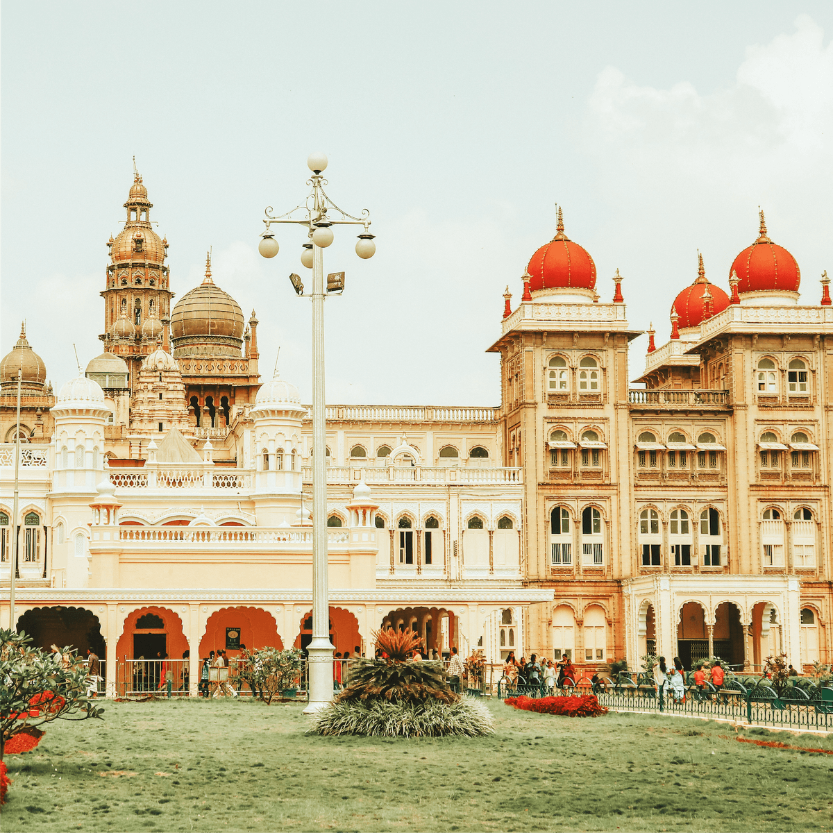
Mysore Palace in India, covering 72 acres, presents a dramatic and elegant array of colors. The palette reflects India's rich cultural beauty, featuring turquoises, purples, burgundies, emerald greens, golds, and yellows.
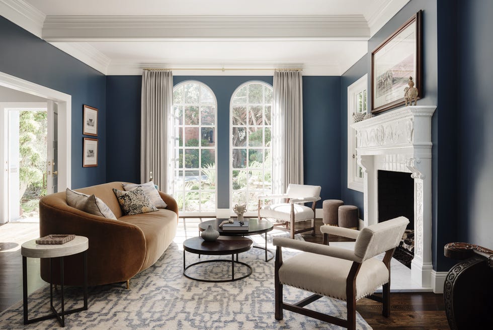
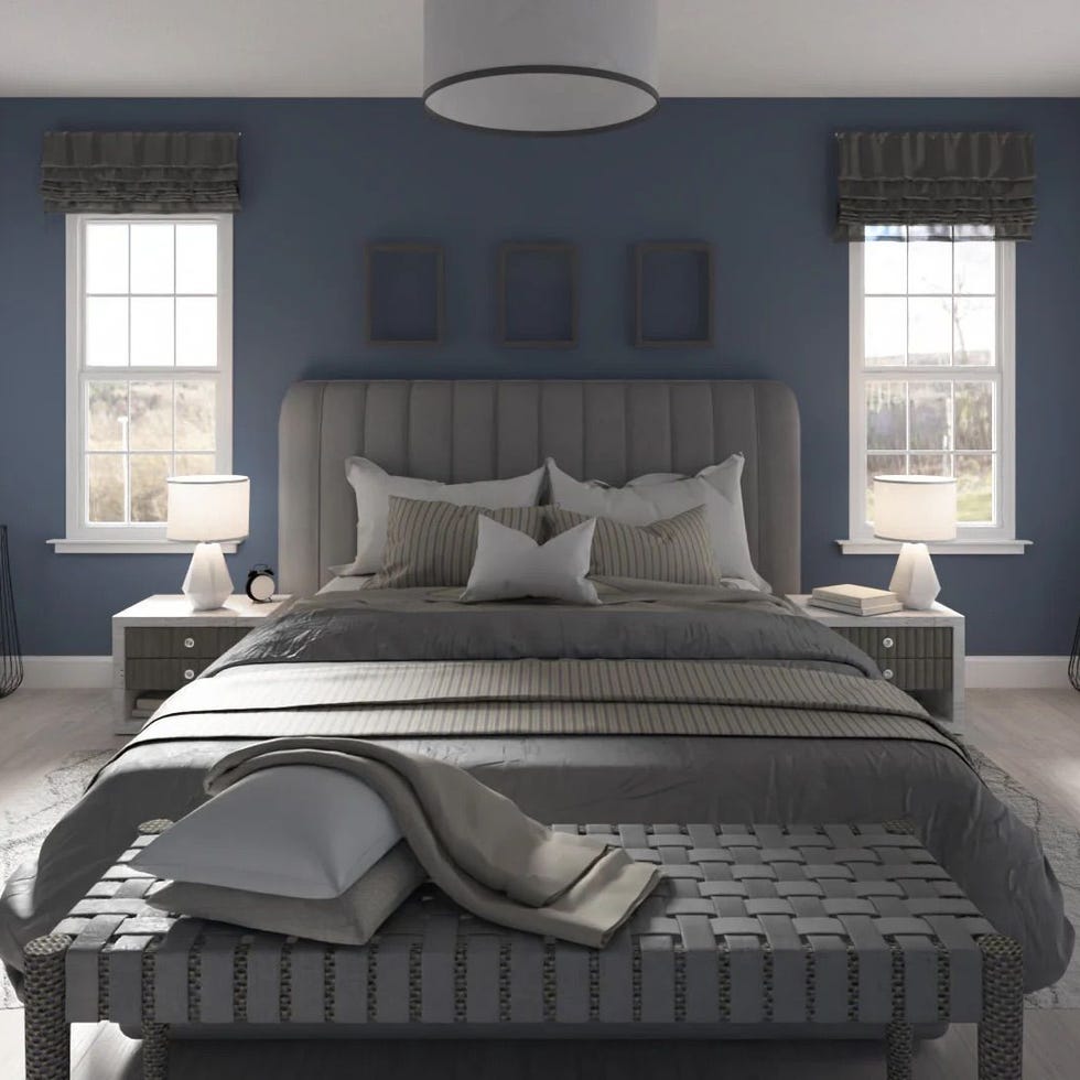
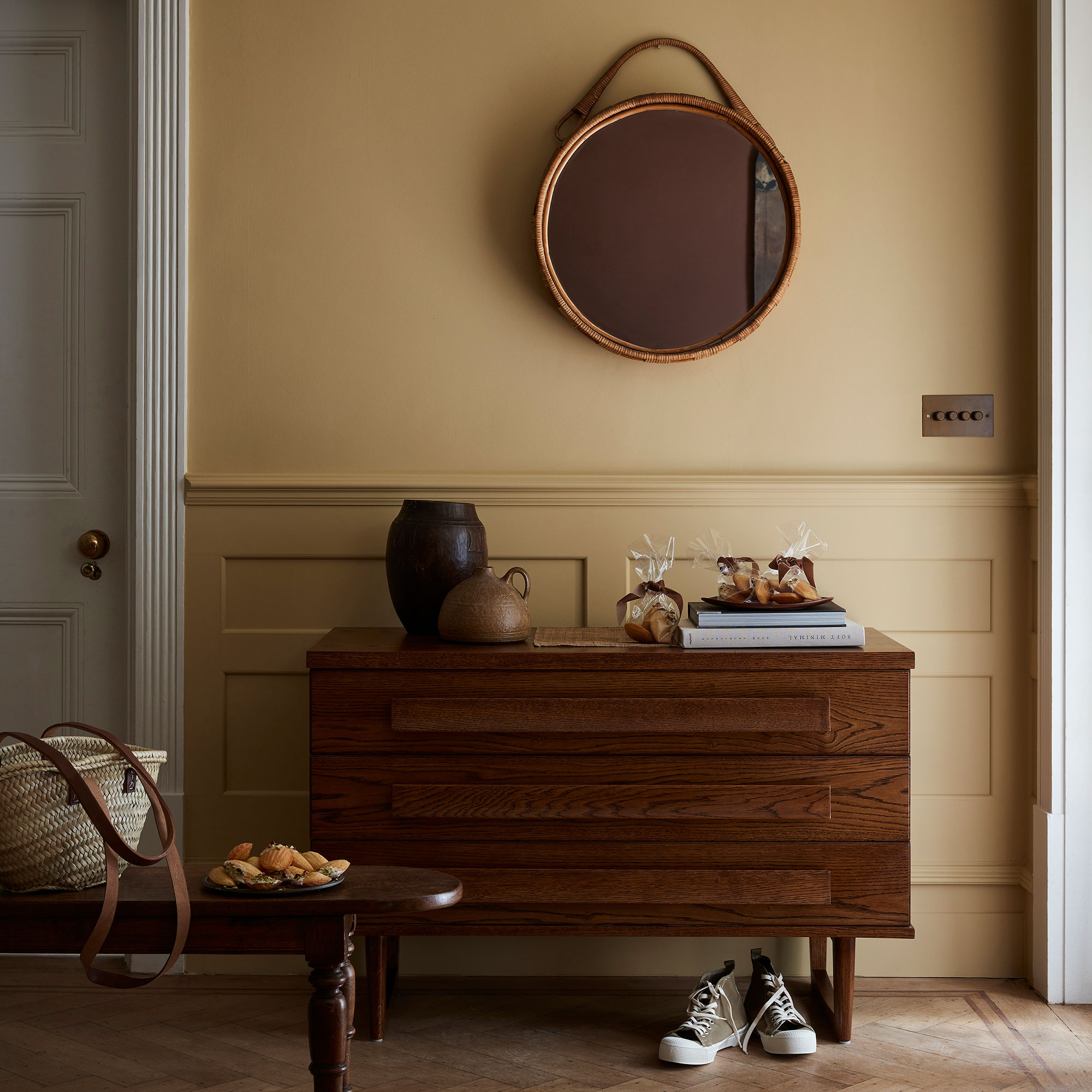
Kensington Palace in London, UK, known as a residence for Prince William, Kate, and their children, and formerly Princess Diana, offers a more neutral and cozy yet grand aesthetic. Its color scheme primarily consists of grey-blue and golds, complemented by warm browns and neutral taupes, achieving a regal and artful feel.
The Forbidden City in Beijing, China, an imperial palace from 1420 to 1912 with 980 buildings, presents an unforgettable destination with a stunning range of hues. Its palette includes pale blue, muted mauves, rich reds, browns, and taupes.
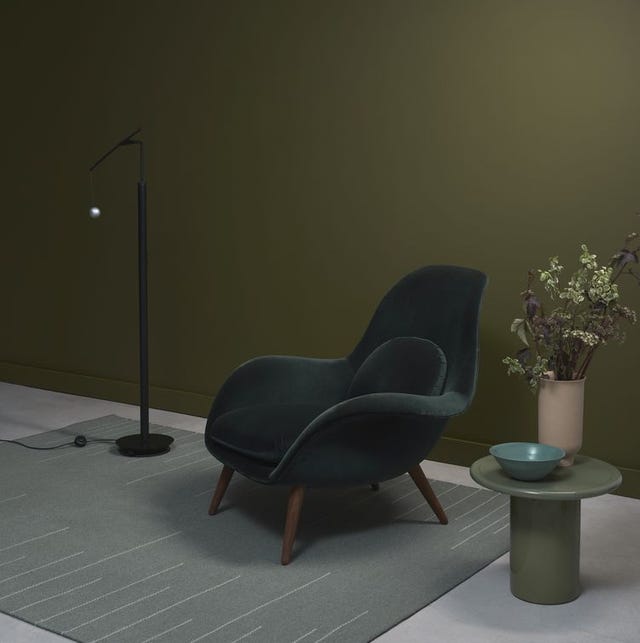
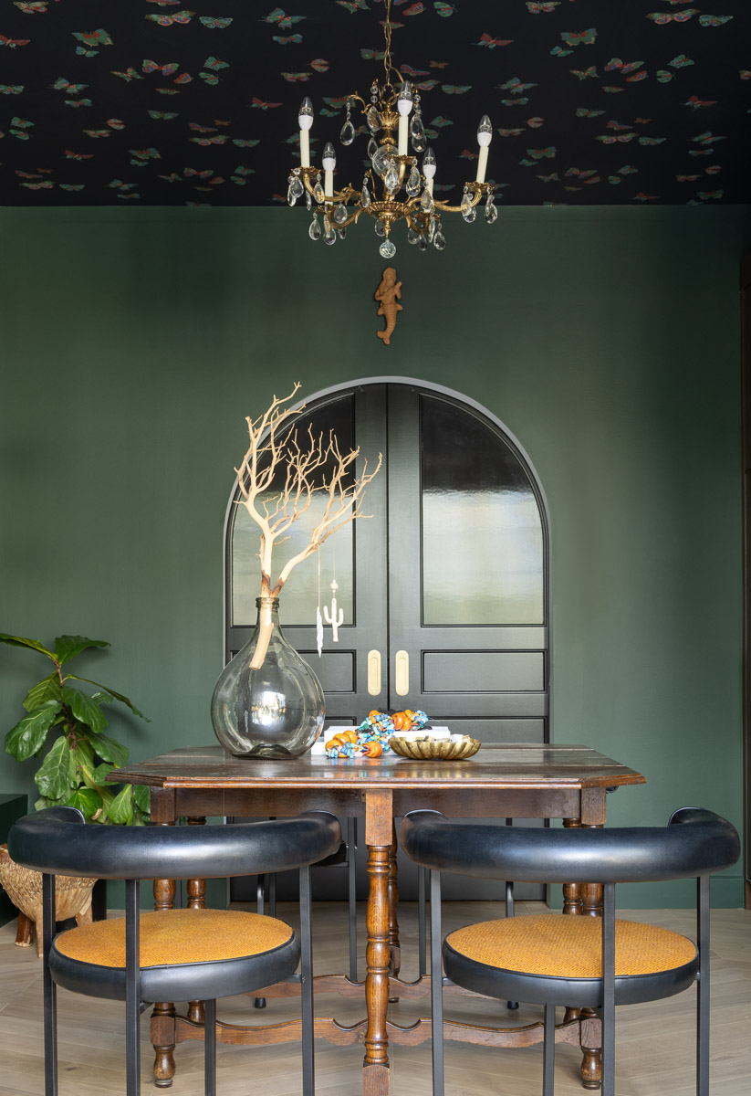
Dublin Castle in Ireland, built on a 13th-century Viking settlement, boasts a history of resilience and beauty. Its interior palette is rich in greens, from moss to kelly to emerald, alongside hints of red-pink, burgundy, and cream.
Palazzo Pitti in Florence, Italy, a Renaissance-era palace home to art and stunning architecture, exhibits an opulent and uniquely Italian interior. Its color scheme spans deep browns, pale blues, golds, reds, and various intermediate shades.
The Palace of Versailles in France, an iconic example of French Baroque architecture, is synonymous with opulence. Its color palette, centered on differing shades and tones of grey and gold, achieves an elegant and extravagant aesthetic.
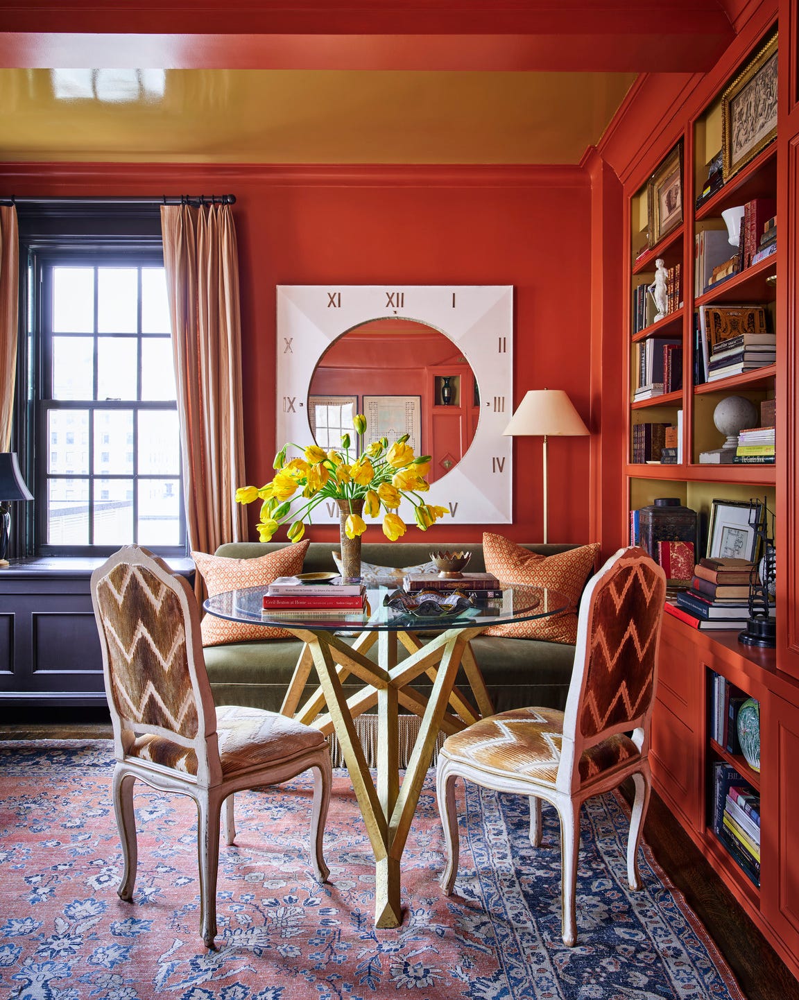
Hampton Court Palace in London, UK, another Baroque-era gem and former residence of King Henry VIII, features a color-rich palette largely due to its extensive art collection. Tones range from navy and sky blue to buttery yellow and vibrant orange, concluding the journey through royal-inspired interior designs.
#InteriorDesign #ColorPalettes #RoyalPalaces #HomeDecor #Inspiration #BuckinghamPalace #Versailles #KensingtonPalace #InteriorDesign #ColorPalettes #RoyalPalaces #HomeDecor #Inspiration #BuckinghamPalace #Versailles #KensingtonPalace
0 comment in total
 No comments yet
You may also like
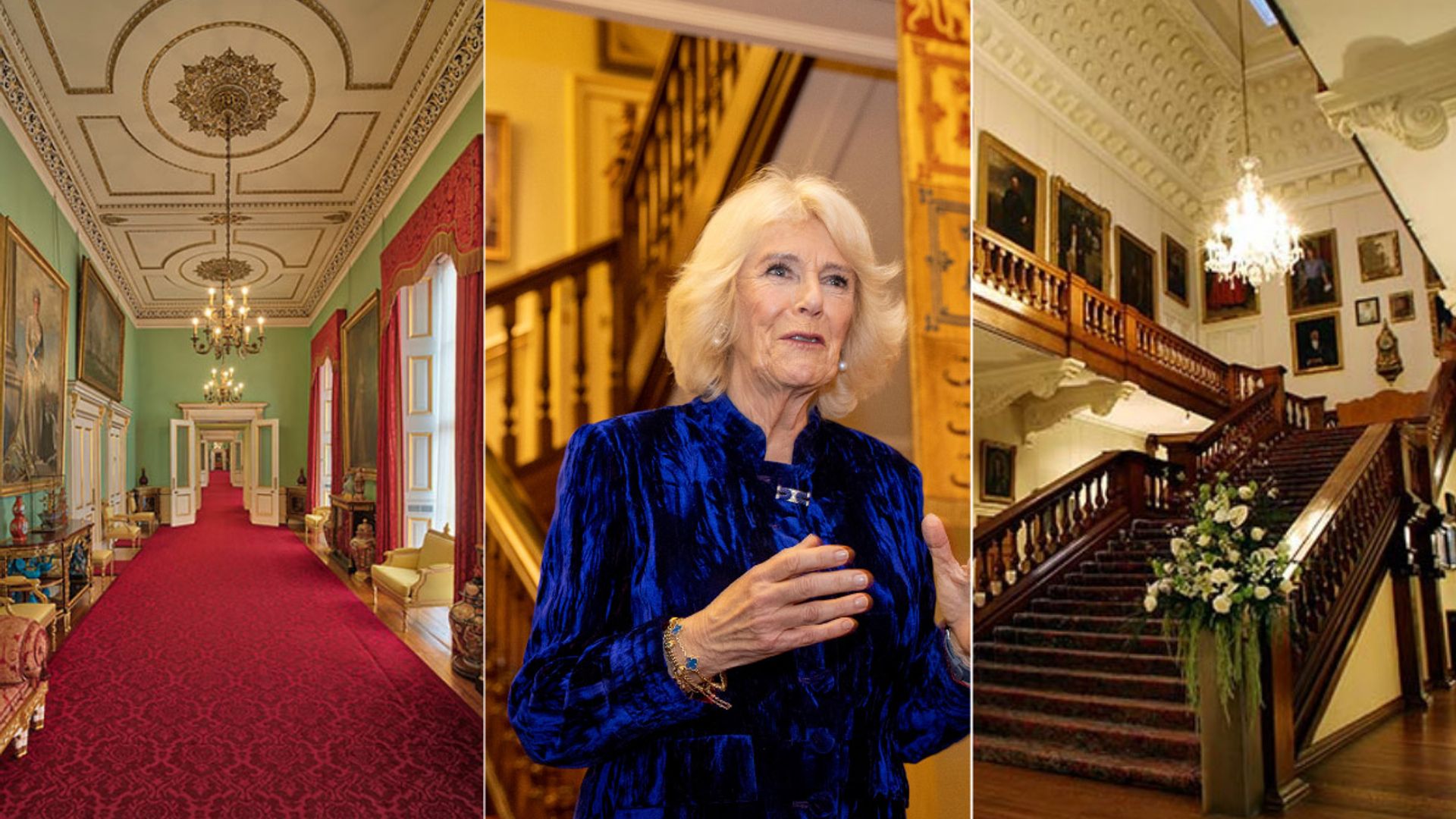
9 astounding royal hallways that are nothing like ours

Discover the beautiful new collection of shades created by ELLE Decoration with Crown Paints

10 opulent interiors that spurn minimalism for rich colours and textures
4 Colors You Should Never Paint Cabinets, According To Designers

11 Paint Colors That INSTANTLY Make Your Home Look "Expensive," According to Designers


10 Timeless Living Room Paint Colors Designers Swear By
Why This Hue Is Suddenly Dominating Every Designer's Wishlist—Plus, How to Style It

What Colors Go with Brown? Here Are 15 Complementary Shades to Try Now
Lick Paint Will Transform the Mood in Your Home Through Color Psychology
Home Design: How to Go All In on a Bold Hue
What Colors Go With Red? 10 Colors That Hold Their Own Alongside This Fiery Hue

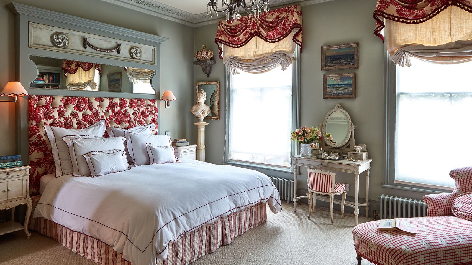
Castlecore is set to take over interiors

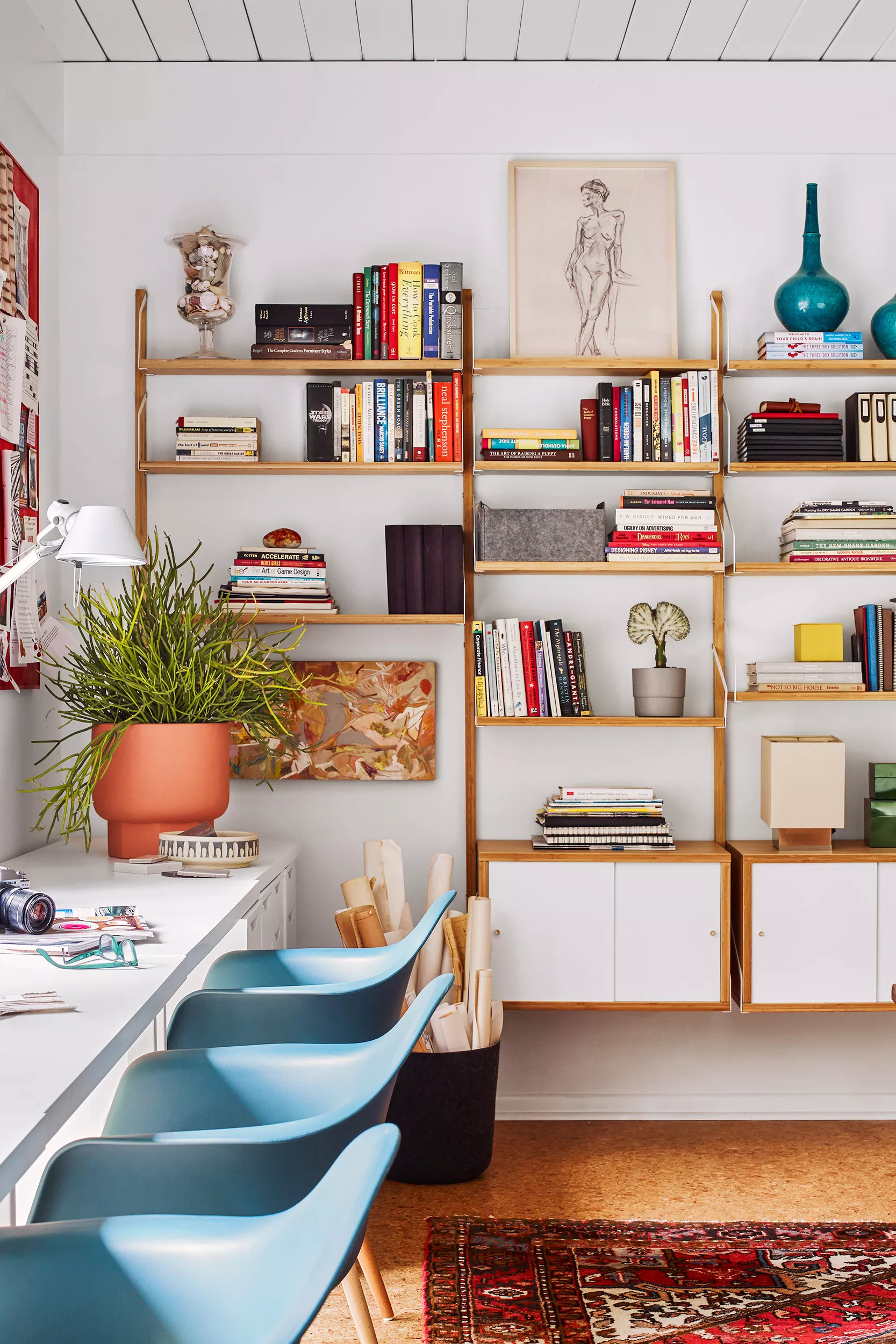
10 Midcentury Modern Color Palette Ideas for Every Room in Your Home

Weekend Design: 5 Color Palettes for a Midcentury Modern Look

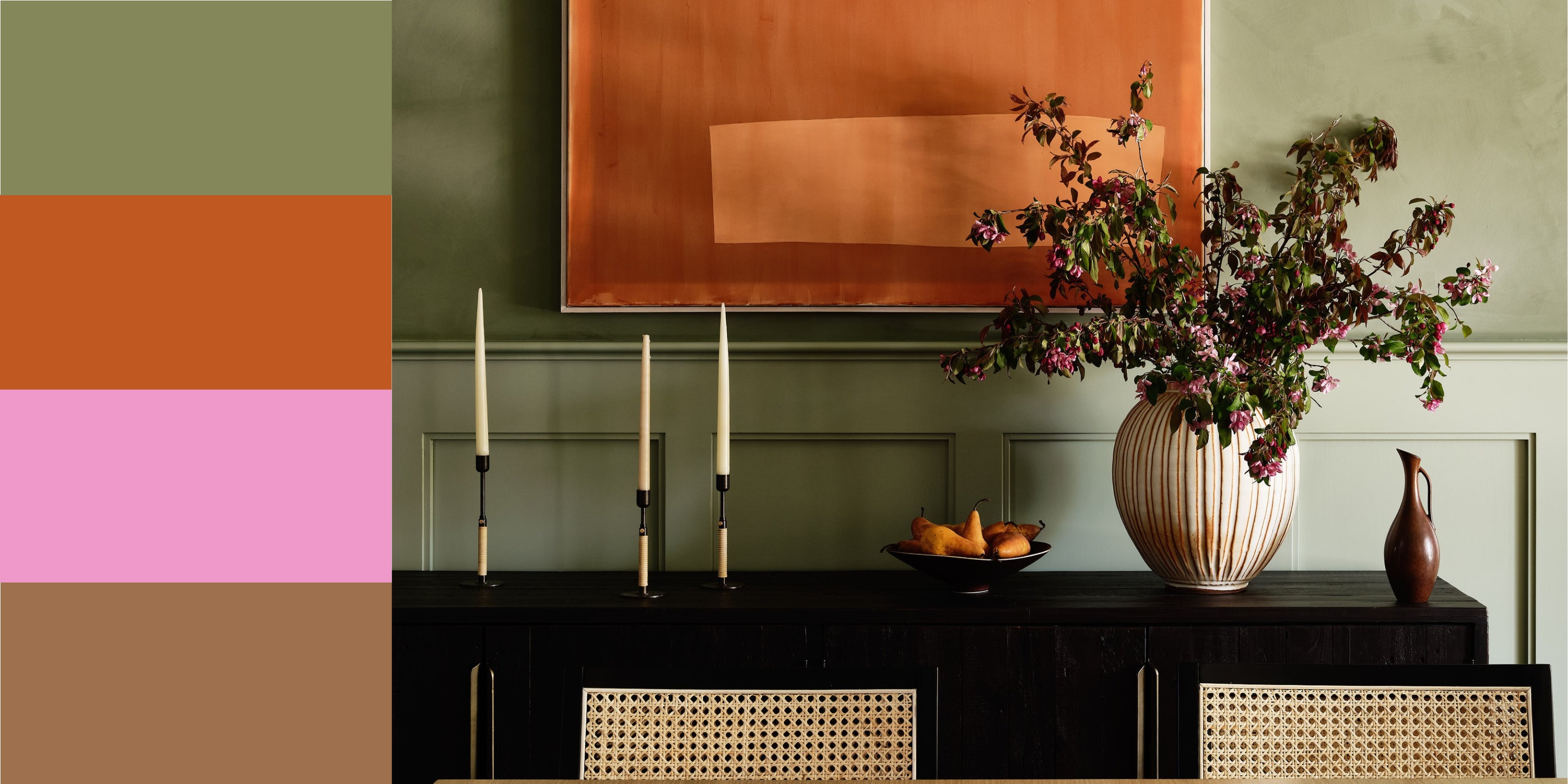
12 Colors That Go With Green I'm Seeing Interior Designers Use All the Time Right Now
Should woodwork be lighter or darker than walls? The rules colour experts use to choose the perfect colour
These 20 Rooms Use a Red Color Palette in All the Right Ways

13 Shades of Red That Bring the Drama
Why This Hue Is Suddenly Dominating Every Designer's Wishlist—Plus, How to Style It

7 Color Combos That ALWAYS Look Good Together, According to Designers