1/7
We Can’t Get Enough of These 13 Paint Color Trends for 2021
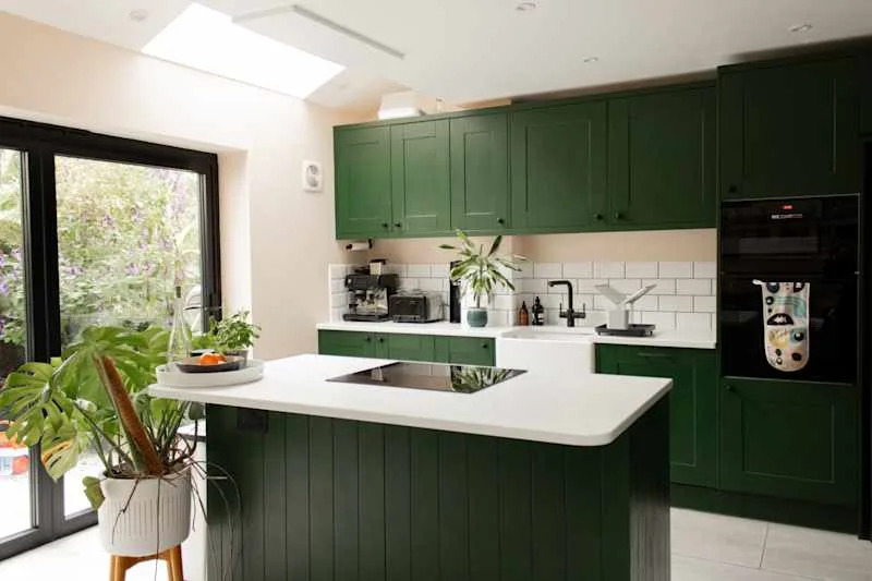
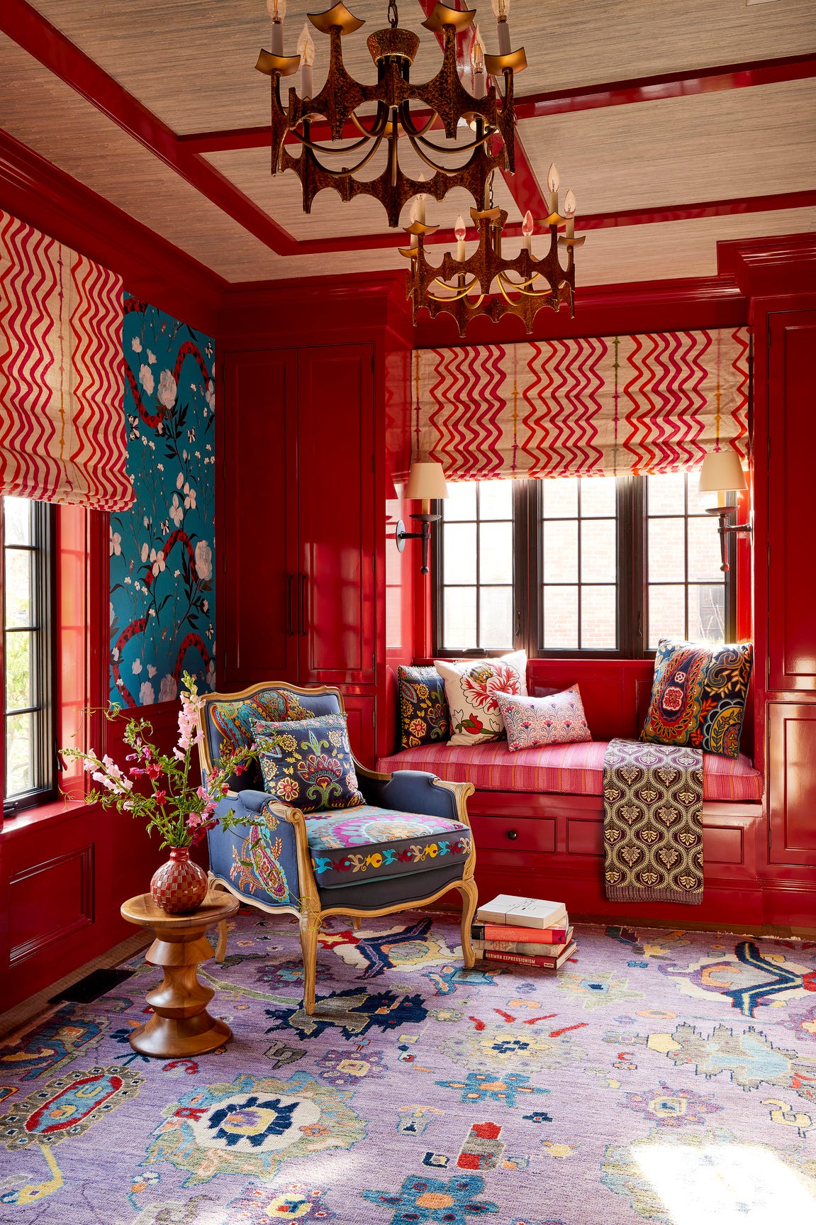
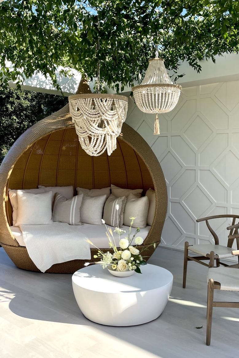
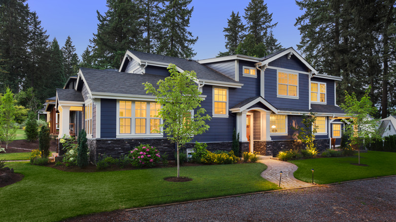
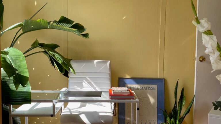
After a year where individuals spent a significant amount of time within their homes, many are looking for ways to refresh their living spaces. This increased attention to domestic environments has highlighted areas that could benefit from updates, such as minor repairs or a fresh coat of paint. A new paint job is presented as an effective method to alter the mood and introduce a sense of novelty and joy into a home. The article explores 13 trending paint colors for 2021, emphasizing a shift from predominantly all-white interiors to more vibrant and expressive hues.
Interior designers were consulted to identify the leading paint color trends for the year. A key takeaway is the importance of selecting colors that align with personal aesthetics, rather than blindly following trends. Max Humphrey, a Portland, Oregon-based designer, encourages bold choices, noting that paint is a reversible decision. Julie Van Daele suggests that for those hesitant to commit to strong colors, incorporating texture with a classic, versatile color can achieve a timeless yet impactful look.
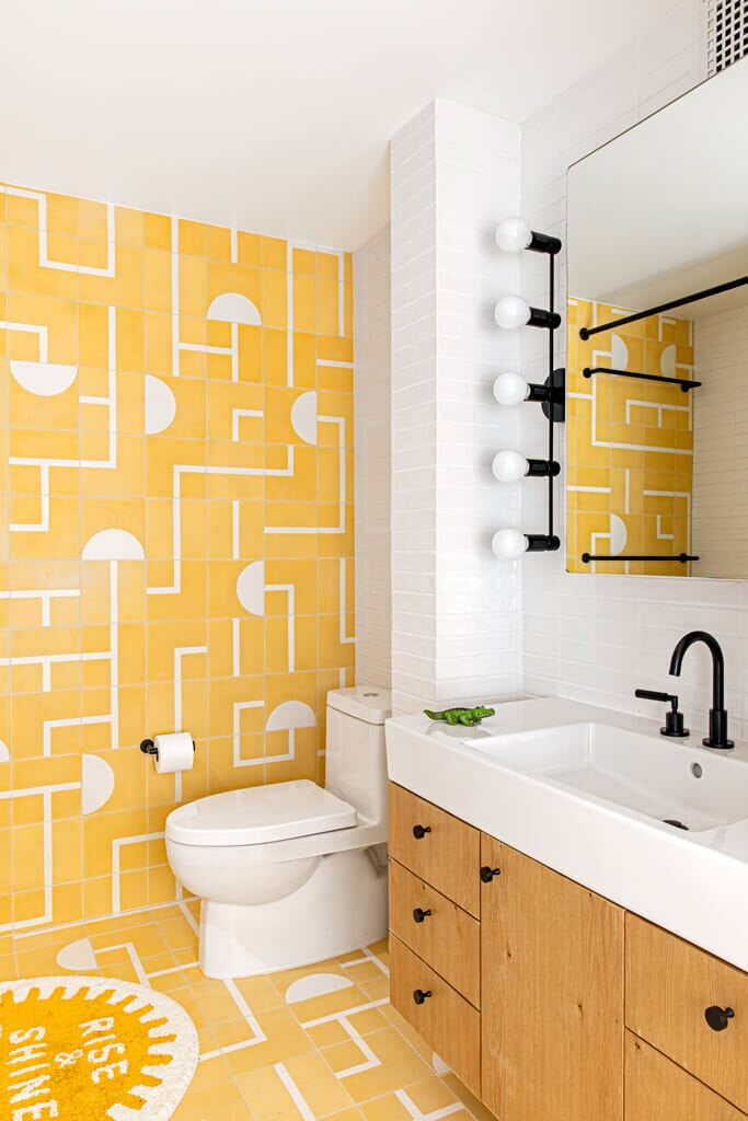
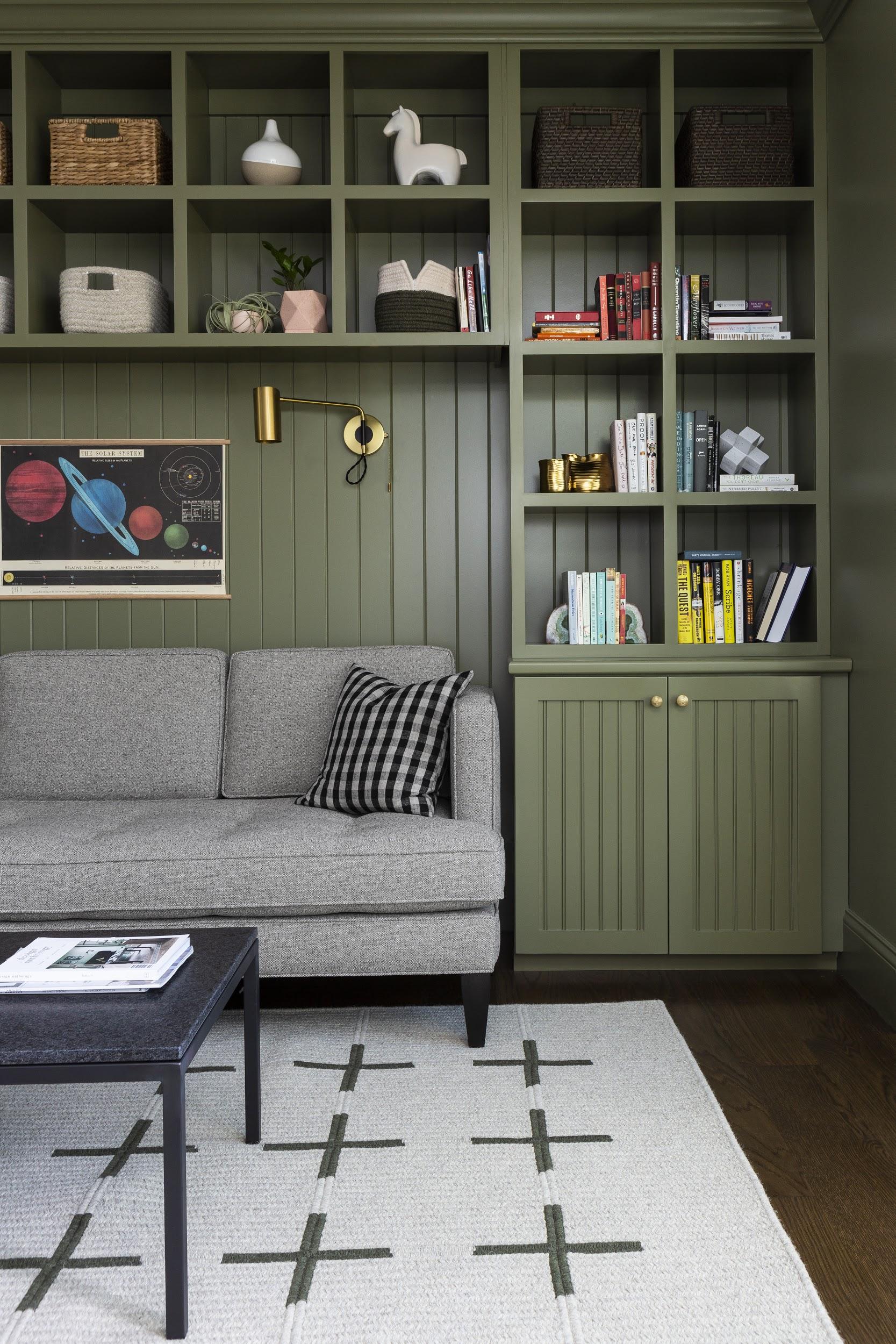
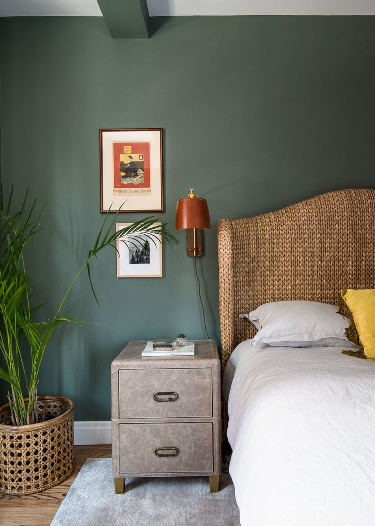
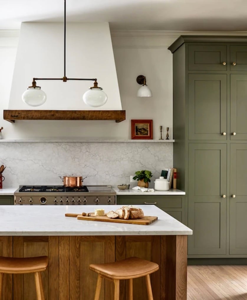
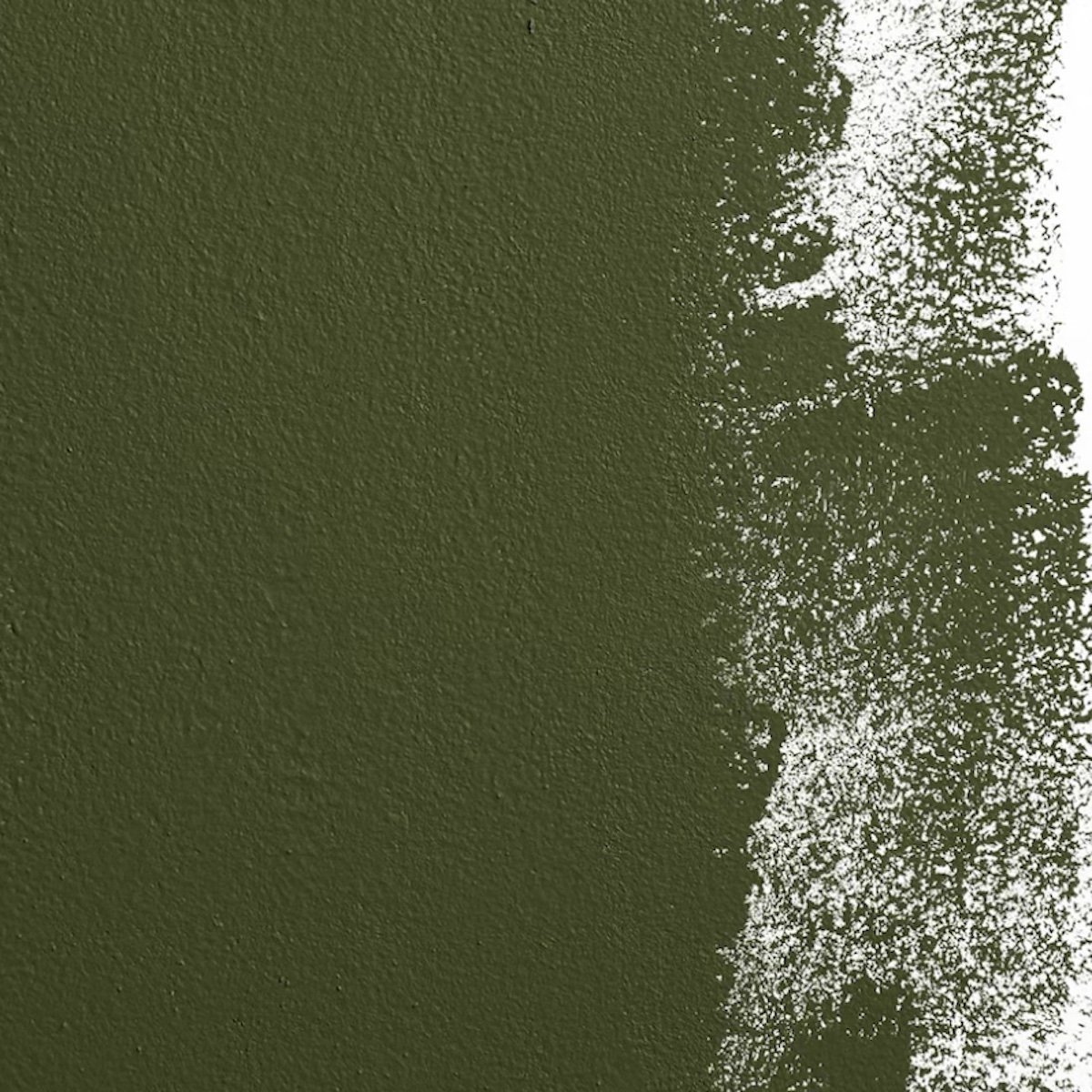
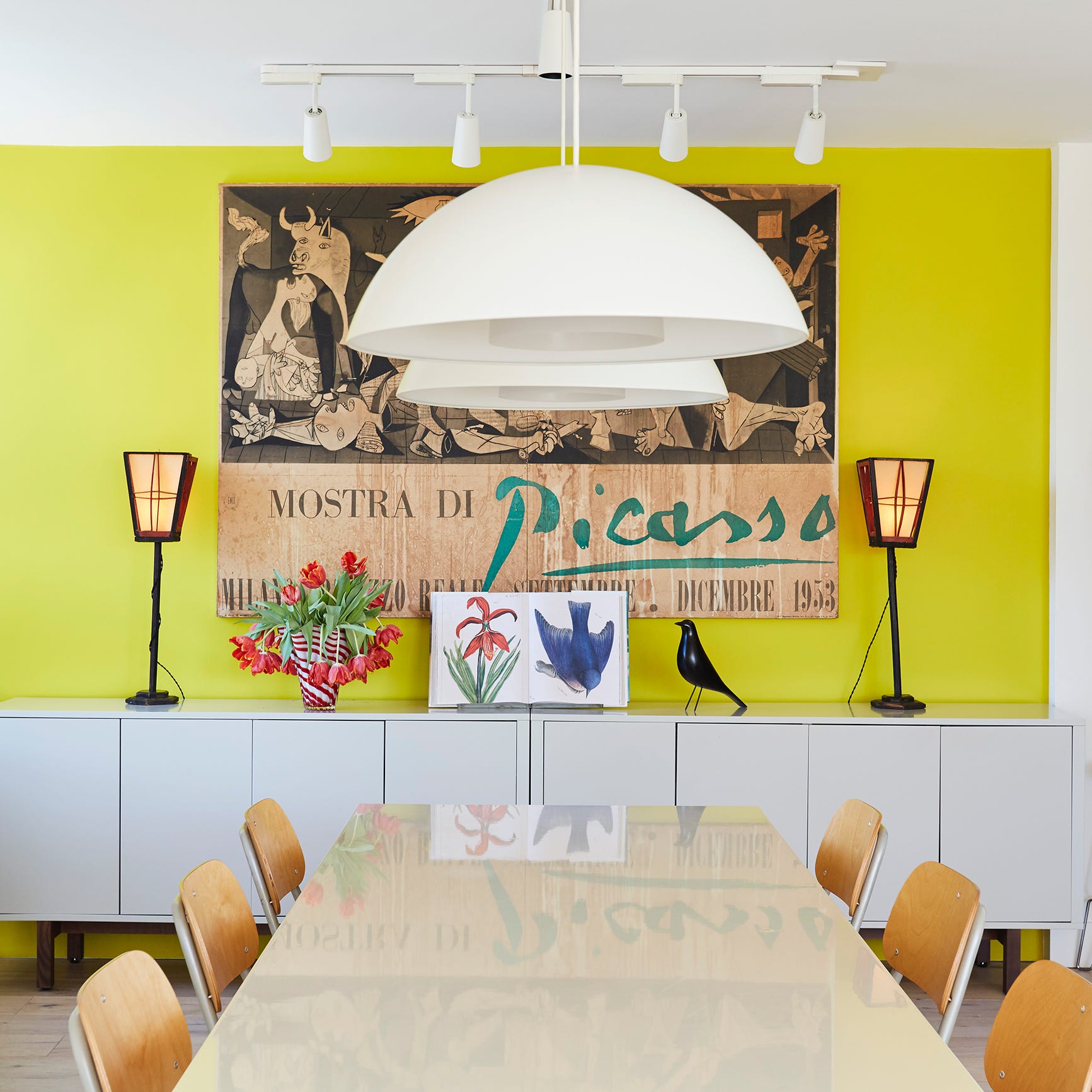
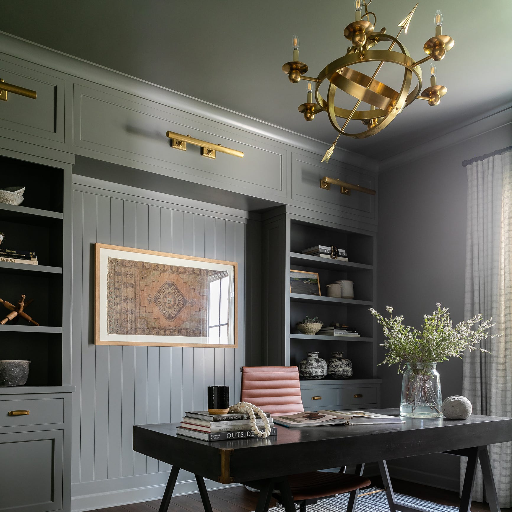
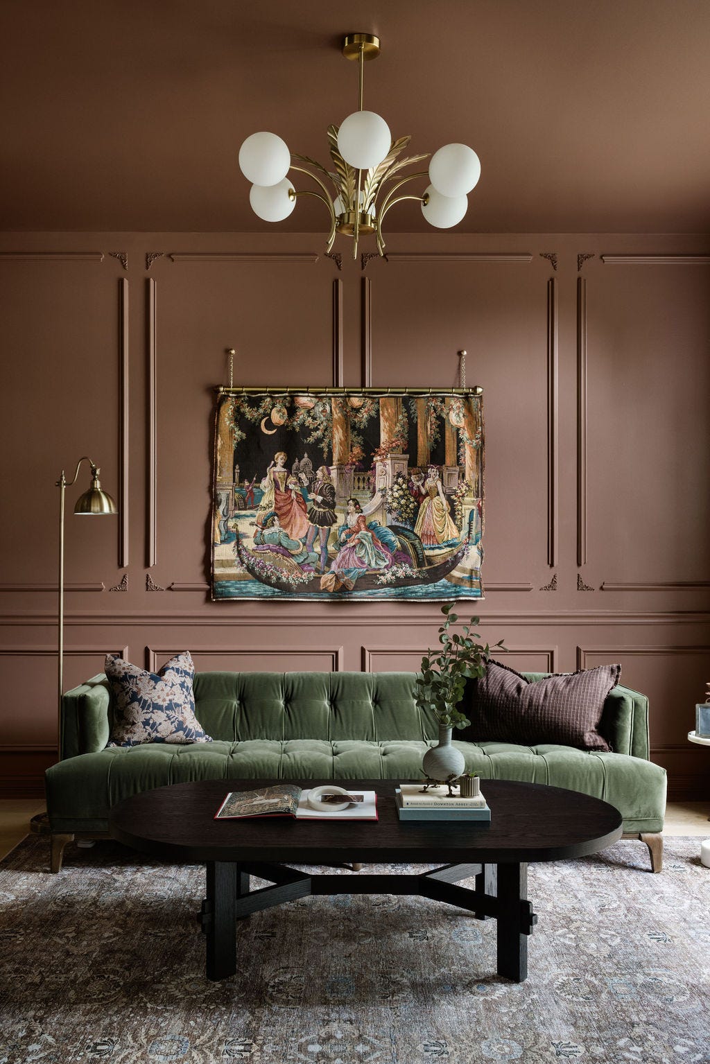
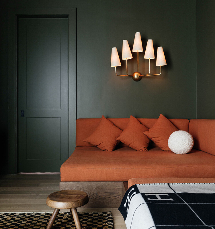
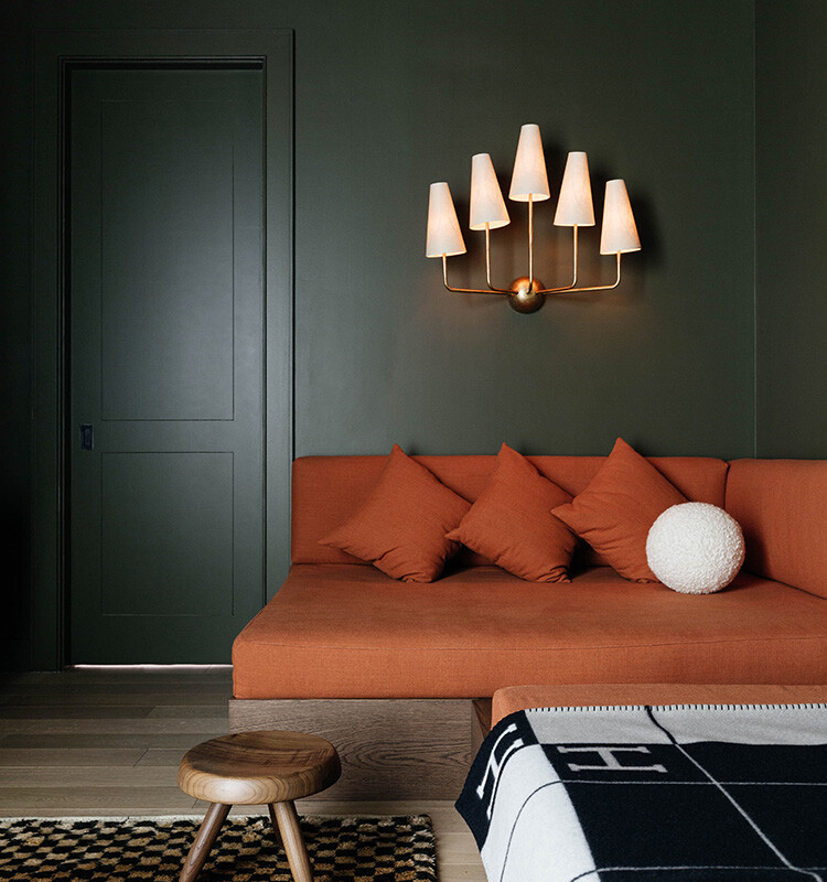
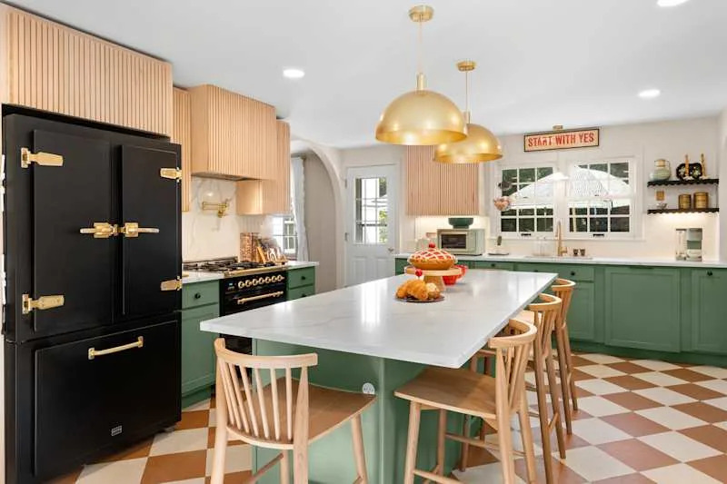
Thirteen specific paint colors and their applications are highlighted. Benjamin Moore's "Hannah Banana" is presented as a rich yellow tone that brings cheer, drawing a parallel to fashion choices. Farrow & Ball's "Dead Salmon" signifies a return to 1980s-inspired earthy palettes, specifically incorporating pink undertones to prevent a drab appearance. Clare's "Dirty Martini" is recommended by Humphrey as an olive green alternative to traditional navy, suitable for bedrooms or as a cabinet color, especially with a slight sheen.
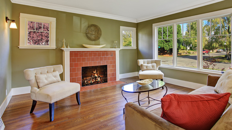
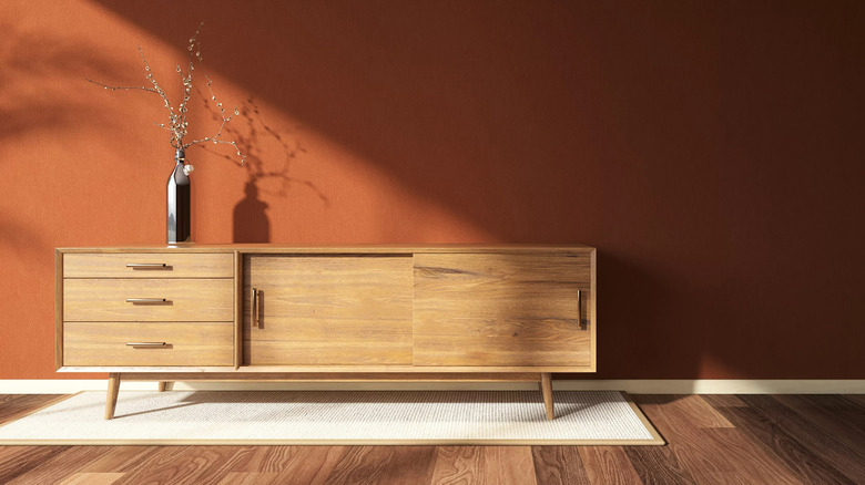
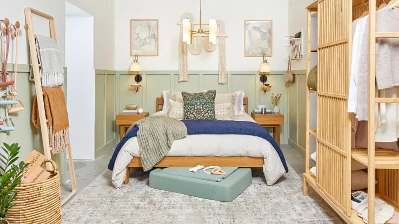
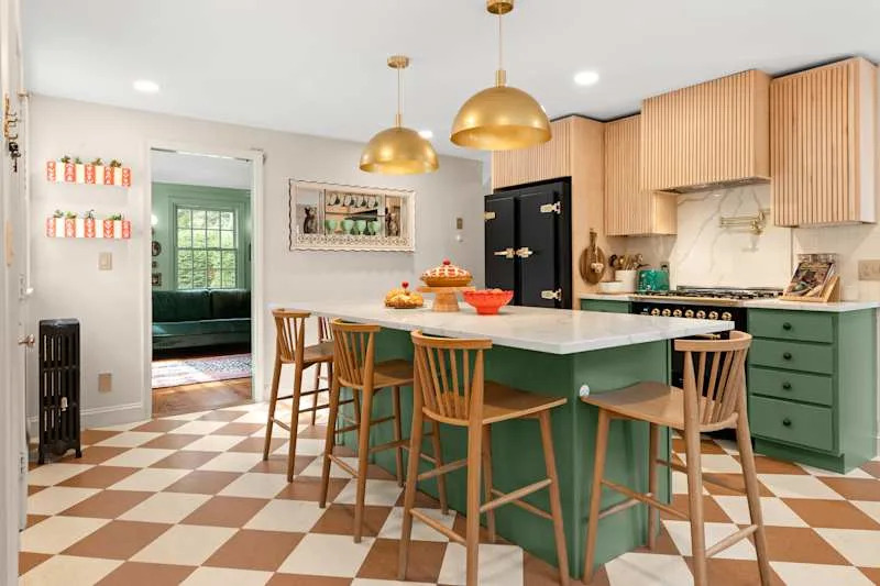
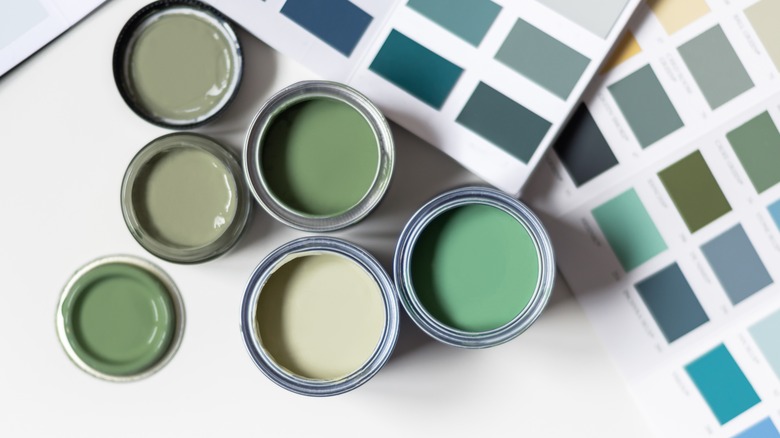
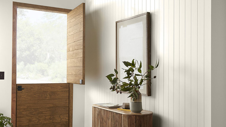
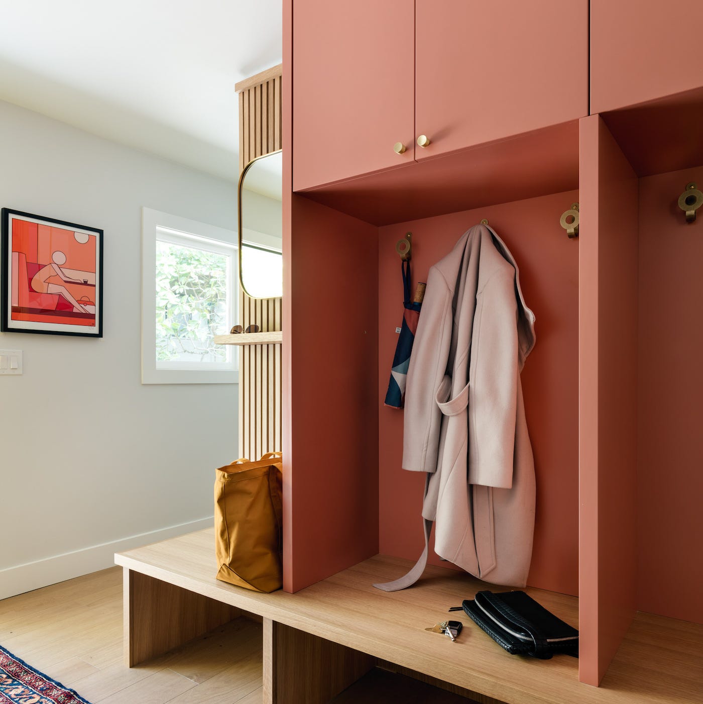
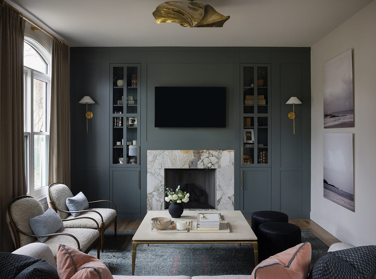
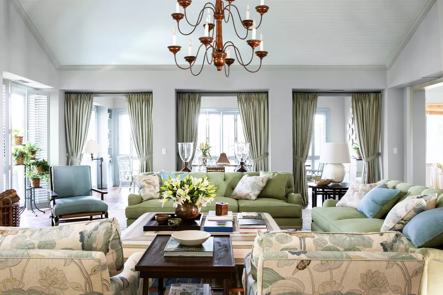
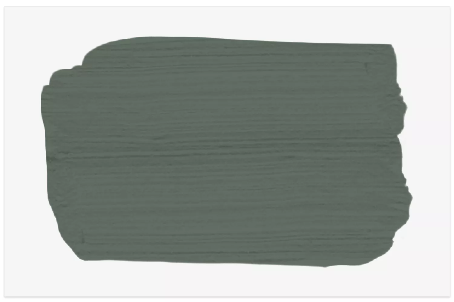
Backdrop's "Ghost Ranch" is identified as a rich earth tone, blending classic brown with deep red to create a warm terracotta hue. For those seeking texture, Portola Paints' "Roman Clay" is praised by Van Daele for transforming walls into a statement without relying solely on color. Farrow & Ball's "Calke Green," a deep sage green, is described as a versatile, elegant, and almost neutral shade suitable for various rooms, including smaller spaces or home libraries. Clare's "Good as Gold" is a subtly sunny mustard tone, seen as joyful and ideal for brightening kitchens, bathrooms, or small bedrooms.
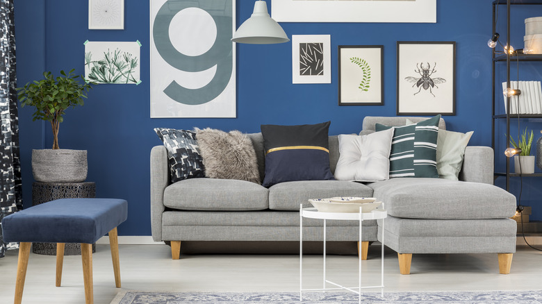
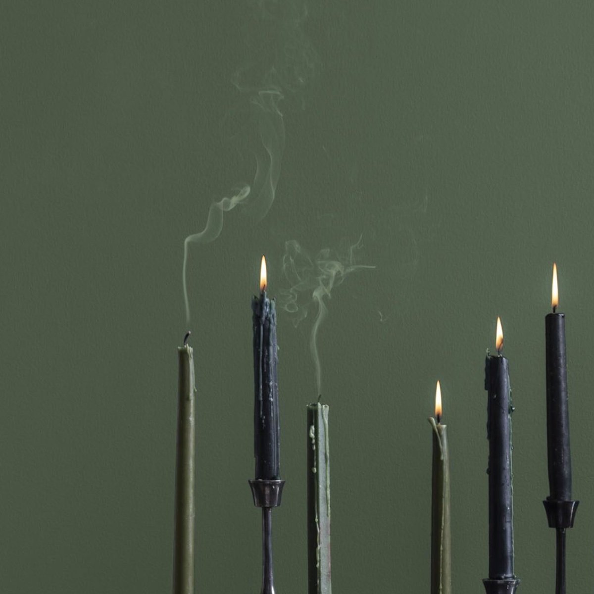
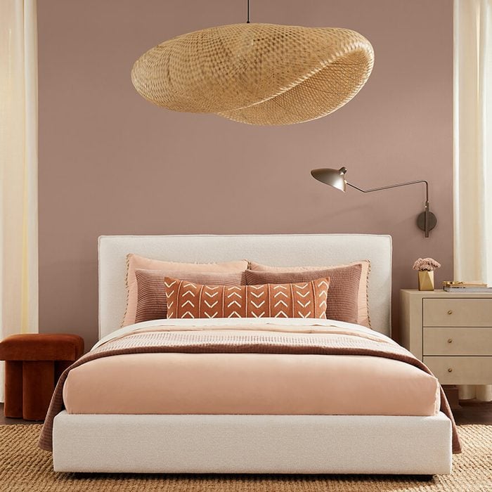
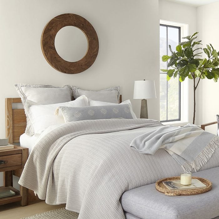
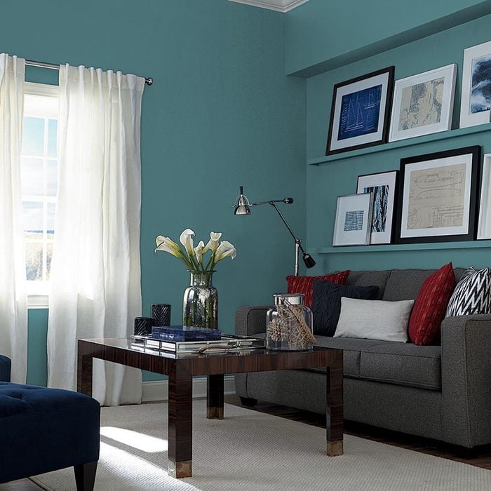
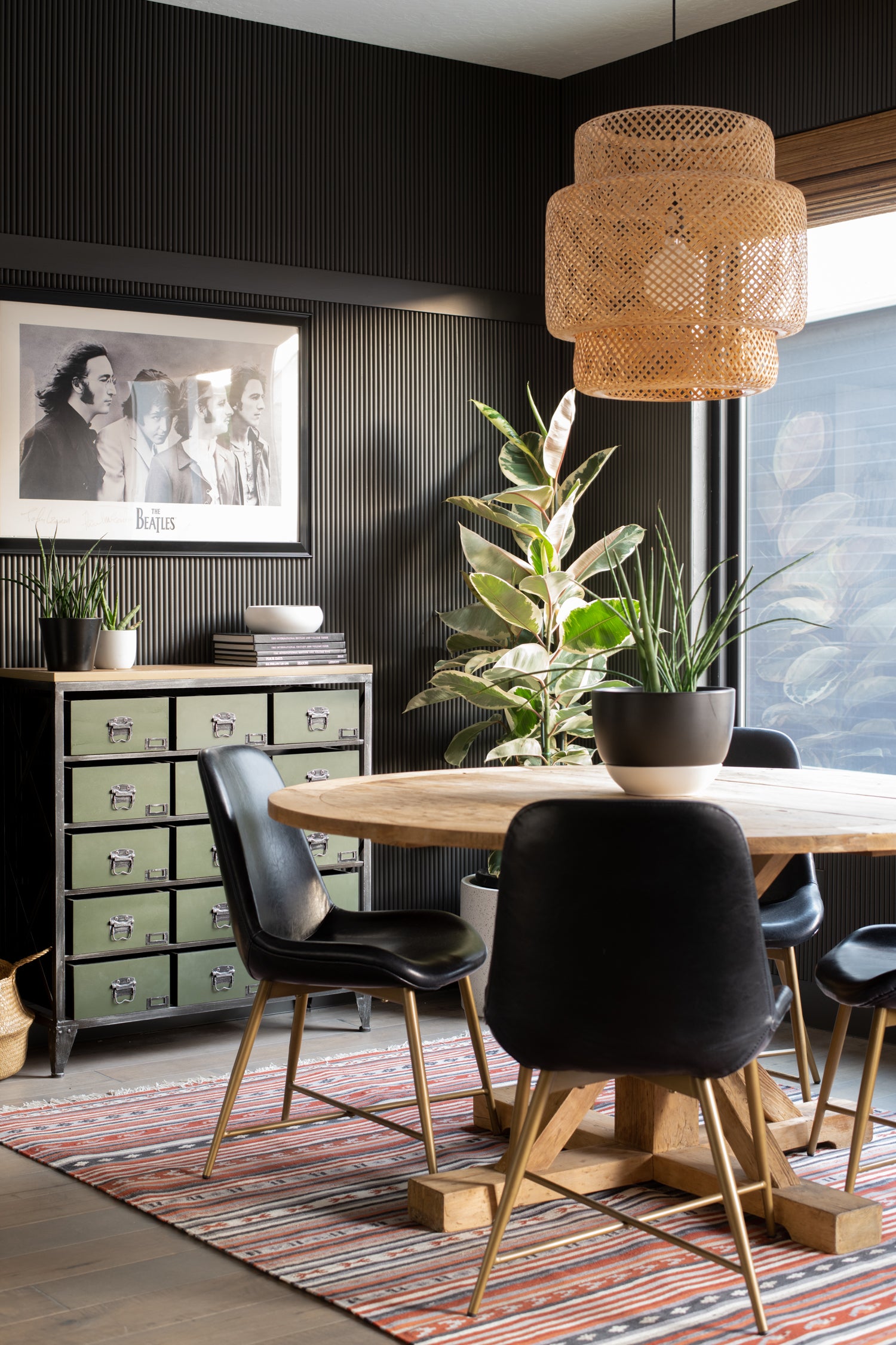
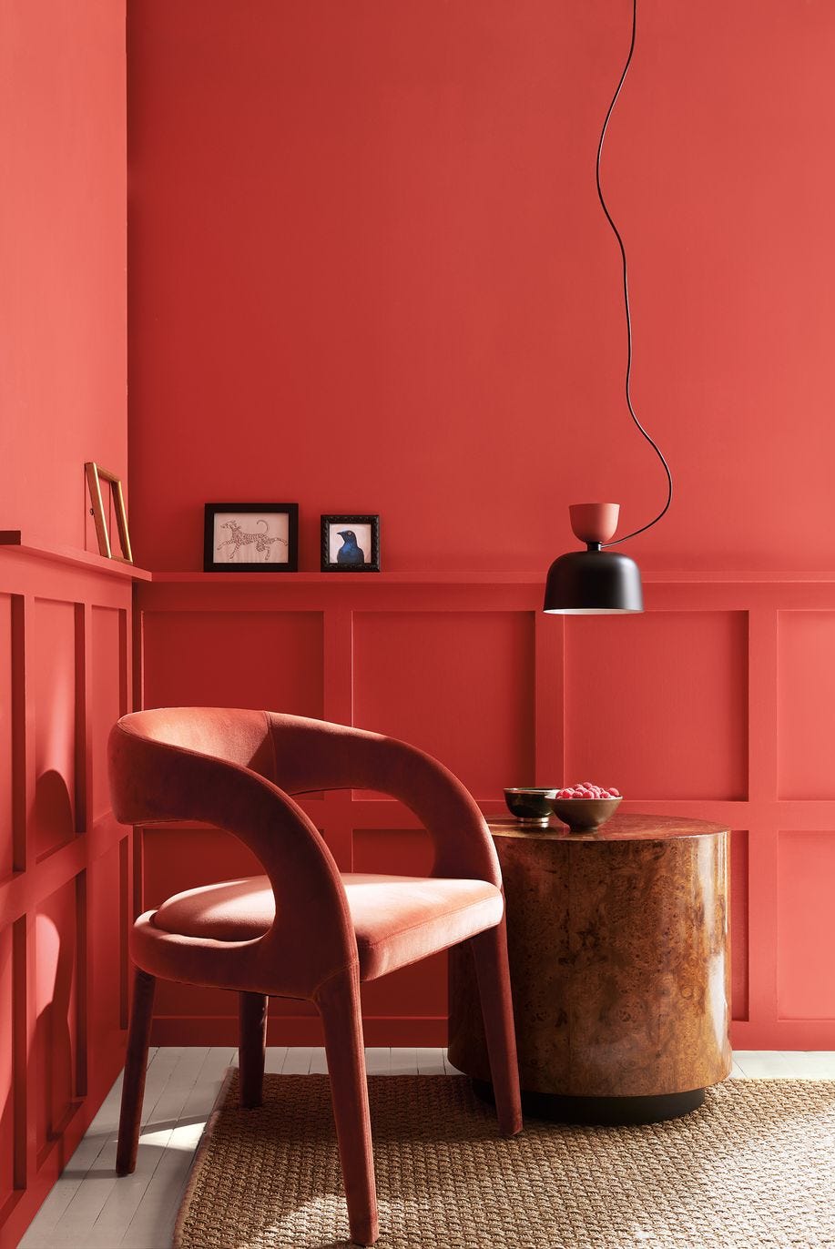
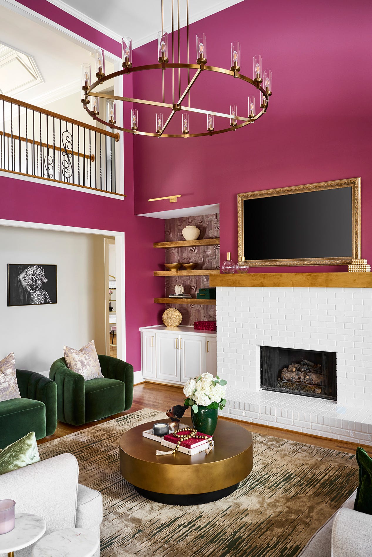
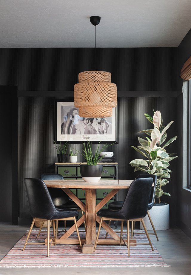
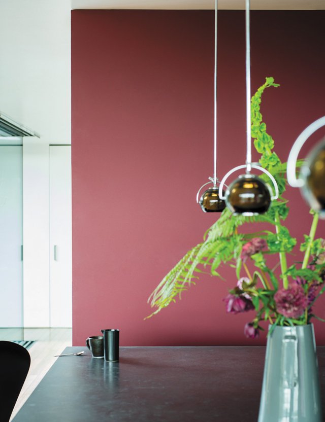
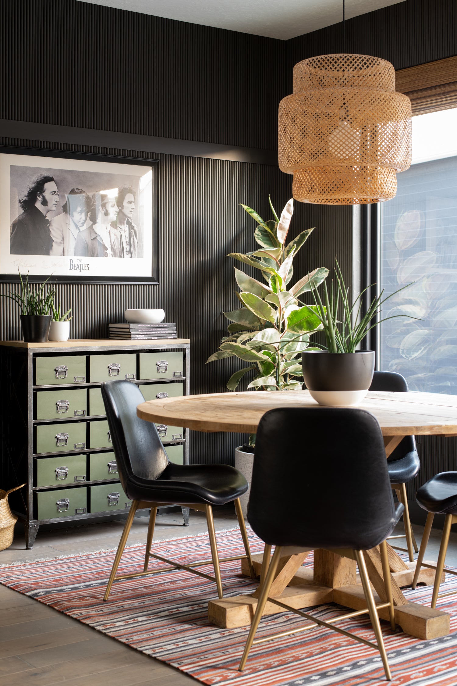
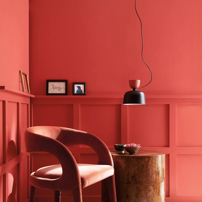
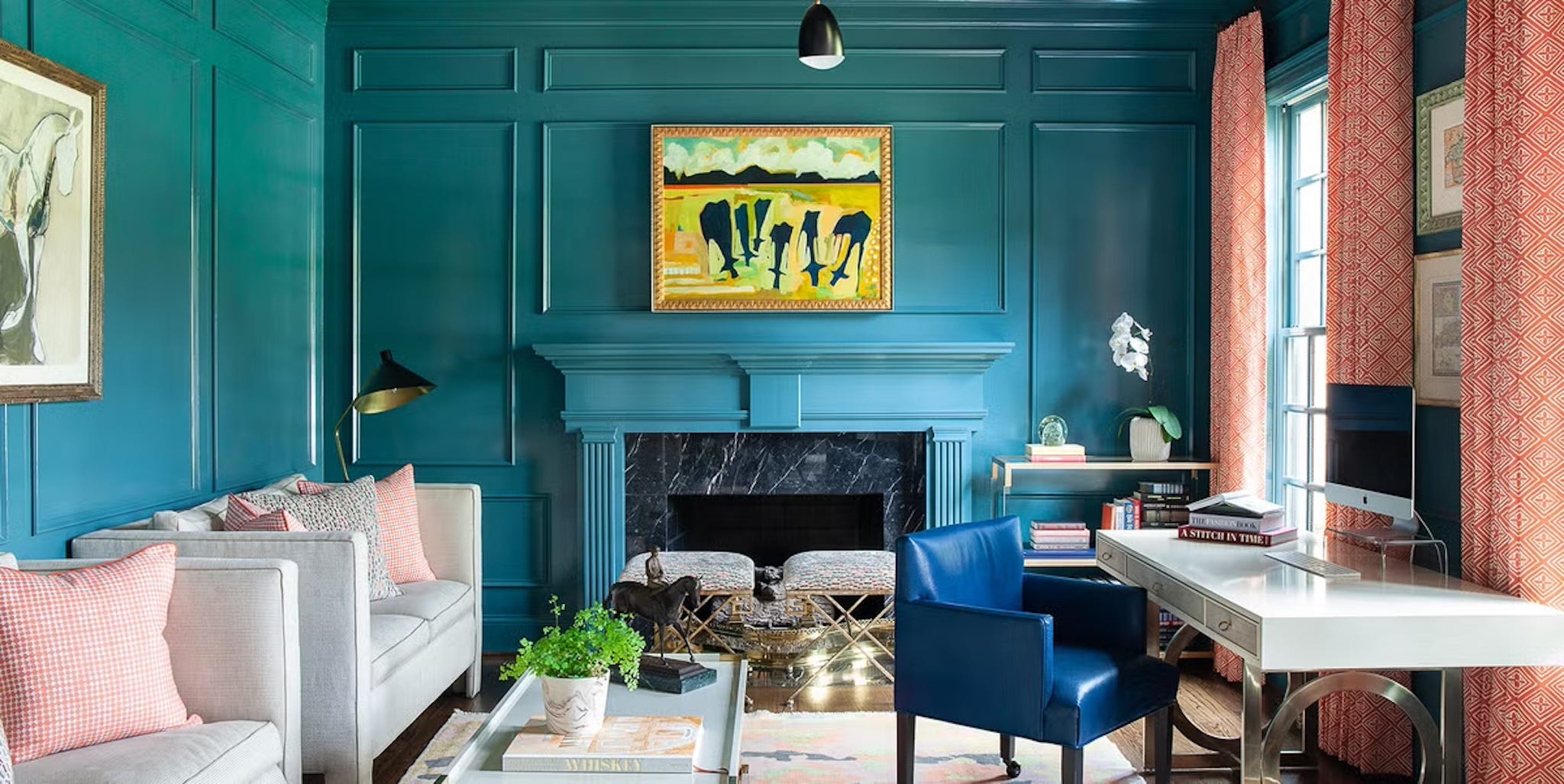
Backdrop's "After Hours," a soft charcoal black, is suggested for creating romantic and moody retreats like bedrooms or candlelit bathrooms, reflecting a growing preference for dark, intimate spaces. Benjamin Moore's "Rust" is noted as a super-saturated color no longer confined to exteriors, perfect for offices, dining rooms, or reading nooks. Benjamin Moore's "Aegean Teal" is highlighted as a soothing grayish blue-green that evokes a stormy sea, suitable for tranquil bathroom or bedroom settings. Clare's "Hyperlink" represents the trend of jewel-tone paints, described as a cheerful blue with white undertones, making it suitable for bedrooms without feeling overwhelming. Backdrop's "36 Hours in Marrakesh" is a deep, warm pink, presented as a grounded neutral that works well in kitchens, bedrooms, or living spaces without being overly feminine. Finally, Benjamin Moore's "Gray Cashmere" is offered as a more subtle approach for those transitioning from neutral walls, providing a neutral shade with hints of green, as suggested by Van Daele, to introduce color without being overtly bold.
#paintColorTrends #homeDesign #interiorDesign #decoratingIdeas #colorPsychology #homeImprovement #designersChoice #earthTones #boldColors #paintColorTrends #homeDesign #interiorDesign #decoratingIdeas #colorPsychology #homeImprovement #designersChoice #earthTones #boldColors
0 تعليق إجمالاً
 لا توجد تعليقات بعد
قد تعجبك أيضًا
These 13 Paint Color Trends for 2021 Will Give Your Home a Fresh Look

What To Expect For 2023 Paint Color Trends

9 Color Trends That Will Take Over in 2023

5 Paint Color Trends We Hope Don't Come Back This Year
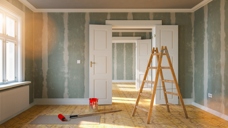
Interior Paint Color Trends You Should Know About In 2021
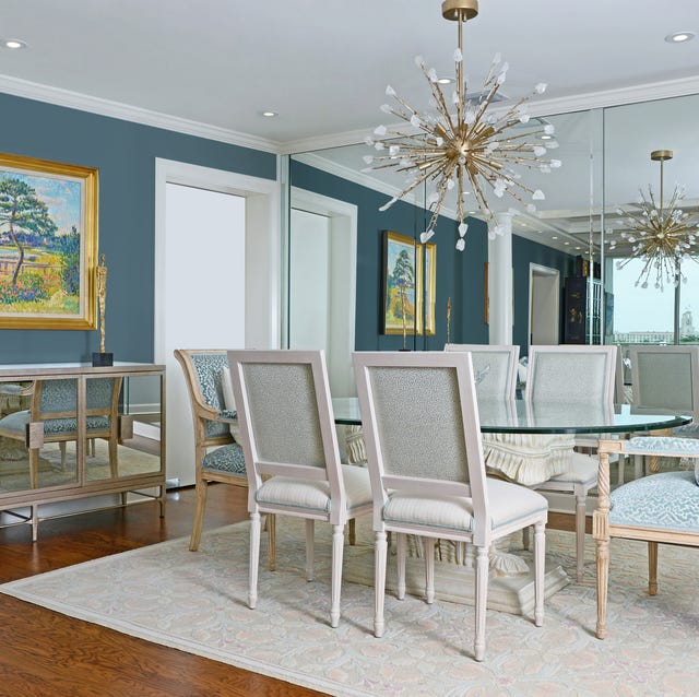
Design Pros Have Spoken: Here Are the Only Paint Color Trends That Matter in 2023

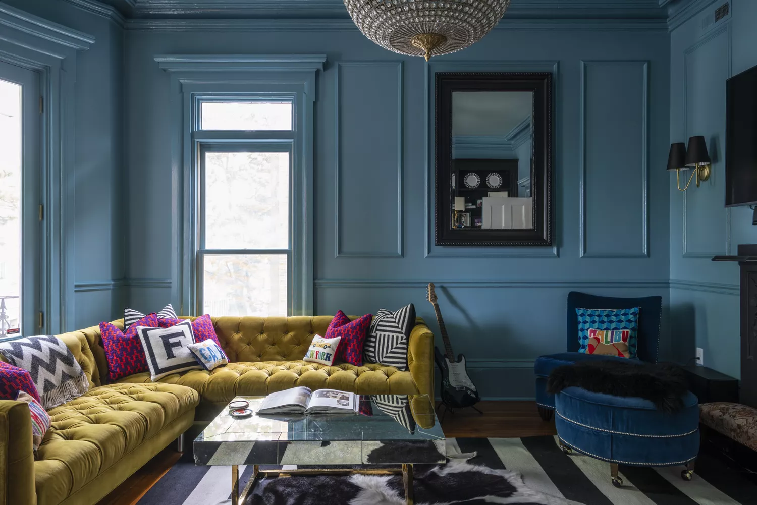
9 Trending Paint Colors You'll See Everywhere in 2025, According to Designers
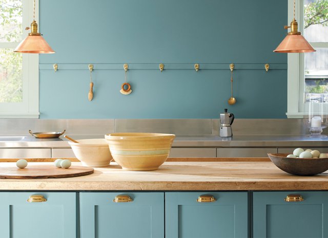
2021’s Palette of Possibilities
The Paint Color Trends of 2023 Are in—And They’re Gorgeous
12 Vintage Paint Colors That Are Trending Again, According to Color Experts

The Most Popular Exterior Paint Colors Of 2021
Take 'Disco Nap,' and other 2021 colors of the year, for a spin

15 Timeless Paint Colors You’ll Never Tire Of, According To Designers
Compare All the Paint Colors of the Year for 2023

Design Pros Have Spoken: Here Are the Only Paint Color Trends That Matter in 2022

Experts Say These 5 Paint Colours Will Be Everywhere In 2026
These 13 Green Paint Colors Are the Best We’ve Ever Seen

Take ‘Disco Nap’ for a spin. This lively hue is one of 2021’s colors of the year.

4 Interior Designers Share the Biggest Paint Color Trends Right Now (and What’s Out!)
14 Best Green Paint Colors