1/4
I asked 3 interior designers for their must-try paint colors in 2025 – they are all the perfect 'in-between' shades
The selection of paint colors for interior spaces often presents a challenge due to the vast array of options available from various brands, ranging from vibrant statement hues to classic neutrals. While general paint trends offer some guidance, insights from professional interior designers can significantly simplify the decision-making process. This article explores the specific paint colors three interior designers are anticipating using in their upcoming projects, highlighting a common preference for 'in-between' shades set to be a prominent trend in 2025.
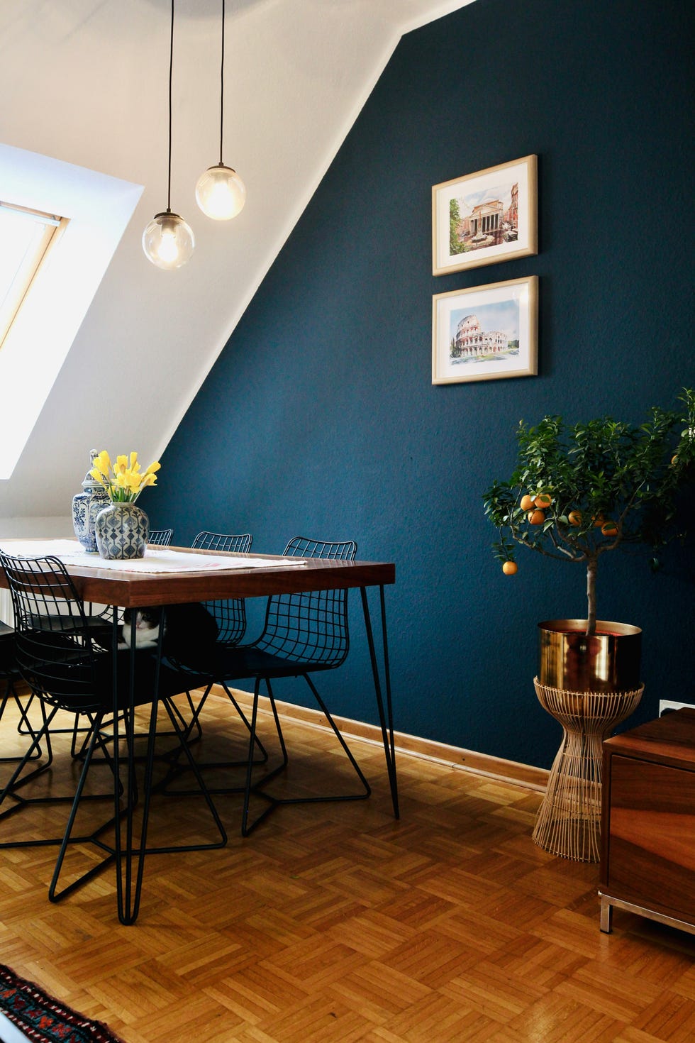
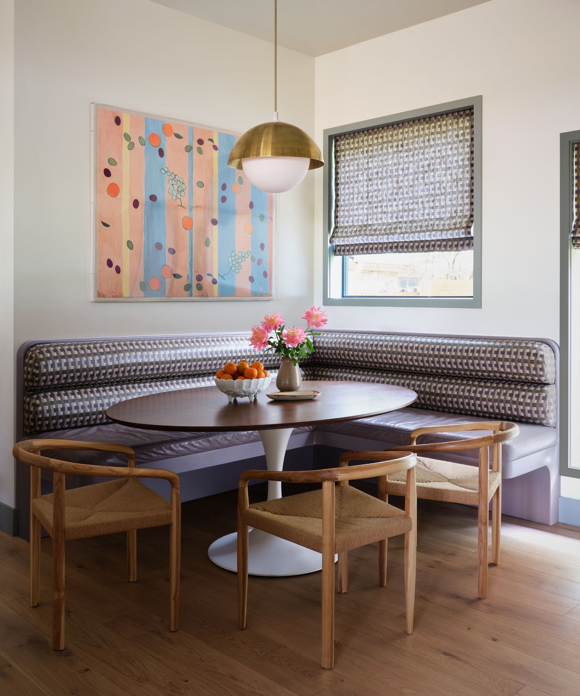
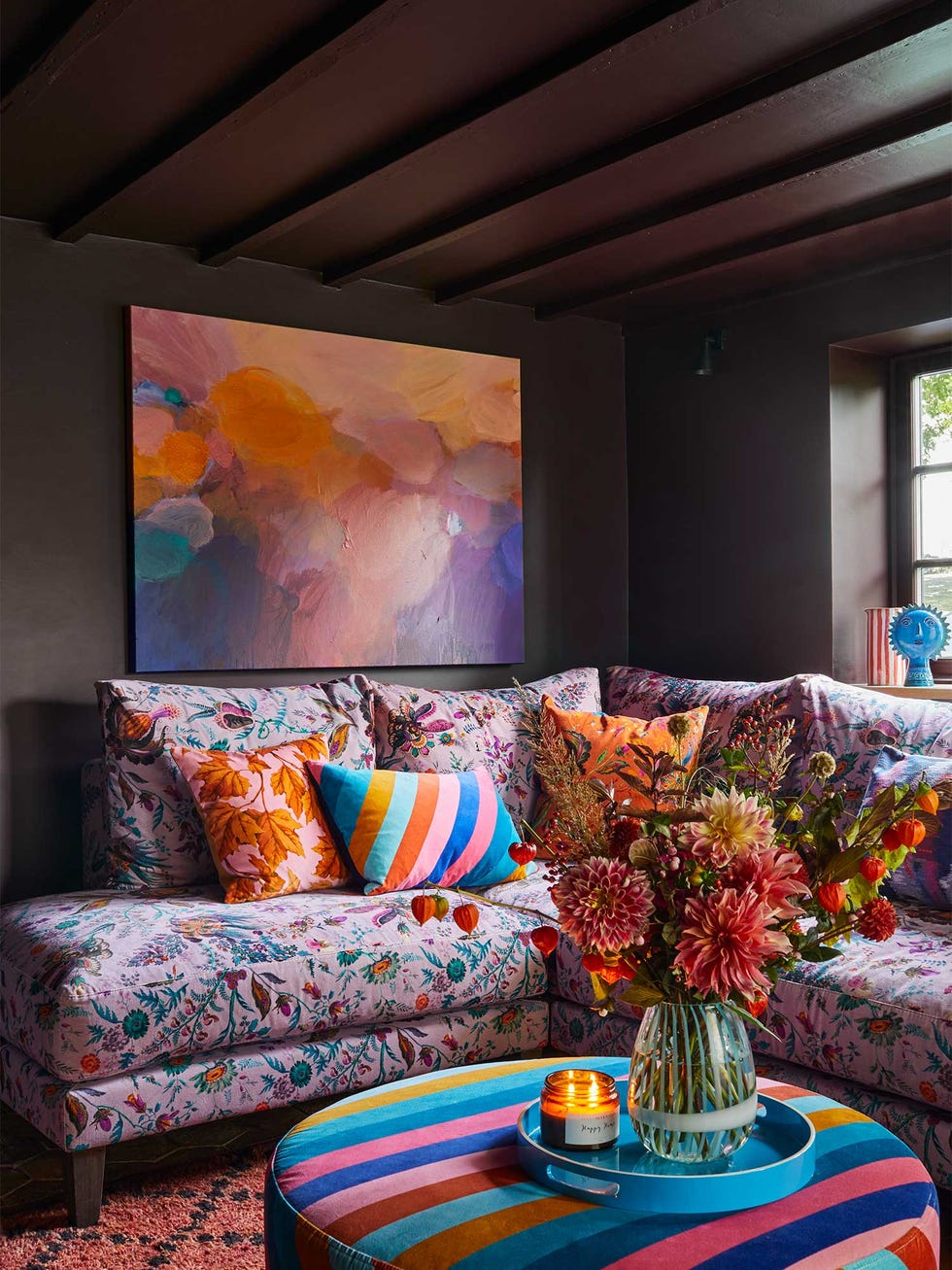
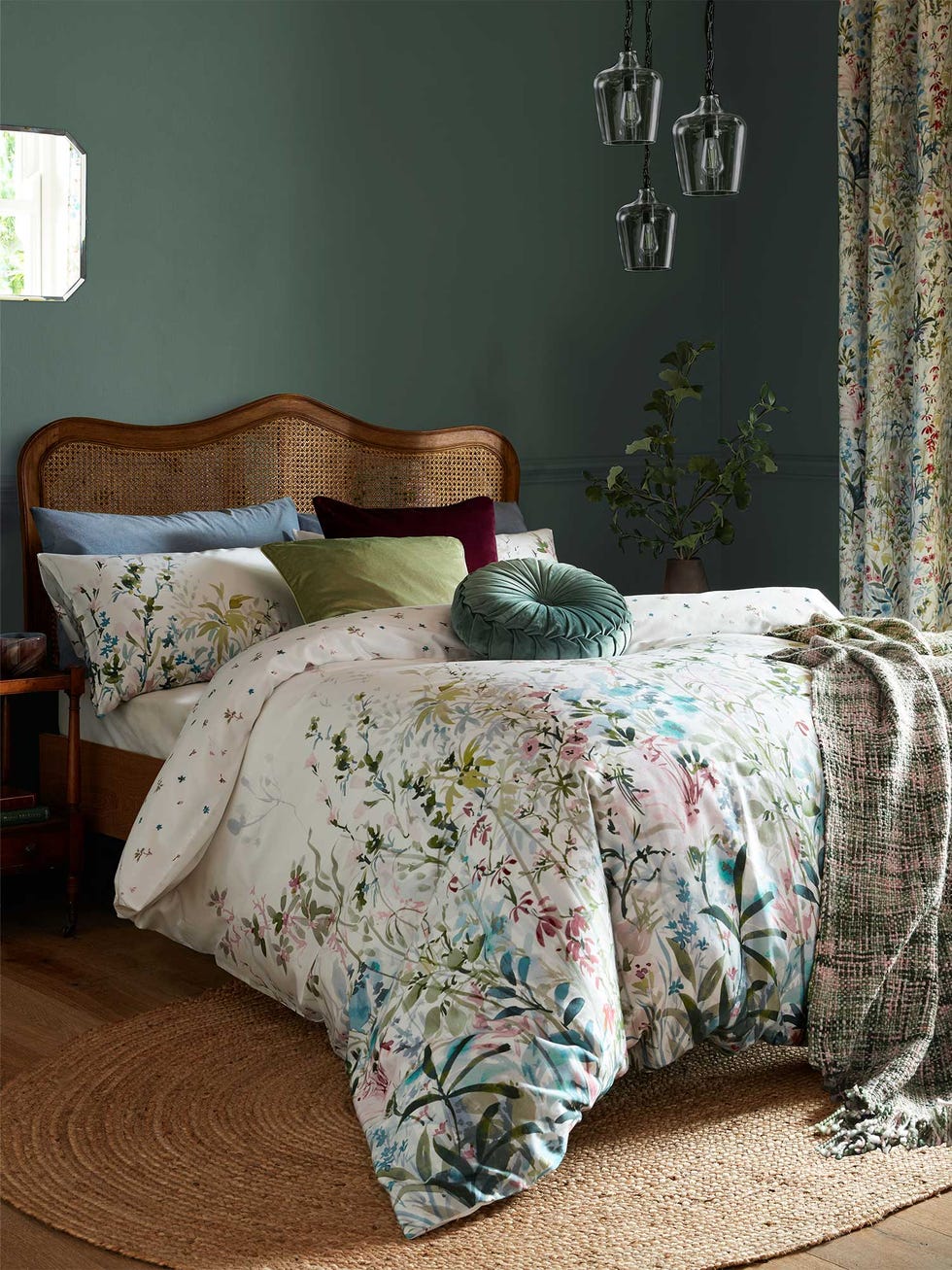
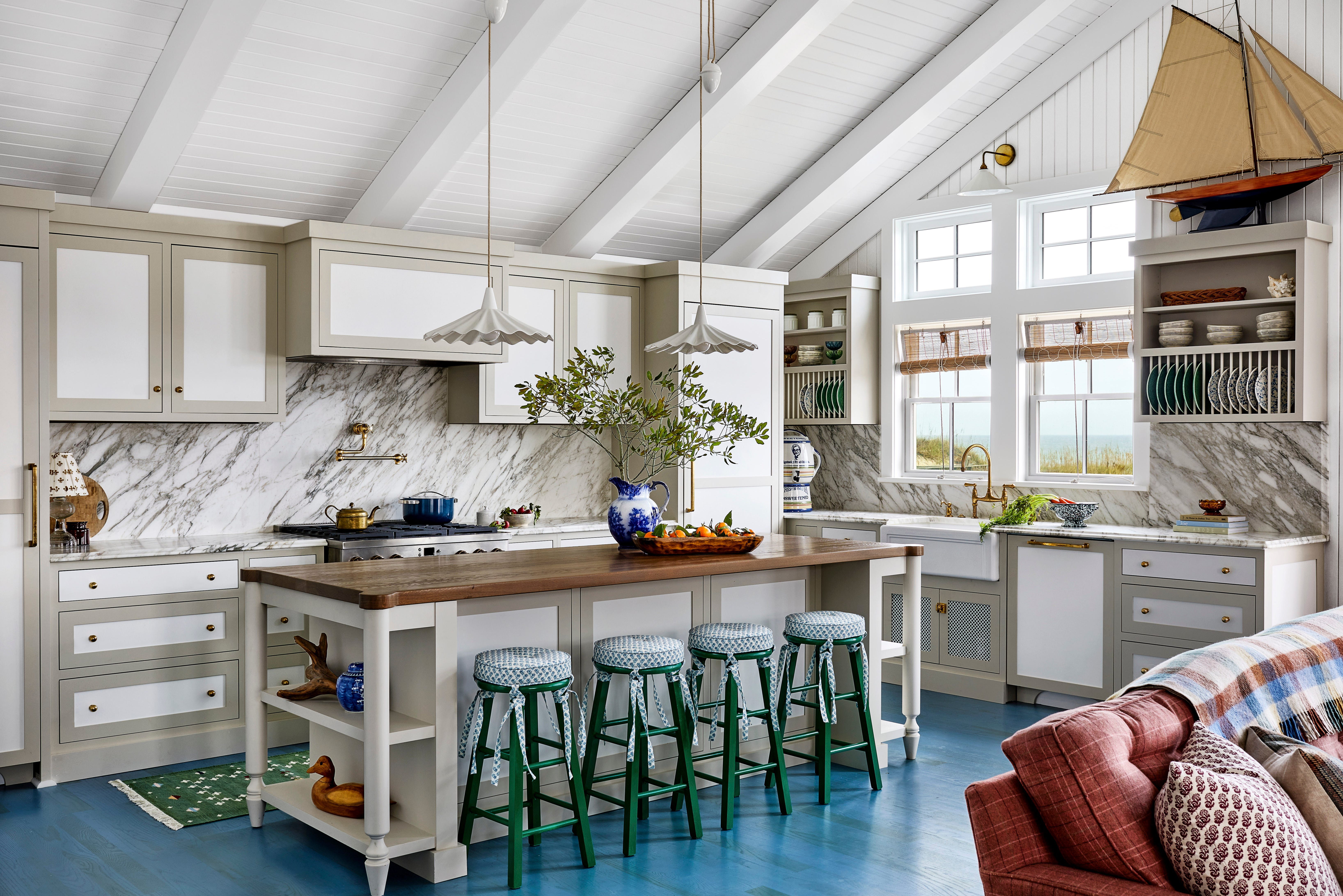
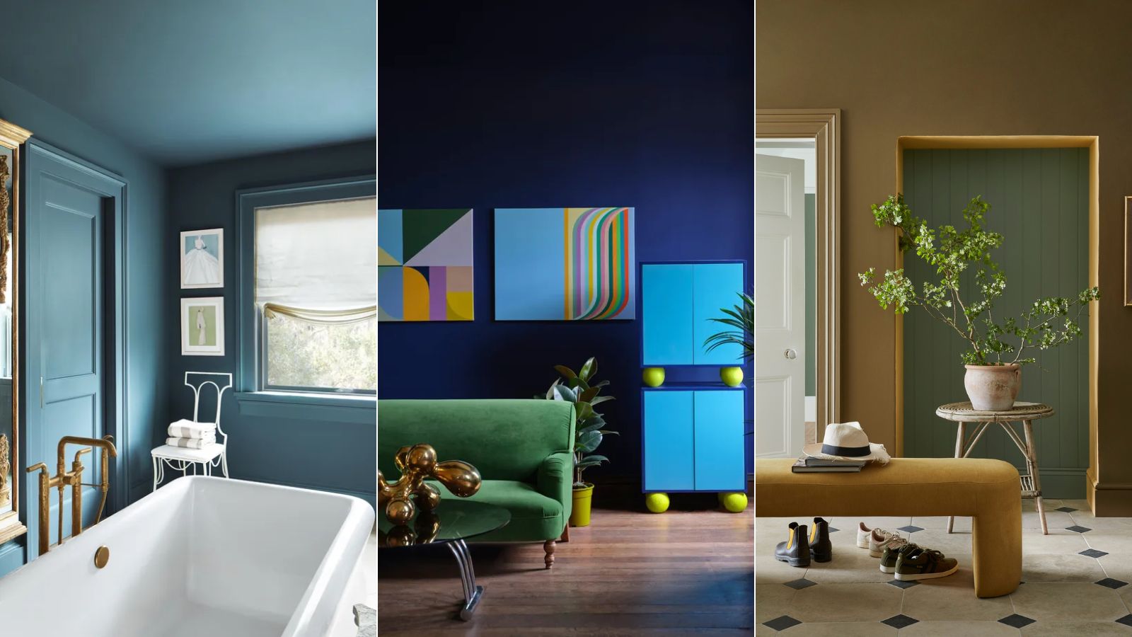
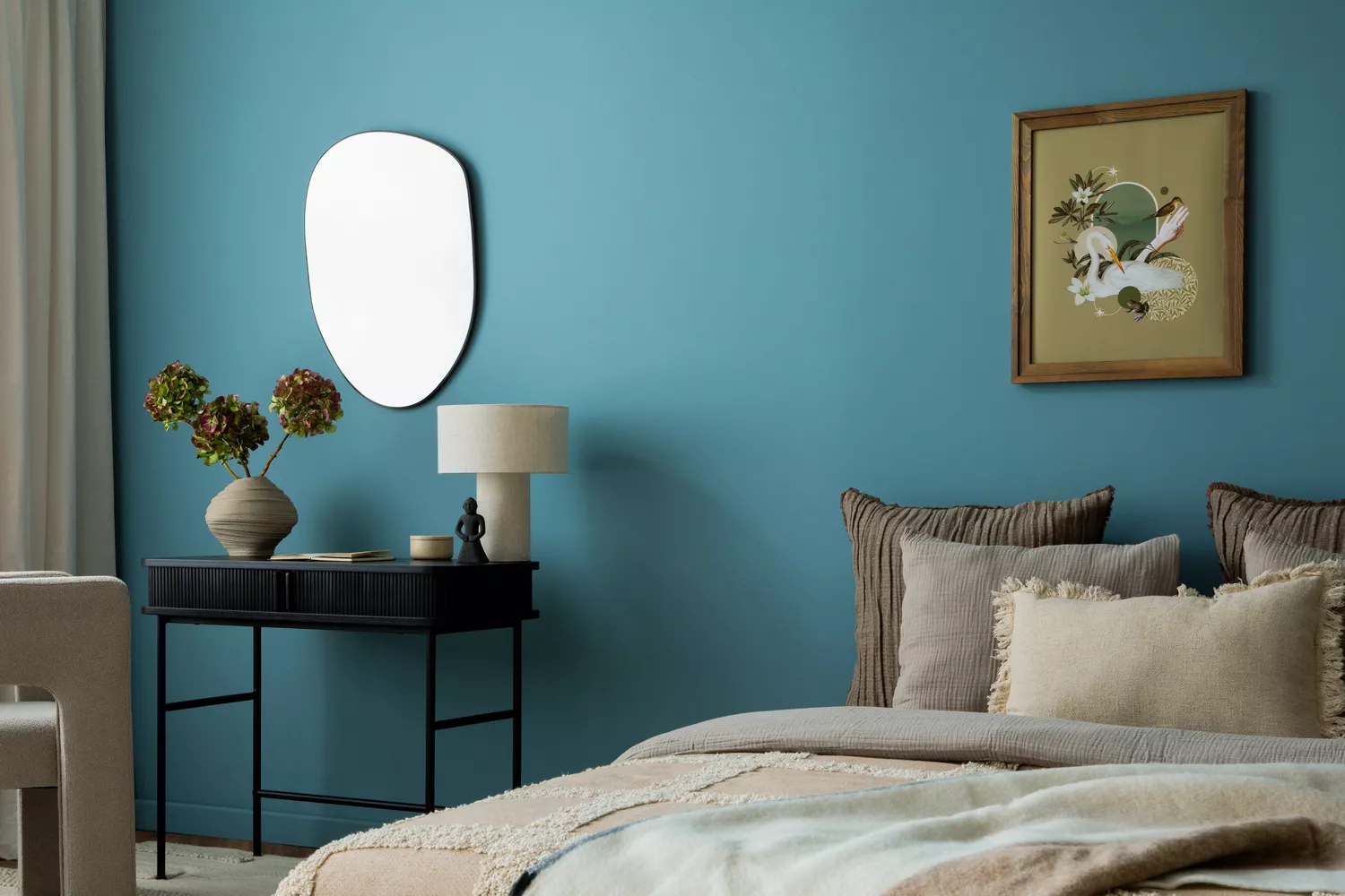
The first color highlighted is 'Stained Glass' by Benjamin Moore, a gemstone teal that perfectly blends blue and green. Nadia Watts of Nadia Watts Interior Design describes it as a luxurious yet grounded color due to its muted tones, making it versatile for various applications such as kitchen cabinets, dining rooms, living rooms, or studies. Its ability to be both bold and serene allows it to complement diverse styles while offering significant depth.
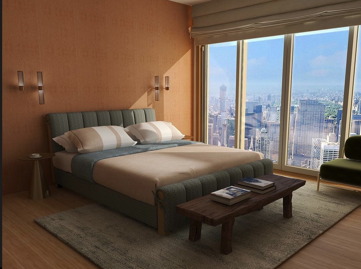
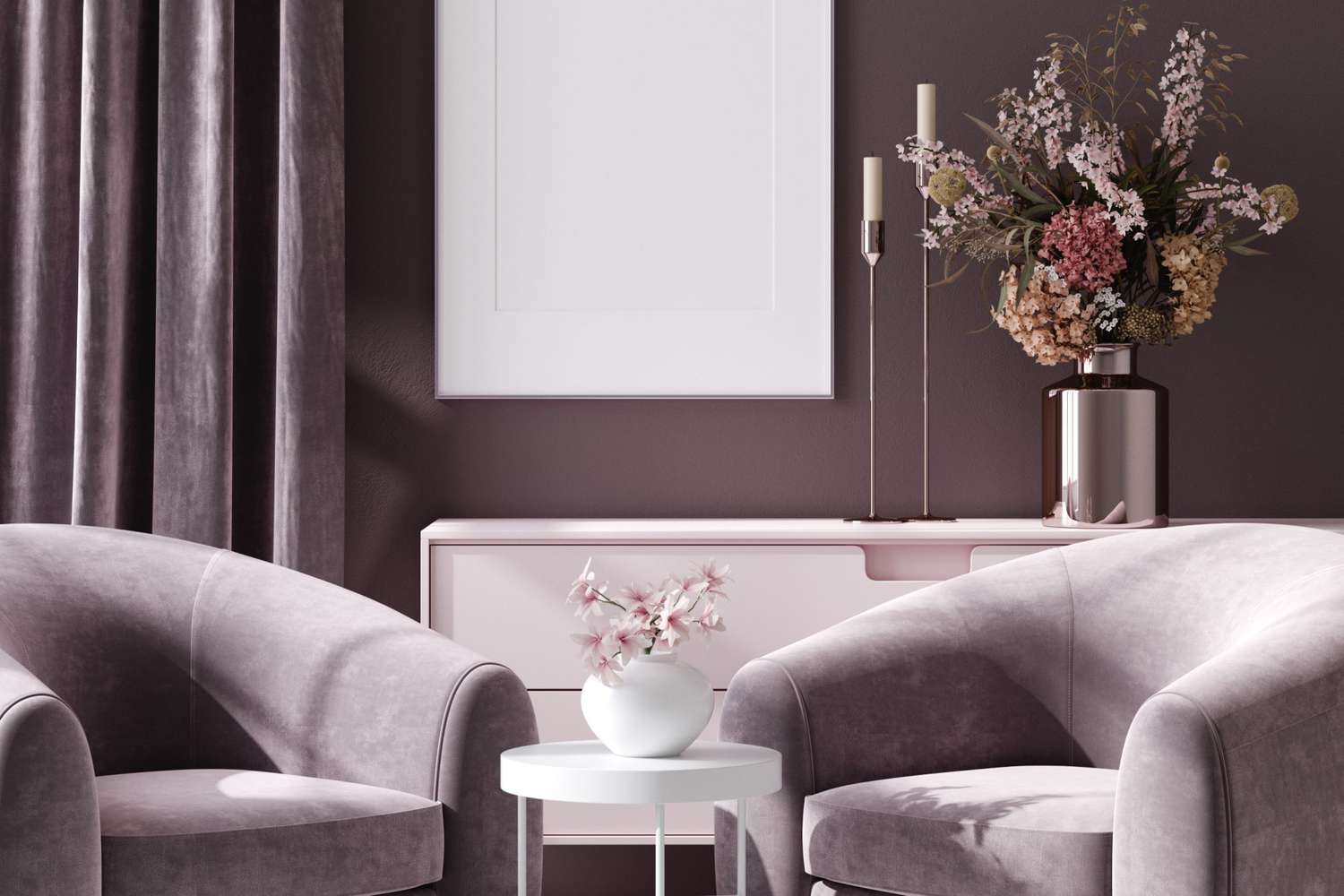
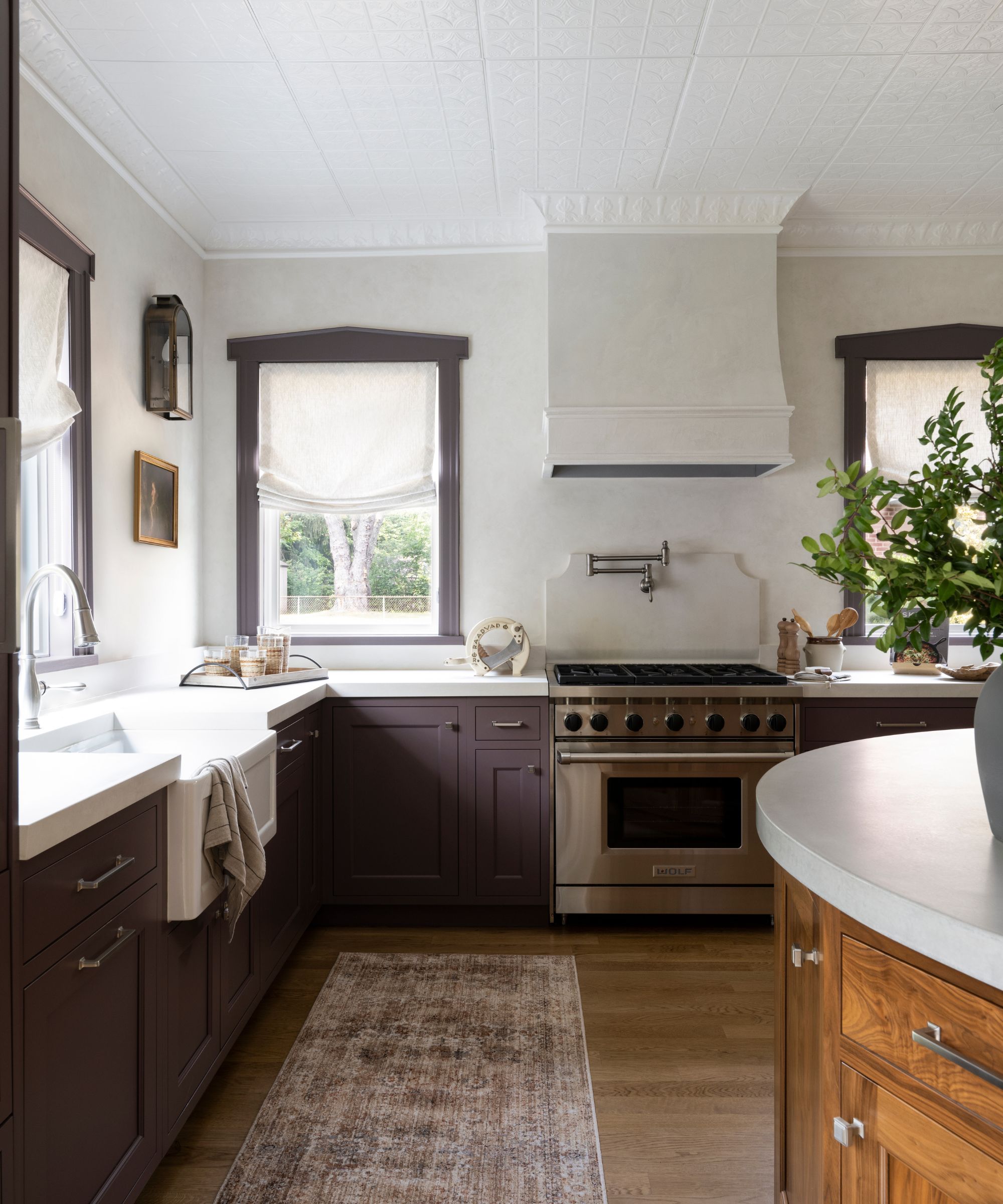
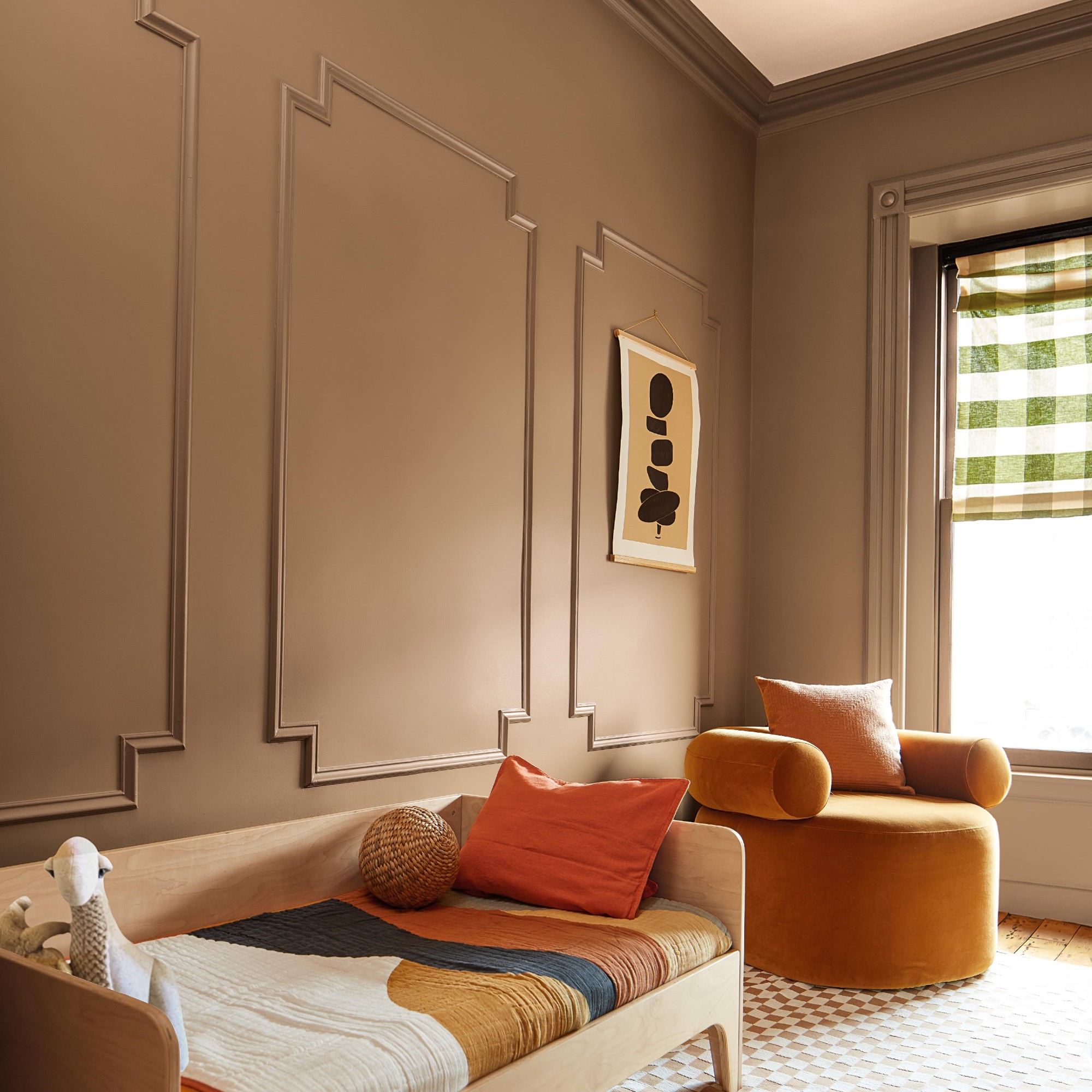
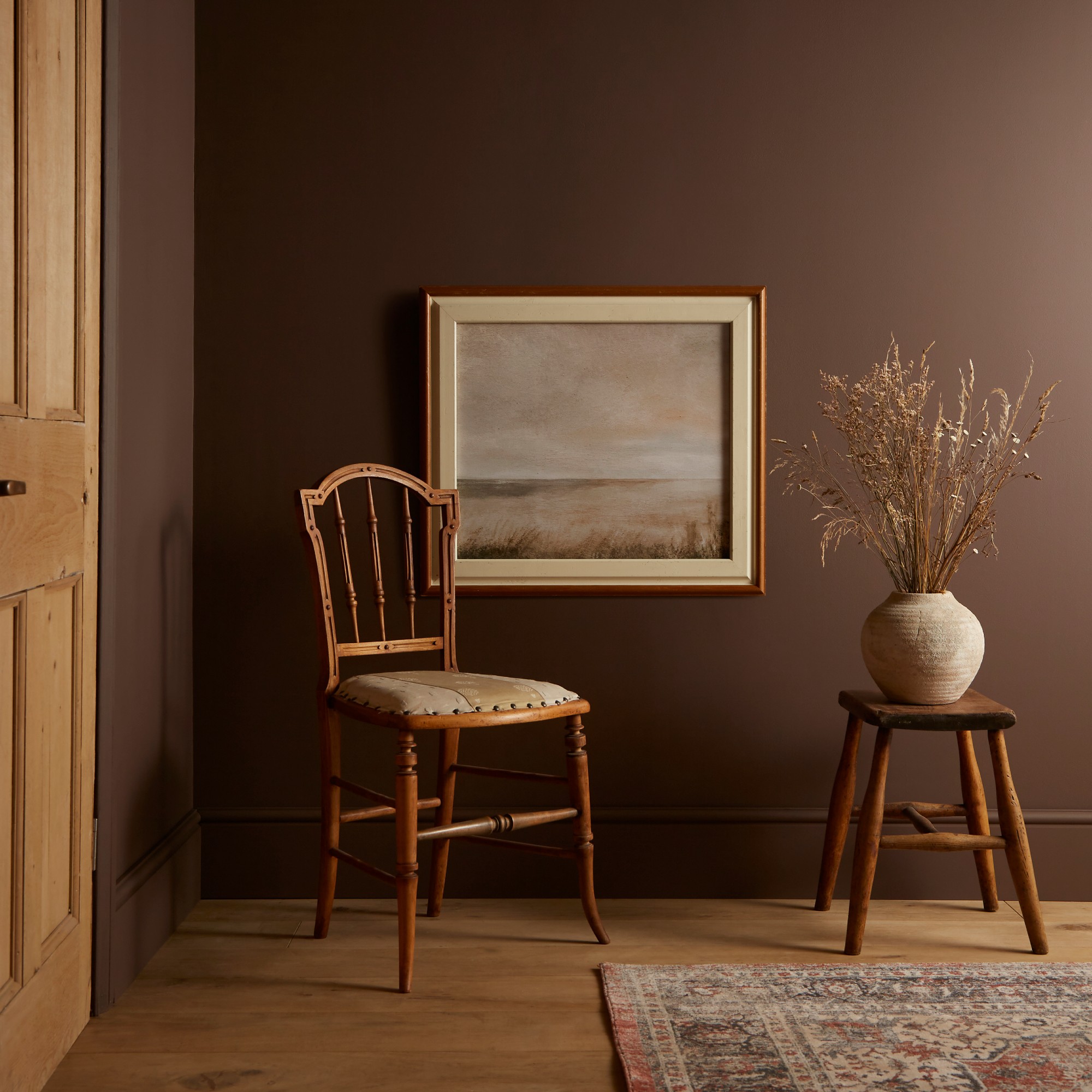
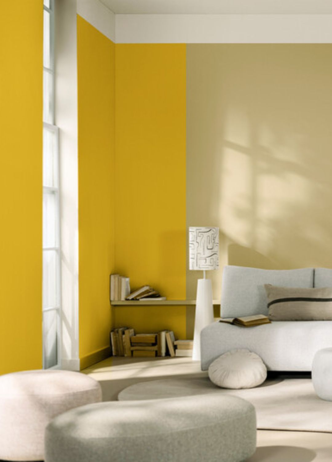
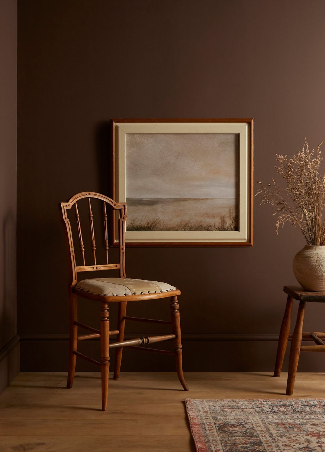
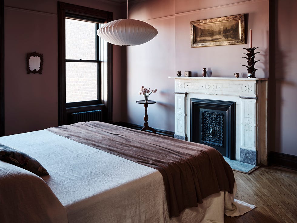
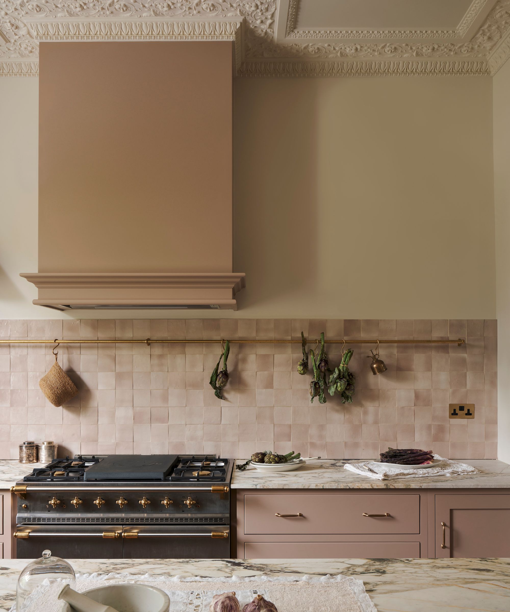
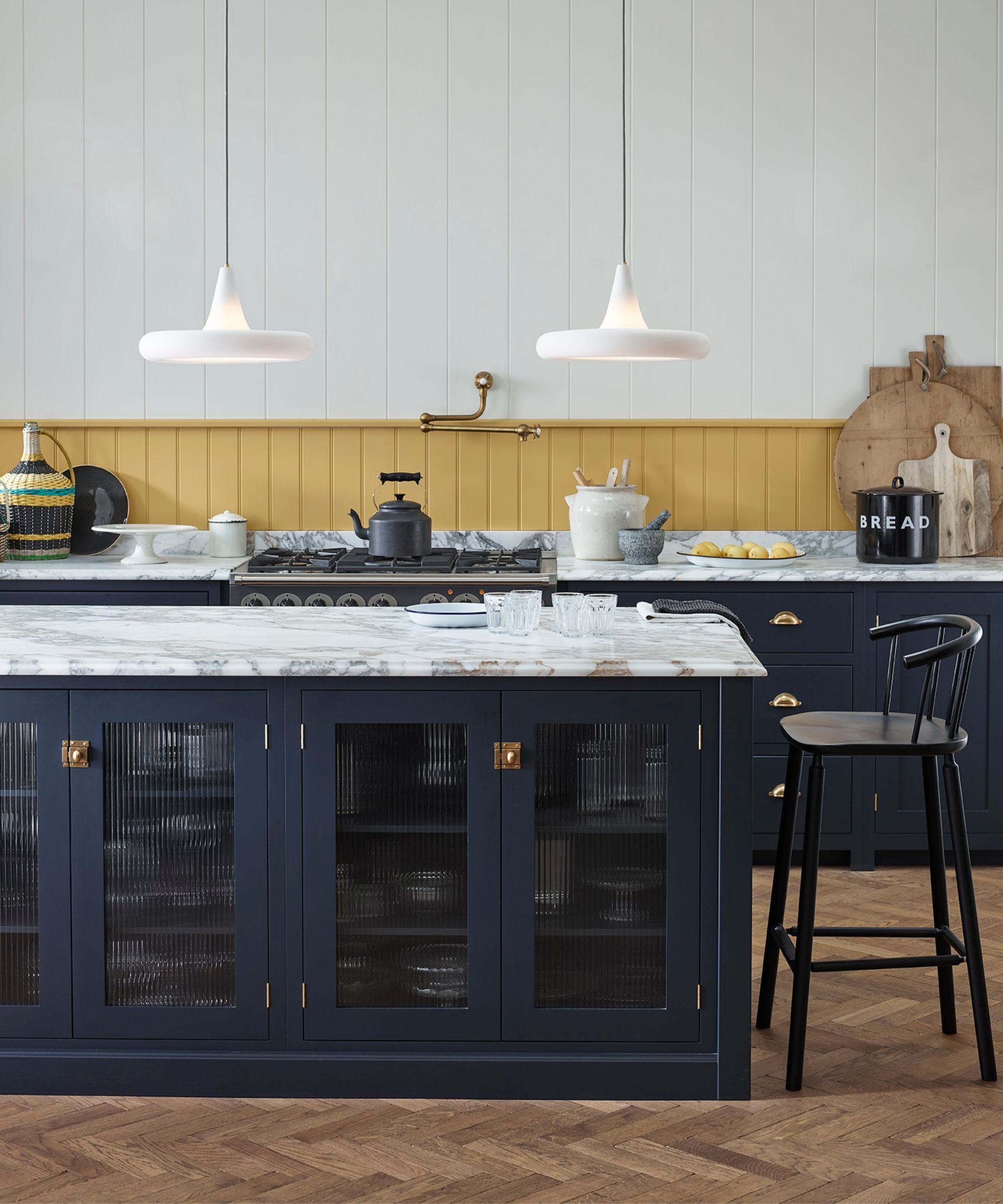
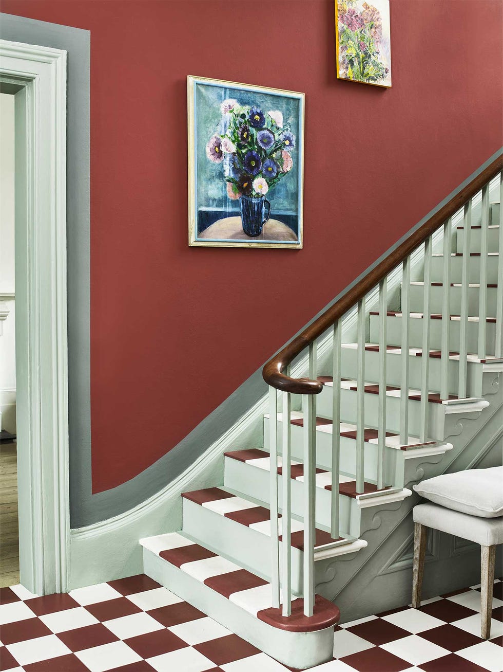
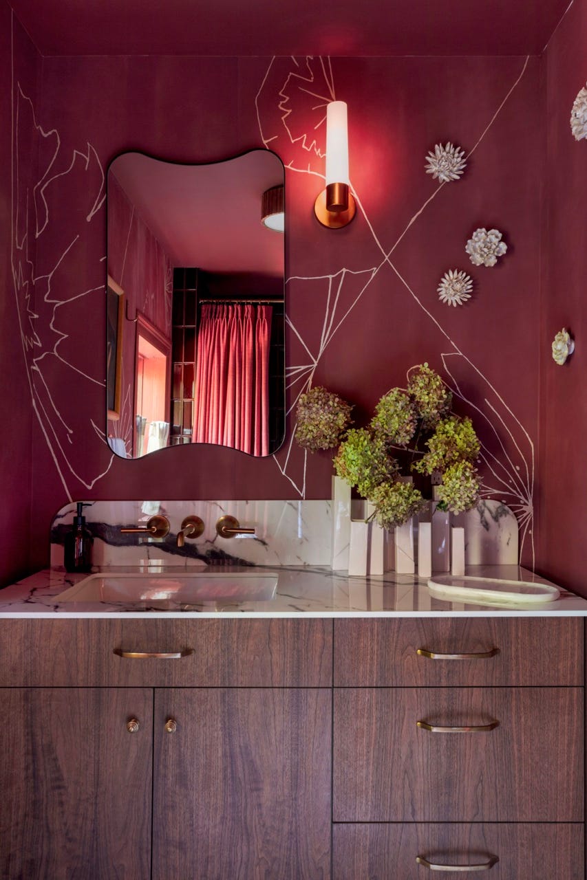
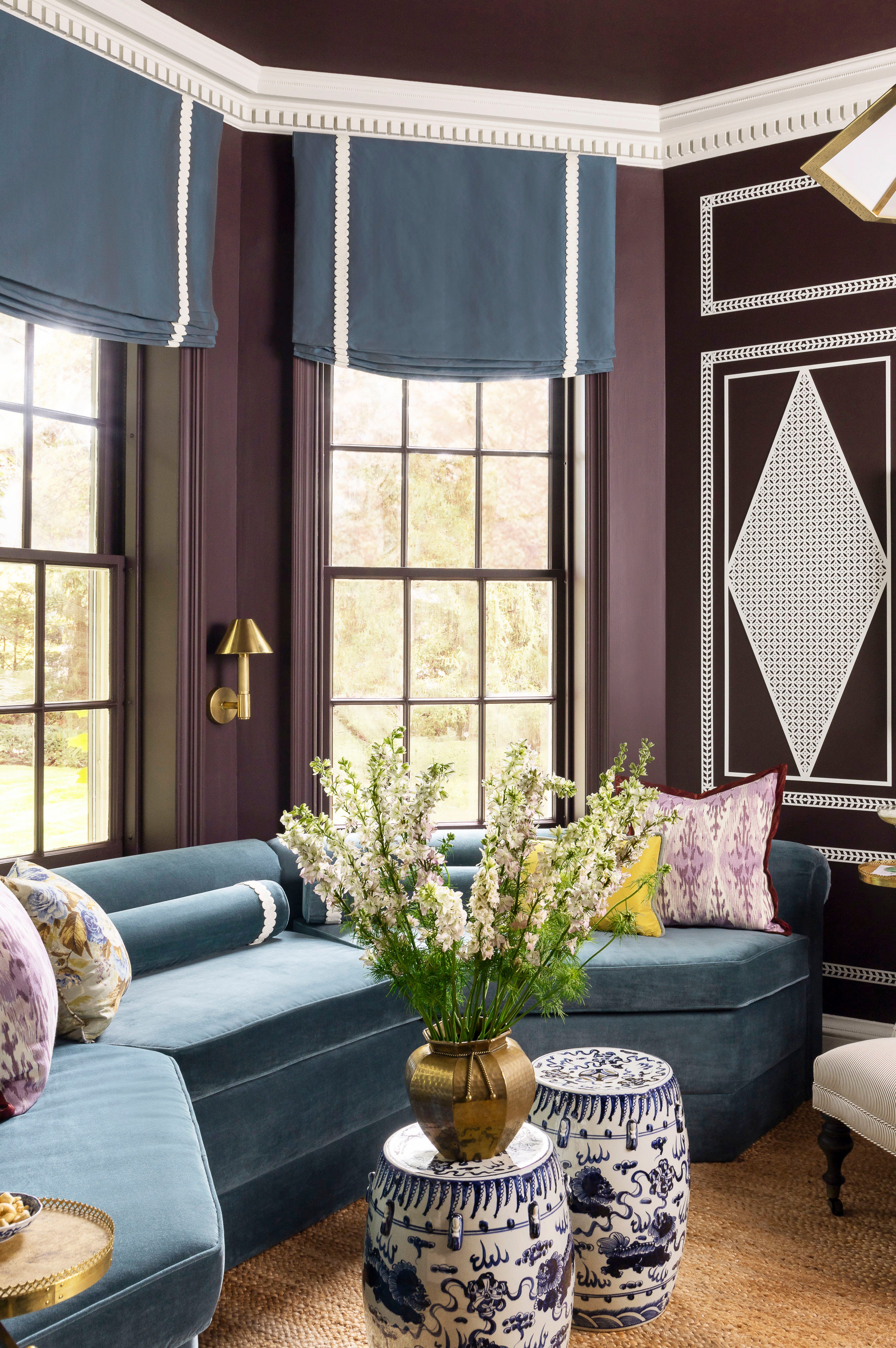
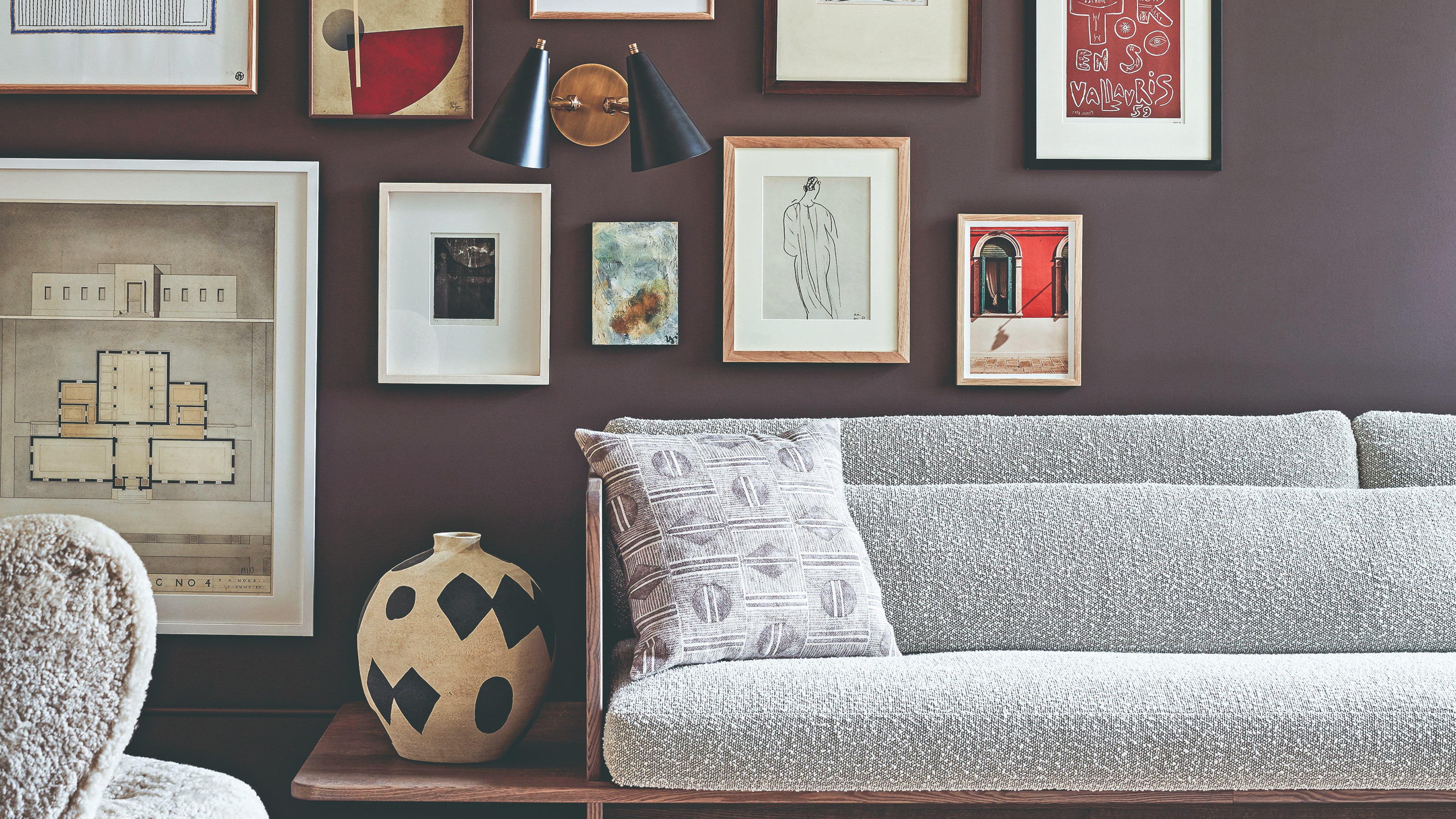
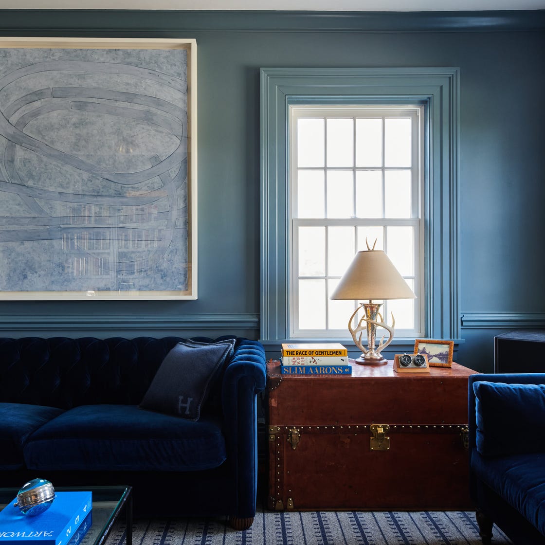
Next, Kristina Khersonsky, founder of STUDIO KEETA, expresses enthusiasm for Farrow & Ball's 'Blue Maize.' This rich blue paint with a subtle purple tint is seen as a fresh and uplifting alternative to the current popularity of deep plums and browns. Khersonsky notes its evocative and moody qualities, comparable to baroque-inspired hues. She also mentions 'Masterpiece Theatre' by Backdrop, an olive brown with a hint of yellow that presents a complex and interesting tone, defying easy categorization and offering a sophisticated depth. These selections reflect a move towards blues that are more nuanced than traditional navy, capable of making a strong statement through color drenching or as a focal point.
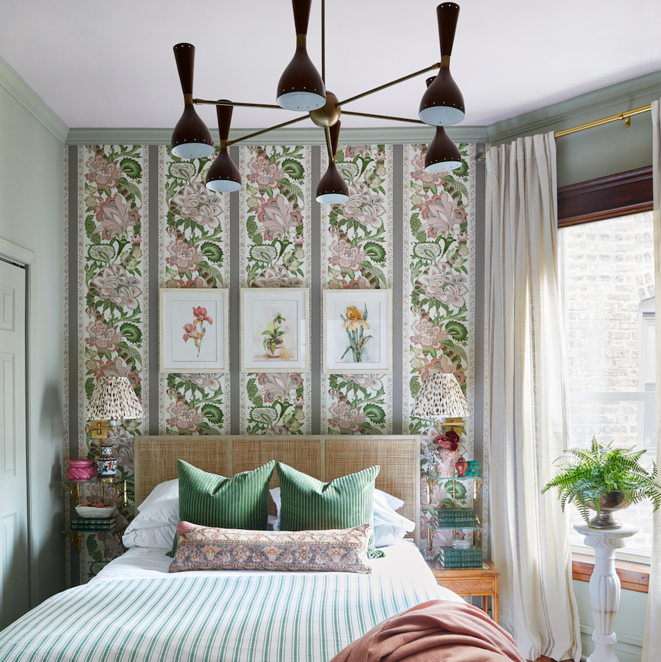
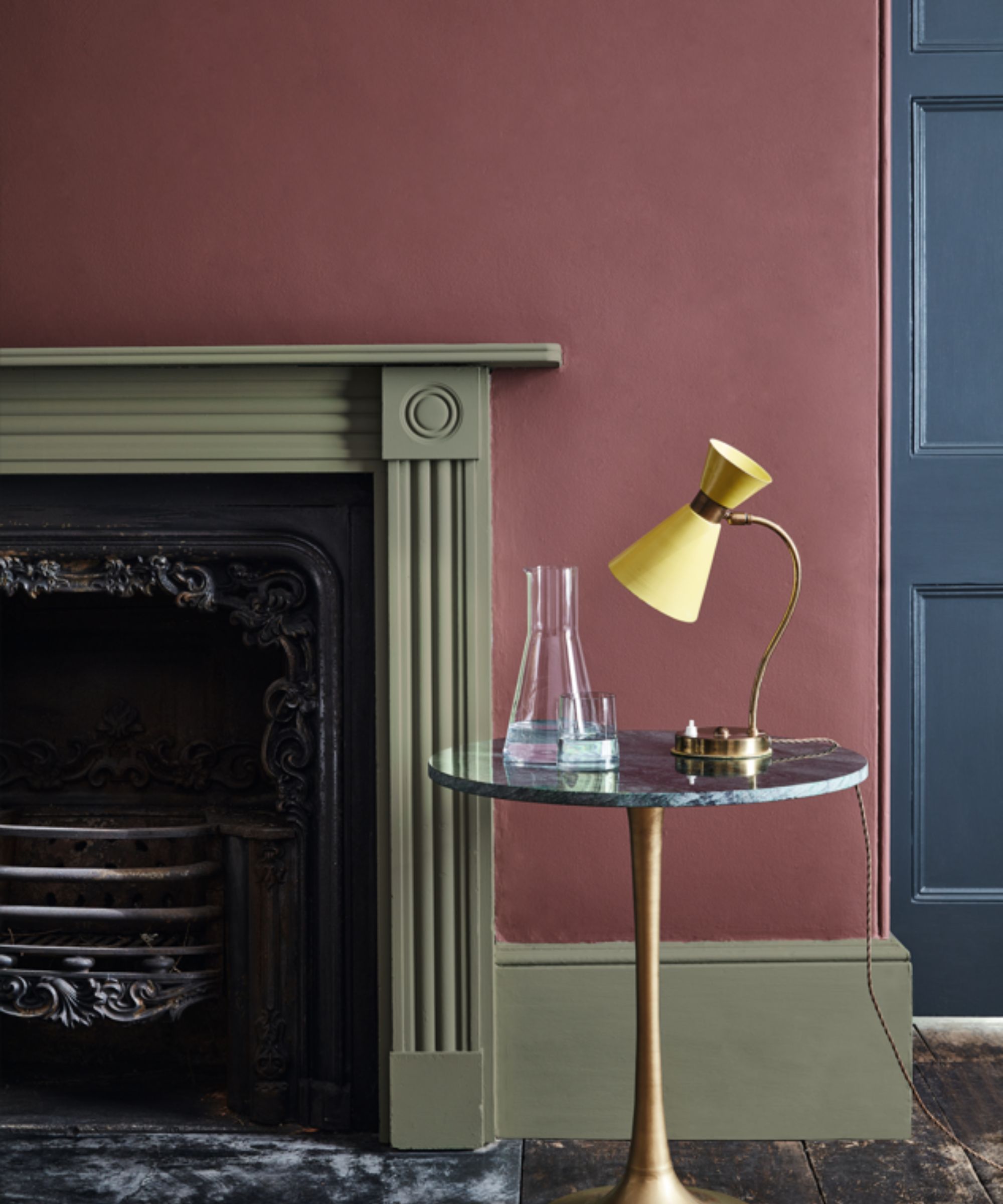
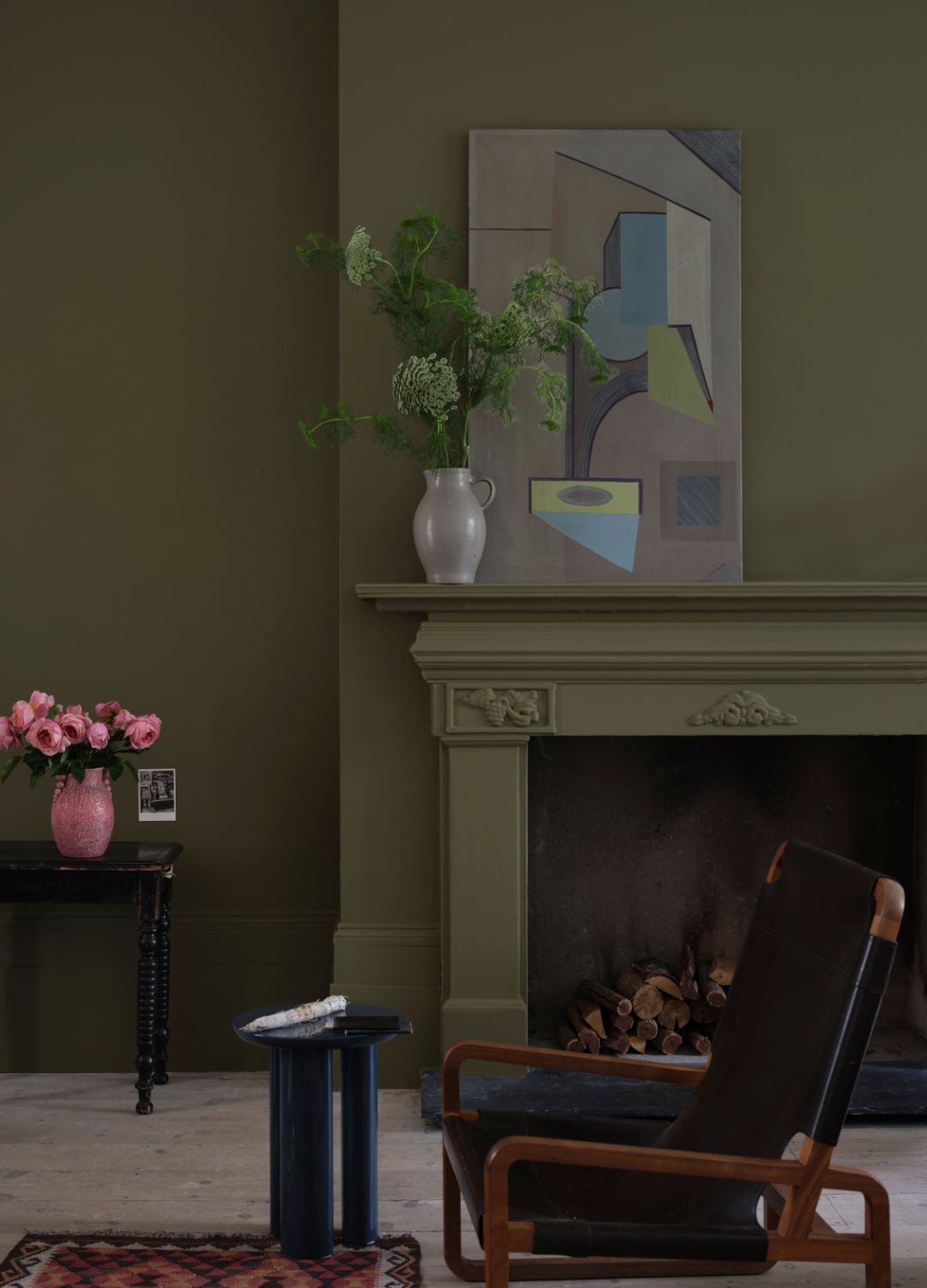
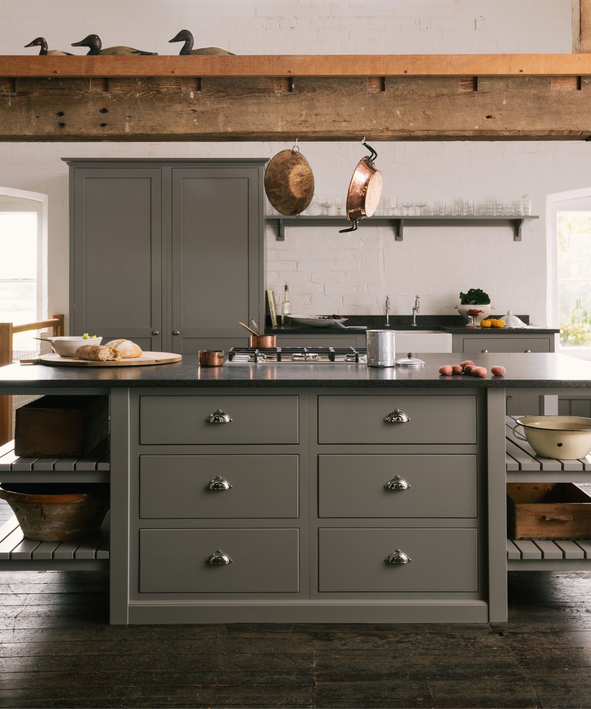
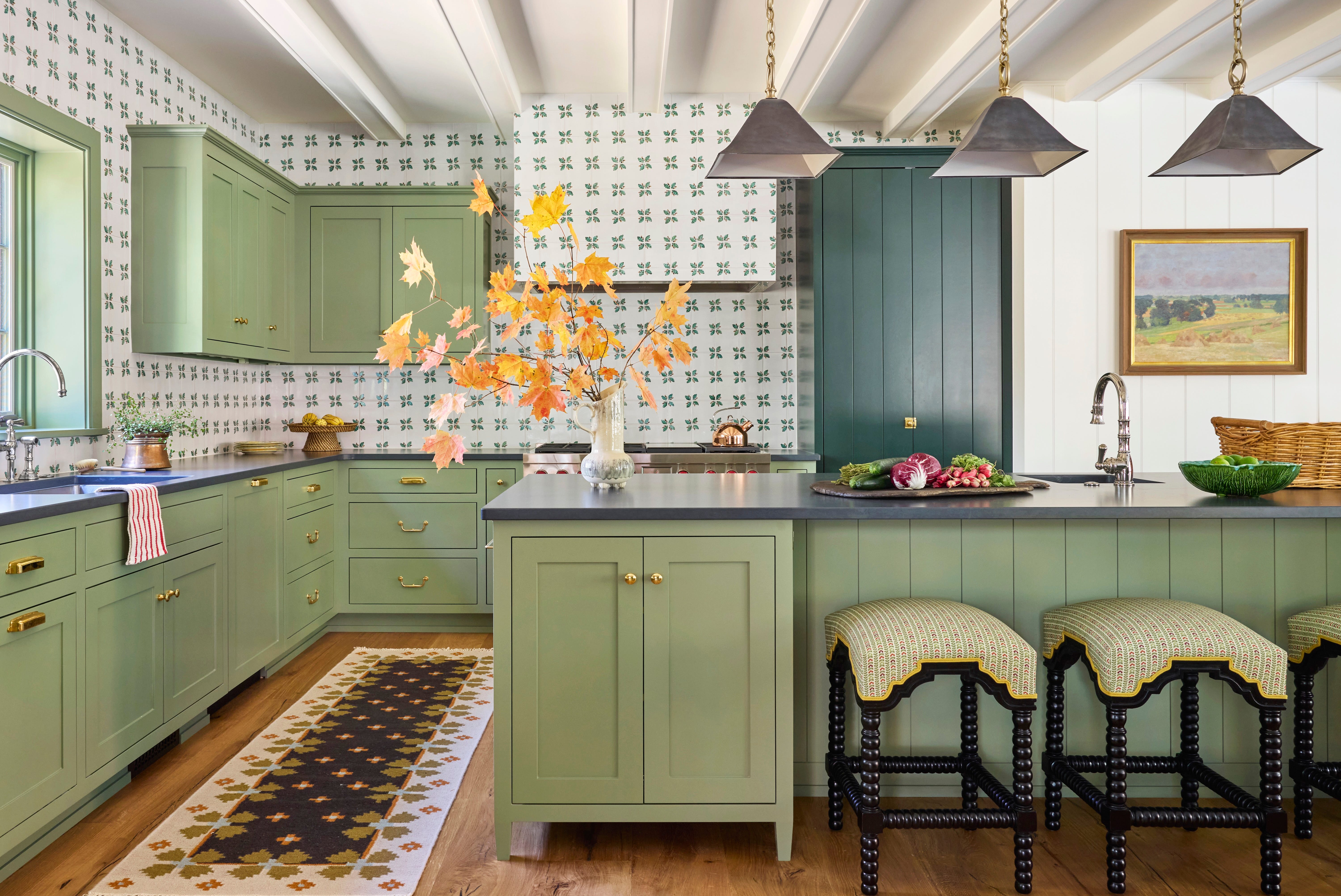
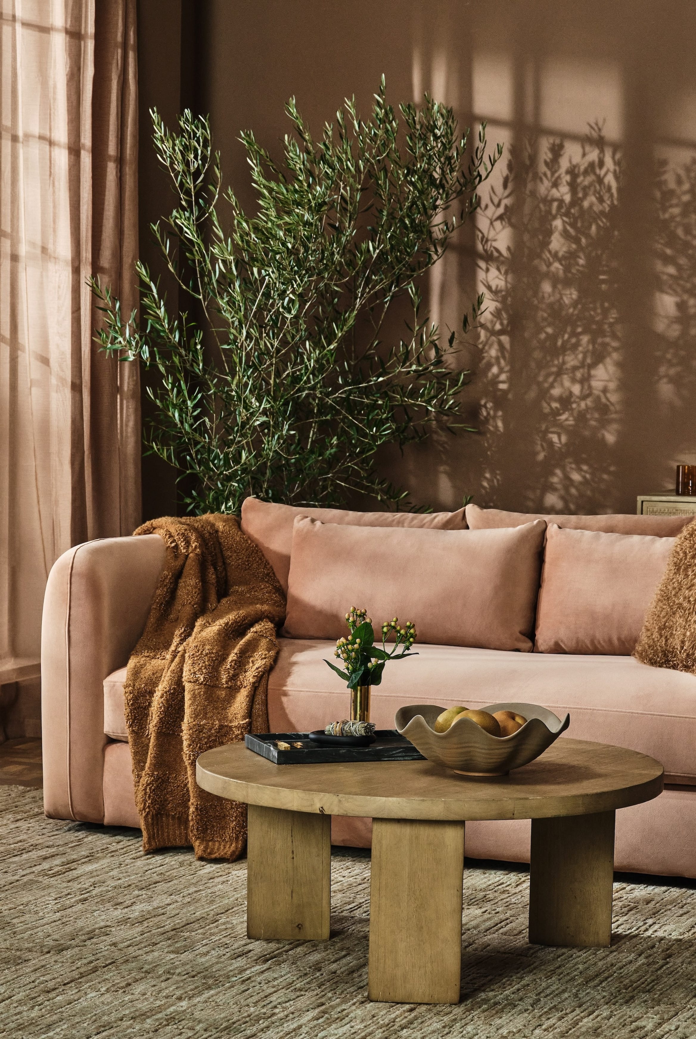
Finally, Melissa Read, Creative Director at Studio Burntwood, introduces 'Light Bronze Green' by Little Greene. This unique shade is an amalgamation of a soft green and a warm bronze, providing a rich yet calming effect. Read appreciates its ability to inject warmth without being overly intense, making it ideal for creating inviting spaces. Its versatility allows it to serve as a subtle backdrop in living rooms or bedrooms, or as a striking accent on cabinetry, feature walls, or architectural details. The warm undertones of this color contribute to a sense of luxury, while its earthy quality ensures a grounded and timeless appeal. It is particularly effective in complementing both natural materials like wood and industrial elements such as metal and stone, offering a sophisticated yet relaxed ambiance.
Ultimately, the designers' choices underscore a growing inclination towards 'in-between' paint colors for 2025. These shades, whether a blue with a purple undertone or a brownish-green, offer a sophisticated and stylish alternative to more conventional 'true' colors. They provide depth, versatility, and a nuanced aesthetic that can elevate various interior spaces, making them feel both contemporary and timeless.
#PaintColorTrends #InteriorDesign #HomeDecor #BenjaminMoore #FarrowAndBall #LittleGreene #ColorPsychology #DesignInspiration #InBetweenColors #PaintColorTrends #InteriorDesign #HomeDecor #BenjaminMoore #FarrowAndBall #LittleGreene #ColorPsychology #DesignInspiration #InBetweenColors
0 تعليق إجمالاً
 لا توجد تعليقات بعد
قد تعجبك أيضًا
These 5 Paint Color Trends Will Be Everywhere in 2024, According to Interior Designers
14 on-trend purple paints approved by interiors designers to use in 2025
Interior paint colour trends 2025: 10 hues you'll be seeing everywhere this year

We Asked Designers to Predict the Top Bedroom Paint Colors for 2025, Here's What They Said


6 key colors to decorate with in May 2025, according to interior design and color experts in the know
The colour palette for 2025 – these are the shades paint experts say we’ll see everywhere next year
Interior Designers Share the 3 Biggest Color Trends for 2026


The #1 Paint Color Trend of 2025, According to Designers

3 New Color Pairings Designers Are Using for Elevated Rooms in 2024 - and How to Get the Look Now

5 Paint Colors That Will Take Over in 2025, According to Interior Designers
Kitchen paint colors going out of style – 3 shades designers are ditching in 2025
Designers Predict You'll Use AT LEAST One of These Colors in Your Home in 2025
5 Paint Colors That Are Out for 2025, According to Interior Designers

19 Elegant Hallway Paint Colors That Designers Swear By in 2025

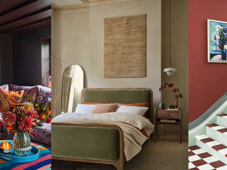
Colour experts share their top paint trends for 2024

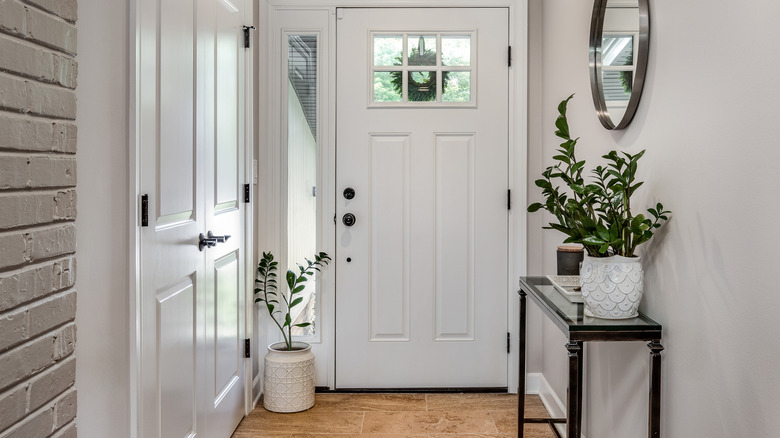
Outdated Entryway Paint Colors To Avoid In 2025 (And What To Try Instead)

4 Interior Designers Share the Biggest Paint Color Trends Right Now (and What’s Out!)


These Colors Will Be Everywhere in Interiors in 2025
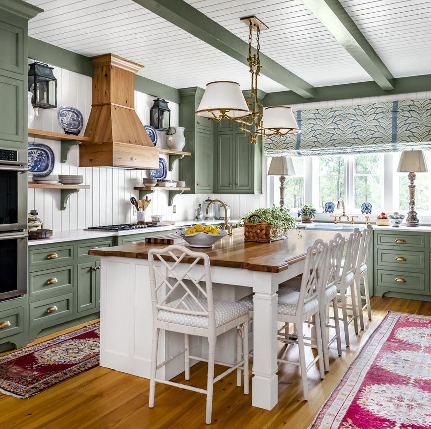
The Best Kitchen Cabinet Colors to Try in 2025, According to Designers
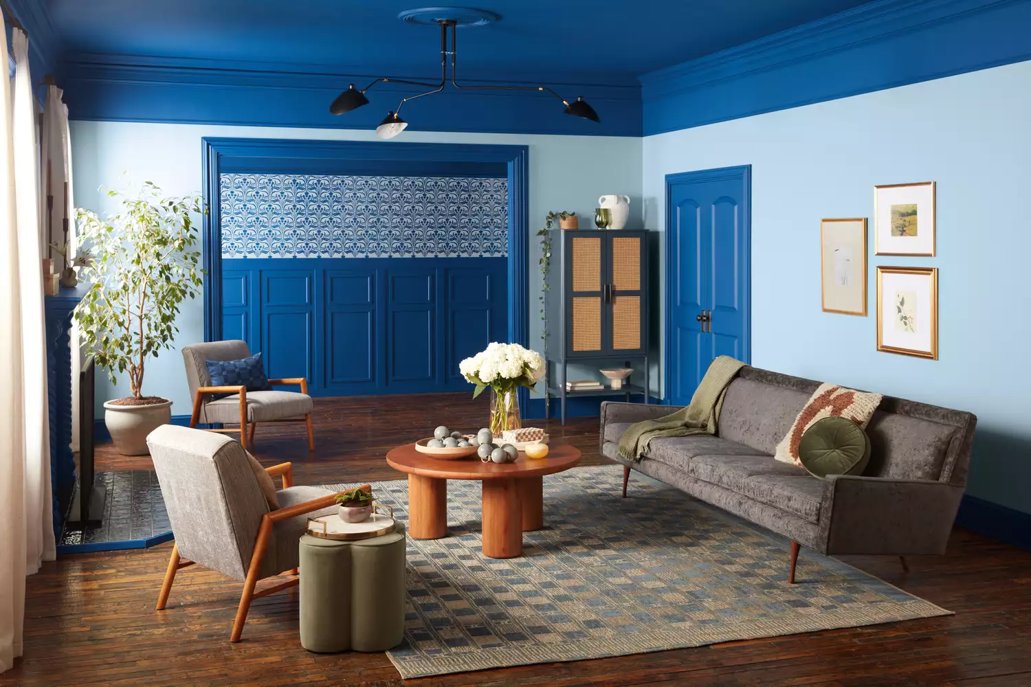
Every 2025 Color of the Year We Know So Far—and Inspiration for How to Use Each in Your Home