9 Paint Colors Experts Predict We'll All Be Using In 2026
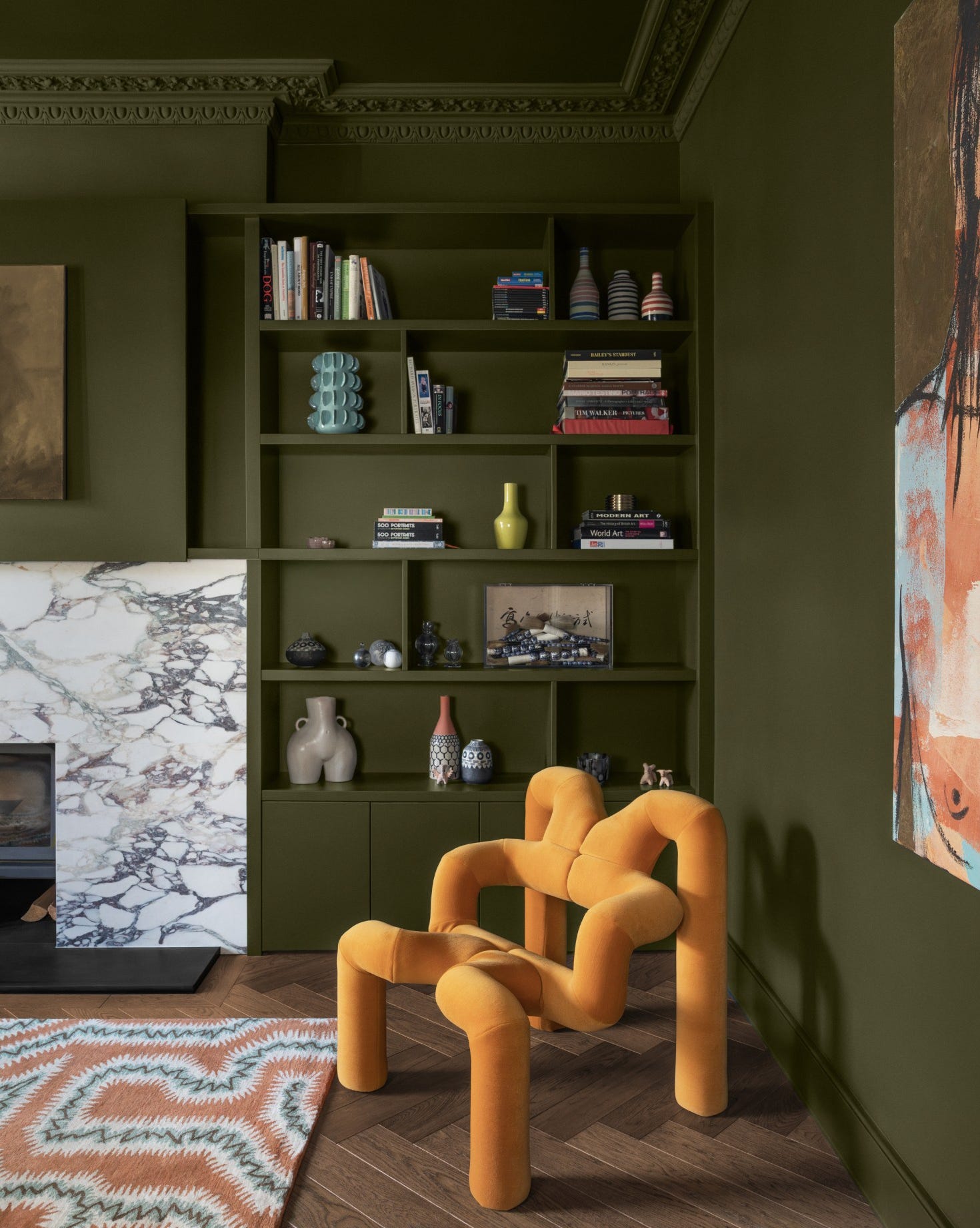
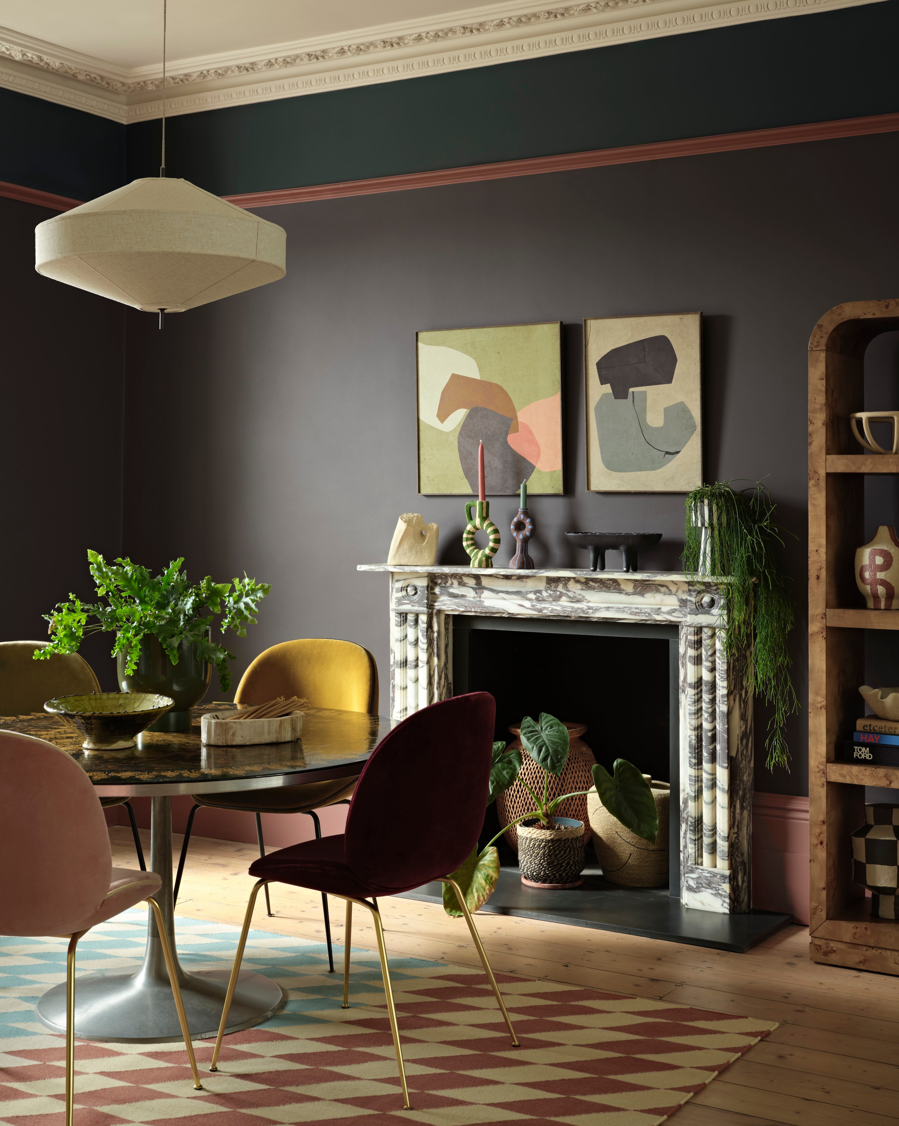
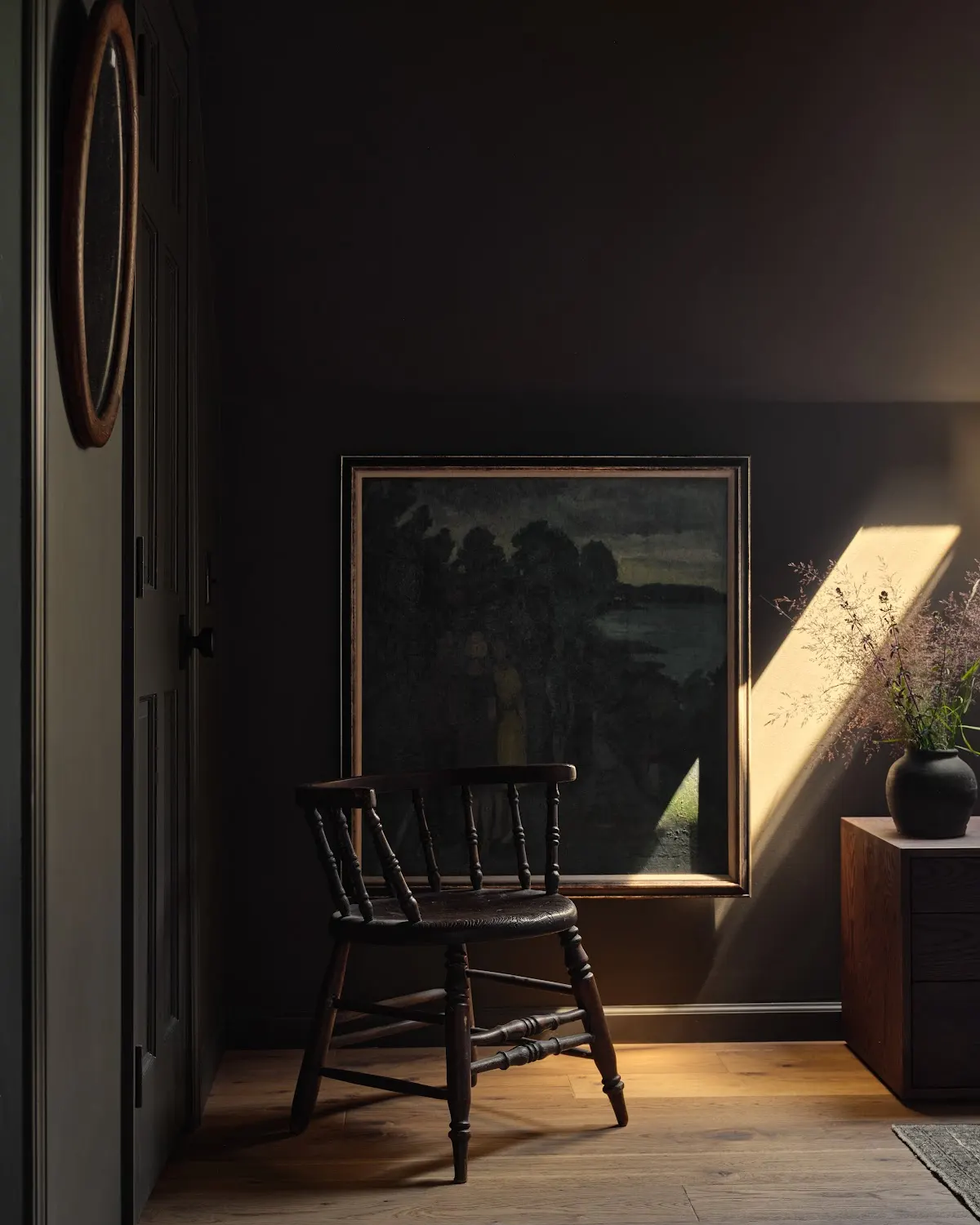
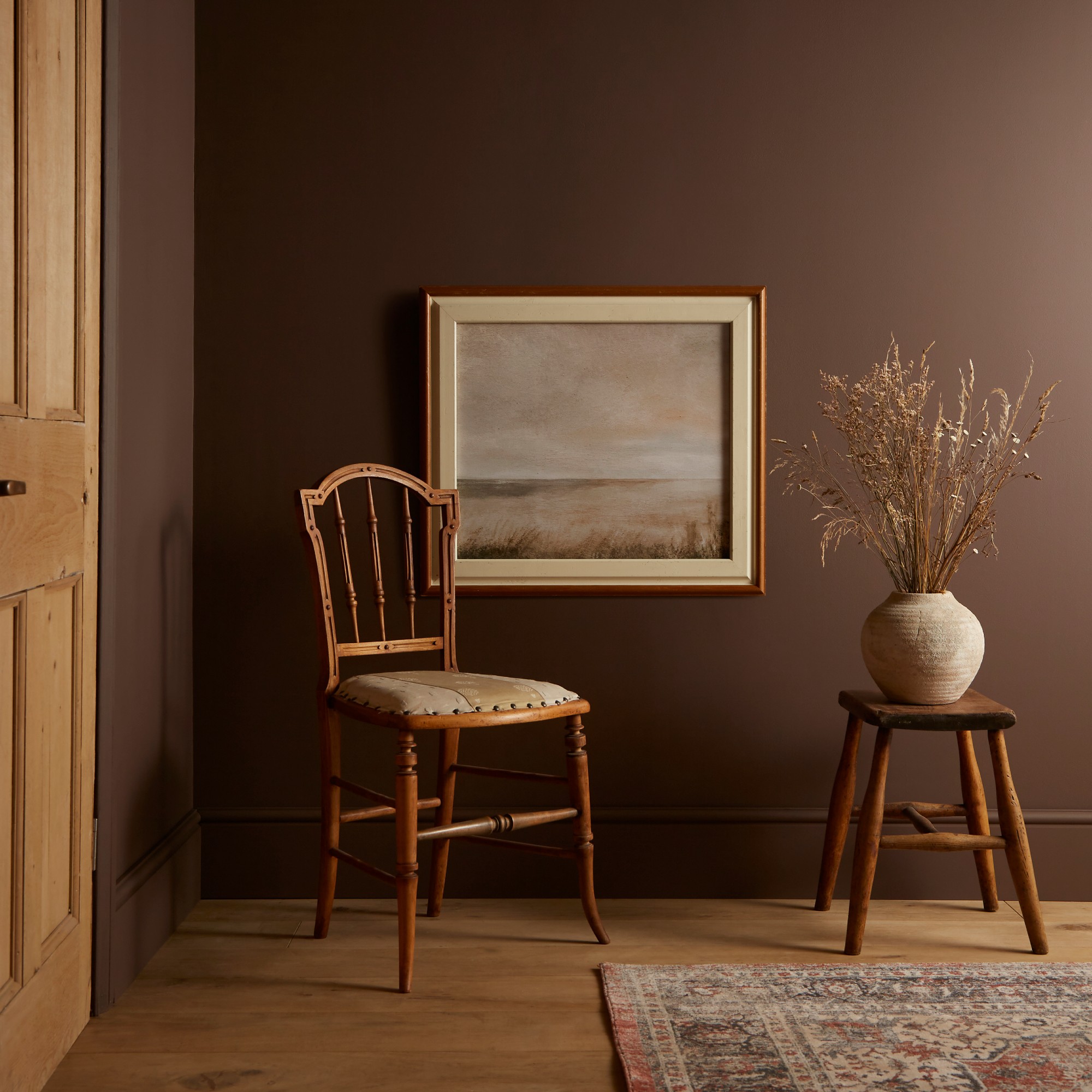
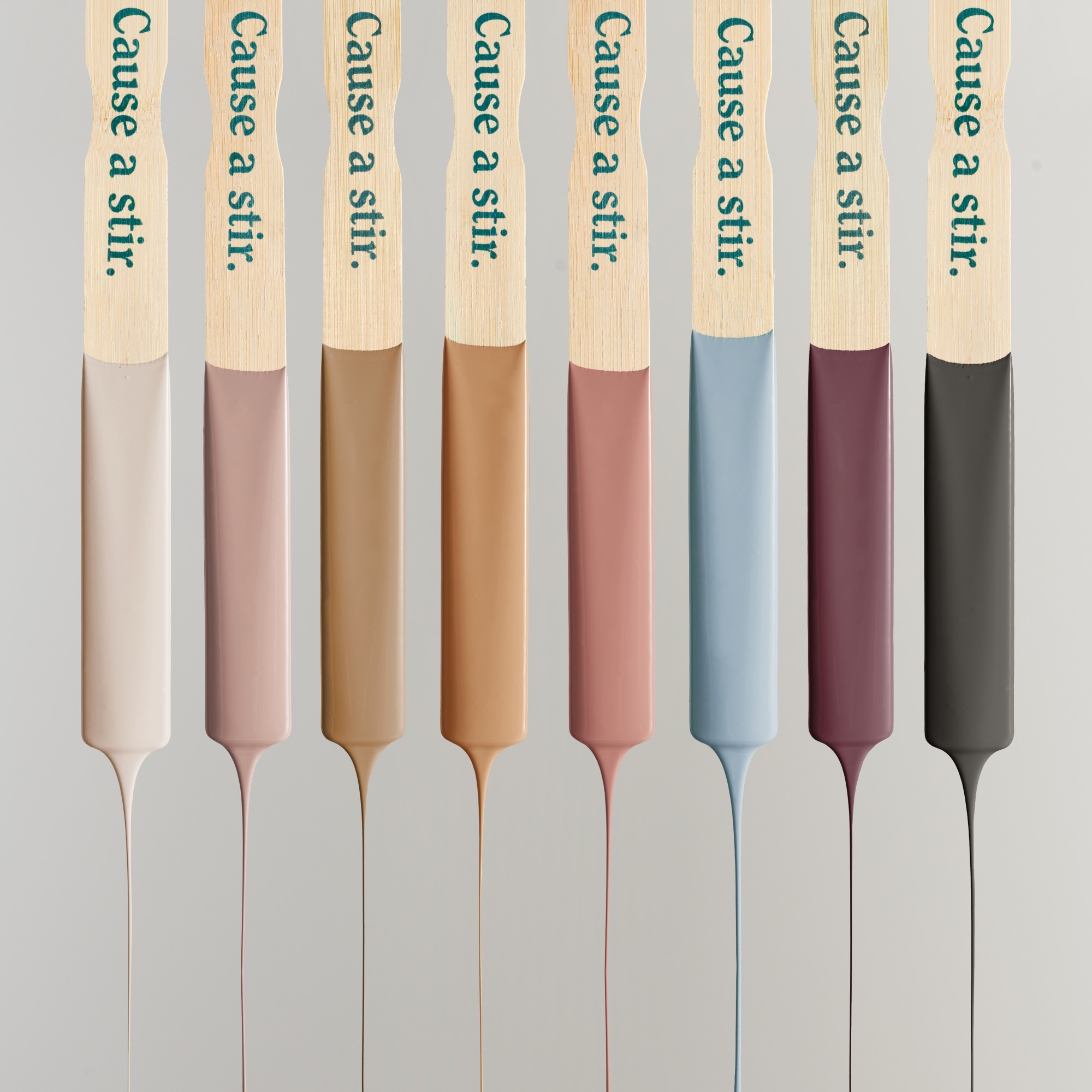
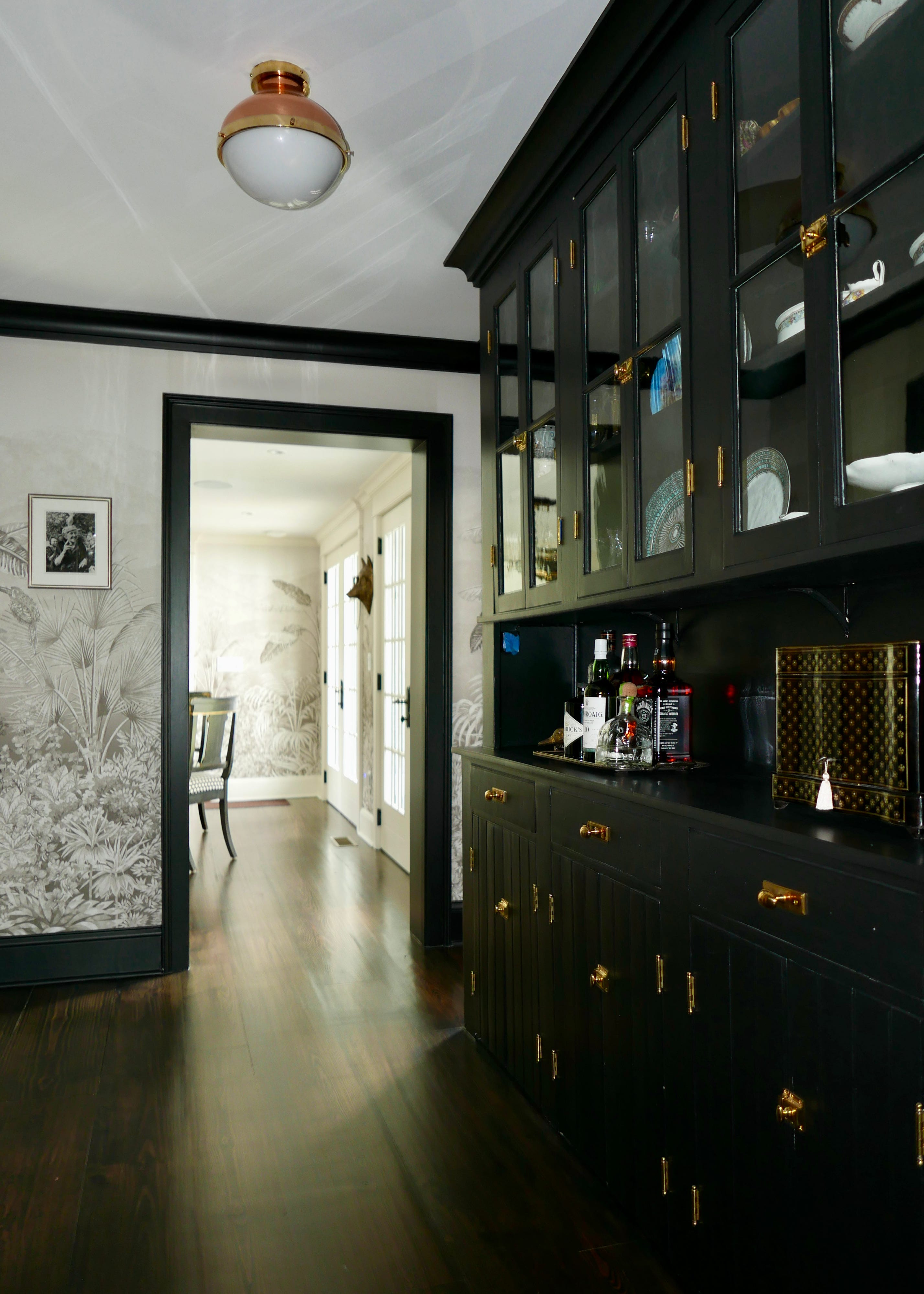
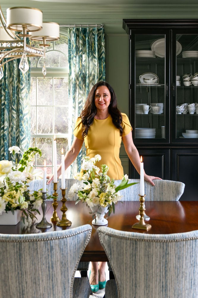
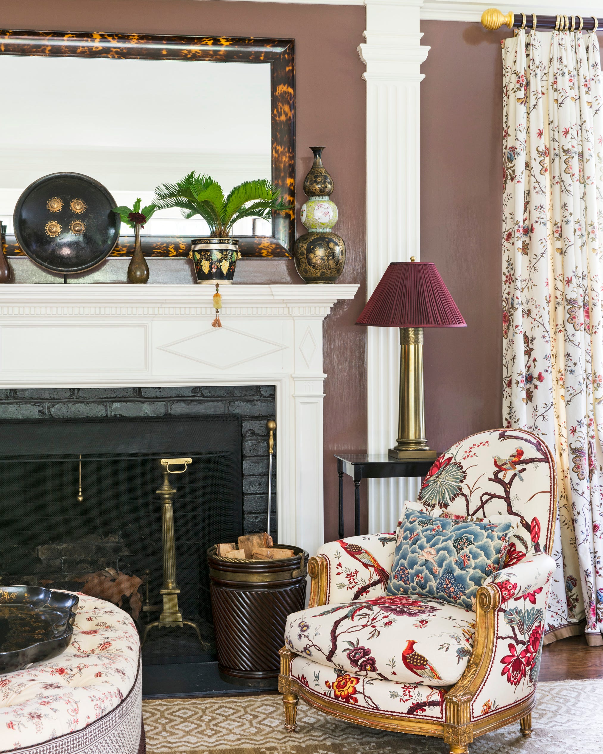
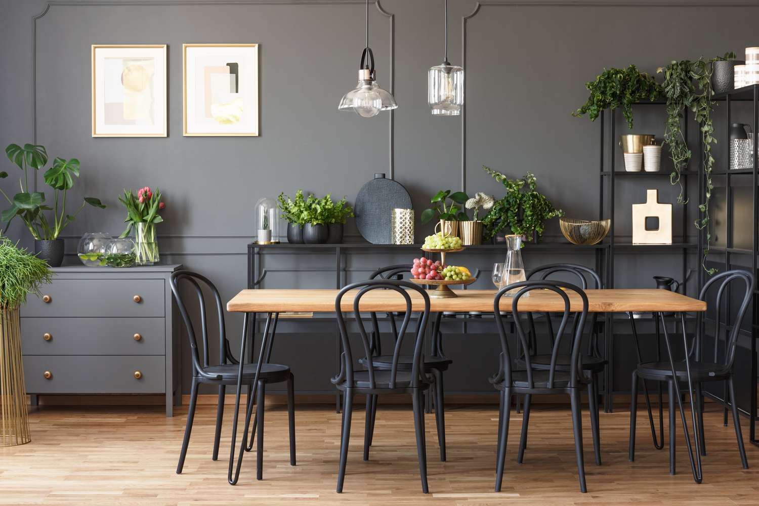
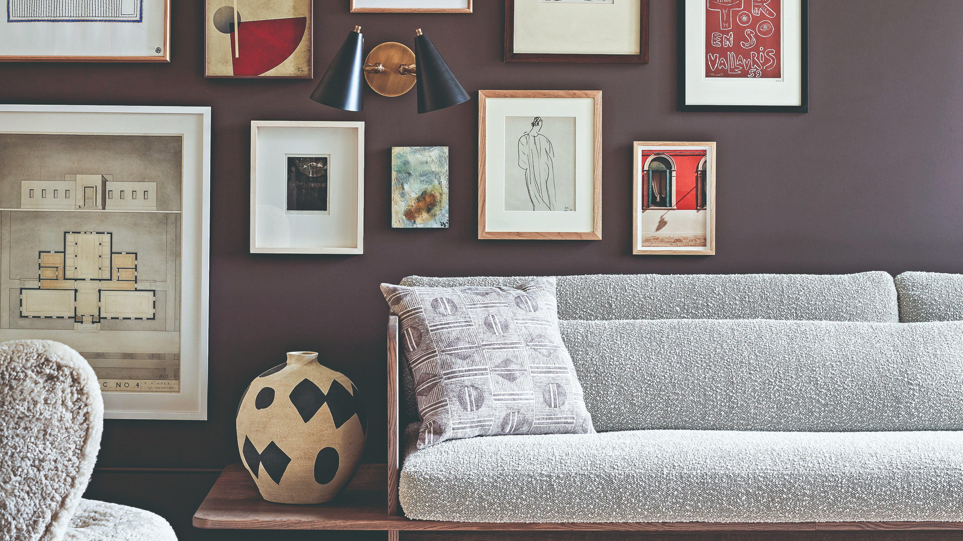
Designers are already anticipating the paint color trends for 2026, with a focus on rich reds, browns, and greens. Katie Lindquist, founder of Katie Lindquist Interiors, is drawn to Farrow & Ball Broccoli Brown (No. 198) for its old-world yet fresh quality. She envisions it in entryways, libraries, kitchens with unlacquered brass, or as a backdrop for layered textiles in dining rooms, suggesting its versatility for both traditional and modern spaces. Claire Thompson Design also plans to use Broccoli Brown extensively, having recently applied it to an exterior front door and seeing its potential for kitchen cabinets or creating a moody, color-drenched room.
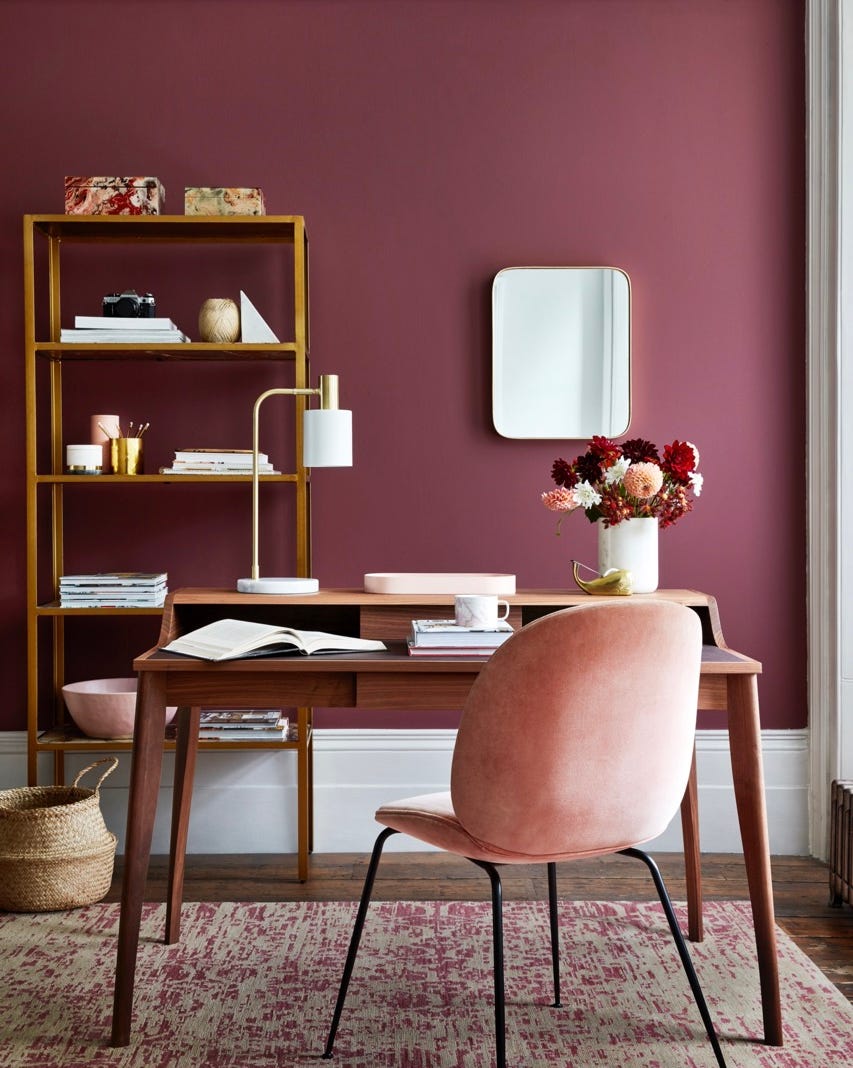
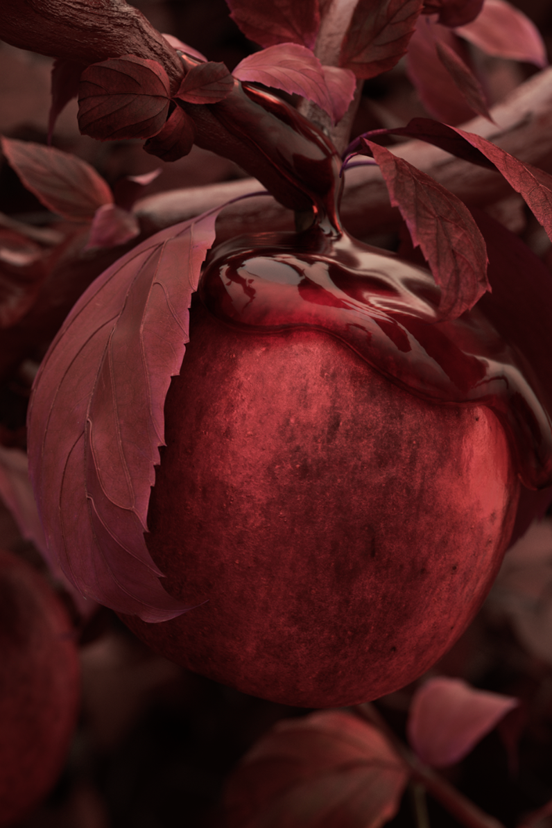
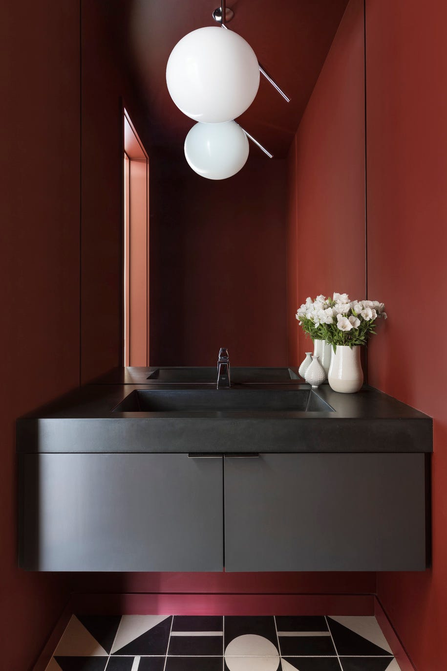
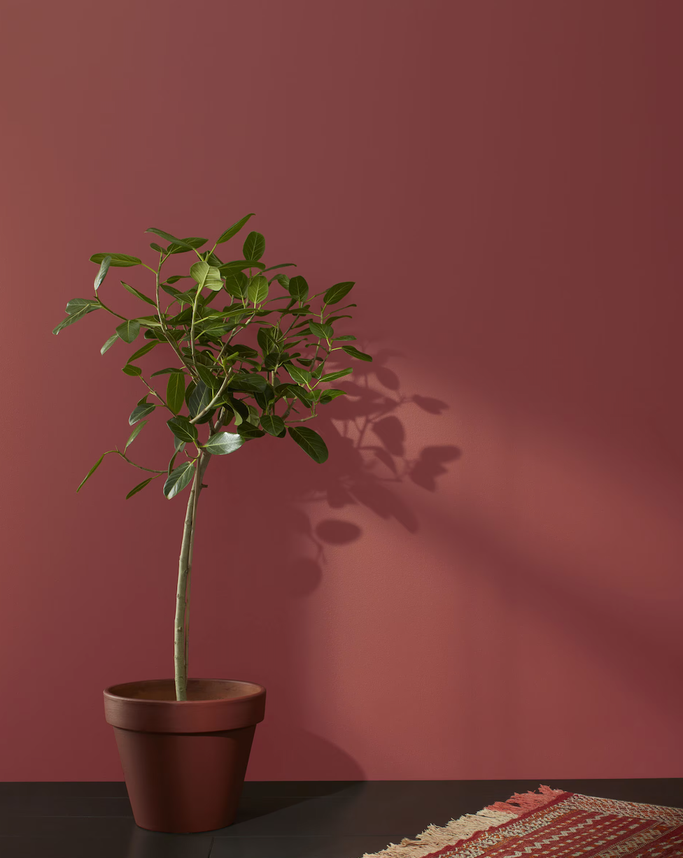
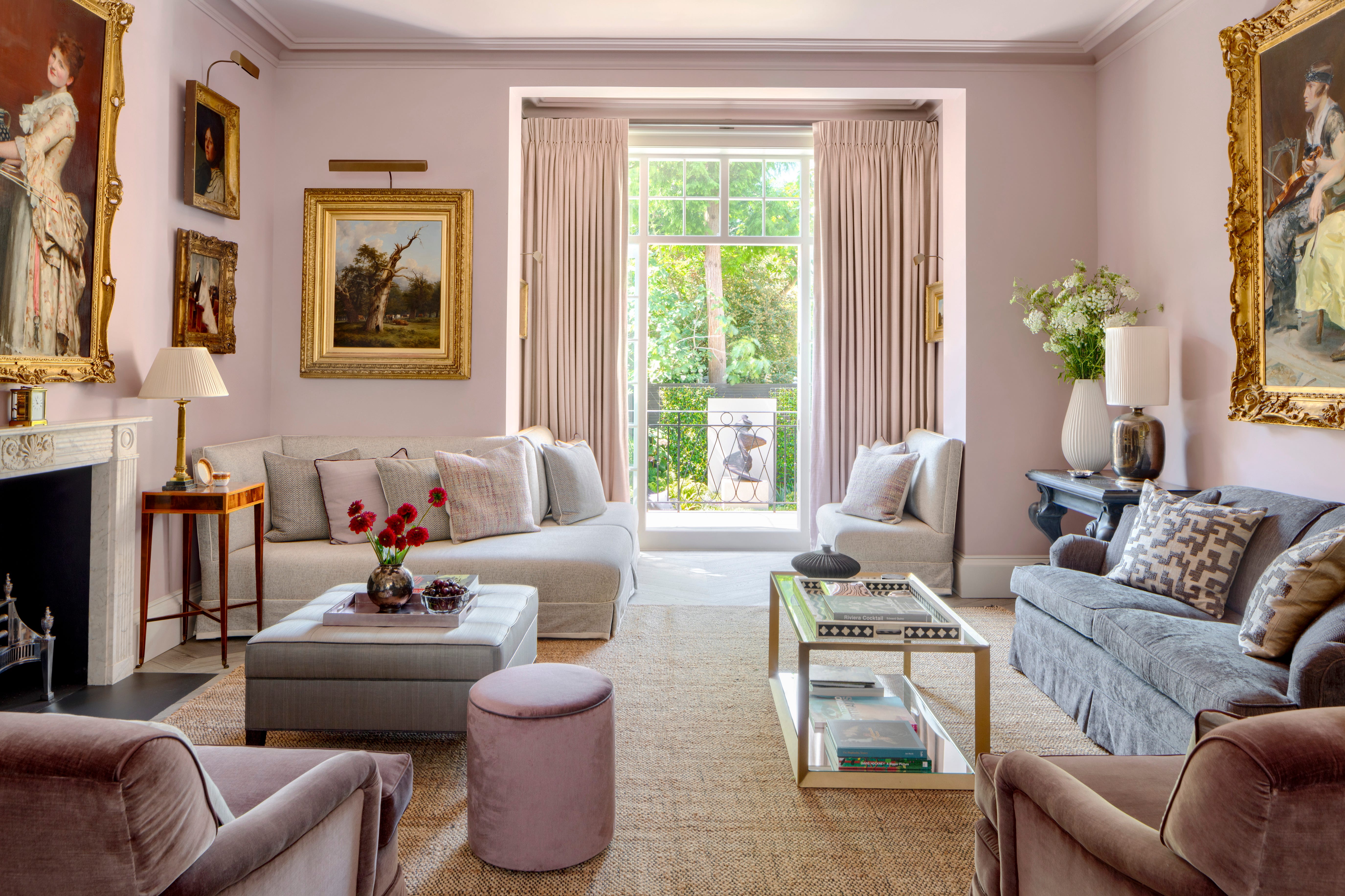
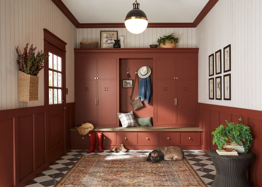
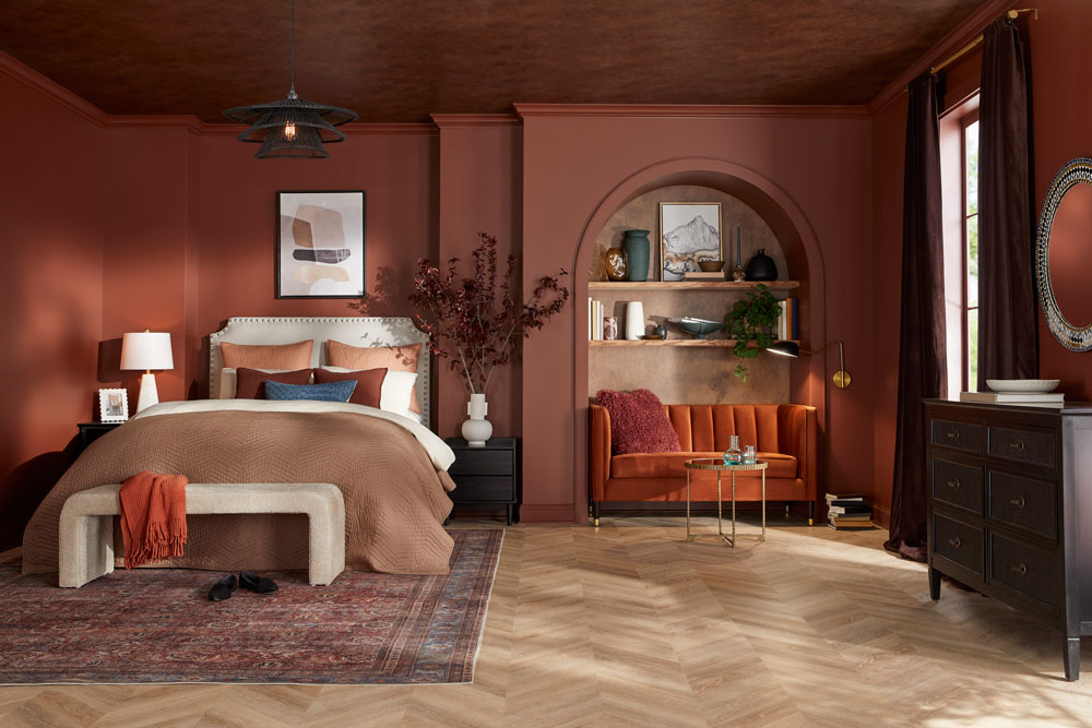
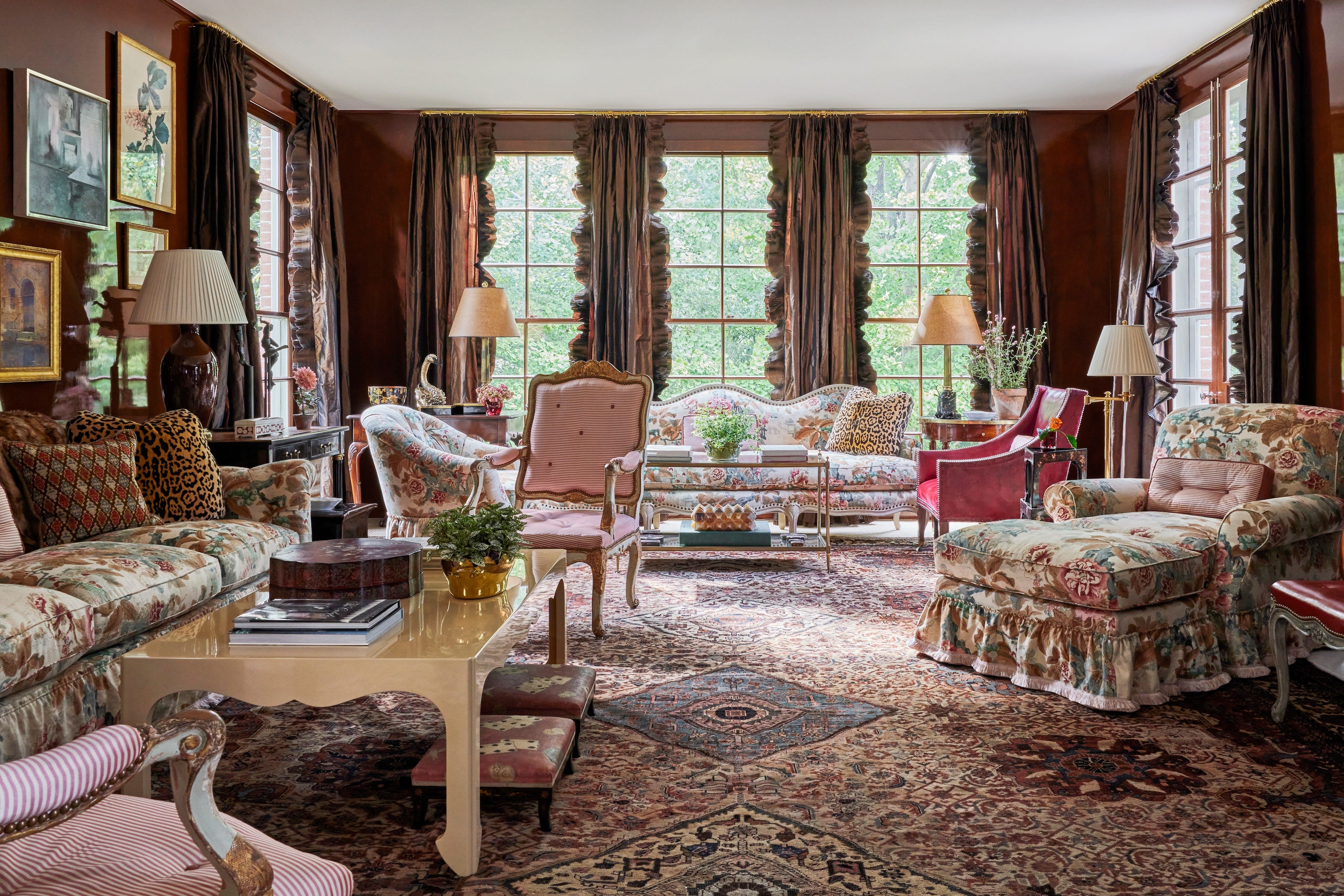
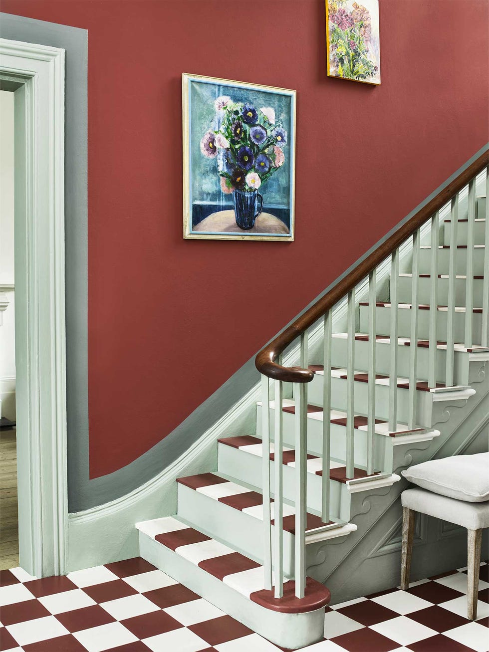
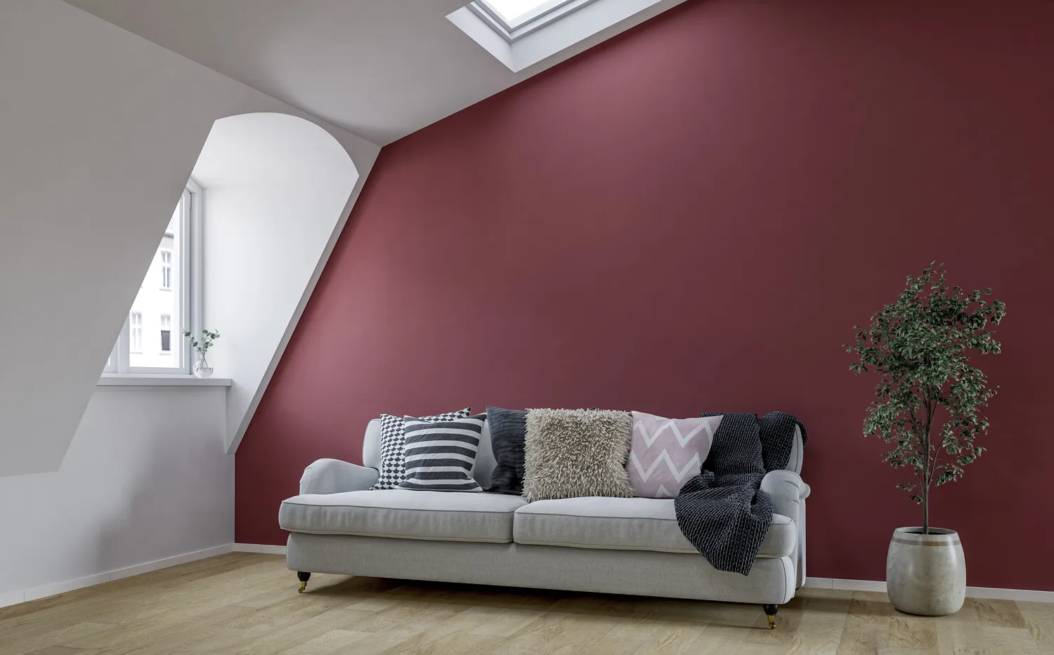
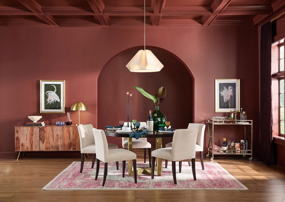
For those interested in color drenching, Farrow & Ball Preference Red (No. 297) is a strong contender. Nicole Roby of Nicole Roby Designs highlights its historical richness and warmth, noting its ability to create an emotionally welcoming atmosphere. Kelly Neely of Kelly Neely Interiors describes it as a beautiful red with brown and purple undertones, offering a moody yet interesting option for various applications, including cabinetry or entire rooms.
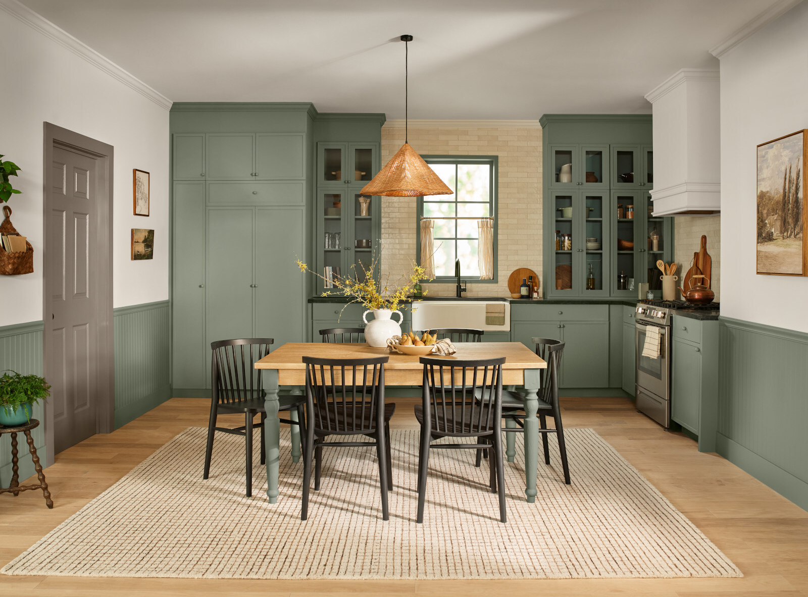
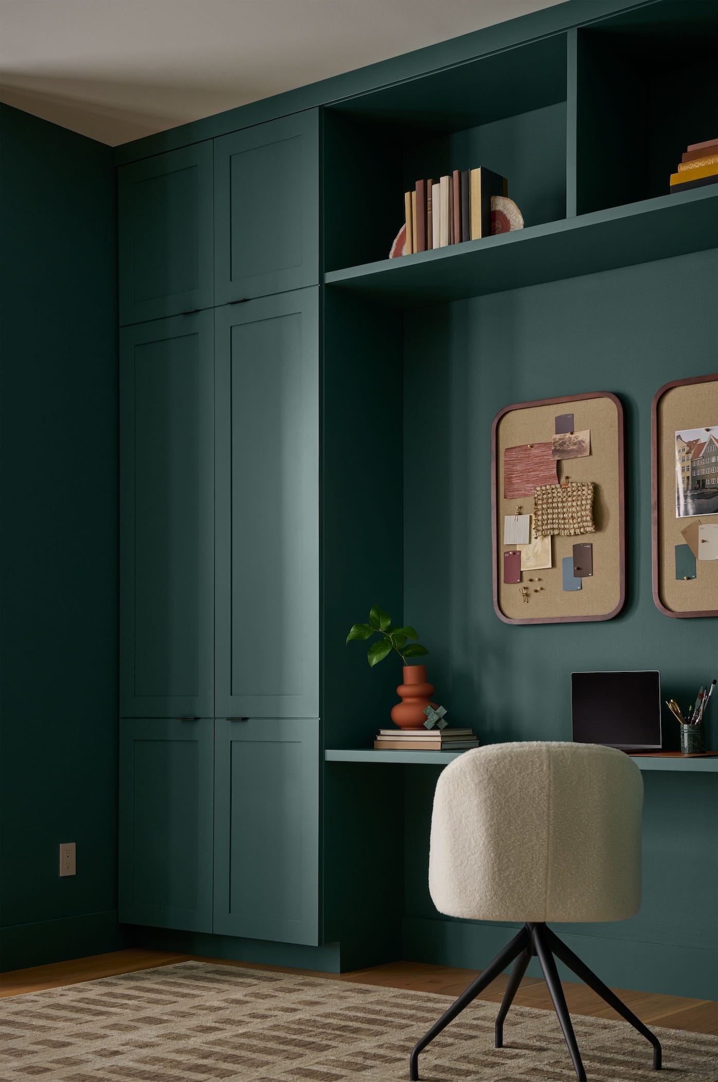
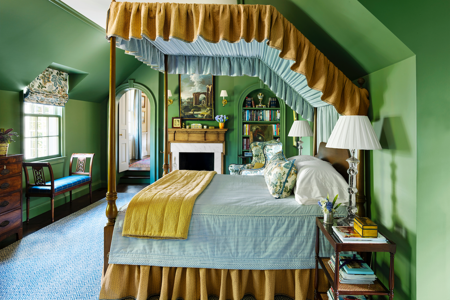
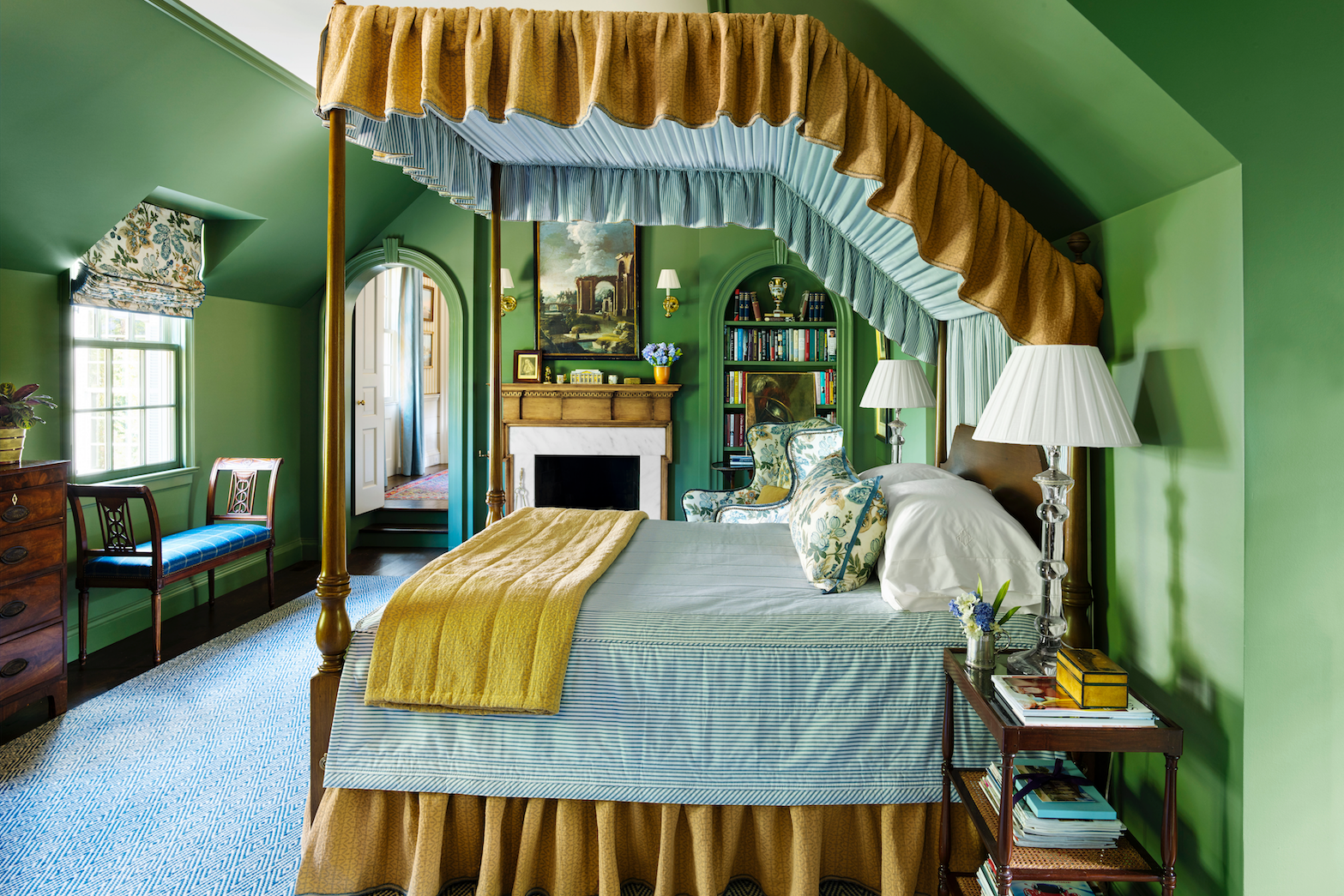
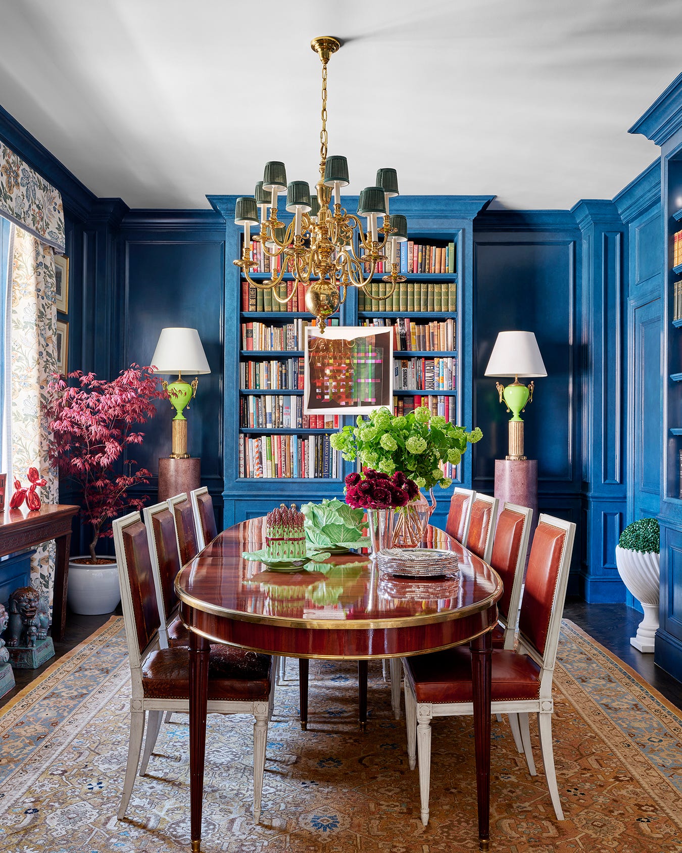
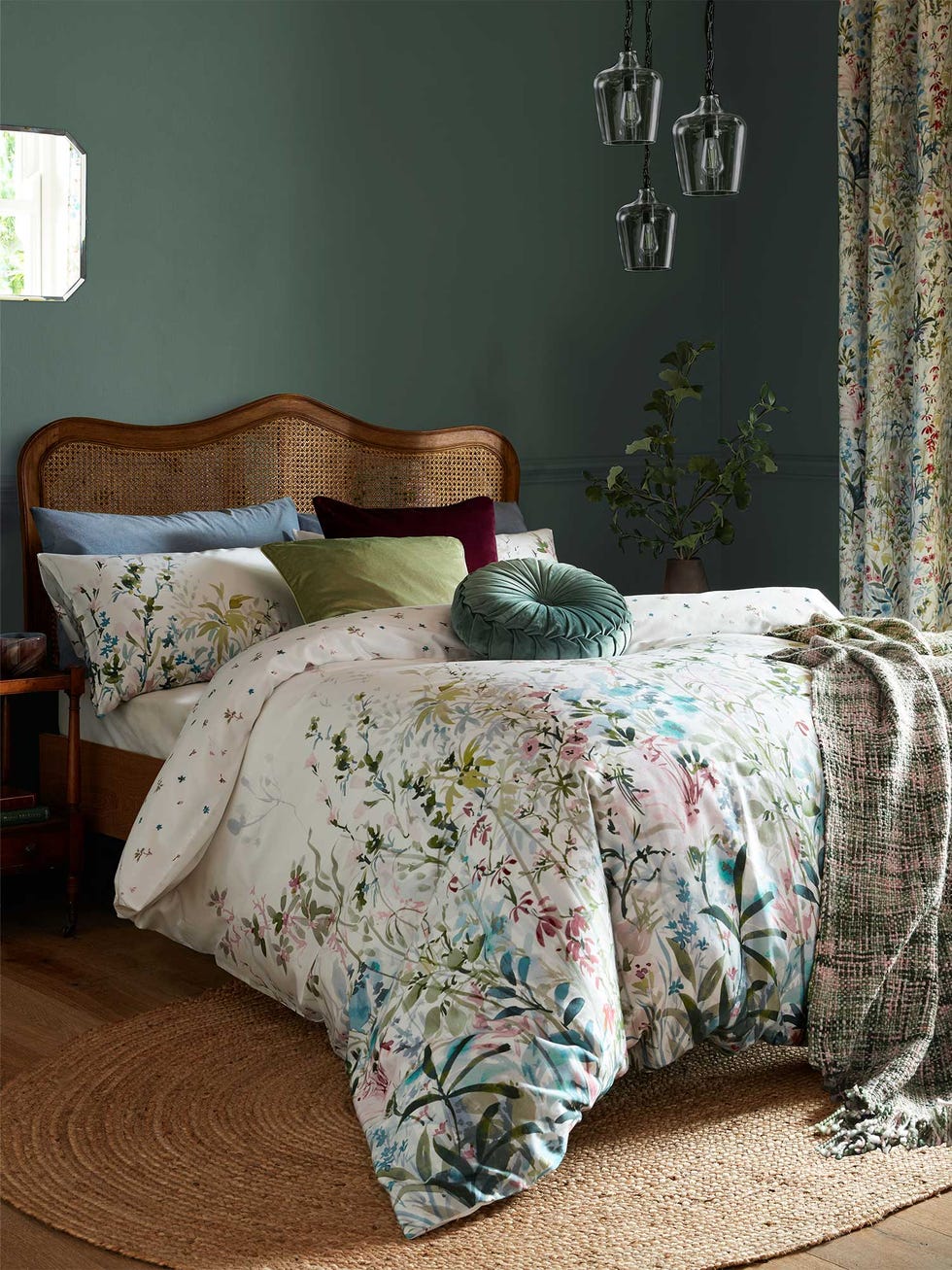
Javier Burkle of Burkle Creative sees Benjamin Moore Wildwood Crest (1538) as a way to blur the lines between indoor and outdoor spaces. He believes this green shade will appeal to a growing desire for authenticity and nature in design, bringing the landscape into living environments and shaping soulful, connected, and enduring spaces. Burkle also favors Benjamin Moore Hasbrouck Brown (HC-71) for its depth and complexity, comparing it to the nuanced beauty of a turtle shell. He appreciates its red undertones, which add vitality and movement, preventing the color from feeling static.
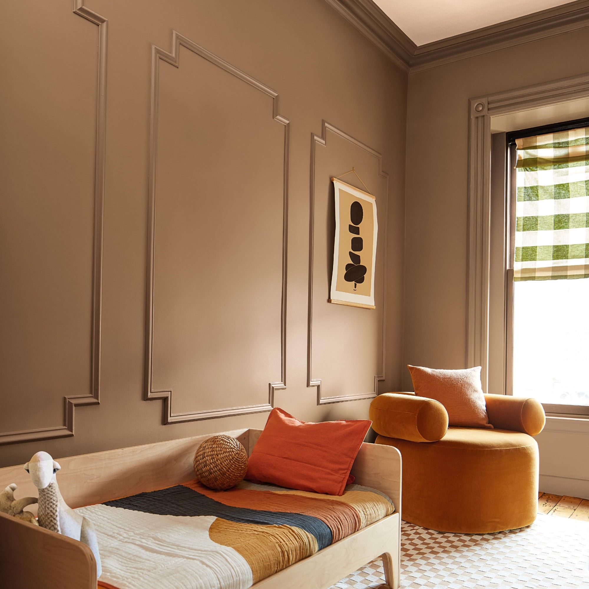
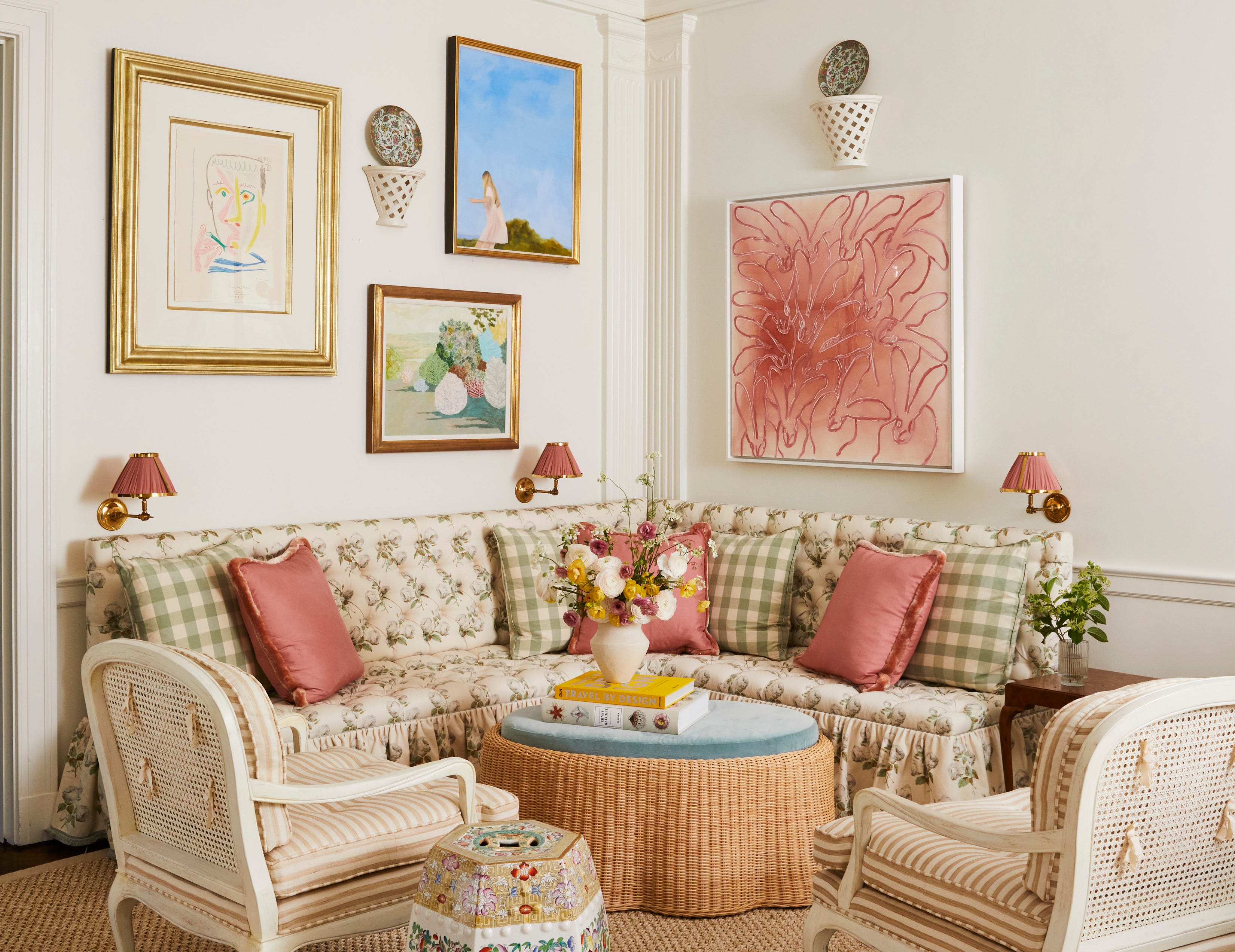
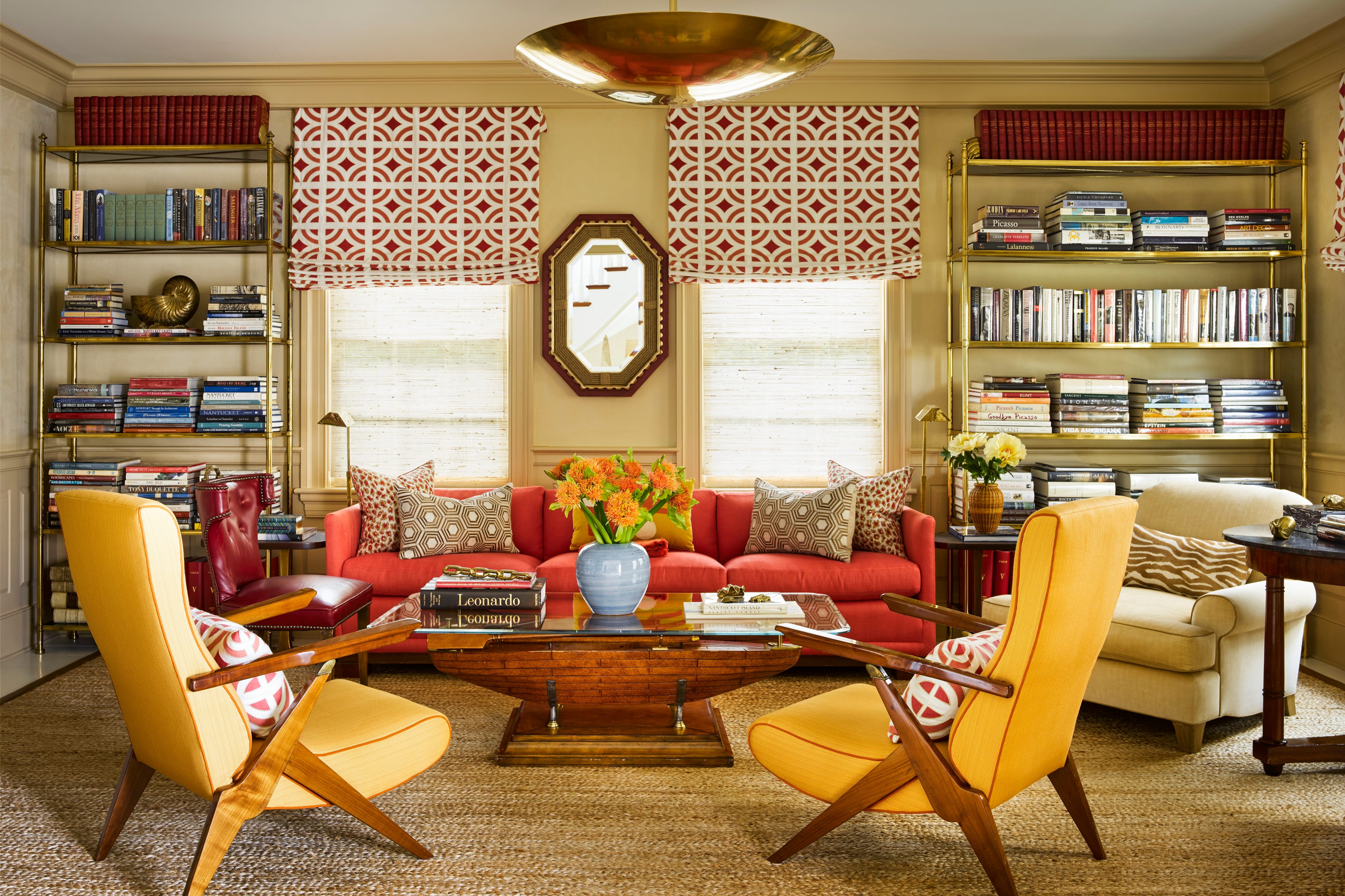
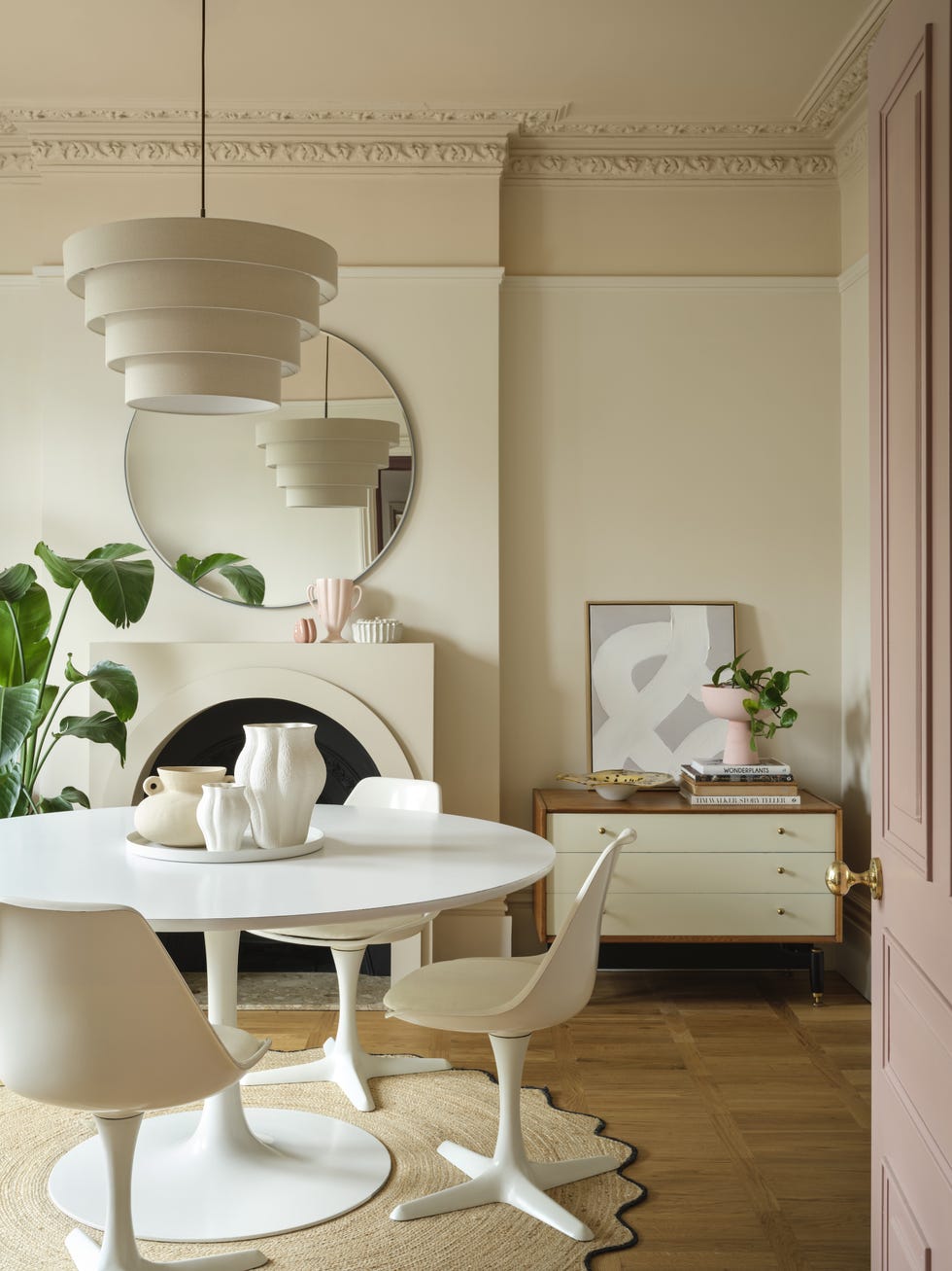
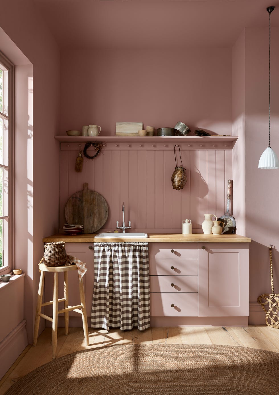
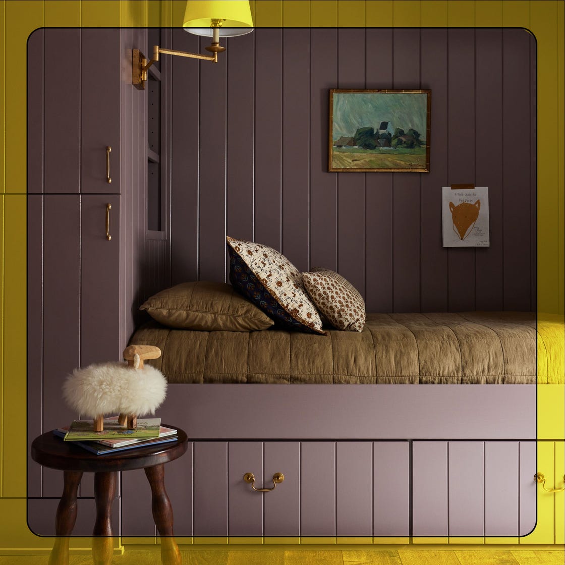
Jessica Duce of JDuce Design is enthusiastic about Sherwin-Williams Butterscotch (SW 6377). She notes its similarity to the timeless appeal of camel leather, which works in almost any setting. She discovered Butterscotch while experimenting with paint colors and sees it as a fresh option for earthy palettes. Emily Spanos of Emily June Designs prefers Behr Frolic 190C-1, a pale blush, over white when aiming for a soft, gentle ambiance, observing a trend toward warmer light tones in interiors.
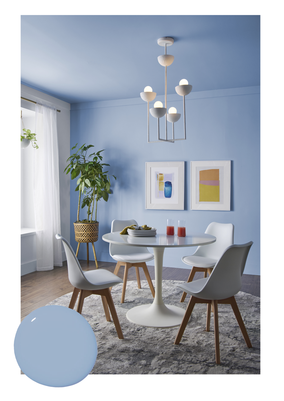
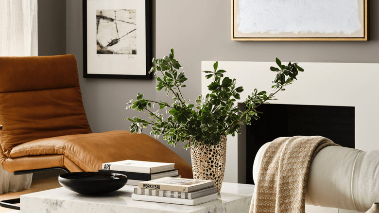
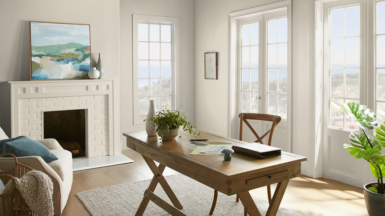
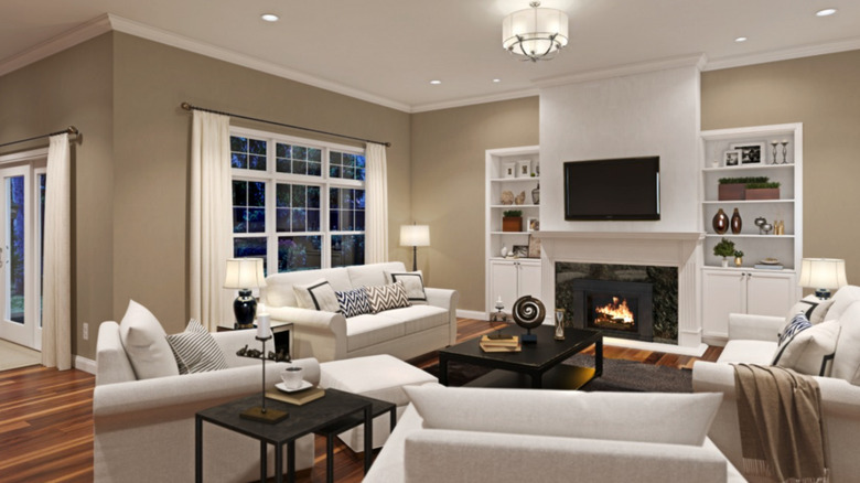
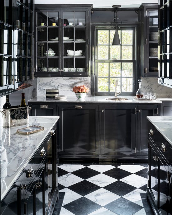
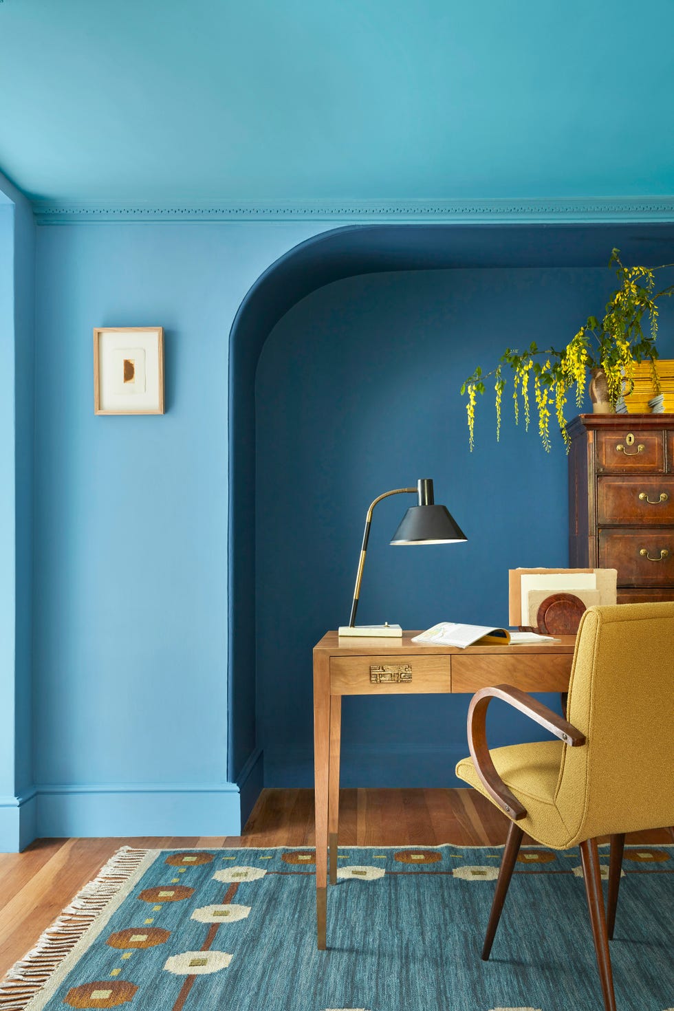
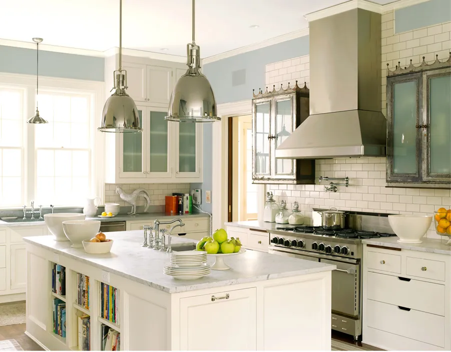
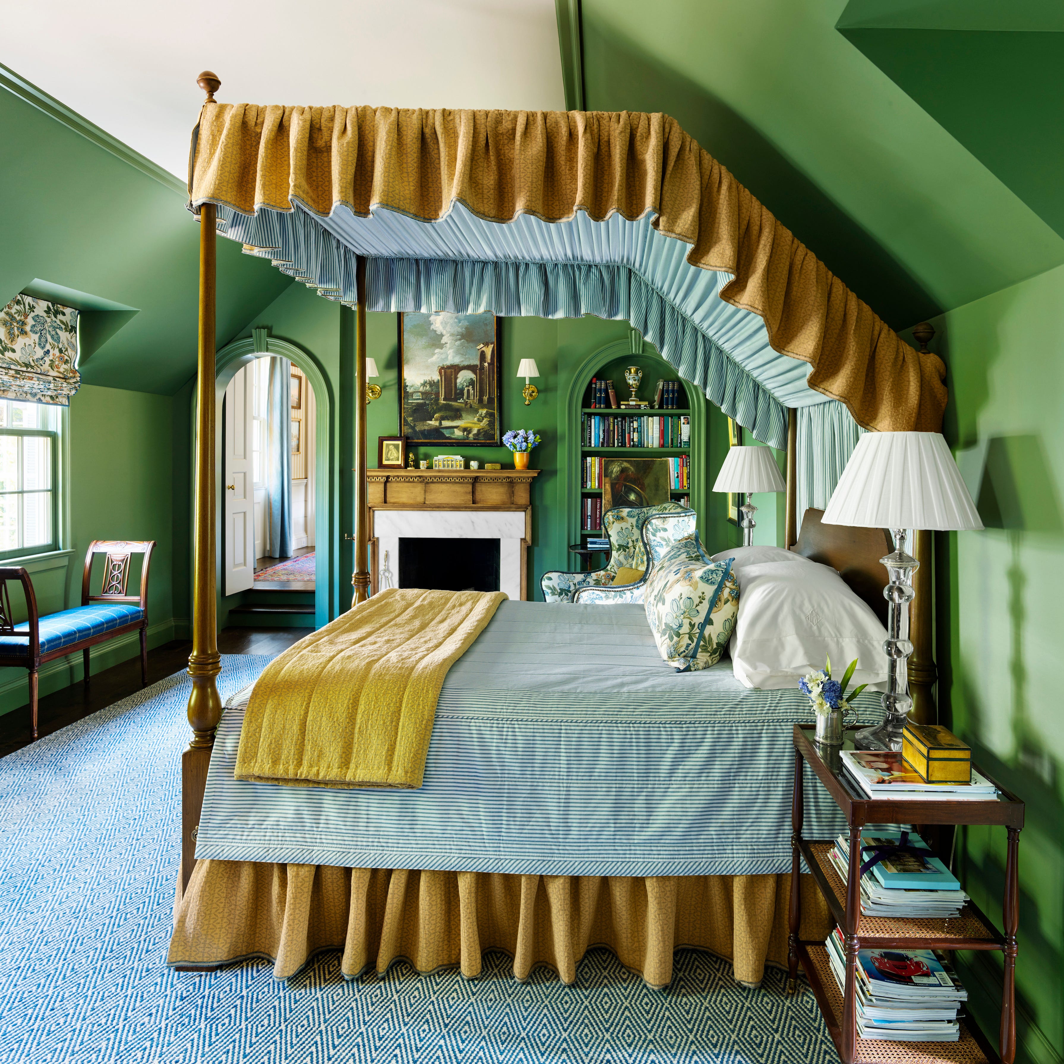
Rainey Richardson of Rainey Richardson Interiors is moving away from grays and instead focusing on Farrow & Ball Oxford Stone (No. 264). She describes it as a rich, warm neutral without any hint of greige, striking a balance between depth and softness for elevated interiors. Her ideal application for this color is a full gloss finish. Lisa Erdmann of Lisa Erdmann Interiors suggests Benjamin Moore Yarmouth Blue (HC-150) for walls or ceilings, highlighting its coastal charm and ability to balance timelessness with freshness. She notes its versatility with both warm neutrals and crisp whites. Lastly, Sherrell Neal of Sherrell Design Studio identifies chartreuse as a popular color. She expresses interest in using Benjamin Moore Citrus Burst (364) in a high-gloss lacquer or Farrow & Ball Green Ground (No. 206) paired with floral chintz fabric.
#PaintColors #HomeDecor #InteriorDesignTrends #FarrowAndBall #BenjaminMoore #SherwinWilliams #BehrPaint #DesignPredictions #ColorDrenching #PaintColors #HomeDecor #InteriorDesignTrends #FarrowAndBall #BenjaminMoore #SherwinWilliams #BehrPaint #DesignPredictions #ColorDrenching
0 تعليق إجمالاً
 لا توجد تعليقات بعد
قد تعجبك أيضًا
What Paint Colours will Rule 2026? The Experts Make Their Predictions

The colour palette for 2025 – these are the shades paint experts say we’ll see everywhere next year
These 8 Colors Will Rule Interiors in 2026, According to Experts

6 Paint Colors Going Out of Style in 2026

What Paint Colors Will Rule 2026? Designers Make Their Predictions

What Colors Will Rule 2027 (and Beyond)? Experts Make Their Predictions
We're Calling It: The 7 Paint Colors That Will Be Huge in 2026

These 8 Color Trends Will Rule in 2025, According to Color Pros


Experts Say These 5 Paint Colours Will Be Everywhere In 2026
These Will Be the Most Popular Paint Colors in 2026

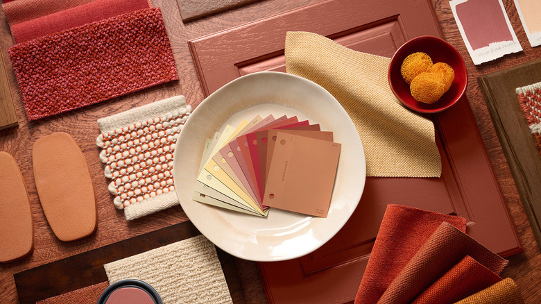
These 20 Trendy Paint Colors Will Be Taking Over Walls In 2026
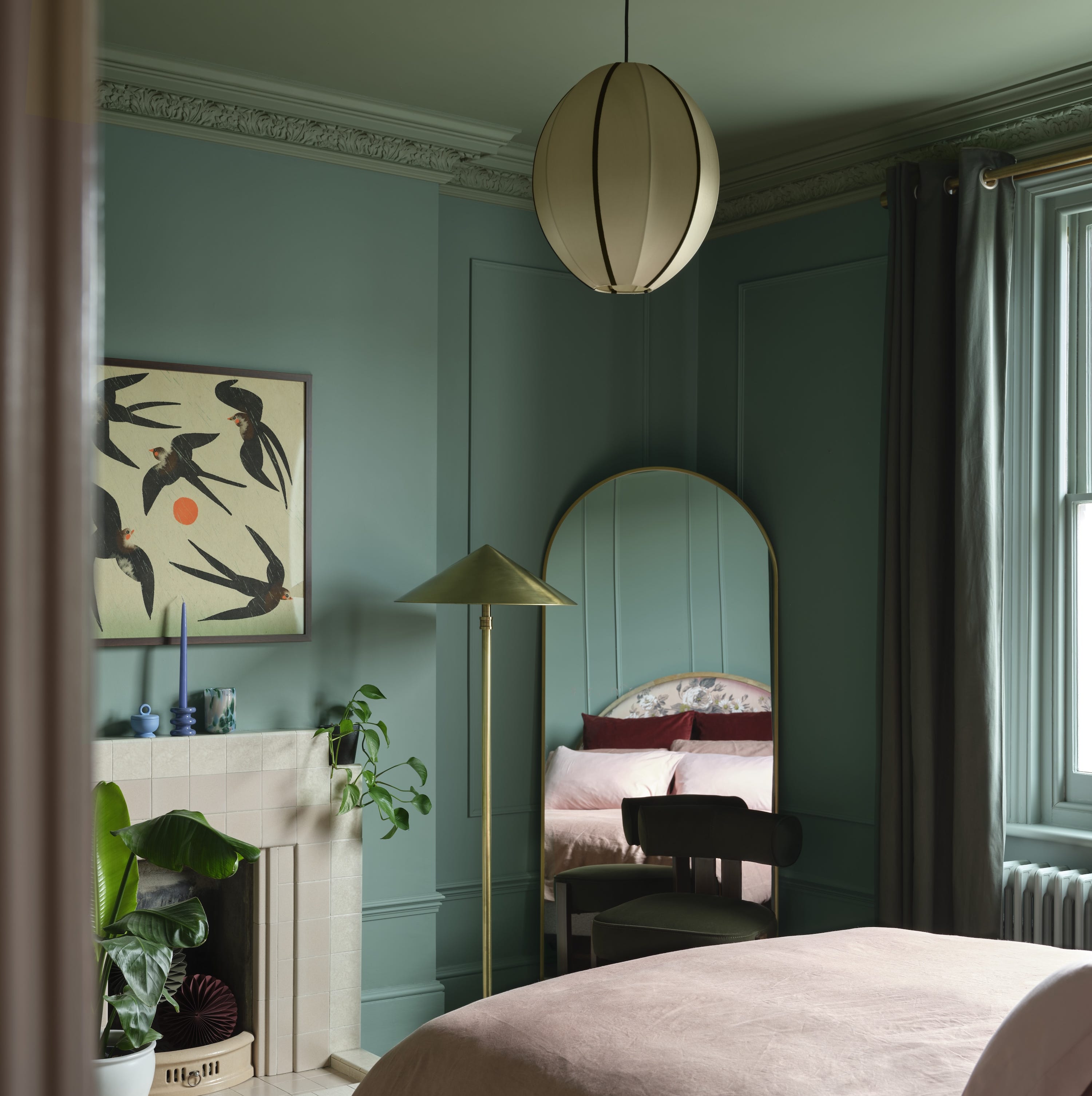
Designers Predict This Will Be The Biggest Paint Trend Of 2026
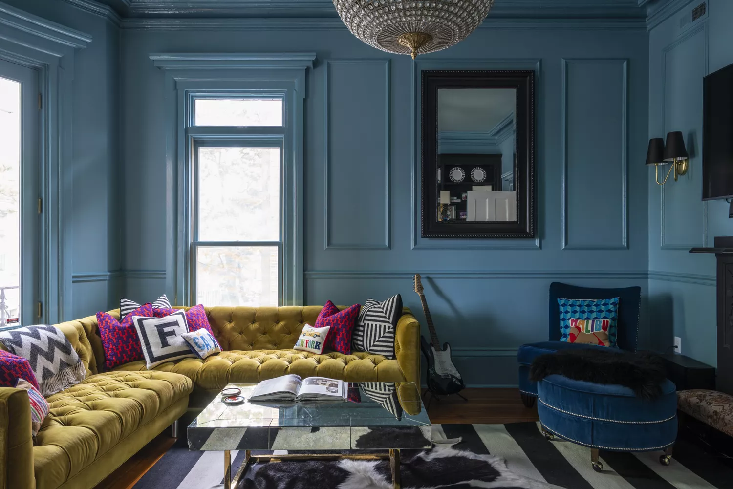
9 Trending Paint Colors You'll See Everywhere in 2025, According to Designers
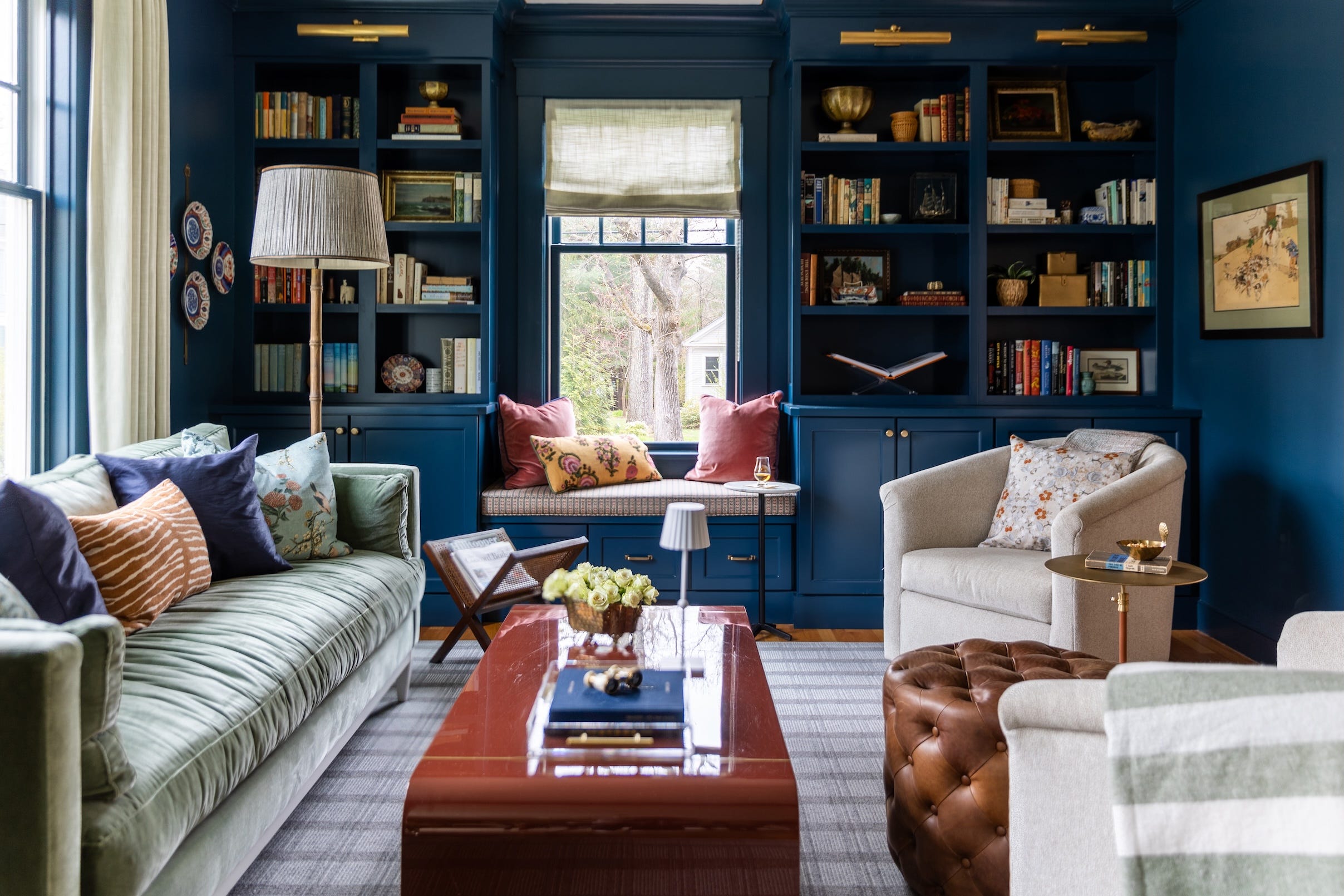
Designers Say These 12 Paint Colors Will Be Everywhere in 2026

Will This Be the Color Everyone Paints Their Room in 2026?

Colour experts share their top paint trends for 2024


8 Paint Color Trends You'll ACTUALLY Want to Live With in 2026, According to Designers

These 6 Colors Will Rule Interiors in 2026, According to Experts

These 7 Colors Will Rule Interiors in 2026, According to Experts

Designers Agree: These 7 Underrated Paint Colors Will Be Huge in 2026