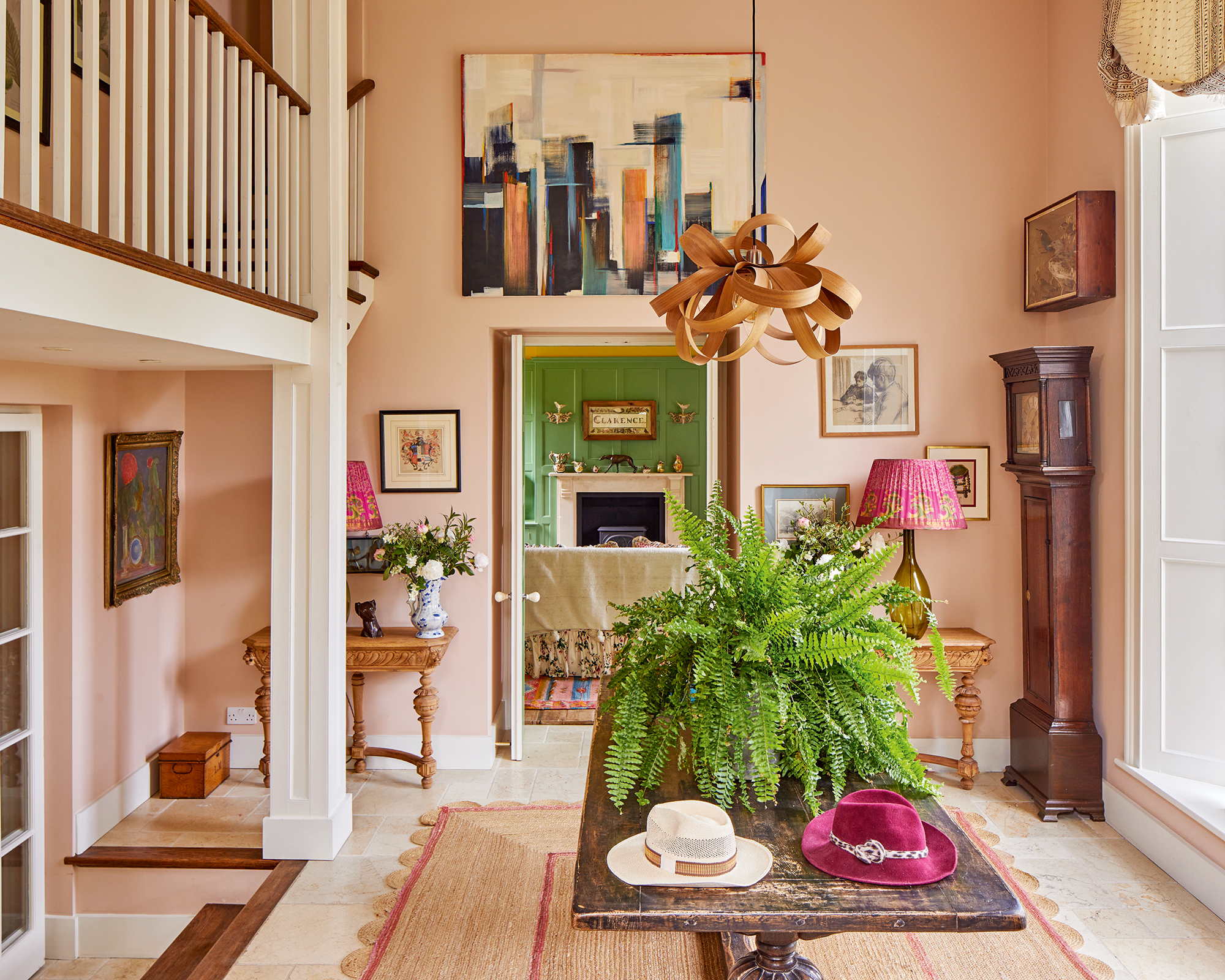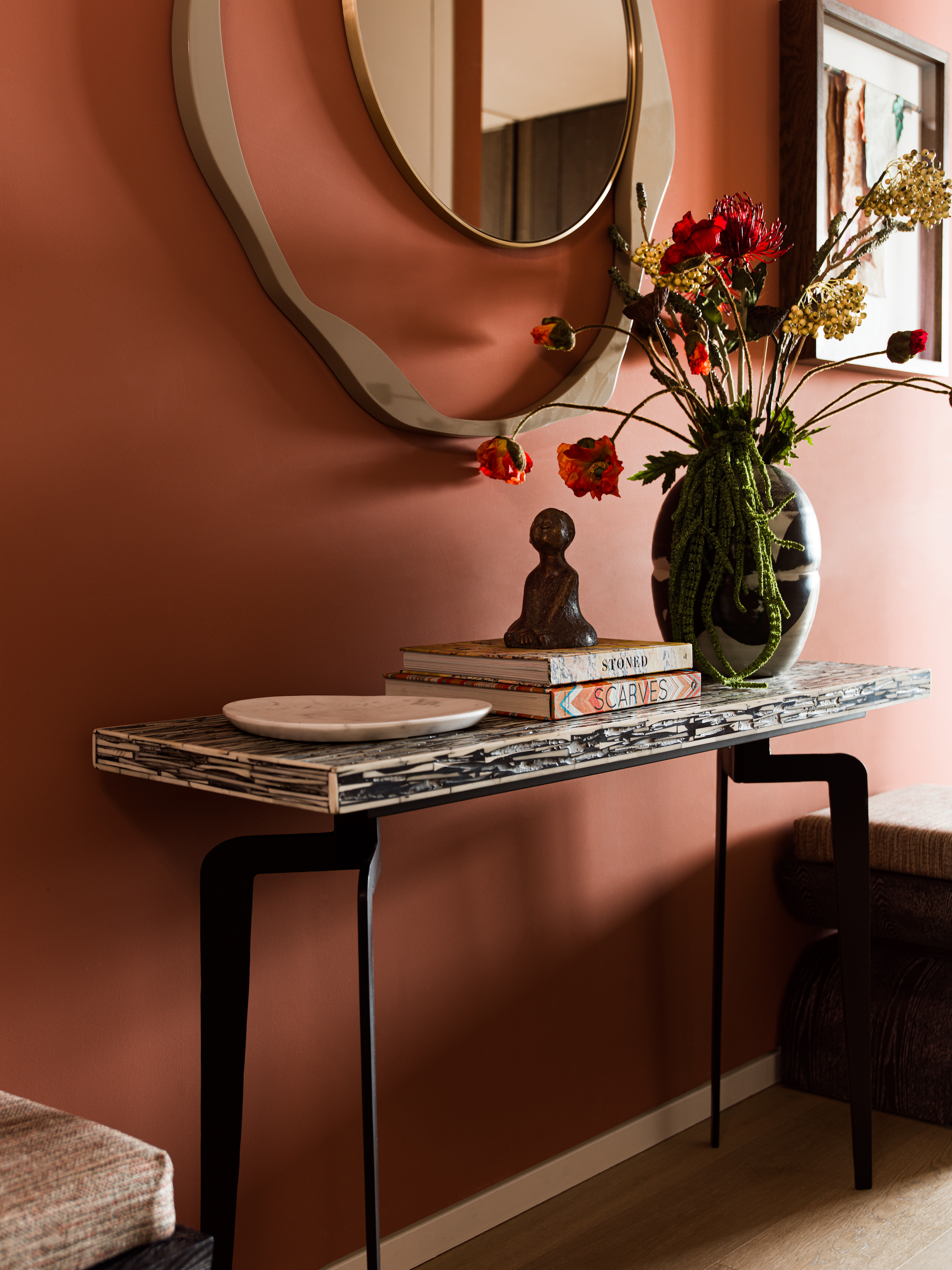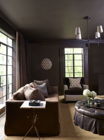
6 Outdated Paint Colors Designers Don't Want to See in Homes Anymore in 2026
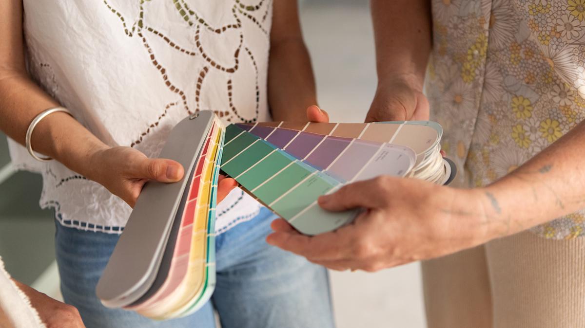
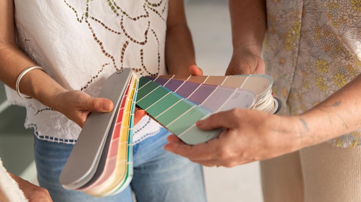
As the new year approaches, interior designers are identifying paint colors they believe have run their course and should be avoided in 2026. While personal preference in home decor remains paramount, understanding current design sentiments can inform choices for those looking to refresh their living spaces. This discussion highlights six specific paint colors that designers consider outdated, offering insights into why they are being phased out and what alternatives are gaining popularity.
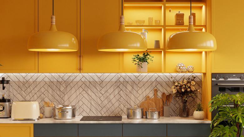
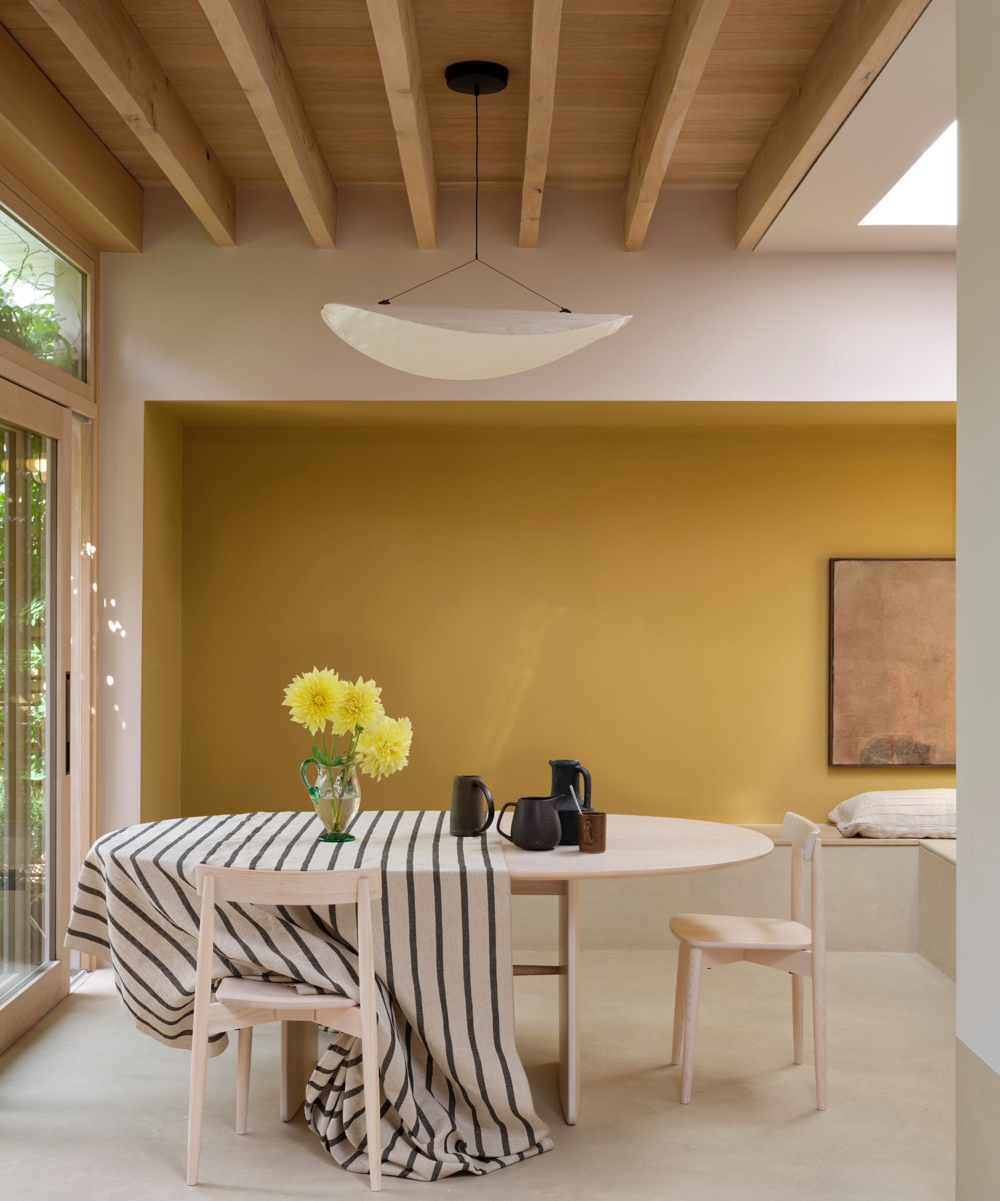
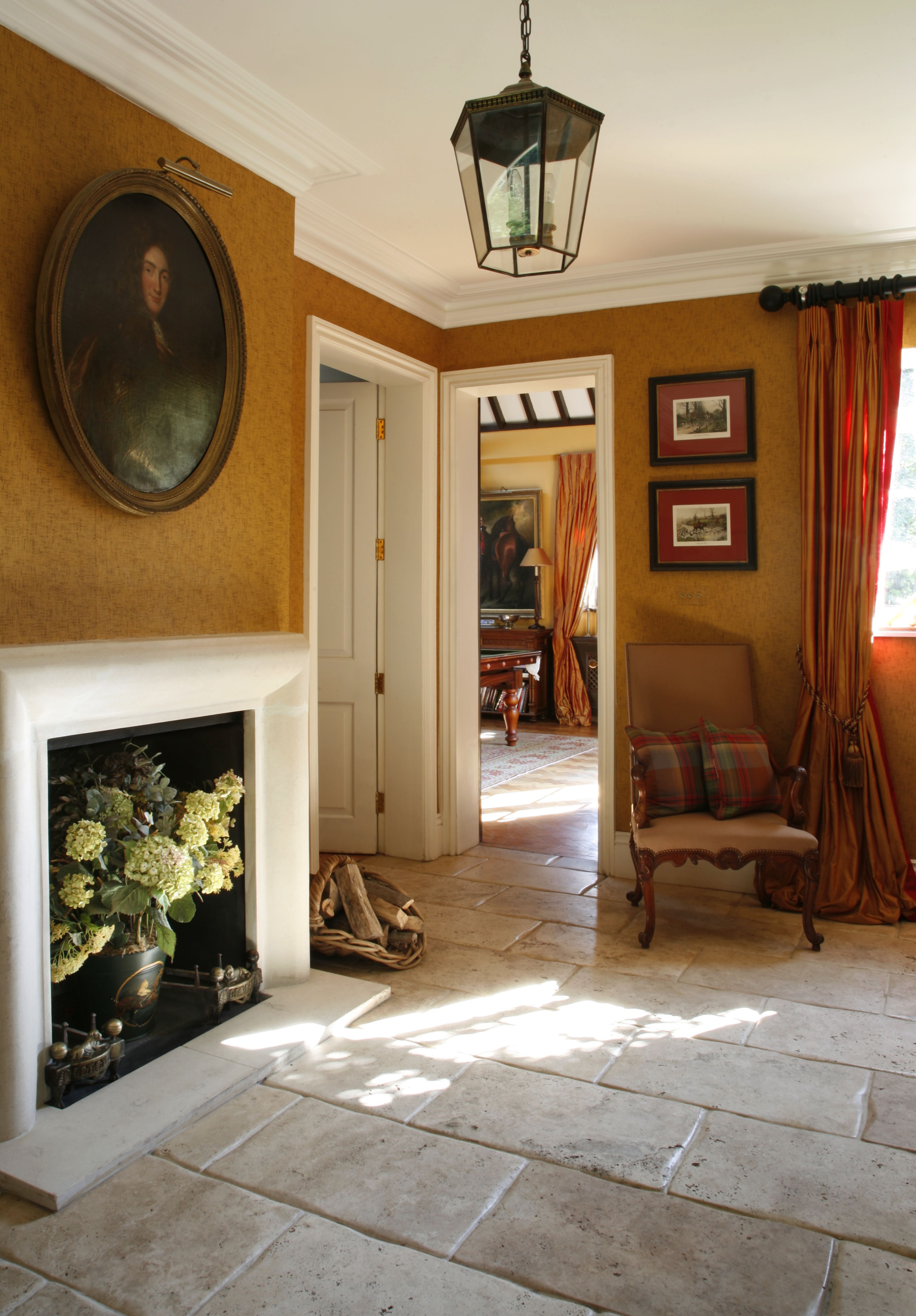
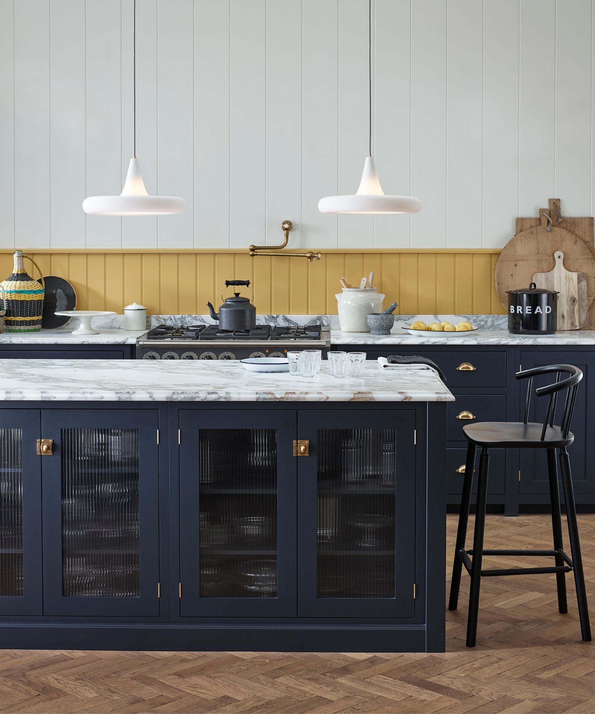
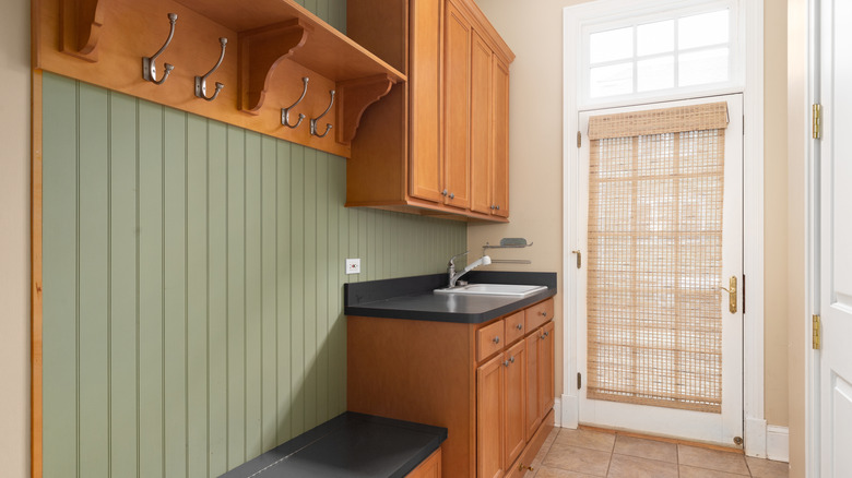
Butter yellow is one such color that designers, including Ali Burgoon Nolan of Studio Burgoon and Jennifer Jones of Niche Interiors, suggest retiring. Despite its recent resurgence in fashion, butter yellow is seen as a hue that can instantly date a space, evoking a "granny vibe" or a strong association with the 1990s. Instead, designers are leaning towards more complex and grounded yellow tones, such as muted ochres or sun-washed wheat shades, which offer greater sophistication and warmth.
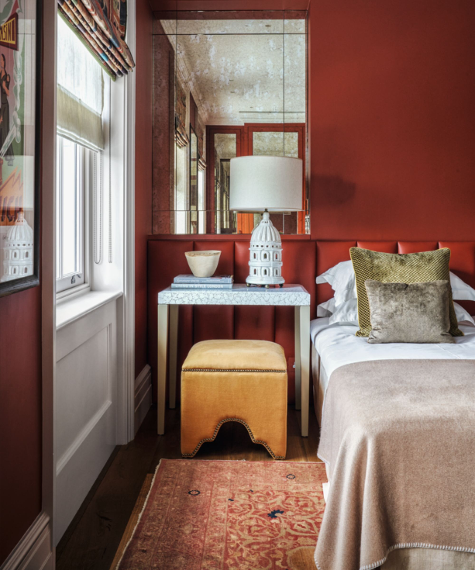
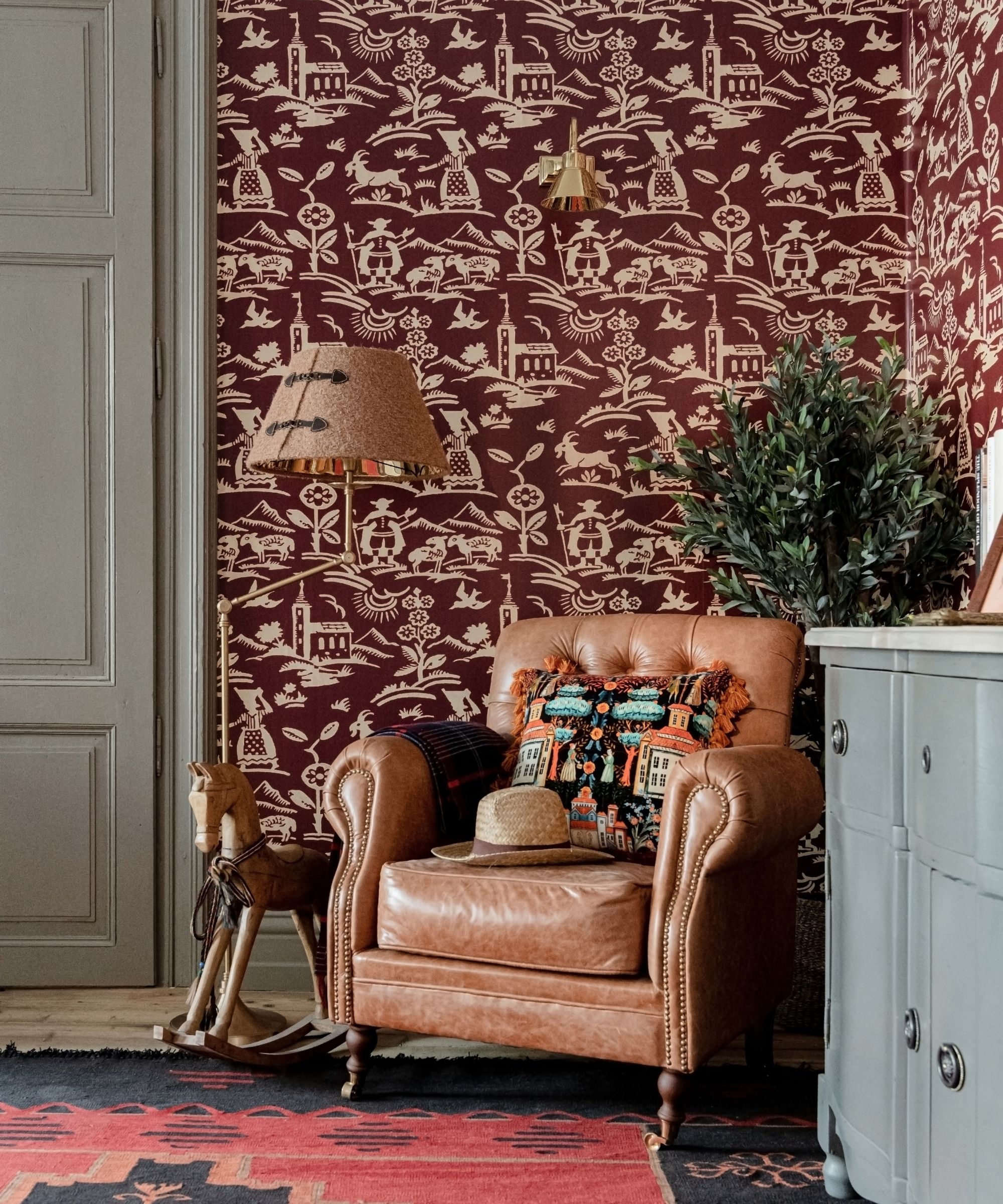
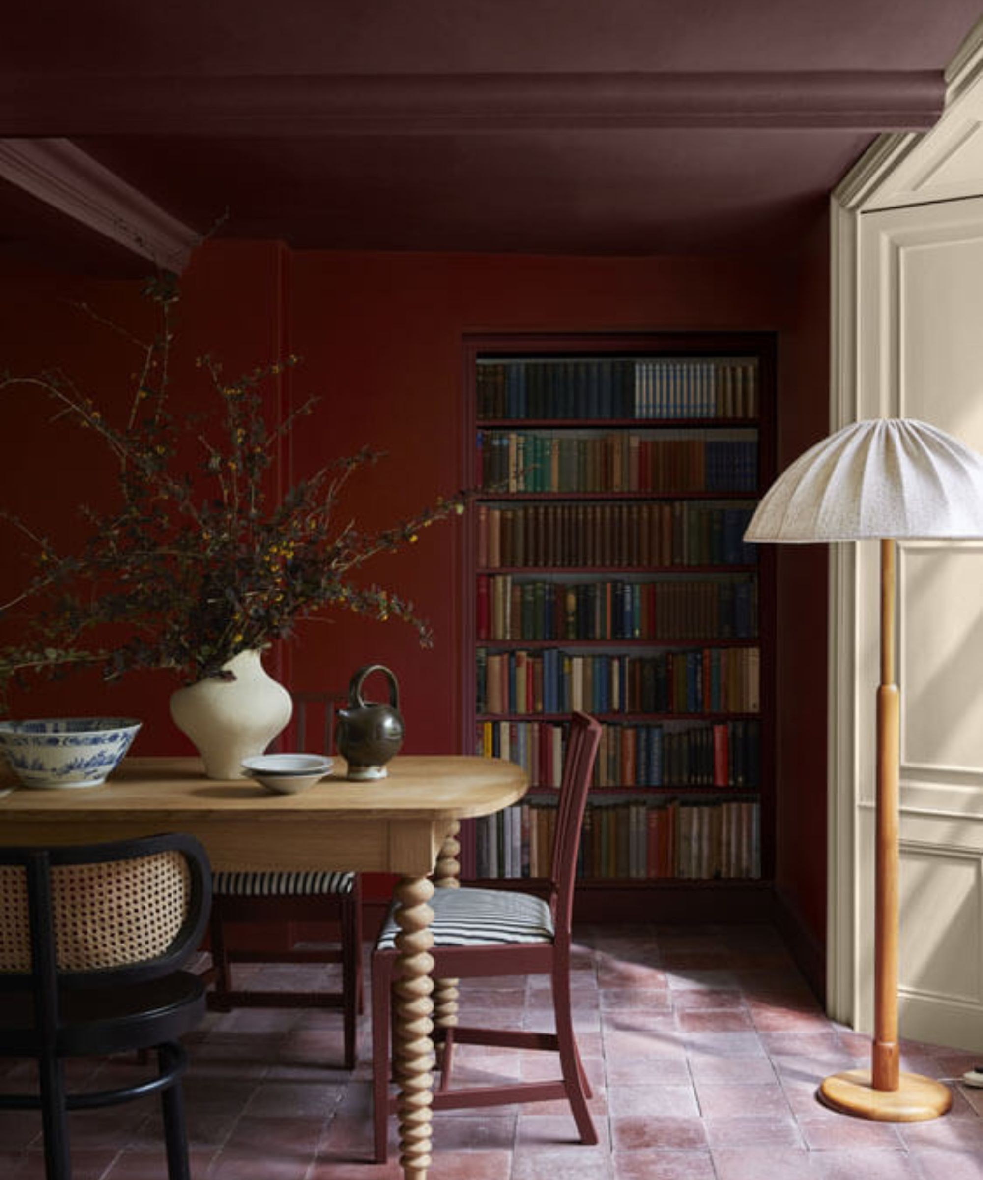
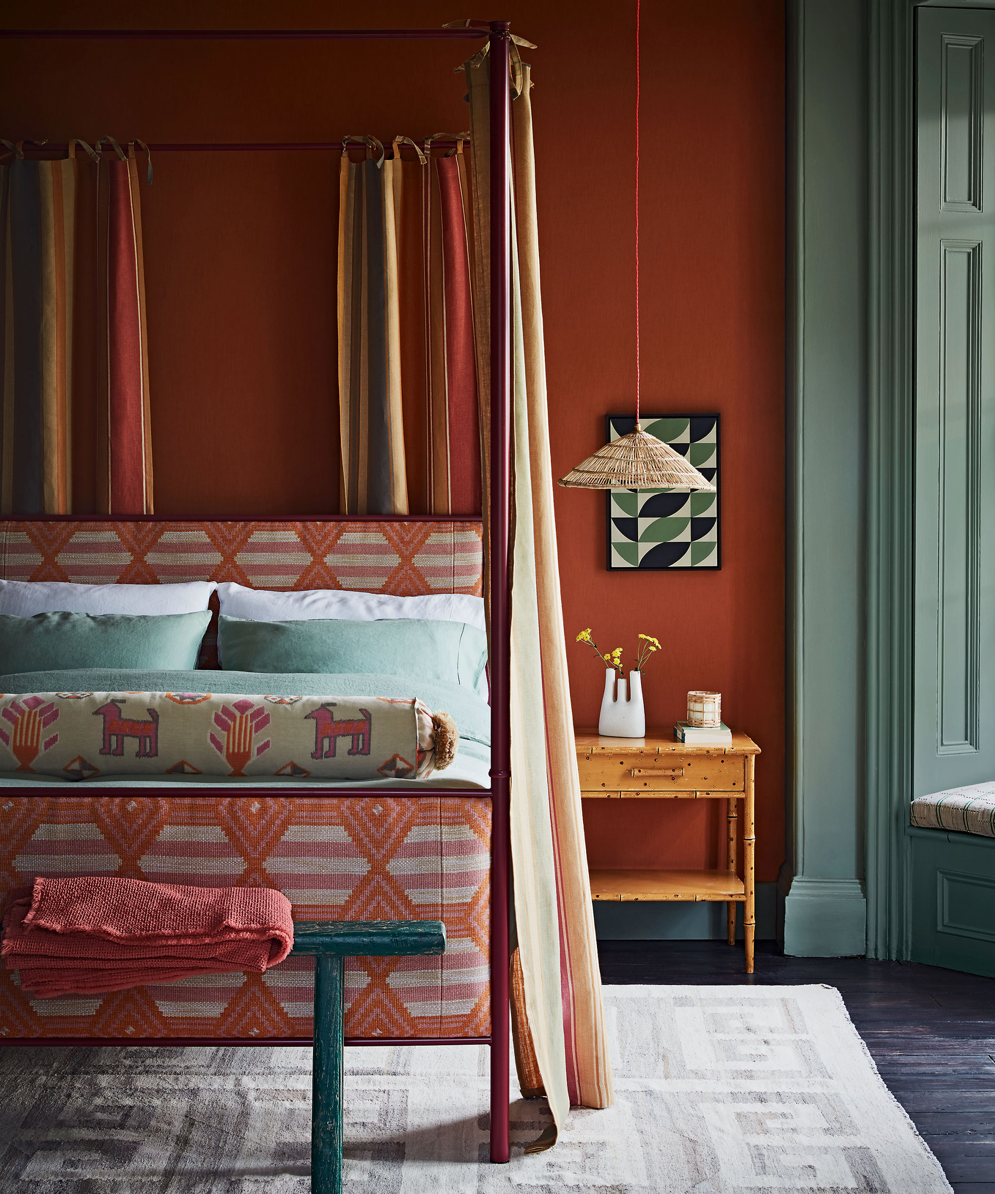
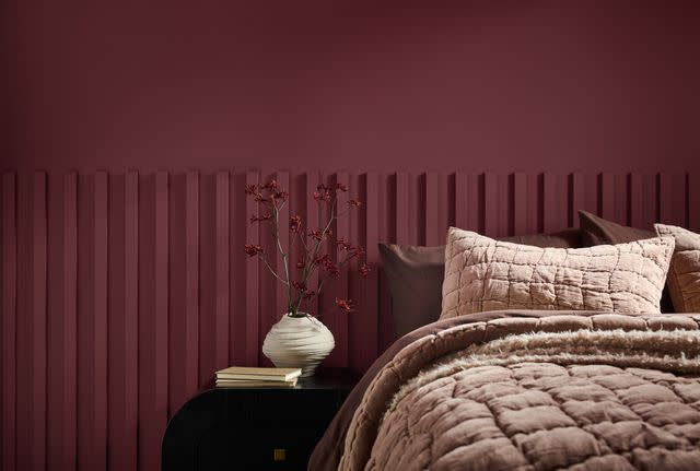
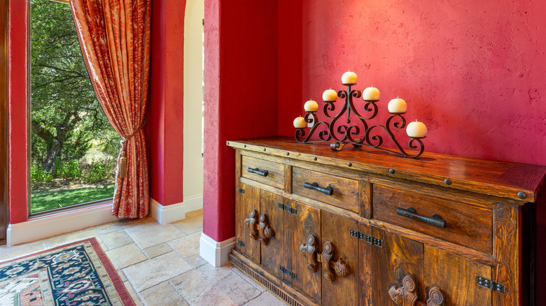
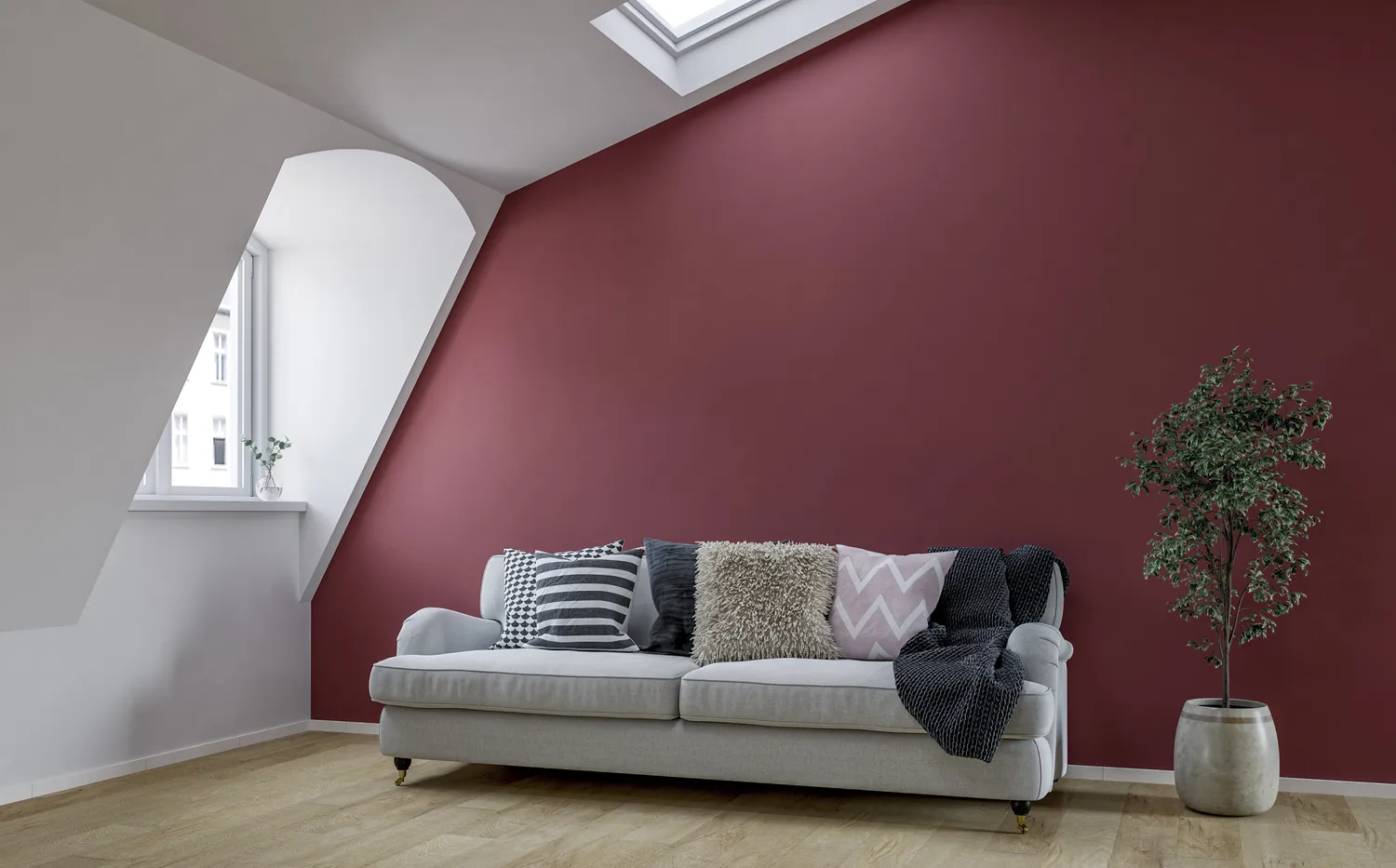
Bright red is another color facing a decline in designer preference. Nolan notes that classic, fire-engine red lacks the depth and dimension favored in contemporary interiors. She recommends richer, moodier reds like burgundy and oxblood, which provide a more refined and nuanced aesthetic suitable for modern homes. Similarly, plum purple is deemed by Dijana Savic-Jambert of Maredi Design to be an overpowering color that tends to dominate a space rather than enhance it, despite its recent trendiness. Designers are moving away from such dominant hues in favor of colors that integrate more harmoniously within a room's overall design.
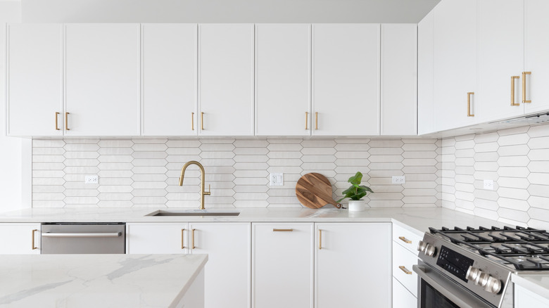
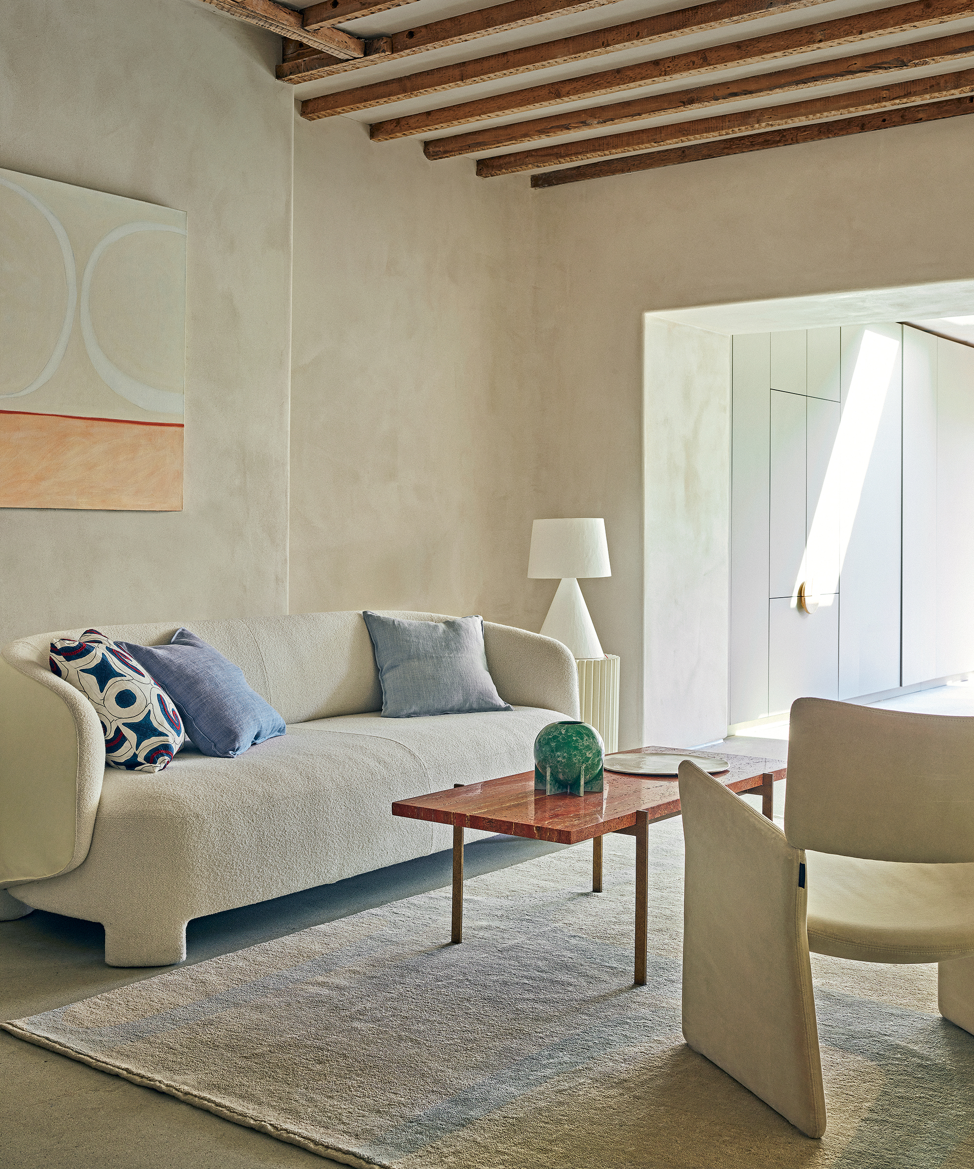
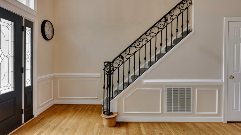
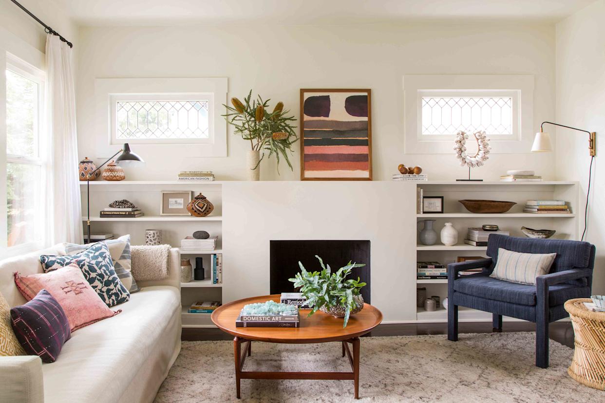
Cool white is also on the list of colors to avoid. Nolan finds cool white to be stark and one-dimensional, particularly in spaces intended to feel warm and inviting. While white remains a popular choice, designers advocate for warmer, chalky off-whites that contribute to a softer, more lived-in atmosphere. Savic-Jambert echoes this sentiment, emphasizing the distinction between a welcoming white and one that appears too bleached or sterile.
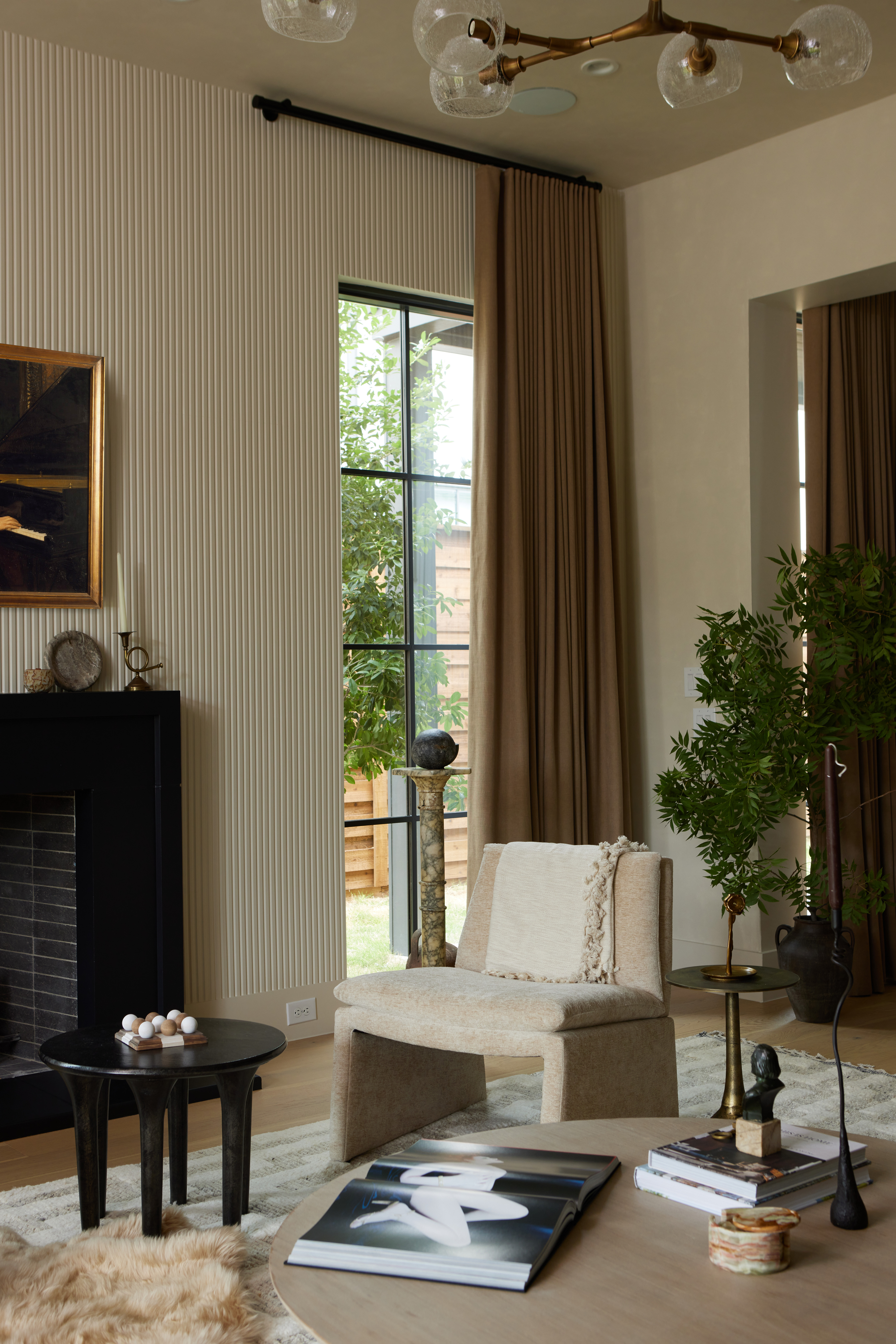
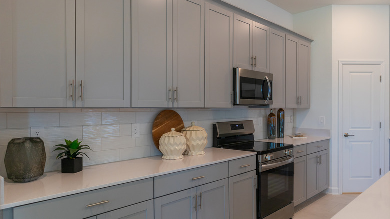
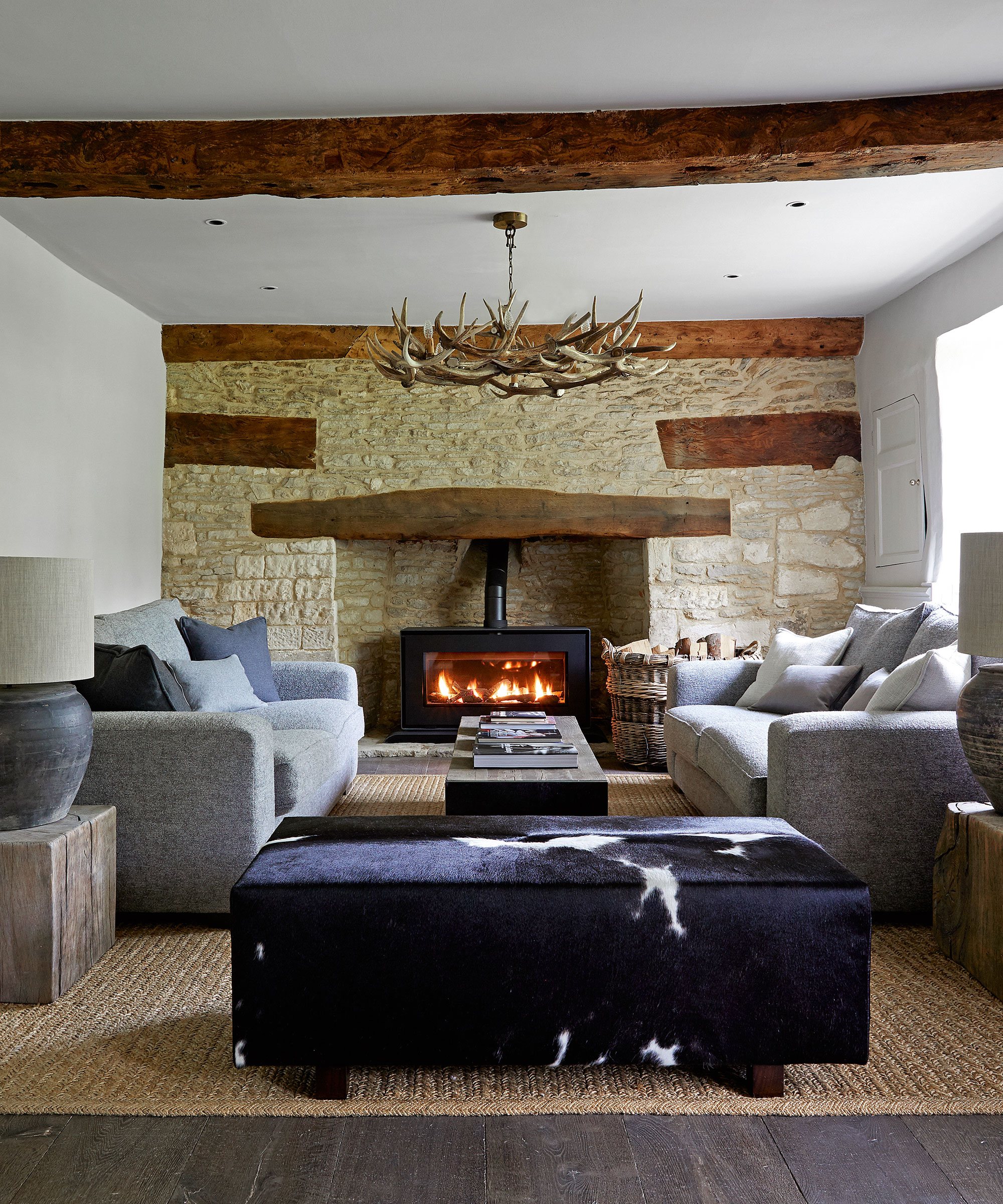
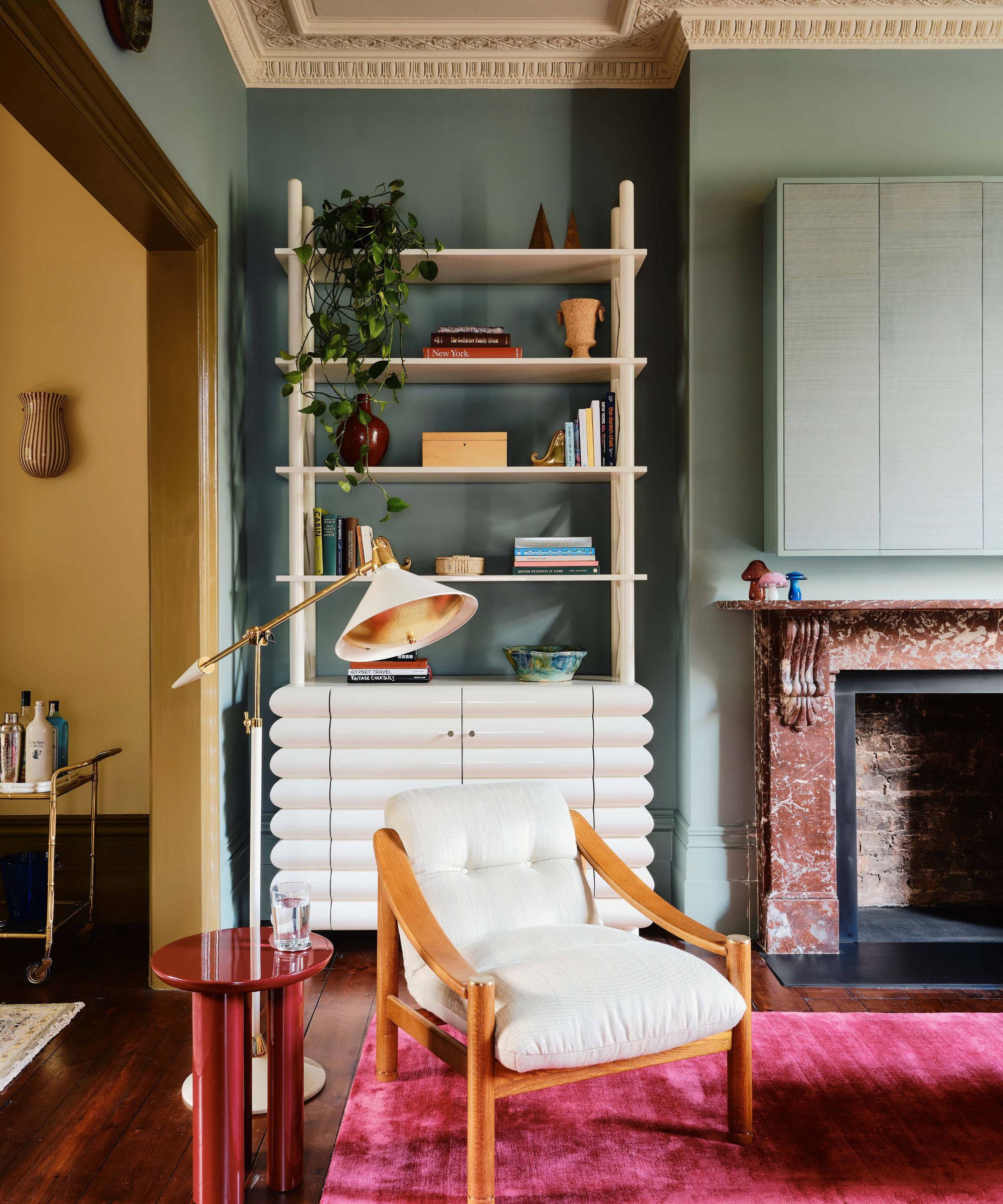
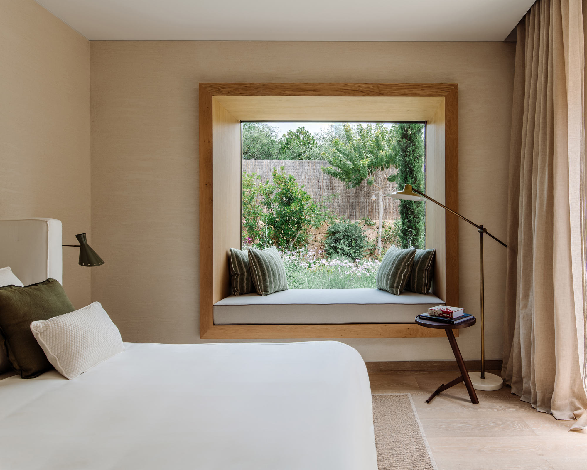
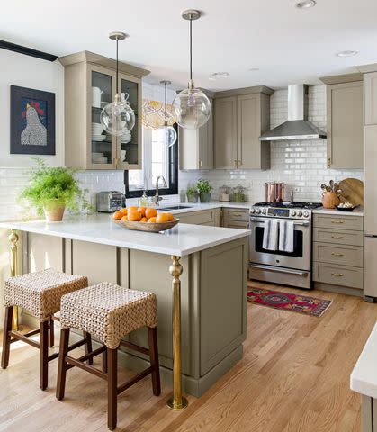
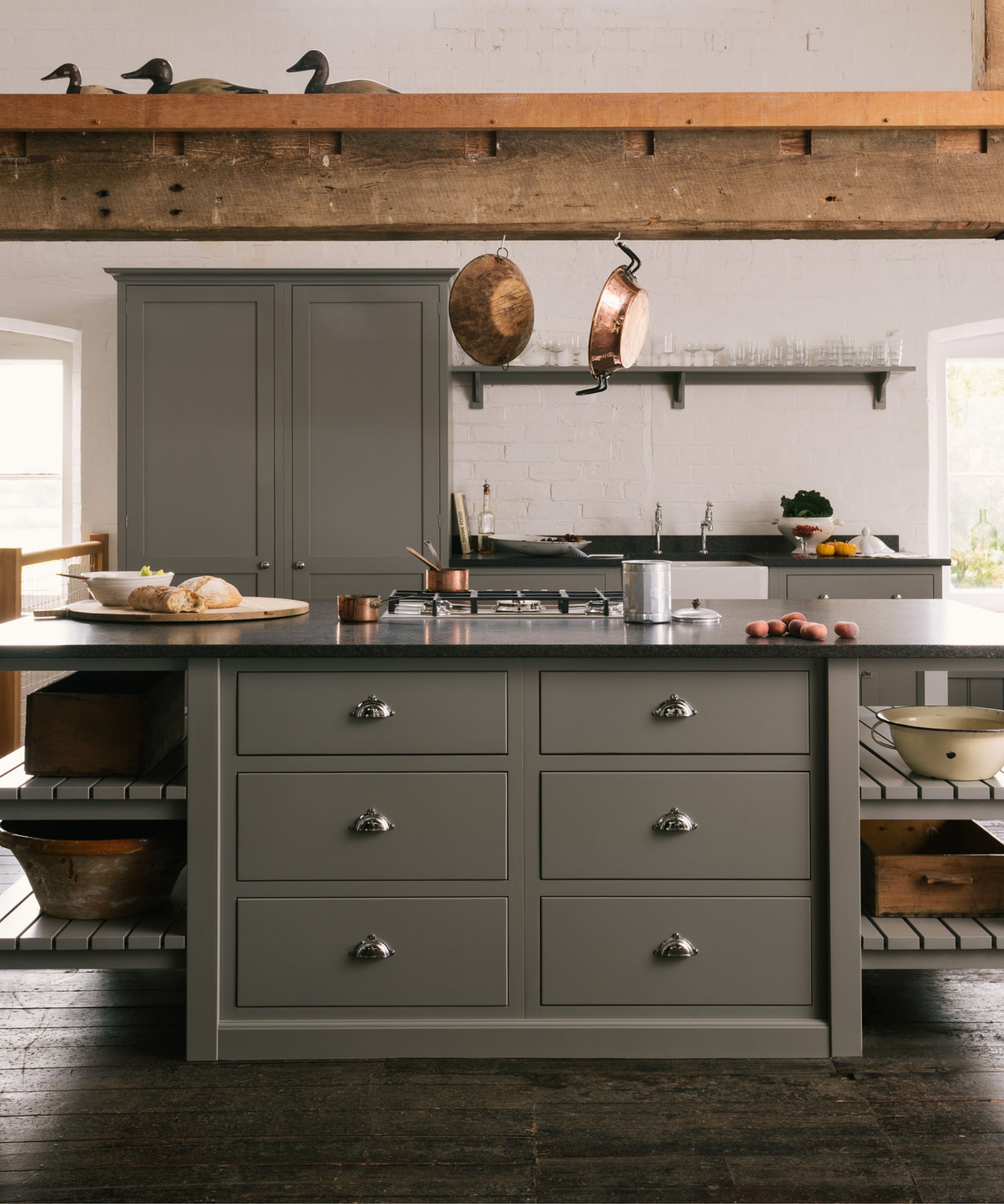
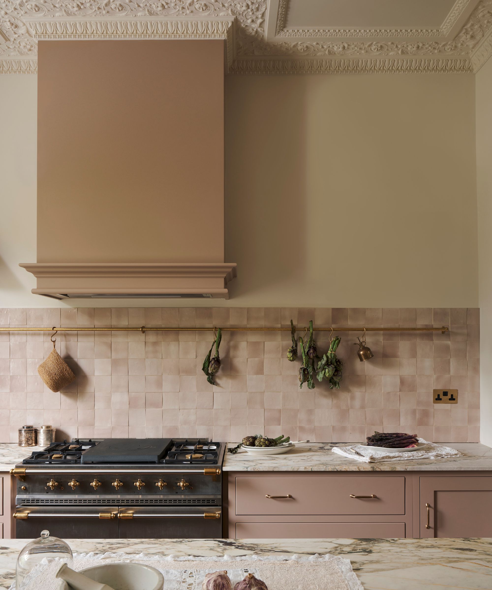
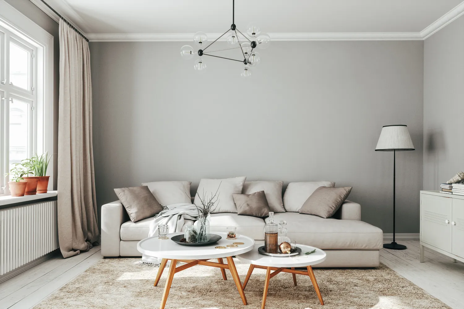
Gray, often referred to as "millennial gray," is another color designers believe has had its moment. Jones asserts that it is time to transition from gray to either more vibrant colors or lighter, warmer neutrals. This shift reflects a desire for interiors that are less cool and more inviting. Following this, greige, a combination of gray and beige, is also identified as a color that has lost its appeal due to its ubiquity. Savic-Jambert suggests that greige has become a default choice, consequently losing its distinctive character. Designers now encourage the use of other warm neutrals that can bring more personality and warmth to a space.
Overall, the trend is moving away from overly specific, sometimes stark, or overly saturated colors, and towards more sophisticated, complex, and warmer tones. While these colors are being de-emphasized by designers, the overarching message remains that personal happiness with one's home decor should be the guiding principle, rather than strict adherence to trends.
#PaintColors #InteriorDesignTrends #HomeDecor #OutdatedColors #ColorTrends2026 #DesignersRecommendations #NeutralColors #WarmTones #HomeRenovation #PaintColors #InteriorDesignTrends #HomeDecor #OutdatedColors #ColorTrends2026 #DesignersRecommendations #NeutralColors #WarmTones #HomeRenovation
0 تعليق إجمالاً
 لا توجد تعليقات بعد
قد تعجبك أيضًا
9 colors designers won’t be using in their living rooms in 2025

8 Paint Color Trends You'll ACTUALLY Want to Live With in 2026, According to Designers

6 entryway paint colors going out of style for 2024 – and the shades to use instead

6 Outdated Bathroom Paint Colors Designers Say You Should Never Use
9 Outdated Kitchen Cabinet Colors We Hope To Never See In 2026
The 5 outdated paint colors of 2024 designers loathe — and what they're loving instead

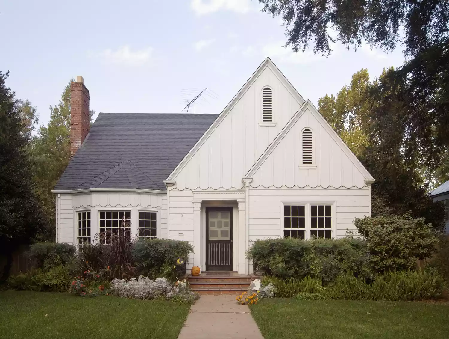
6 Outdated Exterior Paint Colors Designers Would Be Happy to Never See Again

These 6 Colors Will Rule Interiors in 2026, According to Experts

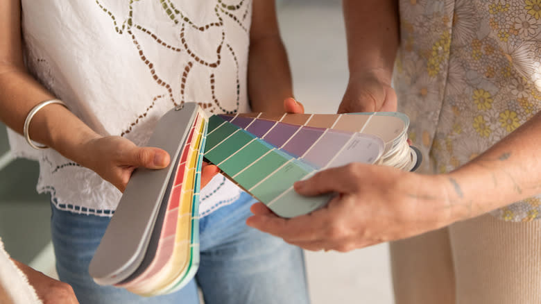
9 Outdated Kitchen Cabinet Colors We Hope To Never See In 2026

6 Paint Colors Going Out of Style in 2026

5 Paint Colors That Experts Say You Shouldn't Use in 2025

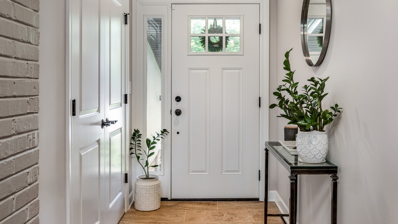
Outdated Entryway Paint Colors To Avoid In 2025 (And What To Try Instead)
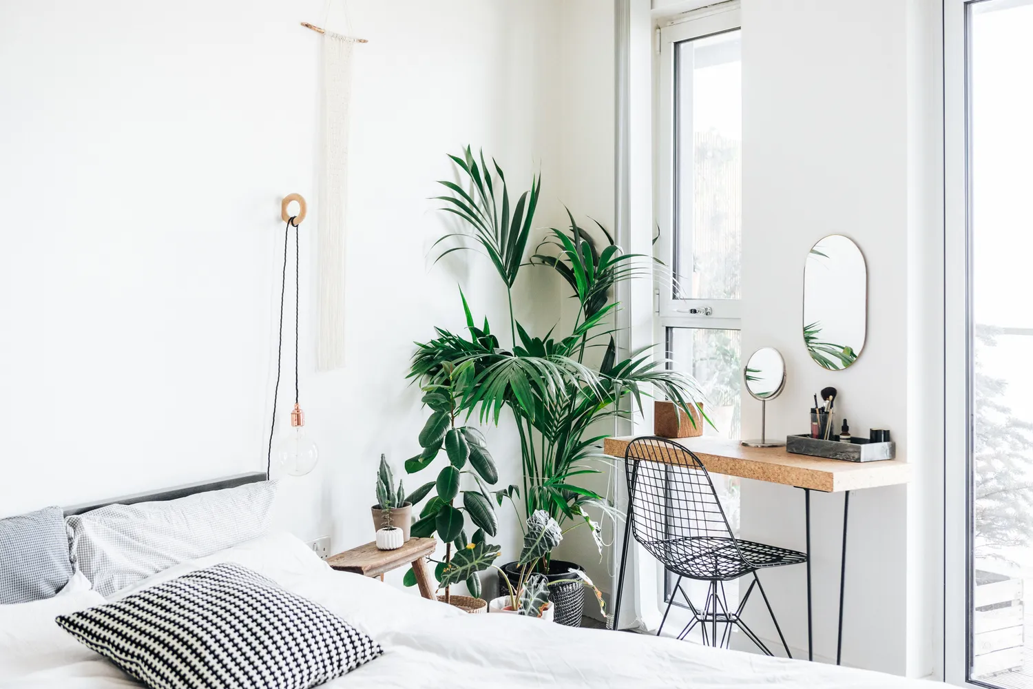
6 Bedroom Paint Colors Designers Don't Want to See in 2026

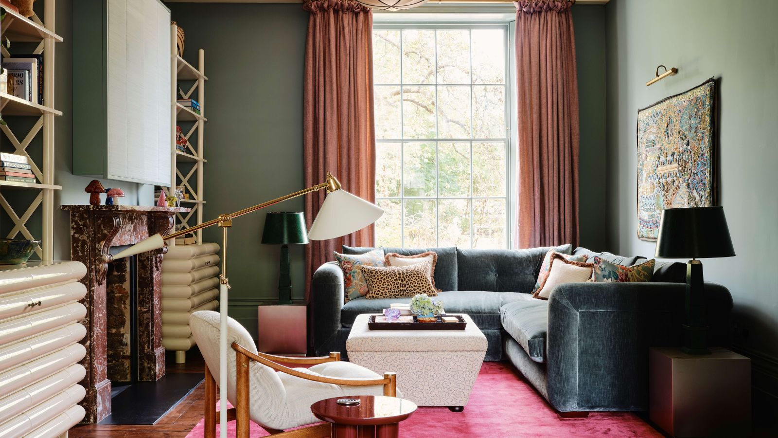
According to Designers, These Are The Outdated Color Trends for 2026

4 Outdated Colors Designers say you Should Steer Clear of When Decorating a Living Room

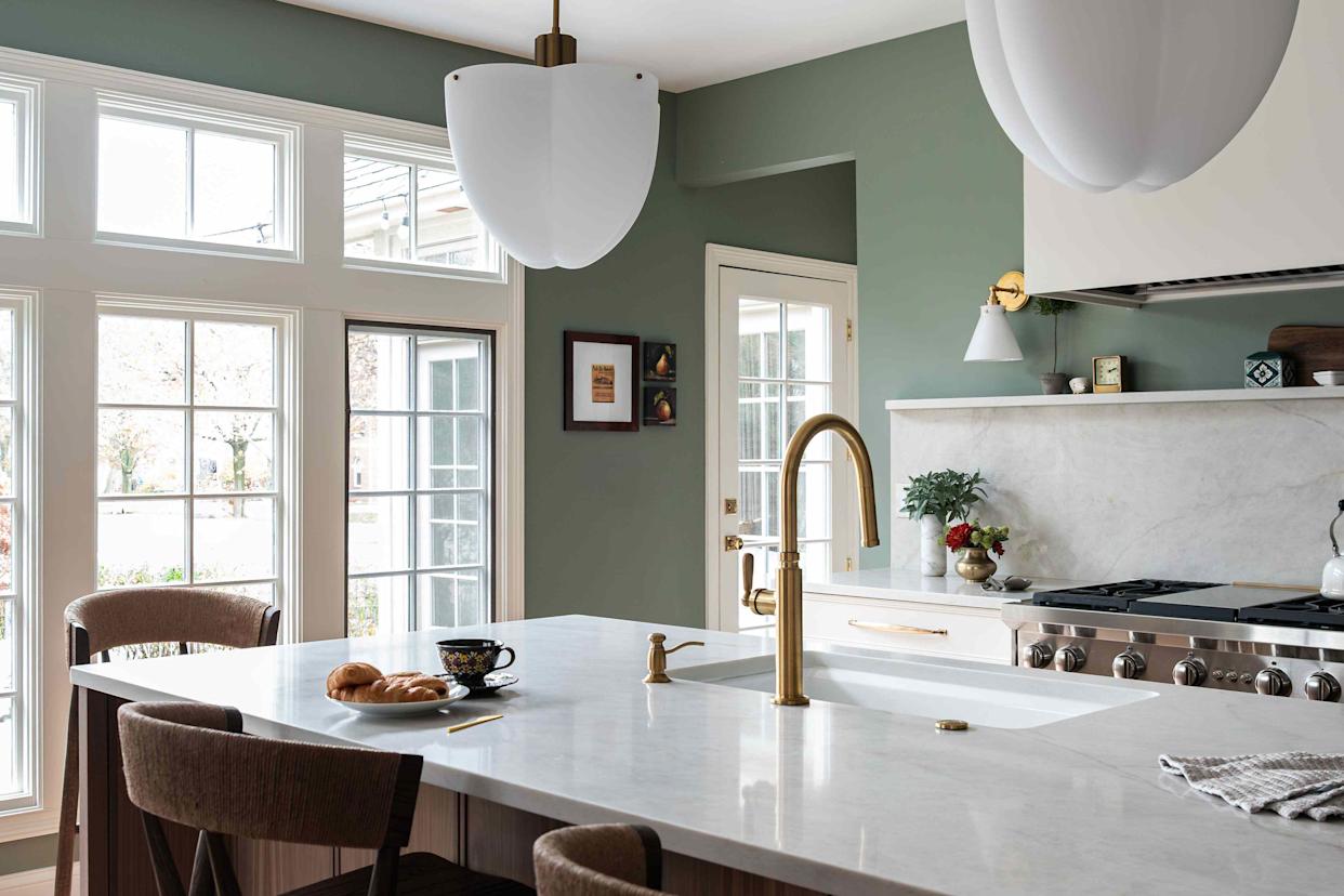
6 Kitchen Paint Color Trends That Are Already Taking Over Walls in 2026
What couch colors are going out of style in 2025? Designers say these 6 shades should be avoided
6 bedroom paint colors going out of style for 2024 – and the colors to use instead
Kitchen paint colors going out of style – 3 shades designers are ditching in 2025
6 Colors Designers Say to Skip in 2026—Yes, Even This Popular Neutral