1/5
How to decorate with Dead Salmon, Farrow & Ball's perfect earthy pink

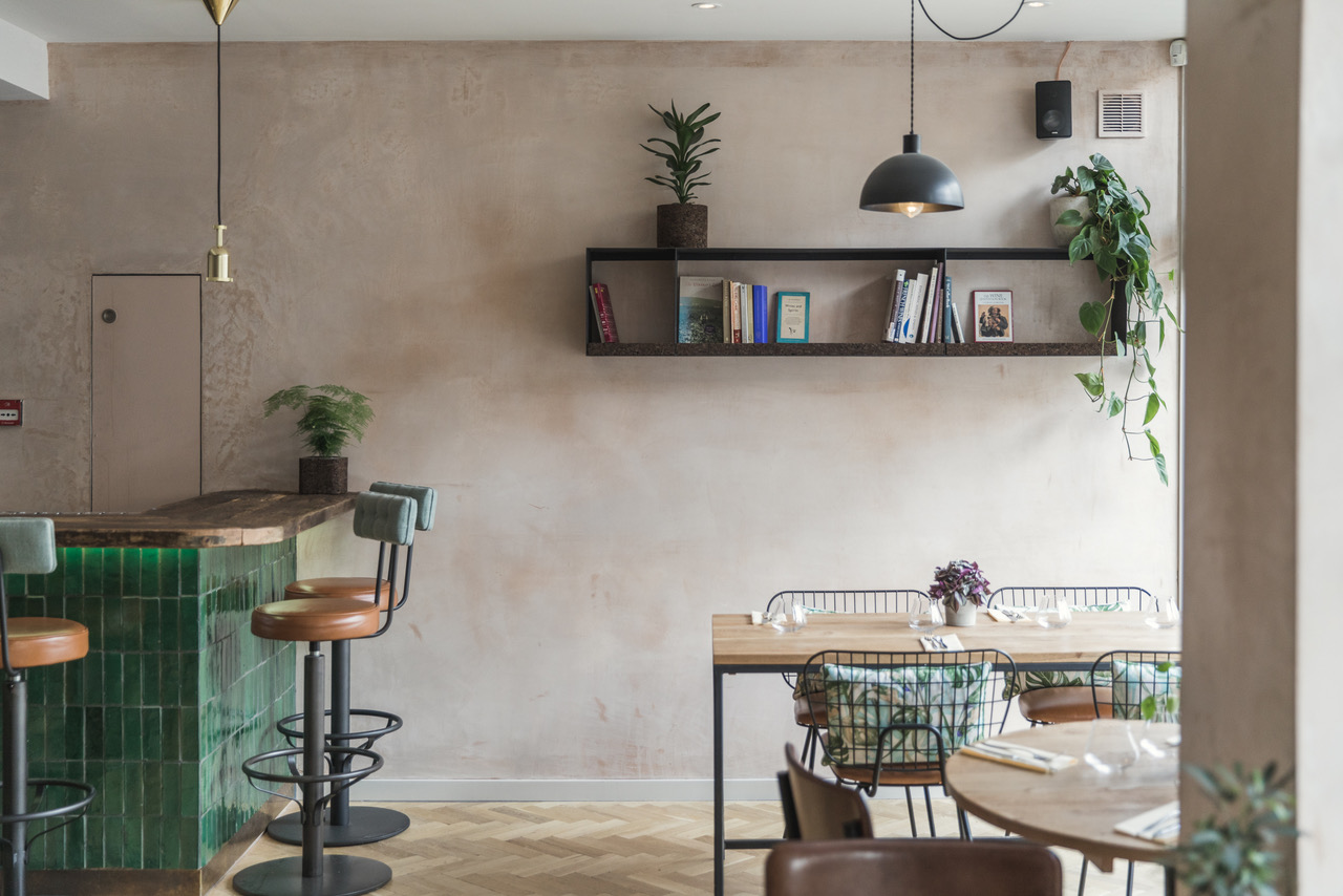
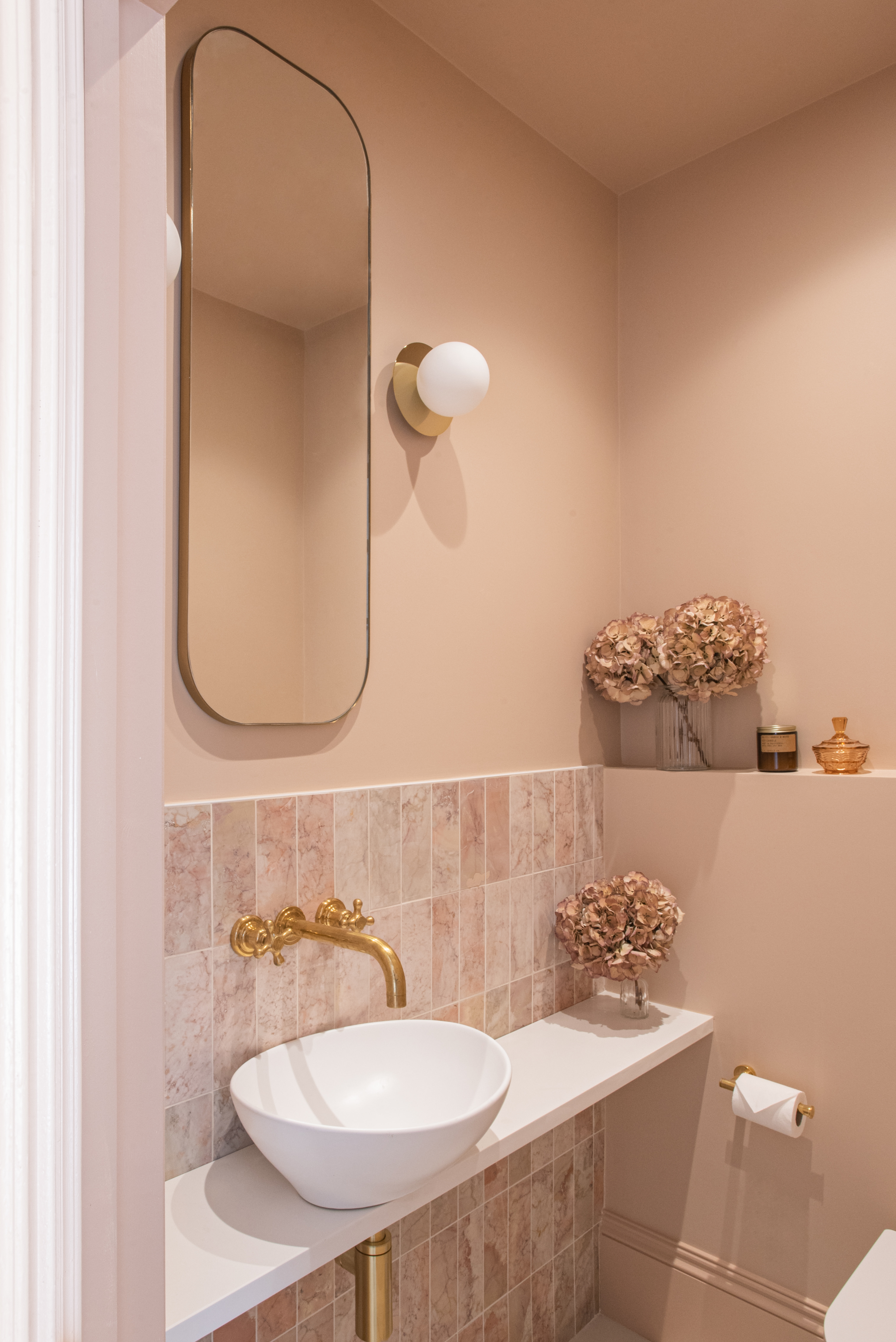
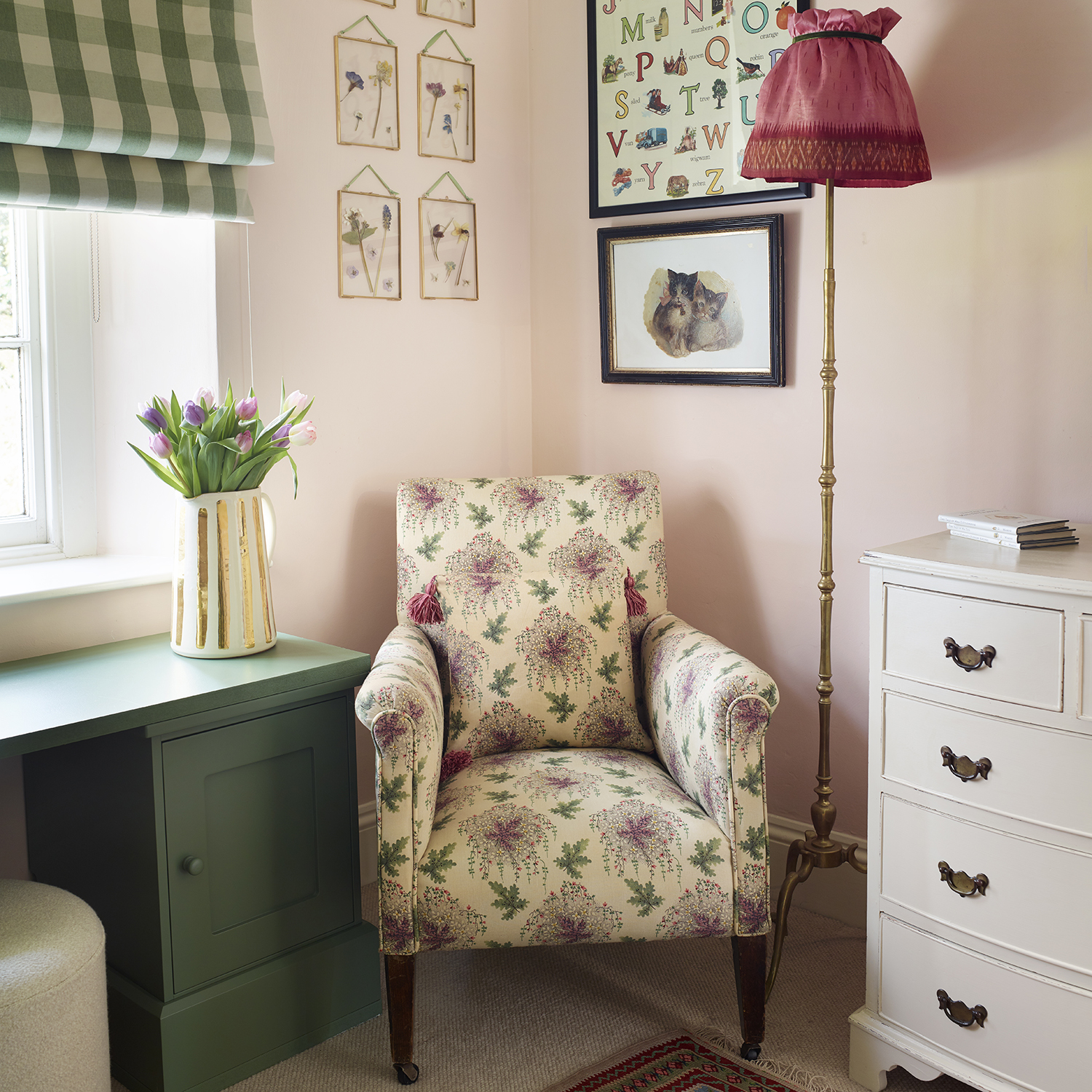
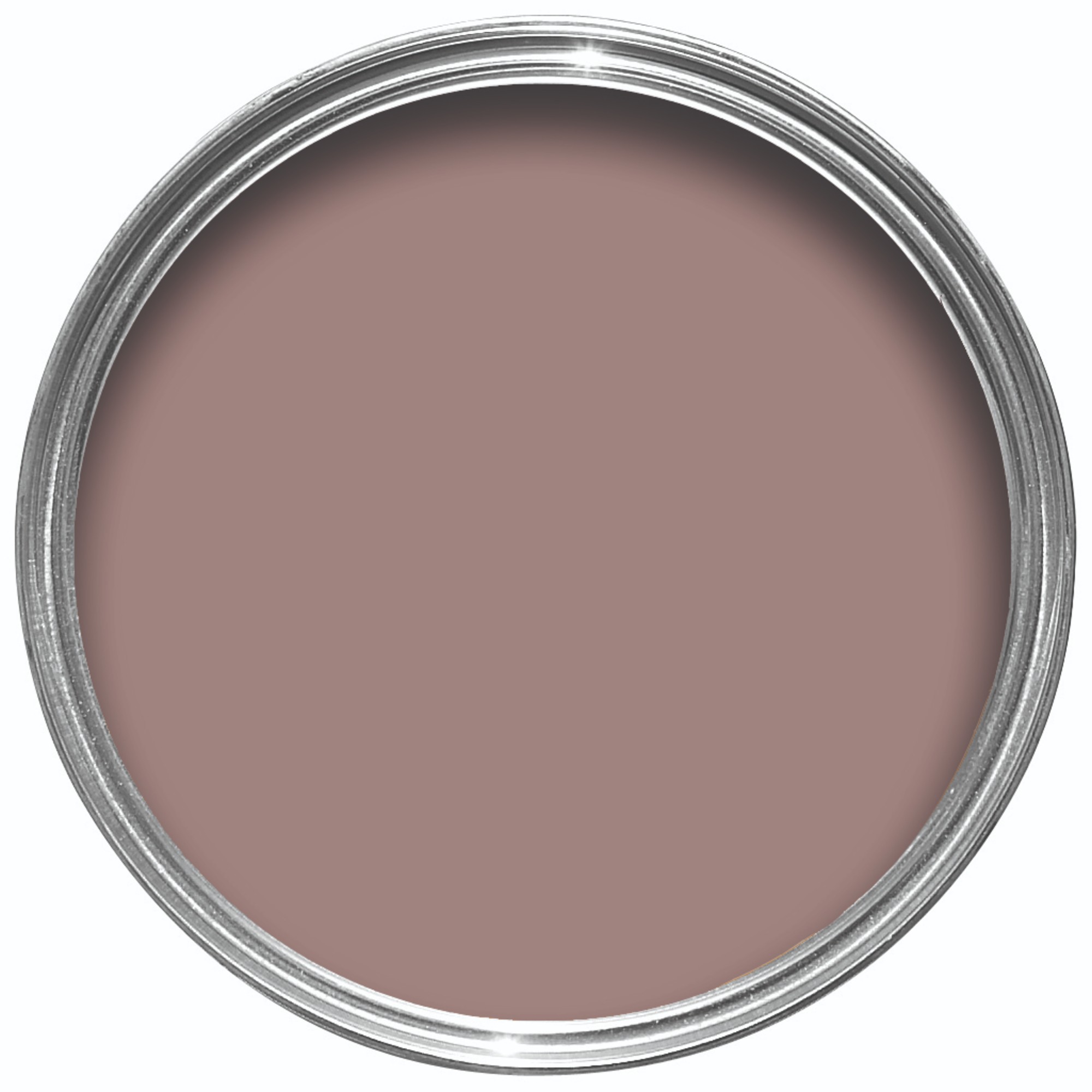
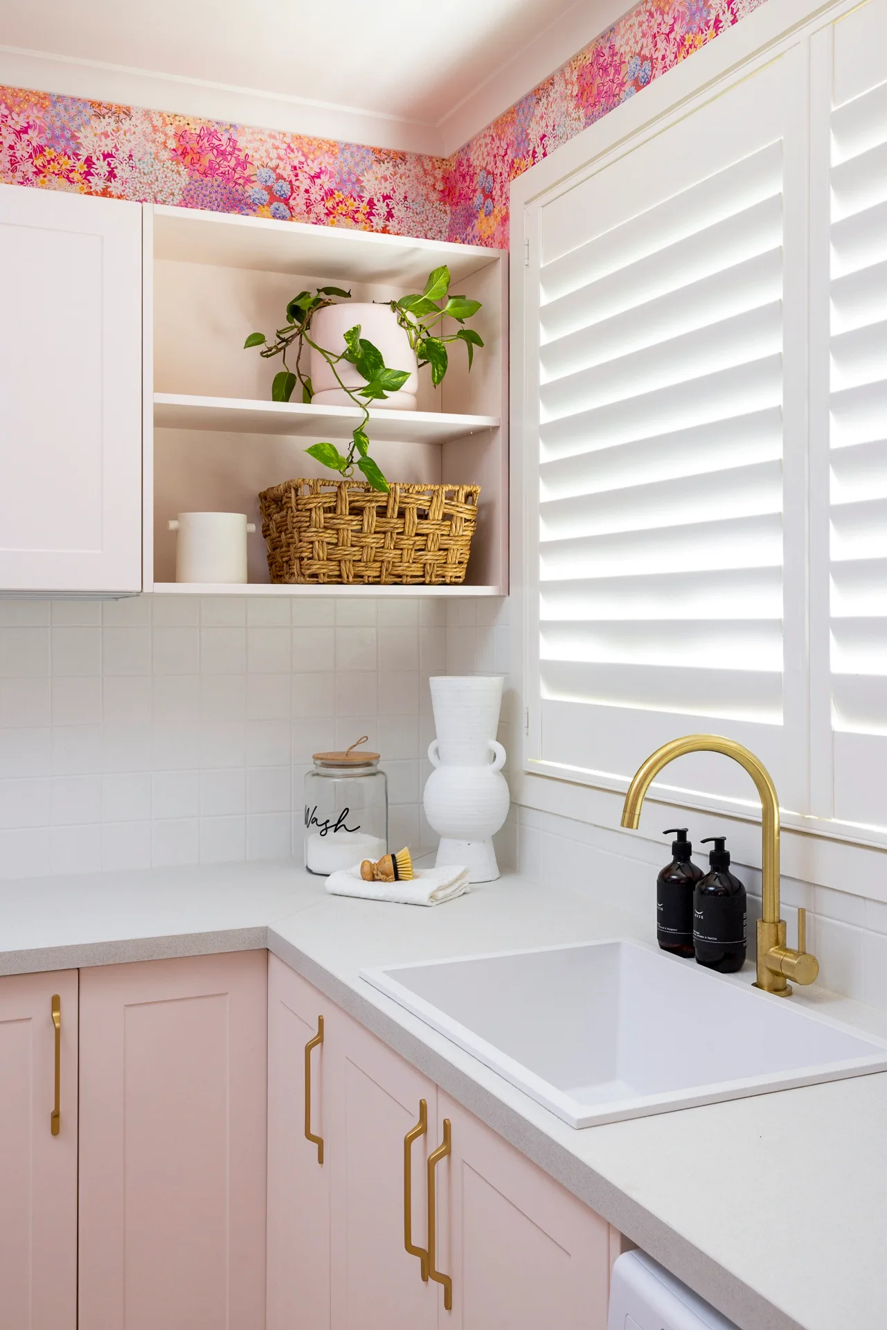
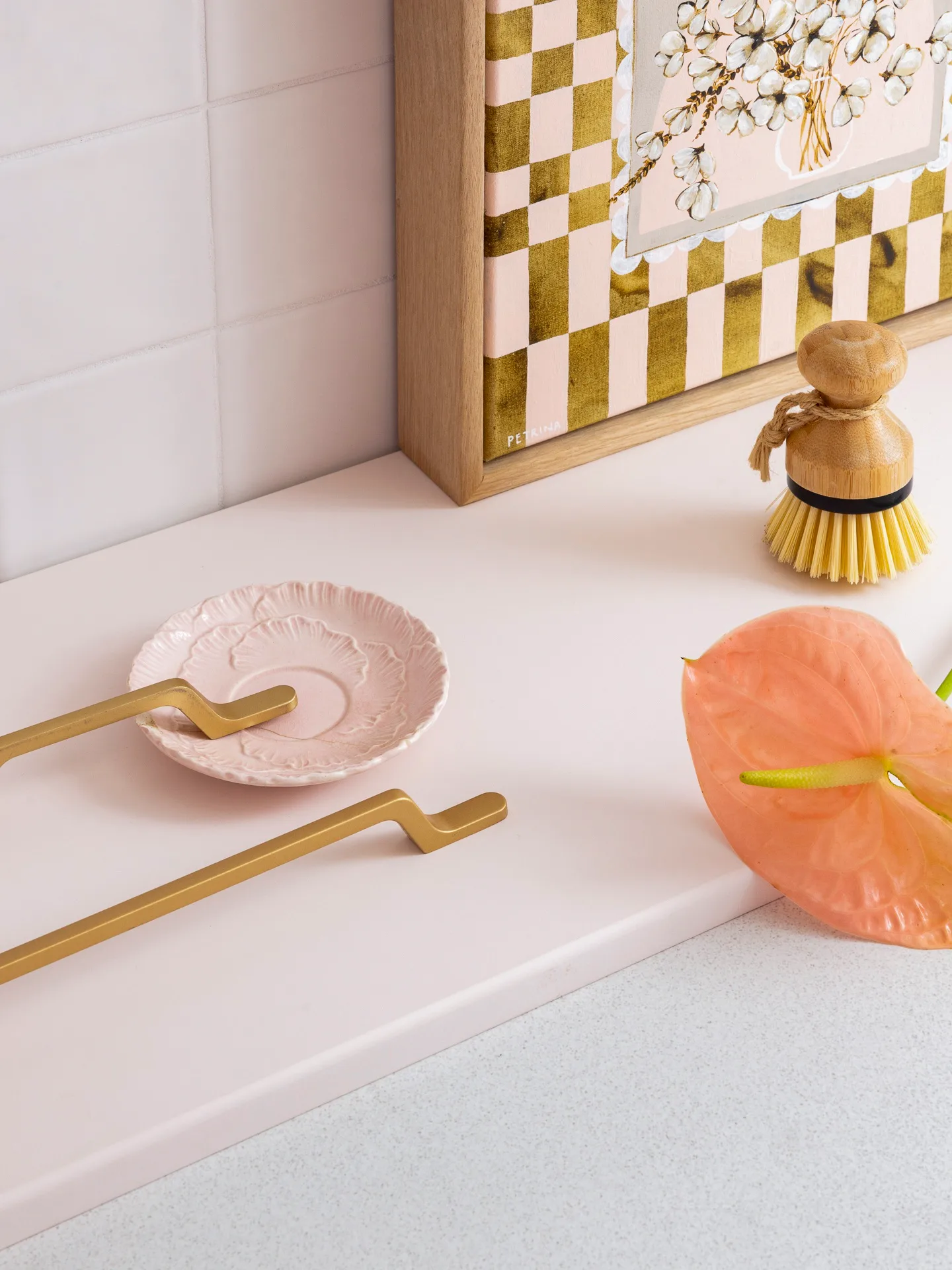
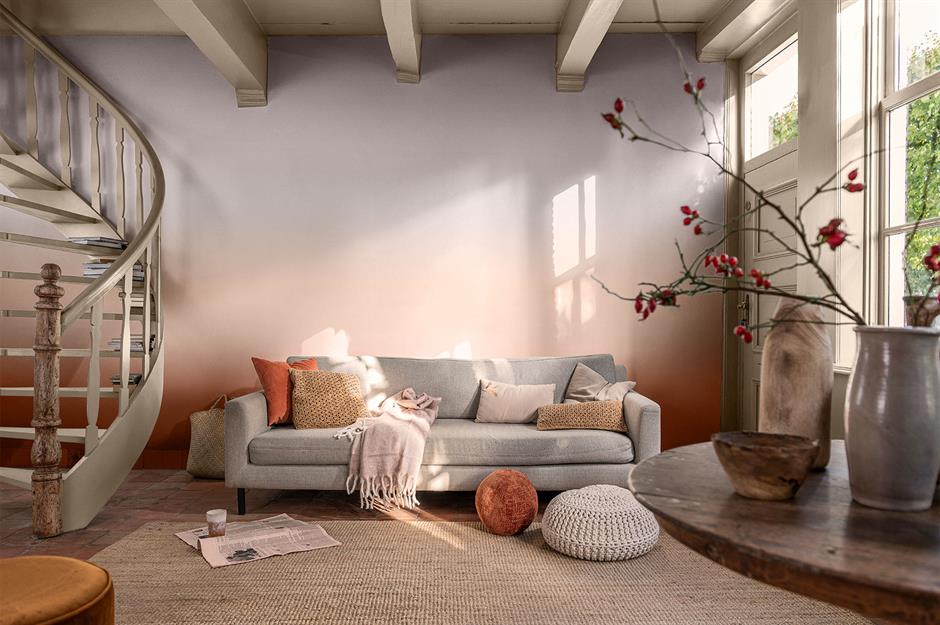
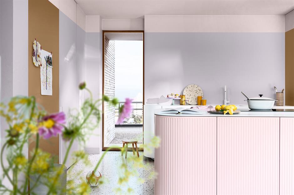
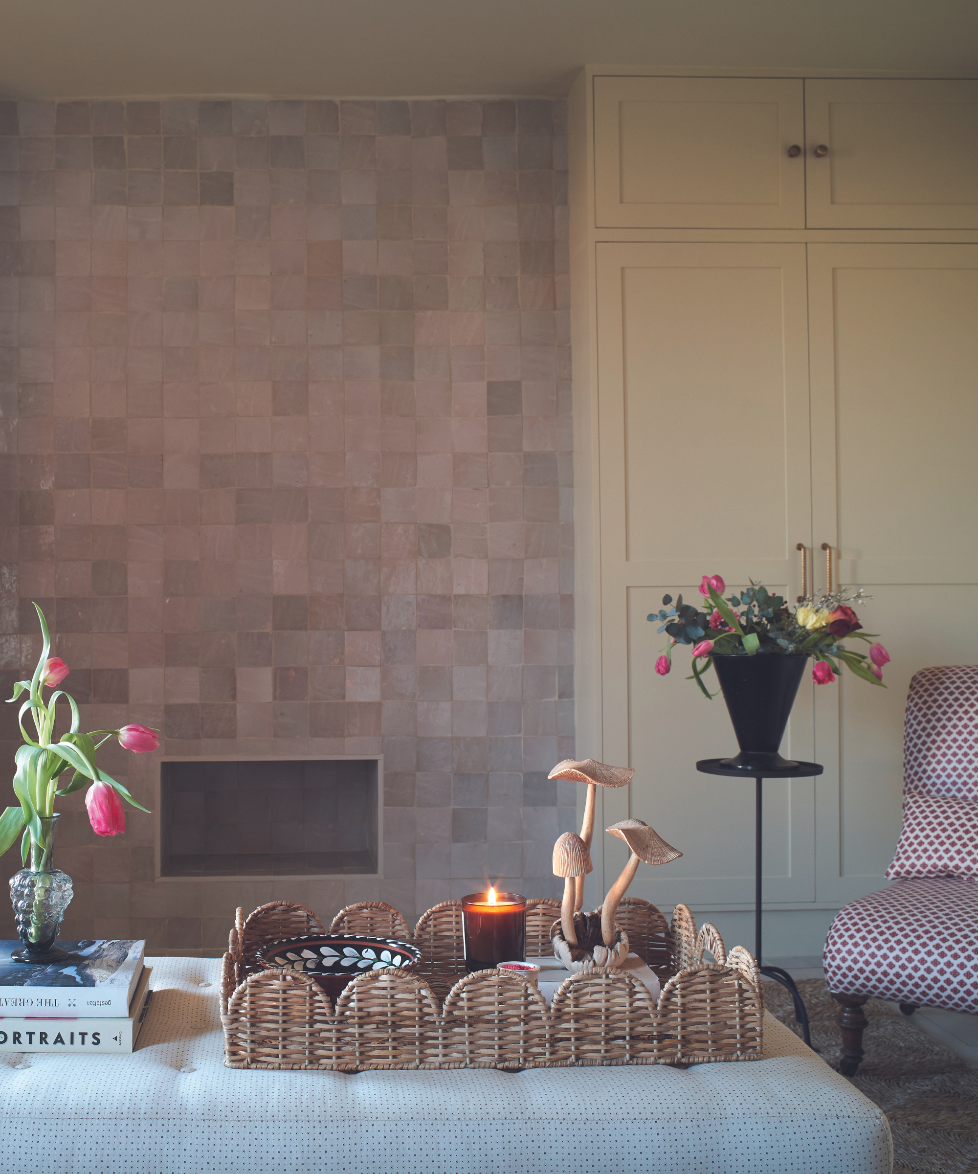
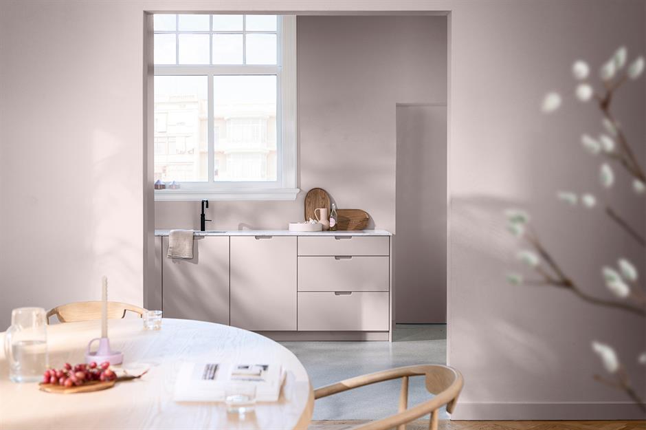
Farrow & Ball's 'Dead Salmon' is a best-selling paint shade, despite its unusual name, renowned for its versatility and sophisticated balance between pink and neutral tones. This unique color possesses a chameleon-like quality, appearing as a muted pink, light brown, or a blend of both, depending on the lighting conditions of a room. This adaptability ensures it works well in various settings, offering warmth and a pop of color without being overtly sweet or childish. Interior designers and color experts highlight its ability to transform, making it a grown-up option for introducing pink into home decor.
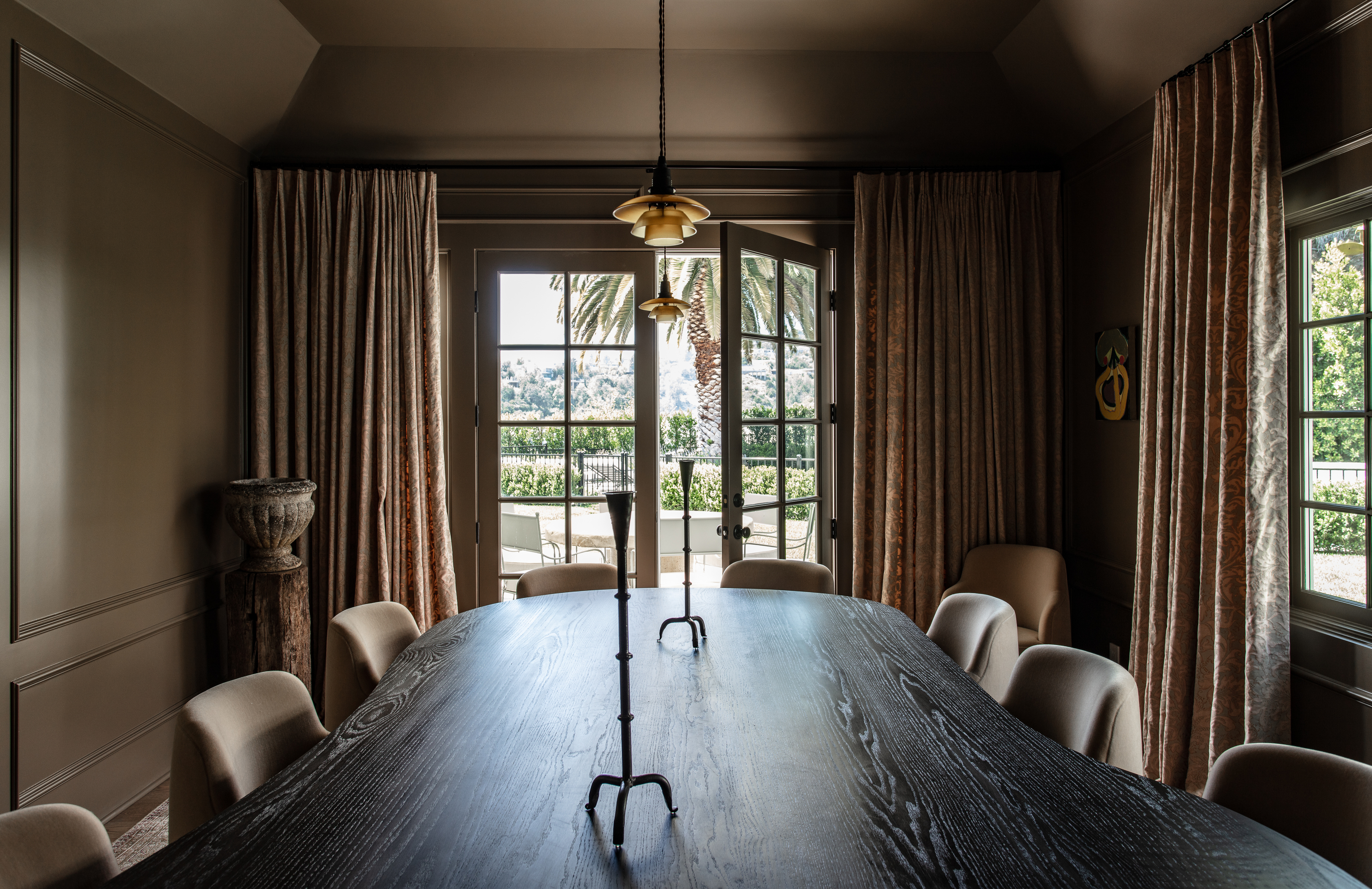
Experts describe Dead Salmon as a 'deep salmon pink' that can also be perceived as a 'strong mushroom steeped in history, or a warming buff neutral.' Patrick O'Donnell of Farrow & Ball explains that its 'brown-tinged drab pink' quality shifts between mushroom, buff, and salmon depending on the light, drawing inspiration from the matt paint finish used at Kedleston Hall. This characteristic means the color can adapt to any lighting situation, maintaining its appeal.
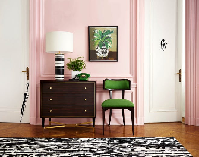
When decorating with Dead Salmon, designers suggest pairing it with specific colors to enhance its natural qualities. Bethany Adams recommends combining it with a creamy white trim to prevent it from looking too muddy, and adding black accents and a splash of chartreuse for a stylish and cool aesthetic. The paint's adaptability means there are few rigid rules for its use, as it harmonizes with a variety of other colors. However, due to its transformative nature, it is crucial to order samples and test the color in the intended space to observe how it behaves under different lights.
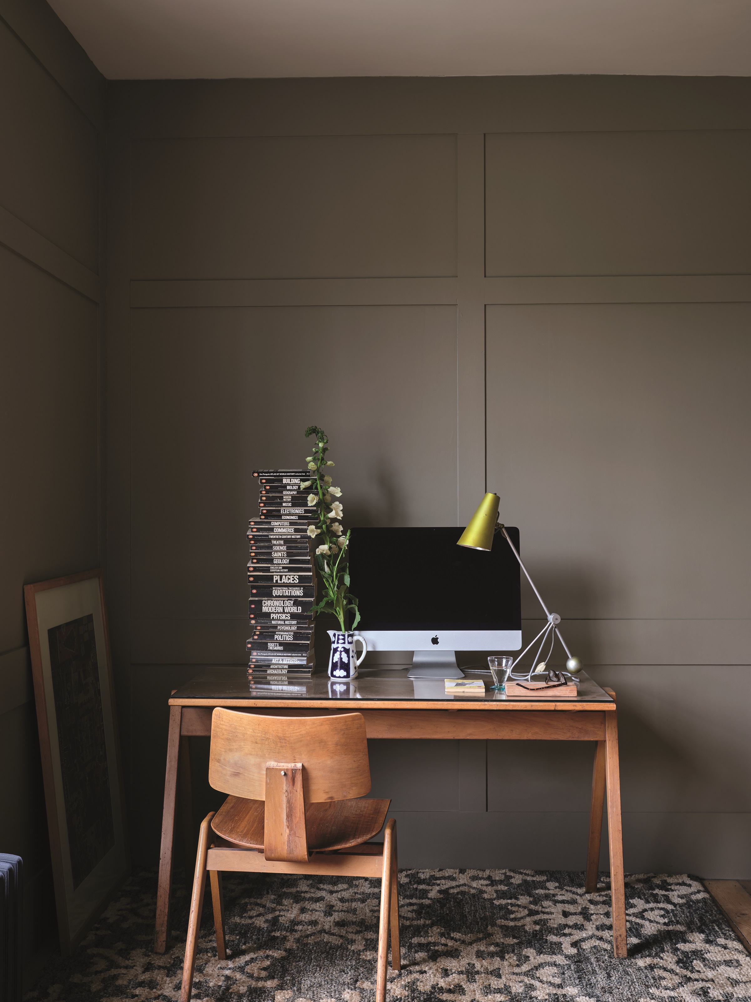
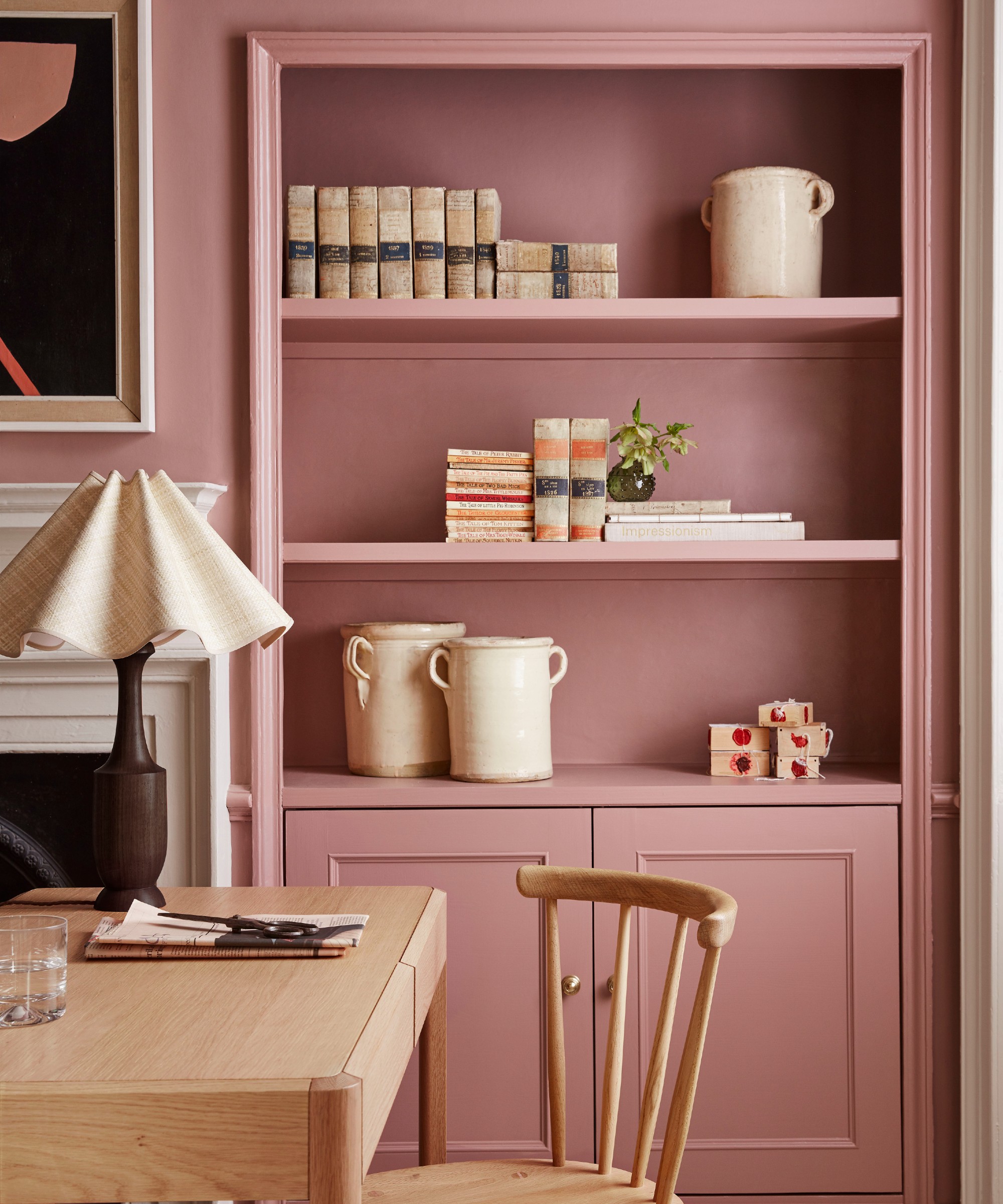
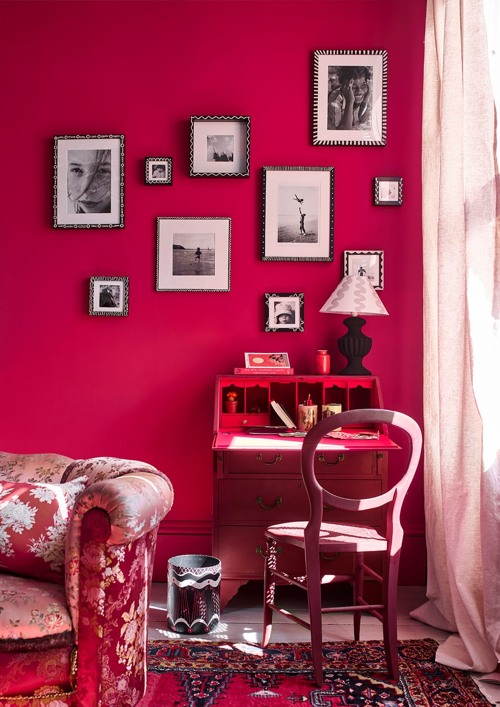
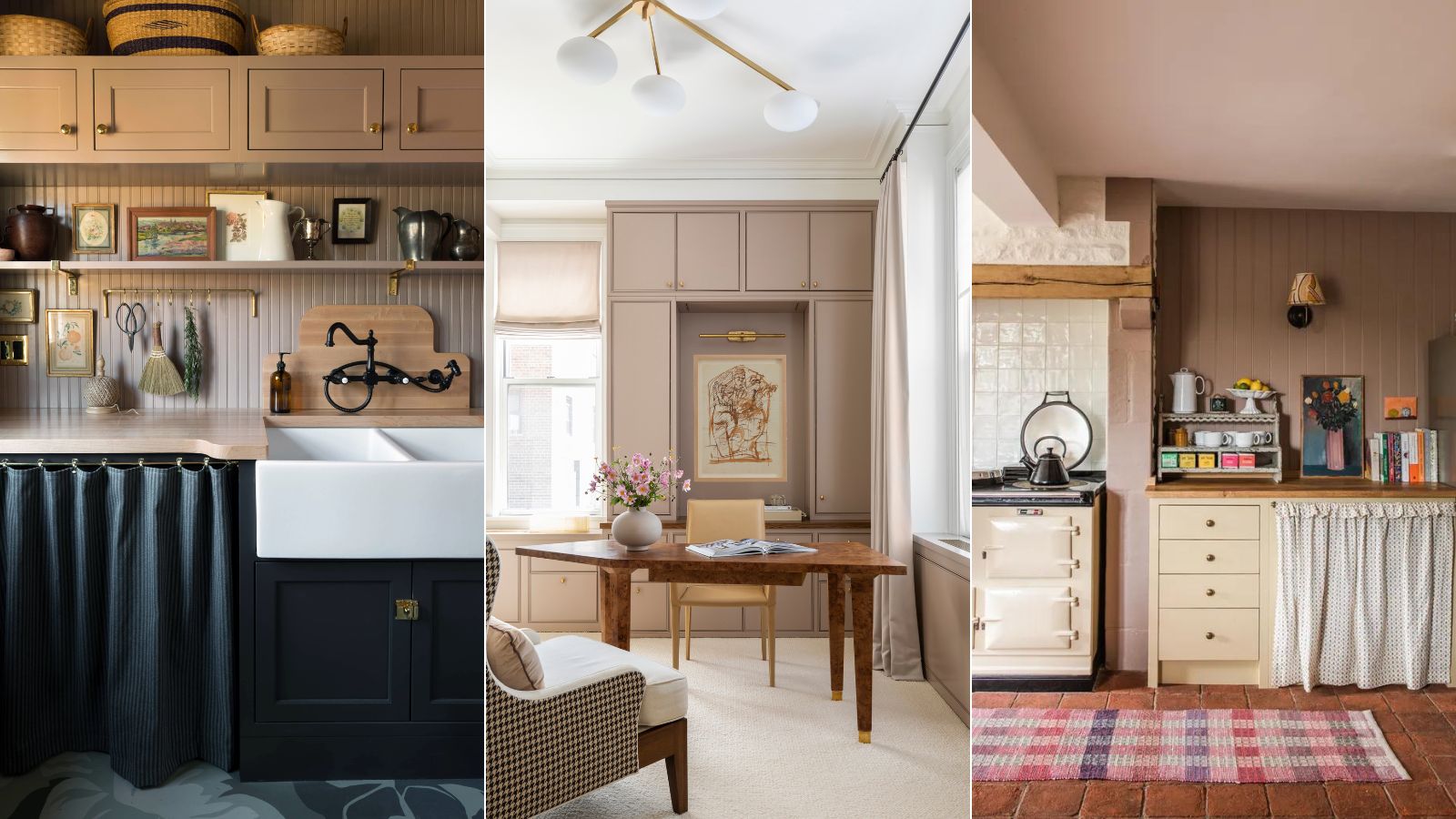
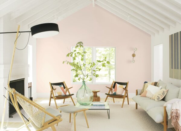
One approach to using Dead Salmon is to freshen its muted tones with crisp whites. Marie Flanigan, a designer who favors this shade, notes its 'slight salmon undertones' and how it takes on 'a new life in different spaces, sometimes slightly more pink or brown depending on the light.' She demonstrates this by pairing it with a fresh white paint in a home office, which brightens the deep pink. Alternatively, Dead Salmon can be integrated into a tonal scheme with similar shades or deepened with rich reds or aubergines to create a dramatic, yet cozy, ambiance. Patrick O'Donnell suggests pairing it with delicate neutrals like Joa’s White for a soft scheme, or with Setting Plaster on woodwork or ceilings for a warm-toned counterpart. For a pop of color, Brinjal or a dark blue such as De Nimes can be introduced.
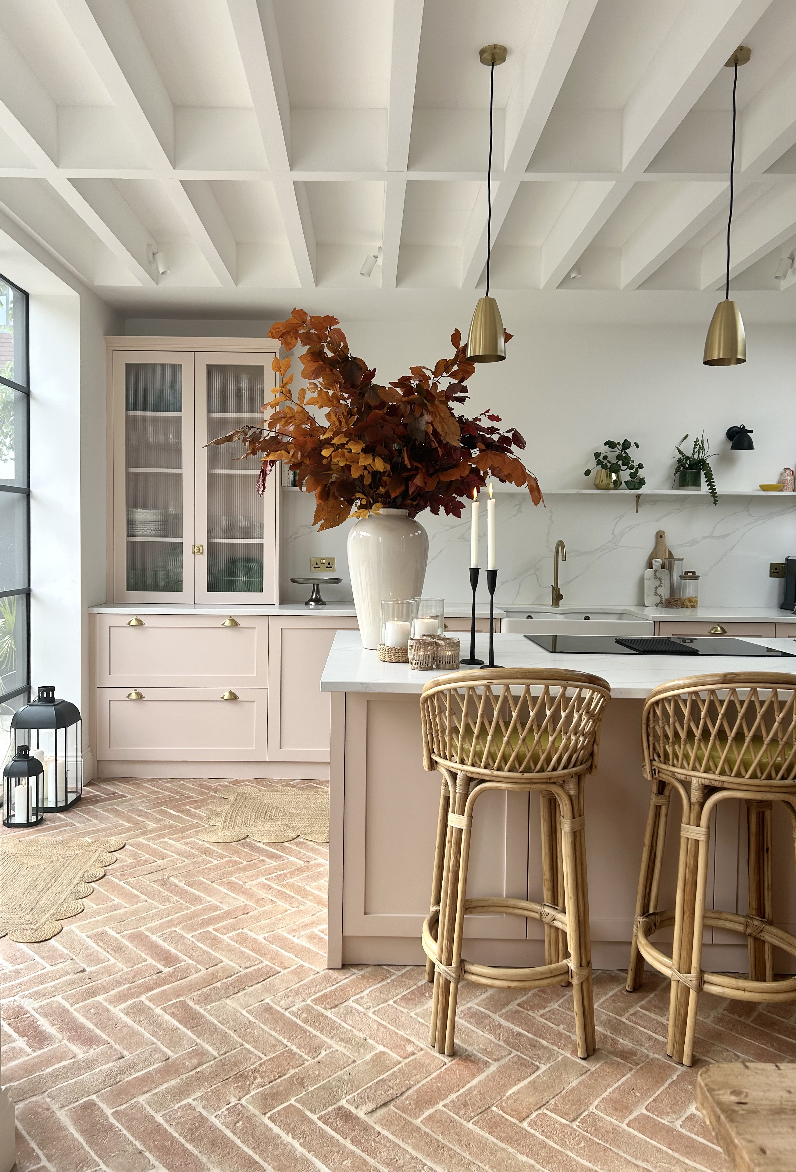
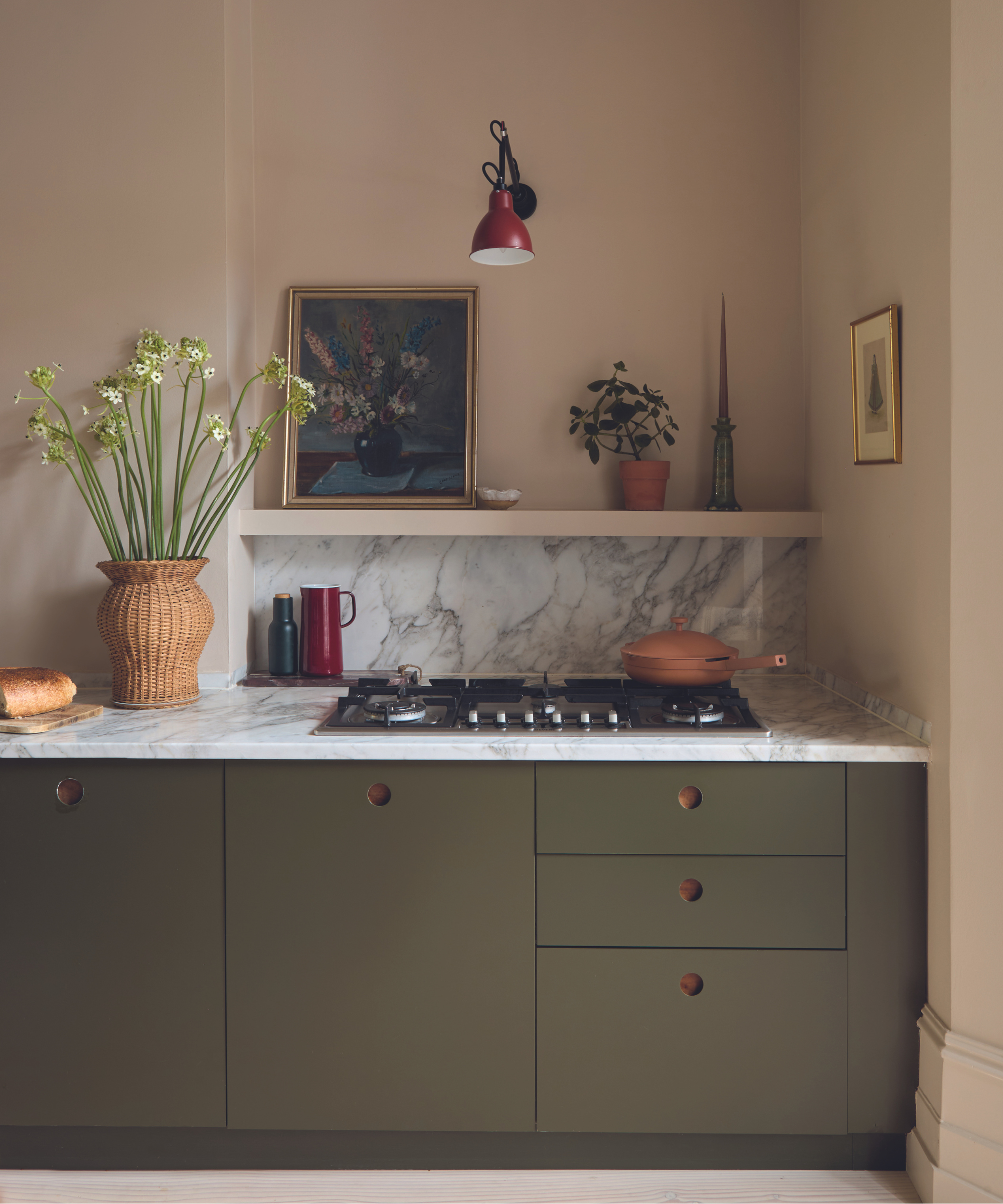
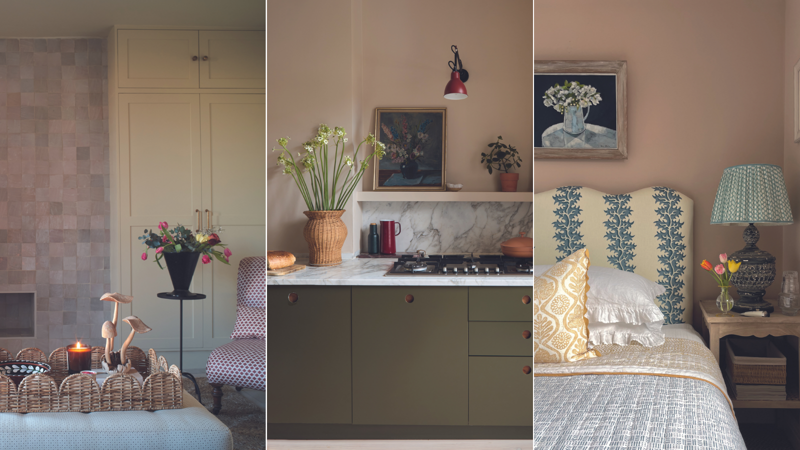
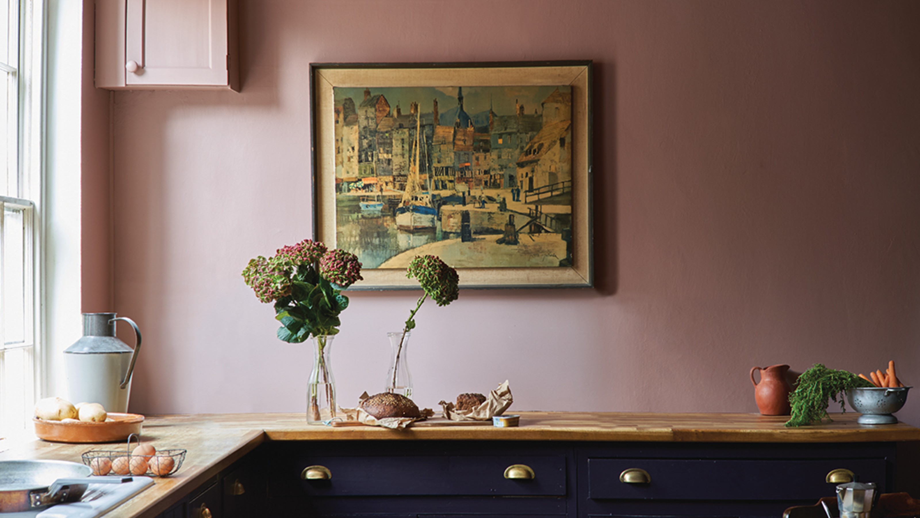
Dead Salmon is also highly effective in kitchen color schemes, particularly in rustic or country-style settings. Lisa Mehydene, founder of edit58, considers it an 'all-time favorite paint color' due to its ease of introduction and its ability to act as a neutral, grounding a space and providing an ideal backdrop for art, fabrics, and furniture. She notes its 'magical quality' to appear brown or pink depending on the light and surrounding colors. In her Cotswolds kitchen, she paired Dead Salmon with Atelier Ellis 'Pollen' painted kitchen cabinetry, creating a 'Rhubarb and custard effect' that feels traditional, warm, and inviting.
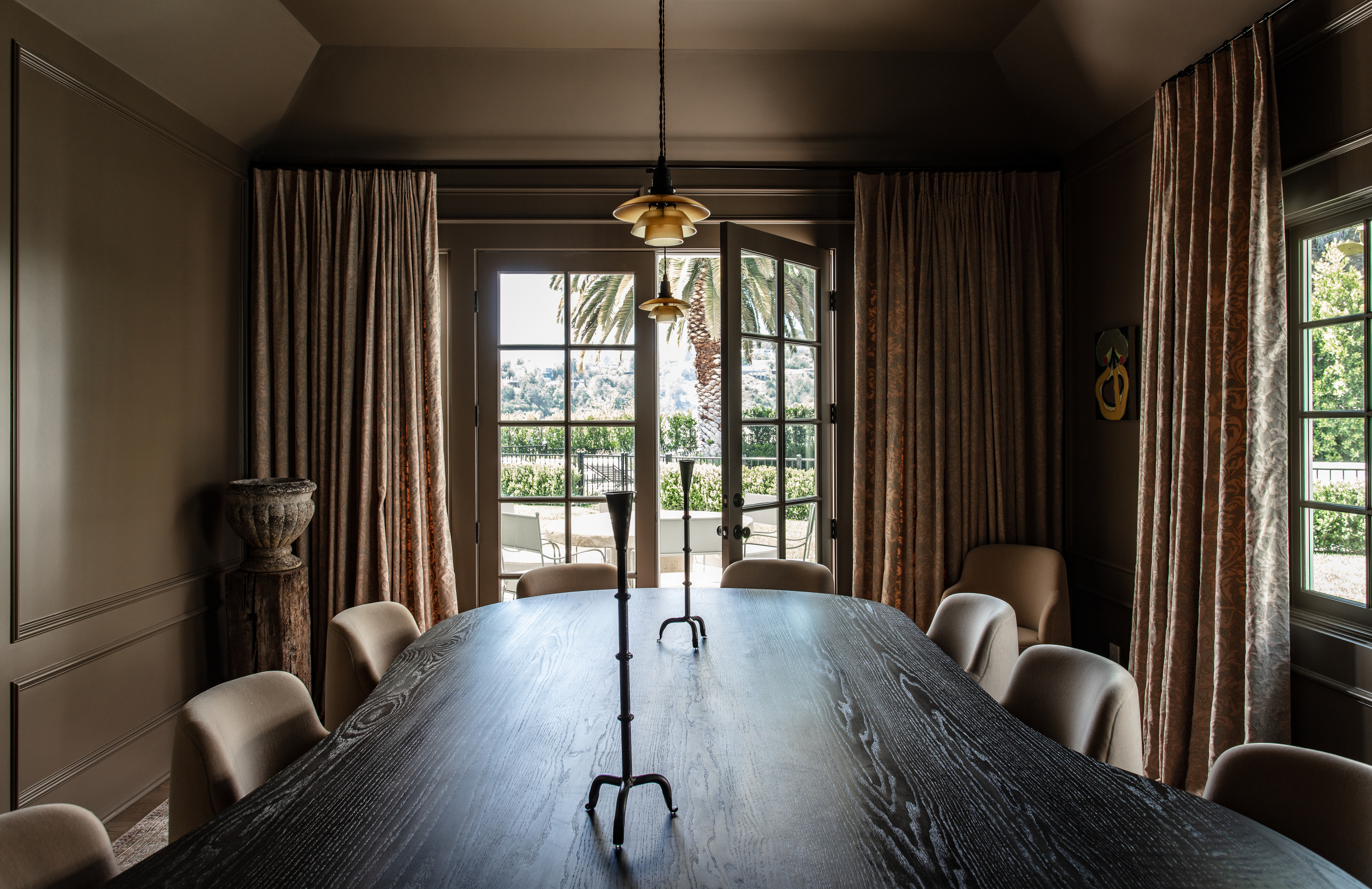
For a moodier and deeper aesthetic, Dead Salmon can be grounded with darker shades. Studio Laloc, for instance, used Dead Salmon on wall cabinetry in a pantry and combined it with Deep Caviar by Benjamin Moore for the floor cabinets. This darker pairing brings out the deeper side of the pink, making it suitable for rooms with limited natural light. Lauren Caron, Studio Laloc's founder, describes Dead Salmon as an 'unexpected warm neutral' or 'drab mushroom color' that can shift to pink, brown, or aubergine depending on lighting and surrounding elements. Its subtlety allows it to recede while complementing more saturated colors within a room.
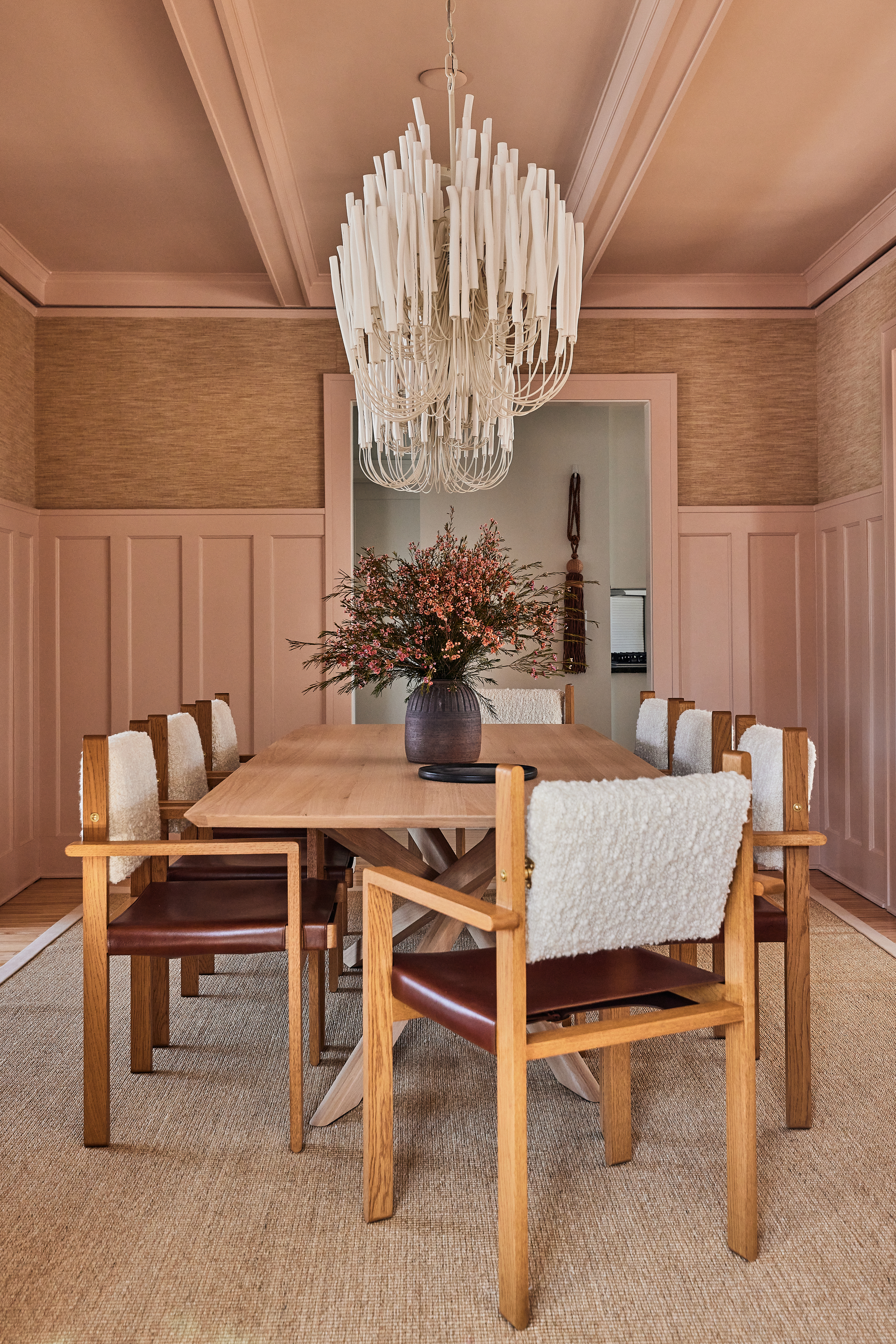
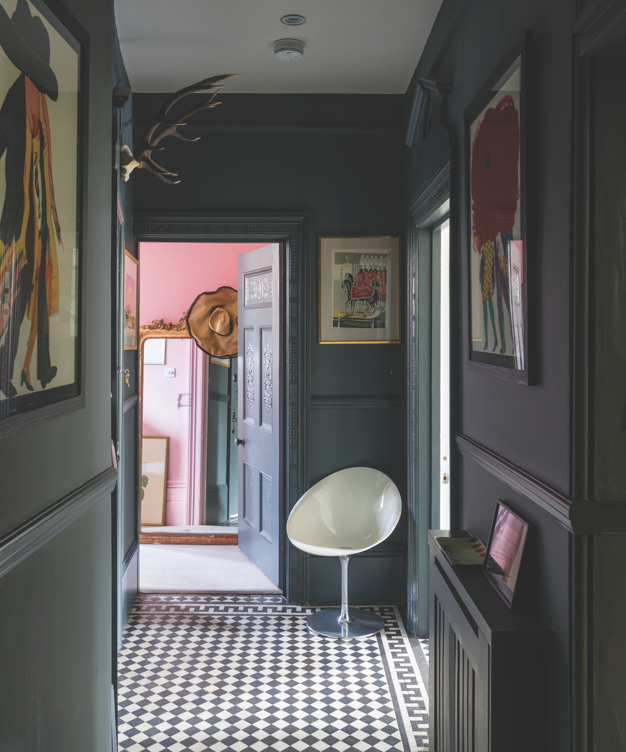
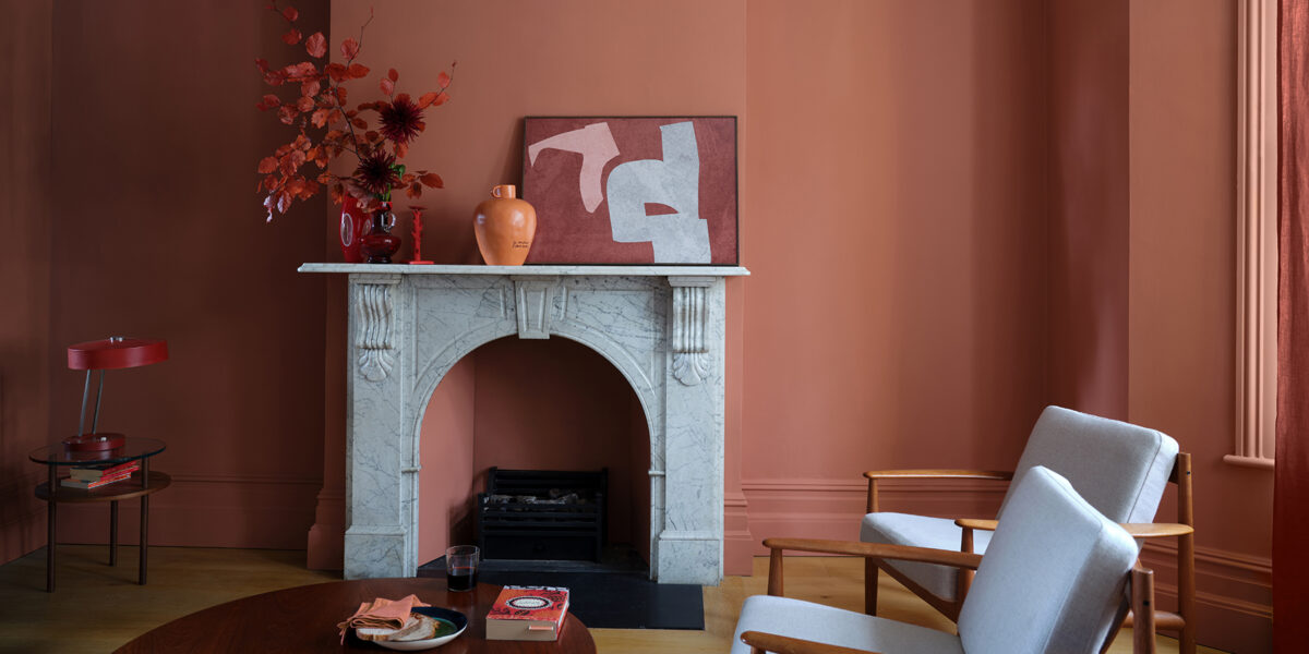
Finally, color drenching a room with Dead Salmon creates an impactful, warm, and welcoming atmosphere. This technique involves painting all surfaces, including walls, ceilings, and trim, in the same color. Because Dead Salmon is so close to a neutral, color drenching with it does not overwhelm the room and maintains flexibility for incorporating other colors and styles. This approach is particularly effective in small bedrooms, enhancing coziness and potentially making the room appear larger. Tom Rutt, founder of TR Studios, praises Dead Salmon's matt quality for adding 'a sense of softness and a fresh, modernity to a space.' He emphasizes its character-changing ability based on natural light, defining it as a contemporary neutral with earthy undertones that works well with other colors or can create impact on its own. Ultimately, Dead Salmon offers a sophisticated, versatile pink alternative that designers frequently recommend for its adaptability and depth.
#DeadSalmon #FarrowAndBall #PaintColors #InteriorDesign #ColorSchemes #EarthyPink #HomeDecor #DesignTips #ColorDrenching #DeadSalmon #FarrowAndBall #PaintColors #InteriorDesign #ColorSchemes #EarthyPink #HomeDecor #DesignTips #ColorDrenching
共0条评论
 暂无评论
暂无评论你可能还喜欢

Farrow & Ball Setting Plaster ideas – how to use this muted pink paint color

5 tips to pull off a chic pink laundry


The *Right* Way to Decorate with Pink, According to Design Experts

How to Reel in the Fisherman Aesthetic at Home (Coastal Colors Are Key!)

How to decorate with Farrow and Ball's Pink Ground – 7 designers share how they use this perfect pink shade
Pretty in pink: decorating ideas for this year's hottest colour | loveproperty.com
Calamine pink, or Dead Salmon? What’s behind paint names

This Game-Changing New Paint Finish Should Only Be Used If You Want to Drench Your Space in Color (and You Absolutely Should)

This Farrow & Ball paint color is trending, but it's tricky to decorate with – here's how the experts make it work
Home design: Add some pink
How to decorate with plaster pink tones – 5 ways to bring this timeless yet trendy hue into your home
Decorating with vege-crazy extravagance
How to Nail This Tricky But Surprisingly Trendy Farrow & Ball Paint Color

6 ways to decorate with Farrow & Ball Down Pipe, a dramatic black paint

Decorating with paint

One Designer Says She's Been Using This Paint Finish for Over 40 Years: 'I Never Get Tired of It'

The 4 best Farrow & Ball Sulking Room Pink alternatives

Ok: These pink Halloween decor buys are super cute

Seashell Decor Is Everywhere Right Now—Here's How to Decorate With It

The Difference Between Eggshell and Semi-Gloss Paint and How to Choose the Right Finish